
HAYLEY LOFTHOUSE
DESIGNER

I am a graphic designer. I believe everyone is born with a gift and with a passion – this is mine.
When I design, I design clean. I design geometric and linear. I favor organization for the benefit of understanding. I am not afraid of color, nor does a lack of color cause me to shy away. These inclinations do not limit me because I am driven to diversify my horizons and further develop my skill set.
“When it becomes clear that no one else shares your level of passion, you are where you belong.”
EDITORIAL
ENVISION MAGAZINE
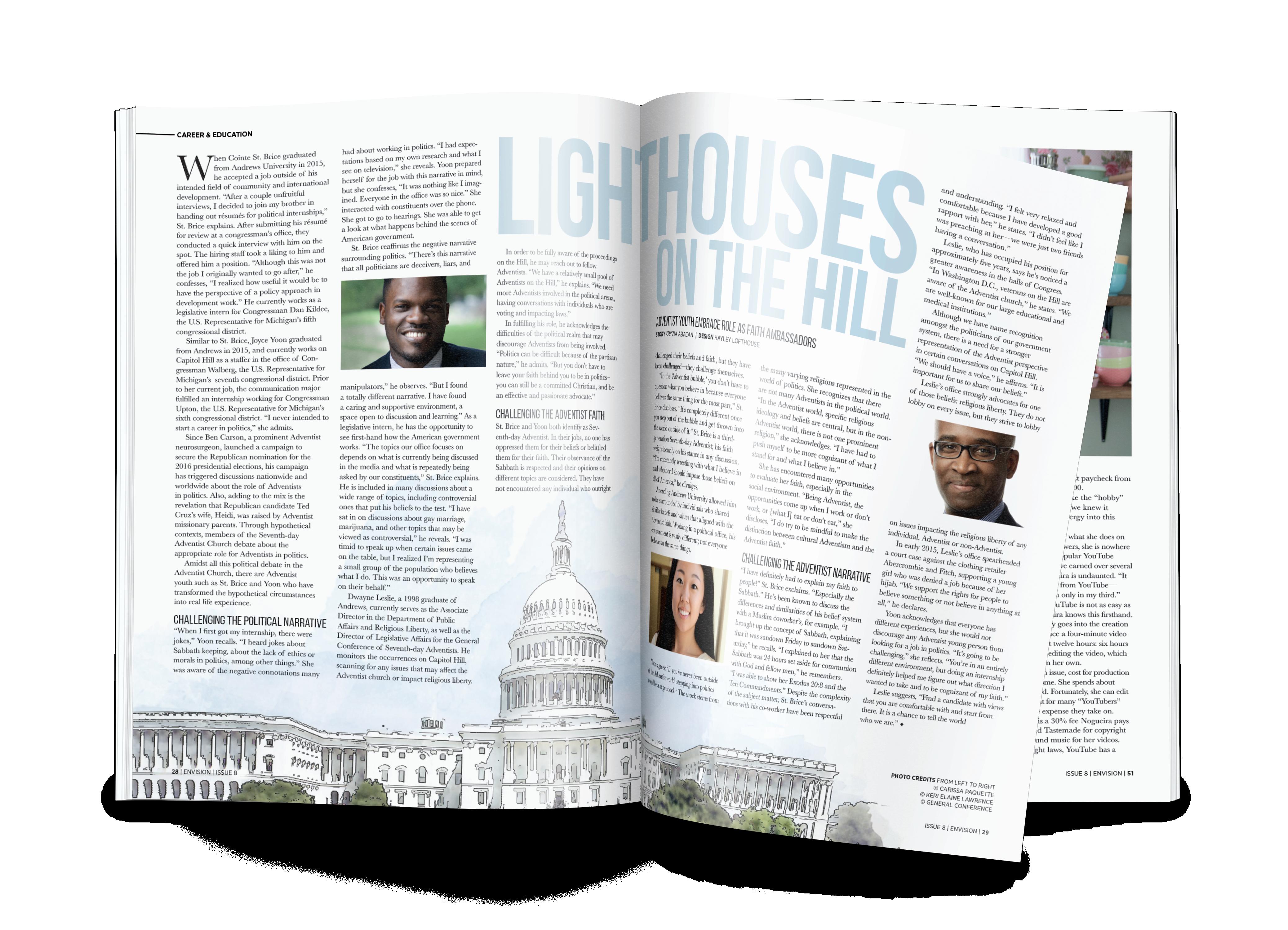
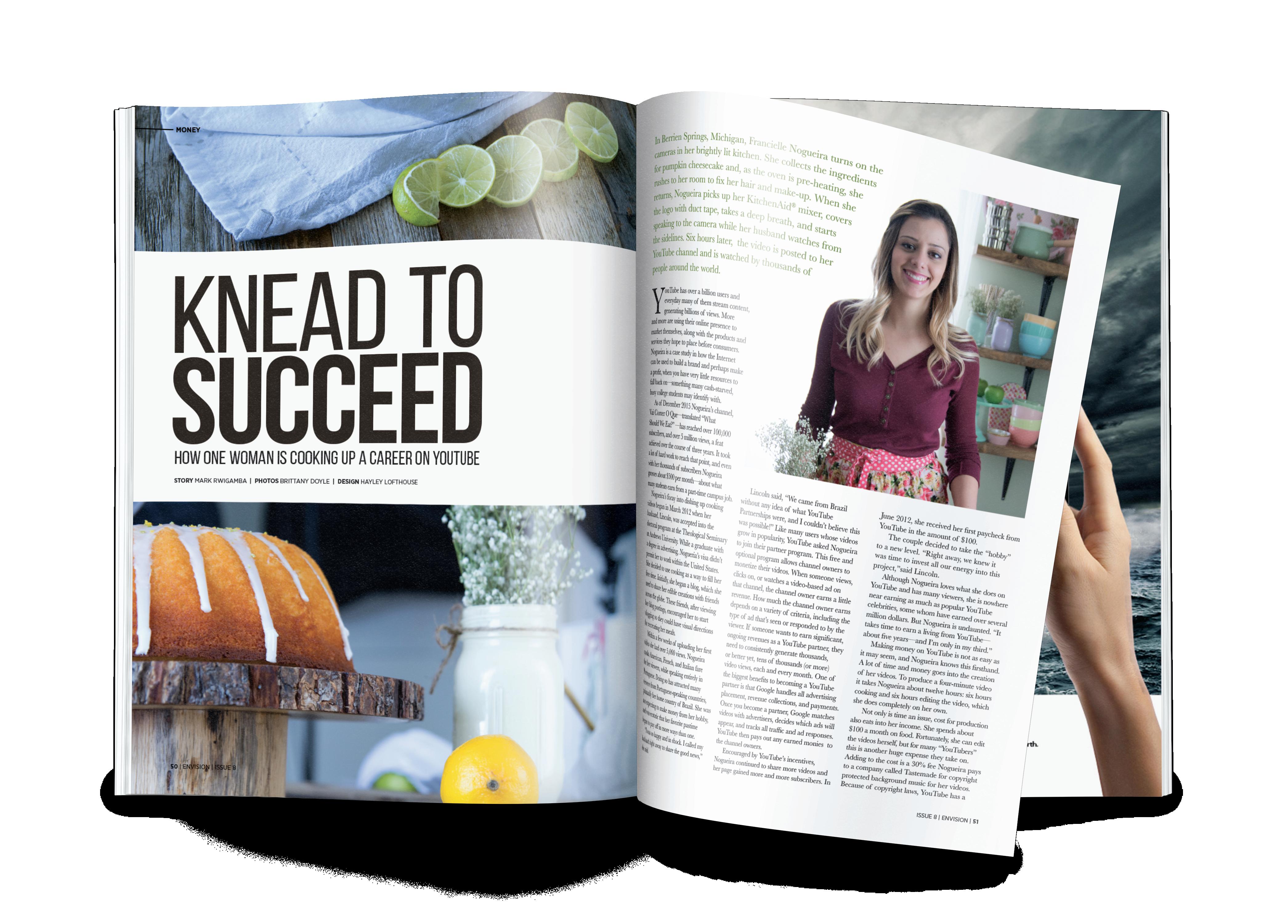
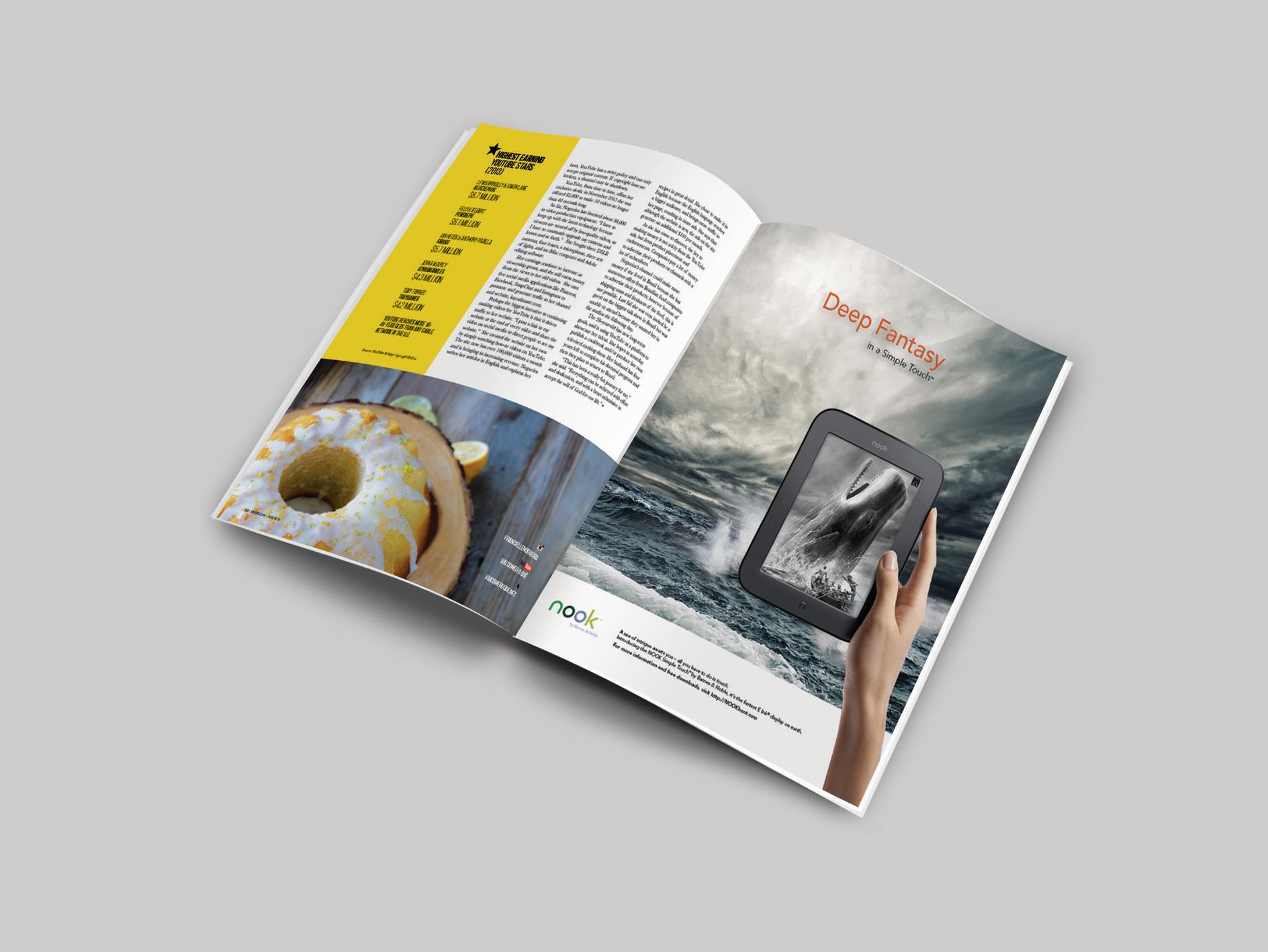
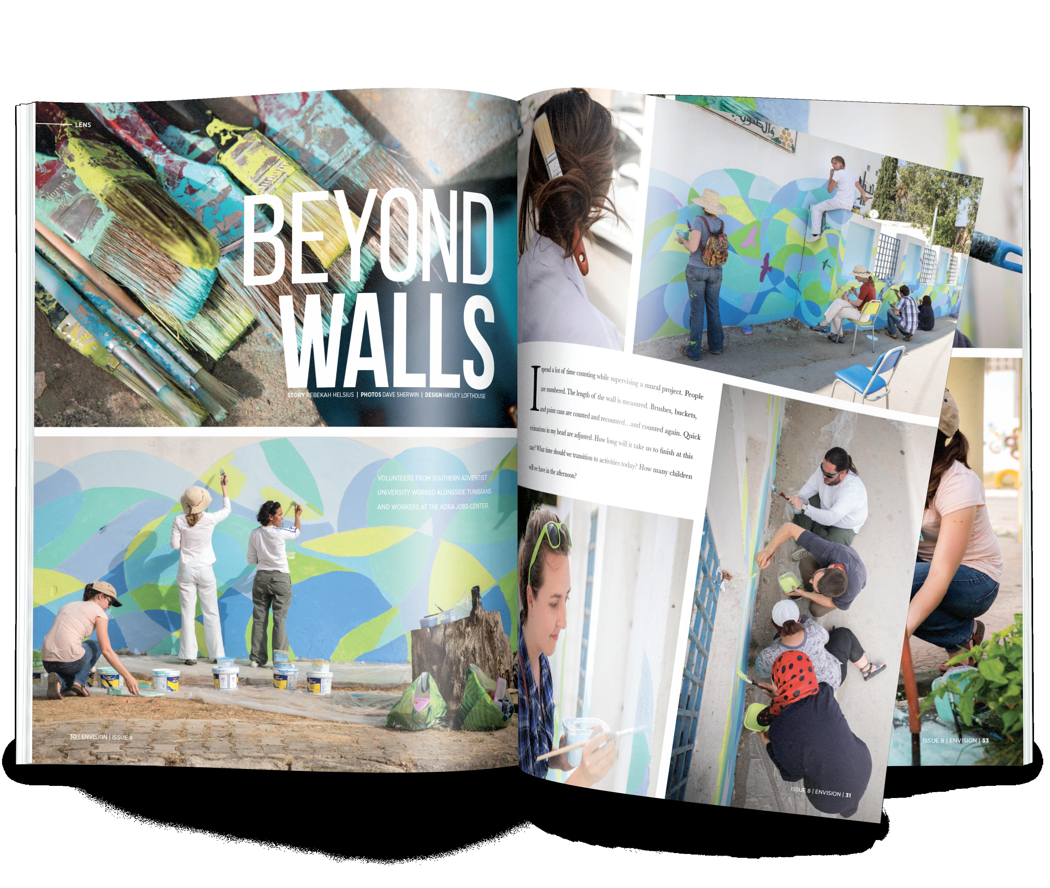
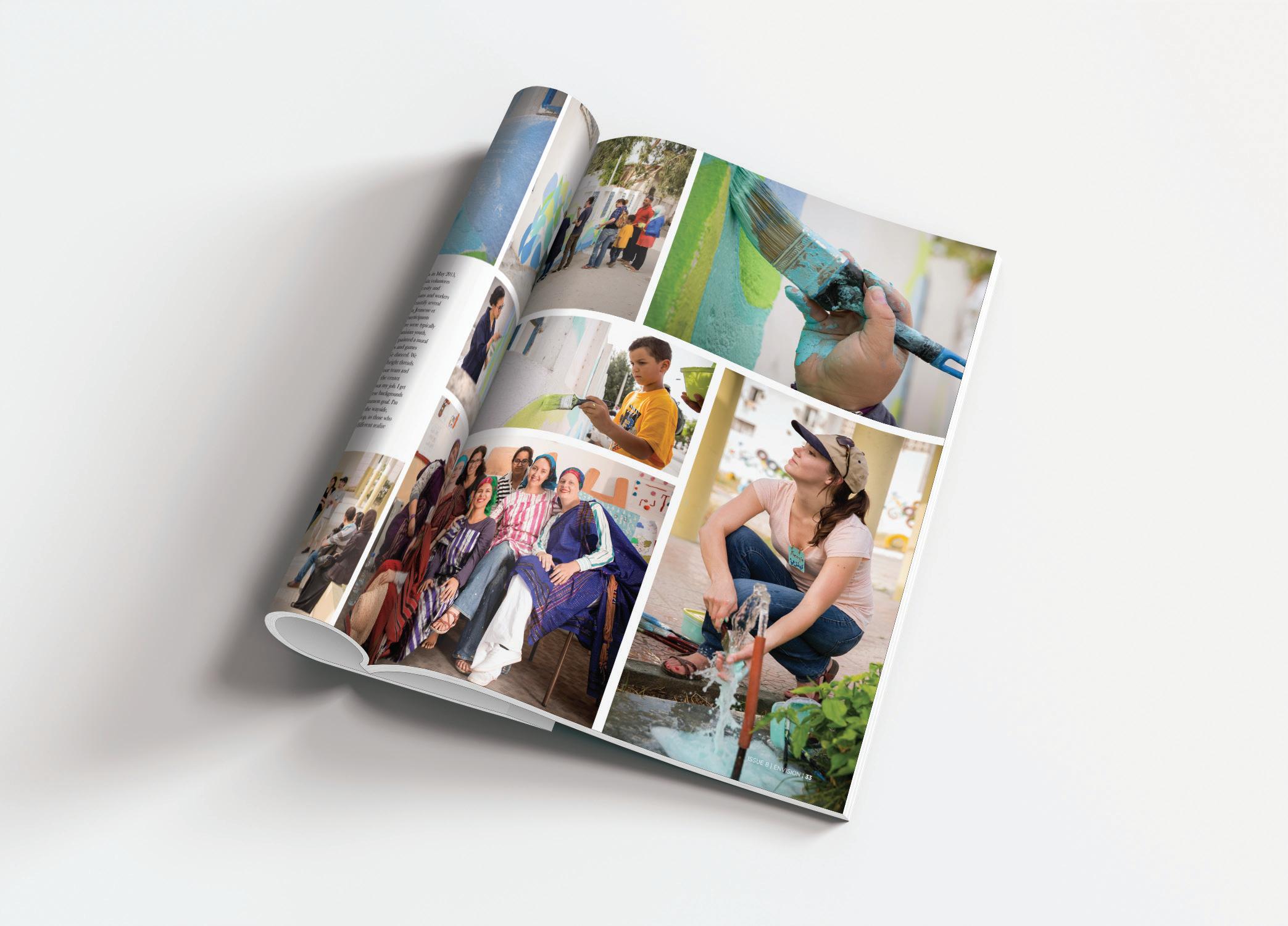
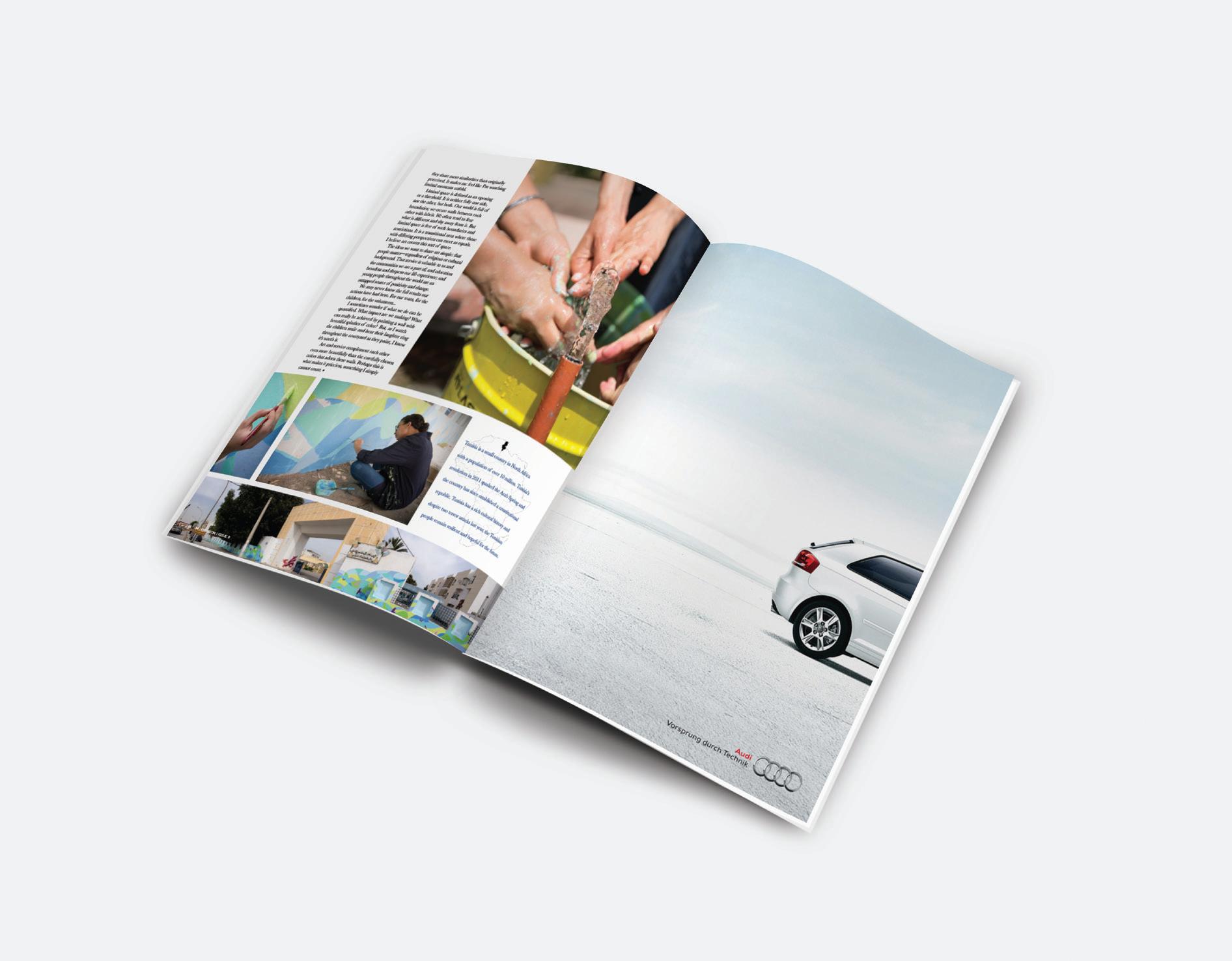
ENVISION MAGAZINE
DYAD MAGAZINE
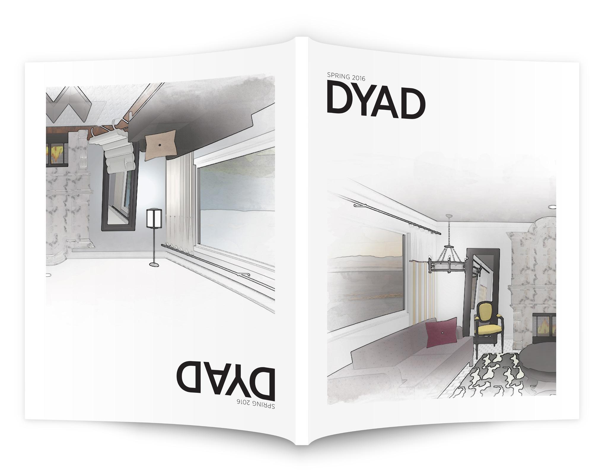
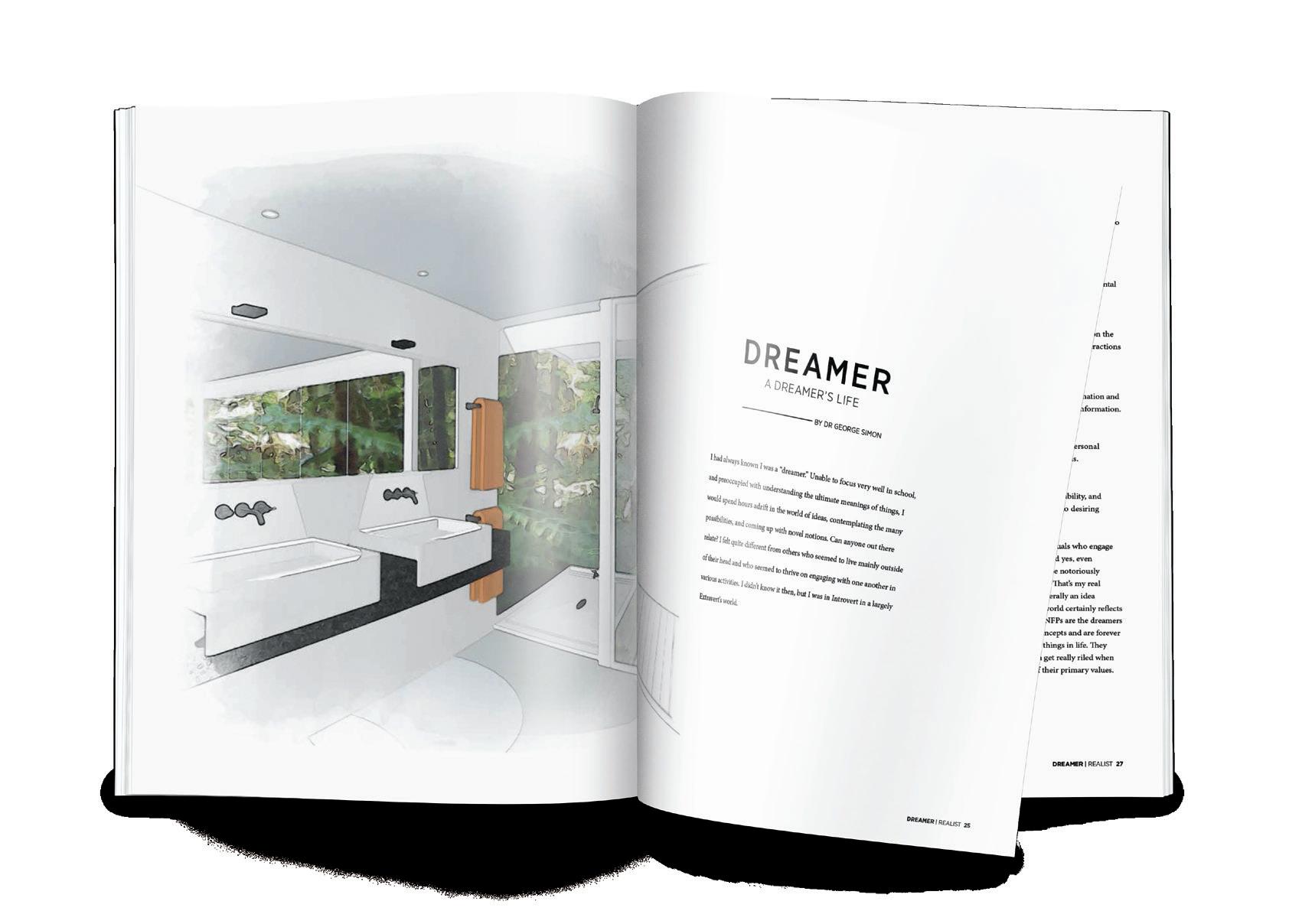
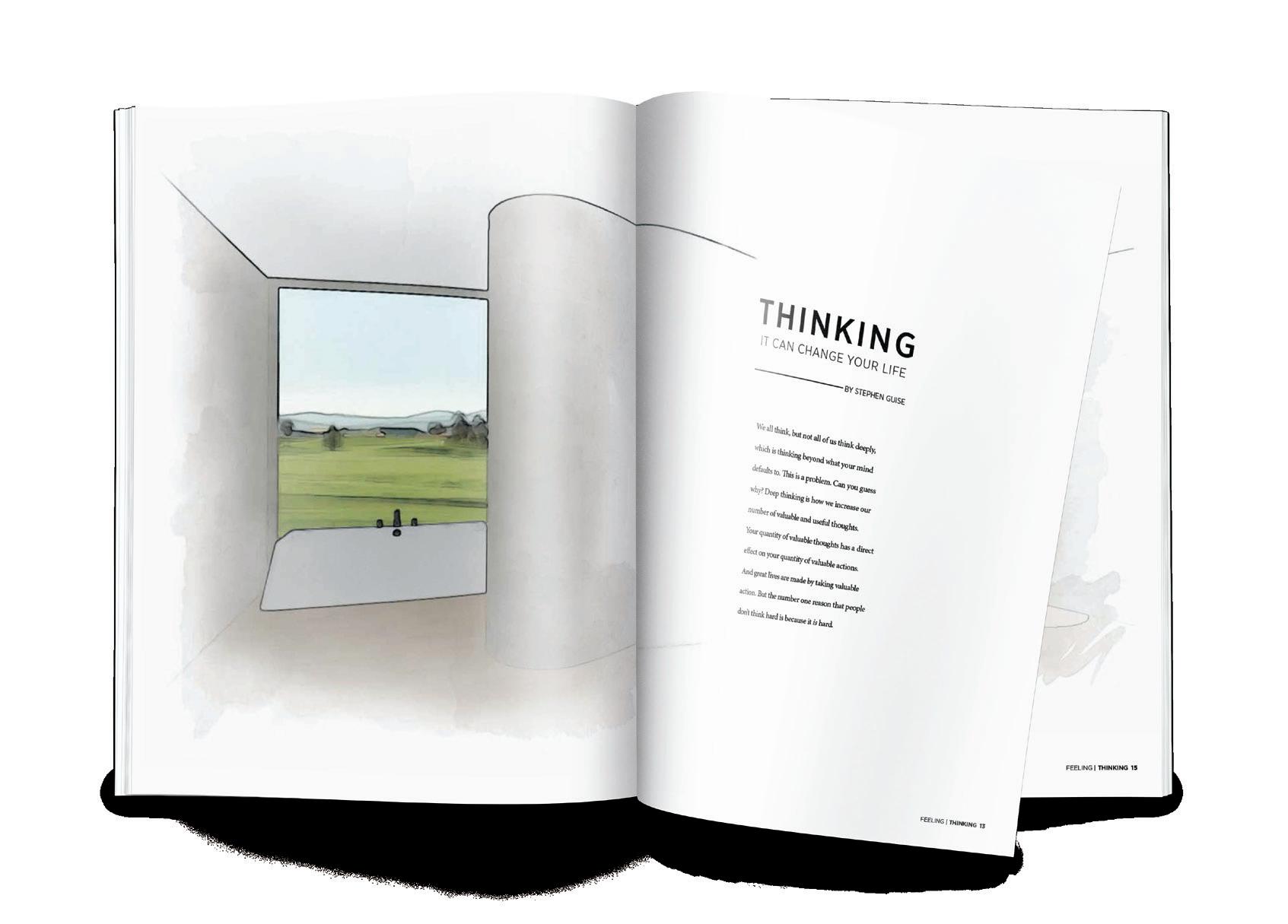
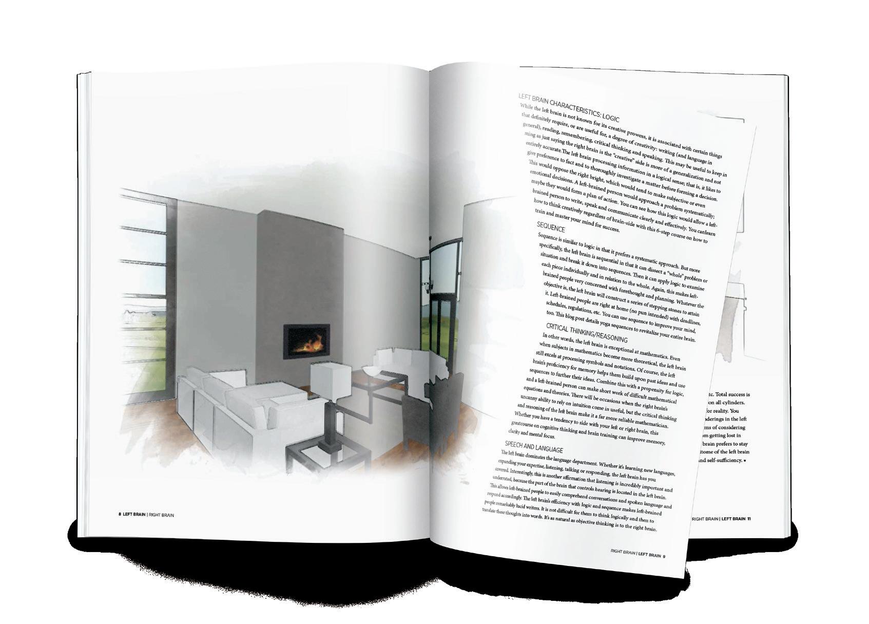
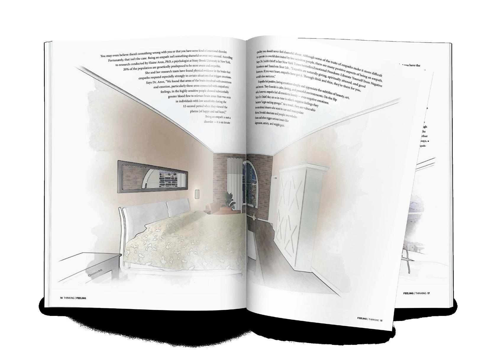
This 60 page publication explores contrasting personality traits within myself, expressed visually through interior design. Titled Dyad, the magazine has two front covers, and flips upside down, beginning the second magazine in the middle of the publication. The spaces were digitally designed, watercolored, and then complied into a magazine.
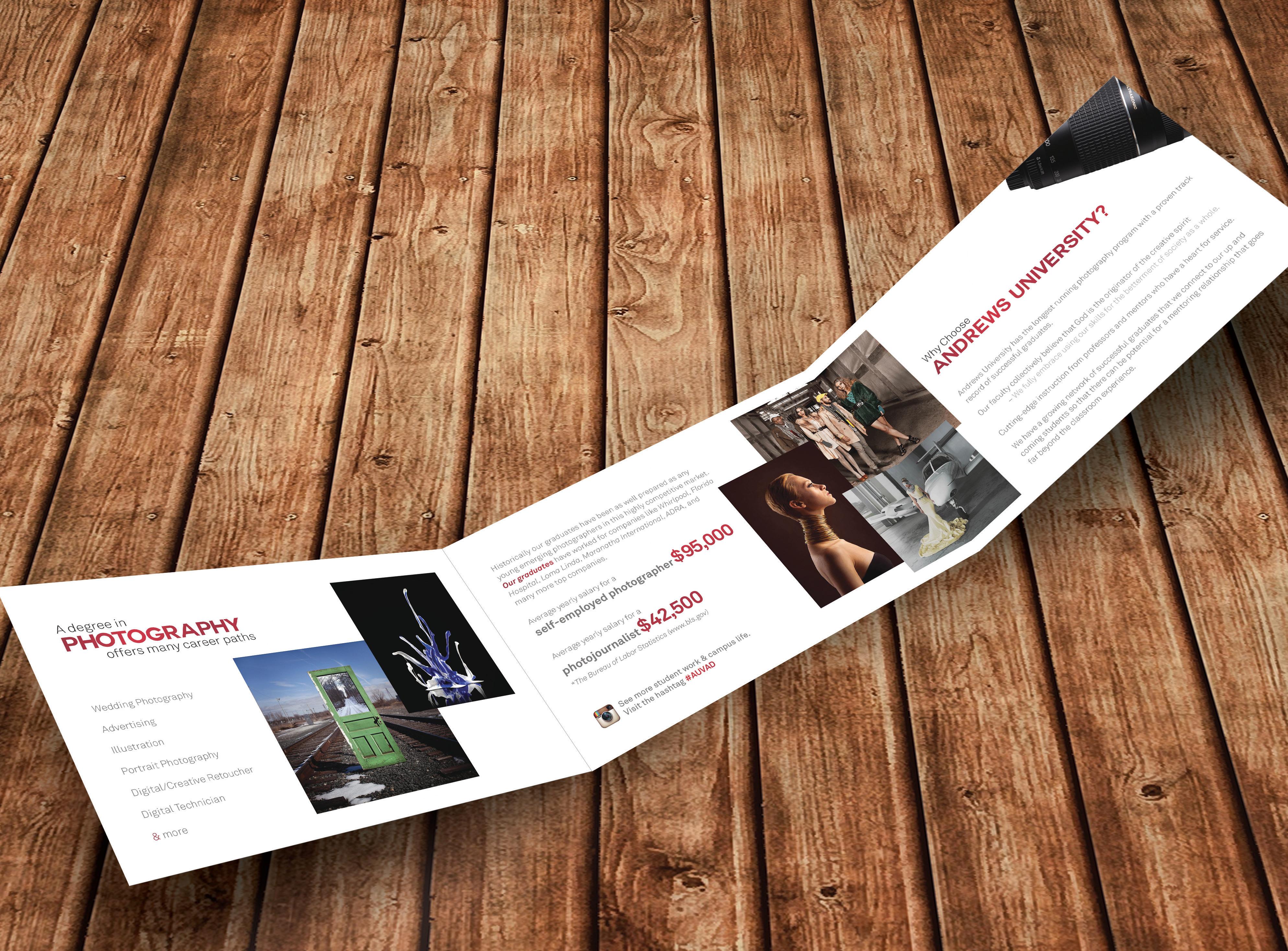
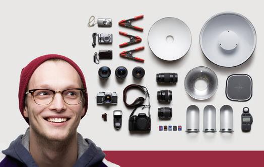
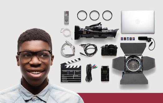
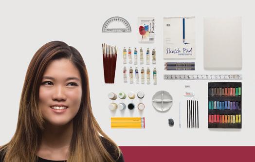

A departmental promotional piece for my Alma Mater, designed to promote and encourage an interest and career in the arts. Four brochures were designed to inform of potential careers options and salary averages one could have with various BFA degrees as well as why Andrews is the best option.
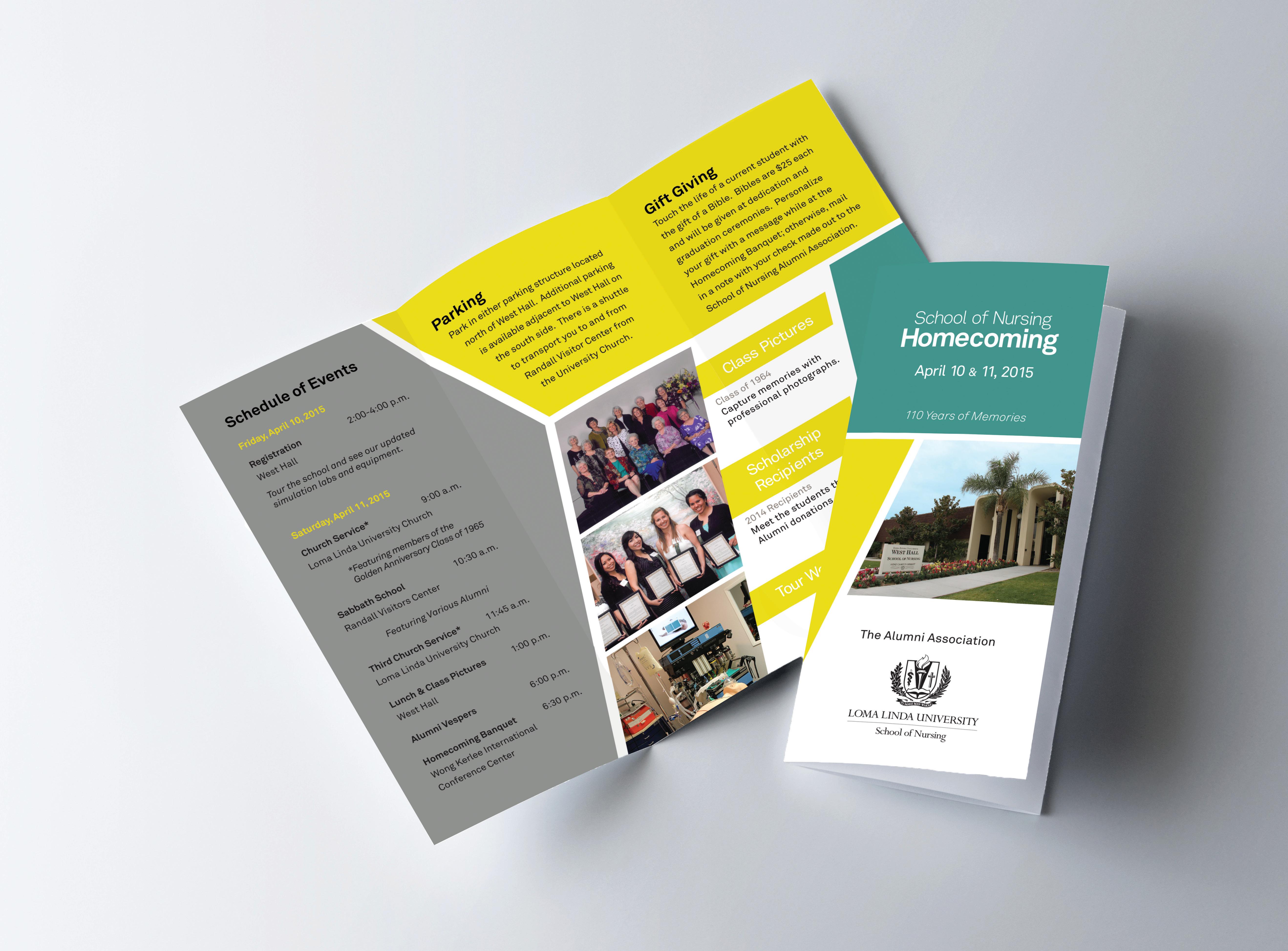
This brochure was designed as a mailer to be sent out to Alumni of Loma Linda University in California. The brochure included the reunion weekend itinerary and an RSVP mailer to be returned for confirmation.
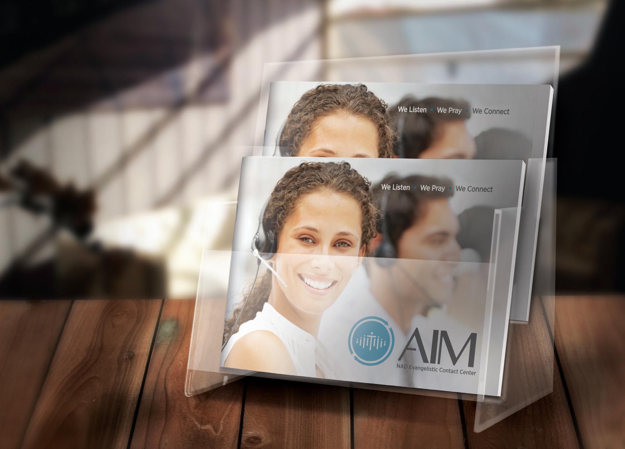
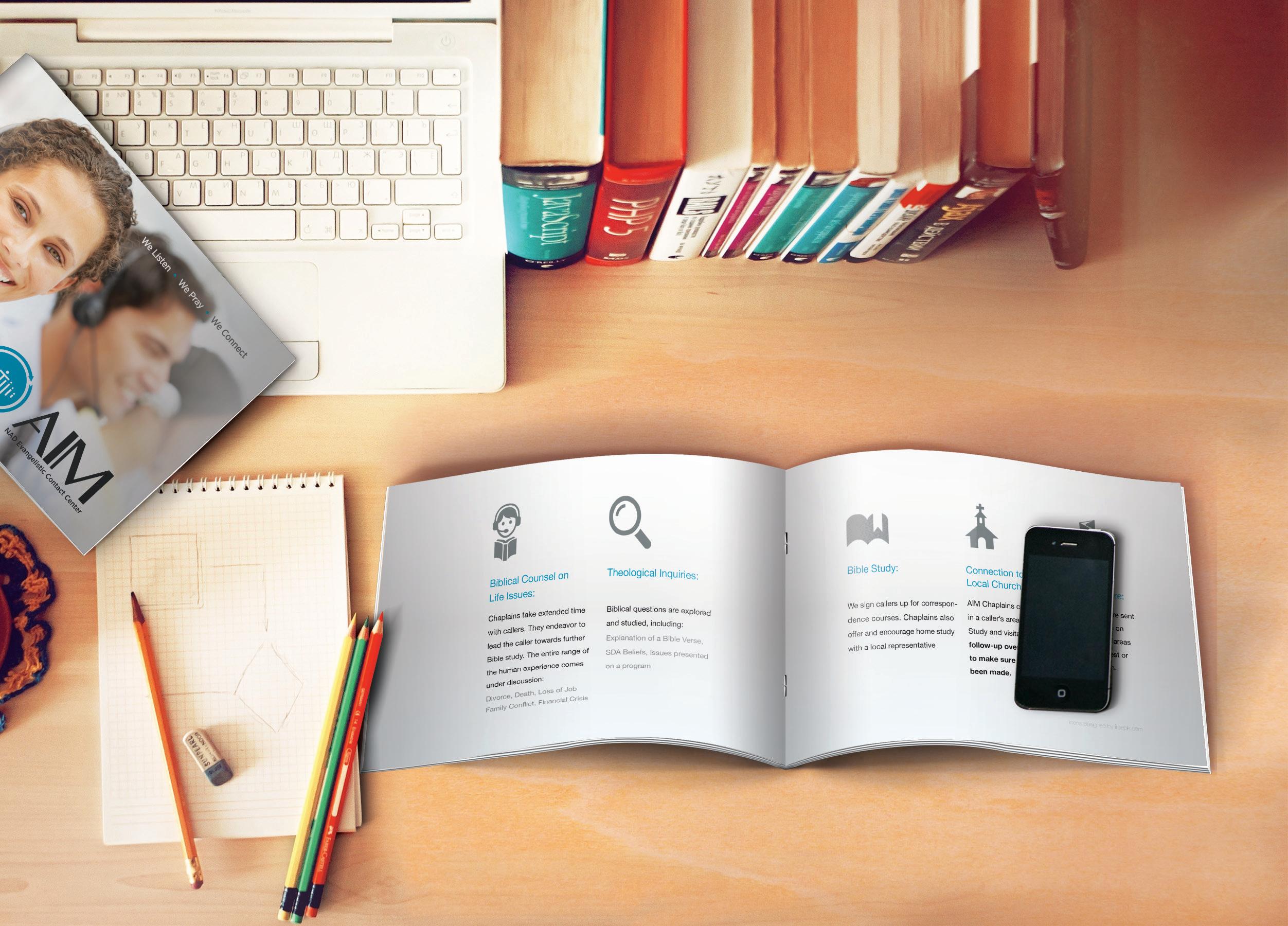
ADVENTIST INFORMATION MINISTRY CALL CENTER
Designed as a promotional piece, this 16 page brochure is clean and organized and designed to emphasis elements of importance to potential clients. The color palette and clean design are pleasing to a wide range of viewers, helping AIM reach the largest audience possible.
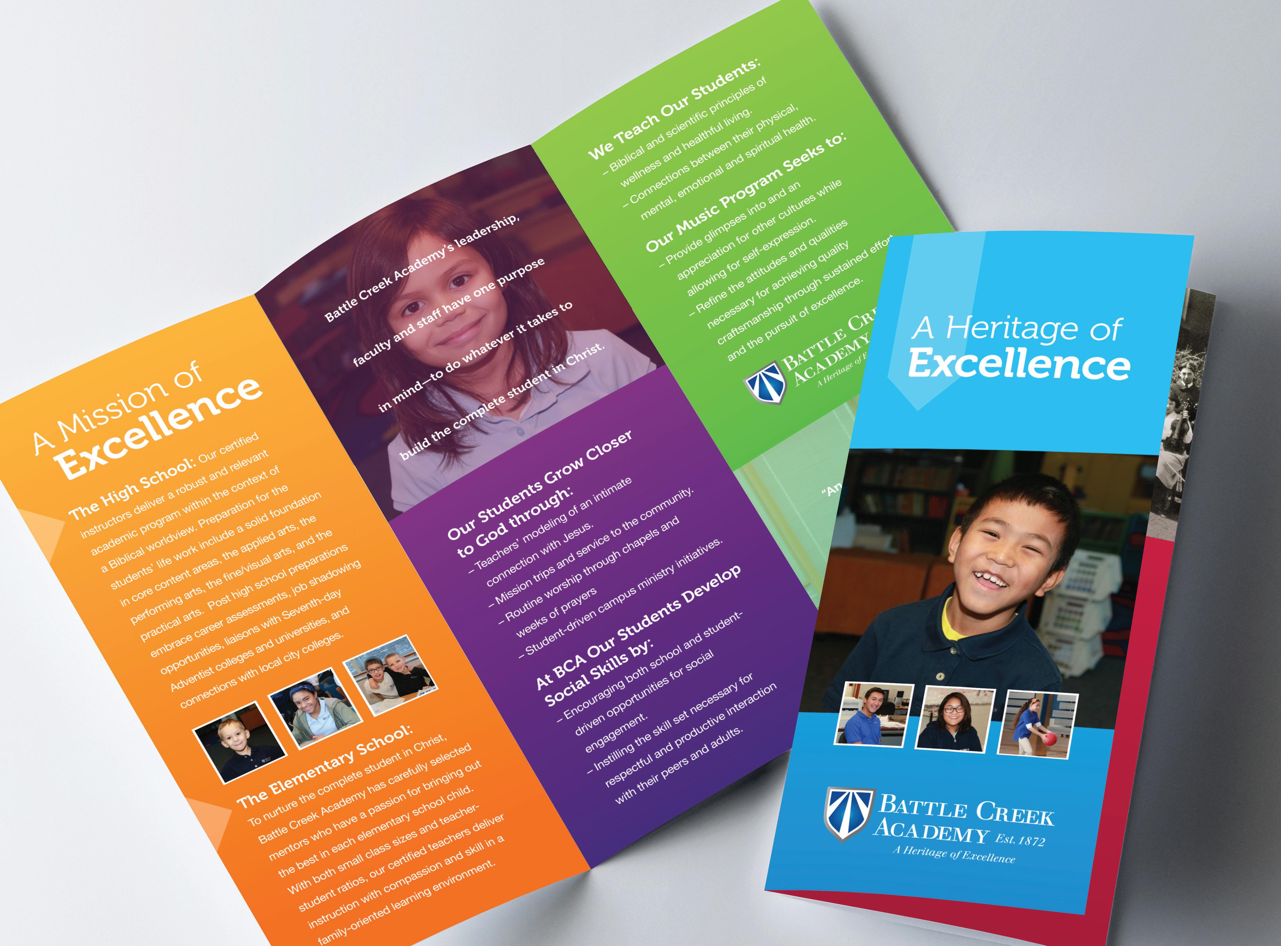
Maintaining the existing logo and color palette, a tri-fold brochure was designed to communicate what makes Battle Creek Academy stand apart from it’s competition by highlighting the areas of academia they excel in, while using friendly pictures conveying the welcoming atmosphere.
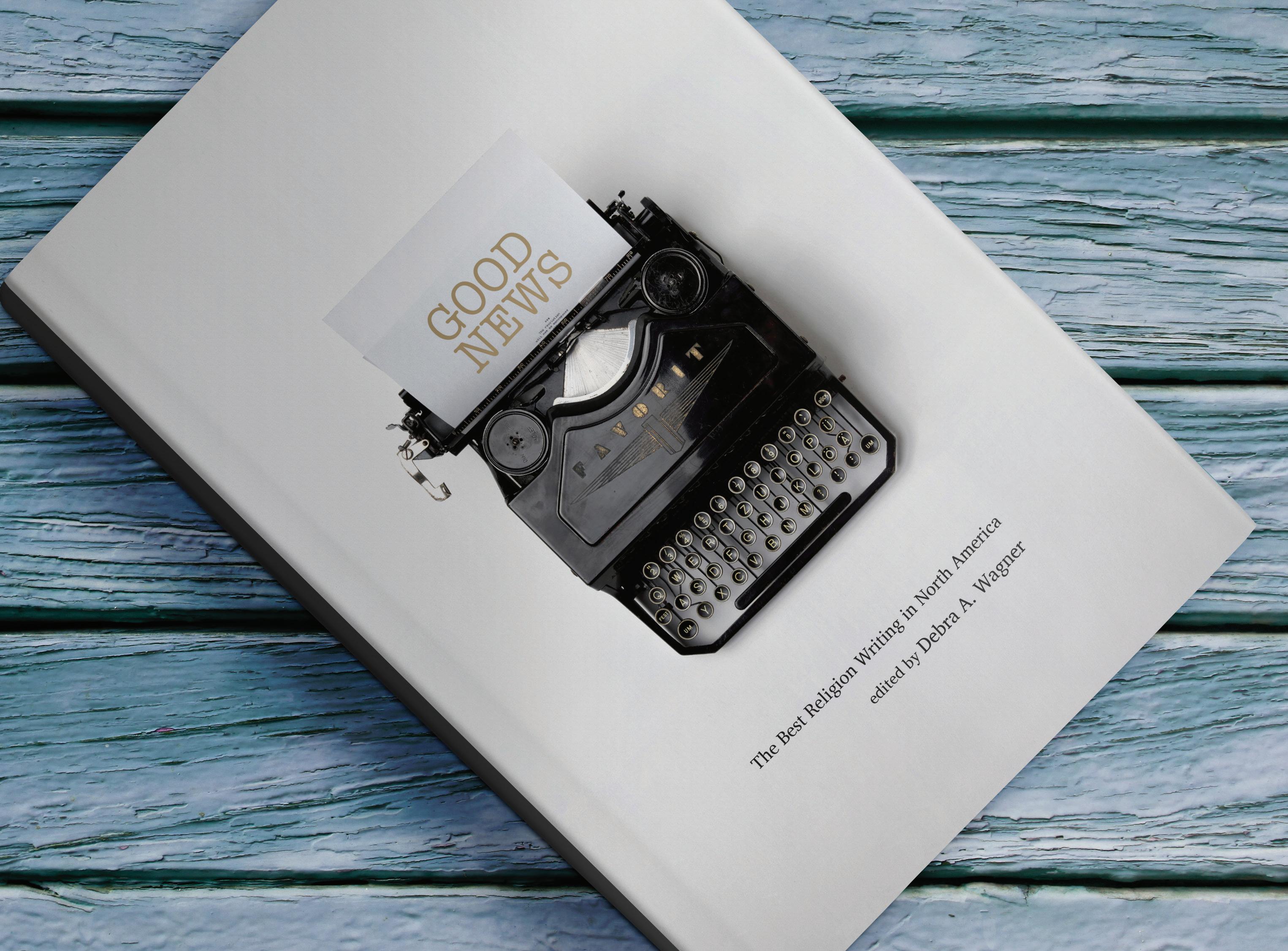
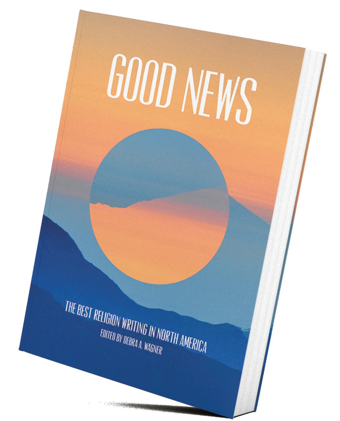
BOOK COVER DESIGN


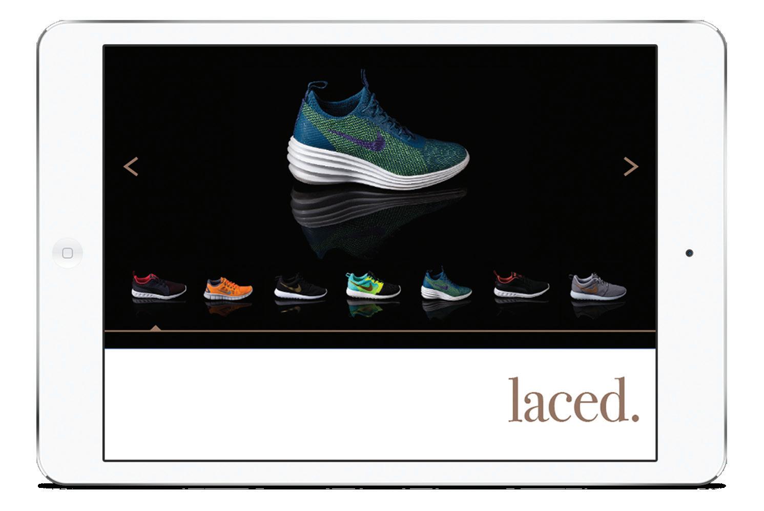
ATHLETIC LOOK BOOK
Designed as digital ‘look book’ to be viewed on an Ipad. The intention was to create a highly visual piece, without the ‘in your face’ pressure of advertising.
BRANDING
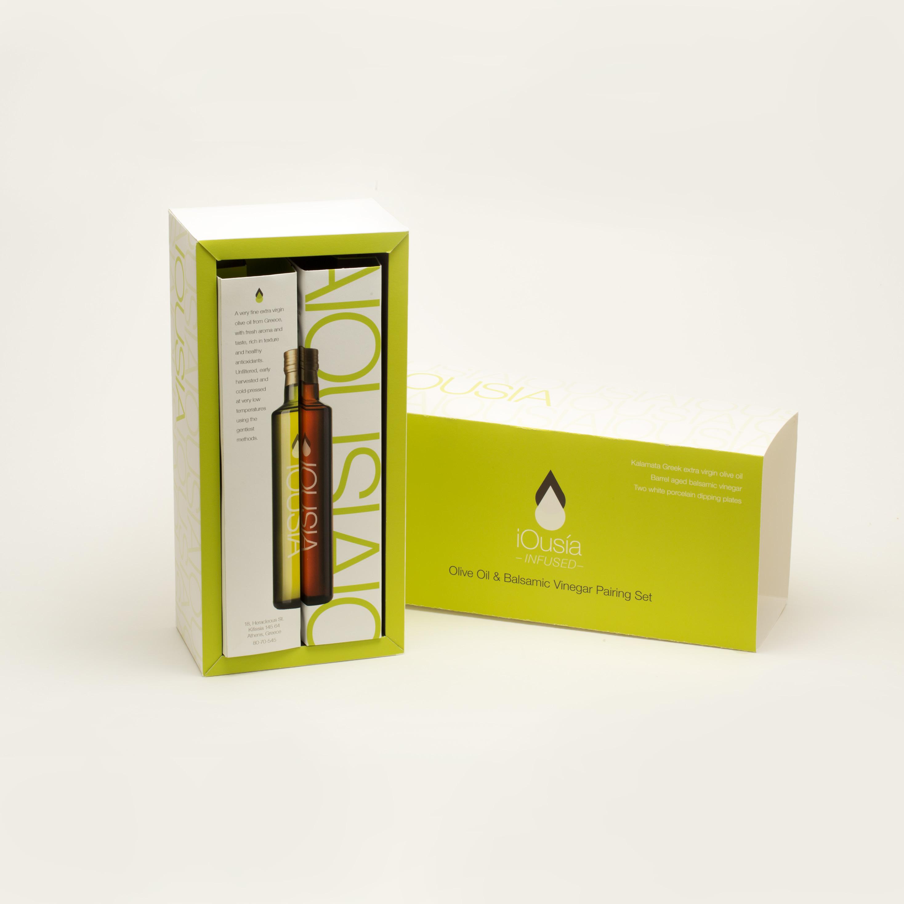
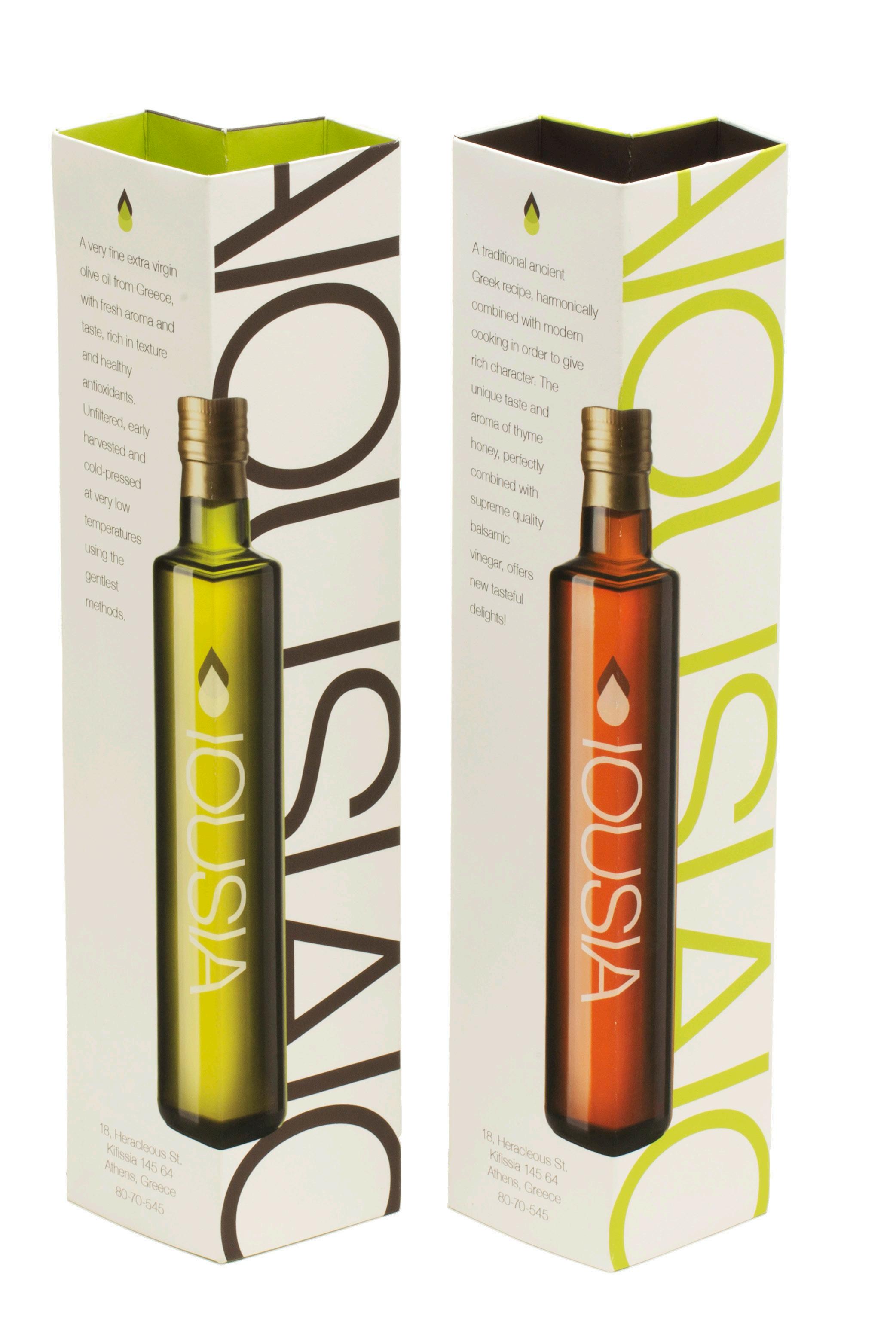
Ousia, the enunciation of the Greek word meaning ‘essence’ is an oil and vinegar brand. The three piece set includes oil, vinegar and dipping plates. Each come in an individual box, and are collectively packaged into a fourth and final box.
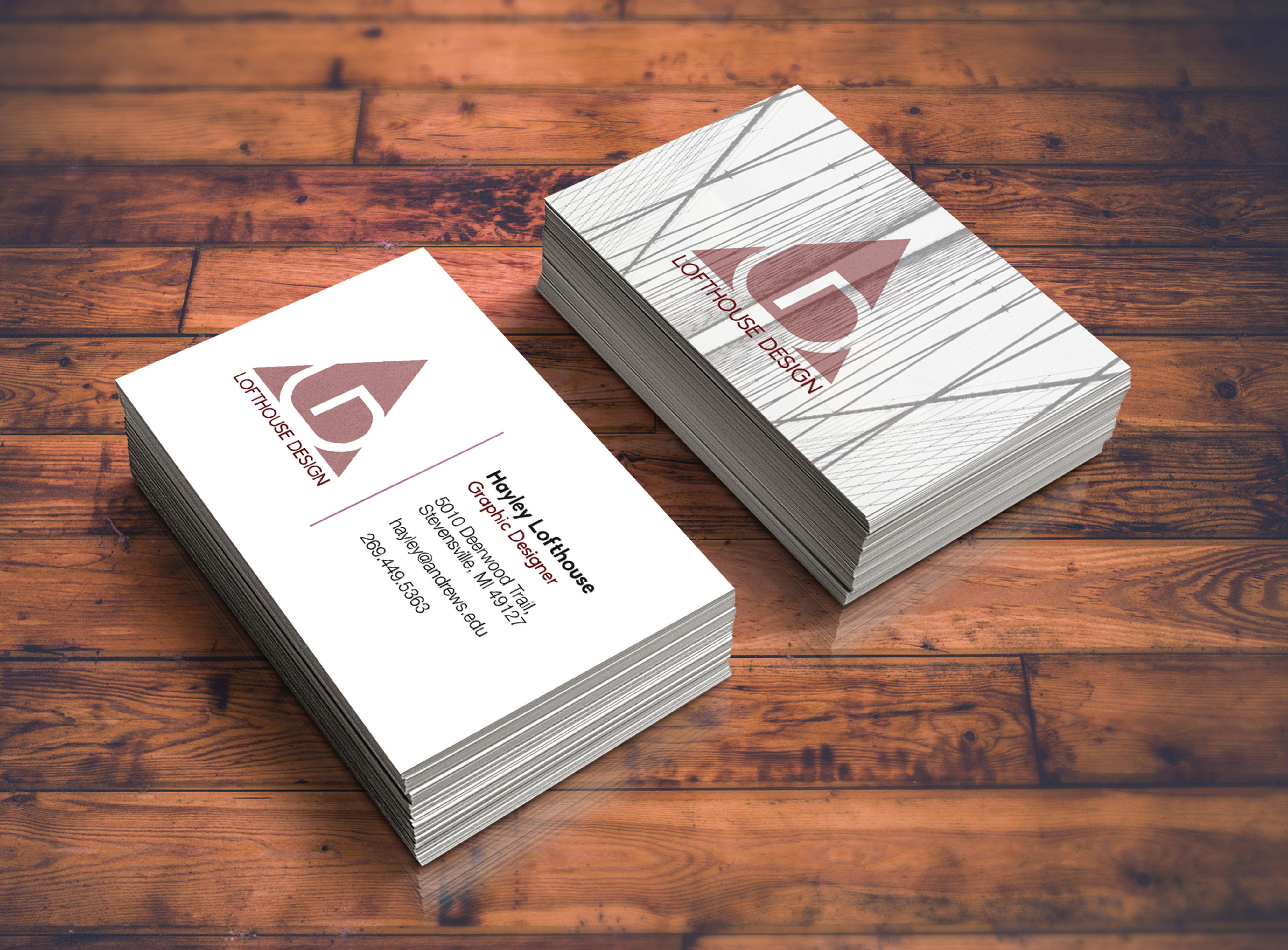
LOFTHOUSE
DESIGN
Self-brand for personal use. The intention behind a self-brand was to promote personal freelance.
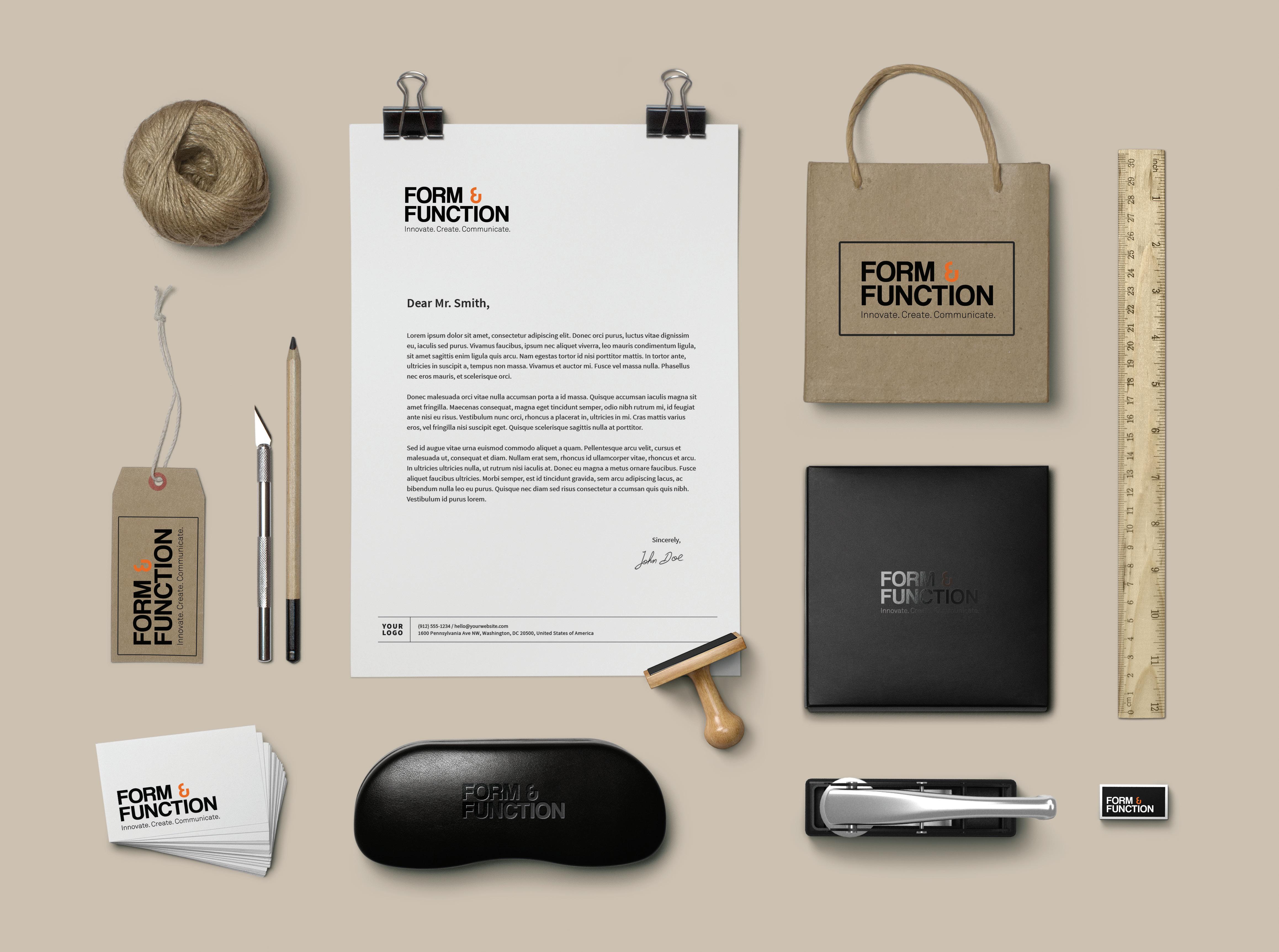
Designed as an word mark, Form & Function is a bold and modern branding. The logo’s beauty relies on the elegance of the type and is easily interchangeable for various applications.
RUTH MURDOCH ELEMENTARY SCHOOL
With slight alterations to the preexisting logo, the redesign provides a fresh, up-to-date look.
The core concept of diversity and religion are maintained while making the human element more energetic, radiating life.
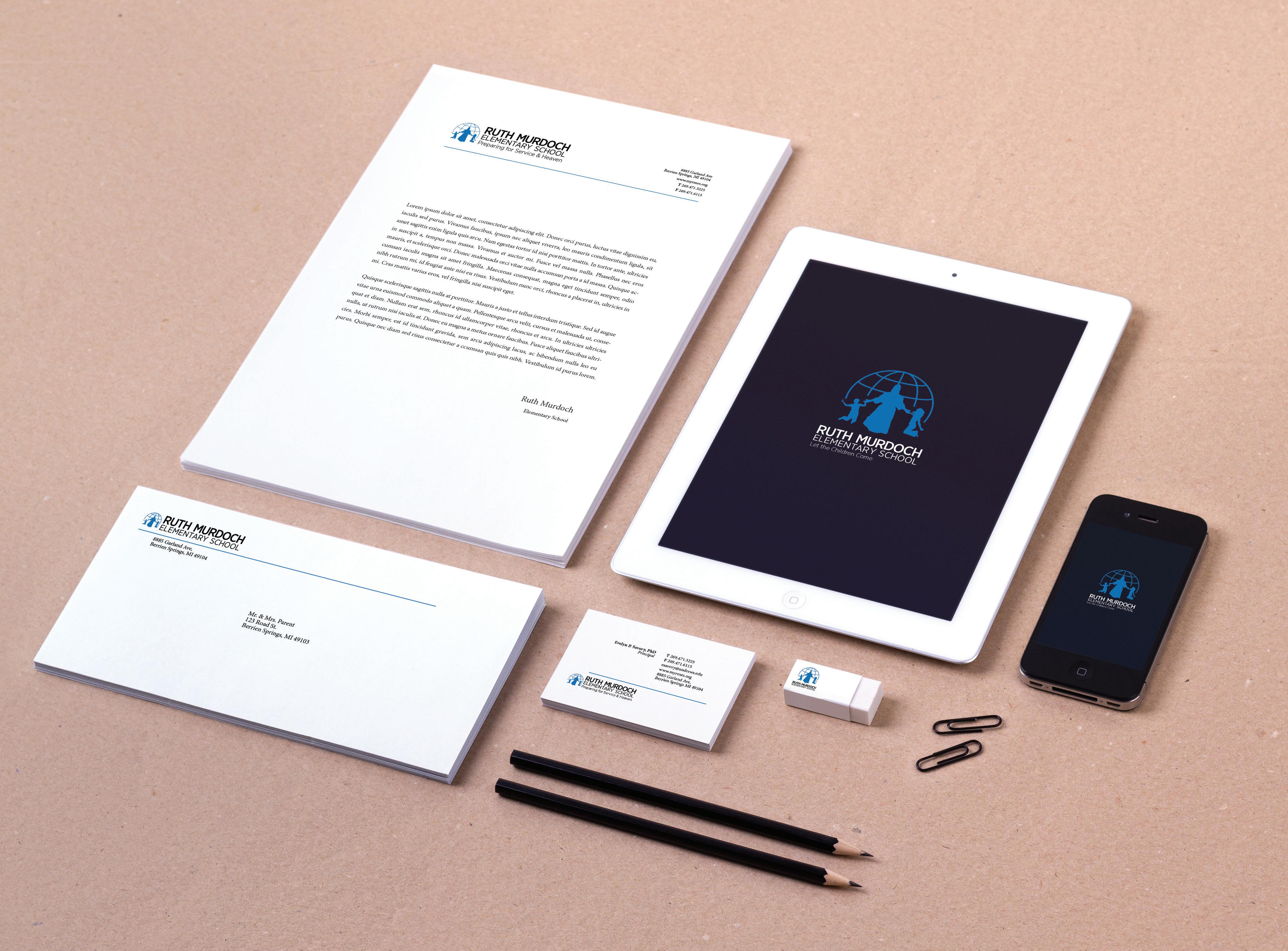
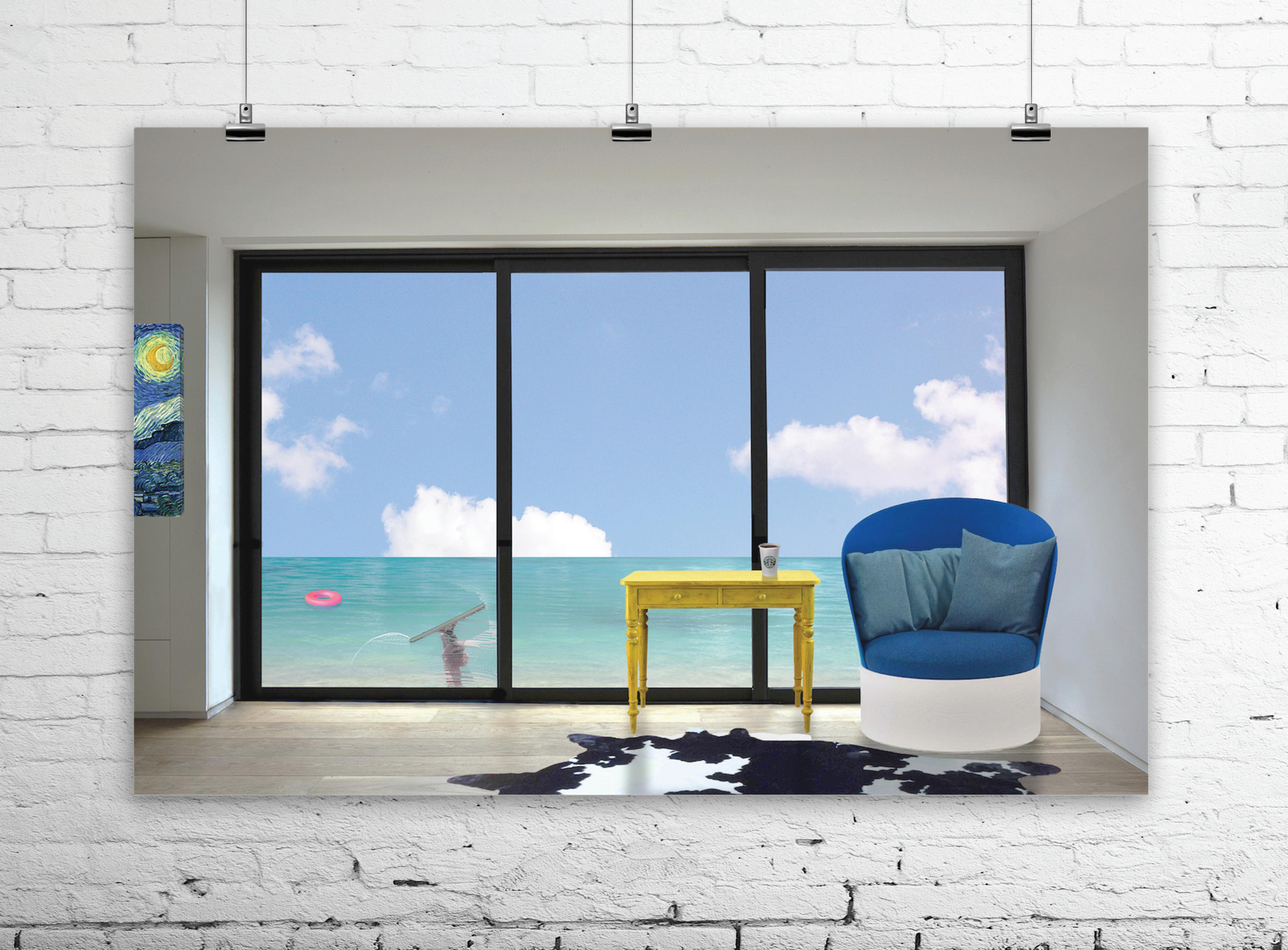
PHOTO MANIPULATION
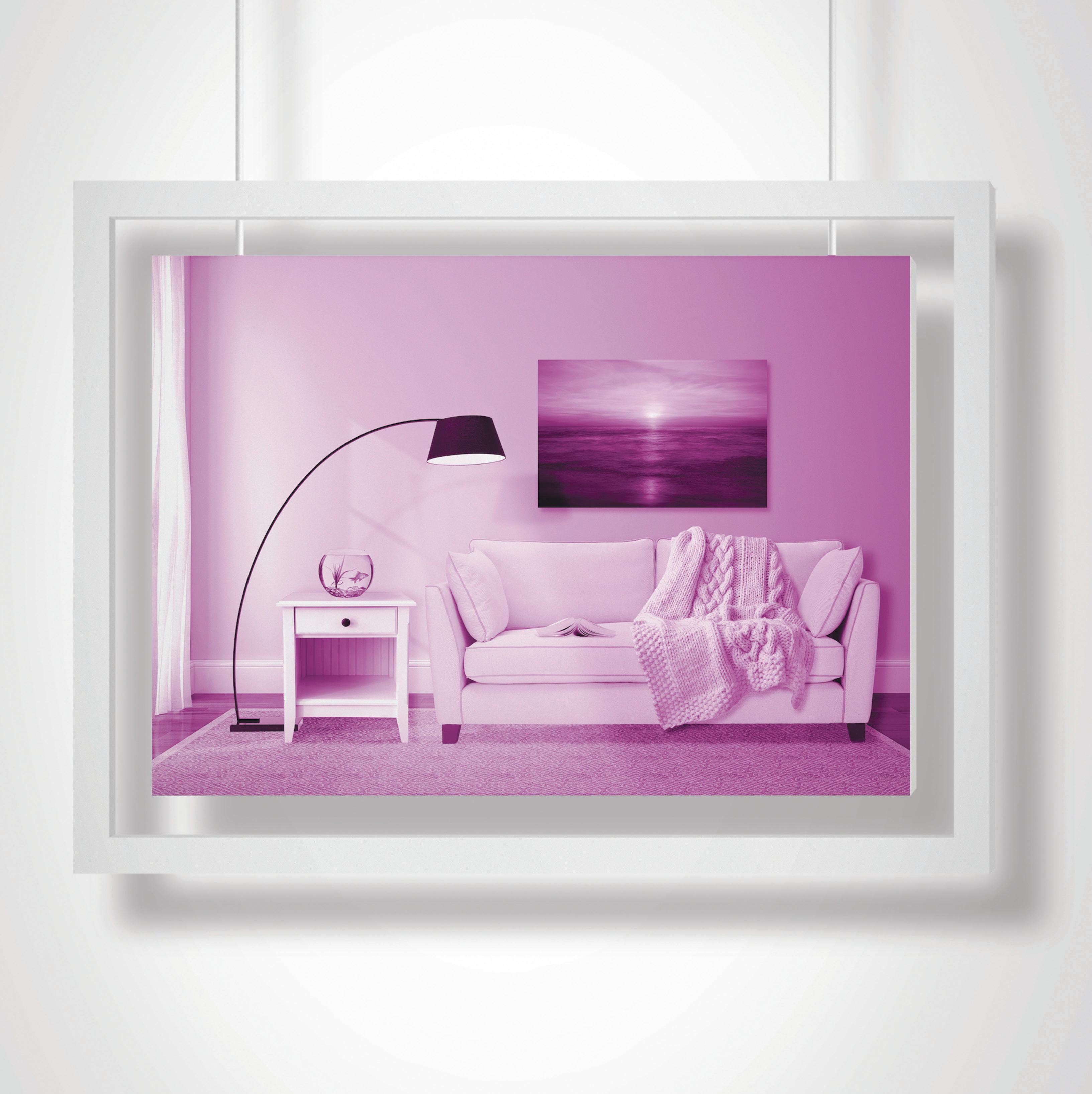
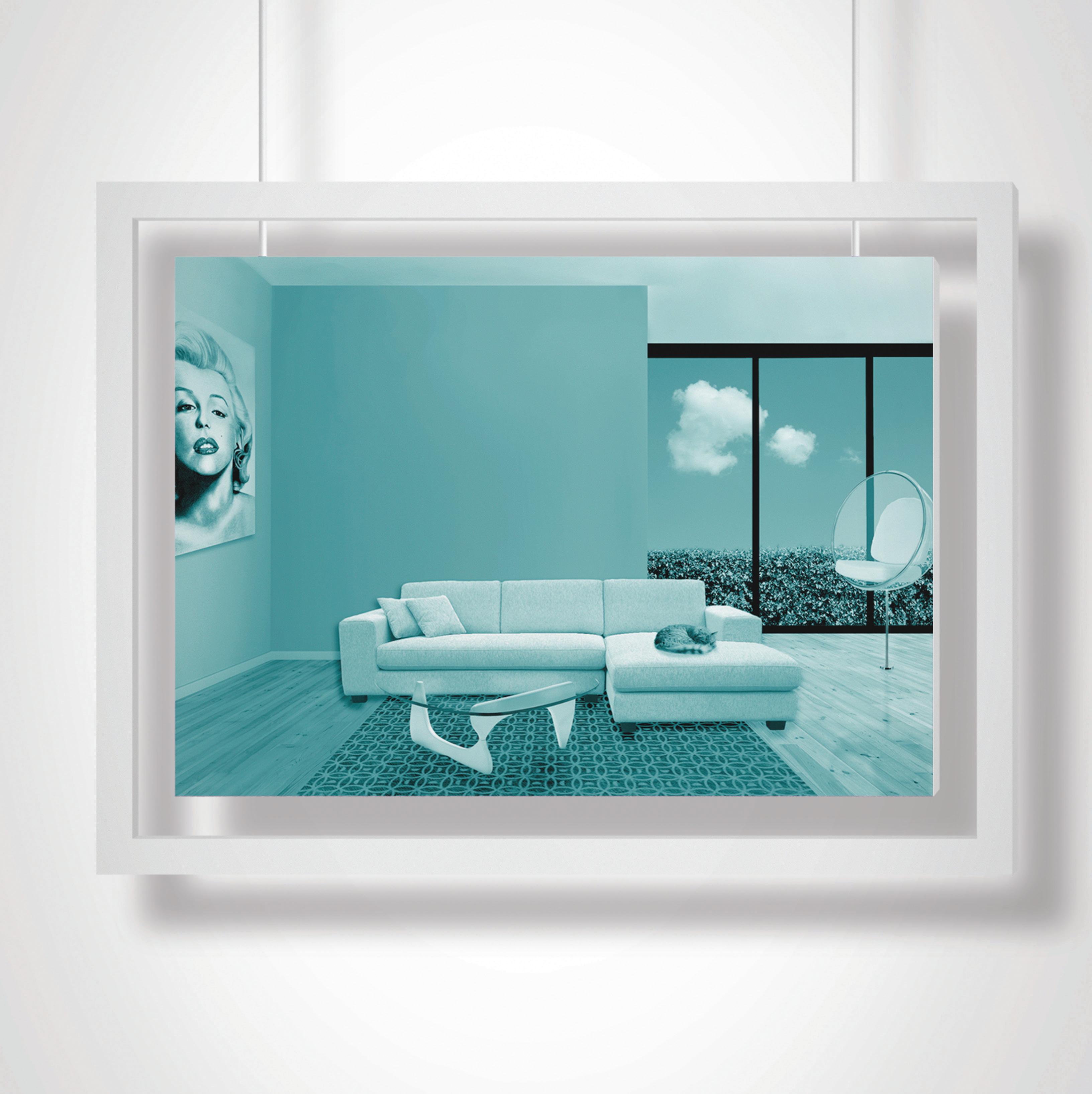

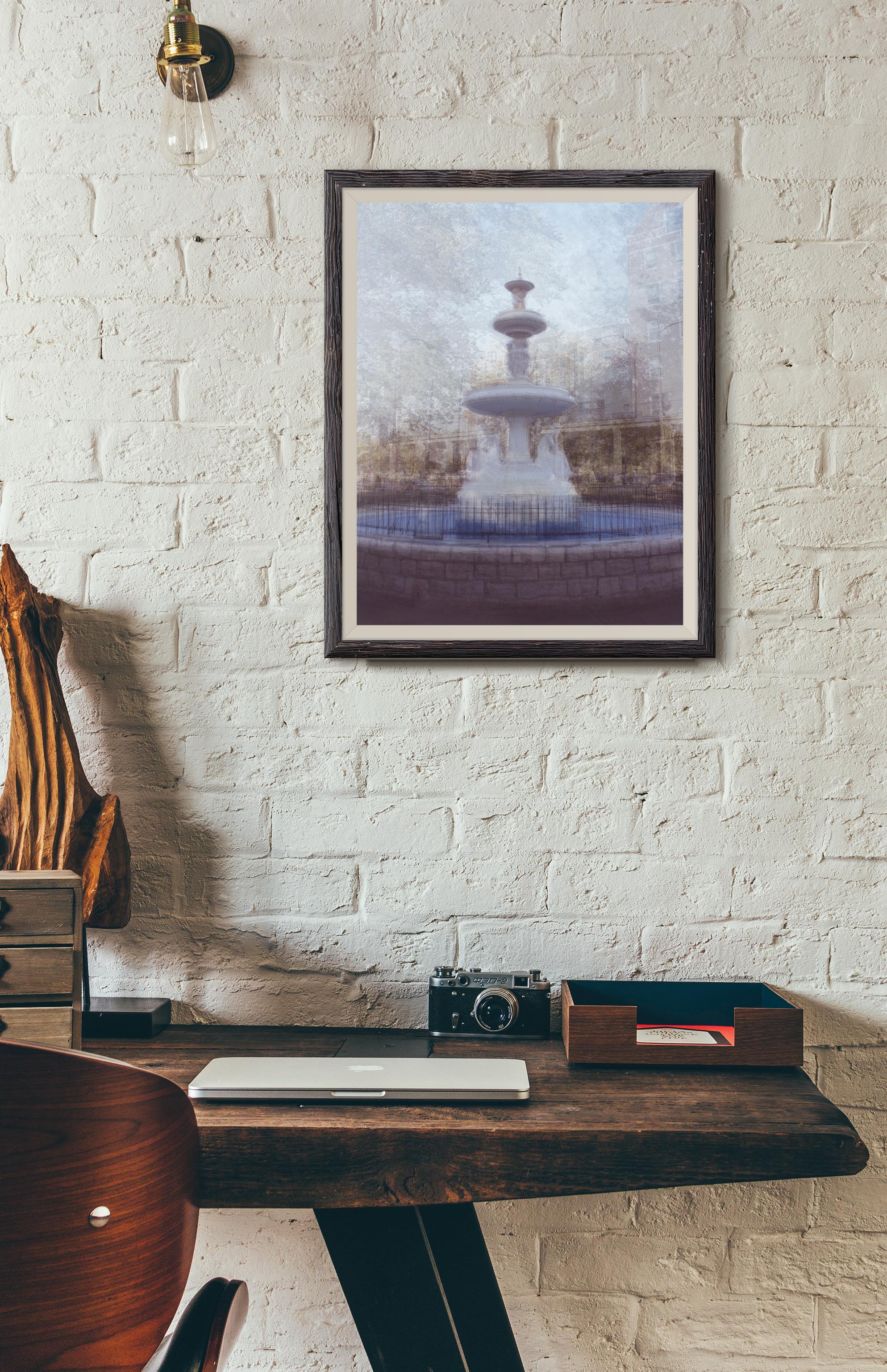
The image on the rigth mimics Pep Ventosa’s approach of photographing an object 360 degrees around and compositing 50+ images into one. The image on the left mimics uses a similar approach but with time as the variable, combining 30 minutes of sunset into one picture.
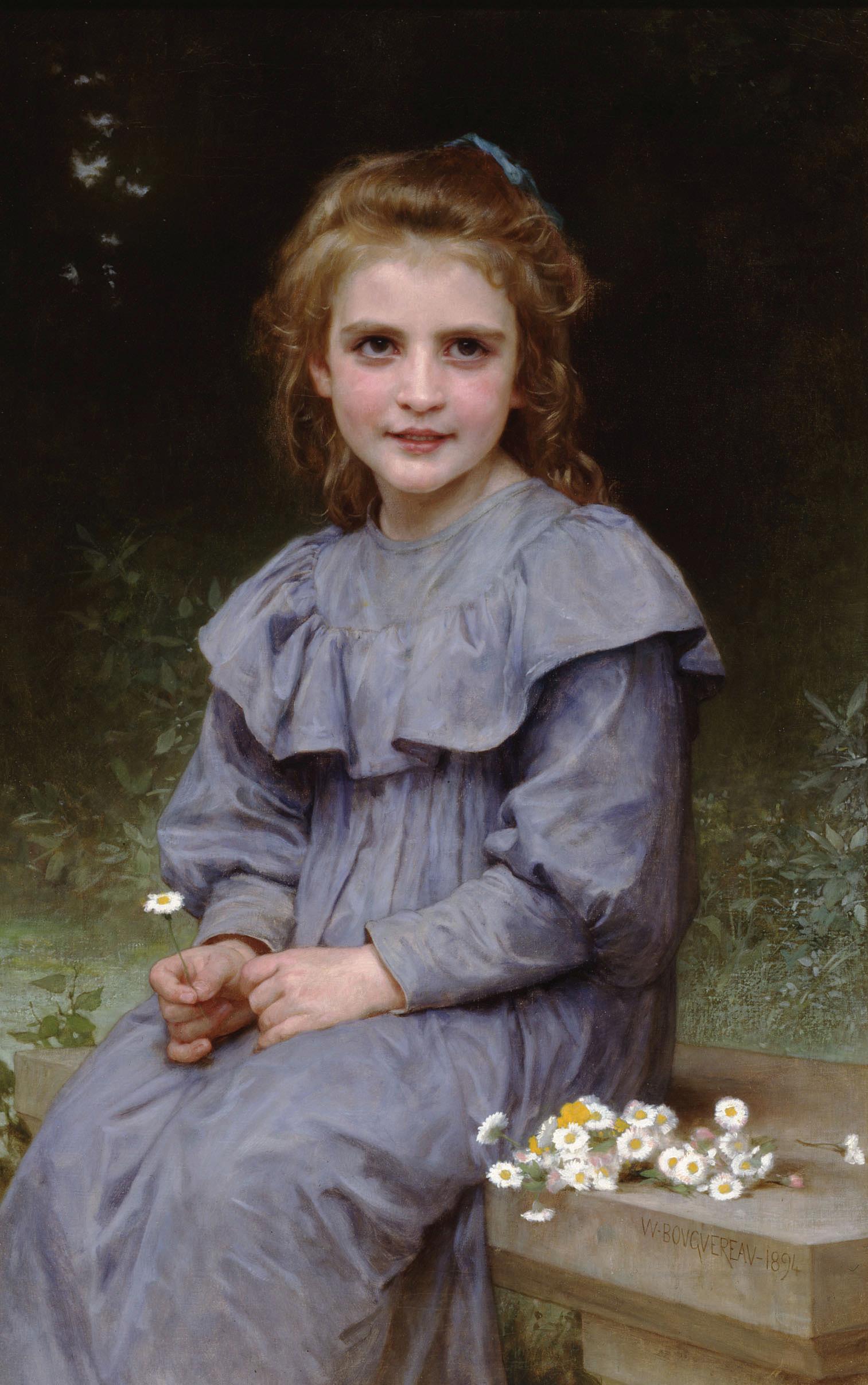


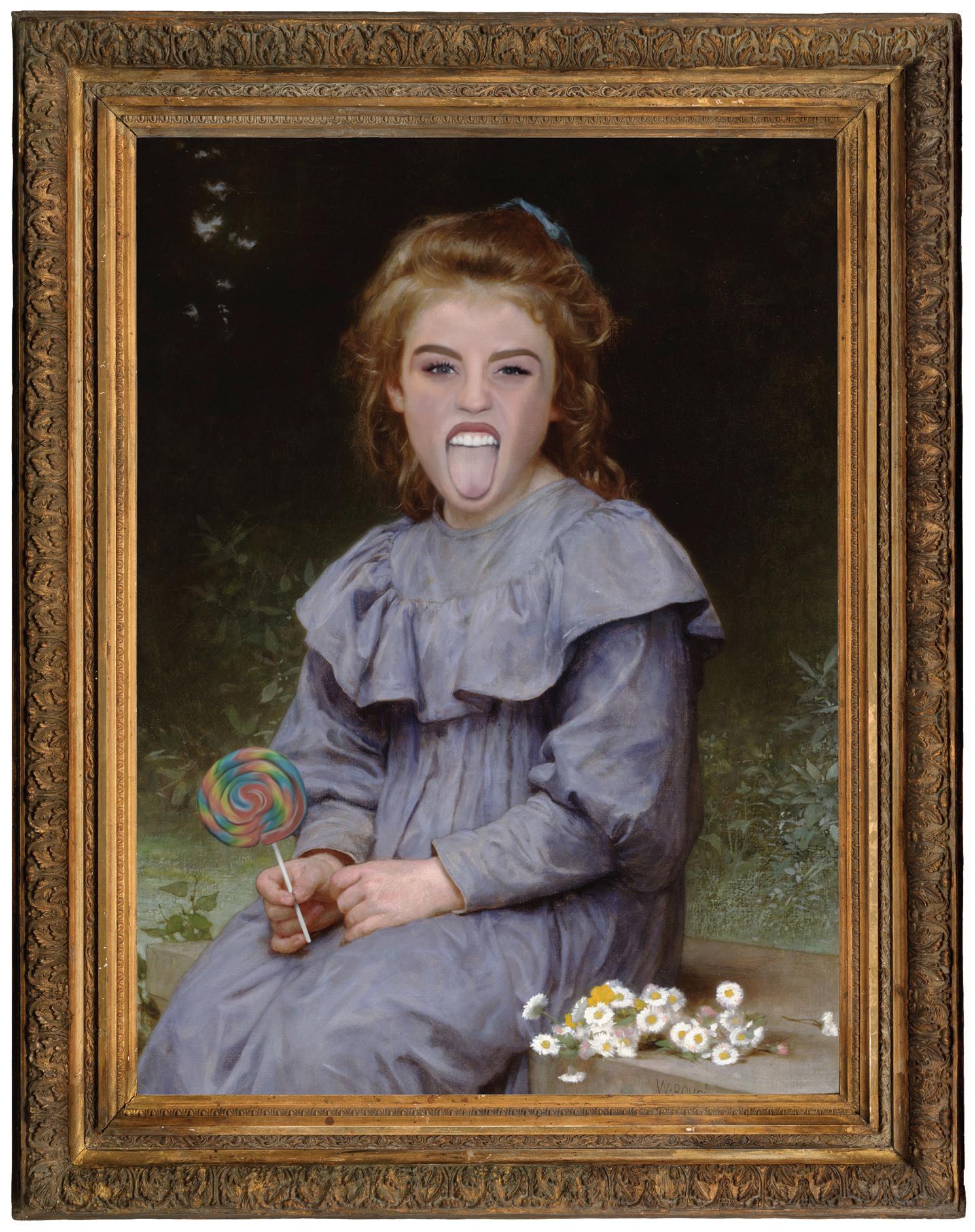
This digital painting was created to contaminate art history by tainting it with modern influences of pop culture to aid in making a statement about the role models of our society.
HAYLEY LOFTHOUSE
DESIGNER
269.449.5363 | hayley101890@gmail.com
HAYLEY LOFTHOUSE
DESIGNER