Basic Understanding of Responsive Web Design
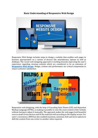
Responsive Web Design includes steps to design a website that enables web pages to function appropriately on a variety of devices like smartphones, laptops as well as desktops. The recent web designing approach is working towards improving the user's experience regarding viewing contents which are considered to be an extension of Responsive Web design. Design, content and performance are critical components to ensure customer satisfaction.
Responsive web designing, with the help of Cascading Style Sheets (CSS) and Hypertext Markup Language (HTML), is making it possible to view the exact content of the website without having to adjust it manually. The approach makes the web pages look beautiful even in small screen devices and fit the material well according to the display screen. For users' convenience, RWD has also enabled maximise, minimise, hide and move options to shift the content from one corner to another when required.