
Portfolio of Liz Sacks, UX Researcher
About Me | Professional
UX researcher who gets to the root of user needs and challenges, translating them into actionable recommendations that empower product teams to make confident business decisions.
Areas of specialty:
● Enterprise-wide user needs discovery and usefulness assessments
● Product-level concept testing, usability and experience assessments, and card sorting
● In-depth interview moderation
● Mixed method research studies
● AI research technology sourcing
Outside of research
Aself-described “Dabbler of theArts”, I love continually expanding my creative skills. I have spent the most time in improv and visual arts (painting & mixed media).
Praise from previous collaborators
“Her reports brim with compelling customer insights and actionable product and design recommendations. Thank you for sharing your customer obsession with us all, Liz.”Fidelity Security Team Q2 2024 Recognition
“She is the kind of professional that creates a better working culture. She’s made my job easier, but also she makes my work better.”
- UX Content Strategist
“Liz’s readouts are second to none, always covering every research question, plus additional insights we didn’t think to ask for.”
- Director of UX Design
“You were a huge help establishing a culture of using research to drive better outcomes for our customers. We've made better business decisions as a result of your work.”
My partner,Andrew and I, have a passion for exploring the world to experience art, culture, food and wine.
- Product Area Squad Lead, Fidelity
How concentration and salience of text impact user engagement of social media ads.
Moderated Eye Tracking Study
Background
A social media company hired Tobii to perform a moderated eye tracking study to better understand how salience and quantity of text in social media advertisements affect user noticeability and engagement.
● Previous research conducted by the social media company determined that if users deem ads in their feed not to be informative enough, they are more likely to go off-platform (e.g., a Google search) to get more information.
● Additionally, increasing the salience of text had been shown in previous studies to improve funnel-down performance of ads.
Objective
Identify how varying text treatments affect a user’s noticeability and engagement of an advertisement, and how different images can influence a user to read text.. To do this, we used eye tracking to evaluate the noticeability and engagement of ads in the current platform’s feeds versus three concepts with varying text treatments, then interviewed participants afterwards.
Team
● Qualitative Researcher (myself)
● Quantitative Researcher
● Two Eye Tracking Technicians
Timeframe June 2022 - July 2022
Participants
60 participants
● Mix of ages: 18-65+ years-old
● Frequent users of platform
Designing the Study
Through collaborative working sessions with the client, Sylvia (the Quantitative Researcher) and I created a mixed method research plan in the following flow:

1. Participants would browse their current social media feeds for 4 minutes (as they would in real life) wearing eye tracking glasses.
2. The moderators would then follow up with in-depth questions on effective and ineffective aspects of ad elements in the current feed.
3. The participant would then browse one of three (randomized) prototype feeds, each with different text treatments while wearing eye tracking glasses to measure noticeability and engagement.
4. Finally, the interviewers would ask the participants in-depth questions on effective and ineffective aspects of the prototype’s ad elements, and compare ad elements of the prototype feed versus current feed.
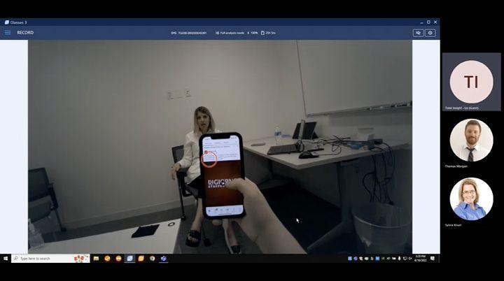
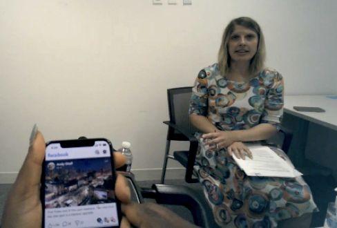
This was a live study where theTobii research lab was transformed into a living room setting with a comfy couch for the user to relax and browse social media content.
Research Questions
1. How does the amount of text in an ad influence a user’s ability and willingness to focus on written content?
2. How does the salience of the text (size, color, font, contrast, placement) influence whether users focus on it?
3. What is the order of viewing for engaged-with ad elements?
Moderating the Interviews | Challenge
Originally, two moderators were proposed (myself and a team member) to divide and conquer 60 participant sessions. Due to understaffing, I conducted all 60 in a three week timespan.
Though the discussion guide was incredibly structured, when a participant veered into unexpected, adjacent topics (e.g. advertising scams), I would let the conversation take some valuable detours.

Quantitative & Qualitative Data Analysis | Convergent Parallel Approach
After the interviews wrapped up, I spent two full weeks analyzing qualitative data for all 60 sessions (1200+ minutes), while Sylvia separately analyzed the quantitative eye tracking results. Once each of us completed our analysis, we regrouped to discuss how qualitative data aligned with quantitative, as well as, areas where deeper analysis may be needed.
Qualitative Analysis
Comparing & Contrasting the data
Quantitative Analysis
Forming comprehensive insights from all data
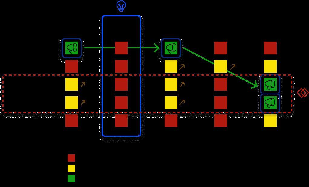
Eye tracking data provided the order a user viewed elements within an ad. Then interviews explained engaging qualities of each element producing continued attention to the ad as a whole.
Eye tracking data: order of viewing ad elements
Qualitative insights on ad element appeal that promotes continued engagement
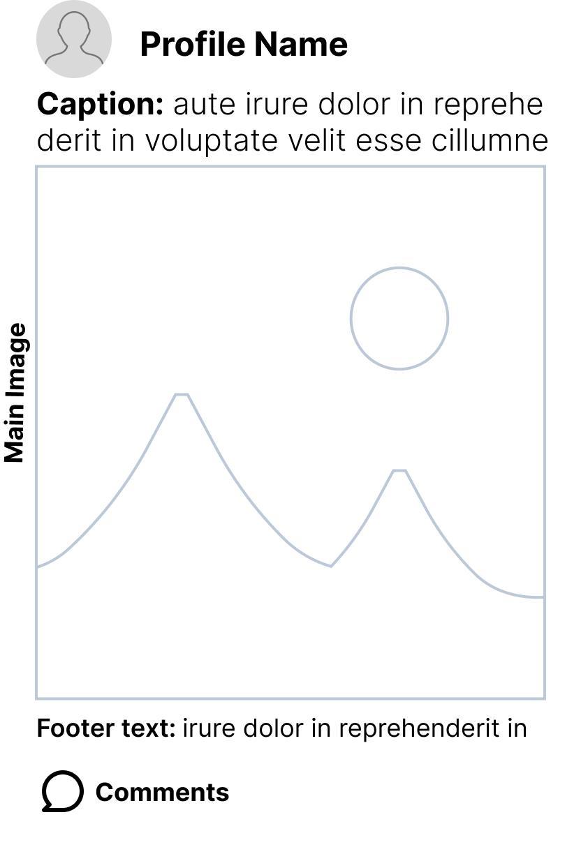
Main Image: graphic and text clearly communicate offering in a clean, aesthetically pleasing design.
Profile Image/Name: recognized and credible brand, or appears credible enough to explore.
Caption: informative, concise and credible. One to three lines is ideal.
Footer Text: clearly defines offering and call-to-action
Comments: consistently positive feedback with enough valid descriptive detail to confirm credibility.
The ads in “Feed B” held the longest overall engagement with users feeling there was just the right amount of text. Then at an individual ad level, appeal of both imagery and fonts factored into overall engagement.
Feed A | Ad Layout
No Text on Main Image
Overall Engagement: 3.45s

Feed B | Ad Layout
Light Text on Main Image
Overall Engagement: 5.31s
Feed C | Ad Layout
Heavy Text on Main Image
Overall Engagement: 4.01s

“It’s the perfect amount of text. If there’s too much, I’m not going to read it. If there’s not enough, it’s going to leave you wondering…” - Participant X discussing “Feed B”
“It’s a boring logo. I don’t like the font of the “Summer Sale”. If they took “Summer Sale” away from the image, it could have been more interesting to click on the ad.” – Participant Y discussing an unappealing ad within “Feed B”
“Feed C”’s main image had the lowest engagement of the three, with users feeling too much of the visual imagery was covered. This resulted in lower engagement with caption and footer text than the other two feeds.
Qualitative data provided deep insights into the nuances of effective ad text layout and quality of content. These insights were translated into actionable recommendations for the social media platform’s advertising guidelines.
Sampling of Recommendations:
● Make the most engaging selling point with concise main image text knowing that some users won’t read ANY text..
Ad Text
● Text shouldn’t obstruct key visual selling point of offering (when used in combination with imagery)
● Use modern, clean fonts in large enough type size to draw attention to main image.
● Captions should be informative, concise and straightforward. Avoid abstract, ironic, indirect messaging. If the caption can be 2-3 lines, it’s ideal. If needed to be longer, make the most important point in the first 2 lines to keep user engaged.

Eye tracking data concluded that users looked at prototype ads (with salience improvements) over 3x more than ads in the live feed.
Without knowing their eye tracking results, participants were asked their preferred feed during the interview process. Although the 20% of participants preferring the current feed seems insignificant at a quantitative level, the “why” shed some valuable input into what was working in the current feed.
80% of participants preferred the prototypes.
● The consistency in design and layout of ads and posts in the prototype felt cleaner.
● Text overlaid on images was concise and didn’t overpower the visual elements underneath it.
● There was minimal caption text which conveyed its message enough to determine if a click-through was desired.
● The overall experience was cohesive and smooth.
20% of participants preferred the current feed,
● Long caption text didn’t require clicking through to “learn more” for ads that were of interest.
● The diversity of advertising design styles made identifying and assessing content more efficient.
● There was a clearer distinction between ads and posts.
● Favorite sections of the feed were missing in the prototype. [in hindsight, the prototype should have included all sections the current feed did]
● This insight albeit, unrelated insight into where these users are engaging in their feeds.
Study creates additional business for Tobii from the client
Though the client had their own UX Research team, they commended my interview skills (which were live streamed during each session), as well as the deep, nuanced insights that complimented the eye tracking data. .
Business Impact
The findings in this study were used to create new ad design standards for the platform itself and guidelines for advertising clients.
.
The Passkey study that answers, ‘are we ready to launch?’
Moderated Experience Test

● Lead Researcher
Team
● 2 UX Designers
● 1 UX Content Strategist
Timeframe
May 2024
Approach
Moderated Experience Test
Context
Fidelity is working towards implementing passkey technology so users can log into their accounts securely and effectively without credentials.
Objective
Identify user expectations for setting up, managing and using passkeys, and define design features that will improve the passkey MVP experience.
Challenge
Prior to the study, the product team shared a goal of launching passkeys later that year but the authenticator would have limitations:
● Web use only (unavailable for mobile)
● Touch ID access only (Facial ID and PIN entry unavailable)
Participants
8 experienced passkey users
Designing the Study
Considerations: Astudy so concentrated in passkey usage, required designing a screener that would ensure participants met the experience required. Because the actual user passkey login experience is so rapid, I also needed to ensure users could recall key aspects of earlier usage and speak on it in detail.
1. Recruiting: To ensure participants were truly experienced with passkeys, the screener included 2 short-answer questions requiring respondents to define the authenticator in simple terms and detail preferred features.
2. Pre-Session Homework: Prior to their interview sessions, recruited participants were asked to consider all of the passkey they have used, and share their most ideal one during the actual session. Plus, think about their earlier experiences using passkeys so details were fresh for our discussion.
Research Questions
1. What are the most important considerations when a user is choosing a passkey over other authenticator options?
2. Based upon prior experience, what are a user’s expectations of how creating and managing a passkey works?
Moderating the Discussion
Phase I: Background: Participants asked detailed questions on how they learned about passkeys, experience/challenges with first-time set-up and desired uses (device types, management practices, multi-device synching vs single device use, etc).
Phase II: Concept Resonance: Participants then provided feedback on Fidelity’s passkey concepts.
Phase III: Comparison: Participants shared their “most ideal” passkey experience, explaining why they chose it, then comparing it to the Fidelity passkey experience.
Formulating Insights and Communicating Actionable Recommendations
Users’ sign in preference for passkeys varied substantially and were based upon experience and comfort using each. Stakeholders were planning on only launching Touch ID in the first release. Interview video clips were used to emphasize both emotional and functional importance of a user’s ability to choose their preferred sign in option with the recommendation to delay launch until all three options could be developed.
Desirable Capabilities
Objectionable Challenges

● Can’t be replicated
● Easy
● Inconsistent effectiveness (e.g. wet or messy hands)
● Unavailable on some devices
● Quick
● Contactless
● Ideal for on-the-go
● Inconsistencies due to glasses, lighting, skin color
● Security concerns (e.g. fraudster with similar facial features could access)
● Not available for all devices
● Consistent and reliable
● Vulnerable to hacking
● Requires typing and remembering number
Touch ID
Face ID
PIN
Formulating Insights and Communicating Actionable Recommendations
In-depth interviews also provided valuable user perspective of the benefits and challenges of passkey use. Insights laid the foundation for the development of promotional and educational content that will be disseminated when the passkey launches.
Users value the efficiency and higher security of passkeys over other authenticators
Quick access with no typing required. Login without needing a second device
Efficient multi-device access of accounts
High level of perceived security.
Operating system, browser and device requirements provided challenges to new users

Inability to switch between different browsers

Learning which technology sychs and how passkeys are managed
Meeting lifestyle needs:
● Work vs personal access
● Multi-user access
Unreliable/inconsistent biometric ID methods
This slide of a passkey user’s dream experience was the finale of this study to really drive home the capabilities users expect in a passkey experience.
Instead of passkey access on only 1 browser…

Instead of PW Managers for each operating system…
Instead of a single passkey for each device…
A passkey that can be accessed on any browser.
All operating systems synching to one passkey.
Passkeys synch seamlessly across all devices.
Business Impact
The product team took the overall recommendation to delay the launch of passkeys until multiple sign in options could be developed, and additionally, until a mobile version was feasible.
Recorded participant feedback on the importance of meeting key expectations for adoption and continued use was truly a powerful resource in this study. .
Enterprise-Level User Needs Discovery
Cross-Functional Jobs-to-be-Done

Role
Qualitative Researcher Team
● 2 Additional Qualitative Researchers
● 2 Strategic Researchers
● Content Strategist
● 2 UX Designers
● 20+ Product Development Stakeholders
Timeframe
February 2023 - May 2023
Approach
Jobs-to-be-Done framework
Background
Industry data indicates that customers who engage in financial planning more successfully meet their long-term and short-term financial goals. Fidelity wanted to figure out how to bring the benefits of financial planning to more of their customers digitally.
Business Goals
Fidelity had more than ten squads in two domains focused on creating financial planning experiences which naturally creates complexity and leads to multiple (and siloed) ideas about a future vision. The fintech company is acquiring new independent financial planners (customers) every year and it’s essential to keep them engaged in Fidelity products and services.
Participants
● 25 Qualitative Participants
● 2,000 Quantitative Participants
The Jobs-to-be-Done Process | High Level
GENERATING SYNTHESIZING QUANTIFYING PRIORITIZING
In-depth interviews across all customer segments to define Job Steps and extract needs.
N = 25

Synthesized and refined discovered needs.
Affinitized and deduped 1500+ user needs down to 150

Surveyed all Fidelity customer segments to quantify needs.
N = 2,000

Used the data to identify business opportunities for target populations.
Stakeholder Buy in and Prep
Convincing Fidelity’s key wealth management stakeholders of the value in allocating the time and resources for a 20-week Job-to-be-Done study (from initial planning through final quantitative analysis) took some convincing.
Objections:
● “We have plenty of research on goal planning, how is this study different?”
● “There aren’t enough working hours in the day for us to participate in timeconsuming collaborative workshops.”
● “Won’t these needs become irrelevant / outdated by the time this study is even over?”
Preparation/Stakeholder Education:
Strategies to Gain Buy In:
● Creating a powerful visualization of the fragmented research on goal planning to show significant gaps, as well as, insights that needed deeper exploration.
● Presenting a proposed project schedule dividing participation in reasonable time increments.
● Educating stakeholders on the study’s framework, value and the evergreen quality of user needs.
Inviting stakeholders to participate in the various phases of need statement development meant training them on how to identify, affinitize and refine need statements.
Mapping Out Job Steps & Needs with Participants
Phase 1: Identify Job Steps:
Myself and the other UX Researchers:
● Developed hypothesized job steps formulated from secondary research and Chat GPT.
● Interviewed and mapped job steps of first wave (N=7) of participants on their unique approaches to goal planning.
Stakeholders:
● Observed interviews and noted needs expressed.
Phase 2: Refine & Consolidate Job Steps:
● We then compared participant jobs steps against the hypothesized job steps to create a more finalized map. Additionally, we condensed overlapping needs to reach a more simplified view.
Phase 3: Discover Needs & Emotions:
● Then we conducted a second wave of interviews (N=14), drilling deeper into how challenges, successes, feelings and priorities factor into the steps, drafting out the user needs.
Affinitizing and Refining Needs Statements
Phase 4: Affinitizing Needs
● Myself and the other UX Researchers led workshops where the entire cross-functional team divided and conquered, affinitizing need statements collaboratively.
We started with 1,500+ needs …And consolidated our way to 113!
● I then partnered with the UX Researchers and Content Strategist to write final drafts of the need statements.
Phase 5: Quantification of Needs
Partnering with the Behavioral Economics and Strategic Research teams, we collaboratively oversaw the development of a survey (through a third party vendor) that would quantify the need statements finalized in Phase 4. This included providing input on:
● Overall structure of the survey
● Specific segments to recruit
● Visual design of survey imagery
● Likert scale response options
Prioritizing User Needs through Job Mapping
Phase 6: Prioritizing Needs
The most crucial phase for the company was mapping out quantified needs and determining which provided the most opportunity. Then of those determined, which were both feasible and viable for the company.
Role & Team
Moderation & Analysis
● 2 Additional Qualitative Researchers
● 2 Strategic Researchers
● 5-7 Product Development Stakeholders
Timeframe
November 2023 - February 2023
Approach
Usefulness Assessments
Project Overview
Fidelity wanted to assess all online solutions provided for customers to determine how well each met the quantified needs identified through the Jobs-to-be-Done studies.
Business Goals
Short-Term
● Determine how effectively customers could address their needs with Fidelity’s digital solutions.
● Map the navigation required for the solutions to meet customers’ current needs.
● Identify gaps in current experiences.
Long-Term
● Devise a strategy to address gaps in solutions.
● Create a strategy for ideal customer path through solutions.
UsefulnessAssessments | High Level


Identified Solutions Assembled Team Assessed Solutions Recommended Actions
Our UX Research team partnered with Subject Matter Experts (SMEs) across the financial institution to prioritize internal solutions to assess. Then, we created cross-functional teams to evaluate solutions comprised of:
● UX Designers ● UX Content ● Strategic Researchers ● Client Solutions ● Business Leads ● Customer Strategy & Segment Marketing

The UX research team divided up assessments we would lead. In total, I led the assessment of 6 internal solutions. Actionable recommendations were presented to stakeholders based on results of assessment.
UsefulnessAssessments | Leading an Individual Study
Phase 1: Teaching cross-functional team the assessment process
Partnering with the Subject Matter Expert (SME), I led learning sessions for the team of assessors that included:
● A live demonstration of the solution with specific guidance of which areas of the experience would be assessed.
● Training on how to evaluate the solution against the user needs.

Phase 2: Asynchronous individual assessments
● I created a Miro board for each assessment so the team could asynchronously rate the solution against all need statements.
○ The board was in incognito mode to avoid influence.
● Group chat and office hours were established for any questions along the way.

Phase 3: Moderated group consensus
● The team then met for 3 sessions of group consensus discussions.
● Moderating these, I encouraged individuals with differing ratings for specific needs to share their reasoning, then help the group determine a final, agreed-upon rating.
Mapping Fidelity solutions’ usefulness against validated user needs
Through Usefulness Assessments, the company has a big picture view of how to consolidate, improve upon, promote and connect various technologies. Assessments are still in progress at current time.