P A Q U E T
ORTFOLIO
D
Polaris Place Lincoln, Nebraska Advanced ARCH Design I Fall 2021 Overlook Lincoln, Nebraska Integrate Studio Spring 2021 REBOUND. Kansas City, Missouri Advanced ARCH Design II Spring 2022 NUhouse Valentine, Nebraska Collaborate Studio Fall 2020
13 25 35 01
DOMINIC PAQUET
(970)449-2794


https://issuu.com/dominic_paquet
dapaquet@comcast.net
@paquet_designs
https://www.linkedin.com/in/dominic-paquet-b84356182/
EDUCATION
Bachelor of Science in Design, University of Nebraska-Lincoln Aug 2017 - May 2021, Graduated with Distinction
Master of Architecture, University of Nebraska-Lincoln Aug 2021 - May 2023
EXPERIENCE
Architectural Intern, DLR Group May 2022 - Present
I am an intern of the K-12 and Higher Education Design team in Lincoln. My main focus has been working on projects in schematic design through design development.
Architectural Intern, University of Nebraska Medical Center May 2021 - April 2022

I was an intern on the Facilities Management and Planning team. I have both assisted with projects from planning to project management and had the opportunity to plan and manage my own projects with the most notable being a $70,000 lab renovation.
Campus Host, University of Nebraska-Lincoln Sept 2018 - Dec 2020
Lead the student recruiting effort on campus by showing prospective students on tours of campus and providing information on student life and academics
Architectural Intern, Building Possibilities, Inc May 2017


Key responsibility as an intern was to use Auto CAD to correct red lined documents, attend meetings, and design iterations. Work entailed multiple on site visits and observing meetings.
Lindsay Neemann, UNMC FMP Manager lindsay.neemann@unmc.edu (402) 836-9700
Mark Hoistad, Director of Landscape Architecture at UNL mhoistad1@unl.edu (402) 472-9232
Heather Hughes, Principal at DLR Group hhughers@dlrgroup.com (402) 540-4962
Bud Shenefelt, Professor at UNL bshenefelt2@unl.edu (404) 309-7603
REFERENCES
SKILLS
• Rhino
• Revit • AutoCAD Awards • Gary A. Spring Scholar • Cecil
Scholar EXTRA CURRICULAR • AIAS • Architecture Competitions • 3X UNL Dean’s List • Volunteer at Weld County Food Bank • Our Lady of the Valley • Firestone Municipality Events Editing: • Adobe Illustrator • Adobe InDesign • Adobe Suite Rendering: • Lumion 12 • Enscape • Adobe Photoshop
Modeling:
3D
Steward
REBOUND.
KANSAS CITY, MISSOURI
Advanced ARCH Design II
 Professor Jeremy Reding Partner Wyatt Gosnell
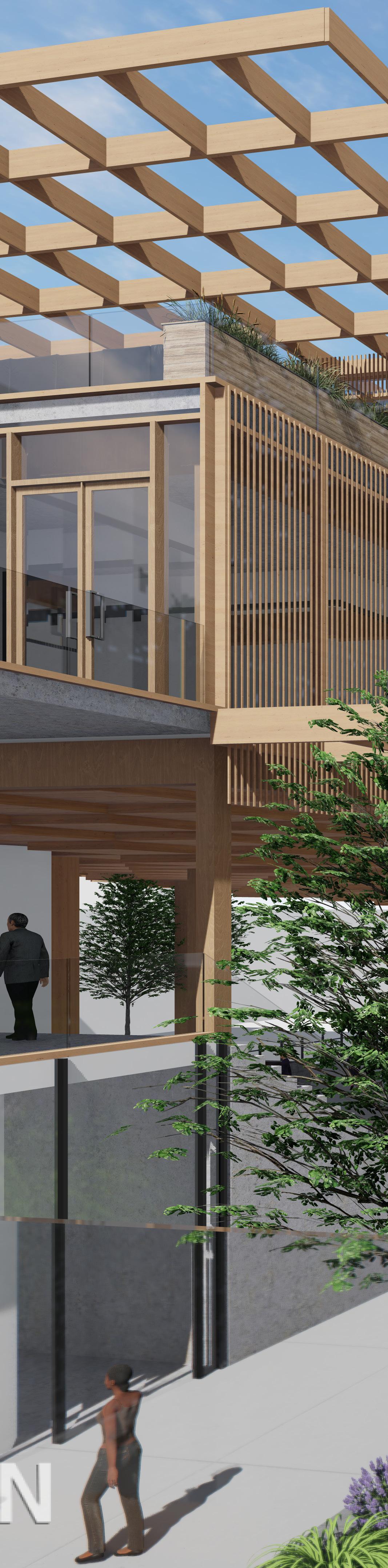
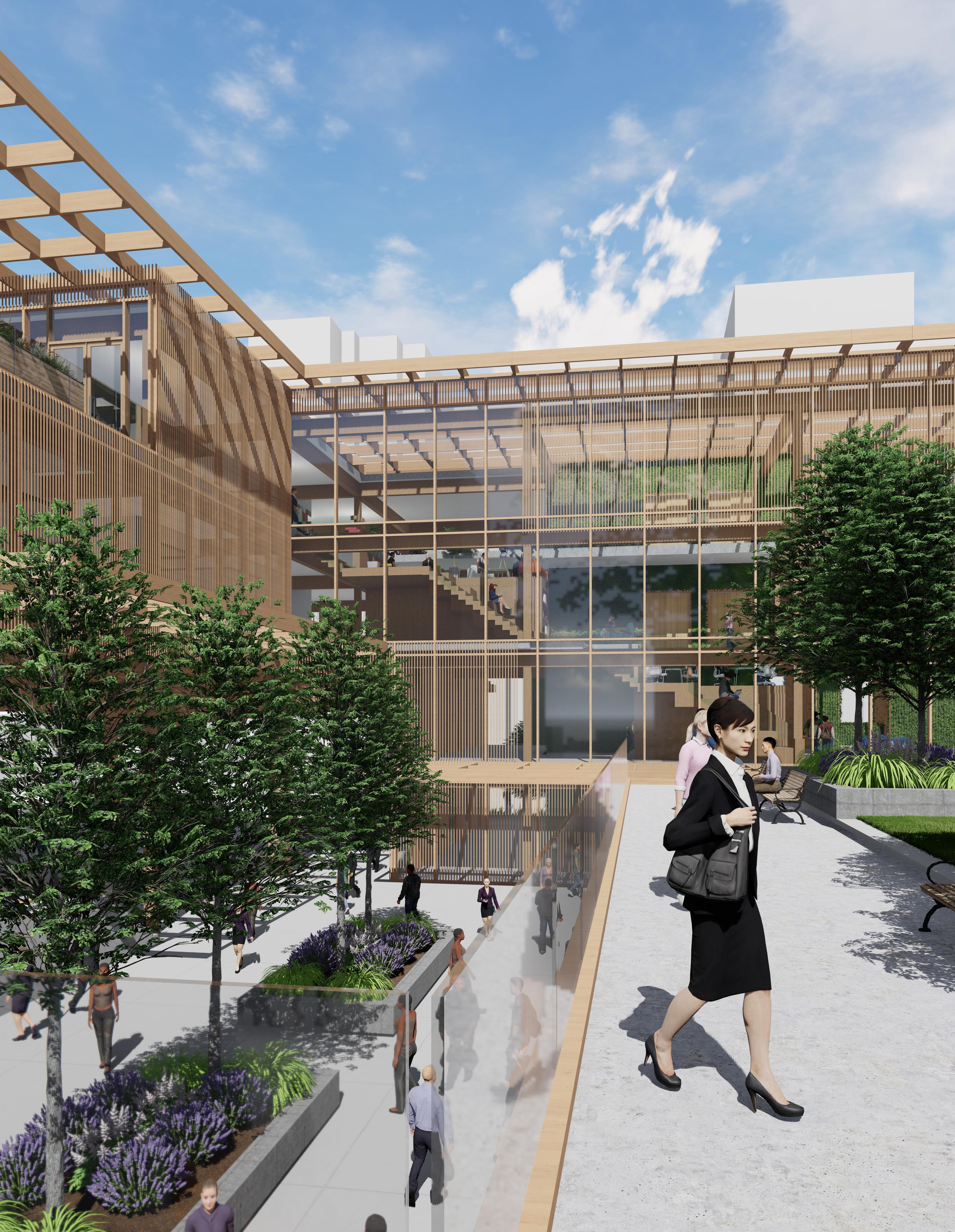
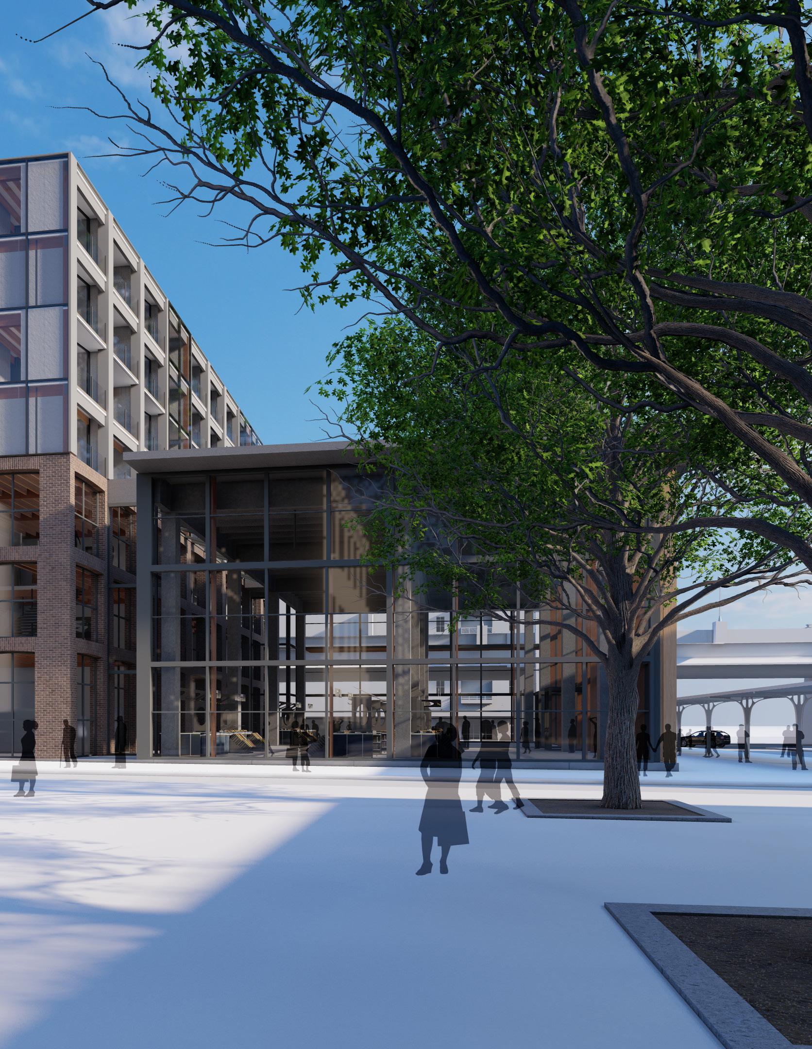
Workplaces are not the same as they were two years ago. Companies headquarters have had to change due to a new found agency towards flexible, integrated, and social workplaces that encourage employees to return to the workplace. REBOUND looks to create a collaborative environment that situates itself within the vibrant Country Club Plaza of Kansas City and serves as a headquarters office for the Hilton Design group.
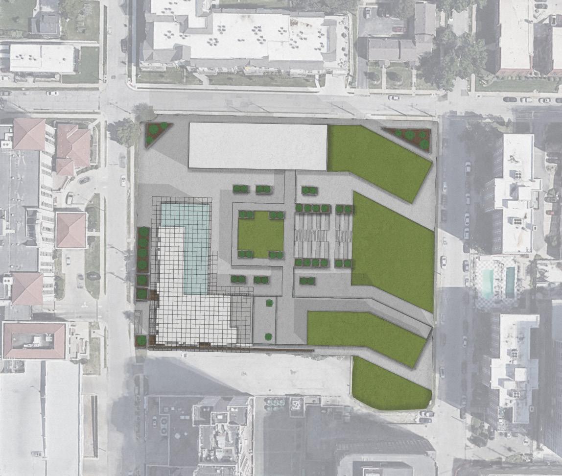
The site is planned to be mixed use in order to increase the diversity of users, activities, and increase the traffic. It site offers outdoor amenities for both employees and the public, and encourages community interaction through community incubation spaces, a market hall/event space, art galleries, and plenty of restaurants to continue the appeal of the plaza to its western edge.
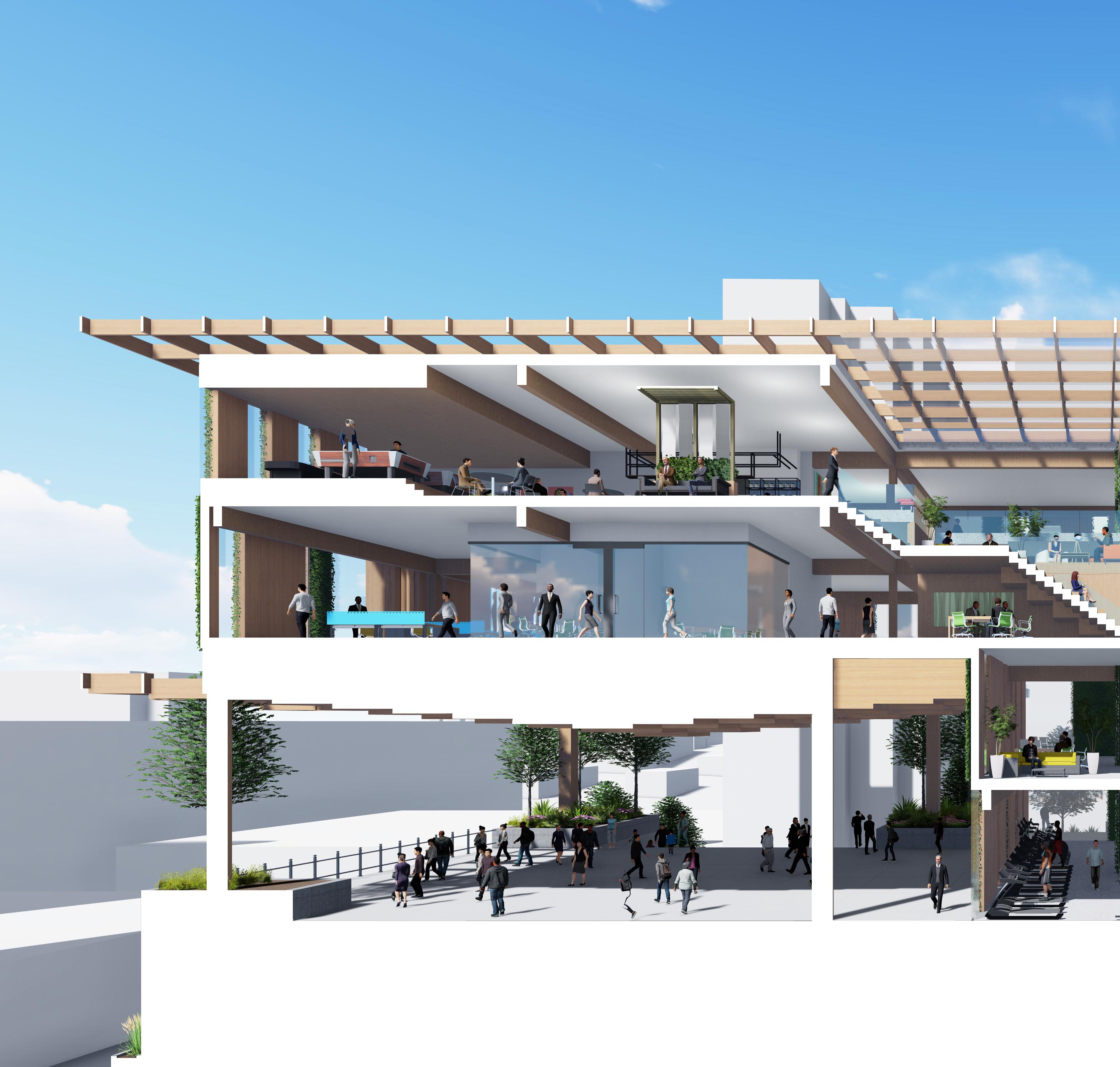
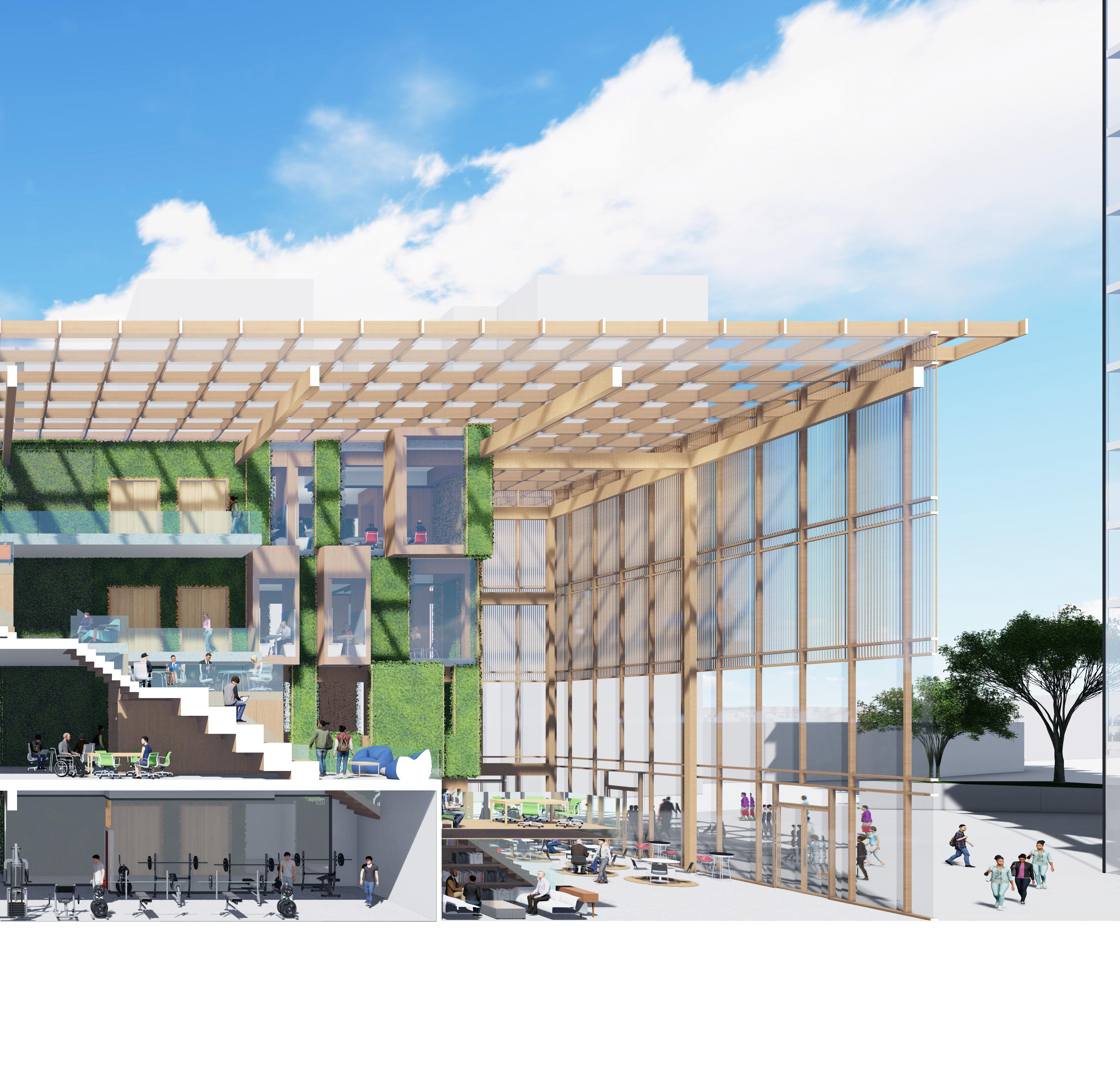
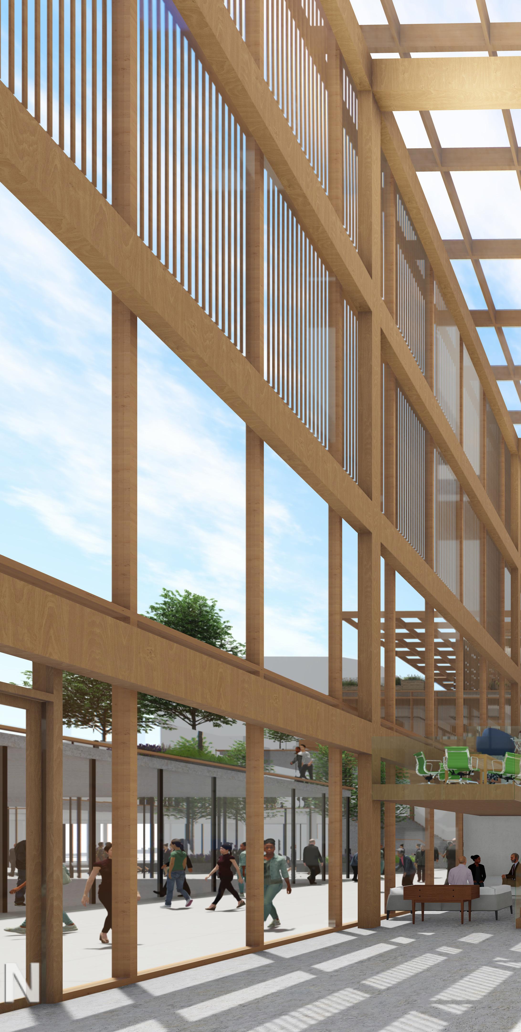
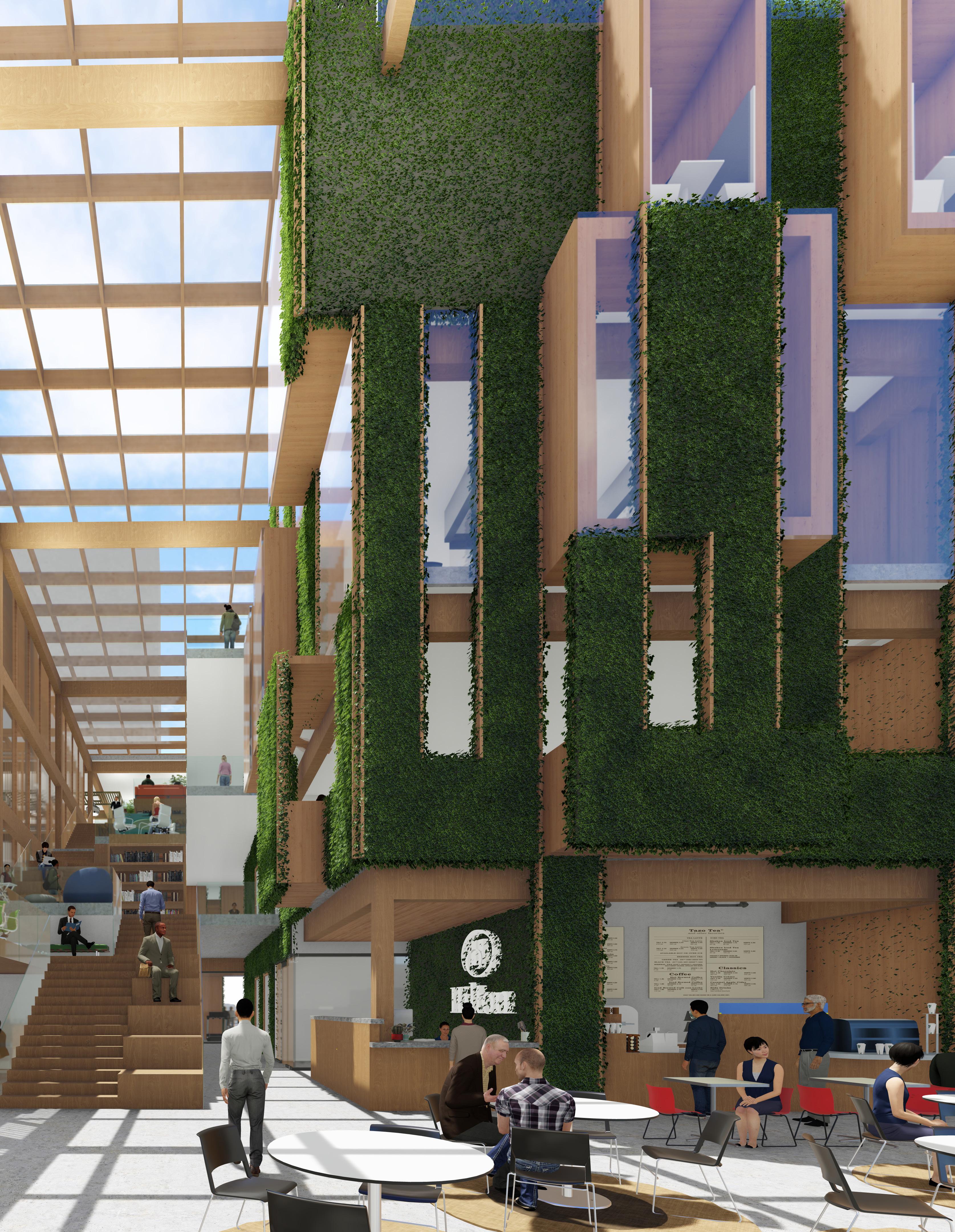
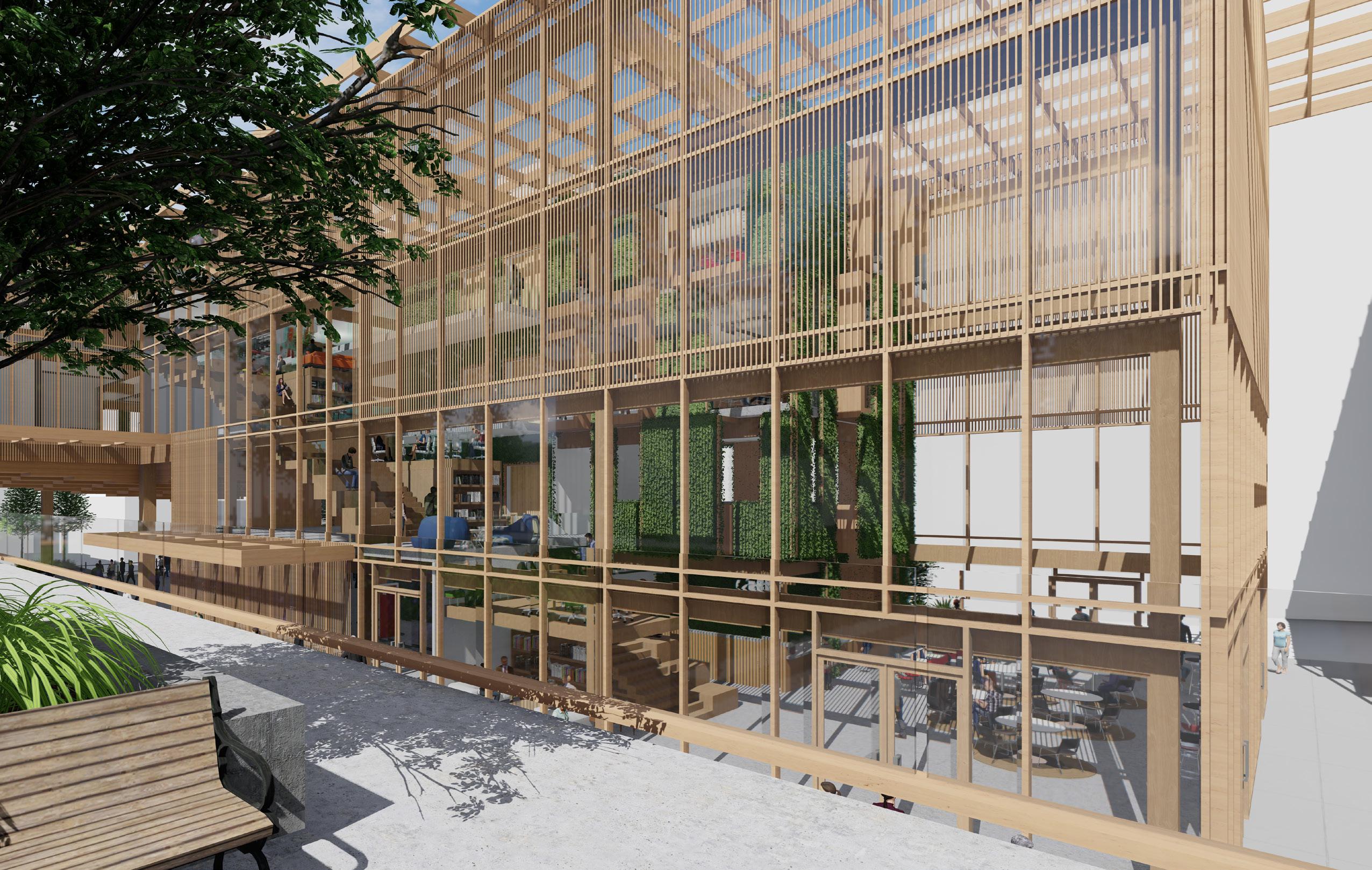
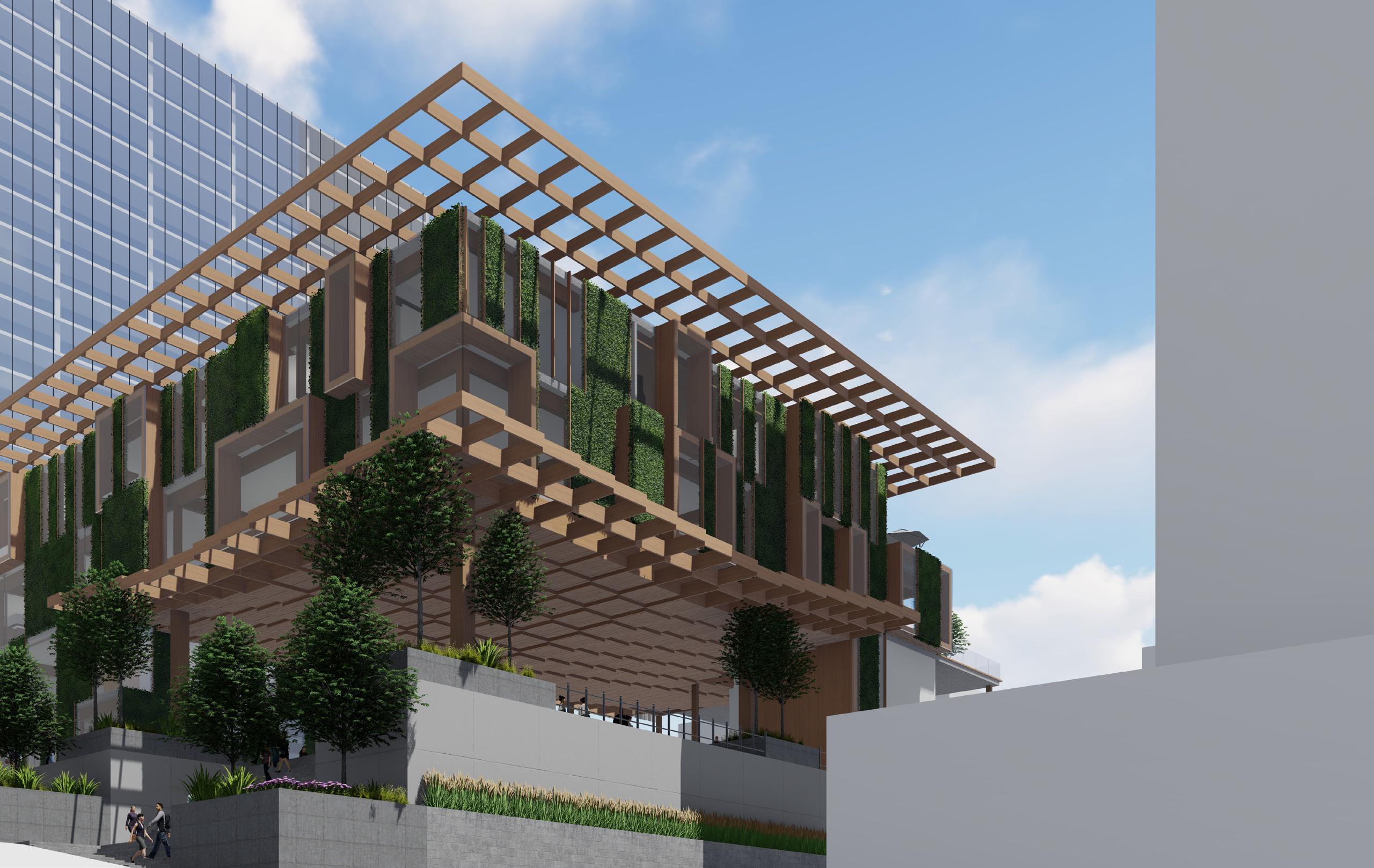
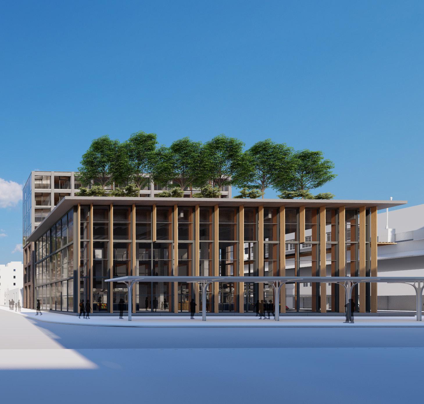
While the site is for both employees and the public, the office building will act primarily as a collaborative space that restores employees desire to work in person. Sustainable design, materiality, and flexible workspaces maximize positive experiences for employees. Through implementation of green facades, a secondary solar shading structure, optimal building orientation, and improved thermal massing materials our design creates a comfortable environment in a sustainable building. The design focuses around the grand stairs that create diverse spaces that allow the employees to connect and flow between each floor’s program. The stairs end at the social program that explore the office as more than just a place for work.
REBOUND. 01
Kansas City, MO 02
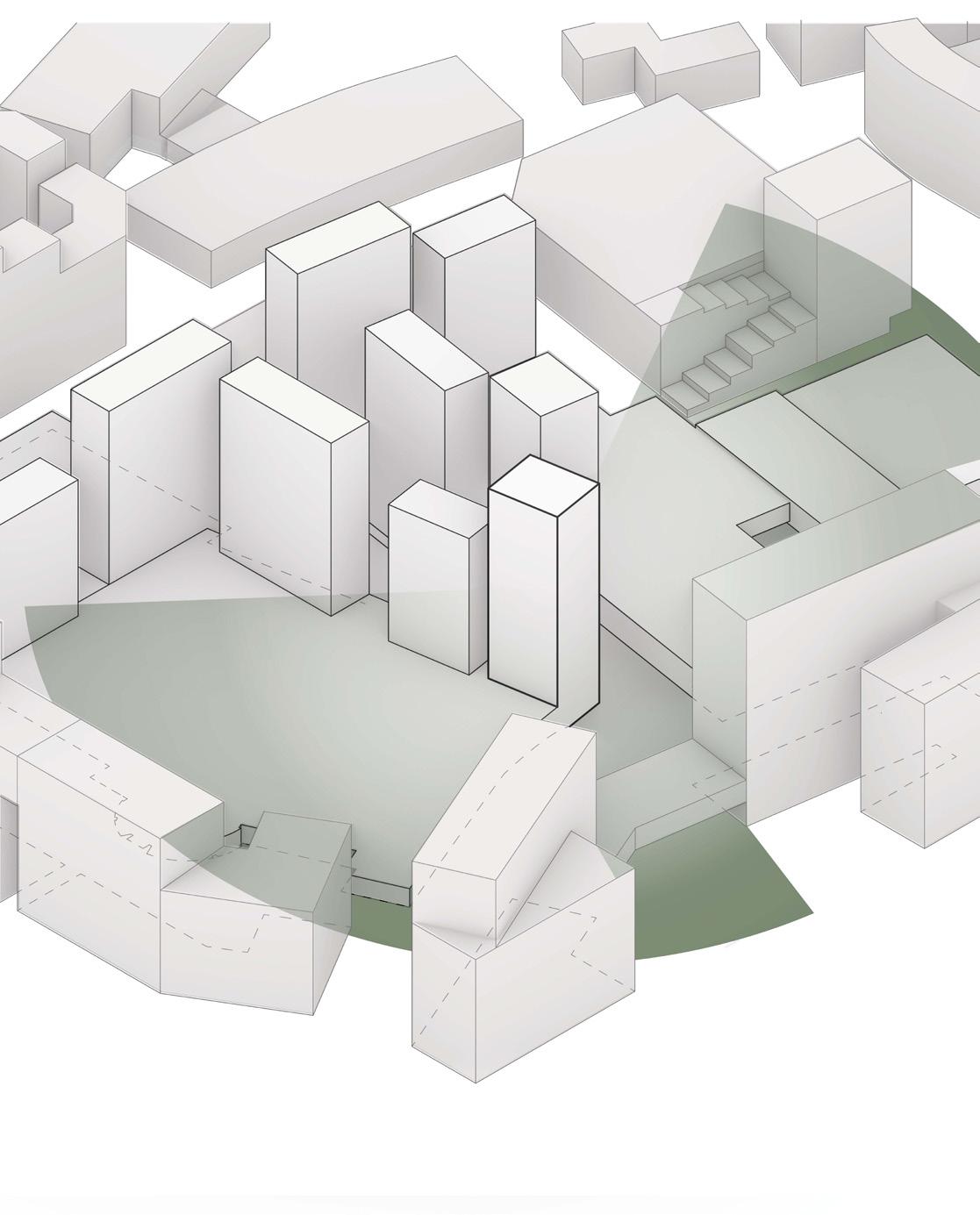
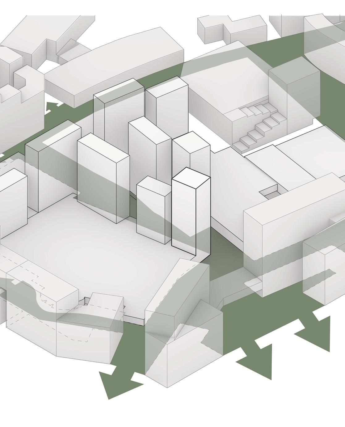
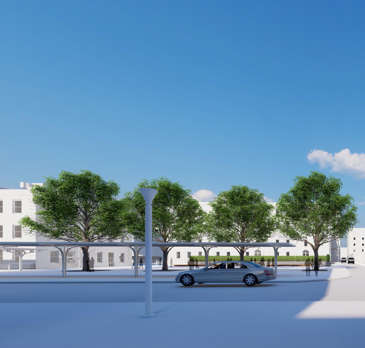
REBOUND. is in the Country Club Plaza in Kansas City. It sits on the west edge and is considerably higher in elevation than the shopping plaza. Its location makes it a prime spot for retail, hotels, and community spaces. The barriers to the site are KC’s climate, the site’s topography, and the solar shading of the surrounding buildings.
REBOUND.
03
Buildable Area Max FAR Circulation to Hilton Pedestrian Access Wind Adjustments Final Program Kansas City, MO 04
The formal progression relies on sustainable design, creation of public space, and spaces that create unique user experiences. The designs stepped patios allow for flexible work and event space while integrating into the overall master planning.
Masterplanned Office 2. Pedestrian Access and Outdoor Space 5. Material Application 6. Atrium Shading REBOUND. 05
1.
3. Atrium Seperation 4. Exterior Addtions 7. Secondary Shading 8. Final Design Kansas City, MO 06
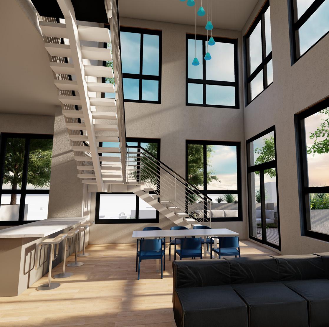
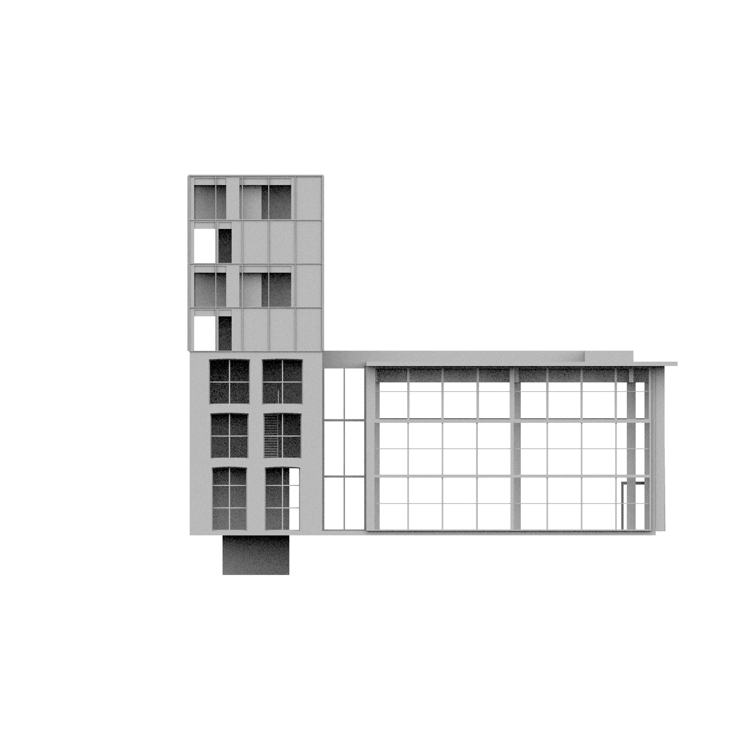
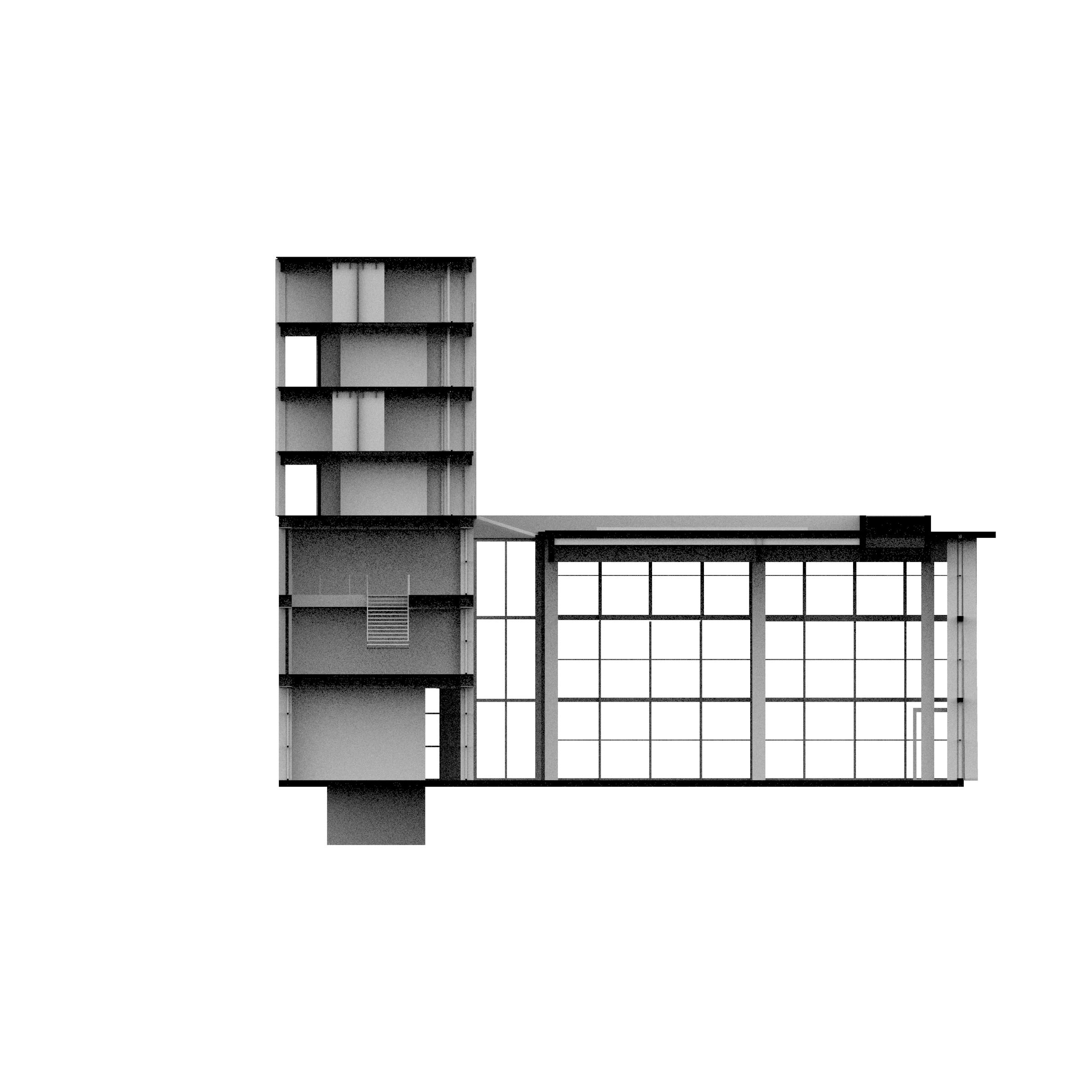
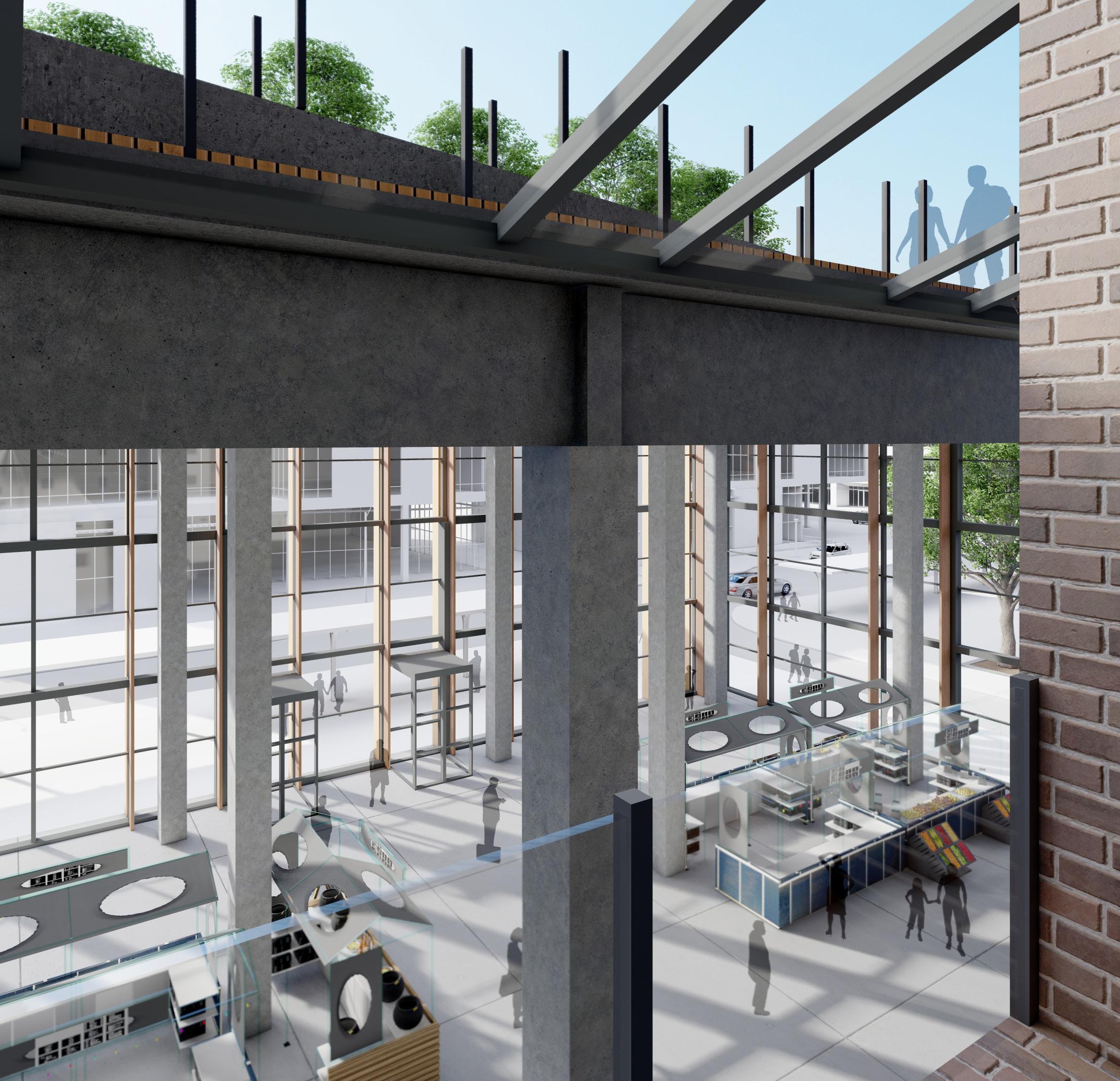
The interior program are reliant on the grand stairs that ground the design. Each of the working spaces tie into and stem from the multipurpose stair. In the section you can see the direct connection the event space has on the fourth level and the public atrium space on the first level. This connection is important to the project as it is the transition point from public to private.
07
REBOUND.
Kansas City, MO 08
The atrium acts as a mixing pot of program, workspaces, and public entries. Its transparent nature serves to open the design up into the community and blur lenses between indoor and outdoor.
REBOUND. 09
MO 10
Kansas City,
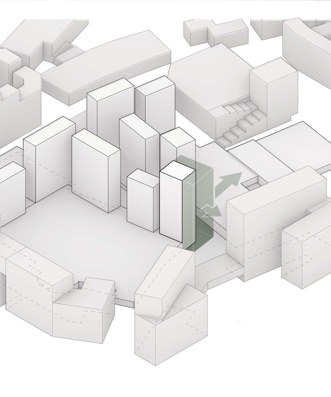
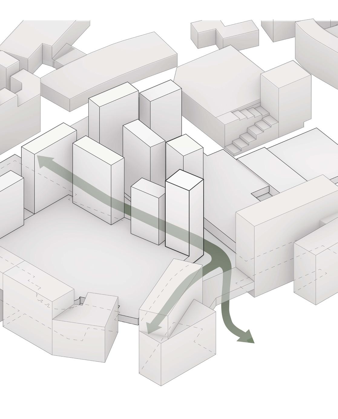
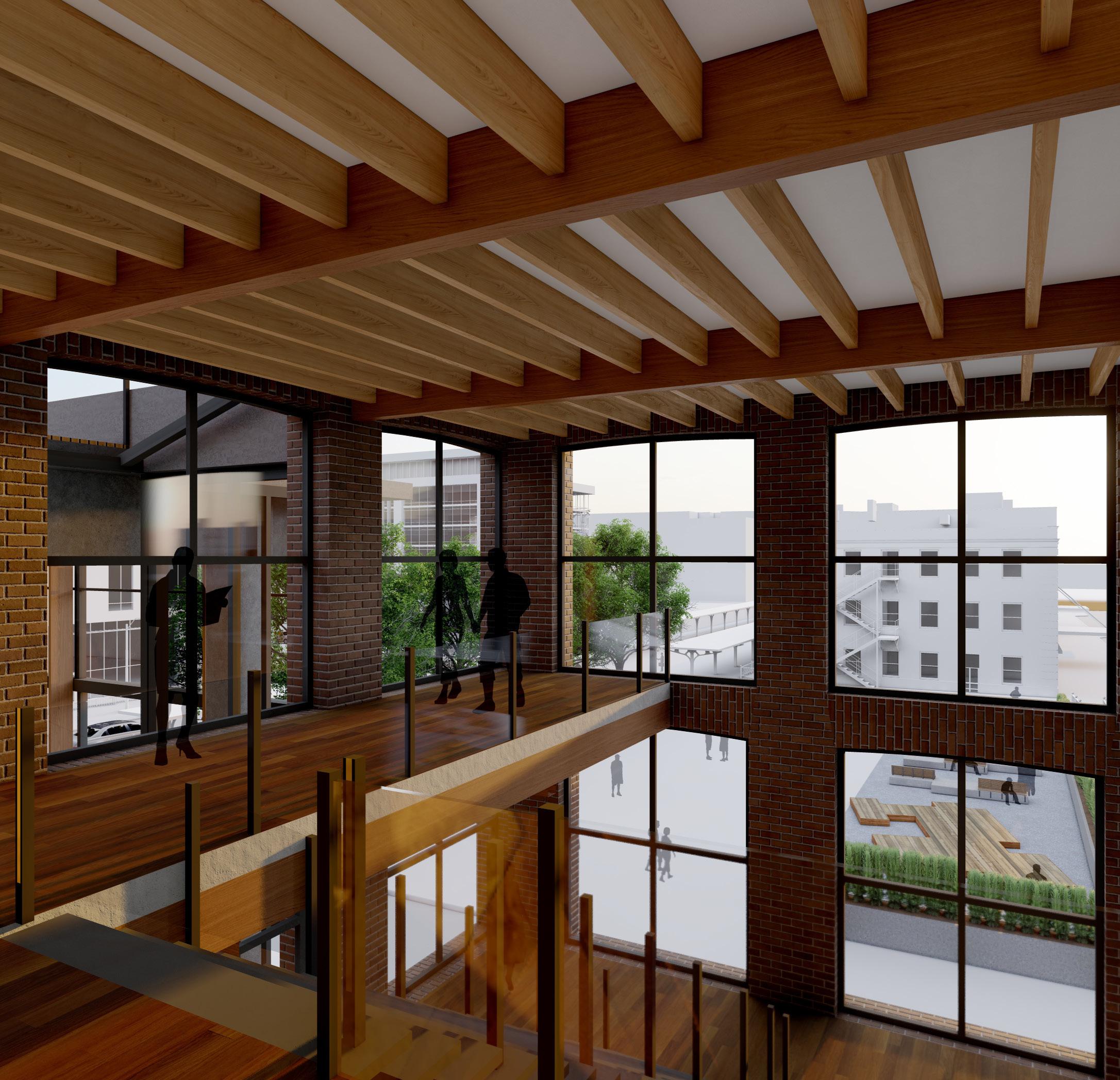
The design is contingent on its connection to pedestrian traffic and access to the Country Club Plaza. In order to maximize its location the design emphasizes entry points and circulation by cutting space through buildings and being integrated into flexible indoor/outdoor space.
REBOUND. 11
Kansas City, MO 12
Polaris Place
LINCOLN, NE
Advanced ARCH Design
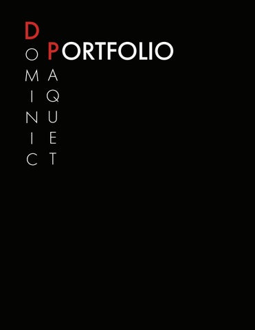
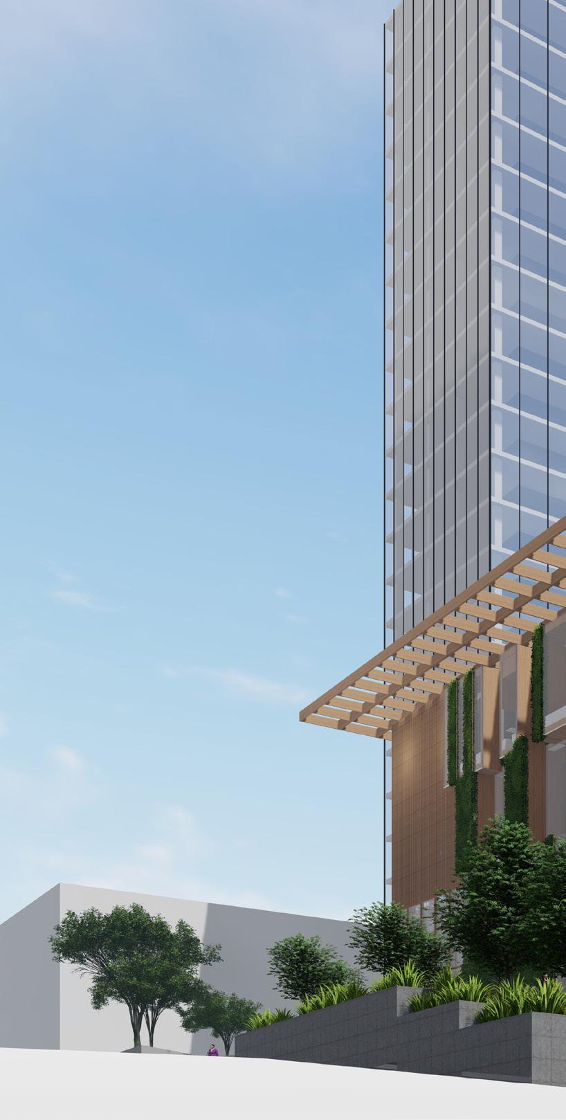
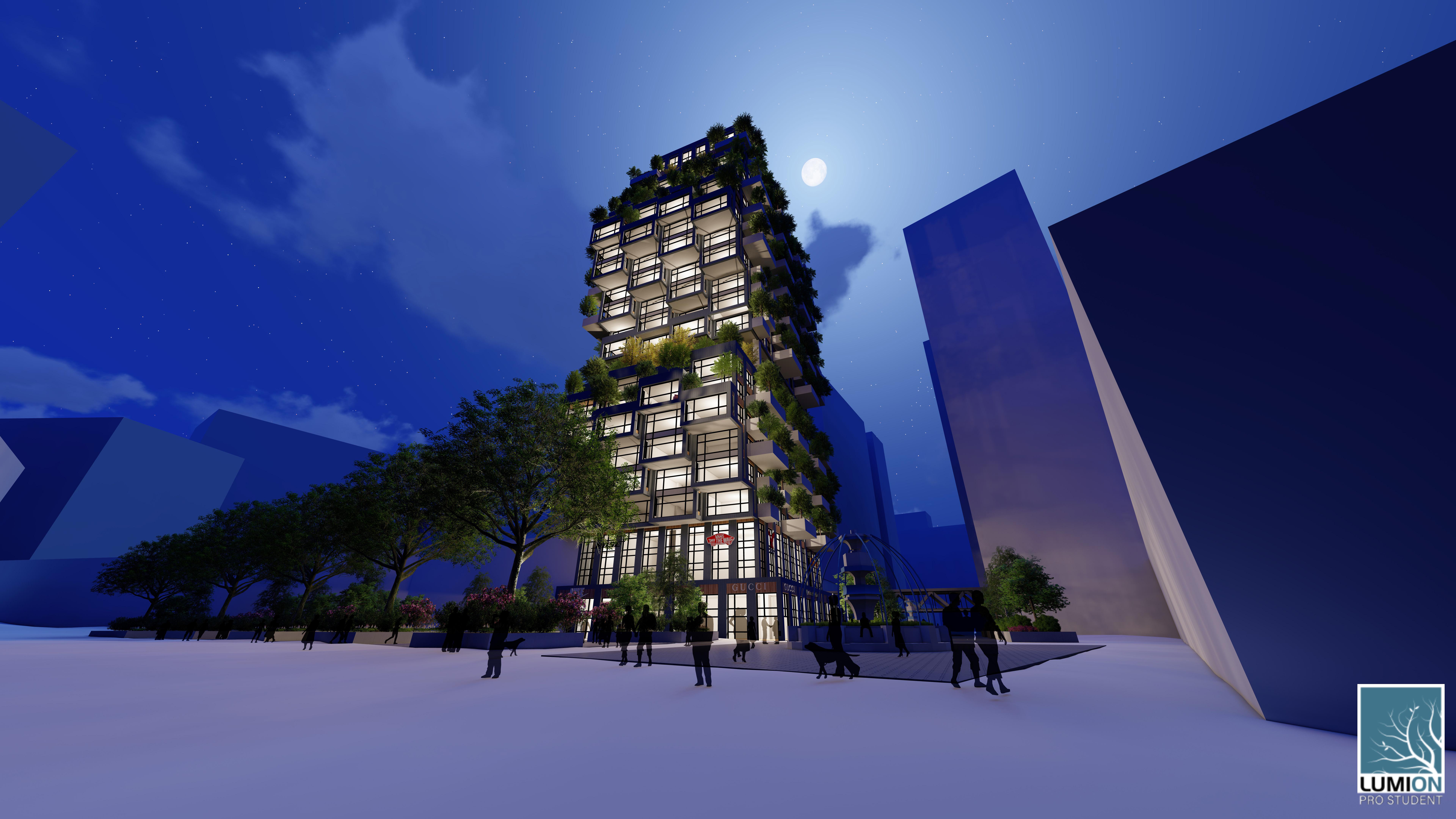
Professor Mark HoistadPolaris Place Residences occupies the southern focal tower in the master plan. It acts as the turning point into the mall district and is a main circulation hub for the office district. The design focuses on accentuating the natural characteristics given to the building by the master planning. Its central nature, crossroads location, connection between the housing districts and office district, and its height distinction on the site make the building a focal point in the project.
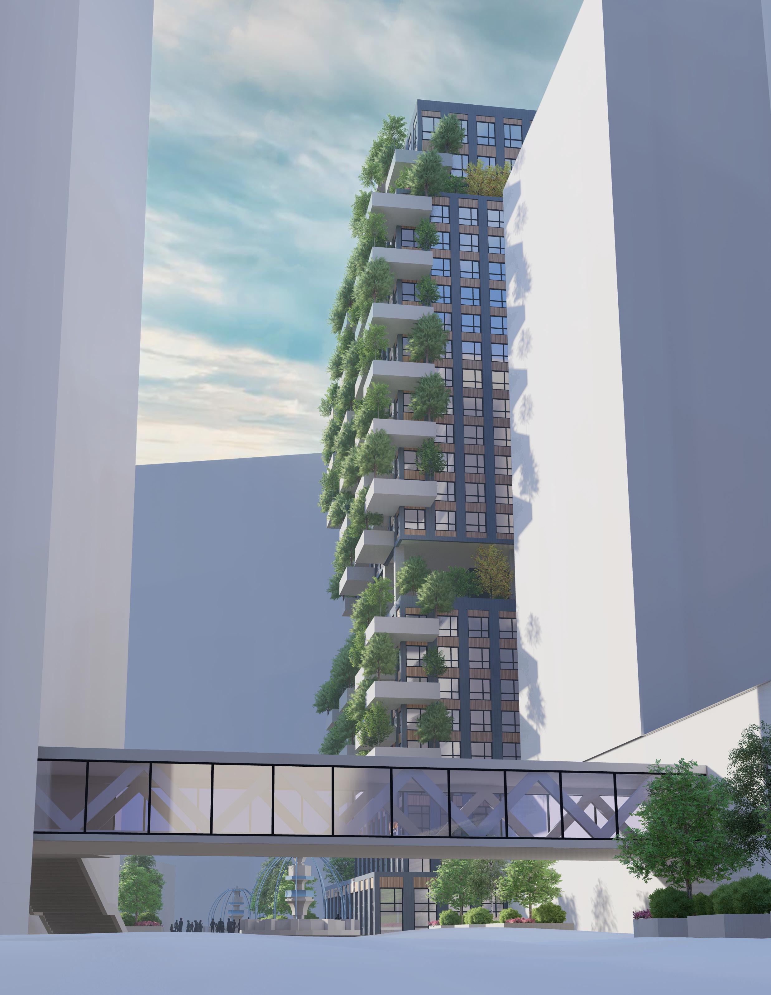
In the design Polaris Place uses green design to stick out within the context of the site. Its vertical forest on the east and west facades differentiate the mixed use housing development from the office towers and other market rate housing the in the mall district. The mass of the building was adjusted from the master plan to stick out into the thoroughfare impacting the natural flow of the space to highlight the buildings importance.
To highlight the vertical forest the materials chosen for the project highlight the conditions created by the vegetated balconies. The dark metal paneling facade blend into the shadows created by the trees and bushes to help make the vegetation determine the form of the building in the day. At night the facade is different as interior light illuminates from the mostly glass facade. Rather than blocking light, at night, the interior lights of the design back light the vegetation on the balconies and thus the true form of the building emerges.
Polaris Place 13
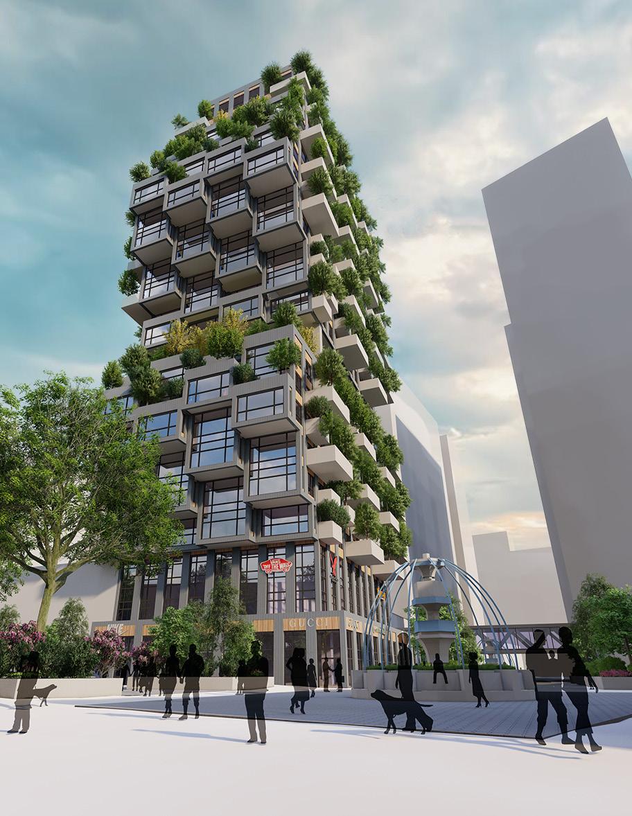
Lincoln, NE 14
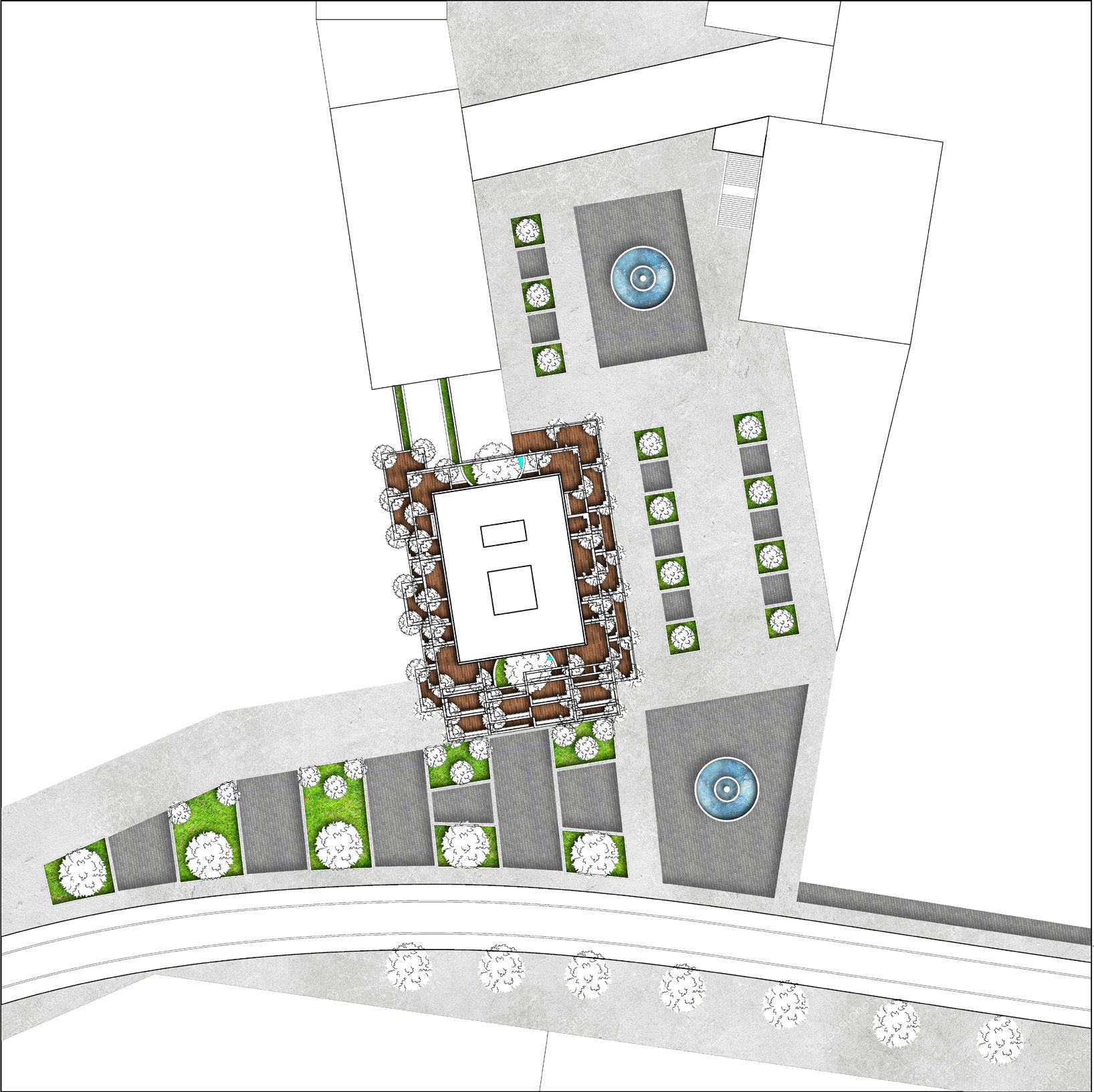
The design of the site around Polaris Place uses trees and planters to focus spaces around the pivoting points and plaza access The master plan design focuses around five districts with the existing mall in the center. The mall district acts as a pedestrian thoroughfare and is the center of the development Polaris Place


“The design focuses on accentuating the natural characteristics given to the building by the master planning.”
15
Polaris Place’s characteristics are given to it from the surrounding context. It’s height, expansion into the plaza, and formal responses responded to site circulation, plaza traffic, and natural vieews on the site.
1.
2.
3. NATURAL
4.
16
SITE CIRCULATION
PLAZA CIRCUALTION
VIEWS
BUILDING EXPANSION Lincoln, NE
Levels 4 and 15 Level 9 Polaris Place 17
Base Form Program Seperation Shifting for Southern Solar
Penthouse Levels 23 and 24 Lincoln, NE 18
Respecting Northern Context Southern Additions for E+W Solar E+W Green Balconies
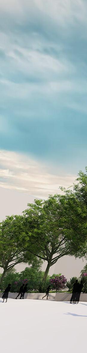
Exterior view of the southern facade and landscaping showing the materiality, focal presence, and green aspects of the design Polaris Place
19
Lincoln, NE 20
Polaris Place 21
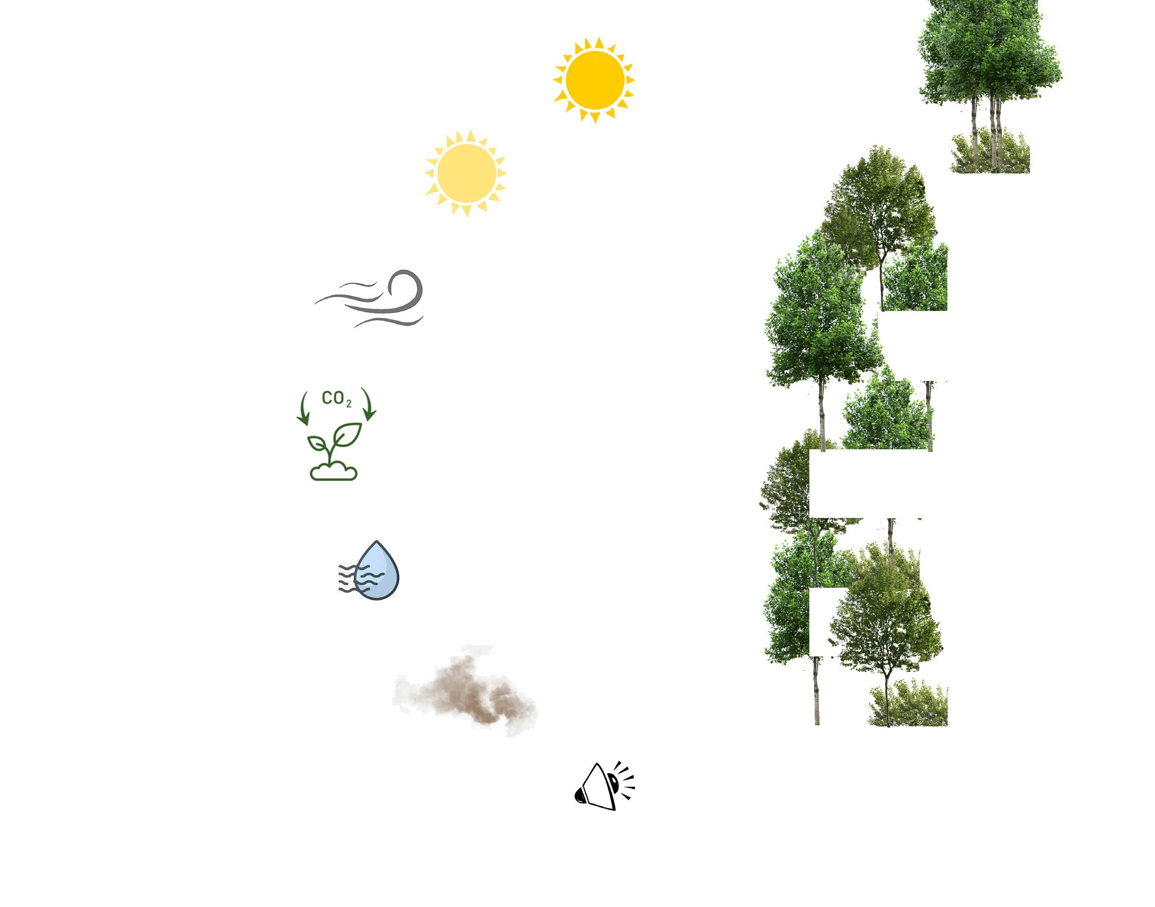
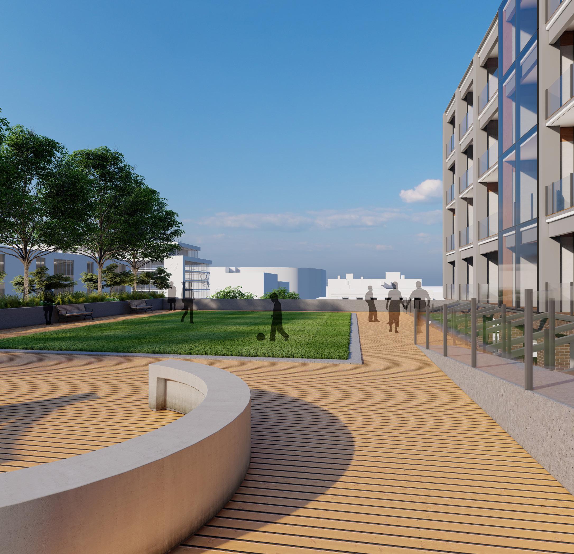
The use of green design and overall sustainable approach to the project increased user experience and comfort within the space. The main green design factor being the vegetative balconies served a multitude of purposes for the user including noise reduction, interior space temperature regulation, humidity control, and as a wind block.
The balconies also serve as water collection to maintain the green facade of the building and supplies the building with its water. In Polaris Place the combination of balcony, roof, and plaza water collection efforts result in a net positive water for the building, thus helping the development in excess water.
Lincoln, NE 22
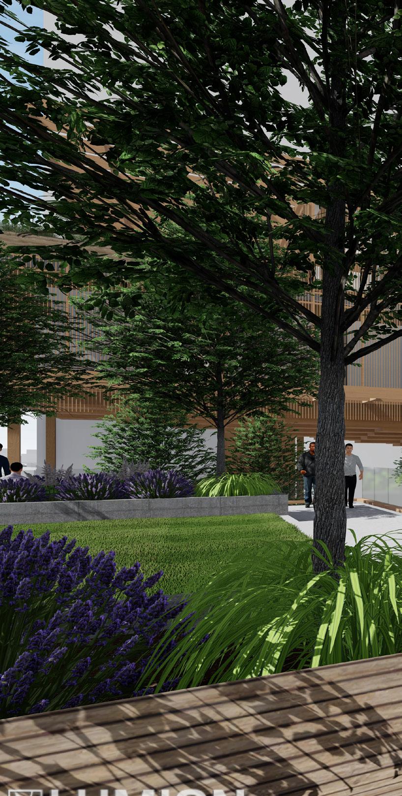
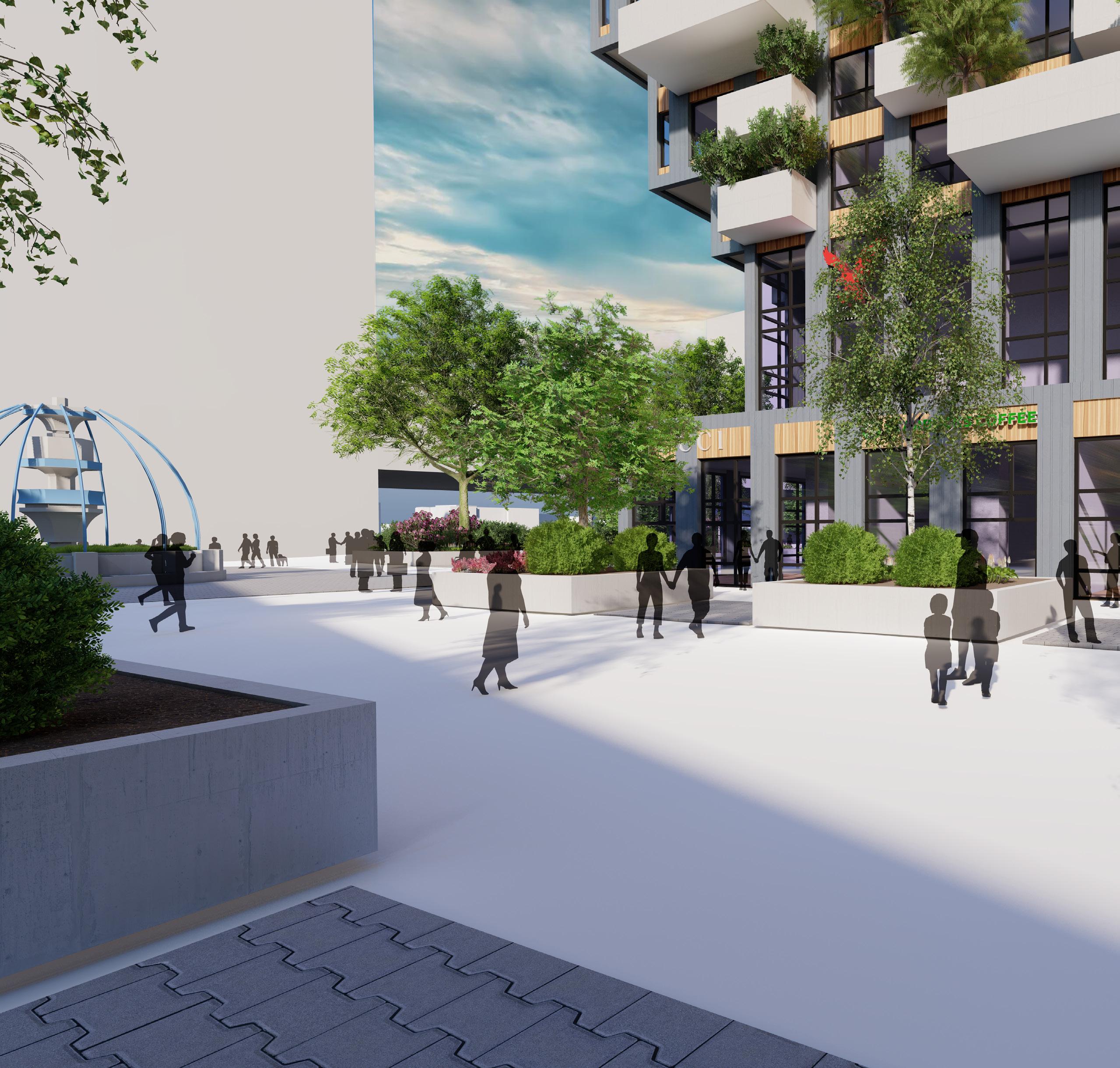
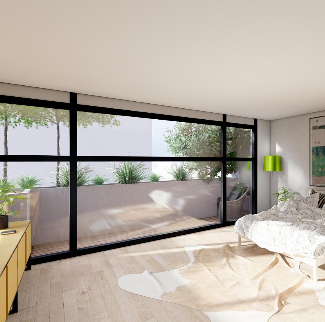
The plaza space associated with the design attempt to encourage certain circulation through the site by being open in the north south corridor and having larger right of ways along the buildings. The space also creates more intimate areas where planters and vegetation define non-right of way space. The interior spaces in the units blur the lines between interior and exterior with large balconies and almost full wall windows, while the penthouse spaces emphasize the sky and height of the space.
Polaris Place 23
Lincoln, NE 24
Overlook
LINCOLN, NE
Integrate Studio 411
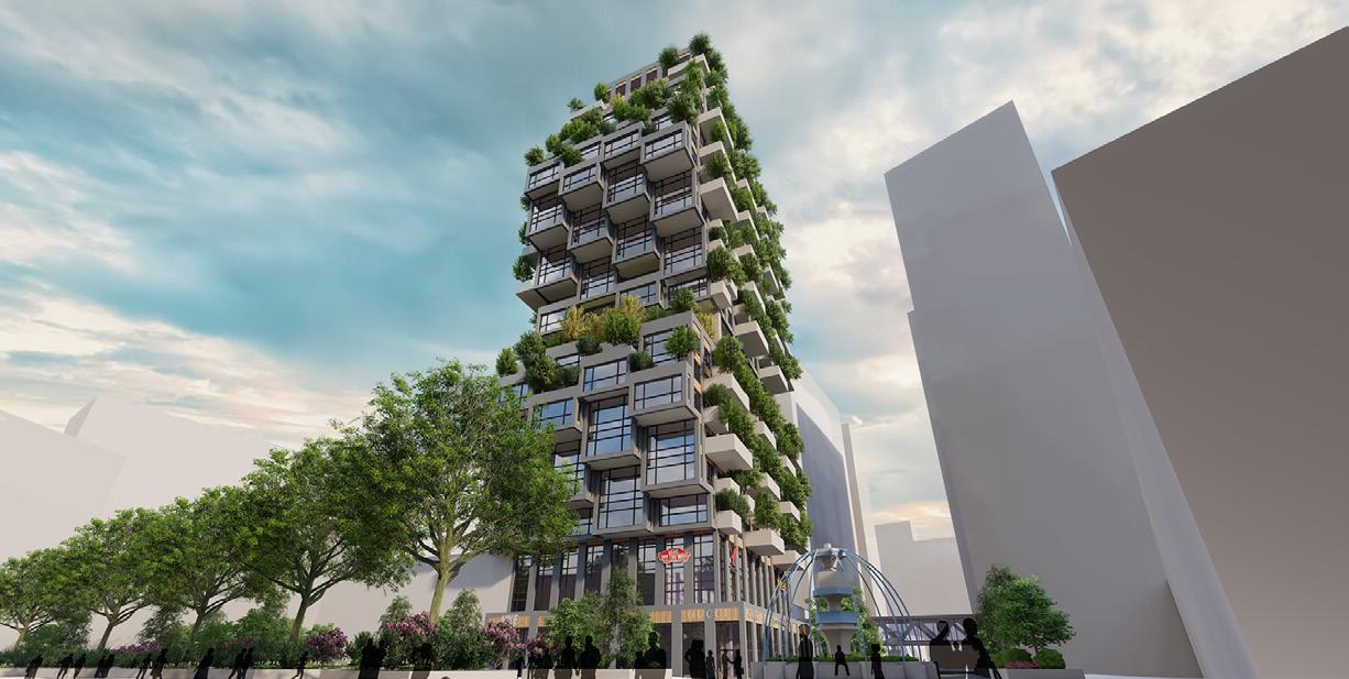
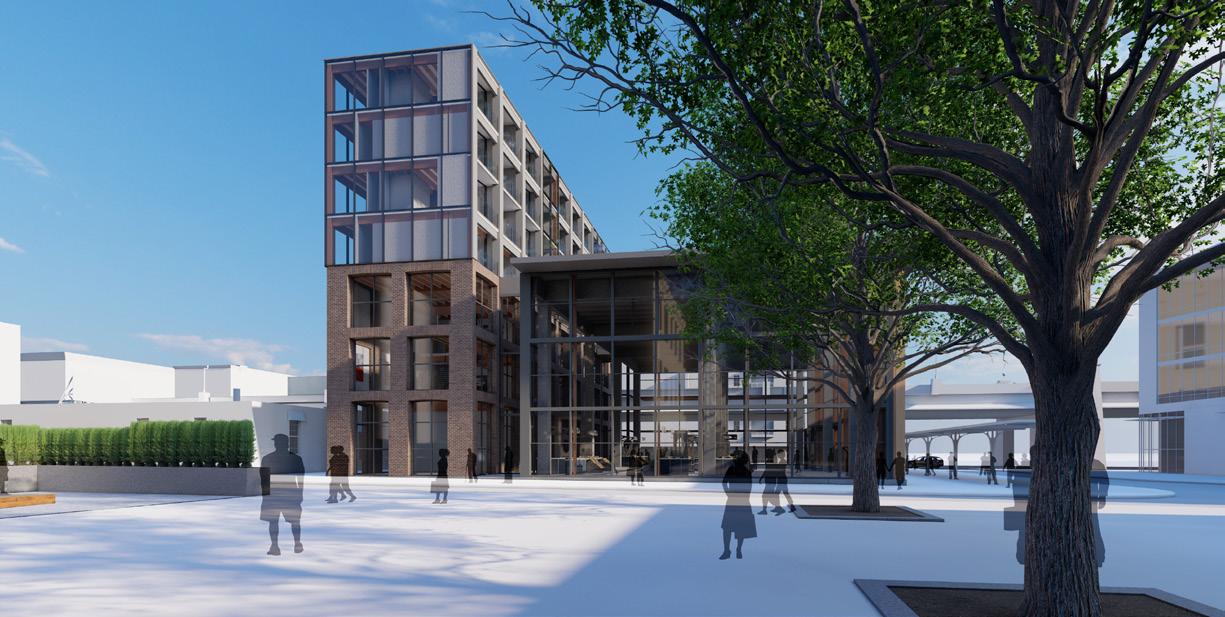
Professor Craig Babe Partner Will DostalThe historic facades of the Haymarket bordered our site on the North and West Sides and presented opportunities to tie our design back to the context. Our design highlights the alignment of our building with the Ollson building to the West with our market hall and aligned our tower with the historic building to the East. Our courtyard was situated on the North side of the site, allowing for us to keep the current flow through the haymarket.
The design serves as an open stage for Lincoln’s diverse social and cultural identity allowing for the historic Haymarket to continue to be the heart of the city. With the sites location on Canopy street it has a major stance in the circulation of the Haymarket but it is also along O st, which is the biggest east west circulation corridor in Lincoln. The visibility of the design makes it a staple of Lincoln when entering from the West.
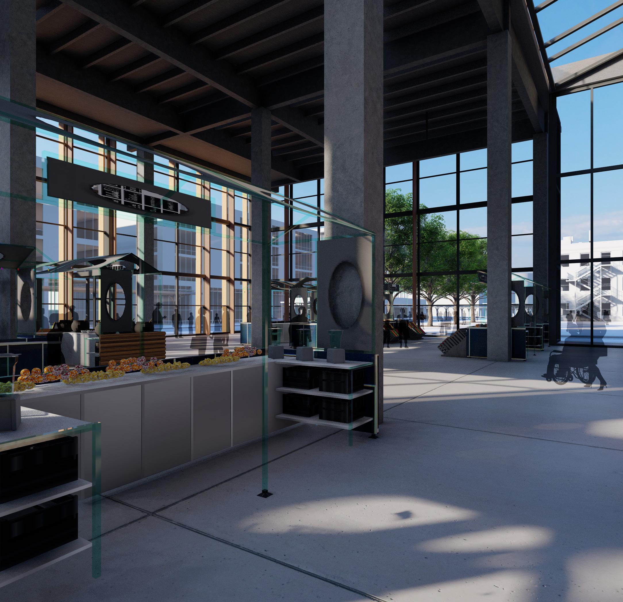
In plan and section the mixed use market space was designed to be an open space with entrances on three sides to increase the foot traffic through the space. The design hinges on the circulation through the spaces being centered around the market space with our corridors separated by the base of our arches. Our goal with the program was to connect the spaces with meaningful and dramatic relationships. By separating our program into three classifications: public, semi-private, and private, we highlighted the three parts of our building by using material changes on the facade and different structural types.

25 OVERLOOK
26
Lincoln, NE
Overlook is situated on the West edge of Lincoln’s downtown in the Haymarket. Its historic location makes new development difficult as its cultural significance requires solutions that respect the current environment and build upon existing circulation and program.
27 OVERLOOK
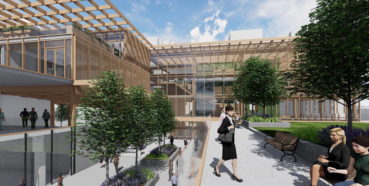
Overlook is a comprehensive studio project that respects the context of the Haymarket while testing its zoning limitations and contextual heights. The project matches the programmatic arrangement of traditional buildings with public and commercial space on the base level and private above. This arrangement is used to activate the market by using it as an extension of the public outdoor space.


28 Lincoln, NE
29 OVERLOOK
The material differentiation in the design was intentionally respective the historic context surrounding the project. It also separates the three program types within the design, public, commercial, and private. The experience in each space differ as well in spacial features with alternating ceiling heights and lighting.
0 25 50 0 25 50
30 Lincoln, NE
Overlook occupies a cultural site within the Haymarket. Is location on the train yard connects the project to all of Lincoln and sits along one of the major streets.
31 OVERLOOK
32 Lincoln, NE
After analyzing our site we determined the South side of the site would best suit a building because the northern side receives the most light throughout the year and by using the south side for our site we were actively using the context as a shading strategy for our market hall. Due to the glass walls our market hall has increased glare and before shading had high temperatures on the South and West sides. By implementing horizontal shading 2/3 the way up our wall on the south side and vertical shading fins on the west side we greatly decreased the sunlight coming in and heating the space. The vertical fins impact the project the most as they block sunlight from directly getting in.
33 OVERLOOK
34 Lincoln, NE
NUhouse
VALENTINE, NE
Collaborate Studio 410
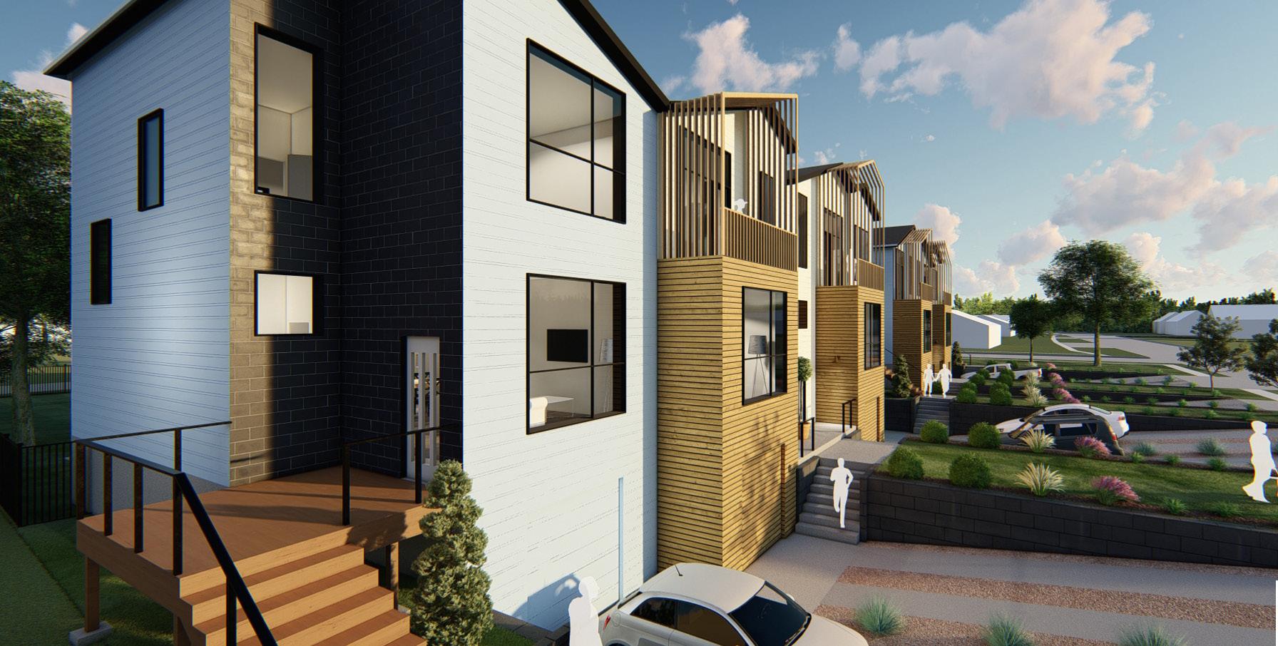
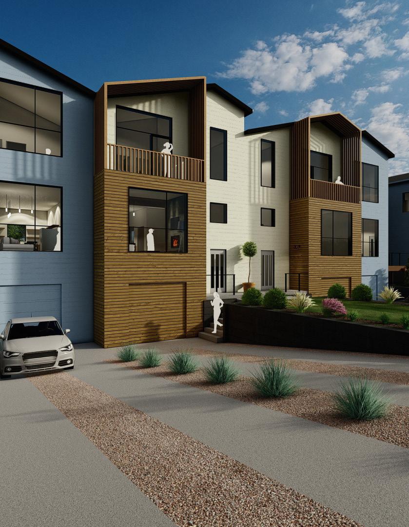
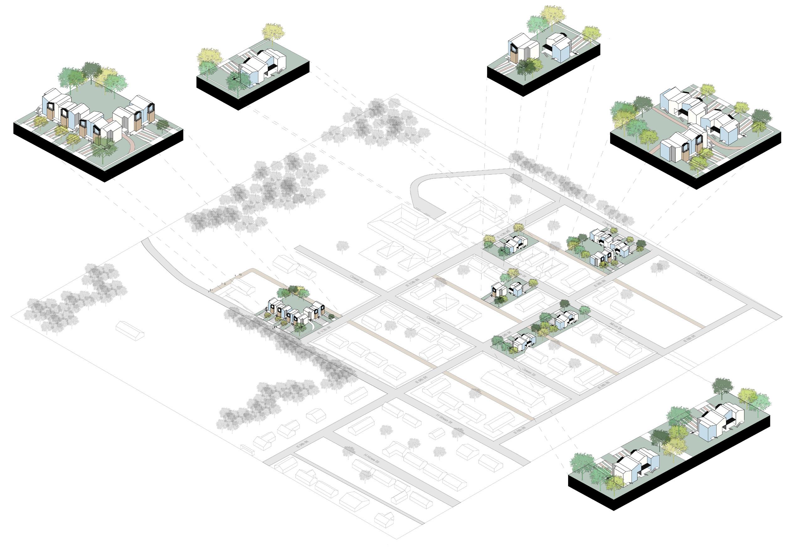
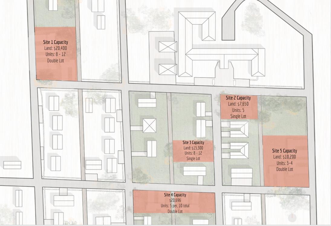
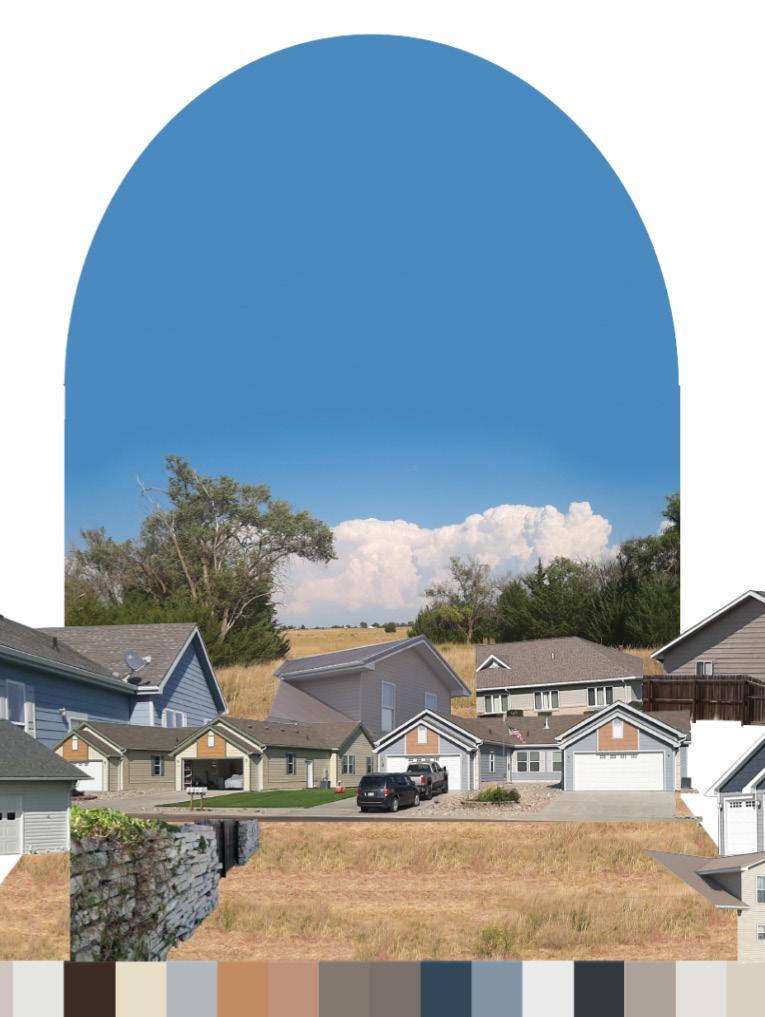
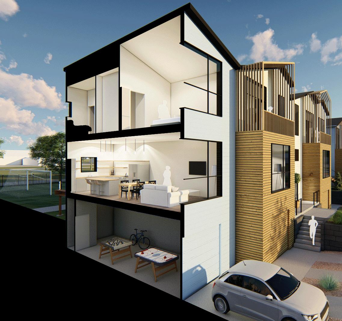
Professors Steve Hardy and Nate Bicak Partners Geneva Sinkula, Patrick Pineda, Sarah Janda, Maggie Coolidge-Van Duran, Ariana OstenThe NUhouse project was a collaboration project between three architecture students and three interior design students. Our team’s site was located in the northeastern corner of Valentine, NE in a newly plotted addition to the town. Our design consisted of 5 empty lots that shared similar conditions including, flat topography, little to no tree cover, and being located on corner conditions. Our team’s design was intended to give the citizens of Valentine more affordable options for housing, as well as increase the density of housing to make the project more appealing to developers. The design focused around creating strong ties to the community through community spaces and set a standard for future developments.
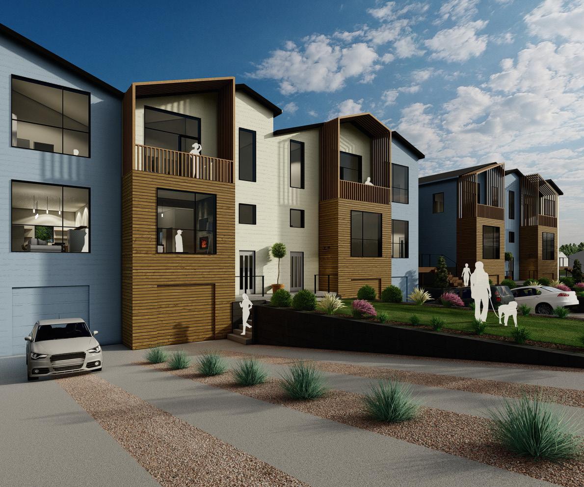
Due to the spread out nature of our site and its context as a new neighborhood in Valentine we were able to use our design to have a heavier impact on the surrounding context. This would break up the existing nature of efficiently built single family homes and multifamily duplexes thus giving the neighborhood more diversity. We intend our three level townhouses to be sensitive to the local built context and community, but also change the context from your typical box duplex to a more thoughtful design. While designing this project we had to constantly remind ourselves of our goal to provide affordable housing for Valentine which informed the typology of our design to be row style townhouses that are efficient to build, with cost effective materials, and using the city code to maximize the impact our design would have on the town.
35 NUhouse
36 Valentine, NE
NUhouse is situated on 5 sites within Northeast Valentine. Its presence on those sites makes it a major shaping force in the context and while the design focuses on a modernization of rural cities, the affordable housing project relies on the density created within the neighborhood.
37 NUhouse
38 Valentine, NE
39 NUhouse
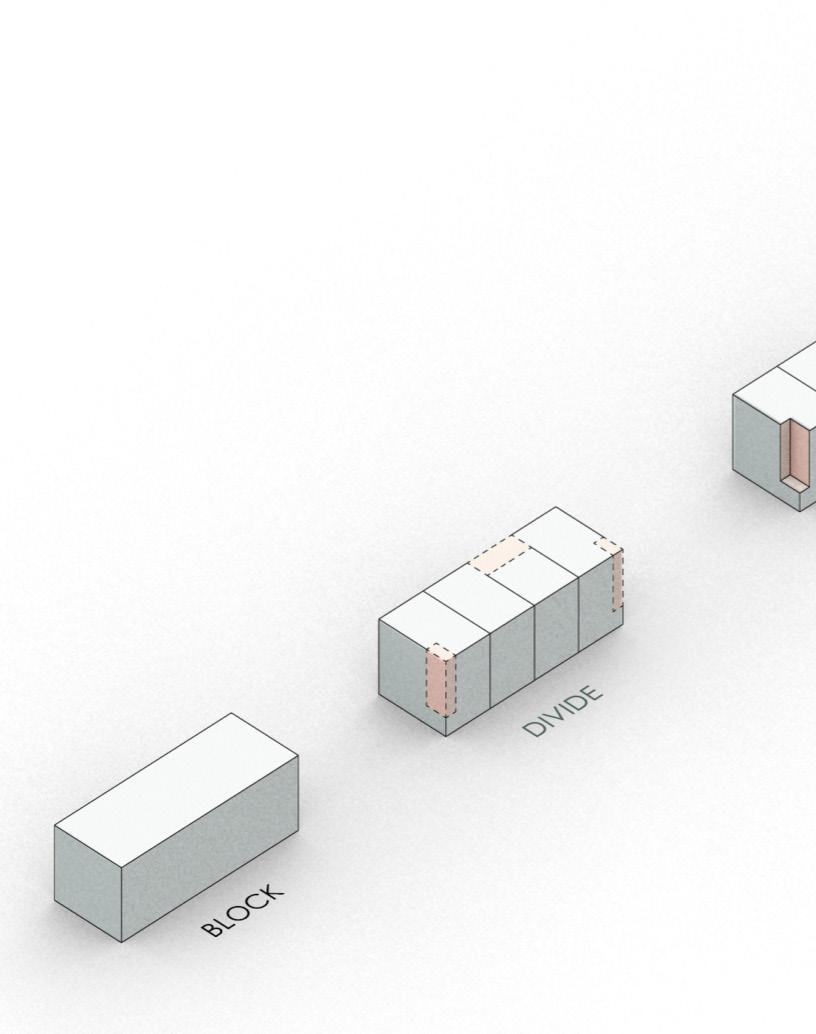
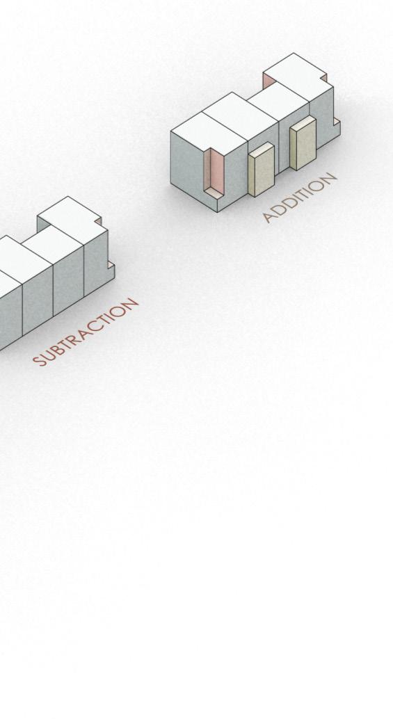
NUhouse’s form comes from three simple moves that drive the interior and exterior arrangements. Through a series of division, subtraction, and addition we created a row house that fits within the context and zoning.
40
NE
Valentine,
NUhouse took materials, colors, and textures from the surrounding context to create the palette for the development. Through doing this the project fits within the small town context while also adding a new formal typography to Valentine.
41 NUhouse
42 Valentine, NE
By using repeating units attached to each other the design achieves a row house style with more flexibility on space uses. The three different unit layouts change the entrances making each unit have their own respective entry experience as well as distinguishable from the street.
43 NUhouse
44 Level 2 Level 1 Basement Valentine, NE
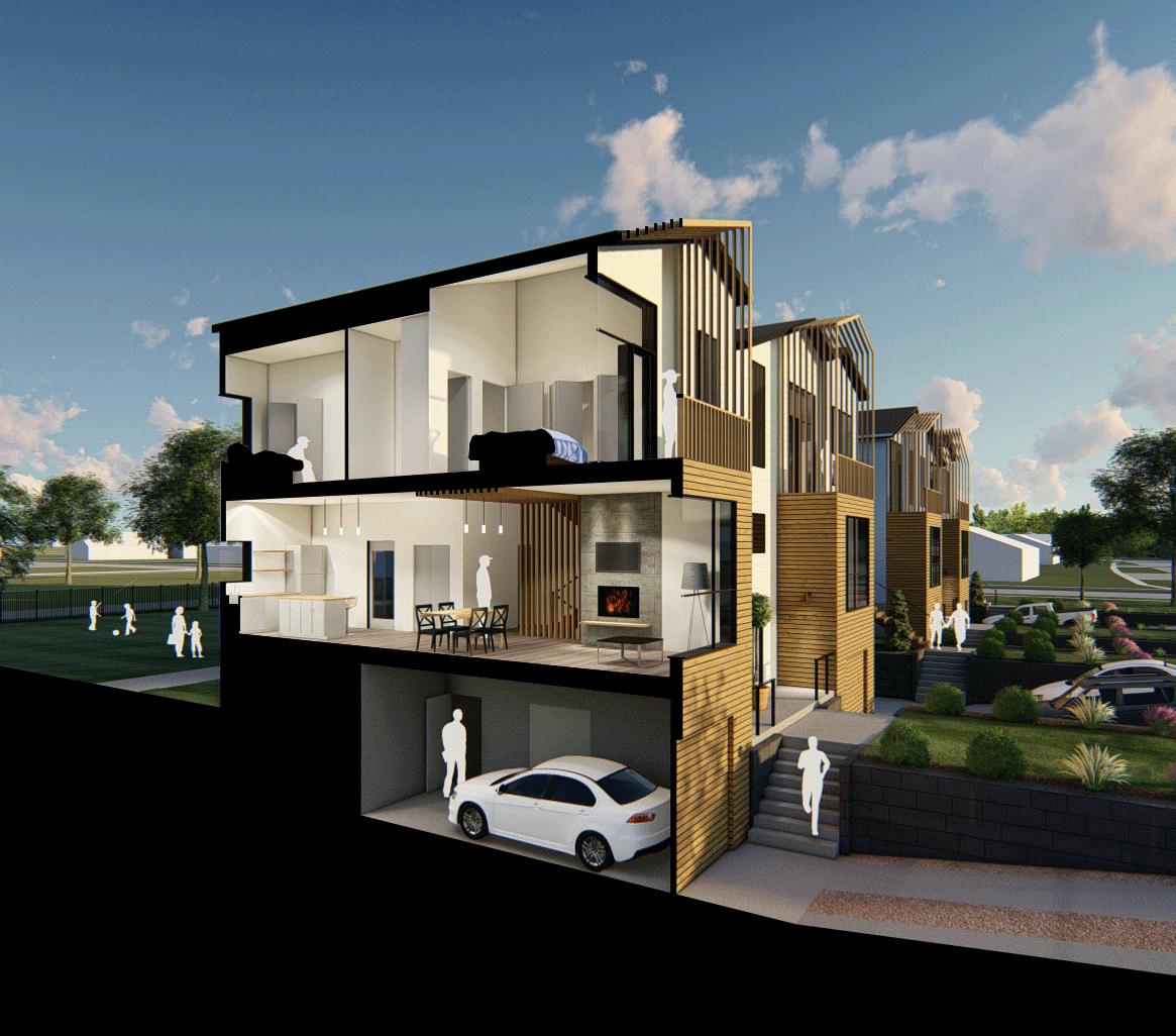
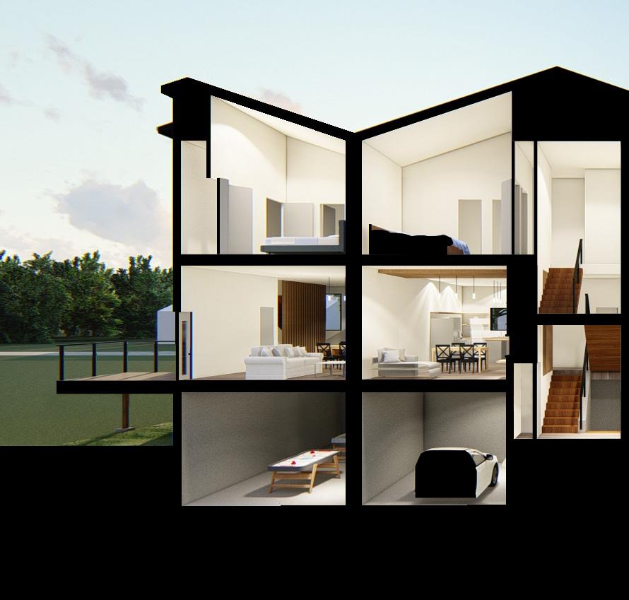
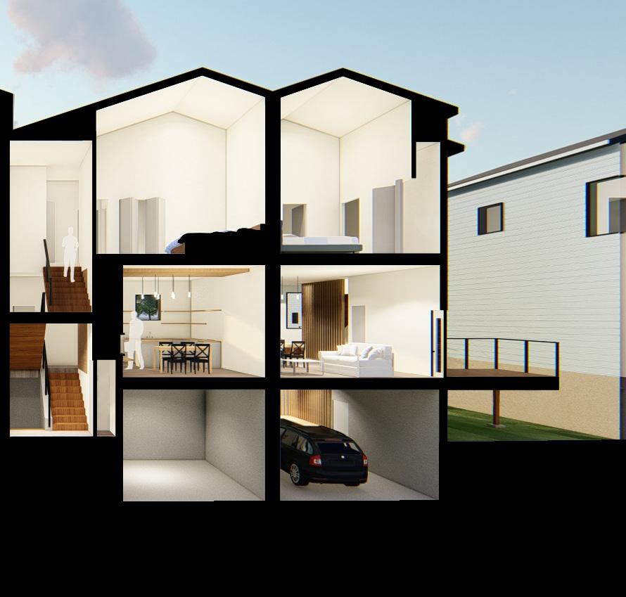
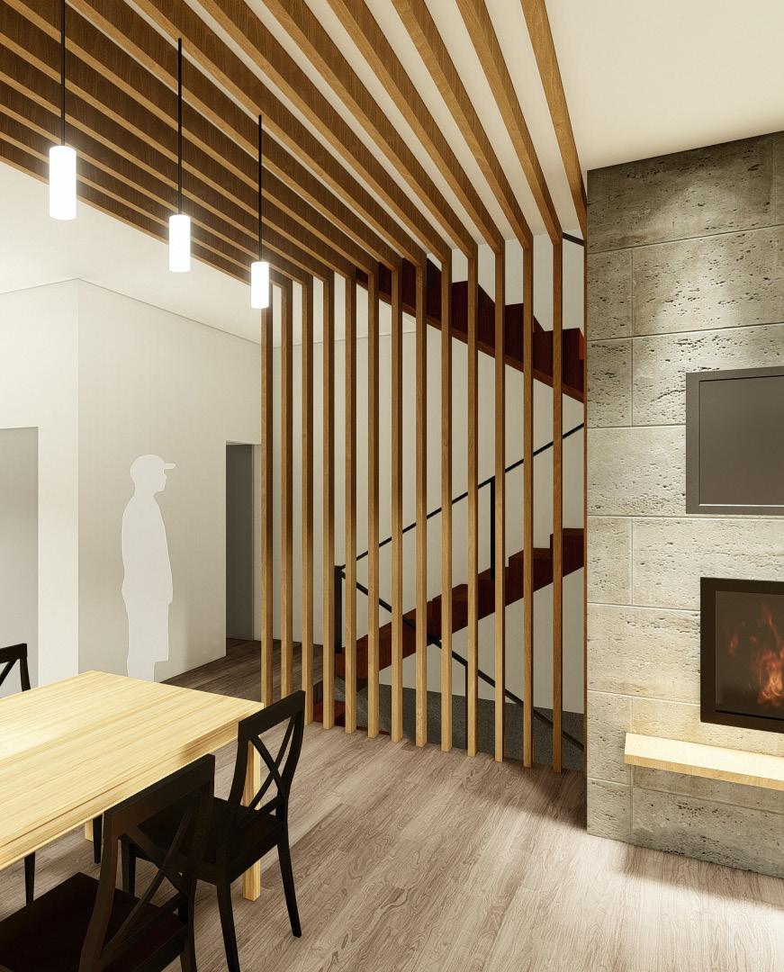
Section perspective render highlighting the vertical circulation and the segregation of program based on its privacy
45
NUhouse
46 Valentine, NE
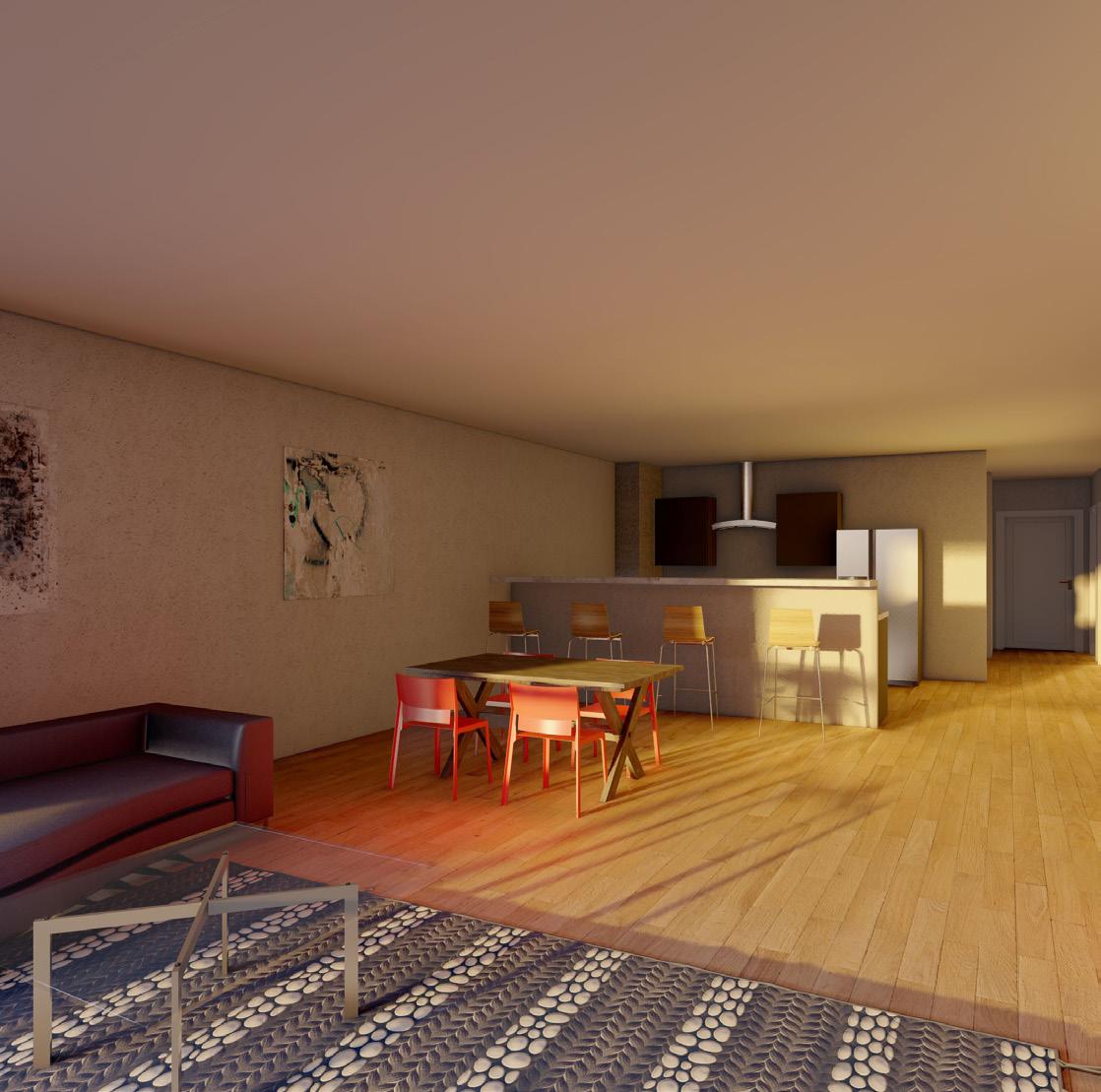
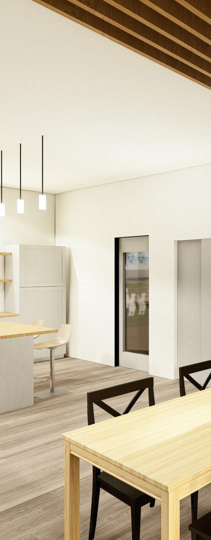
On the interior of our design we wanted to respect the affordable aspect of our project. In the kitchen we opted for only lower casework with open shelving above and allowed for an open floor plan on the main floor that would be separated by wood slatting that would highlight the vertical circulation and go on the ceiling to define the spaces.
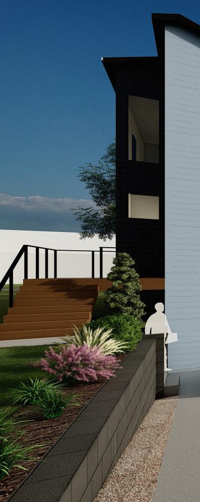
A big part of our design was making sure the design incorporated community spaces, not only for the users of our development, but the people in the community. We arranged our design on the edges of corner lots in order to allow for ample outdoor space behind the units.
47
NUhouse
48 Valentine, NE
Thank You
Dominic Paquet dapaquet@comcast.net (970) 449-2794