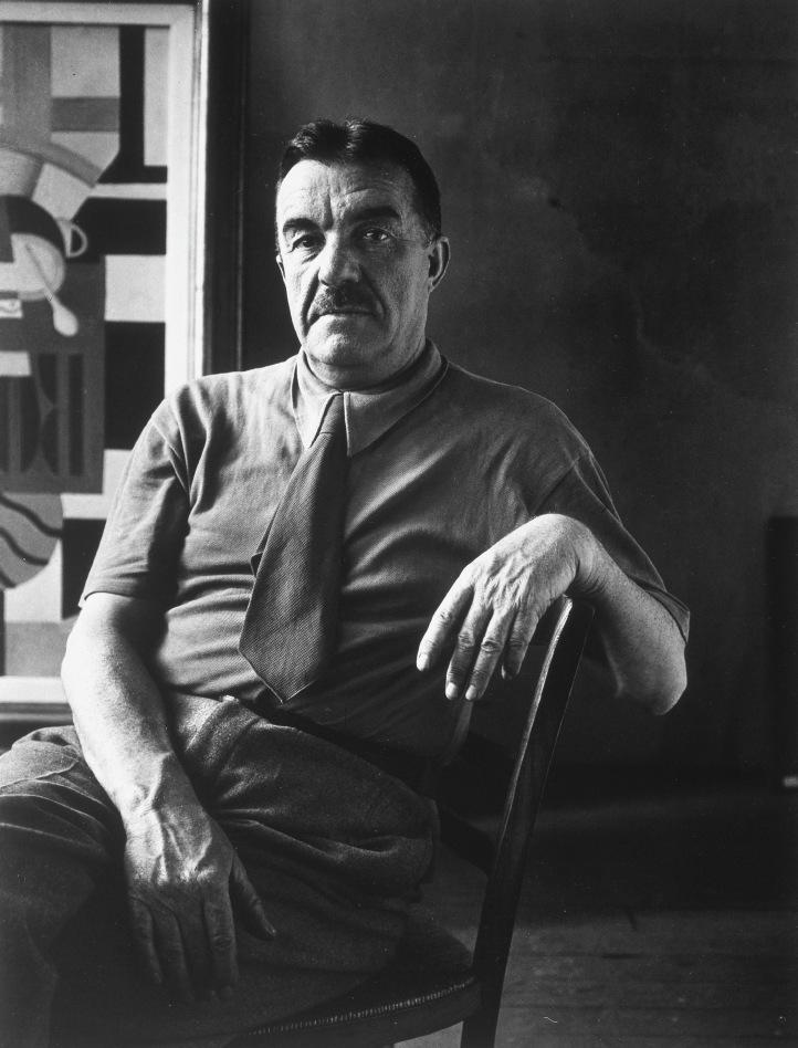
NYC2425401_The Collection of Robert F. and Patricia G. Ross Weis
contributors
JED PERL
Jed Perl is the author of the two-volume biography of Alexander Calder and a regular contributor to The New York Review of Books. His other books include Paris Without End, Magicians & Charlatans, Antoine's Alphabet, New Art City, and Authority and Freedom: A Defense of the Arts. For twenty years, he was the art critic of The New Republic.
LARRY LIST
Larry List is an independent curator and the author of The Imagery of Chess Revisited, Man Ray & Sherrie Levine: A Dialogue, and Takako Saito: Dreams to Do. His most recent book is Permanent Attraction: Man Ray & Chess.
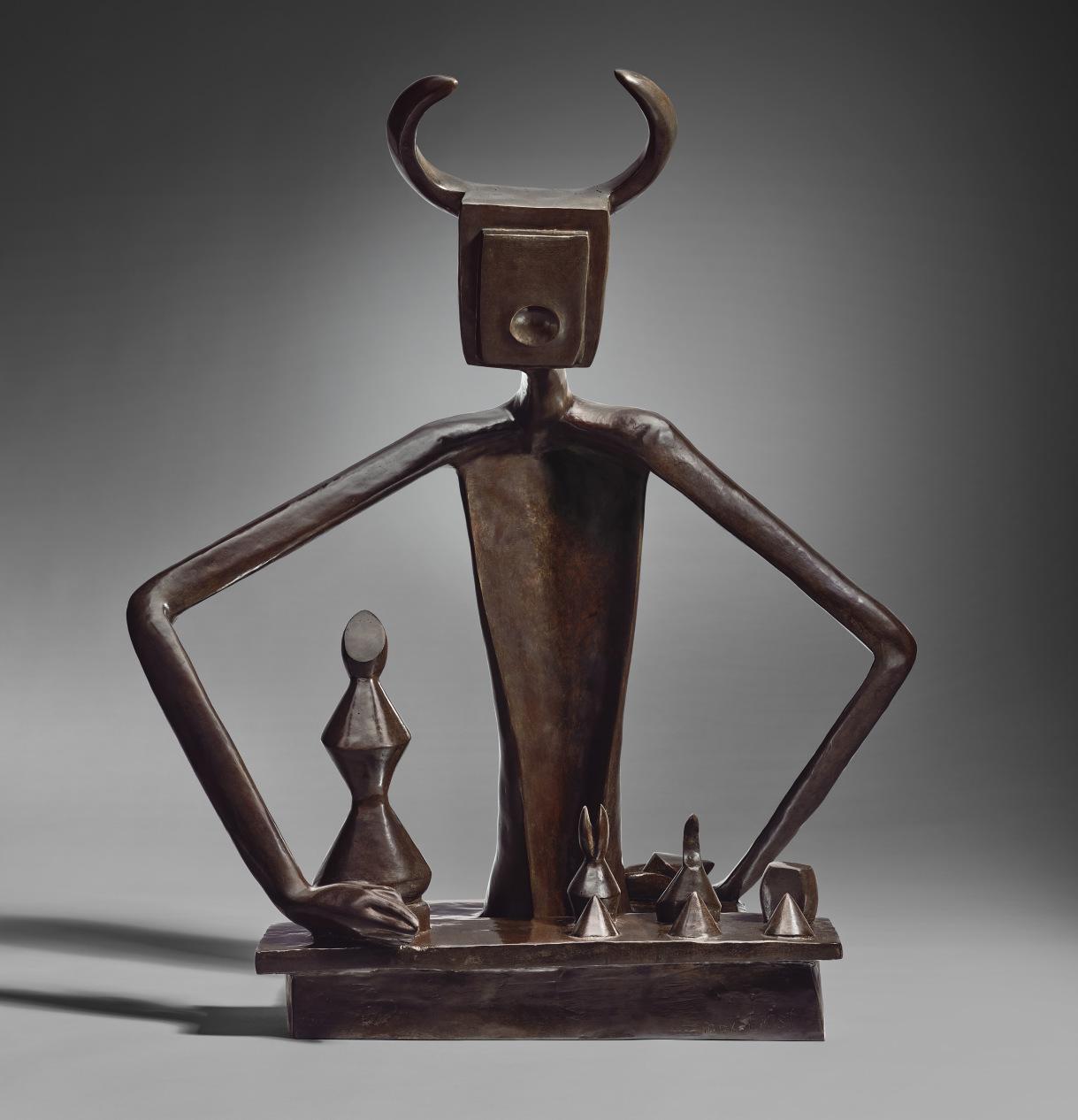
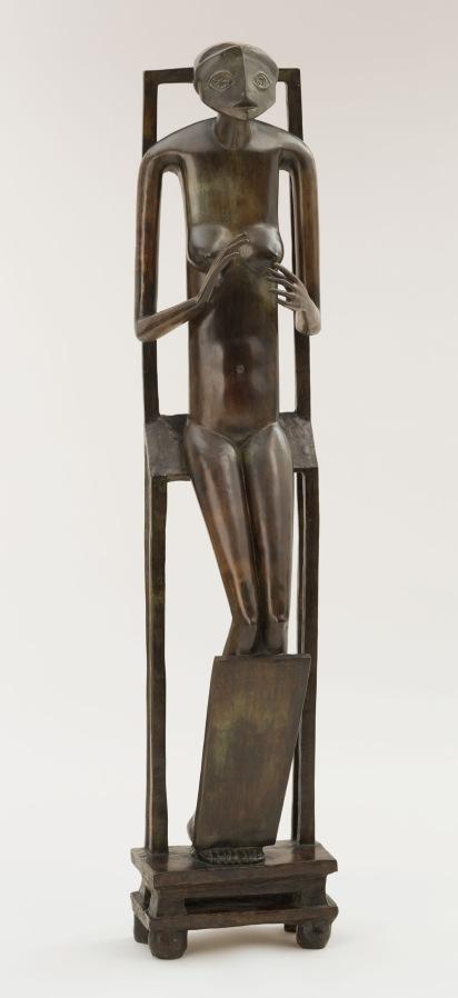
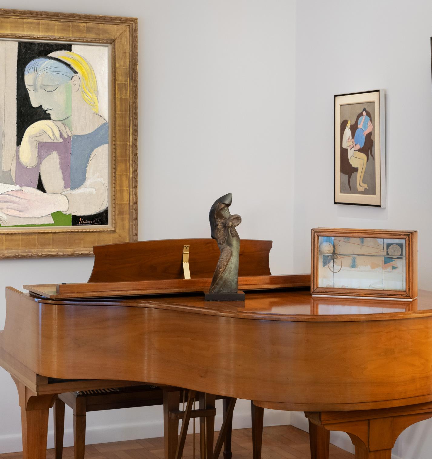
Max Ernst, Le roi jouant avec la reine, 1944. Collection of Robert F. and Patricia G. Weis.
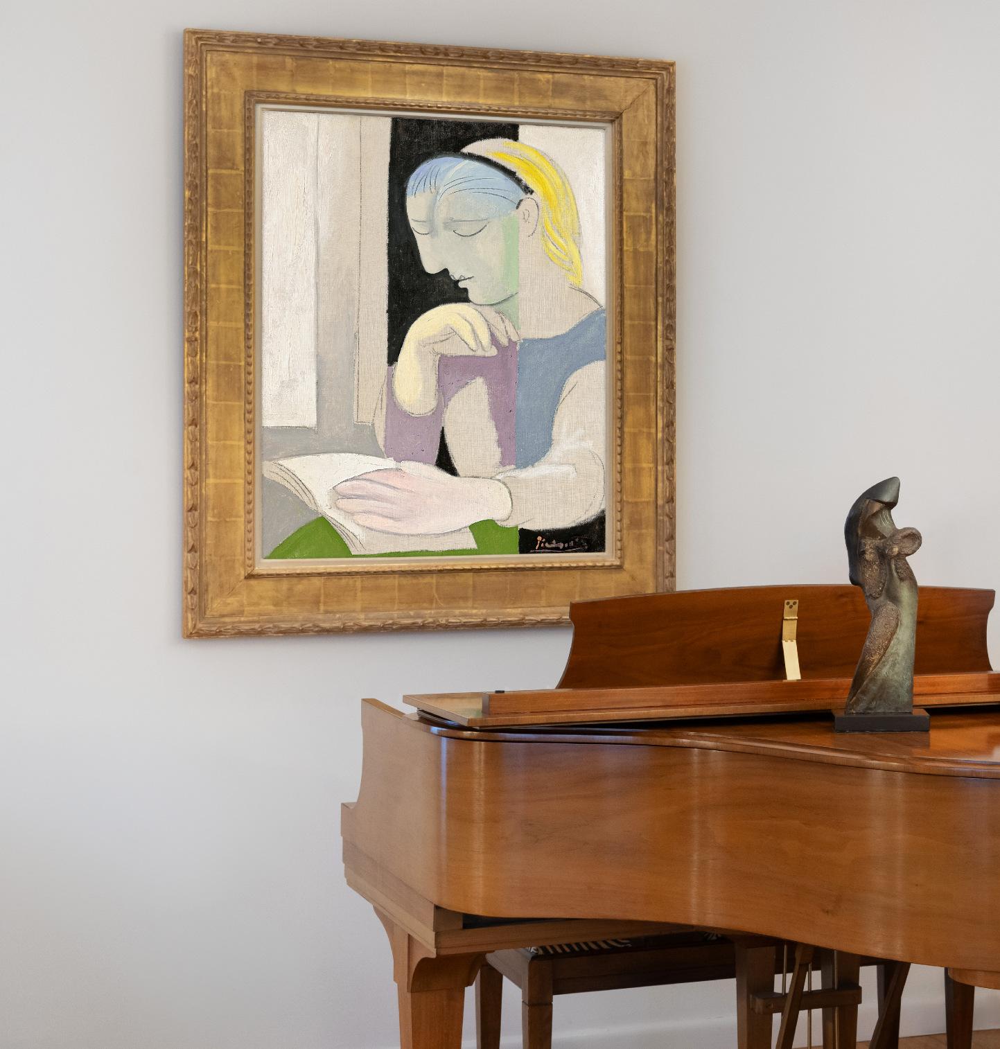
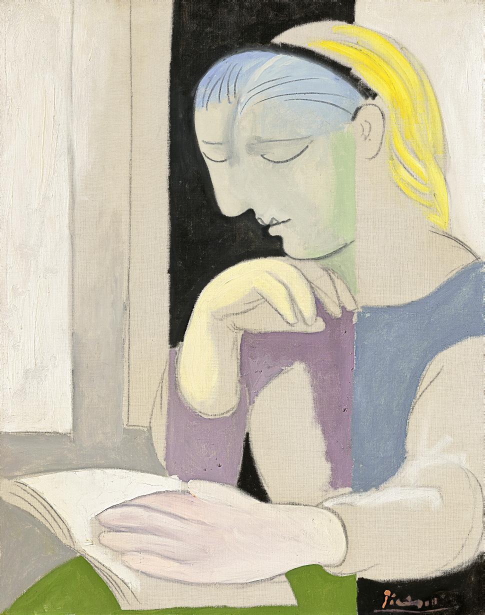
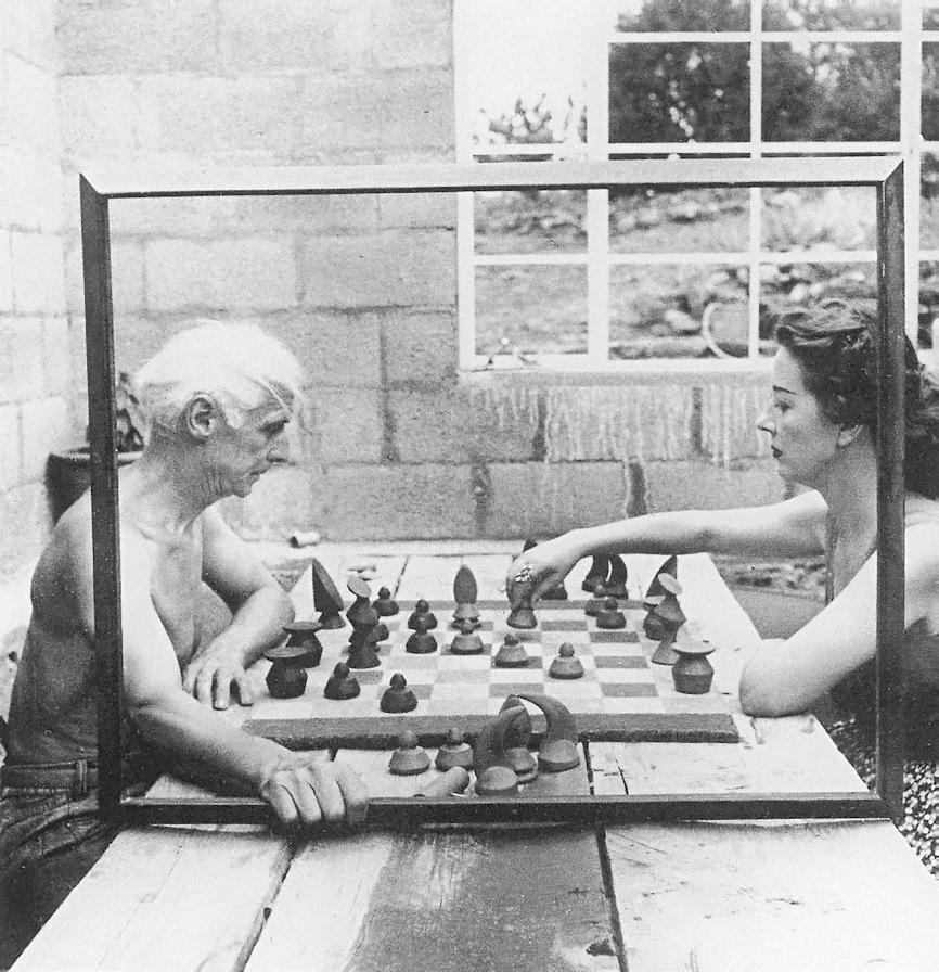
Patricia and Robert Weis, with Pablo Picasso, La Lecture (Marie-Thérèse), 1932. Courtesy of the Weis Family.
The collection of Robert F. and Patricia G. Ross Weis celebrates the thrilling variety and the ultimate unity of modern art. The works the Weises gathered in the bright, clean-lined, elegant rooms of their Pennsylvania home range from a landscape, La Ciotat, that Georges Braque painted on the shores of the Mediterranean before World War I to an abstraction by Mark Rothko, which dates from a little over a decade after the end of World War II. The collection, mostly assembled in the final quarter of the twentieth century, is rich and diverse enough to suggest a map of modern art reaching from Paris to New York and including artists who came of age not only in France and the United States but also in Spain, Russia, Switzerland, Germany, Holland, and Italy. The Weises were adventurers, attracted by Joan Miró’s phantasmagorias, Giorgio Morandi’s old bottles, and Piet Mondrian’s utopian geometries. Among the wonders in their collection is Matisse’s sensuously supercharged 1937 Figure et bouquet (Tête ocre). But for all the delights and seductions of the Weis collection, there’s also a strenuousness about the work these assiduous collectors brought together, a recognition that new forms of beauty involve new intellectual challenges.
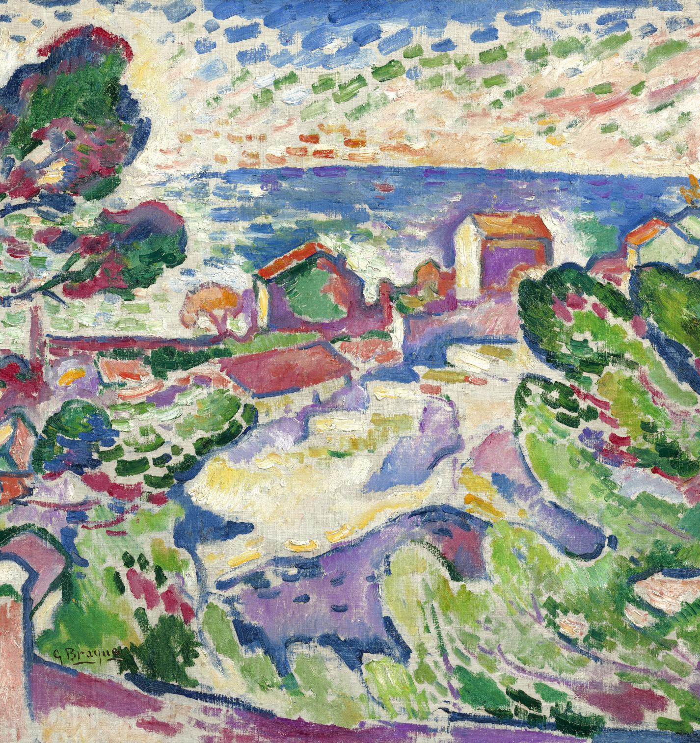
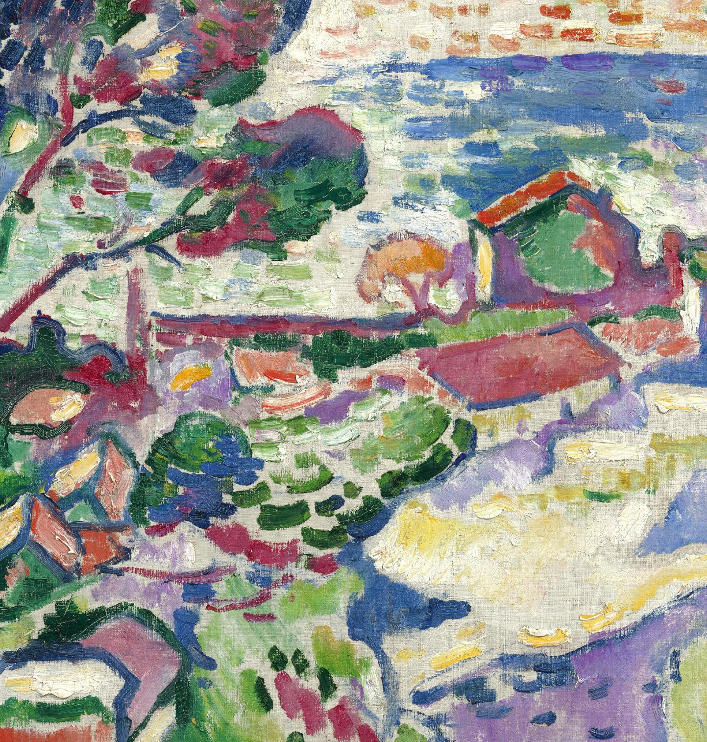
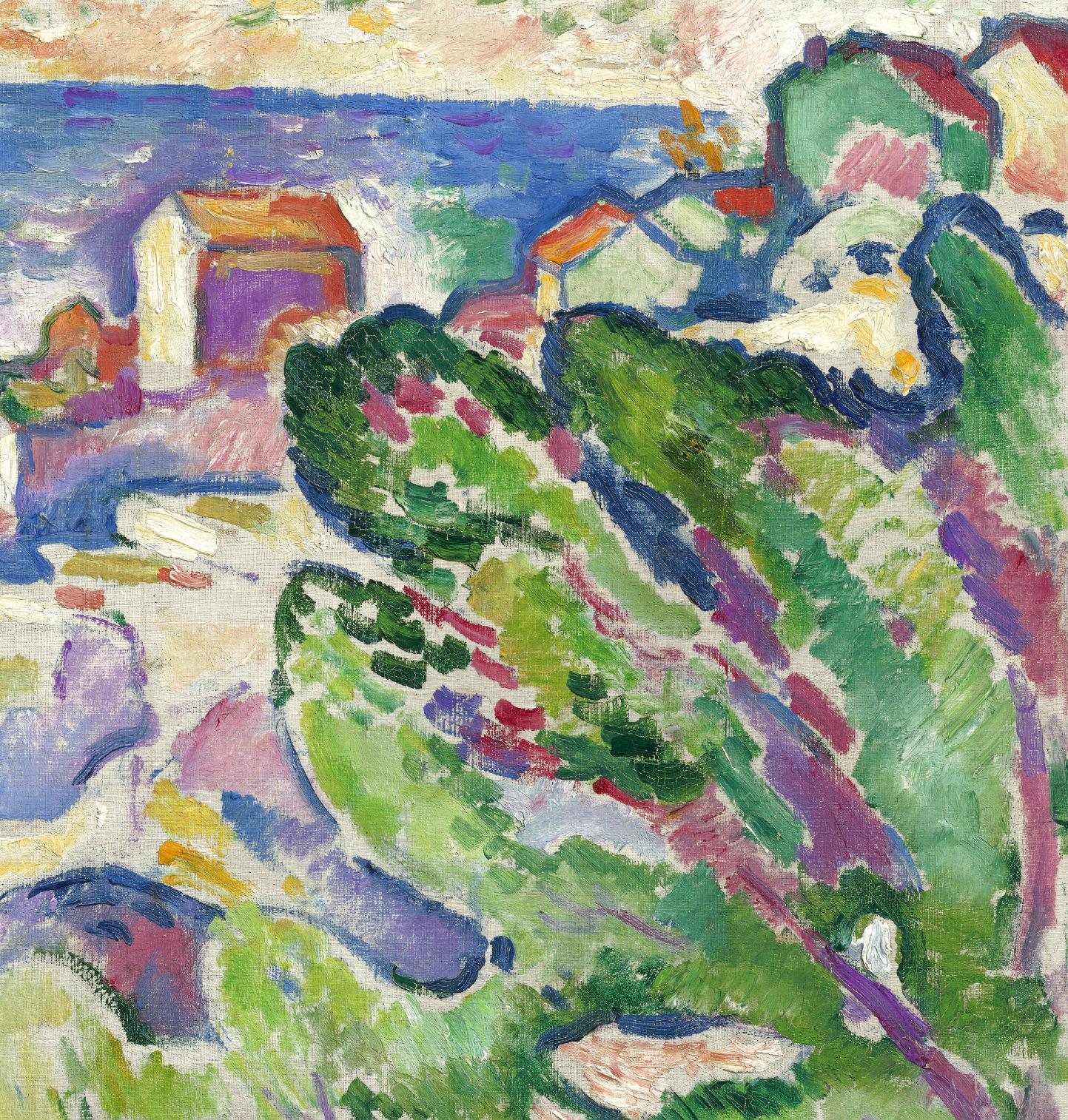
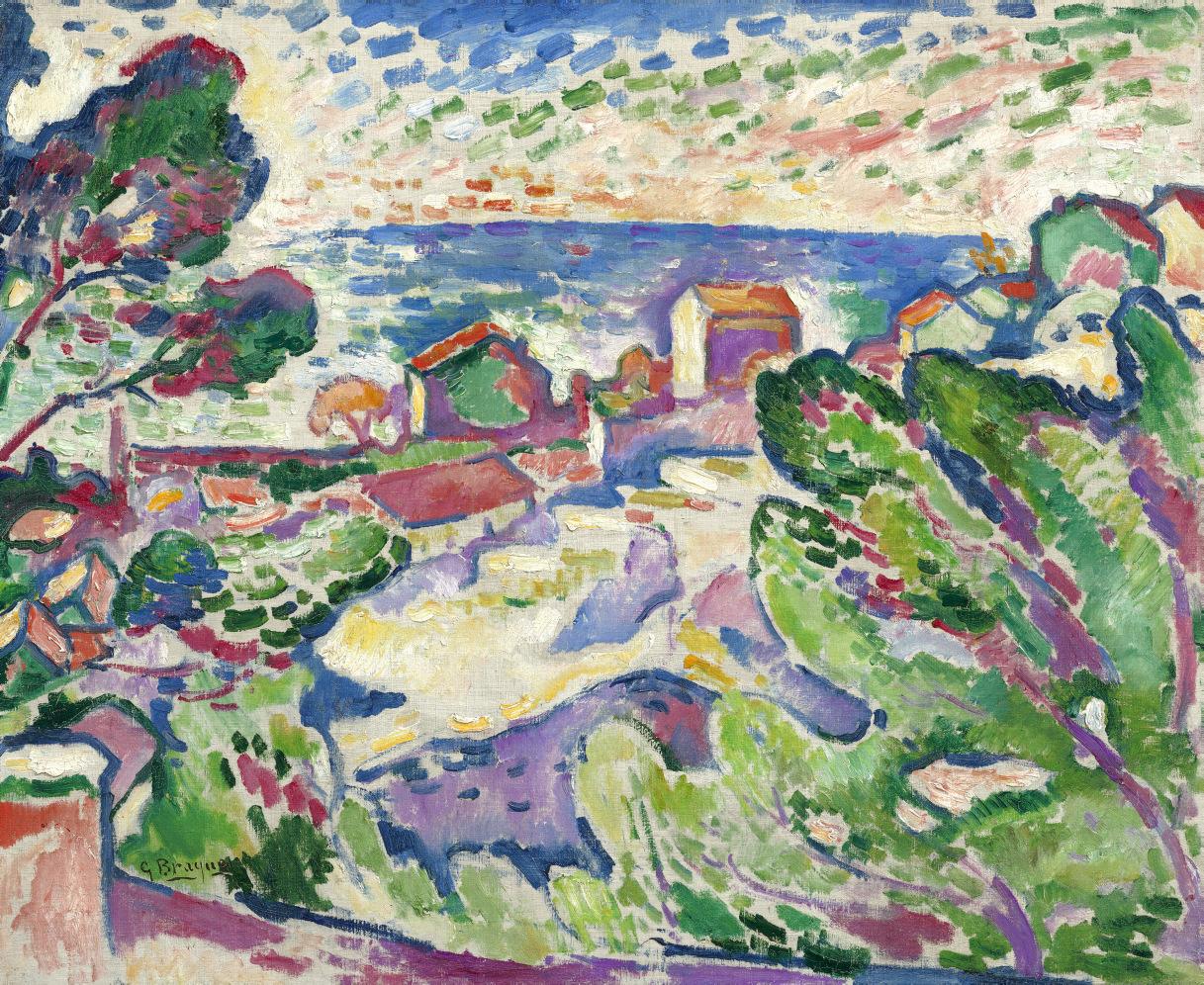
In 1971, near the beginning of their most intensive years of collecting, the Weises purchased the sparkling vision of Mediterranean vegetation, architecture, sea, and sky that Braque painted in the summer of 1907 at La Ciotat, a little port city on the Mediterranean coast. It’s with the youthful energy of La Ciotat, realized when Braque was all of twenty-five, that the Weis collection begins. Braque’s work here is muscular and mysterious, tight-knit and hyperbolic, constructed with the cacophonous orange, purple, blue, red, green, and yellow strokes of paint that two years earlier had pushed a skeptical critic to label a new group of painters les fauves—the wild beasts. Braque took his place in the avant-garde as one of the Fauves, a group that included Matisse, André Derain, Maurice de Vlaminck, and Raoul Dufy. In that summer of 1907 Matisse, on his way to visit the collectors Leo and Gertrude Stein in Italy, stopped to see Braque in the south of France.
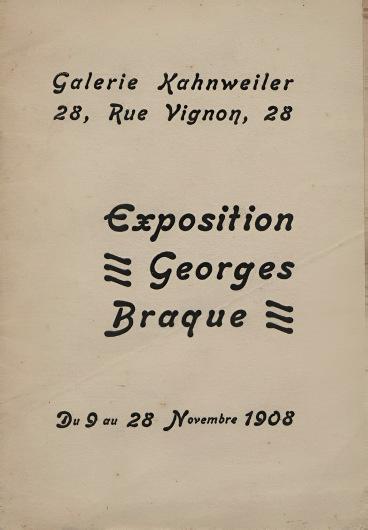
The year after he completed La Ciotat, Braque had an exhibition at Daniel-Henry Kahnweiler’s gallery in Paris. Some words in a review by the poet and critic Guillaume Apollinaire, an intuitive and openminded observer of his artist friends, suggest an impulse or maybe even a compulsion that fuels many of the works in the Weis collection. “For the painter, the poet, and artists in general,” Apollinaire wrote, “each work becomes a new universe with its own laws. (This is what differentiates artists from other men, and especially from scientists.)” What Apollinaire was looking for—and finding in the paintings of Braque, Matisse, Picasso, and other artists who came to interest the Weises—was a renewal of the arts, a search for what he referred to as new forms of “harmony” and “plenitude.” Apollinaire could have been describing La Ciotat when he wrote of Braque’s “richly colored lyricism,” observing that he “expresses a beauty full of tenderness, and the mother-of-pearl of his paintings gives iridescence to our understanding.”
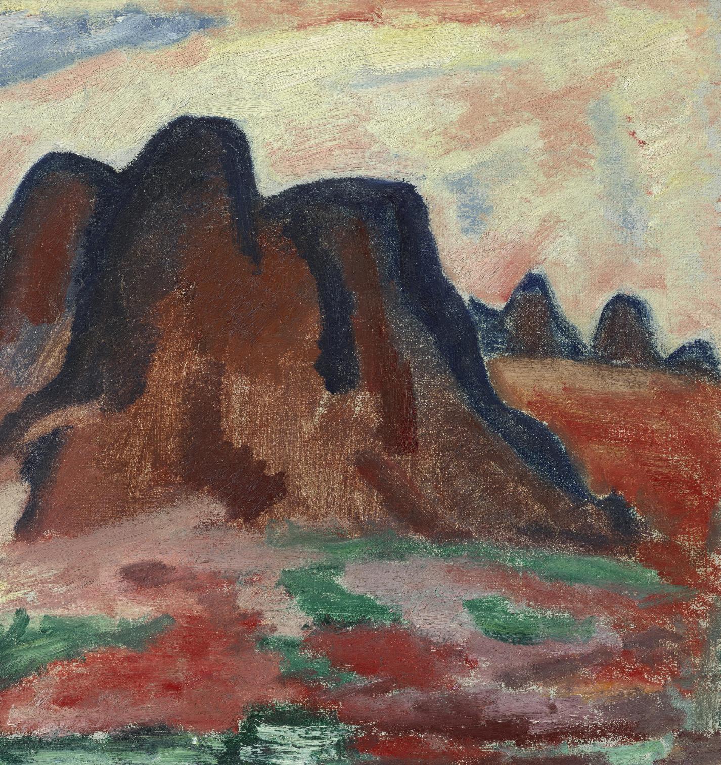
Detail of Georges Braque, La Ciotat, 1907. Collection of Robert F. and Patricia G. Ross Weis.
Exhibition catalogue for Georges Braque's exhibition at the Galerie Kahnweiler in Paris, November 1908.
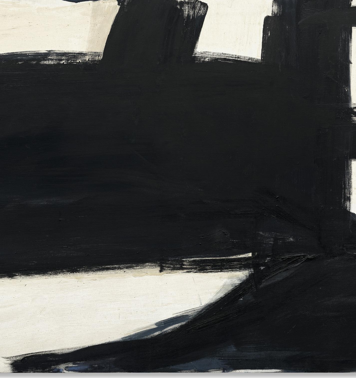
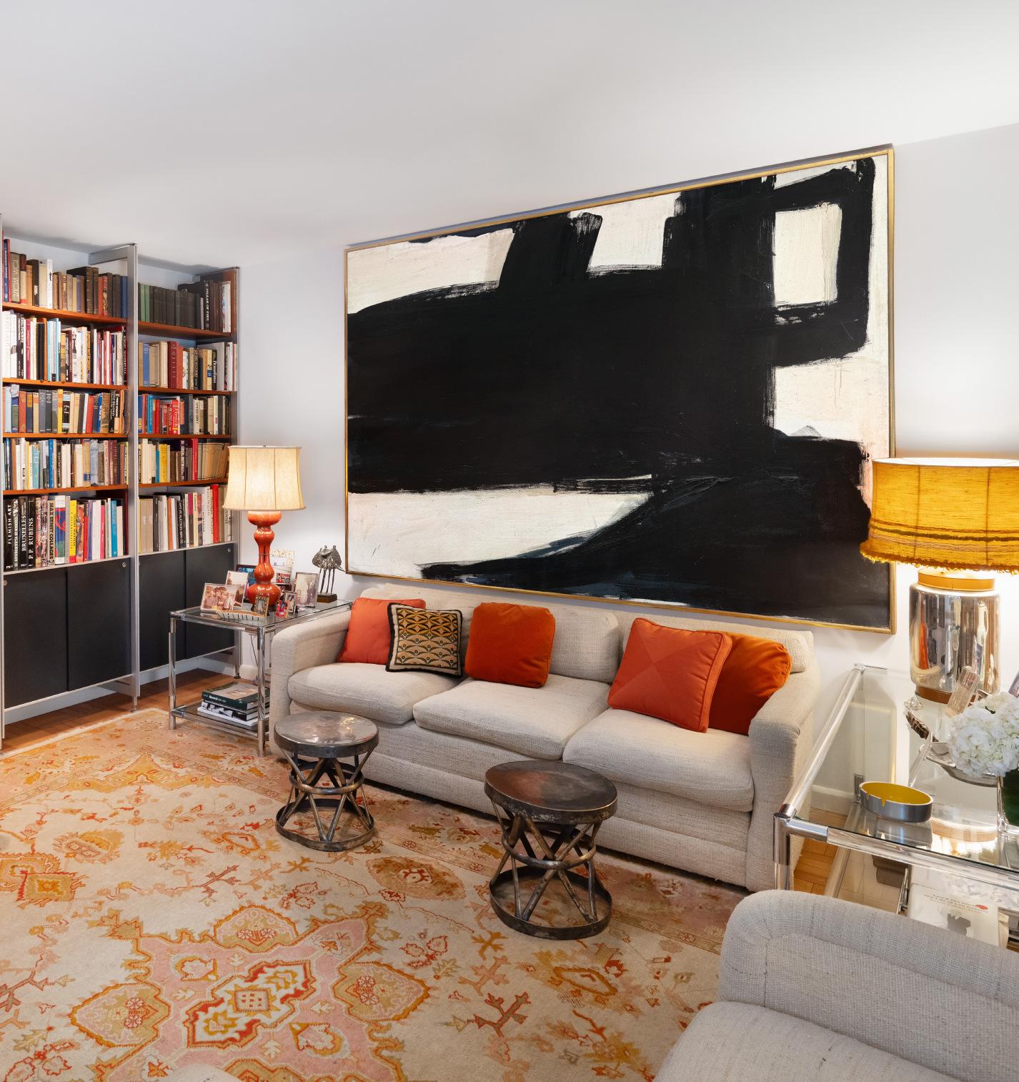
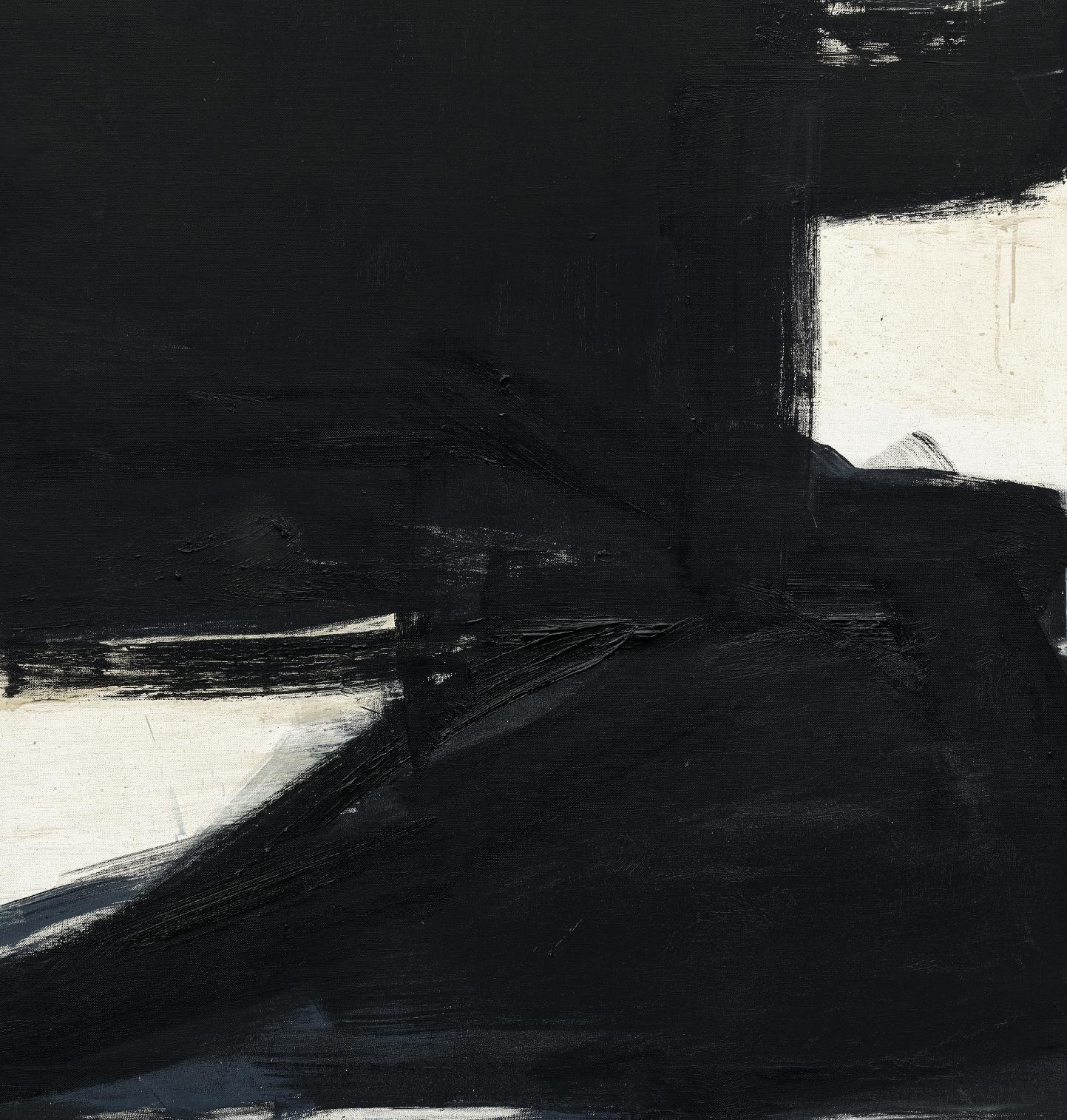
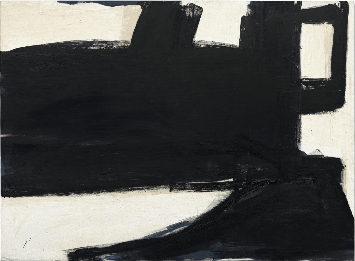
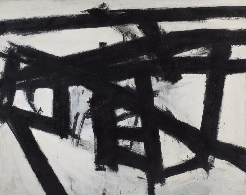
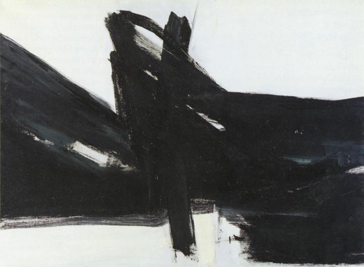
Apollinaire’s enthusiastic response to Braque’s work was one episode in a dialogue between poets and painters that stretched from the interactions between Baudelaire and Delacroix in mid-nineteenth century Paris to the friendship in mid-twentieth century New York of the poet Frank O’Hara and the painter Franz Kline, whose Placidia hung in the den of the Weis house. (When in 1960 Kline and O’Hara participated in a collaborative publication, 21 Etchings and Poems, O’Hara wrote of “the passion that enlightens/and stills and cultivates.”) What united painters and poets, no matter how different their media and methods, was the search for new sensations. The art of the twentieth century—and this includes everything in the Weis collection—can be understood as a series of variations on a theme first announced by Baudelaire in 1859, when he argued that the imagination was the essential human faculty. Baudelaire bitterly observed that whichever way he turned what he was hearing was: “Copy nature; just copy nature.” This, he believed, was a dead end for the artist. Creative spirits had to be loyal not to nature but to their “own nature.” Nature was a dictionary that artists used as they shaped their own sentences and paragraphs. “No one,” he wrote, “has ever thought of his dictionary as a composition, in the poetic sense of the word. Painters who are obedient to the imagination seek in their dictionary for the elements which suit their conception.” The world wasn’t to be reproduced but interpreted—regarded, so Baudelaire explained in the poem “Correspondences,” as a “forest of symbols,” to be arranged in accordance with a logic the artist’s own.
Imagination, Baudelaire wrote, is the “Queen of the Faculties.” Without an imagination no artist can determine the significance “of color, of contour, of sound” or forge the metaphors and analogies that are the essence of the arts. The imagination “decomposes all creation, and with the raw materials
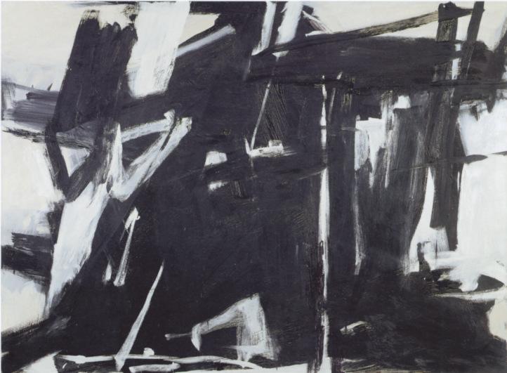
Detail of Franz Kline, Placidia, 1961. Collection of Robert F. and Patricia G. Ross Weis.
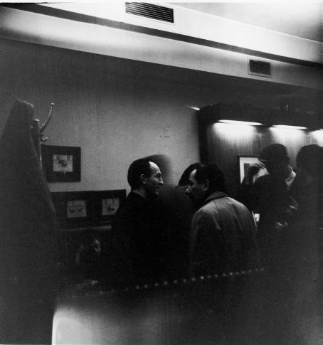
Frank O’Hara and Franz Kline at the Cedar Tavern, New York, 1959. Photo by Fred W. McDarrah/The New York Historical via Getty Images.
accumulated and disposed in accordance with rules whose origins one cannot find save in the furthest depths of the soul, it creates a new world.” The new—this clarion call—would be echoed throughout the twentieth century, with artists, many represented in the Weis collection, presenting new worlds and new realities, whether the surreal visions of Miró and Max Ernst or the distillations that obsessed Mondrian.
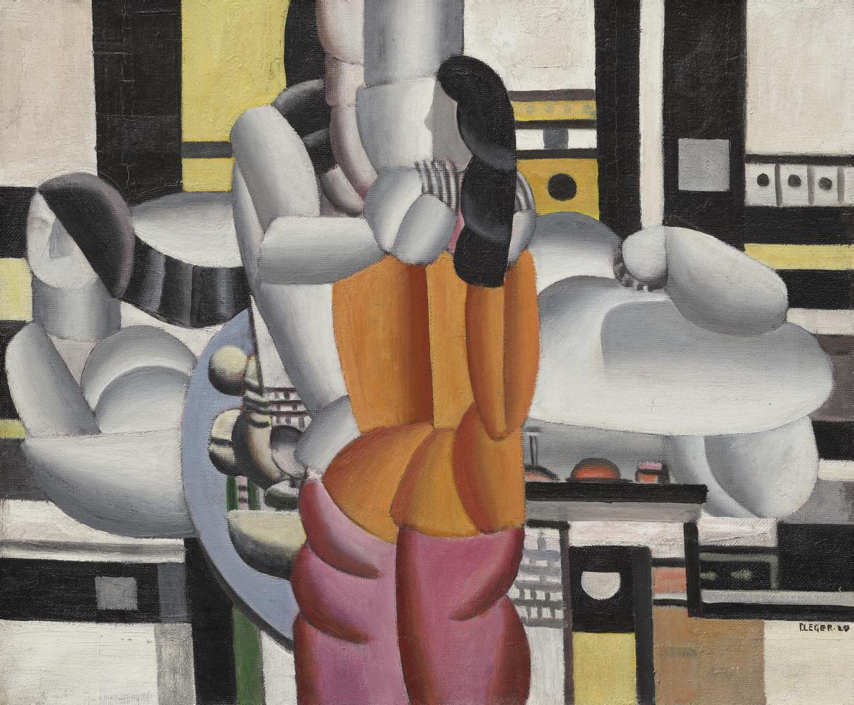
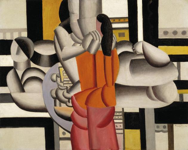
The history of modern art is often described as a series of isms—Fauvism, Cubism, Purism, Neoplasticism, Surrealism, Abstract Expressionism—one following the other like falling dominoes. The Weis collection includes significant examples of each of these movements, but the works are such independent achievements, so vividly and one might almost say implacably what they are, that the generalizations suggested by any ism are immediately dissolved in the particularity of a Picasso, a Matisse, a Miró, a Fernand Léger—or any other work in the collection. Léger’s Composition avec personnages (1920) is among a group of paintings of women in an interior—the most famous is probably Thraee Women (1921-22, The Museum of Modern Art, New York)—that are inevitably described in terms of machine age forms. It’s true that Léger gives arms, legs, torsos, and heads the sleek, steely volumes we associate with the engineering of industrial objects. But there’s also a tenderness about Léger’s silvery grays that makes of mechanization a kind of comedy, a modern romance. In Composition avec personnages, as in all the finest Légers, the platinum tonalities are the setting for surging colors, in this case yellow, orange, and magenta. Léger’s women, with their long, dark, flowing hair, are inscrutable presences. They share an intimacy that the painter infers but is too scrupulous to expose. Léger was a storyteller, but his stories, like those of many modern artists, involve hints, apprehensions, atmospheres, and archetypes, rather than what might conventionally be regarded as a plot.
Fernand Léger, Composition avec personnages, 1920. Collection of Robert F. and Patricia G. Ross Weis.
of ROBERT F. AND PATRICIA G. ROSS
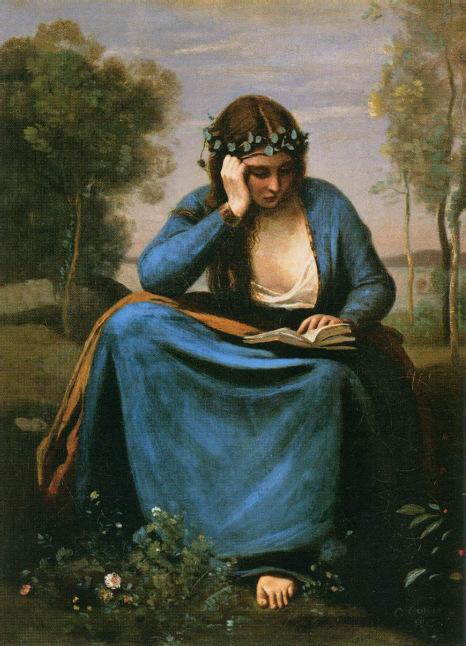
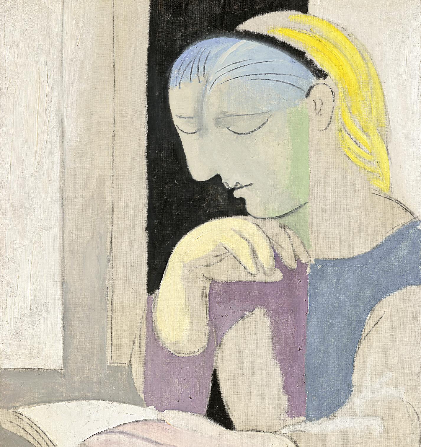
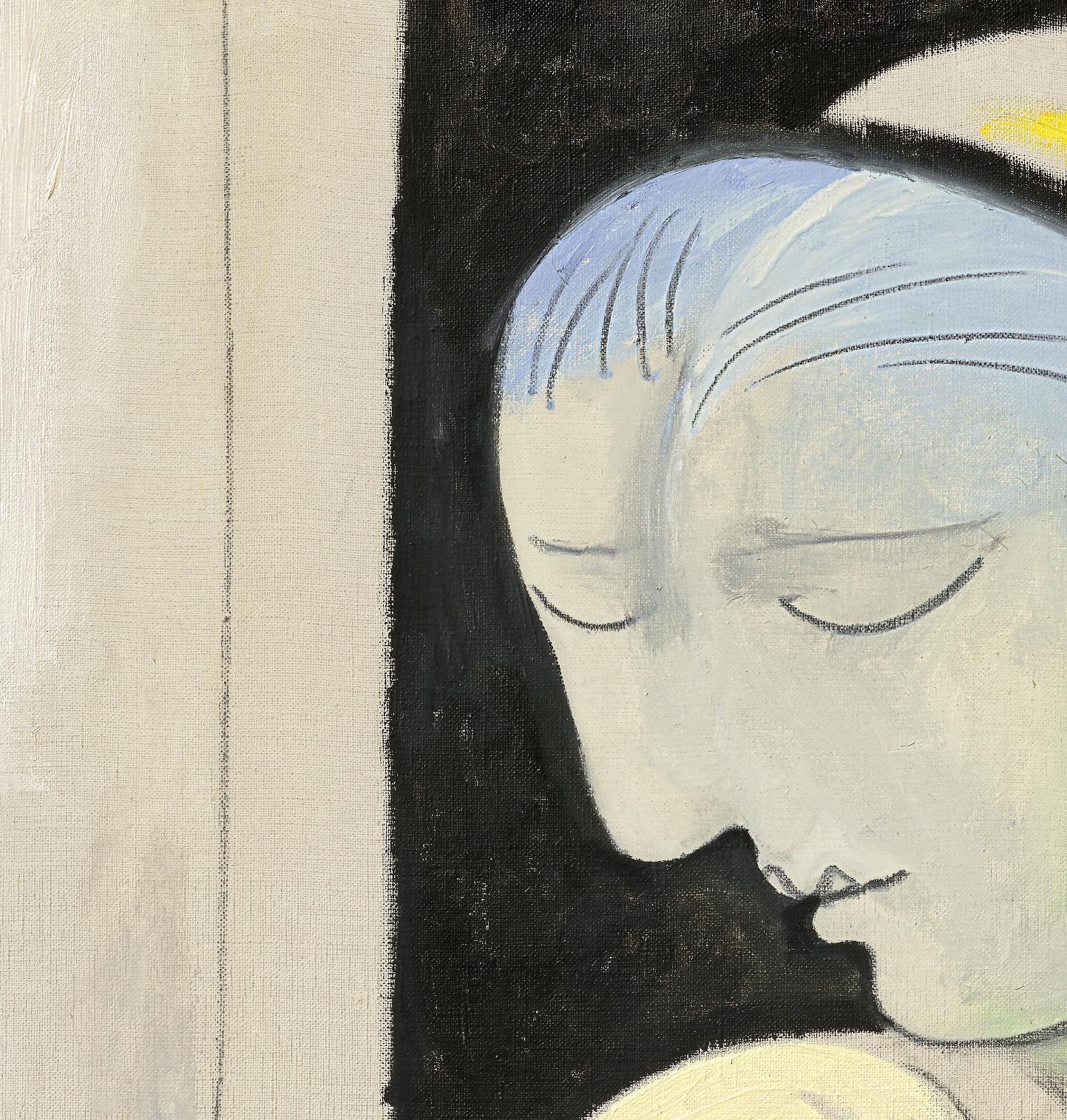
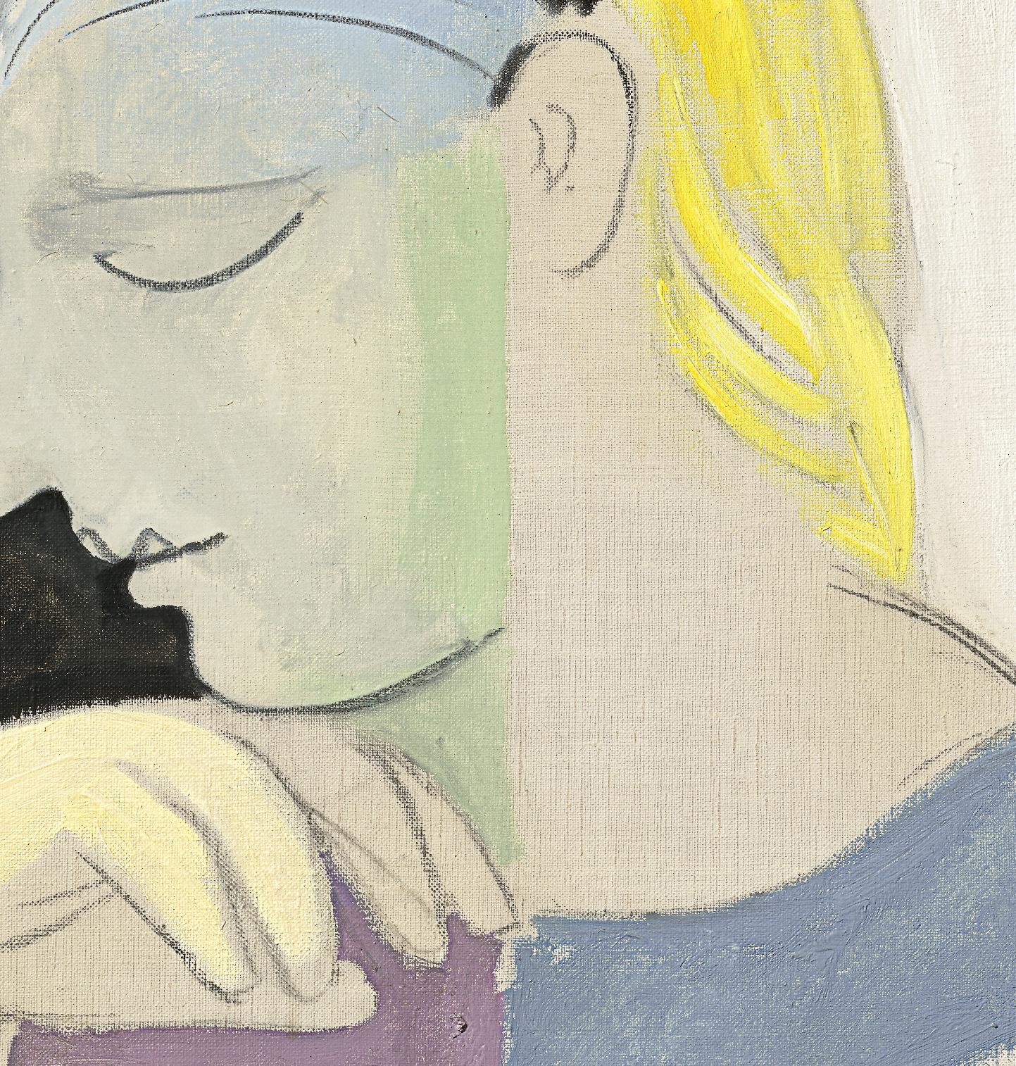
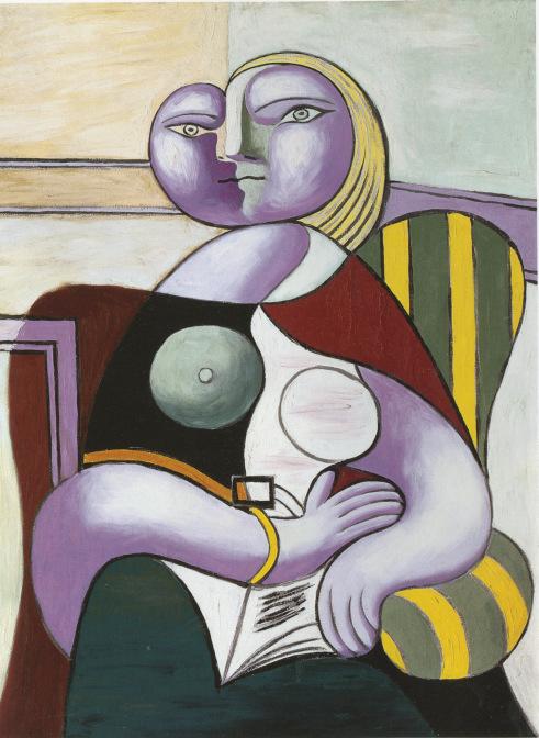
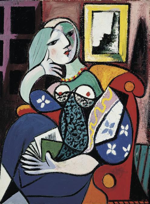
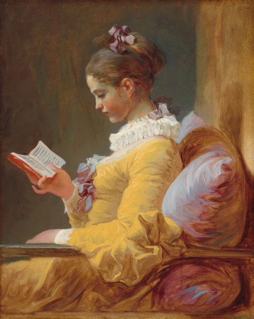
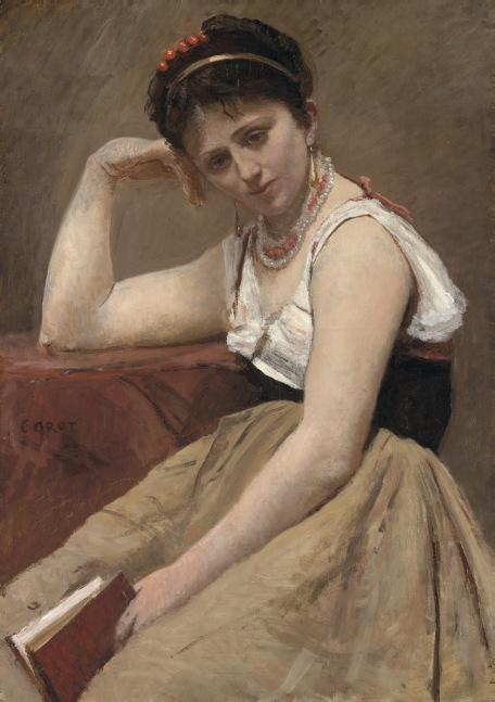
Perhaps no modern artist was more the master of this new kind of storytelling than Picasso. From the circus performers of his early canvases to the tangled gatherings of courtiers, courtesans, and clowns in the etchings of his final years, Picasso represented humanity in all its hectic richness, only rarely succumbing to cliché. One of his greatest early compositions, of a circus troupe in an ambiguous desert landscape, inspired Rilke’s fifth Duino Elegy, with its musings about these men and women who are “more fleeting than we ourselves.” The dreamer and the dream, essential elements in Picasso’s mythological world, are the subject of the Weises’ La Lecture (Marie-Thérèse). Here the young lover with whom Picasso was obsessed for some years in the 1930s is reading a book. To read is to dream, to exercise the imagination, the reader open to all impressions. Marie-Thérèse’s concentrated pose, together with the canvas’s strong but subdued palette, suggest that Picasso, who was as preoccupied with the history of art as any artist who ever lived, was thinking of the paintings of Corot, whose work he admired and collected. When Corot painted a woman reading or playing an instrument or contemplating a painting in the artist’s studio he was reimagining the ancient idea of the muse, but a freer, more casual, contemporary muse, less goddess than alter ego or doppelgänger. Aren’t all creative spirits dreamers?
La Lecture is winningly open-ended, the charcoal lines that describe Marie-Thérèse’s arms, head, and torso a provisional structure for all to see, the areas of delicious color applied lightly and easily. A singular black sets off Marie-Thérèse’s sensuous nose and lips, which were reminiscent, so Picasso believed, of the polished marble profiles that ancient Greek and Roman sculptors gave to Aphrodite and other goddesses. Like many of the carefully selected works in the Weis collection, La Lecture was produced during a critical time in the life of the artist, in this case the early 1930s, when Picasso embarked on a series of sculptural experiments in a studio in the Château de Boisgeloup, near the Norman town of Gisors. La Lecture is inscribed
Detail of Pablo Picasso, La Lecture (Marie-Thérèse), 1932. Collection of Robert F. and Patricia G. Ross Weis.
Jean-Baptiste-Camille Corot, The Reader Wreathed with Flowers (Virgil's Muse),1845. Musée du Louvre, Paris
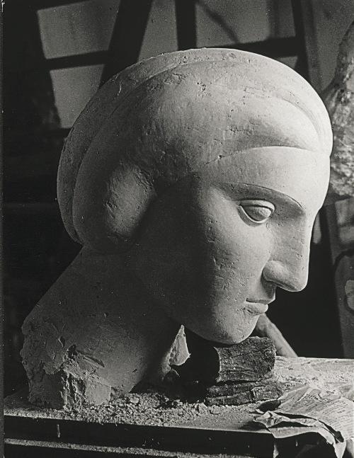
“Boisgeloup 31 Août XXXII.” Picasso at Boisgeloup, obsessed with MarieThérèse’s distinctive physiognomy, was reimagining the adamantine values of Greco-Roman sculpture, the old classical beauty now exaggerated, the result an almost brutal beauty. With La Lecture, Picasso—who was fascinated by the relationship between sculptural and pictorial values—sets the startling silhouette of Marie-Thérèse’s bent head against the black background in such a way that it rhymes with the bold chiaroscuro of Picasso’s Boisgeloup sculptures as they appear in the photographs his friend Brassaï made in the studio where they’d been created.
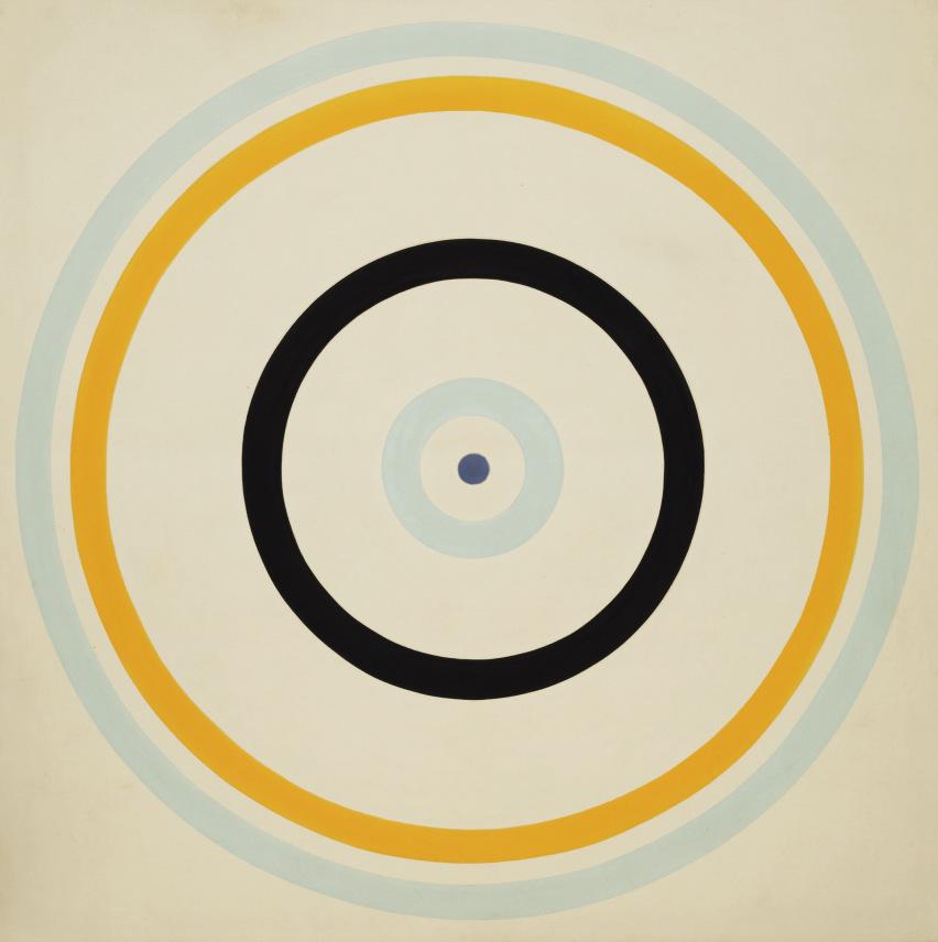
In Paris, where artists from all over Europe and even farther afield gathered in the early decades of the twentieth century, there was sometimes an element of Gallic skepticism that led painters to reject, or at least sidestep, theory in favor of instinct and intuition. Braque, Picasso, and Matisse, although they made enduring observations about their work, were inclined to leave the operations of the Baudelairean imagination an enigma—an inviolate sacred space. As Braque put it in some remarks published late in his life, painting was “like reading tea leaves,” a risky process. In the end, “the idea had to be extinguished.” But other artists were determined to make sense, at times an almost scientific sense, of the new sensibility. My guess is there were those who believed, even if they didn’t actually come out and say it, that Picasso was dissembling when he said that he didn’t seek but simply found, as if responding to nature didn’t have its analytical aspects. For Paul Klee, Wassily Kandinsky, and Mondrian, each represented in the Weis collection, the building blocks of the world as we know it—light, color, dimension, gravity, geometry—were the stuff of studio practice but also of theory and polemic.
The texts published by these artists—Kandinsky’s Concerning the Spiritual in Art, Klee’s “Creative Credo,” and Mondrian’s “Plastic Art and Pure Plastic Art,” among many others—had an impact not only on their contemporaries in Europe but on a somewhat younger generation of New Yorkers, who, whether or not they actually read what the artists had written (many of them did), were influenced by manifestoes, polemics, and treatises that amounted to an owner’s manual for the new art. This revolution in the arts wasn’t limited to painting and sculpture; it involved reimagining all of the visual world.
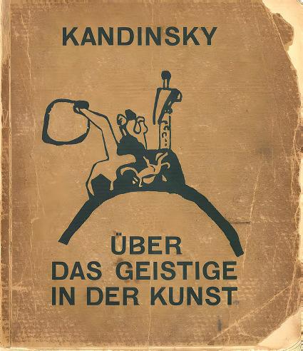
Cover of Wassily Kandinsky's Uber das Geistige in der Kunst (Concerning the Spiritual in Art), 1912.
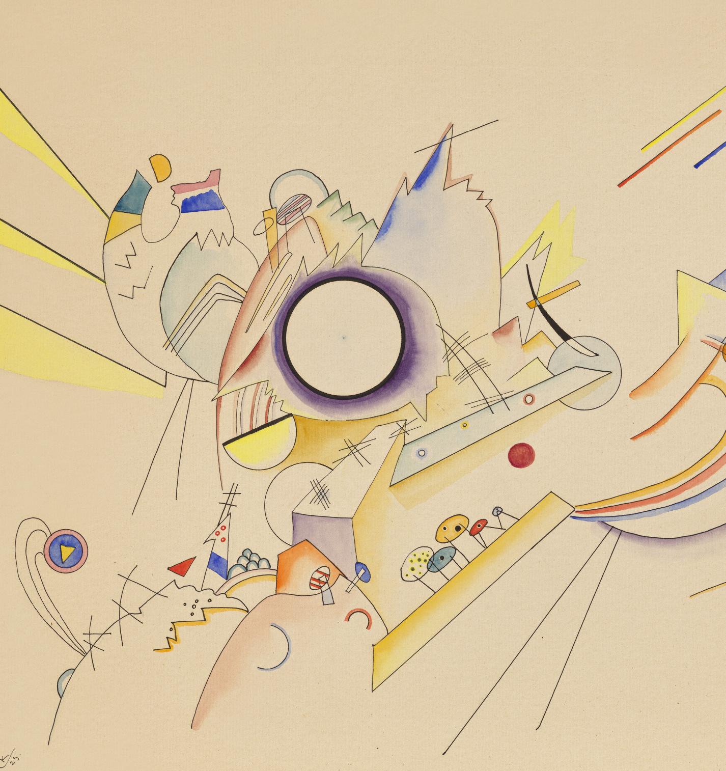
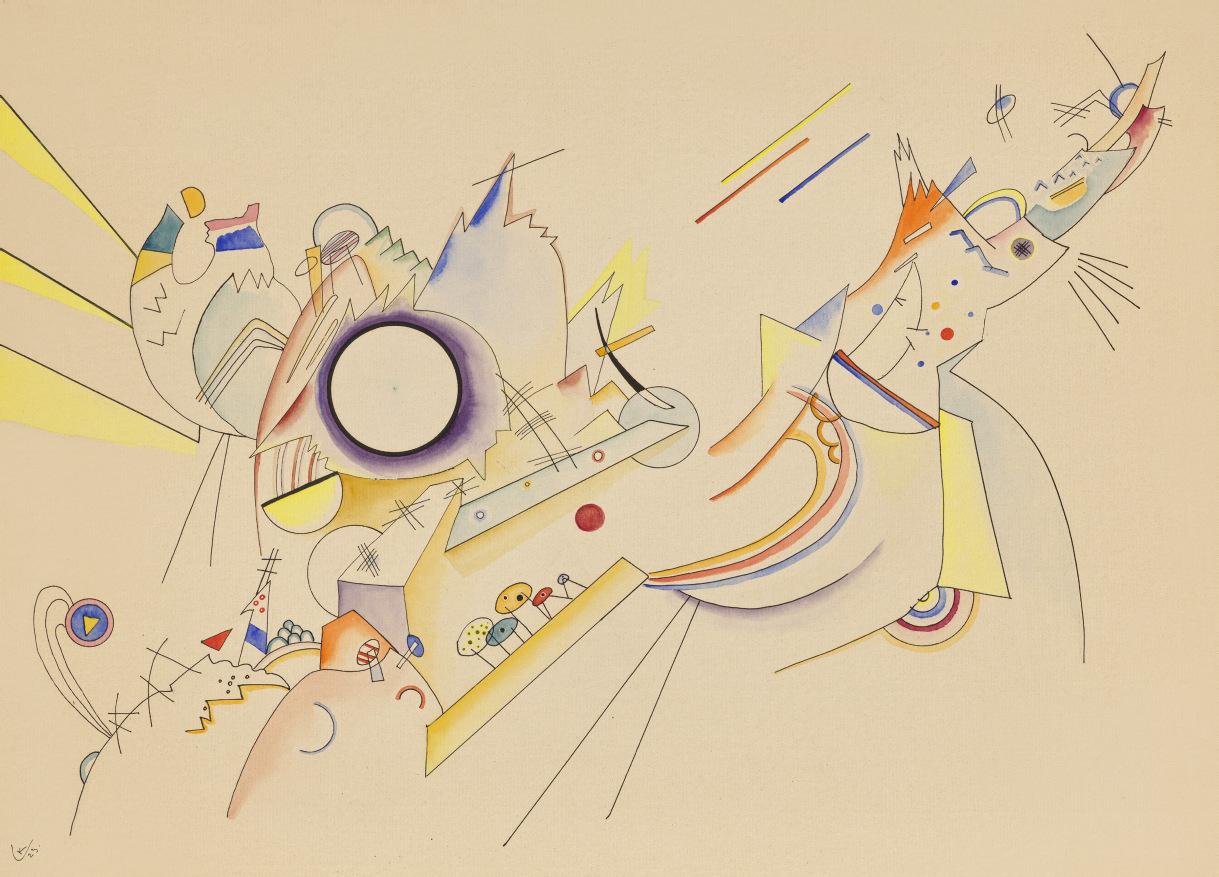
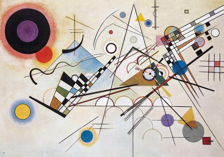
Detail of Wassily Kandinsky, Ohne Titel, 1923. Collection of Robert F. and Patricia G. Ross Weis.
At the Bauhaus, where Klee and Kandinsky taught, painting and sculpture were part of a visionary educational program that embraced textiles, ceramics, metalwork, architecture, and more. Mondrian believed that his pictorial discoveries might ultimately transform the way people lived in their homes and cities.
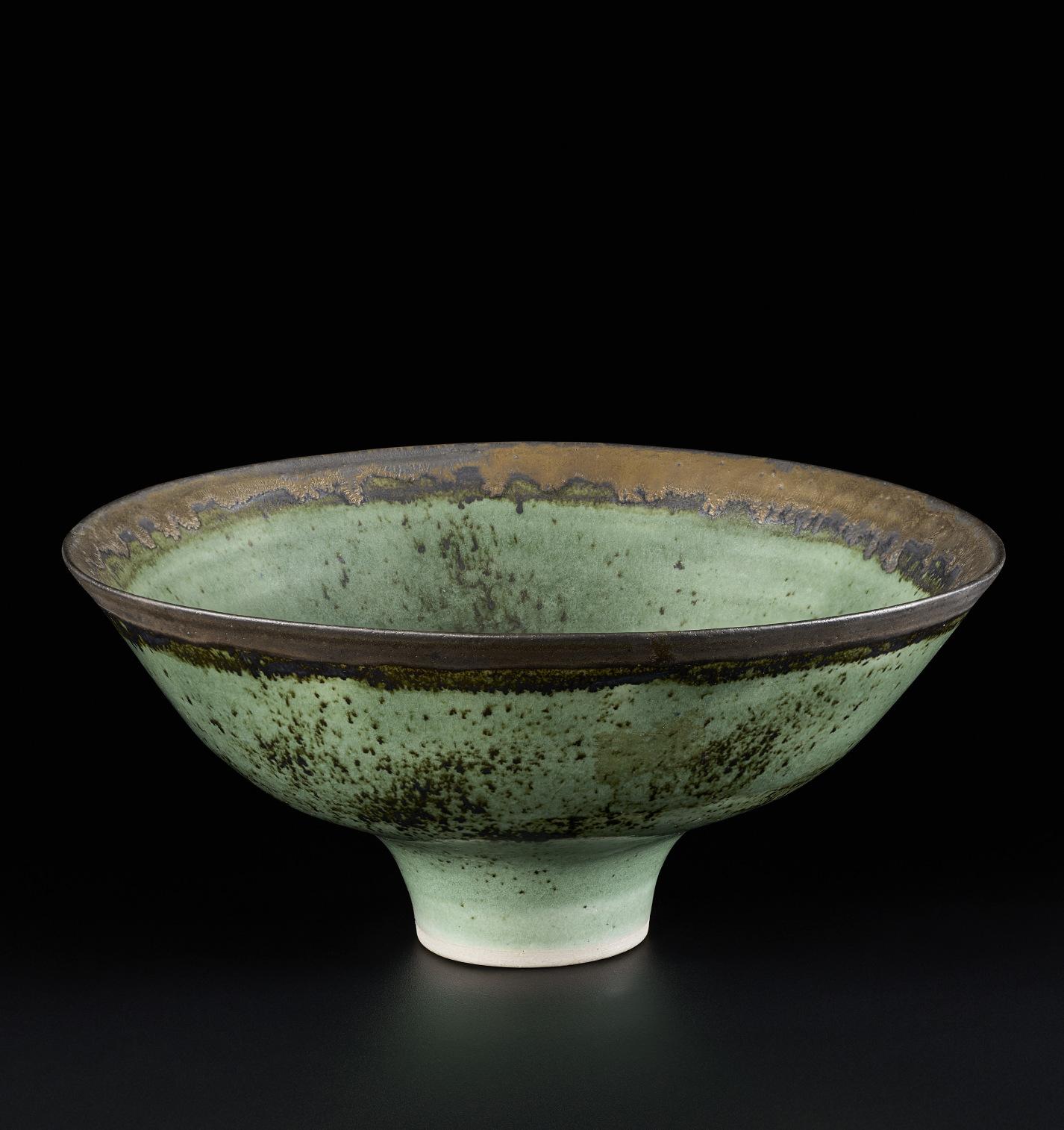
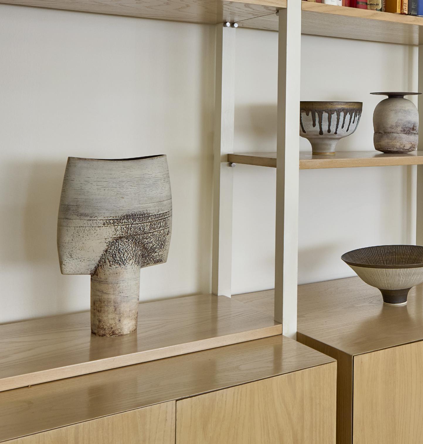
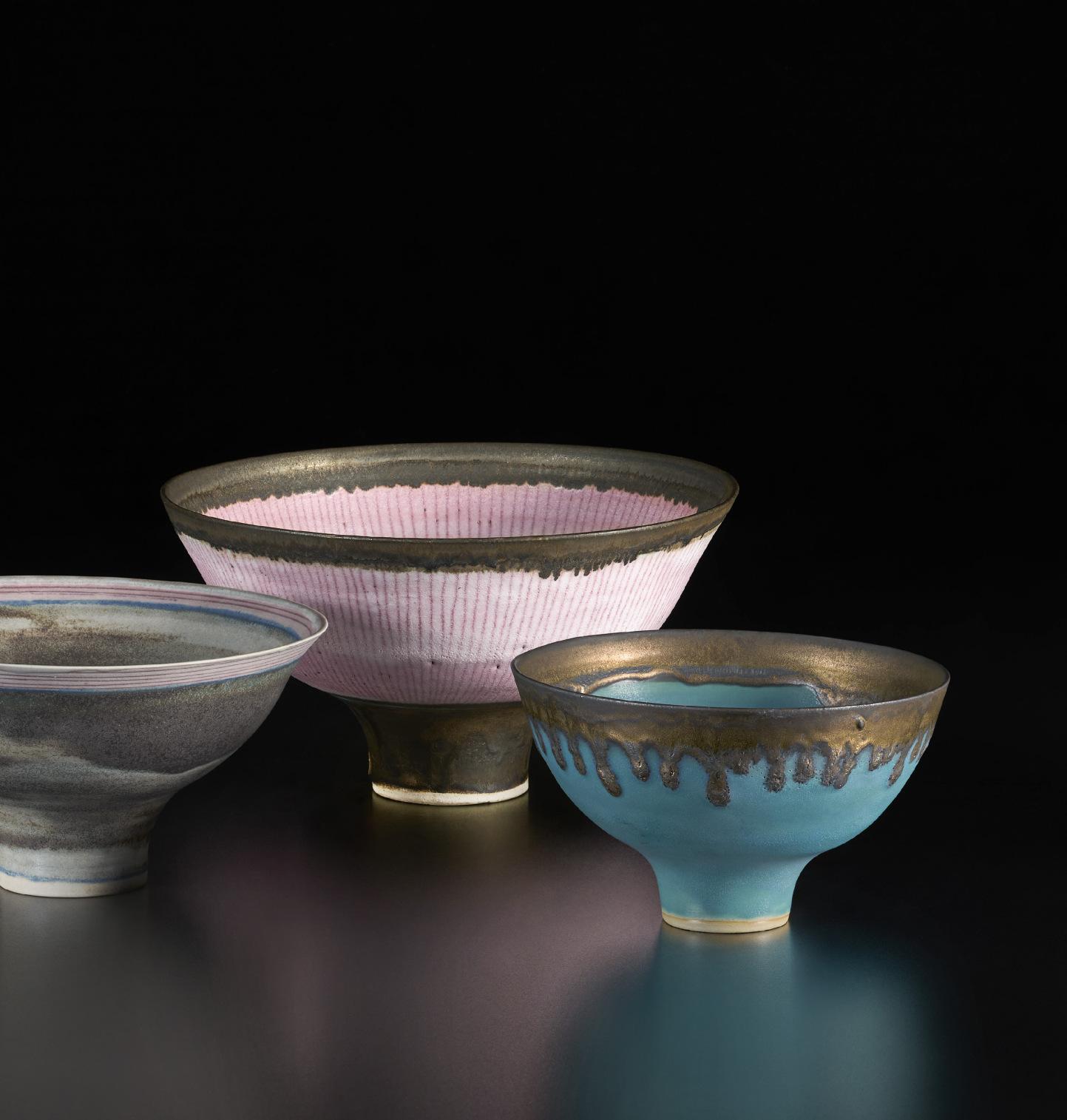
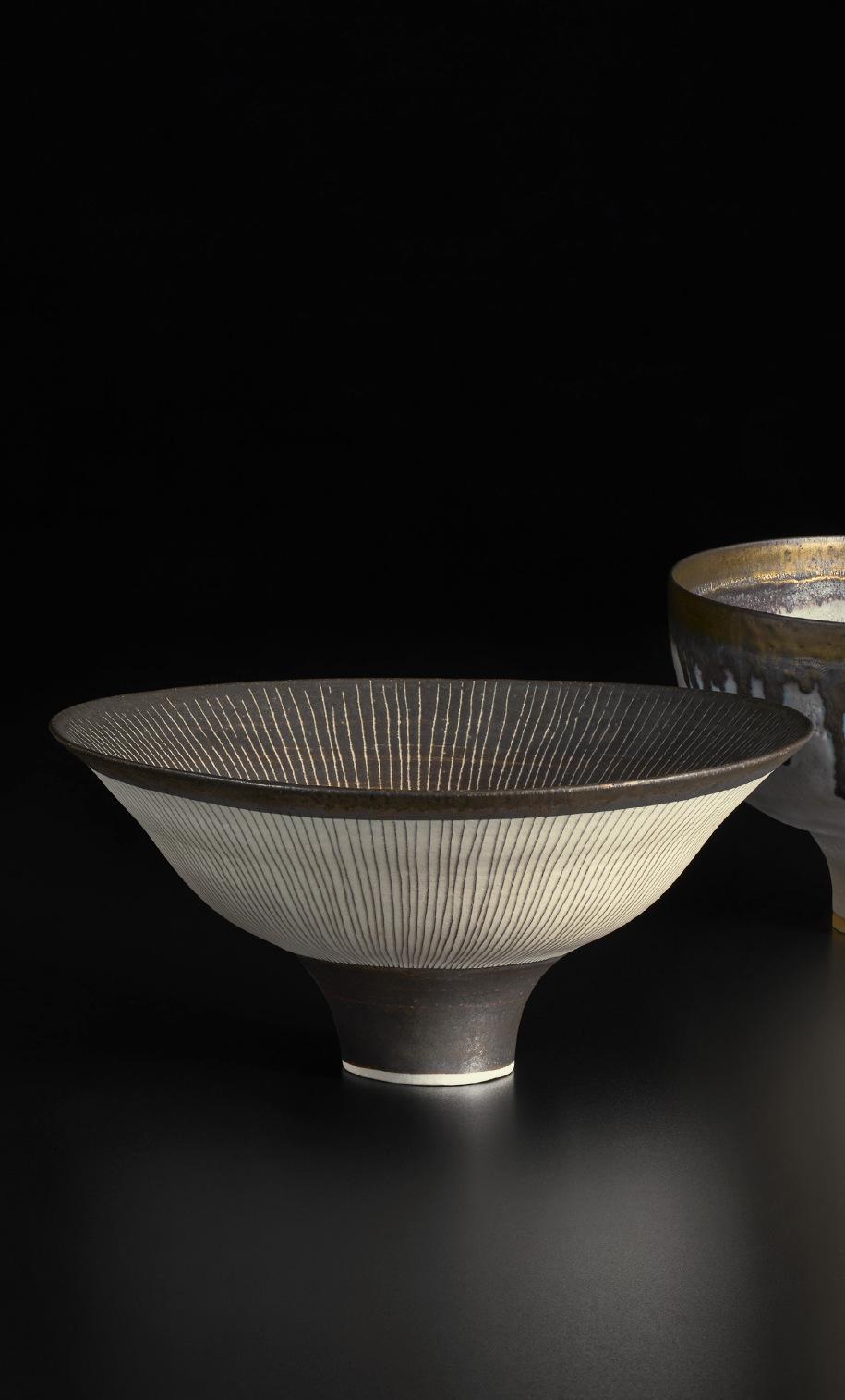
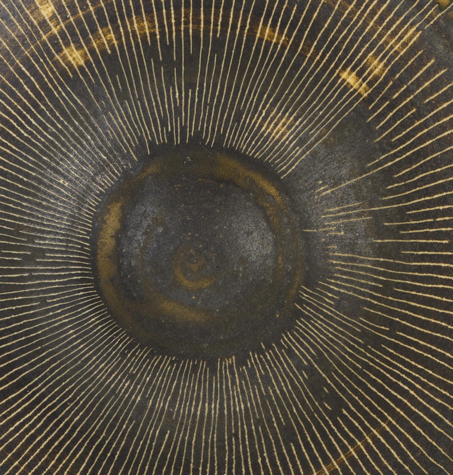
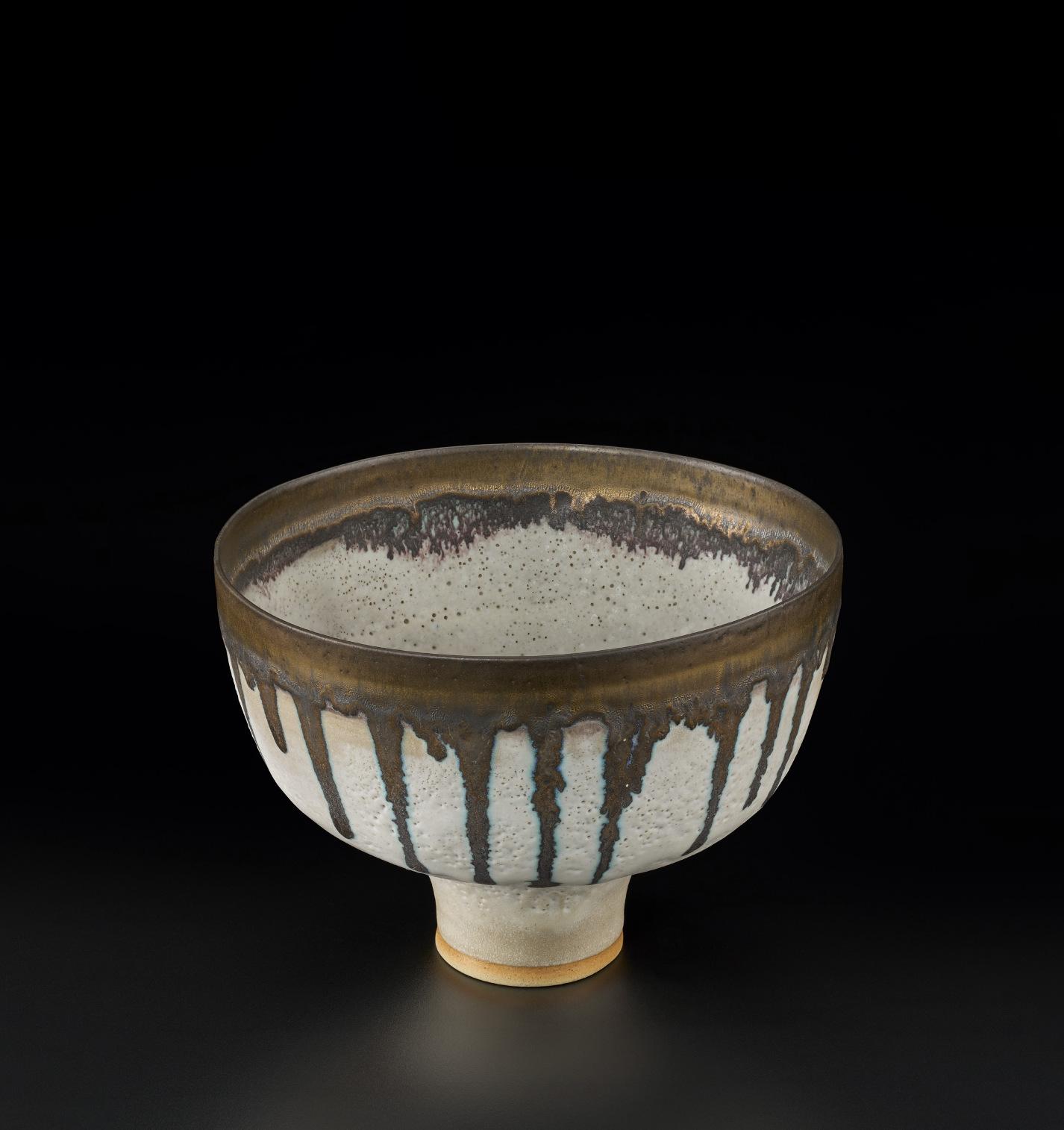
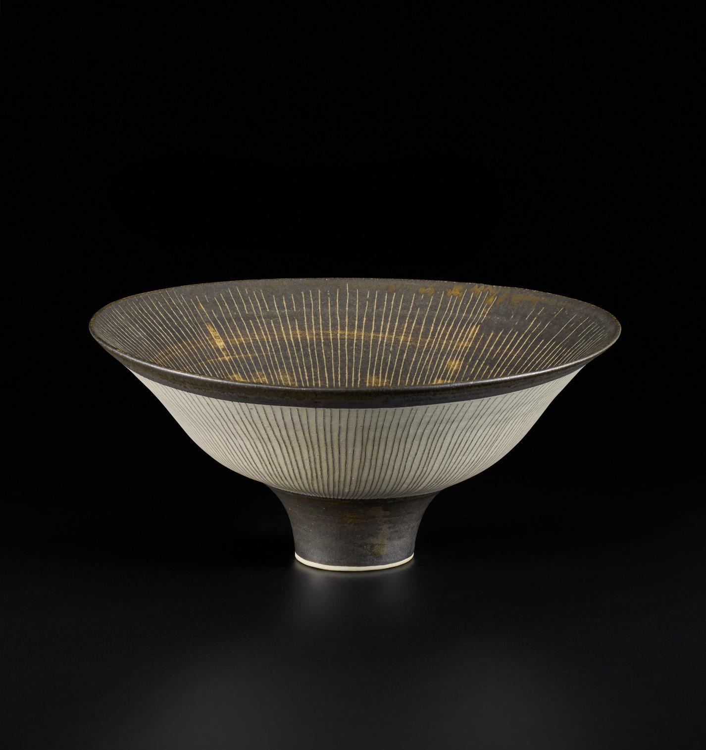
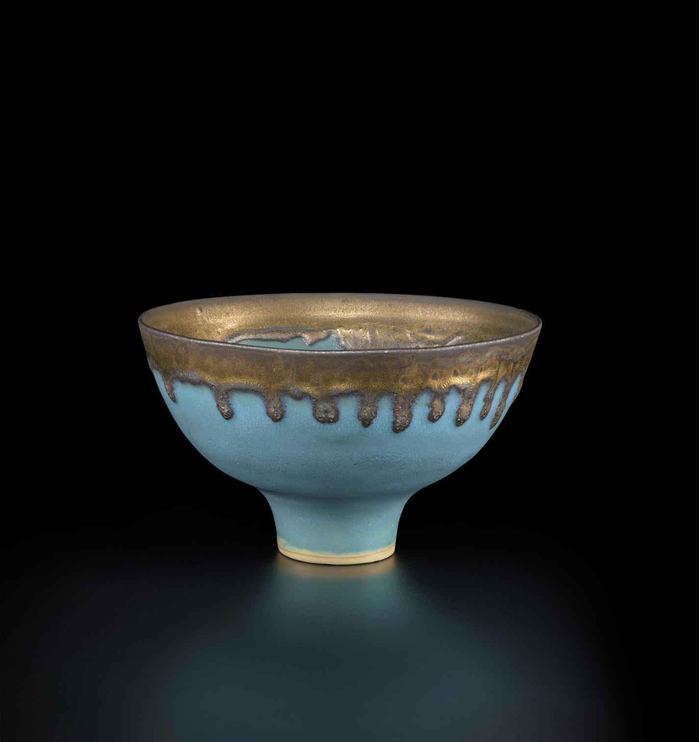
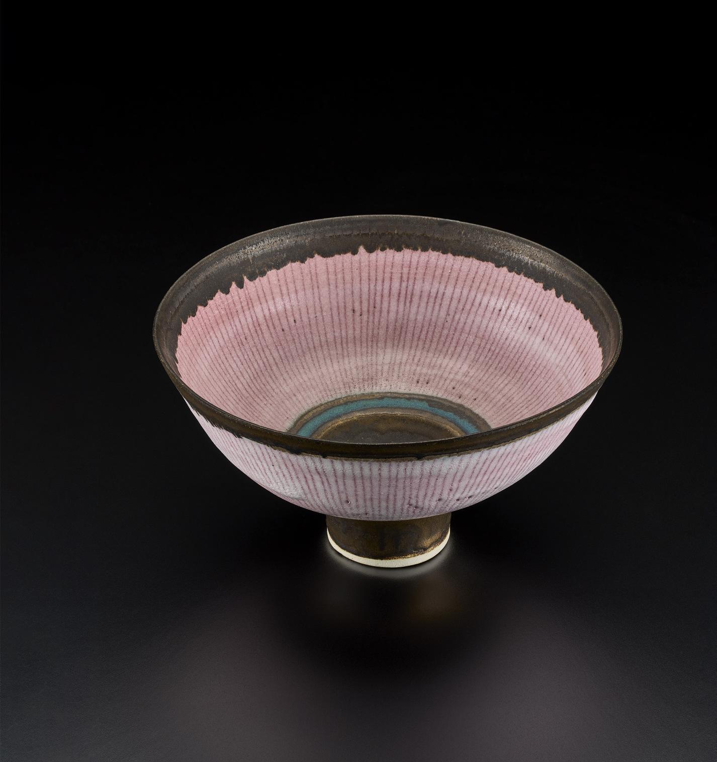
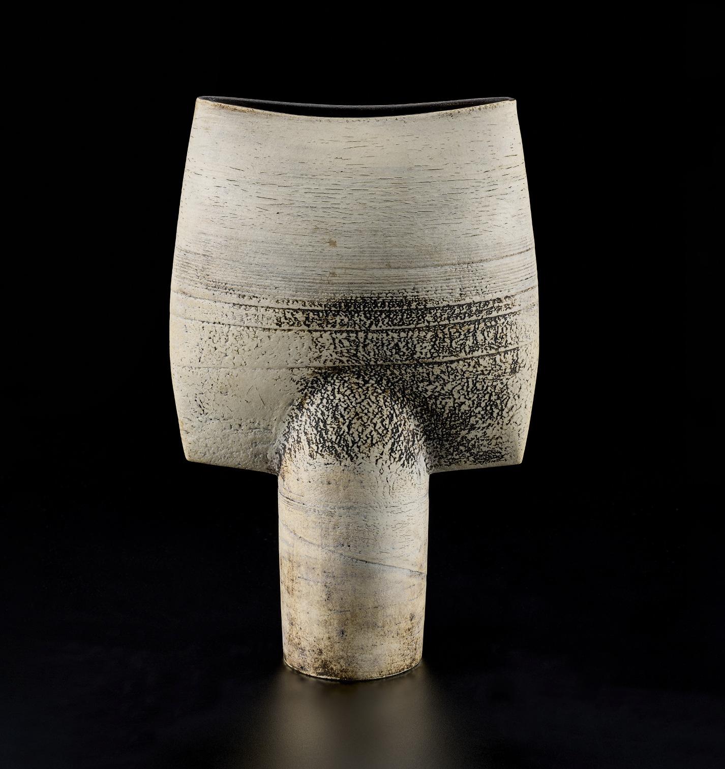
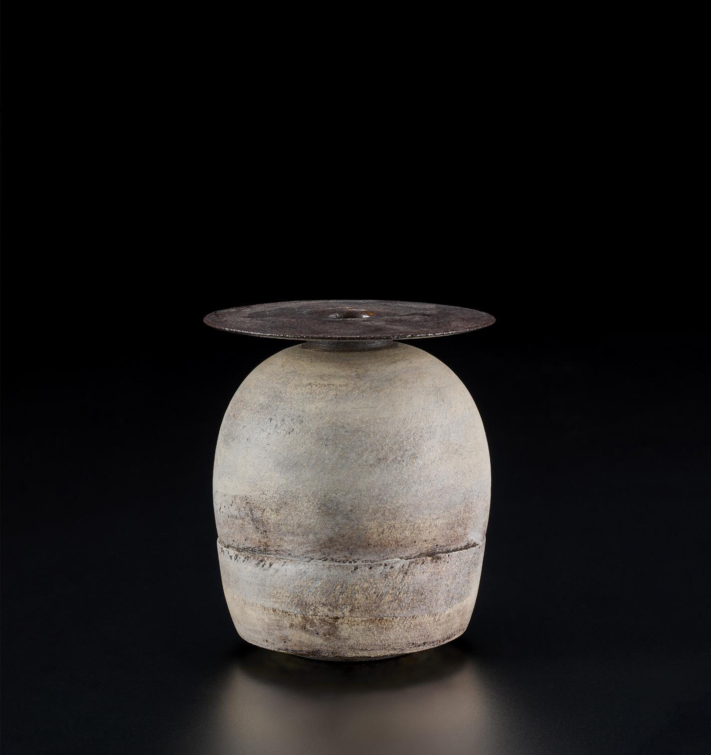
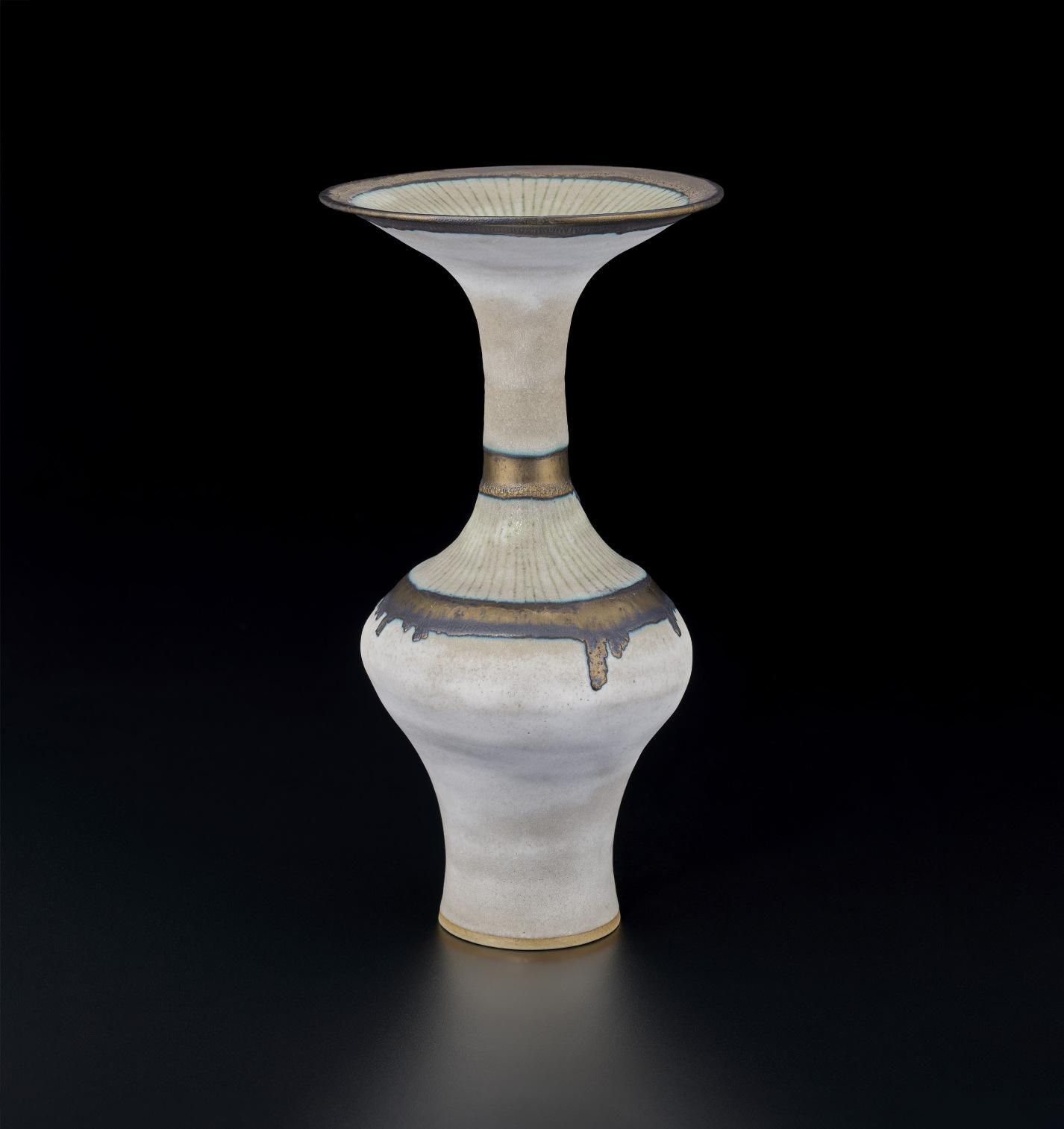
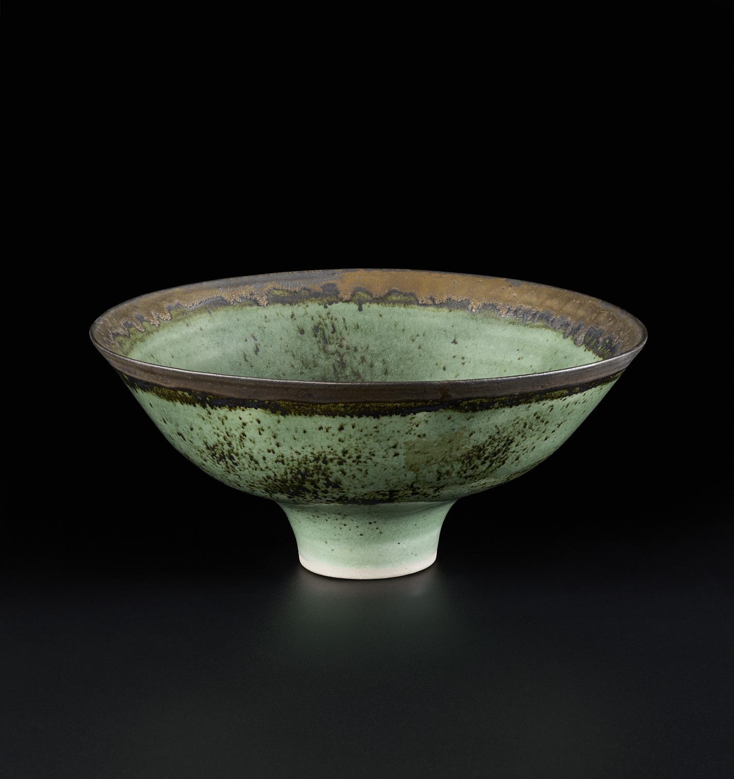
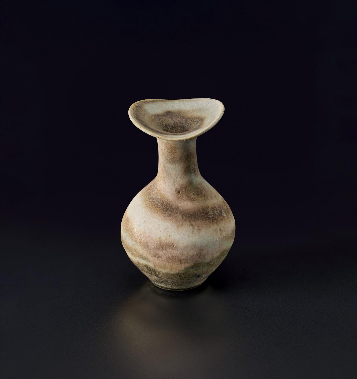
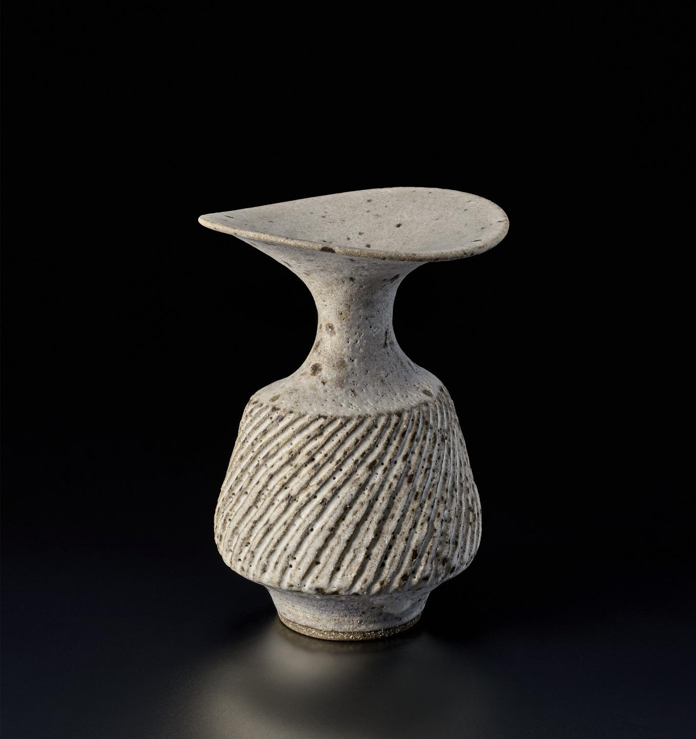
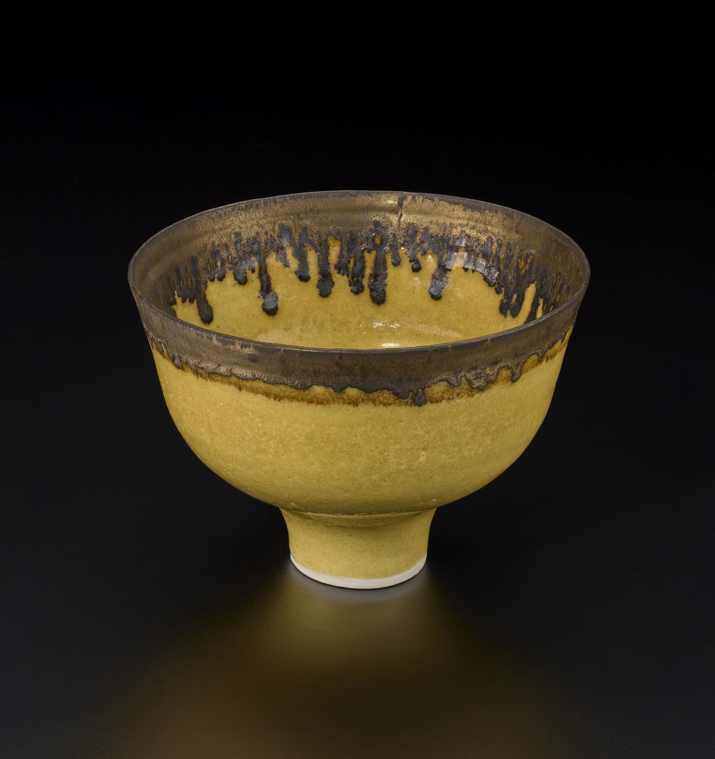
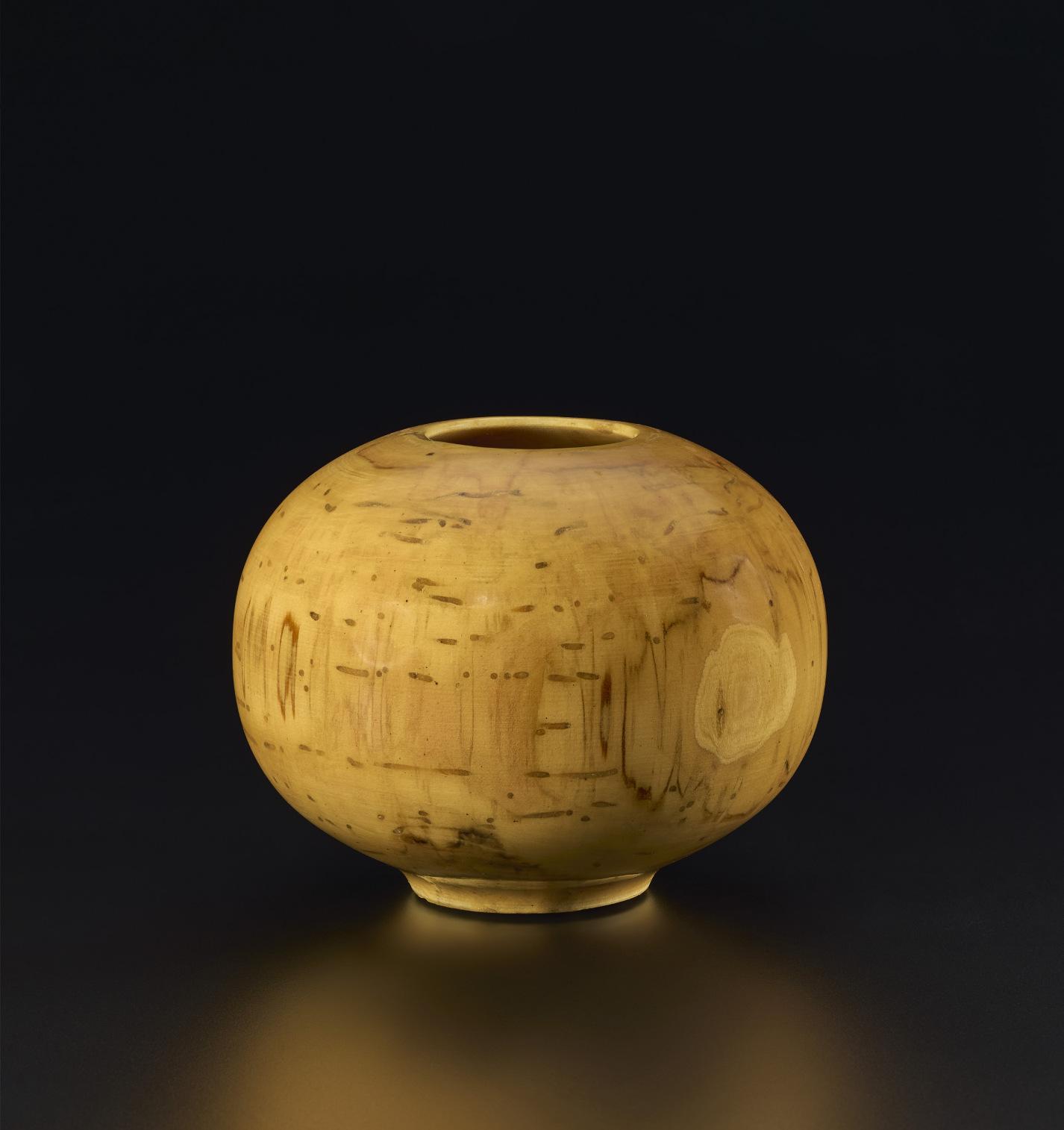
The Weises, by no means indifferent to the expansive nature of the modern adventure, collected ceramics by Lucie Rie and Hans Coper. These two British potters—their work was of particular interest to Patricia Weis—brought an experimental freedom to the shaping and glazing of bowls and bottles. The modern rejection of reality—or at least of some generally agreed upon definition of reality—forced artists to become improvisors, and that could be as true for a potter as a painter. When Coper mixed stoneware with porcelain in one of his bottles or Rie worked different colors and textures in a single bowl, they were simultaneously making something and meditating on the process of making, pottery now less a utilitarian enterprise than a philosophic engagement.
Many of the makers and shapers of modern art were in some sense artist-philosophers. That’s certainly true of Kandinsky and Klee. Their watercolors in the Weis collection, made not long after the end of World War I, while authoritative in and of themselves, also function as guideposts to worlds not yet fully explored. “The possible,” Baudelaire wrote in 1859, “is one of the provinces of truth. It has a positive relationship with the infinite.” The infinite was among Kandinsky’s abiding subjects, certainly in the Weises' watercolor Ohne Titel. The signs and symbols that Kandinsky and Klee incorporated in their work had meanings and implications more open than those of earlier centuries, the old pagan cosmology or Christian theology replaced by what might be thought of as a more democratic approach. As Kandinsky wrote in Concerning the Spiritual in Art, “colors and forms are well-nigh innumerable, their combination and their influence… likewise unending.”
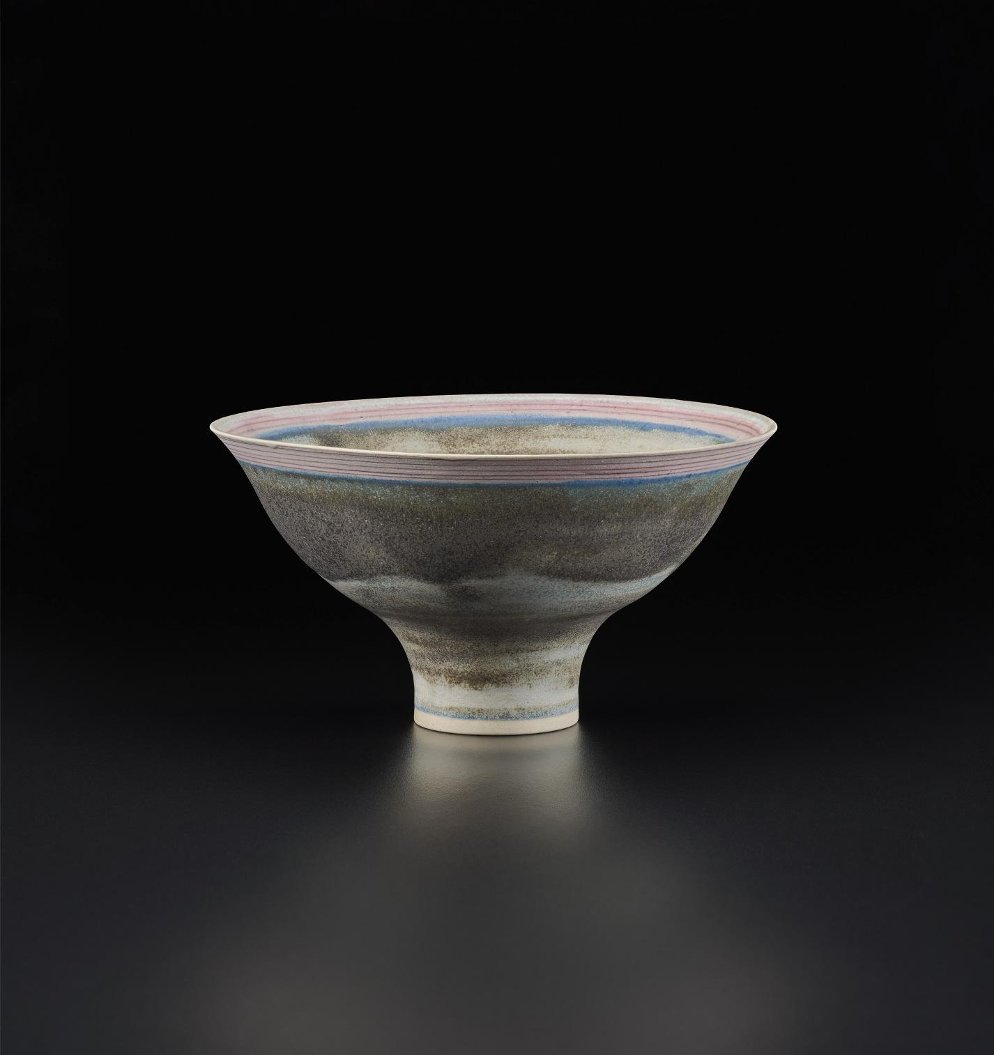
Lucie Rie, Footed Bowl, circa 1982. Collection of Robert F. and Patricia G. Ross Weis.
Kandinsky’s watercolor is a study for a cosmology, excitable in its crescendos of circling, angled, crenellated forms and colors. Around a small central circle a world comes into being. Perspectives unfold. Curious plant life erupts. Growth is rapid and joyous, but also perhaps delicate and perilous. What emerges might as easily vanish, or so it seems. The outcome is unknown.
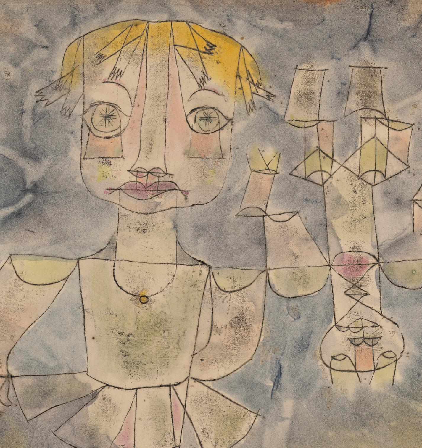
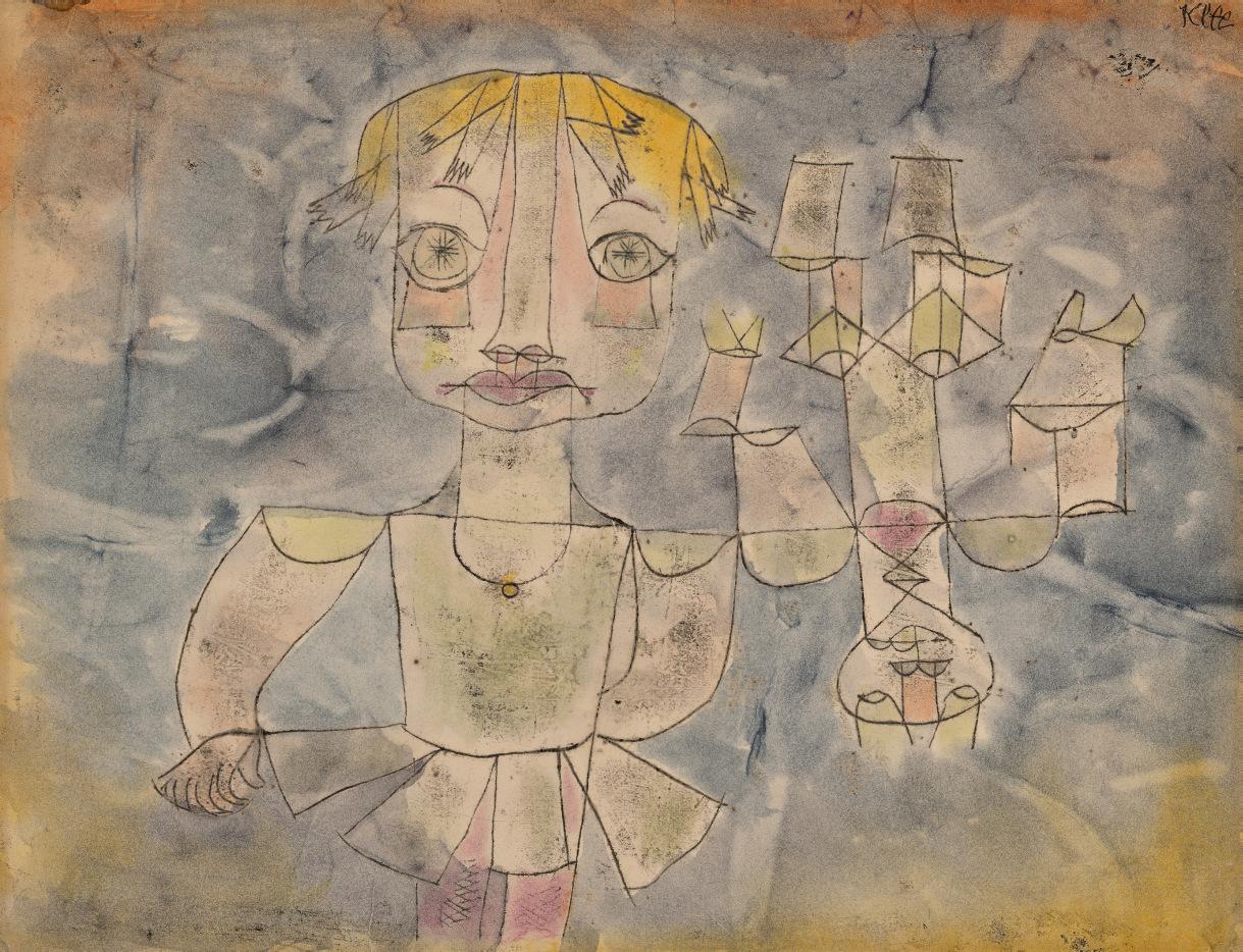
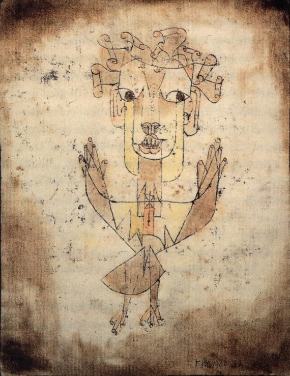
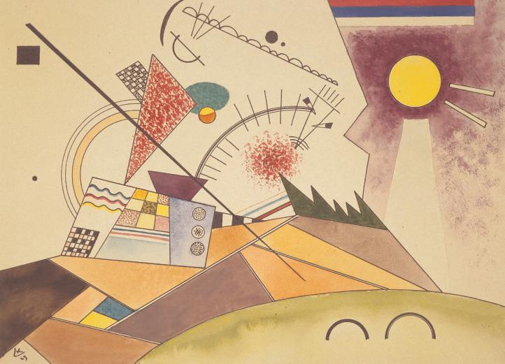
Klee’s Knabenbildnis also raises as many questions as it answers, the boy’s enormous starry eyes beseeching and baffling, the upside-down figure that accompanies the protagonist and is made of the same stuff (lines, angles, semicircles), most likely a younger self or a toy. Both figures are puppet-like, skeletal structures, translucent if not transparent. But all the young figure’s senses are alive. We know this because of the emphasis Klee places on the boy’s eyes, nose, lips, and fingers, the instruments of sight, smell, taste, and touch. The boy is a burgeoning imagination, leaving behind or throwing over (literally, over his shoulder) some earlier, smaller self. Or perhaps that’s not the story Klee means to tell. There’s no single key to unlock one of Klee’s works. Instead we’re offered openness, albeit closely structured, an invitation to the curious to explore.
Klee’s tender watercolor strokes—blues, pinks, and yellows—suggest an imagination inexhaustible but not necessarily impervious, the old romantic optimism now troubled. The same year that he painted Knabenbildnis, Klee made Angelus Novus, which was once owned by the writer Walter Benjamin. The figures in the two works have similar eyes, nose, and mouth, a family resemblance. In Angelus Novus, which Benjamin discussed in a famous essay on the philosophy of history, the writer saw a figure with eyes “turned toward the past,” confronting catastrophe, what Benjamin referred to as “wreckage upon wreckage.” Although it would be too much to say that we know what Klee’s boy is staring at, there’s nothing easy or complacent about his gaze. Klee’s vision of childhood is beguiling and bewildering, like childhood itself.
Modern artists are witnesses to history, their testimony shaped by their own, private histories. Franz Kline, Arshile Gorky, David Smith, and Mark Rothko, all represented in the Weis collection, each had his own way of responding to the new European art that had been appearing in the United States even before the Armory Show of 1913. Braque, Picasso, Klee, and Kandinsky never set foot
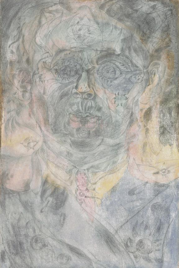
Detail of Paul Klee, Knabenbildnis, 1920. Collection of Robert F. and Patricia G. Ross Weis.
in the United States, but through their writings and exhibitions of their work in galleries and museums—especially in The Museum of Modern Art, which had already mounted major retrospectives of Picasso and Matisse in the 1930s—their achievements became well known. If you look into the history of certain treasures in the Weis collection, you can see the pivotal role that a number of dealers played in this transatlantic dissemination of ideas, particularly Pierre Matisse, a son of the artist, whose New York gallery handled at one time or another two of the three Mirós in the Weis collection, as well as Matisse’s Figure et bouquet (Tête ocre). Both Miró and Matisse made brief visits to the United States, but two other artists in the collection, Ernst and Mondrian, made their homes in New York in the 1940s, and both were among the artists in what has become a legendary exhibition, Artists in Exile, mounted at the Pierre Matisse Gallery in 1942.
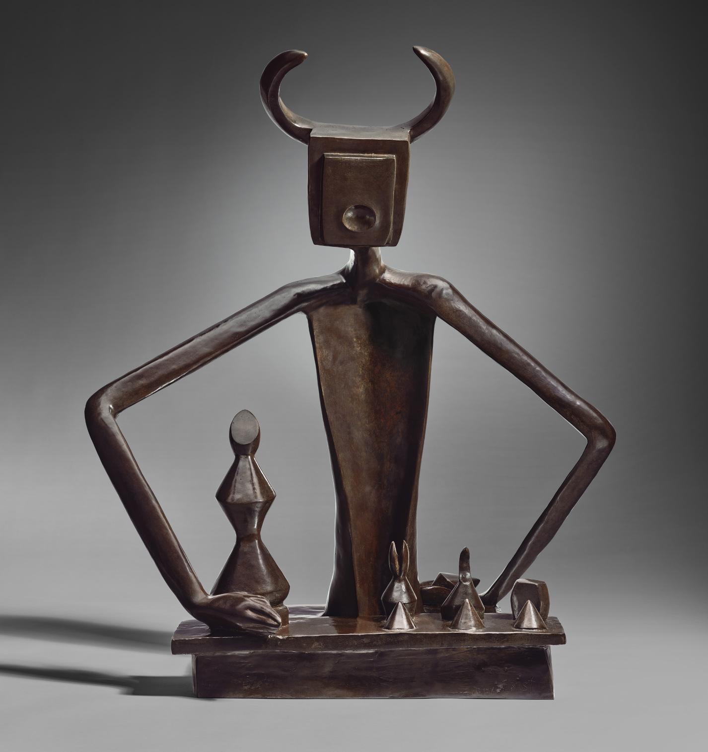
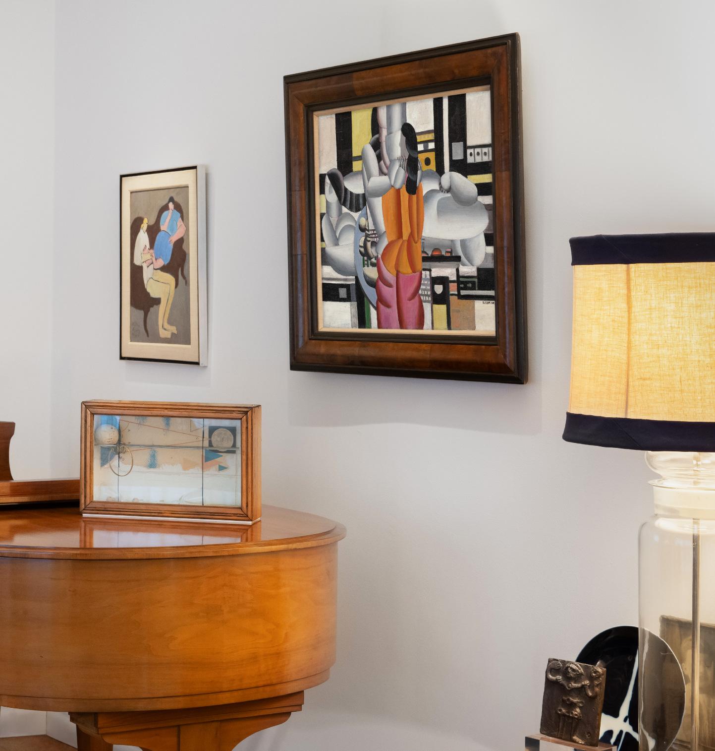
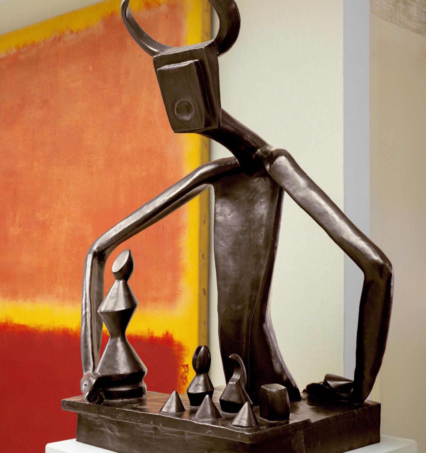
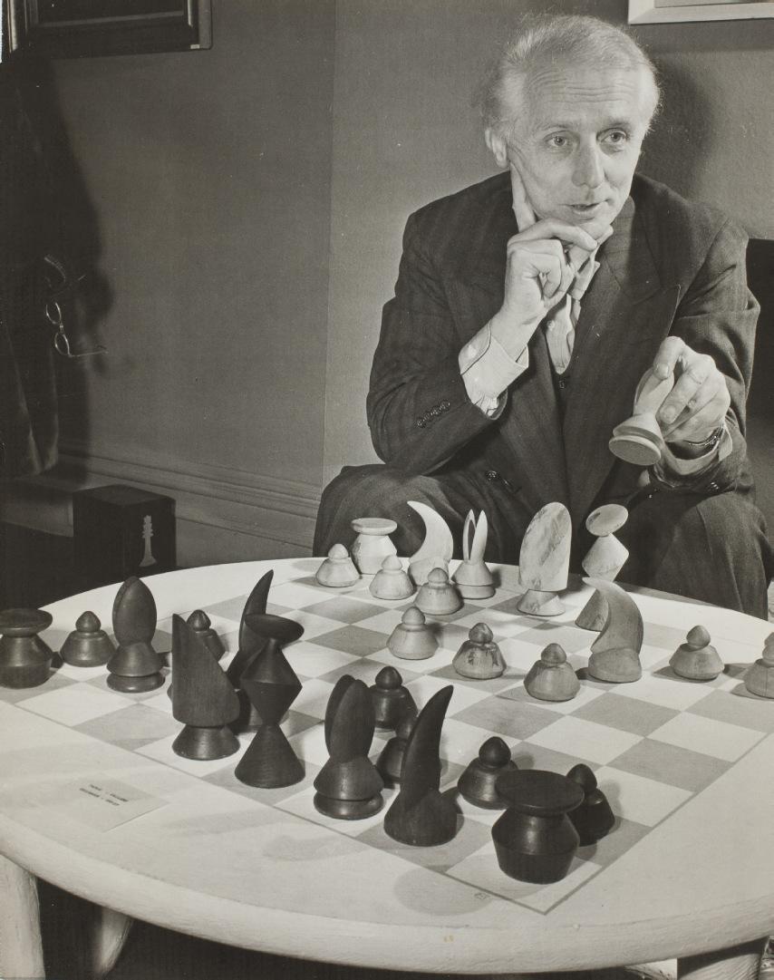
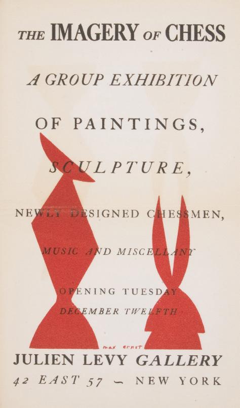
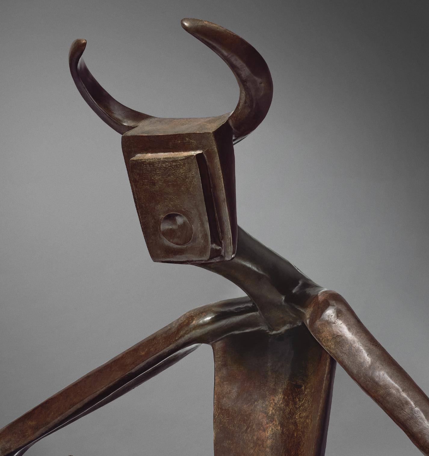
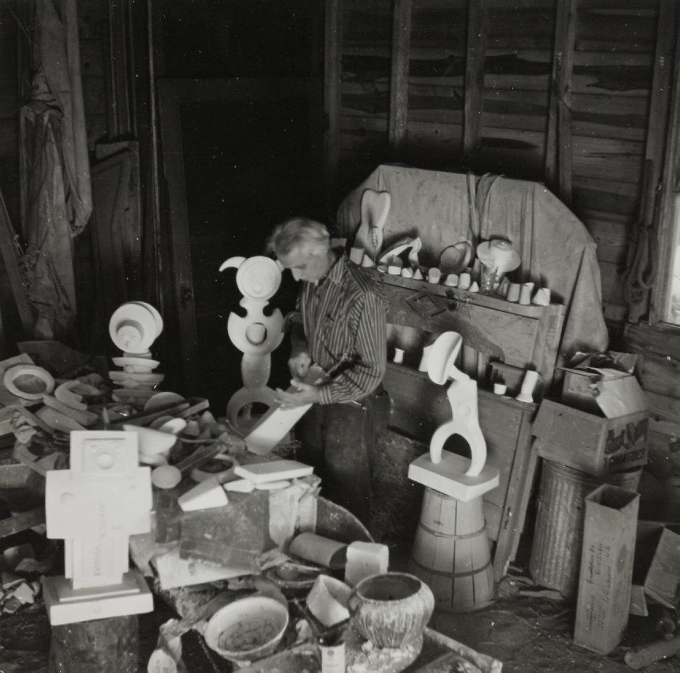
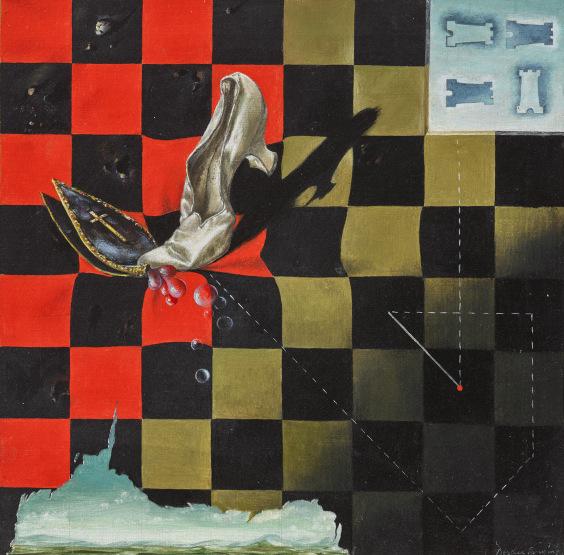
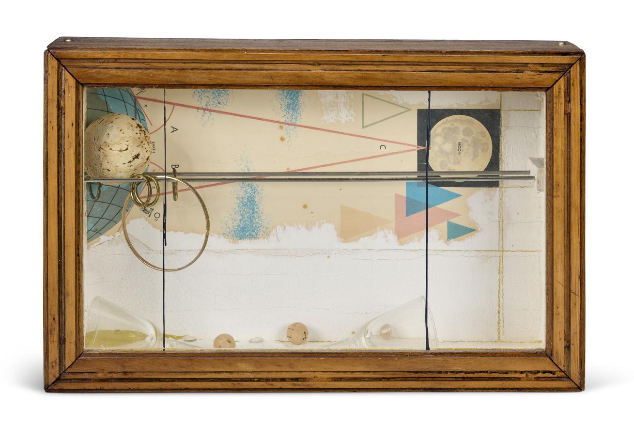
The original plaster of Max Ernst’s Le roi jouant avec la reine was created in New York during the war, as a contribution to an exhibition, The Imagery of Chess, mounted at the Julien Levy Gallery. Levy, in business since the 1930s, was an early and tireless advocate for Surrealism in New York, produced an important book on the subject, and was a staunch supporter of a couple of artists in the Weis collection, not only Gorky but also Joseph Cornell. Chess has a privileged place in the modern imagination, a fascination of creative spirits from Lewis Carroll to Duchamp and Nabokov. It’s an ancient game, the royal imagery a survival of the Middle Ages or earlier, a ritualized reimagining of geopolitical conflict that, for artists and writers confronting the horrors of World War II, offered some solace, the intricate rules a temporary escape from the daily headlines. In Ernst’s strange imagining, the King, a figure whose role in chess is far less dynamic than the Queen’s, has sprung from the board and grown much larger than the Queen. He lords over the game, the Queen now his pawn. Is this King, with horns that to some have suggested the Minotaur of Greek myth, a stand-in for the artist himself? The chess player, moving the pieces around the board, is not unlike the modern artist working paint across canvas; both the chess board and the painter’s rectangle are realms that can only be conquered with some combination of discipline and imagination. The better you know the rules the better off you’ll be when it comes to breaking or at least rethinking them—that’s what one hopes. Shortly before the beginning of World War II, the Dutch historian Johan Huizinga published a book, Homo Ludens, in which he argued that disciplined
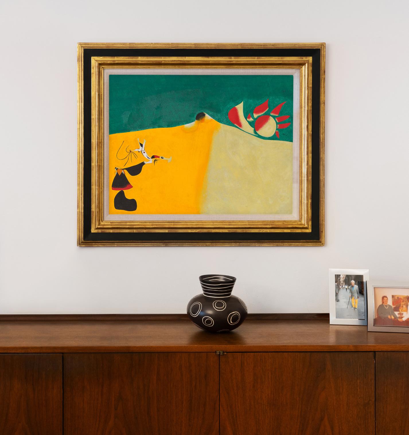
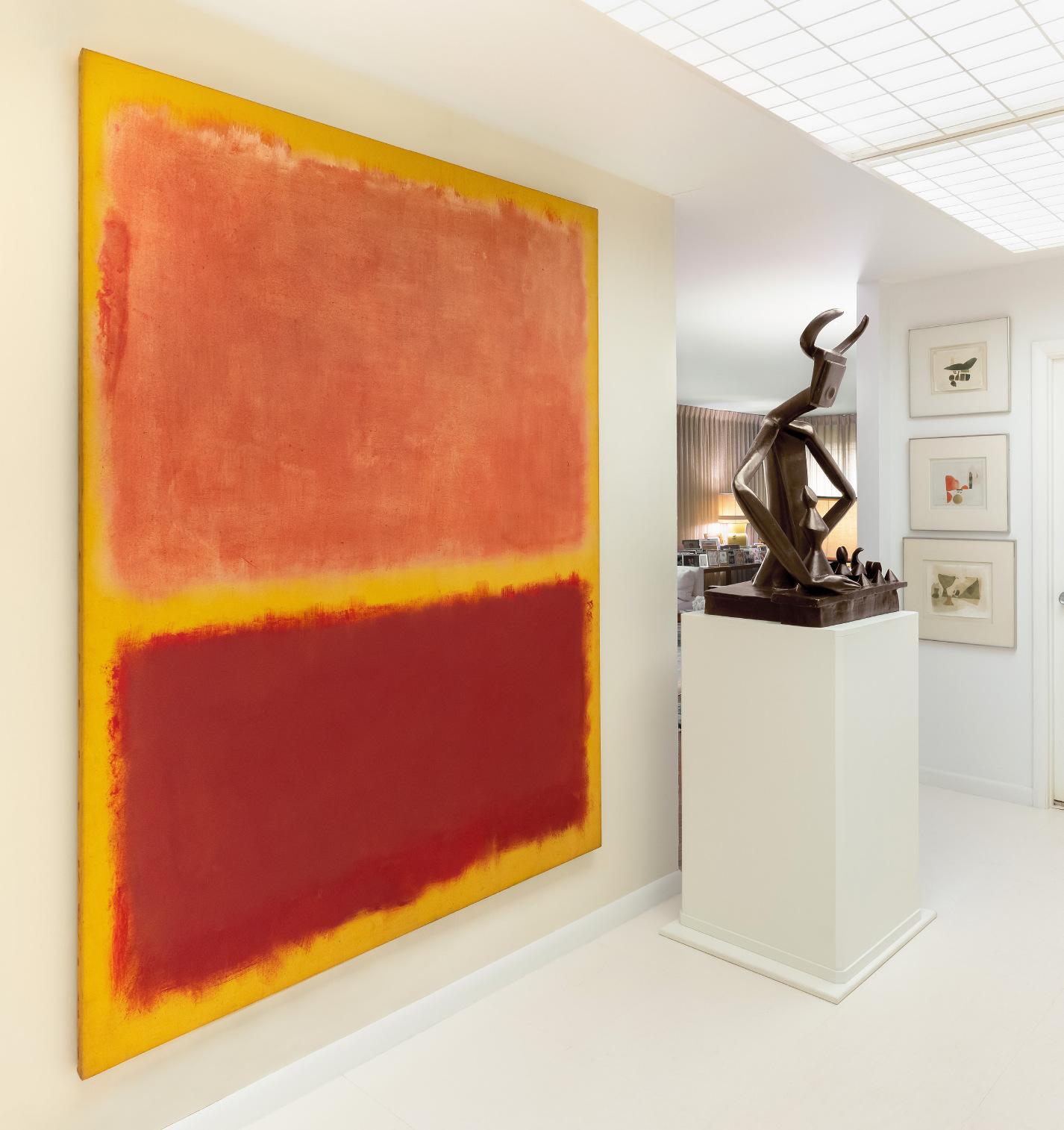
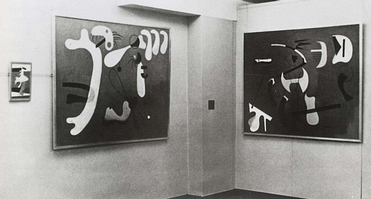
Max Ernst's Le roi jouant avec la reine photographed alongside Mark Rothko's No. 31 (Yellow Stripe) at the Weis residence.
play was the key to civilized existence. Even the most intractable conflict could be resolved if only there were rules, precisely the kind of rules the Fascists refused to play by. Ernst’s sculpture is about rules and broken rules, an allegory of instability.
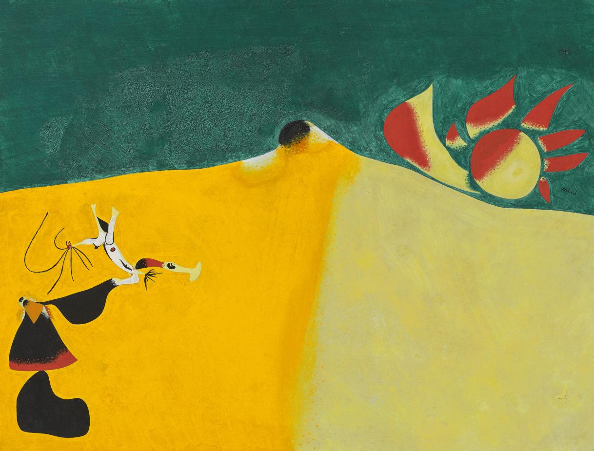
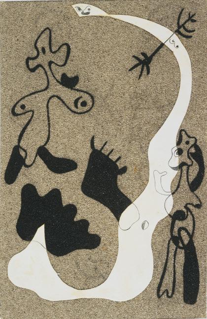
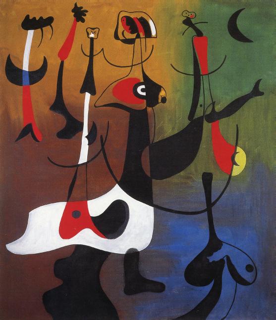
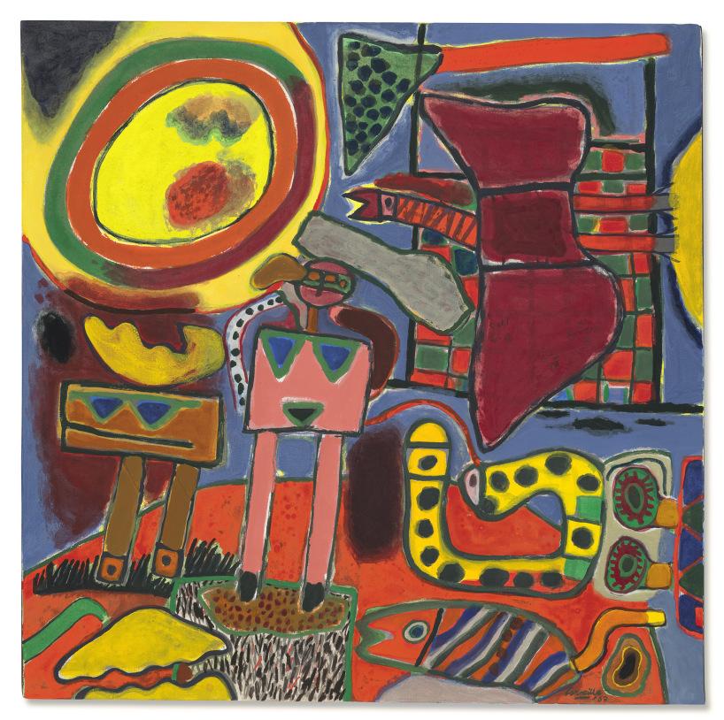
What interested American artists wasn’t modern art as a stylistic evolution from Fauvism to Cubism to Surrealism but how the genius of an artist, whether Ernst, Picasso, Miró, Matisse, or Mondrian, revealed fresh dimensions of the human imagination. Miró, although forever associated with the Surrealists (a term that goes back to Apollinaire) never liked seeing some stylistic label slapped on his work. In the 1950s, Robert Motherwell—a painter represented by a couple of collages in the Weis collection—wrote that “a sensitive balance between nature and man’s works, almost lost in contemporary art, saturates Miró’s art, so that his work, so original that hardly anyone has any conception of how original, immediately strikes us to the depths.” In Miró’s world everything is animate, beginning with the lines that in the Weises’ 1934 work Sans titre (Personnages) swoop and swerve, suggesting the anthropomorphic or zoomorphic, a perpetual metamorphosis. In the Weises’ Les flammes du soleil rendent hystérique la fleur du désert, the title underscores the interaction animating the composition, the sun in the upper right addressing the desert flower in the lower left, which responds excitedly, a metaphorical photosynthesis, the plant coming alive, almost human, as if greeting the sun. The composition is austere and ecstatic, contradictions united in ways maybe only a Spaniard could conceive. As for Femme nue, the third Miró in the Weis collection, her roiling body joins elements animal, vegetal, and mineral with a discombobulated energy that echoes the aggressively anti-classical forms of Antoni Gaudí, the great architect of Miró’s hometown, Barcelona. The openness of Miró’s metaphors and his sense of the rectangle of paper or canvas as a site for free play left a deep impact on American artists, immediately evident in Gorky’s work but also in the paintings of Jackson Pollock and many others.
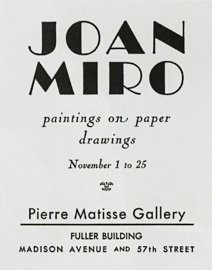
Checklist for the exhibition “Joan Miró: Paintings on Paper, Drawings” at the Pierre Matisse Gallery, New York, November 1932.
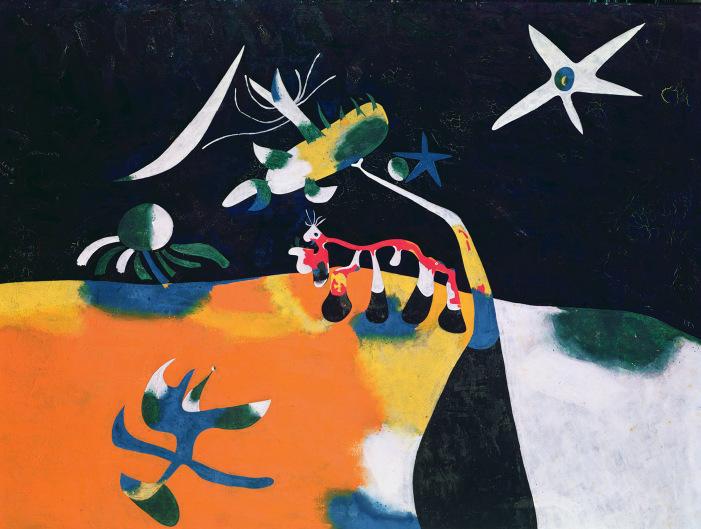
Joan Miró's Les flammes du soleil rendent hystérique la fleur du désert at the Weis residence.
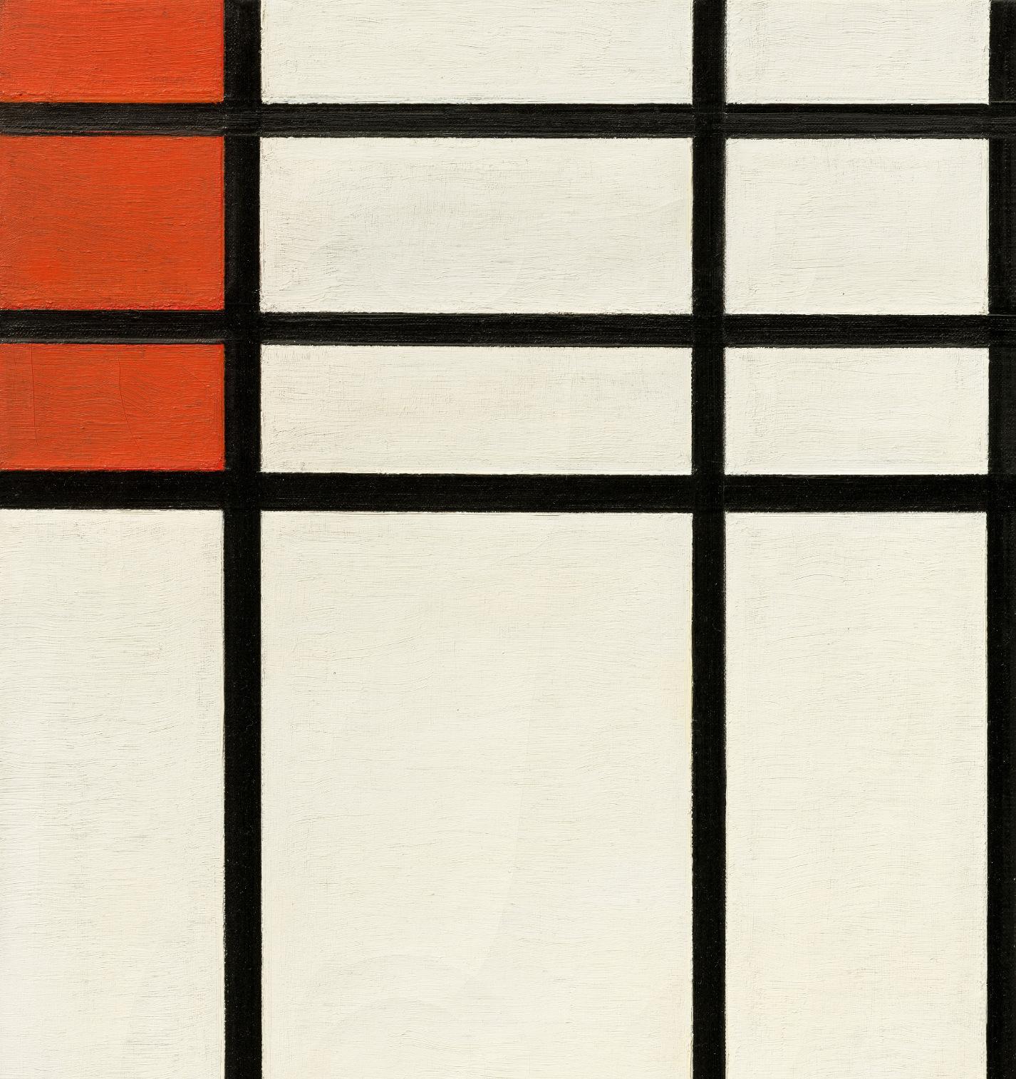
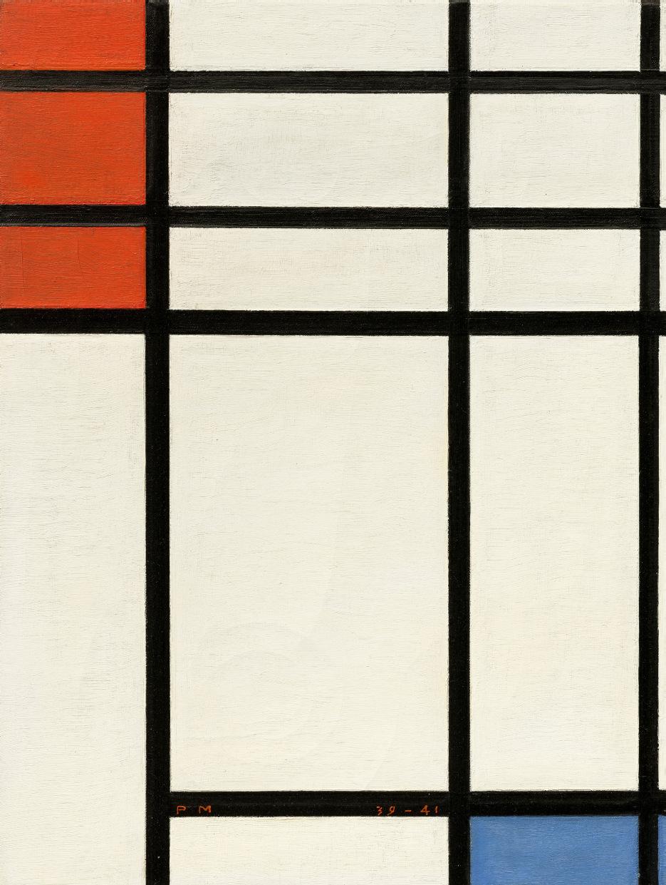
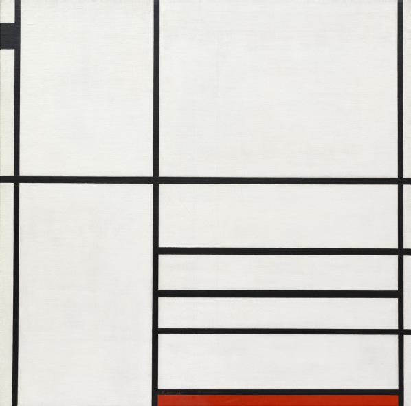
The influence of the Europeans on American artists wasn’t always and perhaps not even primarily a matter of definite stylistic borrowings. Mondrian, who arrived in New York in 1940 and died in the city four years later, discovered a handful of American painters who embraced his devotion to a strict linear art. But even those artists among New York’s avant-garde who painted in radically different ways regarded Mondrian as an almost talismanic figure. They admired his unwavering devotion to an idealistic enterprise, and they loved him for his wholehearted embrace of their city, where he found not only safe harbor but also the titles and some of the increasingly complex and syncopated rhythms of his final canvases. The Weises’ Mondrian, Composition with Red and Blue, begun when he was living in London and completed in New York, the date “39-41” proudly displayed on the canvas, is a model of disciplined energy produced in a time of international turmoil. Compared to some of the larger compositions that he worked on in New York, with their multiplication of colored lines and rectangles, the Weis Mondrian has the sonorous intimacy of chamber music. The few elements here look back to the most restrained and austere Mondrians of the late 1920s and 1930s, even as the tripling of the red rectangles in the upper left creates a baroque complication, the dialogue of one blue and one red in earlier works now a debate, as if the red keeps answering and challenging the blue. There’s a lot to unpack in this picture, buoyancy and weight united for an impact that brings Bach’s exhilarating gravitas to mind.
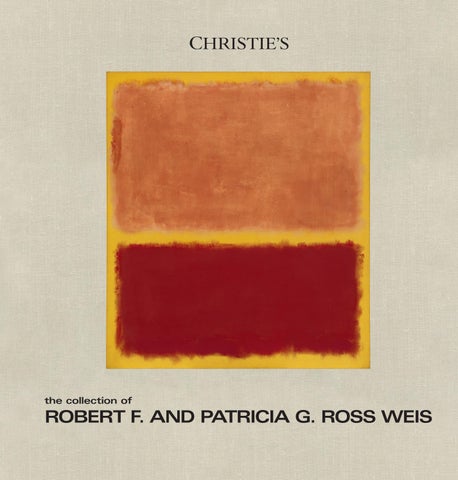
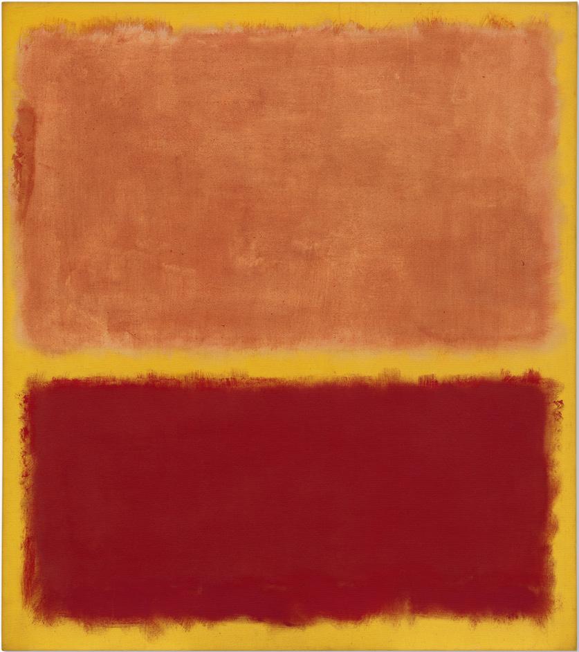
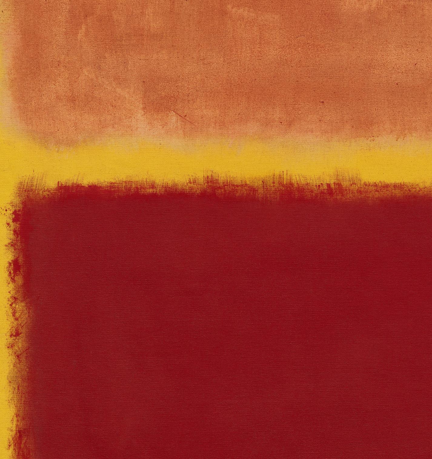
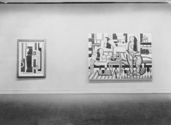
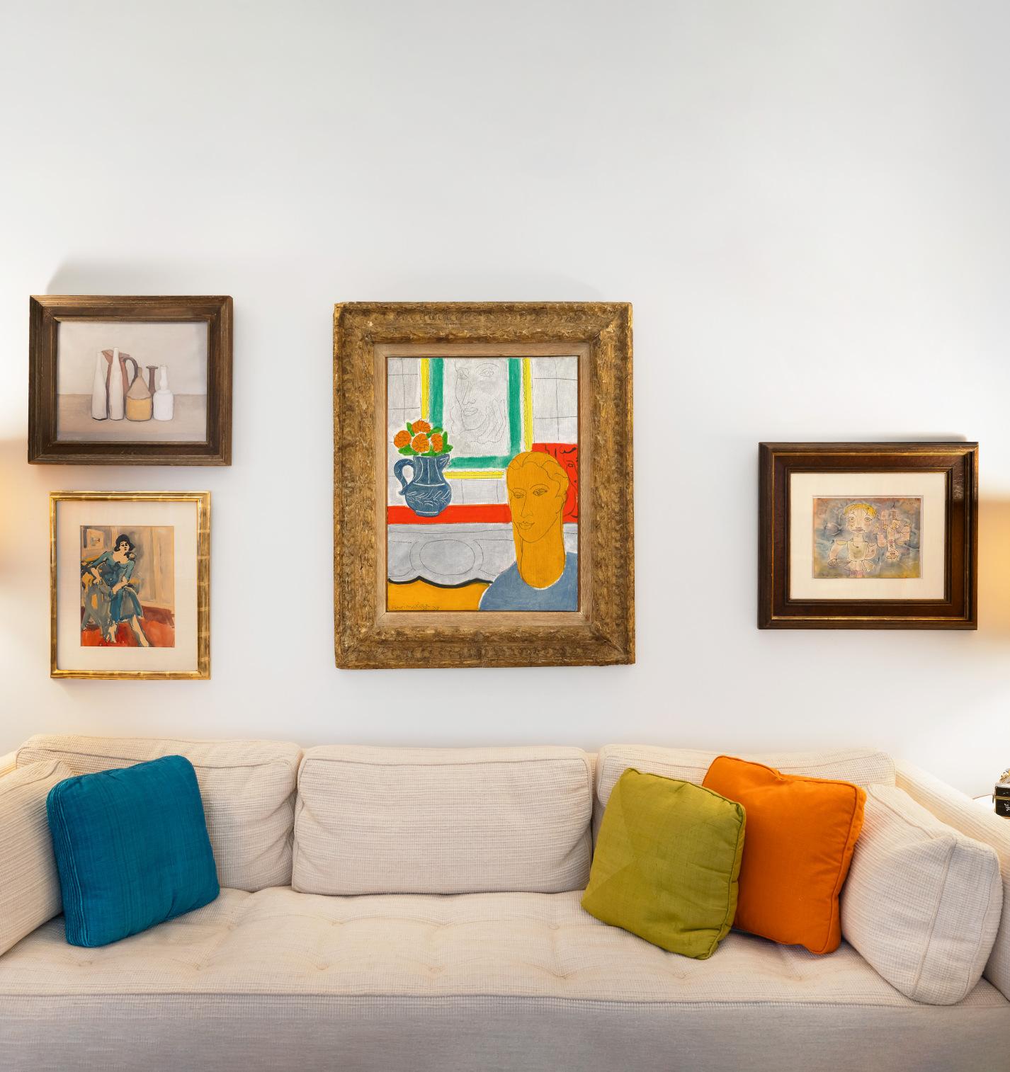
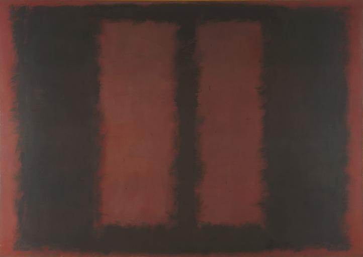
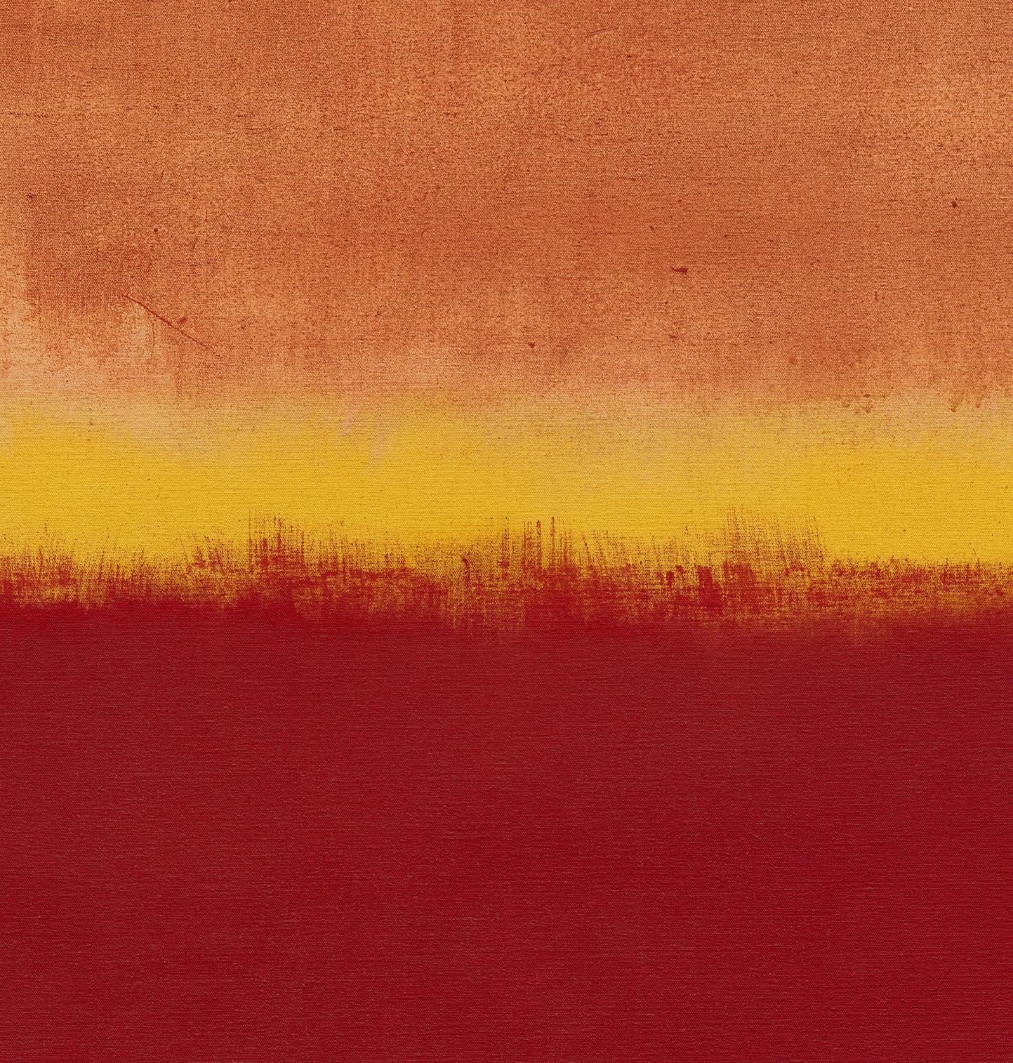
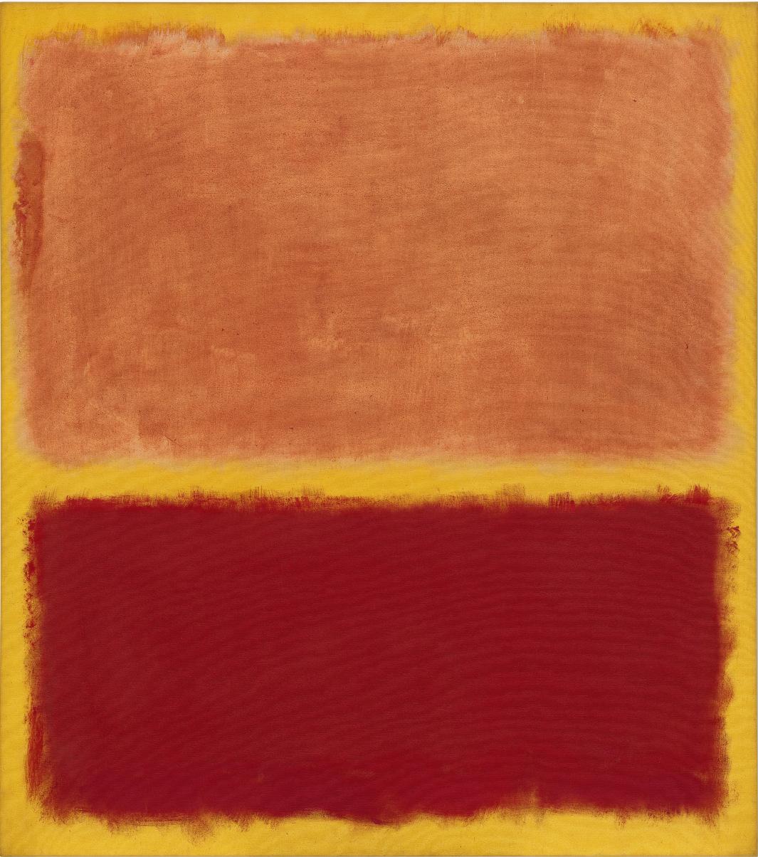
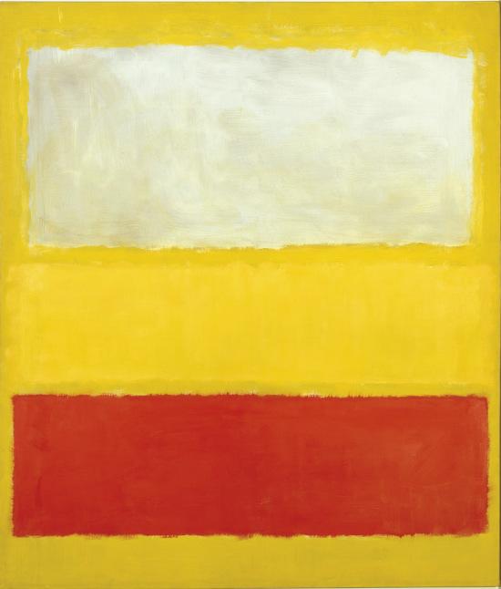
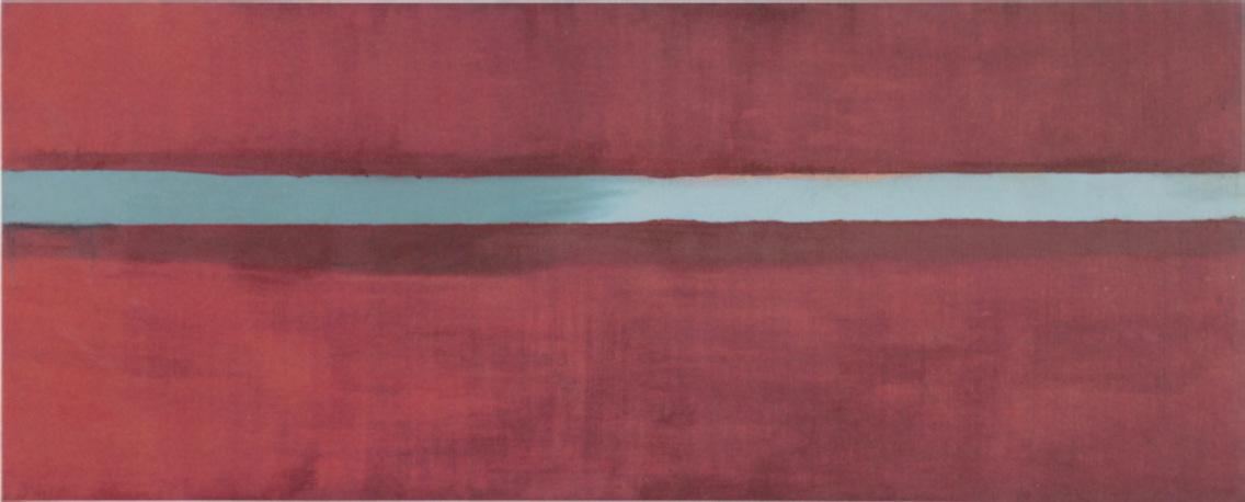
The most striking transatlantic conversation in the Weis collection is between Matisse’s Figure et bouquet (Tête ocre) and Rothko’s No. 31 (Yellow Stripe). When the paintings are hung in adjacent spaces, as they were in the Weises’ Pennsylvania home, the fierce orchestration of blue, ochre, and red in the Matisse seems to be answered by the warm oranges and reds of the Rothko, painted twenty years later. The Matisse, which held pride of place in the Weises’ living room, is among the rigorously concentrated works Matisse produced in his sixties, as he revisited some of the coloristic experiments of his earlier years. If the confrontations between color and line in his work of the years before and during World War I had a swagger and bravado—the pugilistic discoveries of a young genius-experimentalist—the determination with which he joined color and line in Figure et bouquet (Tête ocre) and other works of the 1930s and 1940s suggests tensions more closely calculated. Matisse wanted to see how far he could take the competition between color and line that had been a preoccupation of European painting since the Italian Renaissance, when the artists of Florence and Rome were said to affirm the power of disegno, while in Venice colorito reigned supreme.
Mark Rothko's No. 31 (Yellow Stripe) photographed alongside Max Ernst's Le roi jouant avec la reine at the Weis residence.
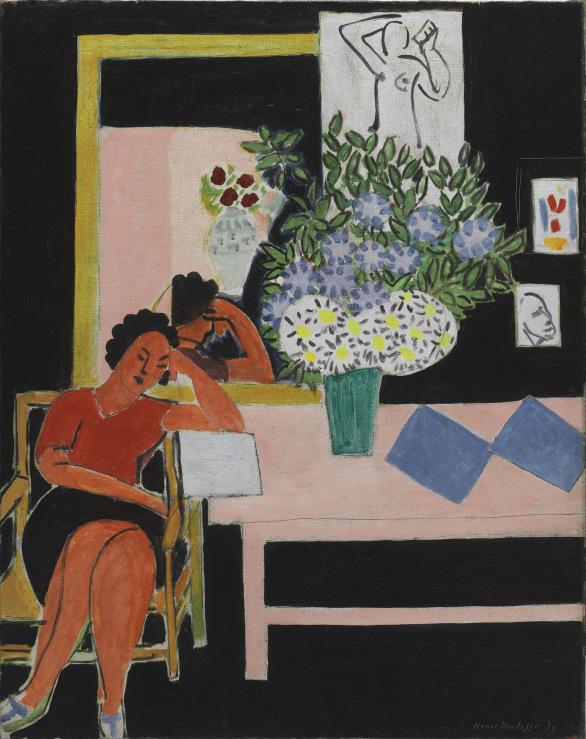
In Figure et bouquet (Tête ocre) Matisse is asking how much he can do with how little, limits suggesting limitlessness. This is one of a number of works which Matisse found it interesting to photograph in various stages, what seemed like the simplicity of his ultimate solution the result of a process of perpetual revision, the experiment not complete until each line, color, and interval had been recalibrated, over and over. The woman’s head, sculptural with its deep ochre coloring and contours almost incised in the canvas, is echoed by the drawing of a woman hanging on the wall, only one counterpoint in a composition where the faces and flowers make another dialogue. Pierre Schneider—in his great book about Matisse, which the Weises had in their library—spoke of “electrifying tensions.” These, so Schneider believed, were fueled by Matisse’s determination to produce works with “a force and monumentality which is out of all proportion to their actual size.” Matisse, so it seemed to Schneider, was already longing for the monumentality he would achieve in some of his immense cut paper compositions of the late 1940s and early 1950s. But the paradoxically modest monumentality that Matisse achieved in Figure et bouquet (Tête ocre) has a fascination all its own. This phase in Matisse’s work, although the subject of Matisse in the ‘30s, a major exhibition mounted not long ago in Philadelphia and Paris, remains in many respects among the least fully explored or understood of his long life.
We know that Rothko admired Matisse’s color. In an interview he said that he “spent hours and hours” with The Red Studio in The Museum of Modern Art, “once it was permanently installed in 1949.” “When you looked at that painting, you became that color, you became totally saturated with it.” Although Figure et bouquet (Tête ocre) presents not a single color but an orchestration, the impact is similar, colors evoking emotions in ways that were first widely discussed by the artists and poets of late nineteenthcentury France, sometimes generating what Rimbaud referred to as a “derangement of the senses.” Rothko, who apparently had no use for Kandinsky’s color theory, may have conceived of color in the perfervid spirit of Nietzsche’s Birth of Tragedy, a book he greatly admired, with its competition between Apollonian reason and Dionysian wildness. Rothko reveled in the antagonistic relationship between these two forces, and probably believed that colors, through their particular qualities and intensities, could evoke that struggle. No. 31 (Yellow Stripe) is one of a number of canvases from Rothko’s later years in which a feverish Apollonian brilliance persists amid and even in spite of the gathering darkness of so much of the work he was doing. If Matisse’s color inclines toward an opulent serenity that we think of as quintessentially Apollonian, with Rothko even Apollo’s sun-suffused glow, as in the Weis canvas, is accompanied by darker energies.
Henri Matisse’s Figure et bouquet (Tête ocre) among other works at the Weis residence.
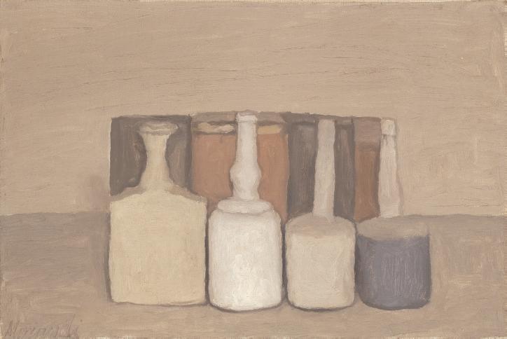
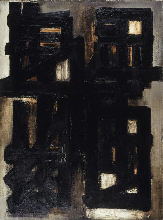
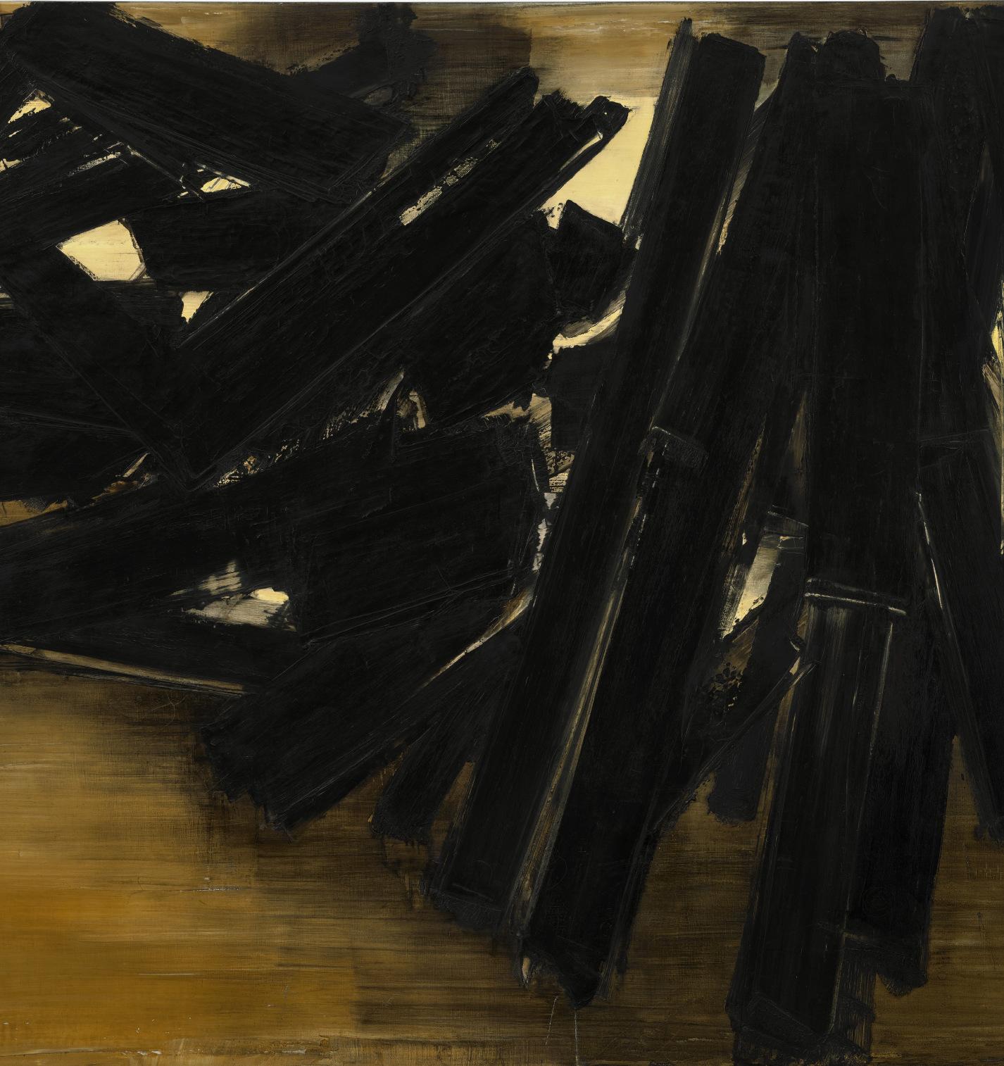
Europe and America are linked in many ways in the Weis collection. It seems that early on, before their most intensive years of collecting, the Weises took an interest in the paintings of Marsden Hartley. This American, who during his early years in Europe was deeply affected by the revolutions of Cubism and painted some abstractions unlike anything by anybody else, eventually focused on American people and places, not only New England but also the Southwest of the Weises’ New Mexico Landscape. There were times in the twentieth century when influences moved from America to Europe, a case in point being the Pierre Soulages in the Weis collection. It’s difficult to imagine that Soulages’ calligraphic attack on the canvas, his black strokes almost recklessly arranged, doesn’t reflect an appreciation for the work in black and white that Willem de Kooning and Kline had been doing in New York. It’s also worth remembering that Americans were interested in what some might regard as dissident or at least divergent strains in the new European art, including Morandi’s post-Cubist reengagement with representation. Morandi is represented in the Weis collection by a still life in which a few objects achieve an intimate monumentality. His still lifes and landscapes, featured in scattered exhibitions in New York in the postwar decades, left a number of American artists thunderstruck. For some he became an almost prophetic figure, revered, not unlike Mondrian, as a solitary adventurer undeterred by the pressures of fashion.
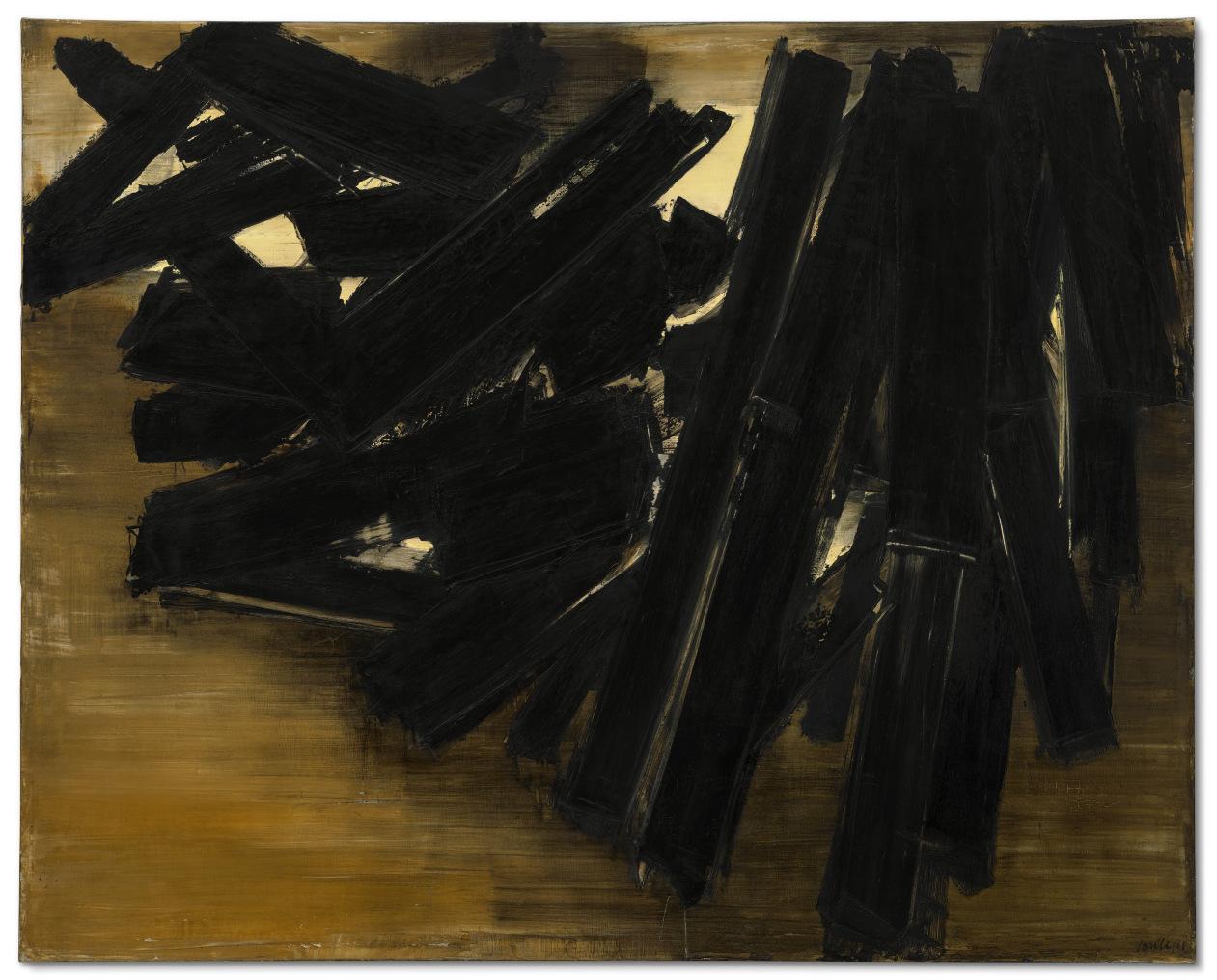
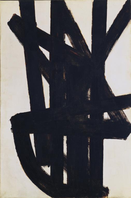
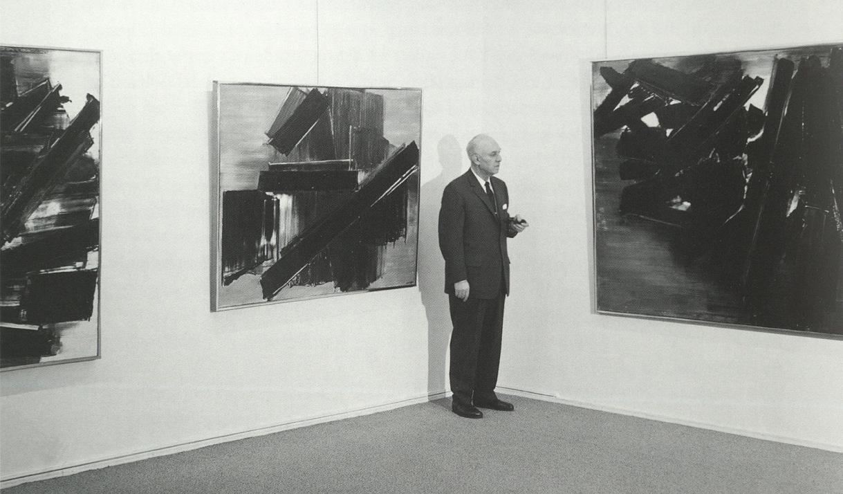
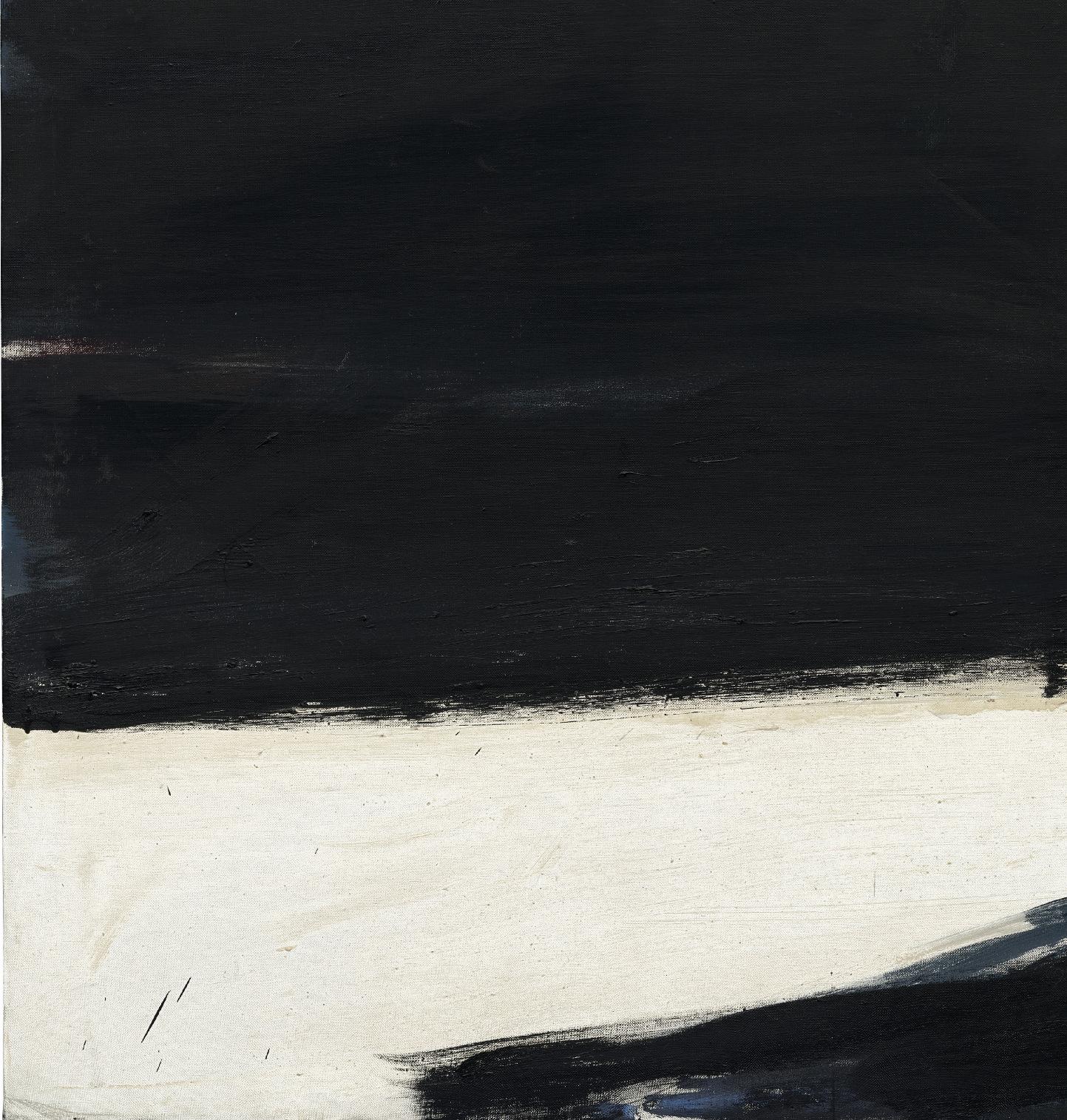
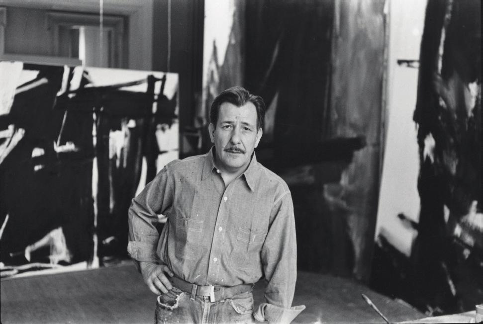
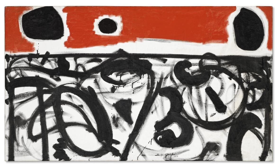
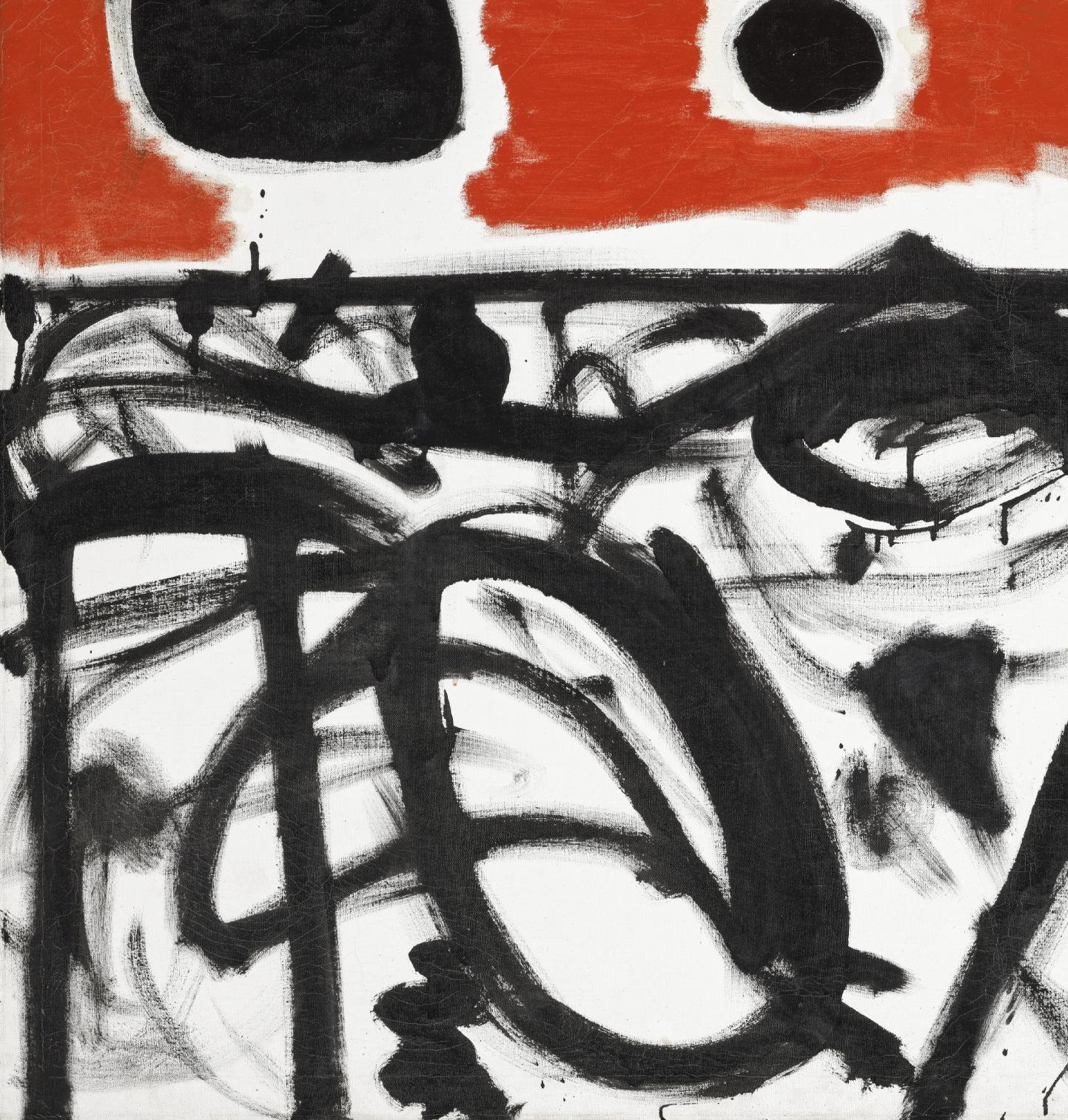
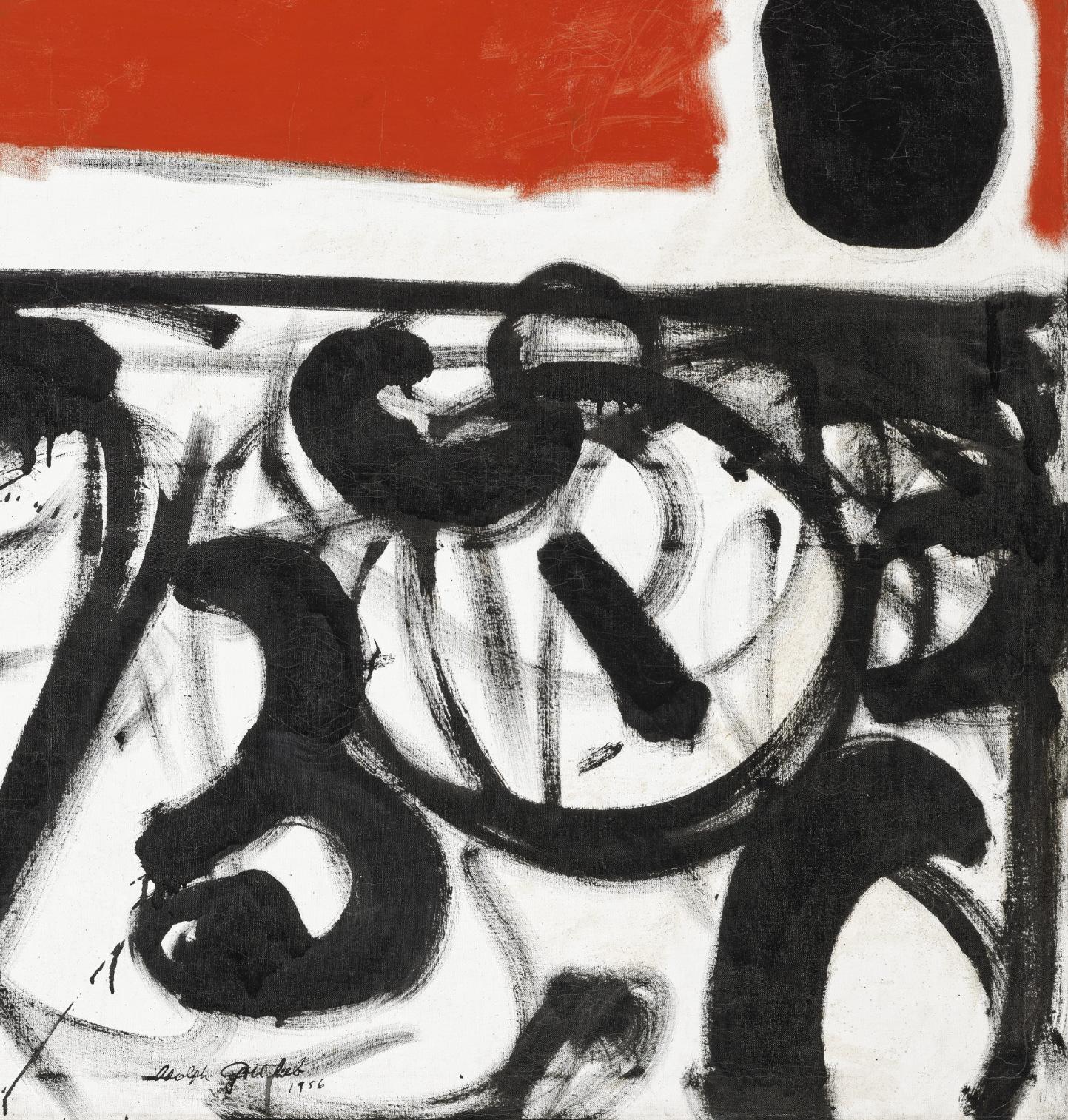
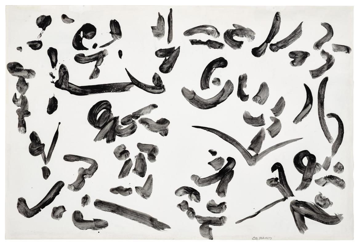
The Weis collection invites speculation as to the fundamental differences or distinctions between art made in Europe and the United States, even if no single principle can possibly hold for artists as different as Rothko, Kline, Gorky, and Smith. Something the poet Frank O’Hara said about Kline’s work is useful. In the introduction he wrote for a conversation with Kline published in the Evergreen Review in 1958, O’Hara associated the blunt force that one feels in works including the Weises’ Kline with “the American dream of power, that power which shuns domination and subjection and exists purely to inspire love.” This American power, so O’Hara believed, was free of the political and religious values, associations, and pressures that had occasioned and maybe even shaped so much European art over the centuries. O’Hara saw the work of Kline and other Abstract Expressionists in the light of Whitman’s vision of a nation freely assembled. If American painting and sculpture of the postwar period sometimes felt Whitmanesque, it was because the artists were detached from Europe’s moral, ethical, and philosophic concerns, some of which Matisse, as a Frenchman, had gathered from Montaigne and Pascal, others of which Picasso and Miró, as Spaniards, knew from Don Quixote
Franz Kine's Placidia photographed at the Weis residence.
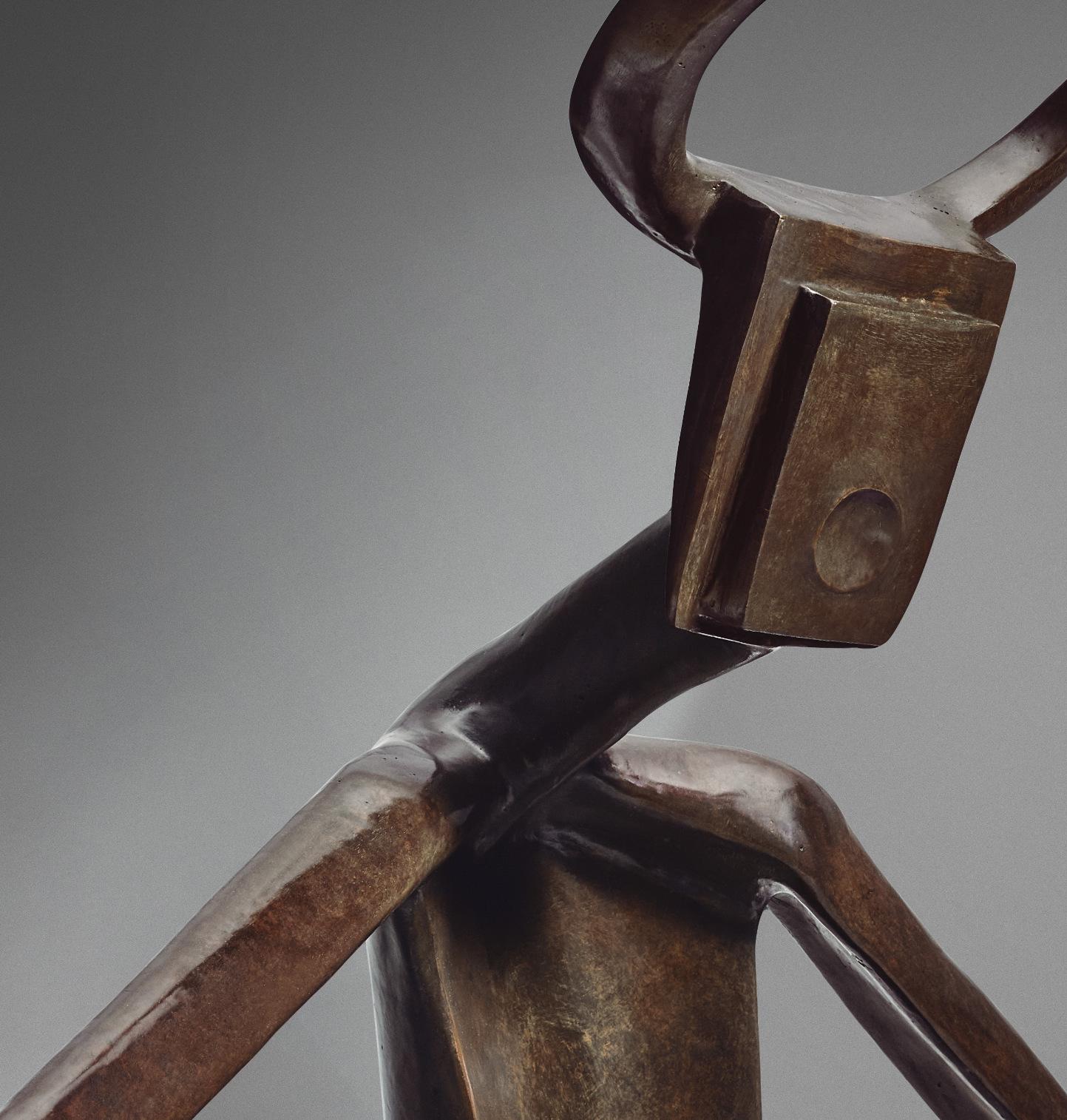
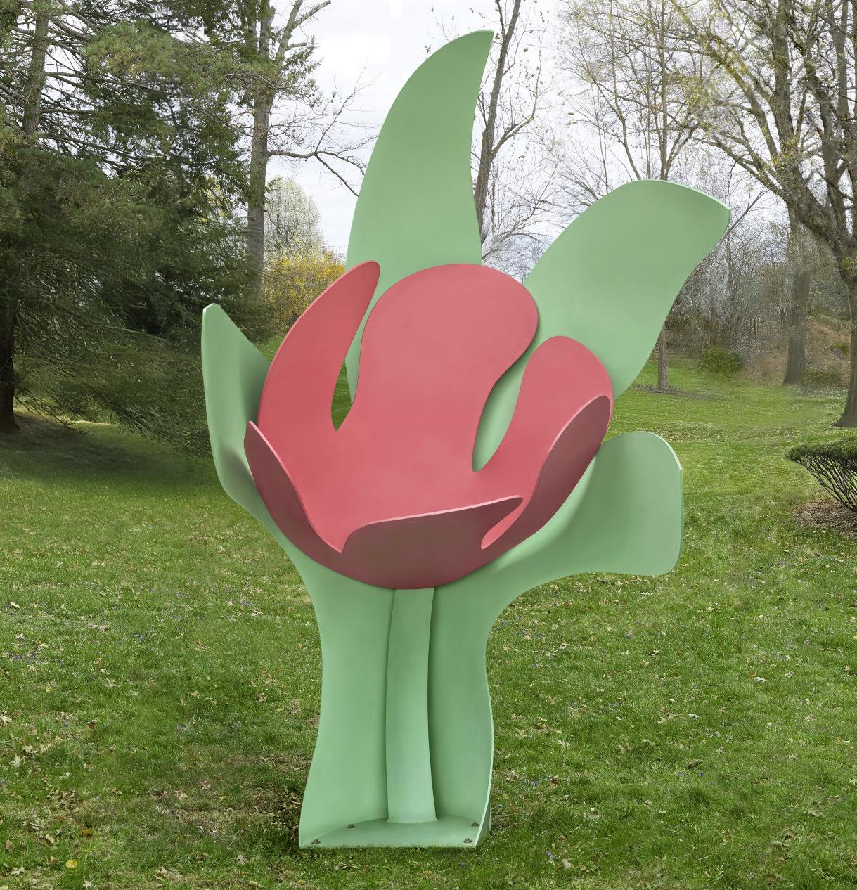
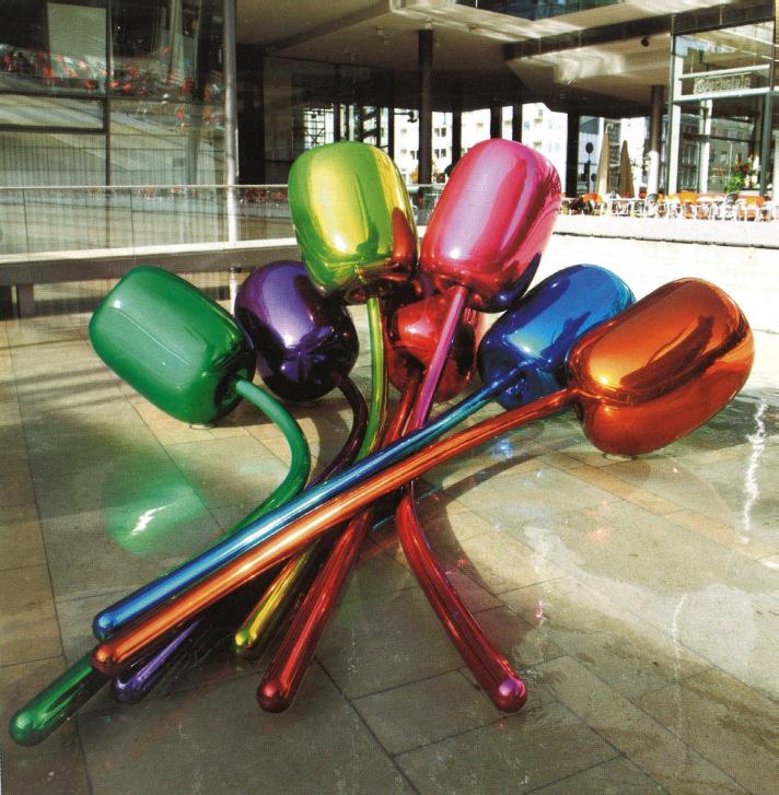
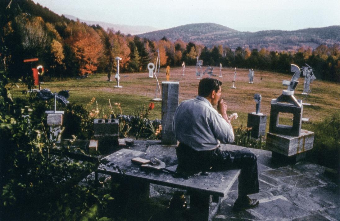
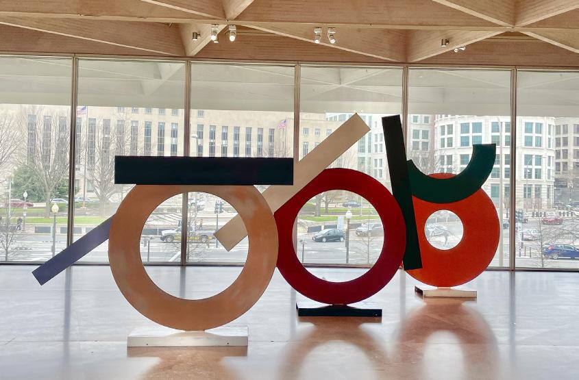
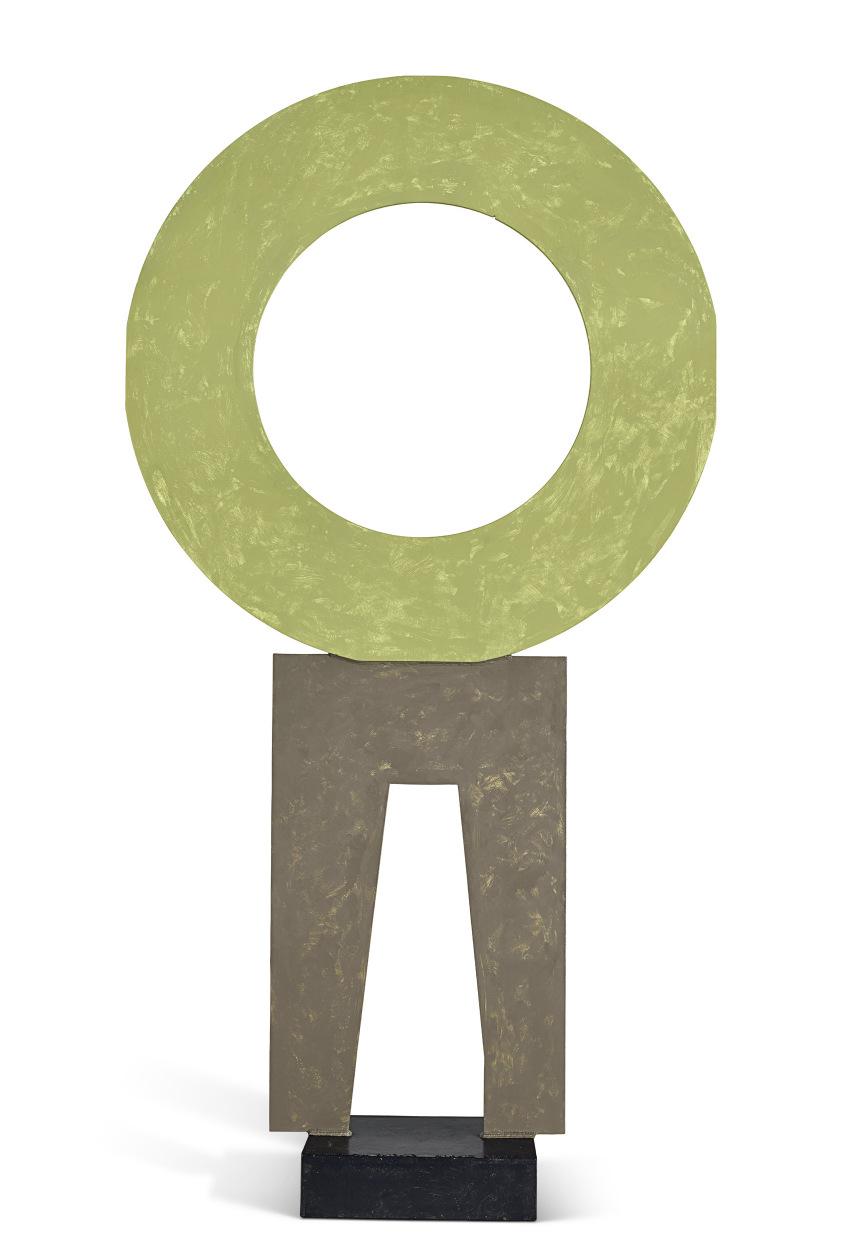
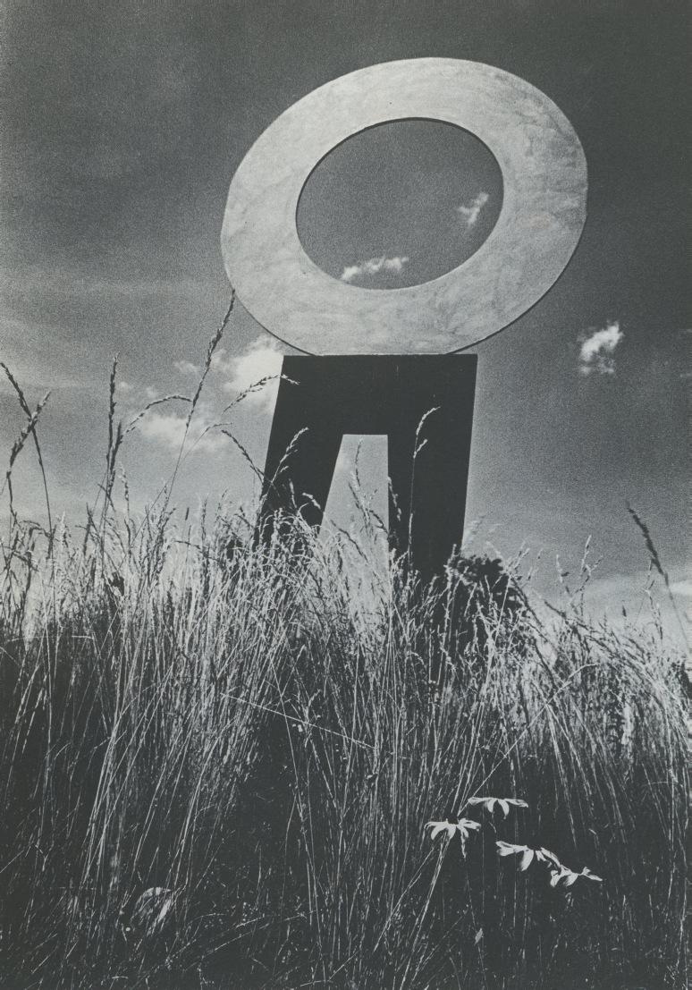
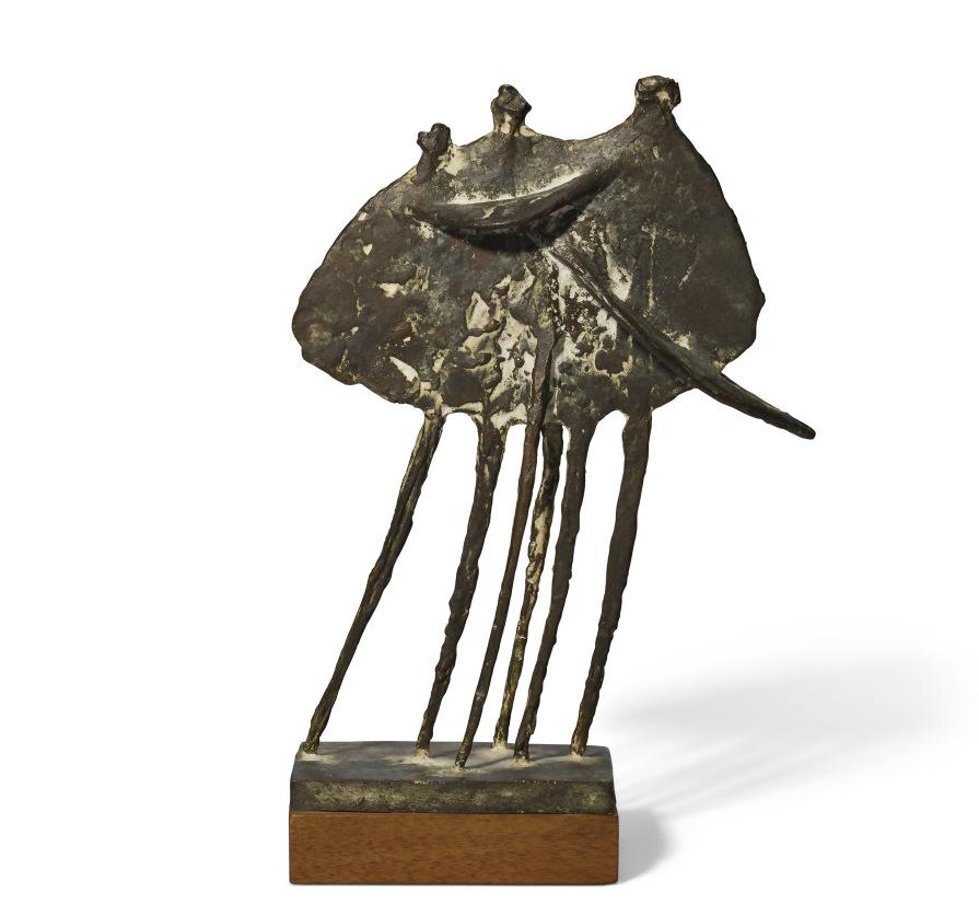
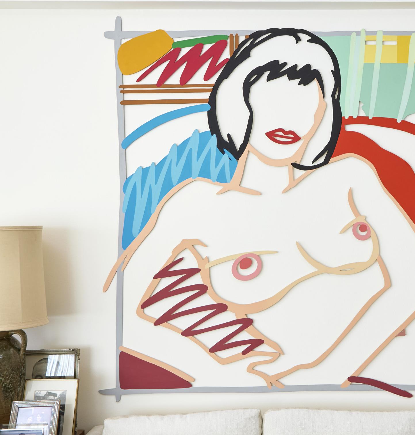
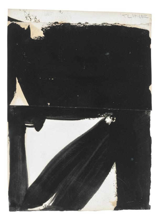
Writing about the power of the imagination, Baudelaire asked, “What would be said of a warrior without imagination?” In the United States, the imagination could have some of the quality of guerilla warfare, as Harold Rosenberg argued in a famous essay, “Parable of American Painting,” where the American artists are the Coonskins and the Europeans are the Redcoats. There is about Kline’s Placidia and Smith’s Circle 2 Legs a sense of the imagination as a warrior going into battle, armed with the simplest, strongest tools. (The title of Kline’s painting, with its suggestion of calm or serenity, might seem to contradict what I’ve just said, except that Placidia was a formidable figure in Roman history, an empress in the late days of a tremendous empire.) Certainly Smith’s Circle 2 Legs is oracular, totemic. This is a work from Smith’s final phase, the sometimes filigreed complications of his earlier years replaced by what amounts to a simple declarative statement. Circles, Smith wrote, “have long been a preoccupation—more primary than squares.” If there is such a thing as a boldface hermeticism—Smith devoted an entire series of sculptures to the primacy of the circle—it is certainly something that interested American artists in the decades after World War II. Even Gorky’s delicate pencil marks in the Weises’ drawing, whatever their echoes of European refinement, suggest not the ancient myths and legends that Miró and Picasso sometimes used as jumping-off points, but some more personal and private cosmology. Gorky’s drawing is an enigmatic landscape dissected but not fully understood, flesh and bone become instruments in a visual music more improvisation than composition. As for the Tom Wesselmann in the Weis collection, the enormous Standing Tulip which they purchased directly from the artist, like all Pop Art, is about power—the power of a comic, ironic exuberance.
The Weis collection salutes the imaginative warriors who made modern art. But Robert and Patricia Weis rejected the turf wars and ideological battles that all too often turned admirers of one aspect of modern art against anything that didn’t align with some core belief. The Weises were animated by their own passions rather than somebody else’s polemics. A discerning pluralism shaped all their acquisitions. That’s why their collection has such extraordinary reach as well as such impressive depth. What unites the Braque, Picasso, Léger, Matisse, Mirós, Mondrian, Klee, Kandinsky, Ernst, Morandi, Rothko, Gorky, Smith, and Kline that they chose to live with in their home in Pennsylvania is the Baudelairean vision of nature as a dictionary, to be used freely by each artist. For the Weises, the way to understand modern art wasn’t as a chronology, genealogy, or flow chart, but as a kaleidoscope, related elements revealed in their infinite variety.
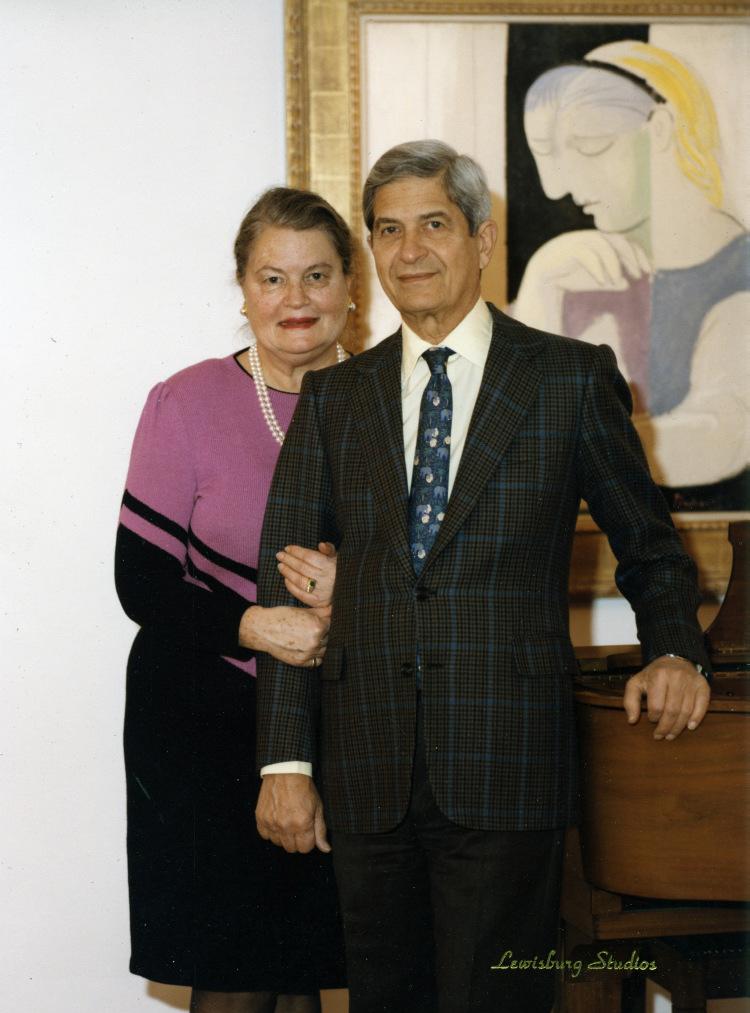
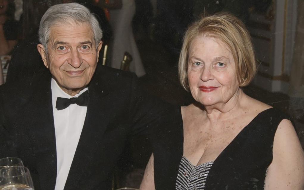
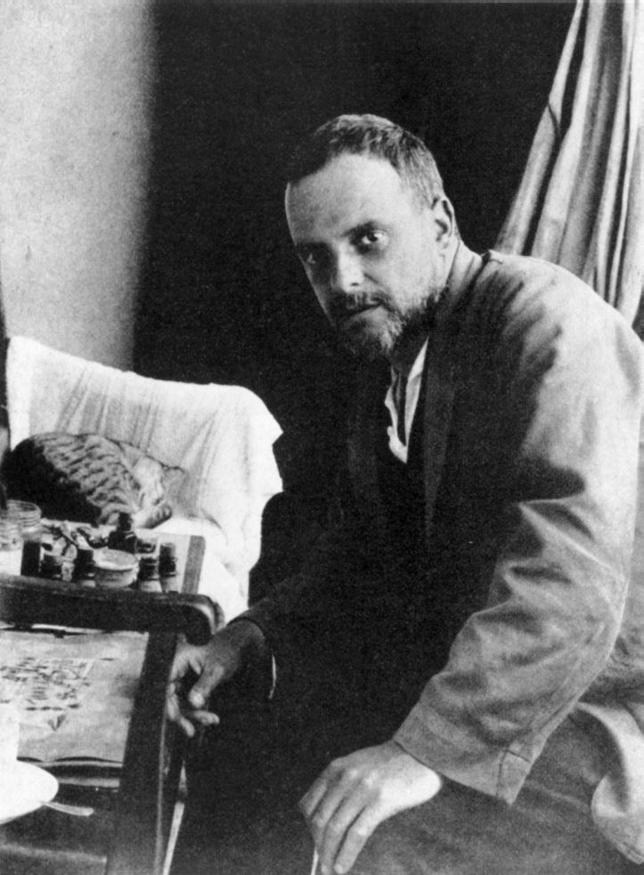
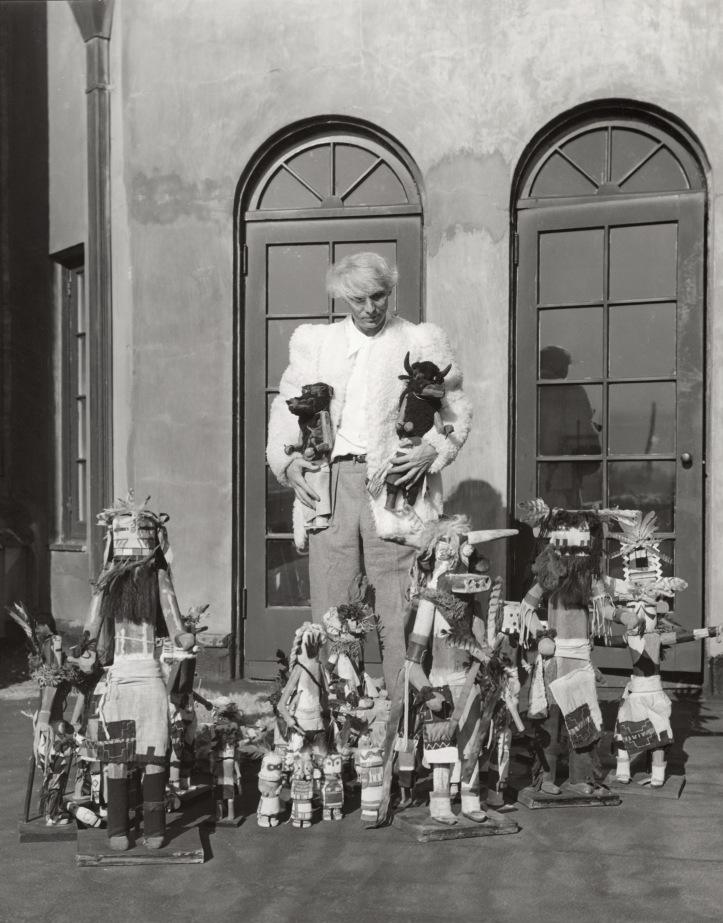
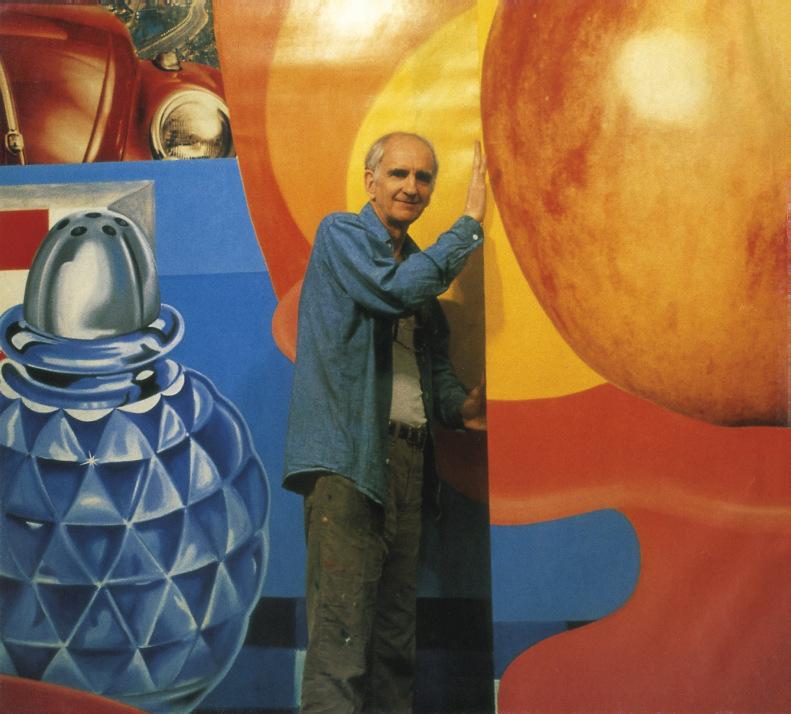
Patricia and Robert Weis. Courtesy of the Weis Family.
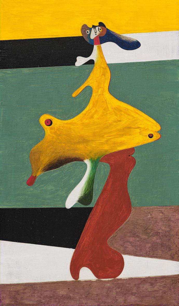
1 JOAN MIRO (1893-1983)
Femme nue
signed, dated and titled 'Joan Miró. 8.32. "Femme nue."' (on the reverse) oil on panel
13⅛ x 7⅞ in. (33.5 x 20 cm.)
Painted in August 1932
PROVENANCE
Galerie Pierre Colle, Paris. Pierre Matisse Gallery, New York (acquired from the above, 29 December 1933).
Robert Sturgis Ingersoll, Philadelphia (acquired from the above, 13 January 1934); Estate sale, Sotheby Parke Bernet, New York, 2 May 1974, lot 246.
Acquired at the above sale by the late owners.
EXHIBITED
Paris, Galerie Pierre Colle, Exposition Miró, December 1932. London, The Mayor Gallery, Paintings by Joan Miró, July 1933. New York, Pierre Matisse Gallery, Joan Miró, December 1933-January 1934, no. 1.
The Arts Club of Chicago, Joan Miró, March 1934.
LITERATURE
M.M., "Pierre Matisse Exhibits Miró" in The Art News, vol. 32, no. 14, 6 January 1934, p. 4.
E. Jewett, "Three Exhibits Get Attention at Arts Club: Compositions of the Modernist Puzzle Critic" in Chicago Tribune, 17 March 1934, p. 19.
J. Dupin, Joan Miró: Life and Work, London, 1962, p. 526, no. 328 (illustrated; titled Standing Woman).
J. Dupin and A. Lelong-Mainaud, Joan Miró: Catalogue raisonné, Paintings, 1931-1941, Paris, 2000, vol. II, p. 59, no. 399 (illustrated).
W.M. Griswold and J. Tonkovich, Pierre Matisse and His Artists, New York, 2002, p. 160 (illustrated in situ in the 1933 Pierre Matisse Gallery exhibition, New York).
In a letter dated 20 January 1932, Joan Miró eagerly described to Christian Zervos his plans for the next steps in his creative journey: “I am working with great enthusiasm on a new series of objects, and as soon as they are finished I shall make small paintings as concentrated as possible which express and sum up, as best as my strength will allow, my latest research...” (letter to C. Zervos, quoted in A. de la Beaumelle, ed., Joan Miró, 1917-1934, exh. cat., Musée national d’art moderne, Centre Pompidou, Paris, 2004, p. 357). Though not realized until a summer sojourn in Montroig later that year, the resulting “small” works—twelve exquisitely painted, intimately sized, experimental oil on panel paintings (Dupin, nos. 396-407)—represented a distinctive shift in Miró’s approach. Executed in bright, glowing colors, these compositions boldly explored the dynamics between abstraction and figuration, biomorphism and linear geometry, and offered not only a condensed synthesis of the theories and ideas which had occupied him for much of the previous two years, but also the path which lay ahead.
Executed in August 1932, Femme nue is a key example from this celebrated series, which emerged at a pivotal moment in Miró’s career, following several years marked by what the artist termed a “crisis of personal consciousness” (quoted in M. Rowell, ed., Joan Miró: Selected Writings and Interviews, London, 1987, p. 266). Miró had been plagued by doubts and dissatisfaction with his work as early as 1928, following the completion of his “Dutch Interiors” series. As a result, the late 1920s and early 1930s have often been collectively described as a period of “anti-painting” within the artist’s oeuvre, during which time he temporarily stepped away from oil painting in an effort to find a new direction in his art. During this turbulent phase, Miró experimented intensely with various media, incorporating found objects into his compositions, creating collages and sculptural assemblages from items plucked from the sandy shores of the beach, the busy pavements of the metropolis, or found scattered around his studio. Nevertheless, painting remained an important means of expression—as he later admitted, “What can I say, I can’t be anything other than a painter. Every challenge to painting is a paradox” (quoted in ibid., p. 266).
These explorations of sculpture and non-conventional media opened Miró’s eyes to different forms and a sense of space, allowing him to return to his easel with a renewed vigor and refreshed outlook. However, this burst of creativity also coincided with a period of financial difficulty for the artist— forced to abandon his apartment in Rue François-Mouthon in Paris, Miró returned to Barcelona, settling with his wife and young daughter at number 4, Passtage del Crèdit, his childhood home where his mother still lived. In his letter to Zervos, Miró described his new studio and the oddness he felt upon his return: “I just have to tell you that the room which will from now on be my studio is the room where I was born. This, after an eventful life and the experience of a reasonable success, feels very strange…” (quoted in A. de la Beaumelle, exh. cat., op. cit., 2004, p. 357). It was here that the first ideas for these new paintings took root. Miró then devoted the summer months to painting, producing this focused series of brightly-hued, jewel-like compositions, which take as their subject the distorted bodies of a collection of mysterious, biomorphic figures.
In Femme nue, the titular female protagonist gazes out from the composition wearing an expression of mild surprise, her head tilted slightly as she considers the viewer. Her body is made up of mellifluous, organic contours that flow, undulate and stretch into a series of interconnected, color-filled planes, with certain features enlarged and exaggerated in the process, drawing our focus to the curvature of her legs, her hips, her breasts. The elasticity of her form suggests an inherent capacity for metamorphosis, as if the woman’s profile may shift and change at any moment as she moves through the world. The interplay of deep, rich pigment across her body is complemented by the linear bands of color that fill the background, stacked atop one another and arranged at varying angles to create a dynamic sense of space and recession behind her form. As Jacques Dupin has noted, this nuanced, inventive use of color was an essential element in the success of this series, and reveals the artist’s distinctive skill and painterly precision: “All these paintings are highly colored, with vibrant resonances and acid flavors conforming closely to the treatment of the forms, in highly refined harmonies” (op. cit., 1962, p. 249).
“When I stand in front of a canvas, I never know what I’m going to do—and nobody is more surprised than I at what comes out.”
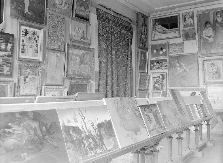
Miró clearly believed he had reached a key breakthrough with Femme nue and its companion paintings, and exhibited the series at the Pierre Colle Gallery in Paris in December 1932, and then in London at the Mayor Gallery the following summer. Looking to further expand his audience, Miró wrote to Pierre Matisse in November 1933 about the possibility of staging an exhibition of his recent work in Matisse’s Manhattan gallery. Lamenting his inability to travel to New York himself, Miró explained “the Ballets Russes of Monte Carlo will be in New York in December and January. I have done the scenery for a ballet called Jeux d’enfants, with music by Bizet. It might be—as was the case in London—a good time to show my work” (quoted in J. Russell, Matisse: Father & Son, New York, 1999, pp. 112-113). With just over a month’s notice, Joan Miró: Paintings opened on 29 December, and included these jewel-like compositions alongside a series of larger-scale, oil paintings which had their origins in paper collages. Femme nue, which appears in an installation photograph of the show, was purchased from the Matisse exhibition by the Philadelphia-based collectors R. Sturgis Ingersoll and his wife Marion, and remained in their collection until 1974, at which point it was acquired by Robert and Patricia Weis.
Curt Valentin Gallery, New York (1952). John Cowles, Minneapolis; Estate sale; Christie's, New York, 15 November 1983, lot 86.
Acquired at the above sale by the late owners.
EXHIBITED
Des Moines Art Center, Giorgio Morandi, February-March 1982 (illustrated).
LITERATURE
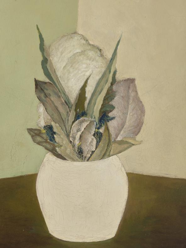
Des Moines Art Center Bulletin, March-April 1982 (illustrated). L. Vitali, Morandi: Catalogo generale, 1948-1964, Milan, 1983, vol. II, no. 1369 (illustrated).
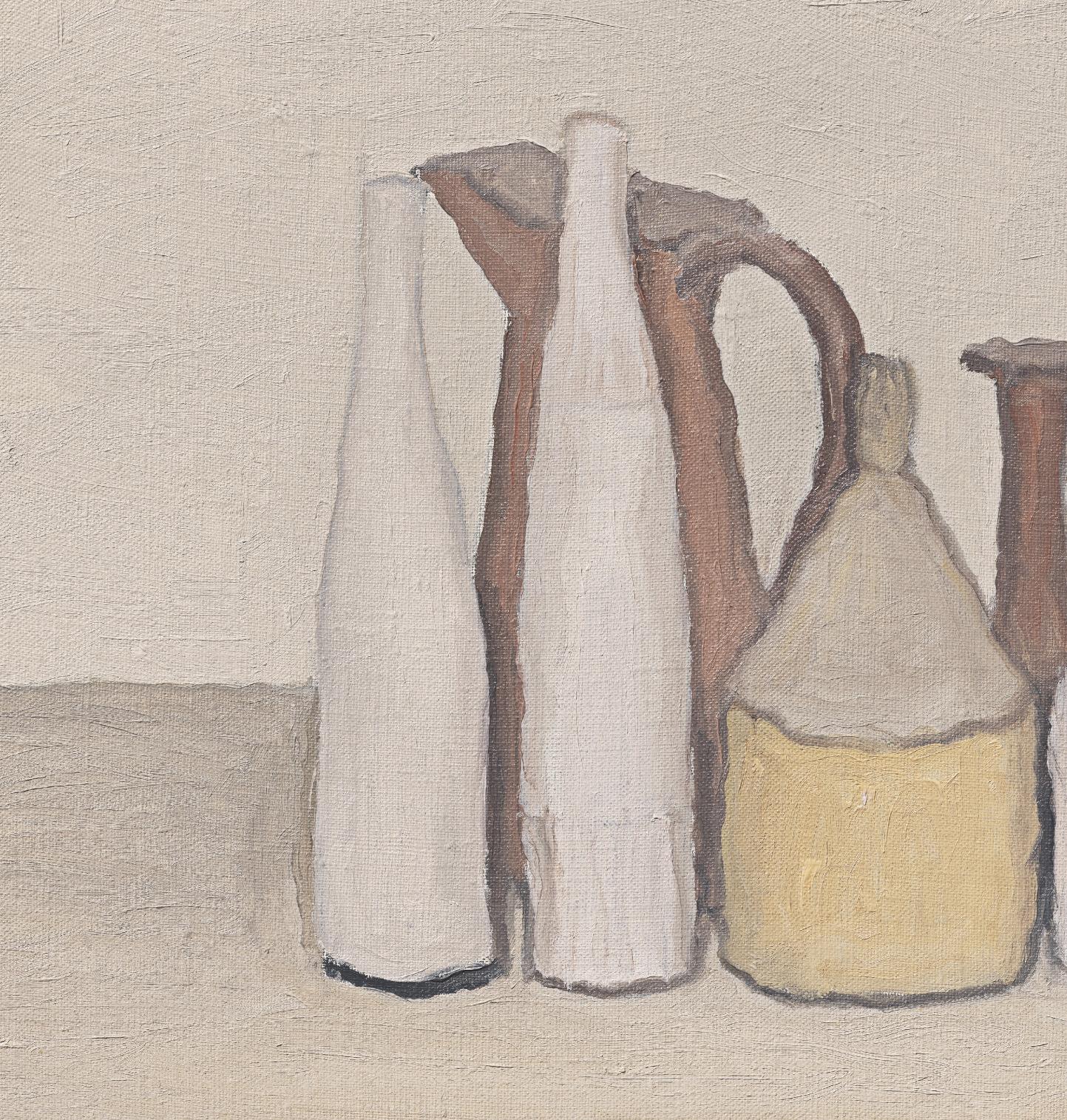
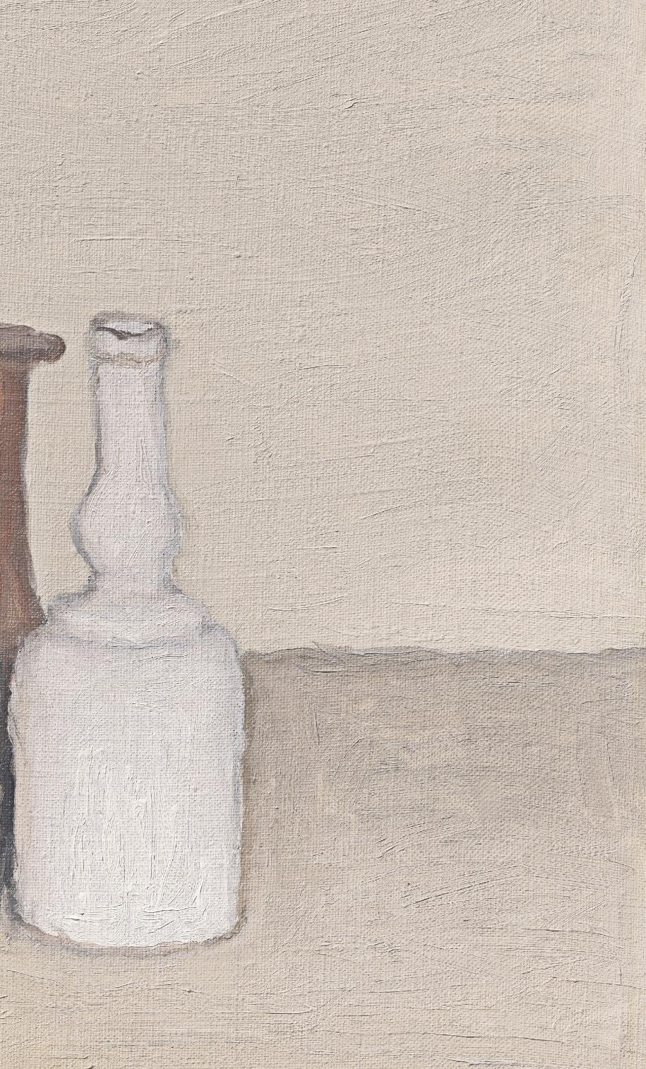
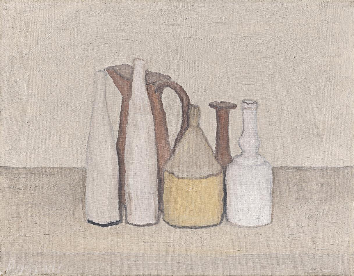
Exuding a quiet serenity, Giorgio Morandi’s 1952 composition Natura morta embodies the refined, meditative quality of the artist’s iconic still lifes following the end of the Second World War. Focusing on an array of quotidian vessels and containers arranged in a loose grouping, this deceptively simple composition is a masterful study of form, color and light, held together by a delicate, mysterious internal balance. Achieving a poetic lyricism from the most humble and familiar of objects—bottles, jugs, vases—was for Morandi one of the fundamental aims of his painting: “Even in as simple a subject,” he explained, “a great painter can achieve a majesty of vision and an intensity of feeling to which we immediately respond” (Interview with E. Roditi, quoted in M.C. Bandera and R. Miracco, eds., Giorgio Morandi, 1890-1964, exh. cat., The Metropolitan Museum of Art, New York, 2008, p. 358).
As with all of Morandi’s still lifes, the objects which populate the scene were personally selected by the artist from the extensive collection of items he kept in his studio. Often sourced from local flea-markets in his hometown of Bologna, and ranging from bottles to boxes, tins to vases and clocks, these objects were recurrent characters in his paintings, appearing in different guises and arrangements across numerous compositions. In most cases, they suggest a certain domesticity, as if they have been pulled from the kitchen or living room of Morandi’s home and appropriated for his artistic vision. However, by entering the world of the painter’s still lifes, they stand outside their original, intended function—to aid this, Morandi would eliminate all traces of an object’s former life before incorporating it into a scene, removing labels from bottles of oil and boxes of tobacco, pouring white paint into glass vessels to reduce the play of reflections and light on their surfaces, and anonymizing containers and tins by covering them with an even layer of matte paint.
Here, two tall, thin bottles coated in white are arranged to the left of the scene, standing just in front of a small pitcher, closely aligned yet ever so slightly different in their profile and texture. A cylindrical yellow container topped by an inverted funnel sits alongside them, leading the eye towards
“It takes me weeks to make up my mind which group of bottles will go well with a particular colored tablecloth. Then it takes me weeks of thinking about the bottles themselves...”
GIORGIO MORANDI
a pair of slender necked vases to the right, which round out the tight configuration. Morandi often spent weeks at a time deciding on the arrangement of his still lifes, contemplating the positioning of his chosen objects at length, from the exact spacing between each item, to the precise angle at which their edges overlap. Examining the serendipitous relationships that occurred as a result of these choices, he sought to celebrate the manner in which such subtle variations in tone, lighting, and arrangement could dramatically alter the visual perception of the objects before him. This approach required intense concentration and methodical analysis, in which every element was scrutinized, studied and evaluated before being committed to canvas. For Morandi, every new configuration represented a unique challenge.
Morandi’s keen skills of observation and diligent process of study ensured that although his works focused on a small repertoire of objects, they never repeated themselves. It was a hazard he was acutely aware of throughout his career, stating in an interview with Edouard Roditi in 1958: “I have always concentrated on a far narrower field of subject-matter than most other painters, so that the danger of repeating myself has been far greater. I think I have avoided this danger by devoting more time and thought to planning each one of my paintings as a variation on one or the other of these few themes” (quoted in E. Roditi, Dialogues: Conversations with European Artists at Mid-Century, San Francisco, 1990, p. 107). Executed in a warm palette of subtly variegated tones and thick, painterly impasto, Natura morta is an exquisite example of Morandi’s mature poetic reflections on perception and representation, capturing the level of in-depth study that lay behind his compositions, which hover on the fragile boundary between abstraction and figuration.
signed and dated 'Henri Matisse 37' (lower left) oil and Conté crayon on canvas 28¾ x 21¼ in. (73.1 x 54 cm.)
Executed in Nice in February-March 1937
PROVENANCE
Galerie Paul Rosenberg, Paris (acquired from the artist, June 1937). Pierre Matisse Gallery, New York (acquired from the above, 11 July 1938). Lily Pons, Dallas (acquired from the above, 13 August 1942); Estate sale, Sotheby Parke Bernet Inc., New York, 26 May 1976, lot 60.
Acquired at the above sale by the late owners.
EXHIBITED
Paris, Galerie Paul Rosenberg and London, Rosenberg & Helft, Ltd., Oeuvres récentes de Henri Matisse, June-July 1937, no. 13 (illustrated, pl. II).
Oslo, Kunstnernes Hus; Copenhagen, Statens Museum for Kunst and Stockholm, Liljevalchs Konsthall, Matisse, Picasso, Braque, Laurens, January-February 1938, p. 13, no. 29 (illustrated).
New York, Pierre Matisse Gallery, Henri Matisse: Paintings, Drawings of 1918 to 1938, November-December 1938, no. 10.
New York, Pierre Matisse Gallery, Henri Matisse: Retrospective Exhibition of Paintings, February 1943, no. 21.
Philadelphia Museum of Art, Henri Matisse: Retrospective Exhibition of Paintings, Drawings and Sculpture, April-May 1948, no. 78 (illustrated). The Dallas Museum for Contemporary Arts, The Lily Pons Collection, April-May 1961.
New York, The Museum of Modern Art, Henri Matisse: A Retrospective, September 1992-January 1993, p. 386, no. 316 (illustrated in color).
LITERATURE
G. Duthuit, "Henri Laurens: A propos de l'exposition Braque, Laurens, Matisse, Picasso à Oslo, Stockholm, Copenhague" in Cahiers d'Art, vol. 12, 1937, p. 225 (illustrated; titled Tête de femme).
A. Revold, "Henri Matisse" in Kunst og Kultur, vol. 24, 1938, p. 42 (illustrated).
G. Scheiwiller, Henri Matisse, Milan, 1939 (illustrated, pl. XXXII).
A.H. Barr Jr., Matisse: His Art and His Public, New York, 1951, p. 477 (illustrated).
G. Diehl, Henri Matisse, Paris, 1958, pp. 113 and 235 (illustrated, pl. 108).
P. Schneider, Matisse, Paris, 1984, pp. 441-442, 536 and 568-570 (illustrated in color, p. 568).
L. Delectorskaya, With Apparent Ease… Henri Matisse: Paintings from 1935-1939, Paris, 1988, pp. 220-221 (illustrated in color, p. 221; earlier state illustrated, p. 220).
G.-P. and M. Dauberville, Matisse, Paris, 1995, vol. II, p. 1364, no. 750 (illustrated).
Y.-A. Bois, ed., Matisse and Picasso: A Gentle Rivalry, exh. cat., Kimbell Art Museum, Fort Worth, 1999, pp. 112-113 (illustrated in color, p. 113, fig. 102).
M. Affron, ed., Matisse in the 1930s, exh. cat., Philadelphia Museum of Art, 2022, p. 241, fig. 109a (illustrated in situ in the 1938 exhibition at Pierre Matisse Gallery, New York, p. 160).
The late Marguerite Duthuit confirmed the authenticity of this work.
“The painting is not a mirror reflecting what I experienced while creating it, but a powerful object, strong and expressive, which is as novel for me as for anyone else.”
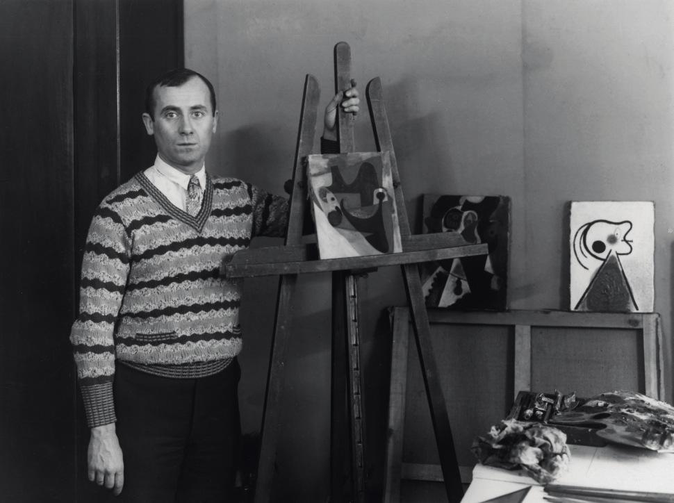
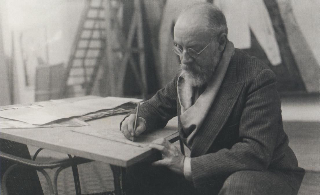
Henri Matisse drawing, circa 1933-1934.
HENRI MATISSE
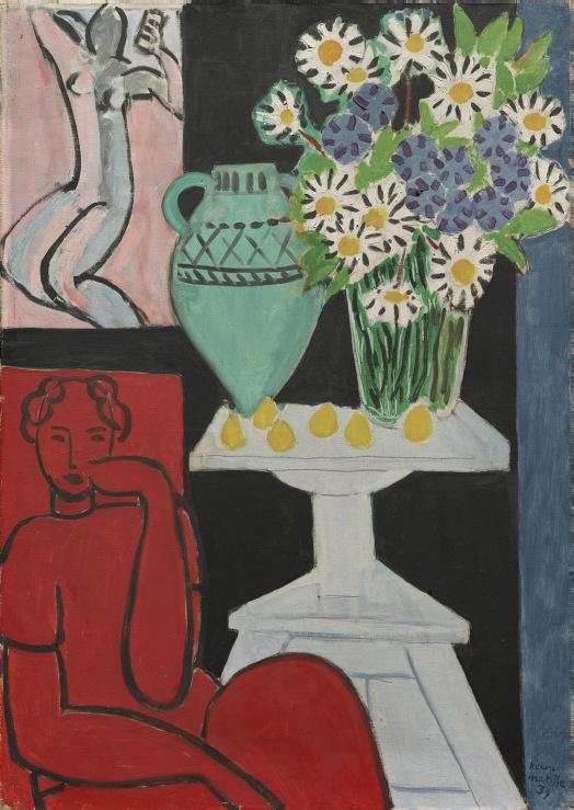
Filled with a vibrant energy and vivid play of color, Figure et bouquet (Tête ocre) is a testament to the continued vitality and spirit of innovation that marked Henri Matisse’s painterly output during the late 1930s. Completed in several sessions between the middle of February and early March 1937, the painting reveals the artist’s renewed focus on analyzing the relationship between line and color in his practice at this time. Constructing his scene in a complex interplay of broad passages of bright, unmodulated pigments and sinuous, fine contours, Matisse explores a new direction in his artmaking, which would have an important impact on his oeuvre over the following decade.
In the five years between 1929 and 1934, Matisse had done very little easel painting—he had devoted more than two years of intensive work to La Danse, the large decorative mural that Dr. Albert C. Barnes had commissioned for his home in Pennsylvania, and was further occupied during this period by an important series of four retrospective exhibitions, in Berlin, Paris, Basel, and New York. He also took the opportunity to travel extensively for the first time in his life—to the United States on four occasions, visiting his son Pierre in New York, before voyaging halfway around the world to Tahiti for a transformative five-month sojourn. “When you have worked a long time in the same milieu, it is useful at a given moment to stop and take a voyage,” he explained to the publisher Tériade in 1930. “[It] will let parts of the mind rest while other parts have free reign—especially those parts repressed by the will. This stopping permits a withdrawal and consequently an examination of the past. You begin again with more certainty” (quoted in J. Flam, Matisse on Art, Berkeley, 1995, p. 88).
When Matisse finally returned to painting after this long hiatus, he found himself faced with two alternative paths—he could return to the hedonistic fantasies that had occupied him in Nice during the previous decade, filling his canvases with sensual odalisques and sumptuous figure studies once again, or he could renew an experimental streak in his art, which had been interrupted in 1918. He boldly chose the latter course, setting himself a highly ambitious project that would lead him to some of the most dynamic works of his career. Determined to reclaim his status as a leading proponent of modernism and demonstrate the continued strength of his creativity, Matisse tested the boundaries of his pictorial idiom, flattening his forms, heightening
his color palette, and leaning increasingly towards the decorative in his focus on pattern. These developments coincided with a subtle shift in his practice, as he employed new methods and techniques in his painting, inspired by his experiences planning and executing the Barnes mural. While the application of paper cut-outs to his canvases allowed him to assess the visual power of his compositions as he worked to refine his vision, photography became an important tool in tracking the progress and development of his ideas, recording the various adjustments, revisions and reworkings that occurred at each stage.
At the same time, line drawing also took on a greater prominence and significance in Matisse’s work. According to his assistant and frequent model, Lydia Delectorskaya, the artist would paint in the mornings, before turning his attention to drawing in the afternoon, a ritual that simultaneously prolonged his painterly activities through the day, while also preparing him for the following morning’s work. As Ellen McBreen has noted, the lines between the two became increasingly blurred within this period: “The interdependence of the two media—the intensity of drawing sessions allowing for the ‘apparent ease’ of painting—is also signified by the graphite marks… on raw canvas, peering out from under the colored surface” (in M. Affron, exh. cat., op. cit., 2022, p. 189). However, this also threw up new questions for Matisse—whereas previously he had believed line and color to be perfectly in accord with one another, symbiotic elements that were inextricably intertwined, by the late 1930s he felt that they were in fact opposing, contrapuntal forces. This concept is vividly explored in Figure et bouquet (Tête ocre), as Matisse conjures an intriguing contrast between the large, flat areas of color, and the delicate, sinuous linear drawing overlaying it, describing the figure, the furniture and the various objects of his studio in a fluid, abbreviated style.
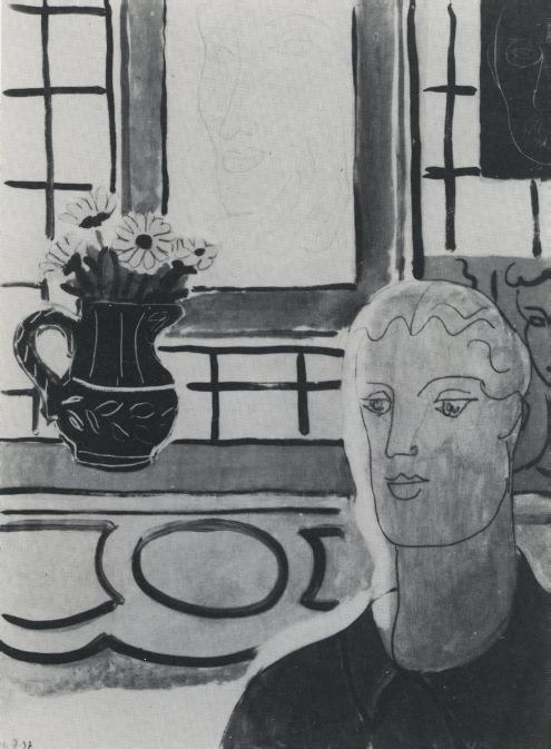
In her publication With apparent ease… Henri Matisse: Paintings from 1935-1939, Delectorskaya indicates that Figure et bouquet (Tête ocre) was completed over the course of several weeks and numerous painting sessions in the spring of 1937 (op. cit., 1988, pp. 220-221). She also included a photograph illustrating an earlier state of the work, recording the painting’s progress on 12 February 1937, which showcases the evolution of Matisse’s approach to the overall composition. In this rare glimpse at
“In my latest paintings, I united the acquisitions of the last twenty years to my essential core, to my very essence.”
the work-in-progress, the lines appear much thicker and darker, executed in flowing, paint-laden strokes of the brush that imbues them with a distinct solidity and weight. Matisse subsequently pared these details back significantly, favoring a thinner, more refined line that echoed his drawings in pen and ink. He also reworked the contours of the figure’s face, altering the angle of her jaw and nose, to create a more elegant silhouette, while the scalloped edges of the frame and the incised detailing of the blue jug appear to have been similarly adjusted or added as he worked. Most notably, another drawing, most likely a self-portrait of the artist executed on a dark black ground, was removed from the wall in the upper right corner of the finished composition, allowing the framed female portrait to take center stage instead.
This elegant, abbreviated impression of Delectorskaya sits prominently on the wall above the mantlepiece, and appears to refer directly to a group of related pen and ink drawings of Lydia that had occupied the artist in recent months. Each work in this long series offered a subtle variation of his sitter in a similar pose, her chin resting on her hand in a pose of quiet insouciance, as in Head of a Woman with Chin in Palm (1937; Pushkin Museum, Moscow). A similar drawing also made an appearance on the wall in Matisse’s La grande robe bleue et mimosas (1937; The Philadelphia Museum of Art), this time reduced to just a series of stark white outlines against a soft blue toned sheet that matches the central protagonist’s dress. In Figure et bouquet (Tête ocre) the large sheet appears to be filled with subtle, interweaving layers of lines, suggesting partially-visible pentimenti that hint at the shifting path of the artist’s hand as he worked to capture her likeness.
The diagonal between the ochre figure and the blue vase on the mantlepiece, meanwhile, introduces a feeling of recession and volume to the scene, offsetting the apparent flatness of the surrounding planes of color. This also sets up an intriguing mirroring effect between the vividly colored character in the foreground and the woman in the framed portrait behind, drawing our attention to the similarities in their features, as well as their striking differences. The grid-like backdrop, meanwhile, places the viewer squarely within the artist’s studio in Nice. In April 1928, Matisse had secured two apartments on the fifth-floor of an attractive building in the Ponchettes neighborhood of the city, and proceeded to merge and reconfigure the two spaces to best suit his needs. In this redesign, Matisse created two studios, which became the site of many of his figurative paintings through
the ensuing decade—one had a large bay window, looking out over the Mediterranean sea, while the other boasted corner windows and trompe l’oeil walls made by a local artisan, one with a faux-tile grid, the other imitating a marble finish.
The graph-like pattern of the tiling brought a dynamic, decorative quality to many of the artist’s paintings during this period—he often played with the size and dimensions of the squares, and frequently allowed the wall to take on different hues as it reflected the play of light within the space. In one canvas the small squares would be depicted using a gently variegated greyish-white tone, off-set by lines of deeper green, only to transform in the next to an expanse of pale turquoise delineated by strong white lines. In other works, the walls are a study of delicate lavender shadows, or a soft, almost iridescent pink, as if bathed in the warm glow of the setting sun. In Figure et bouquet (Tête ocre) these tiles retain their natural, off-white hue, allowing the rhythmic nature of the evenly spaced replica tiling to stand out, while also enhancing the power of the glowing tones of the other elements within the scene. The overall effect is a rich play of color and form, figuration and abstraction, that in many ways anticipates the highly stylized, decorative compositions Matisse would complete in the final years of his career.
Figure et bouquet (Tête ocre) was among a selection of the artist’s recent compositions shown in a series of important international exhibitions between 1937 and 1938, in Paris, London, Copenhagen and Stockholm. The painting subsequently travelled to New York, where it was included in the show “Henri Matisse: Paintings and Drawings of 1918 to 1938,” held at the Pierre Matisse Gallery. It was purchased shortly thereafter by the FrenchAmerican soprano and actress, Lily Pons. Considered one of the most glamorous stars on the operatic stage, Pons had trained as a singer in Paris during the 1920s, and made her debut at the Metropolitan Opera House, New York City, in January 1931. Her expressive style and coloratura soprano led her to become an immediate critical success, while her elegance, beauty and dramatic skills made her a favorite with audiences. As well as touring extensively, she remained with the Metropolitan for more than three decades as a principal, famed for French and Italian coloratura parts. Matisse’s Figure et bouquet (Tête ocre) remained in Pons’s collection for over thirty years, and was hung in her Dallas apartment alongside works by Pierre-Auguste Renoir, Marie Laurencin and Georges Braque. It was sold by her estate in May 1976, at which point the painting was acquired by Robert and Patricia Weis.
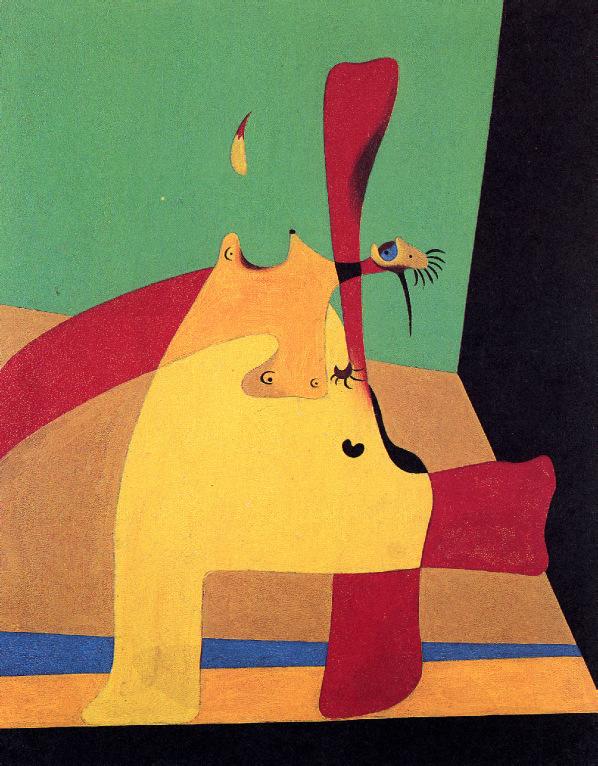
signed 'Picasso' (lower right); dated and inscribed 'Boisgeloup 31 Août XXXII.' (on the stretcher) oil, Ripolin and charcoal on canvas 36¼ x 28¾ in. (92.1 x 73 cm.)
Painted in Boisgeloup on 31 August 1932
PROVENANCE
Galerie Beyeler, Basel (acquired from the artist, 7 November 1966).
Paul Rosenberg & Co., New York (acquired from the above, 6 December 1966).
ACA Galleries, New York (acquired from the above, 2 January 1970).
Private collection, New York.
Private collection, Houston.
Private collection, Mexico.
Acquavella Galleries, Inc., New York (acquired from the above, 1984). Acquired from the above by the late owners, 6 December 1985.
EXHIBITED
Basel, Galerie Beyeler, Picasso I: Werke von 1900-1932, November 1966-January 1967, no. 43 (illustrated in color).
LITERATURE
J. Palau i Fabre, Picasso: Del Minotaur al Guernica, 1927-1939, Barcelona, 2011, pp. 109 and 433, no. 305 (illustrated in color, p. 109; with incorrect dimensions).
L. Madeline and V. Perdrisot-Cassan, eds., Picasso 1932: Année érotique, exh. cat., Musée national Picasso, Paris, 2017, p. 156 (illustrated in color, fig. 42; with incorrect dimensions).
The Comité Picasso has confirmed the authenticity of this work.
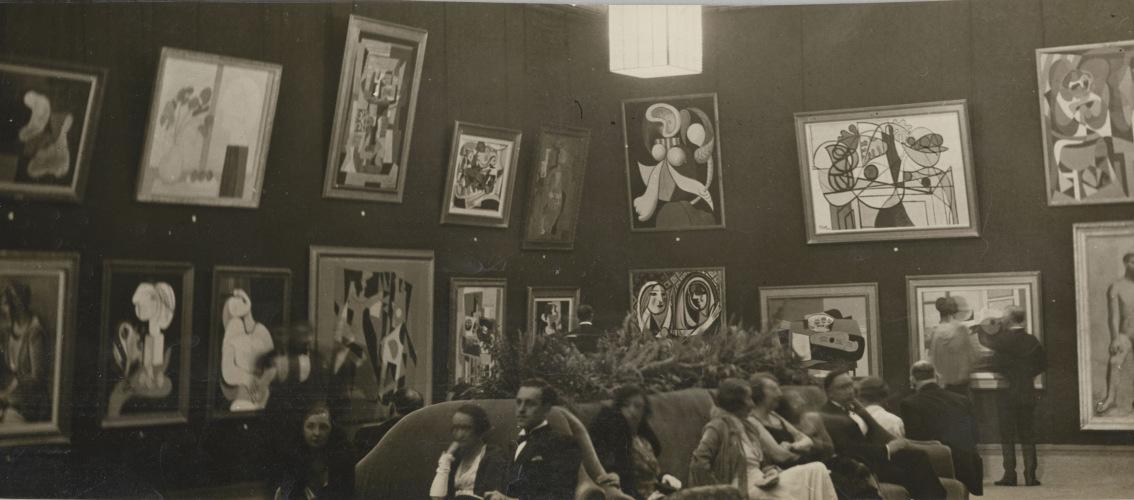
On 15 June 1932, an extensive survey exhibition dedicated to Pablo Picasso opened at the Galeries Georges Petit in Paris to great fanfare. Across each room in the recently renovated galleries visitors to Picasso: 1901-1932 were treated to an expansive array of works from every stage of the Spanish artist’s career thus far, the eclectic arrangement showcasing the breadth of creativity and ceaseless spirit of invention that marked Picasso’s art. The artist himself had been heavily involved in the planning and realization of the show, arranging loans from his most loyal private collectors and drawing heavily on his own personal archive to secure a final total of 225 paintings, seven sculptures and six illustrated books for display. Similarly, he took charge of the hanging of the works, choosing an arrangement that revealed the recurring leitmotifs, subjects and concerns that had fascinated him endlessly across the years.
In the lead up to the exhibition’s vernissage, however, newspaper reports claimed the artist would skip the opening night in favor of an evening at the movies: “I’ve been hooking these things on the wall for six days now,” Picasso is reported to have said, “and I’ve had enough of them” (quoted in M.C. FitzGerald, Making Modernism: Picasso and the Creation of the Market for Twentieth-Century Art, Berkeley and Los Angeles, 1995, p. 193). The artist escaped Paris shortly afterwards, retreating to his seventeenthcentury château, Boisgeloup, in the Normandy countryside. Though just a quick drive from the French capital, this secluded, private property was a refuge for Picasso during the early 1930s, its location reducing the likelihood of unwelcome visitors, prying acquaintances, or admirers paying an unexpected call. Here, he was able to focus on his creative work undisturbed, in the stable he had transformed into a sculpture studio, or the room on the second floor of the corner tower, which had become a dedicated space for painting.
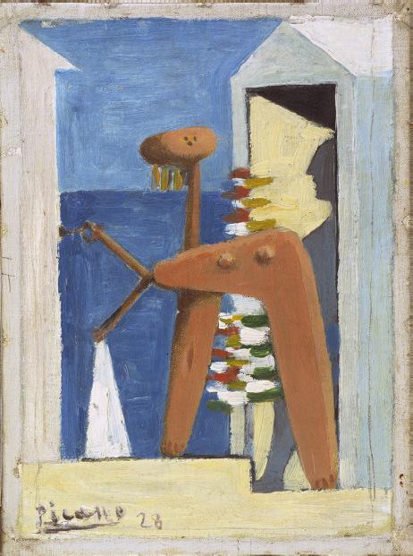
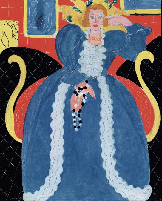
Purchasing a large stock of new canvases, Picasso spent much of the summer of 1932 installed at Boisgeloup, picking up where he had left off in late May as preparations for the grand exhibition had consumed his time and forced him to pause his painterly activities. As with the extraordinary sequence of compositions that had emerged during the opening months of the year, the central figure in Picasso’s art during the summer was MarieThérèse Walter, the young woman who had been his lover and muse since 1927. Painted on 31 August 1932, La Lecture (Marie-Thérèse) portrays
Marie-Thérèse in a moment of quiet leisure, her attention focused solely on her book, as she appears to lose herself in the story. Imbued with a quiet intimacy and tenderness that stands in stark contrast to the more highly stylized portraits of Marie-Thérèse that had occupied Picasso in recent weeks, this painting records the small, everyday moments the artist and muse enjoyed together in their idyllic, hidden retreat that summer.
Picasso had first met Marie-Thérèse Walter in a chance encounter on the streets of Paris in the early evening of 8 January 1927. Marie-Thérèse, who was exiting the famed Galeries Lafayette department store with her newly purchased col Claudine and matching cuffs for a blouse, remembered catching the artist’s eye in the middle of the crowd. Making his way to her, Picasso promptly introduced himself. “You have an interesting face. I would like to do a portrait of you,” he reportedly told her. “I feel we are going to do great things together… I am Picasso” (quoted in J. Richardson, A Life of Picasso, The Triumphant Years, 1917-1932, New York, 2007, vol. 3, p. 323).
View of the Grand Salle during the vernissage of “Picasso: 1901-1932,” at the Galerie Georges Petit, Paris, June 1932. Photograph by Gotthard Schuh.
In turn, Marie-Thérèse responded with a blank look. “The name Picasso did not mean anything to me. It was his tie that interested me,” she explained. “And then he charmed me” (quoted in P. Cabanne, “Picasso et les joies de la paternité” in L’Oeil, no. 226, May 1974, p. 7).
Picasso was deeply struck by Marie-Thérèse’s statuesque beauty and youthful exuberance, and arranged to meet her again two days later, at the Saint-Lazare metro station. “I went there, just like that, because he had such a pleasant smile,” Marie-Thérèse remembered (quoted D. Widmaier Picasso, “MarieThérèse Walter and Pablo Picasso: New Insights into a Secret Love” in Pablo Picasso and Marie-Thérèse Walter: Between Classicism and Surrealism, exh. cat., Graphikmuseum Pablo Picasso, Münster, 2004, p. 29). This legendary encounter came at a pivotal turning point in the artist’s life, as he grew increasingly disillusioned by the haute-bourgeois existence that his wife, the Ukrainian-born ballet dancer Olga Khokhlova, had cultivated for them in Paris. Seeking new inspiration, he had become fascinated by the mythical l’amour fou promoted by André Breton and the Surrealists, a passionate love that would strike suddenly, and consume the beholder. When the tall, blonde, blue-eyed young woman passed him on the street that fateful day, the artist believed he had found such a paramour. The pair soon embarked upon a clandestine affair, centered around furtive meetings and love letters passed in secret.
As Françoise Gilot noted, Walter’s presence left an indelible mark on Picasso’s artistic output during these years, inspiring a vivid new pictorial vocabulary: “I found Marie-Thérèse fascinating to look at. I could see that she was certainly the woman who had inspired Pablo plastically more than any other. She had a very arresting face with a Grecian profile. The whole series
Pablo Picasso, Le Rêve, 24 January 1932. Private collection.
of portraits of blonde women Pablo painted between 1927 and 1935 are almost exact replicas of her… she was very athletic, she had that high-color look of glowing good health one often sees in Swedish women. Her forms were handsomely sculptural, with a fullness of volume and a purity of line that gave her body and her face an extraordinary perfection” (F. Gilot and C. Lake, Life with Picasso, New York, 1964, pp. 241-242). As the 1930s dawned, Marie-Thérèse’s likeness appeared increasingly front and center in his works, blossoming forth in all areas of his creative production. Never before had Picasso’s art radiated such passionate, heady eroticism—from delicate drawings, to monumental canvases, to grand plaster sculptures, Marie-Thérèse became the very foundation of every aspect of Picasso’s artistic output.
By the time their relationship entered its sixth, deeply passionate year, Picasso was intimately familiar with Marie-Thérèse’s form. He could recall from memory the way her golden hair fell as it brushed her cheek, the exact profile of the line that ran from her forehead, down her nose to her chin, and the sinuous, flowing topography of her athletic body as she slept. As a result, she became a vehicle for the artist’s most radical painterly experimentations, allowing him to explore themes of transformation and mutation in a myriad of intriguing ways. In 1931, the artist began a series of monumental plaster sculptures, working on carved reliefs and volumetric busts, each devoted to the poised, elegant features of Marie-Thérèse, while the first half of 1932 witnessed a great outpouring of superlative, monumental canvases capturing her form in a myriad of different styles and variations Ranging from daring, formal reconfigurations of her figure, to richly sensuous visions of her in the role of archetypal reclining nude, these paintings show Picasso at his most inventive. A significant proportion of these works focus on seated portraits of Marie-Thérèse, relaxing in a moment of repose, writing a letter in Buste de femme de profil (MarieThérèse) (Zervos, vol. 7, no. 406; Private collection) or caught in a dreamy, sleeping state in the iconic La Rêve (Zervos, vol. 7, no. 364; Private collection) or Le sommeil (Zervos, vol. 7, no. 362; Private collection).
“I seek always to observe nature. I cling to resemblance, to a deeper resemblance.”
PABLO PICASSO
Pablo Picasso, La Lecture, 1932. Musée national Picasso, Paris.
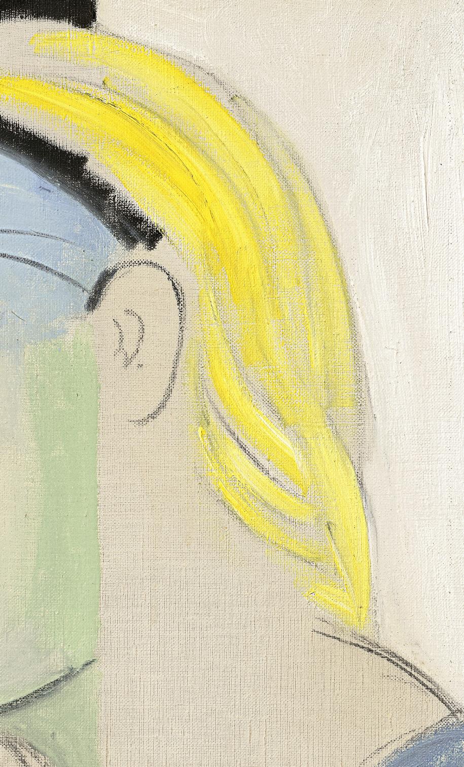
In La Lecture (Marie-Thérèse), Picasso continues this thread of easy leisure, revisiting a subject that had been popular in portraiture since the seventeenth century and which he himself had deployed on numerous occasions for his depictions of the women in his life—that of a female protagonist reading. The first painting the artist completed in 1932 focused on this same subject—in La Lecture (Zervos, vol. 7, no. 358; Musée national Picasso, Paris), painted on 2 January, Marie-Thérèse appears to have been interrupted from her reading, her gaze directed squarely at the artist, her hands resting gently in her lap as she marks her place in the text. By contrast, in La lecture interrompue (9 January 1932, Zervos, vol. 7, no. 363; Private collection) painted a week later, Marie-Thérèse’s head lolls backwards against the headrest of her chair, as if she has is lost in a daydream conjured by the tale, or has drifted-off mid-way through a chapter. In the present work, her focus is trained solely on the book before her—with her chin propped on one hand, and her eyes cast downward, Marie-Thérèse is a study in relaxed focus, the gentle tilt of her head and soft expression suggesting she is oblivious to the artist’s attentions.
Seated before a simple rectangular window—which features in several other works from this year, including Nature morte à la fenêtre (18 January 1932, Zervos, vol. 7, no. 374; Private collection) and Femme assise près d’une fenêtre (Marie-Thérèse) (30 October 1932; Private collection)—MarieThérèse’s form appears monumental, Picasso’s treatment of the figure recalling the stylized, volumetric sculptures the artist had created the previous year, inspired by her elegant features. The soft light that spills through the window, meanwhile, illuminates Marie-Thérèse in a play of light and shade, which Picasso indicates by dividing her form into loosely blocked planes of predominantly pastel tones. Traces of charcoal remain visible on the surface of the canvas, interacting with the painted elements in an intriguing interplay that showcases the fluency and spontaneity of Picasso’s technique at this time. Subtle pentimenti reveal the evolution of the image as he worked to capture a likeness swiftly, lines shifting or altering in order to refine certain elements of the figure, as seen in Marie-Thérèse’s right hand. At the same time, there is a bold assuredness to his mark-making, a confidence that allows him to convey her features with a startling economy of means—with a single, short, curving line, for example, he indicates an eye, while a quick horizontal zig-zag at her mouth hints at the sensuality of her lips.
There is a quiet stillness to La Lecture (Marie-Thérèse), a reflection perhaps of Marie-Thérèse’s ongoing presence in the artist’s life at Boisgeloup during this summer, and the simple rhythms of their days together, reading, working, making love, in the secluded surroundings of the chateau. “We would joke and laugh together all day,” Marie-Thérèse later recalled of their time together, “so happy with our secret, living a totally non-bourgeois life, a bohemian love away from those people Picasso knew then...” (quoted in B. Farrell, “Picasso: His Women: The Wonder is that He Found So Much Time to Paint” in Life, 27 December 1968, p. 74). Picasso’s numerous depictions of Marie-Thérèse from these months focus on poses that are captured from the privileged position of a lover, including close-up views of her face as she sleeps, the soft curves of her body as she reclines on a divan, the dreamy expression that takes over her face as she is lost in thought. Here, she appears completely at ease and comfortable in the artist’s presence. Allowed to observe his model uninterrupted, Picasso captures the vivid presence of his beloved model and muse in a peaceful, unremarkable moment of ordinary life.
In an interview with Marie-Thérèse in 1974, Pierre Cabanne asked her what first came to her mind when she heard the name Picasso. Walter answered: “Secrecy. This was because my life with him was always concealed. It was calm and tranquil. We didn’t tell anyone. We were happy like that, and that was enough for us” (quoted in P. Cabanne, op. cit., 1974, p. 7). In many ways, this secrecy came to an abrupt end when visitors entered the Galeries Georges Petit that June to see the artist’s mid-career retrospective, and discovered the great wealth of recent works dedicated to Marie-Thérèse. The repeated appearance of her features from canvas to canvas, room to room, combined with the often erotically charged nature of the works on show, indicated that the artist had found powerful inspiration in his young lover. Though Marie-Thérèse’s identity would remain hidden for a further three decades—her name and long relationship with the artist only revealed when Françoise Gilot published her memoirs in 1964—it was evident to anyone that saw the 1932 exhibition, either in Paris or in its revised format at the Kunsthaus Zurich later that year, that she now occupied the central position within Picasso’s creative vision.
“We would joke and laugh together all day, so happy with our secret, living a totally non-bourgeois life, a bohemian love away from those people Picasso knew then...”
MARIE-THERESE WALTER
Jean Honoré Fragonard, Young Girl Reading, circa 1769. National Gallery of Art, Washington, D.C.
Camille Corot, Interrupted Reading, circa 1870. The Art Institute of Chicago.
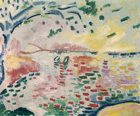
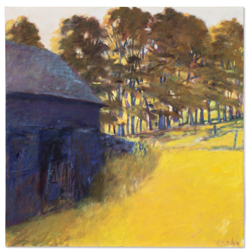
GEORGES BRAQUE (1882-1963)
La Ciotat
signed 'G Braque' (lower left) oil on canvas
19⅜ x 23⅝ in. (49.2 x 60 cm.)
Painted in summer 1907
PROVENANCE
Galerie Pierre, Paris (acquired from the artist, 24 September 1937). Louis Foght, Copenhagen (acquired from the above, February 1938); Estate sale, Sotheby & Co., London, 6 July 1960, lot 165. Matthiesen Gallery, London (acquired at the above sale).
Lady Aline Elisabeth Yvonne Berlin (née de Gunzbourg), Paris and London; sale, Sotheby & Co., London, 7 July 1971, lot 21. Acquired at the above sale by the late owners.
EXHIBITED
(possibly) Paris, Galerie Pierre, Georges Braque: Paysages de l'époque fauve, February 1938.
Copenhagen, Ny Carlsberg Glyptotek, Fransk Kunst: Maleri og Skulptur fra det 19. og 20. Aarhundrede, July-October 1945, p. 8, no. 38.
Copenhagen, Kunsthal Charlottenborg, Levende Farver, September 1950, no. 28.
Munich, Haus der Kunst, Georges Braque, October-December 1963, p. 32, no. 10 (illustrated, fig. 9).
University Park, The Pennsylvania State University Museum of Art, Paintings and Sculptures from Central Pennsylvania Collectors, April-June 1984, p. 9, no. 47 (illustrated, p. 32).
Los Angeles County Museum of Art; New York, The Metropolitan Museum of Art and London, The Royal Academy of Arts, The Fauve Landscape, October 1990-September 1991, pp. 270 and 274 (illustrated in color, p. 274, pl. 286).
LITERATURE
H. Rostrup, "Franske Malerier i en Anonym Dansk Privatsamling" in Aarstiderne, vol. 4, no. 3, June 1945, p. 71 (illustrated in color).
A.M.E. Van Eijk van Voorthuijsen, ed., World Collectors Annuary, Voorburg, 1972, vol. XXIII, p. 64.
J. Flam, “The Gallery: 'Wild Beasts' and Their Landscape” in The Wall Street Journal, no. 18, 20 November 1990, p. 20.
R. Thomson, "Young Man's Painting" in The Times Literary Supplement, no. 4604, 28 June 1991, p. 16.
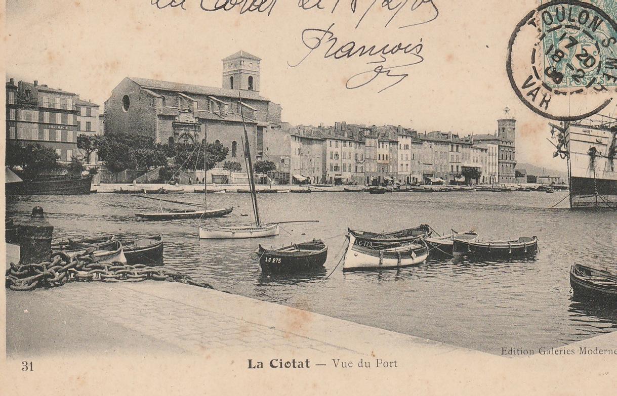
Postcard, La Ciotat – Vue du Port, circa 1905.
Painted during a period of fervent creative development for Georges Braque, La Ciotat is a rare Fauvist composition, dating from the summer months of 1907. Braque had initially encountered the revolutionary approach to painting advocated by the Fauves—the daring group of artists spearheaded by Henri Matisse and André Derain—during a visit to the infamous Salon d’Automne in 1905. He was immediately struck by the vigor of their approach, the purity of their colors, and their daring departure from conventional rules of perspective. Over the following two years, Braque explored their pictorial language intensively, adopting a vibrant, non-naturalistic approach to color that completely transformed his view of the world. In La Ciotat, Braque uses the Fauvist language to capture a bold view of the countryside along the Mediterranean coast, each stroke of saturated, unmodulated pigment exuding a raw power and energy that simultaneously conjures the intense heat and light of the Midi, and Braque’s own instinctive response to the landscape in this quiet corner of the South of France.
Braque first visited the Côte d’Azur in the fall of 1906, traveling to the small fishing-port of L’Estaque, near Marseille. Up until this point, the artist—who was born in Argenteuil and grew up in Le Havre, on the north Atlantic coastline— had never ventured further south than Paris, and his only impressions of the Midi came from the vibrant canvases of Collioure that Matisse and Derain had painted the previous year. His arrival in L’Estaque proved to be a true revelation for Braque, the rugged landscape, deep blue Mediterranean Sea, indigenous plant-life and striking, luminous light capturing his imagination instantly. “It’s there that I felt all the
elation, all the joy, welling up inside me,” he later explained. “Just imagine, I left the drab, gloomy Paris studios where you were still working in bitumen. There, by contrast, what a revelation, what a blossoming!” (quoted in A. Danchev, Georges Braque: A Life, London, 2005, p. 41).
While he later admitted that he had been planning to paint particular motifs on his arrival, saying “my first paintings of L’Estaque were conceived before my departure,” the experience of working en plein air, under the blazing sunlight and within the unique atmosphere of the south, dramatically altered Braque’s vision. “I took great care… to place [my paintings] under the influence of the light, the atmosphere, and the reviving effect of the rain on the colors,” he explained (quoted in ibid., p. 41). The resulting canvases were infused with glowing, incandescent color, the verdant landscapes and panoramic vistas ignited with shades of bright pink, yellow, orange, turquoise, and purple, applied in strong, expressive brushwork, that switched between long, sinuous strokes and short, staccato dashes.
Braque spent several months toiling away in L’Estaque, before briefly returning to Paris in the spring of 1907 for the Salon des Indépendants, where he exhibited a group of his recent Fauvist paintings, each of which found a buyer. Bolstered by this success, the artist was lured to the south again in June, this time venturing further eastwards along the coast to settle in the small town of La Ciotat, which was well-known for its ship building industry. Paying particular interest to the rolling, volcanic cliffs and secluded coves, known as calanques, that sat on the outskirts of town,
the paintings Braque worked on that summer are marked by a growing interest in the construction of pictorial space. As the artist later recalled: “I realized that the exaltation which had overwhelmed me during my first visit [to the Midi] and which I had transmitted onto canvas was no longer the same. I saw that there was something further. I had to cast around for another means of self-expression more in keeping with my nature” (quoted in J. Richardson, A Life of Picasso, 1907-1917: The Painter of Modern Life, London, 2009, vol. II, p. 68).
Painted during this pivotal summer, La Ciotat powerfully illustrates the development of these dual interests in Braque’s style at this time, marrying his bold coloristic vocabulary with a stronger sense of structure and space. Stepping away from the purely perceptive, expressive reaction to the landscape, Braque now also focused on the placement of elements within his scene, meditating on their relationship to one another and the ways in
Georges Braque, Le Golfe des Lecques, 1907. Musée national d’art moderne, Centre Pompidou, Paris.
“It’s [in the Mediterranean] that I felt all the elation, all the joy, welling up inside me. Just imagine, I left the drab, gloomy Paris
studios where one was still working in bitumen. There, by contrast, what a revelation, what a blossoming!”
GEORGES BRAQUE
Georges Braque, Le port de La Ciotat, 1907. National Gallery of Art, Washington, D.C.
Georges Braque, Petite baie de La Ciotat, 1907. Musée national d’art moderne, Centre Pompidou, Paris. Photo: Bridgeman Images.
“Everything about [Cezanne] was sympathetic to me, the man, his character, everything…”
GEORGES BRAQUE
which subtle adjustments and visual connections could alter the overall compositional effect. Here, the view is constructed in a series of distinctive layers, progressing from the short wall in the immediate foreground, through the sweeping hillside, to the azure blue of the bay, and the sky in the distance, executed in short, tesserae-like touches of pure color. Braque used the traditional framing device of a verdant tree in the foreground to enhance this sense of depth, its bushy leaves and twisting branches stretching into the frame from the right-hand side of the canvas in a sweeping arabesque, directing the eye towards the array of red-roofed buildings that fill the steeply sloping hillside.
Arranged in a diagonal line that runs from right to left, following the natural topography of the site, these buildings stand out among the tight mesh of vegetation that fills the incline. Outlined in strong, linear strokes of dark green and blue paint, their regular, geometric profiles offer an intriguing visual counterpoint to the repeated, undulating curves of organic forms within the landscape, which grant the scene a sinuous visual rhythm. In many ways, the construction and layering of the view is strongly reminiscent of Paul Cezanne’s celebrated series of paintings of L’Estaque, which would go on to have an enormous impact on Braque’s developing style through the remainder of 1907 and into the following year. Braque’s growing regard for the older artist’s work was galvanized by the posthumous retrospective dedicated to Cezanne at the Salon d’Automne that October and, from this point onwards, his landscapes began to favor more angular, geometric forms, paving the way for his early cubist compositions. In La Ciotat, the first seeds of this important shift were just starting to take root, infiltrating Braque’s vigorous, vibrant depiction of the Mediterranean landscape with a new sense of refinement and order.
Paul Cezanne, La Baie de l’Estaque vue de l’est, circa 1876-1879. Memorial Art Gallery, University of Rochester.
oil transfer and watercolor on Japan paper laid down on card 9 x 11¾ in. (22.8 x 29.8 cm.)
Executed in 1920
PROVENANCE
Galerie Neue Kunst (Hans Goltz), Munich (acquired from the artist, May-June 1920).
J.B. Neumann, Berlin and New York (1921). Karl Nierendorf, New York (by 1945).
Richard Shaw Sisson, Los Angeles and New York (by 1948, and until at least 1951).
E.V. Thaw & Co., New York (by 1980).
Galerie Springer, Berlin.
Anon. sale, Sotheby's, New York, 6 November 1981, lot 543.
Acquired at the above sale by the late owners.
EXHIBITED
Munich, Galerie Neue Kunst, Paul Klee, May-June 1920, no. 250. Berlin, Graphisches Kabinett J.B. Neumann, Klein Paul Klee, March-April 1921, no. 17.
New York, Nierendorf Gallery, Works by Klee, March-April 1945, no. 13 (titled Girl with Yellow Head).
Beverly Hills, The Modern Institute of Art, Klee: 30 Years of Paintings, Water Colors, Drawings and Lithographs by Paul Klee, September-October 1948, no. 35 (illustrated; dated 1922 and titled Girl with Yellow Hair).
Palm Beach, Society of the 4 Arts, Paintings by Paul Klee, March-April 1951, no. 18 (dated 1922 and titled Little Girl with Yellow Hair).
LITERATURE
The Artist's Handlist, no. 1920, 37. J. Glaesemer, Paul Klee: Handzeichnungen I, Kindheit bis 1920, Bern, 1973, pp. 259 and 279 (illustrated, p. 259).
J. Anger, Modernism and the Gendering of Paul Klee, Ph.D. diss., Brown University, Providence, 1997, pp. 207 and 381.
Paul Klee Stiftung, ed., Paul Klee: Catalogue raisonné, 1919-1922, Bern, 2000, vol. 3, pp. 165 and 199, no. 2382 (illustrated, p. 165).
D. Kupper, Paul Klee, Hamburg, 2011, p. 59.
Paul Klee, circa 1921. Photographer unknown. Image: Lebrecht Authors / Bridgeman Images.
Executed in 1920, Knabenbildnis is a rich example of the technical complexity of Paul Klee’s method of oil transfer drawing, an innovative technique he pioneered in 1919 and called “Ölfarbzeichnungen.” In this process, Klee would cover one side of a sheet of Japan paper with a thin film of black oil paint which, when it had dried sufficiently, could be used like a piece of carbon paper to transfer the artist’s preliminary drawing on to another sheet. Carefully tracing the contours of the drawing with a thin stylus or a metal needle, Klee used this method to create a new version of the image, altering the quality and appearance of the line as he applied varying degrees of pressure during the translation process. This resulted in softer, more granular contours that vary in density as they traverse the page, while small smudges of oil paint, accidentally pressed through by the artist’s drawing hand as he completed the tracing, lend the composition an additional sense of texture.
For Klee, oil transfer drawings offered him an opportunity to introduce color into his oeuvre without having to paint up to the line, or to fill-in his forms with blocks of pigment. The oil paint would repel the sumptuous watercolor washes that he used to fill his backgrounds, their subtly shifting, variegated tonalities bringing dynamic atmospheric effects to his compositions. In Knabenbildnis, Klee deftly applies soft passages of pastel-hued pigments to the sheet, using touches of yellow, peach, sage green and rosy pink to highlight various elements within the portrait, such as the young boy’s hair, his lips and his eyes. There is a distinct, childlike innocence to the picture’s protagonist, his wide-eyed gaze filled with delicately delineated stars, as
the second “figure” in the scene appears upside-down beside him, the line of their shoulders perfectly aligned. The diminutive scale and articulation of this second form suggests it is a soft doll of some sort, perhaps tossed into the air by the young boy, who then hides one hand behind his back. In the process of using the oil transfer technique, Klee often chose to alter certain sections of his original drawing, excluding or adding certain details as he worked on the image a second time. Here, the heeled-boots of the upsidedown figure are eliminated, its legs ending instead in straight, linear dashes, while small segments of diagonal cross-hatching have been added to the young boy’s legs.
Within weeks of its completion, Knabenbildnis was sent directly from the artist’s studio to an important survey of Klee’s work at Hans Goltz’s Galerie Neue Kunst in Munich, which ran from May to June 1920. Featuring over 350 works—including oil paintings and sculptures, drawings, watercolors and prints—the exhibition amounted to a mini-retrospective, offering a comprehensive overview of the artist’s career thus far. The show was organized as part of the arrangement Klee had reached with the dealer Hans Goltz in October of the previous year, which not only granted the artist a new level of financial security, but also relieved him of the laborious business and administrative aspects of art making. Explaining the benefits of the contract in a letter to his friend Alfred Kubin dated February 1920, Klee proclaimed: “No exhibition worries anymore. Hardly any business correspondence anymore!” (quoted in M. Gale, ed., The EY Exhibition – Paul Klee: Making Visible, exh. cat., Tate Modern, London, 2013, p. 47). This exhibition proved to be a watershed moment for Klee’s reputation, marking him out as a bold new artistic voice in post-war Germany.
Paul Klee, Angelus Novus, 1920. The Israel Museum, Jerusalem.
Paul Klee, Bildnis eines Gelben, 1921. The Metropolitan Museum of Art, New York.
Max Ernst and his chess set at the exhibition “The Imagery of Chess,” 1945. Image: The Art Institute of Chicago / Art Resource, NY.
The King Playing with the Queen
LARRY
LIST
An icon of Surrealist sculpture, Le roi jouant avec la reine (The King Playing with the Queen) was created by German artist Max Ernst in the garage studio of a 1944 Great River, Long Island summer rental. Ernst and his new paramour—the American painter Dorothea Tanning—were sharing it with their gallerist Julien Levy and Levy’s wife, painter Muriel Streeter.
Why would Ernst make what would become one of the most significant sculptures of the twentieth century from a group of chess pieces, great and small, playing out some kind of enigmatic tableau? Before being supplanted—first by the radio, then the TV—a chessboard or table was the common centerpiece in cafes, artists’ studios, and peoples’ homes. Everyone from paupers to princes knew the game, played it, and could readily recognize and read its iconography. Disenchanted with the JudeoChristian religion and iconography of past generations of art, Ernst and his fellow Dadaist, then later, Surrealist artists instead embraced chess, which had a rich 1500-year history and imagery that spanned eras and cultures around the globe.
Playing chess was the equivalent of computer gaming for Ernst’s generation. They played chess whenever and wherever they met. When apart from each other, they played correspondence chess via postcards through the mail. They collected books on chess strategy and history. In 1929 Ernst designed chess sets from plaster; in 1944, from plaster and wood; in 1966, a massive solid glass set with pieces almost three feet tall; and in 1966-1967, a jewel-like luxury set in silver and gold. He only ceased making chess-themed work and playing the game when his close friend, and life-long chess partner, Marcel Duchamp died in 1968.
Max Ernst and Dorothea Tanning and Muriel Streeter and Julien Levy playing chess, The Julien Levy Gallery, New York, 1945. Photo: Philadelphia Museum of Art / Bridgeman Images.
Le roi jouant avec la reine was to be the centerpiece of an exhibition dedicated to the chess-themed work of thirty-one other artists in December 1944, The Imagery of Chess, organized by Ernst, Levy, and Duchamp. Before joining Ernst on Long Island, Levy took measurements of the elevator in his gallery building to ensure that Ernst could make his sculpture as large as possible.
It was wartime. Metal was scarce, but Plaster of Paris was cheap and easy to use to copy other forms via mold-making and casting. Ernst described his process as “the culture of systematic displacement” (“Beyond Painting” in R. Motherwell, ed., Max Ernst: Beyond Painting, and other writings by the artist and his friends, New York, 1948, p. 9). Ernst used his mold-making skills to capture the “spirit” of isolated objects he chose—old garage tools, bits of furniture, and kitchen utensils. He then transformed them into ghostly white plaster forms or duplicated them in multiple. He reshaped them and then assembled the disparate forms into a seamless new Sur-reality.
In the present sculpture, the King figure is relatively human scale. It is most often displayed confronting us at our eye level though it has no eyes—only an “O-shaped” mouth seemingly frozen on the verge of utterance—caught short while deep in thought about some previous action, or the next action to take. From the front, the figure seems frozen, static and confrontational. Its right hand reaches forward to protect its large Queen from harm while its left hand reaches back to hide another, formerly ravaged, headless Queen. However, from the side view, the King’s forward-leaning head and staggered articulation of the arms implies a determined, advancing movement. What appear to be a pair of separate horns from the front are revealed to be one, continuous, pointy-ended open loop of bronze from behind. Are they horns, or the remnants of a broken halo? Was the King once Lucifer the angel, but now become Satan, the devil? The inclusion of both a large “healthy” complete Queen in front as well as a lifeless, prone Queen figure behind imply the passage of time, and suggest the dramatic scene that may have taken place just moments earlier. In the words of Julien Levy, who was able to see the work as it was being conceived, Le roi jouant avec la reine “would seem to contradict the conventional concept of three-dimensional sculpture…” (Memoir of an Art Gallery, New York, 1977, p. 262). Here, “visual perception is not from flat to round, but from fact to dream. By a magic ingenuity, the ingredients are like intricate puzzle forms, each with its own opposite” (ibid.).
The King is both a chess piece and a character in this tableau, player and playing piece. The other pieces become their own opposites as well. They are “life-size,” if perceived as chess pieces in relation to a human-scaled king in a benign gameplaying scene, but they are miniature if perceived as characters in a nightmarish scenario, being menaced by an enormous rampaging, devouring King. When he was 30, Ernst studied mentally ill patients and their art and decided to “recognize their streaks of genius and fully explore those vague and dangerous lands confined by madness” (W.S. Lieberman, ed., Max Ernst, exh. cat., The Museum of Modern Art, New York, 1961. p. 9). Here, Ernst as a mature, master artist deftly inflects a trace of madness into this silent, highly controlled and nuanced sculpture.
Opposite the Queen, a Rook was made by simply compressing a rectangular piece of plaster until it bulged in the middle. Three conical pawns were made of truncated casts of a funnel, while behind sits another funnel-based form, topped with a hooked horn or claw shape to indicate the characteristic movement of a Knight.
Chess was the symbolic game of war but for Ernst, war was more than just a game. In World War I, he had been wounded while serving in an artillery unit. During World War II, he was vilified by both the Allies and the Nazis. In Germany, the revolutionary work for which he was renowned was confiscated, labelled “degenerate art,” exhibited as such, and then publicly burned. Living in France between 1939 and 1941, Ernst was repeatedly arrested as an “enemy alien” by the authorities. At the age of 58, he was forced to abandon his home, his beloved companion Leonora Carrington, and his artworks.
He was thrown into internment camps, from which he escaped three times before reaching safety in America. If not for the brilliant logistical help of Varian Fry, and the financial largess of art patron Peggy Guggenheim, he could have readily perished as so many others did. Alexander Cockburn in Idle Passion, Chess and The Dance of Death, observed that “chess tends to become the overriding passion in social groups that enjoyed social power and position, but then lost their power and position. The empty omnipotence of the players over their pieces was sought as consolation for their lost power” (Idle Passion, Chess and The Dance of Death, New York, 1975, pp. 111-112).
Just as the artist pieced together his sculpture from scavenged and re-cast pieces, Ernst and his generation had had to piece together a new social and cultural order from the wreckage of World War I, and then face this challenge again, with World War II. In America he himself experienced “cultural displacement”— dropped into a strange new land where he was monitored by the F.B.I., was not fluent in the language, and where artists didn’t meet nightly at cafes as he was accustomed. Naturally, he and his expatriate peers gravitated to forms and activities with which they were familiar. The design of chess sets and chess-themed art which Ernst and his circle did so brilliantly was their way of reconstructing a new world in their own language, their own image, their own aesthetic.
Le roi jouant avec la reine was assembled from transformed casts of everyday objects, but was also inspired by Ernst’s collection of Pacific and First Nations artifacts, and his love of chess and Greek mythology, through “a system of cultural displacement.”
Sharing the front plinth with the large Queen figure is a Bishop,
made of two truncated funnel casts topped by a clerical mitre made of two vertical casts of the bowl of a spoon, likely inspired by a Wooden Ring-Ended Spoon made by the Haida People of British Columbia that Ernst owned. Similarly, scholar Evan Maurer has identified a large, thin-limbed wooden Whistle Figure from the Mossi People of Upper Volta as a possible inspiration for the slender attenuated arms and torso of Ernst’s king, while the horn-shaped forms adorning its head echo those of a Goli-style fertility mask belonging to the artist (“Dada and Surrealism” in W. Rubin, ed., Primitivism in 20th Century Art, exh. cat., The Museum of Modern Art, New York, 1984, vol. II., p. 569). Their pincer-like quality, combined with the skinny, elongated arms and torso suggest a favorite insect of the Surrealists: the praying mantis, whose strong female Queen devours the male after mating. And, as its opposite, the King figure also alludes to the Surrealists’ favorite mythological creature: the Minotaur, who devours young virgins.
From the earliest times chess, the game of war, was also the game of courtly love, romance, and the battle of the sexes. In addition to the Surrealists’ fixation on the mantis and the minotaur, the sculpture may allude to the origin myth of chess, a 1763 poem by Sir William Jones which combines war, courtship, and love, inspired by the poem Scacchia ludus (The Game of Chess), written by Italian poet Marco Girolamo Vida in 1510. Mars, the God of War, desired Caïssa, a Thracian dryad, so he had Euphron, the God of Sport, create the game of chess which Mars played with Caïssa to win her love.
In chess, the Queen is the most powerful piece, with the primary duty of protecting the King and vanquishing others. Art patron Peggy Guggenheim protected Ernst and secured his escape to America. He married her in late 1941, but quickly came to resent his safety and financial dependence upon her. Ernst was incredibly charming and well known for his loosely practiced form of serial monogamy liberally interspersed with chance encounters, which he referred to as “treasure hunts” when sharing confidences with his adult son Jimmy (quoted in J. Ernst, A Not-So-Still Life, New York, 1984, p. 230). In late 1942, when scouting women artists for a planned show called 31 Women at Guggenheim’s Manhattan gallery, Art of This Century, he visited the young painter Dorothea Tanning. Like Mars, Ernst courted Tanning as if she were the dryad Caïssa, by playing chess with her every day for a week before abandoning Guggenheim and moving in with Tanning (D. Tanning, Between Lives: An Artist and Her World. New York, 2001, p. 64. For a more recent retelling of the tale, as a love poem, see “Time Flew,” in D. Tanning, A Table of Content, Saint Paul, 2004, p. 73). His sculpture, made after his break with Guggenheim, could reflect his rebellious assertion of independence and self-importance as the King, by caressing his tall new Queen (Tanning was taller than either Ernst or Guggenheim, so those in their social circle would have recognized the queen as Tanning in this scenario), while literally putting his abandoned Queen (Guggenheim) behind him.
Another romantic scenario was taking place at the same time, near where Ernst was creating his sculpture. The handsome but skinny, hollow-chested sculptor David Hare was seen daily, amorously nude sunbathing on the beach near Ernst’s summer rental with Jacqueline Lamba, the wife of the “King of Surrealism”—André Breton. Interestingly, early on, the sculpture was alternately titled The King Playing with His Queen, which could be interpreted as the (new) King (David Hare) Playing with His (Breton’s) Queen (Lamba). With this title and interpretation, the horns of the Minotaur king (Hare) then become their opposite, the horns of the cuckolded husband (Breton) (L. List, “The Sculptures of Max Ernst and David Hare: Love, War, Magic and Myth” in The Imagery of Chess Revisited, exh. cat., The Noguchi Museum, New York, 2005, p. 82). In the words of a bemused Dorothea Tanning “a hypothetical King and Queen playing a game involving Kings… and Queens. There is no end to the interpretations that could be put upon such a situation” (quoted in a gallery label from the exhibition, “Max Ernst: Beyond Painting,” at The Museum of Modern Art, New York, 23 September 2017-1 January 2018).
The December 1944 Imagery of Chess show featured prominent expatriate Paris Surrealists like Yves Tanguy, Breton, Kurt Seligmann, Julio de Diego, and Roberto Matta, along with ambitious American artists like Tanning, Streeter, Isamu Noguchi, John and Xenia Cage, Arshile Gorky and Robert Motherwell. It was popular among both artists and the media. December issues of Art Digest and Newsweek reviewed it favorably. The January 1945 Chess Review did a lengthy illustrated cover story, and Town & Country magazine even did a February 1945 fashion spread. Le roi jouant avec la reine featured prominently in every article.
Though the sculpture’s visual and media impact was strong, as a heavy but fragile plaster maquette, Levy was unable to sell the work. Ernst nearly abandoned it in frustration when he and Tanning packed up to move to Sedona, Arizona in 1946. Arriving to say goodbye to his friends, artist and chess partner Robert Motherwell rescued the plaster model and kept it safe in his various studio homes until 1954, when he returned it to Ernst so that Jean and Dominique de Menil could have an edition of ten cast in bronze by the Modern Art Foundry of Astoria, Queens. Motherwell was awarded an example from the original bronze edition for his loyal stewardship of the plaster maquette, which was eventually acquired by the Fondation Beyeler of Basel. This particular example being offered is one of only four from the original edition not yet in a permanent museum collection.
Created by a twentieth-century master, working at the height of his powers, Le roi jouant avec la reine is enigmatic and timelessly captivating because it embodied new, innovative techniques; drew inspiration from indigenous cultural artifacts, Greek myths, chess history and culture; all joined seamlessly together with multiple layers of personal biography. It stands as proof of the words of Roberto Matta that “…the power to create is the power to exalt existence… Max Ernst accepts this as the task of the artist” (quoted in R. Motherwell, op. cit., 1948, p. 194).
The plaster version of Le roi jouant avec la reine in Robert Motherwell’s open-top car, circa 1950. Image courtesy of Dedalus Foundation Archives.
Robert Motherwell and Max Ernst playing chess in East Hampton, New York, 1944. Image courtesy of Dedalus Foundation Archives.
MAX ERNST (1891-1976)
Le roi jouant avec la reine
signed 'Max Ernst' (on the front of the base); stamped with foundry mark '.MODERN. ART. FDRY. N.Y.' (on the back of the base) bronze with dark brown patina Height: 37¾ in. (96 cm.)
Conceived in 1944; this bronze version cast in 1961
PROVENANCE
Hans Mayer, Esslingen and Dusseldorf (acquired from the artist through Galerie Denise René, Paris).
Edward Klejman, Paris (acquired from the above, 1979).
Gregoire Galleries, Inc. (Jean M. Zimmermann), New York (acquired from the above, 9 May 1979).
Acquired from the above by the late owners, 14 May 1979.
LITERATURE
M. Ernst, Beyond Painting: And Other Writings about the Artist and His Friends, New York, 1948, p. 78 (plaster version illustrated, p. 79).
C. Giedion-Welcker, Contemporary Sculpture: An Evolution in Volume and Space, New York, 1955, p. 244 (another cast illustrated).
P. Waldberg, Max Ernst, Paris, 1958, p. 409 (another cast illustrated in situ in the artist's garden, Huismes).
F. Hazan, Dictionnaire de la sculpture moderne, Paris, 1960, p. 88 (another cast illustrated).
J. Russell, Max Ernst: Life and Work, New York, 1967, pp. 204 and 208-209 (another cast illustrated, p. 209, pl. 147).
W. Spies, S. and G. Metken, Max Ernst: Oeuvre-Katalog, Werke 1939-1953, Cologne, 1987, p. 86, no. 2465,I (another cast illustrated).
W. Spies, Max Ernst: Sculptures, maisons, paysages, exh. cat., Musée national d'art moderne, Centre Georges Pompidou, Paris, 1998, p. 312, no. 65 (plaster version illustrated, p. 135; another cast illustrated, p. 312).
J. Pech, Max Ernst: Plastiche Werke, Cologne, 2005, pp. 83-86 (other casts illustrated in color, pp. 84 and 87; other casts illustrated, pp. 11, 82-83 and 85).
This work will be included in the forthcoming volume of the Max Ernst catalogue raisonné, currently being prepared by Werner Spies in collaboration with Sigrid Metken and Jürgen Pech.
Max Ernst in his Sculpture Garage, Great River, Long Island, 1944. Photographer unknown.
For Max Ernst, sculpture represented a vital aspect of his artistic practice. “When I come to a dead end in my paintings, which repeatedly happens, sculpture provides me with a way out,” he explained. “Because sculpture is even more like playing a game than painting is. In sculpture, both hands play a role, just as they do in love” (quoted in J. Pech, op. cit., 2005, p. 8).
Conceived during the summer of 1944, Le roi jouant avec la reine is among the most important sculptures of Ernst’s oeuvre, an intriguing, powerful work that exudes tension and suspense in its depiction of a large hybrid figure, the King of the title, in the midst of a chess game.
The idea for the piece first came to Ernst during a stay on the south shore of Long Island, New York. The artist had rented a beach house in Great River with his partner Dorothea Tanning, where he planned on spending several leisurely weeks relaxing and swimming, enjoying an extended break away from the city. However, Ernst was quickly driven indoors by the ever-present clouds of mosquitoes that surrounded the property, leading him to screen off the garage and convert the space into a small studio. Here, he immersed himself in creating sculptures, expanding upon the small plaster forms he had experimented with in France during the mid-1930s, before the outbreak of the Second World War, to create unique carvings in mahogany and dynamic assemblages in plaster.
The artist’s gallerist, Julien Levy, was instantly taken with the originality of these works when he visited Great River with his future wife, the artist Muriel Streeter: “I feel terribly impressed, and I confess in confidence to Dorothea that Max has suddenly become the greatest sculptor in the modern world” (quoted in W. Spies, exh. cat., op. cit., 1998, p.132). During their time with Tanning and Ernst that summer, Levy and Streeter witnessed first-hand the spontaneous approach to form that shaped the artist’s vision: “Max had taken over the garage as a studio and there he poured his Plaster of Paris into ingenious molds of the most startling simplicity and originality—shapes found among the old tools in the garage plus utensils from the kitchen,” Levy recalled. “One evening he picked up a spoon from the table, sat looking at it with that abstracted, distant sharpness one finds in the eyes of poets, artists and aviators. He carefully carried it away to his garage. It would be the mold for the mouth of his sculpture, An Anxious Friend” (Memoir of an Art Gallery, Boston, 2003, pp. 270 and 271).
An elegant study in pure form and concise volumes, Le roi jouant avec la reine is the most complex sculpture to emerge from these activities. While it is difficult to say precisely which found objects may have inspired different elements in the final construction, the long, angular arms echo flat slats of wood as they connect to the figure’s torso. There is also a strong correlation between certain forms and those found in Native American sculptures and artefacts—Ernst amassed a large collection of painted wooden Kachina figures of the Hopi and Zuni tribes upon his arrival in America, and they proved to be an important stimulus for his imagination during this period. The rectangular head of the King, for example, surmounted by a pair of curving horns, recalls several sculptures from Ernst’s collection, visible in a 1942 photograph by James Thrall Soby. Activating the space between the figure and the chess board before him, Ernst shapes the body in a concave curve, creating the impression that he is leaning over the board, his upper body tense, as he studies the game intensely.
The strategic maneuvering of chess was a subject that fascinated and enthralled Ernst endlessly—he was an avid player and enthusiast of the game, a passion he shared with all three of his companions that summer. Dismayed to discover that no proper chess set was available anywhere in Great River, the artist and Levy created their own, utilizing a series of familiar objects they had discovered around the house for the project. Le roi jouant avec la reine features different pieces from Ernst’s latest designs for chess figures, including the tall, canonical Queen, who towers over the sextet of pieces before her, each awaiting their own turn to move and join the fray. The King’s hand hovers next to the Queen, either readying himself to initiate a move or gently shielding her from harm, as if aware of an on-coming attack by his opponent. There is a palpable feeling of suspense as we await the next move, watching to see how the game will unfold and the dynamics shift.
Max Ernst and Dorothea Tanning playing chess, Sedona, Arizona, 1948.
Photograph by Bob Towers.
“A hypothetical King and Queen playing a game involving Kings and Queens—there is no end to the interpretations that could be put upon such a situation.”
Marcel Duchamp, Portrait de joueurs d’echecs, 1911. The Philadelphia Museum of Art.
It was in this aspect of chess, Marcel Duchamp argued, that its true beauty could be found: “A game of chess is a visual and plastic thing… The pieces aren’t pretty in themselves, any more than is the form of the game, but what is pretty—if the word ‘pretty’ can be used—is the movement… In chess there are some extremely beautiful things in the domain of movement, but not in the visual domain. It’s the imagining of the movement or of the gesture that makes the beauty, in this case. It’s completely in one’s gray matter” (quoted in P. Cabanne, Dialogues with Marcel Duchamp, New York, 1987, pp. 18-19). In Le roi jouant avec la reine, Ernst enhances this tension by engaging the viewer directly in the game being played—when standing before the sculpture, we inevitably take the position of the King’s opponent, occupying the other side of the chess board.
In many ways, the sculpture is built on the study of opposition and power dynamics, using the rich associations of the game and its history to suggest multiple layers of potential meaning. For example, by allowing the Queen, traditionally the most powerful piece on the board, to be dominated and controlled by the King, Ernst suggests the power hierarchy between the two, in which she has no agency in the proceedings. She holds the ability to protect or eliminate all of the other pieces on the board before her, but remains beholden to the whims of the King’s controlling hand.
The plaster version of Le roi jouant avec la reine made its debut at the acclaimed exhibition, “The Imagery of Chess,” at the Julien Levy Gallery in New York in December 1944, and was later given by Ernst to fellow artist and chess enthusiast, Robert Motherwell. It was subsequently cast in bronze over a decade later, and other examples of the sculpture can now be found in the collections of The Museum of Modern Art, New York, the Musée national d’art moderne, Centre Georges Pompidou in Paris, and The Nasher Sculpture Center, Dallas. The present cast was acquired from Ernst by the German gallerist and dealer Hans Mayer shortly after it was created, and was subsequently purchased by Robert and Patricia Weis in 1979.
8 PIERRE SOULAGES (1919-2022)
Peinture 161 x 200 cm, 14 novembre 1958
signed ‘Soulages’ (lower right); signed again and dated ‘SOULAGES 58’ (on the reverse); signed thrice, dated again and partially titled ‘SOULAGES “Peinture” 14 nov 58’ (on the stretcher) oil on canvas
63¾ x 79⅜ in. (161.9 x 201.6 cm.)
Painted in 1958
PROVENANCE
Kootz Gallery, New York.
Mme William Zeckendorf, New York (acquired from the above, 1959).
Gimpel and Weitzenhoffer Gallery, New York
Acquired from the above by the late owners, 1984
EXHIBITED
New York, Kootz Gallery, Soulages, March-April 1959.
LITERATURE
P. Encrevé, Soulages: L’oeuvre complet, peintures I, 1946-1959, Paris, 1994, pp. 278 and 294, no. 348 (illustrated in situ in the 1959 exhibition at Kootz Gallery, New York, p. 159; illustrated in color, p. 278).
P. Ungar, Soulages in America, New York, 2014, p. 72 (illustrated in situ at Kootz Gallery).
Not exhibited publicly since its debut at Samuel Kootz’s gallery in 1959, Pierre Soulages’s masterpiece, Peinture 161 x 200 cm, 14 novembre 1958, encapsulates the distinctive and highly original character that defines the French artist’s painterly abstractions. One of the leading figures of postwar European abstraction, Soulages developed a unique approach to painting that emphasized the interplay of light and material, form and void, gesture and control. His works are known for their striking, elemental force—structures of darkness punctuated by flashes of color and luminescent transparency.
Dating from a crucial period in Soulages’s career, Peinture 161 x 200 cm, 14 novembre 1958 is a masterful example of his raclage technique, a method that involved scraping away layers of pigment to reveal unexpected color relationships and depths. By the late 1950s, Soulages had moved beyond the bold, interlocking black forms of his earlier work and was pioneering a complex process of layering and excavation. Rather than applying color in a straightforward manner, he built up multiple strata of paint, only to then scrape, and manipulate them to uncover luminous variations of tone. This meticulous almost archaeological process gave his works a depth and intensity that set them apart from those of his contemporaries.
Pierre Encrevé, the author of Soulages: L’œuvre complet, Peintures I. 19461959, describes this phase as a defining moment in the artist’s development: “The years 1957-1963 particularly illustrate one of Soulages’s characteristic techniques in the double treatment of the surface: that of scraping, or, if one prefers, transparency through uncovering. On the prepared canvas (primed in white), he applies a layer of paint covering part or all of the surface, upon which he superimposes, while the paint is fresh, one or more layers of different color. He then uncovers a part of the background using the same soft-bladed spatulas that he more often loads with black paint: according to the power and the shape of the movement, this scraping will remove paint all the way down to the canvas, or only as far as one of the intermediate layers. A subtle mixture of the different layers’ colors are created, each time surprising for the painter himself; infinite variations of color are discovered
on the canvas; new luminosities, and unexpected color intensities through transparencies of black… red, blue, and yellow ochre seem Soulages’s colors of choice for neighboring with large surfaces of black, at the same time as he uses them to create these mixtures, these disappearancesreappearances under the blade-scraped veils of black where the ‘transfigured’ color acquires a presence of a very particular emotional intensity” (P. Encrevé, “Le noir et l’outrenoir,” in Soulages: Noir Lumière, exh. cat., Musée d’Art Moderne de la Ville de Paris, 1996, p. 30).
Painted in the airy rue Galande studio that Soulages moved into in 1957 and occupied for nearly two decades, Peinture 161 x 200 cm, 14 novembre 1958 reflects an artist at the height of his powers. Though he had yet to achieve widespread acclaim in France, Soulages was already a celebrated figure in the American art world, where his work resonated with the avant-garde currents of the time.
Soulages’s first visited New York in November 1957—exactly a year before the present work was painted—for his solo exhibition at Kootz Gallery, marking a turning point in his international reputation. The French painter received warm receptions at The Museum of Modern Art and the Solomon R. Guggenheim Museum, and he quickly developed friendships with leading artists such as Mark Rothko, Willem de Kooning, Robert Motherwell, and Franz Kline. This cross-cultural exchange placed him at the center of one of the most dynamic artistic dialogues of the twentieth century.
Despite these associations, Soulages maintained a strong sense of independence from the Abstract Expressionist movement. While many critics drew comparisons between his work and that of the New York School, he resisted such categorization, emphasizing his distinct approach to abstraction. When Robert Motherwell asserted that Abstract Expressionism could only be truly understood by Americans, Soulages famously countered: “An art should be understood, loved, and shared by anyone, anywhere in the world. That we are marked by the culture in which we have grown up
and lived, that’s part of us, very obviously. But I believe that in art, there are fundamentally only personal adventures that go beyond the individual, and even beyond his culture” (P. Soulages, quoted in “Peindre la peinture,” in Pierre Soulages: Outrenoir: Entretiens avec Françoise Jaunin, Lausanne, 2014, p. 31). This belief underscores the universal language that Soulages sought to create through his work, one that transcended national or stylistic boundaries.
James Johnson Sweeney, the director of the Guggenheim Museum and one of Soulages’s earliest champions, memorably wrote: “A painting by Pierre Soulages is like a chord on a vast piano struck with both hands simultaneously—struck and held” (J. Johnson Sweeney, Pierre Soulages, New York, 1972, p. 5). This powerful metaphor captures the sustained, resonant impact of Soulages’s work. Unlike the gestural sequences of Abstract Expressionism, Peinture 161 x 200 cm, 14 novembre 1958 does not narrate an emotional journey or invite a temporal reading of the artist’s psyche. Instead, it presents itself as a singular, unified presence—an event in and of itself. It is neither lyrical nor sentimental; rather, it is a composition of pure structural energy.
Central to Soulages’s philosophy was his rejection of traditional notions of artistic intention. He did not begin a painting with a preconceived image in mind but instead responded to the evolving interplay of material, light, and form. “Rather than movement, I prefer to talk of tension,” he explained. “And rhythm, yes. We can also say form: a shaping of matter
and light” (P. Soulages, quoted in “Les instruments de la peinture,” in Pierre Soulages: Outrenoir, op. cit., p. 92). His use of house painters’ brushes and wide, flat scraping tools—many of which he designed himself—further distanced his work from the gestural expressiveness of his American counterparts. Instead of emphasizing the personal trace of the artist’s hand, Soulages sought to create compositions that stood independently of his own subjectivity.
This approach extended to his views on interpretation. He insisted that his paintings could evoke different responses depending on the viewer’s own experience and perception. “My pictures are poetic objects capable of receiving what each person is ready to invest there according to the ensemble of forms and colors that is proposed to him,” he once explained. “As for me, I don’t know what I am looking for when painting. Picasso said: ‘I do not search, I find.’ My attitude is a bit different: it’s what I do that teaches me what I’m looking for” (P. Soulages, quoted in ‘Peindre la peinture’, op. cit, p. 14).
This philosophy positions Soulages’s work within a broader lineage of modernist experimentation, where the act of painting becomes a dialogue between artist and medium. His technique of layering and excavation suggests an almost sculptural approach to the canvas, one that engages with depth, transparency, and the physicality of paint in a uniquely tactile way. Peinture 161 x 200 cm, 14 novembre 1958 is an eloquent testament to this process, revealing in its scraped surfaces and layered color a history of decisions, revisions, and discoveries.
More than six decades after its creation, Peinture 161 x 200 cm, 14 novembre 1958 remains a powerful statement of Soulages’s artistic vision. In its bold contrasts, rhythmic interplay of forms, and luminous depths, the painting embodies the essential qualities that have made Soulages one of the most enduring and influential figures in modern abstraction. It stands as both a historical artifact of a pivotal moment in twentieth-century art and a timeless meditation on the fundamental forces of light, matter, and perception.
Franz Kline, Cupola, 1958–1960. Art Gallery of Ontario, Toronto.
signed and dated ‘A Gorky 46’ (lower left) crayon and graphite on paper
19⅛ x 24¾ in. (48.6 x 62.9 cm.)
Drawn in 1946
PROVENANCE
Julien Levy Gallery, New York (by 1948).
Julien Levy, Bridgewater, Connecticut (1949); Estate sale, Sotheby Parke Bernet Inc., New York, 4 November 1981, lot 56.
Janie C. Lee Gallery, Houston (acquired at the above sale).
Marisa del Re Gallery, Inc., New York (acquired from the above, by September 1982).
David McKee Gallery, New York (acquired from the above, 1987).
Katherine Komaroff Fine Arts Inc., New York (acquired from the above, 1989).
Barbara Matthes Gallery Inc., New York (acquired from the above, by 1989); sale, Sotheby’s, New York, 13 November 1991, lot 15. Acquired at the above sale by the late owners.
EXHIBITED
(possibly) New York, Julien Levy Gallery, Arshile Gorky: Colored Drawings, February 1947.
New York, Whitney Museum of American Art; Minneapolis, Walker Art Center and San Francisco Museum of Art, Arshile Gorky Memorial Exhibition, January-July 1951, pp. 29 and 48, no. 87 (illustrated, p. 29; titled Drawing).
Spoleto, Palazzo Ancaiani; Jerusalem, Bezalel National Museum; Paris, Centre Culturel Américain; London, American Embassy, USIS Gallery and Bonn, Städtische Kunstsammlungen, Mostra di disegni americani moderni, June 1961-September 1962 (p. 23, no. 21; titled Drawing).
New York, The Museum of Modern Art and Washington, D.C., Washington Gallery of Modern Art, Arshile Gorky, December 1962-April 1963, p. 55, no. 88 (titled Drawing).
New York, Marisa del Re Gallery, Inc. Selected Works on Paper, March-April 1982.
Athens, Pinacothèque Nationale, Modern American Paintings, September-November 1982, no. 82. Houston, Janie C. Lee Gallery, Master Drawings: 1928-1984, March-April 1984, no. 3 (illustrated in color).
Newport Beach, Newport Harbor Art Museum; New York, Whitney Museum of American Art and Minneapolis, Walker Art Center, The Interpretive Link: Abstract Surrealism into Abstract Expressionism, Works on Paper, 1938-1948, July 1986-April 1987, p. 72, no. 15 (illustrated). Madrid, Sala de Exposiciones de la Fundación Caja de Pensiones and London, Whitechapel Art Gallery, Arshile Gorky, October 1989-March 1990, p. 150, no. 85 (illustrated in color).
LITERATURE
J. Loftus, Arshile Gorky: A Monograph, M.A. Thesis, Columbia University, New York, 1952, p. 45 (illustrated, p. 47, pl. XXIX; titled Drawing).
R.F. Reiff, A Stylistic Analysis of Arshile Gorky’s Art from 1943-1948, Ph.D. diss., Columbia University, New York, 1961, p. 42 (illustrated, p. 313, pl. 35; titled Drawing).
J. Levy, Arshile Gorky, New York, 1966, p. 7 (illustrated, pl. 153; titled Drawing).
W.C. Seitz, Abstract Expressionist Painting in America, Cambridge and London, 1983, pp. 16 and 32 (illustrated, fig. 77; dated circa 1946).
Barbara Matthes Gallery, Selections: Fall 1989, New York, 1989, no. 22 (illustrated in color).
E. Costello, ed., Arshile Gorky Catalogue Raisonné (https://www. gorkycatalogue.org), no. D1281 (accessed August 2025; illustrated in color).
“Gorky [is] really feeling happier in his work than ever before… Gorky is so on fire with his drawing he cant [sic] lie in bed at night.”
Thin black graphite lines wander and weave across Arshile Gorky’s exceptional Untitled, ebulliently merging and mingling to produce suggestively biomorphic and naturalistic shapes and forms interspersed with flashes of primary color. Executed in 1946 at Crooked Run Farm in rural Virigina, Untitled emerges from a pivotal period in Gorky’s life, reflecting his mature style which would prove enduringly influential to later generations of artists. Gorky had first developed his naturalistic landscape drawings in 1943, and his explorations on paper produced a novel synthesis of Surrealist automatism and Analytical Cubism amalgamated with the artist's characteristic visual vernacular. Displaying Gorky’s deep knowledge of and commitment to his artistic forebearers, including the Old Masters Paolo Uccello and Peter Brueghel the Elder, and the modern European artists Paul Cezanne, Pablo Picasso, Joan Miró, and Wassily Kandinsky, Untitled revels in the great American artist’s considered draftsmanship and compositional brilliance, balancing imagery taken from nature with imagined abstractions to create one of the first leaps into Abstract Expressionism. The radical genius of Gorky’s drawings led André Breton, the principle theorist and leader of the Surrealist movement, to extol the artist’s “grace of emotion,” stating: “The eye-spring… Arshile Gorky—for me the first painter to whom the secret has been completely revealed!” (A. Breton, “The Eye-Spring—Arshile Gorky," in Arshile Gorky, exh. cat., Julien Levy Gallery, New York, 1945, n.p.).
Gorky and his family arrived at Crooked Run in the spring of 1946 for his third and final summer there, embracing the tranquil environment of the arcadian escape. Gorky suffered dual setbacks earlier in the year—his studio burned down along with many of his artworks, and he was recovering from intensive surgery following a cancer diagnosis. Unable to paint, he retreated into nature once again, finding physical
and spiritual renewal and a newfound prolificity. His wife Agnes, in a letter to the artist Jeanne Reynal at the end of their summer stay, writes how “Gorky is really feeling happier in his work than ever before… Gorky [is] so on fire with his drawing he cant [sic] lie in bed at night” (A. Gorky, “Letter to Jeanne Reynal,” in Arshile Gorky: The Plow and the Song, A Life in Letters and Documents, ed. Matthew Spender, Zurich, 2018, p. 405). Writing a month later, Agnes Gorky describes how Gorky “has drawn & drawn. That’s what he wanted to do like drinking at a spring” (ibid., p. 405).
Gorky arranges his densely drawn swelling and collapsing forms in a traditional compositional manner, the work flowing rightward across the paper and receding slightly into deeper space as his flowing lines progress to the left edge. Gorky invented his forms through a dual process, first interrogating the nature around him at Crooked Farm by physically and psychologically engaging in the natural world, his keen eye carefully dissecting and absorbing its complicated beauty. The artist then transformed the shapes and forms gleaned from his naturalistic investigation, synthesizing them within his idiosyncratic vernacular, abstracting and isolating form from its original context into what André Breton described as a hybrid fusing vision, fantasy, and improvisation. Gorky’s close involvement with his subject is revealed in several passages of Untitled, where he works graphite with his bare fingers to produce soft gray circles which surround certain of his forms. With these gestural strokes, Gorky gets as close to his medium as he was with the nature. Discussing his landscape drawings with his friend Robert Jonas, Gorky wrote, “you see, these are the leaves, this is the grass. I got down close to see it. I got them from getting down close to earth. I could hear it and smell it. Like a little world down there” (A. Gorky, quoted in K. Mooradian, The Many Worlds of Arshile Gorky, Chicago, 1980, p. 152).
Gorky incises brilliant passages of color economically throughout Untitled, leaving the work primarily black-and-white with shaded and cross-hatched graphite lines providing tonal contrast. These subtle interjections of red and yellow are deeply affective, emphasizing his skill as a master draftsman while accentuating the abstract nature of his composition. Some scholars interpret his late drawings as recalling "genitals or viscera and must have welled up from Gorky’s subconscious fantasies” (J.C. Lee, “Arshile Gorky: The Power of Drawing,” in Arshile Gorky: A Retrospective of Drawings, op. cit., p. 63). Gorky here follows the influence of Raphael, whom he carefully studied. The Renaissance master was famed for the subtle eroticism of his naturalistic fresco motifs, particularly in the frescoed festoons of the Villa Farnesina in Rome. While attending as always to the art historical tradition from which Gorky developed his hugely influential style, in the present work Gorky simultaneously looks forward, anticipating future developments in Abstract Expressionism. His syncretic integration of Surrealism and Cubism into the historical procession of artistic styles provided a formative lesson for the Abstract Expressionists, while his black-and-white explorations from 1946, including the present work, influenced Willem de Kooning, Franz Kline, and Robert Motherwell’s experiments with a restricted color palette. Meanwhile, Gorky’s liberal use of graphite and floating patches of color in Untitled would reemerge with Cy Twombly, who acknowledged his debt to the artist with his Untitled (Stones Are Our Food to Gorky) now in the Whitney Museum of American Art in New York.
The present work played a significant role in consolidating Gorky’s status, having been exhibited in several of the artist’s most important museum retrospectives, including the 1951 traveling Arshile Gorky Memorial Exhibition originating at the Whitney and the 1962 retrospective originating at The Museum of Modern Art in New York. Summarizing Gorky’s profound legacy, de Kooning proclaimed that “it is about impossible to get away from his powerful influence,” the artist’s oeuvre providing an endowment which to this day continues to benefit artists (W. D. Kooning, quoted in Ibid., p. 65).
“[I]t is impossible to get away from [Gorky’s] powerful influence… ”
WILLEM DE KOONING
Joan Miró, The Family, 1924. The Museum of Modern Art, New York.
signed and dated 'F. LEGER. 20' (lower right); signed and dated again and titled 'Composition avec personnages F LÉGER 20' (on the reverse) oil on canvas
21¼ x 25½ in. (54 x 64.8 cm.)
Painted in 1920
PROVENANCE
Georges Aubry, Paris; sale, Hôtel Drouot, Paris, 26 February 1927, lot 90. Paul Rosenberg, Paris (acquired at the above sale).
Seized from the National Bank of Commerce and Industry, Libourne, by the Einsatzstab Reichsleiter Rosenberg, 5 September 1941 (ERR inv. No. PR 51); transferred to the Jeu de Paume, Paris, 6 September 1941; returned to the Möbel Aktion for sale and intended for transfer by train to the Nazi depot Nikolsburg, Moravia, 1 August 1944; restituted to Paul Rosenberg, New York (September 1945). Michelene Rosenberg Sinclair, New York (by descent from the above). Acquavella Galleries, Inc., New York (probably acquired from the above).
Acquired from the above by the late owners, 20 May 1975.
EXHIBITED
New York, Acquavella Galleries, Inc., Fernand Léger, October-December 1987, pp. 48 and 78, no. 23 (illustrated in color, p. 48; titled Trois femmes).
LITERATURE
A. Verdet, Fernand Léger: Le dynamisme pictural, Geneva, 1955, pp. 23-24.
G. Bauquier, Fernand Léger: Catalogue raisonné, 1920-1924, Paris, 1992, vol. II, p. 88, no. 244 (illustrated in color; titled Trois femmes).
Fernand Léger in his studio, 1933. Photograph by Rogi André.
In August 1944, as Allied troops advanced towards Paris and the German army hastily withdrew from the city, the French Resistance launched a daring rescue mission. Following a tip-off from Rose Valland, one of their key spies working at the Nazi’s principal repository for stolen art in Paris, their target was a train making its way towards the border. After successfully incapacitating the guards, the small taskforce from the French Resistance pulled open the doors of the freight cars to reveal a treasure trove of Impressionist and modern artworks, all of which had been looted and confiscated from French collections during the war. Among the stacks of masterpieces on this cramped train stood Fernand Léger’s Composition avec personnages, an important work from the collection of the acclaimed Jewish art dealer Paul Rosenberg, who had been forced to flee Paris several years prior to escape persecution during the War. A dynamic and carefully contemplated study of the human form, the painting showcases the evolution of Léger’s pioneering style during a pivotal moment of transition in his career, as he forged a boldly modern approach to the figure in his work.
Dating to 1920, Composition avec personnages was painted in the aftermath of another devastating conflict. Léger had been deeply impacted by his experiences as a soldier on the front lines during some of the most violent and intensive fighting of the First World War, describing the period as “four years without color.” Invalided out of active service in early 1917, the artist returned to Paris a few months later, and was astonished by the ways in which the avant-garde had continued to evolve during the War years. Determined to plunge himself into his work once again, he began to experiment with his painterly forms, investigating, testing and syncretizing various pictorial ideas he observed around him, to find his own unique painterly language in the wake of the War. During the late teens, Léger concentrated on the mechanical aspects of modern life in the city, a world of architecture, engineering, machines and commercial activity, as Paris experienced a post-War boom. In 1920, however, he shifted his focus to the figure, partially in response to the growing popularity of the so-called rappel à l’ordre (return to order) then sweeping through the European avant-garde.
“I had broken down the human body,” Léger explained, referring to his earlier work, “so I set about putting it together again and rediscovering the human face... I wanted a rest, a breathing space. After the dynamism of the mechanical period, I felt the need for the staticity of large figures” (quoted in C. Lanchner, Fernand Léger, exh. cat., The Museum of Modern Art, New York, 1998, p. 188). Fueled by the reopening of the Parisian museums after the War, Léger looked to a range of sources for inspiration, from classical sculpture, to medieval and Renaissance painting, through to the work of his most recent predecessors, such as Paul Cezanne’s monumental bathers, which provided an impressive model for the powerful, volumetric construction of the figure.
Composition avec personnages is among the earliest examples of Léger’s new approach to the figure, and focuses on a trio of women in a carefully constructed interior space, their monumental bodies overlapping and converging in a tight configuration. Two of the women appear nude, their forms composed of sleek grey cones, planes, and cylinders that simultaneously echo ancient sculpture and modern machinery, while the third is dressed in a bright orange blouse and a raspberry-hued skirt, the folds of the fabric suggesting the massive, curving volumes of her body beneath. Converging around a small circular table filled with food, glassware and dishes, the women appear to be engaged in an informal meal or picnic, a relaxed, intimate, everyday occurrence that feels at once timeless and distinctly modern.
This was a subject that intrigued Léger repeatedly during the early 1920s, providing the impetus for such works as Le petit déjeuner (Bauquier, no. 194; Minneapolis Institute of Arts), Les deux femmes et la nature morte (Bauquier, no. 246; Kunstmuseum, Winterthur) and Les Odalisques (Bauquier, no. 251; Private collection). Léger created a slightly different variation of the present scene in another
painting of the same year, Les trois femmes à la nature morte (Bauquier, no. 245; Dallas Museum of Art), further abstracting the figures to pure, geometric forms and reducing the level of detail and color in the depiction of the surrounding space.
Shortly after its completion, Composition avec personnages was acquired from Léger by the dealer and amateur artist Georges Aubry, who played a key role in building the market for contemporary avant-garde artists in Paris during the 1920s. It subsequently entered the collection of Paul Rosenberg in 1927, not long after the dealer had signed an exclusive contract with Léger, and remained with him until the Second World War. Rosenberg’s gallery was renowned for its association with some of the leading figures of modern painting, and his clients included some of Europe and America’s most well-known collectors and museums. However, following the German occupation of France, Rosenberg was targeted by the widespread anti-Semitic laws and policies instated by the Vichy Government. During the summer of 1940, his home and gallery at 21 rue La Boétie was forcibly seized, and his personal possessions— including his art collection, his books, photo clichés (glass negatives), furniture, and archives—were looted.
Rosenberg was able to escape Europe with his wife, daughter, and son-in-law in September 1940, travelling to New York via Spain and Portugal. Anticipating the War, he had sent some artworks abroad before the onset of the conflict, but was forced to leave the majority of his gallery’s inventory and his extensive personal collection behind in France. While a group of works stored in Tours under his chauffeur’s name remained safely hidden for the duration of the War, the bulk of Rosenberg’s collection—including the artworks in his gallery, the family home, and 162 paintings in a bank vault near the southwestern town where the family spent the spring of 1940—were stolen by the Nazis.
Fernand Léger, Les trois femmes à la nature morte, 1920. Dallas Museum of Art.
Fernand Léger, Les deux femmes et la nature morte, 1920. Von der Heydt-Museum, Wuppertal. Image: akg-images.
“Any artwork must comprise both momentary and eternal value, making it last beyond the epoch of its creation.”
FERNAND LEGER
View of the “Salle des martyrs,” at the Jeu de Paume. Archives du ministère des Affaires étrangères, La Courneuve.
Paul Rosenberg in his offices at 21 rue La Boétie, Paris, circa 1920s. Rosenberg Family Collection.
After its confiscation from Rosenberg’s bank vault by the infamous Einsatzstab Reichsleiter Rosenberg (ERR) in September 1941, Composition avec personnages was transported to the Jeu de Paume, the small museum on the edge of the Tuileries Gardens that had been commandeered by the Germans to process and store the fine art stolen during their raids on Jewish collections. Photographs from inside the museum reveal that while works by the Old Masters were carefully arranged throughout the main rooms, paintings and sculptures by those modern avant-garde artists who were considered “Degenerate” under the Nazi regime were gathered together in a special area of the museum, known as the “Salle des martyrs,” the entrance to which was hidden behind a heavy curtain. Here, several compositions from Rosenberg’s collection were hung on walls tightly crammed with pictures by Pierre Bonnard, Pablo Picasso, Henri Matisse, Marc Chagall, Paul Cezanne, Salvador Dalí and Giorgio de Chirico.
Rose Valland was the only member of the French curatorial staff permitted to remain working at the Jeu de Paume during the dark years of the German Occupation. Thanks to her unwavering bravery, the movements of thousands of looted artworks from national and private French collections were meticulously recorded—unbeknownst to the Nazis, Valland spent her days gathering critical information on the identity and destinations of looted cultural property that passed through the museum. After the final cases of artworks from the Jeu de Paume were loaded for transportation to Germany in August 1944, she quickly sent word to the French Resistance that train 40.400, one of the last to leave Paris before the Liberation, was carrying 148 crates of French-owned Impressionist and modern art, destined for a German depot in Nikolsburg, Moravia. Higher priority traffic subsequently sidetracked the train at Aulnay, outside Paris, for nearly a week, allowing the French to intercept the shipment.
Leading the mission was Paul Rosenberg’s son Alexandre, who took command of a detachment of nine volunteers, and successfully captured the train on 27 August. Alexandre was astounded to discover numerous artworks from his father’s lost collection on-board, many of which he had last seen on the walls of his parents’ apartment at 21 Rue La Boétie. After the end of the War, Valland’s diligent records proved essential in allowing these looted artworks to be restored to their rightful owners—Composition avec personnages was among the works that were recovered and returned by France’s restitution commission to Paul Rosenberg in September 1945.
11 JOAN MIRO (1893-1983)
Les flammes du soleil rendent hystérique la fleur du désert
signed 'Miró' (center right); signed again, dated and titled 'JOAN MIRÓ. Les flammes du soleil rendent hystérique la fleur du désert. IV-38.' (on the reverse) oil on board
19 x 25⅛ in. (48.3 x 63.7 cm.)
Painted in Paris in April 1938
PROVENANCE
Pierre Matisse Gallery, New York. Eleanor "Lallie" Biddle Barnes Lloyd and Horatio Gates Lloyd Jr., Philadelphia (acquired from the above, 29 December 1938, then by descent); sale, Sotheby's, New York, 11 May 1994, lot 33. Anon. sale, Sotheby's, London, 27 November 1995, lot 40. Acquired at the above sale by the late owners.
EXHIBITED
Philadelphia Museum of Art, 1964 (on loan).
Philadelphia, The University of Pennsylvania, Institute of Contemporary Art, Selected Works from the Collection of Mr. and Mrs. H. Gates Lloyd, October-November 1967, no. 36 (with incorrect medium).
New York, Acquavella Galleries, Joan Miró, October-November 1972, no. 32 (illustrated in color).
LITERATURE
J. Prévert and G. Ribemont-Dessaignes, Joan Miró, Paris, 1956, p. 142. W. Erben, Joan Miró, Munich, 1959, pp. 135-136 (illustrated, pl. 62).
A. Stewart, "Art Tour Benefit for Corcoran Includes Georgetown Collection" in The Georgetowner, 13 April 1960.
J. Dupin, Joan Miró: His Life and Work, New York, 1961, p. 538, no. 498 (illustrated, p. 334).
J. Dupin, Miró, Paris, 1993, p. 225, no. 247 (illustrated, p. 226).
J. Dupin and A. Lelong-Mainaud, Joan Miró: Catalogue raisonné, Paintings, 1931-1941, Paris, 2000, vol. II, p. 199, no. 582 (illustrated in color, p. 198).
Joan Miró at his studio in Boulevard Auguste-Blanqui 98, Paris, 1938. Photograph by Denise Bellon.
Painted in vivid passages of high-keyed color, Les flammes du soleil rendent hystérique la fleur du désert is a powerful artistic statement by Joan Miró, proclaiming his profound connection to his homeland of Catalonia while living in exile in Paris during the Spanish Civil War. Drawing on his memories of the countryside around his family’s estate at Montroig, Miró conjures a strange, otherworldly desert landscape, using bold bands of color to represent the division of sky and earth in tones of golden yellow and deep, teal green. To the left of the composition, a biomorphic creature—the “fleur” of the title—appears to burst into bloom, throwing its limbs and appendages in the air, its form stretching and contorting as it responds to the flaming sun that crests the horizon. Filled with fluent brushwork, and rhythmic, sinuous lines, the composition offers a glimpse into Miró’s mindset during this turbulent period of his life, as he sought a way to remain connected to the land he loved so deeply, but was now separated from indefinitely.
When Miró left his home in Barcelona in October 1936, he did not realize it would be four years before he would return home. He had intended to embark on just a short trip, travelling to Paris to showcase some recent works from that summer, and to send several pieces to his dealer, Pierre Matisse, in New York. However, within a few weeks, the increasingly fraught and fast moving conflict in Spain led Miró to conclude that remaining in Paris was his safest option. He sent for his wife Pilar and young daughter Dolores to join him in France, and abandoned over a hundred works-inprogress at his family’s homes in Barcelona and Montroig. Writing to Pierre Matisse in January of the following year, Miró lamented this sudden turn of events: “I feel very uprooted here and am nostalgic for my country. But what can be done? We are living through a hideous drama that will leave deep marks in our mind” (letter to P. Matisse, 12 January 1937; quoted in M. Rowell, ed., Joan Miró: Selected Writings and Interviews, London, 1987, p. 146). The artist and his family initially stayed in a series of hotels around the city, before moving to a modest apartment at 98, Boulevard AugusteBlanqui in the 13th arrondissement, where Miró was able to adapt a small, turret room into his studio.
“I am very much attached to the landscape of my country.”
JOAN MIRO
Joan Miró, Personnage lançant une pierre à un oiseau, 1926. The Museum of Modern Art, New York.
During this unexpected exile in Paris, Miró cast his mind back to his early career for inspiration. Seeking to reinvigorate his imagination after being cut-off so abruptly from his on-going works in Spain, he attended life drawing sessions once again at the Académie de la Grande Chaumière and the Colarossi and Ranson academies, telling Pierre Matisse that this work allowed him to “plunge into the reality of things” (ibid.). Shortly thereafter, he embarked upon a visionary still-life composition, Nature morte au vieux soulier (Dupin, no. 557; The Museum of Modern Art, New York) which, in its depiction of traditional, quotidian objects in a kaleidoscopic array of colors, harked back to his cubist still lifes from 1916-1921. Similarly, following the completion of his grand mural for the Pavilion of the Spanish Republic at the Exposition Internationale in Paris, Miró spent the winter months of 1937-1938 working on a richly detailed, figurative self-portrait, Autoportrait I (Dupin, no. 578; The Museum of Modern Art, New York), the artist’s first in almost two decades. Executed in pencil, crayon and thin washes of oil paint, he worked painstakingly on the composition for six months, filling the canvas with an anthology of cryptic signs and pictograms that held particular significance for him. Echoing the format and style of his 1919 self-portrait (Dupin, no. 72; Musée national Picasso, Paris), Autoportrait I looked simultaneously to the past and the artist’s present moment, as he searched for a new creative path forward during this intense period of disruption and uncertainty.
Les flammes du soleil rendent hystérique la fleur du désert and its pendant picture, Nocturne (Dupin, no. 581; Private collection), continued this trend. Painted in the spring of 1938, both works recall the vibrant landscapes inspired by the Catalonian countryside that had occupied the artist a decade prior, which Miró explained he had painted “to keep me in touch with Montroig” while living in Paris during the late 1920s (quoted in ibid., p. 207). As art historian and curator Anne Umland has noted, in these works, “the imagery looks back to the so-called animated landscape of 1926-1927, with broad fields of color, vast expanses of sky and earth, exploding volcanoes, fantastic creatures, and solitary trees sprouting sparse vegetation…” (Joan Miró: Painting and Anti-Painting, 1927-1937, exh. cat., The Museum of Modern Art, New York, 2008, p. 184).
In the present work, Miró seems to directly invoke the color scheme and topography of his 1926 painting Personnage lançant une pierre à un oiseau (Dupin, no. 216; The Museum of Modern Art, New York), altering the view so that the strip of sea is eliminated, and the vast, desert landscape now fills the majority of the picture plane. The powerful sun dominates Les flammes du soleil rendent hystérique la fleur du désert, the glowing, fire-like radiance of the star bursting outwards from its center as it appears along the horizon-line and bathes the landscape in its bright light. The flaming sun had appeared in both of Miró’s self-portraits from 1937-1938, placed directly over the artist’s heart in Autoportrait I, and appearing twice in his semi-abstract Autoportrait II (Dupin, no. 579; Detroit Institute of Arts). Here, it is unclear whether or not the sun is rising or setting, though Miró uses a carefully nuanced play of yellow tones across the board to differentiate where the light has touched, and which portions of the terrain it has yet to reach.
After a period in which he favored succinct, descriptive titles that deliberately denied any elaboration or interpretation of his subject matter, poetry also returned to the fore of Miró’s creative imagination during the late 1930s. This may have been a response to the artist’s memories of the time he spent among the circles of Surrealist writers and poets that lived near his studio on the Rue Blomet during his first years in Paris. As well as writing poetry, Miró increasingly adopted evocative, lyrical titles for his paintings, the majority of which came to him while working on his canvases. In many ways, these titles were a verbal interpretation of the ideas that floated through the artist’s mind as the various forms and images poured forth from his brush, a reflection of his meandering imagination as he meditated upon his paintings. Art historian Margit Rowell has noted, “This parallel verbal poetry, which is never denotative or descriptive, enriches—in fact mythologizes—the iconography of the paintings” (op. cit., 1987, p. 169).
“For me a form is never something abstract; it is always a sign of something.”
With Les flammes du soleil rendent hystérique la fleur du désert, Miró conjures a sense of the frenzied, frantic energy with which the biomorphic form reacts to the light and energy of the sun. The title first made its appearance in the artist’s notebook of poems and prose in May 1938, alongside a reference to “Nocturne,” reinforcing the connection between the two paintings. The magnetism of the lifegiving force at the center of the solar system—its power to transform and alter the natural world, driving transformation and growth—is intriguingly invoked in Miró’s poetic phrasing, infusing the dynamic scene with a palpable sense of tension and emotion that shapes our understanding of the work.
The painting was purchased from the Pierre Matisse gallery in New York in late December 1938 by Eleanor Biddle Barnes Lloyd and her husband Horatio Gates Lloyd Jr. The daughter of a prominent lawyer from Philadelphia, Eleanor—known as “Lallie”—was a renowned collector and supporter of the arts from the 1930s onwards. A longtime chairman of the Institute of Contemporary Art at the University of Pennsylvania and a trustee of several Philadelphia and Manhattan art institutions, Lallie was a founder of the Washington Gallery of Modern Art in 1950. She met and developed connections with numerous contemporary artists through the years, including Alexander Calder, and in 1965 sponsored Andy Warhol’s first solo museum show at the ICA. A newspaper article from April 1960 noted that Les flammes du soleil rendent hystérique la fleur du désert was the first painting Lallie ever purchased for her collection, which would come to include works by Piet Mondrian, Paul Klee, Constantin Brancusi, Jackson Pollock, Willem de Kooning, Arshile Gorky, Robert Motherwell and Mark Rothko. The work held pride of place in her living room for many years, and was purchased by Robert and Patricia Weis in 1995.
12 TOM WESSELMANN
(1931-2004)
Standing Tulip
enamel on aluminum
146 x 91 x 87 in. (370.8 x 231.1 x 221 cm.)
Executed in 1992
PROVENANCE
Acquired from the artist by the late owners, 1992.
“In
all of my dimensional work I use the third dimension to intensify the two-dimensional experience. It becomes part of a vivid two-dimensional image.”
Soaring more than twelve feet high, Tom Wesselmann’s Standing Tulip is an incredibly rare example of the great American Pop artist’s expressive outdoor sculptures. With only a handful of other outdoor Tulip sculptures in existence—including Standing Tulip at the McNay Art Museum, San Antonio and Seattle Tulip, private collection—the present work shows the artist at the height of his creative powers, expanding his iconic Pop aesthetic to a monumental scale. Wesselmann’s boundless creative energies saw the artist constantly reinventing his style, mastering every genre, from nudes to still lifes, in a wide array of media. Deeply mindful of the art historical canon and his place within it, Wesselmann was “constantly absorbed in a tireless quest for the new,” as the art historian Stéphane Aquin describes, leading to his experimentation with three-dimensional, plastic forms in the 1980s and 90s (S. Aquin, “Tom Wesselmann: The World’s Most Famous Unknown Artist,” in Tom Wesselmann, exh. cat., Montreal Museum of Fine Arts, 2012, p. 20). Wesselmann’s radical innovations made him one of the most important artistic innovators of the twentieth century.
Wesselmann and his wife Claire acquired a tract of rural property a two-hour drive from New York City in 1970, using the land, which included the pristine Deer Lake and untouched forest, as a summer retreat away from their small Manhattan apartment. Freed from his cramped studio, Wesselmann was able to explore novel forms, leading to his engagement with the arcadian motifs which surrounded his summer residence. His immersion with nature altered the course of his art, providing a burst of creative productivity infused with new subject matter. Writing in his journal, the artist exclaimed: “very interested in nature by this time, a real competition for any interest in ptg [painting]” (T. Wesselmann, quoted in J. Wilmerding, Tom Wesselmann: His Voice and Vision, New York, 2008, p. 173). Inspired by Matisse’s still lifes, Wesselmann took to drawing floral arrangements created by Claire using flowers from their garden, leading to works including Sketchbook Page of Tulips (With Solids) and Still Life with Orange and Tulip. The tulip motif pervades his oeuvre, seen as well in his Tulip Smoking a Cigarette, melding his floral imagery with another iconic Wesselmann subject.
Wesselmann, reflecting on his sculptural output, noted how “in all of my dimensional work I use the third dimension to intensify the two-dimensional experience. It becomes part of a vivid two-dimensional image. The third dimension, while actually existing, is only an illusion in terms of the painting, which remains by intent in a painting and not a sculptural context” (T. Wesselmann, quoted in D. Buchhart, “Wesselmann and Pop Forever: Dream and Reality in a Theoretically Real World,” in Pop Forever: Tom Wesselmann, exh. cat., Fondation Louis Vuitton, Paris, 2024, p. 23). The artist envisioned his three-dimensional works as a natural progression from his drawings and paintings, expanding the same image outward into the space of the viewer. Reimagining his lines and brushstrokes as something solid and tangible, Wesselmann came upon the idea for his Steel Drawings, landscape and floral still life scenes which reimagine the celebration of the beauty and sensuality of the feminine in his previous series, including the Great American Nude and the Seascapes, in more naturalistic subjects.
Standing Tulip incorporates the naturally-inspired floral imagery gleaned from his summer retreat with his increasing interest in sculpture and his Steel Drawings, radically expanding the burgeoning tulip motif into a grand, three-dimensional scale. The present work has six elegantly bound petals painted in a vibrant red ensconced within an outer layer of four green leaves, which dynamically twist and conform around the flower’s petals. Wesselmann navigates the seeming incongruity of portraying natural forms in inert metal by animating his petals and leaves with naturalistic movement, as if the flower is being tugged at by a strong breeze. Incorporating several technological innovations which allowed the nominally rigid aluminum plate to bend and twist, Wesselmann opens up a new frontier for Pop Art.
Discussing Wesselmann’s sculptural works, the eminent art historian and curator John Wilmerding singles out the tulip for praise: “Among still lifes, [Wesselmann] did design his smoking cigarette, looped belt, and dropped bra along with a few others to be realized and viewed as fully dimensional pieces. One of the most breathtaking was an enormous red tulip encased in green leaves... Like Lichtenstein’s and Oldenburg’s great public cast pieces, Wesselmann’s tulip has an exhilarating presence, being metal in nature and organic in form, thus suited to installation in either an urban or landscape setting” (J. Wilmerding, Tom Wesselmann: His Voice and Vision, op. cit., p. 193).
Tom Wesselmann, Still Life #30, 1963. The Museum of Modern Art, New York.
Standing Tulip perfectly encapsulates Wesselmann’s expanding Pop universe, as the artist sought to broaden his subjects while remaining true to his Pop aesthetic. The tulip remains tied to his earlier nudes in its sensuality, and its metal form became essential to its conceptual appreciation. The Pop Art scholar Marco Livingstone notes that, “in Wesselmann’s case, the metallic surfaces to which he was drawn to in the 1960s and again from the 1980s onwards were perfect for him as embodiments of this urge to create objects that tamed or disguised their emotive content” (M. Livingstone, “Tom Wesselmann, Man of Steel,” in Tom Wesselmann, ed. Stéphane Aquin, exh. cat., Montreal Museum of Fine Arts, 2012, p. 46). Metamorphosizing his singular style into new subjects, Wesselmann expanded the reach and remit of Pop to new settings, allowing its installation to be in direct dialogue with nature.
Wesselmann’s use of a metallic medium recalls the consumer products of the 1960s which first inspired the Pop movement. Livingstone argues that “the steel and aluminum used by Wesselmann in his later years make for glamorous, ‘perfect,’ gleaming objects as alluring as the consumer products paraded before us in his work of the 1960s” (M. Livingstone, “Tom Wesselmann, Man of Steel,” op. cit., p. 47). Adapting to his new era, Wesselmann reaches to novel subjects like the Tulip while remaining in deep conversation with the works of his earlier career.
Standing Tulip has sterling provenance, having been acquired by Weises in 1992, the year of its creation. The present work’s extraordinary rarity and almost legendary status among Wesselmann’s sculptural works culminate in a larger-than-life sculpture which perfectly encapsulates the iconic Pop artist’s singular vision.
13 FRANZ KLINE (1910-1962)
Placidia
signed and dated ‘FRANZ KLINE ‘61’’ (on the reverse); titled ‘PLACIDIA’ (on the overlap) oil on canvas
68 x 92 in. (172.7 x 233.7 cm.)
Painted in 1961
PROVENANCE
Estate of the artist.
Galerie Lawrence, Paris (1962).
Brooks and Florence Barron, Southfield, Michigan (acquired from the above).
Acquired from the above by the late owners, 1978.
EXHIBITED
New York, Sidney Janis Gallery, New Paintings by Franz Kline, December 1961 (illustrated, no. 21).
Paris, Galerie Lawrence, Franz Kline, March-April 1962 (illustrated).
Lewisburg, Pennsylvania, Bucknell University, Center Gallery; City University of New York, Baruch College Art Gallery and Dallas, Pennsylvania, College Misericordia, Art Gallery, Franz Kline: The Jazz Murals, September 1989-January 1990, p. 59 (illustrated, p. 59; illustrated again in situ at the Center Gallery, Bucknell University, p. 60).
LITERATURE
J.-J. Lévêque, “Les expositions à Paris: Franz Kline” in Aujourd’hui, no. 36, April 1962, p. 49 (illustrated).
“Franz Kline: un punto fermo nella pittura americana” in mETRO, nos. 4-5, May 1962, p. 134 (illustrated, p. 135, pl. 5).
H. Gaugh, The Vital Gesture: Franz Kline in Retrospect, exh. cat., Cincinnati Art Museum, 1985, p. 126.
Hauser & Wirth Institute, Franz Kline Paintings, 1950-1962, Digital Catalogue Raisonné (https://franzkline.hauserwirthinstitute.org), no. 235 (accessed August 2025; illustrated).
“It was Kline’s unique gift to be able to translate the character and the speed of a one inch flick of the wrist to a brush-stroke magnified a hundred times.”
Ranking among the most influential American painters of the postwar era, Franz Kline’s powerful, dynamic compositions defined a groundbreaking moment in twentieth-century art. His seminal oeuvre of black-and-white paintings, created between 1950 and his untimely passing in 1962, capture the raw energy of New York and exemplify the triumphant rise of Abstract Expressionism. With their forceful, gestural brushstrokes and stark contrasts, Kline’s paintings distill the era’s ethos into its purest form: an unfiltered expression of movement, emotion, and immediacy.
Executed at the height of his career in 1961, Placidia has remained in the Weis collection for nearly 50 years and has rarely been seen by the public. Measuring over five feet in height and nearly seven feet in width, the painting has a commanding presence, its bold forms imbued with a raw, unrestrained power. Unlike his contemporaries, who often infused their work with symbolic or psychological depth, Kline approached painting as an experience unto itself—focusing on its physicality and the direct interaction between artist, paint, and canvas. Variations in texture and brushwork convey Kline’s physical engagement with the surface, giving the sense of the artist’s small but powerful frame moving with intensity across the vast expanse of the canvas. Striking black and white passages carry a sense of urgency and spontaneity; this visceral energy creating a striking tension between monumentality and intimacy—suggesting both an overwhelming force and a deeply personal, immediate act of creation.
Kline pushed painting to its expressive and abstract extremes, privileging the act of creation itself. His unmistakable style demonstrates both the physical and emotional commitment of the artist. His canvases, though often mistaken as purely spontaneous, were frequently preceded by meticulous sketches and compositional studies, underscoring his deep engagement with structure and form. In doing so, his work encapsulates the radical spirit of Abstract Expressionism, the first American art movement to gain significant international recognition. By stripping painting down to its essential elements—gesture, contrast, and movement—Kline forged a visual language that was both deeply personal and universally resonant, cementing his place as one of the defining artists of his time.
By the late 1950s, Kline’s acclaim had begun to extend beyond the New York art world as his black-and-white gestural paintings attracted national and international recognition. His work resonated with critics and collectors alike, securing his position as a key figure of Abstract Expressionism. In the summer of 1960, accompanied by his wife, Betsy, Kline made his first and only trip to continental Europe. His itinerary took him briefly to Paris before traveling to Rome and Venice, where he had been selected as one of four artists to represent the United States at the 1960 Venice Biennale. There, he received the Ministry of Public Instruction prize—a distinction not without controversy, as tensions flared between Kline and the French artist Jean Fautrier, who had won the Biennale’s grand prize. According to reports, the two artists even came to physical blows, an incident that underscored the broader friction between the American and French schools of abstraction.
At the time, the Venice Biennale served as a key battleground for the ongoing rivalry between the prevailing French School and the emerging dominance of American Abstract Expressionism. However, Kline’s approach to painting was markedly different than many of his contemporaries, including Mark Rothko and Barnett Newman, who viewed their work in metaphysical terms, seeking to tap into the unconscious or invoke archetypal symbols of human experience. Kline had little interest in the existential or spiritual aspirations sometimes associated with Abstract Expressionism. Instead, he was wholly invested in the act of painting itself. “I’m not a symbolist,” he asserted. “In other words, these are painting experiences. I don’t decide in advance that I’m going to paint a definite experience, but in the act of painting, it becomes a genuine experience for me” (F. Kline quoted in K. Kuh, The Artist’s Voice: Talks with Seventeen Artists, New York, 1962, p. 144).
“I’m not a symbolist. In other words, these are painting experiences. I don’t decide in advance that I’m going to paint a definite experience, but in the act of painting, it becomes a genuine experience for me.”
FRANZ KLINE
Michelangelo Merisi da Caravaggio, Calling of Saint Matthew, 1599-1600. S. Luigi dei Francesi, Rome.
Kline’s influences were also distinct from those of many of his New York School peers. While others drew from Surrealism, mythology, or psychoanalysis, Kline found his inspiration in the Old Masters. He deeply admired painters such as Tintoretto, Velázquez, Goya, Caravaggio, and Rembrandt—artists whose use of dramatic contrast, expressive linework, and meticulous practices resonated with his own sensibilities. Like them, Kline’s process-driven, theatrical abstractions often originated from preliminary studies. “Rembrandt’s drawing is enough in itself!” he once exclaimed, emphasizing his appreciation for the sheer power of draftsmanship.
His background in figurative art, honed during his formal training at the Heatherley School of Art in London, shaped his approach to abstraction. The chiaroscuro effects that defined his work—his bold, gestural swaths of black set against stark, luminous passages of white—echo the tonal contrasts employed by the Old Masters. Crucially, Kline never viewed the white passages in his compositions as mere voids; instead, he considered them integral, using them to buttress and carve into the surrounding black forms.
Kline’s 1960 voyage to the European continent, particularly his time in Italy, resonated throughout his later work. In addition to his participation in the Biennale, he embarked on an architectural and artistic pilgrimage, visiting numerous landmarks designed by the Renaissance architect Andrea Palladio. He also traveled to Florence, Siena, Orvieto, and Ravenna, where he was captivated by Luca Signorelli’s dramatic frescoes and the dazzling Byzantine mosaics of the Mausoleum of Galla Placidia. These encounters with Italy’s artistic and architectural heritage seemed to reawaken his classical interests, providing him with new sources of inspiration.
Francesco Bertolini, The tomb of Galla Placidia in Ravenna, 1892.
Franz Kline, Ravenna, 1961. Yale University Art Gallery, New Haven.
Upon returning to New York, Kline began incorporating references to his travels in his work, assigning Italian names to several of his paintings. These canvases often feature structured compositions that evoke the open squares, or piazzas, he encountered in Italy. Notable works include Ravenna (1961, Yale University Art Gallery, New Haven), Turin (1960, The NelsonAtkins Museum of Art, Kansas City), and Palladio (1961, Hirshhorn Museum and Sculpture Garden, Washington, D.C.). Kline’s monumental canvas Placidia, directly references the Mausoleum of Galla Placidia in Ravenna. Built in the first half of the 5th century, the mausoleum was commissioned by Empress Galla Placidia, daughter of Emperor Theodosius I and a central figure in late Roman politics. The site’s rich historical and visual splendor clearly left a lasting impression on Kline, manifesting in the formal structures and title of the present work.
In many ways, Kline’s journey through Italy reinforced his lifelong engagement with the past—not as a nostalgic retreat, but as an active dialogue between tradition and modernity. His paintings from this period do not mimic the classical forms he admired, but rather reinterpret their underlying principles of composition, light, and space within the language of gestural abstraction.
Following his death in 1962, fellow artist Elaine de Kooning eloquently recalled, “it was Kline's unique gift to be able to translate the character and the speed of a one-inch flick of the wrist to a brush-stroke magnified a hundred times. (Who else but Tintoretto has been able to manage this gesture?)” (E. de Kooning, “Franz Kline,” in C. Christov-Bakargiev, ed., Franz Kline 1910-62, exh. cat., Castello di Rivoli Museo d'Arte Contemporanea, Turin, 2004, p. 345). As a result, his cinematic compositions stand as a testament to his ability to synthesize historical influences with the immediacy and dynamism of Abstract Expressionism.
14
PIET MONDRIAN (1872-1944)
Composition with Red and Blue
signed with initials and dated 'PM 39-41' (lower center); inscribed 'of red, blue and white.' (on the stretcher) oil on canvas
17⅛ x 13 in. (43.5 x 33 cm.)
Painted in 1939-1941
PROVENANCE
Celeste and Armand P. Bartos, New York (acquired from the artist, 1941); sale, Christie's, London, 27 June 1983, lot 12. Private collection, Geneva (acquired at the above sale).
Acquired from the above by the late owners, 18 December 1998.
New York, The Solomon R. Guggenheim Museum, Piet Mondrian: Centennial Exhibition, October-December 1971, p. 207, no. 125 (illustrated).
The Hague, Gemeentemuseum; Washington, D.C., National Gallery of Art and New York, The Museum of Modern Art, Piet Mondrian, December 1994-January 1996, p. 282, no. 157 (illustrated in color; titled Composition of Red, Blue and White).
London, Tate Gallery, Mondrian: Nature to Abstraction, July-November 1997, p. 106, no. 69 (illustrated in color, p. 102; dated 1939 and titled Composition of Red, Blue and White).
LITERATURE
Letter from P. Mondrian to H. Holtzman, 3 April 1941.
Letter from P. Mondrian to H. Holtzman, 15 April 1941.
Letter from P. Mondrian to H. Holtzman, 26 April 1941.
Letter from P. Mondrian to H. Holtzman, 30 April 1941.
Letter from P. Mondrian to H. Holtzman, 6 May 1941.
M. Seuphor, "Humanisme de Mondrian" in Aujourd'hui: Art et architecture, vol. 1, no. 2, March-April 1955, p. 8 (illustrated, p. 9).
M. Seuphor, Piet Mondrian: Life and Work, Amsterdam, 1956, p. 431, no. 575.
F. Elgar, Mondrian, 1968, New York, pp. 194 and 248, no. 181 (illustrated, p. 194).
R. Hughes, "Pursuit of the Square" in Time, 8 November 1971, vol. 98, no. 19, pp. 88 and 90 (illustrated in color, p. 90).
M.G. Ottolenghi, L'opera completa di Mondrian, Milan, 1974, p. 115, no. 446 (illustrated).
V.P. Rembert, Mondrian in America, Ph.D. diss., Columbia University, New York, 1970, pp. 304 and 314.
E.A.T. Smith, intro., The Rita and Taft Schreiber Collection, exh. cat., The Museum of Contemporary Art, Los Angeles, 1991 (first state illustrated in situ in the 1939 exhibition at Galerie Charpentier).
J.M. Joosten, Piet Mondrian: Catalogue Raisonné of the Work of 1911-1944, Antwerp, 1998, pp. 401 and 407, no. B293.304 (first state illustrated, p. 401; final state illustrated, p. 407).
H. Cooper and R. Spronk, Mondrian: The Transatlantic Paintings, exh. cat., Fogg Art Museum, Harvard University, Cambridge, 2001, pp. 110-113, no. 1 (final state illustrated in color, p. 111; first state illustrated in situ in the 1939 exhibition at Galerie Charpentier, Paris, pp. 112-113).
Piet Mondrian photographed by Harry Holtzman, at his summer house, 1941, Great Barrington, MA.
Signed and dated “PM 39-41,” Composition with Red and Blue is a rare example of Piet Mondrian’s so-called “transatlantic paintings,” a small but significant series of seventeen oils he completed over the course of several tumultuous years. Written in precise, discreet lettering on the lower black bar of the carefully balanced abstract composition, this small annotation places the painting in a pivotal, seismic moment, not only in the artist’s career, but also history. A pioneering abstract painter and co-founder of De Stijl, Mondrian had fled his home in Paris in 1938 after almost two decades living in the French capital, as the ever-worsening political situation threatened to engulf Europe in war. Travelling first to London, then on to New York, he was accompanied on his journey by a collection of canvases, some of which he had begun in Paris, others which were conceived along the way. Each of the pictures were completed, adjusted and altered in stages over the span of several years and marked with two dates by the artist, reflecting their gradual evolution as Mondrian voyaged westward. Composition with Red and Blue is among this select group of paintings the artist began in Europe and finished in New York, reflecting the artist’s unwavering devotion to his art, even during the most trying of times.
Mondrian was 66 years old when Hitler’s forces marched through the streets of Vienna in the spring of 1938. The previous year, the artist’s work had been included in the now infamous Entartete Kunst (Degenerate Art) show in Munich, the culmination of an ambitious propaganda campaign by the Nazis to vilify, censure and confiscate any artworks they considered inconsistent with their ideology, most notably those of the modernist avant-garde. On the walls of this controversial exhibition, paintings by Max Beckmann, Franz Marc and Ernst Ludwig Kirchner were hung alongside masterpieces by Wassily Kandinsky and Marc Chagall, while derisive graffiti, proclaiming “Madness will be the Method” and “Crazy at any Price,” was scattered throughout the display. Mondrian, who was represented by at least two paintings in the exhibition, was profoundly shaken by the event. As talk of war accelerated over the ensuing months, compounded by news of the Anschluss in March, he made plans to leave his beloved Paris. The artist had initially hoped to sail straight for America, but insufficient funds forced him to alter his course, and he was persuaded to travel to London instead.
Installation photograph of the exhibition Réalités Nouvelles, Paris, 1939, with Composition of Red and Blue visible on the far right.
Mondrian had been drawn to the city in part by his friendships with a number of British painters and artists, several of whom he had met in Paris during the course of the 1930s, such as Winifred Nicholson. Less than a week after his arrival, Mondrian moved into a small one-bedroom apartment at 60 Parkhill Road in Hampstead, not far from his fellow artists Ben Nicholson, Barbara Hepworth and Naum Gabo. As he had in Paris, the artist swiftly set about redesigning his surroundings to best suit his artistic practice, painting the entire space a brilliant, dazzling white, including the smattering of furniture dotted around the rooms. On the walls he then hung rectangular pieces of primarycolored cardboard at regular intervals, which he could move and shift at will—“Within a week, Piet Mondrian had turned it into his Montparnasse studio,” recalled Hepworth (quoted in J.M. Joosten, op. cit., 1998, vol. II, p. 170). After just a month, Mondrian happily reported to his brother Carel that he had achieved “the most important thing, I’m getting on with my work much better here. I can see that it is greatly influenced by these new surroundings” (ibid.).
It was in this positive state of mind that Mondrian embarked upon Composition with Red and Blue in December 1938, showcasing the refined elegance and visual richness of his NeoPlastic vocabulary. For almost two decades, he had diligently explored the formal possibilities of this revolutionary language of abstraction, as he sought to create an idealized pictorial form of pure equilibrium that would reintegrate a fundamental sense of beauty, order and balance to everyday life. “What do I want to express in my work?” Mondrian wrote. “Nothing other than what every artist seeks: to express harmony through the equivalence of relationships of lines, colors and planes. But only in the clearest and strongest way” (quoted in H. Holtzman and M.S. James, eds., The New Art—The New Life: The Collected Writings of Piet Mondrian, London, 1986, p. 282).
Piet Mondrian, Composition of Red, Blue, Yellow and White: Nom III, 1938. The Museum of Contemporary Art, Los Angeles.
“The way I paint, and the way I think are two different things.”
Working with extreme rigor and exactness, the deceptive simplicity of the interplay of elements within the composition—straight lines, pure color, and a bright white ground—belies the hours of deliberation, revision and reflection that marked Mondrian’s approach to painting. He would continually make minute changes to the various elements, adjusting the arrangement of a form, shifting the position and thickness of his lines, reducing or enhancing the strength of a color, before he was satisfied that he had reached a level of clarity and balance within his work. The British art critic Herbert Read recalled, “I once noticed, through a period of two or three visits that he always engaged in painting the black lines of the same picture, and I asked him whether it was a question of the exact width of the line. He answered No; it was the intensity, which could only be achieved by repeated applications of paint” (quoted in J. Milner, Mondrian, London, 1992, p. 202).
By July 1939, Mondrian was sufficiently happy with the picture to include Composition with Red and Blue, along with two other new pictures in an exhibition at Galerie Charpentier in Paris, entitled Réalités Nouvelles. Co-organized by Robert and Sonia Delaunay, this was among the most comprehensive exhibitions of abstract art organized in France in the years immediately preceding the war, and took its name from a quote by Guillaume Apollinaire. Here, the present work hung beside Composition of Red, Blue, Yellow and White: Nom III (1938, Joosten, no. B284; The Museum of Contemporary Art, Los Angeles), as well as the first state of Composition of Red and White: Nom I (1938, Joosten, no. B285/313; Saint Louis Art Museum), while paintings from Wassily Kandinsky and sculptures by Naum Gabo were arranged nearby. Shown together on a single stretch of wall, the trio of paintings by Mondrian not only illustrated the recent developments in his style, but also the richness and potential of the artist’s aesthetic, as the
seemingly restricted language of geometric form conjured entirely different visual experiences, depending on the arrangement of the various elements.
Since the early 1930s, Mondrian had leaned towards a greater sense of complexity and rhythm in his compositions—stepping away from the meditative, restrained style of his so called “classical period,” his paintings displayed a bold new tempo, as he increased the number of lines, crossings and segments within his canvases. In 1933, he introduced the use of double lines arranged in close proximity to one another, the space between them carefully analyzed and measured to generate a profound tension. Works such as Composition with Double Line and Yellow and Blue (1933, Joosten, no. B238; The Hilti Art Foundation) represented a subtle yet dramatic breakthrough in the artist’s idiosyncratic vocabulary, ushering in a new spirit and energy to his pictures. By 1938, these black verticals and horizontals had multiplied and pictures like Composition of Red, Blue, Yellow and White: Nom III and Opposition of Lines, Red and Yellow (Joosten, no. B273; The Philadelphia Museum of Art) show Mondrian using them to progressively compartmentalize his canvases into a network of smaller, sub-rectangles and squares.
In Composition with Red and Blue, Mondrian draws the viewer’s eye towards a series of successive horizontal lines concentrated in the upper portion of the canvas, executed in meticulously applied layers of deep black pigment, their bold forms contrasting with the simplicity of the adjoining planes of pure white. In Composition with Red and Black from 1936 (Joosten, no. B269; The Museum of Modern Art, New York) a similar pattern of three closely aligned horizontal lines is inverted, arranged in the lower right corner of the picture to create a ladder-like effect which suggests upwards movement. In contrast, there is a distinct solidity to their
placement and presence within the present canvas, generating a vivid sense of structure. The space between these rhythmic lines are not precisely equal either, differing slightly from one segment to the next. Driven by intuition rather than any mathematical formula or preconceived plan, Mondrian sought to temper and “orchestrate” the effects of his lines through such subtle adjustments and revisions as he worked. The diagonal placement of the red and blue color planes in Composition with Red and Blue, meanwhile, at the very corners of the painting, brings a further sense of equilibrium to the picture, creating a dynamic energy that seems to push our focus inwards towards the center of the canvas.
Mondrian remained in London for two years, and though he began several new compositions, he completed only two pictures during this time. By 1940 he had almost ceased painting altogether—the fall of Paris to the Germans, followed by the nightly air raids during the Blitz left his nerves in shreds. The bombing of a building near his home proved the final straw for Mondrian, and in September he boarded a ship bound for America. His unfinished pictures and painting equipment followed him across the ocean, arriving three months later in Manhattan. Tucked among the crates of canvases was Composition with Red and Blue, which joined the other “transatlantic pictures” in the artist’s new studio on First Avenue, propped against the walls as they waited for him to return to them. Mondrian had been immediately dazzled by New York, with its breathless dynamism and modernity, its grid-like street plan and vertiginous skyscrapers, and extraordinary mixture of cultures, music and art. Above all, Mondrian felt at home among the throng of European artists who had sought refuge there during the Second World War, many of whom attended the soirees and salons of the flamboyant collector Peggy Guggenheim. Here, Mondrian renewed his friendships with André Breton, Max Ernst, Fernand Léger and Marcel Duchamp. He also became acquainted with a new generation of young American artists through Guggenheim’s gallery, Art of This Century, including Jackson Pollock and Mark Rothko.
Life in the busy metropolis reinvigorated Mondrian, and he returned to his unfinished and in-progress canvases with a renewed vitality. The following three years would constitute one of the most exciting and adventurous periods of his career, as he sought to convey a vivid impression of his new
“Having loved the surface for a long time, then one searches for something more. And yet this is in the surface itself. Looking through it one sees the inner.”
PIET MONDRIAN
Piet Mondrian, Broadway Boogie Woogie, 1942-1943.
The Museum of Modern Art, New York.
Piet Mondrian, Composition in Red, Blue and Yellow, 1937-1942.
“To be concerned exclusively with relations, while creating them and seeking their equilibrium in art and life, that is the good work of today, that is to prepare the future.”
PIET MONDRIAN
surroundings within his abstract paintings. “He was terrifically impressed with the dynamism he found in New York and wanted to make his paintings dynamic,” recalled his close friend Charmion von Wiegand, in an interview with Margit Rowell. “They were too classically balanced once he looked at them through American eyes. But rather than start a new painting with a new idea, he tried out his new ideas on old paintings” (“Interview with Charmion von Wiegand, by Margit Rowell, 20 June 1971,” in exh. cat., op. cit., 1971, p. 80). This new-found vigor would lead Mondrian to complete over 25 pictures in an astonishing burst of creativity, including Composition with Red and Blue. Though it is difficult to pinpoint the exact alterations the artist executed after he returned to the composition following the 1939 exhibition, by double-dating the work 39-41 Mondrian suggests that they were significant enough to consider it incomplete until he applied these final touches in 1941.
Composition with Red and Blue also holds the prestigious distinction of being one of the first pictures that Mondrian sold on his arrival in America. It was acquired in May 1941 by a young architect named Armand P. Bartos, who had been introduced to the artist by the dealer Sidney Janis. Bartos and his wife Celeste would go on to assemble an impressive collection of modern and contemporary art over the following four decades, which included Francis Picabia’s early masterpiece Edtaonisl (Ecclesiastic), Joan Miró’s Le Port of 1945, Fernand Léger’s Etude pour la ville from 1919, another Mondrian, Composition with Red, Blue and Yellow from 1930 (Joosten, no. B219), and Mark Rothko’s Untitled, 1957.
DAVID SMITH (1906-1965)
Circle 2 Legs
signed, titled and dated ‘David Smith 3-13-63 CIRCLE 2 LEGS’ (on the base)
steel and paint
107½ x 60 in. (273.1 x 152.4 cm.)
Executed in 1963
PROVENANCE
Estate of the artist.
M. Knoedler & Co., Inc., New York (on consignment from the above).
Acquired from the above by the late owners, 1977.
LITERATURE
H. Kramer, David Smith: A Memorial Exhibition, exh. cat., Los Angeles County Museum of Art, 1965, p. 36 (illustrated in situ at Bolton Landing). David Smith: A Retrospective Exhibition, exh. cat., Harvard University, Fogg Art Museum, Cambridge, 1966, p. 81, no. 509.
G. Rickey, Constructivism: Origins and Evolution, New York, 1967, p. 137 (illustrated in situ at Bolton Landing, fig. 5).
C. Gray, ed., David Smith by David Smith: Sculpture and Writings, London, 1968, p. 121 (illustrated in color in situ at Bolton Landing, p. 121; illustrated again in situ at Bolton Landing, p. 140).
E.F. Fry, David Smith, exh. cat., Solomon R. Guggenheim Museum, New York, 1969 (illustrated in color in situ at Bolton Landing).
R. Krauss, The Sculpture of David Smith, New York, 1977, p. 110, no. 613 (illustrated in situ at Bolton Landing, fig. 613).
J. Merkert, ed., David Smith: Sculpture and Drawings, exh. cat., Kunstsammlung Nordhein-Westfalen, Düsseldorf, 1999 (illustrated in color in situ, pl. 30).
E. Wingate, ed., David Smith, exh. cat., Gagosian Gallery, New York, 2010 (illustrated in color in situ at Bolton Landing).
C. Lyon, ed., David Smith Sculpture, A Catalogue Raisonné, 1932-1965, Essays, Chronology, References, New Haven and London, 2021, vol. 1, pp. 228 and 368, no. 700; vol. 3, p. 393, no. 700 (illustrated in color in situ at Bolton Landing; illustrated again in color in situ at the Weis residence).
“[T]he circle held a special meaning for Smith, making its persistence in the series’ sculptures another mark of his identity. It is a perfect, utopian shape, unbroken, continuous, and eternal, something he yearned for in life as well as in art.”
PAUL HAYES TUCKER
David Smith seated on the terrace of his house, overlooking the south field, Bolton Landing, New York, 1962 (present lot illustrated). Photograph by Dan Budnik.
Fusing minimalistic monumentality with poised precision, the great American sculptor David Smith’s Circle 2 Legs stands as one of the most magnificent masterpieces of his late maturity. Radically simplifying his forms from his earlier sculptures, Smith here elaborates upon the most singular motif in the artist’s oeuvre—the circle—which first appears as an organizing form as early as 1933, in Agricola Head (Museo Reina Sofia, Madrid). The circle plays an indispensable role in Smith’s sculptural vernacular, emerging as a main compositional motif by the late 1950s and appearing as a discrete series in 1962, the year prior to Circle 2 Legs’s execution, when the artist expressed the importance the form had on his artistic vision, stating, “circles have long been a preoccupation, more primary than squares” (D. Smith, quoted in E. A. Carmean, Jr., David Smith., exh. cat., National Gallery of Art, Washington, D.C., 1982, p. 131). The persistence of the circle across Smith’s output reveals the shape as a critical aesthetic element unifying his oeuvre and summating his artistic accomplishment.
Following immediately after the Circle series, where Smith posited that the circle itself could dominate sculptural works, the present work expands upon his conceit, elevating the form upon a two-legged pedestal. The art historian Paul Hayes Tucker elucidates how “the circle held special meaning for Smith, making its persistence in the series’ sculptures another mark of his identity. It is a perfect, utopian shape, unbroken, continuous, and eternal, something he yearned for in life as well as in art” (P.H. Tucker, “Family Matters: David Smith’s Series Sculptures,” in David Smith: A Centennial, exh. cat., Solomon R. Guggenheim Museum, New York, 2006, p. 81). Circle 2 Legs serves as the ultimate artistic accomplishment for Smith, achieving the Euclidean utopia in art that he yearned for in life.
Circle 2 Legs towers over its surroundings, its two steel elements united with a welding joint to create an almost anthropomorphic silhouette. The bottom steel element rises out from the plinth on two leg-like pillars which merge at the midsection. The upper element is a large circle of half-inch steel
which Smith hollowed in the middle, creating a thick ring form. This element just barely coincides with the bottom steel form, giving rise to an almost suspended sense of levitation over and above the rest of the sculpture. Casting the barest of shadows over its lower partner, the circle appears detached from the physical environment, levitating on a different plane.
The graceful unity of the work belies the technical feat of its execution. Working with an inherently unwieldy medium, Smith’s years of theoretical and technical training—originating with the long hours logged at a locomotive factory during World War Two—allowed him to wrought beauty from a formerly industrial medium. His masterful welding and fastidious attention to material quality makes his heavy material appear light and promulgates the characteristics inherent to the metal which Smith frequently extolled: “steel has the greatest tensile strength, the most facile working ability, as long as its nature relates to the aesthetic demand,” Smith told Elaine de Kooning in 1951. “Possibly steel is so beautiful because of all the movement associated with it, its strength and function” (D. Smith, quoted in “Select Writings by David Smith,” in David Smith: Sculptures and Drawings, ed. J. Merkert, exh. cat., Kunstsammlung Nordrhein-Westfalen, Düsseldorf, 1986, pp. 148-49). Smith utilized an arc welding technique which produced light with such intensity that he was obliged to wear a helmet with dark green eyeglasses so thickly opaque that under normal conditions one could not see through them. Only when the electrode of his welder made contact with the metal would his radius of sight expand to an eight inch radius around his tool; thus, Smith proceeded inch by inch crouched over his sculpture, pouring over every inch of his work with a rarely achieved material intimacy.
Both steel elements are painted: the circular form olive-green paint over an off-white primer layer, the lower element brown paint over the off-white primer. A third of Smith’s corpus after 1960 is painted, mostly in a single color, and the rare examples, such as here, where the artist uses different pigments stresses the separate identities of Circle 2 Legs’s two elements, further emphasizing the removal of the circular form from its lower legs. Smith’s stated rationale for painting his sculptures is protean: “I color them.
“Possibly steel is so beautiful because of all the movement associated with it, its strength and function.”
They are steel, so they have to be protected, so if you have to protect them with a paint coat, make it color” (D. Smith, quoted in J.E. Penny, Minimalist Sculpture: The Consequences of Artifice, Ph.D. diss., The University of Leeds, 2002, p. 41). The process of painting the steel sculptures was however a meticulous, yearslong endeavor. The in-depth preparation began with Smith grinding, wire brushing, sanding, etching, then applying primer coats with a brush, building up layers of textured paint over the steel surface. Smith then painted his stark white ground over the surface, leaving the sculpture in this state for over a year after placing the work in his famed sculpture fields at Bolton Landing before deciding on the work’s final coloration. Examining Circle 2 Legs outdoors, Smith chose his hues with nature as his collaborator.
Smith conceived Circle 2 Legs working flat, looking down upon his burgeoning composition. Through this viewpoint, the artist determined a singular principle perspective that the work would hold, appearing frontally toward the viewer. His insistence on the singularity of this perspective—“for a sculpture, I don’t see it from five different angles at once. I see one view”— articulates the artist’s revolutionary conception of sculpture in the postwar era, rebelling against the classical notions that a “a good piece of sculpture should be able to roll down a hill” (D. Smith, quoted in E. A. Carmean, Jr., op. cit., p. 45).
This method of working flat and perceiving his work as a singular plane permitted Smith the radical notion of translating painterly concepts such as the picture plane into a three-dimensional vocabulary. E.A. Carmean, Jr. writes how, following this innovation, “the circles, for example, read as if the painted rings of Noland’s targets had been lifted out of their stained canvas support and stood directly in space” (op. cit., p. 46). Noland had been teaching at Bennington College, near Smith’s studio, in 1963, and the two artists became fast friends and mutual influences, meeting frequently to discuss their aesthetic theories. Noland admired the older artist, acclaiming how “David knew more about how to go about working than any other artist I’ve ever known personally; in that sense he was an example for us all” (K. Noland, quoted in op. cit., p. 17).
signed with monogram and dated '23.' (lower left) watercolor and pen and India ink on paper 19⅞ x 27 in. (49.8 x 68.5 cm.)
Executed in 1923
PROVENANCE
Nina Kandinsky, Paris (wife of the artist, by descent, until 1972). Thomas Gibson Fine Art, Ltd., London. Acquired from the above by the late owners, 1 March 1972.
EXHIBITED
University Park, The Pennsylvania State University Museum of Art, Paintings and Sculptures from Central Pennsylvania Collectors, April-June 1984, p. 13, no. 84 (illustrated, p. 49).
LITERATURE
T. Gibson, ed., Thomas Gibson Fine Art, Ltd., London, 1972, no. 8 (illustrated in color).
V.E. Barnett, Kandinsky Watercolors: Catalogue Raisonné, 1922-1944, New York, 1994, vol. 2, p. 64, no. 632 (illustrated).
“I did not want to banish objects completely… Here and there, purely abstract forms entered of their own accord”
WASSILY KANDINSKY
Wassily Kandinsky. Photograph by Hugo Erfurth.
Executed in 1923, Ohne Titel reflects the growing complexity and experimental nature of Wassily Kandinsky’s watercolors during a pivotal moment of transition in his life and career. Having spent the War years in Russia, Kandinsky returned to Germany in 1921, and within a few months received an invitation from Walter Gropius to teach at the revolutionary art school known as the Bauhaus. Attracted to the innovative and inclusive educational program, the artist relocated to Weimar and joined the faculty in the summer of 1922, taking on classes for mural painting and analytical drawing. Filled with an array of colorful forms, Ohne Titel dates from Kandinsky’s first full year at the innovative and stimulating school and appears to be a synthesis of the different sources of inspiration and means of expression that fueled the artist’s creative imagination. At once recalling the artist’s semi-abstract landscapes of Murnau from before the First World War, and the increasingly geometric, Constructivist style that he was exploring during the early 1920s, Ohne Titel is a work that looks both to the past and the future, aligning itself to the earlier developments of Kandinsky’s bold form of abstraction and pointing the way forwards, towards the aesthetic that would dominate his work through the following decade.
Arranged along a dynamic diagonal line that runs across the full stretch of the sheet, a plethora of different elements overlap and converge to conjure a landscape-like vista—sharp zig-zagging lines suggest the jagged, stepped profiles of mountain ranges; cool, blue planes containing small triangular patterns evoke the movement of water and lakes; simple, colorful ovals set atop thin linear stalks appear to denote trees and vegetation; a collection
of independent geometrical lines and smoothly curving arcs may be read as beams of sunlight, or even rainbows, connecting different aspects of the scene. The interplay between sharp ink lines and vibrant passages of gently modulated watercolor create a rich visual tension against the white ground of the sheet, allowing certain elements to draw more focus as our eye moves across the composition. In its translation of a more organic and nature-based abstraction into the harsher, geometric language he favored at the Bauhaus, Ohne Titel reflects the sharpening of Kandinsky’s focus on the mechanics of his own creativity at this time, as he sought to develop and distil his theories on form and color into an easily comprehensible method that could be shared with his students.
In the catalogue raisonné of the artist’s watercolors, Vivian Endicott Barnett has compared the composition of the present work to Kandinsky’s 1920 oil painting Spitzes Schweben (Roethel and Benjamin, no. 669; Location unknown), thus linking the watercolor to the evolution of the artist’s grand oil painting Composition VIII (Roethel and Benjamin, no. 701; The Solomon R. Guggenheim Museum, New York), which he completed in 1923 and considered “the high-point of his postwar achievement” (W. Grohmann, Wassily Kandinsky: Life and Work, New York, 1958, p. 188). Ohne Titel remained in Kandinsky's personal collection until his death, and subsequently passed into the possession of his widow Nina. It stayed with her until early 1972, and was purchased by Robert and Patricia Weis that March.
Wassily Kandinsky, Composition VIII, 1923. The Solomon R. Guggenheim Museum, New York.
Wassily Kandinsky, Entwurf zu Bewegte Ruhe, 1923. Musée national d’art moderne, Centre Pompidou, Paris.
17 JOAN MIRO (1893-1983)
Sans titre (Personnages)
signed 'Miró' (lower right); signed again and dated 'Joan Miró. 20/6/34.' (on the reverse) oil and gouache on paper 42⅜ x 28¼ in. (107.6 x 71.6 cm.)
Painted on 20 June 1934
PROVENANCE
The artist; sale to benefit The Museum of Modern Art, Parke-Bernet Galleries Inc., New York, 27 April 1960, lot 42. Emily McFadden Staempfli, New York (acquired at the above sale). Thomas Gibson Fine Art, London (acquired from the above). Acquired from the above by the late owners, 6 November 1974.
EXHIBITED
New York, The Metropolitan Museum of Art, Summer Loan Exhibition, summer 1966, p. 10, no. 103. Philadelphia Museum of Art, Emily McFadden Staempfli Collection, May-September 1968.
LITERATURE
Letter from J. Miró to J.T. Soby, 9 January 1960. J. Dupin and A. Lelong-Mainaud, Joan Miró: Catalogue Raisonné, Drawings, 1901-1937, Paris, 2008, vol. I, p. 230, no. 478 (illustrated prior to signature).
Joan Miró in Barcelona, 13 June 1935. Photograph by Carl Van Vechten.
Executed on 20 June 1934 and measuring over a meter in height, Sans titre (Personnages) vividly conveys the free-flowing, poetic lyricism of Joan Miró’s work during the mid-1930s, as he continued to test his painterly skills on an array of unconventional grounds. While Miró later noted that Pablo Picasso had “le goût de l’instrument,” his own interests for experimentation, he admitted, lay in his supports and materials (quoted in C. Lanchner, Joan Miró, exh. cat., The Museum of Modern Art, New York, 1993, p. 61).
Throughout the summer and fall of 1934, he executed a suite of drawings and paintings on a wide variety of different papers, using everything from coarse sandpaper and corrugated packaging cardboard, to velvety velour paper and topographically detailed maps, to capture his visions. In Sans titre (Personnages), Miró employs a large sheet of specialist drawing paper by the renowned French manufacturers Canson & Montgolfier, leaving sections of the pale, ivory sheet visible among the sweepings strokes of gouache and oil paint, drawing attention to the fine texture of his support.
A trio of strange characters appear in supple, undulating black outlines, the strong strokes of paint accentuating the rhythm of their distorted and exaggerated forms as they move purposefully across the sheet. Passages of opaque color, in shades of white, scarlet red and black, lend these intriguing creatures a certain solidity and presence against the backdrop of delicately layered, semi-translucent washes of pigment that transition from deep burgundy in the lower left corner, through subtly variegated shades of rich brown. The forms of the characters in Sans titre (Personnages) and the nuanced color transitions appear to be closely related to the series of tapestry designs Miró was working on through the winter of 1933-1934 (Dupin, nos. 459-463). Rather than free-floating forms, however, the artist fills this scene with a powerful sense of tension and energy, as the trio appear to march forward in a group. Their angry expressions, denoted by a simple v-shape between their eyes, are accentuated by their aggressive posturing, seen in the enlarged, stomping foot of one character, the raised arm of another that appears to be holding a weapon, and the manner in which the third character bares his sharp red teeth and shouts at an unseen foe. In this way, Sans titre (Personnages) may reflect Miró’s anxiety at the increasing tensions and heightened polarization in Spanish politics and society at this time, which would erupt in the violent suppression of striking miners in Asturias in October 1934, and ultimately lead to the Spanish Civil War three years later.
Sans titre (Personnages) remained in Miró’s personal collection until 1960, when the artist donated the work to a special auction to benefit The Museum of Modern Art in New York. Staged in support of the museum’s 30th Anniversary Fund, an endowment for future purchases and the construction of a new wing at MoMA, this marked the first time in history an auction was live-broadcast via closed-circuit television to multiple locations, with specialized viewing rooms set up in Dallas, Chicago and Los Angeles allowing buyers across America the opportunity to follow along and bid in the sale. The dedicated auction featured works by Paul Cezanne, Georges Braque, Pablo Picasso, Henri Matisse, Jean Dubuffet, Alberto Giacometti, and Arshile Gorky, among others, with each lot either donated by notable collectors, gallerists and benefactors, or by the artists themselves. As the catalogue for the sale noted, this marked the first opportunity for Miró’s Sans titre (Personnages) to be seen by the public: “In sending this gift, the artist stated that the painting is an unpublished work, never before shown or photographed, which he had been keeping for himself” (Fifty Modern Paintings and Sculptures, Especially Donated for the Benefit of the 30th Anniversary Fund of The Museum Of Modern Art, New York, New York, 1960, p. 68).
Sans titre (Personnages) was purchased from the auction by the esteemed collector and gallerist Emily McFadden Staempfli, whose interests in modern art had been sparked while studying at culinary school in Paris during her early twenties. She acquired a broad array of works over the years, by artists such as Niki de Saint Phalle, Paul Gauguin, René Magritte, Constantin Brancusi, and Marcel Duchamp, and in the summer of 1968 loaned 60 paintings from her collection to a special exhibition at the Philadelphia Museum of Art. It remained with McFadden Staempfli until 1974, when it was purchased by the late owners.
“For me, Miró was synonymous with freedom—something more aerial, more liberated, lighter than anything I had ever seen before.”
signed, dated and partially titled ‘MARK ROTHKO 1958 #31’ (on the reverse) oil on canvas
78¼ x 69¼ in. (198.8 x 175.9 cm.)
Painted in 1958
PROVENANCE
Sidney Janis Gallery, New York.
J. Daniel Weitzman, New York (acquired from the above, 1961). William Pall Gallery, New York (acquired from the above, 1988). Galerie Beyeler, Basel (acquired from the above, 1988).
Gallery Urban, Nagoya (acquired from the above, 1989).
Private collection, New York (acquired from the above, 1989).
PaceWildenstein, New York, 1995.
Acquired from the above by the late owners, 1995.
EXHIBITED
Hartford, Wadsworth Atheneum, Continuity and Change: 45 American Abstract Painters and Sculptors, April-May 1962, p. 42, no. 135 (titled Yellow Stripe). University of Texas at Austin, University Art Museum, Recent American Paintings, April-May 1964, no. 55 (titled Yellow Stripe). Ridgefield, Larry Aldrich Museum, Brandeis University Creative Arts Awards 1957-1966, Tenth Anniversary Exhibition, April-June 1966, no. 67 (titled Yellow Stripe). Basel, Galerie Beyeler, Wege zur Abstraktion, July-September 1989 (illustrated in color, no. 79; titled Yellow Stripe).
LITERATURE
“How They Got That Way” in Time, no. 79, 13 April 1962, p. 98 (illustrated; dated 1960 and titled Yellow Stripe).
D. Robbins, “Continuity and Change at Hartford” in Art International, vol. 6, no. 8, 25 October 1962, pp. 59 and 61 (illustrated upside down, p. 59; titled Yellow Stripe).
M. Baranoff, “Recent American Paintings Shown at UT Museum” in Austin American-Statesman, vol. 40, no. 45, 26 April 1964, p. 5 (titled Yellow Stripe).
U. Kultermann, The New Painting, Boulder, 1969, p. 121, no. 192 (illustrated; titled Untitled).
D. Anfam, Mark Rothko: The Works on Canvas, Catalogue Raisonné, New Haven and London, 1998, p. 492, no. 630 (illustrated in color).
“When you turned your back to the painting, you would feel that presence the way you feel the sun on your back.”
MARK ROTHKO
Mark Rothko, 1961. Photo: Kate Rothko / Apic / Getty Images.
Painted in 1958, the same year Mark Rothko embarked on what would become the defining project of his career—a series of murals for the Four Seasons restaurant in the Seagram Building in Manhattan—No. 31 (Yellow Stripe) exemplifies Rothko’s mastery of color and emotional resonance. This period marked a crucial evolution in the Abstract Expressionist’s artistic output, characterized by his exploration of saturated hues and an ethereal sense of spirituality. In this luminous work, Rothko achieves an intensity that resonates with the human condition, invoking a sense of presence so powerful that, as he famously stated, “when you turned your back to the painting, you would feel that presence the way you feel the sun on your back” (M. Rothko quoted in J. E. B. Breslin, Mark Rothko: A Biography, Chicago 1993, p. 275). This effect is unmistakably present in works like No. 31 (Yellow Stripe), where radiant fields of color seem to breathe, casting an almost celestial glow that immerses the viewer in an experience beyond the visual.
During this pivotal phase of his career, Rothko employed high-keyed and luminous colors which he used for a short, but enormously creative, period before evolving toward the more somber preponderance of red, blue, and maroon that emerged from his Seagram murals and would come to mark his later career. No. 31 (Yellow Stripe) exemplifies this earlier creativity with its interplay of deep reds, soft pinks, peach hues, and intense yellows. Here, two fields of shifting color are stacked one on top of another, corralled only by an outer border whose chromatic intensity ultimately possesses the authority to restrain the strength of these two internal fields of color. This sense of internal conflict is further enhanced by the dramatic “feathering” that marks the perimeters of these passages, the result of the constant tussle and painterly incursions that convey the energy of Rothko’s dramatic painterly technique.
However, as Rothko’s reputation began to soar in the mid1950s, so too did his concern over how his work was being perceived. Once a somewhat misanthropic outsider, he now found himself the subject of critical acclaim, which he met with both appreciation and skepticism. Thomas Hess, reviewing Rothko’s 1955 exhibition at Sidney Janis Gallery, had declared him “a leader of post-war modern art” (T. Hess, quoted in J. E. B. Breslin, ibid., p. 355). Yet, Rothko was wary of such interpretations, resisting any notion that his paintings were beautiful, harmonious arrangements of color. Rothko sought to convey deeper, more tumultuous emotions—pain, struggle, and existential unrest. “To those who are friendly to my pictures on the basis of their serenity,” he countered, “I would like to say that they have found endurable in human life, the extreme violence that pervades every inch of their surface” (M. Rothko, quoted in T. Crow, "The Marginal Difference in Rothko's Abstraction," in G. Phillips and T. Crow, Seeing Rothko, London, 2005, p. 35).
It is this paradox—serenity coexisting with barely contained energy—that gives works like No. 31 (Yellow Stripe) their extraordinary power. The painting appears suspended between sublime beauty and a latent, almost volcanic intensity. Like a sunset tinged with an underlying turbulence, it radiates warmth while hinting at something deeper, something volatile. Rothko’s colors, glowing with a nearradioactive luminescence, create a tension that feels on the verge of eruption, capturing what he described as “serenity about to explode” (M. Rothko, quoted in J. E. B. Breslin, op. cit., p. 355). This unique quality of Rothko’s work had been astutely recognized by Hubert Crehan, one of the earliest critics to comment on his mature style. Writing in Arts Digest in 1954, Crehan likened the “immanent radiance” of Rothko’s paintings to the light emitted by a fission reaction— an observation that Rothko himself deemed “acute.” “We
have in our time become aware of the reports of the great billows of colored light that have ripped asunder the calm skies over the atolls of the calmest ocean,” Crehan wrote. “We have heard of the terrible beauty of that light, a light softer, more pacifying than the hues of a rainbow and yet detonated as from some wrathful and diabolical depth. The tension of the colorrelationships of some of the Rothko paintings I have seen has been raised to such a shrill pitch that one begins to feel in them that a fission might happen, that they might detonate” (H. Crehan, “Rothko's Wall of Light: A Show of His New Works at Chicago,” Arts Digest, no. 29, November 1, 1954, p. 19).
Rothko’s response to Crehan’s insight was uncharacteristically favorable for the often embattled artist. Crehan embraced the notion that Rothko’s paintings were not merely tranquil fields of color but rather sites of profound emotional intensity, where elemental forces of light and darkness, joy and despair, clashed upon the surface. Crehan was—as Rothko would do time and again—pointing to what the artist saw as the primordial
Mark Rothko, Black Area in Reds, 1958. Museum of Contemporary Art, Tokyo.
“In essence, Rothko wanted his paintings to speak of and to the human, and his works are full of touches that remind us of their human creator and the work of his hand.”
and tempestuous nature of his work, what Rothko had once described as “eternal symbols upon which we must fall back to express basic psychological ideas. ...symbols of man’s primitive fears and motivations” (A. Gottlieb and M. Rothko, “The Portrait and the Modern Artist,” broadcast October 1943, quoted in I. Sandler, Abstract Expressionism and the American Experience, New York, 2009, p. 82).
Amidst the existential unease of the post-World War II era, Rothko sought to create art that spoke to fundamental human truths. As Karl Jaspers observed, the war had forced people to turn not to Goethe but to Shakespeare, the Bible, or Aeschylus—works that directly confronted the raw realities of human existence (K. Jaspers, Unsere Zukunft und Goethe, Zurich, 1948, p. 22). Rothko, too, drew from these epic sources, aspiring to infuse his paintings with the same universal resonance. Nietzsche, Shakespeare, Mozart, and Aeschylus were among his inspirations, guiding him in his quest to forge a visual language that transcended the confines of abstraction.
Rothko’s work was profoundly shaped by his deep engagement with the philosophy of Friedrich Nietzsche, particularly The Birth of Tragedy In this seminal work, Nietzsche argued that the ancient Greeks had found a way to affirm a meaningful existence in an otherwise meaningless world through the invention of tragic drama. Following Nietzsche’s philosophical insights, Rothko’s abstract paintings reflect the innate dualism the German philosopher had identified as Apollonian and Dionysian forces. The Apollonian embodied order, form, and idealized beauty—exemplified in the precision of Ancient Greek sculpture. In contrast, the Dionysian represented unbridled energy, chaos, and raw emotional intensity, akin to the power of music. For Rothko, the noble and the sublime—central themes in Romantic painting—were meaningless unless they held, “to the bursting point, a core of the Wild” (M. Rothko, quoted in Mark Rothko, Retrospektive, exh. cat., Munich, 2008, p. 18). Like Mozart did in music, Rothko employed the radiant hues of his color fields as tonal vibrations, orchestrating them to evoke profound emotional responses. “I am not interested in relationships of color or form or anything else,” he famously asserted. “I am interested only in expressing the basic human emotions—tragedy, ecstasy, doom, and so on—and the fact that lots of people break down and cry when confronted
J.M.W. Turner, Light and Color (Goethe’s Theory) - The Morning after the Deluge, 1843. Tate, London.
by my pictures shows that I communicate with those basic human emotions. The people who weep before my pictures are having the same religious experience I had when I painted them” (M. Rothko, quoted in Selden Rodman, Conversations with Artists, New York, 1957, pp. 93-94).
For Rothko, a painting like No. 31 (Yellow Stripe) was not simply an image but an experience—an encounter with color so intense that it took on an almost physical presence. As he insisted, “pictures must be miraculous... a revelation, an unexpected and unprecedented resolution of an eternally familiar need” (M. Rothko, “The Romantics Were Prompted,” Possibilities, no. 1, Winter 1947/8). The vast fields of color in this work seem to breathe and shift, their radiance drawing viewers into a realm of heightened perception, where emotions take form in shimmering, weightless hues.
J.M.W Turner, Sunset, circa 1830-1835. Tate, London.
Caspar David Friedrich, Woman at Dawn, circa 1818. Museum Folkwang, Essen.
Rothko’s son, Christopher, later reflected on his father’s paintings’ correlation to the human condition: “In essence, Rothko wanted his paintings to speak of and to the human, and his works are full of touches that remind us of their human creator and the work of his hand” (C. Rothko, in Mark Rothko, New York, 2022, p. 22). This humanity is present across the entire surface of No. 31 (Yellow Stripe), where the glowing surface pulses with life. Through an interplay of light and shadow, Mark Rothko’s artistic legacy continues to resonate. His paintings remain as poignant today as they were in his own time—an enduring testament to his vision, his search for depth beyond form, and his ability to translate human emotion into a transcendent visual experience. The weight and warmth of No. 31 (Yellow Stripe) serve as an invitation into Rothko’s world—one where color is language, and presence is everything.
signed 'JACK.B.YEATS' (lower left), signed again 'Jack B Yeats' (lower right) and titled and inscribed 'an craoibhin ds Hanrahan in The Twisting of The Rope' (lower center)
watercolor, brush and black ink and pen and India ink on card
Image size: 6½ x 5⅜ in. (16.6 x 13.7 cm.)
Card size: 9½ x 6¼ in. (23.5 x 15.7 cm.)
Executed in 1905
RIDGWAY KNIGHT (1839-1924)
Pensées d'automne
signed and inscribed 'Ridgway Knight Paris' (lower left) oil on canvas
22¼ x 18¼ in. (56.5 x 46.4 cm.)
Painted circa 1906
DANIEL
FRANK RUSSELL GREEN (1856-1940)
signed 'Frank Russell Green.' (lower right)
oil on canvas
14 x 18 in. (35.6 x 45.7 cm.)
Horse and Cart
PAUL SIGNAC (1863-1935)
Antibes, vue depuis Juan-Les-Pins
signed and dated 'P. Signac 1910' (lower left) and inscribed 'Juan' (lower right)
gouache and watercolor over pencil on paper laid down on card
7½ x 9⅞ in. (19 x 25 cm.)
Executed in 1910
ANDRE DERAIN (1880-1954)
Personnage au bras gauche levé
signed, numbered and inscribed 'AT ANDRE DERAIN 4/11' (on the reverse) bronze with reddish-brown patina 5 x 4¼ in. (13 x 9.8 cm.)
ANDRE DERAIN (1880-1954)
Le Jongleur
signed, numbered and inscribed 'AT ANDRE-DERAIN 4/11' (on the reverse) bronze with reddish-brown patina 5¼ x 4⅝ in. (13.6 x 11.5 cm.)
ALBERT GLEIZES (1881-1953)
Nu allongé ou Femme nue cubiste
signed and dated 'ALBERT GLEIZES. 21' (lower right)
gouache on board
8⅝ x 10⅞ in. (22 x 27.3 cm.)
Painted in 1921
MARSDEN HARTLEY (1877-1943)
New Mexico Landscape
oil on canvas
16¼ x 25½ in. (41.3 x 64.8 cm.)
Painted circa 1920
MARSDEN HARTLEY (1877-1943)
Still Life with Peaches and Pears
oil on canvas
10¾ x 18¼ in. (27.3 x 46.4 cm.)
Painted circa 1922-1924
Compote of Fruit and Landscape
23¼ x 32 in. (59.1 x 81.3 cm.)
Painted circa 1923-1926
MARSDEN HARTLEY (1877-1943)
oil on canvas
ABRAHAM WALKOWITZ (1878-1965)
Isadora Dancing
signed 'A. Walkowitz' (lower right) watercolor, pen and pencil on paper 14 x 8½ in. (35.6 x 21.6 cm.)
SONIA DELAUNAY (1884-1979)
Projet de tissu
signed 'S. Delaunay' (lower right) and dated '1926' (upper left) gouache and watercolor over pencil on paper
25⅞ x 21¼ in. (65.7 x 53.9 cm.)
Executed in 1926
KURT SCHWITTERS (1887-1948)
Ohne Titel (OESIE)
signed and dated 'Kurt Schwitters 1929' (on the artist's mount)
printed paper and photograph collage on paper laid down on artist's mount
signed twice 'Joseph Stella' (lower left) gouache, crayon and pencil on paper 13 x 10¾ in. (33 x 27.3 cm.)
Cactus Flower
JACK BUTLER YEATS (1871-1957)
The Veteran
signed 'JACK B. YEATS' (lower left); titled 'The Veteran' (on the reverse) oil on panel
9⅛ x 14⅜ in. (23.1 x 36.5 cm.)
Painted in 1944
HENRY MOORE (1898-1986)
Family Group
signed and numbered 'Moore 9/9' (on the back) bronze with brown and green patina
Height: 6 in. (15.3 cm.)
Conceived in 1945
Henry Moore's Family Group photographed at the Weis residence.
HENRI MATISSE (1869-1954)
signed, dated and titled 'JACKY H. Matisse 47' (lower right)
charcoal on paper
20¾ x 16 in. (52.6 x 40.5 cm.)
Drawn in 1947
Jacky
KENNETH ARMITAGE (1916-2002)
Walking Group
bronze with brown patina, on a wooden base
Height: 11 in. (27.8 cm.)
Conceived in 1951 and cast before 1962
ALEXANDER ARCHIPENKO (1887-1964)
Espagnola
signed and numbered 'Archipenko 2' (on the back) bronze with brown and green patina
Height: 14 in. (35.5 cm.)
Conceived in 1957
Alexander Archipenko's Espagnola photographed at the Weis residence.
post-war & contemporary art day sale
ARNOLD FRIEDMAN (1872-1946)
Still Life with White Vase
14 x 10 ½ in. (35.6 x 26.7 cm.)
Painted circa 1942-1946
signed 'Friedman' (lower right) oil on board
MILTON AVERY (1885-1965)
Adolescents
signed and dated 'Milton/Avery/1949' (lower left) oil on canvasboard
18 x 14 in. (45.7 x 35.6 cm.)
Painted in 1949
PAUL-ÉMILE
Blancs Printaniers
BORDUAS
(1905-1960)
signed and dated 'Bourdas 54' (lower right); titled 'Blancs printaniers"' (on the reverse)
watercolor on paper
22 x 30⅛ in. (55.9 x 76.4 cm.)
Painted in 1954
ADOLPH GOTTLIEB (1903-1974)
signed and dated 'Adolph Gottlieb 1956' (lower center); signed, dated and titled ‘ADOLPH GOTTLIEB "RED SKY" 1956' (on the reverse) oil on canvas
42 x 72 in. (106.7 x 182.9 cm.)
Painted in 1956
Red Sky
WOLF KAHN (1927-2020)
Lion
signed with conjoined initials and dated 'WKahn/56' (lower right) crayon on paper
15 x 20 in. (38.1 x 50.8 cm.)
Drawn in 1956
DAVID SMITH (1906-1965)
February 15, 1957
signed with the artist's initials and partially titled 'DS Feb 1957' (lower right) brush and ink on paper
26½ x 40 in. (66.3 x 101.6 cm.)
Painted in 1957
FRANZ KLINE (1910-1962)
Untitled
signed 'KLINE' (upper right)
oil and paper collage on paper
7½ x 5¼ in. (19.1 x 13.3 cm.)
Executed in 1959
LESTER F. JOHNSON (1919-2010)
Man's Head
signed 'Lester' (lower right)
crayon on paper
16⅞ x 13½ in. (42.4 x 34.3 cm.)
Drawn in 1960
WOLF KAHN (1927-2020)
signed with conjoined initials 'WKahn' (lower right) oil on canvas
22 x 30 in. (55.9 x 76.2 cm.)
Painted circa 1960
Sailboats
JOSEPH CORNELL (1903-1972)
Distance to the Moon
signed 'Joseph Cornell' (on a paper affixed to the reverse); titled 'Distance to the Moon' (on printed paper collage affixed to the reverse)
wood box construction—wood, printed paper collage, glass, steel, painted wood, rings, bangle, cork bobber and yellow sand
9⅝ x 14⅞ x 3¾ in. (24.1 x 37.8 x 9.5 cm.)
Executed circa 1961
MILTON AVERY (1885-1965)
Sleeping Bather
signed and dated twice 'Milton Avery 1963/63' (lower right) oil on canvasboard
24 x 36 in. (61 x 91.4 cm.) Painted in 1963
CHARLES GREEN SHAW (1892-1974)
Hoopla
signed 'Shaw' (lower right)
oil on canvasboard laid down on masonite
16 x 12 in. (40.6 x 30.5 cm.)
Painted circa 1963
ASGER JORN (1914-1973)
La Strada
signed 'Jorn' (lower right); signed again, dated and titled 'La Strada Jorn 66' (on the reverse) oil on canvas
23⅝ x 32⅛ in. (59.7 x 81.5 cm.)
Painted in 1966
CORNEILLE (1922-2010)
L'Oiseau au Pays du Grand Soleil
signed and dated 'Corneille 67' (lower right); signed again, dated again and titled '"l'oiseau au pays du grand soleil" Corneille '67' (on the reverse) oil on canvas
39⅜ x 39⅜ in. (100 x 100 cm.)
Painted in 1967
ROBERT MOTHERWELL (1915-1991)
Gauloises on Scarlet No. 9
incised with the artist's initials and date 'RM 72' (lower right); signed again, dated again and partially titled 'Robert Motherwell #9 27 June 27 1972' (on the reverse) acrylic and printed paper collage on Upson board 20 x 16 in. (50.8 x 40.6 cm.)
Executed in 1972
WOLF KAHN (1927-2020)
Purple Shadows of October (A Corner of the Barn I)
signed 'W Kahn' (lower right); titled 'Purple Shadows of October A Corner of the Barn I' (on the stretcher) and dated and numbered twice '#57 1974 #73 1974' (on the reverse) oil on canvas
52 x 52 in. (132.1 x 132.1 cm.)
Painted in 1974
ROBERT RAUSCHENBERG (1925-2008)
Dig-Site (Spread)
signed and dated 'RAUSCHENBERG 76' (lower right); signed again, dated again and titled 'DIG-SITE RAUSCHENBERG 76' (on the reverse of each panel)
solvent transfer, fabric and string on plywood with object, in three parts 84 x 108 in. (213.4 x 274.3 cm.)
Executed in 1976
Brasiliera
incised with artist's initials and dated 'RM 80' (lower left)
acrylic and printed paper collage on canvas mounted on Masonite
72 x 36 in. (182.9 x 91.4 cm.)
Executed in 1980-1986
ROBERT MOTHERWELL (1915-1991)
HELY LIMA (B. 1948)
The Tempest
signed and dated 'Lima-80' (lower left)
acrylic, wood, glue and monofilament construction
34 x 34 in. (86.4 x 86.4 cm.)
Executed in 1980
LUIS FRANGELLA (1944-1990)
Farewell
signed with initials 'LF' (lower right); signed, dated and titled ''FAREWELL' 83 FRANGELLA' (on the reverse)
acrylic on canvas
60 x 50 in. (152.4 x 127 cm.)
Painted in 1983
FUTURA 2000 (B. 1955)
General Reflection
signed, dated and titled 'Futura 2000 GENERAL REFLECTION OCTOBER 1983' (on the reverse)
spray paint and oil stick on canvas 64 x 108 in. (162.6 x 274.3 cm.)
Executed in 1983
DAVID WOJNAROWICZ
(1954-1992)
Romulus and Remus
acrylic, spray paint, printed paper collage and ink on Masonite
48 x 48 in. (121.9 x 121.9 cm.)
Executed in 1983
TOM WESSELMANN (1931-2004)
Monica with Transparent Curtains
signed twice, dated twice and titled 'TOM WESSELMANN, 1987, "MONICA WITH TRANSPARENT CURTAINS," Wesselmann 87' (on the reverse) enamel on cut-out aluminum 65 x 75½ in. (165.1 x 191.8 cm.)
Executed in 1987
Robert and Patricia Weis in Tom Wesselmann's studio, March 1992. Courtesy of the Weis Family.
(on the lower edge of the vertical element) patinated bronze
Height: 160 in. (406.4 cm.)
Conceived in 1986 and cast in 1989
JOHN CHAMBERLAIN (1927-2011)
BEAUZEAU
painted steel
13⅜ x 24⅝ x 12⅝ in. (34 x 65.1 x 32.1 cm)
Executed in 1990
JOEL SHAPIRO (1941-2025)
Untitled bronze
Height: 68¼ in. (173.4 cm.)
Executed in 1994-1995
Robert Motherwell's Brasiliera among other works photographed at the Weis residence.
“To make pots is an adventure to me, every new work is a new beginning. Indeed I shall never cease to be a pupil. There seems to the casual onlooker little variety in ceramic shapes and designs but to the lover of pottery there is an endless variety of the most exciting kind. And there is nothing sensational about it only a silent grandeur and quietness.”
LUCIE RIE, ‘CREDO’, CIRCA 1951
LUCIE RIE (1902-1995)
Footed Bowl, circa 1984
stoneware with pitted white glaze and manganese rim 4æ in. (12 cm) high, 6æ in. (17.2 cm) diameter impressed with artist's seal
PROVENANCE
Private Collection, London International Contemporary Ceramics, Bonham's, London, 20 September 2005, lot 114
Acquired from the above by the present owner
LITERATURE
Lucie Rie: a survey of her life and work, exh. cat., Crafts Council and The Victoria and Albert Museum, London, 1981, p. 89, no. 215 (for a related example)
C. Frankel, Modern Pots. Hans Coper, Lucie Rie & their Contemporaries: The Lisa Sainsbury Collection, London, 2000, p. 127 (for a related example)
Lucie Rie - a retrospective, exh. cat., The National Museum of Modern Art, Tokyo, 2010, pp. 236, 328, no. 179 (for a related example)
LUCIE RIE (1902-1995)
Footed Bowl, circa 1976
porcelain with manganese glaze and radiating sgraffito and inlaid design 4º in. (10.8 cm) high, 9⅜ in. (23.8 cm) diameter impressed with artist's seal
PROVENANCE
Fischer Fine Art Ltd., London Acquired from the above by the present owner, 1986
EXHIBITED
London, Fisher Fine Art Ltd., Nine Potters, September–October 1986, pp. 21, 27, no. 89 (present lot illustrated)
LITERATURE
Lucie Rie: a survey of her life and work, exh. cat., Crafts Council and The Victoria and Albert Museum, London, 1981, p. 88, no. 206 (for a related example)
Lucie Rie and Hans Coper–Potters in Parallel, exh. cat., Barbican Art Gallery, London, 1997, pp. 114, 148, cat. 15.14 (for a related example)
C. Frankel, Modern Pots. Hans Coper, Lucie Rie & their Contemporaries: The Lisa Sainsbury Collection, London, 2000, p. 117 (for a related example)
E. Cooper, Lucie Rie : modernist potter, London, 2012, nos. 89, 95 (for a related example)
Lucie Rie: The Adventure of Pottery, exh. cat., Middlesbrough Institute of Modern Art Centre Square, Middlesbrough, 2022, front cover and pp. 98, 237 (for a related example)
A related example can be found in the permanent collection of the British Museum, London (inv. no. 2012,8022.19).
LUCIE RIE (1902-1995)
Footed Bowl, circa 1982
stoneware, blue glaze with bronze lip and manganese drip 3¾ in. (9.5 cm) high, 6º in. (15.8 cm) diameter impressed with artist's seal
PROVENANCE
Studio Pottery, Christie's, London, 26 November 1998, lot 162 Acquired from the above by the present owner
LITERATURE
T. Birks, Lucie Rie, Yeovil, 2009, p. 217 (for a related example)
Lucie Rie–a retrospective, exh. cat., The National Museum of Modern Art, Tokyo, 2010, pp. 210-211, 327, no. 159, 248, 329, no. 190 (for related examples)
Lucie Rie: The Adventure of Pottery, exh. cat., Middlesbrough Institute of Modern Art Centre Square, Middlesbrough, 2022, pp. 131, 238 (for a related example)
LUCIE RIE (1902-1995)
Footed Bowl, circa 1984
porcelain with pink radiating inlay and turquoise and manganese bands 5 in. (10.6 cm) high, 9 in. (22.8 cm) diameter impressed with artist's seal
PROVENANCE
Contemporary Ceramics, Bonham's, London, 18 May 2004, lot 119 Acquired from the above by the present owner
LITERATURE
Issey Miyake meets Lucie Rie, exh. cat., Sogetsu Gallery, Tokyo and Museum of Oriental Ceramics, Osaka, 1989, pp. 36, 114, no. 84 (for a related example)
Lucie Rie, exh. cat., Babcock Galleries, New York, 1994, n.p. (for a related example)
T. Birks, Lucie Rie, Yeovil, 2009, p. 185 (for a related example)
Lucie Rie–a retrospective, exh. cat., The National Museum of Modern Art, Tokyo, 2010, pp. 212, no. 160, 232-233, no. 175 (for related examples)
E. Cooper, Lucie Rie : modernist potter, London, 2012, no. 98 (for a related example)
Lucie Rie: The Adventure of Pottery, exh. cat., Middlesbrough Institute of Modern Art Centre Square, Middlesbrough, 2022, pp. 140-141, 238 (for a related example)
I. Smith, Lucie Rie, Bath, 2022, front cover (for a related example)
A related example can be found in the permanent collection of the Victoria and Albert Museum, London (inv. no. C.43-1982).
HANS COPER (1920-1981)
Large 'Spade' Form, circa 1966
stoneware with layered white porcelain slips and engobes over a textured and incised body with manganese glaze 12Ω x 8º x 4¾ in. (31.8 x 21 x 14.5 cm) impressed with artist's seal
PROVENANCE
Babcock Galleries, New York
Acquired from the above by the present owner, 1994
EXHIBITED
New York, Babcock Galleries, Hans Coper, November 1994–January 1995, n.p. (present lot illustrated)
LITERATURE
Lucie Rie / Hans Coper: Masterworks by two British potters, exh. cat., The Metropolitan Museum of Art, New York, 1994, front cover (for a related example)
M. Coatts, Lucie Rie and Hans Coper–Potters in Parallel, exh. cat., Barbican Art Gallery, London, 1997, pp. 96, 144, cat. 12.4 (for a related example)
C. Frankel, Modern Pots. Hans Coper, Lucie Rie & their Contemporaries: The Lisa Sainsbury Collection, London, 2000, pp. 10, 25-26, 29 (for related examples)
T. Birks, Hans Coper, Yeovil, 2005, frontispiece and pp. 172-173 (for a related example)
The Essential Potness. Lucie Rie and Hans Coper in Museum Boijmans van Beuningen, exh. cat., Museum Boijmans van Beuningen, Rotterdam, 2014, pp. 61, 168-169, 176-177 (for related examples)
A related example can be found in the permanent collection of the Museum Boijmans van Beuningen, Rotterdam (inv. no. A 4477 (KN&V)).
HANS COPER (1920-1981)
Bottle with Disc Top and Indents, circa 1971
stoneware with layered white porcelain slips and engobes over a textured and incised body, the neck and disc with manganese glaze
5¾ (14.6 cm) high, 5 in. (12.7 cm) diameter impressed with artist's seal
PROVENANCE
Private Collection, The Netherlands Galerie Besson, London
Acquired from the above by the present owner, 1997
M. Coatts, Lucie Rie and Hans Coper–Potters in Parallel, exh. cat., Barbican Art Gallery, London, 1997, pp. 89, 143, cat 10.15
(for a related example)
The Essential Potness. Lucie Rie and Hans Coper in Museum Boijmans van Beuningen, exh. cat., Museum Boijmans van Beuningen, Rotterdam, 2014, pp. 148-149 (for a related example)
LUCIE RIE (1902-1995)
Footed Bowl, circa 1980
stoneware with inlaid pink lines and vivid blue band over blue-grey body 4 in. high (10.2 cm) high, 7º in. (18.4 cm) diameter impressed with artist's seal
PROVENANCE
Bonham's, London, 10 May 2005, lot 144 Acquired from the above by the present owner
LUCIE RIE (1902-1995)
Vase with Flaring Lip, circa 1981
stoneware with white glaze, green radiating sgraffito inlay, and gold lip and running bands
10¾ in. (27.3 cm) high, 5¾ in. (14.6 cm) diameter impressed with artist's seal
PROVENANCE
Crafts Council Shop, Victoria and Albert Museum, London, 1982
Harley Carpenter & Geof Walker, The Berkeley Collection, London Phillips de Pury & Company, London, 27 September 2011, lot 49
Lucie Rie: a survey of her life and work, exh. cat., Crafts Council and The Victoria and Albert Museum, London, 1981, p. 64, no. 41 (for a related example)
Lucie Rie and Hans Coper–Potters in Parallel, exh. cat., Barbican Art Gallery, London, 1997, pp. 92, 143. cat. 11.10 (for a related example)
C. Frankel, Modern Pots. Hans Coper, Lucie Rie & Their Contemporaries: The Lisa Sainsbury Collection, London, 2000, p. 133 (for a related example)
Lucie Rie–a retrospective, exh. cat., The National Museum of Modern Art, Tokyo, 2010, pp. 200, 327, no. 149 (for a related example)
LUCIE RIE (1902-1995)
Footed Bowl, circa 1982
porcelain, emerald green glaze with bronze lip and manganese speckle
3¾ in. (9.5 cm) high, 8 in. (20.3 cm) diameter impressed with artist's seal
PROVENANCE
Studio Pottery, Christie's, London, 26 November 1998, lot 157
Acquired from the above by the present owner
LITERATURE
Lucie Rie / Hans Coper: Masterworks by two British potters, exh. cat., The Metropolitan Museum of Art, New York, 1994, pp. 8, 31, cat no. R32 (for a related example)
Lucie Rie and Hans Coper–Potters in Parallel, exh. cat., Barbican Art Gallery, London, 1997, pp. 115, 148, cat 15.20 (for a related example)
T. Birks, Lucie Rie, Yeovil, 2009, p. 162 (for a related example)
Lucie Rie–a retrospective, exh. cat., The National Museum of Modern Art, Tokyo, 2010, pp. 240, 328, no. 183, 241, 328, no. 184 (for related examples)
E. Cooper, Lucie Rie : modernist potter, London, 2012, no. 99 (for a related example)
The Essential Potness. Lucie Rie and Hans Coper in Museum Boijmans van Beuningen, exh. cat., Museum Boijmans van Beuningen, Rotterdam, 2014, pp. 132-133 (for a related example)
Lucie Rie: The Adventure of Pottery, exh. cat., Middlesbrough Institute of Modern Art Centre Square, Middlesbrough, 2022, pp. 105, 238 (for a related example)
A related example can be found in the permanent collection of the Victoria and Albert Museum, London (inv. no. C.44-1982).
LUCIE RIE (1902-1995)
Vase with Flaring Lip, circa 1970
stoneware, mixed clays thrown together to produce an integral spiral below the glaze
6º x 3¾ x 3º in. (15.8 x 9.5 x 8.2 cm) impressed with artist's seal
PROVENANCE
Private Collection, Cologne
Erskine, Hall & Coe, London
Acquired from the above by the present owner, 2019
EXHIBITED
London, Erskine, Hall & Coe, Lucie Rie, June–July 2018
LITERATURE
Issey Miyake meets Lucie Rie, exh. cat., Sogetsu Gallery, Tokyo and Museum of Oriental Ceramics, Osaka, 1989, pp. 45, 109, no. 61 (for a related example)
Lucie Rie and Hans Coper–Potters in Parallel, exh. cat., Barbican Art Gallery, London, 1997, pp. 91, 143, cat. 11.5 (for a related example)
T. Birks, Lucie Rie, Yeovil, 2009, pp. 183, 189 (for related examples)
Lucie Rie–a retrospective, exh. cat., The National Museum of Modern Art, Tokyo, 2010, pp. 196-197, 327, no. 146 (for a related example)
E. Cooper, Lucie Rie : modernist potter, London, 2012, nos. 75, 89 (for related examples)
Lucie Rie: The Adventure of Pottery, exh. cat., Middlesbrough Institute of Modern Art Centre Square, Middlesbrough, 2022, pp. 125, 238 (for a related example)
A related example can be found in the permanent collection of the Victoria and Albert Museum, London (inv. no. C.42-1982).
LUCIE RIE (1902-1995)
Vase with Fluted Body and Flaring Lip, circa 1975
stoneware with matte gray glaze, manganese speckle, and deep diagonal fluting
7º in. (18.4 cm) high, 5¡ in. (13.7 cm) diameter impressed with artist's seal
PROVENANCE
Babcock Galleries, New York
Acquired from the above by the present owner, 1994
EXHIBITED
New York, Babcock Galleries, Lucie Rie, November 1994–January 1995, front cover (present lot illustrated)
LITERATURE
Lucie Rie, exh. cat., Hetjens-Museum, Düsseldorf, 1980, no. 2 (for a related example)
Lucie Rie: A Survey of Her Life and Work, exh. cat., Crafts Council, 1981, p. 52, no. 28 (for a related example)
Issey Miyake meets Lucie Rie, exh. cat., Sogetsu Gallery, Tokyo and Museum of Oriental Ceramics, Osaka, 1989, pp. 44, 111, no. 71
Lucie Rie / Hans Coper: Masterworks by two British potters, exh. cat., The Metropolitan Museum of Art, New York, 1994, pp. 16, 31, no. R34 (for a related example)
C. Frankel, Modern Pots. Hans Coper, Lucie Rie & their Contemporaries: The Lisa Sainsbury Collection, London, 2000, p. 123 (for a related example)
T. Birks, Lucie Rie, Yeovil, 2009, p. 69 (present lot illustrated)
Lucie Rie–a retrospective, exh. cat., The National Museum of Modern Art, Tokyo, 2010, pp. 208-209, 327, no. 157, 244, 329, no. 188 (for related examples)
Lucie Rie: The Adventure of Pottery, exh. cat., Middlesbrough Institute of Modern Art Centre Square, Middlesbrough, 2022, pp. 89, 237 (for a related example)
LUCIE RIE (1902-1995)
Footed Bowl, circa 1984
porcelain with yellow glaze and manganese running rim
5⅛ in. (13 cm) high, 7 in. (17.8 cm) diameter impressed with artist's seal
PROVENANCE
Private Collection, London Galerie Besson, London
Acquired from the above by the present owner, 1995
LITERATURE
Lucie Rie–a retrospective, exh. cat., The National Museum of Modern Art, Tokyo, 2010, pp. 237, 328, no. 181 (for a related example)
E. Cooper, Lucie Rie : modernist potter, London, 2012, no. 93 (for a related example)
The Essential Potness. Lucie Rie and Hans Coper in Museum Boijmans van Beuningen, exh. cat., Museum Boijmans van Beuningen, Rotterdam, 2014, pp. 102-103 (for a related example)
A related example can be found in the permanent collection of the Victoria and Albert Museum, London (inv. no. C.45-1982).
EDWARD MOULTHROP (1916-2003)
Turned Vessel, 1996
carved ashleaf maple
5¾ in. (14.5 cm) high, 7 in. (17.8 cm) diameter inscribed Ed Moulthrop Rare Ashleaf Maple 016940 and with artist's cypher
PROVENANCE
Heller Gallery, New York
Acquired from the above by the present owner, 1996
LITERATURE
Moulthrop Generations: Turned Wood Bowls by Ed, Phillip and Matt Moulthrop, exh. cat., Arizona State University Art Museum, Tempe, Arizona, 2007, p. 12 (for a related example)
JOHN PAGLIARO (B. 1970)
'Sad Aurora', circa 2003
glazed stoneware and porcelain
9 x 15 x 13Ω in. (22.8 x 38.1 x 34.3 cm)
signed Pagliaro
PROVENANCE
Garth Clark Gallery, New York
Acquired from the above by the present owner, 2004
20/21 MARQUEE WEEK
20 Rockefeller Plaza New York, NY 10020
evening sale
17 November 2025
impressionist & modern art day sale
18 November 2025
post-war & contemporary art day sale
20 November 2025 design
11 December 2025 / March 2026
EXHIBITION
For more information, please visit christies.com or contact us at info@christies.com
tel: +1 212 636 2000
CONTACTS
evening sale
Emily Kaplan ekaplan@christies.com
+1 212 484 4802
Imogen Kerr ikerr@christies.com
+1 212 468 7178
impressionist & modern art day sale
Margaux Morel mmorel@christies.com
+1 212 636 2656
post-war & contemporary art day sale
Allison Immergut aimmergut@christies.com
+1 212 636 2106
Michael Baptist mbaptist@christies.com
+1 212 636 2660
design
Alex Heminway aheminway@christies.com
+1 212 636 2016
chief auctioneer
Adrien Meyer
ACKNOWLEDGEMENTS
editors
Emory Conetta
Rachel Ng
writers
Jennifer Duignam
Stephen Jones
Matthew Biedermann
designer
Kent Albin
copyright
Sebastien Grimbaum
Anne Homans
special thanks
Stephen Chambers, Max Carter, Sara Friedlander, Tylee Abbott, Sophia Baggett, Emma Boyd, Mallory Burrall, Margaret Bustard, Emma Carrig, Candace Christiansen, Emily Clifford, Lou Clinton-Celini, Lee Cohen, Grace Dale, Melanie Davroux, Olivia DeMuth, Quincie Dixon, Natalie Fisken, Ava Galeva, Alexandra Gesar, Vlad Golanov, Kate Goldberg, Christina Haselerhansen, Andrea Horn, Paige Kestenman, Cyrus Marenzi, Anita Martignetti, Matthew Masin, Tory Mileti, Taylor Nemetz, Teresa Ortega, Kelsy O'Shea, Joanna Ostrem, Flavia Poccianti, Rotem Porat, Chandra Rhys, Rusty Riker, Frank Romano, Claire Salon, Samantha Smith, Victoria Tudor, Anndrew Vacca, Catie Van Elslander, Olya Voronetskaya, Maria Yaskun, Kathryn Zabik
This is not a sale catalogue. The sale of each lot is subject to the Conditions of Sale, Important Notices and Explanation of Cataloguing Practice which are set out online, with other important sale information at christies.com. Please see Conditions of Sale at christies.com for full descriptions of symbols used in this publication.