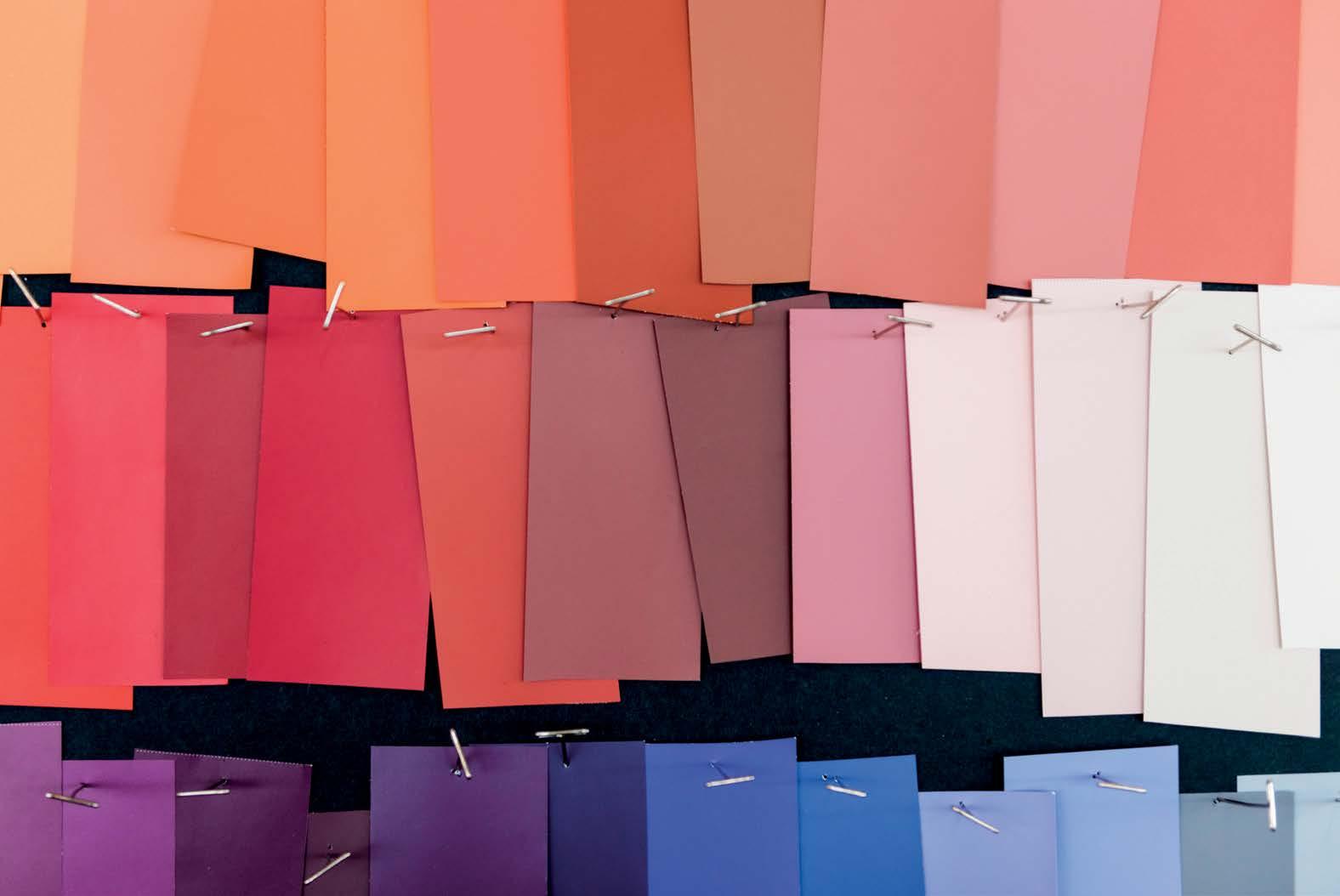
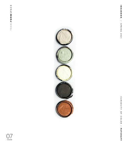
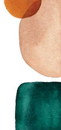
Color can set a tone. Create a mood. Evoke a feeling. It is elemental. Material. Dimensional. We use color to reset the state of things – and our state of mind. But color can also transform. Exploring the duality of tonal contrast – the path of color through texture and form – we can uncover inspiration in the unexpected. Curiosity in the found. Comfort in the collected. Let’s study color in its many dimensions – the bold, the emotive. The color-filled connections that draw us in.
CURIOSITY OF COLOR / A STUDY OF THE TRANSFORMATIVE NATURE OF COLOR
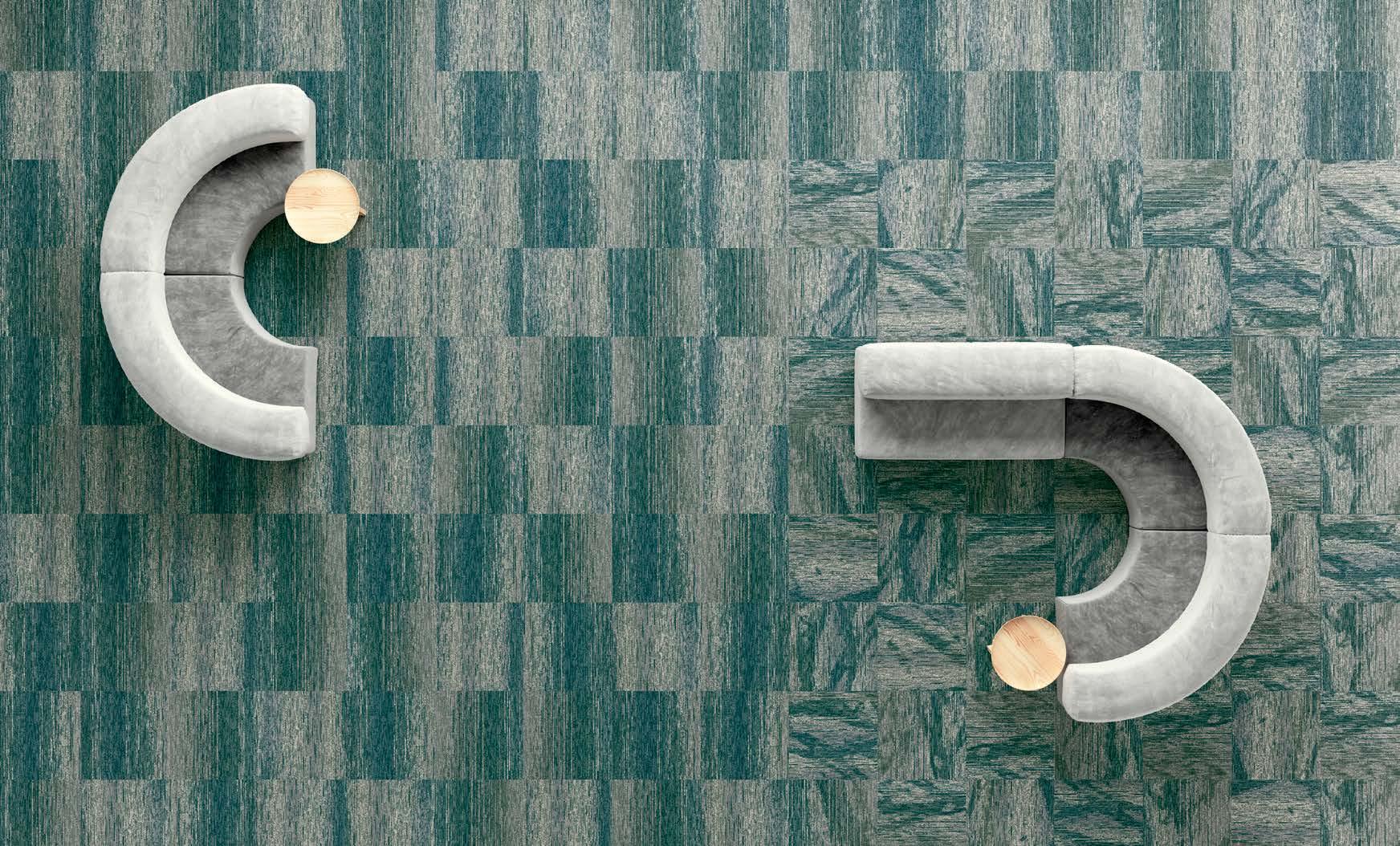
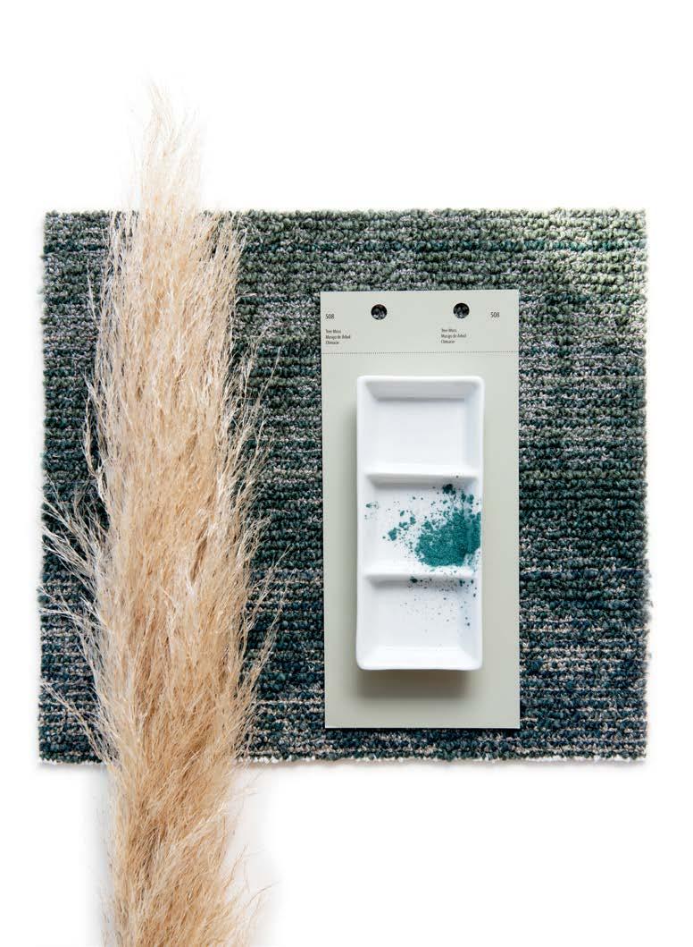
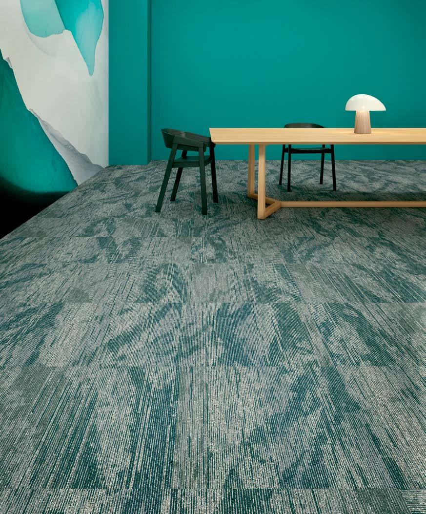
24 / STATES OF WATER
Transforming the fundamental. Flipping the elemental. Color seen through the lens of found objects. Described by its connection to form. Evoked from emotion and sensory experience. Using texture, material and dimension for color that’s fresh + new. Finding the unexpected in the expected to create the colors of the moment. Embrace the curiosity of color.
curio / an unusual article or object of art, valued as a curiosity.
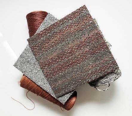
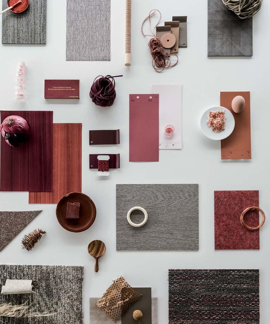
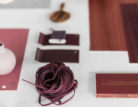
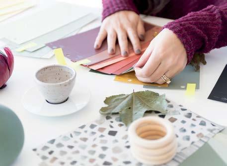
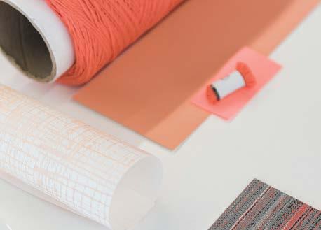
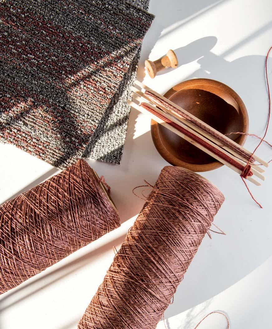
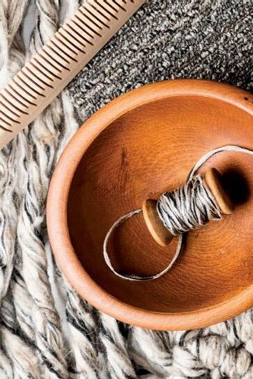
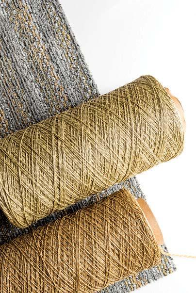
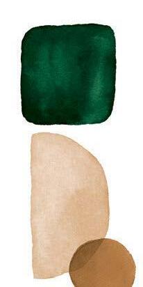
I spy a red onion, a coil of copper, some Himalayan pink salt. What do you spy? In warm umber tones + natural earthen hues, curios common and rare scatter the page – a peek inside our curious collectables. Inspired by the everyday, the lost + found, uncover the materiality of color. A sensorial journey through texture and contour.
objet d’art / an object of artistic worth or curiosity, especially a small object.
Pigmented pops of color energize and envelop. From pebbles to post-its, color appears in contrast. Highlighting dimension + studying shadows, it’s a breakdown of color in its simplest state. Adding depth. Creating connection. Stimulating emotion and positive vibes.
objet trouvé / an object found or picked up at random, considered aesthetically pleasing.
It’s a leaf, a pencil, a spool of velvet trim. Seek + find for color that transitions through material and matter for tonal perception. Objects unique to the seeker, palettes created to inspire. Color is collective. Emotive. Personal. Unexpected. Color is curious.
“We look at color from every angle. Exploring found materials and objects, studying how color changes through texture and form. We’re all drawn to varying shades of color – connecting to the different emotions and feelings that they can evoke. It’s a personal color study for an inspired collective output.”
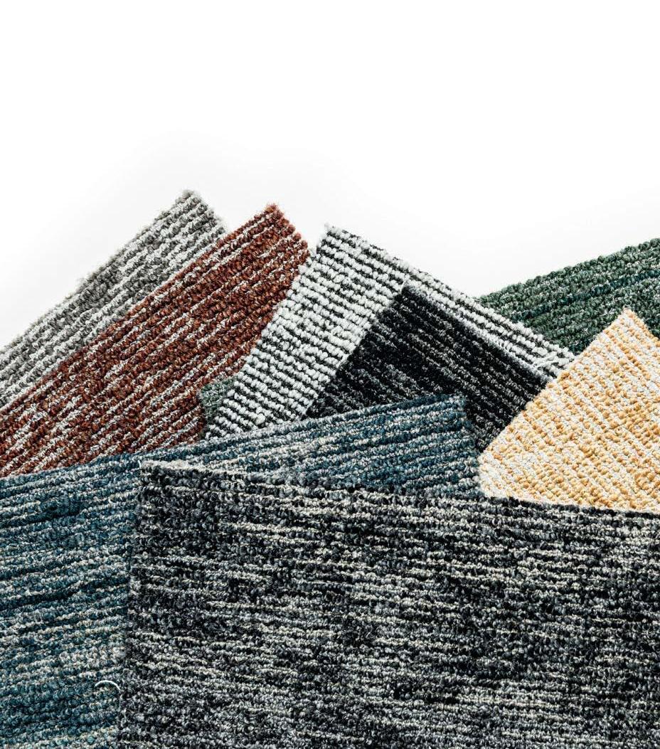
To truly study the transformative nature of color, we brought it back to the basics. We collected and coordinated found items big and small, artful and ordinary. An egg. A honeycomb. An old cell phone. Even a container of pink eraser shavings. We put them together with swatches and samples, studying how the color evolved organically and graphically. Looking at color through the lens of found objects, we saw something in the unexpected. Here are our palettes of the moment.

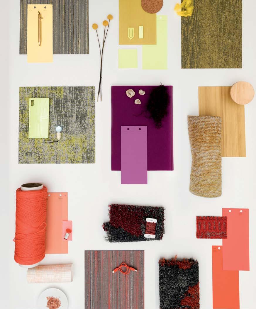
A STUDY OF COLOR AND EMOTION. ENVELOPING COMBINES THE WARMTH OF BRIGHT HUES AND THE COMFORT OF SOOTHING TEXTURES. A PALETTE THAT CAN ENERGIZE AND ILLUMINATE FOR POSITIVE IMPACT, ENHANCING CONNECTIVITY. IT IS EMOTIVE AND JOYFUL, CURATED TO ENLIVEN THE SPACES THAT SURROUND US. WE BASK IN ITS COMFORTING GLOW.
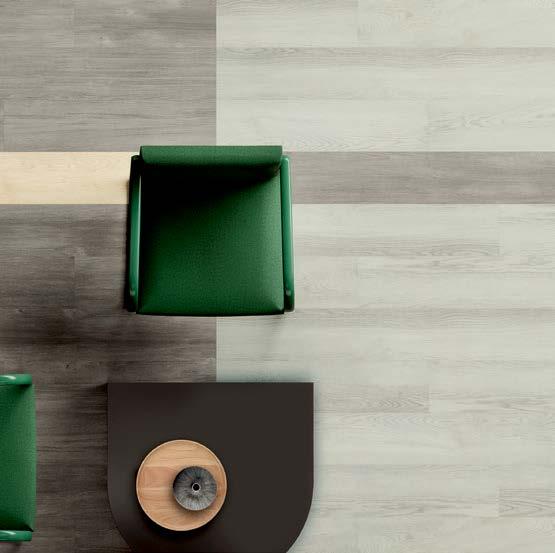
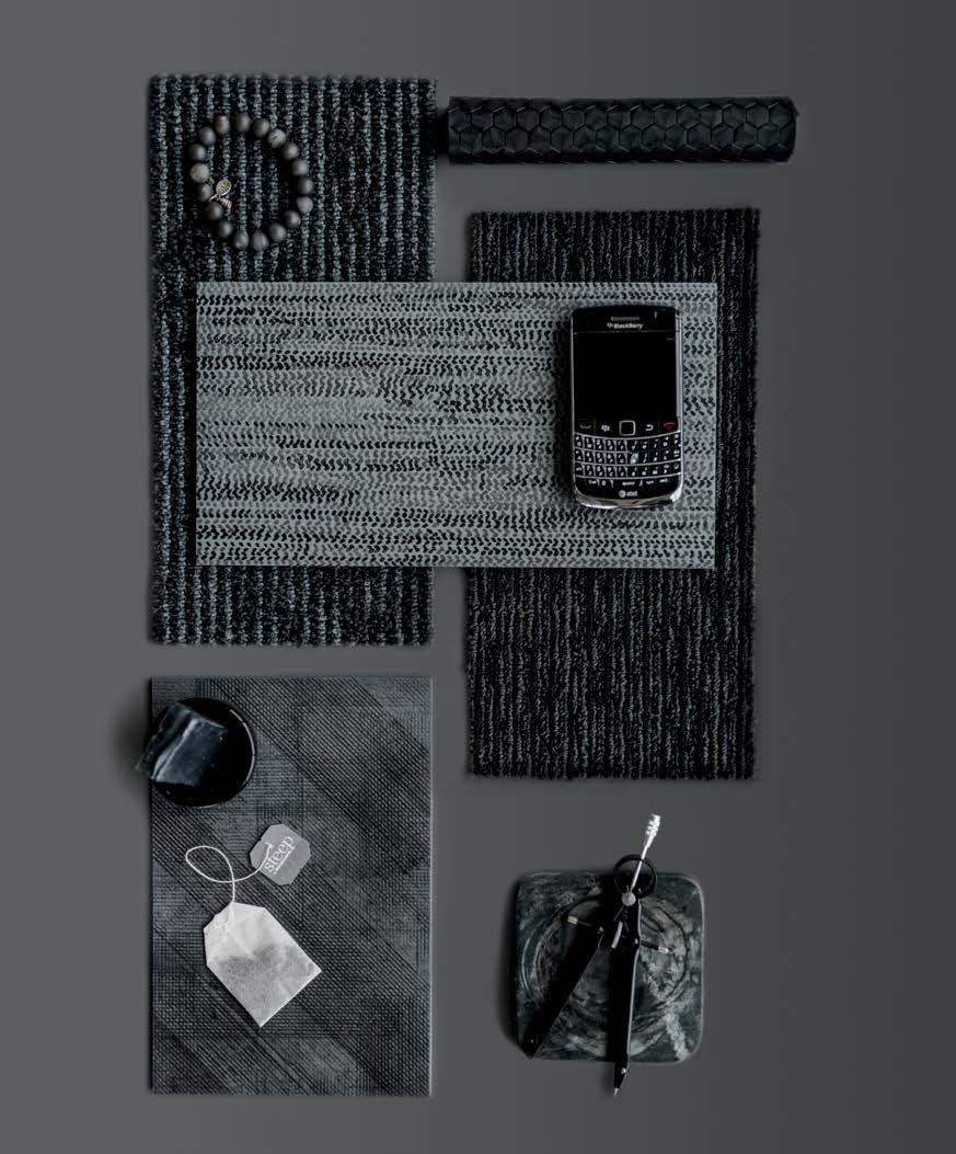
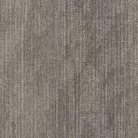
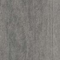
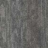
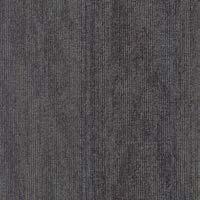
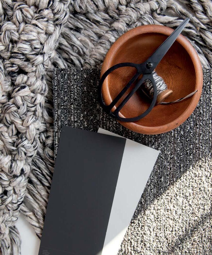
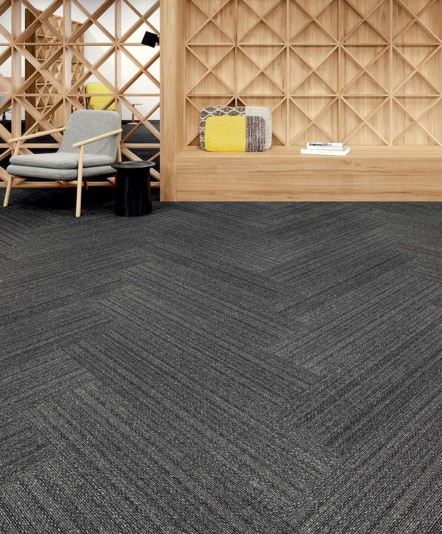
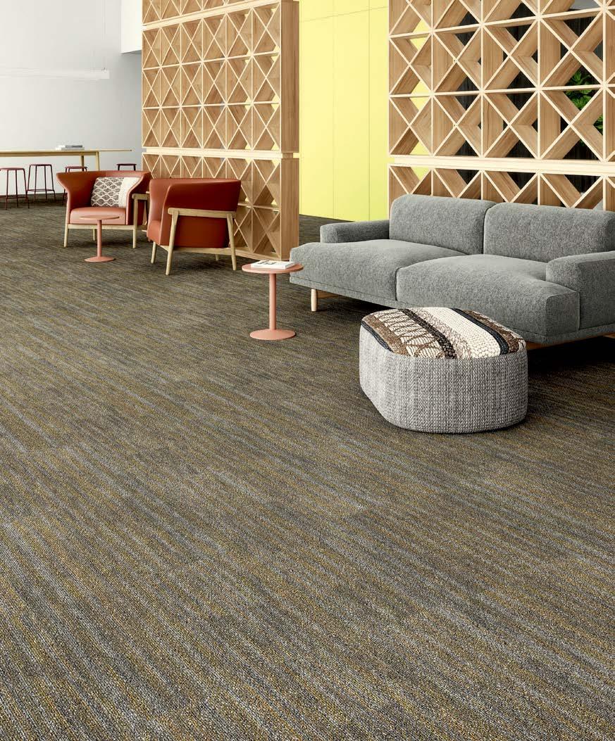
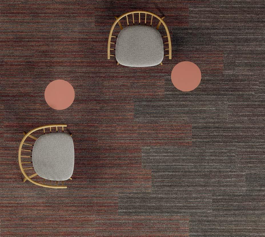
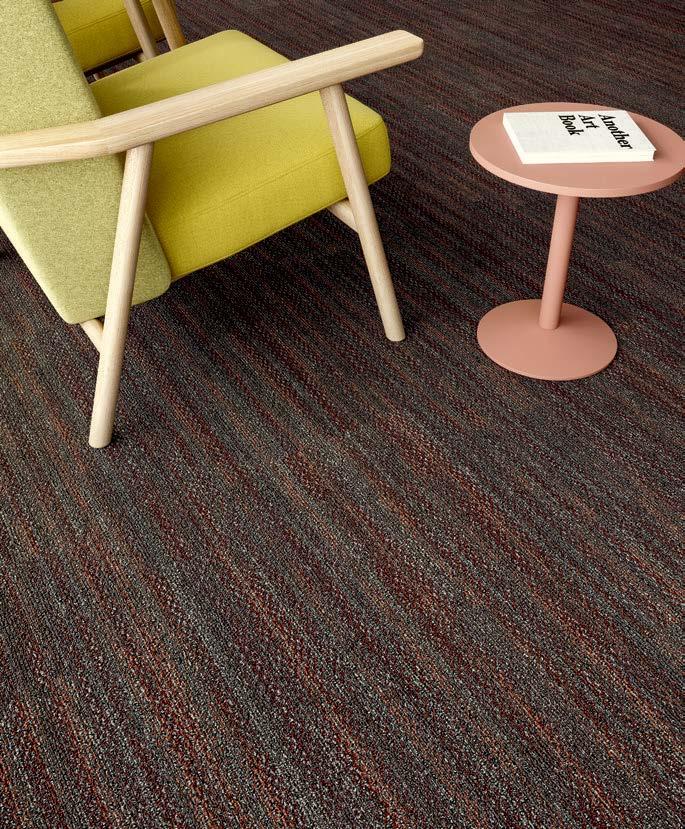
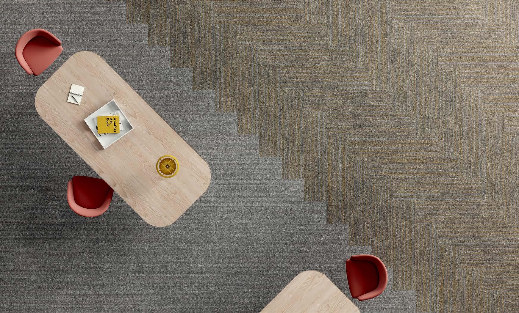
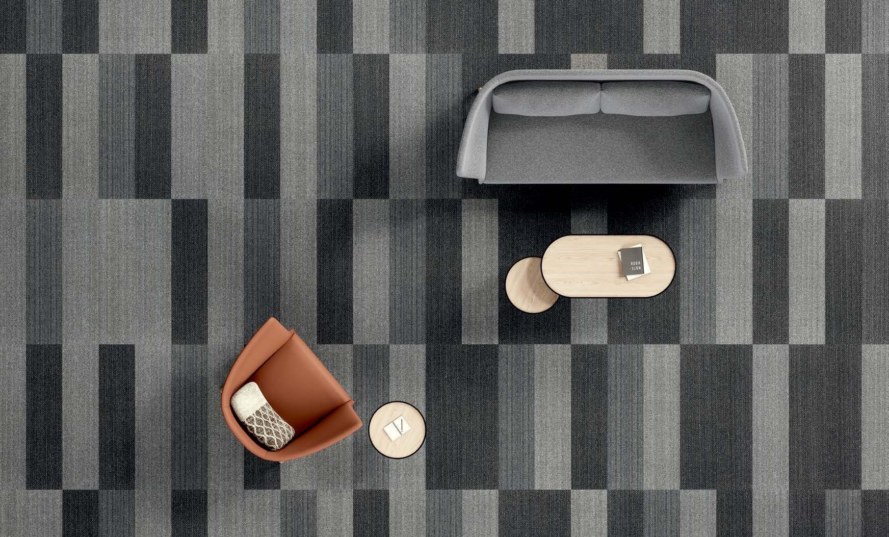
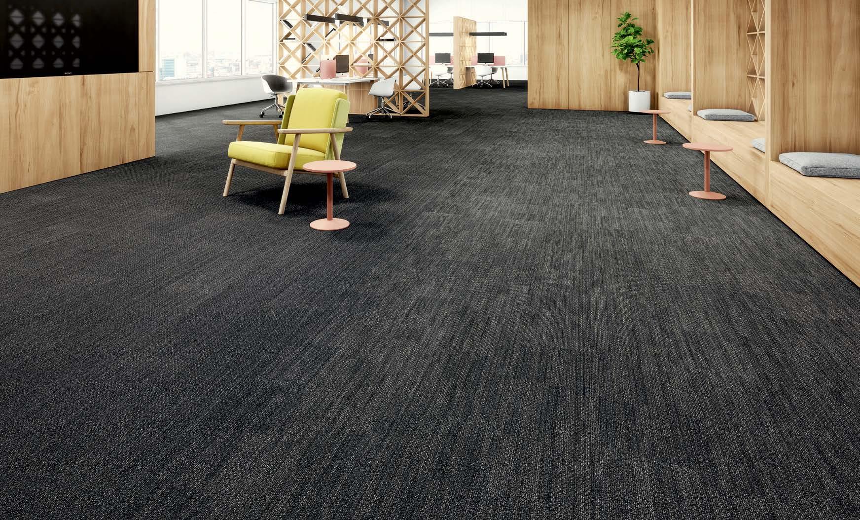
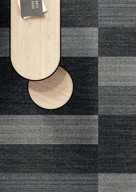
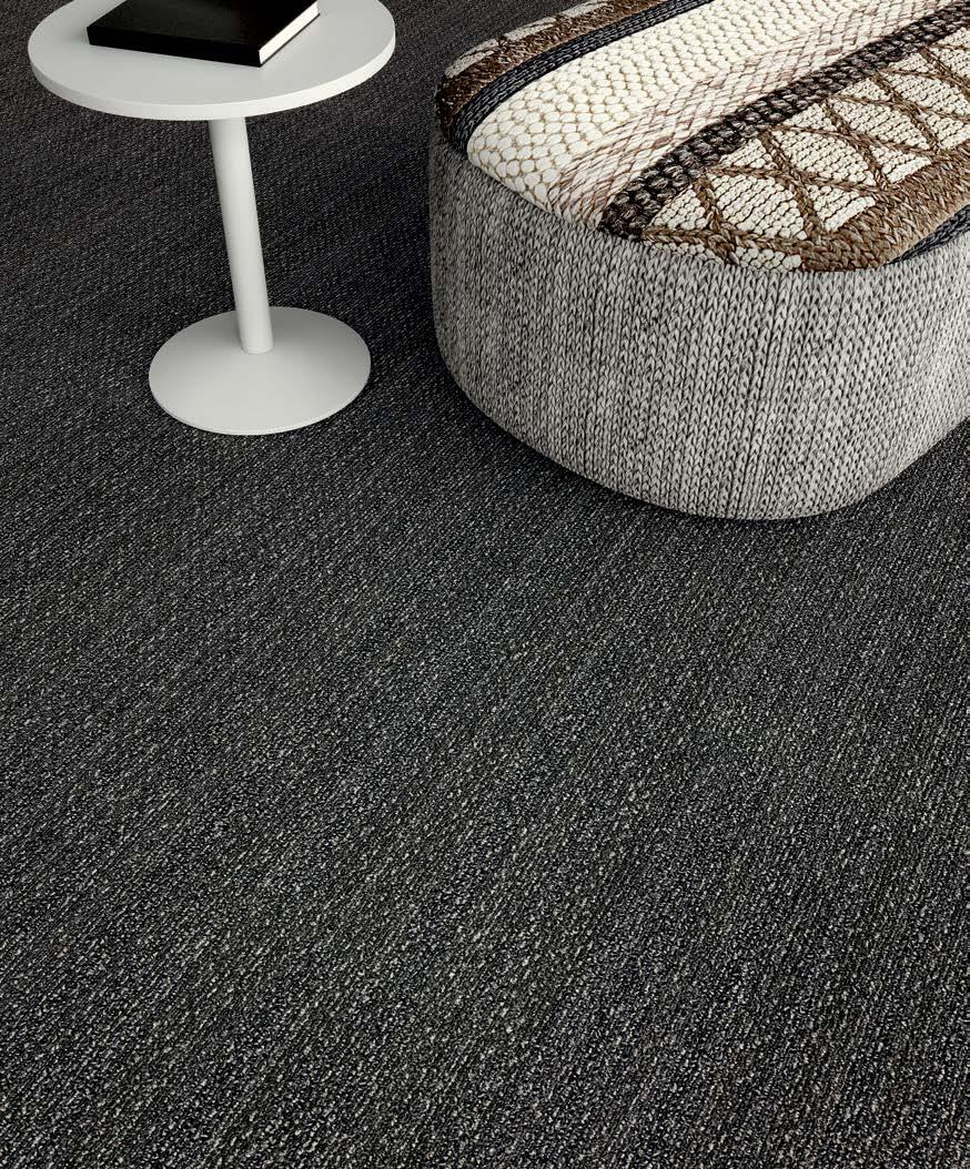
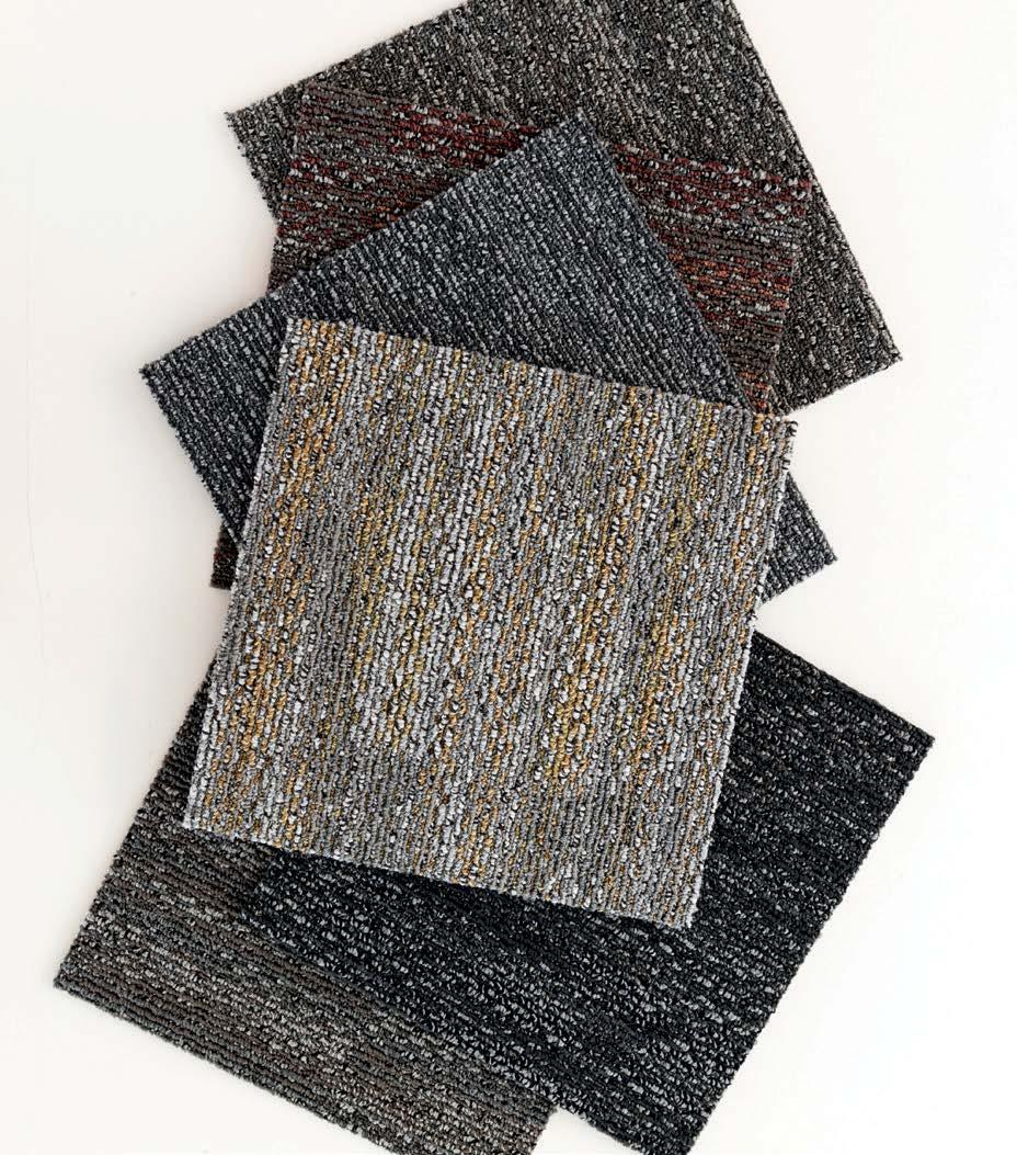
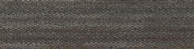
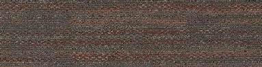
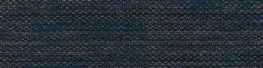
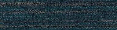
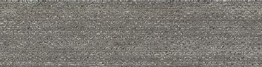
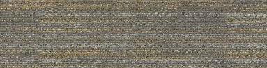
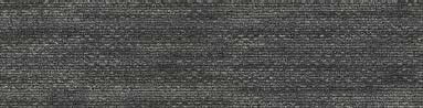
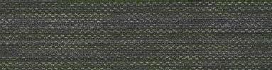
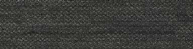
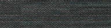
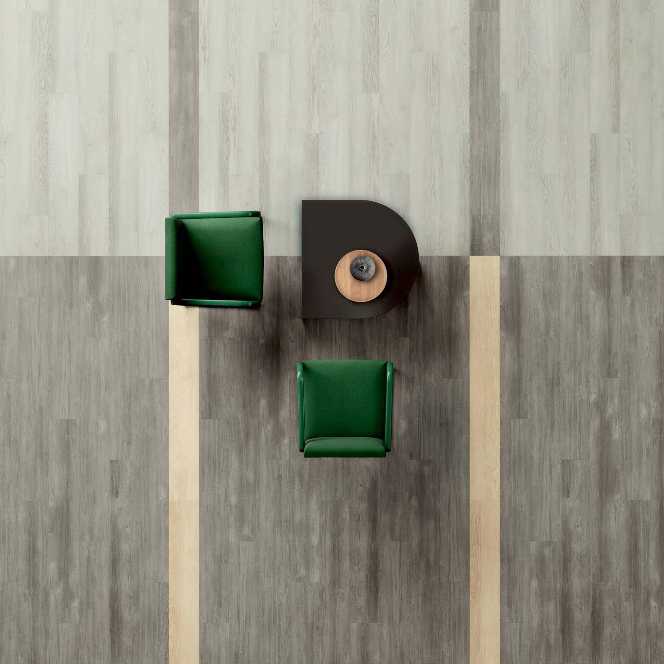
A STUDY OF COLOR AND TEXTURE. WHAT’S OLD IS NEW. EMBRACING THE BOLD SATURATION OF CHARCOAL AND CARBON, RETROSPECTIVE EXPLORES THE DUALITY OF CONTRAST. APPLYING TEXTURE AND DEPTH SOFTENS THE PALETTE, TRANSFORMING SPACE THROUGH LIGHT AND SHADOW. IMPRINTING. MARK MAKING. CARBON DATING. WE TAKE A LOOK BACK TO DESIGN FORWARD.
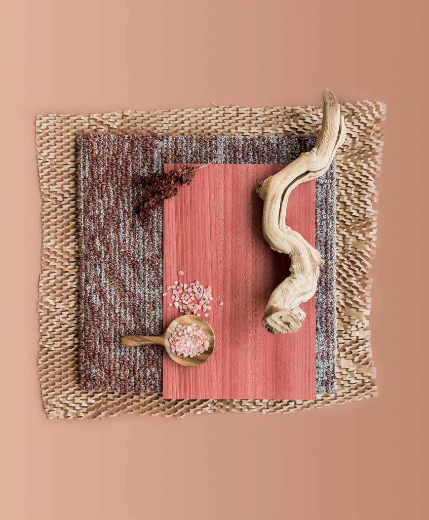
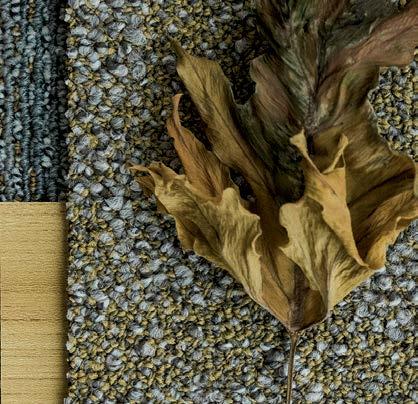
A STUDY OF COLOR AND THE ELEMENTS. EARTHEN IS OUR BIOPHILIC PALETTE OF THE MOMENT. WITH SUNSET LADEN HUES, SHADES OF SUNBAKED TERRACOTTA AND EARTHLY DESERT TONES, COLORS COALESCE FOR PEACEFUL VIBES. INSPIRED BY TEXTURES ROOTED IN ORGANIC ELEMENTS, EARTHEN IS OUR GO-TO PALETTE FOR CALMING SPACES.
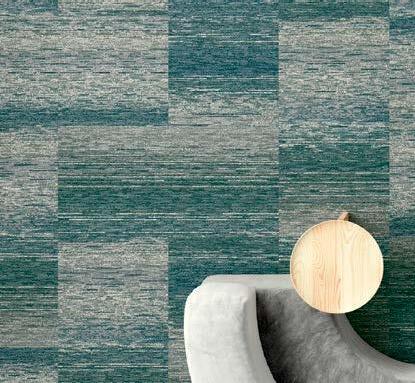
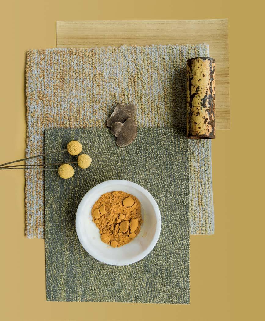
A STUDY OF COLOR AND MATERIALITY. EARTHEN’S DISTANT RELATIVE,
BOUNTIFUL BLENDS INSPIRATION FROM BIOPHILIC AND ADAPTOGENIC
PHILOSOPHIES FOR BALANCE AND SERENITY. SATURATED PIGMENTS IN
OCHER AND SAGE MERGE WITH MUTED TONES IN ECRU AND SAND.
A PALETTE DESIGNED TO NURTURE MINDFULNESS AND ENHANCE WELLBEING, BOUNTIFUL EXUDES AN EMPOWERING PRESENCE.
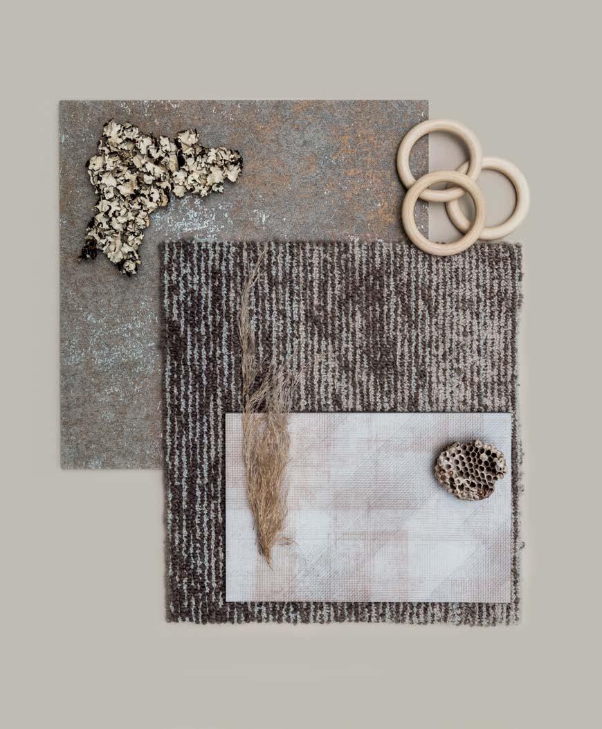
A STUDY OF COLOR AND FEELING. WITH SOFT TONAL SHADES OF SOOTHING
NEUTRAL HUES, DRIFTING TRANSFORMS THROUGH TEXTURE AND FORM. IT IS CALMING. PRESENT. MINDFUL. FAMILIAR. ZEN. A PALETTE CURATED FOR TRANQUIL SPACES, DRIFTING EMBODIES A COMFORTING AURA. MUSING. PENSIVE. THOUGHTFUL. DREAMY. LET’S GET CARRIED AWAY.
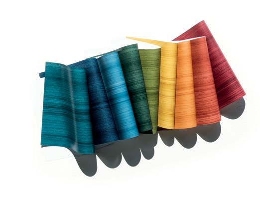
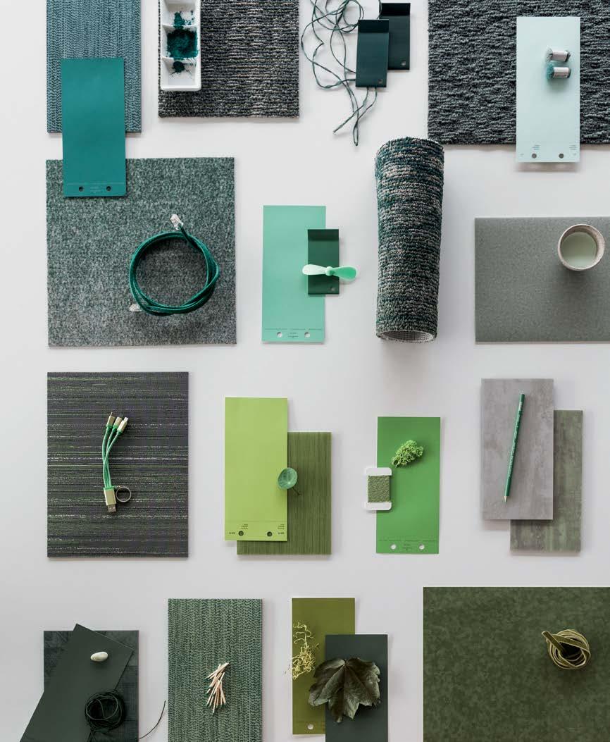
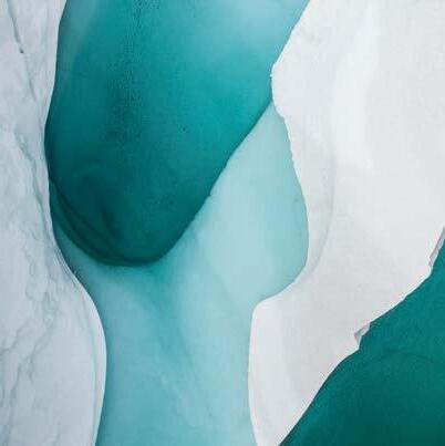
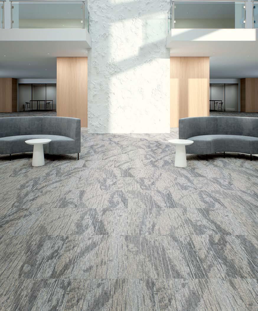
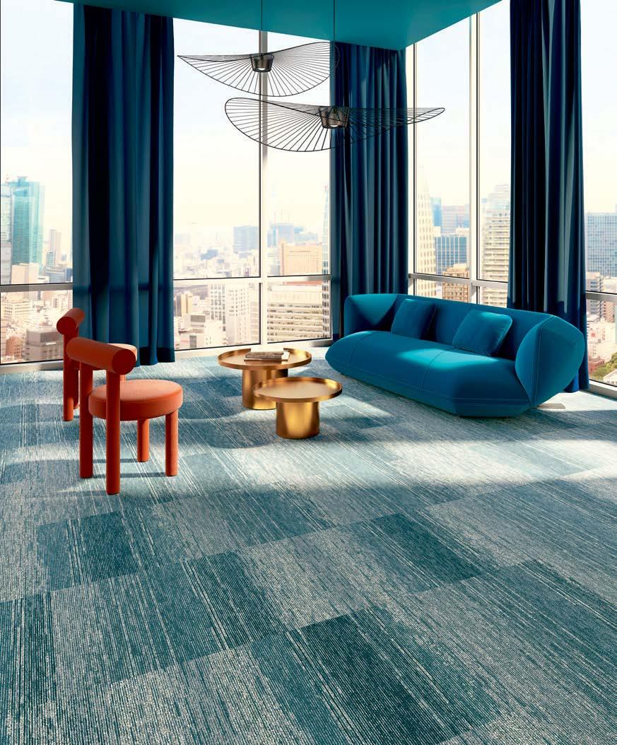
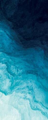
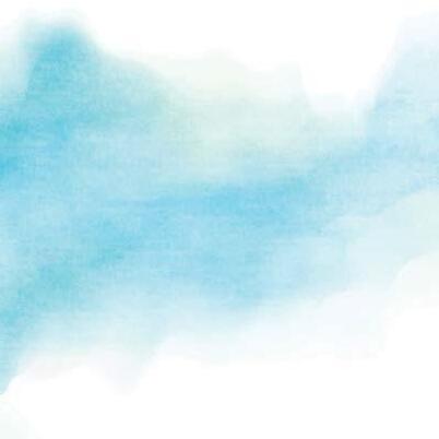
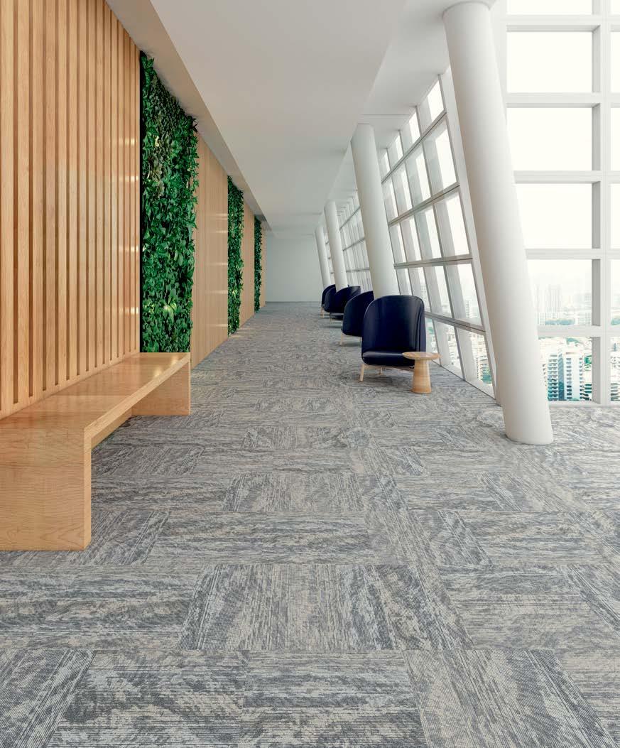
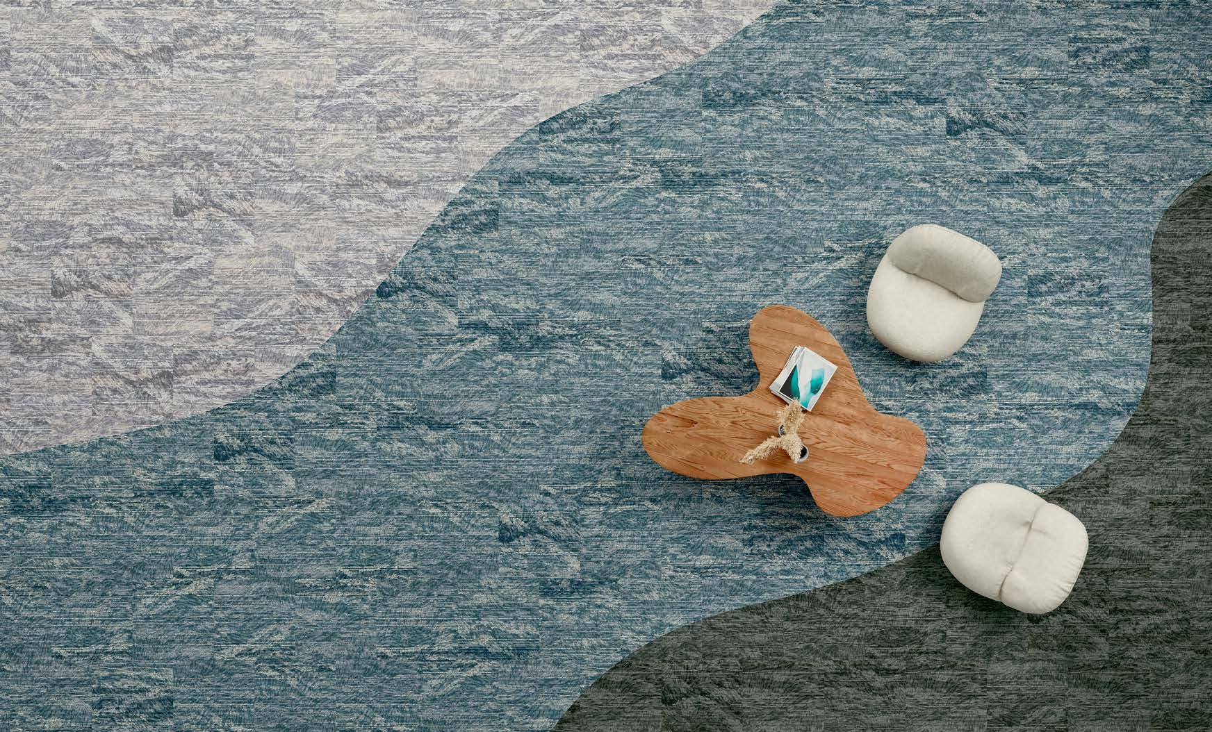
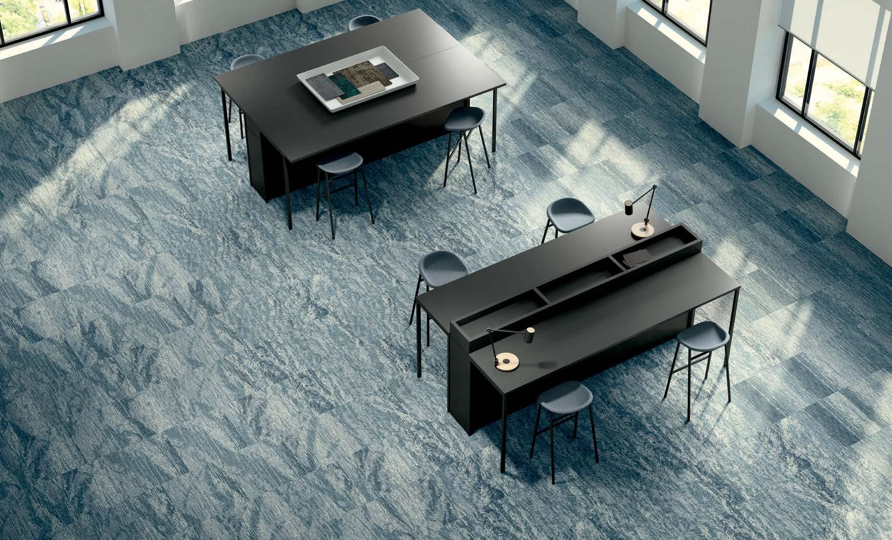
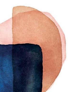
IN MOVEMENT, STILLNESS AND SHIFTING FORMS, STATES OF WATER IS AN EXPLORATION OF TRANSFORMATIVE COLOR AND SWEEPING GRADATION. CONNECTED TO THE TIDES. THE CRASHING WAVES. THE WANING CURRENTS. THE SCULPTURAL QUIETUDE IN SOLID FORM. STATES OF WATER IS TEXTURE AND PATTERN AWASH THAT CREATES A SENSORIAL EXPERIENCE. COLOR SHIFTS AND FADES. EBBS AND FLOWS. RISES AND FALLS. FOR DEPTH, MOTION, DIMENSION.
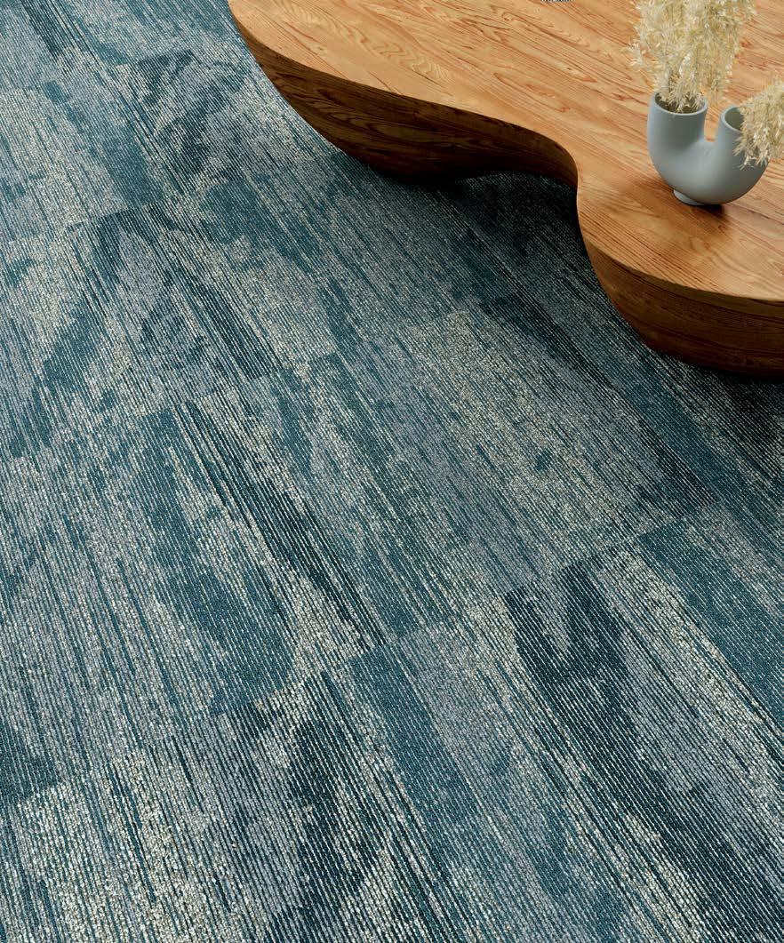
“WATER IN ITS VARIOUS STATES CREATES COLOR IN INTERESTING WAYS. I WAS PARTICULARLY CURIOUS ABOUT THE FORMATIONS OF THE GLACIERS IN GREENLAND – DRAWN TO THEIR CURVATURE AND DRAMATIC HUES.”
ASHLEY WEAVER / PRODUCT DESIGNER
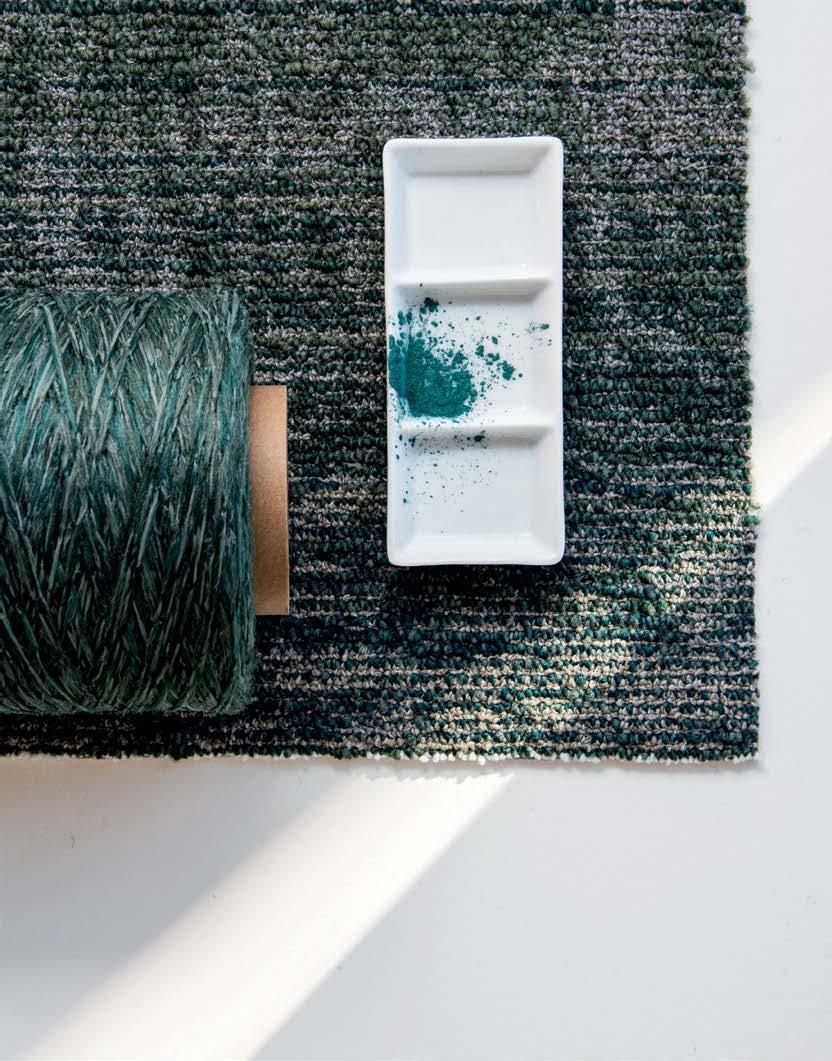
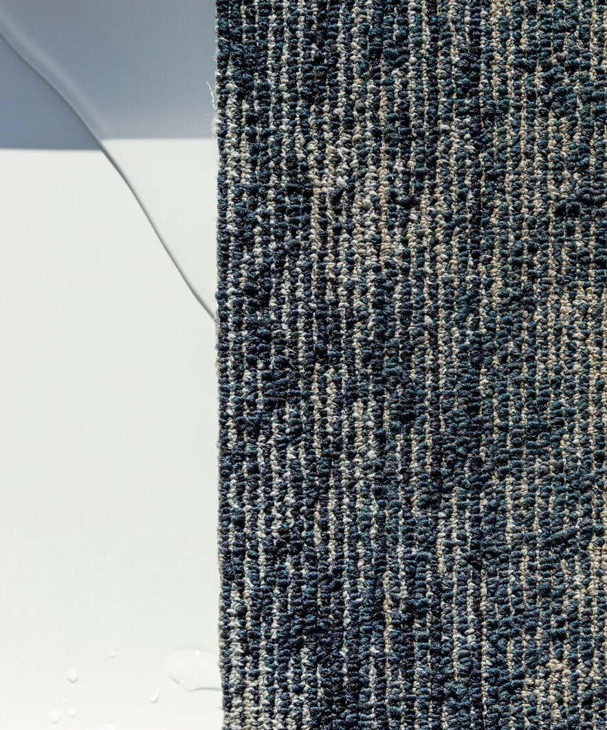
Inspired by beautiful imagery of water in its different forms – solid, liquid and vapor — Ashley studied water’s dramatic movements, depth and color shifts. Using a rich blend of colors within the yarn, Ashley worked closely with manufacturing to replicate the patterning, color and scale of these three states of water.

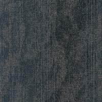
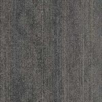
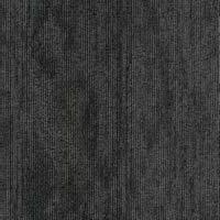
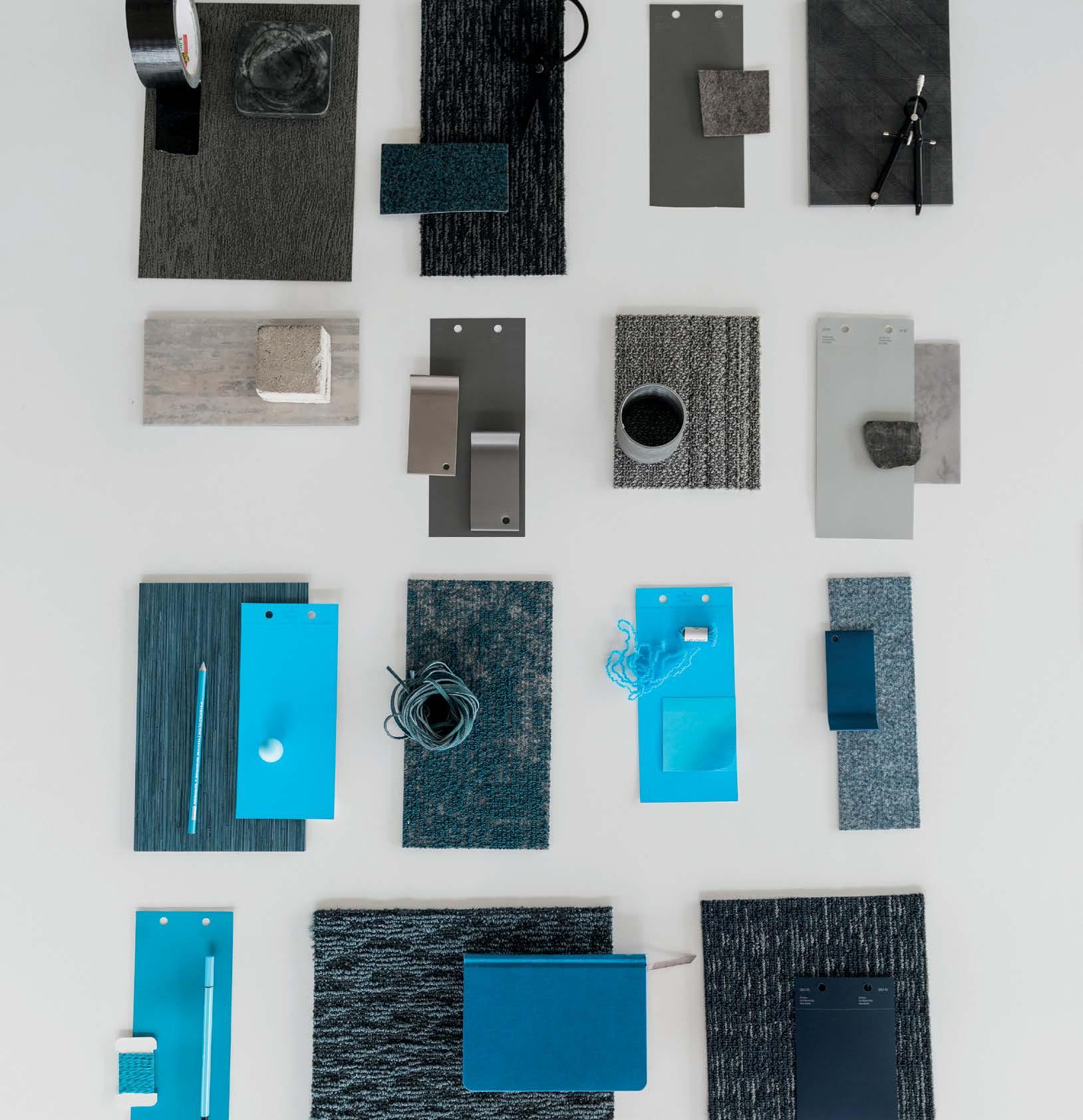
RETROSPECTIVE ARTISTRY INSPIRES WOVEN TEXTURE. DESIGNED FOR COMFORT + CONNECTION. FOR EXPERIENTIAL SPACES. BLENDING COLOR AND TACTILITY IN PAIRS FOR A DYNAMIC DESIGN DUO. EXPLORING THE VISUAL OF THE HANDWOVEN. COZY NEUTRALS
INFUSED WITH COLOR FOR MOVEMENT. INSPIRED BY TEXTURE FOR FAMILIARITY. CREATE WARMTH. DEFINE SPACE. ENHANCE CONNECTION. SETTLE IN.
RON POWELL / SENIOR PRODUCT DESIGNER
With inspiration derived from the artistry of macramé and woven fabric design, Textile Technique incorporates a nubby, textural pattern for comforting spaces. Saturated hues are paired with rich neutrals for balance throughout a beautiful range of colors.
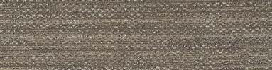
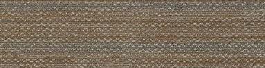
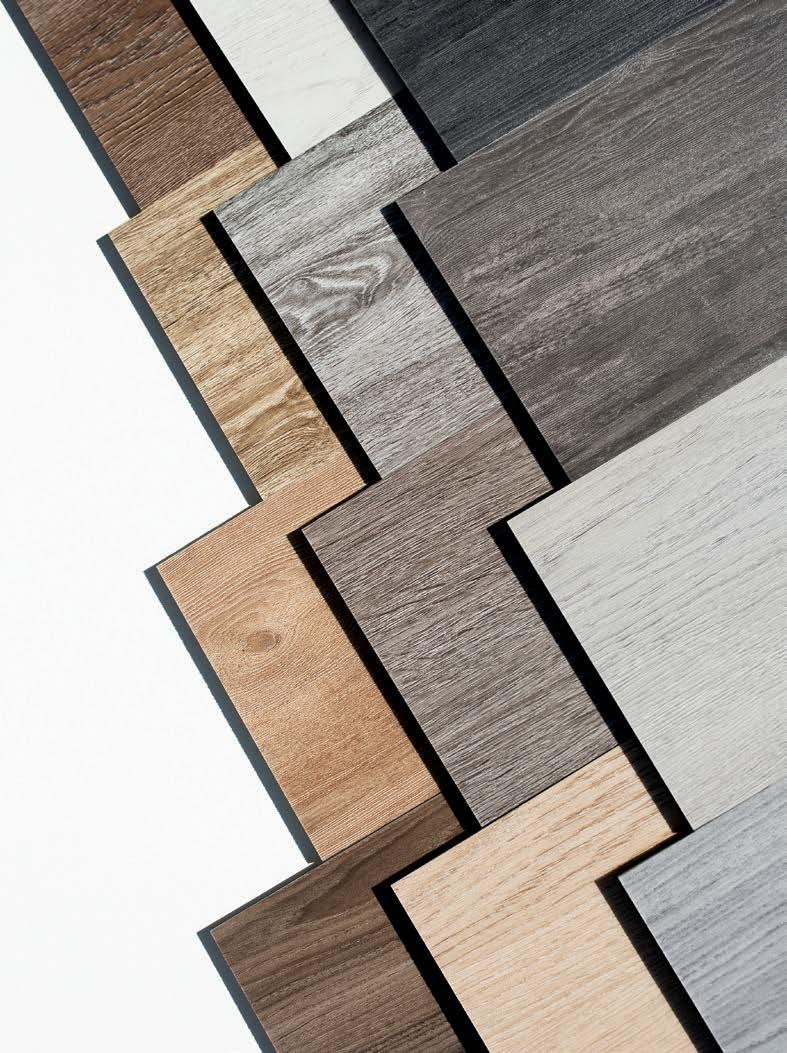
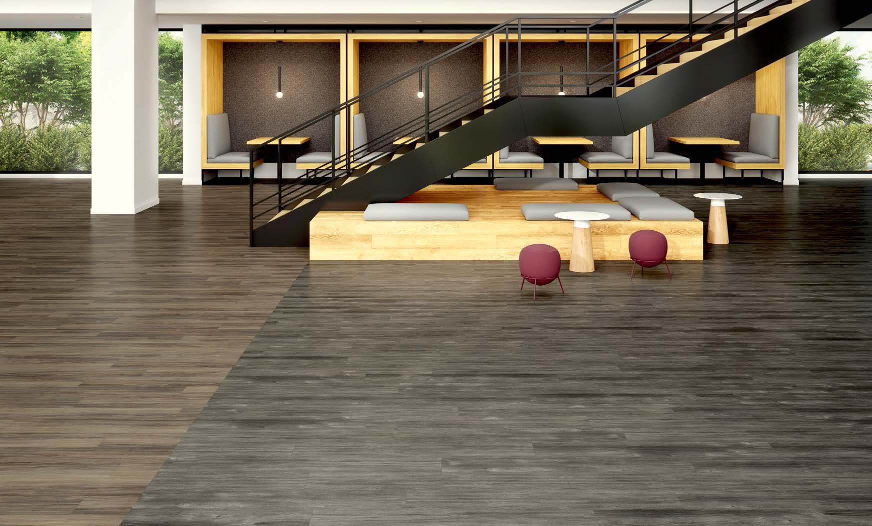
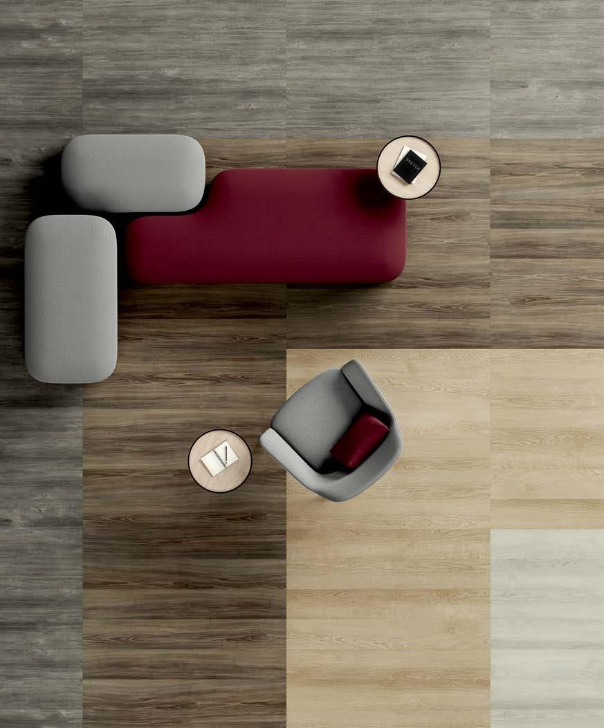
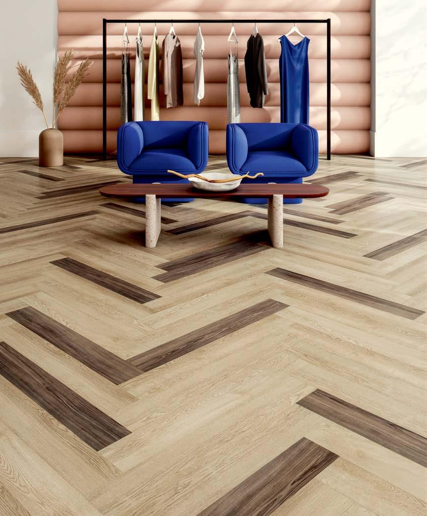
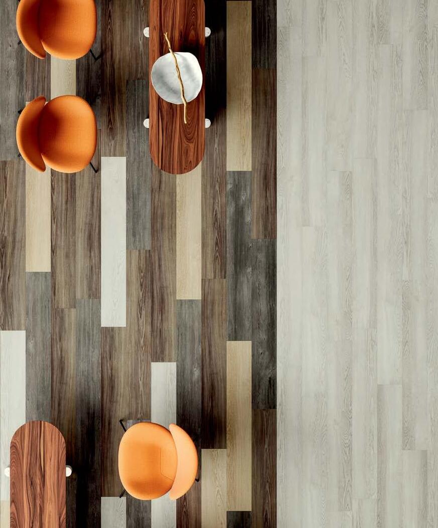
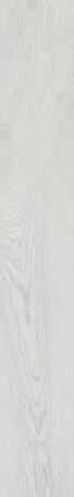
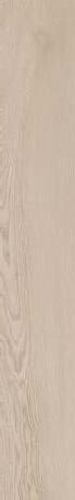
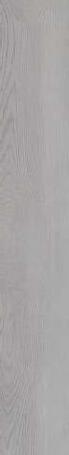
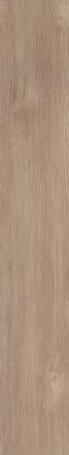
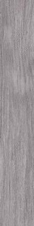
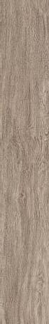
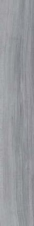
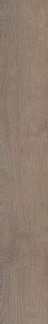
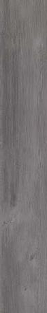
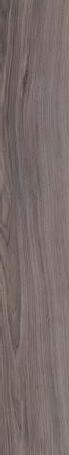
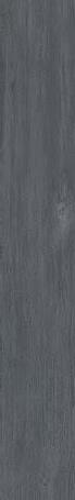
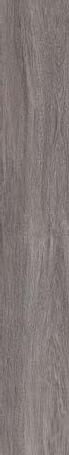
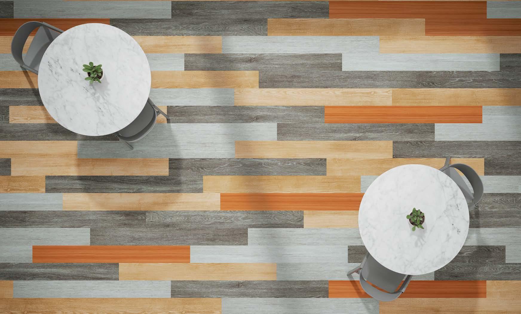
NATURAL WOOD TONE VISUALS FOR TIMELESS DESIGN. EMBOSSED-IN-REGISTER FOR
TEXTURE AND DETAIL. VERSATILE COLORWAYS RANGING FROM LIGHT NATURAL TONES TO WARM TAUPES TO RICH CHARCOAL FOR FLEXIBILITY AND STYLE. ELEVATE SPACE WITH
ATTENTION TO DETAIL. TRANSFORMING EXPERIENCE.
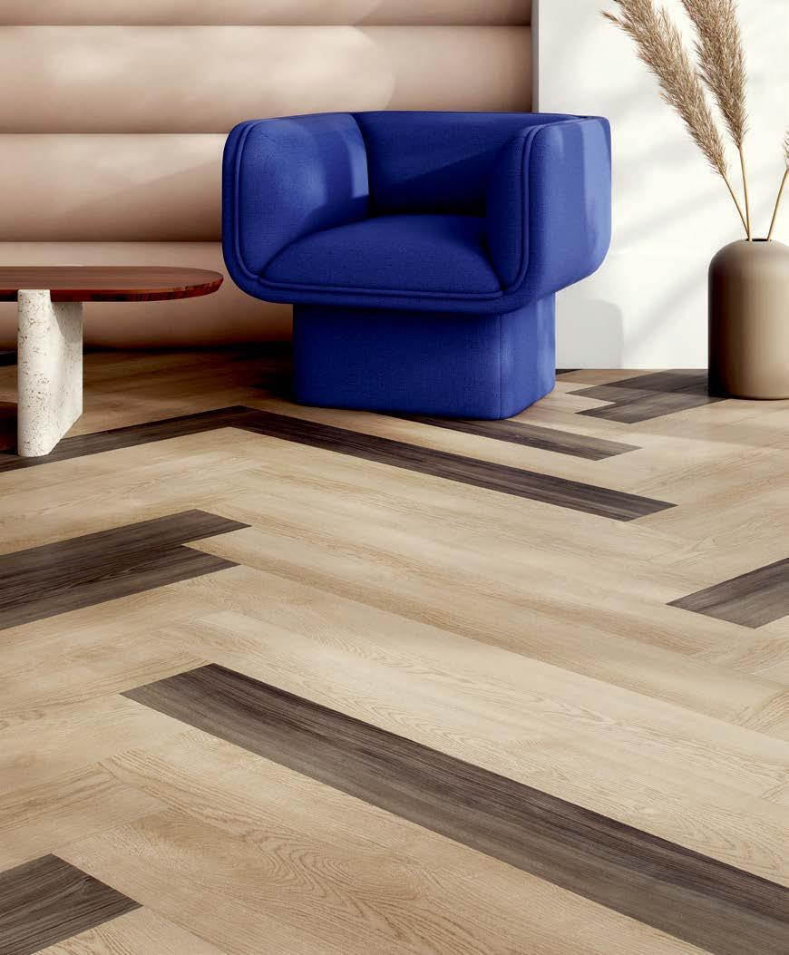
The desire and need for realistic wood visuals continues to be a cornerstone element of design. Expanding on the success of products like our collections Splitwood, Metal Collective and Inset, Reston is an embossed-in-register resilient plank that offers these natural visuals and details without the metallic accents, providing the perfect foundation for any space.
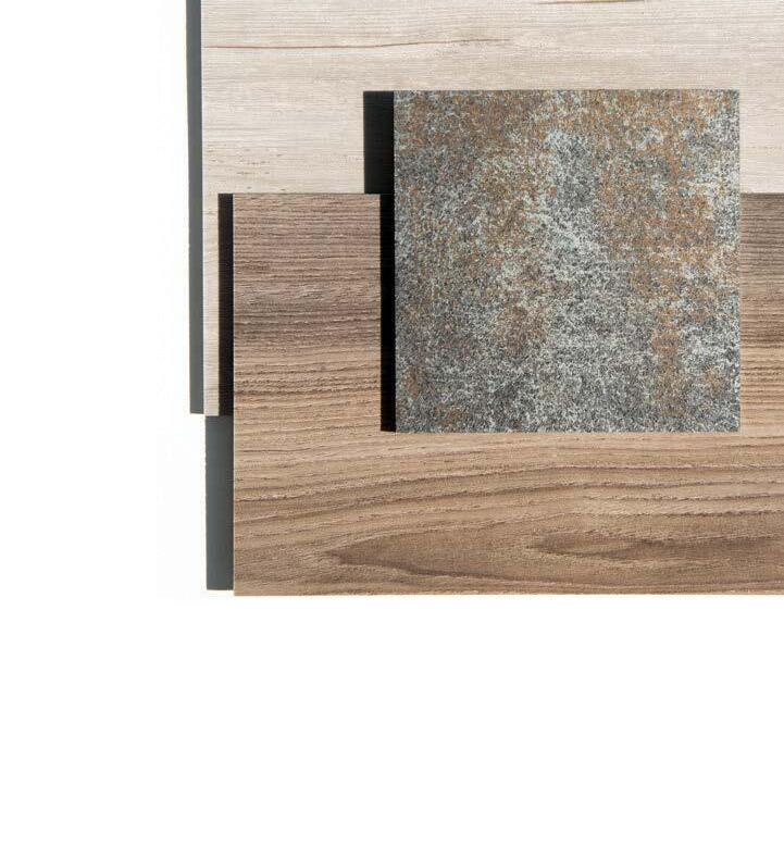
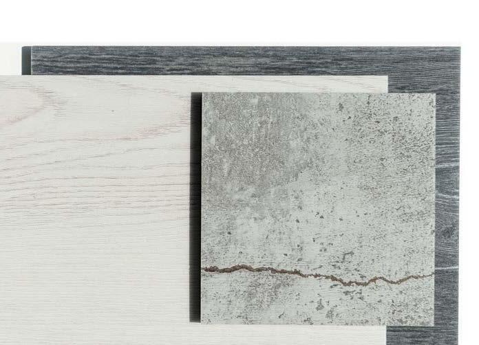
AVAILABLE IN A 7" x 48" PLANK AND 12 COLORWAYS, RESTON IS OFFERED IN COLORS RANGING FROM FRESH LIGHT TONES TO WARMING TAUPES AND RICH CHARCOAL.
Juniper 2048-20
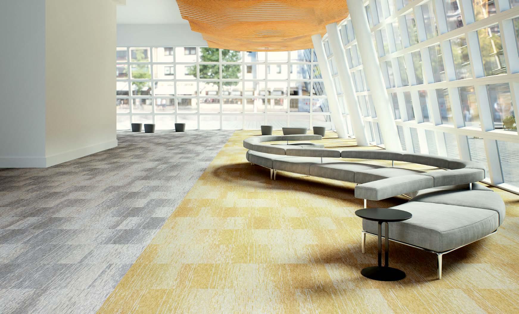
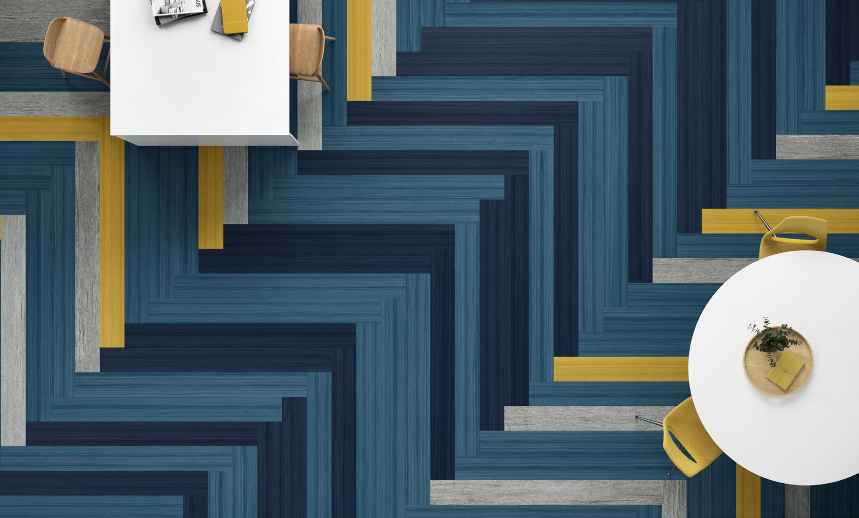
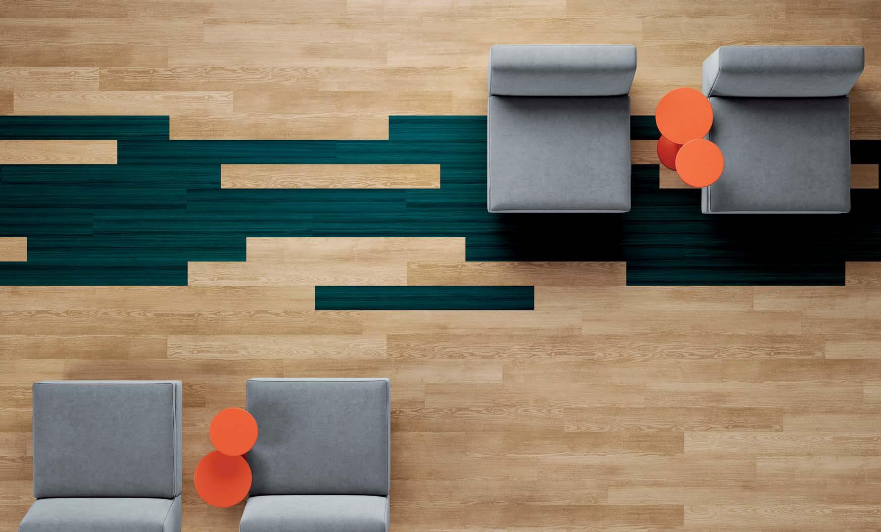
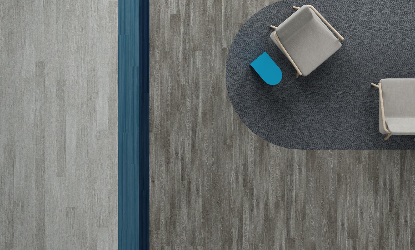
ONE OF OUR MOST POPULAR STYLES UPDATED IN COLOR. TAKING A TIMELESS CLASSIC TO THE NEXT LEVEL. WITH THE ADDITION OF SATURATED TONES AND PIGMENTED BRIGHTS, WE’RE MIXING IT UP. A HIGH-PERFORMING PRODUCT FOR COLOR FORWARD DESIGN. FOR BRANDING. WAYFINDING. DEFINING SPACE. MADE IN THE USA WITH AN EXOGUARD+ TOPCOAT FOR PERFORMANCE AGAINST SCUFFS AND SCRATCHES. FOR DURABILITY AND FLEXIBILITY TO MEET THE RIGHT NEEDS OF YOUR SPACE. ADD A POP OF COLOR FOR EMOTION + ENERGY.
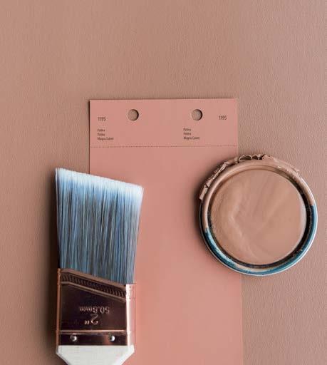
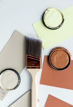
TRANSFORMING DESIGN THROUGH THE CURIOSITY OF COLOR.


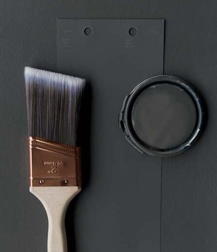
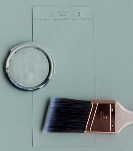
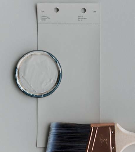
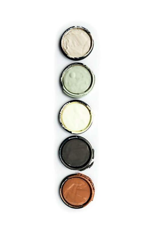
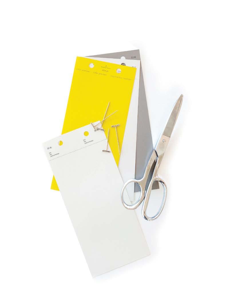
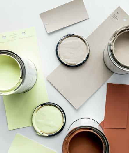
Transform space, floor to ceiling. Patcraft and Benjamin Moore have collaborated to make the sampling process quicker and easier. The Patcraft design team has specially curated a collection of Benjamin Moore paint colors to coordinate with our products. Create coordinated palettes and order flooring samples and 4 x 8 paint swatches through our digital design tray tool at patcraft.com
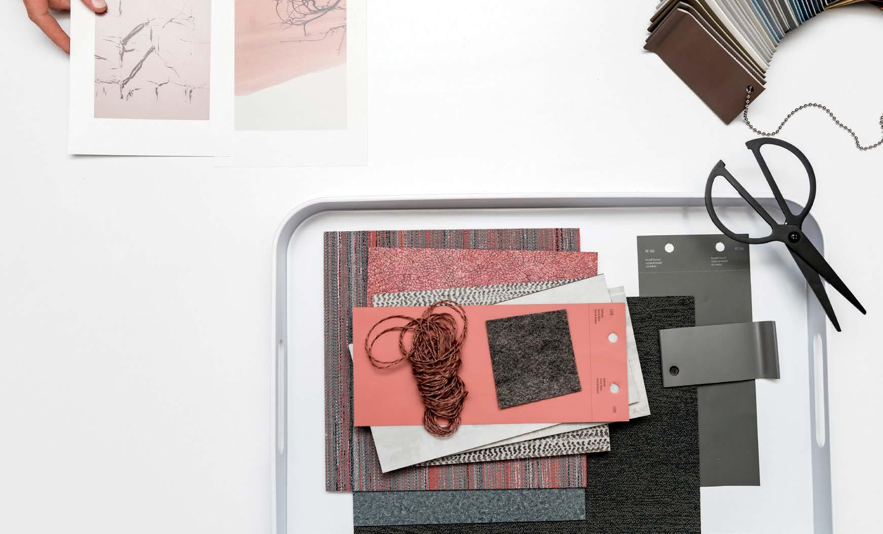
Say ‘hello’ to the latest resource in our designer’s toolkit to make the sampling process quicker and easier – the virtual design tray
At your desk or on the go, create a custom mix in a couple of clicks for a curated set of swatches sent to you next day. Choose from hundreds of styles of carpet and hard surface, in hundreds of colors. Coordinate with our yarn color poms and Benjamin Moore paint swatches to tie it all together.
Ready to return the samples you no longer need? When your project is complete, simply send them back with the return label included in your box for easy, convenient shipping. Create something beautiful at patcraft.com