As Curious Observers, we continually seek to uncover new solutions. Explore untouched opportunities. Adapt to a changing landscape. And challenge the normal process. In moments of unpredictability, we are nimble and agile. Willing to deconstruct and reconstruct perceptions and ideas. Listening, observing, reimagining. Because sometimes you have to flip the script.
Reset your mindset. Create positive disruption to transform space and experience for the now normal and the future state.
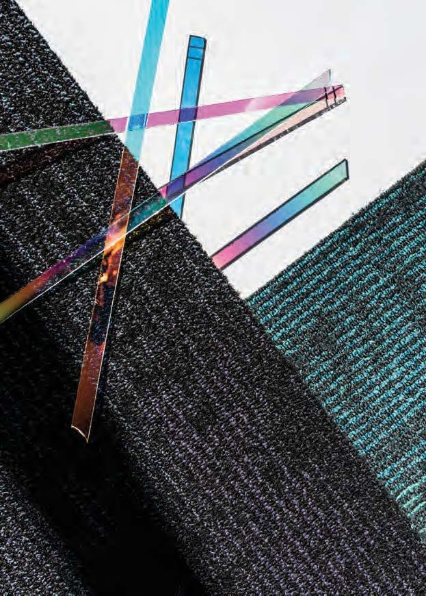
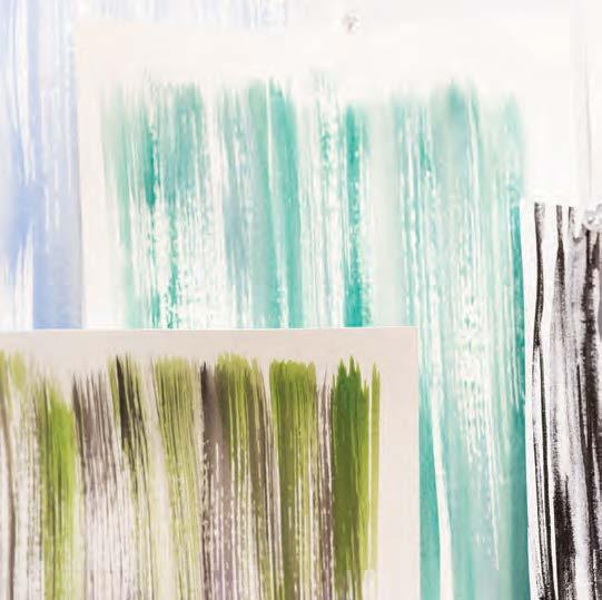
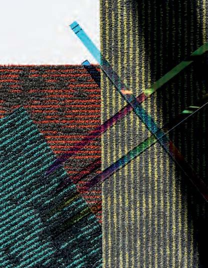
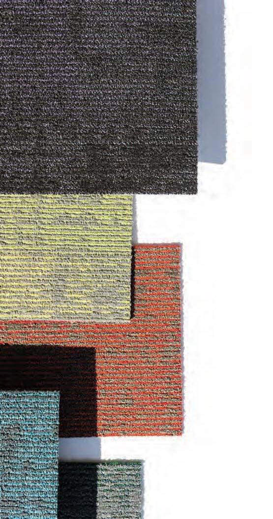
intouch / disrupt artistic impressions
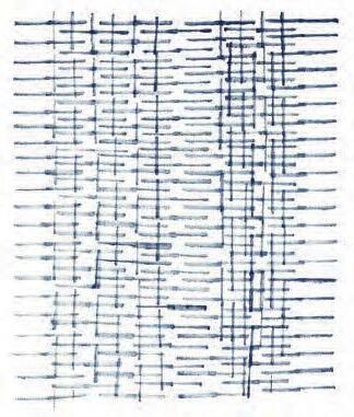
inset / lines take shape. shape disrupts symmetry.
TRANSFORMING DESIGN THROUGH POSITIVE DISRUPTION
MINDSET / RESET
CURIOUS OBSERVATION IS THE APPROACH. POSITIVE DISRUPTION IS THE RESULT.
ALL WITH THE GOAL TO INSPIRE NEW WAYS OF THINKING. TO ARRIVE WE MUST LISTEN TO THE HUM OF DESIGN. EXPLORE THE RHYTHM OF OUR COMMUNITIES. AND GET IN SYNC WITH AUTHENTIC INTERACTIONS. CONNECTING THE INTERNAL AND EXTERNAL FORCES THAT INSPIRE A UNIQUE POINT OF VIEW. TAKE A CLOSER LOOK AT WHAT’S AROUND YOU – WIDEN THE FOCUS TO UNCOVER NEW PERSPECTIVES AND CREATE CONNECTIONS TO ENHANCE EXPERIENCE TOGETHER.
SEEKING INSPIRATION THROUGH CONNECTIVITY /
Sometimes bringing different minds to the table – outside of your immediate team or organization to share ideas and collaborate – is the best way to positively disrupt the creative process.
Since 2018, we’ve partnered with art, style and design powerhouse site, Design Milk, to co-host an annual workshop focused on design, sustainability, inspiration, consumer drivers and collaboration. A meeting of the minds – designers from different locations and industries come together with the commonality of design and creativity. It’s an immersive forum focused on forces that drive creativity through a multisensory, multi-dimensional platform designed to enhance and enrich inspired thinking. This forum has transformed our design process and thinking, underscoring the importance of connectivity. Each year we reimagine the format, creating touchpoints throughout the workshop to connect with the pulse of design and the ideas of the moment.
As a host and panelist, Shannon Cochran, Patcraft’s VP of Creative + Design sees these benefits as far-reaching. “Every year we get new perspective, new ideas to reflect upon to broaden our view as a brand. We’ve realized the importance of storytelling in our communication with designers. We learned that people really want to hear the “why”and the “how” behind our collections. This has carried through to so much of what we do. These experiences are incredibly valuable both for perspective and for deepening our relationships.”
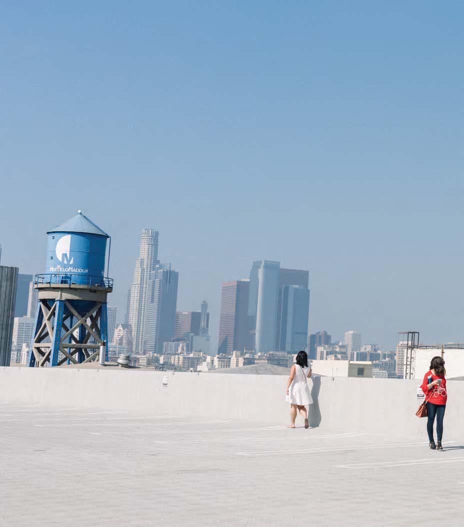
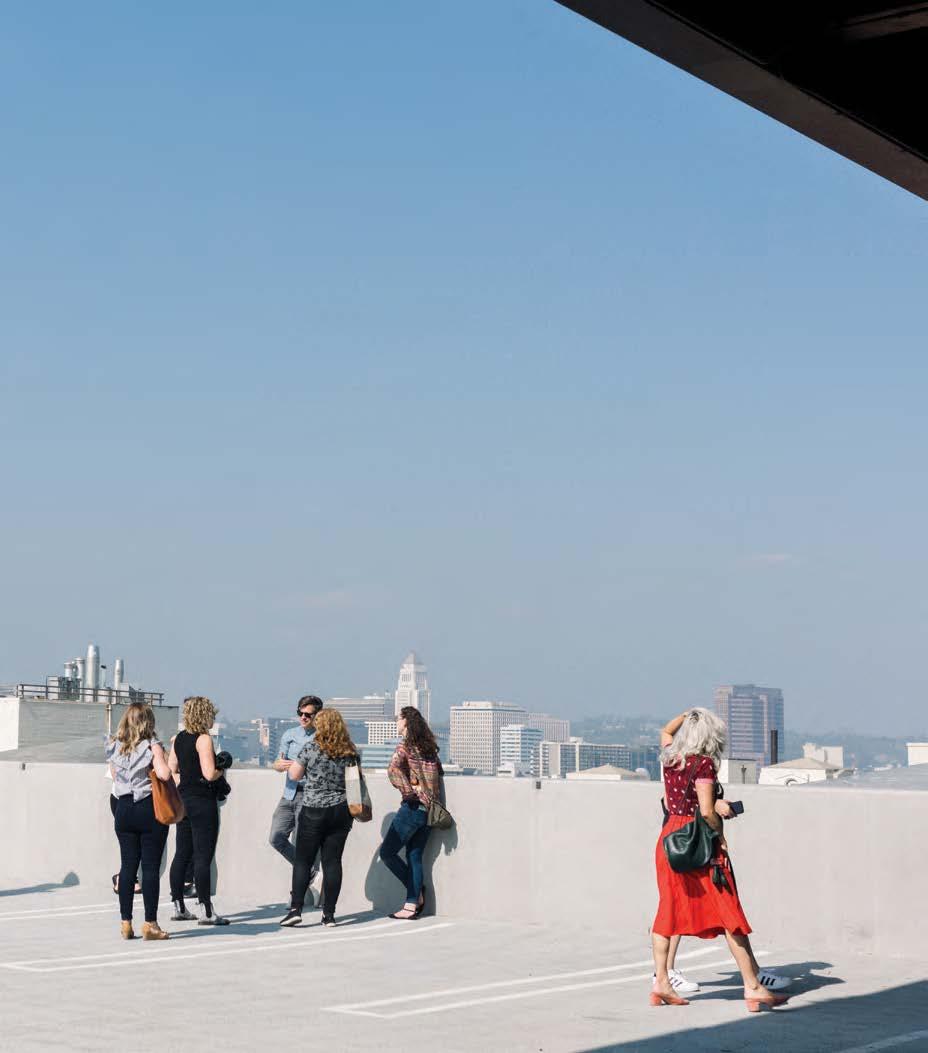
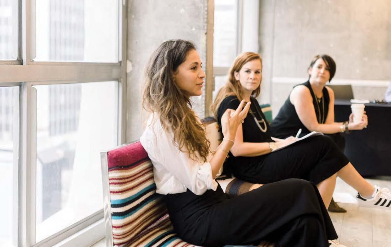
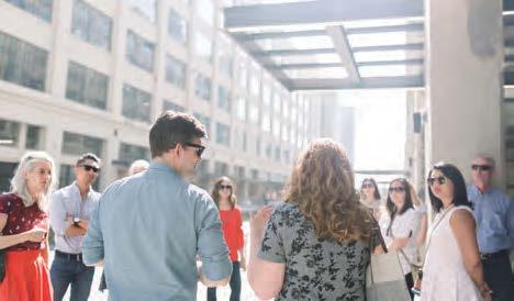
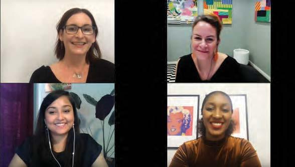
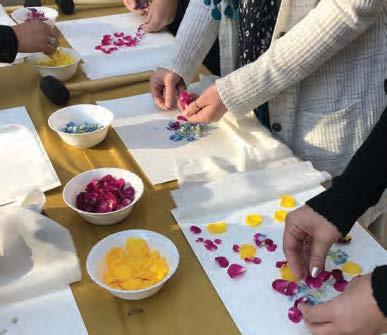
pictured clockwise: 1. ) Mariana Orkenyi, meditation and mindfulness teacher, Jaime Derringer, Design Milk Founder + Chief Creative Officer and Shannon Cochran, VP of Creative + Design for Patcraft discuss the practice of mindfulness in the creative process at the 2018 workshop. 2.) Design and architecture tour of The Row, led by Rios Clementi Hale during the workshop in Los Angeles, 2018. 3. ) The group explores the multi-sensory excersize of flower crushing at Atlanta Botanical Garden in 2019. 4. ) Shannon and Jaime host panelists Nujhat Jahid-Alam, Senior Occupancy Planner, CBRE Global Workplace (Coca-Cola) and Jennifer Edwards, WGSN Consultant Director to discuss consumer drivers and the importance of connectivity during the 2020 workshop.
“AS DESIGNERS, WE STRIVE TO STAY MINDFUL AND INTENTIONAL IN OUR CREATIVE PROCESS. THAT MEANS SHARING AND COLLABORATING IN WAYS THAT FOSTER CREATIVITY AND LEAVE US ENERGIZED.”
SHANNON COCHRAN
VP
OF CREATIVE + DESIGN / PATCRAFT
“IT’S SO IMPORTANT TO WIDEN THE ANGLE OF WHAT WE SEE TO GAIN A DIFFERENT PERSPECTIVE. AND SOMETIMES THE BEST WAY TO CONNECT IS TO LISTEN TO EACH OTHER.”
MICHELE GEARS / ACCOUNT MANAGER, PATCRAFT
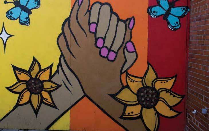
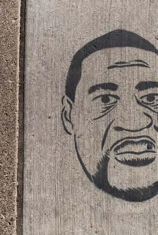
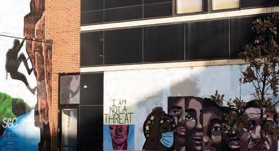
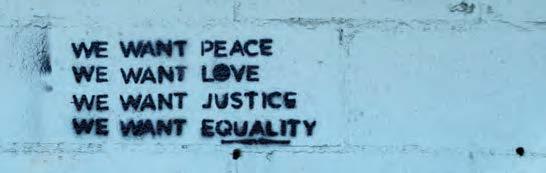
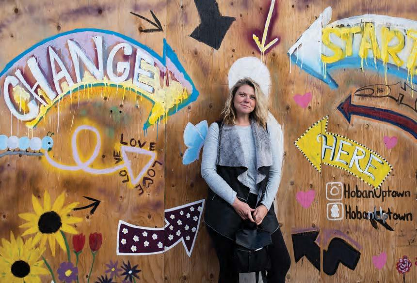
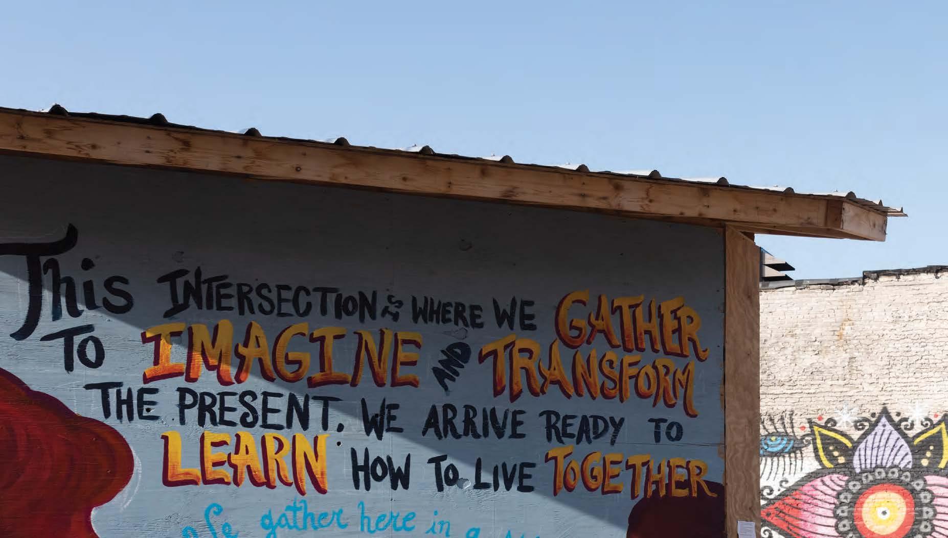
Social Re-Awareness /
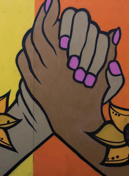
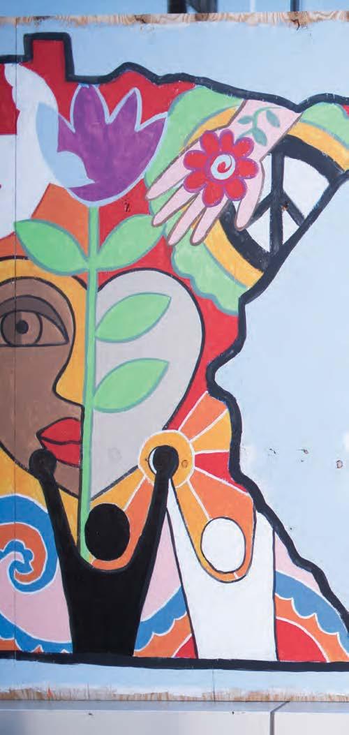
Walk around the streets of Minneapolis and you will see block after block of vibrant visuals that signal an emotional connection in the midst of chaos and disruption. The streets have come alive with powerful murals and messages of a community that is ready for change. While they are stark reminders of the tragic rifts of racial injustice – they offer messages of hope, support and inspiration. For Patcraft account manager Michele Gears, these murals represent a re-awareness of the strength of community coming together through a shared artistic collaboration. “There is so much beauty in our communities. Sometimes you have to stop and look around to take it all in. Positive change and rebuilding is happening right before your eyes. This art is a beautiful and powerful expression that it’s the people that make a community. And it’s the people that can make it better. It’s inspiring to me how Minneapolis has gathered together to heal and to grow – and to become better than we were the day before.”
Positive Disruption for Positive Connection /
“I NEEDED TO SHOW UP AND BE PRESENT. MATCH MY PEERS’ VULNERABILITY. I TURNED ON MY CAMERA AND SAID, ‘HERE’S WHERE I AM ... AND HOW ARE YOU?’.”
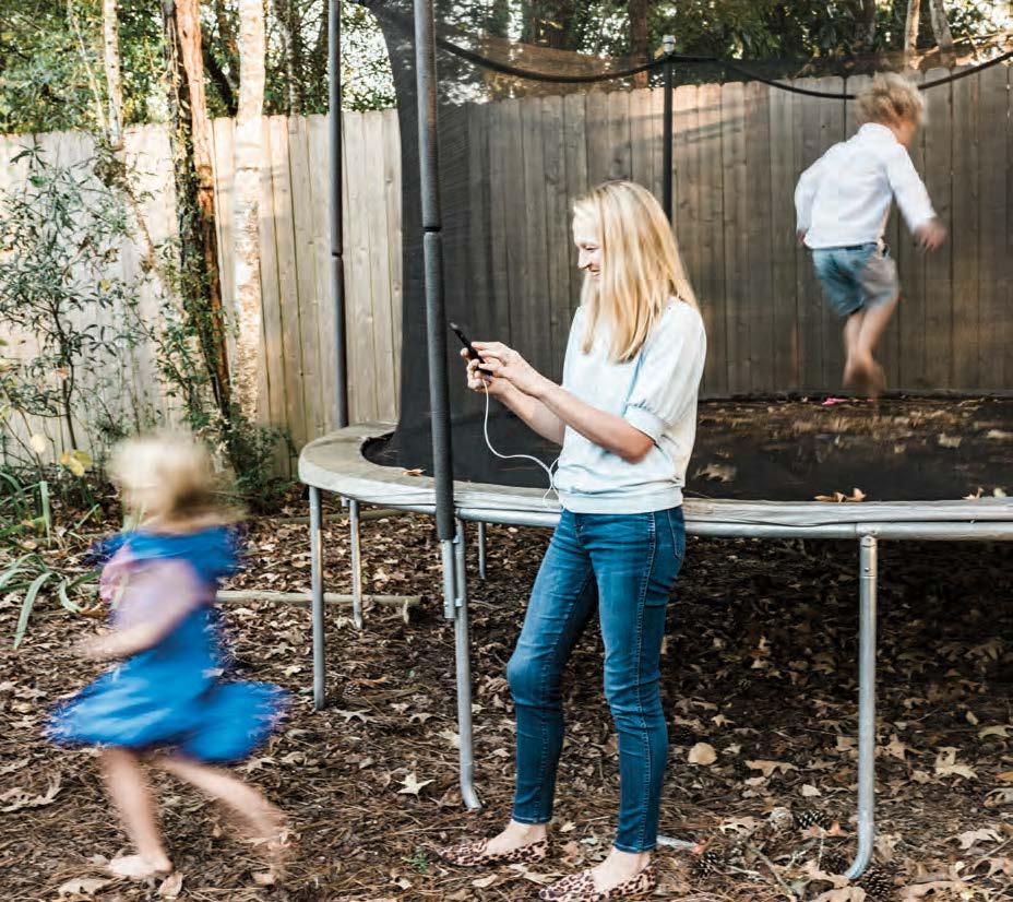
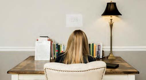
While this past year has been one big disruption, out of this chaos comes transformation – for the better. Adapting to new ways of working, connecting and living, 2020 has set the stage for a mindset reset for how we connect with each other. A shift that begins with authenticity and vulnerability. A realignment of priorities. A focus on empathy.
For Patcraft account manager Noelle Eskew, the disruption of the pandemic led to a deeper sense of connection with customers and co-workers. A month into the pandemic, she was in a virtual meeting – one of many on the calendar for the day. With a new baby, two pre-schoolers and her husband sharing the same work/ living space, she wasn’t prepared to turn on her camera during the meeting. She noticed many black screens in addition to hers. And most of them were her female counterparts – many whom were in a similar situation. She decided to turn her camera on.
“There was a point when I realized, how do we all get through this together? It’s really not about good lighting and fun video backgrounds. This was my reality. I have no choice but to embrace it. It was also an exercise in empathy. Because sometimes your video background is a chaotic house and that is ok.”
This openness has led to new relationships and deeper connections. Having honest conversations about life and balance and sharing personal stories of our new reality, we meet people where they are for comfort and support. We are all in this transformation together.
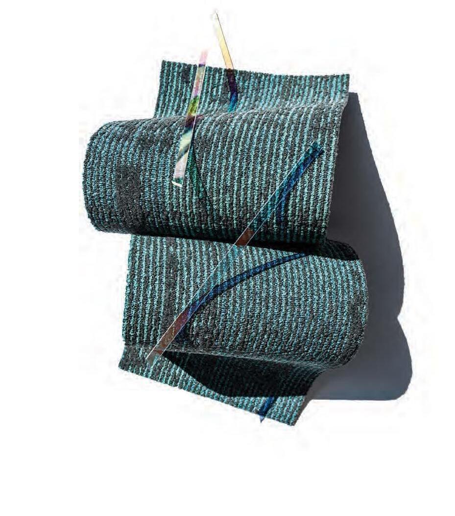
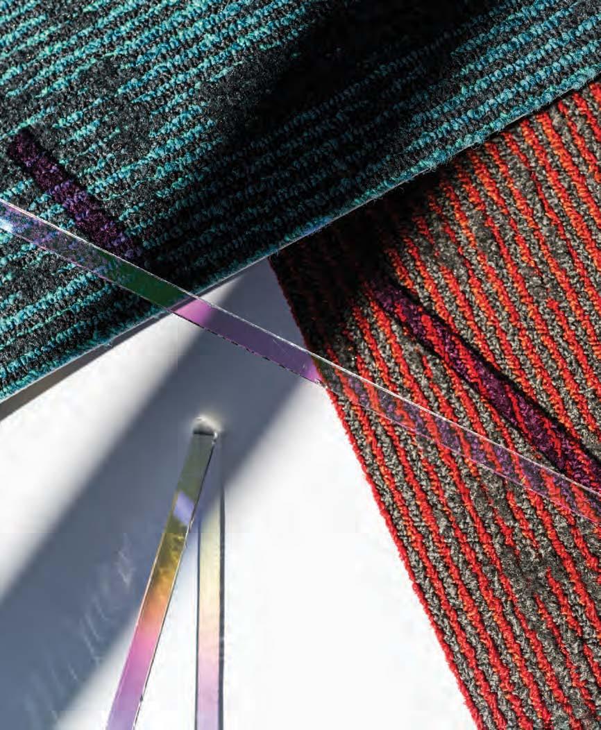
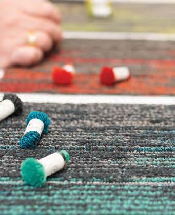
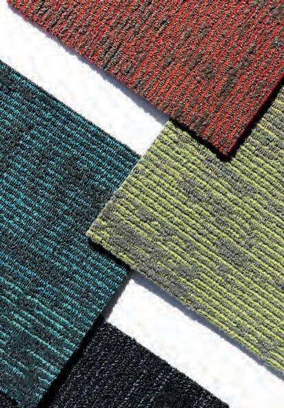
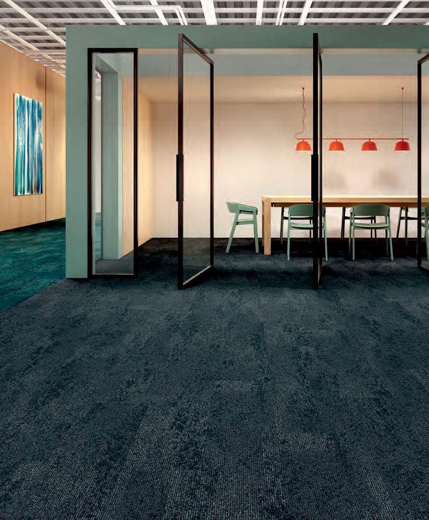
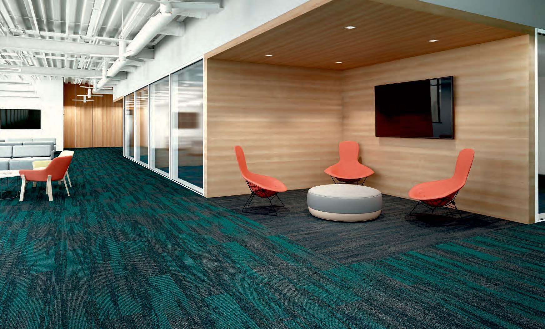
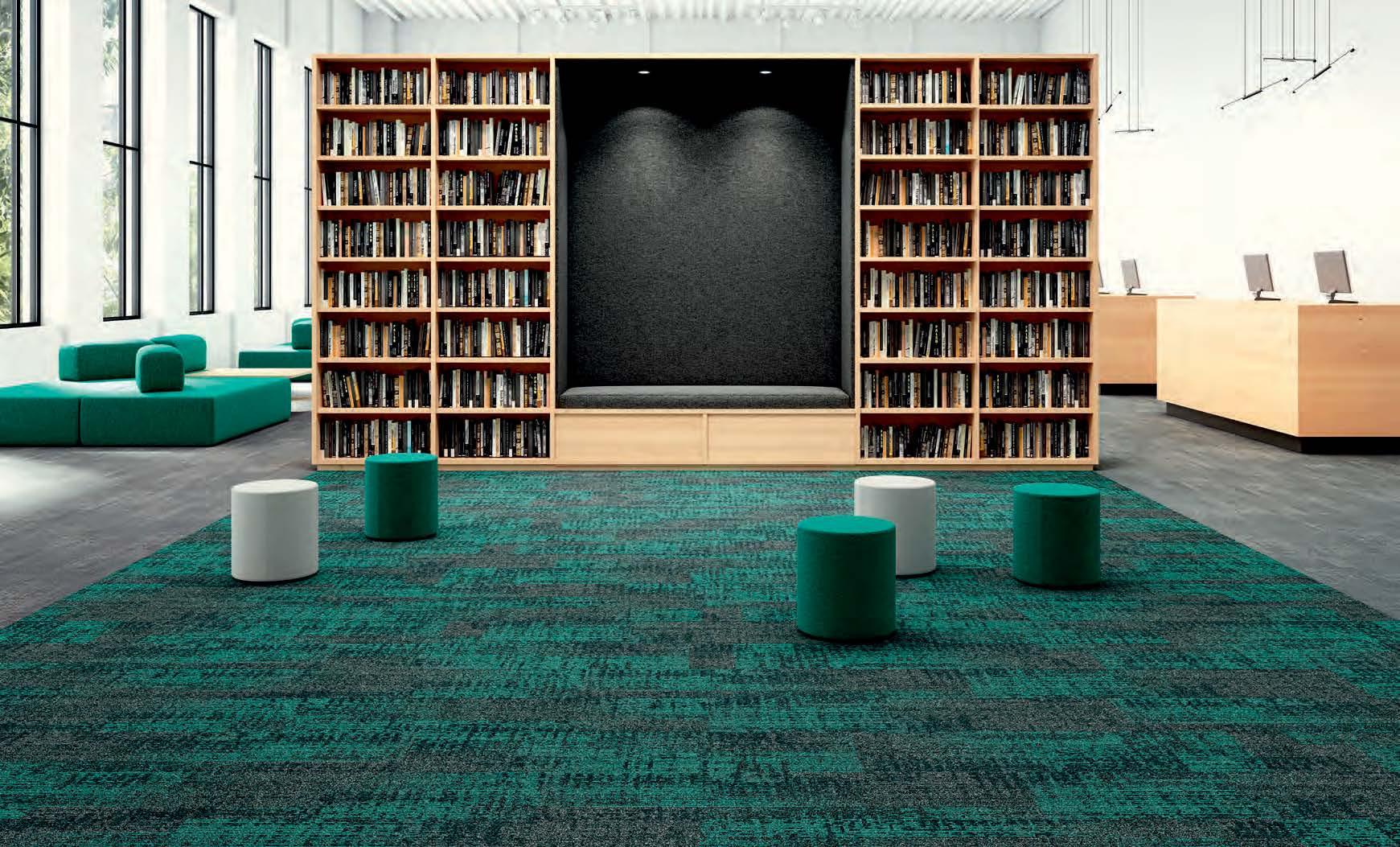
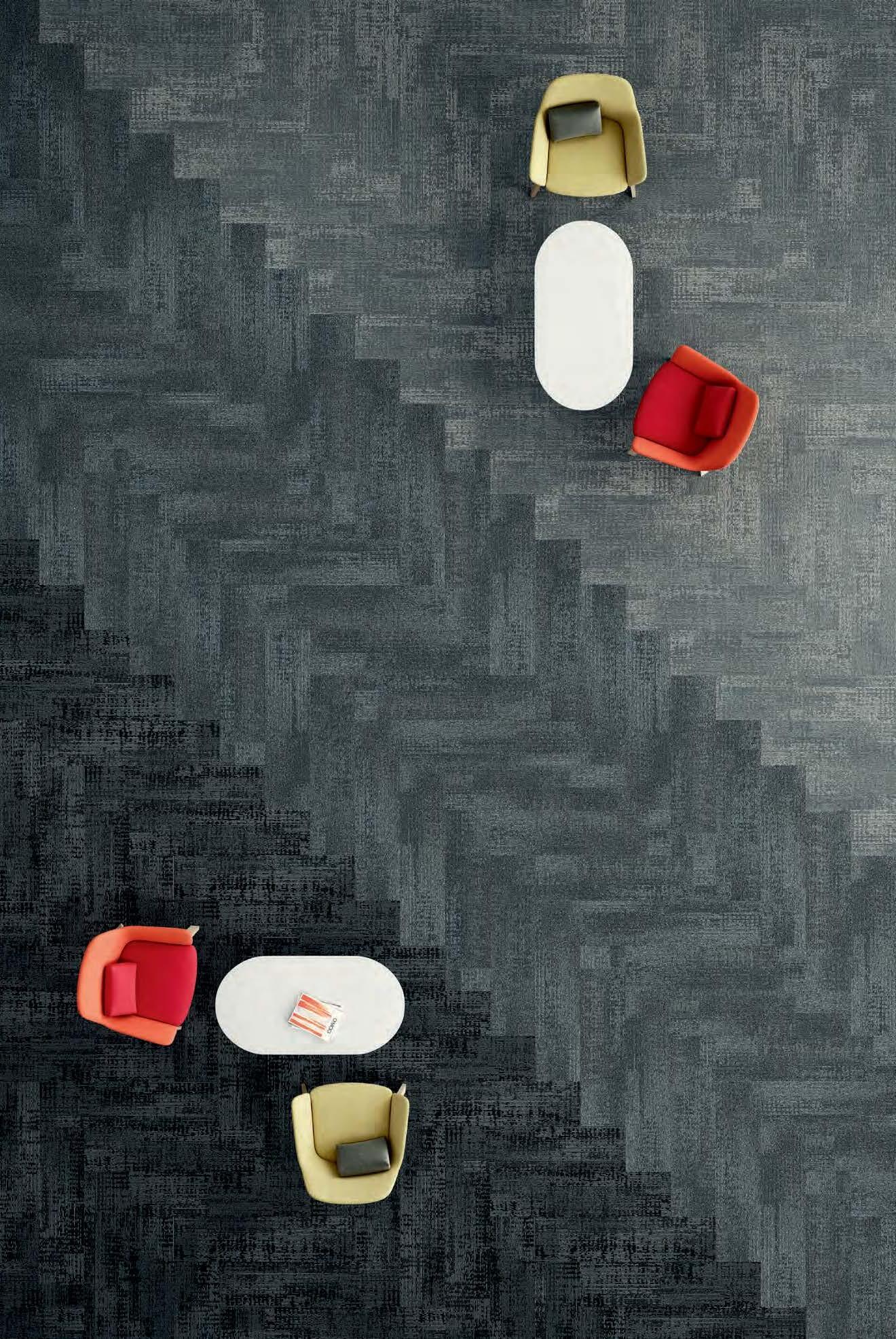
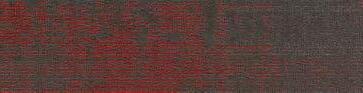
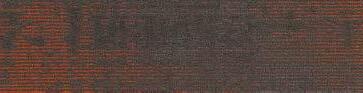
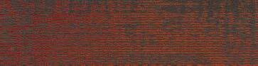
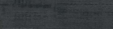
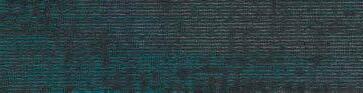
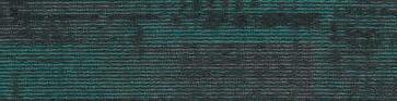
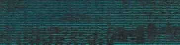
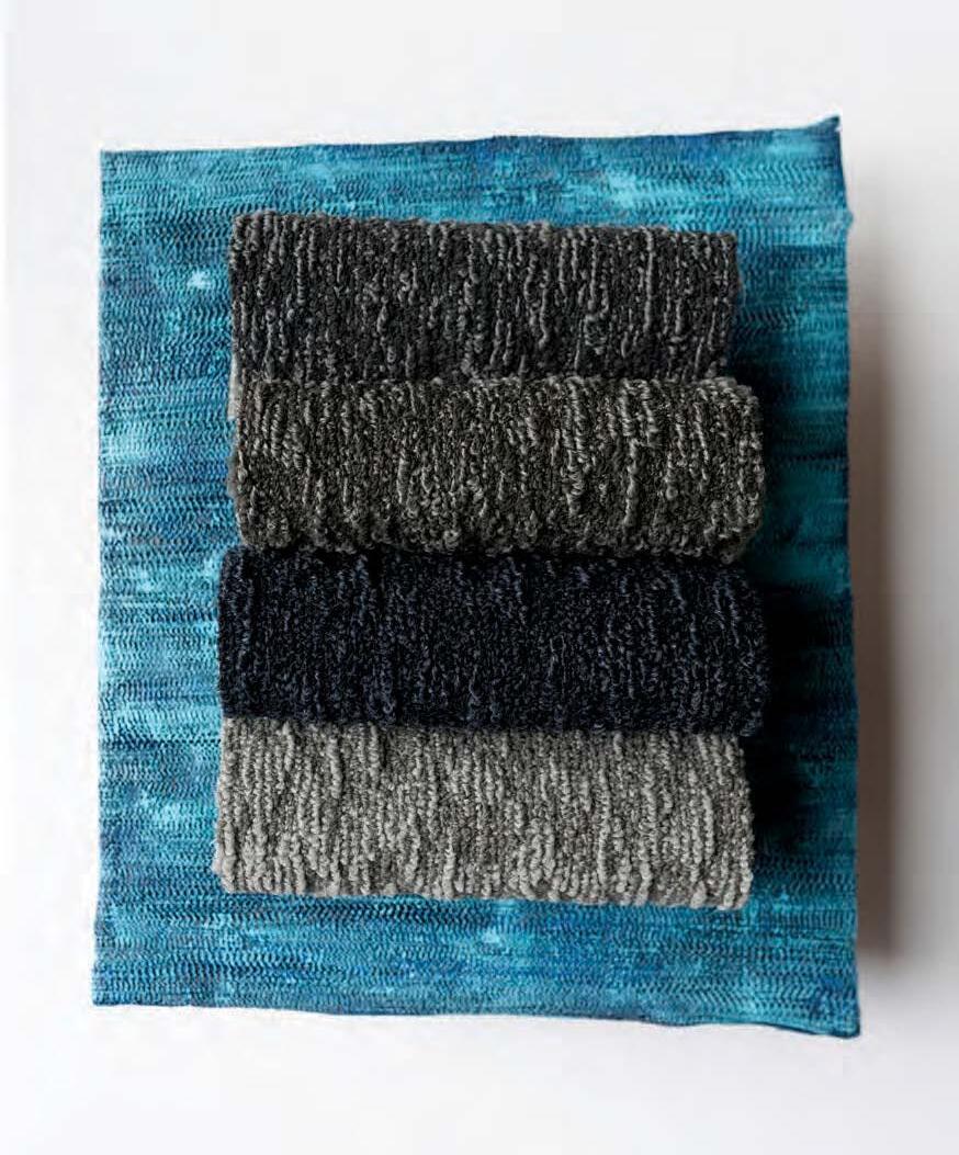
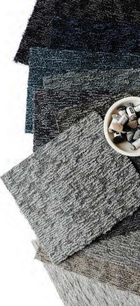
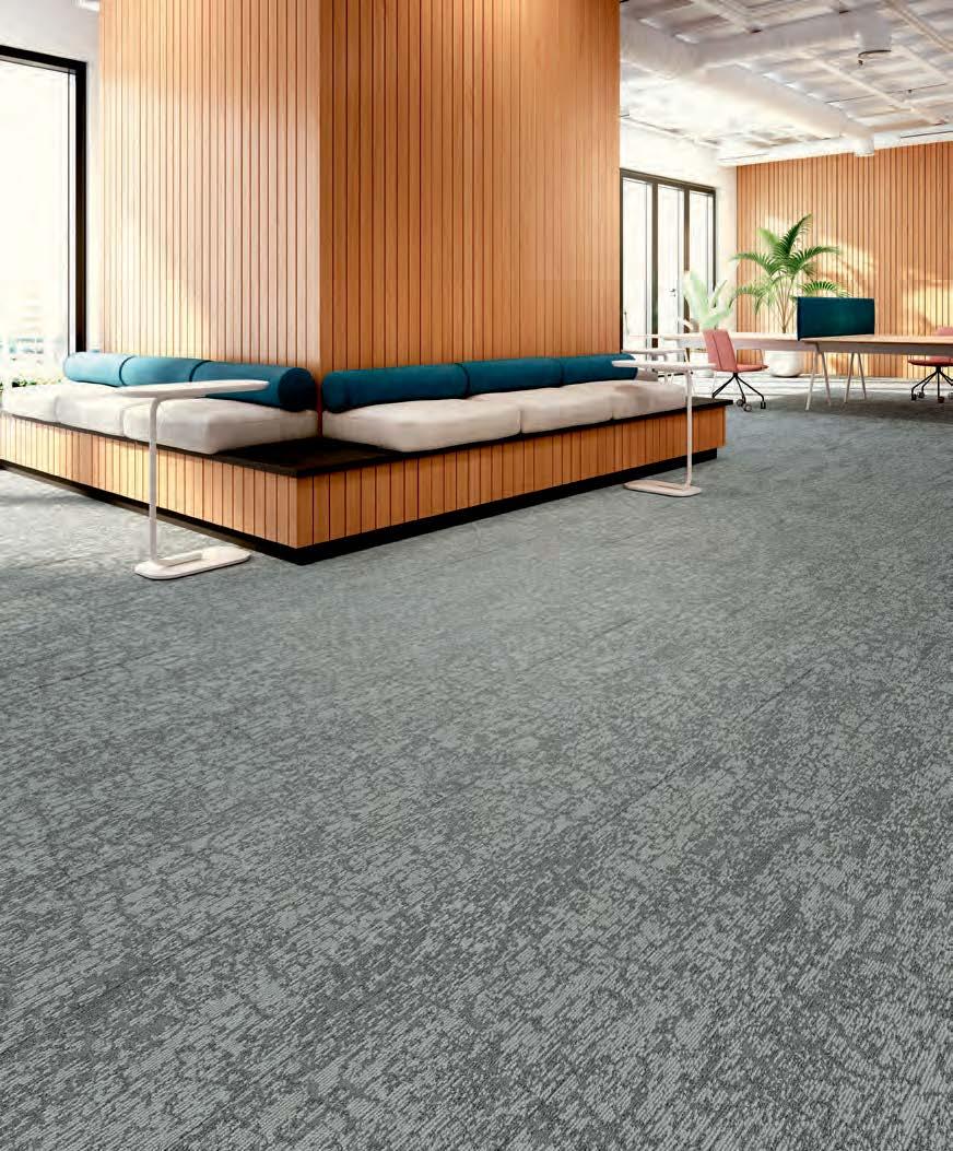
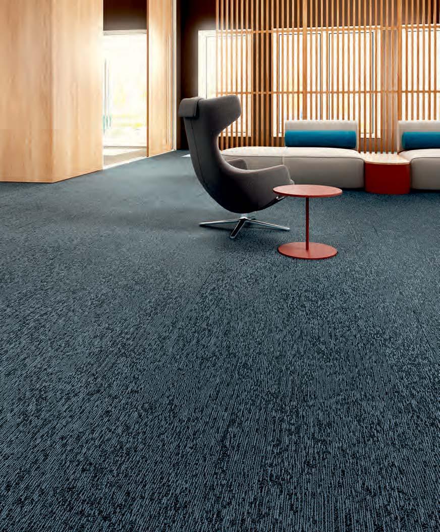
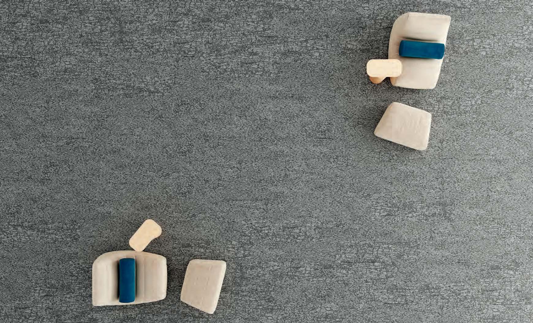
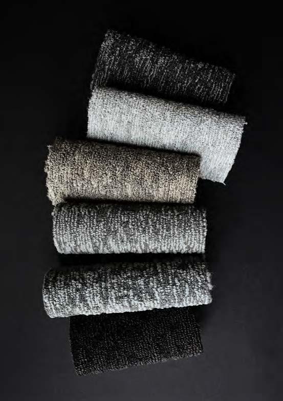
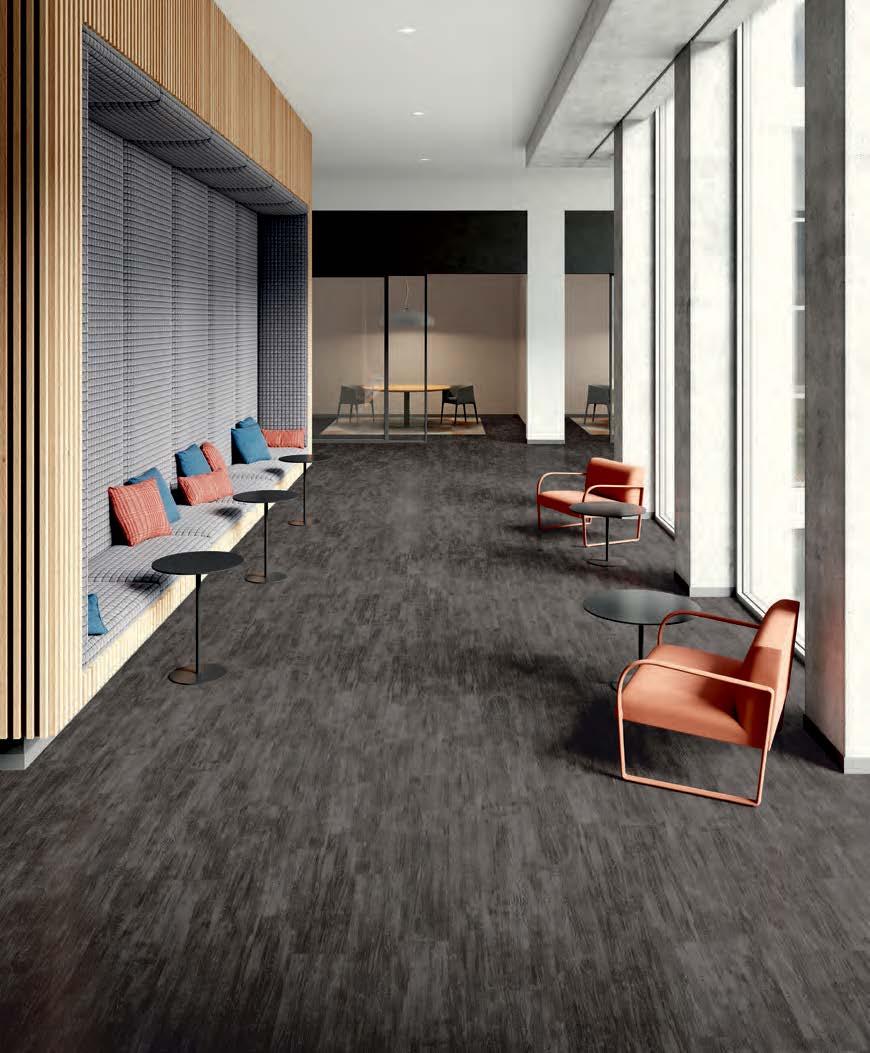
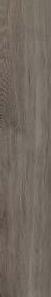
COLOUR INTERFERENCE
VIBRANCE. FULL SPECTRUM. COLOUR INTERFERENCE EMBRACES THE BOLD TRANSITION OF COLOR. EXPLORE SUBTLE SHIFTS THAT BUILD IN INTENSITY. CREATE VERTICAL LAYERING WITH DYNAMIC DISRUPTIONS. IN THREE STYLES AND 20 COLORWAYS, COLOUR INTERFERENCE CREATES KINETIC SPACES – FOR GUIDING MOVEMENT OR CREATING
CONNECTION – IT’S AN INFUSION OF ENERGY THAT TRANSFORMS SPACE.
DISRUPT THE PROCESS
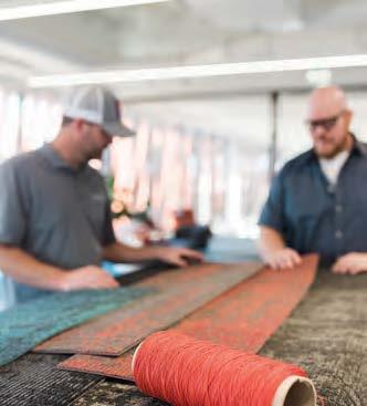
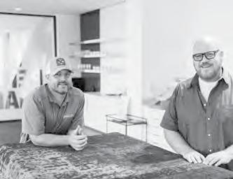
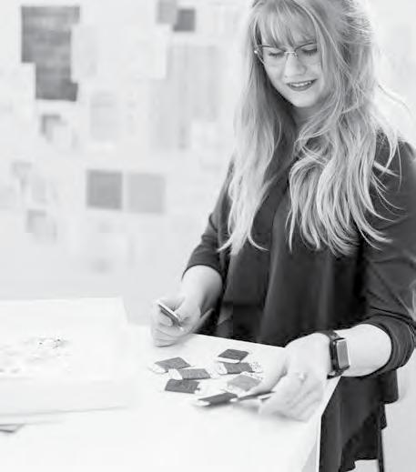
Observations and experiences shape our design process. Bringing different expertise to the table for new perspectives can open the door to new discoveries. The product development process is one of creative and curious observation. When Patcraft product technician Corey Twilley was supervising the run of another product line, he noticed a unique color shift in the transitions between pieces. He brought a sample to Patcraft product designer Ron Powell, noting the nubby texture and the way the color was coming through in the transition. As the knots gave way to rich color, this visual became the inspiration for Colour Interference. Throughout the next phase of the design process, Powell and the design team played with the patterning and color to bring the product to life.
“WE ARE ALWAYS LOOKING FOR WAYS TO PUSH THE BOUNDARIES WITH COLOR AND TEXTURE. SO WHEN COREY SHOWED ME THE TUFTED SAMPLE, I STUDIED THE SAMPLE FOR SEVERAL WEEKS – DETERMINED TO FIGURE OUT A WAY TO BRING THIS UNINTENTIONAL DESIGN TO LIFE.”
RON
POWELL / SENIOR PRODUCT DESIGNER
Embracing this vertical nature of the yarn transition in the tufting process, Ron explored painterly visuals in various color palettes to create layers of textural color. The result are three coordinating styles and 20 colorways.
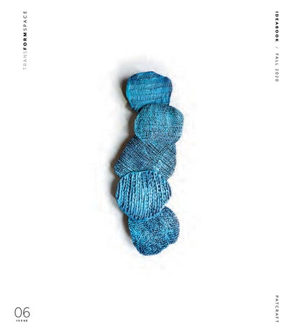
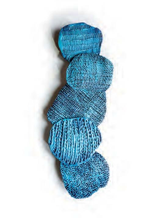
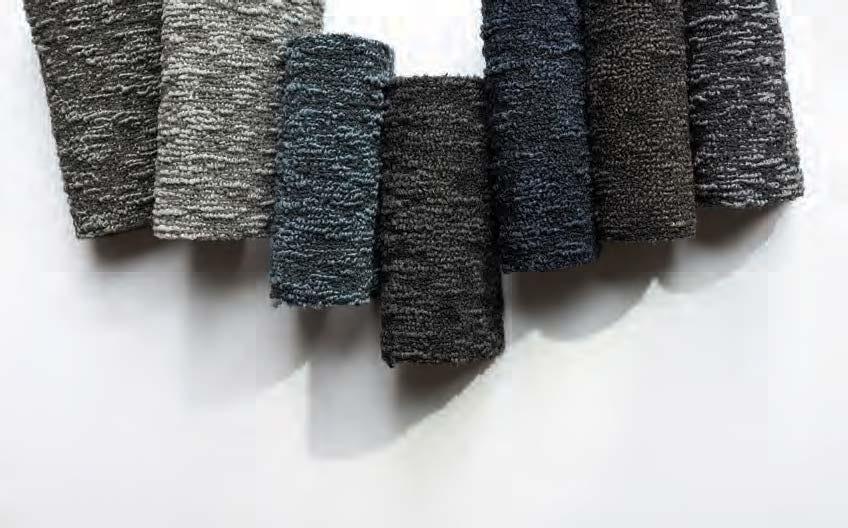
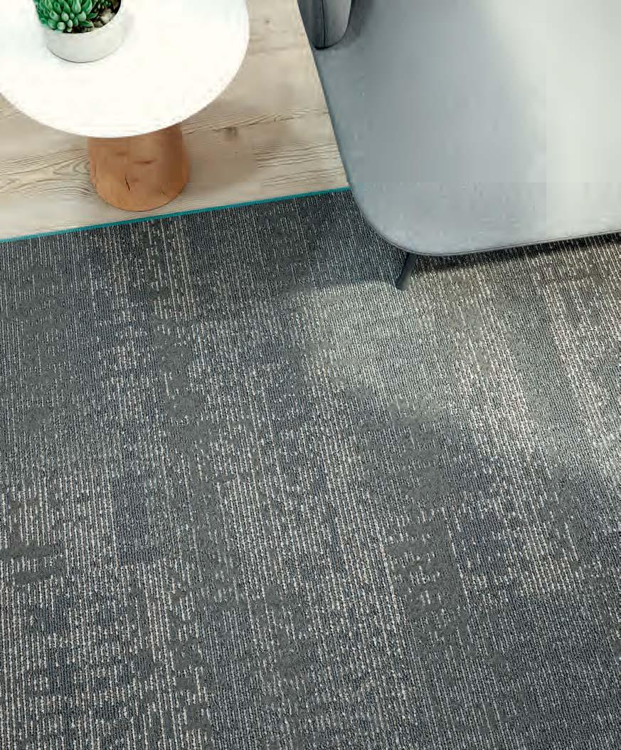
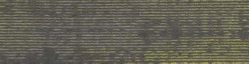
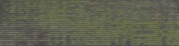
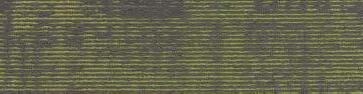
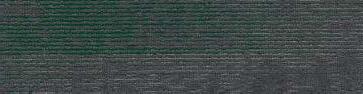
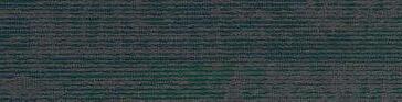
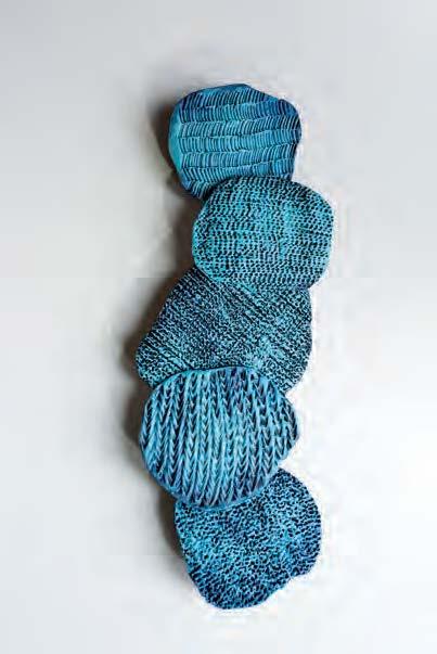
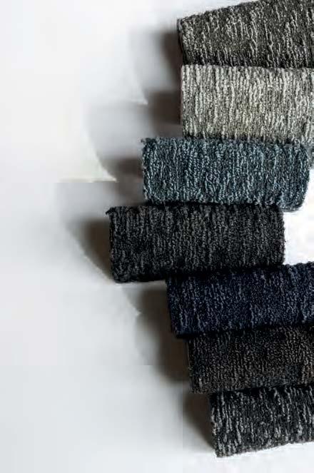
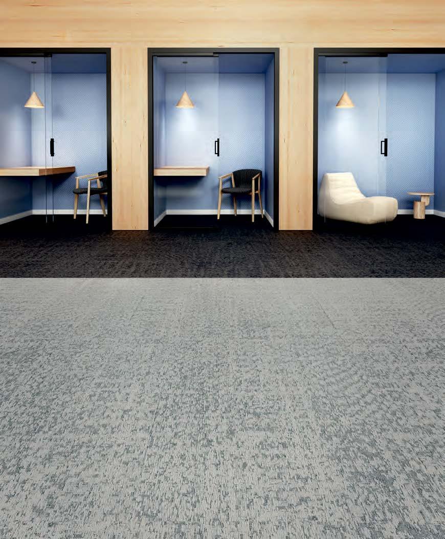
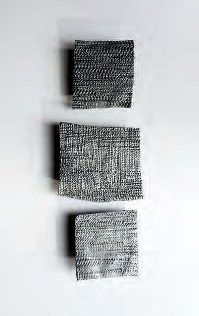
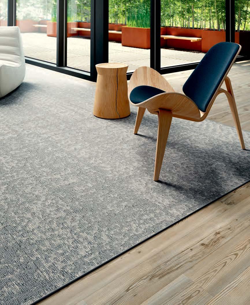
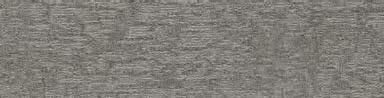
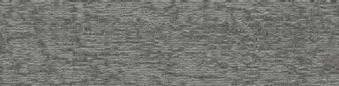
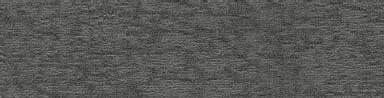
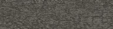
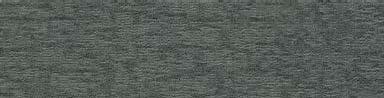
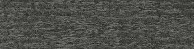
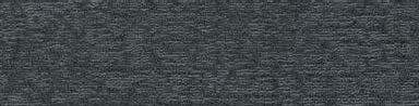
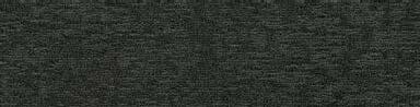
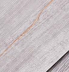
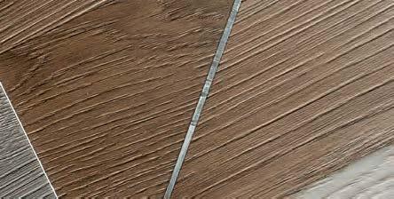
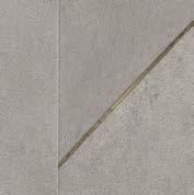
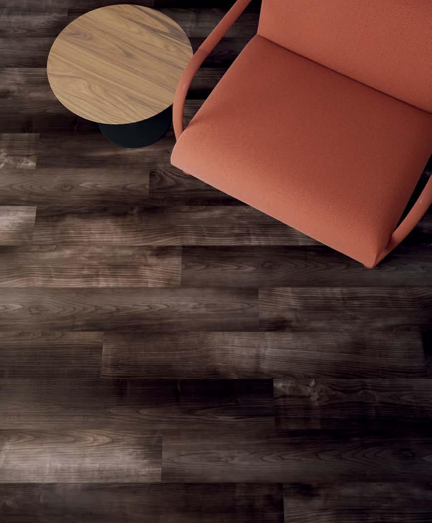
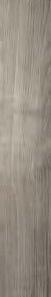
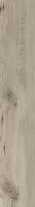
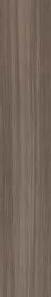
INTOUCH
COCOONING TEXTURES CREATE A SENSORY CONNECTION.
INSPIRED BY THE EXPLORATION OF TEXTURE AND IRREGULARITY IN CLAY, INTOUCH IS A HANDS-ON STUDY OF TACTILE PATTERN THAT MAKES A UNIQUE IMPRESSION. IN 12 X 48 PLANKS AND FOUR STYLES, INTOUCH BALANCES SOFT TONAL COLOR WITH EXAGGERATED TEXTURE. FROM WARM EARTH TONES TO SOOTHING COOL NEUTRALS,
IT’S A TEXTURAL EXPERIENCE THAT CREATES A SENSE OF COZY AND CALM.
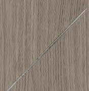
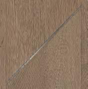
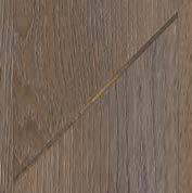
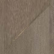
DISRUPT ARTISTIC IMPRESSIONS
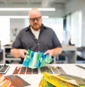
For product designer Ashely Weaver, inspiration is a hands-on process. Her inspiration for InTouch came from an exploration and study of texture with clay. Using various tools and imprinting techniques onto the clay’s surface she noticed the unique impressions it created. Originally envisioned as a hard surface, collection, through the design exploration process, the team came to realize that resilient wasn’t the right medium for the collection. But before shelving the concept, Ashley decided to run the patterns as a soft surface. Through tufting, she was able to recreate the exaggerated textural highs and lows like the inspiration – creating a four-style collection that is a direct interpretation of the visual patterns from the clay formations.
“AS
A MAKER, EXPLORING
TACTILITY AND TEXTURE IS A LARGE PART MY DESIGN PROCESS. CREATING A SENSE OF TOUCH IS AS IMPORTANT AS HOW IT LOOKS .”
ASHLEY WEAVER / PRODUCT DESIGNER
SETTLING IN /
As curious observers, when we explore what motivates us, we are led to solutions that keep people connected for the human experience. In an effort to balance feelings of fear and uncertainty, we seek tactile connections. From the concept of nesting and “settling in,” we crave cozy textures for comfort that create a sanctuary experience.
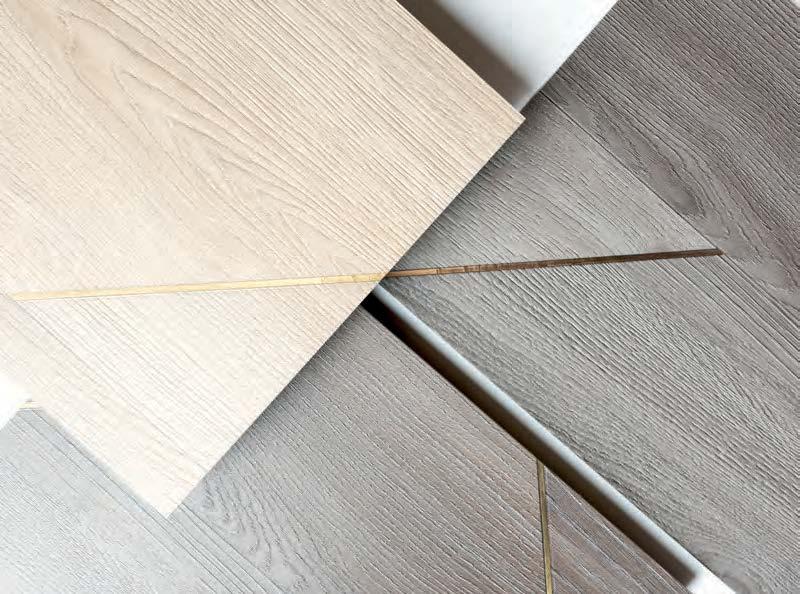
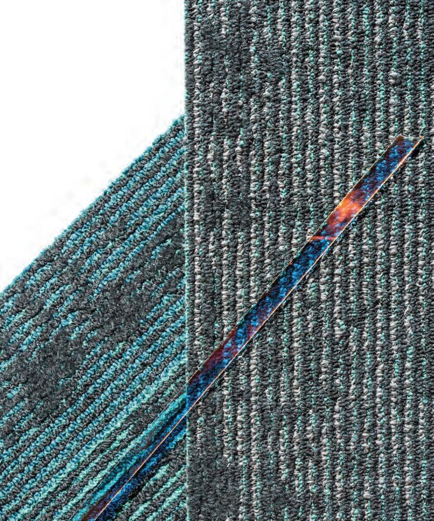
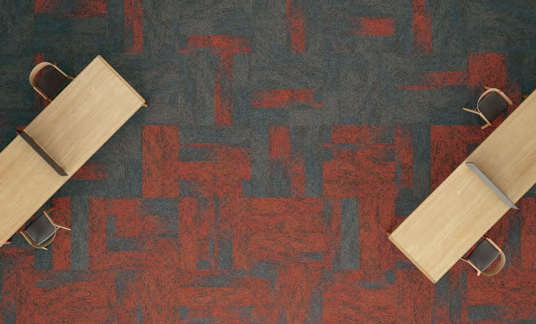
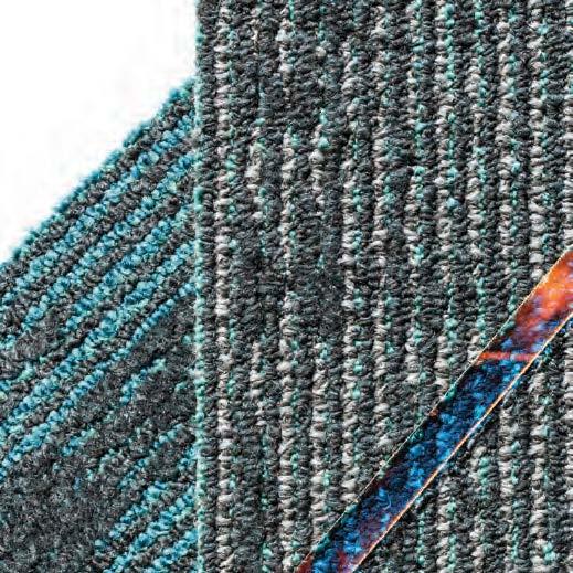
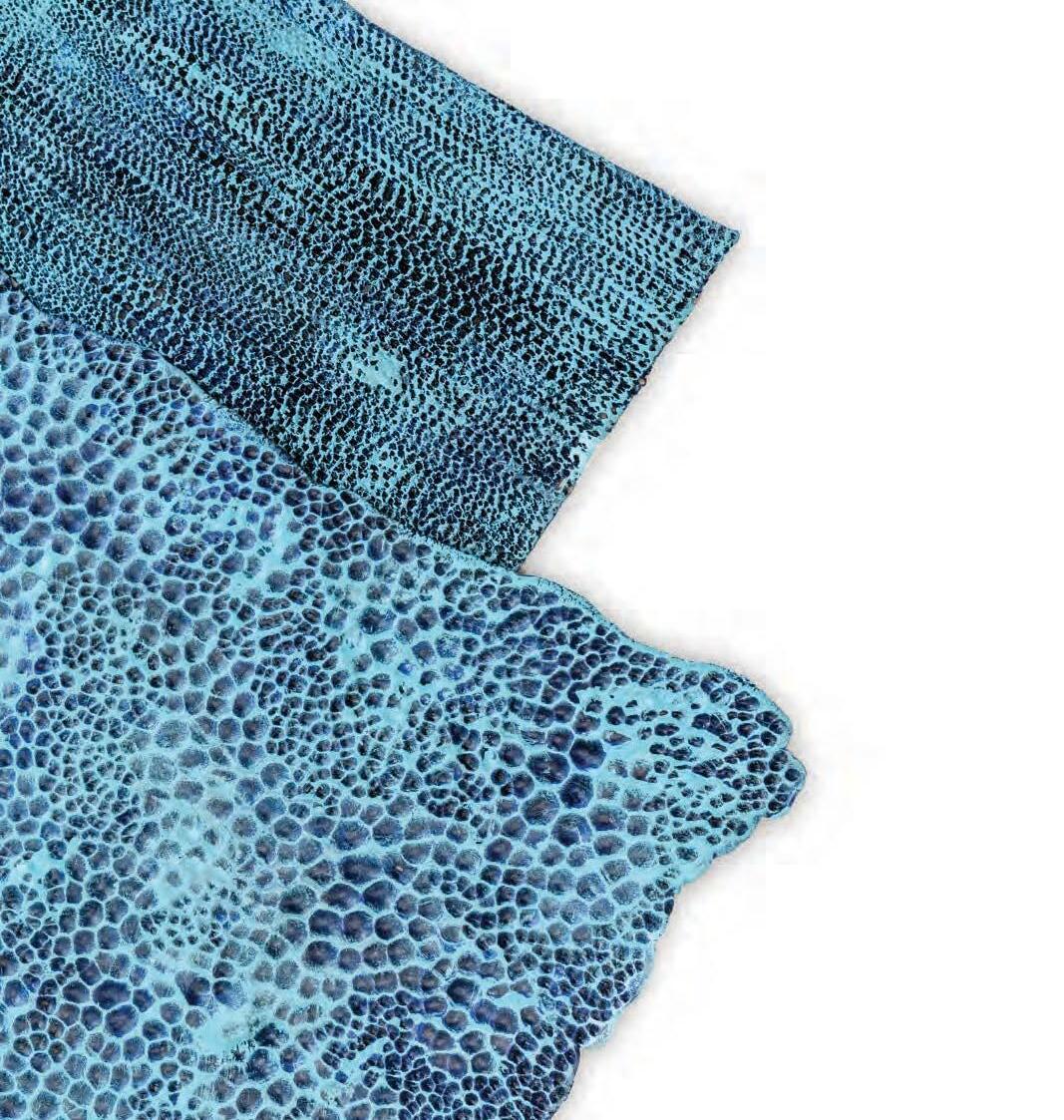
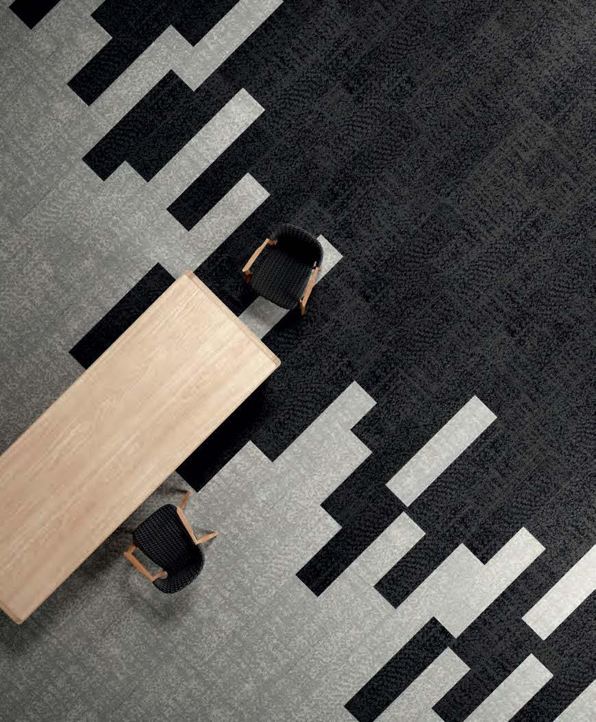
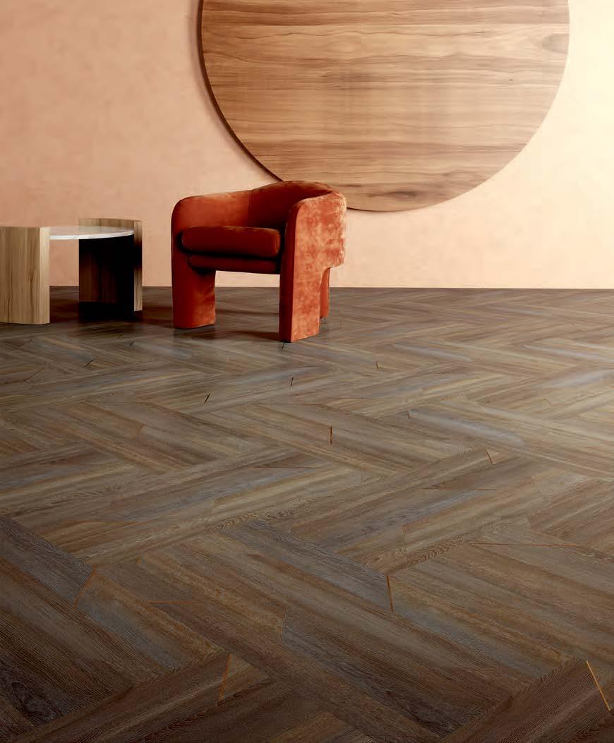
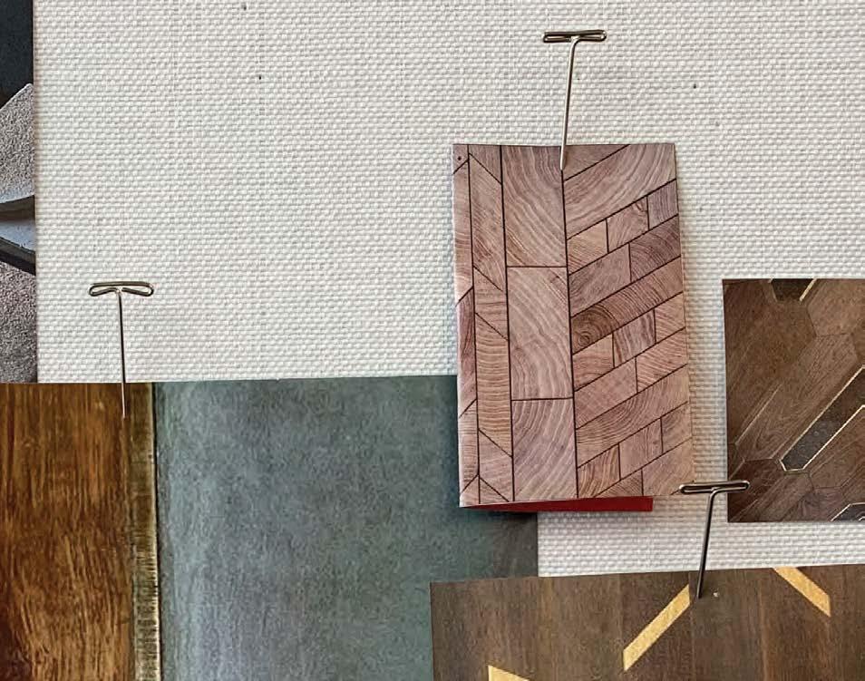
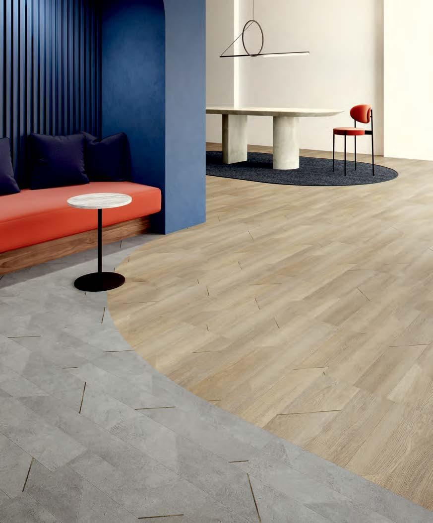
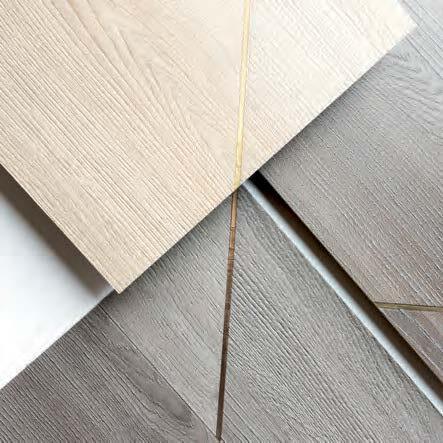
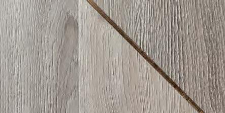
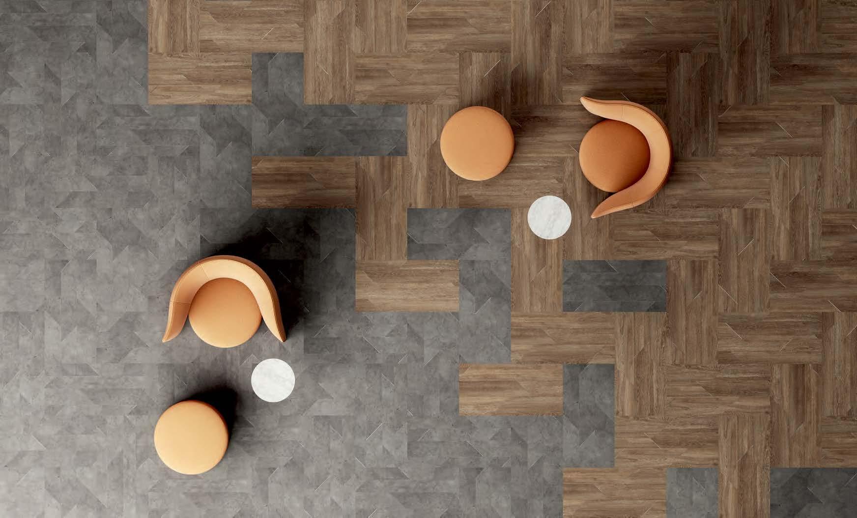
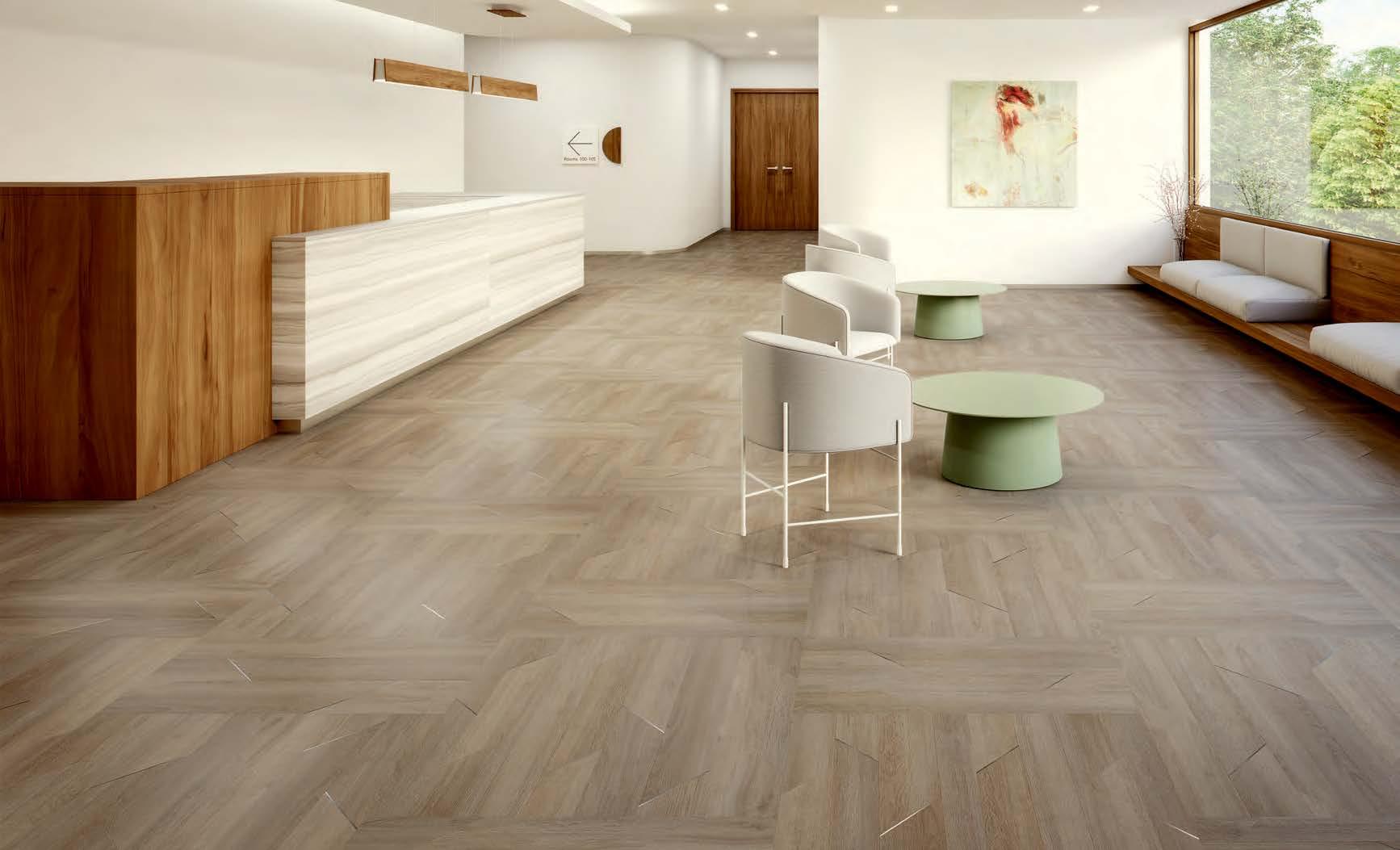
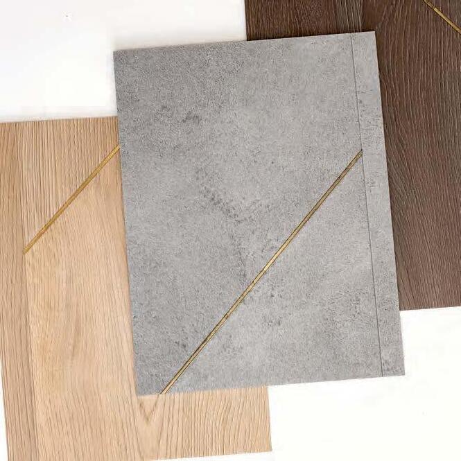
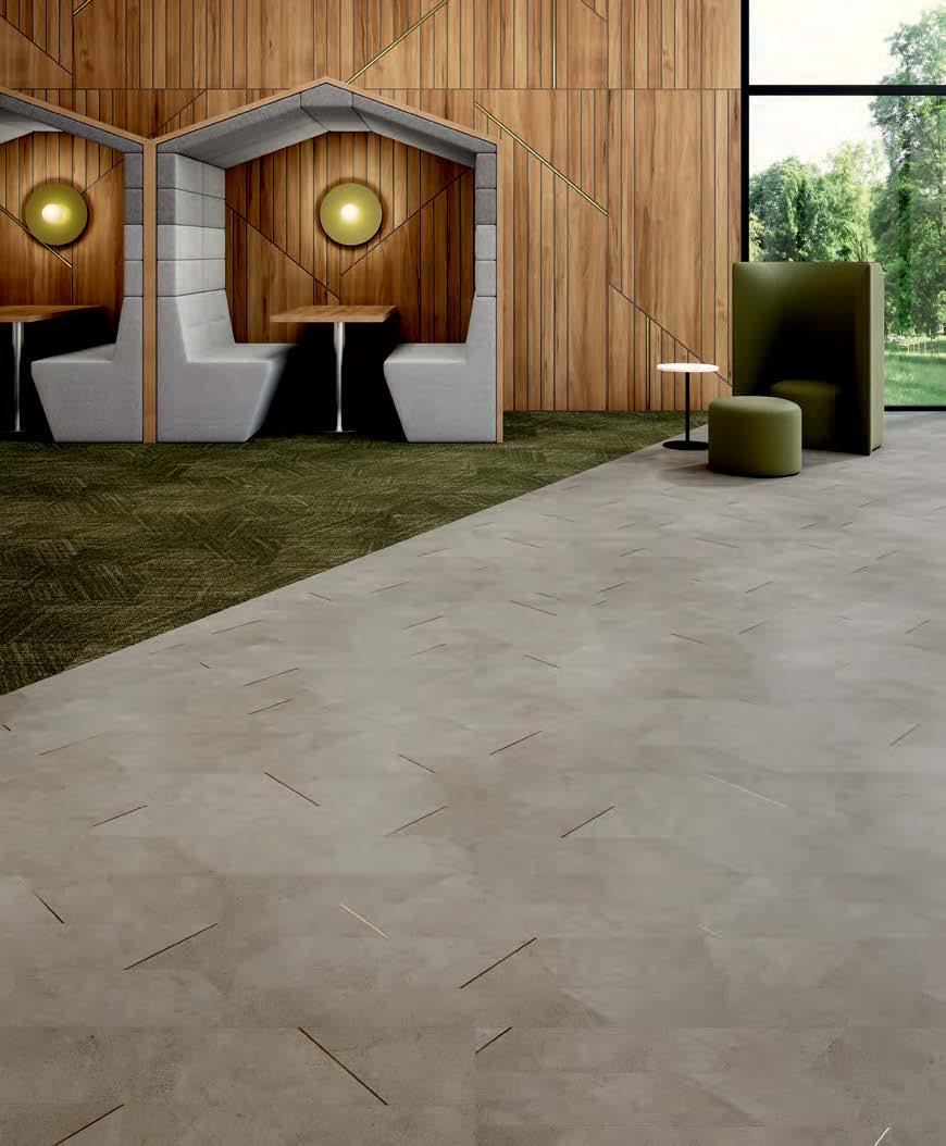
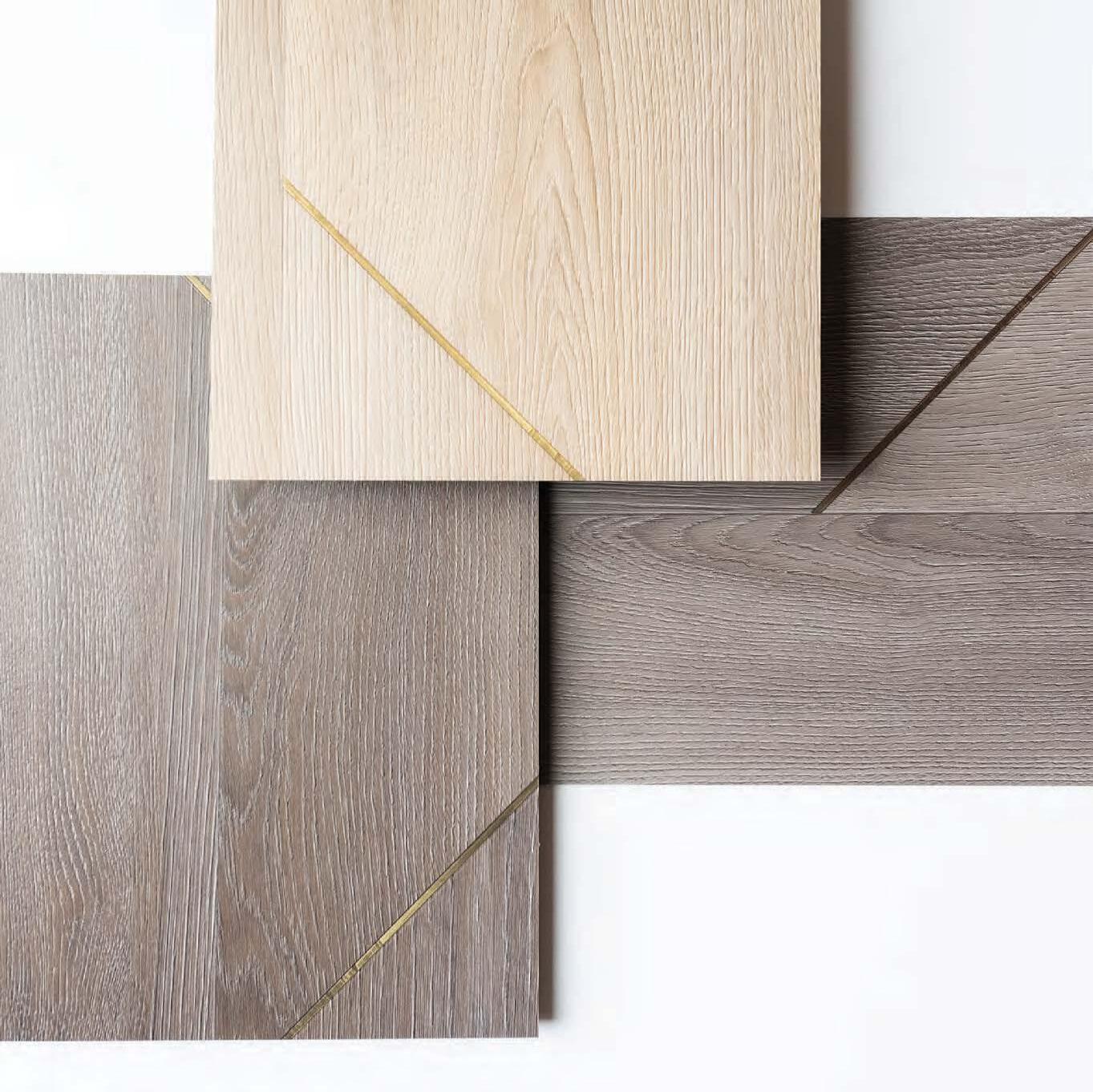
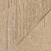
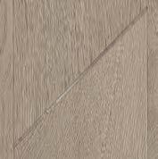
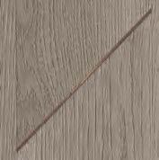
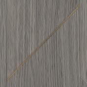
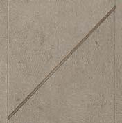
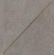
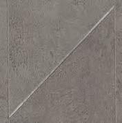
INSET
ANGLED AND INLAID. INSET MERGES MATERIAL FORM AND EMBRACES THE BIAS.
INSPIRED BY THE TECHNIQUE OF PARQUETRY, THIS RESILIENT COLLECTION OFFERS A MIX OF WOOD AND CONCRETE VISUALS ACCENTUATED WITH METALLIC INLAY – CREATING A DISTINCTIVE
INTERPLAY OF LINE AND GEOMETRIC PATTERN. WITH A 5 MM EMBOSSED IN REGISTER, IT MIXES
SEAMLESSLY WITH CARPET WITHOUT TRANSITION, TRANSFORMING ANY SPACE.
“WE WERE INSPIRED BY THE TECHNIQUE OF PARQUETRY –EXPLORING THE EFFECTS OF MOSAIC PATTERNING WITH GEOMETRIC LINES AND ANGLES.”
KELLY WILLIAMS / SENIOR RESILIENT DESIGNER
PARQUET PLAY / Expanding on collections like Splitwood and Metal Collective, Inset is embossed in register in a mix of wood and concrete visuals that feature a unique metallic inlay accent in bronze, silver and gold tones.
SPACIAL
GEOMETRY / LINES TAKE SHAPE.
SHAPE DISRUPTS SYMMETRY.
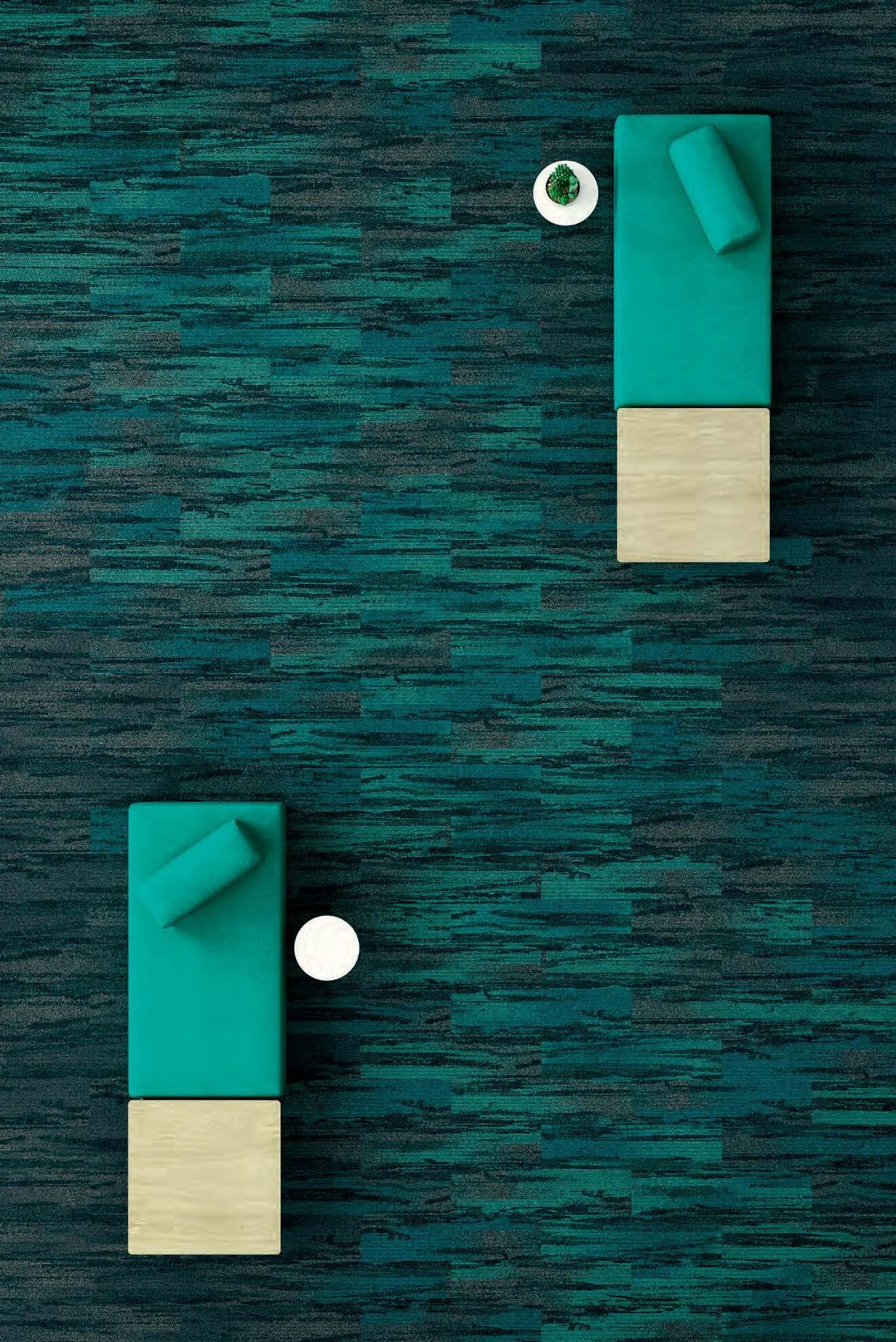
COMFORT + CONNECTION
CIRCULAR SHAPES INSTILL A SENSE OF TOGETHERNESS AND BELONGING. MOVEMENT SUGGESTS ENERGY AND POWER, COMMUNITY, INTEGRITY AND PERFECTION.
STRUCTURE + STABILITY
SQUARE AND RECTANGULAR SHAPES REPRESENT STRUCTURE AND ORDER AND EVOKE HONESTY, RATIONALITY AND FORMALITY.
SHAPE AND FORM HAVE A WAY OF CONNECTING US – CONVEYING MEANING THAT GIVE US SIGNALS AND VISUAL CUES. USING SHAPES AS A DESIGN AESTHETIC, CAN SERVE AS A FUNCTION AS WELL. USED FOR ORGANIZING INFORMATION, CREATING CONNECTION AND ZONING – LINE AND SHAPE CAN POSITIVELY IMPACT OUR EXPERIENCE WITHIN A SPACE.
UNITY + BALANCE
INTERSECTING LINES AND SHAPES SUGGEST TRANSITION, WHILE CREATING BALANCE, UNITY AND HOPE.
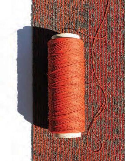
METALLIC INKS
Each color in Inset features metallic ink. The metallic color for each colorway is indicated in the right corner under each image image and also appears as the second word in each color name. Images shown represent the application of the metallic ink; however, fullsized, physical samples shoud be used for true metallic visual effects. Metallic ink will appear in every full size plank.
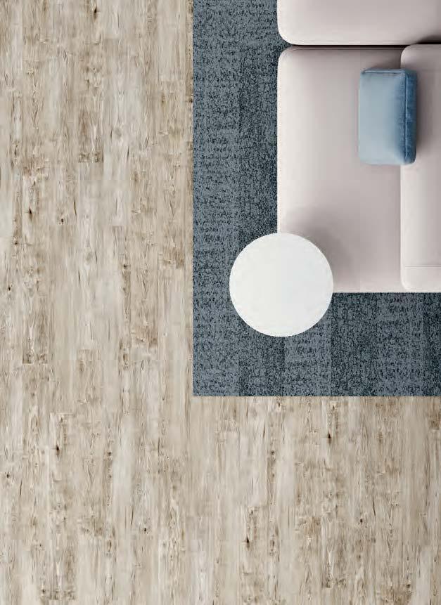
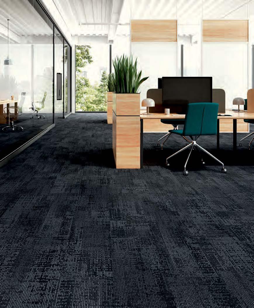
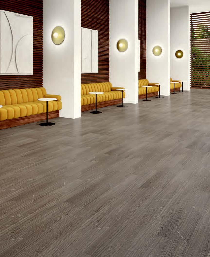
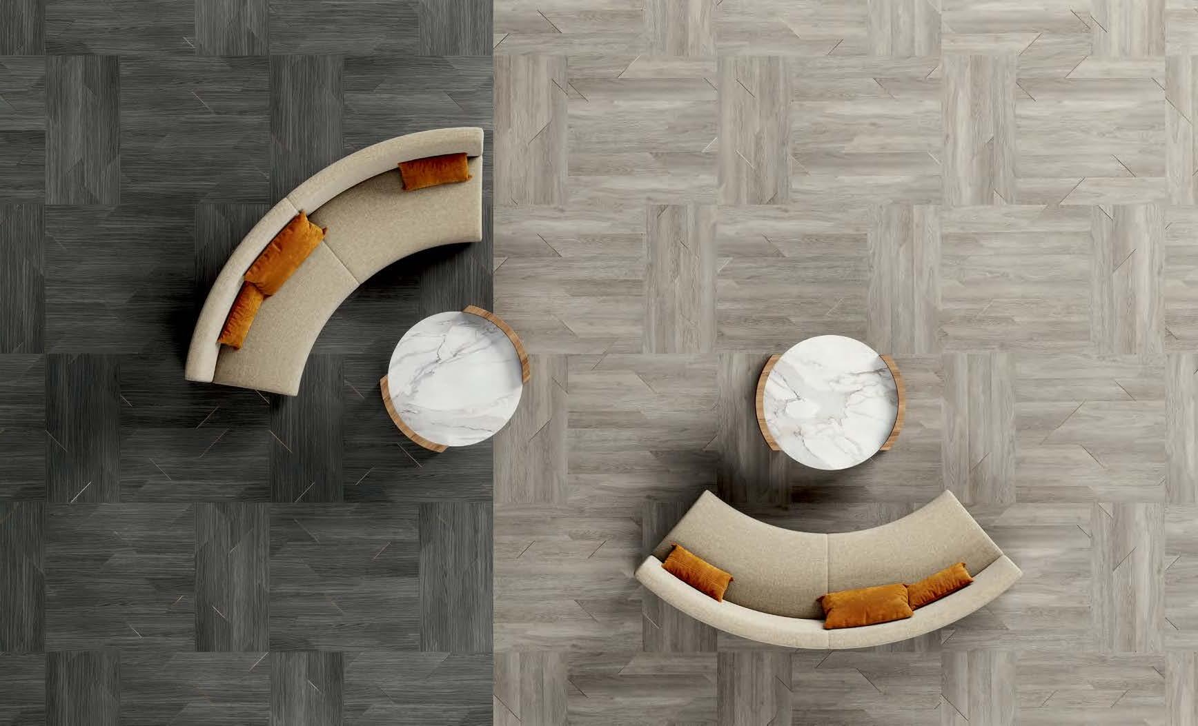
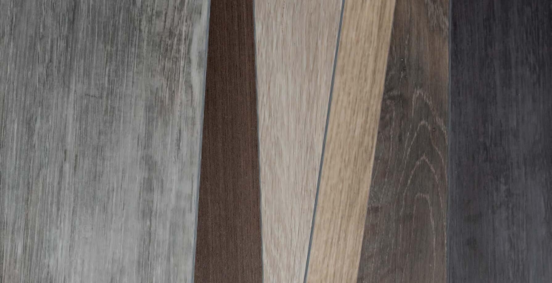
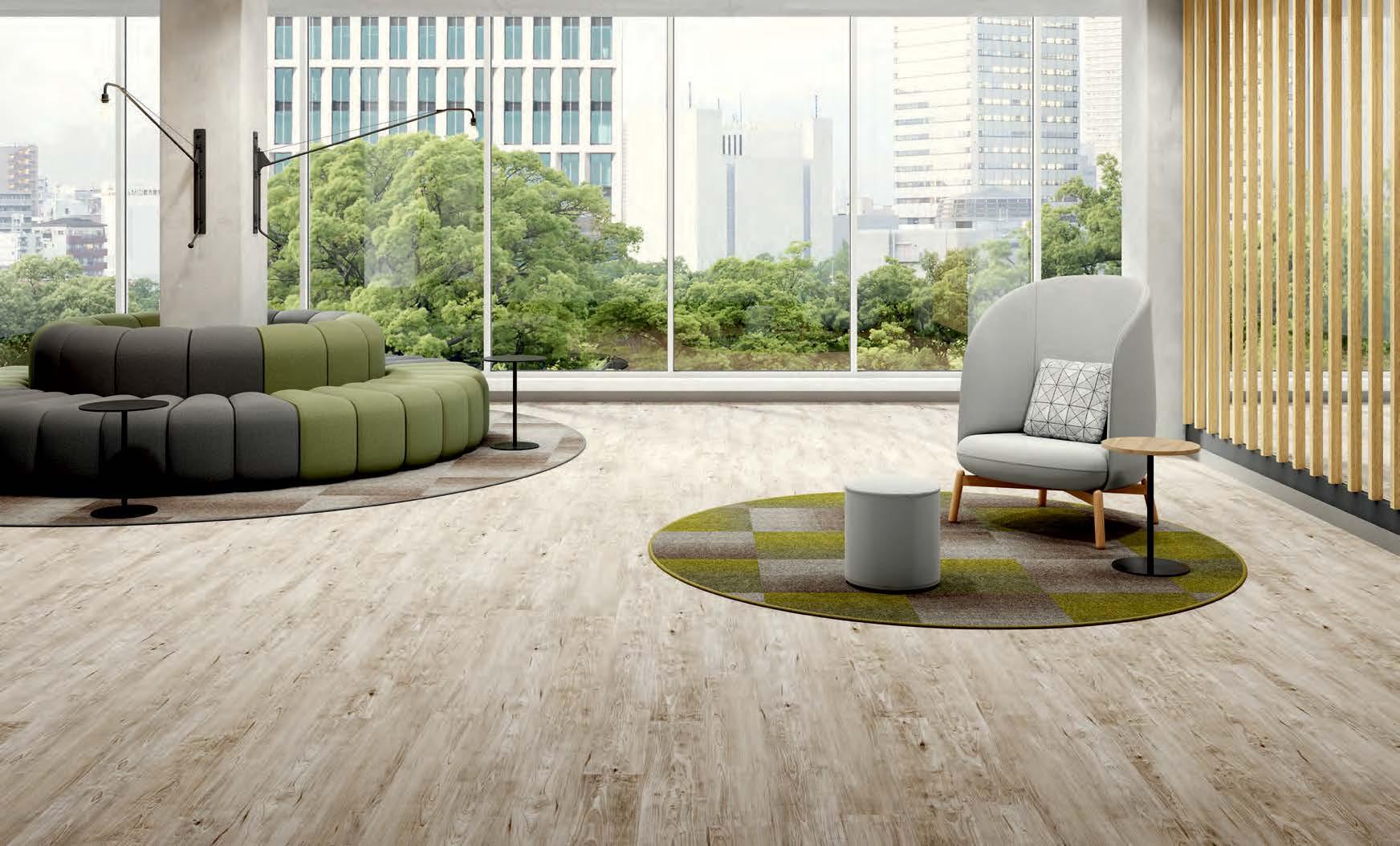
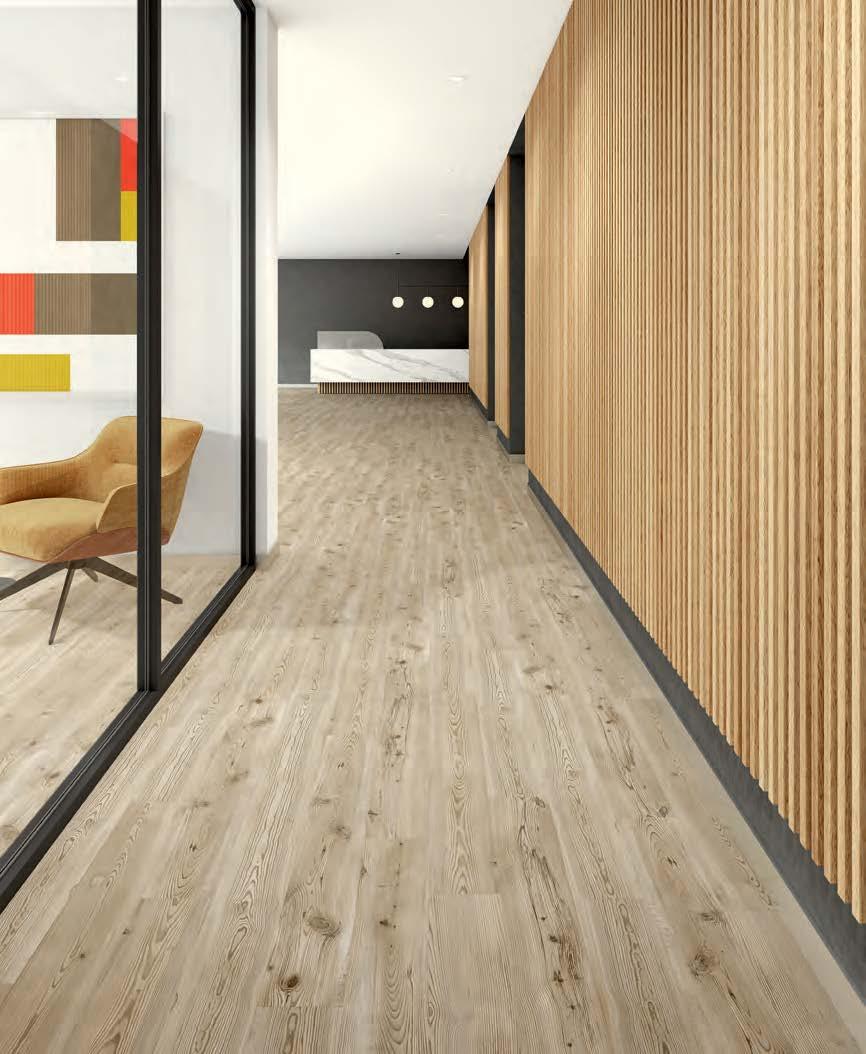
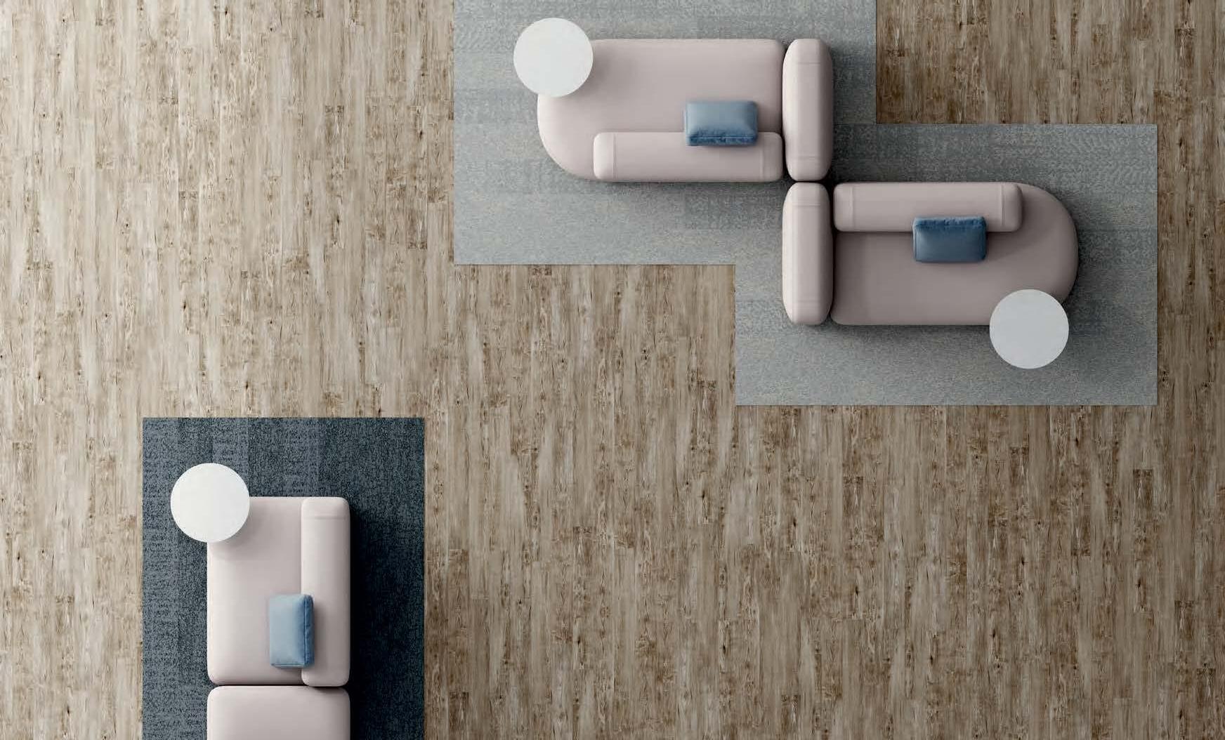
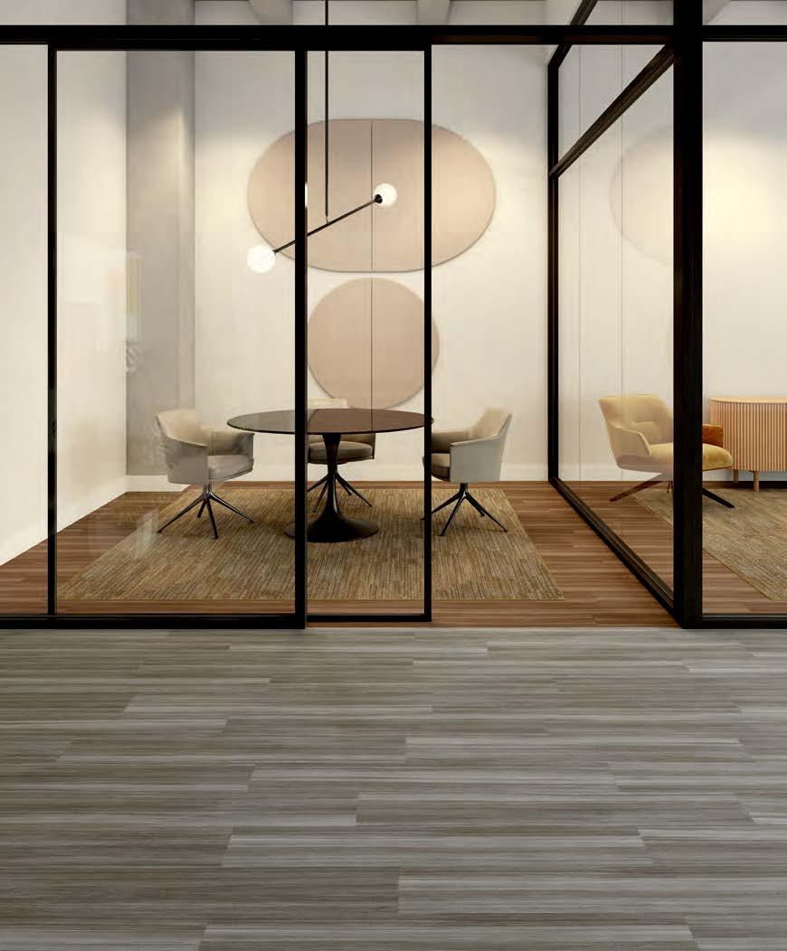
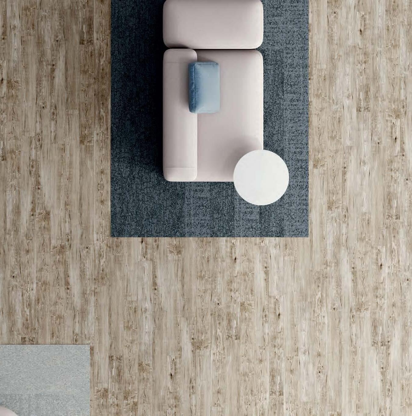
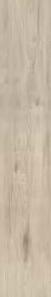
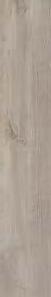
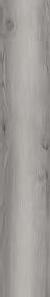
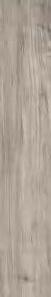
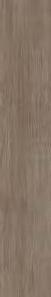
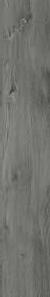
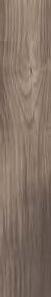
LOCAL RESERVE
TIMELESS BEAUTY. ENDURING PERFORMANCE. LOCAL RESERVE IS AN SPC RESILIENT WITH TONGUE AND GROOVE – DESIGNED FOR EXCELLENT APPEARANCE RETENTION, EASY INSTALLATION AND TOP-DOWN MOISTURE CONTROL. CONSTRUCTED WITH A HIGH DENSITY, RIGID CORE, IT CAN WITHSTAND INDENTATION WITH NO ACCLIMATION TIME NEEDED. MADE IN THE USA, IT COMES IN A WIDE RANGE OF COLORS FROM TRADITIONAL WOOD GRAINS TO MODERN STRAIGHT GRAIN VISUALS. IT’S THE TOTAL EQUATION IN FLOORING PERFORMANCE.
DISRUPT FROM TOP TO CORE
The first of its kind for Patcraft, this innovative solid polymer composite (SPC) construction with a tongue and groove offers high appearance retention, easy intallation and water-tight moisture control – total equation performance from top to core.
THE TOTAL EQUATION
A high density core that can withstand extreme indentation up to 2,500 psi.
ExoGuard+™ top coat resists scratching, staining and scuffing.
Tongue and groove for easy installation with no ledging.
Enhanced cleanability allows for easy removal of stains and spills with pH neutral cleaner.
The rigid core construction offers more subfloor forgiveness during installation with no acclimation time and reduced telegraphing
Water-tight installation protects against top-down liquid and moisture.