Every masterpiece begins with a single stroke, and for Tiny Teapot Bakery Cafe, it started with a font. Searching for the perfect pairing was an adventure in itself—a quest to balance elegance and whimsy, tradition and innovation. It was during the exploration of searching for the right recipe, two typefaces were discovered: ‘Marmelad’ and ‘Fascinate.’
‘Fascinate,’ with its playful curves and vintage charm, brought a touch of personality, echoing the warmth and creativity of the cafe. As the fonts were paired and tested, lowercase and uppercase forms were explored, adjusted, and refined. It was here, amidst the trials and tweaks, that a lowercase ‘a’ caught the baker’s eye. Its soft curves hinted at something more—an invitation to reimagine its form and purpose. The ‘a’ was no longer just a letter. It was the seed of something greater, ready to bloom.
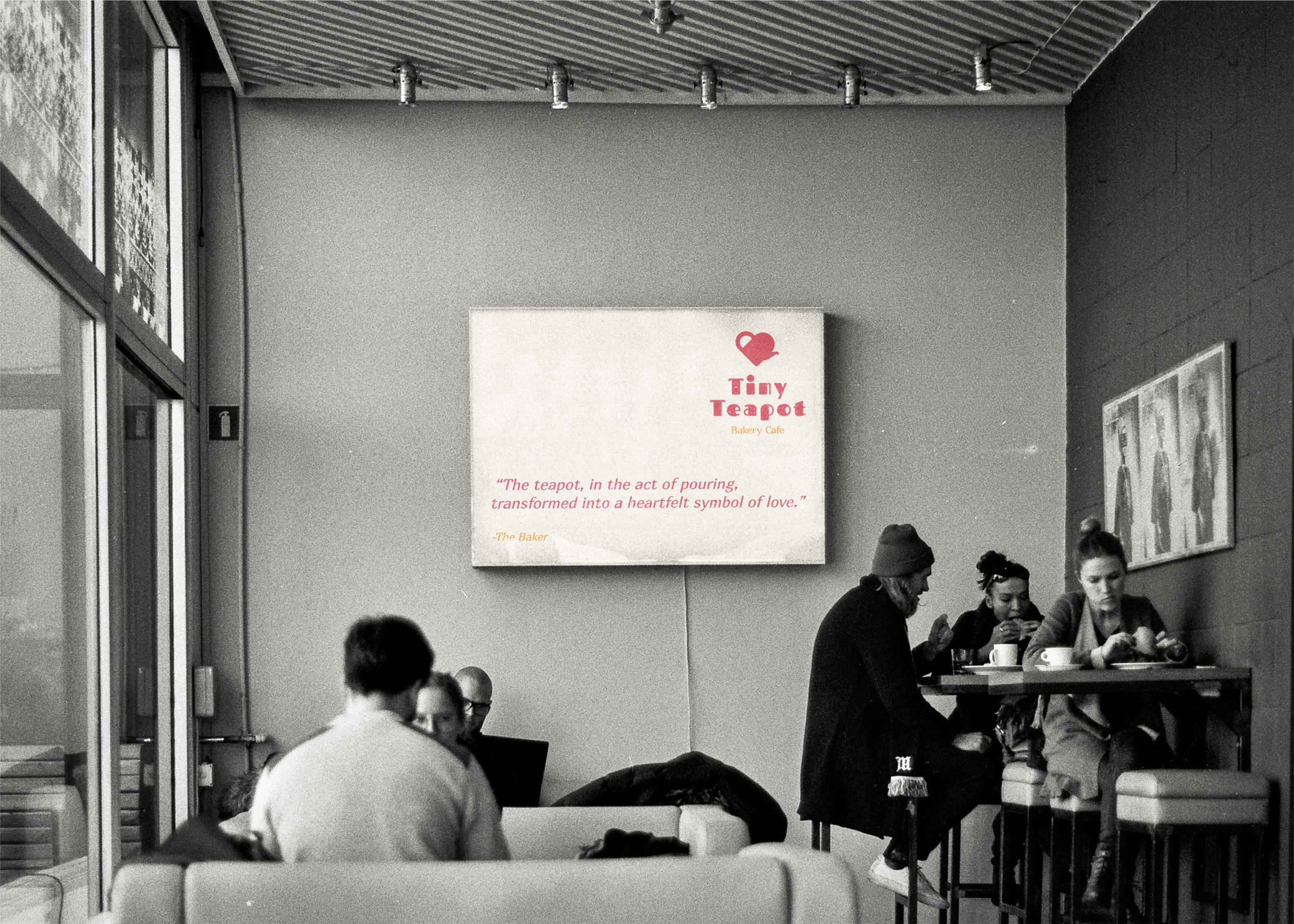
The Tiny Teapot logo is more than a design, it’s soul of the brand. It tells a story of transformation, of how something simple—like a lowercase letter or a humble ingredient—can become extraordinary through creativity and care.
The Birth of a Teapot
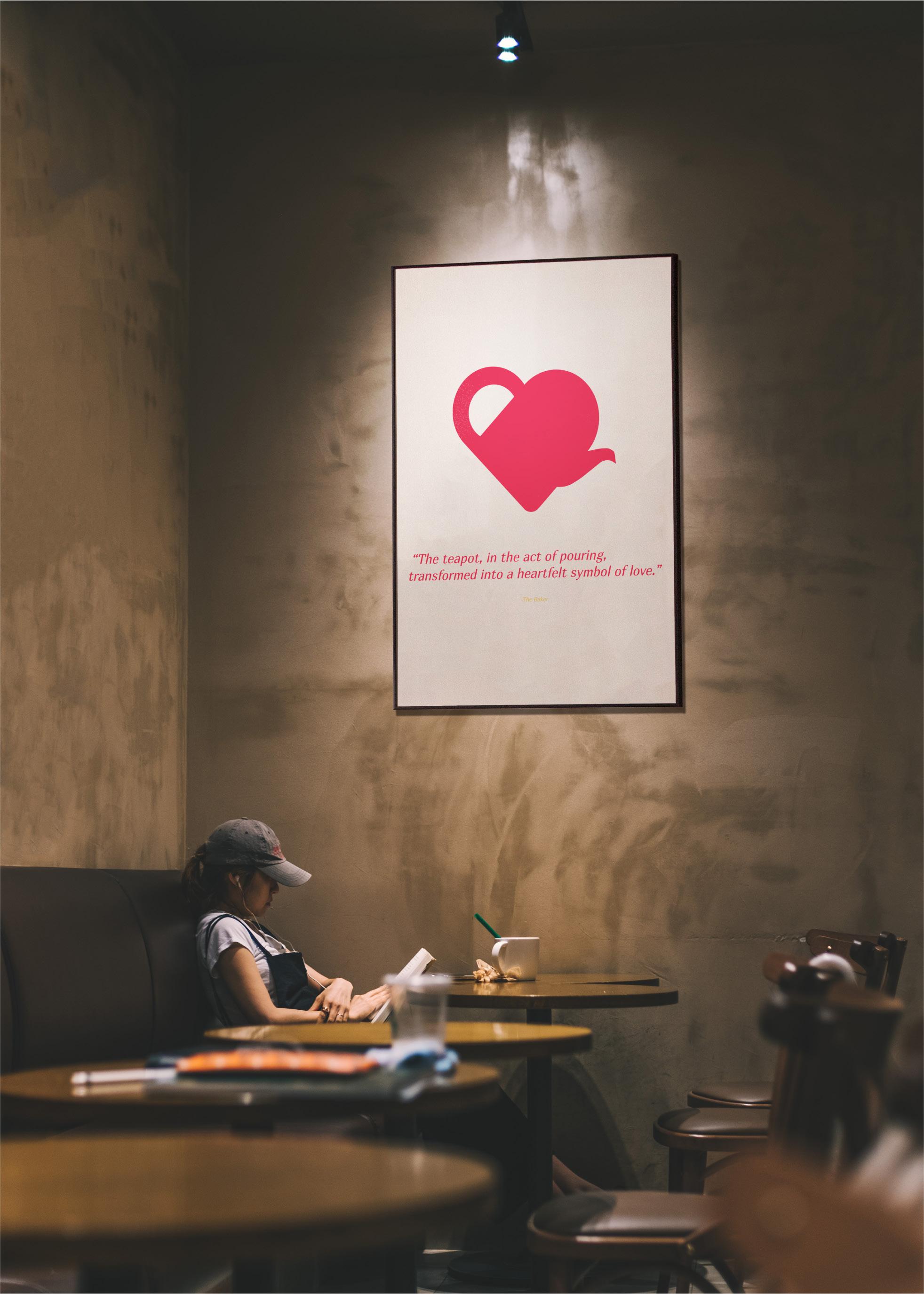
But something magical happened by chance. While experimenting with its orientation, the teapot rotated slightly, revealing an unexpected silhouette: a heart. The teapot, in the act of pouring, transformed into a heartfelt symbol of love. It was a happy accident, but one that felt destined. The heart became a metaphor for the passion poured into every cup of tea , every loaf of bread, and every plate served at Tiny Teapot Bakery Cafe.
The teapot logo was not just drawn; it was discovered. Inspired by the golden ratio—a timeless symbol of balance and beauty—the designer set out to craft a logo that felt harmonious and intuitive.
With the golden ratio as a guide, the lowercase ‘a’ began its transformation. Its rounded bowl became the base of a teapot, and its stem gracefully extended into a spout. By carefully aligning the proportions, every curve and angle came to life with mathematical precision. The handle was born from a perfect circle, mirroring the natural flow of the design.
Hold the teapot firmly by its handle, keeping the spout slightly elevated. Like the Tiny Teapot logo's origin in the lowercase ‘a’, this initial position represents the foundation—a moment of calm before the magic begins.
How to properly pour a Tea?
In the midst of pouring, pause briefly and notice the space between the spout and the tea in the cup. From this angle, the teapot creates a heart-like shape silhouette a happy accident born of balance and design, just like the Tiny Teapot logo.
Gently tip the teapot forward, allowing the tea to flow. As the tea pours out, notice how the motion mirrors the curve of the spout. This moment reflects transformation—the teapot begins to come alive, just as the logo takes shape when rotated.
Finish the pouring with a slight flourish, ensuring that the teacup is filled with just the right amount of tea. This final step embodies the essence of the Tiny Teapot Bakery Cafe: a perfect balance of art and functionality, where the act of pouring tea becomes a heartfelt gesture.
Hand the tea-filled cup to a loved one, a friend, or even yourself. As you share this simple yet profound moment, remember that the teapot’s transformation into a heart is more than just visual—it’s a symbol of the warmth and love that Tiny Teapot Bakery Cafe brings to its community.
Just as the Tiny Teapot logo turned a simple lowercase ‘a’ into a symbol of love, let each pour remind you of the importance of intention. Wether brewing for yourself or others, the act of pouring tea is a small but meaningful way to connect and creat joy.
A Feast of Simplicity
The Light Background Meal showcases logos on crisp, light backgrounds, embodying the freshness of the bakery's offerings.
Appetizer: Word Mark (serves as a secondary logo)
Description: The appetizer logo complements the primary design with simplicity and sophistication. While the heart-shaped teapot is not as prominent here, the ‘Fascinate’ & ‘Marmelad’ from font pairing creates a clean, timeless look—an understated nod to the warmth of the bakery.
Uses: Perfect for business cards, letterheads, and any application requiring clarity and professionalism.
Side Dish: Lockup Logo
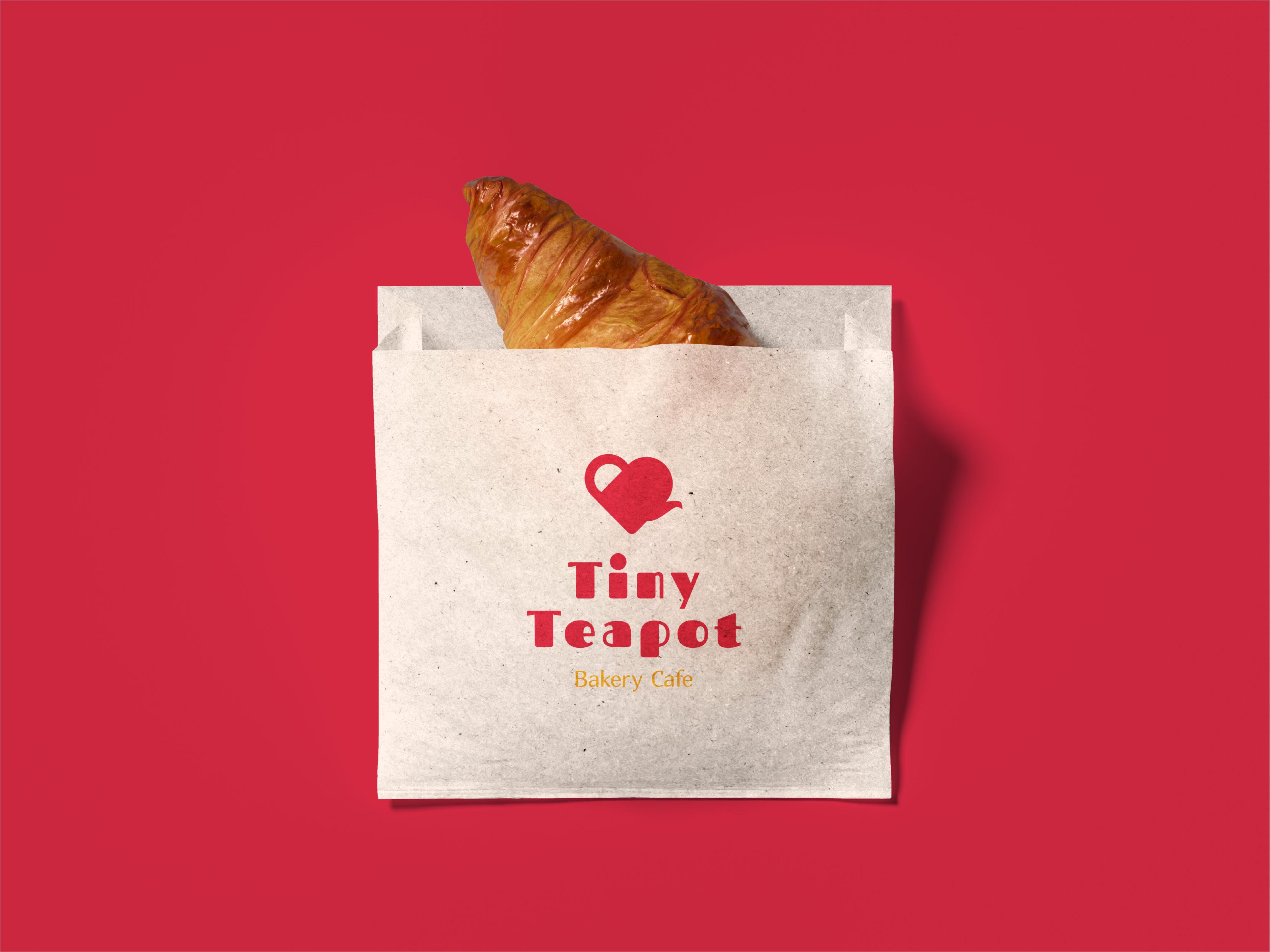
Description: A perfectly arranged brand lockup featuring the heart-shaped teapot It blends visual charm with emotional warmth, capturing our bakery’s essence.
Uses: Best suited for packaging, brochures, and promotional materials where storytelling meets design.
Main Course: Horizontal (serves as a primary logo)
Tiny Teapot Logo Tasting Menu on Light Background
Description: The Main Course logo embodies Tiny Teapot Bakery Cafe's essence with its heart-shaped teapot at the center. As it pours, it forms a loving embrace, symbolizing passion for tea, community, and heartfelt connections.
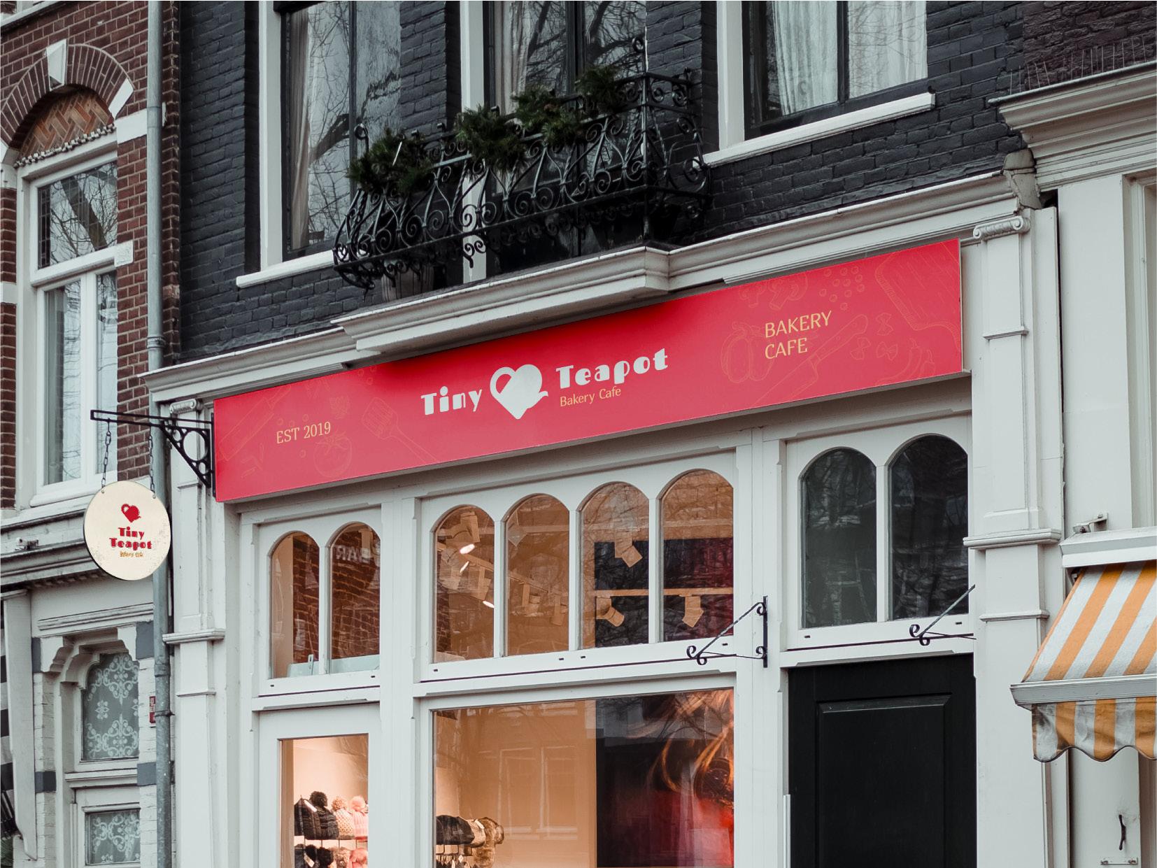
Uses: Shines brightly in website headers, storefront signs, and other applications where making a bold and emotional first impression is key.
Refreshing Note: Cameoji
The Cameoji is the star of playful versatility in the logo. A delightful blend of "Cameo" and "Emoji," it represents the logo in its most compact and expressive form.
The Cameoji is a compact, expressive logo perfect for small spaces like profile pictures, app icons, or stickers. Like a macaron, it’s small, sweet, and full of charm, spreading warmth and joy as a miniature brand ambassador.
A Rich and Decadent Experience
The Dark Background Dessert course highlights logos against moody, indulgent tones. Here, the heart-shaped teapot takes on an elegant glow, much like the richness of a dark chocolate truffle or a freshly black tea.
First Treat: Word Mark (serves as a secondary logo)
Description: On a dark background, the wordmark radiates quiet elegance. While the heart-shaped teapot is small which adds an important detail, the design's simplicity mirrors the understated charm of the baked treats.
Uses: Enhances professionalism on dark-toned invoices, menus, and premium print material.
Decadent Delight: Lockup Logo
Description: The lockup logo is a masterpiece against dark tones. The heart-shaped teapot stands out as a beacon of love and artistry, perfectly complemented by a tagline. It’s the visual equivalent of an artfully plated dessert.
Uses: Great for gift packaging, event branding, and loyalty cards.
Second Treat: Horizontal (serves as a primary logo)
Tiny Teapot Logo Tasting Menu on Dark Background
Description: On a dark canvas, the heart-shaped teapot transforms into a glowing symbol of love and indulgence. The teapot, pouring into the silhouette of a heart, feels like a warm hug in visual form—much like the rich, comforting desserts.
Uses: Perfect for illuminated signs, menus, and branding moments where sophistication meets warmth.
Final Sweet: Cameoji
Description: A playful, miniature version of the heart-shaped teapot, shining like a whimsical treat on the dark background. This tiny design holds the same charm as the full logo but in bite-sized form.
Uses: Ideal for app icons, digital stickers, and social media fun.
1. 1 Dash of Logo Rotation
Rotating the logo tilts the balance of its intentional design, ruining its heartfelt pour and precise proportions.
2. A Pinch of Logo Skewing
Stretching or distorting the logo compromises the delicate harmony of its golden ratio. No teapots should look like they’re melting or squashed!
3. 1 Splash of Unapproved Fill Colors
The teapot’s signature red is non-negotiable. Changing the color dilutes the brand’s personality and recognizable warmth.
4. A Sprinkle of Unnecessary Shapes
Adding any extra shapes around the logo clutters its clean, minimalist look. Let the teapot pour its love without distractions.
5. 1 Teaspoon of Shadows or Drop Shadows
Shadows may look tempting, but they disrupt the logo’s simplicity and modern aesthetic. Keep it flat, sleek, and timeless.
6. 1 Cup of Outlines
Outlines overcomplicate the smooth and inviting flow of the design. The teapot shines in its pure, unadorned form.
While the Cameoji is versatile and fun, turning it into a meme or unnecessary vandalization risks reducing its charm and diluting its elegance. Keep it meaningful and true to the brand.
Preparation Method
1. Combine all forbidden elements in a mixing bowl labeled “DesignDesaster.”
2. Stir until the logo loses its personality and purpose.
3. Served with a side of “NeverAgain.”
Pro Tip:
Keep your design pure and purposeful, like the perfect pour of tea. When in doubt, return to the heart of Tiny Teapot Baker Cafe’s mission: simplicity, warmth, and love.