Disegno #33

Page 1

The Quarterly Journal of Design #33 Summer 2022

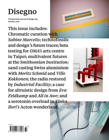
This issue includes: Chromatic curation with Sabine Marcelis; technofossils and design’s future traces; beta testing for OMA’s arts centre in Taipei; multivalent futures at the Smithsonian Institution; sand casting Swiss aluminium with Moritz Schmid and Ville Kokkonen; the radio restored by Industrial Facility; a case for altruistic design from Eva Feldkamp and All in Awe; and a serotonin overload in Yinka Ilori’s Acton wonderland.

UK £15


The Vitra Campus is open 365 days a year Visit us in Weil am Rhein, near Basel vitra.com/campus


v

Introduction


MUDRA Born out of conviction. After three years of development, Brunner and Diez Office are proud to present mudra, a universal chair that puts a modern spin on the technical and ecological possibilities of shaped wood technology. This project has required an in-depth understanding of functionality and extremely high design standards combined with specific expertise surrounding production and a willingness to push the boundaries. Brunner has found the perfect partner to work with on the next generation of the shell chair, with Stefan Diez and his team renowned for their design excellence and depth. brunner-uk.com/products/mudra

2


Introduction


Zanat at Salone Del Mobile, Milano S project, Hall 15, Stand e23 JUNE 7-12

At Salone Del Mobile, we’ll present the 2022 collection, which includes a diverse but complementary set of products by five brilliant designers: Michele De Lucchi, Jean‑Marie Massaud, Patrick Norguet, Monica Förster and Sebastian Herkner. The common thread for all the products is found in their sculptural interpretations and architectural inspiration, a brilliant application of the traditional hand‑carving technique to create a sophisticated and contemporary feel that is at the same time warm and tactile, while bold and directional.

For dealer information, please visit our website: www.zanat.org

4


Introduction


IMAGES COURTESY SNØHETTA AND PLOMP

ILBAGNOALESSI design Stefano Giovannoni - washbasins MILANO DESIGN WEEK - 6-12 JUNE 2022 VISUALS STAGED BY SNØHETTA ARCHITECTS LAUFEN SPACE MILANO_VIA ALESSANDRO MANZONI 23

6


Mea Culpa Words Oli Stratford

Chère reader, an apology. I have erred and I am here to make amends. In the distant past of Disegno #20, I was tasked (by myself) with reviewing the Kenneth, a new pint glass designed by Kenneth Grange. I liked the Kenneth very much and managed to eke out 2,000 words on the topic, largely filled by constantly repeating the idea that having a beer is quite nice, no? The Kenneth’s chief advantage, if I remember correctly, was that it was tall and elegant, but without any of the curvaceousness that our European cousins have long since perfected with their tulip glasses. The Kenneth felt sophisticated and yet, somehow, still very pint-y and British. It was the best of both worlds, conjuring schooldays memories of telling my Spanish exchange host family that I was off to the museo to see the arte, but in fact settling down to drink maximum beer in a sunlit plaza. Loutishness, in other words, but with a European grace. La loutishness. None of this necessarily requires an apology (apart from to my host family, to whom I am so, so lo siento). What does, however, was a passing comment I made about the Kenneth’s companion glass, the Jack. Introduction


Designed by Jack Smith of SmithMatthias, the Jack was everything the Kenneth was not: it was very short and, in order to accommodate a full pint, very fat. If the Kenneth was an elegant finger – perhaps thrust defiantly towards a worried host family to assure them that, no, I was not drunk, and my eyes are always that small and moleish after art – the Jack seemed a terrible thumb. Well, I apologise wholeheartedly. The Jack still strikes me as a thumb, but as I have got to know the design better, I have come to see that this is a wonderful thing and it is now a much-trusted provider of depressants. Because, thinking about it, what’s wrong with a thumb? Of all the digits, the thumb is the mightiest. It is good for pressing stuff and expressing approval. A finger by contrast is snide and waspish, forever wagging disapprovingly or else flipping me the bird. If any digit is to be the model for our friend the pint glass, then it should be the thumb: a stout, reliable digit that can reliably house a stout. There is no lesson here, bar the fact that designs strike you differently at different times: nothing is final and most opinions are subject to revision. Perhaps more accurately, I’ve just had a drink in a bid to help me figure out what to base this editor’s letter on and, well, write about what you know. Jack, a full apology; it’s two from me.

👍

8


Contents 7

Introduction

10

Contents

12

Contributors

14

Masthead The people behind Disegno

16

Timeline March to May 2022 in review

20

Interview Everybody Come Behind the curtain of Yinka Ilori’s Acton wonderland

37

Project A History of Swiss Aluminium Alpine sand casting with Moritz Schmid and Ville Kokkonen

90

51

Review Whose Future? Curating design futures at the Smithsonian

109 Roundtable All Together Now A code of conduct for altruistic design

63

Report Beta Testing An early opening for OMA’s belated Taipei theatre

121

79

Essay Petrified Designers Digging out the technofossils of tomorrow

10

Gallery The Texture of Colour Sabine Marcelis’s chromatic curation

Project Radio Resurrection Industrial Facility teaches an old format new tricks


MAXI SLIDING PANELS, SELF BOLD CABINET. DESIGN GIUSEPPE BAVUSO

London Flagship Store 83-85 Wigmore Street W1U1DL London london@rimadesio.co.uk +44 020 74862193


Contributors Zara Arshad is currently fixated with seaweed. p. 51

Kane Hulse is a colour-based photographer from south London. p. 20

Joe Lloyd is lamenting the slow death of his first lockdown houseplant. p. 121

Jeremy Bonney is building Rupture Community, a place where everyone can find emotional support and experience unconditional love. p. 109

Carlos Jimenez has a passion for storytelling and a dedication to daydreaming about the sea. p. 109

Margot Lombaert makes a really fantastic margarita. p. 109

Lara Chapman is enjoying the bursts of London sunshine. p. 79

Georgina Johnson is an artist-curator and the futuristic mind behind The Slow Grind (2020). p. 20

Eva Feldkamp demystifies how creatives can do good and helps to simplify processes with All in Awe. p. 109

Tei Koukei likes taking photos in Taiwan, taking photos on the road and also taking photos for you. p. 63

Sam Hecht is trying to find his keys. p. 121

Laurence Kubski is a curious and versatile Swiss photographer. p. 90

Brian Hioe is one of the founders of New Bloom Magazine, an online publication covering activism and youth politics in Taiwan and the Asia Pacific. p. 63

Chloë Leen is a director and co-founder of Pup Architects. p. 109

12

Theresa Marx is a photographer represented by Mink Mgmt. p. 109 Rasmus Norlander is an architectural photographer based between ZÜrich and Stockholm. p. 37 Ilaria Ventriglia Burke believes that relationships will save the world. p. 109


The Quarterly Journal of Design #33 Editor-in-chief Oli Stratford oli@disegnojournal.com

Founder and director Johanna Agerman Ross

Publisher and commercial director Chris Jones chris@disegnojournal.com

Deputy editor India Block india@disegnojournal.com

Creative directors Florian Böhm Annahita Kamali akfb.com

Senior sales executive Umaima Walia umaima@disegnojournal.com

Senior creative producer Evi Hall evi@disegnojournal.com

Designer Jonas Hirschmann info@akfb.com

Advertising representative – Italy Carlo Fiorucci carlo@fiorucci-international.com

Sub-editor Ann Morgan

Circulation and stockist enquiries Adam Long along@thelogicalchoicegroup.com

Distribution The Logical Choice thelogicalchoicegroup.com

Contributors Zara Arshad, Jeremy Bonney, India Block, Lara Chapman, Eva Feldkamp, Evi Hall, Sam Hecht, Brian Hioe, Kane Hulse, Carlos Jiménez, Georgina Johnson, Tei Koukei, Laurence Kubski, Chloë Leen, Joe Lloyd, Margot Lombaert, Theresa Marx, Rasmus Norlander, Oli Stratford and Ilaria Ventriglia Burke.

Thanks Many thanks to Laura Kaminska for our peppy new ‘Design Line’ graphic; Map Project Office for a year of collaborations (and a very happy birthday!); Tetsuo Mukai for giving us all the seitan we could wish for; Neil Byrne for storing our editor-inchief’s shoes for an unreasonable amount of time; and Joe Lloyd for his sterling online work.

Contents copyright The contents of this journal belong to Disegno Publications Limited and to the authors and artists featured. If you are tempted to reproduce any of it, please ask first.

Paper and print This issue of Disegno is printed by Park Communications on Edition Offset 120gsm by Antalis. The cover is printed on Arena Extra White Smooth 250gsm by Fedrigoni.

We are very grateful to all our contributors, and for the help of everybody who has supported us and made Disegno #33 possible – not least to Zuri, the newest Disegno cat, who is already doing a superb job of keeping our copies of the journal warm by reclining on them.

Contact us 50 Wenham House Ascalon Street London SW8 4DZ disegnojournal.com The Crit You can keep up with Disegno and our work by listening to The Crit, a podcast focused on the design world and its impact on current affairs. disegnojournal.com/podcasts/the-crit Disegno Works Disegno also runs the creative agency Disegno Works. disegnoworks.com

14


QUEST A new SEAQUAL fabric, made from recycled marine plastic. #seasickofplastic

Masthead


A: Serious drama. A live-streamed

the “phenotyping bottleneck” where

panel titled ‘How to Be in an Office’

human hands and eyes take a certain

Challenge accepted

that aired on 26 March led to student

amount of time to collect and sort

Museum projects often end up in

protests and two faculty members being

samples. In the fields surrounding

the same safe sets of hands, so how

suspended pending an investigation.

Future Seeds, for instance, an

refreshing to learn in March that

The event saw architectural theorist

Alphabet rover is already roaming

the Met in New York has appointed

Marrikka Trotter suggest that young

tirelessly, collecting crop data

architect Frida Escobedo to revamp

architects should settle for 60-hour

that it is hoped could help breed

its modern and contemporary art

weeks on unliveable wages out of sheer

more drought-resistant beans in

wing. The project had been awarded

passion for the job. Allegations then

the future. Its name? Don Roverto.

to architect David Chipperfield in

came to light that Trotter, along with

2015 by then-director Thomas Campbell,

SCI-Arc graduate chair Tom Wiscombe,

before being paused owing to budgetary

had made students work 18-hour days

issues. Having designed museums from

on a competition entry for their studio

Anchorage to Hangzhou, Berlin to

Tom Wiscombe Architecture as part of

Mexico City, Chipperfield is arguably

their course. When the students quit

the safest pair of hands there is; by

en masse after being told to deep

contrast, Escobedo’s projects to date

clean Wiscombe’s studio, they alleged

have been relatively small in scale.

that Wiscombe retaliated with threats

But having a Mexican woman in her

against their reputations. SCI-Arc

early 40s (practically an infant

students and alumni rallied around

in architect years) design a part of

the hashtag #HowNotToBeInAnOffice,

one of America’s grandest institutions

and Wiscombe and Trotter sort-of

is not so much a breath of fresh

apologised in a now-deleted Instagram

air, as an icy blast. Since Max

post the following week, but it only

Hollein became the Met’s director

served to add fuel to the fire. It’s

in 2018, he has been shaking up

a grim situation, but invigorating

the 152-year-old museum by moving it

to see a new generation of architects

away from its traditional Eurocentric

determined to break the cycle of

Silent spring-less

focus, as well as commissioning more

overwork and underpay by holding

"This is the first time in decades,”

BIPOC curators. Escobedo’s appointment

industry elders accountable.

said Sherry Rehman, Pakistan’s

feels like the next piece of this

APRIL

minister of climate change, “that

puzzle. For her part, the architect

Pakistan is experiencing what many

appears unruffled by the scale of

Seeds of change

call a ‘spring-less year’.” April saw

the commission, telling The New York

Bean-counting robots may not sound

a record-breaking heatwave sweep the

Times: “I like challenges.”

like the most obvious heroes of the

Indian subcontinent, with Jacobabad

Anthropocene, but these diligent bots

and Sibi recording highs of 47°C, and

are actually hard at work in Colombia

New Delhi racking up seven consecutive

attempting to preserve agricultural

days over 40°C: temperatures that

biodiversity in the global south.

damaged crops; drained energy supplies;

A new genebank called Future Seeds

closed schools (with Mamata Banerjee,

opened in Cali in March, with a mission

West Bengal's chief minister, reporting

to preserve crop plant species. Built

that children travelling in the heat

in a collaboration between CGIAR’s

“are getting nosebleeds”); and put at

Alliance of Bioversity International

risk the lives of millions. The cause

and the International Center for

of the subcontinent’s early summer

Tropical Agriculture, the solar-

is obvious to all bar ardent climate

powered facility holds samples

sceptics, but dealing with its effects

of 37,000 beans from 114 countries.

is another matter: globally, 356,000

Beans are vital for many diets around

people are reported to have been

the world and keep the soil they grow

killed by extreme heat in 2019 alone.

in healthy, but shrinking biodiversity

With this in mind, cities suffering

has left crops increasingly vulnerable

the effects of climate crisis may soon

to climate change. To support the

follow the lead of Santiago in Chile,

facility’s work, Alphabet, Google’s

which announced the appointment of

SCI-argh

parent company, has lent its technology

architect Cristina Huidobro as its

Q: “What is going on at SCI-Arc?” –

to the cause, employing its Project

new chief heat officer in March 2022,

an incredulous Architects’ Newspaper

Mineral to use robots, drones and

tasking her with weaving extreme-heat

asked in a recent headline.

artificial intelligence to circumvent

mitigation into the city’s urban

16

Images courtesy of Manuel Zúñiga; Juan Pablo Marin / The Alliance of Bioversity International and CIAT; Steve Jurvetson; the Eames Institute of Infinite Curiosity; and Chris Strong / Rebuild Foundation.

MARCH


planning. With extreme weather rising

What would Charles and Ray do?

notorious. But the brand has at least

worldwide, it's a move that other

Where would you go if you wanted to

now put its money where its mouth is,

cities would be wise to ape. A

learn about Charles and Ray Eames? In

lending its cultural weight – and

spring-less year is already in danger

the case of their various products and

financial heft – to the Dorchester

of becoming a spring-less century.

projects, you’re probably best to head

Industries Experimental Design Lab.

to the Eames Office, which aims to

Born from the mind of Theaster Gates

“communicate, preserve, and extend the

in light of the Black Lives Matter

Tweet with impunity

Eameses’ work”. Or perhaps you’re more

movement, the three-year incubator

Elon Musk agreed a $44bn deal to buy

interested in their house, which they

programme will support 14 Black

Twitter in late April (although at

designed in the Pacific Palisades

designers and artists with mentorship,

the time of going to press in May

neighbourhood of LA – then the Eames

creative opportunities and, perhaps

he had claimed that the deal was

Foundation has you covered, offering

most importantly, funding. There is

“on hold” for some inane reason or

full access to the space. “But what

more to do, clearly – and outward-

other), announcing that his takeover

about their process and methodology?”

facing projects can often serve as a

was grounded in a belief that free

we hear you roar. Fear not, because

fig leaf for deeper structural issues

speech is the “bedrock of a functioning

from April 2022 there’s a brand new

– but the Experimental Design Lab is

democracy”. And quite right too: after

organisation that can hook you up:

a positive step nevertheless. Here’s

all, what kind of democracy would it

the Eames Institute of Infinite

hoping more programmes will follow.

be if you weren’t allowed to spuriously

Curiosity. Based out of the Eames

Tweet that someone is a “pedo guy”

Ranch in Petaluma, the institute

whenever they said something mildly

professes to “bring the lessons of

disparaging about your plan to build a

Ray and Charles Eames to those looking

tiny submarine to rescue schoolchildren

to solve today’s most challenging

trapped in a cave? No democracy at

issues”. It’s not a bad remit (after

all, that’s what! So, it’s great news

all, the Eameses were pretty good),

that Musk is now planning to redesign

not least because the institute

Twitter, promising that he’s going

will oversee the Eames Collection,

to unlock the platform’s “tremendous

a repository of tens of thousands

potential” or “die trying”. It’s

of prototypes, components, objects

unclear which elements of the redesign

and artworks. Quickly everyone –

Musk believes may prove fatal, although

to the Eames Ranch!

MAY

he has so far suggested adding a dislike button to Tweets (perhaps wiring it

Time to shine (again)

in could trigger a heavy electric

It must be boring being Marilyn

shock), ramping up subscriptions to

Monroe’s old dress. The crystal-

a mysterious new product called X (to

encrusted sheath worn to serenade

be fair, that does sound like it could

John F. Kennedy set the media aflame

kill you), and a general desire to

in 1962 with its racy design, courtesy

“make Twitter maximum fun!”, seemingly

of Hollywood costumier Jean Louis.

achieved by rowing back on all of the

Now, however, it languishes in a

company’s content-moderation policies

temperature- and humidity-controlled

and reversing its ban on Donald Trump

vault at the Ripley's Believe It

(raising toxicity to lethal levels).

or Not! museum, never going to any

But Musk will not be dissuaded by

Opening the gates

presidential parties. What a lark,

the risks – we will have free speech

Almost two years on from the death of

then, to get another turn in front

at all costs! Death or pedo guys!

George Floyd and the resultant surge

of the flashbulbs some 60 years later,

of Black Lives Matter protests, it’s

when Kim Kardashian decided to wear it

a good time to check back in to see

for the 2022 Met Gala. Pinned into the

whether the brands and institutions

historic garment, Kardashian tiptoed

who were quick to make loud commitments

down the red carpet, before handing

to change have kept their promises.

the multi-million-dollar piece of

Take Prada, for instance, which issued

fashion history back to its phalanx

a statement in 2020 explaining that

of security guards and switching into

it was “outraged and saddened by the

a replica for the remainder of the

injustices facing the Black community”,

evening. Conservationists and fashion

despite not having the best record

historians were understandably furious

when it comes to racial sensitivity:

to see the dress put at risk (although

its 2018 Pradamalia products, which

there is something pleasing about

utilised Sambo imagery, remain

watching garments get to be garments),

Timeline


but the real weirdness comes from

Saul good man

or claim that only they can provide

society’s ghoulish obsession with

Oh, to be young and Saul Nash. This

the correct level of care for delicate

Monroe. Kardashian, who notoriously

spring saw the London-based fashion

items, so a major set of museums

spends her time trying to contact

designer and choreographer sweep the

undertaking this new policy marks

the ghost of the dead Hollywood icon,

awards season board, winning both the

a sea change. Whether it will put

was even gifted a box of Monroe’s

2022 Woolmark Prize with a capsule

enough pressure on the British

hair (which turned out to be fake)

collection of Merino wool sportswear

Museum to, say, return the Parthenon

by the dress’s current owners. Just

and the 2022 Queen Elizabeth II Award

Marbles or Egyptian mummies remains

let the poor woman rest, already!

for British Design, which praised

to be seen.

Nash for his “unique way of combining function, tech and tailoring in his

Unknown drone moan

design practice”. The prizes suggest

The Queen’s train

What, if you had to guess, might

a bright future for Nash, whose label

It’s finally pulled into the station

trigger disruptions to German air

draws on his work as a choreographer

– 33 years since it was proposed,

traffic of unprecedented "intensity

and movement director to create

London’s Elizabeth Line underground

and aggressiveness”? A) Climate

garments rife with slits, zips and

opened this May. There is much to

protestors; B) Apocalyptic weather

performance textiles that are designed

admire in the project, which will

conditions; C) A lovely design

to offer a “celebration of movement,

eventually place an additional 1.5

installation; D) Geese in the

fluidity and function”. “I honestly

million people within 45 minutes of

propellors? Well, if you guessed C,

never even dreamed I’d be given this,”

central London, even if it rankles

you’re correct! In May, Ralph Nauta

Nash said upon claiming the Queen

that the capital has received this

and Lonneke Gordijn of Amsterdam-based

Elizabeth Award in May, retaining

£19bn boost to its infrastructure

Studio Drift announced that their

his modesty despite seemingly winning

when other parts of the UK have seen

Breaking Waves installation, created

everything going. What a life.

funding for transport initiatives

to help mark the fifth anniversary

slashed. Nevertheless, the successful

of Hamburg’s Elbphilharmonie concert

completion of an engineering project

hall, would need to be cancelled after

of this scale is genuinely thrilling,

the project’s dress rehearsal and

not least for the sheer breadth of

inaugural performance were “massively

designers involved. Featuring station

disrupted”. Drift’s display consisted

architecture from the likes of

of 300 illuminated drones, which had

Wilkinson Eyre, Grimshaw and Hawkins

been choreographed to create an aerial

Brown; a new train courtesy of Edward

ballet that was complementary to the

Barber and Jay Osgerby with Map

architecture of the Elbphilharmonie.

Project Office; and a fresh moquette

But the scheme was brought to Earth

designed by Harriet Wallace-Jones and

drones into the mix, resulting in

Put that thing back where it came from, or so

Elizabeth Line to occupy the design

“several collisions” that caused

help me

curious. So, with the line completed

multiple craft to crash. “Since it

It’s becoming increasingly hard for

just in time for the Queen’s Platinum

cannot be ruled out that such crimes

institutions in the global north to

Jubilee, why not celebrate Britain’s

will again be committed,” Drift wrote,

ignore the growing chorus of requests

reigning monarch by gawping at her new

“[…] it is irresponsible to continue

to return the various items looted

train set? It’s what Liz would want.

Breaking Waves in order to protect

during colonial periods that have ended

viewers and employees.” Completely

up in their collections. Which is

benign public art, brought to its

presumably why, in May, the Smithsonian

knees for little reason beyond LOLs.

Institution took the PR-friendly

This is why we can’t have nice things!

approach of officially authorising its 21 museums to negotiate their own repatriation programmes for items found to have been acquired unethically, independent of its top governing body. A gold disc has already been returned to Peru, and negotiations have begun with Nigeria’s National Commission for Museums and

Farewell sweet iPrince

Monuments to return the Benin Bronzes,

Look, we all know the iPod has been

which were stolen by the British Army

a non-entity for years – ever since

in 1897. Many institutions hide the

its thunder was stolen by that jack-of-

murky provenance of their collections,

all-trades the iPhone and, in a bid

18

Images courtesy of Florian Holzherr; the British Fashion Council; Map Project Office; and Apple.

Emma Sewell, there is plenty about the

after unknown pilots flew additional


to keep up with the iJoneses, the iPod abandoned its delightful clicky wheel for a soulless touch screen. But it was still sad to learn in May that Apple was to discontinue the device, 21 years after its launch and 450m units later. Designed by Jony Ive, the iPod was a transformative product, and one that represents a key turning point in 21st-century design and media consumption. The iPod was a vital step in our move towards streaming culture (and its deeply unpleasant financial implications for artists); the iPod played John the iBaptist to the iPhone’s smartphone Messiah; and the iPod was also the critical moment in Apple’s transformation from a manufacturer of computers to a world leader in consumer electronics hardware, software and services. “Today, the spirit of iPod lives on,” explained Greg Joswiak, Apple’s senior vice president of worldwide marketing. He is, of course, right – even if he was speaking after having just pulled the plug on the poor old iPod.

Timeline


Everybody Come Words Georgina Johnson Photographs Kane Hulse

Walking into Yinka Ilori’s new studio in Acton, west London, is like entering a portal of dreams. There are the sunshine-yellow and sky-blue walls adorned with the artist and designer’s archive of upcycled chairs; the flood of bubblegum pink; the submarine portholes in coloured glass on his office door. All so carefully curated and magically combined. In essence, this is joy on demand.

Interview


To create the studio, Ilori and Jacob held weekly hour-long digital sessions in which they drew together on screen, devising ways to combine their enthusiasm for geometric shapes, bold colours and gathering spaces that open up possibilities for the imagination. All of the above are present in the new studio, which can be understood as the physical continuation of this spirit of collaboration and exchange. The studio, too, encourages this way of working. It is loosely divided. Weighty, lime-green felt curtains mark the entrance to a space that, in future, will serve as a gallery, contrasting with the soft, rainbow organza drapes that subtly separate Ilori’s office from the area where his team work. The effect is far from the cold lines, glass walls and repetitious atmosphere of a traditional architecture or design studio. This space abstracts the idea of a boundary line and makes it elastic: the clear demarcations and parameters that denote hierarchies in many studios are, here, made fluid, speaking to the way in which Ilori works. Through this abstraction, Ilori and Jacob have aimed to facilitate collective discourse. This is the crux of collaboration – it is capacity building insofar as it simultaneously augments and strengthens both the individual and the collective. Spaces can do this too. As Ilori and his team tell me, “These curtains are rarely closed.” These ideas also reach beyond the studio. What may be most exciting about the space is its multifunctional potential – something Ilori tells me has been at the top of his mind. “It will be a space to exhibit the work of young people in Acton,” he says, “because there really aren’t many art spaces around here.” The heart in this intention is the cornerstone of his work. There is no art for art’s sake: it is art for everybody and a space for everybody, especially “for those who haven’t engaged with the arts or been invited in”.

The journey through Ilori’s studio provides insight into the way he formulates ideas around spaces: function, emotive potential and, most importantly, the rhythm in which bodies may move in them. As we thumb through a reference book by the artist Bridget Riley, Ilori pauses on a page showing her piece Places for Change (2009). I ask him how the work makes him feel. In the hesitation that follows – a moment of clear contemplation – Ilori starts to assemble the walls of an installation in his mind, considering the channels of light and creating a wholly new work imaginatively. What comes next

“It will be a space to exhibit the work of the young people in Acton, because there really aren’t many art spaces around here.” is almost a collaborative thought-mapping experiment. We discuss how to pull Riley’s work out of the page, how to make it tangible, solid, and yet still painterly. It is clear that Ilori is rooted in this communal way of working. This is present in the physical architecture of the spaces he designs, the messaging in his murals, and especially in his fascination with chairs, which he views as vehicles for storytelling and sites of memory. The design of his studio also affirms this. The new space, which opened in spring 2022, was created as a collaboration between Ilori’s studio and the architect Sam Jacob. In explaining his decision to work with Jacob, Ilori opens his phone to an image of a Christmas tree, The Electric Nemeton, which Jacob’s studio created for Granary Square in 2020. Jacob’s design presented a futuristic forest, standing on 4m steel trunks. By night, the forest glittered in hues of green, but during the day visitors could peer through its scaffold-netting skin to see the timber joints within. The elevation of this installation was designed such that it would be safe to use at the height of the pandemic. This was also when Ilori and Jacob began working together: mid-pandemic, distanced, navigating Zoom like the rest of us.

Georgina Johnson When we were walking through the space you said that Sam is a friend, but what drew you to his work and the idea of pulling him into this? Because it’s a personal space – it’s where you are 80 per cent of the time. Yinka Ilori I’m not an architect – Sam is. I studied furniture and product design, and I’m an artist, but I work within spatial design, architecture, set design – I’m quite greedy. I like to do a bit of everything and Sam works in a similar way. But across his work there is this sense of humour, and I like how he thinks

22


Interview


24


Interview


26


outside of the box and creates the unexpected, which is what we try and do here in the studio. We try and push your idea of what something should be. Georgina I think it’s beyond trying. It’s very successfully exhibited in your works. Yinka Thank you. But with Sam it’s just the way he uses colour, shape and the way he sees space. I wanted to learn from him and I thought he could learn from me. It was trying to bring us together to collaborate. Georgina Your collaboration took place over Zoom. How did that function? Yinka We sent him a brief about what the space needed to do and what it needed to be. The way that we work now is very different from the way we worked two years ago. People want a bit more from their office environment having worked from home. The office is a space where you spend a lot of time, so it needs to make you feel good. It needs to be joyful and it needs to function well. I mean, I take huge pride in making sure my team are happy, and that everyone feels free – so everyone had input on this space. I did the colours on my own, but I always try and get my team’s opinion on things and they all had the chance to talk to Sam. Then Sam and I just spent a lot of time on Zoom, going back and forth with the layouts. On Zoom there’s a pen menu you can click on and then you can just sketch together. Those sketches were really crude and rough, but for us it was great. Georgina They’re works in progress. Yinka Works in progress, right. It shows that, even with limitations and obstacles, you can still create and you can still be collaborative. That was one of the things I find quite inspiring, because we did all of this during lockdown. It was interesting to work with Sam and see his thought process. His design process is very different from mine in terms of how he thinks and how he sketches. Georgina I love what you said about getting the opinion of your staff. Do you think that became more important being in lockdown and seeing how people wanted things to change? Or do you think that’s always been a part of your culture and ethos? Yinka I try and listen, be open to new ideas, and make the work-life balance workable for the team. My thing is that you start at 10am and you leave at 6pm. Don’t work overtime, because spending another hour or two working on something is not going to change it. It can wait until tomorrow. Go home on time, sleep well,

then you’ll be back in here again tomorrow with the same energy. Georgina And you enjoy it. Yinka If you leave here an hour late, it’s going to affect you. You’re knackered. Georgina It has a knock-on effect. Yinka Right – on your travel and personal life, that kind of thing. We had chats about this space [as a result of

“Sometimes designers are afraid of criticism or scared to ask advice, but I try and work collaboratively on most projects.” that]. Actually, we originally wanted to have the team’s space on a platform so they could see the window a bit more. Georgina Like a mezzanine? Yinka Exactly, but it was £30,000 for that platform, so we weren’t going to spend that – it can go on something else instead. But it was nice to get my team’s opinion on the decisions I was making. Sometimes designers are afraid of criticism or scared to ask advice, but I try and work collaboratively on most projects. When I started out, I was used to working on my own, but it’s a gradual thing – you let people in to support you and then they bring in their own ideas. That’s how we worked with Es Devlin on the Brits [Ilori and the artist Devlin co-designed the 2021 Brit Awards trophy and stage design, ed.]. It was the same kind of process where Es was sketching, I was sketching, and we’d come together to find a middle ground. That’s pretty much how it was with Sam. There’s no ego; you can’t go into a collaboration with ego. Georgina That’s an interesting perspective because traditionally architects and designers have been known to have huge egos. Yinka Totally. Georgina But what you’re saying is kind of the opposite of that. What brought you to that? And how do you

Interview


28


Interview


together and have a chat. I think it’s because I grew up in a very big community in North London, which is why the themes that run through my work are communities and people and storytelling. In order to have a healthy project that is rich in stories, you need to talk to each other. You need to hear other people’s stories and hear how you do things culturally in France or Vietnam. Having that kind of conversation between the team is helpful because I get to learn about their ideas. Whenever I sketch I have an idea of what I want to do, but it’s like, “What do you think? Do you think that’s the right way to do it?” Georgina Is that how you work with clients too? Yinka Sometimes clients come into a project with what they want to do. You have to hold their hand and say, “This is what I think we should do.” I listen to what they think they want to do, but I always go away with my team and say, “We want to do this,” and then they put forward some ideas about what they think or how we can develop it. I will always have an initial idea, but the team will have ideas on materials; or how the display should work; or what the user experience is; or whether it could travel; or accessibility for wheelchair users. Those kinds of things we discuss collaboratively. So, I sort of birth it and then they grow it with me. Georgina I’ve read you talking about how objects impart meaning and have their own stories. Yinka When I came into design, people were confused about what I was doing. What are Dutch wax prints? What are parables? Because all of these chairs have parables [Ilori’s studio displays a number of his chair designs, including his 2013 Parable collection of upcycled chairs, ed.]: traditional Nigerian stories about love, hope or community. That’s where it started for me, and chairs are the thing I loved the most because they can tell stories. They’re sentimental objects. Georgina It’s a communal object and that’s the meaning it imparts. Yinka When you sit on a chair, there are just so many imprints of who has sat there. It’s a spiritual thing. I always say that a chair is used in parliament, it’s used in your home, in your car, in a café, in your studio, in the cinema. There’s an element of chairs bringing people together to rule, to destroy, to make love, to cry. It’s a very powerful symbol and that’s why I started to create these chairs I found, and then put my own story into them. That was my first introduction to design, but people didn’t get it at the time.

feel that can then be helped filter out across the wider design scene? Yinka I always try and go into collaborations with a willingness to learn. I think it’s about trying to reassure people that their ideas are heard and listened to. If you’re open and able to listen to other people, it produces incredible projects. There aren’t a lot of artist/architect collaborations, but I think there should be more. There has been an influx of fashion designers working with artists, though. There’s a menswear label called Labrum, led by Foday Dumbuya, and I designed a set for their show.

“When I came into design, people were confused about what I was doing. What are Dutch wax prints? What are parables?” I would love to do more collaborations because it lets me listen and open my eyes. But it’s down to the individual and maybe trying to break down their ego or trying to break down their insecurities or making sure they don’t feel that their idea isn’t as important as mine, or vice versa. Georgina It’s creating a lateral or horizontal hierarchy. Even how you mentioned the design of this space and the mezzanine for your staff – that would have created a divide between you and them. Yinka Totally. Georgina There’s a curtain breaking up the space instead, but you all said that it’s very rarely closed. Yinka Very rarely. Georgina What you’re speaking about is reframing values around work and working together. So there are two different spaces, but you’re all having a conversation that’s very fluid. Yinka And that’s what I love about it. It’s all open here. If you go to most art or architecture studios, there are always these little pockets where the CEO is. But where I was raised, it’s different. I’m Nigerian. Georgina An open home. Yinka An open home! The whole village is coming into your house. That’s how I was raised: I like to come

30


Georgina Now we’re in your new space, what story do you

think it tells? And what stories, in general, do you want the spaces you design to tell? Yinka My previous space was super small. When you work in a small environment, it’s very intimate and very personal. But that space didn’t really feel like mine. It wasn’t as energetic as this one, but it also wasn’t as calming. A space should be able to hold and capture your emotion instantly but also leave you feeling something. Georgina It does feel like a wonderland. Yinka Perfect. Amazing. Georgina You can use that in the press release. Yinka That’s what it is. It’s a wonderland of joy and magic. It’s a place to discover, dream and escape. When you’re in here you forget about outside. Georgina It definitely is a portal. The doors, especially, are like a tunnel of love, or almost like a Wes Anderson submarine set. Yinka We’ve also got all the public murals I’ve done here, like Love Always Wins [a 2021 permanent mural on Gordon Road, commissioned by Harrow Council, ed.]. There’s lots of affirmation and positivity in here. It’s good energy. The work we do here is about community, love and togetherness, so I want to project that. When you leave here, it has hopefully made your day nicer, more positive. Georgina I love that affirmation. There’s one that says: “You’re so precious to me and I want the world to know I love you.” Yinka I really care about giving people flowers now, not when they’re dead. If someone is sick, just say you think they’re incredible. We don’t do a lot of that. For me, it’s about doing it now because it’s so important. Georgina I may be reaching, but maybe your spaces outside of the studio are also seeding that affirmation. Because people walk into them and there is that hope, there is that dream-like essence. You want a space to make you feel that, when you leave it, it has changed you. Yinka That’s it. That’s totally what we want. My niece hasn’t been here yet and she would love it. She’ll have a field day. I want this space to be a space where there are no limits, where everything is possible. You can achieve anything in this space, and hopefully when you leave you will be left with that sense of joy. Because when you walk in here, you can’t control your smile – it’s not forced. It’s like comedy – there

are some jokes where it’s just, this is funny. It’s that kind of uncontrollable joy. That’s what I think my work does and what colour can do in general. Georgina What’s your first memory of colour? Yinka It will always be around my mum and dad. It won’t be one thing, but maybe going to a series

“When you walk in here, you can’t control your smile – it’s not forced. That’s what I think my work does and what colour can do in general.” of different parties at this thing called Ondo Union. My mum is from a part of Nigeria called Ondo State. If you’re from a part of that state, all the women have this group where they host events. It’s like Soho House, basically. Georgina Soho House for the aunties. Yinka For the aunties! But the reason why that was important was because I liked the way the women would wear a lot of pink and lilac. It’s a handwoven fabric called asoke, which is what my mum would wear with all her friends – a lot of pink. And my dad had no choice but to wear pink because he had to match with my mum. He ain’t arguing, because you don’t argue with my mum and you don’t argue with Ondo women. But there is this joy in wearing something as a collective. It gives you a sense of belonging. It makes you feel like you’re not alone. My parents left Nigeria to come here and here is never home – even after 40 years, this is still not home for them. Georgina I get it. Yinka I get it too. I didn’t get it before, but I do now. But pink is my favourite colour. It reminds me of joy and moments of seeing my parents dancing and celebrating and just sharing love with being within their community. So one thing that has been a kind of shift in my work over the last two years is that I really care about creating work in public spaces for

Interview


people who don’t get access to art: who can’t afford to get the bus or train to a museum, or who don’t feel comfortable going to those places. Sometimes those spaces are uninviting or inaccessible. Lockdown let me create work in public spaces on billboards. You can look at those murals, take a photo of them, and I had people messaging me to say, “Yinka, I felt really shit today and seeing your mural made me feel good.” Those messages are just super. It’s the best feeling.

Georgina That’s a huge jump at that age. During a trip

to Mexico I made recently, you would see buildings where you just wanted to be in them, because they were pink or blue. We don’t have that in England. It’s just grey, brown, beige. But there, it was wow. Yinka That’s true. London is such a multicultural, diverse city, but it’s not reflected in its buildings. It should be though. Georgina How do you evoke a sense of, as you said, community but also a sense of self? By having joy and seeing things that may push you to feel joy? Yinka And that also push you towards that feeling of dreaming. My work now is very much about experiences and memory making. Georgina I know it’s a while back, but I read that you did an A-level in sociology – do you think it’s related? Because that’s about social interaction, which is what I want to hinge this conversation on. Community is about human language and how we interact with the world around us. What should be at the top of everybody’s minds is how we safeguard these things like community, nature and our planet. I think the work you do is about creating appreciation. Yinka Totally. My love has probably come a bit from sociology and so on, but also just growing up in North London in a huge estate and protecting your community. For everyone – my mum, my dad, my friends – it was so important. Even though it wasn’t the most amazing place, we loved what we had. So we would protect it and we were invested in making Islington and Essex Road the best place in the world. I think that idea definitely fed into the work I do now. I don’t know if you watched Chewing Gum with Michaela Coel? Georgina Yeah. Yinka That essentially talks about her estate and where she grew up – the joy and magic of growing up in that space. So for me, I try and look at spaces that feel like they need love, or whose voices can be amplified to tell their story. Georgina That reminds me of how you’ve said you want to make this space an exhibition space. Yinka This idea of passing it on or giving back is super important for me. I had struggles growing up. You know, young Black guy, African – my dad wanted me to be an engineer. I was like, “But I don’t want to be an engineer, I want to be an artist.” So for me it’s how I can tap into those families who still have those ideas of “doctor, engineer, scientist”. You can have

“People were struggling; I was struggling. And this project changed the way I viewed my studio and the work I wanted to put out.” Georgina You must be getting serotonin all the time. Yinka We did quite a few of these murals. We did one

with Buildhollywood, who own a lot of the advertising billboards [Better Days are Coming I Promise was installed in 2020 in Blackfriars, commissioned by Kensington + Chelsea Art Week, Jack Arts and CW+ in support of the work of health workers during the Covid-19 pandemic, ed.]. I didn’t get paid for it, but people need this. People were struggling; I was struggling. And this project changed the way I viewed my studio and the way in which the work I wanted to put out was going to be very much around communities and people who don’t get to experience art. I wanted to let them understand the value of art. I remember going for a walk in Acton and there was this block of towers, with this huge Thierry Noir mural [The Acton Giant (2017), ed.] It made me feel quite sad. This was during peak lockdown and I remember seeing kids looking out the window because they couldn’t go and play in their own garden. Georgina The mural made you sad? Yinka No, it was more the fact that were no play spaces. There was no playground, nothing for them to do. There was no public sculpture – nothing that could make them escape. The fact that you’re a kid who is three years old and that’s actually a huge part of your development where you can’t even go and see another kid. You’ve lost two years – you’re now five.

32


Interview


34


Interview


a successful career being a fashion designer, an artist, an architect – whatever it is you want to be. I want to give people a space to showcase their work in any medium or form. With most galleries now you’re asked, “Where is your portfolio? Where have you shown before? Who are you with?” That’s hard. That’s one of the things I found hard. So if I can be of help to anyone who’s up-and-coming, they can show their work here. I have an inner hope that one day there’ll be a Yinka Ilori art fund or scholarship to fund people’s first show maybe. Georgina The thought of building a space like this is that it’s not just for you, it’s also for future generations who may not even know they want to do this yet. Yinka Totally. Sometimes artists or architectural practices are undercover or secretive – they’re not really inviting. In my old studio in Harrow, we had an open glass window and there were these twins – four- or five-years-old – and they would just come in, no knocking. That became the norm. They’d come in, look around, sit down. It was amazing that they obviously liked coming here and that may do something for them in future. The work I do is very much about play and kids and memory making. My project in Dundee is called Listening to Joy [a 2022 installation at V&A Dundee that formed a maze from zippable mesh walls and incorporated audio elements, ed.] and that was partially inspired by my niece. I got obsessed by how she expresses her joy. When she’s playing she’s just running around, and you can listen to her joy and laughter. There are no boundaries. That’s magic for me, because as we get older, we sometimes lose that, but we don’t have to. The joy is still in you; it’s just suppressed. What I’m trying to push adults to do is keep expressing themselves, keep listening, and keep experiencing joy in different forms. Georgina How do you feel about your upcoming show at the Design Museum this year? Yinka I’m super excited. Culturally, it’s a super important show for me and for people behind me. It’s going to be very unapologetic and very truthful to me. We’re referencing where I grew up, my family, my heritage, and faith, which was quite a big part of my upbringing and has fed into my practice. I wouldn’t say it’s a retrospective, but it’s a celebration of my journey and will give you an insight into where I started, my development, and where I’m going next. So I’m very excited. David Adjaye had a show there a couple

of years ago that was called Making Memory, which was incredible and super inspiring to me. I hope mine can pave the way for other young creatives and dreamers. I always say that design is not the most inclusive space – creative space in general isn’t – so I hope it can open a door for a young artist,

“I can tap into those families who still have those ideas of ‘doctor, engineer, scientist’. You can have a successful career being whatever it is you want to be.” designer or architect who looks like me and who believes they can do that show even better. It’s going to be a space where I can immerse you and take you on a journey. And that’s a journey of not only design, but also what has inspired me musically and how music feeds into my work: Fela Kuti, King Sunny Adé, and all these people who are poets and storytellers through music. When those people sing, they are telling you a story and you’re going on a journey. I was so young when I was introduced to these incredible Nigerian artists, but all the themes they were singing about are still so relevant now. Georgina That’s very powerful. Yinka I think there’s something about relevance there. The legacy of my work needs to be relevant in 20, 30, 40, 60 years’ time. I don’t want to create work for now. It’s for forever. E N D

36


A History of Swiss Aluminium Words Oli Stratford Photographs Rasmus Norlander

Europe’s aluminium industry was born in Neuhausen am Rheinfall, a Swiss town in Schaffhausen, the country’s northernmost canton. It was here that the Aluminium Industrie Aktien Gesellschaft established its first production facility in the late 1880s, drawing power from the nearby Rhine Falls, Europe’s most powerful waterfall. “So,” explains Moritz Schmid, a designer based in Bern, “there is a history of aluminium use in Swiss design and industry.”

Project


As a result of the country’s mountainous geography and lack of other natural energy sources, Switzerland’s electricity sector is heavily reliant upon hydroelectric power. Today, Switzerland operates 638 hydroelectric power plants, which account for 59.9 per cent of the nation’s total domestic electricity production. The remaining electricity is largely generated by four nuclear reactors, although these are not expected to be replaced at the end of their lifespan: a fifth reactor, Kernkraftwerk Mühleberg, was shut down in December 2019. Now, following a 2017 referendum, the country

Although Switzerland is no longer a major producer of aluminium, its history in the field has become a pet topic for Schmid and his collaborator Ville Kokkonen, a Swiss-based Finnish designer. “We’ve been looking into the history of aluminium in furniture, at least in terms of our immediate surroundings,” Schmid begins. “Because people tend to just think of Vitra when it comes to Swiss furniture design,” Kokkonen continues, “but Switzerland actually has a not so well-known, but really quite interesting, history in design.” There is, Kokkonen notes, the history of Wohnbedarf, a modern furniture manufacturer founded in 1931 by Werner Max Moser, Sigfried Giedion and Rudolf Graber. Wohnbedarf’s debut collection featured pieces by Wilhelm Kienzle, Werner Max Moser, Flora and Rudolf Steiger, and Alvar Aalto, while it also commissioned graphic design by Max Bill and showrooms from Marcel Breuer and Robert Winkler. “And of course there’s everything that Le Corbusier did here too,” adds Kokkonen. But 20th-century Swiss design history, the pair explain, particularly comes alive in relation to aluminium. “There are, of course, the famous works,” explains Schmid, citing Swiss designer Hans Coray’s 1938 Landi chair. The Landi features a perforated, pressed aluminium seat that nestles between two bent aluminium legs, a design which pioneered the three-dimensional shell form that would later be adopted in plastic by designers such as Charles and Ray Eames. The Landi was developed for the 1939 Schweizerische Landesausstellung national exhibition, with 1,500 units created by the manufacturer Blattmann Schweiz AG to be scattered around the exhibition grounds and the shores of Lake Zürich. A newspaper report at the time described how Coray’s “subtly gleaming silver chairs can be carried wherever our desire leads us, as easily as a newspaper or a book”, and although the Landi eventually drifted from production, its enduring appeal saw it re-editioned in 2016 under the auspices of Vitra. The Landi, Vitra’s chairman emeritus Rolf Fehlbaum explained at the time, was a “masterstroke” of furniture design, which “comes from Switzerland and represents something eminently Swiss”. To Fehlbaum, “[the] first aluminium facilities in Europe were at the Rhine Waterfalls. In this respect, aluminium was a modern, Swiss material.” “The Landi is a very important piece,” continues Schmid, “but there are many lesser known ones too.” There is, for example, Max Ernst Haefeli’s Elektron chair,

A newspaper report described how Coray’s “subtly gleaming silver chairs can be carried wherever our desire leads us, as easily as a newspaper or a book”. will prioritise the development of renewable energy sources, likely deepening Switzerland’s dependence on hydropower. For the aluminium industry, this energy mix has traditionally been a boon. In comparison to fossil fuels, hydropower is a renewable source of energy – albeit not devoid of greenhouse gas emissions – and represents one of the more ecologically responsible forms of powering the metal’s primary production: a notoriously energy-intensive process. To create a tonne of aluminium requires somewhere between 13,000 and 16,000 kWh of electricity. Although aluminium is the most abundant metal in the Earth’s crust, representing 8.1 per cent of its composition, it is typically only found bonded within minerals such as bauxite and cryolite. In order to obtain pure metal, therefore, industrial smelters employ the Hall-Héroult process, which dissolves aluminium oxides in molten cryolite before electrolytically reducing the mixture to generate aluminium. To put Hall-Héroult’s energy demands in context, Australia’s national CSIRO research agency estimates that production of a tonne of steel requires an embodied energy of 22.7 GJ. Hall-Héroult and its associated processes run to around 211 GJ – almost 10 times as much. “So making aluminium in Switzerland made sense historically because of hydropower,” says Schmid, particularly given that this enabled the country, which has few mineral resources, to adopt aluminium as a quasi-national material. 38


Image courtesy of Ville Kokkonen.

Ville Kokkonen’s aluminium lounge chair, cast by Switzerland’s Christenguss foundry.

Project


Moritz Schmid’s aluminium dining chair, cast by Christenguss.

40


Project


which was designed for the German Werkbund in Stuttgart-Weissenhof’s 1927 Die Wohnung exhibition. Haefeli developed a system for the show that relied upon structural elements produced using a castaluminium alloy called Elektron, which he subsequently paired with plywood elements to create an assortment of furniture typologies, including functional, attractive seating. “The Elektron,” Schmid notes, “was one of the world’s first pieces of furniture with aluminium components”. Kokkonen and Schmid further cite Marcel Breuer’s 1097 aluminium lounge chair, designed for the Alliance Aluminium Compagnie’s 1933 Concours international du meilleur siège en aluminium – an aluminium furniture competition that Breuer’s design triumphed in after being selected by a jury containing Sigfried Giedion and Walter Gropius. “And we should also mention Lehni,” Schmid adds. “It’s a company that has strong roots in Swiss design history and which produced several works in sheet aluminium with Donald Judd – very strong pieces, but not well known.” “It is,” Kokkonen summarises, “an incredible past,” but the present realities of aluminium furniture are perhaps less glorious. Bar notable exceptions such as Emeco’s Navy chair and Herman Miller’s Eames Aluminum Group, aluminium is relatively underutilised within contemporary furniture design, “but it’s a material that is actually very appropriate in use,” Kokkonen explains. Functionally, aluminium is blessed with a number of properties that render it suitable for furniture design. The material is lightweight and lends itself readily to casting, machining and forming. Despite this malleability, it is strong and corrosion resistant, ensuring that its forms are long-lasting and durable. Aluminium is also recyclable, with use of recycled (as opposed to primary) metal offering somewhere between a 90 and 95 per cent reduction in energy consumption during production. Moreover, each time the metal is recycled, there is little degradation in performance. “You have an almost 99 per cent perfection in quality [from recycling],” Kokkonen notes, with this circularity resulting in a number of recent design ventures. Emeco, for instance, began measuring its carbon footprint in 2020, noting in its sustainability report from the same year that its commitment to using a minimum of 80 per cent recycled material in its aluminium products “means our footprint is significantly smaller than comparable products made from virgin materials”; Swedish furniture brand Hem has launched

the T Shelf (2022), an extruded shelving system designed by Formafantasma using recycled aluminium; and Apple has made various commitments to produce its components from 100 per cent recycled aluminium, writing in 2019 that the company hoped to move

“Instead of just doing one object, it was felt that it should be a deeper collaboration with an industrial partner.” —Ville Kokkonen towards “a future where we no longer need to mine precious materials from the Earth to make our products”. “We talk about these issues a lot,” says Kokkonen, “particularly in the Swiss context where working with aluminium can be slightly more green.” Although their interest in aluminium may have been longstanding (“I’ve been working on extrusion profiles for years,” Kokkonen notes), the pair’s recent discussions around the material stemmed from a particular commission. In autumn 2019, they began speaking to Heinz Caflisch, an architect and designer who founded the Okro design gallery in Chur, east Switzerland, in 2014. “There isn’t really a design gallery scene outside of Basel in Switzerland,” says Kokkonen, “but Heinz has started up with the idea of trying to do something proper in design.” Schmid had already worked with the gallery in 2019, launching both Hoist, a curtain system that can be gathered vertically, and Duo, a selection of works formed from overlapping green and clear glass plates. Okro’s proposed project with Kokkonen and Schmid, however, was to take a different direction. “Heinz was interested in not just editing pieces, but also making connections between designers and industry,” Schmid explains. While previous projects from Okro – predominantly executed by designers based in Switzerland such as Marie Schumann and Dimitri Bähler – had manifested as straightforward objects, it was determined that any works created by Schmid and Kokkonen would emerge from a dedicated industrial research project. “Instead of just doing an object, it was felt that it should be a deeper collaboration with an industrial partner,” Kokkonen explains. “The gallery wanted to do something with a material-specific producer. In this case, that material was cast aluminium.” 42


Although there are multiple methods of casting, some of which are more technologically complex than others, the root of the process is simple: molten material is poured or forced into a mould and allowed to cool into shape. “It’s a centuries-old method,” explains Kokkonen, who adds that the final form their research into the technique was to take remained uncertain when beginning the process. Although the pair hoped to design furniture as part of the Swiss aluminium tradition, they wanted to tailor any objects they created to the demands of the casting process. “Aluminium has been used in different ways in the past: as a sheet material or as an extrusion,” says Kokkonen, “but we wanted to see the possibilities of what could be done [with casting] before nailing down a particular typology.” As such, Caflisch paired Kokkonen and Schmid with Christenguss, a family-run foundry in Bergdietikon, north Switzerland, which specialises in small-batch, high-complexity sand castings of copper and aluminium alloys. In sand casting, molten metal is poured into a cavity formed within a sand mould – a comparatively low-cost means of mould making when compared to other technologies such as die casting. At Christenguss, an initial mould is milled from a block of epoxy that provides a positive of the finished cast, from which a negative can then be taken using a mixture of sand, natural binder and water. In its basic conception, sand casting is one of the simpler casting techniques (the designer Max Lamb’s 2006 project Pewter Stool used a version of the technique that could be produced on a beach in Cornwall) but its industrialised form is highly skilled and an increasing rarity in many European countries. “There are not so many foundries left in Switzerland,” Schmid explains. “It’s a really old way of working and there are issues of high salary costs [within European industry].” Christenguss is well aware of this. The company was founded in 1923 by Fritz Christen and is today led by a fourth-generation member of the same family, Florian. Although the foundry works with companies of all scales, the bulk of its output revolves around casting machine parts for engines and similar applications. “It’s heavy industry and those who haven’t found their niche or fully optimised mass production are having a tough time,” says Christen, who took over the foundry from his father Theo. “We’re in Switzerland, so we can’t differentiate ourselves through pricing. The only way we can compete is through complexity.”

When Christen was appointed CEO of Christenguss in 2012, the foundry set out to modernise its production capabilities. Automatic sand processing was introduced in the foundry in 2013 and its compressed-air supply was upgraded in the same year, followed by an induction oven system to melt down metals two years later. Yet alongside these initial changes, a more radical adjustment to Christenguss’s operations was also being discussed. “Regardless of what medium you work in, the next step up in complexity is 3D printing,” Christen explains. In order to carve out a niche for itself, the foundry knew that it wished to move into 3D printing, but the precise form which the technology was to take remained up for debate. “We had to decide,” says Christen, “whether we were going to go straight into 3D printing metal, or just 3D print our sand moulds, which we could then flow back into our conventional production lines. Ultimately, the latter represented the more organic way.” In 2016, the foundry’s first 3D printer was installed. Printing its sand moulds gives Christenguss two chief advantages over its competitors. Working directly from CAD files, the opportunity to prototype – and the speed with which this process can take place – is vastly increased. “It brings prototyping to a different level,” notes Kokkonen. “You can quickly try out different shapes, sizes, volumes and wall thicknesses, without investing in a final tool.” Alongside this increased pace, the technology allows for the creation of more intricate castings than would be possible using a conventional mould, markedly increasing the range of the foundry’s output. Yet this increased complexity brings with it the need for handcraft. “People have this romantic idea with 3D printing that you just take the thing out of the machine and it’s there,” explains Christen. “But it actually comes with a whole bunch of processes. You have to clean the support structures where loose sand has stuck to the mould, for instance.” This cleaning, he notes, is highly challenging, particularly with intricate moulds. “Sand is very abrasive, so when you blow or brush it off you have to be very soft and gentle or else you compromise your technical measurements and tolerances. You can’t just get anyone to do that – they have to have an eye for it.” Another challenge of 3D printing sand moulds is that it costs more. Whereas a conventional mould can be made using multiple grades of sand, 3D printing requires extremely fine, standardised particles. “We use quartz sand and, conventionally, we have a little

Project


more room when it comes to grain sizes,” says Christen. “With the 3D printer, that is reduced to one specific size of grain. So that is a cost factor, because that sand is approximately five to six times more expensive than what we use in the regular process.” Further costs arise from the fact that manufacturers of 3D printers require customers to purchase all parts and materials directly from them if they are to extend the warranty on their machines. “Everything on this thing is just ridiculously expensive,” says Christen, “and that’s down to the [3D printer-makers’] business model.” To mitigate this expense, Christenguss operates both 3D-printed and conventionally produced moulds. While the latter is more economical when producing at scale and can satisfy many conventional casting requirements, 3D-printed moulds come into their own for more specialist applications. “Most technical parts have a very simple outer geometry but a very complex interior,” Christen explains. “For certain cases, we can produce the outer geometry on a conventional machine but print the core to get the inner geometry.” Some projects, however, are entirely reliant upon printing. In 2017 and 2018, for instance, the foundry partnered with students from ETH Zürich to create Digital Metal and Deep Facade, two projects built around highly complex, sand-cast aluminium elements. The former cast intricate joints that could knit together aluminium tube profiles to create a pavilion structure, while the latter focused on curling ribbons of metal that snaked around one another to build up a building’s fascia. “Those projects pushed 3D printing to the absolute limits,” says Christen, “but we weaned ourselves off [work like that] a little, because we could see what the workload was in comparison to the outcome – it just didn’t match up.” What Christen hoped for instead was a project that could explore the production capabilities of his family firm, while also resulting in a saleable final outcome. In place of casting components to order, could Christenguss produce a customer-facing product? “This had never materialised up to this point because there are artists, and then there are artists/salespeople,” Christen explains. “We were always waiting for that second type of person, which is what Moritz and Ville represented – they’re designers who can tailor things to a market. That was the draw.” Schmid and Kokkonen’s portfolios eased the process. Schmid, for instance, has created designs for brands such as Kvadrat, Atelier Pfister and Glas Trösch, having

founded his studio in 2008 following a tenure within the studio of Alfredo Häberli. Kokkonen, meanwhile, has operated his office since 2004, providing strategic design and product development for companies including Nokia and Iittala, as well as having served as design director for Artek, the celebrated Finnish furniture brand. “From an economical standpoint that was interesting for me, because it suggested they would create something we could develop, produce and sell,” says Christen. In kind, Schmid and Kokkonen would gain access to a highly specialised aluminium production facility that could aid their development of cast furniture components. In so doing, they hoped to explore the potential for designers based in Europe to expand their industrial repertoire by branching out from traditional design producers and overseas manufacturing facilities, and instead work with small and medium-sized enterprises (SMEs) in their countries of residence. “SMEs are their own sector of industrial production, but they often don’t do any commodity goods or customer-focused products,” says Kokkonen. While such companies have considerable expertise and technical proficiency, he notes, there are typically few opportunities for them to develop new outlets for their skill. Christen agrees. “Only a fraction of people actually know that there are still foundries in Switzerland,” he says, “but I think they’re starting to become interested again, and seeing the necessity of having these industries domestically.” Although Christenguss has historically worked to produce specialist industrial castings, there is little reason that its facilities cannot also serve designers and companies hoping to produce consumer objects – particularly gallery-based works that can carry higher price tags than their more mass-produced equivalents. “A tendency we’re now seeing in the markets, and what Ville and Moritz picked up on, is the excitement of casting and production,” says Christen. “For the last 20 years, the default was that nobody cared where design came from, but with the circular economy and reducing carbon footprints, many people are now coming back to their respective continents and trying to find producers. They want the whole picture – from designing the parts through to the final production.” This is where Schmid and Kokkonen felt they could make a difference, anchoring Christenguss’s production to a contemporary consumer object. 44


The connection between the two components of Schmid’s cast seat shell.

Project


46


Project


The components of Kokkonen’s lounge chair.

“We needed to realise that these guys have a different perspective, which is why they’re designers and we’re not.” Lounge chair image courtesy of Ville Kokkonen.

—Florian Christen

48


“Visiting factories is always fascinating, because you get to really look at it from their perspective,” says Kokkonen. “What would suit them and get them motivated and interested?” With this in mind, the two designers began to investigate furniture elements that could be developed through Christenguss’s 3D-printed moulds, with each designer conscious of the need to balance the process’s benefits against their desire to create pieces that were economically viable and suitable for the market. “3D-printing technology opens up a lot of possibilities, but we wanted to break it down to find something that made sense,” explains Schmid. Kokkonen is similarly wary of the trap of pursuing complexity for complexity’s sake. “The goal was not to go for the craziest shape possible,” he says. “If you do that, the price becomes super expensive because it’s laborious to work with moulds that delicate.” In this respect, the process began to differentiate itself from the previous collaborations with ETH. “I had initially expected their work to be more towards the actual 3D printing being pushed to its limits,” acknowledges Christen, “but we needed to realise that these guys have a different perspective, and see things through another lens, which is why they’re the designers and we’re not.” He pauses. “Actually, we suck at designing. We can produce pretty much whatever you want, but we can’t design anything.” Driven by the constraints they had set themselves, Schmid and Kokkonen began to investigate separate typologies. Schmid, for example, focused on creating a dining chair, and the possibility of casting an aluminium seat shell that could be flat-packed for delivery. “Printing and casting give you opportunities for complexity, but I wanted to ensure that if I were to develop a cast piece, all the chair’s complexity could be contained within that casting,” he says, adding that he subsequently created his chair’s legs from a standard aluminium profile. The cast shell itself, meanwhile, was broken down into two separate castings: a seat and a backrest that could be connected to make the chair. “Casting in aluminium, which has more strength than plastic, opened up new possibilities to work with that shell typology,” he says. “So you could use that seat and four legs as a classic stool, but the backrest then completes it to form a chair – it adds a few extra centimetres at the back because of the radius it has.” “Moritz’s design is an exploration of how far design can push us,” acknowledges Christen. “He was really trying to push the radiuses and shapes, and there are

some undercuts in there which aren’t possible with a conventional mould.” The two castings in Schmid’s chair curve to accommodate one another, for example, before being secured with a single oversized screw – a technical element that, on at least one version of the chair, has been anodised in a zesty orange as an aesthetic flourish to highlight the construction methodology of his design. “It was important to find a nice, simple solution to connect the two parts that is understandable to everyone, but which also gifts the chair its character,” he says. “So you have this big screw head, which works because the backrest has been cast to slightly grab under the seat, meaning that it can’t then turn any further.” Although the chair’s 3D mould was reasonably straightforward, Schmid’s design challenged Christenguss’s team with its material demands. “We pushed this chair beyond where theory says it’s safe,” Christen notes, explaining that a cast of this kind would not typically be allowed to drop below a 6mm thickness. “But Moritz’s chair works perfectly fine at just 4mm,” he says, explaining that Schmid drove this reduction process to help limit the design’s weight. “What we’ve ended up with is really, really thin and weighs 4kg,” Schmid explains. “OK, you can’t compare that to the Landi chair [c. 3.4kg], but to other classic chairs I would say it’s quite alright.” While Schmid pushed at cast aluminium’s functional limits, Kokkonen’s approach was different. “From the very beginning, Ville had the sense that, at some point, you could translate his design from a 3D-printed mould into conventional production,” Christen explains. In place of a dining chair, Kokkonen chose to investigate lounge chairs and, in particular, the opportunity to cast a basic frame structure that might encompass a front and back leg in one pouring. “I was very fond of thinking about a lounge chair as something offering comfort, where weight limitations play a slightly different role to those on a side chair,” he explains. “I wanted to work on a frame in which durability played a big part.” Mindful of the potential for future mass production, Kokkonen favoured the creation of a single mould (although he eventually used two mirrored components to avoid repetition), which would provide the entire structural basis for his subsequent design. “Today, you really want to focus on minimum logistical costs for economic and ecological reasons,” he says, “so I wanted to create a robust component that could be easily flat-packed.”

Project


The resultant frame appears simple, but much like Schmid’s work contains all of the design’s complexity within its casting. Each cast contains a front and back leg, connected by a panel of aluminium that traces the V-shaped geometry of a seat suspended between its two legs. Although Kokkonen’s final casting is simple enough to mean that it could be produced conventionally if desired, 3D printing was used in order to prototype the piece and develop its final form. Initially, for instance, Kokkonen created a hollow, lightweight test version of his structure, before accelerating the design process by shifting into a more solid casting. “But I was surprised by the resultant weight, so I wanted to cut every single centilitre out of it,” he says, with his resulting amendments leaning on weight reduction methods already widely used in industry. At the edge of the casting, for instance, the thickness of the metal increases to provide strength, before thinning out in the centre to generate a kind of I-beam profile. “It gives you a particular tool-like aesthetic that I really like,” says Kokkonen, “which was the principle behind the shape of the frame.” With these castings providing the overarching structure, Kokkonen was free to experiment with the material of the seat that would be suspended between them: while the anodised casting is rough and industrial in tone, this element of the design was a space to introduce a contrasting aesthetic. “I ultimately used bent aluminium for Okro, but you could also use leather or plywood,” he explains. “Something comfortable and luxurious in the centre of the chair, but the edges of the design remain as very industrial structures which are there to support the seat. Any bent sheet material would work as that stabilising structure – you don’t need any extra stretchers in the front or in the back because it’s really rigid.” Schmid and Kokkonen’s aluminium chairs – cast by Christenguss before being assembled by the designers and exhibited at Okro under the exhibition title Al 13 – offer a reflection on the present realities of production and design in Switzerland. “Usually, Christenguss only makes a component of a larger entity, but we wanted to highlight their wider expertise,” says Kokkonen. “They work with industry, and do extremely complex parts for engines and so forth, but we felt there was more design potential there.” The opportunity to create the Al 13 castings, Schmid observes, is an opportunity for the foundry to rekindle something

of the history of Switzerland’s 20th-century aluminium furniture: an opportunity to make a mark alongside Coray’s Landi and Haefeli’s Elektron. “Typically the foundry just have orders to fill, but once we had assembled our chairs, and everyone could finally see them and sit on them, they were so happy,” says Schmid, “which is where it got a bit emotional for all of us.” This, Christen notes, is the power of the project. “It’s been nice to see that there are things that can be done outside of our usual production,” he says. “We essentially have our own product now. It’s something that we helped to develop, and not just something that a customer approached us with to produce. It’s kind of our baby, you know?” Moving forward, Christenguss can produce the designs in small-batch series according to demand, with the two chairs intended as a testament to the sand casting that makes them possible. “It sparks this sense of industrial romance,” concludes Christen. “It gives you a sense of how aesthetic production can actually be.” E N D

50


Whose Future? Words Zara Arshad

The future seems more volatile than ever in our mid-COVID world. Since the pandemic hit the UK, where I live, constant changes in governmental messaging have made it difficult to plan ahead. Should we organise that family gathering during the holidays or not? Can we continue to transition back to in-person teaching? Will I still have a job in six months’ time? Now, after more than two years of uncertainty, of constantly rearranging plans, trying to maintain hope and optimism for the future has, at least for me, been difficult. Review


Amidst such pessimism, a much-needed positive outlook is precisely what the FUTURES exhibition at Washington DC’s Smithsonian’s Arts and Industries Building (AIB) promises. Organised to celebrate the Smithsonian Institution’s 175th anniversary, and co-curated by a team of four – Monica Montgomery (former programmes and social justice curator), Ashley Molese (curator), Glenn Adamson (consulting curator), and Brad MacDonald (AIB director of creative media) – FUTURES showcases “more than 150 aweinspiring objects, ideas, prototypes and installations that fuse art, technology, design and history to help visitors imagine many possible futures on the horizon”. To accomplish its goal, the exhibition mostly adopts an optimistic tone. “It would be too easy to do the Black Mirror version of this show,” notes Rachel Goslins, director of the AIB. “We already have so much help imagining what can go wrong in the future: from science fiction, to media, to pundits. That gets the news, and the attention. And it is an important conversation, but we don’t have nearly as much help imagining what could actually go right, and this is equally important. We, therefore, set out to build an exhibition that helps people craft a vision of the future they want, not of the future they fear.” This invitation for visitors to become active and autonomous participants in charting their own course to the future is mirrored in FUTURES’s exhibition design, produced by New York’s Rockwell Group. The exhibition has been divided into four main parts – Past Futures; Futures that Unite; Futures that Inspire; and Futures that Work – and, rather than delineating one set route through the space, the architecture firm has constructed a series of free-standing structures that help to open up circulation paths for visitors. Once you have passed through Past Futures, the show’s opening, the exhibition journey becomes non-linear, with exhibition goers invited to investigate the installations and objects on display in an order of their choosing. “We really thought about it in relation to choreography,” notes studio principal David Rockwell. “We wanted to create this choreography through the building like a dance. Guests are going to create their own path and I do think that what they take away might be different each time depending on how you move through [the exhibition].” Rockwell Group’s approach to exhibition design was as much influenced by necessity as it was intention. The constraints of working with a historical building

Curating (Designed) Futures In assessing FUTURES, I should make a confession: I myself recently worked on a design exhibition about the future. At the time, I was part of a curatorial team attached to the now-dissolved Design, Architecture and Digital department (DADD) at the Victoria and Albert Museum (V&A) in London. Called The Future Starts Here (2018), this exhibition had a similar remit to the Smithsonian show – at least on a macro level. Like FUTURES, The Future Starts Here “brought together more than 100 objects as a landscape of possibilities for the near future” and its scope was, admittedly, broad. We displayed everything from wearable technology and smart home appliances, to projects that introduced unconventional ways of practising politics, designs for internet connectivity, space travel, and concepts about living forever. The 52

Images courtesy of the Smithsonian Institute and Rockwell Group.

like the AIB meant that several parts of the space had to remain untouched. As Goslins observed to Metropolis magazine, the AIB exemplifies a “strong 19th-century personality”, with around 984 windows, grand, high arches, and a terrazzo floor constructed of prehistoric granite that contains fossils which are tens of millions of years old. It was not possible, therefore, to drill into floors, nor could much be attached or hung from the AIB’s walls or ceiling. Further complicating matters, Rockwell adds that “the building is not humidity controlled either”. These restrictions led to the architecture firm devising a pop-up format for FUTURES. “We had to try and create something that would be future-oriented and if the future is flexible, we had to be very flexible.” Yet while working in or for a long-standing institution such as the AIB can influence the physical shape an exhibition takes, it can also impact curatorial intention and strategy. One of the research starting points for the co-curators of FUTURES, for example, was the Smithsonian’s object collections, a collection that – like many of its kind – is implicated in 19thcentury histories and the continuing legacies of imperialism. Questions may be asked of the limitations, as well as the possibilities, of futures thinking as conceptualised from a museum context: how can curators avoid perpetuating dominant narratives through futures discourse? Additionally, whose futures are being represented in museum exhibitions about the future? How are these futures framed? And who or what gets erased in the process?


FUTURES installed in the Smithsonian Arts and Industries Building.

Whose futures are being represented in museum exhibitions about the future? How are these futures framed? And who or what gets erased in the process?

An exhibit exploring the Bell Nexus “air taxi” concept.

Review


main premise of this show, however, was to tease out both the intended and unintended consequences of designed objects, an idea influenced by the work of philosopher Paul Virilio, whose 1999 book Politics of the Very Worst observes that “[when] you invent the ship, you also invent the shipwreck.” Objects contain many possibilities and probabilities: good, bad and everything in between. The shape of the future depends on how we wield them. Both The Future Starts Here and FUTURES wrestle with the question of exactly whose future is being imagined. As Goslins noted during the FUTURES press view, the AIB’s curatorial team were aiming to present a landscape of futures: possibilities, rather than concrete predictions. “As many exercises in predicative future-making have taught us, it is folly to try and predict the future,” she said. “We get things wrong, we miss consequences, we inadequately account for disparate impact. More importantly, attempting to predict the future diminishes the very important variability therein. There is no one future. There are many possible futures, and which one we end up in very much depends on our individual and collective decisions.” The Future Starts Here was framed in a similar manner. Drawing on critical design studio Dunne and Raby’s PPPP, a diagram that extrapolates from the present to consider multiple future scenarios, our aim as a curatorial team was to explore the potential futures that objects made today contain. A parallel aim was to illustrate that agency lies not with the designer or creator of the objects on display, but instead with their users. These directions were summarised in an introductory text, which noted that “[the] undeniable physical reality of these objects may give the impression that the future is already fixed. But new things contain unpredictable potentials and possibilities, often unanticipated even by their creators. It is up to us – as individuals, as citizens and even as a species – to determine what happens next. While the objects here suggest a certain future, it is not yet determined. The future we get is up to us.” Our approach to futures thinking within DADD was informed by the past, as well as the present. Some of the conceptual thinking that anchored The Future Starts Here, for example, was derived by my co-curators from the V&A’s links to the very first World’s Fair: The Great Exhibition of 1851. Underpinned by colonial-imperial imperatives, The Great Exhibition

was the first international showcase of modern industrial design and of inventions from across the world – exhibits that would, in turn, come to form some of the V&A’s first collections. Held at the Crystal Palace in Hyde Park, London, the exhibition was a grand spectacle, where decorative arts were promoted alongside new technologies, and even raw materials. This transdisciplinary approach to display would inspire my colleagues to seek out contemporary

“There are many possible futures, and which one we end up in very much depends on our individual and collective decisions.” —Rachel Goslins objects from wide-ranging fields, including art, design, science and technology, in order to examine the networked conditions of present-day global production. It was thinking that was eventually reflected back to V&A visitors as a new landscape of dynamic emerging futures. FUTURES is, likewise, influenced by its host institution’s past, specifically the AIB’s connection to the 1876 World’s Fair. Held in Philadelphia, this was the first World’s Fair to be staged in the US and its success helped to fund a new museum called the United States National Museum in Washington DC, now the AIB. “World’s fairs have always been a part of the DNA of the Arts and Industries Building,” says Goslins. “When we started thinking about FUTURES we talked often about the particular magic of world’s fairs in popular imagination, the way they had their finger on the pulse of the most important people and ideas that were going to shape the next century, the way they inspired excitement and hopefulness about the future, the way they brought people together for shared experiences. They were the place to be.” Rockwell echoes these sentiments. Drawing on his own visit to the 1964 New York World’s Fair, he adds that these events are “the biggest, widest look into what things are going to propel us forward, and the possibilities that they present are just fascinating”. Conversely, as Goslins warns, world’s fairs were “also problematic in many ways, including how they treated marginalised groups and a somewhat blind faith in techno-optimism. We like to think about FUTURES 54


as a contemporary world’s fair of ideas, updated for the world we are living in now.” Nevertheless, lingering techno-utopian beliefs (i.e. the proposition that new technologies alone can provide effective solutions to world problems) still seem to inform many futuristic visions. Walking through FUTURES, for example, it is easy to spot projects similar to those we had either researched or shown at the V&A. Soft exo-suits, robot assistants, 3D-printed solutions, and zero-waste, solar panellined floating cities. A superficial sweep of the AIB’s show gives the impression that futures, as interpreted from Euro-American contexts, are somewhat standard – ubiquitous even. Fancy robots, flying vehicles and frontier (or high) technologies – these are the kinds of objects that, at least in my curatorial experience, are expected of an exhibition about the future. As Goslins and Rockwell observe, events like the world’s fairs, alongside the Industrial Revolution, placed technological and economic advancement firmly at the centre of human progress. Technological development has been used as a measure of “progress” ever since. The Second Industrial Revolution brought us electric power and mass production from the late 19th century; the Third Industrial Revolution of the late 20th century, with its advancements in computing and the creation of the internet(s), signalled a digital revolution; while new breakthroughs in fields such as artificial intelligence and biotechnologies have now led governments and experts to declare our arrival at the Fourth Industrial Revolution. Despite recent scrutiny over the contemporary role of technologies, including the impact of digital technology on 21st-century democracies, it is easy to see why the narrative of “technology as progress” may continue to pervade popular human imagination. These are ideas that curators of futures exhibitions can, perhaps, never wholly displace or disregard. Something may also be said regarding spectacle, particularly for shows that tend to privilege objectbased displays. When selecting artefacts for The Future Starts Here, one of the main criteria against which objects were assessed was their aesthetic impact. A range of “star objects” – visually-striking, often interactive or working pieces, which were usually larger in scale – were prioritised, such as artist Tomás Saraceno’s floating sculpture Aerocene or Facebook’s solar-powered Aquila drone. Harking back to the V&A’s history as a repository of “good design”, anchoring the

exhibition with eye-catching objects devised by named creators was one method through which the “design” angle of the show could be amplified.1 Objects that look good on display and in marketing campaigns also capture audiences’ imagination, helping to increase footfall. On the other hand, it is through the pursuit of spectacle that certain projects are privileged by curators over others, a process that I was reminded of in FUTURES when viewing Oceanix, a zero-waste floating city envisioned by Bjarke Ingels Group. While zooming in on the project’s sleek architectural model, I thought back to my childhood in southeast Asia and my encounters with the region’s floating villages, inhabited by communities who have demonstrated sustainable living practices for some time, utilising a range of high-tech and lower-tech solutions. Why do we tend to omit these longstanding examples in our exhibitions about the future? Would displayed representations of these cases come across as too ethnographic? Is it easier as a curator and/or more impressive to instead showcase an architect-designed project? Or, to be completely cynical, is there simply a preference to favour the shiny and new? In his book The Shock of the Old: Technology and Global History Since 1900, historian David Edgerton suggests that “[for] many decades now the term ‘technology’ has been closely linked with invention (the creation of a new idea) and innovation (the first use of a new idea).” Discourse about the future, when bound to technology, is intertwined with discussions around originality and novelty. To open up other areas of inquiry, Edgerton prompts his readers to think about technology-in-use instead. “Time was always jumbled up, in the pre-modern era, the post-modern era and the modern era,” he writes. “We worked with old and new things, with hammers and electric drills. In usecentred history technologies do not only appear, they also disappear and reappear, and mix and match across the centuries.” Considering technology-in-use was a helpful exercise when curating The Future Starts Here. It was this methodology that first led me to question not just what, but also whose futures we were addressing in our show. Shortly after joining the V&A in late 2015, 1 “Why should this exhibition be here at the V&A and not across the road at the Science Museum?” was a frequent question from V&A senior management.

Review


A gesture-controlled FUTURES Beacon display panel, developed by LAB at Rockwell Group.

56


I was briefed about the exhibition’s narrative as it stood at that time. My immediate feedback was that the show – at least in its material representation – appeared to favour initiatives from western Europe and the US. For an exhibition aiming to achieve a global reach, geographic – alongside other forms of – representation would need to be made more even and/or interrogated through exhibition texts and programming. A great deal of emphasis was placed on high technologies too, another characteristic of the show that I suggested required further thought. Some steps were taken to address these points, including re-thinking object selection. The final installation that visitors encountered in the gallery space, for example, was Engineering at Home, a project by designer Sara Hendren and anthropologist Caitrin Lynch. This work focuses on a woman called Cindy, who became a quadruple amputee late in life. Rather than depending on the sophisticated prosthetic that she would later receive (a myoelectric hand), Cindy instead went about “adapting her body and environment with a variety of everyday materials and tools – using what was around her for daily tasks”. A projection of Cindy employing these everyday items – which include cable ties and self-adhesive wall hooks used to open and close zipped items and screw-top containers, respectively – was showcased in The Future Starts Here as a way of pointing to a future that includes both high-tech and low-tech devices; a future that is shaped at home, as well as in research labs and designers’ studios; and a future that is bottom-up, amateur and, overall, more inclusive. For the most part, however, the question of “whose futures?” was tackled implicitly in The Future Starts Here, which is where FUTURES – adopting a more explicit tone when discussing inclusivity and representation – is more effective. The pluralised title of the latter, “FUTURES”, demonstrates this straightforwardly, while a reading of the show’s contents beyond its frontier technologies illustrates that it does, in fact, attempt to both de-centre high technologies and acknowledge diverse futures. In the section Futures that Work, initiatives such as the Virgin Hyperloop (a high-speed mass transportation system) and MIT’s “second-skin” space suit sit adjacent to low-tech craft and nature projects. There are clutch bags constructed of fish leather, created by designer Elisa Palomino-Perez as a prompt for envisioning a more sustainable fashion industry, and Capsula Mundi,

a biodegradable burial capsule devised by designers Anna Citelli and Raoul Bretzel. It is a far cry from the kind of techno-utopian futures we may be more used to. In addition to this greater diversity of futures represented, another strength of the exhibition is the way in which it is embedded in local contexts, particularly through its focus on US-specific histories and developments. “We wanted to firmly root ourselves in the US,” explains Montgomery. “We wanted to use the US as a point of departure, but still include some global perspectives.” In the section Futures that Unite, visitors learn about the positive contribution of grassroots networks on developing infrastructure in the US via the case of the Rural Electrification Administration, a network that utilised cooperatives to bring electric power to rural areas in the 1930s. Elsewhere, exhibition goers encounter US architect Buckminster Fuller’s geodesic domes – constructions that were intended to make human shelters more comfortable and efficient – as well as writer Stewart Brand’s counterculture magazine, the Whole Earth Catalog, which promoted self-sufficiency and individual empowerment. Drawing on stories and environments that would likely be more familiar to – and would, therefore, better resonate with – the AIB’s mostly US-based audiences contributes to the success of FUTURES, with this “more local than global” strategy enabling the curatorial team to offer some fresh perspectives. It is this aspect of the show that sets it apart from other exhibitions like it and, for me as a curator, also opens up unresolved questions around the limitations of projects such as The Future Starts Here, which aim for a global reach. Tracing Historical Legacies The FUTURES exhibition journey starts with the past. Featuring objects from the Smithsonian collections (many of which were selected by curator Abraham Thomas before his departure to The Met in 2020), the show’s introductory section, Past Futures, offers an eclectic mix of historical visions of the future: past predictions that did not come to fruition, as well as inventions such as Bakelite that were once considered futuristic. As an exhibition text highlights, the objects displayed in Past Futures demonstrate that “[we] cannot understand the future without first understanding the past[...] Taken together, these historical visions shaped our present, as well as the dreams we have for the

Review


future.” Much has come before us, and these preceding ideas and things have legacies that continue to impact our world today. Legacies such as these reverberate through the AIB/Smithsonian itself, specifically in the institution’s links to world’s fairs histories, which require further

justification for long-standing racial and cultural prejudices.” The Smithsonian Institution, moreover, helped to reinforce these prejudices, providing ethnographic objects or “specimens” and creating dioramas that were used to represent POC (especially Native American and Indigenous) communities at these international expositions. Although the Smithsonian’s complicity in these processes is not fully explored by the FUTURES curatorial team, some of the difficult histories of the world’s fairs are recollected and examined by featured artists. In the Past Futures section, adjacent to a series of display cases containing various world’s fairs souvenirs and ephemera, is Block Out the Sun. Created by Stephanie Syjuco, an American artist of Filipina heritage, this work takes the 1904 St Louis World’s Fair as its starting point, drawing particular attention to the event’s “Living Exhibits”, which presented Indigenous people “like animals in a zoo”. Of these exhibits, the Filipino Village, which “displayed” more than 1,000 people over seven months, was the largest, and marked the recent colonisation of the Philippines at the time by the US. Reflecting on these histories, Syjuco has rephotographed images of the 1904 World’s Fair, but obscured them with her hands “as if to physically obstruct the racism they document,” a wall text notes. “The artwork reminds us that stories about the future are never neutral.” The exclusionary legacies of world’s fairs are traced elsewhere in Past Futures as well. A text panel titled “Promise and Protest” notes that the New York World’s Fair of 1964 was met with protests, as the Congress of Racial Equality (CORE), an African-American civil rights organisation, highlighted the striking contrast “between the fair’s shining future vision and the neglect of the city’s Black and Puerto Rican neighbourhoods”. Floyd Bixler McKissick, the second director of CORE and a civil rights lawyer, would go on to propose plans for Soul City in the late 1960s, a community that was to be constructed on former plantation land in North Carolina and administered by African Americans. This initiative – represented in FUTURES with a Soul City promotional pamphlet accompanied by a short film – was prevented from being fully realised due to economic and legal challenges. The overarching aim of Past Futures, as co-curator Glenn Adamson explains, “is about looking back to past generations’ futures and encouraging visitors to realise that our own sense of our future is relative to our present, and will probably look quite different in

“It is about looking back to past generations’ futures and encouraging visitors to realise that our own sense of our future is relative to our present, and will probably look quite different in the future.” —Glenn Adamson

scrutiny. The World’s Fair of 1876, for instance, was ostensibly organised to celebrate the 100th anniversary of the signing of the US Declaration of Independence. However, as various researchers have shown, there were other motivations for hosting such an event. In her book Power and Posterity: American Art at Philadelphia’s 1876 Centennial Exhibition and through various journal articles, art historian Kimberly Orcutt has argued that the fine arts at the 1876 World’s Fair were wielded to write (or re-write) a national art history following the American Civil War. The revision of art historical narratives would contribute towards a wider goal of constructing “a triumphal account of American progress, one that would link the nation’s illustrious past to its troubled present as it dealt with the[...] traumas of Reconstruction.” Other scholars have illustrated how the 1876 World’s Fair – and world’s fairs more generally – were laced with racism, with displays enforcing the idea of a “natural” racial hierarchy that separated “Western” and “non-Western” peoples into complex categories. Writing in his book All the World’s a Fair: Visions of Empire at American International Expositions, 18761916, historian Robert W. Rydell contends that the world’s fairs “existed as part of a broader universe of white supremacist entertainments[...] International expositions, where science, religion, the arts and architecture reinforced each other, offered Americans a powerful and highly visible, modern, evolutionary 58


Futures that Work in the West Hall of the Arts and Industries Building,

Review


A model for the exhibition design, photographed in Rockwell Group’s New York studio.

Futures that Work.

60


A Citizen Science education space in the Futures that Unite portion of the exhibition.

Review


the future.” The opening section of FUTURES sets the tone well, highlighting that “[we] are, after all, only the latest in a long line of future-makers.”

connected by criss-crossing wires. Dangling from these wires are several pairs of shimmering shoes. “Thinking about the phrase ‘Futures that Unite’ and thinking about this exhibition as a whole, which is largely technologically rooted, I thought how fitting would it be to integrate something that’s very much the antithesis of tech,” says Shimoyama. “The materials used in the work are those that I associate with DIY craft traditions, of spontaneous memorial, and the ways in which communities of colour, or low-income communities – or any communities really – come together to celebrate life and mourn the loss of something. So I really wanted to pay homage to those communities.” Yet while the projects showcased in FUTURES may be diverse, more needs to be done to reflect these values in the make-up of the curatorial and exhibition teams. It is striking, for example, that only one person of colour serves on the former, a situation that is all-too-familiar from my own experiences of museum work. If museums and cultural organisations are to transform into inclusive spaces, further effort is required by the decision-makers of these institutions to ensure representational balance within workforces, and to re-think and replace old hierarchies and organisational structures, promoting collective action and co-production in their place. As Sharon Heal, director of the Museums Association, remarks: “If we really do want to move beyond the status quo we have to accept that museums are not neutral spaces, ours is not the only authority and that challenge, dialogue and debate should be the new heart of our museums.” Speaking about representation amongst the FUTURES curatorial team, co-curator Molese, who forms a part of AIB’s equity team, says: “We want to be transparent about this, both from the Smithsonian’s own history standpoint and also within our own equity work.” It will take time, of course, for Molese and her colleagues to prompt meaningful change from within their institution, though their achievements will only go so far as those in power at the Smithsonian will allow. Borrowing from the writer Audre Lorde, I can’t quite shift the feeling that “The Master’s Tools Will Never Dismantle the Master’s House.” E N D

Exhibiting Plural Futures While the concept of plural futures suffuses FUTURES, it is the section titled Futures that Unite that illustrates these ideas most effectively. The panel text for this segment of the show poses a number of questions: “What might ‘people power’ look like in the future? What will it take for us to live in ways that are more equitable, peaceful and inclusive? Given our diverse perspectives, how can we best make decisions about our shared futures, together?” Here, visitors are not only introduced to human-to-human cooperation, but also ideas around collaborating with animals, plants and robots. A sprawling installation called The Co-Lab, developed with software company Autodesk, invites visitors to co-design virtual future communities with an AI partner. “Futures that Unite is about unity, choice, and the full spectrum of inclusion”, says Montgomery. This hall is a more quiet, thoughtful and mindful space. Overall, it is not as shiny or flashy or technologically oriented as the others, but it is still a meaningful offering towards the broader spectrum of the show.” The projects presented in Futures that Unite broach various topics, from affordable healthcare made available through open science, to the possibility of accessible video games played with your eyes, as well as biotechnologies used to enable couples of any gender to have children genetically related to both parents. On one end of the room is Futures We Dream, a series of eight videos made by independent filmmakers in collaboration with grassroots groups to highlight social justice issues across the US, including Indigenous rights, youth incarceration and immigration. By drawing attention to everyday issues and communitydriven action, these short films speak to the “meaningful offering” that Montgomery describes, even if their placement in a corner of the space – away from the majority of other exhibits – regrettably locates them on the periphery of the central conversation(s). At the other end of the room, a monument-like structure covered entirely in rhinestones glimmers, commanding attention. Titled The Grove, this sculptural piece was created by Devan Shimoyama in response to the displacement of communities in the US as a result of gentrification. The work itself comprises four “DIY” utility poles, each decorated with silk flowers and

FUTURES is on display at the Smithsonian AIB until 6 July 2022. Rockwell Group paid for Disegno’s visit to the exhibition. 62


Beta Testing Like most high-profile architectural projects in Taiwan’s capital, the OMA-designed Taipei Performing Arts Center (TPAC) has experienced significant delays in construction. Words Brian Hioe Photographs Tei Koukei​​ Report


Originally planned during the 2006-2014 mayoral administration of Hau Lung-bin as part of a competition conducted in 2009, and having broken ground for construction back in 2012, the building is now open – seven years later than originally planned – for a trial period running from March to May 2022. Costs for the building, which is owned by the Taipei city government’s Department of Cultural Affairs, eventually came to 6.7bn NT (around £178.3m), a marked increase on its initial budget of 3.8bn NT. It is one of the most expensive development projects in Taipei’s history.

found that the company actually owed more than 2bn NT, having accepted a 760m NT loan from the city government after taking on the project, while concealing a loan of 540m NT from 11 banks in 2011. At the time, Ko – a figure frequently drawn into political controversy due to his tendency to exchange barbs with opponents and to venture off-script with public comments – stated that he would “strangle one by one” each of the officials responsible for the construction of the project if they were unable to complete it according to his schedule. Evidently, neither the strangling nor the completion of construction took place. By the time the official launch of TPAC takes place later this year, Ko will likely be out of office having served a full two terms, with fresh mayoral elections slated to take place in November 2022. Yet such issues are far from uncommon in the Taiwanese construction industry, particularly with regard to companies bidding on expensive tenders from the government. Things become all the more fraught in relation to projects that carry high international prestige through their architects, with mayors sometimes touting such projects as part of their legacy: particularly if they have future political ambitions. The National Kaohsiung Center for the Arts, better known as Weiwuying, for example, was designed by Mecanoo Architecten and built under the 2006-2018 Kaohsiung mayoral administration of Chen Chu. Opened in 2018, Weiwuying is the world’s largest performing arts centre housed under a single roof, but the space has attracted criticism for its budget of 10.7bn NT and the fact that seven comparable venues already exist or are currently under construction in Kaohsiung. “Is there really a need for eight such venues in a city of just under 3 million people?” asked a critic writing under the pseudonym David Evans in Taiwan’s The New Lens. “Do they offer the residents of Kaohsiung value for money?” Reflecting on Chen’s motivations for authorising Weiwuying and other projects during her administration, Evans further noted that “[perhaps] it was inevitable that she would seek to leave a lasting, physical legacy of her time in office, as many mayors are wont to do. It is just unfortunate that her focus was on grand infrastructure and building projects rather than improving public services and the lives of the city’s people.” Whether Weiwuying proves its worth remains to be seen (it says that it received 800,000 visitors in its first nine weeks after opening, but more recent figures

Ko stated that he would “strangle one by one” each of the officials responsible if they were unable to complete TPAC according to his schedule. Neither the strangling nor the completion took place. TPAC has been billed as a new focal point for the performing arts in Taipei. While most theatre complexes in Taiwan’s capital are situated downtown, TPAC stakes out its claim slightly outside of the urban centre, in a part of the city that reaches towards the Yangming Mountain that overlooks Taipei. The building is set to host both experimental productions and more commercial fare in its three theatres, with the centre comprising a glass cube with a large silver orb protruding from one side (the site of one of those three theatres), along with two further projections (the remaining two theatres, which can also connect together to form a single larger space). It strikes a distinctively more contemporary profile than the city’s existing performing arts centres, which more often feature neo-classical Chinese stylings, as with the National Theater and Concert Hall. When Taipei’s current mayor Ko Wen-je took office in 2014, he insisted that the centre would be completed within his initial four-year term. He doubled down on this promise the following year, stating that it was akin to a “military order” that the project had to be completed by 2016. Yet 2016 in fact saw the sudden cessation of work on TPAC, when the International Engineering and Construction Company, the contractor for the project, went bankrupt, owing subcontractors more than 80m NT for building materials. It was later 64


Report


66


Report


are not readily available), but there are wider concerns within Taiwan about the risks of “white elephant” projects – prestige commissions that are often seen as failing to connect with local residents and which run the risk of falling into Taiwan’s long history of expensive public properties that ultimately sit derelict, having been built to advance the career of a local politician. Further examples of this phenomenon include the Yingtsai Academy in Miaoli, which in 2015 reported receiving only 10 visitors per day, despite having cost 91m NT, or the Hakka Roundhouse, also in Miaoli, which similarly receives few visitors despite a cost of 64.8bn NT. Both structures are thought of domestically as the pet projects of Liu Cheng-hung, Miaoli county commissioner, who was likely hoping to leave his stamp on the region. In fact, so familiar is this phenomenon in Taiwan, that there is even a term for these disused public structures: “mosquito halls”, in reference to the fact that their only occupants are insects despite construction costs having potentially run to hundreds of millions of new Taiwan dollars. The term was coined by art critic and historian Yao Jui-chung, with notable mosquito halls including the 3.1bn NT Linnei Waste Incineration Plant in Yunlin and the largely empty Changhua Coastal Industrial Park, which was built for a staggering 123bn NT but is now scarcely occupied. White elephant projects, those underused public structures that are intimately linked to the careers of local politicians, can be thought of in a similar vein. Although most have not yet become fully fledged mosquito halls, and their cost is many scales of magnitude higher, there is a fear amongst members of the public that they too may share a similar fate. Given the international pedigree of its architects OMA, TPAC has always had the potential to become a political lightning rod, but to date it has largely been spared detailed scrutiny during Ko’s administration. Instead, the combative mayor’s attention has been taken up by the saga of the Taipei Dome, a stadium designed by Populous for Taipei’s Xinyi District. The Dome began to be constructed in 2012, but it became mired in controversy when Ko ran for election in 2014, using his campaign to criticise the scheme for corruption and mismanagement. Ko had originally called for the dome to be demolished after its construction was halted for five years from May 2015, but he has more recently switched to pushing for its immediate completion, seemingly mindful of its potential role

within his political legacy. Operating within a similar timeframe, the Taipei Music Center (TMC), designed by Reiser + Umemoto, is another high-profile project designed by a prominent international architecture firm, which opened in September 2020. This building, too, was an expensive project that premiered with much fanfare, but which has prompted questioning as to whether it can genuinely carry out its purpose of providing a home for Taiwan’s vibrant music scene. Although the TMC hosted Is Your Time, a high-profile 2021 exhibition by composer Ryuichi Sakamoto and artist Shiro Takatani, it has otherwise not managed to stand out amidst the city’s existing programming, with relatively few high-profile domestic or international exhibitions or performances having taken place there. The TMC offers a parallel to TPAC, then, in terms of the challenges facing a prestigious cultural structure aiming to fulfil its intended purpose. For a theatre of its size, TPAC sits on a relatively small plot of land directly adjacent to the Jiantan MRT station. The centre overlooks the Shilin Night Market, one of Taiwan’s major tourist attractions in non-Covid times and a hot spot for street food. This location in northern Taipei, just outside of the city centre, situates TPAC alongside other art infrastructure in the ShilinBeitou area, including the Taipei Fine Arts Museum and the National Palace Museum. The location also serves to distinguish TPAC from what is likely to be its direct competitor, Yang Cho-cheng’s National Theater and Concert Hall, located next to the Chiang Kai-shek Memorial in Zhongzheng District. Nevertheless, there are limitations to the location in Shilin: the Shilin Night Market is primarily tourist fare, for example, and not where locals go for street food. And although TPAC may draw students from the nearby National Yang Ming Chiao Tung University, it is farther away from arts universities that would likely bring in students with more of an interest in attending performances, such as the Taipei National University of the Arts or National Taiwan University of Arts. In response to the strictures of the site, OMA has responded accordingly. “We made this vertical, stacking theatre instead of a horizontal, spread-out theatre as most other theatres would do,” says Chia-ju Lin, senior architect and building site manager, who emphasises the structure’s vertical nature. “It brings in this Z-direction instead of only X and Y.” This same theme is picked up by David Gianotten, an OMA managing partner and architect, who describes the 68


Report


70


Report


72


Report


74


theatre’s structure as reflecting its environment in that the Shilin night market is itself “super-efficient, super-compact, and focused on functionality”– an interesting take on a space that is usually described in terms of rowdy hubbub or urban chaos. Consequently, the “aesthetics of the building are very much based on the functionality.” In this respect, Gianotten describes the centre as “a machine for theatre-making rather than an aesthetic theatre building.” Functionally, TPAC combines three theatres, which are joined together by a boxy central frame that provides the central hub through which visitors move, with the theatres themselves external to this core. The design emphasises the distinctions between these spaces, which have each been assigned a unique spatial profile and colour scheme. As represented in the building’s wayfinding and iconography, the three theatres have individual profiles that make them recognisable from each other, while colour coding helps distinguish the functions of spaces: neutral greys denote areas for the public, blue signifies theatre spaces, green designates offices, and pink points out rehearsal spaces. The most unique feature of the TPAC, however, is its Public Loop (stylised on the building itself as the “Public Loooooop”), which allows visitors to enter the building and view the many layers of the theatre within, all without attending a dedicated performance, and at no charge. Not only does the loop let members of the public passing through the building view snippets of the performances happening within the theatres, but it also allows for a peek into backstage areas of these spaces, which remain hidden in a more traditional theatre layout. Passing these area, the loop then links through to the café rooftop, and assorted terraces – spaces that allow for fleeting glimpses of the sky and surrounding city from within the structure. “That moment of reflecting where you are, was very important to us,” says Gianotten. “That tells a story of the city, of the energy, and gives you the opportunity to step out of it for a moment and reflect. For us, that is an important part of architecture.” As a linear route passing through three-dimensional space, the Public Loop is an entry point into various aspects of the “machine” as a whole – albeit one that offers a highly curated perspective. The loop aims to allow for a glimpse into the inner workings of the theatre, with its colour coding allowing viewers to know at a glance what purpose a specific area serves – an intimate experience of rehearsal spaces or ongoing

performances, all seen through soundproof glass. It remains to be seen whether this experiment pays off, or whether it serves to make the theatre itself into a form of spectacle. Actors, performers, backstage theatre personnel, office workers, and others may ultimately find that allowing the public this level of access is intrusive – an act of putting them on display in spaces that would typically be considered private. Alternatively, the building’s staff may find themselves “acting” and “performing” in areas of the building in which they are visible to members of the public, thereby making the performing arts centre itself into a form

The most unique feature of the TPAC is its Public Loop, which allows visitors to enter the building and view the many layers of the theatre within. of performance. But although it may prove to have elements of a voyeuristic panopticon, the Public Loop’s dissolution of the border between public and private is intended to draw more members of the public into the theatre. In this way, the space is “exposed to people who still need to go over the threshold of going to the theatre,” says Gianotten. Still, it may not be surprising to learn that TPAC has already drawn controversy – some serious, some less so. In a process familiar from other high-profile OMA projects, the TPAC’s architecture has been singled out for a number of humorous comparisons, such as how the CCTV Headquarters in Beijing came to be known as the “Big Pants Building” or the Shenzhen Stock Exchange was termed the “Miniskirt”. In particular, the TPAC’s round structure housing one of the theatres, and the overlapping blocks that comprise the building’s lobby and other two performance spaces, have drawn comparisons to compositions of pig’s blood cake, fish balls, and tofu (all local Taiwanese delicacies) in a number of internet memes. This may be appropriate given that these are among the street food sold at the nearby Shilin Night Market and, fortunately, the building management has taken the jokes in good humour, offering these dishes arranged in the shape of the building within its café. “We hope that after they’ve eaten the dish, they go through the building and see what it provides,” Gianotten comments wryly.

Report


76


“The fact that people make it their own, speculate about it, and comment is a good thing,” he explains, adding that he rather enjoyed the memes. It is a point echoed by Lin. “The question is if the building is creating any interesting discussions or generating new energy for public life,” she says. Yet what has been more deeply controversial is the rollout of the centre. Although the outside of the building looks complete, the interior is still visibly in a state of construction, including aspects of the theatres. While this has been framed as part of TPAC’s trial period, and as part of the building’s fine-tuning before its formal opening later in the year, the unfinished nature of the space has taken some by surprise, as reflected in coverage of the opening by domestic media. It is unclear whether this extended rollout period is due to the significant delays in the building’s construction spilling over (or even an attempt to ensure that the building’s opening can be framed as taking place under Ko’s mayorship rather than a successive mayor’s), but the public is not used to this kind of debut for a project that they imagined to be in a high state of completion. For their part, both Gianotten and Lin emphasise the experimental nature of the structure. Continuing his machine metaphor, Gianotten compares the rollout to the process of software installation for a computer, while underscoring that the building has “all kinds of possibilities that you need to settle in.” Nevertheless, with the TPAC having been under construction for so long, some parts of the building may actually need refurbishing before the final launch, having been worn down over the past 10 years. Still, delays are not unusual in Taipei, and this has not prevented previous construction projects from becoming objects of public pride down the line. The Taipei MRT metro is one example, with polling from 2003 showing an 86 per cent public approval rate for the MRT, less than 10 years after opening following decades of construction with no clear timeline for its completion. The Taoyuan Airport Express is another example of infrastructure that was opened in a partial state of completion following long delays. It remains to be seen whether the TPAC can be integrated into Taipei’s urban landscape in the same way. The public – and stakeholders such as the politicians who have overseen TPAC’s construction – were likely hoping that the structure would make a triumphant splash upon opening, grabbing headlines that would allow the project to be touted domestically as a political

accomplishment. Yet although the structure has received some international attention, domestic responses to date have been more muted. One factor in all this is the pandemic, which has cut off ties between Taiwan and the international community, with Taiwan only gradually reopening its borders now, having maintained a Covid-zero approach for the duration of the pandemic. This policy has likely dampened domestic reception of what would otherwise have been a far more grandiose international opening. Given its lack of recognition as a sovereign state by the majority of the world’s countries, Taiwan is often desperate for international recognition and achievements that it can tout on the global stage. More often than not, Taiwan is overshadowed by its significantly larger neighbour, China, which is also its largest geopolitical threat. China claims Taiwan to be part of its sovereign territory, despite Taiwan’s selfruled, democratic government. Indeed, the last time that the same political entity controlled both Taiwan and the Chinese mainland was in the 19th century. As such, whether in terms of architectural distinctiveness or as a vibrant cultural hub, recognition is likely what Taipei’s politicians and the publics they serve had hoped for from the TPAC. In this sense, the pursuit of global architectural distinction is in line with Taiwan’s broader aspirations for international acknowledgement. Indeed, the aping of what is perceived as “international” is, in itself, an undercurrent of many architectural styles found across the country. As has been observed by critics and academics such as Hsiao Li-jun and Rong Fang-jie, structures in Taiwan are often replicative, reified versions of foreign architectural styles. One particularly blatant example is Tsai Yi-cheng’s Chimei Museum in Tainan – a building whose neoclassical architecture goes so far as to incorporate a replica of Jean-Baptiste Tuby’s Fountain of Apollo from Versailles. Given that a grand debut may never take place, TPAC will be rolled out in a more gradualist fashion: even if TPAC aims for international recognition and to host international performances, its debut has occurred during the Covid-19 pandemic. As such, views of its success will be contingent upon its ability to transform itself into a trusted institution and a natural part of Taipei’s urban fabric, rather than existing as an alien spaceship plopped onto the city by politicians hoping to make a name for themselves. Only time will tell whether this can be accomplished. E N D

78


Fictitious Narratives Words Lara Chapman

“Researchers detail the most ancient bat fossil ever discovered,” reads the first of 1,020,000 headlines that appear when I search for “fossil” on Google’s news tab. It was posted two days ago. “Dinosaurs lived in the arctic research suggests” (one week ago); “Giant rhino fossils in China show new species was taller than giraffe!” (two weeks ago); “ninety-nine-million-year-old snail fossilized in amber while giving birth” (one month ago). The list goes on and on. Fossils are being discovered all the time. Essay


Early projects centred around design and fossils began to appear in the 2010s, running almost in parallel with a growing scientific focus on Earth science, deep future time and humans’ long-term impact on the planet. In 2012, Yesenia Thibault-Picazo, a designer and sound artist, began Craft in the Anthropocene, an ongoing project that investigates what the future of geology may look like. Thibault-Picazo’s work has multiple outcomes, but all are premised on the question of

80

Images by Louise Silfversparre, Yesenia Thibault-Picazo, Ella Bulley, Jeff Elstone, Something & Son and Robin Tarbet.

what our descendants will find when they dig down in thousands of years. Could our waste become their resources? Our technofossils, their fossil fuels? One outcome, for instance, is an imagined future rock that will be found in sites across the north of the UK – Cumbrian Bone Marble. Although speculative, the material is not mere fanciful fiction and is instead based on scientific research and conversations with Jan Zalasiewicz, a geologist and the leader of the Anthropocene Working Group [AWG] — a group of geologists, biologists, atmospheric chemists, polar and marine scientists, archaeologists and Earth scientists. In 2009, this group was tasked by the International Commission on Stratigraphy to gather evidence of whether humans are changing the surface of our planet. The outcomes of the AWG’s research are intended to determine whether the Earth has moved into the Anthropocene – an unofficial but widely used unit of geological time – or if we remain in the Holocene, which began approximately 11,700 years ago. Derived from the Greek words “anthropo”, for “man”, and “cene” for “new”, the Anthropocene posits a radical reshaping of the Earth’s geology around human activity, but needs to be backed up by evidence of human-made changes to the Earth before it can be formalised as a new epoch. Since geological units of time are measured by Earth’s rock layers and the fossils found within them, the AWG is, in essence, looking for technofossils. They have been searching for “the potential for synthetic materials, from artificial radionuclides produced by nuclear testing to plastic waste, to leave an identifiable signal in the strata,” writes David Farrier in his book Footprints: In Search of Future Fossils. This scientific search seems to have played into design’s penchant for technofossils. Without it, there would be no subject matter to explore. Indeed, it was only when Zalasiewicz told Thibault-Picazo about the potential geological implications of foot and mouth disease, which devastated the UK’s livestock and agricultural industries in 2001, that she began her project. During this epidemic, farmers were forced to slaughter millions of sheep and cattle to eradicate the illness. Before the animals were buried in pits, however, they were partially burnt to remove the virus and sanitise the bodies. “The physical phenomenon of this burning was a pre-fossilisation which helped the bone material to transform and, basically, undergo

A fossil offers a snapshot of the elusive former lives that our planet and its creatures have lived. Each time a fossil is uncovered, our understanding of the world shifts subtly. They let us glimpse the past, tell stories, and imagine a world that is radically different and yet, in some ways, surprisingly similar to that we know now. Scrolling through Google and its strata of data, it struck me that the headlines almost exclusively relate to animals. But when the time comes (provided that the Earth is still intact), 10,000, 100,000 or even 1m years from now, what will our fossils show? What stories will we leave behind for future generations to uncover in the human-inhabited layer of the Earth’s shell? Will our descendants even be able find our fossilised bodies amidst the detritus that our society – obsessed with extraction, production and consumption – has left behind? These are some of the questions that I have noticed a small but growing number of designers and artists starting to ponder. These practitioners are turning their backs on the more predictable archetypes of design (note: endless chairs and lamps) and instead focusing their attention on fossils. More specifically, they have focused on “technofossils”, those material footprints that humans will leave behind through manufactured goods. These technofossils will last almost indefinitely and their accumulation is now creating a new geological layer in the Earth’s crust, something the geologist and engineer Peter K. Haff named the “technosphere” in 2014. At first glance, fossils seem an unlikely subject matter of, or medium for, design. Traditionally, they are not designed at all, but instead occur naturally and accidentally across timespans far beyond our reach. So why is the subject now being extracted by designers and brought to the top of the discipline’s crusty surface? The reasons, like the subject, are multi-layered and entangled in science, storytelling, curiosity, aesthetic intrigue, and fear. Let’s go on a little dig together.


Abhurite from Louise Silfversparre’s

Technofossils project.

Cumbrian Bone Marble, created by Yesenia Thibault-Picazo

A plastiglomerate, found by Patricia Corcoran, Charles Moore, and Kelly Jazvac.

Essay


A concrete Anglepoise lamp, designed by Robin Tarbet for Robot Bin Things.

A CAD image depicting Something & Son’s planned Future Fossil sculpture.

Bluebell fossils created by Ella Bulley for her Garden Fossils project.

82


the process of fossilisation,” explains Thibault-Picazo. As a result, “this pile of bones could become a marble in the medium future”. She believes that future humans could mine this material and has created a series of material samples and objects, such as a pestle and mortar made from layers of cow bones and synthetic marble, which are cast into blocks and then worked into real stone. The process for making her Cumbrian Bone Marble mimics the geological process that the actual livestock bones will be exposed to, thereby creating an artificially accelerated fossilisation.

These designers are grappling with changes already in motion. They are shocking scars tucked into the nooks and crannies of our landscapes. Thibault-Picazo describes the subject of her bone marbles as “a little bit gross and quite grim”, but the project may nevertheless possess a sense of optimism – our waste may become our great-great-great-greatgreat-great-great-great-grandchildren’s treasure. Given time, it will no longer be rubbish, but rather a resource ready to be extracted. This may seem reassuring, but it is also a dangerous idea. Max Norman, for instance, writing in the November 2020 edition of the Los Angeles Review of Books, suggests that “visualizing future fossils helps us with the private task of coping with the underlying truth of which ecological consciousness is only the latest manifestation: we live in a fragile, contingent world, and everything that we care about will one day disappear. Geological thinking is the Stoicism of the Anthropocene, a resource for learning how to die in the world we have made for ourselves.” Could deep-time design, then, be a form of escapism? By reframing activities that produce vast amounts of waste and cause huge ecological damage as prospective sources of future resources, is our guilt absolved? Yet Thibault-Picazo’s speculative fossilisations frequently feel terrifying, not mollifying. “Climate

scientists at the Australian National University recently proposed that human activity is forcing changes to the Earth system 170 times faster than natural processes,” writes Farrier. “By this queasy calculus, we will see ten thousand years of environmental change in fifty-eight years, less than a single lifetime.” This statistic does not bring a sense of what-will-be-will-be, but should instead compel us to change, with Farrier stressing that we must show a “willingness to turn and face the damage we have done”. The fact that designers such as Thibault-Picazo are dealing with these “gross” and “grim” topics is perhaps an indicator that we are beginning to do so. Indeed, Thibault-Picazo says that when she first started the project around 10 years ago, many people were largely ignorant about the impact humans are having on the planet. “I remember having discussions with people and it was a discovery for them,” she says. “I think now there is more of an awareness.” While Thibault-Picazo’s project is based on manufacturing speculative future fossils, other designers have begun working on collecting, categorising and displaying existing examples of technofossils. These designers are grappling with changes that are already in motion – their subject matter is future fossils that will persist for millions of years, but which already exist in the here and now. They are shocking scars tucked into the nooks and crannies of our landscapes. When artist Kelly Jazvac attended a talk by the oceanographer Charles Moore in 2012, he mentioned a strange stone that he had come across in 2006 off the coast of Hawaii. Intrigued, she and Patricia Corcoran, an Earth scientist, travelled to Kamilo Beach, Hawaii, in 2013. Here they began a research project based on this new “stone”, for which they coined the name “plastiglomerate”. Plastiglomerates often look like naturally occurring stones, but when you get up close you begin to see that they contain segments of rope and foreign objects, or splashes of bright, artificial colour. As their name suggests, they are not natural. The 200-plus plastiglomerate samples collected by Jazvac and Corcoran are pieces of plastic debris that have been burned in bonfires and fused with sand, pebbles, shells, basalt, wood and rocks. In their 2014 research paper ‘An anthropogenic marker horizon in the future rock record’, co-authored with Moore, they state: “Our study presents the first rock type composed partially of plastic material that has strong potential

Essay


to act as a global marker horizon in the Anthropocene.” Jazvac was not only inspired by the work being done by scientists, but has also actively contributed to it. Plastiglomerates are both evidence of, and a symbol for, how we are visibly changing the composition of the Earth’s crust. We are literally manufacturing the Anthropocene through the 367m metric tonnes of plastic that the world is estimated to produce each year. Plastiglomerates are fossils of the future but also of the present: nature infused with the humanmade, or, the human-made infused with nature. Jazvac and Corcoran documented plastiglomerates through a series of photographs by Jeff Elstone, in which each sample sits against a white background so as to foreground the way in which its constituent materials are sometimes discreetly meshed, at other times jarringly mashed together. The pair have gone on to exhibit their “stones” in galleries around the world, with plastiglomerates having been displayed or collected by the Yale Peabody Museum, Rotterdam’s Het Nieuwe Instituut, and Amsterdam’s Natura Artis Magistra, among others. Perhaps because of the plastiglomerates’ strange beauty, or their ability to talk about destruction, the project received widespread coverage, from mainstream titles such as The New York Times, e-flux and Hyperallergic, as well as specialist scientific journals. As a project, it has bridged the gap between anthropogenic research and public understanding. Speaking to The New York Times in 2014, Corcoran said, “I’m sure people have seen plastiglomerates in other places and just haven’t reported them or given them a name.” Since their initial documentation in Hawaii, plastiglomerates have been found on almost every shore, from Cornwall to Sydney, from Portugal to Canada – they are far more common than originally imagined. It seems likely that the artistic representation of these readymade sculptures contributed to the burgeoning research surrounding plastiglomerates, and has encouraged other scientists and members of the public to document samples in their local areas. The project shows how designers and artists can use their material knowledge and visual storytelling to present complex ideas in a simple, engaging manner, helping to make abstract concepts such as geological time, which are often shrouded by scientific jargon, understandable. Designers and artists can serve as communicators of how we are changing our planet – deep-time messengers. Zalasiewicz tells me that

this is important, because “scientists are, in general, not very skilled at expressing ideas to the wider public.” They can, he explains, “become terribly specialised” and speak in ways that only other scientist in the same field can understand. “New collaborations [between scientists and creative practitioners] are beginning to bring research out into the open and are forcing us [scientists] to construct a narrative that will be widely

Plastiglomerates are fossils of the future but also of the present: nature infused with the human-made, or, the human-made infused with nature. understandable.” To demonstrate how the science of the Anthropocene has become more mainstream, he recounts a story a colleague told him. When this colleague googled the word “anthropocene” in 2010/11, roughly 10 years after the word was popularised by biologist Eugene Stormer and chemist Paul Crutzen, he got 50-60 hits – an afternoon’s worth of reading could give you all the world’s digitally published information on the topic. Today, however, Googling “anthropocene” brings up 5-6bn hits and reaches well beyond science. Of course, the content on the internet has drastically grown in this period and some expansion was to be expected, but this drastic increase does serve as evidence of how the term is now commonly used beyond the realms of science by people working in literature, law, politics, public health, social history, design and more. As wider engagement around this subject grows, the AWG has compiled a significant amount of evidence linking human activity to the changing nature of the world’s crust. This research culminated in 2016, when, at the International Geological Congress in South Africa, the group voted “by large majority” that “the Anthropocene possesses geological reality”. In other words, there is enough evidence of lasting, humanmade technofossils to mark as geological change.

84


They posit that the Anthropocene began in the 1950s with the emergence nuclear-bomb tests, which spread their radioactive particles across the planet. This conclusion was further formalised in 2019 when the AWG completed a binding vote to affirm two key questions: 1) “Should the Anthropocene be treated as a formal chrono-stratigraphic unit?”; and 2) “Should the primary guide for the base of the Anthropocene be one of the stratigraphic signals around the mid-twentieth century of the Common Era?” Both questions received 88 per cent votes in favour. At some point during this period of rigorous scientific investigation and understanding, I suspect that many designers may have experienced an “Oh fuck...” moment. This new layer of the earth’s surface, built up from toxic material traces that can be found from the bottom of the oceans to the outer edges of our atmosphere, has been fed by design and industry – a geological accretion of what Farrier characterised as “technological innovation” and “material consumption”. The most sensible thing to do in response to these findings might have been to do nothing: to stop in our consumption-driven tracks and acknowledge that we don’t necessarily need more design. It is an uncomfortable idea for designers – what do you do when you know that you should no longer make? When you are petrified? While designers are still pondering this question, the scientific investigations have not stopped. Despite its affirmative second vote, the AWG continues to work towards fully formalising the Anthropocene as a new layer of geological time and is conducting further research. Kirsty Robertson, an associate professor of contemporary art at Western University, Canada, whose curatorial, writing and artistic practices focus on petrochemicals and plastics, points out that the “hubris behind self-naming an era is inescapable”, and that there is more at stake than simply naming a moment in deep time – it is also about understanding our relationship to the planet. Writing for e-flux journal in 2016, Robertson issued a warning that “the way that the Anthropocene tends to be used as always-already underway highlights a distinction, and by proxy a hierarchy, between humans and nonhumans (or “more-than-humans”) that perpetuates a nature-culture divide and suppresses ways of understanding the world that might be more relational than taxonomic.” With this warning in mind, we can also use the Anthropocene as a means of

understanding the impact we are having and how to minimise it. The appeal of technofossils as a subject matter for designers seems to be their ability to thrust us into an uncomfortable story that confronts us with our relationship with the planet. They tangibly link our present reality to our future traces, and serve as a crystal ball that shows us what we may leave behind. Louise Silfversparre, for instance, is a 3D designer and animator, who hopes that her Technofossils project (2020) may be able “to give people a deeper insight into how the habits of our civilisation and the way we live have direct consequences on the nature that surrounds us”. Silfversparre’s series of 3D-rendered animations tell the stories of six minerals that would not exist without human activity, and is inspired by the 2017 scientific paper ‘On the Mineralogy of the “Anthropocene Epoch”’, which catalogues 208 humanmade minerals. Take Trinitite, for example. In a 1m20s video, Silfversparre presents an electric-green nugget, whose perforated, jagged body gently floats and bounces. It sheds small flecks of itself like dandruff, which drift across a rusty desert-like backdrop that is accompanied by a caption which reads: “On July 16, 1945, when the United States Government conducted the first successful nuclear bomb test in the desert outside of New Mexico[...] [the] desert sand melted under the incredible heat, creating a radioactive, green-colored glass that today is called Trinitite. This is the only known event where the mineral Trinitite has been created.” The technofossils Silfversparre presents seem somewhat fictional, like kryptonite, with her use of digital technology enhancing this sense of the uncanny. “I was conscious that 3D and animation can easily end up being perceived as just beautiful visuals and nothing more,” she says. “Does that mean that I’m beautifying a problem through my aesthetic choices? Will the audience focus more on the visuals than the subject? There’s always a risk of that, but I hope to draw the visitor in through the animations, get them to stop, and become involved through the information and the meaning behind it.” While the video draws you in, it is the caption that delivers the story and the punch. The digital nature of the project also lets Silfversparre speak about technofossils that have had “hardly any previous documentation”, and show them in their natural habitats, rather than removed from context in a gallery.

Essay


2019, run by Kirsty Robertson with anthropologist Eugenia Kisin and artist Gabriel Levine. The workshops further led to a series of events, a reading list, artworks by participants and an exhibition at Artlab Gallery, Western University. According to its website, the

Outside of the world of galleries, however, are other projects dealing with technofossils. On social media, the @Technofossils Instagram account was launched by an anonymous author in January 2020, and posts photographs of moments where objects and nature intersect – a marble gravestone being enveloped by a tree trunk; a Nokia 5510 from 1998 cemented into a wall; the negative, fossil-like trace of a keyboard embedded in a dodgy pavement repair. It playfully investigates our future fossils through the networked grid combined with everyday observations. In academia too, the subject is receiving increasingly rigorous investigation. Alice Twemlow’s Design and the Deep Future programme at the Royal Academy of Art, the Hague (KABK),1 encourages staff and students to engage with ecology, design and geological time through symposia, exhibitions, events, research projects and lectures. Twemlow, an educator and design critic, writes in her essay of the same name that she began this programme because, “[we] need to pay more attention to what happens when a designed entity becomes trash, of the social behaviours, politics, infrastructures, mechanisms, and economies that shape and gather around its disposal.” She believes that this, in turn, may “enrich our understanding of design culture” and could also “help provide a muchneeded critique of the kind of labels used a lot today that mislead with their deflection of attention away from the physicality of waste, such as the supposed immateriality of information, the ‘cloud’, service design, ‘innovation culture’, and the ‘creative economy’.” Twemlow stresses the need for designers to look beyond design and into other disciplines such as archaeology and discard studies, “to allow for investigation into the kinds of topics that orbit time and design, topics such as waste and trash, the dematerialization of design, repair and re-use, digital detritus, and speculative design.” It is an idea also supported by Zalasiewicz. “If designers have this long-term perspective in mind,” he says, “that might help to create objects that cause less damage in the process of fossilisation.” The end-of-life of objects, he adds, is an indispensable topic for design education. Another educational initiative around deep time is A Museum for Future Fossils, a workshop and graduate summer school in Canada/USA, which launched in

Institutional engagement with technofossils seems to be building momentum. Deep time may soon be, if it is not already, zeitgeist. overarching question that the course sought to explore was: “What does it mean to think curatorially about human impact on the environment?” This institutional engagement with technofossils seems to be building momentum – the more work that is made, the more the interest grows, the more work is made. Deep time may soon be, if it is not already, zeitgeist. Something & Son, a design studio run by Andy Merritt and Paul Smyth, is also seeking to understand how to engage the public with thinking about humans’ impact on the environment in the context of geological timescales. Merritt and Smyth have spent the past seven years working on Future Fossil, a sculpturecum-bandstand commissioned by Milton Keynes Council as a permanent artwork for the town’s Oxley Park. It is intended to open in 2022 and speaks to questions of permanence and impermanence. Milton Keynes was designed in the 1960s as part of the UK government’s plans to create a generation of new towns in southeast England, hoping to relieve housing congestion in London. The UK Office of National Statistics indicates that around 270,000 people now live there. Future Fossil reflects upon the speed at which Milton Keynes has grown, contrasting this with the longevity of the fossils that have been discovered there. Although Milton Keynes is now inland, it is estimated that around 167m years ago the site was under a shallow tropical sea, dotted with tiny islands. Today, tiny fragments of prehistoric marine and land organisms, including brachiopods, oysters and other bivalve molluscs, can be found in the limestone on which the town was built.

1 A platform I worked on as a research assistant, which sparked my interest in geological time and its entanglement with design.

86


Experiments in Cumbrian Bone Marble.

A marble gravestone being enveloped by a tree trunk; a Nokia 5510 cemented into a wall; the negative trace of a keyboard embedded in a dodgy pavement repair.

Trinitite, shown as part of Silfversparre’s Technofossils project.

Essay


Standing more than 8m high, Future Fossil resembles a cave, but it is formed from the inverted negative of a house’s facade – to create it, a mould designed to resemble the newly built residences that

what we design? And how might these designed objects persist? It is not only down to design, however. In his book The Earth After Us, Zalasiewicz asks the reader, “What fossils did you make today?” Zalasiewicz explains that it is not just living bodies that become fossils, but also many of the things we do. Traces of activity have the potential to become “ichnofossils” or “trace fossils”, which can similarly be discovered down the line and tell stories about us. “Humans have the capacity to make fossils all the time,” writes Zalasiewicz, “each time, for example, that one defecates, or walks through the park.” His reframing of unremarkable everyday activities encourages a certain self-consciousness about our individual behaviour, inviting us to look at the world around us through deep-time-tinted glasses. One trace that we will leave behind in abundant quanitites is packaging. Robot Bin Things by Robin Tarbet, for instance, is a series of whimsical sculptures that resemble a little army of robots. Upon inspection, they reveal themselves to be concrete castings taken from the packaging of tech products – garbage that has been fossilised. Tarbet creates his fossils based on packaging that appeals to him and which, he believes, might look good when cast. This aesthetic pull of the fossil form, however, as well as the nature of the subject matter, pose a dilemma to all designers working in the field. “There is a constant awareness of using up resources and an acknowledgement of overconsumption,” explains Tarbet. “[But] in a very disposable era, I like the idea of making a work that, like a fossil, could outlast me due to my material choices alone. Found out of context, [a work like this] could potentially pose a question of how they came to exist, as an art anomaly with the characteristics but none of the intended functions of the consumer products it originates from.” And so we come to another explanation for designers’ interest in fossils – the lure of the intentional trace. By studying what will survive intact and what will be crushed in particular conditions, we can to some extent engineer things and, by extension, ourselves, to remain forever on the planet – a horcrux of fossilised eternal life. What does it mean to selfconsciously make things that will persist? In the introduction to his book, Zalasiewicz writes, halfjokingly: “If you desire immortality for some aspect of your own personal sojourn on Earth, then these pages might contain some more or less soundly

“In a very disposable era, I like the idea of making a work that, like a fossil, could outlast me due to my material choices alone.” —Robin Tarbet

surround Oxley Park will be filled with “the materials of our time”, says Merritt. The structure, he says, will be a highly engineered cocktail of steel, eco-cement, plastic, metal, old logs, and even fruit and vegetables, which has been designed to be structurally sound. “My preference was that we burnt the mould away to leave the chasm,” says Merrit, who explains that this idea was abandoned due to the damage it would do to the materials, as well as the environmental impact of burning. Instead they are working on other de-moulding methods. With time, the natural components of the sculpture will rot, leaving nooks and crannies for nature to grow in, while the humanmade materials will persist. This strange concoction of building materials points to the messiness of our future strata, which, after years of compression underground, will contain a puzzling collection of materials that have been extracted from and travelled across the world – an exotic cake with ingredients that would never naturally be found together. Not everything will survive as a perfect impression of a house or product. In fact, most things will meld together, crushed under the weight of geological time and pressure to become a new layer in the Earth’s crust. Each future fossil is dependent on its context and conditions. Standing inside the Future Fossil, one might wonder if this is what the world will be like in 10,000 years or more. What will we leave behind once we are gone? How do we understand

88


based practical advice on how you might increase your chances of carrying a final message, that of your own brief existence, into the next geological era. If you wish, then, to adorn some museum of the far future, read on.” Designing for an audience of the future is an intriguing proposition. On the one hand, you could imagine Elon Musk or Richard Branson cottoning onto the fact they could memorialise themselves in fossil form. Rather than their current space race, they could instead invest billions in the fossil race – the slowest and, possibly, most pointless competition on Earth. On a less egotistical note, we could ask questions around how we might design for humans many generations away – those whose world, language and cultural references will be drastically different from our own. What will they need to know and why, and could fossils be used to show some of the things the Earth has lost? Garden Fossils (2014), for instance, is a speculative botanical archive of fossilised flowers that will likely no longer populate our planet in the future due to climate change. Made by Ella Bulley, a London-based material designer, the archive documents two examples of endangered plants: English bluebells and cherry blossoms. The first is on the UK endangered species list, while the latter is blooming earlier and earlier due to climate change, causing concern around its ability to reproduce if exposed to sudden frosts. Bulley collected damaged specimens of the plants and encased each of them in a bioresin of her own recipe, mimicking the petrification process that sees objects trapped in tree resin transformed into fossilised amber with the organism preserved inside with pressure over time. “At the time [of making], there were a lot of projects about ‘The world’s ending because of climate change, do something now!’ or ‘This is what the world will be like in a post-apocalyptic future!’” says Bulley. These kinds of projects can become alarming and disempowering in their scope, but Bulley’s archive offers a specific, tangible story about loss. “Rather than having stories or images or texts about these flowers that once were, I wondered if there is a way to preserve for future generations,” she says, with her project asking if we can manipulate historical documentation, and create homemade histories to counter the wider societal carelessness that is changing the course of nature’s history. But Garden Fossils also speaks to a current audience, challenging them to consider if we can preserve species by slowing

down the climatic dangers they are exposed to as a result of our behaviour. I search around my room for inspiration on how to conclude this essay and am confronted by the silent stillness of all the future fossils that I have accumulated in my life. Typing these words, I am acutely aware of the materials in my laptop – the plastic keys clicking, the aluminium casing heating up under the strain of all these words, and its extraordinarily efficient interior, a charcuterie plate of rare metals pulled up from the depths of the Earth. And suddenly, I too am petrified. A petrified design writer, writing about petrification and petrified designers. I suppose the technofossils have done their job. Design’s growing interest in this field is intrinsically linked to the environmental crisis. It provokes us to reflect on our culpability – technofossils are, after all, designed things. They invite us to look further ahead than we are accustomed to doing and gaze with more clarity into deep time – to bridge the gap between now and then. One can only hope that this budding interest in technofossils will help trigger a shift in how and what we design and consume. As to where this path of designers and technofossils will lead us, only time will tell. E N D

Essay


The Texture of Colour Words Evi Hall Photographs Laurence Kubski

90


There are more than 400 objects on display at any one time in the Vitra Schaudepot. Its crisp, houseshaped silhouette, designed by Herzog & de Meuron, encases a glowing white room stacked with practical metal shelving, arranged just so. All filled with furniture, of course. The Schaudepot, which opened in 2016, began life displaying a cross-section of the Vitra Design Museum’s permanent collection, all arranged chronologically. More recently, however, in a desire to apply different lenses to its holdings, the Schaudepot’s curators have decided to use “focus topics” as a method of sampling the museum’s 20,000-plus holdings. For the first topic, the museum exhibited Spot On: Women Designers in the Collection from May 2021 to the same month this year – a display that overlapped with Here We Are! Women in Design 1900 – Today, a temporary exhibition hosted at the Vitra Design Museum. While Here We Are! focused on broader socio-political and design histories, Spot On showcased pieces from the permanent collection by women designers, and used the occasion as an opportunity to acquire work from the likes of Inga Sempé, Reiko Tanabe, Matali Crasset, and Gunjan Gupta. If Spot On was partly an attempt to explore and redress a political imbalance

in the collection, the latest exhibition in the Schaudepot is more abstract in its ambitions: Colour Rush! is a “simple, sweeping gesture” that will categorise the museum’s holdings by colour alone. “It’s a really straightforward approach,” explains Susanne Graner, the Vitra Design Museum’s head of collection and archives. “You don’t have to know the history of the objects, or the age, or even who the designer is. It’s just [there] because of its colour.” The idea, then, is that Colour Rush! will be a visual extravaganza that can appeal to a wide range of audiences. Anyone can come in to enjoy its chromatic spectacle, but, for those more familiar with design history, its curators hope the display will also provide an opportunity to reflect on patterns and make impromptu connections across time periods through colour. “For the first time we’ll include in the high shelves pieces from the collection that aren’t furniture,” says collections curator Nina Steinmüller, who was Graner’s co-curator on the exhibition. “We have a big collection of electronic devices,

Gallery

such as the red Valentine typewriter [Ettore Sottsass Perry A. King (1969)], old streamline style televisions from the late 1940s, and Dieter Rams’s pieces. We’ll show how colour was used in different design areas, not only in furniture.” To achieve the visual impact Colour Rush! required, Graner and Steinmüller considered it essential to get a third party on board: a practising designer who could find connections within the Vitra Design Museum’s collection based on their understanding of and expertise in colour. Additionally, the pair wanted a co-curator without significant previous experience of standard museological display practices. “We wanted a young designer, who isn’t yet famous for their exhibition design,” says Steinmüller. “Somebody with a new and fresh view. A designer’s approach to a museum’s collection is different from that of a scholar or a historian. Designers select objects based on other criteria and will also arrange them differently.”


Sabine Marcelis, a designer based in Rotterdam whose furniture and lighting typically employs sleek cut forms and pastel-refracting resins, fit the criteria. Marcelis had become known to the pair when they acquired her cast resin Candy Cube (2014) for the museum’s collection, although Graner had initially come across Marcelis’s work elsewhere. “The first time I encountered one of her objects was in Connie Hüsser’s exhibition Objects with Love [Biennale Interieur, Kortrijk, October 2018] where she exhibited this pink column,” says Graner. This piece, Candy Column, was designed by Marcelis for Side Gallery in 2018, using highly polished cast resin to create a glowing cylinder of Pepto-Bismol pink. “It was really good. I remember thinking: ‘What the hell is that?!’” Graner laughs. “It was something I had never truly seen before in such clearness and straightness, and this playfulness with colours and form. That is when I got intrigued.” Marcelis is, in Graner’s words, “someone who has a gut feeling about colour,” who could provide the curatorial team with a fluency in its use. “We really wanted someone free of all curatorial impact and who could create a display fitting to their vision [of colour],” Graner explains. “Otherwise, it would have ended up as a very curated project where we’d have tried to find explanations for why everything is there – which is not the intention.” In this sense, the exhibition is proudly ahistorical, a point Marcelis echoes. “As a designer, my work is very much about colour and material,” she says. “I don’t really inject super-deep concepts – it’s not a super-academic way of working.” The decision to offer a sweeping historical survey that doesn’t abide by chronology was a curatorial challenge for Graner and Steinmüller, who frame Colour Rush! as a research experiment. The aim was “to group objects together that wouldn’t normally be shown next to each other,” Graner notes, “[because] usually you choose objects as a result of their history, their story, material or process.” So physical and subjective is the nature of colour, by contrast, that she doesn’t expect to understand the findings of the overall process until the exhibition is installed. “I think it’s something that’s still in progress. So far, we’ve only got the digital layout

on paper. We haven’t seen the final result yet.” In an unusually hands-off approach, Steinmüller and Graner left the selection of objects to Marcelis. “Of course, even before contacting Sabine, the first step was to find out how many yellow, green, blue, purple, black and white pieces of furniture we have,” explains Graner. They presented Marcelis with an initial selection of 900 pieces that covered a basic selection of colours. Some shades were thin on the ground – yellow, pink and purple all required further research – while others were heavily represented. “Earlier on [in the timeline] we had more brown, black and natural colours, because of wood, metal and textiles,” says Graner. “Then, in the 1960s it starts to get really colourful. But if you look at the objects from today, a lot of young designers play around with sustainable materials and we’re starting to see [more muted shades in] wood and biodegradable resins.” Determining the final selection proved delicate. Do you show the colours represented in the museum’s collection or offer a wider spectrum of shades that explore more broadly how colour has been approached through the history of modern and contemporary design? At first, Marcelis took her cue from the collection as presented to her. “It’s super interesting, because there’s just so much black,” she says. “Also red and orange – loads of them – and brown and white. Those were the ones that immediately stood out. OK, well, we have to use those colours.” Pieces such as Studio 65’s ruby red Bocca/Marilyn sofa (1970) or Verner Panton’s tangerine Living Tower (1968/69) are remembered as much for their striking colours as their surprising forms, and proved obvious inclusions. “The idea was to find the complementary colour to the red and the orange,” continues Marcelis, explaining that the design of the exhibition was based on “the way that colour is perceived on the colour wheel. Purple as the opposite to yellow, blue as opposite to orange, and so on.” It was also important to Marcelis that the exhibition hang together as a cohesive colour exercise. “We were thinking about how you experience the space when you walk in, because there is some translucency to it,” she says. “We have big curtains hanging down between the shelves, but they’re not

92

opaque because we wanted to keep the idea that you see the full collection. So we also had to think about how these colours mix when you place them behind one another.” This meant, for example, that one side of the exhibition’s sections are “categorised more in colder colours – blue, green, and white – so they can mix together and avoid creating a gross brown colour! On the other side, you have all these warm tints that seamlessly flow together.” The result is that the colours contrast left to right as you move through the space, but, when looked at straight on, the hues complement one another. While an attempt was made to display each colour equally, some sections remain smaller. “Yellow and purple were definitely the colours there were least of in the collection,” says Marcelis, a little sadly. “It was actually very difficult to find enough purples and pinks.” As such, these shades exist in smaller clusters. Marcelis has also left room for outliers. “I definitely didn’t want to leave out transparent furniture,” she notes, “so those [pieces] occupy a spot on the floor in between the colours because they’re kind of a non-colour.” Talking to Marcelis it becomes clear that curatorial rules were established from the outset. A good example is the approach to multicoloured objects. “We made a very strict rule for ourselves that the only additional colour featured on an object [we would allow] would be either a metal base, for example, or white or black,” she explains. “No other colours – so none of these items display more than the core colour of where they’re categorised – because that was a way of anchoring the way we were working. Otherwise, there is way too much.” It seems a shame, I press, since some objects’ multicoloured-ness is key to their design – they’re important studies in colour themselves. Pieces such as Gerrit Rietveld’s Red Blue Chair (1918– 1923) or George Nelson’s Marshmallow Sofa (1956), for example, have survived in popular memory as inseparable from their multifaceted colourways. Marcelis stands firm, however. “At the end of the day, the exhibition is really about that colour within that design and not the combination of that colour with another colour,” she explains. “Aesthetically, you create a stronger statement if, in the green section, there’s only green


and in the red section, there’s only red. We were quite strict on that.” But while monochrome displays were an important constraint, materiality was something that Marcelis was eager to mix and match. Part of the challenge, she explains, was “just trying to get a really good range of materials. I don’t think this would have been very interesting if it were all upholstered furniture.” This desire to preserve colour purity while ensuring material diversity helped steer Marcelis when she was choosing between different versions of the same design. “We might have a piece in blue flocking, but there’s also a yellow plastic version, or a wooden version,” she explains. “Then the decision was more about which material and colour combination was the most interesting to showcase.” It’s a consideration seen in Marcelis’s own work. Single colours are paired with materials in her pieces to reflect light in very specific ways: a matte resin makes her Soap Table (2018) ever so slightly fluorescent; stretched, knitted upholstery bounces light off her curving donut Boa pouf (2021); and a thick slick of yellow lacquer glistens on top of the pale, wooden interior surfaces of her Candy Cubicle desk (2020). All these works indicate her understanding of how the interplay of texture and light can distinctly change the look of a single colour. “The way that I like to work with colour is not just how it looks on paper,” she says. “It’s more, how do you experience colour in the material?” The end result of Colour Rush! hints towards certain patterns in design history. The orange portion, for example, features pieces that share a somewhat eerie family resemblance. “What was funny with that section,” says Marcelis,

“was that it was the only colour where we actually felt like these pieces were coming from a similar place.” She points to an exhibition plan of the show’s orange section, which features the Panton Living Tower and Naoto Fukasawa’s Chair (2007). “The objects are all a bit moulded and organic, but still quite solid,” explains Marcelis. “We wanted to group those together just to show that, ‘Hey, there is some kind of style happening here,’ but none of these pieces are from the same designer or even from the same era.” In this section, you can see juicy, curved orange forms echoed across seating and furniture, stretching through the 60s and 70s to the 2000s. Similarly, the team say, the exhibition may flag certain historical considerations as visitors wander through the space. “What [trends] came with the first uses of plastic in design? And what options did designers have using different colours at the beginning of the century?” says Steinmüller. “When you stand in front of a plastic object and next to it is one made out of leather or fabric, you realise how different the colour looks in different textures and surfaces. What does it tell us about the materials? Why do designers decide to work with certain materials and use them in particular ways?” The team want the viewer to be present in the moment: to really look and observe what is going on in the visual language. If much of colour’s treatment in design ultimately comes down to personal taste, there’s a sense in which the Vitra Schaudepot exhibition does not need to get bogged down in history. Instead, its impact lies in the physical. This is captured in Graner’s reflection on the archival material that features alongside the exhibits, detailing different colour

Gallery

systems developed by designers. “Most designers or artists who work with colour or develop their own colour system criticise the standardised industrial colour systems,” she says. “They try to add a quality to colour which may have been lost during industrial colour production. Designers such as Sabine, Verner Panton, Hella Jongerius, or Le Corbusier have all tried to go back to the natural quality of colour and work with it in a very specific way, rather than just using the already available industrial synthetic colours.” Outlining historical connections in colour can only get you so far – there’s an element that’s missing if you don’t experience it in person. In honour of this, the exhibition is itself an exercise in experimenting with colour, with the Vitra Design Museum´s collection acting as the material that Marcelis is manipulating. The museum’s team are happy to give themselves up to this process, partly as it has allowed them to re-discover “objects that were previously virtually unknown or at least somewhat hidden,” as Steinmüller describes it, and provide these objects with “the space to glow”. Part justification, part reflection, Graner sums up the process thus: “A lot of designers use colour in their objects, [so] why not speak visually about colour and design? Colour Rush! is on display at the Vitra Schaudepot until 14 May 2023.


94


Opposite: Ross Lovegrove’s FO8 / Figure of Eight chair (1988) for Cappellini and Gaetano Pesce’s Pratt chair, No. 4 (1982), stood behind Kuno Nüssli’s Container DS (2008).

Gallery


Opposite: Cesare Leonardi and Franca Stagi’s Dondolo rocking lounger (1966) above Superstudio’s No. 2600 / Quaderna table (1969). Above: Sabine Marcelis places Oskar Zięta’s Plopp stool (2006) on the Schaudepot shelves.

Gallery


Above: Sabine Marcelis’s Candy Cube (2014). Opposite: Two shades of Verner Panton’s K3 / Heart Cone Chair (1958/59). Previous spread: Verner Panton’s Living Tower (1968/69) and Guido Drocco and Franco Mello’s Nerocactus (1971).

102


Above: Big-Game’s Bold chair (2009) for Moustache, to the right of Job Smeets’s Curved Chair (1988). Opposite: Johanna Sepp, assistant to Sabine Marcelis, puts David Chipperfield’s Piana chair (2010) for Alessi in position.

106


All Together Now Introduction India Block Photographs Theresa Marx

Cutting corners when it comes to design is typically a false economy. The people who would benefit most from expert creative and technical input often find that it falls outside their shoestring budgets, resulting in greater expense further down the line. This, in a nutshell, is the Boots Theory of socioeconomic inequality, as set out by Captain Sam Vimes.

Roundtable


First explained in Terry Pratchett’s 1993 Discworld novel Men at Arms, the Boots Theory encapsulates how expensive it is to be strapped for cash through the metaphor of footwear design. A significant initial outlay, for example, will get you a pair of well-made boots that lasts a decade, while those who can only afford the cheapest option are cursed to keep replacing them, racking up costs over time and paying for the indignity of discomfort. “A man who could afford fifty dollars had a pair of boots that’d still be keeping his feet dry in ten years’ time,” reasons Vimes, captain of the Ankh-Morpork City Watch, “while a poor man who could only afford cheap boots would have spent a hundred dollars on boots in the same time and would still have wet feet.” The Boots Theory shows something important. Beyond aesthetics, design can be essential. You shouldn’t have to fall within a certain tax bracket to enjoy a light-filled and inspiring place to live, work, study, play or relax, for example. But professional creative services have remained a luxury that few charities, non-profits and community groups can afford – until now. All in Awe is a new design initiative built around altruism, which wants to reframe design as an affordable necessity. Its international network of creatives – currently 50-strong and growing – are united by a shared goal of making their skills and expertise accessible. Just because a small, grassroots organisation may not have access to the funds that would usually be required to obtain its members’ services doesn’t mean that it doesn’t deserve them, argues All in Awe. If you believe that good design has the power to change lives, everyone should be able to benefit from it. All in Awe is a social enterprise and a self-described hybrid agency/ co-operative/studio that is dedicated to pairing creative studios with worthy causes. It functions like a design emergency hotline: when a charity or non-profit with a creative challenge reaches out, an invitation is shared across All in Awe’s network for studios and practitioners who can get that need met. The services offered may range from telephone consultations and workshops through to full project management, while its members include architects, artists, developers and designers of all kinds, as well as writers, strategists and curators, all of whom share a desire to use their expertise to help others. All in Awe aims to match the diverse skill sets of its members with projects that support communities or campaign for communal good, sharing design knowledge that is often siloed or exists only behind the paywalls of vocational education and agency fees. The network was formed in October 2020 by designer Eva Feldkamp after she quit her job to pursue a life more orientated towards her personal goal of giving back. A furniture and product designer by training, Feldkamp was leading the interior design team at Tom Dixon when she decided to make her side hustle her main hustle. “I had always volunteered on the side,” she explains. “I was the mentor of a young person and we’d meet every weekend; I call an elderly person through a formal programme every week; and I volunteer at a food bank. But I was trying to figure out how to connect this to my professional life. I just wanted to use the majority of my time to connect with society.” But when Feldkamp reached out to her own creative network for advice on how to make the change, she uncovered an 110

“I had always volunteered on the side, but I was trying to figure out how to connect this to my professional life.” —Eva Feldkamp


Eva Feldkamp, the founder of All in Awe.

Roundtable


The All in Awe code of conduct.

Margot Lombaert of graphic design agency lombaert studio.

Chloë Leen and Eva Feldkamp.

112


untapped aquifer of desire to give back – one that currently had no outlet. “All these creatives I know said: ‘I want to do the same, but I don’t know how,’” she recalls. “That made me start All in Awe.” All in Awe, which incorporated as a Community Interest Company (CIC) in April 2021, has already helped a number of cooperatives and community groups. Its largest project to date is the Peterborough Pop Up, executed as part of the Future Libraries Initiative pioneered by social enterprise Civic. Occupying a vacant unit on Peterborough high street, east England, Civic wanted a welcoming temporary space that could host a wide variety of activities for the local community: from lightsaber handling lessons for children to a school uniform swap. After being contacted by Civic and attending a site visit, Feldkamp put out a call in mid-July last year for All in Awe members to deliver a kit-of-parts design solution for the space. “We had eight collaborators just jumping in, co-ordinating how to solve problems,” says Feldkamp. “Three weeks later, they opened with a space that was really flexible, thanks to this system of curtains on tracks, with custom products to tie the space together.” Pup Architects designed the venue, with bespoke furniture by CPWH and Matteo Fogale, web design and a poster campaign from Sophie Azaïs, Modern Design Review providing consultancy services, and photography by Max Creasy and Carlos Jiménez. As creative lead, All in Awe won sponsorship for the project from design brands Kvadrat and Larusi. The pop-up acted as a pilot for Civic and All in Awe is now set to develop more spaces for the Future Libraries Initiative. The pipeline of other upcoming projects is testament to the wide variety of non-profits that can benefit from affordable design input: graphic design for a pandemic-prevention charity in the UK; web design for an NGO working with animal-advocacy organisations in African countries; a community hub for an AI-safety charity; interior design for a co-working hub for a group of charities in the US; graphic design and branding for a mental-health charity in Latin America; and an events-space interior for a group of NGOs based in Germany, including ones focused on malaria eradication, existential-risk research, and global-disaster mitigation. In working so widely, All in Awe aims to rectify the situation in which creative services are often financially out of reach for charity and community-led projects. “Creativity is not exclusive,” reads the initiative’s mission statement. “It is a fundamental human attribute that should be accessible to all, and especially to those who need it most.” This framework of design equity extends to the way in which the network itself is organised. Members agree to abide by a carefully worded code of conduct that contains All in Awe’s core values: openness, integrity, care, courage and joy. Centring these values is key to the network’s shared goal of “championing creativity for the common good”. When an inquiry comes in, an email goes out asking who can offer assistance. While members can choose to give their time for free, the standard is for everyone to be paid a market rate so as to enable those who may want to help, but cannot afford to do so pro bono, to offer their time. “We are a non-profit ourselves, so we’re basically in the same boat of applying for funding for our projects,” explains Feldkamp. “When we’re talking to different organisations, for example, we can say, ‘Hey, shall we apply [for funding] together? Then we can help all the other charities Roundtable

“Creativity is not exclusive. It is a fundamental human attribute that should be accessible to all, and especially to those who need it most.” —All in Awe mission statement


in your group.’” In addition to its work with non-profits and charities, All in Awe also functions as a social-support network for its members, with an active group chat, virtual meet-ups, and Feldkamp hosting regular in-person gatherings at her east London flat. Some members have been referred to the network by friends or former colleagues, while others have found it through social media. To learn more about All in Awe, Disegno hosted a roundtable that brought together a selection of its members to discuss designing altruistically and the challenges the initiative has faced to date. With the group gathered in Feldkamp’s flat, All in Awe’s informal headquarters, one thing became clear. Rather than being about feeling virtuous, the designers’ altruism meets a need to produce work that is more closely aligned with their own values – a need that may be hard to satisfy in more conventional design studios. The panel is: Carlos Jiménez is a photographer and filmmaker, formerly in-house for the Victoria & Albert Museum, covering the art, architecture and design sectors. Chloë Leen is one of the directors of Pup Architects, a multidisciplinary practice working on projects that have a cultural and social impact. Eva Feldkamp is a furniture and product designer by training, who transitioned into interior design before leaving her role at Tom Dixon to found All in Awe. Ilaria Ventriglia Burke is a creative strategist and communications expert working with designers. Jeremy Bonney is an aspiring tech entrepreneur looking to build a social media platform that “prioritises kindness, listening and vulnerability”. Margot Lombaert is creative director of lombaert studio, a graphic-design practice with a focus on sustainability that creates campaigns, exhibitions and visual identities for organisations in the cultural sector. *** Do you think that people have an innate drive to help? Not just to feel good about “helping the needy”, but having a need to give back? Eva Feldkamp Volunteering, for me, has nothing to do with being a generous person who gives up time. I’m gaining as much as the other person, or even more. It’s humans connecting with one another and opening up your world for others by doing whatever you’re good at – feeling how good it feels to be connected to the world. Building a community is a big part of All in Awe. There’s the creative aspect, of course, but it’s also how creators can feel like part of something – that we’re together and we nourish each other. Carlos Jiménez Interacting with the Peterborough project, for example, was very different from a lot of the work we might normally do. It was refreshing. Charity is great because it’s full of good intentions, but it’s also hard work and it presents you with a mirror – sometimes the reflection you see is not pleasant. It asks where you’re putting your energy and It gives you a wider India Block

114

“The All in Awe code is not about saying we’re going to save the world, but that every person can have positive impacts.” —Margot Lombaert


perspective of what you’re doing with your life, as well as the choices you’re making. Ilaria Ventriglia Burke I arrived to All in Awe after a long period of searching for something where creativity was still a driving force but with a bigger meaning. Working with designers and creatives, you understand that they have a special sort of mind. It’s such an optimistic discipline and this kind of mind can be an incredible asset. I worked for a Dutch company that was trying to make an impact in a Moroccan community of weavers, for instance, practically empowering a group of women with the tools to start a business that could be self-sufficient. It was so emotional to feel that you’re making a difference. Then, afterwards, you’re like, “OK, so now what do we do? A lamp, or another stool that looks good?” India Your Code of Conduct is unusual for a design collective, in that it reads more like an activist manifesto than marketing material. When did you write it for All in Awe, and why? Eva Someone who joined All in Awe quite early on was [writer, curator and consultant] Hugo Macdonald. He got in touch when he saw the website and said: “I’d love to help you bring whatever you are thinking of doing into words.” I had lots of conversations with him and we developed the Code of Conduct together. It’s the things that are important to me, personally, combined with all the outcomes we’re trying to achieve. We did it to have something to look back on. When people join, they have to read it and say, “Yes, I agree. I want to do this.” It’s like a moral compass. Jeremy Bonney There are many companies that have codes of conducts and then you see that the actual behaviour of the company may represent something slightly different. Often what happens is there’s behaviour creep – there’s one person there who doesn’t quite subscribe to it. I’m curious – have you come across any people you’ve worked with through All in Awe who you’re not sure if this really fits them? Eva No, actually. I am often impressed that people do follow [the code]. For example, we had a few calls with different architects, who don’t normally share their knowledge because they’re competitors in the commercial market. But we were figuring out a particular issue and talking about how we could do it better, together. Everyone joined in and shared what they knew. I would have expected that some people would maybe hold back, but the people who really believe in this are the ones stepping up. Ilaria The mission is very structured and clear. It’s a fresh approach. What this agency brings to the table are relationships and technology. Margot Lombaert The All in Awe code resonated for me because it’s not about saying we’re going to save the world but that every person can have positive impacts. The more you collaborate, the more you create a sense of community and can give back and inspire others as well. The idea of integrity and care is really important to me, because when you have low budgets, people are often forced to make shortcuts. And those shortcuts sometimes mean you don’t carry sustainability all the way through. Our role is to make sure that we integrate this through the entire process of design. The code implements this at every stage of the collaboration with the community, the client, the audience and, eventually, for the good of everybody. Roundtable

Carlos Jiménez, a freelance photographer and filmmaker.


It’s great to have a set of values and think more closely about what we’re doing and how it’s being done. In the design world, I’ve never really seen that before. There’s such a disconnect between design education and design practice in terms of values. When you’re studying, what you’re being asked to produce is often about social impact. Then when you start practising, you work to what other people are asking you to do. Ilaria Our cultural upbringing has been very selfishly oriented. For my generation, it’s never been, “You are also part of the human race.” Now, with sustainability, you lose your mind trying to figure out what’s the best choice, while corporations are still free to produce. Margot They confuse consumers on purpose. But what really matters is to say: “We can do great things together.” We can create great projects that have great impact. We’re not powerless in front of big companies and corporations. People can really make a difference. Jeremy As a society, we’ve been on this capitalistic tear for most of the century and the negative consequences of that are obvious. There are people who are really suffering while three people hold, like, hundreds of billions of dollars. Projects like All in Awe show that it’s not just about working from the goodness of our own hearts – it’s actually work that creates value for those who need it. Eva What’s interesting for creators is being exposed to real communities. With All in Awe, you’re not designing for an imagined consumer – you’re working with people who have real requirements and needs. With lower budgets you need to do a good job and use that budget well. One thing we’re developing right now is how we measure impact. We have a debriefing process where we talk to everyone who worked on a project and understand how it went and what could go better. We’re trying to figure out how to measure impact in different ways. There’s one way, which is visitor numbers: how many more donations did this organisation get? Then there’s another metric of how much money they saved on fees, and what were the donations from suppliers and other money-saving aspects. So these are the key parameters that we use right now. But there are all these unmeasurable impacts that are really hard to quantify, but which are very tangible. India In the mission statement you say that creative services should be a necessity, not a luxury. How can creativity become an access route to social justice? Carlos It’s tricky. I produce images and there is this friction. We are so used to certain types of projects, certain types of faces, and this [focus on] sexiness that we’re producing for a client, that we sometimes forget there is another part of the spectrum. Everyone should have access to good design and pictures. But there are all these gatekeepers of taste and presentation. Eva We’ve done quite a few projects, but not all of them are easy to represent in a visual way. Sometimes we’re just helping people and the outcome doesn’t look incredible, but it really helps them. There are things that are beautiful, and that’s great, but I love the other projects as much: where someone just needs to understand how to figure out a spatial problem and we help them do that. We’re all trying to use our skills that we perhaps acquired in a high-end setting, but apply them to really basic needs. Chloë Leen

116

Ilaria Ventriglia Burke, a creative strategist and communications expert.


Jeremy Bonney, a tech entrepreneur.

Roundtable


Chloë Leen, a director of Pup Architects.

118


Sometimes someone just needs a one-hour conversation. If that helps them, we’ve done our job. Ilaria You do projects that you can’t put on Instagram because they don’t look good, but sentimentally, conceptually and practically, that project may be much more powerful than its picture would suggest. Margot Pretty design and good design are not the same thing. Good design is something that has a use and fills a need. Anyone can do something pretty. What we do may sometimes not be as beautiful as it could be, but it actually fits the needs of people. And that’s what matters. Chloë Design is really just problem solving. That disconnect between solving problems and making pretty objects, furniture or buildings, is perhaps why a lot of charity clients and those with smaller budgets don’t think of design as something that can help their organisation – whether that’s branding that’s going to help with their identity, or a website that’s super functional and allows you to get the information you need. It can be as simple as a space that works really well, even if it’s very basic. Design thinking can help solve all of those things. I think lots of charity clients would be really surprised what you can do with the right approach and a small budget. Designers really thrive on those constraints. Eva We want to give beauty to the world. It doesn’t have to be in every little project, but it’s one of the tools. We can do something really practical and help people fix the thing they need fixed, but we can also give them beauty and wonder. That’s another way of enriching someone’s experience. Margot Beauty creates a desire to use a space together. It brings happiness, and feeling happy is a pretty good mission. Jeremy When we talk about beauty, we’re all so moved by these very emotional stories of the human spirit and community. One of my favourite things is that when everyone around us is dwelling on superficial things such as money or aesthetics, someone can put out a story and say, “Hey, we built this thing. It looks very basic, but it fulfils a need.” Those stories can be really powerful. Eva We still have to develop the tools to tell these stories in a different way when they’re more abstract. For example, we had someone calling about a poster campaign for a cooperative in Hackney. They had a hoarding going up for a building site and wanted to attach posters to it, but they didn’t know how big the posters needed to be. They knew the text they wanted to put on the posters, but they didn’t know how to make it fit. So we did a PDF for them, which took 20 minutes and solved their problems. It really helped, but you’d have to engineer that story [to post it online]. India With more traditional clients, you probably speak the same language of design. Is it different with non-profits? Have you had to adjust the way you communicate about design? Eva It’s a big part of All in Awe – we have to do it all the time. Not just developing the brief, but translating between the client and the creative. Right now, I’m the client representative for a project where I’m in meetings translating design language to the client, then translating the client’s mission and vision back to the creatives. Chloë I’ve done a few projects with charities as clients and the priorities are different. There’s more [to do] on our side, and more listening involved. Roundtable

“Lots of charities would be really surprised what you can do with the right approach and a small budget.” —Chloë Leen


There are really specific requirements sometimes. From a design perspective, it’s translating from a design language to something that they can see the benefit of. They can come under scrutiny for doing something that is seen as too frivolous. They’re accountable for what they’re spending money on. Like, “Why are you spending money doing a great fit-out for your office when you could be doing XYZ?” But working with the end-users directly is so much more fulfilling. You can understand how a space is going to be used to really benefit an organisation. Carlos When I photographed the Peterborough project, I was able to apply my experience from years of work. OK, so a brief [from a client like that] may not have a lot of detail, but I know that they’re going to need portraits, they’re going to need details, they’re going to need all of these things. That’s a package that I know they’re going to need because of my experience. Chloë Funding is something that’s key to all of this. Often in early stage conversations with charity clients, their concerns are that they just don’t have the money to do it. So it’s about helping them apply for funding, and also working on these projects in a way that suits the phasing that comes alongside getting grants or access to different pots of money, which is often not very straightforward. Working with those constraints is a big part of strategically working with these types of organisations to make things happen. You have to bring an element of ambition. Margot When there’s no money and no budget, you need to be optimistic. Chloë It’s super collaborative – nobody can do these things on their own. Carlos We can give our time and experience, which is a kind of richness. Eva In the very beginning, we were thinking of just having people volunteer. Then we hacked that and said, “Let’s get people to volunteer with the stuff that they do all day already.” Because that’s going to multiply the outcome and the impact that we can have. It’s also much easier, so you can get more people doing something incredible. Jeremy What I love about All in Awe is that it’s got this altruistic intent, but it’s not just about funding projects. It’s about asking, “What are your talents? What are your skills? Where can we match those with someone who doesn’t have them?” It’s taking people who have abilities and bringing them closer to those needs. E N D

120


Radio Resurrection Words Joe Lloyd Photographs Sam Hecht

One day in late 2019, the London-based design studio Industrial Facility was approached by home audio company Pure with a brief. The brand wanted nothing less than a complete refresh of their portable radio range. This was no mean task. Radio has been threatened with obsoleteness for decades. The Buggles had lamented its decline in 1979 at the hands of video, long before the advent of streaming platforms. Within this wider diminishment of the field, Pure was a company whose defining product, the digital Evoke-1 radio, was almost two decades old. “They needed,” says Kim Colin, one of Industrial Facility’s co-founders, “something to be proud of.”

Project


The Evoke Play radio, fitted with a perforated wooden grill: a new variant upon Industrial Facility’s design that is due to launch in September 2022.

122


There was certainly pride to restore. In the postmillennium years, the Pure Evoke-1 was a consummate consumer electronic, to the degree that when London’s Museum of the Home eventually reveals its early 2000s room, the Evoke will inevitably be in there, nestled on a shelf between The Streets’s Original Pirate Material and Dido’s Life for Rent. It was created by a company called Imagination Technologies, one of the earliest developers to successfully create a digital audio broadcasting (DAB) decoding chip. In 2001, Imagination Technologies released the Pure DRX-601, which it billed as the world’s first portable digital radio. The DRX-601 was a pale oak box with components and a shiny chrome fascia in the shape of a stingray, centred around a tiny screen. On either side, slanted grills let the sound out. It was topped with a curved metal handle reminiscent of the Gateshead Millennium Bridge.

“In the early 2000s, one of the most neglected areas of products was the electronics industry.” —Sam Hecht The DRX-601 was one for the audiophiles only, retailing at £499. But later that year the company developed a more compact, limited-edition model. This design was encouraged and funded by the BBC, which sought to celebrate the centenary of Guglielmo Marconi’s first wireless, transatlantic radio transmission1 while promoting the benefits of DAB over the older FM format. Priced at £99, the more affordable set swiftly sold out and, the following year, Imagination Technologies built on its success with the similar Pure Evoke-1. Having abandoned the elaborate facade of the DRX-601, the Evoke-1 faceplate centred around a capsule-shaped oval, one half given over to the speaker and the other to the control panel. It was another instant hit. By 2015, they had sold more than 5 million units. But the glory days did not last. internet radio dramatically reduced the number 1 Marconi arranged for a message to be transmitted from Cornwall to Newfoundland. Previously, it had been believed that it was impossible to transmit information further than 200 miles due to the Earth’s curvature.

of consumers looking for a DAB set and, in 2016, Imagination Technologies sold Pure to an Austrian investment firm for just £2.6m. Within that same timeframe, Industrial Facility had gone from strength to strength. Established by the Los Angeles-raised architect Colin and London-based industrial designer Sam Hecht in 2002 – the same year that the Evoke-1 was released – the studio had carved itself a distinctive niche bringing design principles to consumer electronic goods. “The genesis of Industrial Facility was always working with companies and industry,” explains Hecht. “In the early 2000s, one of the most neglected, or the most compromised, areas of products was the electronics industry. We decided that we would focus on small products and see if we could make an impact.” The studio made waves early on through its work with Muji, helping the Japanese retail group transform into the diverse, design-conscious retailer it is today. “We introduced them to some very new ideas for electronics and appliances,” says Hecht, “and they entertained those ideas really well. This new Muji suddenly became popular as a place to buy products, not just furniture.” Industrial Facility’s product designs for Muji encompass telephones, magnets, a nutcracker, a coffee machine and a bathroom radio that has been cunningly disguised to resemble a toiletry bottle. Alongside these pieces, the studio steadily built a portfolio across technology brands, including portable printers for Epsom, an alarm clock for Idea International and digital storage devices for LaCie. Over time, Industrial Facility’s work expanded in scope and scale. In the past decade, it has become particularly renowned for its poised, meticulous contributions to furniture design. Recent notable products include the Sling Lounge Chair for Takt, the Fronda seating and table collection for Mattiazzi, the w182 Pastille lamps for Wästberg, and the heightadjustable OE1 Micro Pack desk for Herman Miller. These works have been praised for their return to certain precepts of mid-century industrial design, both in terms of their clean aesthetic and their aim to genuinely improve users’ lives. Yet as the high-end furnishing commissions waxed, those from electronics companies waned. “I’m not quite sure why,” says Hecht, “but it’s probably for several reasons. One is that a lot of designs started to occur in-house. And another is that a lot of products started to erase—” “Or consume,” Colin interjects.

Project


now specialise in products that resemble those from the mid-20th century: the brand’s website particularly highlights its Revival range, based on a product from 1956, which it boasts embodies “Decades of Distinct Design”. Many lesser companies have also adopted this aesthetic, almost as if to remind potential buyers browsing on Amazon that they are looking at a radio. “Then on the other side,” explains Hecht, “are products that try to pretend they are high technology, with glitzy displays, keypads and numerous lights, as if saying, ‘I’m actually a computer. Look at how many buttons I have. You can programme me.’ Much of it is a visual device, nothing to do with function or ease of use.” He continues: “radio has now become this confusing product that struggles to know whether it’s a speaker, a clock or a multimedia device.” Pure had succumbed to the latter tendency, developing designs that include spurious additional features. The Pure Evoke H4 features a kitchen timer, alarm and 40 preset stations. The Pure Evoke F3, the company’s first major model to feature Bluetooth connectivity, has a huge screen that takes up much of its user interface, and a black shell that gropes towards the aesthetics of modern computing. Pure had lost any sense of purity. “I would say that they were at a slight crisis point,” says Colin. “They had made their mark as the first to do something. They had a very big hit, then many other companies followed them. So they no longer held the unique place in the market”. This problem was compounded by the decline of DAB, the technology for which Pure was created, but which has fallen victim to a period of exponential technological advance. FM was invented in 1933 by the engineer Edwin Armstrong, and it remained the leading radio platform until the turn of the millennium with the introduction of DAB. But DAB had less than 20 years to establish itself before internet radio all but superseded it. Pure’s response was to throw new platforms into its products. “They thought, ‘Let’s add the next one and not jeopardise those who use the current one,’” says Colin “This happens to lots of products – they want to migrate their current market along while gaining people who want to use the next technology. But they’re also competing with companies that just do the new technology.” The radio as a discrete object was also facing stiff competition from Bluetooth speakers, which can play internet radio through other devices. “It’s a perfect

“Or consume other products,” Hecht continues. “Phones and laptops suddenly became media devices. Products like radios and clocks became less important.” Industrial Facility was surprised, then, to be asked to design a range of radios at the end of the 2010s. It was doubly surprising to be asked by a British company, one based in the Hertfordshire commuter belt. “In 20 years, we’ve only been asked by two or three British companies to do a product,” says Hecht. “I think we are not really

“The physicality of radio has disappeared and it has become just a speaker.” —Kim Colin

understood here. Perhaps we sound a little bit foreign and there’s less manufacturing in the UK.” As such, Colin and Hecht accepted the brief, keen to return to the roots of their practice. “It came when we had a lot of furniture projects,” Colin recounts, “so it was exciting to think about technology again.” “I’d not thought,” continues Hecht, “that we’d ever do another radio.” Having accepted Pure’s initial brief, Colin and Hecht began by researching their new client. “They had a very new CEO [Peter Ogley],” says Colin, “so we would listen to what his ambitions were. Then we went away and did what we had to do. Companies often have slightly rose-tinted glasses, in that they see the world through their industry. But we’re seeing the [real] world – that’s what I think design can bring to a project.” They were also supported by Pure’s head of design Adrian Nordhaus, a German designer who joined the company at around the same time that Industrial Facility was commissioned. In the years since the launch of the Evoke-1, the aesthetics of radio have reached what might, unfortunately, be described as a nadir. “You start to look at radios,” says Hecht, “and you realise that it’s utterly dismal.” This downward spiral is due to a pull in two contradictory directions, both of which demonstrate that radio manufacturers lack faith in their products’ future. On the other hand, there has been a fetishization of the retro. British radio manufacturer Roberts, once pioneers of the technology,

124


example of products consuming other products,” says Colin. “The physicality of radio has disappeared and it has become just a speaker.” For some audiences, especially those aged under 25, radio is just another type of streaming media – one to be played through computers and speakers along with Spotify, YouTube videos and podcasts. “A lot of people are happy doing that,” says Hecht, ”and that’s fine. But I think equally there are people who have a need for a specific device. And that specific device had been hijacked by the two extremes. So we wanted to make something a little bit more authentic – or pure.” Through speaking to friends and assessing their own habits, Colin and Hecht soon realised that the anecdata suggested that demand for physical radio still exists.2 “I listen to the radio every morning,” says Hecht. They also found an appetite for a radio as an individual object, physically divorced from other devices. Recent years in particular have seen work and leisure compounded into the same phone and laptop screens, where work emails – or the lack of them – are inescapable. They further noted that the radio plays a unique role in exposure, introducing listeners to artists and pieces of music that they would not find through streaming. “Radio plays a part in my life,” says Hecht, “and if I didn’t have it tomorrow, I would miss it.” Pure’s brief focused on home listening – radios for an individual listening experience. “Products where the context is built in are always interesting,” says Colin. “You have to ask, what information do you get from the environment versus from the technology?” “After we’d formed that point of view,” explains Hecht, “we went about designing a product, very, very carefully, thinking about the component tree, the orientation of components, how the speakers could be aligned and positioned.” The aesthetic was determined by both this context and the electronics that needed to be arranged inside. One of their first instincts was to pivot against the sort of many-buttoned, screen-focused interface that had become the norm. They realised that the way most people listen to radio involves settling on, at most, 2 This is backed up by the stats. According to Radio Joint Audience Research Limited (RAJAR), 89 per cent of the UK population listened to live radio in the last three months of 2021, for an average of 20.3 hours per week. DAB accounts for 42.5 per cent of radio listening, internet for 16.9 per cent, and digital TV for 5.1 per cent.

a handful of favoured stations. “You’re not searching through 5,000 stations on a daily basis,” says Hecht. “It’s not quite like TV, where you may be looking for a new piece of media.” In consequence, they decided to downplay their design’s buttons and screens dramatically, if not outright conceal them. If you view the Pure Evoke Play – the series’s core model – at eye level, you may not perceive the buttons at all. They are a series of subtle ridges rising from the top of the unit, in the same black or white colour as the radio’s resin shell. On the right, there is a circular knob that functions as both the on/off button and volume control, with a small LED light beneath that to tell you whether the radio is turned on. In front of it are six tiny nodules – even less raised off the radio’s surface – which set the radio to your chosen presets. Pure’s brief specified that the radios must include a screen, which is purchased on licence from another company and cannot be altered. Industrial Facility’s elegant solution was to place the screen so that it folds down smoothly into the main box. It only needs to be visible when searching for new stations. In addition, the Evoke Play has a handle in the form of a C-shaped cylindrical aluminium tube, which also folds down, dormant except at the moment of use. “Most people probably won’t carry it around that much,” explains Colin, “but if they do want to move it, that will make it easier.” The smaller Evoke Spot, which is designed to sit on a shelf, and the larger Evoke Home, dispense with the handle altogether; Industrial Facility reasoned that the former was light enough without one and the latter was likely to find its home in one fixed place.

“Radio plays a part in my life and if I didn’t have it tomorrow, I would miss it.” —Sam Hecht

The Play’s metallic, rounded handle was influenced by its antenna, which Pure had designated another unalterable aspect of any design. This also retracts. When both handle and antenna are raised, there is a symmetry in their size and verticality. With the screen, buttons, handle and antenna exiled to the top and back of the device, the facade

Project


of the new Evoke series is radically devoid of features. But it is not quite blank. In the current model, it is sheathed in grey textile from Kvadrat’s recyclable Atlas series, which has a complex, dappled texture, with the subtlety of a Vija Celmins greyscale. The colour lends the technology a domestic softness. “Black was a message we felt we didn’t need more of in the home,” says Colin. This plain facade, which is slightly slanted, also plays on the physical qualities of sound. Colin again: “It feels like the sound is coming towards you.” Meanwhile, Hecht describes this design as: “Technology that serves us rather than us servicing the technology” and “something we’d like to live with.” When Industrial Facility presented this to Pure, it was the manufacturers’ turn to be surprised. “They had started to rely,” says Hecht, “like many other companies, on screens as a form of communication—” “And to advertise,” continues Colin, “that it’s a modern product.” Pure asked if there were any other options. “We said no,” says Hecht. “We’ve gone through it, and we think this is the radio that you should be producing.” This aligns with Industrial Facility’s usual practice. “When we can,” explains Colin, “we give one response because we’ve taken the time to edit and curate them. Most often it’s convincing, because we’re presenting a clear point of view – we’ve taken a stand about what is important.” Pure’s second question was about the lack of the MDF box, which had become Pure’s design signature. “It was pretty meaningless functionally,” says Hecht, “but there is this attraction to wood in these sorts of products. People find it comforting.” Wood also calls back to the mid-century radios built by manufacturers such as Roberts and Bang & Olufsen, whose wooden frames helped them fit into the domestic interiors of their time. “We flipped it,” says Hecht, “and we said it would be ridiculous to make the body in wood because you’re never going to be able to engineer it correctly. But I can do this – and I presented a wooden grill.” This grill lies at the heart of another version of the Evoke trio – one that has yet to be seen publicly. Instead of fabric, this version is faced with a wooden board, pricked with minute perforations to allow the sound to flow. Industrial Facility observed this system in the walls of today’s high-tech concert halls, including Herzog & de Meuron’s Elbephilharmonie in Hamburg and OMA’s Casa da Música in Porto. Implementing

it in radio form, however, was not at all easy. “It was challenging,’ says Colin, “because they had never done it before. So they had to find a resource for manufacturing.” That resource has now been found, however, and the wooden edition will be available in September. The design process was not without its challenges. “We argued about the number of preset buttons,” explains Colin, “because we tried to have as few buttons as possible.” They also asked for a battery option, which the Evoke Play ended up having. Pure, for its part, desired a remote control, but Industrial Facility disagreed. “It felt like it promised ‘more’ without giving much more,” explains Hecht. Pure compromised, so only the Evoke Home has one for users with large rooms. Both company and designers also had to contend with the pandemic and the resultant uncertainty. In-person retailers – still an important site for the sale of electronic devices – were closed. Disrupted supply chains also had to be managed. “I have to hand it to them,” says Hecht. “They didn’t cancel the project. They kept supporting it.”

“When we can, we give one response because we’ve taken the time to edit and curate them. We’ve taken a stand about what is important.” —Kim Colin There is still an element of hybridity in the new Evoke series. The devices offer FM, DAB and internet radio, making no distinction between the three. This was to allow for Pure’s customer base, which spans a huge age range, albeit the majority over 25. “Everyone from 10-year-olds to 90-year-olds now use electronic products,” says Hecht, “and their consumption of technology is fast at the beginning before then slowing down.” “People who are no longer early adopters need something familiar as an entry point,” continues Colin. These needs are also addressed by the presence, in the Evoke Home, of a CD drive – a technology that

126


The Evoke family of devices contains the Spot, Play and Home radios.

Project


has arguably become almost obsolete. It is included as a discreet slit on the top of the unit. Otherwise, the additive features of previous Evoke models have gone. For Pure, the new radios have been a success. “The response has been incredible for them as a company,” says Hecht. “They feel incredibly proud of this radio.” It also signalled a shift in the company’s approach, from brand-led to product-led, and from engineering-led to design-led. Industrial Facility has turned a consumer electronic product into a refined design object. If the radio as a typology is to survive into another era, this may be the way it does it. E N D

Industrial Facility ensured that the number of buttons added to the device was kept to a minimum.

128


87 87 Series by Omer Arbel Standard fixtures and bespoke installations

bocci.com


Issuu converts static files into: digital portfolios, online yearbooks, online catalogs, digital photo albums and more. Sign up and create your flipbook.