your invitation to:


We are proud to present the sixth issue of Dinner + No Show, which showcases the talents of artists and writers in the School of Art + Art History at the University of Florida. We strive to create a supportive, inclusive community by encouraging art history and studio art students to bridge the gap between disciplines through collaboration. The publication is divided into two portions: Dinner focuses on the final product of a student’s work, while No Show explores the creative process.
Student artists and writers have produced an abundance of creative works throughout their time, and here we have collected their innovations and research into a formal body of work. Since the university does not have a public arts program, this publication provides art and art history students with the opportunity to share their work with a larger audience.
Dinner + No Show is filled to the brim with a diverse array of outstanding artwork and writing. Every year, we are amazed at what we are able to accomplish with the help and contributions of so many talented students. With utmost sincerity, we hope you enjoy our sixth issue, like a delicious meal paired with your favorite wine.
Warmly, Dinner + No Show Team


DO YOU DISTINGUISH SOMETHING OF USE FROM SOMETHING OF BEAUTY, OR ARE THEY ONE AND THE SAME? CAN THEY BE ONE AND THE SAME?
Toilet is the title of a work by second-year student Valerie Luciow. The sculpture is a squat, approximately 2-foot-tall white ceramic toilet, similar to those you’d find in public. A silver flush valve made of plaster glints under the light, and everything about the toilet is a subtle nod to its displacement between functional object and art object. The pipes do not lead to plumbing, it cannot be flushed – yet, it does share a core feature: ceramic. The material, familiar to all, now taken from the context of mass production to create a household object that most would not immediately call art. Toilet calls into question the way that objects are made, the di erence between an artist and a manufacturer, and the visibility of their hand in the final product.

Luciow is a second-year student pursuing a BFA in Art and a BA in Art History, and has been producing art for over a decade. Her work frequently engages with themes of domesticity and the personal, quiet moments of life. Toilet serves as an extension into an intimate part of domestic life, drawing attention to how context can transform an object’s reception. Paying more attention to the objects around you highlights the intimate connection you have to those objects. This connection is further multiplied when you take the time to study and recreate it, the banal becoming something personal, every inch having been touched by the artist’s vision and hand. The functionality and ease of mass production is broken down and the amount of work it would take for one person to bring this object into existence is starkly put on display. Our collective disregard for the banalities that occupy our everyday life is reflected back at the viewer.
Luciow’s typical medium is oil painting, so working with clay was a return to a medium she hadn’t worked with for over five years. According to her, the intensely hands-on nature of ceramics increased her sense of connection to the material, becoming an experience distinct from that of painting. Hand-building the work further distances itself from any mechanization that could be involved in the process (besides kiln firing). Making Toilet brought up questions for the artist: How are objects made for consumption? How is the artist’s role di erent from that of a manufacturer?
To begin to address these questions, the viewer must confront their own personal relationships with the objects that occupy space in their existence. Do you give a second thought to utilitarian objects? Do you distinguish something of use from something of beauty, or are they one and the same? Can they be one and the same?
Ceramics as a medium acts as near-perfect ground for the two to blend together –you might have a handmade co ee cup in your cabinet, beautiful as it is useful. The material thus takes on a dual nature. If that co ee cup is art, that same idea should extend to the humble toilet.
These Duchampian questions and concepts were key to Luciow’s creation of Toilet but by taking the time to hand-produce the readymade she imbued the work with the visual power of touch, hinting at the hours of work devoted to producing something that exists explicitly at the boundary of functional object and art object. Toilet serves as an exploration of how we assign values to the objects that surround us, an eye-opener as to what can be considered art.
Looking at Delaney Rosson’s series, it’s easy to feel unnerved by the pieces connected through feathers and charcoal. Her works, which focus on freedom and finding answers to self-imposed questions while navigating self doubt, motivate the viewer to angle their head and inspect the shadows from di erent angles. While Rosson is a Graphic Design major, she noted that charcoal on paper felt appropriate for the piece and the raw emotions being expressed. The pieces convey emotional distress, a topic often riddled with intangibility, and turn it into something concrete. The black and white solidify a growing confidence within oneself, a confidence which clearly develops and grows as the series progresses.
The power behind the charcoal enhances the pieces, allowing the viewer to feel a deep-rooted emotional connection with the concept of being physically tied to a version of themselves they no longer identify with. Rosson continues her theme of personal growth throughout the series, with the eyes in the background of Cross Connection prominently featured, representing the internal desire to analyze and criticize yourself. As the series continues, the eyes disappear, suggesting the freedom found in no longer conforming to who you thought you had to be. Rosson cites her personal growth throughout her adolescence and marks her move to college as a time where she recognized the importance of being herself and no longer allowing others to limit her.
Despite showcasing the power of self-discovery and self-love, especially allowing a cathartic release of doves in the final image entitled Finding Freedom there is no denying the unnerving e ect the pieces have on the viewer. Rosson emphasizes the idea that healing, especially with regards to mental barriers and setbacks, is not linear, and is often uncomfortable despite being necessary and healthy. While there are repeated motifs of helping hands, which both show the subject a new way of looking at things (literally and figuratively), the viewer is still left with the impression that despite the help the subject is receiving, the subject is the one who made the improvements on her own. The raw emotion of the charcoal clearly communicates
the di culty of putting self-deprecating thoughts on paper while still allowing the viewer to feel hope for the future, exemplified by the symbolism of the feathers and doves throughout the piece.
In the first piece, only feathers are seen, suggesting that there are only the smallest wisps of hope. In the second piece, there are feathers cascading from the hand, but a shadow still looms over the subjects’ head. She is able to recognize a new perspective, but is unable to fully acknowledge the possibility of freedom from the cycle she’s in. In the final piece, the viewer is unsure of whether the hands are those of the subject or those which originally reached out to her, but the doves set free suggesta new purity of life and a turning of a new leaf. Rosson leaves much of the piece open to interpretation, allowing the viewer to insert their own life experiences and intertwine them with hers, beautifully blending the shared adolescent feeling of both internal and external pressures with the struggles of the viewer, returning them to the uneasy feeling of knowing that their deepest experiences are shared but also confronting them in black and white on paper.
The series not only exemplifies growth, but in Rosson’s case, shows the importance of art in a world that constantly strives to minimize its importance. Throughout our discussion of art and the importance it has in her life, Rosson noted the di culty of growing up in a generation where art is undervalued as opposed to science or math. As someone majoring in graphic design, she mentioned constantly receiving unwanted opinions when discussing her future. However, the series acts as a testament to the power of art, especially in the way it helped Rosson clearly express her frustrations with the world around her, using art as a healthy coping mechanism. While the pieces act as a personal outlet for Rosson, they also act as an outlet for artists as a whole, reminding creators that while modern prejudice against artists persists, art o ers hope and understanding for those who need it most, both artists and audiences.

THE PIECES CONVEY EMOTIONAL DISTRESS, A TOPIC OFTEN RIDDLED WITH INTANGIBILITY, AND TURN IT INTO SOMETHING CONCRETE. THE BLACK AND WHITE SOLIDIFY A GROWING CONFIDENCE WITHIN ONESELF, A CONFIDENCE WHICH CLEARLY DEVELOPS AND GROWS AS THE SERIES PROGRESSES.Delaney Rosson CROSS CONNECTION CHARCOAL, 2022 Artist Delaney Rosson (she/her) Graphic Design, 1st year


Art + Technology, 4th year
Art History + Public Relations, 3rd year
When one first views a work by Alex Kirkpatrick, they can’t help but notice how lifelike the sitters appear. This dramatic, high-contrast art emphasizes the sitters’ emotion, a central characteristic of his style. Kirkpatrick, a fourth-year Art + Technology major at the University of Florida, explores the nuances of identity through his naturalistic portraits.
From an early age, Kirkpatrick demonstrated immeasurable artistic talent. Originally from Ohio, his family moved frequently and traveled cross-country in their RV. He describes these repeated moves as a very strange experience. Kirkpatrick revealed, “Moving around so many times at such a young age definitely influenced my art. Maybe it was the lack of connection or stable upbringing, but it gave me the ability to have a special empathy toward the sitters’ feelings.”
The family settled in Ocala, Florida, where he attended high school. Art had always been his favorite subject, but it wasn’t until sophomore year that Kirkpatrick was introduced to portraiture and began developing his style. The first assignment in his art class was to create a self-portrait. At the end of the year, the students revisited the prompt, and Kirkpatrick was moved by the progress he made. It was a grand moment of inspiration, leading him to refocus his entire practice. He says of this evolution, “I enjoy the challenge of drawing a portrait and the emotions conveyed through it. I’m constantly thinking of ways to make my art more unique than just simply capturing someone’s likeness.”

Kirkpatrick conjures up a disturbing image in As Within, So Without This charcoal work is inspired by one of the artist’s previous self-portraits. He had the goal of capturing genuine agony, however, an obvious expression of pain didn’t go far enough. Two hands emerge from his stretched mouth in a dark, liminal setting, while the inner layers of his chest are exposed and pulled apart by fish hooks. Regarding his process, Kirkpatrick revealed he added visuals that weren’t from his original draft. Some elements of this agonizing scene, such as the mutilated chest and flesh-pulling hooks, were improvised. Kirkpatrick often asks himself how he can take his work one step further. He explains, “The initial idea isn’t always the best idea, so I’m always thinking of ways to elevate the scene.” By emphasizing the physical and mental facets of emotion, he is able to create a strikingly dynamic composition. These unsettling motifs are a product of his contemplation and often appear in many of the artist’s works.
Consistent with most of his portraits, Kirkpatrick used charcoal and a kneaded eraser to draw As Within, So Without To create a composition, he typically sketches in graphite and draws everything else in charcoal. He finds it di cult to attribute a single label to his work because it incorporates elements of several art styles and techniques. Kirkpatrick’s art is influenced by his past works combined with themes of interest, particularly the traumas of war. He also points to Salvador Dalí and the Surrealist movement as major sources of inspiration.
Another black and white charcoal drawing, No Ice Cream for You is an exaggerated portrait of Kirkpatrick’s friend. It emphasizes the sitter’s internal and external conflict, the foundation for all of his works. No Ice Cream For You also reflects his decision to place sitters in undefined spaces. Surrealism often saw its art subjects placed in a dark void. Kirkpatrick also sticks with the themes that have dominated his art since the start of the pandemic: introspection and the grotesque. These portraits represent a specific type of work Kirkpatrick creates. No Ice Cream for You and As Within, So Without are similar in that they both maintain elements of traditional portraiture while breaking them. His morbid, introspective portraits capture the sitters’ physical accuracies as well as their exaggerated expressions.
What Can’t Be Said With Words is a self-portrait inspired by the color palette of Mexican artist Frida Kahlo. It was completed last summer and represents the artist’s desire to advance his painting techniques. Kirkpatrick moved away from his typical style, opting for vibrant colors instead of his usual black-and-white compositions. Although he intentionally contrasted the warmness of the face with cool colors, Kirkpatrick wasn’t interested in color realism. Instead, he wanted to emphasize the individual qualities of each color. Using yellow, red and blue acrylic paint, he took a creative risk that certainly paid o in creating this self-portrait. Kirkpatrick’s turn to color represents the constant evolution of his work, incorporating new mediums with his eccentric style.
The 22-year-old visual artist currently works as a video editor and runs a marketing & production business with his friends. In addition to traditional mediums, Kirkpatrick also works with film and 3D modeling. In February, Kirkpatrick’s work was featured in LAiZY ((Experiments in ARTificial Intelligence)), a digital media exhibition at the University of Florida’s Grinter Gallery.
“I ENJOY THE CHALLENGE OF DRAWING A PORTRAIT AND THE EMOTIONS CONVEYED THROUGH IT. I’M CONSTANTLY THINKING OF WAYS TO MAKE MY ART MORE UNIQUE THAN JUST SIMPLY CAPTURING SOMEONE’S LIKENESS.”


Mankind’s interdependent relationship with the surrounding natural environment has always been one rooted in reverence, awe, reciprocity, and sublimity. University of Florida Senior Kennedy Young’s digital photography series Paynes Prairie seeks to unravel this once mutually beneficial, now increasingly parasitic, dynamic between humanity and its inhabited planet. After centuries of capitalizing o of the globe’s resources and bountiful landscapes, Kennedy argues in her works that individuals must displace themselves from the expansionist assumption of ownership over nature – particularly in the face of rising worldwide calamities – in order to conjure a more empathetic, respectful discourse of coexistence with it.


Kennedy’s process on creating the digital collage photographs shown in Paynes Prairie is su ciently in tune with her all-encompassing artistic impulse: the necessity of practicing self-induced insertion, surveillance, and subsequent reassessment of the natural world. Prior to taking even the first photograph, Kennedy ensures that her session with nature – whether it be the case-in-point of Alachua County’s Paynes Prairie Preserve State Park or another naturalist landscape – be wholly holistic. In other words, rather than merely observing her immediate surroundings and snapshotting a few images, Kennedy enters the organic space intent on capturing countless photos reflective of the entirety of its beautiful and domineering grandeur without being intrusive. Typically, Kennedy takes upwards of two hundred photographs of the environment in a single session.
These captured photos consist mainly of vibrant, nearly psychotropic imagery, such as intensely-hued sunsets and sunrises, as well as areas representative of the sublime connection between humans and said space, an example being nature trails injected with infrastructural development. Through this inwardly-authentic and outwardly-comprehensive photographic experience, Kennedy’s process extends into its next phase of meaning-making, that being digitally editing the photographs in her studio. Using programs like Procreate for tens of hours, Kennedy enters what she
terms a “trance-like state”, where care is taken to superimpose numerous images atop one another, and color adjustments (increased saturation, color inversion, and/or visual filters) are performed. With these artistic techniques, Kennedy’s final productions evoke visual cues and take inspiration from two artistic movements: analytical cubism and psychedelic art popularized in the 1960s. By arranging a single composition with superimposed photographs of the ecosystem in di erent viewpoints, a fractured, yet hallucinatory three-dimensional space blossoms. Moreover, the unnatural, yet elemental saturated colors of the Prairie further Kennedy’s theme of the persistence of extreme beauty, even in chaotic settings. Chaos does not stop short with the environment though, for humans and our ecosystems alike are responsible for producing natural extremes – the debilitating events of climate change serve as the most immediate example.
Throughout this process, Kennedy keeps the perspective of the viewer in mind; within these ambiguous, tumultuous works, each individual’s response will vary and induce an assortment of emotional reactions (one that piques her anthropological interests). However, Kennedy admits there is a goal she wishes observers of her collages internalize: to actively bring the individual closer to the environment they engage with. In these brief holistic experiences incited by the Paynes Prairie series – experiences that infringe on the normative perceptions of time and space – one’s reality is tampered to view the environment in the entirety of its past, present, and future. Additionally, viewers are encouraged to participate in a process of meditative reexamination of ‘Mother Nature’, because as much as we are reliant on it, in the same vein, the planet will one day tire of our abuses. Kennedy’s collaged digital photographs in Paynes Prairie provides insight into an organic space – and, by extension, the environment’s ecosystem as a collective – that is ever-evolving, subject to change, and is ultimately something she, and hopefully her viewers, continue to be in awe of.
“IN THESE BRIEF HOLISTIC EXPERIENCES INCITED BY THE PAYNES PRAIRIE SERIES – EXPERIENCES THAT INFRINGE ON THE NORMATIVE PERCEPTIONS OF TIME AND SPACE – ONE’S REALITY IS TAMPERED TO VIEW THE ENVIRONMENT IN THE ENTIRETY OF ITS PAST, PRESENT, AND FUTURE.”Artist Kennedy Renee Young (she/her) Photography + Anthropology Minor, 4th year Kennedy Young PAYNES PRAIRIE PORTRAIT DIGITAL PHOTOGRAPHY + COLLAGE, 2022


Colombian by blood, Dominican by culture, and American by citizenship, Samantha Rodriguez is a senior Drawing major and Art History minor. As incredibly rich as her background is, Rodriguez is remarkably talented as a mixed media artist, venturing beyond her studies as a Drawing major and creating pieces with complex themes involving introspection, control, and transience.
Harboring an a nity for the arts and complemented by her mother’s experience studying the same field, Rodriguez drew inspiration and motivation to pursue artistic expression from a young age. Being the quintessential class artist, she closely followed her passion of visual creation through school competitions and class projects. Sam’s proficiency across media fully reflects her versatile skill and spirit as an artist. Her talents reveal themselves in various forms from earlier works depicting methodical geometric patterns inspired by her love of mathematics, experimenting with richly saturated colors during quarantine, ultimately evolving to her distinguishable compositions in black, white and red reflecting the nature of the human condition.
Employing the richness of black, white, and red, Self Image 22 is a deeply introspective self-portrait created through the medium of sculpture. “It’s nice to be identified– and I’d rather be identified– from the colors use in my works over anything else,” she explains. Immediately stared down by a single piercing black eye, accompanied by bright red lips and melted ear, Self Image deconstructs spatial and anatomical conventions of the self-portrait. Rather than physically representing herself, Rodriguez explores her experience through expressive introspection, serving as an open reflection on her self-image. “What we see, what we hear, what we speak,” she says, “those are the main components that make us who we are. This is how I see myself, more than what can see in the mirror.” Her work engages with historical precedents of expressionist self-portraiture, exhibiting raw and introspective forms, experimentation with space, and deviation from the naturalism of traditional self-portraits.
Her 2021 installation featured in the Gallery at the Reitz Union, Path of Life is a large-scale work composed of yarn and wire, reflecting on mortality and the transient condition of existence. Inspired by Lousie Bourgeois’s bold Spider and Maman
striking installations, Rodriguez pairs enlarged subjects with even larger, reflective concepts. “I’ve always liked the image of the human eye, how it’s the entrance to the soul,” she reflects. Looking closely underneath the eye’s outline, the melting form of the yarnwork is tied to the incessant passage of time, deepening the notion of our fleeting human presence under the immortality of time. Drawing a visual pun, she points out how life passes by in the blink of an eye. Fittingly, Path of Life followed the same path of ephemerality: the piece was taken down out of a concern that the wire and metalwork would not maintain their integrity.
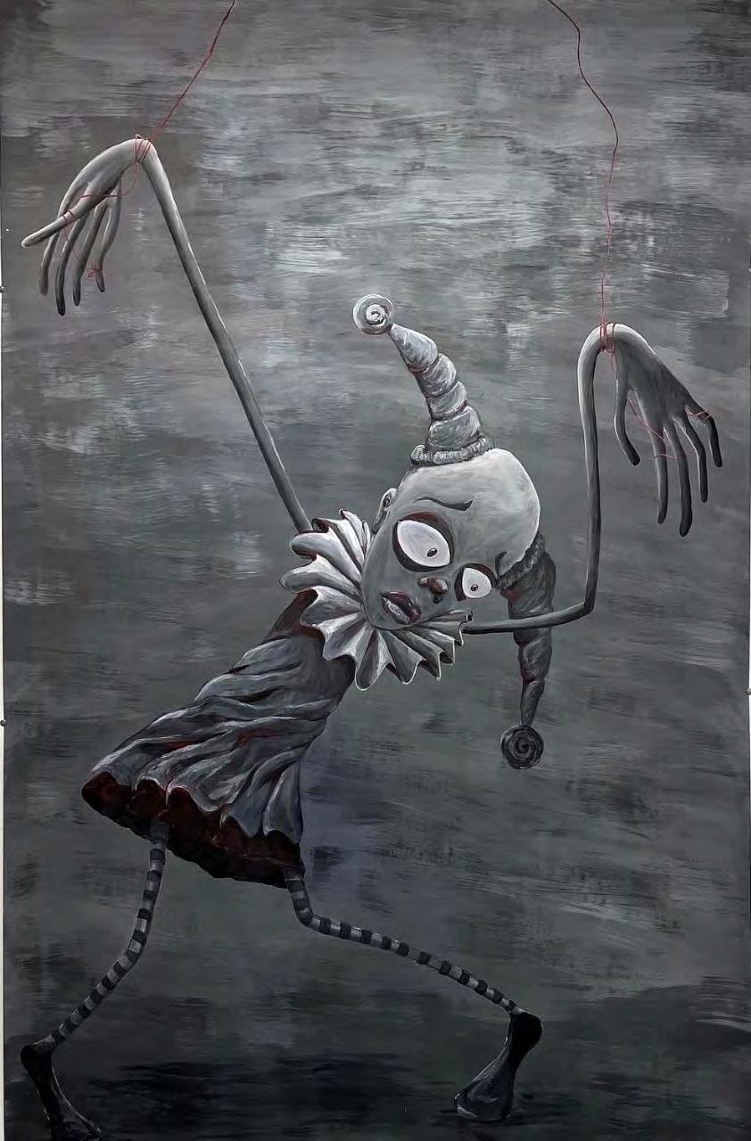
Exploring themes of spectacle and entertainment under external control, People are looking, get up is an exceptionally ominous collage created from cut- and rip-outs from multiple magazines. Taking formal inspiration from the collage work of Allison Zuckerman, she experiments with texture and three-dimensional space through black and white colors to create an impressively eerie composition. The work features a hand creeping and reaching out from the void to the helpless figure sprawled on the floor, illuminating an ambiguous scene of consolation and control. Marionette a painting completed in winter of 2022, studies the theme of control through emotional influences. Observing form and shape through black, white, and red– her signature colors– the work portrays a Tim Burton-esque subject caught by a tautly wrapped red cord. Her work with value is impressive as she draws attention to the figure’s helpless disposition both physically and figuratively, prompting the eye to study the cords that control its every move. Like the ominous panopticon, Marionette brings about an eerie sense of control beyond what can be physically seen.
As a creator, ambiguity plays into her objective: “It’s di cult expecting others to see the work how you see it as the artist,” she notes. Despite the rift between artist and audience, she stresses an importance on the wide range of interpretations across her works. “I appreciate how it opens up new discussions to my work in ways I never considered,” she reflects. “The pool of people that get it, get it. [But,] you should please yourself as the artist.” Her own artistic pleasure embodies the philosophical and profound essences of life, which entices to all living vessels.
Samantha Rodriguez SELF IMAGE 22 CERAMIC, 2022
BEING THE QUINTESSENTIAL CLASS ARTIST, SHE CLOSELY FOLLOWED HER PASSION OF VISUAL CREATION THROUGH SCHOOL COMPETITIONS AND CLASS PROJECTS. SAM’S PROFICIENCY ACROSS MEDIA FULLY REFLECTS HER VERSATILE SKILL AND SPIRIT AS AN ARTIST.


Constant scrutiny has become increasingly normalized in contemporary society. People have found themselves bared thin by the presence of omnipresent eyes. That notion has standardized itself through want of incessant knowledge and excessive truth. These desires increasingly define humans, a species living in constant insecurity over its ignorance. Scrutiny opens humans up and dissects their minutiae albeit without investing in emotion, leaving them vulnerable. Inhumane analyses of humanity have left the species in a plight of uncertainty and ever-unresolved tension. Society has slowly become entrenched in an unpredictable limbo.
Allison Berkner’s works deal with limbo, a vulnerable moment of confusion embedded with a profound internal loss of emotion and perspective. To be in limbo necessitates a lack of belonging within an unfamiliar space. Berkner explores this theme quite literally through her piece In Limbo The work is a monochromatic self-portrait of the artist, positioning herself in an unknown and unbounded territory that is held up by thin pillars. Viewers see only Berkner’s backside, giving a sense of mystery and suspense as to the future that awaits in front of her. The viewer is reduced in size, witnessing the scene from below, and is given lessened importance in a world that may be entirely Berkner’s construction. Despite her vulnerable, open position, her posture conveys no hesitancy toward a bright light that brilliantly illuminates both her figure and the pillars.
This work’s lack of a palette and usage of charcoal has been a recent focus of Berkner’s, seen in works such as Known Unknown and The Shape of Memory These pieces similarly emphasize curvilinearity within surreal or abstract dark spaces, producing an enigmatic oeuvre. However, Berkner’s creations are not comparable to her exercised external image. Allison is a kind, outgoing, and friendly person who represents her university as a preview sta er, her school as a School of Art + Art History ambassador, and herself through her artwork. This constant external presentation of the artist shows an immense vulnerability, an openness to invite questions, and a willingness to answer them through her art. This dichotomy between the artist’s external presentation and the art’s external presentation depicts steadfast confidence and understanding of herself both internally and externally. This level of understanding extends far past herself and into another valued part of her life: family.
Family often functions as the group of people one is most vulnerable around. From birth into old age, family members treat and care for one another. This vulnerability acts as a natural cycle: cared for in childhood, self-managing into adolescence and adulthood, and once again cared for in old age. Berkner’s parallel work, The Look of Love, presents a family member phased into a vulnerable state. The piece shows an older lady sitting in a chair peering directly past the viewer as she outstretches her hand to meet another. Berkner uses warm, light colors and soft modeling to create a comfortable environment, though an indeterminate one. The older lady in the green chair dominates the image amid a nondescript red background. Despite the mysterious circumstances, one finds comfort in the woman’s gaze. This deep connection between humans amid soft coloring can be seen in her previous work In the Moment albeit, in a more sensuous and romantic mood rather than familial.
The woman portrayed in The Look of Love is Sheila Shalloway, Berkner’s grandmother, and the green leather armchair she sits in is definitely hers, outside of that, the environment is not known. The red background almost seems to emanate out of Shalloway, as if her love pulsates outwardly.

Shalloway is diagnosed with dementia. As such, she has evolved into a new vulnerable state, more vulnerable than most, where her information, livelihood, and personality are entrusted to surrounding family members. However, there is solace. This look of love that Sheila holds is universal. She may not remember who greets her, but if it is someone she loves, she lights up with joy at seeing them.
Shalloway finds safety and comfort through her love in The Look of Love while Berkner finds safety and comfort in a light that beckons towards her in In Limbo Both works discover newfound comfort while wading through torrential discomfort and vulnerability. Berkner faces this as her senior year at the University of Florida concludes amid a future developing into total self-management. Despite her current uncertainty, she confidently stands and looks beyond limbo.
ANY WORKS REFERENCED IN THE ARTICLE NOT PRINTED IN THE JOURNAL ARE VISIBLE AT @ALLY.THE.ARTIST ON INSTAGRAM.

“ALLISON BERKNER’S WORKS DEAL WITH LIMBO, A VULNERABLE MOMENT OF CONFUSION EMBEDDED WITH A PROFOUND INTERNAL LOSS OF EMOTION AND PERSPECTIVE. TO BE IN LIMBO NECESSITATES A LACK OF BELONGING WITHIN AN UNFAMILIAR SPACE.”


Time is to be wisely invested and carefully spent, but not collected. It can be murdered like Caesar on the Ides of March but cannot be rescued and stowed for safekeeping. Time is dearly cherished but is often stolen and abused. Futile captures an unspoken tension between using a clock as a tool of both measure and display of time — specifically, its function in managing human life.
At the center of the work, a silver alarm clock is positioned near the end of a long heap of sand; its metal hand rotates in a motorized loop, diligently chiseling a shallow crater in the foundation upon which it sits. Time, like spilling sand, slips through a hole in the clock’s grip. Scattered metal and plastic parts litter the surrounding space revealing the inner mechanics of the clock, signifying the messiness of the broken systems which remain unchallenged, silently composing the rhythms of daily action.

This work presents time as a vaguely tangible measure of physical labor. Yet, time also becomes inherently abstracted through a lack of relative direction: past, present, or future. The artist, Reed Mann, pointedly questions the procedures which commonly attempt to regulate the elusive character of time. Although it is a more recent subject of fascination in her body of work, thinking about faulty methods of measuring time led Mann to begin conceptualizing a visual language that might articulate the vanity of seeking to systematize facets of human life that are inherently fluid.
Since beginning her academic career in Fine Arts at the University of Florida, Mann found that the methodological and structured approach to art-making in the classroom has clearly informed her practice by alleviating the pressures associated with limitations on content and form, leaving her more free to create any work she pleases. Evidenced by Mann’s portfolio, she finds comfort in contemplating the inescapable element of control as it has been implemented into the apparently seamless function of daily life. More specifically, the artist hopes to dismantle the conventions that perpetuate the need to follow these punishing practices.
The production process for the work featured here is inspired by several forms of time-based media; however, those integral to set design and pre-production in film are at the forefront of its conception. Referencing the “small beach” atop which the timepiece sits, Mann discloses that if given the opportunity and means, she “would have filled the entire room with sand”, creating a liminal environment of dunes and valleys between which the small silver clock and the viewer alike can escape, nested away. Introducing yet another aspect of composition for the viewer’s consideration, elicited through the idea of enclosure, Mann even further emphasizes the overwhelming and tremendous task of feeling the need to control the dynamics which bound time and space.
THIS WORK PRESENTS TIME AS A VAGUELY TANGIBLE MEASURE OF PHYSICAL LABOR. YET, TIME ALSO BECOMES INHERENTLY ABSTRACTED THROUGH A LACK OF RELATIVE DIRECTION: PAST, PRESENT, OR FUTURE.


Artist Patricia Pascual (she/her) Pyschology + Art, 3rd year
Writer Ava Bender (she/her)
Art History + Anthropology, 4th year
Patricia Pascual has passionately made art since childhood, and is studying Psychology and Art to bring together her creative drive and appreciation for collaboration. Depending on the inspiration and ideas, Pascual is open to working with many di erent mediums such as collage, digital, watercolor, and acrylic. In Chiaroscuro and Michelangelo’s Mourning Pascual experimented with new mediums and techniques to immerse herself within the art-making process. Pascual is motivated and inspired by a social learning environment, where she can delve into her academic interests and find inspiration in the conversations she has with her peers.
The things around us hold memories, sometimes our own, someone else’s, or even stories we imagine. Sometimes a change in perspective or a closer look is all it takes to give life to these stories. In Chiaroscuro Pascual depicts a still life that begs to be filled with meaning by the viewer, who might invent stories or see something of themselves in the composition. She chose a close-up perspective that obscures most objects from being seen in their entirety, forcing viewers to take a moment to understand the various elements. She hopes this may encourage viewers to appreciate the small crevices of everyday life as overlooked narratives.
Patricia Pascual’s Chiaroscuro is filled with memory, an imagined tableau of things that have been finished, left behind, and moved on from. These are all things that remain in the forgotten corners of the lives of many, yet they have significance in Pascual’s memory as objects that temporarily held her attention but still hold the weight of the joy they once brought her. Pascual’s still life echoes the sentiments of a memento mori, showing things at the end of their use-life: the ukulele that no longer plays, the bottle whose contents are emptied, the shoes that have been outgrown. These elements rest on a wooden chair: a seat covered with things that cannot sit.
The title of this work, Chiaroscuro is self-referential to the technique employed and Pascual uses charcoal, the ideal medium to produce this visual e ect. Chiaroscuro is a dramatic use of light and shadow that emphasizes contrast to model volume, and can heighten a work’s emotional impression. In Chiaroscuro this
e ect shapes the nostalgic mood of the composition. Pascual has just started using charcoal, creating Chiaroscuro to explore the medium. Charcoal requires the artist to engage with its impermanence, as reconstituting and removing material from the canvas are principal techniques. The charcoal is built up, blended together, and lifted away to produce the final work. In working with charcoal, Pascual has found that undoing and redoing her work is productive and essential. Pascual also learned that charcoal takes time, o ering her the space to further develop patience and appreciation for the process.

Graphite, however, lends itself to the quick translation of mental images into physical form, and Pascual is drawn to the immediacy of this medium. In Michelangelo’s Mourning, Pascual engages with an intuitive and persisting mode of learning, that of the “master” copy. Pascual looks to Michelangelo, the Renaissance “master,” to produce a work inspired by his talent for representing emotive human figures. Michelangelo himself developed his skills by producing “master” copies, looking to examples from Classical antiquity. Following the example of other artists breaks down compositional elements and engages an artist in the development of their technical skills. For Pascual, looking back to artists she admires motivates her to push her own practice forward.
Emulating Michaelangelo, Pascual planned the proportions for her figure and chose a variety of techniques, such as cross-hatching and shading, to sculpt the form with graphite. Pascual was moved by the emotive qualities of Michelangelo’s sculptural oeuvre to choose a pose that communicates the figure’s sentiment, and she distressed the paper to enhance the historical character of the work and further connect it to the past that she draws inspiration from.
Pascual knows that despite planning, art-making is a transformational endeavor. Embracing the process and trusting her practice has taught Pascual that seeing her work come together always makes it worth it. Patricia Pascual is dedicated to art as a means to hone her creative vision and skills, and to learn more about herself along the way.

“EMBRACING THE PROCESS AND TRUSTING HER PRACTICE HAS TAUGHT PASCUAL THAT SEEING HER WORK COME TOGETHER ALWAYS MAKES IT WORTH IT.”Artist Taegan Hyland (she/her) Graphic Design, 1st year Writer Mariana Garcia (she/her) Art History, 3rd year

The query of identity often grapples with the doubting conscience. Taegan Hyland, a first-year graphic design student at the University of Florida, is no exception. Hyland is a South Korean-born-American adoptee raised in Iowa that moved to Gainesville in her teenage years.
Hyland is no stranger to inner conflict, but what she does with themes of isolation, confusion, and doubt are reflections of the turmoil many of us may find familiar. Hyland draws back to memories of her childhood in Iowa where her parents tried to immerse her in Korean culture through projects, meals, and stories. She mentions this only added to her confusion about where she was supposed to be “from”.
Isolation paired with recipes, confusion allied with heritage projects, and doubt filled with fairytales – Hyland turned to art as a medium to escape the dualities of her identity. This is precisely why her work Confused in Color is an enticing mirror of the emotions she detailed in our interview. She remembers growing up in a private school that restricted artistic creativity. Hyland states she wasn’t allowed to express her true feelings through art, especially negative ones. Now she is happy to belong to a program that does not limit her expression and is excited to apply the emotions she had previously silenced towards her art.
Using acrylic on paper, Hyland is able to capture the essence of her turmoil through a technicolor lens. Confused in Color displays an ambiguous enigma the artist views as an echo of her identity, specifically one that is ripped apart by the factors that contribute to her life. In this acrylic portrait Hyland is able to portray the splitting sense of confusion she associates with family, school, social life, and her physical identity. Hyland does make it clear that while this portrait expresses concepts she struggles with, the ambiguity of her work is intentional. The subject has no defining features aside from a bright red lip. Hyland needed to ensure any viewer that admires her work can find a channel to identify or empathize with the enigma. Each one of her insecurities is expressed through a psychedelic hand ripping at her portrait’s skin. Hyland intentionally balances the severed head in the upper left corner as a pair of green and blue tinted hands overpower competing yellow and red colored forearms from the lower right. All attempting to stake a claim in this ‘identity’. Hyland’s figure melts under the grip of competing hands. A shattering eruption of her thoughts, expressed through pattern and color, escapes from her mind while internally, a kaleidoscopic whirlpool consumes her sight. Hyland mentions how her subject’s eye is meant to express the joy of the human experience. Hyland prides herself on accepting negative emotions with the same resilience as positive ones. She sums up her feelings with a silver lining, “all of this confusion is worth it because it reminds me I’m alive.”
HYLAND IS NO STRANGER TO INNER CONFLICT, BUT WHAT SHE DOES WITH THEMES OF ISOLATION, CONFUSION, AND DOUBT ARE REFLECTIONS OF THE TURMOIL MANY OF US MAY FIND FAMILIAR.
Alexia Rangel Krashenitsa uses painting as a visual language to express the nuances of interpersonal relationships exquisitely in her work through the use of visually enchanting symbols and metaphors. In Negligence and the Crow Alexia uses acrylic paint to create an imagined visual representation of a turbulent relationship between an adolescent and their mother. By personifying the personality of an attention seeking teenager into the form of a crow, an animal usually pictured as an aggressive antagonist, Alexia is able to embody the oftentimes turbulent relationships which teenagers tend to have with the world around them. The main female figure, distracted by the mesmerizingly illuminating glow from her phone, represents the adolescent’s mother in the narrative. The world around her seems to be growing with lush flowers, but she is unable to see that as her blank gaze is captured only by the small black box held in her hand. The mother is surrounded by darkness, beauty, and persistence, yet is still unable to look up and connect to the world around her. Alexia choses to portray familiar situations in her artwork because she wants the viewer to feel a connection to the work when they see it. She wants to create paintings which people can see themselves in. Even without interpreting the bountiful symbolic elements found in the work, Alexia believes that her paintings strive to make a connection with the viewer, even if it is not her intended message. Any relationship between her paintings and her audience is a positive one as it fosters relatability and makes one feel less alone.

Alexia collects a variety of images to produce her final work. To fully capture her vision she uses a combination of her own reference photos and reference photos that can be found online. She skillfully combines them into one composition causing the separate elements to take on a new life. Creative judgment is used in choosing how to render each of the forms and synthesize the disparate elements. The elements depicted are bright, full of life, realistic, but also stylized in a uniquely fictionalized manner. The prominent colors of Negligence and the Crow are blue and orange, which help create a dramatic sense of contrast in the painting. The colors work in excellent harmony to bring a dream-like essence to the work, reflecting on the viewer’s reality.
The crow as the subject in the paintings relates to Alexia’s greater goal to represent animals in her paintings. She aims to teach people how meaningful animals can be through having them embody human characteristics, bringing to light the connection we can have to non-human beings. Although crows are typically antagonized in popular culture, in actuality they are very intelligent animals and capable problem solvers, similar to qualities that are overlooked in teenagers.
Alexia is a third year University of Florida student studying computer science and fine art. Although some may see the two fields as being distantly related, Alexia knows that creativity is a necessity for both fields. The analytic creativity of computer science merges with her artistic creativity in making paintings which include themes of technology and boast aesthetically technological color palettes and moods.
The intersection between personal experiences, symbolic nature, unique artistic perspective, and a desire to relate it to the world is what makes Negligence and the Crow so limitless in its ability to make connections with the viewer and be understood.
“THE MOTHER IS SURROUNDED BY DARKNESS, BEAUTY, AND PERSISTENCE, YET IS STILL UNABLE TO LOOK UP AND CONNECT TO THE WORLD AROUND HER.”Artist Alexia Rangel Krashenitsa (she/her) Computer Science + Art, 3rd year Alexia Rangel Krashenitsa NEGLIGENCE AND THE CROW ACRYLIC, 2022
Artist Emsley Thornton (she/her) Media Production, Management and Technology, 1st year
Writer Gabriella Martinez (she/her) Art History, 4th year
Emsley Thornton is a bright and kind spirit who is passionate about digital storytelling. She has produced several short films surrounding topics such as emotional abuse, mental health, eating disorders, and many others. To Thornton, this was an important film project because it’s something people need to discuss more in the film industry. She is motivated by her passion for storytelling. She mentions, “In silent film, you don’t know the story through words, but instead through visual analysis.” This is a silent film because she doesn’t think you need to hear things to appreciate them. She’s inspired by words and stories that are not told. Eating disorders aren’t really talked about, and she wants to tell the stories of people that are not publicized.
This depiction is displayed in her most serious silent film, Reminders of Then
This is part of a scene in which the subject struggles to overcome her battle with an eating disorder. She stands in the bathroom, trying to eat again, and has a flashback to when she had an episode in the bathroom. The subject looks at herself in the mirror, rea rming that she is more powerful now than ever. The image features a rugged and rough textured wall, like her scars, reiterating the notion of re-healing. The wounds show how strong we are as individuals. The largest square figure is a scale saying ‘you did this’ as a form of encouragement and support for the subject. Shadowing is manipulated as an artistic technique in how the subject’s hair and glasses are seen through the contrast of light and dark through shadowing. Additionally, the props she created out of paper mache for the short film featured the overlay from the background.
Regarding the production of this scene, Thornton presents how the room was in a dark setting with no lights on except for the projector. The dark room permits the viewers to focus on the film more. With this, Thornton managed the projector to use shadowing to create a stark contrast throughout the composition.
The project title and themes are present in her work. Each of the cups is for the three scenes where she is eating with friends, by herself, etc.; the cups symbolize where she is in her journey of overcoming her eating disorder. Thornton stylistically
chose to exhibit the words on the cups to depict a linear progression. She macheted newspapers to demonstrate di erent words and then drew on the terms the character could relate to. The first cup says “too much,” referring to when the subject of the short film would feel overwhelmed by too much food. The second cup says, “maybe.” Referring to the consideration of the subject to openly invite the idea of food back into her life. The third cup in the composition says, “I am proud of you.” This final cup shows the evolution of the character to overcome her struggles. The object on the left is a protein bar that says ‘fat/ too many carbs,’ The second side says ‘good carbs.’ All the props are relevant because they contribute to the overall meaning of the short film.

One of Thornton’s first serious short films featured themes encompassing emotional abuse. She knows the severity of trauma, how people don’t recognize it enough, and how impactful it is. She’s seen friends and family go through times of struggle and believes it’s not articulated enough in pop culture. Thornton strives to find a story topic inspired by how people are a ected. She hopes to help people feel both heard and understood. Another one of her films, Maybe Am was a finalist at The Open Mind Film Festiva, hosted by the University of California – Los Angeles. This short film was about mental awareness, which also fits into the ideas of emotional abuse. Thornton enjoyed attending this film festival to collaborate with others who felt the exact purpose of shedding light on heavy topics such as emotional abuse.
She has submitted Reminders of Then to several film festivals. But, she hopes to continue her film work and go into documentary filmmaking. In documentaries, she appreciates the autonomy and ability to discover the story and bring the silent voices to life. She wants to pursue filmmaking as a whole and be a producer, screenwriter, or documentarian.
In essence, Thornton wants to stress the importance of eating disorders. She wants viewers to know they have a voice through the national hotline (800) 9312237, and her film can be viewed on her YouTube channel, @emsleythornton2589.

“IN SILENT FILM, YOU DON’T KNOW THE STORY THROUGH WORDS, BUT INSTEAD THROUGH VISUAL ANALYSIS.”Emsley Thornton MAYBE I AM VIDEO, 2022 Artist Leila Elguennich (she/her) Art History + Japanese Minor, 2nd year Writer Marie Fiemeyer (she/they) Art History, 2nd year
Observing an artist over time can lend insight into their emerging style, traces of where they feel the most comfortable. While the school provides an environment to push art students like Leila Elguennich to experiment with new materials, this style can act as a place to return to when seeking refuge. For Elguennich, this space is found in her growing collection of works in watercolor, the most recent of which focuses on comfortability and the fears of staying stagnant through motifs of pinwheels.
Once familiar with the hallmarks of this artist, one becomes able to point them out with ease in her works, such as with Stale Air. The artwork displays a portrait of a girl who turns to look at us in a setting crowded by pinwheels. To create the subject the artist referenced aesthetics found in media online and in pop culture. The styles of her hair and clothing serve as a reflection of today’s world. The pinwheels which frame her are well defined and are as clear to make out as the main figure, while those in the two-toned background are left as impressions, abstracting the planes from each other further. This medium allows for the fragile linework to peer out of the monochrome piece. Despite usually operating in vivid color, the artist chose to limit their palette and use the single yellow hue as a tool to emphasize the girl.

The immediate impression that the artist conveys appeals to the visual sensibilities of the viewer through balance and composition. However, beyond this initial response lies a more complex meaning. Elguennich revealed how Stale Air conveys complacency. The subject commits to the role of portraying a person stuck in a motionless state. As an audience, we can imagine sitting in her place and being still amongst the pinwheels in their petrified states, the world behind us moving at such a speed that it renders them as blurs. The pressure to keep up with a fast-paced world is understood by many students, as well as its ability to weigh one down. The narrative held within the art shines a light on this e ect.
This story of comfort reflects the way in which the piece was created. There is a connection between the themes of unease that the painting holds that contrast with the creation of the piece. The elements and medium included are all within this artist’s realm of expertise, explaining the speed at which she put it together (as it was completed in under twenty-four hours) and demonstrates her mastery in this kind of work. Conveying these uncomfortable emotions through a medium where the artist feels more comfortable may communicate a solution to the dilemma presented in the painting. By putting these experiences down on paper it provides a space to express and release these thoughts.
When questioned in regard to the pinwheels, Elguennich answered that there was no real purpose. It was entertaining for the artist and provided a challenge, while also being a collective tie between this piece and the other works that also include this symbol. Figuring out how to draw the interlocking shapes can almost be seen as a meditative process, connecting lines that the eye can trace upon. Their inclusion intercepts the artworks as a string to bring calmness to otherwise heavy content.
When viewing Stale Air in comparison with Elguennich’s broader oeuvre, it is clear that despite the similar subject, its meaning is unique. A play on the traditional portrait, the artwork demonstrates what practice and dedication can develop over the years to produce complex compositions like this one. It is a lesson in the rewards of dedication and comfort. The artist leaves the audience with this: “I want people to see and feel the concepts and narratives present in my work and the aesthetics use to convey them. also love for the viewer to come to their own conclusion, interpretation, and understandings based on their own experiences.” For future works, Elguennich is sure to continue using her paintings as vessels to explore these themes.
“A PLAY ON THE TRADITIONAL PORTRAIT, THE ARTWORK DEMONSTRATES WHAT PRACTICE AND DEDICATION CAN DEVELOP OVER THE YEARS TO PRODUCE COMPLEX COMPOSITIONS LIKE THIS ONE. IT IS A LESSON IN THE REWARDS OF DEDICATION AND COMFORT.”Leila Elguennich STALE AIR WATERCOLOR ON PAPER, 2022 Artist Nadia Wooten (she/her)
Psychology + Photography, 4th year
Writer Hala Hachem (she/her)Every act committed is one in service of a memory, either to call forth something of the past or collect a new memory to be stored for the future. It is in the way we rack our minds to remember where we left our keys on our way out the door or the way a significant other likes their tea in the morning. The utilitarian aspect of a memory starts to degrade when we render ourselves the benefactor or victim of its emotional capacity. Memories are not always welcome visitors, reminding us at inopportune moments of opportunities missed or a plan gone wayward.
For as much as we rely on memories, acting not as the foundation of who we are as people but the internal structure to support it, sometimes we find cracks, empty spaces where particular details used to reside. One can blame time, its passage often rendering certain memories obsolete. Time is not always the perpetrator. We, sometimes, forget to acknowledge our role in the slow, elusive process of memory loss. It may be because we chose to forget in the moment, not realizing the future implications of the act. Other times, we replay a memory over and over again. Like a record on loop, each pass warps the memory until certain details are distorted beyond recognition. With each recalling of a memory, the original event or idea or thought is not remembered but the last iteration of it we had in mind is.
In unfortunate circumstances, trauma is the reason behind the absence of a memory. This response, initiated by our minds, like an instinct, is meant to protect and prevent further pain and su ering associated with the memory. Memory loss caused by trauma is the core idea tackled by Nadia Wooten in her series Unremembered. Through her art, Wooten calls upon a variety of elements to manipulate the mind through its senses to build a space in which the audience can relive their memories through the artist’s own.
Nadia Wooten UNREMEMBERED PHOTOGRAPHY 2022Though confined to this publication as a series of 153 photographs, Unremembered lives on the mind of the artist and audience as an installation work. Housed in a studio on campus, one is welcomed by the smell of incense into a darkened room where the only source of light guides the viewer to a pedestal. The direction led to six photo albums filled with black and white images of the artist’s body in a nondescript room. The elements of Unremembered come together to produce a space for reliving memories. The dark room blocks out anything that may act as a distraction while the incense calms the mind. The viewer is then primed to receive a base set of photos to help them recall their own memories through the visual cues provided by Wooten. The goal was such that, while the artist may have a di cult time remembering her own memories, using art as a means to rectify that, she provides an opportunity for others to look within the folds of their mind and see what they can find. Behind the installation, the process to produce this unique work started with a printer issue. Once Wooten had photographed herself in her bedroom, she edited the photos through Photoshop to achieve the hazy film e ect. Once that was accomplished, she printed it out only to find that the amount of photos, placed together without an order in mind, could not fit in one volume. Rather than exclude certain images, Wooten created six albums for the viewer instead. For the viewer, this o ers a greater chance of catching a memory from a murky pit where those who are not often recalled reside. For the artist, this was part of her process and trusting her artistic intuition.
When viewing Unremembered through this publication, the viewer, unfortunately, is at a loss as it is di cult to replicate an installation work with so many elements onto ink and paper. To experience it the best way possible, the artist recommends spending time to contemplate the large printed images. By exploring the contours of the blurred shapes, the elements just out of focus, the viewer is anchored back to reality through the concrete, corporeal aspect of Wooten’s body. This will begin the recollection process as your mind looks at the photos, memories will begin to teem at its edges, demanding the energy needed to give it your full attention. After doing so, the series of smaller stills should be glanced over, one image at a time, at a shutter like speed, moving from top to bottom, left to right. With the shift from the larger images to the smaller ones, the eye movements required are no di erent than what you have been doing while reading this article. However, words are exchanged for pictures in an experiment to help you recover what you may have lost but never knew you did.
In a world where we are encouraged, if not rewarded, for moving on at astonishing speeds at the ideas, products, and actions that are on the cutting edge of it all, Nadia Wooten’s Unremembered o ers a reminder to us all. It stands as an oasis where we can collect our thoughts, sorting through the mess of our minds to find a memory, shared or solitary, of times of joy to remember on a bad day or a harsh experience one uses to grow from.
Nadia WootenUNREMEMBERED 4 PHOTOGRAPHY 2022


“...NADIA WOOTEN’S UNREMEMBERED OFFERS A REMINDER TO US ALL. THE SERIES STANDS AS AN OASIS WHERE WE CAN COLLECT OUR THOUGHTS, SORTING THROUGH THE MESS OF OUR MINDS TO FIND A MEMORY…”


Amanda Alvarez P. 11
Ava Bender P. 43
Allison Berkner P. 30-35
Lee LaPlaca P. 16
Valerie Luciow P. 10, 47
Reed Mann P. 36-39
Editor Amanda Alvarez
Editor Adam Blahnik
Graphic Designer Chloe Girod

Tomas Curcio P. 30
Leila Elguennich P. 53
Marie Fiemeyer P. 52
Mariana Garcia P. 44
Hala Hachem P. 55
Taegan Hyland P. 45
Alex Kirkpatrick P. 16-19
Alexia Rangel Krashenitsa P. 46
Ella Kunzke P. 12
Sarah Lantsman P. 36
Gabriella Martinez P. 48
Patricia Pascual P. 42
Samantha Rodriguez P. 24-29
Delaney Rosson P. 13-15
Sophia Salerno P. 20
Emsley Thornton P. 49-51
Carol Velandia P. 24
Nadia Wooten P. 54-57
Kennedy Renee Young P. 21-23
Our deepest gratitude to everyone who contributed to the publication in any capacity, whether they submitted their own artwork and writing, or assisted our editorial and design team.
A special thank you to our faculty advisor Rachel Silveri for her assistance and guidance. We would also like to thank our graphic designer Chloe Girod for working to make the edition into a thing of beauty.
stay awhile.
