neworleansartreview.org
neworleansartreview.org
neworleansartreview.org
neworleansartreview.org
neworleansartreview.org
neworleansartreview.org
neworleansartreview.org
neworleansartreview.org
neworleansartreview.org
neworleansartreview.org
neworleansartreview.org neworleansartreview.org neworleansartreview.org neworleansartreview.org neworleansartreview.org neworleansartreview.org neworleansartreview.org neworleansartreview.org neworleansartreview.org neworleansartreview.org neworleansartreview.org
Contents 30
04 Domestic Bliss
Marie Hull: Bright Fields
By Terrington Calás Jim Richard at Arthur Roger Gallery.
By Judith H Bonner A retrospective exhibition, Ogden Museum of Southern Art.
08 Friends, Neighbors & Saturation
34 Movement & Stillness
By Kathy Rodriguez Wayne Gonzalez’s Forest at Arthur Roger Gallery.
By Marian S McLellan Gina Phillips, Bonnie Maygarden at Jonathan Ferrara Gallery.
11
36
Cheryl Donegan
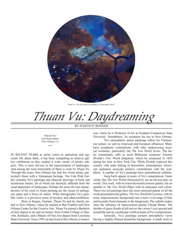
Thuan Vu: Daydreaming
By Rebecca Lee Reynolds Video installations at Arthur Roger Gallery.
By Judith H Bonner Thuan Vu at the Cole Pratt Gallery.
14 Of Narrative & the Surreal
38 Point of Being: Four Exhibitions
By Marian S McLellan Susan Downing-White at Cole Pratt, Benjamin Shamback at Le Mieux, Mitchell Lonas at Callan Contemporary, Robert Kelly and Thomas Kelly at Octavia.
By Kathy Rodriguez Regina Scully at Octavia Art Gallery, Jose-Maria Cundin at Callan Contemporary; James Drake, Vernon Fisher and Lee Diegaard at Arthur Roger.
18
42
Reality: Langford, Pendleton, Staub
On Cinema
By John Mosier Hayao Miyazaki’s The Wind Rises.
By Marian S McLellan Jon Langford, Leslie Staub at Le Mieux; Adam Pendleton at the Contemporary Arts Center.
45 Perspective
22 Self-Taught
By Stephen Bachmann NOLA and the Clash of Civilizations
By Paul Scott Wilson “Self-Taught Genius: Treasures from the American Folk Art Museum.” New Orleans Museum of Art
32
Calendar - Compiled by Archer Cruz, Paul Scott Wilson.
26 Arthur Kern: Always Mutable
By Kathy Rodriguez “Arthur Kern: The Surreal World of a Reclusive Sculptor” Ogden Museum of Southern Art.
20
Cover
- Arthur Kern: Persona, 1974.
See essay, page 26.
Marie Hull: Bright Fields By Judith H Bonner
THE NEW ORLEANS ART REVIEW is published bi-monthly during the art season (October, December, February, April, June) by the New Orleans Art Review, Inc., P.O. Box 51181, New Orleans, LA 70151 (website: neworleansartreview.org), a non-profit organization funded in part by grants from the Louisiana State Arts Council and the Louisiana Division of the Arts, as administered by the Arts Council of New Orleans, the Louisiana Endowment for the Humanities and the National Endowment of the Arts. Subscriptions: fifty dollars for five bi-monthly numbers. (web mail: noareview@netzero.com) Advisory Board: E. John Bullard (New Orleans Museum of Art), Mrs. M. M. Calas (Dubuisson Foundation), Mrs. James Coleman Sr., Mrs. Haydee LaFaye Ellis, William Fagaly (New Orleans Museum of Art), Mrs. Sandra Freeman, Mrs. Eugenie Jones Huger, Mr. Keith Marshall (Madewood Foundation), Mrs. Françoise Richardson, Mrs. Louise Reiss Rogas, Timothy Slater, Mrs. J. L. Stafford, Mrs. John Weinstock, W. Thomas Young. Editorial Board: Stephen R Bachmann, Dale Betancourt, Marilyn Brown, Terrington de Martain Calas, Calvin Harlan, J. T. Peabody. Editor-in- Chief: J. T. Peabody. Managing Editor: Terrington Calas. Associate Editor: Stephen Bachmann. Contributing Editors: Thomasine Bartlett, Dale Betancourt, Judith Bonner, Marilyn Brown, Kate Carter, John H. Lawrence, Carol Leake, Peggy McDowell, Marian McLellan, John Mosier, Rebecca Lee Reynolds, Kathy Rodriguez, Karl Volkmar. Graphic Design: T.M. Calas, Greg Leonard. Graphic Artists: Michael Curry, Chris Lewis, Seth Lovelace. All opinions printed herein are the opinions of the authors and do not reflect those of the New Orleans Art Review, Inc. or its board members. Communications can only be returned if accompanied by a SASE.
03
Jim Richard: By the Pool, 2015. Flashe paint on linen, 46” high.
Jim Richard: Domestic Bliss BY TERRINGTON CALAS by imposing a finer contrivance. At the same time, he redresses the tacit social mandate. This subtle critique, moreover, is furthered by the very insertion of the sculpture. As in much of Richard’s work, it anchors the composition and, more important, provides a jolting disruption of the decorous proceedings. In this instance, it does a bit more. The form, as I say, is biomorphic, and not a little menacing. It suggests a serpent, undulant and advancing. You feel this perfect domestic world becoming less so.
JIM RICHARD “Darn That Dream” Arthur Roger Gallery New Orleans, LA ____ AMONG ART GENRES, domestic scenes and still life rest in our heads as mute poetry, as temperate and solacing — and quintessentially traditional. Not Jim Richard’s. His new paintings (“Darn That Dream,” recently at Arthur Roger) have but one essential connection to the tradition. They exploit it. They manipulate the legacy of Vermeer and Chardin and Vuillard in order to target a contemporary folly. And folly is the right word. These works have to do with impossible dreams and societal charade. More directly put, the evident theme here — and it feels rather discomforting today — revolves around class, deified commodities, and a culture that exalts surface perfection. I say “discomforting” because such an issue belongs properly to another era and perhaps to another country. And yet, these pictures persuade. You come away re-thinking today’s values. By the Pool makes the case shrewdly. With it, Richard confronts a presumed cultural dictate: that an indulgent yet orthodox lifestyle is the American ideal, or rather, the imperative. He submits a scene that verges on the picturesque, almost kitsch; but in his hands, it develops into a leisure-tribe paradigm — a suburban Eden. And a potent vehicle for social critique. The painting depicts the patio of a modernist house. Its space is conspicuously orchestrated — every planter and every shrub in its place, with all the right voids and all the right heights. You sense the eye of a finical professional designer, not a homeowner. But what strikes you is how Richard mitigates the scheme. He does so chromatically. Every color is a broken color. He renders all the foliage the same umbered green, and there are expanses of grey and a muted orange, and the mottled woodrose of an outdoor biomorphic sculpture. This dignified restraint saturates the image — and elevates it. In effect, Richard underscores the garden’s contrivance
*
*
*
INITIALLY, RICHARD’S IMAGERY can look almost quaint. Most of his subjects are smartly turned-out interiors and gardens. They appear to be rooted in the vaunted designs we see in shelter magazines, those glossy registers of domestic fantasy. His method is to take such designs and, as it were, re-vaunt them — or, as in By the Pool, blissfully subdue them. In either case, he brackets their aura of affectation, their theatricality. He then considers what they really mean — pointedly, what they say about us. His most salient posit is that our culture fairly signifies desire. He touches on what is ordinarily a benign and unremarkable facet of today’s sociological temper: the envie for material indulgences. But he sees the pernicious truth of it. Typically, these paintings amplify the circumstance. By dint of their construction and juxtaposed subjects, they trumpet an arrant intoxication with commodities. And this intoxication does not concern the ad-mass, mundane commodities flaunted in the past by Pop Art. Rather, this is a question of luxe objects, indeed the ultimate luxe object: the impeccably stage-managed home. Consider Mulberry or Display or Thin Slice, each work a clock-like congestion of prized appointments — things, things, things — appurtenances of the life we are enjoined to pursue. The message is clear. Our American dream of contentment may have turned into a rhapsody of possession. Madison Avenue is masterful in its job of 04
Jim Richard: Mulberry, 2015. Flashe paint on paper, 11.25” high.
temptation, but we seem compliant sinners. It is possible, of course, to blame the historical moment. In times of anxiety, we need paradises — even preposterous or vulgar ones. They provide a solacing reverie. And, obviously, the present moment warrants considerable solacing. But, as Richard’s work suggests, there is such a thing as surfeit. His Mulberry could scarcely hold another bibelot — or, his Display, one more picture on the wall. (In Andy Warhol’s words, “Buying is more American than thinking…) Such works pose the question, “Is our current object-prurience merely a cultural tonic, or does it imply a blanketing decadence?” If so, that decadence looks like the protraction of a long-term condition. Many of Richard’s scenes are mid-century interiors, and he has worked with similar subjects for years. They have always resonated; they still do. The inference here is that our golden 1950s were not only a period of unfolding democratic ideals; they were also the onset of a commodities hysteria — the one we see about us now.
materialism — quickly revealed itself as parody. It became clear that kitsch was the destination, not the channel. Vulgar images were soon treasured for their sheer vulgarity — objects of blithe condescension. Metaphor was out of the question. In Richard’s art, however, when there is kitsch, it is subject matter. He compels you to see its implications. Tiger is a good example. You are tempted, from the Pop vantage, to delight in the picture’s interior design over-kill — so many clichés fastidiously positioned in one room. It is easy to regard it, haughtily, as unalloyed bourgeois “charm.” In this case, moreover, certain elements add a comfy family-life feeling, a wholesomeness: the slouching ragdoll, a toy tiger, a color-coordinated baby chair. You smile at the banality — and at the lovely impossibility of such a world. But Richard is not so complacent. He unsettles that world for you. He gently discloses its falseness — the “perfect-home-equals-perfect-happiness” message that it advances. And his maneuver is discreet. Two tall, mechanical-looking abstract sculptures effectively intrude into the setting, like surprise guests. Indeed, they appear to hover over the space. But their colors blend in perfectly; this is Richard’s bow to discretion (and to his abiding formal adroitness). Still, there is little doubt: the sculptures denote an imperiling of this conjured utopia; and denote, further, that received values tend to delude. Whereas most of Pop managed only to reflect society, Richard seeks to analyze it.
IN “DARN THAT DREAM,” Richard’s imagery is not the only feature that seems consistently apt. So does his delivery. This is true despite what may seem a somewhat conventional manner. The crisp schematization of form, the playful and sometimes aberrant color — these are, by now, aesthetic givens. We think of them in terms of a generalized post-cubist aesthetic. Richard’s variant, of course, is singular. He long ago devised a canny amalgam of comic book and illustration strategies. In a work like Tiger, you immediately note the cartoon-like lucidity and the rigor so typical of classic illustration. But scrutinized, the painting becomes far more sophisticated: witness the way Richard steers the nearly Baroque system of volumes and shadows. The same attainment is evident in the intriguing spatial construction in Pretty Boy. And yet, despite so much formal sophistication, Richard’s style possesses a jazziness and voyant audacity that correspond fluently with our trade-soaked world. Note the utter congestion of visual incident; note the forward push of motifs. That style, of course, has Pop Art affinities. Happily, Richard’s paintings allow for none of Pop’s outworn and most lamentable mannerism: its ironygambit. Pop’s embrace of kitsch — for a time so forceful in satirizing modern
*
*
*
THE FORCE OF Richard’s cultural stance is undeniable and, as I say, his delivery is markedly fitting. It accords with our consumerist fervor. But that delivery has its own separate function. It serves as a seductive portal into these paintings — a portal that is largely about delectation. Richard seizes you with junctures of out-and-out visual pleasure. And not merely the pleasure one finds in hedonistic subject matter, such as exquisite patios or soigné living rooms. I am thinking, rather, of his technical tropes. They seem geared to pure aesthetic sensation. This even includes something as rudimentary as pictorial syntax. Here, what you see is a sort of visual “perfect pitch.” Witness the cadenced sweep of shapes in Mulberry and By the Pool, or the baffling coherence of a compositional brawl 05
Jim Richard: Tiger, 2009. Oil on paper, 12” high.
or, more notably, as heir to Vuillard, that pattern-savvy chronicler of bourgeois placidity. In Vuillard, you see Belle Époque interiors through affectionate, knowing eyes. It is a world of utter discretion and tranquility, and he painted it in colors as subdued as the light from a 1890s parlor lamp. But he also managed to vivify that world. To make it modern. His regard for pattern, sometimes inordinate pattern, provides a frisson that is entirely about visual delight; it all but shatters the domestic calm. Richard does something like this, as I have said, with teeming compositions and juxtapositions — but he wrests a further frisson from color and color handling. Tiger is a tense, conflicting painting. You feel the tension, but its source is uncertain. Here is an image ostensibly of peace and security; yet it unnerves. Even more than the tall disruptive sculptures, what stirs you is the savage palette — oranges and oranges and oranges, muffled just to the point that they simmer. And because of the simmer, it is a subliminal force — but undeniable. You’re startled at the potent effect of such a small painting. And that effect is amplified by Richard’s brushwork. This is something you grasp only upon close study, but it is crucial. He deliberately thickens and thins out his pigments, leaving a continuous pattern of tactile changes. This is where delectation is most subtle in these pictures, but also most important. In Mulberrry, for example, the thick-thin application results in a strange and irresistible sensuousness. The handling is consistently palpable, physical enough to lead the eye but, at the same time, unaggressive and utterly suave. It’s a charismatic “touch” that one might link to some timeless gestural mode, but Richard’s is more contained, more governed; at times, his paint pools at the edges of a form, stops, and then creates light yet racy textures. You’re aware every second that he’s savoring both his own technique and the paint itself.
like Tiger. And all of these register chiefly as poetized spaces, intended to delight the eye. You think of Giorgione’s legendary “landscape and figure poems,” pictures in which the narrative content is elusive; their meaning resides only in the bliss of lyrical structure. A measure of such “purity” is certainly felt in Richard. He appears to relish the very task of marshaling a composition. You retain the impression that he does so in the service of sheer poetics. Although that distinctive focus on syntax is everywhere in “Darn That Dream,” another object of delectation insistently declares itself: color — color and Richard’s forthright way of working with it. I think of this in relation to two pictorial traditions. First, the abstract one. Viewing a large Richard canvas, you can imagine yourself before a de Kooning, perhaps one of those majestic late-1950s abstract landscapes. They were part of the moment when, for de Kooning, color held sway, was practically autonomous; and descriptive allusions were, at best, minimal. Richard’s Garden with Modernism feels like that. It is, perhaps, the dazzling glory of this exhibition. Above all, the painting is about dauntless, encompassing color. You scarcely take in the pastoral setting. The immediate image is a spiraling hive of nonstop effulgence. In fact, it is a garden walkway veritably smothered by a floral canopy. It combusts with chromatic tension, thanks to a flurry of opposing hues — enticing blues and oranges and delicate olives all vying for attention. A suspended abstract sculpture, vaguely evoking Calder, commands the foreground. It reinforces the notion of a “pure” painting, an image that celebrates color itself. The other color tradition is more obvious and, perhaps, it more readily signals the subtlety of Richard’s achievement. It is not difficult to see a smaller work like Tiger as heir to the School of Paris ethos — heir to Matisse or Bonnard 06
Jim Richard: Garden with Modernism, 2016. Flashe paint on canvas, 67” high.
The issue here, I emphasize, is delectation. And a part of that has to do with medium. In Mulberry — and in several other works — Richard used Flashe, an indelible paint that has the matte, velvety finish of gouache (the time-honored opaque watercolor). It allowed him the freedom to revel in color unmodified by gloss — truer color. It was also the ideal medium for his gift of formulating complex hues that exist only to ravish the eye. Consider the almost ineffable ochres and blues and peaches in Mulberry. Together, they create a singular gem-like image. And up close, the pleasure is heightened by the paint’s very character — its sweet seductive surface, the way it reveals painterly gesture.
how to employ it for now. On the surface, his dominant decorative forebear is Matisse, the fabled hédoniste raffiné who, in painting after painting, established a bourgeois Elysium — art as a spiritual surrogate for unkind reality. We have no trouble seeing such an Elysium in By the Pool or in small treasures like Tiger and Mulberry. But Richard veils every one of them with a vague misgiving. These pictures are delicious, but bittersweet. They recall the tone of an earlier hedonist: Watteau. Absolute bliss tinctured by doubt. And this translates perfectly into a disquiet about today’s cultural complexion. Doubt may, in fact, be the presiding aura of “Darn That Dream.” Yes, there is the doubt you feel in the presence of so many paeans to material satisfaction — each one, to a degree, impeded. But also there is a lingering quality that suggests an art of two minds: the one of noble commentary and another of unabashed fascination with the pleasures many of us seek. q
IMPLICIT IN RICHARD’S painting is a revived perception of the decorative function of art. His pictures declare the power of decoration to concentrate sensuous experience and, thus, to grip the viewer. With a system of rhythms and carefully sited disjunctions — and, of course, his piquant sense of color, Richard makes delight unavoidable. This is partly why I invoked the School of Paris heritage. He shares in its penchant for painterly cuisine. Or rather, he understands 07
Gina Phillips. Installation, Jonathan Ferrara Gallery.
Friends, Neighbors, and Saturation BY MARIAN S. MCLELLAN seductive surfaces, both actual and implied. In fact, fabric is at the heart of Gina Phillips’ “Friends and Neighbors” and Bonnie Maygarden’s “Saturation.” Oddly enough, the notion of material is more visually felt in Maygarden’s holographic, acrylic on canvas paintings than in Phillips’ quilted renderings of people, plants and animals. Says Maygarden, “As the practice of painting evolved, we fought to create images that felt ‘real,’ and later through Op Art images that used illusion to deceive the eye….I play with moments of deception through tromp l’oeil, reflections, and optical color mixing. This allows me to question what our expectations of contemporary images are in a post-digital world.” Maygarden’s highly stylized abstractions can be viewed as much as objects as they can as paintings since each appears to be a crumpled field of metallic colors that extends to all sides of the canvas. The predominantly green Dark Daze IV and bright orange Saturation II engage the viewer with an optical play of subtle
GINA PHILLIPS Friends and Neighbors BONNIE MAYGARDEN Saturation Jonathan Ferrara Gallery New Orleams, LA
ONCE PLACED ON public walls, most two-dimensional art establishes itself as a two-way event, between artwork and art viewer. We, the onlookers, partake of visual description, reading the imagery harnessed within a rectilinear format. Thus, most often, the surface or fabric of the painting or drawing is not a main focal point. However, the exhibits by two local artists at Jonathan Ferrara Gallery immediately grab one’s attention because of their 08
Gina Phillips: Kioko and Koji, 2016. fabric, thread, paint, 63x31 inches,
09
Bonnie Maygarden: Saturation II, 2016. Acrylic on canvas, 58 x 52 inches.
color fades and three dimensionality, as though the wrinkles are physically present and in need of an iron. But going on to Light Air III, with its dazzling bright yellow and cooled down colors to simulate wrinkles, there’s a sense that we are looking at a computer-generated image of some familiar yet unfamiliar terrain. Back on earth, Gina Phillips’ larger exhibit, “Friends and Neighbors,” delights with a visual feast of fabric, thread and paint cut-outs of folks who live in Phillips’ Lower Ninth Ward neighborhood. The well-crafted images, pinned to the walls, evoke a mix of Alice Neel’s lively portraits and Red Grooms’ colorful arrangements. However, Phillips’ entourage shares our space so that they too are objects, like quaint paper dolls that immortalize their subjects. Referring to her portraits in “Friends and Neighbors,” which depict people from the waist up, Phillips states “There’s an interesting dichotomy between the vulnerability of these truncated forms and the strong presence they emanate that speaks to the human condition. More than anything, in each portrait, I try to capture something of the essence of the person.” This sentiment is similar to one expressed by art critic Deborah Solomon in a 2010 New York Time’s piece called “The Nonconformist.” Of Neel’s subjects, Solomon wrote “her connection with them was so intense she claimed to feel newly desolate every time she completed a portrait.” Phillips’ website describes herself as a narrative artist, and for sure, “Friends and Neighbors” has a strong feel of a storybook mural, complete with a Memory Tree With Memory Drops and a Memory Cloud With Raindrops. Grass is painted directly onto the wall beneath Memory Tree, and lyrics from the Talking
Heads’ “New Feeling,” about friends and memories, is crudely penciled onto an adjoining wall. Memories of various things and people are painted inside each shiny drop. Because of their physicality and elaborate piecing-together of remnants of fabric and other materials, Phillips’ characters appear as things to be held and touched, such as they are with hair, buttons and bows, and quilted attire. But, in a gallery setting, we dare not hold and touch. Furthermore, all of the figures are casually posed, as though just passing by in Phillips’ thoughts. Many lines of thread are obsessively drawn to secure material and to describe features, by way of a long-arm quilting machine. Kiyoko and Koji, of a mother in red top holding her baby dressed in a blue onesie, presents the mother looking away while baby scrutinizes her breasts. Nearby, neighbor Joe Cabral and the Crow depicts a gentleman in suit and tie holding close an Old Crow decanter “dressed” in red vest and top hat. Johnny Kashner, in straw hat and printed shirt, has just come, perhaps, from tending to the jaunty Thirsty Cornstalk and Wary-eyed Chick. Above, a gnarly Lux Cloud with raindrops will quench the cornstalk, scare the chick and challenge Maybelle the hairy malamute. Viewing scenes such as the one just described lends a theatrical note to “Friends and Neighbors.” Though Phillips’ cutouts are static, her technique of drawing with a plethora of thread animates the cast of characters, and the fact that each is handmade/ handheld, imbues her subjects with life and substance. In Phillips’ mixed media works, support and substance are mutually dependent, as in life. q
10
Cheryl Donegan: Head, 1993.Video (color, sound), 2.49 min.
Cheryl Donegan BY REBECCA LEE REYNOLDS
white liquid starts to spurt out. She bends down to receive it in her mouth, then plugs up the hole with her finger and stands up to spit the liquid back into the jug. As the music builds, she increases her pace. Instead of spitting into the mouth of the jug, she rests her chin on the edge of the mouth of jug and lets it dribble out of her mouth. At one point she spits directly onto the wall, timed with the music so the spit happens at the moment of silence in the chorus. Her ejaculation shows up as dark pink splatters. Then she starts licking the bottle and even the table. The room has gone from clean to messy in the span of one rock song, and then she backs out of the frame, leaving the camera trained on the jug until the song fades out. It was obviously sexual, but it was also subversive and
CHERYL DONEGAN Arthur Roger Gallery New Orleans, LA _
I WANTED TO crank up the volume. The guitars of Sugar’s 1992 hit “A Good Idea” were making me nostalgic for the 90s: for my college years, for riot grrrl politics and grunge music. The song is the soundtrack for Cheryl Donegan’s video Head (1993), in which we see the artist in profile, facing a neon green plastic jug sitting on a tabletop. Her cornflower blue sports bra contrasts with a pink background, and her pixie haircut recalls Warhol’s muse Edie Sedgwick. She removes a plug in the front of the jug, and 11
Cheryl Donegan: Lieder, 2000. Video (color, sound), 2.45 min.
funny. Donegan was spitting into the jug with insouciance. It made me feel slightly uncomfortable. A couple of guys walked into the room and sat down on the bench next to me. They started to giggle. One remarked, apparently in reference to the title, “that’s a pun.” It was like a Beavis and Butt-Head period commentary, and I felt just as I did then trying to understand what people found entertaining about the animated MTV show. The guys on my bench got the joke, but they didn’t get the work. It’s funny to look back on riot grrrl feminism from our vantage point today. I was just listening to a podcast the other day that posed the question of what happened to feminism in the 90s. Their question was prompted by two TV shows revisiting controversial female figures from the era: prosecutor Marcia Clark in The People v. O.J. Simpson: American
Crime Story on FX, and Anita Hill in the HBO miniseries Confirmation. They never mentioned riot grrrl, as if that moment had disappeared. The blind spot was striking given that riot grrrl gave us the spirit of postfeminism, which I understand as a sly sort of suspicion that everything was not okay, but also that we need to play with the signs of gender and sexuality in order to destabilize them, to start to bring them down. We got to fuck this shit up, I imagine Courtney Love saying as she starts to smear bright red lipstick across her face and slips on a baby doll dress and an electric guitar (her band Hole brought riot grrrl to the mainstream). So Donegan does that too. The combination of pink and green is too girly to not be intentional. The jug and the white liquid recall milk, specifically 12
mother’s milk. Coincidentally, that was the title of the 1989 album by another popular 90s band, the Red Hot Chili Peppers. But the liquid also recalls paint, and the jug is typical of the plastic jugs that might be used in the studio. She’s aping the messiness and macho rhetoric of Abstract Expressionism, the same style that Paul McCarthy would target in his 1995 video Painter, where he bumbles around in an oversized cartoon outfit playing a drunk Abstract-Expressionist painter. In 1993 New York Times critic Roberta Smith interpreted Donegan’s work as “one-line jokes about painting, sex and other bodily functions,” describing an “ironic eroticism” that functions to challenge “male domination in painting and in life.” The irony could also reference Warhol’s 1964 film Blow Job, which shows only the expression on the male recipient’s face. Donegan plays with the cultural connotations of the blow job: giving men what they want, pleasing them in a one-way transaction that lacks reciprocity. Yet her playfulness also recalls Bruce Nauman performing Duchamp’s Fountain in his 1966-67 photographic self-portrait. Nauman’s work engaged the studio as a space of play and discovery, of actions performed and recorded, just as Donegan records her playful actions. The soundtrack carries it own ambivalence. The song is typical of the fuzzy sound of Grunge music, but the lyrics are destabilizing. The subject could be drawn from Appalachian folk song. The main character is getting pleasure from drowning a woman. Her response: “now that’s a good idea.” Is it a typically creepy rock song expressing male desire for domination? Or is it so obviously wrong that it’s mocking that attitude? Given the background of Sugar’s lead singer Bob Mould, I would guess the second. So is this a brilliant pairing of tongue-in-cheek performances? Is Donegan giving her male viewers what they want? Artist and critic Collier Schorr describes the performance as “bravado,” comparing it to Sharon Stone’s over-sexed character in the 1992 movie Basic Instinct. Writing for Artforum, Schorr brought in the performative, and faked, version of sexuality in pornography, writing “the role she plays mimics that of a sex-industry worker, whose choreographed purr and bounce fake you into believing that what she does feels good.” Schorr reads Donegan’s act as “simulation of total abandon” in order to question “who owns women’s pleasure—whether it’s made by men, or by a woman’s own body.” In a 1997 interview, Donegan discussed her own intentions: “firstly, to make a video that used sex in a style antithetical to the MTV jumpcut” by using duration and fulfillment to reclaim “female agency.” Donegan focused on the activity of “creation” as evidenced by the stain resulting from spitting on the wall: “to me, of course, this was very important as it delivered the evidence of pleasure, of excess. And the fact that it is genderized is important—it is her pleasure that results in the mark, her concentration, her absorption that precipitates the explosion—the mark that says ‘I was here!’ This is the challenge to the convention that demands that women be the objects of desire and not the subjects of their own.” Head is shown alongside the more recent video Lieder (2000), in which Donegan takes on Viennese Actionism as if it was a Saturday morning cartoon. Donegan’s head is covered in black plastic and pink liquid is dribbling out of two jug horns that obscure her head like a mask. The plastic jugs are protruding from her eyes, awkwardly taped on with black and green tape. Like the previous video, the camera is still and the scene is framed as a tableau, but the video cuts back and forth between a bust length shot
against an aqua background and a waist length shot of Donegan rotating in a swivel stool against an orange background. In the second setup, she wears a strapless black plastic dress with pink tape sash rising above a pregnant belly. Lieder is the length of a pop song, but has no pop song soundtrack; the only sound is the squeak of the stool’s swivel and the echo of white noise. These sounds alternate with pure silence as we watch her blind body attacked by gobs of paint. Sometimes the pink and Kelly green gobs of paint land on her plastic-wrapped body; at other times, they land on the wall behind her. An assistant helps clean liquid off her chest. Bright pink tape keeps the plastic over her head until she starts to rip it all off. The tape speeds up here and we sense manic anxiety to remove the blinding obstacle. But then she gives up. Her chest slowly falls as if uttering a sigh, “oh well.” Instead of the clear rhythm of Head, this video is more abrupt, expressing frustration as well as whimsy. She is a blind target, playing the part of Jasper Johns’s target while also playing the objectified female body of Viennese Actionism and the canvas body receiving flung paint à la Jackson Pollock. The title, Lieder, is a German term associated with classical music, specifically the song cycles popular during the Romantic era. I remember learning in my college Music Appreciation class that Schubert’s Lieder are considered the highpoint of the genre, but Viennese Actionism counteracted such notions of high art with explicit debasement and defilement. Their performative body actions in the 1960s were documented in photographs and video that are often hard to watch, resembling scenes of torture or S&M rituals. The artists in the group claimed that such actions were intended to cleanse society of its darkest desires, and they have utilized Biblical iconography that depends on realizing the true horror of the Crucifixion narrative while also deploying the rhetoric of Christ’s death functioning as redemption for humanity. Donegan’s willful playing of the blind receiver in pink and green empties the historical reference of its high stakes and uses humor to make the setup more ambiguous. Instead of being taken aback and shocked by the Viennese Actionists, we get to be curious viewers, asking questions about how complicit we are in the activity of looking—at painting and at bodies. q
13
Regina Scully: Horizon 5, 2016. Acrylic on canvas, 48” high.
Of Narrative & the Surreal BY KATHY RODRIGUEZ At Arthur Roger, two artists — James Drake and Vernon Fisher — approach them with collages of imagery, delving into personal history to make non-linear, and at times autobiographical, narratives. In the video space at Arthur Roger, Lee Diegaard’s photographs show the viewer the unseen landscape – darkened by night and populated with feral creatures. All the artists tap into a subconscious automatism and surreal intent in some form or another, embracing their themes through play, form, and concept. Scully’s exhibition, “Horizons in Space,” includes a short video in which she explains her process and subject matter under a variety of categories: geography, intuition, and color. She begins by saying that “Painting is very powerful. It’s its own reality.” This statement about the autonomy of painting sets the tone for the Abstract Expressionist methodology she employs in her work, beginning each painting via intuition. She makes marks that evoke a certain emotion for her, and builds on each gesture of the brush as her gut, in line with her mind, direct her.
REGINA SCULLY Octavia Art Gallery JOSÉ-MARÍA CUNDÍN Callan Contemporary JAMES DRAKE, VERNON FISHER, LEE DIEGAARD Arthur Roger Gallery New Orleans, LA ___
FIGURATION AND LANDSCAPE still have a stronghold in contemporary painting, as currently evinced in five exhibitions at three different galleries. At Octavia Gallery and Callan Contemporary, respectively, Regina Scully and José-María Cundín visit these academic themes in a modernist, formal approach – analyzing color, line, gesture, and paint in works that shimmer with vibrant color. 14
José-Maria Cundín: Borrokos (The Agitators). Oil on linen, 33” high.
She describes in detail her process of finding color, though delivers it in the language of intuition – she seeks color that fits the emotion she desires to express in the mark. At heart a formalist, her paintings still evoke certain subject matter, and Scully references their connection with Chinese landscape painting in the video. This is the geography that structures her compositions. Tinier strokes tend to suggest minute figures trudging through a sublime landscape, maintaining the Romanticism that Scully has stated is present in the work in the past. However, the wildly gestural compositions of earlier works, balanced by their allover attention and horror vacui, are formally apart from these more recent paintings, which more distinctly segregate shape and color. Her formal decisions result in compositions that are more representational, and it is a delight to peer into the surreal, almost science-fiction worlds of her imagination with a different kind of clarity in vision. Cundín’s paintings emphasize the figure at Callan Contemporary in “A Basque Review (De Profundis).” This show incorporates earlier and recent works, in a kind of retrospective that narrates the back-and-forth within his address of subject matter and form. Earlier compositions are more directly figurative, and he tends to revert to this in recent works; however, smaller paint-
ings on gold leaf explore compositional form. In all, color glows – whether literally from a metallic surface, or through layers of saturated polychromatic neon hues that vibrate and shimmer under the gallery lights – which Scully’s saturated, uniquely mixed pigments share. Cundín intuitively deconstructs the figure to various levels of abstraction, building them through organic blocky shapes and illusionistic value. They are situated in stark contexts, like the unornamented windows of Juan Sanchez Cotán’s paintings, in which geometrically precise renderings of food items serve as offerings to the Virgin in thanks for his artistic skill. Cundín’s voluptuous shapes recall Botero’s figures; Cundín similarly structures his forms with blocky musculature that rounds out into dolllike bodies. Cundín’s figures are far more non-objective. Writing along the frames – which also refer to the titles of the works – are both part of an art historical tradition of presentation and a way for the artist to convey political and personal messages. Overall, the collage-like deconstruction married with art historical reference situate the work in 20th century abstraction, yet intrigue by their singular analyses of form and the figure that softly blossom throughout the works. At Arthur Roger, figure and text join within compositions 15
James Drake: Time to Time, 2015. Charcoal, graphite, ink on book pages-76” high.
in the work of two artists and friends, Drake and Fisher. Drake’s work populates the main gallery space. The title “Drawing, Reading and Counting” refers most directly to the artist’s practice of drawing every day for two years, and numbering the drawings which comprise the large-scale drawings mounted on the gallery walls. Their most obvious subject matter involves renderings of architectural space in perspective and figural studies of Drake’s transsexual friends, as noted in the press release. “Feynman diagrams,” methods of illustrating the activity of atomic particles in order to make better calculations in the study of physics, also link the drawings within the compositions and among the works on display. Though large in comparative scale to the figures and text, which become dreamy and surreal in their connections, the diagrams push toward the background, as though marking the path through the mental dreamscape that Drake depicts. Drake’s friendship with Fisher is apparent in the links
between their objects. Fisher, too, employs text, diagrams, and figures in his work, but these stem more from childhood associations. In “Distant Voices in a Foreign Language,” Fisher suggests the dream-like quality of listening to conversation that isn’t understood – and perhaps it is in the secret language of children. Cartoon characters from Disney and elsewhere shape the picture planes and the main figures within them, and gaze upon cosmos-like renderings of equations on blackboards or quiet and eerie Fischl-like suburban scenes. The awe, and nostalgia, associated with the images evokes feelings of the ephemeral and impermanent – much as childhood is experienced and lost except for its constantly fading memory. These characters gaze upon a painting of a blackboard that reads as a dark sky – like children standing in wide-eyed wonder at the expanse of the universe before them. This experience of nature turns back toward the viewer in Diegaard’s photographs 16
Vernon Fisher: I Am No a Monster, 2015. Oil and acrylic on canvas, 45” high.
of animals. In “Night Vision,” she shows works from the Unbidden series, which depict wide-eyed animals via black-and–white night-vision photography. Their pupils dilated before the flash can shrink them, they edge closely to Diegaard’s lens, both curiously trusting and cautiously threatening in their proximity. The closeness of the multitude of photographs, hung individually framed and salon-style on the walls, immediately suggests both trophy rooms and the constant presence of these animals, seen or unseen, in their habitats surrounding us. Diegaard forthrightly states that her work “portrays animal protagonists and the landscape we mutually inhabit,” but from the viewpoint of the photographer standing in awe before their presences. These creatures stare back in the way the figureless cosmos cannot. They are the faces of feral nature, stunned and stunning in their closeness to the camera, as Diegaard apparently automatically “shoots” the image, “taking” the likeness of the animal that presents itself to her lens. She is well aware of the parallel
to hunting in her process, and likens her “trespass” to it both in nature and in the historical context of photography. Though individually diverse, these shows connect in their subjects and forms. The personal, political, ecological, and historical threads that define each body of work form part of a larger fabric or framework in the broad subjects of figure and landscape. Whether by process or associations, the early twentieth-century practice of making connections by games and play via form also seems apparent in the work, and the artists each have their own way of literally putting pieces together. Whether in elemental forms or fragments of memory and experience, those pieces create specific personal and at times subconscious narratives for each artist. It is the viewer’s game to place them in the larger context, and participate in the practice. These artists show freshness in their approaches to timeworn themes, and that by itself is compelling. q
17
Leslie Staub: When Mama First Goes Away, 2015. Oil on paper.
Reality BY MARIAN S. MCLELLAN rock band The Mekons, has ties to the Aboriginal community by way of his friend and fellow musician Roger Knox, an Aborigine known as Black Elvis, with whom Langford’s band Pine Valley Cosmonauts has collaborated. Undoubtedly, the Knox connection, combined with Langford’s love of astronomy as acknowledged in a 2014 VICE interview with Matthew Caron where he described viewing a myriad of stars with Knox in the Australian bush, account for the funky resemblance of “Song Paintings” to Dreamtime paintings. Throughout the show, dots outline words to songs that fill the space around images of animals, country singers, and New Orleans legends. New Orleans Jukebox Heroes, 1/3 features a series of nine composite prints on panel of singers that include Irma Thomas, Ernie K-Doe, Professor Longhair and Snooks Eaglin. The circular Last Fair Deal Gone Down of country singers in cowboy hats, some with skeleton faces, and Nocturne featuring a squid surrounded by song lines, are reminiscent of signs or album covers. Fittingly enough, Langford designs his own album covers. Reality wears a different makeup in a child’s world, a world in which all is new and filled with the magic of promise. Too often that promise is stolen by ill meaning powers that be, as told in Haitian-born Edwidge Danticat’s children’s book Mama’s Nightingale, A story of Immigration and Separation. Copies of
JON LANGFORD Song Paintings LESLIE STAUB Mama’s Nightingale Le Mieux Galleries ADAM PENDLETON Becoming Imperceptible Contemporary Arts Center New Orleans, LA
_
PERSONAL REALITY, while independent of another’s, is not wholly separate. We may rest in our own bed, shielded by walls, but we are in this life together, regardless of how remote our neighbors at large may be. For Aboriginal Australians, this personal reality manifests itself in Dreaming, a mode of tracing ancestral steps by way of visual equivalents related to surrounding environments. Oddly enough, the typically meandering dots found in Dreamtime paintings are evident in the paintings and digital prints of Chicago-based musician Jon Langford’s “Song Paintings” at LeMieux Galleries. As it happens, the Welsh Langford, founding member of the punk 18
Jon Langford: New Orleans Jukebox Heroes, 2016. One third-inch composite prints on panel.
the hardcover book sit atop the counter at LeMieux while New Orleans artist Leslie Staub’s original oil on paper illustrations for “Mama’s Nightingale” line the walls. Whereas Langford’s images tout the words of an adult world, Staub’s folk art style caters to the tale of a child’s plight to free her mother from a Haitian detention center. A predominantly cool palette in “Mama’s Nightingale” serves as the cover of the book and depicts the little girl Saya reaching out to her mother who is symbolically separated by a caged nightingale opposite a cageless one. The coloration of the birds is of course fanciful, as it is in When Mama First Goes Away. Here, Saya is seen listening to tapes of stories sent by her mother, represented by a huge bubble emanating from the cassette player. Inside the bubble are images of Saya’s mother, whose Creole words flow around the perimeter. Illustrations for children’s stories are accessible to most, regardless of age, employing a repertoire that is limited and recognizable to evoke a perfect, hopeful world where everyone and everything are ultimately as they should be. Songs and children’s stories survive our attention span by way of brevity and indirect allusion to reality. However, New York-based artist Adam Pendleton’s “Becoming Imperceptible,” at the Contemporary Arts Center, weaves nearly a century of appropriated images and text extracted from a variety of sources, including the Civil Rights Movement, the Avant Garde, Conceptualism, and Dadaism, into a multifaceted, three-floor collage that manages to flow like a stream of consciousness. Deemed by the CAC as
Pendleton’s “largest solo museum presentation…in the United States,” the black and white multimedia exhibit takes its title from the collaborative writings of philosopher Gilles Deleuze and psychiatrist Felix Guattari. The concept of a silent minority was expressed indirectly in the words of German Dadaist Hugo Ball who said, “art is not an end in itself, but is an opportunity for the true perception and criticism of the times we live in.” This sentiment would seem to serve the thirty-one-year-old art luminary Pendleton, whose own extensive library and personal research provide visual rhetoric throughout “Becoming Imperceptible.” Much of the first floor’s walls contain large letters printed in halftones on vinyl that have the loose feel of street art, the cadence of which is altered by superimposed pieces at varying intervals related to moments in Black history and art history such as the framed silkscreen ink on mirror polished steel Magicienne #2, and the smaller System of Display, H (Hour/Preliminary course of L. Moholy-Nagy, n.d.). On his Systems of Display series, Pendleton states that he is “working to establish a situation where we’re inclined to rethink notions of the past and the future, as well as our ability to understand them enough to make reductive statements.” Pendleton includes the words “Black Dada” in several titles throughout the three floors of “Becoming Imperceptible,” taken from a poem by Amiri Baraka (formerly Leroi Jones). History does indeed repeat itself, and on both the first and third floors several silkscreen ink on canvas works appear with titles all begin19
Adam Pendleton: My Education - A Portrait of David Hilliard, 2011-2014. Three-channel black-and-white video.
20
Adam Pendleton: Magicienne No. 2, 2015. Silkscreen on Plexiglas and mirror-polished steel.
ning with Black Dada/Column. Variation for each diptych comes by way of single letters as in Black Dada/Column (K). The tempo changes a bit on the second floor with the addition of ceramic floor arrangements in the form of dots and dashes called “Code Poems,” inspired by Hannah Weiner’s 1982 book Code Poem in which Weiner created visual poems using the International Code of Signals, albeit with a format that amounts to a textarc precursor. Looming large and loud on a single wall is Notes on Black Dada Nihilismus (proper nouns). Here, Pendleton uses white type on black to spell proper names from Baraka’s poem. Darkness disavows the gallery goer upon stepping out of the third floor CAC elevator, the better to view and absorb the floor-to-ceiling, three-channel black and white video My Education: A Portrait of David Hilliard. Hilliard, a founding member of
the Black Panther Party and now Visiting Instructor at the University of New Mexico, guides us through the Black Panther’s neighborhood in Oakland, California as he recounts the Panther’s 1968 confrontation with police that left the Party’s treasurer, Bobby Hutton, dead on April 6, 1968, two days after Martin Luther King was assassinated in Memphis and two months before Senator Robert F. Kennedy, a proponent of Civil Rights, was assassinated in Los Angeles. The reality of human life is that we exist in a state of flux, always receiving and processing information that over time becomes increasingly layered and spliced. In an effort to decipher the multitude of information, we compartmentalize, piecing the bits together to pave our consciousness and direct our reality. q
21
Flag Gate. Jefferson County, New York c. 1876. Paint on wood with iron and brass 39 1/2 x 57 x 3 3/4.” Artist unidentified.
Self-Taught Genius BY PAUL SCOTT WILSON Remember what happened to your virginity You have been warned. Proceed at your own risk. The above public service announcement was conspicuously absent at the entrance to the nationally touring show, recently at the New Orleans Museum of Art, “Self-Taught Genius: Treasures from the American Folk Art Museum,” ably organized by the American Folk Art Museum’s chief curator, Stacy C. Hollander, and its curator of self-taught art and art brut, Valérie Rousseau. Instead, artistic folk were ingenuously welcomed with an icon of traditional American folk art, “Flag Gate.” An anonymous work from Jefferson County in upstate New York, dated to the American centennial celebrations of 1876, the roughly hewn working gate - painted white with wavy red wooden lathes nailed across to create contrasting fluttering stripes and a blue painted wooden panel with white stars nailed to the corner - embodies many early notions of what is now called traditional American folk art. If not anonymous, such is often seen as the product of a cohesive community, an ethnic, Old World, or religious folk; often utilitarian; and made well before industrialization and advertising
SELF-TAUGHT GENIUS: TREASURES FROM THE AMERICAN FOLK ART MUSEUM New Orleans Museum of Art New Orleans, LA _
STOP RIGHT NOW if you are a self-taught genius. You might inadvertently learn something and then what would you be? A genius, still, no doubt, but certainly not a genius self taught. Think not only of your own artistic self, but of the consequences your learning would certainly wreak on the fortunes and reputations of the art dealers, collectors, and museum curators who discovered and celebrate you, not to mention the disappointment of the general public, who value you above all for your extraordinary art world innocence. 22
Asa Ames (1823-1851: Phrenological Head, c.1850. Paint on wood, 16 3/8 x 13 x 7 1/8.”
effectively leveled material distinctions between nineteenth-century America’s several regional vernacular cultures. 1876 is coincidentally a convenient date for the establishment of American folk art as a collectible genre, as the nation’s Centennial celebration spawned a host of local historical societies in search of artifacts of an earlier era. Other icons from the museum include Asa James’ Phrenological Head, a haunting wooden sculpture of a young girl with a skullcap colorfully painted in dozens of characteristic areas all capturing human nature at its pseudo-scientific best, circa 1850. Edward Hicks has one of his lovely versions of The Peaceable Kingdom, this one with children, as well as the requisite recumbent lion and lamb. Ammi Phillips’ Girl in Red Dress with Cat and Dog, with its bold use of flat color and flat expression, is another favorite of the traditional sort. What was once seen as quaint, sentimental, and somewhat patriotic has been variously redefined over the last century and a half as nationalist, modernist, proletarian, cutting edge, confrontational, or post-modernist. The former curator of the American Folk Art Museum, Gerard C. Wertkin, expertly traced this history in the introduction to his edition of Encyclopedia of American Folk Art (Routledge, 2004). A few pieces from the exhibition - on view at www.selftaughtgenius.org - illustrate some twists and turns of vocabulary, but don’t make an argument. As this is certainly a show with a thesis, that is problematic. What is shared here, by these artists, these works?
Since its establishment as a genre, the collectors, dealers, curators, and even auctioneers of American folk art have redefined their increasingly marketable commodity with every generation. See, for example, Sotheby’s Guide to American Folk Art (Simon & Schuster, 1994). This latest attempt at redefinition - as works of a uniquely American “self-taught genius” - may be the most ambitious to date. The exhibition groups diverse works spanning three centuries under seven largely incoherent themes (“achievers, encoders, messengers, improvement, reformers, ingenuity, and guides”) making it unclear if the posited genius is individual or national in character. “Self-taught” is problematic when applied to any American artist of the last hundred years, folk or fine, regardless of how remote from mainstream culture, as mass media and advertising are, and have been for over a century, ubiquitous. It seems the curators are aware of the ambiguities of the term, but choose to embrace it as representing both: as a supposed cultural norm of autodidacticism in the early National period and as a more neutral descriptor for those contemporary artists formerly known as “outsiders”. The former is plausible; the latter questionable. As noted in sociologist Gary Alan Fine’s Everyday Genius: Self-taught Art and the Culture of Authenticity (University of Chicago Press, 2004), identity art is by nature more controversial than art defined by genre or art-historical style (things we can actually see in the work). Consider the case of Women’s art or African-American art and compare to landscape, still life, and portraiture or impression23
Ammi Phillips (1788-1865): Girl in Red Dress with Cat and Dog, 1830-1835. Oil on canvas, 30� high.
24
Martín Ramirez: Reina, 1960-63. Paint, crayon, pencil, and collage on pieced paper, 48” high.
ism, expressionism, and abstract expressionism. Art defined by its creators’ characteristics - in Fine’s words, “often uneducated, elderly, black, poor, mentally ill, criminal, and/or rural” - is taken on trust no less mysterious than religious faith. I confess: I have lost my faith in the innocent eye. For example, one hundred years ago, in 1915, twentyyear-old Martín Ramirez, one of the most esteemed outsider artists featured in this exhibit, was struck dumb with catatonic schizophrenia. After fifteen years work as a laborer in and around Los Angeles, he was found homeless and institutionalized for the rest of his life. Nonetheless, his artistic works incorporated recognizable icons of his native Mexican folk and religious art, together with popular American magazine photographs of women, with his masterful drawings of trains and tunnels. However interpreted, cultural illiteracy seems improbable in his extreme case. That “genius” has drastically changed and even reversed its meanings over time and cultural circumstances is acknowl-
edged, but never better explicated than in Darrin M. McMahon’s definitive history of the inescapable vagaries of the elusive term, Divine Fury: A History of Genius (Basic Books, 2014). Rather than use a word that has lost all precision, it would be more descriptive to distinguish between artists who have supporting patrons or markets from those who do not. Certainly that or another non-psychological criterion could be supported more readily than a claim of genius and/or mainstream art world ignorance. After considering the works cited above and wandering about this exhibition’s eclectic wonders a second time, it is hard to use the words “self-taught” and “genius” as descriptors in any context as diffuse as the contemporary art world, let alone the many parallel universes of folk art. There is no common denominator. The many magnificent works in this cornucopia of treasures from the American Folk Art Museum suffice without the artifice of the divine self-created artist. See for yourself at www. selftaughtgenius.org. q 25
Arthur Kern: Installation with Silent Myth II. Ogden Museum of Southern Art. ______
Arthur Kern: Always Mutable BY KATHY RODRIGUEZ out quite understanding why. There is a visionary and outsider quality to his work in that way, though Kern earned a Master of Fine Arts from Tulane in 1955, and worked in academia until the mid-1990s. I would liken thinking about Kern’s practice to a fantasy about Henry Darger, carefully tracing the outlines of each of his beloved Vivian girls in his apartment every night, assured that the creation was necessary even if the reason was unclear. Kern’s need to make sculpture appears to stem from an infinitely flowing source of creative energy drawn out on horse hoofs and footsteps. From various articles about his current retrospective, which describe arcane tools and a “dark studio” filled with silent bodies, it’s easy to imagine him alone and determined, modeling figures in polyester resin. As in Darger’s illustrated novel, an obvious and questionable psychological darkness looms over Kern’s sculpture. Whitewashed resin figures hang from the wall, or recline against and into animal forms, recalling late twentieth century horror films like the Hellraiser series and The Cell. The latter makes direct reference to Damien Hirst’s sliced and preserved cow carcasses, an allusion that also seems apparent in sculptures like Acrobat, which
ARTHUR KERN The Surreal World of a Reclusive Sculptor Ogden Museum of Southern Art New Orleans, LA _
“IT’S UP TO the viewer to decide” is a mantra in art-school critiques, uttered by those who refuse the saddle of responsibility for the content of their work. The statement has lost some of its initial power over the last hundred years, since Dada and its iconoclastic break from the academic hierarchy of form and related content. Mostly, this cry initiates a teasing out of artist’s intent, in an exercise in critical thinking. But, a career dedicated to purely surreal art making, with no clear idea of intent, is an exercise in time and commitment. Arthur Kern’s sculptures and drawings at the Ogden Museum of Southern Art are testament to a kind of automatic practice, marked by an obsessive fascination with human, bovine, and equestrian forms. He “just does it,” in his own words, driven to create with26
Arthur Kern: Persona, 1974. Polyester resin, 63� high.
27
Arthur Kern: Dance on Trigger, 1984. 11” high.
melds a cut cow and a prone human figure in a bestial pose. Flayed “clown” skins at the entrance to one of the galleries make good use of the plasticity of polyester resin, which lends itself to recreating the texture of one of Pinhead’s victims of sadomasochistic pleasure. The raw, sexual content of Surrealism and Expressionism is aptly captured in Absonant Reflection, a hanging female figure pinioned at the wrists by sleek steel bolts to the wall. On the wall verso, a series of drawings reproduced as framed giclée prints illustrate contortions of the female body Schiele-style. The expression of line, whether actual in the drawings or implied in the tense contours of the sculpture, speaks of the grace of pain, like representations of the Crucifixion. A twist on a pietá, Abduction of the Queen, in which two childlike male figures hold a lifeless female body aloft, also suggests religious context and sexual abandon. The reversal of roles in Abduction, and the consistent motif of dancing horses, alludes to the carnivalesque in the work. Kern’s is certainly a world turned upside down, or at least an entry into an alternate universe, which he admits may be seen as “grotesque and disturbing to some people.” He asserts that he made “these figures as nature would have made them – if nature had made them” in one of the wall texts for the show. The nature he channels seems intent on deformation, if the standard of our world and rules applies. It is arguable that Kern attempts to emphasize
beauty in the abject, as he de-forms his figures in a material that recalls the white, faintly painted surfaces of classical marbles – longstanding icons of Western beauty. His appropriation of the nude female figure inevitably raises questions about male gaze and the sexism inherent in creating prone, vulnerable, immobilized, and sexualized female forms. Female figures are faceless or headless, though their genitals are highly rendered. Again, the missing body parts and remaining torsos may allude to the missing limbs and parts of classical sculpture, and Kern encourages an un-gendered or non-sexist reading by including “ideals” of male beauty in disintegrating self-portraiture and vulnerable or trapped male figures. It could be that he assembles parts of figures together like Bellmer’s dolls, in a revolt against concepts of perfection. He obviously aligns himself with the creatures of his imagination. He positions female forms in the pose of equestrian statuary, replacing the traditional male figure with a caped woman or winged Venus at monumental scale. The preeminence of the female form is difficult to ignore, but it is plausible Kern feels empathy with the female role of carrier and bearer of new life – the one that he imagines nature could create. The sculptures evince some desire to elevate the female form beyond male gaze, and in this sense, perhaps his pinned woman is an empathetic response to the culturally sustained sexual strictures placed upon her body. 28
Arthur Kern: Self-Portrait, 1969.
By replacing the traditional male figure with a female form in the equestrian context, he switches gender roles within the subject, which alludes to feminist empowerment. Kern’s desire to relate is captured in a lament on the difficulty of “making contact” – “there’s always a barrier,” he says, in finding the way to manifest his forms. Channeling from the subconscious is no aid to overcoming barriers of uncertainty, but a group of mixed media sculptures involving lenses, metal stands, and vitrines embraces the concept of the foreign and unknowable threaded in the work. One self-portrait represents the artist behind a translucent moonscape; the craters are like indexes of impactful moments whose effects remain a mystery – like bursts of creative energy or thought that are lost or forgotten. Spasm looks like a stainless steel and glass abstraction of the female reproductive system, in which a head misshapen by the forces pushing it forward in its amniotic sac stretches the birth canal, as a hand reaches to caress the monstrous form with a maternal touch. All of the work in the multi-media series feels like specimens at the Mutter Museum, where human curiosities can be sorted through among drawers, or viewed in fluid-filled jars. Maybe they are the failures of the creative process, peering back at Kern in his studio, as reminders of the artist’s inability to truly harness natural creative force. His human-kindness is a barrier. Kern’s small-scale horse-and-rider forms are the most fanciful in the retrospective. Patinated and painted, their subtle
patterns and warm color schemes engage the viewer by their softness. Again, female forms dominate, whether fully formed atop the horse’s back, or intimated by the presence of a delicate, dismembered hand caressing the tense neck of a fallen horse paralyzed by quadruple amputations. Myth and allegory suggested by the artist’s internal, personal language has Symbolist connotations, and taps into ancient and global archetypes, as noted by the curator. Kern’s subject matter does allude to the representation of horses in cave paintings, and the Ice Age carved ivory miniatures of the Cave of Vogelherd. But they are still staunchly Kern, much as Redon’s Caliban is singularly his own. The framework in which the content of Kern’s sculpture may be understood is built by the repetition of his motifs, and the strong associations accompanying them. This structure is too clear to be defended by leaving interpretation solely up to the viewer. The artist’s obsession with these forms begs for more self-reflection, beyond simply seeing himself amidst the creatures he has built. Conversely, Kern’s adherence to his belief that these are purely of his unconscious mind is a testament to the mystery that fuels a healthy studio practice. At least something is always unknown in the creative process. Parts are always mutable, steps are always uncertain. At this stage in his career, perhaps this is the best advice he could pass to those who follow him – to embrace the mystery, and do what fascinates and engages the imagination most – regardless of what it means. q 29
Marie Hull: Self-portrait, n.d.
Marie Hull: Bright Fields BY JUDITH H. BONNER
studied music at Belhaven College near Jackson, then a school for women and now a co-ed university. After graduation in 1909, she became a church organist and taught music on the side. Joining the Mississippi Art Association, she took a position teaching art at Hillman College, a woman’s college near Clinton, outside Jackson. Her first art teacher, Aileen Philips, had attended Pennsylvania Academy of Fine Arts in Philadelphia, where Hull then studied under colorist Hugh Henry Breckenridge (18701937) and impressionist Daniel Garber (1880-1958). Garber, who was also known for his portraiture, was part of a group of New Hope School of painters who specialized in landscape painting. Hull’s paintings adhere to the teachings of both men. In 1917, Marie married architect Emmett Johnston Hull (1882-1957), who completed a two-year course at Cornell University in 1906 before returning to Jackson to work in the office of W. S. Hull. W. S. Hull was one of Jackson’s early engineer-architects and the son of Francis B. Hull, who owned one of the largest contracting companies in Mississippi at the turn of the twentiethcentury. Before the marriage, Emmett Hull was practicing inde-
BRIGHT FIELDS Odgens Museum of Southern Art New Orleans, LA -
FOR MANY YEARS prolific artist [Emily] Marie Atkinson Hull (1890-1980) has been held dear in the heart of Mississippians. An exhibition at the Ogden Museum, organized by the Mississippi Museum of Art and celebrating her birth a century and a quarter ago, exemplifies that love. Hull, who also taught art and music, was born in the little town of Summit on the outskirts of McComb. Hull became a mentor to many of the state’s twentieth-century artists. Because of her impact on art and culture in Mississippi, Governor William Lowe Waller (1926-2011) proclaimed “Marie Hull Day” to be celebrated on October 22, 1975. Hull, who was eightyfive years old, had been creating art for six-and-a half decades. Having heard a concert by Polish pianist-composer Ignacy Jan Paderewski (1860-1941) given in New Orleans when she was four years old, Marie Atkinson took piano lessons. She 30
Marie Hull: A Tangle of Lilies, 1968. Oil on canvas, 40” high.
pendently, and their finances allowed for Marie Hull to pursue art. Their truly collaborative relationship is underscored by the fact that Emmett would ask her to sketch architectural structures for him. Together they traveled across backroads in the American Southwest, the West Coast, and the Northwest, a trip during which she painted landscapes. The couple moved briefly to Florida and then to North Carolina before relocating in their home state. Hull studied for two summers at the Colorado Springs Fine Arts Center under popular artist-teachers Swedish landscapist John F. Carlson (1874-1945) and American portraitist Robert Lewis Reid (1862-1929). Reid was a member of The Ten Painters who broke away from the conservative Society of American Artists. In 1922, Hull continued her studies in New York at the Art Students League, where her teachers included impressionist painter Robert Vonnoh (1858-1933) and Frank Vincent DuMond (1865-1951), who was one of the most popular and influential teachers in the country. Although Hull drew from her earlier teachings throughout her career, she experimented with contemporary artistic trends, as is evident in this comprehensive exhibition of works from her earliest period to her latest. Her subjects include birds, city views, street scenes, rural scenes, portraits, landscapes, and floral still lifes. The latter subject was an ongoing theme throughout her life, particularly magnolias, the state flower of Mississippi.
Hull once commented to painter Andrew Bucci (1922-2014), her fellow graduate from Belhaven and long-time pupil, “Painting magnolias saved my life.” Her later works include abstractions and non-objectives, which constitute the work of the last decades of her life, a dramatic departure from her earlier works. Many of the non-objectives include elements of landscapes partially concealed in a mass of brightly colored broad textural brushstrokes. Several drawings from Hull’s earliest training reveal her skill as a draftsman. A 1922 charcoal study of a nude female figure leaning against the back of a cloth-draped chair is a typical assignment in any introductory drawing class. In lower left under her signature, Hull inscribed: “DuMond Life,” which firmly documents her instructor’s identity and the fact that it was sketched during class. A 1912 charcoal portrait of a middle-aged man with high cheekbones and sunken cheeks is strong in composition and the artist’s ability to capture character and likeness. A 1922 work showing a Lady with a Parasol reveals the influence of impressionist paintings depicting a woman in white, carrying a parasol, and walking through a field of colorful flowers. An early 1920s series of paintings of macaws, herons, flamingoes, and parrots reveals her interest in exotic subjects and rich coloration. These works have been compared to those of Neo-Impressionist painter Paul Signac (1863-1935), whose inter31
est in the science of visual perception led him to explore optical effects produced by color harmonies. The series is also reminiscent of Paul Gauguin (1848-1903) in their subject and compositional arrangement. The viewer is reminded of Hull’s training, particularly with regard to the color theories of Hugh Breckenridge, as well as to his quickly applied heavy brushstrokes. Hull depicts the birds singly or in pairs, with an overall concern for color harmonies. She observes the principles of design, particularly line and shape, and a balance between mass and void. These are distinctly carefully planned exercises in the elements of art and the principles of design. They hint at her emerging artistic style and differ considerably from her later floral still lifes with freely painted flowers. In 1929, Hull’s painting of yucca blossoms won second place in the Texas Wildflower Competitive Exhibition. The prize money permitted her to travel abroad. She was one of a large group of American artists who traveled in Europe under the tutelage of painter George Elmer Browne (1871-1946) to sketch and study in France, Spain, Morocco, Canada, and Mexico. Her works from this trip reveal her continued interest in exotic subjects, especially the varied architectural forms of city gates, fortified cities, towers, castles, street scenes, and market scenes. This is particularly true of Hull’s painting of the Church of Sainte-Catherine, Penne, a Gothic styled church in southern France with its octagonal narthex. The church was built in stone on the ruins of Roman foundations. In the journal Hull kept during this trip, she cites the religious wars of the 11th through 14th centuries and the ruins of a chateau. Many of these works are restrained in color, although some have brighter colors in limited areas. Hull was in Morocco at the time of the 1929 Stock Market Crash. After her return stateside, she was able to exhibit a selection of works from her travel-study in New York, San Francisco, and at the Salon in Paris. Three-and-a-half decades after her death, portraits of tenant farmers from the 1930s Great Depression can still be counted among her strongest works. They compare favorably with photographs by Dorothea Lang and portraits taken by the photographers of the Farm Security Administration. Hull sets her colossal figures in three-quarter length view and close to the picture plane; many of these show a landscape with farmhouses and other farm buildings, often seen through a window. Most of her male subjects are portrayed dressed in a longsleeved shirt, either with suspenders or a necktie, and their sun-tanned gnarled hands held firmly on their laps. These men convey a sense of patience, gravity, resilience, and hardship. Likewise, Hull’s portraits of African American domestic workers show them with dignity. Their names are listed without any surname: Annie, Mandy, Melissa, and Sally. Several of these are painted on compressed fiberboard — a hard-board made by compressing fibers of wood chips through a process invented in 1925 by William Mason of Laurel, Mississippi. One such work, a 1932 watercolor and chalk bust-length Portrait of Mandy is characterized by contre-jour lighting, or backlighting, a technique that creates a strong contrast between dark and light. Mandy’s head, which is silhouetted against a window, receives emphasis through a restricted palette of blue, white, yellow, and earth tones. Blue-and-white checkered curtains hanging vertically at each edge of the canvas frame her head and negate deep space.
A three-quarter length Portrait of Solomon Gross, one of at least two portraits of this gray-haired man, differs in its background motif. At the right edge of the canvas is a border created by a dead tree or bush, its brown leaves curl inward to form a decorative motif. On the left edge a few scattered brown leaves create an inner frame for the sitter. The dead growth suggests not only the time of the year as the Fall, but points to the sitter as being in the autumn of his years. This border-like stylistic device appears in many of the artworks in the exhibition. A 1967 three-quarter length portrait titled The Pink Lady is electric in its color. Hull’s good friend, red-headed artist Ida Rittenberg Kohlmeyer (1912-1997), was visiting on a day the model did not appear. Hull dressed her friend in a pink kimono and Kohlmeyer obligingly posed for the class. The figure is generalized and hazy, the hair resembles an orange and yellow halo. Soft vertical stripes in the background lend variety, repetitive pattern, and a sense of balance to the otherwise simple composition. The portrait can be compared with a still life of a vase of Spider Lilies, also painted in oil in the same year as The Pink Lady, and also having a color palette of vivid pinks, oranges, and gold. Spider Lilies, however, has a wider range of color value, with areas of deep magenta. The vase rests on a multi-colored cloth, while the textural flowers are set against a lighter pink ground. Vertical dark stripes on either side allows for a closer focus on the subject of the still life. This still life has a simpler composition than Zinnias, painted a year earlier. Both works retain the sense of the brushstroke. While flower arrangements are placed in a large green wide-bodied pottery vase, the 1966 work includes two smaller pottery vessels, a small bowl and short-necked vase. The background is darker, the table is more strongly defined, and the impasto in the blossoms is applied more thickly. Here, the vertical elements on either side of the canvas are darker and close the space more obviously, consequently creating a stronger focus on the colorful bouquet of orange, pink, and red flowers. Although these two paintings have a shared subject, the artist is obviously exploring the principles of design. Despite the fact that floral still lifes were an important component of Hull’s entire artistic output, these explorations obviously invalidate the concept of boiler-plate paintings. Hull’s travels included Louisiana, and a couple of views of fishing shacks are displayed in the exhibition. A circa-1930 watercolor depicts two shacks on piers in mid-ground and other structures in the distance, with two men wading in ankle-deep water toward an open area on the raised pier. A wheelbarrow in the immediate foreground directs the viewer’s eye inward. The entirety of the work is naturalistic in subject. In contrast, a 1950s view of two fishing shacks has abstract qualities. The buildings are depicted simply in frontal view. A network of orange fishing nets is draped over mid-ground, and a dark blue net is similarly hung below the orange net. The network creates a shrouded effect over the composition. Pines at Sunset, a late work painted in 1972, shows the black silhouette of tall trees against a sky ablaze with red and orange, relieved only by small accents of white color. A 1972 series of three large non-objective paintings representing the Mississippi River are largely depicted as horizontal stripes, their edged blurred and textural. The paintings are simply titled, Mississippi River, 32
Marie Hull: Stables at Stafford Springs, Mississippi, 1966. Oil on canvas, 42” high.
with two of them having subtitles appropriate for their color: “Red Clay” and “Spring.” Despite the barely perceptible subject, the visual components of line, color, form, shape, space, texture, and value are evident in all three paintings. Other works that appear to be non-objectives actually have elements of landscapes or other subjects that become apparent from a greater distance. In viewing these works, one recalls that Breckenridge turned to this type of abstraction, often incorporating small fields of bright contrasting colors, frequently applying titles that indicate the particular subject. Throughout her career, Hull experimented with emerging stylistic art trends, with subject, color theory, and the principles of design. She also experimented with media and techniques. By the mid-1950s her artistic style had evolved into non-objec-
tives, but she retained her interest in color and bravura brushwork. Hull’s work was exhibited at a number of prestigious venues, including the Ringling Museum, the Art Institute of Chicago, the 1939 San Francisco Golden Gate Exposition, and the 1939 New York World’s Fair. In 2001, the Mississippi Museum of Art held a major exhibition of her work, and fifteen years later organized and opened this exhibition with much celebration. A visit to the galleries affords a true appreciation of the accomplishments of this legendary artist. q
33
Movement & Stillness BY KATHY RODRIGUEZ shapes traced across the surface. Negative spaces in Forest glow with deep light, as values heighten towards the background. Harder contrasts of high- and low-key values define the textures and shallow space of the foreground. Everything is densely packed within the containment of the canvas stretcher, evoking, by this constriction, the true scale of the subject. The forest stretches beyond these boundaries, and is hard-kept within their confines. Perhaps the containment of the subject matter has ecological connotations, and the palette may also point this way; again, Gonzales’ crowd scenes – even if small scale – suggest sardine packing in the closeness of figures and density of marks. The sublime largeness of this kind of landscape is threatened, and containing it pictorially may point to the preciousness of the resource. The achromatic palette suggests documentation, or memory. The cool and warm blacks, whites, and grays recall Guernica, and its journalistic references. That content seems too loaded, however, as Gonzales’ intent appears to be far more formal. Variations in value tensely stretch between closeness to the surface of the picture plane and spatial exploration because of color temperature, like the modernist color fields of Josef Albers and Hans Hoffman. The density of the painted surface states it flat intentions plainly – that stasis of the space of the modern painted surface – at the same time as inviting moving exploration of the illusion of depth, marrying various modes of historical approaches to the medium. Gonzales earned a B.A. in Fine Arts from the program at the University of New Orleans in 1985, during the tenure of Jim Richard. Richard retired from his position as Research Professor at UNO in December 2012, but throughout his career, he has promoted the work of his students at Arthur Roger. In 2011, a group show he organized titled “Common Ground” featured Gonzales’ iconic crowds. Richard again curated Gonzales and several other artists in exhibitions accompanying his solo show at the gallery. Richard’s one-person exhibition “Darn That Dream” features works that demonstrate his influence on the development of Gonzales’ style. The perpetual movement of Gonzales’ marks is rooted in Richard’s own gestural application of flat paint. Throughout much of his career, Richard has favored Flashe, a graphic paint that flattens into a matte surface more consistent than gouache. He uses gouache in small-scale framed works on paper, which fracture planes and spatial depth into flat, consistent areas of color. The palettes range from wildly polychromatic to insistently monochromatic, varying the opacity of a single color to achieve a variety of value. Various iterations of his iconic and autographic subject matter - Richard fills his modern interiors with delightfully kitschy decorations, highly contrasting patterns and textures, and oddly engaging arrangements of modern art objects – in turn fill the walls of the gallery in different scales and arrangements, from salon style to single-spacing.
WAYNE GONZALES Forest Arthur Roger Gallery New Orleans, LA ____
WE ARE CONSTANTLY moving. Perhaps this lesson is taken for granted in the contemporary elementary classroom, and it’s easily proven with a simple astronomical observation exercise. I clearly remember the excitement of the discovery of my own perpetual motion despite my feeling of conscious stillness, found with a few evenings of sky mapping mandated by a physics class. It was a marvel to consider even the tiniest particle of matter is struck with consistent energy, and that energy is reiterated in the patterns and rhythm of the surrounding world. Painting, by comparison, can be read as an illusion of stasis. Though the index of the painter’s gesture reveals the energy and action of the movement of the brush, it is deceptively still upon the substrate. The viewer is then kinetically responsive to the stillness, as the eyes move upon and throughout the composition. Even in the most modern canvases, this is the case; often, the reality of flatness contrasts with the fantasy of depth even in the flattest surfaces. Layers of paint or blocks of color shift our vision and dazzle the eyes in their thin space on the frankly painted surface, as in a Rothko or a Hoffman. The expressive mode of painting taken by Wayne Gonzales in Forest, the large-scale achromatic acrylic on canvas painting now at Arthur Roger Gallery, parallels the movement of matter and the painter/viewer in his characteristic economic and gestural strokes. As in his paintings of crowds, his marks beg not only the kinesthetic response of the viewer, but also a response in actual spatial depth. As the marks lay flat on the surface, they invite close inspection of their abstractness and simplicity, and distanced observation to marvel at the phenomenon of their gestalt, melding into legible representation. The subject matter of this painting is especially riddled with the paradox of simultaneous movement and stillness. The representation of a tangle of leaves and branches from a near vantage point, as though from a nest caught in this weave, is photographically still. Whether it’s a cliché or not, a forest breathes – the stillness of a scene like this opens an opportunity for mindfulness toward the action of creatures, plant life, air, and moisture, which move, fill, and vacate the space. The horror vacui of this scene mimics the space filled by Gonzales’ crowds – instead of figures, this Romantically-scaled painting is populated with dense organic material. Each mark of the paint serves as an individual figure, much like the figures in his crowd scenes can be deconstructed into single positive value 34
Wayne Gonzales: Forest, Installation view. Arthur Roger Gallery.
Sticks and Globe, both from 2015, translate architectural space into flat surfaces. Richard’s interiors are densely packed, as Gonzales’ exterior scenes. In these two paintings, the texture of the painted mark enhances the quirks of the subject matter. The transparency and opacity of the gouache creates a consistent and jerky rhythm in the compositions that evokes a kinetic response in the viewer. The intensity of the dense space combined with the gestural texture of the mark making evokes an anxious hum, a frequency of wavelength in the composition. Though still and frozen, it appears to move, and begs movement. The same effect can be found in Gonzales’ work on display. Richard’s collages are steeped in the content of time and motion. Synthetic cubism elevated this craft practice to the level of fine art more than a hundred years ago. This method of constructing images embraced visual puns and games, utilizing trompe l’oeil in the painted versus collaged surfaces of the compositions. Richard plays with our perception, locating cut and collaged materials in paintings (or vice versa), as in Gallery Moment. The cubist fracturing of the subject matter allows for simultaneous multiple viewpoints, again uniting stillness and motion. The thick space of Richard’s interiors, punctuated with monumental,
floating, or awkward objects and paintings-within-paintings, poses questions about simultaneous moments. The space and the objects seem anachronistic, or plopped in a place where they both belong and do not belong. Influence passes fluidly between students and teachers and artist to artist. That perpetual motion is constant and understood. Motion happens in unconsidered territory as well. Even within the stillness of a given subject in a series – crowds, or interiors, for instance – movement and change happen with growth and process. Gonzales, on whose work Richard’s influence seems apparent, comments on the persistence of movement. Even as one stands silently and still in front of his monumental canvas, the heart beats, the lungs expand and contract, and the eyes blink and twitch over the surface of the painting. Gonzales encourages mindfulness in this work, which is reflected in the meditative subject matter as well as the techniques with which it is painted. The lineage of this skill is apparent in the adjoining room of the gallery, where the viewer is able to observe Gonzales’ Forest from a distance at the same time as being surrounded by Richard’s evolving world in painting. q 35
Thuan Vu: The New World (An Opening 2). Oil on panel, 36x36.”
Thuan Vu: Daydreaming BY JUDITH H. BONNER
icut, where he is Professor of Art at Southern Connecticut State University. Nonetheless, Vu maintains his ties to New Orleans. Vu’s atmospheric poetic paintings reflect his Vietnamese culture, as well as American and European influences. Many have symphonic connotations, with titles underscoring musical overtones, particularly the The New World Series. The latter immediately calls to mind Bohemian composer Antonin Dvořák’s New World Symphony, which he composed in 1893 during his time in New York City. While Dvořák explored this country with some feeling of discomfort, contemporary American audiences associate positive connotations with the symphony. A number of Vu’s paintings have parenthetical subtitles. Song birds appear in many of Vu’s compositions. Some works, like The New World (Marooned II), are an obvious play on words. This work, with its warm brownish-crimson palette, has its parallel in The New World (Blue) with its dominant cool colors. These two oil paintings have the most restricted palette of all the works presented at the gallery. The New World (In Giverny), with its misty impressionistic background, has a more vivid range of lilac and lavender floral elements in the foreground. The subtitle makes clear the influence of impressionist painter Claude Monet. The rhythm of green fronds at left moves the viewer’s eye upward and around the canvas, a technique visible in many of Vu’s compositions. Generally, Vu’s paintings present atmospheric views having a slightly blurred dreamlike background. A small work in
THUAN VU Cole Pratt Gallery New Orleans, LA ___
IN RECENT YEARS as artists return to naturalism and represent life about them, it has been compelling to observe gallery exhibitions as they explore a wide variety of artistic subjects. This is most obvious in the representation of landscapes. And among the most memorable of these is work by Thuan Vu. Through the years, New Orleans has had few Asian artists, particularly those with a Vietnamese heritage. The Cole Pratt Gallery presents Vu’s paintings and charcoal drawings of birds and mysterious forests, all of which are distinctly different from the usual depictions of landscapes. Perhaps the most obvious characteristics of his work to Asian painting are the issues of ambiguous space and a focus on nature. What distinguishes Vu’s gemlike works is a pervasive sense of mystery and otherworldliness. Born in Saigon, Vietnam, Thuan Vu and his family settled in New Orleans, where he studied at Ben Franklin and New Orleans Center for the Creative Arts. Thuan Vu earned a Bachelor of Arts degree in art and art history from Centre College in Danville, Kentucky, and a Master of Fine Arts degree from Louisiana State University. Since 1999, he has lived in New Haven, Connect36
Thuan Vu: The New World (Marooned II). Oil on panel, 14” high.
plores the compositional placement of arch-like branches, set off by a network of interwoven branches, twigs, and leaves. In a tondo painting subtitled Portal, a branch follows the curve from the bottom center, winding around to the upper right. The range of color is warmer, with reds, pinks, yellows, and oranges balancing the cool greens and blues. Vu’s manner of applying thicker layers of paint in slightly arched strokes helps direct the eye around this near-abstract composition. The largest of Vu’s works, painted in oil on aluminum, is a paradisiacal panorama title The New World (A Clearing). The upright element in this composition is a slender tree trunk or branch with Y-shaped forked branches set against a light clearing in the background, the entirety set between dark areas of foliage. Orange brushstrokes define tree branches emphasize the texture of bark. As with the artist’s other works, the composition evokes a sense of mystery. The exhibition is named titled after a similar work, The New World (Daydreaming in an Open Land), in which the clearing between the dark trees is more expansive. In this oil painting, warm tones of cadmium orange provide a balance for the light and dark blues. The viewer can look upward through a clearing, with the entirety suggesting hope for a new day. As one wanders metaphorically through these misty wooded scenes, the mind wanders from the present world. Throughout this exhibition, the overall romanticism of the artworks is offset by thoughtful compositional arrangements. q
the New World Series, subtitled Anemone, is typical of the majority of paintings at the gallery. Foreground elements are given more definite delineation, while the hazy atmospheric distant elements are rendered in broader strokes of overlapping color. A number of tondo (circular) paintings appear like telescopic views, especially four chalk-and-charcoal views featuring a song bird. Each drawing depicts the bird in a different position and different placement, with the overall composition carefully arranged for balance, variety, and rhythm. The birds appear frozen, as if knowingly observed and preparing for flight. Vu’s charcoal drawings, which appear to have their source in black-and-white photographs, provide the artist the opportunity to explore composition without incorporating color and exercising color theory. The drawings retain the quality of the stroke of the stick of charcoal or chalk. Curiously, displayed side-by-side, they also recall musical whole notes, or semibreve. They also recall John James Audubon’s manner of depicting birds for his Birds of America, in which he routinely showed the creatures in different positions and in their natural habitats. Vu develops color theory in The New World (Warm), which he depicts in jewel-like tones, especially amethyst and tourmaline, with amber-colored accents. The most fantastical of these colorful tondo paintings, The New World (American Hymn, Brass) depicts two brass musical instruments, which appear to be playing music. Two nearly camouflaged birds blend into the background like unfolding blossoms. In a series of paintings subtitled Arch, the artist ex37
Mitchell Lonas: Flow, Incised painted aluminum, 47” high.
Point of Being: Four Exhibitions BY MARIAN S. MC LELLAN rather than on site. Still, the scant marshland beneath a looming sky in Places East of Here 37, and the family of ducks dwarfed by a sun-tinged sky in Leaving Ingram Bayou, both manage to convey a whimsical tranquility that goes beyond a picture post card. In fact, it is evident that Downing-White has a sincere devotion to recording the gossamer beauty of our vanishing wetlands as seen in the triptych Souvenir of Two Summers Ago. A solitary man holds a windswept net, as if to catch the sanctity of his surroundings. While the vast outdoors gleaned from handheld vistas pave Downing-White’s journey, Benjamin J. Shamback’s “Let Them See Cake (and Flowers)” at LeMieux Galleries affords intimate glimpses of epicurean harmony by way of cultivated flowers paired with baked confections. Employing a method of painting in oil on copper plates, Shamback, who also lives in Mobile where he teaches at the University of Southern Alabama, says “I intend for my paintings to strike a balance between their imagery, coloring and their physicality-their presence as objects. Part of this physicality, is the use of a metal support…” The notion of paintings as objects seems important to Shamback, as is his Baroque style of painting, thus lending an antiquated sense of the Vanitas tradition to his work, albeit with
SUSAN DOWNING-WHITE Cole Pratt Gallery BENJAMIN J. SHAMBACK LeMieux Galleries MITCHELL LONAS Callan Contemporary ROBERT KELLY AND THOMAS KELLY Octavia Gallery New Orleams, LA _
ART IS THE gold that mines the artist’s impulse and feeds the spiritually impoverished life. Or so one would hope. And from the likes of four exhibits displaying the quarry of five artists, an earnest search to represent life’s point of being is apparent. Naturally, the sites of excavation are quite varied, with some ostensibly more exotic than others, but ultimately, it is not the attributes of place that yield meaning, but the ability to extract the essence of that place. Susan Downing-White’s “Recent Work” at Cole Pratt Gallery presents plein air views of the passing glory of Gulf Coast marshlands. The Mobile-based artist’s soft focus application of oil on canvas suits the serene scapes that she paints from photographs 38
Susan Downing-White: Leaving Ingram Bayou, 2015. Oil on canvas, 32” high.
a twist. Although no skulls are visible in Shamback’s still-lifes, there is a playful air of the fleeting nature of flowers and sweets as visual and gastronomic treats to be consumed before they spoil, just as life is to be savored while alive. Lush, red camellias opposite a slice of chocolate cake topped with frosted flowers in Cake and Camellias, and a pair of homemade cookies at the foot of a shiny pitcher in Jabba and Horseshoe Crab Cookie, live on as palpable testaments to transitory moments. It is not wholly possible for humans to distance themselves entirely from the natural world of their earthly being. However, due to the advancements in the 21st century of our developed country, we are, on whole, very removed from the sources of our creature needs, and even more so from our spiritual needs. We no longer feel privileged, we feel deprived! Thankfully, physical fitness and other self-help opportunities abound, that we may find our way. Or get lost trying to find it. Like Shamback, Mitchell Lonas uses metal as a support for his relatively large-scale, incised painted aluminum works in “Convergence” at Callan Contempory. Lonas, an Asheville, North Carolina artist, has found inspiration in the murmurations of starlings. In an artist’s statement, Lonas asserts that the starlings’ behavior displays “the epitome of self-organization and shared perspective…and shows us how human beings might work together in a similar way to find a greater good.” Other birds might beg to differ, given starlings’ pushy reputation. But, other birds aside, there is indeed a magnificent energy caught up in a multitude of starlings sweeping across the sky, as captured in Lonas’ Murmuration, Siena. Like the other pieces
in “Convergence,” Murmuration, Siena is evocative of the seductive nature of mezzotints, and capitalizes on the glistening metal lines and animated marks that Lonas exposes by scratching into the painted black ground. Here, a vortex sends the starlings into frenzied flight. In addition to mezzotints, Lonas’ very direct way of drawing into the black grounds is reminiscent of the scratchboard technique, typically reserved for small scale. Strongly recalling Pat Steir’s waterfall series of paintings, Flow is executed in a vertical litany of finer, more congested lines, akin to waterspouts. Besides incising, Lonas sparingly dulls some areas of Flow for a misty effect. In Bluebird Nest, copper paint has been added to a few spinning lines to describe the nest hovering in the balance of darkness. Returning to the thought of the natural world, its importance to our wellbeing, and our inability to find either, let us turn to the National Geographic Society, an organization that continues to lead us on a worldwide search. It’s hard to imagine that National Geographic began in 1888, the same year the portable Kodak camera was invented by George Eastman. Without photographs, there most likely would not have been a National Geographic Magazine. And without either, we might not be discussing Octavia Art Gallery’s “From Concealed to Revealed,” a paired exhibition of paintings and photographs by fraternal twins Robert Kelly and Thomas Kelly, respectively. Born in Santa Fe, New Mexico, the twins reside several thousand miles apart, and lead distinctively separate lives, all the while remaining cognitively close. In 1978, the same year that Robert Kelly received a degree from Harvard, Thomas Kelly be39
Benjamin Shamback: Jabba and Horseshoe Crab Cookie. Courtesy Le Mieux Galleries.
generated Archival Lambda Color Prints of these individuals establishes the ascetics as commodities and therefore endangers their quest for spiritual enlightenment. Probably not, for the red, white and yellow tilakas, that the Sadhu Brothers painted on their bodies, relate to their particular, devotional god. Plus their bodies are mere conveyors. Having relinquished all connection to earthly possessions, the sadhus and sadvi are freed from the ties that bind and therefore are completely available for spiritual enlightenment. Dominated by oranges and blacks, Panch-Agni-Tapasya, depicts the five fire austerity ceremony with each seated ascetic surrounded by burning cow dung. The austerity is repeated over the course of eighteen years, each time with an increasing heat source. Here in the USA, salvation can’t come fast enough! Several of the ascetics in Thomas Kelly’s photographs are devoted to the god Shiva, as in the elegantly cropped photograph Smoking Sadhu. Wearing a white turban and painted forehead, heavy streams of charas smoke issue from the sadhu’s nostrils. An accompanying placard states that “Shiva is invoked before the first puff…” The above exhibits are important reminders that in these United States of America, despite how aware we have become, we remain a kid glove nation. q
came a Peace Corps Volunteer, travelling to Nepal. Thomas continues to live in Kathmandu, Robert in New York. According to Octavia’s press release, Robert asserts that “Painting is how I started to find refuge, in terms of a private space and a bit of separation from my brother.” Certainly, there is a Zen quality to Robert’s austere oil and mixed media paintings that recall Motherwell’s symbiotic shapes and Klee’s suspended circles, but without the gesture. The flat, gray and black tulip-shape in Circulo V (Pajaro) is symmetrically divided, and like Robert’s other paintings on view, incorporates glossy paint and collaged papers with bits of text from his travels, including Nepalese papers. More contained is the very tight arrangement of red and off-white geometry in Mimesis Rouge XXV, whereas the black semicircles in Mimesis Noir XXI barely touch. Of the two, Thomas must be the more extroverted, serving as a photo-activist for UNICEF and other children’s organizations, and working on films related to global injustices. Furthermore, his work can be seen in numerous publications, including National Geographic and Newsweek. Yet, Thomas’ colorful photographs in “From Concealed to Revealed” focus on the trust he has established with the Hindu yogis of India and Nepal, particularly the male sadhus and female sadhvi who allowed him to photograph them despite their ascetic lifestyles that place them in the realm of outcasts. One could wonder if the act of displaying commercially 40
On Cinema
The Wind Rises. The Early Years.
A Profound Moral Tale BY JOHN MOSIER If it were possible to strap these people down and force them to watch Hayao Miyazaki’s Kaze Tachinu (The Wind Rises), they would be in for a considerable shock. Actually, even Miyazaki’s many admirers have not been prepared for this, his supposedly final, film. Yes, there are all the usual touches, from the beautifully detailed Japanese villages of yesteryear to the marvelous trains and verdant meadows. And yes, film critics have been universal in their praise. But all of his previous films have involved the imaginary, from the friendly creature of My Friend Totoro to the porcine pilot of Porco Rosso, not to mention the fantastic machines and magic spells of Howl’s Moving Castle and Spirited Away. By contrast, The Wind Rises is firmly anchored in a recognizable twentieth century place and time: twentieth century Japan (mostly), from roughly the period 1910 to 1945. This period covers the high points in the life of Jiro Hirokoshi, who is likewise a very real person. While some of the other characters are actual people as
THE WIND RISES Hayao Miyazaki, Director
ONE OF THE MOST interesting events in recent cinema history has been the emergence of animation, its transformation from cartoons for children to a form with both an intellectual and an aesthetic impact. Hollywood has inadvertently furthered that development by plundering graphic novels, the source of most contem¬porary animation, for its stories, but, as is usually the case, without much under¬standing of why the artist chose the form he did. Interestingly enough, outside of a handful of professional critics, intellectuals still treat animation as beneath contempt. Hardly surprising: the interesting development in the arts in the last half of the nineteenth century, from the Impressionists in France to Secession in Vienna, were treated the same way—simply to name two rather well-known instances. 41
The Wind Rises. Caproni.
well, Miyazaki adds an entirely new dimension to the story by introducing a character from a modern novel. A German one, to boot, so the result is a somewhat confusing and yet surprisingly profound meditation on why people make pacts with the devil. It’s the same theme that occupied Thomas Mann when he wrote Doctor Faustus, and it’s no accident that the German character, Hans Castorp, is a character from what is arguably Mann’s most famous work, The Magic Mountain. We don’t generally think of an animated film as serious, but this one definitely is. Mann contented himself with a vague and general account of the Faustian bargain, centering it on a composer, Adrian Leverkuhn, loosely modeled on Schoenberg. But let’s face it, nowadays no one much cares whether artists make deals with the devil or simply go to the devil. They’ve either made way too many shady deals trying to attract attention, or they’ve arted themselves into obscurity, which one supposes is probably the ultimate damnation for an artist. At some point the world simply decided that its contemporaneous artists were either useless or inconsequential. A point reached considerably before Mann’s Doctor Faustus. The general claim made by defenders of the novel, that it’s really about the rise of National Socialist Germany, is probably an accurate reflection of what Mann thought he was doing, but it’s not much help if we want to understand why and how. But Miyazaki is most definitely interested in those things,
and his film is an attempt to explain how it was that the wicked came so close to success. Because Hirokoshi isn’t an artist. He’s a real person who made his own very real pact with the devil. Not out of a desire for wealth, fame, or a fair lady, but in his pursuit of a great dream: flight. Provided you’re willing to dig into his story, take the trouble to learn about the very real people in this sad story, you’ll discover that this is actually a very disturbing and profound cautionary tale. All the more so because it really happened. Unfortunately, in order to understand just how profound Miyazaki’s subject is, it is necessary to do a little digging. Horikoshi is hardly a household name except to military aviation buffs, but he’s the man credited with designing what was probably the greatest fighter plane of the Second World War, the Mitsubishi A6M, com¬monly known as the “Zero.” It is no exaggeration to say that Horikoshi gave the Japanese navy the weapon that was responsible for its remarkable six month string of victories in 1941 and 1942. The plane’s enormous range, its speed, and above all its maneuverability, not only gave Japanese pilots a remarkable margin of aerial superiority, it allowed them to carry the air war far beyond the range of their startled opponents. He was one of a disparate group of men whose inventive genius turned Japan into the most formidable enemy imaginable—an enemy that came with a cat’s whisker of introduc42
ing the United States to a strategic bombing campaign. Horikoshi jumped past all the designs of the late 1930s at once. His plane not only had a range was half again as great as that of its contemporaries, but it exceeded them by the same margin in every other flight specification. It took American designers years to catch up. No one else ever did. Rather comically, given the disdain many intellectuals have for Japanese animation, Miyazaki’s film is actually the first biopic about one of the century’s great aeronautical engineers that reveals an understanding of why they were great. That is to say, it explains the enormous obstacles that had to be overcome. The exposition is brief, it is succinct, and it explains the difficulties very neatly. They boiled down to four simple problems. Engine designers were never able to produce engines with enough power. That limitation led both to a con¬sidera¬tion of aerodynamics—a subject that was basically terra incognita—and an obsession with weight. If the airplane was sleek enough, and light enough, the limitations of engine output could be finessed. But that meant dealing with the fourth obstacle, which was stress: the lighter the air frame, the less able to handle the extreme forces working on it. Miyazaki doesn’t waste any time on turgid exposition: he shows the dramatic results, as prototype after prototype literally comes apart in the air. He under¬stands that the history of early aviation is basically just one crash after another. But Miyazaki is mostly if not entirely interested in something else, and what gives the film its intellectual solidity is that he very shrewdly understands the moral problem that these early aircraft designers had, from the Italian Giovanni Battista Caproni to Hugo Junker and Willy Messerschmitt. As young men, they were fascinated by the concept of the airplane, just as Bleriot and the Wright brothers had been. But they were not only men of genius, they were visionaries. For instance, Cap¬roni didn’t just foresee the age of transatlantic air travel, he designed and constructed a mas¬sive seaplane that he hoped would be the first transatlantic passenger carrier— and this back in 1921. Figuring out solutions to the basic problems was very much a trial and error process, so it’s no surprise that Caproni’s giant seaplane disintegrated as it took off. And thus the problem, the solution, and the moral dilemma. The problem was that no private concern could afford the costs of subsidizing these visions. Not for very long, anyway. On the other hand, governments all over the world had both the funds and the need. World War One had introduced airplanes to their military establishments, and in each country there were officers who became airpower enthusiasts. Even a grudging acceptance released funds on a scale that dwarfed what was available in the private sector. And thus the Faustian bargain. If you were mad to design and build airplanes, your only real resource was your country’s army or navy. But what they wanted was not a transatlantic passenger plane, but a bomber. And, in accordance with the latest theories being uncritically accepted by the airpower apostles in the world’s armies and navies, that meant dropping bombs on innocent civilians. The apostles tried to dodge that issue in various ways, but they knew very well that was what was intended. So for all of
these designers, it was the perfect Faustian bargain. And, unlike the old fashioned and entirely abstract one that Thomas Mann dissected in Doctor Faustus, this one was firmly grounded in reality. So it’s grimly ironic that the first person to articulate the problem is an aging Japanese animator—a pacifist to boot—whose only apparent interest was in fantasy, whose preferred medium was one to which intellectuals never paid any attention. So Junker, an ardent pacifist, ended up being responsible for the dive bomber, Caproni for the heavy bomber, and Messerschmitt and Horikoshi for the modern fighter plane. This last owing to the widespread—and erroneous—belief that the only way to stop the bomber was with the fighter. History is full of examples of inventors who saw their inventions put to a use that was not at all what they intended. Guillotine, for instance, aimed to create a more humane means for administering capital punishment. The guil¬lotine was infinitely more humane than chopping off someone’s head with an axe, or strangling him slowly by hanging him from a rope. Not to mention all the truly barbaric means of execution that still were being used in the eighteenth century. Where the analogy breaks down is that the good doctor had no way of know¬ing that his invention would become synonymous with the terror of the first phase of the French Revolution. Much the same could be said of Alfred Nobel, who invented dynamite as an aid to miners. But the geniuses of the second wave of early aviation all knew exactly what their military establishments aimed to do. Miyazaki handles this through dreams that Hirokoshi has in which he meets Caproni, who has rationalized his own Faustian bargain. Not only is the miracle of flight a noble goal, but it will enable people to travel to places undreamt of. The choice of the Italian is a shrewd stroke. It was Caproni’s bombers that gave the Italian aviator Douhet the notion that future wars would be decided by strategic bombers—a theory whose result was the deaths of hundreds of thousands of hapless civilians. Because Strategic bombing meant flying over the enemy’s cities and dropping high explosives on them. And since those cities were full of civilians, the term really meant killing civilians—regardless of what was often claimed. In this very precise and important sense, they were quite different from what early Socialists always called the ordinary “Merchants of Death.” On the one hand, Krupp and Schneider and Mauser were basically just merchant engineers. Armies had been using cannons and guns for hundreds of years. There was a market, and they met an established need. The principles—what we might call the science of it—had been known for centuries. But the great aeronautical designers were going off into the unknown. The difficulty with explaining genius is that as time passes the consequences of discoveries they made become so firmly embedded in our consciousness that they seem simple. But consider: in 1915, when airplanes were constructed entirely of wood and canvas, Hugo Junker created one made out metal. In 1918, when an airplane carried at most a handful of people and flew a few hundred miles, Caproni envisioned a passenger plane that could carry a hundred people across the Atlantic. Of course a century later, all this seems painfully obvious, and there is a contemporary intellectual disease in which ev43
The Wind Rises. Failure.
ery development is treated as a smooth part of an evolutionary process. But it isn’t. Now everyone with a deep interest in the cinema knows that Miyazaki is hands down the world’s master of animation, not just at the incredible artistry of his hand drawn scenes, but at his ability to create animated figures whose movements mimic perfectly the dynamism of human beings. But up until now, everything he’s done has involved the creation of a fantasy world. It’s compelling and imaginative, but finally it’s imaginary. The world of Horikoshi—Japan in the 1920s and 1930s—is real, as is the hero himself. The renditions of the effects of the great earthquake of 1923 is remarkable—much more so than any of the supposedly realistic film attempts to capture these horribly destructive events. So too with the perfectly detailed renderings of the aircraft involved, and the meticulous visual accounts of their disintegrations. Miyazaki takes liberties with Horikoshi’s real life. He involves him in a hopeless love affair with Naoko, a beautiful young woman who is dying, of tuberculosis. That suggests a parallel. Both dreams are doomed. It also allows him to weave Hans Castorp into the story, since Mann’s novel takes place in a sanitarium. Although Miyazaki makes use of the Japanese short story “The Wind has Risen,” by Tatsuo Hori, that story is simply a variant on a familiar German Romantic idea, which sees the most
tragic of great loves as one in which the loved one dies of some incurable disease. We think of that as an early nineteenth-century theme, but that’s not the case. Mann himself made use of it in his novelle, Tristran, and it was popularized in the 1930s by Erich Maria Remarque in Drei Kameraden. Miyazaki’s not the first, or only Japanese artist of note to graft on a foreign sensibility into a Japanese one. The great Japanese filmmaker Akira Kurosawa did the same thing with his use of Shakespeare, and Yoshishige Yoshida did it with his incredible adaptation of Wuthering Heights, Onimaru. Here it serves exactly the same purpose as it did in Remarque’s novel. It is Horikoshi’s great and doomed love affair that keeps him from drifting into despair and nihilism. It also insulates him from the moral consequences of his bargain—and to a certain extent, distracts us from pondering the horrible consequences. In the end—in both reality and in the film—Horikoshi lives to see Japan devastated by the airpower that he and his fellow visionaries had created. He loses one love, only to see the other turned into an instrument of destruction. Unsurprisingly, he retreats into the same dreams he had as a boy, in which he and Caproni engage in a dialogues about the wonderful and peaceful world that will result from the conquest of the air. It’s a profound moral tale, beautifully executed; all the more impressive given the extent to which the contemporary cinema has deteriorated into idiotic grotesqueries. q 44
Perspective
Allen Toussaint, 2009. (Photo: Marie Carianna.)
NOLA and the Clash of Civilizations BY STEPHEN R BACHMANN a matter of self-interest: Today it is “clear” that diversity is a good thing, and the “science” of evolution is cited to sustain the proposition. (Just like the science of evolution was cited 150 years ago to establish that purity – and, moreover, breeding towards purer, higher states – was a good thing.) Thomas Edsall, who is usually perfect, participates in the recent fashion when he evaluates the ostensibly “conservative” position associated with Donald Trump:
IN ITS OBITUARY concerning the death of New Orleans cultural treasure Allen Toussant, The New York Times quoted from an interview published in Red Bull Music Academy Daily: What is it about your hometown that inspires such extraordinary creativity? It’s everything. Everything. It’s who we are, the food we eat, the history, Mardi Gras Indians who rehearse all year around, the second line brass bands who strut that stuff, the syncopation, the humour, and the slightly slower pace than the rest of America – the way we mosey along rather than running the race.
Trump is going directly after those Republican voters who seek to protect what some scholars call “compositional amenities” – the comfort of a common religion and language, mutually shared traditions, and the minimization of cultural conflict. – NYT, Sept. 2, 2015
The perspicacity of Toussant’s remarks provides a helpful starting point for a discussion of the interplay between culture and community. That this issue transcends the trivial is suggested by the recent controversies concerning immigrants in the United States (many of them Hispanic) and refugees in Europe (many of them Muslim). The “liberal” position is clear. Multi-culturalism is a good thing, and societies should welcome and accommodate these newcomers. If it is not a matter of good manners and decency, it is
When Edsall cites “compositional amenities” he is alluding to a term used by David Card, et al., where they determined that …individual attitudes toward immigration policy reflect a combination of concerns over conventional economic impacts (i.e., wages and taxes) and compositional amenities, with substantially more weight on the latter. Most of the differ45
ence in attitudes toward immigration between more and less educated natives is attributable to heightened concerns over compositional amenities among the lesseducated. Our third conclusion is that concerns over compositional amenities are substantially more important than concerns over the impacts on wages and taxes.
In other words, stupid people oppose immigration more than smart people because stupid people worry more over “compositional amenities,” concerns which the sociologists elicited through the following questions: vi. Do you agree or disagree that it is better for a country if everyone shares the same customs and traditions? vii. Do you agree or disagree that it is better for a country if there is a variety of different religions? viii. Do you agree or disagree that it is better for a country if everyone can speak one common language? ix. Would you say that a country’s cultural life is undermined or enriched by the presence of immigrants? x. Do you agree or disagree that a country should stop immigration if it wants to reduce social tensions?
A compositional amenity, then, involves “amenities” like customs, traditions, religion, language; and sometimes tensions arise with the decline of homogeneity in these areas. The implication is that the decline of homogeneity in areas of customs, traditions, religion, language should NOT give rise to tension, because things like customs, traditions, religion, language constitute mere “amenities.” They are not fundamental to personhood. The problem here is that this 21st century “liberalism” that trivializes customs, traditions, religion, and language, into fortuities comes close to 17th century liberalism, at least that espoused by John Locke, who believed that the mind was a “blank slate.” There was no nature, only nurture, until later classical liberals decided that the human essence was to “truck and barter” (Adam Smith), among other things. Since Locke, a number of thinkers have been arguing for and against other features of the human person which should be viewed as inherent and fundamental. The blank slate approach, however, extended into the 20th century under the aegis of B.F. Skinner. A person familiar with the history of Noam Chomsky’s thought will note that part of what set Chomsky off into his transformational grammar was the degree to which it could reject the behaviorist notion that the human being was utterly malleable. For Chomsky the innate nature of grammar also signals other innate features of human personhood which must receive respect. Thus, what one considers a fortuitous amenity – as opposed to something more fundamental – devolves into basic politics. And political matters precipitate social reactions. In 2007, before the recent cresting of anxiety over immigrants and refugees, The Wall Street Journal reported that
Donald Trump, August 2015. (Michael Vadon).
this diversity is not automatically and totally wonderful; and that persons who find it problematic may be pointing not only to their status as rubes, but also to certain fundaments underpinning human nature. And without those fundaments, Chomsky would point out, the person becomes nothing more than a target for the elites to manipulate into automatons, a blank slate upon which elites may write whatever they choose. The tut-clucking of “liberals” who criticize appeals to culture is, therefore, not only inappropriate and contrary to certain human fundamentals; it is also dangerous. But just as an extreme “liberal” approach to these issues appears wrong, so too does an extreme “conservative” approach. An absolute subscription to “traditional” values” will, as The Wall Street Journal suggests, lead to an end to creativity. As evolutionary theory now suggests, a rejection of diversity will lead to a society of inbred morons. If absolute liberalism leads to suffering and chaos, absolute conservatism leads to stupidity and death. Clearly, some balance between the two approaches is required; but how that balance should be achieved will remain a matter of controversy and history for years to come. One might try to delve into these matters by starting close to home. Toussant alludes to New Orleans’ moseying culture. I have lived in a number of places for a number of years over the course of my life, including New Orleans and New York (and Boston and Chicago). In New Orleans, you mosey, in New York you do not. And these alternative approaches to walking and to life reflects the culture of each city. The question after this becomes, how critical are these differences? If you want to mosey in New York, you will need to be ready to pay a price, just as you would have to pay a price if you wanted to hustle and bustle in New Orleans. But what is the price? Are the denizens of the two cities allowed to visit one another? Can a citizen of New Orleans become a citizen of New York only
The higher a community’s ethnic and religious diversity, the fewer people vote and the less they volunteer, the less they give to charity and work on community projects…. Dr. Putnam’s study … suggests that in diverse communities, trust erodes not only between members of different ethnic groups, it erodes within the ethnic group as well...
The WSJ also noted that “recent research also suggests that diversity increases economic and creative innovation,” so it is clear that this diversity stuff involves a two edged sword, with both positive and negative aspects. The point, though, is to note that all 46
if he learns to abandon his moseying and turn to hustle and bustle? Is it appropriate or possible for residents of the Big Easy and the Big Apple to fly under the same national flag? Immigration would seem to constitute a fundamental feature of US society and history. (Indeed, the USA cannot be comprehended without appreciating it.) The experience of the Germans is illustrative. They worried Ben Franklin, among others. Germans and their language were attacked during World War One. However, Germans did become Americans and redefined America as they did so. By way of example, two of their signature dishes became quintessentially American foods, the hot dog (as in Frankfurt) and the hamburger (as in Hamburg). Their evergreen trees have helped to define Christmas. One can mark similar processes with Irish, Italians, Jews, and many other groups. One may compare the German experience to the Mexican experience: as Mexicans adjusts their language to English, they introduce their host nation to an item which becomes the new national dish, viz., the taco. (The opening of the first Taco Bell might have signaled to Donald Trump that the battle was already over.) Of course, one should be careful about overstating the size and cushiness of the US welcome mat. The US annihilated native Americans because they were heathen, hunters, and red. The United States enslaved Africans because they were heathen, hunters, and black. The experiences of yellow and brown skinned people in the United States have their own dismal stories to tell. Skin color might be the most difficult difficulty for the US to overcome. France may be more obsessed over matters of religion, because its history is marked with battles against Muslims (732, Battle of Tours), Protestants (1572, St. Bartholomew Day Massacre), and crucifixes in the class room (1905, Law Separating Church and State). Certainly it is obsessed with its language, and applicants for French citizens are subjected to more rigorous testing in regard to their ability to speak French than are applicants to the USA in regard to their ability to speak English. One could review various societies and evaluate the degree to which they are “liberal” and “open,” or “conservative” and “closed.” In one sense, each side of the spectrum must argue the right for each society to explore its own way: “conservatives” respect cultural differentiation as a matter of necessity; “liberals” must respect cultural differentiation from the principle that diversity must be respected, even when it comes to different cultures developing differences between one another. The problem with the liberal position is that its slippery slope leads to the nihilism Chomsky has identified. The problem with the conservative position is not only when it allows societies to become repressive and stagnant; when it slips into notions that some societies are so fine that they must be allowed to rule or destroy others (e.g., Rome, Nazi Germany), it becomes lethal. One could close this discussion with some notion that individual societies should be allowed to choose and cultivate their own unique characters as long as they don’t hurt anybody and start singing kumbaya around the campfire. Certainly one could look to New Orleans for some guidance in such areas. It is possible to think of New Orleans without its music and food? Then one must look to squeeze boxes from Germany through the Cajuns to the rhythms and sounds from Africa to the Caribbean. The food sources are as varied and rich as a New Orleans jambalaya or gumbo;
but what first struck me about New Orleans food culture is how in this ostensibly macho culture men would brag about their recipes, discuss and exchange them over the radio. (This probably relates to France, where a chef wears his outfit like a member of French Legion of Honor – which he might very well be). Nevertheless, it is necessary to note how picking, choosing, and “doing no harm” is not always so simple or innocent. The migrant “invasion” of the USA is in part the fault of the USA, which invented and enforced NAFTA in the 1990s. The result was the proletarianization of many Mexican farmers, who were moved off their lands, and had nowhere to go except the USA. Similarly, if Europe (and the USA) were not so addicted to petroleum they might not have to worry about refugees from the Middle East. The white man’s need for gas is so extreme that he will tolerate any repressive regime that will deliver him his petrol heroin. This repression generates regimes like Saddam Hussein and Saudi Arabia, and reactions like ISIS. The ordinary people get ground into hamburger, and finally decide it is better to risk a boat ride over the Mediterranean. If Americans could put their gasoline values in a drawer would things get better? Maybe for the USA, but one might still wonder about what would happen next. The ordinary people in the Middle East might democratically vote for some Islamic state that would offend our sensibilities. – as has happened in Iran. At that point does one invade the place in order to protect the rights of women? In any case, I do not want to indulge that misogyny here, whether it comes with a Saudi prince or some refugee husband head of household. In the end, every society will make its own cultural choices whether it wants to or not, and whether it knows it or not. For example, France made such a choice when it eventually chose Voltaire’s ecrasez l’infame against intolerant Catholics. With its Civil War, the USA chose a petty capitalism of small entrepreneurs over an “agri-business” based on plantation slavery. Actually, each society should make those choices, else it loses cohesion as its members lose fundamental constituents of identity (Some professors may dismiss those fundaments with phrases like “compositional amenity,” but they are just wrong.) It is fine that some cultures are different from others, and if you claim to love diversity between individuals from different cultures, you have to concede that these happy exchanges cannot occur without the existence of cultures that maintain differences from each other. After that, though, each culture must be conscious of and careful about the choices it makes. Who does it suppress and who does it hurt with such choices? Its members? Its neighbors? Itself? This is a controversy where the “beware the slippery slope” argument cannot end the discussion. The extremes of enforcing cultural norms, and the extremes of tolerating others’ cultural norms, can both lead to disaster. People need to try the role of thinking adults here. In the meantime, the problems continue to arise. The Canadians have declared themselves to be a multi-cultural society. Switzerland denied citizenship to Muslims because their children refused, on religious grounds, to shake hands with a female teacher. Even within the French Socialist party, the leaders cannot agree what to do with head scarves. And in the so-called melting pot of the United States, there seems to be more heat than melting at present. q
47
Jimmy Lee Sudduth at the Anton Haardt Gallery. Photo: Anton Haardt Gallery.
______
Calendar COMPILED BY ARCHER CRUZ AND PAUL SCOTT WILSON A GALLERY FOR FINE PHOTOGRAPHY, 241 Chartres St. (568-1313, www.agallery.com). Elliott Erwitt: “Black & White and Kolor” (photography), through June 30.
Williams, ongoing. ARIODANTE GALLERY, 535 Julia St. (524-3233, www.ariodantegallery.com). Works by Annie Lousteau, Chigusa Nishioto, Renee Melito, Sheryl Denbo through June 30..
ACADEMY GALLERY, 5256 Magazine St. (899-8111, www. noafa.com). Annual STUDENT EXHIBITION through July 22nd.
ARTHUR ROGER GALLERY, 432 Julia St. (522-1999, www. arthurrogergallery.com). Exhibitions by George Dureau, Jenny Leblanc and Kyle Bravo, Bunny Matthews, August 6 through September 17.
ANTENNA GALLERY, 3718 St Claude Ave. (298-3161, www. press-street.org/antenna). “Controls and Counter Reactions,” work about blight by New Orleans artists curated by Carl Joe Williams, through July 3. “The Midden Heap Project,” experimental work about Finnegan’s Wake, through July 31.
BARRISTER’S GALLERY, 2331 St. Claude Ave. (525-2767, www.barristersgallery.com). Aimee Farnet Siegel: “Momentum and My Muse” (paintings) and Joel Scilley: “Stumps and Twigs”, through May 7.
ANTON HAARDT GALLERY, 2858 Magazine St. (504.309.4249). ”Outsider Artist Exposé,” folk and outsider art by Mose Tolliver, Howard Finster, Jimmy Lee Sudduth and Chuckie 48
John Folsom at Callan Contemporary.
BOYD SATELLITE, 440 Julia St. (581-2440, www.boydsatellitegallery.com). “Photographs,” Curtis Knapp retrospective, through June 30.
CONTEMPORARY ARTS CENTER, 900 Camp St. (210-0224, www.cacno.org) . Group Show: “Teen Art Exhibition: Voice of a New Era,” through May 1. Adam Pendleton: “Becoming Imperceptible” (mixed media), through June 16.
CALLAN CONTEMPORARY, 518 Julia St., New Orleans, (5250518, www.callancontemporary.com). “Coastal Cartography,” mixed-media Georgia coast landscapes by John Folsom, through July 30.
FOUNDATION GALLERY, 1109 Royal. (568-0955, www.foundationgallerynola.com). “All the Place You’ve Got,” new photographs about land and water by Cate Sampson, through June 30.
CAROL ROBINSON GALLERY, 840 Napoleon Ave. at Magazine. (895-6130, www.carolrobinsongallery.com). “Transformation,” new work by Nell Tilton, through June 30.
THE FRONT, 4100 St Claude Ave. (www.nolafront.org). “Bayou: By Us,” group exhibition about the experience of living near the Gulf of Mexico,through July 3.
COLE PRATT GALLERY, 3800 Magazine St. (891-6789, www. coleprattgallery.com). “Everything in Its Place,” abstract acrylic paintings by Brad Wreyford, through June 25. Works by Jim Graham, September 27 - October 31, 2016.
GEORGE & LEAH MCKENNA MUSEUM OF AFRICAN AMERICAN ART, 2003 Carondelet St. (586-7432, www.themckennamuseum.com). Vitus Shell: “Must be Two Sides: The Dualities of the Black Experience” (paintings), through May 21.
COLLINS DIBOLL ART GALLERY, Loyola University, 6363 St. Charles Ave. (861-5456, www.loyno.edu/dibollgallery/). “Summer Show”: Kyle Encar and Azu Roma, June – September.
GOOD CHILDREN GALLERY, 4037 St Claude (616-7427, www. goodchildrengallery.com). ”Evil Earth System,” installation based on language and data visualization by Lala Rascic, through July 3
49
Rosemary Scott-Wishburn at Jonathan Ferrara.
HISTORIC NEW ORLEANS COLLECTION, 533 Royal St. (523-4662, www.hnoc.org). “Awash with Color: Seldom-Seen Watercolor Paintings by Louisiana Artists, 1789–1989,” through June 4.
MAY GALLERY AND RESIDENCY, 750 Carondelet St. (3163474). “Trail Magique,” new work by Dave Greber, thru July 31. NEWCOMB ART GALLERY, Tulane University. (865-5328, www.newcombartgallery.tulane.edu). Diana Al-Hadid: “Cultural Ruins” (paintings and sculptures) and Elena Dorfman: “Syria’s Lost Generation” (photography), May 9 – July 24.
ISAAC DELGADO FINE ARTS GALLERY, Delgado Community College, 615 City Park Ave. (361-6620). “Delgado Open,” new work by non-art faculty and staff, through July 14.
NEW ORLEANS ART CENTER, 3330 St. Claude Ave.(707-7799317). “Connections,” exhibition by Sharon Jacques, Jan Gilbert, Gary Oaks, Mario Padilla and others, through July 3.
JONATHAN FERRARA GALLERY, 400 Julia St. (522-5471, www.jonathanferraragallery.com). “Art Hysterical,” curated by Matthew Weldon Showman; “Web of Life,” abstract paintings by Richelle Gribble; “Mother Vision,” dimensional photographs by Rosemary Scott-Fishburn, through July 30. “Exchange,” work of eight German artists as part of cultural exchange between New Orleans and Berlin, June 24-July 31.
NEW ORLEANS MUSEUM OF ART, City Park. (606-4712, www.noma.org). “Self-Taught Genius: Treasures from the American Folk Art Museum” (various media), through May 22. “Unfiltered Visions: 20th Century Self-Taught American Art” (various media), through October 9. Bob Dylan: “Bob Dylan: The New Orleans Series” (paintings), through July 31. Vera Lutter: “Inverted Worlds” (photographs), through July 17. “Orientalism: Taking and Making” (paintings, photographs, decorative arts), through December 31.
LE MIEUX GALLERIES, 332 Julia St. (522-5988, www.lemieuxgalleries.com). Leslie Staub: “Mama’s Nightingales” (illustrations), through April 30. Jon Langford: “Song Paintings” (paintings), through May 28. Deedra Ludwig: “Luminescence: New Paintings, June 4-July 30, 2016. June 4-July 30, 2016. Marcy Lally: Memento Wild (new sculptures), June 4-July 30, 2016.
NEW ORLEANS PHOTO ALLIANCE, 1111 St Mary St. (61050
Katrina Andry, from “Controls and Counter Reactions,” at Antenna Gallery.
4899, www.neworleansphotoalliance.org). Cate Sampsom, June 4 - July 31; Adam Davies, June 4 - July 31.
STAPLE GOODS, 1340 St. Roch Ave. (908-7331). “On My Way,” new work by Ernest Joshua Littles, “Di(vision),” new work by Kateri Tolo, through July 3.
OGDEN MUSEUM OF SOUTHERN ART, 925 Camp St. (5399600. www.ogdenmuseum.org). “Bright Fields the Mastery of Marie Hull” (paintings), through May 28. “A Place and Time: Part I” (photographs from permanent collection), through May 29. Arthur Kern: “The Surreal Work of a Reclusive Sculptor,” through July 17. “Top Mob: A History of New Orleans Graffiti,” June 4 – November 6. “/’pāpər/” (works on paper), June 11 – November 6. “In Time We Shall Know Ourselves: Photographs by Raymond Smith,” June 12 – November 18. “Louisiana Contemporary” (juried annual show), August 6 – September 18.
STELLA JONES GALLERY, Place St. Charles, 201 St. Charles Ave. (568-9050, www.stellajonesgallery.com). “Raw,” mixed-media abstract works by Antonio Carreno through July 31. STEVE MARTIN GALLERY, 624 Julia St. (566-1390, http:// www.stevemartinfineart.com). “Perspectives,” sculptures by Garrett Haab, through June 30. TEN GALLERY, 4432 Magazine St. (333-1414). “Transformed Visions,” collaborative work by Jono Goodman and Aidi Kansas Through June 30.
OCTAVIA ART GALLERY, 454 Julia St. (309-4249, www.octaviaartgallery.com). “Lumen,” oil paintings by Jerry Cabrera, through July 2
UNO-ST. CLAUDE GALLERY, 2429 St. Claude Ave. (280-6410, www.finearts.uno.edu/gallery.html). “Presences,” mixed-media work by current Master of Fine Art degree candidates, through Aug. 7.
SOREN CHRISTENSEN GALLERY, 400 Julia St. (569-9501, www.sorenchristensen.com). Exhibition of gallery artists including debut showings by Ashley Pridmore, Glenn Vatshell and Gretchen Weller Howard, through June 30. 51
THE ESSENCE OF THINGS DESIGN AND THE ART OF REDUCTION AN EXHIBITION OF THE VITRA DESIGN MUSEUM, GERMANY
06.24. – 09.11.2016
u
e St
Cas
mes
8/Ea
se, #
ou dy H
s&
arle
l, Ch
ode
m ture itec Arch use,
arin
a ro S
s/Ee
e Eam Ray
5-49
94 en 1
itra
©V
D
n esig
oto
; Ph
eum
Mus
rlin ütte
as S
dre : An
Ho
The Essence of Things: Design and the Art of Reduction brings together 150 objects from one hundred years of design history, ranging from flip-flops to high-concept living pods. Furniture, appliances, lighting, graphic design, and architecture are represented in this exhibition, which includes work by historic and contemporary designers including Gerrit Rietveld, Jean Prouvé, Le Corbusier, Ray and Charles Eames, Eero Saarinen, Donald Judd, Jasper Morrison, and Shigeru Ban.
The Essence of Things: Design and the Art of Reduction is presented at NOMA in memory of H. Mortimer Favrot, Jr. and supported in part by the Favrot Architecture and Design Endowment and AOS Interior Environments.
35-0616 Essence of Things New Orleans Art Review Ad.indd 1
6/20/16 5:12 PM