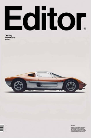
Featuring works from Nathalie Baaklini, Barbara Anastacio, S.T.I.F.F Design, Najt Lix Studio, An Improbable Future, Liam Hopkins, Hito Steyerl, Claudio Rodil, Lucía Malvido, and Francisco Marzioni.
Editorial Letter
At Editor, our passion for space design transcends its traditional boundaries. We believe that space, in all its forms, holds the potential to shape experiences, evoke emotions, and inspire creativity. Whether it’s the physical spaces we inhabit, the digital realms we navigate, or the conceptual landscapes we imagine, our mission is to explore and celebrate every facet of design.
Our journey is driven by the desire to build a community of artists, thinkers, and designers. We envision a collective where ideas flow freely, collaboration thrives, and creativity knows no bounds. This potential community is not just about sharing works of art; it’s also about fostering an environment where diverse perspectives converge, pushing the limits of what’s possible.
We are committed to closely following creative processes, understanding that behind every chef-d’oeuvre lies a story of perseverance, innovation, and passion. By delving into these journeys, we aim to uncover the nuances that make each creation unique. Our pages are dedicated to highlighting the intricate paths that artists and designers tread, offering insights that inspire and educate.
In an era dominated by digital content, we stand firm in our advocacy for the printed word. There’s an undeniable magic in holding a beautifully crafted publication, feeling the texture of the paper, and seeing the vividness of the images. Print allows us to create a tactile connection, making the experience of reading a deeply personal and immersive one. Through our magazine, we aim to preserve the artistry of print, celebrating its enduring relevance in a digital age.
The importance of teamwork cannot be overstated in our creative endeavors. This first issue of Editor is a testament to the collaborative spirit that drives us.
From writers and photographers to designers and editors, every team member brings their unique expertise and passion to the table. It is this synergy that enables us to produce content that resonates, inspires, and engages.
Interdisciplinarity is at the heart of our approach. We believe that the intersection of different disciplines sparks innovation and fuels creativity. By blending elements of art, design, technology, and philosophy, we strive to present a holistic view of the creative world. This cross-pollination of ideas not only enriches our content but also broadens our understanding of the myriad ways in which creativity manifests.
As we move forward, we remain committed to these principles. Our goal is to continue building a platform that not only showcases exceptional talent but also fosters a sense of community among our readers and contributors. We invite you to join us on this journey, to explore the vast landscapes of creativity, and to be part of a collective that values the power of design, the printed word, and the endless possibilities that arise when diverse minds come together.
Let’s create, inspire, and celebrate the beauty of design in all its forms and as we say, ‘Life can be edited’.
Santiago Felippelli Conway santiago@conwayandpartners.com
Sculpting Light and Shadow Green Surprise
Shiroiya Hotel blends art, architecture, and design to inspire creativity and urban exploration.
Sunshine Hunter
You’re a renowned creative brand strategist, how did you get into photography?
Photography has been an integral part of my life from the very beginning. My father was always looking at everything through the lens of a camera, embracing every moment, even the simplest ones. I used to spend hours discovering all the pictures my father had taken, listening to music through headphones and appreciating every printed picture he kept. Growing up during the war in Beirut, Lebanon, this was probably the most calming, peaceful, and familiar memory I have. Looking at pictures transported me and it always allowed my imagination to travel. I inherited my father’s love for photography, capturing the light and looking at things differently. He introduced me to various types of cameras, mostly analog, and polaroids. So carrying a camera became second nature to me, an essential accessory to document life’s moments.
How do you apply your skills and experience in photography and visual art?
I was fortunate to pursue an education and professional life that constantly highlighted the aesthetics of everything, from images in retail
campaigns to curating sensorial experiential events. This allowed me to understand how an image, certain lighting, or a designed setting can communicate and evoke emotions.
Of course, not everyone is visual, but it’s the first sensorial message our brain receives when we encounter a person, brand, or destination. I aim to ensure that every photograph evokes a feeling, a message, or a poem— always bringing us back to our human emotions. Since my work revolves around brands, experiences, and destinations, photography is key to transmitting a story, feeling, mood, or intention. I aim to ensure that in every project, the visual aspect evokes an emotion that allows the viewer to engage on a deeper level. Photography is a medium of sensory and emotional expression, deeply intertwined with poetry. Given my background in brand strategy and visual communication, I leverage photography to convey messages, stories, and emotions. Recognizing the visual sense as our primary means of engagement, I ensure that every project elicits a profound emotional response, leaving a lasting impression on the viewer.
A part of your photography focuses on the connection between bodies, skin, and nature. How do you conceptually approach this aspect of your work?
I was a ballet dancer from the age of four; classical music, bodies, and movement have always left me mesmerized. The way a body moves is an expression of freedom, vulnerability, and emotions.
Experiencing more than eleven years of war, witnessing suffering and the inability to move freely, has enhanced my appreciation and gratitude for freedom—to be, to explore, to feel, and to discover. My photography connects these elements as an invitation to uncover what our bodies are telling us and to take a journey inward for selfdiscovery. It is also a celebration of nature and how we interact with it, capturing the countless effects nature has on us—how it inspires, calms, and heals us. From the texture of water, goosebumps, and sweat, we extract emotions of surrender, excitement, and sometimes even fear. One of the values celebrate the most in life is freedom, and our bodies are a statement of beauty, movement, and freedom. The essence of freedom and the celebration of life’s beauty inspire my exploration of the connection between bodies, skin, and nature in my photography. Drawing from my background in ballet, I am particularly drawn to the grace and freedom of movement, seeking to convey these elements through my work.
Born and raised in Beirut during the war, and later a lavish traveler and iconoclast in branding, art, visuals, and photography, Nathalie Baaklini shares her insights on capturing the beauty of the world through a unique lens, embracing humanity, and the importance of light in her artistic journey.
What determines whether you lean toward color or black and white when taking/editing a photograph?
I love colors, the endless combinations and shades the light allows us to discover. I am definitely a sunshine hunter; it would be a shame to hide all the wonderful sunrises and sunsets we are gifted with daily, even when the skies are grey. I am mostly satisfied when a picture doesn’t need any color editing; I aim to capture the depth of the light in every image. I spend hours playing around with the framing and perspective, the light and its colors always guide me. Black and white has a way of creating timelessness in a moment, quieting down some of the noise and allowing us to embrace simplicity. There is always an invitation to explore the subtle light and nuances of grey versus the celebration of colors. It’s mostly a mood and the emotion or intention of the message I want the photograph to transmit. enjoy making my photographs as authentic and unfiltered as possible, leaning more often toward embracing the mood, how the light touches our skin and imperfections. Those are the details that usually catch my eye. While both color and black-andwhite photography have their merits, I often gravitate toward the latter for its timeless quality and ability to accentuate subtle nuances of light
and shade. However, my choice ultimately depends on the mood and atmosphere I aim to evoke, with a preference for natural skin tones over grayscale.
Considering your career has spanned various countries, how does cultural diversity influence your artistic work?
My artistic vision is rooted in a celebration of humanity in all its forms, embracing the richness and complexity of human experiences, transcending cultural, geographical, and societal boundaries. Through my photography, I aim to foster connections and evoke universal emotions that resonate with individuals across diverse backgrounds. Love, humanity, young and old, all nationalities, colors, and features are celebrated. It is about being conscious, aware, and exposed to the beauty, vulnerability, fragility, love, emotions, and boldness of the experiences shared and felt across and beyond culture, background, religion, or sexual preference.
How do you build a connection with the people or spaces portrayed? How do you convey emotions or atmospheres in your photographs and snapshots?
I am genuinely passionate about people, about finding the beauty in
everything, and discovering what makes a certain person, space, location, or experience different. I try to look at the least obvious perspective, what others generally don’t see. I seek emotion through my senses, whatever element can help transmit a sensation. Water is usually my favorite because of the reflections and the light. I’m a lover of light. Building connections with subjects and spaces is an organic process fueled by genuine curiosity and passion. I seek to uncover the beauty and emotion hidden in everyday moments, capturing them through a unique perspective.
Do you have any themes or places left to photograph? What is your next challenge?
I love close-ups, capturing the texture of skin, goosebumps, and the dance between bodies, nature, spaces, and light. My next challenge is to embrace the intimate within a bigger landscape, transitioning from my Leica camera to using a drone. This allows me to capture intimacy in vast settings. For example, I am traveling to Bolivia to visit the Salar de Uyuni. I am excited about playing with light and reflections in this breathtaking scenery. Additionally, I have already started taking more photos with drones, which has been an adventurous step forward.—
Nathalie Baaklini Revealed: Look, Feel, and Connect
Evolution by Design
From Desert to Design —Sculpting Light and Shadow
Interweaving Textures and Traditions in Bold Design
Raised amid the deep contrasts of Almería, from arid deserts to the mesmerizing Mediterranean, designer Gema Gutiérrez infuses her heritage into every creation. Her designs blend natural stone with glass, and weave bold metals into rich fabrics, capturing not only the interplay of light and shadow but also a profound connection to diverse cultural traditions.
Industry: Interior Design
Founded: 2016
Almería is your homeland and also a place rich in colors, vistas, and a dense cultural history. How do you believe these elements from your land intertwine with the dimensions of your design? Is there any distinctive feature of Almería that you consider a signature in your work?
Almería, the place where I grew up, continually inspires my design work. The stark colors of its desert landscapes and the Mediterranean’s deep blue are echoed in my color palette. The region’s rich history of diverse civilizations in coexistence has inspired me to seamlessly blend styles and textures. A standout feature of Almería that influences my work is the natural brightness of the surroundings, which compels me to design spaces that naturally enhance both light and shadow.
Where do you think your design sensitivity comes from? Was there an early experience you consider pivotal in this regard?
My appreciation for design developed from my childhood visits to historic
buildings with my family. Each exhibit and monument taught me to appreciate shapes, spaces, and colors, profoundly shaping my aesthetic perspective from a young age.
When starting a project, do you have any rituals that help you connect with the space and begin the creative process? How do you prepare mentally and emotionally for transforming a space?
Before I dive into a project, I prefer to spend some time alone, away from any visual or informational clutter, tuning into the sounds, colors, and shadows around me. In our fast-paced, overstimulated world, our brains often resort to surfacelevel thinking when overwhelmed with the constant demand to process information and make quick decisions. This can hinder deep, focused work, which requires extended periods of undistracted concentration. My ritual involves connecting with the space to envision its transformation potential. Part of my mental and emotional preparation includes meditation and drafting preliminary sketches.
Are there particular materials or elements you’re drawn to or consider essential for “editing” a space? How do these preferences influence the character and atmosphere of your designs?
I’m particularly drawn to mixing materials. These elements do more than just add color and texture; they are crucial for creating a space that feels warm, authentic, and soulful. The unique personality of natural stone, the bold presence of metal, the delicacy of glass, and the blend of textiles are staples in my work. My goal is to harmonize these without compromising the essence and prominence of each material individually. These choices give my designs their bold and contemporary character.
Puntofilipino projects are known for their distinctive use of textures and colors. What value do these choices add to your projects, and how did your affinity for incorporating these elements into your designs originate?
I believe textures and colors bring a rich, multidimensional quality to
my work, adding both depth and character. My fascination with these elements began during my design education, where I explored their ability to dramatically alter spatial and emotional perceptions.
How do you assess the interplay of natural and artificial light in your projects, and how does it influence your other aesthetic choices?
Light plays a pivotal role in my designs. I use natural light to bring out the best in materials and forms, while artificial lighting is chosen to create distinct moods and accentuate architectural elements. This careful consideration of lighting is a key factor in my aesthetic decisions and shapes the overall design process.
In such a competitive and saturated field like interior design, how do you keep your work fresh and innovative? What are your main sources of current inspiration?
To keep my work fresh and innovative, I continuously seek inspiration from fashion, art, music,
and architecture. Traveling and exploring new cultures also fuels my creativity, allowing me to incorporate fresh ideas into my designs. I tend to keep mainstream aesthetic trends at arm’s length; I observe and respect them, but my creations uniquely arise by seeking the essence and soul through materials and objects.
Has there been any book, movie, or personal encounter that radically changed your understanding of the world and, consequently, your approach to design?
Well, an experience that really transformed my perspective was the encounter with the Japanese designer, Issey Miyake. His design approach, blending technology and tradition, made me rethink how spaces can adapt to modern life without losing their historical and cultural essence.
We know that behind the story of every brand lies something interesting. Can you tell us how the name Puntofilipino came about?
The name “Puntofilipino” stems from an episode involving Fabio de Miguel, known artistically as Fabio McNamara. The anecdote goes that, after a romantic breakup, a neighbor of McNamara’s painted his living room with vibrant and striking colors. McNamara, upon seeing the room from outside, was so impressed that he asked to see it up close, exclaiming about the striking “Filipino point” he had observed. This expression, “Filipino point,” is associated with something mischievous, daring, and visually scandalous, capturing the essence of the studio that aims to stand out with bold and distinctive design. This story illustrates how the name encapsulates the studio’s philosophy of going beyond the conventional, using design to express a unique and daring identity.—
Founders: Gema Gutiérrez Headquarters: Madrid · Milan Marbella
Area Served: Worldwide Web: puntofilipino.com
Green Surprise
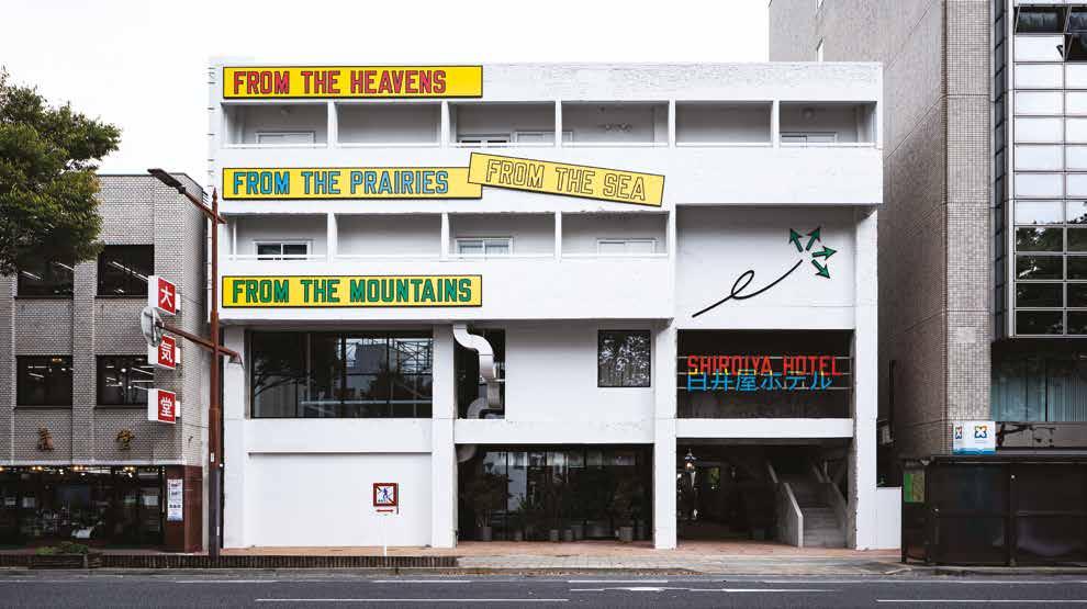
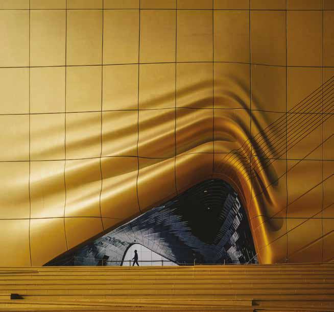
The Shiroiya Hotel in the Middle of Maebashi, Japan
Shiroiya Hotel aims to stimulate individual creativity through art, architecture, design, food, nature, and city experience. As a remarkable urban intervention, it offers a dynamic gallery of site-specific and curated art.
Sou Fujimoto is the architectural mind behind the Shiroiya Hotel, which began with the ambition to revitalize central Maebashi. It occupies the grounds of the former Shiroiya Ryokan, an inn that closed permanently after hosting guests for over 300 years. Maebashi is a former silk manufacturing city that greatly contributed to Japan’s modernization.
In an interview, Fujimoto stated: “I started to think about the possibility of changing this ordinary-looking building by entirely removing the floor space and leaving the beams and pillars exposed. By doing this, we would be creating a spacious, four-story atrium that could be used as a hotel lobby, but also as a place where people would gather together in Maebashi. [...] It would be a place that catches people by surprise but also a place that’s part of the city. [...] This was the idea I had in mind, and thought it was quite interesting.”
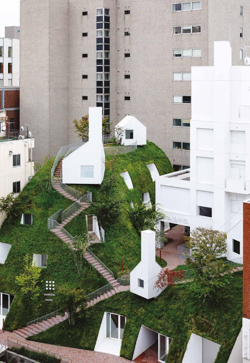
The project soon became an urban development, and an environment proposal, manifested in a riverbanklike building. The hotel features two buildings: the “Heritage Tower,” a boldly renovated building occupying the former Shiroiya Ryokan, which houses the boldly designed atrium,
and the “Green Tower,” a new building inspired by the former river bank of Tonegawa. The two towers combined act as a “living room” of the city, a place where local residents and travelers gather and interact in a reenactment of Maebashi City’s new slogan for the future, “Where Good Things Grow.” To complete this image of the hotel, Fujimoto guided the overall design and interior while further collaborating with various designers and artists.
Visitors and guests can enjoy original architecture and art throughout the hotel. The exterior of the hotel facing Route 50 is adorned with Lawrence Weiner’s distinct design. The reception desk welcomes guests with a large photograph from Hiroshi Sugimoto’s “Seascapes” collection.
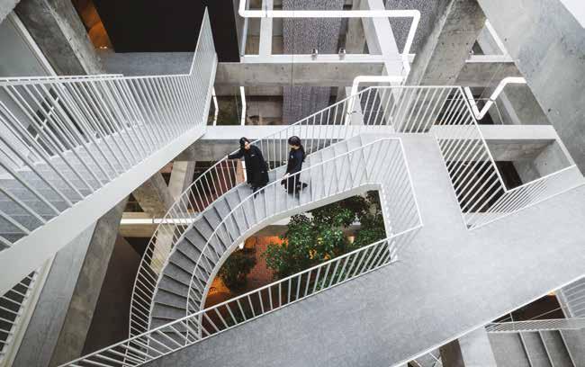
The atrium of the four-story Heritage Tower houses numerous artworks, including the fantastical “Lighting Pipes” by Leandro Erlich, who is known for his permanent work at the 21st Century Museum of Contemporary Art. At the top of the Green Tower, hotel guests can enjoy artwork by internationally acclaimed artist, Tatsuo Miyajima. As if visiting a museum, each guest room at both
towers exhibits unique artwork of local Gunma Prefecture-based and international artists, providing guests with an extraordinary art experience upon every visit.
The Heritage Tower boasts four exclusive rooms designed by four great creative minds: Great Britain’s world-renowned designer Jasper Morrison, Italy’s master of architecture Michele De Lucchi, Argentina’s famous conceptual artist Leandro Erlich, and Sou Fujimoto. The artists designed each room’s installation, creating a one-of-a-kind space that is unique to this hotel. The remaining rooms are designed for guests to enjoy gentle colors and subtle attention to materials and details. The Green Tower’s guest rooms include a balcony from which guests can feel a sense of unity with the greenery surrounding the tower.
In addition, the hotel has two dining spaces: “the Restaurant,” a Joshu (the name formerly used for the wide Gunma Prefecture area) cuisine restaurant, supervised by 2-Michelinstar chef-owner, Hiroyasu Kawate, and “the Lounge,” an all-day diner. Both restaurants offer a variety of surprising culinary experiences that will surely please guests.—
Nestled in the bustling district of Shibuya City, Tokyo, a neighborhood renowned for its vibrant street life and cultural diversity, lies RUBIA. This restaurant emerges as a distinctive fusion of Mexican and Japanese cuisines, created by the renowned DJ and restaurateur, SARASA, owner of Casa de Sarasa, alongside global restaurateur, Edo Kobayashi, from the Edo Kobayashi Group.
RUBIA offers a refined dining experience that stretches from brunch to dinner, where traditional Mexican cooking techniques seamlessly blend with the philosophies of Japanese cuisine. This culinary merger produces innovative dishes that feature local, seasonal Japanese ingredients. Brunch favorites like Tetela, Memela, and Tacos de Canasta, alongside enchiladas, are transformed through a fusion lens, while dinner offers specialties such as Fresh Catch Ceviche Paprika and Mole de Olla, adorned with local seasonal vegetables.
Above RUBIA, on the second floor, the tranquil TAHONA bar offers a stark contrast to Shibuya’s energetic pace. Here, guests can savor Mexico’s world-famous agave spirits—mezcal and tequila—crafted through the traditional ‘TAHONA process.’ This ancient method, involving a two-ton volcanic stone wheel, meticulously presses the agave, ensuring that the spirits retain the deep, authentic flavors of their origin. TAHONA’s cocktails are designed to complement
the unique profiles of its craft mezcal and tequila, providing a meticulously curated drinking experience.
At the
and dessert Buñuelo with Yuzu Cream illustrate his expertise.
RUBIA not only offers mouth-watering flavors but also serves as a cultural bridge, blending the vibrancy of Mexican cuisine with the refined elegance of Japanese culinary tradition, set against the backdrop of one of Tokyo’s most dynamic districts.—
RUBIA
1. Fried Squid Ink Tamales with Mango Chili in Seafood Dashi.
1. The Heritage Tower holds Lawrence Weiner’s designs. Photo by Shinya Kigure. 2. The Green Tower is inspired by a riverbank. Photo by Shinya Kigure. 3. The Atrium, where locals and visitors meet. Photo by Katsumasa Tanaka.
Shiroiya Hotel — Rubia
A Modern Fusion of Mexican and Japanese Cuisine in Tokyo
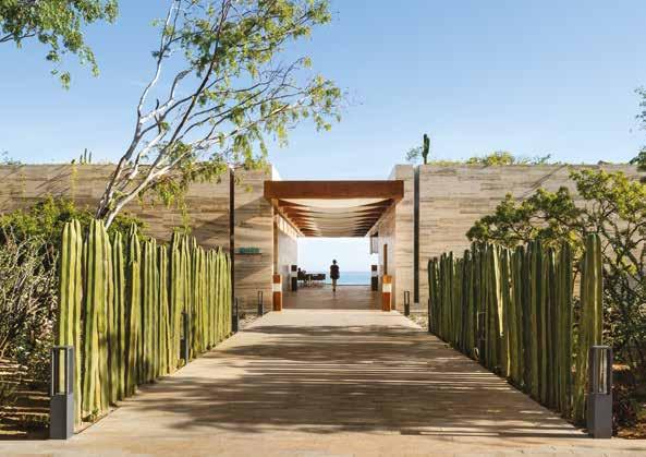
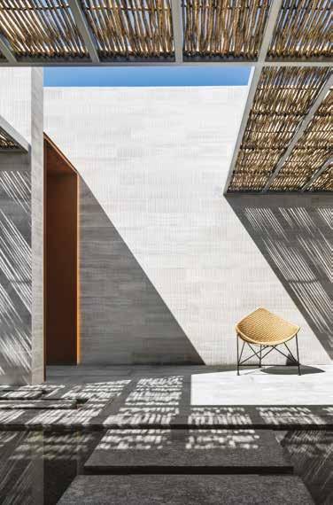
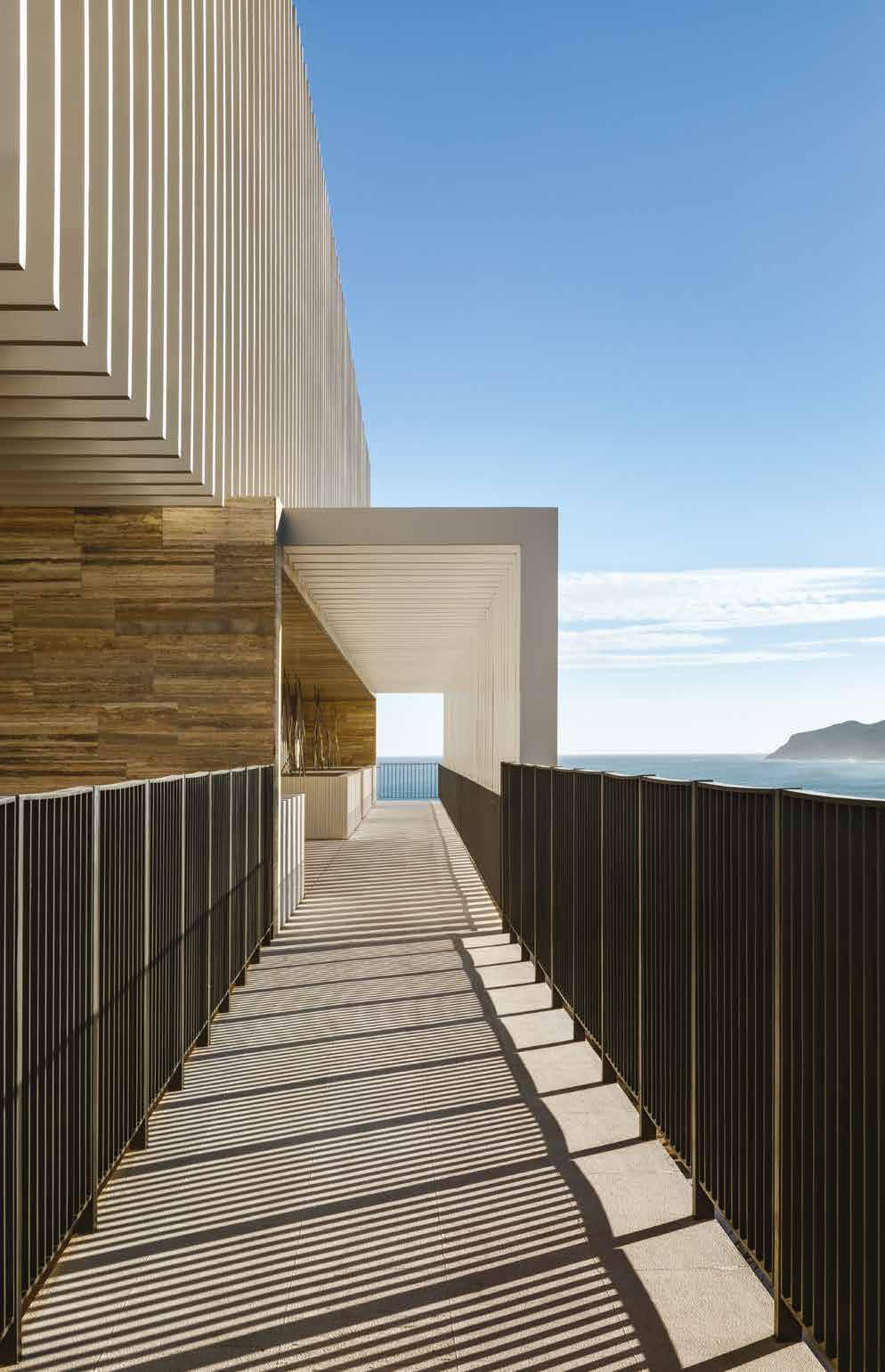
Solaz Los Cabos Unveiled
and Desert
An Oasis of Luxury Between Ocean
The
We
The Modern Argonaut
Sailing the Creative Seas with Jérome Hein
In an era where the essence of luxury smoothly integrates with the principles of design, Jérome Hein, at the helm of The A Group, navigates the intertwined paths of architectural brilliance and yacht design innovation.
Rooted in the illustrious backdrop of Monaco, Hein propels his father’s visionary legacy toward new horizons of sustainability, mastery in craftsmanship, and artistic integrity. This conversation reveals how an enduring relationship with the sea, coupled with an unwavering dedication to design superiority, orchestrates the evolution of premier residential and yacht endeavors.
surround yourself with essential partners who will help our company progress in the right direction. That is my focus.
As CEO, your leadership is pivotal. What’s one strategic decision you’ve made that significantly shaped the company’s direction or ethos?
am committed to maintaining the ‘family spirit’ and a friendly atmosphere in our daily work. I strongly believe that a positive work environment is crucial for success.
One of my core principles is to involve the team extensively, ensuring that everyone works together and communicates effectively.
Monaco is a symbol of luxury and exclusivity. How has its environment influenced a specific design or project approach that wouldn’t have been conceived elsewhere?
Monaco is a very inspiring place. It is not just luxury and exclusivity, and that is what makes this place so unique. It is full of energy with a strong multiculturalism, and a very innovative spirit. These characteristics have provided us with opportunities to work on a
variety of projects. Recently, we were selected to design the Monaco Pavilion for the upcoming World Expo in Osaka in 2025. The design is complete, and we have now begun the construction follow-up phase. For this project, we aimed to showcase Monaco’s commitment to sustainable development by proposing a pavilion designed as a garden, challenging visitors to consider the importance of green spaces in cities. In our profession, every new project—be it a house, a boat, a public space, or a private area—is a unique journey shaped by its specific environment and distinct constraints. We never design the same project twice.
Sustainability is reshaping industries globally. Can you discuss a project where The A Group pioneered eco-friendly design in an unexpected way?
Sustainability is definitely the biggest challenge we are facing. The construction industry is one of the most consuming in the world, yet we are in a leading position when it comes to experimenting with innovations and influencing our society’s way of life. I can mention here one of our latest yacht projects, for which The A Group was the Project Manager and Owner’s Representative. Named H3, this yacht is actually
a refit project of a yacht designed and delivered by The A Group more than 20 years ago. Bringing an existing superyacht up to date with an amazing aesthetic and technical transformation has an even more positive effect as a sustainable new build. In the same field, I can say that we are currently focusing on a project that is again on the border between architecture and yacht design. The idea is to imagine a modular and reusable project that will constantly change style according to the client’s desires, giving it a new identity without necessarily demolishing and rebuilding it.—
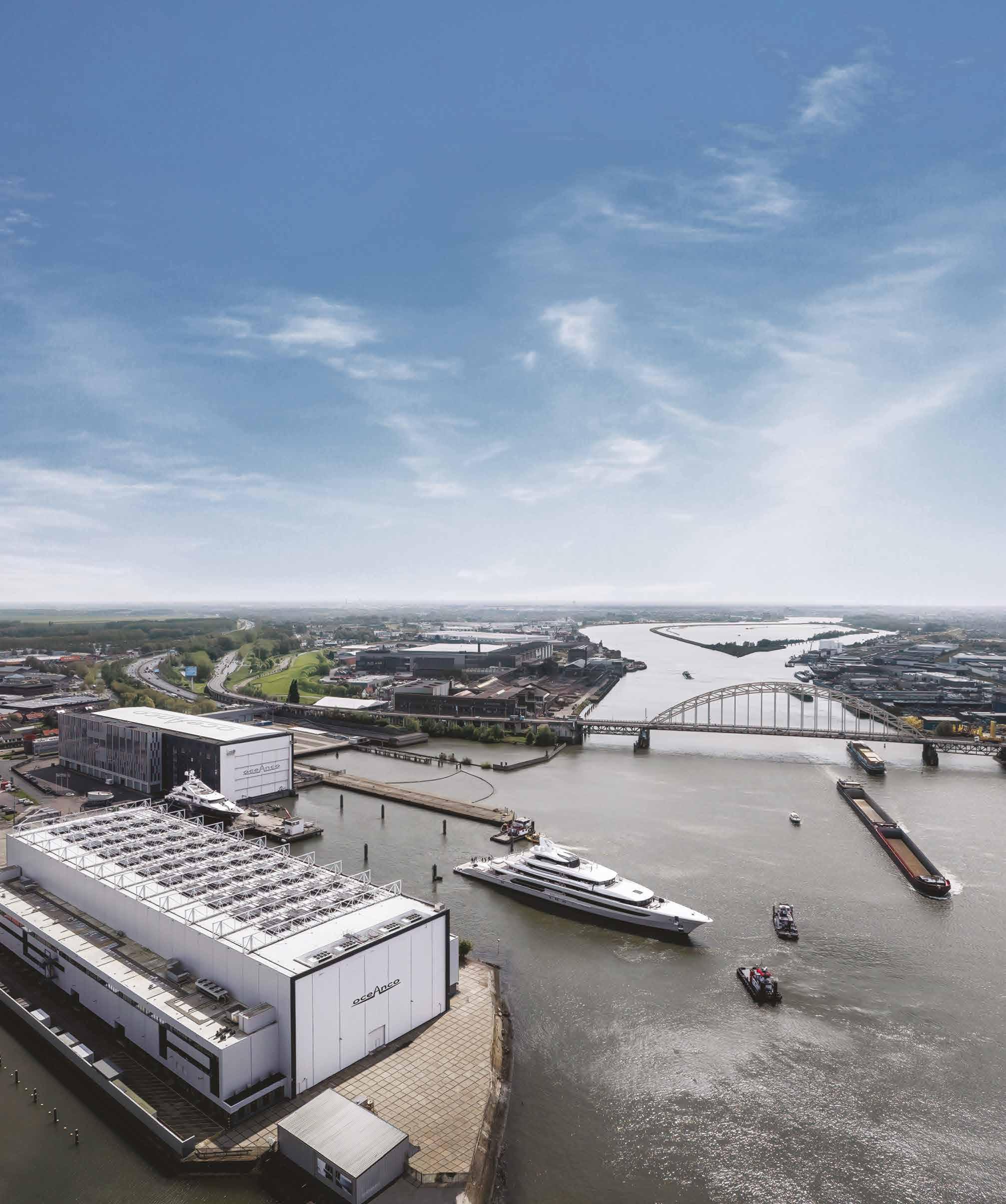
The impressive H3 yacht, showcasing cutting-edge design and sustainable practices, crafted by Oceanco and The A Group.
Pleasure is in the Detail
Welcome to the Atmospheres of Najt Lix Studio
Najt Lix Studio is a visual project founded by Celeste Najt and Matias Lix Klett. Based in Berlin, they work with film and photography to portray sensual stories about design, interiors, and architecture.
Creativity and the Everyday
Can you share with us your journey into the world of photography and filmmaking? How do you navigate the balance between showcasing authenticity in your work while still maintaining artistic interpretation or creativity?
Our partnership began inadvertently when we started sharing our vision in everyday life. We are partners in life and at work. Our obsession with furniture, architecture, design, aesthetics, functionality, beauty, form, tools, craft, music, and so on led us to start sharing some projects.
Celeste: To create frames within reality is something I’ve enjoyed since I was very young. began taking photographs of everyday life while studying visual arts, and gradually, photography became one of the main mediums of my practice, which led me to study and obtain a degree in the field. My first steps in the commercial world of photography involved assisting international photographers in interior and travel shoots for renowned magazines.
Matias: I was always attracted to light in some way. I was curious about it, so started a drawing course with a friend; this led me to start studying Graphic Design, which brought a lot of my knowledge of composition, color balance, and structure. After a couple of years, I shifted to studying Photography, which eventually led me to Film School. My main studies bring to the surface the story behind things, people, emotions, objects, random corners in the street, and things that catch my attention.
The idea of the studio started to grow slowly but steadily, naturally leading us to dedicate more time to it every day. Today, we are fully dedicated to our studio, although we also dedicate some time to our personal projects. For us, authenticity arises from both our artistic interpretation and creativity, which serve as the driving impulses when creating stories and content. Our cultural influences have shaped the way we perceive things, and over the years, we have been able to create our own unique vision through a combination of these influences and our work experience.
In what ways do you think your work contributes to or reflects contemporary societal norms or values? What role do you believe everyday objects play in shaping culture and identity, and how does this influence your creative process?
Communicating important ideas and bold concepts that shape our society is a privilege and, at the same time, a big responsibility. Since we are working with individuals who dedicate their lives to these ideas and concepts, we are responsible for communicating their effort, their quest, and their vision. In other words, we build bridges that pass knowledge through visual language. Everyday objects play a significant role in shaping culture and identity. They can reflect and preserve cultural traditions, values, and emotions. They carry a symbolic meaning, representing ideas, beliefs, and cultural practices.
How do you see the intersection between photography and filmmaking when it comes to portraying everyday life? Do you find one medium more effective than the other for this purpose? How do you see this in relation to your other artistic practices?
The intersection between photography and filmmaking is a very rich and dynamic area, where each offers a unique perspective and approach. Both are visual storytelling mediums that capture moments and narratives from everyday life. Naturally, film unfolds in time, allowing for a deeper exploration of narratives and characters enriched by sound and montage, which introduces rhythm. Photography, in contrast, invites personal interpretation, demanding a deeper engagement with the static image to contextualize it. Despite sharing techniques, composition, framing, and the use of light and shadows, these characteristics highlight the distinctive impact and meaning behind each medium’s final image.
You work within the storytelling of Design, Architecture, and Lifestyle on the one hand, and Real Estate and Hospitality projects on the other. How do you approach the different themes and environments in your projects?
Each project requires a specific approach: some are more technical, focusing on angles, camera positions, and light, while others are more creative, needing a sensitive look. Understanding what the client seeks is crucial for our focus and communication. Najt Lix Studio’s wider concept is to portray from micro to macro within a design, allowing us to
showcase at various scales. Whether it’s a large building or a small object, we seek the narrative behind it, finding similar concepts across scales. We aim to balance aesthetics and functionality, communicating the story behind each object, interior, or building.
Getting in the Mood
How do you approach finding beauty or interest in seemingly ordinary objects or moments of everyday life?
We naturally find something to highlight in objects and moments, whether it’s a surface, an error, or shapes; there’s always something that captures our attention. The best results come from combining several elements. It’s about being connected with the present and what’s happening in front of you at the moment of capture. While you can plan for a shoot in a specific way, being open to what presents itself is crucial. Things can change quickly, and adaptability is key to working with what you have.
Light plays an important role in conveying the mood or atmosphere in your work. Could you share any specific techniques or tools you use to manipulate or enhance light in your projects?
Light, objects, and space interaction is fundamental in our storytelling. Using light as an expressive tool is fascinating; it’s a limitless language. Whether manipulating natural light by directing, modifying, blocking it or combining artificial with natural light to enhance shadows or highlights, the core principle remains the same: shaping light to achieve the desired mood or atmosphere. Even with artificial light, you gain complete control, allowing precise adjustments. Despite the varied techniques, all aim to masterfully shape light.
How do you select the ideal setting and utilize light, shadow, color, and sound to enhance the depth, dimension, and atmosphere in your compositions?
Selecting the ideal setting begins with understanding the story we aim to tell, that specific emotion or pulse. This pulse sets an initial atmosphere, guiding the integration of all elements—light, shadow, color, and sound—to achieve the desired effect. Each component not only connects ideas and reveals concepts but may also become the story’s focal point.—
Portrait by Fiona Castiñeira
Unresolved Figures
Painter Elo Menéndez on Color, Form, and Aesthetics
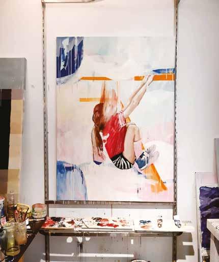
Embarking on a journey through the vibrant world of contemporary art, we delve into the captivating creations of Elo Menéndez, whose distinctive style seamlessly blends elements of pop culture with abstract expressionism. From his early fascination with art to his evolution as an acclaimed artist, Menéndez shares insights into his creative process, inspirations, and aspirations.
Can you start by telling us a bit about yourself and your journey as an artist? What drew you to the world of painting, specifically to the combination of pop and abstract art?
From a very young age, felt a great attraction to art in general. From my time in primary school, only remember the subject of plastic arts. Later, I studied and graduated from a school with an orientation in Fine Arts. I have very fond memories of those years, and they were clearly milestones in my career. In the end, I studied Architecture. For over 15 years, I designed commercial spaces for brands like Levis, Lacoste, Bimba y Lola, etc., but in the past few years, I realized that I only feel passionate and free in front of a canvas.
Who are some artists or movements that have influenced your work? How do you draw inspiration from popular culture, and how does it manifest in your art?
I am an admirer of movements such as Abstract Expressionism, Neoexpressionism, and Modern Art. Within them, artists like Mark Rothko, Cy Twombly, Franz Kline, Basquiat, etc., are the ones who have influenced my work the most. But I cannot fail to mention other periods, such as the Baroque, Romanticism, and their great exponents like Rembrandt, Goya, and Velázquez. When I was 12 or 13 years old, I had the opportunity to visit an exhibition by the great Argentine painter, Carlos Alonso. Seeing his work and being lucky enough to exchange a few words with him definitely changed my life. He also left an indelible mark on the local art scene.
Can you walk us through your typical creative process from idea to finished artwork? Do you have any rituals or routines that help you get into a creative mindset?
Usually an image appears in my mind due to something I saw or read during the last few days—it’s quite immediate. From there, I start working on it. In some cases, I work on the sketch digitally until I have a solid idea, and then I move to the canvas. During this transition, things or accidents often happen that lead me to modify the initial idea. Doubts arise, and a certain uncertainty appears, which I gradually correct until the work starts taking shape. I don’t consider the work finished until I feel that it conveys something. It must have life and soul.
What mediums and techniques do you prefer to work with, and how do they contribute to the overall aesthetic of your paintings? How do you approach the use of color, texture, and form in your pieces?
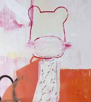
In general, I seek a balance between the figurative and abstract aspects of form. I appreciate a certain disorder, but without neglecting the figure. Another pattern that repeats in my works is the mixture of materials. I usually work with synthetics, pastels, and primarily oil paint. Regarding color, I work with a restricted palette, aiming for a balance between warm and cool tones.
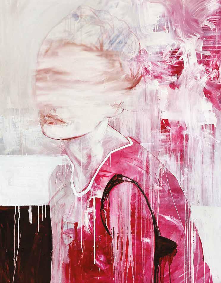
Are there recurring themes or concepts in your work that you find yourself returning to?
In series such as “Invisible” or “Croma,” a common factor may be the presence of human figures—generally female—that do not reveal their faces. embrace the notion of leaving aspects unresolved. I encourage the viewer to complete the narrative of the artwork by not fully disclosing everything. Additionally, I pay close attention to the body language of the figures.
How has your style evolved, and are there new directions you want to explore? What do you hope viewers take away from your art?
I acknowledge that my work evolves from year to year. At times, interrupt the ongoing series with a piece that might seem unrelated. It is a process to provide myself with distance in order to ultimately return to the series but with renewed vigor. While it may sound self-assured, I perceive a certain maturation in my recent works. Looking ahead, I aspire to embark on a series of abstract pieces, departing from representational figures. I aim to evoke a sense of tranquility tinged with a hint of mystery to foster engagement with my artworks.—
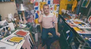
Elo Menéndez
Rough, but Sleek
Studio Practice, founded by Seohu Ahn and Sisan Lee in 2019, brings a multidisciplinary approach to architecture, interior design, and exhibitions. Their designs focus on industrial materials, sculptural forms, and everyday objects, blurring the line between art and function. Based in Seoul, the studio sheds light on the evolving contemporary Korean design scene and the unique interplay between nature and urban environments.
into furniture making and discovered a newfound passion. It was through a fortuitous encounter with the curatorial platform Meeseek that he received the opportunity to bring his designs to life.
Following subsequent projects, Lee and Ahn’s practices intertwined, leading to the establishment of Practice Studio. This endeavor allowed them to explore diverse design opportunities and expand their creative horizons, attracting attention from prominent brands. Their journey highlights the transformative power of passion, collaboration, and cultural influences in the world of design.
Moreover, Korea’s rapid pace of change and multicultural influences contribute to a distinctive design identity characterized by adaptability
and openness. Studio Practice’s experiences demonstrate the vibrant and dynamic nature of contemporary Korean design, where the fusion of nature and urban environments plays a crucial role. Their ability to understand and respond to the needs and desires of the present era allows them to make significant contributions to the design landscape.
As the Korean design scene continues to evolve, Lee, Ahn, and their peers are shaping the country’s design identity, leaving an indelible mark on the global stage. With their talent, creativity, and dedication, they are propelling Korean design into a new era characterized by innovation, adaptability, and harmonious coexistence of natural and artificial elements.—
Studio Name: Studio Practice
Seohu Ahn, Sisan Lee
Dialogs and Cuts in Stiff.Design
While still in architecture school, Till-Moritz Ganssauge and Florentin Steininger founded STIFF in 2008 as a workshop for planning and producing art pieces. It soon expanded into an office that designs and crafts exhibitions and interiors. Alongside STIFF, Ganssauge started a prototyping workshop and studio for furniture named T x L, which primarily sources and produces locally.
One Plate Wonder
STIFF and T x L reuse materials from exhibition architecture, materials from an industrial background, or local craftsmanship and recycle them into their practice with a circular process. Their motto: “form follows sustainability.”
Sonic Visions of Montreal
Although winter brings deep snow, Montreal nurtures a vibrant musical soul year-round. Beneath the surface, its artists craft melodies that transcend borders, finding listeners from afar. This is the story of an unexpected epicenter where independent spirits give voice to their art, and influence spreads globally.
Instructions to play: Roll out your world map and look for America’s North East Region. Place your finger over the tiny dot that represents New York City, and use it to navigate against the tide of the Hudson River all the way North to the Labrador Peninsula. If you want to travel by land, drive the tip of your index along Interstate Route 87, the little almost straight line that borders the river bank as it changes names. Across the Coast of Sainte Catherine and the Saint Lawrence River, detached from the continental lands, you will stop at a little isle shaped like a foot. Now, you have arrived in Montreal, Canada, and you are in the right place.
First occupied by the Inuit people, then by Vikings, then by the French and English pirates, and most recently by industry laborers and hipsters, Montreal has an enigmatic way of giving birth to her music. Between her architectural triumphs and legendary forests, musicians find a safe playground.
Maybe you’ve never been to Montreal, but you can imagine the city when you listen to her music. Under the sound of this city, there is always a noticeable scratch, a chalky imprint preserved from the 50s and kept alive by the Real Book ritual that has taken place once every few years since 1980, organized by the acclaimed non-profit association Festival International de Jazz de Montréal.
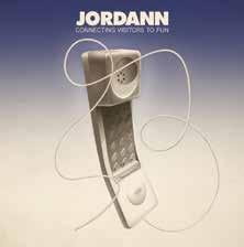
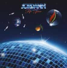
Jordann is a young producer who writes darling “bedroom pop” poetry and transforms it into shiny, crooner-dreamy-
funky tracks. He has released two white-label records ( Connecting Visitors to Fun , 2020, and Safe Space 2022) initially via Bandcamp and then pressed by the local label Return To Analog. By looking at his album’s cover art, you already know you’ve started the coolest trip.
The Organizing Committee Eryk Salvaggio is not your typical guy making music with computers. He’s more like a super nerdy teacher who trains artificial intelligence to understand and recreate the sharp logic of experimental arts. As humans write science fiction stories to talk about our destiny, The Day Computers Became Obsolete is a philosophical essay that uses cybernetic resources to sing about robots becoming aware of themselves and analyzing their role in the human community.
Vendôme, a four-man folk music band, is an interesting example of how the genre has developed since its heyday post-World War II. Their arrangements carefully recall a vintage atmosphere using contemporary tools. Their first LP, Fable de la grenouille doré e, has strong influences of the 70s romance present in the work of Robert Charlebois or Jean-Pierre Ferland.
Beaver Shepard labels all his albums with the “devotional” tag, without irony. He has a way of plugging us directly into a state of gratefulness where we can feel our roots deepen into the wonders of nature without letting us forget about our connection to technique and electronics.
In 2010, the band SUUNS wowed the shoegazers, postpunks, grungies, and indies with an EP featuring a dark, melancholic sonic big beat shot with psychedelics. Since then, their career has taken them to every remarkable venue in the world. SUUNS is a group of sharp, witty musicians who nail it every time they play live, and their records sound like garage albums mixed by a god.
The first time you listen to Men I Trust, a part of you knows you’ve been expecting to hear from them your whole life. If you are in rush hour, eager to get home, or feeling a little dizzy about a decision, tune into any of their records. They will pull you onto the clear little highways that go up the green hills of Montreal, giving you some perspective on the cityscapes and skyscrapers.
To be isolated so far north seems to give Montreal’s music a pure air. At its essence, the city is a creative metropolis tucked into the vast woods and streams of this storied territory, All that is happening in Montreal’s music scene seems to stem from a relationship between the sacred and the modern. It is a scene that thrives in an incredibly original, innovative way, remodeling its own influences and resulting in colorful, powerful scapes. Montreal’s underground turns to mainstream the minute it plays on your speakers. Turn up the volume and visit Montreal.—
From DIY Amplifiers to High-Fidelity
Reverie: Audiophile Claudio Rodil shares his secrets
Are you passionate about audio but unsure where to start? Our expert, Claudio Rodil, shares his audiophile secrets to building a hi-fi system that’s not only affordable but also durable and exceptional in performance. Discover the nuances of sound with insights from a true connoisseur.
How did your passion for audio come to life?
I developed a fondness for music at a young age. During high school, I attended a program focused on electronics, and at the age of 14, I built my first 2 x 125w amplifier from a kit and also crafted a set of three-way speakers. Although my memory isn’t perfect, I recall it sounding quite impressive. Later on, I spent several years as a DJ, exposing myself to equipment of a certain quality from an early age.
Can you recall a “revelation moment” when you heard something that made you feel like you had achieved perfection in audio reproduction?
I wouldn’t say “perfection,” but I do recall several magical moments. A soundcheck outdoors before a live concert.
Or the first time, I was around 14 or 15 years old, I entered a large nightclub with an Altec-Lansing sound system featuring compression drivers whose headroom seemed limitless. I also remember in the early ‘80s, the first time I heard AC/DC on a Mark Levinson system with Infinity speakers, and a few years later, my initial experience with single-ended triodes and high-efficiency speakers.
What are the most noticeable differences between listening to music on a conventional system and a high-fidelity one?
First, we need to define what a conventional system is, as nowadays, there are budget-friendly systems capable of satisfying any enthusiast. For instance, Apple’s HomePods are a mainstream option that can sound remarkably good. The differences become more noticeable when the listening conditions or recording aren’t ideal or at least appropriate.
Do you have a favorite device for playing music?
The one I use the most is the computer, paired with an external DAC, both at work and in my dedicated listening room. I hardly listen to CDs despite having a large
collection, and occasionally, indulge in vinyl. If I were to pick a favorite, I’d confess to having a certain weakness for open-reel tape decks.
Can you tell us about streaming services that offer music in a lossless format?
As a music lover, I wish high-res catalogs were more extensive, sourced from original recordings, and free from typical compression. As an audiophile, I hope Spotify fulfills its promise to make its extensive catalog available in at least 24-Bit/96KHz soon.
Is there any music that consistently evokes a specific emotion in you, like nostalgia, joy, or melancholy?
Oh, absolutely. Many pieces evoke emotions, and many of them also remind me of the equipment I originally heard them on. AC/DC’s “Back in Black” not only recalls the glory of the third year of high school but also the Mark Levinson system of a friend’s father when I first listened to that vinyl.
What’s the most surprising innovation in the world of high-end audio that you’ve experienced recently?
In my opinion, digital room measurement and speaker response correction systems, such as DIRAC or Acourate, redefine high-end audio paradigms.
How important are room acoustics and speaker placement in optimizing the performance of a budget hi-fi system? Do you have any tips on setting up a listening space effectively?
If we’re talking about a dedicated room, its volume, aspect ratio, and furnishings are perhaps the most crucial aspects of achieving good sound quality, closely followed by the characteristics and proper placement of the speakers. There’s abundant material on the internet regarding this topic. Many enthusiasts, however, prefer buying a new cable or changing their DAC rather than
removing the glass table on which the remote control rests, adding curtains in front of a window, or changing the sofa so that the ears are properly aligned with the speakers to avoid coloration. And undoubtedly, acoustic treatment seems to be the last thing on people’s minds.
Could you recommend some cost-effective yet highquality brands or models for amplifiers, speakers, and turntables suitable for beginners in hi-fi audio?
I’d prefer to emphasize that, before acquiring a system or a component like an amplifier or speakers, one should consider what other components they will be paired with, the characteristics of the room where the speakers will be placed, and the listener’s distance. Nowadays, most products from minimally recognized brands perform well and undergo strict quality control. It’s not about brands but about choosing what is suitable first and then delving into the characteristics of various technologies. The options in both amplifiers and speakers are extensive. Integrated amplifier or preamplifier + power amplifier?
Tubes, transistors, or perhaps hybrid? Class A, Class AB, Class D? Speakers—passive or active? Monitors, small towers, or full-range? Dynamic, planar, or ribbon? Or maybe high-efficiency full-range speakers for use with single-ended triodes? No doubt, in certain situations or rooms, some options will be ruled out.
What advice can you offer on building a hi-fi audio system gradually, allowing enthusiasts to start with a solid foundation and expand their setup over time without breaking the bank? Without a doubt, by adjusting the listening room. Then, I would
JORDANN
Montreal Nurtures a Vibrant Musical Scene
Lucía Malvido
teenage engineering
Sleek Design is the Alternative Future of Consumer Electronics
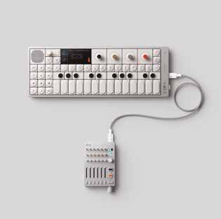
From reimagining music-making with the iconic OP-1 portable synthesizer and growing the synth population with the affordable pocket operator series to rethinking listening with the OD-11 ortho directional speaker and the OB–4 magic radio, teenage engineering applied their signature mindset to a new legacy of enduring technologies. Their creations have attracted collaborations with well-known artists and brands, sharing in their vision to integrate creativity into the everyday. teenage engineering was founded in 2007 and is based in Stockholm, Sweden.
teenage engineering has carved a unique niche in the realm of product design and innovation. Their iconic OP-1 synthesizer, introduced to the market with great acclaim, exemplifies their commitment to blending industrial design excellence with a playful and creative spirit. The company’s approach challenges traditional consumer electronics by creating products that invite users to engage and interact with them on a deeper level. From the compact and intuitive Pocket Operators to the innovative CM-15 microphone, each teenage engineering product reflects a balance between creativity and commercial viability.
functionality but also inspire creativity and experimentation among users. In recent years, teenage engineering has continued to expand its product lineup, introducing new devices and accessories that push the envelope of what is possible in the world of electronic music and audio production. Their collaboration with other companies, such as IKEA and Panic, has further demonstrated their ability to innovate and adapt to changing market trends.
Industry: Consumer electronics
Founded: 2005 Founders: Jesper Kouthoofd, David Eriksson, Jens Rudberg, David Möllerstedt Headquarters: Stockholm, Sweden Area Served: Worldwide Web: teenage.engineering
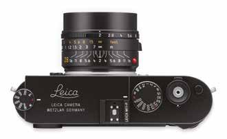
Leica M 11-P
Like no other camera, the Leica M has stood for vivid and authentic images taken at the center of the action since its launch in 1954. The intuitive, unique, and unobtrusive style of M photography is especially appreciated by photojournalists working in conflict areas.
Behind teenage engineering’s success is a team that prioritizes self-trust and interdisciplinary collaboration. Co-founder, David Möllerstedt, emphasizes the importance of constraints in driving innovation and the value of diverse perspectives in the product development process. teenage engineering remains steadfast in its commitment to pushing the boundaries of product design while ensuring accessibility to a wide audience. Their philosophy revolves around making products that not only meet high standards of quality and
One of teenage engineering’s most notable achievements is its ability to create products that strike a balance between form and function. The company’s products are not only aesthetically pleasing but also highly functional, making them popular among both professional musicians and hobbyists alike.
Another key aspect of teenage engineering’s success is its commitment to sustainability and environmental responsibility. The company strives to minimize its environmental footprint by using eco-friendly materials and manufacturing processes whenever possible. Looking to the future, teenage engineering remains focused on pushing the boundaries of product design and innovation. The company continues to explore new technologies and collaborations that will enable it to create even more innovative and inspiring products for its customers.
teenage engineering stands out as a trailblazer in the field of product design. It is known for its innovative spirit, dedication to craftsmanship, and ongoing pursuit of excellence at the intersection of art and technology. With its continued focus on creativity, collaboration, and sustainability, teenage engineering is poised to remain a leader in the industry for years to come. Leica
Additional new features of the Leica M11 perfects the traditional M understatement and expand the range of applications even further. The deliberate omission of the red Leica dot on the camera front, for example, allows for even more discreet photography. Instead, subtle Leica lettering is engraved on the top plate. The plate and the bottom cover are milled from aluminum in the matte black Leica M11-P and from brass blocks in the silver chrome camera version. Merged with an all-metal body made of a highly solid magnesium alloy, the interior of the camera is carefully protected. The LCD monitor, made of sapphire crystal glass with an anti-reflection protective coating, enables the
optimal evaluation of photos in all lighting conditions. The Leica M11-P combines state-of-the-art camera technology with maximum flexibility with its 60 MP BSI CMOS sensor, Triple Resolution Technology, and the high-performance Maestro-III processor. Finally, the large 256 GB internal memory makes the camera a reliable and functional precision tool that is always ready for use. There are also two new black leather accessories for the M-System: The M-System case and the carrying strap emphasize the clean lines in the design of the new Leica M11-P. A black edition and a silver edition of the Leica M11-P will be available globally at all Leica Stores, the Leica Online Store, and authorized dealers.—
and vignetting at maximum aperture got the Summilux-M 35 f/1.4 its title as the “true king of bokeh”. Photographing at open aperture in backlit conditions creates intended lens flares that can be used for specific creative effects. At smaller apertures it delivers very
sharp and almost distortion-free pictures that easily meet all modern requirements on image quality.
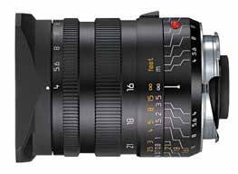
For architecture photography, try the Tri-Elmar-M 16-18-21 f/4 ASPH
The Tri-Elmar-M 16-18-21 f/4 ASPH has a super wide-angle lens with three focal lengths. With its impressive angle of view of 107°, this Elmar lens conquers 16mm super wide-angle photography in perfect Leica M style. Due to the minimal distortion and barely perceptible field curvature; it can be recommended for highly demanding architecture photography even at the 16mm setting. The Tri-Elmar-M 16-18-21mm f/4 ASPH unites three super wide-angle focal
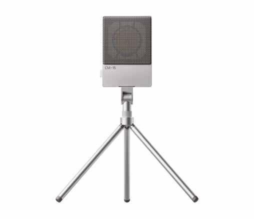
CM—15
The CM–15 is a portable large-diaphragm condenser microphone and the first all-in-1 microphone offering a combination of 48v phantom powered mini xlr, USB-audio interface and pre-amp, 3.5 mm line output, and battery power. The super-cardioid polar pattern means CM–15 focuses on capturing sounds in front. The sound quality of CM–15 is clear and transparent, with extremely low selfnoise. Its compact form factor allows for quick and portable studio set-ups for musicians and podcasters alike. Connectivity options include true analog output over mini xlr and 3.5 mm jack, as well as USB-C; all can be used simultaneously. CM–15 can also be powered three ways: through phantom power, battery, or USB-C. Truly one-of-a-kind, CM–15 is the only battery-powered microphone to include all these features.
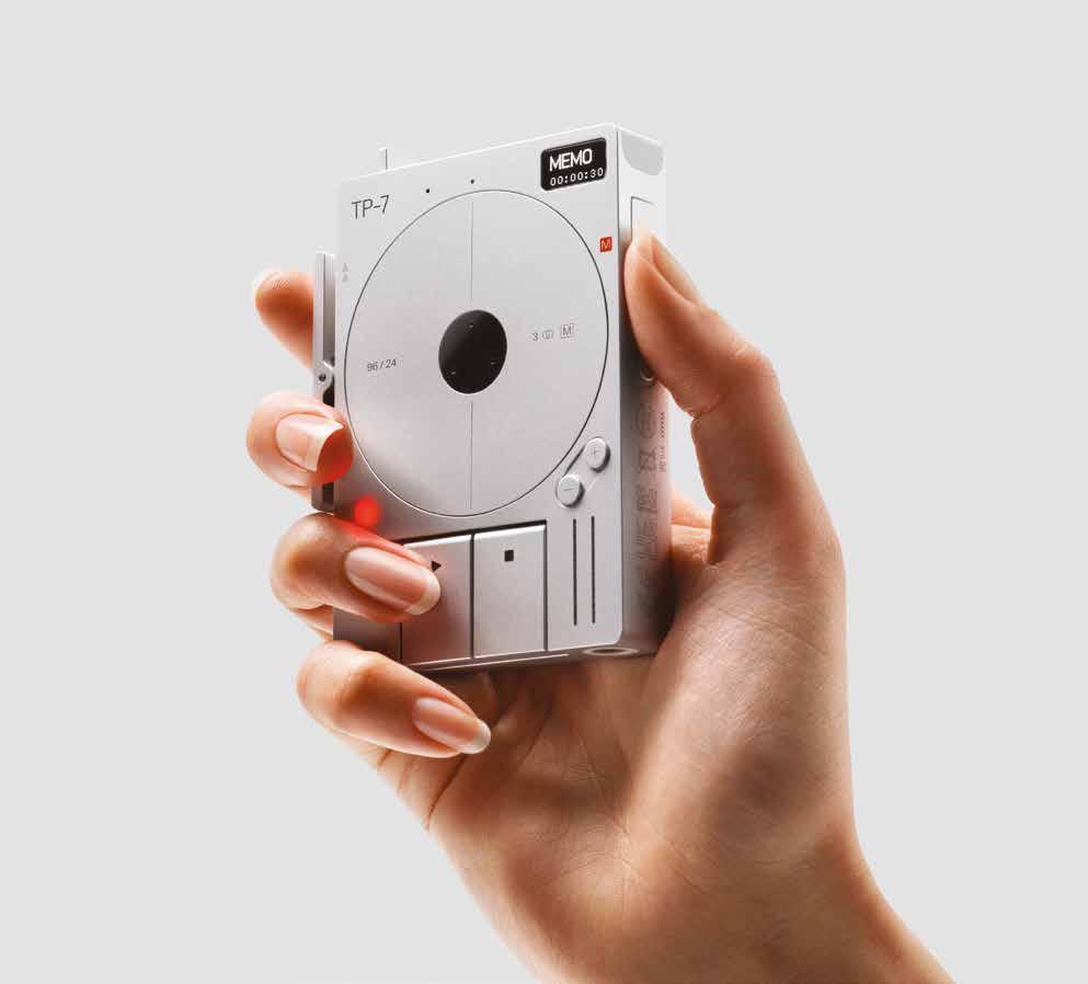
TP—7
The TP–7 field recorder is a dedicated recording device with a seven-hour rechargeable battery and 128 GB of internal storage. It is built to record sound, music, interviews, and important ideas with zero friction in the highest possible quality. TP–7’s discreet size and dedicated function make for an unobtrusive recording device, perfect for professionals who require reliable dictation, such as journalists, lawyers, and medical professionals. For musicians, TP–7 is a playground. Creative minds will appreciate functionalities that include simultaneous line-in and recording, overdubbing, and even a portable DJ setup.
At the center of the TP–7 is the motorized ‘tape reel,’ used to navigate menus, scrub through audio, and pause recordings. It also serves as a subtle visual feedback mechanism. The one-of-a-kind rocker on the left side allows quick audio scrubbing, while the mode button is placed below. On the other side are the memo and navigation buttons. The ergonomic placement of these functions allows for easy single-handed control.
computer—1
While setting up their first office many years ago, teenage engineering set out to create their ideal PC case. It was to have a small desktop footprint and be easy to move around. They built it with a laser cutter, high-density board, and spray paint. Computer–1
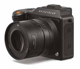
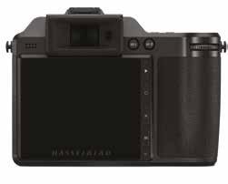
a new dark gray tone body of machined aluminum, the X2D 100C houses a 100-megapixel, backside illuminated (BSI) (43.8 × 32.9 mm) CMOS sensor, delivering up to 15 stops of dynamic range with a 16-bit color depth. The X2D 100C enables a creative experience unimaginable in the past. It empowers content creators to capture the intricacies of an image’s highlights and shadows, utilizing the Hasselblad Natural Colour Solution (HNCS). Working alongside the new 5-axis, 7-stop in-body image
stabilization system (IBIS), handheld image capture is possible in the widest range of conditions. Hasselblad independently developed its own IBIS for the X2D 100C in order to meet the stringent requirements for stabilizing a 100MP sensor. Keeping size and weight in mind for easy portability, the X2D 100C is the most compact medium format IBIS solution on the market. With 294 Phase Detection Autofocus (PDAF) zones, the system ensures the subject is rapidly located and brought into focus. The X2D 100C captures files in 3FR RAW and full-size JPEG, and the cutting-edge, built-in 1TB SSD storage and CFexpress Type B card support delivers a high capture rate for fast-moving subjects.
The X2D 100C features a 0.5-inch OLED Electronic Viewfinder (EVF) with 5.76-million dots, a high magnification of 1.00x with a refresh rate of 60fps, which supports electric refractive error correction to ensure the whole display is sharp and bright,
pleasing bokeh through excellent subject isolation. It features an integral central shutter, offering exposure times from 60 minutes to 1/2000s with full flash synchronization.
A True Travel Companion: the XCD 2,5/38V
Equivalent to a full-frame 30mm focal length, the XCD 2.5/38V
When using the XCD 2,5/38V lens,
Hasselblad X2D 100C
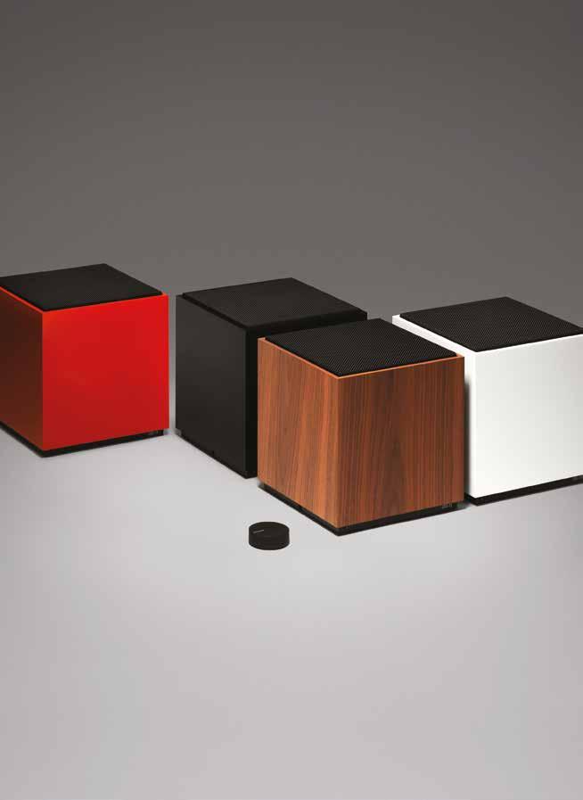
Iconic Carlsson sound in a sleek, wireless loudspeaker.
In Defense of the Poor Image
BY HITO STEYERL
Hito Steyerl (1966, Munich) is a filmmaker, visual artist, and writer. She is a Professor of Experimental Film and Video at the Berlin University of the Arts. Steyerl is known for her critical investigations into the intersections of technology, politics, and aesthetics. Her notable publications include The Wretched of the Screen
Duty Free Art: Art in the Age of Planetary Civil War and Hito Steyerl: I Will Survive
Her work has been exhibited in leading international venues, including the Museum of Modern Art in New York, the Venice Biennale, and the Berlin Biennale.
The poor image is a copy in motion. Its quality is bad, its resolution substandard. As it accelerates, it deteriorates. It is a ghost of an image, a preview, a thumbnail, an errant idea, an itinerant image distributed for free, squeezed through slow digital connections, compressed, reproduced, ripped, remixed, as well as copied and pasted into other channels of distribution. The poor image is a rag or a rip; an AVI or a JPEG, a lumpen proletarian in the class society of appearances, ranked and valued according to its resolution. The poor image has been uploaded, downloaded, shared, reformatted, and re-edited. It transforms quality into accessibility, exhibition value into cult value, films into clips, contemplation into distraction. The image is liberated from the vaults of cinemas and archives and thrust into digital uncertainty, at the expense of its own substance. The poor image tends toward abstraction: it is a visual idea in its very becoming. The poor image is an illicit fifth-generation bastard of an original image. Its genealogy is dubious. Its filenames are deliberately misspelled. It often defies patrimony, national culture, or indeed copyright. It is passed on as a lure, a decoy, an index, or as a reminder of its former visual self. It mocks the promises of digital technology. Not only is it often degraded to the point of being just a hurried blur, one even doubts whether it could be called an image at all. Only digital technology could produce such a dilapidated image in the first place.
Poor images are the contemporary Wretched of the Screen, the debris of audiovisual production, the trash that washes up on the digital economies’ shores. They testify to the violent dislocation, transferrals, and displacement of images – their acceleration and circulation within the vicious cycles of audiovisual capitalism. Poor images are dragged around the globe as commodities or their effigies, as gifts or as bounty. They spread pleasure or death threats, conspiracy theories or bootlegs, resistance or stultification. Poor images show the rare, the obvious, and the unbelievable – that is, if we can still manage to decipher it.
Low Resolutions
In one of Woody Allen’s films the main character is out of focus . It’s not a technical problem but some sort of disease that has befallen him: his image is consistently blurred. Since Allen’s character is an actor, this becomes a major problem: he is unable to find work. His lack of definition turns into a material problem. Focus is identified as a class position, a position of ease and privilege, while being out of focus lowers one’s value as an image. The contemporary hierarchy of images, however, is not only based on sharpness, but also
and primarily on resolution. Just look at any electronics store and this system, described by Harun Farocki in a notable 2007 interview, becomes immediately apparent2 In the class society of images, cinema takes on the role of a flagship store. In flagship stores high-end products are marketed in an upscale environment. More affordable derivatives of the same images circulate as DVDs, on broadcast television or online, as poor images. Obviously, a high-resolution image looks more brilliant and impressive, more mimetic and magic, more scary and seductive than a poor one. It is more rich, so to speak. Now, even consumer formats are increasingly adapting to the tastes of cineastes and esthetes, who insisted on 35mm film as a guarantee of pristine visuality. The insistence upon analog film as the sole medium of visual importance resounded throughout discourses on cinema, almost regardless of their ideological inflection. It never mattered that these high-end economies of film production were (and still are) firmly anchored in systems of national culture, capitalist studio production, the cult of mostly male genius, and the original version, and thus are often conservative in their very structure. Resolution was fetishized as if its lack amounted to castration of the author. The cult of film gauge dominated even independent film production. The rich image established its own set of hierarchies, with new technologies offering more and more possibilities to creatively degrade it.
Resurrection (as Poor Images)
But insisting on rich images also had more serious consequences.
A speaker at a recent conference on the film-essay refused to show clips from a piece by Humphrey Jennings because no proper film projection was available. Although there was at the speaker’s disposal a perfectly standard DVD player and video projector, the audience was left to imagine what those images might have looked like. In this case the invisibility of the image was more or less voluntary and based on aesthetic premises. But it has a much more general equivalent based on the consequences of neoliberal policies. Twenty or even thirty years ago, the neoliberal restructuring of media production began slowly obscuring noncommercial imagery, to the point where experimental and essayistic cinema became almost invisible. As it became prohibitively expensive to keep these works circulating in cinemas, so were they also deemed too marginal to be broadcast on television. Thus they slowly disappeared not just from cinemas, but from the public sphere, as well. Video essays and experimental films remained for the most part unseen, save for some rare screenings in metropolitan film museums or film clubs, projected
in their original resolution before disappearing again into the darkness of the archive. This development was of course connected to the neoliberal radicalization of the concept of culture as commodity, to the commercialization of cinema, its dispersion into multiplexes, and the marginalization of independent filmmaking. It was also connected to the restructuring of global media industries and the establishment of monopolies over the audiovisual in certain countries or territories. In this way, resistant or non-conformist visual matter disappeared from the surface into an underground of alternative archives and collections, kept alive only by a network of committed organizations and individuals, who would circulate bootlegged VHS copies amongst themselves. Sources for these were extremely rare – tapes moved from hand to hand, depending on word of mouth, within circles of friends and colleagues. With the possibility to stream video online, this condition started to dramatically change. An increasing number of rare materials reappeared on publicly accessible platforms, some of them carefully curated (Ubuweb) and some just a pile of stuff (YouTube). At present, there are at least twenty torrents of Chris Marker’s film-essays available online. If you want a retrospective, you can have it. But the economy of poor images is about more than just downloads: you can keep the files, watch them again, even re-edit or improve them if you think it necessary. And the results circulate. Blurred AVI files of half-forgotten masterpieces are exchanged on semisecret P2P platforms. Clandestine cell-phone videos smuggled out of museums are broadcast on YouTube. DVDs of artists’ viewing copies are bartered3 Many works of avant-garde, essayistic, and non-commercial cinema have been resurrected as poor images. Whether they like it or not.
Privatization and Piracy
That rare prints of militant, experimental, and classical works of cinema, as well as video art, reappear as poor images is significant on another level. Their situation reveals much more than the content or appearance of the images themselves: it also reveals the conditions of their marginalization, the constellation of social forces leading to their online circulation as poor images4 Poor images are poor because they are not assigned any value within the class society of images – their status as illicit or degraded grants them exemption from its criteria. Their lack of resolution attests to their appropriation and displacement5. Obviously, this condition is not only connected to the neoliberal restructuring of media production and digital technology; it also has to do with the post-socialist and postcolonial restructuring of nation states, their cultures, and their archives. While some
nation states are dismantled or fall apart, new cultures and traditions are invented and new histories created. This obviously also affects film archives – in many cases, a whole heritage of film prints is left without its supporting framework of national culture. As I once observed in the case of a film museum in Sarajevo, the national archive can find its next life in the form of a videorental store6 Pirate copies seep out of such archives through disorganized privatization. On the other hand, even the British Library sells off its content online at astronomical prices. As Kodwo Eshun has noted, poor images circulate partly in the void left by state-cinema organizations who find it too difficult to operate as a 16 / 35mm archive or to maintain any kind of distribution infrastructure in the contemporary era7 From this perspective, the poor image reveals the decline and degradation of the film-essay, or indeed any experimental and non-commercial cinema, which in many places was made possible because the production of culture was considered a task of the state. Privatization of media production gradually grew more important than state controlled/sponsored media production. But, on the other hand, the rampant privatization of intellectual content, along with online marketing and commodification, also enable piracy and appropriation; it gives rise to the circulation of poor images.
Imperfect Cinema
The emergence of poor images reminds one of a classic Third Cinema manifesto, *For an Imperfect Cinema*, by Juan García Espinosa, written in Cuba in the late 1960s8 Espinosa argues for an imperfect cinema because, in his words, “perfect cinema – technically and artistically masterful – is almost always reactionary cinema.” The imperfect cinema is one that strives to overcome the divisions of labor within class society. It merges art with life and science, blurring the distinction between consumer and producer, audience and author. It insists upon its own imperfection, is popular but not consumerist, committed without becoming bureaucratic. In his manifesto, Espinosa also reflects on the promises of new media. He clearly predicts that the development of video technology will jeopardize the elitist position of traditional filmmakers and enable some sort of mass film production: an art of the people. Like the economy of poor images, imperfect cinema diminishes the distinctions between author and audience and merges life and art. Most of all, its visuality is resolutely compromised: blurred, amateurish, and full of artifacts. In some way, the economy of poor images corresponds to the description of imperfect cinema, while the description of perfect cinema represents rather
the concept of cinema as a flagship store. But the real and contemporary imperfect cinema is also much more ambivalent and affective than Espinosa had anticipated. On the one hand, the economy of poor images, with its immediate possibility of worldwide distribution and its ethics of remix and appropriation, enables the participation of a much larger group of producers than ever before. But this does not mean that these opportunities are only used for progressive ends. Hate speech, spam, and other rubbish make their way through digital connections as well. Digital communication has also become one of the most contested markets – a zone that has long been subjected to an ongoing original accumulation and to massive (and, to a certain extent, successful) attempts at privatization. The networks in which poor images circulate thus constitute both a platform for a fragile, new, common interest and a battleground for commercial and national agendas. They contain experimental and artistic material, but also incredible amounts of porn and paranoia. While the territory of poor images allows access to excluded imagery, it is also permeated by the most advanced commodification techniques. While it enables the users’ active participation in the creation and distribution of content, it also drafts them into production. Users become the editors, critics, translators, and (co-) authors of poor images. Poor images are thus popular images – images that can be made and seen by the many. They express all the contradictions of the contemporary crowd: its opportunism, narcissism, desire for autonomy and creation, its inability to focus or make up its mind, its constant readiness for transgression and simultaneous submission9. Altogether, poor images present a snapshot of the affective condition of the crowd, its neurosis, paranoia, and fear, as well as its craving for intensity, fun, and distraction. The condition of the images speaks not only of countless transfers and reformattings, but also of the countless people who cared enough about them to convert them over and over again, to add subtitles, re-edit, or upload them. In this light, perhaps one has to redefine the value of the image, or, more precisely, to create a new perspective for it. Apart from resolution and exchange value, one might imagine another form of value defined by velocity, intensity, and spread. Poor images are poor because they are heavily compressed and travel quickly. They lose matter and gain speed. But they also express a condition of dematerialization, shared not only with the legacy of conceptual art but above all with contemporary modes of semiotic production10. Capital’s semiotic turn, as described by Felix Guattari11, plays in favor of the creation and dissemination of compressed and flexible data
The poor image is a copy in motion. Its quality is bad, its resolution substandard. As it accelerates, it deteriorates.
packages that can be integrated into ever-newer combinations and sequences12 This flattening-out of visual content – the concept-in-becoming of the images – positions them within a general informational turn, within economies of knowledge that tear images and their captions out of context into the swirl of permanent capitalist deterritorialization13. The history of conceptual art describes this dematerialization of the art object first as a resistant move against the fetish value of visibility. Then, however, the dematerialized art object turns out to be perfectly adapted to the semioticization of capital, and thus to the conceptual turn of capitalism14
In a way, the poor image is subject to a similar tension. On the one hand, it operates against the fetish value of high resolution. On the other hand, this is precisely why it also ends up being perfectly integrated into an information capitalism thriving on compressed attention spans, on impression rather than immersion, on intensity rather than contemplation, on previews rather than screenings.
Comrade, what is your visual bond today?
But, simultaneously, a paradoxical reversal happens. The circulation of poor images creates a circuit, which fulfills the original ambitions of militant and (some) essayistic and experimental cinema – to create an alternative economy of images, an imperfect cinema existing inside as well as beyond and under commercial media streams. In the age of filesharing, even marginalized content circulates again and reconnects dispersed worldwide audiences. The poor image thus constructs anonymous global networks just as it creates a shared history. It builds alliances as it travels, provokes translation or mistranslation, and creates new publics and debates. By losing its visual substance it recovers some of its political punch and creates a new aura around it. This aura is no longer based on the permanence of the “original,” but on the transience of the copy. It is no longer anchored within a classical public sphere mediated and supported by the frame of the nation state or corporation, but floats on the surface of temporary and dubious data pools15. By drifting away from the vaults of cinema, it is propelled onto new and ephemeral screens stitched together by the desires of dispersed spectators. The circulation of poor images thus creates “visual bonds,” as Dziga Vertov once called them16. This “visual bond” was, according to Vertov, supposed to link the workers of the world with each other17. He imagined a sort of communist, visual, Adamic language that would not only inform or entertain, but also organize its viewers. In a sense,
his dream has come true, if mostly under the rule of a global information capitalism whose audiences are linked almost in a physical sense by mutual excitement, affective attunement, and anxiety. But there is also the circulation and production of poor images based on cell phone cameras, home computers, and unconventional forms of distribution. Its optical connections – collective editing, file sharing, or grassroots distribution circuits – reveal erratic and coincidental links between producers everywhere, which simultaneously constitute dispersed audiences. The circulation of poor images feeds into both capitalist media assembly lines and alternative audiovisual economies. In addition to a lot of confusion and stupefaction, it also possibly creates disruptive movements of thought and affect. The circulation of poor images thus initiates another chapter in the historical genealogy of nonconformist information circuits: Vertov’s “visual bonds,” the internationalist workers pedagogies that Peter Weiss described in The Aesthetics of Resistance, the circuits of Third Cinema and Tricontinentalism, of non-aligned filmmaking and thinking. The poor image – ambivalent as its status may be – thus takes its place in the genealogy of carbon-copied pamphlets, cine-train agit-prop films, underground video magazines, and other nonconformist materials, which aesthetically often used poor materials. Moreover, it reactualizes many of the historical ideas associated with these circuits, among others, Vertov’s idea of the visual bond. Imagine somebody from the past with a beret asking you, “Comrade, what is your visual bond today?” You might answer: it is this link to the present.
Now!
The poor image embodies the afterlife of many former masterpieces of cinema and video art. It has been expelled from the sheltered paradise that cinema seems to have once been18 After being kicked out of the protected and often protectionist arena of national culture, discarded from commercial circulation, these works have become travelers in a digital no-man’s land, constantly shifting their resolution and format, speed and media, sometimes even losing names and credits along the way. Now many of these works are back – as poor images, I admit. One could of course argue that this is not the real thing, but then—please, anybody—show me this real thing. The poor image is no longer about the real thing – the originary original. Instead, it is about its own real conditions of existence: about swarm circulation, digital dispersion, fractured and flexible temporalities. It is about defiance and appropriation, just as it is about conformism and exploitation. In short: it is about reality.—
1. Woody Allen (dir.), Deconstructing Harry . 1997. 2. “Wer Gemälde wirklich sehen will, geht ja schließlich auch ins Museum,” Frankfurter Allgemeine Zeitung June 14, 2007.
Conversation between Harun Farocki and Alexander Horwath.
3. Sven Lütticken’s excellent text “Viewing Copies: On the Mobility of Moving Images,” in e-flux journal , no. 8 (May 2009), drew my attention to this aspect of poor images.
4. Thanks to Kodwo Eshun for pointing this out.
5. Of course, in some cases, images with low resolution also appear in mainstream media environments (mainly news), where they are associated with urgency, immediacy, and catastrophe – and are extremely valuable.
See Hito Steyerl, “Documentary Uncertainty,” A Prior 15 (2007).
6. Hito Steyerl, “Politics of the Archive: Translations in Film,” Transversal (March 2008).
7. From correspondence with the author via e-mail.
8. Julio García Espinosa, “For an Imperfect Cinema,” trans. Julianne Burton, Jump Cut, no. 20 (1979): 24–26.
9. See Paolo Virno, A Grammar of the Multitude: For an Analysis of Contemporary Forms of Life (Cambridge, MA: MIT Press, 2004).
10. See Alex Alberro, Conceptual Art and the Politics of Publicity (Cambridge, MA: MIT Press, 2003).
11. See Félix Guattari, “Capital as the Integral of Power Formations,” in Soft Subversions (New York: Semiotext(e), 1996), 202.
12. “All these developments are discussed in detail in an excellent text by Simon Sheikh, “Objects of Study or Commodification of Knowledge? Remarks on Artistic Research,” Art & Research 2, no. 2 (Spring 2009).
13. See also Allan Sekula, “Reading an Archive: Photography between Labour and Capital,” in Visual Culture: The Reader ed. Stuart Hall and Jessica Evans (London/New York: Routledge 1999), 181–192.
14. See Alberro, Conceptual Art and the Politics of Publicity
15. The Pirate Bay even seems to have tried acquiring the extraterritorial oil platform of Sealand in order to install its servers there.
See Jan Libbenga, “The Pirate Bay plans to buy Sealand,” The Register January 12, 2007.
16. Dziga Vertov, “Kinopravda and Radiopravda,” in Kino-Eye: The Writings of Dziga Vertov ed. Annette Michelson (Berkeley: University of California Press, 1995), 52. 17. Vertov, “Kinopravda and Radiopravda,” 52. 18. At least from the perspective of nostalgic delusion.
George Lois: The Rebel Who Redefined Advertising
A SON OF THE BRONX: THE FORMATIVE YEARS OF GEORGE LOIS
In the vibrant heart of The Bronx, amid the ceaseless pulse of New York City, 1931 heralded the arrival of George Lois. Born to Greek immigrants, his early years were steeped in the spirit of a working-class neighborhood, a crucible where his future as a luminary in graphic communication began to take shape. Lois’ childhood was marked by a curious blend of rebellion and creativity, with his father’s florist shop serving as the backdrop for his nascent talents. Here, among the blooms, he first wielded his pen, hinting at the revolutionary vision he would one day unleash. Though often believed to have been shaped at major universities, Lois’ formal education in design was brief and unconventional. At Pratt Institute, he found little in the way of traditional education to inspire him, save for the guidance of Herschel Levit, a mentor who recognized Lois’s unique talents and advised him that formal education had little more to offer him. Levit encouraged Lois to seek real-world experience, leading him to a pivotal role with Reba Sochis, where his career in graphic design truly began. This period was transformative, as Lois crafted a personal style that defied conventions, preparing him to spearhead an industry on the cusp of change.
1960 s DISRUPTOR: THE CAMPAIGNS OF GEORGE LOIS THAT SHOOK MADISON AVENUE
Following his stint in the military, George Lois embarked on a meteoric trajectory in advertising, beginning with a foundational role in the CBS advertising department in 1954. This experience was merely the prologue to a storied career that would see Lois become a vanguard of Madison Avenue. His subsequent transition to Doyle Dane Bernbach (DDB) proved to be a crucible for his burgeoning talents, positioning him at the forefront of a creative revolution.
At DDB, in an era when advertising was largely formulaic, Lois’s fearless creativity began to percolate. His first campaign for Kerid ear drops in 1959 became a case study in controversy-courting creativity. With a vivid portrayal of the hazards of ear poking with pencils and bobby pins, the campaign initially “disgusted” colleagues for its perceived grotesqueness. Yet, Lois’s unwavering belief in the power of bold visual storytelling carried the day, heralding the arrival of a creative force, unwilling to be constrained by the industry’s genteel conventions.
The foundation of Papert Koenig Lois (PKL) in 1960 marked Lois’s foray into entrepreneurialism, creating the first publicly traded advertising firm. By 1967, Lois, Holland, Callaway emerged as a beacon in the advertising world, with a client roster boasting the likes of Olivetti and Cutty Sark and billings reaching $40 million. It was an unmistakable declaration of Lois’s ascendancy to the pinnacle of advertising.
Lois’s tenure in the industry was punctuated by campaigns that did more than sell products; they permeated the cultural fabric of the time. The “When You Got It, Flaunt It” campaign for Braniff International Airways not only revitalized the airline’s image, but also encapsulated a burgeoning ethos of the 1960s. Lois masterfully combined celebrity endorsements with vibrant visual flair, disrupting the traditional airline advertising playbook. Figures like Andy Warhol and Sonny Liston, cast in roles and settings far removed from their public personas, epitomized Lois’s knack for the unexpected. As Lois himself said, it was about “making them believable by showing them in a human way, downplaying their celebrity”.
Beyond the skies, Lois’s “I Want My MTV” campaign embedded itself into the lexicon of an entire generation, marrying music with television in a rallying cry that was both a demand and a declaration. His conceptual genius in naming Stouffer’s Lean Cuisine offered a new narrative in the realm of convenience food, while his rebranding efforts for Tommy Hilfiger catapulted the fashion label into the cultural zeitgeist.
Amid the 1960s’ Creative Revolution, George Lois’s innovative spirit was both celebrated and contested. His significant contributions to design and advertising were scrutinized, alongside unjust accusations that he claimed credit for work he didn’t do. Contrary to these accusations, Lois indeed pioneered those projects, or, in some instances, his genuine innovations were overlooked without due recognition. This paradox underscores the complexity of attributing creative achievements in a collaborative and highly egregious industry, reinforcing Lois’s enduring influence beyond the confines of controversy.
In an era defined by its conservative mores, Lois’s work was a beacon of boldness. His campaigns did not merely navigate the cultural currents of the 1960s; they helped to redirect them. With a portfolio that was as much provocation as it was promotion, Lois challenged and changed Madison Avenue, leaving an indelible mark on the canvas of American advertising.
THE VISIONARY IDEAS BEHIND “I WANT MY MTV”
In 1982, George Lois, already a titan of the advertising world, known for his boundary-pushing creative work, was approached by MTV. The network, then just a fledgling operation struggling for wider recognition and distribution, needed something monumental to break into the mainstream. Lois, understanding the potential of MTV to redefine music and visual culture, crafted the “I Want My MTV” campaign.
This campaign distilled the essence of what MTV aimed to be—a rebel in the television landscape, a herald of a new era where music was both seen and heard. By enlisting rock icons like Mick Jagger and David Bowie, Lois didn’t just use celebrity endorsements; he harnessed the spirit of rock ‘n’ roll rebellion to create a movement. These stars didn’t merely appear in advertisements; they became voices of a generation clamoring for a new form of entertainment. As Lois himself recalled, “I Want My MTV ignited a firestorm of popular demand for MTV within minutes after the commercials ran in each market.”
The genius of the campaign lay in its simplicity and its direct appeal to viewers to demand MTV from their cable providers, effectively turning audiences into advocates for the channel. This strategy not only succeeded in expanding MTV’s reach but also in embedding it into the cultural fabric of the era. The campaign’s impact was profound, marking a significant moment in the evolution of advertising, where the message merged seamlessly with the medium, and the brand became a symbol of youth culture.
Lois’s work on the “I Want My MTV” campaign epitomizes his legacy as a master of the advertising craft. It showcases his ability to fuse commercial objectives with cultural insight. His approach was not only about selling a product but about igniting a cultural revolution, proving that advertising, at its best, can change the way we see the world.
THE ESQUIRE COVERS
Throughout the 1960s and early ‘70s, George Lois crafted a series of ninety-two Esquire magazine covers that were as provocative as they were visually compelling, leaving a profound mark on the landscape of American culture and journalism. Each cover, a canvas of Lois’s ingenious mind, ventured beyond mere aesthetic appeal, daring to confront and comment on the tumultuous socio-political climate of the era.
Lois’s cover, featuring Muhammad Ali as Saint Sebastian (1968), for instance, was not just a portrait but a powerful statement on religious freedom, race, and the Vietnam War. This imagery, coupling Ali’s defiance against the draft with the martyrdom of Saint Sebastian, encapsulated Lois’s unique ability to distill complex narratives into striking visual metaphors.
Another notable cover from 1969 depicted Andy Warhol drowning in a can of Campbell’s soup, a wry commentary on consumerism and the art world. This, like many of Lois’s works, blurred the lines between advertising, art, and editorial content, challenging viewers to engage with the magazine on a deeper level.
Lois’s covers for Esquire were more than just memorable pieces of graphic design; they were cultural artifacts that captured the spirit of an era, prompting public discourse and reflection. His ability to leverage the magazine cover as a medium for social critique underscored his role not only as a designer but also as a cultural provocateur.
The legacy of these covers, many of which reside in the permanent collection of The Museum of Modern Art in New York, is a testament to their enduring relevance and impact. In 2008, thirty-one of his covers were installed at the museum, further solidifying their place in the annals of design history. This prestigious recognition underscores the profound effect George Lois’s work continues to have on the perception of magazine covers today, even as their influence in an ever-evolving media landscape may seem somewhat diluted.
THE BEDROCK OF CREATIVITY
George Lois’s impact on the advertising world stems from a core philosophy: the supremacy of “The Big Idea.” This ideology was not merely a set of abstract principles but a clarion call to elevate advertising from mere commercial transactions to moments of cultural significance. Lois believed that at the heart of every memorable campaign lies a singular, potent concept, capable of not only capturing attention, but of also provoking thought, evoking emotion, and driving action.
This philosophy is exemplified in his transformation of the Xerox brand. Lois’s approach to promoting the Xerox 914 revolutionized public perception of office copying. Originally developed by Chester Carlson in 1938 and rejected by major corporations, the technology found its home with the Haloid-Xerox Company, later shortened by George to Xerox. Lois, at his newly formed ad agency Papert Koenig Lois, convinced Xerox that a televised demonstration would dramatically elevate the product’s profile. The initial ad featured a little girl making copies so seamlessly that her father marveled, “Which one is the original?” Although the Federal Trade Commission challenged the ad’s authenticity, Lois responded by filming a new commercial in front of FTC investigators, this time using a chimpanzee as the operator, humorously highlighting the machine’s ease of use. The campaign was an instant hit, achieving Xerox’s ten-year sales goals in just six months and establishing a lasting legacy for xerography, as evidenced by the two trillion copies made annually worldwide.
Lois’s approach was revolutionary. He advocated for a move away from the safety of tested formulas and toward the embrace of bold, innovative concepts. His campaigns did not merely seek to inform, but to stir the imagination, challenge preconceptions, and engage consumers on a deeper level.
By championing the idea that advertising could be both an art form and a vehicle for commentary, Lois redefined the boundaries of the industry. His legacy, characterized by a relentless pursuit of “The Big Idea,” continues to inspire creatives to craft campaigns that resonate more profoundly with audiences. Through his work, Lois demonstrated that the most impactful messages are those that connect with people, not just as consumers, but as part of a shared human experience.
LEGACY OF A CREATIVE TITAN
In the vast landscape of creative innovation, George Lois emerges as a seminal figure whose audacious vision redefined the parameters of design and advertising. His legacy is underpinned by a profound influence that transcends his immediate industry, resonating across multiple disciplines. Recognized by institutions like the Art Directors Club Hall of Fame and The One Club Creative Hall of Fame, Lois’s contributions have been celebrated not just for their creative brilliance but also for their enduring impact on visual communication. He was also honored with a Lifetime Achievement Award from the CLIO and the Society of Publication Designers, further cementing his legacy in the design world.
Beyond the realm of professional recognition, George Lois’s philosophical imprint resonates deeply within the halls of academia. His philosophy, advocating for bold innovation and the breaking of conventions, has been embraced by institutions such as the School of Visual Arts and the Massachusetts Institute of Technology. These establishments, among others, have integrated Lois’s approaches into their curricula, nurturing a culture of creativity that dares to challenge the status quo.
Integral to understanding Lois’s enduring influence are his literary contributions, particularly his seminal works: George, Be Careful, What’s the Big Idea? and Damn Good Advice (for people with talent!) . These volumes not only serve as a testament to Lois’s genius but also act as invaluable resources for aspiring creatives. Through his body of writings, Lois extends beyond the confines of his visual work, offering wisdom and inspiration that continue to guide and provoke thought among readers across the globe. George Lois’s legacy, marked by distinguished awards, educational impact, and significant literary work, sketches the enduring figure of a man whose influence extends far beyond conventional acclaim. His imprint on the creative sphere is not a constellation of celebrated campaigns, but a dynamic testament that perpetuates innovation, learning, and artistic eminence across successive generations. Lois’s narrative serves as a guiding light for those aspiring to shape their world, instilling a bold ethos of ingenuity and authenticity. In doing so, his fervor, creativity, and enduring influence on advertising, American and global culture, remain vibrantly alive, inspiring the creative minds of tomorrow.—
Shattering Conventions: One Design at a Time
Gastón Navarro
The legendary “Father of the Big Idea” pioneered bold, ingenious advertising that reshaped American culture. From revolutionizing Esquire covers into provocative debates to transforming the fortunes of brands like MTV and Tommy Hilfiger, his creative genius left an indelible mark on media and marketing. His trailblazing work challenged conventions and ushered in a new era of advertising that intertwined art, innovation, and popular impact.
Born and raised between Lisbon, Brussels, and London, Barbara Anastacio is a director and photographer who has produced a number of films for NOWNESS, contributing to the flagship interiors series, My Place. Her portfolio also includes projects for brands such as COS, Vogue, and River Island.
/ The One Nicole Kidman
Jean Charles de Castelbaljac
Trevor Noah
Will Ferrell Anitta
Charli XCX
Massimo Vitali
Steve Aoki & Family
Paloma Elsesser & Family
Amber Valetta & Familly
Amanda Gorman
Jenny Holzer
Jennifer Aniston
/ My Place
/ Tommy Hilfiger
Cinematic Odyssey
Barbara Anastacio crafts intimate narratives with silence, encouraging unexpected, profound responses through her distinctive storytelling technique.
Barbara Anastacio
Quiet, Real and Thoughtful: a conversation with Barbara Anastacio
Tell us a little about yourself and how you got started in the world of filmmaking.
I came from a small town in Portugal where a career in filmmaking was not even part of the vocabulary. Luckily, I found refuge behind the camera early on when my dad first bought a VHS. Little did I know that this camera would allow me to transcend my geographical limitations twenty years later. studied Visual Anthropology at Goldsmiths College in London. During this time, I was deeply influenced by the “ethnofiction” films of Jean Rouch and the cinema verite’s blurring of lines between fiction and documentary. After graduating, wanted to learn more technical skills and started working as an assistant photographer in London while developing my own practice.
Soon after, in 2011, I moved to NYC with an arts grant to work with Magnum Photos in NYC. It was a unique opportunity to meet some of my heroes and also to realize that it’s not such a far-fetched reality to be one of them. The city’s energy and vibrancy seemed to fall short with a still image, so I started making short videos with my DSLR camera instead. Around this time, I also met with Jonas Mekas, whose diaristic work greatly inspired me. He taught me that to be a filmmaker, you just need to grab your camera and make films. There’s nothing but yourself stopping you. And so I did, capturing everything around me voraciously. Knowing that my time was limited due to visa limitations also gave me a sense of urgency. Except, I ended up staying. The series My Place for Nowness was a result of this period, and at first, I shot, directed, and edited myself. As it grew in popularity, I was able to start working with a small crew just to direct. My commissions grew bigger and more varied from clients including Vogue, The New York Times, and brands like Valentino, Tommy Hilfiger, etc... and that’s how I find myself here today answering this question. So basically, I never planned any of it!
How do your projects typically evolve, from the initial idea through development and filming?
Each project is very unique and it’s hard to have a one-fits-all approach. Sometimes I storyboard, sometimes I don’t. But generally, I’d say the step that I never skip is the research process. I guess it’s maybe the anthropologist in me. I love immersing myself in the subject or the story that I’ll be working on, whether it’s a documentary, a fictional piece, or a commercial. To read as much as possible about it, interview people, meet them and spend as much time as possible with the world I’ll be creating and/ or recreating. It’s also important for me to create a visual moodboard that serves as the map to the journey I’m embarking upon.
Can you share your approach to interview shooting, including how you balance scripted content with improvisation?
My main approach to interviews is to just be present and listen. I know this sounds very basic, but it can be challenging to do that when you’re on set with a bunch of people, lights, cameras, and a stressful time crunch. I really thrive in creating intimate environments where everyone feels comfortable and included. It’s important that the person being interviewed sees it as a collaboration. Metaphorically, I almost become invisible to create the space for them to shine. Generally, I have pre-written questions that I follow, but they really change according to the flow of our conversation and the energy on set. I think it’s important to allow for silence and not feel like you need to fill in each gap with chatter. This breathing space often allows the most interesting responses to occur.
What are your key responsibilities as an editor, and how do you approach them in your work?
I love editing the work I direct, it feels like the reward from all the sweat you’ve had on set. You truly see the film come to life. Editing is another form of directing, so it comes with huge responsibility. You can really tell the same story completely differently depending on how you edit it. For me, editing is a very intuitive process, and I don’t have a rigid set of rules. My priority is to tell a story in an engaging and unexpected way while maintaining the emotional truth of the story.
The videos in ‘The One’ series are quite short. How long is the raw material? Where does the magic happen? During the filming or in the editing studio?
We have very little time with each person since they’re major celebrities with tight schedules. We usually film about 20 or so minutes of raw material. It’s kind of edited into a snackable piece of the conversation
since it mostly lives on social media. A lot of the first questions are usually just a warm-up to get the person comfortable. It’s only toward the end that we get to the core of it. There is very minimal editing involved in these.
How do you build trust with powerful individuals who are accustomed to control when filming ‘The One’?
This is an interesting question because there is no straight answer or formula for this. My goal is to just create the space for each individual to be themselves and I’m just the vessel for that. On the one hand, there is this invisibility that I think is important for me to embody, while also being extremely alert and present to the other person and what they’re going through. It’s surprising to see how even highly achieved and successful individuals can still struggle with insecurity when faced with a camera. So I’m just there, making sure they trust me to be themselves.
We loved your portrayal of George Lois in his apartment for the My Place series on Nowness. What caught your eye when you first entered?
I think what first caught my eye was the amount of books he had. I remember thinking whether I’d ever get to read that many books in my lifetime. Also, it was kind of funny how he was surrounded by so many chairs that no one was allowed to sit on. I thought that was kind of hilarious, and it really exemplified how passionate of a collector he was.
Can you share one interesting observation or detail about filming in George’s apartment that gave insight into him as a creative?
The premise of the My Place series was a sort of anthropological essay on the person reflected by their spaces and what they surrounded themselves with. I think George Lois was the perfect embodiment of that. He even mentioned it in his book of advice - “make your surroundings a metaphor for who you are” (pg 111). He was an avid collector, art historian, aesthete, artist, and family man. His apartment was, in many ways, a museum in terms of how many treasures it carried, but it never felt too cluttered or deprived of life. In some ways, his no-frills, no-bullocks approach really transpired in his space. It was a place of a life fully-lived in all aspects. It was also funny that he was coined as the original Mad Man, infused with a lot of negative womanizer connotations, but he really was a one-woman man and still very much in love with his wife after all those years. That was very touching to witness.
What technique do you find most effective for getting compelling reactions and candid responses during interviews?
I think having an open mind and not expecting too much or having a closed-off, preconceived idea of what you want to get out of people is an important start. And to generally allow for an uncomfortable silence. That’s usually when people get really thinking deeper into things instead of just their auto-pilot answers or reactions to a social situation. I also prefer not to call action or call cut in interviews so that the people don’t feel like they are performing.
You have experience shooting both in color and black and white. What factors most influence your choice of visual palette for a project?
For interview-based projects, I love the simplicity of black and white and how it really distills the person’s essence in a timeless manner without the distraction of color. But overall, I love working with color and the richness of detail it provides. If know it’s an environment where I’ll have more control over the surroundings, I’ll probably opt for color and its richness.
Do you have to adjust your approach when making an ad or short film with a brand’s message rather than a purely personal vision in mind?
I think filmmaking always involves a compromise of sorts. Everything is perfect in your head, but when you get to set, there are always elements you can’t control. I think part of the magic of filmmaking is embracing that and making the most of what is offered to you. I think this applies to branded work too. Constraints can be a way to test and expand your creativity. It forces you to think out-of-the-box for solutions you wouldn’t otherwise consider if everything was possible.
How does your creative approach change between independent and commercial projects? Ever faced any vision compromises?
My creative approach is the same in both situations. What changes is maybe how I behave on set and how much I push or don’t push to get my vision across. When working on a commercial project, it’s a lot about the dialogue with the client and how they want their product to be seen. When it’s a personal project, I’m my own client, so that dialogue happens mostly with myself.
With so many superficial portrayals of ‘beauty’ in media, how do you define true artistry?
If you’re asking how to achieve authenticity, I always strive for that by removing any superficiality of a given character or situation. If it’s a fictional situation, it’s important to get at the emotional truth of the character or story. If it’s a documentary, my only rule is not to manipulate reality to fit my vision and to be open to what unveils in front of me.
Do you ever worry about perpetuating unrealistic lifestyle ideals when depicting personal spaces?
That was one of my main concerns with the My Place series I created for Nowness back in 2015. I really wanted to show spaces as they are, unfiltered and raw, and to avoid the cliched manufactured spaces you often see in interior design films. For this series, the emphasis was for me on the messiness of real life - there is more to be said about the postcards on the fridge than the Alessi juicer.
Let’s imagine that, finally, aliens make contact. Which of your films would you choose to explain who you are?
I doubt aliens would be interested in watching movies, but if they were, I would probably show them the short film I did with robotics professor, Hiroshi Sugimoto. It ponders what it means to be human, and I’d be curious to see what aliens would make of it. Otherwise, maybe just My Place, so they can see the mundanity of everyday life.
Let’s set the stage for a deserted island scenario. You can only have five films to watch. Which ones would you choose?
On a desert island, I would probably relish in the beauty of nature - the best filmmaker of all. But if I really had to pick five films to be stuck with, would probably go for long classics. Here are my picks:
Scenes from a Marriage (1973) by Ingmar Bergman chronicles the many years of love and turmoil that a couple goes through. It’s incredibly long, so it would keep me entertained for a good period. It’s incredibly insightful and emotionally mindblowing.
Barry Lyndon (1975) by Stanley Kubrick I love all of Kubrick’s films. It follows the adventures of an incorrigible trickster whose opportunism takes him from an Irish farm to the battlefields of the
Filmmaker and Director
A (Very) Probable Future
Curiosity, Excitement, Desire: The Images and Designs of An Improbable Future
Moving between past and future temporalities and imaginaries sheds light on the technologies we ruminate in the present. The hype over AI visualizations inaugurates a discussion about processes, creativity, and technology. Under the pseudonym, An Improbable Future, this New York-based industrial designer experiments with AI to recover exceptional hardware designs. With a subtle, nostalgic approach, these images leave us thinking about the possibilities of design practices.
How did you first become interested in combining art and AI? What inspires you to work with AI-generated images?
I first became interested in generative AI with the launch of Midjourney in July 2022. I had been aware of AIgenerated art and design for a couple of years, so I was excited to try it out and see what I could create with it. I was curious if this was something that could be controlled to create very specific compositions or if it would just generate random images. My goal was to understand how it might be used for industrial design and what impact it could have on the design industry.
Can you walk us through your creative process when working with AI? How do you choose the input data or algorithms you use for your AI-generated art?
I use Midjourney on an iPad to create my AI art—typically generating
hundreds of images in one session if I get into a flow. My approach combines a set of prompts I’ve developed over recent months with minor tweaks for variety. This ensures consistency, but make specific changes to certain words that I like to experiment with. dedicate weeks exclusively to creating and exploring, followed by a separate period for reviewing and curating. I work as an industrial designer, so I like to reference products, brands, and archetypes I’m familiar with and merge them with the unfamiliar. It’s a fun process that leads me down many, many creative rabbit holes.
To what extent do you consider AI as a co-creator or a tool in your art-making process?
I see it as a tool you can co-create with—it’s like having another collaborator to bounce ideas off of. There needs to be a lot of back and forth with the program to get something interesting and meaningful
out of it. It’s unlike any other creative program I’ve used, so it takes a very different approach to get it to generate anything of substance.
A sense of nostalgia seems to inform your designs, particularly in the realm of retro-futuristic aesthetics. How does this nostalgia influence your creative process?
I grew up in the 80s, so the vibe and technology of that era heavily inform my work. There is a tactility and materiality from that decade that is missing in today’s products that I’d like to imagine we might return to. I think consumer products and vehicle designs from the 80s and early 90s were a lot more experimental and aspirational—something that is missing from the design of modern technology.
Can you recall a specific moment or influence from your past that ignited your fascination with this blend of nostalgia and future tech?
I think it’s been something that’s been bubbling up in my mind for a while. I previously designed lots of consumer products and cell phones but got bored with how diluted each design would become as it went through the development process. With the rise of touchscreens in the past decade, the focus has shifted more toward apps, leaving hardware design often devoid of emotion and personality. By drawing inspiration from the 80s, I wanted to revisit a time when there was more variety in the hardware design than the generic consumer electronics you see today.
How do you maintain your own artistic voice and style while using AI in your work? Do you see AI as an extension of your artistic expression or a separate medium altogether?
I see generative AI as an incredible tool for expression, but you need to know how to work with it. I think it’s crucial to have a point of view, so I approach it from a designer’s
lens. I spend a lot of time crafting and curating the outcomes to get them to the standard I’m looking for. It’s easy to generate images, but it’s very challenging to create something meaningful and intentional.
What kind of reactions do you hope to evoke from your audience through your AI-generated art and the dystopian objects it portrays?
Curiosity, excitement, desire. Because of the retro-futuristic aspects of the designs, the forms are very familiar. But the closer you look, the more unusual they seem. They are accessible, yet alien at the same time. Some objects can tell a story by how worn they look and feel, whereas others can seem out of place with the brand they represent. Each image is a provocation that represents an alternate view of technology and transportation that doesn’t necessarily fit in this world.
How do you see the intersection of AI and art heading in the future?
I’m convinced that we’re on the cusp of a significant transformation in creativity, driven by generative AI and tools like Midjourney. As this field grows and technology advances, I look forward to seeing more artists, designers, and architects embrace AI to expand the horizons of creative expression. We’re just scratching the surface of what this technology can do, and I’m excited about the prospect of new creative trailblazers emerging to demonstrate the full potential of these tools.—
Art Unveiled
By drawing inspiration from the 80s, I wanted to revisit a time when there was more variety in hardware design than the generic consumer electronics you see today. It’s easy to generate images, but very challenging to create something meaningful and intentional.
A Lazerian Process
I read that as a child, you were already interested in how things and objects worked. What do you attribute that early curiosity to?
I believe it was something that is in my genes and instilled into me from a young age, as my family is quite creative and inquisitive. My dad was a joiner and always making things. When he moved over from Ireland, he lived in London for a while before moving up North, and he worked at Pinewood Studio building sets—in fact, he was instrumental in building a lot of the James Bond sets. Through a lot of observation and play, I gained knowledge. I was always messing about with cars and experimenting with things. I also used to pull machines apart and wanted to know how they worked—I guess that was just a natural curiosity and something I’ve always had, so I don’t really know any different. At thirteen, I bought a Lambretta scooter, and by fourteen, I was restoring classic Vespas and Lambrettas at a scooter shop. I also bought and rebuilt a classic mini for fifty pounds! You learn so much from taking something apart and rebuilding it, to as it was or better; the way all these instruments and parts work together as one has always been fascinating to me.
Do you see a continuity between the child who disassembles objects and the adult who designs large projects? In what ways does it manifest?
Yes, most definitely. With a lot of projects I get involved in, there is a lot of R&D time allocated to pushing boundaries and seeing how far I can take things. I think it manifests in a way where I want to make things bigger and better in the experimental parts of what I do. do believe that the foundational skills, traits, and curiosity developed during childhood exploration can evolve and find expression in the more complex and sophisticated endeavors of adulthood. My passion for exploration has certainly come through manifesting as a drive to explore and push the boundaries of what is possible in the design of large projects. The hands-on experience I gained as a child disassembling objects has only grown, and I think it taught me a lot about how disassembling objects often requires attention to detail and noticing how each part contributes to the whole. In the design of large projects, similar attention to detail is crucial to ensure that every element is considered for functionality, efficiency, and aesthetics. It also taught me a lot about patience, how things can’t be rushed or thrown together, and the importance of splitting a project into stages.
Is there a creative discipline that you feel more connected to or that allows you to express yourself more personally?
I wouldn’t say I am particularly connected to one in particular as the variety and diversity of using different disciplines is what makes this job so interesting to me. Although do enjoy working with cardboard. I like to manipulate what it can do and show the durability and strength it offers. I like the simplicity of cardboard and paper, materials that people discard without much thought. I love to model with these – if can create the form in paper or card I know I can translate this into other materials.
As an artist, I find a profound connection and personal expression in the discipline of creating. Sculpture allows me to translate my thoughts, emotions, and visions into tangible, three-dimensional forms. The tactile nature of working with various materials, be it metal, card, wood, or other mediums, provides a unique avenue for me to express myself artistically.
The process of sculpting, from conceptualizing an idea to physically shaping the material, allows me to engage with my creativity on a deeply personal level. Each piece I create becomes a manifestation of my artistic identity, reflecting my experiences, perspectives, and artistic journey. The act of sculpting is not just a technical skill; it’s an intimate exploration of self-expression. The ability to transform raw materials into expressive and evocative sculptures grants me a sense of fulfillment and authenticity. Whether I’m working on abstract forms or figurative representations, sculpting allows me to communicate narratives, provoke emotions, and share my worldview with others.
In essence, sculpture serves as a powerful and personal means of artistic expression for me, providing a unique platform through which I can convey the depth and complexity of my creative vision.
How do you transition from disassembling objects to being interested in art and design?
I studied 3D design at college and university and decided that wanted to pursue a career in the creative industry. Originally, I wanted to become an architect, but didn’t feel I could utilize my making skills quite as much as I do now. Whilst at
university, I used savings to start to purchase small essential machinery and then rented a small workshop in an old cotton mill in a small town called Mossley. I was chosen to exhibit at New Designers as part of my university work and then slowly started to get noticed for the furniture was designing at the time. always had a vested interest in art and design and used to draw and paint a lot when I was younger, which cultivated my artistic side. Everyone’s story is different, but it does take a lot of hard work and perseverance. I think a lot of people think that it comes easily, but a lot of blood, sweat, and tears are created to try to get a successful business in any sector, especially the creative one. Everything is designed, and I love how I can merge the functional design elements with an artistic eye to create things that sometimes have a function and other times are purely a statement piece to enjoy and stimulate conversation.
Let’s talk about Lazerian. First and foremost, who is Gerald?
I wanted a mascot that wasn’t stuck to a language and could be appreciated by anyone. It needed to sum up what I do, which is to bring 2D to 3D. From this, Gerald the dog was born. Gerald is the Lazerian mascot and has been representing Lazerian for the majority of the studio’s existence. He is an Italian Bracco breed, known to be a hard-working, driven, and smart dog. Dogs are a man’s best friend and are known for their most important quality—loyalty—which is an important aspect of the Lazerian brand and its customers. With the style of the Gerald logo, the dog has a strong posture of readiness and pride. The style of the logo also emphasizes a specific trait: the animal is grounded, and the lines are elegant—much like the style of work that Lazerian can portray.
Gerald was the protégé of a Lazerian project in which over 100 artists, designers, and creatives were invited to design Gerald a fresh new coat. The international project consisted of 120 paper dogs exhibited in New York, Milan, and London and elevated Lazerian as an art and design studio.
The paper model, standing on four legs with its nose in the air, consists of 88 individual paper pieces for each large format dog. This construction exemplifies good design, imparting strength and grace to a commonly overlooked material.
Your studio has a reputation for pushing boundaries in the world of art and design. What innovations or trends do you see shaping the future of design?
I tend to try not to follow trends as a rule, but it is obviously always a good idea to look at what’s out there and keep on top of the latest innovations and methods that can help me push boundaries. I always believe that Sustainable and Regenerative Design will be a continuing factor for the foreseeable future. There will be a continued focus on sustainability and a shift toward regenerative design, emphasizing environmentally friendly practices and materials.
A shift toward the use of digital twins, virtual, and augmented reality to enhance the design process, allowing for more immersive experiences and precise simulations, will be something that develops further. This will also include generative design, such as leveraging algorithms and artificial intelligence to create design solutions, optimizing for various parameters, and producing complex and efficient structures.
Continued advancements in 3D printing and additive manufacturing will enable more complex and customizable designs with reduced waste. There will be greater emphasis on a circular economy and upcycling, encouraging the reuse, recycling, and repurposing of materials.
It’s essential to stay updated on the latest developments and trends within the design industry, as innovation is a continuous process with new ideas emerging regularly, although the specific direction of innovation may vary across different design disciplines, such as product design, graphic design, architecture, and more.
What is the daily creative process like at Lazerian? How do you and your team maintain a consistently innovative and experimental approach to projects?
Every day is completely different, and every project is truly unique, so the creative process can vary depending on the motivation. However, when a project comes in, there is the initial R&D stage, which consists of research (depending on the project, this could be into the culture or history of a place or could be looking at connections to certain areas and buildings, etc.). The design stage is always done by myself.
A Conversation with Liam Hopkins
Lazerian is a multidisciplinary creative studio founded in 2006 by Liam Hopkins. Based out of a combined workshop and design studio in a former hat factory in Denton, Manchester, Lazerian creates large-scale artworks, public art installations, bespoke sculptural commissions, interiors, custom-made furniture, and brand promotional objects.
You learn so much from taking something apart and rebuilding it, to as it was or better; the way all these instruments and parts work together as one has always been fascinating to me.
— Liam Hopkins , Artist and Designer
Within the team, everyone has their own specialist skills, whether mechanical or physical. As we work with a variety of different materials (anything from cardboard to metal) and various processes, the team members do have a good understanding of each, but we use their specialist skill sets to our advantage.
From exhibitions to everyday general buildings and structures, my inspiration is stimulated as to how something is constructed or composed. I’ve also loved just playing around in the workshop, which has given me a library of knowledge of mistakes, methods, processes, and material manipulations, which are constantly evolving. When new projects come in, I can go into my library and see if any of these experiments can start the idea rolling.
Your team possesses a diverse skill set. Can you share how this diversity enhances your approach to projects and contributes to your studio’s unique style?
One of the most important things for Lazerian is that we have a diverse skill set. It can help to enhance the creativity of what we do, as well as make us adaptable and allow us to stand out from the competition and be innovative and unique in the projects we do. Our studio style is essentially a deep understanding of the multifaceted nature of design, as well as the uniqueness we offer. By having different skill sets, we can translate them into different problem-solving approaches, as well as offer creative solutions that actually work.
The diverse skill set allows Lazerian to handle a wide range of projects with various styles, themes, and mediums. Being versatile allows us to cater to a broader client base and take advantage of projects with different requirements, which always makes things interesting.
The ‘Message in a Bottle’ sculpture is an intriguing representation of the circular economy. Could you share how this artwork encourages discussions about environmental impact and the future of sustainability?
At first glance, the sculpture appears to be a plastic tree inside a two-meter bottle, but upon closer inspection, it’s revealed to be a representation of the ‘circular economy’— it is about reusing products rather than scrapping them and using new resources. Through the idea of ‘creating another bottle,’ the sculpture encourages people to look at the transformative power of our everyday choices and decisions. Essentially, it’s designed to make people think about the future of the planet and how everyone has a part to play it. It is fun and interactive, too. People can write an environmental promise or a pledge on a piece of seeded paper and post it into the bottle. These will then bloom into wildflowers, representing renewal and natural growth, as well as creating a spectacular evolving piece of art.
The ‘Message in a Bottle’ sculpture is crafted from PET (polyethylene terephthalate) materials made up of 100% recycled plastic bottles, which have been shredded and melted down to create an incredibly durable material. Then the seeded paper brings the metaphor of growing beauty surrounding the tree, just as word will spread and meaning will grow from the experience of seeing the sculpture. Small, daily decisions are really what this is all about if we’re to create a better future.
Your ‘Morpheus’ sculpture at the RHS Chelsea Flower Show is impressive. Could you share the story behind this 3D site-specific exterior piece and its significance in the Manchester Garden?
The ‘Morpheus’ sculpture showcased at the 2019 RHS Chelsea Flower Show holds a significant place within the Manchester Garden, featured in the “Space to Grow” category. This site-specific outdoor piece was part of the garden’s narrative that celebrated the rejuvenation of Greater Manchester and emphasized the importance of green spaces and sustainability in post-industrial cities.
Named after the Ancient Greek word “ ,” meaning ‘form’ or ‘shape,’ Morpheus symbolizes the evolution from Manchester’s cotton industry (Cottonopolis) to the birthplace of Graphene. The sculpture’s narrative journey unfolds across cultivated zones, starting from the rear corner of the garden and ascending gracefully to represent the rise of the cotton industry. It then descends beneath the paving, symbolizing slumber or a dream-like state before emerging again to signify the path to the realm of graphene.
The sculpture seamlessly integrates with the surroundings, blending natural and built elements. Its form was derived from a hexagonal grid mirroring the molecular arrangement in both Cotton and Graphene. Crafted from
carbon fiber with meticulous hand-cutting and finishing, Morpheus represents a fusion of traditional craftsmanship and contemporary technology. This process not only built tension and fluidity within the sculpture but also allowed for the gradual integration of planting over time, emphasizing sustainability. Overall, Morpheus encapsulates the story of Manchester’s industrial evolution and resilience, embodying the garden’s themes of adaptation and rejuvenation in post-industrial cities.
Sustainability is a growing concern in the creative industries. How does Lazerian incorporate sustainable practices into its work, and how do you see sustainability evolving in the world of design?
Sustainability is a huge part of what I do at Lazerian. I have wanted to be known for this since I founded the studio nearly twenty years ago, and I’ve always wanted it to be a large factor in the projects I’ve done over the years. At Lazerian, I have always looked into materials and processes that have as little impact on the environment as possible. have also always been interested in materials that have already had a life. They hold stories and marks of use, which give them character and charm. Being able to use this to create something different from it is super exciting. have always felt like I have a purpose as a protector or guardian of numerous items over the years, to stop them from being destroyed or lost, especially if they have become broken or are no longer in style.
Within my creative career, I have been involved in helping to restore buildings that are over two hundred years old and will now (due to my input) survive for a further two hundred years. I have also restored vehicles that are over sixty years old and created a mobile studio so it can be taken on the road to design wherever I wish.
These ethics translate into the work as well, instilling stories into projects through the reuse of materials. Sustainability has been evolving for a while now, but believe a lot more biomaterials will become more readily available as the need for the reuse of materials becomes more accepted.
How do you see art being integrated into a real estate project? How would it add value to the project?
As an artist, I see art being integrated into a real estate project as an incredible opportunity to transform spaces and add immense value. When my artistic vision is combined with the architectural design and functionality of a building, the result is a truly captivating and immersive experience for residents and visitors alike. Art has the power to breathe life into any space, turning it into a unique and visually stunning environment. Whether it’s creating largescale installations, vibrant murals, or intricate sculptures, my art can bring a sense of identity and personality to a real estate project. By carefully selecting and placing artwork, I can enhance the aesthetic appeal of the building and make it stand out in the surrounding landscape. But art integration goes beyond mere decoration. It adds depth and meaning to a space, allowing me to tell stories, evoke emotions, and create a sense of connection. Through my artwork, can create a dialogue with the viewers, inviting them to engage, contemplate, and explore the space on a deeper level. The presence of art sparks conversations, fosters creativity, and creates a sense of community among those who interact with it. Moreover, integrating art into a real estate project adds significant value both in terms of financial appreciation and quality of life. Art can increase the property value of a development, attracting potential buyers and tenants who appreciate the cultural and artistic aspects of the space. Additionally, the presence of art enhances the overall experience for residents, providing them with a stimulating and inspiring environment that promotes well-being and personal expression. Collaborating with developers and architects allows me to be part of a larger creative process. By working closely with them, I can ensure that my art complements the architectural vision and serves the needs of the space. This collaborative approach not only enriches the final outcome but also fosters a sense of synergy between different disciplines and creates a holistic experience for all who engage with the project. In conclusion, as an artist, integrating art into a real estate project is a thrilling opportunity to transform spaces and add significant value. It allows me to express my creativity, engage with viewers, and contribute to the overall aesthetic and experiential qualities of the development. Through art, can create spaces that inspire, captivate, and leave a lasting impression on
encounter them.—
Look the Machine in the Eye: an Opportunity to Be Human
Science Fiction Lenses on the New Paradigm of AI Writing
In the lore of classic cinema, machines were once envisioned as harbingers of war, yet today, they emerge as collaborators in creation. As we stand at the brink of 2024, artificial intelligence is not only ready to assist, but often excels in tasks we once claimed as solely human, especially in the realm of writing. This unexpected evolution presents us with an opportunity to redefine what it means to be creative in an age where machines can mimic the muse.
In
we find machines ready to help us with everything we need, and when it comes to work, they can often perform even better than we can.
The future has arrived without drama or catastrophe, without war or pain. The discomfort is rooted more in the suspicious and seemingly complete machine’s domestication by human hands than in the possibility of a sanitary rebellion. The old Occam’s razor, with its bluish and certain edge, forces us to use the shortest path, the route outlined by Large Language Models (LLMs), the machine we usually call “artificial intelligence.”
Like the mythical Golem of medieval synagogues, AI works through prompts and direct instructions that are processed by the machine. Just as sweeping the synagogue was the task for the ancient, magically animated monster, for ChatGPT, Gemini, and other LLM services, it involves writing travel articles, improving the wording and grammar of texts, or drafting letters of recommendation and job board presentations. They generate text in its most common forms with amazing accuracy.
When ChatGPT was launched in November 2022, the tool’s viralization
was as automatic as its text creation. LinkedIn and Twitter, the most sophisticated social networks, were the epicenters of the old discussion raised by Umberto Eco in his classic Apocalyptics and Integrals . Public opinion was divided between those who furiously predicted the ruin of humanity and those who expressed naïve hope when talking about integration and collaboration. The bitter nihilists anticipated mass layoffs, whereas the alt-right saw this as an opportunity to stand out from the crowd with what they believed were their unique skills.
The truth is that editors and writers could feel the breath on their necks of cruel HR managers ready to do the inevitable, arguing that if machines can do it just as well, faster and cheaper, why should they continue employing a bunch of free-thinkers in their offices? Wouldn’t the culture of automatism eventually encompass the poets and novelists who hold their day jobs in marketing?
Welcome to the machine Typewriters and word processors each changed the nature of writing in their own unique way. The 20th century, beginning with writers dipping pens into inkwells, ended with fingers crackling on soft keyboards and the blue light of screens reflecting off the stressed faces of workers racing to meet tight deadlines.
LLMs generate text from context, while we, as writers, craft context from text, creating worlds that flourish in society’s shadows, imbued with meaning.
Pineider has been offering luxury everyday objects for almost two hundred and fifty years. Pens, papers, cards, bags, and leather goods find a unique place in its selling catalog and in writing history. As Pineider states in its manifesto, history is a humming choir of pens that sings about time across pages, an ancient dance of the alphabet directed by punctuation: words that stop for a question, then start again with the new-found certainty of a capital letter; words that hesitate over a comma; words that after a line break, jump into the abyss of their tomorrow. It was in 1774 that Francesco Pineider founded the homonymous shop in Piazza della Signoria in Florence, Italy, where he created the first personalized printed letters drawn from Anglo-Saxon
These changes were eventually assimilated quite organically, with little conflict. LLMs were launched in the latter half of 2022, and while we are still grasping their full scope, they are now a fixture in virtually every newsroom and content department worldwide. So much has changed in just a few months that soon, we might scarcely remember how content was created before the advent of ChatGPT.
Need ideas for article calendars? Just use a prompt. Looking for inspiration for an opinion column on AI?
Pre-written prompts are readily available on the internet. How about spelling and grammar checks? A simple Ctrl-C and Ctrl-V, followed by a common prompt, can fix any issues. The increasing automation of processes has now encroached upon a realm once considered sacred: creative writing. The Great Goddess of Writing now trembles before her new avatar, emerging from the future, reluctant to share the authorial spotlight with a machine.
The fate of a machine Polish author Stanislaw Lem wrote Trurl’s Electronic Bard in 1967, a short story about an engineer who wants to create a poet machine. First, he fed it with “tons” of texts and literary references so it would compose new poems. The result, simplistic and childish verses, showcased this primordial yet visionary machine learning. Then, the inventor concluded that the machine lacked contextual experiences and recreated the very existence of life, running a “model” in the machine. Finally, he replaces the circuits of logic with ones based on narcissism. That is when Electric Bard becomes a true poet.
This science fiction classic was undoubtedly read by those who imagined and developed LLM technology. Of course, a playful reading
often gives way to a utilitarian one, sidelining Lem’s sarcasm and irony, favoring the incredible predictions that served as inspiration for creating the complex technology of LLMs.
In Isaac Asimov’s The Last Question a computer spends eons learning to answer a question, and the answer ultimately makes it God. In Arthur C. Clarke’s 2001 Space Odyssey , a computer acquires free will in space and experiences evil. In Philip K. Dick’s, Androids Dream of Electric Sheep a service robot develops the ability to feel hope and, therefore, disappointment.
The imaginations of the world’s most creative writers appear to have conceived the idea of AI long before the advent of high-tech, creating a paradox if such ways of thinking were to be supplanted by automated machines. It’s often said that humans possess unique qualities, like sensing and empathizing, that make us special. Yet, when these skills are enumerated, engineers often smile and suggest that replicating them is just a matter of time – and not a long time at that.
But here comes the science fiction to save the day again. It was other Polish writers, Arkadi and Boris Strugatsky, who introduced the word “robot” from the word “robotchnik,” which in their language refers to heavy-duty servants. Strugatsky wrote a play that changed the history of the 20th century and beyond. By founding robots as servants, they sealed forever the fate of the machines that man creates as prosthetic elements.
All machines must pass When behavioral algorithms are fully integrated into technology, and Big Data emerges as a new paradigm, a new concept begins to form, acting as the glass ceiling for automated language models. Everything an AI can do stems from pre-existing concepts included
and Germanic figures. Since then, an exclusive web of illustrious (and intimidating!) users—such as Napoleon, Lord Byron, or Ridley Scott—shaped Pineider’s successful becoming over the centuries. Manual writing introduces unparalleled uniqueness. Crafting a simple handwritten note transforms into a rebellious act, a means of asserting one’s distinct essence. Pineider’s fountain pens are a timeless symbol of style that cherishes and preserves the elegance of traditional living and writing crafted from luxurious materials. These pens promise a superior writing experience, allowing you to produce elegant and high-quality pieces. The unique technique of Italian fountain pens provides comfort for passionate writers, offering a soft grip
and a refined aesthetic. By adjusting the angle, holding,
Midori originated in 1950 as a Japanese stationery brand, specializing in crafting writing paper and envelopes. Over the years, they expanded to include a diverse selection of products, including notebooks and sketchbooks, aimed at enhancing and bringing vibrancy to individuals’ everyday experiences. When it comes to notebooks, Midori has crafted a long and adaptive expertise in diary making, starting with the first business diaries and made-to-order products for corporate clients in 1952. The Diary Free, which ignored dates, and the Multi-Year Diary (Ikusaigetsu), which accommodated the same dates for different years, followed as writing and thought instruments
in its training. Essentially, it repeats and remixes established patterns and schemes. Thus, its ‘creativity’ is not genuine, but rather a recombination of already existing concepts.
This means that the probability of a machine inventing something is very low. It is frankly unreasonable to replace creative writers who are capable of drawing inspiration from stones in every deadline, copy or campaign, article or travel guide, skilled in avoiding directives that undermine projects, and capable of turning a client’s unrealistic ideas into slogans, taglines, concepts, advertisements, and attractive social media posts.
The robot, inherently, is and always will be a servant to humans. It is called upon by the wisest among us to assist.
However, this is where its role as a prosthetic comes into play: with each new task performed by these machines to aid humans, a new dependency is created for the latter. Automation and robotization don’t necessarily threaten human capacity as much as they push us toward faster, more error-free work, a development that may not be entirely positive for writers and editors.
Only those of us who work with text know the silence, patience, and quiet of the stone, and we know all too well the psychological ceremonies we go through to get it done. LLMs generate text from context, while we, as writers, craft context from text. Each writer creates entire worlds within their paragraphs, worlds that flourish in the shadows of society, with the ultimate goal of filling it with meaning. This is why AI presents challenges that we must comprehend, confront, and integrate until it becomes just another stream in the vast river of writing.—
to accompany the non-linear pace of ideas. The Diamond demo, the first pocket-sized notepad in Japan, quickly gained popularity by maximizing inscribing surfaces during a period of rapid economic growth.
Midori products use original, high-quality MD paper made of hardwood pulp. The pulp is broken down in specially filtered river water, colored, and then turned into paper with a sieve-like tool called a sugeta. It is dried and then tested by professional craftsmen who check weight, thickness, color, and writing quality.
“Midori” means “green” in Japanese, symbolizing the vigor of a plant extending its leaves across a field. The company’s current logo was created as early as 1987 to graphically enact
World of Pineider’s Fountain Pens
Francisco Marzioni
Midori’s Unique Paper, Products and Process
Sketching Poems
Polestar 4 / Hype Transportation in Non Artificial Evolution
Polestar (Nasdaq: PSNY) is the Swedish, electric performance car brand,
As a design-driven brand, the design of Polestar 4 sees the continuation of key elements, first shown by the Polestar Precept concept car coming to life. The interior and its materials have been designed around the theme of ‘soft tech’, drawing inspiration from the fashion and sportswear industries. Aerodynamic efficiency is enhanced by the low nose, retractable door handles, flush glazing with frameless windows, rear aero blades, and airflow optimization around the rear light bar. Built on the premium Sustainable Experience Architecture (SEA), developed by Geely Holding, Polestar 4 is a D-segment SUV coupé with a large body and long, 2,999 mm wheelbase. Overall length is 4,839 mm, width is 2,139 mm, and height is 1,544 mm.
The resulting generous interior proportions are especially evident in the rear, where occupants are cocooned in an intimate environment with reclining seats. Adjustable ambient lighting that adds an extra dimension to the interior, inspired by the solar system, allows the driver to customize the driving environment. The standard full-length glass roof is available with optional electrochromic functionality, allowing for opaque or transparent execution depending on the mood. Thanks to the elimination
of the rear window, the glass roof stretches beyond the rear occupants’ heads, creating a truly unique interior ambiance. Maximilian Missoni, Head of Design at Polestar, says: “With Polestar Precept, we previewed a stunning new occupant experience by removing the rear window and pushing the rear header, which plays an integral safety role, further back. This means that now, rear occupants can have a unique experience in our SUV coupé.”
In Polestar 4, more circular and low-carbon materials replace traditional solutions. This includes measures for greater supply chain transparency, like blockchain traceability for risk materials in the batteries. A mono-material approach, first presented in the Polestar electric roadster concept in 2022, is applied to interior materials, where all layers of certain components are produced from the same base material. This allows them to be recycled more effectively and efficiently by eliminating the need for incompatible materials to be separated before recycling. New interior materials include a tailored knit textile that consists of 100% recycled PET, along with bio-attributed MicroTech vinyl and animal welfare-secured, Nappa leather upholstery. The material
and the design have been created by Polestar designers together with the Swedish School of Textiles (Borås Textilhögskolan) and further developed with suppliers. It is made to fit, producing no offcuts and reducing overall waste. Inlay carpets in the interior are made using recycled PET and floor carpets are made using ECONYL, which includes reclaimed fishing nets.
Motors are of a permanent magnet, synchronous design. Driving dynamics are true to the Polestar brand — sharp steering and handling responses result in a thrilling and nimble driving experience for all occupants. Despite the high output and performance, control and confidence are always key factors to produce a responsible, everydayenjoyable EV experience. Semi-active suspension features in the dual-motor version provide an additional layer of adjustment between comfort and performance dynamics. Wheels range from 20 to 22 inches in size, depending on the version, with tires supplied by Pirelli and Michelin.
Safety is part of Polestar’s DNA, thanks to its strong connection to Volvo Cars. These safety genes are built into Polestar 4, which features leading safety technology inside and out.—
to improve society by using design and technology to accelerate the shift to sustainable mobility. Headquartered in Gothenburg, Sweden, its cars are available online in 27 markets globally across North America, Europe, and Asia Pacific. Polestar 4 is an electric performance SUV coupé that transforms the aerodynamics of a coupé and the space of an SUV into a new breed. Built on the premium Sustainable Experience Architecture (SEA) developed by Geely Holding, Polestar 4 is a D-segment SUV coupé with a large body and long, 2,999 mm wheelbase. Overall length is 4,839 mm, width is 2,139 mm, and height is 1,544 mm.
More and more companies are coming to understand the competitive advantage offered by outstanding design. With this, you can create products, services, and experiences that truly matter to your customers’ lives and thereby drive powerful, sustainable improvements in business performance. But delivering great design is not easy. Many companies accomplish it once or twice; few do it consistently. The secret: building a truly design-driven business in which design is central to everything you do. Do You Matter? shows how to do precisely that. Legendary industrial designer, Robert Brunner, (who laid the groundwork for Apple’s brilliant design language) and Stewart Emery (Success Built to Last) begin
Donald Miller’s StoryBrand process is a proven solution to the struggle business leaders face when talking about their businesses. This revolutionary method for connecting with customers provides listeners with the ultimate competitive advantage, revealing the secret for helping their customers understand the compelling benefits of using their products, ideas, or services. Building a StoryBrand does this by teaching listeners the seven universal story points all humans respond to, the real reason customers make purchases, how to simplify a brand message so people understand it, and how to create the most effective messaging for websites, brochures, and social media. Whether you are the by making an incontrovertible
Today’s economic downturn is, unfortunately, shifting the focus of innovation toward profits at the expense of the people and greater society that a company serves. In an urgent call to prioritize humancentered design and innovation when it is most at risk, Mauro Porcini, PepsiCo’s Chief Design Officer and SVP, has written a timely book—both manifesto and memoir. Porcini’s approach can be summed up by a human-centered philosophy of business, leadership, and design, which anyone can learn from this book and apply. It is rooted in the simple truth that great design comes from an earnest desire to make other people happy. He explains that the key to real, world-changing innovation