Colour concepts
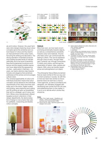
NCS colour system: C = S 0530-B D = S 3060 -Y30R E = S 2060-G30Y
G A
E
F = S 0520 -Y90R G = S 5540-G10Y A = S 0550-G90Y B = S 4020 -Y30R
G F
E
D
D G A
F
E G
F
G C A
B
C A
E
E
F
G F
D C
E E
G F A
E
G A
D C F
G G G
A
F
D C
C B E
A
D C
G F
E
North facade
11
12 a
ety and culture. However, the usual hard ware store designs featuring visual colour concepts ignore the emotional and cul tural impact of colour and thus lead to an impoverishment of the colour realm, favouring the striking and decorative. The strong saturation of standard products and building facades tends to indicate artificiality and a low level of sensitivity. Now that fundamental functional archi tecture and the largest possible expres sion have determined the appearance of cities – particularly in Germany – for years, we need a decisive step towards honesty and elegance that sensitively addresses all the senses and encourages cultural vision. The universal applicability of colour and individual production means that colour concepts can be tailored to the individual requirements of the client more than ever today and in the future. Digital models and printing, laser engraving and cutting, and 3D printing all open up possibilities that call for a strategic use of colour and form. Where once manufacturers offered targeted product collections in their design departments, the democratisa tion of design is now a factor that calls for justifiable, overarching and flexible colour concepts.
13
D G A
A
E
E
G F
E
F
F
E
D C
G E
F
G C A
E
D
C A
G
G F B
South facade b
Outlook More than ever, we now need uncom promising emotionality towards objects, as well as a comprehensive sensibility towards colour and materials. Anyone who feels colour can communicate this feeling to others. This can be explained through close scrutiny, through intelli gent, syntactic use, through connections in history and culture, and through the observation of nature, cities, people and objects. With colour we transfer experi ences and atmospheres to an object.
10 S anta Caterina Market renovation, Barcelona (E) 2005, Miralles Tagliabue a design sketches b execution 11 Colour defines and delineates levels of meaning, design by Petra Blaisse for the Central Library in Seattle (US) 2004, OMA. 12 Translation of music into colour, Klavier apart ment block, Schiedam (NL) 2007, Architecten bureau K2. 13 The Raw Color design company illustrates the holistic impression of colour atmospheres. Natural colours and transparencies show the interplay of colour and the fascination of light and colouring. Eindhoven (NL) 2010. 14 Experimental colour and material studies a Studio Besau-Marguerre b Hella Jongerius, 2013
The philosopher Slavoj Žižek proclaimed that we need clichés to find our way and to orient ourselves in society. So with this in mind we need new clichés to ensure that the future we want has a chance. Trend agencies, as well as architects and designers, are ultimately engaged with developing new clichés from the old ones and establishing them on the market. It is up to us to decide which clichés they should be. Notes: [1] Rieke, Timo: haptic visuals – Oberfläche und Struktur – Farbe und ihre Beziehung zur Tast wahrnehmung. Frammersbach 2008. [2] Kenya Hara (b.1958), Japanese graphic artist, designer and curator.
14a
b
49