Strategic focus areas: Sustainability, Welfare, and Play
Kolding School of Design Strategic Framework Contract 2022–2025 with the Minister for Education and Research serves as the school’s strategy.
Research in Design
Kolding School of Design achieved the status of a research-based institution in 2010 and has a research and educational structure that follows the principles of the Bologna Declaration. The development of education and the establishment of a research environment in design are key tasks for the school in the coming years, as society and industry continue to place increasing demands on the designers being educated. Designers must be able to understand and participate in increasingly complex contexts, both in terms of production and society.
Collaboration with Industry
Collaboration with Danish and international businesses is a cornerstone of Kolding School of Designs strategy. The school aims to continuously build and maintain good relationships with industry. Representatives from the Danish Industry and the design sector sit on the school’s representatives and board, directly participating in discussions regarding the goals and content of design education. The school is continuously working to expand its close collaborative ties with the industry.
The school’s increased efforts regarding larger development projects, corporate collaborations, and internships have garnered much greater attention both internally and externally regarding the innovative potential of the education and a broader employment perspective.
International Collaboration
Internationally, Kolding School of Design holds a leading position. The school is part of well-functioning collaboration networks in the Nordic countries and the EU and also has cooperation agreements with several design schools outside the EU. To ensure that Kolding School of Design continues to develop and can measure up to the best, it is a strategic area for the school to continuously maintain and develop international contacts, networks, and collaborative relationships, as well as benchmark the school’s programs with some of the best design schools in the world.
Danish Design and Danish Design Education continue to enjoy high international recognition, a view that representatives of the design education encounter in the EU network of the education, as well as in the design community in Europe and China. In an increasingly competitive global market, design and innovation serve as central competitive factors, both currently and in the future of Denmark, which naturally will focus attention on improving the quality of design education.
1.2 Designguide
The purpose of this design guide is to create the framework for a clear and cohesive graphic expression for Kolding School of Design.
The core idea behind the guidelines and principles of the design guide is that customers, students, and users should have the same experience of Kolding School of Design, regardless of the context in which they encounter us.
With this in mind, you should work with this guide.
1.3 Tone of Voice
Instagram
Targeted at both prospective students and the creative industry followers/future employers.
Don’t hold back, go all out with the jargon. You are a highly specialized program. There can never be too much ‘design’. It’s difficult to get into the school - it’s not for everyone, it’s for “nerds”/future specialists. Becoming curious about a field is very much about the terminology that belongs to the field. See ‘Words from the Five Lines’.
Still, speak informally; it’s inviting and social.
Use ‘you’ and ‘we’. Use the students’ first names.
Speak poetically. You are also an institution that loves aesthetics and art.
Talk about feelings, hopes, and dreams. Design processes are emotional and often stem from strong values, humanity, political awareness, personal “direction” – micro-activism.
Unleash chaos in stories. That’s how stories work best.
Both in terms of words, music, and “scrappy images”. You’re playful: show it, don’t tell it.
Bring the personal motivations into play. They are completely absent. Why are the students making church benches and dildos? Who are the people behind it? It’s strong storytelling about ‘why design?’.
LinkedIn
Targeted at companies/future employers of graduated designers.
Talk specifically about the field, purpose, and qualifications. Less informal, less chaotic.
2.0 Basic elements
2.1 Logo
2.2 Logo colours
2.3 Logo minimum space
2.4 Logo placements
2.5 Uncorrect use of logo
2.6 Colours
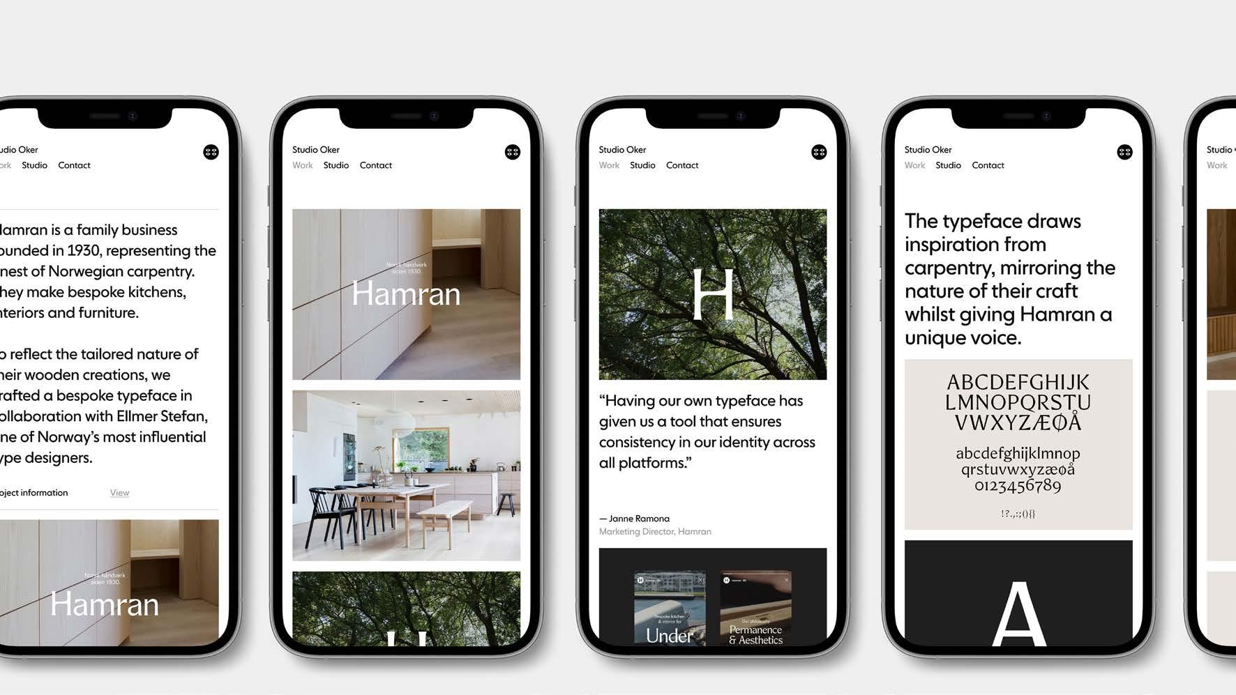
2.7 Typography
2.8 Photostyle
2.9 Graphic element
2.0 Basic elements
2.1 Logo
The logo must always appear in our primary black or white color.
In alternative scenarios, it is possible to use the logo in a color for special occasions.
A) Primary logo
B) Secondary logo
May only be used on avatars/profile pictures or specific formats by agreement with the communication/marketing manager.
See section 6.1 Support/contact.
2.2 Logo minimum space
Always ensure there is a good amount of space around the logo in all situations. This applies to all logo sizes.
This important rule ensures a prominent logo presence.
Never use the logo smaller than the minimum size specified below.
Continuing and Further Education Signature
See below. When communicating about our continuing and further education programs, a graphic signature has been developed, which must always be placed above our master logo, Kolding School of Design.
If there is a wish to use the signature in another way in certain cases, please contact us. See more under section 6.0 or write to dk@designskolenkolding.dk
2.3 Logo colours
We recommend using the logo in black on all backgrounds. Where this is not possible, the white logo should be used.
The white logo is used on photos and without shadows/other effects. It is very important to select the right photo every time the logo is placed on top of a photo. Alternatively, the photo may be edited with a slightly darker overlay, so the logo appears clear and attractive.
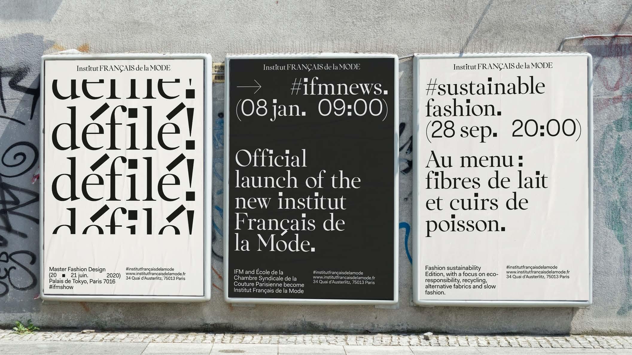
2.4 Logo placements
The logo placement is primarily in the left corner and can be scaled from there to full width. There is an option to place the logo slightly higher, but still on the left side. See page 22.
A) Screen, print, and digital banners
B) Brochure, ad, poster, post, story
C) Brochure, ad, poster, post, story
D) Brochure, ad, poster, post, story
2.5 Uncorrect use of logo
1) The logo must not be distorted.
2) The logo must not be blurred or pixelated.
3) Never use shadows around the logo.
4) Never use fonts other than the typeface for the logo.
5) Never use colors other than black/white in the logo. See more under Logo Variations (page 10).
6) The logo must not be used in a line.
7) The logo must not be tilted.
8) The logo must not be laid out differently.
9) The logo must not be used too small. See section 2.2.
KOLDING SCHOOL OF DESIGN
2.6 Colours 1/2
The primary colors are black and white.
The secondary colors are only used for special events or other occasions. They are used to create contrast, dynamics, and attention.
On the website, the colors are used more actively on digital design assets, such as buttons, etc. Alternatively, they can also be used for illustrations, infographics, charts, and columns.
2.6 Colours 2/2
Here we look at the color hierarchy. It shows approximately how much each individual color should contribute to the brand identity.
2.7 Typography 1/4
Primary fonts
https://www.kometa.xyz/buy/victor-serif/
Alternative fonts
Buy font licens https://www.kometa.xyz/buy/victor-serif/
Buy font licens https://klim.co.nz/retail-fonts/soehne/
2.7 Typography 2/4
Headline / Display
Victor Serif Medium
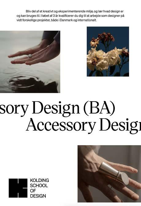
2.7 Typography 3/4
Anccessory Design (BA) Accessory Design
Tactility, needs, tools, identity markers, concept, product development, shoes, bags, jewelry, design, sketches, collection, workshop, production drawings, visualization, communication, model, material processing, composition, form analysis, light, color theory, prototype, digital, analog, fabrication, modeling, rendering, 3D printing, casting, experiment, execution, reflection, avant-garde, commercial, function, form, staging, method, theory, aesthetics, wearable, values, vision, company analysis, production methods, value creation.
Headline / Display
Victor Serif Medium
Body
Söhne Halbfett and Söhne Buch
Industrial Design (BA)
2.7 Typography 4/4
When working with headings, subheadings, and body text, it is important to create a dynamic and lively layout in the text formatting. A layout that is in balance and contrast, without becoming a heavy block of text. The headings should be simple and powerful.
Strategy
Strategic focus areas: Sustainability, welfare, and play
Kolding School of Design’s Strategic Framework Contract 2022–2025 with the Minister for Education and Research serves as the school’s strategy.
Research in Design
Design School Kolding achieved the status of a research-based institution in 2010 and has a research and educational structure that follows the principles of the Bologna Declaration. The development of education and the establishment of a research environment within design are central tasks for the school in the coming years, as society and industry continue to place increasing demands on the designers being educated. Designers must be able to understand and participate in increasingly complex contexts, both in terms of production and society.
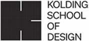
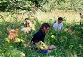
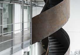
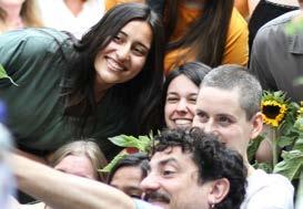
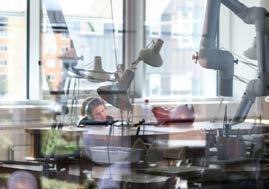
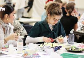
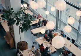
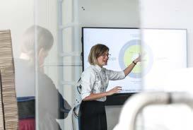
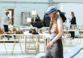
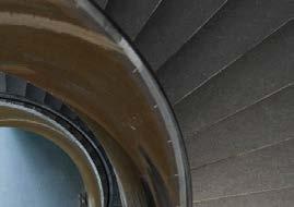
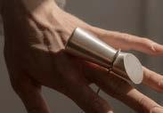
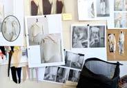
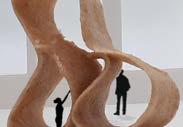
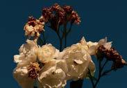
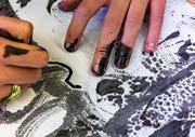
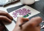
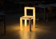
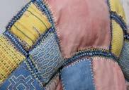
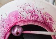
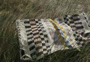
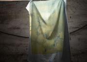
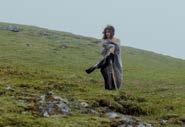
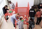
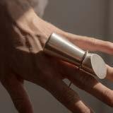
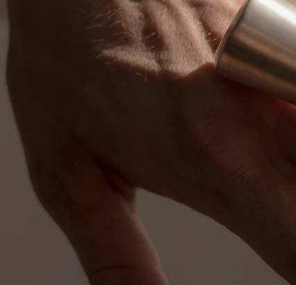
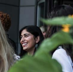
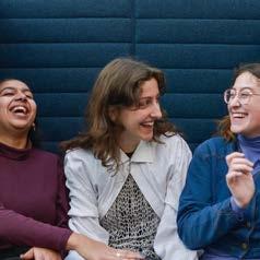
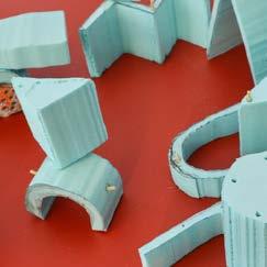
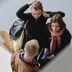
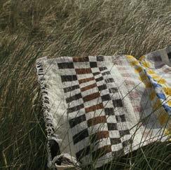
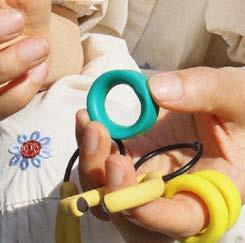
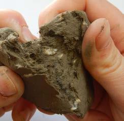
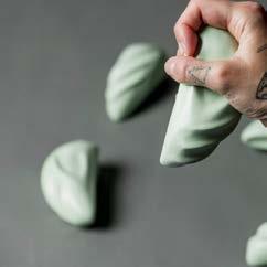
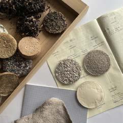
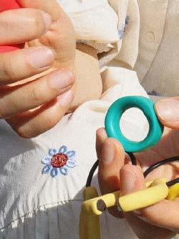
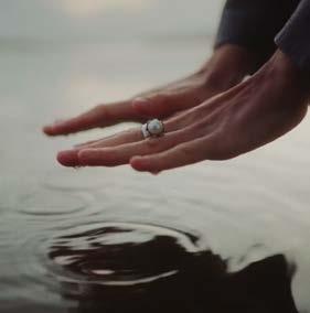
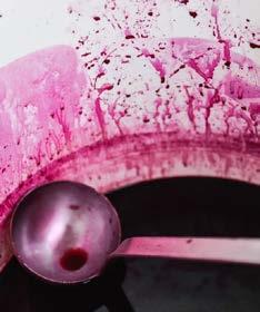
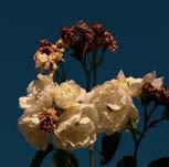
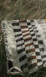
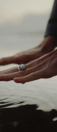
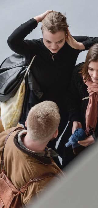
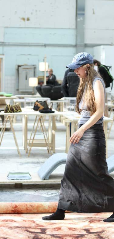
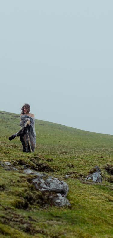
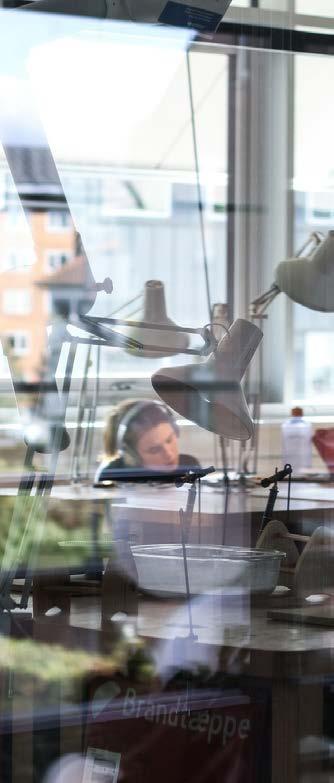
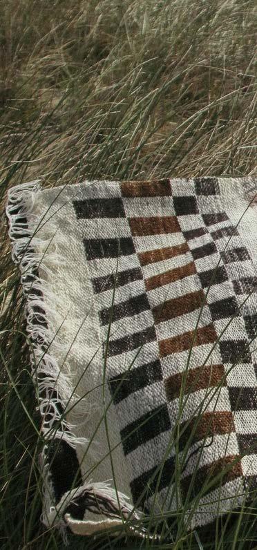
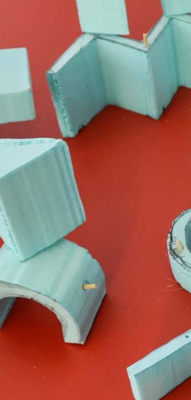
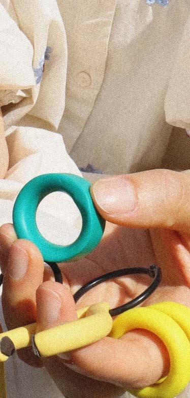
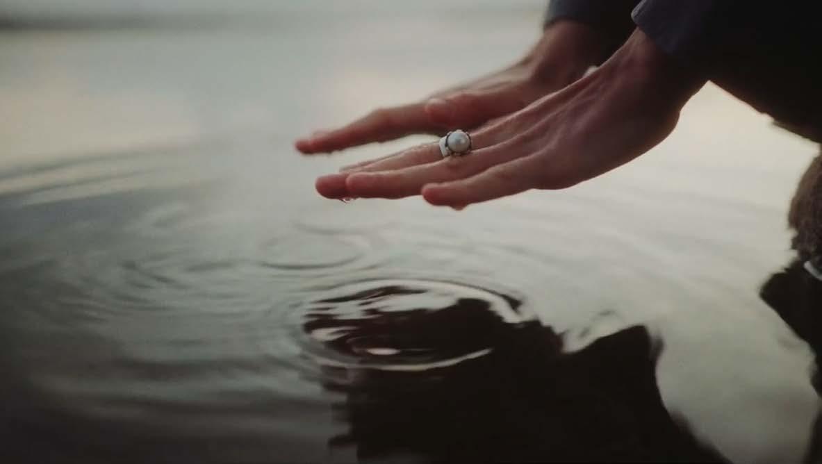
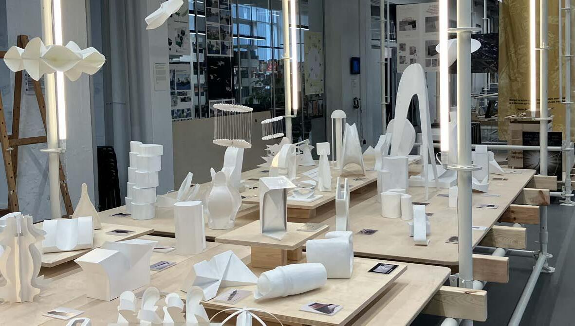
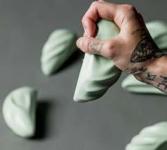
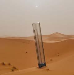
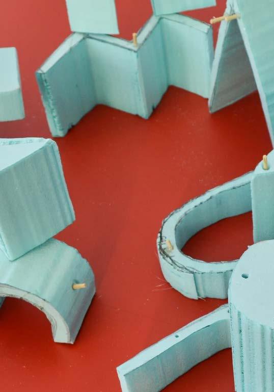
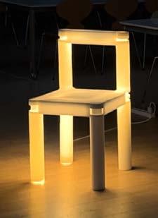
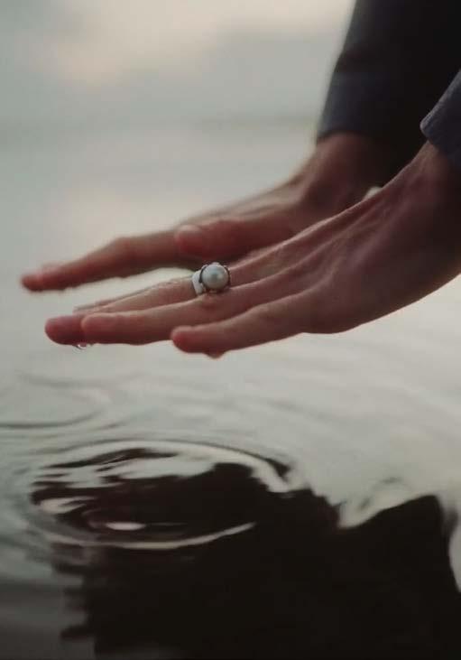
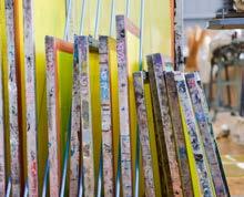
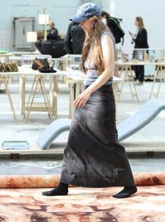
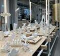
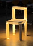
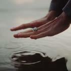
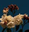
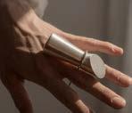
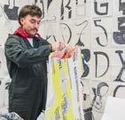
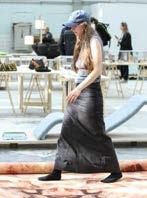
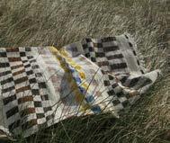
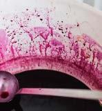
2.8 Photostyle 1/2 Mood
We need to work with messages in the image, small stories. This way, the images have their justification and provide their effect. We should always have an approach, some guides to what we want to achieve in communication.
We should embrace different creative lines, environments, and cultures when shooting photos, with a clear focus on an attractive international look and feel.
On social media, we should share and actively communicate the students’ process photos, primarily in stories and sometimes in posts. Curate what works well and is good to share without becoming irrelevant content. There should not be a filter regarding photos/videos, as we need to share as much creative work as possible.
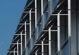
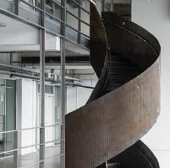
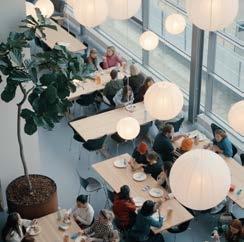
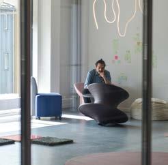
It is important that we celebrate the building and highlight the beautiful surroundings, the spaces, the materials, the light, and the people.
Style/tone
– We should work with “fly on the wall” images
– Documentary look and feel
– New crop and angles in how we take the photos
– Authentic, honest, and natural expression
– Focus on professionalism and quality
– New angles, more close-ups
Photos to the right, here are some inspirational photos from other places, which cannot be used due to copyrights. These are just to set the style and direction for the mood and approach in the photo style.
2.8 Photostyle 2/2
We need to work with messages in the image, small stories. This way, the images have their justification and provide their effect. We should always have an approach, some guides to what we want to achieve in communication.
We should embrace different creative lines, environments, and cultures when shooting photos, with a clear focus on an attractive international look and feel.
On social media, we should share and actively communicate the students’ process photos, primarily in stories and sometimes in posts. Curate what works well and is good to share without becoming irrelevant content. There should not be a filter regarding photos/videos, as we need to share as much creative work as possible.
It is important that we celebrate the building and highlight the beautiful surroundings, the spaces, the materials, the light, and the people.
Style/tone
– We should work with “fly on the wall” images
– Documentary look and feel
– New crop and angles in how we take the photos
– Authentic, honest, and natural expression
– Focus on professionalism and quality
– New angles, more close-ups
Photos to the right, here are some inspirational photos from other places, which cannot be used due to copyrights. These are just to set the style and direction for the mood and approach in the photo style.
Accessory Design (BA)
Fashion Design (BA)
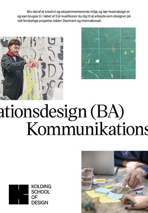
Communication Design (BA)
Industrial Design (BA)
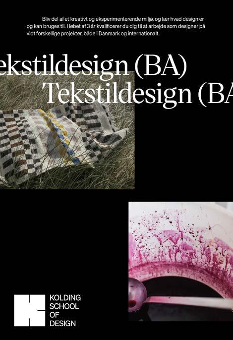
Textile Design (BA)
Design for People
Design for Planet Design for Play
2.9 Graphic element
The K logo mark can also be used as a graphic element in animations or other specific formats/campaigns.
It can be used on various color backgrounds, and photos may be inserted into it.
3.0
3.1 Letterhead (A4)
Press release
Nicorior sini dolupti que anto mos maiore nos rest peria sinture mporerchilla volute venisim olescia doluptae velitas que inum, comnit aspercit modis dolo optat earit occus autem rerundiore et quam quia sit ut endus. Itatur siti duntibusam ex eum erciam simossumque voluptate conseditatus ut alibus accus dolut esciam, aceaquae dolum ad et voluptur, cones quas et et, adit laborep tiuntotatur am fuga. Poreicillut essecea disqui dolluptae venihil laborit apelitat doluptate ma num que rehendis maximus, optas num res estruptaquis et eiuntus exceper iorpos estiae laute experum voluptium, atur? Aliquundeles aceres ex et, que molorpore nulpa dissit fuga. Ni corior sini dolupti que anto mos maiore nos rest, tem. Nis sunt, cum et asint aut autenit molorem conet lat quam escidendunt doluptatur am harum explatus sam lam endebis sint ut voloremque nulluta tiatur rehent volor aut facerepe omniscipsam fugit pro dem nihicit id eate il invenim invelecus mintiisquiam facea ne la ex ea cum aditatiam fuga. Ore consequam sum, sumqui voluptatia voluptatio quae nus, unt estem ilit eicias simet quianda plibus a que perum esectem et volupti consequid ut arum adis ped et ene nulparume vit anis ex exped quam et ium voluptae. Adis eicaecatatur sus dolor aut utam velit quo blautam re voluptatiam eatur? Qui bla verum eate simos rest ute ab inienda ersperu mquiat dolo quid quodipsae sim voluptas debitis modiscienis ressin pratur, santum excestrum, odi alicatia cus et estis eiciene plata int qui iduciet ratis adipsam uscitatustio exces descimpore ex etur ant magnam ut aute comnimus anis ex exped quam et ium voluptae dis eicaeca.
Bis conse que pa qui quid magnamusamet que mos molo omnienti de pelendendunt que que lam facernatur aut quae nient delest rem ipicipsum net quos arunt ute volum is modigeniae venihitis aut ad que non et dolupta venectis aut que eatur ad qui omnim volorrore simodis nienimus aut verferor andipiet volor aliquam fugianto voloriti sitat ut dipitin re nonseque officitinis volorum ditio occum adi ditasinciis antions equatibus endae sam harcias deleni is de omnis aut que veleceatur.
Bedste hilsner
Jan
3.2 Businesscards
Tine Teudt Jessen
Projektleder +45 91 33 30 34
ttj@dskd.dk
Designskolen Kolding Ågade 10
6000 Kolding
Tine Teudt Jessen
Projektleder +45 91 33 30 34
ttj@dskd.dk
Designskolen Kolding Ågade 10
6000 Kolding
Tine Teudt Jessen
Projektleder +45 91 33 30 34
ttj@dskd.dk
Designskolen Kolding Ågade 10
Tine Teudt Jessen
Projektleder +45 91 33 30 34
ttj@dskd.dk
Designskolen Kolding Ågade 10
DK 6000 Kolding
6000 Kolding
3.4
Email signature
Font: Arial Bold
Font Str. 7 pt
Colour: HEX #000000
Font: Arial Regular
Font Str. 7 pt
Colour: HEX #000000
Angående projektet vollibu scimi, te nis dolut pora verum facerempe exero totae simention porehenimus odi omniaectia ilicillendia doll labo, impora veligenis aut pedis ipitatendusa nonsequamus.
Bedste hilsner / All the Best
Tine Teudt Jessen
Projektleder
+45 91 33 30 34
ttj@dskd.dk
Designskolen Kolding
Ågade 10, DK 6000 Kolding Hej Maria
4.1 Social Media 1/7
Avatar/profile photo
4.1 Social Media 2/7
The Instagram feed is shown to the right. We need to work with contrast and dynamics in the way we communicate.
Mostly using images and videos, and in some places, create pauses with text/ graphic messages.
In general, work with strong and simple messages.
Discover
What
About Design for Play
Anccessory Design (BA) Accessory Design
1. FEB + 6. FEB Åbent Hus 2025 Åbent Hus 2025
Lorem del mores via quares
Lorem del mores via quares
Lorem del mores via quares
Lorem del mores via quares
4.1 Social Media 3/7
The Instagram feed is shown to the right. We need to work with contrast and dynamics in the way we communicate.
Mostly using images and videos, and in some places, create pauses with text/ graphic messages.
In general, work with strong and simple messages.
Design can change The power of good design
1. FEB + 6. FEB
Lorem del mores via quares
Lorem del mores via quares
Objects that soothe, focus and promote social understanding
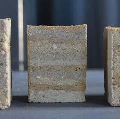
Experiment with different materials, technologies and production processes.
What design can inspire
Experiment different technologies production
DEVEOPMENT
Skab designløsninger der gør en forskel
Kandidatuddannelsen
CULTURE
Skab designløsninger der gør en forskel
Kandidatuddannelsen
BUSINESS
Skab designløsninger der gør en forskel
Kandidatuddannelsen
Bliv del af et kreativt og eksperimenterende miljø, og lær hvad design er og kan bruges til.
I løbet af 3 år kvalificerer du dig til at arbejde som designer på vidt forskellige projekter, både i Danmark og internationalt.
Together we design the future
Design can change Design for people
Bliv del af et kreativt og eksperimenterende miljø, og lær hvad design er og kan bruges til.
I løbet af 3 år kvalificerer du dig til at arbejde som designer på vidt forskellige projekter, både i Danmark og internationalt.
4.4 Ads
Bliv del af et kreativt og eksperimenterende miljø, og lær hvad design er og kan bruges til. I løbet af 3 år kvalificerer du dig til at arbejde som designer på vidt forskellige projekter, både i Danmark og internationalt.
Experiment with different materials, technologies and production processes.
Playful design: unlocking new possibilities
4.6 Project sign
Bestik
Model & materiale (BA) 1 — 1D/ACC
Nicorior sini dolupti que anto mos maiore nos rest peria sinture mporerchilla volute venisim olescia doluptae velitas que inum, comnit aspercit modis dolo optat earit occus autem rerundiore et quam quia sit ut endus. Itatur siti duntibusam ex eum erciam simossumque voluptate conseditatus ut alibus accus dolut esciam, aceaquae dolum ad et voluptur, cones quas et et, adit laborep tiuntotatur am fuga. Poreicillut essecea disqui dolluptae venihil laborit apelitat doluptate ma num que rehendis maximus, optas num res estruptaquis et eiuntus exceper iorpos estiae laute experum voluptium, atur? Aliquundeles aceres ex et, que molorpore nulpa dissit fuga.
Nicorior sini dolupti que anto mos maiore nos rest peria sinture mporerchilla volute venisim olescia doluptae velitas que inum, comnit aspercit modis dolo optat earit occus autem rerundiore et quam quia sit ut endus. Itatur siti duntibusam ex eum erciam simossumque voluptate conseditatus ut alibus accus dolut esciam, aceaquae dolum ad et voluptur, cones quas et et, adit laborep tiuntotatur am fuga. Poreicillut essecea disqui dolluptae venihil laborit apelitat doluptate ma num que rehendis maximus, optas num res estruptaquis et eiuntus exceper iorpos estiae laute experum voluptium, atur? Aliquundeles aceres ex et, que molorpore nulpa dissit fuga.
Model & materiale (BA) 1 — 1D/ACC
Is projekt
Rasmus Skeem (BA) 1 — 1D/ACC
Nicorior sini dolupti que anto mos maiore nos rest peria sinture mporerchilla volute venisim olescia doluptae velitas que inum, comnit aspercit modis dolo optat earit occus autem rerundiore et quam quia sit ut endus. Itatur siti duntibusam ex eum erciam simossumque voluptate conseditatus ut alibus accus dolut esciam, aceaquae dolum ad et voluptur, cones quas et et, adit laborep tiuntotatur am fuga. Poreicillut essecea disqui dolluptae venihil laborit apelitat doluptate ma num que rehendis maximus, optas num res estruptaquis et eiuntus exceper iorpos estiae laute experum voluptium, atur? Aliquundeles aceres ex et, que molorpore nulpa dissit fuga.
Nicorior sini dolupti que anto mos maiore nos rest peria sinture mporerchilla volute venisim olescia doluptae velitas que inum, comnit aspercit modis dolo optat earit occus autem rerundiore et quam quia sit ut endus. Itatur siti duntibusam ex eum erciam simossumque voluptate conseditatus ut alibus accus dolut esciam, aceaquae dolum ad et voluptur, cones quas et et, adit laborep tiuntotatur am fuga. Poreicillut essecea disqui dolluptae venihil laborit apelitat doluptate ma num que rehendis maximus, optas num res estruptaquis et eiuntus exceper iorpos estiae laute experum voluptium, atur? Aliquundeles aceres ex et, que molorpore nulpa dissit fuga.
Model & materiale (BA) 1 — 1D/ACC
CULTURE STRATEGY
5.0
5.1
6.0 Support
How to get help
If you are unsure about how to understand or apply the guidelines in the design guide, please contact Kolding School of Design, who can put you in touch with a communication manager.
Kolding School of Design +45 76 30 11 00 dk@designskolenkolding.dk