PORTFOLIO ARCHITECTURE
PHILIP LADD
UNDERGRADUATE
SELECT WORKS
2019-2023


3 11 7 15 19 21 23
TABLE OF CONTENTS Resume 1 The Cross | Downtown Chicago Apartments 3 Hand Drafting and Sketches 7 A.S.H. Project | Starkville Habitat for Humanity 11 Ross Collins Vocational School | Meridian, MS 19 Renderings | Interior and Exteroir 21 23 Blue Economy Research Center | Gulfport, MS 15 II Presentation Boards

Philip Ladd
Professional S ummary
Dedicated Architecture student specializing in efficient and logical design. Advanced knowledge of sustainable design elements and LEED green building standards. Projects focused on commercial and residential designs ranging from a 250 sq. ft. tiny house to a 115,000 sq. ft. apartment complex.
Work History
CCD Architecture - Architectural Intern
09/2023 - Current
• Worked to help build new graphical templates for firm bid documents.
• Aided in schematic design, as well as design development on several projects ranging in size and cost.
• Generated presentation quality renderings of different schemes
Mississippi State Event Services - Audio Visual Technician Starkville, MS
08/2019 - 05/2023
• Monitored and repaired audio, video, control systems and video conferencing equipment.
• Provided troubleshooting techniques in integrating professional audio/video systems.
• Oversaw multiple large scale events and aided in the running of many high profile meetings.
Self-employed - Swim Lesson Instructor
Columbus, MS
05/2019 - 08/2022
• Taught students pool and water safety guidelines.
• Taught daily swim instruction to students varying in ages and skill levels.
YMCA - Lifeguard
Columbus, MS
05/2017 - 05/2019
• Monitored safety of guests in and around swimming pool.
• Learned and maintained proficiency in first responder skills such as First Aid and CPR to offer individuals in distress optimal support.

pal4msu@outlook.com
(662)251-4833
Starkville, MS 39759
Education
Mississippi State University
Starkville, MS
Bachelor of Arts: Architecture
Anticipated in May of 2024
• 3.73 GPA (Deans List all Semesters)
• Stephanie M. and Don F. Pizzetta
Annual Scholarship Recipient
• Featured in BARNworks 20/21
• Relevant Coursework: Historic
Preservation, Site Planning, & Passives
New Hope High School
Columbus, MS 05/2019
High School Diploma
• 4.0 GPA
• Awarded Star Student for highest ACT in the class
Skills
• AutoDesk Revit - Advanced
• AutoDesk AutoCAD - Intermediate
• Adobe InDesign - Intermediate
• Adobe Photoshop - Advanced
• Enscape - Advanced
• SketchUp - Advanced
• Cura - Advanced
• Rhino - Beginner
• Physical Modeling - Intermediate
Digital Portfolio

1
2
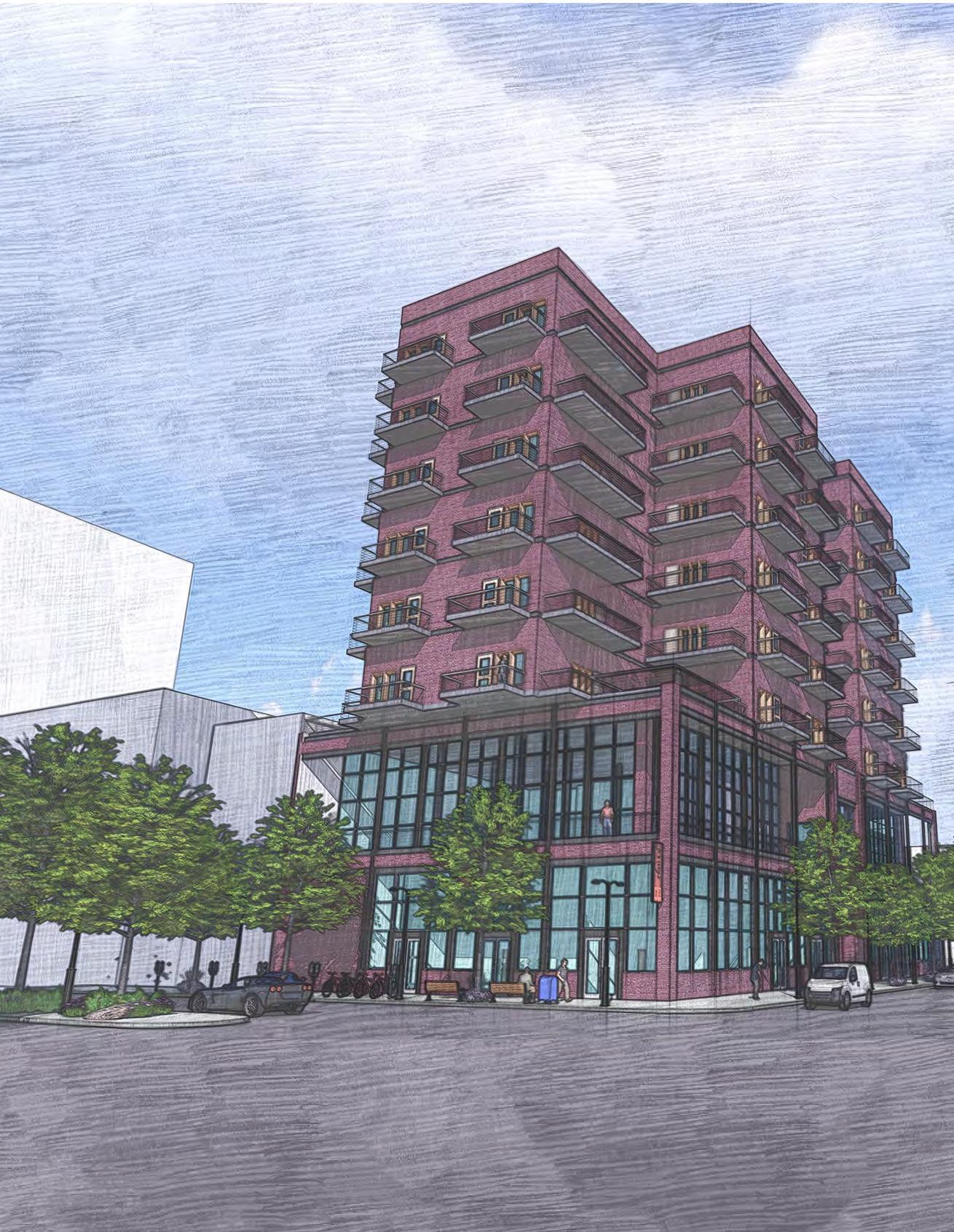
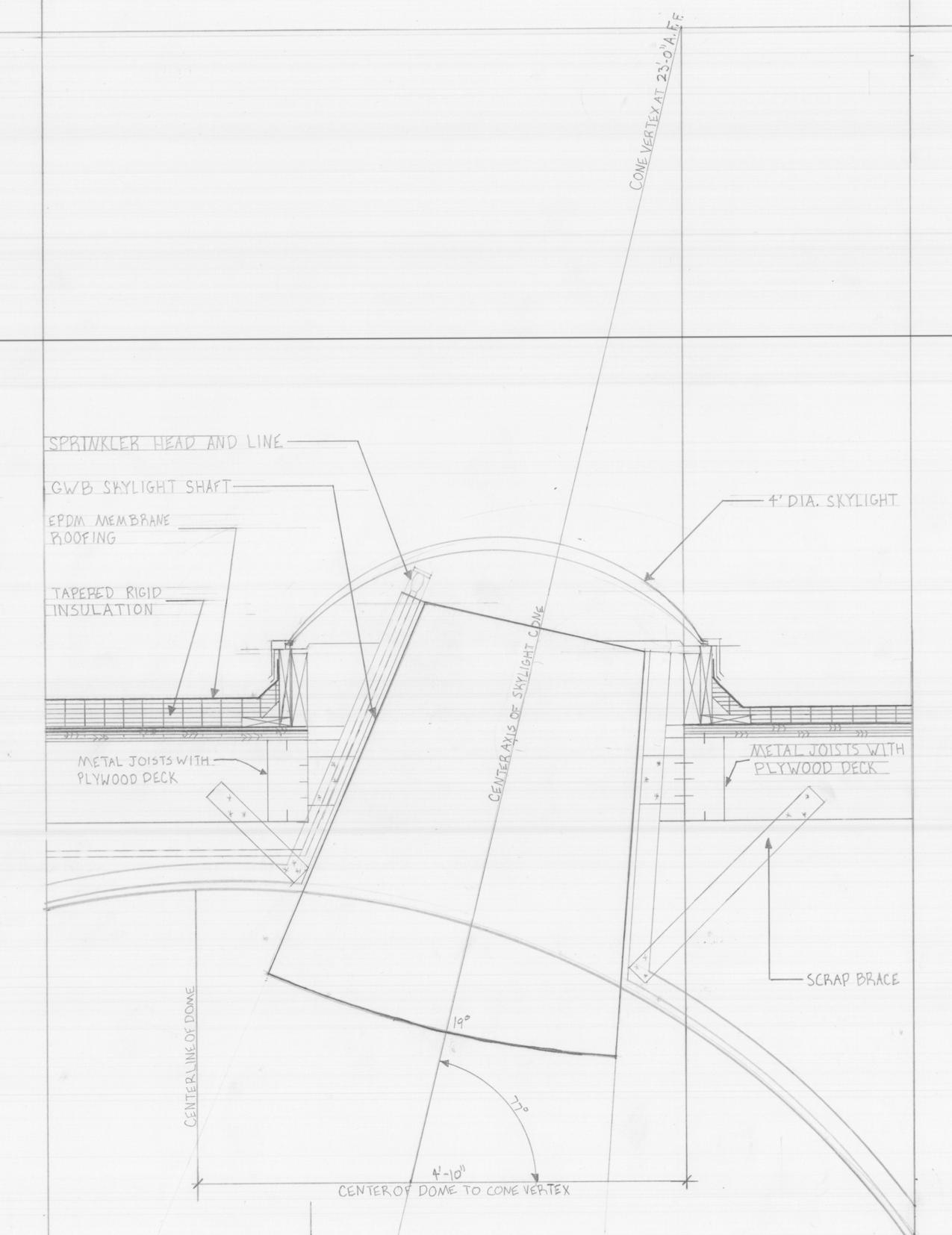
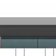
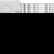
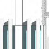
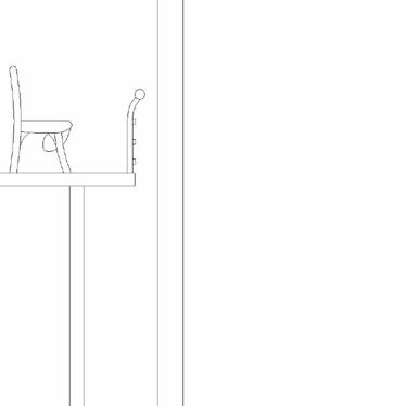
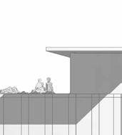
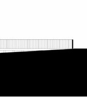
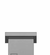
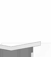
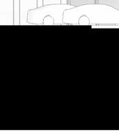
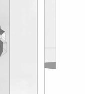
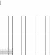
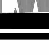
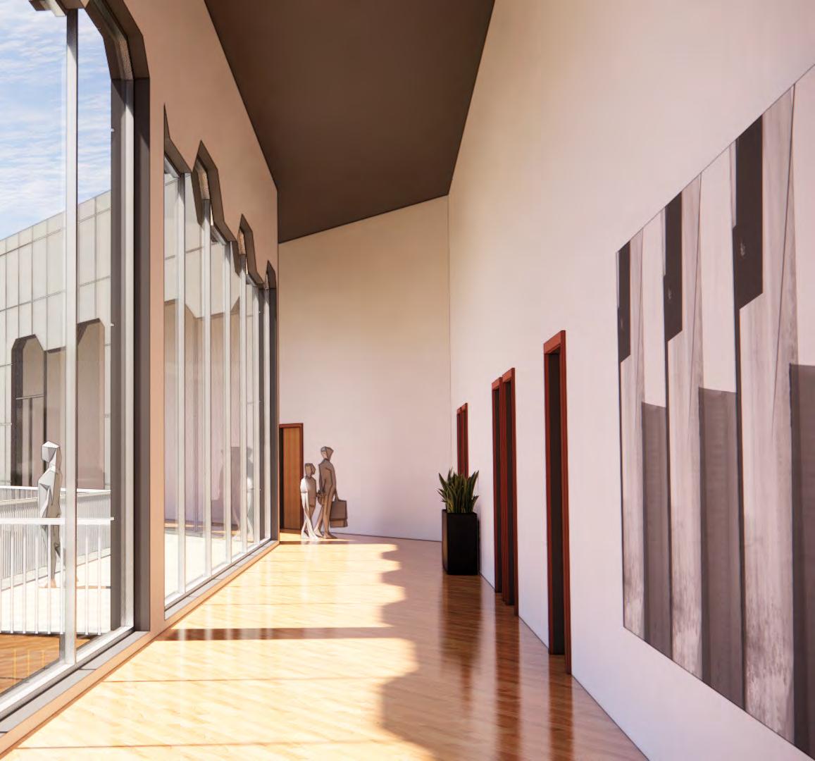
THE CROSS
A STUDY OF SPACE AND AFFORDABLE HOUSING
Chicago, IL
WHAT MAKES A HOME?
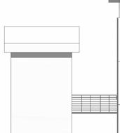
The objective of this project was to study what makes a home and implement our findings into a multi-use apartment complex. In my research, I discovered the home is a place of psychological comfort. It is a space that you can control; a space that is entirely your own. In search of these tenets I found myself designing The Cross, a building made to feel like home.
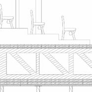
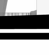
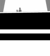
STACKING AND SLIDING
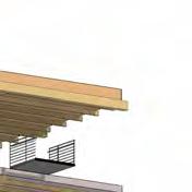
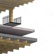
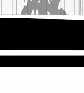
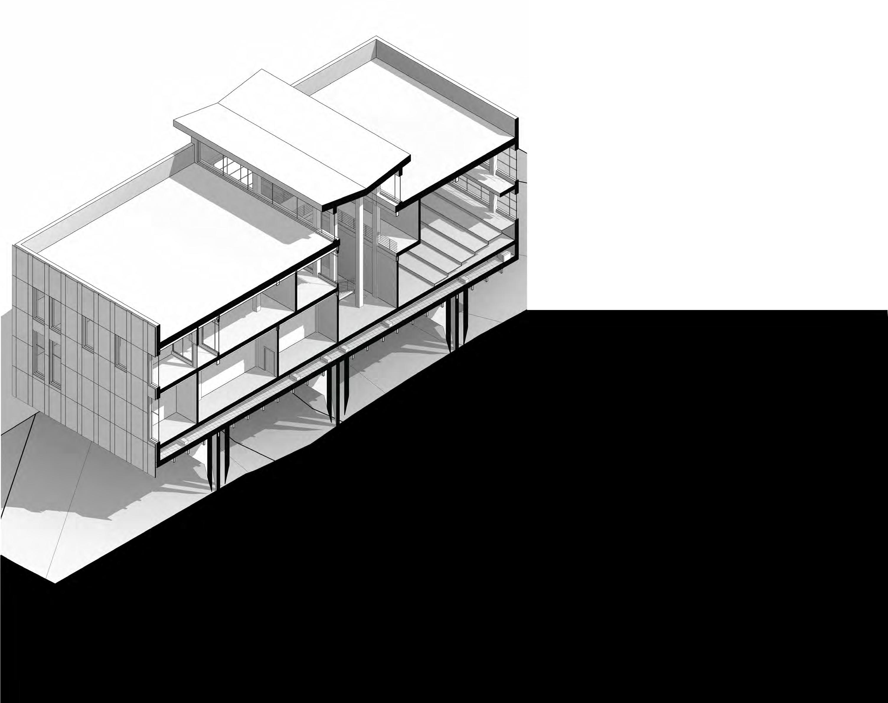
The apartment units stack atop a podium housing a private gym and storefronts. A delineation between the two-story podium and the apartments creates visual cohesion with the shorter surrounding Chicago cityscape. The additional floor in the plinth also allows for a wrap-around balcony, giving guests downtown views while they enjoy their pizza. The apartments themselves slide into place in a doublecross grid system producing interlocked, identical living quarters while efficiently utilizing square footage. Means of egress are centrally located providing efficient and equal access to each unit.
3
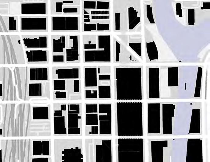
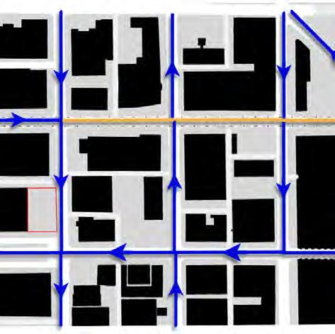
Circulation around the site
4
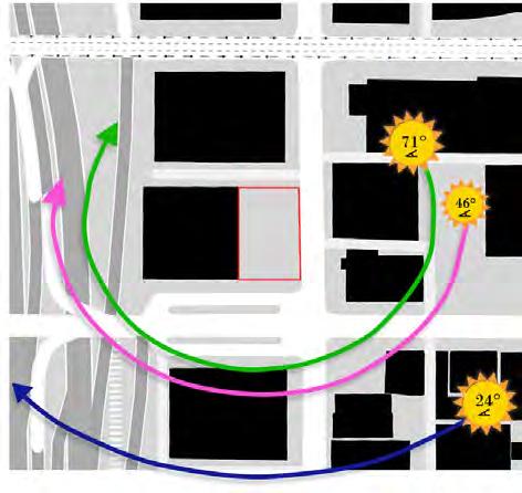
path study around the site
Sun
General map of East Side
2nd Floor Plan


Typical Residential Floor


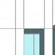
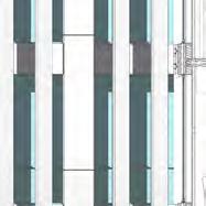
TYPICAL UNIT

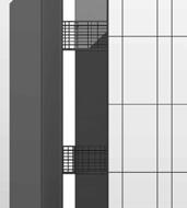
The standard unit layout was designed in tandem with the overall form of the building from the very start. Every single unit is identical down to the brick, and each has its place in the structural grid that makes up The Cross. Units contain two different areas, the public and the private. For a person to feel truly at home they must have a space that is theirs, we can see this in teenagers when they fight to have their own space. With the limited amount of space we had to work with the best move was to make the bedroom feel completely cut off from the living space. This decision led to the addition of a second balcony off of the bedroom, allowing the residents to have a space off of their room that was their own. Generating this boundary between private and public spaces is a perfect sample of The Cross as a whole.


ADA UNIT


Inside The Cross there are 6 residential floors and each one of those is equipped with an ADA unit directly next to the public laundry room. The ADA units have only a few minor changes to acheive compliance, being the bathroom and the kitchen.
A rigorous study into how other designers address the issues presented by this code allowed me to create the unit seen on the left. A feeling of home is reliant on a feeling of comfort, and part of said comfort is knowing that others around you are not that different. The Cross accomplishes that by implementing many ADA compliant design philosophies into the base unit, only adding the luxary of extra counter space in the main units.
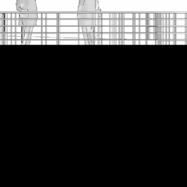
5 1 2 3 6 4 7 6 8 15 14 11 12 5 13 6 9 6 7 8 6 10 Seating Courtyard Lobby Gym R.R. Outdoor Balcony (Seating) 1 2 3 4 5 6 7 8 9 10 A B C D E AA 1 2 3 4 5 6 7 8 9 10 AB C DE AA


6 Andy Ladd Project #3: Schematic Design
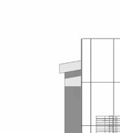
PROJECT A.S.H.
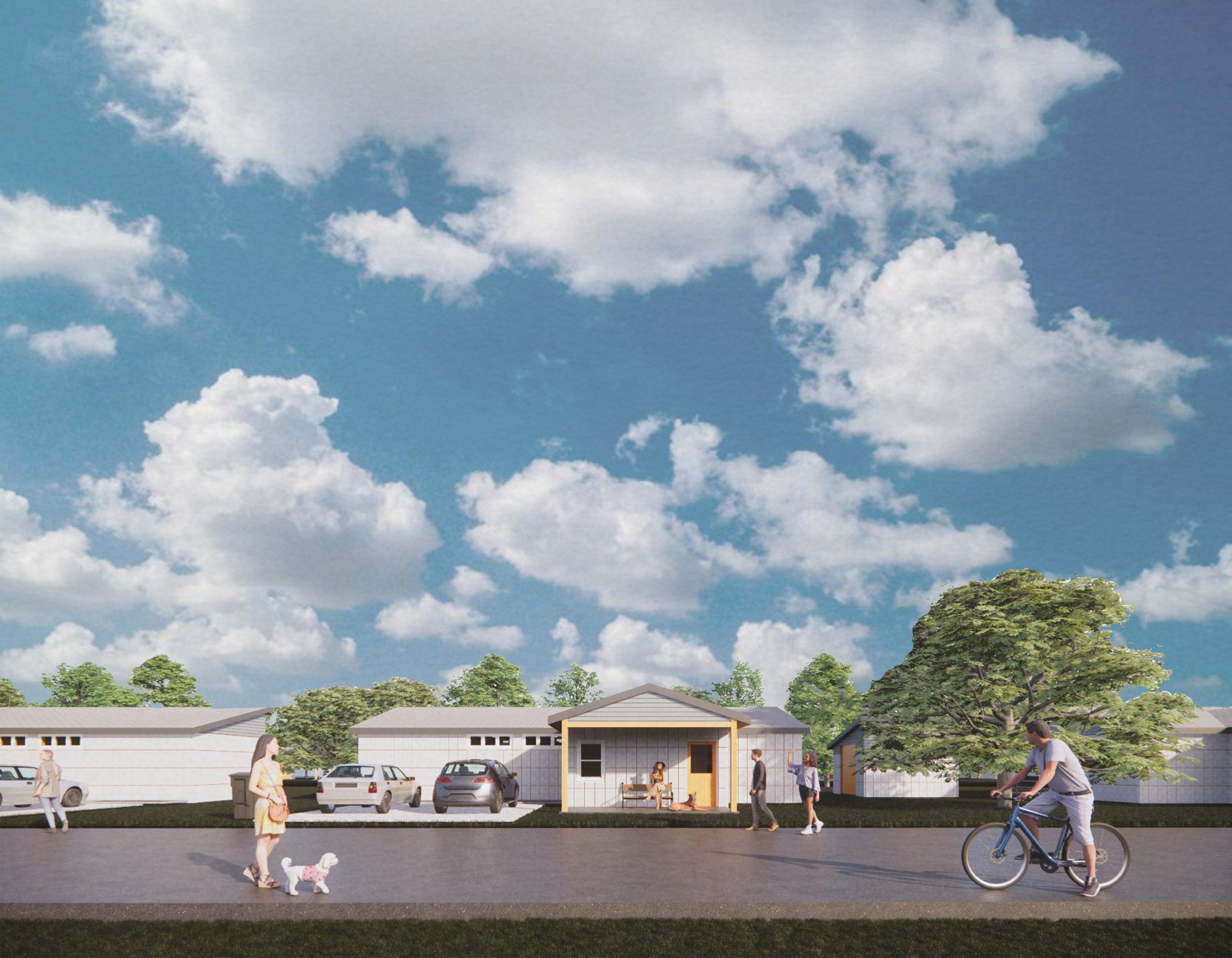
IMPLEMENTING CONCRETE FOR AFFORDABLE HOUSING
STARKVILLE, MS
7
PROJECT INTRODUCTION
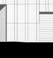
When designing residential architecture, the preconceived notion of what it can and should be, for the past few centuries, has changed drastically from what residential architecture has been. This is in part to several factors, most foremost of which is the rise of suburbia. A set type of building construction with a small material palette has left the vast amount of mid-range to low-range architecture devoid of any personality or substance. These quasi-laws set into place designating how residential architecture should be designed make it difficult to break from the suburban archetype without making a too-strong statement. Due to these factors, the task of designing a Habitat house in Starkville, MS using precast concrete seemed momentous at first, a challenge which had no real solution. Pre-cast housing, traditionally, does not feel very homelike. Due to the nature of the construction, pre-cast housing often feels foreign, cold, and unwelcoming. Beyond that, precast housing by necessity of efficiency is mass produced, often leading to cookycutter neighborhoods with no real variance.
THE GOAL
Because of these challenges, the goal of the project was suprisingly clear from the start. The goal was to design an efficient pre-cast concrete form which would feel more like a welcoming home than a safety shelter. More than this, the goal was to design a precast typology which could bring personality and variance to a neighborhood.
8
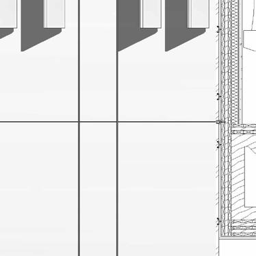
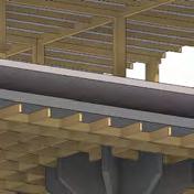
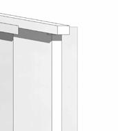
GYP.
OSB SPACER
GYP.
OSB SPACER
JAMB EXTENSION
JAMB EXTENSION
WEATHER STRIPPING
WEATHER STRIPPING
STOOL
STOOL
APRON SPACER
APRON SPACER
GYP.
GYP. BATT INSULATION
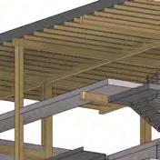
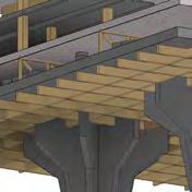
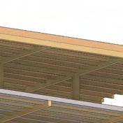
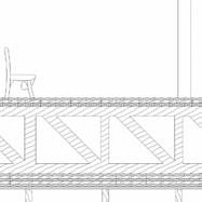
CONCRETE AS A MATERIAL FOR A HOME
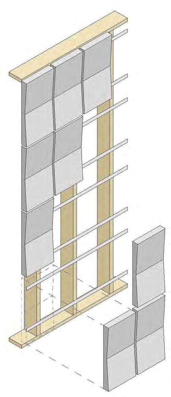
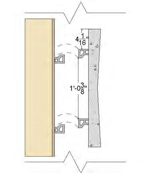
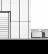
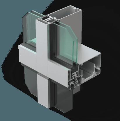
A.S.H. (Affordable Sustainable Housing) was the brainchild of a group with the stipulation that we must have the facade consist entirely of concrete. To meet this guideline, we had to dive deep into research and discover any possible way that we could coat a building in concrete and still have it feel like ahome while maintaining a low cost. Concrete is not made for small-scale projects, especially not the precast system used in this project. The ability to mass-manufacture the concrete panels and apply them universally was essential to the projects success.
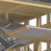
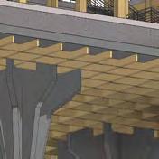
A FOCUS ON STRUCTURE
Throughout the project, I was tasked with designing and implementing the structural system that would compose each home. The goal of my design was to create a series of panels that were aesthetically pleasing and could be put together by volunteers. This idea was accomplished with custom-designed Z-clips that allowed the panels to be placed onto a series of 2” x 6” boards and were held on by their own weight. Each panel weighs around 125 pounds but that can easily be lifted by 2 volunteers working together. These factors together, along with uniform panel sizes and adjustment of the overall design, resulted in a beautiful and delicate exterior that does not feel oppressive to the occupant.
OSB
OSB
BATT INSULATION
BATT INSULATION
2" X 6" STUD
2" X 6" STUD
PRECAST PANEL
SHINGLES
SHINGLES
PLYWOOD AND FELT
PLYWOOD AND FELT
BATT INSULATION
BATT INSULATION
WOOD SIDING
WOOD SIDING
On top of the panel systems design, I was also placed in charge of the overall structure of the project as seen to the right.
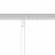
CASEMENT FLASHING
PRECAST PANEL CASEMENT FLASHING
PRECAST PANEL
PRECAST PANEL
Z-RUNNER CONNECTION
Z-RUNNER CONNECTION
SUBSILL
SUBSILL
FLASHING
FLASHING
2" X 6" STUD
2" X 6" STUD
GYP.
GYP.
BATT INSULATION
BATT INSULATION
Z-RUNNER CONNECTION
Z-RUNNER CONNECTION
ANCHOR BOLT
ANCHOR BOLT
PRECAST PANEL
PRECAST PANEL
2" X 6" STUD
2" X 6" STUD
FLASHING
FLASHING
REINFORCEMENT REBAR
REINFORCEMENT REBAR
5" SLAB
5" SLAB
COMPACTED GRAVEL
COMPACTED GRAVEL
EARTH
EARTH
DOOR FRAME
DOOR FRAME
RUBBER SEAL HINGE DOOR
RUBBER SEAL HINGE DOOR
2" X 6" STUD
2" X 6" STUD
BATT INSULATION
BATT INSULATION
PRECAST PANEL
PRECAST PANEL
Z-RUNNER CONNECTION
Z-RUNNER CONNECTION
BATT INSULATION
BATT INSULATION
2" X 6" STUD
2" X 6" STUD
GYP. SIDING
GYP. SIDING
TRIM
TRIM
VAPOR RETARDER
OSB
VAPOR RETARDER
OSB
CLIP FOR PRECAST
CLIP FOR PRECAST
CONNECTION
CONNECTION
PRECAST PANELS
PRECAST PANELS
2" X 6" STUD
2" X 6" STUD
BATT INSULATION
GYP.
BATT INSULATION
GYP.
TRIM
TRIM
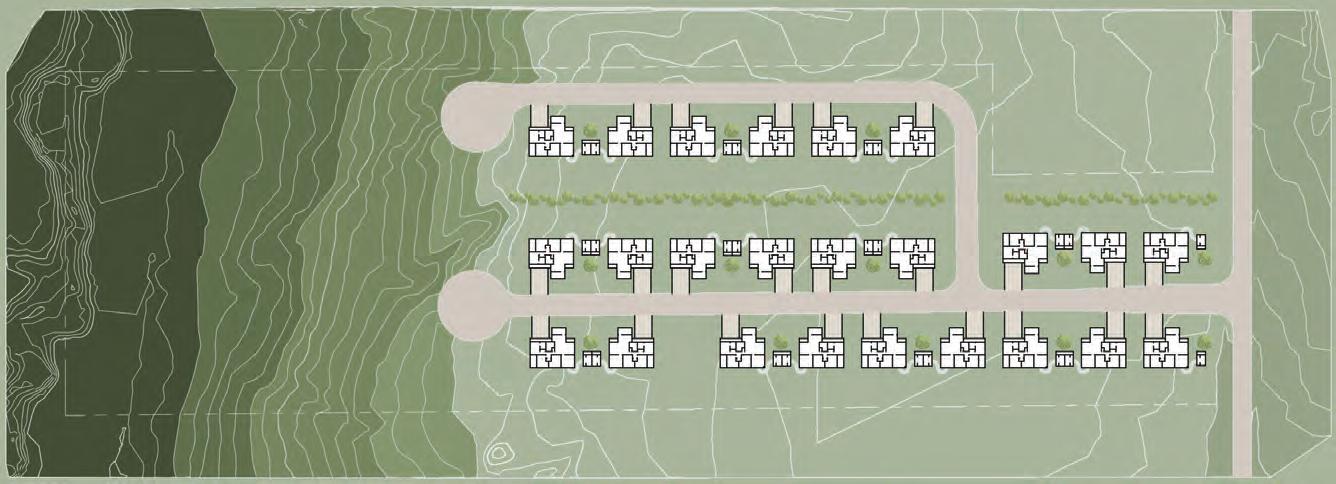
SITE PLAN
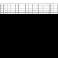
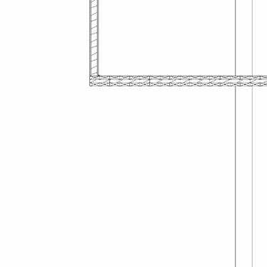
3" = 1'-0" 2 Foundation 3" = 1'-0" 3 Roof 3" = 1'-0" 4 Window Sill 3" = 1'-0" 5 Window Header 3" = 1'-0" 7 Corner Detail 6" = 1'-0" 1 Connection 3" = 1'-0" 6 Door Detail
BATT INSULATION
3" = 1'-0" 2 Foundation
= 1'-0" 3 Roof 3" = 1'-0" 4 Window Sill 3" = 1'-0" 5 Window Header 3" = 1'-0" 7 Corner Detail 6" = 1'-0" 1 Connection 3" = 1'-0" 6 Door Detail
3"
9
10
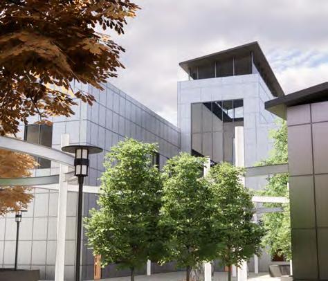
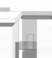
ROSS COLLINS VOCATIONAL SCHOOL
A SCHOOL OF THE FUTURE
MERIDIAN, MS

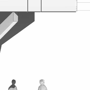
DESIGNING FOR THE PSYCHE
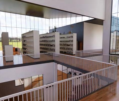
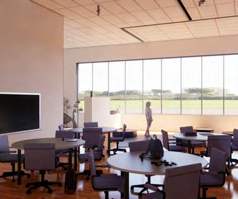
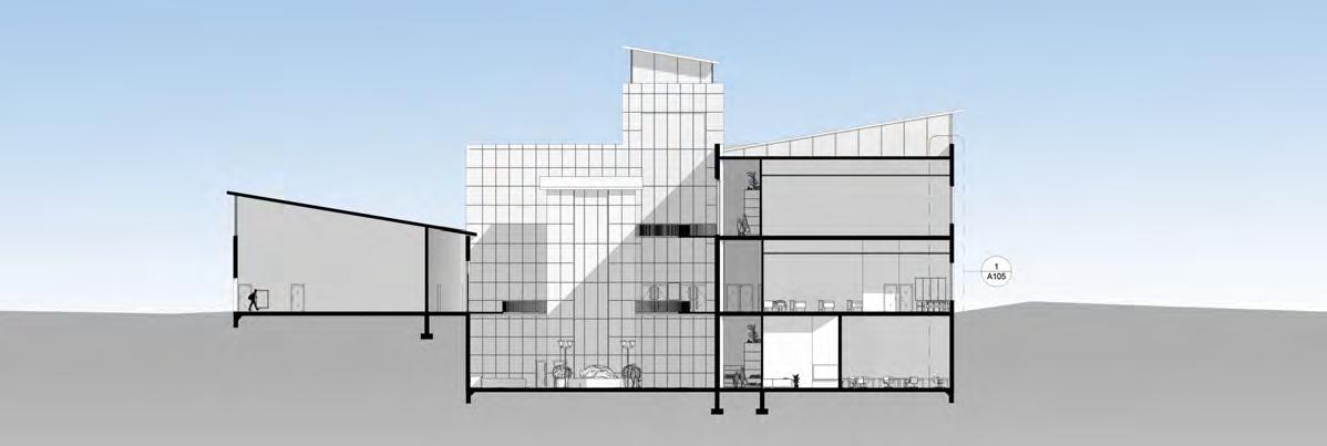
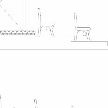
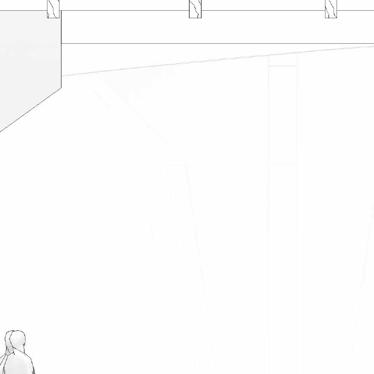
The Ross Collins Vocational School project was a wonderful opportunity to study how architecture can affect the mental state of the people who interact with the space. This factor is of the utmost importance when it comes to educational facilities, especially public schools. Attempting to design a building that generates a feeling of safety and openness is no small task, but The Hub accomplishes that splendidly. Using a layout that is easily comprehended and focusing the students through 2 major hubs allows the environment to be one of community and comfort. On top of that, large skylights create light and airy spaces throughout.
NOT TO BE ABANDONED
Students today spend 40 hours a week and up to 12960 hours over their 12 years of primary school inside a building. Why, of all buildings, do we not put full effort into these? This building shapes young children more than their own home does in most cases. A school should be a place of learning and a place of beauty, not a prison. Cinderblock construction is cheap and effective, but it is outdated and creates an environment that is not conducive to learning. The fact that our schools have similar layouts and materiality to modern prisons is awful. We as designers should look further into the psychological effects of our architecture on the people who occupy it, and where better to start than with our children.
11

12
13
BRING THEM TOGETHER
We as designers must consider every little facet of a design, even the ones that the occupants of a space may never consciously notice. These details range from the height of a specific window to the materiality of the walls and floors, as each of these has a profound effect on the people who interact with our creations. So, what makes a school what it is and how can we design a building that challenges those standards while maintaining a sense of familiarity? That is the question that The Hub aims to answer.
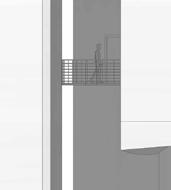
The focus throughout this design was sat squarely on the library and outdoor courtyard space (pictured on the left). These were the two areas that every other part of this facility funneled into, therefore they would see the most amount of people. The approach taken here was to create spaces where students would like to spend their time and would excite them about coming to the building.
The core factors that contribute to that are quite simply access to natural light and openess. Heavy concrete walls that we typically see at schools accomplish neither of these, while the storefront walls and metal paneling attribute a certain lightness to the building’s facade. These design choices aim to bring a feeling of brevity to the students that use these spaces, encouraging comfort and enjoyment.
14
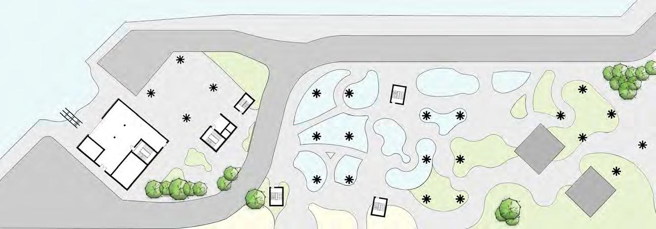
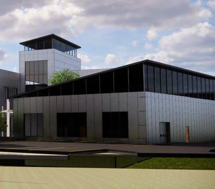
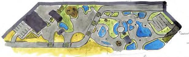
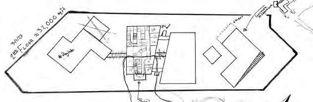
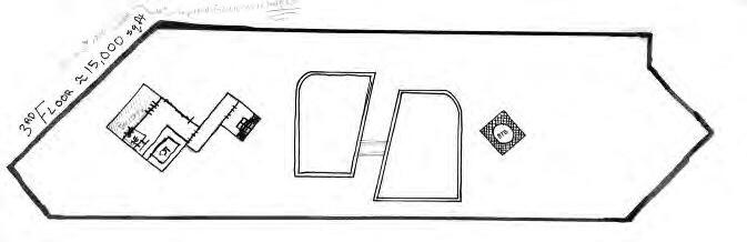
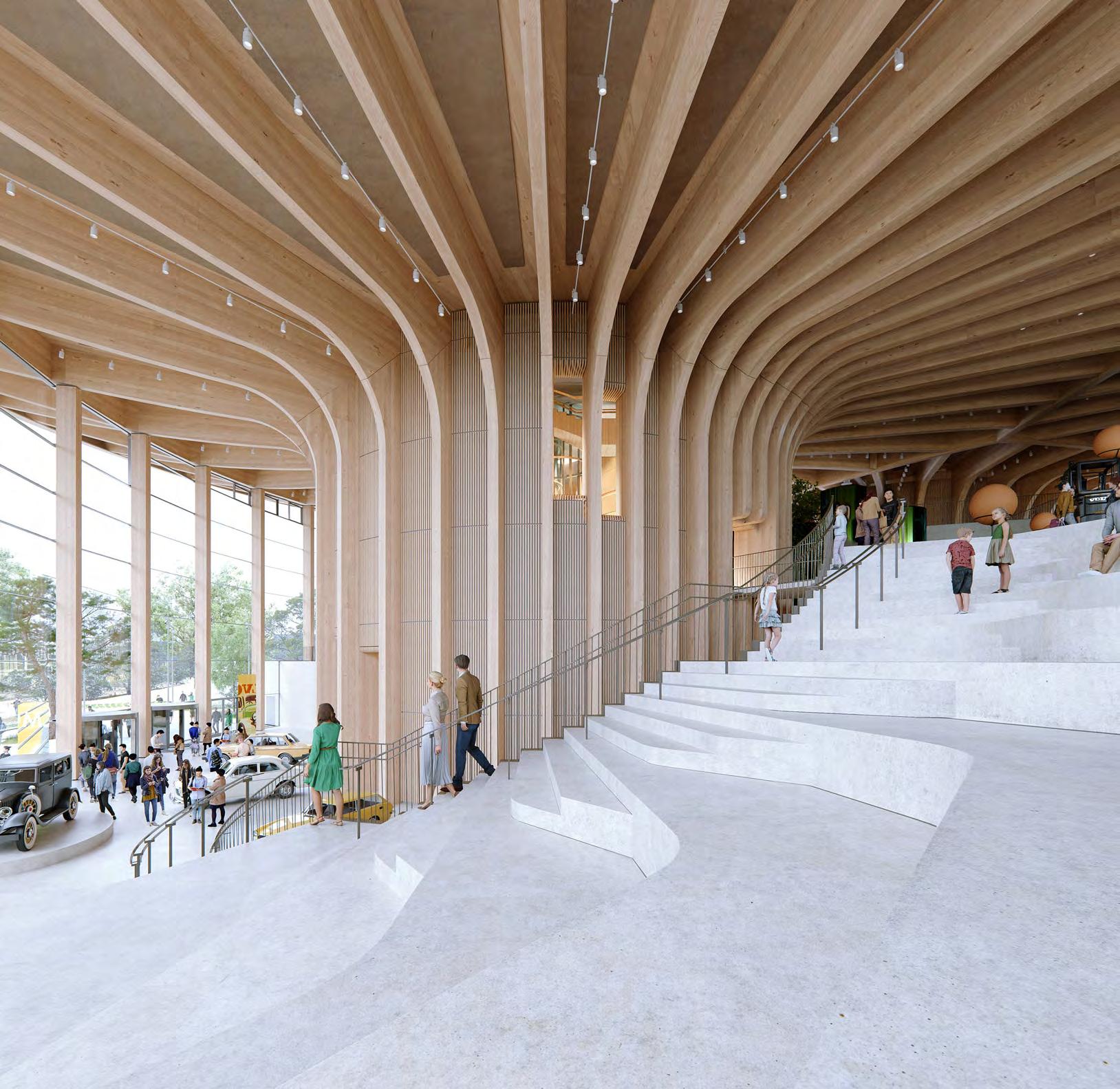
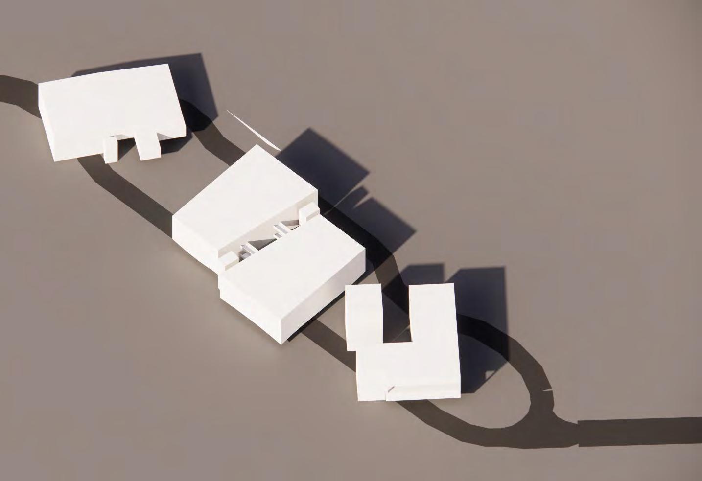
BLUE ECONOMY RESEARCH CENTER
BRINGING THE COAST TO LIFE GULFPORT, MS
15
16
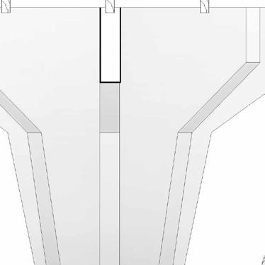
STRUCTURE IS KEY
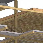
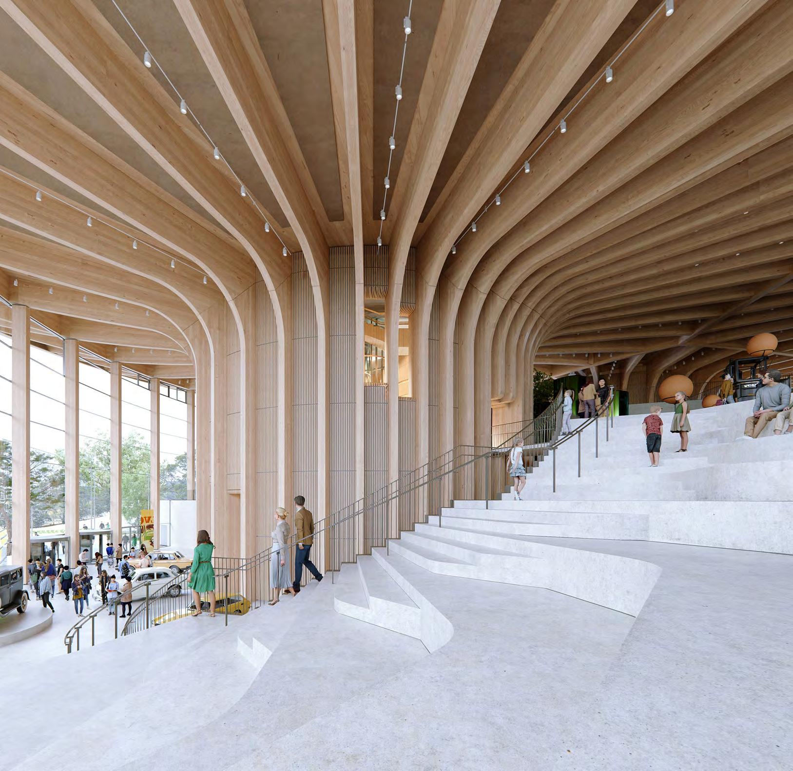
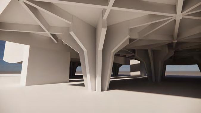
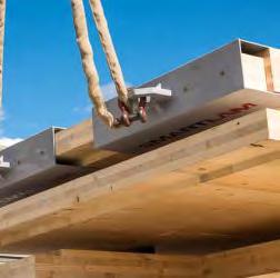
There are many construction challenges when approaching construction on the coast, the main one being the requirement to be 25 feet above ground level in case of flooding. The Doldrum solves this problem with a series of flower-inspired columns holding up individual buildings that make up the complex. These columns are composed of concrete with a hollow center to allow for rainwater collection. The rest of the complex’s structure is composed entirely of mass timber with a metal panel facade system. The column system underneath is calculated to hold double the weight of the building, and is even rated to be able to support lateral force equal to hurricane force winds up to category 3 comfortably.


17
CLT 5-ply Panel System
Smart Curtain Wall System K1660 2-Ply
Glulam 18" x 18" Columns
1 2 3
CLT Shear Wall System
Glulam 12" x 4" Beam
Solar Fins @ 45 Degree Angle
Glulam 12" x 4" Beam
Pratt-Style Truss
CEI Materials Cladlock Paneling
1 {3D} Copy 1 Copy 2
Smart Curtain Wall System K1660 2-Ply


18 Level 1 24' 0" Level 2 40' 0" Ground 0' 0" Roof 52' 0" T. O. P. 57' 0" B. O. B. 18' 0" Level 1 24' 0" Level 2 40' - 0" Ground 0' 0" B. O. B. 18' 0" SOUTH-EAST ELEVATION SOUTH-WEST ELEVATION Scale = 1/8” = 1’ Scale = 1/8” = 1’ Level 1 24' 0" Level 2 40' 0" Ground 0' 0" Roof 52' 0" T. O. P. 57' 0" B. O. B. 18' 0" Level 1 24' - 0" Level 2 40' - 0" Ground 0' - 0" Roof 52' - 0" T. O. P. 57' - 0" B. O. B. 18' - 0" NORTH-WEST ELEVATION NORTH-EAST ELEVATOIN Scale = 1/8” = 1’ Scale = 1/8” = 1’ FLOOR PLAN
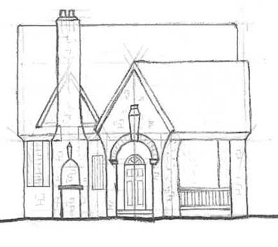
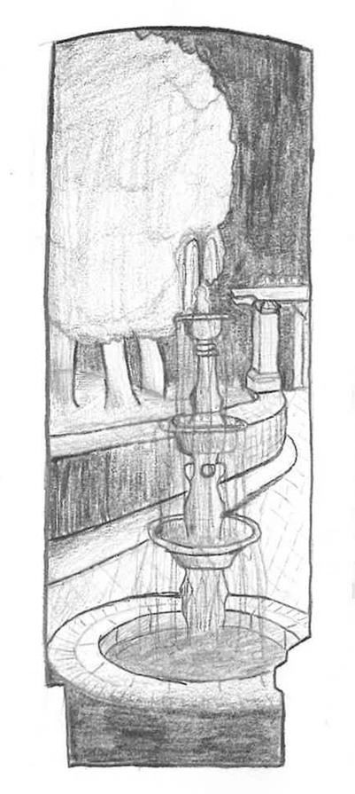
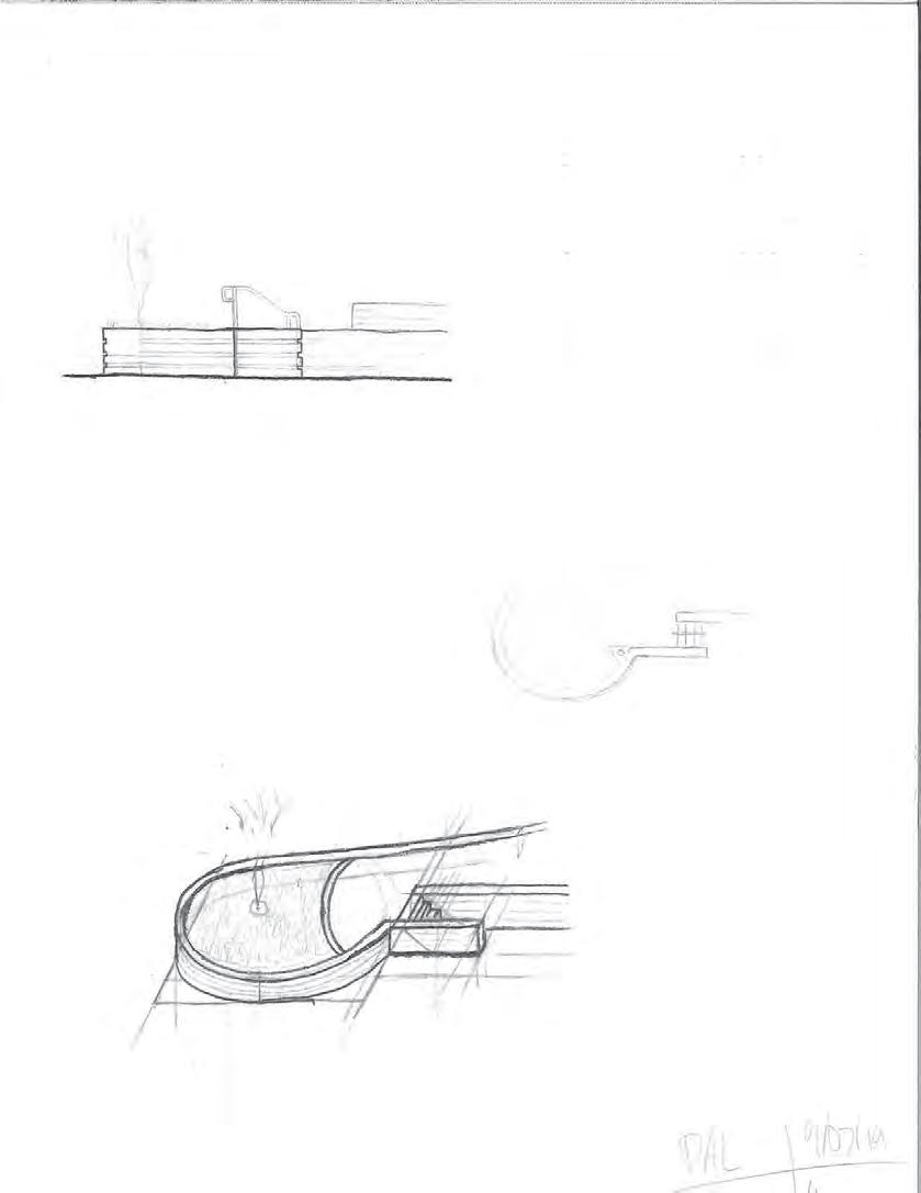
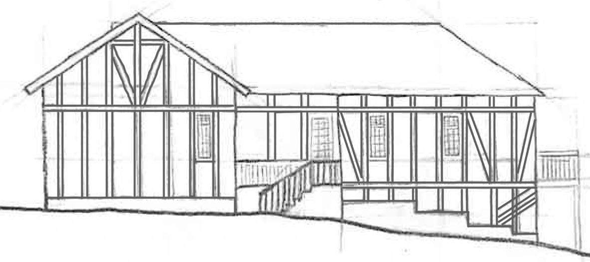
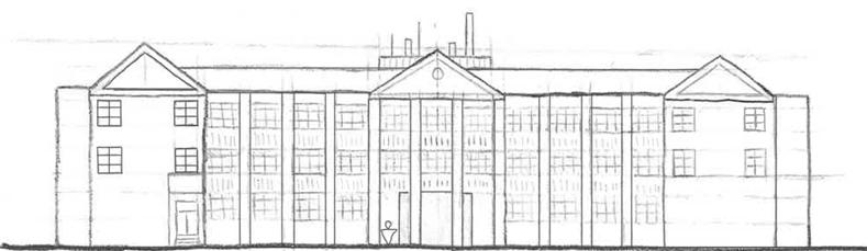
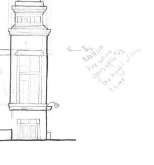
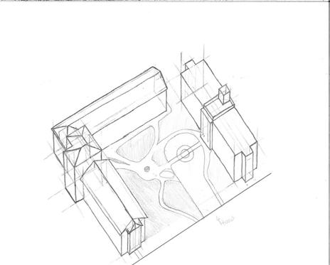
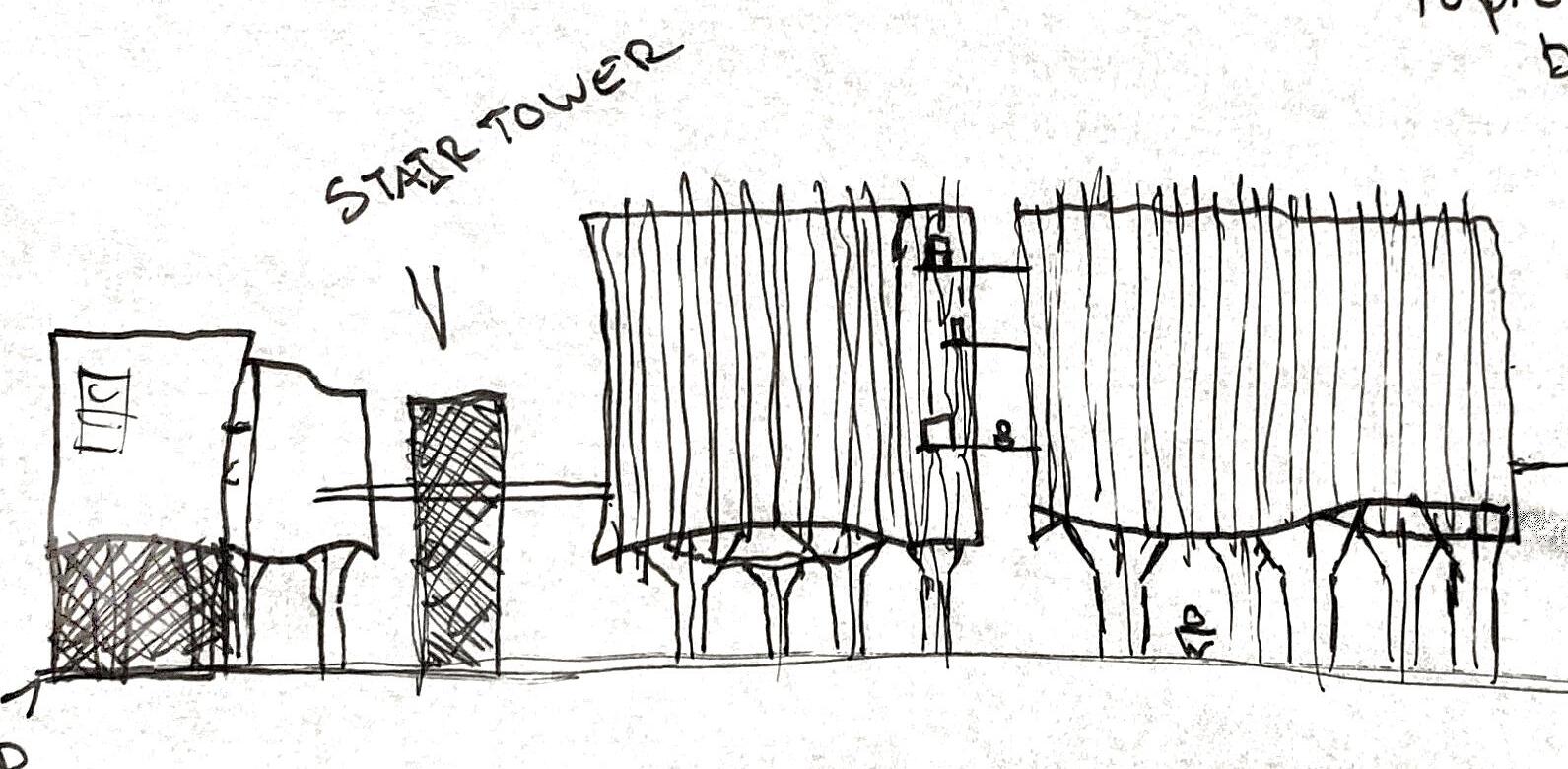
HAND-DRAFTING AND SKETCHES
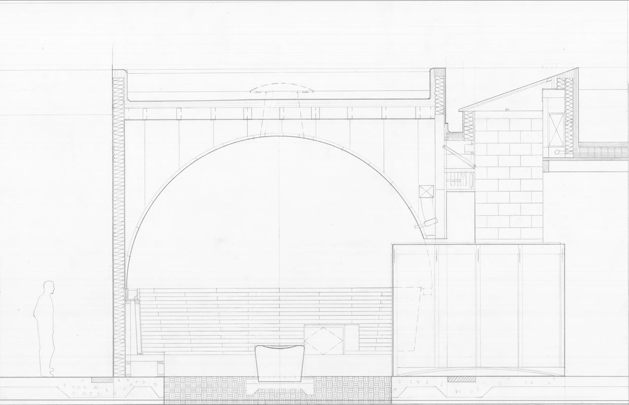
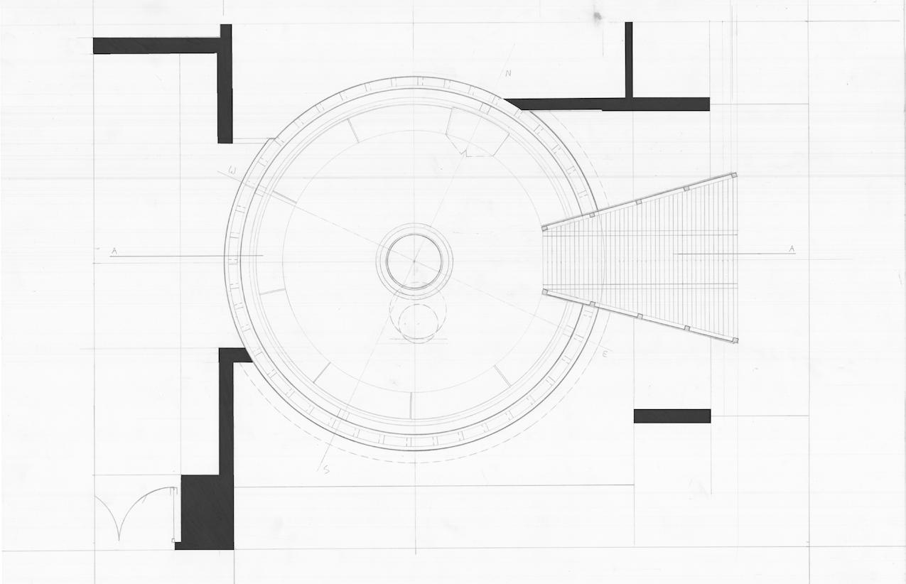
19
20
21
RENDERINGS
22
ConceptualDesign
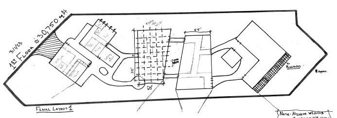

Drafted Plans and Concepts
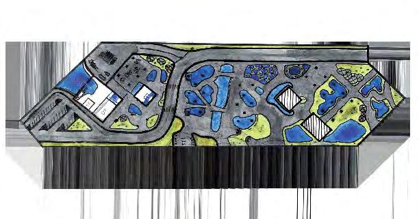
These drawings are a result of an attempt to fully comprehend the site and all of the factors and problems that come with it. The site at hand presents many unique problems to solve, namely transportation to the site and pedestrian flow around the buildings that are created. The focus of my design effort up to this point has been on the human interaction at the ground plane, which consists of an aquarium extension center and park area for the public. The areas above aim to bring nature into the site in a way that feels organic, resulting in a connection to the environment around the pedestrian.
The core concept of the design is humanity and its place in the order and chaos of the natural world, or in this case more so, the architects will and how much it can affect. How do we as designers control the site and the people who interact with our projects? We have limited control over the chaos, therefor we implement what little we have over very specific parts of the design. We can control the aesthetic and we can control the core circulation of a project. Both of these factors do slip from our grasp a bit as the budget and environment can affect the freedom of these. An area with a vast amount of freedom comes in the form of program implementation. The program may be provided, but we may put the key parts of that program wherever we so desire as designers. This factor, as well as the freedom provided to the first floors programming, is where I chose to focus my concept. The parts of the design storm I attempted to take and make completely mine are the first-floor program and the overall circulatory feel of the space.
I chose to design the Research Park half of the overall program and I chose to place it on the western half of the site bordering the harbor. This decision was made to create easy access to the water to allow for the launching of nautical research vessels, as well as docking underneath the lab building near the dive tank for essential vehicles. This half of the site is also intended to be private, at least compared to the interpretive center, so the placement makes it much more difficult for pedestrians to find their way in unintentionally. Of course, it will not be completely disconnected, but it does create the closing gate for the site.
Schematic Design
Programming and Plans
Moving into schematic design the priority shifted to circulation throughout the site and the space itself. As I was designing the professional half of the site, I decided to focus on ease of movement into and out of the labs while leaving plenty of circulation space moving forward to bend into more beautiful areas during design development. Each design move was made to further the design into the stages to come with full confidence in its ability to adapt to the needed conditions.

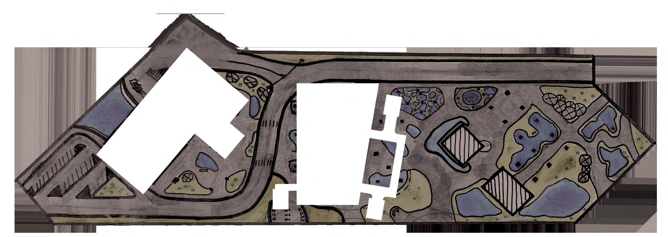
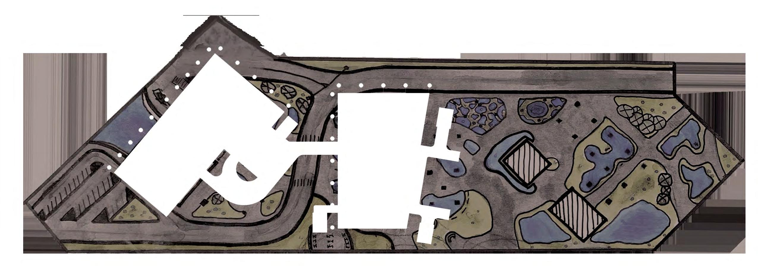

Bringing the program into the third dimension displays the way the structure underneath brings together the entire design. The large columns create an atomsphere that encourages exploration, but allows the designer to properly limit pathways throughout the space. The circulation underneath the spaces on the ground level is controlled by these columns, but complemented by the building layout. The overall design encourages the oberserver to walk through the columns to discover the next bend or gap in the structure. Each nook and cranny compliments the next with this form. The above drawings only show the programmed half with context, while the 3D shows the entire massing.
3D Graphic Display
1 4 B C D F H 10 11 K L M O P Q 122 SF 15 227 SF Vessel Lab Dive Tank 256 SF 1161 SF 202 SF 31 WR Storage Storage 49 Lobby 122 SF 122 SF 15 175 SF Small Conf. Office Office
Doldrum EE Calculations
In addressing the materiality of The Doldrum I came to the conclusion that I wanted to clad the entire building in an alluminum rain-screen and have the interior be composed entirely of wood. The shear walls are made of CLT and the beams are Glulam, and all of this was done with the intention of showing off the connection between the modern day method of construction and the future that we’re constantly staring down. Mass timber on the coast is a difficult task to accomplish, and this method is one that accomplishes all of the necessary goals. The rain-screen protects the mass timber structure from the elements while also allowing for a change in aesthetic that would otherwise be impossible. This combination of elements comes together to create the meshing of systems that is the Doldrum.


Total Operating Hours= 12,624,602.12hrs

Unit Weight= 150 lbs
Amount of Material= 2400 sq. ft. EE for Material= .75 MJ/Kg
Total Operating Hours= 850,819.58 hrs
Unit Weight= 8.1 lbs
Amount of Material= 2,706 sq. ft. EE for Material= 19 MJ/Kg
Total Operating Hours= 1,323,433.62 hrs
U.S.


737


Carbon

Total
Avoided
Unit Weight= 6 lbs
Amount of Material= 3,214 sq. ft. EE for Material= 15.50 MJ/Kg Total Oper-


Unit Weight= 15.30 lbs Amount of Material= 10,124 sq. ft. EE for Material= 12 MJ/Kg Total Operating Hours= 5,857,579.65 hrs 1) CLT 5-Ply Panel System 2) CLT 3-Ply Panel System 3) CLT Shear Wall System 4) CEI Materials Cladlock Paneling 5) 3-Ply Laminated Photo-Voltaic
Cast-in-Place
Shaped Concrete 7) Smart
Wall
K1660 2-Ply 8) Glulam Beams 9) Mitrex Solar Panels (Gray Shingle Pattern) 26,345,234.32
OP. Hours Unit Weight= 12 lbs Amount of Material= 3,250 sq. ft. EE for Material= 12
Operating Hours= 1,476,742.75 hrs Unit Weight= 13 lbs Amount of Material= 4367 sq. ft. EE for Material= 12 MJ/Kg
Operating Hours= 1,983,405.01 hrs
1.2 lbs
of Mate
rial= 15,239
EE
Material= 219
Glass 6)
Form
Curtain
System
hrs Total
MJ/Kg Total
Total
Unit Weight=
Amount
-
sq. ft.
for
MJ/Kg
lbs
ft. EE
ating Hours= 947,404.28 hrs Unit Weight= 18
Amount of Material= 2245 sq.
for Material= 12 MJ/Kg
Unit Weight=
lbs
rial=
EE
13
ating
1 2 3 4 5 6 7 8 9 Metal Panels Solar
Products
Glass
Total Operating Hours= 1,530,039.81 hrs
35
Amount of Mate-
957 sq. ft.
for Material=
MJ/Kg Total Oper-
Hours= 1,383,012.73 hrs
Wood
Concrete
m³ (26010 ft³) of lumber and sheathing
Canadians forests grow this much wood in:2 minutes
and
stored in the wood:629 metric tons of CO2
greenhouse gas emissions:243 metric tons of CO2
potential carbon benefit:873 metric tons of CO2 184 cars off the road for a year Energy to operate 92 homes for a year
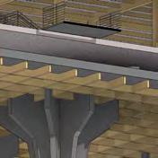
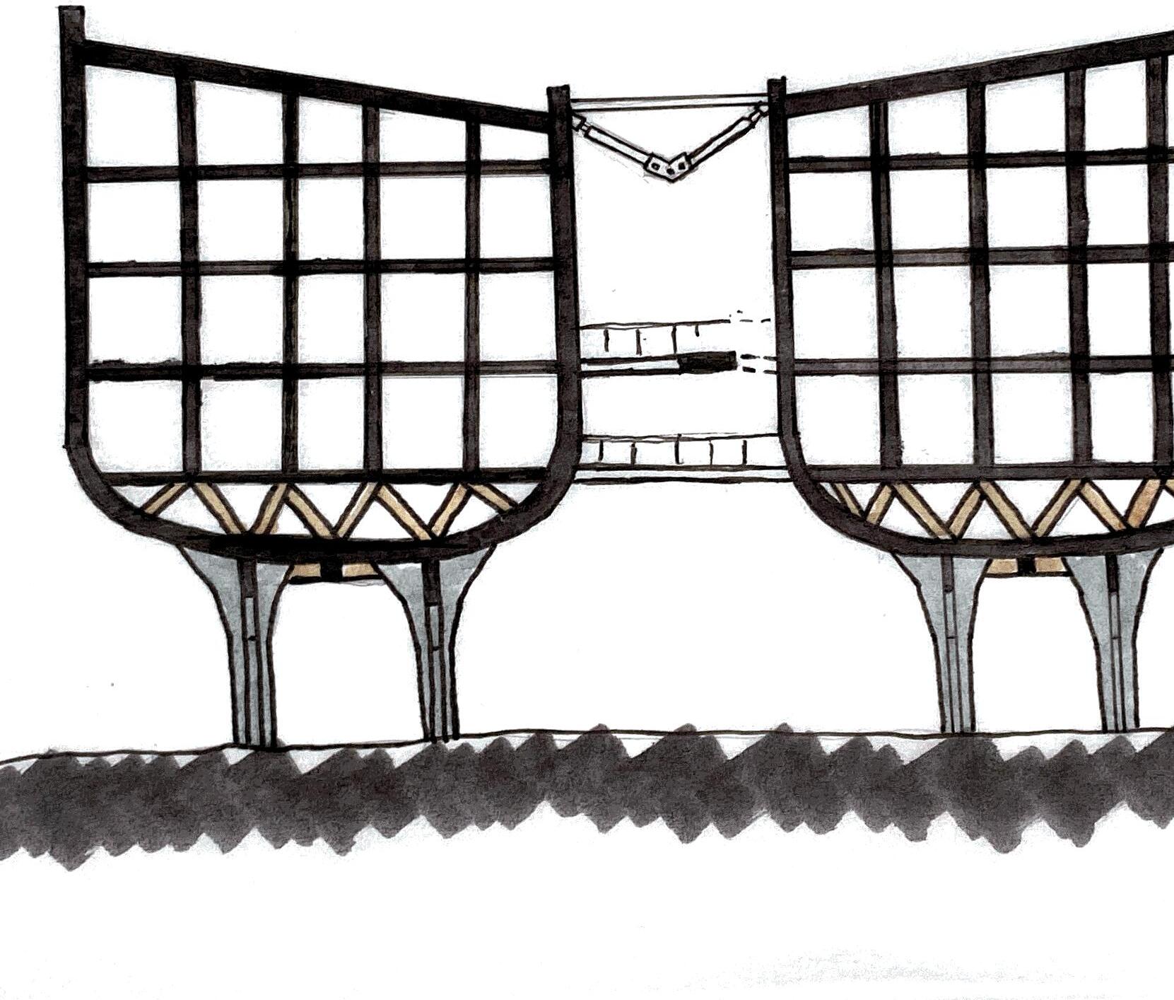
Doldrum HVAC Implementation
The approach to passive and active cooling in the Doldrum is a simple, yet effecient one. The goal of these systems is to create a system that is undetectable to the pedestrian while providing substantial air flow and quality. The main concepts of the design are complimented by the implementation of a plenum space to hide the majority of the duct work, as well as many of the main mechanical components. This space also allows for a sort of cooled flooring that falls under the passives category of air control.
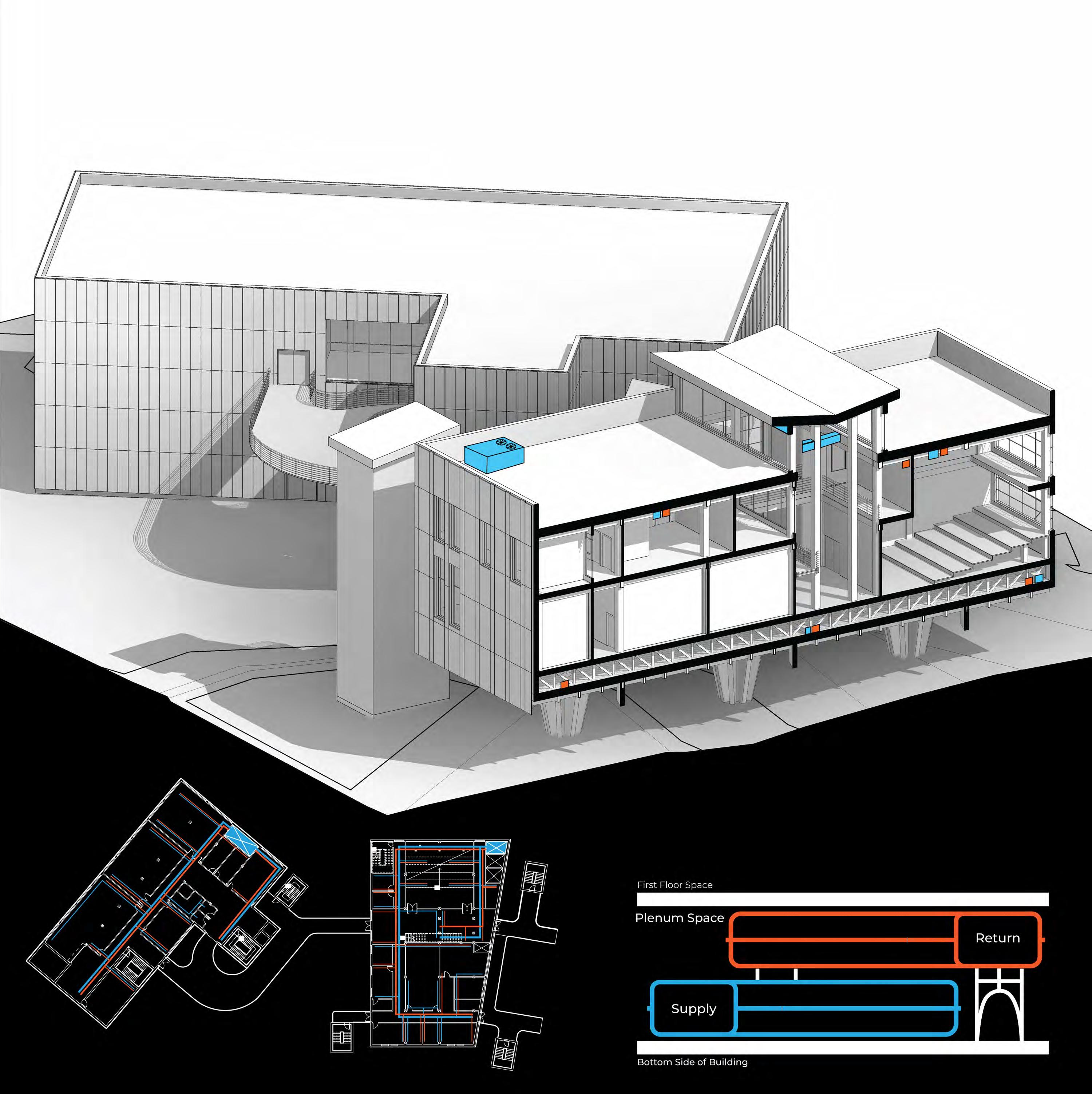
Each of the main buildings will be equipped with a rooftop consdenser hidden behind the parapet. These systems can easily supply enough cooling to this building throughout the summer in tandem with passive cooling techniques.
Taking advantage of the clearstory space, the Doldrum passively forces the hot air from the atrium up and out of the vented sides using natural air pressure. This effecitvely cools the space below as it pulls out the warm air as it is replaced by the cold air provided through the system. The atrium is the only space that will have visible ventilation as the ducts cross across the space on top of the roof. This decision was made intentionally to create a unique experience as you walk through the space. The concept of connection that the sky bridges provides is accentuated by this briding of ducts.
The Doldrum will be taking advantage of a forced air system as it is the most logistically plausible option
Plenum Diagram
The below diagram demonstrates what the inside of the plenum space is going to look like in a very simple visual style. The return ducts will have pleny of space to stack on top of the supply ducts as the space is 6 feet in height. This provides the opportunity to put much more then just these two main components, but for the sake of the diagram that is what is shown.
SCALE: 3/32” = 1’
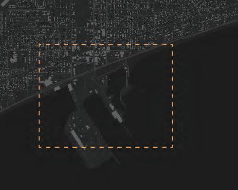
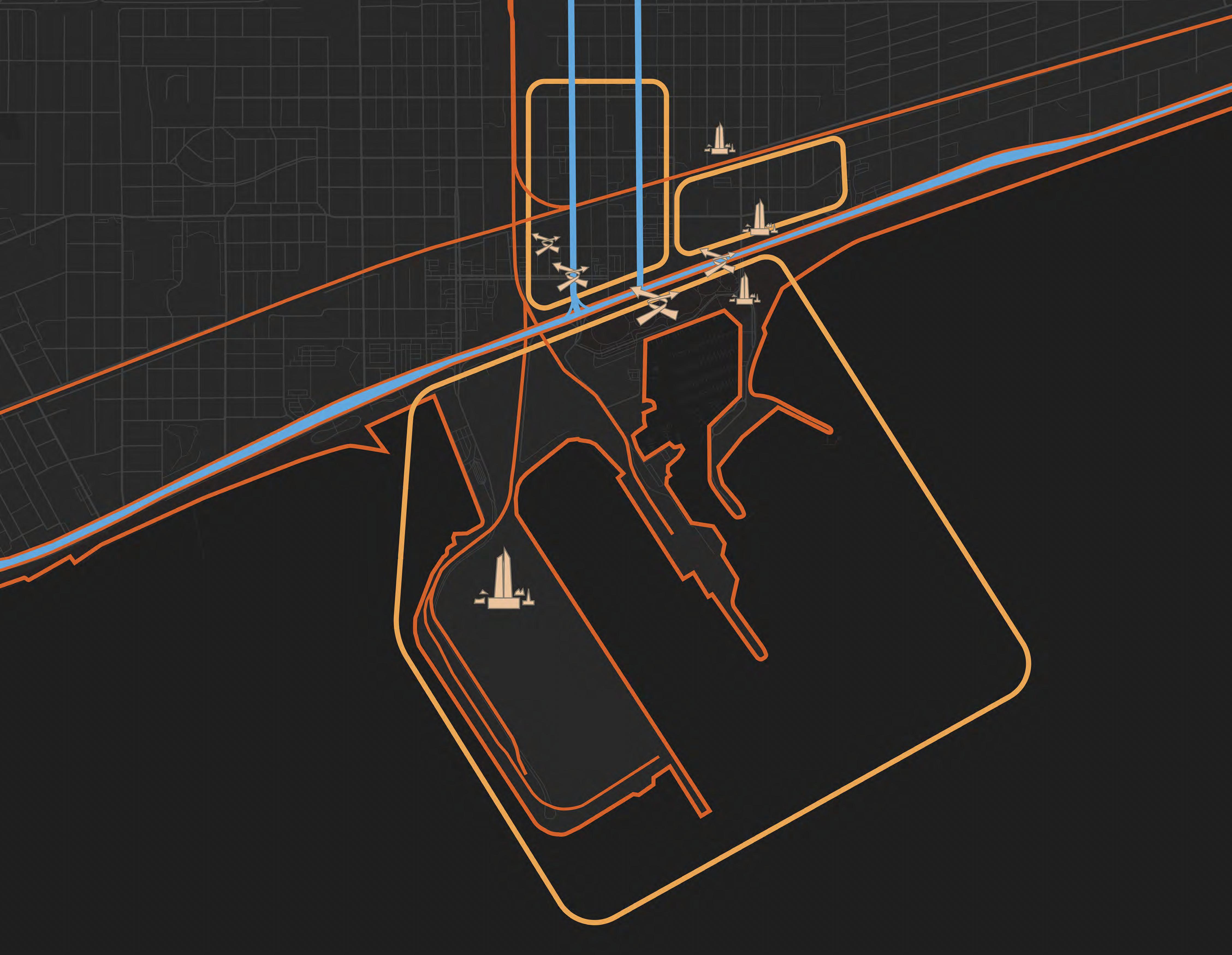
PATHS
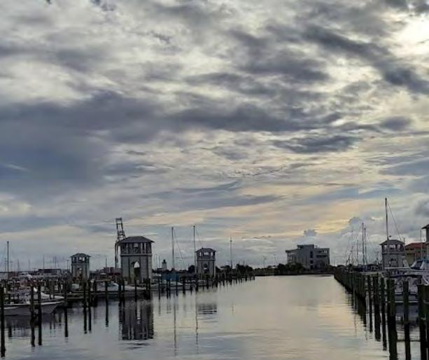

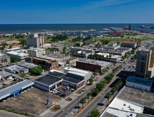
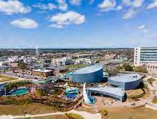
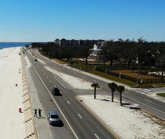

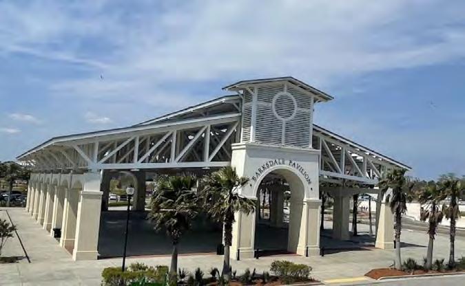
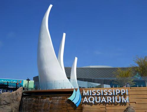
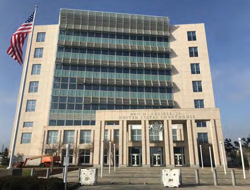
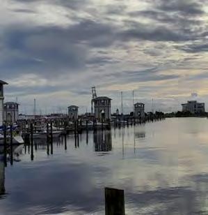
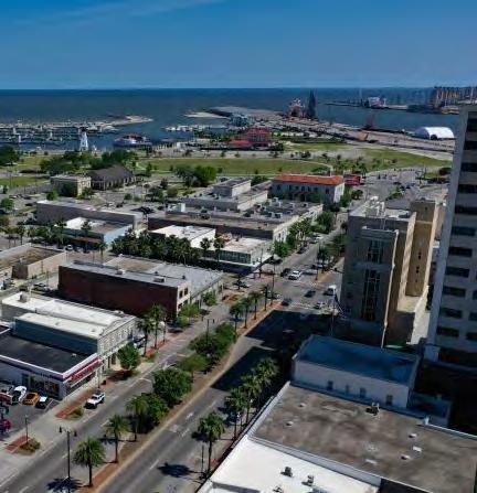
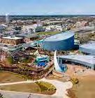
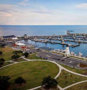
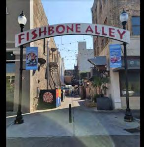

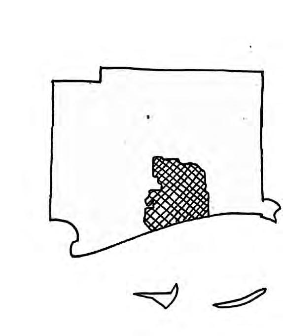
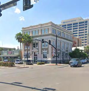
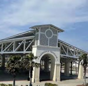
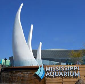

GULFPORT, MS ANDY LADD KEVIN LYNCH STYLE MAPPING AND WRITING ASSIGNMENT SITE PLANNING - ARC 4733 PROFESSOR HANS HERRMANN FEBRUARY 20, 2023 DISTRICTS The districts function as spaces that the pedestrian moves throughout and have a certain level of recognition towards due to their continuity. The goal of districts is to organize a city into distinct sections that serve that function. Gulfport’s districts suffer more from the storms than any other category, as attempting to set up permanent districts is a herculean task. The districts focused on here include the Port and Harbor District, the Food and Business District, and the Tourist District. Each of these areas has a distinct feel and is utilized by the surrounding paths and edges to help build the city fabric. The district that is made by the port and harbor is the main draw for pedestrians across Highway 90. These areas have a distinct separation from the rest of Gulfport and offer unique services and ocean access. The Food and Business District takes up most of the downtown area of Gulfport and is where most of the restaurants, businesses, and smaller art installations are located. This is undoubtedly the heart of the city compared to any other district. The Tourist District encapsulates the Mississippi Aquarium and the surrounding tourist attractions. This district is distinct as a result of its unique architecture that is meant to draw the attention of the observer. NODES There are a few notable nodes around Gulfport, each of which serves as a junction, or connection point, for the city. The nodes of Gulfport are not particularly strong, but they have great potential. These nodes are located at key points along the pathways of the city and very importantly, have room to grow. The major nodes of Gulfport are Jones Park, Fishbone Alley, 25th Avenue and East Beach Boulevard, and the pedestrian bridge that is currently under construction. Each of these locations provides a unique, and recognizable, place for pedestrians to reorient themselves and gather if desired. Jones Park is a very prominent node, as the largest green space in Gulfport it offers respite from the city and great views of the ocean with many pathways carved through for traffic. Fishbone Alley is a pathway that has evolved into a place for people to walk through and around to get to different locations. The intersection at 25th and East Beach is a prominent end to the downtown district and is the site of a crosswalk across Highway 90 facing the port and Jones Park. The pedestrian bridge is not yet completed, but when it is it will be a place for people to cross Highway 90 above the traffic and stand to watch fireworks festivals and look out at the ocean whenever they desire. Each of these spaces exemplifies the Lynchian node.
There are many paths in and around Gulfport that contribute to the overall circulation through the city. These paths are functional in bringing the visitors and residents toward the other important areas. Taking ad vantage of these paths provides the opportunity to frame views and implement strategies to increase resident interaction and happiness. The major paths of Gulfport include Highway 90, 23rd Avenue, and 25th Avenue. There are many auxiliary paths that feed into these pathways, strengthening them in the process. The key aspect of the major pathways that earn them that title is their draw and overall importance to the city as a whole. Each one of those three paths is necessary to the identity of the city. Highway 90 is the most important of all as it is the major highway that goes along the coast and connects Gulfport to many other major coastal cities like Biloxi and Mobile. This road is prolific and is implemented quite poorly into the overall design of Gulfport, functioning as a major artery and a hard developmental line for residen tial use. The value of 23rd Avenue lies in its ability to provide a view of the downtown area of Gulfport as people approach the city, be it by car or on foot. Finally, 25th Avenue serves as a major entryway to the metropolitan area from Jackson and Hattiesburg. This functions as Gulfport’s downtown area with a large number of first-floor shops and apartments. LANDMARKS Gulfport has many locations that contend for the title of landmark for the city as a whole. These place function as reference points for pedestrians and other observers as they move around the city. Each of these locations is essential to learning how to properly navigate throughout Gulfport. The landmarks of Gulfport include the Gulfport Municipal Marina, the Mississippi Aquarium, the cranes on the port, and the Dan M. Russel Jr. Courthouse. Each of these areas is distinct enough to stand out from the surroundings while being located in important places around the city. There are a few minor landmarks as well, these serve as lesser points of reference that can be used as well. The Gulfport Municipal Marina might not be the tallest building in the area, but it serves as a navigational aid when moving around Jones Park and the Marina itself. The pavilion sits at the end of the parking for the area and on the edge of Jones Park between it and the coast. Similarly, the Mississippi Aquarium stands apart with its unique placement and aesthetic, not its height. Upon the completion of the pedestrian bridge, this site will become even more of a landmark. As far as recognizability goes, the cranes on the port stand above the rest. The Dan M. Russel Jr. Courthouse stands as a unique piece of postmodern architecture that stands out amongst the rest of Gulfport. This building is recognizable from a distance and easily functions as a landmark. EDGES The edges of Gulfport are significantly stronger than any other facet of the city. The locations that con stitute edges are places that manage to create hard boundaries for construction and can be seen from many locations around the city. It is easy to follow them to reach any of the noted landmarks that can help a pedestrian find their way to whatever their destination may be. All of the edges that are to be listed create a noticeable, and legible, cut across Gulfport. These are the key factors of the Lynch-style edge that Gulfport manages to exemplify. The major edges consist of Highway 90, the coastline, and the Gulf and Ship Island Railroads. The edge that impacts Gulfport the most would have to be the cost line, followed directly by the slice that is Highway 90. The coast impacts Gulfport more than anything else ever could. It brings both the city’s lifeblood, in the form of shipping profits, and destruction, in the form of hurricanes and storms. Highway 90 creates a hard line that cuts down the coast and promotes a boundary that the city butts up against. The different railroads that come from the port on the coastline side of Highway 90 create different grids that constitute the city. The city of Gulfport is host to an environment that creates an incredible opportunity to generate a community that draws in people from all around the world. It sits on the coastline of the Gulf of Mexico and is home to some beautiful islands, as well as an active port and harbor. The Lynchian style of analysis presents a method to break down the different aspects of Gulfport and their corollary effects. Studying the edges and paths of the city, as well as their effects on the locations of nodes, shows more facets of a city than one can perceive at first glance. Each of these categories offers a distinct view of the city and its worth. Paths feed into nodes, which are key points of different districts, often focused around or near landmarks. That example is one way that these categories can work together to better show the way a city can be deemed both legible and imageable. As a city, Gulfport lacks distinct edges or areas that stand out as nodes, but they do exist, albeit barely. Understanding this city is incredibly difficult from the human perspective and creates a confusing and difficult environment to navigate. Even from an ariel perspective, the city lacks distinct features outside of the courthouse, Highway 90, the port, and the spacious Jones Park. These features do not, and will never be able to, make up for the distinct lack of planning that went into the overall form of this city. Attempting to fully understand Gulfport from a Lynchian perspective creates issues about whether a portion of the city is worthy of being placed into any of the categories necessary. Implementing the Keven Lynch style of analysis for the city of Gulfport allows the observer to break down the area into smaller, more digestible chunks. This style shows the strengths and weaknesses of the city, as well as allows a comprehensive understanding of the inner workings of the city as a whole. On top of those factors, the five different categories help ascertain the legibility and imageability of the city. In his writings, Lynch breaks down the imageability of the city into five different categories: paths, edges, districts, nodes, and landmarks. Each one of these typologies builds into the others to create a full-fledged system to study the legibility of a city plan. The Lynchian system definitely does not do Gulfport any favors. Breaking the city itself down leaves much to be desired, but when factoring in the coast, allows the city some leeway by promoting its imageability. Gulf port is a city fraught with issues, many of which stem from its propensity to be struck by hurricanes every thirty or so years. This fact alone makes designing a city that is meant to be memorable and easy to navigate difficult as the city is essentially reset every three decades. This results in Gulfport lacking a true identity outside of its major landmarks that have survived the likes of Hurricane Katrina. These include some paths, edges, and landmarks, while districts and nodes have shifted over the years as the town has changed after these catastrophes. Highway 90 and the port stand as permanent installations that have weathered the storms, but most other significant aspects of the city have been built in the wake of the disasters leaving the city as a quilt of random projects crammed wherever they can be fit. There is room for the city to grow back into a legible location, but it would require massive amounts of funds and dedication from the citizens. ANALYSIS - DISTRICTS - NODES - LANDMARKS - MAJOR PATHS - MAJOR EDGES 1* 1* 1) Jones Park 2) Fishbone Alley 3) 25th Avenue and East Beach Boulevard 4) Pedestrian Bridge 1) Gulfport Municipal Marina 2) Mississippi Aquarium 3) Cranes on the Port 4) Dan M. Russel. Jr. Courthouse 1) Port and Harbor District 2) Food and Business District 3) Tourist District 1) Highway 90 2) The Coast Line 3) Gulf and Ship Island Railroads 1) 25th Avenue 2) Highway 90 3) 23rd Avenue L1 L2 L4 L3 N1 N4 N3 N2 D1 E3 E2 E1 P2 P1 P3 E2