FRANCESCO FRANCHI


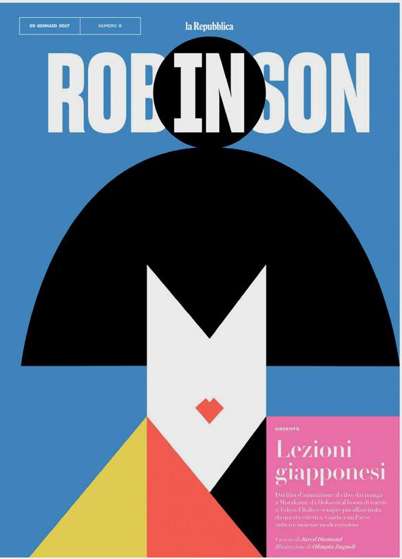


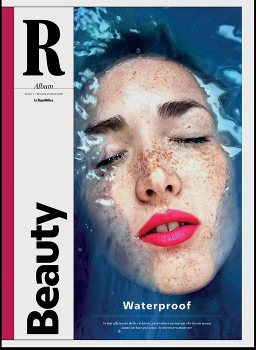
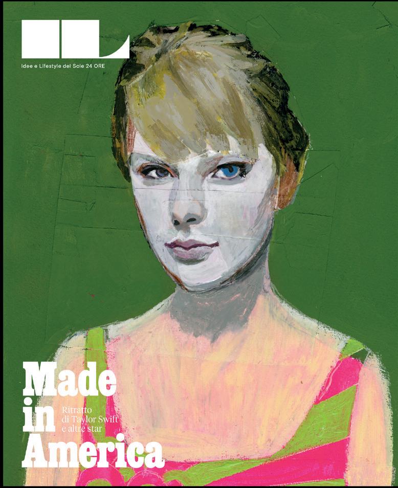
[Cover and Back cover]
Cover magazines of IL Magazine, la Repubblica, Gedi


How did you get into designing newspapers? I studied architecture in Milan, and when I was at university, I started to work in a graphic design studio. I worked on the design for way finding systems, infographics, and editorial design, books, and a magazine for Pirelli, the tire company. Then I started to work for “Corriere della Serra ”, which is one of the leading newspapers here in Italy.
After I finished my final dissertation, I returned to the design studio. And a few months later, I had a call from Il Sole 24 ORE, which is the leading financial newspaper in Italy. They were developing a new magazine called the IL magazine and so I began working towards a professional qualification in journalism. In Italy, to work at a newspaper, you have to be a professional journalist. That entails one and a half years of training, then you do this exam, and you become a journalist.
I was at Il Sole 24 ORE for eight years. Then, nine years ago, I moved to La Repubblica in Rome. The main newsroom, is in Rome, I stayed there for five years, and then finally, moved to Milan, which is where my family is from.
Do you do work from home?
No, we have nine local offices around Italy.
One is in Milan. To move to Milan, I had to work on another magazine, called ‘D’. I’ve been on that for almost two years now. And in the meantime, they started a few monthly supplements here in Milan. So I have been supervising all the special editions of the newspaper, but I don’t have the daily routine of the newspaper to contend with. That’s really, really hard.
Now, I have a team of graphic designer here in Milan, working on the supplements, and special editions. We work on the website as well. And, on top of all that, I have redesigned the newspaper twice already.
That seems like a lot of redesigning!
Since I moved to La Repubblica , we have had four new Editors in Chief. And every time an editor in chief arrives, he wants to change things, to give a sign that something is going to change.
What kind of change are we talking about here?
Actually, for the first redesign, the idea was to focus on the changing habits of the readers. For example, the different phases of the day when people read, this routine is changing, and with it, the demand for news is changing.
So it was a reflection on this change, and how digital and print can work together. For example, for that first redesign we talked about a newspaper that works for different parts of the day. We had the hour, the day, the week, and the month.
So, in every section of the newspaper, we had a column where we placed all the news that a person needs to know really quickly, in the time it takes to eat breakfast, for example. There you’ll find everything you need to know before you go to work.
Then we have a part which we called ‘the day’. That was the section you maybe read in the evening, to find out what happened that day. And we had a section called ‘the week’ which was a supplement in the middle of the paper. So every day we had a different supplement which focused on a different topic: fashion, design, science. Finally, we had different monthly products too.
taking inspiration from the habits of your readers
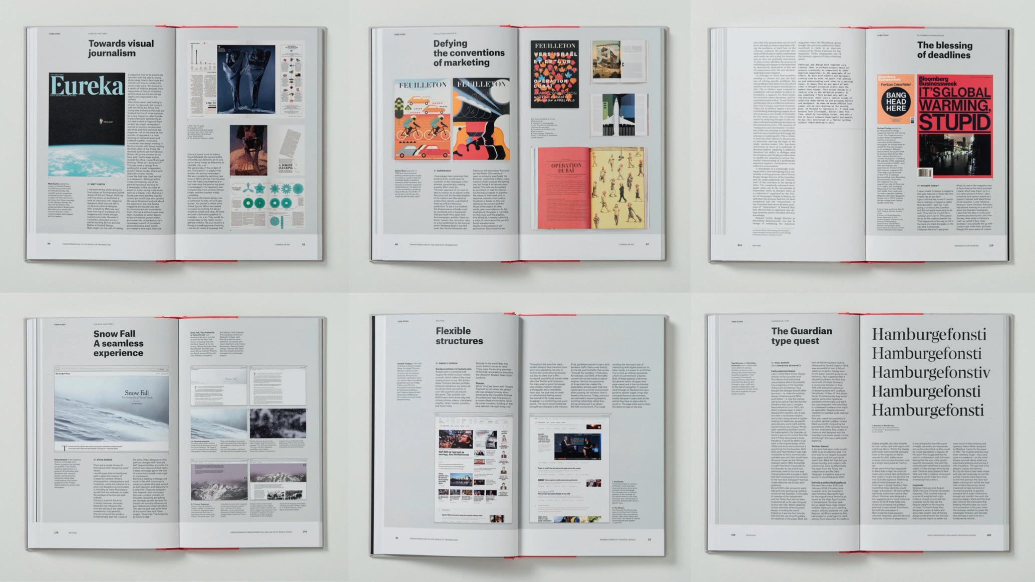
This was when I wrote the book, ‘Designing News’. That was about the role of design inside news rooms. 10 years later, I say that now we are more designing a ‘news experience’. We are focused on designing something that goes out on different media and can be approached by different senses. It can be touched, can be read, can be listened to, it can be watched.
This is the idea behind the Domestika.org course I created a few years ago. It works on a sort of matrix where on one axis you have the time of the day, and on the other axis you have the five senses. You have to design something that goes through this matrix. It must work through your branded product, but also through third party products, like social media. As a designer, you have to give identity to the content, to give a form to the content which works through all these channels.
Designing News
Gestalten, September 2013

THE DIFFERENT PHASES OF THE DAY WHEN PEOPLE READ, THIS ROUTINE IS CHANGING, AND WITH IT, THE DEMAND FOR NEWS IS CHANGING.


Have we got to a point where we understand this new media landscape well enough to begin perfecting the design?
No, you have to test and you have to try new things, to experiment. Sometimes you find editors that are really open to experimentation, really open to risk. Other times you have bosses that don’t want to take risk. That was the case for the second redesign at La Repubblica . They wanted a newspaper similar to the first edition from 50 years before. It was an attempt to get back the old readership. They asked me to take inspiration from the past, and to make the font bigger.
You have to try to keep the brand strong with the print edition. I think you need to design and to package a different product. For example, it could be a sort of playlist of the best content you have. You need to invest in the content, and then to print only what really has value in print. But we are in a moment where your readership wants the old newspaper, because it's an old readership. So you can't experiment. You can't take the risk of designing a different newspaper.
So what do you do?
Then you try to design a newspaper that is similar to the website. But it’s the same news in the paper that you had the day before, in the digital edition. In this case, the print edition is just for an older readership, or for people that enjoy the routine of going out and buying the newspaper.
How do you feel about print these days?
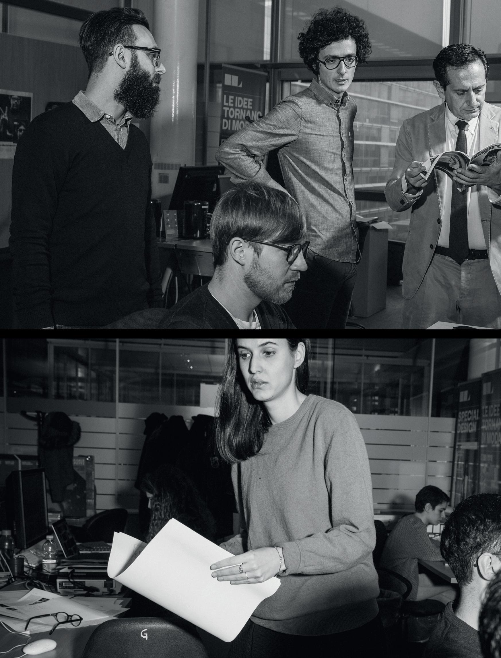
I'm not scared about the end of print, I'm scared about the end of a way of doing newspapers, whether it’s digital or print. Newsrooms are changing. They don’t have the energy they used to have. When I started to work in the newsroom, I liked it because the environment was so full of energy. People screaming, people fighting. But it was also a place where intellectuals, journalists, people from cinema, sport, they came together in the newsroom. The daily meeting was a sort of election. I miss this part of the work. Going to press or going online, is not so different, the process is more or less the same. But I need this energy, because at the end of the day, it’s the people that make the the journal, the newspaper, the magazine.



Where has that energy gone?
I think some of it is because the people that made the newspaper what it is, they retired. They were the people that cared about the details, that knew about the process, they worked with the heart. Digital, I think, is somehow colder, it's not warm like the paper. So the process has become less human, more related to algorithms.
The approach to the work is different too. You used to speak with people in the newsroom, now you text, or you send a “WhatsApp”. For me, you need to speak with people to know what they want, because our job is to translate the content into a form people find easy to consume. We translate and communicate ideas. I think you need to speak with people for this.
There's a ton more information these days, but a lot less understanding. Is it possible to produce something which is digital and has soul?
I think it's possible. I think we have to educate people to value the content. I believe we have to focus on quality and
on the value of things. We should not use online for aggressive advertising. And if people want a massive scrolling page, they can go to other places for that, so the newspaper should not try to copy the logic of social media.
We have to work on different products for different parts of the day, creating different tones for our readership. Something to be consumed slowly, something that is quick. We have to work on the matrix I mentioned before.
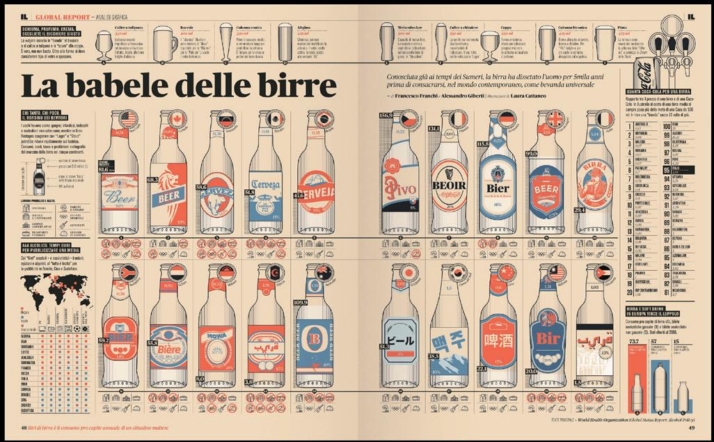
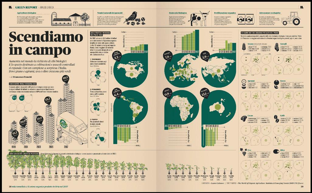
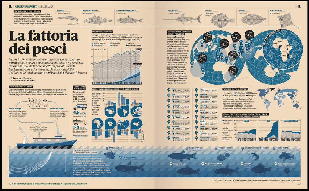
Your infographics are a good example of high value content. That was an attempt to combine the different languages, to tell a story in a visual way, combining data, illustration, maps and so on. It's something that I liked when I was at university, and as soon as I got the opportunity to work on a real newspaper, in a real magazine, I tried to put this way of working into practice.
I did this when I was at Il Sole 24 ORE, and the approach has stayed with me in every project I’ve developed since. I like this way of communicating, but it's something that can be mixed with other ways of working. It can be very attractive for the audience, but it needs a lot of work. So, right now, when you have less resources to work with every day, less people, less money, less time, it’s difficult to develop something like that.
If I was a student, looking to get into publishing, news, or the media, what kind of thing should I study?
I think you have to keep hold of all the things that you can learn, from as many fields as possible. Art, cinema, music, sport… What I always say to younger people is, don’t just focus on digital, go to the library, try to absorb all the stuff that you will use later on in your career. If you do this, later on, when you approach a project, you’ll have a background to draw from.
Many people don’t look beyond the first page of Google search
Think about the design from the ‘60s and ‘70s, when people did a lot of research. They discovered a lot of stuff. Nowadays we forget the past, and we design poorly as a result. We are doing cheap when what we should be doing in focusing on value.
Your university thesis about graphic journalism, how do you look back on that now?
Well, the main idea was the role of design in news, but it was also about the importance of empathy, to give form to content. The idea to create a more participatory way of working, where many actors are involved and all those actors respect the expertise of the other people.
So, for example, you worked with a photo editor that knows about photography. But, every person was important to the team. The goal was to create a team where people respected each other and everyone put his or her expertise into the process. It was about the importance of a functional hierarchy, and not just a vertical hierarchy. You need to be open minded, to experiment and to make mistakes.
Would you add anything if you wrote the thesis today?
I wrote that dissertation almost 20 years ago. So, now, of course, I would be more focused on the experience in general, on the reader. And the need to take risks, because this is the only way to make steps forward. Without risk, we stay in the same situation. We must have courage if we want progress.
I always try to start from the main idea, the answer to the question: “Why we are doing this page? What do we want the reader to know?” With this in mind, and with all the data you collected, you try to make a flow or reading through the material, even if it's a sort of non linear way of reading.
You can start from anywhere within the story, but we always focus on the story, and we try to make the it more comprehensible. We don’t use a particular aesthetic just because it's nice or colorful.
The best way, of course, is always to work with a journalist or editor, who can give you the starting point. As a designer, I think you need to speak with the people that are writing the content before you start work. Even when I’m doing an editorial project I need to start with the editor to understand what he or she has in mind. Just doing graphics for their own sake is really hard for me.
I have been very lucky in my career because I have always found people I work with that I can learn a lot from. In the design studio, in the newsrooms. I’ve had great editors, who taught me so many things. It’s really important to learn and to have people around you that can share their vision, and teach you how to work.


La Repubblica
November 2017
WHEN I STARTED TO WORK IN THE NEWSROOM, I LIKED IT BECAUSE THE ENVIRONMENT WAS SO FULL OF ENERGY. PEOPLE SCREAMING, PEOPLE FIGHTING.


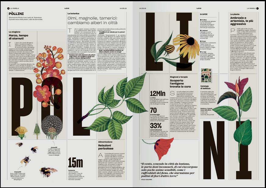

Live
, infographics
by Manuel Bortoletti
Working in print, typography must be very important to you as well?
Typography is the most important starting point, because it gives you the identity of the project, it sets the mood and the feeling. So I always start from typography. Perhaps it’s so important because type is something that readers don’t understand in an explicit way, its effects are implicit in the way of reading and in the way of approaching a project.
When I’m choosing a typeface, I always try to start from the past of the project, the story behind the font, or the inspiration for its design. On a recent project we found a connection to the ‘70s in the content, so I got this typeface from Commercial Type, that they designed with the ‘70s in mind. This was the link between the project and the typeface.
How about digital type, is that equally valuable?
Digital typography is becoming more and more important. It’s more important than in print now, because of the definition of the new displays, new mobile phones. You can work better now on digital than in print.
Actually, we are always trying to economize on the print spend, so print is now worse than before. We have reduced the quality of the paper and of the ink. For example, in my newspaper now, it is quite impossible to get a true black because they have reduced the inks. Meanwhile, you can see every detail of the type design on a display.
On the subject of screens, have you noticed people's attention getting shorter?
No, I notice that people want things explained. Mostly this is the case for young people, because maybe they don’t read the news every day, so they don’t know the evolution of the stories. So, what they want is to have things explained clearly. This is perhaps one reason why newspapers are not going down so well with the younger generation.
In fact, in Italy, we have some websites or some brands that are working on social media, on Instagram, and they explain the news very well. It’s an Instagram post, so you cannot say too much, but they are succeeding where newspapers fail because they try to explain the news. Sometimes they are superficial, very superficial, but they give you this feeling.


Is there such a thing as Italian design, or is design becoming a global mono-culture?
Sometimes people say to me, ‘your work is so Italian’ but I can never understand this. Maybe because Italy has a lot of influences. We had people in the ‘60s and ‘70s that shaped a lot of Italian style. I’m thinking of Bruno Munari, Bob Noorda and Massimo Vignelli. And we take references from our past, maybe this is the reason there is a sort of Italian style.
Do you look at old newspapers and magazines for inspiration?
I do this a lot. Really, a lot. This is a clear difference between print and digital. If you wanted to see how a website looked 10 years ago, you can't. Maybe you can get the content from that period, but it will be in the new design. If you go through libraries and bookshops, you find old stuff in the old design, so it's easier to collect and explore printed stuff. I always look at print when I’m doing digital stuff, I always try to find inspiration from the past.
When you are designing newspapers nowadays, you're always thinking about the digital user experience. But I think there is some overlap between the two media. They overlap in the design, but they don't overlap in the content. You have to think differently to give form to the content, but the design elements are the same.
If you look at The Guardian, for example. Elements of the print are the same as the digital. But how they create news, it's completely different.
Where else do you look for inspiration?
I like The Guardian , and the New York Times, and some magazines. But I find inspiration from other fields too. From the arts, architecture, for example... For a recent project, I even took inspiration from the label of a shampoo bottle!
WITHOUT RISK, WE STAY IN THE SAME SITUATION. WE MUST HAVE COURAGE IF WE WANT PROGRESS.


PE'L SCHLECHTER Graphic Design 2017
38 TIM JOHN & MARTIN SCHMITZ Scenography Design 2017
39 BROSMIND Illustration Design 2017 40 ARMANDO MILANI Graphic Design 2017
LAURA STRAßER Product Design 2017 42 PHOENIX DESIGN Industrial Design 2018
43 UWE R. BRÜCKNER Scenography Design 2018
44 BROUSSE & RUDDIGKEIT Design Code 2018
45 ISABELLE CHAPUIS Photography Design 2018
46 PATRICIA URQUIOLA Product Design 2018 47 SARAH-GRACE MANKARIOUS
59 DAVID KAMP Sound Design 2021 60 THOMAS KURPPA Brand Design 2021
MARC TAMSCHICK Spatial Media Design 2020
54 TYPEJOCKEYS Type Design 2020
55 MOTH Animation Design 2021
56 JONAS LINDSTRÖM Photography 2021 57 VERONICA FUERTE Graphic Design 2021
58 CHRISTOPHE DE LA FONTAINE Product Design 2021
Design 2022 63 STUDIO KLARENBEEK & DROS Design Research 2022 64 JOUPIN GHAMSARI Photography Design 2022 65 LOTTERMANN AND FUENTES Photography Design 2022
66 SUPER TERRAIN Graphic Design 2022 67 EIKE KÖNIG Art Design 2023
68 CHRISTOPHER NOELLE Light Design 2023
69 DENNIS HINZE Sport Fashion Design 2023
70 KLASIEN VAN DE ZANDSCHULP
Design 2023 71 VALENTIN VODEV Industrial Design 2023
72 GERMANS ERMICS Sculptural Design 2023
73 MADE BY JAMES Type & Logo Design 2024
74 SNASK Branding & Video 2024
75 CRAFTING PLASTICS! STUDIO Design Research 2024
76 STUDIO BRUCH Graphic Design 2024
77 GEMMA O'BRIEN Graphics & Lettering 2024
78 MARLOTA Fashion Design 2024
79 RONAN BOUROULLEC Product Design 2025
Design Friends would like to thank all their members and partners for their support.
COLOPHON
PUBLISHER Design Friends
COORDINATION Anabel Witry
LAYOUT Vera Heliodoro
INTERVIEW Mark Penfold
PRINT Imprimerie Schlimé
PRINT RUN 250 (Limited edition)
ISBN 978-2-919829-08-8
PRICE 5 €
DESIGN FRIENDS
Association sans but lucratif (Luxembourg)
BOARDMEMBERS
Anabel Witry (President)
Guido Kröger (Treasurer)
Heike Fries (Secretary)
Vera Heliodoro, Reza Kianpour, Hyunggyu Kim (Members)
COUNSELORS
Zoë Mondloch, Hyder Razvi, Olga Silva, Silvano Vidale
Support Design Friends, become a member. More information on www.designfriends.lu
Design Friends is financially supported by
This catalogue is published for the lecture of Francesco Franchi
story telling in news media" at Mudam Luxembourg on March 26, 2025 organised by Design Friends.


