THE PLATINUM ISSUE

Vithal House | 35 Gorst Road | Park Royal NW10 6LA | T:0208 8961 1342 | M:07870 108 358 www.stjamesinteriors.com SPECIALIST IN HANDCRAFTED BESPOKE JOINERY
Handmade in England
Introducing Forme brassware, the conscious collection made with uncompromising attention to detail.
Design Centre Chelsea Harbour samuel-heath.com



www.franklite.co.uk . info@franklite.co.uk . +44 (0)1908 691 818 . decorative lighting solutions | commercial | retail | hospitality | project designs
92 URBAN REFUGE MODERN SIMPLICITY BY DOUGLAS DESIGN STUDIO
100 ASIAN INSPIRED INTERIOR DESIGN EXCELLENCE
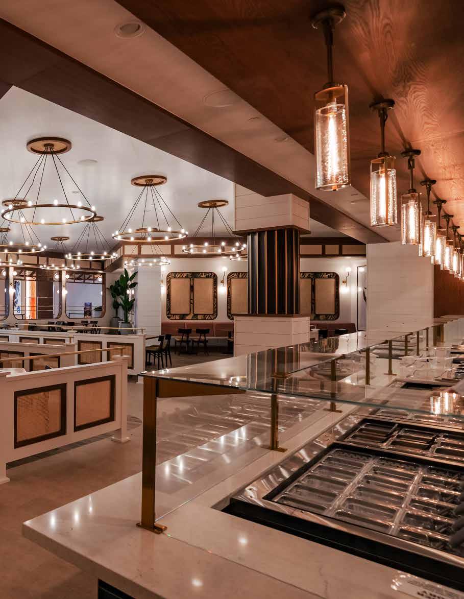
MALIE BY KENNETH USSENKO DESIGN
108 FUSION OF OPULENCE AND FUNCTIONALITY HAMPSTEAD BY SAMANTHA BARTLETT INTERIORS LTD
118 WELL-BEING DESTINATION IN THE HEART OF TOKYO SORANO HOTEL BY CURIOSITY INC.
128 LUXURIOUS AND DIVERSE EXPERIENCE GARDEN CITY BY BLLENDDESIGNOFFICE
136 UNIQUELY DESIGNED DINING EXPERIENCE DON ALFONSO 1890 BY LIBERTY ENTERTAINMENT GROUP 144 MAJESTIC FRENCH MANOR 27 CIVIDALE BY MAHZAD HOMES
Cover: Foxdon by Design By Uber - See page 26 for more details.
10 LUXURY AND FUNCTIONALITY COMBINED AL MALQA PRIVATE VILLA BY THE DESIGNERS HALL CONTENTS
54 HISTORIC INFLUENCE AND BOTANIC INSPIRATION FOUR SEASONS NEW ORLEANS BY BILL ROONEY STUDIO, INC. 9 Editorial 66 LUXURIOUS AND INNOVATIVE ARCHITECTURAL MASTERPIECE SKY LANE BY DE LOREN & ASSOCIATES
34 BACK TO NATURE EFJORD BY SNORRE STINESSEN ARCHITECTURE 44 A MODERN COUNTRY HOUSE IN SÃO PAULO HARAS LARISSA BY ROSA MAY SAMPAIO 82 CULTURALLY INSPIRED EXCEPTIONAL DESIGN ILIOS CANCUN BY FILIPAO NUNES ARQUITECTOS
LUXURIOUS GEORGIAN STYLE NEW-BUILD FOXDON BY DESIGN BY UBER 26
Bohemian Crystal and its sparkling course
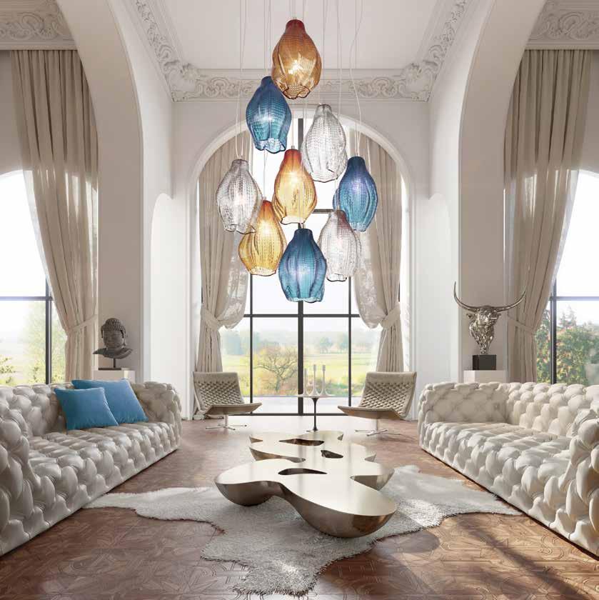
www.preciosalighting.com www.preciosamaritime.com
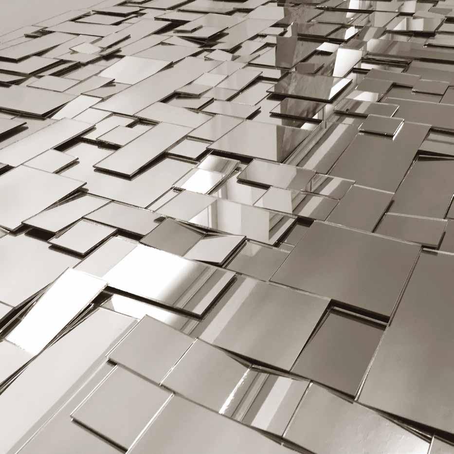
Patchwork Mirror Series info@lushbaytor.com / lushbaytor.com
THE PLATINUM ISSUE
The Platinum issue celebrates over a decade in print, 14 to be precise, this year. It was the first of our bold steps into hard back publishing back in 2010. At the time, it was exactly as a regular magazine would be in terms of content, with a variety of features and articles of varying length and theme. Over the past few years, the contents have developed in line with its look and feel, and are essentially a collections of diverse design projects from all corners of the globe.
The common factor is that all are by designers who have been highly acclaimed, and shortlisted in

The International Design Awards. Some are hotel projects, other residential schemes. All can take us to another place. Good design can certainly do this; I personally find the escapism much needed in a hectic world of upheaval.
Next month, we move on to the Pre-Awards issue, and will give you the opportunity to see more shortlisted projects in all three Design Awards for 2023. How can it be that we are entering PreAwards season so quickly? The years are flying by too fast!
Until next month
Joanne
Published by design et al Watergate House, Watergate Street, Chester CH1 2LF For general enquiries: +44 (0)1244 346 347 or info@design-et-al.com For awards enquiries: +44(0)1244 401 932 or info@thedesignawards.co.uk
10 design et al
LUXURY AND FUNCTIONALITY COMBINED
AL MALQA PRIVATE VILLA BY THE DESIGNERS HALL
The Platinum Issue 11
12 design et al
The Platinum Issue 13
14 design et al
The Platinum Issue 15
16 design et al
18 design et al
The Platinum Issue 19
20 design et al
The Platinum Issue 21
22 design et al
The Platinum Issue 23
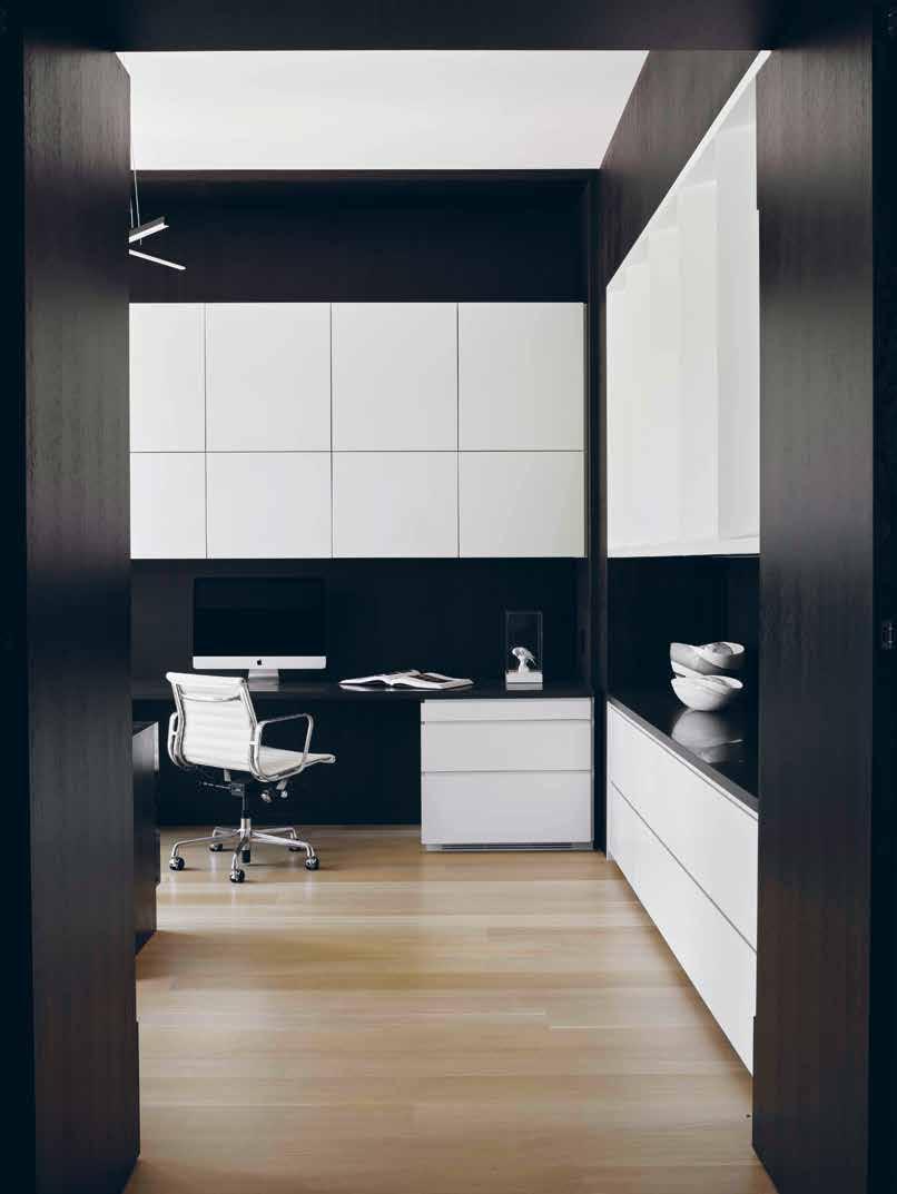
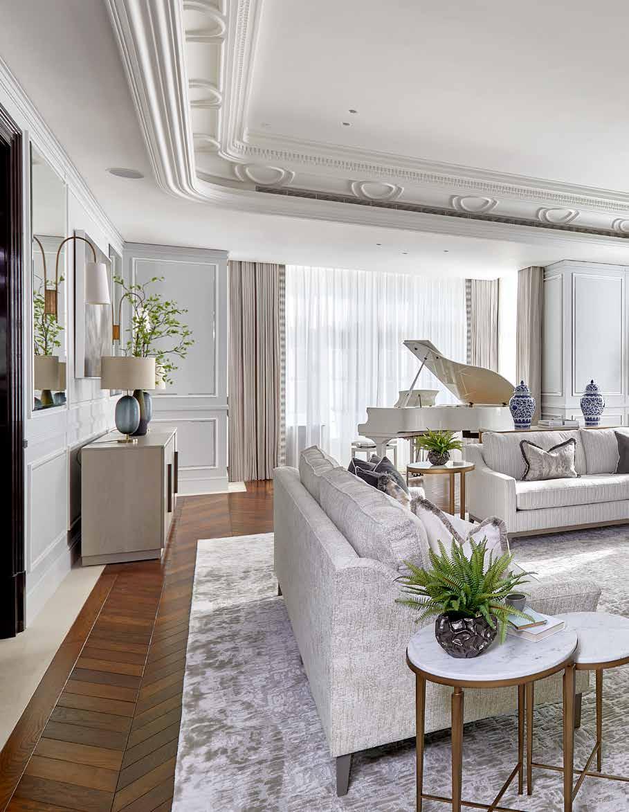
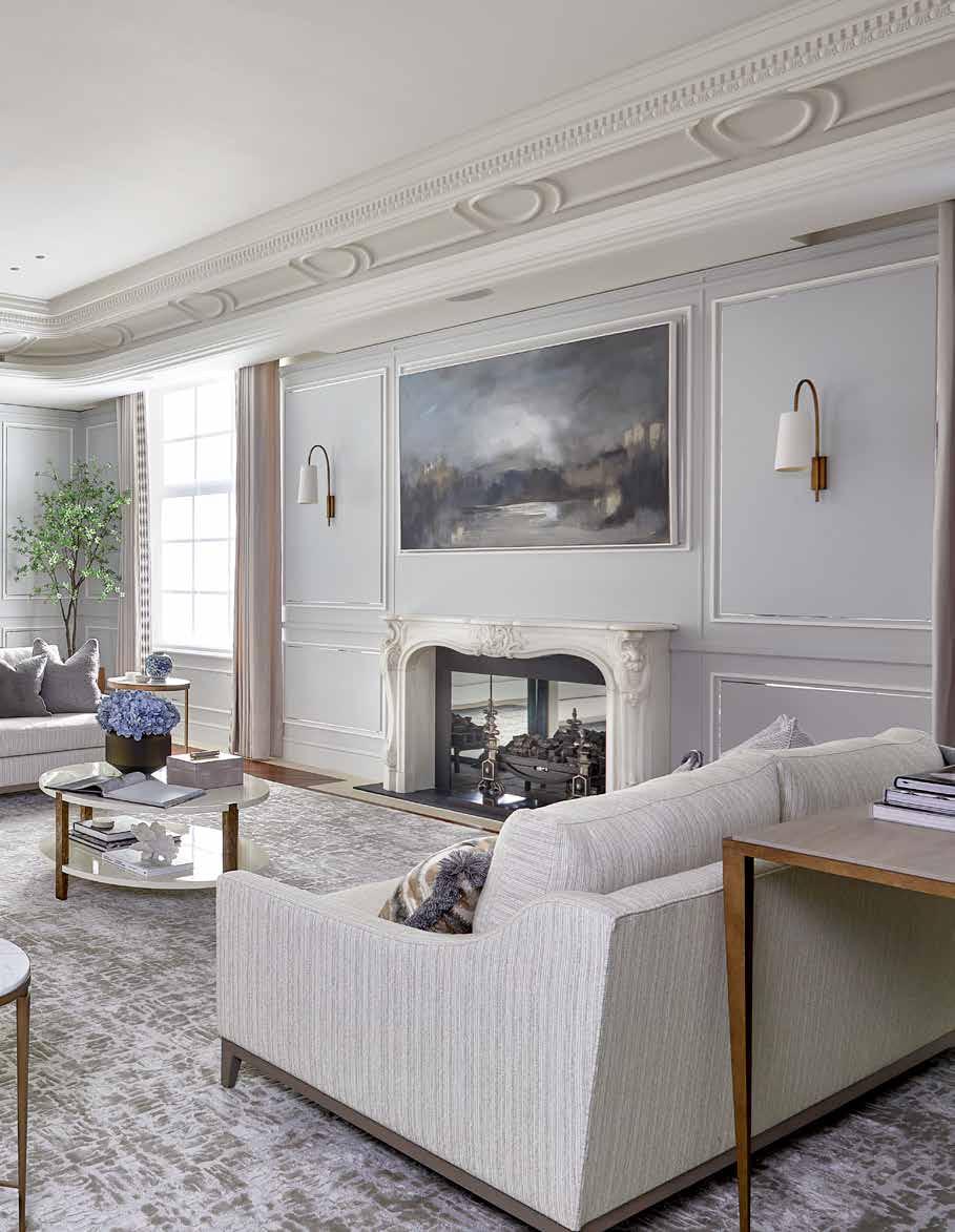
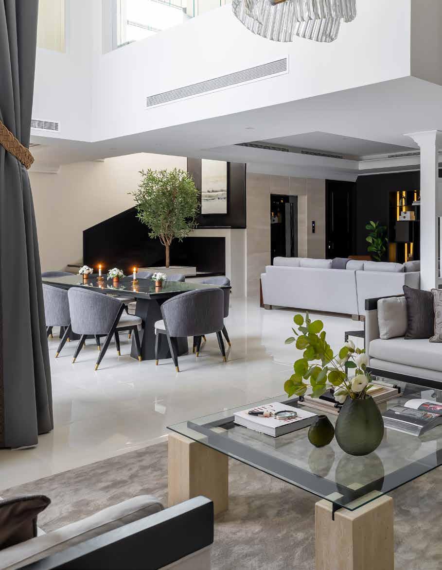
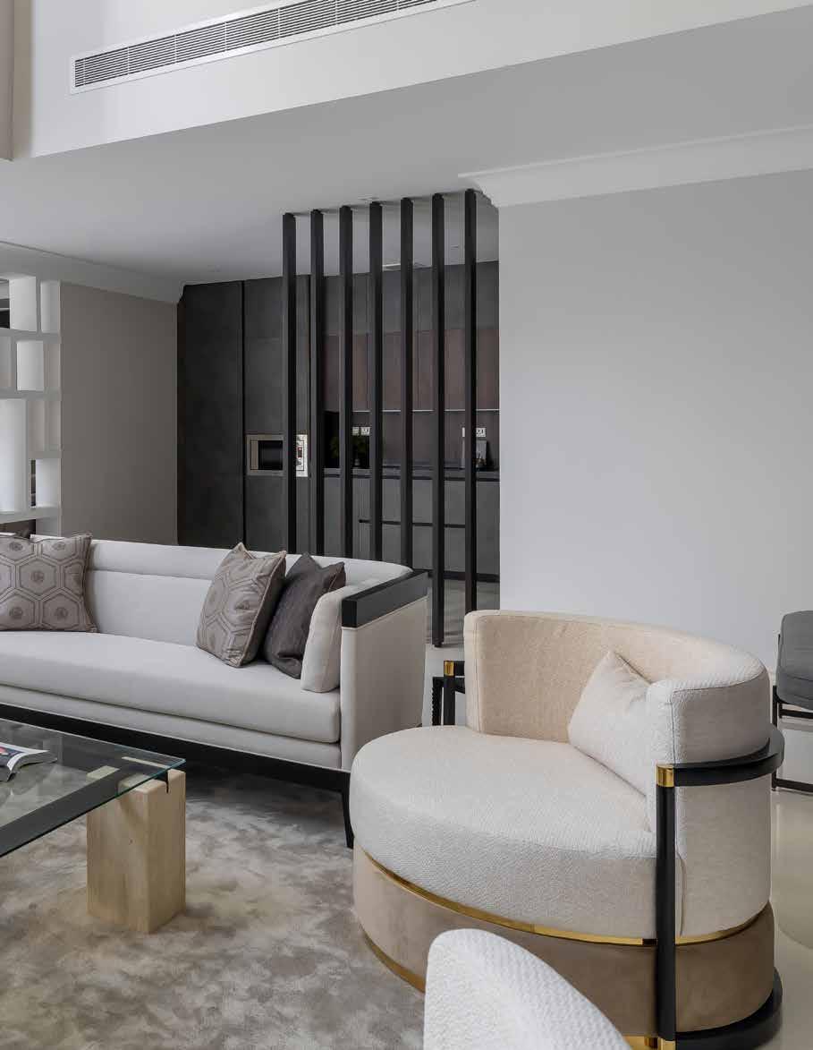
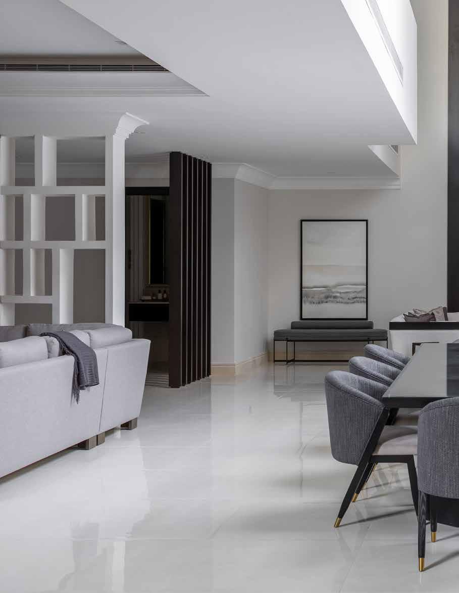
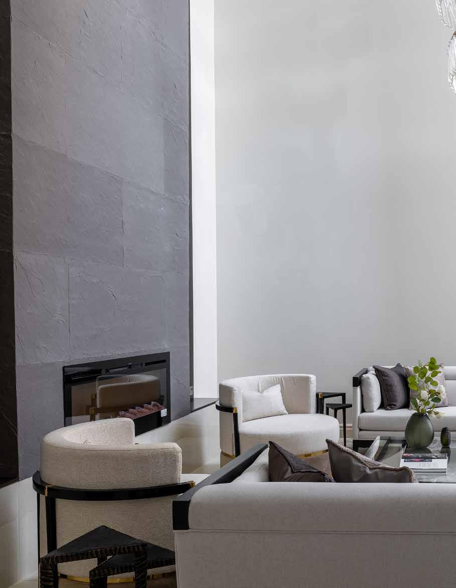
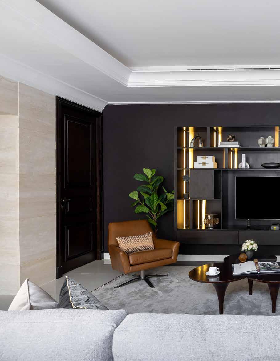
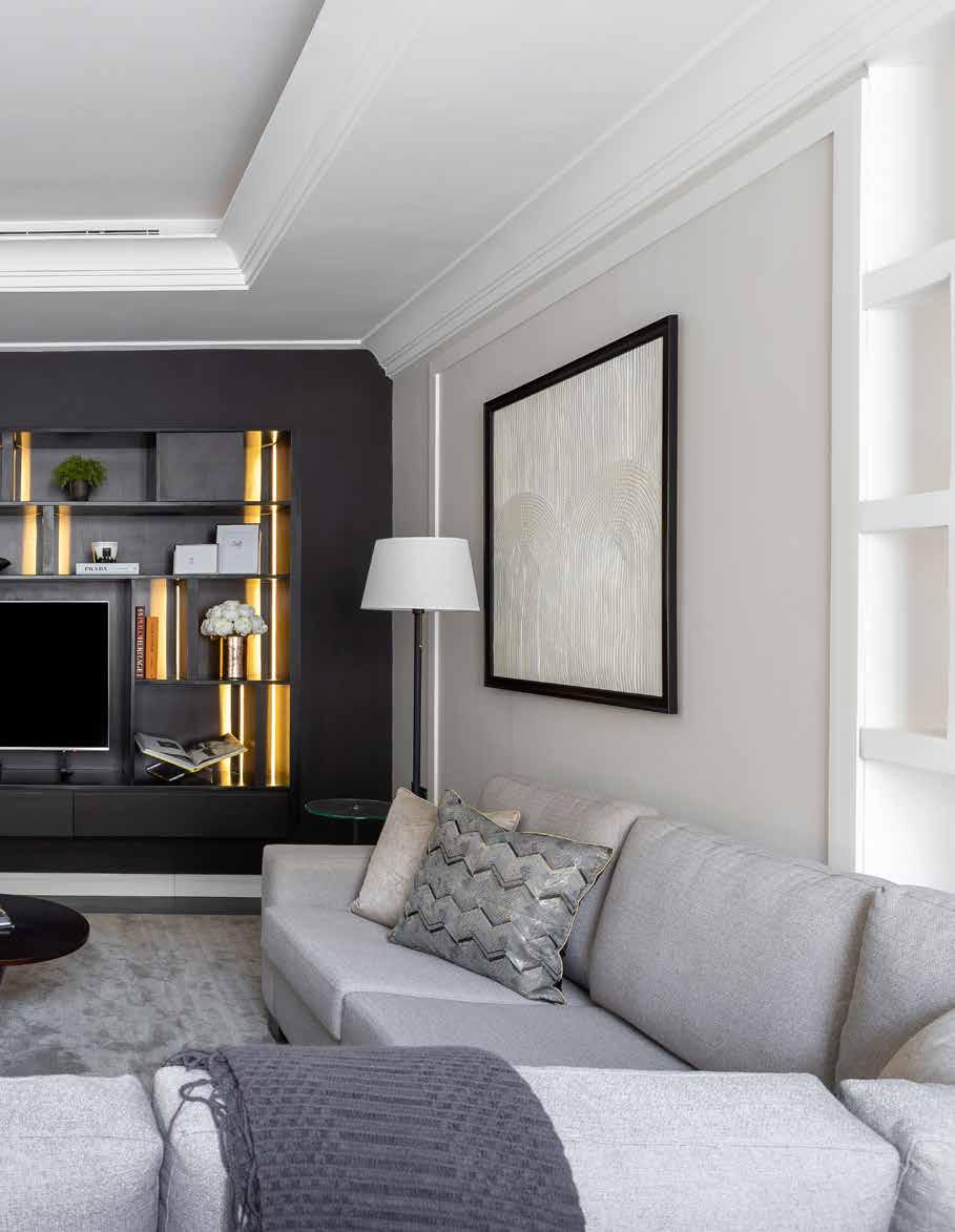
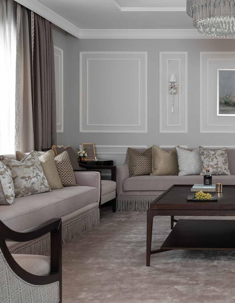
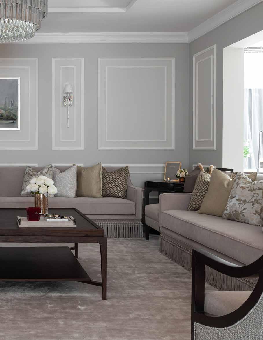
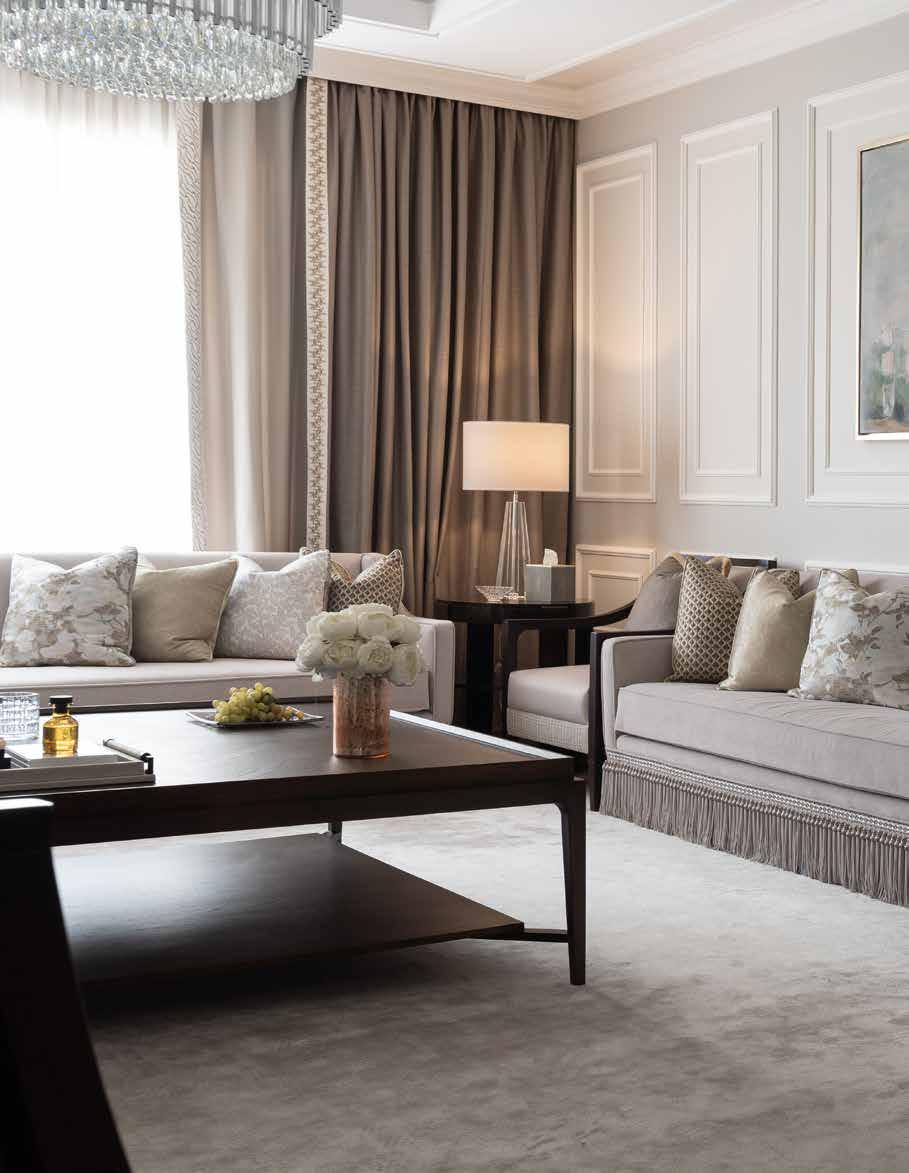
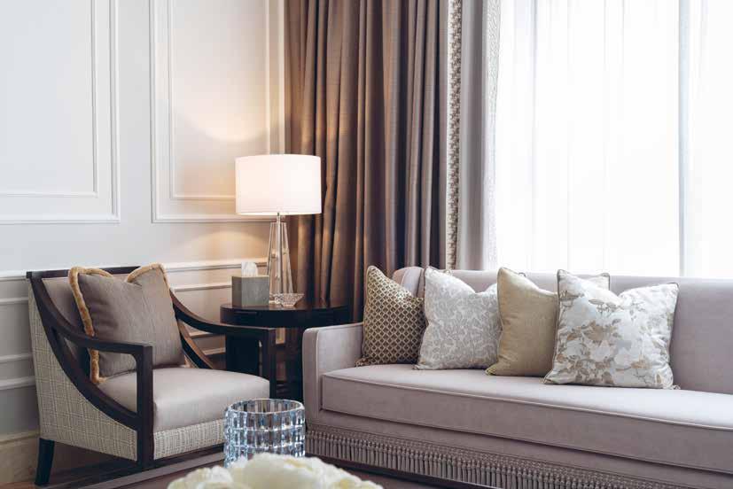
The Al Malqa Private Villa in Riyadh, Saudi Arabia, is a project that showcases the perfect balance between luxury and functionality. The design team were tasked with creating a grand luxurious formal space for entertaining while also providing a comfortable and inviting heart of the home basement for the family to relax in. The clients had specific requirements for the formal living room, home office, and open space living basement, and the challenge was to create a design that appealed to both the wife’s idea of a formal classic space and the husband who preferred a simple clean space.
The starting point for the project was the client’s personality and vision, which served as the main inspiration for the design. A neutral colour palette was used throughout the house to create a seamless connection between the different areas. The soft colour scheme and simple lines made the space look cohesive, providing a sense of continuity throughout the house.
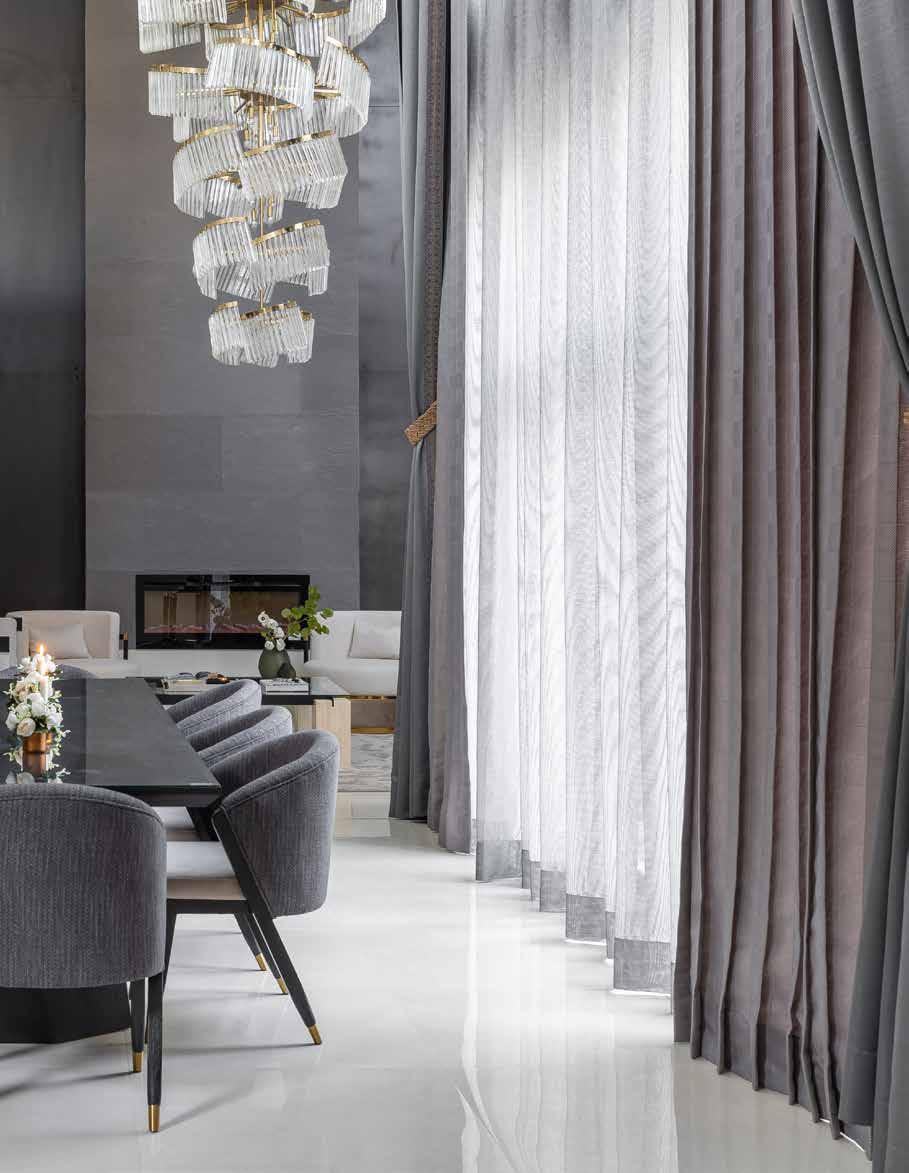
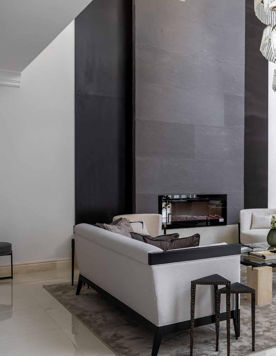
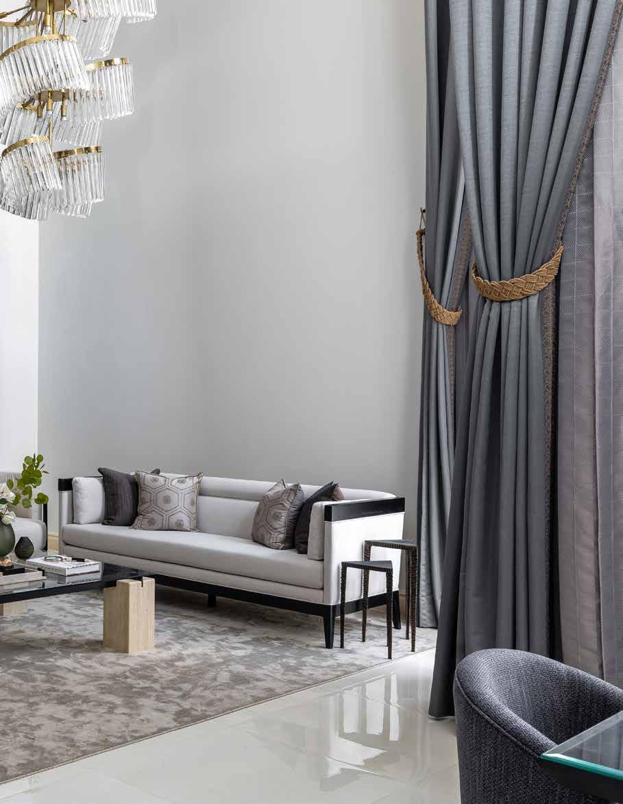
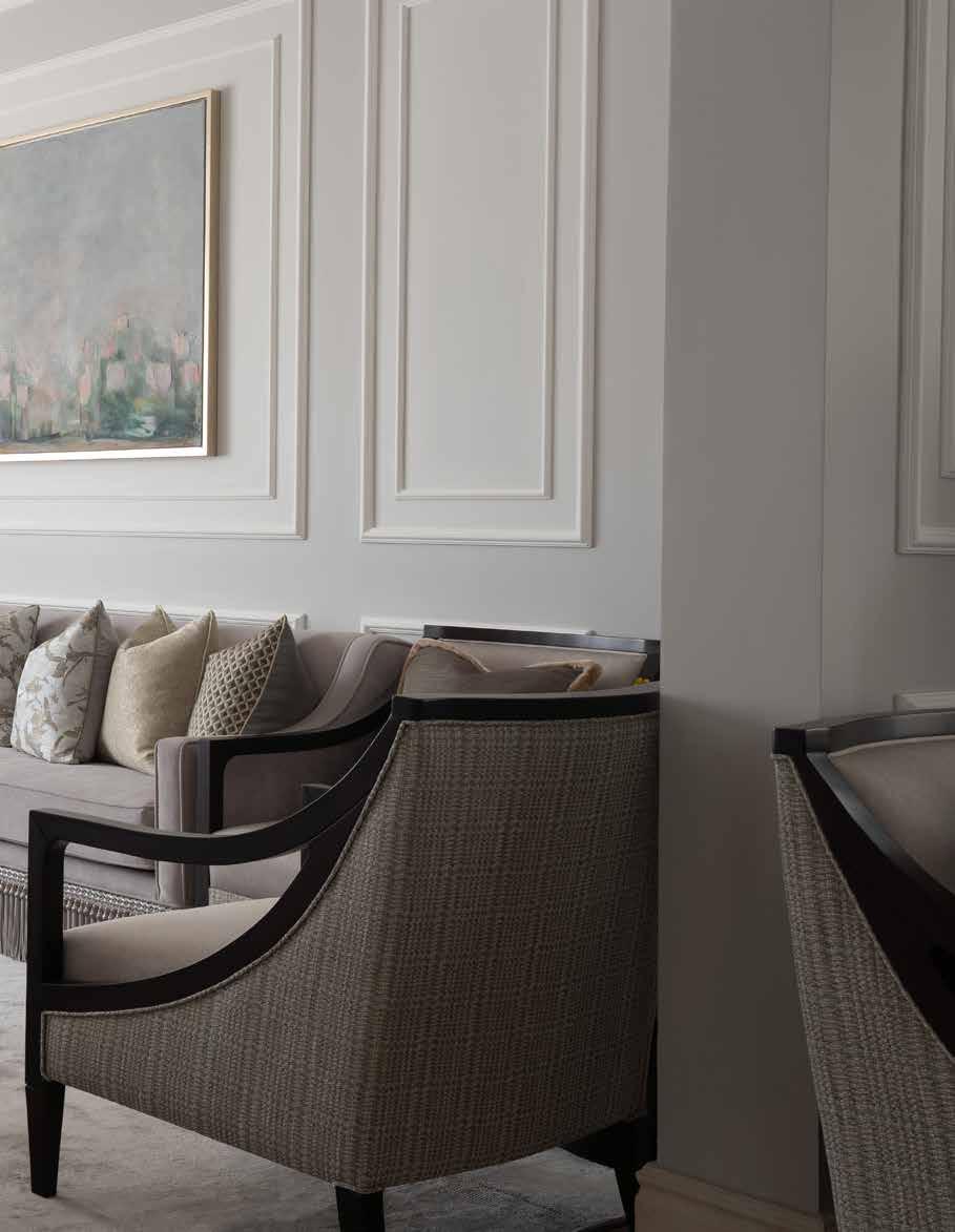
To complement the luxurious status of the house, bespoke furnishings were created, ensuring there was a seamless blend between design and architecture. The coffee table and dining table were designed to fit the area and the client needs. The oversized coffee table was perfect for formal gatherings, while the dining table was more to the narrow side to make the circulation around the area since it was placed in a heavy traffic area. The formal living space has a mix of classic and modern elements, making it
appealing to both the wife and husband’s design preferences. The sofa and cushions, along with the oversized coffee table, were some of the key features of the space. The coffee table was a centrepiece of the space, creating a focal point for gatherings and adding a touch of elegance to the area. The home office, on the other hand, had a more textured design with an off-white 3D carved art that filled the wall without overpowering the space. All artwork was painted for the project, specifically to fit the colour scheme and aspect of the space. The Saudi artist Mariam was commissioned to create artwork that represented the classic landscape in an abstract way.
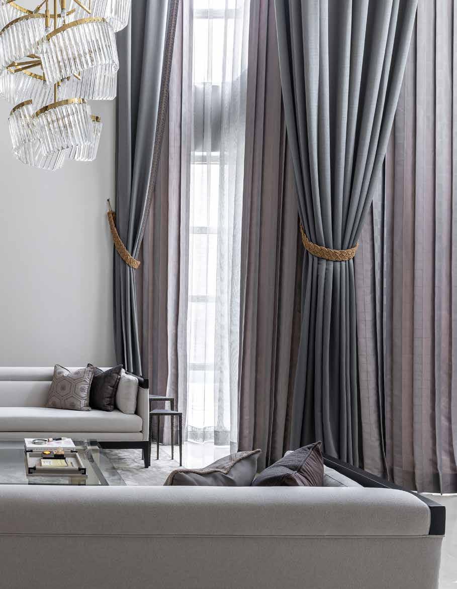
To create the bespoke furnishings and wall art, the project required the skills of various specialists and artisans. Artists were commissioned to create all wall art, while bespoke furniture was created to fit the specific needs of the client. A custom-made basement chandelier added a unique and personal touch to the space, further enhancing the luxurious feel of the house.
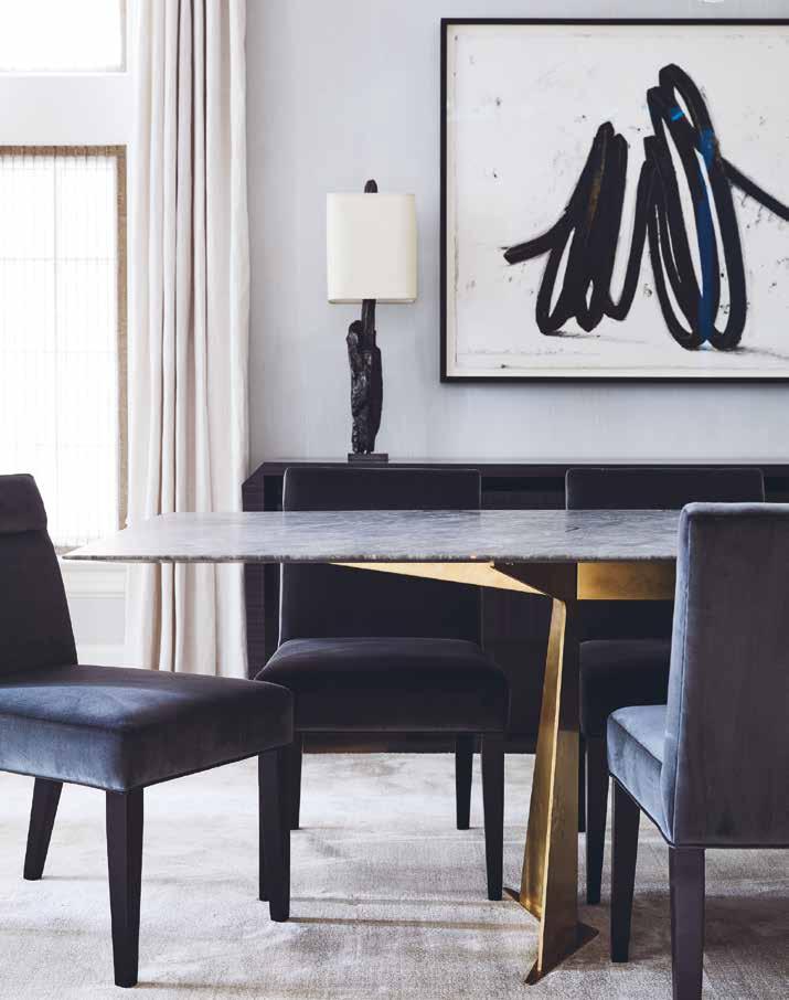
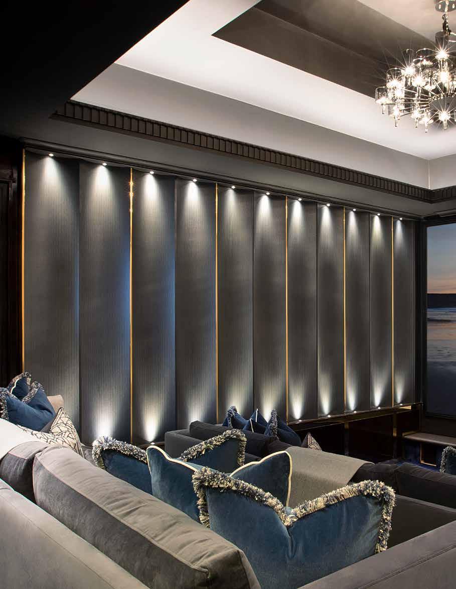
The basement’s open family living area featured a modern and elegantly simple design, complete with dark finishes. The clients shared the same vision, desiring a contemporary and uncomplicated aesthetic, while remaining receptive to incorporating darker finishes. The design team particularly favoured the dining table and chairs, seating around the fireplace and curtains as standout features in the space. The dark finishes contributed to a cosy ambiance, while also
preserving the space’s welcoming and luminous atmosphere. Thanks to the twostory windows that flood the space with natural light, the house’s design blends seamlessly into its surroundings and the broader environment. The clients were delighted with the outcome, as it brought their ideas to fruition and fulfilled their vision.
The collaboration between the clients and the design team was critical to the project’s success. The design team was able to translate the client’s vision into a tangible design that met all their requirements. The clients’ trust in the design team’s expertise and their ability to bring their ideas to life were key to the project’s success. “The success of any design comes from the clients themselves. When the client believes in the designer and gives them the freedom to design, they will get the best results possible. Most clients cannot visualize the final result unlike the designers, so trusting us is a very important aspect of the project’s success”, explained May AlHammadi, Creative Director at The Designers Hall.
The Al Malqa Private Villa is an example of how a well-executed design can create a luxurious, inviting and functional space that reflects the client’s personality and vision while integrating well into the location. The collaboration between the clients and the design team was critical to the project’s success, and the bespoke furnishings and wall art added a unique and personal touch to the house’s design.
24 design et al
“To complement the luxurious status of the house, bespoke furnishings were created, ensuring there was a seamless blend between design and architecture.”

www.thedesignershall.com
Interior Design Studio
LUXURIOUS GEORGIAN STYLE NEW-BUILD
FOXDON BY DESIGN BY UBER
26 design et al
The Platinum Issue 27
28 design et al
The Platinum Issue 29
30 design et al
The Platinum Issue 31
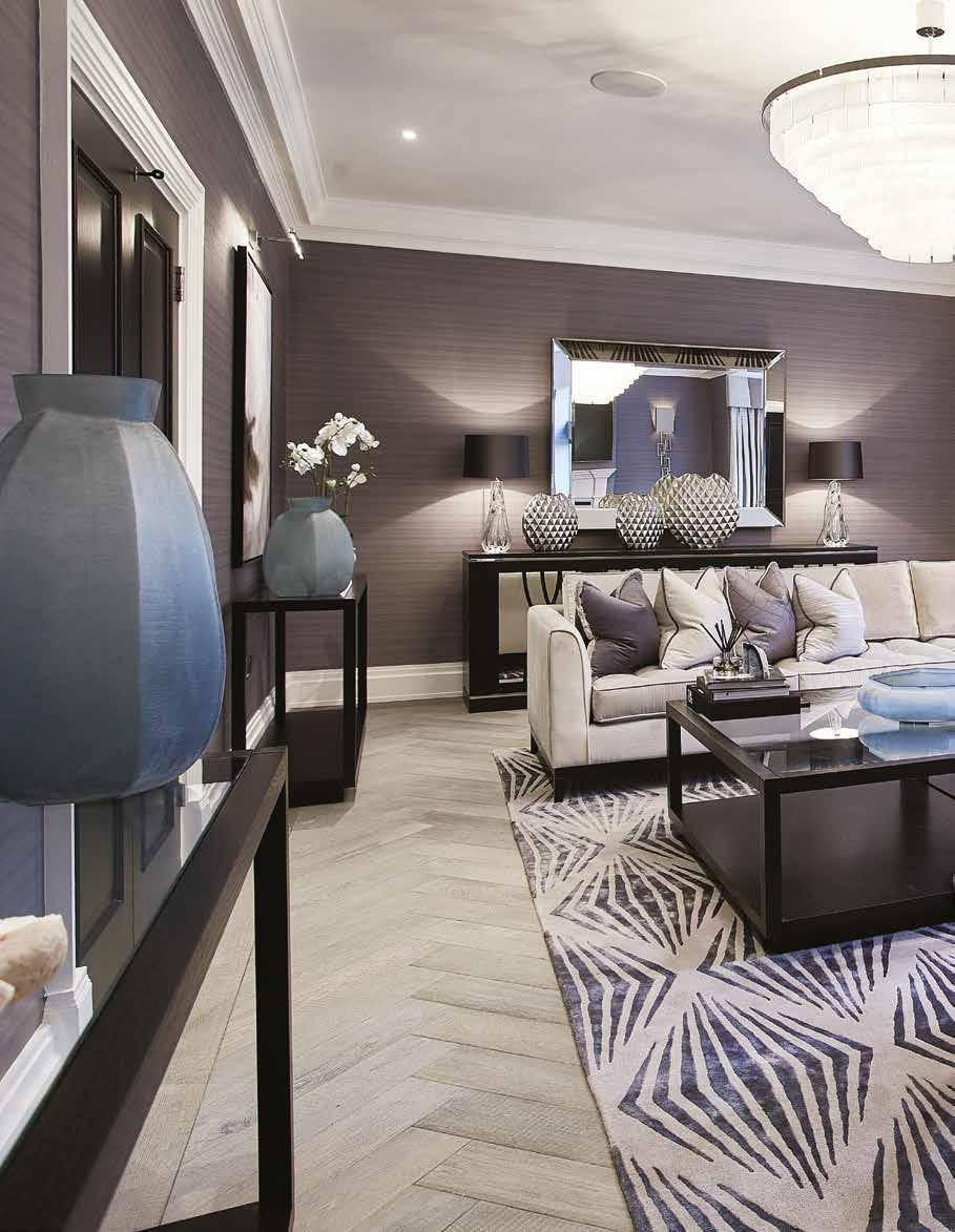
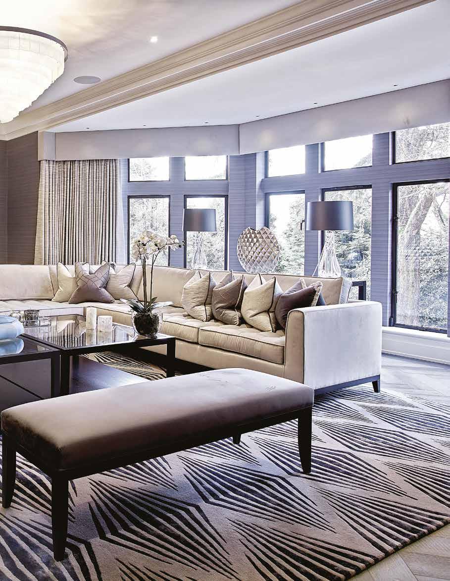
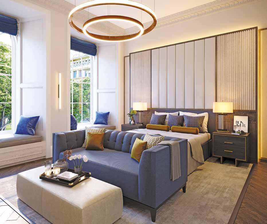
Created by Design by UBER, Foxdon is a breathtaking new build that exudes elegance, sophistication and class. Located in the heart of the Cheshire countryside, this Georgian style property sits on a sizeable plot of 5 acres and spans 14,000 sq foot, offering 6-bedroom suites, an entertainment area, a mancave with a supercar garage, and a leisure suite.
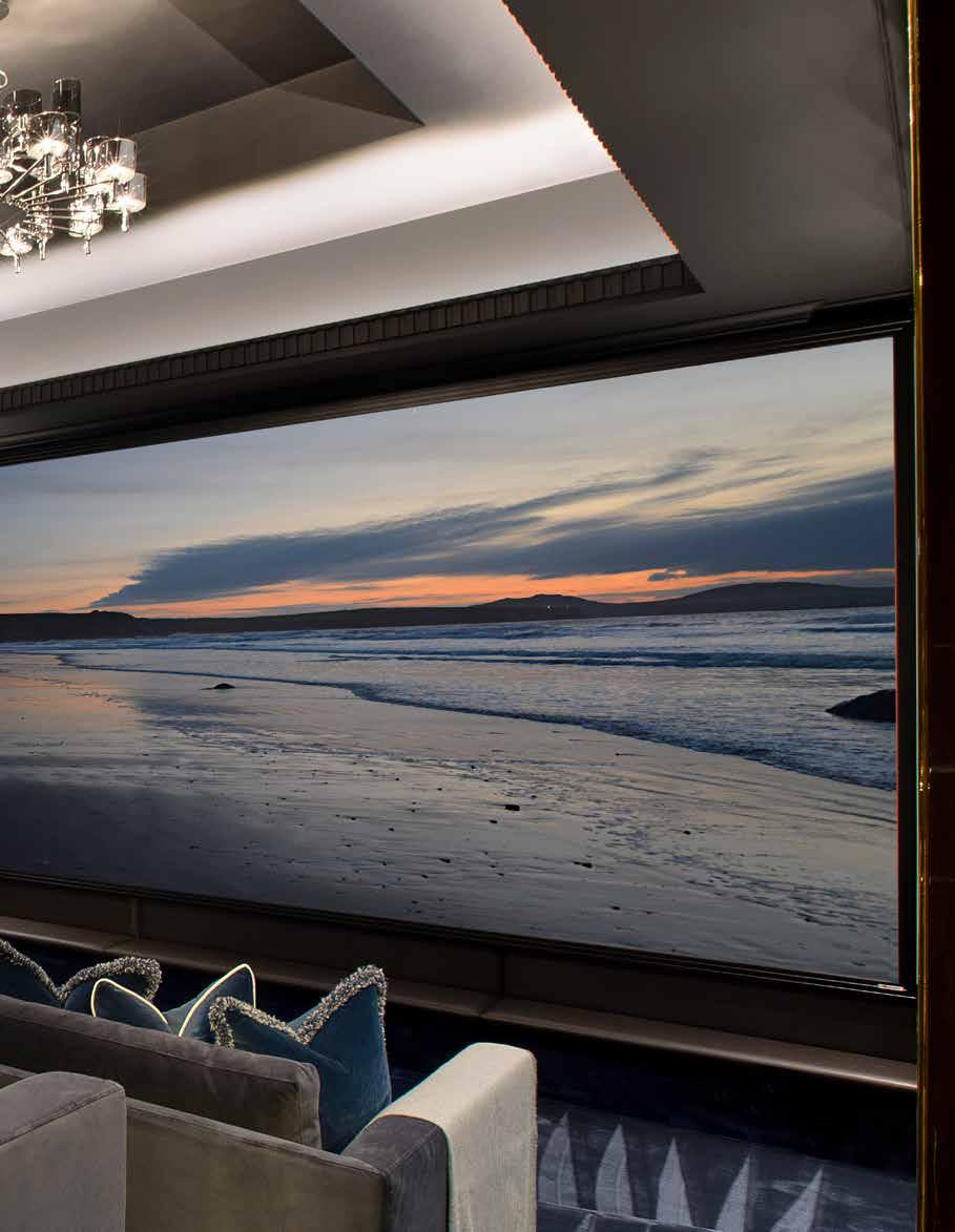
The brief for this project was to create a home that was perfect for entertaining extended family and friends, which meant that it needed to have all the facilities and amenities to do so. Design by UBER rose to the challenge by creating a leisure suite fit with a pool, sauna and steam room, a bar to entertain with a games room, pool table, arcade games and bowling alley, and a cinema room for the family to relax and enjoy their favorite movies.
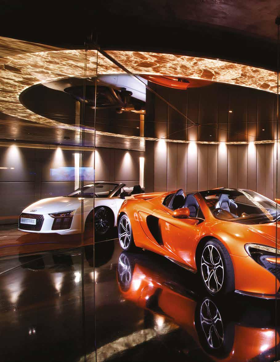
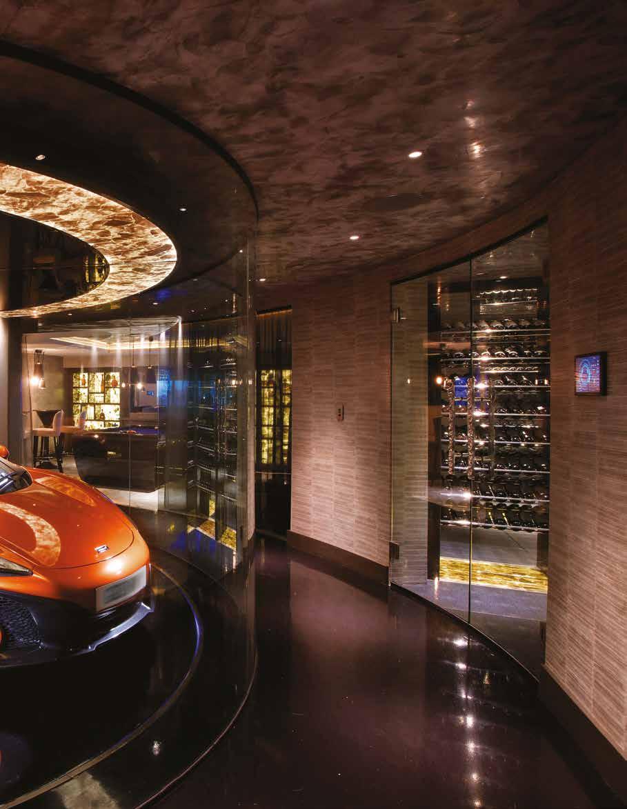
The client also had a passion for luxury cars and wanted a space to securely store and showcase his growing collection. This led to the creation of a spectacular mancave, designed by Design by UBER, which features bespoke back-lit quartz wine cabinets, leather-clad walls, polished plaster ceilings and floor, and a circular glass turntable for the client’s extraordinary supercars in a trophy-like display setting.
Design by UBER played a significant role in the development of a grand new Georgian manor house project, right from the conceptual stage to the final execution. The entire process involved a complete demolition of the previous structure to pave the way for a larger and more sophisticated Georgian-style new build. With the aim to create an interior that perfectly complements the Georgian period and English stately homes, Design by UBER drew inspiration from their past projects, which the client adored, to create the exquisite interiors of the new residence.
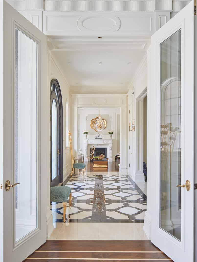
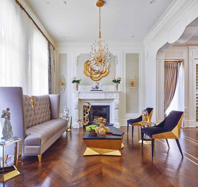
The architectural design of Foxdon was heavily influenced by the Georgian period, and every detail was meticulously planned to exude luxury and elegance. Design by UBER decided to fit the entire property with handcrafted bespoke joinery and fittings to ensure a completely customized look that befits the grandeur of the building. The neutral colour palette used throughout the house perfectly complements the high-end bespoke fixtures and fittings in every room, creating a timeless and sophisticated ambiance that exudes luxury and comfort.
The combination of intricate architectural details, bespoke joinery, and luxurious fittings used in every room of Foxdon is a testament to the expertise and vision of Design by UBER. The end result is a palatial residence that is both stunning and functional, delivering a luxurious living experience that is second to none.
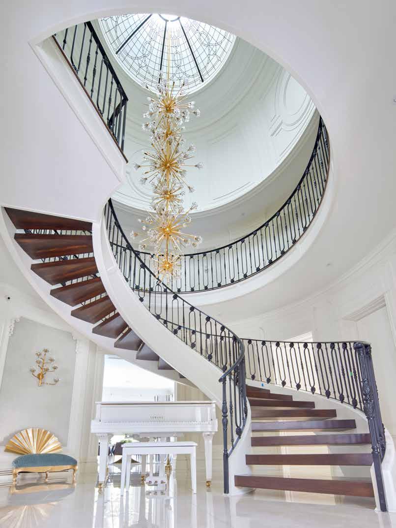
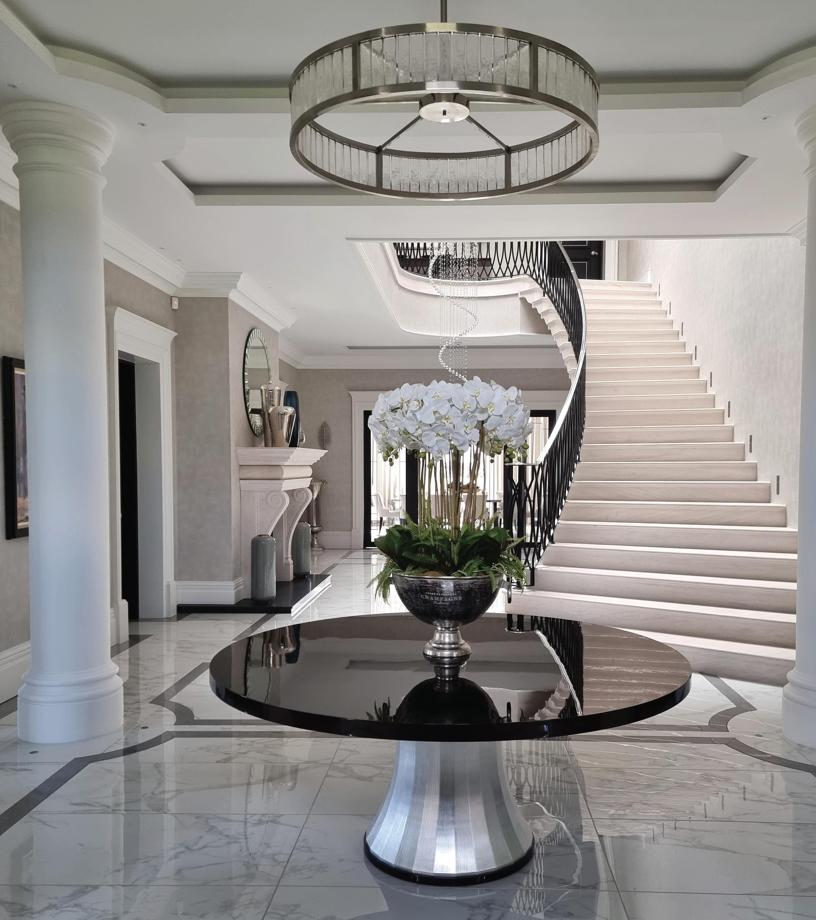
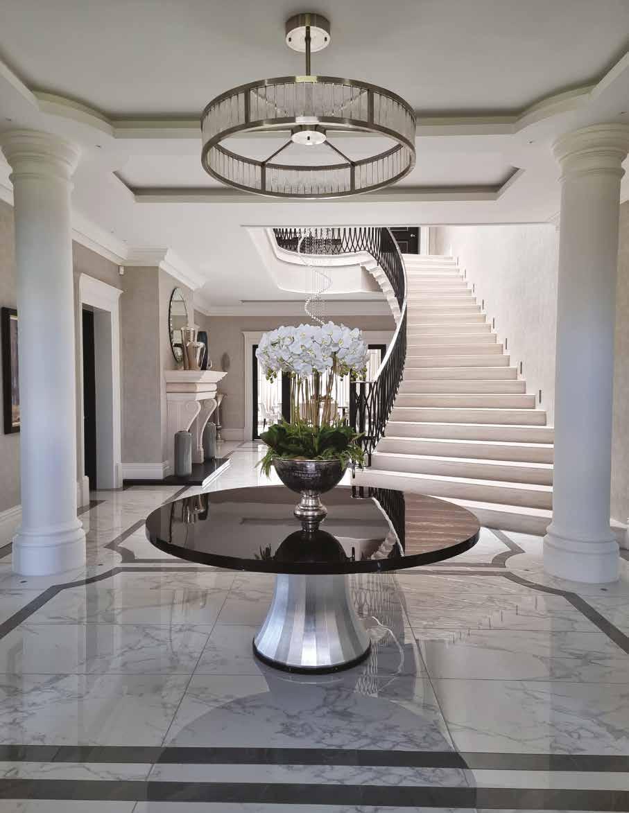
The property boasts several outstanding features, but perhaps one of the most striking is its stunning main entrance staircase. Crafted from solid Portuguese limestone, the staircase spans three floors and features a breathtaking 3.7-meter-wide bottom tread that commands attention upon arrival. The handmade balustrade and handrail, plated with nickel, lend an air of luxury and elegance to the staircase’s design. Above the staircase, a magnificent glass dome sits, bathing the space in natural light and creating a sense of grandeur. The dome’s strategic positioning allows the light to filter through each floor, infusing the space with a warm and welcoming ambiance. However, the true centerpiece of the staircase is the show-stopping 9-meter-drop chandelier, which is gracefully suspended from the glass dome and cascades down to the grand entrance lobby. This impressive feature adds a touch of drama to the space and creates an unforgettable first
impression. Together, the staircase, glass dome, and chandelier make for a truly remarkable entrance that sets the tone for the rest of the property’s grandeur and sophistication.
Another impressive aspect of the design is the attention to detail. Design by UBER created character and detail through cornice and skirting details, architraves, ceiling roses, high ceilings, and columns. The grand ceilings were shaped and detailed to maximize the effect of the large rooms, and the use of uncluttered lighting solutions that relied more on decorative lighting created an impressionable impact. The ceiling details were matched with border floor detailing and shaped cabinetry to reinforce the curves.
The design of Foxdon works perfectly in its location due to the affluent homeowners in the area who have larger, more traditional-looking homes sitting within their own land. The modernized Georgian stately home complements the neighboring houses, while the interior design scheme injects character and detail to complement the exterior of the property.
The design was everything Design by UBER’ client had asked for and more. The brief was to create a luxury home that had the amenities to entertain family and friends, as well as bespoke furnishings and fittings. And they really encapsulated that vision. Design by UBER has successfully designed and executed a luxurious, sophisticated, and timeless interior for Foxdon. The attention to detail, use of high-end bespoke fixtures and fittings, and thoughtful design have resulted in a breathtaking property that is perfect for entertaining and relaxing with family and friends.
32 design et al
“The neutral colour palette used throughout the house perfectly complements the high-end bespoke fixtures and fittings in every room.”
INTERIOR ARCHITECTURE & DESIGN SERVICES designbyuber.com +44 (0)333 220 5550 CHELFORD ROAD OLLERTON KNUTSFORD CHESHIRE WA16 8RY UNITED KINGDOM
BACK TO NATURE
EFJORD BY SNORRE STINESSEN ARCHITECTURE
34
design et al
The Platinum Issue 35
36 design et al
The Platinum Issue 37
38 design et al
The Platinum Issue 39
40 design et al
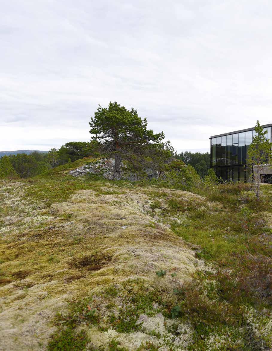
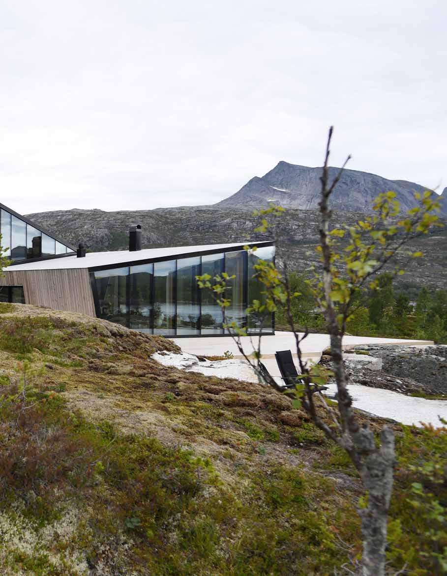
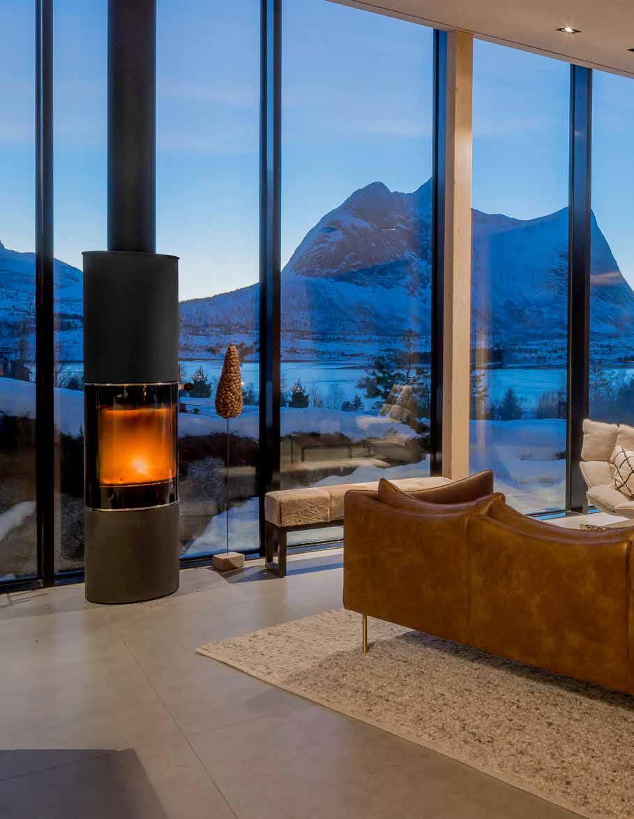
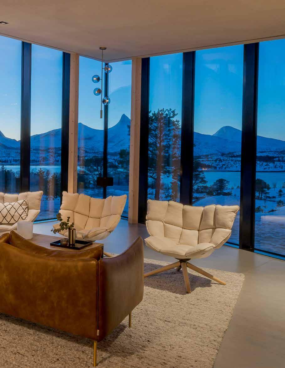
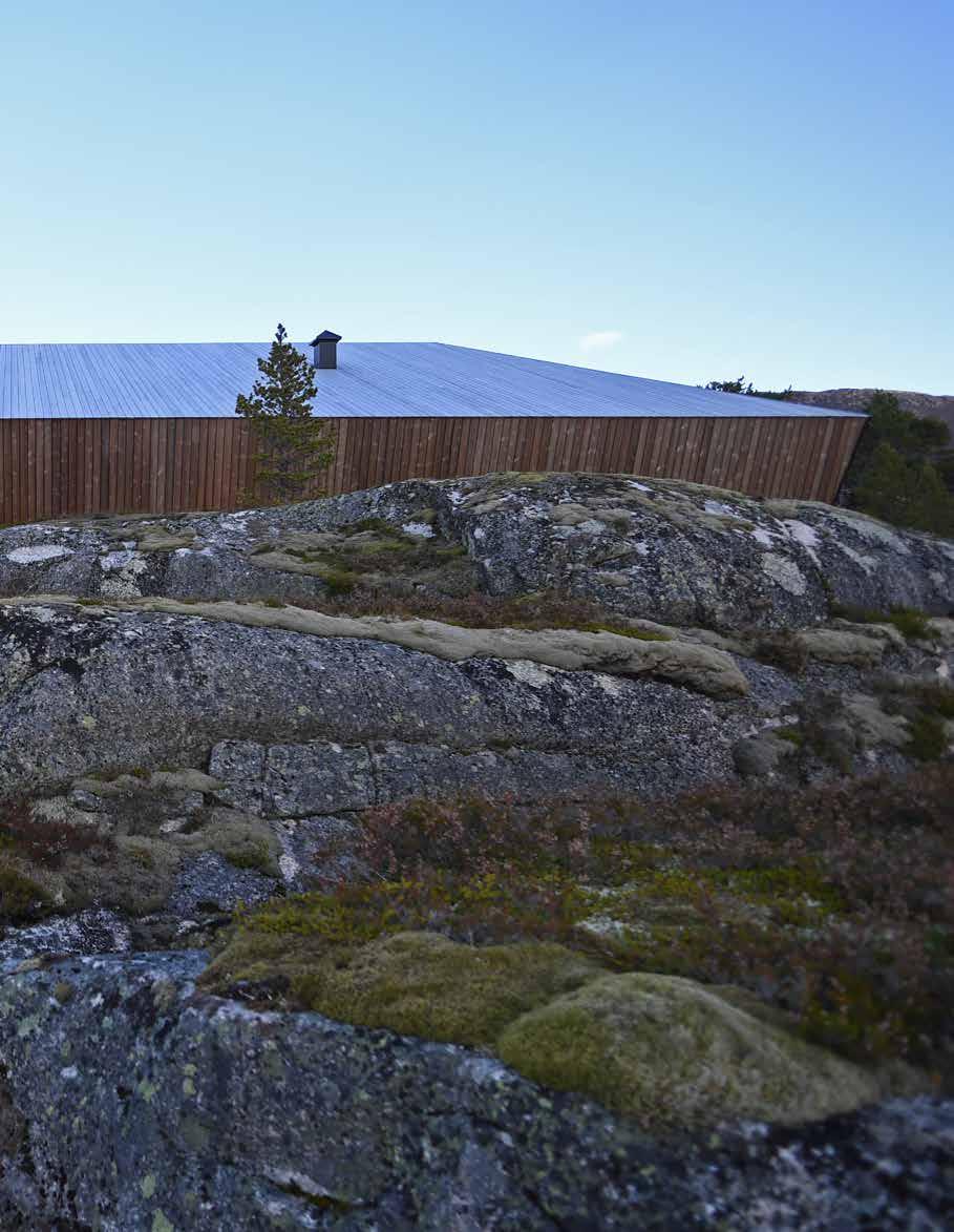
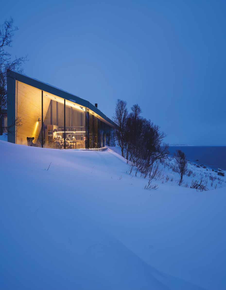
Located in a branch off the Ofoten fjord in Northern Norway, Efjord is a residential retreat that focuses on the panoramic views of its surroundings. Positioned on an island called Halvarøy on a natural ledge in the terrain, the site overlooks the fjord to the west, two of Norway´s most challenging climbing peaks towards the south and is protected by a ridge in the terrain towards the east. The client desired a retreat that focused on the panoramic views of the site, but also transported them to a feeling of isolation and total privacy, away from hectic workdays in the city.
The conceptual layout opens and closes the building in different directions, where the Eastern part of the cabin closes towards neighbouring buildings and opens towards a ridge. The opposite directions are sought at the front end of the cabin, opening to the magnificent views towards the dramatic mountains and the fjord to the West.
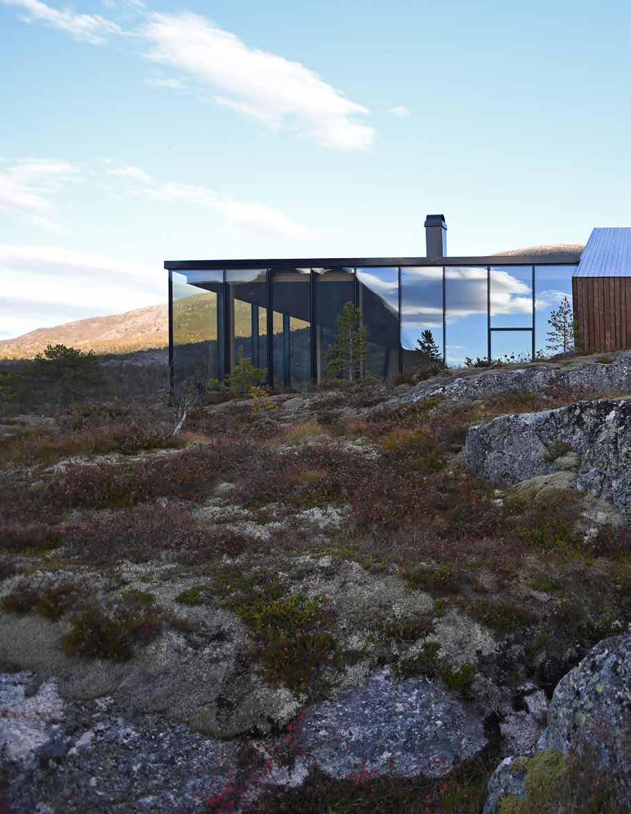
The process of creating their dream cabin was no easy task. First, the couple had to work with the Ballangen municipality to develop a completely new zoning plan for the undeveloped area. Once complete, they carefully selected a building site that was naturally flat, so as to minimise site disturbance. The site affords spectacular views of the fjord and mountains, optimal access to daylight, and privacy.
“Connection to the place, site, and nature and the actual retreat from hectic daily life were perhaps the core elements they sought,” noted Owner and Architect Snorre Stinessen, who worked closely with his clients to create a sculptural retreat that not only amplifies the beauty of Efjord, but also exudes a sense of warmth to make the couple feel instantly at home.
Describing how the project fits in to the environment, Stinessen said “the overall
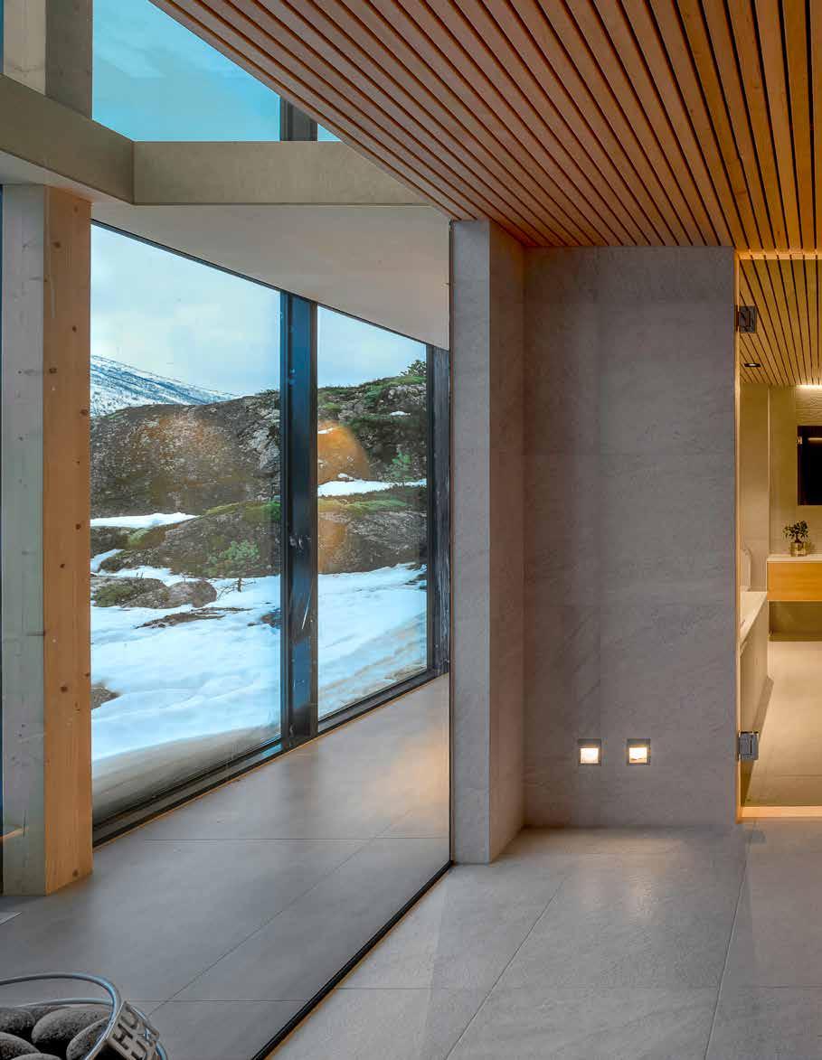
design and shape of the building and how interior and exterior is seen as equally important parts in the connection with the landscape as well as in the choice of materials which are both traditional and also a prominent part of the local fauna: the wood, with natural greying pine for the exteriors and birch for the interiors, the stone granite based floors that resonate the connection to the actual stone ground of the site and surroundings. Not least how the close terrain and vegetation was protected and preserved during the building period and the site was mad ready with minimum physical impact to the terrain”.
The cabin is placed on height with the existing terrain to allow the outdoor spaces to interact seamlessly with the natural landscape. The terrain itself provided a natural orientation and positioning of the building, allowing the different functions to work in tune with the movement of the sun and the balance between privacy and views.
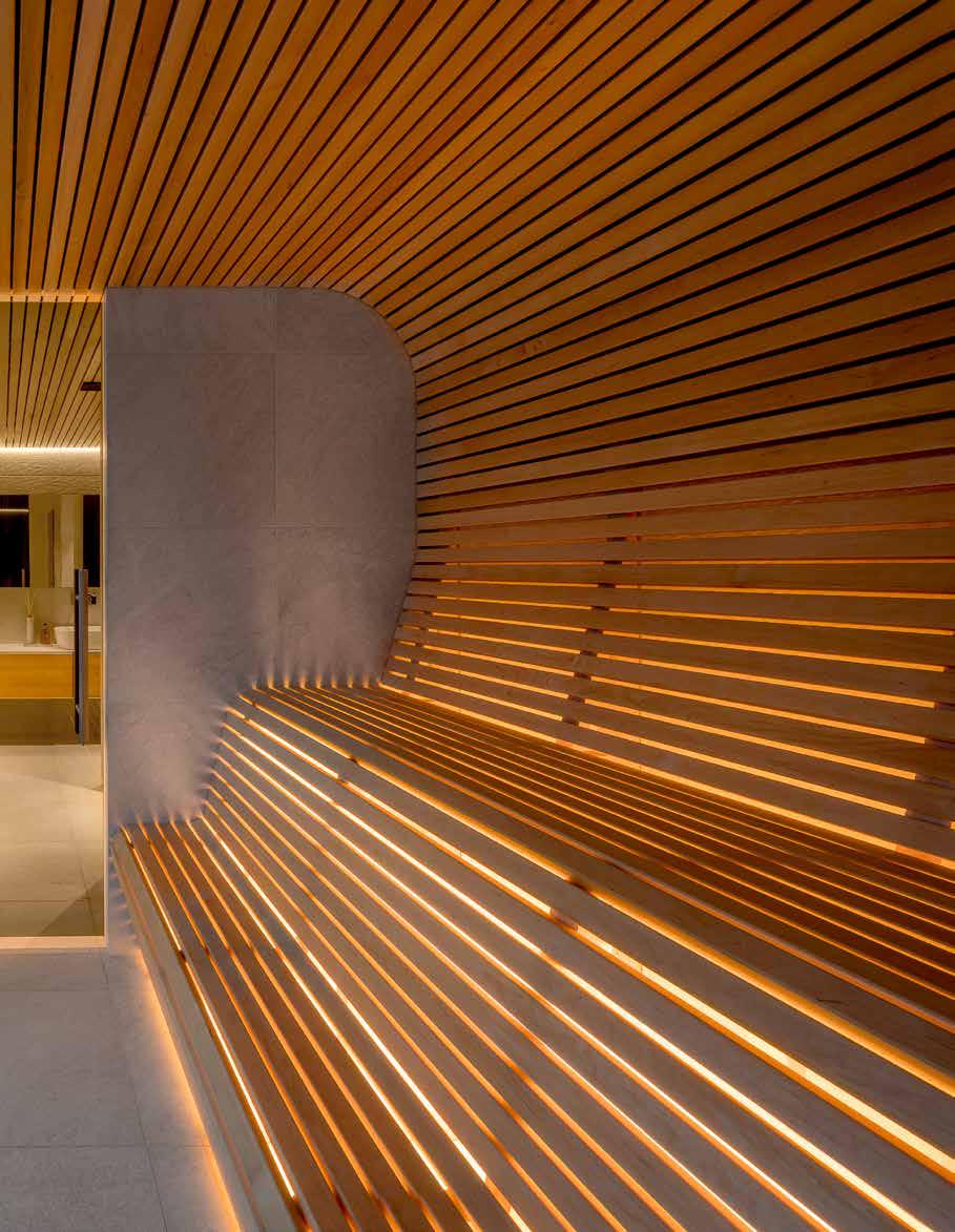
The exterior of the cabin consists of two materials; structural glazing and core pinewood. The wood, typical for this region, has been treated with iron sulphate to achieve an even patina. The interiors have been designed using birch veneer and the floors in granite tiles to complement the stone outside. The sauna interiors and ceiling are clad in aspen slats because of the hygroscopic properties of the wood.
Asked about his favourite aspect of the project, Stinessen explained it is how it relates to the landscape, both as a volume from afar or close up and also from inside to outside. “It is a journey from hectic everyday life to space and room for slow living in close connection with both nature and oneself”, he states. The transition from the entrance to the living room is a beautiful journey in itself;
walking through the corridor which brings in the close landscape and terrain, and then down the steps into the living area revealing the incredible view over the majestic mountains and the beautiful fjord. Throughout the design and building process, the surrounding areas and vegetation were protected and preserved, and the site was completed with minimum physical impact to the terrain as to protect the wider environment.
Stinessen explains that the project works well “mainly because the building sits comfortably in the landscape and provides a sense of belonging, while it at the same time provides a different approach than the traditional. Not to seek difference in itself, but rather to uphold the fundamental elements of design that connects to and respects nature, much even in the sense of the basic shelter or historic buildings, while at the same time adhering to functional requirements of a modern family life”.
At The International Design & Architecture Awards 2020 held in London, Snorre Stinessen Architecture received the Architectural Glasshouse Award. Speaking about the Awards Stinessen stated, “The Awards are certainly one of most important programmes for upholding the importance and impact of good design and architecture. Its long term and clear presence is in itself a beacon in this regard and the focus on involving a wider audience emphasise the fact that design and architecture, good or bad, has an importance and effect which is much broader than just the object itself”.
Efjord creates an escape from hectic everyday life, providing space for slow living in close connection with both nature and oneself, whilst having the perfect balance of total privacy and magnificent views.
42 design et al
“Interior and exterior is seen as equally important parts in the connection with the landscape as well as in the choice of materials which are both traditional and also a prominent part of the local fauna.”


44 design et al
A MODERN COUNTRY HOUSE IN SÃO PAULO
 HARAS LARISSA BY ROSA MAY SAMPAIO
The Platinum Issue 45
46 design et al

The Platinum Issue 47
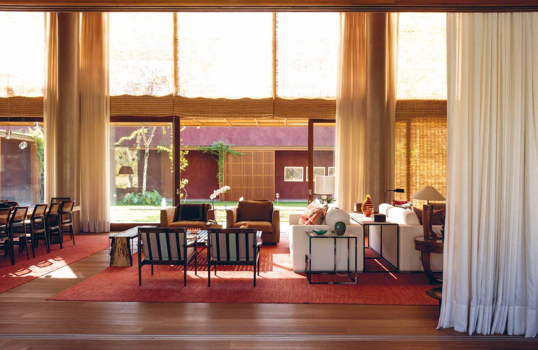

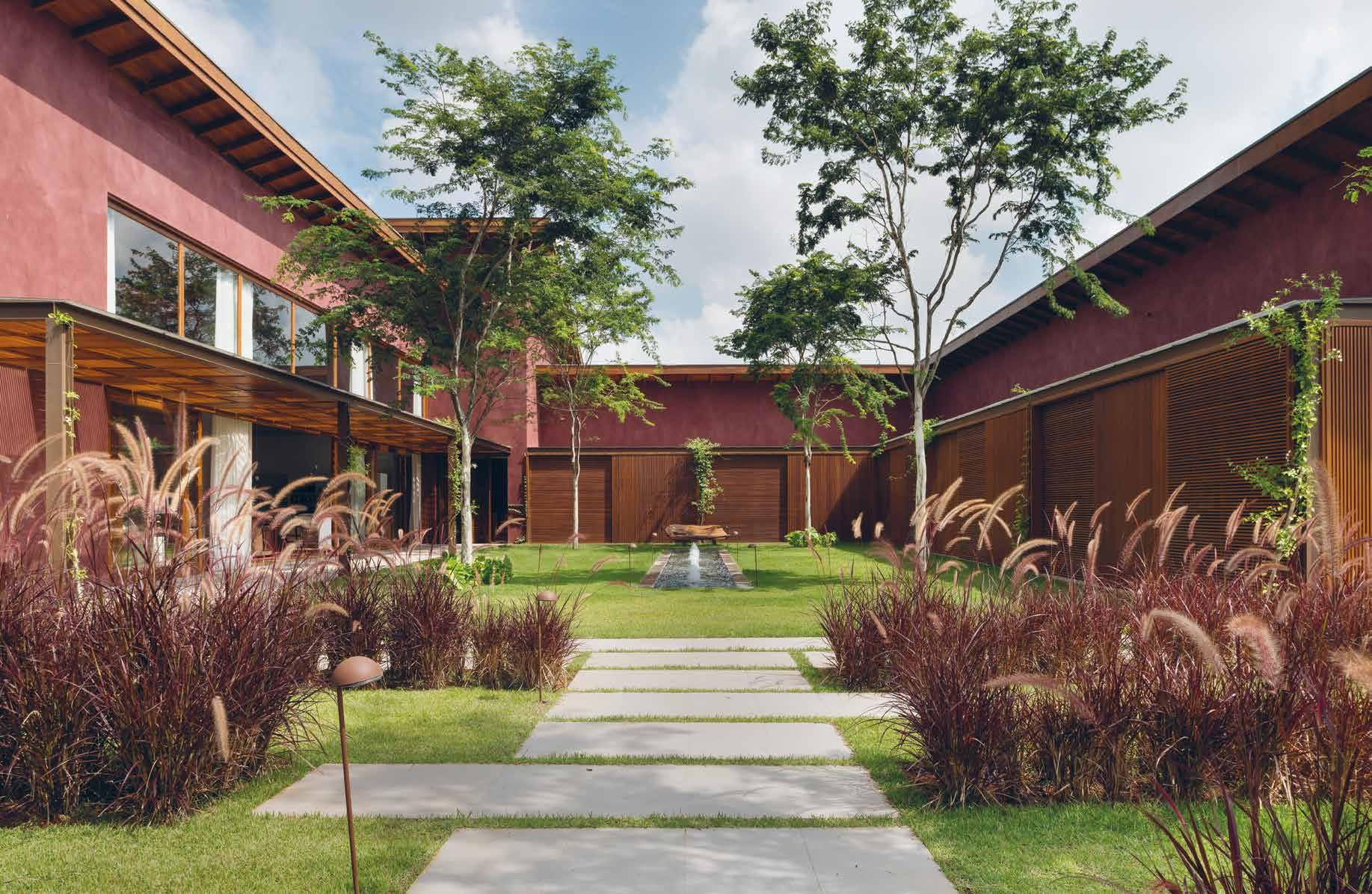
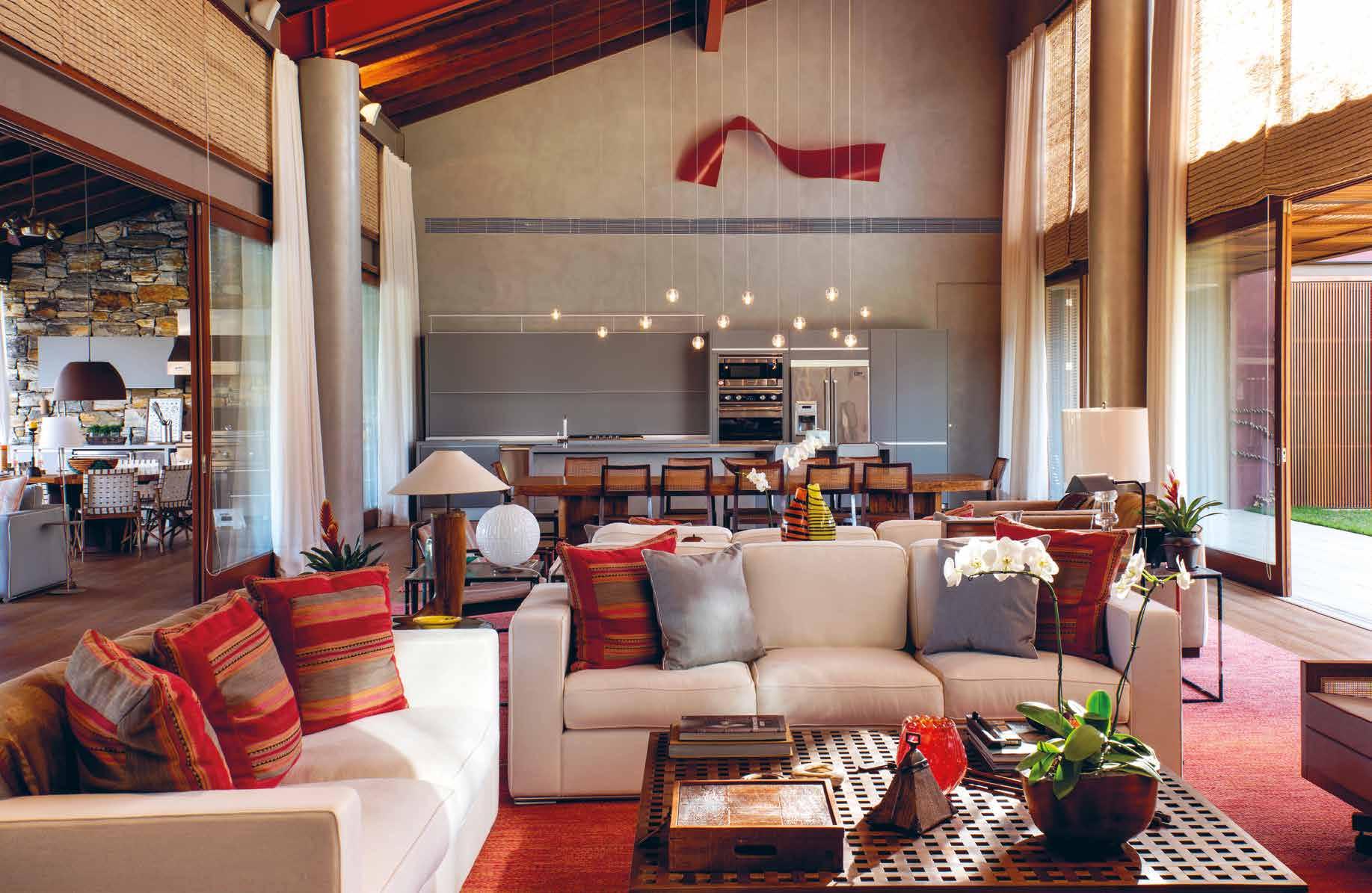
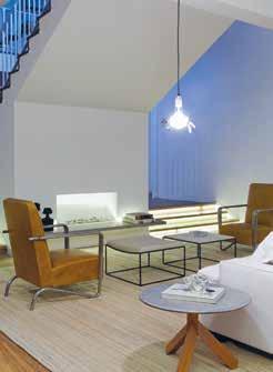
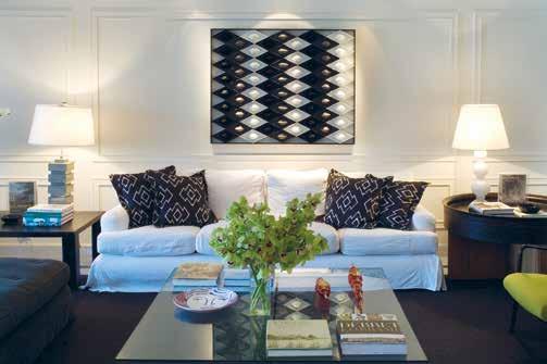
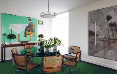
Nestled in the lush green countryside of São Paulo, Brazil, Haras Larissa is a stunning modern country house that perfectly blends contemporary design with natural surroundings. Completed in 2018 by Tiburcio Engenharia, this luxurious property boasts a built area of 1,150 square meters, as well as an impressive 450 square meters of swimming pool and gardens. The project was designed by an architectural team and the interior design was carried out by Rosa May Sampaio Arquitetura de Interiores.
The main vision for this project was to create a beautiful and comfortable house that would be a perfect escape from the hustle and bustle of city life, surrounded by nature. With its sweeping views of the countryside, and thoughtfullydesigned interiors, Haras Larissa is truly a masterpiece. The team behind the project poured their hearts and souls into every detail, from the choice of building
materials to the layout of the rooms, ensuring that every element of the house was not only aesthetically pleasing but also functional and practical for daily use. The result is a harmonious blend of modern luxury and rustic charm, creating a unique and inviting atmosphere that makes guests feel right at home. Whether they want to relax by the fireplace with a good book or entertain friends and family in the spacious living areas, Haras Larissa has something for everyone. The house is also designed to be sustainable, with energy-efficient features and eco-friendly materials, reflecting the team’s commitment to environmental responsibility.
The house’s exterior was painted by Terracor, using water-based paints that provide desirable finishing effects such as aging patinas, weathered lime, and ancient “terracotta” textures. The waterbased paints used by Terracor not only
provide desirable finishing effects but also offer environmentally friendly options. Unlike oil-based paints, which can emit toxic fumes, water-based paints have low volatile organic compound (VOC) levels, making them safer for the environment and the people who live in the house. The bold red wine tone chosen by the architect adds to the house’s unique character and complements the surrounding greenery, creating an eye-catching contrast that draws attention to the house’s design. The use of terracotta textures further enhances the house’s aesthetic appeal and gives it a timeless, classic feel.
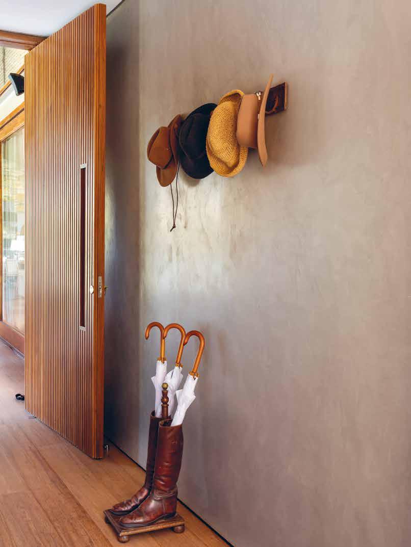
The house boasts an abundance of stunning woodwork throughout its interiors, showcasing a deep commitment to sustainability. Adding to the allure, the lighting design perfectly complements the natural surroundings, creating a cosy ambiance that is both calming and inviting. One of the most striking features
50 design et al
“The house boasts an abundance of stunning woodwork throughout its interiors, showcasing a deep commitment to sustainability. Adding to the allure, the lighting design perfectly complements the natural surroundings.”
The Platinum Issue 51
of the house is its high ceilings, which lend an air of spaciousness and grandeur to the living room, dining room, and kitchen. These areas are cleverly separated from the TV room by sliding glass doors, creating a fluid indoor-outdoor transition that invites the outdoors in. Stepping outside, the terrace and barbecue area beckon, leading off from the living room and providing a perfect space for entertaining guests. The well-appointed design and layout make it easy to enjoy al fresco dining, relaxing in the sunshine, or simply taking in the picturesque surroundings. Whether hosting large gatherings or enjoying intimate moments with loved ones, this space is sure to delight.
The guest bedroom suites are designed to provide ample space and comfort, opening directly out to a beautifully landscaped garden. Each suite boasts a unique “U” shape with an internal patio and a serene
pond, providing a perfect retreat for guests to relax and unwind. The master bedroom, located on the second floor, is a luxurious haven of its own. It comes complete with a cosy sitting room, an elegant bathroom, and a spacious closet, providing the perfect sanctuary for the homeowner to retire to at the end of a long day. Below the master suite, the house offers a range of entertainment options. A sprawling home theater doubles up as a game room, offering endless hours of fun and entertainment for the entire family. For the photography enthusiast homeowner, there’s a dedicated dark room that provides a perfect space for indulging in their hobby.
A service area, including the carekeeper’s house, garage, and dressing room, is located separately from the main house and can be accessed from the swimming pool and garden.
One of the standout features of this property is the deck that surrounds the swimming pool and hot tub, which also cleverly hides the pool equipment. This space provides a perfect place to relax and soak up the sun while enjoying the peaceful surroundings.
Haras Larissa is a true gem of modern interior design, where every detail has been thoughtfully considered to create a luxurious and comfortable retreat for its inhabitants. Its perfect blend of contemporary design with natural surroundings has created a space that is both practical and visually stunning. It’s a perfect example of how modern interior design can be combined with the beauty of nature to create a harmonious living space.
“Haras Larissa is a true gem of modern interior design, where every detail has been thoughtfully considered to create a luxurious and comfortable retreat for its inhabitants.”
52 design et al

www.rosamaysampaio.com.br E-mail: rosamaysampaio@terra.com.br Phone Number : (+5511) 3085-7100 / (+5511) 99974-5251 Rua Alemanha, 691 – Jardim Europa – São Paulo/ SP 01448-010 Instagram:@rosamaysampaioarq / @rosamaysampaio
HISTORIC INFLUENCE AND BOTANIC INSPIRATION
FOUR SEASONS NEW ORLEANS BY BILL ROONEY STUDIO, INC.
54 design et al

The Platinum Issue 55
56 design et al

The Platinum Issue 57
58 design et al

The Platinum Issue 59
60 design et al

The Platinum Issue 61
62 design et al

The Platinum Issue 63
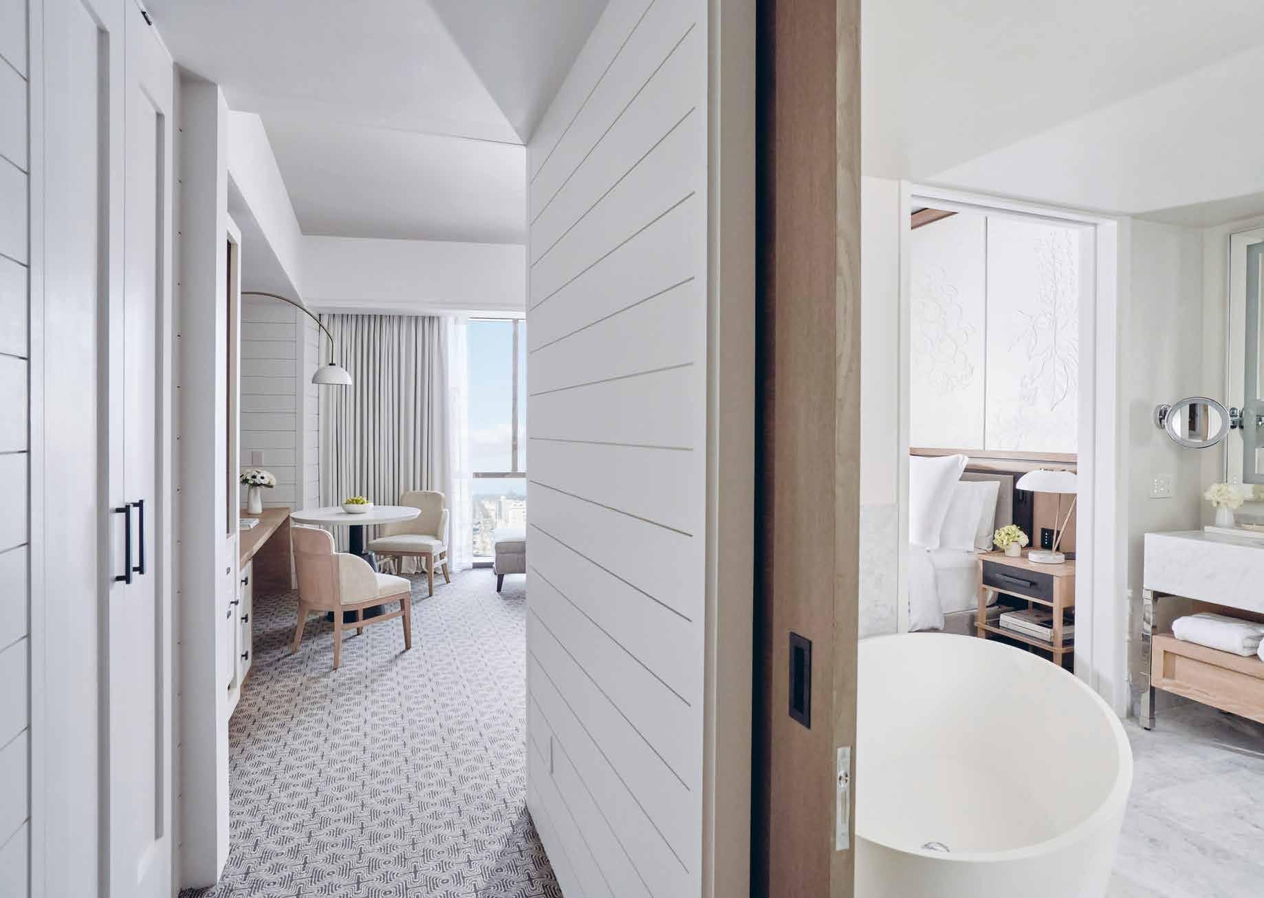
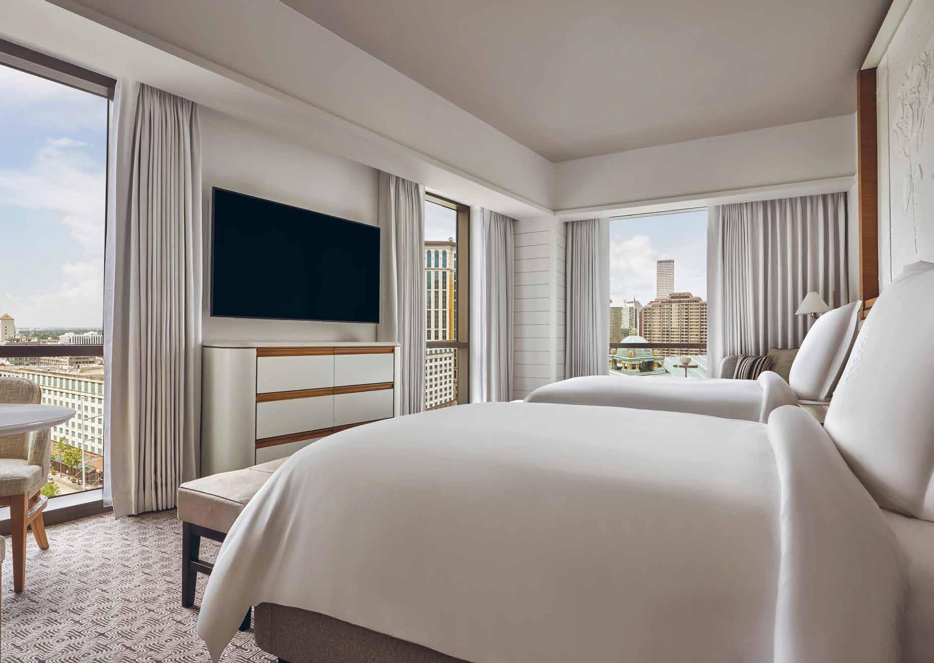
Located in the heart of the central business district along the Mississippi waterfront, Four Seasons New Orleans is situated in a newly renovated 34-storey World Trade Centre building. The lead designer, Bill Rooney of Bill Rooney Design, spearheaded the conversion of the 1960s office building into a contemporary hotel by blending the historic architectural elements with a fresh new look. With floor-to-ceiling windows, the hotel now boasts 341 guest rooms and suites, and 92 private residences, all offering spectacular views of the river or city.
Originally built in 1967 as the International Trade Mart by modernist architect Edward Durell Stone, the landmark tower was more commonly known as the World Trade Centre—named in 1968. The onceprominent office building sat unoccupied for a decade prior to undergoing the over half-billion dollar, three-year renovation.
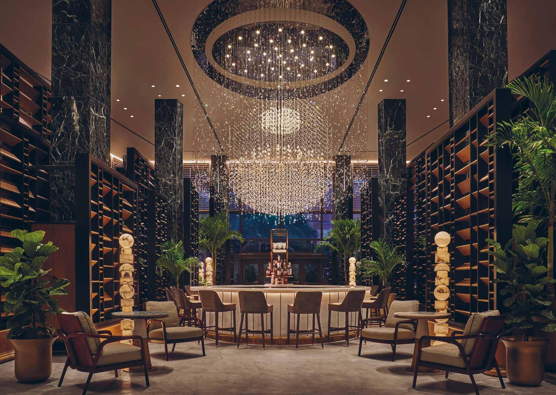
The compass-shaped tower is constructed with four sections that align with the cardinal points of North, South, East, and West – a homage to navigating the river. New Orleans is a city filled with cherished heirlooms and it is from this legacy that the interiors emerge. The lobby is centered around the bar that is enveloped by a grand lighting installation made up of varying crystal and glass arrangements creating the hint of an heirloom chandelier shape. The Chandelier Bar serves as a showpiece where guests sip cocktails under the custom chandelier made from 15,000 Bohemian crystals. “The twinkling, reflective movement of the chandelier creates a layered mood in a room that is subdivided by contemporary shutter screens made of oak, iron, and curated
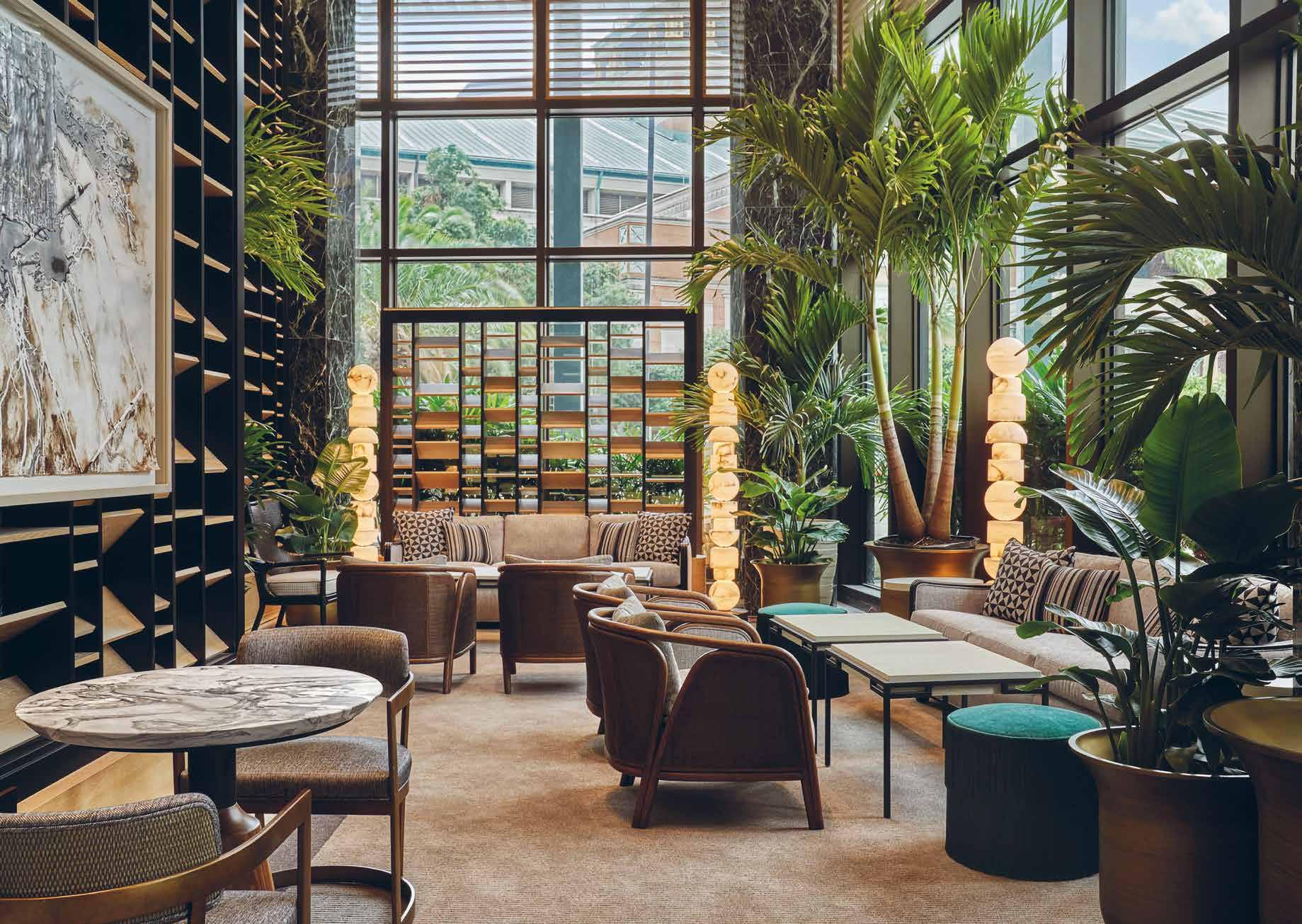
artwork,” says Bill Rooney of Bill Rooney Studio. The shutter screens create intimate spaces with their arrangement. The lobby is envisioned as a garden pavilion, with an interior atmosphere that is composed of an eclectic and contemporary arrangement of classic curiosities surrounded by a lush garden sanctuary.
In a city that embraces a multicultural heritage, and celebrates life, alluring gardens, art, music, and cuisine and set on two riverfront acres flanked by lush gardens, the design of the Four Seasons New Orleans is inspired by the sanctuary and allure of this botanic backdrop. It is this restful setting that the interiors become a foundation to celebrate the multi-cultural heritage of the city through art, food, and threads of historic influence.


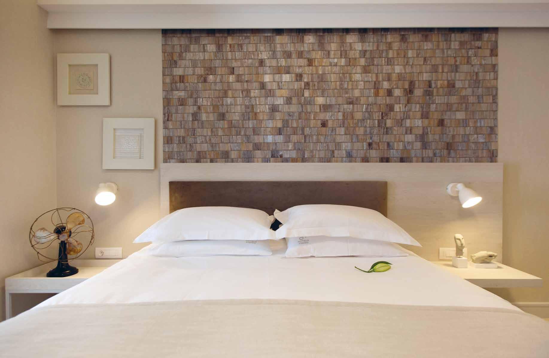
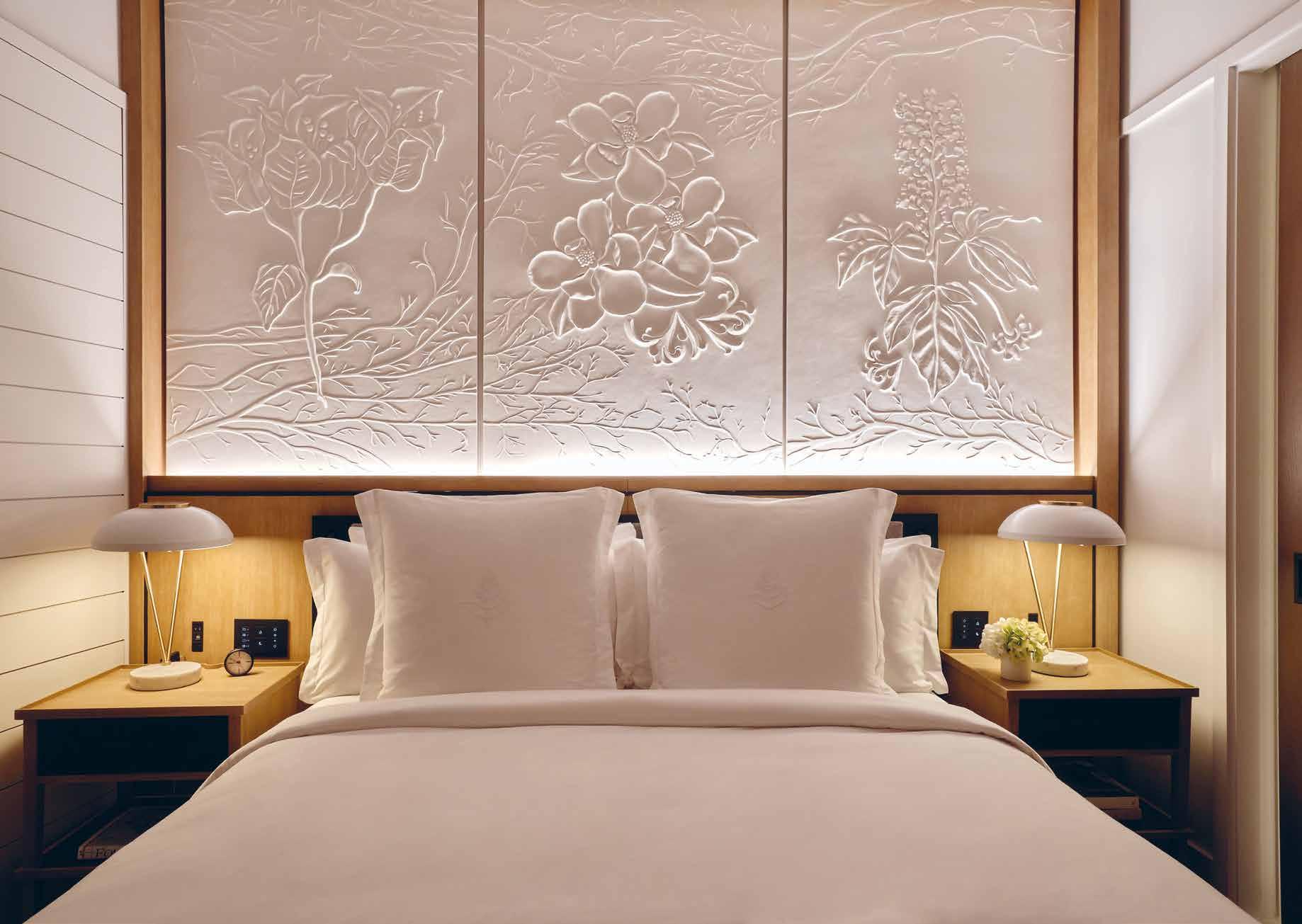
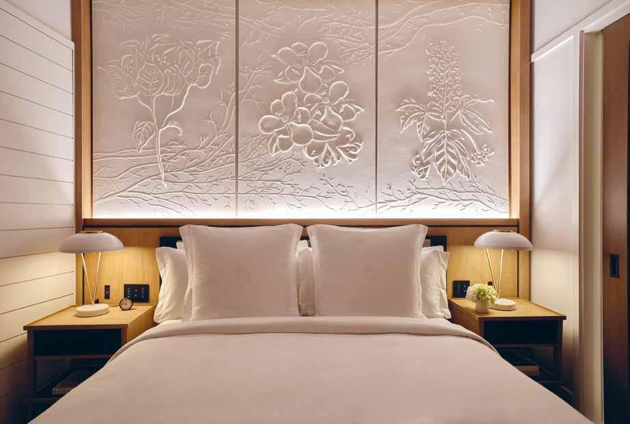
Designed to suit the needs of every traveller, the 341 guest rooms and suites are a serene chamber with a fresh palette of white and pale greys, referencing the patterns found in New Orleans gardens. “The guest rooms are formed through references found in nature. With hints of local culture and influenced by the patterns found in New Orleans gardens,” explains Rooney. With views of the city and river, the fresh bright white palette is layered carefully with materials, art, and curiosities. This is ultimately expressed through a large plaster wall relief of regional planting that anchors the bed. The plaster relief is complimented by accent lighting and a regional materiality that is articulated with white shiplap walls, soft washed white oak accents, Carrara stone, Wilton weave carpet patterned after the building plan, and

64 design et al
“the design of the Four Seasons New Orleans is inspired by the sanctuary and allure of this botanic backdrop. It is this restful setting that the interiors become a foundation to celebrate the multi-cultural heritage of the city through art, food, and threads of historic influence.”
alluring and distinctive design


LUXURIOUS AND INNOVATIVE ARCHITECTURAL MASTERPIECE
66 design et al
SKY LANE BY DE LOREN & ASSOCIATES
The Platinum Issue 67
68 design et al
The Platinum Issue 69
70 design et al
The Platinum Issue 71
72 design et al
The Platinum Issue 73
74 design et al
The Platinum Issue 75
76 design et al
The Platinum Issue 77
78 design et al
The Platinum Issue 79
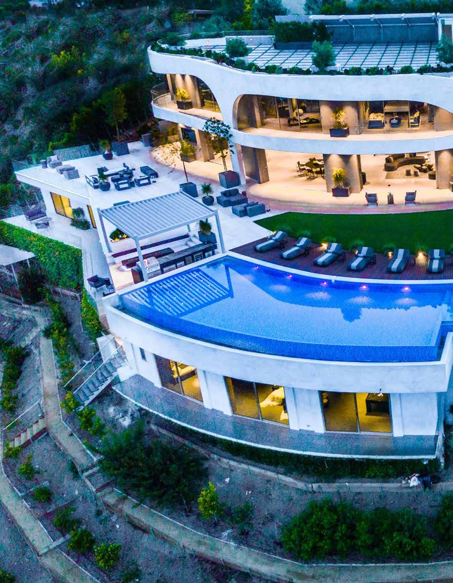
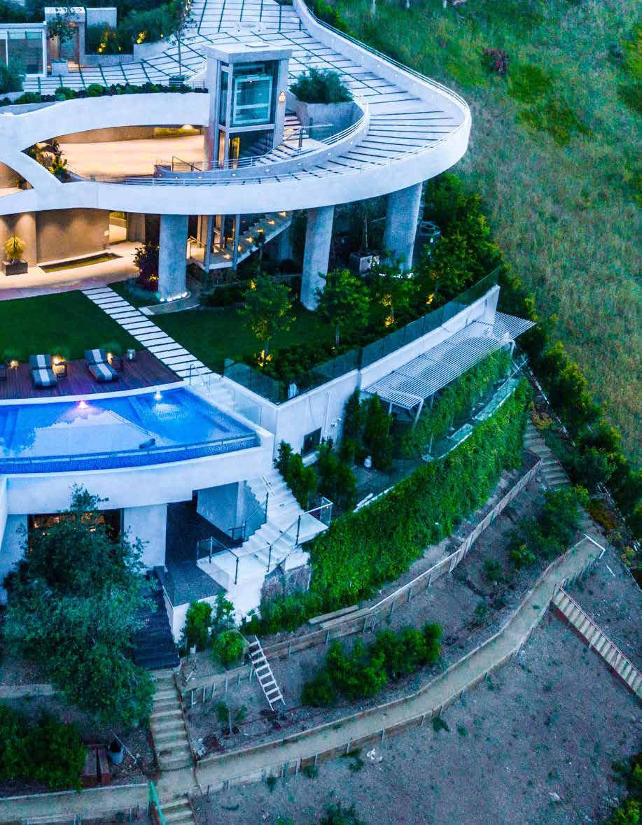
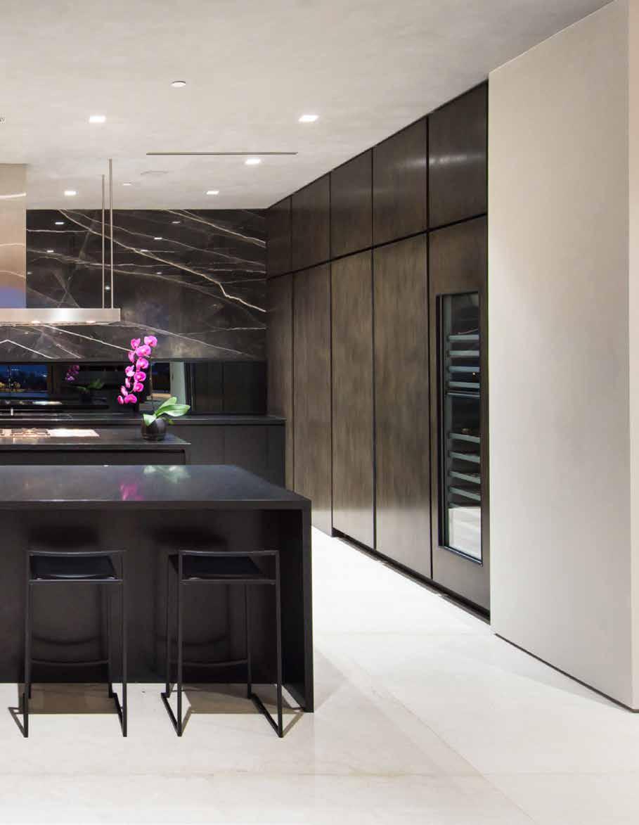
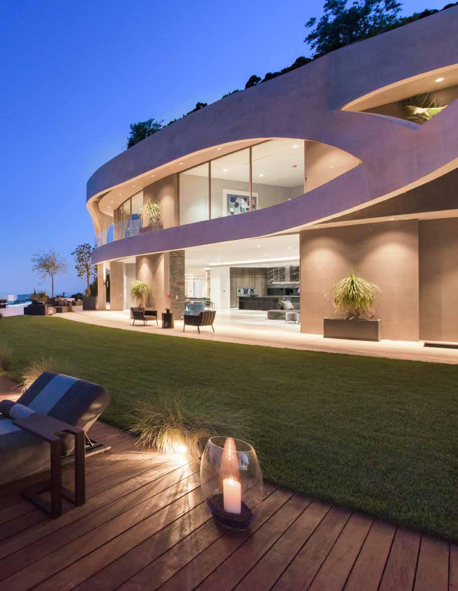
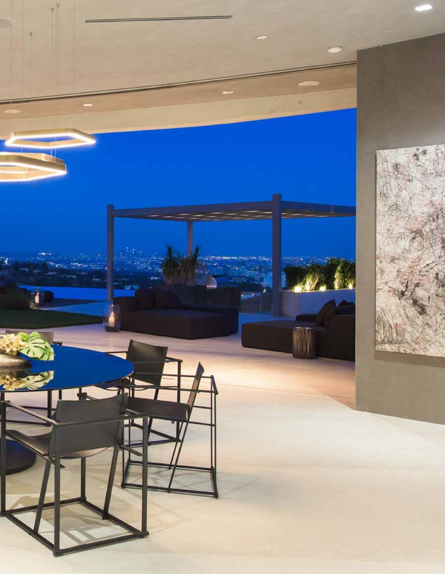
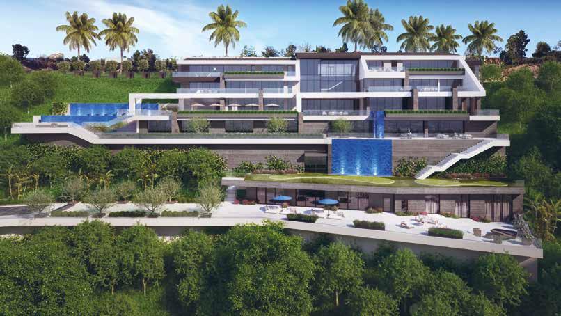
Sky Lane is a stunning architectural masterpiece located in the heart of West Los Angeles. Designed and built by the renowned de Loren & Associates, this unique residence blends seamlessly into the surrounding landscape and offers unparalleled views of the city.
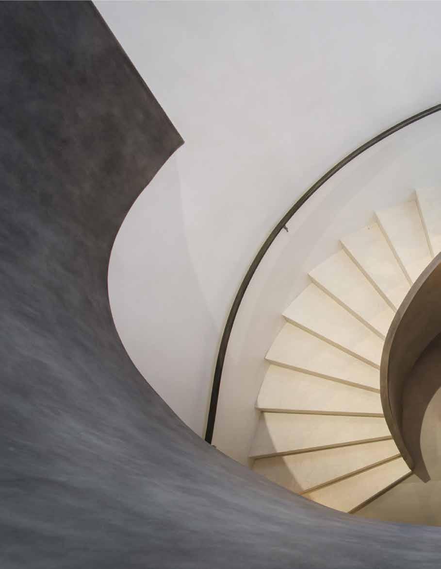
Inspired by the natural curvature of the Brentwood hills, the design of Sky Lane is truly one-of-a-kind. Unlike any other home in Los Angeles, visitors enter Sky Lane through its roof, adding a sense of excitement and wonder to the experience. The dynamic facade of the residence wraps around the building, featuring an exterior skeleton that is offset from the structure and offers complex curvature to the residence.
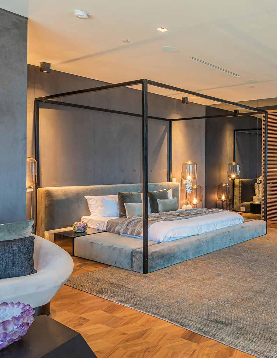
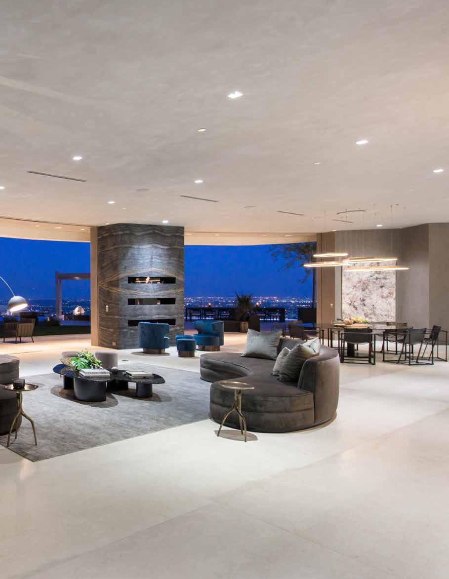
Inside the interior is just as impressive as the exterior. The property features an extensive wine cellar, a movie theatre, a gym and spa, seven large bedrooms, including a beautiful master bedroom, multiple waterfalls, an entertainment room, an office, a zen garden, and a 300-square-foot living green wall. The home is also equipped with DARWIN smart home technology, allowing residents to monitor air and water quality and control lighting for the perfect mood.
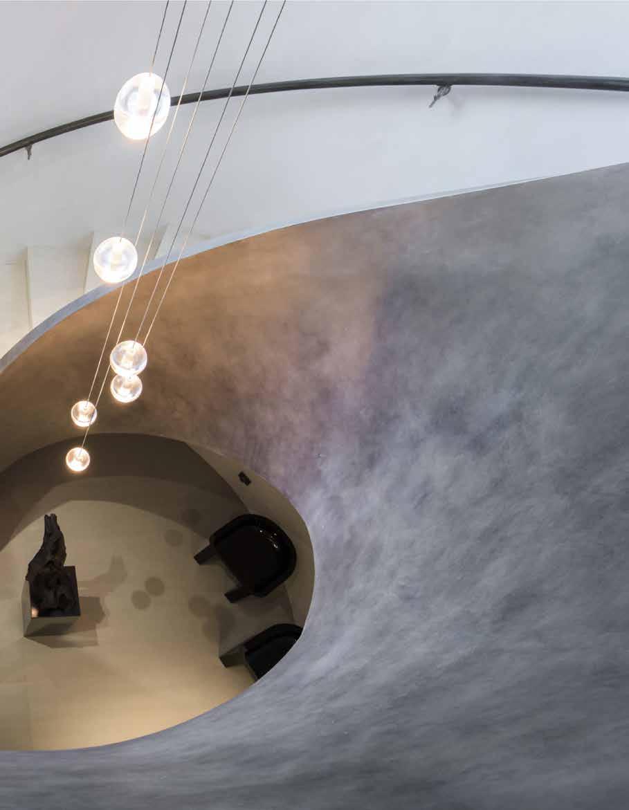
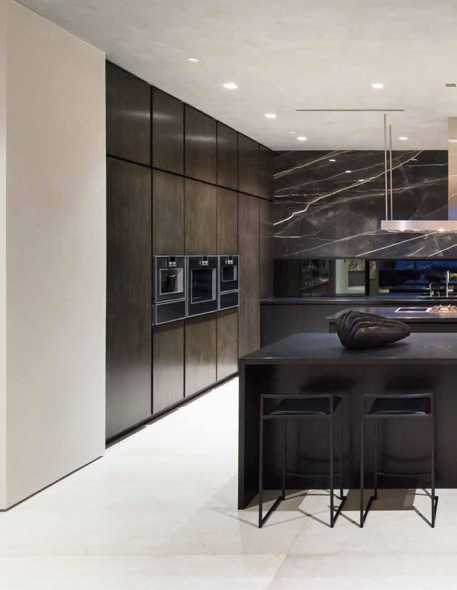
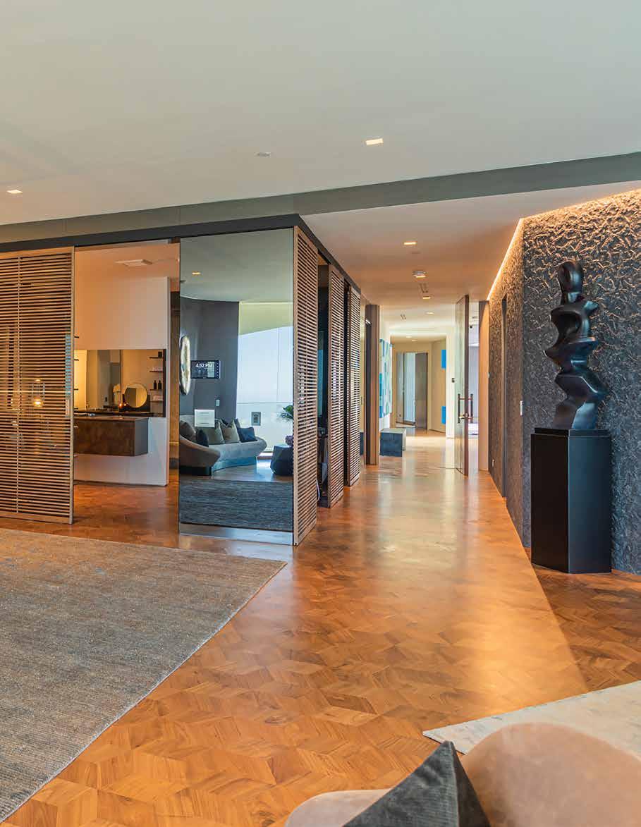
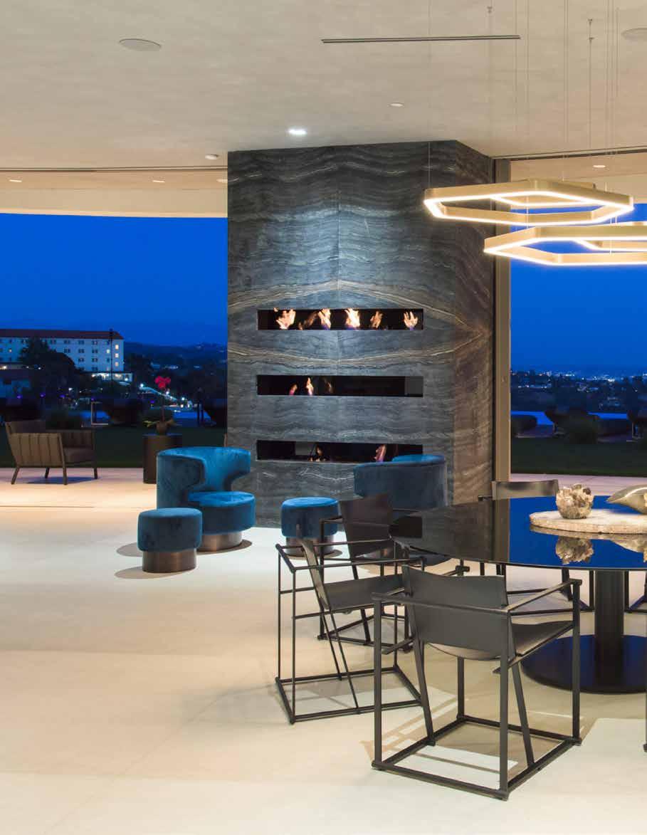
The interior design of Sky Lane is elegant and modern, with clean lines and high-end finishes that complement the building’s overall aesthetic. The living spaces are bathed in natural light that streams in through floor-to-ceiling windows, creating a sense of seamless connection between indoors and out. The decor is minimalistic, with an emphasis on functionality and simplicity.
The master bedroom is a true oasis, featuring stunning views of the city and a private balcony. The ensuite bathroom boasts a luxurious bathtub and shower, while the walk-in closet provides ample space for even the most extensive wardrobe. The other bedrooms are equally luxurious, with each featuring its own unique design and views of the city.
A true highlight of the property is the entertainment room with a state-ofthe-art sound system and ample space for hosting guests. The movie theatre is equipped with a large screen and comfortable seating, providing the perfect space for movie nights with family and friends.
A gym and spa offer the perfect place to unwind and stay active. With high-end equipment and a sauna, residents can exercise and relax in style. The zen garden provides a peaceful escape from the hustle and bustle of the city, while the living green wall adds a touch of nature to the interior design.
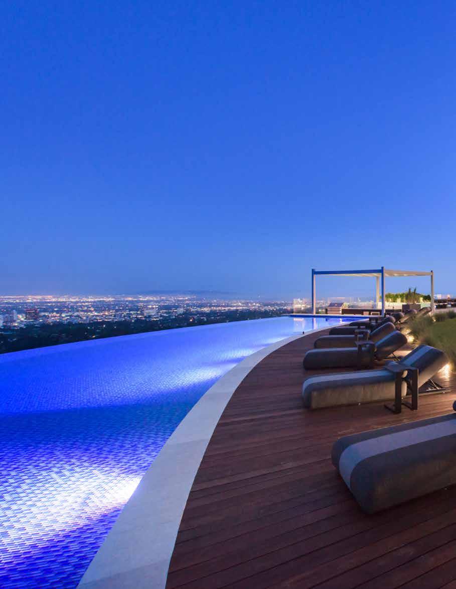
The pool at Sky Lane is a work of art in itself, following the dynamic curvature of the house and allowing the pool to wrap around the terrace, encompassing every view available. This 75-foot infinity pool features a jacuzzi, Baja, and a swim-up bar, creating a luxurious and relaxing atmosphere for residents and guests alike.
Sky Lane was built on a site that was deemed un-buildable for over 50 years. Many contractors and engineers tried to build on this hillside but were not able to come up with a design solution. The clever engineering and complex design process
that went into completing the overall look of the house is a testament to the skill and creativity of de Loren & Associates.
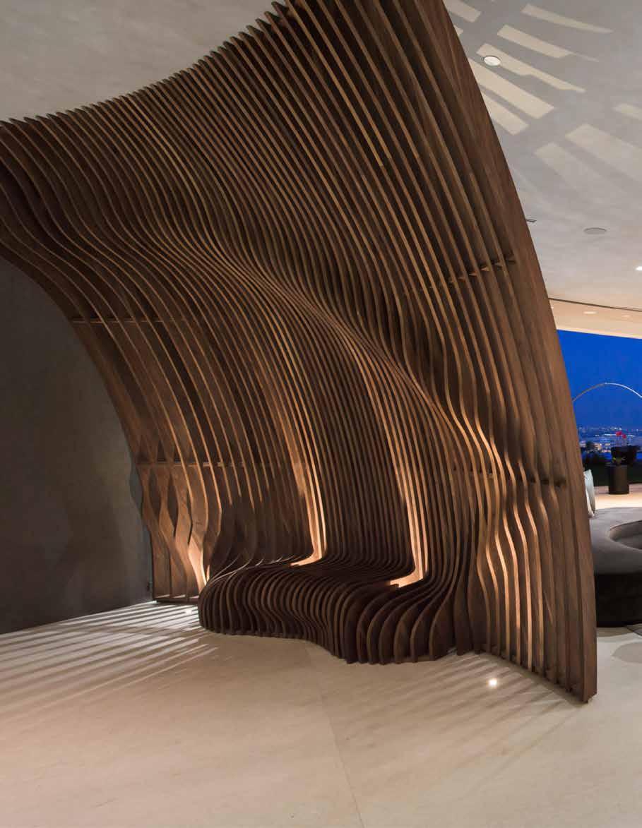
The distinct curvature of the buildings facade drew inspiration from luxury yachts, giving the entire residence a feeling of dynamic movement. A favourite feature of Sky Lane for de Loren & Associates had to be the unique, 75-foot infinity pool, which offers exceptional views of Los Angeles, including the Getty Museum, Downtown Los Angeles, and the Pacific Ocean, all from one location. The custom-made curved sculptural wall and two bars in the living room add to the overall aesthetic and accentuate the curves of the residence, handcrafted by Japanese master craftsman Toshi Kawabata using solid walnut wood.
Use of advanced materials and technology throughout Sky Lane adds to its appeal. High-strength concrete and steel are used throughout the building, allowing for open spaces and expansive views without compromising the building’s stability. The energy-efficient systems, including solar panels and a rainwater collection system, make Sky Lane a model of sustainable living in the heart of the city.
Sky Lane is a truly remarkable property that sets a new standard for luxury living in Los Angeles. Its unique design, luxurious amenities, and attention to detail make it a one-of-a-kind residence that’s sure to impress. The combination of cutting-edge technology and sustainable features make Sky Lane a true model of modern living, while its convenient location offers easy access to all that the city has to offer.
80 design et al
“The interior design of Sky Lane is elegant and modern, with clean lines and high-end finishes that complement the building’s overall aesthetic.”
de Loren and Associates is, at its core, a family-run architectural design "House" with an authentic, sophisticated and clear creative identity. Our design philosophy, based on a long term vision, values past heritage methods, modern innovation and precise contemporary aesthetics to create fine heirloom quality homes worldwide.
CULTURALLY INSPIRED EXCEPTIONAL DESIGN
ILIOS CANCUN BY FILIPAO NUNES ARQUITECTOS
82 design et al
The Platinum Issue 83
84 design et al
The Platinum Issue 85
86 design et al
The Platinum Issue 87
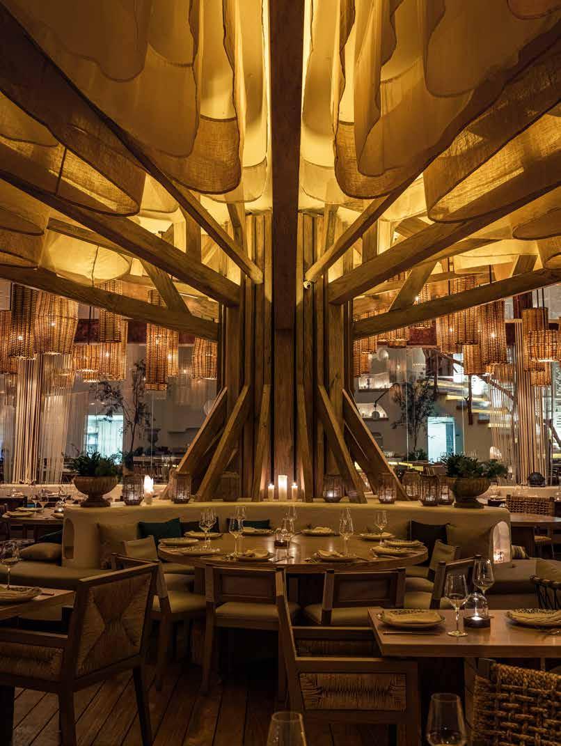
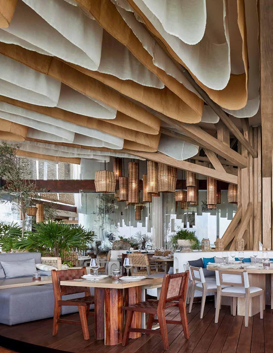
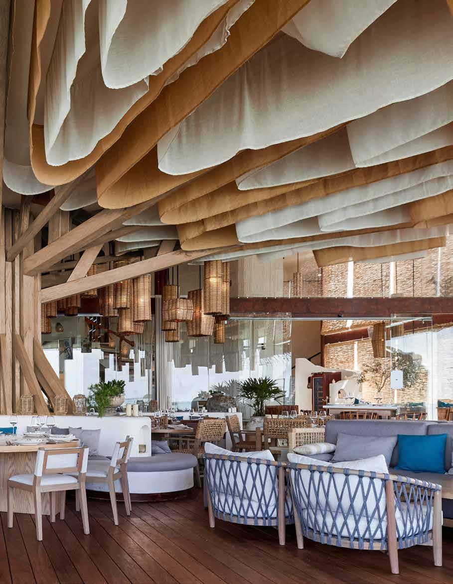
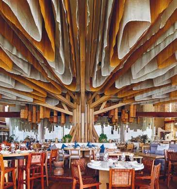
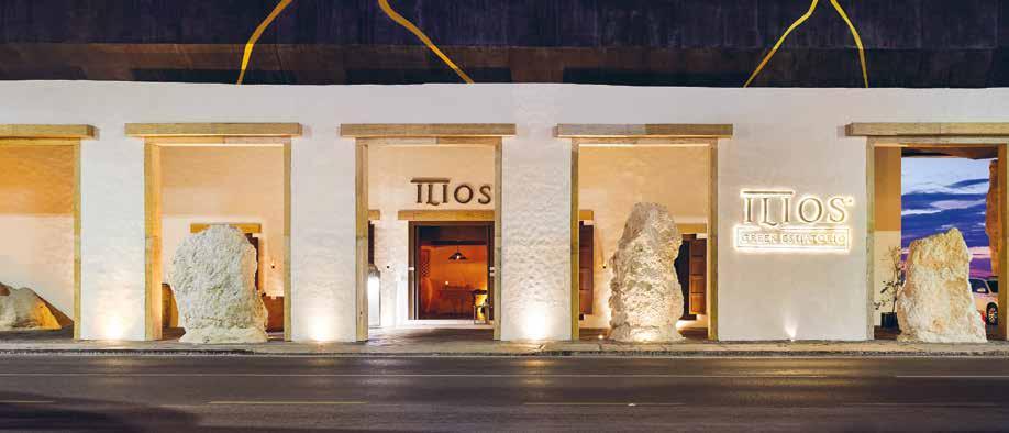
Ilios is a Greek restaurant which arises in the Nichupté lagoon, in Cancun, Quintana Roo. The fusion between Greek and Mayan cultures gives guests the sense they are in a magical place, full of history. The principal design is a structure covered by a tree design, which represents an age old Mexican legend.
The brief was for a restaurant that could define the idea of a Greek restaurant and make a great fusion with the food. Although this project represents the combination of two cultures, the design team gave themselves the task of focusing on a single element, the main structure that gives birth to the space and supports a large part of the complex, which is located on a mangrove swamp. Undoubtedly, the biggest challenge was this central structure, making it transform into a sculpture and not only as the main anchor of the place, both from the terrace slab and from the platform that emerges over the lagoon. Initially there was very little space, so the designers created the platform over the lagoon to increase the space with the tree as the core structure for the platform and the ceiling.
The idea of the central tree comes from “La Ceiba” a tree venerated and sacred by various pre-Hispanic cultures in Mesoamerica such as the Mayans, where they believe that certain deities of the jungle live in it and that the famous legend of the Popol Vuh tells of the development of three levels: at its base they placed the Kab or the earth that living beings inhabit, in this project this is the platform where the activities take place; in the stem and branches the gods established their dwelling; while at the top of its glass inhabited the origin of all the gods in the form of a magnificent celestial quetzal bird, which is represented by the diverse amount of fabrics that fall on the room, playing with the height of the space, and as its complement the number of luminaires that make the space cosy, despite the great height with which it was worked.
This was one of the most ambitious projects for Filipao Nunes Arquitectos in a time of uncertainty, in which the requirements of a total of 870m2 of construction are covered, of which 600m2 are positioned on the lagoon, serving more
than 252 guests, with spaces destined not only for the tasting of dishes, but also for the development of various shows and activities throughout the day, creating unique experiences for each of those who enter the space.
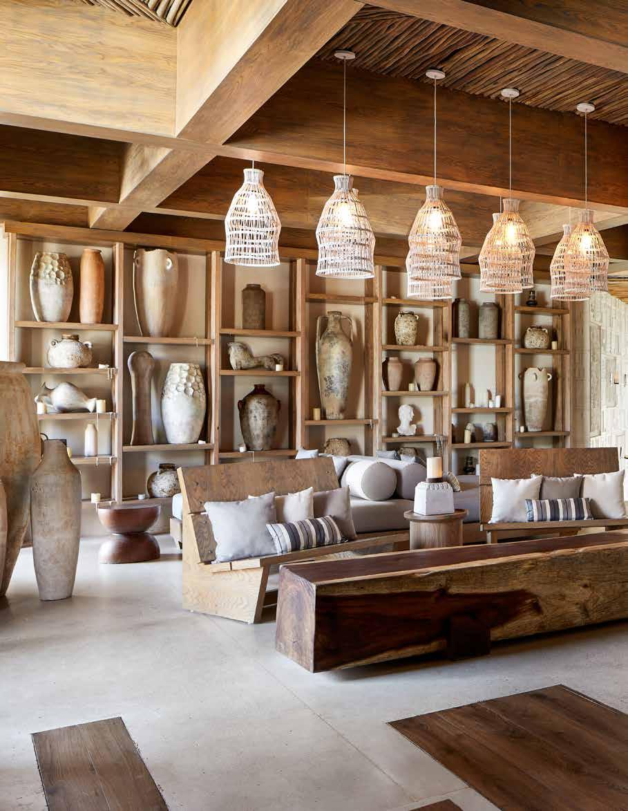
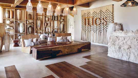
Its construction during a difficult time in fact helped the local and national economy, with the collaboration of Mexican brands, helping with accessories, decorative lamps and accents of the place. All the lamps, chairs and mouldings were made by local artisans, which was very important in this project, as it activated jobs and local business that were closed in the pandemic. For this reason, for the client it is one of the most important and special projects.
This project allowed Filipao Nunes Arquitectos to design a fascinating place, a meeting space in which each visit can be different and of which the word spreads inviting those who are always in search of new recreational adventures. Respecting scale and proportion, with the openings of the structure at the same distance, the strings simulating the Greek
88 design et al
“This project allowed Filipao Nunes Arquitectos to design a fascinating place, a meeting space in which each visit can be different and of which the word spreads inviting those who are always in search of new recreational adventures.”
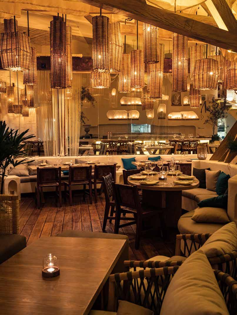
columns and the beams the capitals, this is a minimalist and dematerialized reinterpretation of classical Greek architecture, just as it is inspired by the mix between the elements of the architecture of the Greek islands like Mykonos and Santorini with the Mayan ruins like Zama, Coba and Xel-Há.
One of the favourite aspects of this project for the design team is the use of the tree as a centre piece on the terrace, as well as the centre piece of the structure, making this the centre of attention, from which a design of hanging fabrics and accessories arises.
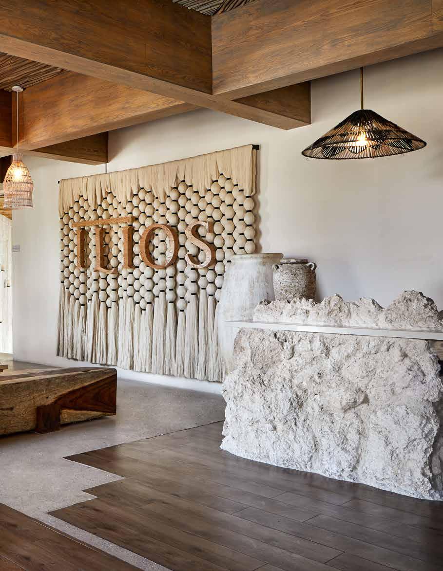
The general design respects the lagoon and its contour in nature, allowing the platform to “float” on it trying not to touch the water level. Ilios celebrates not only multicultural fusion, it also makes reference to nature, integrating itself into the space in which it meets raw materials such as treated wood, natural stones, concrete, raw colours, linen fabrics, and

reed. The use of wood, in all its possible forms and applications, added to these raw materials, have been the tone of the spaces and environments of Ilios. The furniture plays a crucial role; from the imposing rattan lamps, through the generous ecosystem of seats and tables, everything works in both a structural and interior distribution way thanks to its functionality. The design is integrated between the interior and the exterior with the use of materials and lights, from its entrance it welcomes guests to a new place, with surprises in every corner.
Filipao Nunes Arquitectos were winners of the Restaurant / Bar Design Award at The International Design & Architecture Awards 2022 with this project. When asked about the importance of the Awards Filipe Nunes, Director of Filipao Nunes Arquitectos explained that the Awards “are important since they are an international platform to promote your projects around the world”. On winning the Award at the ceremony in London in
September, Filipao remarked “It is an enormous pride for me and for my team to receive this incredible recognition in London rubbing shoulders with people that we admire and respect so much... Ilios Cancun is a project that materialises overcoming adversity, resilience... and celebrates life... thank you so much!”
Ilios brings traditional Greek gastronomy to a new level of elegance and sophistication amid décor with an exceptional design, eco-integrating architecture and visual harmony in every corner.
“Ilios celebrates not only multicultural fusion, it also makes reference to nature, integrating itself into the space in which it meets raw materials such as treated wood, natural stones, concrete, raw colours, linen fabrics, and reed”
BUILD 90 design et al



WWW.FILIPAONUNES.COM @FILIPAONUNES INFO@FILIPAONUNES.COM BUILD & BELIEVE
URBAN REFUGE
MODERN SIMPLICITY
 BY DOUGLAS DESIGN STUDIO
92 design et al

The Platinum Issue 93

94 design et al

The Platinum Issue 95
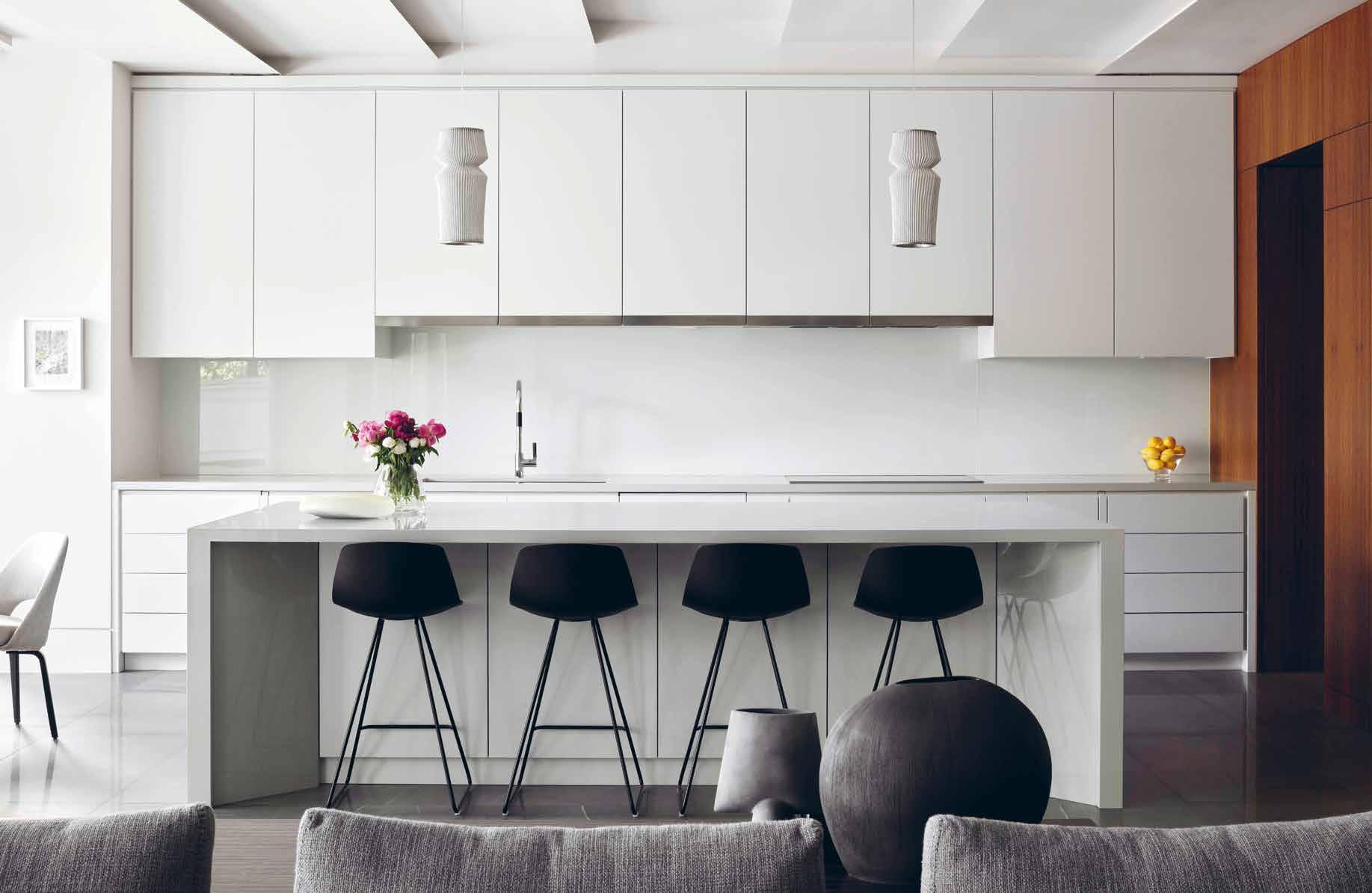
Located in Toronto, this crisply tailored design composes a well-structured, modern yet warm and versatile living space for an active family of five. The family home offers an urban refuge with a contemporary, minimalist and inviting interior. It is a city house that lives large.
Sitting in an established pocket of Toronto with spacious, but traditional homes. The clients enlisted Douglas Design Studio to create a design to accommodate them and their three teenage daughters as well as a busy routine as executive professionals.
The design concept ensures seamless functionality while creating a warm family home. A balance was struck between the traditional, classic architecture and thoroughly modern interior design. Thoughtful details create the relaxed and sophisticated environment the clients were seeking. This also includes the mindful use of natural materials, such as textured woods and fabrics with a distinct sense of warmth and simplicity. The family has a kind and easy going rhythm, which was translated into a crisp and luxurious design accommodating each individual’s needs.
Clever design strategies were used to accommodate the wishes of each family member. The hidden bar, for example,
addresses the difference between a wife who does not drink and a husband who is an avid wine collector. The guiding principle in the entire design proved to be the family’s own values and rhythms, ensuring an intergenerational family home and urban refuge to enjoy for decades to come.
The clean, richly contrasted aesthetic of the dining room is defined by its central plaster art piece, custom designed and installed by local artist Anthony Valin. Its angular lines and their spatial dimension bring a note of calm modernity to the space. The art installation is flanked by custom made, segmented antiqued mirrors, their bronze finish adding warmth and gravitas to the vignette. The dramatically geometric Agnes chandelier by Roll & Hill echoes the same sharp lines. Black wainscoting around the room floats off the wall, and vibrant drapery in a contemporary pattern adds a punch of colour.
In the kitchen and breakfast area, a sculptural solution for the ceiling accommodates mechanical necessities and adds loft to the centre of the space. Extruded aluminum lining the edges makes them appear paper thin and near weightless. The light fixtures, courtesy of Arturo Alvarez, layer plaster
over linen, iterating the use of natural, modern materials throughout the house. A caterers’ kitchen provides hidden extra space for entertaining and a bright breakfast corner invites family conversation to catch up on the days events.
This home does not have a living room, consistent with the family’s rhythm. The family room, designed for informal lounging and entertainment, features a striking Metropolitan chair from B&B Italia and colourful Verner Panton chairs from Vitra for the children’s homework area. A custom designed credenza from the Jeffrey Douglas Studio Line hugs the back of the sofa in the centre of the room. A powerful stone installation combines a fireplace and television. Office The view in from the hall has a wall of angled bookcases that keeps the modern lines clean and uncluttered. These shelves accommodate reference material and necessary files for this daily use home office. A stunning custom desktop of Lemurian Blue Extra granite with deposits of labradorite creates sparkle while keeping it sleek and professional.
Due to the location in an established area of Toronto mostly featuring traditional homes, the design aimed to facilitate a mental shift from a classic outside to
“A balance was struck between the traditional, classic architecture and thoroughly modern interior design. Thoughtful details create the relaxed and sophisticated environment the clients were seeking. This also includes the mindful use of natural materials, such as textured woods and fabrics with a distinct sense of warmth and simplicity.”
96 design et al

The Platinum Issue 97
a pure, modern interior. The entrance, hallways and stairs took on a special role interconnecting rooms and transitioning from an uncontrollable outside world to a serene personal space.
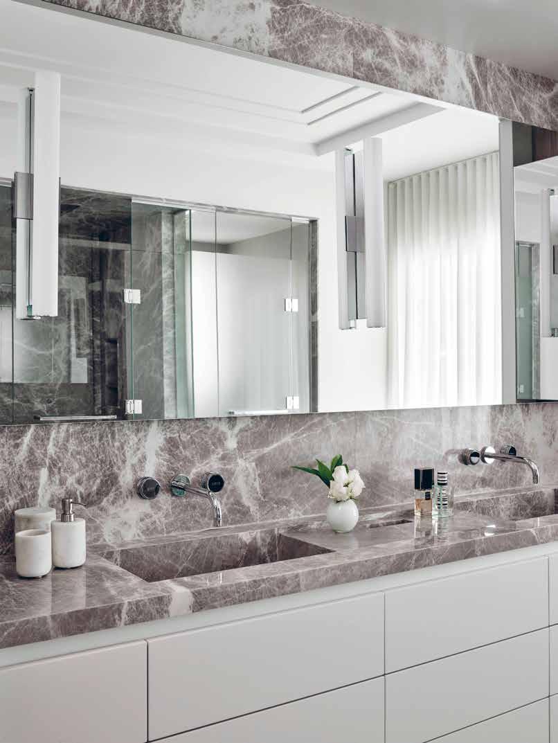
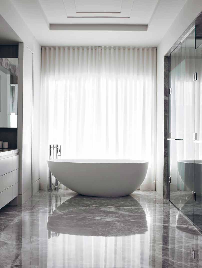
The calm and meditative atmosphere of the master bedroom is achieved using large panels of matte-finish wood. A TV is hidden in the foot of the bed, continuing the story of uncluttered, yet fully functional spaces. The master ensuite is calm and airy with a palette of grey and white stone and painted surfaces. The strong central axis brings in diffused light with a large window over a centred freestanding bathtub. The 10 feet long vanity features custom made stone sinks that are linked by a lowered wet space that contains soaps and towelettes. A dedicated makeup area in the dressing room uses a glowing panel of colour corrected LED light to create perfect lighting to start and end each day.
Each of the family’s three daughters has her own bedroom with distinct colour palettes, soft feminine materials and fresh, modern lines. The young but
timeless designs hold much potential for growth as an aesthetic backdrop to their journey to adulthood.
Purposeful spaces were created to display the clients’ art collection, such as a custom corner for a glass sculpture by local artist Jeff Goodman Studio, The “Three Sisters” installation in another hallway, commissioned through the Steven Bulger Gallery, mirrors the family’s own structure.
A fully equipped spa/gym is a complete wellness centre with a Scandinavian-style sauna featuring an elegant custom sink and mirror, with a unique black frame structure that holds extra space for shelving and towels. The basement rec room does not sacrifice style for function with its custom cut large format porcelain tile doors hiding copious storage. The outdoor pool area features a cabana with a kitchenette and outdoor television for summer movies.
Douglas Design Studio won the Award for Luxury Residence - Canada with this project in The International Design &
Architecture Awards 2022. On receiving this accolade, Jeffrey Douglas, Principal Designer of Douglas Design Studio stated “It is especially gratifying to receive recognition outside of your local community and amid an international field of such excellent work. It speaks to the hard work and attention to detail from a whole team of people. This home with great architectural bones by Richard Wengle Architect, terrific attention to quality of construction by GoldCon Construction, tireless communication and design from Douglas Design Studio team members Neil Shobhanadry and Gordana DiMonte, speaks to how many people it takes to achieve something simple, elegant and of long term value”.
As with every truly successful interior design, this space is a custom-fit, authentic reflection of its inhabitants. The home opens pathways to approach each day as an adventure as well as provide the structure needed to build habits that define a life well lived.
“It is especially gratifying to receive recognition outside of your local community and amid an international field of such excellent work. It speaks to the hard work and attention to detail from a whole team of people”
98 design et al

www.douglasdesignstudio.com 416-538-4692
ASIAN INSPIRED INTERIOR DESIGN EXCELLENCE
MALIE BY KENNETH USSENKO DESIGN
100 design et al

The Platinum Issue 101

102 design et al

The Platinum Issue 103

104 design et al

The Platinum Issue 105
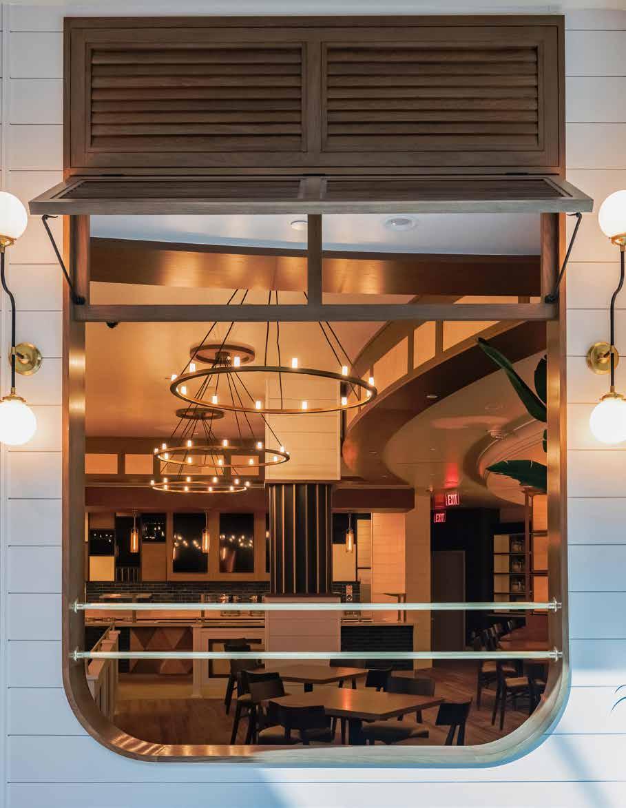
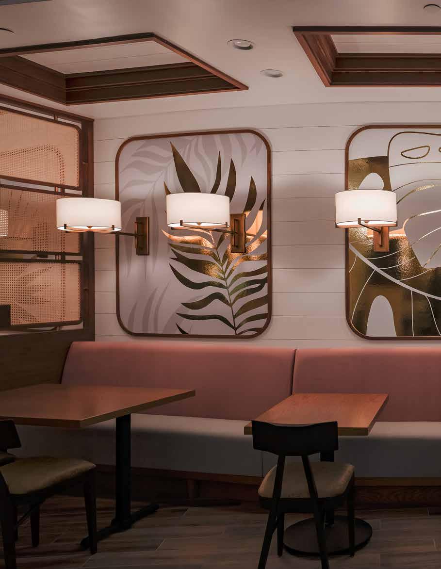
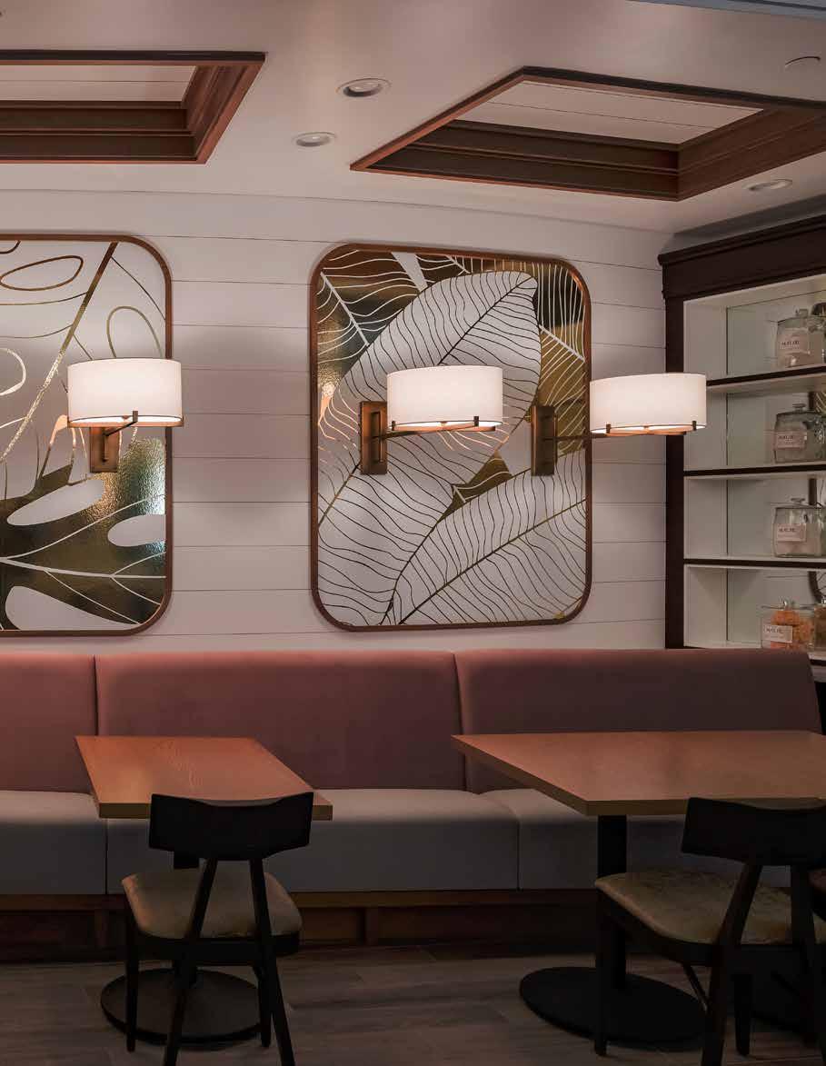
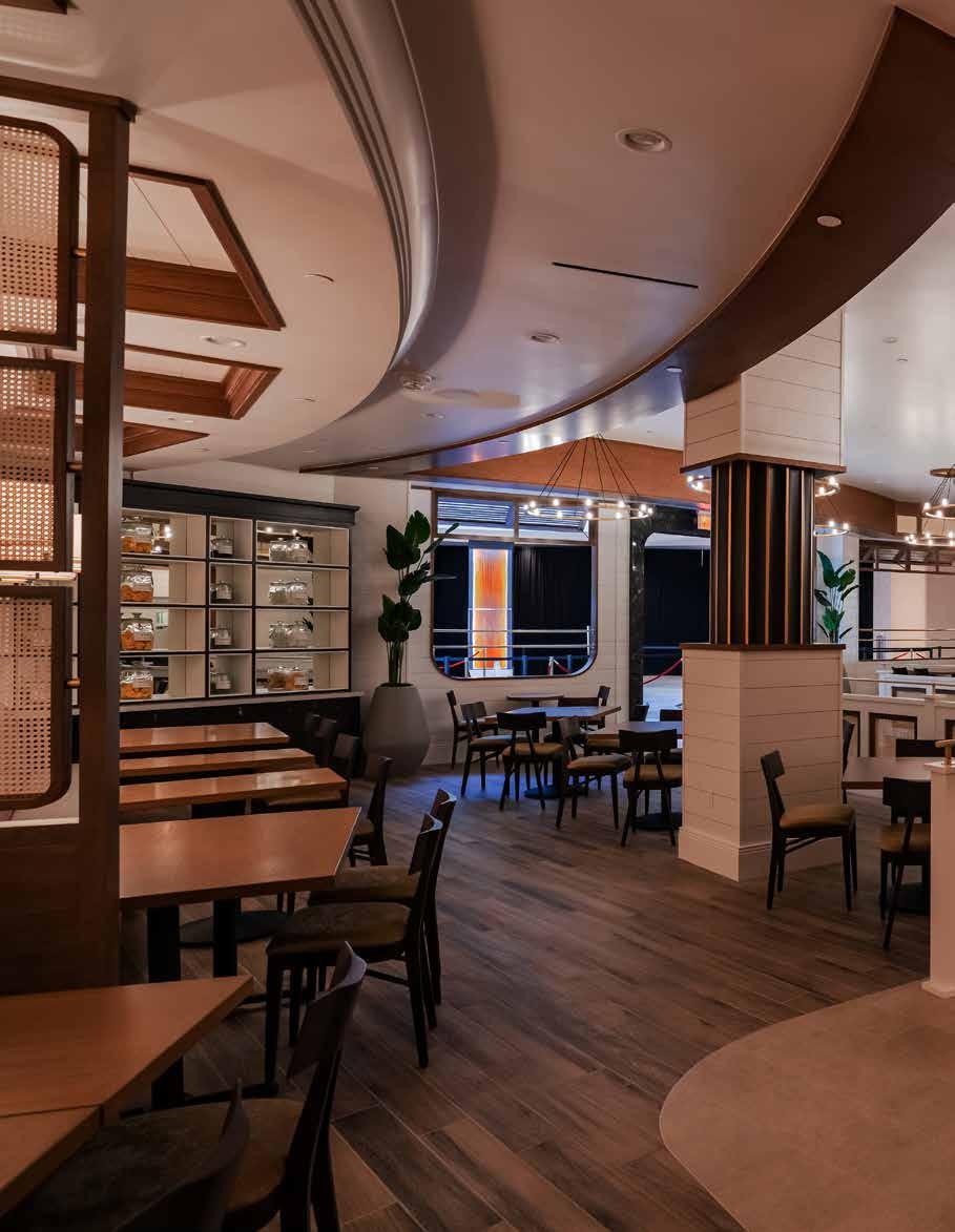
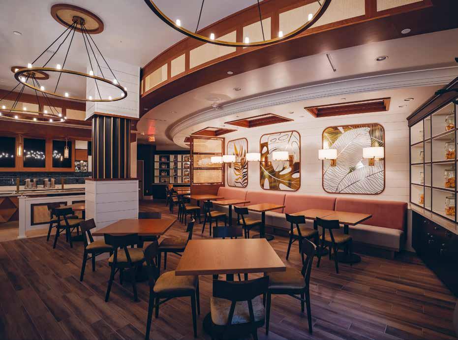
Nestled within the Spotlight 29 Casino in Coachella, the Malie restaurant is a stunning example of interior design excellence. Designed by Kenneth Ussenko, the owner and lead designer of Kenneth Ussenko Design, the restaurant takes inspiration from the Asian influences found throughout the Hawaiian Islands, while also balancing the vision of a Hawaiian plantation home with rich colours that compliment the Asian cuisine served by the kitchen team.
Malie restaurant’s interior design stands out due to its use of vibrant textures and fun fabrics that contrast beautifully against the clean white canvas of wood and tiles. This design direction is a key aspect of the restaurant’s overall aesthetic, creating a strong impact at the entrance of the Spotlight 29 building. The lively colors and playful patterns of the fabrics used in the restaurant’s design are a testament to the designer’s creativity and imagination. The fabrics’ bold and exciting textures add an element of fun and playfulness to the space, making it a memorable dining experience for guests. Furthermore, the clean white canvas of wood and tiles provides the perfect backdrop for the vibrant textures and fun fabrics to shine. The contrast between the white surfaces and colorful fabrics creates a sense of balance and harmony that enhances the overall design aesthetic. This design direction not only creates a visually appealing atmosphere but also contributes to a fresh, clean, and sophisticated space that complements the interiors of the casino spaces. The Malie restaurant’s design is a perfect reflection of the modern, vibrant, and cosmopolitan atmosphere of the Spotlight
29 building, making it an ideal destination for dining and entertainment.
The design team poured their heart and soul into the project, and their favorite aspect of it is undoubtedly the exquisite custom-built shutters and light fixtures. These one-of-a-kind creations impart a distinct character to the restaurant’s ambiance, enhancing its overall appeal. To achieve their design vision, the team left no stone unturned, working relentlessly to create bespoke millwork, case goods, seating, artwork, and custom lighting. Every aspect of the decor has been meticulously crafted and thoughtfully curated to evoke a specific mood and atmosphere, elevating the dining experience for guests. Indeed, the design team’s dedication and attention to detail have paid off handsomely, as the restaurant’s aesthetics are a testament to their creativity and expertise. From the moment one enters, the space envelops them in a warm and inviting embrace, setting the tone for an unforgettable culinary adventure.
The Malie restaurant boasts a design that seamlessly blends with the surrounding environment, inviting customers from the bustling building promenade that hosts some of the valley’s most significant concerts and shows. The restaurant’s architecture exudes an air of elegance, augmenting the overall aesthetic of the casino, and transforming it into an irresistible destination for anyone seeking a lavish and immersive dining experience. Nestled within the lively building promenade, the Malie restaurant’s design transcends the boundaries of conventional dining spaces.
The restaurant’s aesthetic appeal creates a sense of harmony with the natural environment, attracting customers from far and wide to indulge in its luxurious ambiance. The architectural finesse adds a touch of sophistication to the casino’s overall decor, elevating its reputation as a go-to destination for a night out in the town. Malie restaurant’s design is an excellent example of how architecture and environment can blend seamlessly to create a unique and unforgettable experience. Its location in the bustling building promenade coupled with the elegant aesthetics of the restaurant makes it a must-visit destination for anyone seeking an immersive and sophisticated dining experience in the valley.
The Malie restaurant’s interior design has received critical acclaim from various design industry leaders, including its shortlisting in The International Hotel & Property Awards. According to Kenneth Ussenko, these Awards are crucial in connecting dreamers and artists who are changing the vision of the world through their innovative and creative designs.
The Malie restaurant’s interior design is a stunning example of how expertly designed spaces can elevate the overall ambiance of a location. The restaurant’s blend of Hawaiian plantation home aesthetics and Asian influences, coupled with bespoke custom-built features, creates a warm and welcoming space that leaves a lasting impression on customers. With more exciting projects lined up for the next 12 months, it’s clear that Kenneth Ussenko Design will continue to push the boundaries of interior design excellence.
106 design et al
“Every aspect of the decor has been meticulously crafted and thoughtfully curated to evoke a specific mood and atmosphere, elevating the dining experience for guests.”


kennethussenkodesign.com
FUSION OF OPULENCE AND FUNCTIONALITY
HAMPSTEAD BY SAMANTHA BARTLETT INTERIORS LTD

108 design et al

The Platinum Issue 109

110 design et al

The Platinum Issue 111

112 design et al

The Platinum Issue 113
Hampstead, located in the bustling city of London, is a truly magnificent residence spanning across an impressive 24,000 square feet. Boasting of a plethora of luxurious amenities it includes a home spa, a stunning swimming pool, a salon, a traditional hammam, a serene study, a spacious guest lounge, and not one but seven exquisitely designed bedroom suites complete with staff quarters. The property also features three expansive games rooms, perfect for entertaining guests, and a state-of-the-art 14 seater cinema room, ideal for cosy movie nights with family and friends. The grandeur of Hampstead truly has to be seen to be believed.
The Hampstead project, expertly executed by Samantha Bartlett Interiors Ltd, sets the bar high for combining opulence and functionality in interior design. The design firm was approached by a family businessman to transform his newly acquired property into a warm
and inviting space, rather than a sterile showroom. The extensive brief called for the creation of a larger gym and the redecoration of all rooms, as well as the addition of a 14-seater cinema room, games room, playrooms, swimming pool, spa, salon, his and her changing rooms, and a Hamman. Other features included a garage, 7 main bedroom suites complete with dressing rooms and ensuites, his and her powder rooms, a study, drawing room, kitchen, dining room, and wine cellar. With an impressive amount of space, the Hampstead project showcases how luxurious amenities can be seamlessly integrated into practical living spaces.
The completion of the Hampstead project in just 19 weeks is a remarkable accomplishment, especially considering its size and complexity. The design team worked tirelessly to bring the client’s vision to life, creating a warm and welcoming atmosphere for his young family. The refurbishment project was
all-encompassing, involving every aspect from the initial concept to the final touches, and it was completed within budget and on schedule. Despite facing a number of logistical challenges, such as supply chain disruptions and courier strikes, the project management team played a crucial role in ensuring the project’s success. The team worked long hours and weekends to fast-track delivery services and keep the program on track. The client was thrilled with the outcome, and Samantha Bartlett credits the success of the project to the dedication and hard work of the entire team. “We are incredibly grateful to everyone who played a part in this project,” she said. “Without their commitment, we would not have been able to deliver such a stunning result.”
The design team took inspiration from the natural world and strived to achieve sustainability by incorporating refurbished, reused, and up-cycled
114 design et al
“The completion of the Hampstead project in just 19 weeks is a remarkable accomplishment, especially considering its size and complexity”

elements into their work. They created a neutral and tranquil colour palette that was also durable enough to withstand the rigors of daily family life. Samantha Bartlett, the project’s lead designer, stated that “We derive inspiration for all our projects from nature and endeavour to infuse it into our interiors using patterns, textures, colours, compositions, and lighting.”
One of the key features of the design was the bespoke joinery commissioned by CMD and the decorative elements created by Henry Van Der Vijver, a decorative artist, surface designer, and finisher. Aileen Daly, one of London’s leading bespoke textile artists, also worked on the project.
The design team had many favourite aspects of the project, but two in particular stood out. The first was the stunning transformation of the swimming pool area, which featured beautiful marble panelling that immediately elevated the space. The second was the installation of a double aquarium in one of the children’s
playrooms, which held special meaning for the client and his family. Samantha Bartlett explained that these unique features helped to bring a personal touch to the project and create a truly special space for the family.
The Hampstead project has been shortlisted in The International Design & Architecture Awards 2023, which is a testament to the design firm’s expertise and professional standards. “We are very pleased to present this project to The International Design & Architecture Awards, the award itself presents a form of acknowledgement for your expertise and professional standards something we hold very dear” explained Founder, Samantha Bartlett. The project showcases the firm’s ability to create luxurious and practical designs that meet the needs and requirements of the client, while also incorporating sustainable and ecofriendly elements.
The project was a remarkable achievement that left the client overjoyed
with the final design. The cohesive work of the design team, the client’s prompt decision-making and payments, and the unwavering commitment of the contractors and subcontractors created a dream team that exceeded the client’s expectations.
The Hampstead project stands out as a stunning example of luxurious and functional interior design. The expertly executed transformation of the property showcases the successful integration of opulent amenities into practical living spaces, with the design team’s use of sustainable and eco-friendly elements adding an extra layer of value. Hampstead is a true masterpiece that sets the bar high for future interior design projects.
116 design et al
“The expertly executed transformation of the property showcases the successful integration of opulent amenities into practical living spaces”


studio@samanthabartlett.com 07595670539 www.samanthabartlett.com
WELL-BEING DESTINATION IN THE HEART OF TOKYO

118 design et al
SORANO HOTEL BY CURIOSITY INC.

The Platinum Issue 119

120 design et al

The Platinum Issue 121

122 design et al

The Platinum Issue 123

124 design et al

The Platinum Issue 125
Nestled in the beautiful surroundings of Tachikawa city, Japan, Sorano Hotel is a brand-new establishment located just a stone’s throw away from the magnificent Showa Kinen Park, one of the most celebrated national parks in Japan, offering guests a tranquil retreat amidst the bustling metropolis of Tokyo. With Shinjuku, one of Tokyo’s most vibrant districts, only a 30-minute train ride away, SORANO HOTEL is the perfect base for travellers seeking a perfect balance of urban excitement and natural serenity.
The concept of the hotel is “well-being,” offering health-conscious activities, such as dining, spa, and workouts, to cater to our updated lifestyles. Tachihi Hospitality Management Co., Ltd. commissioned the project with a brief to design the interior of the hotel that embodied the “wellbeing” concept, capturing the luscious green and amazing view of the national park adjacent to the hotel. Curiosity Inc designed the hotel’s exquisite interior, including the entrance, lobby, public area, diner, bar, spa, and infinity pool on the rooftop. The hotel has 81 guest rooms, and all rooms have a park view, a balcony, and over 52sqm of space, designed uniquely with modern Japanese elements.
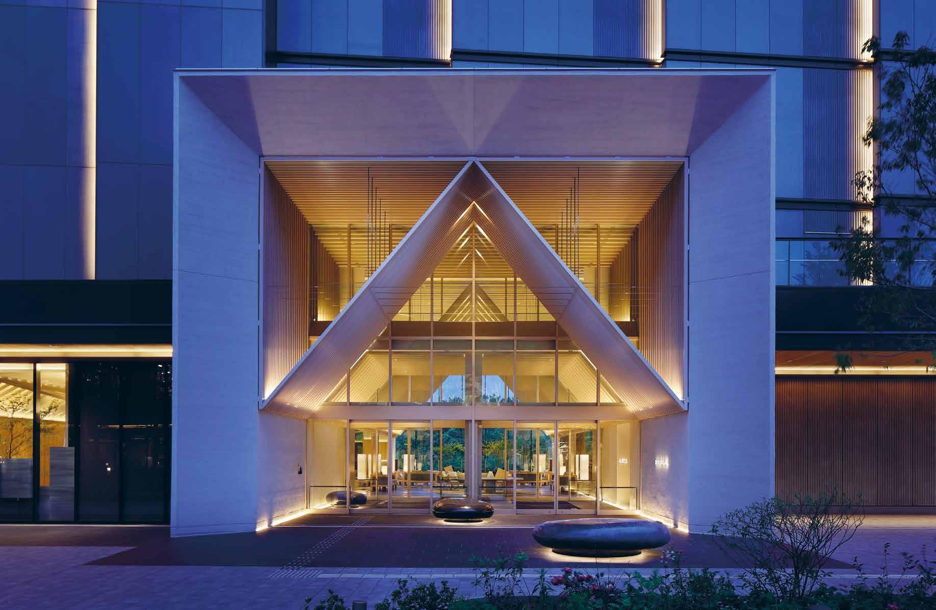
The proximity of Sorano Hotel to Tokyo is one of the amazing aspects of the hotel. In a few steps, visitors can shift from an urban environment to a lush green garden. The unique typology allowed Curiosity Inc. to create a striking lobby space that stands out for its openness to the adjacent garden, providing visitors with an unexpected immersion in nature. According to Curiosity Inc., the lobby serves as a gateway between the urban setting and the expansive parkland in front of the hotel, with just a 15-meter stroll enough to make guests forget about the city and feel completely enveloped in greenery. The lobby’s tent-like shape and distinct louver design create an inviting and cosy atmosphere, ideal for lounging. Local suppliers, including Shingo Oohira, a ceramic artist, and Hakuichi, a Kanazawabased gold foil artisan, have contributed artwork and objects that adorn the public areas, diner, and bar. The use of Wajue washi, a traditional Japanese paper, can be seen in the wallpaper of the diner, the
sliding doors of the Spa suite, and the screen partitions in the hallways.
The Wa Modern Room is a standardsized accommodation that exudes an air of elegance and sophistication. One of its most distinctive features is the black tatami floor, a departure from the traditional straw coloured mat commonly found in Japanese-style rooms. This striking element not only adds a touch of modernity to the space but also provides a unique contrast to the serene atmosphere of the room. The room is furnished with comfortable futon bedding that faces a lovely terrace outside, allowing guests to indulge in breath-taking views of the surrounding landscape. Upon entering the room, guests are welcomed by an awe-inspiring sight, as the transparent screen provides an unobstructed view of the space. This feature creates a sense of openness, which is further enhanced by the natural light that floods the room, providing a warm and inviting ambiance.
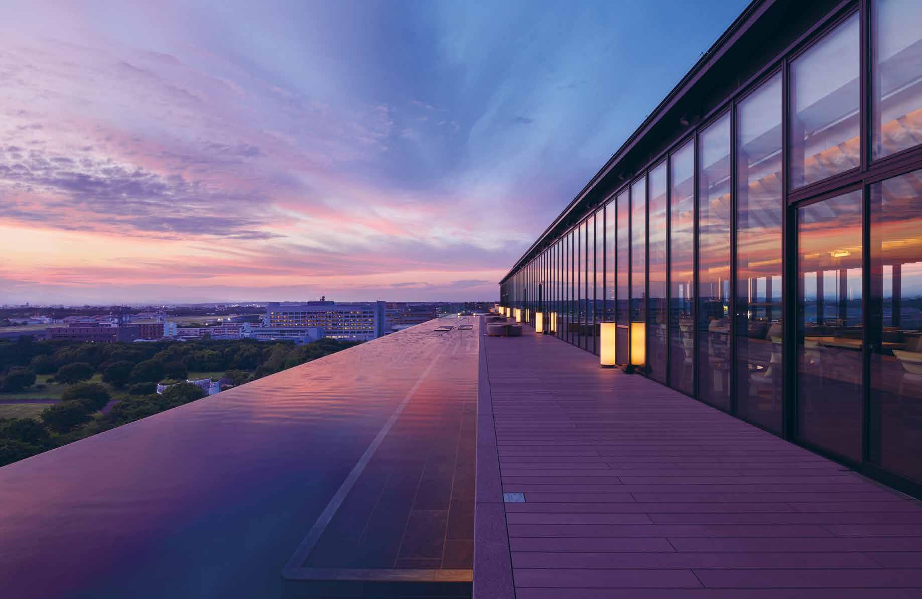
The 10th and 11th floors of Sorano Hotel provide an exquisite well-being experience for guests, complete with a state-of-theart gym, indoor spa, and an infinity pool that offers a breath-taking view of the sky and greenery. The most notable and iconic feature of Sorano Hotel is its impressive 60-meter long Infinity Pool, which spans a width of 4 meters. As guests climb the stairs from the 10th floor, they are met with the magnificent view that suddenly opens up before them, showcasing the surrounding area in all its glory.
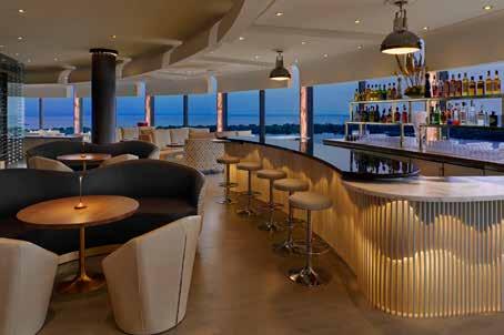
The Sorano Rooftop Bar is another gem of the hotel, located adjacent to the Infinity Pool. The long-curved bar offers a warm welcome to customers day and night, and the view from the bar is nothing short of spectacular. The design team at Curiosity Inc. speaks highly of this aspect of the project, stating that “The infinity pool that spans across the roof of the hotel is the most unexpected scene. Upon exiting the elevator, the space suddenly opens up to a 180-degree free view of the park in front of the hotel. The view is reflected in the infinity pool, offering guests a special and unparalleled experience.”
Curiosity Inc. used natural materials, from wood to translucent fabrics and
washi paperwork, to embody the hotel’s well-being attitude. The aesthetic is very much influenced by the traditional ryokan (Japanese style inn) and the delicate woodwork found there, as it brings warmth and softness, contrasting with the dramatic setting of the hotel. The structure is kept open and details are visible, creating a sense of luxury that comes from the intersect quality of the making and not added decorations. Curiosity Inc’s. design can be described as textured minimalism, as very few materials seem to be used, but actually, there is a large palette of textures mostly created specifically for the project.
The design of the hotel by Curiosity Inc. is a masterful creation that has successfully imbued every aspect of the hotel with a sense of surprise and continuous discovery. The various room areas and facilities are all meticulously crafted to provide guests with an unforgettable experience. The balance of design materials and colours creates a seamless connection with the outside garden, allowing guests to feel immersed in the beauty of nature from the lobby, restaurants, spa, and pools. The aim of the design is to create a space that disconnects guests from the hustle and bustle of the urban areas while simultaneously anchoring the hotel in the cultural context of Tachikawa. The hotel’s culinary and cultural assets are seamlessly integrated into the design, providing guests with a true sense of the unique character of the area. From the moment guests enter the hotel, they are transported into a world of wonder and beauty, where every corner reveals a new surprise.
Sorano Hotel is a beautifully designed hotel that embodies the “well-being” concept. The natural materials used throughout the hotel bring warmth and softness to the dramatic setting, and the minimalistic design, combined with a large palette of textures, creates a unique and unforgettable atmosphere. Whether guests are looking for a relaxing stay or a new holiday style that offers healthconscious activities, Sorano Hotel is the perfect destination.
126 design et al
“The design of the hotel by Curiosity Inc. is a masterful creation that has successfully imbued every aspect of the hotel with a sense of surprise and continuous discovery”.
CURIOSITY is a multidisciplinary studio based in Tokyo, created by French designer Gwenael Nicolas. The studio is constantly redefining the boundary of design, from interior design to architecture and product design. Not in an abstract way but realistically by collaborating with a large spectrum of companies and clients, to create new products, develop new materials and define new design identities.
2-13-16 Tomigaya, Shibuya-ku, Tokyo 151-0063 JAPAN
TEL: +81 (0)3 5452 0095

www.curiosity.jp


128 design et al
LUXURIOUS AND DIVERSE EXPERIENCE
GARDEN CITY BY BLLENDDESIGNOFFICE

The Platinum Issue 129

130 design et al

The Platinum Issue 131

132 design et al

The Platinum Issue 133
Located in the bustling neighbourhood of Kalamata in Messinia, Garden City by BllendDesignOffice is a luxurious boutique hotel that offers guests a unique experience. The building was originally a typical residential block of flats, which has been transformed into a boutique hotel with 25 different suites, each offering a unique mood and theme association.
The hotel features different room typologies, Flamingo, Mountain View, Olive Tree, Spring Blossom, Sky Nest, Grapevine and Sea Breeze are the seven floor room typologies ranging in size from 13 to 27 square meters, and each room is designed to evoke a particular emotion or theme. The room furniture is specially designed and manufactured using thermo-formed Italian surfaces, which allows for a seamless integration of the dominant materiality and colour of each room’s concept. The rooms feature an industrial feeling with open wardrobes, metal structures, and colourful velvet fabrics, vintage decorative objects, and Greek features.
In addition to the unique rooms, Garden City features an organic restaurant, Saffron Restaurant, which serves creative Mediterranean dishes under the signature of Chef Tsiotinis. Guests can also enjoy the Oenothera SPA, which offers a meditative and zen environment for spiritual engagement, herbal oil treatments, and pampering. The Lime Gym is available for guests who want to engage in active physical activity.
One of the standout features of the hotel is the “wet self-service area,” which is clad in black basaltic quartz, evoking the midnight blue of the Mediterranean sky. It offers a Scandinavian sauna, colour therapy shower, a relaxing lounge area, and a minimalistic steam bath in a midnight blue lava plaster surrounding. The Corian platform was designed to allow the user to enjoy the steam bath lying
down or in a more relaxed body posture, while the semi-spherical ceiling alcove imitates the sky dome with the application of RGB fibre optics and an Italian ceiling faucet.
The design concept draws inspiration from the gardens and floral themes of the Messinian landscape, with the building’s facade evoking the feeling of garden fencing with herbaceous green foliage of Mediterranean climbing plants. The reception area is designed in black and white, acting mainly as a moon-gate that drains the current emotional state of the guest upon arrival in the hotel premises.
The location of the hotel in Kalamata, Messinia, adds to its charm, as guests can explore the local area and indulge in the diverse tourist attractions in the vicinity. From the magnificent beaches of the Mediterranean to the historic sites and museums, there is no shortage of things to do and see in the area.
One of the key elements of the hotel’s design is its attention to detail. The custom-designed furniture and fittings in each suite add to the hotel’s exclusive and luxurious atmosphere. From the open wardrobes to the metal structures and velvet fabrics, each element has been carefully chosen and integrated to create a seamless experience for guests.
The project required local iron smiths, marble installers, and wooden craftsmen to create the custom-designed wardrobes, marble flooring, and custom furniture designs. Advanced CNC technology was also applied for the Italian thermoforming of CLEAF surfaces and custom furniture design exclusively for each suite by Bllend.
Garden City by BllendDesignOffice is a unique and exclusive boutique hotel that offers luxury and diverse emotional experiences, despite its small scale. The hotel emits an elegant, nostalgic,
yet contemporary atmosphere in a very common urban environment, while keeping its initial character of a “poly katoikia” residential block of flats.
The International Hotel and Property Awards provide an excellent opportunity for BllendDesignOffice to showcase their work to a diverse global audience and test the design outcome and impact in a global context. According to Helen Brasinika, Design Director & co-founder, the awards are also an excellent opportunity to network and gain more exposure, “The International Hotel and Property Awards are important for Garden City as they provide a great platform to showcase the hotel’s unique concept and design, as well as for networking and getting more exposure. The boutique hotel is a testament to how small scale projects can have a major impact with the proper care and attention, and the design and research team did a great job in transforming a typical residential block of flats into a luxurious and unique experience”.
Garden City by BllendDesignOffice is a unique and exclusive boutique hotel that offers guests a luxurious and diverse emotional experience. With its attention to detail, unique features, and elegant design, the hotel is a testament to the firm’s expertise and ability to transform a typical residential block of flats into a luxurious boutique hotel. The hotel’s nomination for the International Hotel and Property Awards is a testament to the success of the project and the firm’s ability to create small-scale projects with a major impact.
134 design et al
With its attention to detail, unique features, and elegant design, the hotel is a testament to the firm’s expertise and ability to transform a typical residential block of flats into a luxurious boutique hotel.


UNIQUELY DESIGNED DINING EXPERIENCE
DON ALFONSO 1890 BY LIBERTY ENTERTAINMENT GROUP

136 design
et al

The Platinum Issue 137

138 design et al

The Platinum Issue 139

140 design et al

The Platinum Issue 141
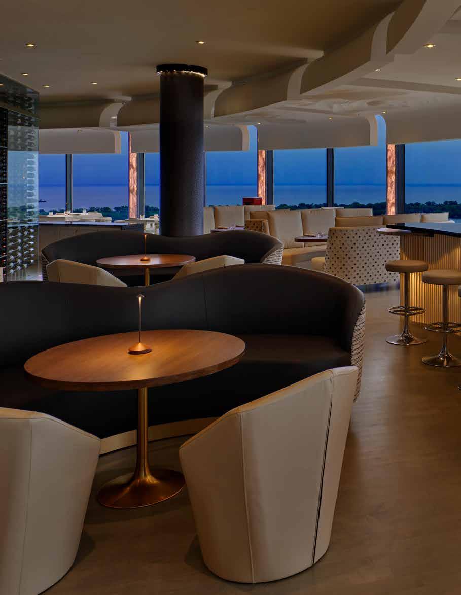
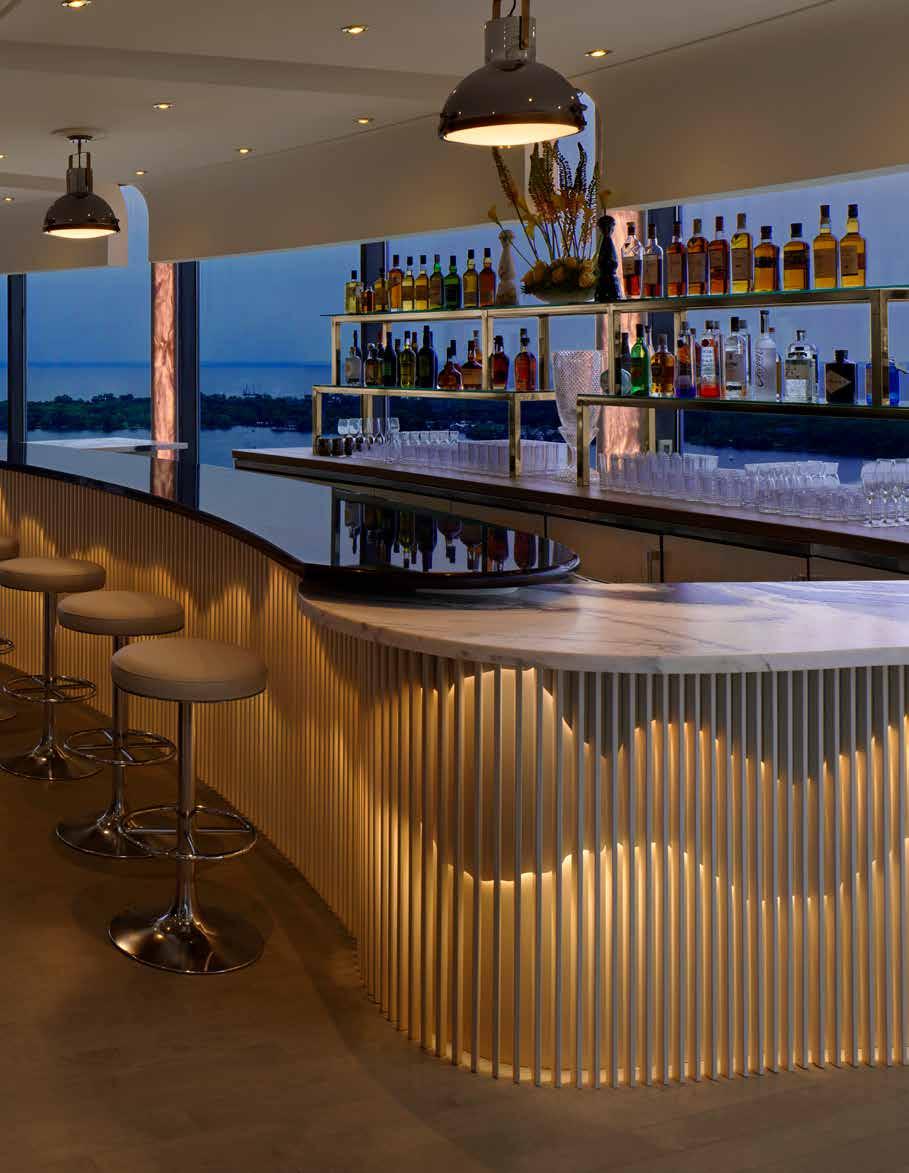
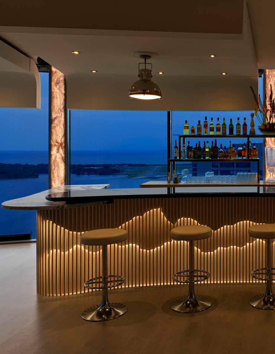
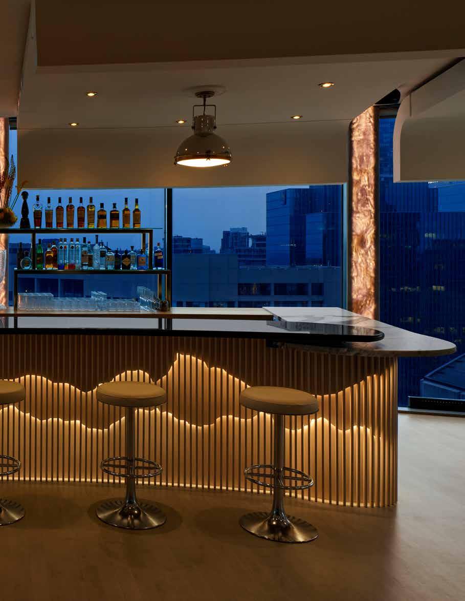
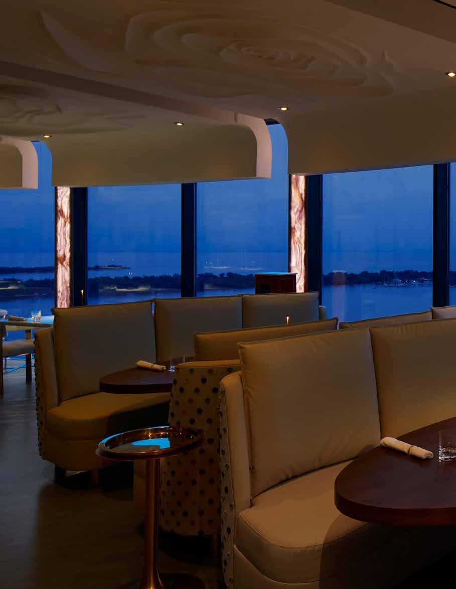
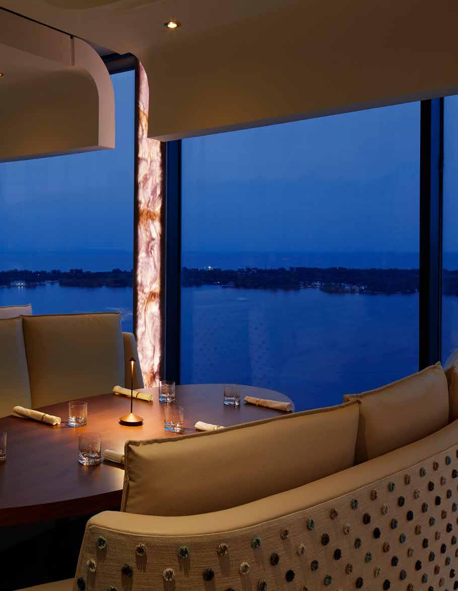
Located on the 38th floor of the Westin Harbour Castle Hotel, the new restaurant space is airy, elegant and modern in design. Don Alfonso 1890 is a restaurant that has gained worldwide attention, not only for its exceptional cuisine but also for its unique design.
The open kitchen at Don Alfonso is a key aspect of the restaurant’s design allowing customers to observe the chefs at work while providing them with a stunning view of the cityscape in the background. This design feature not only satisfies customers’ curiosity about food preparation, but it also reassures them about the hygiene standards of the restaurant. Chefs also get to enjoy the airiness of floor to ceiling windows while creating culinary art. The design of the open kitchen is just as important as the rest of the design throughout the restaurant with details such as handcrafted copper ceilings, mosaic glass wall tiles, and white marble counters. By design, a big part of the Don Alfonso dining experience is to invite customers to walk through and meet the chef and his team.
When designing a restaurant Liberty Entertainment Group strongly believe that the design of a space is just as crucial as the quality of the food served. For them, the ultimate goal is to ensure that guests experience the intended design concept fully. They do not follow the latest design trends blindly; instead, they carefully select colours, textures, materials, lighting, and other elements that convey the desired ambiance. The designer’s objective is to create an environment that enhances the dining experience and leaves a lasting impression on the customers.
One of the reasons why the open kitchen design works so well is because it is seamlessly integrated into the wider environment. The design details and flow of the room organically mimic and reflect the lake to city views in the background. For instance, the simple organic pattern
and slats of metal on the bar face are an extension of the natural shoreline visible in the background, and at sunset, the backlit columns blend into the glow of the dawn sky. Hand crafted crystal light fixtures embellish the sparkle of the city lights and the green and copper hues of the open kitchen draw inspiration from the industrial landscape in the distance. The design elements adopt the natural curvature and fluidity of its surroundings, the design details blur the lines between interior and exterior — and everything comes into perspective.
The open kitchen design at Don Alfonso required specialist artisan skills to bring it to life. The rose motif ceiling plaster work, for example, required a team of fine plaster craftsmen and four sanding and painting applications. I hand drew a design which was sent to New York city for 3D translation into a 8ft x 8ft mold which was then sent to a precision plasterer in Toronto to create individual forms for ceiling application. The marble entry flooring was book-matched four ways to create a centre butterfly effect, which required precision cuts and calculations by specialized fabricators. The bar face was created in layers by traditionally skilled fine carpenters and state-of-theart precision CNC cutting equipment. Painstakingly- each post is individually hand pegged directly into the floor.
Incorporating individually curated and commissioned art pieces that reflect the personality of a space can greatly enhance the dining experience by adding originality and intrigue. One controversial item included in the story behind the artwork can spark conversation and make the experience even more memorable.
In the original Don Alfonso restaurant, a signature Crane and Butterfly sculpture created by renowned artist Philippe Pasqua was the centrepiece of the design. The combination of a skull and beautiful butterflies in the sculpture symbolized the concept of “the end” transforming into a “new beginning.” To continue with the
theme of transformation, the latest works from Damien Hirst’s “The Empresses Series” were selected for installation in the restaurant. The crystal dust butterfly motif in these works visually transforms depending on the time of day and lighting in the room, adding a magical element to the dining experience.
The design of the restaurant has received recognition in The International Hotel & Property Awards, where it has been acknowledged for its timeless, sophisticated, and clever design. When shortlisted, Stacey Hawkins, Director of Marketing at Liberty Entertainment Group explained the importance of this recognition “The awards recognize design as an interpretation of successfully transforming the function of a hospitality space into a beautiful showcase. In awarding timeless, sophisticated, clever and primarily relevant hospitality design, this recognition is a fundamental benchmark to elevating creativity and brilliance in design”. The open kitchen at Don Alfonso is an excellent example of a design that has successfully transformed the function of a hospitality space into a beautiful showcase.
To establish a top-notch establishment, every tiny aspect should be aesthetically pleasing to the most perceptive eye. Manipulating the natural lighting in the room has enabled a captivating interplay of ambiance as the room transitions from natural to creatively textured lighting. This transformation generates an irresistible blend of excitement and allure that enhances the dining experience. The area is packed with intricate design elements that keep guests engaged throughout their stay.
The design of Don Alfonso 1890 is a remarkable fusion of sophisticated and clever design elements that have transformed the restaurant into a beautiful showcase leaving a lasting impression on customers.
142 design et al
“The design elements adopt the natural curvature and fluidity of its surroundings, the design details blur the lines between interior and exterior — and everything comes into perspective.”


CASA LOMA • LIBERTY GRAND • BLUEBLOOD • DON ALFONSO 1890 BLUE BOVINE • DANICO • CIBO WINE BAR KING WEST | YORKVILLE | YONGE PREMIER HOSPITALITY COLLECTION TORONTO’S libertygroup.com
MAJESTIC FRENCH MANOR
27 CIVIDALE BY MAHZAD HOMES
144 design et al

The Platinum Issue 145

146 design et al

The Platinum Issue 147

148 design et al

The Platinum Issue 149
Located in the beautiful neighbourhood of South Richvale in Richmond Hill, Ontario, 27 Cividale is a stunning French manor home that exudes luxury and sophistication. The interior design of this majestic centre hall home was created with a focus on fulfilling the client’s extensive wish list, while providing the ultimate in elevated luxury living.
As soon as guests step inside the house, they are welcomed by an impeccably designed grand vestibule, which sets the tone for the rest of the house. The vestibule leads into a breath-taking twostory rotunda foyer that leaves a lasting impression on visitors. One of the most striking features of the foyer is the freestanding circular staircase system that draws the eye upward to the second-floor ceiling dome. The dome, which spans 6 meters in diameter and 3 meters in height, creates a sense of grandeur and elegance. From the second floor, guests can appreciate the beauty of the foyer and its stunning centrepiece. To maintain the French manor character and appeal, the main floor features high ceilings of over 3 meters. These high ceilings are complemented by towering 3-meter exterior door and window assemblies that showcase custom oval shapes within the transoms. The exterior doors and windows are a true work of art, combining form and function to create an elegant and timeless look. Together, the vestibule, rotunda foyer, circular staircase, and high ceilings create a sense of opulence and sophistication that is befitting of a French
manor. The attention to detail in every aspect of the design makes this home truly exceptional.
The design team faced a significant challenge in creating a functional and aesthetically pleasing home within the limited space available on the plot. With the dimensions of 18.23 metres in width and 38.71 metres in depth, the team sought the approval of city planning officials to construct a garage platform below the main-floor level. This innovative solution allowed the team to maximize the building envelope and create a seamless flow throughout the home. However, the design team faced another challenge when it came to the rear yard, which was relatively small and unable to meet the family’s lifestyle needs and landscaping requirements. Undeterred, the team thought up and generated creative solutions. They decided to integrate various backyard features, such as incorporating the hot tub within the pool and layering the different entertainment areas to flow as one. This approach created a cohesive outdoor living space that the family could enjoy and appreciate. The backyard also boasts a stunning focal point - a stone water wall framed with foliage at its edges. This elegant feature creates an inviting and attractive outdoor entertainment space that would be appealing to the discerning purchasing demographic. Overall, the design team’s dedication to overcoming challenges and finding innovative solutions resulted in a stunning and functional home that is sure to impress.
Despite the numerous challenges encountered during the design and construction of the property, the final result was a breath-taking masterpiece. The home’s impressive sale value of $5.13 million is a testament to its outstanding quality and luxurious features, particularly when compared to larger homes on bigger plots in the neighbouring areas of South Richvale. The property at 27 Cividale stands out in the elevated luxury housing market niche, thanks to its majestic exterior composition and meticulously planned interior design.
The team behind this project went above and beyond to ensure that every detail was meticulously crafted to achieve the desired outcome. The exterior of the property exudes elegance and sophistication, making a bold statement from the very first glance. The careful selection of materials and the precision in their execution come together to create a harmonious and cohesive whole. Inside, the interior design is nothing short of stunning, with every element carefully considered and thoughtfully executed. The high-end finishes and luxurious features are apparent in every room of the house, creating a seamless and luxurious living experience.
27 Cividale is a true testament to the power of creative problem-solving and exceptional interior design. It’s a stunning example of how even the most challenging design obstacles can be overcome with the right team and vision.
150 design et al
“The design team’s dedication to overcoming challenges and finding innovative solutions resulted in a stunning and functional home that is sure to impress.”
Mahzad brings a passion for perfection to building distinctive residences in the Toronto and GTA. A second generation Builder, Mahzad learned the art of design and construction techniques directly from her father Ahmad, a highly regarded builder and architect.

Designing grand and elegant residences crafted to exquisite standards, Mahzad Homes stand apart as timeless classics integrating European inspired design and old world craftsmanship in world class homes.
Ingenuity and design excellence are Mahzad’s signatures of quality, and it is with this simple philosophy that Mahzad Homes aim for the intricate construction of every home. This drive for perfection has been central to Mahzad’s success, from maintaining an exceptional level of customer satisfaction to achieving numerous awards, accolades, and press features.

www.mahzadhomes.com


The Platinum Issue 2023 © design et al 2023 | £25


 BY DOUGLAS DESIGN STUDIO
