


PUBLISHER Joanne Beedles
DIGITAL PUBLISHER Richard Stockton
SENIOR PUBLISHING MANAGER Caroline O’Gorman
GROUP DESIGN AWARDS MANAGER Glenn Hughes EDITORIAL MANAGER Natalie Cowley SENIOR EDITORIAL RESEARCHER Isobella Lichfield SENIOR CLIENT ACCOUNT MANAGER William Sherry MANAGER OF THE INTERNATIONAL YACHT & AVIATION AWARDS Laura Curtis AWARDS COORDINATOR Victoria Baker AWARDS COORDINATOR Megan Fisher AWARDS COORDINATOR Alexander Stephens AWARDS COORDINATOR Jonathan Thomas
GRAPHIC DESIGN Christian Thomas ACCOUNTS Anthony Taylor, Paul Jones PR CONSULTANT Catherine Lyne
FOR ALL ENQUIRIES, PLEASE CALL: +44(0)1244 346 347 OR EMAIL special.publications@design-et-al.com design et al, Watergate House, Chester CH1 2LF
Annual subscriptions vary by location, please contact subscriptions@design-et-al.com stating your full address for a subscription quote. ISSN 1750-8851
INTRODUCTION
NICOLE GOTTSCHALL
ANDREW HODGKINSON
VICTORIA PLASENCIA
ALUA KULIBAYEVA
LEIVARS
FARES
BERNARDI & BEATRIZ PESCHARD
BATHROOM
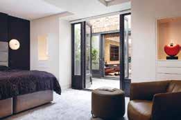
BEDROOM
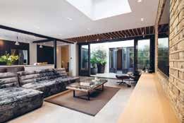
CINEMA
DESIGN SCHEME - AMERICAS
INTERIOR DESIGN SCHEME - ASIA PACIFIC
INTERIOR DESIGN SCHEME - CANADA
INTERIOR DESIGN SCHEME - EUROPE
INTERIOR DESIGN SCHEME - LONDON
DESIGN SCHEME - MIDDLE EAST & AFRICAS
INTERIOR DESIGN SCHEME - UK
INTERIOR DESIGN SCHEME - GLOBAL
DESIGN OVER £50,000
KITCHEN DESIGN OVER £100,000
DESIGN OVER £150,000
SPACE - AMERICAS
LIVING SPACE - ASIA PACIFIC
LIVING SPACE - CANADA
LIVING SPACE - EUROPE
LIVING SPACE - LONDON
LIVING SPACE - MIDDLE EAST & AFRICAS
LIVING SPACE - UK
LIVING SPACE - GLOBAL
£1-2.5 MILLION (PROJECT VALUE)
£2.5-5 MILLION (PROJECT VALUE)
£5 MILLION PLUS (PROJECT VALUE)
BESPOKE CABINETRY
FABRIC
- CARPET/ RUGS
PIECE
LIGHTING SCHEME
TABLE
WALLCOVERING
MARKET VALUE £1-2.5 MILLION
RESIDENTIAL MARKET VALUE £2.5-5 MILLION
RESIDENTIAL MARKET VALUE £5 MILLION PLUS
RESIDENTIAL MARKET VALUE £10 MILLION PLUS
RESIDENTIAL MARKET VALUE £20 MILLION PLUS
RESIDENTIAL ARCHITECTURAL PROPERTY
164 BEACH HOUSE
CITY SPACE (APARTMENT PENTHOUSE) - LONDON
CITY SPACE (APARTMENT PENTHOUSE) - GLOBAL
RESIDENCE - AMERICAS
LUXURY RESIDENCE - ASIA PACIFIC
LUXURY RESIDENCE - CALIFORNIA
LUXURY RESIDENCE - CANADA
LUXURY RESIDENCE - EUROPE
RESIDENCE - LONDON
LUXURY RESIDENCE - UK
LUXURY RESIDENCE - GLOBAL
RESTORATION
SWIMMING POOL
RESTAURANT BAR DESIGN
HOTEL DESIGN


It has been an extraordinary year for us all, with the world moving in different directions from conflict to chaos in many parts of our planet and yet, once again, we in the global design sector will come together and meet to celebrate and reward our work, and each other’s, in harmony, with excitement and some exhilaration. As a community we – you - are quite incredible .
As I write this, we are part of the way into the voting process for The International Design & Architecture Awards and already tens of thousands of you have taken the time to vote for your favourite schemes. The International


Design & Architecture Awards Book of Shortlisted Project 2022 features every shortlisted entry in all categories and is a chance to keep a record of the projects being considered for this year.
Next month we will bring you the ‘Winners’ Issue’ and allow you to step inside the design projects you have selected as this year’s winners.
For now, enjoy this year’s rather long shortlist.
Until next month, Joanne
design et al would like to thank our sponsors for this event:

Founded in 1993 by Nicole Gottschall, the company has been at home at Seestrasse 344 in Zurich Wollishofen since 2009. Their team consists of unique people who each contribute their individual expertise to the success of each project.
Where were you born/ where did you grow up?
I was born in West Africa in the middle of the jungle of Ghana. My parents were living in Accra at that time of adventure.
Please explain your relevant training/ work experience.
I founded my company in young years after studies in art history and several trainee programmes in Switzerland. Up to now I have accrued over 30 years’ experience in the interior design and construction field.
Please describe the highlight of your career to date.
Giving every day the best in designing a better and a more beautiful world. Building up an engaged, motivated and very skilled team - bringing my wide knowledge to them to get the best interior designers on their own. Every project is a highlight and every smile in the face of our customers too.
How did achieving this make you feel?
Proud. Thankful. Humble about the ways of life.
Where do you find inspiration for your work?
Every day keeping my eyes open. Our very inspirating customers. Silence and retreat.
How do you relax and find your work/ life balance?
Silence and retreat. Travelling. Cooking. Gardening.
What project(s) are you currently working on?
Several huge private residences nearby St.Moritz. Private residences all over Switzerland. A modern and exclusive villa at the border of Lake Constance. A hotel in Davos, and many more.
Tell us a little more about these project(s)... Contemporary, timeless warm style, density in sensations of materials and space; condensation of perception of how space surrounds human. All interior design includes carpenters work, in built furniture, kitchens, bathrooms, wellness areas, lightning concept. All fabrics like curtains, home decoration and styling. Feel good packages with even every fork in the drawer.
Please describe the project you are most proud of to date, with reasons why this was a success. Two connected luxury penthouses at the Lake Maggiore, with pool and pool houses. The customers are still with us and building villa by villa. A luxury villa with incredible views over lake of Zurich. This customer is an architect himself and very demanding - also he is still with us and developing projects year by year.
How would you describe your work/design style /ethos?
We are designing in a contemporary, cosy and timeless style. We create spaces with a dense energy level which bring sustainable better living and wellbeing to the customers.
How has the pandemic changed your outlook on work/ life?
I see a deep paradigm shift as people are much more aware how valuable a beautiful home is and how much it may support health and resilience.
How do you predict the pandemic will change the global design sector?
I’m convinced, that home office will change how we live and biophilic design will break boundaries.
What are your thoughts on the future of design?
Back to the roots. Design that helps people to have a more convenient live. Living in spaces that belong to us and are nourishing our souls and express our personalities - not for someone else, just for us!
Please tell us your aims for the next twelve months and beyond.
Staying on track with the running projects and getting more customers a brighter smile in their face.
Which direction are you moving in from a design perspective?
Let’s call it ‘unagitated elegance’. More clean and calm spaces in opposite to our chaotic and loud world.
How is your work evolving?
Sustainable with a deep understanding on human needs and an immerse knowledge on how to bring happiness through spaces.
Let’s create positive emotions through spaces and building a better world.
is a great
for
to accompany people on their way to their dream.
are the pillars of my daily work!“
Gottschall, Head of Design, GO INTERIORSAndrew Hodgkinson Founder/Managing Director, Hodgkinson Design

Hodgkinson Design is an architect studio specialising in residential projects, based in west London.
Where were you born/ where did you grow up?
I grew up in Lincoln, England and moved to study at Brighton Art College aged 19/20. Since then I have lived and worked in London.
Please explain your relevant training/ work experience.
BA Hons Interior Design at Brighton Art College, my dissertation included an interview with the now-acclaimed designer Eileen Gray. I managed to tape the interview and it sat in storage for more than 40 years. In 2019 we worked with a specialist team to create a film about the interview. The film was showcased at the Bard Graduate Centre in New York in 2020.
Please describe the highlight of your career to date.
There have been many of course. Designing the brand image and concept stores for Space NK and seeing the beauty brand become a ‘category killer’. Working with Nicole Farhi on her brand. Designing shops for Karl Lagerfeld, Yves Saint Laurent, French Connection, Harvey Nichols 3rd floor, to name a few.
How did achieving this make you feel?
Worthwhile. I’m making a contribution to people’s lives and businesses.
How do you relax and find your work/ life balance?
I relax when I am in nature, walking, horse riding or drawing. To draw a place is to remember it better.
Has this changed in recent years?
Drawing outside of work has become more important to me in the last 10 years. I have enjoyed life drawing and the difficulty of producing a technically accurate and emotive drawing. However, I am most comfortable drawing landscapes whilst keeping an eye/ear out for birds.
Tell us a little more about these project(s)...
I have noticed people’s ambition for the design quality of their homes has increased, whether as a result of staying at hotels, from TV or social media. Consequently, the residential projects in recent years are increasingly sophisticated and demanding. We have produced some elegant, striking and modern homes with clients that believe in our vision. Our projects often involve an existing house that will be refurbished with modern extensions. It is important to create a natural conversation between the old and new elements of a home, and use them to enhance one another. Old buildings will often have hidden issues or planning limitations; however some great design solutions have come from these. One example is in our Marylebone project, where a curved bookcase follows the walls of a staircase (that couldn’t be altered) and creates a moment of design interest.
Please describe the project you are most proud of to date, with reasons why this was a success.
The best projects come about because of a good understanding of the clients likes and dislikes and their appreciation of the processes we go to, to achieve the objective. The project featured; Marylebone flat, is a good example.
How would you describe your work/design style /ethos?
Modern, classic, inspired by natural materials with contemporary art and furniture. Simple, elegant and designed to last. Not flashy.
What are your thoughts on the future of design?
More important than ever. In the UK we have a World Class Creative industry that needs to be recognised, encouraged and helped by the Government to make sure it is maintained. This starts with education at an early age.
Which direction are you moving in from a design perspective?
Designing more of our own furniture and lighting, with some installations where appropriate.
Alongside my design work I’ve been involved in a film about Eileen Gray (one of the greatest designers of the 20th Century). The film follows my recorded interview with Gray whilst narrating a story of her life and career through images and music. We have shown the film at several art institutions in the last few years, namely The Bard Graduate Centre, New York; The Design Museum, London; and recently The Royal College of Art, London, where I am a mentor to interior students. We hope the film will be shown at other destinations in Europe in the coming year. I have also contributed to an E1027 book called E1027: Restoring a house by the sea.
Design can be a massive catalyst for change; driving quality and business performance.
Interior Designer, Victoria Plasencia settled in Guadalajara, Mexico and founded VP Interiorismo. She studied Senior Business Management at IPADE Business School as well as other subjects including painting, carpentry, pottery, landscaping, stained glass, and feng shui. She has been a speaker in several conferences as well as on television shows, and her Interior Design work has been published in different books, newspapers, and magazines.
Where were you born/ where did you grow up?
I am from Guadalajara, Mexico. I grew up in a talented family, surrounded by artist and architects.
Please explain your relevant training/ work experience?
I studied in many places such as: ITESO, UNICO, IPADE Business School, Tyler School of Art and I have more than 15 years as an Interior Designer.

Please describe the highlight of your career to date.
Winner of “Best Residential Interior Private Residence Mexico” in 2021 and 2020 at The International Property Awards.
How did achieving this make you feel?
Achievements like this are amazing for all the team, because it helps us to realise that we are going on the path of excellence and that is something that motivates us to continue creating and improving.
Where do you find inspiration for your work?
I get inspired by nature, travels and
seminars, I love to see magazines, new inspiring designs from all over the world and then start creating for some special need to be solved.
How do you relax and find your work/ life balance?
My work is my passion and is something that I enjoyed a lot. I believe is very important to have balance and spend time with family and friends, but most important with myself. I try to do activities that nourish myself as much as possible.
What project(s) are you currently working on?
Right now we are working on many residential projects in Miami, San Diego, Houston, and Mexico, and some commercial projects in Mexico
Tell us a little more about these project(s)...
This year we are expanding our firm to the USA and have had a great opportunity to work on projects outside of our country.
The challenging part of this is to go outside the comfort zone and to be more open to new worldwide perspectives.
Please describe the project you are most proud of to date, with reasons why this was a success?
The Maiave Spa at Sheraton Hotel in Puerto Vallarta because we needed to create a Spa in a place that was used for laundry and offices and it turned out amazing.
How would you describe your work/design style /ethos?
I love timeless design, modern, neutral, clean lines, nature, natural lights, and
natural materials such as wood and marble that are easy to maintain. More specific, designed for the personality of the people that are going to be using the space, they need to feel comfortable and practical.
How has the pandemic changed your outlook on work/ life?
After the pandemic, I realised that we need to enjoy every minute of our lives and be surrounded by the people we love, so I have this duty to simplify the people’s lives with an environment that can offer spaces to be with our loved ones.
How do you predict the pandemic will change the global design sector?
I think that after the pandemic design is moving toward nature, contemplation, open spaces, wellness to really care about nature and humanity.
Please tell us your aims for the next twelve months and beyond.
To expand our business in the USA, grow my team and search for excellence in all our projects.
Which direction are you moving in from a design perspective?
I will focus on more sustainable materials, look for well-being in all perspectives in each project and see the opportunities to transform lives through design.
We as a team are evolving to find excellence in all of our projects, transforming the lives of everyone involved in our work.
Victoria Plasencia CEO Founder of VP Interiorismo and Victoria Plasencia InteriorismoVictoria Plasencia Interiorismo, guided by confidence in the value of design as a tool to improve people’s well-being, creates unique decorative solutions that turn each space into a story of its own.


Our portfolio reflects our capacity to dialogue with di erent styles and to bring di erent spaces to life; through a process of thoughtful and people-oriented design we contribute to a warm and comfortable atmosphere in every project.

Following her vision, Alua Kulibayeva, lived and studied her BA (Hons) Degree in the United Kingdom, travelled around the globe taking its best and founded Lumi Interiors. Lumi – is a high-end interior design studio based in Dubai that specialises in luxury residential interiors in UAE and worldwide for both private clients and developers.
Where were you born/ where did you grow up? Born in Kazakhstan, grow up and studied in the UK
Please explain your relevant training/ work experience.

KLC Interior Design
Royal HollowayUniversityof London Bellerbys Brighton College
TZ Service Holding Founder, CEO
LUMI Interiors Founder, Creative Director
Where do you find inspiration for your work?
I find my inspiration from nature including water, sea, sky, beach, all aspects of the natural world. I also take inspiration from traveling where Im exposed to different cultures and fashions. The workof other designers also impacts my design process, developing trends on Instagram, etc. The development of new materials is particularly fascinating.
What project(s) are you currently working on?
I am currently working on a couple of International projects: ALMA, a full refurbishment and a new Penthouse in Palm Jumeirah. I am also currently developing a homeware range, but this one I will share with you in the next interview…
Tell us a little more about these project(s)...
The ALMA project is located in the heart of Central Asia, Kazakhstan in Almaty, the city of apples. The villa is 10,500 square feet, facing the mountains similar to a
Alua Kulibayeva Founder & Creative Director, Lumi InteriorsSwiss chalet. The main idea of the project is to create a home with the amenities, comfort and luxury of modern living within natural surroundings. We also aim to encompass a range of materials both modern and traditional in keeping with its surroundings by combining our bespoke designs in metal, wood and silk fabrics. We will use coolers sympathetic to nature with an array of different textures. The goal is to preserve the traditional ambience of family home with the richness of modern design. This is an existing villa, that we are fully refurbishing and building an extension. Particularly looking forward viewing the before and after pictures when we can see my design ideas realised, it will be amazing! You can feel that the place has got the soul, have modern positive characteristics. Most importantly I have a happy client.
Please describe the project you are most proud of to date, with reasons why this was a success?
The completion of 6,343 square foot Penthouse in W residence, Palm Jumeirah, facing the ocean and with a long boardwalk along the seafront. A modern interpretation of nature, bringing the outside in, working with in the remit of a family home. I was incredibly proud of how we were able to encompass London Luxury design into family living space. A big achievement was that we offset the monochrome pallet with a range of soft textures, patterns and exciting materials to make the project pop.
How has the pandemic changed your outlook on work / life?
My design journey started in the beginning of the pandemic; as the World started to close down my life as a wife and working Mum, with a lot of duties and responsibilities felt very restricted. But then my life reopened with a growing
interest in design. I decided that I need to take only advantages of this. Pursuing this interest, I enrolled at KLC school of Design for my Third Degree, Interior Design.
With the support of my husband and family a new chapter of my life started, I took a leap into the multifaceted world of design and have never looked back. Day after day I had so much satisfaction from the new information and images coming into my head. I was so proud that I found myself, I found my calling in life. I jumped into this new energy, a new way of life. Adding to this, as a child and as a student, I always was interested more in how the room looked, what accessories it has. Every time going to Harrods I was amazed with the interiors and architecture of the building, meanwhile my friends were enjoying shopping, I was distracted by the beautiful atmosphere around, the Interior Design.
How do you predict the pandemic will change the global design sector?
With people spending more time in their homes, they are investing more time, money and energy to their living space. Creating a great need for more designers. Home gyms, adaptable multifunctional rooms, home offices are becoming the new normal.
I am constantly finding inspiration. My aim is to create spaces people want to spend their lives in, a man’s home is his castle, it should be a comfortable one.
Design is a very interesting journey full of creativity and inspiration. Our main goal is to deliver the most liveable, personalised, elegant and unique interiors. Happy client is our motto.
 Rebecca Leivars
/ Managing Director,
Rebecca Leivars
/ Managing Director,
 Interiors
LEIVARS is an internationally celebrated high end residential interior design studio with a fundamental passion for creating beautiful interiors. Whether inspired by existing architecture or their clients’ individual tastes, every stage of design is considered with meticulous attention to detail. Founded by Rebecca Leivars in 2007 following her success at KLC School of Design (London), a focus on quality and practicality has since earned LEIVARS many industry awards and extensive press coverage.
Where were you born/ where did you grow up?
I was born in the North of England, ‘Stockton on Tees’ but raised in the Midlands, the border between Derby/ Nottingham, I am very proud of my East Midlands and Northern heritage. I was also lucky to live in various European countries between 9 - 13 years of age, so I was able to absorb a wealth of different cultural experiences.
Please explain your relevant training / work experience.
My initial training was a background in HR Management which has been a tremendous help with dealing with on site and building work. I then studied at the prestigious KLC School of Design, London, and was awarded Student of The Year.

Amongst my work life I have renovated several personal properties, that hands on experience coupled with my design training and background in handling conflict situations throughout my HR career has helped me navigate through complex build and design projects.
Please describe the highlight of your career to date.
I have been very lucky and also humbled to have been awarded multiple design accolades throughout my career and the
highlight is always at the end of each project seeing how thrilled and happy our clients are with our designs and the process. If we then manage to win in the International Design Awards, well then that truly is the icing on the cake. Within such a global and competitive market, any industry recognition from my peers is a wonderful achievement and something never taken for granted.
How did achieving this make you feel?
Each time it gives such a feeling of pride not just personally but also to the dedication from my fabulous and trusted team and it really encourages us to continue to do better and better.
How do you relax and find your work/ life balance?
I love to walk with my beloved dog Harry, sadly he’s getting older so our walks are shorter and more of an amble these days. I love to lie with my loved one and just be. Life is busy, our industry is fast paced so to be able to switch off and just relax, or laugh, that is all I ask and with the sun on my face and spending precious time with those closest to me.
What project(s) are you currently working on?
We are very lucky to have lots of wonderful clients and repeat business, so as their property portfolio grows they take us with them. Current projects include wonderful Victorian family homes in Barnes, Claygate, Camden (London). A Grade 1 Jacobean family home in East Sussex, a city mews house in St John’s Wood (London), a substantial Edwardian family home in Nottingham, a farmhouse and outbuildings in Hastings, East Sussex, a wonderful residence in Chiswick and a stunning barn conversion in Blakeney in Norfolk. We’re busy.
Tell us a little more about these project(s)...
They are a real mix, all families with the exception of St John’s Wood which is an International bachelor client. Each home requiring full interior design and overseeing all building work, so every detail is incredibly important and we can never pause for a moment as it’s so important that all the wheels keep turning and we plan ahead as much as we can to ensure we are always a few steps ahead.
What area(s) of the design sector do you work in for the most part?
We only work within the high-end residential sector; it would be lovely to move into small hotel design although we are just designing a pub in Nottingham which is very exciting and very special being my home town.
How would you describe your work/design style /ethos?
We genuinely do not have a style, we do collectively like more contemporary design and particularly European design that said that is the utter joy of our business to be able to adapt to every genre of design and at the end of the day if the client wishes to have their home Art Deco, Industrial, Classic English or Contemporary, we are skilled and experienced enough to adapt to their needs and we love the diversity.
I do believe all Interior Designers have both a duty of care and obligation to not least self develop as a standard but also to invest in their teams. An energised, well trained team that is stimulated will also perform with the right attitude and strive for excellence! I am a massive advocate for that and change isn’t to be feared! And to the world should laugh more! Despite some horrors that happen / are happening within the world, always find the good in the day and keep smiling!

Mohamed Fares is an indelible part of Egypt’s creative zeitgeist. Highlights of his career trajectory include his current position as Chief Designer of Alchemy Design Studio – a leading Egyptian design firm that focuses its creative approach on a multi-cultural understanding that is inspired by different urban narratives – he also represented Egypt at the International Young Design Entrepreneur (IYDE) Awards in 2008 held in London.
Where were you born/ where did you grow up? Born and raised in Cairo, Egypt.
Please explain your relevant training/ work experience.
I graduated in 2000 from the Architecture Department, Faculty of Engineering at the Cairo University, Egypt. After graduating, I joined Alchemy Design Studio as Chief Designer in 2003.

Please describe the highlight of your career to date.
In 2021, my company was responsible for the Royal Procession of Mummies from the Tahrir Egyptian Museum to the National Museum of Egyptian Civilization. It required painstaking attention to detail, after all, these mummies were all Royalty, and deserved a procession worthy of their stature and station. With scant references in modern and ancient texts, we had to create something we hope they would be proud to see with their own eyes.
Where do you find inspiration for your work? Perhaps it’s cliched to say, but inspiration is everywhere. Furthermore, inspiration is every-when: thoughts birthed during a morning jog will evolve into an idea by the afternoon, by evening it will have become a concept, fed by the experiences of the day. Sleep, Dream, Wake Up and Repeat.
What project(s) are you currently working on?
Currently I’m working on a cool concept to showcase beautiful Art pieces in a great location like no other, The Grand Pyramids of Egypt. Also, I have a couple of signature projects in Orange County LA, Dubai, Lebanon & Saudi Arabia.
What area(s) of the design sector do you work in for the most part?
My design history extends beyond the numerous commercial and residential projects and into the realm of everyday life.
The creative part can be seen on my own line of eyewear, photography projects and musical interests. My passion for storytelling and eye for captivating visuals is on display in my work occupying the Director’s chair in a number of film projects. All my projects present a unique and layered narrative.
Please describe the project you are most proud of to date, with reasons why this was a success. I’d have to mention my iPhone series. It is an ongoing and dynamically evolving project that’s all about spontaneous moments captured through the lens of my iPhone and appreciating the randomness of the journey and that beauty that lies within the unexpected encounters. A series of captions represent those life moments as seen through my eyes.
How do you predict the pandemic will change the global design sector?
Dynamic Interior & Exterior Spaces: an area of design thought accelerated by COVID. Being Under quarantine really forced us to look at our personal living spaces in a different light and inflamed the desire to improve the function of those spaces. I’m expecting more and more urban spaces to
incorporate exterior natural elements, as I also expect an increased appreciation for a designated home office; not just for those who have sprawling abodes, but for all levels of employees and entrepreneurs. We should also expect those spaces to exploit the lack of workplace guidelines when decorating in a home office. Individualism at the workplace is on the rise.
What are your thoughts on the future of design?
What is old is new. Undoubtedly there will be throwbacks and homages to the previous generations’ aesthetic sensibilities, embellished by newer techniques in production. Urban street styles, for example, first captured mainstream attentions in the 80s and 90s. It looks set to rise again, but with a decidedly millennial attitude.
Sustainability and Technology; they go hand-in-hand. Developments in Design and Production technology are allowing us to create lighter and stronger materials; 3D printing gives us a tangible working model of a car engine in the fraction of the time and cost is used to take. The toolbox is getting bigger, and we will see increased usage into making our planet a better place to live.
Which direction are you moving in from a design perspective?
Architects and designers are increasingly aware of their responsibility towards sustainability and maintaining a certain level to connect their buildings with nature. Living spaces are becoming more open and fluid, with the formal separation of spaces becoming less frequent. Integration between indoors and outdoors is the key in any living space. Exposing materials as wood and concrete with their raw state will be used more with other colourful objects.


Bernardi & Peschard Arquitectos is a firm established by Alejandro Bernardi and Beatriz Peschard, based in Mexico City. Their professional skills complement each other and give rise to architectural projects that are characterised by their elegance, luxury and exceptional attention to detail, over more than two decades.
Where were you born/ where did you grow up? Both descendants from European grandparents, we were born in Mexico.
A: Grew up in Mexico City, and summers with family in northern Italy, maybe where fascination for opera comes from.
B: Raised in Mexico City and Paris, in a family devoted both to art and science and where women had careers.

Please explain your relevant training/ work experience.
Now spouses and parents in our personal life, we both studied Bachelor of Architecture in Mexico City, and started working in our third year at the University, where we met.
A: Always graduated top of the class, started working with professor Jose Grinberg and entering architectural competitions.
B: Debuted as Professor in the Department of Architecture at Universidad Anahuac from 1988 to 2000, passionate for painting and photography, had the chance to start working with Agustin Hernandez Navarro,

one of the icons of Mexican Architecture and Sara Topelson when she was president of UIA.
After 10 years of valuable learning and experience, In 2000, we decided to found the studio with our names, to pursue the long path of the life of an architect together .
Please describe the highlight of your career to date.
Even though each new conquest is special, the highlight to date has been design of the interiors of Halo, a Feadship 188’6”luxury motor yacht, created in close cooperation with the owner.
Has this changed in recent years?
As an Architect, your life IS Architecture… plus: when your partner in business is your partner in personal life, and your daughter is a Bachelor of Architecture student in Cornell … you cannot forget to follow rule#1.
What project(s) are you currently working on?
We started our practice with residential projects, but have now expanded to residential, a museum, yachting, temporary installations, corporate offices, restaurants, hotels, in Mexico, Miami, NYC, A Coruna, Madrid, and ST Moritz. .
How would you describe your work / design style / ethos?
During these 20 years we expanded to become a big office and have come back to a more intimate studio, to be able to take care of every detail. Our practice is
very much based in mutual confidence between client and architect. We like to say we design many projects for few clients, rather than single projects for a lot of clients.
We believe in architecture as a whole, you cannot separate interior from exterior. Architecture should be for the people, not for the architect. Every project is a process that involves collaboration with consultants across disciplines. Our work tries to be always true to ourselves, it includes an amalgamation of influences and studies, experimentation, always in search of new solutions, aware of the social impact and sensitive to site and local tradition .
How has the pandemic changed your outlook on work / life?
The pandemic proved that architecture is a practice that cannot be remote / work-from-home. It is a multidisciplinary teamwork, you have to see, touch, feel the light, experiment the spaces and proportions and emotions. However, Architects have to design with new considerations for a new way of life, to help people feel safe and make the world a healthier place.
What are your thoughts on the future of design?
Architecture and design constantly have to be re-imagined adapting to new technology and preventing the global environmental crisis. In many aspects, they will have to evolve to restore emotional safety, spaces will be more flexible and adaptable.

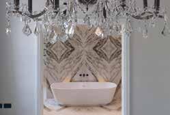
A modern extension was built on the back of this property which consisted of the master bedroom, dressing room and en-suite that all overlooked the garden allowing the natural light of the day to flow into the rooms. Obsidian Interiors wanted to create the feeling of space whilst allowing the en-suite to be discreetly hidden from the bedroom when needed. When working out the floor plan, the designers came up with the idea to centralise some double pocket doors. Making a real feature of this master en-suite. The design of the pocket doors was to match all the other classic-styled doors in this property.
Weeks were spent choosing the right colour hues, textures, styles, brassware and glass finishes. After sourcing the most beautiful book matched porcelain tile from Mandarin Stone, this gave the room a sustainable and elegant look. Choosing a geometric form of bold taps, from Samuel Heath, in a city bronze finish contrasted really well with the colour tones and marble veins in the tile.
In terms of the design, Obsidian Interiors added a full height stud wall to create a center showpiece using the book match tiles so as you entered the room. It gave the Master En-suite a real impact. “WOW” factor. Maintaining a consistent design throughout, Obsidian cleverly designed a double walk-in shower area one side of the dividing wall & on the other side designing the double wall-mounted basin area. Keeping the basin area minimal and simply styled with Antonio Lupi units, lots of feature lighting.
Taking advantage of the beautiful tall ceilings and underpinning the classic and elegant styling, two tall recessed mirror cabinets & bronze fluted wall lights were added above the basins, which enriched and complemented this area. Finishing this section off with beautiful cornice, which matched the original cornice in the rest of house.
Location: London, UK
Interior Designer: Victoria Vogel
Construction: Rixon & Gower
Associated: Stone Interiors
Photography: Luca Piffarretti
The design brief for Victoria Vogel was to renovate the bathrooms and kitchen of a late 19th century apartment located in Cadogan Gardens, London. Built by Lord Chelsea, these Victorian buildings with their red bricked facades, have beautiful architectural features, from their high ceilings, wide staircases and intricate mouldings details. The client wanted a modern bathroom and kitchen to juxtapose against the classic features.
Victoria Vogel separated the space by adding a stud wall and creating a shower room rather than keeping it open plan as this is the only guest bathroom for the apartment. The designers dropped the ceiling slightly to make the proportions more in line with the narrow room, and then created a bold theme to keep the small space interesting.
Victoria Vogel created a black and white theme using Thassos marble subway tiles in the shower, Nero Antico on the vanity unit, architrave and sink. The designers also used odette black and white tiles from West One Bathrooms for the floors and bronze fixtures from Waterworks to tie the space together. Stone Interiors were responsible for creating the architrave, vanity unit and sink all in marble and the custom joinery was made by Rixon and Gower.
Cadogan Gardens is a very high end address and Victoria believes that the design of the bathroom, and the rest of the apartment, reflects this. It is a timeless design but also keeping up with the current trends.
Location: San Antonio, Texas
Interior Designer: Shea Pumarejo/Younique Designs
Construction Company: Forged Oaks/Victor Salas Jr.
Photographer: Jennifer Siu Rivera
A Celestial Sanctuary is a star-studded sanctuary featuring Lilac Marble and a Smart Glass window that turns from frosted to clear like magic. The clients enjoy travelling and staying in luxury hotels and desired to have that same experience while at home.
To achieve this feel, the following features were created: A shower big enough for two featuring two shower heads including a handheld on a slide bar and a stationary showerhead. His and Hers floating vanities each framed with a custom cabinetry entablature with hidden medicine cabinet and concealed LED lighting. Her vanity features a Smart Glass window that remains frosted for privacy until a switch is flipped changing the glass to transparent allowing the homeowners a view of the outdoors. A Pewter metallic free-standing bathtub was located directly across from the entrance to serve as a dramatic focal point.
Lilac Marble and Black Nero marble tile were both repeated multiple times throughout the space in varying shapes and textures which adds interest while keeping the colour consistent throughout. The Starburst detail is repeated from the chandelier over the tub to the floating mirrors over the vanities and gold finishes are repeated in lighting, plumbing, and cabinetry hardware.
The homeowners are young and fashionforward and this Master Bathroom is reflective of the vibrancy and playfulness that already preexists in the property.

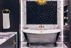
Interior Designer: Rebecca Leivars /
LEIVARS Interiors Studio
Construction: London Builders & Decorators
Photography: Nick Smith Photography
LEIVARS Interiors Studio worked with the client, the CEO of an international luxury brand, for the third time with this project. The brief was to completely strip out and reconfigure the rooms to create a home office whilst maximising light and comfort. The client asked for subtle nods of elegance from the Art Deco era yet having undertones of femininity and drama.
LEIVARS Interiors Studio wanted to connect the living and dining space to create a striking statement fireplace and sight line towards the small rear patio, and so they designed a full-length low level fireplace and opted to have this made from beautiful marble with fluting detail. By keeping the fireplace low and long whilst working with vertical fluting details it gives this small property the feeling of height with real impact. By adding in a bio ethanol fire gave some warmth and interest in the colder months.
Within the 3 upper rooms, LEIVARS Interiors Studio opened up the master bedroom to the en suite so it became grander in presence. The designers connected the rooms by selecting a contrast ceiling paint, so it felt continuous and cohesive. Adding in a striking statement vintage chandelier really gave the bathroom its own showstopper. LEIVARS then selected a beautiful Calacatta Rose marble to adorn the shower and bathing area which created a gorgeous en suite bathroom for her with an added touch of a bespoke fluted black ash vanity unit. Heavy use of antique gold mirrors to create reflection making the room feel bigger and adding warm tones. The scheme is so successful because it’s simple, and the design details and materials speak for themselves rather than over filling the design scheme.
Location: Manchester, UK
Interior Designer: Rachael Lauren Interiors
Photographer: James White Photography
This principal bathroom ties in perfectly with the building’s historical nature. Rachael Lauren Interiors introduced traditional undertones into the space with classical lighting, panelling and brassware - this, combined with a contemporary bespoke double vanity and large format marble tiles, to produce the perfect blend of classic contemporary that’s also practical for family life.
The brief for Rachael Lauren Interiors was to transform two small rooms into one large family bathroom. The clients requested a functional family bathroom that was not only beautiful and aesthetically pleasing but had the practicality for family life. Their main criteria was to include lots of storage, a separate bath and shower area but above all a bathroom that would have the longevity to stand the test of time.
The designers ensured that traditional elements were introduced such as wall panelling, classical lighting, and brassware. They then went onto work closely with the client, suppliers, and trades people to ensure that the bathroom designs executed perfectly to meet the criteria of everything required for modern family life, such as a large bespoke double vanity, double mirrors, and lots of hidden storage. Rachael Lauren Interiors also added hardwearing vinyl wallpaper above the panelling, large format nonslip tiles to the floor and worked to ensure the bathroom met the client brief in full and the clients were thrilled with the result.
The main feature within this bathroom is the double bespoke vanity area with feature mirrors. This is a one-of-a-kind custom made original design that is not only beautiful but also has the practicality aspect of storage.
Location: UK
In the master ensuite the primary design focus for Pippa Paton Design Ltd was to create a space for the busy working couple to rejuvenate with a decadent and spa-like aesthetic, whilst also providing the daily functional requirements of a bathroom.
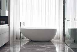

The layout positions each of the functions in separate zones around the outside of the room, and was designed to ‘hide’ these elements from view whilst luxuriating in the large, centrally-positioned white composite stone bath, selected both for its comfort and for its simple feminine silhouette which enhances the uncluttered simplicity of the room’s design. Sitting on a warm pale grey seamless resin floor, the bath has plenty of adjacent space for a lounging stool and two antique martini tables for the couple to chat and drink whilst bathing.
To enable the shower area to be positioned centrally on the end gable wall behind the bath, a north-facing window was covered over. The shower area was formed from a bespoke floor-to-ceiling Corian pillar supporting glass shower panels on either side. The pillar houses a bath filler and controls on the bath side, together with low level niches for bath products, and a wallmounted shower head, handheld wand and mixer and diverter for the ceiling-mounted rain shower on the shower side.
The layout, volume and storage solutions in the master suite, combined with the use of both simple and luxe materials and neutral palette, afford a truly relaxing and luxurious space.

Location: Toronto, Canada
Architect: Richard Wengle
Construction Company: GoldCon Project Management
Photographer Credit: Patrick Biller
A consistent story of luxurious simplicity is told throughout this home. The guiding principle for Douglas Design Studio across the entire design proved to be the family’s own values and rhythms, ensuring an intergenerational family home and urban refuge to enjoy for decades to come.
Thoughtful details create the relaxed and sophisticated environment that their clients were seeking.
This property is located in an established pocket of Toronto with spacious, but traditional homes. These clients were looking to create an urban refuge in a contemporary, minimalist and inviting design. To accommodate them and their busy routine, the design concept ensures seamless functionality while creating a warm family home. Therefore, a balance was struck between the traditional, classic architecture and thoroughly modern interior design.
There is a continuing story of uncluttered, yet fully functional spaces within this home, as well as the mindful use of natural materials. This all comes together in the master ensuite - a calm and airy space with a palette of grey and white stone and painted surfaces. The strong central axis brings in diffused light with a large window over a centred freestanding bathtub whilst remaining private. The 10 feet long vanity features custom made stone sinks that are linked by a lowered wet space that offers a space for soaps and towelettes. A dedicated makeup area in the dressing room uses a glowing panel of colour corrected LED light to create perfect lighting to start and end each day.
Due to the apartment’s compact size, spatial planning was not an easy task, so Juliettes Interiors chose to introduce customised pieces of furniture to ensure the right flow was achieved throughout the space with each piece working in harmony together. In one small living space, Juliette and her team needed to create three zones: a living area, kitchen/dining and office. With detail at its core, the design scheme needed to be cohesive. Dark tones and luxurious fabrics have been skillfully layered, paired with a variety of textures and bold brassware accessories – from the striking pendant light above the table to the dressing table in the bedroom. The large windows allow for plenty of natural light to flood the rooms, adding depth and interest to the dark décor.
Due to the property being an Historic Grade II listed Mansion of particular historical importance, the team needed to protect the internals of the building as their works have an impact on the special interest of the property. Additional plasterboard was fixed to the internal walls leaving them with a void between the real historical wall and the internal plasterboard. Hanging heavy items and fixing heavy items on the walls was a challenge in that each fixing had to be reinforced to enable the plasterboard to take the weight of the fittings.
High end furniture is more often made to larger more generous proportionsassuming the properties are larger to accommodate the pieces. In this project, the team had to deal with the opposite situation. It meant each piece was customised and/or a prototype one-off item, whilst being design accurate and functional from the outset.
Location: Ontario, Canada
Interior Designer: Kelly Harvey Living

 Developer: SkyHomes Corporation
Kelly Harvey Living is a Toronto design studio that places a focus on elevated living and quality of lifestyle. The interior of Kleinburg Manor is kept timeless and calm using neutral tones and layered fabrics. The clever techniques and a warm design scheme present a tranquillity within the property that is based in the luxury pocket of Kleingburg, Ontario.
In the master bedroom, a neutral palette is elevated with the lighter-toned wall coverings and furnishings placed in contrast to the dark wood flooring and furniture. Layered textures exude comfort, and the straight lines and warm lighting make this a serene space. There is a dialogue between each piece of furniture and design detail. The master space offers a connected bedroom, bathroom, closet and office/reading area. Though the scheme carries across each area, there is a different ambience to suit the use. The closet is adorned with bright lighting and white cabinetry for a light and energised space, and the master bathroom embraces classic design with contrasting textures and tones whilst maintaining a soft and peaceful feel.
Clever design is a key tool in making a timeless home. Built-in cabinetry offers both utility and luxe to a number of rooms in the property, such as the dark wood shelving in the office, his and hers vanities in the master bathroom, and the flawlessly designed walk-in closet that offers an organised space for daily use. Kelly Harvey Living looks to emphasise the spaciousness of the home using contrasts and floor-toceiling details such as upholstery, built-in cabinetry and wall-length drapes.
The Palm Jumeirah project has a unique design as the interiors look to smoothly complement the views of the property’s surroundings. With this project, Lumi Interiors created a concept story with lots of textures and interesting details and decorations. It feels luxurious and rich, yet liveable and practical.
Inspired by the beautiful views and amazing sunsets, the home is connected to its surrounding nature. Entering the apartment provides sanctuary from the hot weather, transitioning into a light and fresh interior.
Lumi Interior used natural tones and a multitude of textures to ensure that the design remained rooted to its context, as well as unique art, light textured fabrics, and natural colours such as blues, bronze, and brown.
The master bedroom has a sand and sea concept, using an earthy monochrome palette but with lots of texture. It was important for the designers to ensure that texture was consistent in the details, including within the joinery, furniture, and accents. There is a bird’s eye pattern in the writing desk, joinery, and side tables, and a de Gournay wallpaper that was a bespoke design by Lumi Interiors and de Gournay. This wallpaper depicts a male and female bird looking to each other from the panels as well as butterflies and flowers as a further allusion to the nature outside.
The driving force of the interiors was its connection to nature. The designers’ choice of soft furnishings, art pieces, and colour palette all reflect the outside which in turn created a harmonious design scheme. This became more prominent in particular rooms such as the living room, dining room, and master bedroom due to the views that they offer.
Location: London, UK
Interior Designer: Sandra Flashman Studio
Construction: Alex Deco Design
Photography: Anna Stathaki
Located where Daniel Dafoe once lived, the residence is steeped in local history, where the brickwork was likely made from clay dug from Dafoe’s garden. Church Street Residence is a modern interpretation of a Victorian Townhouse, which highlights traditional features in a modern context. The clients wanted a home that felt open and comfortable, retaining much of the original architecture whilst being understated and luxurious with sumptuous details.
On the second floor, Sandra Flashman Studio created a master bedroom suite through installing a long hidden cabinet that begins from the landing and continues along the length of the corridor, and into the master bedroom. This created an open and continuous space, maximising light from both ends of the house and allowing the landing to feel like part of the bedroom. The bedroom can be closed off with a hidden sliding door and black out curtains, so it can feel cosy and intimate at night. This understated elegance is interspersed with a touch of glamour in the bathroom, which is finished with fluted tiles, mixed with Carrara marble and a hint of antiqued mirror.
Using some minor architectural interventions, Sandra Flashman Studio were able to create a space that feels unified and open. The 2nd floor master suite and loft space maximise the usage of light to create the feeling of a much bigger space. The smoked oak finish throughout reminds you of its Victorian heritage, yet the openness and clean profiles of the interior architecture and details feel modern. It has unique details that create moments of glamour, yet is on the whole calm and inviting as a home.
Location: Johannesburg, South Africa
Interior Designer: Audi Snÿman
Photographer Credit: Luke van der WaltMaison Benie works to the brief of a modern home, detailed, with only the best finishes. It is a home where luxury is key and privacy upheld. The clients wanted the extraordinary for their home and were prepared to have unique, individual, and bespoke custom features, and items crafted and manufactured for them.
The master suite encapsulates the atmosphere of the home as a magnificent and relaxing space. Unique brass and antique mirror wall art adorns the wall of the bedroom, complemented by a beautiful bespoke high end French polished console. A wooden table depicting the map of Africa outlined in copper complements two velvet occasional chairs. The bespoke bed includes a unique brass framed headboard with wall lights mounted above the pedestals and onto the upholstered headboard. An automated fireplace completes the ambiance.
A custom-designed private kitchenette adjoins the suite allowing for complete privacy. The walk-in closet is complete with spacious display areas, a comfortable luxurious seating area and stylish wallpaper. This area leads to a luxuriously finished bathroom. Rose gold taps create a highly impactful visual, and bronze mirrors enrich the ambiance of this space. The bathroom also benefits from spectacular views and allows the owners to enjoy the vistas from a balcony complete with chaise lounges.
With a modern and contemporary feel, the design of the home flows easily into the natural architecture of the luxurious, upmarket residential landscape. The master suite embraces the South African landscape with opulence, showcasing its seamless transition from the home into the hills. It is an exemplary combination of gorgeousness and practicality.
Location: Japan
Architect: Kenji Tamaoki
Interior Designer: Atsuko Tsukahara (Studio Cotan)
Construction Company: Hishida Contractor’s Office
The clients,a young couple with a strong interest in music, requested Studio Cotan to design their master bedroom in the theme of their favourite music video. The video created by a Japanese music group is titled “A Carnival of Fire and Forest”. The designer visualized the mysterious atmosphere by use of lightings, fabrics and vibrant colour combinations. Gradation of leaves is expressed by the beautiful wallpaper with a complex layer of colours, making a clear contrast with the vibrant orange of the bed headboard.
The gorgeous curtain and iridescent sheer curtain reflect the idea of sunlight coming through thousands of leaves into the dark forest. The sheer curtain was also aimed to blur the border between the interior and the exterior. The naturally shaped handcrafted pendant lights and shiny black table lamps illuminate the serene space representing a midnight forest. The project is in a suburban area of Nagano prefecture in Japan, and is well known as the place where Japanese Ukiyo-e print artist Hokusai painted a dragon and a phoenix on the ceiling of a festival floats during his stay. The vibrant colour combination of orange and blue on the paintings inspired the designer so she decided to use the ideas in the design scheme to reflect the energetic expression by Hokusai as well as to reflect the culture of the district.
The layers of colours on fabrics and wallpaper are a key part of this design to represent the idea of “a carnival of fire and forest” provided by the clients. The carefully chosen materials, are effectively lit up. The lighting techniques demonstrate their beautiful texture, which gives a clever contrast in the room and provide depth to the space.
Location: UK
Designer: Panoramic Properties Limited
Panoramic Properties set out to create a luxury home cinema that forms part of a spectacular property. This home cinema needed to cater for 24 guests at any one time and provide the theatrical experience for the homeowner and guests.
Key aspects to the design included lighting, where Panoramic Properties created architectural ceiling details allowing for diffused lighting to be positioned, combined with the latest home automation; this created the optimum luxe levels for enjoying the cinema experience. Panoramic Properties also created a staggered seating arrangement, allowing uninterrupted views of the screen. The under-lit tiered steps each have a curved face softening the feel and echoing the bespoke upholstery. The bespoke curved sofas sit within their own booth giving each a sense of privacy and enclosure, within the bigger space.
Panoramic Properties feel the design works well on many levels but the attention to detail throughout sets this home cinema apart from others. The room is in perfect symmetry from entering the 2 sets of inlaid double doors at the rear to the seating and screen position. Lighting remained a key focus throughout the design process, from the starry-effect sky including shooting stars in the rear raised ceiling detail, to the low-level lighting in the seats and curved booth upstands for low level lighting the walkways during a film.
There are several elements seen within the space such as the metal inlay with inlayed leather in the doors that are carried through into other elements of the property giving the development continuity throughout. This space was perfectly created for the user to get lost in the world of film, sport or gaming by submerging their senses and shutting out the external world whilst within the space.
Location: Brighton, UK
Interior Designer: Pfeiffer Design
Photography: Simon EldonSituated in a Regency townhouse, this cinema room juxtaposes contemporary elements, opulent fabrics, textures and colours to create a coherent space. When a previous client came asking for a cinema room at home, to be situated in the lower ground floor of their townhouse on the Brighton seafront, Pfeiffer Design jumped at the chance to create something truly special.
The design brief was to design a home cinema room that felt warm, cosy, traditional and something that really added value and intrigue to the property. The lower ground floor location meant that the room provided the perfect setting for a cinema, a room in which to relax and retreat.
Inspired by the architectural features of the building, the Art Deco movement and the exclusivity of a private Gentlemen’s Club, the design juxtaposed contemporary elements, opulent fabrics, and sumptuous colours to create a coherent scheme. Pfeiffer Design’s concept provided options that not only fit the brief, but expanded upon it, providing options and ideas that were functional and practical in terms of comfort and acoustics but nevertheless seriously glamorous.
The design of the cinema room is set apart from the rest of the home, with a secretive exclusive art deco interior which contrasts with the period features of the rest of the house. The in-house team of upholsterers and curtain makers designed and made the upholstered furniture pieces, curtains, and soft furnishings, while the joiner installed a bespoke media wall complete with panelled cabinetry and inlaid with natural cork wallpaper, in which to disguise unsightly AV equipment.
Location: Palm Jumeirah, W Residence
Interior Designer: Alua Kulibayeva
The brief for this project was to create a luxury London style home cinema in Dubai’s best location - Palm Jumeirah. The room was made by using the finest and expensive materials in order to pull off the luxury look desired by the clients. Zimmer + Rohde blue spaghetti panels, venettino Italian marble surface where installed to give the perfect space which can be used as a side table for clients comfort.
Features were installed to create the ultimate cinema space such as cabinets for snacks and drinks and Sockets for phone/laptop charge. A Zimmer + Rohde grey sofa with Zimmer + Rohde and Chase Erwin fabrics continues the colour palette throughout the whole room.
Art et Floritude sculptural lighting functions not only as a normal ambience lighting, but also as a sculptural detail in brass, antique brass, gold and white. Whole design lighting by John Cullen Lighting creates spectacular ambience. The softest fabrics and the most comfortable sofa make it comfortable for any movie duration. Everything is bespoke and designed by Lumi Interiors.
The completed project is cosy and liveable with comfortable yet luxurious furniture. The blue hues integrate perfectly with the Arabian sea views.
Location: Surrey, UK
Interior Designer: Fiona Brass Interiors
The brief for Fiona Brass Interiors was to create an informal but elegant home for their client. The clients had an impressive, yet relaxing home which Fiona Brass Interiors wanted to mirror in their designs. The design scheme had to complement the design and architecture of the building yet set it apart from other properties in the area. The client asked the designers to create a scheme that was bespoke and unique to anything that other people had seen.
The brief for the cinema room was create a welcoming space for 8-10 people with ultimate comfort in mind. The seating needed to be automated with head support and the designers needed to incorporate the existing joinery and build upon this whilst incorporating it into the design to create a cohesive space.
In the cinema room, the wall panelling was made bespoke considering the acoustics of the room and acoustic panelling was also added to the ceiling. Specialist lighting design was integrated to create ambience and the Roman blinds are electric on a remote, along with the lighting and cinema screen.

Fiona Brass Interiors had a specific seating plan and platform with 2 tired seating which they adhered to. The overall function of the screen and sound needed to be of the highest quality, whilst the aesthetics of the room needed to conceal the technology, wires, and appliances.
Fiona Brass Interiors wanted to give the space some personality whilst keeping the design scheme and fabrics in line with the luxury style home. The colour palettes feature neutrals, greens and blues echoing the natural setting of the home in the Surrey Hills.
Location: New York, USA
Interior Designer: JAM
Architect: JAM
Photography: Gieves AndersonJAM initiated a redesign of this modern beautifully detailed pied-a-terre that cleverly integrates function with luxurious materials and textures. The homeowner purchased this apartment in original 1993 condition, complete with tight and awkwardly segmented spaces - it felt tiny. The client wanted to open up the space and were open to the idea that the only walls would be those surrounding the bathrooms. The new living spaces would be defined with cabinetry, raised platforms and furniture.
A lengthy and enjoyable design process looking at wide range of materials, textures, finishes and furnishings resulted in a space that feels expansive and special. Attention and exploration were given to each detail –from the slight space between the terrazzo platform and the floor to make it appear as if it’s floating, to the way the stone floor wraps around from the powder room to the master bath to help define the private areas of the home. Each area of the home has a story full of meaning and design expression.
The key aspect of this project was that after a career in medicine, the redesign became a way for the homeowner to truly express their creative interests and bring together the materials, textures and art that they fell in love with during the design process with JAM. The design optimally integrates aesthetics with function in a way that feels seamless and natural in the space. The result is a way of living, not just furniture and finishes within a physical space.
This apartment is on an upper floor in a Manhattan high-rise with expansive views of the Hudson and surrounding city buildings. The design of this space remains calm enough to feel as though you are floating in the sky and softens the surrounding urban environment.
Location: Los Angeles, USA
Wonderview is an amazing hillside project with three stories and the most spectacular Los Angeles views. Every element in the house has been designed to its smallest detail. The craftsmanship is truly impeccable, ranging from the custom millwork in every room of the house, the delicate crystal lighting fixtures, beds upholstered in high end fabrics. The stone selections, veneer woods, fabrics and wallcoverings all work intricately to bring a very sophisticated bespoke palette to life.
The smart home technology has allowed the team to utilize the smart systems for the lighting, drapery, sound etc. Every room in the house is fully functional and bespoke. One can only constantly stop and marvel at the beautiful dining room accent wall, the walk-in winery at the living room and the double island kitchen. The colossal sliding doors from the dining and living area open up to a megalith Los Angeles Skyscraper view. The project was a remodel, as the client’s family was growing, their needs were changing as well.
The challenge was to provide a design that worked both for the client and his family as well as his elderly parents. The team determined the best solution would be to provide one of the 3 floors as a separate living quarter for the parents with kitchen, living/dining and bedroom suite. The design seamlessly melds all the floors together, never giving an idea of complete separation whilst allowing privacy. The interiors connect the client’s needs with functionality; the materials are bespoke for a great sense of luxury, however require low maintenance. The large sliding doors and windows utilize the beautiful views, allowing a full panorama of architecture and light to flood the rooms.
Location: Central Virginia, USA
Interior Designer: Ivey Design Group
Architect: SMBW
Construction Company: Jeff Jarrelle
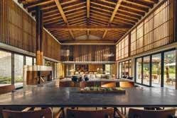
Photographer: Ansel OlsonIvey Design Group was tasked to produce a colourful, modern interior design for a new build home located on a 10-acre property in central Virginia, USA. The home needed to be casual and comfortable, but sophisticated and modern. The architecture of the home includes exposed steel beams, cedar ceilings, and abundant natural light through both floor to ceiling and clerestory windows.
The home is situated such that it has expansive views of the property, including wooded areas and a pond. Ivey Design Group was then tasked with bringing in warmth, colour, and comfort to the 9,000 square foot home, while still showcasing the amazing, wooded scenery outside. This was achieved through a careful balance of colour and texture. Warm woods, moments of colour against a neutral backdrop, and clean lines create the modern yet playful home the homeowners were after. In addition to aesthetics, this home needed to be ready for entertaining. With fold and stack glass doors opening to an expansive outdoor kitchen, patio, and infinity pool, an ample bespoke walnut beverage station, and double islands in the kitchen, this home can host family and friends with ease.
Ivey selected hard finishes and upholstery fabrics that can stand the wear and tear of everyday life. This home is modern but playful, luxurious but not pretentious, and bold but inviting, and never boring.
The design truly reflects the client’s lifestyle and personality: family friendly, modern, colourful, and unique, yet still lets the exterior views shine. There are moments of colour, comfort, calm, and wow.
Location: Laguna Beach, California
Interior Designer: Kenneth Ussenko
Construction Company: MWC Commercial General Contractors
The historical Gucci Villa is a landmark residence nestled into the seaside city of Laguna Beach, California. Kenneth Ussenko states “before starting the design journey on this project, it was a pleasure to see some of the interior work of the original Gucci Watch designer that had influenced the decor and vision of this estate villa”. Due to the historical nature of this residence, the focus for this project was to carefully update and elevate the interiors into a contemporary vision of a classical painting.
To achieve the design brief, the team had to take each room back down to the bare bones of the structural framing and rebuild from the core. From there they created layers of detailed classical and modern moldings for the canvas of the spaces to help outline the history patina of a bygone era. For the Duchess seating room, it was important to create a charming, yet sophisticated space for the homeowners to relax and socialise with family and friends. Linen and leather wallcoverings blanket the walls outlined and framed with wood and brass moldings. Ceilings plastered in a pearl patina reflect the crystal chandeliers above the new marble floors.
The kitchen was a bespoke journey of great craftsmanship creating a radius line of cabinets that were finished in walnut, brass, antique mirror and sprinkled with gold dust. Key to this design is also the Gucci Bar Retreat, a petite gem of glitz and glamour. This space of texture and shape is created with undulating wood moldings, accompanied by a bespoke settee bench which faces a marvelous gold bar and barback.
Location: New York, USA
Architect: Jean Nouvel
Interior Designer:
Interior Marketing Group
The client was looking for a designforward, sophisticated aesthetic with an emphasis on organic shapes and strong modern art influence to balance the angular architectural lines of the worldfamous Jean Nouvel building in midtown near billionaire row. The 82 floor supertall skyscraper is located on West 53rd Street in the Midtown Manhattan neighbourhood and is situated directly above the Museum of Modern Art.
Interior Marketing Group balanced a light, airy palette with lush jewel tones and soft lines that complemented the architecture. In each room, the designers added an unexpected element that added a sense of whimsy which helped offset the otherwise very sophisticated design and palette. The interior design scheme also had to make use of the expansive and enviable views over the city.
The client was also looking to showcase a beautiful art collection that helped create an inspiring experience every time they came to town. Interior Marketing Group did this by curating a unique, bold, and graphic collection of modern pieces that carried the story and connected the spaces from room to room.
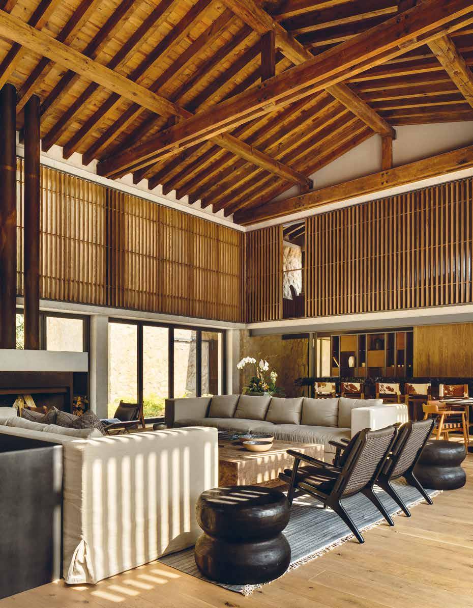
Location: Valle de Bravo, Mexico
Architect & Interior Designer:
Alejandro Bernardi / Beatriz Peschard
Photographer: Rafael Gamo
Submerged in the topography, and the vegetation, this estate finds its place in an exclusive residential compound located in Valle de Bravo. The house was designed as a second home in a one-story layout that contains public, private recreational and service spaces. The main entrance, between colour and stone volumes, guides you through and into the main space. A double height stone volume with wood ceilings that encloses the living and dining experience, connected with the exterior terrace and opening on both sides to create a feel of transparency and depth.
This magnificent space was designed as the heart of the house, connecting the service areas, with the kitchen and on the other side, the bedrooms. This volume can be integrated with the exterior terrace that hosts an exterior living, dining, pool and fire pit experience. The volumes containing the bedrooms, kitchen and service areas are located around the main stone volume, and they all interact with the topography, adjusting their position to get better views, more privacy or simply a privileged spot on the terrain. Attention to detail is present throughout the project, the dialogue between solid and transparency play a main role, the amount of natural light drawn upon the house allows the temperature to regulate in a more natural sense..
Family life flows around the central area, the main core of the house. From here, you can really appreciate all of the details and key aspects, like the emblematic windows that let nature in, and shower each space with sun and natural light.
Location: El Dorado Hills, California, USA
Interior Designer: Kristen Fiore
Construction: North Ranch Builders
Photography: Stephanie Russo
Kristen Elizabeth Design Group were brought in to design this modern new build property located in the foothills of California. The brief was to oversee the interior design and direction for all finishes and furnishings throughout the 5500 square feet, including exterior finish palettes and materials and full interior design scope.
It was important to the client that Kristen Elizabeth Design Group ensured all interior finish selections reflected a modern rustic style which would exude warmth, style and comfort. All areas of the home had to be family friendly yet reflect a highly conscious design style with a contemporary feel. The design scheme also needed to integrate colour in key areas and ensure the home is fluid and harmonious.
For the designers, the favourite aspect of this project was the clients. They were keen on having fun, trying new styles and pushing their own boundaries. They allowed Kristen Elizabeth Design Group to introduce happy, playful patterns and prints while maintaining a high level of design. The home sits atop a hill overlooking Folsom Lake in Northern California.
The exterior colour and material palette work inconspicuously into the natural environment despite the size of the home. It is landscaped with water wise/indigenous plantings, solar panels, and various low use water features throughout the property. The entire home is balanced with repetition. The colour palette is soft and neutral, but warm and joyful. Hints of hues and textures were dropped throughout the home to ensure it felt fluid and calming amidst lots of family fun and kid chaos.
Location: Taizhou, Zhejiang
Interior Designer: Xiangyu Xie, Dongmei Wang, Shu Tang, Yancheng Wang, Qianlin You, Xuefang Zhu, Ru Xiao, Xiaowen Zhu, Changhua Wang
This project aims to create a new type of liveable community, a bearing platform for advanced modern urban development. It intends to comprehensively improve social grassroots services and governance, intensely promoting the progress of social civilization and cultural heritage development, and creating a vibrant and liveable place to attract innovative talents to reside here.
The project takes the people’s demand for a better life and delivers the vision of “homeowners have their personalized house” as the guide. The project locates in Taizhou, the centre of the north and south of Zhejiang Province. It is at the junction of land and sea. It is one of the 27 central cities in the Yangtze River Delta region, which has many harbours and shorelines and is the only pilot zone for economic development in the bay area of Zhejiang. The design concept of “harmony” is infiltrated in Taizhou’s landscape, such as the soul and spirit of the mountain and sea, and gradually integrated into the bloodline.
The design team extracts these local cultural elements and transmits the spirit of harmony into the space. When designing the plan’s circulation, the design considers the harmony of people and architecture first, and then the harmony of people and space, which are interrelated. Moreover, the design extracts the inspiration from the phoenix pattern and creates many shapes of curving lines throughout the project. In ancient mythology and legends, the phoenix is the bird of good luck. It is the most beautiful among all feathered insects and is the king of all birds.
Location: Bangkok, Thailand
Interior Designer: VAIR Design Studio
This project is a luxury private penthouse situated in the heart of Bangkok city, Thailand. The main inspiration for this project is the client’s desire to bring the beauty of nature into the metropolitan living space. Each part of the interior space reflects this concept and has its own different themes to make the space beautiful and interesting. For the entrance hall, which is a semi-outdoor area, the design theme is to create an impression of being in a sky garden overlooking the stunning view of the city.
Vair Studio created a space that resembles a garden seating gazebo surrounded by perforated partitions made of copper metal in a floral pattern. The ceiling is cladded with stainless steel that reflects the sky, which creates a feeling of openness and airiness to the space. Walking inside from the entrance hall is the living room. This area is inspired by the theme, “Beauty Under the Ocean.” A large sofa set is placed at the centre with a beautiful crystal chandelier that looks like swarms of fish swimming on top. The dining room area is connected to the living space. This space is designed to have multiple layers of elements when viewed from the living area.
In the centre layer is the feature dining table set. Above is a leaf-shaped glass chandelier, representing the leaves fluttering down from the tree into the water. In the background is a crystal-clad counter bar and a crystal chandelier inspired by the glitter of a waterfall reflecting the sunlight. The design team used custom printed wallpaper on all sides of the wall, combined with the copper arch and wall lamps, to make this narrow space attractive and interesting.
Location: Singapore
Interior Designer: Aloysius Ganiel
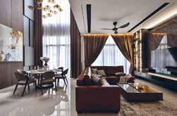
Aesthetically, the homeowner wanted the house to have elements of a timeless luxury style to reflect the urban contemporary look of Singapore. Functionally, they wanted to have a space that separates both social and private space and with personal activities included in their everyday life.
The key aspect is to create a gradual transition from the social to the private interior space and help people decompress from the fast pace of the city. This sense of decompression is achieved through the materials palette, which mirrors the interior environment in the communal social space and then becomes softer and warmer into the bedrooms as people continue their journey into the house.
This concept was driven by connectivity, the layering of spaces and the creation of views. The family members are guided on a journey through the space. Strong design details and material elements, like the stone and carpentry finishing, establish symmetry in the front of the entrance and draw the view to the secluded styling living space when approaching into the space. This natural lighting and well-ventilated space heightens the whole interior experience, providing intimacy and sensational mood of each individual area that deepens the connection between the house itself and home-owner.
The designer selected muted tones and honed materials to enhance the sense of authenticity and comfort. This creates a quiet, elegant atmosphere, with mirrored surfaces and natural stone catching the eye. The central point-of-sale is made from stone and commands attention, while the bespoke furnishings, woven elements and handmade touches add texture, luxury and a feeling of escape.
Location: Selangor
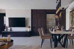
The softness created by the composition of marble textures, delicate gold accents, and neutral tones creates a cosy luxury atmosphere in this holiday home for a family of four.
Luxury, comfort, and relaxing were three main considerations in the design brief for this property due to it being a second home this is what the client found most important. The client would like to treat this home as a holiday home for his family to gather around. At the same time, the client likes natural wood colours, so dark wood colour laminate is used in the common area as the main feature colour.
The key feature in the house is the double volume feature wall panelling at the dining area due to the clients preference being natural wood colours this has been created to stand out and tie together the main areas. It is a bespoke, simple yet elegant 3D gradation double volume feature wall panelling.
The client travels a lot and he likes to have a home that has a resemblance to a resort or luxury hotel. Therefore, the mood and design of this house matches his preferences.
Location: Nova Scotia, Canada
Interior Designer: Amazing Space Interiors
Construction Company: Atibin Homes
Photographer Credit: Monika Greetham
This Halifax-based home has been designed by Amazing Space Interiors with classic elegance in mind. To suit the client’s style and needs, the home had to be a contemporary view on this, combining the clean, textured interiors of modern design and the classic twist of a familiar and timeless aesthetic. With an open plan layout for the living, dining and kitchen areas, cohesion between them was a key consideration for the designers. Amazing Space Interiors designed the space with clean lines, elegant furniture, and a touch of sparkle. Each element has been included to elevate each other and add intrigue to enhance the overall look. One of the designers’ favourite aspects of this open plan area is the wood ceiling, that not only ties each ‘section’ together but adds depth, sophistication, and balance.
The design scheme continues throughout the home, with the interiors centring around cool neutral tones and the layering of textures. The designers also draw parallels between the shapes and textures from each space to enhance the movement between areas. The master bedroom remains neutral with hints of blue in its accessories and furnishings, complementing the scheme of the home whilst establishing a calming space.
Pairing the neutral tones with the large windows that offer views of the Nova Scotian forestland as well as a wealth of natural light allowed Amazing Space Interiors to create a bright and open feel. Having this motif run through the property not only corroborates the effortless and seamless flow between spaces but also ensures that the design remains classic in style and modern in execution.
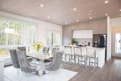 Location: Kleinburg, Canada Interior Designer: Diana Bastone Designs Photographer Credit: Stephani Buchman Photography
The Orico Project is sophisticated yet approachable, blending traditional and contemporary elements. The design scheme came from working with the existing elements and design to enhance them.
For the dining room, the space was designed to work in harmony with the existing light fixture. The opulence and sparkle of the lighting fixture in the dining room was the highlight of the space, and so the designers chose supported the fixture rather than taking away or overwhelming it. The brass highlights and subtle colour palette makes for an elegant and sophisticated space.
The family room had an existing fireplace which was then enhanced with Diana Bastone Designs’ wall treatment and unit. The design of the space was based on flexibility. The homeowner expressed their key request of being able to hide the television when they are entertaining; this was fulfilled by creating a custom unit that allowed for sliding so that the television could either be visible or hidden within the wall unit.
The primary bedroom was to be a calm oasis. The colour palette of soft pastel tones was derived from the stone of the fireplace and creates a calm retreat. With the 14-foot ceiling, the space called for a dramatic style headboard, and the custom-designed bed gives the room a grand appearance. The nightstands were also custom produced to coordinate with the bed design. In the bedroom sitting area, all the pieces were reupholstered to suit the new bedroom décor, championing the craftsmanship of well-built furniture by giving each piece a new life.
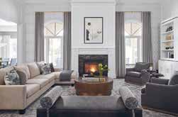
Location: Bennington Heights
Architect: Rowlands Associates Inc.
Interior Design: Rowlands Associates Inc.
Construction Company: Chalcraft Custom Builders
Photographer Credit: Lisa Petrole
This whole house renovation by Rowlands Associates pays careful attention to how each design element affects how the space feels to our human nature. It is a design that works well because this is a home that simply feels great to live in.
Bennington Heights is a contemporary space that has undergone a full transformation. Working with great clients that had a keen eye for furniture and interior design, this project involved the complete renovation of a long and narrow home that had an amazing swimming pool and back garden but lacked connection to the interior spaces. Rowlands Associates moved the kitchen and dining areas to the back of the house and introduced and large format window system with screens that allowed the indoors and outdoors to connect. A sofa and workspace add to the functionality of this well used space that brings a busy family together.
Overall design theme is contemporary feel with classic modern furnishings that focus on comfort as well as visual appeal. The connection to the outdoors has been translated into the design scheme, with the open spaces on the lower floor remaining light, bright and vibrant. Each space embraces the natural light that the location offers and is elevated by the tones and textures that are taken from nature.
It is a playful design scheme that is filled with intrigue whilst remaining an ordered, relaxing and calm space. It is a place of comfort and a place to gather in a turbulent world. A true family home for a busy group of movers and shakers!
Location: Ontario, Canada
Interior Designer: Kelly Harvey Living
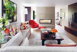
Developer: SkyHomes Corporation
The interior of Kleinburg Manor by Kelly Harvey Living is kept timeless, where the core foundations are that classic design will never tarnish, and that elegance comes from subtle details. The stunning property is based in a luxury pocket of Ontario, and features a number of custom details as well as furnishings from the Kelly Harvey Living line.
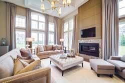
Neutral tones and warm lighting are combined with both soft and natural textures for a sense of calm throughout the home. This works well with the natural brightness that comes from the large windows and sense of space from the height of the rooms. Light drapery complements the wall colours with a slight contrast that amplifies the spaciousness. Textures are layered for depth and warmth, with rugs being used for a comfortable and homely ambience. Space is the ultimate luxury in property, and so Kelly Harvey Living looks to emphasise this using floorto-ceiling details such as upholstery, built in cabinetry and wall length drapes.
Throughout the home, the décor is kept contemporary whilst the colour palette is both neutral and warm. The builder wanted a unique fireplace and a custom railing designed which was deliverable due to Kelly’s familiarity with products and custom design. The fireplace was created from custom leather panels and nailheads. The iron railing was designed to suit the space as it climbs with the triple height staircase and becomes a key feature of the entrance along with the marble flooring. Built in cabinetry offers both utility and luxe to several rooms, such as the office shelving, his and hers vanities in the master bathroom, and the flawlessly designed walk-in closet.
Both floors of the Penthouse Plazza were originally planned as office space and were taken over in the shell – without walls and stairs. With great sensitivity, the architects created a beautiful, luxurious retreat in the middle of one of the most beautiful areas of the Swiss Alps. According to their company philosophy of creating emotions, they succeeded in creating a home away from home.
The condensation of the surface, the use of precious and tactile-sensual materials in combination with skilful lighting creates cosiness and warmth. Sensuality and the claim of feeling at home are the core goals of their work. With this extraordinary project, they created an inspiring and enriching living experience for their clients out of nothing.
Go Interiors GmbH’s favourite aspect of the project is the transformation from an empty space to a beautiful mountain home. The designs works well as it is simple but cosy, with an alpine modern feeling flowing throughout.
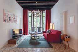
Location: Venice, Italy
Interior Designer: Ilaria Campagna Interior Design
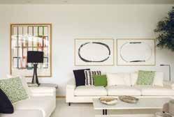
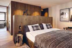
Palazzo Venere dates back to the 16th century and is protected by “Belle Arti” (an institution of the Italian Government that safeguards cultural heritage buildings). The building has a floor surface of 240 sqm and is partitioned on 3 levels.
Palazzo Venere apartments are all different from each other in the architectonic details and the furnishings. Each apartment combines the ancient Venetian architectonic features and the details reflecting the Italian twentieth century design in a unique way so you can live like a real Venetian and feel at home at the same time. The traditional Italian style is key to the design and is prominent in every detail, creating a vintage and eclectic ambience that flows through the apartments. The antiques and paintings were created by the owner himself and add to the project’s uniqueness.
The design works well because it describes the true Italian style that is found in the houses of Venice; antiques and made in Italy furnishings combined with traditional and unique Venetian interiors. Ilaria Campagna Interior Design have given a new life to history, re-adapting it in a contemporary key. The traditional interior is also able to accommodate different styles. In this case, the team followed the taste of the client, passionate about vintage 70s furniture.
All the interiors have been restored by skilled artisans who have restored the original floors and parquet, have redeveloped the wooden beams of the roof and have made the doors from scratch based on the originals using ancient painting techniques.
Location: Vilamoura, Algarve, Portugal
Interior Designer/Interior Architect: SA&V – SAARANHA&VASCONCELOS Architect: Vasco Lopes Photographer: Montse Garriga GrauGreen Summer, located in Vilamoura, Portugal, is a beautiful holiday home with comfort details allowing an all-year-round experience. The property has been designed to create a flowing atmosphere with relaxed lines and a touch of sophistication.
The clients expected a very spacious home with an outside opening, creating a unique space merging interior with exterior. The clients also requested that the design features the use of light tones and the creation of a timeless ambiance whilst having a strong personality. Since the clients love to entertain, all social areas are very important. Being a house to enjoy mostly in Spring and Summer, it also needed to be designed to welcome Autumn and Winter.
Key to the overall design was fusing and enjoying the exterior and interior as a whole. The design works so well as there is a common thread, a continuity in the way the story of this project is told and between the spaces that are part of it. In addition, not only does it convey a good feeling inside, but it is also actually a very comfortable home. In a word: coherence.
The house itself is entirely white with only a few details of materials such as stabilized corten steel, wood or grey stone that make the perfect integration with the surrounding pine forest. Also, the dark green swimming pool, the interior design and colour coordination are a plus in the integration with the surroundings.
Location: Kenmare, Ireland
Architect: Diarmuid Twomey Interior Designer/ Designer: Nathalie Vos and Justina Gruzdyte Other companies involved: Holbein Carpentry & Joinery Photographer: Lynda Kenny
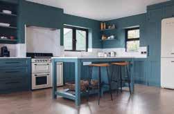
Edit Design Studio’s vision for The Little Red Bridge was a functional home that flows well. It needed to have everything it needs to be stylish and comfortable. For the designers, the most enjoyable aspect was having fun with design features, expressing the personality of the owners.
The brief was to create a comfortable and inviting holiday home with soul and warmth. The interiors needed a pared down luxury, unique homestay feel that exudes character, personality, and individuality. The house is in the beautiful countryside with fantastic views of Kenmare Bay and the Beara Peninsular. Style wise, it was important to maintain a modern country vernacular. The idea was to bring the outside in and reflect the colours of the ocean views and garden. For the furnishings, they use natural textures and fibres such as oak, cane and wool as a tie to the wider environment.
The ground floor living space was opened up by knocking out the back façade and incorporating floor-to-ceiling sliding doors. This created an easy indoor-outdoor living, converting the single living space into a large kitchen and dining room with a bespoke fitted kitchen and giving space to entertain. An airy lounge has a woodburning stove and folding doors to give the occupants the choice of semi-open plan living or separate rooms if they so wish. Joinery was completed by a local company, and Irish elements have been used in the details and decoration. The traditional Irish Skib baskets are hung as an installation on the kitchen wall, and Irish woollen throws and blankets are used in the bedrooms and lounge.
Location: urb. El Herrojo, Benhavis
Interior Designer: Jana Novakova
Architect: Studio Tobal - Diego Tobal Developer: Fintech Construction Company: Solis Photographer: Charly Simon
Casa Varanda is a residential villa with generous sunlit indoor spaces overlooking the sea, with 6 bedrooms, double height living and dining room, game room, gym, spa, outdoor pool and beautiful gardens. The villa is designed in a contemporary style, with the utmost care for comfort with high quality seating furniture and turnkey spaces.
The living and dining area is a vast open space having full height windows with sun light accentuating the light and fresh summer colour scheme. Key to the design are the motorized full-size windows which visually decorate the room expanding to the beautiful view of the gardens. The double height ceiling salon with its wooden cladding makes the room feel airy, but at the same time very cosy and warm. The focal point wall with the chimney has two types of wall paneling, backlit onyx and real dried moss to add a fresh unexpected accent. The moss has also been used in the entrance in combination with travertine 3D cladding backlit with LED. The generously sized spaces fitted with natural stones, wood and turnkey furniture all over the villa, including bathrooms, gives guests the feeling of a luxury vacation.
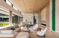
The design scheme is in line with the modern architecture, yet the selection of colour schemes per area gives a clean and tranquil aesthetic, creating a more vacational look. The property integrates itself into the wider environment through the use of natural materials which blend into the surroundings and also having 3 large trees planted within its premises in order to blend within the surrounding green hills.
Location: Vilnius, Lithuania
Interior Designer:
Vaida Zemaityte / Cle de Maison
Photographer: Kernius PauliukonisBuilt from scratch, the whole process of the Valakampiai Residence took almost four years to complete. The client’s bold personality is reflected through the interior design scheme with their passion of coloured diamonds being the biggest inspiration for the interiors. Cle de Maison to worked with exceptional artisans worldwide to create special fabrics and furnishings for a truly bespoke residence.
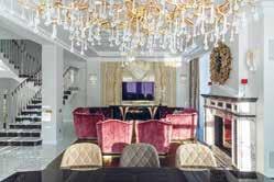
The interiors are inspiring, layered with intriguing textures & materials, bold colours, sophisticated finishes and details which offer the client something personal and curated. To achieve this, the use of natural materials is featured throughout the design with solid oak parquet with brass inlays, natural Carrara marble floors and stairs, moldings, glossy Ebony Macassar, mirrors, brushed and polished brass detailing in specific areas and the use of beautiful, elegant lighting. Within all spaces bespoke furniture pieces were designed, finished in bold colours luxurious velvets, solid wood veneer, complimented with high gloss tables which all were then finished with an extensive use of rugs, mirrors and accessories. The use beautiful, exquisite pairs of chandeliers in various rooms is prominent, along with accent wall lamps.
Crafting a design that was a perfect balance between eclectic, modern classic and timeless would allow the existing architecture to breathe. The scheme demonstrates that opulence can be successfully harnessed from precise detailing and tactility. The use of colours and textures to interpret the style of the home was one of the designer’s favourite elements, due to the excitement of seeing the same colours used and looking so different in every room, it’s almost unidentifiable.
Location: London, UK
Interior Designer: AC Spatial Design
To fulfil the client’s ambitious vision on a compact site, AC Spatial Design undertook a rigorous design and refinement process to complete the vision forming a balanced approach, the designers were determined to deliver a residence with generous proportions and carefully framed vistas befitting the leafy location. The carefully considered monochromatic palette became a guiding principle for the new gestures creating a curated home of subtle luxury and familiar comfort.
The interiors throughout are methodically detailed and refined, fitting the rigorous geometry of the architecture while maintaining a timeless and essential aesthetic. Fine craftsmanship and careful material selection are evident upon entry, with Timber flooring by Bassano Parquet, bespoke joinery by Creatives Edge and stone cladding by Pietracasa. A sense of calm pervades the formal living area.
The house is filled with natural light, with glazed openings and light-toned windows treatments ensuring sunlight to illuminate the interior. Forming a base of clean lines and warm and textural timber underfoot, the floating staircase connects the levels, encouraging the eye upward. Furniture and lighting then act as the natural additions to the structure, drawing on a soft and desaturated palette of textured fabrics. Ensuring an ingrained sense of flexibility in the planning of dining and kitchen area, and how each space connected and opened to the next – was key.
AC Spatial Design’s vision was fully aligned with the client’s requirements and needs to live in a house with a timeless and essential aesthetic. Through focusing on refinement and an enduring base, the Family House becomes the ideal base for its art-loving clients between London & Cape Town.
Location: UK
Architect: Chris Snow Architects
Interior Designer: Frank & Faber Ltd

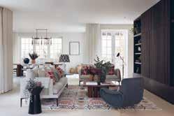 Photography: Paul Craig
The brief was to design a scheme which cohesively unites the two houses whilst simultaneously reflecting the very unique tastes and personalities of the two brothers.
The significant research phase established key influences including the geographical setting of the property, alongside the international heritage and lifestyle of the clients, who live between Nairobi and London, are of Indian descent and have a passion for travel. A love of history and desire for a home which felt warm, devoid of ostentation and reflected their personalities.
The interiors reflected the architectural mix of classic and contemporary. Classic materials including marble, timber and stone were executed in contemporary details including discreet full height pocket doors and joinery. Dominant use of natural materials in base finishes, furniture and lighting brought an innate warmth and sense of wellbeing. Softness was achieved by consistent use of elegant window drapes.
The intentionally simple backdrop of base finishes allowed the soft furnishings, lighting, furniture and accessories to introduce unique personality. A soft pallet was informed by the surrounding gardens and neighbouring Hampstead Heath, introduced through a range of fabrics which mixed patterns and textures inspired by the British, Indian and African heritage.
The design successfully fulfils the brief of marrying luxurious quality with a homely warmth, comfort and absence of ostentation. At once grounded in its geographical location as well as reflecting an international heritage.
Location: London, UK
Interior Designer: Studio Mae Interiors/ Mima Romanic
A striking white stucco mansion in Notting Hill has been transformed from two derelict apartments into a light, bright two-storey home with wellness at the core.
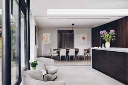
The client’s dream was to create a light, bright Parisian Deco style interior. The original floorplan was dark and pokey and so Studio Mae Interiors worked to reconfigure the entire flow of the space. This meant taking it from three bedrooms to two, to create more space in the rest of the property. With only 1350 square feet, it was essential that every single inch was designed intelligently to maximise space and storage. The client, as well as the designers, are all Australian and, as Australians, it was essential to flood the property with light for wellness at home.
Sadly, there wasn’t an original feature left in this beautiful period property. Just the bones of the building remained so Studio Mae Interiors gutted the entire place taking it all the way back to the brick walls underneath. Aesthetically, it was imperative that the design found a balance between blending the elegance of the traditional with the boldness of the modern.
Studio Mae Interiors were initially very concerned about the darkness within this property, but the combination of open plan living, clever reflective pigments throughout the interior scheme, natural sunlight in the day and soft lighting in the evening has transformed the space from what it was. Sourcing sustainable, ethical materials was also extremely important to the designers, and a signature style of Studio Mae Interiors.
The interior scheme has achieved a perfect balance between beautiful, period detailing, modern furnishings and minimalist, clean lines. As a result, the home feels incredibly calm and cocooning, creating the perfect sanctuary for the clients.
Location: Leinster Square, London
Interior Designer: Banda Design Studio
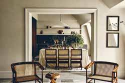
Developer: Banda
Described as “like stepping into an Old Masters painting” this penthouse apartment is a beguiling mix of rustic looks and luxury feels. The penthouse is located on the 5th floor and spans over 2,300 square feet with a further 500 square foot private roof terrace.
The design brief for Banda was to create something that was completely unique and totally unexpected in a city penthouse. Inspired by travels to Tuscany and rural France, the brief was to introduce a farmhouse quality to the space with rustic tones and luxury amenities, with an overarching influence of wabi-sabi (the Japanese art of finding beauty within imperfections). A strong sense of home was equally important, as was the sense of a life well-lived and travelled.
This gentle, restful space is anchored by the strong geometric lines of the fireplace in bold Nero Marquina marble and statement pendant lighting that provides just the right amount of juxtaposition to the softness. The colour palette is owned by natural tones blending from olive to taupe, with the calming shades giving a depth that displays a human, artisanal touch.
The original oak beams accentuate the double-height ceiling in the open plan living space and add a feeling of earthiness to the space. This is further enhanced by the high quality, natural and non-toxic clay plaster on the walls with its moisture and temperature regulating qualities.
The feeling of harmony and sanctuary is echoed by the leafy garden square that the penthouse overlooks. One of London’s hidden gems, the private gated garden of Leinster Square is surrounded by the beautiful white stucco-fronted Grade II listed buildings, whilst being only moments away from the hustle and bustle of Notting Hill.
Location: London, UK
Interior Designer: Gomm Studio Ltd
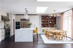
Architect: Quartet Architecture
Construction: Bygga Construction
Photography: Paul Craig
For this project, the clients wanted a home that looked extraordinary, mixing traditional with contemporary styles. Above all, the clients wanted the home to flow perfectly to suit their needs as a young family.
The brief included creating a stunning showpiece master suite, with bedroom, en-suite bathroom and bespoke dressing room. The children’s rooms, playroom and bathrooms needed to be playful, colourful, and exciting creative havens for young minds. Furthermore, the clients required more formal adult areas - a drawing room and study. The brief was to take inspiration from hotels the clients love, such as Heckfield Place and to create a sumptuous but not overly extravagant home.
One of the key aspects of this project was the open plan living and dining area. Gomm Studio Ltd created bespoke separate areas for the kitchen / pantry and the living room area with large L-shaped sofa and tv. All of this is divided by the spacious entrance hallway flowing into the room, allowing plenty of room for the children to play. Topped off is the wall-filled windows overlooking the garden, with gorgeous softfabric curtains flowing to the dark wood floor.
The design works so well as it looks beautiful without being overly showy. It is definitely for a modern, young family, and incorporates their artwork and tastes to stand out amongst the timeless aspects of the design. The whole house flows – if you took each room in isolation you could match together that they belong in the same house - yet each has its own identity. The whole house is joined together by a delightful spiral staircase. It fulfils the brief of working for the whole family, with fun and enjoyable spaces for all generations.
Location: London, UK
Interior Designer: Argent Design Architect: Argent Design
10 Stanhope Gate, located in the heart of Mayfair, was originally built around 1757 in the reign of George II. This newly refurbished private residence is set across six storeys with finishes to the highest quality and finest materials sourced from across the globe to create a masterpiece of design and opulence.
The brief from for Argent Design was to turn this previous commercial property into a single lavish family residence sympathetic to the period and style of the smart Mayfair set. It needed to be fully refurbished and modernised throughout with 21st Century technology advancement in music, audio and home automation.
The tailored and sophisticated design created by Argent Design works effortlessly with the period detailing of both the residence, surrounding architecture and heritage. The designers have created a timeless interior of elegant colour and smart tailoring with period details and modern accents to give it the 21st century twist.
Argent Design have created an amazing story which runs through the house and take you on a joinery through the subtle detailing in the house, from the fret work on the gates to the embroidery on the cushions, the detail on the carpet through to the bedding stitching. All to create an harmonious and sumptuously elegant interior.
Location: London, UK
Interior Designer: Birch House
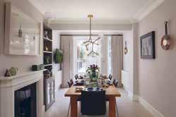
Architect: SM12 Architects
Construction: Adrian Design Photography: James Balston
This Grade-II listed Chelsea townhouse underwent a full refurbishment and extension. Working closely with the client, their architect and local conservation teams, Birch House created a design that completely transformed the property while remaining faithful to the character of the original building.
The client wanted a full redesign of every interior architectural detail and finish including bespoke fitted joinery, lighting, and bathrooms, as well as furnishing and styling throughout. They wanted the property to ooze a feeling of tranquillity and provide a restful feeling akin to staying in a luxurious boutique hotel. Importantly, as the client has such an extensive and interesting art collection, they wanted the interiors to allow it to sing. Accordingly, Birch House kept the overall colour scheme simple providing the perfect backdrop to the art.
Birch House reinstated period features, selecting materials to complement the original style of the property. The form and proportion of the Georgian architecture, the natural light and gorgeous period detailing were the stars of the show. But to avoid creating a pastiche of a period house, Birch House kept the design of the hard finishes, the kitchen and fitted joinery very contemporary using inset mirrors to enhance the feeling of space and give a nod to a more traditional shaker style.
The structural alterations to the rear and full mansard roof extension have been carefully considered, taking into account the particular characteristics of the surrounding mid-19th century buildings. Birch House worked closely with our client’s architect to maximise floor space and bring in natural light at every opportunity.
Location: London, UK
Interior Designer: Sandra Flashman Studio
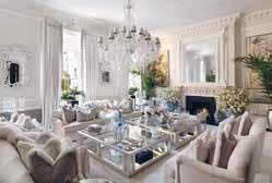
Construction: Alex Deco Design
Photography: Anna Stathaki
Located where Daniel Dafoe once lived, the residence is steeped in local history, where the brickwork was likely made from clay dug from Dafoe’s garden. Church Street Residence is a modern interpretation of a Victorian Townhouse, which highlights traditional features in a modern context.
Typical of a Victorian Townhouse, the building has a narrow footprint with rooms that feel small and closed off. The clients wanted a home that felt open and comfortable, retaining much of the original architecture whilst being understated and luxurious with sumptuous details.
Taking inspiration from its history, Sandra Flashman Studio updated the central staircase and created a feature that wound through all the levels of residence and ended with a skylight above it. The staircase is beautifully crafted with iron balustrades and solid wood bannisters and clad with a sumptuous smoked wood flooring that is used throughout the space.
The loft was opened up with additional skylights, to create a lounge space with low level furniture and underfloor heating. The interior brickwork was restored to give a sense of it’s original architecture and a warm texture, resulting in a loft-like lounge which opens out onto a terrace overlooking the London skyline.
Using some minor architectural interventions, Sandra Flashman Studio were able to create a space that feels unified and open. The smoked oak finish throughout reminds you of its Victorian heritage, yet the openness and clean profiles of the interior architecture and details feel modern. It has unique details that create moments of glamour, yet is on the whole calm and inviting as a home.
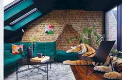
Location: London, UK
Interior Designer: Mahrukh Jamil
Developer: Meritas
Photography: Natalia Monica Photography
The brief for Mahrukh Jamil Interiors was to create a contemporary and sophisticated city space in which their client could feel the luxury of a high-end hotel but the warmth of a home. The client wanted to use the apartment for his family to enjoy breaks in London but also, as a CEO of a multinational firm, a place to entertain friends and colleagues. The brief also included a challenge to maximise space and storage which was a key component in the joinery design.
It was important for Mahrukh Jamil Interiors to consider textures and colours that would help to inspire and relax the client in their city apartment. By using luxurious materials and colour palettes with the occasional pop of colour, the designers were able to connect each room seamlessly.
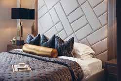
Mahrukh Jamil Interiors’ favourite part of the project was designing all the joinery for the apartment. Using triangular and diagonal shapes that were also used in the dining area lighting, dining chairs, and accessory fabrics, Mahrukh carried these patterns as a running theme throughout the apartment.
The design was for an apartment that is one of many apartments in a new residential development in Paddington. As an extremely vibrant, busy, and multi-cultural part of central London the design had to be in line with the area and the price of the property itself. The apartment, overlooking the Grand Union Canal, is in a modern and sophisticated building that has clearly been developed for a certain clientele. Therefore, the contemporary and sophisticated design of the apartment perfectly integrates with its surroundings.
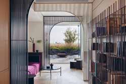
Location: London, UK
Interior Designer: Paola Leon Design
Architecture: MATT Architecture
Construction: Faithdean
Photography: Chris Snook
Paola Leon Design & MATT Architecture were tasked with designing the new headquarters of Soho Estates. The spaces are designed to look and feel like a home. Outside of working, a garden terrace, kitchen, library, bar and snugs provide the familiar spaces for short breaks to rest and recharge. Material, texture, colour and attention to detail typically unseen in an office setting. Texture and colour were carefully curated to enhance each individual space. Vibrant, rich hues and bold materials were used in high energy areas where collaboration and socialisation are encouraged. For the quieter spaces that require focus a calmer neutral palette was applied.
As a family-owned and family-run business, the design blurs the line between home and workplace. Using material, texture, colour and attention to detail typically unseen in an office setting, a series of comfortable and familiar spaces are created, alongside a variety of private and collaborative work settings. All spaces are unified with linear patterning providing depth and texture. This is visible across the design on finishes and fittings, from fluted wall panels, bespoke joinery and reeded glass to ribbed metalwork, ironmongery and soft furnishing.
Ethical and sustainable sourcing was an essential guide to material selection. At each stage environmental impact was assessed. The client brief was to create a dynamic and flexible workspace that encouraged movement and interaction. The space needed to project the family brand, be inviting and delightful to clients, colleagues and collaborators. A space that captured the spirit of Soho - vibrant, colourful, with character - encouraging personal inventiveness and creativity.
Location: London, UK
Interior Designer: Emma Green Design Limited
Photography: Veronica Rodriguez
This fun-loving, dynamic family wanted to upgrade their Edwardian family home to highlight their personalities and passions within a brand new design scheme. Against a tight timescale of nine months, the project began with a complete strip out of the existing flooring, joinery and almost all existing furnishings and fixtures. The period features such as ceiling roses, cornicing and spindles were left to shine in the new scheme.
The clients wanted to create an impact in the entrance hall and for this to highlight the style and colours of the rest of the house. Emma Green Design chose to retain the original staircase and paint this a dark grey and offset this against the encaustic floor tiles. The sophisticated and cocooning lounge was wanted as a place of sanctuary in the evenings to watch TV and also entertain adult guests. The designer chose to create this blue thread through to the kitchen where the units are a softer shade of blue with gorgeous bespoke cream leather bar stools on which to perch.
Generous storage was incorporated into the kitchen cabinetry as the client doesn’t like to see clutter! The overall look is colourful, yet calm and allows the spaces to breathe. Emma Green Design wanted to incorporate colour and character throughout the house whilst retaining a sense of lightness with predominantly neutral tones on the walls.
The interior design scheme is a curated design with bespoke joinery sprinkled throughout, from the bespoke media unit to the show storage in the hallway to the toy room storage, which sits confidently with the rest of the customised furnishings and allows them to breathe and the scheme to flow from room to room. The colour scheme is sophisticated yet interesting.
Location: United Kingdom
Interior Designer: Rebecca Leivars / LEIVARS Interiors Studio
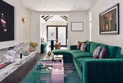
Construction:
London Builders & Decorators
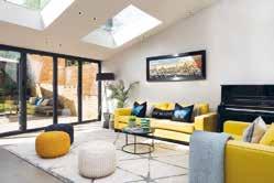
Photography: Nick Smith Photography
LEIVARS Interiors Studio worked with the client, the CEO of an international luxury brand, for the third time with this project.
The brief was to completely strip out and reconfigure the rooms to create a home office whilst maximising light and comfort.
The client asked for subtle nods of elegance from the Art Deco era yet having undertones of femininity and drama.
LEIVARS Interiors Studio wanted to connect the living and dining space to create a striking statement fireplace and sight line towards the small rear patio, and so they designed a full length low level fire place and opted to have this made from beautiful marble with fluting detail. By keeping the fireplace low and long whilst working with vertical fluting details it gives this small property the feeling of height with real impact. By adding in a bio ethanol fire gave some warmth and interest in the colder months.
Within the three upper rooms, LEIVARS opened up the master bedroom to the en suite so it felt much grander in presence and connected the rooms by selecting a contrast ceiling paint, so it felt continuous and cohesive. And by adding in a striking statement vintage chandelier, it really gave the bathroom its own showstopper. The designers also selected a beautiful Calacatta Rose marble to adorn the shower and bathing area which created a gorgeous and pretty en suite bathroom for her with an added touch of a bespoke fluted black ash vanity unit. Heavy use of antique gold mirrors creates reflections which make the room feel bigger and add warm tones.
Location: United Kingdom
Architect: Breley Design
Interior Designer: Rose Narmani
Developer: Ulisses
Construction: Daniel Zefli
Photography:
Julian Abrams, Nick Smith
This elegant country mansion is contemporary and stylish and showcases functionality without sacrificing sophistication. The design brief indicated that the space needed to be open, bright and light and should take advantage of the high ceilings. Allowing as much light as possible to flood into the living spaces was of vital importance. The colour scheme was to be a multitude of varying greys with pops of contrasting colours throughout to bring depth and intrigue into the interior design.
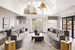
Rose Narmani was tasked with creating a timeless design scheme that would last years and survive any current design trends. The living space was to be contemporary and comfortable, with many natural and contrasting textures, finished of with an ultimate touch of luxury. The high ceilings created were Rose Narmani’s favourite part of this project as it completely changed the dynamic of the space. The designers were tasked with removing the original ceilings to create a room that doubled in height. As you enter the house and proceed into the formal living room then you feel the effect of this structural change.
The design is so effective because firstly the client is delighted with the end result and that is the main overriding objective when finishing a project. The designers began this project from the renovation stage and then moved onto interior design and finished it with interior styling. Rose Narmani spent so much time with the client to ensure that they understood both their individual and family requirements and preferences. The design transformed this property and made it into the glamorous home that the client never wants to leave.
Location: Jaffa, Israel
Architect: Tzvia Kazayoff
Interior Designer: Tzvia Kazayoff Photographer Credit: Amit Gosher
After years of living abroad, Tzvia Kazayoff’s clients established their common home in their birthplace, Israel. The project began in a Jaffa neighbourhood called Ajami that faces the sea.
The property belongs to a couple, one a high-tech man and the other a media man, together with their beautiful newborn. As they started a family they wanted a home that was designed for their needs whilst embracing their country, community and surroundings. The property is a 190 sqm duplex penthouse with a direct elevator to the living room, with two large balconies of 150 sqm. The design is eclectic and incorporates mixed cultures within the context of the area, as well as satisfying the needs of the couple.
Thinking about their rituals as a young couple with a new baby, Tzvia Kazayoff created a custom design, emphasising the master bedroom as a temple for the couple. The entire design scheme was concentrated on the location, with the connection to the sea as well as the urban landscape. Additional openings and windows were opened in the project planning in order to reveal a permanent and direct connection to the sea. The connection between the eclectic design and the diverse neighbourhood in which the property is located cannot be ignored.
For Tzvia Kazayoff, what makes the design successful is the products that were created in the design of the house while constantly thinking about how they will live in it. It is this consideration for use and their clients, along with the connection to the neighbourhood and its cultural fabric, that makes this home effective.
Location: Neve Ilan, Israel
Architect: Dana Oberson, Oded Livyatan, Ofra Goldberg
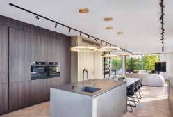
Interior Designer/ Designer: Dana Oberson, Oded Livyatan, Ofra Goldberg
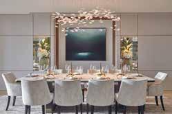
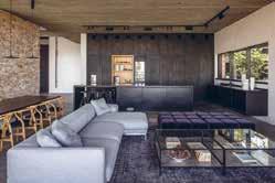
Landscape Architecture: Mohr-Avidan Photographer Credit: Amit Geron
Originally a cooperative kibbutz founded with the establishment of the state of Israel, Dana Oberson Architects Studio’s new project borders the Arab town of Abu Ghosh, where remains of historic biblical settlements have been discovered. The two-story house is built on a gentle slope overlooking the Neve Ilan forest, the lowland, and the Mediterranean Sea.
The choice of material came from observing the unrefined stone that builds the agricultural terraces of Neve Ilan. Dana Oberson, founder of Dana Oberson Architects Studio loved how the layers of history are evident in the stone, and therefore wanted to tell a story of identity and context by making this stone a significant part of the structure. These unrefined stone slabs flow from the outside into the interior spaces of the house, connecting them.
The selected materials are exposed and rough; Brutal concrete ceilings, brushed and burnt-looking oak cladding, natural iron and the local unrefined stone. The house ends in an outdoor terrace and an infinity pool that blends with agricultural terraces, horizon, and sky. In developing the landscape, it was important to avoid railings to assimilate in the landscape. This challenge was repeated in the design of the railings between the two levels of the house. Unlike a continuous railing that connects two points and creates a boundary, Dana Oberson Architects designed a railing from random-looking flat iron pillars, which serve as a basis for the growth of climbing plants and thus integrate maximally with the landscape.
The Palm Jumeirah project has a unique design as the interiors look to smoothly complement the views of the property’s surroundings. With this project, Lumi Interiors created a concept story with lots of textures and interesting details and decorations. It feels luxurious and rich, yet liveable and practical.
Inspired by the beautiful views and amazing sunsets, the home is connected to its surrounding nature. Entering the apartment provides sanctuary from the hot weather, transitioning into a light and fresh interior. Lumi Interior used natural tones and a multitude of textures to ensure that the design remained rooted to its context, as well as unique art, light textured fabrics, and natural colours such as blues, bronze, and brown.
The master bedroom has a sand and sea concept, using an earthy monochrome palette but with lots of texture. It was important for the designers to ensure that texture was consistent in the details, including within the joinery, furniture, and accents. There is a bird’s eye pattern in the writing desk, joinery, and side tables, and a de Gournay wallpaper that was a bespoke design by Lumi Interiors and de Gournay. This wallpaper depicts a male and female bird looking to each other from the panels as well as butterflies and flowers as a further allusion to the nature outside.
The driving force of the interiors was its connection to nature. The designers’ choice of soft furnishings, art pieces, and colour palette all reflect the outside which in turn created a harmonious design scheme. This became more prominent in particular rooms such as the living room, dining room, and master bedroom due to the views that they offer.
Location: Windhoek, Namibia
Interior Designer: DLH Lifestyle cc Photographer Credit: Willem Vry
DLH Lifestyle was appointed to design, specify and oversee all interior installations at this magnificent hilltop house, situated in the surrounding mountains. It offers spectacular views towards the city of Windhoek. Working with the clients’ individual pieces and artworks, the designers had to create a scheme that was able to unify all of their items and collections into their new home in Namibia.
The success of the design is its seamless connection to the natural world and vast beauty of the surrounding mountains. DLH Lifestyle delivers a sensitive yet highly contemporary scheme, working in colours and raw materials from the environment.
The design uses raw materials: granite, marble, wood, and metals, that mirrors the earth’s rich layers in a space that both shows off the beauty of the natural world and complements the clients’ lifestyle of luxury, modern living. The marble flooring and granite worktops, the accents in the dining table and motif in the curtains all represent the textures inspired from the layers of our earth.
Upon arrival you can move through a zen garden styled from local stone and succulent trees from this area into a tranquil space, making the integration from outside to inside slow and intentional. Once inside, vast frameless views penetrate through the double volume space, giving you a complete view out the other side over the horizon. The home allows you to experience the natural surroundings through large, unobstructed, and frameless views outwards. DLH Lifestyle also worked with local artisans to give the home another tie to it’s location, such as the staircase that features a beautifully wrapped handrail in a bright and robust tan leather which was installed by a local Namibian leather artist.
Location: Manja, Madaba, Jordan
Interior Design:
Anas Zabalawi, Within175
Architect: Anas Zabalawi, Within175
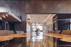
The secret retreat is located near the Ancient Greek city of Madaba, Jordan. The property is surrounded by an amazing landscape full of olive and pine trees, that helps you to relax and recharge your mind, body and soul.
Within175 integrated a minimalistic design into a combination of rough concrete (which is the main element here), with natural oak wood and glass. The whole concept behind this project is to release yourself from the bustle of day to day life and materialistic elements by recharging your energy, going back to nature, and fulfilling your mind and soul without any distraction. Minimal materials were used to shape the architecture in this way, so it blends with the surrounding nature, having the outside inside and reflecting the green shades of the olive trees, blue skies and the red soil on every wall and floor.
The main entrance of the house was made from rough concrete that gives any guest the curiosity to find out what lies within. Glass blocks were integrated in the concrete wall to offer sunlight reflection to the interior and to add shape to the front. Lighting was one of the most effective elements in showing the roughness of the concrete, adding serenity to the spaces both inside and out.
Large sliding glass doors were added to most of the rooms, and an open ceiling courtyard was created in the centre of the house to allow natural sunlight and a fresh breeze into all spaces. The building was lifted by 2 meters from the ground level so the view would not be blocked by the olive trees and for better air circulation.
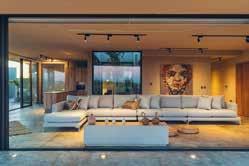
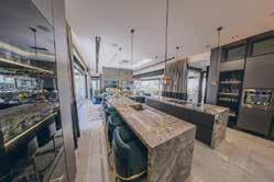
Location: Johannesburg, South Africa
Interior Designer: Audi Snÿman
Photographer Credit: Luke van der Walt
The brief given to Audi Snÿman Interior Design was for a modern home that is detailed, unique, and bespoke, featuring individuality in every way. Where quality and luxury are key. The designers created an interior design scheme of decadent opulence that is somewhat understated, and totally bespoke.
Placing their trust in Audi Snÿman Interior Design, the interiors of the clients’ home radiate style, luxury and class. With the estate being renowned for some of the most magnificent fauna and flora sightings and benefitting from spectacular views of the beautiful Magalies mountains, the exceptional interiors are paired with views out towards the surroundings for an impactful experience. Opulence is a driving force in Maison Benie’s interior scheme. Unique black and white contrasts create a modern feel.
A double volume black and white entrance hall with curved glass balustrading welcome guests into the home. The accents that are found here continue into the dining area which is plush and extravagant. Lounge areas are warmer and filled with textures, whilst still featuring bespoke pieces and luxurious finishes. A formal lounge, complete with a lift bar and bespoke furniture is tied together with brass insets that complement the bespoke sculptures. Unique brass and antique mirror wall art adorn the wall of the master bedroom, and the ensuite bathroom leads to an outdoor lounge area to enjoy the surrounding views. The rose gold ladies’ champagne bar is finished with leather and brass accents, and the gentleman’s bar is complete with blue velvet bar stools and a bespoke life-size glass statue of father and son.
Location: Sharjah, UAE
Architect: Whitehouse
Interior Designer: Leali Ezzat
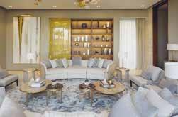
Photographer Credit: Intelier Loud & Clear
The Olivo Villa is a high-end interior renovation project for a residential private villa by Ele Interior. The goal was to create a home that is practical, durable and modern in style with a touch of luxury. With a neutral and bright colour palette, the interiors are refined and sophisticated taking the surrounding nature as it’s a muse.
Ele Interior’s main focus was to highlight and connect the interiors with nature. Thus, this played a key role in the designers’ selection of colours and materials, and the execution of the project as a whole. The interior design connects to the environment outside with the integration of the signature olive tree, and the use of natural materials with a palette that reflects this. The neutral tones are the foundation of the interior scheme, taking hues from natural elements such as stone, sand, and wood, built upon with the blues and gold of the sky throughout the day.
Being in a desert area, Ele Interior’s wanted to add a connection with nature and greenery around the villa. There is a fundamental connection between the property and its location through the floor to ceiling windows. They allow a considerable among of natural light into the rooms and blur the boundary of where the interiors end. With the views that they offer, they highlight the natural elements that are used within the villa, such as the statement olive tree and natural travertine. The main idea of the design was to keep it clean and simple with a contemporary and minimalistic style. Open spaces and walls that use accessories sparsely allow the design to highlight the statement high ceilings, key lighting pieces and contemporary paintings.
Location: Ascot, UK
Interior Designer: Q Design House
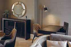
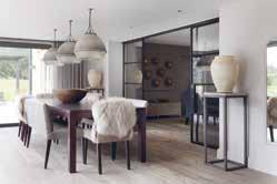
Construction: Q Design Licensing
Photography: James Robinson
This project involved a complete design and build renovation, Q Design House were brought in to create a light and airy interpretation of a traditional English home in Berkshire for clients who recently moved from Hong Kong. To achieve this, Q Design House used contrast between light and dark to brighten the spaces and incorporated traditional joinery details such as panelling in the entrance hall, a typical panelled gentleman’s room home office, a shaker kitchen and fully marble bathroom complete with marble beading.
Each traditional aspect was uplifted with contemporary elements to create a brighter and modernised scheme. For example, timber flooring was modernised by using a brighter tone and laid in a herringbone pattern with a border. Q Design House were playful with colours using a dark navy contrasted with natural exposed oak details in the kitchen and dark green panelling paired with a tan leather sofa in the study. Even a burgundy home bar with antique mirroring created a fun element in the games room. The entrance hall was completely transformed from orange varnished woodwork to a striking space with contrast, light and striking details.
The team at Q Design House managed the interior design, interior architecture and build of the project for a complete renovation. This collaborative approach allowed them to ensure a cohesive finish across the project from striking joinery to soft tones and interesting textures in the fabrics. Each aspect was carefully considered to relate back to the clients brief for a traditional English home, with all the comfort and warmth that that brings, but with the added contemporary feel of a light and airy home.
The brief for Pippa Paton Design was to create a modern family home for the clients and their family. The clients who happen to be professional chefs required a space to enjoy time together and entertain at scale, with both functional and luxurious spaces which connect seamlessly internally and connect externally to terraces and gardens beyond. The overall design approach was to reconfigure spaces, moving walls where necessary, to improve circulation and create seamless transitions between spaces, whilst introducing an abundance of bespoke joinery and display areas.
The expansive 1100 sq. ft. kitchen space was almost loft-like in scale, but the existing small island was visually lost, the cabinetry offered inadequate storage and two steel pillars intruded into the space. Moving the entrance to the adjacent dining area allowed the crockery cupboard and pantry walls to be aligned. The elegant drawing room, with luxurious seating and furnishings, features a display of sunburst wall lights and a bespoke bar whose doors open to 180 degrees when entertaining.
Overall, the spatial layout, design approach and technical specifications ensure the house has exceeded the family’s hopes and aspirations. By reconfiguring spaces to improve circulation, introducing capacious bespoke joinery and display areas and selection of luxurious materials, Pippa Paton Design has reinvented this village house as a highly functional yet luxurious modern family home where spaces transition seamlessly internally and connect externally to terraces and gardens beyond.
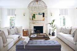
With the aim to turn this apartment into a truly luxurious gentleman’s private office, Juliettes Interiors was commissioned to design a working environment that wasn’t only practical and professional for Zoom and in-person meetings, but a space that was also strikingly beautiful and sophisticated. The option to stay late at the ‘office’ as well as provide an overnight base was also required, with a living-style zone added for maximum comfort.
Due to the apartment’s compact size, spatial planning was not an easy task, so Juliettes Interiors chose to introduce customised pieces of furniture to ensure the right flow was achieved throughout the space with each piece working in harmony together. In one small living space, Juliette and her team needed to create three zones: a living area, kitchen/dining and office. With detail at its core, the design scheme needed to be cohesive. Dark tones and luxurious fabrics have been skillfully layered, paired with a variety of textures and bold brassware accessories – from the striking pendant light above the table to the dressing table in the bedroom. The large windows allow for plenty of natural light to flood the rooms, adding depth and interest to the dark décor. The office is set up in the living space at the centre of the apartment.
A premium Italian leather desk and chair complements the dark wood and brass detailed designer desk, blending together for an incredibly opulent final product.
Due to the property being an Historic Grade II listed Mansion of particular historical importance Juliettes Interiors needed to protect the internals of the building as their works have an impact on the special interest of the property.
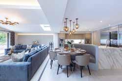
Location: Surrey, UK
Interior Designer: Fiona Brass Interiors
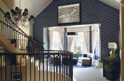
The brief for Fiona Brass Interiors was to create an informal but elegant home for their client. The clients had an impressive, yet relaxing home which Fiona Brass Interiors wanted to mirror in their designs. The design scheme had to complement the design and architecture of the building yet set it apart from other properties in the area. The client asked the designers to create a scheme that was bespoke and unique to anything that other people had seen.
Whilst looking impressive, the landing design also need to be a functional space which Fiona Brass Interiors considered and incorporated bespoke tables that could be folded away when not needed. They also wanted to explore lighter fabrics with practicality in mind, so Fiona Brass Interiors incorporated stain resistant fabrics and easy clean options.
The design brief for the bedroom was to introduce a softness and a relaxing colour palette, however, still make an impact. The space was vast, so the furniture needed to not be dwarfed, and make a statement. The brief for the cinema room was create a welcoming space for 8-10 people with ultimate comfort in mind.
Fiona Brass Interiors had a specific seating plan and platform with 2 tired seating which we adhered to. The overall function of the screen and sound needed to be of the highest quality, whilst the aesthetics of the room needed to conceal the technology, wires, and appliances.
Fiona Brass Interiors wanted to the space some personality whilst keeping the design scheme and fabrics in line with the luxury style home. The colour palettes feature neutrals, greens and blues echoing the natural setting of the home in the Surrey Hills.
Location: UK
Following the completion of another residence for the client, Panoramic Properties Limited were engaged to transform this beautiful Victorian property back to its former glory whilst supplying all the modern luxuries.
As the property has split levels, its high ceilings in the formal rooms offered the opportunity to restore and add back into the original character of the home. Architectural features were considered through the use of ceiling details, ceiling roses, coving and lighting. Panoramic Properties were commissioned to design and supply bespoke cabinetry & upholstery throughout the build, to give a truly unique look that perfectly fitted to each space. This included TV ottomans, study cabinetry, bar, booth seating, TV cabinetry, wardrobes, beds & headboards
The open plan kitchen boasts a huge island that houses a bespoke seating booth and informal dining area, featuring subzero fridges, a ‘slide and hide’ pantry, a picture window behind the main sink, a preparation sink on the island, two double ovens and vein matched marble effect worktops. This design works as it optimises grandeur and luxury whilst maintaining a cosy, homely feeling throughout. The property features all the modern amenities and yet retains its Victorian soul and character. This is achieved by protecting and restoring the stunning original features, whilst also introducing the modern aspects that take a hint of inspiration from the Victorian style of the build, to sit in contrast to the original elements. This makes a clear division from the modern to the old and yet they complement each other seamlessly.
Location: Surrey, United Kingdom
Interior Designer: Patsy Blunt Interiors
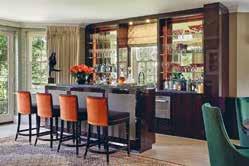 Photography: Nick Smith
Housed within a modern architectural interpretation of an impressive mansion block, this unique property includes 2 bedrooms, 2 bathrooms, a spacious dressing room, together with an art studio. Patsy Blunt Interiors were keen to ensure that this spacious apartment also incorporated the client’s personal taste and as such, it features vibrant colours, bold wallpaper along with unique ornaments collected from the various countries they have lived in.
During the initial consultation phase, Patsy Blunt Interiors learnt that our client’s upbringing in Zambia inspired her creative nature. She described playing in her father’s fruit garden, as a child and exploring the markets filled with spices. Thus, her love of colour heavily influenced the chosen design schemes. The designers worked closely with the client to create an interior which is suitable for modern living, every finish was chosen with detail and quality in mind.
The open plan kitchen and dining was designed to allow for all year-round entertaining, with a bespoke built-in bar being a key feature. The cabinetry is finished in a dramatic sycamore black high gloss, accented with antique brass detailing, and a shagreen panelling to add texture to the joinery. The bar makes a real statement with its striking, backlit glass panel.
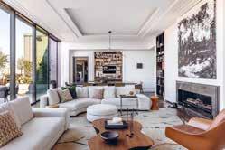
Location: London, UK
Interior Designer: Hodgkinson Design Architect: Hodgkinson Design Construction: Hale Photography: Tom St Aubyn
Hodgkinson Design were approached by a couple through the recommendation of another client, for whom they had recently completed a substantial residential project.
To meet the clients brief, Hodgkinson Design created a 3-bedroom apartment with open plan living-dining-kitchen grouped around a central courtyard. The minimalist courtyard has impressive potted plants and a pale palette to maximise the light that bounces into the surrounding rooms. Hodgkinson Design also enlarged the doorway openings to encourage the relationship between outside and in. The kitchen and reception areas were key for the couple as they love to cook and entertain.
The main objectives for Hodgkinson Design were to design a space that spoke of privacy and comfort, and of which was visually stimulating but still relaxing. The scheme was designed with a New Yorkstyle in mind, using an earthy and textural language. It included contemporary juxtapositions of oak beams and oak doors, with yellow brick walls and a careful use of coloured walls, all set against a polished concrete floor that ran through the living spaces. The lighting is soft with moments of accents and adjustable features using Lutron controls.
This project is located in a very busy part of London, by focusing the key rooms around the courtyard Hodgkinson Design were able to create a peaceful refuge and private home for the clients to escape the busy pace of London life.
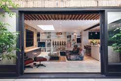
Location: Cambridgeshire, UK
Interior Designer:
Katie Malik Studio Ltd. Photography: Maciek Platek Photography
Katie Malik Studio were brought in for a full renovation of a 1930s detached house for a couple in their thirties, who had a very clear vision of what they desired for their interior scheme. The brief was simple – to achieve a Scandinavian style feel throughout – the clients communicated many of their wishes through inspirational images that they had discovered on social media.
Since the clients were very clear and decisive about the style, the style and the colour scheme was a very natural choice.
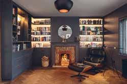
The design is well thought through and responds well to the clients’ brief - it’s functional and perfectly Scandinavian.
Katie Malik Studio used natural materials (in both look and provenance) that tied in with the Scandinavian style, which was a very organic choice considering the goal of creating a Scandi comfort style for a young family. The designers used lots of natural wood (in both whitewashed oak and walnut), even wood effect tiles on the ground floor high traffic areas and opted for neutral colours paints from Benjamin Moore too.
The home is located in a village south of Cambridge. Little Abington is a popular commuter’s village which enables the homeowners to make the most of country life while being able to commute to work to the city of Cambridge. The home overlooks the paddocks and has a stunning mature garden which originally attracted the clients. Katie Malik Studio feel the serenity of the interior ties in very well with the peaceful surroundings.
Location: London, UK
Interior Designer:
KSR Architects & Interior Designers
Photography: Taran WilkhuThe overarching brief required KSR Architects & Interior Designers to subtly reconfigure the layout of the recently completed show flat to improve flexibility and connectivity for key spaces, and to refine the existing furnishings and fittings by supplementing with more appropriate pieces.
The client required the interior to be both refined and relaxed, responding to a desire to entertain and unwind in the same space. The main living room in particular needed to be able to adapt to enable the same space to be used for large, refined parties, small family gatherings, or simply watching the rugby with a beer.
The apartment needed to reflect the client’s sophisticated taste and enable their impressive art collection to be displayed to best advantage within the home. New bespoke joinery items were required for display purposes and also to provide focal points within rooms. A feature bar console was required to enable an impressive drinks collection to be both displayed and served with elegance. The kitchen required reconfiguring to improve its functionality when entertaining large gatherings whilst also providing space for casual dining.
The master bedroom suite needed to accommodate a walk-in dressing room, new generous vanity units, and an important steam shower. Additional connections were required to enable the spaces to flow whilst facilitating flexible uses. Thus, the brief was to retain the best parts of this brand new Marylebone penthouse but to adapt, supplement and enhance it to create an holistic design that responded to the client’s lifestyle and taste.
Location: Hertfordshire, UK
Interior Designer: Joanne Mills
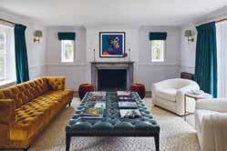
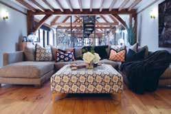
Associated: CDM Carpentry, Brandt Kitchens
Interiors by Joanne Mills Ltd were selected for the refurbishment of this luxuriously converted barn residence. This project involved a complete redesign of the main barn, a newly designed kitchen, a luxury bathroom, two large bedrooms, an en-suite and a family room.
The brief for Interiors by Joanne Mills was to completely remove the older, outdated elements of the previous design within the barn adding a complete refurbishment of all areas throughout the property. It was important to try and retain the rustic heritage of the barn, by preserving as many of the original features as possible. Simultaneously, the designers wanted to generate a luxurious style and warmth that wouldn’t feel out of place in this setting. One of the main challenges for Interiors by Joanne Mills was the complex space, namely the length of the barn. However, with a clever reshuffle and redesign of the layout of the interiors, the designers were able to seamlessly marry together the areas of the property effortlessly.
For the designers, one of the key aspects of this project was the Kitchen. Assisted by Brandt Kitchens, they were able to create a stunningly luxurious kitchen that fits perfectly into the wider environment of this location. The features of interest include the 4 metre quartz island, the antique brass finishes and the exposed brickwork. The exquisite paintwork and integrated lighting scheme add a mesmerising charm to this unique space.
Location: Dorset
Interior Designer:
LEIVARS Interiors Studio
Architect: Munden Robinson Architects
Photography: Nick Smith Photography
A spectacular coastal residence bringing harmony between the old and new. LEIVARS were invited into the project mid-way through construction work to design the interiors for this stunning family coastal retreat.
The brief was to use the three colour tones from the original stained-glass window of this 1930’s house yet bring the design into the 21st century working with the incredible design by the architects who managed to create a breath-taking angled rear extension to fully absorb the ever-changing coastline throughout the year. Working with the three key colours, LEIVARS set out to add block colours and select angles in design and patterns that took on and complemented the rear extension detail. Use of teal, mustard and deep red tones were used throughout to ensure consistency and cohesion in design.
The open plan area needed to be fun and relaxed for the younger family members, yet the two salon rooms were to be slightly more refined for evening drinks using inspiration from the clients travels to the Far East. The bedroom was to have soothing tones that would balance with the sea scape views to be enjoyed all year round. The colour palette complements the ever-changing tones of the sky and sea, when the weather is slightly wilder the mustard/gold tones coupled with the warm undertones add a sense of cosiness giving a general glow as you enter from one space to the next and when the sun is beaming through, the cooler tones of the teal bring the scheme back. A great mixture of texture and details throughout bring strong sight lines that draw you from space to space organically.
Location: New Forest, UK
Interior Designer: Blank – Slate Studio, Bari Jerauld
Construction: Colorare
Photography: Chris Snook
New Forest Country House is a stylish country escape for a busy London family. The estate comprises of a main house, two guest cottages, a pool house, a writing studio, a study and a party barn. There are vegetable gardens, olive trees, paddocks and completely surrounded by the enchanted forest.
The brief for Blank – Slate Studio was to reinvent what was previously a very tired property, gutting it to its bare bones. Over the year, the clients had obtained an extensive and vibrant art collection, the furnishings were to act as the perfect backdrop and complement each piece. The designers were given full creative freedom for the design scheme, which is every designer’s dream.
Whilst the clients wanted to escape their busy London life, they also wanted to use the Country House as a place to entertain family and friends. Blank – Slate Studio removed most of the old doors and opened up many of the walls, which created a more free flowing space from one room to another and allowed the designers to introduce spaces that would be perfect for hosting elegant evening soirees.
The property now feels appropriate to its surrounding areas. The forest and green paddocks serve as backdrop out of every window, Blank – Slate Studio wanted to incorporate the outside in with having large French doors opening up to the patio overlooking the majority of the property.
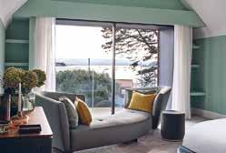
The Palm Jumeirah project has a unique design as the interiors look to smoothly complement the views of the property’s surroundings. With this project, Lumi Interiors created a concept story with lots of textures and interesting details and decorations. It feels luxurious and rich, yet liveable and practical.
Inspired by the beautiful views and amazing sunsets, the home is connected to its surrounding nature. Entering the apartment provides sanctuary from the hot weather, transitioning into a light and fresh interior. Lumi Interior used natural tones and a multitude of textures to ensure that the design remained rooted to its context, as well as unique art, light textured fabrics, and natural colours such as blues, bronze, and brown.
The master bedroom has a sand and sea concept, using an earthy monochrome palette but with lots of texture. It was important for the designers to ensure that texture was consistent in the details, including within the joinery, furniture, and accents. There is a bird’s eye pattern in the writing desk, joinery, and side tables, and a de Gournay wallpaper that was a bespoke design by Lumi Interiors and de Gournay. This wallpaper depicts a male and female bird looking to each other from the panels as well as butterflies and flowers as a further allusion to the nature outside.
The driving force of the interiors was its connection to nature. The designers’ choice of soft furnishings, art pieces, and colour palette all reflect the outside which in turn created a harmonious design scheme. This became more prominent in particular rooms such as the living room, dining room, and master bedroom due to the views that they offer.
Location: Texas, USA
Interior Designer: Nathan Hejl Interiors
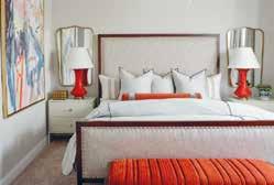
This transitional town home is a fun and easy liveable second home for the clients who work in the city. Nathan Hejl Interiors were enlisted to create this transitional design concept with an overall neutral colour palette accented with bright warm tones fill the spaces. The selection of furnishings are easy up keep with for this active family while simultaneously adding a fun and playful style.
This family lives a busy lifestyle while traveling between their two homes, so it was important to make the clients feel comfortable in this second home. The newly designed property allows easy living while the clients work in the city but also remains lighthearted and welcoming. The autumnal tones of the bedroom suite remain a key piece of the puzzle to this modern interior.
Another of Nathan Hejl Interiors’ favourite aspects of this project was the intimate dining space created for six guests. Perfect for entertaining friends of the clients or even just for quality family time together. It was important to the designer that the design integrates well into the wider environment so various sustainable materials were used as well as some repurposed furnishings.
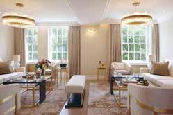
Location: London, UK
Interior Designer: Sequoia London Photographer Credit: James BalstonAn international client engaged Sequoia London to completely redesign two apartments they had purchased to create one extraordinary luxury home in Central London, made up of four bedrooms and four bathrooms.
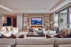
Sequoia London were responsible for all the permissions, budgets, space planning, project management, interior architecture, interior design, specification, sourcing and procurement of all finishes, FF&E items, decorative accessories and tableware.
Sequoia London created a large master suite for the owners, including a seating area, a walk-in wardrobe and large bathroom, a further ensuite for their children and two further guest bedrooms and bathrooms. For entertaining spaces, Sequoia created a formal living and dining room and a cinema/family room where they could relax and spend time as a family. The apartment also contains a luxury kitchen and staff accommodation with a built-in study area and ample storage.
All of the joinery (wardrobes, closets, TV units, bar and storage areas) were bespoke and designed by the designers for this project. The majority of the luxury bespoke designed furniture was also designed by Sequoia for this project along with the two stunning chandeliers in the formal living and dining suites.
Almost all of the finishes and FF&E items were sourced from and the majority of all, excluding fabrics, were manufactured here in the UK using some of the country’s best suppliers. The neutral colours and pallets have been followed throughout the property making the flow from one space to another feel seamless, whilst still allowing each room to have its own identity.
Location: Neve Ilan, Israel
Architect: Dana Oberson, Oded Livyatan, Ofra Goldberg
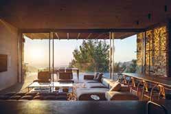
Interior Designer/ Designer: Dana Oberson, Oded Livyatan, Ofra Goldberg Landscape Architecture: Mohr-Avidan
Photographer Credit: Amit Geron
This house by Dana Oberson Architects Studio sits on the edge of the two towns, Arab and Jewish, becoming a statement of respect for the place and the neighbours; it’s a property that calls for coexistence. The single level entrance facade blends into the view and integrates into the environment. The material choice comes from the unrefined stone that builds the agricultural terraces of Neve Ilan.
The architects loved the layers of history in the stone. They wanted to tell a story of identity and context where this stone is a significant part of a structure. These unrefined stone slabs flow from the outside into the interior spaces and connect them. A glass foyer between two volumes of stone doubles the space. The transparent entrance to the house reveals a dramatic view of the terraces and the forest. The materials are exposed and rough; concrete ceilings, burnt-looking oak cladding, natural iron, and the local unrefined stone. Black basalt connects the interior to the exterior, another local material that was mined and given a new interpretation as the house floor. The house ends in an outdoor terrace and an infinity pool that blends with terraces, horizon, and sky.
It was important to avoid fences and railings in the landscape as the designers wanted the house to act as a seam rather than a division. In the interior, unlike a continuous railing that creates a boundary, random-looking flat iron pillars serve as a railing and base for climbing plants, integrating the landscape as well as connecting the two levels.
Location: Singapore
Interior Designer: Aloysius Ganiel
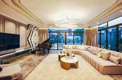
Aesthetically, the homeowner wanted the house to have elements of a timeless luxury style to reflect the urban contemporary look of Singapore. Functionally, they wanted to have a space that separates both social and private space and with personal activities included in their everyday life.
The key aspect is to create a gradual transition from the social to the private interior space and help people decompress from the fast pace of the city. This sense of decompression is achieved through the materials palette, which mirrors the interior environment in the communal social space and then becomes softer and warmer into the bedrooms as people continue their journey into the house.
This concept was driven by connectivity, the layering of spaces and the creation of views. The family members are guided on a journey through the space. Strong design details and material elements, like the stone and carpentry finishing, establish symmetry in the front of the entrance and draw the view to the secluded styling living space when approaching into the space. This natural lighting and well-ventilated space heightens the whole interior experience, providing intimacy and sensational mood of each individual area that deepens the connection between the house itself and home-owner.
The designer selected muted tones and honed materials to enhance the sense of authenticity and comfort. This creates a quiet, elegant atmosphere, with mirrored surfaces and natural stone catching the eye. The central point-of-sale is made from stone and commands attention, while the bespoke furnishings, woven elements and handmade touches add texture, luxury and a feeling of escape.
Location: Kuala Lumpur, Malaysia
Interior Designer: Simon Yew
Luxurious French accents are found in this unique home, personifying to the inhabitant’s classy lifestyle. Accompanied by modern porcelain tiles and wavy geometric garden surrounding the façade, the swimming pool is designed to exude different ambience under various lighting. Overlooking this exotic tropical paradise, a modern sitting area has been created with wicker furniture on one of-a-kind encaustic graphic tiles against stone textured wall.
Entering the home itself, transports the soul into euphoric elegance. Bianco Jade marble is the perfect canvas to highlight the handmade crystal chandelier. The custommade modern console is set with Belgium Black marble and lined with champagne gold. Specially made to compliment the Luna Grey marble flooring that spans throughout this magnificent first level, it is a delight for visitors to explore.
The entertainment room’s centre piece is the modular sofa. Full of surprises, the grand piano settles in front of a unique art piece. The Panda White feature wall is considered a rare natural marble species. Arranged in the current design trend, boiserie covers this room from wall-to-wall while the ceiling of both entertainment and dining rooms are adorned with champagne gold leaves and wave chandeliers. Built-in display shelves featuring Calacatta marble adorned the textured wall paint.
Modern Nordic in design, champagne gold, Calacatta marble and luxurious velvet make the eight-seat dining table. In matching theme, the main kitchen’s countertop uses imported A-Grade Volakas marble under a pair of unique pendent lights. Finishing this room’s eclectic elegance is the burgundy velvet bar stools give a pop of rich colour.
Behind imposing black framed glass doors, the kitchen is significantly toned down in palette with grey boiserie and matching granite countertop.
Location: Gloucestershire, UK
Architect: YOO Ltd
Interior Designer: Anja Revenda, The Lakes Developer: YOO Ltd Photography: Ola Smit
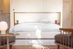
The brief was to create a private retreat nestled in the heart of the Cotswolds, a home away from home that’s equally an oasis of calm as well as a perfect place for entertaining. It’s inspired by a global traveller and collector with a touch of Rock n Roll. The goal was to design an open plan, spacious 5-bedroom family show home featuring a large terrace that would overlook a waterside nature reserve at The Lakes.
The home is situated on a rural luxury estate spread across 850-acres of freshwater lakes, meadows and woodland in the Gloucestershire countryside. It is created for those seeking a family friendly community and luxury sanctuary with a unique connection to nature. Facilities onsite include a 17-metre pool, spa and gym, a range of events and fitness programming not to mention a host of outdoor activities, sailing and kids club. Key to the brief was to seamlessly achieve a belonging to the community lifestyle of the estate residents whilst retaining privacy within the home. One of the key aspects of this project is the amazing play of shadow and light as the sun moves around the building. Carefully selected pieces of furniture, artworks and decorative objects that come with a story which give the spaces a warm, welcoming and homely feel.
The multitude of windows provide endless views and welcome the outside in. Despite the large, open plan footprint the spaces have been carefully zoned to create cosy spaces that flow into each other whilst also providing privacy. Much attention has been given to the selection and combination of materials and colours which provide a beautifully nuanced and textured backdrop to the curated pieces of furniture, lighting and decor.
Location: Vienna, Austria
Interior Designer: Helen Green Design
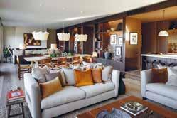
Architect: Archiguards
Developer: MBT Investment GmbH Photography: Julian Abrams
A luxurious modern family home set within the middle of a small vineyard overlooking the city, this beautiful property features a stunning floating staircase and floor to ceiling windows, bringing in extraordinary landscaping and light, all of which is reflected within the elegant modern interiors. The villa is tucked away between the traditional villas renowned in this suburb which creates a perfect backdrop for this contemporary villa.
The Client is relocating to Vienna from overseas and after being enchanted with the location and the design of the villa, they contacted Helen Green Design with the brief to create an innovative space with cosy, timeless and elegant design throughout.
The beautiful property comprises of a newly built Main House with a floating staircase and floor to ceiling windows bringing in extraordinary landscaping and light into the property. The ground floor includes an open plan Living Space, Entertainment Area and Family Kitchen. On the First floor, the design brief included three children’s Bedrooms, and a Master Suite with a Terrace overlooking the vineyard on the Second Floor.
Neutral base palettes and gentle tones of colour inspired by the surrounding landscape creates a harmonious retreat from city life. The design both architecturally and internally brings a complete unique design to a beautiful landscape.
Location: London, UK
Interior Designer: MK Design
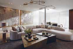
Construction: HBA Construction
Kitchen: Neil Norton Design
Photography: Lucas Pelizaro
MK Design were tasked with the complete renovation of an authentic two bedroom apartment located in Wimbledon. The property was something quite special, which inspired the designers immediately. The house had a lot of character with architectural features but it been left mostly untouched for between 30-40 years. MK Design had the ultimate opportunity to reinvent this home and bring a new modern twist to life.
One of MK Design’s favourite aspects of this project was that there were marble fireplaces in every room, many of which required significant maintenance and restoration, but the results speak for themselves. Additionally, mouldings were created to replicate the original designs in many of the rooms, truly making full use of the heritage of the property.
The design needed to reflect the client taste while offering a unique timeless design style. MK Design believe that this project is a great example of interior design can highlight traditional British design with a nod to modern style. It is the perfect balance between old and new, with an abundance of added character and soul.
Location: Ottawa, Ontario
Interior Designer:
Henrietta Southam Design
Photographer Credit: Marc Fowler
As a reimagined build of a 1920s red brick home in a historical enclave in Canada’s Capital, this home is an homage to the historical industry of the area whilst making the space warm and inviting. The success of Papermill Safari is in the details and thoughtfulness of the design; each design choice has been highly considered to make this a layered, comfortable, yet impactful residence.
The home needed to work for a blended family, so Henrietta Southam Design redistributed all spaces, providing everyone with their own space as well as calming communal areas. This meant finding space to add bedrooms and bathrooms for each child while tailoring the spaces to their ages and needs whilst allowing for more autonomy. An earthy palette and natural textures build a neutral personality that aids this harmony.
Burnt red clay is the thread of colour infused in the predominantly creamy interiors, where layers of papier-mâché, cord, driftwood, cane and wool lend the warmth. Tribal motifs in colour, shapes and texture enhance the earthiness of the interior whilst remaining comfortable and culturally sympathetic. To soften the rectangular rigidity of the house plan, curves were added in arches and walls, materials, and lighting choices.
The free-standing bath is honoured in the ‘Bliving Room’ by placing it with a view and enhancing its stage presence by flanking the room with antique Verdigris columns from a French Provençale church. Bakuba mud-cloth motifs in the heavy linen-clad swivel chairs enhance the organic feel.
Location: Christchurch, New Zealand
Architect: Sheppard & Rout Interior Designer: Ben Lewis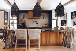
The brief for this prestigious project was to present something that was unique and different in style on each level of the apartment building, to not double up on product or materials used so each apartment was a fresh, clean look that was sophisticated and edgy.

Trenzseater delivered an interior which was inspiring, it was layered with intriguing textures & materials, sophisticated finishes and details which offered the client something personal and curated. To achieve this, the designer featured throughout the use of natural materials with solid oak timbers, brushed brass detailing in specific areas and the use of beautiful, elegant lighting.
They used mirrors to accentuate the heights and grand scale in various parts,and also used mirrors as an art form which featured beautiful, bevelled glass pieces sequenced together to collectively offer stunning visuals. Exquisite wallpapers from their own collection were used in various spaces to offer texture and interest in spaces where room was not sparse, these often-featured gold leaf detailing and metallic finishes. All spaces were designed using bespoke furniture pieces, finished in luxurious velvets, relaxed linens, flocked velvets, fine wools, and antiqued leather, complimented with timber and high gloss tables which all were then finished with the company’s extensive use of European rugs, mirrors, lighting & accessories.
It is balanced, layered, and textured, offering an interior which can easily be relatable but offers inspiration and interest at the same time. It is also relaxed and inviting. The use of natural materials, products and finishes complements the architecture, it also balances the location of the site which is a high-profile central city position.
Location: Essex, United Kingdom
Architect: KMK Architects
Developer: SMC Construction
Photography: Gary Derbridge
The design brief was to create an interior scheme that you would expect a Rockstar in Los Angeles might have. It needed to be dark and moody, whilst not drawing too much attention away from the light tunnels leading downstairs or the views of the woodlands. The trust was gained from the first discussion with the client and the design naturally grew from that point.
The house from the outside looks like a simple one or two bed bungalow, but the minute you open the large copper oxide steel door, the viewer knows they are walking into something special. The beautiful concrete floor leads your eye to the furthest point, the gorgeous views of the back garden. Once you arrive at the living space, your appetite is filled with a number of design features that instantly create a laid back relaxed mood especially at night with the dark ceilings.
The four main areas of the living space are made up of the dining area, drinks area, seating area along with the main kitchen. The light tunnel and fireplace create a subtle divide for each area while maintaining the open plan living vibe. The client expressed how incredible it is that the dining area still feels intimate while having so much glass in the property, the fireplace divide was a great addition to create this.
The light tunnel breaks up the drinks area and kitchen space beautifully, the German kitchen has an English made surround with a copper beading detail to truly create that bespoke look. The island has a copper oxide steel door to subtly tie in with the property front door. The large island with the Bora is the client’s favourite part of the kitchen, as you have a large prep and plate up section on the island while still being part of the conversation or entertainment.
Location: Ottawa, Ontario
Interior Design: Henrietta Southam Design
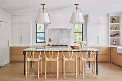
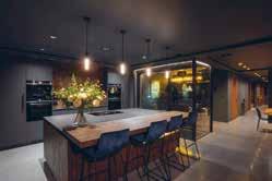
Photographer Credit: Marc Fowler
Papermill Safari is a reimagined build of a 1920s red brick home in a historical enclave in Canada’s Capital. This is the fourth historical house that Henrietta Southam Design has transformed in this small heritage overlay area, with the absolute conviction that they have given each one a new lease on life while respecting the language and volumes of the era they were built in.
The home needed to work for a blended family, so Henrietta Southam Design redistributed all spaces in order to adapt to the evolving family’s whims and wishes, providing everyone with their own space as well as calming communal areas allowing for more sibling and parental peace and autonomy. The new spatial reconfiguration connects the kitchen with the living areas in an open plan layout.
An earthy palette and layered, natural textures run through the home, and becomes paramount in the kitchen. The space is warm, calm, and grounded, with the 10-foot sculptural sequoia slab of the island forming a centrepiece. Burnt red clay is the thread of colour infused in the predominantly creamy interiors, where layers of papier-mâché, cord, driftwood, cane and wool crafted by various nomadic tribes lend the warmth and surprise of another worldly adventure. Connected to the kitchen is the breakfast nook, where a high level of detail provides a quieter area for the family whilst complementing the lighter tones of the kitchen marble. The semi-round darns for the dining space place an emphasis on the curves, and its white finish provides a harmonising opposition to the sharp angles and black finishes of the kitchen.
Location: Ottawa, Canada
Architect: Bill Ritcey
Interior Designer: Tanner Vine
Developer: Art & Stone Group
Construction: Art & Stone Group
Photographer Credit: Kevin Belanger
This home was designed with clever use of space in mind while keeping a jaw-dropping style, no matter where you are in the house. The kitchen is inviting, spacious and full of natural light. You will find a generous hidden pantry and coffee bar in it too.
The flow in this home is so natural that is feels like it was perfectly thought through. The family has its space to retreat to, so that each member enjoys some alone time, and it is also designed to bring the family together. The aesthetics are also congruent; it all works so well together. It’s truly a calm and serene place to be.
There are four main aspects to the home that became Art & Stone Group’s favourite elements. One of these is the kitchen, as it has soft and beautiful details and yet is full of storage. The kitchen isn’t heavy to the eye, it has soft and beautiful details yet, and is full of storage to maximise it’s usage. As a family with 3 young boys it was important to make this communal area both calming and functional. The designers had master cabinet makers work on all the cabinetry in the home. The warm, modern, bright and airy interiors are completed with a mild traditional touch –this design scheme for the whole property is embraced in the kitchen.
Location: Kuala Lumpur, Malaysia
Date Completed: May 2021
Interior Designer: Simon Yew
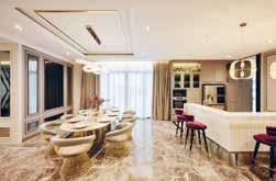
Luxurious French accents are found in this unique home, personifying to the inhabitant’s classy lifestyle. Entering the home itself, transports the soul into euphoric elegance. Bianco Jade marble is the perfect canvas to highlight the handmade crystal chandelier. The custommade modern console is set with Belgium Black marble and lined with champagne gold. Specially made to complement the Luna Grey marble flooring that spans throughout this magnificent first level, it is a delight for visitors to explore.
The entertainment room’s centre piece is the modular sofa. Crafted with innovative value engineering, it is spectacular and flexible, enabling the inhabitants to change the room’s ambience at will. Full of surprises, the grand piano settles in front of a unique art piece. The Panda White feature wall is considered a rare natural marble species. Arranged in the current design trend, boiserie covers this room from wall-to-wall while the ceiling of both entertainment and dining rooms are adorned with champagne gold leaves and wave chandeliers. Built-in display shelves featuring Calacatta marble adorned the textured wall paint.
Modern Nordic in design, champagne gold, Calacatta marble and luxurious velvet make the eight-seat dining table. In matching theme, the main kitchen’s countertop uses imported A-Grade Volakas marble under a pair of unique pendent lights. Finishing this room’s eclectic elegance is the burgundy velvet bar stools give a pop of rich colour. Behind imposing black framed glass doors, the kitchen is significantly toned down in palette with grey boiserie and matching granite countertop.
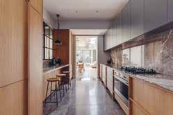
Location: London, UK
Architect: Hanson Architects Photographer Credit: Chris WhartonThe vertical framing & solid Oak handles characterise this kitchen, offering equal amounts of both beauty and functionality. Complemented by the grey hues in the signature Emperador Grey Marble and Paint & Paper’s Paris Rooftops, it’s a very organic and honest material palette that allows the details to shine through.
The design brief for this project by Shape London was to create a light filled space with an honest and natural material palette. The space is striking with signature marble and light timber. The client wanted to be able to close it off to the rest of the house which is what Shape London has accomplished for them.
The key aspect of the project is the Solid Oak framing & handle details as well as the breakfast bar. For a galley kitchen it feels incredibly generous and connects each of the GF spaces through the use of the large sliding doors and Crittall screen. There is copious amounts of worktop space as well as storage and everything is within easy reach.
It’s incredibly well connected with the rest of the property, front, rear and central circulation spaces. This truly does make it the heart of the home and a very sociable space.
Interior Designer: Peek Architecture + Design Construction: Capstone Joinery: Prime Cuts Joinery Photography: Alex Maguire
Peek Architecture + Design worked closely with the client to deliver precisely what was required. The clients wanted a kitchen space where people could also socialise and have parties, as it is the first room of the house. The kitchen is not only perfectly functional, but through the combination of finishes and lighting, it is a great space to entertain too.
The key aspect of the project was the rich mix of materials and the oak used for the island. The dark blue doors, stained oak side panels, patinated brass sheets and plinths, mirrored splashback, cardboard pendants and lacquered brass handles all combine to create the contemporary design scheme.
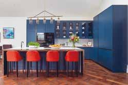
Many specialists were required to work on the completion of the project. For example, Prime Cuts Joinery, a workshop based in West London were brought in to assist with the joinery. Peek Architecture + Design specified finger joints and solid elements to the kitchen. Traditional skills were required in the methods of overlaying and veneering. Additionally, the stonemasons at Ideal Stone Interiors, template and installed everything within a millimetre of tolerance. The clients are now able to use this space all day for various functions and have been so happy with the scheme brought in by Peek Architecture + Design.
Location: Oxshott, Surrey, UK
Kitchen Design: Ligneous Kitchens
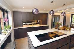
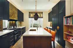
Photography: Colin Morrell
Ligneous Kitchens were tasked with creating a contemporary kitchen for a professional couple with children, who are keen chefs and entertainers for their recently purchased house. The clients wanted to create a beautiful contemporary kitchen that, as a hub for their family life, flowed from kitchen functionality to grownup entertaining, civilised dining and a place to bring the family together. Practical, elegant, uncluttered and highly functional, with a wow factor.
Clever use of space was key as they were concerned about making sure that the lovely clean lines of their minimalist kitchen remained undisturbed by visual clutter. They wanted to make sure the eye was drawn to the accents of rich colour and texture, giving the aesthetic depth and soul. The brief called for a handle-less design and Ligneous Kitchens advised that intelligent lighting design, position and colour temperature would bring the surface textures to life.
Choices of appliances in this brief were partially to make sure they worked with the design motif, but functionality and build quality were required in the conversation, from the off, as the ability to complete demanding cooking tasks and stand the test of time were front-and-centre for this family of keen chefs. The worktop needed to be carefully chosen for understated elegance, a high degree of practicality to stand family use and achieving that wow factor!
All the furniture and colours in the rest of the kitchen and house have taken their colours from the kitchen, the kitchen remains the seed from which the entire overall design for the refurbishment has grown.
Location: Surrey, UK
Interior Designer: Lindi Reynolds & Co
Architect: Mary Hackett & Associates
Construction: Woodlands Construction
Photography: Robert Sanderson
Lindi Reynolds & Co were appointed as Architectural Interior Designers to this 512 square metre new build residential property for the CEO of a major Blue Tech company and her family.
Working with the footprint created by Mary Hackett & Associates the designers were asked to consider every interior aspect of the home, and offer complete solutions which would be stylistically aligned with the client’s family’s character and style sensibilities. To this effect, Lindi Reynolds & Co were invited to suggest changes to the internal modelling of the interior. All interior aspects were to be worked with, creating complete and fully considered, timeless, classic, elegant and interesting spaces that flowed seamlessly from one to the other.
Through the design process the client was looking to create a calm and tranquil home, which exuded grace and timeless elegance to provide a haven from the long hours spent in business, a status reward for hard work and endeavour, but at the same time recognising it as a welcoming family home. Lindi Reynolds & Co. were able to include many bespoke features, such as the burnished bronze metal finishes that set this kitchen apart, and the pendant over the island is also bespoke. The continuous handsome Versailles floor has been designed and laid to embrace the kitchen layout, and the Maries Corner bar stools work effortlessly in a dramatic orange Whistler leather.
The design scheme outcome was so successful because Lindi Reynolds & Co ran a series of intensive design workshops with the client to understand and distil their unique design sensibilities.
Location: UK Designer: Panoramic Properties
Following the completion of another residence for the client, Panoramic Properties Limited were engaged to transform this beautiful Victorian property back to its former glory whilst supplying all the modern luxuries.
As the property has split levels, its high ceilings in the formal rooms offered the opportunity to restore and add back into the original character of the home. Architectural features were considered through the use of ceiling details, ceiling roses, coving and lighting. Panoramic Properties were commissioned to design and supply bespoke cabinetry & upholstery throughout the build, to give a truly unique look that perfectly fitted to each space. This included TV ottomans, study cabinetry, bar, booth seating, TV cabinetry, wardrobes, beds & headboards
The open plan kitchen boasts a huge island that houses a bespoke seating booth and informal dining area, featuring subzero fridges, a ‘slide and hide’ pantry, a picture window behind the main sink, a preparation sink on the island, two double ovens and vein matched marble effect worktops. This design works as it optimises grandeur and luxury whilst maintaining a cosy, homely feeling throughout. The property features all the modern amenities and yet retains its Victorian soul and character. This is achieved by protecting and restoring the stunning original features, whilst also introducing the modern aspects that take a hint of inspiration from the Victorian style of the build, to sit in contrast to the original elements. This makes a clear division from the modern to the old and yet they complement each other seamlessly.
Location: Sugar Quay, Tower Hill, London
Interior Designer: Casa Alta Design Construction Company: Chartwell Group
Associated: GS Contracts, Gaysha Ltd, Esoundworks
The brief required Casa Alta Design to transform an originally bland developer’s apartment into a warm and welcoming home with simply the best of everything. The focus was to supply the most cuttingedge technological features – the whole apartment can be controlled from a remote location - infused with the design creating a beautiful yet comfortable and convenient space.
The apartment, located by the Thames, now prioritizes the views from all windows creating a connection with its amazing surroundings. By using extensive framing of all windows, clad with American Walnut and following the same grain as per joinery, Casa Alta Design have integrated the gorgeous viewpoints such as The Shard and other London landmarks as a backdrop for the rooms.
The client’s South American roots inspired the design concept with carefully curated references - marbles, bronze, dark wood, and a concise but rich palette of colours. Built throughout the COVID 19 lockdowns and supply disruptions, this project is a statement of Casa Alta Design’s commitment to delivering projects to the highest standards.
The bespoke joinery package for this project was extensive and Casa Alta Design had to work closely with the joinery contractors. The craftsmen at GS Contracts and Gaysha are no strangers to working with exotic materials and demanding briefs. To ensure an even grain throughout the joinery, Casa Alta Design used a single American Walnut log creating a sense of continuity in all pieces. The superb verde tinos green marble cladding has a special leathered surface texture.
Location: Wapping, London
Designer: Sophie Mills Studio
Construction: Suffolk Bespoke
Kitchen: The Harris Cabinet Co
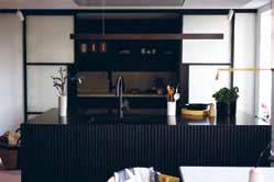
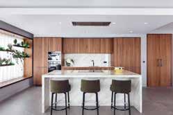
Photographer: Bilyana Dawson
Sophie Mills Studio had the opportunity to design this kitchen after an older kitchen was destroyed by a large fire. That layout was of units all around the edge of the room, which left too large a space in the middle. Whilst the room is slightly too narrow for a standard island, the Studio had to use the best of their ingenuity to come up with a solution. This design creates zones within the kitchen – a pantry, an island, a breakfast cupboard, and bench seat.
The pantry has crittal doors that echo large crittal doors from another area of the apartment, the doors enable part of the kitchen to be closed off, hiding mess where necessary, and creating a more intimate feel. The pantry purposely sits behind the oven and hob to facilitate food storage and preparation. The hob, oven and sink were placed in the island, so that food can be cooked, or plates cleared, while continuing to maintain social contact with the room. To fit all the necessary functions in the island, Sophie Mills Studio needed to think beyond standard width 600mm units, and they used vertical slats on all panels, to camouflage breaks in the visual lines and as handles for opening the drawers.
The kitchen faces west along the Thames with beautiful views, which were previously half covered by units. Sophie Mills Studio fully revealed one window between the pantry and island, bringing more natural light into the room and a stunning visual entry from the hallway, and set a bench seat by the other two, creating a calm and comfortable space to sit while enjoying the view.
Location: Buckinghamshire, UK
A lifetime fan of Clive Christian Furniture, the client wanted to create a spectacular and striking kitchen for their family to congregate and come together for all occasions - ultimately making the kitchen the beating heart of the home. The detailed design aspect of the brief centralised around creating a sense of symmetry within the kitchen, Clive Christian Furniture were challenged to integrate specialised storage, opulent monochromatic beauty, and practicality to create a sense of balance throughout the space.
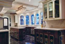
The cabinetry itself is a work of art, with specialised inlaid steel and ambient lighting, which is behind the perimeter frames that surround each block of cabinets, framing the doors and shelves further enhancing the symmetrical look and balance of the space. The kitchen island was a key aspect of this design. It needed to offer two key components: the first being enough space for the whole family to sit comfortably, and the second, for all the kitchen appliances to be within easy reach of the centre point
Following the brief closely, Clive Christian Furniture were able to achieve a sense of balance and symmetry within the space, which is ever pleasing to the eye. This can be seen in every small detail from the framing of the cabinetry echoed within the island, to the balancing of the kitchen appliances on either side of the central island - and while it is a beautiful space, it is effortlessly practical for the client too.
Location: Laguna Beach, California
Interior Designer: Kenneth Ussenko
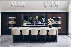
Construction Company: MWC Commercial General Contractors
The historical Gucci Villa is a landmark residence nestled into the seaside city of Laguna Beach, California. Kenneth Ussenko states “before starting the design journey on this project, it was a pleasure to see some of the interior work of the original Gucci Watch designer that had influenced the decor and vision of this estate villa”. Due to the historical nature of this residence, the focus for this project was to carefully update and elevate the interiors into a contemporary vision of a classical painting.
To achieve the design brief, the team had to take each room back down to the bare bones of the structural framing and rebuild from the core. From there they created layers of detailed classical and modern moldings for the canvas of the spaces to help outline the history patina of a bygone era. For the Duchess seating room, it was important to create a charming, yet sophisticated space for the homeowners to relax and socialise with family and friends. Linen and leather wallcoverings blanket the walls outlined and framed with wood and brass moldings. Ceilings plastered in a pearl patina reflect the crystal chandeliers above the new marble floors.
The kitchen was a bespoke journey of great craftsmanship creating a radius line of cabinets that were finished in walnut, brass, antique mirror and sprinkled with gold dust. Key to this design is also the Gucci Bar Retreat, a petite gem of glitz and glamour. This space of texture and shape is created with undulating wood moldings, accompanied by a bespoke settee bench which faces a marvelous gold bar and barback.
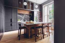
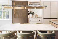
Location: London, UK
Interior Designer: Jo Hamilton Interiors
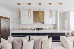
Associated: Doig
Photography: Patrick Williamson
Jo Hamilton’s fully bespoke Hampstead Kitchen is a perfect balance of modern elegance and warm, earthy textures. It features an understated classical reference, complemented by layer on layer of irresistibly tactile finishes.
The brief for Jo Hamilton Interiors was to create a truly unique, design-led kitchen while still being practical for a busy family. It should use state-of-the-art equipment for a keen chef to make the most of his culinary talent; with generous and comfortable space for eating, relaxing, and entertaining.
For designer Jo Hamilton, the success of this project rested on achieving a number of aspects. Among these, and some of her favourite features, were the full height bronze mesh sliding door to the kitchen pantry that could be pulled across to protect hanging hams or homemade pastry resting on the cold marble surface. A further design detail that made all the difference was the square brass hanging rail inside the kitchen pantry, with custommade squared hangers set against backlit marble to stunning effect.
The realised design perfectly meets the aspirations of the client and Jo’s design intent. It is beautiful, clever and yet completely functional.
The design of the kitchen sets the tone for the remainder of the property, also designed by Jo Hamilton Interiors. The bespoke, wide plank walnut flooring, designed specifically for this project, continues throughout much of the property. The soft warm tones in the walnut inspire a base for the overall theme of contemporary rustic tones and rich, luxurious textures.
Location: London, UK Photography: Glyn Ridgers
The inspiration behind the grand floor to ceiling wrap-around storage came from the living room, which still retains its original 1800’s Victorian wood panelled walls. With this project, Neil Norton Design wanted to retain the immense character whilst producing a considerate modern result.
The property is located within a gorgeous building, so it was important that the interior was as impactful as the exterior, if not more so. The client also wanted a space where he could entertain, so a kitchen with a spacious central island as a social area was created. The kitchen and the furniture for the rest of the house needed to integrate well with the architecture of the building, it was extremely important for Neil Norton Design to give their clients as much storage as possible, making use of any awkward space by turning it into an organised cabinet.
The final result feels effortless, even though every tiny detail is extremely thought out. The different materials and textures come together perfectly in a classic space that feels contemporary. The designers don’t get to work with high ceilings as often as they would like to, so when they do, they like to make use of the extra space - storage is key, and the finished project always end up being very dramatic!
Neil Norton Design made sure the kitchen felt like a natural continuation of the space, drawing inspiration from the rest of the property and creating a unique and timeless room that looks classic and contemporary at the same time.
Location: Edmonton, Alberta Interior Designer: Aness Handous
Tailored Interior approaches design with an understanding of sophisticated, modernluxe interiors, with a high level of attention to detail. This home has been designed entirely bespoke, tailored to a family that wanted something unique and customised to their specific tastes.
The open-plan living works with a modern, bright design scheme to establish a light and refreshing ambience, where the kitchen provides a key communal space for the family. For this area, there is a thoughtful process that brought about the most elegant finishes which lie at the heart of the design, whilst remaining functional, spacious, and uncluttered for family life.
The seemingly minimalist design for the kitchen is an accumulation of an abundance of fine details. It is an entirely bespoke design, where the impeccable workmanship elevates the space. A combination of natural textures and refined colour palate creates a comfortable and approachable design that is simultaneously opulent. The hand-made custom metal work on the kitchen hood fan develops a textured focal point that centres the design.
The custom trim pieces and tailored cabinet hardware ties the sophisticated details together, and the dark cabinetry provides an enticing contrast in the kitchen, as well as a harmonious parallel to the other cabinetry pieces across the open plan space.
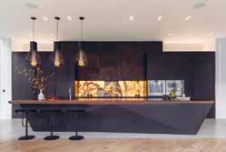
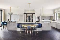
Location: Surrey, UK
Interior Designer: DCL Interior Design
Developer: Accuro Residential Ltd Kitchen: Martin Moore
Every element of this statement kitchen is entirely bespoke. Custom made cabinetry and beautiful, luxurious materials feature throughout the design.
Involved from the very beginning of the project, Martin Moore worked closely with the owners to create a truly luxurious, statement kitchen that sits in complete harmony with the grand proportions of the room. One of the largest they have ever designed, the impressive, curved island spans the entire width of the room; highly functional it incorporates generous storage and prep space, as well banquette seating, forming the social hub of the space.
Bespoke furniture painted in Martin Moore’s Pale Platinum is teamed with satin brass handles, as well as brass taps and fittings, adding warmth to the space. Monochromatic mosaic tiles add decorative flair to the splashback area whilst strikingly veined Cosmic Black granite distinguishes the raised level breakfast bar from the main island. A co-ordinated quartet of assorted pendant lights placed above the island illuminate all areas within the kitchen, and complete this statement look.
Whilst the kitchen is totally in keeping with the grand architecture of the house it also functions perfectly as a family kitchen and also for entertaining on a large scale.
Family and friends naturally gather at the breakfast bar sited close to the appliance cupboard, with its coffee machine and adjacent drinks cabinet, while larger groups dine at the central table.
Location: London, UK
Interior Designer:
Natascha Dartnall - ND Studios
Kitchen Design: Extreme Design
Construction: Cosmur Construction Ltd
Associated:
Rob Wyke – Spring Residential
Photography: Laura Rupolo
Extreme Design’s unique approach to design gave them the freedom to design every element of the client’s kitchen, creating an environment with its own identity that works harmoniously with the rest of the home. The angular shapes of volcanic rock formations and contrast of glowing lava flowing through fractures within the earth’s surface had formed the basis of the client’s bold design narrative. Inspired by geographical features, they wanted the kitchen design to not only reflect this distinctive concept but also be a welcoming and warm environment for the family.
A monolithic stone island was fabricated and crafted to create a beautiful abstract 3D geographical form in the centre of the space. Incorporating a floating breakfast bar, hand finished in a liquid metal copper, runs the entire length of the block, tapering inwards before disappearing back into the stone. The use of dark-stained timber and black acrylic lacquer, paired with matt black granite worktops create a dramatic and monochromatic design. With copper accents lifting the palette, adding texture, warmth, and an organic aspect to the space. Positioned centrally on the backdrop is a striking full height splashback featuring an individually sourced Jade Onyx.
The layout of the kitchen is designed with family life in mind. Two tall ‘hidden’ doors open to reveal secret rooms on either end of the kitchen. A walk-in larder and additional worktop space provides generous pantry storage, while the TV snug area offers a cosy space for the family to enjoy the latest movie releases together in secluded comfort.
Location: UK
Interior Designer: Pippa Paton Design

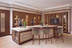
Photography: Paul Craig
The expansive 1100 sq. ft. kitchen space was almost loft-like in scale, but the existing small island was visually lost, the cabinetry offered inadequate storage and two steel pillars intruded into the space. Sub-dividing two metres at the entrance and altering the dining area access enabled formation of a dark-stained oak-clad walk-in pantry for food storage and coffeemaking with crockery & glassware storage cupboards opposite, visually reducing the room’s length.
A seven-metre island (bronze-clad on one side, timber-clad on the other) with oversized industrial hinges and lay-on bronze-wrapped drawers and doors is now the centrepiece of the space. The design allows multiple prep and cooking stations, capacious storage and a breakfast bar seating six. The concrete-coloured Corian worktop continues the industrial aesthetic, incorporating Bora hobs and extractors (wrapping below to mount controls), multiple-use stainless-steel trough (herb storage to champagne-on-ice) and conductive phone-chargers. A vintage slab of marble brought from the client’s previous home has been inset in the island to provide a proving surface for food prep when required.
A table with banquette seating provides a working area for menu/recipe development and casual dining with a larger dining area adjacent to the kitchen. An Aga provides additional cooking facilities and warms a cupboard with dog bed for two miniature dogs (a bronze open-grill allows closure of door at night).
Overall, the expansive kitchen with its industrial, loft-like feel has successfully provided a professional-standard kitchen but without the look and feel.
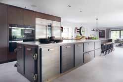
Location: Surrey, UK
Developer: Applegate Homes
Construction: Applegate Homes
The goal was to deliver a living space that would be at the heart of the home and more than just a kitchen; not just a space where the family could live together, but also an exquisite area for entertaining and a space that would complement and enhance the overall design scheme of the property. Ashton Bespoke believed that, to achieve this goal, the design process would have to deconstruct the traditional kitchen form, whilst still having due regard to the necessary standard elements and ergonomics.
The island was going to be the truly dominating aspect; it was imperative that function and form were to be equally as important as the design. As well as all other the materials used, the selection of the stone “Taj Mahal” would be key. A raised breakfast bar with seating brought inclusion and the decorative frontal panels incorporated the array of materials used within the whole kitchen.
The property has a classic architectural style, so it was imperative that the design and all the key elements work harmoniously together. No single element could detract from the overall vision, but each element should complement all of the layered details. From the simple form of the curved and surrounding shagreen leather clad panels with inset bronze detailing to the display niches, which incorporate leather side panels, handmade antique mirrors, soft accent lighting and inset bronze detailing.
The kitchen adjoins the family room and Ashton Bespoke designed and developed the fireplace and TV display wall that would connect these two areas. Design concepts and materials with layered details, similar to those used within the kitchen, were incorporated into this space to create a continuous, flowing and seamless integration between these two spaces.
Location: San Antonio, Texas
Interior Designer: Shea Pumarejo/Younique Designs
Construction Company:
Forged Oaks/Victor Salas Jr.
Photographer Credit: Jennifer Siu Rivera
Pushing the boundaries of traditional design, this kitchen utilizes shapes, lines, and colour to define this space and draw the viewers eye around the room to the various details. Traditional materials such as wood cabinets, marble countertops and backsplash and brass fixtures are utilized in non-traditional ways to redefine the traditional kitchen. These custom cabinets by Forged Oaks in San Antonio are truly a work of art from the construction to the brass inset details to the beautiful finish.
Custom cabinet doors with 3 dimensional details adorn the tower cabinets that flank the range wall, housing small appliances and pantry items with roll out cabinet inserts. These same cabinets feature inset brass rivets, inlaid brass details, and cut rock crystal knobs that repeat the pyramid effect of the 3 dimensional doors. The use of colour and pattern in the marble backsplash tile commands the focus and is contrasted by the simplicity of the shapes of the custom brass vent hood and light sconces.
The juxtaposition of the very neutral, monochromatic colour scheme of the natural wood cabinetry and floors with the bold choice of colour and pattern in the backsplash creates excitement for the viewer. This home renovation was designed for a young, fashion-forward couple who are not intimidated by colour and the mixing of patterns. Every room in this home while different carries with it the same theme of the unexpected use of materials and colour, and attention to the smallest of details.
Location: Palm Beach, Florida
Interior Designer: Jackie Armour, JMA Interior Designer Architect: Patrick Segraves, SKA Architect + Planner Construction Company: Edgewater Construction Photographer: Brantley Photography
A couple looking to merge their two Florida residences into a single intracoastal-front home in Palm Beach County wanted to create a warm, inviting oasis for their large extended family. The new construction, classic colonial home is a departure from the couple’s previous homes, which tended toward a darker colour palette and heavier furnishings typical of Mediterranean style.
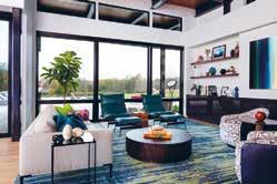
Seamlessly incorporating many of the client’s previous pieces of cherished furniture by reupholstering, updating, and refinishing them in softer blues, greens and creams enabled the family to update beloved pieces to echo their new lush and sunny surroundings in South Florida. Many traditional elements are brought to life in this timeless home – from the open-space concept and custom millwork to the soft colour palette. The traditional feel of the stairs with a stunning chandelier makes a statement as you enter the home. Uniquely, this house has wallpaper in almost every room, but each injected a different texture and feeling.
All the interior architecture and millwork, including the wall paneling, cabinetry, and ceiling details were custom designed inhouse. The result is a warm sanctuary with formal touches that celebrates the couple’s love of art, the outdoors, and spending time with family. This design works so well as there are formal and informal spaces for everyone in the family to feel comfortable. It has an open layout, with access to the lanai, pool and grounds that make it feel airy, light, and connected to its south Florida surroundings. It unexpectedly updates the classic colonial style, while still feeling classic and traditional.
Location: Central Virginia, USA
Interior Designer: Ivey Design Group
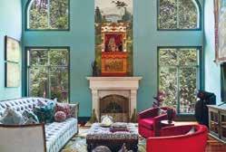
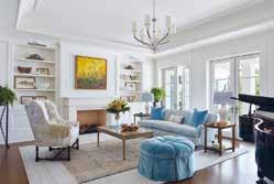
Architect: SMBW
Construction Company: Jeff Jarrelle Photographer: Ansel Olson
Ivey Design Group was tasked to produce a colourful, modern interior design for a new build home located on a 10-acre property in central Virginia, USA. The home needed to be casual and comfortable, but sophisticated and modern. The architecture of the home includes exposed steel beams, cedar ceilings, and abundant natural light through both floor to ceiling and clerestory windows.
The home is situated such that it has expansive views of the property, including wooded areas and a pond. Ivey Design Group was then tasked with bringing in warmth, colour, and comfort to the 9,000 square foot home, while still showcasing the amazing, wooded scenery outside. This was achieved through a careful balance of colour and texture. Warm woods, moments of colour against a neutral backdrop, and clean lines create the modern yet playful home the homeowners were after. In addition to aesthetics, this home needed to be ready for entertaining. With fold and stack glass doors opening to an expansive outdoor kitchen, patio, and infinity pool, an ample bespoke walnut beverage station, and double islands in the kitchen, this home can host family and friends with ease.
Ivey selected hard finishes and upholstery fabrics that can stand the wear and tear of everyday life. This home is modern but playful, luxurious but not pretentious, and bold but inviting, and never boring. The design truly reflects the client’s lifestyle and personality: family friendly, modern, colourful, and unique, yet still lets the exterior views shine. There are moments of colour, comfort, calm, and wow.
Location: Illinois, USA
Interior Designer: Jasmin Reese Interiors Photographer: Michael Alan KaskelThe Chamberlin Project is a magical, modern day Victorian kaleidoscopic space, with vibrant colours and finishes that are bold, yet quiet at the same time. Jasmin Reese Interiors was initially hired to help select pillows for the family room, from there Jasmin also suggested changing the rug, which led onto the team changing that entire room. After working on additional rooms within the house, eventually Jasmin Reese Interiors had transformed every main room in the home.
Jasmin Reese states “I was so inspired to come to the clients with bold saturated ideas and “what ifs” that they agreed to - and always chimed that we should take that idea to the next level! I was excited to source period pieces and came across lots of interesting curiosities.” The design works so well as the scale of the home allows the colours and limited furnishings to vibrate and create a high octane look and feel. In addition to this, the design also manages to feel nostalgic, creating an interesting mix and design concept.
Specialist artisan skills were used throughout the design of the project, including through the wallpaper hangers, art hangers, high quality painters and an individual who made the roman intaglios in the primary bedroom. As Chicago is known for its grey, muted environments, the Chamberlin Project stands out rather than blends in with most homes in this area. This home is in the middle of the woods and at night you can see the glowing tones of the beautiful fuchsia and teal room from down the street.
Location: Miami, USA
Interior Designer: Argent Design
Architect: Argent Design, Kobi Karp Architects
1600 West 25th Street is a stunning 12,000 square foot waterfront property completed by Argent Design, illustrating the very best in modern luxury living, and offering vast open plan living, both in its exterior surroundings and within its beautiful interior.
The client’s brief was to create a larger new build open plan family home for entertaining. They wanted both a lively interior that was also soft, which was challenging for the designers. The waterfront was the priority and Argent Design had to make the most of the magnificent view and the indoor-outdoor living favoured in Miami amongst the warm climates.
For Argent Design, one of the key aspects of this project was the use of different colours and materials. Materiality and colour are so great to play with in Miami - with the bright light you can carry strong colour, texture, and pattern and with the scale of the space it plays well in the space and adds the zing and interest while still being soft, elegant and zen.
Great time was spent on the layout of the living space to ensure an easy flow and open plan but still having divisions, so the space doesn’t feel vast as this was a worry for the client having seen a lot of properties in Miami.
With such varying architecture in Miami, it can be very easy to go to bold and striking - for Argent Design, they prefer to build on materials and accents with colour fabrics, stones in alternative finishes such as hydro, honed or leathered for interest. They drew a lot from around the natural surroundings for the scheme, the greens of the lush planting, blues of the ocean and sky.
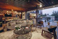
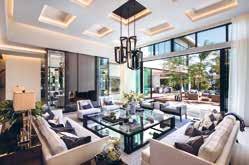
Location: Texas, USA
Interior Designer: Nathan Hejl Interiors
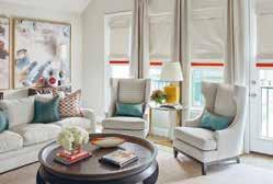
This transitional town home is a fun and easy liveable second home for the clients who work in the city. Nathan Hejl Interiors were enlisted to create this transitional design concept with an overall neutral colour palette accented with bright warm tones fill the spaces. The selection of furnishings are easy up keep with for this active family while simultaneously adding a fun and playful style.
This family lives a busy lifestyle while traveling between their two homes, so it was important to make the clients feel comfortable in this second home. The newly designed property allows easy living while the clients work in the city but also remains lighthearted and welcoming. The autumnal tones of the bedroom suite remain a key piece of the puzzle to this modern interior.
Another of Nathan Hejl Interiors’ favourite aspects of this project was the intimate dining space created for six guests. Perfect for entertaining friends of the clients or even just for quality family time together. It was important to the designer that the design integrates well into the wider environment so various sustainable materials were used as well as some repurposed furnishings.
Location: Jalisco, Mexico
Interior Designer:
Victoria Plasencia Interiorismo
Architect: Dio Arquitectura
Casa Galo is characterized by its modern style, versatile design proposals, and multiple living spaces. In this spacious residence, the art pieces are the protagonists, they were chosen specifically to uniquely emphasise the textures, materials, and tones of each space that they accompany.
During the design process, Victoria Plasencia Interiorismo integrated sophisticated finishes and monochromatic tones that reflect a contemporary and current style. The cushions, rugs, and elements of different materials were key to achieving a contrast in which neutral shades and bright colours are balanced, giving an avant-garde touch, which together results in a warm, elegant and cosy atmosphere. The exterior of the residence is surrounded by large green areas, which blend in with shades of grey, granite floors, and black ironwork. Inside, walnut wood, granite for the bar counter, and quartz in the kitchen were chosen.
The project is distributed over two floors; on the ground floor, there is a hall with elegant windows, decorated with golden touches, and a double-height planter with a sculpture that blends the natural environment with the interior of the residence. After the hall, the bar, the dining room, and the living room are located, behind them are the guest bathrooms, hidden by a dividing wall that has a special design of wood panels that generates warmth and union in this area.
The use of organic and natural materials and the monochromatic colour scheme blend beautifully throughout the project, Victoria Plasencia Interiorismo was able to completely integrate all the various spaces in Casa Galo through a timeless design.
Location: California, USA
Interior Designer: Nina Takesh
This Helena Street property by Nina Takesh Designs is a contemporary, Mediterraneanstyle, 12,000-square-feet home located in the suburbs of Brentwood, California, on a gorgeous, tree-lined street. The house is modern with classical elements and represents an era when raw materials like onyx, marble, and unlacquered brass were part and parcel of design. The look –expansive 20-foot ceilings and architectural soffits - is luxury at its core with a California aesthetic.
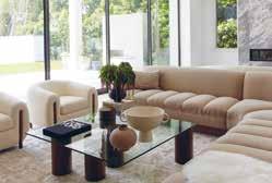
A baby grand piano sits in the corner near a bespoke walnut round table displaying decorative objects. The grand, double sided living room is adorned with a floorto-ceiling, double-sided marble fireplace encircled by custom pieces. It is laid out to create two distinct spaces where the styles are different yet complementary. On one side, where the family relaxes, there is a custom channeled sofa, reminiscent of pieces made by Giuseppe Munari, along with a glass and walnut coffee table where the feet are set as if randomly, with one foot protruding through the actual glass.
On the opposite side, you will find a curved sofa with a round, made-to-measure bleached white oak coffee table along with an architectural bench and lilac velvet club chairs. A bar of beautiful onyx marble also graces this great room along with bespoke Nina Takesh bar stools upholstered in an ivory boucle.
The kitchen is classic in nature, with modern touches, such as a leather-finished marble countertop, and white satin finish cabinets, whilst plattner chairs can be seen in the eating area of the kitchen around a Minotti warm wood dining table.
Location: Jupiter Island, Florida
Architect:
Christian Thomas and John Melhorn
Interior Designer: Betsy Brown
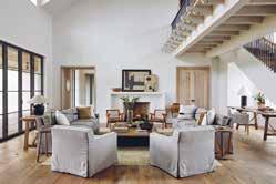
Construction Company:
Thomas | Melhorn
Photographer: Nicole Franzen
Wabi-sabi, the Japanese design principle that emphasizes the perfectly imperfect, is imperative to every aspect of this home. The architecture recalls that of the Florida vernacular with materials that would be found in the surroundings. This house was intended to be passed from generation to generation and so, the material palate was carefully curated with the intention that it would both age in harmony with the ocean’s environment, but also exude a memory of previous experiences.
The floors are raw oak planks that have been fumed and gently waxed to present the natural beauty of the material. The walls and ceilings are a composition of waxed plaster and lime cypress, creating a soft elegance welcoming of the colours and light of the oceanfront setting. The house makes an intentional angle shift, the kitchen and family room reside within a wing of the house that faces southeast rather than directly east. This shift presents a different view of the beach and ocean, looking along the coast of sea grapes and coconut palms with the tropical Atlantic beyond. The kitchen is cypress wood that has been coated in a lime wash and stripped to reveal a beautiful, aged cypress and the counter tops are limestone sourced from Romania, which resembles the colour of the local beach sand.
The north wing is dedicated to the children’s bedrooms and the ocean terrace; a magnificent post and beam covered terrace overlooking the ocean and entire property. This balcony has been purposely orientated to capture the breeze on any day giving respite from the tropical sun.
Location: Taizhou, Zhejiang
Interior Designer: Xiangyu Xie, Dongmei Wang, Shu Tang, Yancheng Wang, Qianlin You, Xuefang Zhu, Ru Xiao, Xiaowen Zhu, Changhua Wang
This project aims to create a new type of liveable community, a bearing platform for advanced modern urban development. It intends to comprehensively improve social grassroots services and governance, intensely promoting the progress of social civilization and cultural heritage development, and creating a vibrant and liveable place to attract innovative talents to reside here.
The project takes the people’s demand for a better life and delivers the vision of “homeowners have their personalized house” as the guide. The project locates in Taizhou, the centre of the north and south of Zhejiang Province. It is at the junction of land and sea. It is one of the 27 central cities in the Yangtze River Delta region, which has many harbours and shorelines and is the only pilot zone for economic development in the bay area of Zhejiang. The design concept of “harmony” is infiltrated in Taizhou’s landscape, such as the soul and spirit of the mountain and sea, and gradually integrated into the bloodline.
The design team extracts these local cultural elements and transmits the spirit of harmony into the space. When designing the plan’s circulation, the design considers the harmony of people and architecture first, and then the harmony of people and space, which are interrelated. Moreover, the design extracts the inspiration from the phoenix pattern and creates many shapes of curving lines throughout the project. In ancient mythology and legends, the phoenix is the bird of good luck. It is the most beautiful among all feathered insects and is the king of all birds.
Location: Bangkok, Thailand
Interior Designer: VAIR Design Studio
This project is a luxury private penthouse situated in the heart of Bangkok city, Thailand. The main inspiration for this project is the client’s desire to bring the beauty of nature into the metropolitan living space. Each part of the interior space reflects this concept and has its own different themes to make the space beautiful and interesting. For the entrance hall, which is a semi-outdoor area, the design theme is to create an impression of being in a sky garden overlooking the stunning view of the city.
Vair Studio created a space that resembles a garden seating gazebo surrounded by perforated partitions made of copper metal in a floral pattern. The ceiling is cladded with stainless steel that reflects the sky, which creates a feeling of openness and airiness to the space. Walking inside from the entrance hall is the living room. This area is inspired by the theme, “Beauty Under the Ocean.” A large sofa set is placed at the centre with a beautiful crystal chandelier that looks like swarms of fish swimming on top. The dining room area is connected to the living space. This space is designed to have multiple layers of elements when viewed from the living area.
In the centre layer is the feature dining table set. Above is a leaf-shaped glass chandelier, representing the leaves fluttering down from the tree into the water. In the background is a crystal-clad counter bar and a crystal chandelier inspired by the glitter of a waterfall reflecting the sunlight. The design team used custom printed wallpaper on all sides of the wall, combined with the copper arch and wall lamps, to make this narrow space attractive and interesting.
Location: Singapore
Interior Designer: Aloysius Ganiel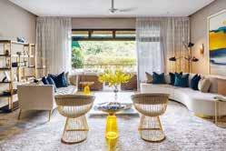
Aesthetically, the homeowner wanted the house to have elements of a timeless luxury style to reflect the urban contemporary look of Singapore. Functionally, they wanted to have a space that separates both social and private space and with personal activities included in their everyday life.
The key aspect is to create a gradual transition from the social to the private interior space and help people decompress from the fast pace of the city. This sense of decompression is achieved through the materials palette, which mirrors the interior environment in the communal social space and then becomes softer and warmer into the bedrooms as people continue their journey into the house.
This concept was driven by connectivity, the layering of spaces and the creation of views. The family members are guided on a journey through the space. Strong design details and material elements, like the stone and carpentry finishing, establish symmetry in the front of the entrance and draw the view to the secluded styling living space when approaching into the space. This natural lighting and well-ventilated space heightens the whole interior experience, providing intimacy and sensational mood of each individual area that deepens the connection between the house itself and home-owner.
The designer selected muted tones and honed materials to enhance the sense of authenticity and comfort. This creates a quiet, elegant atmosphere, with mirrored surfaces and natural stone catching the eye. The central point-of-sale is made from stone and commands attention, while the bespoke furnishings, woven elements and handmade touches add texture, luxury and a feeling of escape.
Nidhi Jain’s task was to design the clients 5BHK, 3800 sq ft house. Fortunately, the bones of the house were in a pretty good condition so they didn’t have to spend a lot of time in renovating bathrooms and kitchen, this area became a small enhancement. Everything else in the property from furniture to art and accessories was to be brought in or custom made and fit into a design story of a glamorous home.
When the clients walked into the Nidhi Jain office for the first time, they expressed their liking and made it noticeably clear what they wanted, which was – glamorous and sophisticated with a bit of opulence. The clients are both from financial Industry, entertaining is part of their profession and culture. The whole idea was to take the natural beauty as an inspiration in the design concept.
Nidhi generally starts the design process by creating a story from the start of the house, leading into different spaces, until the last corner of the house. They then put in the blocks of ‘requirements’ as the next layer. Once that is done, they add in emotions into the design like curiosity, excitement, pause, mystery etc.
In this house one of the key elements are the arches. The designer has used this element, in different scales and form, from a restaurant to, office and now even residence. Nidhi Jain wanted to frame the elements of the design through this arch. Being a contemporary style of design, they changed the language of these arches to suit the concept. Nidhi painted them in high gloss reflective finish and secondly, then switched the emphasis from height to width of the arch making it humble and suitable for a house yet creating drama in the space.
Location: Edmonton, Alberta
Interior Designer: Aness Handous
With House of Sevens, Tailored Interiors uses a combination of elements and finishes that all work together to create the utmost level of balanced sophistication and luxury. Its open-plan living works with a modern, bright design scheme to establish a light and refreshing ambience.
The home has been designed entirely bespoke, tailored to a family that wanted something unique and customised to their specific tastes. The mix of elements and sophisticated choice of finishes results in a one-of-a-kind, thoughtful, and detailed design. The Italian porcelain, gold coated metal, Cambrian quartz, bevelled mirrors, and sectional and soft decor are all provided in-house, custom built and designed by Tailored Interior. Many of these custom elements became Tailored Interior’s favourite aspects of the project, including the dining table, and the metal details that run through the living areas such as the fireplace pillars, dining table, and the kitchen hood fan.
Tailored Interior approaches design with an understanding of sophisticated, modernluxe interiors, with a high level of attention to detail. There is a thoughtful process that brought about the most elegant finishes and created the core of this bespoke design. Balancing bold design choices with layered soft finishes, the clean and bright home has depth and warmth added from the mix of textures and abundance of angles and shapes. It unifies thoughtful design with impeccable workmanship.
Location: Kleinburg, Canada
Interior Designer: Diana Bastone Designs
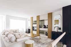
Photographer Credit: Stephani Buchman Photography
The Orico Project is sophisticated yet approachable, blending traditional and contemporary elements. The design scheme came from working with the existing elements and design to enhance them.
For the dining room, the space was designed to work in harmony with the existing light fixture. The opulence and sparkle of the lighting fixture in the dining room was the highlight of the space, and so the designers chose supported the fixture rather than taking away or overwhelming it. The brass highlights and subtle colour palette makes for an elegant and sophisticated space.
The family room had an existing fireplace which was then enhanced with Diana Bastone Designs’ wall treatment and unit. The design of the space was based on flexibility. The homeowner expressed their key request of being able to hide the television when they are entertaining; this was fulfilled by creating a custom unit that allowed for sliding so that the television could either be visible or hidden within the wall unit.
The primary bedroom was to be a calm oasis. The colour palette of soft pastel tones was derived from the stone of the fireplace and creates a calm retreat. With the 14-foot ceiling, the space called for a dramatic style headboard, and the custom-designed bed gives the room a grand appearance. The nightstands were also custom produced to coordinate with the bed design. In the bedroom sitting area, all the pieces were reupholstered to suit the new bedroom décor, championing the craftsmanship of well-built furniture by giving each piece a new life.
Location: Ottawa, Canada
Interior Designer/ Designer: Art & Stone Group
Developer: Art & Stone Group
Photographer Credit: Kevin Belanger
Natural materials and textures bring life to this property. Art & Stone Group were able to meet their client’s wish list and create a beautifully aesthetic home. It is a minimal, organic single-family home, with a Scandinavian and Japanese essence.
The clients wanted their home to feel bright and airy, while keeping a minimal yet comfortable, organic feel. They are avid travellers, and so the spaces and finishes were created to feel like many of the places they love travelling to. They also wanted many areas within the home where each family member could retreat to other than bedrooms to have some alone time. Therefore, Art & Stone created a beautiful and cosy reading nook on the bedroom level, as well as a nook in one of the offices.
The last element of the brief was to use natural textures as much as possible in the home, without making their home feel rustic
The main floor’s kitchen, dining and living is open as the homeowners love to entertain and wanted to maximize the space for entertainment. The kitchen is the heart of the home. It has a seemingly minimal look to it though intricately worked details; master cabinet makers created all of the millwork to ensure that the details Art & Stone Group envisioned were achieved.
All appliances except the stove are hidden behind cabinetry, leaving the eye wondering to the clever lower level of the island. The hood fan detail reflects the island table. The 3-sided waterfall island can also be used as a bar for cocktails, but also offer a large unobstructed surface for food preparation. The lower level of the island pulls from the typical Japanese style restaurant, which is one of the clients’ favourite places.
Location: Ontario, Canada
Interior Designer: Kelly Harvey Living
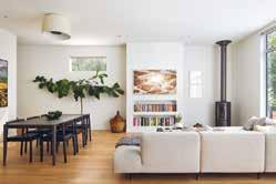
Developer: SkyHomes Corporation
Clever design is a key tool in making a timeless home. With Kleinburg Manor, Kelly Harvey Design looks to build a comfortable yet opulent residence in a way that is both relaxed and relaxing.
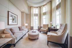
Throughout the home, the décor is kept contemporary whilst the colour palette is both neutral and warm, making for a timeless and elegant interior. The property offers a choice of spaces to gather such as the main lounge, family room, lounge area in the loft space, and kitchen with breakfast area, as well as spaces to entertain including a music room, basement with games table, wine cellar, and home cinema.
The foundations for this project are that classic design will never tarnish, and that elegance comes from subtle details. Neutral tones and integrated lighting are combined with both soft and natural textures for a sense of calm. This works with the natural brightness of the home from the large windows and the sense of space from the height of each room. Textures are layered for depth and warmth, and the design scheme is elevated whilst remaining understated through custom details such as the unique fireplace, custom railing and furnishings from the Kelly Harvey Living line.
In the family room and lounge, light floor-to-ceiling drapery complements the wall colours with a slight contrast that multiplies the natural light and height that these rooms offer. As requested by the builders, the family room features a custom fireplace that Kelly Harvey Living created from custom leather panels and nailheads. With a view to this room, the kitchen and breakfast area uses lighter neutrals and replaces gold finishes with silver for differentiation between areas without becoming displaced. Built-in cabinetry offers both utility and luxe.
Location: Venice, Italy
Interior Designer: Ilaria Campagna Interior Design
Palazzo Venere dates back to the 16th century and is protected by “Belle Arti” (an institution of the Italian Government that safeguards cultural heritage buildings). The building has a floor surface of 240 sqm and is partitioned on 3 levels.
Palazzo Venere apartments are all different from each other in the architectonic details and the furnishings. Each apartment combines the ancient Venetian architectonic features and the details reflecting the Italian twentieth century design in a unique way so you can live like a real Venetian and feel at home at the same time. The traditional Italian style is key to the design and is prominent in every detail, creating a vintage and eclectic ambience that flows through the apartments. The antiques and paintings were created by the owner himself and add to the project’s uniqueness.
The design works well because it describes the true Italian style that is found in the houses of Venice; antiques and made in Italy furnishings combined with traditional and unique Venetian interiors. Ilaria Campagna Interior Design have given a new life to history, re-adapting it in a contemporary key. The traditional interior is also able to accommodate different styles. In this case, the team followed the taste of the client, passionate about vintage 70s furniture.
All the interiors have been restored by skilled artisans who have restored the original floors and parquet, have redeveloped the wooden beams of the roof and have made the doors from scratch based on the originals using ancient painting techniques.
Location: urb. El Herrojo, Benhavis
Interior Designer: Jana Novakova
Architect: Studio Tobal - Diego Tobal
Developer: Fintech
Construction Company: Solis
Photographer: Charly Simon
Casa Varanda is a residential villa with generous sunlit indoor spaces overlooking the sea, with 6 bedrooms, double height living and dining room, game room, gym, spa, outdoor pool and beautiful gardens. The villa is designed in a contemporary style, with the utmost care for comfort with high quality seating furniture and turnkey spaces.
The living and dining area is a vast open space having full height windows with sun light accentuating the light and fresh summer colour scheme. Key to the design are the motorized full-size windows which visually decorate the room expanding to the beautiful view of the gardens. The double height ceiling salon with its wooden cladding makes the room feel airy, but at the same time very cosy and warm. The focal point wall with the chimney has two types of wall paneling, backlit onyx and real dried moss to add a fresh unexpected accent. The moss has also been used in the entrance in combination with travertine 3D cladding backlit with LED. The generously sized spaces fitted with natural stones, wood and turnkey furniture all over the villa, including bathrooms, gives guests the feeling of a luxury vacation.
The design scheme is in line with the modern architecture, yet the selection of colour schemes per area gives a clean and tranquil aesthetic, creating a more vacational look. The property integrates itself into the wider environment through the use of natural materials which blend into the surroundings and also having 3 large trees planted within its premises in order to blend within the surrounding green hills.
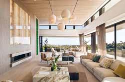
Location: Surrey, UK
Interior Designer: Lindi Reynolds & Co Architect: Mary Hackett & Associates Construction: Woodlands Construction Photography: Robert Sanderson
Lindi Reynolds & Co were appointed as Architectural Interior Designers to this 512 square metre new build residential property for the CEO of a major Blue Tech company and her family.
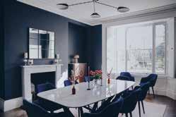
Working with the footprint created by Mary Hackett & Associates the designers were asked to consider every interior aspect of the home, and offer complete solutions which would be stylistically aligned with the client’s family’s character and style sensibilities. To this effect, Lindi Reynolds & Co were invited to suggest changes to the internal modelling of the interior. All interior aspects were to be worked with, creating complete and fully considered, timeless, classic, elegant and interesting spaces that flowed seamlessly from one to the other.
Through the design process the client was looking to create a calm and tranquil home, which exuded grace and timeless elegance to provide a haven from the long hours spent in business, a status reward for hard work and endeavour, but at the same time recognising it as a welcoming family home. The kitchen was designed, supplied and fitted by Lindi Reynolds & Co. As a result, they were able to include many bespoke features, such as the burnished bronze metal finishes that set this kitchen apart, and the pendant over the island is also bespoke.
The design scheme outcome was so successful because Lindi Reynolds & Co ran a series of intensive design workshops with the client to understand and distil their unique design sensibilities. As soon as this was understood, the brief was clear, and they set about creating a comprehensive set of designs which flowed seamlessly from one space to the other.
Location: Kenmare, Ireland
Architect: Diarmuid Twomey
Interior Designer/ Designer: Nathalie Vos and Justina Gruzdyte
Other companies involved: Holbein Carpentry & Joinery
Photographer Credit: Lynda Kenny
The Little Red Bridge sits in a beautiful country-side setting, with fantastic views taking in Kenmare Bay and the Beara Peninsula. Small windows and French doors opening onto the deck fail to optimise these vistas - the interiors needed to open to those views and bring them in. The brief given to Edit Design Studio was to create a comfortable and inviting holiday home with soul and warmth a functional, stylish and comfortable home.
As a holiday home, the interiors had to appeal to guests looking for an escape, with a subdued luxury, unique homestay feel and individuality. Living spaces were maximised to deliver a great space to entertain. Style wise, it was important to maintain a modern country vernacular.
Edit Design Studio opened the ground floor living space by knocking out the back façade and incorporating floor-to-ceiling sliding doors. The previous single living space was converted into a large kitchen and dining room, with new bespoke kitchen and large dining table.
The most enjoyable aspect for the designers was having fun with design features. In the dining room, they used Shaggy sideboard from Kare that embodied holiday living, paired with the traditional Irish Skib baskets hung as an installation.
The interiors were kept simple, with an idea to bring the outside in and reflect the colours of the ocean views and the garden.
For the furnishings, Edit Design Studio used natural textures and fibres such as oak, cane and wool, and local tradespeople where possible.
Location: Isle of Man
Interior Designer: Blank Canvas Limited

Assocaited: Osborns, Tony Taylor, Dixon Construction
Photograpy: Lili Design & Photography
As an extension to a period property, Blank Canvas Limited were asked to develop a malleable space that complements the rest of the home whilst being contemporary and sociable. The design had to be sympathetic to the rest of the home, not losing sight of the period features, and be a key talking point of the property.
The design brief that was given was to create a contemporary yet sympathetic space that would be a key talking point to the home. The space had to be mature and sophisticated, and able to accommodate large dinner parties, taking inspiration from the sleek 1960’s mid-century aesthetic, combining understated glamour and drama.
The flooring was a significant development for this room as all the subfloor and joists needed to be rent, and the original lath and plaster skirting had to be cut into to accommodate the new parquet flooring. For depth and warmth, the designers added a bold solid-colour custom farrow and ball rug from the Rug Company. The contrast between block colours keeps to the midcentury style whilst not detracting from the hand-laid floor. The muted tone of the rug complements the warmth and pattern in the parquet whilst softening the navy walls, giving the overall look a striking impact.
It is a moody room that takes on a personality of its own depending on the time of year. During the summer, the wisteria that grows outside the window cascades down whilst the dappled light feeds through and complements the space’s lighter colours and natural tones.
In winter, the dark tones work with the dimmable pendant and scattered lamps for a dramatic yet cosy atmosphere.
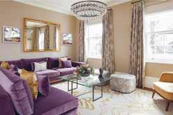
Location: United Kingdom
Architect: Breley Design
Interior Designer: Rose Narmani
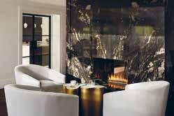
Developer: Ulisses
Construction: Daniel Zefli
Photography:
Julian Abrams, Nick Smith
This elegant country mansion is contemporary and stylish and showcases functionality without sacrificing sophistication. The design brief indicated that the space needed to be open, bright and light and should take advantage of the high ceilings. Allowing as much light as possible to flood into the living spaces was of vital importance. The colour scheme was to be a multitude of varying greys with pops of contrasting colours throughout to bring depth and intrigue into the interior design.
Rose Narmani was tasked with creating a timeless design scheme that would last years and survive any current design trends. The living space was to be contemporary and comfortable, with many natural and contrasting textures, finished of with an ultimate touch of luxury. The high ceilings created were Rose Narmani’s favourite part of this project as it completely changed the dynamic of the space. The designers were tasked with removing the original ceilings to create a room that doubled in height. As you enter the house and proceed into the formal living room then you feel the effect of this structural change.
The design is so effective because firstly the client is delighted with the end result and that is the main overriding objective when finishing a project. The designers began this project from the renovation stage and then moved onto interior design and finished it with interior styling. Rose Narmani spent so much time with the client to ensure that they understood both their individual and family requirements and preferences. The design transformed this property and made it into the glamorous home that the client never wants to leave.
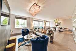 Location: Knightsbridge, London Photographer Credit: Ben Thompson
Key Interior and Designs are a passionate team of creative individuals that are inspired to transform a client’s apartment or house into a home. For this project, the team have created a brighter, lighter and more welcoming apartment in the centre of London.
The brief was to take inspiration from the client, location, apartment and nearby Hyde Park and transform the apartment into a sophisticated space to enjoy. Through bespoke lighting pieces, items, soft colours and brighter inserts of soft furnishings with colour, the designer achieved a project which is decadent and sophisticated yet playful and fun. Elements of pieces, colours or soft furnishings each encapsulate the client’s personality; young and sophisticated.
The favourite pieces are the light fittings as they are all handmade and bespoke, each one completely individual. The team have worked intelligently with the use of space. Using pops of colour, light, glass and mirrors to reflect and maximise and utilise the space available.
The apartment overlooks Hyde Park which inspired the designer to ensure there were sustainable elements involved in the project. They reused elements of the existing furnishings including doors and ensured that they were repurposing objects where able to and achieve the same result - if not better - as purchasing something new. Incorporating a sustainable angle into all projects and utilising the supply chain works incredibly well. All of the light fittings are hand blown Murano glass pieces from Venice. Each one completely individual with so much colour, movement, and personality.
To fulfil the client’s ambitious vision on a compact site, AC Spatial Design undertook a rigorous design and refinement process to complete the vision forming a balanced approach, the designers were determined to deliver a residence with generous proportions and carefully framed vistas befitting the leafy location. The carefully considered monochromatic palette became a guiding principle for the new gestures creating a curated home of subtle luxury and familiar comfort.
The interiors throughout are methodically detailed and refined, fitting the rigorous geometry of the architecture while maintaining a timeless and essential aesthetic. Fine craftsmanship and careful material selection are evident upon entry, with Timber flooring by Bassano Parquet, bespoke joinery by Creatives Edge and stone cladding by Pietracasa. A sense of calm pervades the formal living area.
The house is filled with natural light, with glazed openings and light-toned windows treatments ensuring sunlight to illuminate the interior. Forming a base of clean lines and warm and textural timber underfoot, the floating staircase connects the levels, encouraging the eye upward. Furniture and lighting then act as the natural additions to the structure, drawing on a soft and desaturated palette of textured fabrics. Ensuring an ingrained sense of flexibility in the planning of dining and kitchen area, and how each space connected and opened to the next – was key.
AC Spatial Design’s vision was fully aligned with the client’s requirements and needs to live in a house with a timeless and essential aesthetic. Through focusing on refinement and an enduring base, the Family House becomes the ideal base for its art-loving clients between London & Cape Town.
Location: London, UK
Interior Designer: MM Interiors
Within the hub of vibrant Covent Garden, MM Interiors transformed this contemporary family home into a tranquil and sophisticated oasis, interjected by the subtle use of warm textures and statement colours making this home a delight for family and friends to enjoy!
Taking inspiration from the clients’ Indian heritage, MM Interiors created a modern design using a warm and inviting colour palette and textures to set the tone for a contemporary scheme oozing sophistication. The designers chose light finishes in the bespoke marble and Oak TV unit wall cabinet alongside the marble handmade coffee table. Fused with a statement piece bespoke velvet navy sofa, which carefully contrasted with burnt orange cushions, created a warm and inviting space for family and formal entertaining in the living area.
In the dining area, MM Interiors selected a stunning Brazilian grained quartz stone - righteously named ‘Black Beauty’ - as a standalone piece with a stained grey glass top to maximise the space of the room whilst allowing the beauty of the stone table pedestal to be shown through. Contrasted against the gentle glass blown brass bird chandelier, this stunning dining area was in keeping with the modern design and natural textures the clients so very much desired.
As always, all MM Interiors items are sustainably sourced, and no animal products are used in the interiors of the homes they design. This inspirationally elegant and vibrant family home has been designed with much care and attention to detail to create a warm and embracing space for all to step into and enjoy.
Location: St. John’s Wood, London
Interior Designer: Shalini Misra Ltd
Photography: Mel YatesThe client wanted to bring out the period features with wall panelling, intricate cornicing, archways, and panelled window shutters. This rich historical depth to the property provided a beautiful backdrop to the furniture, lighting and accessories. The wall panelling was enhanced with gold painted lines delineating the shapes and highlighting this wonderful period feature. Dark timber doors and dark chevron timber floors bring a depth and richness to the space.
In the reception room mid-century lighting mixed with Venetian floor lamps sit together with grey, red and pink upholstery bringing strong colour and warmth to the space. The seating has been designed in striking shapes with a double-sided velvet upholstered bench and sofas with fluted upholstery on the seats. These round shapes bring a diversity to the linearity of the wall panelling and cubic cornicing. Natural materials are brought in through marble and glass tables. A bespoke bar cupboard was designed for the reception with a striking onyx back that is back-lit creating a feature in the room during the day and night. The cosy study area has further seating with a sofa and armchairs and dark timber on the walls which combines well with the mantelpiece crafted from the same timber. The room is dark and cosy, comfortable and intimate.
Bold wallpapers are seen in certain areas in the property with a pleated paper effect wallpaper in bright blue in the lower ground floor by the kitchen and a bold print of loops in the powder loo with a complementing blind. The kitchen dining area has a long glass table with an over extended bespoke banquette offering flexible seating in the area. An ottoman has been designed to match the banquette to create a cosy seating space with the banquette.
Location: Covent Garden, London
Interior Designer: Pfeiffer Design
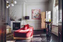
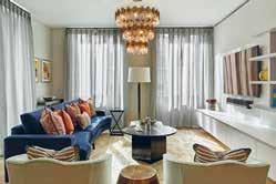 Photography: Simon Eldon
When a previous client approached Pfeiffer Design about designing his new London residence, they jumped at the chance. Being that the luxury apartment is situated in an iconic West End building, in a prime location for access to shops, restaurants and theatres, the designers knew the interiors needed to reflect this. Pfeiffer Design had a clear vision from the start and knew the aesthetic needed to reflect not only the apartment’s location and unparalleled view of the London skyline, but the cosmopolitan creativity and avant-garde atmosphere of London’s West End. With the client and their own office based near Brighton, they were required to coordinate the entire project remotely, liaising with the building’s concierge team when it came to organising installations and deliveries.
As this was the clients second home, he wanted the apartment to feel different from his permanent residence, which is a period property. Therefore, mid-century icons were used to bring a sense of gravitas to the scheme. Conversely, Pfeiffer Design utilised a bold, graphic colour palette and didn’t shy away from provocative contemporary artwork to really tie the scheme together. This interplay between brazen use of colour and dependable design classics creates a unique interior, reflective of the diverse nature of London’s West End.
Bespoke upholstery and soft furnishings formed a key part of the design remit. Pfeiffer Design created soft waveheaded linen curtains to soften the angular floorto-ceiling windows, as well as a bespoke panelled headboard wall, incorporating switches and sockets to sit behind the bed.
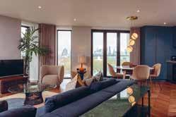
Location: London, UK
Interior Designer: Supremati
Construction: Stone Black Ltd
Photography: Nick Smith Photography
Albion Gate is a project designed by Supremati for a developer in Hyde Park, London. Set in a lavish, historical Art Deco building, the property consists of two bedrooms both with their own en suite bathrooms.
The client requested that Supremati be responsible for the design management of the property, therefore the entire space was coordinated under their own creative direction. The majority of the furniture and artwork was already owned by the client, Supremati was asked to design the bespoke joinery, such as the doors, bookshelves and TV unit, to source all the decorative lighting and finishes and redesign the interior architecture including the reflected ceiling plan.
The designer’s intention was to create an interior design scheme that would exude luxury, while simultaneously being comfortable and spacious. Much of the inspiration came from the Art Deco building that the property resides in, the bespoke details are taken from that era and are held to the highest standard. Similarly, the colour palette of green hues are inspired by the property’s location, Hyde Park. There is a perfect balance created between the minimalism and luxury of the interior, while also adding a freshness to it.
The newly integrated design elements combine into one luxurious, elegant and calming apartment. Moreover, it exceeded the client’s expectations.
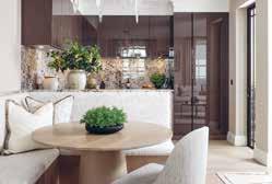
Location: London, UK
Interior Designer:
Samantha Bartlett Interiors
Construction: Cordles
Photography: Ryan Wicks, Al Roberts
A warm colour palette was curated by Samantha Bartlett Interiors for the client who requested a masculine design with elements of femineity for his home, a 1,359 square foot property in the heart of Chelsea. The key element to the brief was to make the home user-friendly, and offer an ease of flow from one space to another whilst accommodating the required areas listed by the client. This refurb project although small was extensive, it is now compliant and sustainable and took less than one year from concept to completion.
In order to create the aforementioned palette for the client, Samantha Bartlett Interiors derived the designs and textures from nature. The studio is inspired by nature, its unique forms, colours, textures, patterns, and organic materials which are stacked with distinctive features are endless. Here they have embraced earth’s natural tones and materials.
Samantha Bartlett Interiors used mainly bespoke sustainable furniture and joinery to optimise the joinery and space available and collaborated with various artisans to fulfil these packages. The property has also been designed to improve conservation of fuel and power, and to enhance its surrounding environment.
The newly formed spaces perfectly meet the clients brief, and seamlessly work in harmony with one another. The areas feel bigger, are much lighter and warm and the space is much more user friendly, an environment anyone would be happy to live in.
Location: London, UK
Interior Designer: Mahrukh Jamil
Developer: Meritas
Photography: Natalia Monica Photography
The brief for Mahrukh Jamil Interiors was to create a contemporary and sophisticated city space in which their client could feel the luxury of a high-end hotel but the warmth of a home. The client wanted to use the apartment for his family to enjoy breaks in London but also, as a CEO of a multinational firm, a place to entertain friends and colleagues.
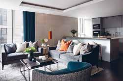
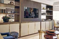
It was important for Mahrukh Jamil Interiors to consider textures and colours that would help to inspire and relax the client in their city apartment. By using luxurious materials and colour palettes with the occasional pop of colour, the designers were able to connect each room seamlessly. One of the client’s favourite aspects of the design scheme as the contrasting patterns and textures that were used throughout to add interest and depth to the interior.
Mahrukh Jamil Interiors’ favourite part of the project was designing all the joinery for the apartment. Using triangular and diagonal shapes that were also used in the dining area lighting, dining chairs, and accessory fabrics, Mahrukh carried these patterns as a running theme throughout the apartment.
The design was for an apartment that is one of many apartments in a new residential development in Paddington. As an extremely vibrant, busy, and multi-cultural part of central London the design had to be in line with the area and the price of the property itself. The apartment, overlooking the Grand Union Canal, is in a modern and sophisticated building that has clearly been developed for a certain clientele. Therefore, the contemporary and sophisticated design of the apartment perfectly integrates with its surroundings.
Location: Sugar Quay, Tower Hill, London
Interior Designer: Casa Alta Design
Construction Company: Chartwell Group
Associated: GS Contracts, Gaysha Ltd, Esoundworks
The brief required Casa Alta Design to transform an originally bland developer’s apartment into a warm and welcoming home with simply the best of everything. The focus was to supply the most cuttingedge technological features – the whole apartment can be controlled from a remote location - infused with the design creating a beautiful yet comfortable and convenient space.
The apartment, located by the Thames, now prioritizes the views from all windows creating a connection with its amazing surroundings. By using extensive framing of all windows, clad with American Walnut and following the same grain as per joinery, Casa Alta Design have integrated the gorgeous viewpoints such as The Shard and other London landmarks as a backdrop for the rooms.
The client’s South American roots inspired the design concept with carefully curated references - marbles, bronze, dark wood, and a concise but rich palette of colours. Built throughout the COVID 19 lockdowns and supply disruptions, this project is a statement of Casa Alta Design’s commitment to delivering projects to the highest standards.
The bespoke joinery package for this project was extensive and Casa Alta Design had to work closely with the joinery contractors. The craftsmen at GS Contracts and Gaysha are no strangers to working with exotic materials and demanding briefs. To ensure an even grain throughout the joinery, Casa Alta Design used a single American Walnut log creating a sense of continuity in all pieces. The superb verde tinos green marble cladding has a special leathered surface texture.
Location: London, UK
Interior Designer: Birch House
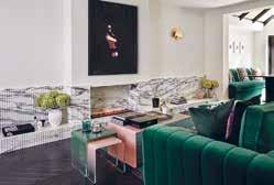
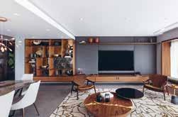
Architect: SM12 Architects
Construction: Adrian Design
Photography: James BalstonThis Grade-II listed Chelsea townhouse underwent a full refurbishment and extension. Working closely with the client, their architect and local conservation teams, Birch House created a design that completely transformed the property while remaining faithful to the character of the original building.
The client wanted a full redesign of every interior architectural detail and finish including bespoke fitted joinery, lighting, and bathrooms, as well as furnishing and styling throughout. They wanted the property to ooze a feeling of tranquillity and provide a restful feeling akin to staying in a luxurious boutique hotel. Importantly, as the client has such an extensive and interesting art collection, they wanted the interiors to allow it to sing. Accordingly, Birch House kept the overall colour scheme simple providing the perfect backdrop to the art.
Birch House reinstated period features, selecting materials to complement the original style of the property. The form and proportion of the Georgian architecture, the natural light and gorgeous period detailing were the stars of the show. But to avoid creating a pastiche of a period house, Birch House kept the design of the hard finishes, the kitchen and fitted joinery very contemporary using inset mirrors to enhance the feeling of space and give a nod to a more traditional shaker style.
The structural alterations to the rear and full mansard roof extension have been carefully considered, taking into account the particular characteristics of the surrounding mid-19th century buildings. Birch House worked closely with our client’s architect to maximise floor space and bring in natural light at every opportunity.
Location: United Kingdom
Interior Designer: Rebecca Leivars /
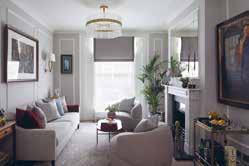
LEIVARS Interiors Studio
Construction:
London Builders & Decorators
Photography: Nick Smith Photography
LEIVARS Interiors Studio worked with the client, the CEO of an international luxury brand, for the third time with this project.
The brief was to completely strip out and reconfigure the rooms to create a home office whilst maximising light and comfort.
The client asked for subtle nods of elegance from the Art Deco era yet having undertones of femininity and drama.
LEIVARS Interiors Studio wanted to connect the living and dining space to create a striking statement fireplace and sight line towards the small rear patio, and so they designed a full length low level fire place and opted to have this made from beautiful marble with fluting detail. By keeping the fireplace low and long whilst working with vertical fluting details it gives this small property the feeling of height with real impact. By adding in a bio ethanol fire gave some warmth and interest in the colder months.
When working with expensive marble slabs which are unique and one of a kind, it was imperative for LEIVARS that they worked with trusted and highly skilled stone masons. Marble is fragile in nature, so the fluting detail was a painstaking job with each fluted section having to also be hand polished, the whole process took nearly nine weeks. The designers wanted to use a striking and impacting colour and selected the beautiful emerald velvet for both the sofa and banquette seating area. By keeping the colour scheme limited to just three colours and using obly brass as an accent, it allowed the home to flow seamlessly and not feel visually cluttered.
Location:
Almaza Bay, North Coast, Egypt
Architect: Hala Saleh (TDF+)
Interior Designer: Hala Saleh (TDF+)
Photographer Credit: Nour El Refai
Almaza Bay Residence by TDF+ is a summer house on a plot of land that resides on an elevated second platform by the beach at Almaza Bay, Egypt. It is a space that breathes. This is the essence of the architecture and flows into the interiors. A spiritual open conversation between the structure, the beach line and its skyline.
Seamlessly, the user flows from one space to another with ease; TDF+ uses the partial doors, open court, open bathrooms, and exposed kitchen to invite one in a boundary-less experience. These dissolved boundaries expose the kitchen, calling for continuous action that invites homeowners or guests to self-serve with no question regarding what is where. The modularity of the space allows for multi-function usages, accommodating small gatherings in a cosy setup and large gatherings in an entertaining manner; the living room turns into a bedroom with its own on suite bathroom, the back-to-back seating areas open to adjacent indoor and outdoor seating, the court working desk turns into a cocooned outdoor dining.
There is an open conversation between TDF+’s choice of grounded materials. Handcrafted in their nature of application, they have human imperfections that give a real meaning to the space. Neo-cement covers the walls, floors, ceilings, sinks and showers and extend to the naturally flowing pool with its two mechanical systems that accommodate the multi-dimensional slanting in its borders and walls. The natural imperfections call for walking barefoot in the space. The smooth colour palette hugs the carefully personalised pieces in each space.
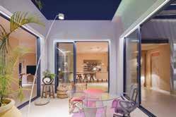
Location: Bahrain
LN Villa was designed and executed by Anar from the initial concept stages. The design team worked on both the interior and exterior design of the property, providing a cohesion between these as well as with the beach-side location in Bahrain. It embodies luxury, comfort and contemporary styling.
The design team at Anar believes that your home should tell the story of who you are and be a collection of what you love. This modern design is given life through vibrant colours that connect the interiors with the stunning sea views. Where possible, the rooms are given large, sea facing windows so that they benefit from natural light and emersion into the landscape. There is a neutral base for the design scheme, built upon with vibrant and happy colours of blue and orange that are taken from the beach and sand. Golden tones, rounded shapes and warm lighting are incorporated as a representation of the beach sunsets. Though this continues throughout the home, in living areas and bedrooms, the master bathroom is given a moodier ambience. Dramatic lighting and darker, earthier tones in the marble are offset by the natural lighting and views for a calmer contrast.
The design balances form and function, holding the belief that for a design to exemplify luxury it must still incorporate comfort as a priority. Anar looks to create a story with accessories and furnishings, with the highest end imported materials and selections. The repeated patterns, shapes and textures add depth and familiarity into the design scheme.
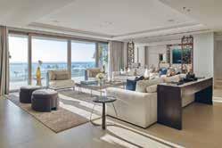
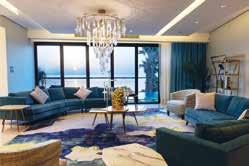 Location: Palm Jumeirah, W Residence
The Palm Jumeirah project has a unique design as the interiors look to smoothly complement the views of the property’s surroundings. With this project, Lumi Interiors created a concept story with lots of textures and interesting details and decorations. It feels luxurious and rich, yet liveable and practical.
Inspired by the beautiful views and amazing sunsets, the home is connected to its surrounding nature. Entering the apartment provides sanctuary from the hot weather, transitioning into a light and fresh interior.
Lumi Interior used natural tones and a multitude of textures to ensure that the design remained rooted to its context, as well as unique art, light textured fabrics, and natural colours such as blues, bronze, and brown.
The master bedroom has a sand and sea concept, using an earthy monochrome palette but with lots of texture. It was important for the designers to ensure that texture was consistent in the details, including within the joinery, furniture, and accents. There is a bird’s eye pattern in the writing desk, joinery, and side tables, and a de Gournay wallpaper that was a bespoke design by Lumi Interiors and de Gournay. This wallpaper depicts a male and female bird looking to each other from the panels as well as butterflies and flowers as a further allusion to the nature outside.
The driving force of the interiors was its connection to nature. The designers’ choice of soft furnishings, art pieces, and colour palette all reflect the outside which in turn created a harmonious design scheme. This became more prominent in particular rooms such as the living room, dining room, and master bedroom due to the views that they offer.
Location: Israel
Architect: Yonatan Ephrat
Interior Designer: Yonatan Ephrat
What started as a classic renovation of an old and neglected apartment in the heart of the Old City of Jerusalem turned, unexpectedly, into an unfolding story - the integration of the past with the present, history with modernity – as, quite by accident, original architectural features dating back to the Ottoman Empire were discovered.
In the course of the construction, 500-yearold features such as stone walls, niches, and arches were revealed, restored and integrated into the design. The apartment which overlooks the Temple Mount also has a private open roof with breath-taking views of the Old City. These original architectural treasures as well as the spectacular Old City view dictated the minimalist and luxurious design of the apartment chosen by the architect.
Once these amazing elements were found the designer choose a more minimalistic design approach to not “fight” with the original stone and arches discovered and restored. This approach gave the stage to the original elements but at the same time gave a modern, warm touch and feel to the space. The harmony between the old and the new, each complementing the other and not daring to interfere is what made the end result so fascinating, interesting and beautiful.
In a deeper philosophical way, this is the story of beloved Jerusalem. The old and the new, all the different religions, the holiness and the secular and so on.
Interior Designer/Designer: Guy Sirota Photographer: Yoav Gurin
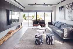
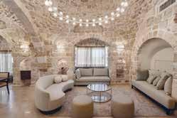
This ten-year old seventh-floor penthouse has undergone a comprehensive and thorough renovation by Guy Sirota that includes the demolition and redesign of all spaces. As the couple who own the apartment were looking to make improvements, Guy asked them what their dream home would be – their response was a place where they and their family can grow for many years.
The design scheme plays with industrial style and earthy tones. The interiors feel at home relative in the city apartment, offering a functional and calm space for urban living. It takes on luxury with a modern approach, mixing materials and textures whilst being a family space. Guy Sirota uses these varied finishes to define each space. The living area remains light with natural tones such as wood and brown leather, and a cabinet TV wall has been installed with a zero door and without visible jambs to give a smooth and clean appearance.
The kitchen is a flat matte black, family friendly space where cabinetry allows sides to remain clear. It is both functional and modern in style. The kitchen windows have been replaced by a panoramic window that overlooks the kitchen.
The original opening to the balcony has been enlarged by means of a constructor to provide a connection between the interior and outdoor living spaces. Created as a long and rectangular open area, the balcony provides an additional space for the owners to relax or enjoy the company of family and friends, whilst the floor-to-ceiling doors create impressive feeling of space within the interior. On the balcony Guy Sirota created a seating area with a panoramic glass railing for a view across the city, as well as an outdoor dining area and lounge space.
Location: North Coast, Egypt
Interior Designer: Shewekar Elgharably Photographer Credit: Nour El RefaiVilla Natura integrates beautifully with the wider environment because it is explicitly inspired by it. The serenity of the space, the lush greenery, the use of materials from nature and the finer asymmetric details all around the house are all true reflections of the nature in this area and in general. Shewekar’s luxury beach house is situated in one of the most prestigious and oldest developments on the North Coast of Egypt, and marries different materials, colours, techniques, accessories and artwork into a coherent design whilst paying tribute to Egypt in the subtle details.
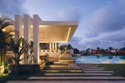
The design brief from the owner was to completely re-design the space to create a more modern look and feel, and provide more breathing and hosting space for the family of 3 generations that will be spending their summers there. The key requirements for this included multiple living spaces, a hosting/ show kitchenette, and a smooth flow throughout the house. This design works so well because within it, Shewekar was able to successfully bring together a myriad of generations, points of view, eras and functional and aesthetic elements.
There are three key aspects that make this project particularly special and close to the designers hearts - the nod of love and respect it gives to nature, to their Egyptian heritage and to local craftsmanship. The best representation of this trilogy is the masterpiece kitchenette and bar that were custom designed for this space; the bespoke cabinetry mimics an over-sized canvas made of stained veneer mirroring the nature outside, while the bar legs are hand-crafted like palm trees that are rich in this area and honoured in their Pharaonic heritage, all of which required the most skilled artisan workers to bring it to fruition.
Location: Kuwait, Mishrif
Interior Designer: Fatemah Al Obaid, Lulwa Al Hujailan, Eman Al Sudairawi
Photographer Credit: Design Talk
Residence AB is a project that looks to highlight simplicity and elegance. Triple Interiors were asked to work on the living areas with the brief of an open space concept, with their clients asking for a living space that opened onto the dining area.
The design by Triple Interiors speaks the taste of the Middle eastern world. They focus the interiors on a classical style but with a combination of colours and textures, and bespoke pieces that keep the area modern. The design works because of the selection of bespoke furniture and lighting, and it’s awareness of the clients’ needs and tastes. The bespoke coffee corner is designed to meet all the needs for Triple Interiors coffee-loving client. The inclusion of draws and cabinets provide the owners with additional storage space whilst keeping a sleep appearance. Mirrored surfaces are used to emphasise the space and give a wider feeling to the area, applied across different areas and in a range of shapes as to blend in with the design.
This residence is an open space Neoclassic apartment. The base of the colour scheme is muted, built upon with pastel tones in the furniture, art and draping, and key luxurious elements such as the marble wall in the living area and gold finishes throughout. The lighting elements within the space are well designed as to accompany shifts in mood and ambience, and help define each area. The full living space features incorporated lighting, with the lounge benefitting from a modern fireplace for warmth, sconces being used to frame the coffee bar, and the dining table being centred underneath a statement chandelier for an opulent entertaining space. Adjacent to the dining table is also an uplit planter, that adds lush greenery and further luxury.
Location: Dubai, UAE
Interior Designer/ Designer: Caspaiou Design & Interiors

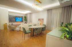
Photographer Credit: Juliet Dunne
Tailored interior design can be very important for one’s personal wellbeing. Caspaiou Design & Interiors’ brief for this project was to create a dream home for a Dubai based family, using all spaces in the home with family and friends. The interior design is tailored to the experiences this particular family wished for, creating spaces to share experiences in an atmosphere that is luxurious yet still calm and comfortable.
When working on the interiors for this home, Caspaiou Design & Interiors needed to truly understand what their client’s needs were, to then be able to design and develop each space to meet these requirements. Their success with this comes from the combination of materials and colours whilst bringing to life each aspect, theme and focus that the family wished for. The interior design was directed by the artworks that had been curated by the family as a guidance for the design, combined with a practical approach to use all spaces for family and friends, and letting the natural flow of sunlight play an important role in the design.
High windows capture a richness of natural light that connects each space and welcomes a calming atmosphere. The natural flow of sunlight works with the light tones and variety in textures that are used throughout the interior to develop the spaces. Caspaiou Design & Interiors not only consider the impact of natural light but utilise this as part of their design, using this to guide the combination of different materials and textures that work together. Whilst keeping their colour palatte muted and soft, the designers champion the family’s curated art within each area of the home.
Location: Dubai, UAE
Interior Designer: Jacqui Hunter
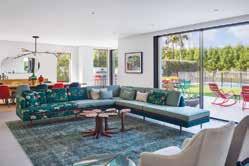
Construction Company: Hennessy LLC Dubai
Photographer Credit: Alex Jeffries
Villa At The Lakes is a carefully considered family home by Jacqui Hunter, owner and designer of Imagenius Interiors. For Jacqui, design is about the experience and how people feel inside the space; in this home - joyful comes to mind. It is bright, sunny, and full of light and fun elements, yet with simple and clean architectural lines.
The clients were looking to take the plunge with a full refurbishment of the Villa. This meant completely redesigning the Villa from floor to ceiling, with some walls being lost and gained along the way. They put complete trust in the designers, giving them creative freedom and support on what they were creating. This became a great experience and satisfying design process for Imagenius Interiors.
The designers and clients were fellow South Africans, so it was important to showcase the work of South African designers and artists. The result was a combination of some of the best South African design and iconic international design. Selected pieces come together with bespoke furniture to amplify the character of the home, such as the Bocci chandelier in the entrance that embodies the fun and colourful feel of the home, and the hand embroidered Casamento couch made very specifically for the family and for the space. South African artists were commissioned for the paintings within the home. Each piece has a story, has some meaning and is relevant in the lives of those who live here. A sense of place is very important, and though the property integrates with the larger environment, the use of larger windows features gives it a contemporary feel, and remains grounded by its South African ties.
Location: Hertfordshire, UK
Interior Designer: Hill House Interiors
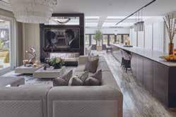
Associated: Boffi
Photography: Ray Main
Having built a long-standing relationship with the client whilst designing the interiors of her home throughout the years, Hill House Interiors was thrilled to be instructed to work on the latest space in this incredible Hertfordshire family residence. The new phase is centred on a brandnew extension in which an area that had previously been an external courtyard, was enveloped into the build to join two parts of the home, creating a sensational space to accommodate an open plan kitchen, family and dining super-room.
The brief to the Hill House Interiors studio was to create a sleek, stylish, and multifunctional space that would seamlessly provide a central hub suited for both everyday family life and activities as well as an impressive space to entertain guests with a touch of theatrical flair.
The previous layout was small and restrictive, and with limited natural light, it was dark and underwhelming. Therefore, a key element within the vision of the project was to transform the new space into one that the client would be proud to enjoy as both a family and as a party host.
The new extension, with a striking wall of large floor-to-ceiling windows, now floods the space with light and reveals unobstructed views of the home’s remarkable views of their grounds. With such beautiful nature quite literally on the doorstep, the brief for the furniture and furnishings was very much inspired by bringing the outside in.
Location: New Forest, UK
Interior Designer: Blank – Slate Studio,
Bari Jerauld
Construction: Colorare
Photography: Chris SnookNew Forest Country House is a stylish country escape for a busy London family. The estate comprises of a main house, two guest cottages, a pool house, a writing studio, a study and a party barn. There are vegetable gardens, olive trees, paddocks and completely surrounded by the enchanted forest.
The brief for Blank – Slate Studio was to reinvent what was previously a very tired property, gutting it to its bare bones. Over the year, the clients had obtained an extensive and vibrant art collection, the furnishings were to act as the perfect backdrop and complement each piece. The designers were given full creative freedom for the design scheme, which is every designer’s dream.
Whilst the clients wanted to escape their busy London life, they also wanted to use the Country House as a place to entertain family and friends. Blank – Slate Studio removed most of the old doors and opened up many of the walls, which created a more free flowing space from one room to another and allowed the designers to introduce spaces that would be perfect for hosting elegant evening soirees.
The property now feels appropriate to its surrounding areas. The forest and green paddocks serve as backdrop out of every window, Blank – Slate Studio wanted to incorporate the outside in with having large French doors opening up to the patio overlooking the majority of the property.
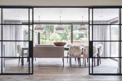
Location: UK
Interior Designer: Pippa Paton Design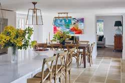 Photography: Paul Craig
The brief for Pippa Paton Design was to create a modern family home for the clients and their family. The clients who happen to be professional chefs required a space to enjoy time together and entertain at scale, with both functional and luxurious spaces which connect seamlessly internally and connect externally to terraces and gardens beyond. The overall design approach was to reconfigure spaces, moving walls where necessary, to improve circulation and create seamless transitions between spaces, whilst introducing an abundance of bespoke joinery and display areas.
The expansive 1100 sq. ft. kitchen space was almost loft-like in scale, but the existing small island was visually lost, the cabinetry offered inadequate storage and two steel pillars intruded into the space.
A seven-metre island (bronze-clad on one side, timber-clad on the other) with oversized industrial hinges and lay-on bronze-wrapped drawers and doors is now the centrepiece of the space. The design allows multiple prep and cooking stations, capacious storage and breakfast bar seating for six. Overall, the expansive kitchen with its industrial, loft-like feel has successfully provided a professionalstandard kitchen but without the look and feel.
Overall, the spatial layout, design approach and technical specifications ensure the house has exceeded the family’s hopes and aspirations. By reconfiguring spaces to improve circulation, introducing capacious bespoke joinery and display areas and selection of luxurious materials, Pippa Paton Design has reinvented this village house as a highly functional yet luxurious modern family home where spaces transition seamlessly internally and connect externally to terraces and gardens beyond.
Location: Ascot, UK
Interior Designer: Q Design House
Construction: Q Design Licensing Photography: James Robinson
This project involved a complete design and build renovation, Q Design House were brought in to create a light and airy interpretation of a traditional English home in Berkshire for clients who recently moved from Hong Kong. To achieve this, Q Design House used contrast between light and dark to brighten the spaces and incorporated traditional joinery details such as panelling in the entrance hall, a typical panelled gentleman’s room home office, a shaker kitchen and fully marble bathroom complete with marble beading.
Each traditional aspect was uplifted with contemporary elements to create a brighter and modernised scheme. For example, timber flooring was modernised by using a brighter tone and laid in a herringbone pattern with a border. Q Design House were playful with colours using a dark navy contrasted with natural exposed oak details in the kitchen and dark green panelling paired with a tan leather sofa in the study. Even a burgundy home bar with antique mirroring created a fun element in the games room. The entrance hall was completely transformed from orange varnished woodwork to a striking space with contrast, light and striking details.
The team at Q Design House managed the interior design, interior architecture and build of the project for a complete renovation. This collaborative approach allowed them to ensure a cohesive finish across the project from striking joinery to soft tones and interesting textures in the fabrics. Each aspect was carefully considered to relate back to the clients brief for a traditional English home, with all the comfort and warmth that that brings, but with the added contemporary feel of a light and airy home.
Location: Brighton, UK Interior Designer: Pfeiffer Design Kitchen Design: Roundhouse Design Photography: Simon Eldon & Mary Wadsworth
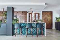
Inspired by the property’s seaside location and the clients’ love for turquoise hues, this home was designed with family in mind. Pfeiffer Design was involved in bringing this fabulous project to fruition fortheit clients who had outgrown their existing house, situated in one of Brighton’s most loved residential enclaves, with a spectacular view to the sea and close access to the South Downs. The decision to extend, create a second floor and refurbish the entire home was not one the clients undertook lightly, especially with three young children.
The brief was to improve the existing space, creating cohesion and flow between the interior spaces and provide much needed usable space for all the family to enjoy. The challenge and opportunity for this project was to combine the dynamic and contemporary architecture with interior design suitable for family life. This meant practicalities and function as well as style and innovation were at the forefront of all design decisions.
The internal layout of the primary, spacious and interlinked rooms needed to be designed to create not only wonderful entertaining areas, but ensure these rooms are versatile and still feel intimate, welcoming and comfortable for the family to relax in, throughout the seasons.
The ethos for Pfeiffer Design as interior designers is that family homes should be designed with family life at the forefront of every decision made, and that the spaces reflect the lives of a busy family with growing children whose needs will evolve over time.
Location: United Kingdom
Interior Designer: Rebecca Leivars / LEIVARS Interiors Studio
Construction: London Builders & Decorators
Photography: Nick Smith Photography
LEIVARS Interiors Studio worked with the client, the CEO of an international luxury brand, for the third time with this project. The brief was to completely strip out and reconfigure the rooms to create a home office whilst maximising light and comfort. The client asked for subtle nods of elegance from the Art Deco era yet having undertones of femininity and drama.
LEIVARS Interiors Studio wanted to connect the living and dining space to create a striking statement fireplace and sight line towards the small rear patio, and so they designed a full length low level fire place and opted to have this made from beautiful marble with fluting detail. By keeping the fireplace low and long whilst working with vertical fluting details it gives this small property the feeling of height with real impact. By adding in a bio ethanol fire gave some warmth and interest in the colder months.
When working with expensive marble slabs which are unique and one of a kind, it was imperative for LEIVARS that they worked with trusted and highly skilled stone masons. Marble is fragile in nature, so the fluting detail was a painstaking job with each fluted section having to also be hand polished, the whole process took nearly nine weeks. The designers wanted to use a striking and impacting colour and selected the beautiful emerald velvet for both the sofa and banquette seating area. By keeping the colour scheme limited to just three colours and using obly brass as an accent, it allowed the home to flow seamlessly and not feel visually cluttered.
Location: Edmonton, Alberta
Interior Designer: Aness Handous
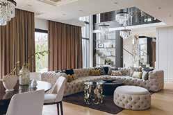
House of Sevens is a luxurious mix of bespoke custom designs, created with thoughtful design and impeccable workmanship. Balancing bold design choices with layered soft finishes achieves a modern luxury that is also fitting for a family home.
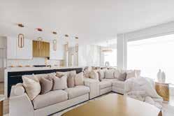
The design evokes a light and refreshing ambience, whilst the layered textures and abundance of angles and shapes add a welcoming warmth. It is an entirely bespoke home, tailored to the family’s specific tastes and desire for something unique.
Many of the custom elements became Tailored Interior’s favourite aspects of the project, including the custom-designed and built dining table and the customised metal details that run through the living areas such as the fireplace pillars, dining table, and the kitchen hood fan.
This design works so well because all the elements and finishes used play the perfect role with each other while creating the utmost level of balanced sophistication and luxury. There is a thoughtful process that brought about the most elegant finishes such as porcelain, gold coated metal, Cambrian quartz, and leather pressed finishes, and created the core of a bespoke design. The mix of elements and intricate choice of finishes results in an unseen, oneof-a-kind, thoughtful and detailed design that showcases timeless elegance.
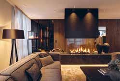
Interior Designer: Go Interiors GmbH Photographer: Pierre Kellenberger
Both floors of the Penthouse Plazza were originally planned as office space and were taken over in the shell – without walls and stairs. With great sensitivity, the architects created a beautiful, luxurious retreat in the middle of one of the most beautiful areas of the Swiss Alps. According to their company philosophy of creating emotions, they succeeded in creating a home away from home.
The condensation of the surface, the use of precious and tactile-sensual materials in combination with skilful lighting creates cosiness and warmth. Sensuality and the claim of feeling at home are the core goals of their work. With this extraordinary project, they created an inspiring and enriching living experience for their clients out of nothing.
Go Interiors GmbH’s favourite aspect of the project is the transformation from an empty space to a beautiful mountain home. The designs works well as it is simple but cosy, with an alpine modern feeling flowing throughout.
Location: Raszyn near Warsaw, Poland
Interior Designer: HOLA Design
Photographer: Yassen HristovThe Art of Serenity is titled to reflect the mood of the interior designed by HOLA Design. The property’s inhabitants are two adults and their dream place to live is an interior in the style of timeless elegance, with classic elements, but without accents directly referring to glamour.
It was the investors’ wish that their home should be bright and spacious, which was possible, among others, by thanks to the large number of windows. In addition, this effect is enhanced by numerous mirrors and glazing proposed by HOLA Design. The interior is finished with natural materials such as wood and stone. There are also many noble arrangement elements, such as stucco, subtle wallpapers and black accessories. Elegance reigns here not only on the ground floor, but also in the staircase connecting two levels and on the first floor.
The house features a classic division of functions, with a kitchen, dining room and a lounge area downstairs, and stylish bedrooms and bathrooms upstairs. The arrangement of the house reflects the preferences of customers, both in terms of colours and the form of equipment. It is impossible not to notice the sympathy for quilted elements which can be found in almost every room, especially in the living room and bedrooms. There are many effective lighting fixtures in the house, alongside solutions that, although invisible at first glance, do increase the everyday comfort of living, such as underfloor heating or an intelligent home system.
Location: Jupiter, Florida
Interior Designer: Jackie Armour, JMA Interior Design Architect: Brian Collins, Affiniti Architects Construction Company: Dan Reedy, Onshore Construction Photographer: Brantley Photography
The space was designed for a discerning client who loves color, JMA Interior Design brought color throughout the house with custom tile, cabinetry, wallpaper, and fabrics. Their biggest challenge was making multiple colors blend and flow, while still maintaining cohesion.
The kitchen and family room are open to each other, so when selecting fabrics and a color palette, the team ensured they used similar color tones but kept the spaces different by using different textures and saturations of hue. This keeps the spaces discrete but also interconnected with one another. The kitchen is light and airy with pale green subway tiles while accents of rift-cut oak on the ceiling beams and vent hood surround add visual interest, warmth, and texture to the space. Keeping the kitchen in soft tones balances the bright colors in the family room, which the kitchen opens to. While classically inspired elements such as a triple set of double cypress entry doors, white-painted millwork and columns, wooden brackets and ceiling beams, and a pair of dramatic staircases contribute to the character-rich backdrop, a mix of comfy furnishings, artful accents, and vibrant colors and patterns enliven the traditionally inspired interiors with fresh notes of contrast.
This design reinforces the active, indooroutdoor lifestyle of its owners and their unique vision -- traditional, with a young, fun twist that’s bursting with color. The design embraces its picturesque site with features like the pool, the hardscaping, and tall windows that take advantage of the ample natural light and views of the surrounding South Florida waterfront.
Interior Designer: Lazzoni NYC

Location: Istanbul, Turkey
Located in the historic neighborhood of Besiktas, Istanbul, this residential project was designed with the beauty and serenity of Bosphorus in mind. Placed in Europe, overlooking Asia, the project was the perfect medium to enliven the Japandi style. Natural materials and simple lines create serene minimalism through all spaces, bringing the best from two different sides of the world - Scandinavia and Japan, just like Bosphorus does with Anatolia and Thrace.
Being one of the oldest neighbourhoods of Istanbul, Besiktas has a grand historical background holding imprints from Sephardi to Armenian to Turks, making the area the perfect location for art and culture. Imar House was designed with custom-made articles that were exclusively built for the project from the kitchen, to the bathroom, to the bedroom with inspirations from the past and present. Minimalism and functionality come together in natural wood, simple tones, and soft hues, creating minimal yet well curated spaces in Japandi style.
Floor-to-ceiling windows of the residence offer mesmerizing panoramas from the Asian shore of Istanbul while being situated on the European side, beholding the Bosphorus from atop. The project works so well as the location was specifically selected by the client to form a transitioning bond as a concept. The main idea was to be able to harmonize two ends, so this project was the perfect medium to reflect a merge of cultures in design, lifestyle, and location while also binding the two ends of old and new.
Location: Jupiter Island, Florida
Architect:
Christian Thomas and John Melhorn
Interior Designer: Betsy Brown
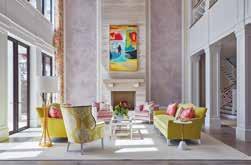
Construction Company: Thomas | Melhorn
Photographer: Nicole Franzen
Wabi-sabi, the Japanese design principle that emphasizes the perfectly imperfect, is imperative to every aspect of this home. The architecture recalls that of the Florida vernacular with materials that would be found in the surroundings. This house was intended to be passed from generation to generation and so, the material palate was carefully curated with the intention that it would both age in harmony with the ocean’s environment, but also exude a memory of previous experiences.
The floors are raw oak planks that have been fumed and gently waxed to present the natural beauty of the material. The walls and ceilings are a composition of waxed plaster and lime cypress, creating a soft elegance welcoming of the colours and light of the oceanfront setting. The house makes an intentional angle shift, the kitchen and family room reside within a wing of the house that faces southeast rather than directly east. This shift presents a different view of the beach and ocean, looking along the coast of sea grapes and coconut palms with the tropical Atlantic beyond. The kitchen is cypress wood that has been coated in a lime wash and stripped to reveal a beautiful, aged cypress and the counter tops are limestone sourced from Romania, which resembles the colour of the local beach sand.
The north wing is dedicated to the children’s bedrooms and the ocean terrace; a magnificent post and beam covered terrace overlooking the ocean and entire property. This balcony has been purposely orientated to capture the breeze on any day giving respite from the tropical sun.
Location: Kuala Lumpur, Malaysia
Interior Designer: Simon Yew
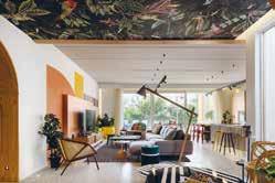
Luxurious French accents are found in this unique home, personifying to the inhabitant’s classy lifestyle. Accompanied by modern porcelain tiles and wavy geometric garden surrounding the façade, the swimming pool is designed to exude different ambience under various lighting. Overlooking this exotic tropical paradise, a modern sitting area has been created with wicker furniture on one of-a-kind encaustic graphic tiles against stone textured wall.
Entering the home itself, transports the soul into euphoric elegance. Bianco Jade marble is the perfect canvas to highlight the handmade crystal chandelier. The custommade modern console is set with Belgium Black marble and lined with champagne gold. Specially made to compliment the Luna Grey marble flooring that spans throughout this magnificent first level, it is a delight for visitors to explore.
The entertainment room’s centre piece is the modular sofa. Full of surprises, the grand piano settles in front of a unique art piece. The Panda White feature wall is considered a rare natural marble species. Arranged in the current design trend, boiserie covers this room from wall-to-wall while the ceiling of both entertainment and dining rooms are adorned with champagne gold leaves and wave chandeliers. Built-in display shelves featuring Calacatta marble adorned the textured wall paint.
Modern Nordic in design, champagne gold, Calacatta marble and luxurious velvet make the eight-seat dining table. In matching theme, the main kitchen’s countertop uses imported A-Grade Volakas marble under a pair of unique pendent lights. Finishing this room’s eclectic elegance is the burgundy velvet bar stools give a pop of rich colour.
Behind imposing black framed glass doors, the kitchen is significantly toned down in palette with grey boiserie and matching granite countertop.
Location: United Kingdom
Architect: Breley Design
Interior Designer: Rose Narmani Developer: Ulisses
Construction: Daniel Zefli Photography: Julian Abrams, Nick Smith
This elegant country mansion is contemporary and stylish and showcases functionality without sacrificing sophistication. The design brief indicated that the space needed to be open, bright and light and should take advantage of the high ceilings. Allowing as much light as possible to flood into the living spaces was of vital importance. The colour scheme was to be a multitude of varying greys with pops of contrasting colours throughout to bring depth and intrigue into the interior design.
Rose Narmani was tasked with creating a timeless design scheme that would last years and survive any current design trends. The living space was to be contemporary and comfortable, with many natural and contrasting textures, finished of with an ultimate touch of luxury. The high ceilings created were Rose Narmani’s favourite part of this project as it completely changed the dynamic of the space. The designers were tasked with removing the original ceilings to create a room that doubled in height. As you enter the house and proceed into the formal living room then you feel the effect of this structural change.
The design is so effective because firstly the client is delighted with the end result and that is the main overriding objective when finishing a project. The designers began this project from the renovation stage and then moved onto interior design and finished it with interior styling. Rose Narmani spent so much time with the client to ensure that they understood both their individual and family requirements and preferences. The design transformed this property and made it into the glamorous home that the client never wants to leave.
Location:
Seashell Compound, North Coast, Egypt
Architect: Mohamed Fares
Interior Designer: Mohamed Fares
Developer: Seashell, North Coast
Photography: Nour Refai
Sitting on a Mediterranean Beach, Alchemy wanted the design of this home to benefit from its location as well as its inhabitants. With this in mind, they designed Shell House as a harmonious beach house that reflects the host’s personality, layering textures to give depth and gravity to the space and implementing colours, shapes and patterns for a fun, summer feel.
It’s bright and bold approach to design defines this beach house as both fun and comfortable.
The Shell House is a playful, thoughtful, and generous abode. It is a property that embodies the spirit of Summer, and is a place where guests can have fun and enjoy each other’s company as well as it’s North Coast location. Alchemy took inspiration from the Summer season to design Shell House as a bright and welcoming property. Playful design emulates the host’s personality, with unconventional shapes being used within the living spaces. Bold block colours and natural materials are an eyecatching partnership, and the layered textures give gravity to the space. Each design decision has been made to add vibrancy and liveliness to the home, which inevitably alludes to the fun of summer.
The luxury villa also considers a fourth dimension: Time. When designing with this concept, the house captures the essence of the sea by allowing the golden light of the sunset to engage with the property. The natural light throws shadows throughout the day, introducing a dynamic element to the interiors. As the sun rises and sets its light interacts with the textures, angles, and lines of Shell House - the house and it’s location work together to express the true design potential of the property.
Location: Palm Jumeirah, W Residence
The Palm Jumeirah project has a unique design as the interiors look to smoothly complement the views of the property’s surroundings. With this project, Lumi Interiors created a concept story with lots of textures and interesting details and decorations. It feels luxurious and rich, yet liveable and practical.
Inspired by the beautiful views and amazing sunsets, the home is connected to its surrounding nature. Entering the apartment provides sanctuary from the hot weather, transitioning into a light and fresh interior. Lumi Interior used natural tones and a multitude of textures to ensure that the design remained rooted to its context, as well as unique art, light textured fabrics, and natural colours such as blues, bronze, and brown.
The master bedroom has a sand and sea concept, using an earthy monochrome palette but with lots of texture. It was important for the designers to ensure that texture was consistent in the details, including within the joinery, furniture, and accents. There is a bird’s eye pattern in the writing desk, joinery, and side tables, and a de Gournay wallpaper that was a bespoke design by Lumi Interiors and de Gournay. This wallpaper depicts a male and female bird looking to each other from the panels as well as butterflies and flowers as a further allusion to the nature outside.
The driving force of the interiors was its connection to nature. The designers’ choice of soft furnishings, art pieces, and colour palette all reflect the outside which in turn created a harmonious design scheme. This became more prominent in particular rooms such as the living room, dining room, and master bedroom due to the views that they offer.
Location: Israel
Architect: Yonatan Ephrat
Interior Designer: Yonatan Ephrat
What started as a classic renovation of an old and neglected apartment in the heart of the Old City of Jerusalem turned, unexpectedly, into an unfolding story - the integration of the past with the present, history with modernity – as, quite by accident, original architectural features dating back to the Ottoman Empire were discovered.
In the course of the construction, 500-yearold features such as stone walls, niches, and arches were revealed, restored and integrated into the design. The apartment which overlooks the Temple Mount also has a private open roof with breath-taking views of the Old City. These original architectural treasures as well as the spectacular Old City view dictated the minimalist and luxurious design of the apartment chosen by the architect.
Once these amazing elements were found the designer choose a more minimalistic design approach to not “fight” with the original stone and arches discovered and restored. This approach gave the stage to the original elements but at the same time gave a modern, warm touch and feel to the space. The harmony between the old and the new, each complementing the other and not daring to interfere is what made the end result so fascinating, interesting and beautiful.
In a deeper philosophical way, this is the story of beloved Jerusalem. The old and the new, all the different religions, the holiness and the secular and so on.
Location: Dorset
Interior Designer: LEIVARS Interiors Studio
Architect: Munden Robinson Architects
Photography: Nick Smith Photography
A spectacular coastal residence bringing harmony between the old and new. LEIVARS were invited into the project mid-way through construction work to design the interiors for this stunning family coastal retreat.
The brief was to use the three colour tones from the original stained-glass window of this 1930’s house yet bring the design into the 21st century working with the incredible design by the architects who managed to create a breath-taking angled rear extension to fully absorb the ever-changing coastline throughout the year. Working with the three key colours, LEIVARS set out to add block colours and select angles in design and patterns that took on and complemented the rear extension detail. Use of teal, mustard and deep red tones were used throughout to ensure consistency and cohesion in design.
The open plan area needed to be fun and relaxed for the younger family members, yet the two salon rooms were to be slightly more refined for evening drinks using inspiration from the clients travels to the Far East. The bedroom was to have soothing tones that would balance with the sea scape views to be enjoyed all year round. The colour palette complements the ever-changing tones of the sky and sea, when the weather is slightly wilder the mustard/gold tones coupled with the warm undertones add a sense of cosiness giving a general glow as you enter from one space to the next and when the sun is beaming through, the cooler tones of the teal bring the scheme back. A great mixture of texture and details throughout bring strong sight lines that draw you from space to space organically.
Location: Ottawa, Canada
Interior Designer: Art & Stone Group
Developer: Art & Stone Group
Photographer Credit: Kevin BelangerArt and Stone Group have worked to make The Wabi-Sabi Home bright and airy, keeping a minimal yet comfortable and organic feel. Natural materials and textures to bring life to the home with a Scandinavian and Japanese essence.
Built in a neighbourhood alongside nearly 100 years old homes, it was crucial to keep the roof style similar to those around it, letting this home stand out because of its beauty and rather than shape. As a home for avid travellers, the spaces were created to feel like the places they love travelling to. The kitchen, dining and living is open as the homeowners love to entertain, and the house needed two comfortable offices for them to work from. They also wanted areas where family members could retreat to other than bedrooms, so Art & Stone Group incorporated two cosy nooks. There are four bedrooms on the second level, and a suite in the basement for visitors.
The kitchen is the heart of the home. It has intricately worked details; master cabinet makers created the millwork to ensure that the details Art & Stone Group envisioned were achieved. The waterfall island can be used as a bar but a large surface for food preparation. Elsewhere in the home, the master bath feels airy and natural with its egg-shaped tub, open curb less shower and expansive ceilings leading to a huge vanity with 7ft custom mirrors, alongside 3 milky glassed Luceplan lighting fixtures. The main bath on the second floor plays perfectly with the angle of the ceiling, while keeping the space practical.
Location: London, UK
Interior Designer: Birch House
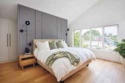
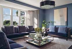
Architect: SM12 Architects
Construction: Adrian Design
Photography: James BalstonThis Grade-II listed Chelsea townhouse underwent a full refurbishment and extension. Working closely with the client, their architect and local conservation teams, Birch House created a design that completely transformed the property while remaining faithful to the character of the original building.
The client wanted a full redesign of every interior architectural detail and finish including bespoke fitted joinery, lighting, and bathrooms, as well as furnishing and styling throughout. They wanted the property to ooze a feeling of tranquillity and provide a restful feeling akin to staying in a luxurious boutique hotel. Importantly, as the client has such an extensive and interesting art collection, they wanted the interiors to allow it to sing. Accordingly, Birch House kept the overall colour scheme simple providing the perfect backdrop to the art.
Birch House reinstated period features, selecting materials to complement the original style of the property. The form and proportion of the Georgian architecture, the natural light and gorgeous period detailing were the stars of the show. But to avoid creating a pastiche of a period house, Birch House kept the design of the hard finishes, the kitchen and fitted joinery very contemporary using inset mirrors to enhance the feeling of space and give a nod to a more traditional shaker style.
The structural alterations to the rear and full mansard roof extension have been carefully considered, taking into account the particular characteristics of the surrounding mid-19th century buildings. Birch House worked closely with our client’s architect to maximise floor space and bring in natural light at every opportunity.
Location: UK
Interior Designer: Pippa Paton Design
Photography: Paul Craig
The brief for Pippa Paton Design was to create a modern family home for the clients and their family. The clients who happen to be professional chefs required a space to enjoy time together and entertain at scale, with both functional and luxurious spaces which connect seamlessly internally and connect externally to terraces and gardens beyond. The overall design approach was to reconfigure spaces, moving walls where necessary, to improve circulation and create seamless transitions between spaces, whilst introducing an abundance of bespoke joinery and display areas.
The expansive 1100 sq. ft. kitchen space was almost loft-like in scale, but the existing small island was visually lost, the cabinetry offered inadequate storage and two steel pillars intruded into the space. A seven-metre island (bronze-clad on one side, timber-clad on the other) with oversized industrial hinges and lay-on bronze-wrapped drawers and doors is now the centrepiece of the space. The design allows multiple prep and cooking stations, capacious storage and breakfast bar seating for six. Overall, the expansive kitchen with its industrial, loft-like feel has successfully provided a professionalstandard kitchen but without the look and feel.
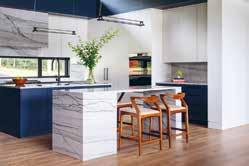
Overall, the spatial layout, design approach and technical specifications ensure the house has exceeded the family’s hopes and aspirations. By reconfiguring spaces to improve circulation, introducing capacious bespoke joinery and display areas and selection of luxurious materials, Pippa Paton Design has reinvented this village house as a highly functional yet luxurious modern family home where spaces transition seamlessly internally and connect externally to terraces and gardens beyond.
Location: Vilnius, Lithuania
Interior Design: Carter Tyberghein
Photography: Carter Tyberghein & Mark Luscombe-Whyte
Carter Tyberghein was commissioned to develop a scheme for the interior spaces for this family home located in the most prestigious area of Vilnius, off the oldest main artery of the city which dates back to the Middle Ages. The city has been included as a UNESCO World Heritage Site.
In light of this, the initial task was to carry out meticulous space planning to link seamlessly the oldest parts of the apartment with the rest of the property as well as maximising the surface area. Due to the thickness of the ancient internal walls and the building being listed, this task had its limitations. However, the layout provides a continuous, uninterrupted flow throughout the living areas, whilst the varying ceiling heights from one room to another creates desirable rolling effects, defining the role of each room and provides a sense of uniqueness to this family home. Remnants of painted friezes were found in part of the property during the refurbishment which were salvaged and reinstalled.
The internal envelop of the property was developed using traditional and decorative architectural elements such as panelled doors, decorative cornices to harmonise with the traditional and historical character of the city and its building.
A dramatic wide staircase leads the way to the first-floor landing and living areas, while another, with bespoke wrought iron balustrade, takes us to the bedroom floor. Design elements, carefully hand-picked finishes, furniture, and soft furnishing were developed simultaneously to ensure coherence in the design, producing a full and coordinated package leading to holy grail of all Carter Tyberghein’s work - a timeless interior with contemporary classic interpretations.
Location: Central Virginia, USA
Interior Designer: Ivey Design Group
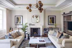
Architect: SMBW
Construction Company: Jeff Jarrelle
Photographer: Ansel OlsonIvey Design Group was tasked to produce a colourful, modern interior design for a new build home located on a 10-acre property in central Virginia, USA. The home needed to be casual and comfortable, but sophisticated and modern. The architecture of the home includes exposed steel beams, cedar ceilings, and abundant natural light through both floor to ceiling and clerestory windows.
The home is situated such that it has expansive views of the property, including wooded areas and a pond. Ivey Design Group was then tasked with bringing in warmth, colour, and comfort to the 9,000 square foot home, while still showcasing the amazing, wooded scenery outside. This was achieved through a careful balance of colour and texture. Warm woods, moments of colour against a neutral backdrop, and clean lines create the modern yet playful home the homeowners were after. In addition to aesthetics, this home needed to be ready for entertaining. With fold and stack glass doors opening to an expansive outdoor kitchen, patio, and infinity pool, an ample bespoke walnut beverage station, and double islands in the kitchen, this home can host family and friends with ease.
Ivey selected hard finishes and upholstery fabrics that can stand the wear and tear of everyday life. This home is modern but playful, luxurious but not pretentious, and bold but inviting, and never boring. The design truly reflects the client’s lifestyle and personality: family friendly, modern, colourful, and unique, yet still lets the exterior views shine. There are moments of colour, comfort, calm, and wow.
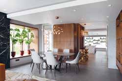
Location: Sugar Quay, Tower Hill, London
Interior Designer: Casa Alta Design
Construction Company: Chartwell Group
Associated: GS Contracts, Gaysha Ltd, Esoundworks
The brief required Casa Alta Design to transform an originally bland developer’s apartment into a warm and welcoming home with simply the best of everything. The focus was to supply the most cuttingedge technological features – the whole apartment can be controlled from a remote location - infused with the design creating a beautiful yet comfortable and convenient space.
The apartment, located by the Thames, now prioritizes the views from all windows creating a connection with its amazing surroundings. By using extensive framing of all windows, clad with American Walnut and following the same grain as per joinery, Casa Alta Design have integrated the gorgeous viewpoints such as The Shard and other London landmarks as a backdrop for the rooms.
The client’s South American roots inspired the design concept with carefully curated references - marbles, bronze, dark wood, and a concise but rich palette of colours.
Built throughout the COVID 19 lockdowns and supply disruptions, this project is a statement of Casa Alta Design’s commitment to delivering projects to the highest standards.
The bespoke joinery package for this project was extensive and Casa Alta Design had to work closely with the joinery contractors. The craftsmen at GS Contracts and Gaysha are no strangers to working with exotic materials and demanding briefs. To ensure an even grain throughout the joinery, Casa Alta Design used a single American Walnut log creating a sense of continuity in all pieces. The superb verde tinos green marble cladding has a special leathered surface texture.
Location: Toronto, Canada
Architect: Brenda Izen
Interior Designer: Ali Budd Interiors
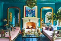
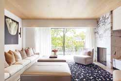
Construction Company: Jordyn Developments
Landscape Architecture: Wendy Berger & Associates
Photographer Credit: Scott Norsworthy
When the clients approached Izen Architecture with a vacant lot, it came with many restrictions: the developer had already secured city-approved building permits stipulating the footprint, height, general layout and elevations. Izen Architecture found every opportunity within the parameters for humanity and joy.
A key part of the approach was to infuse the interiors with natural light. To do that, they used frameless windows -only recently engineered to withstand Toronto winters, the design results in a near-perfect sense that the interiors flow to outside. The effect is particularly sublime where the frameless window wraps a corner. Another set of frameless windows look out to the backyard’s tree canopy, resulting in living spaces that feel more like a rural nature retreat than an urban Toronto abode.
The tree house sensibility is heightened by the use of white oak engineered hardwood flooring on the ceiling, as well as polished concrete floors that amplify natural light, reinforcing the effortless, airy aesthetic.
The stairs are supported by heavy steel framing hidden in the wall, but appear to be origami-thin, floating planes of white oak. The glass rails sit in sleek black steel channels and are capped with similar channels that act as hand-grips.
The weightlessness of the interior is infused into the home’s overall massing.
From the street, the main entrance and the garage are seamlessly integrated into the surrounding wall of porcelain. Above grade, the second and third floors cantilever overhead and are clad in Indiana limestone.
The contrast in the materials makes the upper volumes appear to be defying gravity.
Location: Illinois, USA
Interior Designer: Jasmin Reese Interiors Photographer: Michael Alan KaskelThe Chamberlin Project is a magical, modern day Victorian kaleidoscopic space, with vibrant colours and finishes that are bold, yet quiet at the same time. Jasmin Reese Interiors was initially hired to help select pillows for the family room, from there Jasmin also suggested changing the rug, which led onto the team changing that entire room. After working on additional rooms within the house, eventually Jasmin Reese Interiors had transformed every main room in the home.
Jasmin Reese states “I was so inspired to come to the clients with bold saturated ideas and “what ifs” that they agreed to - and always chimed that we should take that idea to the next level! I was excited to source period pieces and came across lots of interesting curiosities.” The design works so well as the scale of the home allows the colours and limited furnishings to vibrate and create a high octane look and feel. In addition to this, the design also manages to feel nostalgic, creating an interesting mix and design concept.
Specialist artisan skills were used throughout the design of the project, including through the wallpaper hangers, art hangers, high quality painters and an individual who made the roman intaglios in the primary bedroom. As Chicago is known for its grey, muted environments, the Chamberlin Project stands out rather than blends in with most homes in this area. This home is in the middle of the woods and at night you can see the glowing tones of the beautiful fuchsia and teal room from down the street.
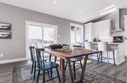
Location: Canada
BLD Homes (Brownlee Land Development) is a locally owned home builder that offers a higher quality of living to the town of Perth and surrounding areas in Canada. From start to finish, they treat each client’s home like their own, ensuring a high standard for each completion. With their most recent project, BLD Homes present The Stewart –an open home with maximised space, curb appeal and premium finishes in the sought after neighbourhood of Hayshore Estates.
The Stewart is a stunning, brand new, spacious, three-bedroom bungalow that sits on a quiet street. Featuring vaulted ceilings, a walk-out basement, and nearly 3000 sq.ft. of exceptional living space, it integrates rural life with modern living. The open concept connects the living, dining and kitchen areas which is one of BLD Homes’ favourite aspects of the house. The design scheme creates a flow through these spaces, but the spacial design and subtle differences in tones, materials and furnishings help define each.
This home is complete with high-quality materials throughout the main level, quartz countertops in the kitchen and all bathrooms, as well as designer fixtures throughout. All the cabinetry is custom, completed by local artisans, and the kitchen features high-end finishes and appliances. The design integrates into the environment by using natural colours and materials, and is flooded with natural light that complements the open space and tall ceilings.
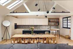
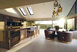
Location: Cheshire, United Kingdom
Interior Designer: Design by UBER
Photography: Karl Hopkins
A converted Grade II listed stable block was transformed with a glass kitchen extension taking in spectacular views. A full layout reconfiguration based around a steel inner framework allowed the outer structure ‘bones of the house’ to fully showcase the historic charm of the original oak beams and period elements.
It was the vision of Design by UBER’s Managing Director, who saw the potential to take this modest ex-stable barn with a previously dated interior and release the period potential to the maximum whilst bringing it right up to date by completely rearranging the orientation (creating a glass ‘box’ kitchen). The upper floors needed to accommodate a family in a characterful but more modern living environment.
One of the designer’s favourite aspects of the project is the views from the new kitchen, preparing a master chef’s meal with the Officine Gullo oven as your guests sip cocktails on the curved marble ‘chef’s table-style’ bar, feels very special at sunset. It re-orientates the house to allow the kitchen to be a focus room and fully incorporate the tremendous elevated landscape position to fully appreciate the views across the treetops and snaking River Dane.
This clever use of modern building techniques to suspend the structure within the existing frame managed to preserve a lot more of the original 400-year-old features and character. It allowed modern technology to be easily integrated (and truer walls to work with), whilst leaving fabulous original features like King Truss oak beams to shine as the show-stopper focal elements.
Location: London, UK
Architect/Interior Designer:
Peek Architecture + Design
Construction: M. H. Costa / Capstone
Associated: Prime Cuts Joinery
Photography: Alex Maguire
Peek Architecture + Design was required to completely refurbish an old warehouse for a young family, with an eye on energy efficiency through insulation, heating and lighting. Bespoke joinery was introduced throughout, and a feature staircase to bring light into the centre of the building.
One of the key aspects of the Paddington Warehouse was the overall use of a common palette of materials throughout. Additionally, the central staircase was vital to the overall scheme. By combining the timber handrail with black metallic spindles for the balustrade, the designers were able to retain a modern industrial feel into this warehouse conversion.
Many specialist skills were required to complete the work, M.H. Costa built everything in house for the Paddington Warehouse and together they templated the curved oak handrail on site. One of they key internal layout changes included moving the kitchen to opposite side of the room along with the design and creation of a feature wall featuring bespoke joinery, a steel-framed door and glass wall.
Peek Architecture + Design believe that the overall scheme works particularly well as they were able to create a calm and functional space, with a high level of detail and finish.
Location: Gloucestershire, UK Architect: YOO Ltd
Interior Designer: Anja Revenda, The Lakes Developer: YOO Ltd Photography: Ola Smit
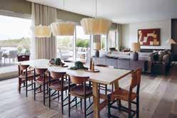
The brief was to create a private retreat nestled in the heart of the Cotswolds, a home away from home that’s equally an oasis of calm as well as a perfect place for entertaining. It’s inspired by a global traveller and collector with a touch of Rock n Roll. The goal was to design an open plan, spacious 5-bedroom family show home featuring a large terrace that would overlook a waterside nature reserve at The Lakes.
The home is situated on a rural luxury estate spread across 850-acres of freshwater lakes, meadows and woodland in the Gloucestershire countryside. It is created for those seeking a family friendly community and luxury sanctuary with a unique connection to nature. Facilities onsite include a 17-metre pool, spa and gym, a range of events and fitness programming not to mention a host of outdoor activities, sailing and kids club. Key to the brief was to seamlessly achieve a belonging to the community lifestyle of the estate residents whilst retaining privacy within the home. One of the key aspects of this project is the amazing play of shadow and light as the sun moves around the building. Carefully selected pieces of furniture, artworks and decorative objects that come with a story which give the spaces a warm, welcoming and homely feel.
The multitude of windows provide endless views and welcome the outside in. Despite the large, open plan footprint the spaces have been carefully zoned to create cosy spaces that flow into each other whilst also providing privacy. Much attention has been given to the selection and combination of materials and colours which provide a beautifully nuanced and textured backdrop to the curated pieces of furniture, lighting and decor.
Location: Chelsea, UK Interior Designers: Noor Charchafchi, Lola Osunneye
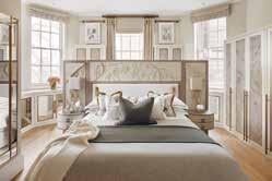
Construction: UK Property Solutions Photography: Julian Abrams
Located in the heart of Chelsea, this 3 bedroom apartment was transformed into beautiful home catering to the luxury lifestyle the Sloane Building surrounds itself within.
The design brief was to complete a full refurbishment and furniture package, including redesigning the bathrooms and the kitchen, with a full lighting and a soft furnishing package. The neat and neutral palette accentuates the Edwardian architectural details of the building with a modern twist. The brief was to maintain a sense of flow and movement throughout the space using simple forms and shapes adding depth with textural details. Following the natural narrative of the apartment with eccentric curves and arches, Celine Interior Design mirrored this into their design for the living room Television Unit. The arched doors in the hallway and the arched panel within the existing arched niche emphasised the soft curves and style throughout.
The Master bedroom was a very special design with a stunning leather detailing panels specially made from India. Every inch of the Master headboard is so specially crafted in a way that walking into this space feels almost dreamy.
The design works because it feels so seamless throughout each space, every area flows into the next, there’s a stunning theme of brass and layers of creams and white that just feel like waves of soothing texture that weave in and out of every area. It’s a layered blend of old and new within a crafted contemporary space, which is so rich in personality and character. Materials and Finishes are sumptuous and warm, with a wealth of textures offering both comfort and aesthetic delight.
Location: Valle de Bravo, Mexico
Architect & Interior Designer:
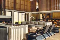
Alejandro Bernardi / Beatriz Peschard
Photographer: Rafael Gamo
Submerged in the topography, and the vegetation, this estate finds its place in an exclusive residential compound located in Valle de Bravo. The house was designed as a second home in a one-story layout that contains public, private recreational and service spaces. The main entrance, between colour and stone volumes, guides you through and into the main space. A double height stone volume with wood ceilings that encloses the living and dining experience, connected with the exterior terrace and opening on both sides to create a feel of transparency and depth.
This magnificent space was designed as the heart of the house, connecting the service areas, with the kitchen and on the other side, the bedrooms. This volume can be integrated with the exterior terrace that hosts an exterior living, dining, pool and fire pit experience. The volumes containing the bedrooms, kitchen and service areas are located around the main stone volume, and they all interact with the topography, adjusting their position to get better views, more privacy or simply a privileged spot on the terrain. Attention to detail is present throughout the project, the dialogue between solid and transparency play a main role, the amount of natural light drawn upon the house allows the temperature to regulate in a more natural sense.
Family life flows around the central area, the main core of the house. From here, you can really appreciate all of the details and key aspects, like the emblematic windows that let nature in, and shower each space with sun and natural light.
Location: Toronto, Canada
Architect: Richard Wengle
Construction Company: GoldCon Project Management Photographer Credit: Patrick Biller
This is a city house that lives large. Based in an established pocket of Toronto, Douglas Design Studio’s clients wanted to create an urban refuge in a contemporary, minimalist and inviting design. To accommodate the family of 5, the design concept ensures seamless functionality while creating a warm family home, and a balance was struck between the traditional, classic architecture and thoroughly modern interior design. The space is a custom-fit, authentic reflection of its inhabitants.
Due to the location mostly featuring traditional homes, Douglas Design Studio facilitated a mental shift from a classic outside to a pure, modern interior. The entrance, hallways and stairs took on a special role interconnecting rooms and transitioning from an uncontrollable outside world to a serene personal space. Thoughtful details create the relaxed and sophisticated environment the clients were seeking, including the mindful use of natural materials, such as textured woods and fabrics with a distinct sense of warmth and simplicity.
The clean, richly contrasted aesthetic of the dining room is defined by its central art piece, custom designed and installed by local artist Anthony Valin, flanked by custom-made, segmented antiqued mirrors whose bronze finish adds warmth and gravitas. Black wainscoting around the room floats from the wall, and vibrant drapery in a contemporary pattern adds a punch of colour. In the kitchen, a sculptural solution for the ceiling accommodates mechanical necessities and adds loft to the centre of the space.
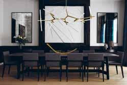
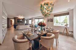
The Palm Jumeirah project has a unique design as the interiors look to smoothly complement the views of the property’s surroundings. With this project, Lumi Interiors created a concept story with lots of textures and interesting details and decorations. It feels luxurious and rich, yet liveable and practical.
Inspired by the beautiful views and amazing sunsets, the home is connected to its surrounding nature. Entering the apartment provides sanctuary from the hot weather, transitioning into a light and fresh interior. Lumi Interior used natural tones and a multitude of textures to ensure that the design remained rooted to its context, as well as unique art, light textured fabrics, and natural colours such as blues, bronze, and brown.
The master bedroom has a sand and sea concept, using an earthy monochrome palette but with lots of texture. It was important for the designers to ensure that texture was consistent in the details, including within the joinery, furniture, and accents. There is a bird’s eye pattern in the writing desk, joinery, and side tables, and a de Gournay wallpaper that was a bespoke design by Lumi Interiors and de Gournay. This wallpaper depicts a male and female bird looking to each other from the panels as well as butterflies and flowers as a further allusion to the nature outside.
The driving force of the interiors was its connection to nature. The designers’ choice of soft furnishings, art pieces, and colour palette all reflect the outside which in turn created a harmonious design scheme. This became more prominent in particular rooms such as the living room, dining room, and master bedroom due to the views that they offer.
Key Interior and Designs are a passionate team of creative individuals that are inspired to transform a client’s apartment or house into a home. For this project, the team have created a brighter, lighter and more welcoming apartment in the centre of London.
The brief was to take inspiration from the client, location, apartment and nearby Hyde Park and transform the apartment into a sophisticated space to enjoy. Through bespoke lighting pieces, items, soft colours and brighter inserts of soft furnishings with colour, the designer achieved a project which is decadent and sophisticated yet playful and fun. Elements of pieces, colours or soft furnishings each encapsulate the client’s personality; young and sophisticated.
The favourite pieces are the light fittings as they are all handmade and bespoke, each one completely individual. The team have worked intelligently with the use of space. Using pops of colour, light, glass and mirrors to reflect and maximise and utilise the space available.
The apartment overlooks Hyde Park which inspired the designer to ensure there were sustainable elements involved in the project. They reused elements of the existing furnishings including doors and ensured that they were repurposing objects where able to and achieve the same result - if not better - as purchasing something new. Incorporating a sustainable angle into all projects and utilising the supply chain works incredibly well.
All of the light fittings are hand blown Murano glass pieces from Venice. Each one completely individual with so much colour, movement, and personality.
Location: Maui, Hawaii
Interior Designer: Philpotts Interiors
Architect: Dan Dzakowick
Photographer: Travis Rowan
At its heart, this vacation house is about creating a sanctuary where a multigenerational family can share experiences and create memories. Overlooking Maui’s southern shore with views to ocean, mountain landscapes and other nearby islands, this home was designed to experience nature and support active lifestyles.
A strong connection with nature and liveability drives the arrangement of Coral House’s main gathering spaces. A covered lanai sits between the pool and interior living, dining and kitchen spaces. Large pocket doors open to merge the exterior and interior spaces. They allow for an open plan with kitchen, dining and living areas integrated into a single casual space that uses a unified language of material finishes and detailing.
The home’s flat roofs are tiered for scale and designed with large eave overhangs protecting the lanai spaces and interiors from sun and rain. Second-story living spaces are set back from the ocean side of the home due to development requirements, and a green roof provides these spaces with an upper garden and ocean views. Photovoltaic solar panels on the upper roof are hidden from view below.
The success of the design results from a cohesive and contextual architectural concept. The design has a sense of belonging to the site and the larger context of the island and the Polynesia region. The architectural vision is one of tropical modern inspired from Japanese craftsmanship and a sense of restraint. The interior and exterior spaces are merged enabling the inhabitants to experience amidst the luxurious tropical climate. The furnishings and artworks support the larger architectural vision.
Location: London, UK
Architect: Strom Architects Ltd
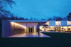
Interior Designer: Hena Sawjani / Studio Maria
Developer: Spring Residential
Photography: Richard Chivers
Strom Architects were approached by Spring Residential to collaborate on the redesign of large family house in London that had already been granted planning permission by a previous architect. Whilst the ground floor plan remained, the architectural language was simplified to have a stronger concept with a long rectangular first floor volume, spanning across the ground floor H-shaped plan.
The central part of the “H” comprises a large double-height entrance space, emphasised by a two-storey chimney, a sweeping helical staircase, and a living area commanding the central space of the house. One of the legs of the “H” contains kitchen, dining and home office, while the other is service orientated with garage, nanny’s room, plant, cinema and a spa area with pool, steam room and hot tub.
The first floor volume sits over the H-shape and consists of four en-suite bedrooms to one side of the double height gallery. To the other side is a generous master bedroom with a spacious en-suite and dressing room. The bedroom enjoys a private balcony overlooking the garden.
The first floor is expressed as a lighter form utilising white render and contrasts with the solidity of the lower brick volume creating a clear architectural diagram. The “H” creates and entrance courtyard to the road, where openings and windows are carefully considered to provide privacy while creating a welcoming entrance. Full height glazing surrounding the open plan kitchen, dining and living spaces opens up to a private courtyard and allow the house to feel transparent and connected with the landscaped garden.
Location: urb. El Herrojo, Benhavis
Interior Designer: Jana Novakova
Architect: Studio Tobal - Diego Tobal
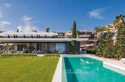
Developer: Fintech
Construction Company: Solis
Photographer: Charly Simon
Casa Varanda is a residential villa with generous sunlit indoor spaces overlooking the sea, with 6 bedrooms, double height living and dining room, game room, gym, spa, outdoor pool and beautiful gardens. The villa is designed in a contemporary style, with the utmost care for comfort with high quality seating furniture and turnkey spaces.
The living and dining area is a vast open space having full height windows with sun light accentuating the light and fresh summer colour scheme. Key to the design are the motorized full-size windows which visually decorate the room expanding to the beautiful view of the gardens. The double height ceiling salon with its wooden cladding makes the room feel airy, but at the same time very cosy and warm. The focal point wall with the chimney has two types of wall paneling, backlit onyx and real dried moss to add a fresh unexpected accent. The moss has also been used in the entrance in combination with travertine 3D cladding backlit with LED. The generously sized spaces fitted with natural stones, wood and turnkey furniture all over the villa, including bathrooms, gives guests the feeling of a luxury vacation.
The design scheme is in line with the modern architecture, yet the selection of colour schemes per area gives a clean and tranquil aesthetic, creating a more vacational look. The property integrates itself into the wider environment through the use of natural materials which blend into the surroundings and also having 3 large trees planted within its premises in order to blend within the surrounding green hills.
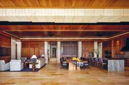
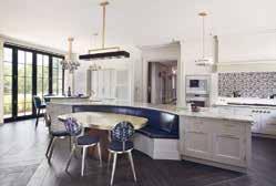
Location: Surrey, UK
Interior Designer: DCL Interior Design
Developer: Accuro Residential Ltd Kitchen: Martin Moore
Every element of this statement kitchen is entirely bespoke. Custom made cabinetry and beautiful, luxurious materials feature throughout the design.
Involved from the very beginning of the project, Martin Moore worked closely with the owners to create a truly luxurious, statement kitchen that sits in complete harmony with the grand proportions of the room. One of the largest they have ever designed, the impressive, curved island spans the entire width of the room; highly functional it incorporates generous storage and prep space, as well banquette seating, forming the social hub of the space.
Bespoke furniture painted in Martin Moore’s Pale Platinum is teamed with satin brass handles, as well as brass taps and fittings, adding warmth to the space. Monochromatic mosaic tiles add decorative flair to the splashback area whilst strikingly veined Cosmic Black granite distinguishes the raised level breakfast bar from the main island. A co-ordinated quartet of assorted pendant lights placed above the island illuminate all areas within the kitchen, and complete this statement look.
Doors are inlaid with pale leathered faux snakeskin or dark marble effect porcelain panels set off with satin brass inlays.

Whilst the kitchen is totally in keeping with the grand architecture of the house it also functions perfectly as a family kitchen and also for entertaining on a large scale.
Family and friends naturally gather at the breakfast bar sited close to the appliance cupboard, with its coffee machine and adjacent drinks cabinet, while larger groups dine at the central table.
A lavish drinks cabinet solution, the Collins combines the style and function of the cocktail cabinet with elegant wine storage. The design brief was to create an elegant home bar for the clients to entertain their guests. The pandemic has led to a shift towards entertaining at home and so the clients wanted to create a space that could rival even the finest speakeasy in London. On a practical level, the cabinet and cellar needed intelligent storage for bottles, glassware and mixology equipment.
The design incorporated elegant, lined drawers for small equipment, deep rubber lined drawers to conceal spirit storage and in the wings, intelligent temperaturecontrolled wine coolers by Gaggenau. The cabinet and cellar also needed to allow the space to look appropriate during the morning and afternoon, the design incorporated front doors which fully conceal the bar, creating the illusion of a beautiful cabinet only. When the evening draws closer, the pocket doors can be stowed away to reveal a stunning bar with backlit onyx and a black marble worktop.
Davidson London adore the clever use of mechanisms in the storage. The pocket doors allow the most beautiful elements of the space, the back bar and worktop, to be revealed, while the deep drawers allow the spirit bottles to be concealed. The Collins has a sense of harmony about it, it’s the perfect marriage of classic form and superlative materials. The backlit onyx, together with the elegant, brushed brass detailing, introduces a softer, more romantic element to the design. This is juxtaposed against the luxurious black marble worktop and dapper black sycamore veneer which creates a strong silhouette.
Location: Scotland, UK
Cabinetry: Clive Christian Furniture
Interior Designer: Anna Mills Interiors
The setting was a striking Georgian townhouse in Edinburgh, and the overall design brief was to rework and enhance the existing kitchen and cellar by celebrating its historic features while adding in masculine touches throughout the property that enlightened the space with the client’s personal style - sleek, chic and traditional. While the overall look and feel was important to the client, the space also needed to be practical for entertaining family and friends.
The inspiration behind the design came from three different areas: heritage, character and places. In terms of heritage, the client had a deep appreciation for understanding and adoring the history of the property, so restoring the property to its original roots played a big part in the design. The client had some key pieces of furniture he had inherited from family members and past homes that needed to be included within the space. This naturally brought the desire to use rich mahogany and walnut stained woods. In terms of character, everybody wants their home to feel like them, so personal details were pulled out and touches to feed throughout the design to reflect the client’s personality and lifestyle. And lastly with regard to places, the client has a second home in Spain, so Clive Christian took inspiration from the client’s traditional Spanish home and wine cellar adding a warming Mediterranean touch of nostalgia to the basement space.
Clive Christian were able to truly transform the layout to allow the kitchen to become the heart of the home. In smaller spaces such as this, it’s being prepared to take the time and have the drive as craftsmen and designers to make every single aspect work for the client.
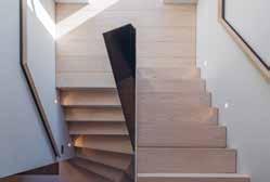
Location: North Cornwall, UK
Designer: Yeo Design
Architect: Laurence Associates
Construction: Noble Construction
Photography: James – Capsule Studio™
Embarking on the journey of building their forever home, the clients asked Yeo Design to create a statement focal point for the entrance hallway of their family home in North Cornwall - something simple yet bold and noteworthy. They wanted something out of the ordinary, and the designers agreed that a slap in the face from some hot-rolled steel and white ash stair treads would be the perfect welcoming.
It was important for the staircase to complement the existing contemporary feel of the client’s home. Yeo Design needed to incorporate a continuity of textures from other rooms, such as the hot-rolled steel cutting through the kitchen cabinetry and slatted ash ceilings in the kitchen. The designers wanted to create a staircase that represented a piece of art, a sculpture-like structure. However, the ultimate battle was making it a practical staircase for everyday use, but without making it look like a bogstandard staircase - it needed to be one of a kind.
Details of the structure were also at the forefront of the client’s needs. Yeo Design needed to provide the details of exactly how the staircase would work and how it would fix into the home without jeopardising the initial design. The Twisted Staircase showcases simplicity at its best. The key design feature is the twisting of the hot-rolled steel, making it visually (and structurally) unique from anything we have seen before.
The design of the twisted staircase is so pure and different, and the designers and clients absolutely love it. It’s some of YEO’s finest work to date, from the design to the technical development.
Location: Henley, UK
Interior Designer: Carmen Evans, Pan’s Lodge Cabinetry: Clive Christian Furniture
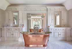
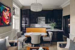
Nestled in the exclusive “golden valley” of Hambledon Village, just outside of Henley on Thames, Yewden Lodge, is a seven bedroom Victorian country house steeped in history. On the base level, the brief was to update and redesign the master suite in this impressive but dated Victorian Country House, starting with combining the original main bedroom, bathroom and guest room to create one beautiful master suite for the client.
The second part of the brief revolved around the incredible bathtub. The Drummonds bath is polished nickel on the inside and bright copper on the outside - this became the ultimate focal point and inspiration behind the entire project. The third layer of the brief was to bring the outside-in. This involved raising the bathroom to ensure the very best views of the garden could be seen. Working in harmony with the Clive Christian Furniture architectural detailing and cabinetry, the bathroom is a haven of tranquillity and serenity, featuring ‘his and hers’ vanity units, Drummonds bathroom ware and Christopher Hyde chandeliers.
This was a very unique project with a culmination of acute attention to detail and a sense of adventure on behalf of the client, Yewden Lodge is an ode to the wider area’s tranquillity, afforded by its proximity to the river, and its notoriety when it comes to statement design and real estate. It has been reimagined for relaxed, luxurious 21st century family living, and boasts the finest example of the architectural and historical integrity of a building’s façade informing the interior design.
Location: Buckinghamshire, UK
Photographer: Jonathan Bond Photography
This project involved the interior renovation of a restored riverside arts and crafts property which included bespoke cabinetry, space planning and lighting. Various sections needed enhancing with bespoke cabinetry, internal doors to segregate areas more effectively, let in light and enhance journey through the house.
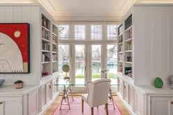
The clients wanted to celebrate being by the river, therefore the design aimed to make a more seamless link between the home and the river. Although the house is an English home dating back over 150 years, the client wanted a fresh, bright clean New England interior which was sympathetic with the house which has a contemporary feel.
They wanted to use white across the ground floor and taking that brief Mark Taylor Design developed bespoke joinery features that successfully achieved that. This was achieved by using wide panelling on the walls, bold mouldings, metal fixtures and fittings for accent, glass to reflect light and a lighting plan that created warmth. The scale of the cabinetry doesn’t diminish the grandeur of the space but creates a secure and comfortable environment. As easy to relax in as to entertain in.
The ground floor was an empty shell. The bespoke cabinetry enhances the original space both in stature and empathy with the original structure. It helps the natural flow from one room in to the next. The specialist skills used for this project is Handmade joinery. Specifically, the louvre large internal doors.
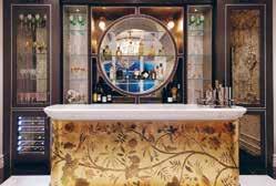
The historical Gucci Villa is a landmark residence nestled into the seaside city of Laguna Beach, California. Kenneth Ussenko states “before starting the design journey on this project, it was a pleasure to see some of the interior work of the original Gucci Watch designer that had influenced the decor and vision of this estate villa”. Due to the historical nature of this residence, the focus for this project was to carefully update and elevate the interiors into a contemporary vision of a classical painting.
To achieve the design brief, the team had to take each room back down to the bare bones of the structural framing and rebuild from the core. From there they created layers of detailed classical and modern moldings for the canvas of the spaces to help outline the history patina of a bygone era. For the Duchess seating room, it was important to create a charming, yet sophisticated space for the homeowners to relax and socialise with family and friends. Linen and leather wallcoverings blanket the walls outlined and framed with wood and brass moldings. Ceilings plastered in a pearl patina reflect the crystal chandeliers above the new marble floors.
The kitchen was a bespoke journey of great craftsmanship creating a radius line of cabinets that were finished in walnut, brass, antique mirror and sprinkled with gold dust. Key to this design is also the Gucci Bar Retreat, a petite gem of glitz and glamour. This space of texture and shape is created with undulating wood moldings, accompanied by a bespoke settee bench which faces a marvelous gold bar and barback.
MLM Creation were involved in the renovation of La Samaritaine’s private areas; Prestige Lounges, Private Lounges, Personal Shopping Lounge, and Grand Magasin. Custom made by Marguerite Le Maire in Nepal and India in workshops selected for the quality of their production, the rugs’ have been designed to integrate perfectly into the building which is an architectural jewel representative of the Art Nouveau Style.
A subtle balance had to be found between the architectural vision and expressing Marguerite’s creativity. Despite being unique and colourful, the pieces do not overpower the other furnishing elements.
For the Prestige Lounge, the lobby and main lounge were inspired by the store’s Art Nouveau details. The pattern was drawn by hand for fluidity. MLM Creative decided on creating a graphic dual-colour, feminine rug in the beauty lounge and first private room. The colours in this beauty lounge pop whilst remaining feminine. The piece in the private room also uses daring colour combinations. The linear design in the second beauty lounge follows more soothing direction.
Private Room 2 is fun and playful with a speciality animal print as Marguerite acknowledges leopard print as a French classice. The third private room is large carpet adorned with this classic leopard pattern, and modern, feminine colours. The Private Lounge has a simple yet effective design, using masculine colours for a classic look, and in the Personal Shopping Lounge, Marguerite takes inspiration from the Japanese screens present in French decoration. The design for the Grand Magasin features a motif inspired by Chinese ceramics from the Qing dynasty. This is a high traffic area, so it needed to be a rug that could be read in all directions - circular and decorative.
Date Completed: March 2022
Photographer Credit: Gavin KingcomeDesigned with integrity from beginning to end, each rug from Tania Johnson Design conveys a unique connection between inspiration, tradition, and skill. Tania has always been inspired by water, the way reflections on the ripples and waves constantly create new patterns. The Water collection consists of seven finely detailed rugs, each hand-knotted in the finest Himalayan wool and Chinese silk.
To celebrate the ten-year anniversary of Tania Johnson Design’s bestselling Water collection, the company is launching several new colours and shapes throughout the year. Tania specialises in translating her textural photographs into unique and timeless rugs, and each design in the Water collection is based on Tania’s photography capturing moments in time created by water. The collection consists of seven designs: Flow, Rainstorm, Ripples, Splash, Waterlines, Wave and Whirl.
The designer has found that her clients are drawn to the gentle, flowing designs in this collection. Each piece is fully bespoke, made to order in any size, shape, and colour- customisable to work perfectly in any environment. The fibre content can also be changed. Tania and her team work closely with their clients to create the perfect rug for each project and Tania personally works on every design and weaving graph herself to ensure each one, regardless of size or colour, is an individual piece of art.
For each rug, Tania personally creates every weaving graph and specifies each colour used. Following the graph by eye, each intricate rug is hand-knotted by expert weavers in the Kathmandu factory. From the start, Tania wanted to be sure her rugs were produced ethically and to help the communities involved in their production, so has been a member of GoodWeave since forming the business.
 Photographer Credit: Prue Ruscoe
Inspired by the interplay of the warp, weft and the intricacy of hand-knotting, The Griglia Collezione is a forward-thinking collection with a wide range of applications, unique in its aesthetic and unmatched in the world of rug designs. “Griglia” meaning ’Grid’ in Italian is a subtle geometry based on the scale of a knot.
GRIGLIA was intricately designed on a grid of squares 2.5mm x 2.5mm, hand-knotted in 100 knots per square inch by Tappeti’s talented artisans in Nepal. Hand making rugs to this level of intricacy took over 18 months in research and development to enable consistency. This process relied heavily on collaboration with the makers who hand-knot the rugs using ancestorial craft traditions. This collection celebrates weaving and hand-knotting, with the skill of the artisans at the heart of the design.
Each individual piece was designed in layers using a base grid for an improvisation in directional shapes, textures, and chromatics. The designs are unassumingly complex, detailed, and work with the harmony of the woven texture. The subtlety of the detail in the base of the rug and the movement of the lines of colours brings life to these pieces. The individual’s relationship with the piece changes with distance, where proximity to a piece reveals finite details and distance blurs colours into each other creating gentle spectrums.
Grigila uses biodegradable fibres that are locally sourced in Nepal where possible, and yarns are batch-dyed with non-harmful dye to order to reduce waste and pollution. Tappeti carefully crafted a fresh palette based on extensive trend forecasting and took inspiration from traditional sources for a unique aesthetic. This collection is made to order, customisable in scale, size, shape and colour, so that the collection can suit any space.
Dena Lawrence collaborated with the finest weavers in Kashmir to translate the sense of freedom captured in her paintings into handwoven rugs. Dena’s vibrant colours and intuitive designs are dynamic, progressive, and conversational pieces influenced by the Australian landscape, and bridge the earthy elements to the esoteric. They are lively, interactive, and moodboosting.
The Firesun Collection is a luxurious line of hand-knotted rugs, inspired by elemental forces and the natural world. Each rug is a work of art, finely knotted in Kashmir from 100% silk. The collection employs a high knot density to convey the dynamic movement of Lawrence’s paintings in hyper-real detail. The tightly packed, intricate knots make the rugs durable, and this structural integrity allows the subtle tonal shifts of Dena Lawrence’s paintings to be replicated and enhanced in woven form. The result is a shimmering, painterly expression with vivid intensity that will bring unique luxury to any space.
The weaving of these designs was a new concept for the weavers who had previously only woven traditional Persian carpet designs. Initially, Dena Lawrence’s freeflowing abstract works, full of curvilinear gestures, were challenging. The best master-weavers in Srinagar were employed for the project and training was given so that the weavers could create these new concept rugs. Their expertise enabled a merging of modern expressionist art from Australia with the timeless technique of hand-knotted rugs.
Each rug is highly detailed and has an energetic effect. The intricate design and skill of the weavers enabled the Universe piece to capture the sense of drama and mystery of the Universe in silk, currently topical with the new James Webb space telescope increasing awe at the beauty of the universe.


Associated: Aquafil USA Photographer Credit: SYLKA
By developing EcoSylk, SYLKA has created a new fibre system that replicates the properties of their previous award-winning NuSilk micro-fibre, while delivering on their pledge to become an eco-conscious manufacturer. This new development now replaces NuSilk across all SYLKA’s range of opulent carpets and rugs.

Noticing that the luxury carpet sector had no product that could truly claim of being environmentally conscious and entirely recycled, SYLKA Carpets set about developing a ‘circular solution’ that would ensure that every carpet created not only comes from recycled fibres but that every carpet they produce are themselves fully recyclable. All that is required from the customer is that they return the carpet to one of their facilities or a prearranged collection point. Every inch of carpet they collect will be regenerated into EcoSylk, creating new fibres that are as stunning as the virgin yarn.
The carpet industry leads to more than 430,000 tonnes of carpet being discarded in the UK every year, with the incineration of used carpets costing the UK around £16.5 million a year in unpaid climate damage, and allows more than 50 toxic chemicals to be leached into the soil when products are sent to landfill. Through careful development, SYLKA are transferring the handcrafted skills of their second-generation NuSilk fibre to this new sustainable solution. With this, they remain renowned for producing high-quality carpets and rugs that have the benefits of being luxurious with a deep, lustrous look, soft to the touch, easy to maintain, and resilient to wear and fibre loss, with the additional commitment to sustainability.
Since 1984, ANTA have followed a tradition in Scotland for designing and manufacturing natural, sustainable flatweave carpet using locally sourced material.
The latest carpet collection reflects this dedication and offers new, exciting patterns for use in both traditional and contemporary spaces. Differing widths ensures that they work as hardwearing stair runners, carpets and rugs. The pieces are made with two-ply British wool and woven exclusively in Scotland, which not only helps minimise the carbon footprint but offers a natural, sustainable, longlasting product.
ANTA believe function is just as important as aesthetics which is why they strive to deliver timeless style with enduring quality. As with all their designs, each is inspired by a contemporary Scot, place, flora or fauna. And this collection is no exception, each has its unique story to tell, from the bright red Ullapool houndstooth named after the red funnelled Caledonian MacBrayne Ferry (which shipped the yarn across The Minch to Ullapool’s port) to the pink, blue and red checked Samuel Peploe, named after the famous Scottish Colourist whose son taught Annie at the Edinburgh College of Art.
The remaining carpets include: Peacock, a plain but striking blue-green plain flatweave inspired by the peacock’s iridescent plumage. Many of which can be found roaming freely around the town of Dunfermline; Flora Stewart, a contemporary take on an ancient family tartan; Seagull, a modern and soft grey flatweave found on the plumage of the noisiest Scottish coastal sea bird; Poolewe, a sophisticated pink and grey houndstooth inspired by the dusky pink sunsets found on the West Coast.
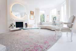
Bazaar Velvet were tasked with creating a selection of bespoke rugs for several rooms of an opulent London home. Each piece that was created for this project is contemporary but uses classical elements of design from traditional weavings. Each of the rugs needed to be individual in design and colour yet have a synergy that links them all together. They created various designs in-house as a starting point for the project, which were then developed through further meetings that allowed the client and designer to decide on a direction for the pieces.
Once the designs were confirmed, the focus then turned to the consideration of colours and following that the finalised designs were entrusted to their workshop in Nepal to create. Each rug was handmade and took five months to complete. Hand-knotted luxury rugs such as these exemplify premium quality and are made using traditional methods dating back hundreds of years. Skilled artisans work on a wooden loom using cotton threads known as warps, knotting wool or silk yarns around each thread by hand, following each row with a cotton weft thread to keep the knots in place. The rug then undergoes several stages of hand-finishing, including trimming, washing, binding and stretching.
The designs and colours that have been developed achieve a balance between classic and contemporary style; each complements the space that it has been tailored to as well as each other. There is a high level of detail for each piece and a thorough understanding of its place in the home. The colours for the bedroom piece remain muted for a serene ambience, yet the colours and fluidity of the textured piece in the dressing room drive a more feminine feeling.
Designer: Claudia Afshar
Developer: Mehraban
Lifestyle Shoot Partner: Atra Studios
Photographer Credit: Meghan Bob
Inspired by earth, nature, and its striking elements, as well as art and architecture, this collection is designed to transform any room into a grand space. Made of Superior Grade, Hand-Spun New Zealand Wool and Hand-Spun Natural Silk, the collection achieves the highest level of beauty and feel.

The rugs are woven in Bhadohi, India, the weaving capital of Southeast Asia with a reputation for having the world’s most skilled weavers, with the finest materials. The key aspect of this collection is its restrained design sensibility, and extremely focused palettes. The mix of curves, lines, organic shapes, and pile heights makes this collection both contemporary and elegant. Sands echoes the patterns after being struck by waves. Water inspired the Ripples rug, with the patterns made by a rock thrown into a pond. The graduated spacing in the rug is made with darker and lighter hues for a richer depth. Inspired by sheer limestone walls with cracks in the earth is Surfaces. The Contour rug is designed with generous curves. Its oval shape, extreme pile height, and powerful silhouettes take inspiration from the natural human body.
Steps, Formation and Strokes stem from architecturally inspired elements. Formation’s rectangular slabs reflect tiling. The field is constructed of wool and silk, while the lines are recessed silk. Strokes’ tone-on-tone design with two pile heights and separate silk and wool areas embody the organic stroke of a paintbrush. Steps completes the collection, including shadows, depths as well as texture with its varying pile heights and silk in lower areas to create a beautifully curated 3D feel.
Bay Gallery Home presents ‘My Country’ Aboriginal fabrics: direct translations from artwork by Australian Central Desert Aboriginal artists.
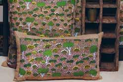
Bay Gallery Home are the creators of the world’s first Australian Aboriginal Interiors collection, the award winning My Country. Its inaugural core ranges of wallpapers, ceramic wall tiles & rugs and has been expanded to include their new fabric collection. The My Country fabric collection consists of 12 different fabric designs on five different fabric bases, including: cotton velvet, polyester medium pile velvet, avanti linen, linen forte and half panama cotton.
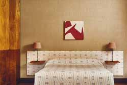
Drawing upon the British manufacturing industry, My Country is a pioneering translation of authentic Central Australian Aboriginal artwork. My Country references the Aboriginal philosophy and creative process, whereby all of creation is in relationship, at one with the land. The artwork’s particular provenance and symbols - inspired by mapping myths, rituals and sacred topography - results in a compelling, versatile aesthetic with a most subtle compositional depth of field, imbuing spaces with wider horizons of the imagination.
The My Country collection is informed by gallery space interactions, observing what customers are drawn to and why. With access to a vast scope of original artwork and in consultation with industry specialists, Bay Gallery Home offers a range of core products for interiors, and extends a facility to designers and architects who may wish to commission exclusive bespoke pieces.
The Pepenado collection presents an exciting new artisanal technique to A RUM FELLOW’s handwoven fabric collection. The Pepenado technique introduces graphic icons which are meticulously threaded in between the warp threads directly onto the loom. The textural embroidered icons add a floating dimension to the designs enhancing the propulsive beauty of these masterfully handwoven fabrics.
The collection represents an extraordinary intimacy between the artisan and cloth in which their feet lift the shafts, powerful arms propel the shuttle, and dexterous fingers interlace threads between warp yarns to create the icons. Pepenado consists of two designs available in four colourways each. The layering of weaving techniques and shades of colour creates a collection full of vibrancy in which soft tones are enriched with rich pop hues. The Pepenado collection celebrates artisanal weaving skills with designs that are uplifting and cheery with a generous slice of sophistication.
The tactile fabric is masterfully woven on a timber frame floor loom by A Rum Fellow’s indigenous master weavers in Guatemala. The icons are skilfully hand placed between the warp threads whilst the fabric is woven on the loom creating a rich tactile cloth.
A Rum Fellow’s favourite design piece is called Fable, inspired by storytelling and tradition. The product is an intricate plaid design which takes a familiar pattern in a refreshing new direction in which embroidered icons combine with patterned woven checks and traditional horizontal lines are realised in diamond patterned weave. All these detail elements combine to create a richly layered handwoven plaid fabric with a contemporary twist.

Since 1921, Foglizzo’s reputation has been founded on the design and development of high-quality leathers for clients who require exclusivity and individual customisation. Heir to the best Italian traditions, over three generations Foglizzo has been driven by a culture of excellence and guided by artisanal know-how, innovative technical skills, and the ability to understand their customers’ needs. Without sacrificing the coveted look and soft hand that distinguishes only the best hides, Foglizzo aircraft collections are specially engineered to meet the most stringent industry performance tests.
When searching for the best solutions, Foglizzo Leather’s expertise and passion are at their client’s disposal. By listening to their visions, understanding their needs and desires, and collaborating creatively within project constraints, Foglizzo are able to drive innovation and push results beyond expectations. With this innovation, Foglizzo has developed the Low Specific Weight (LSW) collection, a new leather engineered to weigh up to 30% less than traditional aviation leather. The collection offers several available finishes and colourway options.
As part of their performance improving leathers, the LSW collection is available as Nubuck, Semi-Aniline, Full Aniline and High Performance. Starting at Nubuck which weighs 575gr, the range increases to Semi-Aniline at 600gr, Full Aniline at 640gr, up to High Performance at 680gr, all with a thickness of 0.9 | 1. The High Performance option is 39% lighter than traditional aviation leathers, with the full collection ranging from 26-39% lighter. The 4mg leather originates from North Italy, and has a 60 Second vertical burn in accordance with FAR 25.853. The leathers are flame resistant and lightweight, yet highly resistant to bending, stretching, soiling and wear.
The Key Interior and Designs team were briefed to design a light fitting that was unusual and unique in a residential home with clients who often entertain. The idea of having a suspended light fitting held up by various supports, rather than just one wire was inspired by the suns rays that are often seen through clouds around sunrise and sunset anywhere in the world.
The owners described how they required a light fitting that wouldn’t get ‘boring’ over time, and would keep guests interest each time they visited! It was important that through the colours chosen, the light had to create a sense of warmth throughout the area but not dominate the room or use colours or one individual colour that would be difficult to work or style with other items and areas of the dining room. The final design for light feature itself gives a warm amber glow and seemingly cultivates a soft, friendly atmosphere created through colour the design of the discs and individual curves of the various discs which are all vary in size.
The light chosen has the power to brighten a room but not overpower and highlight the contents on the table below in the most flattering way. Each disc that was handmade and positioned carefully to reflect other areas of the light, this dynamic yet deliberate organisation of the discs enables the option to view the light from a different angle depending on where the guests is sitting.
A favourite or key aspect of the design would be the gradual colour transition from amber through to transparency. The piece integrates into the wider environment structurally and with using the colour amber, the fixture light offers the perfect warm glow which creates its own magic, in a room that is frequently used and many other elements included.
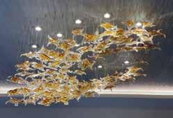

Designed by Sean Lavin and part of Visual Comfort & Co.’s Tech Lighting Modern Collection, Collier exudes luxury and sophistication. The innovative design is customisable so that its form can be tailored to each space and scheme, and its versatility is without compromise on opulence.
Solid faceted crystal made in the Czech Republic fully encapsulates integrated LED modules which are interlocked by customengineered solid brass or polished nickel connectors. The endcaps reflect light back into the crystal and complete the aesthetic, ensuring a scintillating brilliance through the chain. Complementary detailing can be found through all components.
Collier can be hung straight down in pendant form or draped from two mounting points for a striking chandelier, utilising the surface canopy or more minimal remote driver canopy. Individual stands can also be interwoven to create incredible light sculptures with stunning illumination. In each of its forms, Collier adorns its surface in an almost gemlike fashion and can work well in Living Room, Dining Room, or even Kitchen applications.
This patent-pending design is all about quality, connectivity, and customisation. It is made to order, available in either pre-determined lengths from 2ft to 20ft or custom lengths through the Visual Comfort & Co. quotes department, and backed by a five-year warranty.

The Bracciale Sconce designed by Raven & Lack is a limited-edition wall light inspired by the intricate detailing of jewellery and hand-crafted artisan materials. The sconce is manufactured using hand-poured Murano glass and cast bronze.
Created using hand-poured Murano glass, encased in cast bronze cuffs, The Bracciale Sconce designed by Australian design duo, Raven & Lack, is representative of their desire to collaborate and share their creative vision through unique design using honest materials. The inspiration behind the design was a collection of textured, stacked jewellery cuffs with intricate hand detailing that showcases specialist artisan manufacturing techniques. The Bracciale Sconce form part of a limited-edition gallery collection and are the very first item in the Raven & Lack bespoke lighting and furniture collection.
The soft line of the hand-poured glass brick creates a beautiful contrast against the cast bronze cuffs that bind the lights components together. The L.E.D panels creates a soft, even, luminous glow that permeates out of the light. The Murano glass element is hand poured to create a softness to the overall glass shape and the naturally forming bubbles contribute to the organic appearance on the luminaire. The varying textures of the bronze cuffs are carved and cast by hand which showcase a highly skilled artisan technique.
The Bracciale Sconce is a truly versatile design that combines a modern aesthetic with traditional manufacturing techniques. The design lends itself to classic or contemporary interiors and compliments a myriad of design aesthetics. The Murano glass is recycled and the materials are of the highest quality. The integrated manufacturing techniques supports and promotes local artisans.
 Designer: Ceramicah Photography: Elizabeth Carababas
The Raku Collection is a limited edition series of Tera Lamps made using a special firing technique that results in a completely unique combination of colours and textures. Inspired by the vibrancy of the Earth, the intention was for every piece to feel as if it had been pulled from a volcano, still burning with colour and life. Timeless in both their shape and finish, they provide more than just light but are sculptural pieces of art that enhance the mood of any environment.
Ceramicah is a Los Angeles based studio founded by Micah Blyckert and Alexandra Cadiz. At the root of each Ceramicah piece is Micah’s curiosity for how things work, supreme attention to detail and focus on materiality and precision, having spent over a decade honing his craft to produce bespoke products in which every aspect is considered and designed. The Raku Collection is no exception to this and is Ceramicah’s most exclusive and unique collection yet.
For the Raku Collection, each lamp base and shade were hand-thrown by Micah and given its vivid colour through a laborious firing technique called Raku. Rooted in traditional Japanese ceramics, Raku is a special process in which pieces are removed from the kiln while still glowing hot and placed into containers with combustible material such as sawdust or paper. The containers are then covered leaving no room for oxygen to get in, which is what creates the velvety black texture and iridescent crackling effect. The beauty of the Raku firing process is that every piece comes out completely unique and one of a kind. The shape and finish of each unique piece make them suitable for many different contexts, from an ultra-modern sleek space to a more textured, lived-in space.
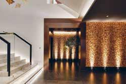
Location: UAE
Architect: Russell Skea Infinite Designers
Interior Designer: Helen Skea Infinite Designers
Construction Company: BW Interiors
Photographer Credit: Duncan Chard
Surrounded by greenery, this sevenbedroom home takes its identity from nature in the form of ‘The Tree of Life’; a centre piece imported from Indonesia that acts in stark juxtaposition to the strong vertical and horizontal lines featured throughout the home.
Lighting design was introduced throughout to enhance the features of this stunning villa. The brief was to seamlessly integrate the lighting within the natural organic features to add impact and drama along with soft and delicate warmth to each space. The scheme that John Cullen Lighting has developed seamlessly disappears into the structure, so that just the effects can be seen rather than the light sources. It plays well with the natural textures, creating an inviting space from room to room.
The natural materiality of the space was considered throughout to create an organic, warm, inviting space which lives and breathes in the nature surrounding it. For John Cullen Lighting, their favourite example of this is the double height main hall that is flooded with rays of sunshine from the cleverly designed skylights and slatted ceilings. However, in the evening, the lighting appears almost imperceptibly from within the vertical wooden details and adds a soft yet delicate warmth to the space. The room is instantly transformed from fresh and vast, to intimate and cosy.
Key Interior and Designs are a passionate team of creative individuals that are inspired to transform a client’s apartment or house into a home. For this project, the team have created a brighter, lighter and more welcoming apartment in the centre of London.
The brief was to take inspiration from the client, location, apartment and nearby Hyde Park and transform the apartment into a sophisticated space to enjoy. Through bespoke lighting pieces, items, soft colours and brighter inserts of soft furnishings with colour, the designer achieved a project which is decadent and sophisticated yet playful and fun. Elements of pieces, colours or soft furnishings each encapsulate the client’s personality; young and sophisticated.
The favourite pieces are the light fittings as they are all handmade and bespoke, each one completely individual. The team have worked intelligently with the use of space. Using pops of colour, light, glass and mirrors to reflect and maximise and utilise the space available.
The apartment overlooks Hyde Park which inspired the designer to ensure there were sustainable elements involved in the project. They reused elements of the existing furnishings including doors and ensured that they were repurposing objects where able to and achieve the same result - if not better - as purchasing something new. Incorporating a sustainable angle into all projects and utilising the supply chain works incredibly well. All of the light fittings are hand blown Murano glass pieces from Venice. Each one completely individual with so much colour, movement, and personality.
Location: Surrey, UK
Interior Designer: Lindi Reynolds & Co
Architect: Mary Hackett & Associates
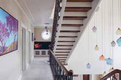
Construction: Woodlands Construction Photography: Robert Sanderson
Lindi Reynolds & Co were appointed as Architectural Interior Designers to this 512 square metre new build residential property for the CEO of a major Blue Tech company and her family.
Through the design process the client was looking to create a calm and tranquil home, which exuded grace and timeless elegance to provide a haven from the long hours spent in business, a status reward for hard work and endeavour, but at the same time recognising it as a welcoming family home.
The staircase was an intriguing and challenging opportunity for Lindi Reynolds & Co, as the client asked them to design it to work with the triple volume space that was inherited from the architect. It is a central feature to the house and creates a dramatically stylish yet, welcoming statement on entering the house. The designers intended to create a sense of theatre with the staircase itself and the lighting of the space. They proposed a lighting installation of coloured glass which acts as a sculptural form, and which adds interest at every level. The relationship between the staircase and the lighting installation is fluid and dynamic.
The design scheme outcome was so successful because Lindi Reynolds & Co ran a series of intensive design workshops with the client to understand and distil their unique design sensibilities. As soon as this was understood, the brief was clear, and they set about creating a comprehensive set of designs which flowed seamlessly from one space to the other.
The project was designed to celebrate the evolution and growth of a family owned business with deep culture and values, whilst leading a path which is ahead of its time. Viso Inc took the challenge and worked closely with designer Truong Ly: according to the designer’s vision, Viso Inc has successfully design-engineered and fabricated a one of-a-kind fixture. The aim was to create a single fixture that brings harmony to a space which benefits from a high ceiling, large windows and plenty of natural light. The lighting company engineered a complex structure to give a sense of depth while maintaining practicality.
Each light fixture is strategically placed, emulating a sense of strength while providing a sense of space and wonder. Standing at 265”/673cm tall from the ceiling and elevated 72”/183cm from the floor, the polished brass structure provided five levels of depth through its complex 26 rows of cells design. With a total of 236 cells, 12 of those give easy access to champagne glasses for functionality in the space.
With a structure this size, Viso Inc had to be meticulous with the ways in which it would light the area. To ensure adequate light, 4 different lighting structures were suspended, each placed strategically to provide uniform light as required throughout the day. This custom design spans 312”/792.5cm across, covering the space and providing a different angle and view throughout the bakery. To complement the design, shelves with transparent bases were also created, with the same material and finish, putting the finishing touch on Viso Inc’s masterpiece.
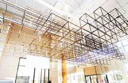

The Tulip Chair, by SCHUTT, features a handmade, finely crafted tulip backing with antique brass plating long stem legs resembling the tulip flower, with beautiful royale blue cushioning.

SCHUTT is a design house with a unique approach, providing their clients with the highest quality and experience, whilst always keeping their designs aligned with creativity and harmony. The team put their core principles and philosophies into practice with everything that goes into creating that perfect space. Inspired by diverse cultural influence and the relationships of balance, beauty, and order, they are able to keep their designs richly layered.
Chairs are Kendal Schutt’s favourite piece of furniture as they convey such character in a room. Kendal describes this project as both a blessing and a challenge however she believes that the design of the Tulip chair works so well as it follows ‘the design holy 3’, it is functional, beautiful and comfortable. The Tulip and Rose chairs are limited edition and there will only be a certain amount made, so, like art these chairs will hold and appreciate in their value.
All of these chairs were designed by Kendal Schutt and everything is handmade, no machines.
The brief was to design a unique chair which could either be a stand-alone feature piece or part of a set designed to be used at a table. The conceptual direction was undefined, however, the design needed to be fit for purpose, take into account design trends, and demonstrate an understanding of working with metal. It would be constructed out of mild steel with accent metals such as brass, copper and bronze. Combinations of materials could be used such as upholstery, glass and leather. The chair would need to be for internal use. The design could not currently exist in any form.
The design was inspired by the ceremonial dress of Ndebele women. The main feature being the distinctive copper-coiled leg and neck pieces called Idzila. The coils wrap around the seat cushion. The back of the chair comprises of a long sinewy piece of hammered metal. This elongates elegantly towards the backplate like the Ndebele women’s necks. The chair is an artwork in itself, a conversation piece and focal point of any interior setting. Each chair is numbered and signed, and is handmade allowing for customisation of fabrics and finishes.
The concept and design inspiration of the traditional Ndebele dress marries seamlessly with the material and its textured variations.
The chair was almost entirely produced from recycled metal. It shows that recycling and repurposing can be, and should be integrated into our design philosophy. The metal work was entirely created by hand. The legs are faceted and almost look carved; the long tapered spine comprises a hand hammered technique and the seat back comprises of hammered sheet that is laminated to the steel back.

Rooted in pure mathematics, the Hedron Lounge Chair is not only built with the correct ergonomic measurements and angles for a seating piece, but it also sits as a functional sculpture in the home. The paired lounge chair and footstool is customisable in its specifications and features the high level of quality and craftsmanship that is at the heart of every piece by Matthew Nunn Studio.
The piece is based on the Dodecahedron; the fourth platonic solid which has been studied for thousands of years. Matthew Nunn Studio thrives on technical challenges and so each dihedral mitre on every side of each pentagon is cut by hand to a degree of accuracy of 0.1 degrees and 0.5mm, as it is then jointed by hand with mortise joints along each edge to ensure its longevity. The result is a piece that is beautifully simple in its complexity.
Elevating the Hedron Lounge Chair from being ‘just’ furniture is its ability to evoke emotion from the user when in use as well as when viewed upon. With its curated range of material choices as well as its ability to be customised to a client’s requirements, the chair is capable of accenting the interior, whilst simultaneously incorporating a statement piece. The adaptable aesthetics of the chair then sets the tone for what environment it will work best in.
The Dana Collection consists of six pieces; a lounge chair, sofa, coffee table, 2.7m and 1m tables and an armchair. The design brief pays homage to the beautiful Mid Century Danish designs of the 20th Century.
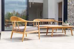
The team spent many months on intricate design and construction details to make this traditionally handcrafted style of design, by modern machining methods of the highest skills. The tapered legs have round tenons taken through the top of the arms as a traditional design feature and have dark wood wedges driven into the slots in the tenons to give the constructional strength it requires. The Dana lounge set creates a stylish seating area for up to four people, combining the Dana sofa and two lounge chairs. Using FSC Teak from sustainable forests has produced premium quality furniture, with a durable and elegant design. Every component of the chair and sofa have been skillfully programmed by 5 axis CNC machinery. The shaping of every single component has been carefully considered for its structural integrity to create this lightweight slender design.
The seat cushions are made from Kvadrat fabric - an excellent quality fabric which has deep roots in Scandinavia’s worldfamous design tradition. The team have carefully selected five earthy colours which are equally calming and sophisticated. As well as the lounge set, Alexander Rose is launching Dana Dining, with a generous 2.7m 8/10-seater dining set and for smaller spaces, a 1m square 4-seater set. The armchair compliments the lounge chair with its sweeping arm to back curvaceous form. The seat pad is woven in a traditional basket style, using 4mm round twisted Olefin cord, in a natural colour and suitable for outdoor use.
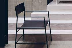
Designer: Christian Watson
Construction: Christian Watson Limited
Photographer: Simon Bevan
Christian Watson designed the Allingham Armchair as a reinterpretation of the classic director’s chair. “I wanted to bring my own strikingly minimal style with a pared-back palette of materials, bold lines, and a juxtaposition of man-made and natural materials, and create something both comfortable and aesthetically pleasing.” Designed to suit any environment to either blend in with its surroundings or to be a statement piece for any home. With each chair handmade to order, the Allingham can be personalised to suit any interior scheme, and Christian Watson Limited are able to manufacture the frame size to fit any designated space. This means that their clients can create a unique item that is personal to them whilst maintaining the integrity of the original design.
All Christian Watson’s work is created to be a future heirloom and to outlast fleeting trends, so quality is one of the most important factors. The quality is achieved by creating everything by hand by both Christian and a dedicated craftsman and by sourcing the best materials possible. The design suspends two pieces of sustainably sourced, hand-stitched, black or tan Italian leather across a delicate yet dynamic metal frame. The beauty of the leather is that it will become supple over time, moulding to the contours of your body to provide a natural and relaxed seated position. It is all about keeping furniture in the home, to not throw away and discard, but to love and to last, and to hand down for generations, which is why the metal frame is created with uncompromising quality.

At first glance, the Alais sofa and its companion styles are distinguished by gently curved upholstery frames and the addition of ball-shaped feet, sized to scale. But there’s more than meets the eye. Nathan Anthony Creative Director Tina Nicole was eager to explore distinctive design elements for adding to the softly rounded, au courant upholstery frames her company has become known for.
A longstanding attraction to spherical shapes felt like a logical next step. Materiality is always another consideration for Nicole, whose path to the sphere led to new possibilities with handcrafted, planed hardwood and, most recently, to innovative expressions in resin. The ball feet crafted in resin are the result of a design collaboration between Nicole and international multimedia artist Sahara Novotna. A cocktail party conversation about Novotna’s resin artworks — often subversive thoughts or ideas revealed in three-dimensional candy hearts or gummy bears, for example —led to the pair’s playful exploration of art and furniture. This direction supports new tastes for curated living spaces, and the contemporary high end design clients who eschew mass production in favor of unique and handcrafted items.
Nicole describes the design process for the Alais sofa as an evolution occurring over several seasons of development. For the Los Angeles based, bench made upholstery specialist, all items in the collection are made-to-order and fully customizable, including the selection of fabric covers. The ball feet are available in 11 wood finishes, and 5 resin colors. As shown, the fabric is a plush Italian velvet in Emerald, with Novotna’s marbleized spheres in strieblack and white-resin, which are produced by the artist in her Hollywood studio.
The rounded forms of the Niemeyer II armchair are influenced by architectural details that are most reminiscent of the modernist House of Canoas designed by Oscar Niemeyer in 1951. Having a refined design, this armchair is minimal and yet remains a statement piece for any interior scheme.
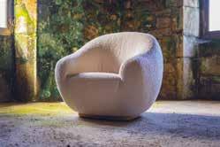
The upholstery work is meticulous, and the seams are reduced to what is only essential, in order to reproduce the backward movement of flat roof when seen from an aerial view. Upholstered in a special woven bouclé, this welcoming armchair receives people with a gentle embrace and feels like the most comfortable place in the room.
The Niemeyer II is an armchair with a challenging design. Having a strong narrative speaking behind its organic forms, the creative process was developed in a cohesive dialogue between the general rounded design and the focus on the correct location of the seams.
Being influenced by elements of modernist architecture such as freedom of forms and volumetric organicity, the main goal was to create a free design. The construction process had several adjustments, both in the wooden structure and in the exact location of the seams, to reach the final design, in which you find total simplicity. The handmade production was a process of adjustments between the free sketches, the technical drawings and the full scale prototypes. While the upholstery was being improved, the structure had to be adjusted to the new demands, until Insidherland reached the final balanced design.
The symbolism is strong and so is the design itself. Niemeyer II is almost minimal in its inner hidden complexity. Reduced to the essential, the design and the details create a graceful symbiosis between form and function.
As a pioneer of the use of forged carbon fibre in the interior design market, Matthew Nunn Studio has developed the Luna Coffee Table using this exotic material as well as bronze to be a captivating retro-futurism piece that suits any interior.
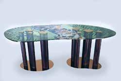
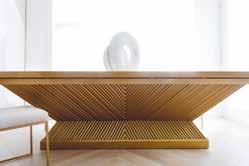

The Luna derives its name from the beauty and wonder of the Cosmos and looks to evoke those feelings in its design. The bronze base is designed in homage to the elliptical orbits of so many celestial bodies, and the main structure embodies the feelings of wonder and awe in its ability to convey the essence of the challenging physics of the universe. From the gravity defying tip to the asymmetric shape, the piece elicits a questioning of how it works and how its come to be.
Due to the detail in its engineering, concept, and craftsmanship, the piece can complement any design scheme despite its unorthodox material. There is an enticing beauty and familiarity in the piece which comes from the relationship between the materials; carbon, the fundamental building blocks of all life, and bronze with its traditional elegance and warmth. This is then placed in contrast with its shape and engineering, where the use of cantilevers as well as the carbon fibre’s inherent strength achieves an aesthetic previously not thought possible in a free-standing unfixed piece.
A rhythm of design principles mixed with modern elements seamlessly creates calm and stability for Tailored Interior’s bespoke piece, The Becca. It is a timeless combination that sets exceptional design and workmanship apart.
The piece is a fluted geometrical design with no compromise, implementing unforgettable details such as Italian marble porcelain, and 350 hours metal of production. As one of the very first Bespoke Pieces from Tailored Interior’s new Luxury Furniture Collection, The Becca sits perfectly in front of its stunning backdrop feature wall that is created from the same Italian porcelain used for the tabletop, mixed with hand pressed genuine leather in pristine asymmetrical installation applications to create the ultimate dining and design experience. The dining room is an accumulation of intricate details, where the bespoke table acts as a centrepiece for the room.
Its linear design adds a confidence to an otherwise soft area of the home. The strong angles work with the choice of colour palette to create an opulent equilibrium, where its chevron pattern is offset by the natural fluidity of marble veins. The goldplated base is paralleled in other areas of the open plan design such as the kitchen hood, providing cohesiveness between the living areas.
Designer: Vanessa Stella, Fabrizio Rocchi
Developer: UNICA
Photographer: De Rossi Studio
Atelier is an artistic creation, in its most sublime declination, that should be able to translate aesthetic manifestation into subtle language, capable of communicating with the inner reality of human beings and touching the most sensitive and deepest strings. The Atelier table pursues the idea of art capable of combining aesthetic astonishment, functionality and poignant wellbeing.
UNICA, innovative Italian brand, gets design inspiration from biomimicry for better functionality and sustainability of its creations. The Atelier table eliminates every barrier between inside and outside, with nature setting its rules and its strategies also to the design. The objective is to look at plants and animals to improve the functionality and sustainability of human creations and, at the same time, to rediscover human empathy with the environment that hosts them. To obtain these results UNICA got their inspiration and material from natural elements and the harmonious relationship that they create with everything that surrounds them. Using the typical excellence of Made in Italy to process materials, Atelier is the perfect solution that combines material and spirit, transforming neighbouring spaces into places where nature has a starring role.
In their works, through attentive processes that blend the most ancient knowledge of tradition with the most innovative techniques for working precious materials, the spark of gold powder encounters the transparency of glass, the polished reflection of metal and the robust strength of wood to grasp light and be able to return it to the spaces in a dance of reflections that requires care and the possibility of feelings well beyond the immediate view.
Christian Watson Limited designed the Wandle Desk as a curvaceous and dynamic writing desk that would contrast Christian’s minimal style with a pared-back palette of materials and bold lines, with subtle and dynamic curves and a stunning, simple, kidney shape. The design will create a statement in any setting, whilst providing ample and ergonomic space for homeworking.
Christian Watson wanted to create something that would encompass both the striking straight lines and subtle simple curved lines and maintain its function perfectly. The kidney-shaped writing surface is held up by three minimal straight legs, whilst a bar runs through each leg mirroring the long curve on the top surface. This bar creates harmony between the bold straight lines and minimal curves. The Wandle is a writing desk that is made entirely from metal and is available in monochrome black and white. The solid metal frame is another contrast with the organic shape of the desk, bringing the man-made and natural together. Designed to suit any environment to either blend in or to be a statement piece.
With each desk handmade to order, the Wandle can be personalised to suit any client, and the team can manufacture the frame size and colour to match any interior scheme. All of Christian’s work is created to be a future antique and be handed down for generations. Built to outlast fleeting trends, it is all about keeping furniture in the home, to not throw away and discard, but to love and to last, and to hand down for generations, which is why the metal frame is created with uncompromising quality.
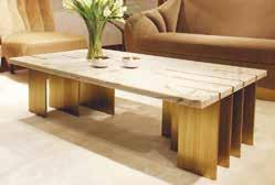

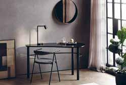
The Chalice Table is a beautiful contemporary table with a smooth semitransparent blue, or satin dark tinted oak top and open grain distressed bronze base. The design brief was to create a show stopping circular entrance table that would look in keeping with a period home, while embodying a contemporary edge. To achieve this brief Davidson London took a traditional material, like oak, and gave it a contemporary identity by using adding the liquid bronze to the distressed base and adding a blue glasslike, semi-transparent top.
Davidson London adore this piece as it is the sister product to The Decanter Table from their Wanderlust Collection. The Chalice Table has a similar beautiful shapely base with an elegant, slanted top, all the while incorporating rich materials which elevate the piece to the highest levels of luxury. The glistening effects of the bronze base add an enchanting effect to the piece, this is masterfully juxtaposed again the glasslike blue top, or smooth satin oak top, to create a stylish centre or dining table.
The table’s visual opulence, together with the prestigious materials used, makes The Chalice Table the crowning glory of the grand entrance hall for which it was made. The table has been designed with either a semi-transparent blue top, or beautiful radial veneer, which then sits upon a shaped pedestal, showing off beautiful highlights of liquid bronze brushed into the open grain oak. For the oak top version, great skill is required to cut, position and lay the veneer to create a perfect radial pattern.
Inspired by a Paul Klee’s drawing in which the Swiss painter and musician portrays the soul of a dead Pianist who, having lost his instrument, continues to play music using his own body, the Pianist coffee table doesn’t represent the piano but the hands of the artist, vehicle of technique and emotion. The brass blades design the shape of the four longest fingers that, on a white keyboard in Estremoz marble, release a melody hidden within the musical notes.
The Pianist center table is based on four essential pillars: concept, form, function and emotion. The concept carries a personal symbolism, as the author Joana Santos Barbosa, was herself a piano player. The form takes the human hands into a functional design that exhales an emotional story.
The design takes an original approach that brings symbolism and emotion into any space. Thought to be a central piece for living rooms, the Pianist coffee table can be customized in several noble materials to perfectly highlight a sense of luxury in highend residential interiors around the World.
Being a minimal design, Pianist apparently defies the laws of physics, presenting a contradictory effect between the thin brass blades that pierce a heavy marble top. The constructive process of Pianist was a continuous challenge between the simplicity of the design and its stability. All process included a teamwork of skilled artisans. By minimising the presence of any unnecessary accessory, the maximum emotional impact was achieved.
Designer: Raseel Gujral Ansal
Developer: Pop Store Interiors pvt ltd
Suffused with myriad cultural inspiration the Illustratti Collection 2018-19 is Raseel Gujral Ansal’s current edition of the Illustratti wallpapers. The collection comprises of approximately 60 different designs plus colourways in running roll lengths as well as murals.
The collection was born in 2013 out of a compulsive instinct to express her inherent art legacy. It is an evolution to a spontaneous and vibrant format, featuring graphic art that can be customized by dimension – on wall paper and beyond. It is the amalgamation of graphic art on wallpaper, textiles, canvas, glass, board. Exemplifying the true spirit for a new generation, “Art by the metre”.
It is packed with youthful energy, complimented with free movement of varying forms, prints and vibrant colours that amalgamate to express individual personality. The various segments within the collection lend a mood of tongue-incheek expression. It is the effervescent characterization of being your unabashed true self and hence offers limitless possibilities for customisation.
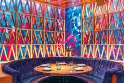
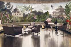
Architect: Kobi Karp
Interior Designer: ICRAVE
Developer: Groot Hospitality Construction Company: City Construction Group
Photography: Groot Hospitality
Inspired by Brazil’s architecture in the 1950’s and Coconut Grove in the 1960’s, The Key Club by David Grutman has curated the perfect modern dining experience. The mix of mid-century furnishings, hand crafted structural features, and use of vibrant colour make this space truly one of a kind.
Candice Kaye Design was asked to create a wallcovering design that would live behind the structural partitions. ICRAVE and David Grutman were looking for a print that evolved beyond anything typical, be able to add to the space as a whole - but also be able to stand alone as its own work of art. CKD hand painted rose petals and layered the petals using multiple opacity and texture techniques to create depth and interest to the print. The layout of the print is a non-repeated mural playing with colour inspired by the colour story of The Key Club. The hand painted technique adds a level of sophistication and intention, as every single petal was hand placed with a purpose. As you walk through the space the wallcovering moves and flows with you, providing a new experience of colour and layout. The scale of the rose petals were designed to interact perfectly with the structural patricians living in front of it.
Everything CKD does is bespoke one of a kind and tailored to the space, this wallcovering was created exclusively for The Key Club. Every detail from the mix of hand painting techniques, the colour story, the scale and layout were chosen with purpose, intention and thoughtfulness.
Location: Battersea, London
Architect: Flower Michelin Architects
Construction: Bailey and Jones
Photographer: Stale EriksenThe Battersea House, by Cornice London Ltd, is a beautiful, bespoke plaster fluted wall panel with a radius curve and cornice.
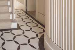
A full refurbishment to an Edwardian terraced house, required a fluid, decorative wall covering throughout the hallways/ entrance, staircase and basement. The aim was to link multiple levels/spaces with decorative fluted walls. The client wanted the arches, at the front elevation, referenced with both the old and new together.
Key to the design of the project are the roof lights which cast defined shadows over the sharp lines and detailing on the wall panels, within the interior spaces. The design of the project works so well due to the detailed linear language which ties together and links separate spaces across multiple levels.
Location: Ottawa, Canada
Architect: Bill Ritcey
Interior Designer: Tanner Vine
Developer: Art & Stone Group
Construction: Art & Stone Group
Photographer Credit: Kevin Belanger
This bright and airy Canadian property has been built with a modern approach to tradition. It is designed to use space in a clever yet jaw-dropping style, and each element of the home is at one with another. The flow in this home comes naturally, offering spaces to retreat to, as well as bringing the family together. It is a calm and serene place to be.
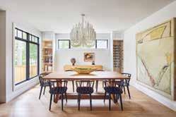
There are four main aspects to the home. The first is the front of the home, with its gorgeous shapes and clever use of materials. The second is the kitchen – soft and beautiful details yet full of storage. The staircase is third, being a prominent aspect that brings the floor together with grandeur.
The fourth is the master quarters - from the arched walk-in closet, the beautifully calming bedroom, and the bright and fresh bathroom, it is a haven of tranquillity. Master cabinet makers worked on all the cabinetry, and Art & Stone Group had a master in plaster do the venetian plaster in the home. Wonderful blacksmiths and the best wood workers created the custom staircase.
You are greeted by a gorgeous handmade wood door at the entrance. Inside, the foyer is grand with visuals across the eastern to the western wing of the second floor, and through the depth of the main floor. Upstairs are 5 bedrooms, to host the family and their guests. An arched opening in the master walk-in closet leads to the master bedroom with beautiful transom windows, looking onto picturesque trees. The master bathroom has large windows that welcome natural light but remains private, nonetheless. The vanity wall features a chevron marble backsplash, and the freestanding tub offers a relaxing space to sip wine and watch the sun set.
Location: Edmonton, Alberta
Interior Designer: Aness Handous
Balancing bold design choices with layered soft finishes, House of Sevens is a modern luxury that is also fitting for a family home. Devised by Tailored Interior, the home has been custom designed for the family with an understanding of sophisticated, modern-luxe interiors, with a high level of attention to detail.
Tailored Interior’s scope of services is wide-ranging, including home staging and custom pieces, as well as full service interior design. House of Sevens is a luxurious mix of bespoke custom designs, created with thoughtful design and impeccable workmanship, tailored to the family’s specific tastes and desire for something unique. A combination of natural textures and refined colour palate creates a comfortable and approachable design that is simultaneously opulent, and the openplan living works with a modern, bright design scheme to establish a light and refreshing ambience.
This design works so well because all the elements and finishes play the perfect role with each other while creating the utmost level of balanced sophistication and luxury. There is a thoughtful process that brought about the most elegant finishes such as porcelain, gold coated metal, Cambrian quartz, and leather pressed finishes, to create the core of this bespoke design, whilst remaining functional, spacious, and uncluttered for family life. The intricate choice of finishes and accumulation of fine details results in a thoughtful and detailed design that showcases timeless elegance.
Location: Ottawa, Ontario
Interior Design: Henrietta Southam Design
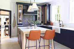
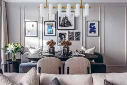
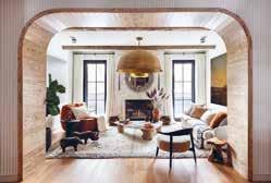
Photographer Credit: Marc Fowler
This complete renovation and reimagination of a 1920s red brick home by Henrietta Southam Design resides in a historical enclave in Canada’s Capital. Papermill Safari is an homage to the industry of the historical area while also catering to the intent to make the space warm and inviting.
This is the 4th Historical house Henrietta Southam Design has transformed in this small heritage overlay area, with the absolute conviction that the designer has given each one a hundred-year-more lease on life while respecting the language, and more importantly the volumes of the era they were built in. Creating an ‘industrial tribal’ style for the interiors, a thread of burnt red clay infuses the predominantly creamy interiors, where layers of papiermâché, cord, driftwood, cane, and wool crafted by various nomadic tribes lend warmth and surprise whilst remaining comfortable and culturally sympathetic.
Organic touches infuse the home, such as the antique Verdigris columns and stone hearth and sinks in the master suite. Henrietta Southam Design redistributed all spaces to adapt to an evolving blended family. This meant adding bedrooms and bathrooms for each child while tailoring the spaces to their ages and needs.
Taking advantage of adding a four-storey extension, the spatial re-configuration also allowed for more family autonomy. The concept hinged on redefining the open staircase at the heart of the home which floods the home with light. To soften the rectangular rigidity of the house plan, curves were added in arches and walls, materials, and lighting choices.
Location: Chelsea, London, UK
Interior Design: Raven & Lack
Developer: The Berkeley Group (St. George)
Photography: Taran WilkhuRaven & Lack were appointed to the Interior and FF&E Design for a 650 sq.ft. residential show apartment in The Westwood House of the popular Chelsea Creek Development. One of London’s most elegant waterside developments combining luxurious city living with European-style waterways, tree lined avenues and landscaped parkland, all a stone’s throw from the stylish King’s Road and fashionable Chelsea Harbour.
Raven & Lack worked closely with the developer’s executive team to uplift the base build of the apartment to an exceptional level of finish, with a unique narrative developed specifically for the project, taking inspiration from Amsterdam and Copenhagen designs. The client brief requested that the interior architecture and FF&E design strongly reflect the narrative of place and ensured cohesion in the detailing and palette throughout.
The design inspiration merges utopian principals from the famous Dutch design movement ‘De Stijl’ in a contemporary, architectural setting. European inspired furniture with a focus on natural form and colour, with Mondrian inspired ratios. Textures and hand-crafted finishes (by the best of British) bring an artisanal layer of luxury and individuality. Natural timbers, brushed metals, specialist resins and gilded plasters. All accentuated with handwoven fabrics drawing inspiration from fashion materiality.
Raven & Lack’s focus on relaxed elegant luxury, simple beautiful detailing, in high quality materials, has been executed exceptionally well. The design narrative ensured the Icon Westwood Apartment had a sense of style and substance and above all delivers on quality for longevity.
Location: Ascot, UK
Interior Designer: Q Design House
Construction: Q Design Licensing
Photography: James Robinson
This project involved a complete design and build renovation, Q Design House were brought in to create a light and airy interpretation of a traditional English home in Berkshire for clients who recently moved from Hong Kong. To achieve this, Q Design House used contrast between light and dark to brighten the spaces and incorporated traditional joinery details such as panelling in the entrance hall, a typical panelled gentleman’s room home office, a shaker kitchen and fully marble bathroom complete with marble beading.
Each traditional aspect was uplifted with contemporary elements to create a brighter and modernised scheme. For example, timber flooring was modernised by using a brighter tone and laid in a herringbone pattern with a border. Q Design House were playful with colours using a dark navy contrasted with natural exposed oak details in the kitchen and dark green panelling paired with a tan leather sofa in the study. Even a burgundy home bar with antique mirroring created a fun element in the games room. The entrance hall was completely transformed from orange varnished woodwork to a striking space with contrast, light and striking details.
The team at Q Design House managed the interior design, interior architecture and build of the project for a complete renovation. This collaborative approach allowed them to ensure a cohesive finish across the project from striking joinery to soft tones and interesting textures in the fabrics. Each aspect was carefully considered to relate back to the clients brief for a traditional English home, with all the comfort and warmth that that brings, but with the added contemporary feel of a light and airy home.
Location: Altrincham, UK
Interior Designer: Design by UBER
Associated: Sona
Photography: Karl Hopkins
An Edwardian villa was purchased by the client with the goal of restoring and modernizing the tired interior for current family comfort. As well as modernizing the interior, some of the more exuberant style choices from the previous owner were toned down. Design by UBER planned to increase the amount of natural light in the main living areas by opening the rooms up and adding glass structured ‘walls’. The client also required a study as well as a dedicated entertainment space for hosting friends and family in comfort and luxury.
With next to no natural light able to get through to the entryway of the property it originally felt like a very small, dark and dingy space. To maximise the transformation of this area Design by UBER removed the wall that separates the entrance hall from the kitchen and day living and added glass partitions and crittall doors where the original wall once stood. Directly beneath this, the extension provides extra leisure space for a newly appointed gym.
To create more living space, a two-story extension was added to the rear of the property, extending off the ground floor creating a radiant glass-encased dining orangery, which branches off from the newly refurbished kitchen and informal day-living area. This new space is enclosed by additional crittall glass partitions.
With this being a property that has tremendous amounts of history Design by UBER sought to restore and enhance these period features. They started by uncovering, restoring stained-glass windows and reappointing the ceiling roses, cornice work as well as incorporating period-correct fireplaces to add more character to the property and to honour this property’s history.
Location: London, UK
Interior Designer: Birch House
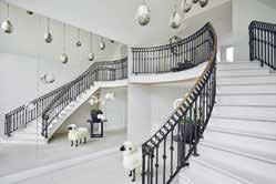
Architect: SM12 Architects
Construction: Adrian Design
Photography: James Balston
This Grade-II listed Chelsea townhouse underwent a full refurbishment and extension. Working closely with the client, their architect and local conservation teams, Birch House created a design that completely transformed the property while remaining faithful to the character of the original building.
The client wanted a full redesign of every interior architectural detail and finish including bespoke fitted joinery, lighting, and bathrooms, as well as furnishing and styling throughout. They wanted the property to ooze a feeling of tranquillity and provide a restful feeling akin to staying in a luxurious boutique hotel. Importantly, as the client has such an extensive and interesting art collection, they wanted the interiors to allow it to sing. Accordingly, Birch House kept the overall colour scheme simple providing the perfect backdrop to the art.
Birch House reinstated period features, selecting materials to complement the original style of the property. The form and proportion of the Georgian architecture, the natural light and gorgeous period detailing were the stars of the show. But to avoid creating a pastiche of a period house, Birch House kept the design of the hard finishes, the kitchen and fitted joinery very contemporary using inset mirrors to enhance the feeling of space and give a nod to a more traditional shaker style.
The structural alterations to the rear and full mansard roof extension have been carefully considered, taking into account the particular characteristics of the surrounding mid-19th century buildings. Birch House worked closely with our client’s architect to maximise floor space and bring in natural light at every opportunity.
Location: United Kingdom
Architect: Breley Design
Interior Designer: Rose Narmani
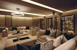
Developer: Ulisses
Construction: Daniel Zefli
Photography: Julian Abrams, Nick Smith
This elegant country mansion is contemporary and stylish and showcases functionality without sacrificing sophistication. The design brief indicated that the space needed to be open, bright and light and should take advantage of the high ceilings. Allowing as much light as possible to flood into the living spaces was of vital importance. The colour scheme was to be a multitude of varying greys with pops of contrasting colours throughout to bring depth and intrigue into the interior design.
Rose Narmani was tasked with creating a timeless design scheme that would last years and survive any current design trends. The living space was to be contemporary and comfortable, with many natural and contrasting textures, finished of with an ultimate touch of luxury. The high ceilings created were Rose Narmani’s favourite part of this project as it completely changed the dynamic of the space. The designers were tasked with removing the original ceilings to create a room that doubled in height. As you enter the house and proceed into the formal living room then you feel the effect of this structural change.
The design is so effective because firstly the client is delighted with the end result and that is the main overriding objective when finishing a project. The designers began this project from the renovation stage and then moved onto interior design and finished it with interior styling. Rose Narmani spent so much time with the client to ensure that they understood both their individual and family requirements and preferences. The design transformed this property and made it into the glamorous home that the client never wants to leave.
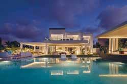
Location: North Coast, Egypt
Interior Designer: Shewekar Elgharably
Photographer: Nour El Refai
The brief was to completely re-design Villa Natura to create a more modern look and feel, and provide more breathing and hosting space for the family of 3 generations. With a total built-up area of 320 sqm split among a ground and first floor, and an 850 sqm outdoor area, the luxury beach house now includes 6 ensuite bedrooms, multiple living spaces, a hosting/ show kitchenette and sufficient staff housing whilst providing a smooth flow throughout the residence.
There are three key aspects that make this project particularly special for Shewekar Design Studio; the nod of love and respect it gives to nature, to their Egyptian heritage and to local craftsmanship. For them, the best representation of this is the masterpiece kitchenette and bar; the bespoke cabinetry mimics an over-sized canvas made of stained veneer mirroring the nature outside, while the bar legs are hand-crafted like palm trees that are rich in this area and honoured in their Pharaonic heritage.
Villa Natura integrates beautifully with the wider environment because it is explicitly inspired by it. The serenity of the space, the lush greenery, use of natural materials and the finer asymmetric details are all true reflections of nature and this area. It also looks to Egypt in subtle details such as the Lotus tiles in the pool bar, the “cartouche” headboard in the master bedroom and the palm-tree crafting of the indoor bar. This design works so well because within it, Shewekar was able to successfully bring together a myriad of generations, points of view, eras and functional and aesthetic elements. True to its eclectic design ethos, Shewekar Design Studio was able to beautifully marry different materials, colours, lines, techniques, accessories and artwork into a coherent design.
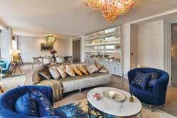 Location: Knightsbridge, London Photographer Credit: Ben Thompson
Key Interior and Designs are a passionate team of creative individuals that are inspired to transform a client’s apartment or house into a home. For this project, the team have created a brighter, lighter and more welcoming apartment in the centre of London.
The brief was to take inspiration from the client, location, apartment and nearby Hyde Park and transform the apartment into a sophisticated space to enjoy. Through bespoke lighting pieces, items, soft colours and brighter inserts of soft furnishings with colour, the designer achieved a project which is decadent and sophisticated yet playful and fun. Elements of pieces, colours or soft furnishings each encapsulate the client’s personality; young and sophisticated.
The favourite pieces are the light fittings as they are all handmade and bespoke, each one completely individual. The team have worked intelligently with the use of space. Using pops of colour, light, glass and mirrors to reflect and maximise and utilise the space available.
The apartment overlooks Hyde Park which inspired the designer to ensure there were sustainable elements involved in the project. They reused elements of the existing furnishings including doors and ensured that they were repurposing objects where able to and achieve the same result - if not better - as purchasing something new. Incorporating a sustainable angle into all projects and utilising the supply chain works incredibly well. All of the light fittings are hand blown Murano glass pieces from Venice. Each one completely individual with so much colour, movement, and personality.
Location: Cheshire, UK
Interior Designer: Panoramic Properties
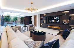
Architect: Ollier Smurthwaite Architects
Photographer: Karl Hopkinson
Panoramic Properties were instructed to tailor these apartments to the high-networth individuals who would be living there. Specifically in the apartments Panoramic were asked to create beautiful bathrooms, kitchens, cinema room, bedrooms, dressing rooms, glass vitrine, study, lounge and dining room. In each of these spaces they were asked to create a luxurious, cosy but contemporary environment. There were several bespoke cabinets and upholstered pieces, along with carefully selected accessories, soft furnishings, and feature lighting.
The grandeur of the master suite is a true success of this project. The suite includes a very large walk-in dressing room, massive en-suite which has a separate dressing area and private WC space within, kitchenette and even its own lounge. It’s not just the scale of the bedroom that is so impressive but also the level of finish throughout, with Italian leather-fronted wardrobes with contract stitching details, large format precious stone effect porcelain tiles in the bathroom and beautiful bespoke cabinetry and upholstery in the bedroom and private lounge area.
The design scheme of Windswood is so successful due to the standard of finishes maintained throughout the property; each detail has been carefully considered to give a seamless sophistication to the apartment. This combined with well-proportioned rooms, generous ceiling heights and meticulous designs, creates an opulent yet cosy feel throughout. Panoramic Properties’ ongoing commitment to producing the highest level of sustainable design has created this stunning, warm, state of the art luxury apartment.
Location: London, UK
Interior Designer: Studio Mae Interiors/ Mima Romanic
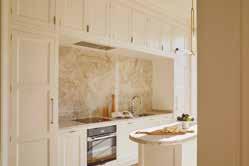
A striking white stucco mansion in Notting Hill has been transformed from two derelict apartments into a light, bright two-storey home with wellness at the core.
The client’s dream was to create a light, bright Parisian Deco style interior. The original floorplan was dark and pokey and so Studio Mae Interiors worked to reconfigure the entire flow of the space. This meant taking it from three bedrooms to two, to create more space in the rest of the property. With only 1350 square feet, it was essential that every single inch was designed intelligently to maximise space and storage. The client, as well as the Directors of SMI, are all Australian and, as Australians, it was essential to flood the property with light for wellness at home.
Sadly, there wasn’t an original feature left in this beautiful period property. Just the bones of the building remained so Studio Mae Interiors gutted the entire place taking it all the way back to the brick walls underneath. Aesthetically, it was imperative that the design found a balance between blending the elegance of the traditional with the boldness of the modern.
Studio Mae Interiors were initially very concerned about the darkness within this property, but the combination of open plan living, clever reflective pigments throughout the interior scheme, natural sunlight in the day and soft lighting in the evening has transformed the space from what it was. Sourcing sustainable, ethical materials was also extremely important to the designers. The interior scheme has achieved a perfect balance between beautiful, period detailing, modern furnishings and minimalist, clean lines. As a result, the home feels incredibly calm and cocooning, creating the perfect sanctuary for the clients.
Location: Dorset
Interior Designer: LEIVARS Interiors Studio
Architect: Munden Robinson Architects
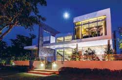

Photography: Nick Smith Photography
A spectacular coastal residence bringing harmony between the old and new. LEIVARS were invited into the project mid-way through construction work to design the interiors for this stunning family coastal retreat.
The brief was to use the three colour tones from the original stained-glass window of this 1930’s house yet bring the design into the 21st century working with the incredible design by the architects who managed to create a breath-taking angled rear extension to fully absorb the ever-changing coastline throughout the year. Working with the three key colours, LEIVARS set out to add block colours and select angles in design and patterns that took on and complemented the rear extension detail. Use of teal, mustard and deep red tones were used throughout to ensure consistency and cohesion in design.
The open plan area needed to be fun and relaxed for the younger family members, yet the two salon rooms were to be slightly more refined for evening drinks using inspiration from the clients travels to the Far East. The bedroom was to have soothing tones that would balance with the sea scape views to be enjoyed all year round. The colour palette complements the ever-changing tones of the sky and sea, when the weather is slightly wilder the mustard/gold tones coupled with the warm undertones add a sense of cosiness giving a general glow as you enter from one space to the next and when the sun is beaming through, the cooler tones of the teal bring the scheme back. A great mixture of texture and details throughout bring strong sight lines that draw you from space to space organically.
Location: Florida, USA
Los Pinos Residence is a sophisticated living environment with natural light, bold colour accents and a clean aesthetic The great room is the introduction to the home. Kobi Karp Architecture & Interior Design’s intent was to create a space plan that will optimise both function and aesthetics from multiple angles within the room. Items have been selected and justified from a functional perspective, while making a statement that is stunning and timeless.
The great room is an open-concept in nature, so the challenge was to seamlessly connect the living and dining areas to each other and to the adjoining outdoor spaces. A mix of neutral tones and colour accents throughout creates zones that differentiate the living and dining areas but have them work together in their shared space. All members of the family were considered while designing this residence. The family room is adjacent to the kitchen and has access to the outdoor living space, this family room is casual and informal. Furniture was carefully selected to be soft, comfortable, and durable. Separate areas for TV viewing and playing games have been arranged to support a variety of family activities.
Overall, Kobi Karp’s vision was to create a place where the family can comfortably come together and enjoy each other. Furnishings, accessories and colour accents provide interest and the coldness of polished chrome is softened by wood elements. The high ceiling windows offer plenty of natural light to flood into the space.
Interior Design: Renee Gaddis Interiors
Construction Company: CR Smith
Euphoria by Renee Gaddis Interiors is an interior design scheme featuring ceiling details, wall accents, flooring accents and a variety of gorgeous interior items. For Renee Gaddis and her team, it is the fun, eclectic elements with a neutral colour palette that make this unit so uniquely beautiful.
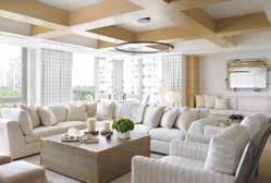
Parquet patterned flooring adorns the main areas with metallic gold and black metal tones, soft and tonal fabrics, and distinctive lighting elements. Each guest bedroom ranges from masculine to coastal blues to delicate and elegant while the master bedrooms golden ambiance sets itself exclusively apart – not to mention with a beautiful view of lush green and the Gulf of Mexico beyond! Bold accessories and an assortment art complete this space for the ultimate hang out spot.
Indeed, the mixture of materials including hard surfaces, tile accents and soft goods served to be Renee Gaddis’ favourite aspect of this project. Artisan skills involved throughout this include custom woodworking throughout, custom tile flooring and patterned wood flooring. As a result, everything blends so nicely together yet is in no way uniform. Everywhere you look still delivers a real wow factor.
The design of this space features elements from the outside world to the interior. Using natural quartzite and stone accents, help blend elements of exterior with interiors. Renee Gaddis and her team genuinely enjoyed designing Euphoria. It served as a fantastic opportunity to create a design to the highest of their capabilities. Undoubtedly, Euphoria very much reflects the fact that this opportunity was thoroughly delivered within the result.
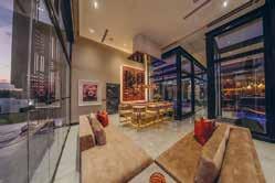
Location: Johannesburg, South Africa
Interior Designer: Audi Snÿman
Photographer Credit: Luke van der Walt
Maison Benie is a 1,600sqm home that sits in a prime residential development outside Johannesburg. The estate is renowned for its spectacular views of the beautiful Magalies mountains. Audi Snÿman Interior Design’s brief was for a modern, detailed home that is entirely bespoke with only the best finishes.
The interior design scheme is decadent opulence. Black and white contrasts create a modern feel, and large glass windows open the interiors out to the surroundings and emphasise the space. Wall finishes include luxurious wallpapers, tile, and stone cladding whilst bronze artefacts, brass wall art and commissioned wall paintings add to the luxe. Talented sculptors and artists were commissioned for the various fine art pieces, custom-designed wall units and vanities throughout, and bespoke furniture specialists designed the custom pieces.
A double volume entrance hall welcomes guests into Maison Bénie. The dining area is extravagant, with bespoke furniture and unique lighting. A TV lounge and upstairs pyjama lounge accommodate all tastes. There is also the formal lounge, complete with lift bar and bespoke furniture, and finished with brass accents and fine art pieces. A total of 7 refined and relaxing bedrooms with magnificent marble en-suite bathrooms are integral to this family home.
Outdoor areas include a covered patio and an open patio with a covered option, and two rooftop lounges and a barbecue area. A sunken outdoor boma and an outdoor swimming pool and jacuzzi provide excellent entertainment areas. For the children, there are two jungle gym areas, a trampoline, basketball court and a sandpit. There is also a spacious customized garage for 6 cars.
Location: Palm Jumeirah, W Residence
The Palm Jumeirah project has a unique design as the interiors look to smoothly complement the views of the property’s surroundings. With this project, Lumi Interiors created a concept story with lots of textures and interesting details and decorations. It feels luxurious and rich, yet liveable and practical.
Inspired by the beautiful views and amazing sunsets, the home is connected to its surrounding nature. Entering the apartment provides sanctuary from the hot weather, transitioning into a light and fresh interior. Lumi Interior used natural tones and a multitude of textures to ensure that the design remained rooted to its context, as well as unique art, light textured fabrics, and natural colours such as blues, bronze, and brown.
The master bedroom has a sand and sea concept, using an earthy monochrome palette but with lots of texture. It was important for the designers to ensure that texture was consistent in the details, including within the joinery, furniture, and accents. There is a bird’s eye pattern in the writing desk, joinery, and side tables, and a de Gournay wallpaper that was a bespoke design by Lumi Interiors and de Gournay. This wallpaper depicts a male and female bird looking to each other from the panels as well as butterflies and flowers as a further allusion to the nature outside.
The driving force of the interiors was its connection to nature. The designers’ choice of soft furnishings, art pieces, and colour palette all reflect the outside which in turn created a harmonious design scheme. This became more prominent in particular rooms such as the living room, dining room, and master bedroom due to the views that they offer.
Location: Hyde Park, London
Interior Designer: Katharine Pooley Ltd
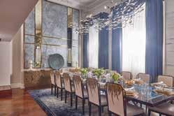
Photography: Nico Wills
‘The Lancasters’, an exquisitely beautiful white-stucco fronted terrace, is the grand setting for Katharine Pooley’s latest extraordinary design project. Extensive building works, and a total redesign, resulted in two properties being seamlessly merged into one incredible, art-filled, 8,000 sq. ft. residence.
It was important to the client that the final design be warm in tone and contain detailing that showcased the best of British craftsmanship and contemporary design. Katharine Pooley worked tirelessly to ensure the beauty of the traditional marble fireplaces, plaster columns and intricate cornicing of this fine building, were balanced gracefully with new contemporary details.
Katharine Pooley found much inspiration in the breath-taking, and unsurpassed, views this home enjoys, and commissioned handpainted silk wallpaper with tree motifs, leaf shaped chandeliers and bespoke foliage themed ironmongery to ensure that the timeless beauty of Hyde Park was as much evident within the property as outside of it. It was key that the interior spoke to the surrounding city landscape, embracing futuristic and luxurious finishes such as bronze, marble and pearlized resins, it was vital to balance the strength of these finishes with softer, tactile, more organic shapes reflecting the outside world.
The soft colour palate and layers of lighting ensure that a grand space remains intimate, inviting and comfortable. Double height rooms overlooking Hyde Park ensured the views are sublime year round and the designers worked to bring this natural beauty into the interior designs as well ensuring a beautiful flow inside and out.
Location: Dubai Hills, UAE Interior Designer/ Designer: Helen Kristina Skea Construction Company: BW Interiors (Interior Fit-Out) Dubai, UAE Other companies involved: Wallace Whittle Ltd (MEP) & John Cullen Lighting
The Foundation of this 7 Bedroom Luxury Dubai Hills Villa project by Infinite Architects Interior Design Urban Planning was grounded by the following four corner stones: the client’s vision, the designer’s translation, the fit-out contractor’s execution, and the passion and energy of the project team.
The design inspiration was ‘The Tree of Life’, a concept born from nature and translated into a sophisticated interior mood and style that flows seamlessly between the internal and external spaces. This design language permeates the interior, changing texture, hue and intensity as dictated by the function and mood of each individual space. The atmosphere pervading the villa is tranquil and harmonious with a feeling of relaxation and luxury. This is the ultimate in open plan living.
Upon entry, the proportions of the double volume lobby provide a dramatic introduction. The eye is lead to the focal point of the villa - a central ten-meterhigh enclosed courtyard with a bespoke sculptural timber feature which covers the space. Sunlight brings about a play of light and shadow that fills the courtyard, highlighting its dramatic proportions and spilling out into the neighbouring spaces on two floors. Adjoining areas are linked to the courtyard by elegant metal lined portals with large pivoting ribbed oak wall panels. Infinite blurs the transition between spaces, giving rise to a free-flowing interior.
Location: Dubai, United Arab Emirates
Interior Designer: Olivia Watts & Claudia Mitcham
Interior Design & Bespoke Interior Design Furniture: MWM Studio
Interior Fit out: BOND Interiors
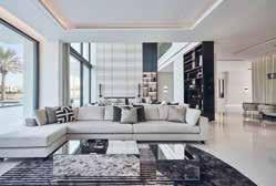
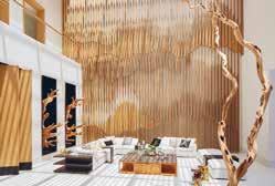
Project Manager: View Emirates
Photographer Credit: Juliet Dunne
The brief was to create a unique and elegant interior with a contemporary monochromatic palette, enhanced by the interior architecture and finish selections. Although the palette was subdued, by using rich materials, high-end detailing, custommade joinery, custom furniture, and bold artworks, the design emanates luxury. The entire interior, from layout to finishes, to furniture and accessories were selected or custom designed by MWM Studio.
The impressive architectural entrance sets the tone of the villa, balancing drama and brightness. The grand double volume entrance hall guides guests to a marble feature bench at the base of the staircase, sitting on a custom-made Italian silk rug. The staircase extends from the side of the circulation and is surrounded by combed marble cladding, a recessed marble handrail with integrated lighting and an inset mirror.
Studio MWM emphasized the design of the main entertainment area by designing a double volume space surrounded by expansive glazing to open the area, and a seamless marble wall with integrated metal shelving and bioethanol fireplace. This space is inclusive of a unique bar area with glass box wine cellar, where the integrated lighting and black metal frame creates a statement feature. The contrasted ‘cavelike’ home cinema showcases a curved ceiling and rich velvet sofas in a truly relaxing atmosphere.
Location: Maui, Hawaii
Interior Designer: Philpotts Interiors
Architect: Dan Dzakowick Photographer: Travis RowanAt its heart, this vacation house is about creating a sanctuary where a multigenerational family can share experiences and create memories. Overlooking Maui’s southern shore with views to ocean, mountain landscapes and other nearby islands, this home was designed to experience nature and support active lifestyles.
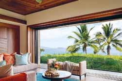
A strong connection with nature and liveability drives the arrangement of Coral House’s main gathering spaces. A covered lanai sits between the pool and interior living, dining and kitchen spaces. Large pocket doors open to merge the exterior and interior spaces. They allow for an open plan with kitchen, dining and living areas integrated into a single casual space that uses a unified language of material finishes and detailing.
The home’s flat roofs are tiered for scale and designed with large eave overhangs protecting the lanai spaces and interiors from sun and rain. Second-story living spaces are set back from the ocean side of the home due to development requirements, and a green roof provides these spaces with an upper garden and ocean views. Photovoltaic solar panels on the upper roof are hidden from view below.
The success of the design results from a cohesive and contextual architectural concept. The design has a sense of belonging to the site and the larger context of the island and the Polynesia region. The architectural vision is one of tropical modern inspired from Japanese craftsmanship and a sense of restraint. The interior and exterior spaces are merged enabling the inhabitants to experience amidst the luxurious tropical climate. The furnishings and artworks support the larger architectural vision.
Location: Palm Beach, FL, USA
Interior Designer: Brian Worthington & Associates
Brian Worthington & Associates were brought in to completely redesign this English Georgian Style private residence in the location of Palm Beach, Florida. It was important to the clients to have an interior scheme that was both informal and sophisticated with a gentle nod to the surrounding Palm Beach. Brian Worthington & Associates injected colour and an overall sense of an understated European style.
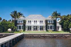
The designers were able to purchase vintage English furniture and also commissioned bespoke pieces of furniture with this turnkey residence. For Brian Worthington & Associates, the key aspects of this project are the super high end materials and bespoke furniture, these combine perfectly to reveal an ultra refinement and truly quiet luxury.
Palm Beach has multiple different styles, and you could say that Sunnyside would probably be the most classical in style. Yet with the contemporary exterior water feature of a stone sphere, this helps to make it very relevant to the 21st-century in Palm Beach. Brian Worthington & Associates think Sunnyside is very contemporary, yet has a very cool nod to ‘the new Palm Beach’ based on the location and is completely sympathetic to the kind of seasonal winter that you’d expect from this area.
This 10,500 square foot house has a cohesive and seriously understated refinement. Brian Worthington & Associates have achieved a completely balanced harmony between the symmetry of the 18th century English Georgian style with the most current contemporary finishes.
Location: New York, USA
Architect: Jean Nouvel
Interior Designer: Interior Marketing Group
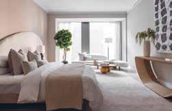
The client was looking for a designforward, sophisticated aesthetic with an emphasis on organic shapes and strong modern art influence to balance the angular architectural lines of the worldfamous Jean Nouvel building in midtown near billionaire row. The 82 floor supertall skyscraper is located on West 53rd Street in the Midtown Manhattan neighbourhood and is situated directly above the Museum of Modern Art.
Interior Marketing Group balanced a light, airy palette with lush jewel tones and soft lines that complemented the architecture. In each room, the designers added an unexpected element that added a sense of whimsy which helped offset the otherwise very sophisticated design and palette. The interior design scheme also had to make use of the expansive and enviable views over the city.
The client was also looking to showcase a beautiful art collection that helped create an inspiring experience every time they came to town. Interior Marketing Group did this by curating a unique, bold, and graphic collection of modern pieces that carried the story and connected the spaces from room to room.
Location: Cabo San Lucas, Mexico
Interior Designer/Architect: Denton House Design Studio
Developer: Discovery Land Company
This luxurious property benefits from expansive views above the Sea of Cortez. Its stone and glass-clad exterior creates a seamless transition between the indoors and outdoors.
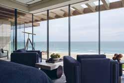
The clients asked Denton House Design Studio to create an exquisite residence and to optimize a stunning view, where both sunrise and sunset would govern the pace of the day. They required understated luxury that would surprise and delight guests. The clients stated that ample space for entertaining and socializing must balance with private removes where the family can convene to spend quiet time. The layout needed to take advantage of the year-round warm weather, allowing for blurred lines between indoors and outdoors. The experience of entering the home should be dramatic and set the tone for an unforgettable stay, oozing with luxury and tranquillity.
Local craftsmen were the heroes of this project. Carved stone and local materials would showcase world-class art and furniture. The colour palate would bring the outdoors in, and each window must frame a view of the outdoors, whether of the ocean or inland vegetation. The clients requested design components like outdoor showers set among existing boulders, an outdoor kitchen, and water elements.
A double beach front lot was the choice location for this 14,000-square foot home. It is located in the prestigious El Dorado Golf and Beach Club, a spectacular members-only community based along the “Golden Corridor’ that connects San Jose del Cabo to Cabo San Lucas. It features beautiful architecture combined with modern luxury design. Great care was taken in the design of Casa del Casillo Dorado to complement its natural surroundings.
Location: Chelsea, UK
Interior Designers: Noor Charchafchi, Harriett Browne, Lola Osunneye
Developer: Lodha Developers
Photography: Julian Abrams
One of the finest residential developments in the world is home to some of the world’s most elite and VIP residents. The brief for Celine Interior Design was to provide a show apartment with full FF&E and bespoke joinery to create an impressive and luxurious home.
At Celine Interior Design, one of their most unique offerings is to be able to immediately change and impact the human state without the individual ever noticing a difference. That has effortlessly been achieved in this room through the creation of not only a glamorous living space but one in which a family can still feel comfortable and cosy and immediately at ease. The master bedroom is a masterpiece in both its design and ability to immediately allow and inspire its inhabitants to unwind. Celine Interior Design have layered soft tones and textures throughout this space. It is a serene, sophisticated and seamless space using natural wools and linens to create an organic sentiment throughout the room.
The dining room is bright and airy. The artwork chosen is an abstract depiction of nature, the gold tones within this create a sense of luxury. The designers wanted to use a soft muted colour palette to brighten the space. The earthy tones of the wallpaper, which were also used in the private hallway allow the rooms to flow into each other and create a feeling of connection. The wide openings into the space create a beautiful transition from the living room into the dining room, connecting one space to the other.
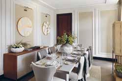
Location: Neve Ilan, Israel
Architect: Dana Oberson, Oded Livyatan, Ofra Goldberg
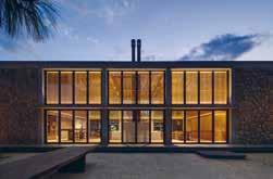
Interior Designer/ Designer: Dana Oberson, Oded Livyatan, Ofra Goldberg
Landscape Architecture: Mohr-Avidan
Photographer Credit: Amit Geron
This house by Dana Oberson Architects Studio sits on the edge of the two towns, Arab and Jewish, becoming a statement of respect for the place and the neighbours; it’s a property that calls for coexistence. The single level entrance facade blends into the view and integrates into the environment. The material choice comes from the unrefined stone that builds the agricultural terraces of Neve Ilan.
The architects loved the layers of history in the stone. They wanted to tell a story of identity and context where this stone is a significant part of a structure. These unrefined stone slabs flow from the outside into the interior spaces and connect them.
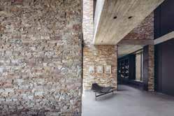
A glass foyer between two volumes of stone doubles the space. The transparent entrance to the house reveals a dramatic view of the terraces and the forest.
The materials are exposed and rough; concrete ceilings, burnt-looking oak cladding, natural iron, and the local unrefined stone. Black basalt connects the interior to the exterior, another local material that was mined and given a new interpretation as the house floor. The house ends in an outdoor terrace and an infinity pool that blends with terraces, horizon, and sky.
It was important to avoid fences and railings in the landscape as the designers wanted the house to act as a seam rather than a division. In the interior, unlike a continuous railing that creates a boundary, random-looking flat iron pillars serve as a railing and base for climbing plants, integrating the landscape as well as connecting the two levels.
Location: Valle de Bravo, Mexico
Architect & Interior Designer: Alejandro Bernardi / Beatriz Peschard
Photographer: Rafael Gamo
Submerged in the topography, and the vegetation, this estate finds its place in an exclusive residential compound located in Valle de Bravo. The house was designed as a second home in a one-story layout that contains public, private recreational and service spaces. The main entrance, between colour and stone volumes, guides you through and into the main space. A double height stone volume with wood ceilings that encloses the living and dining experience, connected with the exterior terrace and opening on both sides to create a feel of transparency and depth.
This magnificent space was designed as the heart of the house, connecting the service areas, with the kitchen and on the other side, the bedrooms. This volume can be integrated with the exterior terrace that hosts an exterior living, dining, pool and fire pit experience. The volumes containing the bedrooms, kitchen and service areas are located around the main stone volume, and they all interact with the topography, adjusting their position to get better views, more privacy or simply a privileged spot on the terrain. Attention to detail is present throughout the project, the dialogue between solid and transparency play a main role, the amount of natural light drawn upon the house allows the temperature to regulate in a more natural sense.
Family life flows around the central area, the main core of the house. From here, you can really appreciate all of the details and key aspects, like the emblematic windows that let nature in, and shower each space with sun and natural light.
Location: Vallauris, France
Architect: Kube
Interior Designer: Kube – Tala Akkawi
Set in a villa originally constructed in 1977; the design sought to lovingly restore original hand-crafted features and sensitively create additional area for wellness and community living through connecting nature with the villa. A reticent unobtrusive design created the substantial additional volumes by carving the spa inward, all while maintaining clear evocative eastern sea views. There is a sense of openness and natural flow through the villa with connected views to the landscape.
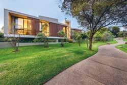
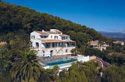
Special attention was given to levelling, to ensure the connection outside can be enjoyed while dipping in the jacuzzi or laying in the sauna, seamlessly out through to the yoga deck, infinity pool and sunrise over the coastline. In case privacy is preferred, there are 3 zones of voile curtains to use at pleasure.
The brief was to create a self-contained retreat to re-energize in nature, with gathering family in mind - coinciding with a post pandemic ideal design for living. There are a variety of indoor & outdoor zones, like 4 dedicated seasonal outdoor dining spots each with unique views, one by a fire-pit and another beneath discrete heating laid in a false ceiling.
Palm trees inspired the bespoke artwork of the interiors, while the bedrooms were designed around a collection of individual art pieces. Vallauris town hall approved a teal for the timber shutters, contrasted with dark wrought iron fittings – today a teal palette can be found throughout the joinery, kitchen, bathrooms, Roche Bobois furnishings and lovingly restored antiques. Surplus materials, wood and iron grills were transformed into bespoke furniture on-site, like coffee tables, paying homage to the original craftsmanship. The design centered around a communal harmonious balance of inside / outside living.
Location: Johannesburg, South Africa
Architect: Gottsmann Architects
Photographer Credit: Rene WalkerThis concrete house by Gottsmann Architects seeks to be pure in both form and materiality. A design that is not pretentious but refined. The use of material is expressed in a purposeful and unambiguous manner, using off-shutter concrete as the primary building material with large expansive glass doors as key aspects of the project.
The design needed to result in a contemporary single storey family home with 4 bedrooms and open living areas. Natural light was a key requirement from the brief, as well as circulation and flow of spaces, and strong visual connections to the surrounding landscape. Due to the front street elevation being primarily composed of the garage, it was also important that this was treated sensitively with a welcoming approach.
Surrounded by lush greenery, the home is designed to create the necessary privacy between neighbours whilst showcasing bright living areas that are free of curtains and blinds. The addition of planting onto and against the building softens the façade while the central garden atrium in the core of the house helps breathe light into the interiors. The exterior of the garage is softened with a timber custom-made oversized garage door, which became one of Gottsmann Architects’ favourite elements of the home.
The low-lying house blends in with the surrounding landscape rather than compete. The expansive use of glass helps blur the lines between the interior and the exterior, connecting the inhabitant to the surrounding green open spaces, bringing a constant awareness of the changing seasons and grounding the home within the context of its surroundings.
Location: Maui, Hawaii
Interior Designer: Philpotts Interiors
Architect: Dan Dzakowick Photographer: Travis RowanAt its heart, this vacation house is about creating a sanctuary where a multigenerational family can share experiences and create memories. Overlooking Maui’s southern shore with views to ocean, mountain landscapes and other nearby islands, this home was designed to experience nature and support active lifestyles.
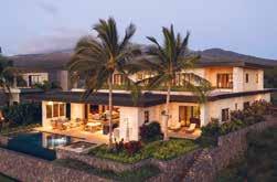
A strong connection with nature and liveability drives the arrangement of Coral House’s main gathering spaces. A covered lanai sits between the pool and interior living, dining and kitchen spaces. Large pocket doors open to merge the exterior and interior spaces. They allow for an open plan with kitchen, dining and living areas integrated into a single casual space that uses a unified language of material finishes and detailing.
The home’s flat roofs are tiered for scale and designed with large eave overhangs protecting the lanai spaces and interiors from sun and rain. Second-story living spaces are set back from the ocean side of the home due to development requirements, and a green roof provides these spaces with an upper garden and ocean views. Photovoltaic solar panels on the upper roof are hidden from view below.
The success of the design results from a cohesive and contextual architectural concept. The design has a sense of belonging to the site and the larger context of the island and the Polynesia region. The architectural vision is one of tropical modern inspired from Japanese craftsmanship and a sense of restraint. The interior and exterior spaces are merged enabling the inhabitants to experience amidst the luxurious tropical climate. The furnishings and artworks support the larger architectural vision.
Location: Jupiter Island, Florida

Architect:
Christian Thomas and John Melhorn
Interior Designer: Betsy Brown
Construction Company: Thomas | Melhorn
Photographer: Nicole Franzen
Wabi-sabi, the Japanese design principle that emphasizes the perfectly imperfect, is imperative to every aspect of this home. The architecture recalls that of the Florida vernacular with materials that would be found in the surroundings. This house was intended to be passed from generation to generation and so, the material palate was carefully curated with the intention that it would both age in harmony with the ocean’s environment, but also exude a memory of previous experiences.
The floors are raw oak planks that have been fumed and gently waxed to present the natural beauty of the material. The walls and ceilings are a composition of waxed plaster and lime cypress, creating a soft elegance welcoming of the colours and light of the oceanfront setting. The house makes an intentional angle shift, the kitchen and family room reside within a wing of the house that faces southeast rather than directly east. This shift presents a different view of the beach and ocean, looking along the coast of sea grapes and coconut palms with the tropical Atlantic beyond. The kitchen is cypress wood that has been coated in a lime wash and stripped to reveal a beautiful, aged cypress and the counter tops are limestone sourced from Romania, which resembles the colour of the local beach sand.
The north wing is dedicated to the children’s bedrooms and the ocean terrace; a magnificent post and beam covered terrace overlooking the ocean and entire property. This balcony has been purposely orientated to capture the breeze on any day giving respite from the tropical sun.
Location: Manja, Madaba, Jordan
Interior Design:
Anas Zabalawi, Within175
Architect: Anas Zabalawi, Within175
The secret retreat is located near the Ancient Greek city of Madaba, Jordan. The property is surrounded by an amazing landscape full of olive and pine trees, that helps you to relax and recharge your mind, body and soul.
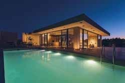
Within175 integrated a minimalistic design into a combination of rough concrete (which is the main element here), with natural oak wood and glass. The whole concept behind this project is to release yourself from the bustle of day to day life and materialistic elements by recharging your energy, going back to nature, and fulfilling your mind and soul without any distraction. Minimal materials were used to shape the architecture in this way, so it blends with the surrounding nature, having the outside inside and reflecting the green shades of the olive trees, blue skies and the red soil on every wall and floor.
The main entrance of the house was made from rough concrete that gives any guest the curiosity to find out what lies within. Glass blocks were integrated in the concrete wall to offer sunlight reflection to the interior and to add shape to the front. Lighting was one of the most effective elements in showing the roughness of the concrete, adding serenity to the spaces both inside and out.
Large sliding glass doors were added to most of the rooms, and an open ceiling courtyard was created in the centre of the house to allow natural sunlight and a fresh breeze into all spaces. The building was lifted by 2 meters from the ground level so the view would not be blocked by the olive trees and for better air circulation.
Location:
Malpaís, Puntarenas, Costa Rica
Architect: José Manuel Álvarez Cruz
Photographer: Tony Aragón / Roberto D’ambrosio
Casa de la Tierra y el Mar is a beach house designed with bioclimatic parameters and tropical architecture, with a great relationship between inside and outside. Also influenced by the empathy with the ocean, the design incorporates features such as a shaped roof to resemble the waves, the high and privileged location which reminds the residents of a yacht cabin that seems to navigate in the forest canopy, and the exterior bridge which feels like a bowsprit, pointing north.
To design in the Pacific north coast of Costa Rica is a subject that needs to be carefully considered to avoid loose ends. Factors like the temperature, corrosion, having big openings to take advantage of the views and the incidence of the sun need to be analysed and incorporated into the design. All of these things reminded the designers how the old houses were built in this area, and all those elements were once again considered.
The house is almost a bedroom, which disappears and merges with the exterior when the blinds are open. The tall windows that open up completely to the deck, help out to make the most of this interaction with the outdoor space. This relationship between inside and outside was maximised with the design of a bridge, which extends like an arm, and allows to touch the branches of the trees around the house. In the pool, it is possible to see the ocean from above and the trees at the same level, and it’s probable that a curious monkey may find its way to the house.
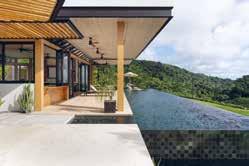
Korantina Homes’ concept is simple; an enclave of bespoke designer villas located on unspoiled shore and a shimmering blue sea, with first-class security and concierge services on hand at all times. Here, the glamouring world is shut out at the gate, everyday stresses dissolve and families are free to spend time together. It’s a place for zen, serenity or lavish parties, whatever suits the mood. The villas are contemporary in style and designed with timeless elegance. The gentle slope towards the sea ensures every house has a spectacular view of the beautiful surrounding area and crystal-clear waters.
Owners can immerse themselves in local culture and history through rich and luxurious materials. From the lower ground floors to the balconies, local colours and textures have been incorporated, stone, wood, plants and mosaics. The villas also play with light and shade, blurring the edges between inside and outside spaces and making opulent living areas feel as if they are part of the spectacular landscape. Residents can while away hours in their private pool or jacuzzi, unwind in their sauna or enjoy the latest films in their state of art home cinema. Wine cellars, sculpture courts and well-equipped gyms are also key features.
Cap St Georges is the perfect place to lie back, switch off and relax. Thanks to its west facing position, Cap St Georges enjoys spectacular sunsets and panoramic views maximized by the villas design. The areas sea caves and pure waters make it one of the most idyllic stretches of the Mediterranean coast, perfect for swimming and diving.
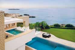
Location: Jupiter Island, Florida
Architect:
Christian Thomas and John Melhorn
Interior Designer: Betsy Brown
Construction Company: Thomas | Melhorn
Photographer: Nicole FranzenWabi-sabi, the Japanese design principle that emphasizes the perfectly imperfect, is imperative to every aspect of this home. The architecture recalls that of the Florida vernacular with materials that would be found in the surroundings. This house was intended to be passed from generation to generation and so, the material palate was carefully curated with the intention that it would both age in harmony with the ocean’s environment, but also exude a memory of previous experiences.
The floors are raw oak planks that have been fumed and gently waxed to present the natural beauty of the material. The walls and ceilings are a composition of waxed plaster and lime cypress, creating a soft elegance welcoming of the colours and light of the oceanfront setting. The house makes an intentional angle shift, the kitchen and family room reside within a wing of the house that faces southeast rather than directly east. This shift presents a different view of the beach and ocean, looking along the coast of sea grapes and coconut palms with the tropical Atlantic beyond. The kitchen is cypress wood that has been coated in a lime wash and stripped to reveal a beautiful, aged cypress and the counter tops are limestone sourced from Romania, which resembles the colour of the local beach sand.
The north wing is dedicated to the children’s bedrooms and the ocean terrace; a magnificent post and beam covered terrace overlooking the ocean and entire property. This balcony has been purposely orientated to capture the breeze on any day giving respite from the tropical sun.

Location:
Seashell Compound, North Coast, Egypt
Architect: Mohamed Fares
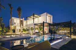
Interior Designer: Mohamed Fares
Developer: Seashell, North Coast
Photography: Nour Refai
The Shell House is a playful, thoughtful, and generous abode that embodies the spirit of Summer. It’s bright and bold approach to design defines this beach house as both fun and comfortable. Alchemy’s interior design for this house thrives in it’s North Coast location.
The design brief was for the property to be a luxury villa that is an extension to the host’s personality. A beach house that is a lively and welcoming, spacious and considerate. Alchemy needed the interiors to be a bright reflection of it’s surroundings, taking inspiration from the Summer season. Bold block colours are paired with natural materials for an eyecatching partnership. Playful design emulates the host’s personality, with unconventional shapes being used within the living spaces, and novel design techniques that can be found in all corners of the home. The layering of different textures gives depth and gravity to the space, whilst still keeping a light and open feel to the interiors.
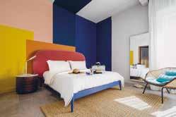
Sitting on the Mediterranean Beach of the north Coast of Egypt, Alchemy wanted the design of the home to benefit from it’s location as well as it’s inhabitants.
Putting the fourth dimension – Time – into consideration meant that the designers allowed the natural light to throw shadows throughout the day, introducing a dynamic element to the interiors. It is the input of this element that helps to capture the essence of the sea by allowing the golden light of the sunset to engage with the house and interact with its textures, angles, and lines. This dramatically ties the house to it’s location as the two work together to express the true design potential of the property.
Architect: BLCK.
Interior Designer/ Designer: BLCK. Construction Company: BLCK.
Photographer Credit: Nour El RefaiSKY 19 is considered to be one of BLCK.’s most challenging projects. Coordination became a prioritised skill, as the client did not have a brief for the aesthetics. Everything had to be carefully considered to produce a property that the designers and client enjoyed.
This is a seaside property with a triangularshaped plot, overlooking an artificial lagoon. The client wanted something one of a kind, meaning many of BLCK.’s decisions allowed for the property to fit well into it’s environment, as the outside area was heavily impacted by the plot shape, sun orientation, wind direction, and landscapes. These were all considered in the design process, positioning the main area of the pool to have maximum sunlight, aligning the pool horizon with the artificial lake, and the dining table having the best sunset view. The project’s exterior aligns well with the environment, but the interiors were intended to stand out. SKY 19 is a unique beach residence, using only two colours in its interior design, black and white. The minimalist scheme becomes playful when paired with the lighting integration and bright accents. With BLCK.’s clever implementation of this scheme, the house stands apart from others in the area, but also focusses on the outdoor areas as requested.
The client also asked for the lighting to be studied carefully. Natural lighting is a key tool and became highly important in the exterior design. With the added lighting, the property’s outdoors become more stunning when lit. The client requested that BLCK. increase the outside seating areas as much as possible. Due to their importance, the main exterior areas are highlighted using lighting, from the seating and dining areas to walkways.
Location: urb. El Herrojo, Benhavis
Interior Designer: Jana Novakova
Architect: Studio Tobal - Diego Tobal
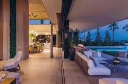
Developer: Fintech
Construction Company: Solis
Photographer: Charly Simon
Casa Varanda is a residential villa with generous sunlit indoor spaces overlooking the sea, with 6 bedrooms, double height living and dining room, game room, gym, spa, outdoor pool and beautiful gardens. The villa is designed in a contemporary style, with the utmost care for comfort with high quality seating furniture and turnkey spaces.
The living and dining area is a vast open space having full height windows with sun light accentuating the light and fresh summer colour scheme. Key to the design are the motorized full-size windows which visually decorate the room expanding to the beautiful view of the gardens. The double height ceiling salon with its wooden cladding makes the room feel airy, but at the same time very cosy and warm. The focal point wall with the chimney has two types of wall paneling, backlit onyx and real dried moss to add a fresh unexpected accent. The moss has also been used in the entrance in combination with travertine 3D cladding backlit with LED. The generously sized spaces fitted with natural stones, wood and turnkey furniture all over the villa, including bathrooms, gives guests the feeling of a luxury vacation.
The design scheme is in line with the modern architecture, yet the selection of colour schemes per area gives a clean and tranquil aesthetic, creating a more vacational look. The property integrates itself into the wider environment through the use of natural materials which blend into the surroundings and also having 3 large trees planted within its premises in order to blend within the surrounding green hills.
Location: Leinster Square, London
Interior Designer: Banda Design Studio
Developer: Banda
Described as “like stepping into an Old Masters painting” this penthouse apartment is a beguiling mix of rustic looks and luxury feels. The penthouse is located on the 5th floor and spans over 2,300 square feet with a further 500 square foot private roof terrace.
The design brief for Banda was to create something that was completely unique and totally unexpected in a city penthouse. Inspired by travels to Tuscany and rural France, the brief was to introduce a farmhouse quality to the space with rustic tones and luxury amenities, with an overarching influence of wabi-sabi (the Japanese art of finding beauty within imperfections). A strong sense of home was equally important, as was the sense of a life well-lived and travelled.
This gentle, restful space is anchored by the strong geometric lines of the fireplace in bold Nero Marquina marble and statement pendant lighting that provides just the right amount of juxtaposition to the softness. The colour palette is owned by natural tones blending from olive to taupe, with the calming shades giving a depth that displays a human, artisanal touch.
The original oak beams accentuate the double-height ceiling in the open plan living space and add a feeling of earthiness to the space. This is further enhanced by the high quality, natural and non-toxic clay plaster on the walls with its moisture and temperature regulating qualities.
The feeling of harmony and sanctuary is echoed by the leafy garden square that the penthouse overlooks. One of London’s hidden gems, the private gated garden of Leinster Square is surrounded by the beautiful white stucco-fronted Grade II listed buildings, whilst being only moments away from the hustle and bustle of Notting Hill.
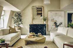
Location: London, UK Interior Designer: Harrod Interior Design
Harrods Interior Design were required to create a colourful, modern apartment in the luxurious Regents Crescent building located in Regents Park, London.
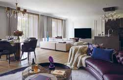
The client wanted a neutral design scheme that would feature pops of colours to add fun and intrigue to the interiors. The clients stated that their favourite colours were navy, purple and mustard yellow, so the designers’ integrated bursts of these colours throughout the property. It was also vital that the scheme mixed contemporary, modern designs with small classical twists to blend with the surrounding areas and architecture.
There were two main requests that the clients wanted the Harrods Interior Design to incorporate into the property. The first was to do with their art collection, as big art lovers and collectors the client wanted furnishings to complement the artwork that they had collected over the years. The second request was with regards to wine storage; as the clients are very passionate about wine, bespoke wine units were designed by Harrods Interior Design to really hit the brief.
The property previously had one oversized living room and a dining room; however, the client wanted an area that was divided into various zones. Therefore, Harrods Interior Design were able to section the space into a cosy living space, dining area and formal seating area using different shapes to create the zones.
Location: London, UK
Interior Designer: Mahrukh Jamil
Developer: Meritas
Photography: Natalia Monica Photography
The brief for Mahrukh Jamil Interiors was to create a contemporary and sophisticated city space in which their client could feel the luxury of a high-end hotel but the warmth of a home. The client wanted to use the apartment for his family to enjoy breaks in London but also, as a CEO of a multinational firm, a place to entertain friends and colleagues.
It was important for Mahrukh Jamil Interiors to consider textures and colours that would help to inspire and relax the client in their city apartment. By using luxurious materials and colour palettes with the occasional pop of colour, the designers were able to connect each room seamlessly. One of the client’s favourite aspects of the design scheme as the contrasting patterns and textures that were used throughout to add interest and depth to the interior.
Mahrukh Jamil Interiors’ favourite part of the project was designing all the joinery for the apartment. Using triangular and diagonal shapes that were also used in the dining area lighting, dining chairs, and accessory fabrics, Mahrukh carried these patterns as a running theme throughout the apartment.
The design was for an apartment that is one of many apartments in a new residential development in Paddington. As an extremely vibrant, busy, and multi-cultural part of central London the design had to be in line with the area and the price of the property itself. The apartment, overlooking the Grand Union Canal, is in a modern and sophisticated building that has clearly been developed for a certain clientele. Therefore, the contemporary and sophisticated design of the apartment perfectly integrates with its surroundings.
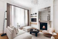
Location: London, UK
Interior Designer: Kayla Pongrac, Iron and Ivory
Construction Company: PDCR Photographer Credit: Darryl Snow
Blending heritage comfort with contemporary functionality, Brondesbury Villas is a late 1800’s Victorian space that has been modernized by drawing inspiration from its original architecture and ornate detail. The apartment is in a Victorian villa in northwest London and complements the capital city’s architectural heritage whilst promoting modern day industrial design styles and products.
Iron and Ivory opened the apartment by removing the interior walls to expose the building’s base structure. From there the designers were able to redistribute the space. Working with local suppliers, they sourced premium materials such as the Calacatta Monet Marble, bespoke kitchen cabinetry and integrated joinery which also helped maximise the space.
The interiors are balanced, finding harmony between tradition and modernity. The colour palette is neutral, light, and warm to balance the black architectural detailing and hardware. The clean, light ambience is complemented by the open plan design; the kitchen island has a bespoke metal support to keep a lightweight and flexible design for the open-ended seating area.
Showing cognisance of the property’s history, Iron and Ivory had specialists repair the damaged coving which was done entirely by hand, taking several days to repair and preserve the decorative mouldings. They also worked with a bespoke joinery company to remake the skirting and picture rail identical to the original profiles. The fireplace also needed restoration to clean and purify the marble to remove imperfections.
Location: Sugar Quay, Tower Hill, London
Interior Designer: Casa Alta Design
Construction Company: Chartwell Group
Associated:
GS Contracts, Gaysha Ltd, Esoundworks
The brief required Casa Alta Design to transform an originally bland developer’s apartment into a warm and welcoming home with simply the best of everything. The focus was to supply the most cuttingedge technological features – the whole apartment can be controlled from a remote location - infused with the design creating a beautiful yet comfortable and convenient space.
The apartment, located by the Thames, now prioritizes the views from all windows creating a connection with its amazing surroundings. By using extensive framing of all windows, clad with American Walnut and following the same grain as per joinery, Casa Alta Design have integrated the gorgeous viewpoints such as The Shard and other London landmarks as a backdrop for the rooms.
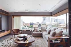
The client’s South American roots inspired the design concept with carefully curated references - marbles, bronze, dark wood, and a concise but rich palette of colours. Built throughout the COVID 19 lockdowns and supply disruptions, this project is a statement of Casa Alta Design’s commitment to delivering projects to the highest standards.
The bespoke joinery package for this project was extensive and Casa Alta Design had to work closely with the joinery contractors. The craftsmen at GS Contracts and Gaysha are no strangers to working with exotic materials and demanding briefs. To ensure an even grain throughout the joinery, Casa Alta Design used a single American Walnut log creating a sense of continuity in all pieces. The superb verde tinos green marble cladding has a special leathered surface texture.
Location: London W2 Construction Company: M2 Project
The initial brief was to create a Parisian apartment in the loft levels of a large Victorian block in West London. The top two levels of the building were to be merged, with a new mansard roof forming the external shell for internal rework. During design development stage the brief moved towards a more modern NY style loft/ Parisian apartment combination and the two have been beautifully merged. This set the project tone, with the clients drive to cleverly use every inch of space being another paramount factor.
A contemporary take on a traditional picture rail is a feature of the reception room. It was designed and manufactured to accommodate suspended art with weight bearing steel rollers that enable the feature art piece to roll and reveal a large entertainment system behind. In addition, looking from the middle landing upward with all the beautiful angles, the soft curve of the handrail and the antique library ladder, is another rewarding aspect of the project.
The first floor is lobbied by a bespoke finished Crittal wall that was hand finished by Rupert Bevan to achieve an older aged metal finish - complementing the double herringbone floor that was blackened by hand to achieve the right effect. Rupert Bevan also masterminded the antiqued mirror finish to the kitchen splashback. Novocastrian created the bespoke ironwork, from modern picture rails with sliding artworks, pivoting library ladder in the stair atrium & balustrades right through to the custom iron furniture.
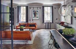 Location: Knightsbridge, London Photographer Credit: Ben Thompson
Key Interior and Designs are a passionate team of creative individuals that are inspired to transform a client’s apartment or house into a home. For this project, the team have created a brighter, lighter and more welcoming apartment in the centre of London.
The brief was to take inspiration from the client, location, apartment and nearby Hyde Park and transform the apartment into a sophisticated space to enjoy. Through bespoke lighting pieces, items, soft colours and brighter inserts of soft furnishings with colour, the designer achieved a project which is decadent and sophisticated yet playful and fun. Elements of pieces, colours or soft furnishings each encapsulate the client’s personality; young and sophisticated.
The favourite pieces are the light fittings as they are all handmade and bespoke, each one completely individual. The team have worked intelligently with the use of space. Using pops of colour, light, glass and mirrors to reflect and maximise and utilise the space available.
The apartment overlooks Hyde Park which inspired the designer to ensure there were sustainable elements involved in the project. They reused elements of the existing furnishings including doors and ensured that they were repurposing objects where able to and achieve the same result - if not better - as purchasing something new. Incorporating a sustainable angle into all projects and utilising the supply chain works incredibly well.
All of the light fittings are hand blown Murano glass pieces from Venice. Each one completely individual with so much colour, movement, and personality.
Location: London, UK
Architect: Verduyn Architecture
Construction: JD Build Ltd Kitchen Design: deVOL Kitchens
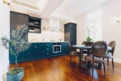
When the current owners bought the apartment, it had been used as a short term let for several years and completely lacked charm and character. They approached Verduyn Architecture to completely renovate the apartment. The brief was to make better use of the compact space as well as to pay tribute to the exquisite exterior Grade II Listed façade of which it forms part.
Work included substantially raising the ceiling which dramatically increased the sense of space. The old ceiling had also covered a portion of the windows and with the ceiling now lifted the skyline is exposed, letting in significantly more natural light. A window, which had previously been blocked up was reinstated, further enhancing the views and natural light.
The wall between the galley kitchen and living room was removed to create a large open plan living space in which a new deVOL shaker kitchen takes centre stage. The apartment was fully renovated including a new bathroom, new joinery and finishes throughout. The result is a mix of contemporary living and traditional style with attention to detail of utmost importance.
The design pays tribute to the Grade II listed facade of the building within which it is located by using a complementing colour scheme and introducing elements of traditional, classical styling. This nod to the traditional is evident in the choice of finishes from light fittings and brassware through to wallpaper and furniture.
Location: London, UK
Interior Designer: Matthews Rea Architect: Rodic Davidson Architects Developer: SMAP Photography: Vigo Jansons
Matthews Rea were asked to design and install the interior décor for two threebedroom apartments within this unique newly build development in Kensington. Taking inspiration from the modern architectural detailing, the designers worked with a natural, textured, and warm palette to give the spaces a welcoming, elegant but contemporary feel.
When working on interior design schemes for a developer, Matthews Rea can assist with the base design and finishes, including kitchens, bathrooms, flooring, doors, ironmongery etc. In this instance, everything was in place, so they worked closely with the Developers team –Architect, Project Management and Contractors to ensure that they offered wall finishes, joinery, furniture, lighting, rugs and art etc that fitted seamlessly into the decisions already made. In the living area, the designers installed a large scaled patterned canvas with a predominantly mustard and green colour palette to draw your eyes immediately. Many interesting pieces of artwork were utilised throughout the scheme to create an art gallery like feel in this luxury home.
Matthews Rea met with the architect on more than one occasion to really understand their design ethos for the apartments. Clean lines and beautiful vistas from one room to another belie the amount of careful attention to detail required for this type of modern living. It’s all about understated comfort and luxury, carefully considered and designed for modern living.
Location: London, UK
Interior Designer: STUDIOAida Ltd
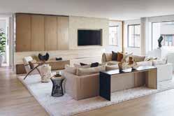
Architect: STUDIOAida Ltd
STUDIOAida successfully transformed this Knightsbridge apartment into an elegant and sophisticated Pied a Terre. The client wanted to use the property for meetings and as a place to display a myriad of heirlooms and antiques which had been collected over the years. The challenge for the designers was to infuse these historic pieces with contemporary art and furniture so that the design scheme didn’t feel too nostalgic.
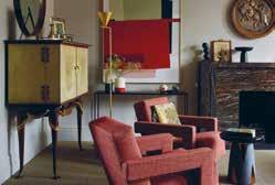
The apartment is set on the second floor of a redbrick townhouse and was converted in the 1950’s when all the period fixtures were removed. STUDIOAida Ltd discovered some of the original cornices and skirting behind one of the old built-in wardrobes and used these to create new moulds to reinstate original details.
Faux ceilings were removed to uncover the original tall Victorian windows and the designers were able to reinstate the original rippled glass. The original fireplace was lost in the previous conversion and instead of recreating what they thought could have been the original, STUDIOAida Ltd designed a new fireplace in Port St Laurent marble inspired by Sir John Soane’s fireplace and treated it like a new piece of furniture rather than a conventional fireplace.
To avoid a museum like appearance, the client’s collection of Italian, Austrian, Turkish and English antique furniture had to be carefully curated and brought to life. The designers purposefully chose striking modern pieces to juxtapose but complement the traditional.
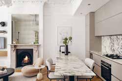
Location: London, UK
Interior Designer: Kayla Pongrac, Iron and Ivory Construction Company: PDCR Photographer Credit: Darryl Snow
Brondesbury Villas is a modernised late1800s Victorian home in northwest London. This apartment by Iron and Ivory showcases how period properties can be renovated whilst keeping key heritage identifiers with efficient, bespoke joinery and elevated finishes to create a comfortable and sophisticated home. It complements London’s architectural heritage and promotes modern-day industrial design styles and products.
It’s a blend of heritage comfort and contemporary functionality. Iron and Ivory had specialists repair the existing coving that had been damaged over the last 125 years. This was done by hand over several days to repair and preserve the decorative mouldings. The original skirting had been destroyed beyond repair, so the designers worked with a bespoke joinery company to remake the skirting and picture rail identical to the original profiles. The fireplace also needed restoration, which then became a central feature of the living space and a favourite aspect of the project for Iron and Ivory.
With the restored and original features leading the design, the colour palette is neutral, light, and warm to balance the black architectural detailing. Working alongside local suppliers, the designers sourced premium materials such as the Calacatta Monet Marble, bespoke kitchen cabinetry and integrated joinery for a bespoke, luxury design which also helped maximise the space. The clean, light ambience is complemented by the open-plan design; the kitchen island has a bespoke metal support to keep a lightweight and flexible design for the openended seating area.
Location: Oslo, Norway
Interior Designer: Gathe + Gram Photographer: Filippa TredalThe timeless and unique apartment lies in a building from 1898 in the residential area of Frogner in Oslo and had not been touched since 1987. Gathe + Gram gave the property a new lease of life with a classic yet modern look. The pandemic made many people rethink the space in which they live and the owners of this apartment were some of these people. They sold their previous apartment after spending lockdown inside and found a run down, but beautiful apartment with a lot of potential.
Everything was gutted except the wellpreserved original cornicing in the apartment, which became key to the design alongside the tall ceilings and history in the walls. The brief was to create a timeless apartment that feels light and airy with understated elements of luxury. Use of a classical oak herringbone floor, real marble and custom elements give the apartment a unique and personal look. All the joinery is bespoke as well as the majority of the upholstery items.
Unlike new buildings these older apartments have a different feel, it is a balance to make them appear new, yet still very personal. It’s important to get the scale right of furniture and bespoke joinery. The kitchen counters are taller than normal, as well as an oversized backsplash to make the kitchen sit right in the space, the ceiling height is 3.1m, a normal sized kitchen would be dwarfed in this room. The apartment has a mix of vintage, bespoke and new furniture, this creates a more unique look than getting everything store bought.
Location: Knightsbridge, London Photographer: Ben Thompson
Key Interior and Designs are a passionate team of creative individuals that are inspired to transform a client’s apartment or house into a home. For this project, the team have created a brighter, lighter and more welcoming apartment in the centre of London.
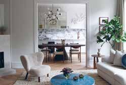
The brief was to take inspiration from the client, location, apartment and nearby Hyde Park and transform the apartment into a sophisticated space to enjoy. Through bespoke lighting pieces, items, soft colours and brighter inserts of soft furnishings with colour, the designer achieved a project which is decadent and sophisticated yet playful and fun. Elements of pieces, colours or soft furnishings each encapsulate the client’s personality; young and sophisticated.
The favourite pieces are the light fittings as they are all handmade and bespoke, each one completely individual. The team have worked intelligently with the use of space. Using pops of colour, light, glass and mirrors to reflect and maximise and utilise the space available.
The apartment overlooks Hyde Park which inspired the designer to ensure there were sustainable elements involved in the project. They reused elements of the existing furnishings including doors and ensured that they were repurposing objects where able to and achieve the same result - if not better - as purchasing something new. Incorporating a sustainable angle into all projects and utilising the supply chain works incredibly well.
All of the light fittings are hand blown Murano glass pieces from Venice. Each one completely individual with so much colour, movement, and personality.
Location: Israel
Architect: Yonatan Ephrat
Interior Designer: Yonatan Ephrat
What started as a classic renovation of an old and neglected apartment in the heart of the Old City of Jerusalem turned, unexpectedly, into an unfolding story - the integration of the past with the present, history with modernity – as, quite by accident, original architectural features dating back to the Ottoman Empire were discovered.
In the course of the construction, 500-yearold features such as stone walls, niches, and arches were revealed, restored and integrated into the design. The apartment which overlooks the Temple Mount also has a private open roof with breath-taking views of the Old City. These original architectural treasures as well as the spectacular Old City view dictated the minimalist and luxurious design of the apartment chosen by the architect.
Once these amazing elements were found the designer choose a more minimalistic design approach to not “fight” with the original stone and arches discovered and restored. This approach gave the stage to the original elements but at the same time gave a modern, warm touch and feel to the space. The harmony between the old and the new, each complementing the other and not daring to interfere is what made the end result so fascinating, interesting and beautiful.
In a deeper philosophical way, this is the story of beloved Jerusalem. The old and the new, all the different religions, the holiness and the secular and so on.
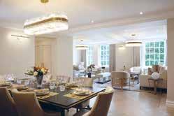
Location: London, UK
Interior Designer: Sequoia London
Photographer Credit: James Balston
An international client engaged Sequoia London to completely redesign two apartments they had purchased to create one extraordinary luxury home in Central London, made up of four bedrooms and four bathrooms.
Sequoia London were responsible for all the permissions, budgets, space planning, project management, interior architecture, interior design, specification, sourcing and procurement of all finishes, FF&E items, decorative accessories and tableware.
Sequoia London created a large master suite for the owners, including a seating area, a walk-in wardrobe and large bathroom, a further ensuite for their children and two further guest bedrooms and bathrooms. For entertaining spaces, Sequoia created a formal living and dining room and a cinema/family room where they could relax and spend time as a family. The apartment also contains a luxury kitchen and staff accommodation with a built-in study area and ample storage.
All of the joinery (wardrobes, closets, TV units, bar and storage areas) were bespoke and designed by the designers for this project. The majority of the luxury bespoke designed furniture was also designed by Sequoia for this project along with the two stunning chandeliers in the formal living and dining suites.
Almost all of the finishes and FF & E items were sourced from and the majority of all, excluding fabrics, were manufactured here in the UK using some of the country’s best suppliers. The neutral colours and pallets have been followed throughout the property making the flow from one space to another feel seamless, whilst still allowing each room to have its own identity.
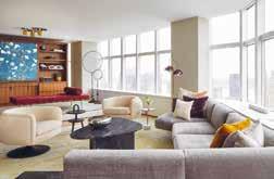
Location: New York, USA
Interior Designer: JAM
Architect: JAM
Photography: Gieves Anderson
JAM initiated a redesign of this modern beautifully detailed pied-a-terre that cleverly integrates function with luxurious materials and textures. The homeowner purchased this apartment in original 1993 condition, complete with tight and awkwardly segmented spaces - it felt tiny. The client wanted to open up the space and were open to the idea that the only walls would be those surrounding the bathrooms. The new living spaces would be defined with cabinetry, raised platforms and furniture.
A lengthy and enjoyable design process looking at wide range of materials, textures, finishes and furnishings resulted in a space that feels expansive and special. Attention and exploration were given to each detail –from the slight space between the terrazzo platform and the floor to make it appear as if it’s floating, to the way the stone floor wraps around from the powder room to the master bath to help define the private areas of the home. Each area of the home has a story full of meaning and design expression.
The key aspect of this project was that after a career in medicine, the redesign became a way for the homeowner to truly express their creative interests and bring together the materials, textures and art that they fell in love with during the design process with JAM. The design optimally integrates aesthetics with function in a way that feels seamless and natural in the space. The result is a way of living, not just furniture and finishes within a physical space.
This apartment is on an upper floor in a Manhattan high-rise with expansive views of the Hudson and surrounding city buildings. The design of this space remains calm enough to feel as though you are floating in the sky and softens the surrounding urban environment.
Location: El Dorado Hills, California, USA
Interior Designer: Kristen Fiore
Construction: North Ranch Builders
Photography: Stephanie Russo
Kristen Elizabeth Design Group were brought in to design this modern new build property located in the foothills of California. The brief was to oversee the interior design and direction for all finishes and furnishings throughout the 5500 square feet, including exterior finish palettes and materials and full interior design scope.
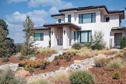
It was important to the client that Kristen Elizabeth Design Group ensured all interior finish selections reflected a modern rustic style which would exude warmth, style and comfort. All areas of the home had to be family friendly yet reflect a highly conscious design style with a contemporary feel. The design scheme also needed to integrate colour in key areas and ensure the home is fluid and harmonious.
For the designers, the favourite aspect of this project was the clients. They were keen on having fun, trying new styles and pushing their own boundaries. They allowed Kristen Elizabeth Design Group to introduce happy, playful patterns and prints while maintaining a high level of design. The home sits atop a hill overlooking Folsom Lake in Northern California.
The exterior colour and material palette work inconspicuously into the natural environment despite the size of the home. It is landscaped with water wise/indigenous plantings, solar panels, and various low use water features throughout the property. The entire home is balanced with repetition. The colour palette is soft and neutral, but warm and joyful. Hints of hues and textures were dropped throughout the home to ensure it felt fluid and calming amidst lots of family fun and kid chaos.
Location:
111 West 57th Street, New York, USA
Interior Designer: Studio Sofield Architect: SHoP Architect
Developer: JDS Development Group Photographer: Adrian Gaut
111 West 57th Street, the bold yet graceful residential tower that soars perfectly centered over Central Park in Midtown Manhattan, unveils a new, $28.5M, 4,492 square foot, full-floor residence on the 42nd floor. The four-week installation, inspired by travel, celebrates art, fashion, and design for the mobile-minded. Through a series of exclusive events and private appointments, visitors were transported through the historic Steinway Hall amidst breathtaking views of Central Park and the Manhattan skyline.
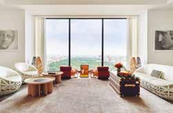
The exhibition curated by Rita Chraibi feature specially selected pieces from a luxury fashion house’s iconic collection, comprising beautifully crafted travelinspired objects. The collection features some of the world’s most renowned names in design, including India Mahdavi, Marcel Wanders studio, Patricia Urquiola, Campana Brothers, and Atelier Oï, among others.
Rita Chraibi wanted to show that, despite the strength and power of the objects, it was completely possible to make them coexist in a single space, in a harmonious way to create a living space both elegant and warm and to obtain a unique masterpiece in Residence 42. The passion was coordinating the shapes and colours of these objects, some of which have soft and sensual shapes and others with oceanic inspiration - for example, the anemone table by Atelier Biagetti, which is a true work of art, or the Bombocca sofa by Campana Brothers, which reminds one of the compositions of the ocean.
Location: Illinois, USA
Interior Designer:
Jasmin Reese Interiors
Photographer: Michael Alan KaskelThe Chamberlin Project is a magical, modern day Victorian kaleidoscopic space, with vibrant colours and finishes that are bold, yet quiet at the same time. Jasmin Reese Interiors was initially hired to help select pillows for the family room, from there Jasmin also suggested changing the rug, which led onto the team changing that entire room. After working on additional rooms within the house, eventually Jasmin Reese Interiors had transformed every main room in the home.
Jasmin Reese states “I was so inspired to come to the clients with bold saturated ideas and “what ifs” that they agreed to - and always chimed that we should take that idea to the next level! I was excited to source period pieces and came across lots of interesting curiosities.” The design works so well as the scale of the home allows the colours and limited furnishings to vibrate and create a high octane look and feel. In addition to this, the design also manages to feel nostalgic, creating an interesting mix and design concept.
Specialist artisan skills were used throughout the design of the project, including through the wallpaper hangers, art hangers, high quality painters and an individual who made the roman intaglios in the primary bedroom. As Chicago is known for its grey, muted environments, the Chamberlin Project stands out rather than blends in with most homes in this area. This home is in the middle of the woods and at night you can see the glowing tones of the beautiful fuchsia and teal room from down the street.
Location: Palm Beach, FL, USA
Interior Designer: Brian Worthington & Associates
Brian Worthington & Associates were brought in to completely redesign this English Georgian Style private residence in the location of Palm Beach, Florida. It was important to the clients to have an interior scheme that was both informal and sophisticated with a gentle nod to the surrounding Palm Beach. Brian Worthington & Associates injected colour and an overall sense of an understated European style.
The designers were able to purchase vintage English furniture and also commissioned bespoke pieces of furniture with this turnkey residence. For Brian Worthington & Associates, the key aspects of this project are the super high end materials and bespoke furniture, these combine perfectly to reveal an ultra refinement and truly quiet luxury.
Palm Beach has multiple different styles, and you could say that Sunnyside would probably be the most classical in style. Yet with the contemporary exterior water feature of a stone sphere, this helps to make it very relevant to the 21st-century in Palm Beach. Brian Worthington & Associates think Sunnyside is very contemporary, yet has a very cool nod to ‘the new Palm Beach’ based on the location and is completely sympathetic to the kind of seasonal winter that you’d expect from this area.
This 10,500 square foot house has a cohesive and seriously understated refinement. Brian Worthington & Associates have achieved a completely balanced harmony between the symmetry of the 18th century English Georgian style with the most current contemporary finishes.
Location: Jupiter Island, Florida
Architect:
Christian Thomas and John Melhorn
Interior Designer: Betsy Brown
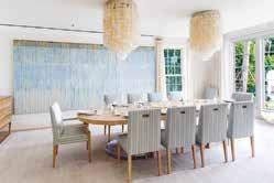
Construction Company:
Thomas | Melhorn
Photographer: Nicole Franzen
Wabi-sabi, the Japanese design principle that emphasizes the perfectly imperfect, is imperative to every aspect of this home. The architecture recalls that of the Florida vernacular with materials that would be found in the surroundings. This house was intended to be passed from generation to generation and so, the material palate was carefully curated with the intention that it would both age in harmony with the ocean’s environment, but also exude a memory of previous experiences.
The floors are raw oak planks that have been fumed and gently waxed to present the natural beauty of the material. The walls and ceilings are a composition of waxed plaster and lime cypress, creating a soft elegance welcoming of the colours and light of the oceanfront setting. The house makes an intentional angle shift, the kitchen and family room reside within a wing of the house that faces southeast rather than directly east. This shift presents a different view of the beach and ocean, looking along the coast of sea grapes and coconut palms with the tropical Atlantic beyond. The kitchen is cypress wood that has been coated in a lime wash and stripped to reveal a beautiful, aged cypress and the counter tops are limestone sourced from Romania, which resembles the colour of the local beach sand.
The north wing is dedicated to the children’s bedrooms and the ocean terrace; a magnificent post and beam covered terrace overlooking the ocean and entire property. This balcony has been purposely orientated to capture the breeze on any day giving respite from the tropical sun.

Location: Jalisco, Mexico
Interior Designer: Victoria Plasencia Interiorismo Architect: Dio Arquitectura
Casa Galo is characterized by its modern style, versatile design proposals, and multiple living spaces. In this spacious residence, the art pieces are the protagonists, they were chosen specifically to uniquely emphasise the textures, materials, and tones of each space that they accompany.
During the design process, Victoria Plasencia Interiorismo integrated sophisticated finishes and monochromatic tones that reflect a contemporary and current style. The cushions, rugs, and elements of different materials were key to achieving a contrast in which neutral shades and bright colours are balanced, giving an avant-garde touch, which together results in a warm, elegant and cosy atmosphere. The exterior of the residence is surrounded by large green areas, which blend in with shades of grey, granite floors, and black ironwork. Inside, walnut wood, granite for the bar counter, and quartz in the kitchen were chosen.
The project is distributed over two floors; on the ground floor, there is a hall with elegant windows, decorated with golden touches, and a double-height planter with a sculpture that blends the natural environment with the interior of the residence. After the hall, the bar, the dining room, and the living room are located, behind them are the guest bathrooms, hidden by a dividing wall that has a special design of wood panels that generates warmth and union in this area.
The use of organic and natural materials and the monochromatic colour scheme blend beautifully throughout the project, Victoria Plasencia Interiorismo was able to completely integrate all the various spaces in Casa Galo through a timeless design.
Location: New York, USA
Architect: Jean Nouvel
Interior Designer: Interior Marketing Group
The client was looking for a designforward, sophisticated aesthetic with an emphasis on organic shapes and strong modern art influence to balance the angular architectural lines of the worldfamous Jean Nouvel building in midtown near billionaire row. The 82 floor supertall skyscraper is located on West 53rd Street in the Midtown Manhattan neighbourhood and is situated directly above the Museum of Modern Art.
Interior Marketing Group balanced a light, airy palette with lush jewel tones and soft lines that complemented the architecture. In each room, the designers added an unexpected element that added a sense of whimsy which helped offset the otherwise very sophisticated design and palette. The interior design scheme also had to make use of the expansive and enviable views over the city.
The client was also looking to showcase a beautiful art collection that helped create an inspiring experience every time they came to town. Interior Marketing Group did this by curating a unique, bold, and graphic collection of modern pieces that carried the story and connected the spaces from room to room.
Location: Maui, Hawaii
Interior Designer: Philpotts Interiors
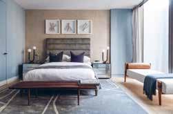 Architect: Dan Dzakowick
Photographer: Travis Rowan
Architect: Dan Dzakowick
Photographer: Travis Rowan
At its heart, this vacation house is about creating a sanctuary where a multigenerational family can share experiences and create memories. Overlooking Maui’s southern shore with views to ocean, mountain landscapes and other nearby islands, this home was designed to experience nature and support active lifestyles.
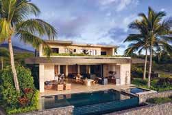
A strong connection with nature and liveability drives the arrangement of Coral House’s main gathering spaces. A covered lanai sits between the pool and interior living, dining and kitchen spaces. Large pocket doors open to merge the exterior and interior spaces. They allow for an open plan with kitchen, dining and living areas integrated into a single casual space that uses a unified language of material finishes and detailing.
The home’s flat roofs are tiered for scale and designed with large eave overhangs protecting the lanai spaces and interiors from sun and rain. Second-story living spaces are set back from the ocean side of the home due to development requirements, and a green roof provides these spaces with an upper garden and ocean views. Photovoltaic solar panels on the upper roof are hidden from view below.
The success of the design results from a cohesive and contextual architectural concept. The design has a sense of belonging to the site and the larger context of the island and the Polynesia region. The architectural vision is one of tropical modern inspired from Japanese craftsmanship and a sense of restraint. The interior and exterior spaces are merged enabling the inhabitants to experience amidst the luxurious tropical climate. The furnishings and artworks support the larger architectural vision.
Location: Japan
Architect: Takashi Hamada
Interior designer: Ryoko Ogoshi/ FFE Hiromi Hiroshima Construction Company: Suzuki Construction co,. Ltd
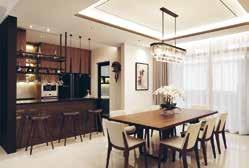
Having commissioned an architect to create the external shell, the client asked interior designer, Ryoko Ogoshi to create a sophisticated, warm, modern interior to respond to the dramatic setting of the house. Ryoko worked with the clients and the architect from the earliest stages of the design and together they modified the interior architecture the architect had initially proposed to make the interior spaces respond to the client’s lifestyle and the exterior views.
The clients wanted a weekend home where they could indulge in this love of nature. A place to relax away from their busy city lives, to watch the sunset while listening to the sounds of the sea, sitting by a fire in the sunken living space.
The clients are Japanese/American so the fusion of East and West cultures is quietly incorporated throughout the design. Having spent time in California, they both love surfing and being outdoors, and the home has an observatory and large greenhouse for growing produce. The main double-height living space has the most spectacular views of the sea and the sunken seating area creates even more focus on these views.
The project is all about the views, capturing them, seeing the landscape and seascape change with the weather and the seasons. The internal architectural layout of the house that Ryoko created reinforces this at every point, by addressing every key room to the views. The client bought the site because of its dramatic location – a rocky hillside behind and the Pacific Ocean in front.
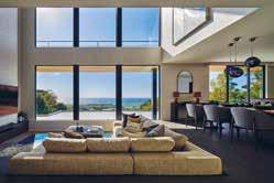
Location: Selangor
The main feature of this modern luxury home is, the feature wall panelling that gels the entire mood of the house that the designer and client are aiming to achieve. The different height levels of each space automatically create an invisible wall in the common area. In the middle of the section of the house, the living room has a slightly higher floor space.
There is one corner of the house which has a much lower spatial height than the rest, defining a more cosy ambiance, sat on a slightly elevated deck.
A great feature of the project is the customized carpentry work that is throughout the property. The TV cabinet acts as the partition with sharing look through display cabinet to create a space that is connected but not too open. In the master bedroom there is a cushion bedhead panel framed with gold chromed finishing and black framing strips design for wall light that follows through from the living area.
Enter the home, and the rich notes of chocolate already make it presence known and felt. A shoe cabinet serves as an entrance piece that whets the appetite for more. The main feature of this modern luxury home is the feature wall panelling that gels the entire mood of the house. The client wanted the home to be reflective of the stature of the neighbourhood as well as their personality. To bring the best of both worlds in a tasteful manner, this home is luxuriant and rich in textures without losing comfort or habitability.
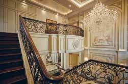
Location: Ranong Province Thailand
Interior Designer: Mr. Bhuwasit Taweerittanawong
The story begins right from the intrigued interior design which portrays a timeless classic concept accommodating this longlasting family of prosperous businessmen. A design that seamlessly blends modern technology and appliances into a piece of art. Coupled with Sino-Portuguese style, the building is inspired by the long history dated to the arrival of Portuguese settlers.
Artist Palazzo IA himself, being inspired by the complex design of Thai Royal Palace in the 18th century, drew the tale to show the “Symbol of Success” on the canvas of the interiors. A place that embeds QR code technology for visitors to embark an experience as real as visiting an authentic museum while revealing captivating meaning behind each drawing on the wall, the staircase, the living room, and the bedroom. The living room has a distinctive blue oceanic tone compared to the rest thanks to its extraordinarily stunning colour combination to bring the nearby sea and sand to the dining table allowing residence to feel the sensation of dining at the beach without having to leave the complex. The master bedroom is glamorously filled with pink and white pigments to follow the concept of “Dream of Flower” with appealing crown curtains to represent the chamber for queen of the house.
With the modest proportion for five family members, the inside of the mansion, on one hand, gives out the sense of harmony and peace for the small family. On the other hand, the exterior allows it to stand with elegantly surrounded by stunning view of mountains and the beach, this residence complex demonstrates prosperity and power to the surrounding villagers. Visitors and passers-by will be amazed of the aura it spreads and it soon will become a landmark and the talk of the town in Ranong province.
Location: Melbourne, Australia
Architect: C. Kairouz Architects
Interior Design: Sammy Kairouz & Co. from C. Kairouz Architects
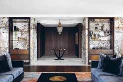
Construction: Samssons Projects Photography: Emily Bartlett
The Park View Penthouse features stunning bird’s eye view of Melbourne. The penthouse is luxurious and expressive in design detailing. The clients aspired for spaces to reflect their personal heritage, showcasing a rich reflection of their culture. Inspired by their Middle Eastern and Moroccan background, the desire was to unite this in a modern and refined manner.
The Parkview Penthouse incorporates an awe inspiring 180-degree outlook, encompassing views from ANZAC park, Melbourne’s CBD and off to the bay. Harmonizing a warm and expressive colour palette; with a soft nod to Albert Pinto’s orientalism, and classic furniture, alongside bold artwork – the brief was dipped in luxury. The desire for the kitchen to be open and large came to life with a generous island bench, and butler’s pantry to maximise the functionality of the kitchen, which was previously located in a tight corner. The kitchen orientation, now facing north, provides for unparalleled views to the city skyline.
The design brief built in flexibility to turn the guest bedroom into a dedicated study, providing a lavish zone to conduct work from home. Refreshing interior design updates to the two main bathrooms result in an expressive and moody design palette, complementing the rich reflection of culture and connection for the clients We feel the effective central flowing layout really enhances the overall experience.
Location: California, USA
Interior Designer: Nina TakeshThis Helena Street property by Nina Takesh Designs is a contemporary, Mediterraneanstyle, 12,000-square-feet home located in the suburbs of Brentwood, California, on a gorgeous, tree-lined street. The house is modern with classical elements and represents an era when raw materials like onyx, marble, and unlacquered brass were part and parcel of design. The look –expansive 20-foot ceilings and architectural soffits - is luxury at its core with a California aesthetic.
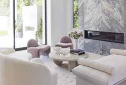
A baby grand piano sits in the corner near a bespoke walnut round table displaying decorative objects. The grand, double sided living room is adorned with a floorto-ceiling, double-sided marble fireplace encircled by custom pieces. It is laid out to create two distinct spaces where the styles are different yet complementary. On one side, where the family relaxes, there is a custom channeled sofa, reminiscent of pieces made by Giuseppe Munari, along with a glass and walnut coffee table where the feet are set as if randomly, with one foot protruding through the actual glass.
On the opposite side, you will find a curved sofa with a round, made-to-measure bleached white oak coffee table along with an architectural bench and lilac velvet club chairs. A bar of beautiful onyx marble also graces this great room along with bespoke Nina Takesh bar stools upholstered in an ivory boucle.
The kitchen is classic in nature, with modern touches, such as a leather-finished marble countertop, and white satin finish cabinets, whilst plattner chairs can be seen in the eating area of the kitchen around a Minotti warm wood dining table.
Location: Laguna Beach, California
Interior Designer: Kenneth Ussenko
Construction Company: MWC Commercial General Contractors
The historical Gucci Villa is a landmark residence nestled into the seaside city of Laguna Beach, California. Kenneth Ussenko states “before starting the design journey on this project, it was a pleasure to see some of the interior work of the original Gucci Watch designer that had influenced the decor and vision of this estate villa”. Due to the historical nature of this residence, the focus for this project was to carefully update and elevate the interiors into a contemporary vision of a classical painting.
To achieve the design brief, the team had to take each room back down to the bare bones of the structural framing and rebuild from the core. From there they created layers of detailed classical and modern moldings for the canvas of the spaces to help outline the history patina of a bygone era. For the Duchess seating room, it was important to create a charming, yet sophisticated space for the homeowners to relax and socialise with family and friends. Linen and leather wallcoverings blanket the walls outlined and framed with wood and brass moldings. Ceilings plastered in a pearl patina reflect the crystal chandeliers above the new marble floors.
The kitchen was a bespoke journey of great craftsmanship creating a radius line of cabinets that were finished in walnut, brass, antique mirror and sprinkled with gold dust. Key to this design is also the Gucci Bar Retreat, a petite gem of glitz and glamour. This space of texture and shape is created with undulating wood moldings, accompanied by a bespoke settee bench which faces a marvelous gold bar and barback.
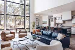
Location: El Dorado Hills, California, USA
Interior Designer: Kristen Fiore
Construction: North Ranch Builders
Photography: Stephanie Russo
Kristen Elizabeth Design Group were brought in to design this modern new build property located in the foothills of California. The brief was to oversee the interior design and direction for all finishes and furnishings throughout the 5500 square feet, including exterior finish palettes and materials and full interior design scope.
It was important to the client that Kristen Elizabeth Design Group ensured all interior finish selections reflected a modern rustic style which would exude warmth, style and comfort. All areas of the home had to be family friendly yet reflect a highly conscious design style with a contemporary feel. The design scheme also needed to integrate colour in key areas and ensure the home is fluid and harmonious.
For the designers, the favourite aspect of this project was the clients. They were keen on having fun, trying new styles and pushing their own boundaries. They allowed Kristen Elizabeth Design Group to introduce happy, playful patterns and prints while maintaining a high level of design. The home sits atop a hill overlooking Folsom Lake in Northern California.
The exterior colour and material palette work inconspicuously into the natural environment despite the size of the home. It is landscaped with water wise/indigenous plantings, solar panels, and various low use water features throughout the property. The entire home is balanced with repetition. The colour palette is soft and neutral, but warm and joyful. Hints of hues and textures were dropped throughout the home to ensure it felt fluid and calming amidst lots of family fun and kid chaos.
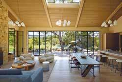
Location: Montecito, California
Architect: William Hefner
Interior Designer: Kazuko Hoshino
Built and designed by William Hefner and his late wife Kazuko Hoshino, Romero Canyon is the second home located in Montecito, California which took over 10 years to come to fruition. Indeed, this is a truly fantastic design, which serves to complement the natural environment through its use of natural stone and wood, integrating into the landscape.
When William Hefner found the home, it was a 900 square foot house from the 1930’s. He and his family had always dreamt of creating a compound- separate buildings that could foster a feeling of being on holiday. As a result of this, we are presented with three distinct yet closely related buildings. They placed each structure as close to the edge of the property as was permitted, so the garden would be maximized in the middle.
There are three stone buildings, with are a combination of stone and integrated coloured plaster, mixed with wood stained cedar on the interior and exterior. All the stone used on the house and in the retaining, walls was harvested during the excavation for the pool and foundations. An interesting facet of the design is that there is no paint in the home, a result of a commitment to making sure all materials were natural, inside, and out. There are oak floors with knots, and steel doors and windows throughout. Light plays a crucial part in the home’s design.
Rich skylights in the pool house and great room help to balance the light through large expanses of steel and glass. For the interior design, the palette is limited from grey to sea foam to light taupe- pulling inspiration from traditional Japanese houses where indigo and blues mix with woods. The space is purposely under-furnished to create a sense of space, light, and tranquillity.
Location: Ontario, Canada
Interior Designer: Kelly Harvey Living
Developer: SkyHomes Corporation
A timeless design with custom features and contemporary décor – Kleinburg Manor is a stunning property based in a luxury pocket area in Ontario.
The triple height staircase welcomes guests and accentuates the magnitude of the home. The custom iron railing was designed to suit the space as it climbs with the triple height staircase and becomes a key feature of the entrance foyer along with the contrasted marble flooring. Rounded shapes, warm lighting and curved architectural features offer a soft and welcoming entrance.
The core foundations for this project are that classic design will never tarnish, and that elegance comes from subtle details. Neutral tones and integrated lighting are combined with both soft and natural textures for a sense of calm throughout the home. This works well with the natural brightness of the home that comes from the large windows and sense of space from the height of each room. The design scheme is elevated whilst remaining understated through custom details such as the unique fireplace, custom railing and furnishings from the Kelly Harvey Living line.
Space is the ultimate luxury in property, and so Kelly Harvey Living looks to emphasise this using floor-to-ceiling details such as upholstery, built in cabinetry and wall length drapes. Built in cabinetry offers both utility and luxe to several rooms in the property, such as the dark wood shelving in the office, his and hers vanities in the master bathroom, and the flawlessly designed walk-in closet that offers an organised space for daily use.
The property offers a choice of spaces to gather and entertain, including a music room, lounge area in the loft space, and a basement with games room, wine cellar, and home cinema.
Location: Ottawa, Canada
Architect: Bill Ritcey
Interior Designer: Tanner Vine
Developer: Art & Stone Group
Construction: Art & Stone Group
Photographer Credit: Kevin Belanger
Set in a neighbourhood amongst more traditional homes, the architectural design of Marshall Court allows it to stand out whilst offering a cohesive look within the neighbourhood. With a modern Tudor exterior, the dramatic peaks give it a prominent feel, but the light colours used for the exterior finishes make the home approachable and is a nod to what can be found within.
Behind the handmade wooden door at the entrance is a grand foyer; look up to find a catwalk from the eastern to western wing of the second floor and look straight, you see the entire depth of the home. It was designed with clever use of space in mind while keeping a jaw-dropping style, no matter where you are in the house. It’s warm, modern, bright and airy interiors are completed with a mild traditional touch. The staircase is a work of art; beautifully curved and elegant, at the centre of the home. The kitchen is inviting, spacious and full of natural light, and features a generous hidden pantry and coffee bar. Upstairs are 5 well-proportioned bedrooms. The master quarters are stunning; an arched opening greets you in the walk-in closet. The bedroom is an ideal size and has beautiful transom windows that offer picturesque views. The master bathroom has big windows but is very private, nonetheless. The vanity wall is stunning with its chevron marble backsplash.
The flow in this home comes naturally. The family has its space to retreat to, where each member enjoys some alone time, and it is also designed to bring the family together. The aesthetics are congruent as each element works with each other. It is a truly calm and serene place to be.
Location: Toronto, Canada
Architect: Richard Wengle
Construction Company: GoldCon Project Management
Photographer Credit: Patrick Biller
Sitting with spacious, but traditional homes, Douglas Design Studio facilitated a mental shift from a classic outside to a pure, modern interior. The entrance, hallways and stairs aid the transition from an uncontrollable world. A consistent story of luxurious simplicity is told through different spaces in the home. Contrasts in blackened wood and white with richly coloured and textured fabrics in the dining room versus warm natural woods with plastered linen light fixtures all add to the experience.
The hidden bar accommodates a wife who does not drink and a husband who is an avid wine collector. Purposeful spaces were also created to display the clients’ art collection. Rather than a living room, the family room is designed for informal lounging and entertainment. A custom designed credenza from the Jeffrey Douglas Studio Line hugs the back of the sofa, and a powerful stone installation combines a fireplace and television. The guiding principle in the design was the family’s values and rhythms, ensuring an intergenerational family home and refuge to enjoy for decades.
A fully equipped spa/gym is a complete wellness centre with a Scandinavian-style sauna featuring an elegant custom sink and mirror, with a unique black frame structure that holds extra space for shelving and towels. The basement rec room does not sacrifice style for function with its custom cut large format porcelain tile doors hiding copious storage. The outdoor pool area features a cabana with a kitchenette and outdoor television for summer movies.
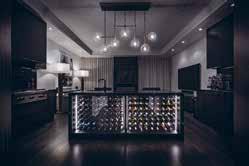
Location: Toronto, Canada
Many hours were spent in the designing stages for this project, sourcing the solutions which would help Reno Gurus to achieve the sophisticated, sexy, dramatic, unique and comfortable feel of this Toronto home. Situated in the iconic Yorkville neighbourhood, this is a place that has been built to impress.
The designers wanted to bring the upscale look from the surrounding architecture of this specific Toronto neighbourhood to the interior of this property. Their luxurious interior design and execution of the Yorkville project reflects the dynamic affluence of the area. They were delighted to be trusted with this property in their hands. From the first viewing, Reno Gurus knew that they would be able to transform this five-storey townhouse to an elegant, hotel-style residence, which is a secondary home for their clients.
This place needed an artistic touch and remodel skills to help incorporate the personality and style of the homeowners –the goal being a sexy, dramatic, luxurious, and modern interior. The designers also needed to update the floor plans and layouts so that the clients could have an elegant and open space. The design scheme ties each area together, with a timeless yet striking approach. A mix of fabrics and finishes give depth to each space. Dark tones and materials are used throughout, paired with gold accents for a style that balances comfort and sophistication.
Location: Pegeia, St Georges
Architect/Interior Designer/Developer/
Construction: Korantina Homes Team
Korantina Homes’ concept is simple; An enclave of bespoke designer villas located on unspoiled shore and a shimmering blue sea, with first-class security and concierge services on hand at all times. Here, the glamouring world is shut out at the gate, everyday stresses dissolve and families are free to spend time together. It’s a place for zen, serenity or lavish parties, whatever suits the mood. The villas are contemporary in style and designed with timeless elegance. The gentle slope towards the sea ensures every house has a spectacular view of the beautiful surrounding area and crystal-clear waters.
Owners can immerse themselves in local culture and history through rich and luxurious materials. From the lower ground floors to the balconies, local colours and textures have been incorporated, stone, wood, plants and mosaics. The villas also play with light and shade, blurring the edges between inside and outside spaces and making opulent living areas feel as if they are part of the spectacular landscape.
Residents can while away hours in their private pool or jacuzzi, unwind in their sauna or enjoy the latest films in their state of art home cinema. Wine cellars, sculpture courts and well-equipped gyms are also key features.
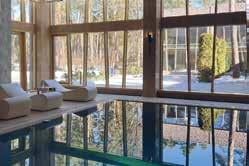
Cap St Georges is the perfect place to lie back, switch off and relax. Thanks to its west facing position, Cap St Georges enjoys spectacular sunsets and panoramic views maximized by the villas design. The areas sea caves and pure waters make it one of the most idyllic stretches of the Mediterranean coast, perfect for swimming and diving.
Location: France
Interior Designer/Architect: ALTER EGO Project Group
Villa Pinède is a grand-scale project in which the customer’s desires fuse with the architects’ and designers’ professionalism to create this manmade miracle. The interior of Villa Pinède dazzles and captivates you right at first glance, you relish its spaciousness full of light and air, its sophisticated stylistic allusions, exquisite finesse of natural materials and magnificent execution of every single detail. This family residence is meant to become a hereditary jewel, a legacy for future generations.
One of the customer’s key demands was utilising rare and exclusive natural materials. The creative team collaborated with the manufacturers who use production woods from controlled and programmed cuts and extract stone in accordance with the Natural Stone Sustainability Standard. The stone was in fact given a leading role in the beautiful interiors of the house. The rooms are finished with unique marble, granite, calcite and onyx individually selected at the best Italian quarries.
One of the most unique features of the interior is certainly the fireplace in the lounge. This 6-metre-high art object is made of a single slab of marble with the use of innovative technologies of stone processing. Its décor which looks like folds of marble “fabric” is inspired by classical sculptures of great Renaissance masters. The originality and distinctiveness of the interior is coupled with it being practical, consistent and pure in an avant-garde manner. The planning solutions are made with the modern ideas of comfortable life in mind, and the functionality of design sets the tone for the whole project. This functionality creates the setting in a necklace with individual stunning details, unmatched décor and art objects shining like precious gems in it.
Location: Vilnius, Lithuania
Interior Design: Carter Tyberghein
Photography: Carter Tyberghein & Mark Luscombe-Whyte
Carter Tyberghein was commissioned to develop a scheme for the interior spaces for this family home located in the most prestigious area of Vilnius, off the oldest main artery of the city which dates back to the Middle Ages. The city has been included as a UNESCO World Heritage Site.
In light of this, the initial task was to carry out meticulous space planning to link seamlessly the oldest parts of the apartment with the rest of the property as well as maximising the surface area. Due to the thickness of the ancient internal walls and the building being listed, this task had its limitations. However, the layout provides a continuous, uninterrupted flow throughout the living areas, whilst the varying ceiling heights from one room to another creates desirable rolling effects, defining the role of each room and provides a sense of uniqueness to this family home. Remnants of painted friezes were found in part of the property during the refurbishment which were salvaged and reinstalled.
The internal envelop of the property was developed using traditional and decorative architectural elements such as panelled doors, decorative cornices to harmonise with the traditional and historical character of the city and its building.
A dramatic wide staircase leads the way to the first-floor landing and living areas, while another, with bespoke wrought iron balustrade, takes us to the bedroom floor. Design elements, carefully hand-picked finishes, furniture, and soft furnishing were developed simultaneously to ensure coherence in the design, producing a full and coordinated package leading to holy grail of all Carter Tyberghein’s work - a timeless interior with contemporary classic interpretations.
Location: urb. El Herrojo, Benhavis
Interior Designer: Jana Novakova
Architect: Studio Tobal - Diego Tobal
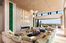
Developer: Fintech
Construction Company: Solis
Photographer: Charly Simon
Casa Varanda is a residential villa with generous sunlit indoor spaces overlooking the sea, with 6 bedrooms, double height living and dining room, game room, gym, spa, outdoor pool and beautiful gardens. The villa is designed in a contemporary style, with the utmost care for comfort with high quality seating furniture and turnkey spaces.
The living and dining area is a vast open space having full height windows with sun light accentuating the light and fresh summer colour scheme. Key to the design are the motorized full-size windows which visually decorate the room expanding to the beautiful view of the gardens. The double height ceiling salon with its wooden cladding makes the room feel airy, but at the same time very cosy and warm. The focal point wall with the chimney has two types of wall paneling, backlit onyx and real dried moss to add a fresh unexpected accent. The moss has also been used in the entrance in combination with travertine 3D cladding backlit with LED. The generously sized spaces fitted with natural stones, wood and turnkey furniture all over the villa, including bathrooms, gives guests the feeling of a luxury vacation.
The design scheme is in line with the modern architecture, yet the selection of colour schemes per area gives a clean and tranquil aesthetic, creating a more vacational look. The property integrates itself into the wider environment through the use of natural materials which blend into the surroundings and also having 3 large trees planted within its premises in order to blend within the surrounding green hills.
Location: Hyde Park, London
Interior Designer: Katharine Pooley Ltd
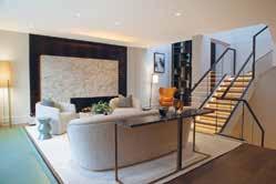
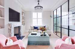
Photography: Nico Wills
‘The Lancasters’, an exquisitely beautiful white-stucco fronted terrace, is the grand setting for Katharine Pooley’s latest extraordinary design project. Extensive building works, and a total redesign, resulted in two properties being seamlessly merged into one incredible, art-filled, 8,000 sq. ft. residence.
It was important to the client that the final design be warm in tone and contain detailing that showcased the best of British craftsmanship and contemporary design. Katharine Pooley worked tirelessly to ensure the beauty of the traditional marble fireplaces, plaster columns and intricate cornicing of this fine building, were balanced gracefully with new contemporary details.
Katharine Pooley found much inspiration in the breath-taking, and unsurpassed, views this home enjoys, and commissioned handpainted silk wallpaper with tree motifs, leaf shaped chandeliers and bespoke foliage themed ironmongery to ensure that the timeless beauty of Hyde Park was as much evident within the property as outside of it. It was key that the interior spoke to the surrounding city landscape, embracing futuristic and luxurious finishes such as bronze, marble and pearlized resins, it was vital to balance the strength of these finishes with softer, tactile, more organic shapes reflecting the outside world.
The soft colour palate and layers of lighting ensure that a grand space remains intimate, inviting and comfortable. Double height rooms overlooking Hyde Park ensured the views are sublime year round and the designers worked to bring this natural beauty into the interior designs as well ensuring a beautiful flow inside and out.
Location: Kensington, UK Architect/Interior Designer:
Project London
Construction:
Project London Construction
Associated: Cor Domi, PL Glazing
Photography: Ugne Pouwell
The aim of this project was to create a multifunctional home for a young couple with a growing family and to uncover maximum usable space while complying with local restrictions and respecting the historical facade in the Notting Hill conservation area. Project London had a careful balancing act of retaining and restoring original features while creating a bespoke, contemporary family home.
The clients, a young couple expecting their first child, wanted a home to cater to them as both a growing family with small children and a sociable, young couple.
For the family, the sizable bedrooms, downstairs family space and guest ensuite were created. The guest bedroom and bathroom were drawn up in the vault, with its own front door access to allow the clients’ parents to stay long periods of time with their own privacy and access. Upstairs, we created two bedrooms of equal size to eventually become the children’s rooms.
To cater to the couple’s social side, Project London maximised space for entertaining, such as the west-facing terrace, bar and upstairs living room.
The interior was designed to blend contemporary with classic. Traditional features like Georgian style mouldings and an open fireplace were restored to honour the Georgian exterior, while contemporary elements like crittall style panels, micro cement and a neutral colour palette were introduced. Unique beading and marble surfaces were designed in the kitchen to bring character while rustic elements like rattan features and limewash paint blend the old and new with an exotic modern twist.
Location: London, UK
Interior Designer: Alex Kravetz Design
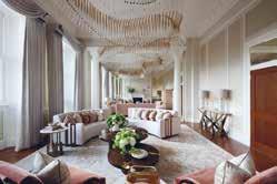
Developer: CIT
Alex Kravetz Design were commissioned to transform a contemporary two-bedroom garden villa residence which is 1864 sq ft and in the prime location of London’s Regent Crescent. The brief given by the client was to create a contemporary and timeless interiors fit for entertaining guests as the client likes to entertain but they also wanted one that equally works just as well for day to day living for them.
The favourite or key aspect of the project and its design has to be the fact that it is flooded with natural daylight throughout. Another key aspect would be the vernacular multi-level interior architecture as this helps the flow of the property and creates spaces for the entertainment element that was mentioned within the brief by the client.
The design works so well as Alex Kravetz Design have created a connection to nature through the colour schemes, rich textures and finishes. Space planning that allows flexible living, working and entertainment spaces. As the villas have the garden setting - the design narrative of tranquility and sensual design was chosen. Biophilic motives were used too in parts of the decor. There were specialist skills that were used throughout as the entire project was executed in 12 weeks start to finishdesign, procurement and installation.
Location: London, UK
Interior Designer: Samantha Bartlett Interiors
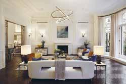
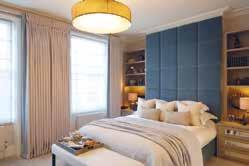
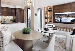
Construction: Cordles
Photography: Ryan Wicks, Al Roberts
A warm colour palette was curated by Samantha Bartlett Interiors for the client who requested a masculine design with elements of femineity for his home, a 1,359 square foot property in the heart of Chelsea. The key element to the brief was to make the home user-friendly, and offer an ease of flow from one space to another whilst accommodating the required areas listed by the client. This refurb project although small was extensive, it is now compliant and sustainable and took less than one year from concept to completion.
In order to create the aforementioned palette for the client, Samantha Bartlett Interiors derived the designs and textures from nature. The studio is inspired by nature, its unique forms, colours, textures, patterns, and organic materials which are stacked with distinctive features are endless. Here they have embraced earth’s natural tones and materials.
Samantha Bartlett Interiors used mainly bespoke sustainable furniture and joinery to optimise the joinery and space available and collaborated with various artisans to fulfil these packages. The property has also been designed to improve conservation of fuel and power, and to enhance its surrounding environment.
The newly formed spaces perfectly meet the clients brief, and seamlessly work in harmony with one another. The areas feel bigger, are much lighter and warm and the space is much more user friendly, an environment anyone would be happy to live in.
Location: London, UK
Interior Designer: Birch House
Architect: SM12 Architects
Construction: Adrian Design
Photography: James Balston
This Grade-II listed Chelsea townhouse underwent a full refurbishment and extension. Working closely with the client, their architect and local conservation teams, Birch House created a design that completely transformed the property while remaining faithful to the character of the original building.
The client wanted a full redesign of every interior architectural detail and finish including bespoke fitted joinery, lighting, and bathrooms, as well as furnishing and styling throughout. They wanted the property to ooze a feeling of tranquillity and provide a restful feeling akin to staying in a luxurious boutique hotel. Importantly, as the client has such an extensive and interesting art collection, they wanted the interiors to allow it to sing. Accordingly, Birch House kept the overall colour scheme simple providing the perfect backdrop to the art.
Birch House reinstated period features, selecting materials to complement the original style of the property. The form and proportion of the Georgian architecture, the natural light and gorgeous period detailing were the stars of the show. But to avoid creating a pastiche of a period house, Birch House kept the design of the hard finishes, the kitchen and fitted joinery very contemporary using inset mirrors to enhance the feeling of space and give a nod to a more traditional shaker style.
The structural alterations to the rear and full mansard roof extension have been carefully considered, taking into account the particular characteristics of the surrounding mid-19th century buildings. Birch House worked closely with our client’s architect to maximise floor space and bring in natural light at every opportunity.
Location: London, UK
Interior Designer: Helen Green Design
Architect: Rigby & Rigby Photographer: Julian Abrams Photography
Helen Green Design was appointed to complete the Interior Design & FF&E for this beautiful Grade II listed First Floor apartment in of the most sought after addresses in London. The brief for this residential project was to transform the existing listed property into a luxurious and elegant home for the client. Alongside the team of consultants and architects, Helen Green Design has worked with the owner reviewing the property’s layout to accommodate their needs and lifestyle and create a unique and modern living space, remaining respectful to the historical value and listed features of the apartment.
One of the key aspects of the property that Helen Green Design wanted to celebrate and highlight with their design, is the sense of grandeur provided by 4m tall ceilings and abundance of light and greenery flooding the space through the floor to ceiling windows on the front facade.
The entire space is balanced with custom made classic and contemporary furniture pieces, hand-knotted rugs, bespoke soft furnishings and fitted joinery, designed and developed by the team in collaboration with the best UK craftsmen and artisans.
Schemes in every room have been carefully considered and put together to reflect the above, connecting all the elements into a sophisticated and tailored home for the client. All of the pieces are meant to harmoniously inject the client’s own style and personality into this striking space, simultaneously telling a story of the history of the property and the area complimented by the signature Helen Green Design aesthetic.
Location: Hertfordshire, UK
Interior Designer:
Alexander James Interior Design
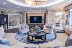
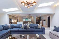
Architect: Chase New Homes
Developer: Chase New Homes
Photography: Tony Murray Photography
The Lakehouse is a beautiful lakeside home, tucked away on a private estate in a rural corner of Hertfordshire. The client required their home to be fully refurbished and modernised, to achieve the perfect family home that is luxurious, yet functional in style.
Alexander James Interior Design designed and specified all internal finishes of the property, as well as providing design and specification for all bathrooms, using the finest materials to achieve a luxurious, hotel style finish. The marble flooring continued throughout most of the first floor creates a palatial feel throughout the key guest and entertaining areas, something that was important to the client who enjoys entertaining.
In the dining room of the home, which was originally a conservatory at the rear of the property, Alexander James used a large square bespoke dining table in satin sycamore semi-gloss finish, accompanied by 12 dining chairs with feature rear fabric. Above the table hangs a large statement pendant light in taupe silk finish, completing the grand look of the space.
In the drawing room of the property, Alexander James created a circular coffered ceiling central to the room, enabling them to create an inviting oval seating layout, perfect for entertaining friends and family.
The design integrates perfectly as Alexander James Interior Design have provided a contemporary, stylish home for modern living, whilst maintaining a traditional feel that is reflective of the stunning countryside it is surrounded by.
Location: UK
Designer: Panoramic Properties
Following the completion of another residence for the client, Panoramic Properties Limited were engaged to transform this beautiful Victorian property back to its former glory whilst supplying all the modern luxuries.
As the property has split levels, its high ceilings in the formal rooms offered the opportunity to restore and add back into the original character of the home. Architectural features were considered through the use of ceiling details, ceiling roses, coving and lighting. Panoramic Properties were commissioned to design and supply bespoke cabinetry & upholstery throughout the build, to give a truly unique look that perfectly fitted to each space. This included TV ottomans, study cabinetry, bar, booth seating, TV cabinetry, wardrobes, beds & headboards
The open plan kitchen boasts a huge island that houses a bespoke seating booth and informal dining area, featuring subzero fridges, a ‘slide and hide’ pantry, a picture window behind the main sink, a preparation sink on the island, two double ovens and vein matched marble effect worktops. This design works as it optimises grandeur and luxury whilst maintaining a cosy, homely feeling throughout. The property features all the modern amenities and yet retains its Victorian soul and character. This is achieved by protecting and restoring the stunning original features, whilst also introducing the modern aspects that take a hint of inspiration from the Victorian style of the build, to sit in contrast to the original elements. This makes a clear division from the modern to the old and yet they complement each other seamlessly.
Location: Dorset
Interior Designer:
LEIVARS Interiors Studio
Architect: Munden Robinson Architects
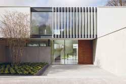
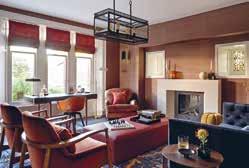
Photography: Nick Smith Photography
A spectacular coastal residence bringing harmony between the old and new. LEIVARS were invited into the project mid-way through construction work to design the interiors for this stunning family coastal retreat.
The brief was to use the three colour tones from the original stained-glass window of this 1930’s house yet bring the design into the 21st century working with the incredible design by the architects who managed to create a breath-taking angled rear extension to fully absorb the ever-changing coastline throughout the year. Working with the three key colours, LEIVARS set out to add block colours and select angles in design and patterns that took on and complemented the rear extension detail. Use of teal, mustard and deep red tones were used throughout to ensure consistency and cohesion in design.
The open plan area needed to be fun and relaxed for the younger family members, yet the two salon rooms were to be slightly more refined for evening drinks using inspiration from the clients travels to the Far East. The bedroom was to have soothing tones that would balance with the sea scape views to be enjoyed all year round. The colour palette complements the ever-changing tones of the sky and sea, when the weather is slightly wilder the mustard/gold tones coupled with the warm undertones add a sense of cosiness giving a general glow as you enter from one space to the next and when the sun is beaming through, the cooler tones of the teal bring the scheme back. A great mixture of texture and details throughout bring strong sight lines that draw you from space to space organically.
Location: London, UK
Architect: Strom Architects Ltd
Interior Designer: Hena Sawjani / Studio Maria
Developer: Spring Residential
Photography: Richard Chivers
Strom Architects were approached by Spring Residential to collaborate on the redesign of large family house in London that had already been granted planning permission by a previous architect. Whilst the ground floor plan remained, the architectural language was simplified to have a stronger concept with a long rectangular first floor volume, spanning across the ground floor H-shaped plan.
The central part of the “H” comprises a large double-height entrance space, emphasised by a two-storey chimney, a sweeping helical staircase, and a living area commanding the central space of the house. One of the legs of the “H” contains kitchen, dining and home office, while the other is service orientated with garage, nanny’s room, plant, cinema and a spa area with pool, steam room and hot tub.
The first floor volume sits over the H-shape and consists of four en-suite bedrooms to one side of the double height gallery. To the other side is a generous master bedroom with a spacious en-suite and dressing room. The bedroom enjoys a private balcony overlooking the garden.
The first floor is expressed as a lighter form utilising white render and contrasts with the solidity of the lower brick volume creating a clear architectural diagram. The “H” creates and entrance courtyard to the road, where openings and windows are carefully considered to provide privacy while creating a welcoming entrance. Full height glazing surrounding the open plan kitchen, dining and living spaces opens up to a private courtyard and allow the house to feel transparent and connected with the landscaped garden.
Location: Toronto, Canada
Architect: Richard Wengle
Construction Company: GoldCon Project Management
Photographer Credit: Patrick Biller
Douglas Design Studio’s crisply tailored Toronto home is well-structured, modern, warm, and versatile. The designers ensured a balance between classic architecture and thoroughly modern interior design.
Luxurious simplicity is told throughout the home. Contrasts in blackened wood and white with richly coloured and textured fabrics in the dining room versus warm natural woods with plastered linen light fixtures all add to the experience. The entrance, hallways and stairs transition the owners from an uncontrollable outside world to a serene personal space.
Clever design strategies accommodate the wishes of each family member. The hidden bar addresses the difference between a wife who does not drink and a husband who is an avid wine collector. Purposeful spaces also display the clients’ art collection. The guiding principle in the design was the family’s values and rhythms, ensuring an intergenerational family home to enjoy for decades.
The family room is designed for informal lounging and entertainment. A custom designed credenza from the Jeffrey Douglas Studio Line hugs the back of the sofa, and a powerful stone installation combines a fireplace and television. A caterers’ kitchen provides hidden space for entertaining and a bright breakfast corner invites family conversation. The calm and meditative master bedroom is uncluttered yet functional, featuring large panels of matte-finish wood. The master ensuite is calm, with grey and white stone.
Location: France
Interior Designer/Architect:
Villa Pinède is a grand-scale project in which the customer’s desires fuse with the architects’ and designers’ professionalism to create this manmade miracle. The interior of Villa Pinède dazzles and captivates you right at first glance, you relish its spaciousness full of light and air, its sophisticated stylistic allusions, exquisite finesse of natural materials and magnificent execution of every single detail. This family residence is meant to become a hereditary jewel, a legacy for future generations.
One of the customer’s key demands was utilising rare and exclusive natural materials. The creative team collaborated with the manufacturers who use production woods from controlled and programmed cuts and extract stone in accordance with the Natural Stone Sustainability Standard. The stone was in fact given a leading role in the beautiful interiors of the house. The rooms are finished with unique marble, granite, calcite and onyx individually selected at the best Italian quarries.
One of the most unique features of the interior is certainly the fireplace in the lounge. This 6-metre-high art object is made of a single slab of marble with the use of innovative technologies of stone processing. Its décor which looks like folds of marble “fabric” is inspired by classical sculptures of great Renaissance masters. The originality and distinctiveness of the interior is coupled with it being practical, consistent and pure in an avant-garde manner. The planning solutions are made with the modern ideas of comfortable life in mind, and the functionality of design sets the tone for the whole project. This functionality creates the setting in a necklace with individual stunning details, unmatched décor and art objects shining like precious gems in it.
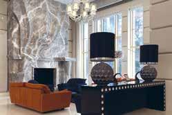
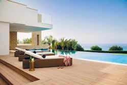
Location: Jupiter Island, Florida
Architect:
Christian Thomas and John Melhorn
Interior Designer: Betsy Brown
Construction Company: Thomas | Melhorn
Photographer: Nicole Franzen
Wabi-sabi, the Japanese design principle that emphasizes the perfectly imperfect, is imperative to every aspect of this home. The architecture recalls that of the Florida vernacular with materials that would be found in the surroundings. This house was intended to be passed from generation to generation and so, the material palate was carefully curated with the intention that it would both age in harmony with the ocean’s environment, but also exude a memory of previous experiences.
The floors are raw oak planks that have been fumed and gently waxed to present the natural beauty of the material. The walls and ceilings are a composition of waxed plaster and lime cypress, creating a soft elegance welcoming of the colours and light of the oceanfront setting. The house makes an intentional angle shift, the kitchen and family room reside within a wing of the house that faces southeast rather than directly east. This shift presents a different view of the beach and ocean, looking along the coast of sea grapes and coconut palms with the tropical Atlantic beyond. The kitchen is cypress wood that has been coated in a lime wash and stripped to reveal a beautiful, aged cypress and the counter tops are limestone sourced from Romania, which resembles the colour of the local beach sand.
The north wing is dedicated to the children’s bedrooms and the ocean terrace; a magnificent post and beam covered terrace overlooking the ocean and entire property. This balcony has been purposely orientated to capture the breeze on any day giving respite from the tropical sun.
Location: Pegeia, St Georges
Architect/Interior Designer/Developer/
Construction: Korantina Homes TeamKorantina Homes’ concept is simple; An enclave of bespoke designer villas located on unspoiled shore and a shimmering blue sea, with first-class security and concierge services on hand at all times. Here, the glamouring world is shut out at the gate, everyday stresses dissolve and families are free to spend time together. It’s a place for zen, serenity or lavish parties, whatever suits the mood. The villas are contemporary in style and designed with timeless elegance. The gentle slope towards the sea ensures every house has a spectacular view of the beautiful surrounding area and crystal-clear waters.
Owners can immerse themselves in local culture and history through rich and luxurious materials. From the lower ground floors to the balconies, local colours and textures have been incorporated, stone, wood, plants and mosaics. The villas also play with light and shade, blurring the edges between inside and outside spaces and making opulent living areas feel as if they are part of the spectacular landscape. Residents can while away hours in their private pool or jacuzzi, unwind in their sauna or enjoy the latest films in their state of art home cinema. Wine cellars, sculpture courts and well-equipped gyms are also key features.
Cap St Georges is the perfect place to lie back, switch off and relax. Thanks to its west facing position, Cap St Georges enjoys spectacular sunsets and panoramic views maximized by the villas design. The areas sea caves and pure waters make it one of the most idyllic stretches of the Mediterranean coast, perfect for swimming and diving.
Location: London, UK Architect: MMKM Architecture & Interiors Interior Designer: Lawson Robb Construction: Bentis Brothers Ltd Photographer: Handover Agency
A Grade II listed Townhouse in the scenic setting of Little Venice that perfectly harmonises contemporary with Grade II listed features.
The brief for Lawson Robb was to blend the heritage of the building with contemporary features and detailing. Throughout the property everything was bespoke and tailored to the client’s exacting requirement: from the mouldings to the fireplaces, installations of the joinery to the furniture, and the integration of the back of house systems. This refined approach was subtly juxtaposed with the artwork, an element which really enabled the client’s personality to shine through and create that final flourish to the scheme.
For designer George Wolstenholme, the marriage of contemporary interior design within a Grade II listed backdrop was his favourite aspect of the project. Many skilled specialist artisans were used throughout the property, from the bespoke joinery, ironmongery, furniture to the bespoke pattern within the flooring. 90% of the design in this project is bespoke to suit client’s way of life. The design highlights the original features of the property, whilst using integrated technology to make it sure it sits perfectly into the modern way of life.
The large traditional windows bring in beautiful light to the property, highlighting the sophisticated design and connecting the property to the charm of Little Venice.
Location: Chelsea, UK
Interior Designers: Noor Charchafchi, Harriett Browne, Lola Osunneye
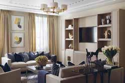
Developer: Lodha Developers
Photography: Julian Abrams
One of the finest residential developments in the world is home to some of the world’s most elite and VIP residents. The brief for Celine Interior Design was to provide a show apartment with full FF&E and bespoke joinery to create an impressive and luxurious home.
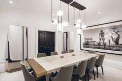
At Celine Interior Design, one of their most unique offerings is to be able to immediately change and impact the human state without the individual ever noticing a difference. That has effortlessly been achieved in this room through the creation of not only a glamorous living space but one in which a family can still feel comfortable and cosy and immediately at ease. The master bedroom is a masterpiece in both its design and ability to immediately allow and inspire its inhabitants to unwind. Celine Interior Design have layered soft tones and textures throughout this space. It is a serene, sophisticated and seamless space using natural wools and linens to create an organic sentiment throughout the room.
The dining room is bright and airy. The artwork chosen is an abstract depiction of nature, the gold tones within this create a sense of luxury. The designers wanted to use a soft muted colour palette to brighten the space. The earthy tones of the wallpaper, which were also used in the private hallway allow the rooms to flow into each other and create a feeling of connection. The wide openings into the space create a beautiful transition from the living room into the dining room, connecting one space to the other.
Location: Johannesburg, South Africa
Architect: Gottsmann Architects
Photographer Credit: Rene Walker
This is a low-lying house that seeks to blend in with the surrounding landscape rather than compete. Surrounded by lush greenery in Johannesburg, it is designed to create the necessary privacy between neighbours whilst showcasing bright living areas that are free of curtains and blinds. It is a contemporary design that is not pretentious but refined.
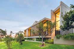
The brief called for the design of a contemporary single-storey family home with 4 bedrooms and open living areas. The open-plan nature of the home merges with the exterior landscape allowing a person to move freely between inside and outside space. A two-storey open volume passage with an extended visual axis at both ends divides the home into its public and private domains. This passage acts as the foyer, the primary circulation route, and a gallery.
The concrete house seeks to be pure in both form and materiality, where the use of material is expressed in a purposeful and unambiguous manner. Gottsmann Architects placed a focus on developing a design that incorporated natural light, good circulation and flow of spaces, and strong visual connections to the surrounding landscape. In doing so, the expansive use of glass helps blur the lines between the interior and the exterior, connecting the inhabitant to the surrounding green open spaces. There is also a central garden atrium, allowing the house to ‘breathe’ by bringing natural light into the interior of the house.
Location: London, UK
Interior Designer: Puk Kroijer Construction Company: Peak Construction Photography: Mateo Millership
Chalon House is a renovation of a Grade II listed Georgian house, along with the construction of a modern extension. The vision was to create a family home whilst also paying homage to the house’s historic past as a gathering point for the area’s local artists and intellectuals.
Lastein Interiors respected the home’s English origin while incorporating the clean and minimal Scandinavian aesthetic. The ground floor is designed in an elegant Victorian style, the original fireplace hearths were cleaned and oiled, the fireplace surrounds were restored to match the original. The original staircase leads to the bedrooms, which needed to be bright and warm but not without their own ode to the period of the property. Ornate cornices and Georgian-style cabinets frame the teenagers’ rooms without being overbearing. The master bedroom ceiling was opened up, exposing a rustic yet elegant beam.
The challenge for the extension came from wanting to preserve the original structure, while modernising the home to allow a substantial kitchen and dining area to play its role as the heart of the house. Japaneseinspired ‘floating’ roofs are connected by thoughtfully positioned glazing; one covering the kitchen, and the other a hyggelig sunken dining area with sleek Danish-inspired marble, iron and wood. Throughout the house is a clear feeling of stability through equilibrium - the constant balancing act of yin yang. The newly constructed modern extension built of delicate glazing and floating roofs, paired with the restored historic fabric of the Georgian house is the clearest example of this complimentary balance.
Location: Hertfordshire, UK
Interior Designer: Susan White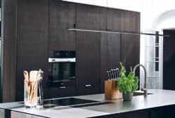 Photography: Vigo Jansens
A beautiful historic family home in Hertfordshire was restored and designed in a contemporary style for the client. The client’s love of colour, texture, art and historic details were the beginnings of the brief for this project.
The house, which is of historic importance, was built by John Watts (c. 1554 – 1616) who was an English merchant, Alderman and shipowner, active in the East India Company and Virginia Company and Lord Mayor of London in 1606. A lot of time was spent on the interior architecture of the building, ensuring it’s integrity. You will notice a few oddities throughout which add so much character to the home. Chandeliers not quite centred in a room - due to the fact that listed beams are under the ceiling above. Fireplaces that aren’t centred due to the historic chimney structures behind the walls.
The finished project is a very comfortable family home where the client can entertain, host guests and share this wonderful space. Their love of colour comes through in each room, true to IGGI’s style which is a monochromatic backdrop delivered through the interior architecture, but layering colour through fabrics and striking modern artwork. From pink sofas to bold sculptures and feature blue walls, the design of this home captures your attention in each room. IGGI Interior Design worked on the interior architecture, together with English Heritage and specialised consultants to initially restore the property.
This property is a seamless transition between old and new. The historic features are very present in the new contemporary design, but they aren’t read by the eye as being out of place, they perfectly enhance the look of the space.
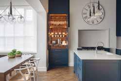
Location: Israel
Architect: Yonatan Ephrat
Interior Designer: Yonatan Ephrat
What started as a classic renovation of an old and neglected apartment in the heart of the Old City of Jerusalem turned, unexpectedly, into an unfolding story - the integration of the past with the present, history with modernity – as, quite by accident, original architectural features dating back to the Ottoman Empire were discovered.
In the course of the construction, 500-yearold features such as stone walls, niches, and arches were revealed, restored and integrated into the design. The apartment which overlooks the Temple Mount also has a private open roof with breath-taking views of the Old City. These original architectural treasures as well as the spectacular Old City view dictated the minimalist and luxurious design of the apartment chosen by the architect.
Once these amazing elements were found the designer choose a more minimalistic design approach to not “fight” with the original stone and arches discovered and restored. This approach gave the stage to the original elements but at the same time gave a modern, warm touch and feel to the space. The harmony between the old and the new, each complementing the other and not daring to interfere is what made the end result so fascinating, interesting and beautiful.
In a deeper philosophical way, this is the story of beloved Jerusalem. The old and the new, all the different religions, the holiness and the secular and so on.
Location: Azeitão, Setubal, Portugal
Interior Designer/Interior Architect:
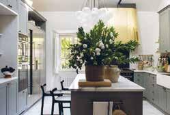
SA&V – SAARANHA&VASCONCELOS
Photographer: Montse Garriga GrauQuinta dos Carvalhos is a family home on the outskirts of Lisbon, which has belonged to the family since the XVIII Century and was recently restored as a retreat where the owners like to go whenever they need to rest from their hectic lives in the city.
This is a historic house where, back in the XVIII Century, the first Azeitão cheese was produced – a true glory of Portuguese gastronomy. The main priority was to enhance the natural beauty of a house owned by the family for several generations, making it more comfortable for today’s life, where modern features are essential without destroying tradition. These clients, art collectors and beauty lovers, enjoy welcoming their family and friends at home. They have a high attention for detail and in their homes nothing can be left to chance.
For them, there are things that the team already knew would be mandatory: quality and refinement above all, comfort and personalization, beauty, irreverence, a mixture of styles. The hostess often says “nothing is impossible” and the creative team also shares this maxim. In this project, nothing was impossible and everything was thought out in detail, including the Portuguese Estremoz stone used in the WC’s. However, these ambiances were not only made of beauty, as the client combines her passion for detail and aesthetics with technical support, “things have to work well.” Therefore the team had to merge functionality with beauty making it a perfect symbiosis. This project is art and antiques combined with contemporary pieces in an extremely comfortable and beautiful mix of old and new.
Design Intervention were enlisted by the clients to create a luxury swimming pool that sits seamlessly with the surrounding lush tropical landscape. Designed with glamour in mind, and a strong sense of wit and fun.
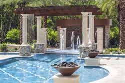
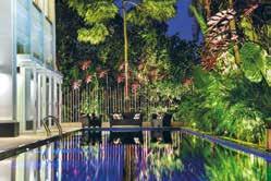
This pool has been designed by Design Intervention as a space for fun and laughter and though glamorous, Design Intervention have added unexpected, humorous elements to delight and inspire the senses. A luxury seating area is set at one end of the pool giving a view of the expansive lap pool in front of them and at the same time enjoying the views of the surrounding tropical nature. Design Intervention chose the seating area to be made of a material that is waterproof yet comfortable enough for the clients or guests to enjoy and to create a barrier that is functional yet glamorous from the outdoor pool and the lush foliage.
With a brief to create a luxurious swimming pool that would fit seamlessly within the lush tropical backdrop, Design Intervention used underwater speakers that have been synchronized with patio speakers to ensure a seamless musical experience even when underwater.
The oversized pink metal leaf sculptures are a light-hearted and utterly unexpected element that sets a fun, carefree tone. This design complements the surrounding landscape sitting seamlessly within, combined with a modern edge and a shot of wit. There is a cheerful, nonchalant energy to the design that never fails to illicit a smile. There is a sense of glamour to Design Interventions work, alongside a strong feeling of wit and fun.
Location: Odessa, Florida
Architect: Ryan Hughes Design Build
A request from a Tampa family to replicate a favourite resort in their own backyard was answered by award-winning pool and outdoor space designer, Ryan Hughes Design Build in his signature “over the top” manner. Inspired by a 5-star resort, the Ballmont Lazy River project created streaming waters built to flow around and through an elegant and commercially appointed outdoor space literally outside the family’s back door.
Flowing for over 200 feet, the river passes fire pots and fire features, sunken spas, and multiple venues for outdoor gathering and relaxation. Ryan Hughes Design Build was able to incorporate tremendous wow into the overall design as well as elegance and personality. The Mediterranean design style of the home and the personal preferences of the family were integrated within the 1.5-million-dollar project. The design provided ample space and bountiful experiences for family fun to a gathering of 500. Private relaxation was also addressed by incorporating a dedicated owner’s patio with lounge seating, spa and landscaped privacy.
The plan began with establishing critical sight lines originating from within the opulent home and continuing to each defined area and major outdoor feature. Guests are able to capture the totality of this residential resort upon entering the home. The pool area and adjacent pairs of fire features were also the focal point for a sight line that commenced within the outdoor kitchen and dining area. The owner’s patio with a private spa, pergola and seating area was purposefully placed on a direct line from the curved terrace off the owner’s bedroom. This design style allowed Ryan Hughes Design Build to capitalise on the organised architecture of the home while adding an organic feel with the encircling river.
Location: Jupiter Island, Florida
Architect:
Christian Thomas and John Melhorn
Interior Designer: Betsy Brown
Construction Company: Thomas | Melhorn
Photographer: Nicole Franzen
Wabi-sabi, the Japanese design principle that emphasizes the perfectly imperfect, is imperative to every aspect of this home. The architecture recalls that of the Florida vernacular with materials that would be found in the surroundings. This house was intended to be passed from generation to generation and so, the material palate was carefully curated with the intention that it would both age in harmony with the ocean’s environment, but also exude a memory of previous experiences.
The floors are raw oak planks that have been fumed and gently waxed to present the natural beauty of the material. The walls and ceilings are a composition of waxed plaster and lime cypress, creating a soft elegance welcoming of the colours and light of the oceanfront setting. The house makes an intentional angle shift, the kitchen and family room reside within a wing of the house that faces southeast rather than directly east. This shift presents a different view of the beach and ocean, looking along the coast of sea grapes and coconut palms with the tropical Atlantic beyond. The kitchen is cypress wood that has been coated in a lime wash and stripped to reveal a beautiful, aged cypress and the counter tops are limestone sourced from Romania, which resembles the colour of the local beach sand.
The north wing is dedicated to the children’s bedrooms and the ocean terrace; a magnificent post and beam covered terrace overlooking the ocean and entire property. This balcony has been purposely orientated to capture the breeze on any day giving respite from the tropical sun.
Location: Kings Cross, London
Interior Designer: Henry Chebaane Hotel Group/ Developer: Magenta Restaurants Ltd
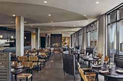
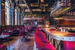
On the corner of Belgrove St and Euston Road stood the large branch of a Barclays Bank. The brief was to create a design concept for the space that would optimise the internal volume and reduce impact of constraints, draw inspiration from its location, provide a joyful environment for staff and customers and Offer a unique, memorable social space that enhances the neighbourhood of Kings Cross-St Pancras.
Magenta is a bar and restaurant within an indoor pergola of Victorian industrial architecture, dressed in a palette of coal, steel and oak, upholstered with magenta wool and anthracite leather. An evocative space where thousands of butterflies, flutter overhead, in shimmering hues of pink and silver, to a cinematic soundtrack punctuated by atmospheric bird songs. The result might look, taste and feel like what “MAGENTA” is today. A name that evokes northern Italy and its flavours, but also the chemistry of nature and the organic pigments that sustain plant life. These include the anthocyanins that colour our food and wines in vivid shades of red, pink and purple. “MAGENTA” is the colour of imagination. “MAUVE” is the name of the restaurant’s private dining room, accessed via its own staircase and seating 12 people. The intimate space has been designed like a fantastical steampunk dining carriage, and includes its own kitchen gantry, also useable for a drink reception.
MAGENTA’s design is an unusual balance of artistic and functional sensibility. The soaring space has been conceptualised as an indoor pergola of Victorian industrial architecture, dressed in a palette of coal, steel and oak, softened and enlivened with vibrant hues of magenta fabrics, theatrical lighting, atmospheric bird songs and thousands of pink butterflies hovering overhead.
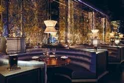
Location: Hong Kong
Architect: Design East
Interior Designer: Robert Angell Design International Developer: Aqua Restaurant Group Construction Company: Mountain Contracting Co Ltd
The concept for the design comes from the rich history of Hong Kong as a trading city and its rich cultural traditions in craftsmanship. That combined with its location and the world’s largest natural harbour using the water and aqua as the true inspiration which in its many forms can evolve into colour, light & dark, tone & texture.
Beautiful patterns of nature have inspired Robert Angell to create gaufrage presser patterned wall feature panels that have a beauty that you want to feel. The way in which water gives form to soft shapes and their fluid connections to each other has inspired them to make the connections and create the spaces as vibrant and exciting interiors In which to dine and indulge. The colours of stitched embroidery creates a fluis thread which inter-weaves the details & bring their colours to play too.
The underlying colours are blues but these are textured and played on with accents of bronzes, burnt umbers and golds with flashes of white to contrast the dark. The terraces by contrast are playing on black and white lines of simple and stark contrast of tone on tone, simplistic form and classic shape of printing type and text follows on from the language of the interiors seamlessly to create a series of dynamic dining and bar experiences.
The craftmanship and bespoke element of this project allowed the designers to exceed the Clients expectations which Robert Angell Design International are proud of.
Location: Encinitas, California, USA
Interior Designer: Mark Zeff; Stacie Meador; Francesca McCulloch
Architect: Joseph Wong Design Associates
Hotel Group/Developer: Hyatt/JMI Realty
Photographer: Eric Laignel
Vaga is a restaurant in the Alila Marea Hotel located in Encinitas, California and was inspired by the beautiful views of the Pacific Ocean that run along the entire length of the restaurant. The entire layout of the space is built around these breathtaking views and the restaurant design successfully creates a serene setting for guests to be able to fully take them in.
There is a modern interior and exterior dining space along with an adjacent lounge area, working to integrate both spaces together. Key to the design is the doublesided stone clad fireplace which ties the lounge together with the dining room. There is an exhibition kitchen and bar creating drama throughout the space and the dining banquettes are custom circular louvered wood banquettes, created to give privacy to diners and still allow for openness to not obstruct the views to the Pacific Ocean. The windows are full height and all overlook the ocean and beautiful California coast line.
The project seamlessly integrates into its wider environment as the entire shape of the building and façade mimics the coastline and dune so that it is virtually carved into its surroundings. Specialist artisan skills have been used throughout the project with custom furniture fabricators creating the custom furniture.
Location: Cancun
Architect: Filipao Nunes Arquitectos
Interior Designer: Alejandro Magaña
Photographer: Aldo Garcia
Ilios is a Greek restaurant which arises in the Nichupté lagoon, in Cancun. The fusion between both cultures creates a magical ambience for guests, that they are in a beautiful place surrounded by history.
This project allowed Filipao Nunes Arquitectos to design a fascinating place, a meeting space in which each visit can be different and of which the word spreads inviting those who are always in search of new recreational adventures. Respecting scale and proportion, with the openings of the structure at the same distance, the strings simulating the Greek columns, the beams, and the capitals, this is the team’s minimalist and dematerialized reinterpretation of classical Greek architecture. Just as it is inspired by the mix between the elements of the architecture of the Greek islands like Mykonos and Santorini with the Mayan ruins like Zama, Coba and Xel-Há.
One of Filipao Nunes Arquitectos favourite aspects of this project is the use of the tree as a centrepiece on the terrace, as well as the centrepiece of the structure, making this the focal point, from which a design of hanging fabrics and accessories arises. The design works so well as it works in both a structural and interior distribution way thanks to its functionality, making it a place for the whole family, also in this restaurant different entertainment shows are developed. The design is integrated between the interior and the exterior with the use of materials and lights, from its entrance it welcomes you to a new place, giving you beautiful surprises in every corner.
Location: Washington D.C., USA
Interior Designer: David Anthony Chenault
Hotel Group/Developer: Hoffman Enterprises
Photographer: Stacy Goldberg
Nara-Ya is a high-end Japanese sushi restaurant located in Washington D.C. and is inspired by the weird and wonderful. When approached by the owners to design a new Japanese Izakaya-style restaurant, there was a specific design brief to create an entirely unconventional space for what would otherwise be a traditional Japanese eatery. Nara-Ya’s design personality is androgynous and non-conforming. The project is an emotion that stirs all five senses; it is chic, bold, trendy, yet timeless.
Nara-Ya begins by following old school rules but then bends them to fit its will. Ultimately, it demands to be seen and seeks to stir one’s innermost thoughts. The project opens with glamour, greeting guests right up front with the message that it is not afraid to make a bold statement. It is a modern layered mix of print and textures that has many organic elements of nature.
The entry, known as “The Salmon,” is a four-sided entry box that one walks through to enter. Guests are venturing into the sea, with an air of sophistication and shades of a green characteristic of the sub-aquatic world. Guests are invited to get lost in the lovely contrast of pretty shells, pink fish, and seahorses. An iron railing is based on Kintsugi: the ancient Japanese art of repairing broken items by mending them with other metals.
The bold and elevated interior design created by David Anthony Chenault is a syncopated extension of the cuisine, where dishes are also presented with drama on the level of an art form and sensorial visual experience.
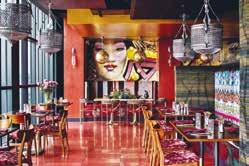
Location: Macao
Architect: Aedas (Macau) Lda
Interior Designer: Interior Designer: Alan Chan Design Company
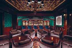
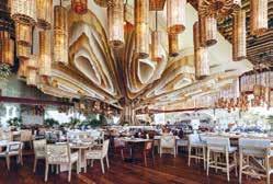
Developer: Venetian Orient Limited
Conceived by world-class interior designer Alan Chan, whose philosophy was to create a seamless integration of art and culture into every space. Each of the unique and very different “rooms” as you progress through the space within The Residence represent a unique characteristic, inspired by famous British personalities – Charles Darwin, Paul Smith, Charles Saatchi, Andrew Lloyd Webber and Winston Churchill.
In a typical manor house, the front parlour is the Reception Hall and show place where guests first arrive. The reception area, an equivalent to a front parlour, is decorated with a mix of vintage and contemporary artworks to establish the unique personality all of its own. Pre- and posttheatre dining became an important part of the theatre tradition in London.
The gentlemanly manner is an intangible part of British heritage. The Bar within The Residence comprises the characteristics of a private club, still very popular in London today. This space is where one could imagine Winston Churchill enjoying a whiskey whilst writing his fictional novel. Curiosity objects are often collected for pleasure in a typical British household.
The design brief afforded the opportunity to convert a blank canvas within a retail corridor immediately adjacent to the premier Paiza Gaming salons, into a new high-end destination F&B space within The Londoner development. The remit was challenging from many aspects, especially how best to gracefully carve out the lounge, restaurant, and bar spaces, taking guests on an experiential journey of London style and sophistication.
Location: Ionnina Greece
Interior Designer: Helen Brasinika
Architect: Helen Brasinika & Associates
Construction:
Exarchou _ Tsiouris Construction
Photographer: Pygmalion Karatzas
The Lake Hotel is a new five-star hospitality infrastructure at the lakeside location Limnopoula. Bllend were invited to create a contemporary hotel identity based on a newly built three-level building shell with several classical elements of vernacular architecture such as the ‘sahnisi’ and the ‘arches’. Tradition is introduced allegorically at the parking zones where antique concrete paving in red clay and ochre were used to portray the herringbone patterns typically found in Gianniotika handicrafts. The same pattern continues to all the driveways, the reception alley, the surrounding multipurpose space, and the conference hallways at the basement.
The total surrounding area of 10 acres is divided into various functional areas with local materiality associations and the colours of vernacular architecture. The landscape reminiscent of the local riverbeds gently slopes toward the pool which is treated like a villagers’ central square paved with sidewalk concrete tiles. The pool bar can be accessed via a wooden crossing over a shallow pool with river pebbles, while right next to it a Mediterranean herb garden was created to provide the purest ingredients for salads and traditional dishes.
The combination of earth tones, ochre and red earth highlights the geometric building volumes, while at night LED 3000K lighting fixtures highlight the building elements, incorporating the game of light and shading with different versions of materiality. It is contemporary and traditional, luxury and cosy, local and international, managing to meet its target within the first year of its launching among a great and well established competition in the surrounding area.
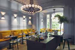
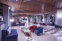
Location: Hamburg, Germany
Interior Designer: Alexander Garbe / stilwerk / atelier
Hotel Group/ Developer: stilwerk hotels
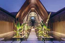
The design of the stilwerk hotel combines art nouveau charm with a stimulating mix of interior styles with an emphasis on highquality craftsmanship down to the finest detail from the floors to the walls, from the kitchen to the beds. The aim is always to make guests feel at home and every piece of furniture has been lovingly designed, produced and curated with this focus in mind.
After all, stilwerk’s believe that truly experiencing design means using all the senses: seeing, hearing, smelling, touching and tasting. Nearly all the furniture you will find in the hotel is either made in Germany or in Europe, which means they are able to offer exactly the same level of quality you would choose for your home.
Entering the boutique design hotel in a 150 year old townhouse makes you feel like entering a home of a friend or family member. Exploring the city after a healthy & local breakfast and coming back to the living kitchen in the evening for a glass of wine is like being home. The combination of having a welcoming host and the opportunity to explore hand picked and curated furniture which could easily fit your house or flat makes an unforgettable experience.
Elegant, authentic and unique, that perfectly describes the location of the surrounding the hotel. Respecting the historical facade and time-honoured charm an exciting interior concept was created that relies on natural materials and handcrafted manufacturing quality which integrates an urban lifestyle and historical fundaments. Refurbishing and recreating a 150 year infrastructure means bringing specialists and creative designer together to build something new but old.
Location: Bodufushi, Raa Atoll
Architect: Autoban, Atolye4n
Interior designer: Autoban
Hotel Group/ Developer: Joali
Construction Company: Gurok
The resort’s design was to emerge from this idea of weightlessness and offer a transformative and purifying stay through the shedding of all unnecessary excess, reconnecting with one’s self and surroundings, becoming one with nature.
For JOALI BEING, Autoban constructed an experiential design narrative around a combination of the identity of the island, the concept and philosophy of the wellness retreat and a seamless integration of architecture and interior design. Applying biophilic principles through Autoban’s signature layered design approach, they set nature at the very core of the design, emphasizing detail and materiality to create multi-sensory interactions. All structural elements were designed to achieve a sense of lightness, with linear and flowing architecture that seems to hover lightly in place, at once a part of the natural environment whilst simultaneously floating lightly above it.
Patterns and textures were used to mimic configurations of nature along with delicate touches to evoke the spirit of the island to create natural, welcoming and warm spaces. As with every Autoban design, an overarching approach ensures that all external and internal spaces work in harmony to contribute to a distinct design story.
At the heart of the retreat are three terraced pavilions facing the iridescent Indian ocean. Standing before a threetiered pool and deck, the elevated structures are reminiscent of temples, with striking thatched roofs floating above textured columns. Lofty, spacious and stylish, under the traditional roofs the pavilions house the main bar, a tea lounge and social and dining areas.
Interior Designer: Atwater Inc Studio
Architect: AE Urbia & Bynum Design
Build LLC
Hotel Group: Curio by Hilton
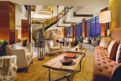
Construction: RKG & Associates
Inspired by the Colorado River and the majestic red rocks of Arches National Park, the design of the HooDoo Moab tells the stories of explorers discovering and celebrating the dramatic and remarkable nature. A rich, warm colour palette, infused with accents of terracotta and effervescent earth minerals, sets the tone.
Hoodoo Moab’s elegant, yet rustic atmosphere is on full display as you enter the hotel. The towering lobby is filled with sophisticated details and embellishments that put the region’s natural aesthetics on display. The rusty Corten steel columns are reminiscent of the rich mountain region and the curvaceous grand staircase, with driftwood railing, leads the eye towards the sky bridge that connects the guest rooms with the ballroom arena. The views and windows are designed to take full advantage of the mountain region and spectacular La Sal Mountains. Custom designed furniture, petrified tabletops, rich hand tufted area rugs that emulates the regions rugged but elegant nature, allows for an elegant yet casual atmosphere.
Surrounded by a sea of red cliffs and striking, striated desert skies, the design team imagined the guest rooms to complement the nearby natural wonders. Designed to be in dialogue with its environs, the horseshoe-shaped building hugs a central courtyard with each room oriented towards panoramas of sandstone buttes. The team visited Moab and fell in love with the terracotta-coloured rocks, the dinosaur road, the murky Colorado river and realized they couldn’t compete with this. They had to embrace the environment and celebrate the dramatic nature and history.
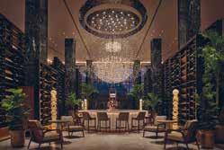
Location: New Orleans, LA
Interior Designer: Bill Rooney Studio, Inc.
Architect: Cambridge Seven Architects Hotel Group/Developer:
Two Canal Owner, LLC
Construction Company: Woodward Photographer: Christian Horan
New Orleans is a city that embraces a multicultural heritage, and celebrates life, alluring gardens, art, music, and cuisine. Set on two riverfront acres flanked by lush gardens, the design of the Four Seasons New Orleans is inspired by the sanctuary and allure of this botanic backdrop. It is this restful setting that the interiors become a foundation to celebrate the multi-cultural heritage of the city through art, food, and threads of historic influence.
The lobby is centered around the bar that is enveloped by a grand lighting installation that is made up of varying crystal and glass arrangements creating the hint of an heirloom chandelier shape. The experience creates a layered story of discovery in a room that is subdivided by contemporary shutter screens made of oak, iron, and curated art that create intimate spaces with their arrangement. The lobby is envisioned as a garden pavilion, with an interior atmosphere that is composed of an eclectic and contemporary arrangement of classic curiosities surrounded by a lush garden sanctuary.
With hints of local culture, the room design is uniquely influenced by the biophilic, and the patterns found in discrete New Orleans gardens. This is ultimately expressed through a large plaster wall relief of regional planting that anchors the bed. The plaster relief is complemented by accent lighting and a regional materiality that is articulated with white shiplap walls, soft washed white oak accents, Carrara stone, Wilton weave carpet patterned after the building plan, and modern furniture forms derived from the modern 20th century spirit of the existing architecture.
Location: Tuscany, Italy
Interior Designer: Eva Khoury
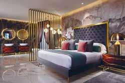
Hotel Group/Developer: Riva del Sole Resort & Spa
The restructuring and redesign of Riva del Sole Resort & Spa was undertaken by Eva Khoury along with a local team. The property itself is a large project, and so continues to have an ongoing renovation, with the current upgrades having taken places within a 6 month period of seasonal closure.
The boutique hotel is a 60 year old property that is focussing on a having a prevailing sense of ‘Made in Italy’ throughout its restructuring. Eva Khoury is the designer on the project, working with a local team that provides her with the best handcrafted components to her design vision of comfortable, nature-influenced luxury. The entire project has been designed by Eva, covering the interiors of the suites, conference centre, and restaurants. Though a large scale project, attention is given to the finest details. Each piece of furniture, each door, bed and the marble sinks were designed by Eva and crafted by the artisans working with her.
Eva Khoury’s strength in her hospitality design is through the adaptability of the interiors. The design for Riva del Sole is adaptable, appealing to all guests at the resort. The hotel holds its distinctiveness whilst still respecting all safety regulations and unaffecting it’s practicality of welcoming a wide range of guests. Though Eva’s designs are always unique, the interiors for this project in particular centres on reflecting it’s outside environment. Ensuring that guests do not feel trapped or enclosed within the hotel, the designer wanted to give the impression of being outside with a connection to nature. It’s this creative twist that makes Riva del Sole unlike any other hotel.