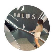
JULIE DEPETRIS
INTERIOR ARCHITECTURE AND DESIGN STUDENT 2025
FAY JONES SCHOOL OF ARCHITECTURE AND DESIGN
INTERIOR ARCHITECTURE AND DESIGN STUDENT 2025
FAY JONES SCHOOL OF ARCHITECTURE AND DESIGN
Testaccio District Rome, Italy Group Project
Revit, Rhino, Photoshop, Enscape
4th Year - First Semester
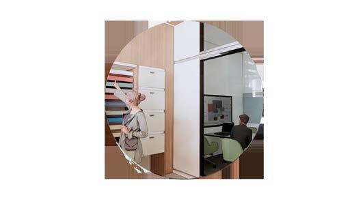
For this project, teams were tasked with repurposing a building in the historic slaughterhouse district of Testaccio and transforming it into a learning facility for adults with Autism Spectrum Disorder (ASD). The facility is designed to support individuals with various levels of ASD and provide them with skills that enhance their ability to integrate into the workforce and community.
The design focused on fostering the development of lifelong skills, such as communication, workplace readiness, and the ability to manage overwhelming stimuli in the environment. Additionally, the facility serves as a platform to educate and engage the Testaccio community about ASD, promoting inclusivity and understanding. The center aims to empower students to lead fulfilling, independent lives within the broader community by creating a space that encourages meaningful connections.
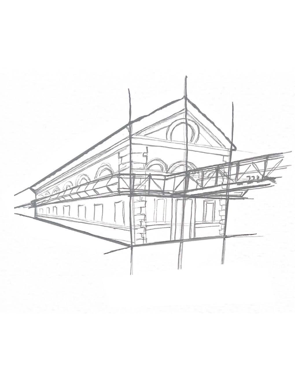
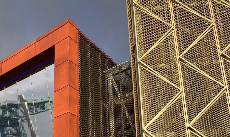
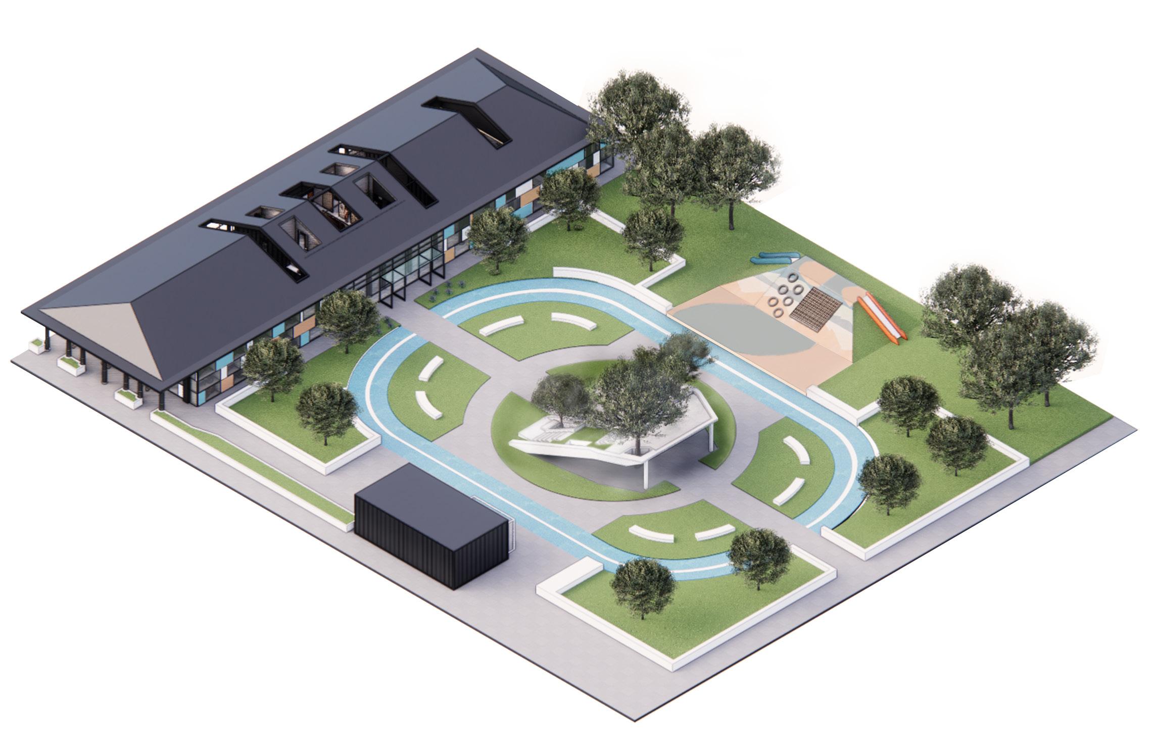
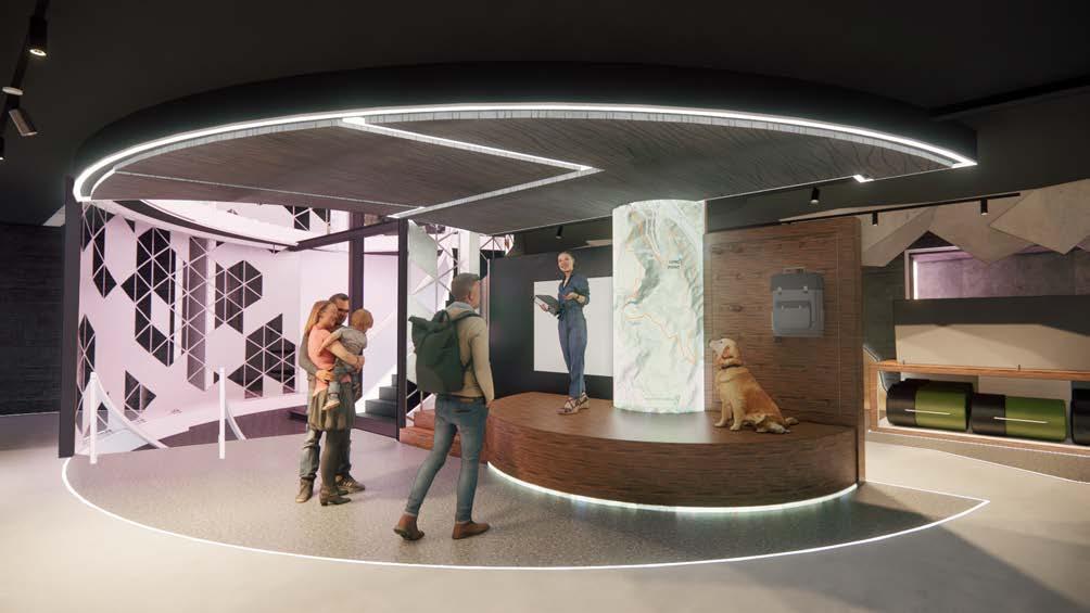
The project site is in the historic Slaughterhouse District of Testaccio, Rome, where the original slaughterhouse, built in 1872, was abandoned in 1982. Over time, the area has gradually transitioned into an educational hub, with the city adapting the district to meet the needs of students. We were tasked with redesigning one of the buildings on the edge of the facility and transforming a large adjacent plot of land.
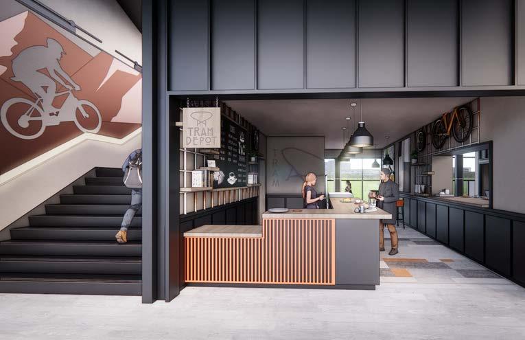
Like much of Italy, Testaccio embraces cycling as both a mode of transportation and a recreational activity. Situated about 30-40 minutes from the city center of Rome, the district is also seeing a rise in interest for rock climbing, despite the nearest climbing facility being over 40 minutes away.
By reimagining the space as a rock wall and bike repair
• Ages between 18 - 30 (young adults)
• 1 in 68 kids have some spectrum of autism
• boys 4.5 times more likely than girls
• range between low stimulus and high stimulus
• Social but low interaction - a very social activity with little talking or eye contact. main focus is communicating what color to grab or how to position the body to better climb.
• Very repetitive actions - hones on a particular skill. many people with asd have a talent or hobby that they heavily focus on. by repeating a climb it helps with that repetitive skill or ability.
• Can be done at any time - climbing takes little time to prepare for. they can decide to just come down to a climbing facility and rent gear. less preparation helps with less stress.


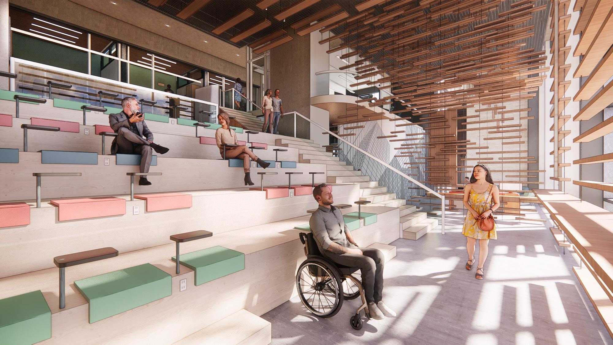
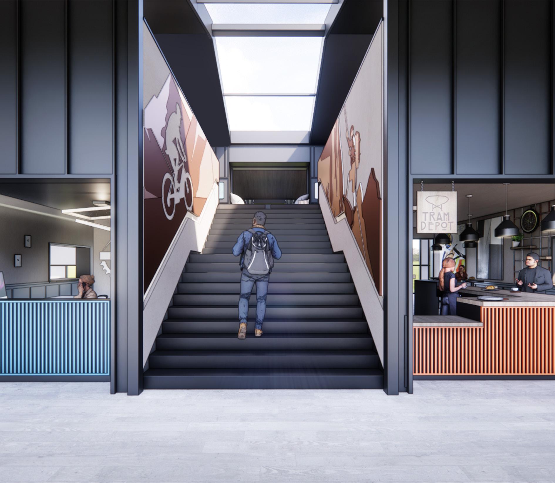
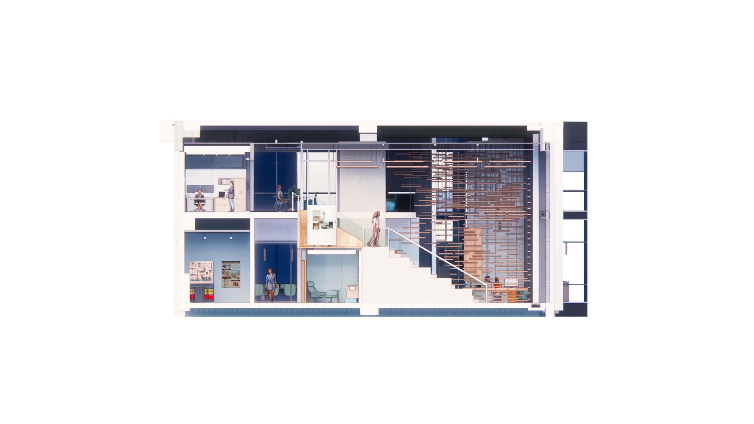
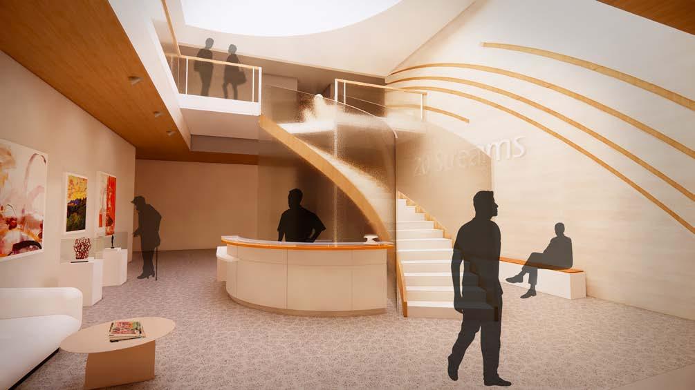
The concept of ascending is prominently showcased through the central staircases—interior and exterior—and the three key forms introduced within the interior space.


DIRECTIONAL ASCENDING
Directional elements are highlighted through the strategic use of color and the flow of the floor plan.
DIRECTIONAL BALANCE ASCENDING
DIRECTIONAL BALANCE
Balance is achieved through the design’s thoughtful combination of tones and material transitions.


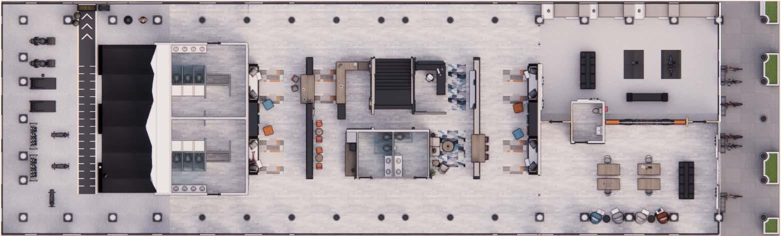
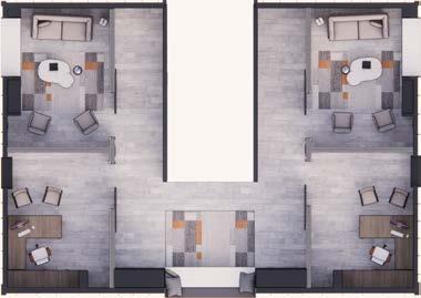
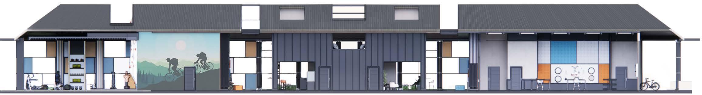

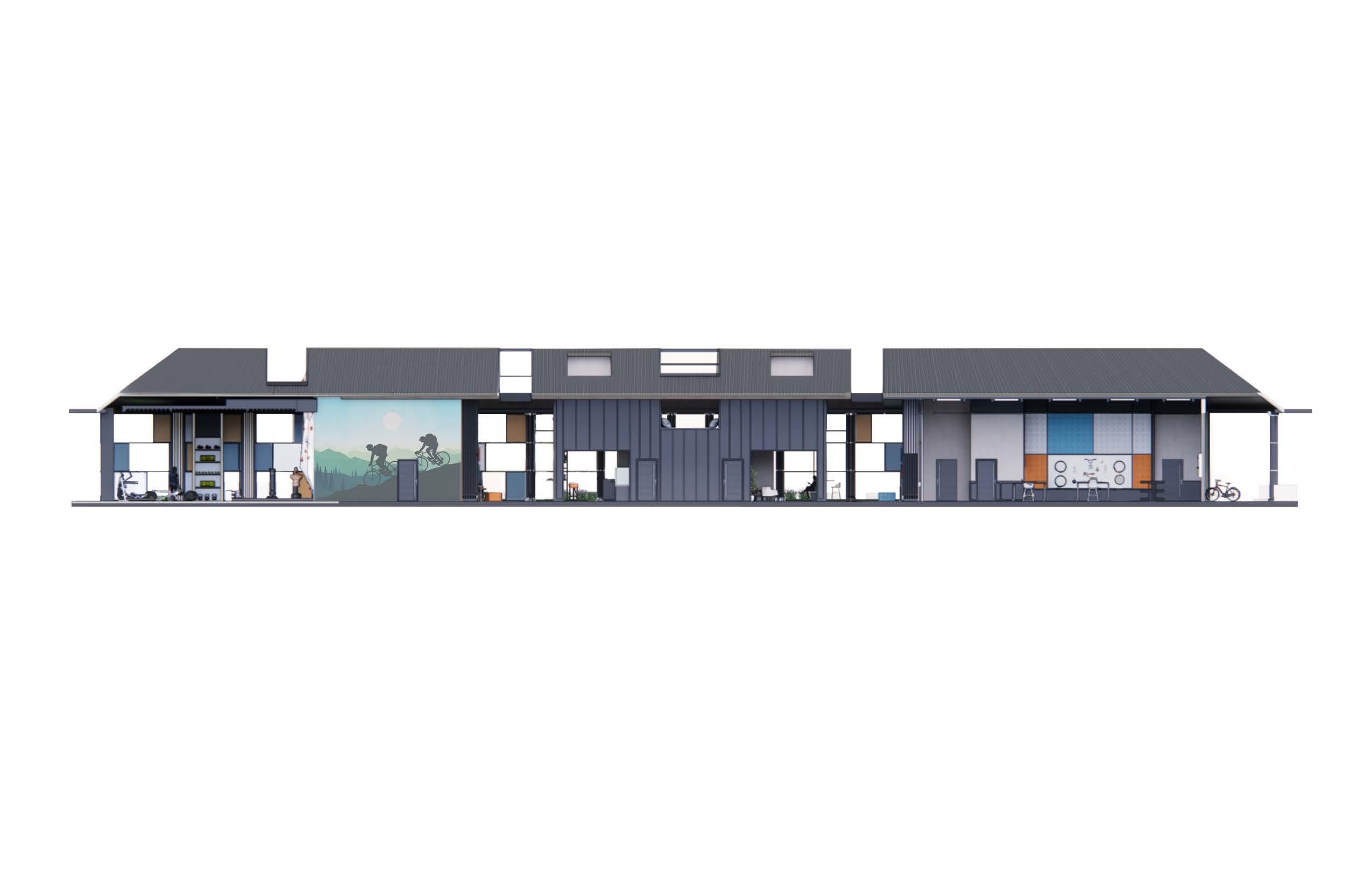
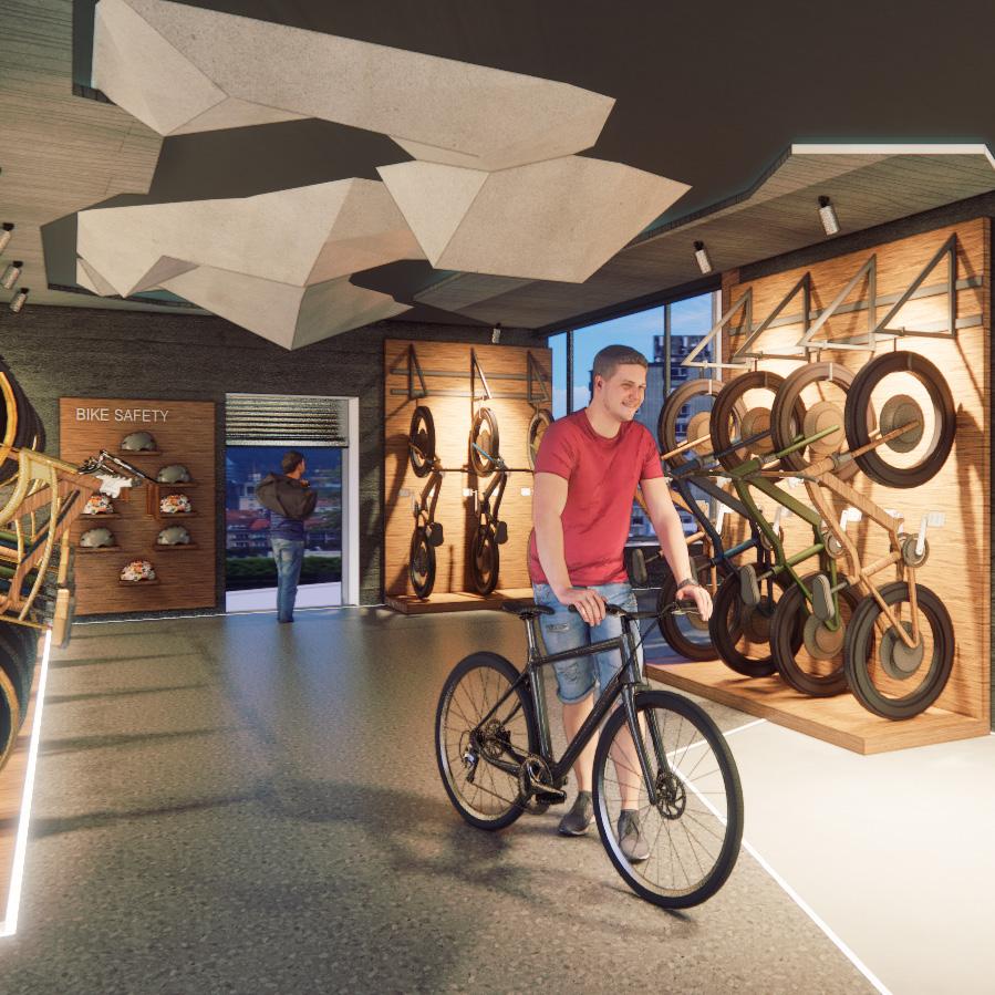
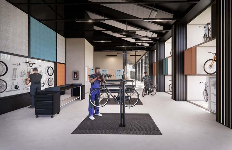
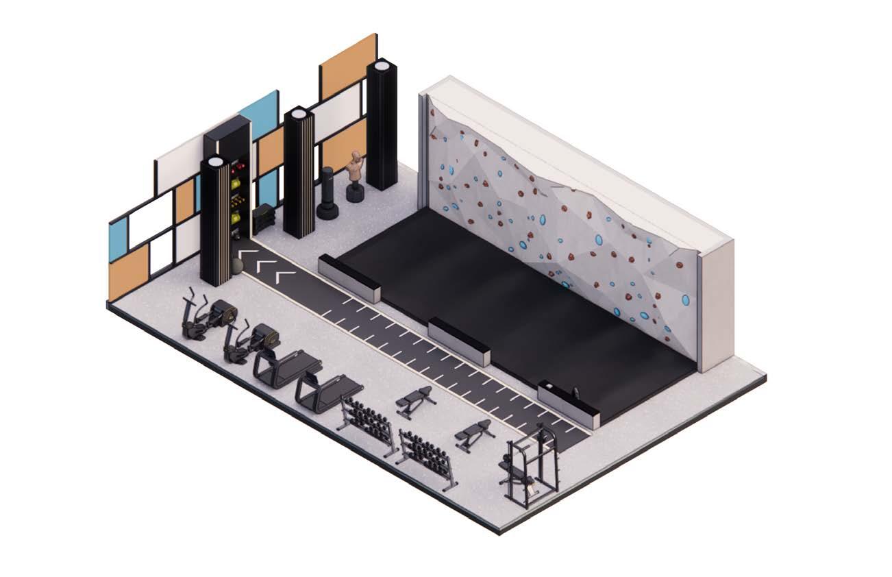
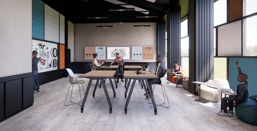
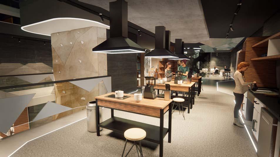
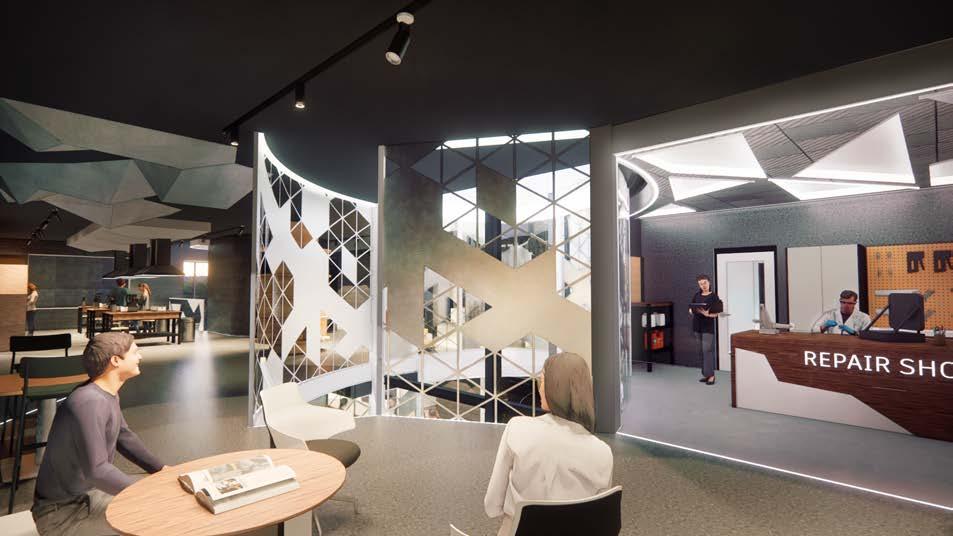
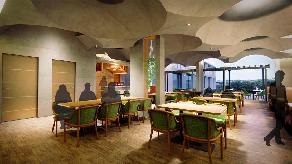
The ASD learning facility is designed to teach individuals with Autism Spectrum Disorder (ASD) practical skills in bike repair and rock wall equipment maintenance. These two distinct trades are separated into separate sectors within the space, allowing students to focus on one task at a time in a clear and organized manner.
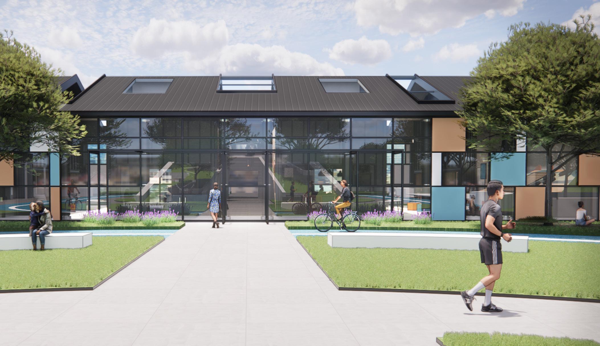
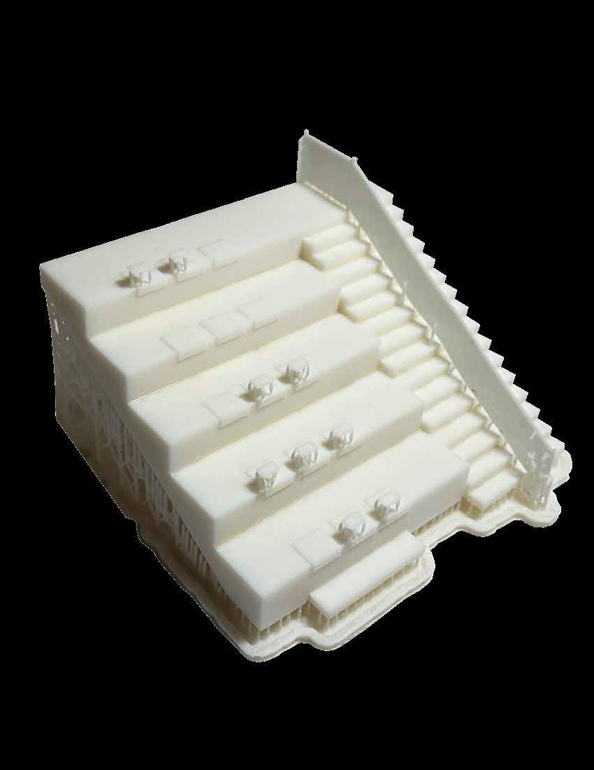
The design concept revolves around the themes of “Ascending,” “Balance,” and “Directional.” These key ideas reflect the center’s goals of fostering independence and helping students achieve social and educational milestones. “Ascending” is symbolically represented through the large communal staircase outside, as well as the monumental staircase at the heart of the floor plan, signifying growth and progress.
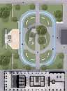
The spatial organization relies on three main forms to maintain balance and clarity within the layout. These forms, which are integrated into both the site and floor plans, provide a clean, structured flow that supports the center’s directional goals, ensuring a harmonious and purposeful design.
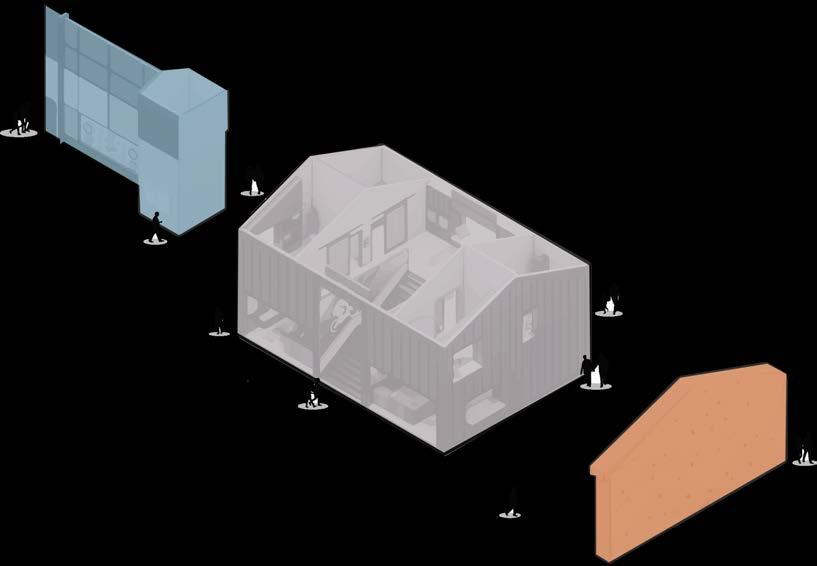
The bike repair space offers a community service, allowing individuals to have their bicycles repaired by students from the ASD Center. This hands-on experience helps students develop practical bike repair skills and customer interaction, preparing them for future employment in bike repair shops. By engaging with the community, they foster independence and build stronger local connections.
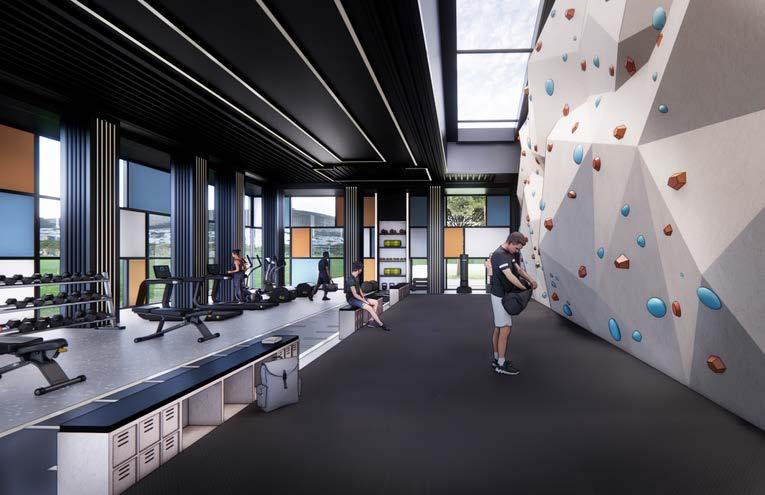
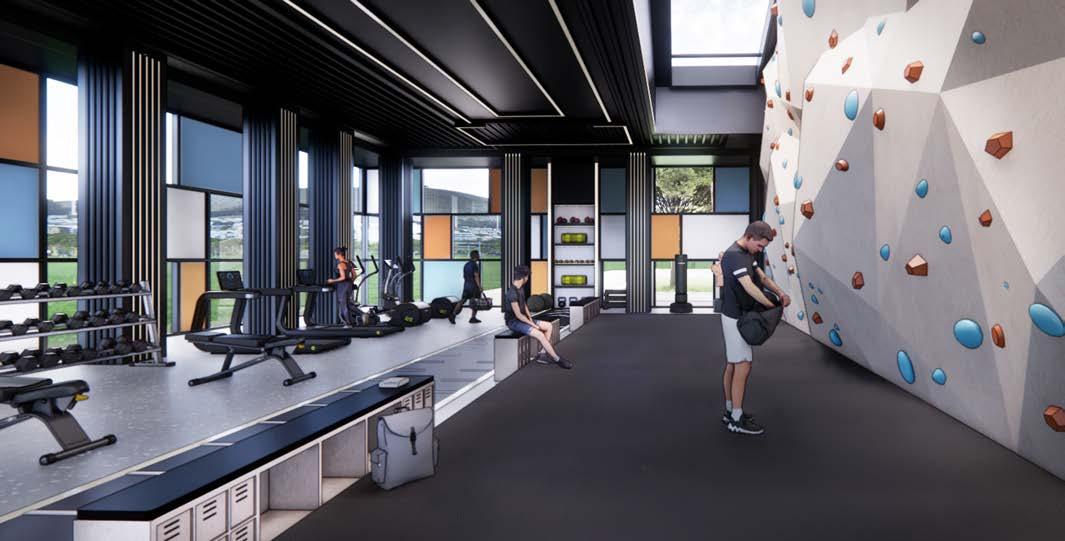
The gym and rock wall area features typical gym equipment—weights, bench presses, cardio machines, and a dedicated stretching area. It provides a private environment for individuals with ASD to work out at their own pace. The central feature, a rock wall, offers an opportunity to learn climbing equipment use, while also teaching maintenance and sales skills.
The bike learning space provides an optimal environment for individuals with ASD to acquire bike repair knowledge, with a display element on the middle wall showcasing various tools and parts to enhance the learning process.
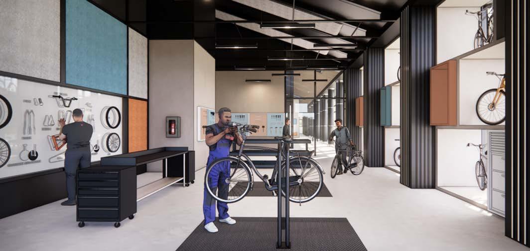
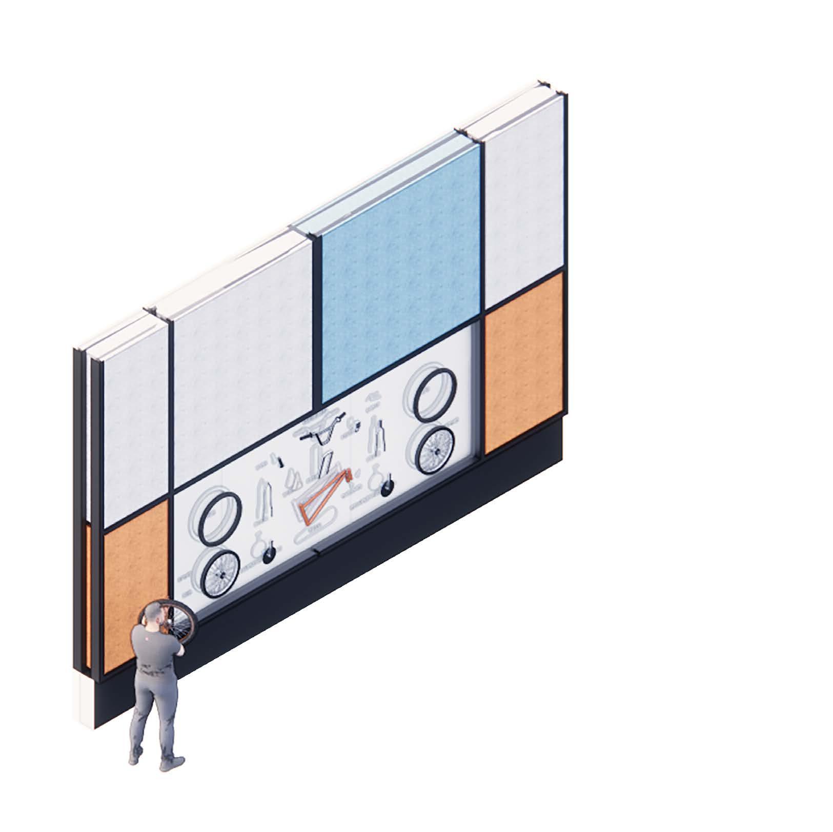


The design of this learning center was tailored to meet the sensory needs of individuals with ASD. One key feature is the bike wall, which displays an exploded view of a bike. Students can remove and study individual parts, with silhouettes behind each part for easy identification even when not physically present. The bike wall is integrated into the bike learning and repair spaces, providing continuity as students transition between the two.
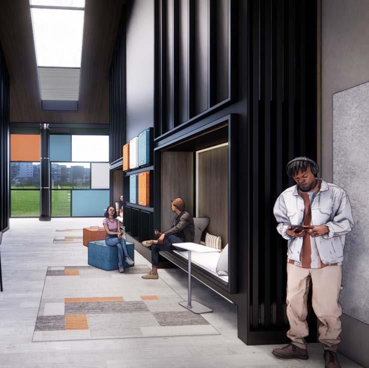
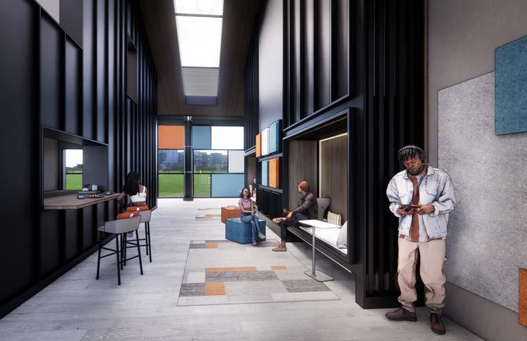
Additionally, private, adjustable seating was incorporated to offer students a space for personal time. The modular seating, embedded within the walls, is flexible and can be relocated throughout the center as needed.
A façade was added to the building to address light control, which features extensive glass. This helps manage natural light, reducing overstimulation during periods of intense sunlight.


Dallas, Texas
Revit, Photoshop, Enscape
Third year - First Semester
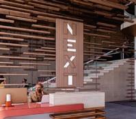
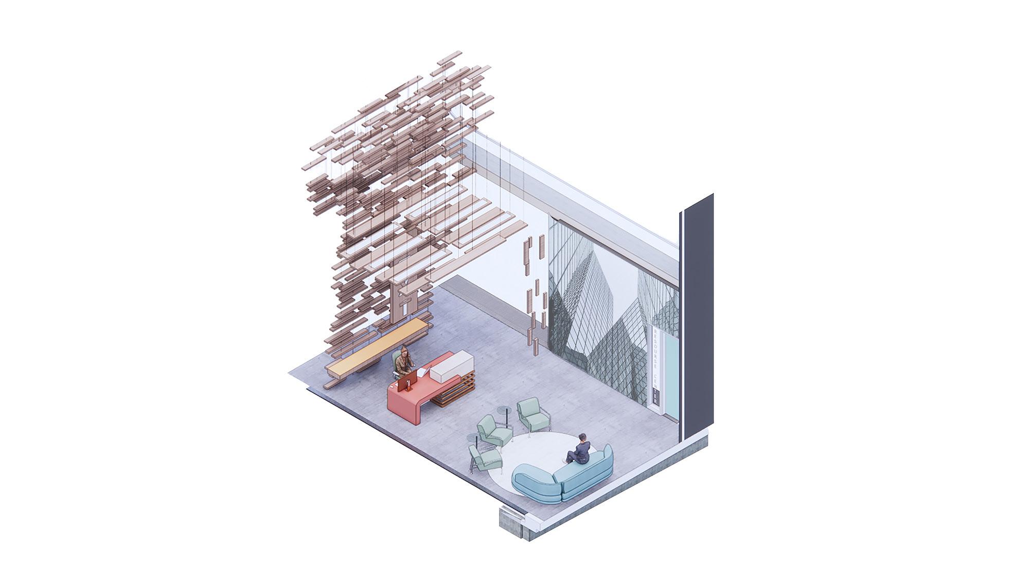
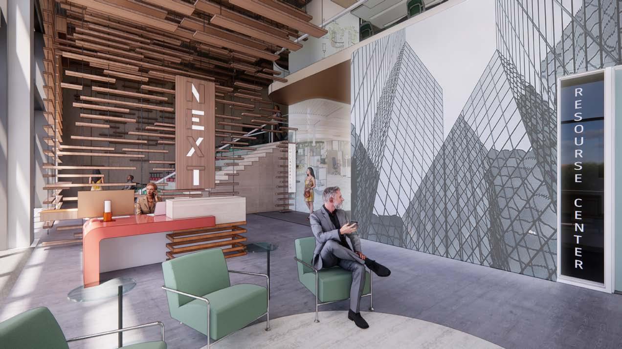
For the NEXT competition, our challenge was to transform a designated space on the third floor of an existing office building in Dallas, Texas. With a generous 30-foot floor-to-ceiling height, the design incorporated a mezzanine to optimize functionality while meeting competition requirements.
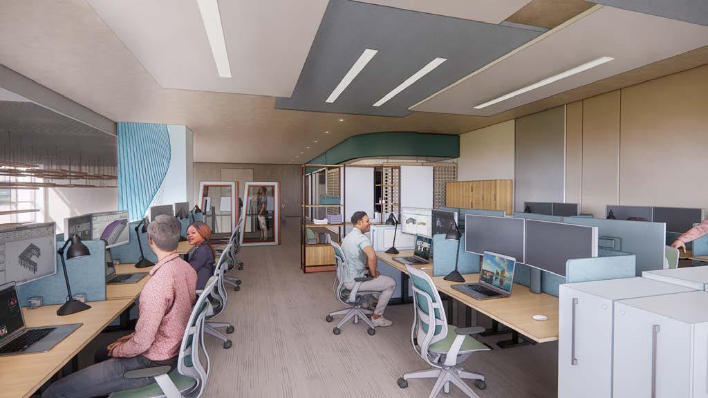
The project was designed to accommodate 43 employees of an architecture firm, integrating sufficient workstations, meeting rooms, and essential amenities. Prioritizing a post-pandemic workplace strategy, the design leveraged technological advancements to foster innovative collaboration. By embracing a hybrid work model, the space was crafted to offer a dynamic, flexible, and engaging environment that encourages employees to reconnect and thrive.
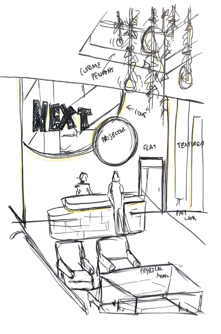
The design concept centered on “threshold”—the point at which an experience begins—aligning with NEXT’s vision of innovation and collaboration. Initially explored through organic forms, a threshold graph, and mathematical equations, the idea evolved with the addition of “alternating,” emphasizing seamless transitions and spatial clarity without physical barriers. Layers of varying ceiling heights and subtle divisions defined spaces while maintaining fluidity.
Technology was key in fostering connectivity, and interactive digital display walls were integrated throughout the space. These displays enhanced collaboration, provided access to shared knowledge, and showcased NEXT’s past work, reinforcing a dynamic, future-focused workplace.
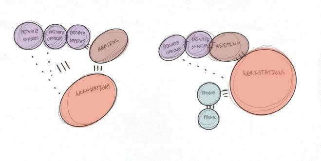
Team homebases are designed to foster a natural flow between focused work and collaborative Open collaboration enhances transparency and trust, while increased access to private spaces supports focus and wellness.
Modular, movable, and multi- use support different types of work and adapt easily.
Support teams working remotely and side by side. Pay attention to cameras, acoustics, technolocy, space and lighting
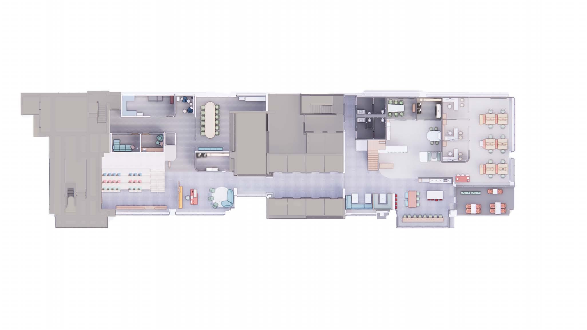
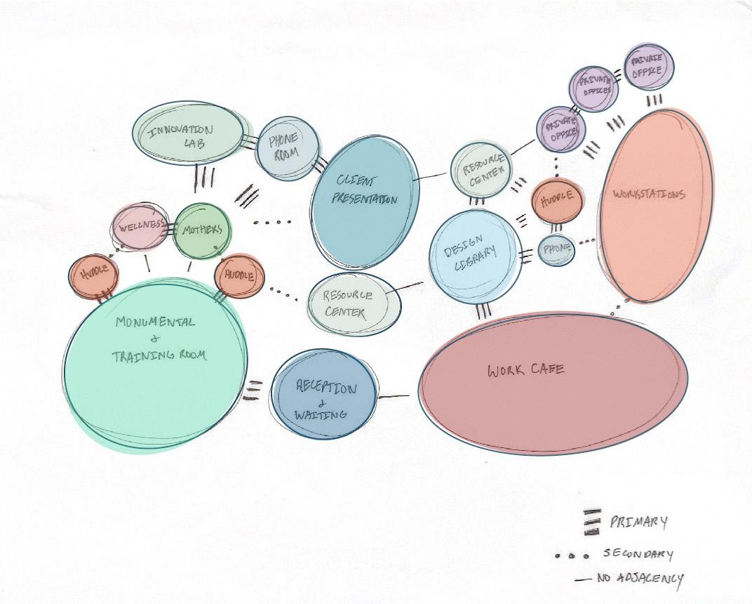
The floor plan strategically differentiates between public and private zones, as well as highand low-traffic areas. Reception, client spaces, and large gathering areas are positioned adjacent for seamless interaction. Meanwhile, the left side of the building is dedicated to employees, housing workstations, gathering areas, and essential resources to ensure privacy and focus.
Floor plan - The floor plan focused mainly on the public vs. private areas and the high-traffic vs low-traffic spaces. The reception, client, and sizeable monumental gathering places reside right next to each other for quick adjacency.
The left side of the building is laid out to accommodate the employees residing there. Their gathering spaces, assets, and workstations are mainly on the left side of the building for more privacy.
The reflective ceiling plan reinforces the design’s rhythm through layered, repeating panels. Predominantly crafted from wood, these panels are interspersed with recessed lighting and digital display elements, creating a cohesive and dynamic overhead experience.
RCP- The reflective ceiling plan was based on the repeated ceiling element throughout the space. This is executed by repeated panels layered throughout. Most ceiling panels are wood; the rest are recessed lights or digital display panels.
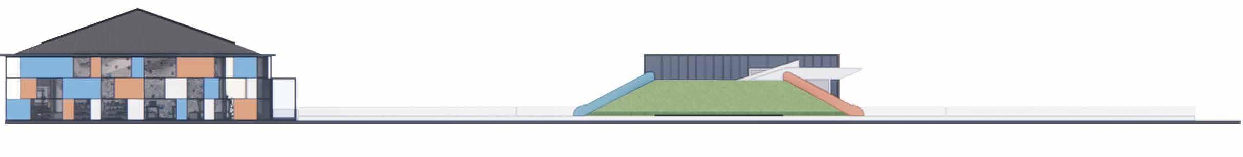
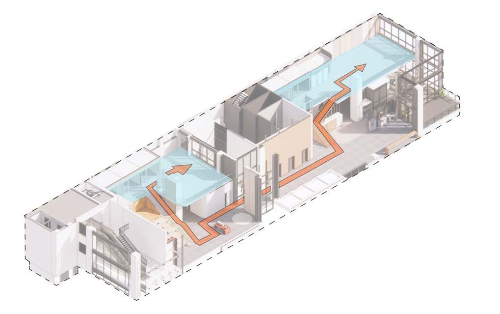
The sectional cut highlights the monumental staircase’s multifunctionality. It is designed as a staff training area and a collaborative space for brainstorming and teamwork. Above the staircase, two huddle spaces provide additional seating during training sessions. Below, the mother’s and wellness rooms efficiently utilize otherwise unused space.
The mezzanine is strategically located along the north side, where most workstations and private offices are. Its placement above the huddle spaces and training room ensures easy access while maximizing natural light from the full-height curtain walls, creating a bright, open workspace.
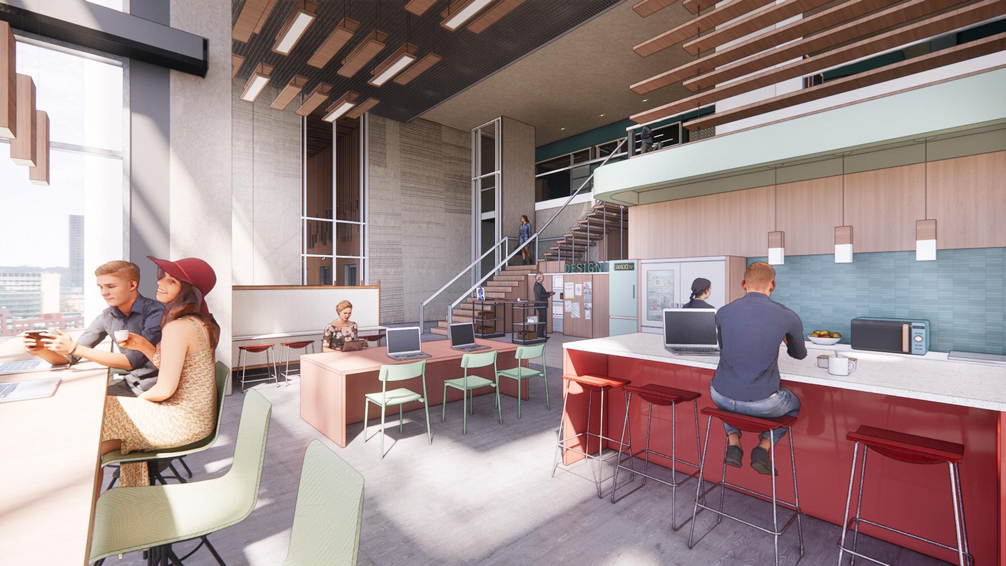
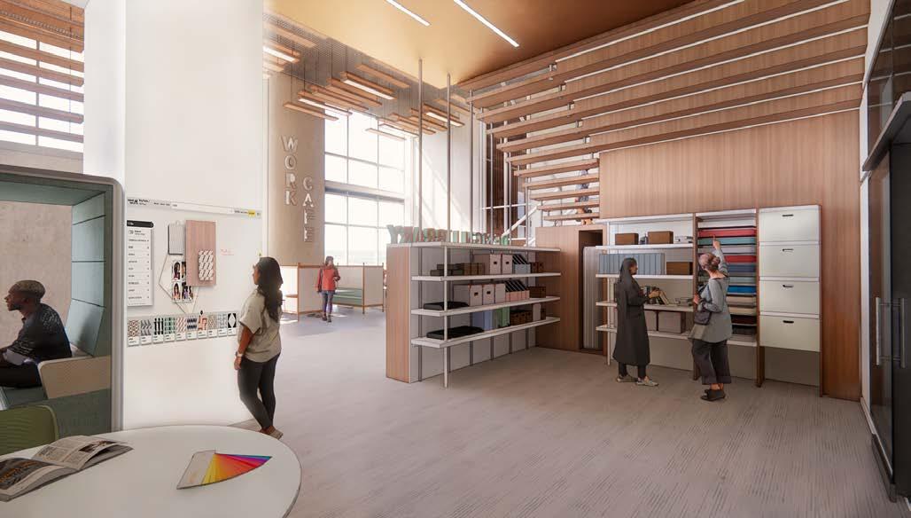
Work café - located adjacent to the main workstations, serves as a multipurpose space for meals, informal work, and small firm events.
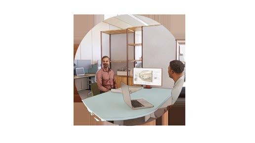
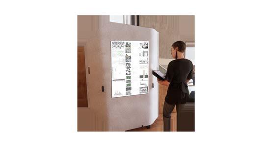
Design library - is divided into three zones for flexibility. The first, open to the café and full-height curtain walls, features a pin-up board for optimal material visualization. The semi-enclosed middle section houses material storage, while the fully enclosed area is designed for client meetings and sample reviews.
Workstations - are organized into three color-coded teams, ensuring clear wayfinding while efficiently accommodating 43 employees.
Fayettville, Arkansas
Revit, Photoshop, Enscape
Third Year - Second Semester
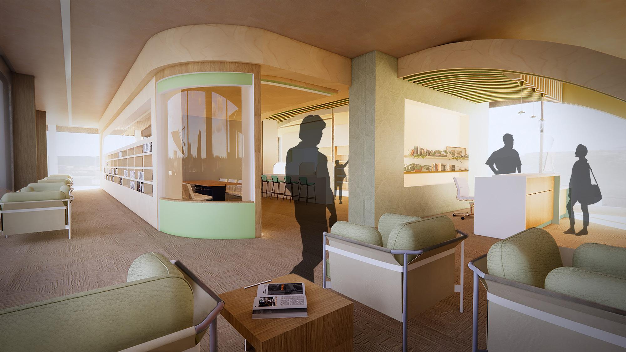
As part of this project, we were tasked with redesigning an old three-story factory building near Dixon Street in Fayetteville, Arkansas, transforming it into a modern library. Each group was given a unique concept for the library’s design, and my assignment was to create an outdoor activity library.
The concept centered around providing a space where visitors could rent outdoor equipment or purchase small related items, fostering a connection with nature and the local environment. This design incorporated flexible spaces for both the rental and retail aspects, with thoughtful spatial planning to create an inviting atmosphere for outdoor enthusiasts. The goal was to integrate the library into the community while promoting active outdoor engagement.
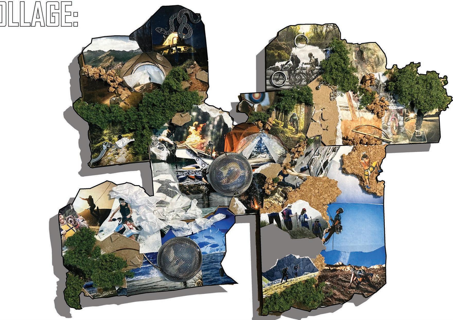
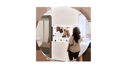
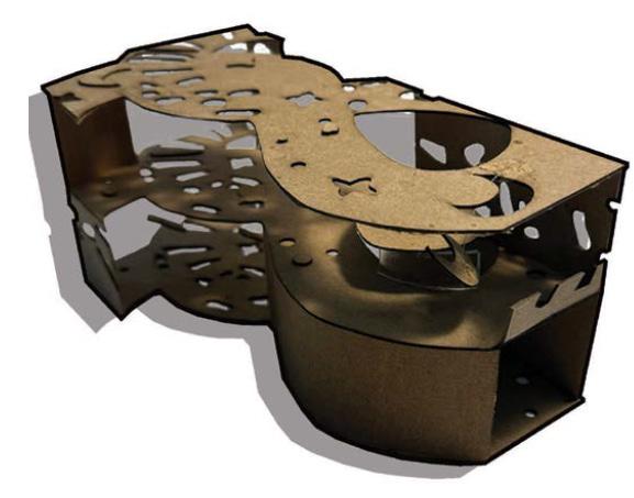
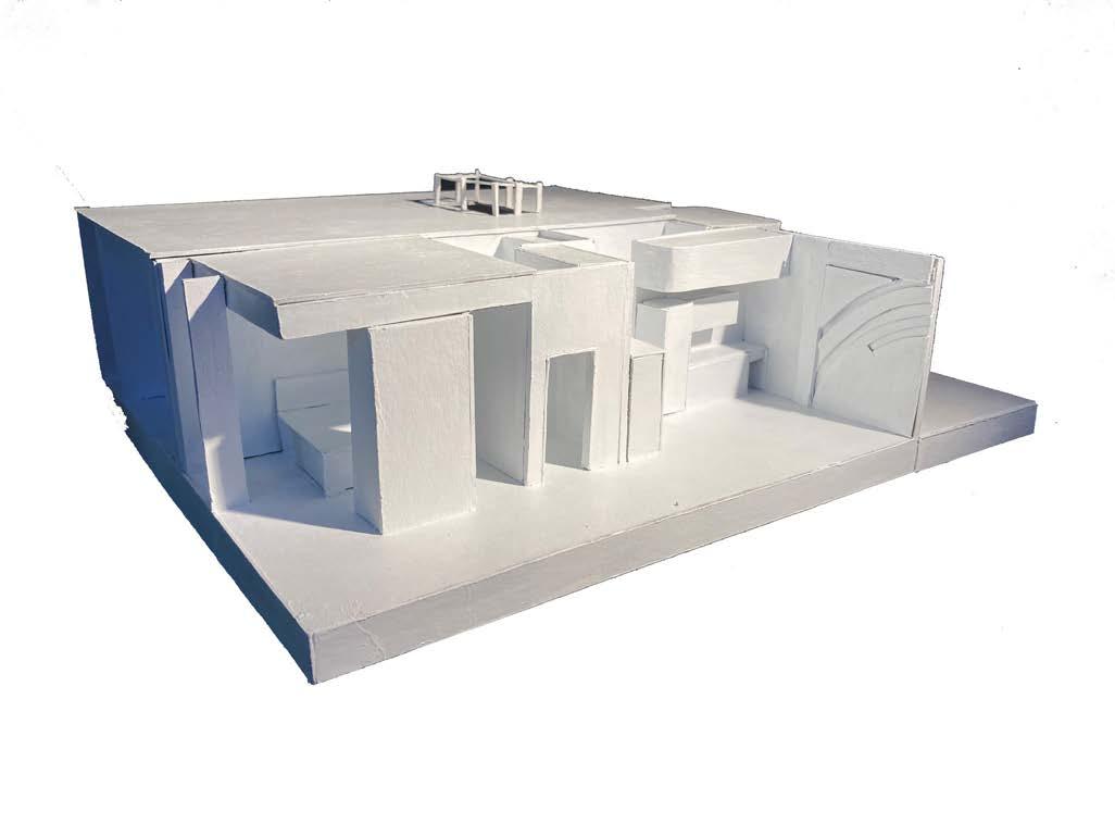
To address the challenges of designing within a large, three-story space, collages and conceptual models were created to organize the expansive area. Given the scale of outdoor rental items, the strategy involved dividing the space into distinct sections for each activity.
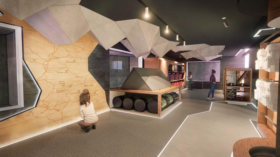
The concept was inspired by the immersive qualities of the outdoor environment. Rather than bringing nature indoors, the focus was on creating immersion through interactive digital displays, varying ceiling heights, floor changes, and hands-on experiences visible from within the space, while also focusing on light control and light flow in a way that mimics the outdoors. With these ideas it was time to figure out how to turn these collage ideas into the full buildings design.
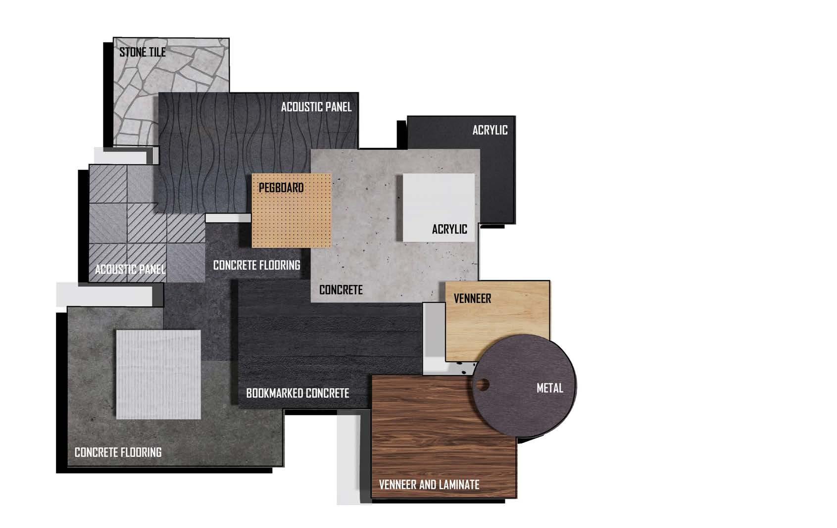
The design intent was to create an immersive experience within the library, akin to the feeling of being in nature, without directly bringing nature indoors. This was achieved through art-gallery-style lighting, which evoked a cave-like atmosphere, and rock-inspired structures that lowered the ceiling heights. The flooring featured jagged patterns, mimicking rock formations, without actual texture. To enhance the moody lighting and highlight the digital display walls, the windows were covered, allowing for better control of light levels and making the displays more prominent and inviting for visitors to engage with.
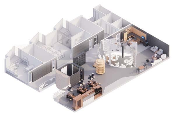
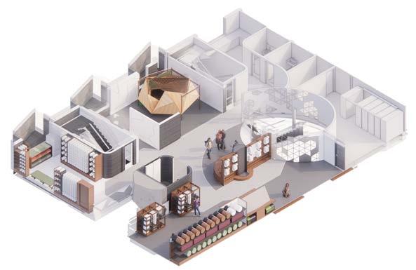
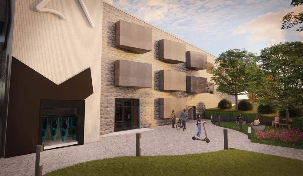
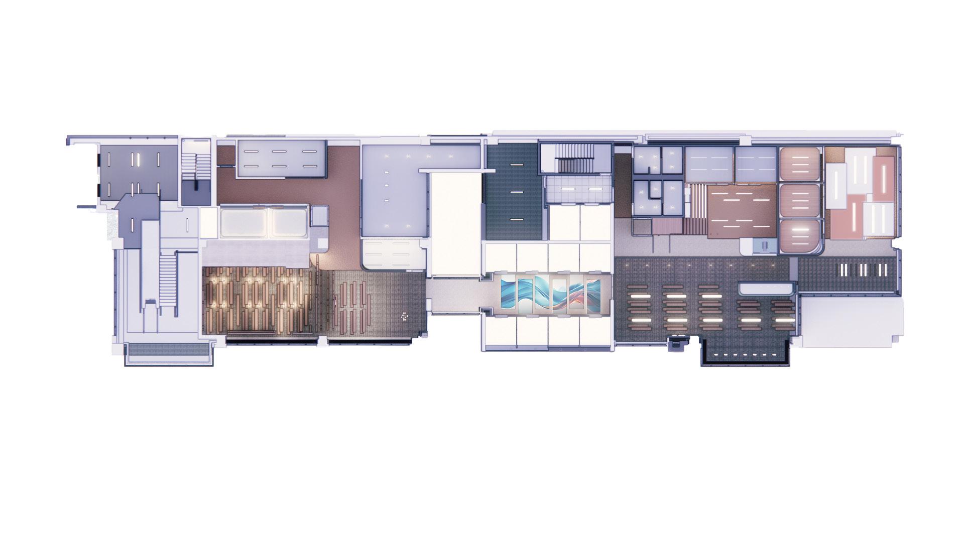
The library’s items were organized by activity to ensure an efficient flow throughout the space and accommodate large outdoor equipment. Fayetteville is a hub for biking, hiking, and rock climbing, influencing the library’s floor division. Due to their popularity in the region, water sports, including kayaking and canoeing, were also incorporated.
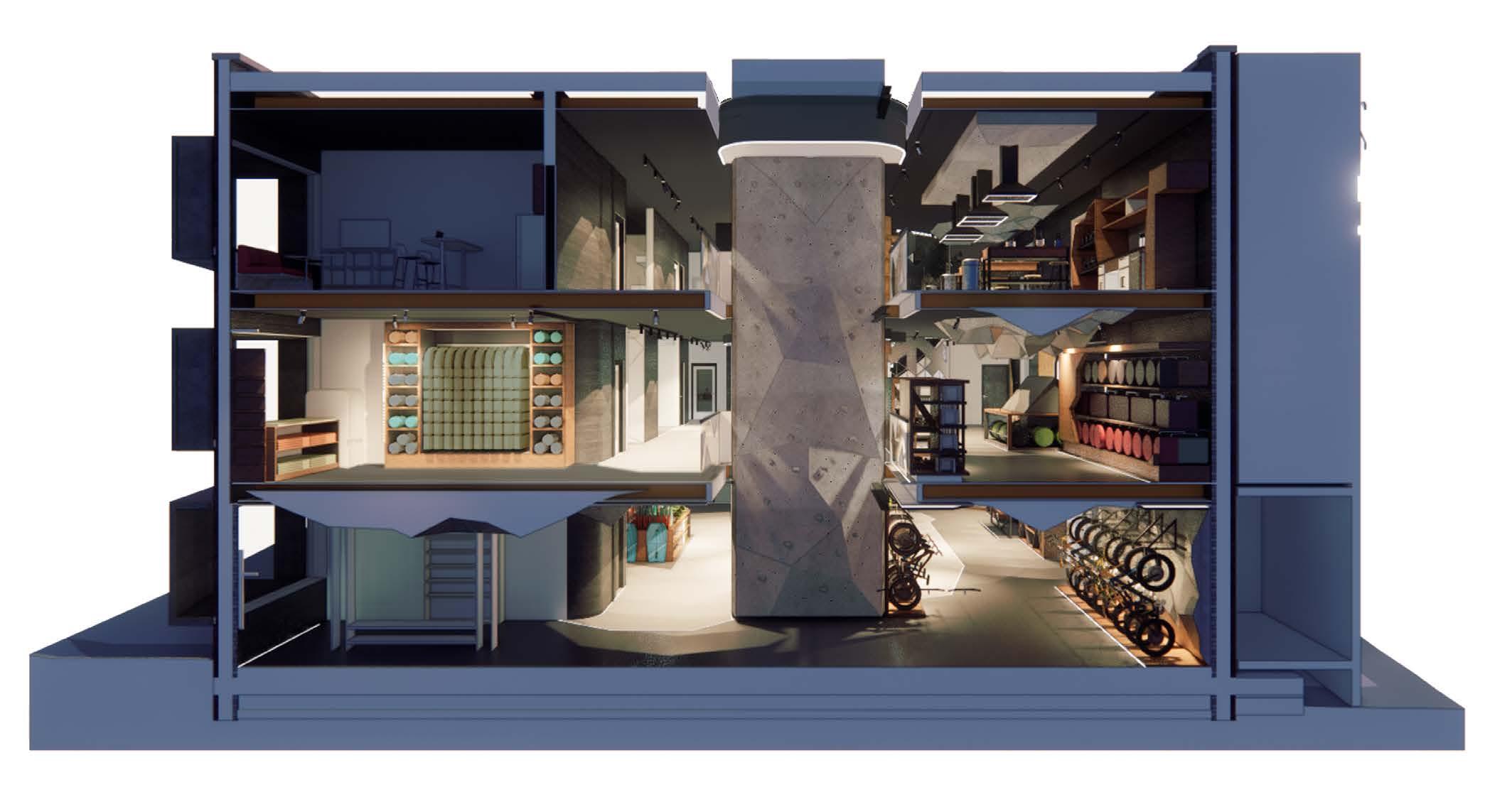
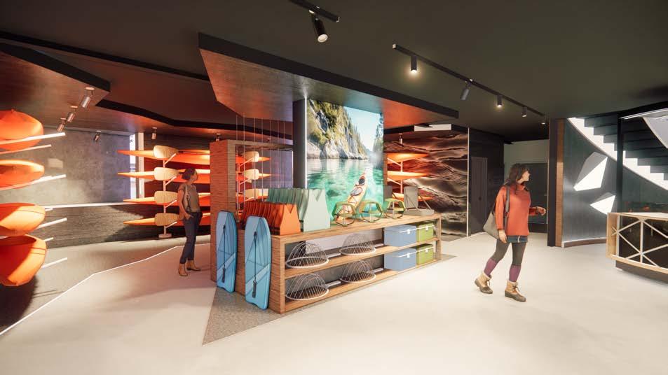
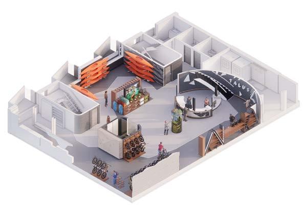
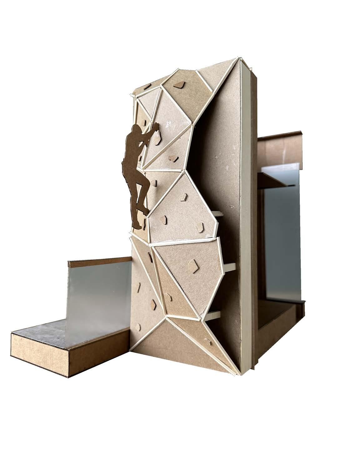
The design focused on two key areas: bike rentals and rock wall equipment. The library’s centerpiece was a rock wall that spanned the full height of the building, positioned to face the busy street to attract attention. The first floor was dedicated to bike rentals, creating an accessible, central space for outdoor enthusiasts.
To maximize space use, the rock wall was designed to serve as a structural element for the building. An elevator shaft was integrated behind the rock wall, optimizing space while ensuring ADA accessibility. This design combined the grand height of the rock wall and elevator in one impactful area, creating a visually striking feature. Given the relatively small size of each floor, this strategy helped increase usable space in the floor plan while maintaining necessary clearance for accessibility.
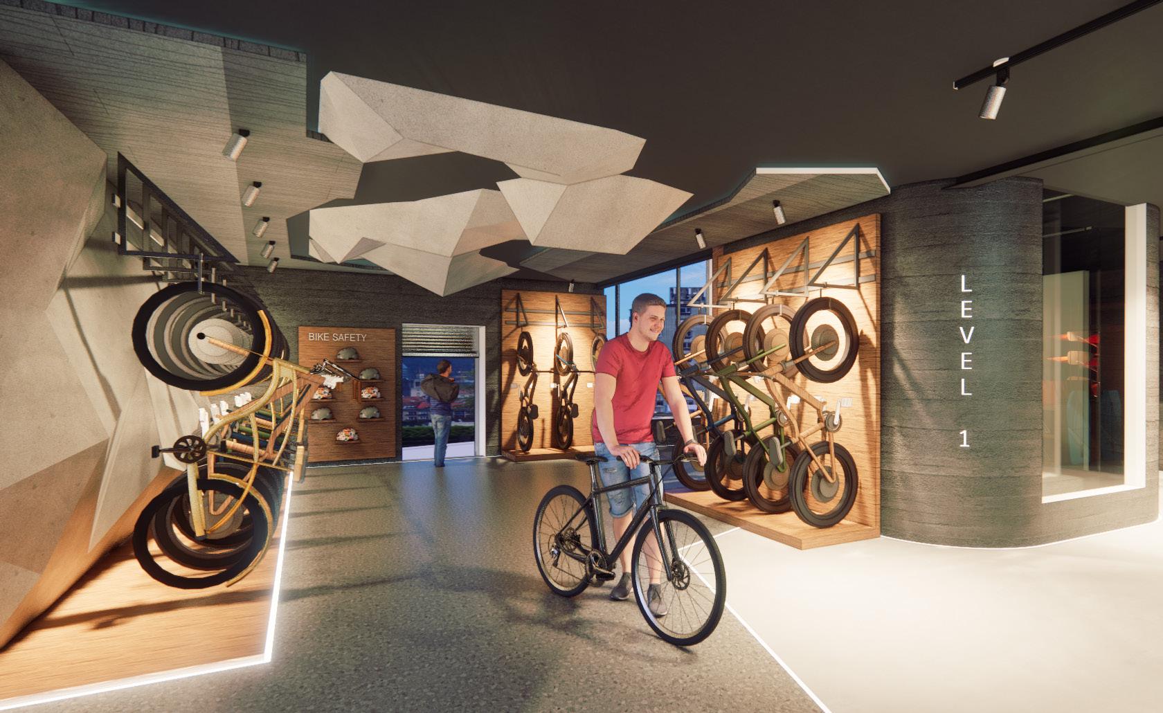

The interior evokes a moody, cave-like ambiance, achieved through the use of natural materials such as stone and wood. To counteract the acoustics of these hard surfaces, strategically placed ceiling and wallmounted acoustic panels enhance sound absorption and comfort.
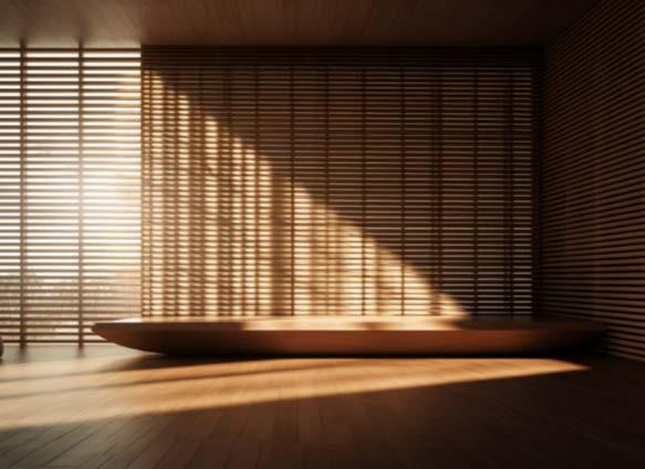
The staircase features a perforated material designed to create dynamic light and shadow effects throughout the day. Positioned beneath a skylight, it mimics the dappled light filtering through small openings in caves and forest canopies, enhancing the spatial experience.”

Revit, Photoshop, Enscape
Second year- Second Semester
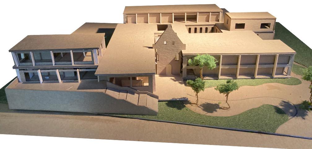
This project reimagines an existing building in Paderborn, Germany, transforming it into an independent senior living facility. Inspired by the “retrospective” concept, the design reflects on the city’s rich history, drawing influence from German Renaissance architecture.
The facility is designed to foster a vibrant, healthy lifestyle after retirement, with thoughtfully curated spaces that encourage social interaction and community building. Open communal areas invite both residents and the public, creating opportunities for meaningful connections and an enriched living experience.
1.Residence
2.Entry
3.Administration
4.Restaurant
5.Fitness
6.Meeting
7.Music Practice
8.Gathering
9.Courtyard
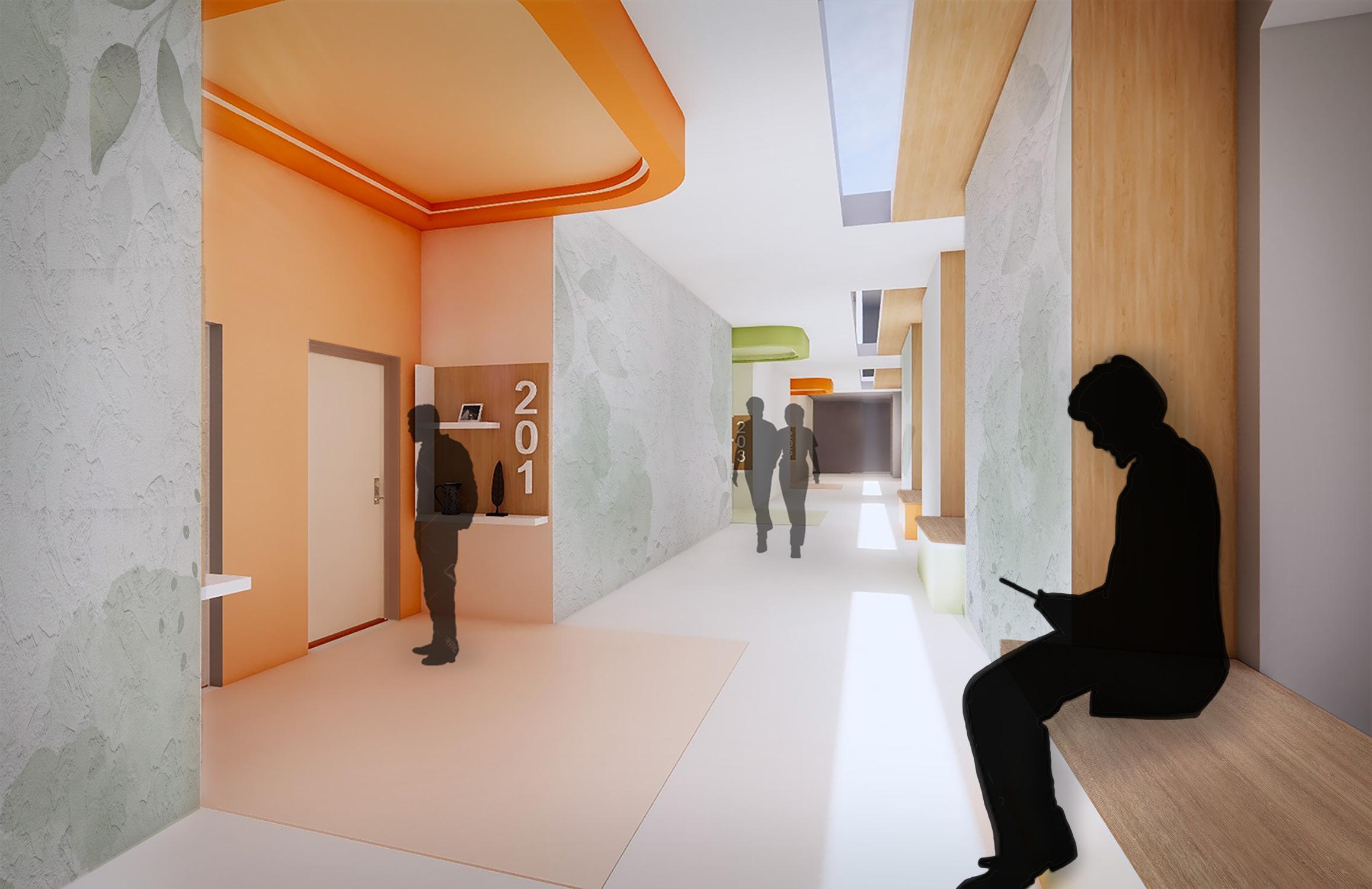
The senior living center consists of 45 units, offering both single and double accommodations, all designed to meet ADA requirements. Wayfinding elements were incorporated to help residents easily navigate the space.
The corridor design enhances direction and room identification. Brightly painted room locations and overhangs with built-in lighting help distinguish rooms from a distance. Additionally, customizable shelf spaces near each entrance allow residents to personalize their space, placing photos or cherished items that evoke a sense of home.
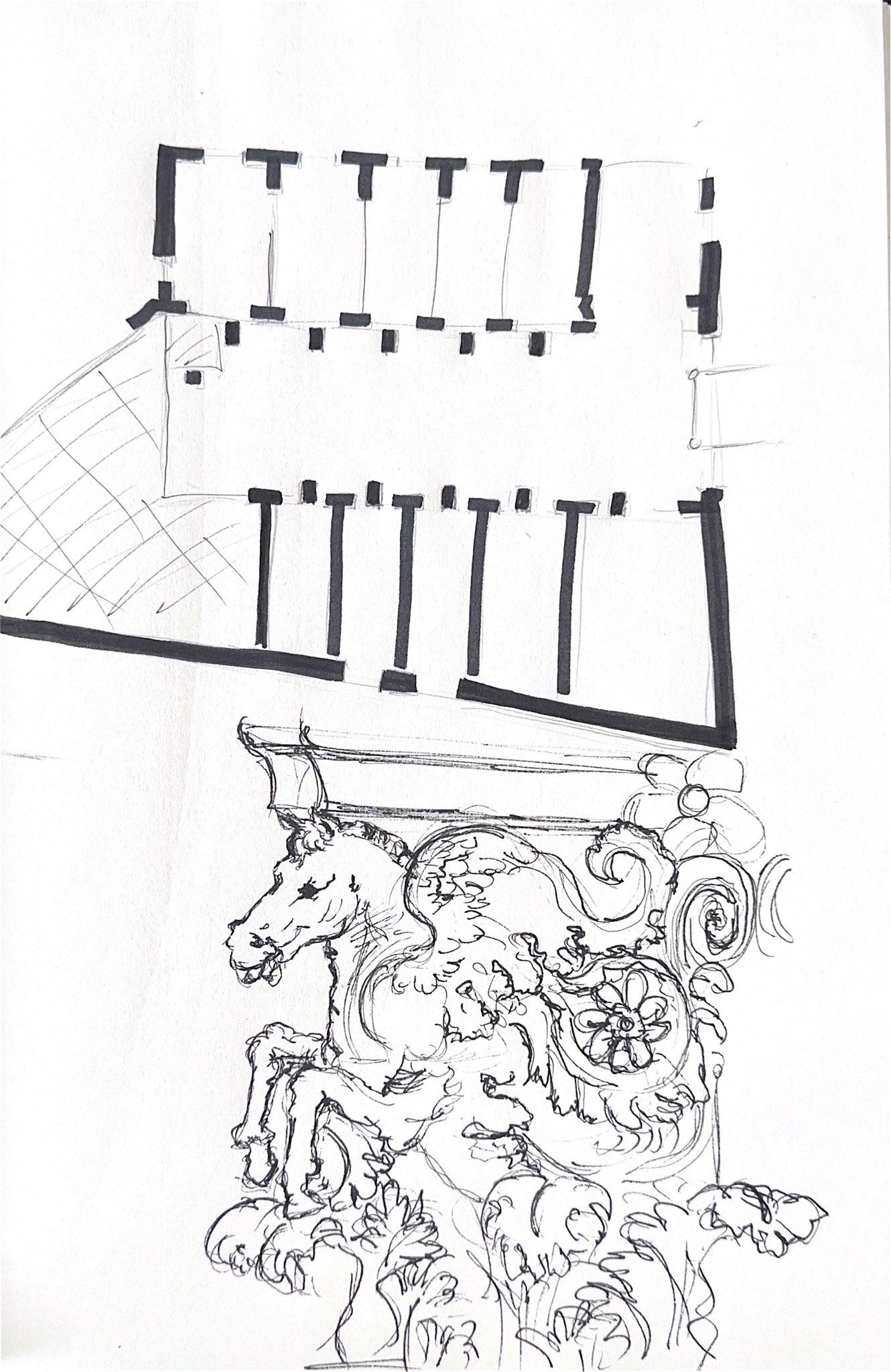
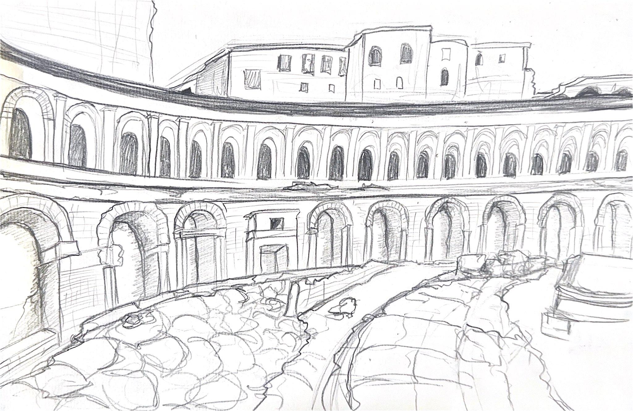
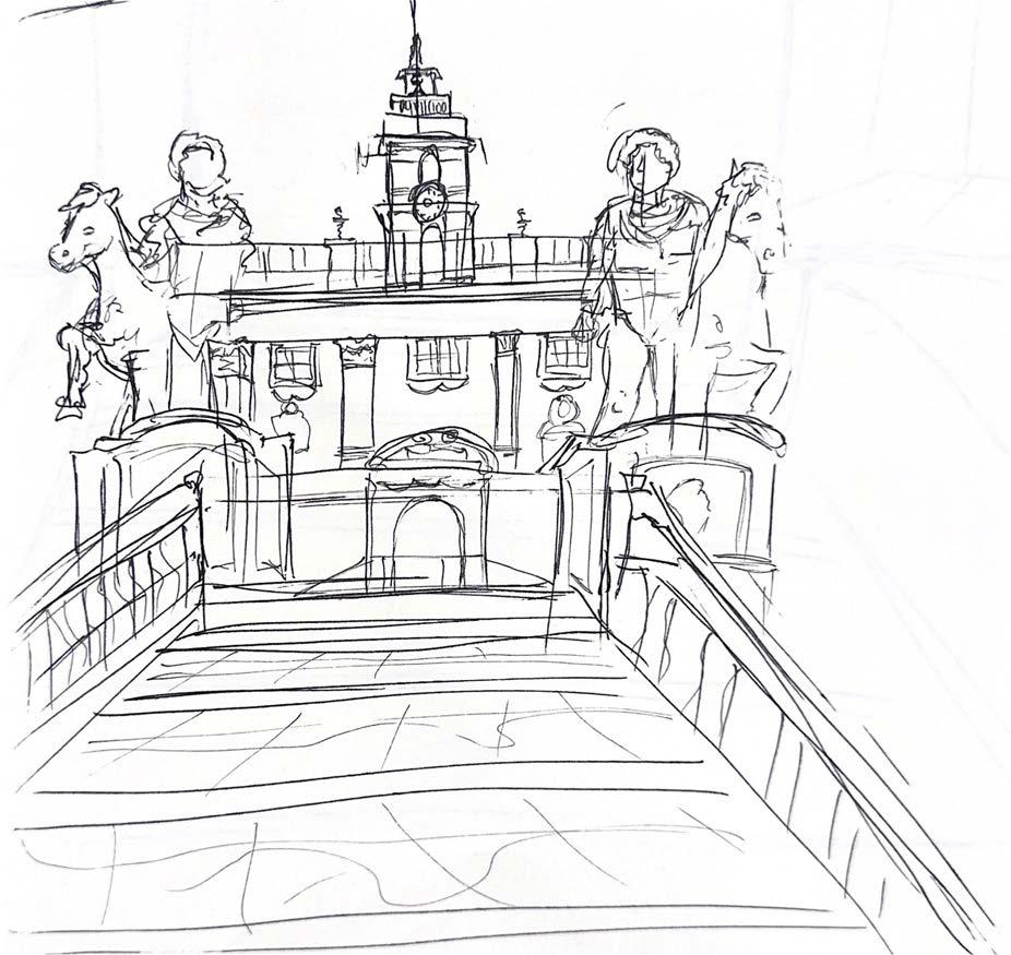
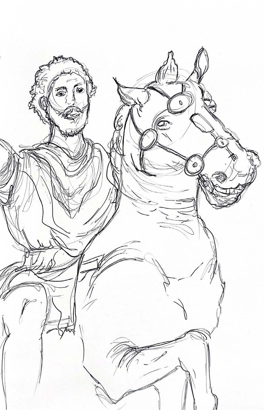
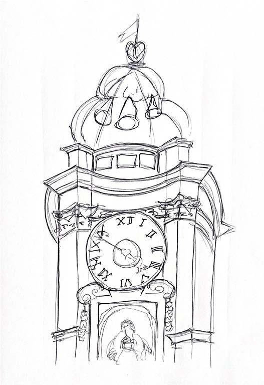
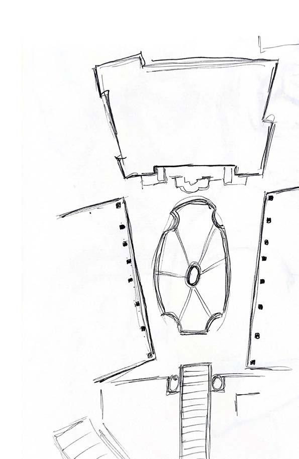
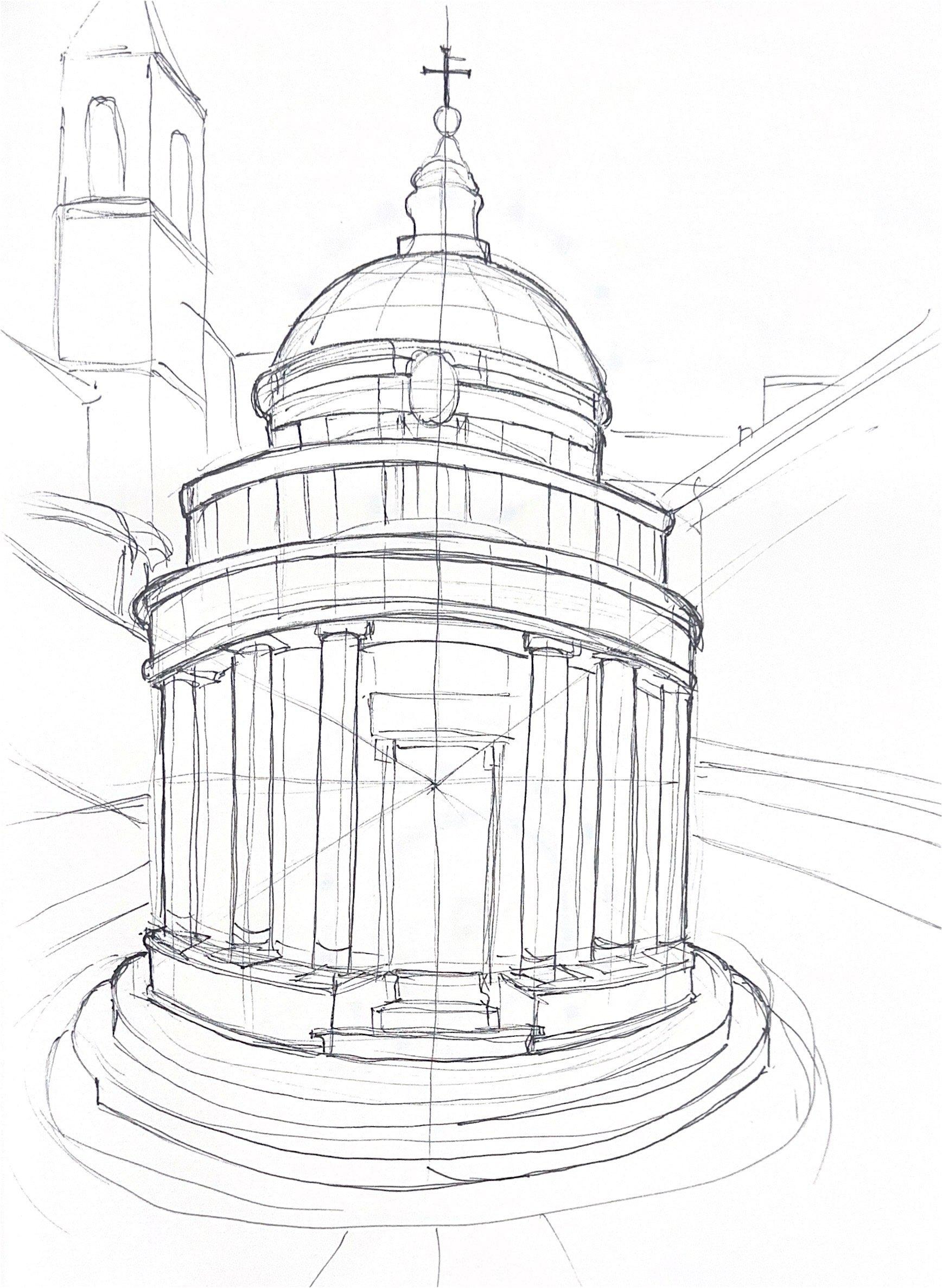
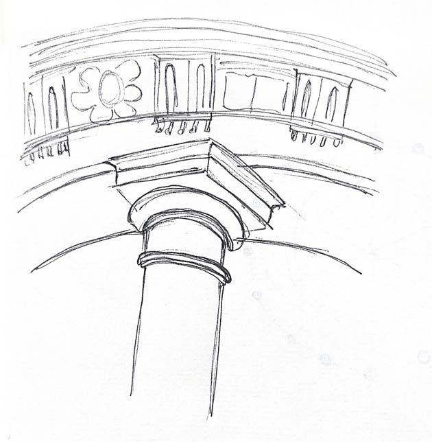
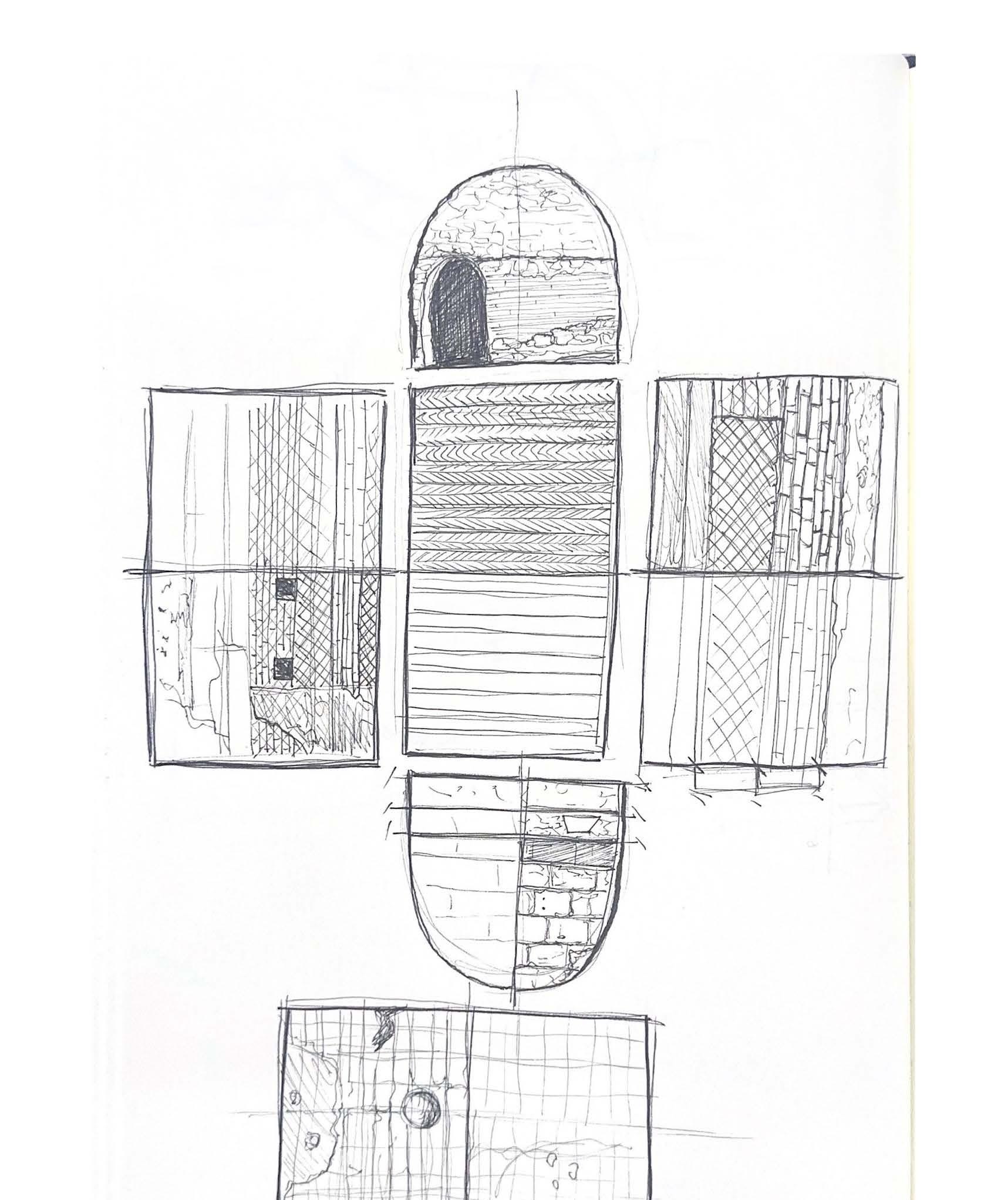
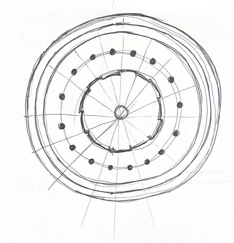
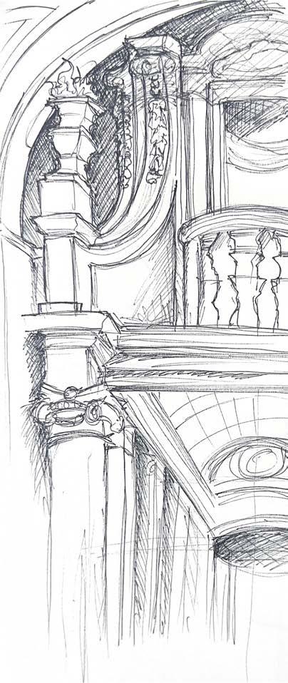
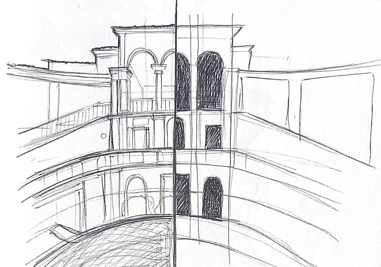
During my study abroad in Rome, Italy, I took an architectural drawing course and analyzed iconic buildings and monuments throughout the city. Our class explored notable sites such as the Trajan Market, the Pantheon, Capitol Hill, the Colosseum, and St. Peter’s Basilica.
This experience significantly refined my drawing techniques, shifting my approach from conceptual to a more precise architectural focus. Concentrating on the hidden geometry and spatial scale of these historic structures deepened my understanding of analytical drawing and how to capture the essence of architectural form.
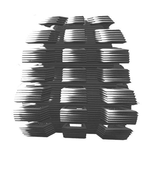
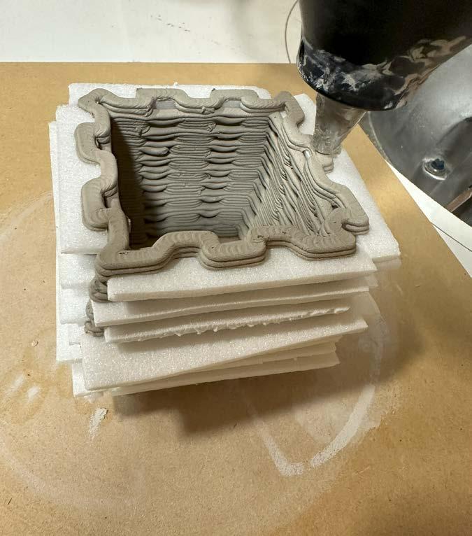
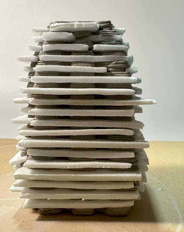
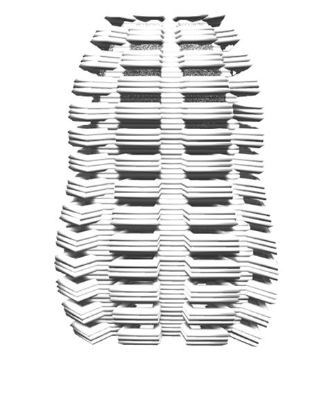
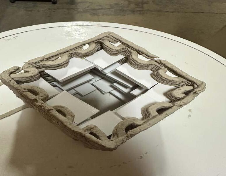
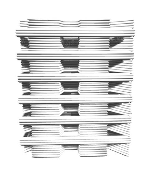
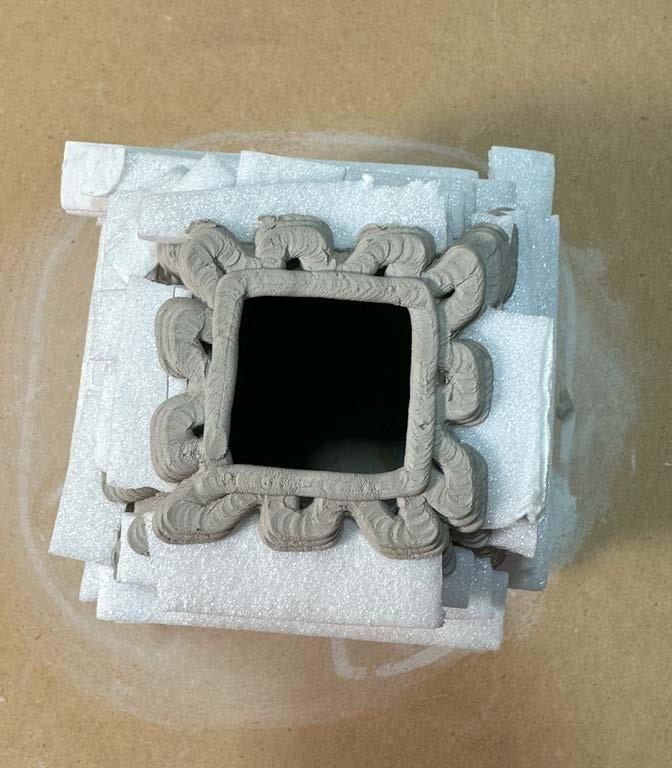
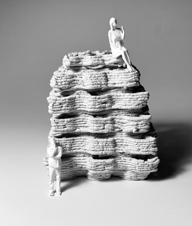
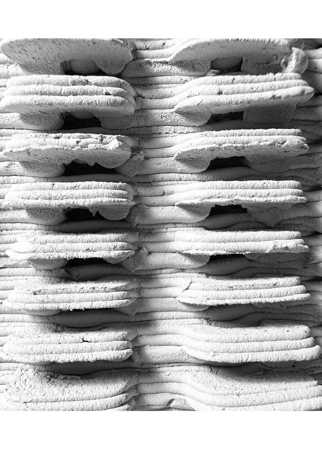
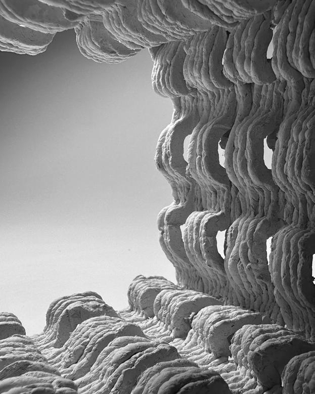
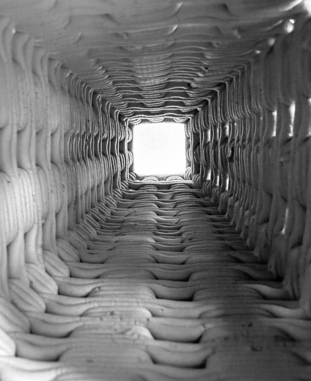
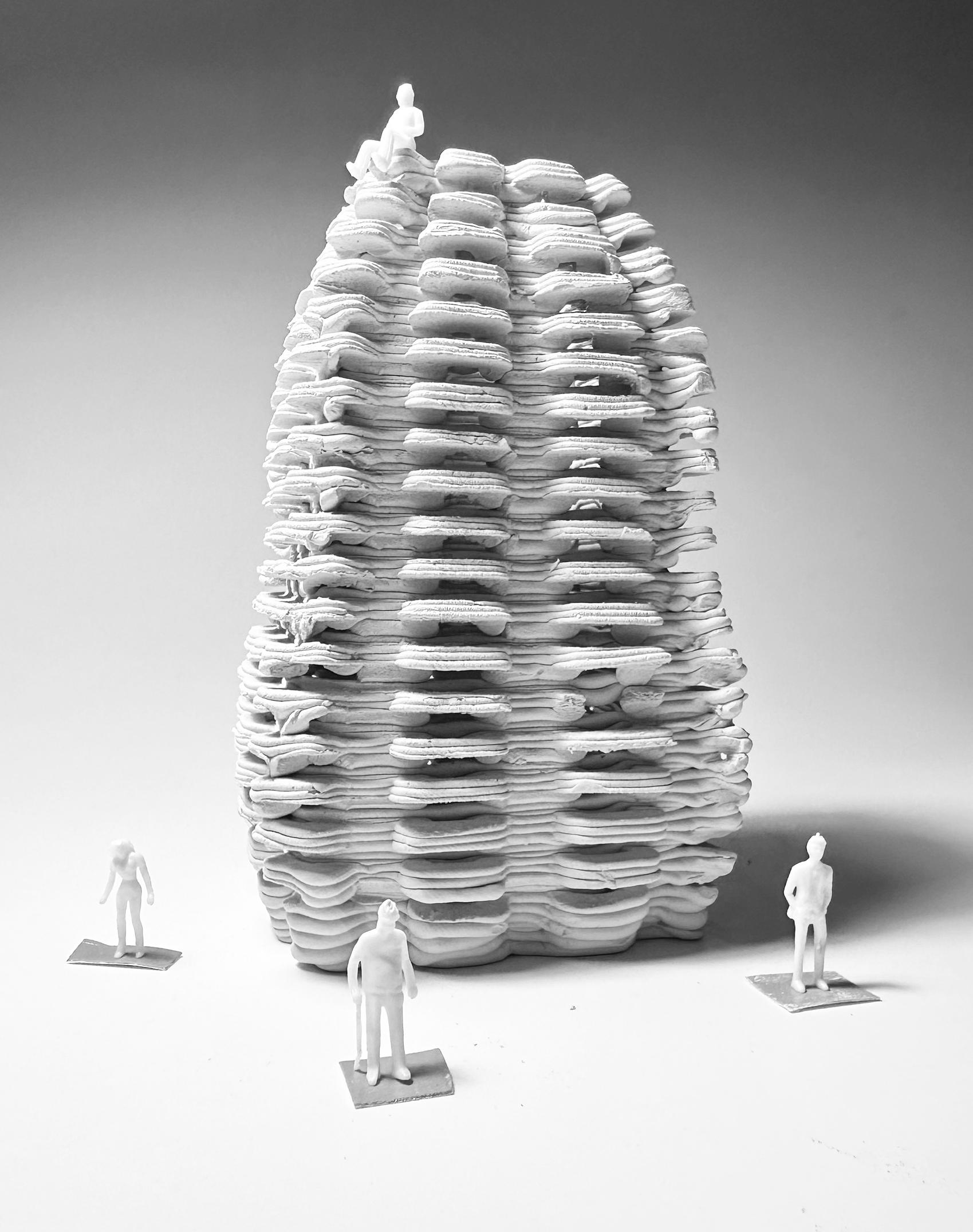
As an introductory exercise in my 3D printing studio, we used Potterware software to explore the capabilities of a ceramic printer. The objective was to create a form that could be further manipulated into an architectural structure, with the potential to scale from small to large dimensions. We were encouraged to push the printer’s limits by experimenting with various techniques, including cutting, bending, and integrating additional elements into the printed ceramics, to explore new possibilities in form and materiality.
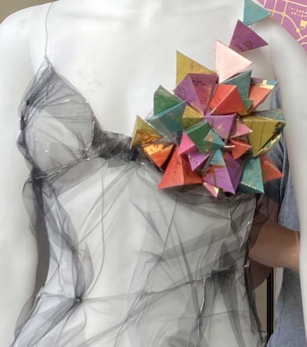
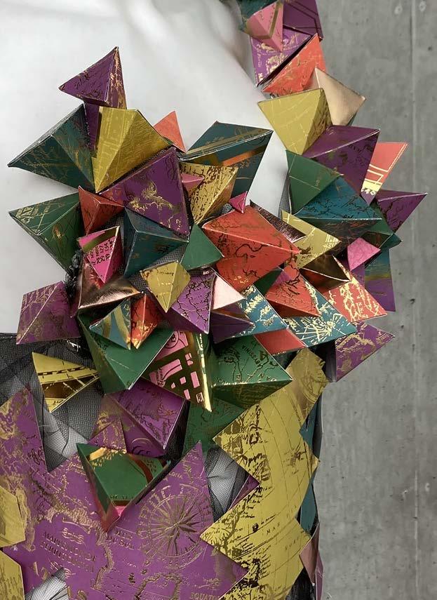
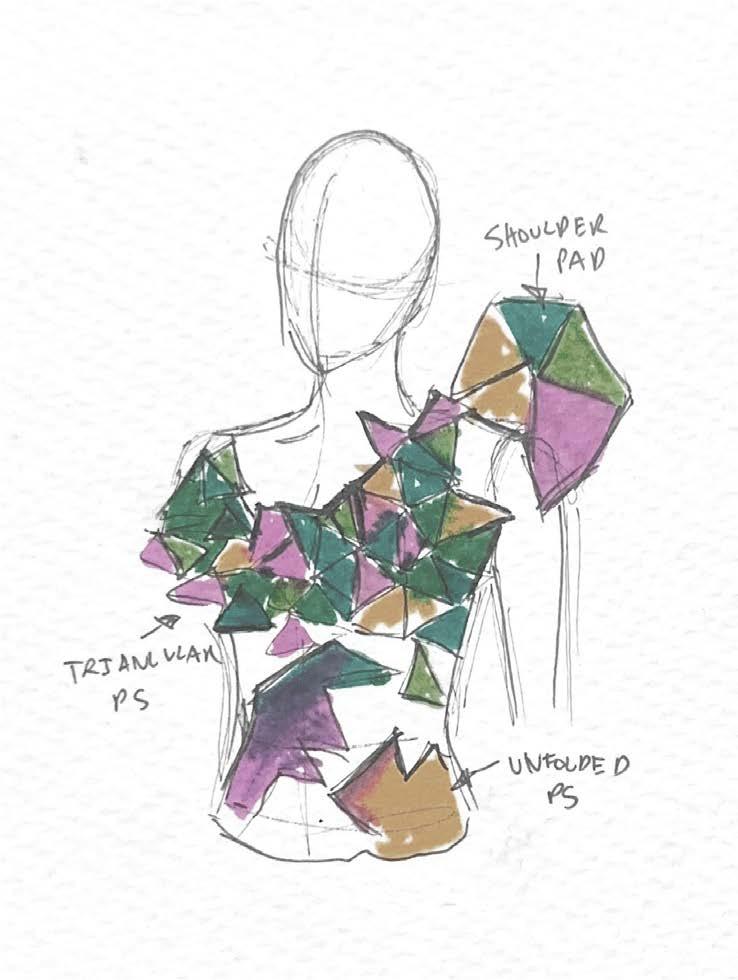
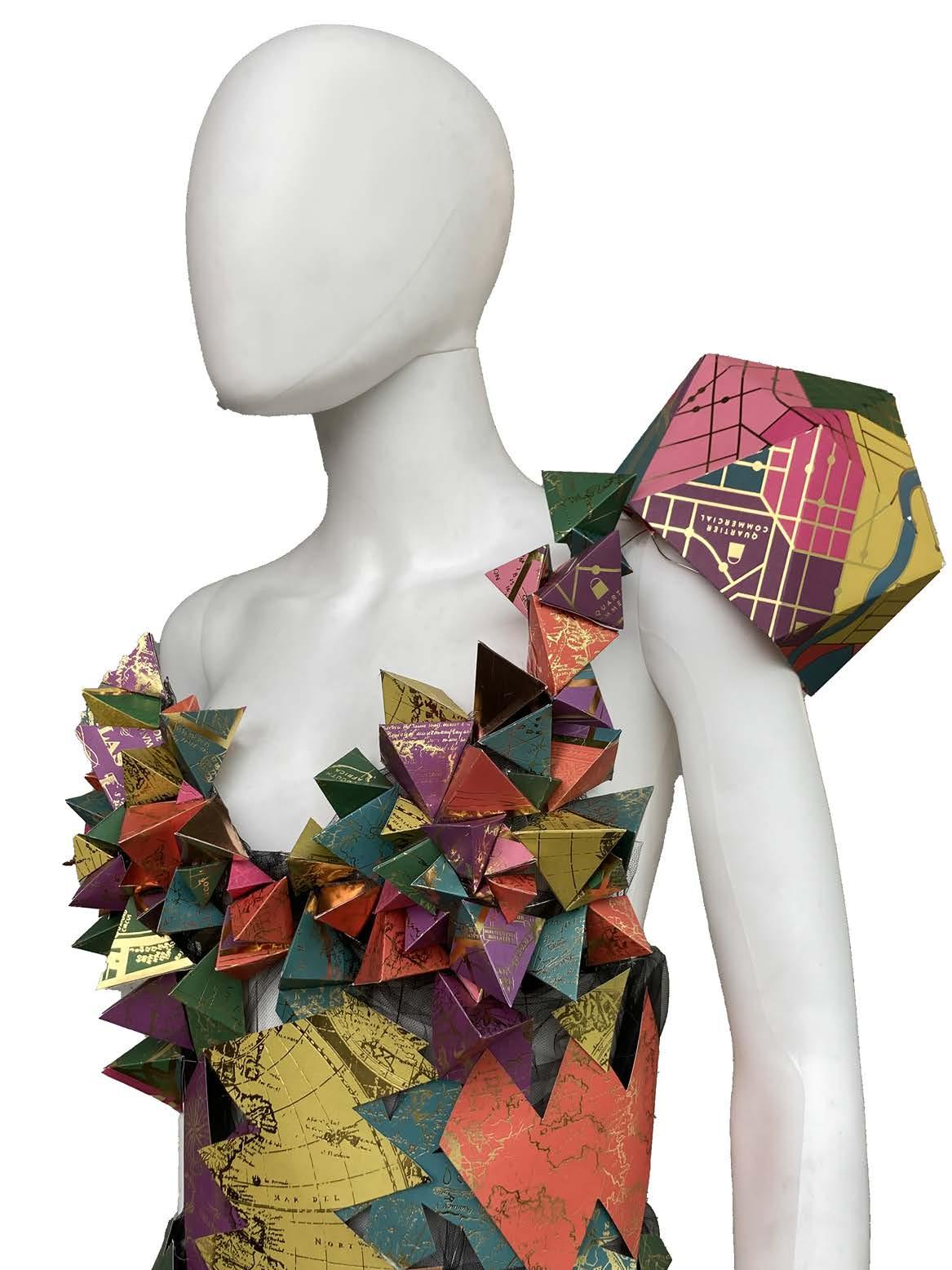
This project focused on the precise cutting and construction of Platonic solids. The challenge was to design a wearable outfit incorporating multiple Platonic shapes.
I created a metal-framed corset with mesh fabric to facilitate the attachment of the solids. The torso of the corset was crafted by deconstructing and flattening the shapes, allowing for a structured yet flexible design. Light tones and exenterated the intended warm atmosphere. This workshop was intended for only a week, so the design development was quick and
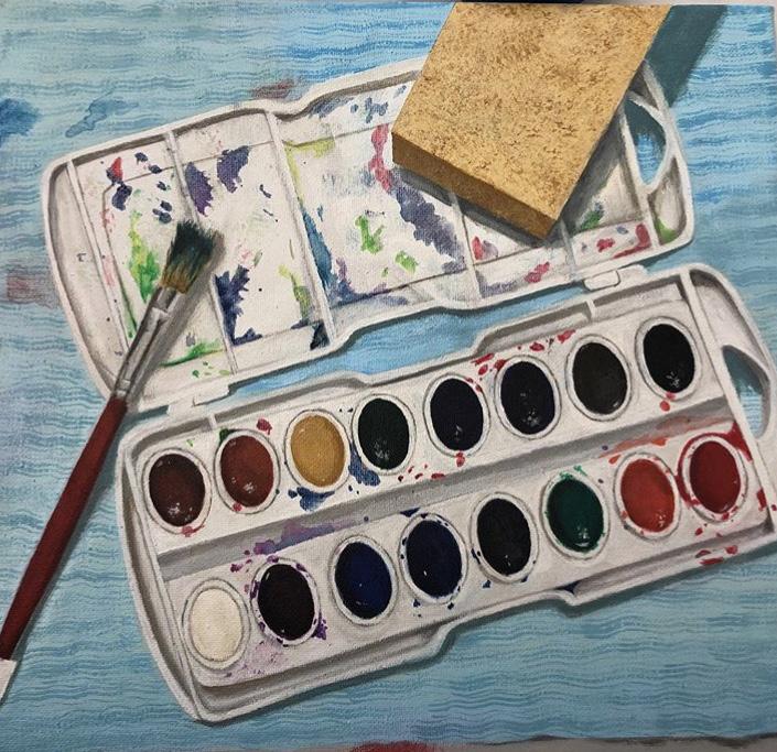
Painting has been a lifelong passion of mine, eventually evolving into a fulltime business. Through this practice, I’ve gained a deeper understanding of fundamental design principles essential in any creative field, particularly architecture. The skill of color mixing and application has greatly influenced my approach to balancing color within architectural spaces. Additionally, the compositional balance I achieve in painting parallels that of spatial design, ensuring that elements flow seamlessly and the eye and body move naturally through a space.