AMANDA VALDEZ GRATITUDE


April 2 - May 15, 2021
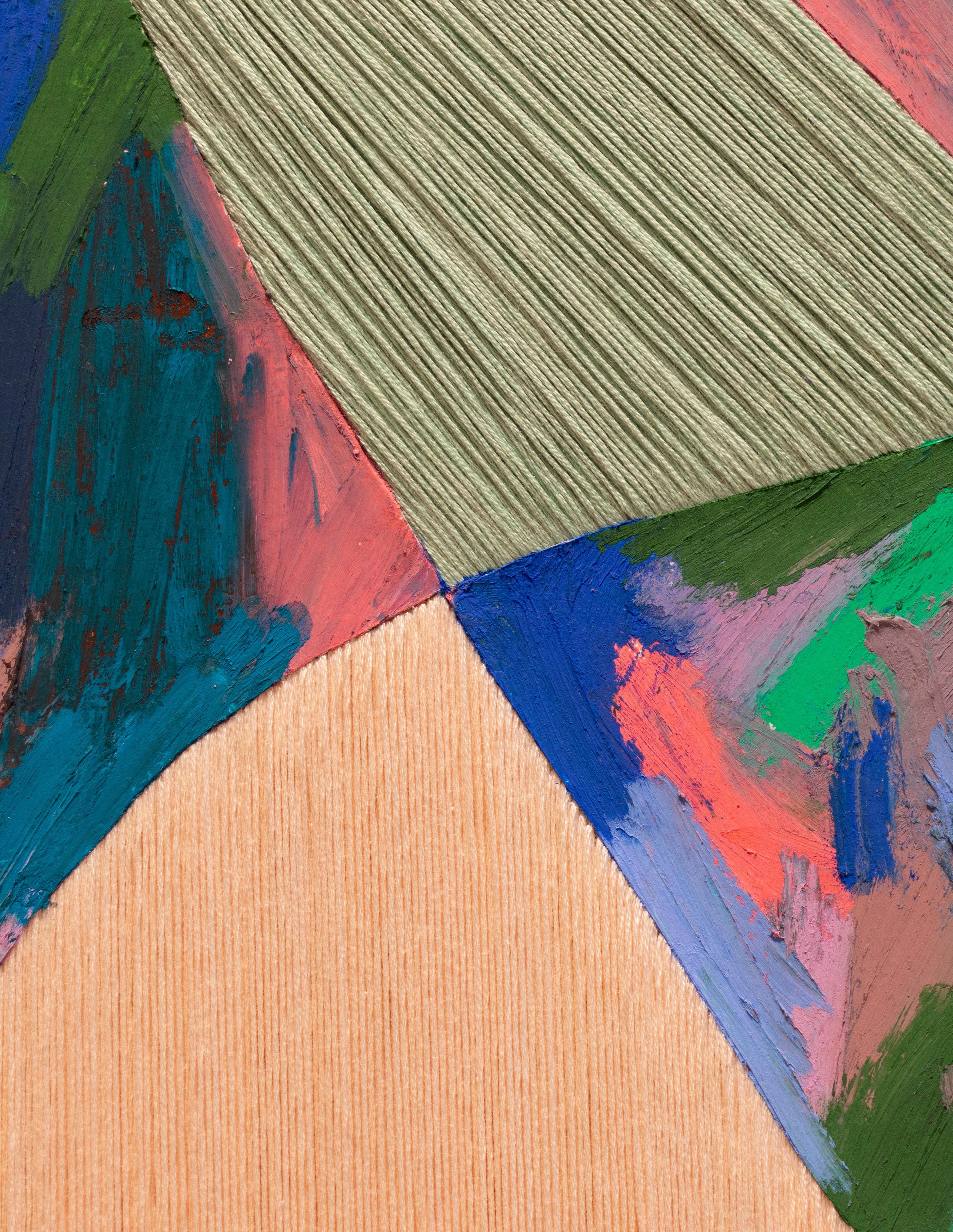
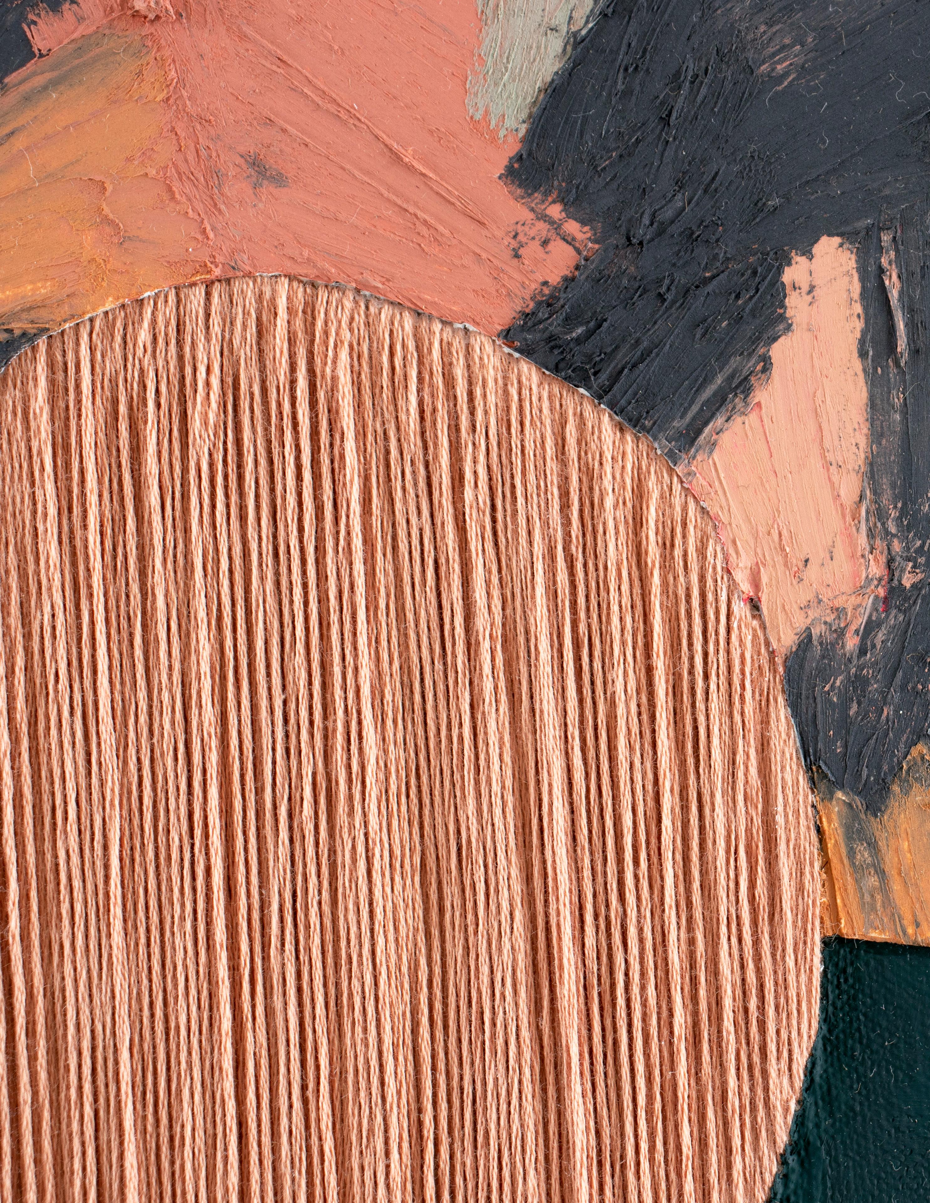
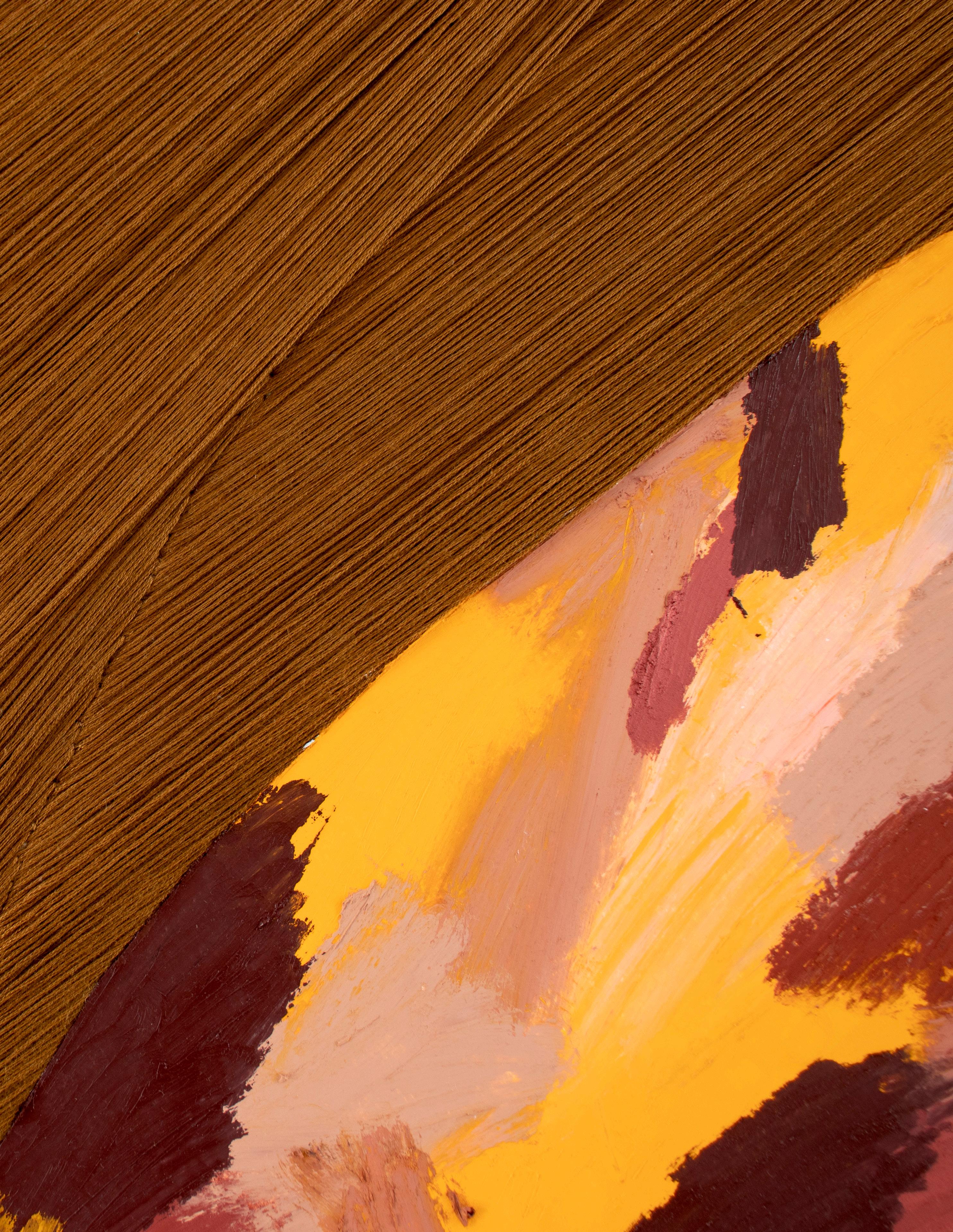
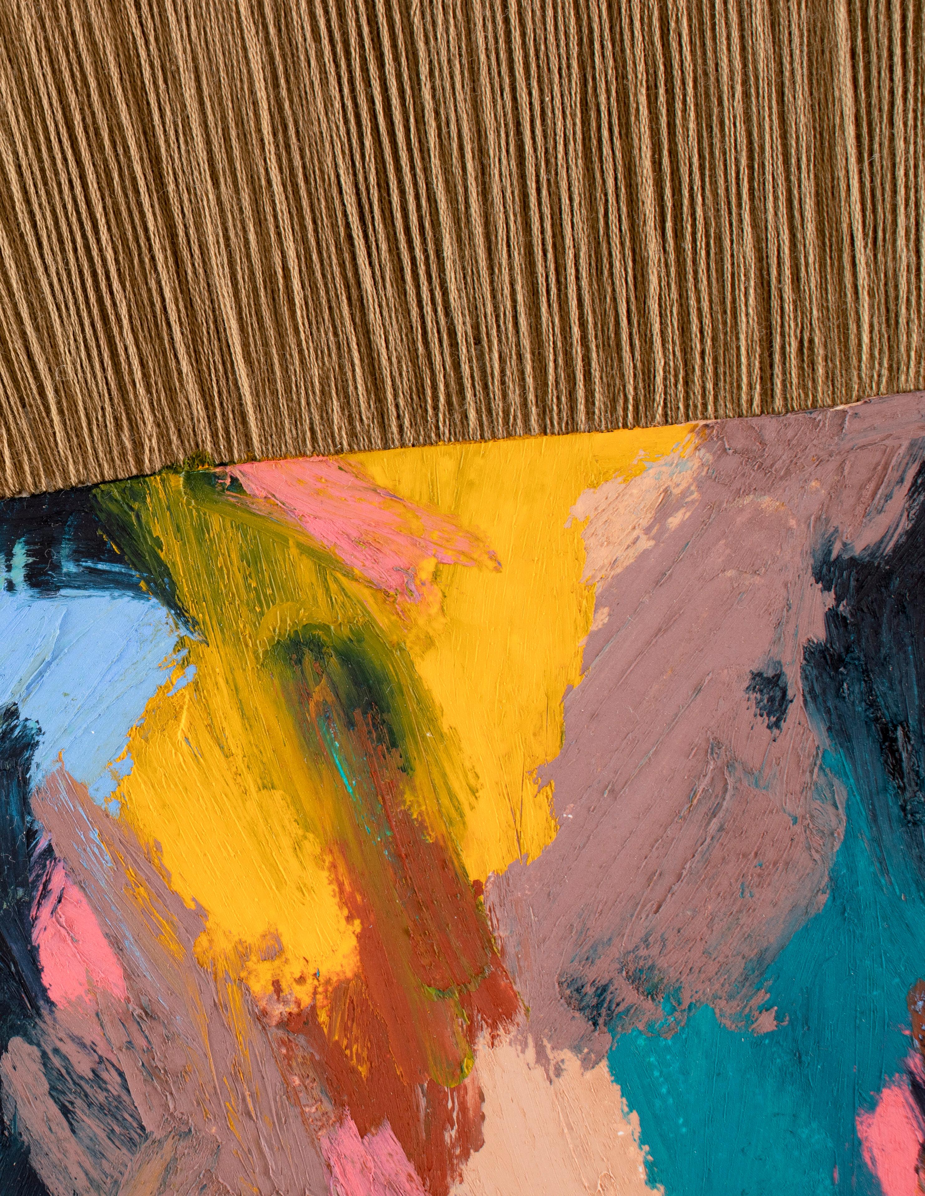
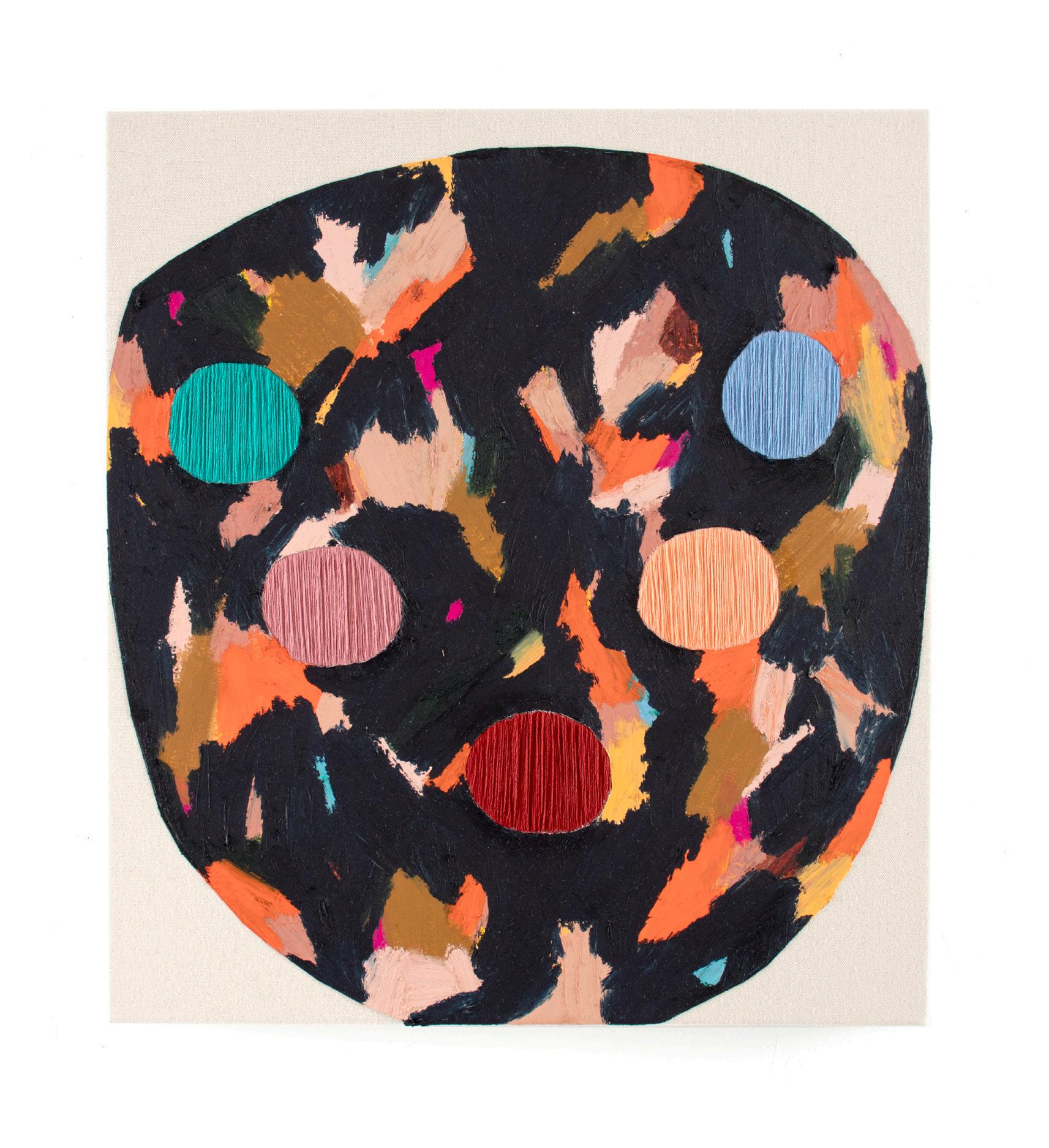
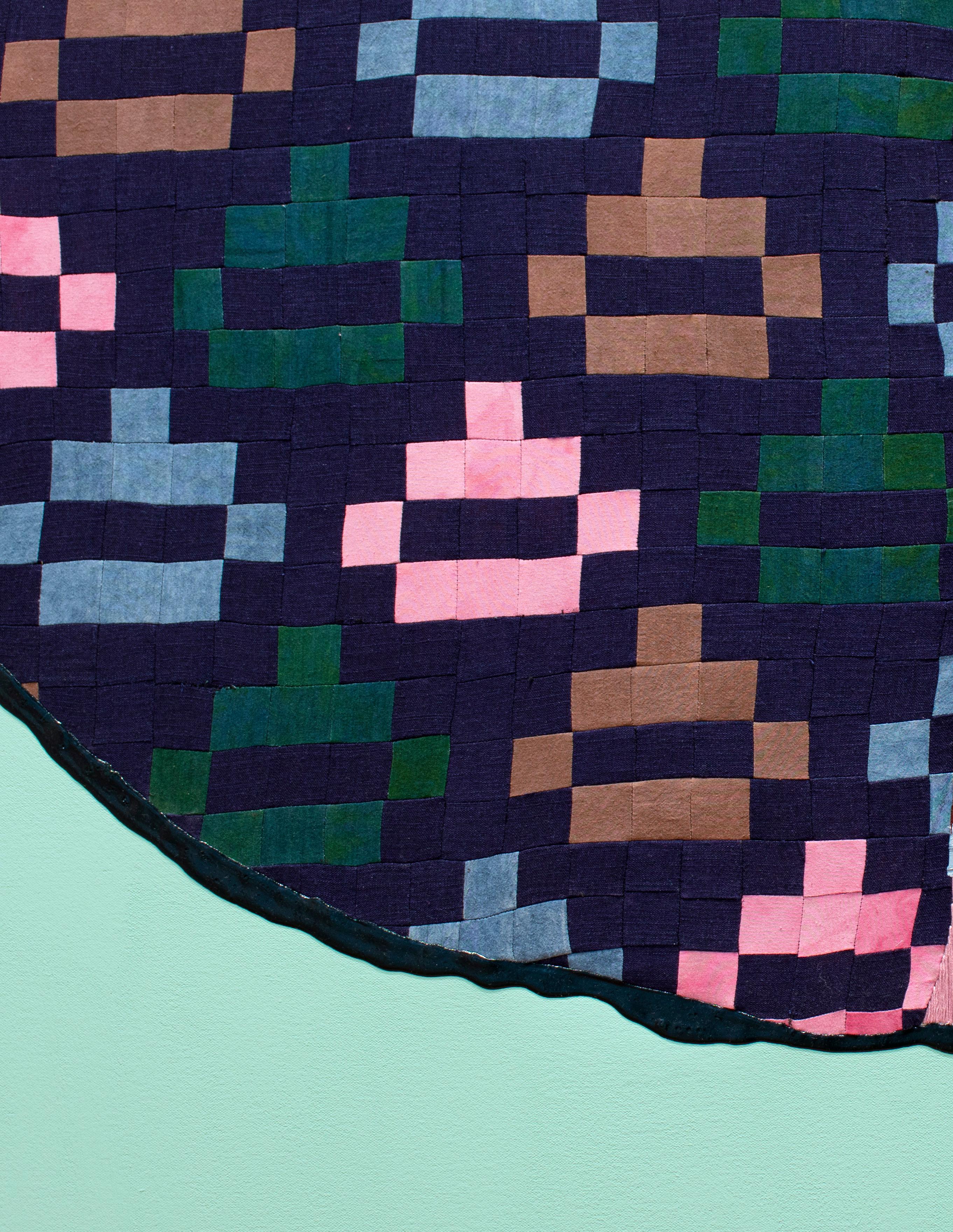
DENNY DIMIN GALLERY Amanda Valdez, silent divide (Detail), 2021. Embroidery, fabric, oil stick on mounted paper, acrylic, and canvas 16 x 14 in/41 x 36 cm.


Knowing the past is as astonishing a performance as knowing the stars. Astronomers look only at old light. There is no other light for them to look at. This old light of dead or distant stars was emitted long ago and it reaches us only in the present. Many historical events, like astronomical bodies, also occur long before they appear, such as secret treaties; aide-memories, or important works of art made for ruling personages. The physical substance of these documents often reach qualified observers only centuries or millennia after the event. Hence astronomers and historians have this in common: both are concerned with appearances noted in the present but occurring in the past.1
-- George Kubler, The Shape of TimeAmanda Valdez is a seeker and problem solver. She gathers colors, shapes, and patterns from across different times, cultures, and places, creating a complex syncretic language of forms using diverse media like gouache, oil stick, embroidery, quilting, and weaving, sometimes all at once. Valdez is an avid researcher and has spent years investigating topics as far-ranging as Pagan iconography in the Renaissance, textile production and patterning of Islamic art in the Ottoman Empire, Guatemalan weaving made on backstrap looms, modernist Bauhaus textiles, and the quilts of Gee’s Bend. She “loves the history of the world, the history of making, the history of hands” and says that she often thinks of these [objects] “as vehicles for time travel” that allow her to “connect back to somebody who was making something 300 years ago.”2
Valdez’s confident and complex paintings and drawings, which range from the size of a small sheet of paper to a tall human being with widely outstretched arms, are paradoxically both expressionist and conceptual; they unabashedly embrace a wide range of styles and techniques that build on modernist traditions, feminist art, the Pattern and Decoration movement, and the shapes and colors that she finds in nature and the built environment. Her works touch upon a dazzling range of aesthetic languages from different cultures and time periods that coalesce into paintings that incorporate replication, variation, and invention. Despite the many touchpoints, the works are disciplined and rigorous, offering tactile pictures that reveal creative problem solving around compositional complexity and innovative uses of color connected to our physical, emotional, sensual, and psychological experiences.
Valdez attended the School of the Art Institute of Chicago (SAIC) from 2005 to 2007. As an undergraduate there, she studied Joseph Albers’ color theory and gained a technical understanding in that class; the “real contention,” she recalls, “was that it wasn’t color theory.... It was color observation, it was color reality.” She also drew on her own intuitive sense of color and her personal relationship to it, something she had been connecting to since childhood.
At the SAIC, Valdez also studied with Michelle Grabner, an artist
3: Email to the author, March 23, 2021.
4: Email to the author, March 24, 2021.
5: George Kubler, The Shape of Time: Remarks on the History of Things (New Haven, CT: Yale University Press, 1962).
6: Email to the author, March 15, 2021.
known for her examination and transformation of patterns and materials found readily in the domestic realm – gingham tablecloths, crocheted blankets, embroidery, and wallpaper. Her investigation into process, pattern, and repetition provided a uniquely rigorous feminist take on Minimal and PostMinimal painting and sculpture, especially in her early tondo and gingham paintings, which Valdez was looking at during this time.
In Chicago, Valdez experimented with synthetically dyeing fabric and silk screening shapes onto fabric. In summer of 2007, she participated in residency at the renowned Ox-Bow School of Art in Saugatuck, Michigan where she studied with Chicago-based feminist artist, Judy Ledgerwood, who would prove to be significant for her ongoing thinking about form, color, and ancient goddess iconography. Focusing on one image that she kept repainting throughout the two weeks, Valdez eventually, at the recommendation of Ledgerwood, transformed the painting into a large-scale work for her senior thesis. In one of Valdez’s last critiques in Chicago, her professor, art critic and curator Terry Meyers, “got [her] to see that the ideas [she] wanted to communicate would only be illustrations of those ideas in paint, but that [it would be more powerful if she] could use [actual] materials to be those ideas.”3
Valdez remembers trying to use abstraction to “communicate the impact of how things come together physically, emotionally, and psychologically in our lives.”4 The Chicago work, while not successfully accomplishing these concepts materially, would become an important springboard for her subsequent exploration in graduate school.
In Spring 2009, Valdez began her MFA program at Hunter College in New York, training with the feminist artist Valerie Jaudon, one of the founders of the Pattern and Decoration Movement in the 1970s. Jaudon studied nonWestern art sources, creating allover abstract paintings with interwoven rhythmic patterns drawn from Celtic, Islamic, and Mexican sources.
Jaudon and her frequent collaborator Joyce Kozloff’s radical feminist journal Heresies rejected the sexist tropes that considered craft and design as the inferior underbelly of abstraction, paving the way for a future generation of young feminist artists to engage with pattern, decoration, and craft without remorse. Jaudon challenged Valdez to begin to think about her work as part of an ever-expanding matrix, something she would later read about in more detail in George Kubler’s classic text The Shape of Time: A History of Things. 5 Not long after, Valdez saw Jaudon’s exhibition at Von Lintel Gallery in New York and was overwhelmed by two works in particular – Alphabet (2006) and Verbatim (2007) – because of the way they showed how much information could be packed into an abstract painting, “the way [Jaudon] could manipulate such simple shapes into complicated and perfectly balanced compositions”6 (fig. 1).

Because Hunter had no fiber facilities, Valdez spent her first semester painting with unsatisfactory results. During the summer, she reflected upon her first run of work and critiques and decided to use her sewing machine to assemble fabric and canvas together as a way to bring mass produced textiles into painting. The contemporary tradition of merging aspects of craft and art, incorporating fabric, sewing, and other domestic materials into painting, sculpture, and performance dates back to the earliest moments of the feminist art movement beginning with Judy Chicago and Miriam Schapiro’s groundbreaking collaborative project Womanhouse in 1972 in the Feminist Art Program at CalArts. At this time, female artists began sourcing materials and themes for their artwork as a result of consciousness-raising sessions with other women who were beginning to explore the personal and political in their lives and work for the first time. Soon after Womanhouse, Schapiro began to push beyond her hard-edged paintings like Big Ox and experiment with a type of collage, assemblage, decoupage, and photomontage that she named “femmage”:
Femmage: a word invented by us to include all of the above activities as they were practiced by women using traditional women’s techniques to achieve their art-sewing, piecing, hooking, cutting, appliquéing, cooking and the like--activities also engaged in by men but assigned in history to women.7
Schapiro suggested that women’s aesthetics and technical innovations had been overlooked and trivialized throughout history. The compelling rejection of the patriarchal narrative around the inferiority and feminization of ornament, decoration, and craft is well documented in the practices of many artists during that period. Many art historians at the time were also beginning to write texts that considered both the ideological and historical construction of femininity and crafts throughout history.8
It was against this historical backdrop that Valdez spent months experimenting with fabric and the sewing machine before she realized that she did not want to have the fabric collaged on top of the canvas as in femmage, but instead wanted to engineer the fabric so that it was part of the canvas itself, meaning that she would cut out the shape she wanted in the canvas, remove that shape, and then sew the new colored fabric shape into the edges of the cut-out canvas. In this way, color, shape, and ground literally became one. She explained that this “felt intentional and strengthened the feminist foundation of the work” because the textiles were then “equal to that of the canvas support traditional to painting.” Valdez appreciated the traces of the hand that resulted, particularly the way that one “could feel the stitches, the tension, of separate pieces of fabric coming together.”9
When Valdez returned to Hunter in the fall, she began to flex
7: Miriam Schapiro and Melissa Meyer, “Waste Not Want Not: An Inquiry into what Women Saved and Assembled-FEMMAGE.” Heresies I, no. 4 (Winter 1977-78): 66-69.
8: Art historians were also charting these questions, particular Rozsika Parker and Griselda Pollock, Old Mistresses: Women, Art, and Ideology (London: Pantheon Books, 1981); Rozsika Parker, The Subversive Stitch: Embroidery and the Making of the Feminine (London: The Women’s Press Ltd, 1984).
9: Email to the author March 22, 2021
10: Briony Fer, “Bordering on Blank: Eva Hesse and Minimalism,” On Abstract Art (New Haven and London: Yale University Press, 1997), 109-130.
11: Email to the author, March 20, 2021.
12: Email to the author, March 23, 2021. Fer discusses and pictures Hesse’s Hang Up in her text.
intellectually, learning about other modern and contemporary feminist art and textile practices. She read Briony Fer’s book On Abstract Art and was fascinated with the chapter “Bordering on Blank: Eva Hesse and Minimalism,”10 explaining that what interested her was how the work exemplified “the moment where psychology entered minimalism.”11 Around this time, Valdez also started experimenting with embroidery after discovering some sewing materials in a box when her mother was moving houses. She brought the thread into her studio and started thinking about using it as a form of drawn line in her paintings, at first exploring what would happen if she wrapped it around her stretcher bars like Eva Hesse did with cloth in Hang Up (1966), but then settled on keeping the thread within the frame.12
Recognizing the significance of Valdez’s engagement with textiles, Jaudon directed her to the book Bauhaus Textiles: Women Artists and the Weaving Workshop (1998), which focused on women in the Weaving Workshop, such as Gunta Stolzl and Anni Albers (fig. 2). In Winter 2011, Valdez’s ambitious MFA thesis show, which included seven new paintings of various sizes, revealed the powerful results of her three-year quest to develop a feminist language of colorful abstract biomorphic form with paint, fabric, and embroidery that encapsulated the paradoxical nature of physical, emotional, sensual, and psychological experiences that she wanted to convey through abstraction (fig. 3). By this time, Valdez had developed a general practice where form, which she describes as “primal,” “ancestral,” and “of her body,” emerges first through drawings.

Valdez considers the work Good to be the King the most successful in the show. She describes it as “deeply mysterious to her” and credits the curator Adrian Saldaña with helping her understand some of the subconscious decisions that she made in the painting (fig. 4). For instance, the title is a reference to Valdez’s Mexican-American father who often would say “It’s Good to be the King” during power struggles in her family home, and the forms and colors used in the painting echo those of the Mexican flag, especially the bottom

 Figure 2: Anni Albers, Two, 1952. Linen, cotton, and rayon. 18 1/2 x 40 1/4 in. /47 x 102.2 cm. The Josef and Anni Albers Foundation, 1996.12.3. © 2021 The Josef and Anni Albers Foundation/ Artists Rights Society (ARS), New York. Photo: Tim Nighswander/ Imaging4Art.
Figure 3: Amanda Valdez installation. Hunter College MFA Thesis Exhibition, Crane Art Center, Philadelphia, PA, 2010. Courtesy of the artist.
Figure 2: Anni Albers, Two, 1952. Linen, cotton, and rayon. 18 1/2 x 40 1/4 in. /47 x 102.2 cm. The Josef and Anni Albers Foundation, 1996.12.3. © 2021 The Josef and Anni Albers Foundation/ Artists Rights Society (ARS), New York. Photo: Tim Nighswander/ Imaging4Art.
Figure 3: Amanda Valdez installation. Hunter College MFA Thesis Exhibition, Crane Art Center, Philadelphia, PA, 2010. Courtesy of the artist.
two semicircular forms made from dark black, grey, green, and brown “bricks.”
Several years later, during a conversation with a collector, Valdez also recognized “the angularity of the central shape” bore a resemblance to armor and she had, in fact, studied and sketched Japanese armor during lunchtimes at the Art Institute of Chicago. It was at this point that Valdez began to realize that “everything [she] ingested would come out through drawing.” For Valdez, the sewing job of the brick-like upside down arch was difficult to make because the canvas between each segment of fabric was “like mortar between bricks, or grout between tiles,” and this also seemed significant because her father worked as a tile setter. The time that goes into making the textile parts of her work is extremely labor intensive and in many of the thesis paintings Valdez tried to balance the “preciousness” of the embroidery with the “release” of the loose paint, which she incorporated as an intentional nod to Abstract Expressionism as well as way of “making fun of it” and acknowledging it as a clichéd antiquated gesture (fig. 5) 13
Other paintings in the thesis show suggested the beginning of a more self-assured treatment of boldly colored biomorphic work that Valdez would continue to explore after graduate school. For instance, Dwells Among Us contains numerous flat organic shapes: the central orange abstract fabric shape loosely resembles an orifice – an open mouth or gaping vagina, for example -- while the white painted shapes that cradle it could be inner thighs and a buttocks facing the viewer head on (fig. 6). But the longer one looks, the more the shapes and focus shift depending on which part you are looking at. The top portion of the work comes into view with a transformed echo of the bottom white cheeks. Here they are not composed of flat fabric but made from embroidered arcs of twelve distinct colors. At the same time, the orange fleshy shape and the embroidered arcs merge, creating a heart-shaped form with a pointy bottom that presses flirtatiously against the exact intersection of the two white forms as if waiting to be released or expelled.


 Figure 5: Amanda Valdez, Good to be King, 2011. Fabric, acrylic and canvas. 72 x 84 in/183 x 213 cm. Courtesy of the artist and Denny Dimin Gallery.
13: Email to the author, March 24, 2021.
Figure 6: Amanda Valdez, Dwells Among Us, 2011. Fabric, gesso, embroidery and canvas. 60 x 48 in/152 x 122 cm. Courtesy of the artist and Denny Dimin Gallery.
Figure 5: Amanda Valdez, Good to be King, 2011. Fabric, acrylic and canvas. 72 x 84 in/183 x 213 cm. Courtesy of the artist and Denny Dimin Gallery.
13: Email to the author, March 24, 2021.
Figure 6: Amanda Valdez, Dwells Among Us, 2011. Fabric, gesso, embroidery and canvas. 60 x 48 in/152 x 122 cm. Courtesy of the artist and Denny Dimin Gallery.
In another work, When Spirit Becomes Flesh, we see large, centralized anthropomorphic areas of green fabric pressing against a beige unprimed canvas shape; white gesso defines the negative space surrounding the entire main figure (fig. 7). This painting is organic and explosive, falling firmly into a sensibility coined by critic Lucy R. Lippard in 1966 as “Eccentric Abstraction,” which identified a young group of artists -- Claes Oldenburg, Yayoi Kusama, Lee Bontecou, Lucas Samaras, and Eva Hesse -- working in the tradition of Louise Bourgeois (“erotic or scatological allusion”), Meret Oppenheim (“sensuous identification”), and Salvador Dali, for example. These artists working in the 1960s retained Minimalism’s clear, modular serial-like grid while paradoxically allowing metaphorical, autobiographical, psychological, and erotic form to enter into their works. She explained: “eccentric abstraction is more allied to the non-formal tradition devoted to opening up new areas of materials, shape, color and sensuous experience.” She went on to describe what she called “body ego” -- “the desire to caress, to be caught up in the feel and rhythms of a work” and “repulsion, the immediate reaction against certain forms and surfaces which take longer to comprehend.” With Eccentric Abstraction, materials are unexpected and evoke sensuous responses, and subject matter often relates to metamorphosis, suggesting force instead of process.14
The composition of When Spirit Becomes Flesh embodies many of the characteristics Lippard described in her essay: metaphor, psychology, eroticism, and sensuality. The egg-like green organic fabric form sits pressing on top and against a beige canvas rump-like shape that resembles the orange and white forms in Dwells Among Us. Two triangular forms at the bottom embroidered in pinks and oranges appear like truncated phallic peg legs that disappear beyond the confines of the painting. On the left side of the central adjacent shapes in the small area between them and the edge of the canvas, Valdez painted more consecutive small arched forms in different colors. On the right side, more colorful arcs appear to bulge out of the space between the central forms, and beyond them gestural brown brushstrokes suggest an explosion of shit, a convulsive release from the tightly controlled centralized bodily forms. It is difficult to look at the painting without feeling some kind of multisensory bodily recognition of the forms which are at once seductive and repulsive.
Shortly after her 2011 graduation, Ledgerwood reconnected with Valdez and invited her to help with a large-scale site-specific installation, “April Showers,” at Tracy Williams, Ltd. in New York. It was an important opportunity for Valdez to assist Ledgerwood on a project of this scale. The work consisted of an all over, diagonally-gridded quatrefoil corner painting with three horizontal bands of bright yellow, pink, and green. Signature drips
spilled from the bottom and colorful decorative painted ceramic vessels were arranged at both edges of the work and in the center where the two walls met. The color relationships, while seemingly simple at first, were actually quite complicated and certainly unexpected. The top “yellow” band was made from neon yellow lines set against a brown ground; the “pink” band was made from ochre lines on a fluorescent pink ground; and the “green” band made from neon green lines on top of an olive base.
Both the form and content of Ledgerwood’s work proved instructive for Valdez. Coming of age as a young painter in the 1980s, Ledgerwood benefitted from the contributions of the Pattern and Decoration Movement as well as the discourse around Great Goddess iconography of the 1970s. Her engagement with modern abstract painting and women’s domestic craftwork across cultures demonstrated how one could mix abstraction and feminist iconography associated with European Paleo and Neolithic Goddess cultures, something that many feminist artists like Mary Beth Edelson, Carolee Schneemann, and Ana Mendieta were first exploring in their body art during the 1970s. It was a time of robust interdisciplinary discourse around Goddess culture, which included theologians, art historians, historians, architects, and psychologists. Many female artists during this period began to make pilgrimages to “caves, mounds, sanctuaries, shrines, or megalithic sites in search of the energy evoked and the artifacts or symbols of veneration left by ancient cults which worshipped the Goddess.”15 Valdez was enamored with Ledgerwood’s provocative use of color in other works such as the painting Grandma’s Flower Garden (2006) (fig. 8). In it, Ledgerwood alters the modernist grid by turning it diagonally and filling it with repeated brightly-colored quatrefoil forms. Valdez explained the attraction: “She rides high on chroma. . . [and] will punch up her colors and
15: See Gloria Femen Orenstein, 1988. “The Reemergence of the Archetype of the Great Goddess in Art by Contemporary Women in A. Raven, C. Langer and J. Frueh, ed., Feminist Art Criticism: An Anthology, 2nd ed. New York: Icon Editions, 71-86. For other texts on this subject, see Lucy Lippard, “The Pains and Pleasures of Rebirth: European and American Women’s Body Art, in Art in America, 64, no. 3 (May –June 1976) and Gloria Femen Orenstein, “Recovering Her Story: Feminist Artists Reclaim the Great Goddess,” in Norma Broude and Mary D. Garrard, eds, The Power of Feminist Art (New York: Harry No. Abrams, Inc., 1994).
8: Judy Ledgerwood, Grandma’s Flower Garden., 2006. Acrylic mica, acrylic gouache and oil on canvas. 84 x 120 in/213.36 x 304.8 cm. Courtesy of Rhona Hoffman Gallery, Chicago.

16: “Transcribed Zoom studio conversation with Amanda Valdez,” February 10, 2021.
17: Several years after helping Ledgerwood with the installation, she purchased the book, Judy Ledgerwood et al., Judy Ledgerwood (Ostfildern, Germany: Hatje Cantz, 2009) and continues to study the work included in it.
18: Joan Simon and Susan C. Faxon, Sheila Hicks 50 Years Addison Gallery of American Art, Phillips Academy, Andover, Massachusetts, November 5, 2010-February 27, 2011 (New Haven: Yale University Press, 2010).

19: Email to the author, March 13, 2021.
20: Amanda Valdez, “In Conversation with Sheila Hicks, Dossier, Issue 12, 2013, 36 - 43.
21: Email to the author, March 21, 2021.
22: Email to the author, March 15, 2021. Valdez owns Hicks’ book: Susan Faxson et. al, Sheila Hicks: Fifty Years (Andover, MA: The Addison Gallery of American Art, 2010).
then just throw in something that you’re like, ‘What the hell is that green doing in there?’ She’s going to give you something that’s beautiful, but she’s going to make it challenging and it’s not going to be metabolized quickly.”16 While Valdez only studied with Ledgerwood briefly in Chicago, her lessons on color and female-derived forms from different histories and cultures became even more important after helping her with the mural. In return for Valdez’s help, Ledgerwood did a studio visit with Valdez and they discussed the work that she was making then.17
Between 2012 and 2018, Valdez traveled across the United States, Europe, and Central America for numerous prestigious artist residencies studying quilting, weaving, and drawing techniques. These opportunities gave her time and space to experiment and often led her to push her practice hard in new directions. During this period, Valdez started writing about and interviewing feminist artists who she would not normally have had the opportunity to meet like the fiber artist Sheila Hicks, photographer and filmmaker Shirin Neshat, and the sculptor Kiki Smith.18
When researching Hicks in preparation for her interview, Valdez discovered the writings of Hicks’ Yale professor George Kubler who wrote the book, The Shape of Time: Remarks on the History of Things. It reminded her of some of Jaudon’s lessons about how one must think about “everything that’s ever been made [as] a matrix”:
.
. . [W]hen I came across the George Kubler book, he talks about art history as this vehicle for time travel and that everything that’s been made before sends out these signals. Just like the stars have sent out their signals. And we’re studying something that has already happened. Like we’re looking at a star. But what we’re looking at already happened. We’re looking at an object in a museum, or we’re looking at a ruin on top of the mountain. But this thing has already happened. I’ve always just kind of identified with that thinking. It explains how I experienced my desire to understand the humans before us or even just to see what their hand made.”19
The interview with Hicks was another inflection point in Valdez’s matrix related to her deep interest in weaving and textiles.20 She was drawn to Hicks’ “adept sense of material manipulation” explaining that “subtlety is so apparent in her weave structures, especially her small scale weavings.”21 Valdez had been studying Hicks’ innovative weavings and sculptural textiles since graduate school, focusing on the rhythms that she creates while “manipulating shifts in the weave structure.” She explained that Hicks’ work has always left her in awe because “it can seem so simple but is so complex” and this paradox clearly was what Valdez was striving for in her own work (fig. 9) 22
In 2014 Valdez traveled to Omaha, Nebraska to do a residency at the Bemis Center. While there, she visited the International Quilt Museum in Lincoln and subsequently made Mirror, Mirror, her first work that
incorporated quilting (fig. 10). The centrally-placed organic form is made from four shapes: the bottom basket shaped quilted area, a painted black gesso form reminiscent of a top lip, and two pointy, pincer-like forms above painted in layered yellow, gold, ochre, and white brush strokes. The points of the two pincers drip with deep orange paint from above.23 She used a triangle pattern that she found in a book, but transformed it by using commercially-sourced and hand-dyed orange, brown, and light brown fabrics sewn with black triangles to make the design “more graphic” and “to let the color pop against them.” She explained that she “wanted to play with the color palette having an all over effect and not stick to a strict patterning of the color.24

Valdez continued her research into the history of women’s weaving, reading texts that proved pivotal for her practice including T’ai Smith’s Bauhaus Weaving Theory: From Feminine Craft to Mode of Design (2014), which she credits as being “wildly important” for her because of its inclusion of original feminist writings by Anni Albers, Gunta Stözl, and other Bauhaus weavers. Valdez also studied other books on Albers including her richly illustrated classic On Weaving, which discusses the history, art, tools and techniques of handmade (as opposed to industrial) weaving and illustrates the creative problem solving that could be explored in handmade textiles.25
In 2015, Valdez and her husband traveled to San Marco, Guatemala, where Valdez learned of a women’s co-op nearby in the town of San Juan, which was famous for its textiles. She took a boat there and met some of the weavers who taught her to set up a backstrap loom, a simple loom that typically consists of sticks, rope, and a strap that is worn around the weaver’s waist. Using this loom, a weaver can produce fabric with a plain weave with an over-under-over-under pattern. At the co-op, Valdez made some simple weavings for the first time.
Later that year, Valdez spent three weeks at a textile symposium at the Mark Rothko Center in Latvia. That the summer she had started reading Margot Adler’s Drawing Down the Moon: Witches, Druids, GoddessWorshippers, and Other Pagans in America and it was on her mind in Latvia, continued to think about many of the ideas the book addressed and found herself “ruminating on the power of the moon, [especially] the ways we wax and wane with states of being internally. How we can be in phases. For women, obviously there is our menstruation cycle. But it was beyond that.”26 She made many drawings that began to incorporate silvery graphite to fill in the shapes because she wanted to “translate this shiny material onto the surface of the paintings instead of trying to find a substitute.”27 For example, in the drawing
Time Trick (2015) (fig. 11), two marigold yellow bars at the top and bottom of the drawing serve as a vise that presses together two semicircular forms, one black gouache and the other filled with sketchy graphite. On the base of the

23: Email to the author, March 28, 2021. 24: Email to the author, April 3, 2021.
25: T’ai Lin Smith, Bauhaus Weaving Theory: from Feminine Craft to Mode of Design (Minneapolis: University of Minnesota Press, 2014); Anni Albers, On Weaving (New Expanded edition) (Princeton, NJ: Princeton University Press, Revised edition, 2017.
26: Margaret Adler, Drawing Down the Moon: Witches, Druids, GoddessWorshippers, and Other Pagans in America, (London, England: Penguin Books; Revised & Updated edition, 2006).
27: Email to the author, April 3, 2021.
Figure 10: Amanda Valdez, Mirror Mirror, 2014. Fabric, acrylic paint, black gesso, and canvas. 72 x 60 in/183 x 152 cm. Courtesy of the artist and Denny Dimin Gallery.bottom circle just above the yellow band, silver horizontal drips of paint appear like an ocean wave against a dark sky, creating a primal effect through pure abstraction. That drawing became the basis for Valdez’s first untitled tapestry. In it, a centralized black hourglass shape based on the two semicircular forms in the drawing merge to become one figure set against a pink ground with yellow horizontal bars across the top and bottom. Here the dripping silvery paint on the base of the bottom semicircular form has disappeared and the pink ground separates the central form from the yellow top and bottom edges so that it floats, released from the tension of the yellow “vise” found in the drawing. Valdez was dissatisfied with the results of the tapestry because she was unable to translate her organic forms into the weave structure and and could not determine what colors and weaving approaches would be most successful. She yet to decipher how weaving could enter her painting practice. Undeterred, Valdez continued to explore the world of textiles in the first of two residencies at the Joan Mitchell Foundation in New Orleans in 2016. She spent a month working with natural dyeing processes on fabric and created eight small paintings. She also began a series of drawings based on a particular reproduction of the ancient fertility/mother goddess, Tanit, which she had found in an old feminist book from 1976 called Moon, Moon.28 The text discusses “the cultural, religious, and psychological significance of the moon throughout history and presents materials and guidelines for increasing moon consciousness” in relation to Second Wave feminist thought. Although there are countless representations of Tanit in Pagan art, Valdez was taken with the one represented in this book. It pictures a black and white photograph of a nude stone figurine with heavy breasts, a large rump, and arms raised up and outstretched in a welcoming U shape. On the opposite page at the top is a small abstracted form in black that shows a reductive geometric design of Tanit’s main form: a small round circle (head) sits above a wide U-shaped form (outstretched arms) and rests on an inverted thick U-shaped form (legs and hips). Below the graphic illustration of the sculpture is the caption: “A woman with her arms upraised is one of the basic forms of the moon symbol. In different ways this then was transformed into the animals, people, and their symbols thought to be closely related to the particular powers of the moon.”29

Two sketches (fig. 12) done during the first Mitchell residency show Valdez playing with the shapes found in both the sculpture and the geometric design. In one powerful drawing, an elegant minimal marigold arc opens up towards the sky balancing perfectly on the tip of a graphite triangle sitting on a thin earthy light sienna horizontal base. In another drawing, we see a different take on the Tanit form. This time the figure is much clumsier overall. A thick black painted arc at the top suggests arms that echo the contour of the top dark black truncated circle in the preparatory drawing for the Latvian
 28: Anne Rush, Moon, Moon, (New York: Random House, 1976). 29: Ibid., 74-75.
Figure 12: Amanda Valdez, The Magician, 2016. Gouache and graphite on paper. 12 x 9 in/30 x 23 cm. Courtesy of the artist and Denny Dimin Gallery.
28: Anne Rush, Moon, Moon, (New York: Random House, 1976). 29: Ibid., 74-75.
Figure 12: Amanda Valdez, The Magician, 2016. Gouache and graphite on paper. 12 x 9 in/30 x 23 cm. Courtesy of the artist and Denny Dimin Gallery.
tapestry; below, a yellow arc facing the opposite direction substitutes for legs. The graphite “body” suggests the bottom semicircular form from the tapestry drawing, but here it has been squished between the two arcs and roughly resembles the shape of a simplified apple core lying on its side.
While Valdez was at the Joan Mitchell residency that year, she took a day trip to Gee’s Bend in Alabama where she met some of the legendary quiltmakers and bought a small quilt. She had first seen some of their quilts at Greg Kucera Gallery in Seattle around 2004 and found them “fresh and unpretentious in their approach to shape and color.” Like so many art students, Valdez had studied Abstract Expressionism as an undergraduate and was stunned to discover that one could make expressive nonobjective work, but her excitement tempered when she realized how male dominated and white that movement was, especially in terms of what was being shown in museums, books, and classrooms in the 2000s,
Something like Gee’s Bend celebrated so many of the things I love about abstraction and was done by people who were not white men. Their designs and sensitivity to color are so sophisticated. I believe much of art is about problem solving, so their material restraints led them to so much invention. Run out of fabric? Well you’re not buying more, so let’s use this fabric over here and shift the pattern in this section with it. All these little moments, you can almost follow their making, their construction.30
Valdez later purchased the book Gee’s Bend: The Architecture of the Quilt and continued to study several of the innovative and colorful quilts very closely, (fig. 13). Valdez explained why these quilts were so instructive:

They each provide lessons to me, most importantly on how to subvert expectations either with color or composition. How to insert an element that is going to challenge the cohesion of the piece, yet still pull it off. How to trick the eye to think it knows what’s coming yet creating a glitch, a pattern doesn’t repeat perfectly, a color shifts in random ways, design elements that collapse into one another or firmly hold their boundaries.31
During this time at the Joan Mitchell Foundation, Valdez deepened her understanding of the types of sophisticated color choices, compositional complexity, and innovations found in Gee’s Bend quilts, and began to develop her own vocabulary of shapes associated with female fertility, the moon, and pagan goddess iconography.
Valdez returned to the Mitchell residency again for two months in 2017, developing an entirely new body of work. She spent extensive time in the library pouring over books about Joan Mitchell’s drawings. Inspired by Mitchell’s gestural abstraction, she began making fresh oil stick drawings on paper that allowed her to “get a more immediate sense of [her] hand back into the work.” Valdez wondered how she might add a “different version of
30: Email to author, March 15, 2021. 31: Email to the author, March 15, 2021.32: Email to the author, March 23, 2021.
33: Email to the author, March 28, 2021.
34: In addition to Anne Rush’s Moon, Moon cited above, Valdez studied a selection of the books including: Averil Cameron and Amelie Kuhrt, eds., Images of Women in Antiquity (Oxfordshire, England: Routledge, 1995); Eva Cantarella, Pandora’s Daughters (Baltimore, MD: The Johns Hopkins University Press, 1987); Marija Gimbutas, The Language of the Goddess (San Francisco, CA: Harper, 1995); Marija Gimbutas, The Goddesses and Gods of Old Europe (University of California Press, 2007); Giovanni Casadio and Patricia A. Johnston, eds., Mystic Cults in Magna Graecia (Austin, TX: University of Texas Press, 2010); Eugene Lane-Spollen, Under the Guise of Spring: The Message Hidden in Botticelli’s Primavera (England: Shepheard-Walwyn, 2015); Adrienne Mayor, The Amazons: Lives and Legends of Warrior Women Across the Ancient World (Princeton, NJ: Princeton University Press, 2016); Jennifer Neils, Women of the Ancient World (Los Angeles, CA: J. Paul Getty Museum, 2011); James D. Rietveld, Artemis of the Ephesians: Mystery, Magic and Her Sacred Landscape (CreateSpace Independent Publishing Platform, 2014); and Edgar Wind, Pagan Mysteries in the Renaissance (New York: W. W. Norton and Company, Inc.; Revised edition, 1969).
35: Etel Adnan, To look at the sea is to become what one is: An Etel Adnan Reader (Nightboat Books, 2014).

36: “Transcribed Zoom studio conversation with Amanda Valdez,” February 10, 2021.
37: Email to the author, March 28, 2021.
[her] hand, other than the methodical one spending hours embroidering or constructing elaborate quilt patterns.” She began cutting out paper shapes, mounting them to the canvas, and drawing quickly on them in all directions with layers of different colors of oil stick that she knew “could compete with the lushness of the embroidery on the surface.”32
During this second residency, Valdez returned to her Tanit investigations of the previous year, explaining that she experienced a “sharp” affinity to the shape: “It felt in line with the work and from the same female psychic ancient gene pool. I’ve known her more as a fertility goddess, a mother goddess figure.”33 She also returned to her experience working with Judy Ledgerwood whose example of bringing together decorative forms and patterns from ancient matriarchal cultures seems to have had a profound influence on Valdez. For several years after their collaboration, Valdez studied historical, cultural, and religious interpretations of the moon and goddess iconography in antiquity and the Renaissance.34 The first fully-realized work that resulted from this research was Daily Failures (2017) (fig. 14), which speaks to Valdez’s quest to incorporate her ongoing experiments into her paintings successfully. Here, the main X form in the canvas can be seen as an abstracted figure approximating the pose of a moon salutation with arms raised up and feet and legs planted firmly on the earth below. She exuberantly deploys the oil stick drawings on equal terms with the other materials, showing the interplay of associative forms related to nature and the body that shift amidst the composition. The painting is organized around a glossy dayglow orange X painted in the center that establishes four compartments filled with two roughly equilateral triangles on the left and right. These areas contain quickly executed oil stick scribbles layered in different colors and directions, more assertively representing a return to the hand prompted by her studies of Mitchell’s drawings, but without the use of dripping paint that she had employed before. The top form is made from two equilateral triangles, one hot red, the other dark rust, sewn together into the shape of a diamond against a brown-purple fabric that fills the quadrant. The bottom (roughly) equilateral triangle is embroidered in a jagged irregular royal blue form with two asymmetrical pink areas at the top and bottom.
The use of color in the work is outrageous; it demonstrates Valdez’s fearless instinct and experience bringing challenging color combinations together in different shapes that are at once difficult yet strangely harmonious. Here the eccentric lessons learned from the colorplay in Ledgerwood’s paintings come to the fore as well as those she had been studying in Etel Adnan’s two volume set, To look at the sea is to become what one is: An Etel Adnan Reader 35 Valdez has spoken about her interest in making difficult decisions with color that create a sense of discomfort. She finds Adnan’s work
compelling for this reason (fig. 15); appreciating the way Adnan can create beauty “with a tinge of toxicity.” Speaking about how she thought about this approach to color in terms of her own work, Valdez explained:


[Y]ou can ride this line to create a certain level of anxiety within something that’s really beautiful. I think that at times my paintings have done that . . . You feel these imperfections react to your own physical experience and to the imperfections of our body. But then with color, I like to sometimes play with creating something that’s maybe uncomfortable. Maybe it’s not the beautiful decision. Maybe it’s a more challenging decision colorwise, but that is ultimately creating a more interesting painting to contend with.36
What followed Daily Failures at the residency was full Tanit (2017) (fig. 16), a dark blue monochromatic painting that consolidated her formal drawing experiments related to the moon and Tanit. Valdez explained: “I turned the space of her open arms into a bowl, a container, symbolizing all that we hold as women. And to posit the question, what’s in that container?”37

In the painting, Tanit’s simplified “arms,” which are made from graphite on a black ground, reach up towards the sky. Inside the “vessel,” there are two main areas that make up a breast-like shape that echoes the forms she explored in the drawing experiments during her first residency at the Mitchell Foundation. It also repeats the top triangular quadrant in Daily Failures. The bottom area of the “cup” is embroidered tightly in gray thread sewn in multiple directions that creates a horizon line at the top of the semi-circle. Above it is a section of paper that has been mounted into the canvas and is covered with layers of lively dark oil stick scribbles that reiterate the diverging lines of the embroidery. The darkest marks sit on the surface of the drawing, allowing a glowing moon-like light to peek through a night sky. The architectural horizontal base is made of three hand dyed fabric rectangles in different hues of indigo, creating a rhythm alternating from navy blue to indigo and back to navy blue -- all colors that are incorporated into the drawing above.
Pinwheel Pioneer (fig. 17), the first work that Valdez made following the Mitchell residency, incorporated all of the media (with the exception of weaving) she explored in the years since graduate school: painting, oil stick drawing, embroidery, and quilting. The work includes a central ovoid shape cut off at the base. A pinwheel quilt pattern, which pulsates with different irregular patches of rhythmic color, dominates the top half of the work and it is interrupted by a deep blue embroidered triangular slice with a pink apex, creating another allusion to Tanit’s vessel. The top shapes are cradled by a soft gouache line that separates it from the quieter bottom half of the work. The central inverted triangle shape in dark blue and salmon colors repeat the color scheme throughout the quilted fabric portion and brushy palette below. The quilted geometric form can also be seen as two adjacent mountains set against
Figure 16: Amanda Valdez, full Tanit, 2017. Embroidery, handdyed fabric, oil stick on paper, and canvas. 42 x 46 in/107 x 117 cm. Courtesy of the artist and Denny Dimin Gallery.the backdrop of a dark night sky with a tiny moon peeking through just behind where the two forms meet. Below the quilted and embroidered mountain forms on the left side towards the bottom, a slightly darker horizontal form covered in darker hues of browns, blues, and terracotta oil stick marks interrupts the canvas and appears like a geological strata. The top “moonscape” of Pinwheel Pioneer recalls the top red triangle quadrant of Daily Failures and full Tanit’s blue upraised arms. This time the quilted pinwheel container holds the dark night sky and a representation of the moon itself.
A life-changing opportunity to push Valdez’s understanding of weaving came in the spring of 2018 when she spent six weeks at a residency at the New Roots Foundation in Antigua, Guatemala, a UNESCO World Heritage site filled with brightly colored Spanish Colonial architecture and lush natural plant life. Two large volcanoes were also close to the site: an active one associated with death (it had caused many casualties years before when it erupted) and one close to the residency, which was known as the “volcano of life” and water. This unique environment contained a large textile mill and living compound. The mill, which includes a staff, hand and mechanical looms, a dyeing shop, and carpentry and metalsmithing workshops, creates high end textiles purchased by European and American designers and worked with Sheila Hicks to make the two cotton and linen “anchor panels’’ that formed part of her massive Venice Biennale installation, Escalade Beyond Chromatic Land (2017).
During the residency, Valdez spent time weaving, drawing, and making watercolors that she used to develop shapes for weaving. She also took long walks exploring the town and ran at a track at an elementary school daily. She recalled: “The land looked like a patchwork quilt going up the Volcano de Agua, especially in late afternoon, the light would highlight all the ridges and valleys within it.”38 Although Valdez had gone to New Roots with no preconceived notions about what she would make, while she was there she realized she would return to Full Tanit one last time.
New Roots presented a once-in-a-lifetime opportunity for Valdez. Of the many resources there, the most important were the people, particularly owner Michael Denburg and manager Luc Deerwerdt, who helped Valdez understand weaving methods more deeply. She began a five-week period of weaving experiments that led to the design of Full Tanit (2018). The mill dyed many materials for her to explore and she began to realize that she could combine different weaving methods and materials into one piece, something that approximated the way she already brought multiple media together in her paintings. An important session with Deerwerdt, spent rummaging through old weaving samples, was critical for her because she learned that she could essentially do whatever she wanted with her tapestry. Valdez sought to
“bring together on one surface a multitude of materials and methods as [she] built a composition.” She did not want her shape to be subsumed flatly within the warp and weft: “It’s not normal to bring chenille shag in contact with a wool flatweave. I had a moment where I couldn’t believe that given everything I could do there I was going to use a chenille shag, it felt like other weavers would have done something more sophisticated. But it gave me this amazing texture for the strong shape of Tanit.”39 Before leaving the residency, Valdez spent one full week drawing and planning the piece, leaving behind an 8x10 foot line drawing that served as the pattern for the tapestry. She also left behind samples of things she had woven and notes about the materials that she had used. In late spring and summer 2018, Valdez worked with New Roots remotely from Brooklyn. Denburg and Deerwerdt subsequently mocked up every type of weave and material that she wanted in small samples, like a shag she had not woven and the big top stitch section, and sent them to her to approve for each section before they started weaving it that summer.
Full Tanit (2018) (fig. 18) arrived in New York in early September 2018 in time for her exhibition at Denny Dimin called First Might. Valdez titled the show after reading Adrienne Meyer’s book The Amazons: Lives and Legends of Warrior Women Across the Ancient World and coming across an Amazonian leader whose name translated to First Might.40 The huge 112 x 96 inch-work Full Tanit (2018) was a powerful coming out party of sorts for her first ambitious foray into weaving and it suggested that much more was to come. The tapestry includes Valdez’s signature palette and abstract anthropomorphic iconography seen throughout her work over the past decade. The joyous composition consists of a dark blue flatweave ground with a centralized chalice-like form made in different shades and textures of pinks and reds. The “arms’’ are made from five colors of shag chenille (two yellow, a dark red, and two shades of pink). The dark red-maroon semi-circle inside the vessel is made from a thin bouclé fiber, and the top horizontal top stitch above it was made from a mix of pink, melons, buttercream yellow and sienna embedded in the weaving by hand. The central chalice form sits on top of three alternating color blocks composed of a heavy, nubby bouclé marigold fiber that recalls the flat gouache yellow base in the Tanit drawing Time Trick (2015) as well as the associated experimental Latvian tapestry. The alternating yellow rectangles also acknowledge the original blue Tanit painting from the year before, but what was then a dark blue base now takes over the whole ground. Valdez’s first full-fledged tapestry provocatively translated her painterly language of “primal” forms, textures, and colors into a textile made solely from different unexpected textures and thicknesses of wool, linen, chenille and cotton threads. It presented an entirely new way to assemble architectural and biomorphic forms, unlikely color combinations, and mark making.

39: Ibid.
40: Valdez explained that what struck her in Meyer’s research was how she proved “that all archeological assumptions from the past must be questioned. Technology today is routinely proving that burial sites thought to be of male warriors are actually women. . . .Male archeologists have tainted their field and research with patriarchal reads of the sites.” Email to the author, March 21, 2021. See Meyer’s text, The Amazons: Lives and Legends of Warrior Women Across the Ancient World (Princeton, NJ: Princeton University Press, 2016.
Figure 18: Amanda Valdez, Full Tanit, 2018. Wool, linen, chenille, cotton. 95 x 119 in/241 x 302 cm. Courtesy of the artist and Denny Dimin Gallery.41: Valdez explains the weave draft as follows: “A weave draft is a drawing on graph paper detailing the order in which you will pull singular threads through the different number of harnesses and then the order/patterning in which you will lift up those harnesses, referred to as the treadling. The threading of the harnesses is detailed at the top of the drawing. The treadling is detailed along the right side of the drawing. Filling in the information in the field reveals how the pattern *could* look. Depending on the fiber used the pattern can be very exacting to the graphic depiction of the drawing, or can deviate from the drawing but emerge some other secondary patterning. Email to the author, March 15, 2021.
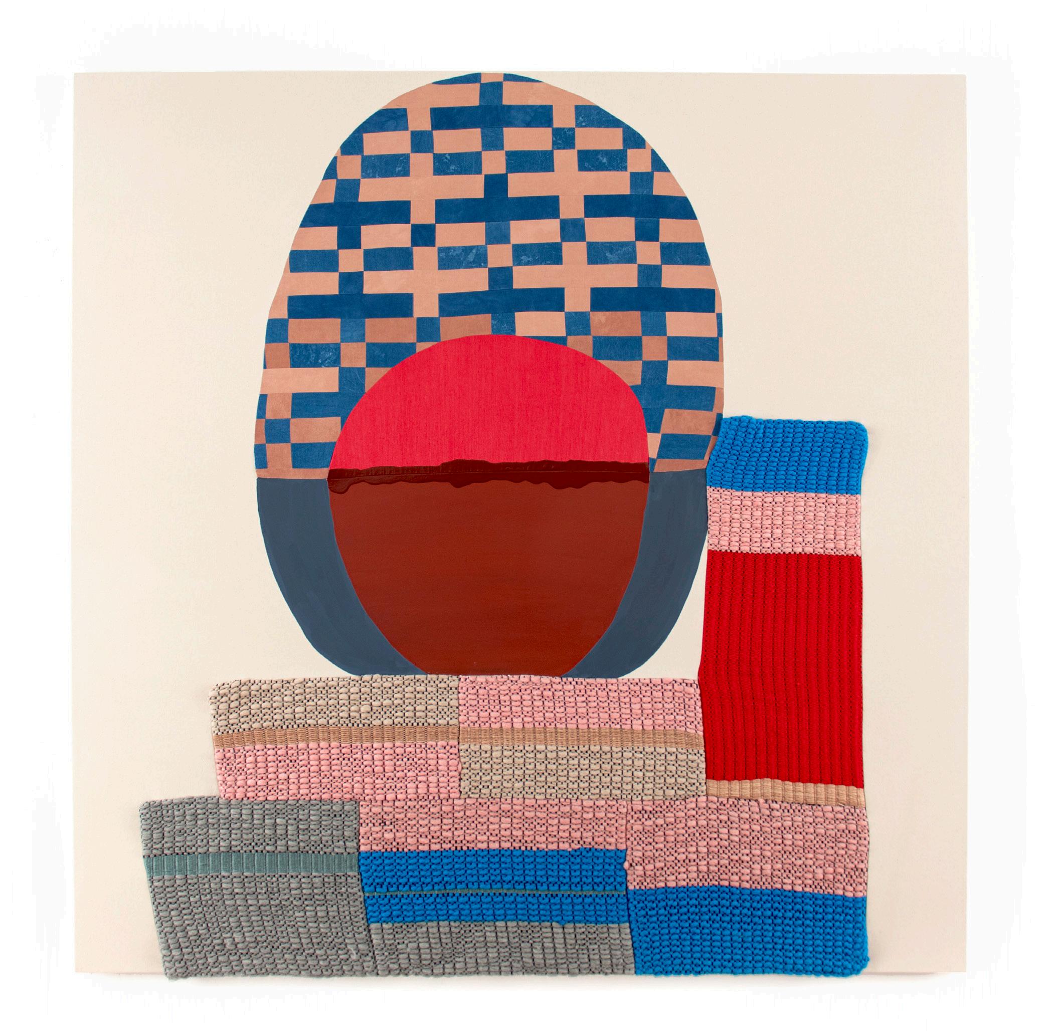
Although Valdez had gotten her first loom in 2017, she continued to experiment with weaving after New Roots through trial and error. It was not until November 2020 that she was willing to incorporate weaving into a painting for the first time. As she was beginning to develop a new body of work for her upcoming show Gratitude at Denny Dimin in April 2021, Valdez realized that although she had been studying textile history for fifteen years and had seen many “weave drafts” or textile patterns in Albers’ book On Weaving, she had no idea how they worked. She decided to take an online weave drafting class during the Covid-19 pandemic where she finally learned how to make her own weave drafts on graph paper (fig. 19). 41 Valdez was thrilled with the results and set about developing a series of thirteen new works for her exhibition Gratitude, four of which freshly incorporated aspects of weaving never before seen in her work.
One of the two largest paintings in the show, Canopy (2021) (pl. 7), employs an earth-toned palette with various shades of ochres, mauves, browns, reds, and yellows that repeat throughout the work. Valdez had begun this painting prior to taking the weave drafting class; however, it shows the culmination of her previous experimentation with quilting, painting, drawing, and embroidery. The composition includes two “architectural elements”: the upside down “L” along the top and left portions of the painting and a square patch of fabric in the lower right. The majority of this shape is made from hand-dyed fabric; a quilt block element can be seen in the horizontal sections, but in the vertical sections of the pattern gets somewhat subsumed with small different colored squares that have been pieced together, creating an optical flickering sensation as in early works. Three yellow horizontal stripes repeat

and alternate with two solid light brown stripes across the top and down the left side. The main oval figure (a taller and thinner version of Pinwheel Pioneer’s main form) is made from areas of shiny brown embroidery that took nearly ninety hours to sew; a central area is filled with “juicy” colorful oil stick marks; and the bottom field is made from orangey rust gouache. The three floating circles are each made out of different materials deployed throughout the composition: the top red circle is embroidered like the brown ground, the middle circle is made from a flat burgundy gouache set against the oil stick marks, and the bottom-most circle is a burgundy oil stick against a flat gouache field.

These works require many stages of planning and are highly composed, a complex and time consuming process. Valdez begins by making many thumbnail drawings in her sketchbook of familiar shapes that she manipulates in different ways, eventually bringing them together in compositions that she likes before determining what the final design will be (fig. 20). She then develops clusters of designs for paintings at the same time, pre-determining their dimensions, scale, and architectural elements and then makes gouache and graphite drawings that she uses as “maps” for the paintings.. Once Valdez decides on the plan for her work, she uses large sheets of tracing paper that she hangs on the wall in layers that form the different parts of the paintings. These sheets get cut up and discarded in the process of transferring the shapes to the canvas.
Valdez made the work high on hope (2021) (pl. 1), which premiered in the show Gratitude, from the same process of sketching and compositional and material experimentation. At 75 x 75 inches, it is among the largest works Valdez has made and is the first in which she incorporated weaving into her practice. The painting is made from raw canvas, gouache, and hand-dyed quilted fabric and woven yarn panels based on her own weave draft pattern (fig. 19). The work consists of three main sections that break down into more complicated subsections. There is a central glowing orb, made from hot red fabric and flat rust-red gouache. It feels primal and ancient, like a rare blood moon (fig. 21). Underneath the orb is an egg-shaped form with a typicallyflattened base that sits on top of a stepped architectural woven area. The top two thirds of the ovoid surface are made from a quilted cross-shaped pattern taken directly from Valdez’s weave draft and translated into a few variations of hand-dyed blue and pink fabric cut and sewn together in the same quilt pattern used in the woven shapes below. The orange-pink and indigo shapes seem to pulsate from ground to surface, making something so clearly geometric suddenly optically elusive. The bottom third of the oval is painted in a flat dark blue gouache that cradles the orb and supports the quilted portion above, joining fabric, gouache, and challenging color juxtapositions and patterns all at
 Figure 21: Amanda Valdez, high on hope (Detail), 2021. Handwoven fabric, hand-dyed fabric, gouache, and canvas. 75 x 75 in/191 x 191 cm. Courtesy of the artist and Denny Dimin Gallery.
once. Like many of Valdez’s previous works, the shapes, patterns, and colors move in and out of focus: at times certain portions dominate and come to the surface while others recede, only to shift again the longer one looks.
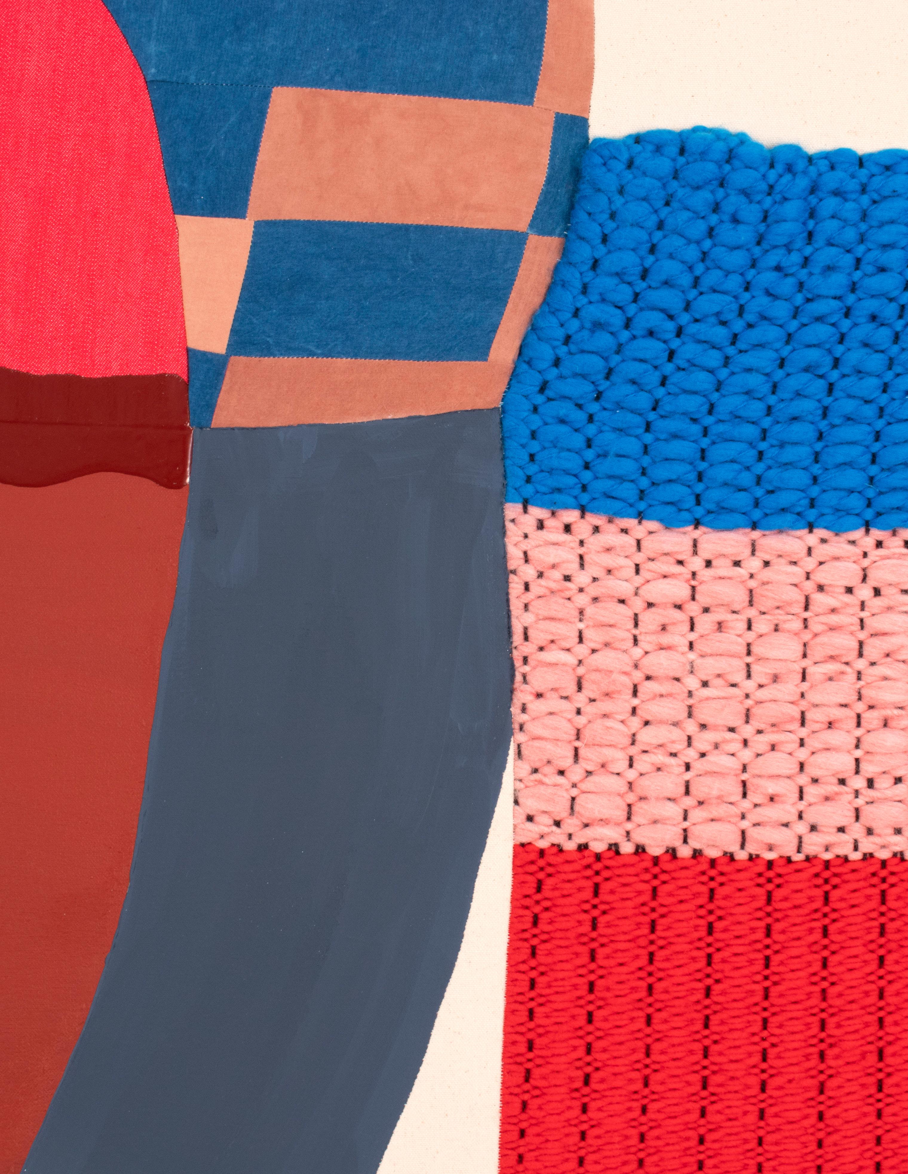
The base of this organic shape is geometric, made from six panels woven and sewn together as one irregular shape that is then sewn into the canvas; the fiber is so thick that it creates a relief on the surface of the painting, pushing confidently into the world around us (fig. 22). Created from different densities of yarns based on the same weave draft pattern as that depicted in the quilted pattern above, the relationship between them is barely perceptible, despite the fact that they are made from the same pattern (fig. 23) The woven portion is subsumed by scale and materials, a hidden echo of the original design. That subtle quietness is subversive and a symptom of Valdez’s ability to manipulate a complex range of materials and aesthetic languages adeptly, integrating them into one experience that feels deceptively simple. But one only needs to flip the canvas over to see the rigor that forms the painting’s metaphorical unconscious. Underneath the gridded stretcher bars is a separate work, almost, made from diverse media that have never been brought together before. The sewn and quilted sections are surprisingly assertive. They cut through the canvas and replace it. They will not be subsumed or repressed. Valdez has developed her own conceptual language that reveals materially how diverse aesthetic media and practices, such as fabric, sewing, quilting, and weaving, absorbed from different times and cultures, can rigorously coexist with abstract painting and drawing.

Flip the work from back to front. Its surface is not collaged atop a canvas ground. The woven and sewn portions are the surface. There is no illusionism; only a richly allusive materiality. In many ways, high on hope is a provisional answer to many of the questions that Valdez has been asking for the past fifteen years. It is eccentric. It is abstract. It is paradoxical, sensuous, and complicated, yet it seems easy at the same time. It is unapologetically feminist and grounded in self, in history, in time, in places far and wide, in the hands of others, and in the rich history of abstraction and craft. It is part of a matrix that includes what Kubler called “the old light” of “distant stars” emitted long ago. Valdez has travelled in real space and time to stretch her knowledge and practice. But she also has studied objects from throughout art history “as vehicles for time travel” that allow her to “connect back to somebody who was making something 300 years ago.”42 Valdez’s works -- organic, sensual, biomorphic forms, challenging and joyous color combinations, and unexpected juxtapositions of materials -- are stars whose lights that someday will be seen by new “qualified observers” who are “concerned with appearances noted in the present but occurring in the past.”43
 42: Freiman, “Transcribed Zoom studio conversation with Amanda Valdez,” February 10, 2021.
43: Kubler, The Shape of Time: Remarks on the History of Things
Figure 22: Amanda Valdez, high on hope (Detail), 2021. Handwoven fabric, hand-dyed fabric, gouache, and canvas. 75 x 75 in/191 x 191 cm. Courtesy of the artist and Denny Dimin Gallery.
42: Freiman, “Transcribed Zoom studio conversation with Amanda Valdez,” February 10, 2021.
43: Kubler, The Shape of Time: Remarks on the History of Things
Figure 22: Amanda Valdez, high on hope (Detail), 2021. Handwoven fabric, hand-dyed fabric, gouache, and canvas. 75 x 75 in/191 x 191 cm. Courtesy of the artist and Denny Dimin Gallery.
Lisa D. Freiman is a professor of art history at Virginia Commonwealth University’s School of the Arts. She also works as an independent curator and art consultant. For over thirty years, she has served in leadership and curatorial roles in the modern and contemporary art field. She was the inaugural director of VCU’s Institute for Contemporary Art and co-curated its opening exhibition, Declaration in 2018. As Senior Curator and Chair of modern and contemporary art at the Indianapolis Museum of Art (IMA), Freiman developed a dynamic and widely-recognized program that supported artists’ work through major traveling exhibitions, commissions, acquisitions, and publications. In 2011, the U.S. State Department selected Freiman as the commissioner and curator of the U.S. Pavilion for the 54th International Art Exhibition, la Biennale di Venezia, the oldest international exhibition of contemporary art in the world. Her exhibition Gloria featured six newly commissioned, site-responsive works by the collaborative artists Allora & Calzadilla. In 2010, Freiman launched 100 Acres: The Virginia B. Fairbanks Art & Nature Park, an expansive project that offered a new model for 21stcentury sculpture parks emphasizing experimentation, place-making, and public interaction through changing commissioned artworks. Freiman earned her PhD and MA degrees in modern and contemporary art history from Emory University and holds a BA from Oberlin College.


 1. high on hope , 2021
 2. New Me , 2021
Embroidery, hand-dyed fabric, fabric, oil stick on mounted paper, gouache, acrylic, and canvas
2. New Me , 2021
Embroidery, hand-dyed fabric, fabric, oil stick on mounted paper, gouache, acrylic, and canvas
 3. funhouse for us , 2020
 4. silent divide , 2021
 5. soft, slow , 2021
 6. up in the garden , 2021
 7. Canopy , 2020
 9. over & under , 2021
 10. Embodied , 2021
 11. latch & cradle , 2021
 12. down in the dirt , 2021
 13. Gratitude , 2021
Lives in New York, New York
Born 1982 in Seattle, Washington
2011 Masters of Fine Arts, Hunter College, New York, NY
2007 Bachelor of Fine Arts, The School of the Art Institute of Chicago, Chicago, IL
2021 Gratitude, Denny Dimin Gallery, New York, NY
2020 Piecework, Heckscher Museum of Art, Huntington, NY First Home, Reynolds Gallery, Richmond, VA Rattle Around, Koki Arts, Tokyo, Japan
2019 Wild Child, the Landing Gallery, Los Angeles, CA
2018 First Might, Denny Dimin Gallery, New York, NY
2017 Hot Bed, Dot51, Miami, FL
2016 Rotherwas Project 1: Amanda Valdez, Ladies’ Night, Mead Art Museum, Amherst College, Amherst, MA
2021 New Iconography: Artists Raising Children, The Landing, Los Angeles, CA
2019 Yellow, SEPTEMBER, Hudson, NY
Serious Play: Translating Form, Subverting Meaning, Gallery at BRIC House, Brooklyn, New York
2018 The Larkin, Vacation Gallery, New York, NY Materializations, The Landing, Los Angeles, CA
Pot Shop, Ed. Varie, New York, NY
Spatial Flux: Contemporary Drawings form the JoAnn Gonzalez Hickey Collection, The Gregory Allicar Museum of Art, Colorado State University, Fort Collins, CO
NADA, with Denny Gallery, New York, NY
2017 Surface Tension, E. Tay Gallery, New York, NY
2016 The City & The City, Denny Gallery (Pop Up), New York, NY
Nothing You’ve Ever Done Before, for the National Council on Education for the Ceramic Arts
2007 Ox-Bow School of Art, Saugatuck, MI
2006 Utrecht University, Utrecht, The Netherlands
The Mysteries, Koki Arts, Tokyo, Japan
Time & Tide (two-person exhibition with Caris Reid), Denny Gallery, New York, NY
2015 Diamond Seat, (two-person exhibition with Caris Reid), Circuit 12 Contemporary, Dallas, TX
2014 Thick as Thieves, Denny Gallery, New York, NY
2013 Double Down, Prole Drift, Seattle, WA
Taste of Us, Denny Gallery, New York, NY
(NCECA) at Kansas City Regional Arts Council (ArtsKC), Kansas City, MO
2015 #BemisPainters, 1985-2015, Bemis Center for Contemporary Arts, Omaha, NE
Metamodern, Denny Gallery, New York, NY
A Common Thread: Stitching & Embroidery, San Jose
Museum of Quilts and Textiles, San Jose, CA
2014 Cirrus, Dorfman Projects New York, NY
UNTITLED. with Denny Gallery, Miami Beach, FL
Taking Off: Hot New Painters, Reynolds Gallery, Richmond, VA mark.repeat., Curated by Kirk Stoller, C2C Project Space, San Francisco, CA
Between the Lines, Galería Agustina Ferreyra, San Juan, Puerto Rico
Made in Ratio, Cheryl Hazan Gallery, New York, NY
2013 Currently Untitled, Galerie Protégé, New York, NY Floater, BravinLee Programs, New York, NY
Works Off Canvas, Denny Gallery, New York, NY
Same Same But Different, Guest Spot, Baltimore, MD
2012 El Regreso de los Dinosaurios, Abrons Art Center, New York, NY
Two Rivers, One River Gallery, Englewood, NJ
Same Same but Different, SOIL Gallery, Seattle, WA
Return to Rattlesnake Mountain, Wassaic Project, Wassaic, NY
Same Same but Different, Parallel Art Space, Queens, NY
MsBehavior, curated by Jordana Zeldin, The ArtBridge
Drawing Room, New York, NY
2011 Hunter MFA Thesis Exhibition: And There Will Be Trouble, Times Square Gallery, Hunter College, New York, NY
Faraway Neighbor, Curated by Janelle and Lisa Iglesias
Flux Factory, New York, NY
2013 Foundation for Contemporary Arts, Emergency Opportunity Grant, New York, NY
New York Foundation for the Arts Emergency Grant, New York , NY
Joan Mitchell Emergency Grant, New York, NY
2012 The Eleanor Gay Lee Award, Hunter College, New York, NY
The Esther Fish Perry Award, Hunter College, New York, NY
2011 College Art Association’s MFA ProfessionalDevelopment Fellowship
2019 Artist-in-Residency, 100WCorsicana, Corsicana, TX
2018
Artist-in-Residency, New Roots Foundation, Antigua, Guatemala
2017 Artist-in-Residency, Wassaic Project Print Editions Program, Wassaic, NY
Artist-in-Residency, Joan Mitchell Foundation, New Orleans, LA
2016 Artist-in-Residency, Joan Mitchell Foundation, New Orleans, LA
2020 Criblez, David J. “These 5 museums are open inside and outside,” Newsday, September 10
Arnold, Melissa. “Heckscher Museum welcomes
Don’t Fence Me In…Or Out, curated by Lisa Corinne
Davis, Lesley Heller Workspace, New York, NY
2010 Xanadu: A Stately Pleasure Dome, curated by Erin Shafkind, Soil Gallery, Seattle, WA
Studio Cube, Curated by ACE Collective, Hunter College, New York, NY
Hunter MFA, Crane Art Center, Philadelphia, PA
2008 Her Mark, Woman Made Gallery, Chicago, IL
Evanston + Vicinity Biennial, Evanston Art Center, Evanston, IL
2008 Around the Coyote Spring Art Festival, Curators Choice Award, Riverfront Gallery, Chicago, IL
2007 School of the Art Institute of Chicago Fall BFA
Undergraduate Show, G-2 Gallery, Chicago, IL
2009 Educational Scholarship, 16 Copenhagen, Seattle, WA
2008 Curators Choice Award received from Julie Rodriguez Wildholm for Around the Coyote Arts Festival, Associate Curator at Museum of Contemporary Art, Chicago, IL
2007 Ox-Bow Thomas Baron Scholarship, Chicago, IL School of the Art Institute of Chicago Educational Grant, Chicago, IL
2006 School of the Art Institute of Chicago Educational Grant, Chicago, IL
2014 Artist-in-Residency, Bemis Center for Contemporary Arts, Omaha, NE
2013 Artist-in-Residency, Byrdcliffe, Grant Support from The Pollock-Krasner Foundation, Woodstock, NY
2012 Artist-in-Residency, MacDowell Colony, Peterborough, NH
2010 Artist-in-Residency, Yaddo, Saratoga Springs, NY
abstract artist Amanda Valdez for first major New York exhibit,” TBR Newsmedia, May 1
2019 Pagel, David. “Amanda Valdez’s art: part painting,

part quilt, 100% fun,” LA Times, May 28
2018 Rockefeller, Hall. “You Are What You Read,” Less Than Half, December 19
Curry, Colleen, “Who We’re Watching: Artist Amanda Valdez,” Galerie, October 26
Johnson, Grant Klarich, “Amanda Valdez: First Might,” Brooklyn Rail, October 3
“Amanda Valdez at Denny Dimin Gallery, New York,” ARTNews, September 11
Olesen, Ivy, “NADA New York Features Porcelain Hot Dogs and Commanding Chat Bots,” The Art Newspaper, March 9
Ehrlich, Madeline, “Armory Week: North Brooklyn Artists and Galleries,” Greenpointers.com, March 9
Durón, Maximilíano, “Preview NADA New York
2018,” ARTnews, March 7
2017 Valdez, Amanada “Under Current: Tidal Pull,” The Common, Issue No. 13, April
2016 Currin, Sophie, “Current Rotherwas Room Artist
Amanda Valdez Speaks About Ladies’ Night,” The Amherst Student, September 28
Confort, Caitlin, “Dance Parties, Feminism & Embroidery With Artist Amanda Valdez,” Art Zealous, September 9
Cohen, Alina, “Collaborative Artist Duo Hangs
Exhibition According to the Moon’s Cycle,” Forbes, April 19
2016 Messinger, Kate, “Meet the Artists Behind a Witchy
New Show Inspired by the Lunar Cycle,” PAPER Magazine, April 7
Parrott, Skye, “Amanda Valdez and Caris Reid: Interview,” double or nothing, February
2015 “Moon,” Lula Japan Magazine
Micchelli, Thomas, “Going Meta: Art after the Death of Art,” Hyperallergic, August 22
Arnold, Kristi, “Metamodern,” On-Verge, August 19
2014 Wilson, Stephen, “Amanda Valdez – Thick as Thieves at Denny Gallery,” NYblk Arts, October 12
Mead Art Museum, Amherst College, Amherst, MA Davis Museum, Wellesley College, Wellesley, MA
Heckscher Museum of Art, Huntington, NY Time Equities, New York, NY
“Caris Reid & Amanda Valdez,” Women Artists Interviews, Volume 2
“Artist of the Week: Amanda Valdez,” LVL3 Media, April 21
2013 Frank, Priscilla, “4 Contemporary Female Artists who are Shaping the Future of Painting,” Huffpost Arts & Culture, December 19
Graves, Jen, “Three Abstractionists Make Stuff: The Life of Forms is a Mystery,” The Stranger, September 18
Langner, Erin, “Doubling All the Way Down,” New American Paintings, September 18
“Works Off Canvas,” Art in America: The Lookout, September 5
Kirkwood, Jeffrey, “A Sweet Tooth & Some Cavities: Amanda Valdez at the Denny Gallery,” Idiom, February 13
Neely, Evan, “Amanda Valdez: Taste of Us,” Dossier, January 22
2012 Losk, Alice, “You Can Feel the Pulse,” Artsicle, July 16 McClemont, Doug, “Doug McClemont’s Top 10 New York Shows,” Saatchi Magazine, April 20
Hurst, Howard, “Hanging Art in a Broom Closet,” Hyperallergic, June 5
Terran, Dan, “Same Same but Different Debuts in Bushwick,” Artsicle, July 3
2012 Butler, Sharon, “MsBehavior in Chelsea,” Two Coast of Paint, May 14
Zeldin, Jordana, “MsBehavior” catalog, ArtBridge Publication, March
New American Paintings, No. 99, Juror: Alma Ruiz, Senior Curator, Museum of Contemporary Art (LA) Boston, MA
“The Untamed Hand,” NYArtsMagzine.com, March 28
2011 Winant, Carmen, “Fine Arts Programs Open their Studios to the Public,” WNYC.com November 18
2008 “Her Mark,” Woman Made Gallery Publication, Chicago
Fidelity Investments, New York, NY
JoAnn Hickey, New York, NY
A.G. Rosen, New York, NY
Adam Driver and Joanne Tucker, New York, NY

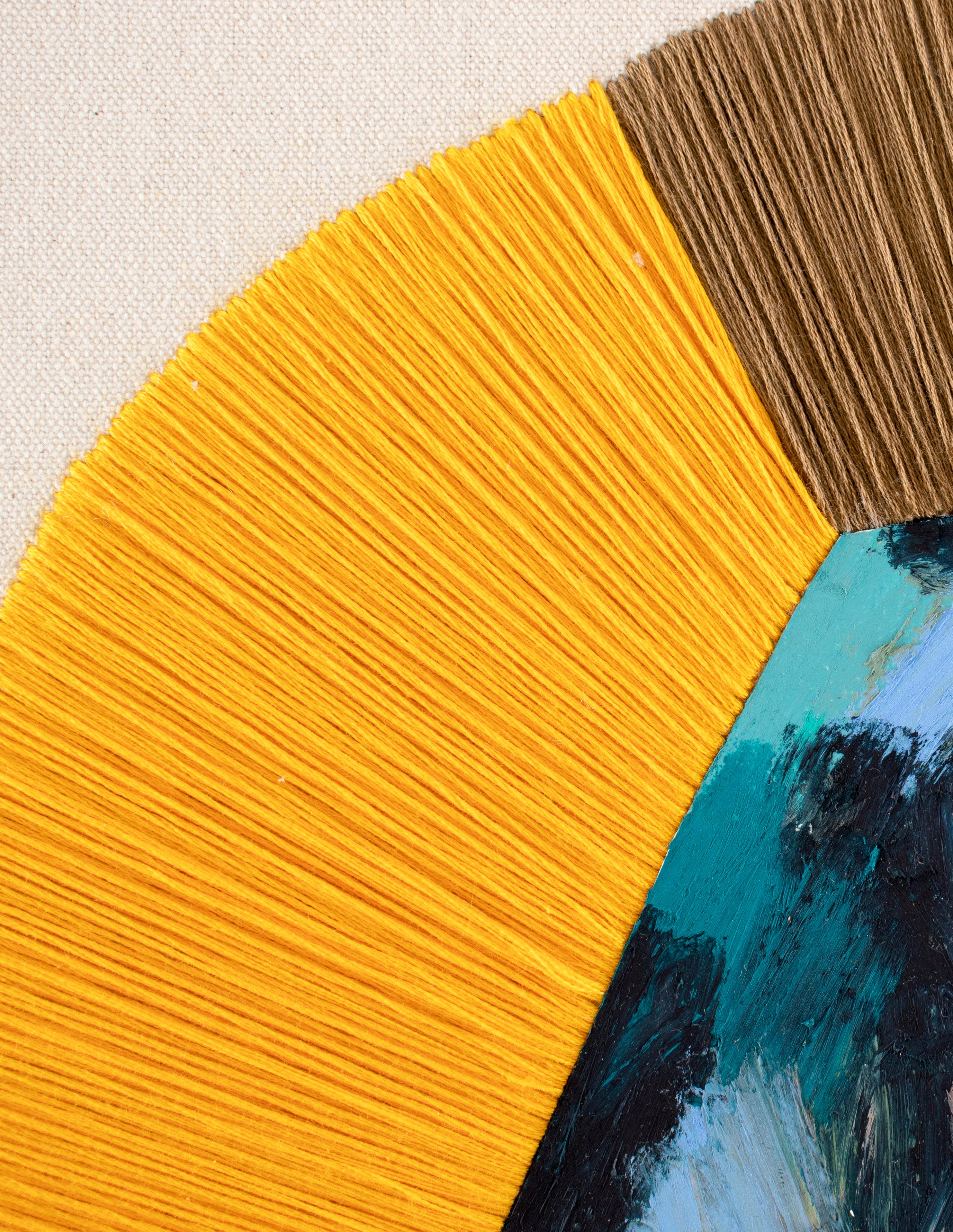
Amanda Valdez, Gratitude (Detail), 2021. Hand-woven fabric, gouache, acrylic, and canvas. 32 x 36 in/81 x 91 cm.
Catalog © 2021 Denny Dimin Gallery
Text by Lisa Freiman © 2021 Lisa Freiman
Artwork by Amanda Valdez © 2021 Amanda Valdez
This catalog was published on the occasion of the exhibition Amanda Valdez: Gratitude at Denny Dimin Gallery, New York, April 2 - May 15, 2021.
Cover: Amanda Valdez, New Me (Detail), 2021. Embroidery, hand-dyed fabric, fabric, oil stick on mounted paper, gouache, acrylic, and canvas. 58 x 52 in/147 x 132 cm.
All works are courtesy of the artist and Denny Dimin Gallery, unless otherwise noted.
 DENNY DIMIN GALLERY