Trought this portfolio, I will showcase some of my projects I‘ve been involved in or worked on from 2021 - 2025. Additionally, it also includes some projects I completed during my threemonths intership at a communication and branding agency.
Enjoy browsing through!
Education
University of Applied Scienes Salzburg
Bachelor’s Degree in Design- and Productmanagement
2021 - 2025
University of Applied Scienes Salzburg
Bachelor’s Degree in Business Administration
2020 - 2021
School of Business Administration
2015 - 2020
Bergland Creation GmbH Oct. 2024 - Nov. 2024
• Product- and Graphic design
• Packaging Design after CD/CI (Brandguidelines)
• Product Photography
Internship at „COOPH“ Jul. 2023 - Oct. 2023
• Product- and Graphic design
• Research
• Elaboration of concept ideas
Software Skills
• Indesign
• Illustrator
• Photoshop
• ArchiCad
• 3Ds Max
• Solidworks
• Vector Works
content
Interior Design
• Creat.Studio (Bachelor Thesis)
• Organoid
• Work ‘N’ Live Graphic Design
• Business card
• Flyer
• Book Cover
• Poster Design
Product Photography
• Dior Sauvage
• Yves Rocher
• Ray Ban
• Fishes in a bucket
3D Modeling
• Lego Trike
• Dump Servent
• Kitchen Modeling
• My Desk Branding
• T-Shirt Project “Unbiased”
• Bachelor’s Thesis “Creat. Studio”
Internship at „COOPH“
• Stickers
• Art Prints
Interior Design
01 | Creat. Studio
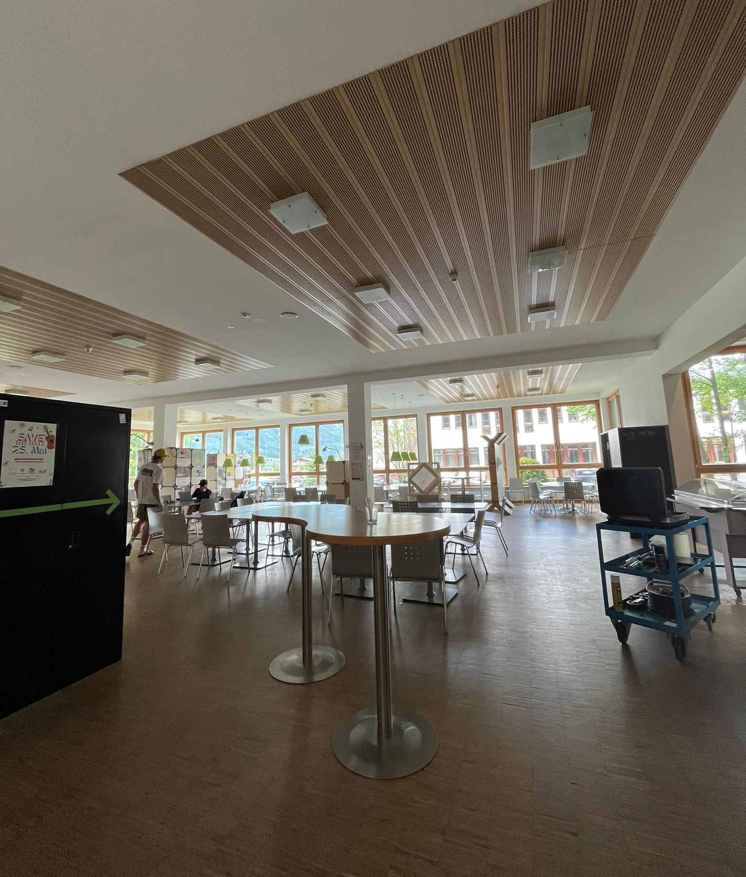
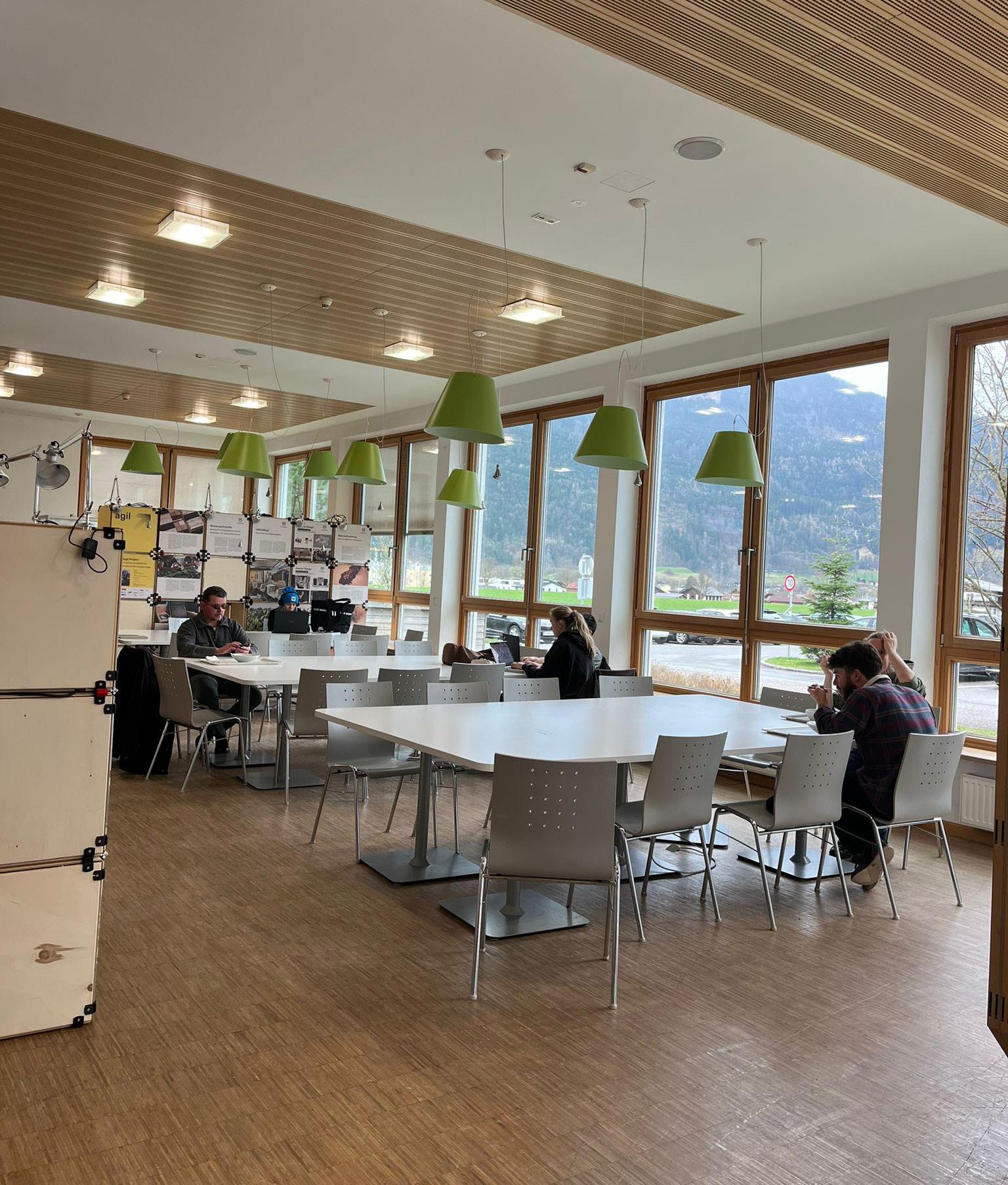
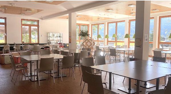
Creat. Studio is a fictional interior design company that specializes in creating creativity-enhancing learning environments at universities. This company was developed as part of my bachelor‘s thesis, which focused on redesigning the cafeteria at FH Salzburg.
The goal was to design a so-called „Creative Workspace,“ a space conceived for creative work. Characteristics of such spaces include various modern technical equipment, flexibly usable furnishings, and a casual atmosphere.
(insights)
These are real photos of the cafeteria at the Salzburg University of Applied Siences in Kuchl. As shown, the students are sitting on the same grey chairs, the room is very poor in lighting and colorless. Even there are several studies that emphasize color, good lighting and different materiales in educationals institutions.
(insights - the final interior)
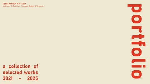
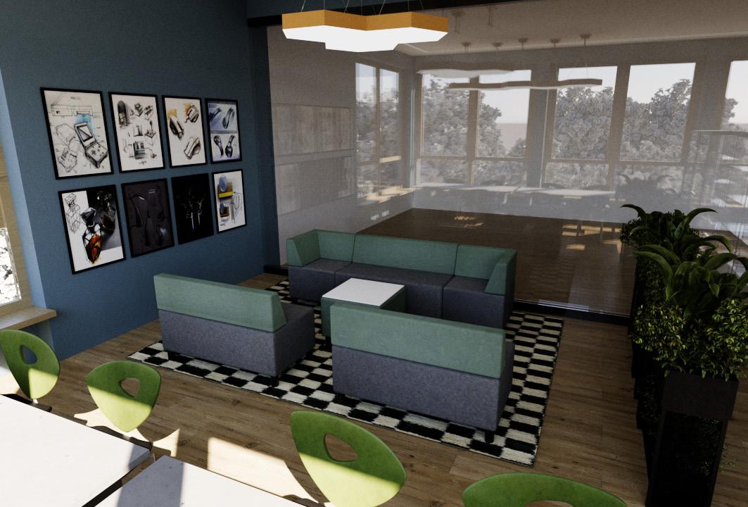
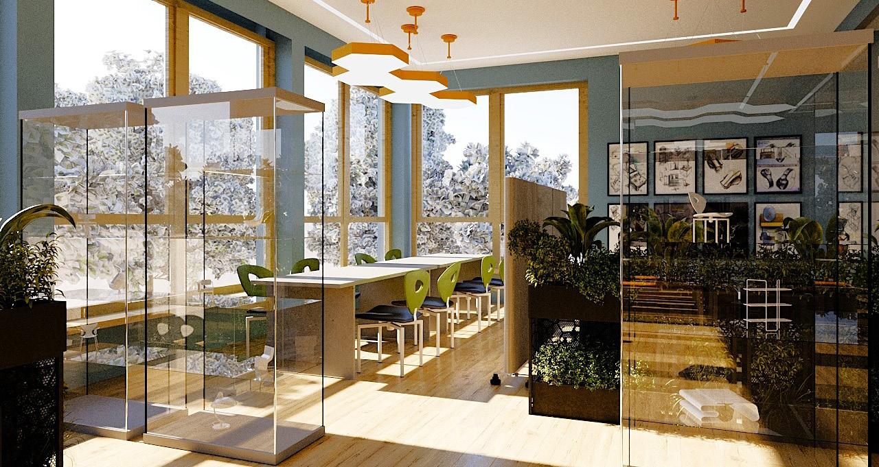
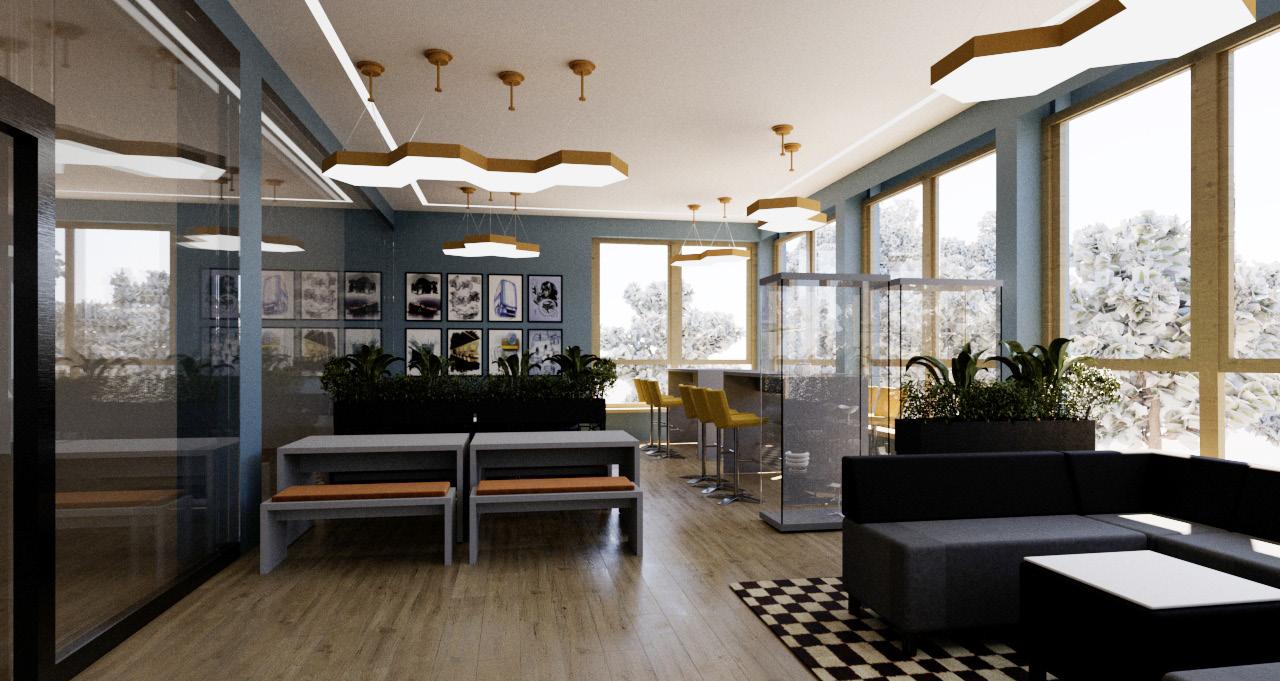
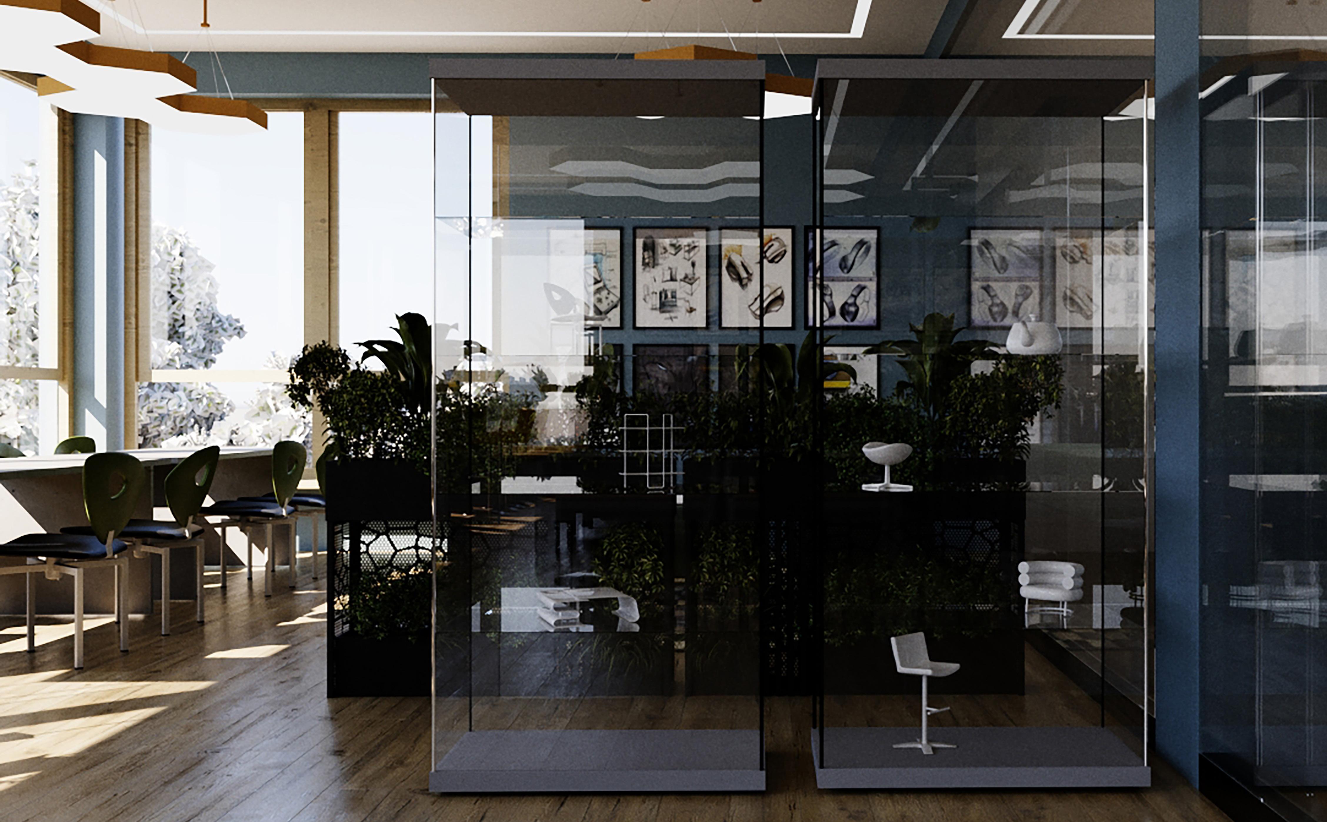
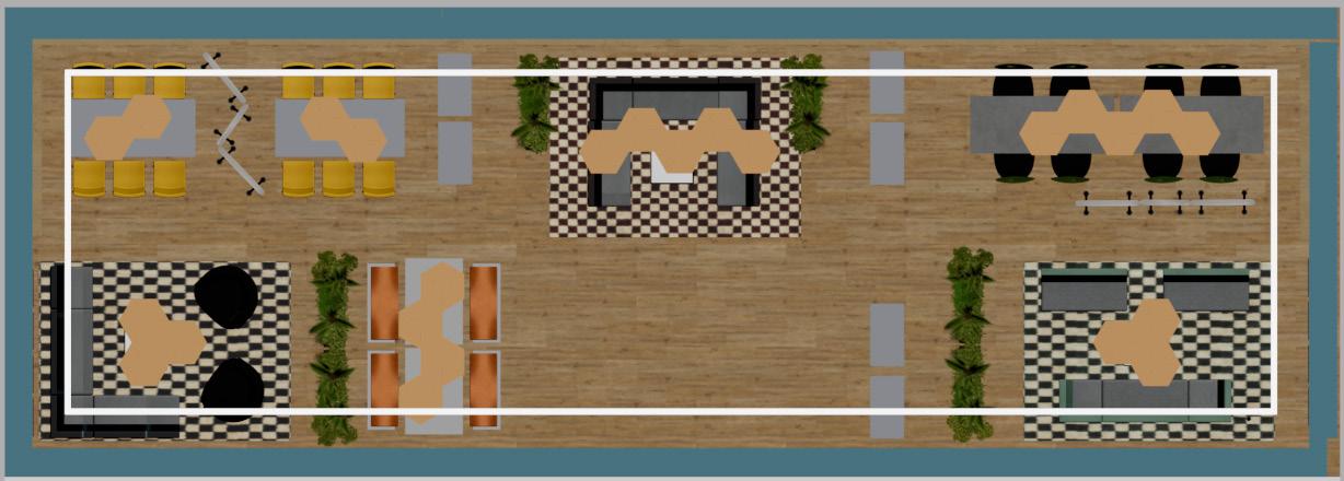
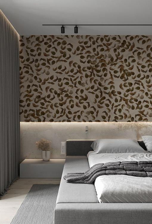
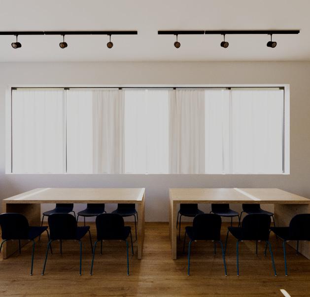
The „Creative Room“ is accessed through a glass door located in the middle of a glass wall, which is positioned at the pillars, separating the upper part of the cafeteria from the rest of the activities. The room is fully designed for creative and productive work, featuring numerous well-thought-out design elements.
On the left side, there are two work tables, each equipped with three yellow bar stools. The yellow seating adds color and dynamism to the room, while the black-and-white checkered carpets visually highlight and demarcate this area. The right side features two larger tables surrounded by a total of eight green chairs. These comfortable chairs invite extended work sessions and create a pleasant working environment.
In the center of the room, there is a geometrically designed table surrounded by additional seating options. Plants placed on each side of the room visually soften the space, contributing to a natural atmosphere and improving the indoor climate.
Particularly versatile are the two modular acoustic room dividers that can be freely moved around the room. They allow for individual structuring of the space according to users‘ needs. The dividers also provide acoustic shielding and create more privacy in different zones.
The walls are adorned with picture frames that promote an inspiring and creative mood. Above the work areas, orange lamps specifically illuminate these spaces, while a rectangular, narrow ceiling light evenly lights up the entire room. The wood-look flooring completes the overall picture, ensuring a warm, welcoming atmosphere. The „Creative Room“ is thus the ideal place for focused work and creative processes
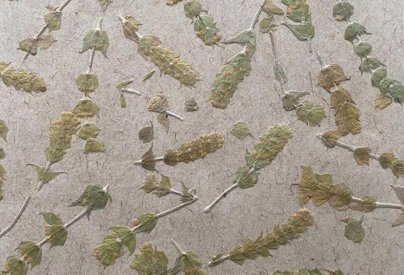
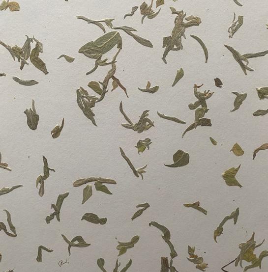
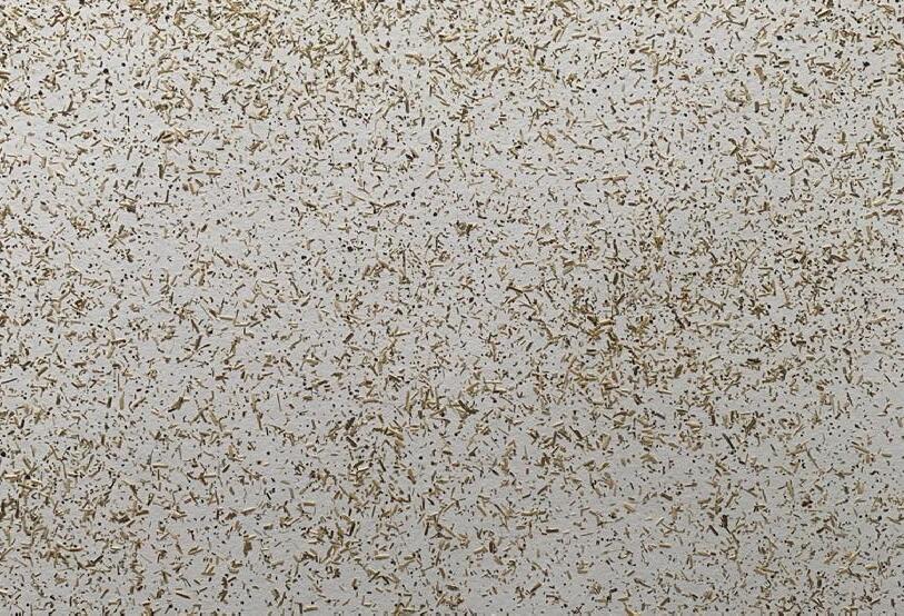
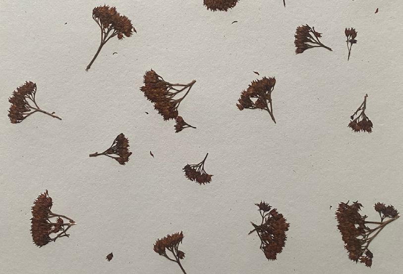
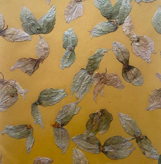
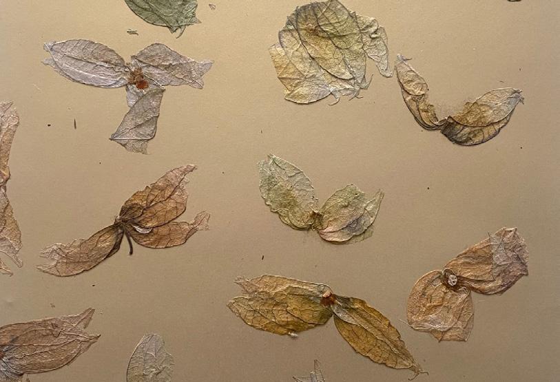
Organoid is an Austrian company in Tyrol. Organoid produces or designs surfaces from natural materials (tea, flowers, sand, sheep‘s wool, coffee grounds, leaves, etc.). Their surfaces are used in interior- and furniture design.
The task in interior design in cooperation with Organoid was to create our own surface for their international collection.
I chose three materials (Greek Mountain Tea, Stonecrop andPhysalis Peel) with this I was able to design a total of six patterns.
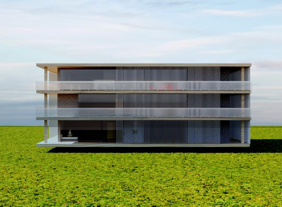
03 | Work 'n' Life
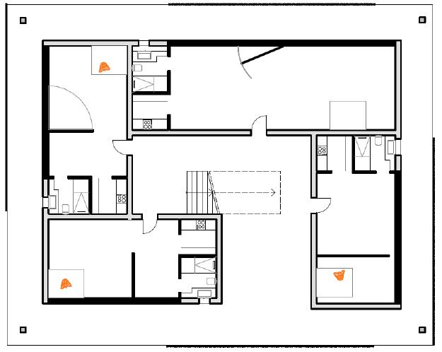
As part of the Interior Design class, my partner and I have created a residential building that aims to bring added value to the community. We have developed concepts, built models, and visualized the building. Our concept called „Work and Life“ aims to create a harmonious balance between professional and personal demands within a single building complex.
(insights)
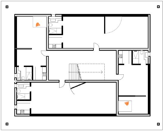
The first two floors of the building are dedicated to residential areas (50 - 70 sqm), specifically designed for individuals and families who value a close connection between living and working spaces. The apartments on the second floor are similarly equipped to those on the first. The café serves as a social hub for residents and external guests. It offers a relaxed atmosphere, ideal for informal meetings or breaks during work. With a selection of healthy and local foods and beverages, it becomes a central element of the building. Adjacent to the café is a modern coworking space that provides flexible workstations, meeting rooms, and all necessary technological connections. This area is designed to foster creativity and collaboration, making it ideal for freelancers, students and so on.
(50 m2 Apartment)
Workspace / Sleeping- and Living Area / Kitchen / Bathroom / Dinning Area
(insights)
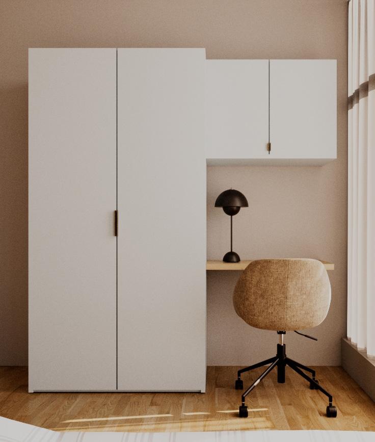
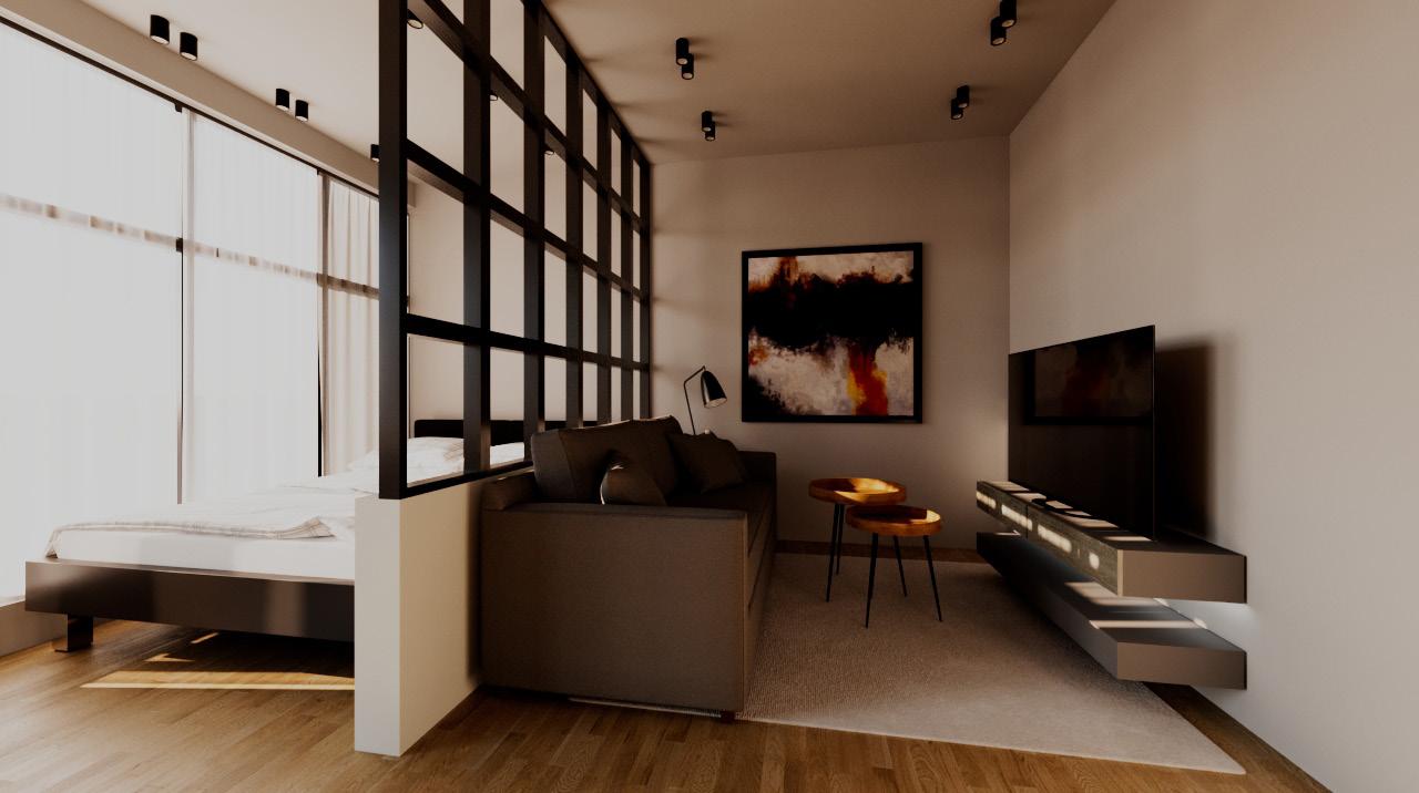
The first image shows a minimally designed workspace. The room is kept in neutral tones, with a simple bright grey wall. On the left side, there‘s a large, pastel blue cabinet that reaches up to the ceiling, providing ample storage space. On the right side of the room, a floating wooded shelf is mounted above a chic desk chair made of brown fabric with a black metal base. A simple black desk lamp provides lighting. Large windows ensure plenty of natural light and are adorned with light, transparent curtains.
The second image displays a combined living and sleeping area in a modernly designed room. The large bed is immediately adjacent to a built-in sofa that creates a cozy seating area. Above the sofa hangs a large, abstract painting with dark and fiery tones. The room is divided by a half-height wall with an integrated black lattice, creating an open yet separated area. Another feature of the room is a long, slender TV stand in front of the sofa. Here too, large windows provide ample daylight, complemented by ceiling spotlights that offer pleasant lighting.
(insights)
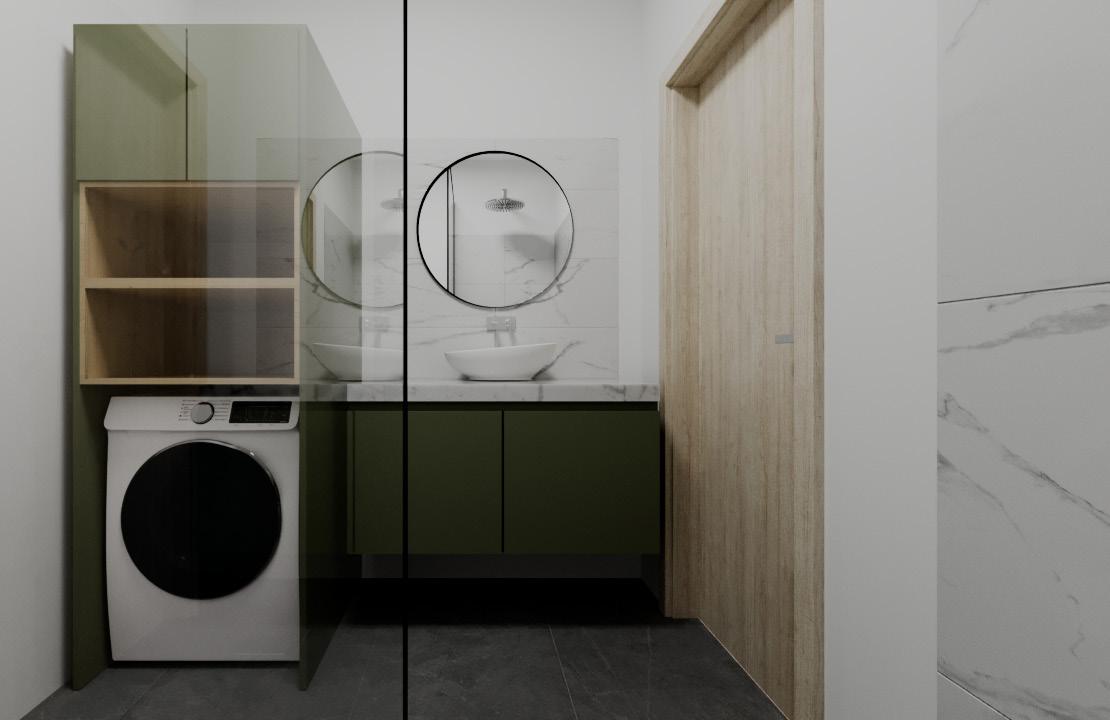
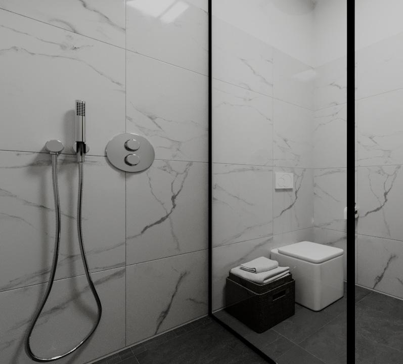
The bathroom is modern and efficiently designed within a space of 4 square meters. The color palette is subdued, combining shades of green, white, and gray to create a calming atmosphere. The smooth surfaces and the use of large marble tiles on the walls give the room an elegant and tidy appearance.
In the first view, the washing area is smartly placed next to a built-in cabinet that offers both shelving and space for a washing machine. The sink area is equipped with a modern, round mirror and a simple yet stylish faucet. The second view reveals the shower and toilet, separated by a glass wall. The shower is fitted with a handheld showerhead, and the toilet is a floor-standing model with a push-button flush mounted above it. The use of marble tiles continues here, maintaining a visual consistency throughout the bathroom. The functional design and choice of materials make this bathroom not only visually appealing but also practical and easy to maintain
(insights)
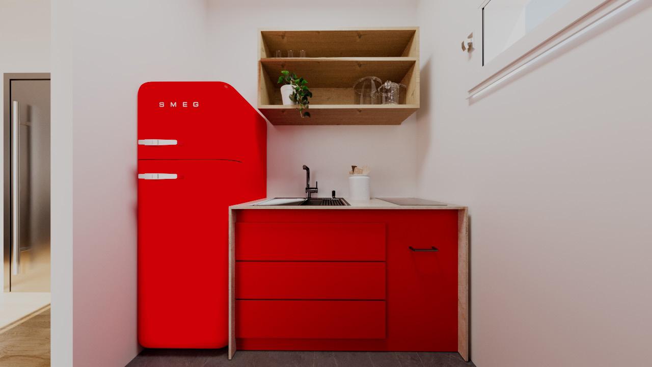
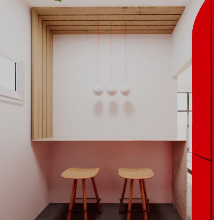
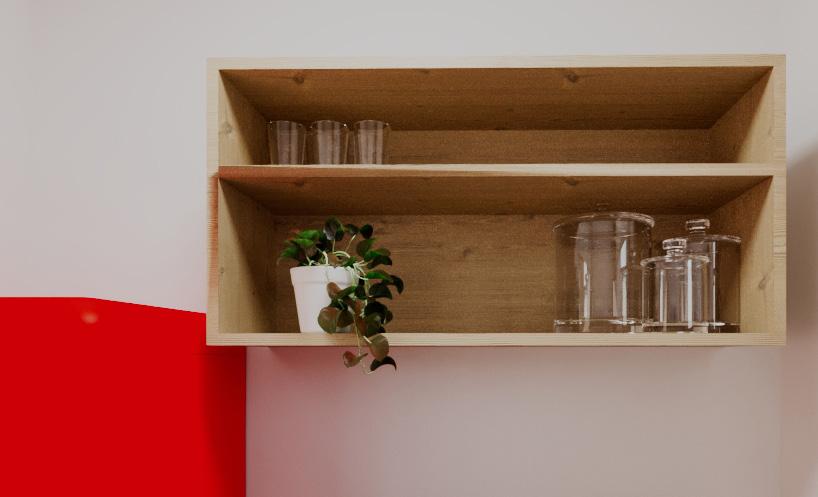
This kitchen stands out as a vibrant and functional element within a 50 square meter apartment, occupying an area of 4 square meters itself. Its striking red color scheme, especially noticeable in the SMEG refrigerator and the base cabinets, adds lively accents to the otherwise neutral space.
The kitchen is equipped with a modern, black sink and matching faucet, integrated into a simple countertop. Above this, an open, wood-paneled shelf provides practical storage space for dishes and kitchen utensils, as well as room for decorative items like small plants.
The second view reveals a special seating area characterized by its minimalist design. Two wooden bar stools are placed under a custom, wood-paneled niche, illuminated by simple, modern hanging lamps. This area offers a cozy corner for quick meals or as a spot to linger during meal preparation.
Despite its compact size, the kitchen is well-conceived, with style and functionality maximized in a small space.
(insights)
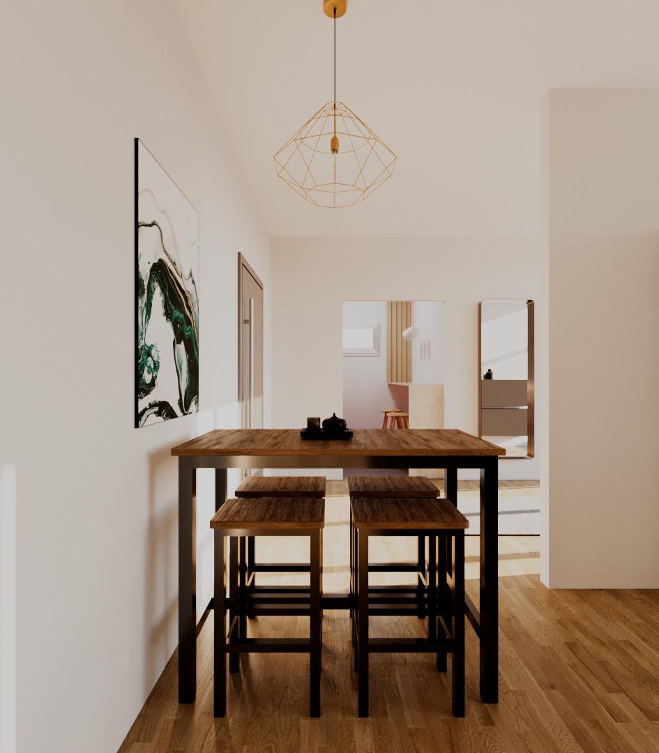
The dining area is modern and simply styled. A large, dark wooden table stands at the center, surrounded by four matching stools that add a simple yet elegant touch. Above the table hangs a striking, geometric pendant light in gold, which gives the room a modern, design-oriented atmosphere. On the left wall, there is a large, abstract artwork with bold green and black shades, providing a dynamic contrast to the otherwise neutral wall colors. The room is bright, filled with natural light, and conveys an open, inviting feeling.
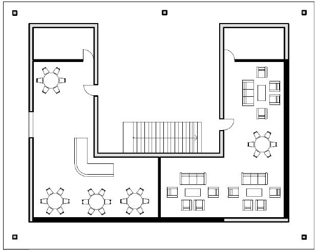
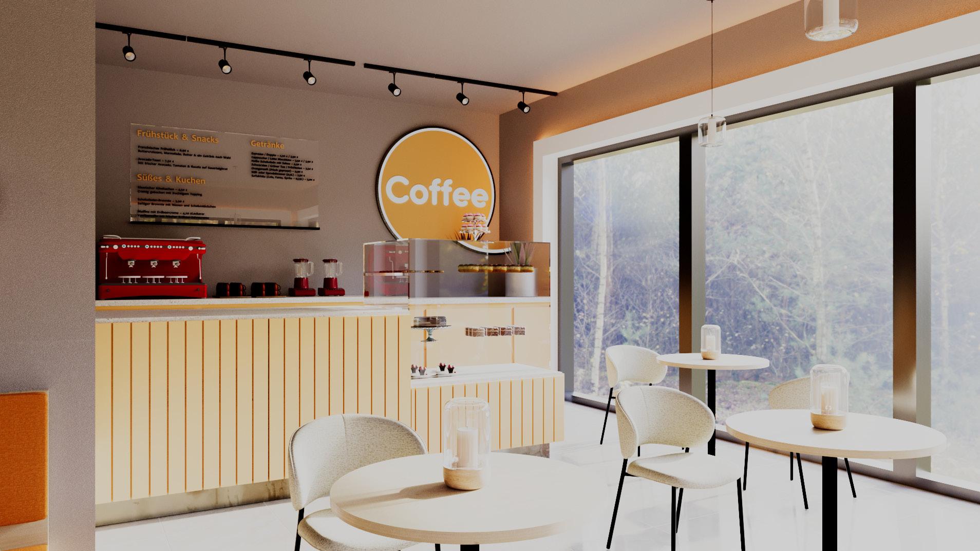
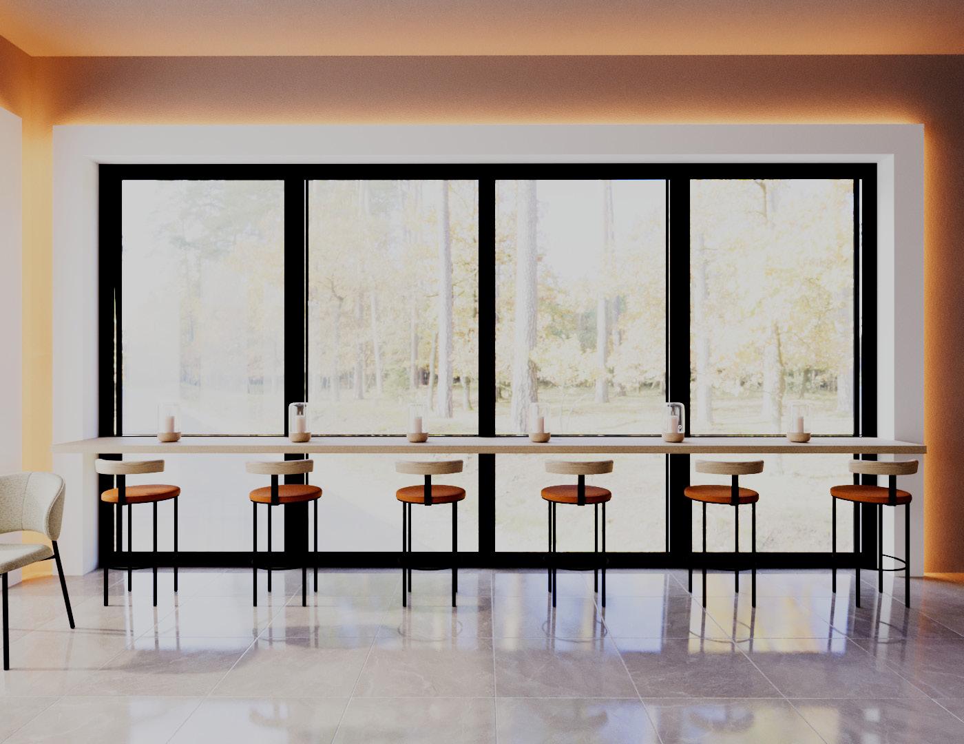
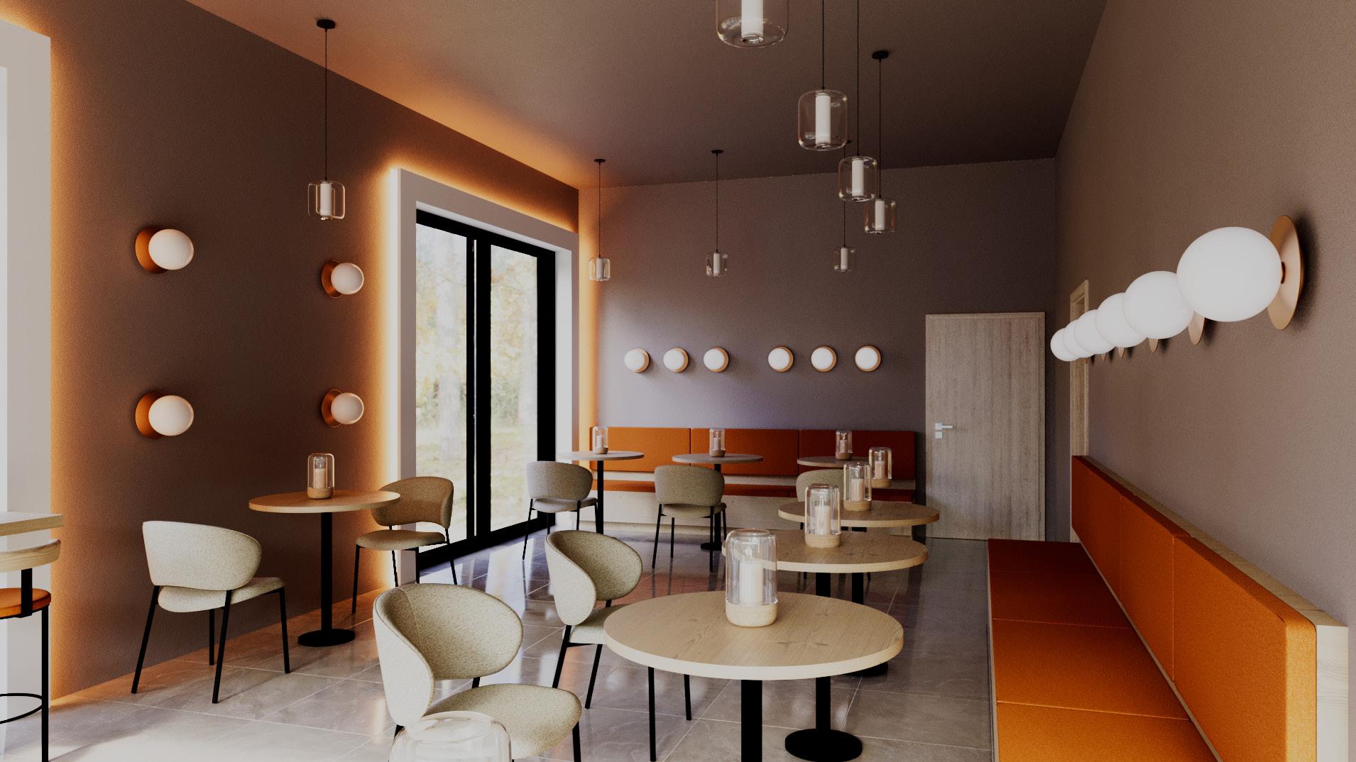
(Café Bar)
A place where residents and outsiders can eat, drink, and talk together. The café is located on the second floor and offers visitors a view above the clouds of Kuchl.
The café bar offers breakfast, snacks, cakes, sweets and beverages.
(insights)
A long, upholstered bench in a warm orange tone runs along the wall. It is mounted on a wooden base, creating a natural and stylish look. Three round wooden tables with sleek black metal legs are positioned in front of the bench. They are accompanied by three comfortable chairs with light beige fabric upholstery and black metal legs. Six round wall lamps are mounted on the wall, providing soft, diffused lighting. Three elegant pendant lights with glass cylinders hang from the ceiling, adding stylish lighting accents.
(insights)
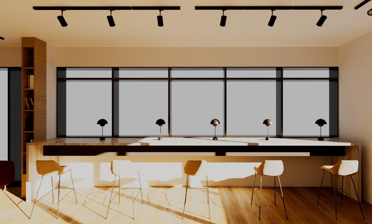
The café bar has a long, narrow high table positioned in front of a large window. Instead of being supported by its own legs, the table is held up by the window frames, creating a sleek and seamless look. The room design relies on natural light sources through the large windows, which provide a wonderful view of the municipality of Kuchl.
The subtle indirect lighting on the ceiling creates a cozy atmosphere, while the beige-brown wall color makes the space feel pleasantly warm. Small decorative elements such as candles and a glass carafe are placed on the tabletop, adding to the stylish and inviting ambiance
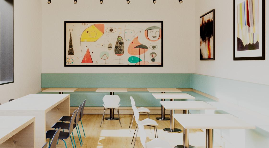
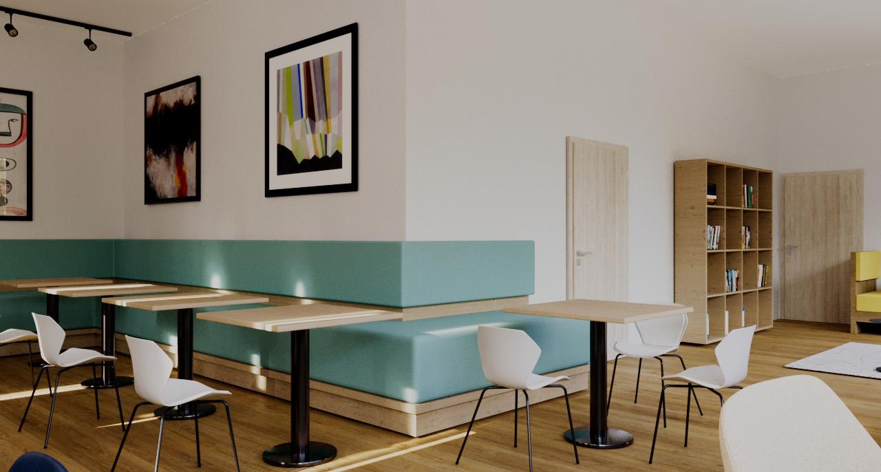
(Co-Working Space)
The co-working space is also located on the second floor, making it the „neighbor“ of the café bar. In the co-working space, residents can study, work on projects, and support each other
(insights)
The long communal tables encourage teamwork and productive exchange, while smaller seating areas provide retreats for focused work or meetings. A continuous, upholstered bench along the wall ensures maximum comfort and flexible usage options. Light wood elements combined with soft pastel tones create a calm and motivating atmosphere. Abstract artworks add creative accents and stimulate inspiration. Large windows allow plenty of natural light to enter, enhancing the open and spacious feel of the room.
(insights)
Two tables, each with six blue chairs, offer residents the opportunity to work in groups and spend time together. The long high table, like the one in the other area, is attached directly to the window frame, creating an open and modern room feeling. The generously sized windows allow plenty of natural light into the room while offering a sweeping view of the community of Kuchl. Stylish black table lamps also provide pleasant lighting in the evenings, creating a welcoming atmosphere.
(insights)
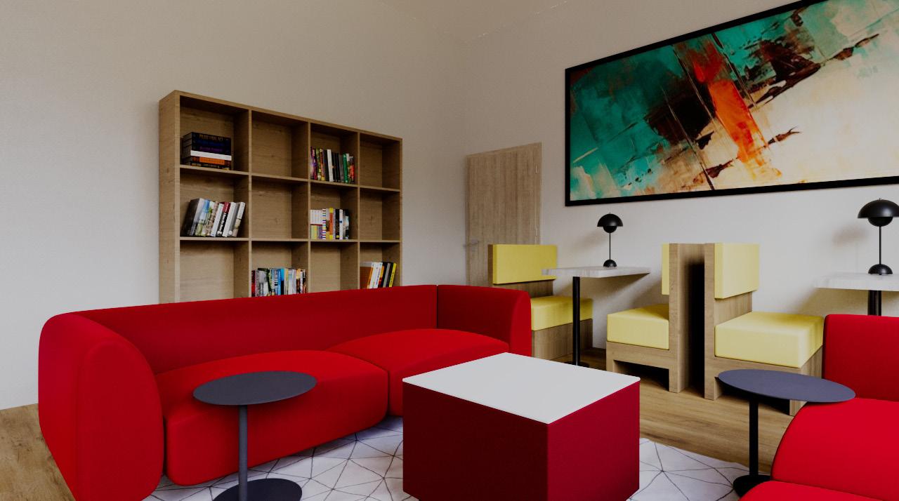
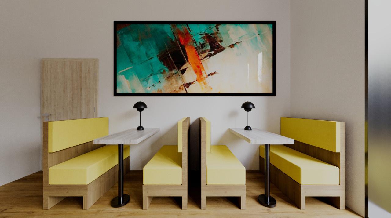
The yellow seating booths provide quiet individual workspaces with an ergonomic design. The red sofa area invites flexible work, meetings, or creative sessions. An open bookshelf with books, magazines, and newspapers fosters knowledge exchange and inspiration. Warm wood elements and bold color accents create a productive atmosphere. Modern details and an abstract wall painting add creative touches. The thoughtful design supports both concentrated work and informal interaction.
Graphic Design
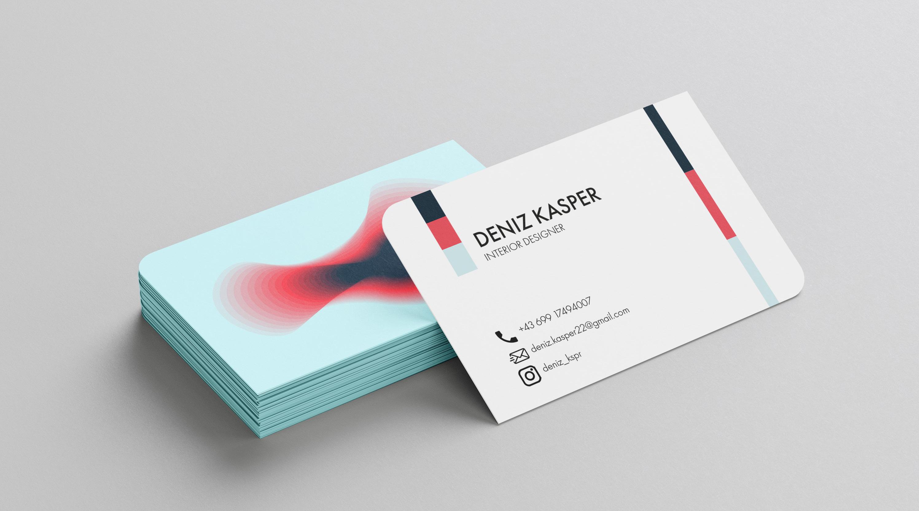
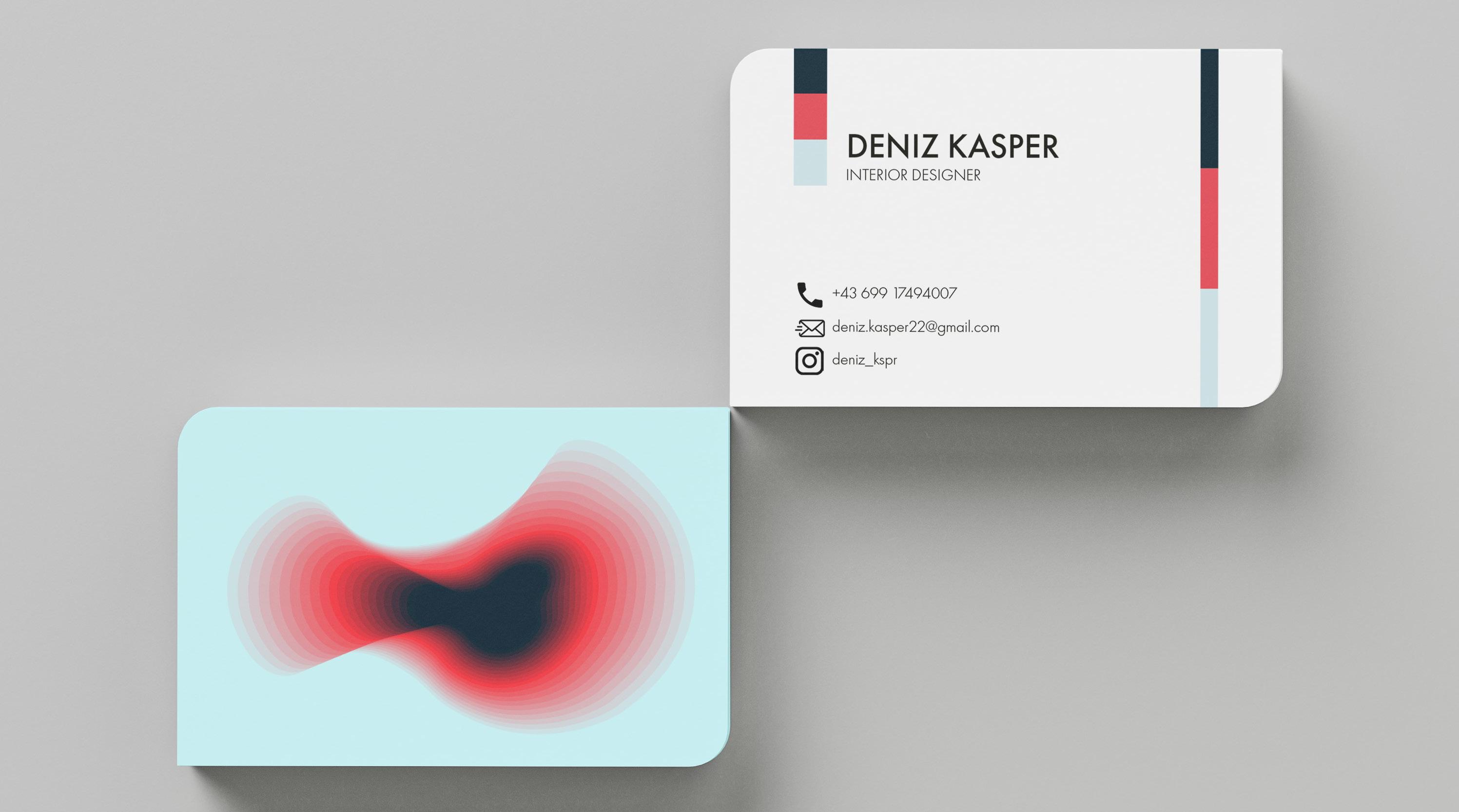
04 | Business Card
business cards are less „cards“ and much more portable advertisements with built in call-to-action and are great to visualize and practice corporate identites.
Colours are an essential for interior design. To much colours and you‘re looking at a circus, no colours at all and the rooms feels empty. Thats why I chose three colours and a „free form“ to give so depth into a flat surface.
05 | Flyer Design
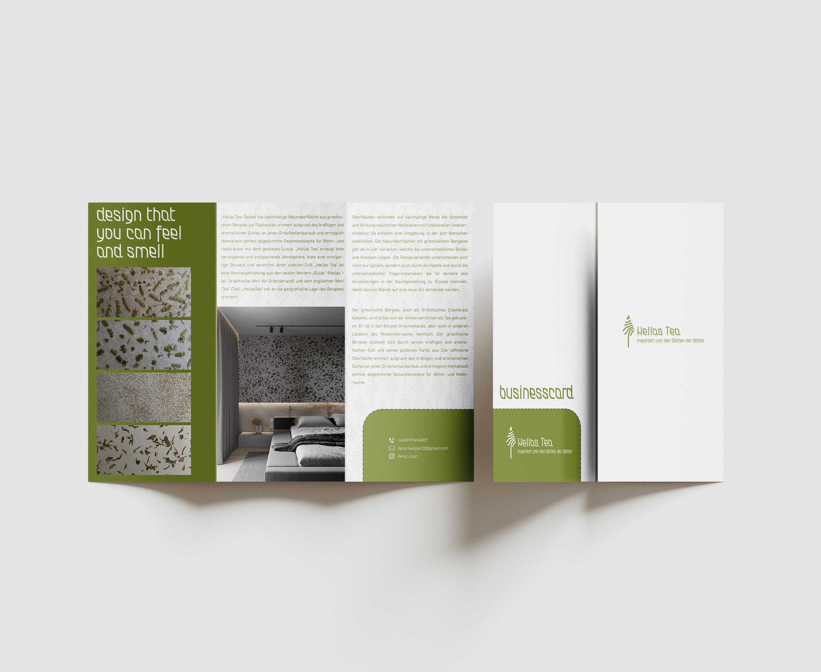
In the ‚Advertising‘ course, the task was to design a flyer promoting an existing project/product. The flyer had to feature a self-designed logo and text about the product. I chose to focus on natural surfaces, developed in collaboration with Organoid. The flyer displays four patterns made from Greek mountain tea. In reality, you can touch and smell the different patterns. The logo symbolizes Greek mountain tea and also serves as the branding pattern.And a fun detail is the business card that can be torn off from the flyer
Flyer by Corporate Design
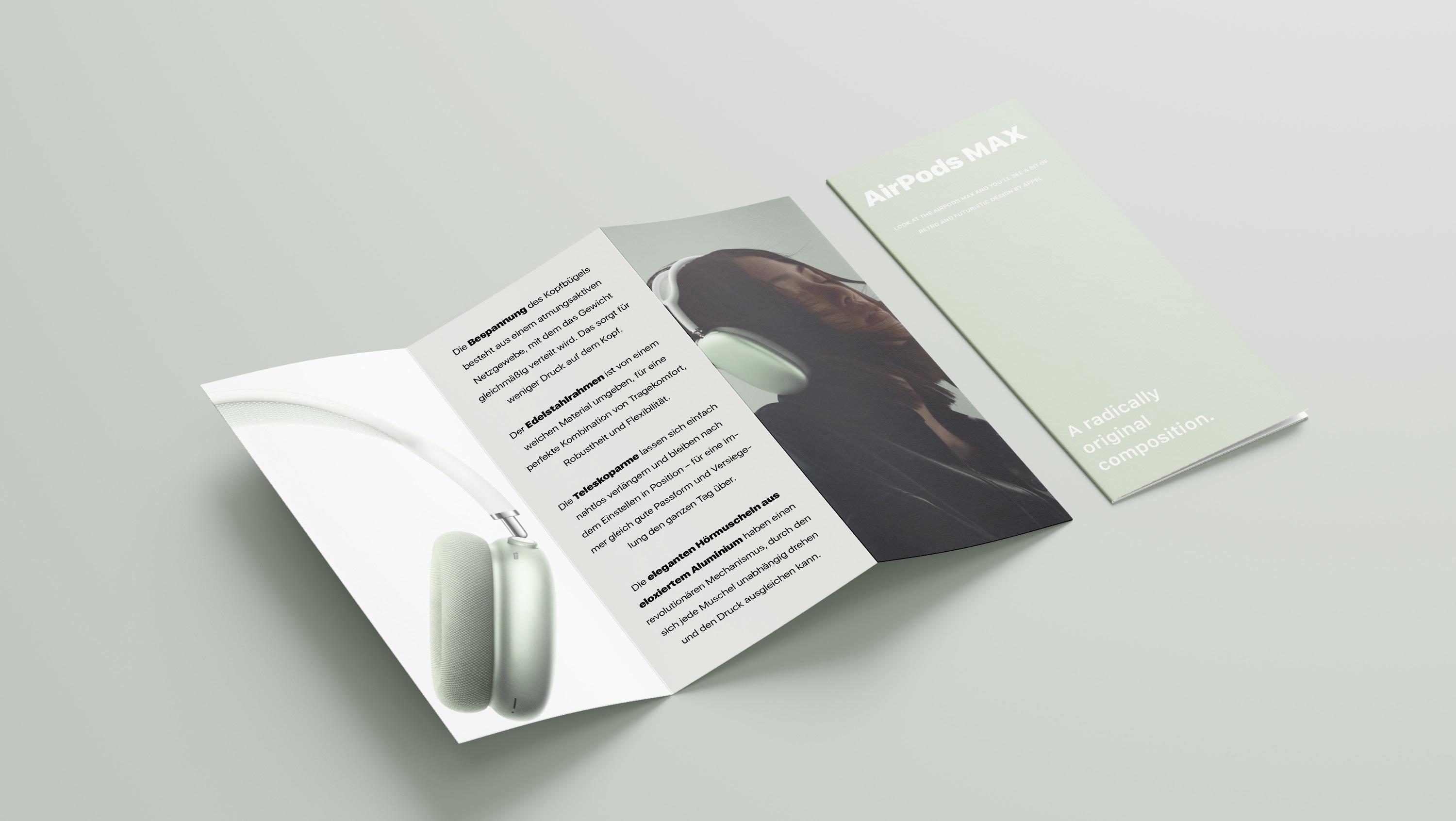
As part of the graphic design class, we had to design a flyer. The flyer had to be from a specific company and the task was to reflect the corporate design. In my case, I chose Apple and designed a flyer for the Airpod Max.
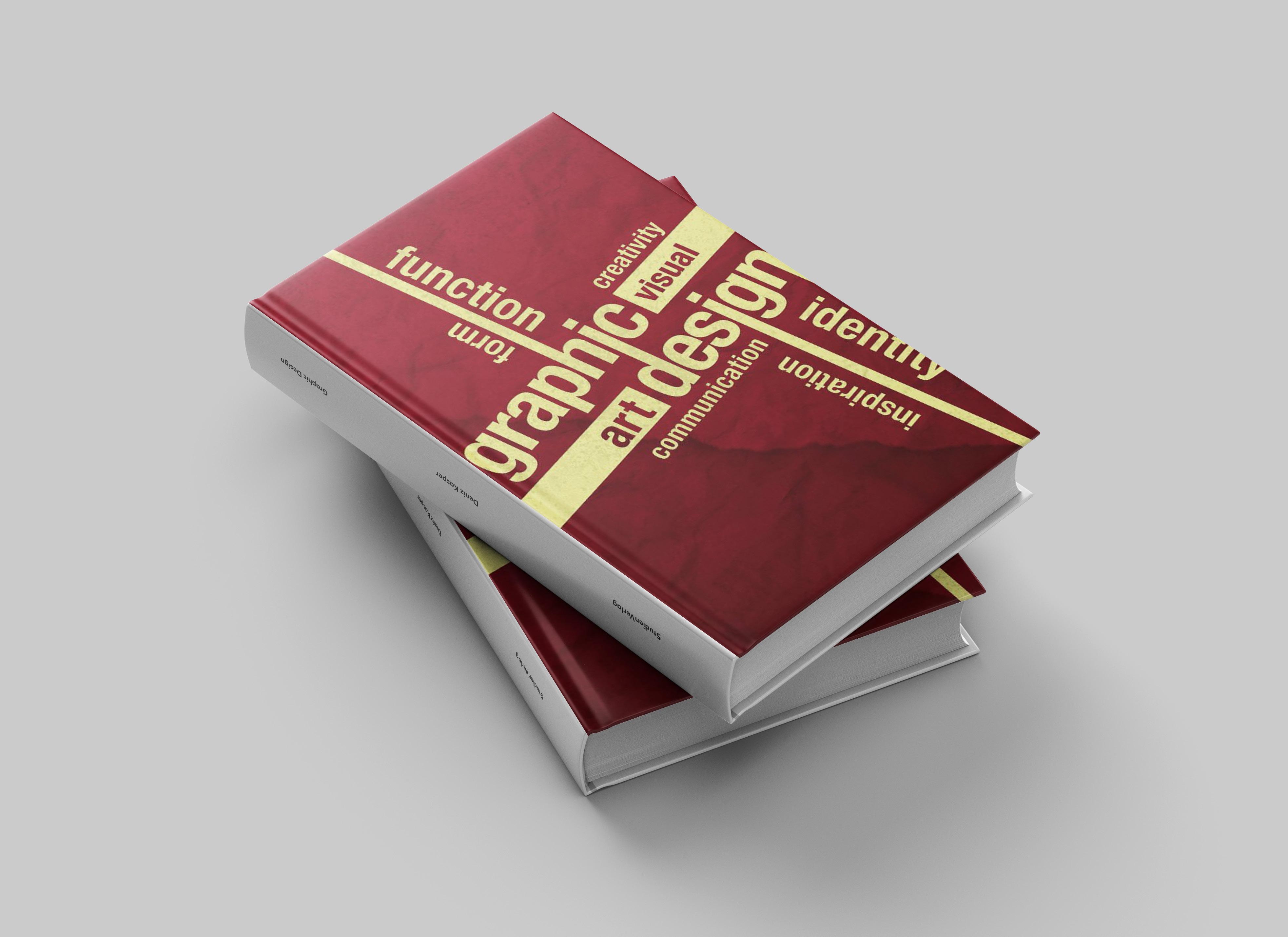
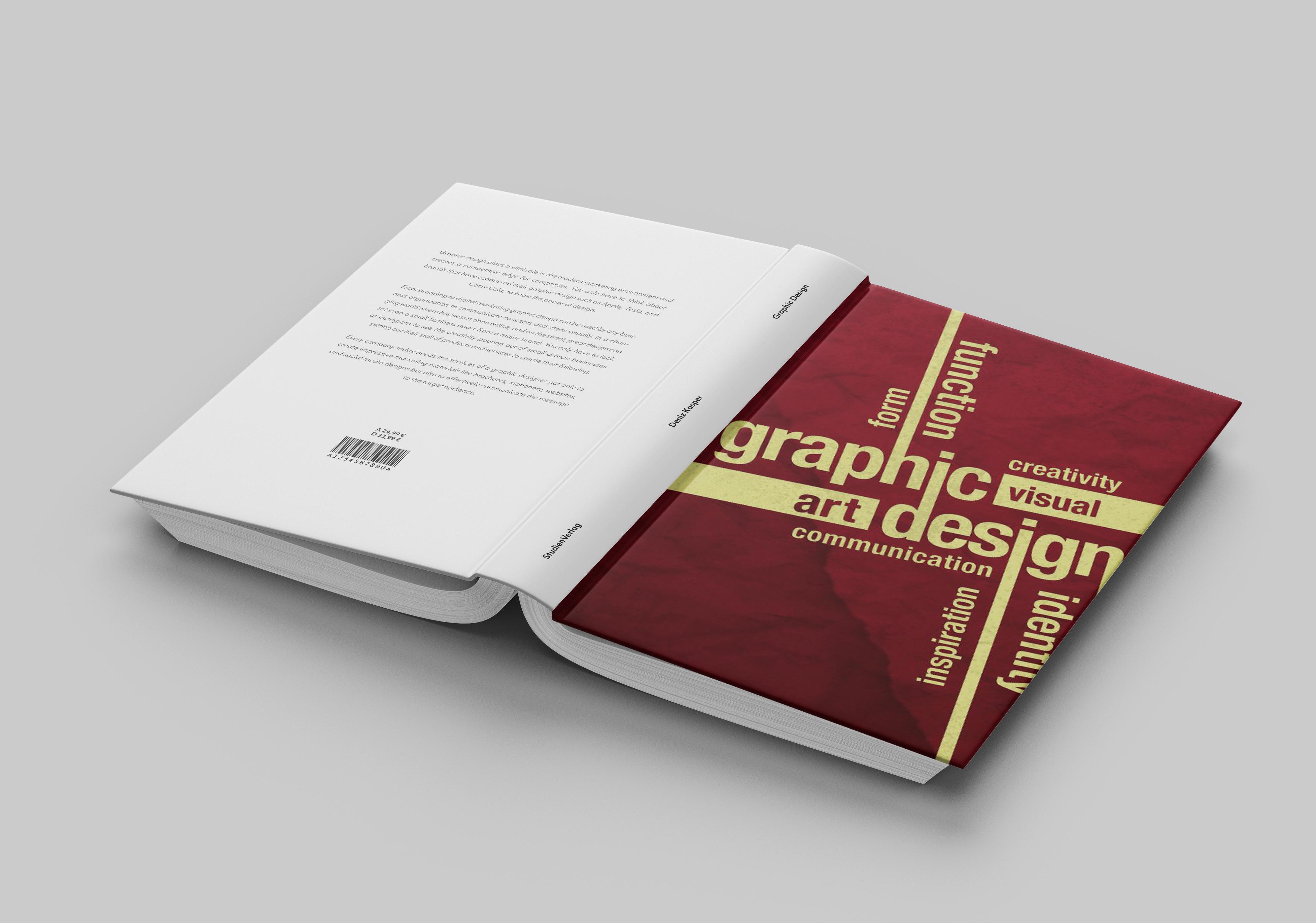
Another task og the graphic design class was to design a book cover. I went with a book cover about „graphic design“. As colours I used gold and red because they work really good together. On the back side of the book cover I wrote some information what the book is about. For this small task I used Photoshop and Illustrator. 06 |
Book cover
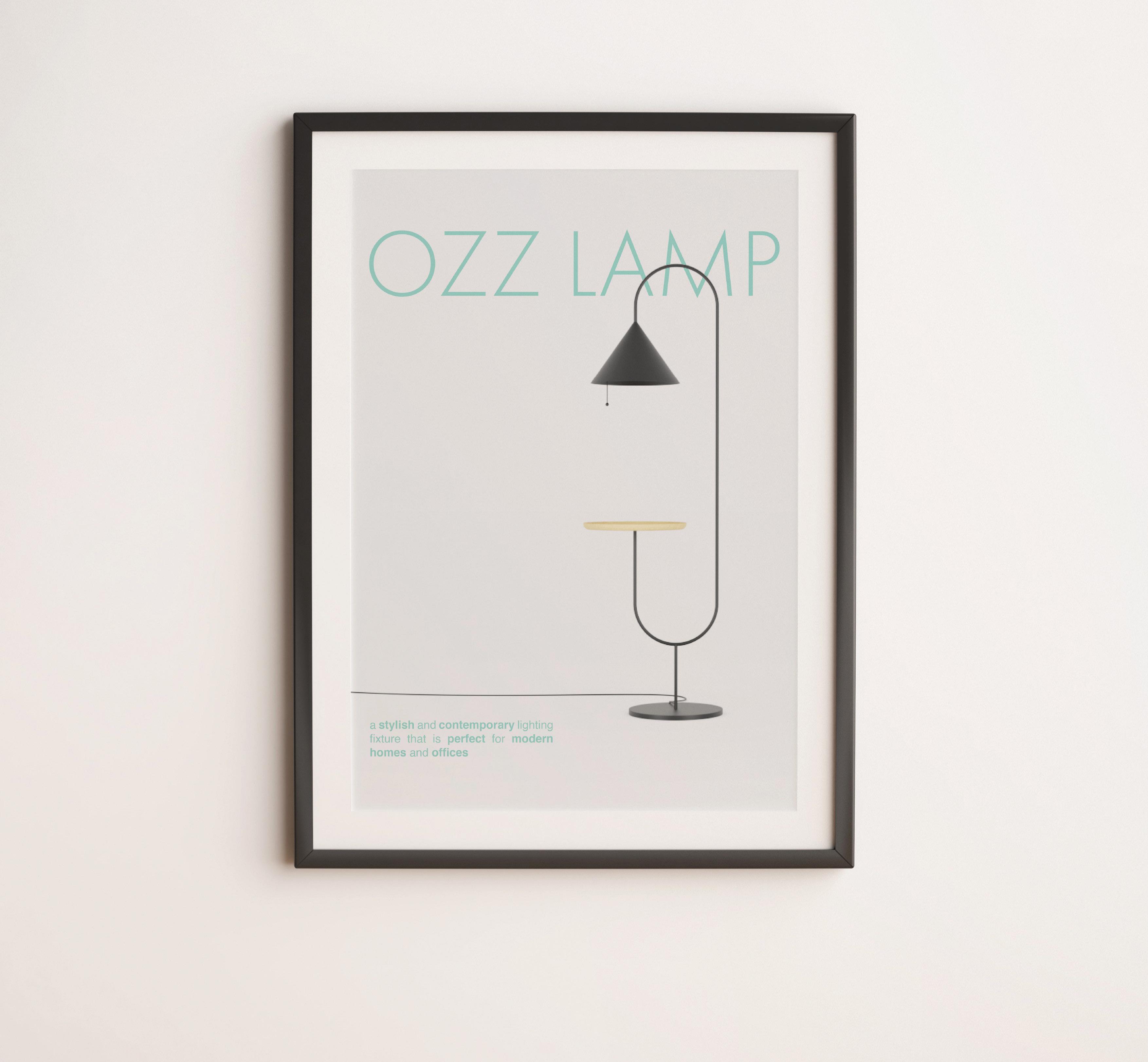
During the 3rd semester of the graphic design class, I had to design several posters. The first one „Ozz lamp“ , which was actually a task for another 3D class, but I though „why don‘t you make a poster of it?“
07 | Poster Design - Ozz Lamp
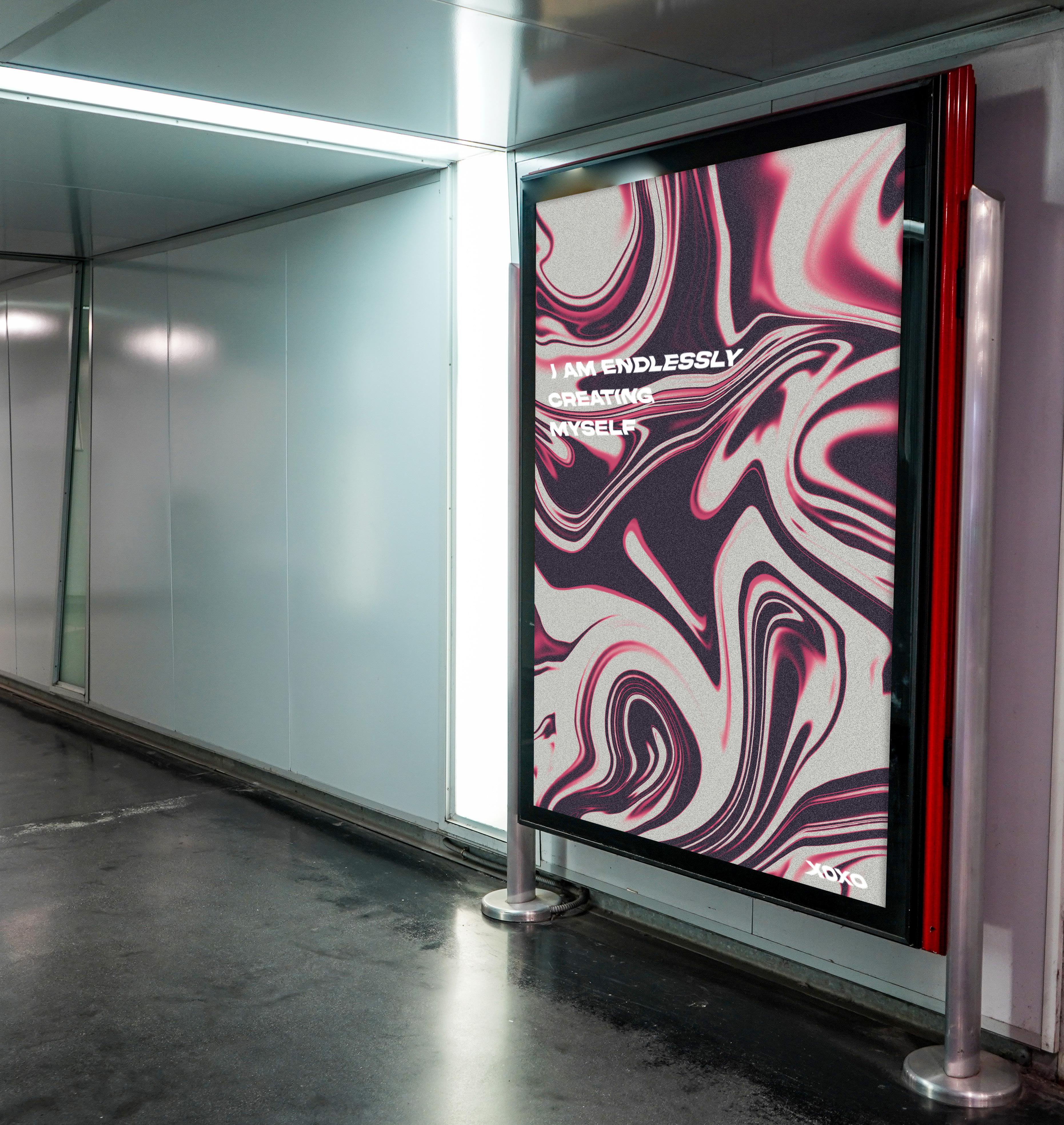
Poster Design - Inspiriational qoute
The 2nd poster goes more in the direction of „motivation“ and „self-discovery“ and is intended to remind passers-by that you can always improve yourself and learn new things.
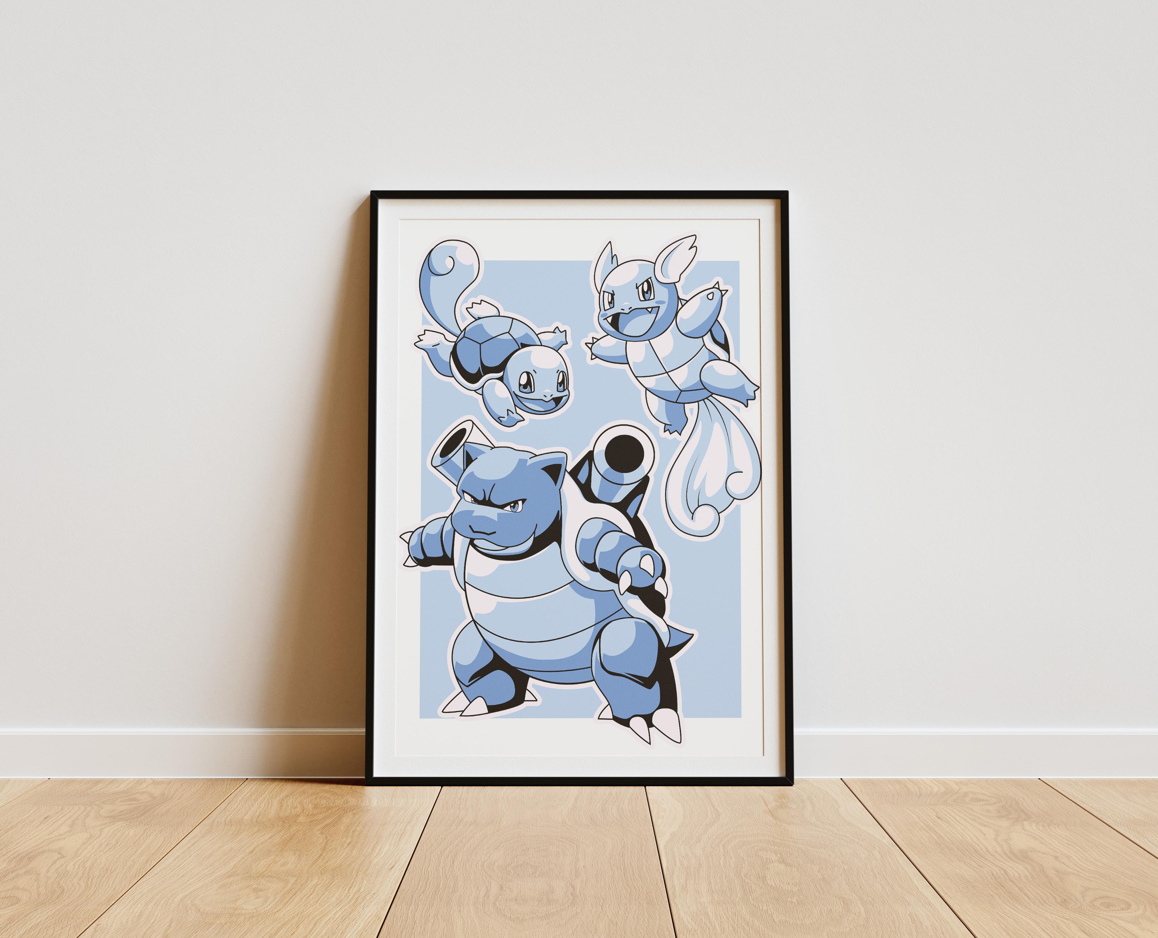
Poster Design - Schiggy/ Squirtle
The last poster was actually a real-life project for my little nephew, who‘s a Pokemon Fan, so for christmas, I made him a poster of the first water pokemon starter „Squirtle“ with all of its evolution.
Product Photography
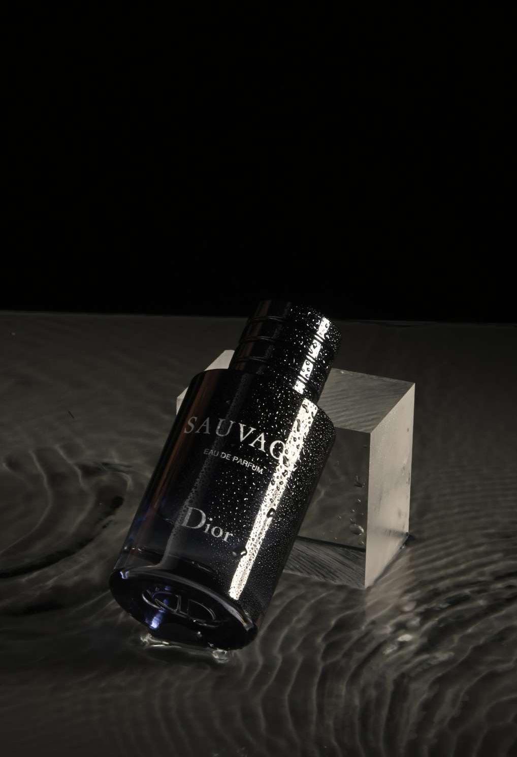
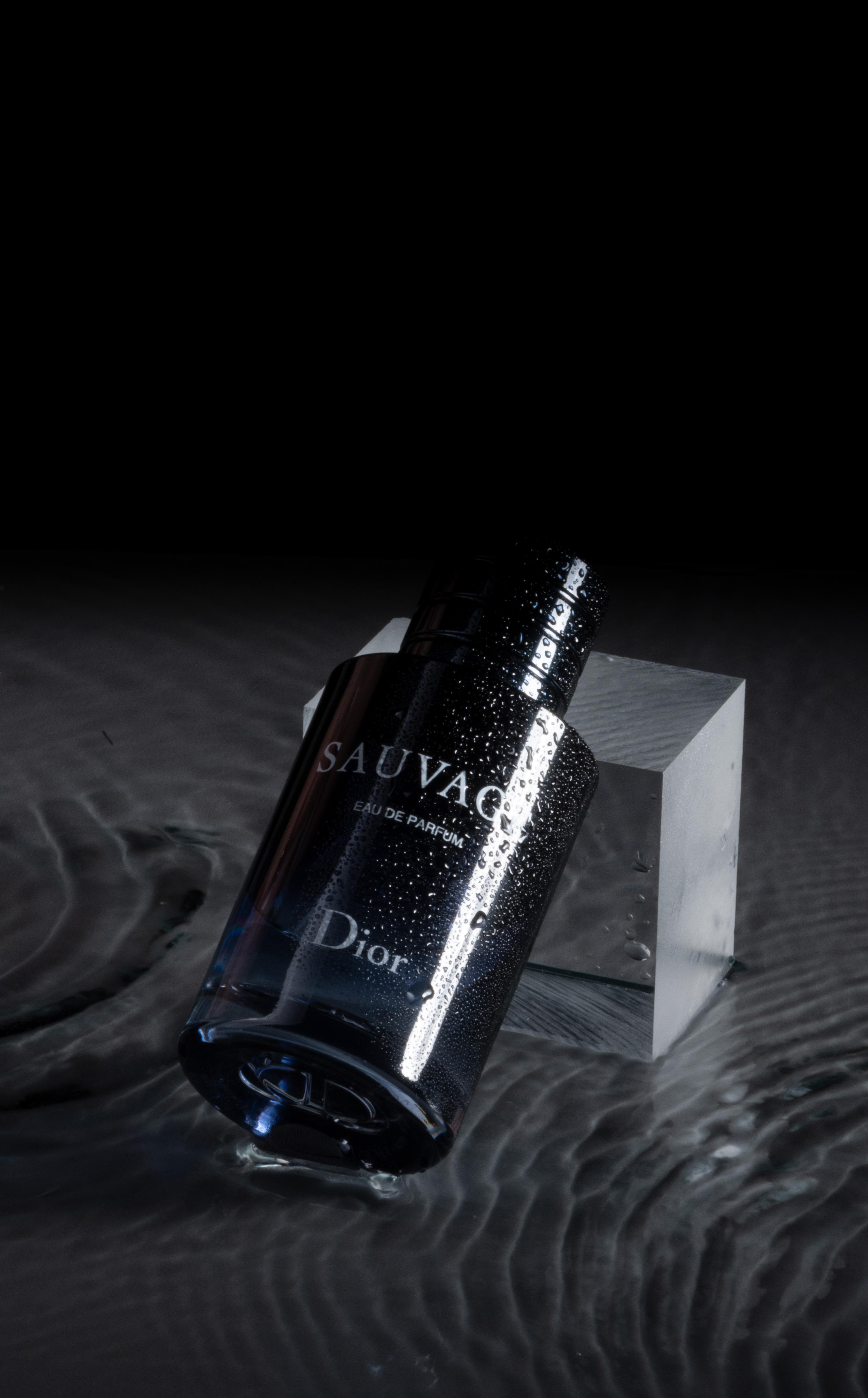
In my 5th semester, I discovered my interest in photography. The semester project was to photograph a product and present it well. In my case, I chose one of my perfumes.
My goal was to capture the mysterious and cool color scheme of Dior Sauvage. In the ‚before‘ picture, the light appears very yellowish, the background has a sharp edge, and the photo looks very bland.
The programm I used for the photo was camera raw. I first used a dark color gradient to get a even background. Then I used the color gradient tool to match the parfum‘s cold color scheme. For the rain drops on the bottle I simply used a spray.
08 | Dior Sauvage
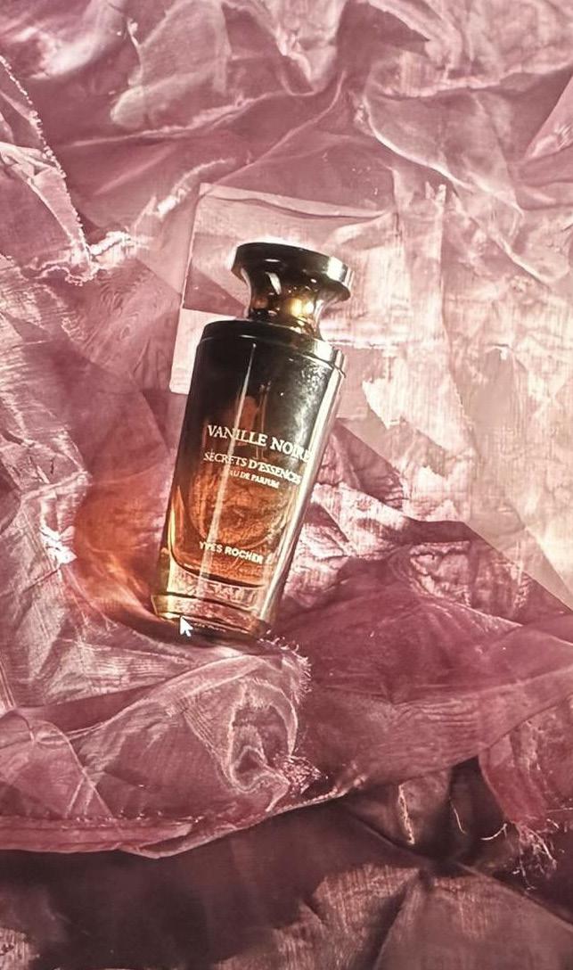
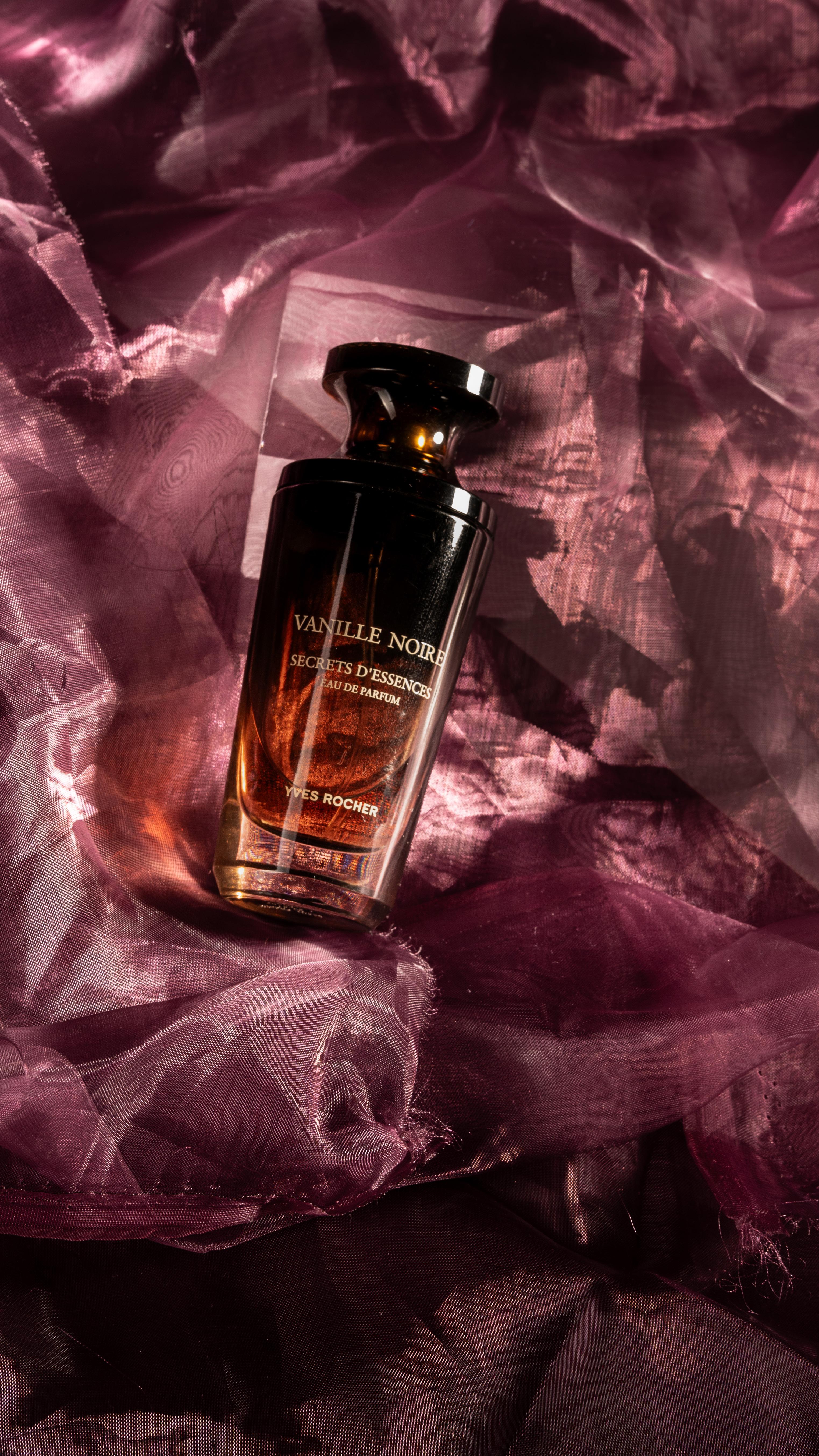
Further I did a second photo of another parfum which goes by the name „Yves Rocher - Vanille Noire“ .
As you can see the picture on the left side is very bright, blury, the information cannot be read. Therefore, in the second picture, I lowered the exposure to make the image darker. Then, using the AI tool in Camera Raw, I selected only the perfume bottle and adjusted the brightness, contrast, and shadows to make the perfume stand out better. Additionally, I darkened specific areas in the background. I did that, because I wanted to I capture the dark gradient of the bottle.
09 | Yves Rocher
10 | Fishes in a bucket
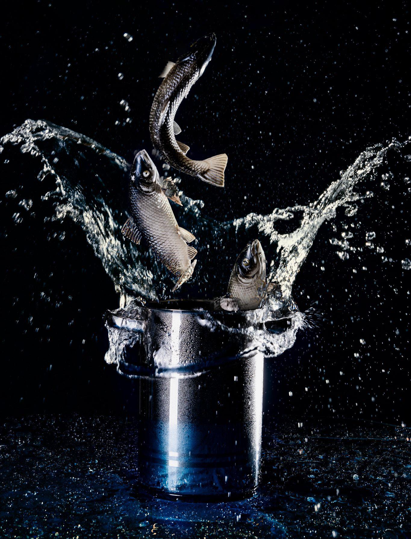
In the 6th semester of the photography course, we had to complete various small projects. One of these projects involved taking a photo based on a sketch. The sketch depicted fish jumping out of a bucket, and we had to recreate this photo as a group. First, we photographed just the fish and the bucket. Then, we threw stones into the bucket to create water splashes. In Photoshop, we combined both photos, resulting in the image you see on the right.
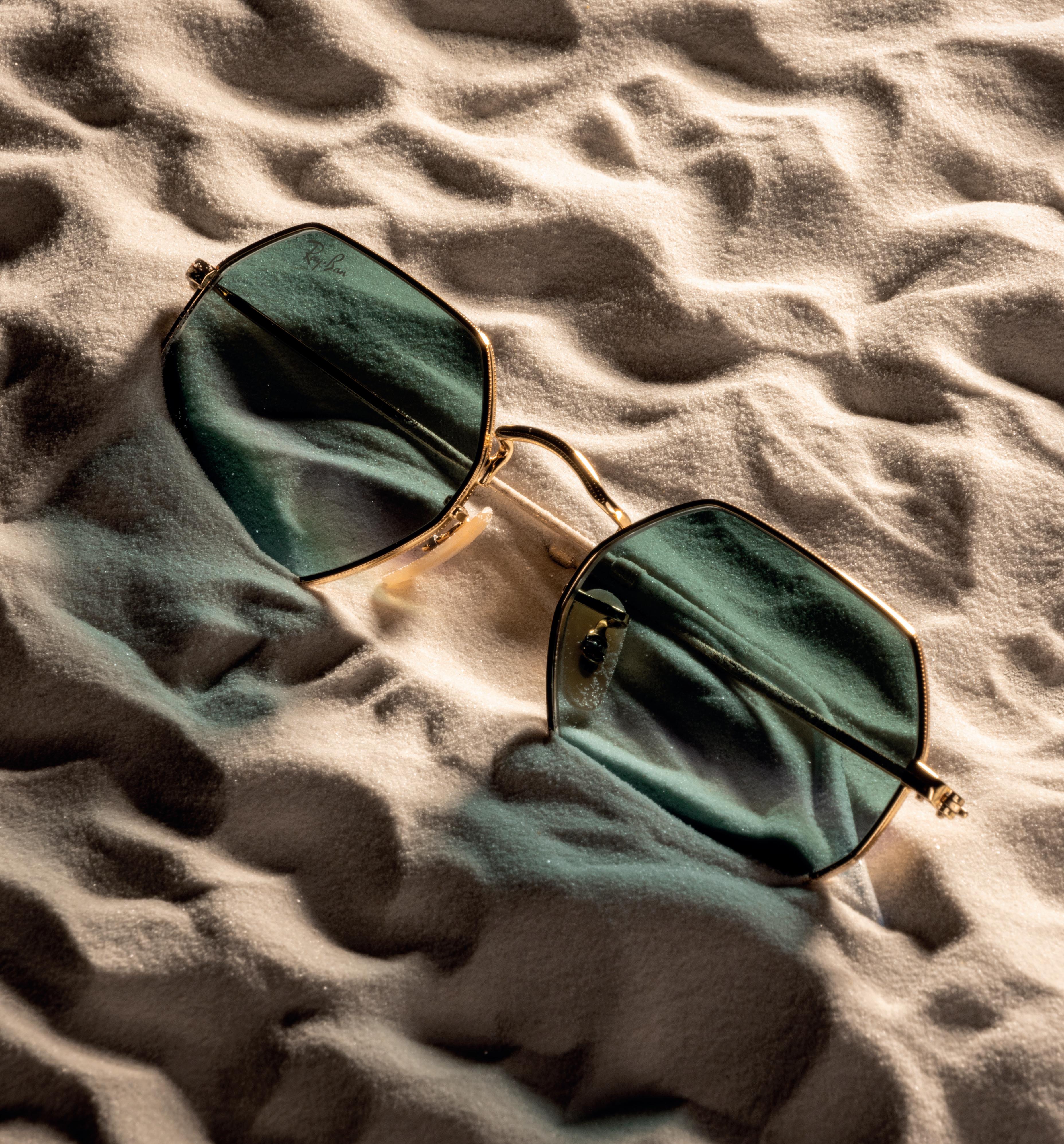
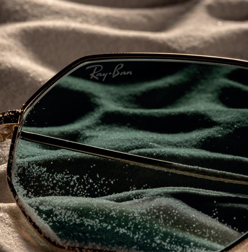
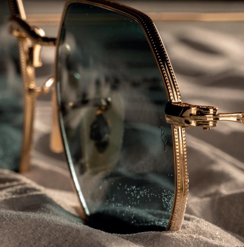
The semester project in the photography course was to create a product photo, including a detail shot and an application example. I chose my Ray-Ban sunglasses. For the background, I used decorative sand and backlit the glasses to give the shadow a bluish hue. The two detail shots highlight the „Ray-Ban“ inscription and the hinge of the arm. The goal of this project was to design a poster or layout. The layout should include the brand‘s logo, the photos, and a title and a subtitle.
OCTAGONAL CLASSIC
Zeitlose Eleganz:
Die Ray-Ban OCTAGONAL CLASSIC - ein Symbol für Stil und Klasse
Neue Formen und zukunftsweisende Farbtöne versehen das legendäre Profil eines Retro-Klassikers mit einer einzigartigen Persönlichkeit: von Rund zu Achteckig! Underground, deluxe und revolutionär in einem, überarbeitet diese neue achteckige Form das feine Goldmetall-Profil eines Klassikers von Ray-Ban.
3D-Modeling
As a design student it is important to be able to create 3D models to visualize the desired design. The following exercises did a great job introducing me into the 3D shaping and rendering world. The different softwares such as 3Ds-Max, Solidworks, Vectorworks tought me how to model real life objects like kitchens, furnitures, toys and even whole scenes. The following pages are showcasing some of my 3D-Modeling and renderings projects.
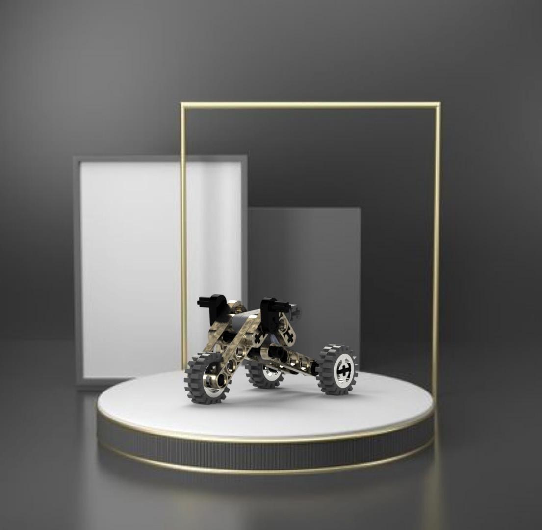
12 | Lego Trike
The lego Trike was one the first ever 3D-Modelling and rendering project. The Tasks was first of all to model all the single lego parts and to stack them together to build the trike. The second part was to create three different renderings.
The idea behind the first rendering was to present the Lego trike in the way new cars are presented. It is displayed on an illuminated podium, with a simple background so as not to attract too much attention. The color scheme of the trike is also kept simple, with several golden accents and black steering
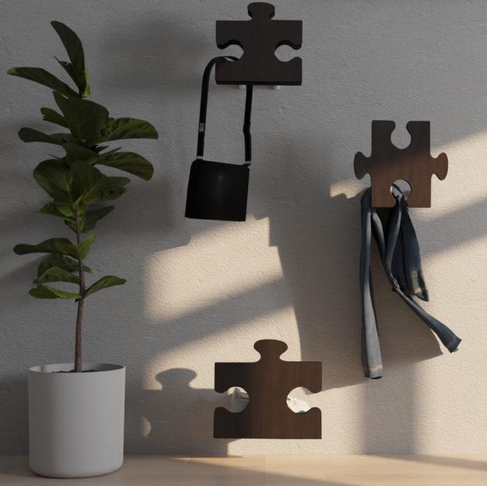
13 | Dump Servant
As part of the furniture design class, we had the task of designing a dump servant. This was also group work. In addition to designing the Servant, my partner and I should consider which target group we should target. My partner and I created the „Puzzle Servant“. The „Puzzle Servant“ can carry up to seven items and can be found in every family home. In order to bring a certain naturalness into the room, we chose wood as the material.
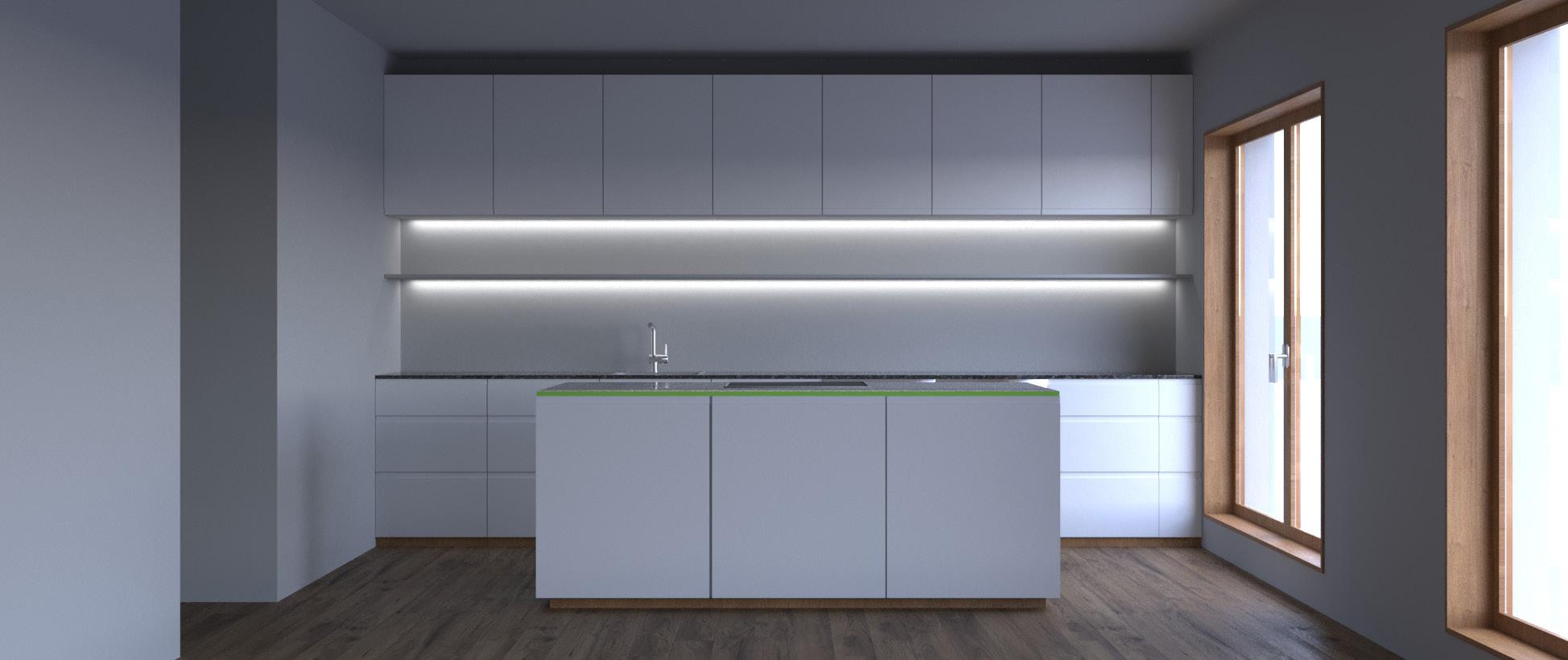
14 | Kitchen Modeling
During the CAD class, I was introduced to a new 3D modeling tool, which is called 3Ds Max. The goal was to model an entire apartment. However, the focus was on modeling the kitchen and presenting it in a simple scene.
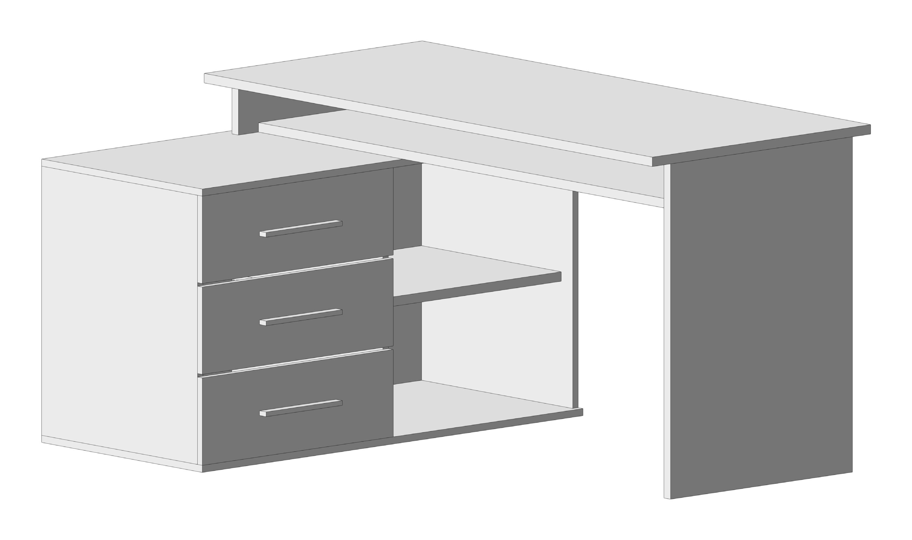
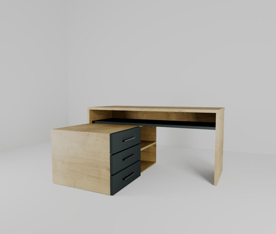
During the interior design class I was introducted to another 3D-Modeling-tool, which was Vectorworks. The task was to draw a floorplan of our own room and to bulid any furniture which stands in the room. In this case i remodeled my desk.
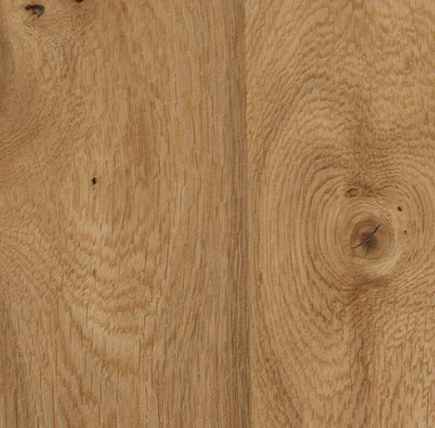
As for the rendering I used 3Ds Max, added the materials. The surface and sides, as well as the shelves on the left side of the desk, are made of knotty oak veneer. The desk drawers and the lower shelf are both covered with a dark veneer.
Branding
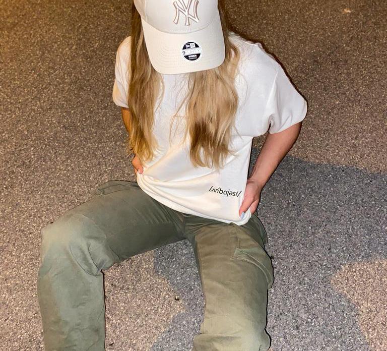
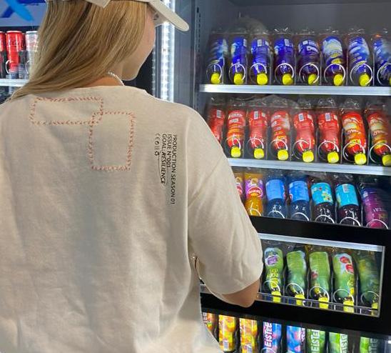
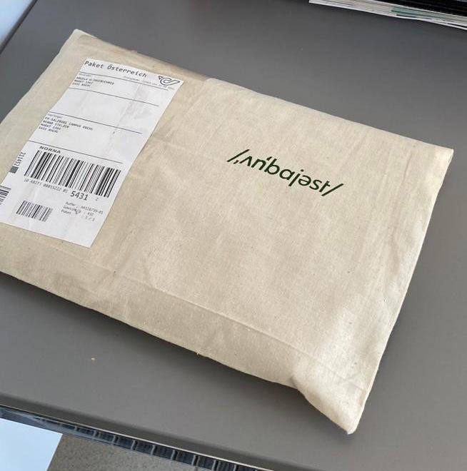
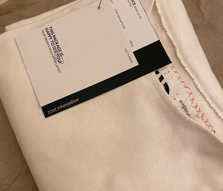
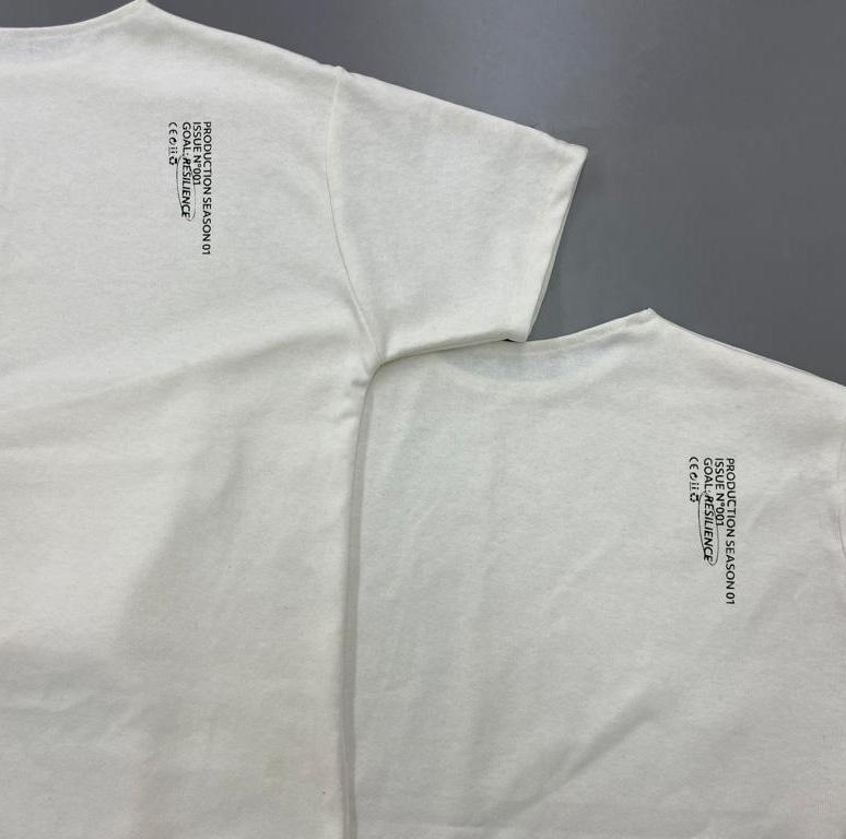
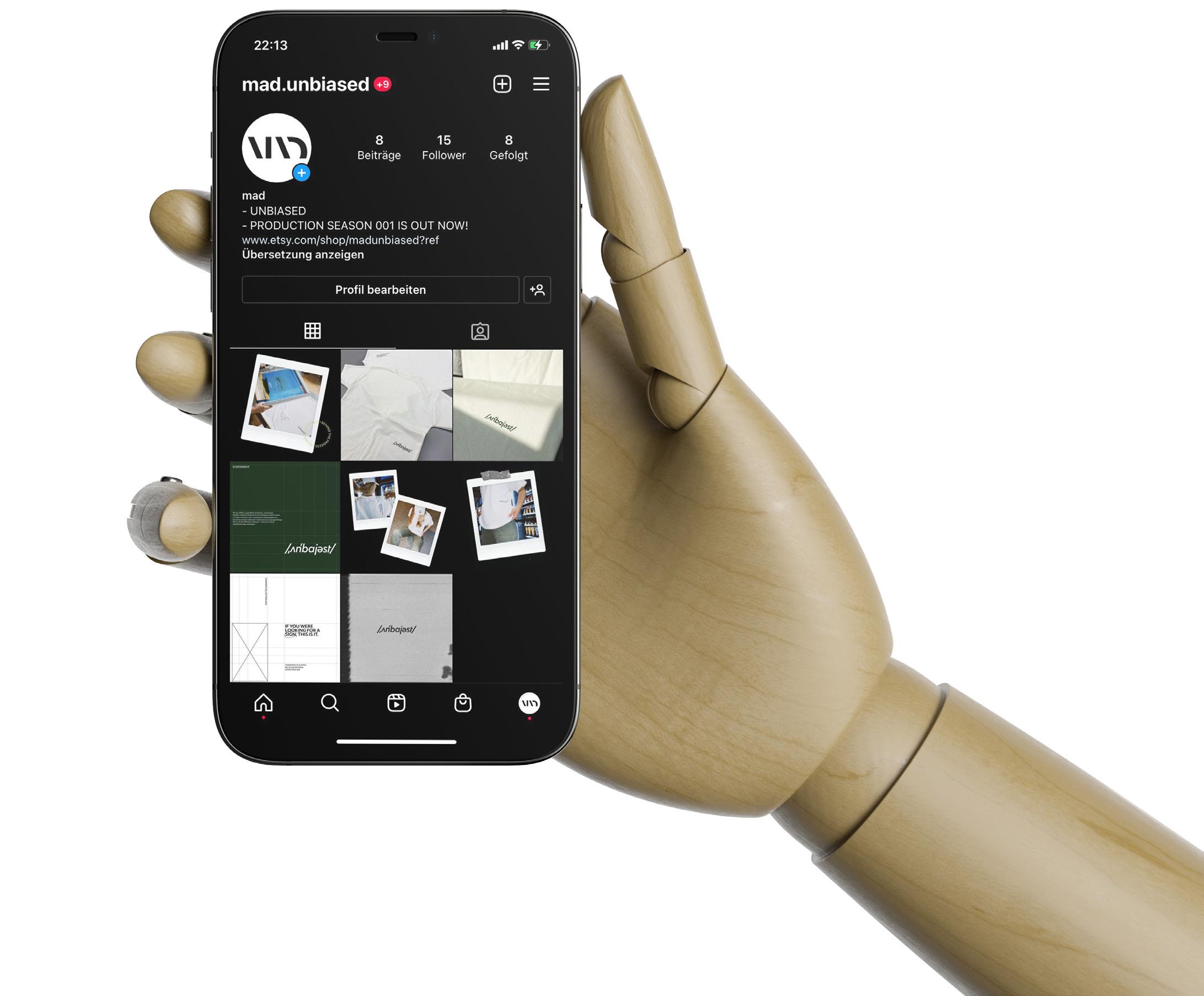
MAD is a fashion company that engages with the concept of resilience, aiming to raise awareness about this theme through the design and sale of their streetwear-style T-shirts. „Unbiased“ is the first product line from MAD, symbolizing the importance of being open-minded.
Dark Green
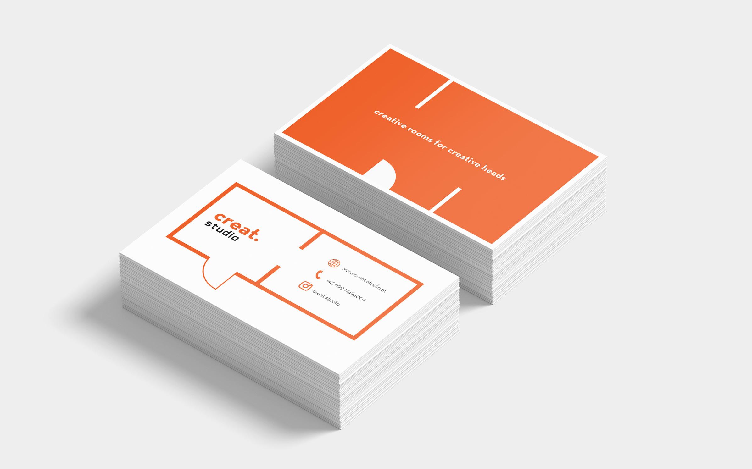
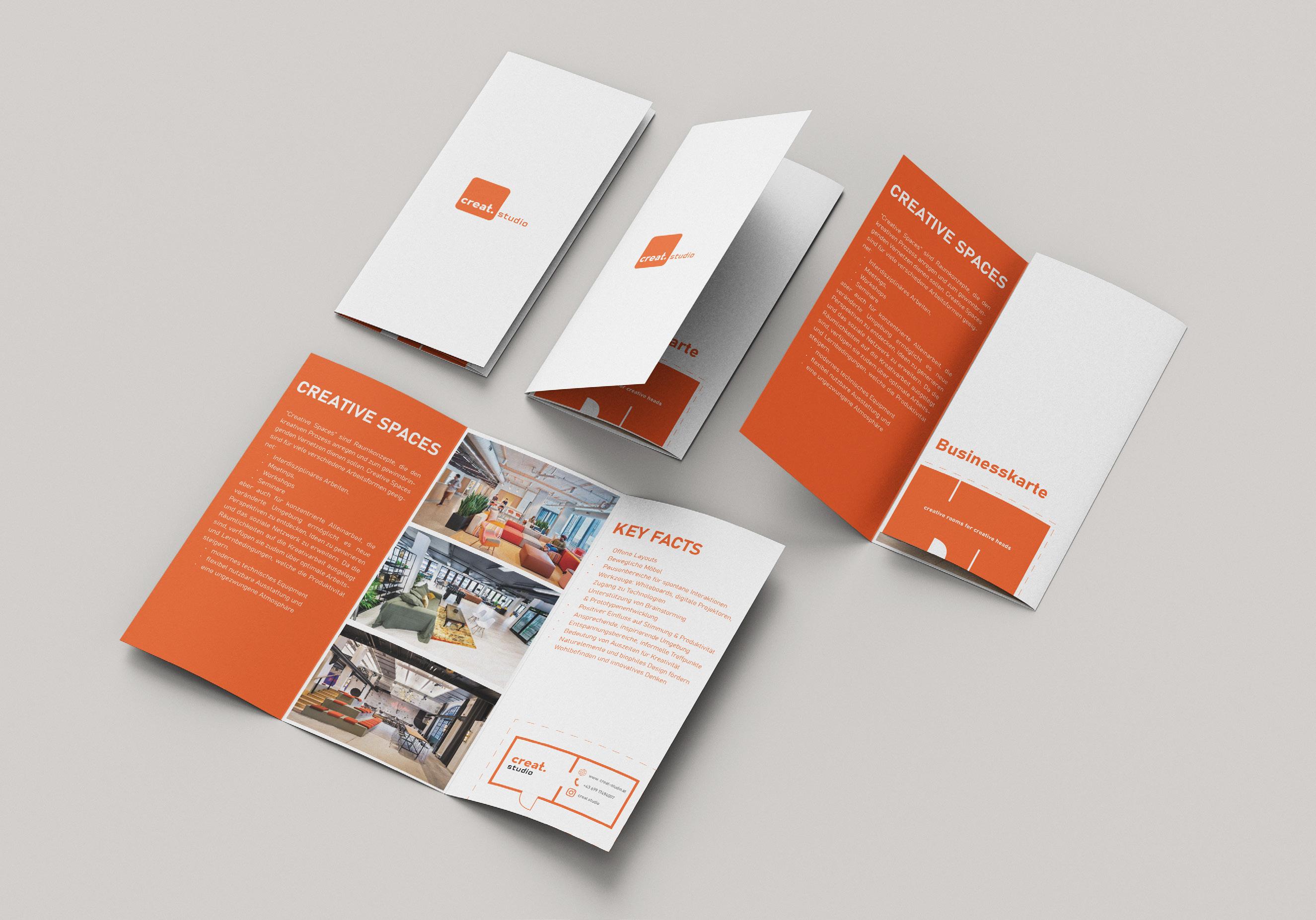
18 | Creat.Studio
Creat.Studio is an Interior Design company that offers an innovative way to design creativity-enhancing learning environments in higher education institutions while fully utilizing the potential of physical learning spaces for educational development. Universities come into direct contact with experienced designers who specialize in creating inspiring and functional educational spaces. The goal of Creat.Studio is to support educational institutions that want to promote the well-being and creativity of students by providing thoughtful and aesthetically pleasing learning environments.
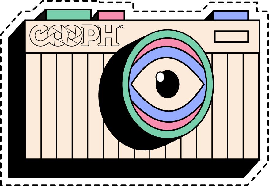
Internship at „COOPH“
COOPERATIVE OF P HOTOGRAPHY
My main responsibilities revolved around product and graphic design (stickers art prints and illustrations), combined with concept development, the creation of communication assets, and research work. Throughout my three months I was involved in some projects for „COOPH“, such as designing, ropes, camera connector, stickers, art-prints, t-shirts and caps and also for PIEPS GmbH. In this case, my task was to create small illustrations for their instruction manual for the IPS PRO search device.
When designing the stickers the only requierment was to implent the „COOPH“ logo and something that can be associated with cameras. So, I was allowed to design anything I wanted. These pictures are just a little glimpse of the stickers I have done during my internship.
I am a memory you never lose never lose memories (again...) didn’t forget to save! did you already save?
I collect memories I save moments
19 | Sticker Design
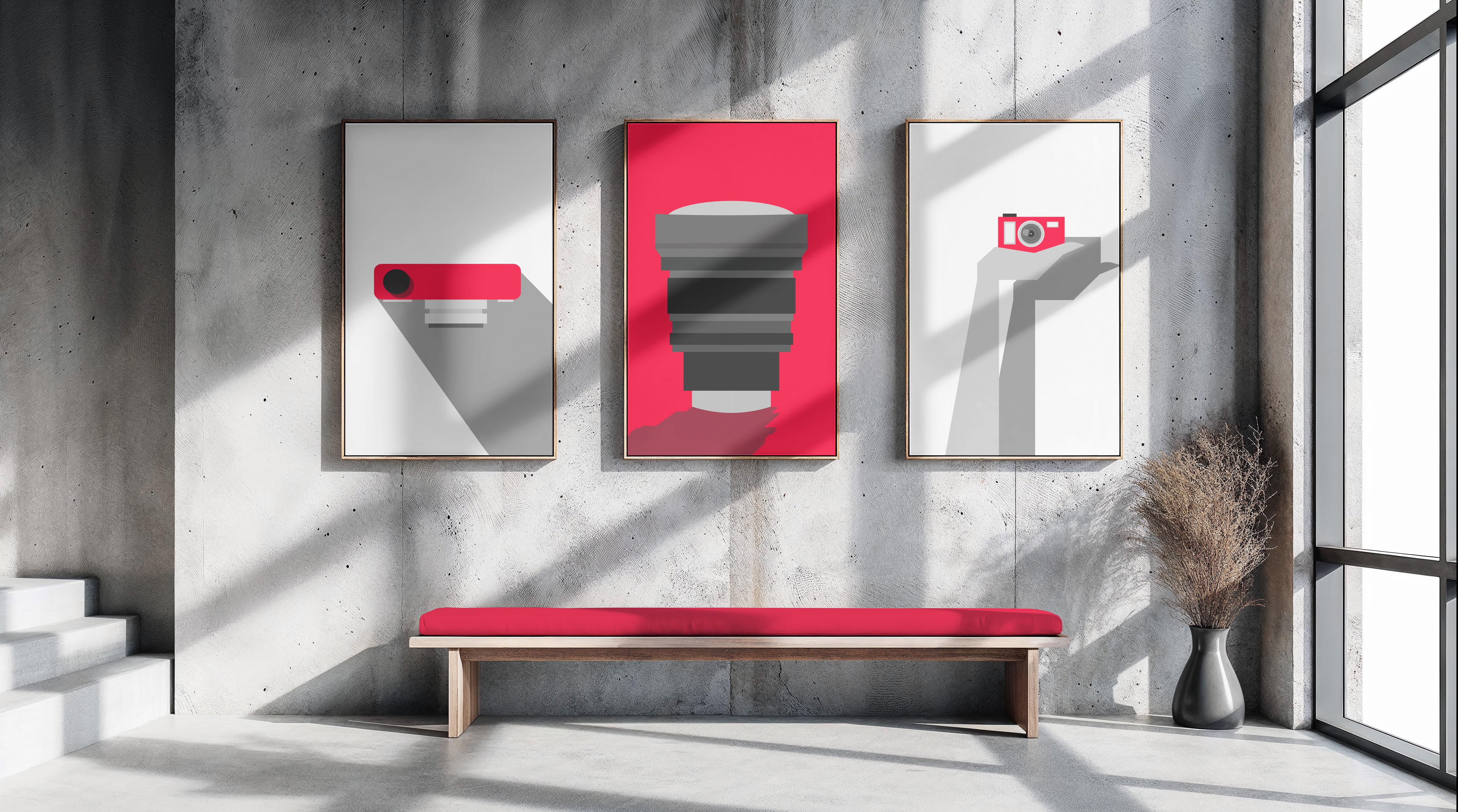
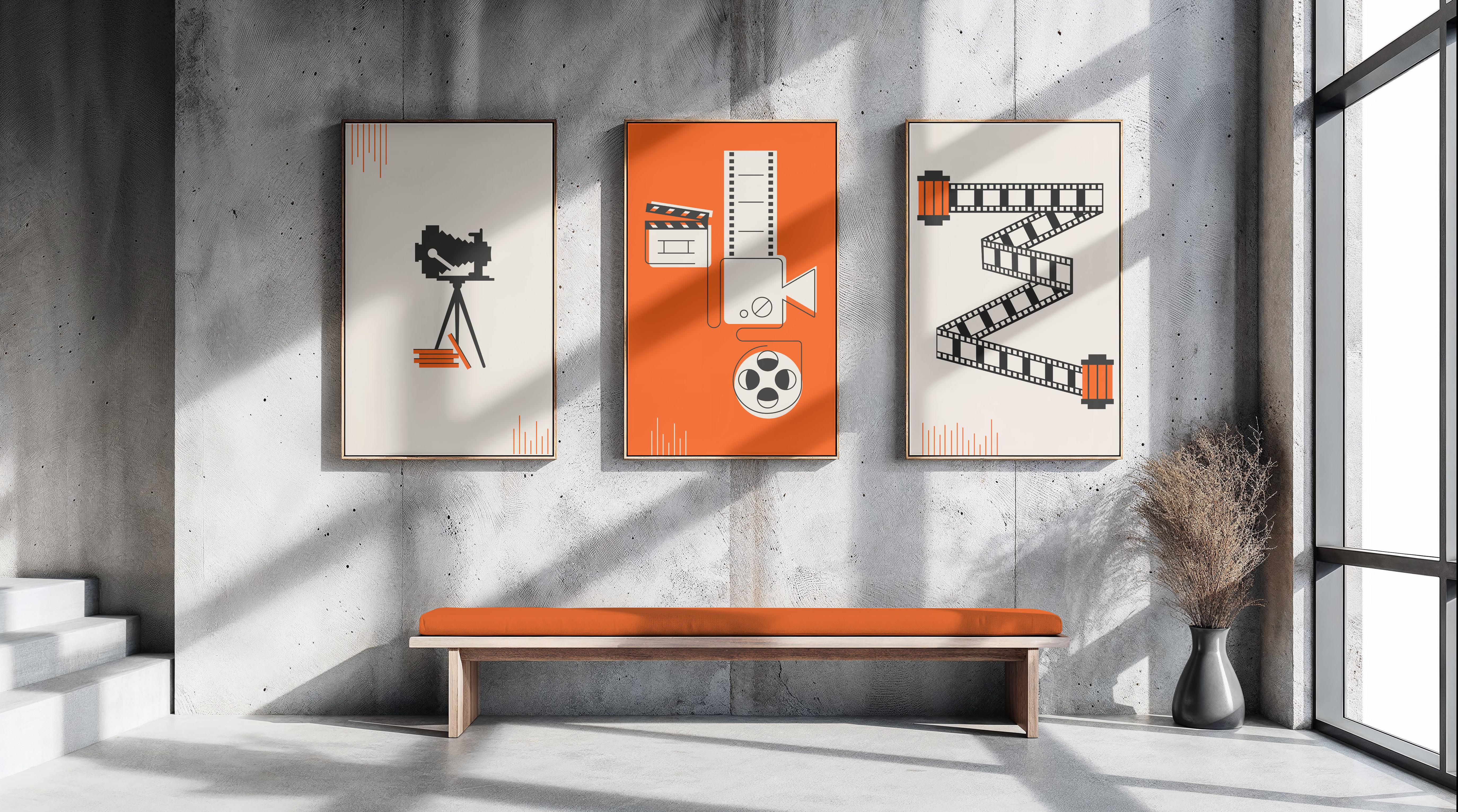
20 | Art Prints
The first series of my art prints are showing in a minimalistic way of how lights and shadows affects the apperance of a camera.
The second series of my art prints should symbolize life graphically. The first picture shows the first camera, figuratively representing the first moments in life. The second picture depicts the different moments one experiences in life, in the spirit of ‚Cut, Camera, Action.‘ The last picture shows film reels. Film reels store individual frames that play an entire movie; therefore, life is a collection of countless frames that play out life.
21 | PIEPS GmbH
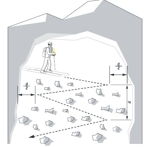
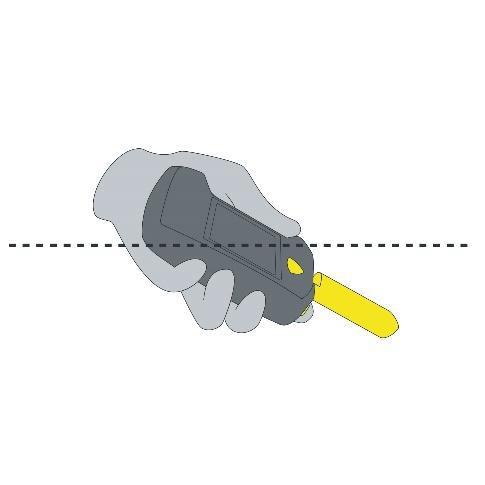
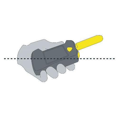
The PIEPS GmbH specializes in the development, manufacturing, and distribution of products for mountain sports and alpine safety (avalanche transceivers and safety equipment). For a new avalanche transceiver, I had to illustrate three illustrations for the user manual. For this, I was supposed to orient myself on the template of the real-life product.
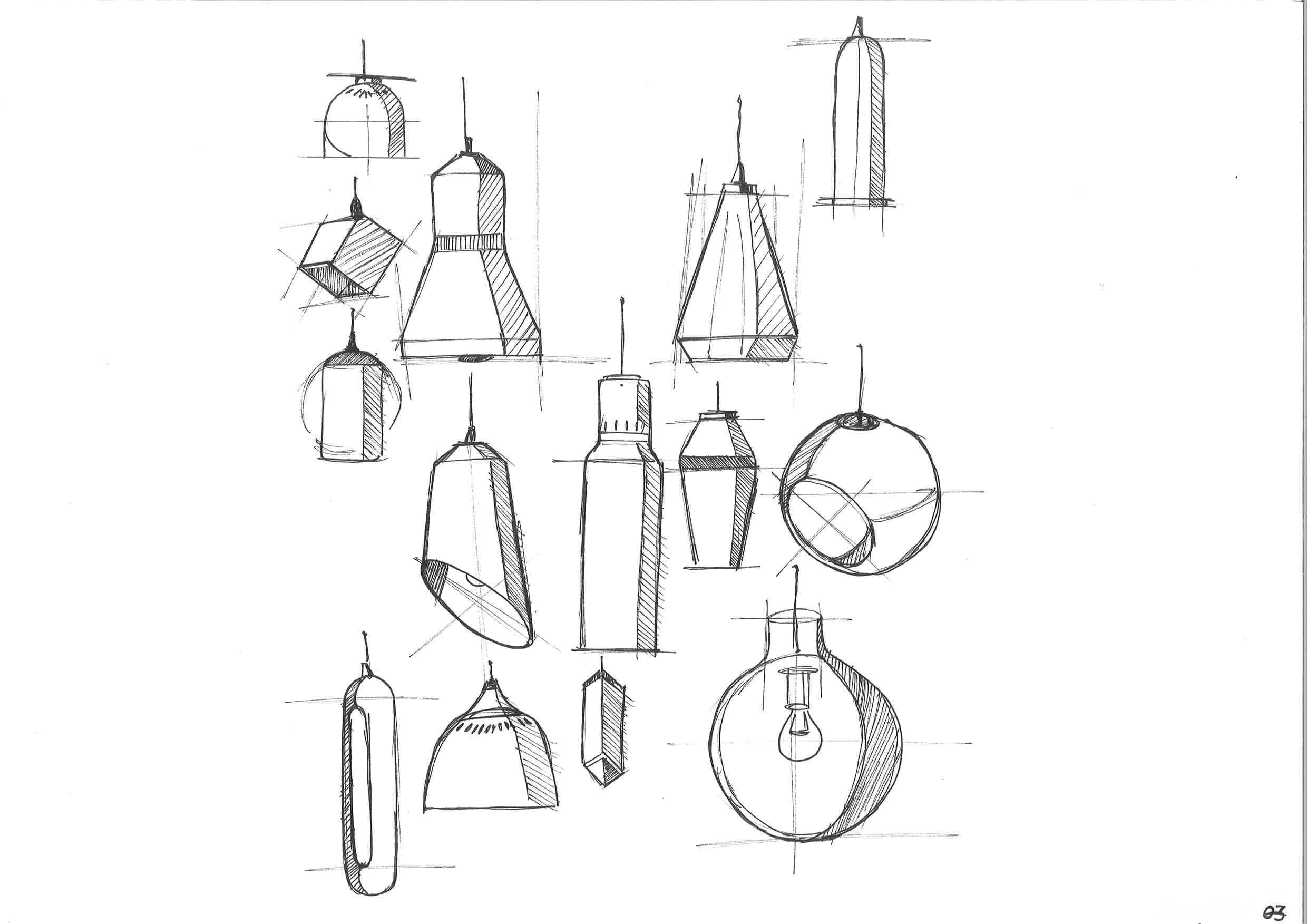
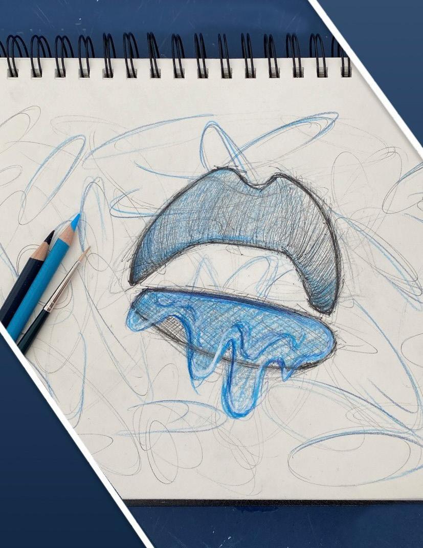
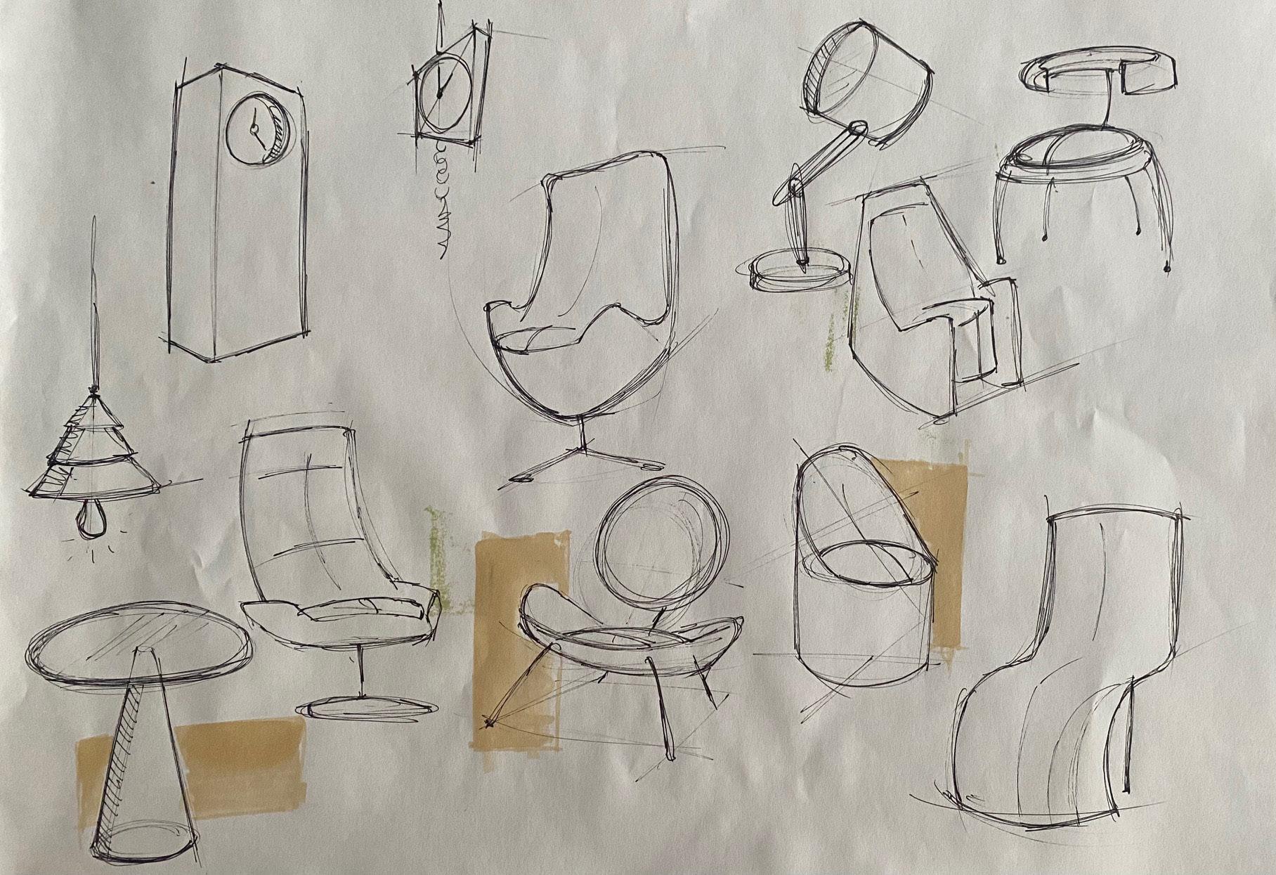
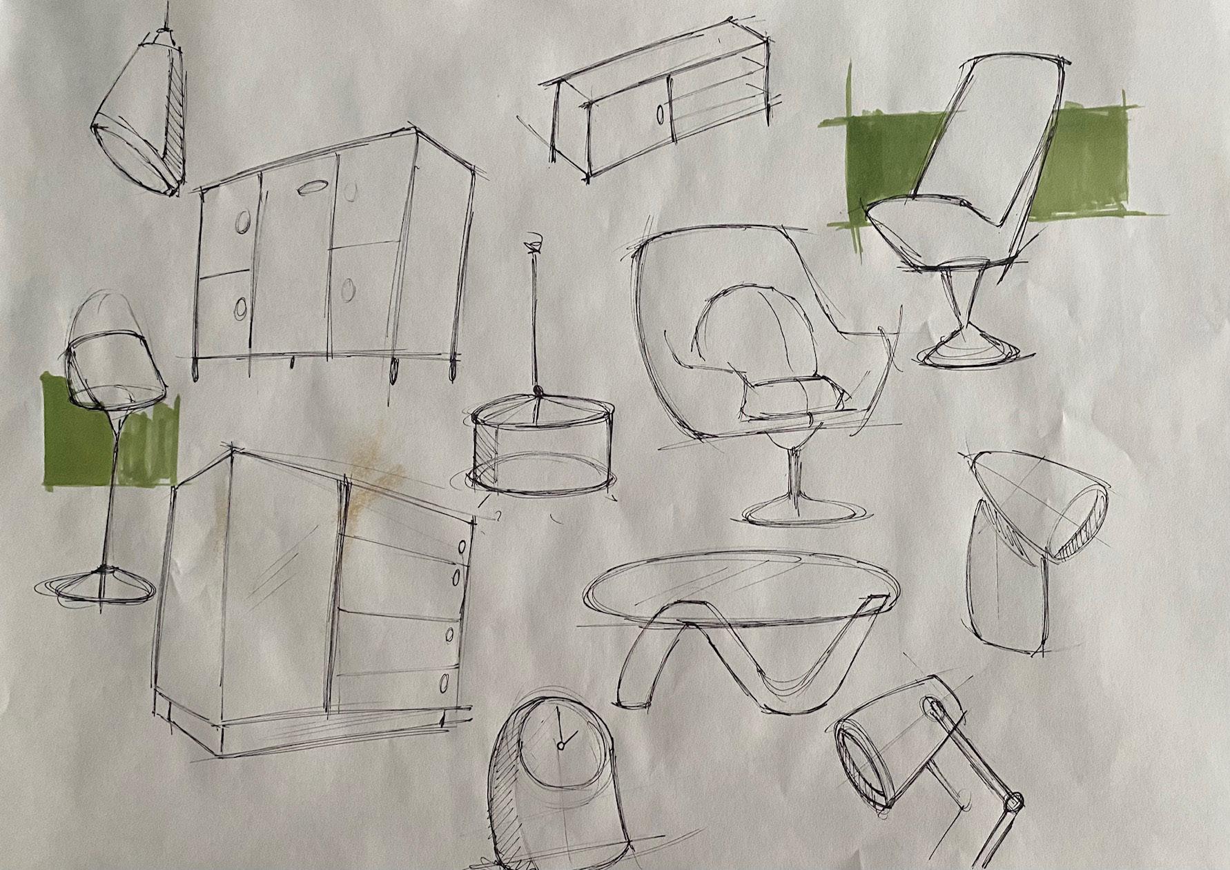
Sketching skills
As a design student, it is not only important to be able to make 3D models, but also to have drawing skills to sketch nice and sweet „renderings“. Because sketches help in the design process to get the final result
(insights)
These are some sketches which were made during the „Organoid“ project to help me visualize where I want to see my own surfaces.
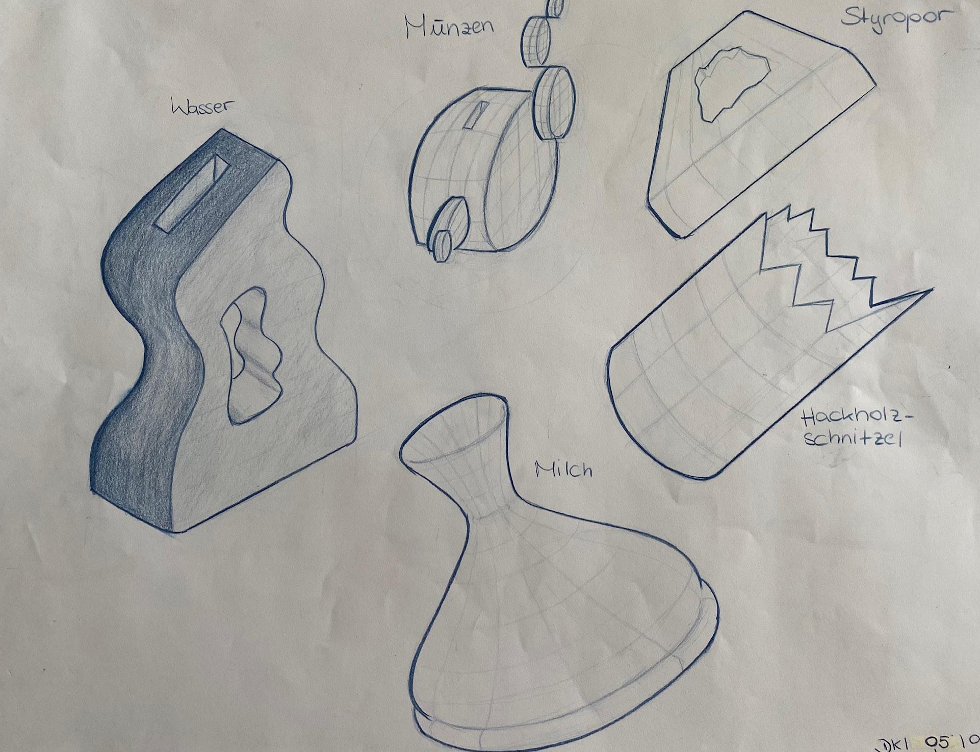
(insights)
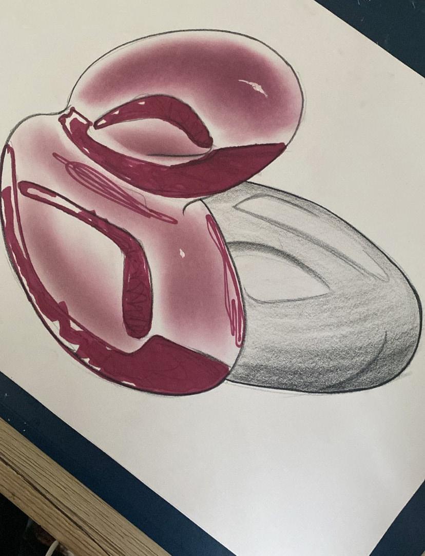
These sketches were made during the first industrial design project. The task was to design the task was to design vessels that reflect the design language of a specific liquid or material. In my case it was water, milk, styrofoam, wood chips and coins. Furthermore, i had to make a prototype of the chosen vessel, which was a vessel for water.