C o l l a g e D e s i g n
brand manual
02 About this manual 04 brand refresh 05 the brand 13 design 15 colour palette 17 logo 22 typeface 25 patterns 31 visual style
01

This brand manual is intended as a guide for internalalignmentand for externalstandardizationof the brand and its elements.
The former, a set of inward looking elements, defines the brand’s values, mission statement, long term vision, positioning, personality and voice. It leads directly to communication and messaging strategy and to the design refresh.
The design section, intended for external standardization, lays out the various design elements in this brand refresh. It will be used as a guide and template for all design decisions across platforms and messaging formats.
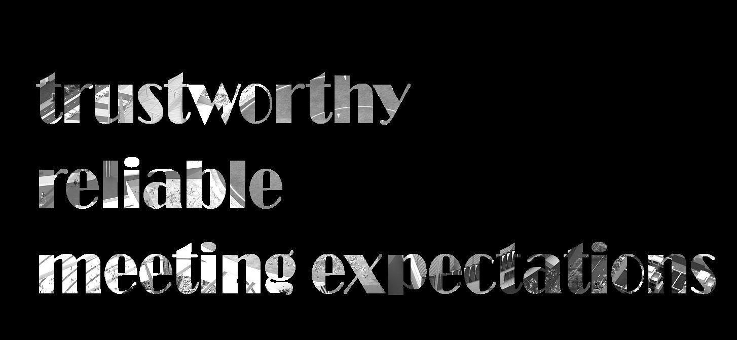
The brand attributes that emerged were steady and grounded. Collage Design is most likely to be known for its dependability; the firm can be relied upon to deliver “as per expectations”, on-time and on-budget. These are the qualities that bring clients back, time after time. These are also the qualities that attract glowing recommendations, garnering new business.
As a brand though, these are also staid attributes.
The passion that is evident amongst the key stakeholders, the confidence, the implicit trust in the team, the inclusive and friendly nature of the team, the vision to design more, bigger, better…these do not translate to the brand in its current messaging.
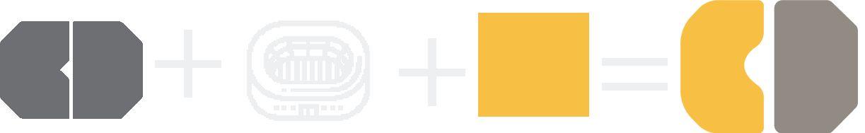
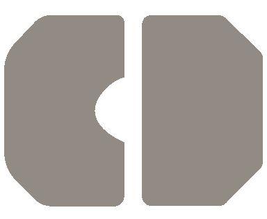
What also emerged as explicit problem statements was that the brand monogram lacks recall and that the brand identity lacks “flamboyance”.
This brand refresh attempts to retain the attributes of the brand while injecting the missing self-confidence and vibrancy.
We are an architecture firm that designs, engineers, builds, manages, researches and consults.
As such, we exist both in a creative aerie as well as firmly on the ground.
We are thinkers and doers. We are visionary yet collaborative. We are of high technology but also of the earth. We are modern yet inspired by age old, local cultures.
we design, construct, consult
Our mission
To work as a team so that we may enrich people’s lives with designs that fulfil our clients’aspirations while delivering on their requirements of time and budget, thereby leaving a legacy in the world of architecture.
These are the beliefs we hold. They serve as the guiding principles for our actions, behaviours and decisions.
We achieve our milestones “by working together and trusting each other”
We deliver on commitments, “come what may”
We have immense “confidence and trust in the team”
“We are a collage of people with diverse skills who come together to deliver cohesive designs”
We are guided by “patience, knowing it’s a long term game and by being supportive of each other”.
We ensure a “relaxed, friendly work atmosphere” with the “freedom to evolve”.
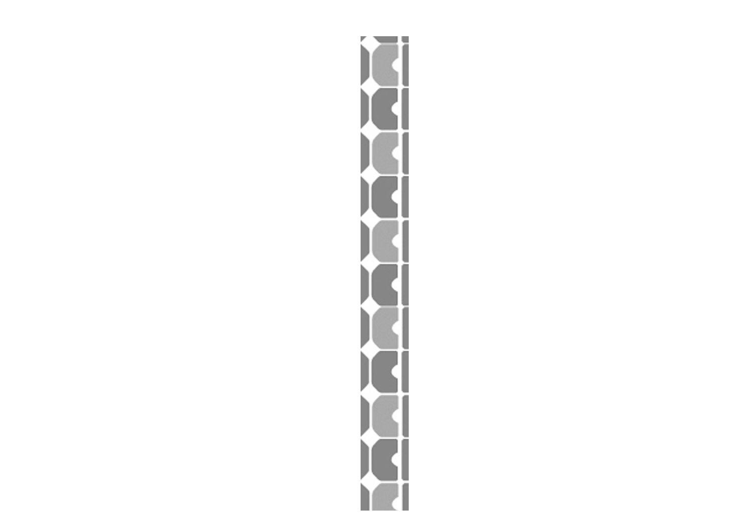
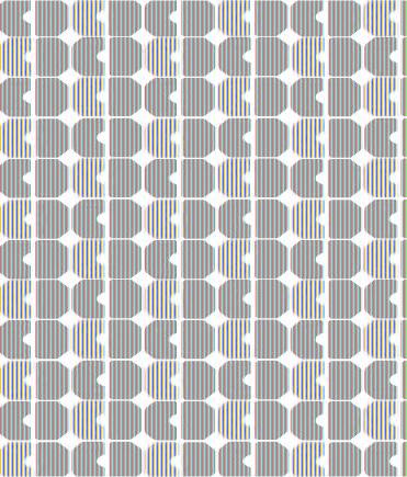
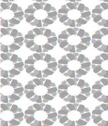
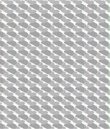
We are reliable and trustworthy
We are quietly confident but never diffident or self-effacing
We are authoritative. We claim our leadership position
We are mentors. We share our expertise
We own our leadership position within the area of sports infrastructure at all times. However, our positioning is derived from the fact that we undertake projects in a vast array of categories while offering a large suite of services within each category.
Sports…Institutional…Commercial…Interiors…Landscape…Industrial Design…Engineering…Project Management…Turnkey EPC…Master Planning…Research…Consultancy
Our value proposition therefore is that we design and deliver everyarchitectural need.
Design | Construct | Consult Architects | Engineers | Consultants
Our primary audience consists of our current and potential clients primarily in the state and central governments, bureaucrats and officials as well as executives in large corporates and educational institutes. Our secondary audience is the industry - our competitors as well as young architects and engineers. Our tertiary audience consists of the communities that live and breathe the spaces we design and build. These are sportspersons, students, families living in residential units, men and women from the workforce who spend a significant part of their lives in their office spaces and so on.
Our tone of voice
We speak in short sentences. We are confident and do not need to hedge our claims. For instance, a sentence like “The design attempts to re-establish the ecological…” will become“ The design re-establishestheecological…”
Conversely, our quiet confidence stops us from seeking descriptors for every noun and verb. Abusterminusbuildingneednotbedescribedasiconic.Weknowitwillbe,withtime.Wedonotneedtostateit.
We speak directly without superfluous words
We speak confidently without qualifiers
We are engaging and low on jargon
We are narrative…we share stories, not merely facts
The colour palette reflects the corporate nature as well as the earthiness of the brand through its use of a dark grey with a warm colour temperature.
Vibrancy is injected with the golden ochre. These form the primary colour palette.
The secondary palette includes black and white and lighter opacities of the Grey.
Earthy, positive, confident, successful
Wise, futuristic, sophisticated
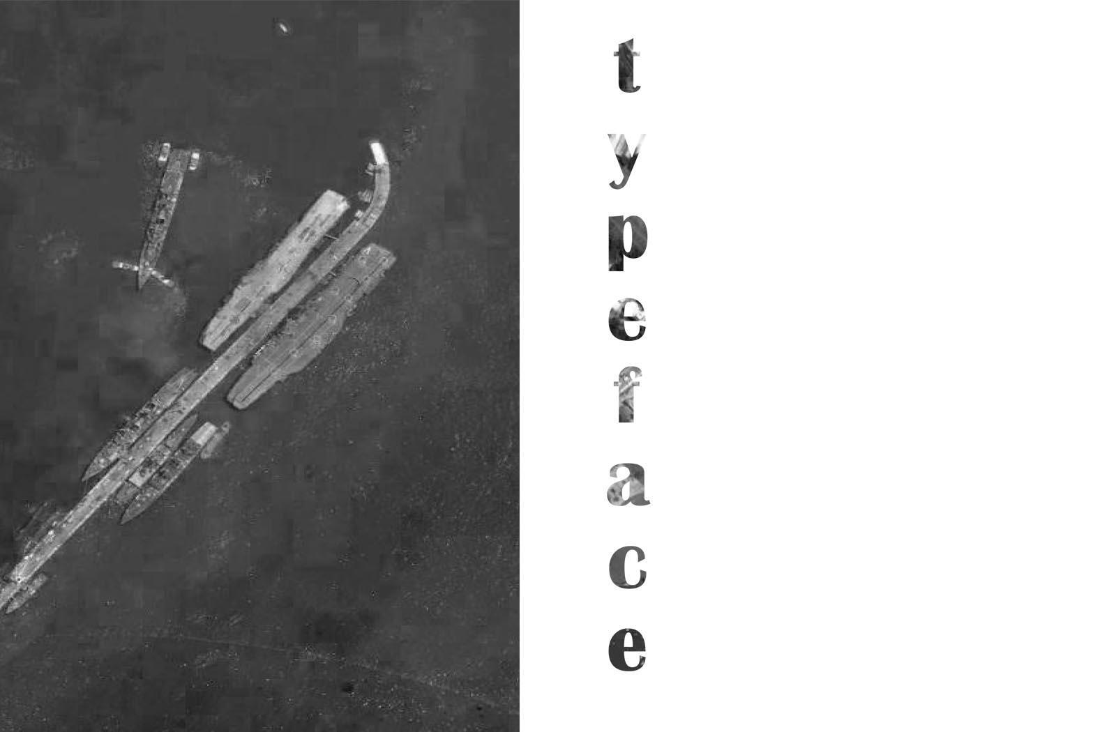
TheMontserratfamilyoffontsisa part of the Montserrat Project, whichaimstorescuethebeautyof early 20th century Argentinian urban typography seen in Montserrat,atraditionalquarterof BuenosAires.
It is clean, readable in both print and web formats and is licensed under the Open Font License for commercial and other use.
DownloadthefamilyfromGoogleFonts
The Thin, Light and Normal variations of the font should be used in all body copy in print and web, as well as for all business communication, with ideal sizes ranging from 10 pt to 12 pt.
Semi-Bold, Bold and Black versions of the Montserrat font should be used for Headings in print and web. Further separation can be achieved with the use of the brand colours.
Montserrat Semi Bold (14 pt)
Montserrat Semi Bold in 14 - 16 pt size is ideal for headings in letters and other documents that do not have multiple levels of formatting. Use it in the brand colours for maximum impact.
Montserrat Bold (15 pt)
Montserrat Bold in 12-14 pt size may be used in documents that need multiple heading styles and presentations that require more design elements. It is ideal for web documents, especially in the brand colours Montserrat Black (15 pt)
Montserrat Black may be used for large format print collaterals, on the website and other elements that require a finer design input.
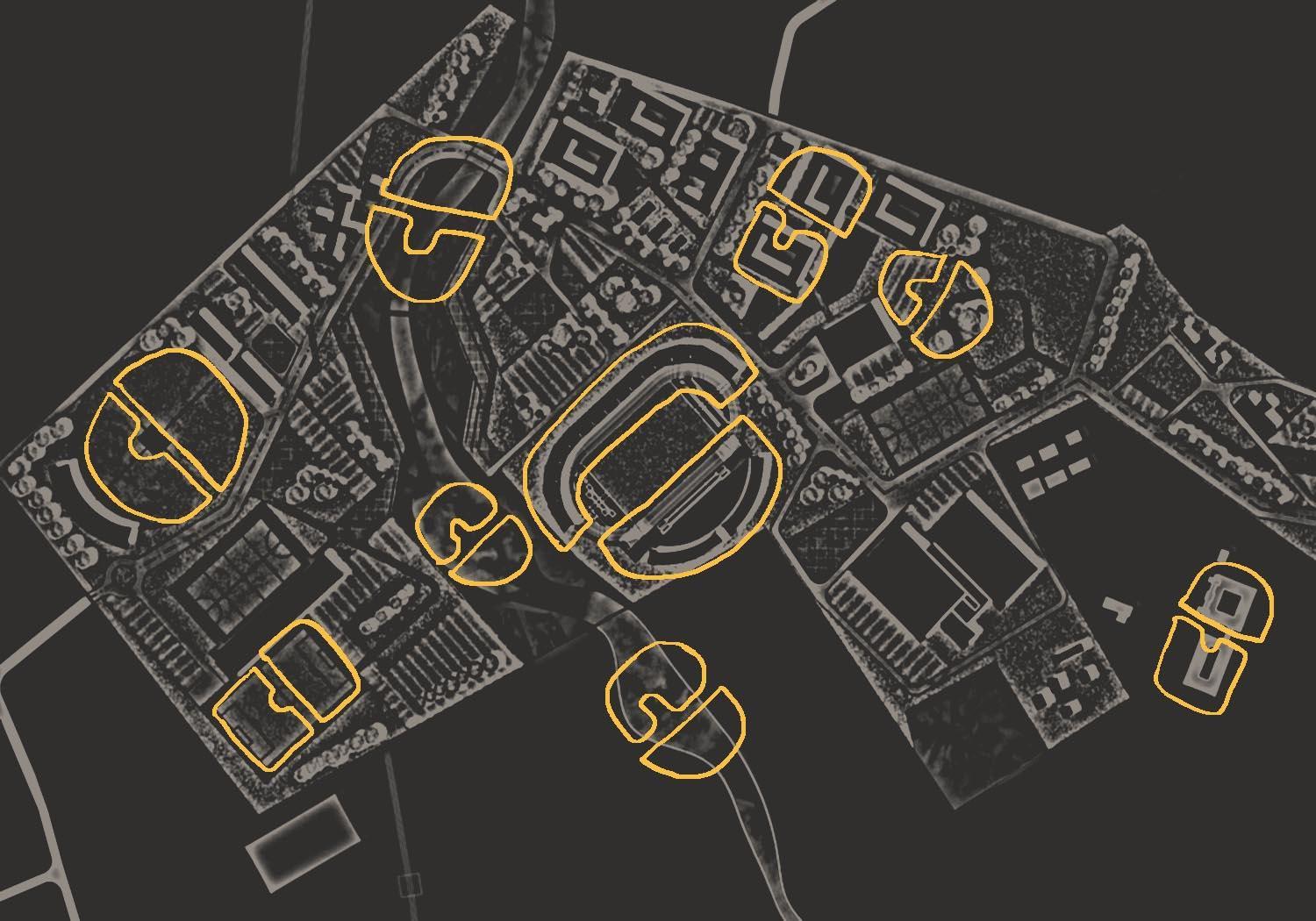
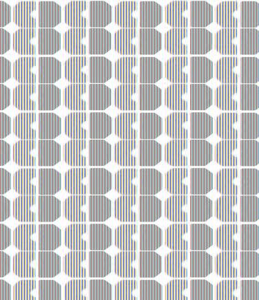
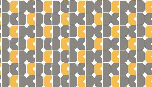
To be used in print collaterals, merchandise, event backdrops, etc in order to make the brand monogram more recognisable over a period of time.
Business card mock up to demonstrate the use of one logo option, the primary typeface and a brand pattern.
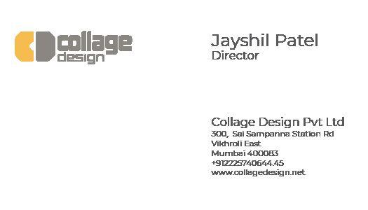 Card front
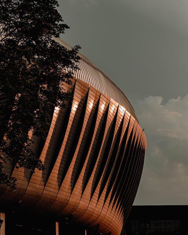
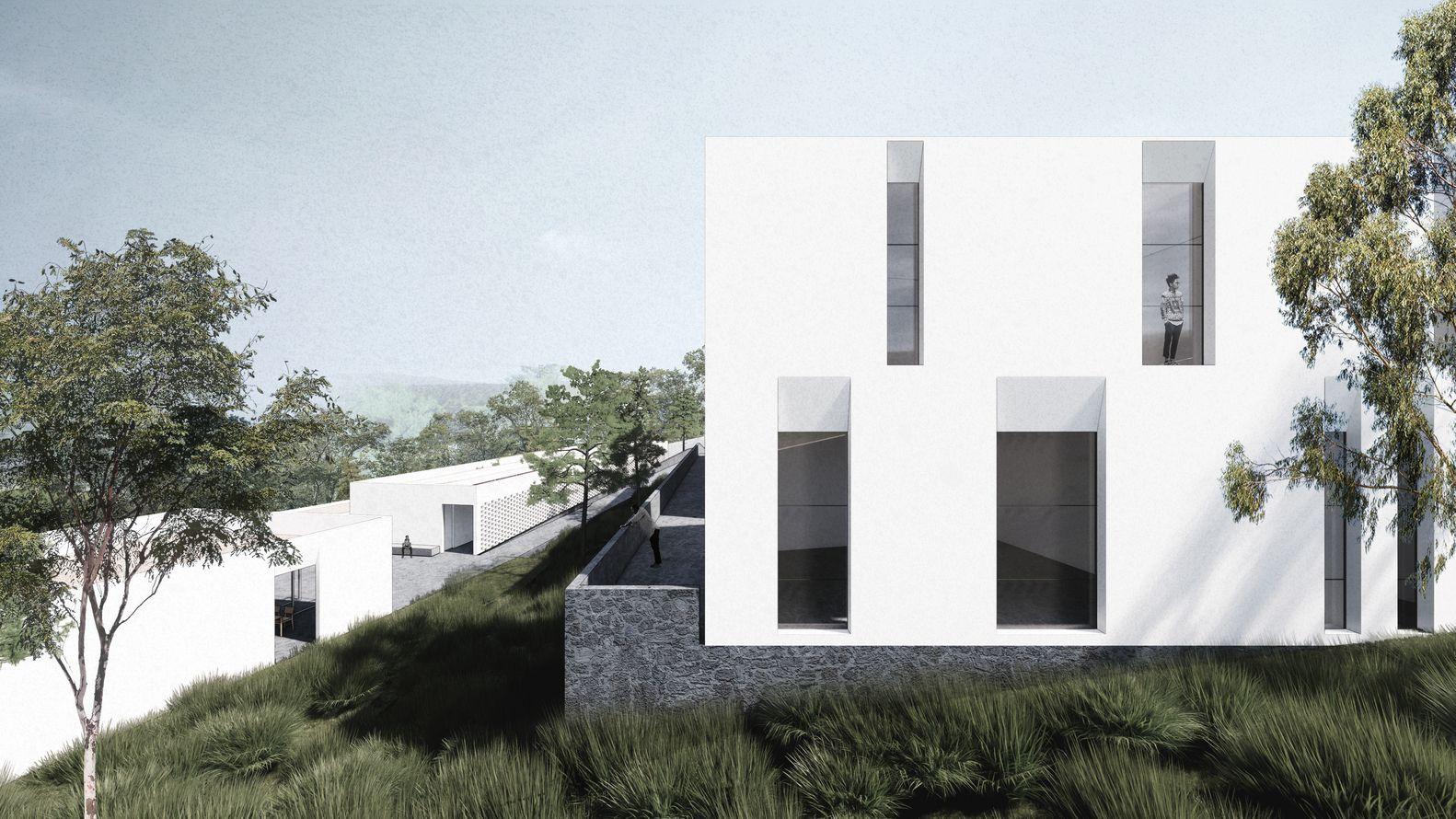
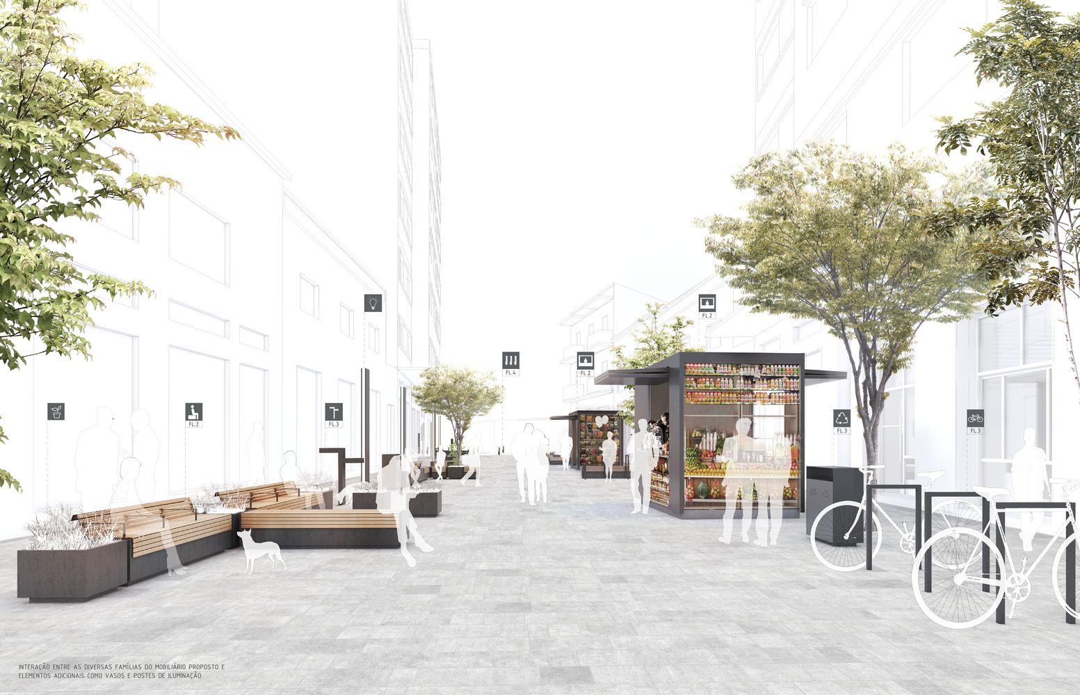
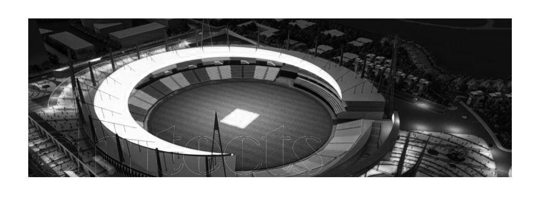
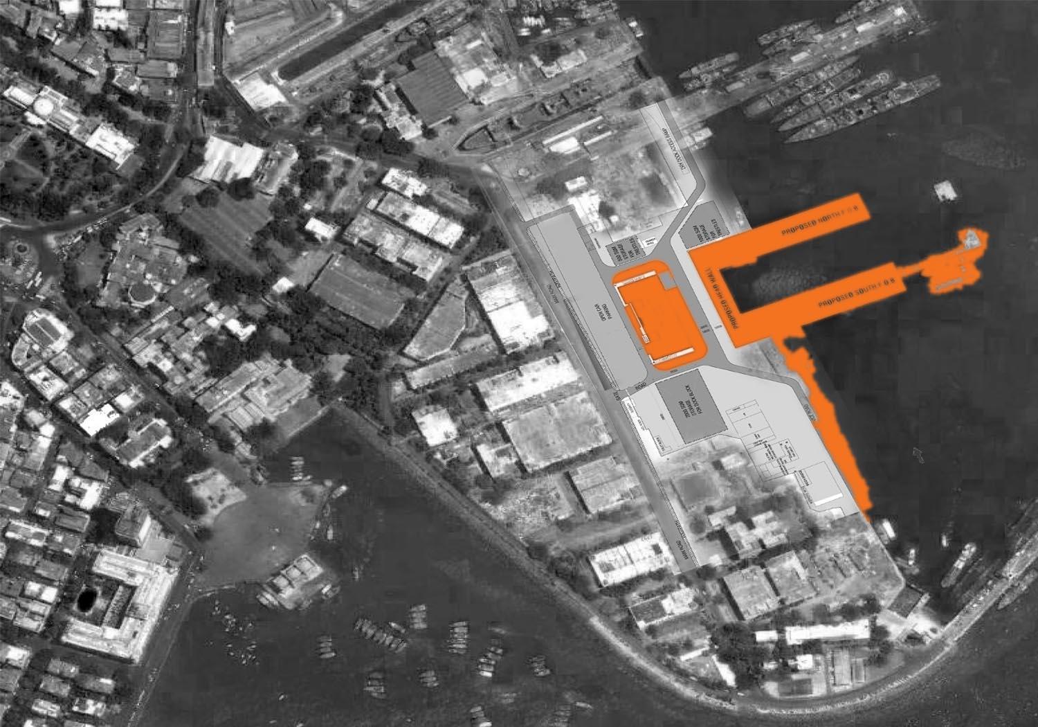
Project photographs and architectural drawings are the mainstay of our visual language, used extensively as marketing tools. Therefore, we will strive always, in the toughest conditions, to “get the hero shot”
Use techniques such as time lapse photography and post production manipulation, particularly in crowded or poorly landscaped areas. The architecture must stand out.
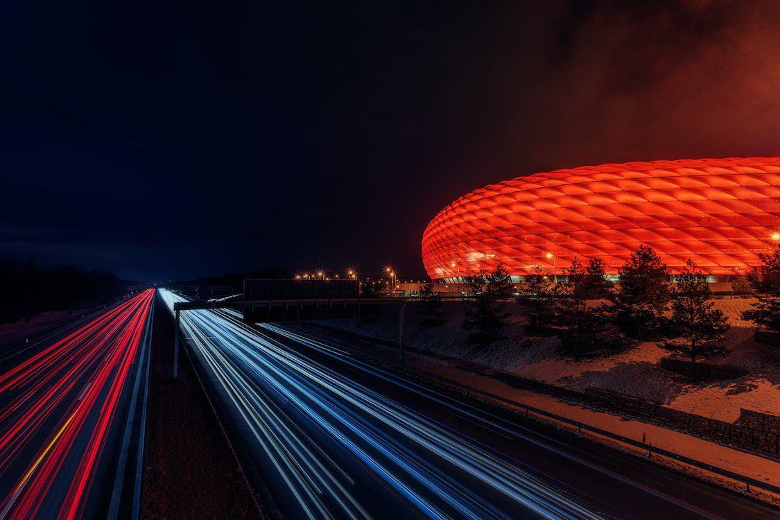
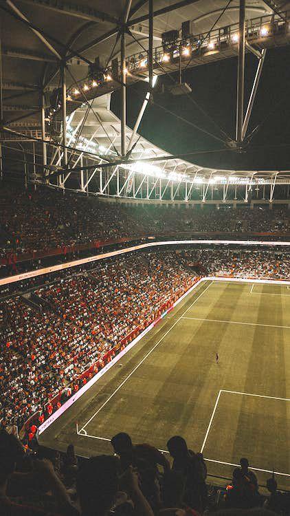
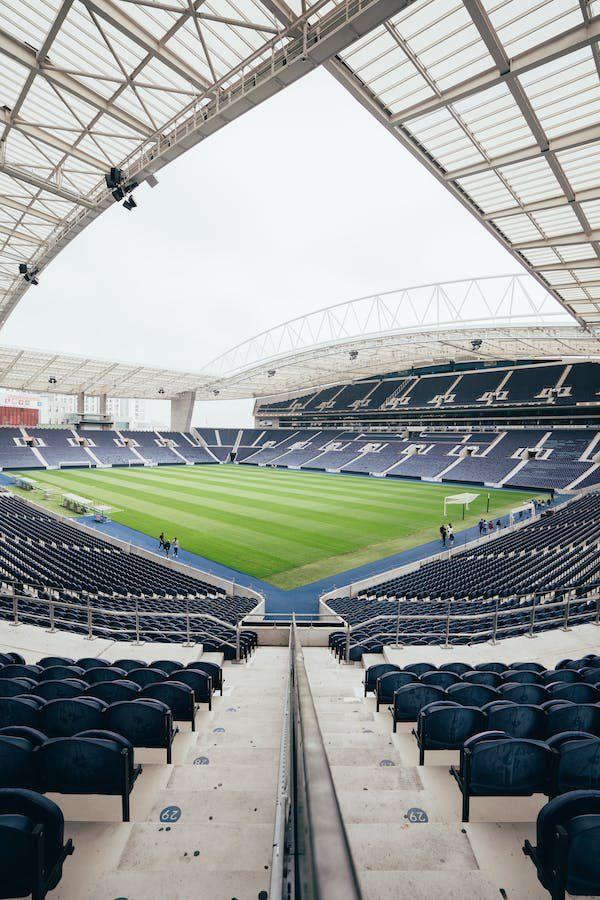
Aerial, drone photography for maximum impact.
Dramatic colour correction in post production enhance the strong fundamentals in our photographic style
SergioSouza,imageviaPexels
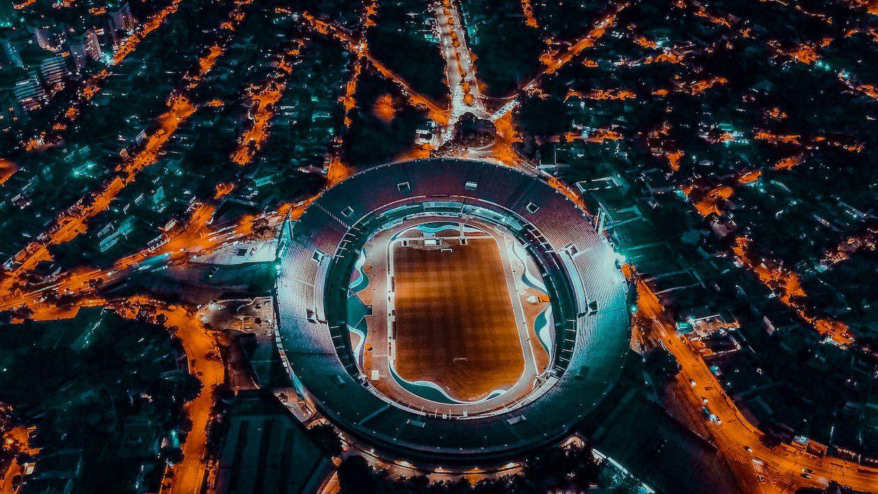
Aerial photography to draw attention to the dramatic lines in our designs. Where it is not possible to shoot amidst packed crowds, we will invest in CG to create the sense of a vibrant crowd.
LouisaHager,imageviaPexels
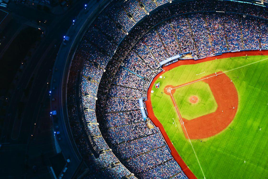
For work in progress photographs, where the project is not yet in its finest condition, aerial shots with post production effects such as vignettes may be used to ensure visually stunning marketing material
Our photographic material will reflect the strong lines and planes in our work
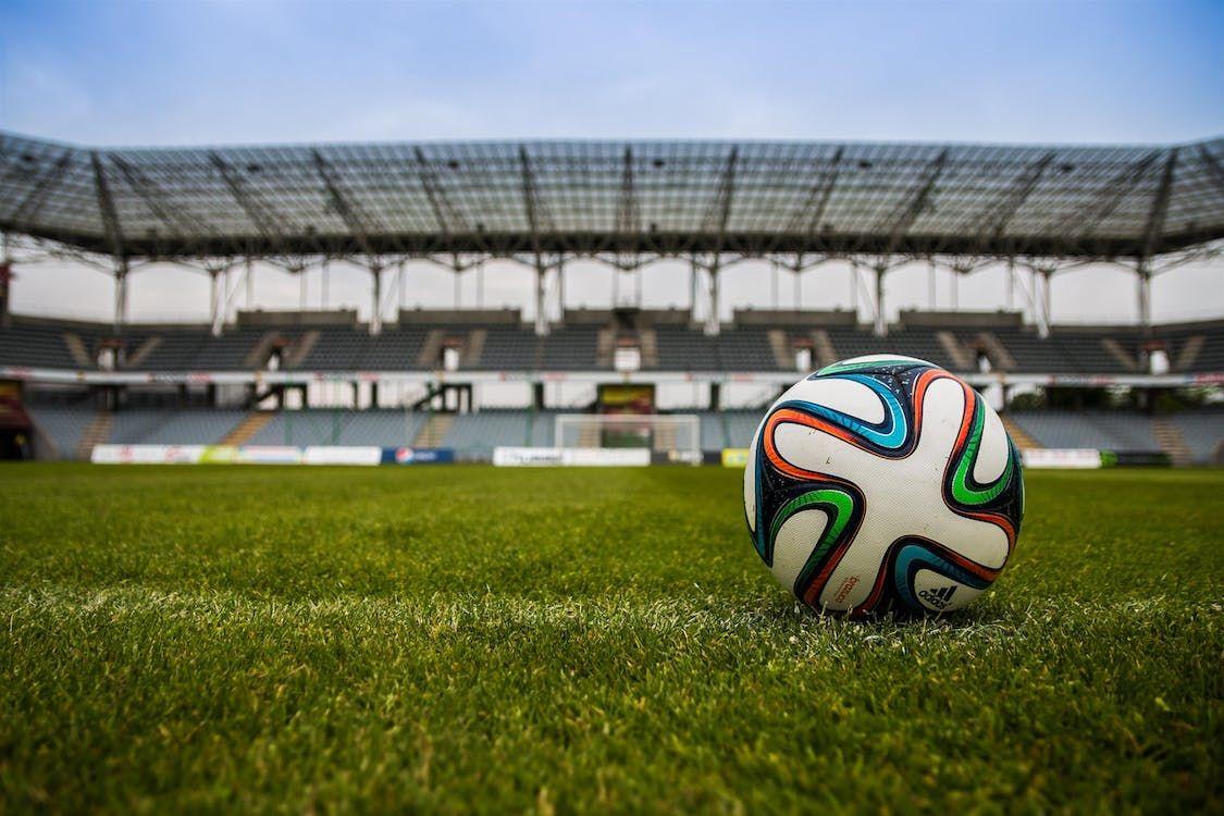
The subject of each photograph must relentlessly be about our designs.
FredericoErthal,imageviaPexels
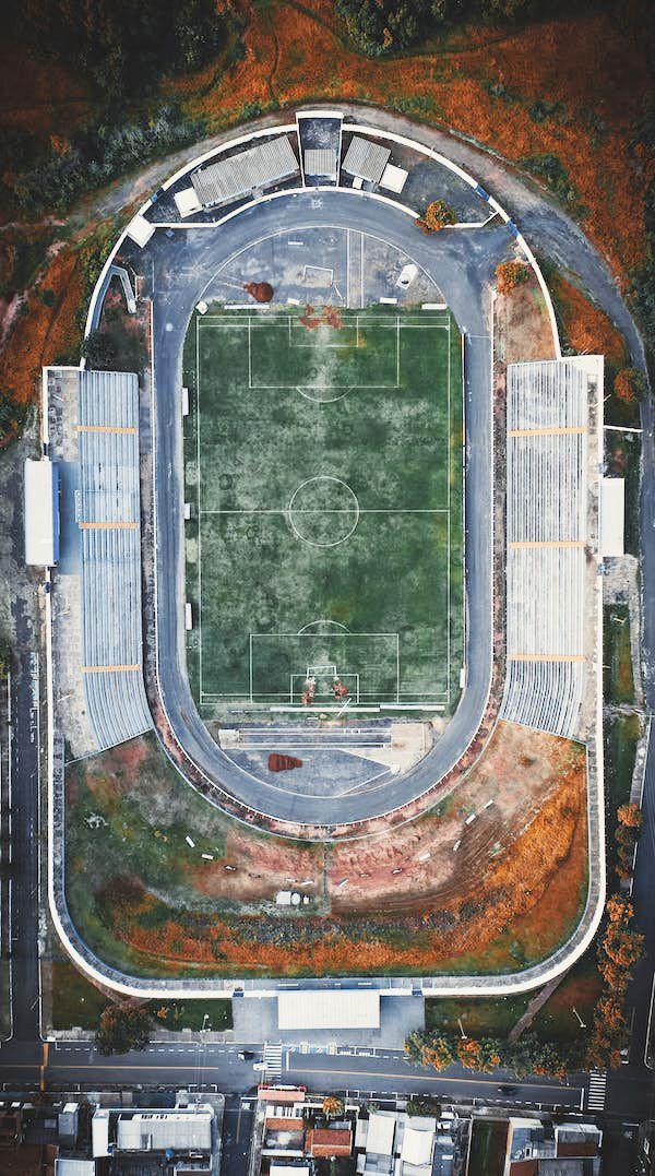
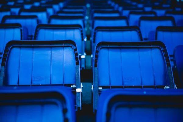
In order to speak to our tertiary audience and to be able to build our brand story, our photographic material will also feature the small details. Those that speak without words.
Our residential, commercial and institutional work will look for the lines and planes too, with light - natural or otherwise - playing an important role in communicating the feel of the place.
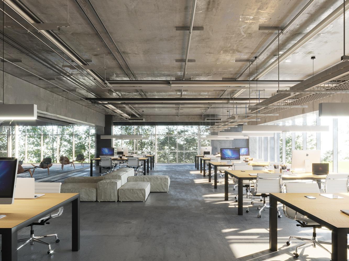
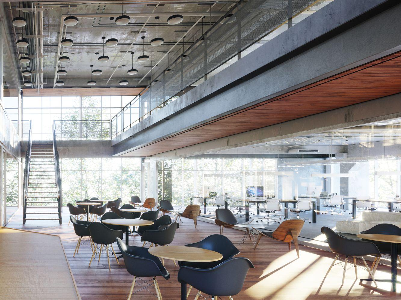
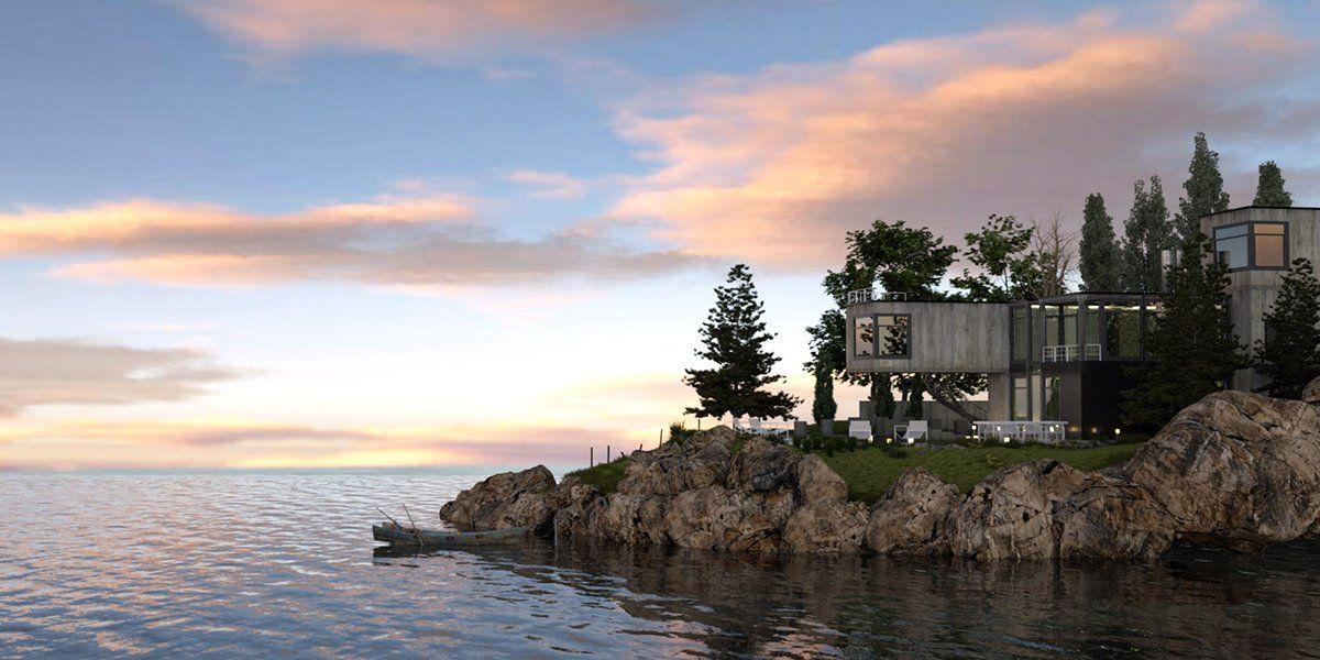
Taking advantage of the host of rendering softwares available, our 3D renderings will play close attention to atmospherics, to realistic textures of water bodies, plants, skies, etc.
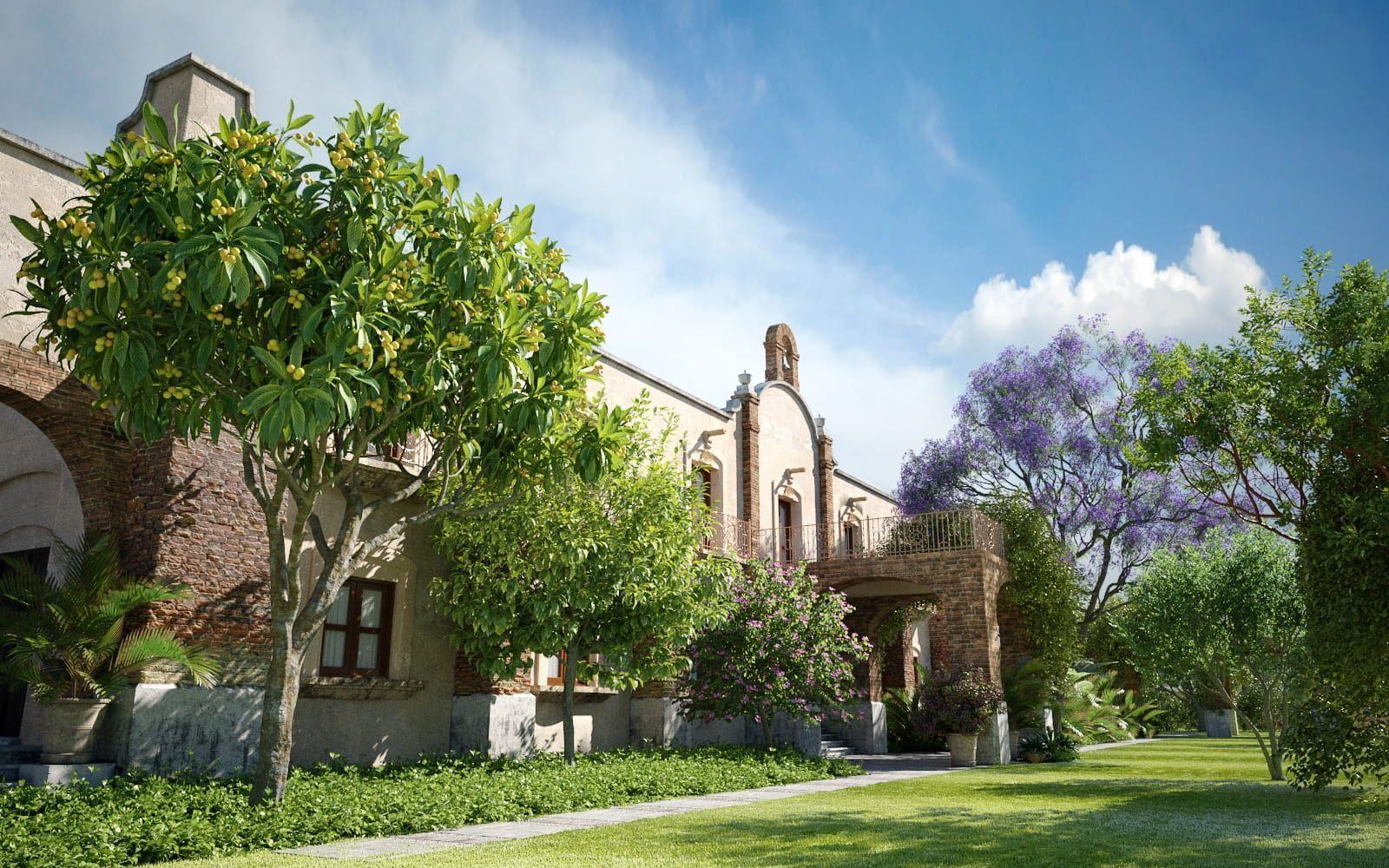
We will reject the plastic, often dystopian look that poor renders tend to have.
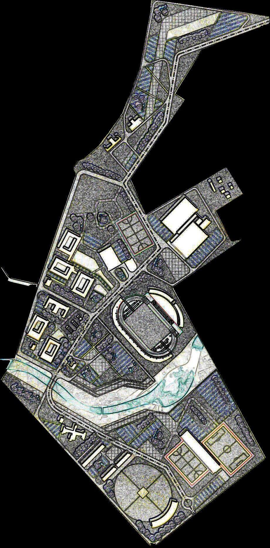
In the absence of realistically rendered drawings, we will make flat, vector art a virtue, such as here….