


Project 1
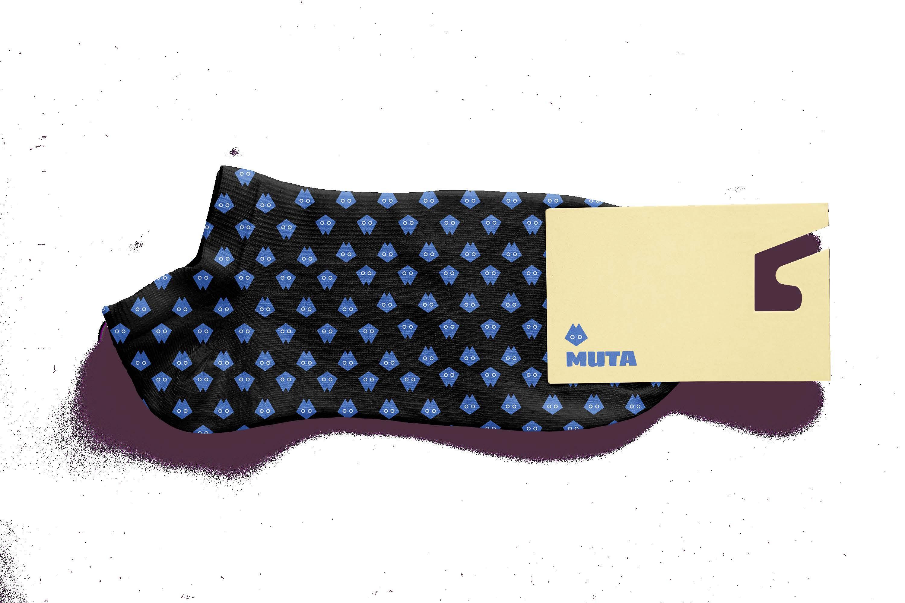
MUTA is an apparel brand that I made this year to use as practice for my design abilities, and to see how far I could go when creating a full company and product line from basically nothing.
For this brand I knew I had wanted a vibe that was simple and bold, but also fun and playful at the same time. I tried to build a wide range of designs to work with, bringing in different images, messages, and styles on a good range of merchandise
Starting with the logo, I had the idea of a heart-like icon, to represent care and tranquility. While playing around with the heart shape, I landed on this fox or cat figure. It is also fun, cute and an interesting image to play with. I was deciding between many colors when I and landed on a nice blue shade, 436bb4. It pops on white and black and also isn’t too loud of a color. Once the logo was set, the rest of the branding came into place very easily. I found
Sigmar to use as a header font and as the official MUTA company wordmark, because it is as bold as I want and offers some unique shapes in their letter forms. Pairing Sigmar with something was tough, as I wanted a font that I know could contrast the header well, but also stay legible. Eventually, I landed on Myriad Pro Regular, which I believe accomplishes this feat.
For my MUTA merch designs, I also wanted imagery that popped in a few different ways. Something striking was good, that’s pretty much the goal for each item. The board, for example, is a familiar image but tuned to an infrared color, jumping off of a background that is void of anything. The MUTA bag uses the company logo and name in their normal colors, but paired with a nice beige it stands out and works as a color combo.


2
This book cover is one of my earlier personal projects, but I have decided loved the design so much that I wanted to transform it into a full mock-up of a real, printed book cover.
BLK ART is a book that highlights black western art in the past few centuries, with a focus on artists that are pretty much unknown to most people. Following this concept, I wanted the focus of my cover design to be some major art pieces from the book.
To do this, I have framed some of my favorite and most striking portraits from BLK ART by using the letters of the title as the frames. I tried to find portraits that matched the mold of each letter, like a man standing up straight to represent a T for example. With a white background, these figures were even more prominent. I also used a bright color from one of the cover portraits to create some accents on the back and spine of the book, which
tied everything together. With the addition of an award nomination, to highlight the level of writing this book reaches, in hopes to garner more people to read it, a bar-code, and the publishers logo, this book felt as real as I could make it.
This was a fairly simple and easy project, but also one that I am very proud of. Due to the overall book design and the thought that went into each decision I made, I included it here.

Art is power. Representation is power.
For millennia, humans have fought wars over the right to wield it. In recent centuries, these wars have largely kept diversive stories out of art and history, leaving the study of black history shallow and oversimplified. But slavery isnʼt the beginning of black stories- nowhere near it.
Have you seen images of Mansa Musa, an emperor of Mali in the 14th century, and the richest man to ever live? Or John Blanke, trumpeter for King Henry VIII? Or Dido Elizabeth Belle, young aristocrat and great-niece of Lord Chief Justice William Murray, First Earl of Mansfield?
This is what black (art) history looks like, unfiltered.
2024 NAACP Image Awards Nominee For Outstanding Non-Fiction
$19.49 USD
$27.95 CAD


3
This was a personal project inspired by my trip to Colorado years ago and my little bit of love for post card design. By using free use sources or pictures from my dad, uncle and other family members, I was able to create some visually striking graphics on the front of the postcards.
From the jump, I knew I wanted the postcards to focus on the colors and shadows of each image. Colorado is a very vibrant and diverse landscape, so that would be a great goal to focus on.
For the 4 designs, I wanted to make them in pairs. To do this, I began with the back of the postcard, where all the information will go. I went very minimal, with lots of white space, because I wanted something clean and simple. The writing should be the focus, in my opinion. To make it not boring and empty, though, I added a cute picture of a deer, one of the most common animals in Colorado. By turning
it into a cool texture, I could alter the color, and use a pink and blue to help split the cards into pairs.
3D4A9F and CE4B9B are both subtle but vibrant at the same time, which works well to help represent the landscape of the great state of Colorado.
To split my cover images in pairs, I did two with a unique frame and two with some fun symmetry. The rainbow photo uses the shadows of the images itself as a black border, where I can place the text, and the 4 panels I though was a fun way to break up an image into something visually striking. The colors here are subtle but very beautiful, something I keep trying to focus on.
The two mirrored images consist of one pic merging into a reverse of itself and one being altered to a different color, but the same image. These two ideas offer something that’s fun and interesting.


Pariaecus, consequunt ipsanihillam quam, vent, cor solest, commoditatae occum iliqui aped molenimus iurest moluptius re, nectotatatum rem qui doluptas ipsam aliqui offictis quae veni rectorerum in nonempe rspedissime commolu ptatus molorporem inullac eperiatem ateste laborun turio. Uptati occumet rem incias doluptatis sundi qui rem quidel et ute percime placcae ea eum faccum quam et apis volorese nis eoste sum hictur, volut di omnimusam incto odic tem laborenis magnimped et odis as aut reius ut vellita con num rehent occatur?
Vitiorro occum as est, sitaspedic tem fugia alique elluptaqui dolo to consequi alitibu stiur, cuptatus, aces anditas sincimusciis estis


CARD DESIGN: ERIC BARTON ERICBARTONDESIGN.COM

COLORADO, UNITED STATES OF AMERICA
PLACE STAMP HERE
CARD DESIGN: ERIC BARTON ERICBARTONDESIGN.COM
Pariaecus, consequunt ipsanihillam quam, vent, cor solest, commoditatae occum iliqui aped molenimus iurest moluptius re, nectotatatum rem qui doluptas ipsam aliqui offictis quae veni rectorerum in nonempe rspedissime commolu ptatus molorporem inullac eperiatem ateste laborun turio. Uptati occumet rem incias doluptatis sundi qui rem quidel et ute percime placcae ea eum faccum quam et apis volorese nis eoste sum hictur, volut di omnimusam incto odic tem laborenis magnimped et odis as aut reius ut vellita con num rehent occatur?
Vitiorro occum as est, sitaspedic tem fugia alique elluptaqui dolo to consequi alitibu stiur, cuptatus, aces anditas sincimusciis estis
COLORADO, UNITED STATES OF AMERICA
PLACE STAMP HERE
4
This project was started amid the implementation of Florida’s controversial “Don’t Say Gay” laws. Because of this, I used my stamps to represent an influential and unique culture in America, the queer community.
My goal was to make something topical and visually appealing within this project, which I believe I was successful with.
Flipping the anti-queer slogan into a line of support and pasting it in a big, bold font is a great attention grabber, even more so when it’s paired with the striking image of David Bowie, a famous queer artist. I used black and white images of some of my favorite LGBTQ artists that had an impact on Americans and the rest of the world, then blended bright colors onto their clothing to represent the rainbow of the LGBTQ+ flag. The white color background of each ad, consisting of a pile of paper and envelopes, feels cleaner, pretty and on theme. The white color also
helps the imagery pop really well. I also tried to limit my text as much as possible, only adding what I felt was necessary for each ad spot. With the slogan and logo on the digital ad, you pretty much know what the whole idea is, and their is more leading text on the large poster because it is necessary to the design. Using little pops of red on the text, yellow makeup, or rainbow dots, I brought in more depth and little, colorful elements to pull everything together.
This poster, ads and mockup collection is one of my favorites because of how well it came out and the overall message that comes with it. I have been proud of this work for the past year or so since I finished, and I was glad to tweak it and improve on some small areas to make it ready for this showcase. Due to my hard work and design skills, this project and the BLK ART designs got their own display in the Bowen Center for Innovation and Design at JWU.


This project is a re-design of the menu for Brickway on Wickenden, a brunch place in Providence. Their current menu resembles a website from before I was born, so I knew I wanted to make them something new, fun and unique.
To do this, I created a logo that resembles a fried egg and incorporated the colors of the logo into a clean and minimal menu. I used that orange color to highlight important sub-headings or icons that needed to stand out, like an exclamation mark next to an allergy warning, or a line that advertises sides that come with the meal you’re buying. I felt that little decisions like this make the menu less boring and helped to build strong hierarchy. I also used these highlights on the back and front covers to convey that this menu is breakfast only, and show you what kind of online order options are offered at Brickway on Wickenden. With a logo on the back to fill space, I was confident in this layout being the one to use.
Once I finished these 4 columns, I was looking for a way to make the menu itself unique and engaging, since the overall design of it was minimal. By splitting the menu into 4 columns, I could fold in the two columns on the side to form a cover for the entire menu while staying on just one sheet of paper. This is something I’ve never done or seen before, so I thought it would be a fun challenge to work on.
At the end, these choices definitely did their job as far as engagement and individuality, and the drink menu paired with it, in the same style, was a nice addition to make sure all of the items on the menu were present.

While learning more about Photoshop in freshman year. I was tasked with creating 4 separate bill designs for the city of Providence, Rhode Island. I had to use my own pictures and only create the front side, so it was limiting but a bit of a smaller project so I could test ideas well. I wanted to represent a smaller community here, while also teaching people at the same time. A solution to this was using sign language as the main imagery for each bill. By using sign language on an item that would be common in every person’s house, wallet, car, etc. I could bring awareness to the deaf and disabled community while also making it a normal part of people’s life.
I used all black and white designs, except for the sign language symbols. They each had a color multiplied over-top. Using 4 colors for 4 different bills, I could add an element that would make it easier for visually impaired people to see the difference in each note. Also, adding braille bumps on the bottom of each
bill was good for fully blind people to work with. The faint background was a good addition to fill space, and the faint seal was nice, because I could overlay a security feature on it while also not standing out too much and taking away from the rest of the visuals.
Once I added small text and color for the mayoral shout, serial number, and location, and city slogan, I was finished with a cohesive design that incorporated many elements of Providence and its citizens.


The finale to my typography class, this card deck was one of the most challenging but fulfilling projects I’ve done. Working out a design that would be simple enough to work for each font, but also unique and cool enough to not get stale was tough. I also struggled a bit with branding and color, but in the end was able to pull everything together.
I love using a grid, so that was step one for this design. I went through many ways of boxing in the main letter so that it was a focus but also not cramped by borders. Then figuring out where to add the designer of the font and other information about each font came very natural, as the main grid left room that was just calling to be filled. To add some variation, I switched between full white cards w/ black lines, and full black cards with white lines, hence the name “knockout type.” I applied a very similar layout to the front and back of the cards box, then pulled in a little character I liked about the
design to fill out space on the tabs. The logo came easy as the letter Y in type resembled someone lifting their hands up, which is common for a boxer after they win, tying into the name “knockout” in an additional way. Once this was done, I knew I needed color somewhere.
In a style I always use, I added a touch of color to the main focus, by making the word knockout on the box pink, and by making the main letter of each card that same pink. I believe this decision took the cards over the top, so that they were now fun and bright, instead of plain black and white.

Pot-Head magazine is a gardening magazine that shares stories and advice based around gardening and the things you can do with your garden. It was the final project for my Editorial and Design class, so I wanted to do as much as I could with it. My main goal was to make each section of the magazine in a different style. From cover, to ads, to articles, I felt it would be most fun if every spread was unique.
I tried to make every segment, including the back and front covers, different from each other so that I could practice some different styles and offer a design that never goes stale. For the cover, I filtered and colored an image of flowers I found in my camera roll, altering its size, shape and borders to make something striking that interacts well with the text. A cover should draw you in and I think mine does that well.
My first spread, the interview, I spent time playing with layers from an image of me and my girlfriend
spending time in the backyard at my house. I cut out the scene of us digging in the dirt, then sized it to fit at the bottom of the intro page. This placement is unique and I feel it stands out on the blue background, and is enhanced by the red lining around both pages. This contrast of red and blue goes very well together and is really nice on the eyes.
My next spread, Preparing for Winter, is meant to resemble snow and ice colors, which is why it is all white. I love working with minimal details, and using spots of color to keep you engaged on a piece of paper that could be viewed as empty. I think with this spread, and the no justice, no peace ad, I did pretty good with that technique.
The two ads, for JWU and Brickway on Wickenden, I used characteristics I thought went well with the school, and with the menu I designed for Brickway on Wickenden.


