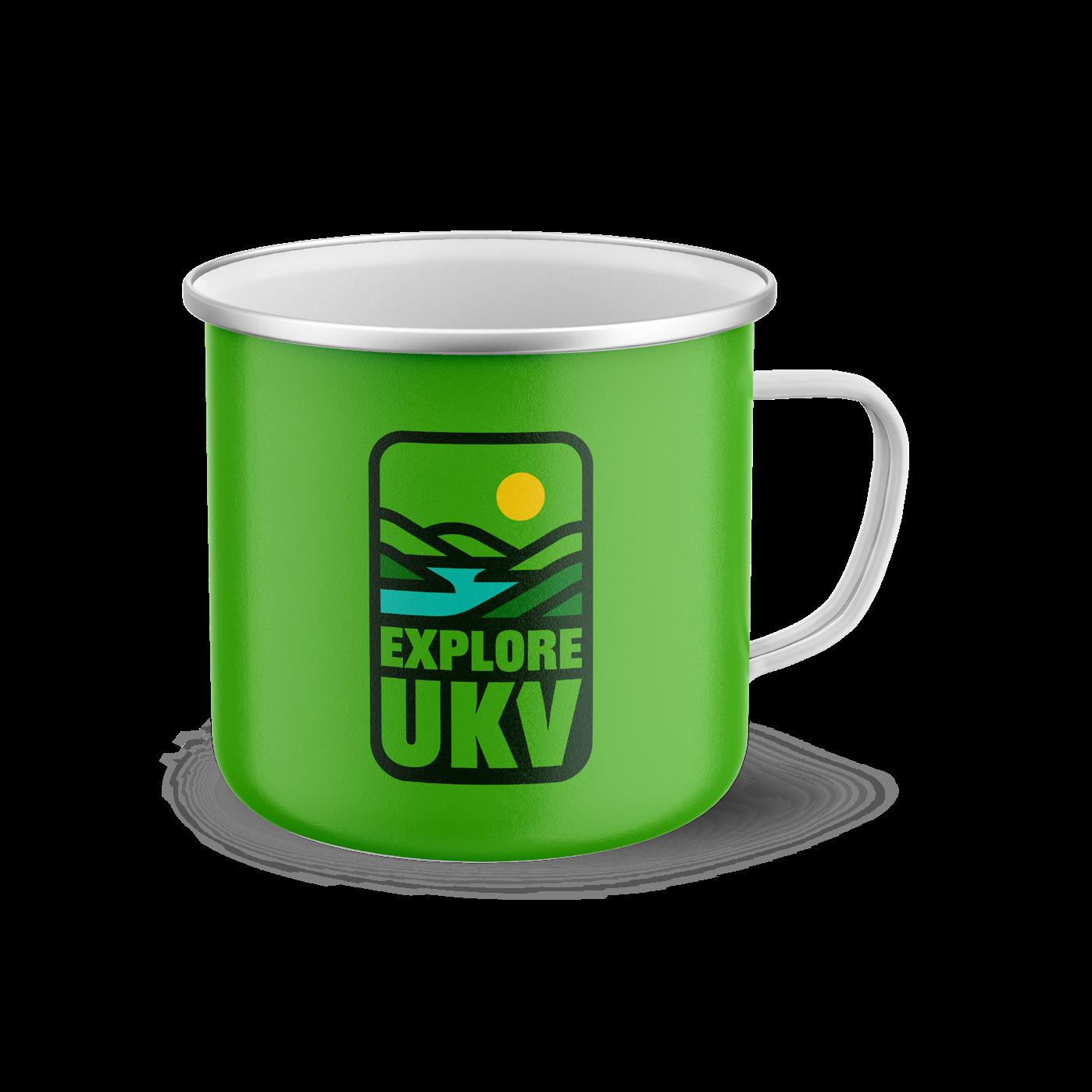
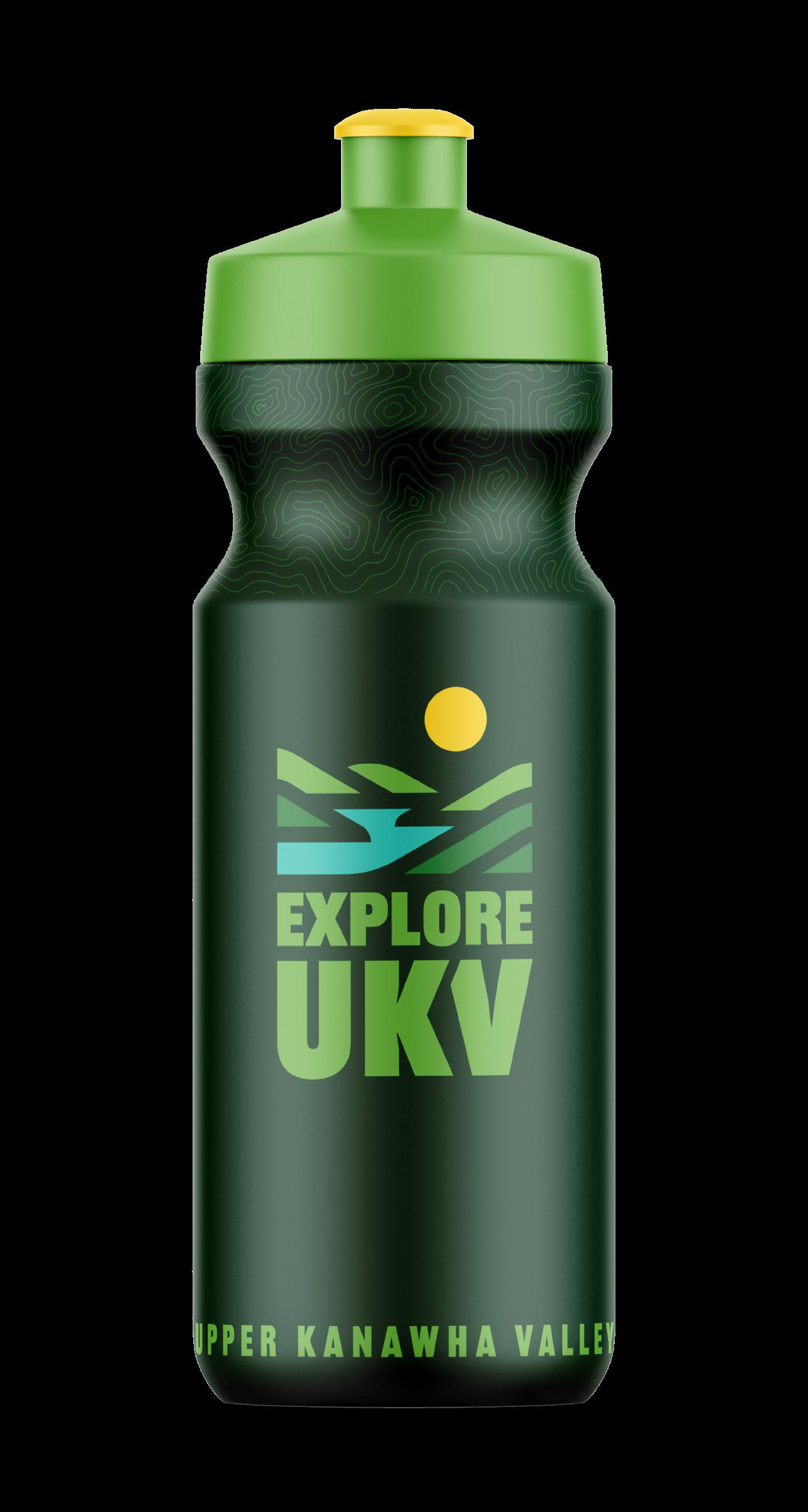
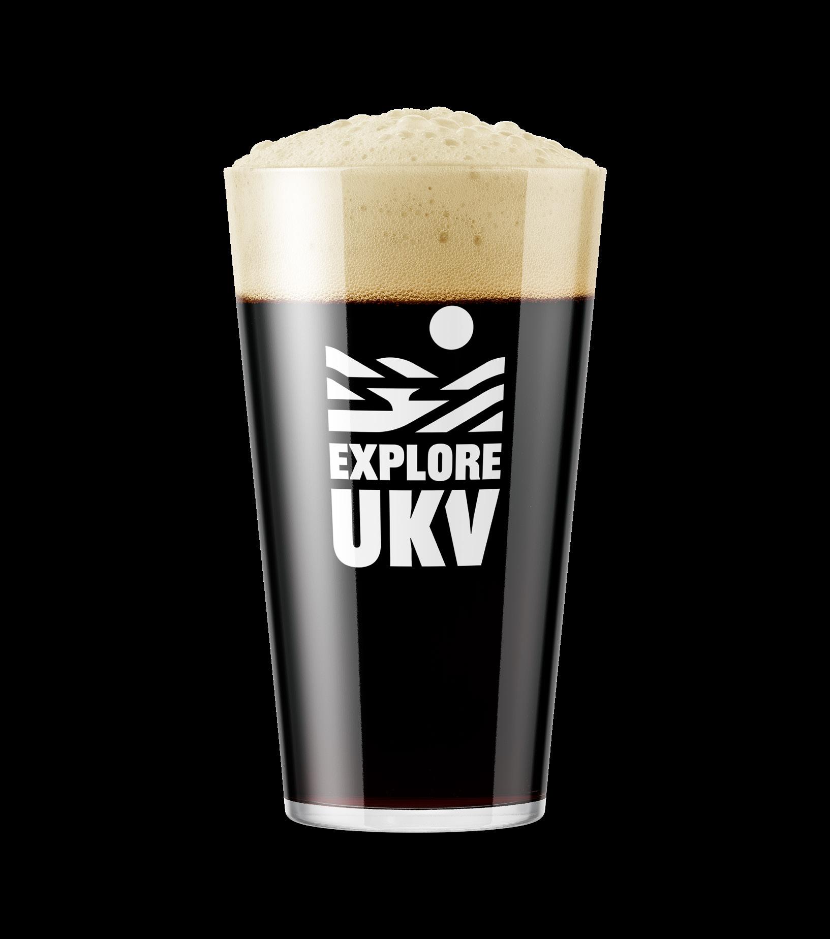
A Flexible Identity System
Trying to fit the same mark simultaneously on a billboard and on a keychain is a challenge. Our identity system is designed for flexibility, consistency, and brand recognition.
We have provided different logo lockups that should cover every space imaginable. Instead of trying to fit a logo into a space that is too small or crowded, simply use a different version for maximum visual impact and clarity.
Logomark
Explore Sun
Vertical Mark
Combination Mark
Horizontal Mark
Explore Mark
LOGOMARK
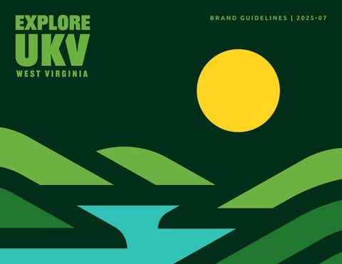
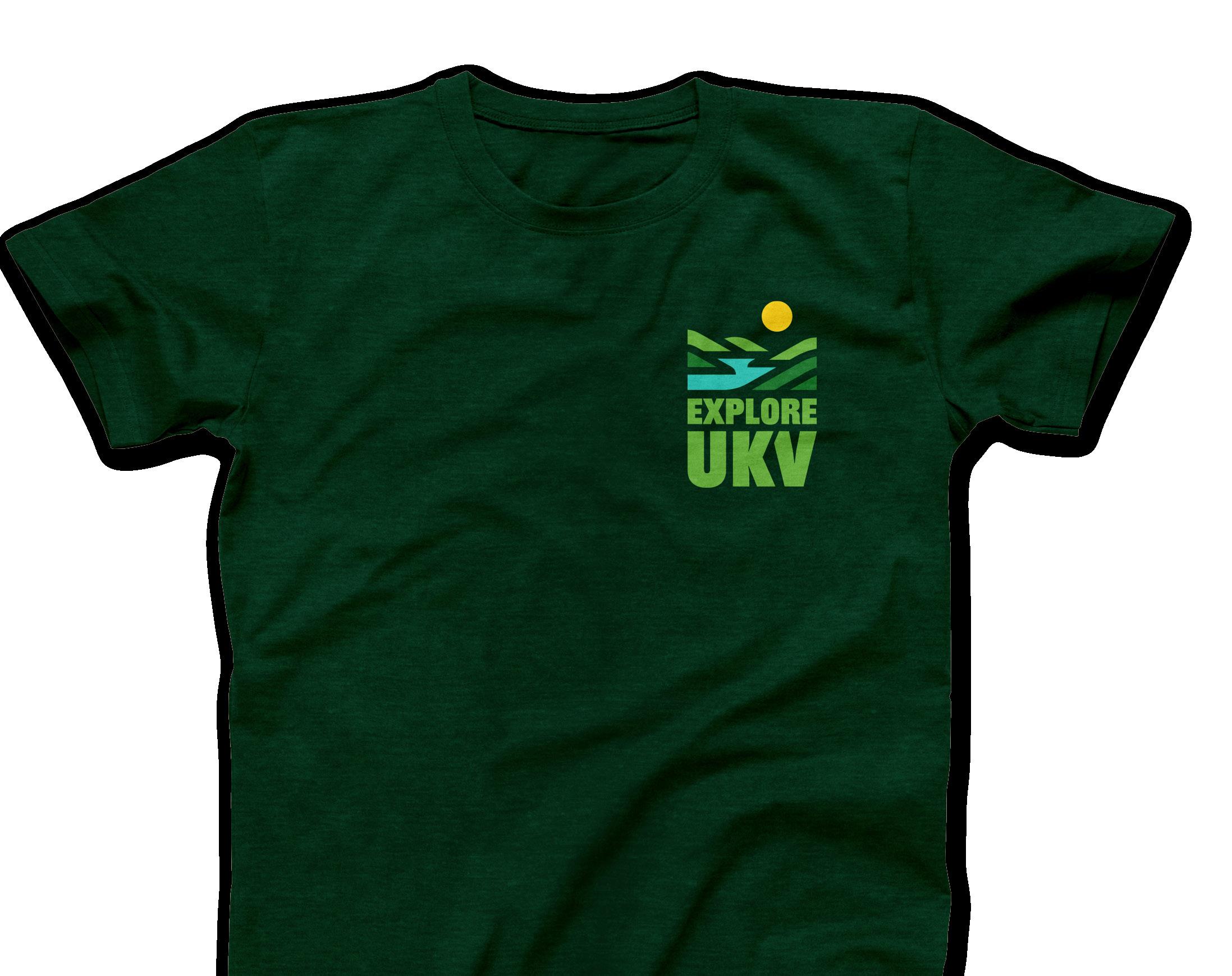
The UKV logomark is the signature symbol of the brand—simple, iconic, and easily recognized across all applications.
As the most adaptable and widely distributed visual element, it appears on everything from apparel and accessories to digital platforms and print materials, serving as the core of the visual identity.
ON MOUNTAIN PINE
HORIZONTAL MARK
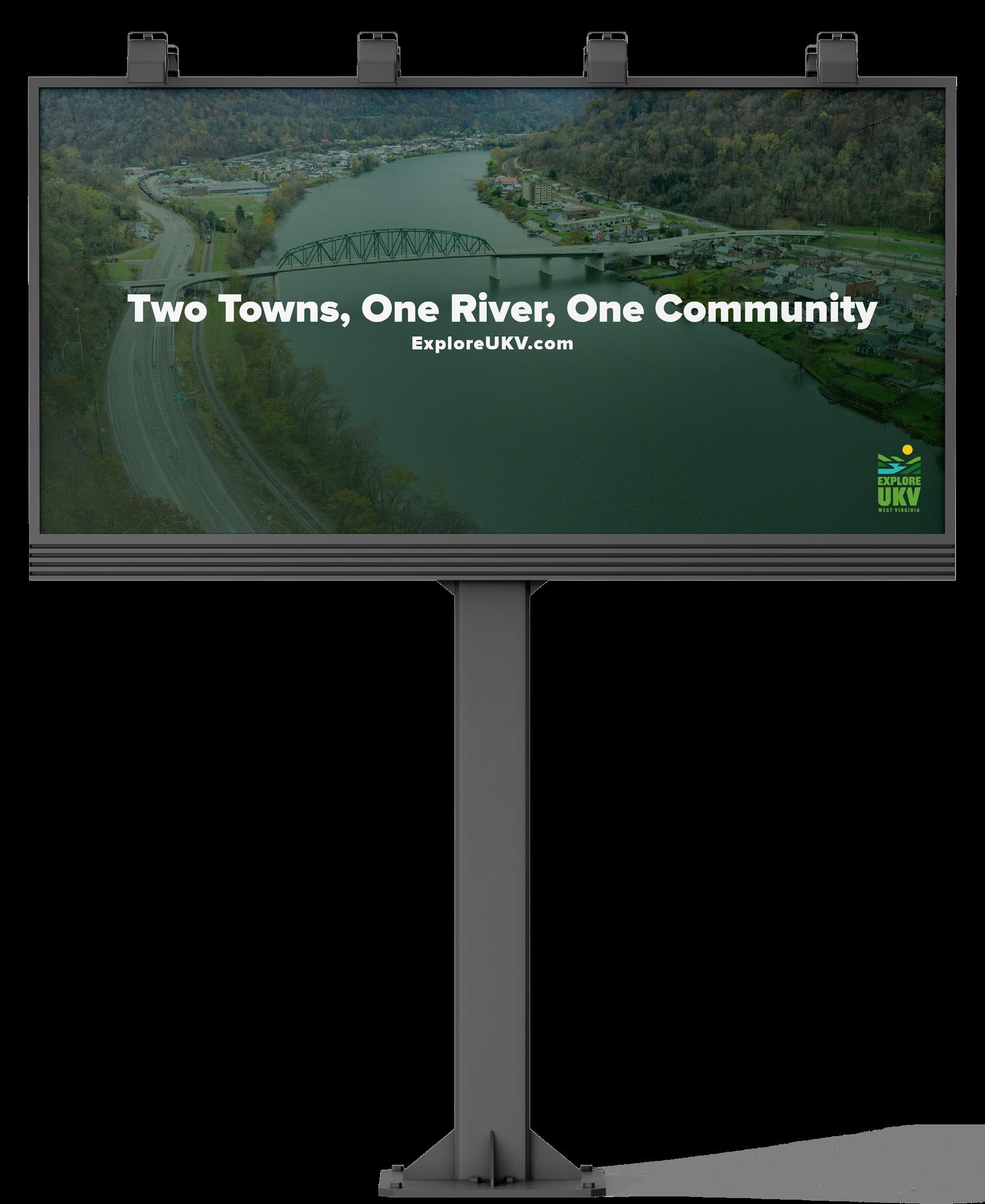
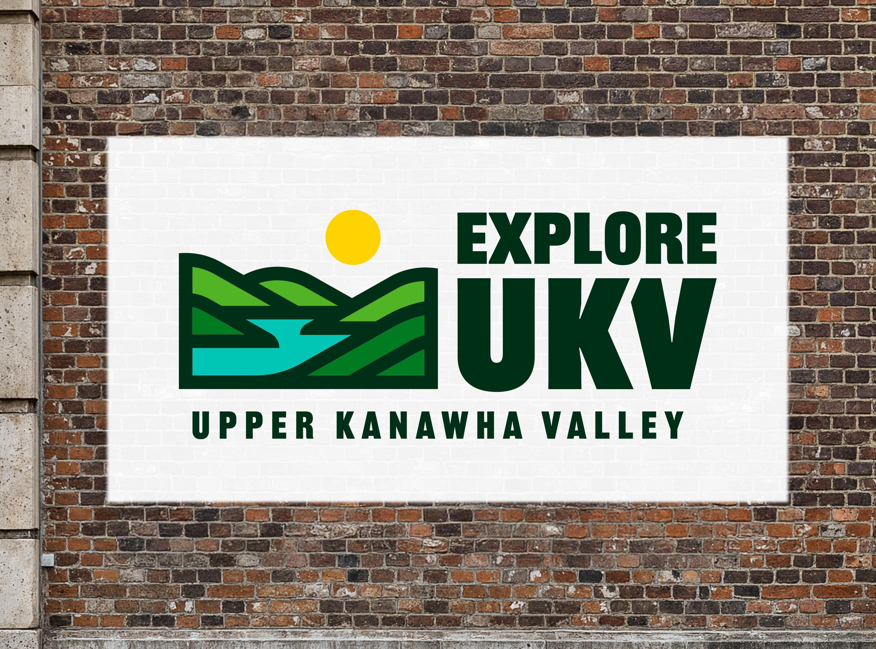
The horizontal mark is an extremely vertically compact version of the UKV brand designed for high visibility in tight spaces.
It’s ideal for applications like letterhead headers, billboards, and other wide-format print cases.
ON MOUNTAIN PINE
VERTICAL MARK
This vertically oriented mark offers a streamlined presentation of the UKV identity, emphasizing legibility and simplicity.
It’s a good option for vertical layouts or stacked branding needs, especially in mobile interfaces or print collateral.
ON MOUNTAIN PINE
COMBINATION MARK
The combination mark presents the UKV brand in a landscape layout, integrating text and imagery in a compact way.
This version works well for letterheads, website headers, and situations where width is available but height is constrained.
ON MOUNTAIN PINE
EXPLORE MARK
Optimized for wide layouts, the expore mark lays out the UKV name and symbol in a compact way.
It’s best used in banner ads, website navigation bars, and other horizontal applications where clarity and space efficiency are priorities.
ON MOUNTAIN PINE
EXPLORE SUN
This rounded mark offers a streamlined presentation of the UKV identity, emphasizing legibility and simplicity while focusing on the sun element of the brand.
It’s a smart choice to tag in layouts where legibility at small sizes is important especially on mobile.
ON MOUNTAIN PINE
Incorrect Usage
Don’t rotate the logo. Don’t distort, compress or stretch the logo dimensions. Don’t change the layout or relationship between logo elements.
Don’t make alterations to elements within the logo or wordmark that are not consistent with the brand.
Don’t use gradients in or on the logo. Don’t use shadows, bevels or other effects on the logo.
Background Control
Our logo works very well on a plain white background. Mountain Pine works well as an alternative background when using the inverted logo.
Valley Grass is a great background color for the logo. If you are using one of the patterns, make sure there is proper transparency so that the logo stands out.
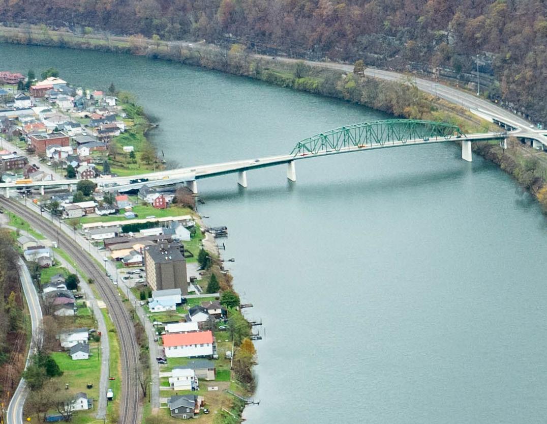
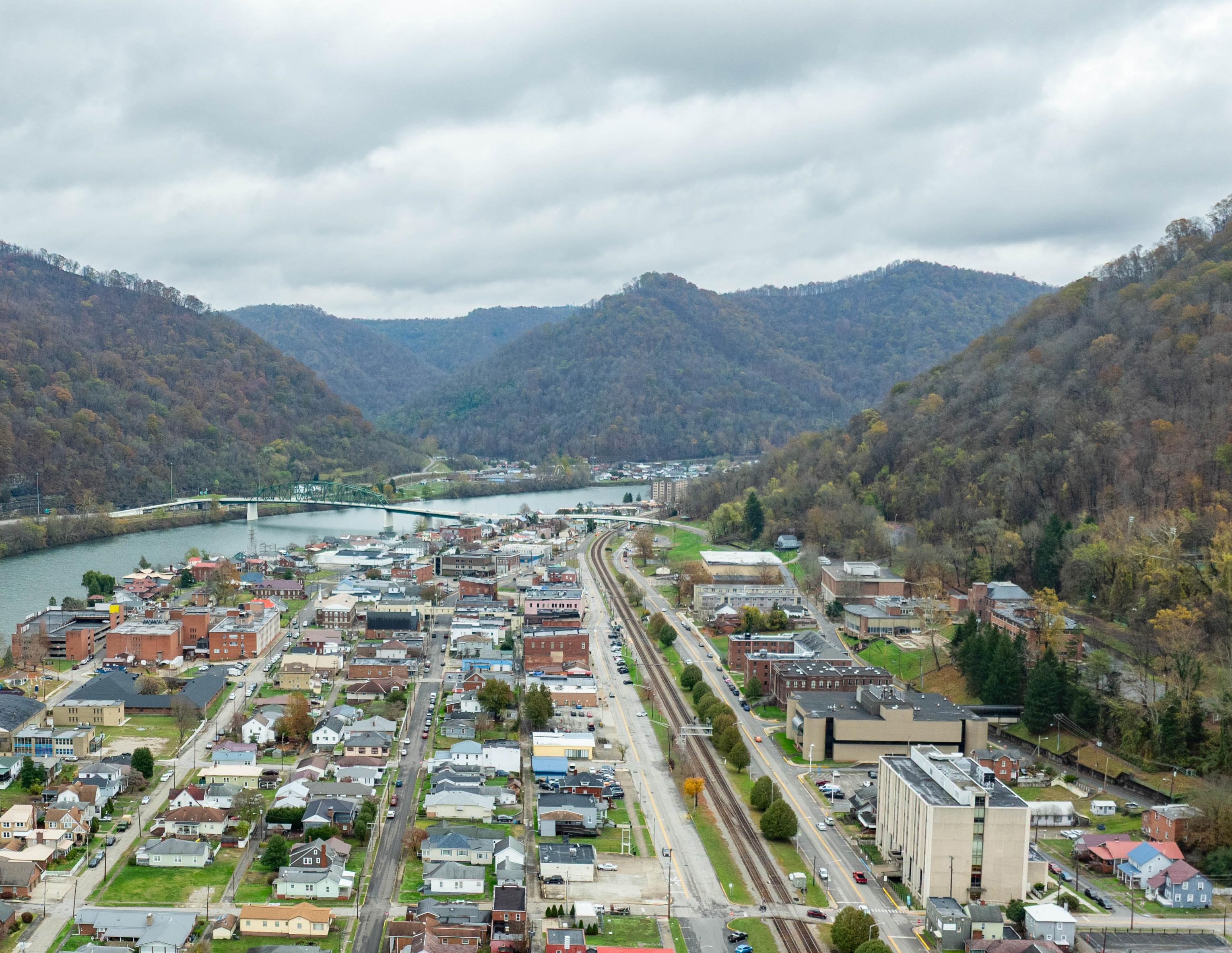
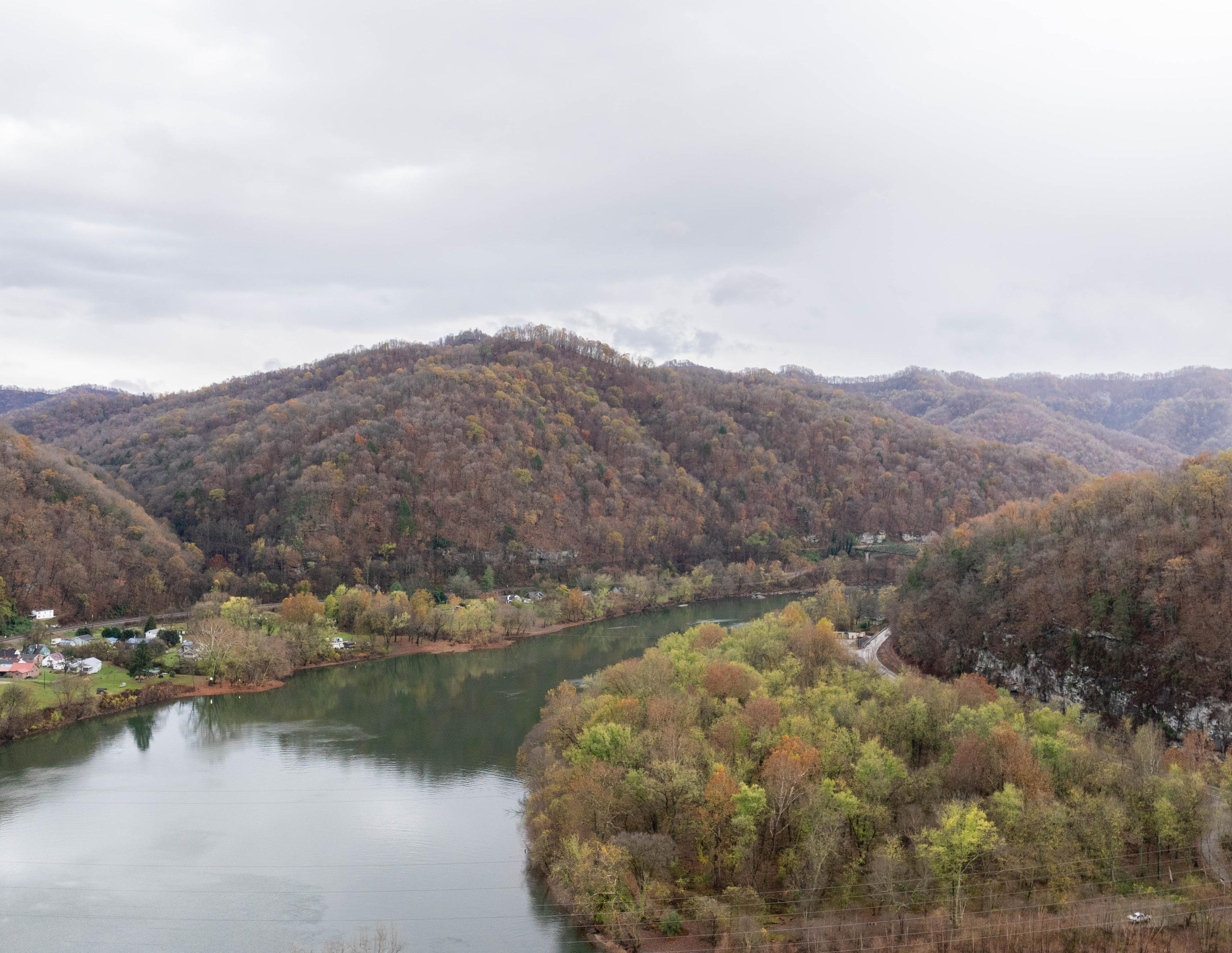
Be careful placing the logo over a photo. Make sure you have a transparent Sunlight layer on top of the photo if at all possible. Use the full color or white versions of the logo.
COLORS & FONTS
CONSISTENCY TO THE
“T”
BRAND COLORS
The consistent use of color is vital to effective brand recognition.
Our brand should always be represented in one of the colors on this page, aside from specific recommendations within this guide.
Do not use any other/ unauthorized colors.
VALLEY GRASS
DIGITAL
HEX - #6BB240
RGB - 107, 178, 64
PRINT
PANTONE - 3308 C
CMYK - 64, 7, 100, 0
MOUNTAIN PINE
DIGITAL
HEX - #002E19
RGB - 0, 46, 25
PRINT
PANTONE - 7534 C
CMYK - 84, 51, 82, 69
HILLS
DIGITAL
HEX - #20782F
RGB - 32, 120, 47
PRINT
PANTONE - 143 C
CMYK - 85, 29, 100, 17
APPROVED PRIMARY PAIRINGS
Nearly all of the colors within our primary palette can be used in combination. Whenever possible, strive for legibility with contrast, especially when setting typography.
Mountain Pine text and elements on a Valley Grass background.
Perfect for use on web.
SECONDARY PALETTE
SUNLIGHT
HEX - #FFD522
RGB - 255, 213, 34
RIVER
HEX - #31C3B5
RGB - 49, 195, 181
PANTONE - 115 C
CMYK - 1, 14, 94, 0
Valley Grass text and elements on an Mountain Pine background.
High contrast, less brand recognition. Use sparingly.
PANTONE - 3258 C
CMYK - 68, 0, 37, 0
EYEBROW
HEADER SUBHEAD
INTRODUCTION SENTENCE LOREM IPSUM DOLOR SIT AMEZ CONSECTETUER
Lorem ipsum qui derumqu odissi te voluptam a volut ere consect urectiur soloreria quia sanderia aut pa volut odio. Otatendicit, ut et alic te volest
Ligendam, consequi quias a volupic iatur, iliquia ad magnimus eni imeni consecaepudi core eatur? Ovid que atia sumet quid quisit adite ex eum.
FONT CHOICES
Railroad Gothic ATF was chosen for its bold, industrial character and vintage Americana roots, providing a striking contrast to the primary typeface. Its condensed proportions and sturdy letterforms enhance visual impact and legibility, reinforcing a brand identity that is both distinctive and timeless.
