Color Field and Abstraction: Brushed, Stained and Sprayed Paintings
Thomas Downing
Nancy Genn
George Hofmann
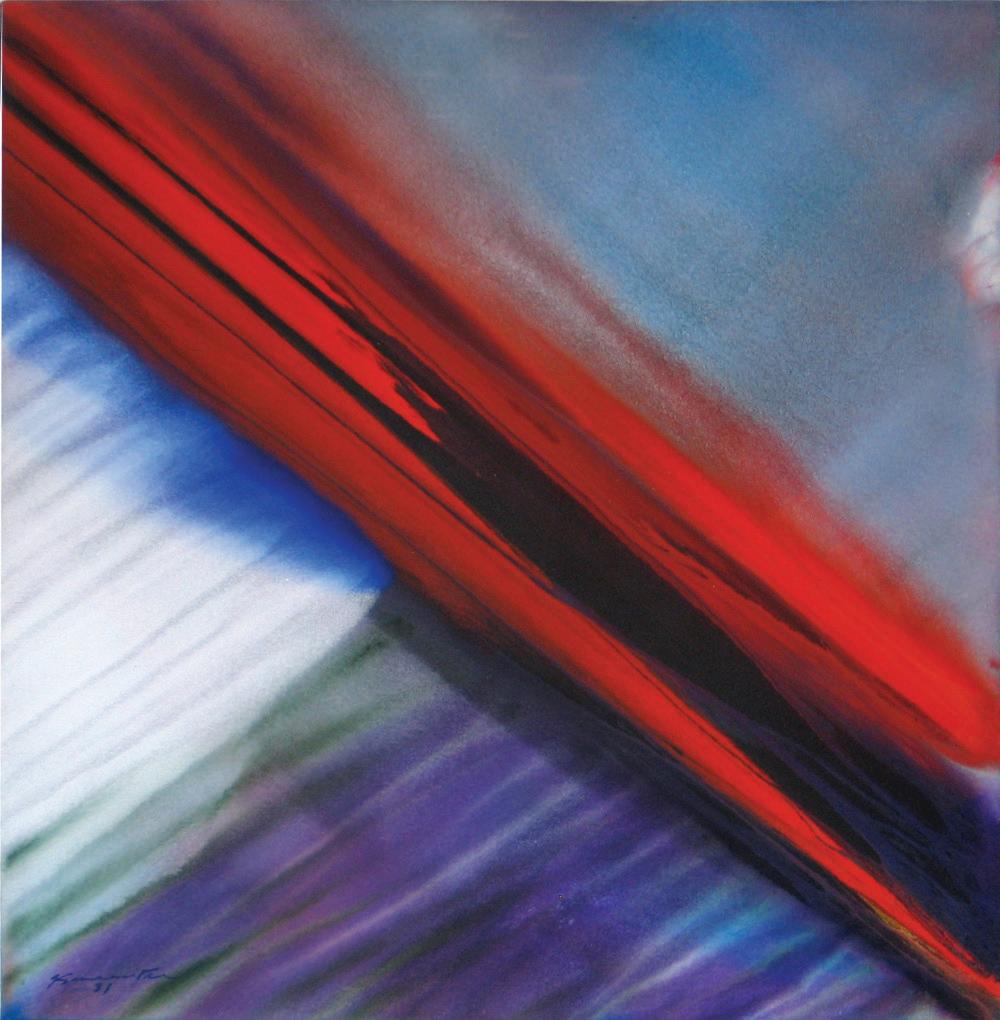
Matsumi Kanemitsu
James Kelly
Ronnie Landfield
Howard Mehring
Lester Rapaport
Martha Szabo
Ben Woolfitt
This presentation focuses on color and abstraction, but more specifically on the artist’s processes for delivering the color. In most cases, each artist uses and selects color as all or an integral part of the content of their compositions, while the process sets the mood and conveys the intent. Ten artists and 25 of their paintings from 1960 through 2023 are included in the exhibition.
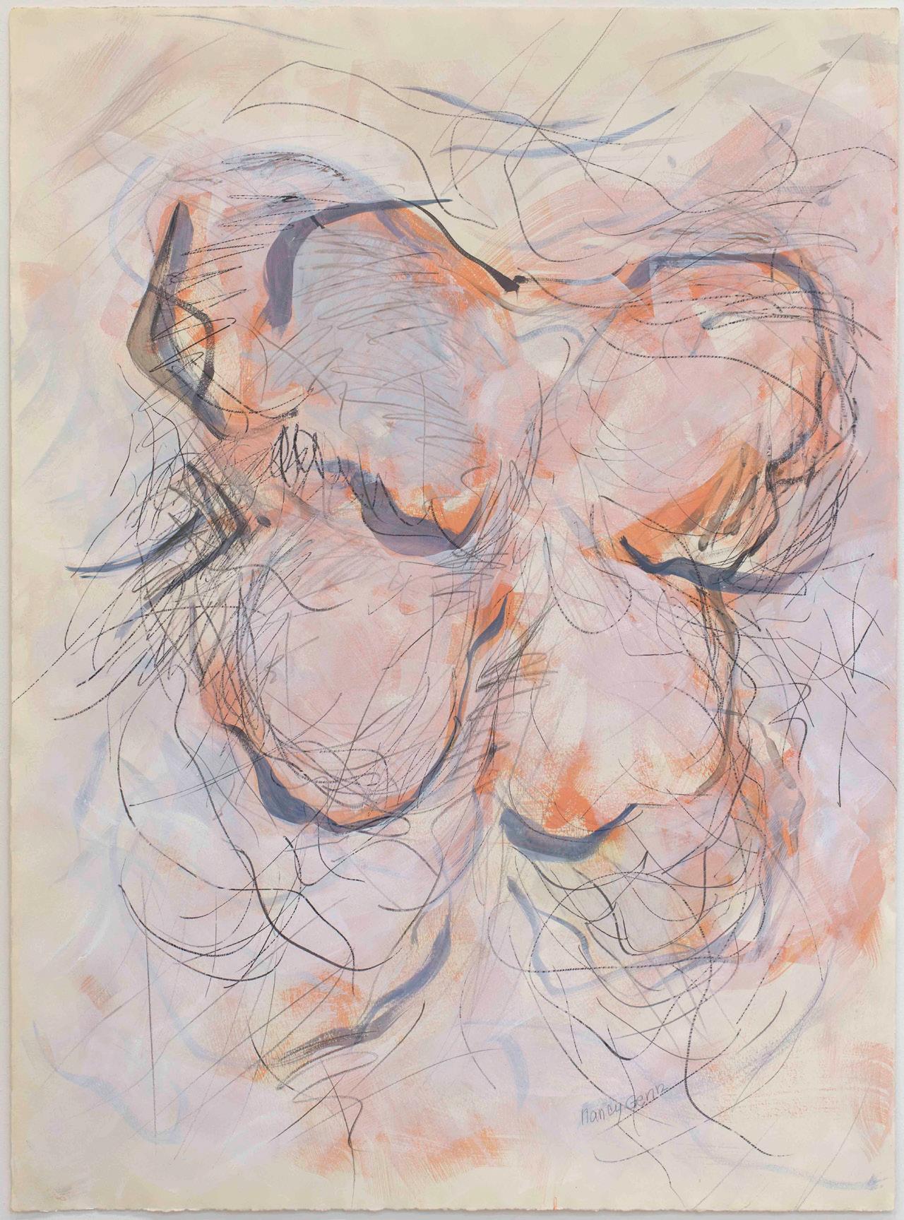
Nancy Genn’s painting from 1964 is a classic work from her earlier period with radiant colors, hints of the most perfect lavender, then effortlessly and perfectly layered with brush marks that seem calligraphic. The marks provide movement and energy that unifies the composition and almost hint at a story.
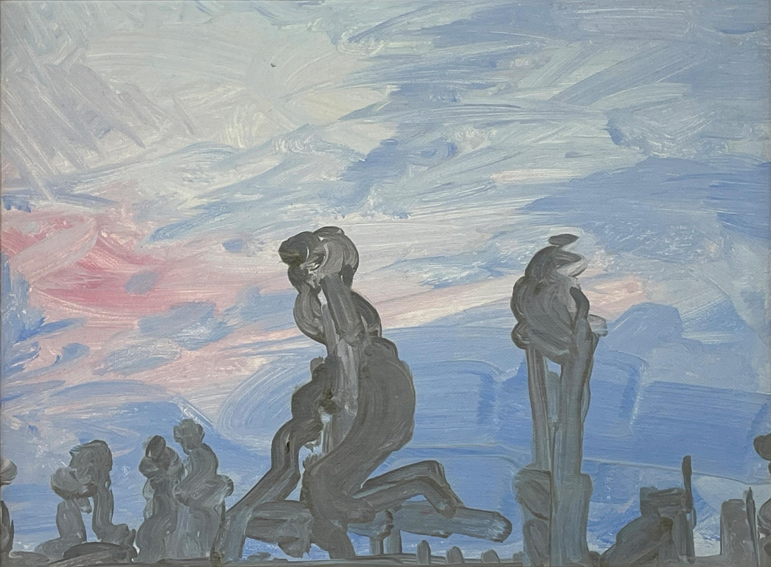
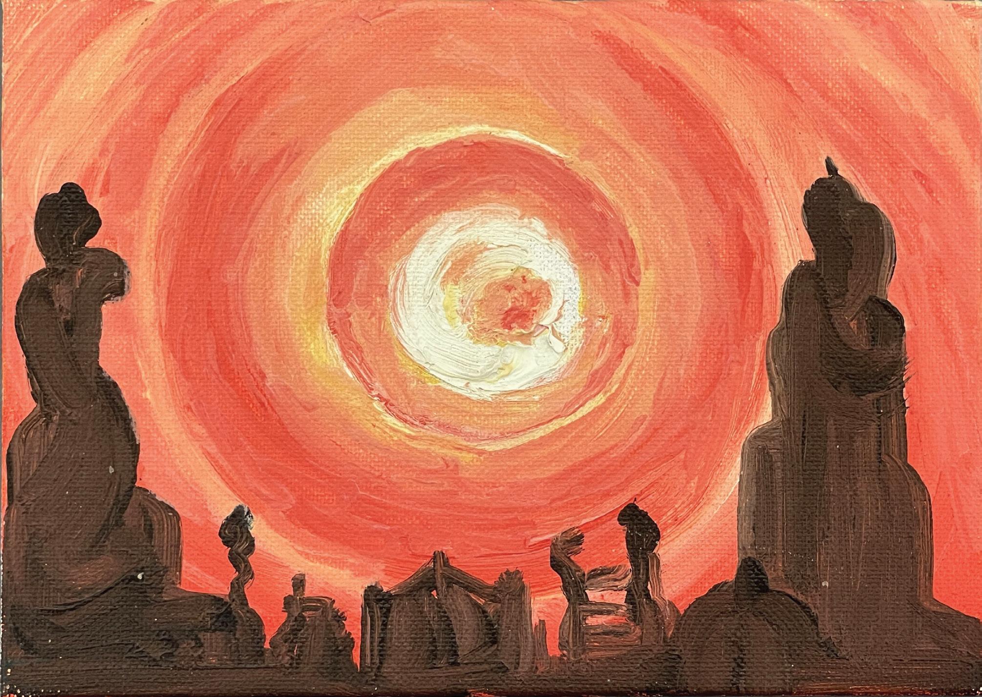
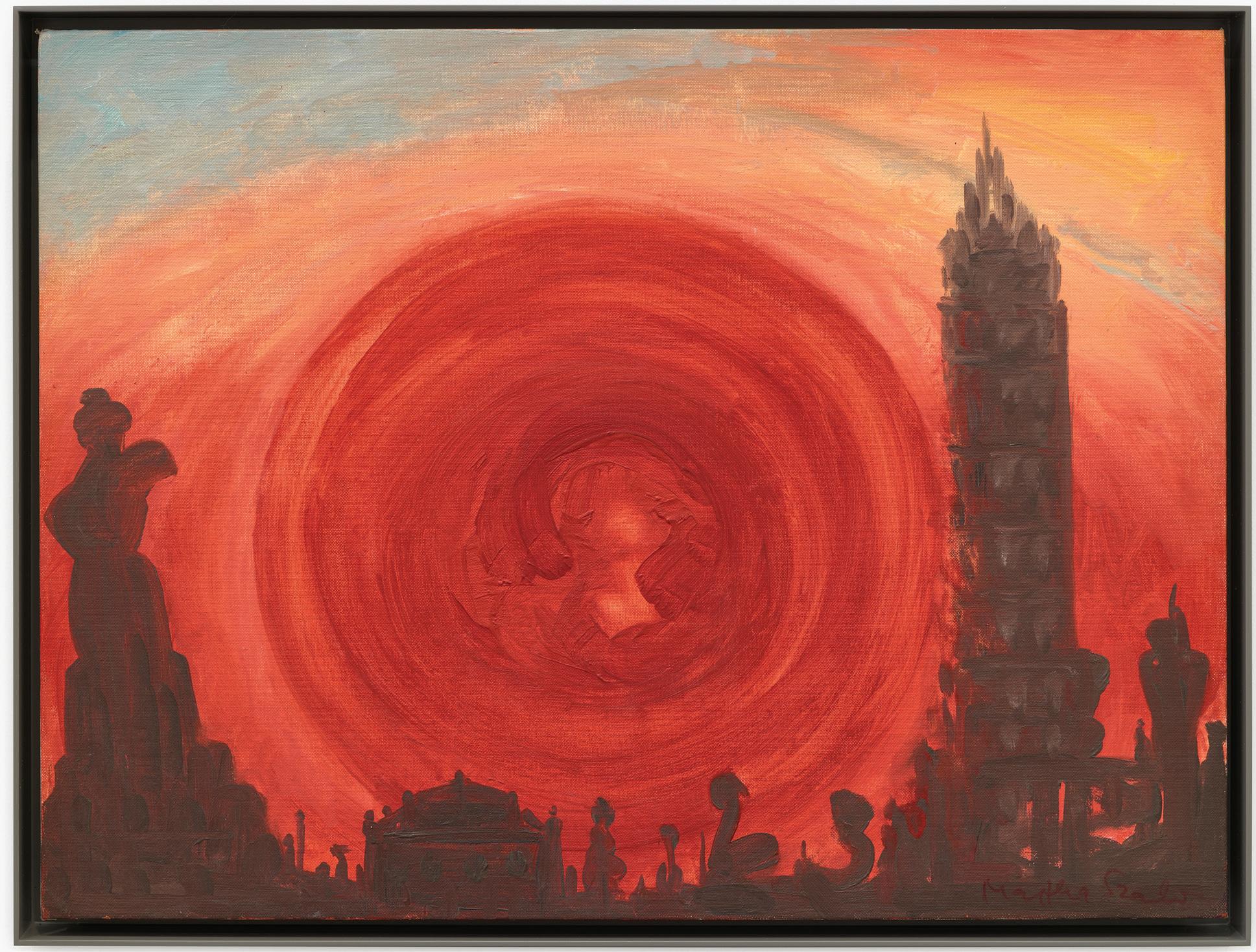
The early 1960s painting from Thomas Downing has short wide strokes of layered color and radiating light that conveys warmth and energy. In contrast, Martha Szabo uses large swaths of colors melding from cool lavenders to radiant ochers and yellows through an orange glowing orb to covey the break of day through a surreal rooftop setting in New York City where skyscrapers in the distance and nearer chimneys with spires of smoke are anthropomorphic and suggest dancing figures at dawn.
Howard Mehring creates large blocks of color in concentric quadrants of collaged stained canvas. While the composition is geometric, the artist applies the hues with a mottled process that give the blocks of color spatial depth, combined with the concentric layers there is an illusion of overlapping planes. George Hofmann also layers large passages of translucent colors built up in an organic process. Hofmann’s paintings are inspired by nature and place from the artist’s memory. Thus, the palettes and process render more of a mood and emotional experience.
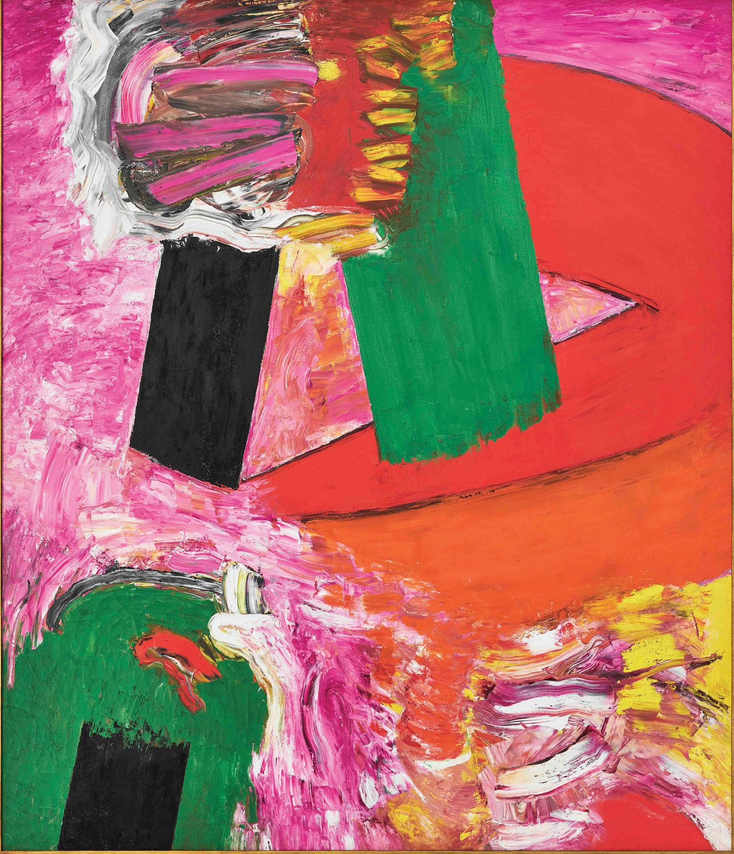
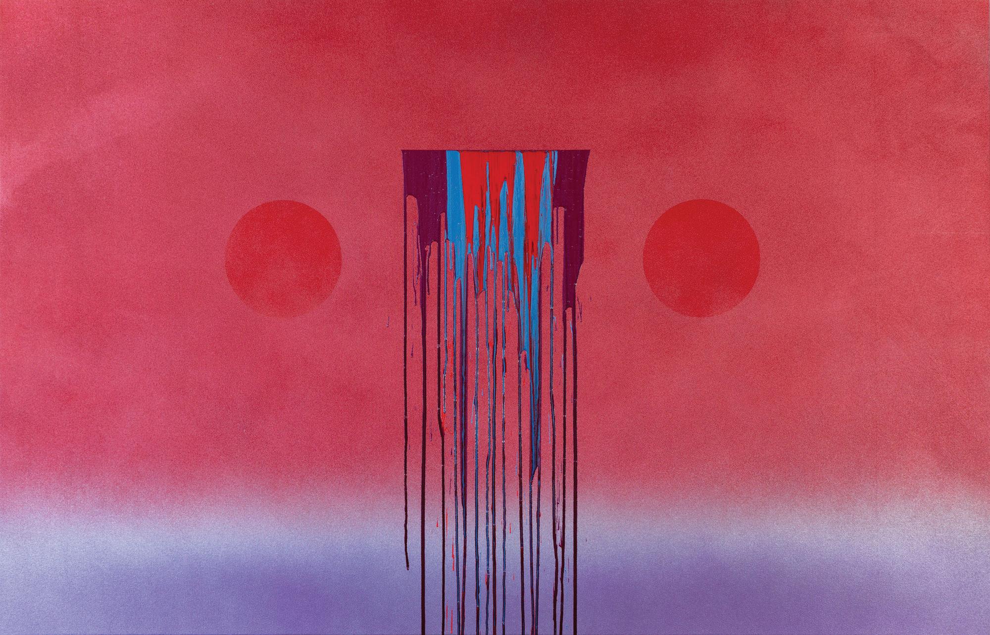
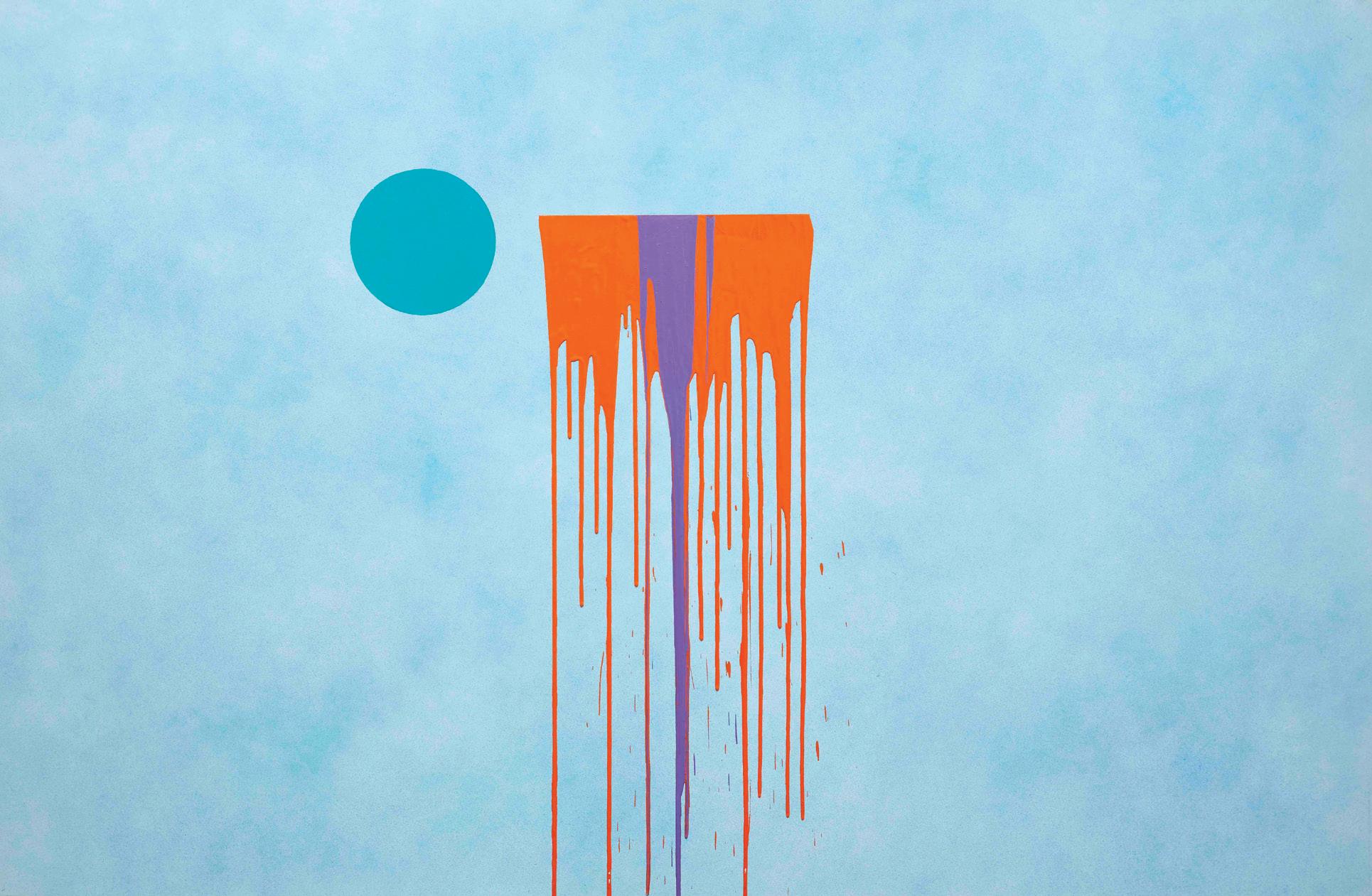
James Kelly and Lester Rapaport both use bold color palettes and a combination of shapes. The shapes in Kelly’s paintings range from brushy frenetic unbound expressionistic strokes next to flatter, almost hard-edge shapes of saturated hues ranging from curved to geometric. The result is a narrative woven through color and form. Rapaport sprays his colors on the canvas supports to convey ethereal moody layers of color and shapes with a focal point of fluid colors that run down the canvas and drip off the edge. The result is meditative compositions that evoke in viewers a range of joyous to sad memories and emotions.
Ben Woolfitt uses a process of layering colors and medium additives such as gels with different types of pigments from interference to metallic sprays and leaf to build his surfaces and allow color to radiate and move through his paintings emulating breaking light.
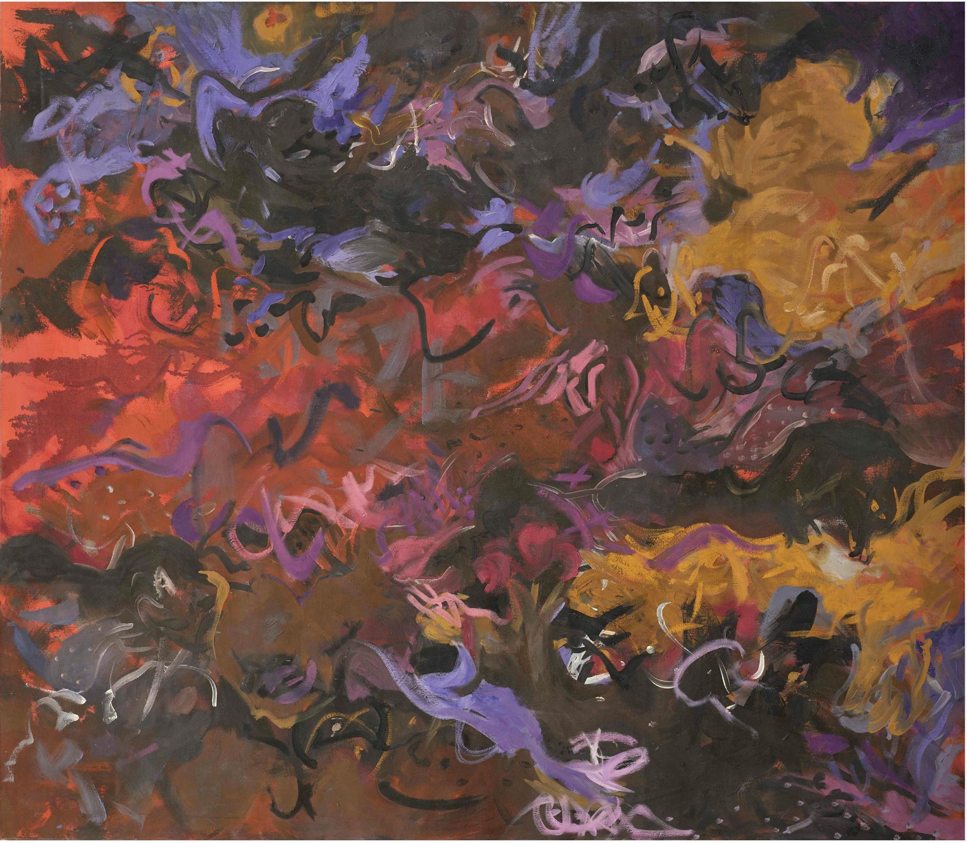
Ronnie Landfield and Matsumi Kanemitsu are both inspired by nature and use combinations of staining techniques and layering color to convey the energy during sunrise and sunset, or waxing and waning moons, and the ocean tides. Their palettes indicate whether the subject is water or land, day or night, bliss or pandemonium.
By David Eichholtz May 2025, New York
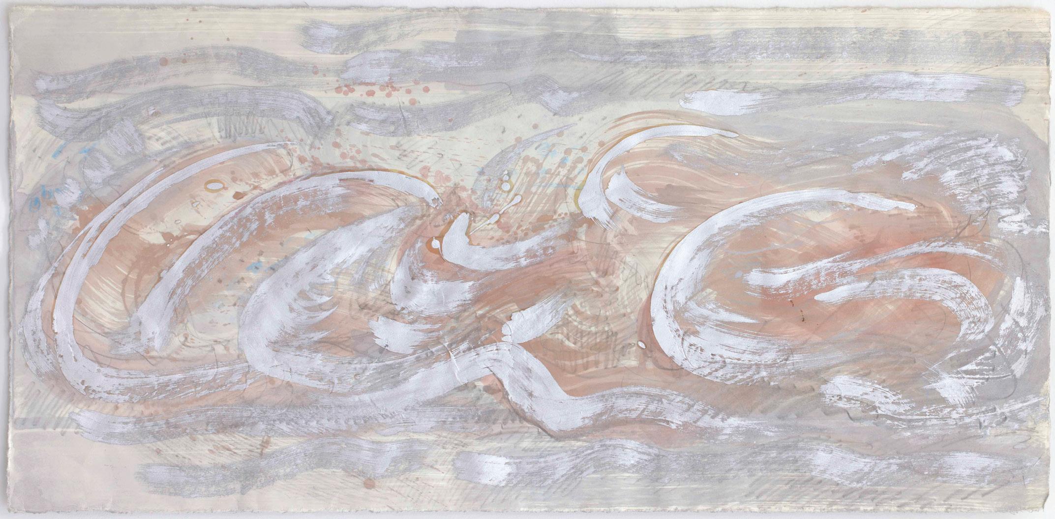
Nancy Genn
After Houksai , 2012
Mixed media on Kozo paper
20 x 40”
About Nancy Genn:
Nancy Genn (1929), a California artist whose artworks have been exhibited and collected nationally and internationally, lives and works in Berkeley. She studied at the California School of Fine Arts (now The San Francisco Art Institute) and the University of California, Berkeley between 1947 and 1949. In 1978 she was awarded the prestigious United States/Japan Creative Arts Fellowship that allowed her to travel and lecture about her pioneering techniques in Japan. In the 1980s she received wide recognition for her experiments with paper, exhibiting with Robert Rauschenberg and Sam Francis in the US and in Asia (New American Paperworks, 1982-83). She was invited several times as visiting artist to Rome by the American Academy, also Turin by ICAR (International Center of Aesthetic Research), Venice by the Cini Foundation (2019) for an exhibition at Ca’ Pesaro and recently to Todi (2020), to participate in the first Festival of Arts as a tribute to Beverly Pepper. Significant retrospectives of her artworks include Planes of Light (2003) at the Fresno Art Museum, CA, and Architecture from Within (2018) at Palazzo Ferro Fini, Venice.
Solo Exhibitions in Museums:
M. H. De Young Museum of Art, San Francisco, CA
Fresno Art Museum, Fresno, CA
The Oakland Museum, Oakland, CA
Los Angeles Institute for Contemporary Art, LA, CA
Richmond Art Center, Richmond, CA
Istituto Italiano di Cultura Chicago/The Art Institute of Chicago, IL
Istituto Italiano di Cultura, Los Angeles, CA
Bolinas Museum, Bolinas, CA
Mills College Art Museum, Oakland, CA
America Assoc. for Advancement of Science, Washington DC
Cowell College Gallery, UCSC
Museo di Ca’ Pesaro, Galleria Internazionale d’ Arte Moderna, Venice, Italy
Carl Cherry Center for the Arts, Carmel, CA
University of California, Santa Cruz, Cowell College
Sanchez Art Center, Pacifica Center for the Arts, Pacifica, CA
Nancy Genn’s Artworks In Selected Museum Collections:
Achenbauch Foundation, California Palace of the Legion of Honor, San Francisco, CA
Albright-Knox Art Gallery, Buffalo, NY
American Craft Museum, New York, NY
Auckland Museum, Aukland, New Zealand
Brooklyn Museum, Brooklyn, NY
Cincinnati Art Museum, Cincinnati, OH
Crocker Art Museum, Sacramento, CA
Des Moines Art Center, Des Moines, IA
Fondazione Georgio Cini, Venice, Italy
Fresno Art Museum, Fresno, CA
Indianapolis Museum of Art, Indianapolis, IN
International Center of Aesthetic Research, Italy
Library of Congress, Washington, DC
Los Angeles County Museum, CA
Mills College Art Museum, Oakland, CA
Museum of Modern Art, New York, NY
Museo di Ca’ Pesaro, Venice, Italy
Museum of Modern Art Jacksonville, Florida
National Museum of American Art, Washington, DC
The New York Public Library, New York, NY
New York University Art Collection, NY
The Oakland Museum, Oakland, CA
Palazzo Ferro Fini, Venice, Italy
Portland Art Museum, Portland, OR
San Francisco Museum of Art, CA
Smithsonian Institution, Washington, DC
Southwest State University Art Museum, Marshall, MN
University Art Museum, University of California, Berkeley
University of Texas, El Paso, TX
Weisman Art Museum, University of Minnesota, Minneapolis, MI
Western Carolina University Fine Art Museum, Cullowhee, NC
Mixed media on paper
Nancy Genn
Opus 36 (pink) , 2020
30 x 22.5”
Thomas Downing
Thomas Downing was born in Suffolk, Virginia. He studied at Randolph-Macon College, Ashland, Virginia, where he received his Bachelor of Arts degree in 1948. He then studied at the Pratt Institute, a well-known art school in Brooklyn, New York, until 1950. That year he received a grant from the Virginia Museum of Fine Arts, enabling him to travel to Europe, where he studied briefly at the Académie Julian in Paris. In 1951 he returned to the United States, and after serving in the U.S. Army, settled in Washington, D.C., where he began to teach, in 1953. The following summer, he enrolled in a summer institute at Catholic University, studying under Kenneth Noland, who was a founder of the Washington Color Field Movement. He became a friend of Noland, who became a significant influence on Downing’s art. In the late 1950s, Downing shared a studio with Howard Mehring, another artist of the Washington Color School and Color Field painting. From 1965 to 1968, Downing taught at the Corcoran College of Art and Design in Washington, D.C. There he taught several people who in their turn became artists influenced by Downing’s ideas, including Sam Gilliam. His paintings to a large extent consisted of circles arranged in precise patterns on the canvas, with colors often chosen according to ideas of symmetry. Downing clearly pre-dated Damien Hirst’s ‘spot paintings’. In the last ten years of his life, Downing lived in Provincetown, Massachusetts.

Thomas Downing Bush, 1960 ca
Acrylic on canvas
51 x 38”
Martha Szabo Cityscape, Blue Sky Pink Sunset , 1975 ca
Oil on canvas
9 x 12”
Martha Szabo
Cityscape, Untitled, Silhouettes Awaiting Setting Sun (Orange,YellowRings) , 1976
Oil on canvas
5 x 7”
Martha Szabo
Demilunes 29 , 1975 ca
Oil on canvas
20 x 24”
Martha Szabo
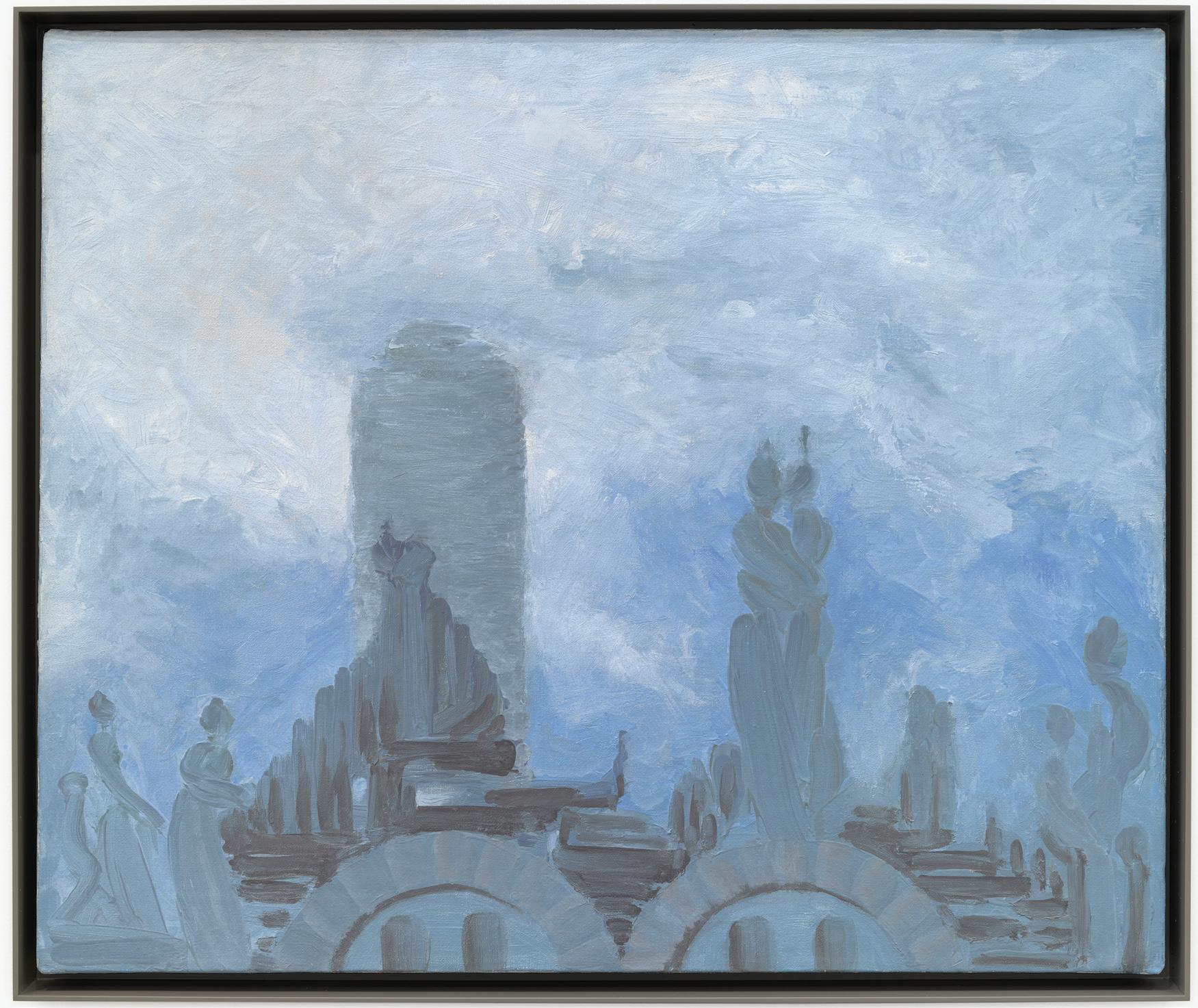
Up On The Roof: Liberation, Transformation, Celebration
Paintings by Hungarian-born holocaust survivor, many never before exhibited, memorialize New York City’s majestic skyline and the artist’s newfound freedom in America . . .
Marth Szabo’s artworks are all easel-sized or smaller, oil on canvas and many with views of the New York City skyline and its architectural triumphs one after the other over more than six decades as observed from the rooftop and windows of the artist’s mid-rise and high-rise apartment buildings where she lived and worked in Manhattan throughout her career.
Twenty of her paintings were installed salon style in an intimate presentation of several thematic and aesthetic vignettes, given the small size of the canvases ranging from 6 x 4 inches up to 24 x 39 inches, during her debut exhibition with David Richard Gallery in New York in the fall of 2023 just prior to her passing. A digital catalog was published with an essay by Gwen F. Chanzit, Curator Emerita, Denver Art Museum. Abstractions spanning four decades, several art historical –isms, and a lifetime of insatiable creativity, the exhibition marked an important chapter in the history of art and our city and heralded in the gallery’s exclusive representation of an amazing woman artist.
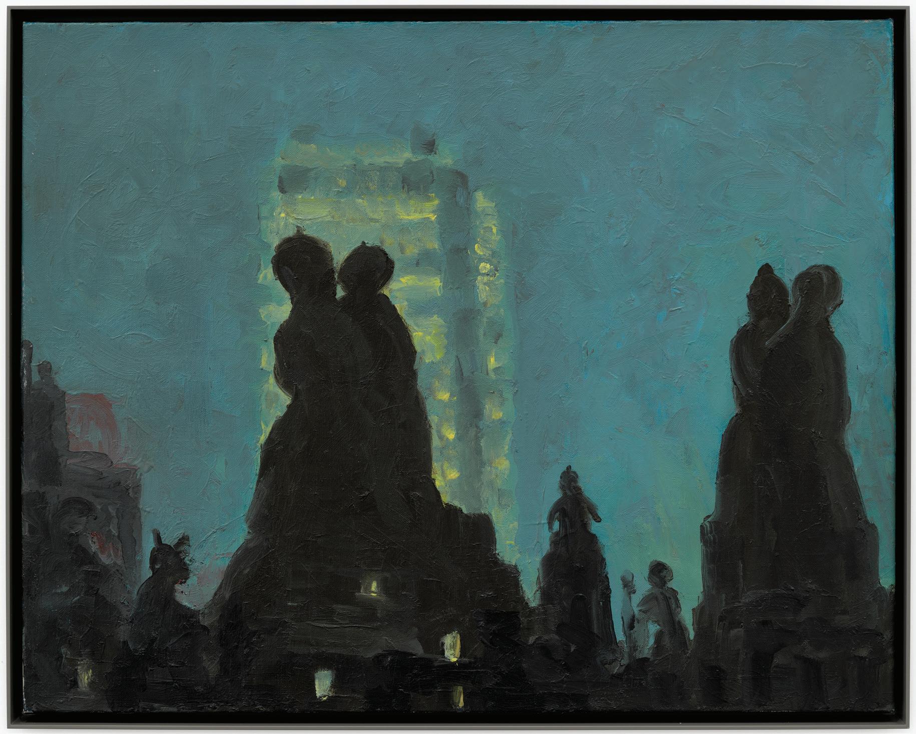
Martha Szabo
Neon City (MS23) , 1975
Oil on linen
22 x 28”
Martha Szabo
Untitled Crimson Sunset (MS27) , 1976 Oil on board Plyex by Grumbacher 18 x 24”
Howard Mehring
Born Washington, DC 1931-died Annapolis, MD 1978
Howard Mehring studied art at Catholic University of America, where he met Kenneth Noland, then an instructor, and Thomas Downing. The two were soon to be associated with Mehring as members of the Washington Color School.
After earning his MFA in 1955, Mehring taught in area schools but continued to paint, experimenting with materials such as the fast-drying new acrylics in order to find a personal direction in his art. In 1959 he exhibited his lyrical abstractions at Origo, the Washington cooperative gallery he helped found, but it was the 1960 show at Jefferson Place Gallery, where the public first saw his striking all-over stippled abstractions, that confirmed his talent. The influential New York critic Clement Greenberg’s inclusion of Mehring in the seminal 1964 “Post-Painterly Abstraction” brought him greater renown.
In the last years of his active career, Mehring turned entirely to drawing. These lyrical, expressive works are not studies for paintings but are meant to stand alone, although taken as a whole, they reveal Mehring’s fascination with certain forms such as stars. Since his untimely death, critical reevaluation of Mehring’s work has led to his being regarded as an innovator and one of the most important figures in the Washington Color School.
National Museum of American Art (CD-ROM) (New York and Washington D.C.: MacMillan Digital in cooperation with the National Museum of American Art, 1996).
From: https://americanart.si.edu/artist/howard-mehring-3263
James Kelly (1913 – 2003)
James Kelly’s seven-decade career spanned: hard-edge geometric paintings from the 1940’s, California Abstract Expressionism from the 1950’s, Pop from the 1960s, Minimalism from the 1970s, and even his last painting representing the artist’s return to his own personal language of painterly abstraction from the 1980s and onward. James Kelly (1913 – 2003) is an American painter. He was championed by Walter Hopps and included in his first curatorial foray, the seminal Merry Go Round exhibition of 1955. In Los Angeles, Kelly was one of the original artists at The Ferus Galley. Kelly’s work is included in the permanent collection of The Museum of Modern Art, The Whitey Museum, The Los Angeles County Museum of Art, and The San Francisco Museum of Modern Art.
James Kelly Taxi , 1962
Oil on canvas
76.5 x 65”
Framed size - 80” x 68.25”
Signed lower right-hand side
About James Kelly:
James Kelly (1913 – 2003) is an American abstract painter born in Philadelphia. After enlisting in the second World War, he followed in the footsteps of Jack Kerouac and moved to California to study on a GI Bill at the California School of Fine Arts where Clifford Still was a prominent teacher. In San Francisco Kelly’s work flourished, in 1953 he married fellow painter Sonia Getchtoff. Kelly lived in Fillmore in the same building as Jay Defeo, he was at the nexus of artistic activity in Northern California. Kelly was championed by Walter Hopps, who included him in his first exhibition in 1955 known as the Merry Go Round Exhibition, where he installed abstract paintings on a merry go round in Pasadena. Kelly’s paintings were presented alongside works by Mark Rothko and Clifford Still. In Los Angeles, Kelly was one of the original artists at opening of the The Ferus Galley.
Art works by James Kelly are included in the permanent collections of: the Museum of Modern Art, Whitey Museum, Los Angeles County Museum of Art, San Francisco Museum of Modern Art, Oakland Museum, Norton Simon Museum, La Jolla Museum of Art, Worcester Art Museum, Crocker Art Museum, Amon Carter Museum of Art, National Gallery of Art, The Library of Congress, Fogg Museum at Harvard University, New York University, University of California, Los Angeles, and the JP Morgan Chase Art Collection.
Ben Woolfitt Magic , 2023
Acrylic on canvas
60 x 72”
Ben Woolfitt
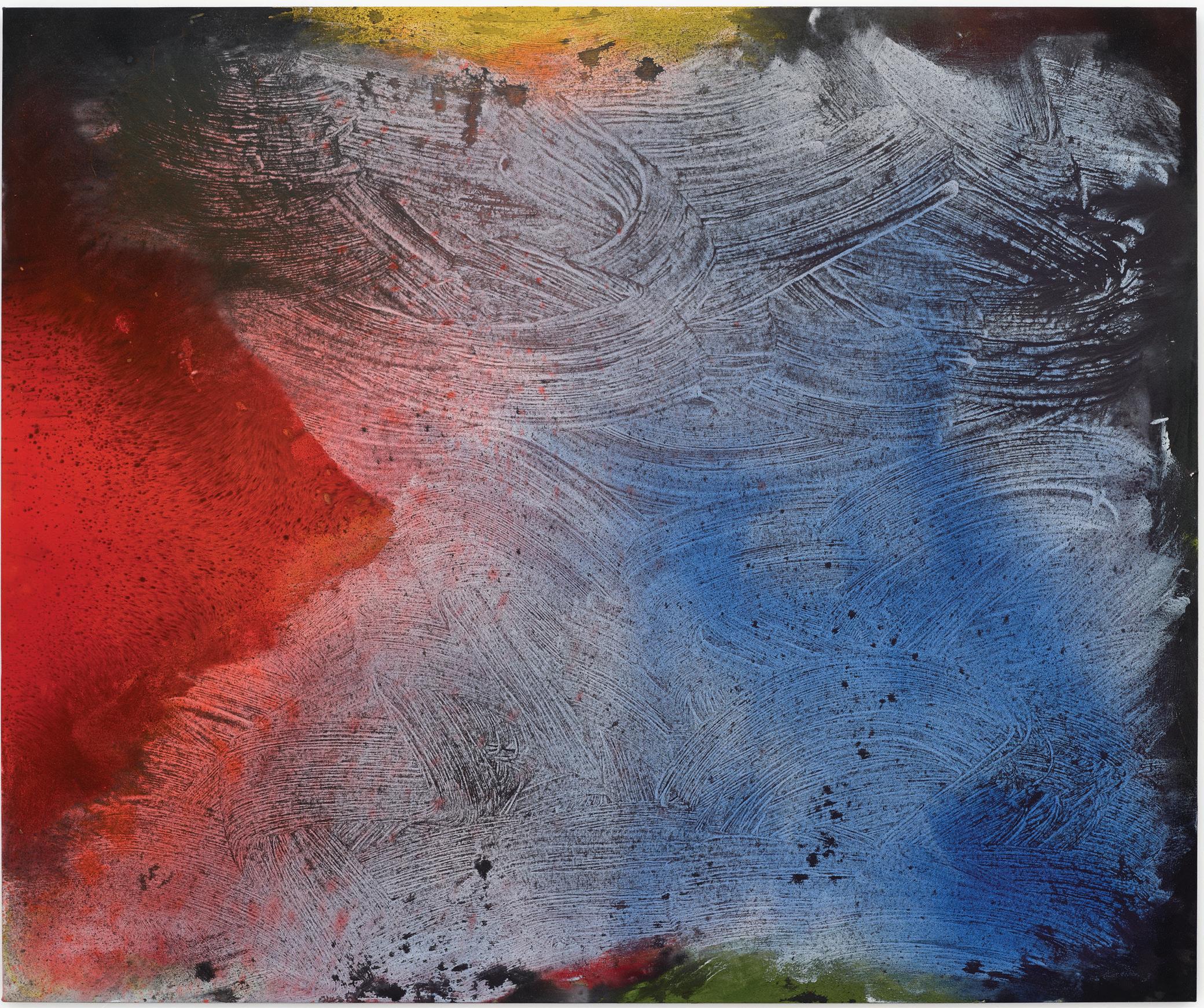
Always exploring non-objective abstraction and inspired by Color Field painting, Woolfitt’s process-driven paintings begin and end with surface and color. These newest works start with waves and swaths of gesso that provide the first step in his process. Applying pigment in layers with each mark and gesture in response to the prior additions, the colors and imagery organically evolve filling the canvas and running off the edges in every direction. The variety of media, including acrylic paint, dry pigment, metallic leaf, and graphite and the canvas filling, all over painting approach makes the work dynamic, full of intrigue with the color and imagery extending beyond the canvas edges. Depending upon the range of palettes, from black and white, to blue, black and white, or black and gold, with occasional additions of green or red, each painting having sprays of colors in the grounds or moving toward the surface with clusters of marks evokes astral skies, the cosmos, or nautical vegetation and creatures deep in the sea.

Ben Woolfitt Power of Light , 2023
Acrylic on canvas
60 x 72”
George Hofmann – Artist Statement
Since finding my footing in painting in the 1960’s, I’ve sought a way of working that respects, and ultimately finds its origins in, emotions. Ironically, my training, and my innate sense of balance, have so subtly influenced me that I’ve found being true to my feelings much more challenging than it would seem, so I cannot say that I have been successful with this. All too often self-criticism, the desire for acceptance, the abhorrence of disharmony have all undermined the best of my intentions.
In practice, working this way often starts with a choice of color: this can be impulse, or an instinct, or the source could be a dream, or a longing. In reality, all work starts earlier, with a choice of materials: here too, feelings play a decisive role, in the choice of the surface, the medium, the size and format, etc. All these emotional inputs are extremely determining – which show up most when disregarded, and, I believe, are most keenly sensed in the frustration with any work that falls short.
Ideas can actually be emotive too: an idea conceived out of feeling and executed in a feeling way can be a powerful conveyer of emotion. I think Matisse, at the very beginning and especially at the end, is a perfect example. His ideas are emotionally conceived, and his work is painted and drawn and cut with feeling. Art that is ideological is basically emotional; the problem is often that artists not in touch with their feelings, and critics and curators who do not let their senses work make choices that do not resonate emotionally.
I believe that great art wants to change - art that is based on refinement is significant (see Velasquez) if it is based in true feeling. Truth seeking is the key, ambition helps (see Caravaggio): if it is based in true feeling it has power, if not, itis empty and unrewarding.
As an artist, I’ve often misunderstood what I’ve done or not understood it untillater. Hopefully, history will help to sort this out. Now, towards the end of my working life, I know that I know more, but, at the moment of making something new, it is all a mystery still.
George Hofmann Blue In , 2008
Acrylic on linen 40 x 32”
George Hofmann (b. Jamaica, NY 1938)
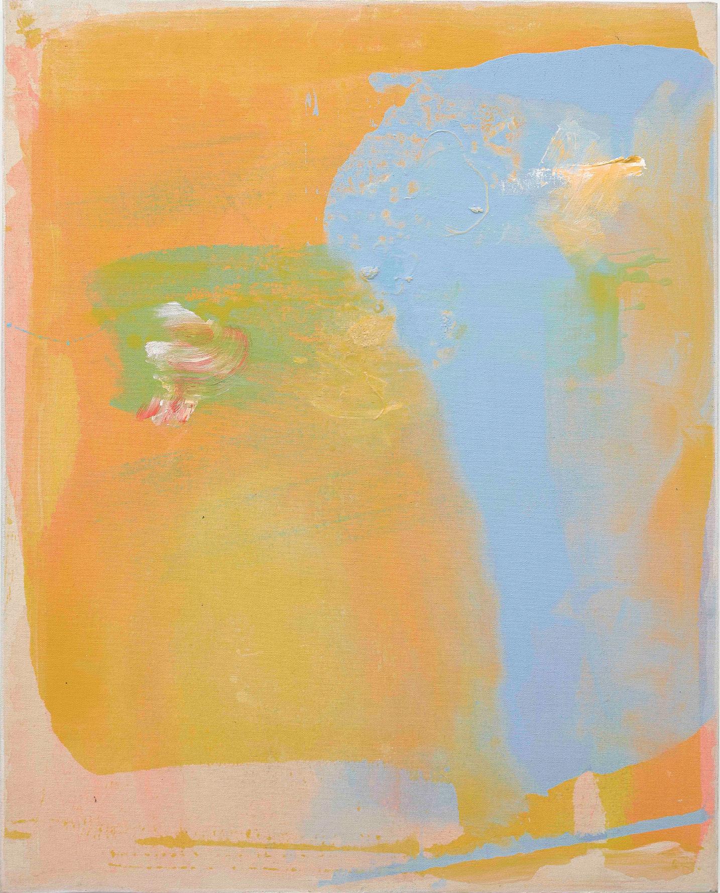
Color Field and gestural paintings by New York artist George Hofmann. Creating abstract paintings for over 6 decades, Hofmann explores color and form using a variety of staining, brushing, and layering techniques with saturated and dilute glazes of acrylic paint. His preferred supports are canvas, linen and paper. However, recently, Hofmann has been working on smooth wood panels that reveal the grain so that he can build and excavate the paint to fragment his compositions on a natural surface, making them more reductive and a different viewing experience. Most of Hofmann’s paintings are rooted in nature and personal experience. He is passionate about art history and writes thoughtful and challenging essays on contemporary painting. Hofmann taught at Pratt Institute and Yale University in the 1960s and then at Hunter College in New York from 1967 through 2002 when he retired.
Matsumi Kanemitsu (1922- 1992)
“In his late years Mike saw his painting as a metaphor- equal and opposite- of the poetry, grandeur, tranquility, and life-threatening violent potential in the force of nature. He could not help agreeing with his friend, Jackson Pollock, that when he was IN his painting, working in a trance like state, he was nature itself.”
— Gerald Nordland
“To me, I want my work to be like life- everything that is different or opposite to be in balance, like yin and yang, negative and positive, day and night. I want to be just like sunshine, like moon.”
— Matsumi Kanemitsu
Kanemitsu came out of traditional Japanese painting and Abstract Expressionism as part of the Cedar Bar crowd in New York. Living and working in NY at the beginning of his professional career, he was friends with De Kooning, Kline and the rest of the New York School. He later moved to Los Angeles in the early 1960s where he painted and taught until his death. He exhibited in important galleries including Dwan Gallery, Janus Gallery and Louis Newman in LA. He was included in numerous museum exhibitions and collections.
Kanemitsu’s paintings are represented in numerous public collections, including Metropolitan Museum of Art, NY, Museum of Modern Art, NY, National Gallery of Art, Washington, D.C., San Francisco Museum of Modern Art, Los Angeles County Museum of Art, and Art Institute of Chicago among many others.
Matsumi Kanemitsu
Pacific Series #23 , 1981
Acrylic on canvas
48 x 48”
Ronnie Landfield (B. 1947):
Emerging in the 1960s in New York City, Landfield’s paintings are Post Painterly abstractions and strongly influenced by Color Field painting with mostly stained and poured pigment on canvas. Most of his compositions reference nature, the land and skies at various times of day as the sun light interacts with the organic surfaces and moisture in the air to produce prismatic colors.
His paintings are represented in public and private collections, including the Metropolitan Museum of Art, the Museum of Modern Art, the Whitney Museum of American Art, the Art Institute of Chicago, the Hirshhorn Museum and Sculpture Garden, the National Gallery, among numerous others.
About Lester Rapaport’s Artworks
The paintings in this presentation are from and relate to his series, Waking Up and A New Chapter, coming out of years of Rapaport’s meditation practice and soul searching and, as the title suggests, a path and looking forward. They are reductive and open with a single poured band of paint in the center of the canvas with one or more circles of color placed on one or both sides of the pour in different locations situated on a mottled, softly hued ground. The paintings evoke meditation centers and Tantric painting with the isolated shapes of saturated color on an open ground. As noted, they come out of meditation and spiritual reflection, not as a direct commentary on anything in particular, but as his response to personal emotions as well as frustrations with current cultural and political turmoil.
Lester Rapaport
Waking Up for Leontyne Price , 2020
Acrylic cotton duck 54 x 84 x 2”
As an artist, Rapaport cannot resist channeling the imagery and teachings of art history’s masters to help him picture what is hard to explain in words. In the earlier series of paintings from the 1980s, Gifts to the Universe, picturing the complexities of space and creating the illusion of spatial depth, Rapaport was inspired by: the drips, automatism and layering of Jackson Pollock; the multiple and simultaneous views from the Cubists; and Henri Matisse’s bold use of color and form as well as leveraging positive and negative space to create strong figure / ground relationships. Regarding the newer paintings from the series, Into the Mystery, Rapaport was very moved and inspired by the brushy, pillowy soft, ethereal, dream-like surfaces produced by Mark Rothko and his large canvases.
These series were featured in a recent exhibition, Outside / Inside. View the exhibition and read the full essay at the following link:
https://davidrichardgallery.com/exhibit/622-lester-rapaport
About Lester Rapaport:
Rapaport (b. 1947), born and raised in New York City, earned his BFA in 1969 and pursued graduate studies at Hunter College. Initially trained and concentrated on figurative painting and drawing, by the late 1960s he switched entirely to abstract painting. The 1970s were a bit of a lost decade for the artist due to health issues and other personal matters. However, he reemerged in the early 1980s and has consistently produced challenging and inter-related series of abstract artworks that he has exhibited mostly in and around New York. His strongest affiliations have been with Westbroadway Gallery in New York and Sideshow Gallery in Brooklyn.
Lester Rapaport
Marion’s Smile , 2015
Acrylic on canvas
54 x 84 x 2”