LURA
Secondary logo
This is a ‘solid’ version of the logo for use in circumstances where reproduction of the primary logo might not be possible, or might not be the most effective use of the logo (on an image, for example), or when the circumstances dictate the use of a single colour version only.
Exclusion zone
In order for the logo to stand out when used in conjunction with other logos or graphic elements, we have devised an ‘exclusion zone’ around it which indicates the minimum amount of clear space to be left around the logo and in which no other elements should appear.
The zone is measured using half the total height of the logo.
Minimum size
The recommended minimum width to print the logo is 15mm or for screen use the minimum display size is 45 pixels..
Bad practice
To keep the integrity of the brand you should NOT change the logo at all…
Do not resize any elements
Do not use the logo on a distracting background
Do not obscure the logo with graphics or images
Do not alter the spacing of any logo elements
Do not recolour the logo
Do not distort the logo
Brand colour palette
The new logo features a graduation which can also be used as a background in printed material, websites, social media assets etc. The specific colours and formula for recreating the graduation in software such as Adobe
InDesign and Adobe Illustrator is shown below. Also shown are the other primary brand colours and some secondary colours which can be used to complement the main colours, where required
Lura Aqua Light
C 51, M 3, Y 14, K 0
R 132, G 201, B 219
Hex: #84c9d6
Lura Aqua
C 81, M 37, Y 36, K 18
R 40, G 114, B 132
Hex: #287284
Secondary Blue
C 80, M 55, Y 43, K 36
R 54, G 79, B 94
Hex: #354f5d
Secondary Grey
C 12, M 9, Y 10, K 0
R 229, G 228, B 228
Hex: #e5e4e3
White
C 0, M 0, Y 0, K 0
R 255, G 255, B 255
Hex: #ffffff
Left colour 100%
Location 0
C 81, M 37, Y 36, K 18
R 40, G 114, B 132
Hex: #287284
Right colour 100%
Location 100
C 62, M 0, Y 33, K 0
R 95, G 191, B 185
Hex: #5ebeb8
Location 50%
Brand typography
We have identified two typefaces for use with the new brand. They both complement the logo and work well together. The fonts can be used in the various weights included with each family, but try to minimise the amount of weights used in one document.
The font Source Serif 4 is to be used for body text and Neue Haas Grotesk can be used for headings, but both of these can also be used for display type, such as larger headings, call-outs and pull-quotes. Both fonts are available to download on Google fonts.
Source Serif 4 Light
abcdefghijklmnopqrstuvwxyz
ABCDEFGHIJKLMNOPQRSTUVWXYZ
1234567890!@£$%^&*()
Source Serif 4 Light Italic abcdefghijklmnopqrstuvwxyz
ABCDEFGHIJKLMNOPQRSTUVWXYZ
1234567890!@£$%^&*()
Source Serif 4 Semi Bold abcdefghijklmnopqrstuvwxyz
ABCDEFGHIJKLMNOPQRSTUVWXYZ
1234567890!@£$%^&*()
Neue Haas Grotesk Bold
abcdefghijklmnopqrstuvwxyz
ABCDEFGHIJKLMNOPQRSTUVWXYZ 1234567890!@£$%^&*()
Neue Haas Grotesk Regular abcdefghijklmnopqrstuvwxyz
ABCDEFGHIJKLMNOPQRSTUVWXYZ 1234567890!@£$%^&*()
Source Serif 4 Light
Sitatus se nonseque cone sequid eaque vent eatium utem fuga. Et qui delitem. Nam et, cusaperibus, quam, experum alit quos essene quo odigendamene nonet aborero consequassit laceaque non pos solecab impore voluptae. Maximpores pe ilis
Neue Haas Grotesk Bold
Sitatus se nonseque cone Sequid eaque vent eatium utem fuga. Et qui delitem. Nam et, cusaperibus, quam, experum alit quos essene quo odigendamene nonet aborero consequassit laceaque non pos solecab impore voluptae.
Nonseque
Doluptatis earis ad exeraecte doluptatusam nectat delitae quat!
Sitatus se nonseque Conesequideaqueventeatiumutem fuga.Etquidelitem.Namet,cusaperibus,quam,experumalitquosessene quoodigendamenenonetaborero consequassitlaceaquenonpossolecab imporevoluptae.Maximporespeilis
Poreritfaceritatiur?Doluptatisearisad exeraectedoluptatusamnectatdelitae quat.Erisautaritdolecusdamus. Ciadit,untutasperrodolormaiossusae. Et,sitatiatiavolumquodisquepedi comniminreceresequianonsecusant utquenonsedolorat.
Hilisullaborraporepudisediteumenim invelendae autem faccatur, consed et ipicidelicialiatenitasperatemetlaut excerumcusdam,sialiaquatenientio volomacumquatioribusnonem.Etmi, temporsitesessitlautmagnisdoluptur raenonsepore,teconsequiodignam initatemvelexplisnumquaeperorum eatusmolorporecaerrovolore,simaio queperuptamnosdiiusadmaiorsolti tesitendofparat.
Nonseque tiny heading
Doluptatis earis
ad delitae exeraecte
Sitatus se nonseque Cone sequid eaque vent eatium utem fuga. Et qui delitem. Nam et, cusape- ribus, quam, experum alit quos essene quo odigendamene nonet aborero consequassit laceaque non pos solecab impore voluptae.
Porerit facerit atiur? Cone sequid eaque vent eatium utem fuga. Et qui delitem. Nam et, cusape- ribus, quam, experum alit quos essene quo odigendamene nonet aborero consequassit laceaque non pos solecab impore voluptae. Maximporespeilis Et mi, tempor sit es essit laut magnis doluptur rae nonse pore, te consequi odignam initatem vel explis num quaeperorum eatus molorpo recaerro volore, simaio que peruptam nos di ius ad maior solti. Doluptatis earis ad exeraecte doluptat usam nectat delitae quat. Eris aut arit dolecus damus. Cia dit, unt ut asperro dolor maiossusae. Et, sitatiatia volum quodis que pedi comnimin receresequia nonsecusant ut que nonse dolorat.
ERIS AUT ARIT DOLECUS DAMUS. CIA DIT, UNT UT ASPERRO DOLOR MAIOSSUSAE. ET, SITATIATIA VOLUM QUODIS QUE.
tiny heading
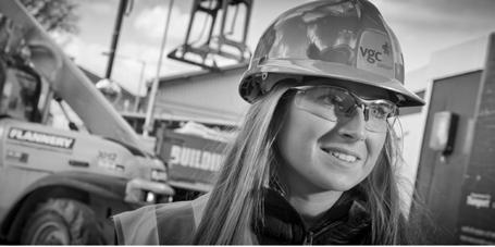
Photography
Photos to feature interesting crops, close-ups and shallow depth of field. One of the aspects we believe is very important are the people at Lura. Candid and semi-candid shots with interesting and relevant backgrounds can work well. Black and white is perfect for this.
or email: ian.fermor@datumcp.com


