Darlene
This case study focuses on a centralized hub or shared facility that provides various services, resources, and support to a community.
This case study focuses on a centralized hub or shared facility that provides various services, resources, and support to a community.
This project focuses on turning a cube into a different shape by removing individual cubes itself.
Creating operational efficiently across everything that touches the design process.
Creating operational efficiently across everything that touches the design process.
My name is Darlene Lee, a senior at Alief Taylor High School in Houston, Texas. Growing up, I’ve always had a passion for architecture and engineering , sparked by my fascnation with construction sites and designs. Whether observing buildings being constructed in person or admiring blueprints online, I was drawn to the idea of bringing ideas to life through design and structure.
I chose to pursure architecture because it allows creativity with problem solving. I love the thought of shaping spaces that not only serve a purpose but also inspire and uplift people. I’m especially motivated to enter this field as a woman, in what is a traditonally a male dominated industry. My drive, resilience, and determination have helped me push past doubt and stay focused on my goals
Rasied by my grandparents, I’ve learned to embrace challenges and work hard for what I believe in. After high school, I plan to begin my academic Journey at a university, majoring in architecture and a minor in engieering. My ultimate goal is to secure a successful, fulfilling career in these fields while breaking barriers and inspiring others along the way.
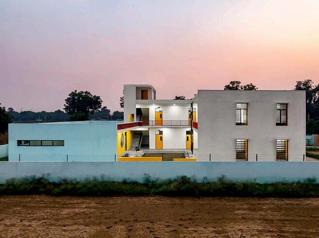
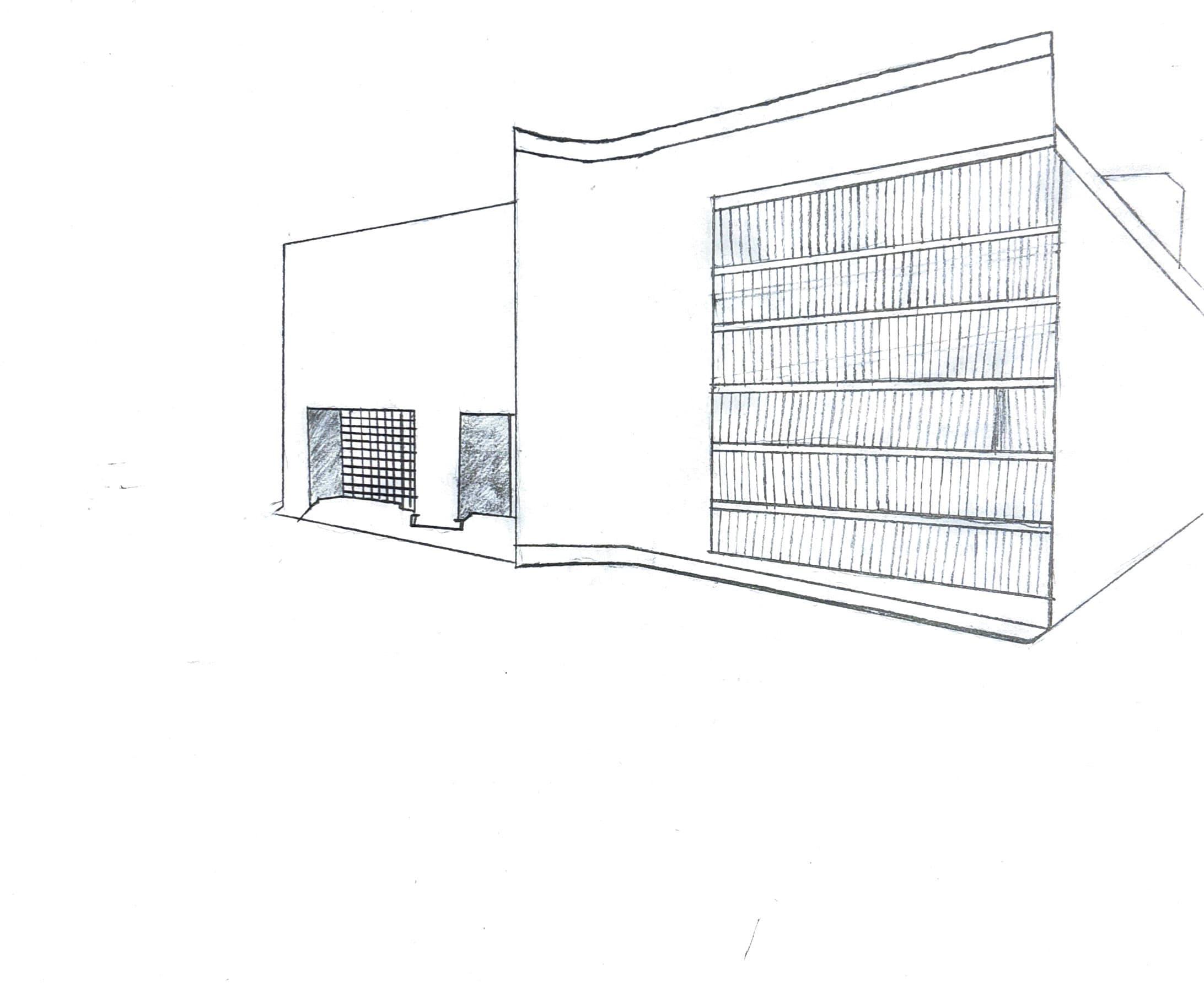
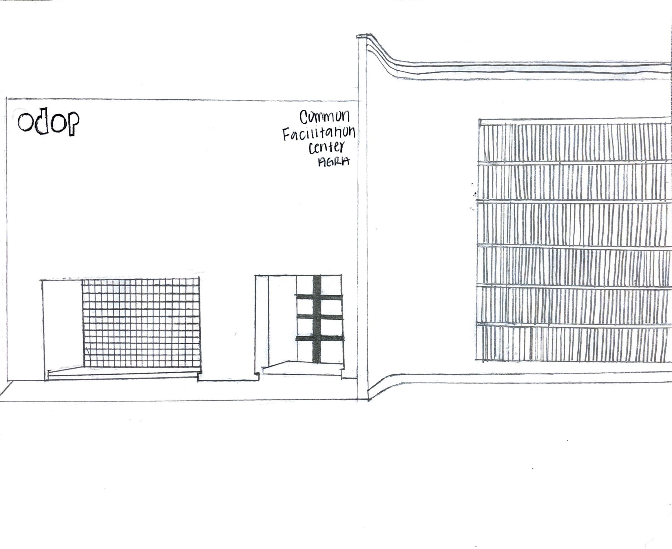
My commercial building is the Common Facilitation center designed for artists to showcase their work and collaborate.
Located in arga, india, it blends functionally with creativity, providing spaces for workshops and community engagement.
This view allowed for a more dynamic view of the building. This technique uses two point vanishing points, and you can see how both sides of the structure angle toward those points, creating depth and sense of realism.
This perspective focuses on presenting the building’s facade as if viewed head on. It’s ideal for showcasing the structures symmetry and specific details, such as the placement of windows, doors, and any design elements on the front face.
Topography Map
Buildings
The topography diagram shows the location of my building and the surrounding area of my building, providing insight into the site and how the building fits within its enviornment.
This diagram represents the surrounding buildings of my commerical building, This gives an insight into the relationships of neighboring buildings to my site.
Topography Contour
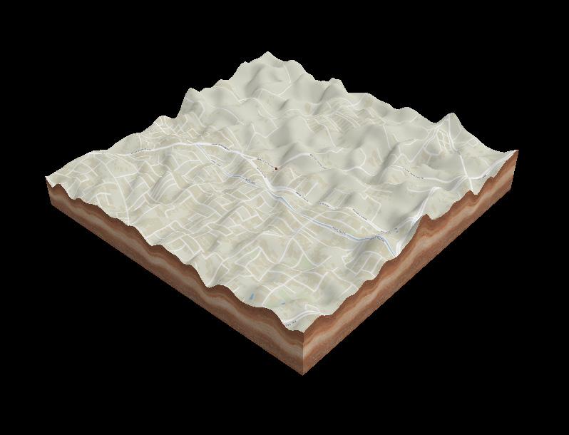
Elevation & Terrain
This topography contour highlights the steep slope off the terrain of my building location.
This topography diagram shows the lands elevation around my building located in Arga, India, highlighting how the building sites within the natural terrain.
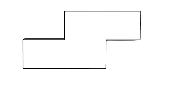
The Cubic Project Involves a large cube with smaller indidvual cubes. The goal is to remove some of the individual cubes from the structure and rearrange them into a new shape. This process helped develop design skills, as I had to think about how to create a new structure while keeping balance and proportion. This is allowed me to think outside the box.
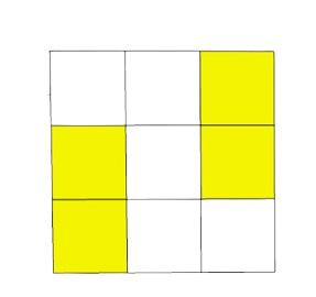
I started off with a simple cube of 27. I highlighted the individual cubes I decided to remove.
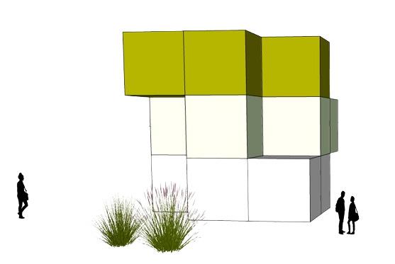
Next, I removed the highlighted squares to create a new dynamic structure.
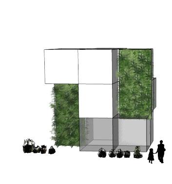
Last, I added greenery and adjusted proportions to enhance the aesthetic. Also, I Incorportated human figures to show function.
UNDERSTANDING OPERATIVE DESIGN
THOUGH SKETCH UP MODELING
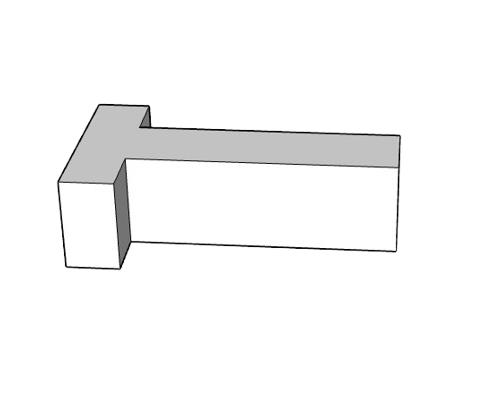
This shape has to be my least favorite because its form feels too disconnected and lacks the cohesive, familiar structure that the overall operative shape provides.
This shape combines two blocks into one cohesive form, where the smaller block intersects the larger one. This creates a clean, balance design with a sense of connection and structure.
Overall Operative Design
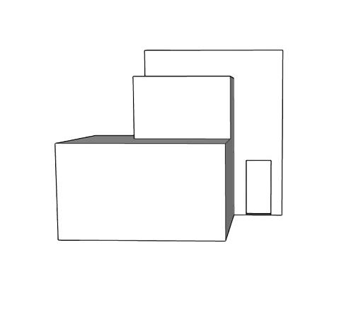
I like this shape because it resembles the outline of a house, which gives it s familiar and comforting architectural quality. The clean layered arrangement of the blocks add balance and simplicity.
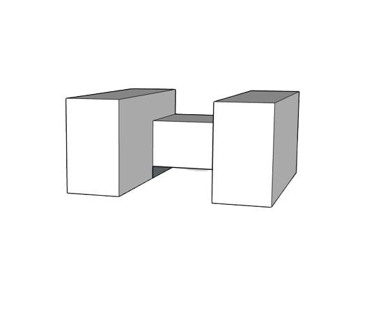
This lodge shape features two large blocks connected by a smaller central volume, creating a sense of enclousre and openness. Its symmetry and clean lines give it stong grounded look.
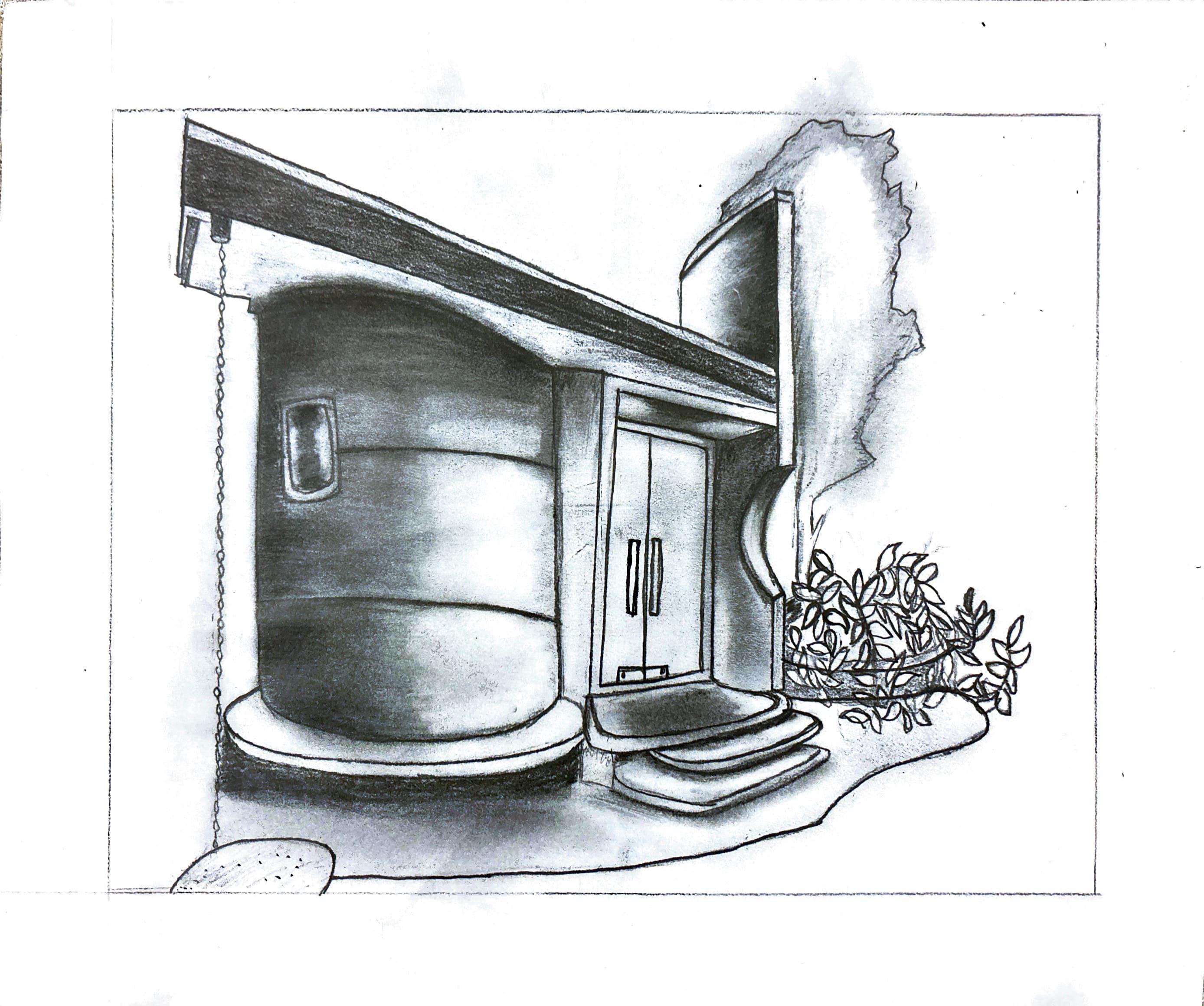
Tiem Bánh Minji Cake Bakery- Is a small bakery located on the edge of the vast rubber forest of Duc Linh, where there is a basalt red soil, blending with the surrounding greenery.
When drawing this image for my final, some challenges I faced were shading certain areas to create depth and making sure the curves of the building were on point. It took time and focus to get the proprtions right, but I kept at it. Overall, I think I did a good job.
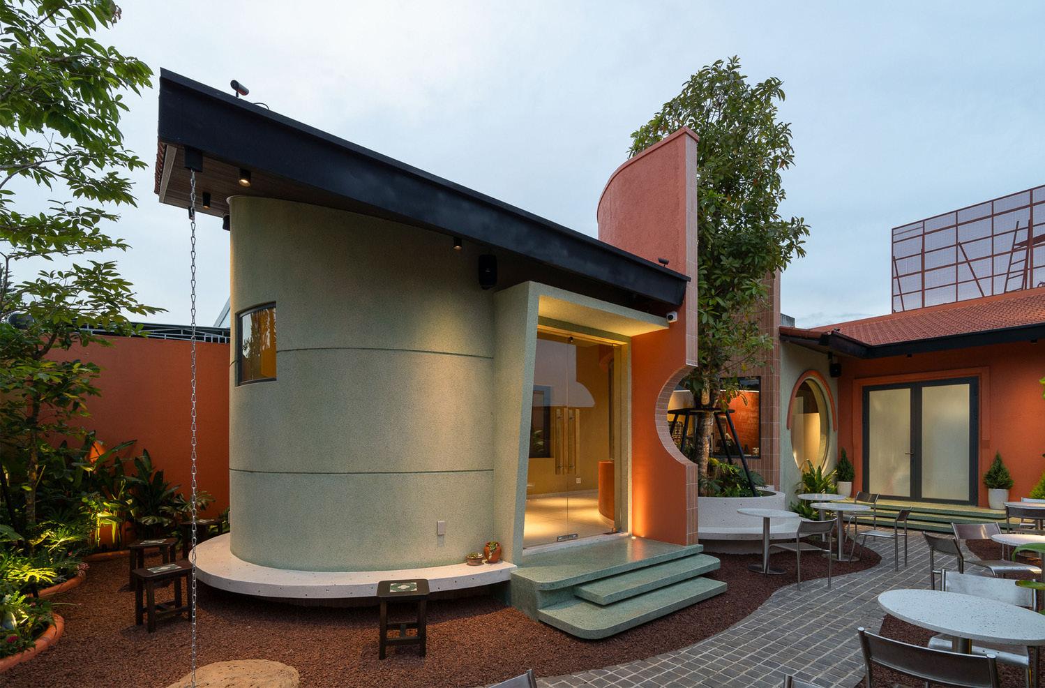
SThe accuracy of the buildings shape and the precision of the lines are key strength in my drawing, as they effectively capture the structure’s form and detail.
OThe building presents opportunity to attract tourism, as vistiors may be drawn to its unique design. Futhermore, as it being a bakery it offers guests to explore while connecting with the enviornment.
WThe water drainage could have been more detailed, and the shading on the floor could have been improved for greater consistency.
TThe cost of the building may have been expensive because of the unique design. Additionally, I incorporated greenery into the bottom right corner of the sketch, which wasn’t orignally part of the image, to enhance the look with more greenery.
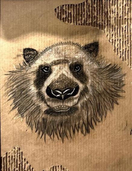
MATERIALS COMPETITION
This is a black and white charcoal drawing a panda that was created on cardboard to incorporate natural texture into the piece.
I used a white pencil to emphasize the panda’s facial details, giving it a realistic feel. The torn edges of the cardboard were added intentionally to create a distressed look, enhancing the organic and raw aesthetic of the artwork.
MATERIALS
• Cardboard
• Charcoal
• White color pencil
ARCHITECTURE PORTFOLIO
Architecture
UH ID: 2482958
Darlenel06@icloud.com