


For this project, I have been asked to consider and produce an understanding in regards to the recent rebirth of Prada, which since its beginning has seen many iterations of its story over several generations. Belgian fashion designer, Raf Simons, was introduced to Prada in 2020, where he joined Miuccia Prada as an equal creative director with aims to revitalise the powerhouse’s success. Since his introduction, Prada has become one of the most relevant brand platforms of our time, as their story-filled narratives which shape each collection, campaign and show, have provided an all-around social, political and ecological commentary of our world today.
By exploring the history of Prada, I have been asked to develop ways to understand the brand’s unique viewpoint on storytelling, emphasising a focus on the unique ideology that Simons uses to convey a story through each of their collaborative collections together. In order to reshape this for the next generation, I have looked at the cultural, social and political position of each collaborative collection between the two designers, aiding me to develop a complete understanding of Raf Simons, which allowed me to piece together how his work gels alongside Miuccia Prada’s so well. Written as a continuation of my research file, this exhibition book displays my process of creation for Prada.


I began my journey by looking at a variety of different images surrounding Prada, in order to determine my favourite aspects of the brand and what I believe works well. From this, I created multiple mood boards and concept pages to demonstrate my ideas, noting which images stood out as particularly strong to me.


Alongside my deeper study into the work of Prada, I also examined Simon’s individual work on a deeper level in order to give myself a better understanding of the way that he works.

I found this methodology helpful, as it allowed me to create visual parallels between both of the designer’s work, whilst also recognising their differences and how these aspects could be merged together in a new way.

My comparisons demonstrated the significance of black and white to both designers, with it being continually used in Prada’s work as well as its crucial presence in Simons’ DNA, highlighting the necessity for me to utilise the vital contrasting colour combination in my own work. In addition to this, I gained a solid awareness of Prada’s use of silver, as the metallic hue has made countless appearances in its designs over many years, through its usage in not only clothing but also in bags, shoes and accessories of all kinds. This realisation encouraged my research into the colour, where I worked to analyse silver in great detail, developing an essential understanding of its connotations.


Silver, known as a colour and perceived in an array of different yet soothing nature, which calmness combined with purification, with its ability to offer a sense The modern and elegant look silver, symbolises wealth and characteristics of fluidity, mystery.

and a precious metal, can be different ways due to its sleek which expresses feelings of purification, corresponding sense of strength and stability. look that is connected with and success, whilst conveying sensitivity, emotion and mystery.

An interesting connotation of silver exists from the belief that it represents a mirror to the soul, by helping people to view themselves in the same way that they are seen by others. This reflective nature, combined with its sensitivity, works to inspire mental telepathy by reflecting back any energy that is given in, protecting individuals from negative energy as it is reflected back to where it has come from. The ideology behind this, partnered with silver’s association with healing, due to its antimicrobial properties, which suggest that it is a much cleaner object than alternative materials, works to enhance the way we see ourselves.

Through this ability to withdraw negativity, silver has the ability to restore equilibrium within spiritual energy and feminine power, ultimately working to offer comforting qualities for individuals. Silver helps cleanse and release mental, physical and emotional issues, opening new doors by illuminating the mind and shining a positive light on the future. This idea that silver has the ability to destroy evil is further supported by the beliefs of people within Europe, whose ideology demonstrates that silver is the only effective weapon against witches, werewolves and other kinds of mystical creatures.

Through its relation to the moon and the ebb and flow of the tides, silver signals a time of reflection and change of direction as it illuminates the way forward. Due to this representation of silver being connected to the moon, the people of India believe that it aids the destruction of negative dreams, and works to improve emotions. Alternatively to this, Greeks associate silver with purity, clarity, strength, focus and feminine energy, as it is the colour of the goddess, Artemis. This correlation between silver and the sensitivity of the moon’s cycle of ebb and flow, portrays gentle and comforting qualities, expressing emotional and fluidity in relation to the moon’s feminine energy.

Colour psychology suggests that silver expresses a balance between black and white, demonstrating its ability to act as an unbiased critic, whilst still remaining compassionate and
with a good sense of justice. It also believes that individuals that possess a strong admiration towards silver are creative and imaginative, through their desires to try new things whilst striving towards any new opportunities that are given to them. These people are thought to be quick decision-makers, emphasising reliance on their strong sense of responsibility to guide them in the right direction. Silver also broadcasts traits of glamour and sophistication, relating to the professional and corporate market, portraying a nature of respectability and courtesy.


Contrary to its admiring aspects, silver also possesses negative characteristics, including lying, cheating and conniving traits, coming from the phrase ‘silver tongue’, which refers to the idea that a person can manipulate others through their choice of words. In addition to this, the colourless energy that is connected with silver can sometimes express negative feelings of injustice and coldness, which ultimately trigger feelings of sadness, loneliness and depression, causing individuals to feel uncommitted, lifeless and isolated from others.

This research that I conducted surrounding silver, helped me to create a holistic evaluation of the colour, which allowed me to draw on the benefits of its usage within the fashion industry. I decided to take forward this idea of using silver, as I felt that it was not only relevant to Prada but that it also shares similar characteristics to Raf Simons, through its expressive and reflective nature. With two of Miuccia and Raf’s biggest goals being to address themes of individuality and sexuality, silver seems to fit this trend due to its ability to balance and express positivity within oneself. Silver also works as a genderless colour, particularly for its use within male and female accessories, therefore it matches Simon’s individual aims as a designer to break the mould between the genders. A continuous theme of heroism runs through Simon’s designs, and with silver’s connotation of negative destruction and its effective ability against witches, a triumphant heroic success is echoed through the colour. These analysations supported my decision to incorporate the previous use of silver into my new creation for Prada, as it not only recalls its previous success but also provides hope towards new beginnings.
These evaluations encouraged my desire to create a narrative of positivity and hope, where silver works to reflect light onto oneself, working to remove ideas of self-doubt and disappointment, in order to replace them with encouraging senses of relief and enlightenment. Due to the increasingly worrying statistics relating to mental health disorders among young people, the focus of this narrative seemed suitable for the next generation, allowing Prada to use its established platform and influence as a brand in a way that encourages positive change. Research from the Mental Health Foundation has shown that disorders including depression and anxiety are most common in people within the LGBTQ+ community, with devastating statistics portraying that 1 in 8 of these people between the ages of 18 and 24 had attempted to take their own life. Coinciding with the ongoing mission of Miuccia and Raf’s work to embrace individuality, I aimed to acknowledge these ideas throughout my creation for Prada, playing on the ideology of reflection and the great power that the silver hue holds.


Putting my ideas into reality, my initial shoot featured an array of different and unusual backgrounds, allowing me to experiment with ideas and decide what was going to work. This consisted of a sequence of images that displayed a refined model posed in front of a range of backdrops including a bathroom, shower, a staircase and a brick wall, with each of the images conveying an unusual characteristic. From printing my favourite images out and arranging them on a white A1 board, I was able to adapt and compare them to consider what was going to be effective in terms of telling my story. As it was important for me to ensure that a stamp of Raf Simon’s unique expression was apparent through the creation, I decided to enhance certain features of the model, working to convey the designer’s heroic aesthetic, whilst incorporating the use of black and white into some of my images.
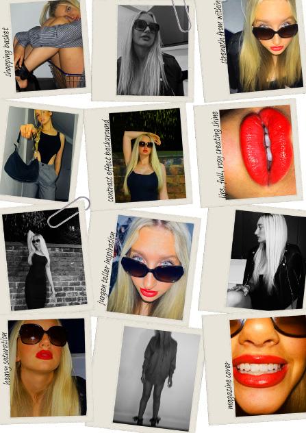

After considering my outcomes, I found that strength lay within the close-up facial images that I shot at unusual angles, showing the model’s eyes raised above her sunglasses and a zoomed-in position of the inside of her mouth. I particularly liked these images as I felt like they demonstrated a sense of courage and determination through their attention to specific features, which blended well with my narrative of positivity within individuality. The aesthetic behind the images reminded me of Jürgen Teller’s work, so I decided to do some research into the German photographer.


The product of my initial shoot also helped me to draw some of my images worked better towards high-street fast-fashion retailers often shoot their clothing and as that it was very fitting of my narrative or the previous not to take this idea forward, instead focusing on the Jürgen Teller and following shoots from

draw on what I didn’t find effective. I felt as though high-street marketing, reminding me of how online as much as I liked the clean finish of this, I didn’t think previous work of the two designers. As a result, I decided the idea of a close-up lens, taking inspiration from and producing my from alternate angles.

As I wanted to ensure my work fully mirrored my ideas, I collected a range of silver items and accessories for my next shoots, this included foils, gems, sunglasses, jewellery and lettering. I decided to work with a more minimal background for my next images, as I didn’t want the surroundings to distract from the message that I was conveying through the model. Here, I focused on conveying the message of silver, incorporating lighting and shadows with the reflective hue on the glasses and clothing. I originally scattered silver gems around the model’s face, however, I found that the effect of this looked more like spots than mirrored patches, therefore I decided to edit them out of my images, particularly as the use of these in conjunction with the silver glasses and dress seemed too overcrowded and ultimately reduced the effectiveness of each component.


I decided to name my campaign ‘possible’, with the wording of this purposely removing designed to convey that we are always more capable than we believe, encouraging possible version of themselves that they can be. The ‘im’ being scribbled out, highlights you want to live it, ignoring the opinions of others. This re-iterates the influence

removing the ‘Im’, which sits in front of the word ‘impossible’. The message of this is encouraging strength and determination within individuals to strive to become the best highlights the need to remove self-doubt and the importance of living your life how and impact of silver and its reflective ability to replace negativity with positivity.

When considering how my campaign would be communicated, I looked at Prada’s social media accounts and discovered that they regularly update these pages with their latest collections. With ever-growing media surrounding TikTok this will be a vital place for Prada to post, particularly as it is incredibly popular among the next generation. Store activations will also take place throughout Prada’s stores, including immersive and interactive designs allowing individuals to experience a feeling of comfort and alacrity.


The runway show for the campaign will feature a cast of famous faces that are commonly Courtney Love, Selena Gomez, Adele, Amal Clooney, Lila Moss, Chyler Leigh and Natalie comfort for the audience with the knowledge that all individuals, regardless of their background, acknowledging and embracing our abilities to be individuals. A calming soundtrack will be

commonly known as mental health advocates due to their own personal struggles, including Natalie Portman. The aim of this is to create a soothing environment to express a sense of background, experience struggles in different ways and this should be welcomed and accepted, be played alongside the show, to support the narrative and the emotions of the viewers.


