Layout
Typographic Hierarchy
Layout
Typographic Hierarchy
UI/UX Design
Approach:
Through in-depth research of many types of boutique hotels, I was able to gather inspiration for the design, layout, and content of this site. During my investigation, I was surprised to find and learn from several examples of what NOT to do, such as repetitive logo usage on the first section of the landing page, TOO MUCH information ( too much going on/elements), and missing their target audience. I also found layouts that I liked and added certain elements such as consistency of typographic hierarchy and easy-to-see navigation to my design.
Process:
By focusing on a mostly ocean blue color palette development, a clear typographic hierarchy, and a cohesive image library featuring luxurious oceanside living I was able to create a sophisticated look for each page of this site that represents the quintessential upscale waterfront Newport vibe.

Results:
A well-rounded website design that speaks to Newport tourists and the venue. I enhanced my skills in UI/UX Design and understanding of content hierarchy as well as incorporating multiple images to create a cohesive design.


Approach:
Through in-depth research of the two chosen typefaces, I was about to find not only background information and the origin of the fonts but the font anatomy for these typefaces.

Process:
By focusing on each letter’s anatomy and a clear typographic hierarchy, I was able to achieve a well-balanced layout that demonstrates the aesthetics of each font.
Results:
An easy-on-the-eyes-looking design that nicely points out the features of the fonts.


Approach:
Typographic Hierarchy
Illustrations
Image Editing
Through extensive research on event poster designs (specifically Halloween-themed ones), I was able to accumulate many different design directions that I would like to begin at like adding in illustrations and a spooky vibe.
Process:
By focusing mostly on the illustrations and typographic hierarchy I was able to achieve not only the Halloween vibe I was going for but as well as the comeliness to look for more information.
Results:
A simple Halloween concept that adjectively communicates the event by intersecting creative typography hierarchy and hand-drawn inspired illustrations.


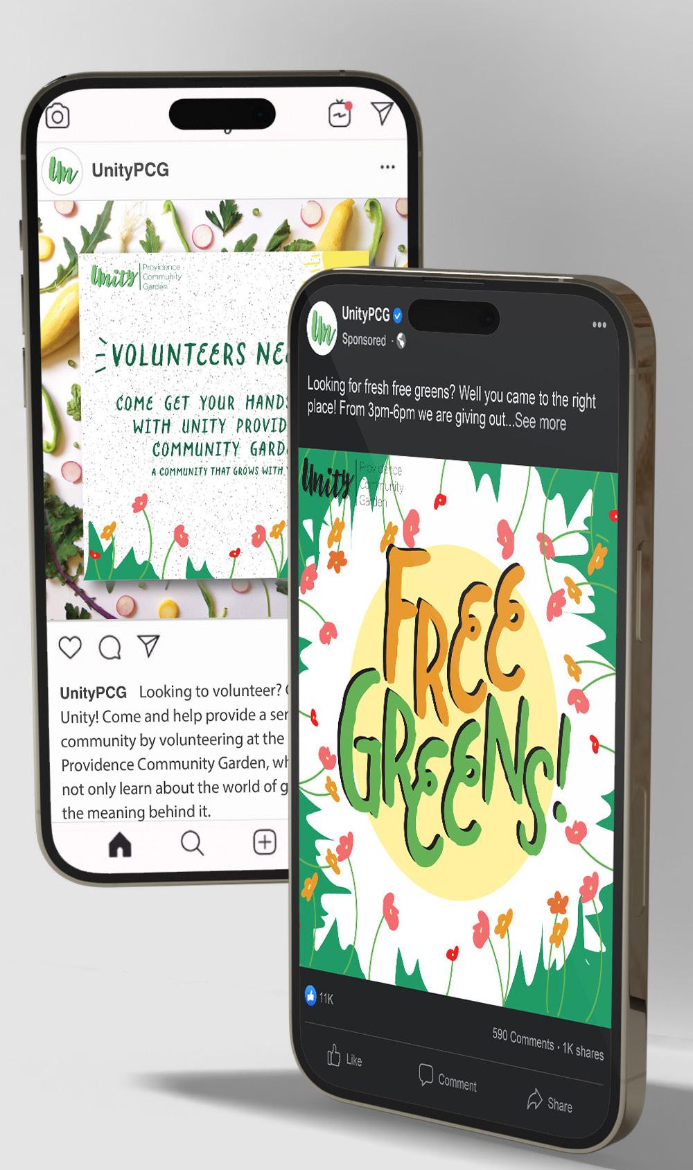
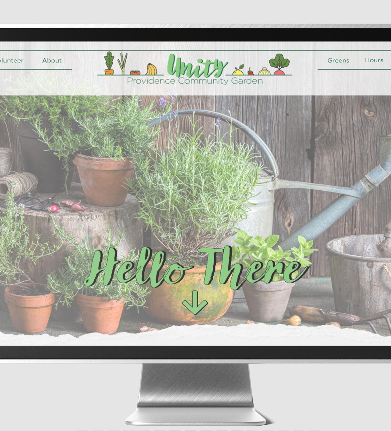
Approach:
Illustrations
Brand Identity
UI/UX Design
Through extensive research and how to conceptualize brand identity, I was able to come up with a well-rounded brand strategy that would complement the brand.
Process:
By focusing mostly on how to execute the brand strategy I was able to create not only their logos but their landing web page, Instagram/Facebook ads, and flyer’s to help their brand flourish.
Results: A simple concept that adjectively communicates the brand.
Approach:
Illustration
Typographic-
Hierarchy
Through extensive research on package design specifically energy drink ones, I was able to gather a good sense of direction I wanted to take this packaging design, like adding in illustrations and stylized fonts.

Process:
By concentrating mostly on the illustration and typographic hierarchy I was able to attain the visual direction I was aiming towards to capture the “customer” attention.
Results:
A simple energy drink package design concept that captivates my audience’s attention.


Approach:
Illustrations Font Pairing
Through in-depth research of many logos that include all of the elements and references that she sent to which how she wanted her logo to be like, I was able to gather inspiration for this very particular design.
Process:
By focusing mostly on the illustrations, and typographic hierarchy I was able to achieve a sophisticated look for the client’s logo.
Results: A well-rounded logo that communicated what the business is.


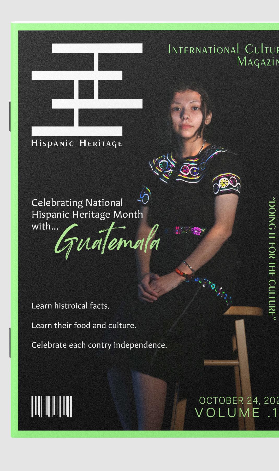
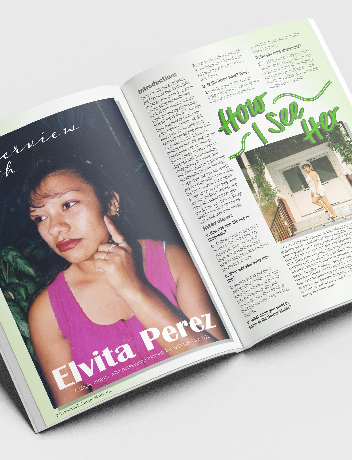
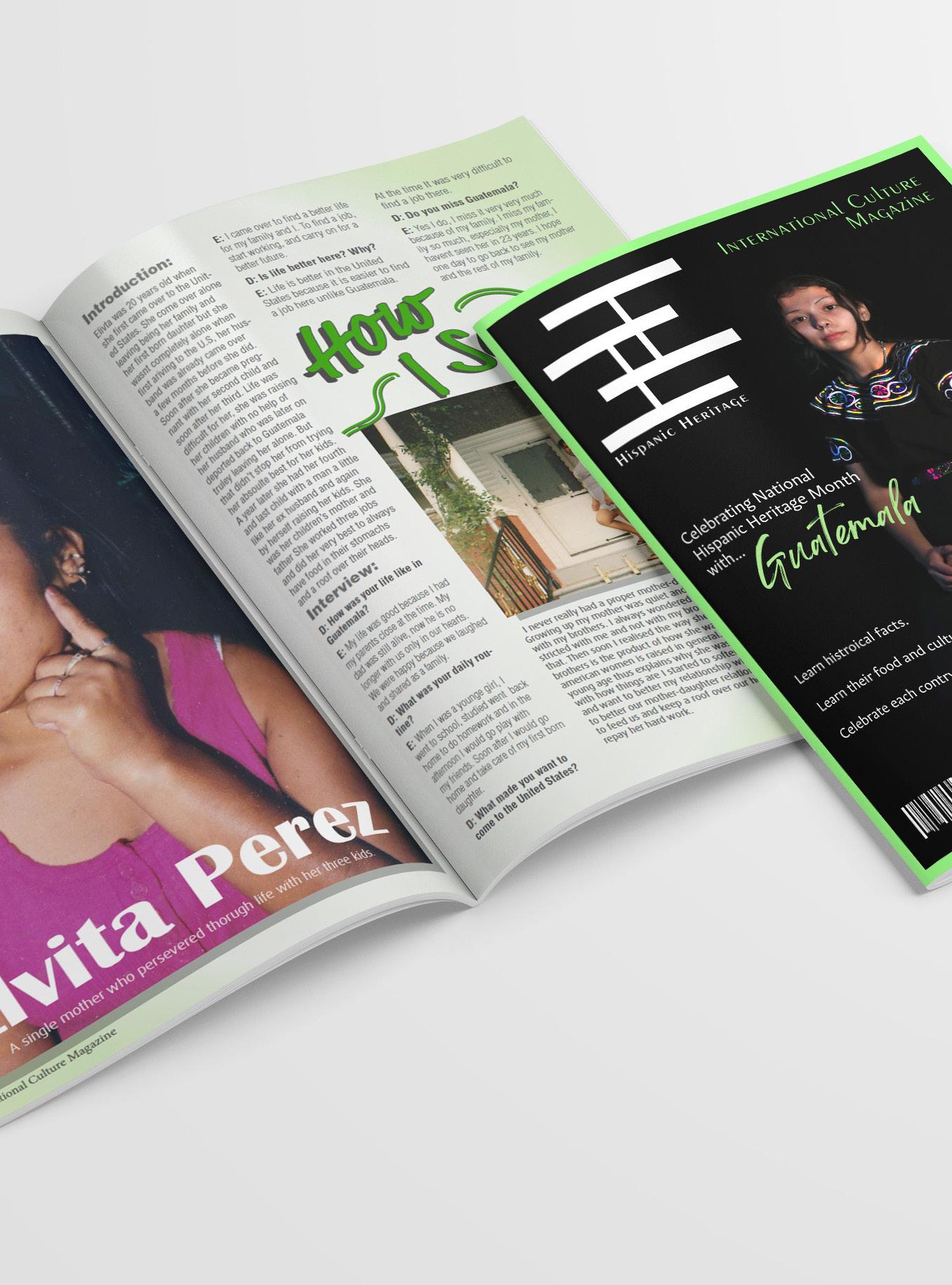
Approach:
Layout
Typographic Hierarchy
Through in-depth research of many types of magazines, I was able to gather inspiration for the layout and content of the magazine. In addition, I have also researched Guatemalan history to not only refresh my memory but also try to connect my readers to the design.
Process:
By focusing on a clear typographic hierarchy and original photography I was able to create a suave look for each page of the magazine.
Results:
A well-rounded website design that connects to Guatemalan culture.
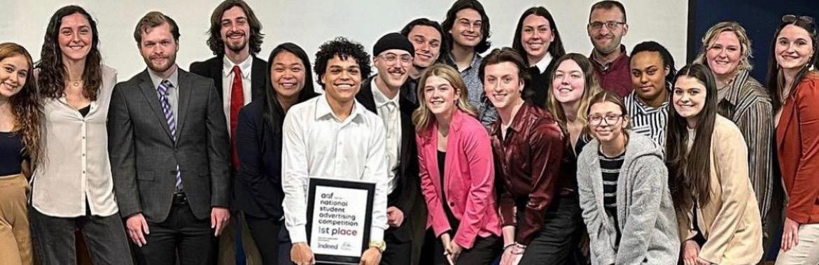
Approach:
Layout
Typographic Hierarchy Collaboration
Through in-depth research of strategic executions into what Indeed wants for their campaign, which is making them more compelling to their Gen Z (18- 24-year-olds) audience, we were able to come up with a well-rounded strategy for the brand.
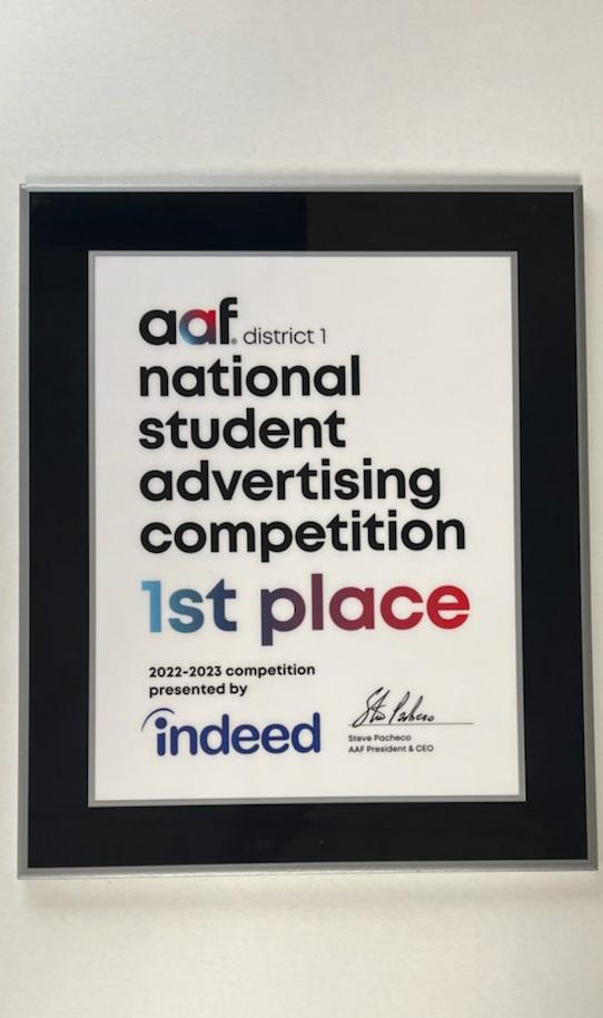
My Role:
Design a partnership poster to promote a partnership with AMC movie theatres and the upcoming movie “Wonka”. Design and prototype chocolate bar wrappers and winning tickets to generate excitement and communicate the partnership.
Results:
By focusing on the Indeed brand guidelines as well as our creative campaign direction, I was able to create a cohesive look for all deliverables related to this promotion.
Due to the NSAC competition being ongoing, creative can’t be shown at this time.