My mission as a designer is to create work that blends creativity and skill, pushing boundaries while maintaining the essence of cohesive branding. With a focus on personalized illustration and design I strive to help businesses and individuals express their vision in a visually captivating and meaningful way. I am dedicated to crafting bold, innovative designs that enhance brands and create a memorable impact.
my story
My journey into graphic design began in high school at a technical school focused on graphic communication, where I first discovered my passion for illustration. What started as a love for drawing quickly grew into a deep appreciation for the vast creative possibilities within design. This sparked a strong desire to continue learning and evolving within the field.
Today, I work primarily with Adobe Illustrator and InDesign— Illustrator being my go-to tool for creating detailed, highresolution vector illustrations, and InDesign for crafting cohesive brand designs and layouts that ensure consistency across platforms.
I’m excited about continuing to grow in the design field and bringing creative visions to life with every project.
core values community-driven
This project goes beyond mere visuals; it’s fundamentally about people. I have a strong commitment to understanding the needs of those I design for and alongside. Whether I’m working with a small business, a nonprofit organization, or pursuing a personal endeavor, community remains at the heart of my work. I prioritize listening, collaborating, and creating with purpose.
creative
Great design isn’t about following a strict formula. I’m open to experimenting with outof-the-ordinary ideas if it helps convey your story in a unique way. I embrace curiosity, exploration, and impactful visual narratives, as design should challenge limits rather than simply adhere to trends.
expressive
Every project has its own unique character, and I ensure that it shines through. My approach embraces emotion and identity, whether the design is vibrant and striking or subtle and introspective. I steer clear of the ordinary, striving for designs that convey a meaningful message.
down-to-earth
I leave my ego at the door. I pride myself on being direct, open, and approachable. You won’t encounter any design lingo or extra fluff — just a teamwork-focused approach that delivers exactly what you need, sprinkled with a touch of creativity.
ROSY CHEEKS # f58a89
M:57 Y:35 K:0
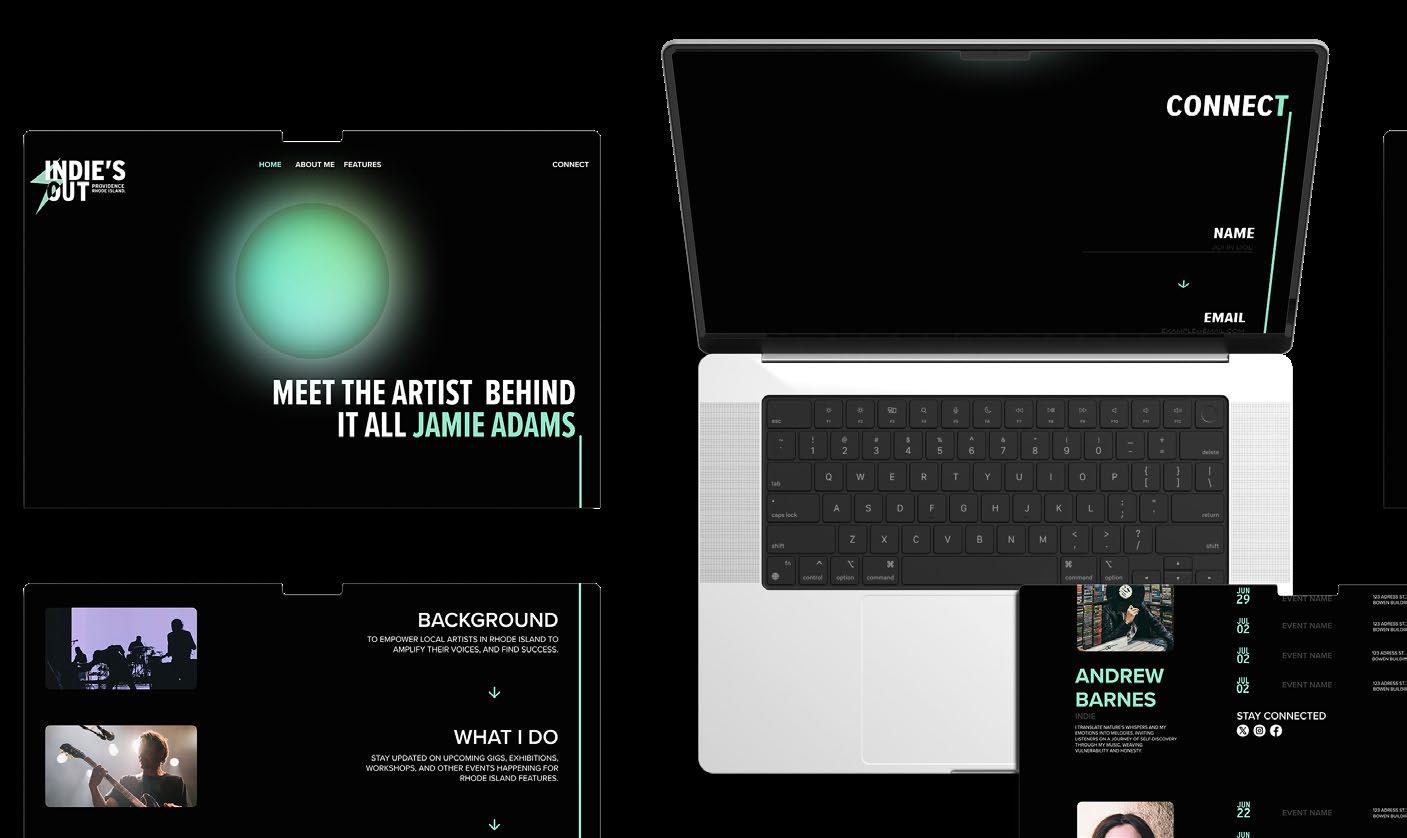
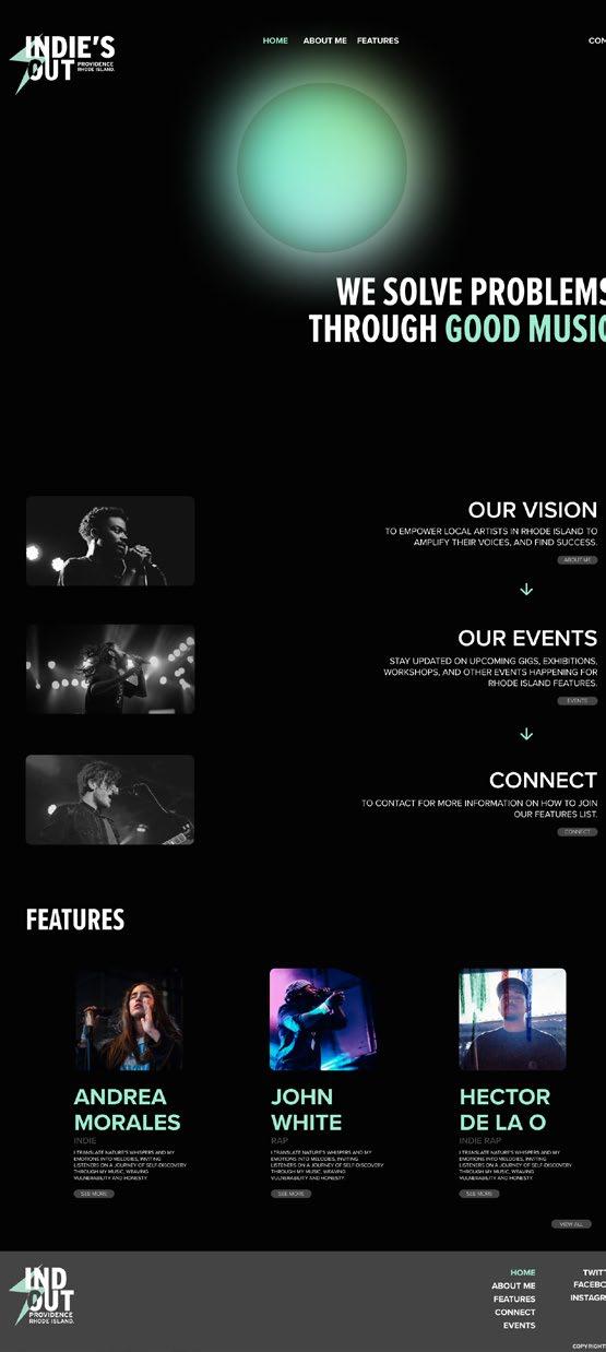
INDIE’S OUT PROVIDENCE RI
where local artist's gather
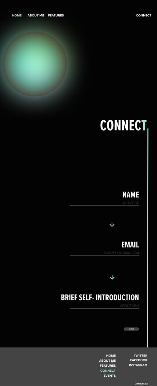
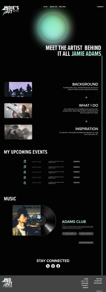
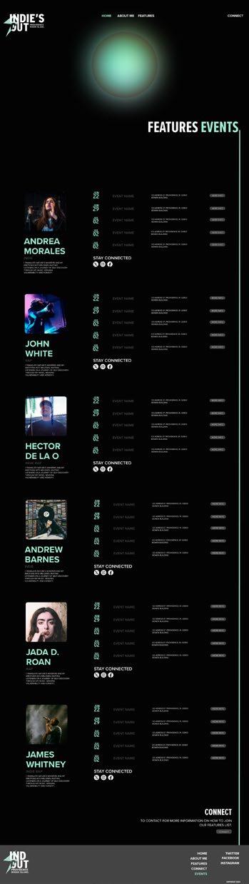
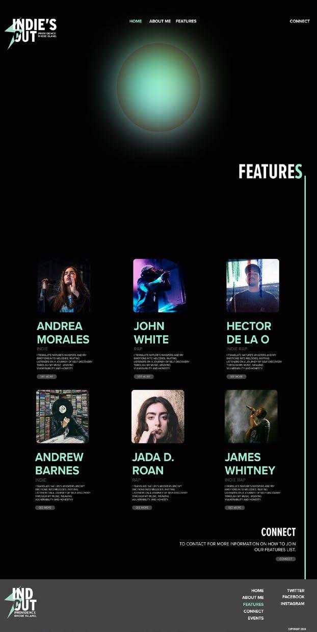
Created a logo and an easy-to-navigate website highlighting indie artist’s in Providence, Rhode Island, with an events page displaying their upcoming performances and dates. This project required a deep dive into indie band culture, aesthetics, and vision for the website design. One of the main challenges was finding the right balance between visual appeal and functionality , all while ensuring the indie look. The end results successfully highlight the artist’s and offer a pleasant experience for their fans.
WE SOLVE PROBLEMS THROUGH GOOD MUSIC.
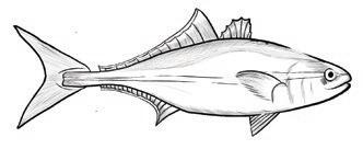
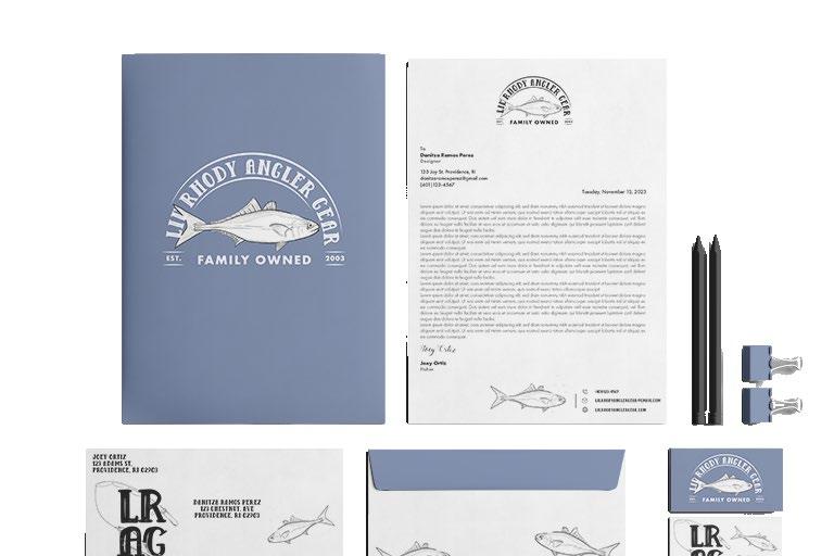
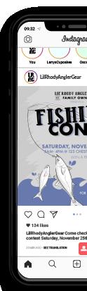
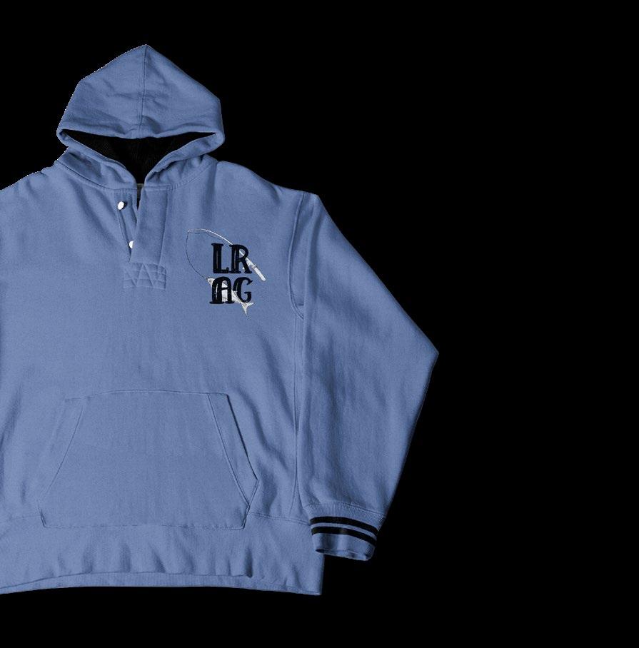
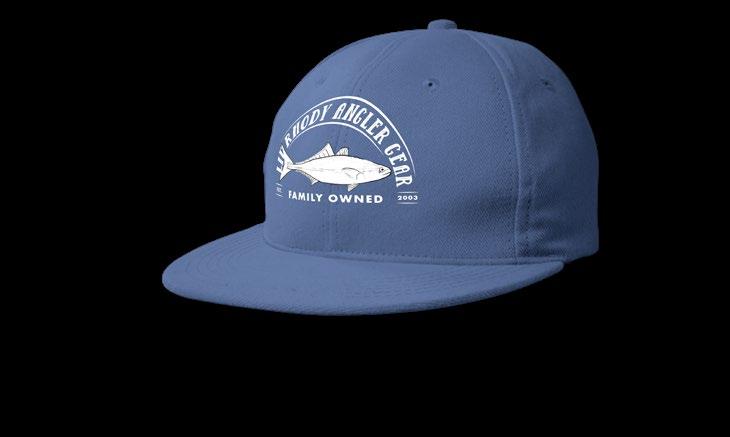
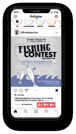
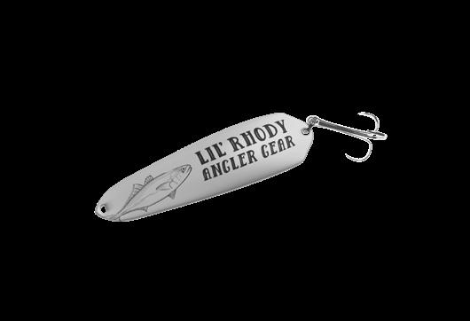
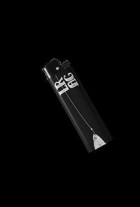
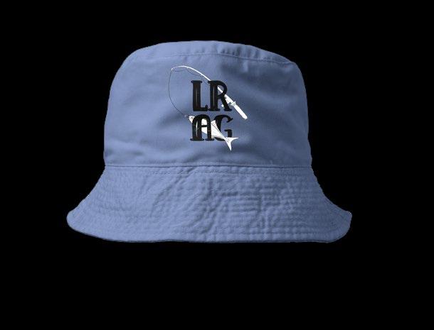
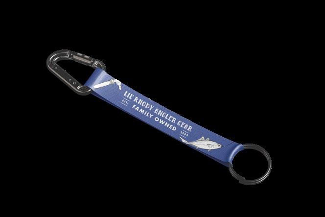
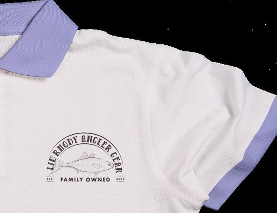
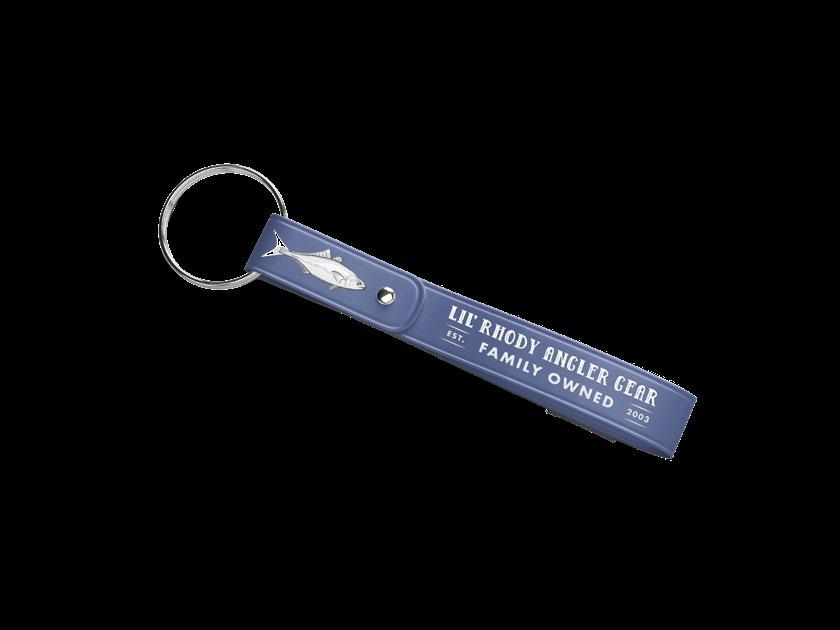
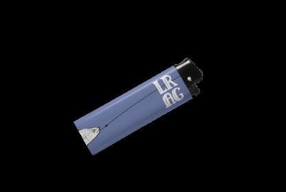
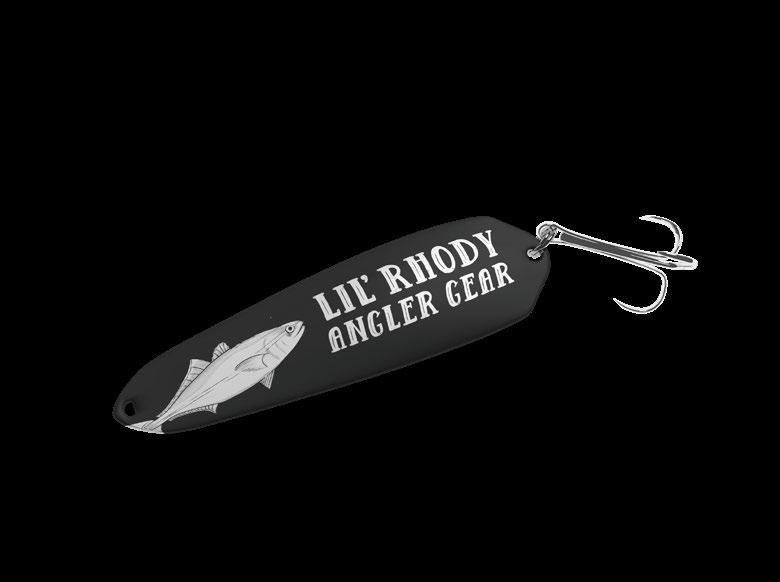
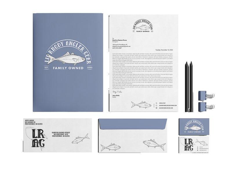
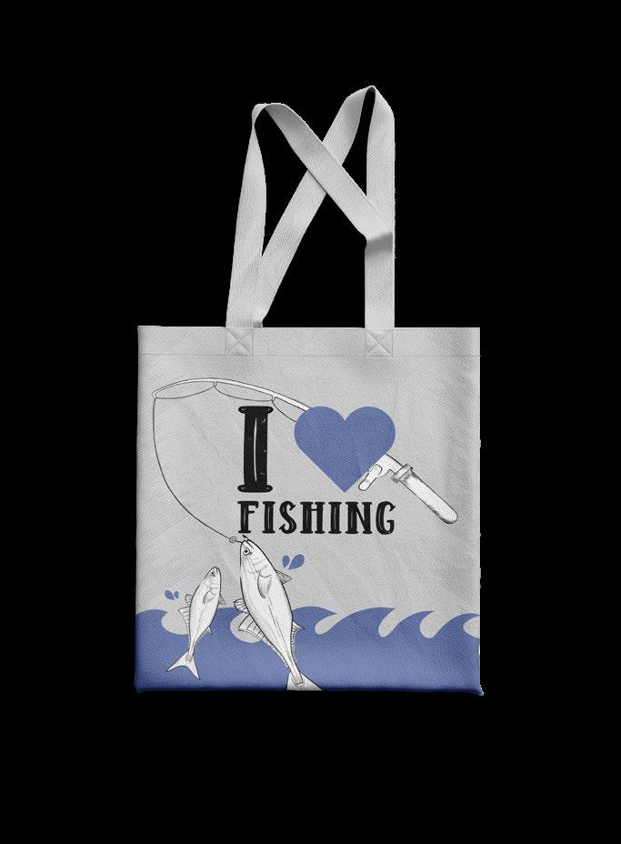
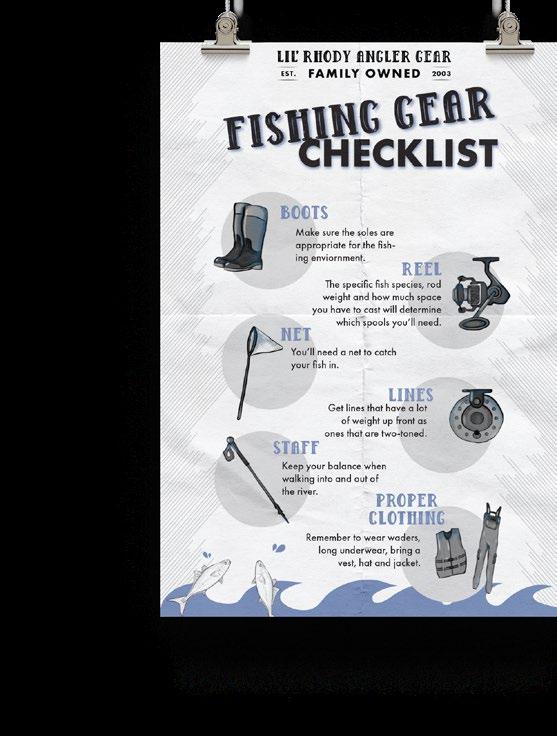
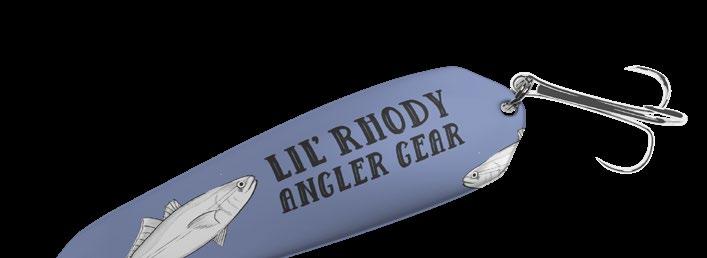
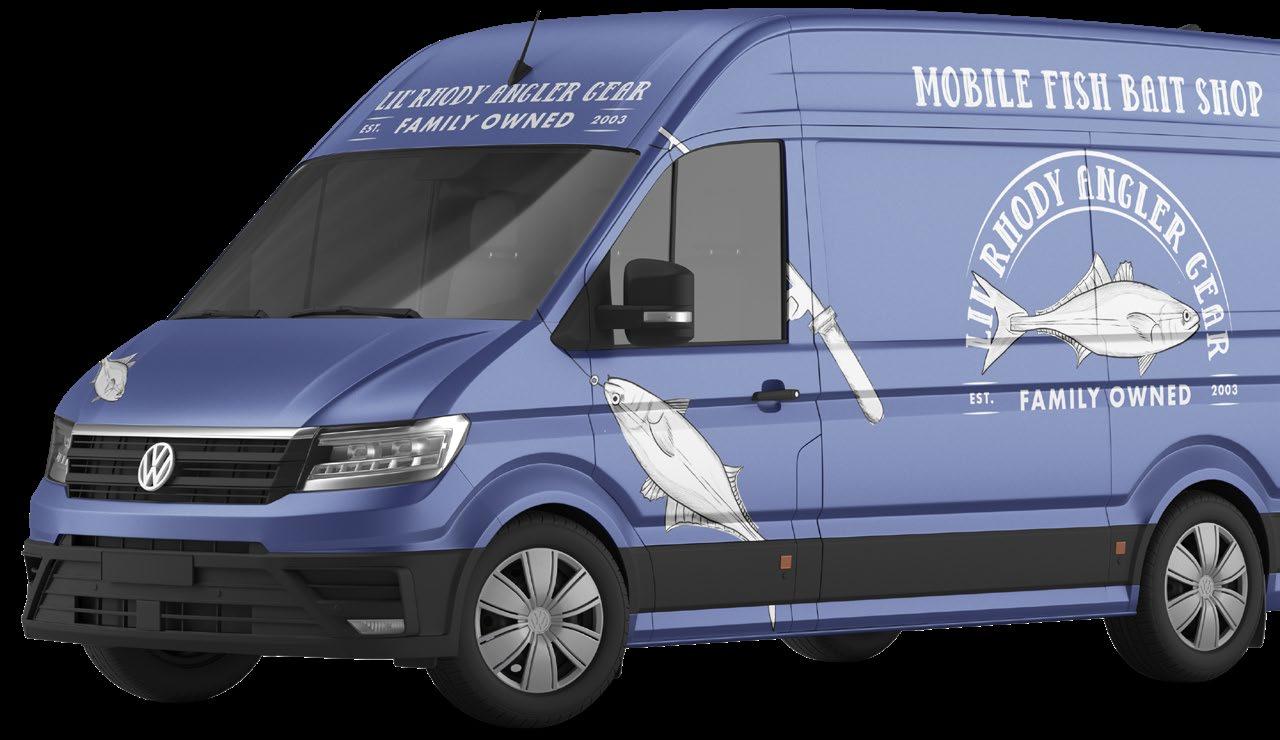
LIL' RHODY ANGLER
GEAR
where the fishing gear is at
Developed a hypothetical brand and crafted a complete brand identity package with a logo system, business cards, letterhead, enveloped, uniform, vehicle wrap, corporate merchandise, social media ad campaign, and informational poster. This project required a detailed exploration of variant fishing brands for cohesiveness across all deliverables. One of the main challenges was developing a cohesive identity and incorporating brand personality all while curating a balance between creativity and practicality The end results effectively craft a brand that feels both modern and appealing to the fishing market.
Fishing Must-Haves for Every Angler.
pt · douglas wolves serif
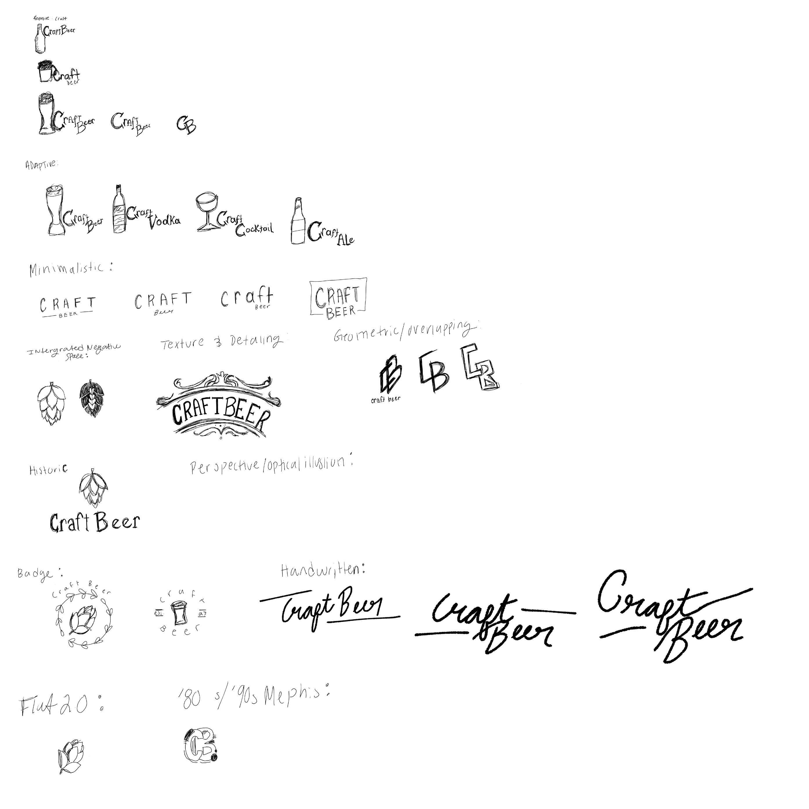
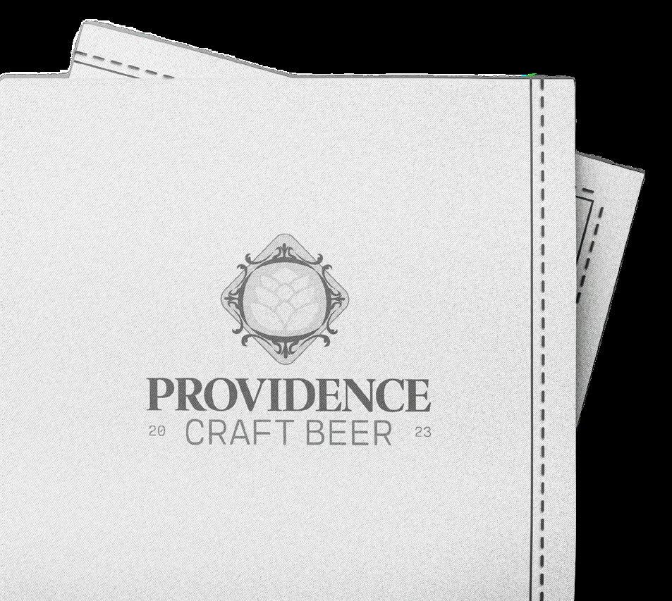
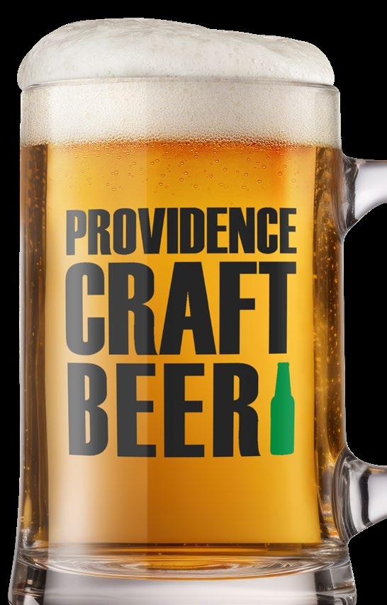
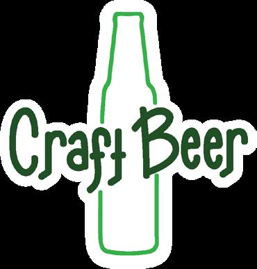
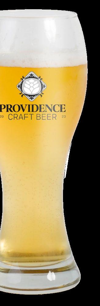
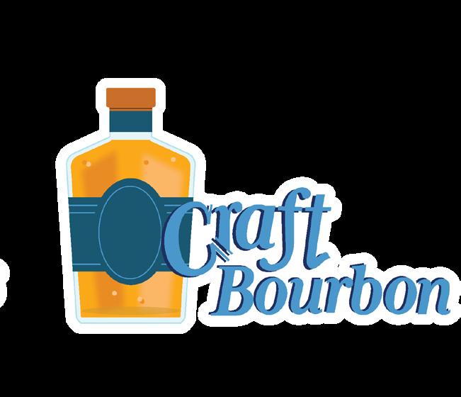
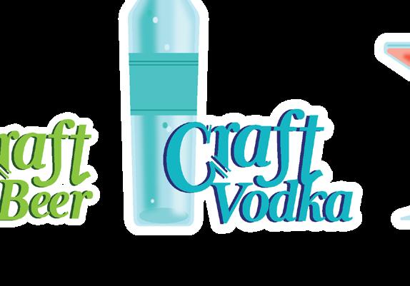
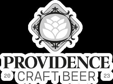
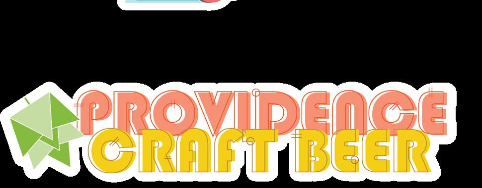
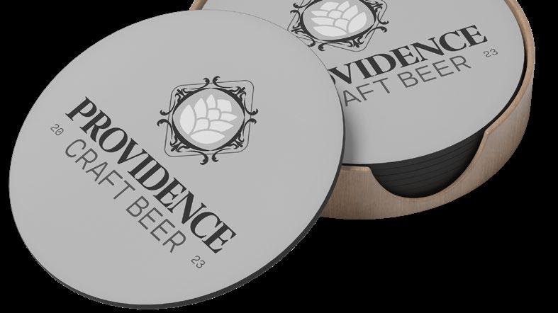
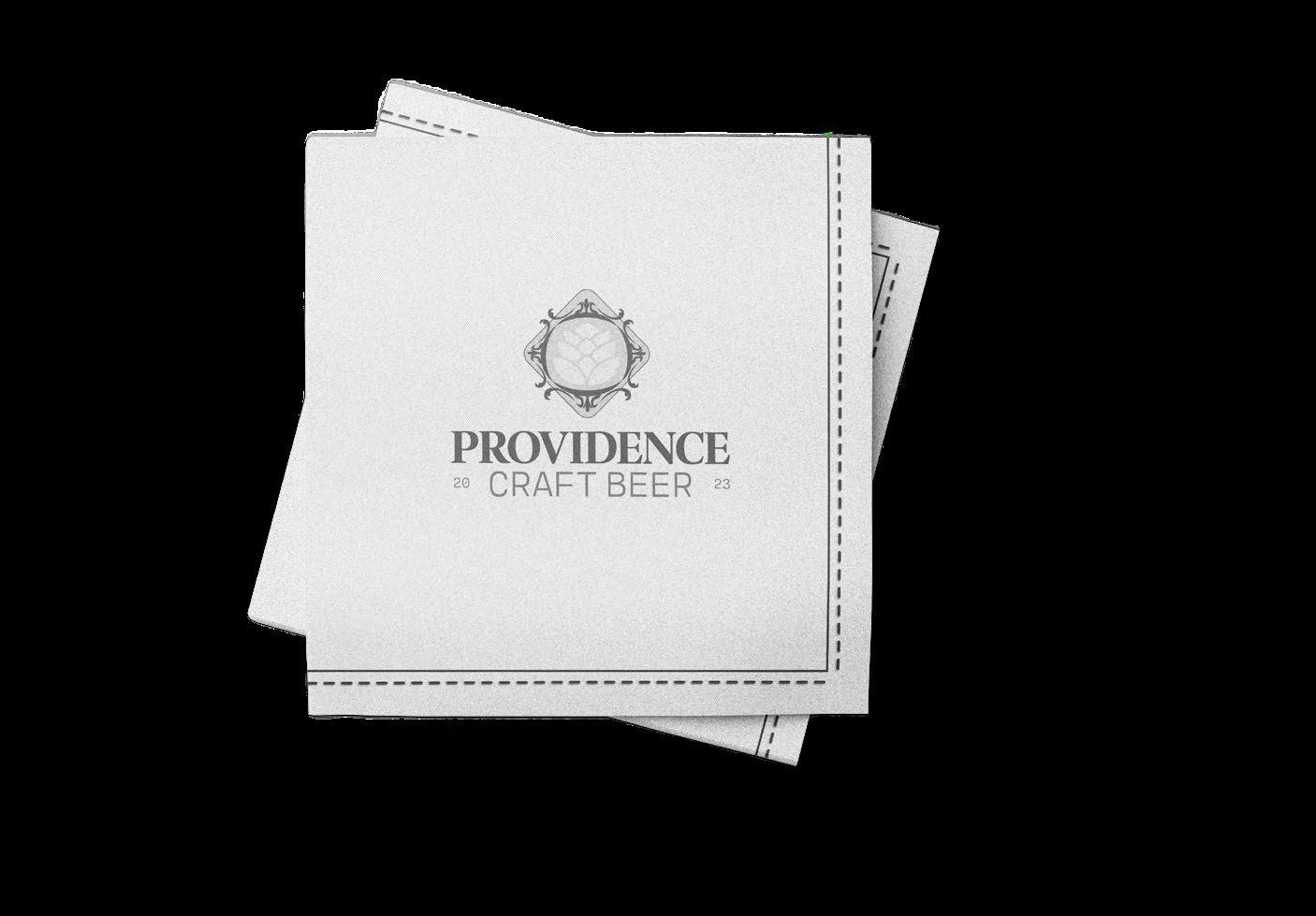
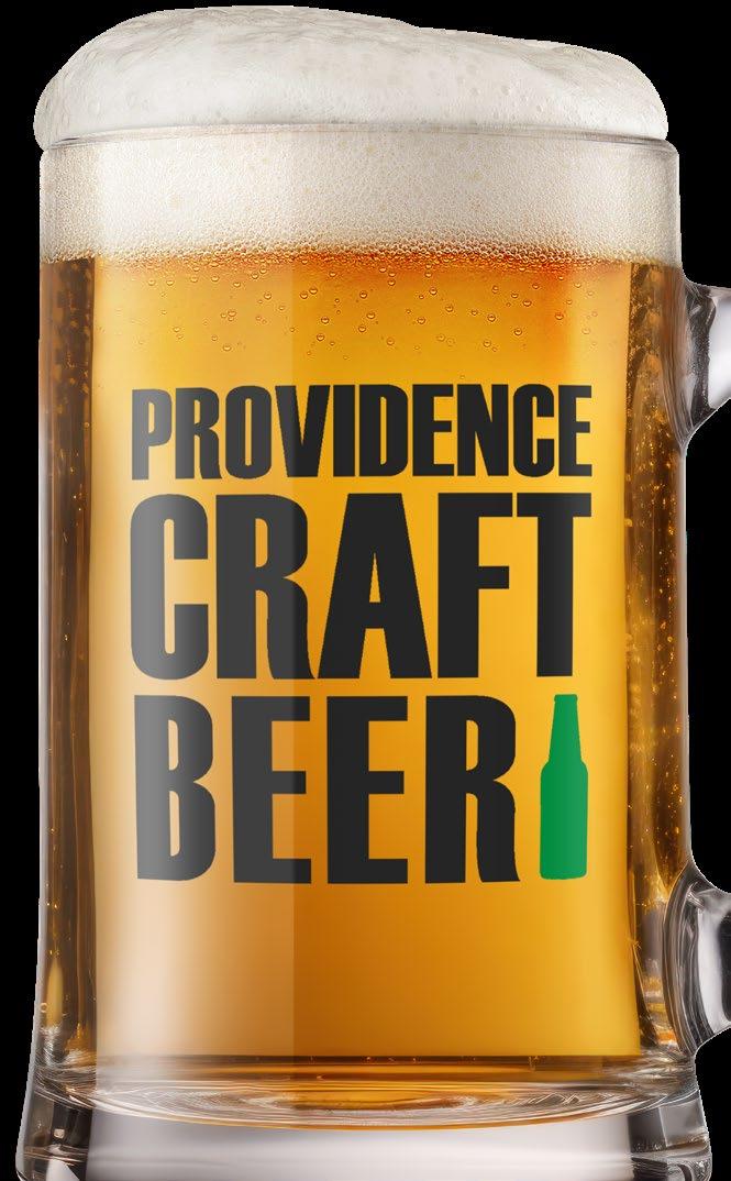
PROVIDENCE CRAFT BEER
a tall cold one
Conceptualized a hypothetical brand and designed a comprehensive logo system , featuring six distinct style trends: Responsive, Adaptive, Minimalistic, Texture & Detailing, Handwritten, and ‘80s/’90s Memphis. This project involved extensive research and exploration to meticulously craft each logo according to its respective trend, ensuring both visual and conceptual balance while staying true to the essence of each style. One of the main challenges was ensuring that each logo style remained true to each trend while managing personal design preferences The end results successfully combine creative expression with functional design.
◊ client personal ◊ aptitude · logo design ◊ know-how adobe illustrator, illustration
Sip, Savor, Celebrate The Craft Experience
typography color palette sketches
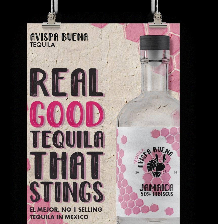
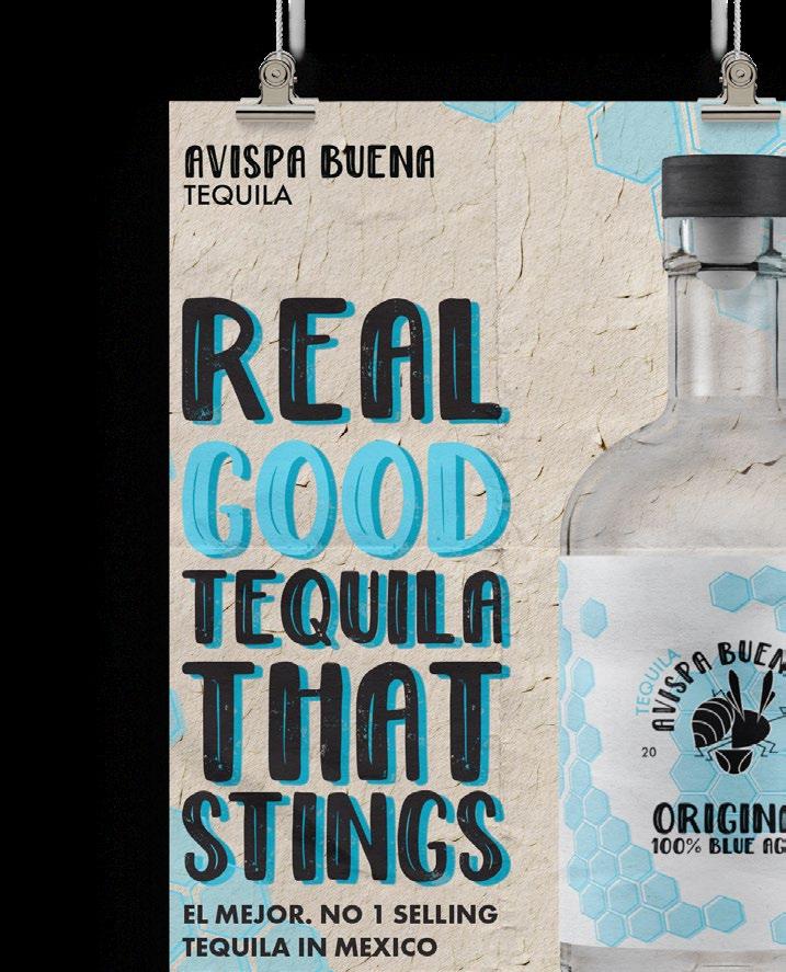
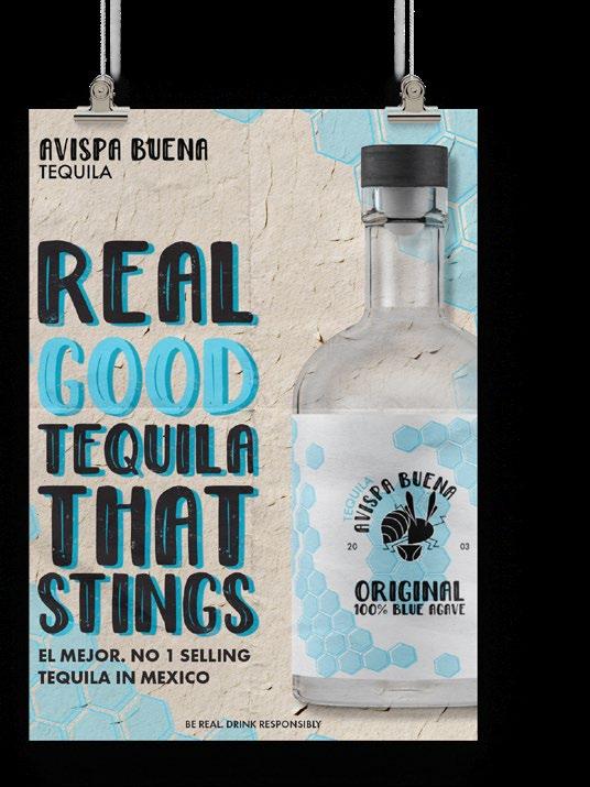
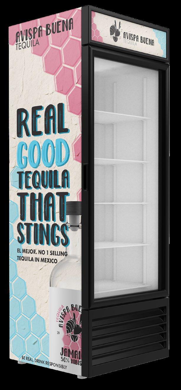
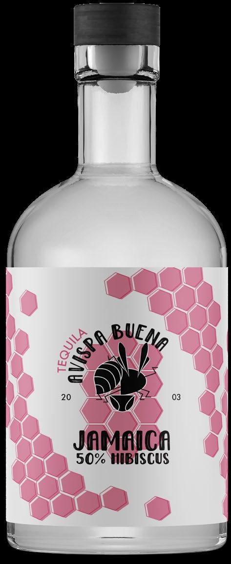
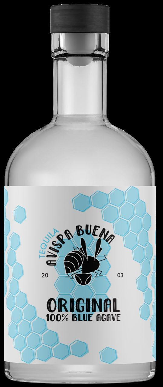
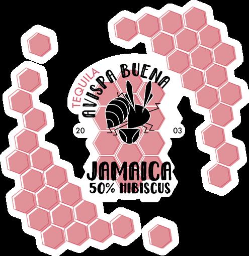
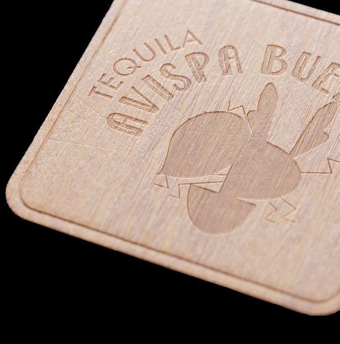
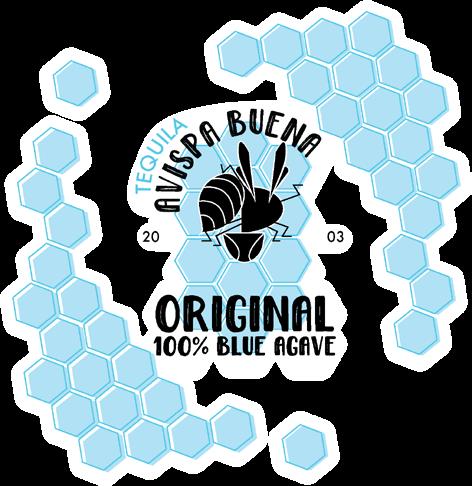
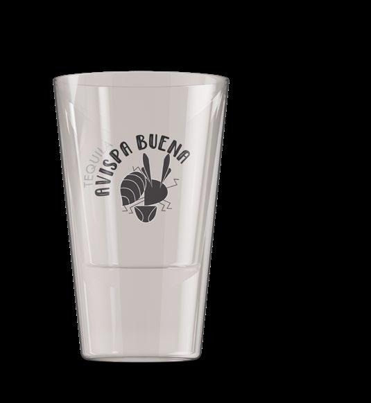
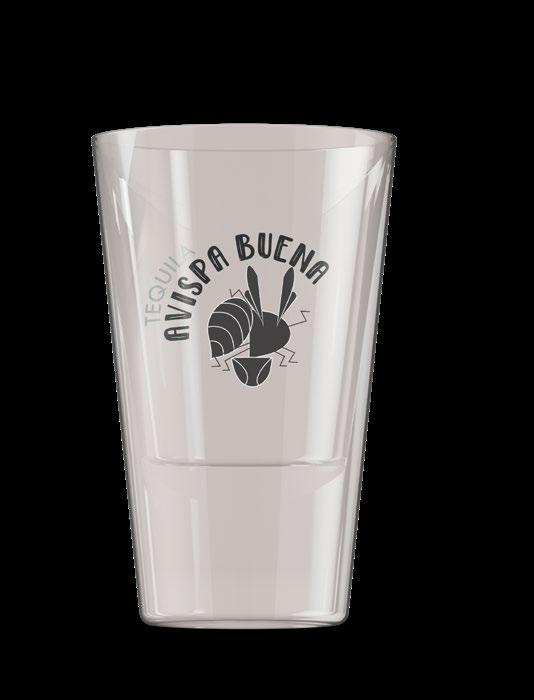
AVISPA BUENA TEQUILA
real
good tequila
Created a hypothetical tequila brand and designed a comprehensive brand identity package including a logo system, tequila bottle label, social media ads, and a refrigerator mockup. This project involved in-depth research into the tequila market to ensure consistency and appeal across all elements. One of the main challenges was developing a distinctive logo system and label design that communicated both the brand's personality and premium quality while defining the brand’s message The end results effectively establish a modern, vibrant brand that resonates with tequila evnthusiasts and stands out in a competitive market.
◊ client personal ◊ aptitude package, logo design ◊ know-how · adobe illustrator, indesign typography color palette
REAL GOOD TEQUILA THAT STINGS
futura pt medium · douglas wolves sans
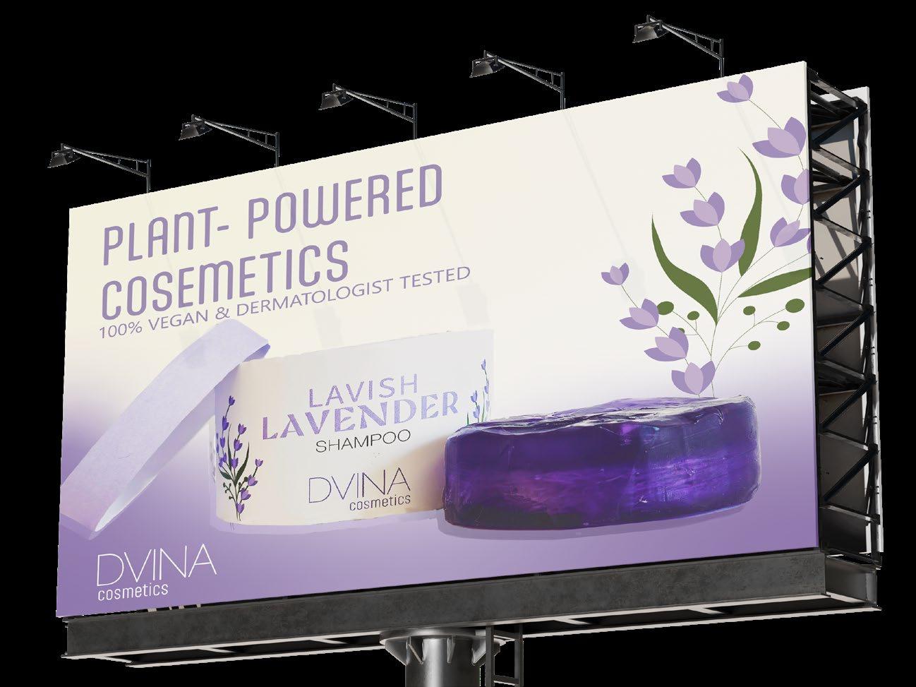
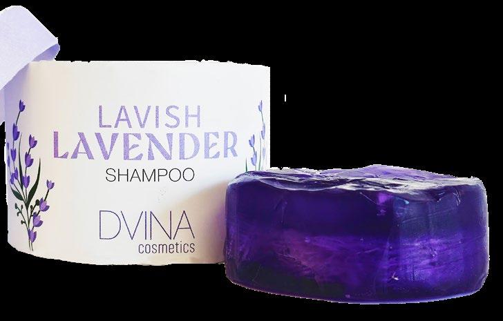
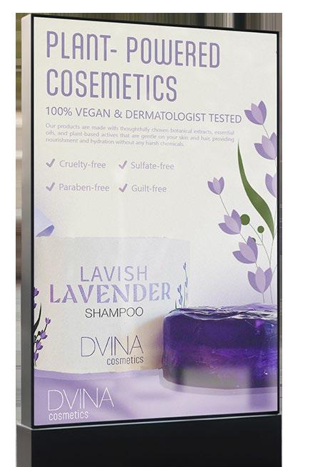
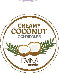
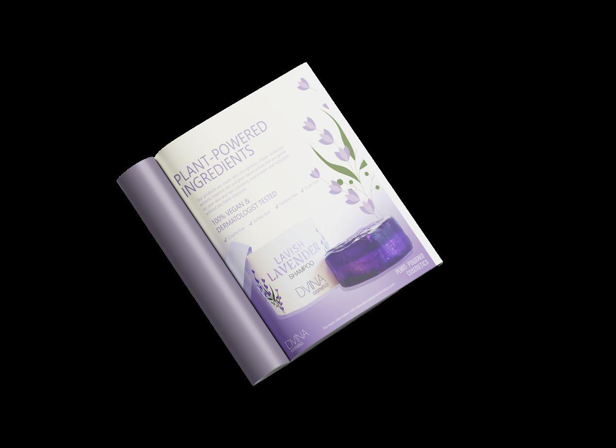
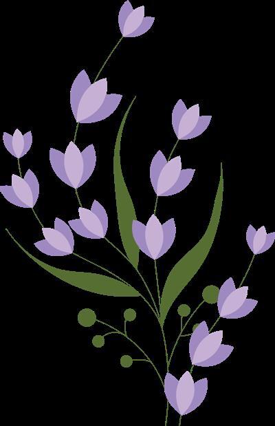
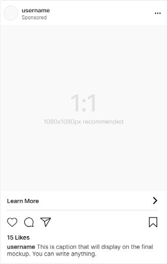
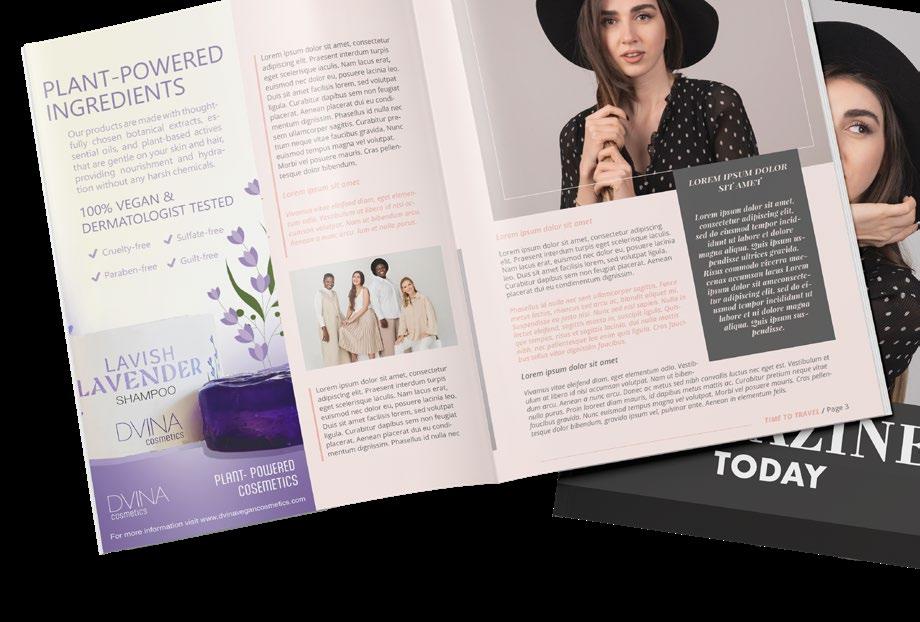
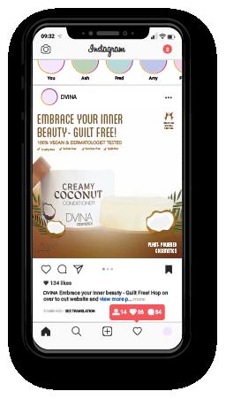
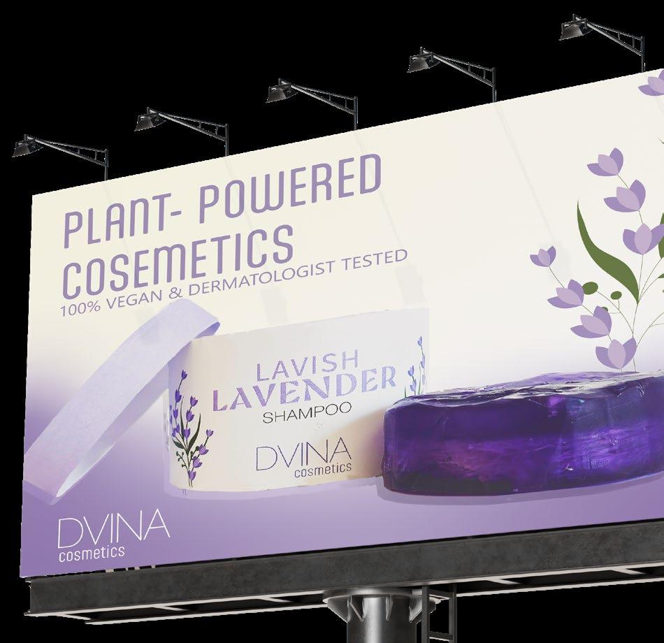
DVINA COSMETICS
plant powered cosemetics
Developed a strategic and thoughtful advertising campaign for a product line, with a logo, collection of ad variations, package design, and self-constructed packaging. This project required shaping a cohesive visual narrative across various deliverables, including print, digital, and social media assets. One of the main challenges was coordinating crossplatform consistency while designing various ad formats The
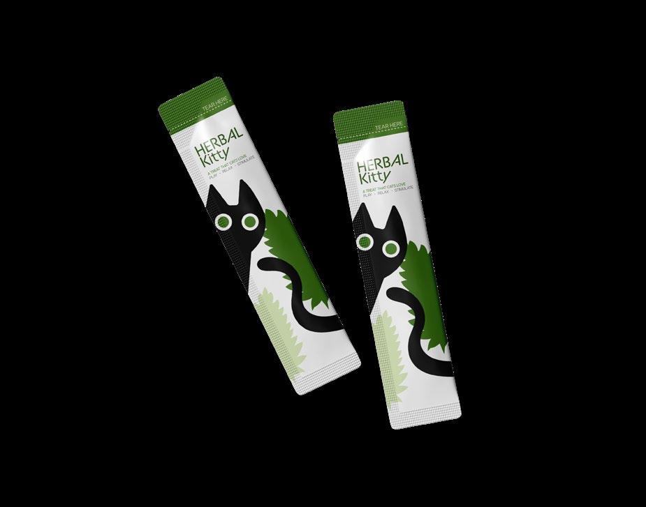
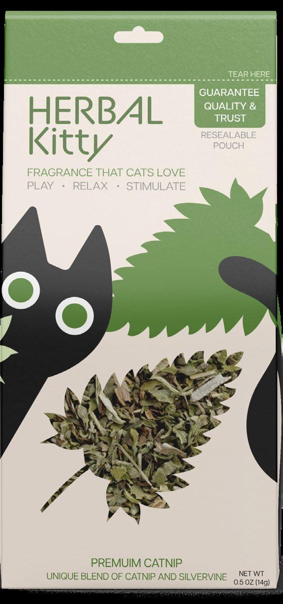
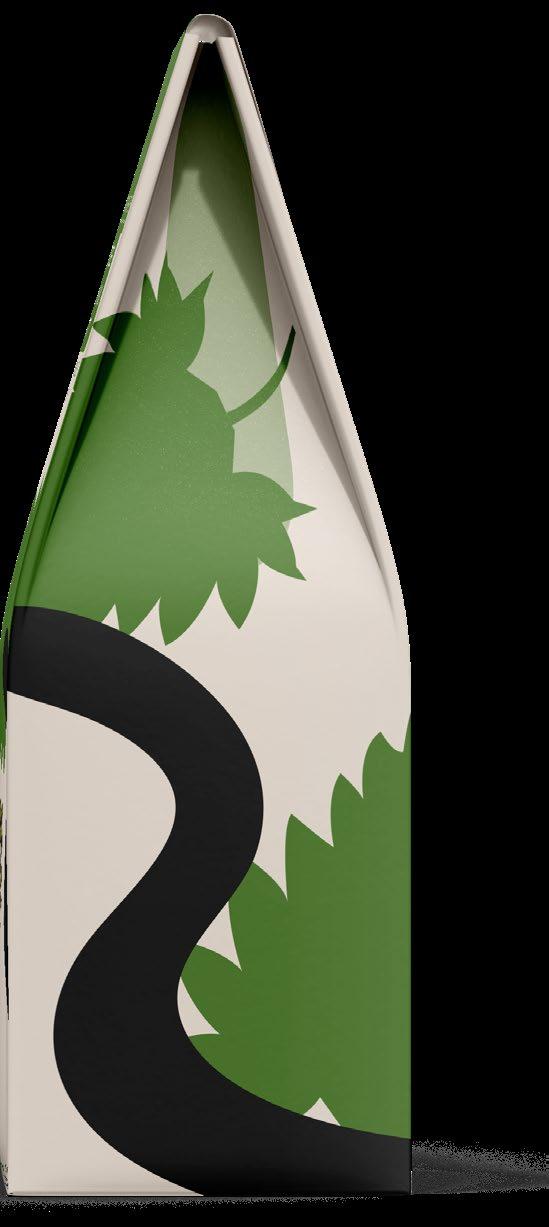
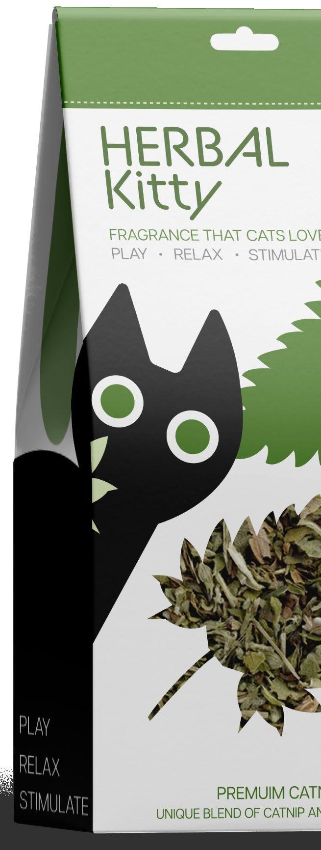
HERBAL KITTY
grass that cats love
Crafted and designed a hanger tab package, focusing on branding and visual coding This project involved integrating key elements like product features, barcode, manufacturer info, and other important facts while ensuring the package’s visual balance . One of the main challenges was balancing aesthetics with functionality The end result effectively delivers a cohesive and practical design that effectively communicates the product features.
◊ client personal ◊ aptitude package design, layout ◊ know-how adobe illustrator typography color palette
A FRAGRANCE THAT CATS LOVE
FRAGRANCE THAT CATS LOVE
FRAGRANCE THAT CATS LOVE
A GREAT SOURCE OF STIMULATION FOR DOMESTIC CATS. THIS PORVIDES STIMULATION TO THE DOMESTIC CAT CAN NOT GET FROM BEING IN AN INDOOR ENVOIRINMENT. HERBAL KITTY CATNIP HELPS BY MOTIVATING YOUR CAT TO EXERCISE AND PLAY.
DIRECTIONS: RUB A GENEROUS PINCH OF CATNIP BETWEEN YOUR FINGERS TO RELEASE THE AROMA STORED IN THE DIRED LEAVES AND FLOWERS THEN PLACE ON FLOOR FOR YOUR CAT TO ENJOY. KEEP THE BAG SEALED FOR FRESHNESS.
WARNING: INTENDED FOR PET USE ONLY. DO NOT TAKE INTERNALLY.
FRAGRANCE THAT CATS LOVE RESEALABLE POUCH RELAX PLAY STIMULATE
PLASTIC
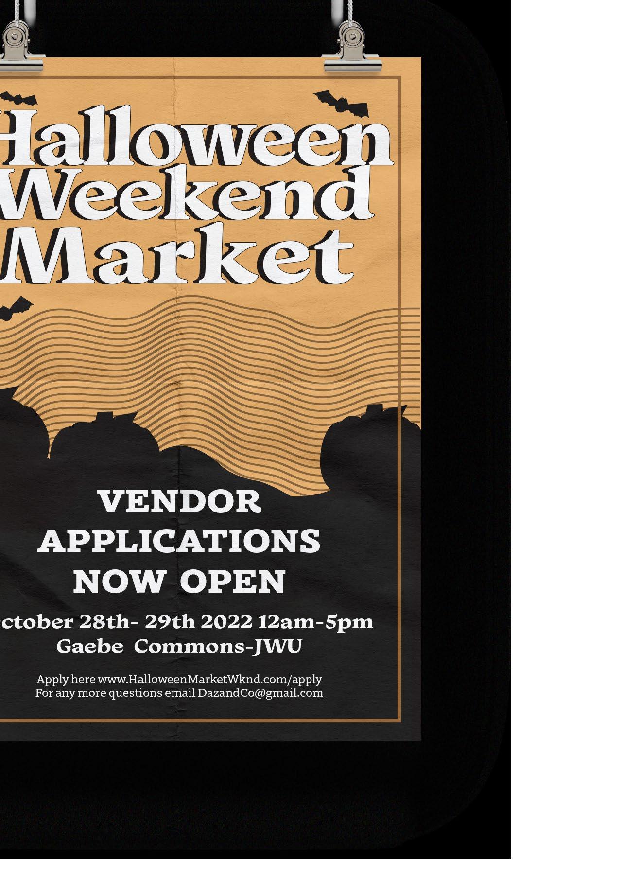
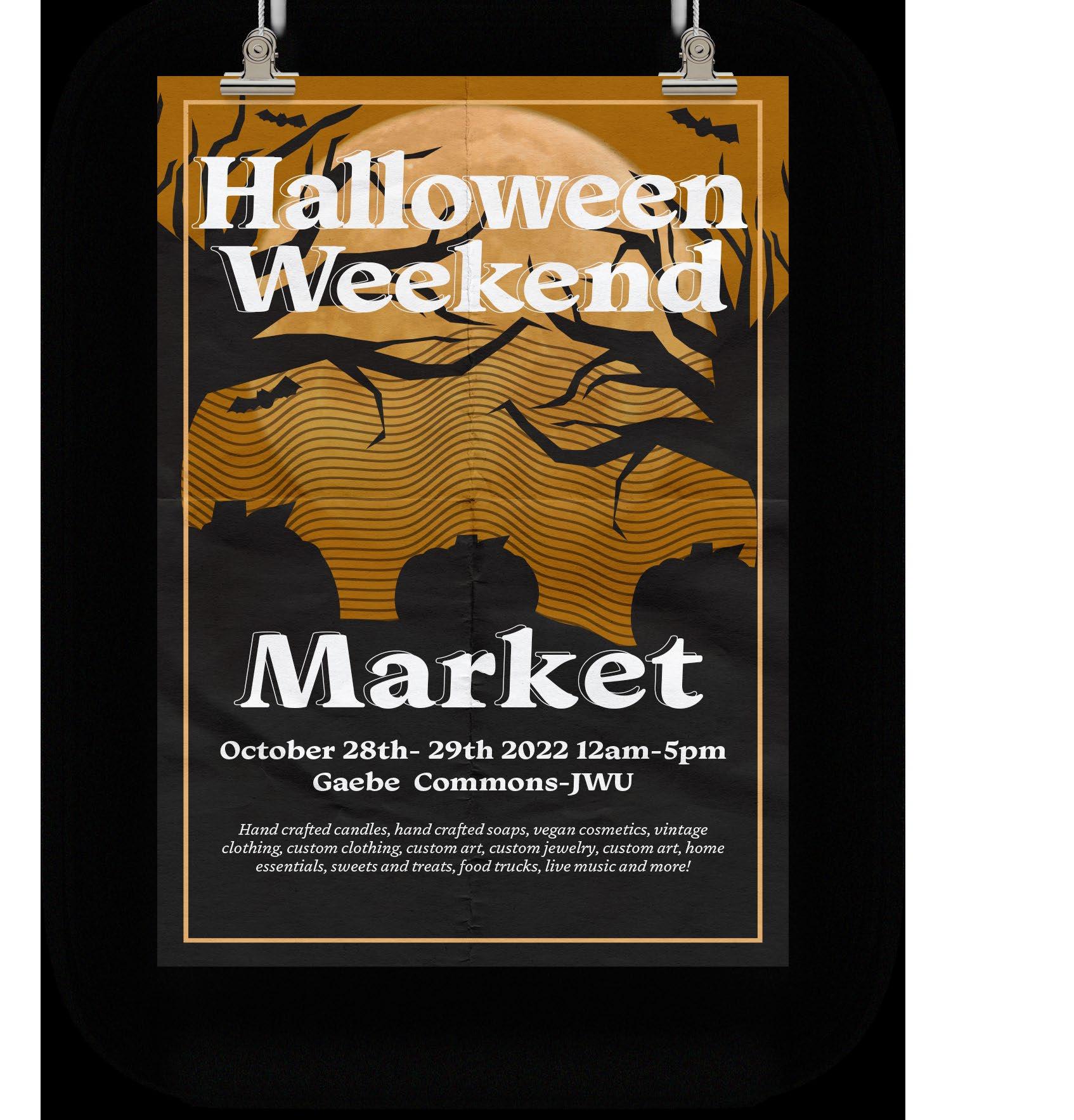
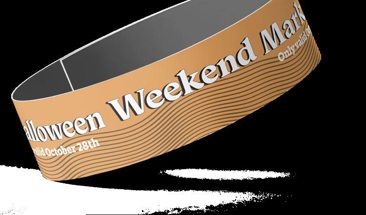
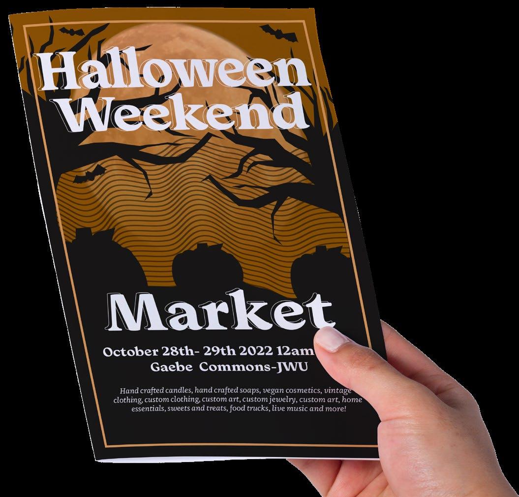
HALLOWEEN WKND MARKET
frights, delights, and market sights
Designed a Halloween-themed outdoor market promotional flyer, creating a visually engaging piece that incorporates spooky elements with a strong seasonal appeal. This project involved careful consideration of color schemes, typography, and imagery to ensure a cohesive and striking design. One of the main challenges was blending creativity with clarity, ensuring the flyer was both eye-catching and informative The end result successfully captures the Halloween spirit while effectively promoting the market event, making it both festive and compelling for the target audience.
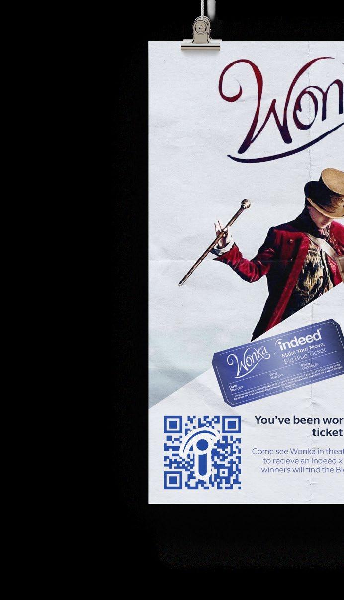
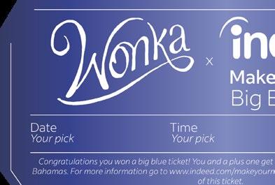
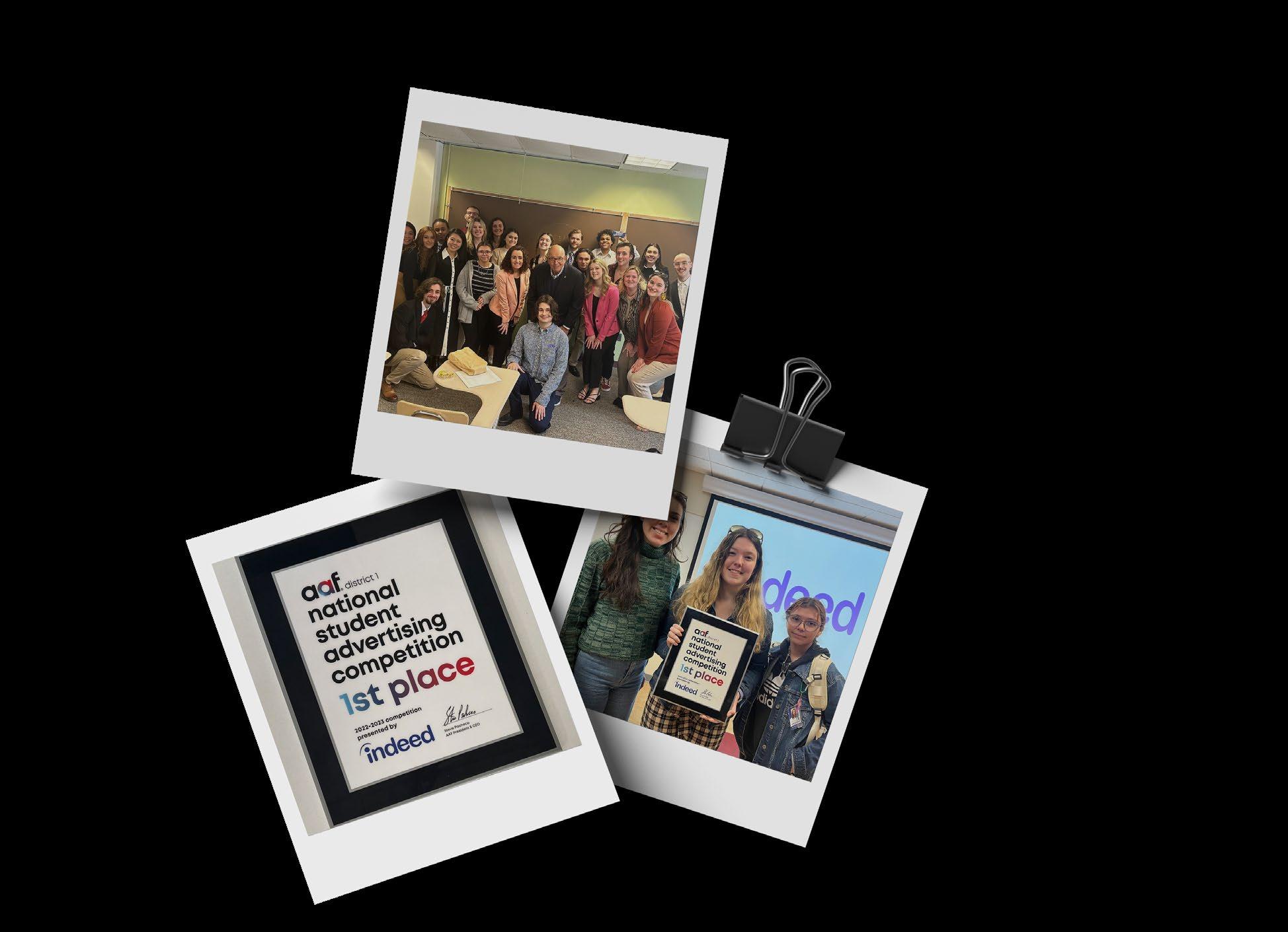
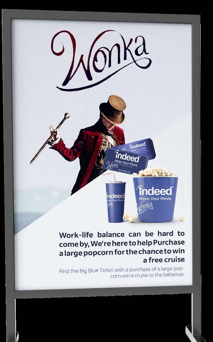
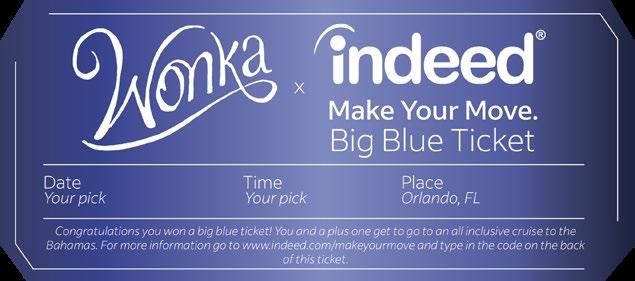
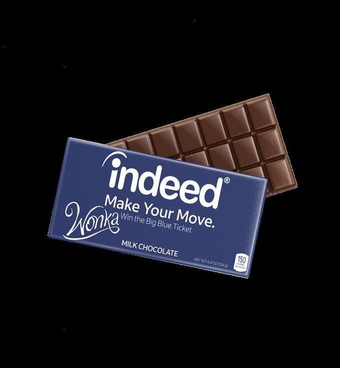
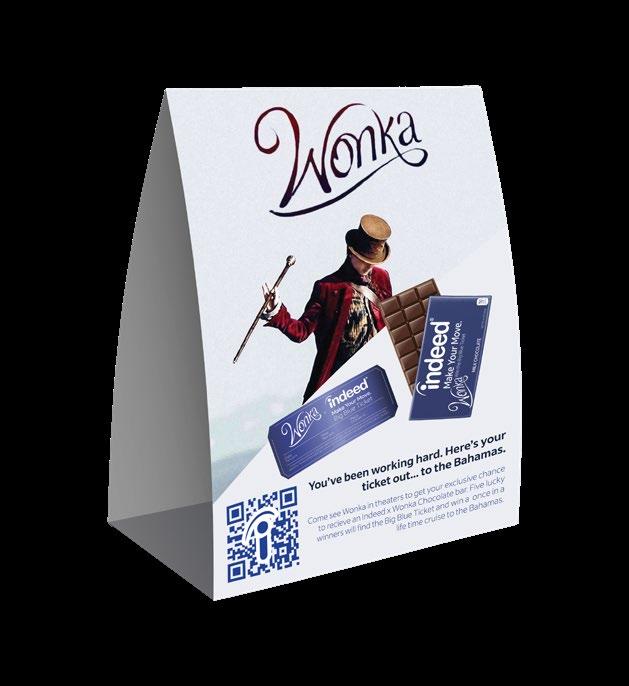
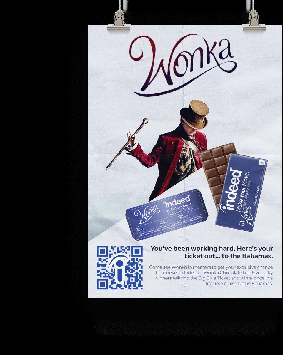
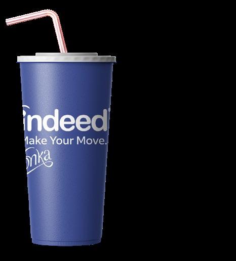
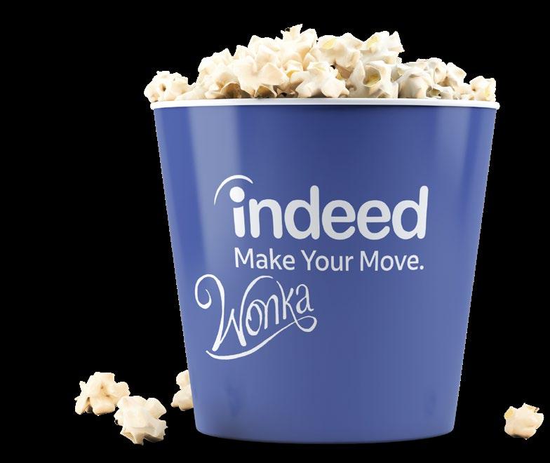
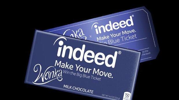
Collaborated with the JWU Ad Team to create Indeed , targeting Gen Z (18–24). Deliverables included a executions , and a presentation for the American Advertising Federation’s, National Student Advertising Competition while introducing a fresh design aesthetic aimed at resonating with the target demographic. My role focused on designing promotional materials and the 2023 film Wonka, including a poster, chocolate bar wrappers, and winning tickets to generate excitement. Some of the main challenges were establishing content hierarchy and adapting to revisions while maintaining a Gen Z-focused aesthetic. The final designs achieved a cohesive, engaging look that resonated with the target audience.
◊ client Indeed ◊ aptitude collaborative, layout
typography
Make Your Move.
indeed sans bold · indeed sans
sketches
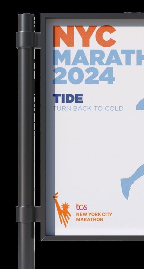
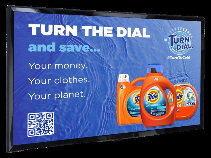
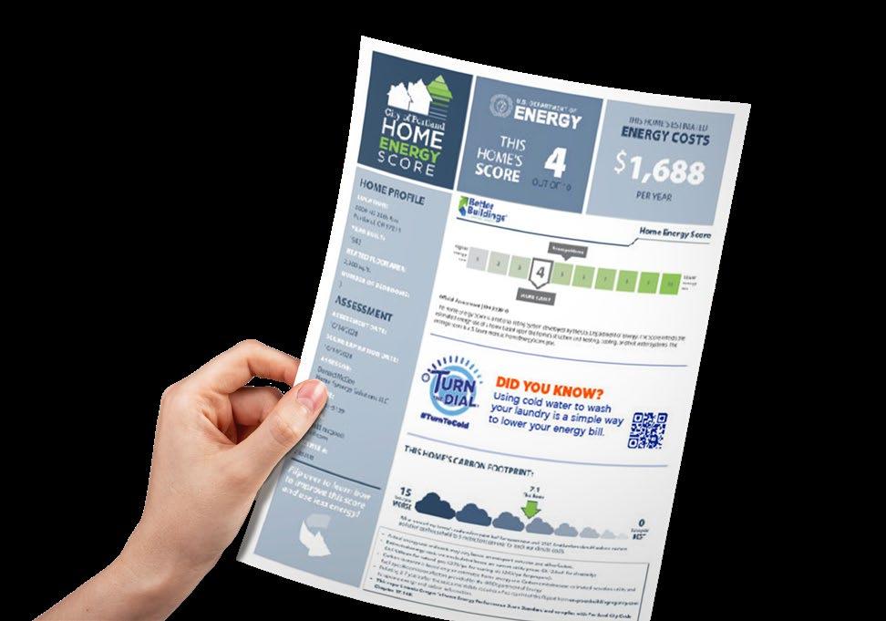
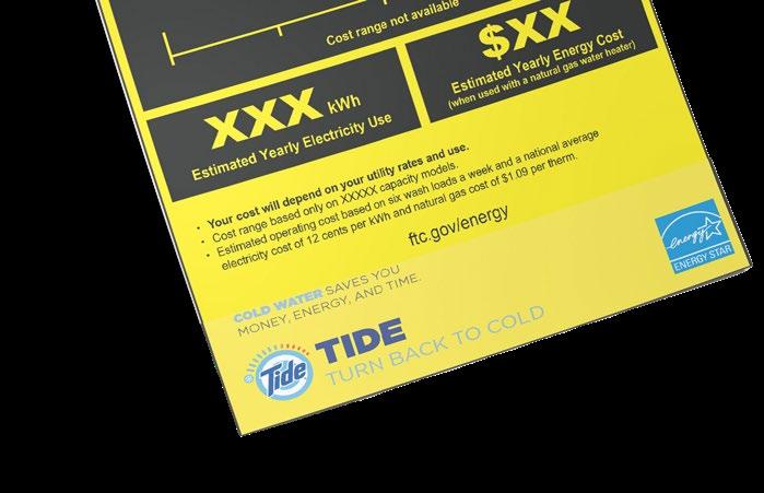
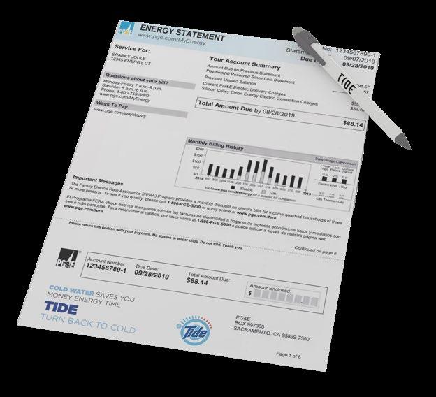
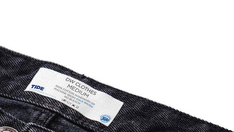
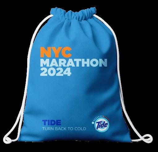
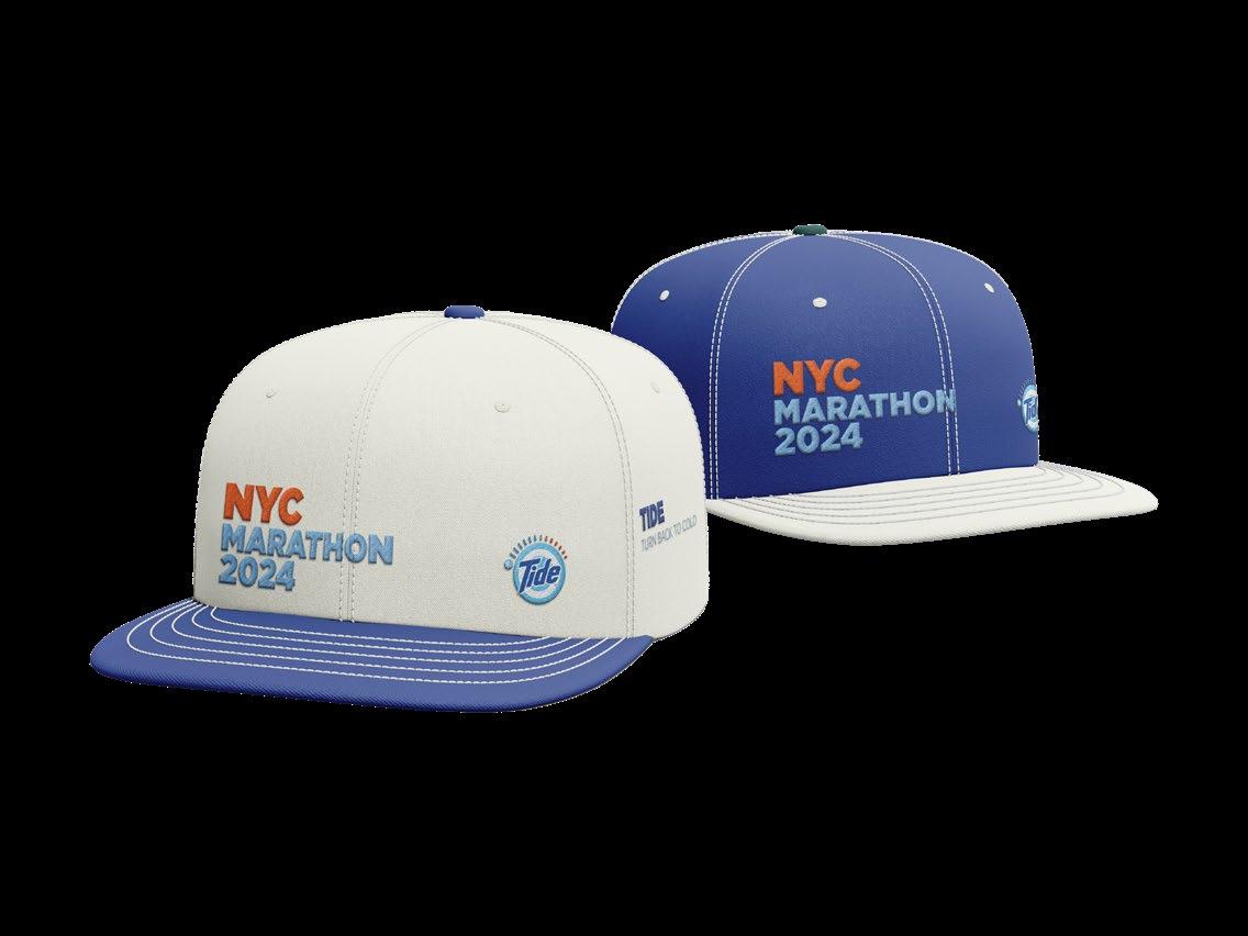
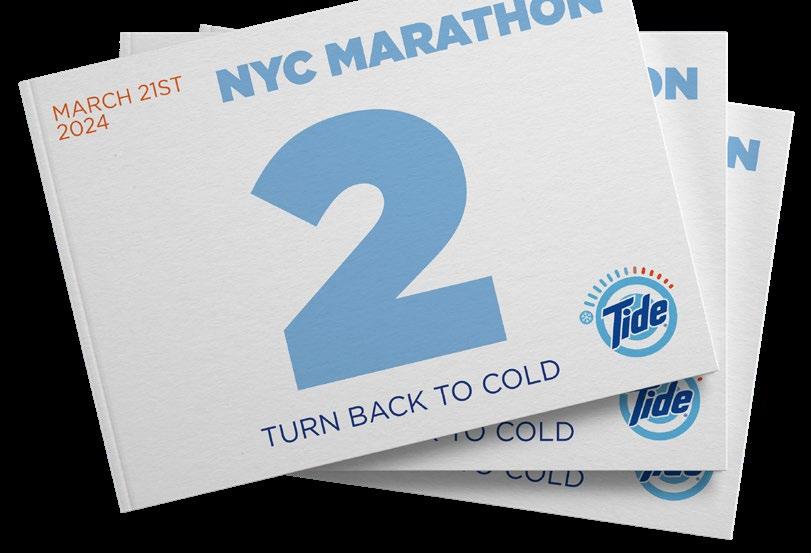
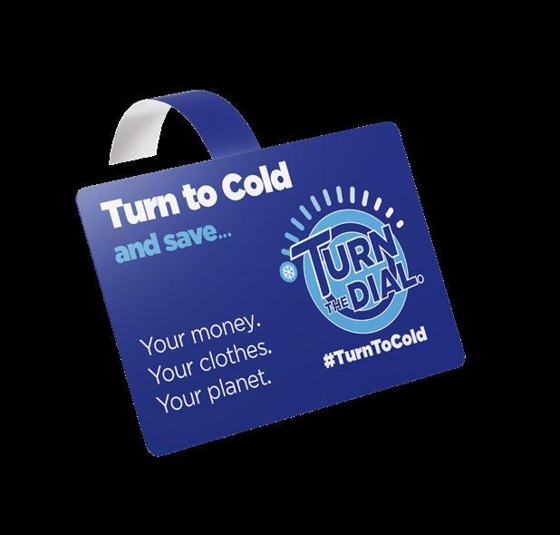
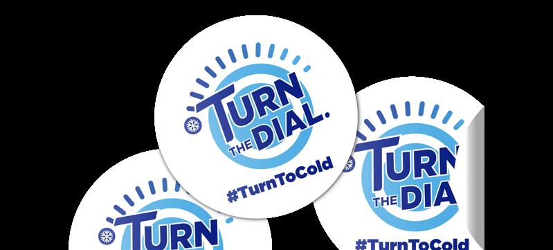
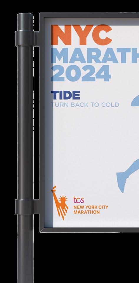
NSAC TIDE
turn the dial, turn to cold with tide
Collaborated with the JWU Ad Team to create an targeting Millenials and Gen Z (18–35). Deliverables included a creative executions, and a presentation for the American Advertising Federation’s, National Student Advertising Competition guidelines while introducing a fresh design aesthetic aimed at resonating with the target demographic. My role focused on designing energy report ads, energy guide ads, and promotional materials such as cart ads, floor stickers, shelf-talkers, and digital signage. Some of the main challenges were coordinating cross-platform consistency various ad formats ensuring the designs remained to the brand standards. The final designs achieved a cohesive, engaging look that resonated with the target audience.
aptitude collaborative, layout
typography
Turn the Dial.
gotham ultra · gotham black
sketches
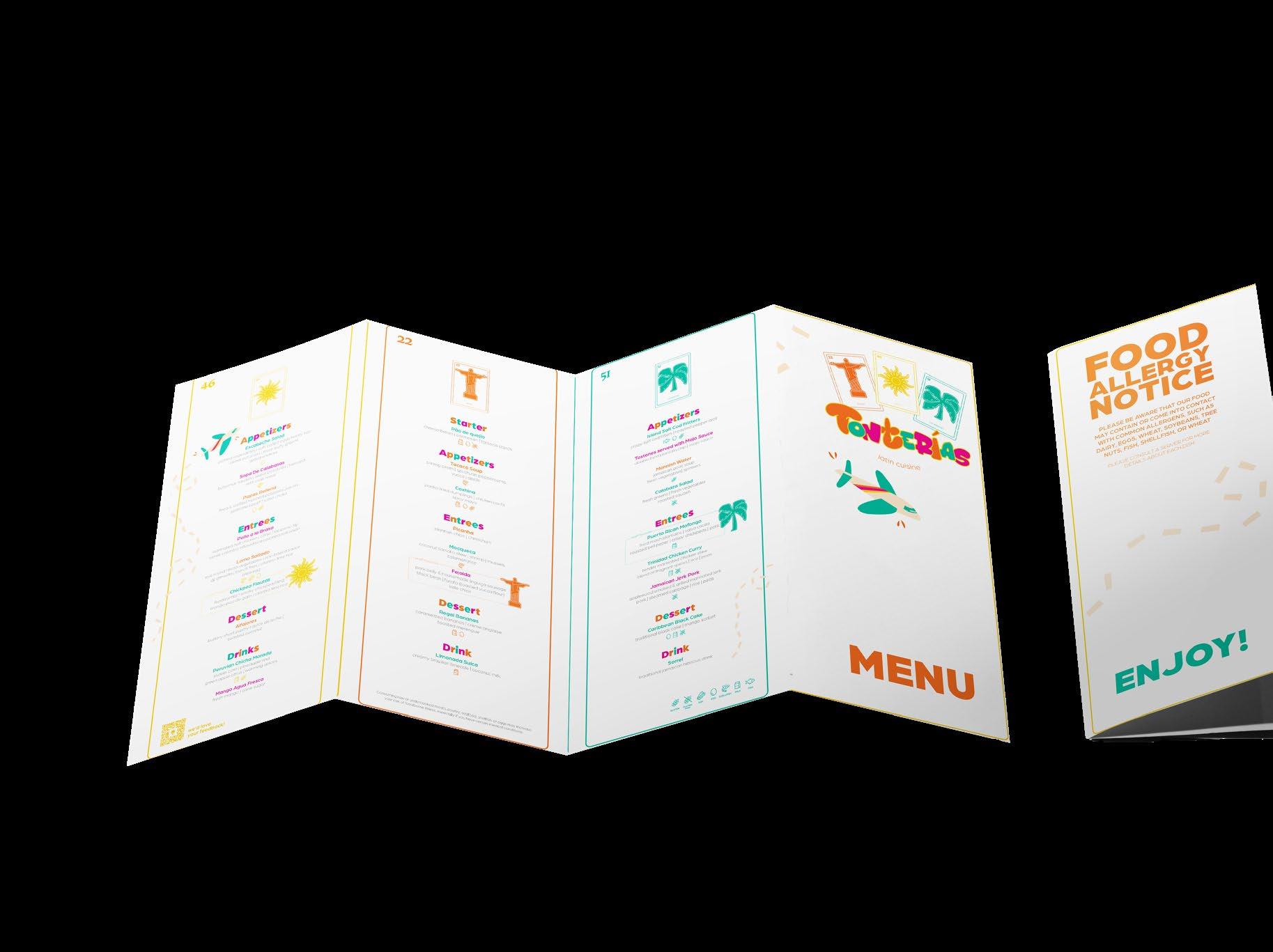
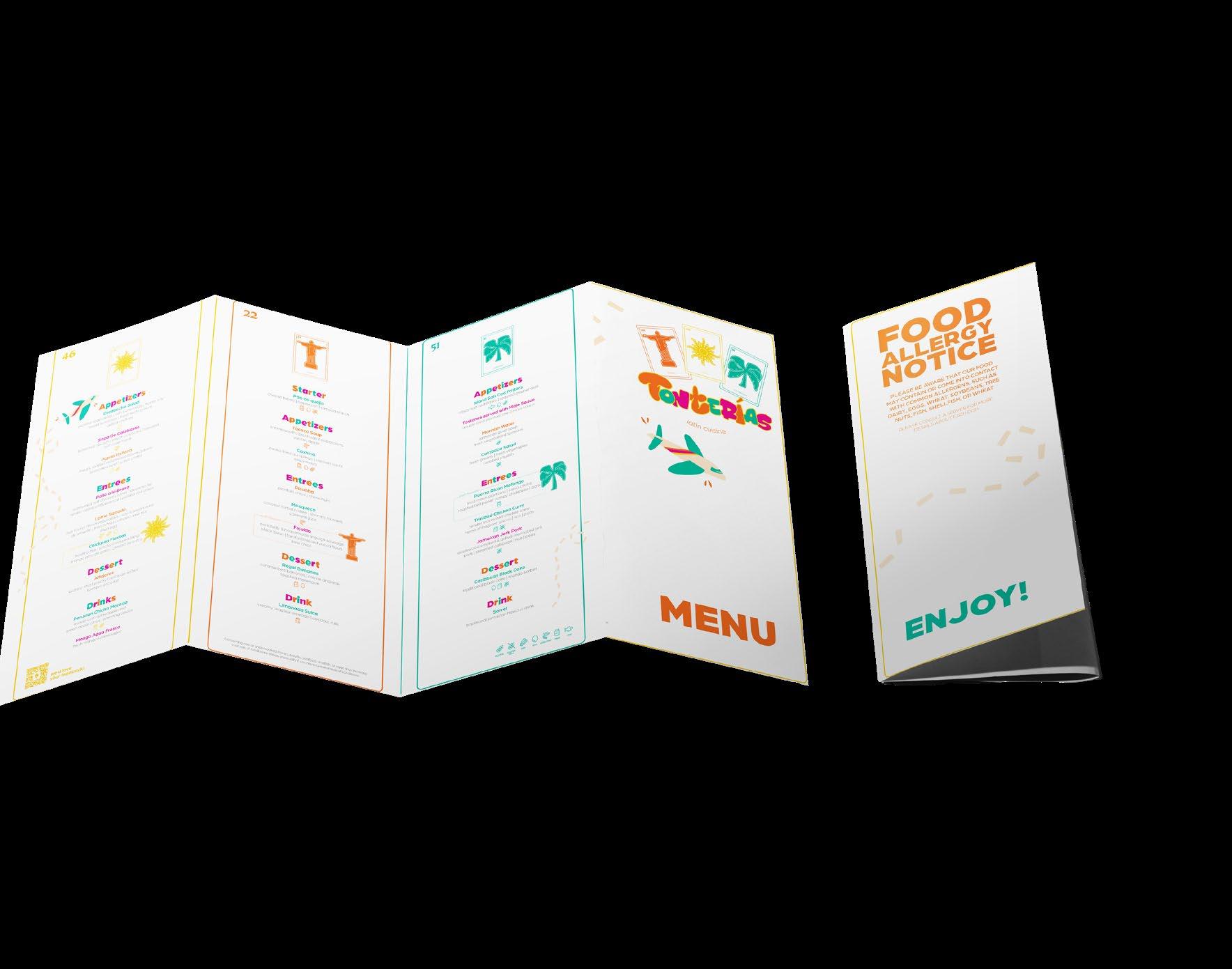
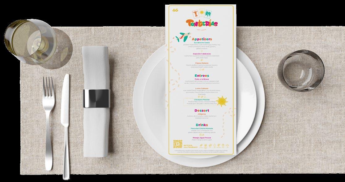
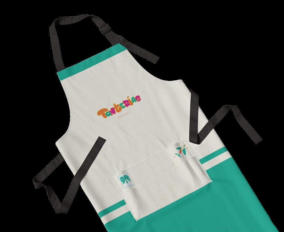
TONTERIAS
latin cuisine
Collaborated with a design team to design branding for JWU culinary students hosting a public grand opening event. Our client requested a to represent their team, Tonterías, and the Latin cuisines they’d be serving. The final logo combined a teammate’s type-driven illustration with my own Lotería-style graphic illustration, resulting in a playful and culturally rooted brand system. My role focused on designing three separate menus for each culinary team, reflecting their unique dishes while staying true to the group’s overall vision. The biggest challenge was maintaining visual consistency while giving each menu its own personality. The final designs captured the energy of the event and the vibrancy of the students’ culinary stories.
◊ client culinary students ◊ aptitude · illustration, layout
typography
PUERTO RICAN MOFONGO
arboria black · arboria light
sketches
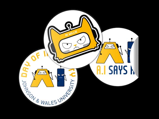
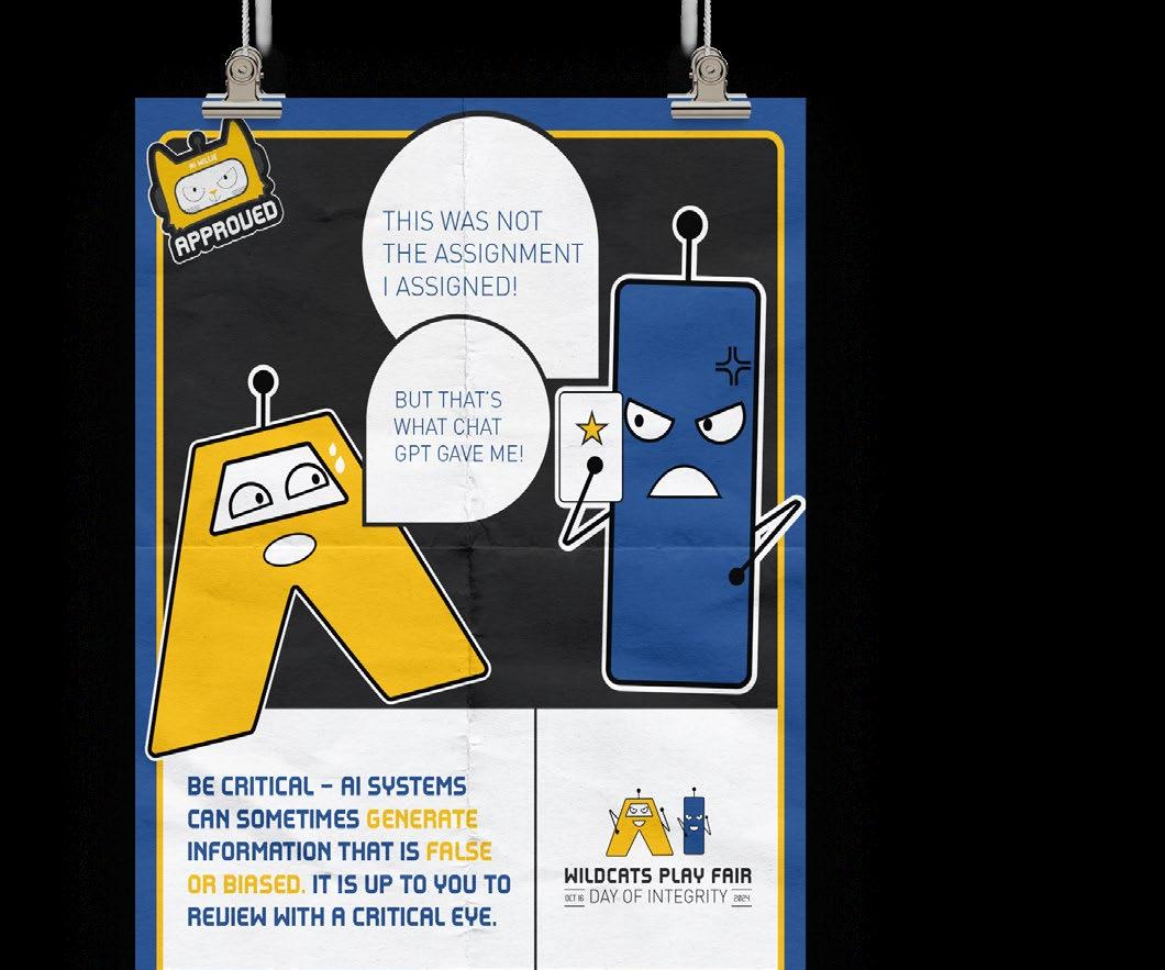
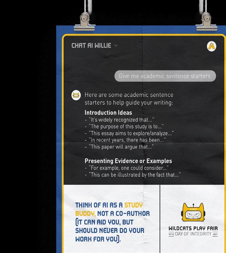
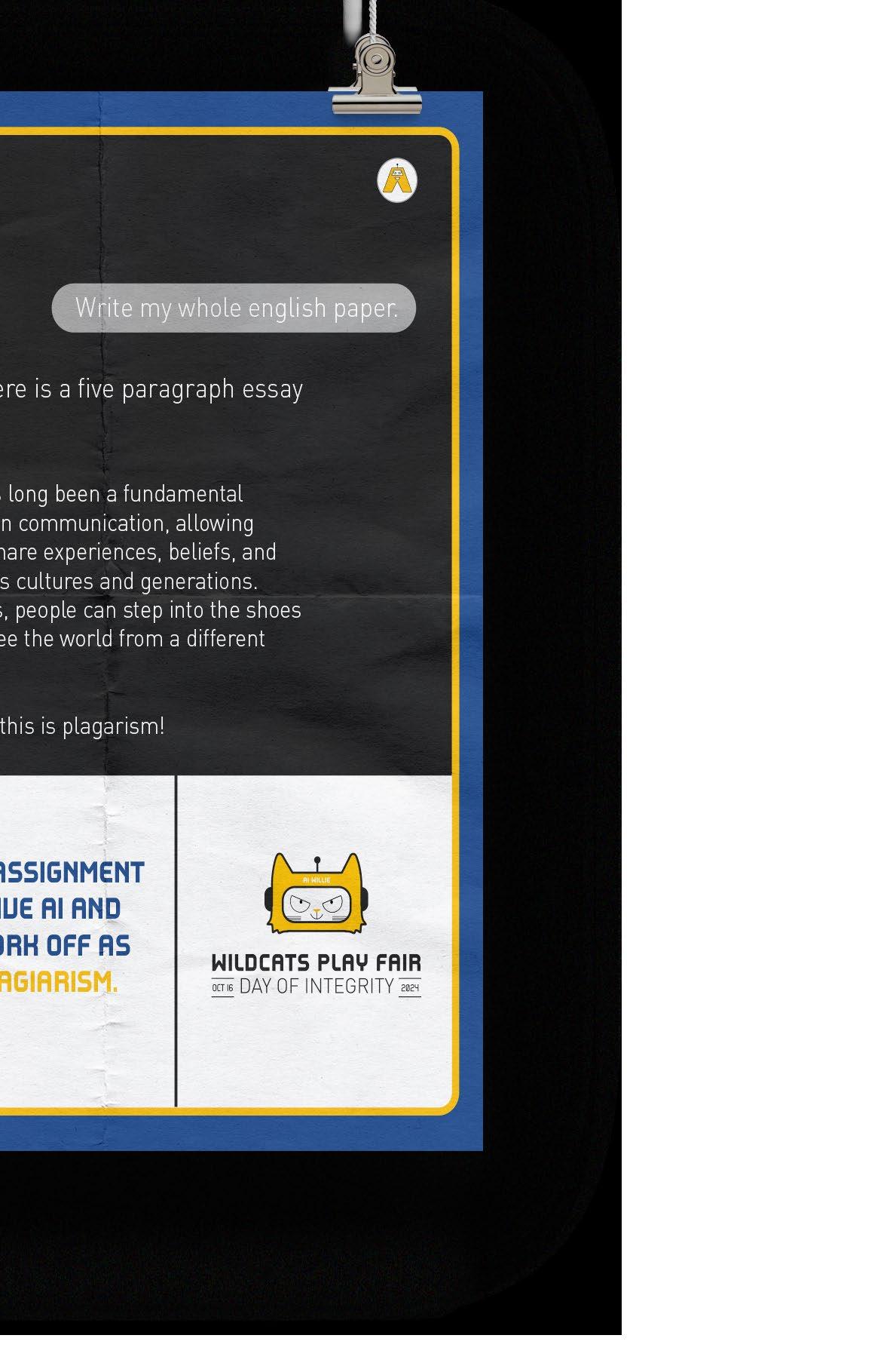
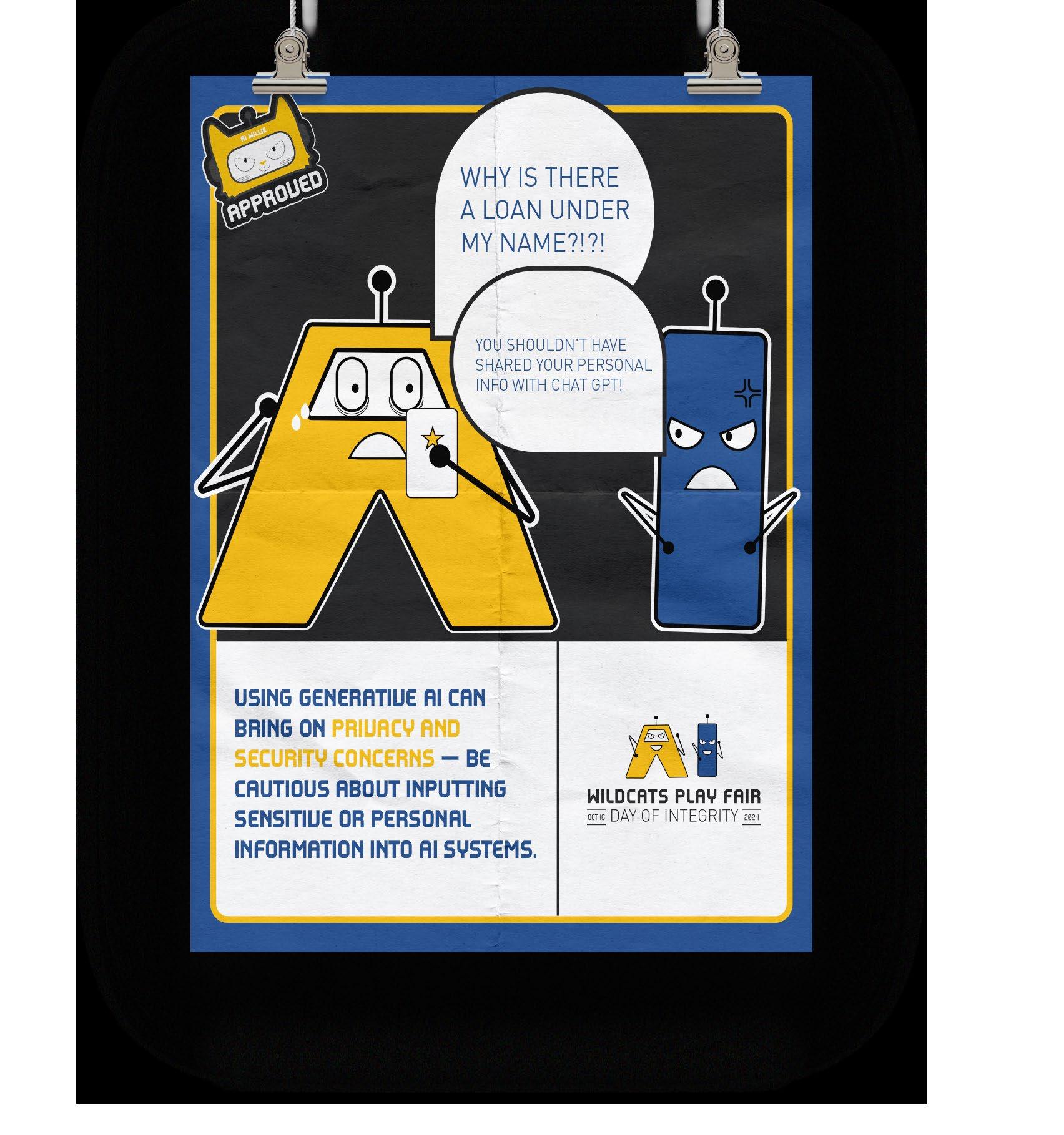
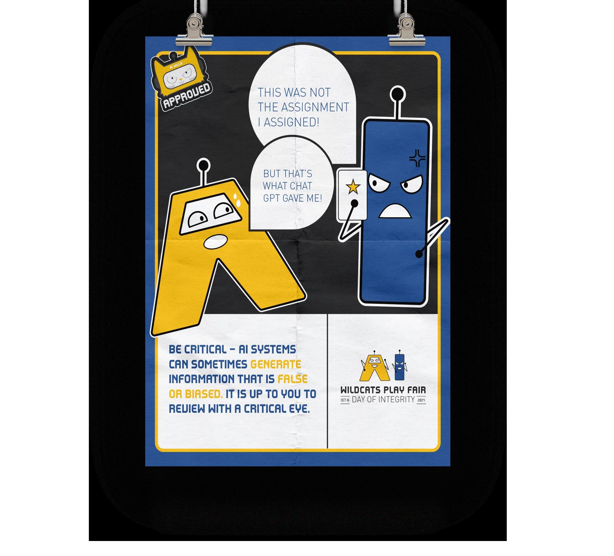
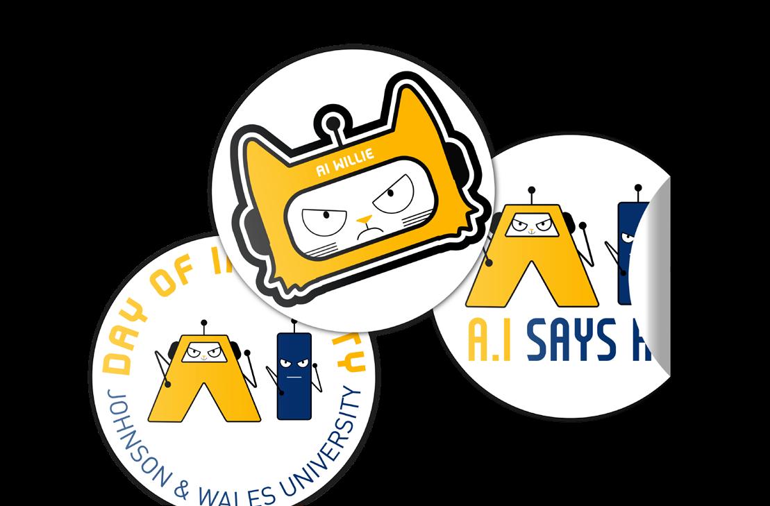
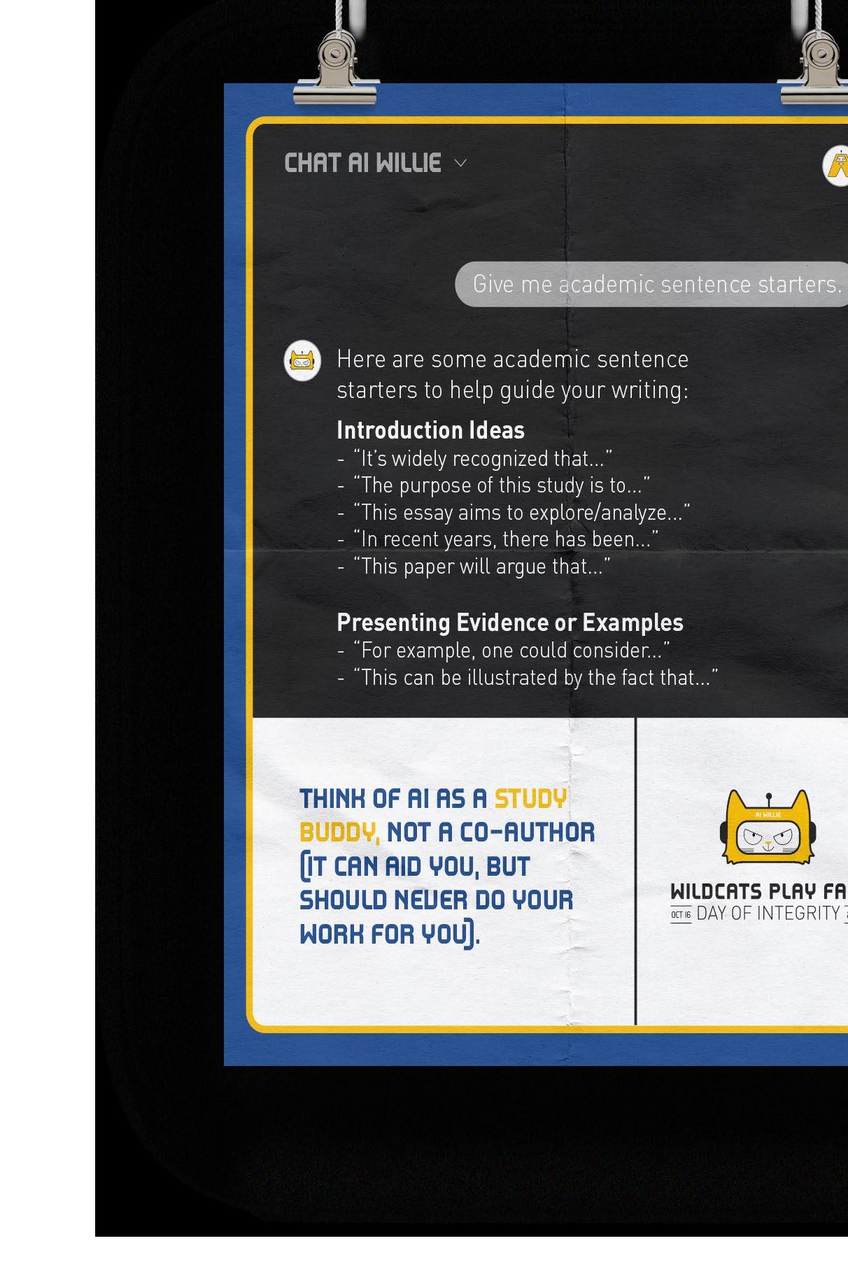
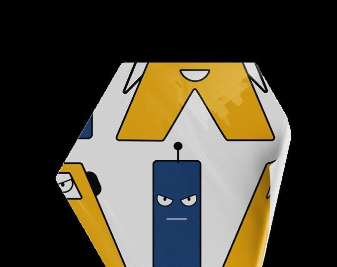
JWU NATIONAL INTEGRITY DAY
day of integrity with ai willie
We were tasked with creating a comprehensive visual identity including a logo system, informative posters, social media ads, and stickers. This project involved carefully considering the event’s core values and translating them into cohesive, impactful design elements . One of the main challenges was creating informative posters that clearly communicated the event’s message while maintaining visual interest and readability across various formats The end result effectively communicates the event’s theme of integrity, presenting a professional yet playful identity that resonates across both print and digital platforms.
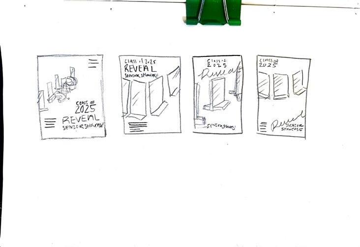
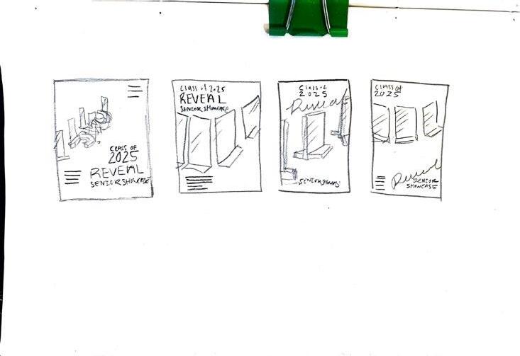
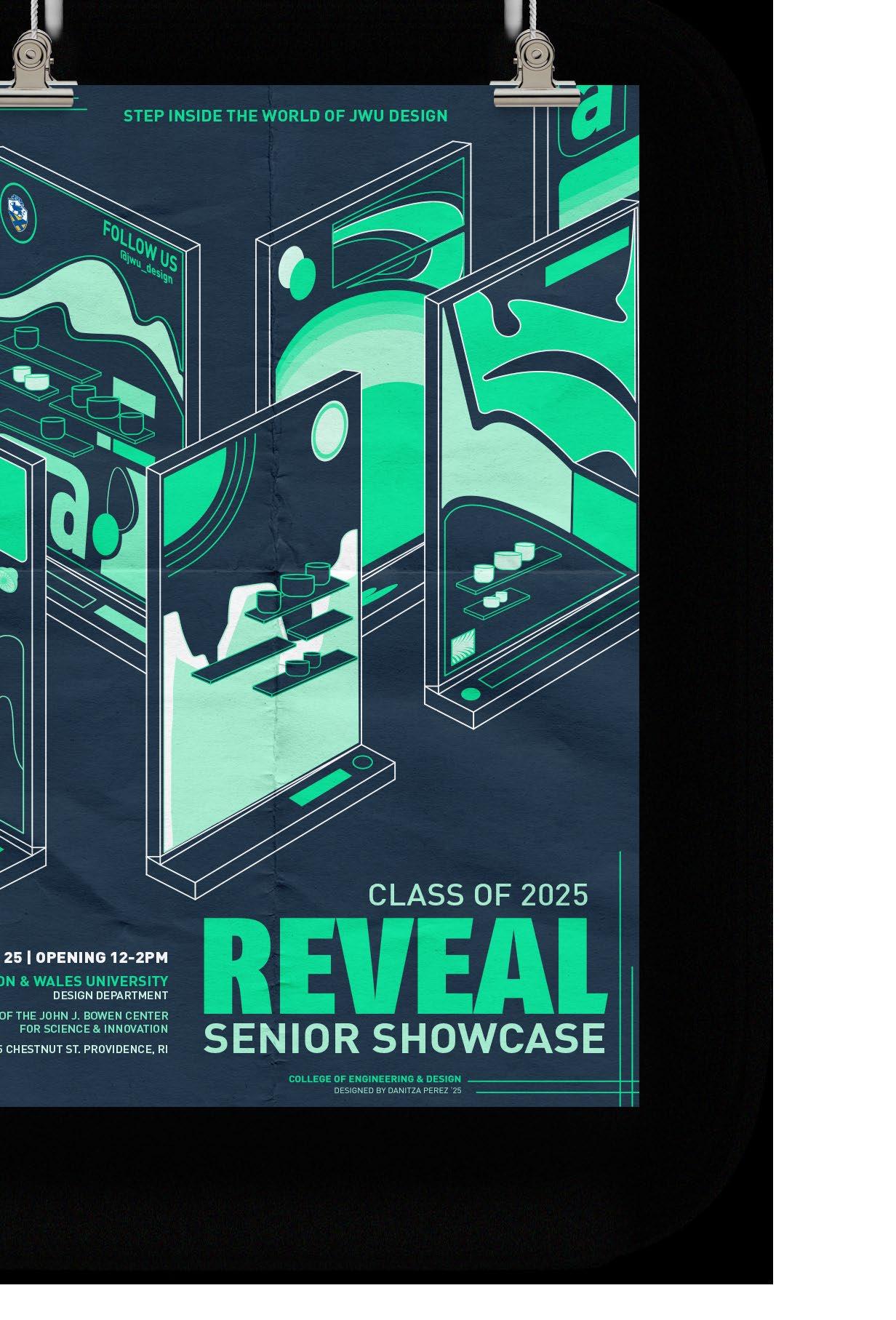
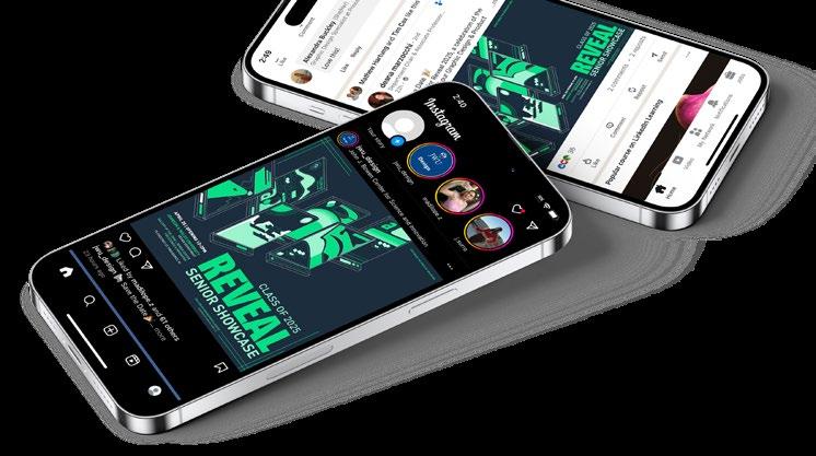
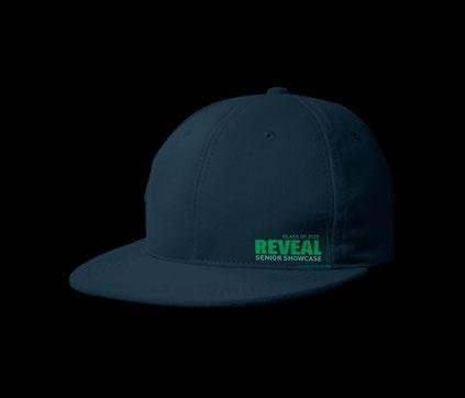
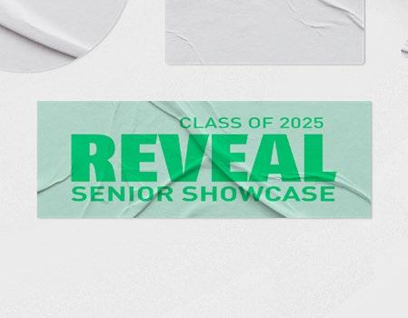
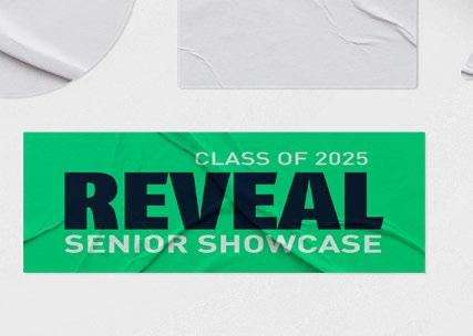
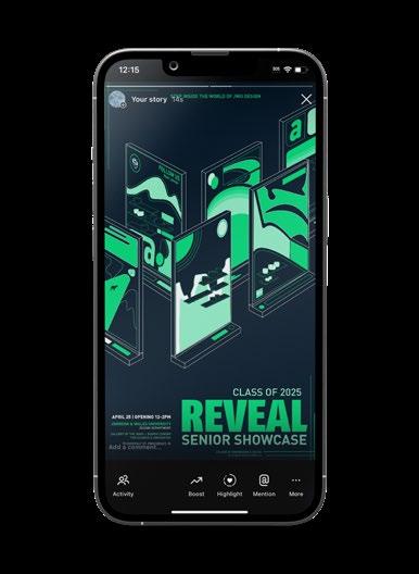
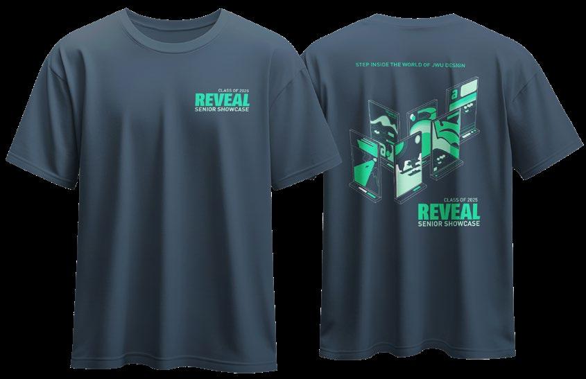
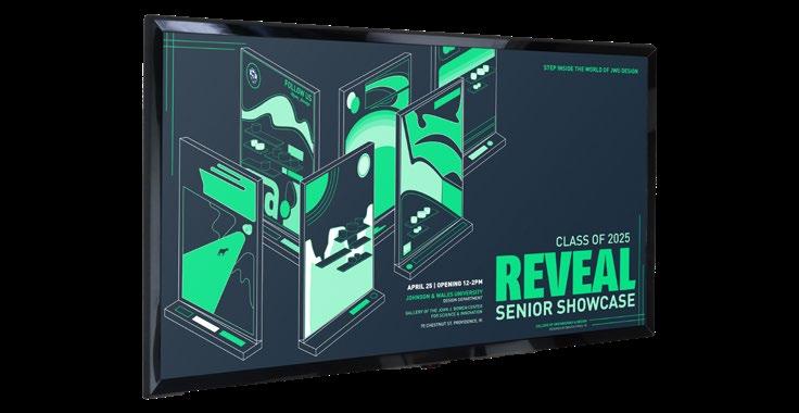
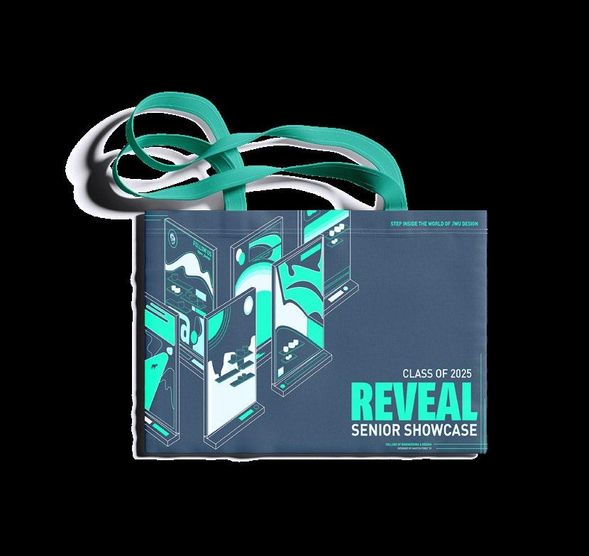
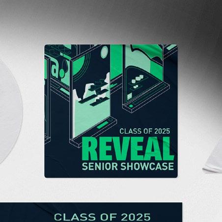
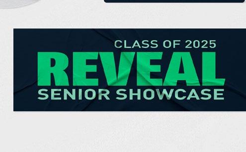
Designed the official reveal poster for the JWU Class of 2025 senior showcase as part of a department-wide mini competition. The poster was anonymously selected by peer vote as the concept that best represented the senior class. Following the selection, I expanded the design into a full campaign, including social media ads, TV wall graphics, alternate poster sizes, a t-shirt, and sticker. The final deliverables maintained visual consistency while effectively capturing the energy and identity of the graduating class.
aptitude poster design, illustration
STEP INTO THE WORLD OF JWU DESIGN
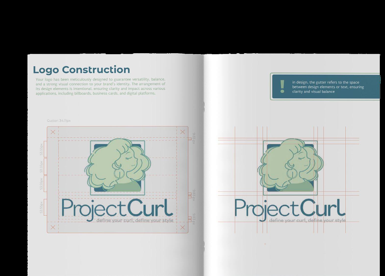
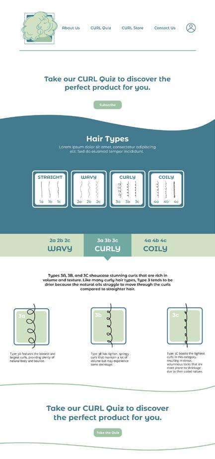
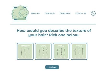
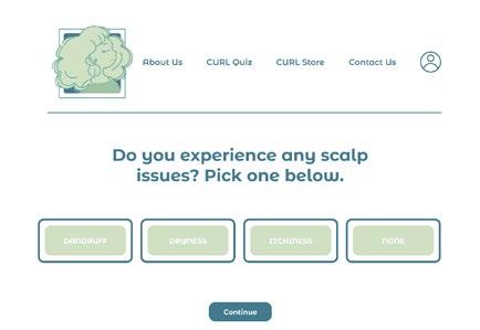
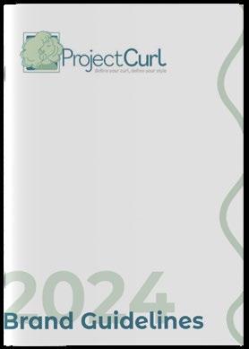
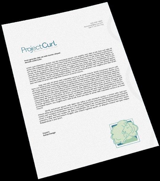
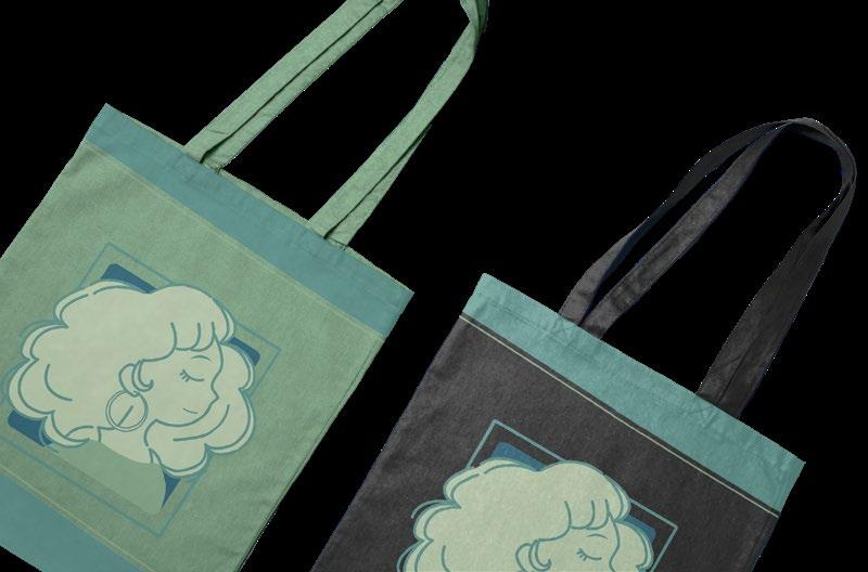
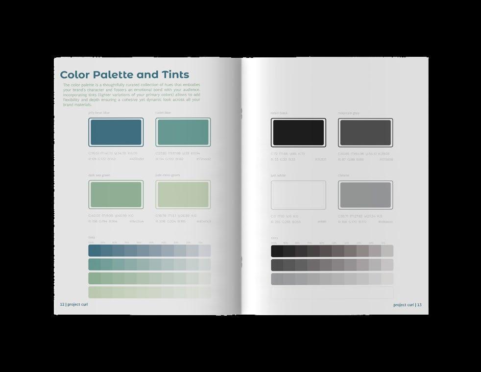
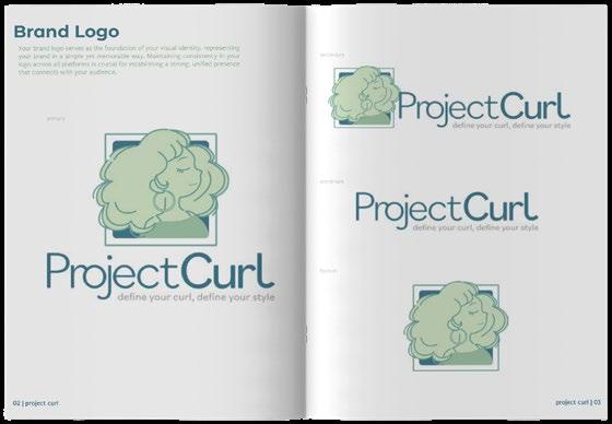
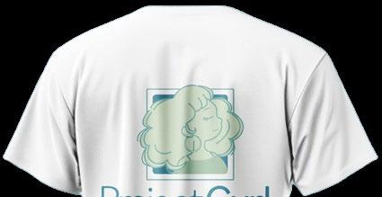
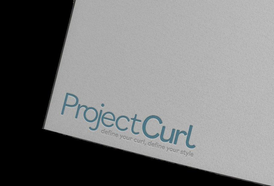
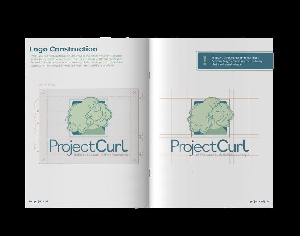
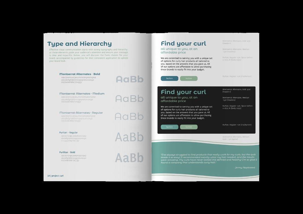
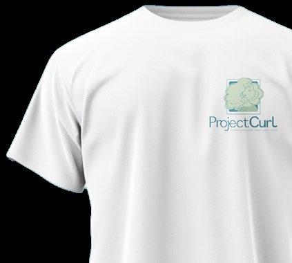
PROJECT CURL
define your curl, define your style
We were tasked with creating a comprehensive brand identity , including a logo system and a fully designed high-fidelity website. This project involved creating a visual language that not only represented their brand values but also ensured a seamless user experience across digital platforms One of the main challenges was aligning the brand’s visual identity with its core values all while ensuring the website was both visually engaging and highly functional. The end result effectively conveys a modern, user-friendly experience that resonates with ProjectCurl’s target audience, establishing a strong, cohesive brand presence.
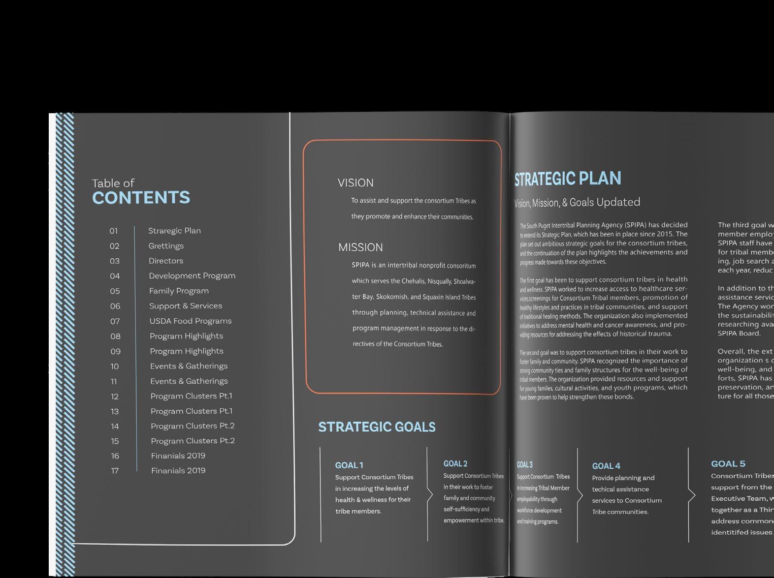
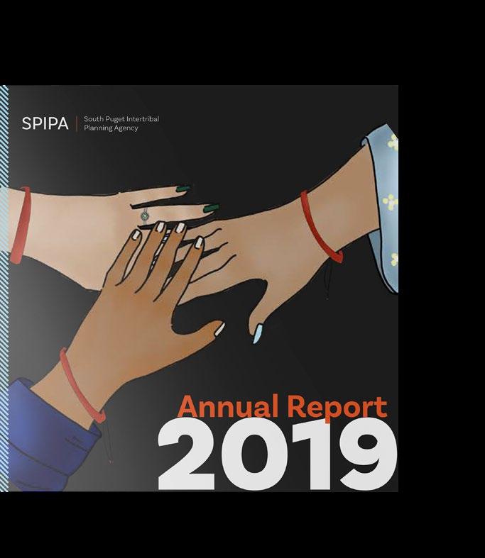
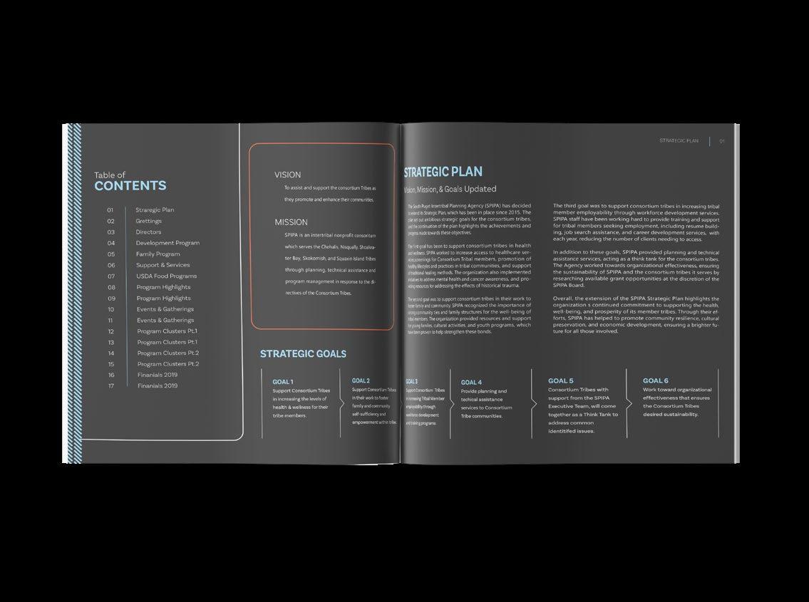
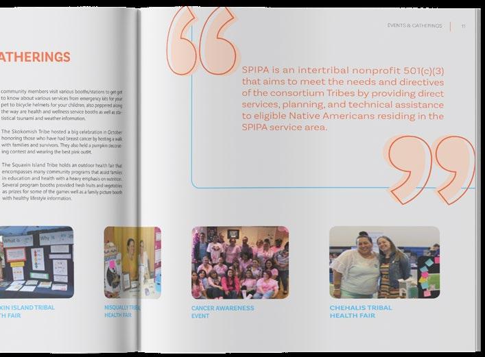
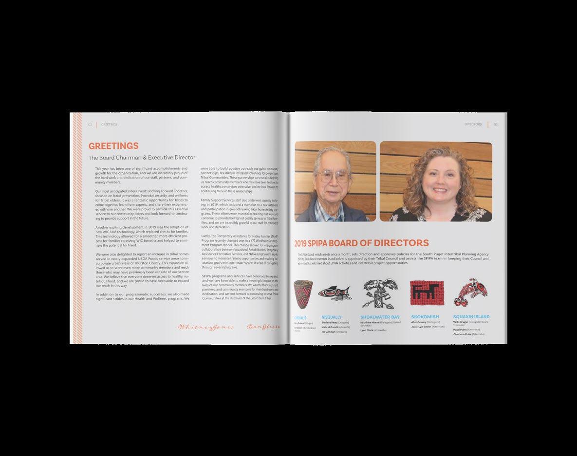
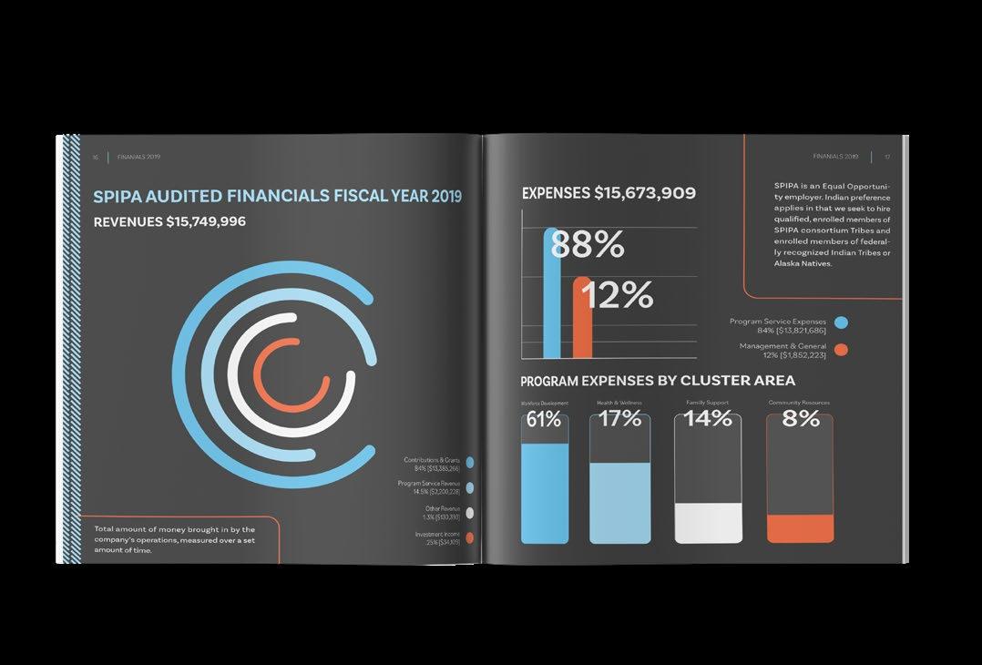
Re-designed an annual report for a company with an existing design in need of refinement. Using Adobe InDesign for layout, along with Illustrator and Photoshop to create, edit, and enhance visual assets , this project focused on delivering a brand-focused and easy-tounderstand design One of the main challenges was reimagining the report's structure while ensuring consistency with the brand’s identity and visual language The end result successfully transforms the report into a polished and engaging booklet.