


JORDAN UNIVERSITY OF SCIENCE AND TECHNOLOGY

COLLEGE OF ARCHITECTURE & DESIGN
DEPARTMENT OF DESIGN AND VISUAL COMMUNICATION
Project Title
HELPING COLOR-BLINDED PEOPLE OVERCOME DIFFICULTIES
ASSOCIATED WITH COLORS THROUGH VISUAL DESIGN AND APPLICATIONS
A Thesis Presented by:
Nour Mohammad Abdulkareem
For the submitted of a graduation project (1)
In Design and Visual Communication
(Major: Multimedia - Design as a tool to resolve problems in society)
Supervised by Dr. Laila Al Ibrahim
I would like to express my deepest gratitude to my instructors for their guidance and support throughout my academic journey. Their dedication and expertise have been instrumental in shaping me into the person I am today. Dr. Laila's guidance, encouragement, and support have been invaluable to me, and I am truly grateful for the knowledge and skills I have acquired under her mentorship. I would also like to acknowledge my father's soul, who has been a constant source of inspiration and motivation for me even though not physically present. My beloved mother for her support and love throughout my life. Her guidance and encouragement have been a constant source of inspiration for me, My friends and beloved ones, thank you for being my support system and for always being there for me. Your love and encouragement have been invaluable to me and I couldn't have made it this far without you.


The current study explores the intersection of design, augmented reality (AR), and medicine in the context of facilitating the daily lives of individuals with color blindness. Through a review of various case studies, the study examines the advantages and disadvantages of different design and technological solutions aimed at assisting color blind individuals in understanding and interpreting colors. The study finds that current applications often lack consideration for the unique needs of color blind individuals in their interface design and tend to focus on describing the perception of color for these individuals rather than facilitating their understanding of how typical individuals perceive and interpret color. Additionally, the study highlights a significant communication gap between typical and color blind individuals, which hinders the development of effective technological solutions. The study therefore recommends an awareness campaign aimed at fostering improved communication as a crucial component in the development of an AR application designed to aid color blind individuals in understanding color codes.
Key words : Vision impairement , Color vision deficiency , Visual design , Applications ,Augmented reality, color coding ,Website ,User interface.

Color blindness, often known as impaired color vision, is the inability to distinguish between certain colors. It happens when light-sensitive cells either do not perceive or do not relay color signals to the brain. Color blindness, in other terms, is a condition in which the capacity to discriminate certain hues is less than normal (Mohammadi, 2022).
Color blindness is considered to be one of the most common disorders among university students. It highly affects students’ academic performance and daily life activities and directly influences their future and the way they interact with the world around them (Mohammmadi, 2022).
The ability to distinguish between colors is extremely important, especially for industries that depend on colors, such as paints or textiles, screens, and foods. Let alone that distinguishing between colors is vital in almost every aspect of our daily lives, for example, red usually expresses danger and is used to draw attention, and green indicates safety life, and renewal. If Red-Green Color blindness cannot distinguish between these colors, color symbolism is no longer important (McLeod, 2014).
Nevertheless, designers’ efforts towards finding an effective solution to this problem are still limited. For instance, current design guidelines include having appropriate luminance contrast to guarantee that persons who cannot differentiate specific colors can still distinguish various parts of a design, such as text vs. backdrop and various levels of information on a map (Nuñez, Anderton, & Renslow, 2018).
The present study adopts a two-folded approach that takes into consideration the need to raise awareness of CVD and shed light on the struggles CVD people suffer from on a daily basis while attempting to identify design-based methods to help these people overcome these obstacles and lead a normal lifestyle.
The present project attempts to find solutions that would help colorblind people adapt to the disease by interacting with them and considering them in all areas of life, whether through design, technology, Augmented Reality, or other means.
An appealing site, with rich and updated visual design, will attract more people and can relate to them even if they are not very knowledgeable about technology, so we discovered that with the increased use of mobiles, tabs, and computers, we must use this tool in a way that increases user awareness and prepares an interactive community that benefits each other using UI, UX, and visual design.
Based on earlier studies prepared in Yemen, Damascus, and several foreign countries, it was concluded that there is a large segment of dentistry students and middle school students suffering from color blindness, which affects their academic and practical life significantly, and this makes it an important problem to consider and its consequence.
(Mohammadi, 2022) (ALhouri, 2021)The importance of the research lies in highlighting the suffering of people with color blindness and helping them to engage in society and help them receive ideas and messages in addition to understanding the meaning and purpose of using each color that is used around them, whether with warning signs or marketing advertisements and other fields, like other people with normal vision.
Due to a lack of studies and because of the importance of colors and how it affects many life aspects Especially the field of design, which is the most widespread tool in the fields of awareness, as it is the most important tool in reaching some presented ideas and because Lack of awareness of designers for not taking into account the problems of color blindness we decided to shed lights on them and help these individuals in overcoming these challenges and have a regular life. Based on what was confirmed by the research, a group of questions emerged:
-Can mobile application help in dealing with color blindness?
-Is it effective to create a cooperative platform to enhance color blindness?
-How can visual design help solve the problem?
One of the research's primary goals is to provide experiences that are accessible to all users, including individuals with Color blindness. Color Vision Deficiency can significantly impact how a user perceives information or the environment. There are already several technologies available that can be used to either aid or automate the process of color vision deficiency readability testing for digital interfaces and content.
With the spread of using smartphones and interactive platforms, we found that they should be used to raise awareness and help people with disabilities.
For the effectiveness of interactive platforms in spreading awareness and solving health and societal problems at present, according to the studies prepared by the researcher, we chose that our method to help overcome the problem of color blindness among the color blind people is an application that analyzes the colors and gives each of them its meaning to make it easier for those people to differentiate between colors and the purpose of Using it in certain places such as "danger signs", in addition to providing an interactive platform between patients with color blindness and those with normal color vision, which helps patients to get an adequate description of what normal people see as if they see colors in their natural form, and this will help them in their daily life choices, such as choosing the clothes that they will wear On an important day or when choosing food to buy and many more fields.
Visual design will help in raising awareness through awareness campaigns with different coloring styles such as color coding by using certain patterns to show contrast for color-blind people and letting normal people see what they see in their normal life.
The research will create new opportunities for researchers in the medical field such as CVD to choose the technology for dealing with such problems in addition that it will integrate designers in solving them, which confirms the relationship between design and its effectiveness in the therapeutic assistance provided by the medical sector.
The suggested Project can be one of the most successful and helpful for society, especially for people who have Color Vision Deficiency At different ages also, it will increase societal awareness through cooperation, The volunteers will be selected from the locality of normal vision people so that the help can be reached to that in need person as soon as possible with profit to the volunteer.
The present study was based upon a case study of people with color blindness and people with normal vision who simulated the experience of the affected by using virtual reality and transferred the problems they faced during the experiment.
This project is intended to be executed this project will be during the first and second semesters of the academic year 2022/2023.
The project will help people cope with color blindness and raise awareness about its obstacles worldwide, starting with Jordan.
There is a lack of studies and awareness campaigns that may help in doing the research, and most of the available solutions and proposals, according to what has been observed about their users, are classified as not serving the largest segment of people affected by the disease.
Some of the most common available techniques to deal with this problem are:
•Mobile application that translates colors.
•Enchroma glasses.
Back to the mentioned techniques after doing several studies on the application and the usability of the glasses, it was shown that the available applications are quite weak in simulating colors and giving the results for the user as written in the application feedback, on the other, hand Enchroma Glasses is a choice when the type of color blindness is Deutan or Protan which are red-green color blindness.
After covering the problems of the study, considering the importance of taking those who suffer from color blindness into account, and shedding light on the obstacles they encounter, while looking into the relative literature, multiple topics have been identified to be investigated throughout the project.
A study titled “Using Design and Graphic Design with Color Research in AI Visual Media to Convey” conducted by Liu et al. (2021), explains the use of images and color matching in visual media communication design, to improve the way visual media communication design is conducted, moving beyond traditional color matching and image application, in order to more effectively use color art in graphics and create excellent works. It was shown that according to 45.6% of respondents, optical media interfaces are frequently utilized for packaging design; 68% of respondents said that the film and television industries use them more frequently, and 49% of respondents said they are extremely satisfied with AI use of visual media in communication.
Jdaitawi & Kan’an (2021) investigated the way AR enhance students learning. Focusing on individuals with special needs, under the title of “A Decade of Research on the Effectiveness of Augmented Reality on Students with Special Disability in Higher Education.” The research has shown that AR technology has proved beneficial to pupils with disabilities. The findings also revealed that AR technology was used in settings with intellectual disabilities. Finally, the findings demonstrated that AR could help students improve their social skills, social relationships, and engagement.
Do EnChroma glasses improve color vision for colorblind subjects? was the topic of a study carried out by the researchers (Gómez-Robledo et al., 2018). The research's objective was to examine the efficacy of EnChroma glasses for its users who experience color blindness. The findings revealed that; even though the glasses change how colors are perceived, they do not help with diagnostic testing or restore more normal color vision to viewers with CVD.
Researchers (Kwang-myeong & kim, 2017) in an article titled “Mobile Application UI/UX Design of Color Conversion for Color Vision Defectives” studied how it’s not enough to focus only on the diagnosis of color vision disorder or conversation itself without sufficient understanding of color vision disorder and the usability of smart devices to generate practical and desirable outcomes when compared to various product launches.
The proposed UI/UX design principles for persons with color vision form the theoretical foundation of relevant research proved that the generated color conversion software would help people with color vision improve their quality of life.
(Kwang-myeong & kim, 2017)
After conducting several studies on color blindness and its rationale, looking at the design aspect about the topic at hand, and after conducting a case study on people who had a hypothetical experiment to simulate the disease and people who were already infected, the researcher came up with the idea of putting forward an application that helps in integrating people with color blindness in all aspects of life, practical and educational with Others with normal color vision by translating colors into special codes for each color and providing an opportunity for those with a normal color vision to discuss what their eyes see of aesthetic details with people who are color blind through an interactive platform that integrates all of them in one place.
By using Augmented Reality (AR), everything that is around the user will be simulated, an accurate description of the colors will be given for each of them, and the brightness levels will change to show the color contrast and convey the ideas that designers usually try to convey to people in general.
Color blindness is the inability to perceive differences in colors that other people can see and affects many people around the world, according to studies, a large number of dentists suffer from this disease. Color blindness can be a genetic disease as well as that it can infect people over time.(Apfelbaum et al., 2012)
2.3.1 Causes of color blindness
•Most cases of color vision insufficiency are caused by a genetic flaw handed down from parents to their children.
•It happens because some of the color-sensitive cells in the eyes, known as cones, are either missing or not operating correctly. (Gordon, Colour blindness, 1998)
2.3.2 Types of color blindness
• Monochromacy (full colors color blindness)
• Dichromacy (Dichromats can match every color they perceive using only two main hues.)
• Anomalous trichromacy (their ability to discern between hues is better than that of dichromats, but it is still not normal.)
• Red-Green color blindness (Dutan, Protan)
• Blue-yellow color blindness (Tritan, Tetartan)
(Living With Colour Vision Deficiency, 2022)
"CVD" is a changeable trait that ranges from mild color vision deficit to a complete lack of color perception in a small number of people. Approximately 75% of those with color impairment are green impaired, while the majority of those who remain are red impaired. The majority of people with red-green color blindness are men. Because of the deficiency, reds and greens are viewed as shades of yellow; thus, red-green visuals given to the public will not depict regions of distinction to these individuals. (Keene, 2015)
2.3.3 Color blindness symptoms
The primary symptom of color blindness is the inability to see colors as most people do. People who are colorblind may have difficulty seeing the distinction between the hues, their tents, and how vibrant the colors are. (NHS website, 2022)
Color blindness symptoms are frequently so faint that they go unnoticed. Many persons with color blindness are unaware of their condition since we become accustomed to how we perceive colors. People with severe color blindness may also experience other symptoms such as fast side-to-side eye movements (nystagmus) or light sensitivity. (NHS website, 2022)
2.3.4 Color blindness treatments
There is no effective treatment for inherited color blindness at the moment. Some colorblind people use colored filters and lenses that can assist them to discern between particular color combinations in certain contexts, while others might have little impact or can cause extra confusion. (Badawy et al., 2018)
Color is a strong tool for encoding and amplifying visual information in our daily lives, regardless of culture or lifestyle. It is hypothesized that abnormal color vision has a qualitative impact on people's lives and that this impact is likely to be distinctive and individualized.(Stoianov et al., 2019)
2.4.1 Color blindness in academic life
The use of colors in education is widespread, especially in the first school grades where kids are supposed to differentiate between things using colors due to their mental abilities to absorb the large amount of information directed to them in school subjects such as mathematics, science, language, and arts. (Gordon, Colour blindness, 1998)
Having color blindness may impact children’s educational system in the long term and their higher education studies in the future.
People who are colorblind will not be able to study things that they are enthusiastic about such as Aeronautic Engineering, Dentistry, and Arts. (Gordon, color blindness, 1998)
2.4.2 color blindness in daily lives
People who are color blind always face problems in their daily life activities as they can’t differentiate between danger signs and don’t understand the use of colors in things around them such as traffic Signal Color Recognition for Protan and Deutan Color-Vision Deficient People.
Dichromasy is characterized by the absence of one of the three typical receptors. As a result, their color discrimination skill is twodimensional rather than three-dimensional.
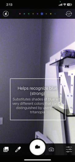
Protanopia and deuteranopia are the two types, with the former lacking the long-wavelength ("red") receptor and the latter lacking the middle-wavelength ("green") receptor. Their capacity to distinguish between a red, yellow, and yellow-green signal code based on color is lacking, and they must rely on the standard brightness hierarchy in which yellow is brighter than yellow-green, which is brighter than red. This problem is solved for them by using a bluish-green signal rather than a yellowish-green signal. (Dain & King-Smith, 1981)
As well as they face a problem when choosing their food due to their inability to differentiate between fresh and expired. (Dain & KingSmith, 1981)
2.4.3 Aesthetic Impressions
When numerous distinct hues are combined, visual impressions are significantly altered for those with CVD. When compared to persons who do not have CVD or the artist's intended audience, the overall impression of a painting or image can vary significantly. Additionally, persons with CVD may experience significant issues with the color of their clothing. This is frequently seen as one of the largest restrictions in daily living. For patients with CVD, gray clothing may have a brilliant bright hue, which could result in unintended color pairings. Additionally, patterns that don't match or are offensive are not seen as such. Even while tastes vary and fashion changes annually, some pairings can never provide a pleasing outcome.
(Liu et al., 2021)Color has symbolic meaning, beyond merely visual perception, humans categorize colors into verbal and nonverbal semantic categories at higher degrees of abstraction. (Jahanian et al., 2017)
2.5.1 Color cognition
Humans categorize colors into several more abstract categories. Color cognition is the study of the linguistic and semantic categories connected to colors.(Jahanian et al., 2017)
When identifying colors people always connect them with physical things or emotions, for example when identifying a color as “red” it can be also described as “warm” or even more abstractly as “romantic”. The enormity of the relationship between color and meaning and its crosscultural variation has spawned an entire field of research in color naming, emotional meanings of colors, and visual communication design.(Jahanian et al., 2017)
2.5.2 Colors in visual design
The more widely used visual design information, the more significant its state of development. Color and image are the two key components of visual communication design. These two elements have a significant impact and have the power to grab the public's attention. (Liu et al., 2021)
Without the use of colors and images, visual communication cannot be designed. A visual media design's three key components are color, graphics, and text. We won't undervalue the significance of color in the creation of optical media. The goal of visual communication design is to increase consumer interest in products by enhancing their visual appeal and creative potential. (Liu et al., 2021)
Based on previous research people who have color vision deficiency will not be able to receive these messages and get the needed potential.
2.5.3 Tactile representation of colors
Tactile color patterns (TCP) are embossed surface designs that can be touched to transmit color information to PVI. TCPs may be useful because they can be combined with other tactile modalities, such as information about contours or the borders of objects in the artwork. By focusing on the artwork relief pattern, they provide instant color perception.
(Jabbar et al., 2021)
2.5.4 Colors contrast for CVD people
According to a study done by (Ilhan et al., 2019)color blinded people have difficulty When a person has a certain type of color blindness, such as red-green blindness, they may have trouble recognizing the color contrast of the objects around them or may even see them as being one color. According to what the researcher has examined, individuals who have it see the two colors as one color, even though the two colors differ slightly for those with sound vision. It is vital for improving the contrast between the shades of one color and the brightness of each one individually so that color-blind viewers can distinguish between the various color shades to present the image in its most appealing form.
Most humans on the earth about one billion people have disabilities. A disability that might include problems in vision, hearing, or mobility, and affects 36 million Americans, or 12% of the total population [Disabled World (2011)]. The invention of the cell phone has given many people with disabilities numerous options for growth.(Flatla et al., 2015)
2.6.1 Usefulness of technology for disabilities
The goal of tangible mobile applications is to make it possible to interact between the real world and the digital world without the need for conventional input-output devices like a mouse, keyboard, and monitor. (Ullmer & Ishii, 2000). Users get one step closer to the real world when engagement is achieved through physical motions rather than pressing the keyboard (Jacob et al., 2008).
People with disabilities have access to a variety of multisensory interactional options because of tangible technology. Additionally, by offering chances in the cognitive, social, and linguistic domains, a tangible mobile device offers a richer learning environment for the special education domain than a conventional graphical user interface system. (Polat et al., 2019)
In three consecutive sessions, participant DS completed 6%, 33%, and 22% correctly according to baseline sessions of the pilot project (Polat et al., 2019). The participant had a 44% correct response rate in the initial probe session following the first intervention session. She successfully met the predefined criterion following the third intervention session,In addition, IG gave correct answers in 28%, 33%, and 28% of the sessions.
The usability of smartphone apps has grown to be a major concern, however, current UIs are unsatisfactory due to trade-offs with application developers. According to the Nielsen Norman group's 2009 usability research of mobile phone Apps, 3 usability problems were found, including efficiency, screen size, and text input. Overall, 59% of tasks were completed. The desired tasks should be mapped with a user's mental model in order to make the mobile interface as usable as possible. As a result, the AUIs can be directly applied to raise user pleasure and usability. Despite this, many apps have usability problems because of their out-of-context user interfaces.(Waseem Iqbal et al., n.d.)
2.6.2 UI, UX, and color blindness
Users who are color-blind encounter numerous difficulties when using mobile devices. For various categories of color-blind users, the mobile OS offers static color-blind color schemes that must be messianically modified. To implement an adaptive interface system with senses of the type of colorblindness and switches to the appropriate color-blind mode, a research application is developed. Experimental usability testing is used to assess this adaptive environment evaluation ion's criteria including user task effectiveness, efficiency, and satisfaction.
According to the findings, the color-blind modes offered may improve usability and user happiness, but a slight improvement in effectiveness and efficiency may be made. Additionally, it is discovered that in both adaptive and non-adaptive environments, simply switching to the appropriate mode cannot make much of a difference. Until adequate adaptive interfaces for particular people are created through user centered design (UCD).(Waseem Iqbal et al., n.d.)
2.6.3 Tactile Interface for colorblind
People with visual impairments (PVI) “color blindness” can interact more deeply and abstractly with works of art and everyday things using tactile perception. And they now have more opportunities to enjoy visual arts because of the development of tactile and multisensory assistive devices. (Jabbar et al., 2021)
2.6.4 Adaptive interface in IOS and Android
Mobile phones have developed into indispensable tools that are routinely utilized to satisfy the needs of users based on their req- uirements. To accommodate color-blind individuals, the Android (Google) and iPhone (Apple) operating systems currently integrate Color Vision Deficiency (CVD) functionalities.
However, the user interface (UI) of many apps continues to have usability issues related to complexity and adaptability. (Waseem Iqbal et al., n.d.)
Inherited color vision impairment is currently incurable; however, most people can live with it over time.
2.7.1 medical solutions
According to a study titled “Gene therapy in color vision deficiency” conducted by (el Moussawi et al., 2021) on animals and humans, gene therapy is something possible to be done in the future by delivering the genes via intravitreal rather than subretinal injections to be safer.
However, up until today, these remedies have not been addressed, and there is still no effective treatment for color blindness based on the latest research.
2.7.2 Color correctors
• EnChroma Glasses
EnChroma creates optical lens technology that selectively blocks certain light wavelengths at the location where there is an excessive overlap or confusion of color sensitivity. The M and L cones are changed in such a way that along the so-called "confusion line," color discrimination is more different for that person. (How EnChroma Glasses Work, 2022)
EnChroma glasses are made to help persons with anomalous trichromacy, which accounts for four out of every five cases of color blindness and is thought to affect four out of five people. Protanomaly and Deuteranomaly, two forms of partial red-green color blindness, are the most prevalent varieties. (How EnChroma Glasses Work, 2022)
• Contact Lenses
Based on(Elsherif et al., 2021) research The created contact lenses are contrasted with readily available color-blind eyewear. The Ishihara test is used to evaluate contact lenses in patients with color vision deficiencies. Participants report that a colorful atmosphere improves the colors’ visibility and contrast.
In comparison to commercial color-blind spectacles, the proposed contact lenses exhibit improved results indoors and attain comparable results outdoors. (Elsherif et al., 2021)
2.7.3 Mobile Applications
An interface known as Color Find from Golden Shores technologies LLC features a single camera view, a quit button, and a short line that outputs the color name of the focal point of the camera view. Additionally, Mobiala.com offers a color detector that, once the screen has been clicked, enables a color presentation in several modalities at the center of the camera view. NGHS.fr offers yet another interface for color blindness correction. Different user interfaces give a diversity of aspects, but they do not improve comprehension or usability.(Schmitt et al., 2012)
A real-time direct or indirect view of a physical, real-world environment that has been improved or supplemented by the addition of virtual, computer-generated information is known as augmented reality (AR).(Carmigniani et al., 2011)
2.8.1 Augmented reality in Education
Utilizing AR technology has revealed a variety of benefits in several fields. However, more investigation is required to precisely understand how AR improves kids' learning. Since a few years ago, augmented reality (AR) has been employed in higher education to improve the physical, cognitive, personal, and social abilities of students with special needs. This systematic review focused on research indexed in 8 worldwide databases and provided an overview of the application of augmented reality (AR) technology in the special needs field in higher education literature published between 2011 and 2020. For the review, 36 studies were included. The findings suggest that most studies had successful outcomes because augmented reality technology worked well for children with disabilities.(Jdaitawi
& Kan’an, 2022)
Color blindness is a visual disability that affects many people, and due to that several technologies and awareness campaigns have been developed to assist them in adapting and controlling it. Here are several examples:
3.1.1 Project Brief
Color Blind Pal is an application that was founded in 2015 and it allows colorblind users, to see the colors around them. It also allows people with normal eyesight to experience what it is like to be colorblind.
(App Store, 2015)
Application timeline and target audience
The application took 7 months to be published and targeted color-blind youth and the elderly as well as non-color-blind people to be aware of CVD.
Color Blind Pal’s mission: help colorblind people to distinguish colors around them.
Vision: a place where colorblind people don’t struggle to know the colors around them without needing any help from others.
3.1.2 Project outcomes
Color Blind Pal allows users to perform the following:
•Determine the exact meaning of any hue.
•Understand any color-coded map, chart, or graph.
•Pass a color vision test Color Blind Pal is packed with capabilities to ensure that users don’t need help. (App Store, 2015)
•Color Inspector with the following features:
1.Select from a variety of color names, including common names, scientific names, and colloquial names (like "beige")
2.View the hue, saturation, and value of the color, as well as the actual RGB color code
3.Freeze the camera and examine the various hues in the image.
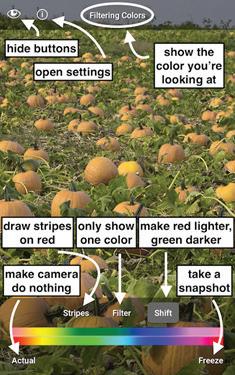
•Color Filter also has the following features:
1.Highlight a specific color
2.Choose a color by tapping it or dragging the color spectrum slider.
3.Draw a striped pattern of overall reddish colors to identify what color anything is without changing the colors.
4.Freeze the camera and experiment with various filters to obtain an accurate idea of what the image looks like.
5.Hide all the buttons on the screen so that the user gadget becomes a gateway through which the user may see the world in more vibrant colors.
Application Logo
They used an eye with a flower behind it to achieve the project's goal of allowing persons with color blindness to see the colors around them, the colorful flower surrounding the black and white eyes to represent them. (App Store, 2015)
Logo colors
The designer used primary and secondary colors with black and white. (Figure 3.1)
1. Logo Meaning and Colors
They used primary and secondary colors in the back of the eye to represent all colorblindness types. And representing what the application offers to incorporate people with color blindness and enable them to recognize the colors around them, the logo's composition was circular, including a colorful flower, containing the black and white eye. (Figure 3.1)
2. Typeface
They used the Helvetica typeface for the data in the application which is Sanserif font to be easier to understand for users and it gave the app a formal sense
App UI
The designer tends to use simple design for the user interface by using minimal icons and color sliders with the default device camera.(Figure 3.2)
App UX
The user experience relies around on specifying the object which color the user wants to know via the phone's camera and then selecting the shade of color the user wants to know. (Figure 3.3)

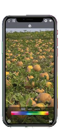
The used symbols, colors, and flow were simple and easy to understand the color of the icons was white on a background of grey shades as well as they were classic icons with known symbolism. (Figure 3.3)
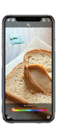 Figure 3.2 user interface
Figure 3.3 User Experience
Figure 3.2 user interface
Figure 3.3 User Experience
The application contributed to helping a good number of people with color blindness, but the user interface suffers from many problems. People with Monochromacy type of color blindness will not be able to differentiate between the application’s space and what their eyes see, because everything appears to them in black and white in addition to the complexity of the contents, it is not easy to know the distribution of application settings and the categories it contains. (Figure 3.4)

Concerning the logo of the application, the researcher believes that it did not achieve the desired idea for people with color blindness, and the color contrast between the elements of the logo was not properly considered.
Based on the connection between the examined case and the researcher's project, Color contrast between application elements and the logo will be considered based on color blindness cases.
The researcher found that color Blind Pal helps people with color vision deficiency to distinguish colors around them simply in a basic way but based on given feedback it still suffers from its inability to give the true color of things and doesn’t work from distance, as well as the pattern used to distinguish between elements and its brightness is white and very thin, it does not accurately achieve what it was found for. (Figure 3.4)


 Figure 3.5Feedback
3.2.1 Project Brief and design process
It is an application designed by Martin Douděra that allows users to see their surroundings through a filter designed specifically for their form of color blindness.
And it allows people to notice elements they may not have noticed previously.
NowYouSee assists persons who are colorblind in any way and everyone else in understanding their daily struggles. In addition to the zoom feature, it can be used by people who suffer from blurred vision to read and see small texts and far objects.
Application timeline and target audience
The application was published in 2016 and it took nearly one year to design and develop and targeted color-blind youth and the elderly. (App Store, 2016)

Mission: is to assist colorblind people in distinguishing colors in their surroundings and help in figuring out if the user is color blind and the type of it.
(App Store, 2016)
Vision: an application that helps colorblind people in their daily lives.
3.2.2 Project outcomes
The application includes a color detector that helps in distinguishing shades of colors as well as the ability to change color filters to discover more amount of colors.
Application logo
The logo is a circulated iris symbol to represent an application designed for the eye and it is colored with gradient colors.
(Figure 3.5))
1. Logo meaning and colors
The logo is basically an eye Iris colored with four colors on the back of a black pupil and it is built on a circular grid to give a sense of closure, so the symbols remain clear. The colors chosen for the logo represent health and cure colors:
•Blue is peaceful and comforting, and it represents positivity and healing. Bright blues convey feelings of loyalty, trust, security, and dependable authority.
•Green represents health and safety.
•Purple is one of the three secondary colors. It's neither cool nor warm, like a mix of blue and red. Purple exemplifies the harmony of blue's tranquility and red's excitation. And it represents bravery and value. (Bruna, 2022b)
2. Typeface
The used Calibri sanserif font is easy to read font however, the design's rounded features lend it a slightly modern appearance
App UI
It is an application connected to the phone camera and used default camera layout settings with different easy to understand symbols and buttons. (Figure 3.6)
App UX
The user can swipe left and right to cycle through a range of color filters that help distinguish between different hues. There's also a color recognition tool that can tell the user what color they're aiming the app towards and a color-blind test if they're wondering about their vision.

(Figure 3. 7)
The icons' hue was white on a black background, and they were classic icons with well-known symbolism, the user flow is easy to understand, and it looks like the default phone camera
Figure3.6 NowYouSee App UI Figure 3.7 NowYouSee app UXThe application helped many people with color blindness; however, the user interface suffers from some problems. The text appears on the screen while taking a photo which makes it hard to read the popped message when changing the color filter. As well People with Red-Green colorblindness mentioned that the filter which conveys their case is not working in the way it should be and gives wrong information. (Figure 3.8)
And it provides the ability to detect the main colors only, so it cannot give the users accurate information about the color gradations of the things around them for free.
The researcher believes that the application's logo did not achieve the desired idea for persons who are colorblind and that the color contrast between the elements of the logo was not appropriately considered.
NowYouSee App helped people in discovering colors around them but based on what the researcher found, the problem of red-green color blindness was not addressed in the right way, as they both appear in the same form on the application, and this leads to giving the wrong information about both for users, whether he is color blind or not.
3.3.1 Project Brief
Color Blind Awareness is a Corporation of Community Interest (non-profit) founded in 2010 to raise community awareness of the problems of colorblind persons.
The creation of this website was to be a resource for other parents who may suspect their child is colorblind or who have just had their child diagnosed and are unsure what this means or how to help their child, the website now includes a lot of information for parents and instructors.
Website timeline and target audience
The website targeted parents and the school’s com-

Mission: raising awareness of the needs of color-blind people in the community.
Vision: A society that considers people with color blindness and applies methodologies that help them adapt, especially in the educational field.
3.3.2 Project outcomes
•They were able to persuade both the Department of Education and the Government Equalities Office in 2016 that color blindness is a Special Educational Need and a disability. They were also honored to be a member of the Council for Disabled Children's Council.
• In 2016, they litigated the BBC, and the BBC Trust ruled in their favor, asking the BBC to do more in the future to guarantee its content is color blind 'friendly.'
•They operate a variety of projects to increase awareness of color vision differences. (About Us, 2022)
Logo meaning
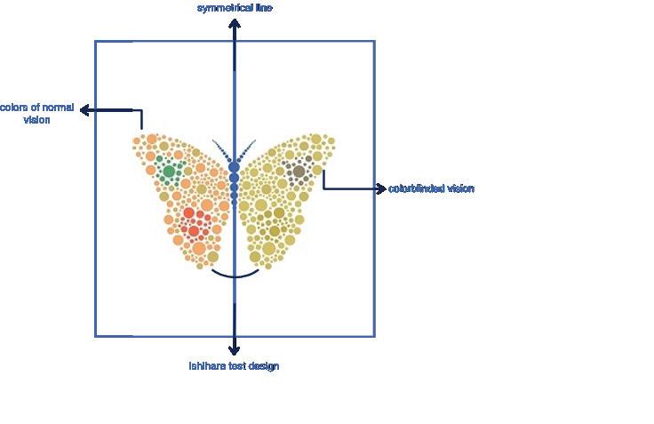
The logo is in a butterfly shape made of the Ishihara test design style which is a color vision test for the detection of red-green color blindness. (Figure 3.10)

Logo anatomy and colors
The colors used in the logo design were colors that represent the red-green color blindness vision and the meaning behind the colors are:
Orange: Orange is a vibrant color. It evokes change, movement, and transformation, and its existence in nature sunsets, vegetables, and fire confirms this concept. (Bruna, 2022)
Green: represent health and safety.
Red: It's an intense color that demands our attention and forces us to examine our physical requirements and survival instincts. (Bruna, 2022)
Yellow: It has an inspiring core, is entertaining, and has a level of innocence that resonates powerfully with children. (Bruna, 2022)
Blue: is peaceful and comforting, and it represents positivity and healing. Bright blues convey feelings of loyalty, trust, security, and dependable authority. (Bruna, 2022)
Typeface
Core Sans D is a postmodern take on a condensed sans-serif typeface.
It has a simplified geometric construction and a large x-height to improve legibility. The family is suitable for advertising, headlines, and body text. (Figure 3.12)

Website UI
They used white and blue colors for the entire user interface and preferred text among symbolized clickable buttons as well as many picture fields to communicate visually with the audience. (Figure 3.13)
The website contained a slider containing the information provided by the website, along with the space in which that information appears, in addition to related subheadings at the end of the page. (Figure 3.13)
The design was user-friendly, the colors chosen are blue and white as well as the comfortable white spaces around the website content were well arranged, examining the interactive part of the website they used clickable text instead of buttons to make it clearer for the users and get their messages directly. (Figure 3.14)
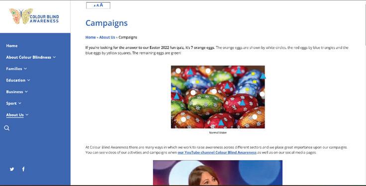 Figure 3.13 website UI, UX
Website UI
Use of blue for the user interface
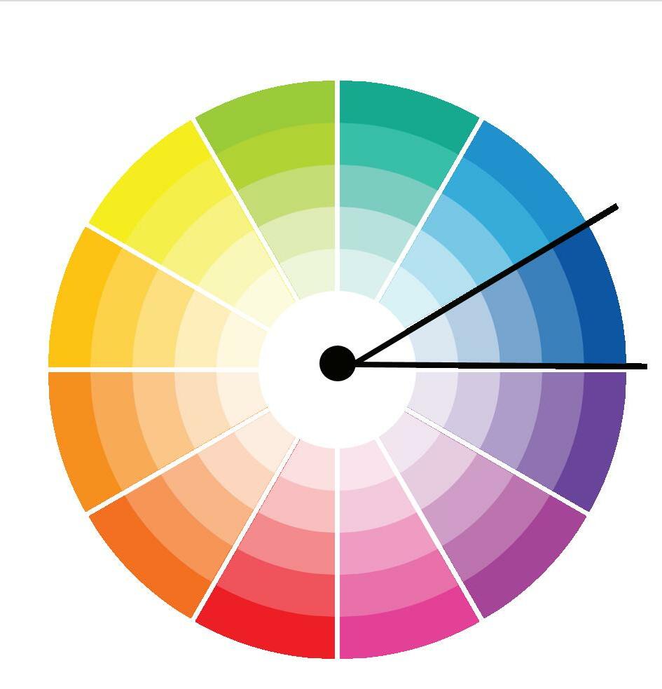
Blue and its various hues blend harmoniously with virtually every other color in the color wheel. Blue can be a terrific choice to tie the other colors together in web design, where you should keep your color palette to a maximum of three. This implies that you can still utilize blue in your website design even if your logo is not blue.
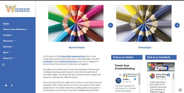
Blue is a hue that represents optimism. People are more likely to feel elevated and positive about the future when they encounter specific blue hues. Compared to the deeper blues that conjure reliability, this shade of blue is typically lighter or brighter. People who feel positive about the goods and services offered on a website are more inclined to interact with it or sign up for something.
(Advantages of Using Blue in Your Web Design – Pumpkin Web Design Manchester, 2019)
Website UX
The user flow layout is easy and simple everything is identified and understandable, despite that there is too much text to read in each tab which makes it more informative than an interactive website. (Figure 3.15)

First poster: in this poster they wanted to show how colorblind people’s vision looks like in the sports field.

Second poster: in this poster, they are trying to simplify the colors of the eggs for colorblind people, so they used the shown symbols to make it simple for them to recognize colors the orange eggs are represented by white circles, red eggs by blue triangles, and blue eggs by yellow squares. The rest of the eggs are green.
 Figure 3.17 easter poster symbols
3.3.4 Discussion
Based on the outcomes researcher found that the website had raised awareness about colorblindness very well by including all the information needed about it in well-arranged titles and videos despite the weakness of the designs used to identify it visually in addition to the logo and user experience design.
The researcher believes that the website has a real problem connected to the vast quantity of displayed texts, which causes visitors confusion and chaos for the website users. (Figure 3.19)
Motion graphic video screens: the video explains the types of colorblindness compared to normal vision using a Christmas tree and Ishihara test style in the background. (Figure 3.18)
 Figure 3.18 screens from motion graphic videos
The researcher will rely on the material supplied by the site on the issue in his study, which also wants to raise awareness about color blindness, taking into account the reduction of writings and information on one page in order to maximize the benefit as much as feasible.
 Figure 3.19 website problem
The color blindness awareness campaign helped raise awareness about colorblindness despite the design problems they had, it helped to enhance public knowledge of the same problem. Because there will be no adjustments to benefit persons with color vision problems until the public raises their awareness.
3.4.1 Project Brief
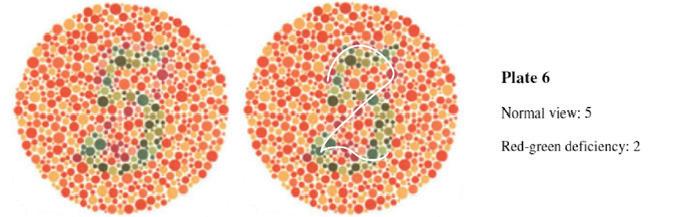
Ishihara test is a color vision test used to detect impairments in red-green color vision. It was named after its creator, Shinobu Ishihara, a University of Tokyo professor who first published his experiments in 1917.
(Handaya, Tokyo, Hongo Harukicho,1917)
Project target audience
The project targeted Ophthalmologists to help them in Diagnosing cases of color blindness and it is recently public for all people so they can figure out if they are colorblind by themselves. (Handaya, Tokyo, Hongo Harukicho,1917)


Mission: Diagnosing cases of red-green color blindness.
Vision: Facilitating the process of diagnosing people with color blindness and helping everyone discover it.
3.4.2 Project outcomes
Ishihara test had many designs and colors
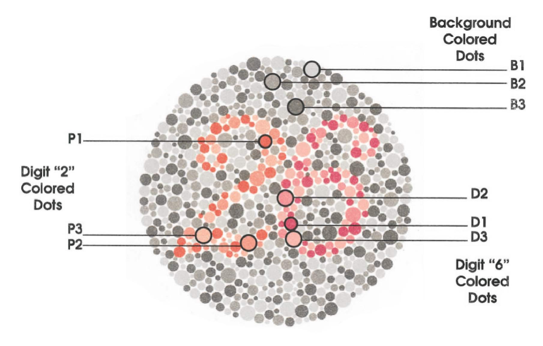
•Demonstration plates: meant to be viewable by all people, whether they have normal or poor color vision. For demonstration reasons only, and generally not included in the calculation of a screening score.
•Transformation plates: Individuals with color vision defects should perceive a different figure than those with normal color vision.
•Diagnostic plates: meant to assess the type and degree of a color vision deficiency (protanopia or deuteranopia).
•Tracing plates: Subjects are instructed to draw a visual line across the plate instead of reading a number.
(Birch, 1997)
•Vanishing plates: Only those with normal color vision could figure out the color plates.
•Hidden digit plates: Only people with color blindness could recognize the figure
The Ishihara test is the recent technique used to detect colorblindness and it helped in raising awareness among those who didn’t know they are colorblind and don’t know about the disability.
colors
The colors used in this test varied depending on the type of color blindness to be detected and whether it was existent or not, but they all contained a color with a high degree of brightness and contrast and a slightly lighter color until we reached the lighter degree, allowing them to accurately diagnose the visual color disability.
(Lee & Honson, 2003) (Figure 3.20)
Colors used based on triadic and complementary color theory to give different results for people with normal color vision and the colorblind.(Lee & Honson, 2003) (Figure 3.21
Figure 3.20 Color gradationsIshihara pallets
There are many colors used in the Ishihara tests so it can detect as many types of color blindness as possible, which were previously mentioned.

Typeface
The designer used a curved typeface to the centered numbers or letters written on the color palette so it can be merged with the circles in the background and not easy to identify. (Figure 3.23
 (Figure 3.22)(Birch, 1997)
Figure 3.22 Ishihara pallets
(Figure 3.22)(Birch, 1997)
Figure 3.22 Ishihara pallets
The researcher found that the designer of the Ishihara test used numbers in his pallets because the numbers are basic, easy to recognize, and symbolic, and they do not include many features such as pictures, and the numbers are recognized by many people all over the world, and they are not like letters, which vary from place to place and might be difficult to differentiate.
(Figure
 Figure 3.24 portrait Ishihara test
3.4.5 Discussion
The Ishihara test is a rapid and simple screening method for identifying people with red-green CVD. However, its capacity to categorize CVD and assess its severity is constrained.
The researcher validated some prior findings that test plates differed greatly in their ability to identify faulty color vision during an assessment of color blindness in psychiatric patients. Some of the plates were rather untrustworthy in this regard. The degree of unreliability increases with the age. Furthermore, it was discovered that when captured on black and white panchromatic film emulsion in regular daylight, the untrustworthy plates revealed their secret number. The plates were then re-shot using a specialized correction filter and a fast, panchromatic, black-and-white film emulsion (Kodakplus X) under tungsten illumination (Kodak Wratten Eleven). (Birch, 1997)
It is clear from this that, at least in some plates, relative differences in the reflected luminance (also known as brightness contrast) play a significant part in making the "hidden numerical" visible to the human eye in addition to the color disparities on the mosaics of the plates. This observation deserves reporting since it is very intriguing and possibly significant, and because the author could locate no prior reference to it. (Birch, 1997)
To attain the best level of accuracy in color discrimination, the researcher will base his project on the prior case study and consider the color contrast and brightness of the colors.
Over the years, the test demonstrated its capacity to identify many cases of color blindness, but the issues with color contrast and brightness levels that were noted made it less accurate in identifying all cases. To improve the accuracy of the proper diagnosis, the researcher advises that this issue be addressed by boosting the brightness and color contrast of the color dots.
3.5.1 Project Brief
An application that is designed to simulate colorblindness vision for people with normal color vision and to help the colorblind discover the colors around them by using mobile cameras or the filter of the device.
Application timeline and target audience
The application took nearly 8 months to be published and targeted colorblind people and the community to raise their awareness.
Mission: raising awareness of the vision of color-blind people in the community and helping those with disability.
Vision: an application that helps people around the world understand the vision of color blindness and consider them in their daily lives.
3.5.2 Project outcomes
Sim Daltonism app allows users to perform the following:
•Determine the exact meaning of any hue in the eye of the color blind.
•Connect things that have the same colors by emoji color code.
•Understand the difference between colorblindness types.
It is also packed with color filters to ensure that users simulate the real vision of each type.
•Color Filter has the following features:
1.Color blind type color changer
2.Description of the color and how it will look like
Sim Daltonism app has proven its worth in achieving a portion of its objectives based on the feedback presented by users and has raised awareness about the vision of color-blind people for its users.
Many aspects have contributed to their understanding of the application and dealing with it as the following:
Logo meaning
The application logo was a flower illustration colored orange and green with another dark yellow flower illustration.
(Figure 3.25)
The flower symbolizes the beauty of nature and its colors, and the dark yellow part indicates colorblind people. The philosophy of the chosen colors is:
Orange: Orange is a vibrant color. It evokes change, movement, and transformation, and its existence in nature sunsets, vegetables, and fire confirms this concept. (Bruna, 2022)
Green: represent health and safety. (Bruna, 2022)
Application UI
The application uses the phone camera and utilizes the default camera layout design with simple extra icons and buttons.
It also includes a page that defines colors and how they are related to everything around us, as well as a slider to adjust the type of simulated color blindness. (Figure 3.25)
The colors used in the application were white, orange, and black for the texts as well as it supports the dark mode feature.

Use of colors in the user interface
Colors have a big influence on how we see a solution. The correct tones have gained their meaning in every culture. They are also linked to our emotions.
Based on that the reason for chosen colors was:
White: it expresses freshness, modernity, and purity, as well as white spaces, are always a requirement in UI design because it eliminates any distractions and allows the user to focus on the content. Text with margins has been proven to be more legible, and consumers can have a better grasp of the information. (Rajput, 2022)
Orange: Orange mixes the former's enthusiasm with the latter's cheerfulness. However, it has a great contrast with white and black. (UI Design in Practice: Colors, 2020)
Black text: The study discovered that low-vision people who are not blind read text better with pure black font or white text on a black backdrop. As a result, utilizing black text for the application to boost accessibility. (Why You Should Never Use Pure Black for Text or Backgrounds, 2015)
Application UX

The application was user-friendly due to its simple user flow, it worked like a screen filter that didn’t have an actual camera use so users couldn’t capture a photo with it, it just simulate colors through the camera lens. (Figure 3.27/3.28)
 Figure 3.27 Application wireframe
Figure 3.28 app user flow
Figure 3.27 Application wireframe
Figure 3.28 app user flow
3.5.4 Discussion
Based on the outcomes researcher found that the application had raised awareness about colorblindness by color simulating very well.
However, the application had a real problem describing colors for people with color blindness because it used symbols from nature to link colors with them, which is a problem because the symbols used differ in their colors in the usual manner according to their types, and the color-blind person never knew the real colors of those symbols. (Figure 3.29)
Based on the connection between the examined case and the researcher's project, he will examine how the colors will be converted into symbols so that they are understood by all users and raise the project's accuracy level.
 Figure 3.29 colors symbols
The Sim Daltonism App assisted people in discovering colors around them and raising their awareness in the eyes of colorblind people, but according to the researcher, the color code representation did not help color-blind people to connect colors to things around them in the right way, as their colors are not usually the same in daily life and they don't know the actual color of these things. And this causes confusion for colorblind users.
As well as that the colors used in the application logo icon didn’t describe any type of colorblindness types and were not accurate enough to it.
To enhance the application's accuracy for colorblind users, the researcher recommends that this issue be solved by adopting another method to allow them to relate colors to items around them as real code or a color description rather than emojis.
After discussing the study's challenges and the necessity of including individuals who suffer from color blindness and shedding light on their struggles, the researcher decided to consider them in his project and came up with a proposal to integrate them into society and help them in their everyday lives.
The project aims to help color-blind people in their daily life struggles and raise awareness about their problems as well as offer visual experiences that are accessible to all users, including those who are colorblind by designing an interactive mobile application that integrates them into society and help them with distinguishing colors around them by using social platforms and augmented reality color coding.
4.2.1 Who is the target audience?
It addresses color-blind people as well as those with the normal color vision of different age groups from youth to the elderly.
4.2.2 What are the things that will be provided for them?
- Mobile application that contains:
1.A social platform that brings together people with color blindness and those with normal color vision.
2.Color coding feature.
3.Color inverter lens.
4.Augmented reality simulator.
5.Color description.
- Website
1.Social platform.
2.Color coding feature.
3.Color Description.
- Awareness campaign
1.Billboards
2.Posters
3.Social media posts
4.Awareness videos
4.2.3 Where and for whom the project is based?
The project targeted the world in general and particularly the Middle East and other less fortunate parts of the world.
And it will be in essential aspects of such regions using different ways, such as:
1.Crowded highways via billboards.
2.Gathering places such as malls and marketplaces.
3.The application and website will be available to everyone at any. time and from any location.
4.Newspaper and brochures.
4.2.4 When is the right time to implement the project?
The years 2022-2023 preceding September Color Blindness Awareness Month for the awareness campaign. And there will be no limited time for the application and website usability.
4.2.5 Why was this project chosen?
This project was chosen due to the daily suffering of individuals with color blindness and the lack of information about the disability, its presence, and how to deal with it.
4.2.6 How will the awareness campaign work?
The awareness campaign will be using billboards, newspapers, brochures, motion graphic videos, and real-life cinematic videos.


There are many reasons for choosing prism as a name and symbol for an application and an awareness campaign addressing color blindness and here are several key components.
First and foremost, it would likely place a strong emphasis on the importance of understanding the experiences and needs of individuals with color blindness. This could involve gathering insights from those with the condition, as well as collaborating with researchers and clinicians who have expertise in this area.
Another key component of this it might be a focus on the use of innovative and cutting-edge technology to address color blindness. In particular, the use of prisms as a means of correcting or improving color perception could be a central focus of this research. This could involve exploring the potential benefits and limitations of different prism designs and configurations, as well as examining how these prisms might be integrated into everyday life for those with color blindness.
Finally, this research philosophy might also emphasize the importance of rigorously, understanding the effectiveness of a prism in reflecting the problems of color-blind people in how the seven colors that are reflected from the prism cannot be fully seen by them.

Monochromatic color theory Monochromatic color schemes use variations of a single color to create a cohesive and harmonious look, and can be effective for creating a calming atmosphere, drawing attention to a specific element, creating a cohesive look, and giving a design a professional appearance. Monochromatic color schemes can be especially effective when combined with other design principles like balance, contrast, and hierarchy.
Blue is a popular color that is often used in design projects. It is often associated with calmness, tran- quility, and trustworthiness
Dont rotate the logo
Dont add any color
Dont Change logo margins
Dont drop shadow
Dont distort the logo
Dont change the typeface
Dont change the proportion
Dont remove any part of the logo
 Figure 5.12 (Logo Donts)


In conclusion, the objective of this research was to aid individuals who are color blind in overcoming the difficulties related to colors. The study aimed to develop an awareness campaign and an application that creates color coding for color blind individuals, with the objective of taking their needs into account while designing and to help them gain a better understanding of colors.
The results of the research indicated that color blindness can pose substantial challenges for individuals in their daily lives, particularly in the realm of visual design and color recognition.
The research findings revealed that creating a color coding system that is specifically tailored to the needs of color blind individuals and utilizing accessible visual designs can significantly enhance their experience and understanding of colors.
It is recommended that designers and the general public be sensitized on the issue of color blindness and the importance of considering the needs of color blind individuals in visual design. Further, implementing color coding systems and awareness campaigns can raise awareness and understanding of color blindness, thereby improving the daily lives of those affected.
1- Awareness Campaigns: Design and implement comprehensive awareness campaigns to educate the general public about color blindness and the difficulties associated with it. These campaigns should focus on raising awareness about the importance of taking color blindness into account when designing visual aids, websites, and other digital interfaces.
2-Design Guidelines: Develop design guidelines for digital interfaces and visual aids that take into account the needs of color-blind individuals. These guidelines should include recommendations for color choices, color contrast, and the use of symbols and patterns.
3-Collaboration with Designers and Developers: Encourage collaboration between designers and developers to create solutions that are accessible and usable by color-blind individuals. This can be done through workshops, conferences, and other educational events.
4-User Testing: Conduct user testing with color-blind individuals to ensure that the solutions designed and implemented are effective in helping them overcome the difficulties associated with color blindness. This will also provide valuable feedback for improving the solutions in the future.
1. ALhouri, C. (2021). Study of Prevalence of Color Blindness among Dental Students at Damascus University. Damascus University Journal for health sciences, 1-2
2. Apfelbaum, E. P., Norton, M. I., & Sommers, S. R. (2012). Racial Color Blindness: Emergence, Practice, and Implications. Current Directions in Psychological Science, 21(3), 205–209
3.bates, D. h. (2008). Better Eyesight Without eyeglasses . new delhi : orient paperbacks.
4. Badawy, A. R., Hassan, M. U., Elsherif, M., Ahmed, Z., Yetisen, A. K., & Butt, H. (2018). Contact Lenses for Color Blindness. Advanced Healthcare Materials, 7(12). https://doi.org/10.1002/adhm.201800152
5.Gordon, N. (1998). Colour blindness. public health, 86-90.
6.Gordon, N. (1998). color blindness. Public Health, 81-84.
7. https://doi.org/10.1177/0963721411434980
9. Keene, D. R. (2015). Microscopy and Microanalysis. Cambridge University, 279 - 289.
10. Kwang-myeong, J., & kim, h. (2017). A Study on Mobile Application UI/UX Design of Color Conversion for the Color Vision Defectives. Journal of the Korean Society of Design and Culture, 669 - 682
11. McLeod, R. N. (2014). A PROOF OF CONCEPT FOR CROWDSOURCING COLOR PERCEPTION EXPERIMENTS. Optom Open Access, an open access journal, 1-3.
12. Mohammadi, M. (2022). Prevalence of Color Blindness in Iranian Students: AMeta-analysis. Journal of Ophthalmic & Vision Research, 413-420
13. Nuñez, J. R., Anderton, C. R., & Renslow, R. S. (2018). Optimizing colormaps with consideration for color vision deficiency to enable accurate interpretation of scientific data. PLOS ONE, 1-4
14. Szczurowski, k., & smith, m. (2018). Emulating Perceptual Experience of Color Vision Deficiency with Virtual Reality. Institute of Technology Blanchardstown., 1-2.
15. Schmitt, S., Stein, S., Hampe, F., & Paulus, D. (2012). Mobile services supporting color vision deficiency. Proceedings of the International Conference on Optimisation of Electrical and Electronic Equipment, OPTIM. https://doi.org/10.1109/OPTIM.2012.6231860
16. https://doi.org/10.1007/s11042-010-0660-6 el Moussawi, Z., Boueiri, M., & Al-Haddad, C. (2021). Gene therapy in color vision deficiency: a review. In International Ophthalmology (Vol. 41, Issue 5, pp. 1917–1927). Springer Science and Business Media
B.V. https://doi.org/10.1007/s10792-021-01717-0
17. Elsherif, M., Salih, A. E., Yetisen, A. K., & Butt, H. (2021). Contact Lenses for Color Vision Deficiency. Advanced Materials Technologies, 6(1). https://doi.org/10.1002/admt.202000797
18. Flatla, D. R., Andrade, A. R., Teviotdale, R. D., Knowles, D. L., & Stewart, C. (2015). ColourID: Improving colour identification for people with impaired colour vision. Conference on Human Factors in Computing Systems - Proceedings, 2015-April, 3543–3552.
https://doi.org/10.1145/2702123.2702578
19. Ilhan, C., Sekeroglu, M. A., Doguizi, S., & Yilmazbas, P. (2019). Contrast sensitivity of patients with congenital color vision deficiency. International Ophthalmology, 39(4), 797–801. https://doi.org/10.1007/s10792-018-0881-7
20. Jabbar, M. S., Lee, C. H., & Cho, J. D. (2021). Colorwatch: Color perceptual spatial tactile interface for people with visual impairments. Electronics (Switzerland), 10(5), 1–17. https://doi.org/10.3390/electronics10050596
21. Jahanian, A., Keshvari, S., Vishwanathan, S. V. N., & Allebach, J. P. (2017). Colors-messengers of concepts: Visual design mining for learning color semantics. ACM Transactions on Computer-
22.Human Interaction, 24(1).
https://doi.org/10.1145/3009924
23. Jdaitawi, M. T., & Kan’an, A. F. (2022). A Decade of Research on the Effectiveness of Augmented Reality on Students with Special
24. Disability in Higher Education. In Contemporary Educational Technology (Vol. 14, Issue 1). Anadolu University, Faculty of Communication Sciences. https://doi.org/10.30935/cedtech/11369
25. Liu, C., Ren, Z., & Liu, S. (2021). Using Design and Graphic Design with Color Research in AI Visual Media to Convey. Journal of Sensors, 2021. https://doi.org/10.1155/2021/8153783
26. Polat, E., Cagiltay, K., Aykut, C., & Karasu, N. (2019). Evaluation of a tangible mobile application for students with specific learning disabilities. Australian Journal of Learning Difficulties, 24(1), 95–108. https://doi.org/10.1080/19404158.2019.1613437
27. Schmitt, S., Stein, S., Hampe, F., & Paulus, D. (2012). Mobile services supporting color vision deficiency. Proceedings of the International Conference on Optimisation of Electrical and Electronic Equipment, OPTIM. https://doi.org/10.1109/OPTIM.2012.6231860
28. Stoianov, M., de Oliveira, M. S., dos Santos Ribeiro Silva, M. C. L., Ferreira, M. H., de Oliveira Marques, I., & Gualtieri, M. (2019). The impacts of abnormal color vision on people’s life: an integrative review. In Quality of Life Research (Vol. 28, Issue 4, pp. 855–862). Springer International Publishing. https://doi.org/10.1007/s11136-018-2030-1
29. Waseem Iqbal, M., Amelio, A., Khuram Shahzad, S., Brodic, D., & Ahmad, N. (n.d.). Adaptive Interface for Color-Blind People in Mobile-Phones
30. McLeod, R. N. (2014). A PROOF OF CONCEPT FOR CROWDSOURCING COLOR PERCEPTION EXPERIMENTS. Optom Open Access, an open access journal, 6-10
31. Birch, J. (1997). Efficiency of the Ishihara test for identifying red-green colour deficiency. Ophthalmic and Physiological Optics, 17(5), 403–408. https://doi.org/10.1016/S0275-5408(97)00022-7
32. Lee, D. Y., & Honson, M. (2003). Chromatic variation of Ishihara diagnostic plates. Color Research and Application, 28(4), 267–276. https://doi.org/10.1002/col.10161
33. Rajput, M. (2022, October 20). The Benefits of Using White Space in UI Design. Mindinventory. https://www.mindinventory.com/blog/importance-of-white-space-in-ui-design/
34. App Store. (2015, September 15). Color Blind Pal. https://apps.apple.com/us/app/color-blind-pal/id1037744228
35. UI Design in Practice: Colors. (2020, December 2). UXMISFIT.COM. Retrieved December 15, 2022, from https://uxmisfit.com/2019/05/21/ui-design-in-practice-colors/
36. Why You Should Never Use Pure Black for Text or Backgrounds. (2015, May 8). Uxmovement. From Why You Should Never Use Pure Black for Text or Backgrounds (uxmovement.com)
37. Bruna. (2022, July 27). Meaning of the Color Red: Symbolism, Common Uses, & More. Colors Explained. Retrieved December 13, 2022, from https://www.colorsexplained.com/color-red-meaning-of-the-color-red/
38. About Us. (2022, April 11). Colour Blind Awareness. https://www.colourblindawareness.org/about-us/
39. Advantages of using blue in your web design – Pumpkin Web Design Manchester. (2019, February 15). Colour Blind Awareness. Retrieved December 15, 2022, from https://www.pumpkinwebdesign.com/web-design-manchester/advantages-of-using-blue-in-your-web-design/
40. Birch, J. (1997). Efficiency of the Ishihara test for identifying red-green colour deficiency. Ophthalmic and Physiological Optics, 17(5), 403–408. https://doi.org/10.1016/S0275-5408(97)00022-7
41. Lee, D. Y., & Honson, M. (2003). Chromatic variation of Ishihara diagnostic plates. Color Research and Application, 28(4), 267–276. https://doi.org/10.1002/col.10161
42. App Store. (2016, January 28). Sim Daltonism. https://apps.apple.com/us/app/sim-daltonism/id1050503579