Esse
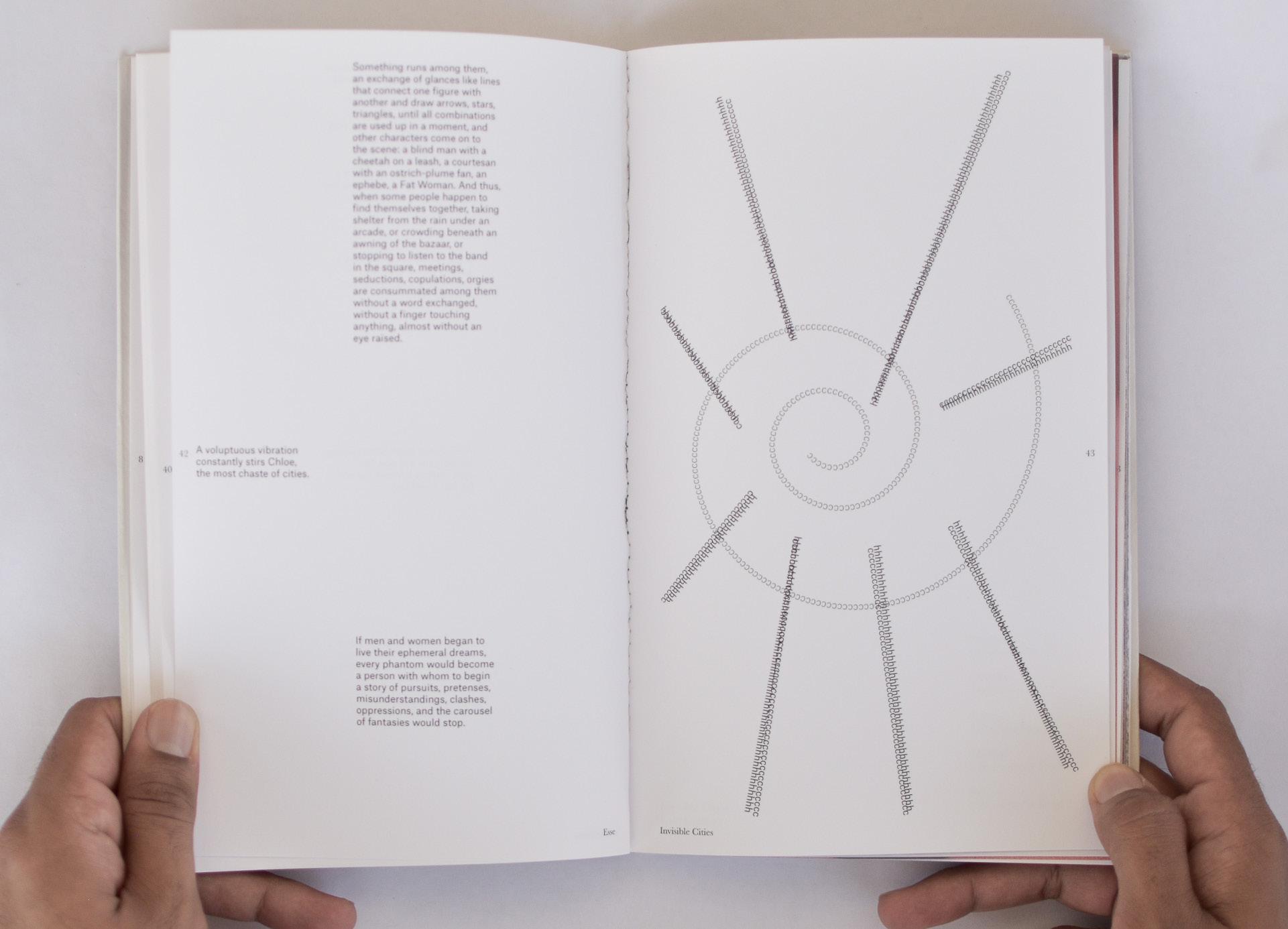
Esse is a group project completed during the Porto Design Summer School 2023. The book design included Italo Calvino’s Invisible Cities and two other short stories. Each group memeber had to design 5 chapters. The main approach learned during the project was to takeaway as much as I could and yet maintain the core idea of my design. The design uses an 11 column grid ran common through the full book. I used letters as a base form to create abstract illustrations for each chapter that represented the main idea of the storyline. The book was printed by the group in the class itself and bound at a local print shop in Porto.


Leggere Cambia Tutto

Leggere Cambia Tutto is a special edition magazine combining chapters from previous two editions of the magazine. It is published by the literary festival - La città dei lettori. The project was designed for the final thesis project at IED. The concept is magazine as tokens, charms and memories. It brings forward personal narratives and layers of memories with the use of bold colours, imagery and typograhy. The chapters come in a tin box bound by an elastic band, reminiscent of boxes used in childhood to collect tangible memories and trinkets. Inside the box are separate chapters, postcards and stickers.


The fall of the house of Usher
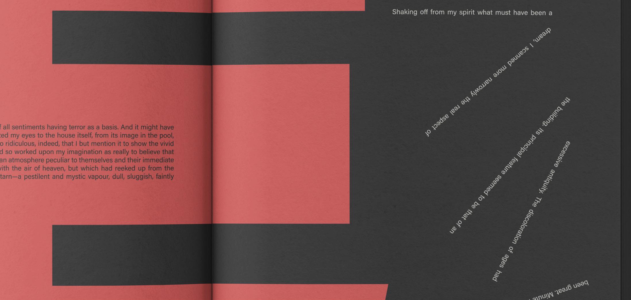
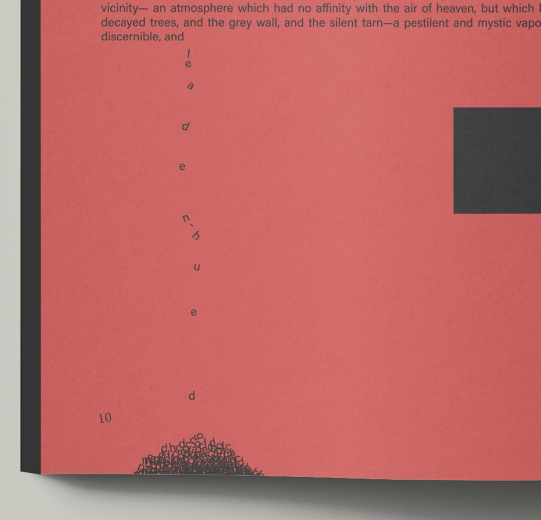
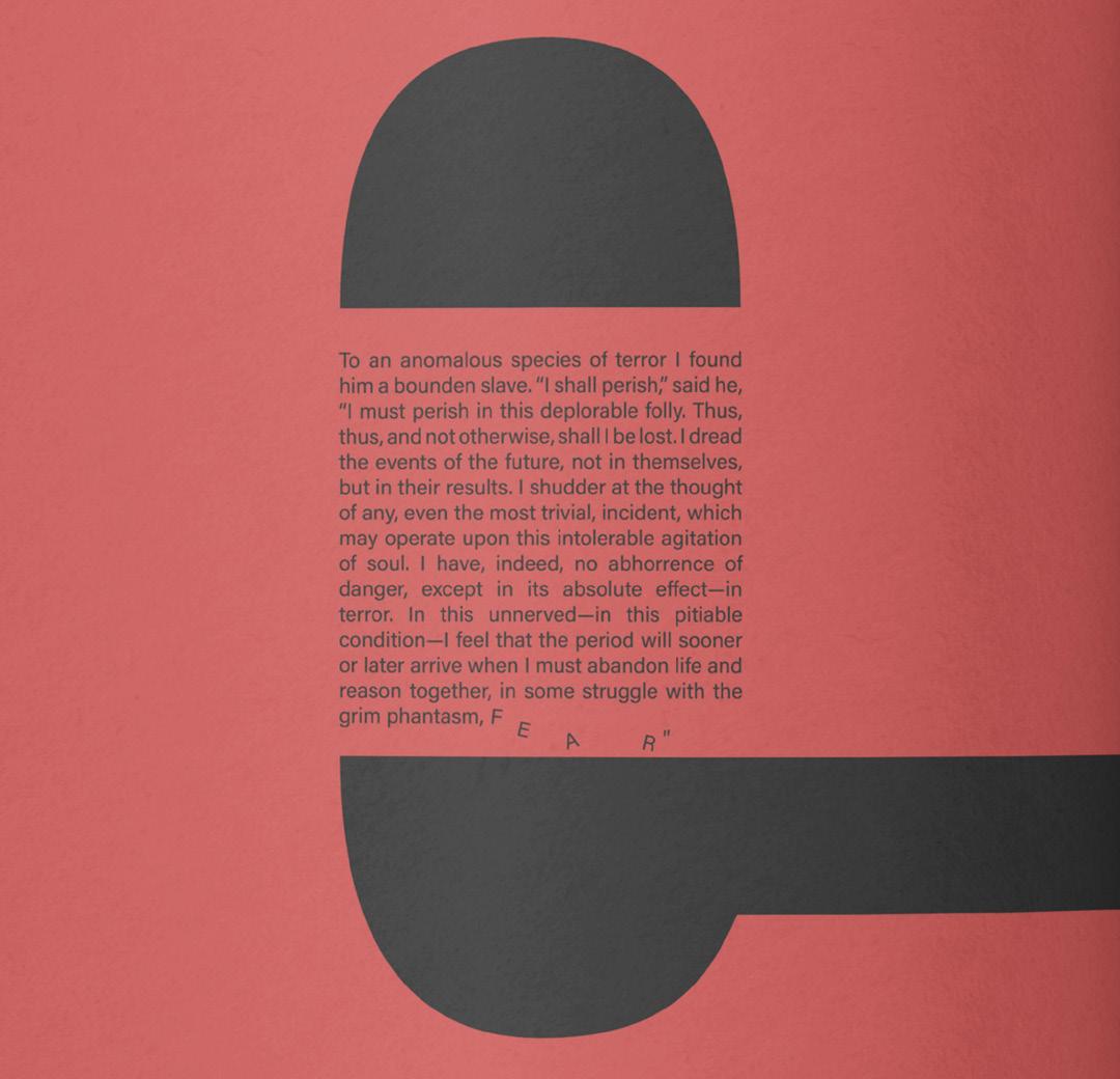
A short story by Edgar Allan Poe in which the narrator is visiting his friend, Roderick Usher at his estate surrounded with mystery. A sense of eeriness is evoked in the layout by the use of bold typography to create positive and negative space for the story to dwell inside and emphasise the feeling of being stuck in the estate. Some paragraphs lock and suffocate into each other, sentences topple down, letters crumble into a heap under the weight of the claustrophobic atmosphere the narrator is trapped in. A display (June Exp) and a sans serif typeface (Acumin Concept) along with the colour combination of three basic colours adds to the sudden unexpected disruptions in this book design.




The Nemesis
Magazine and map design featuring acitivties, places and things to do in Florence as part of a student group project at IED. The design was based on a grid common to all students, and we were free to explore within it. The font used is Areminiscent smile for headings and Proxima Wara for body text. The layout is modern and contemporary. The article chosen for the chapter designed is of Le Murate, a community space in Florence that now has a contemporary art gallery within its complex. The use of the brand colour pink of Murate Art Gallery aligns its self with certain elements on each spread and surprises the viewer on the last spread with a bold pink page including the description of the galley.


Sounds of Rajasthan
To delve in the cultural sphere of the state I belong to, Rajasthan (in India), I designed vinyl covers exploring the theme folk music from the state. The vinyl covers are inspired by artists/ designers from different eras such as Belle Epoque, Moderism, Avant-gardes, International postwar style, Postmoderism and digital age of design and visual communication.


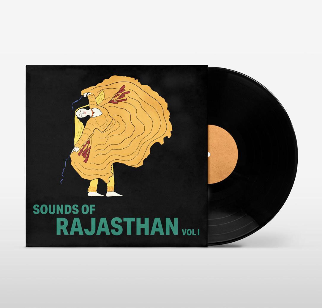
Vol I inspired by Leonetto Cappiello
Vol II inspired by Fortunato Depero
Vol III inspired by Lester Beall
Vol IV inspired by Lora Lamm
Vol V inspired by Kiyoshi Awazu
Vol VI inspired by David Carson


Consorzio Montecucco Tutela


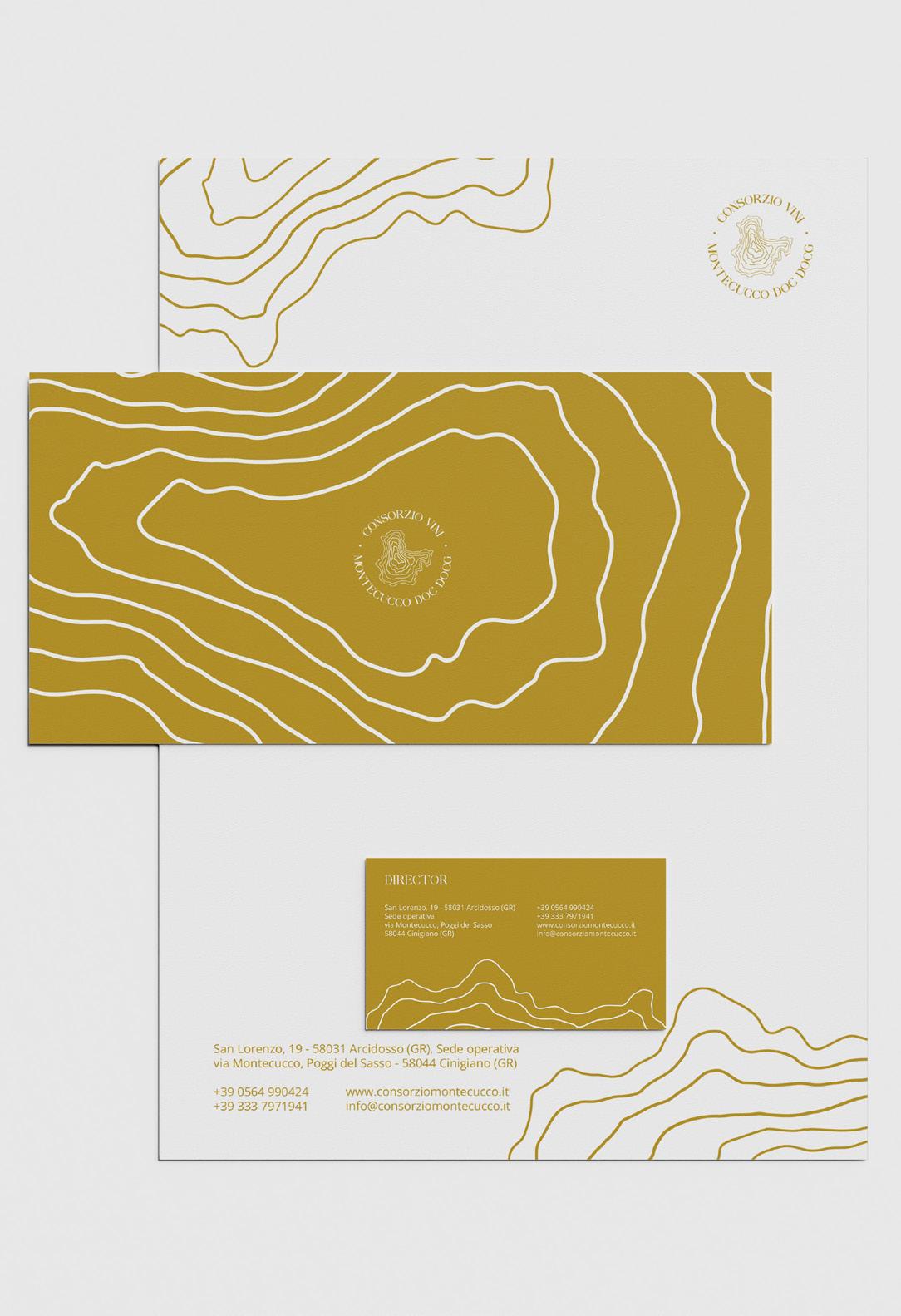
Winner of the logo competion at IED, Firenze. The design of the topographic lines in the logo are reminiscent of the human print on the territory. The seven lines represent the seven municipalities in the Grosetto region. The dots are visual breakers for the two titles. The earthy colours represent the region’s territory, partly drawing from the existing heritage and brand identity of Consorzio. Against Regular is an elegant serif typeface, which is modern yet has a hint of nostalgia to it. The fluid serifs give the logo a playful approach and expands the space for new creative ideas. The design brings in the new identity that Consorzio associates with, one of moving forward and looking ahead yet keeping past roots intact.



Fosco
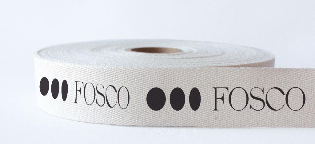
The overall idea behind the branding and packaging was to keep it handmade, elegant, contemporary, rooted and cool. The logo derives from the different solid shapes of the olives. The main font used is monka regular as it is contemporary yet has an artisanal value added, while the second contemporary grotesque sans serif font complements the serif font. The packaging uses long form bottle shape with matt finish for main bottle and ceramic finish using silk screen print for special edition. The Christmas edition uses recipes with olive oil from tuscan region. The box is made of hay using local weave techniques inspired from the olive pressing mats used in process of making olive oil.


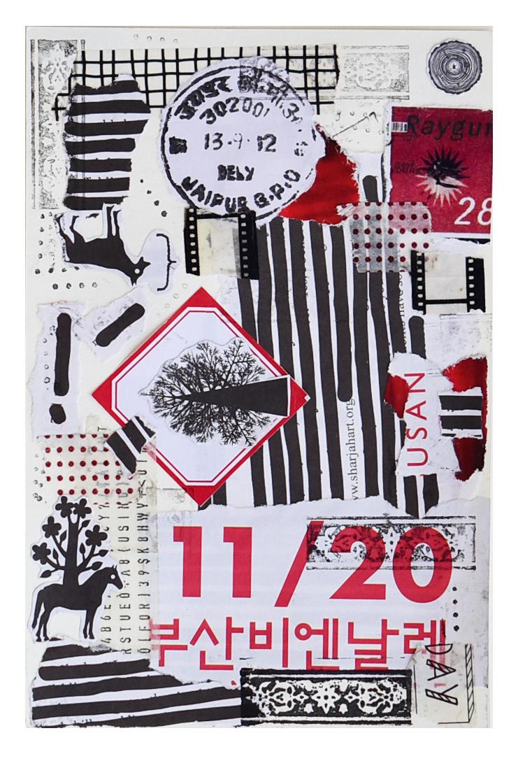
Analog Postcards


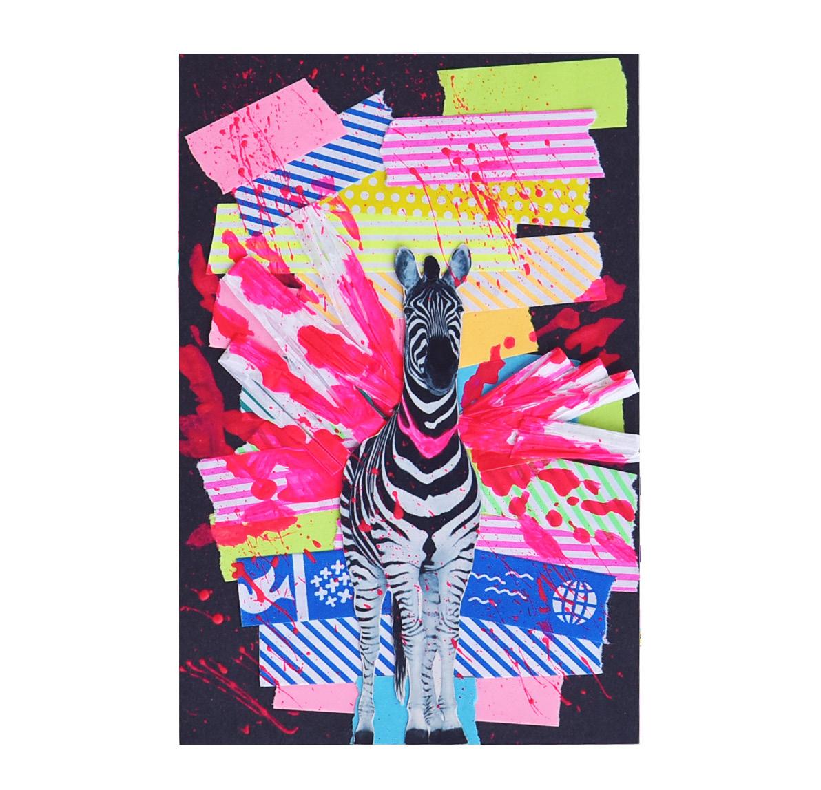
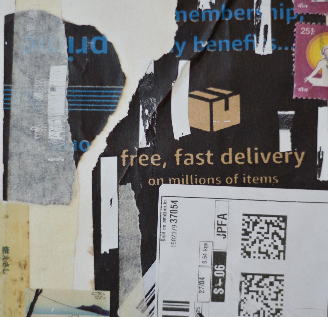
An ongoing exploration of handmade analogue postcards made March 2020 onwards exploring techniques such as collage and mixed mediums such as poster paints, drawing inks, markers. stamp inks and microtip pens. The inspiration behind the postcards was to explore and find common visual languages with finds from old magazines and books and scraps lying around at my home when the lockdown had started.




09
Visual Journals
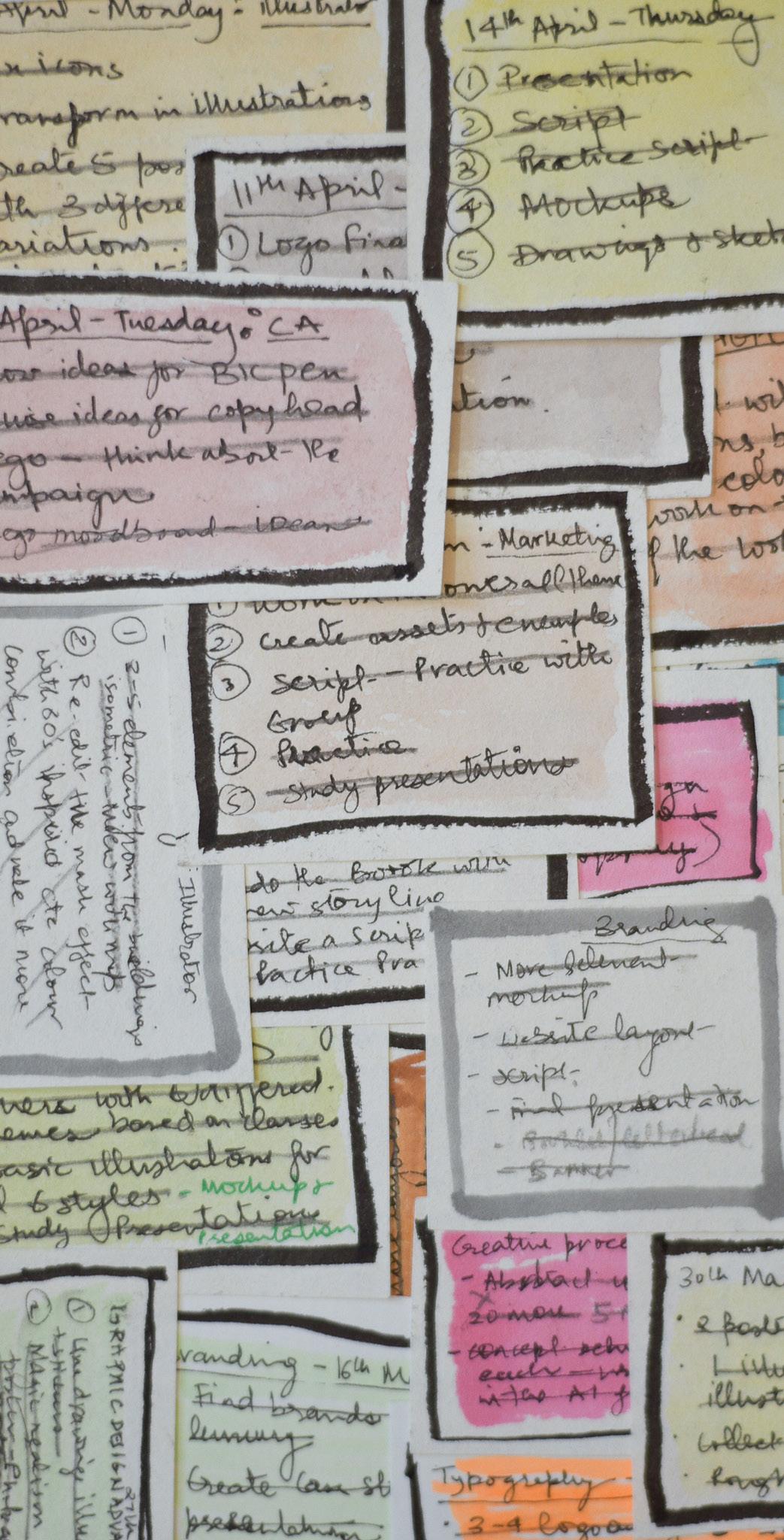
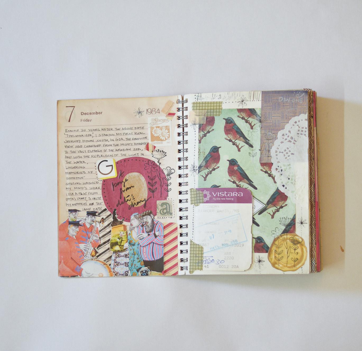
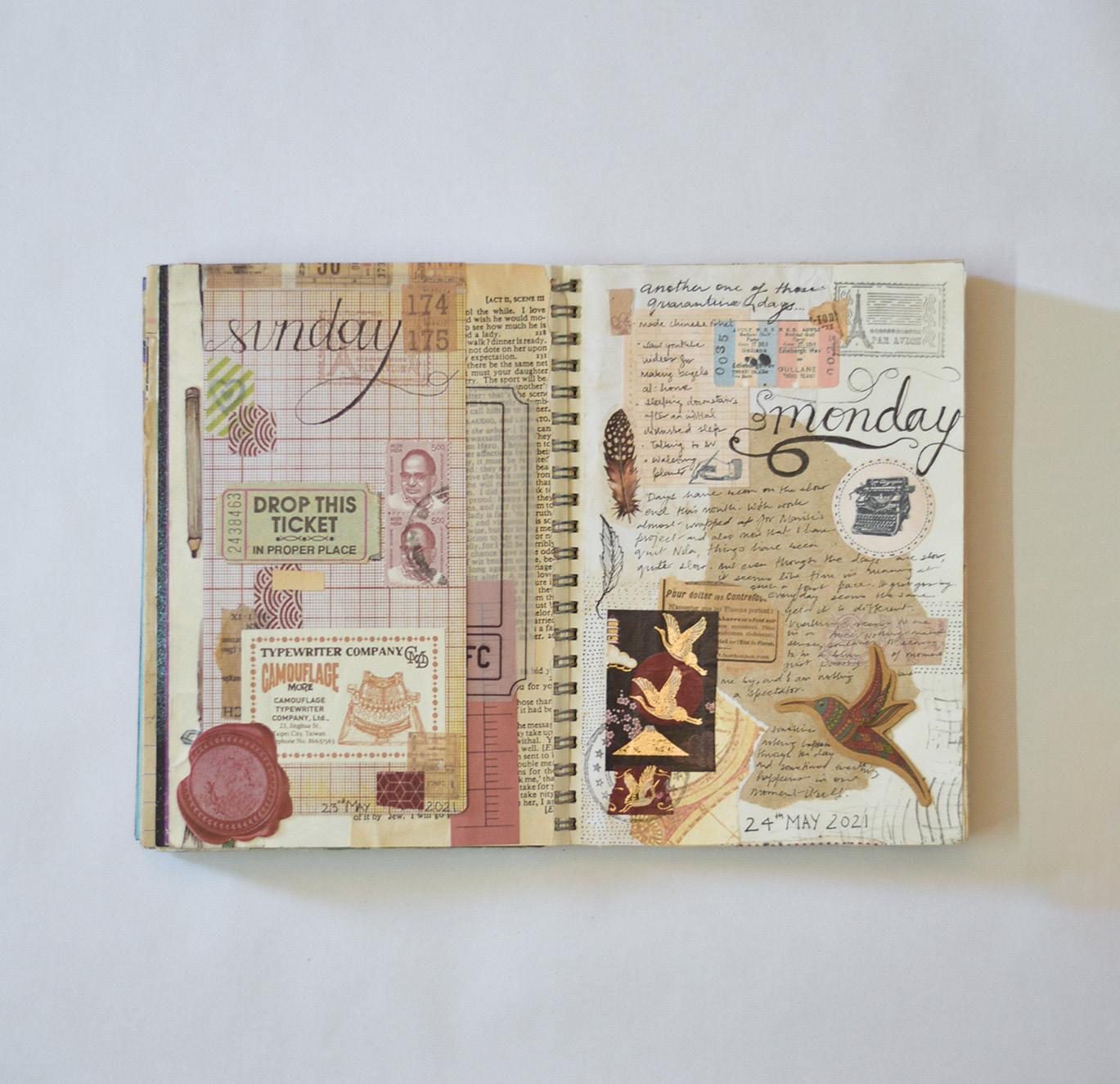
A few spreads through my journey of maintaining visual diaries for the last 8+ years. Sometimes I document what is in front of me, sometimes I imagine abstract drawings, sometimes I take inspiration from other artists, designers and creatives and sometimes record tanglible memories such as dried leaves, flowers, paper scraps between the pages of my journals. My journal is a place of solace for me, and I use it to pen down my feelings, draw my surroundings, document everyday events and give myself the liberty to basically do whatever I feel like.




www.studiodamu.xyz

hello@studiodamu.xyz
Instagram:
