

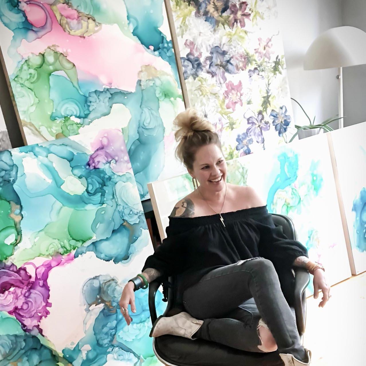

Across your bodies of work, color seems to serve as an emotional conduit. What draws you to using color as a primary mode of emotional communication?
Color to me is one of the very purest forms of vibration. Out of all the five senses, it has the power to tangibly shift energy almost immediately…right up there with sound, especially music. The difference to me is in the unattached quality of color…it can mean anything to anyone and varies completely from person to person. Words have often failed me in my everyday life and felt contrived, but I have found that expressing myself simply through shape and color feels more authentic and valid to me than attempting to box my emotions in with vernacular. The world is such a talky place, you know? I would rather contribute to it in a different and more intentional way than add to all the noise.
How has your relationship to color evolved over time? Have there been shifts in how you use or perceive emotional color through different phases of your practice?
Back when I first started painting professionally, I of course was much more timid than I am now, to put it plainly. Despite those initial challenges in figuring out my voice, I feel like my approach to palette has become much more sure footed over the years. By trial and error and experimentation, I have become more intuitively aware when hues jive together in the way that it touches an emotional space when viewed. My only barometer for that is how I personally feel when I view my own work, and as I got through the process of creating it. Someone else viewing that same piece may feel completely differently. It is that open ended factor that I love tapping into.
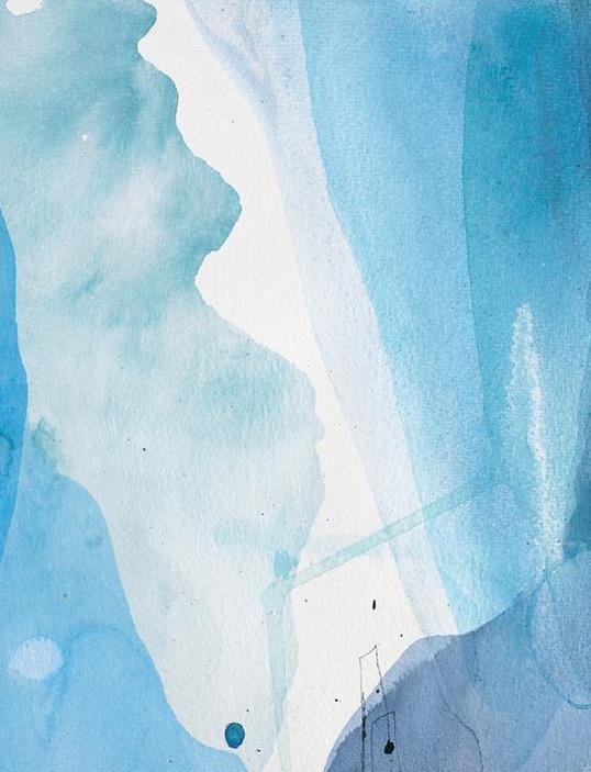
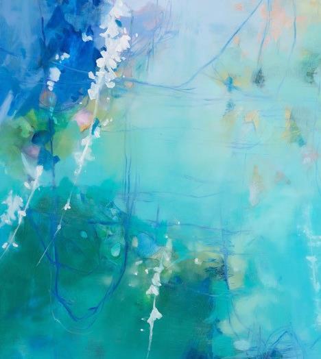
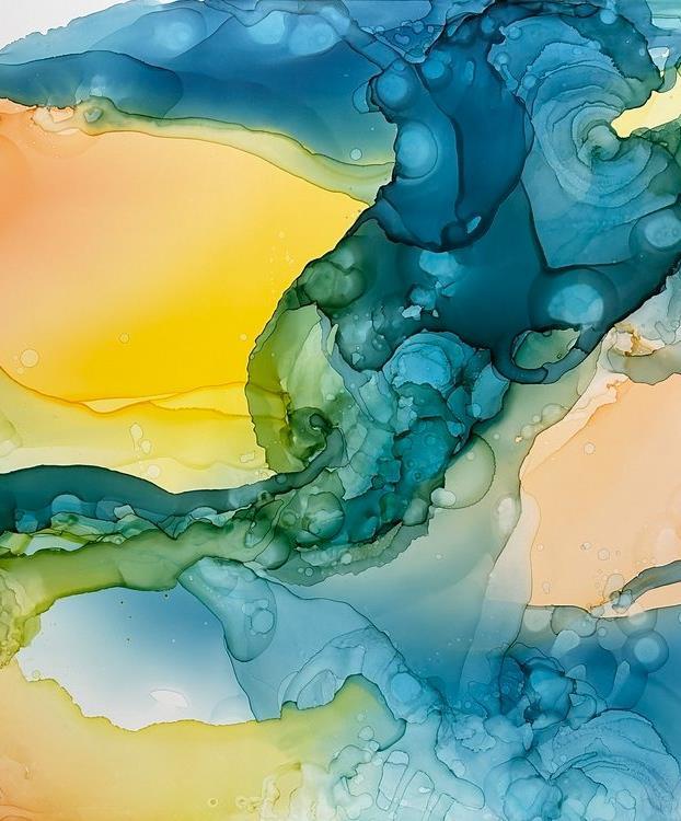
There’s an almost visceral quality to your color choices—soft, saturated, or jarring. How do you approach color selection, and what emotional registers are you hoping to activate in the viewer?
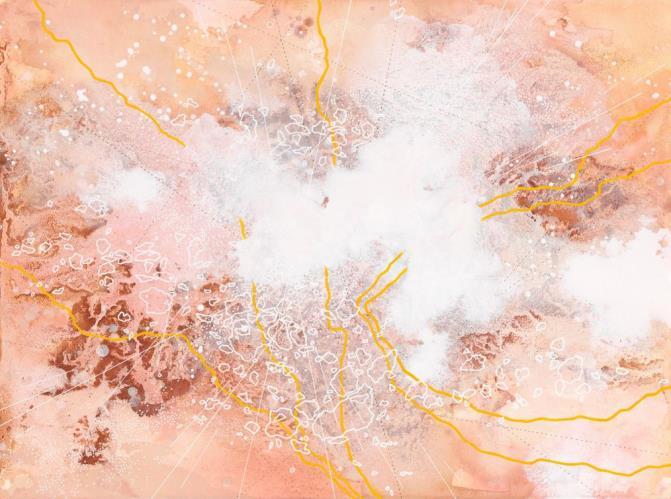
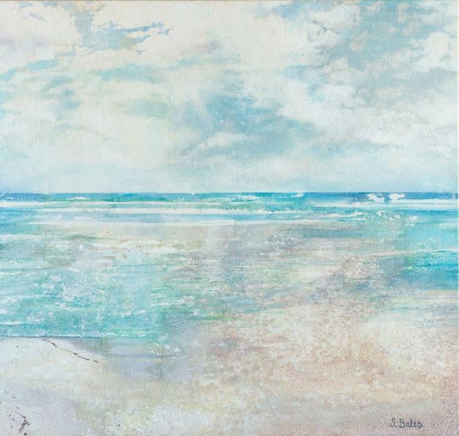
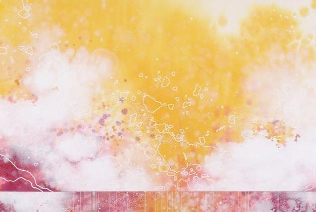
Man, what an amazing compliment! Let’s just say that if I haven’t evoked an emotion through my work, I have not done my job. I know that my work is not for everyone…some folks may want something more homogenous and accessible than what I tend to create, and I am more than fine with not appealing to everyone. All I aim for is joy, peacefulness, and a little bit of escapism in my work…
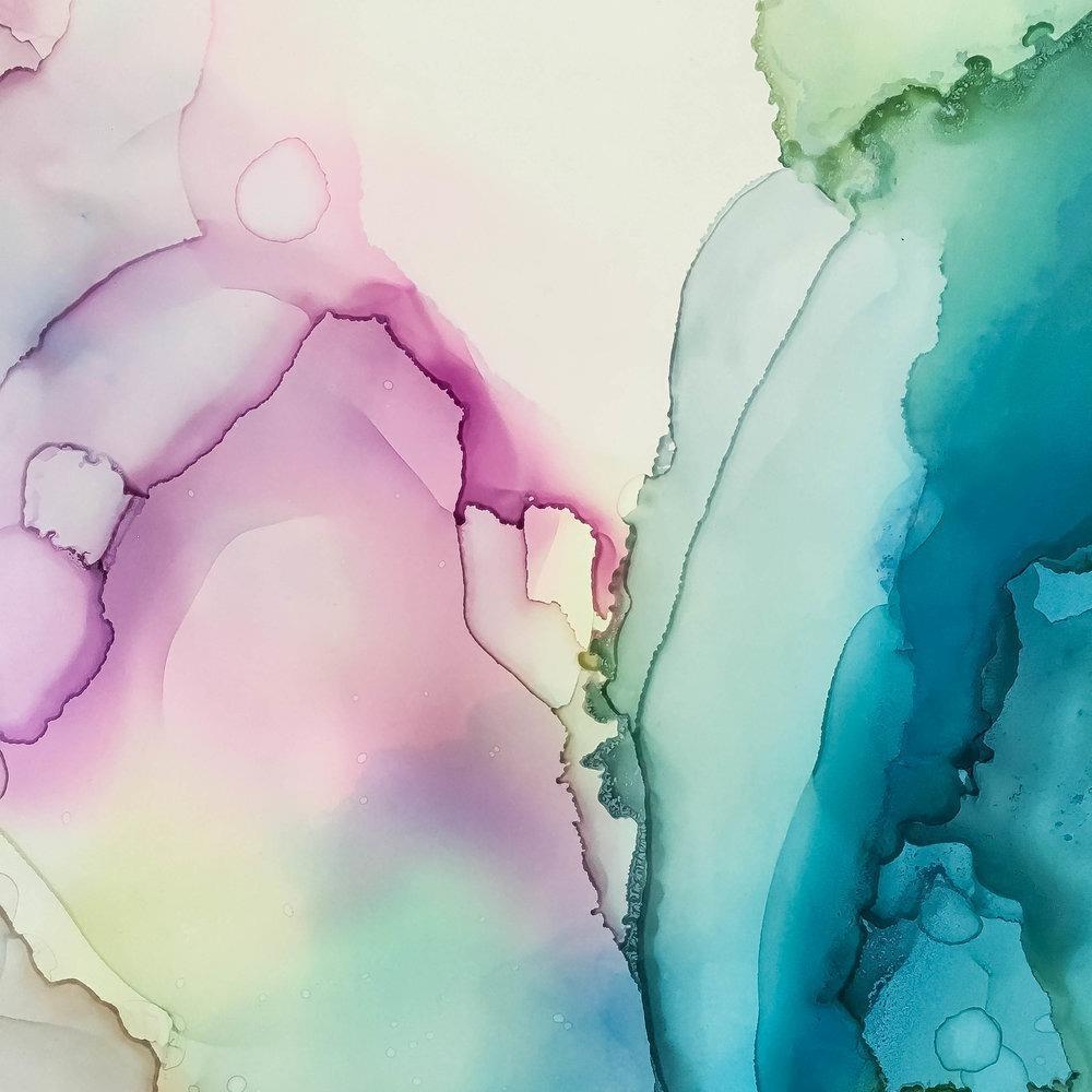
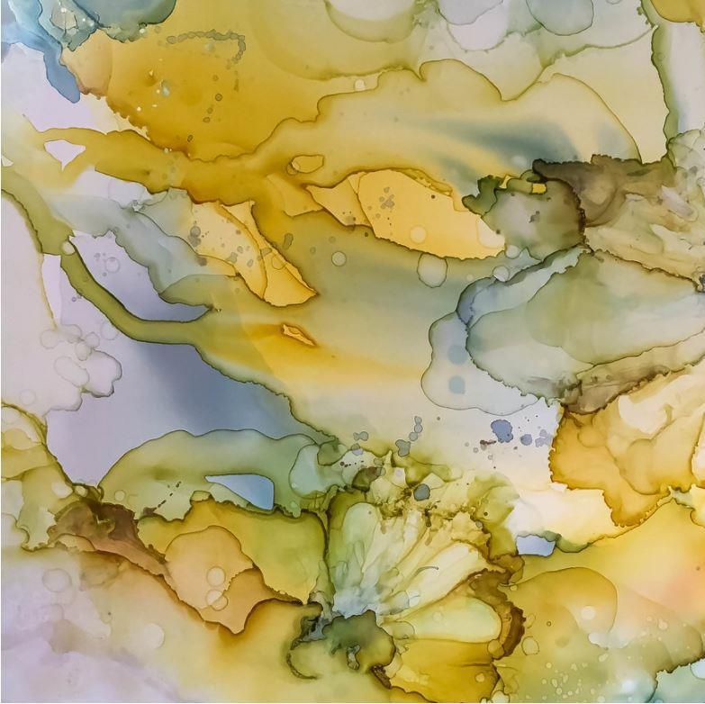
(Continued) If a painting of mine makes someone stop in their tracks, come in for a closer look, pause and relax and think, or even NOT think…then that is all I can ask for in being content with why I do all this in the first place. I feel that colors are the most effective in evoking an emotion when they are juxtaposed with other shades. It’s the combination of colors and shapes that is what makes a painting vibrational. Just as with music… it isn’t music unless there are multiple notes relating to each other. And it isn’t life unless there are multiple hearts and minds in relation as well. It’s all the energy between them that is the juice. That’s the good stuff.
Are there particular colors you return to again and again? What emotional or psychological space do they hold for you?
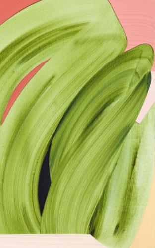
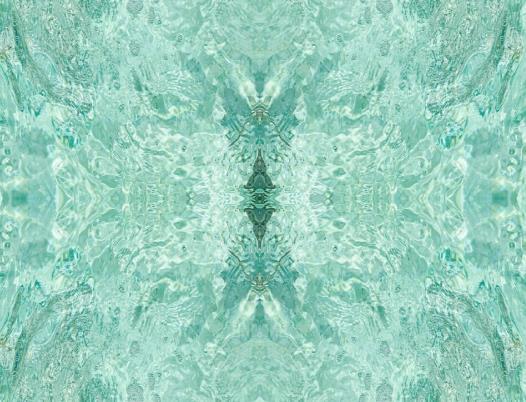
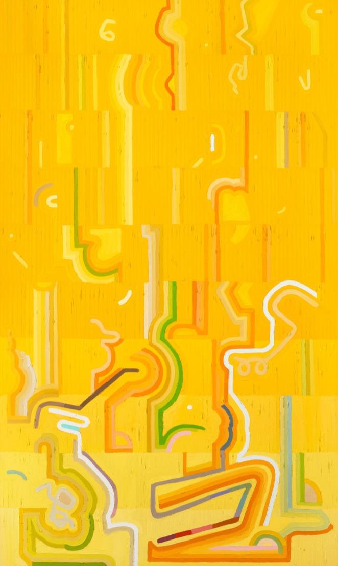
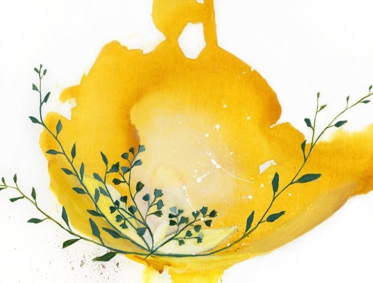
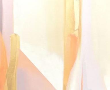
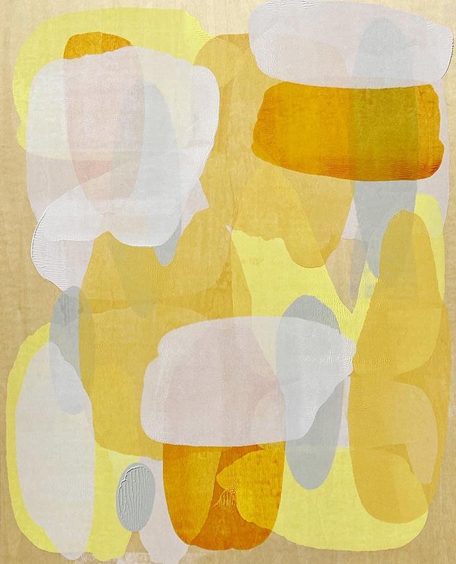
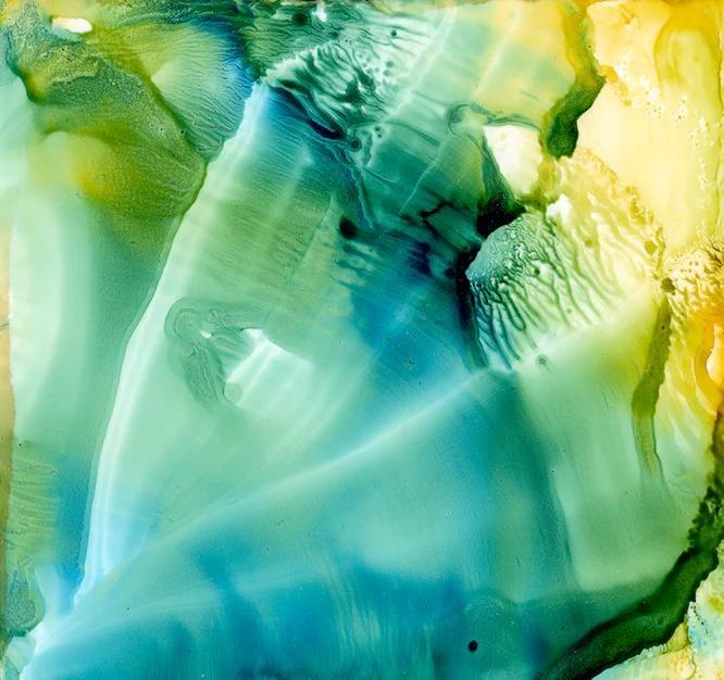
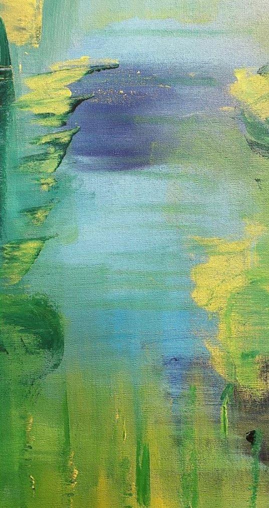
Oh, the list is long! Name a hue in the rainbow, and I will give you an example of it bringing me joy or evoking a memory within me. I have been relying heavily on four specific shades of green in much of my recent botanical work. I am very opinionated about these greens, I tell you! Orange will also always ignite something for me, and glowing hot pink…but especially when they sit right up next to another hue. Add periwinkle? I’ll probably wind up dancing because of it. That’s when I know I am on the right track, when each color I intuitively choose vibrates next to the other.
Thank you for the opportunity to serve your art needs.
DAC Art Consulting requests and reserves the right to implement concepts presented for referenced project(s).
All artwork purchased for reproduction shall be reproduced by DAC Art Consulting.
All artists, through their Publisher / Representative, DAC Art Consulting, reserve all reproduction rights, including the right to claim statutory copyright, in the work.
The work may not be sketched, painted, or reproduced in any manner whatsoever without the written consent of the artist, through its Publisher / Representative.
Images provided on spec sheets are for style reference only. Commissioned artwork may vary slightly from the image provided.