JULIANA GUARNIZO


2024 ADVISOR CONFERENCE
BOLTON GLOBAL CAPITAL
GOLF TOURNAMENT 2024
REINSURRANCE GOLF FOUNDATION
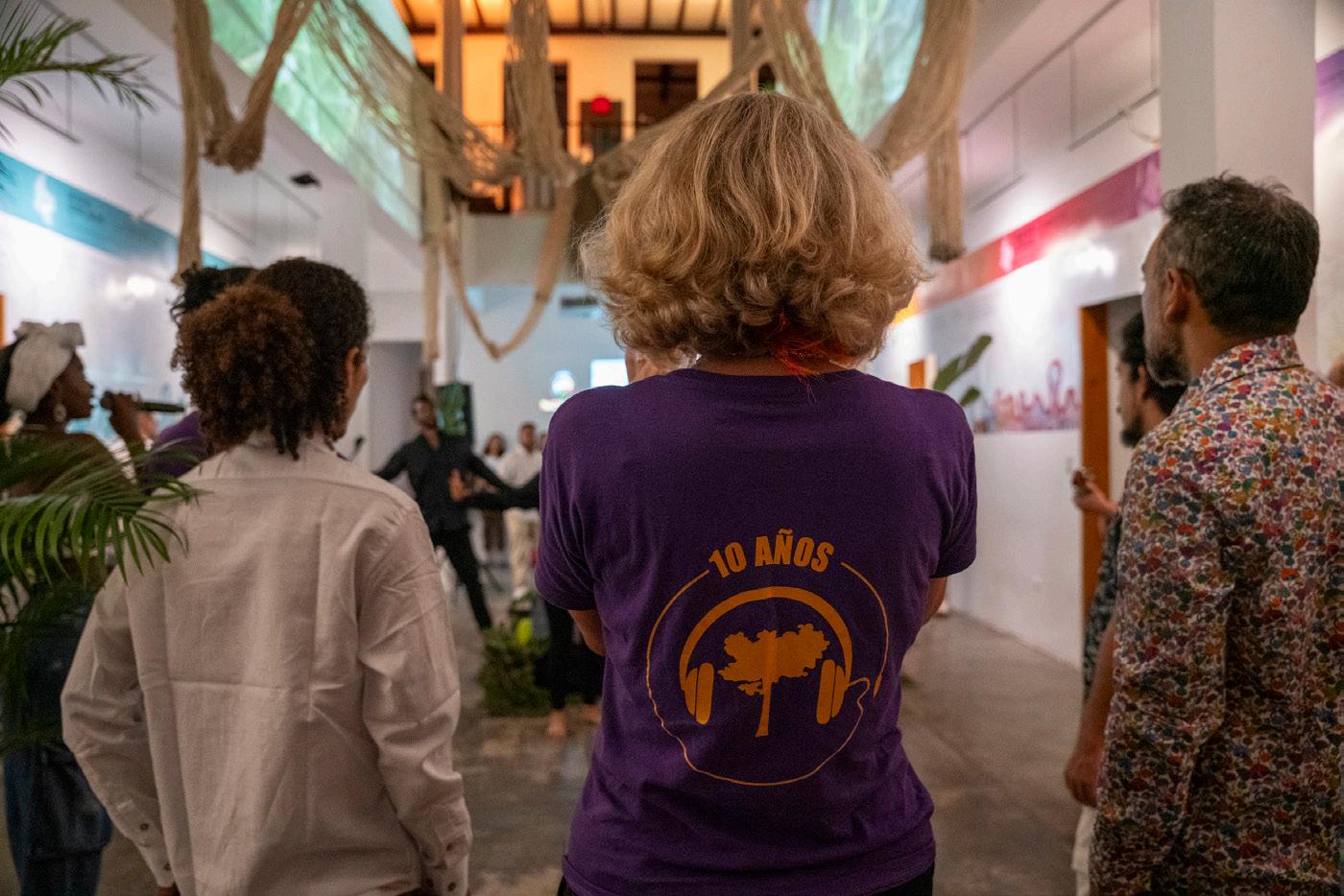
10 YEAR ANNIVERSARY EVENT
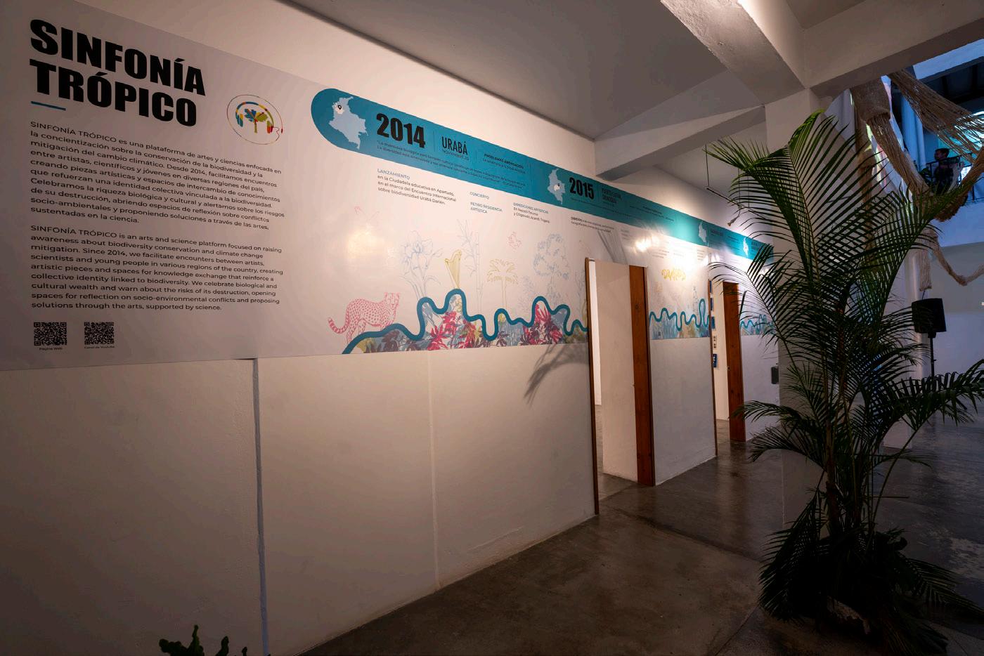
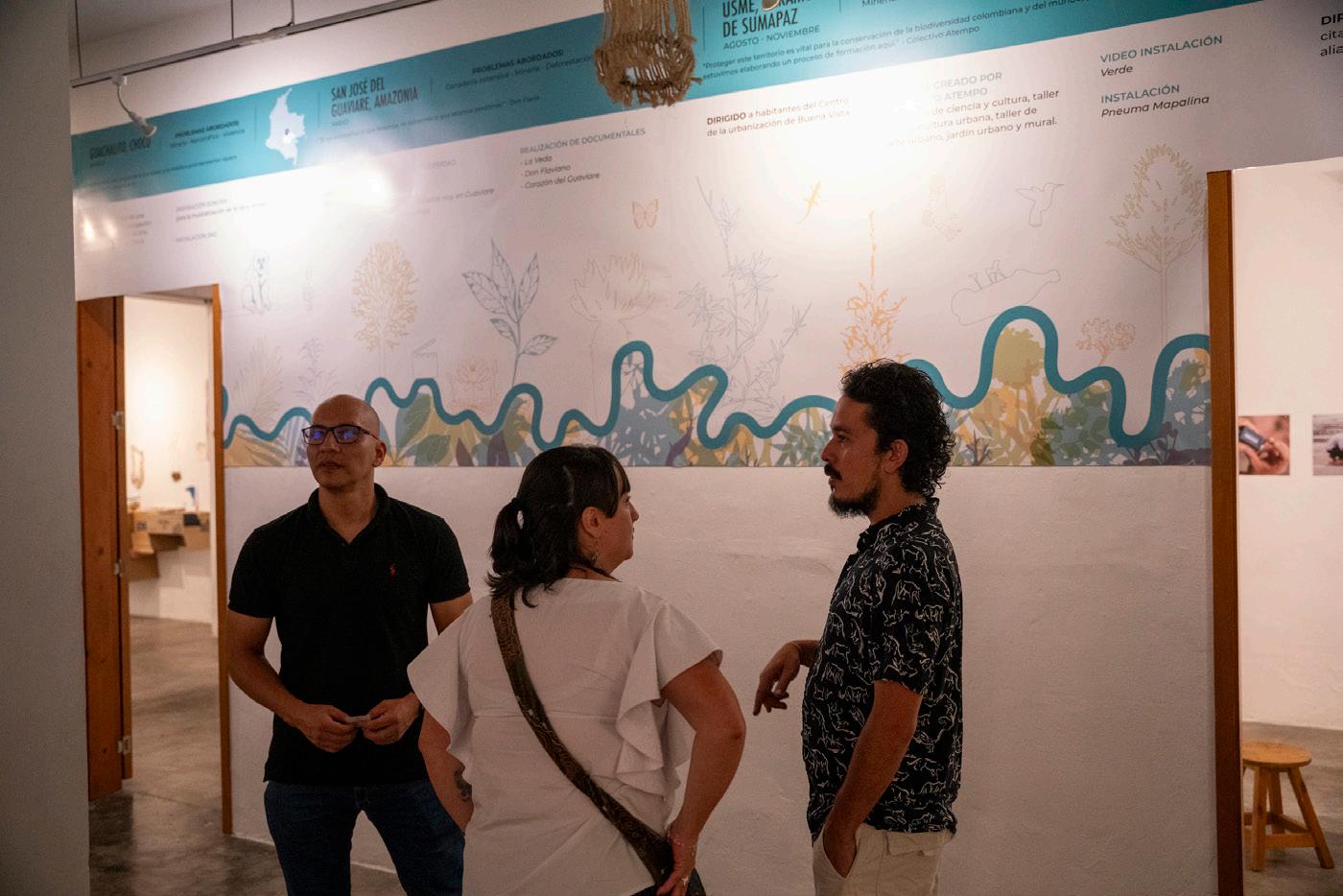
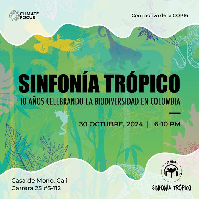
SINFONÍA TRÓPICO
CONCIERGE WEBSITE
BOLTON GLOBAL CAPITAL
COLLABORATION CAMPAIGN
ABSOLUT VODKA X BICYCLE CARDS
INTERACTIVE BOOKLET
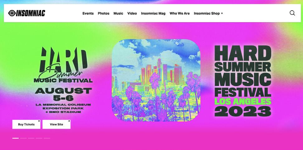
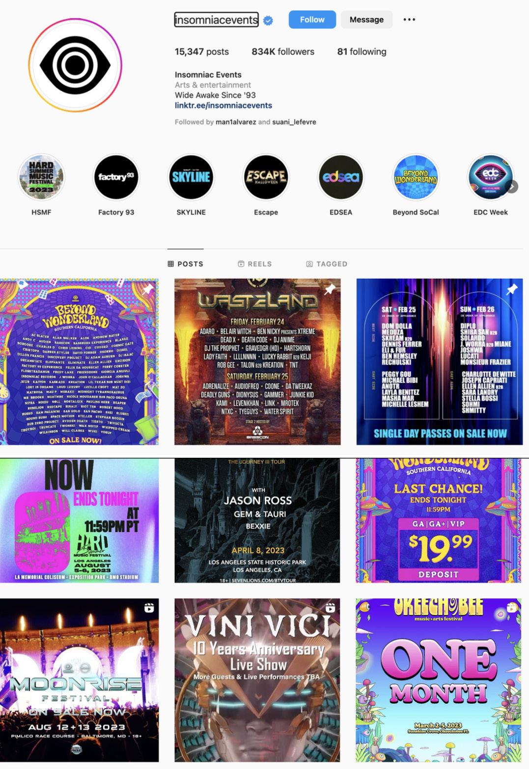
INSOMNIAC
PRINT/DIGITAL CAMPAIGN
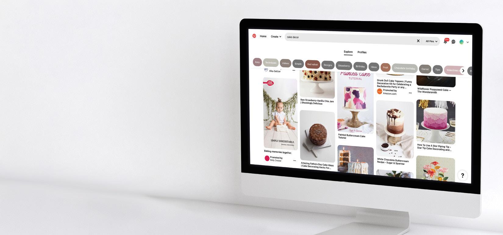
BETTY CROCKER
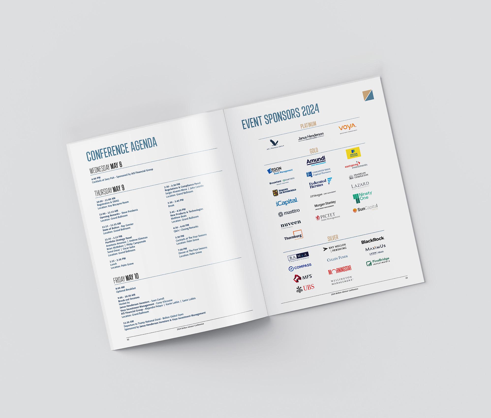
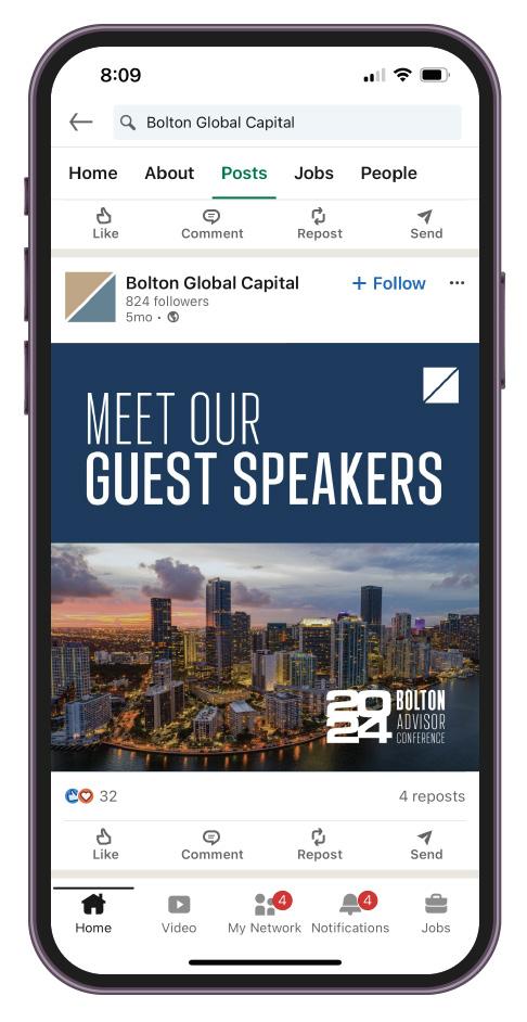
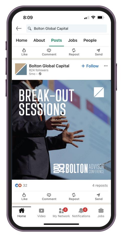
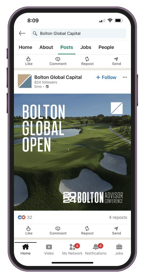
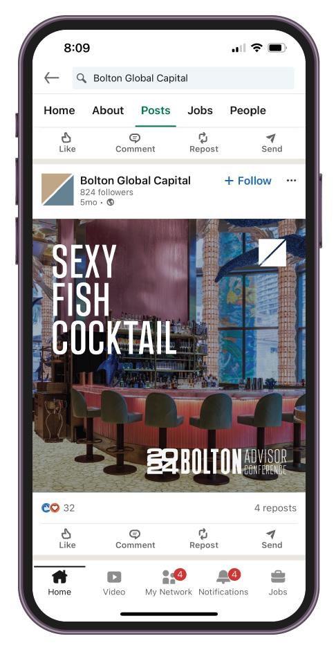
Bolton Global Capital has provided independent wealth management services globally for the past 40 years. Annually, they host an advisor conference featuring informational panels, breakout sessions, and a variety of social events for their guests. For this event, a variety of print and digital assets were designed to inform and enhance the experience for both the guests and the brand’s exposure.
Bolton Global Capital has previously updated their brand image by adjusting their brand colors, typography, logo, and overall aesthetic. The purpose of this rebranding was to modernize their image and reflect the growth of their corporation over the years. Their website was the first and only design created under this rebranding effort. Taking this into account, the goal of this campaign was to deliver assets that aligned with the new brand guidelines, ensuring coherence while pursuing a more modern and bold approach.
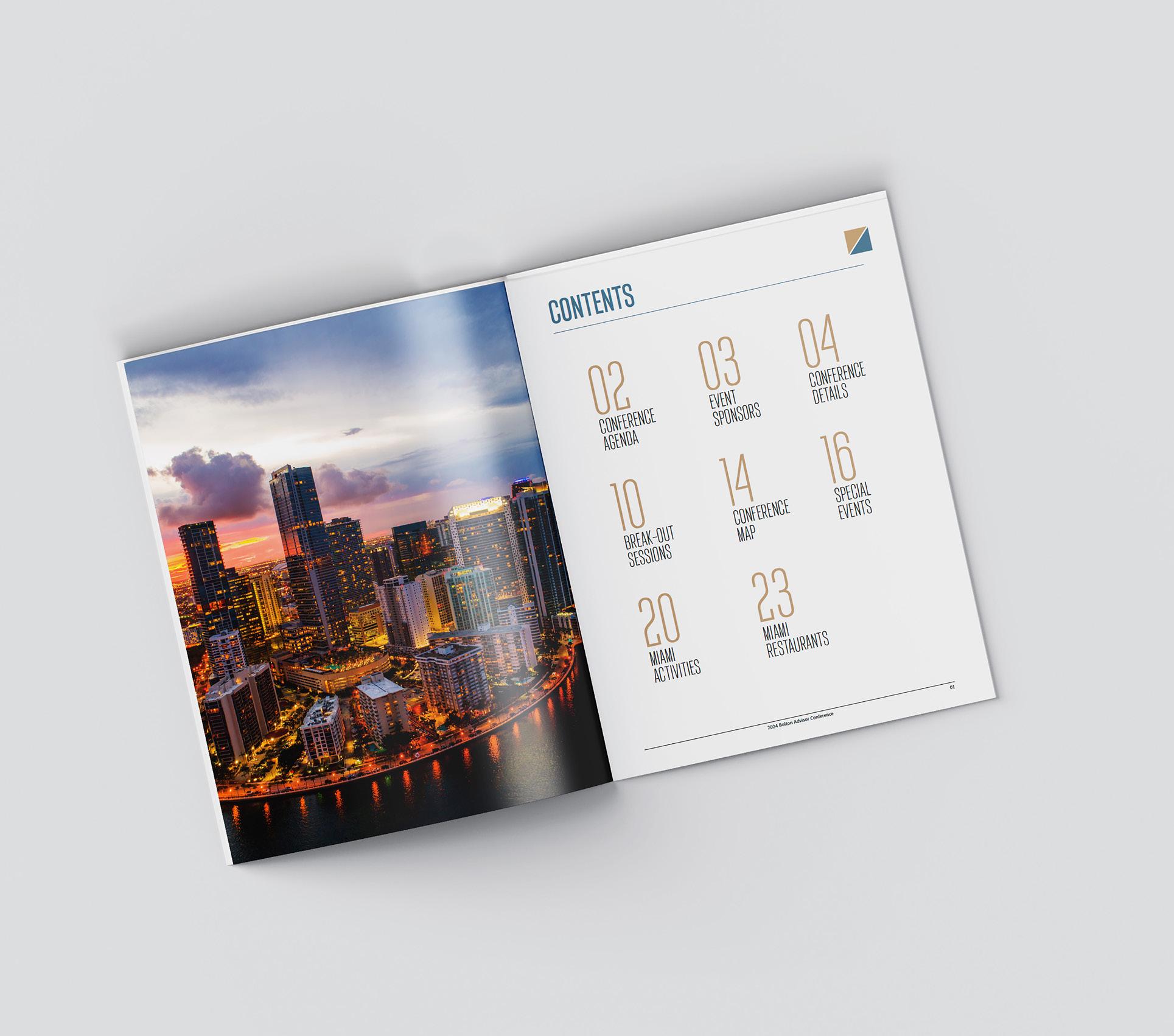
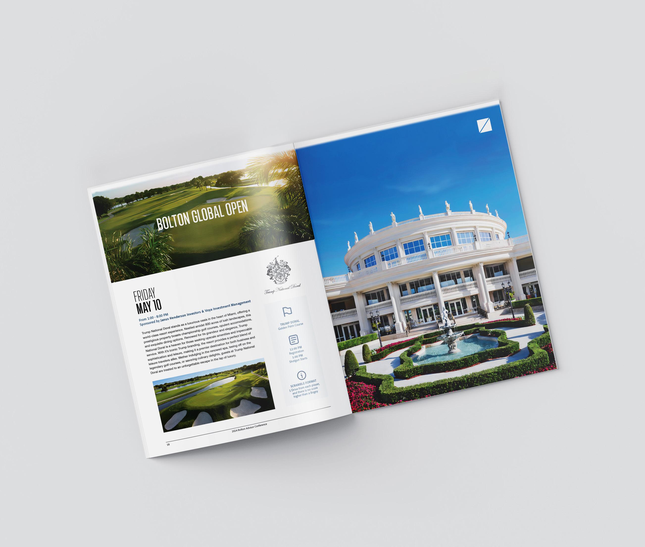
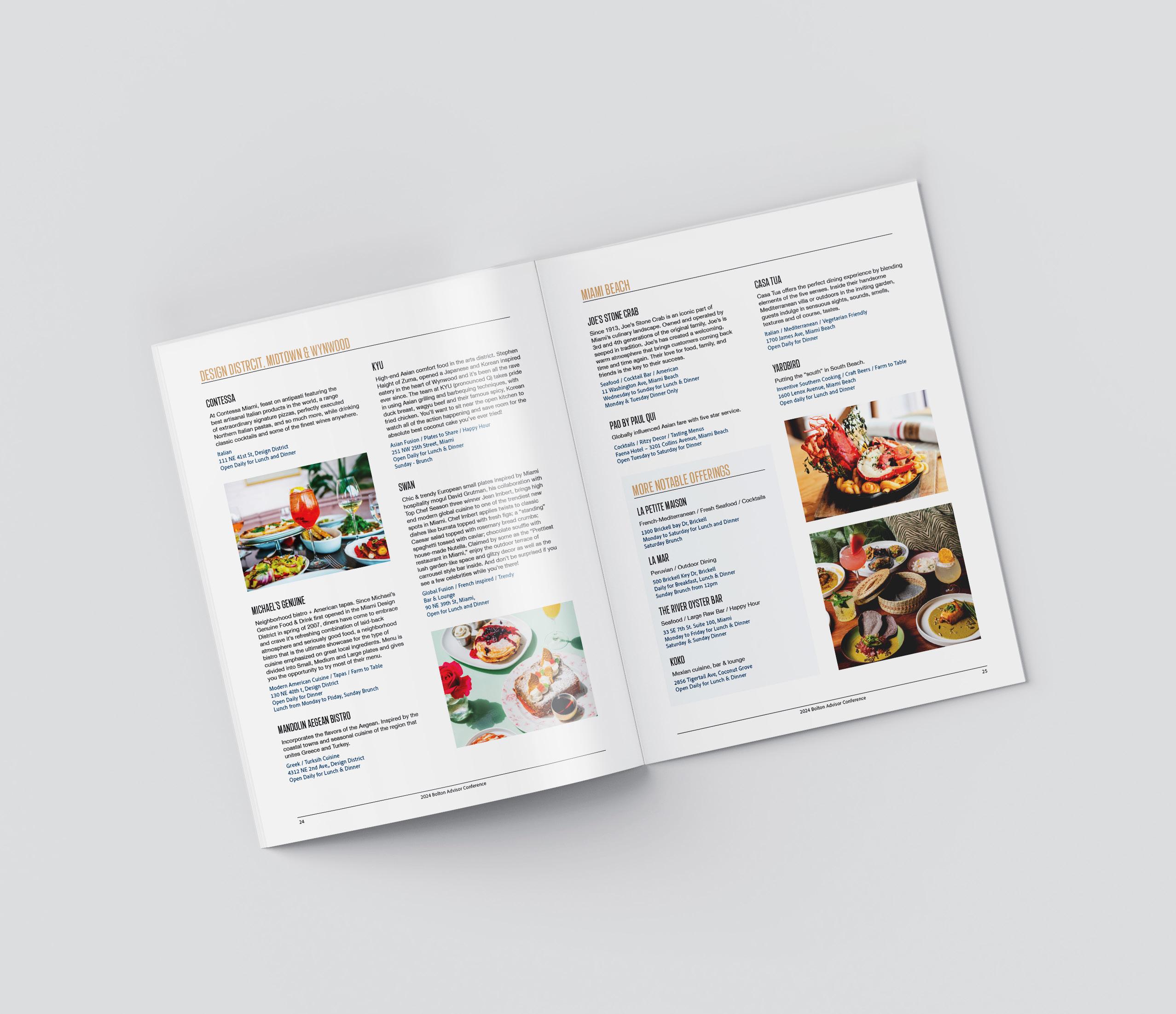
- Brochure
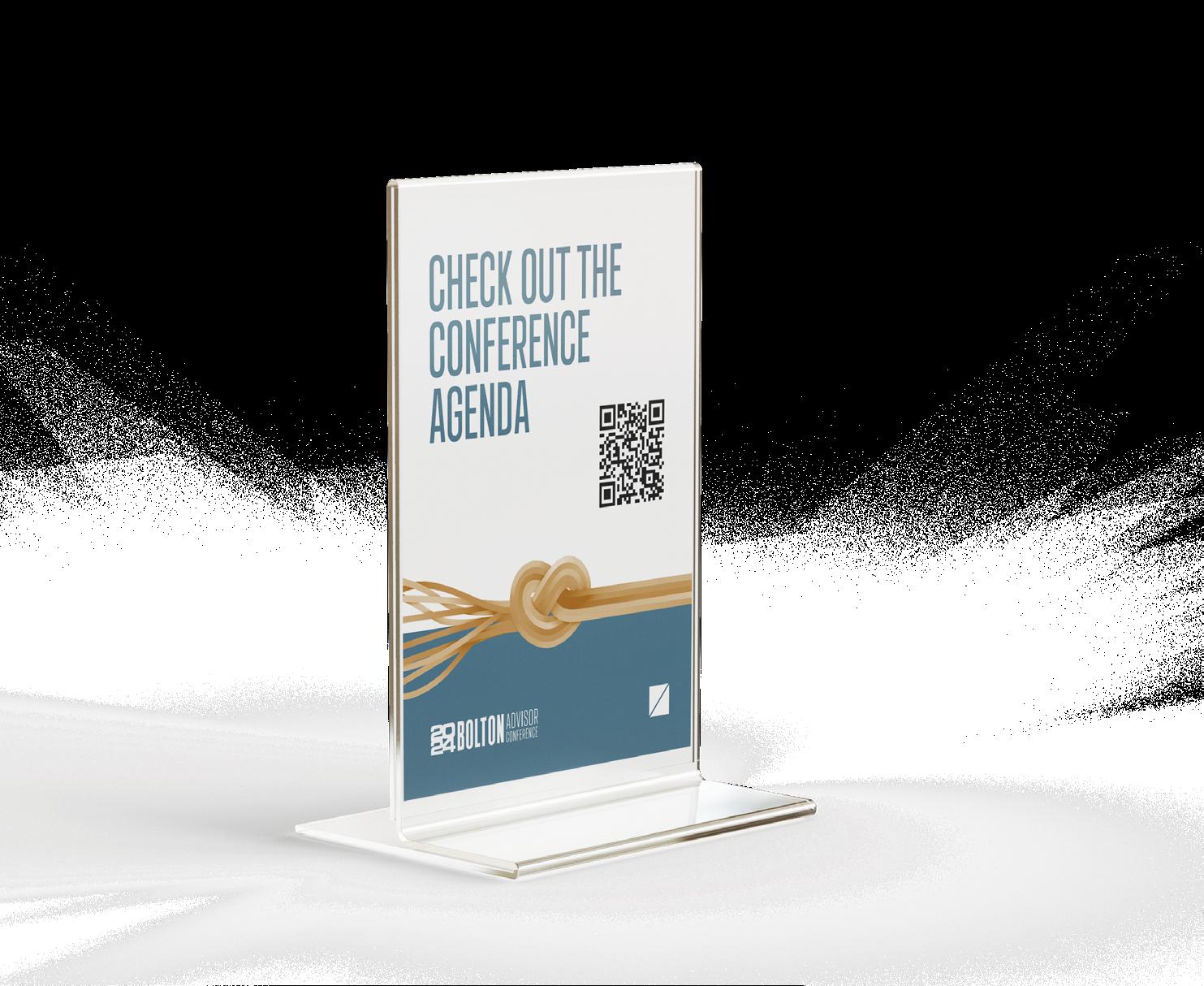
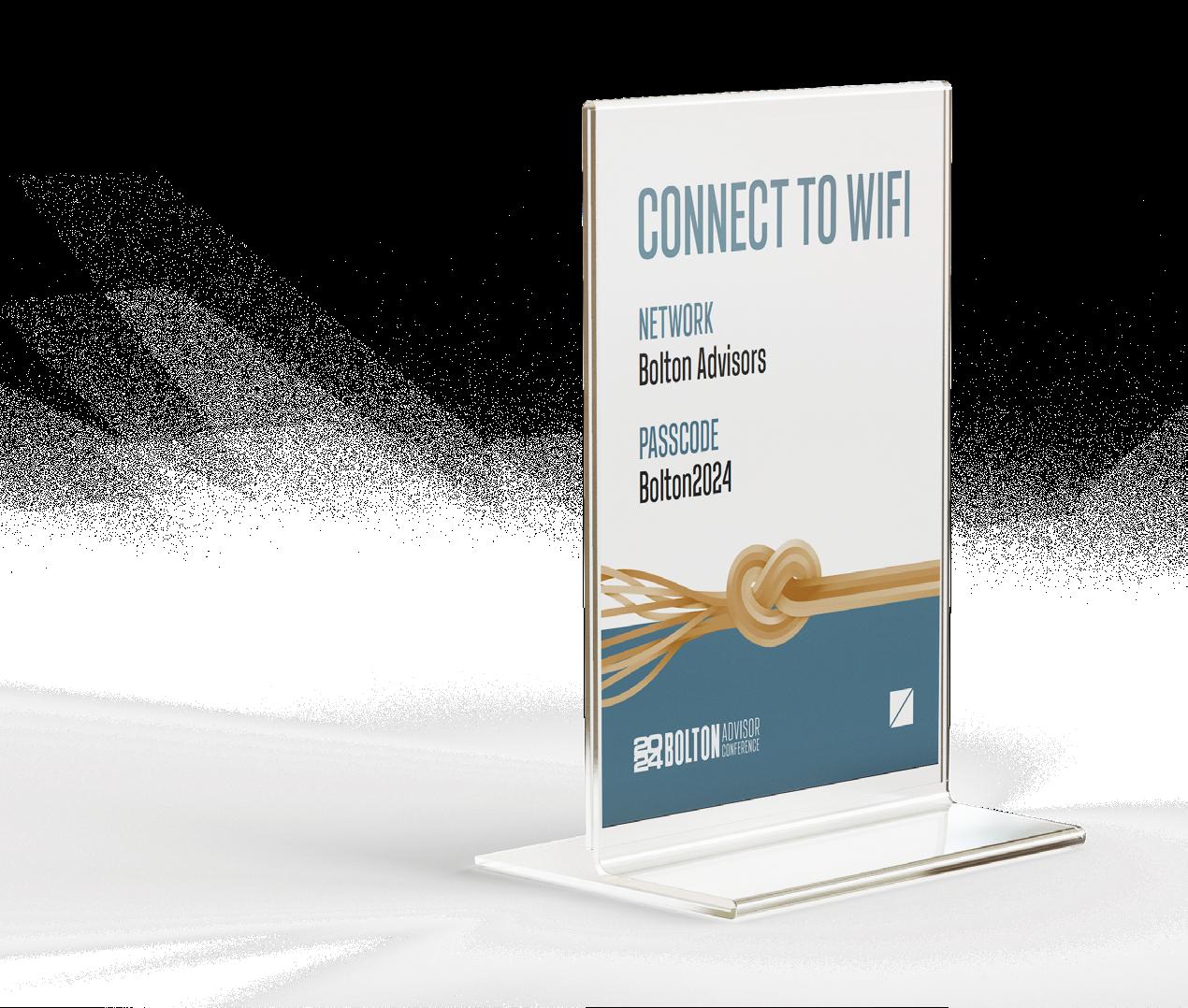
- Table Tops
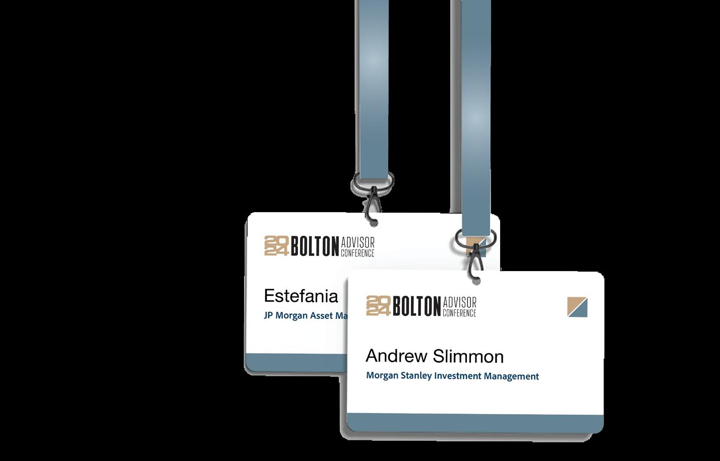
- Name Tags
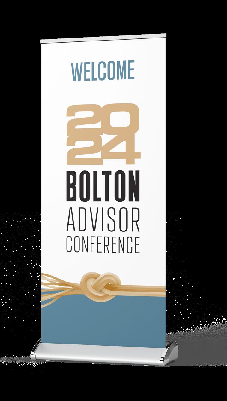
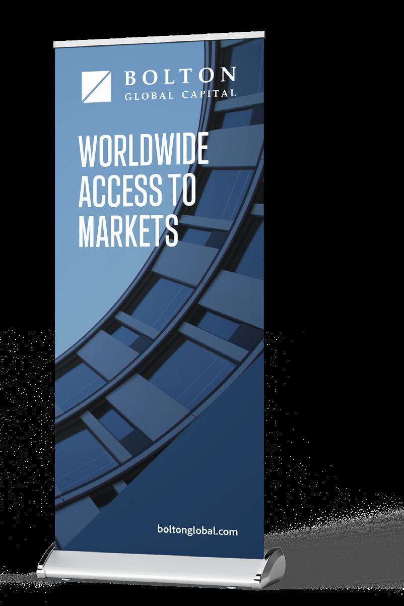
- Pull Up Banners
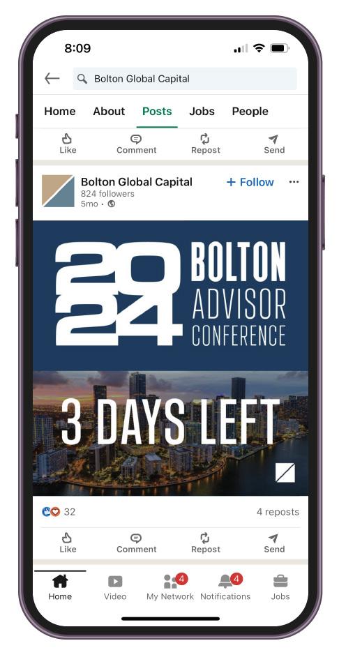
- Social Media Posts
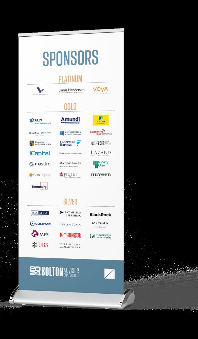
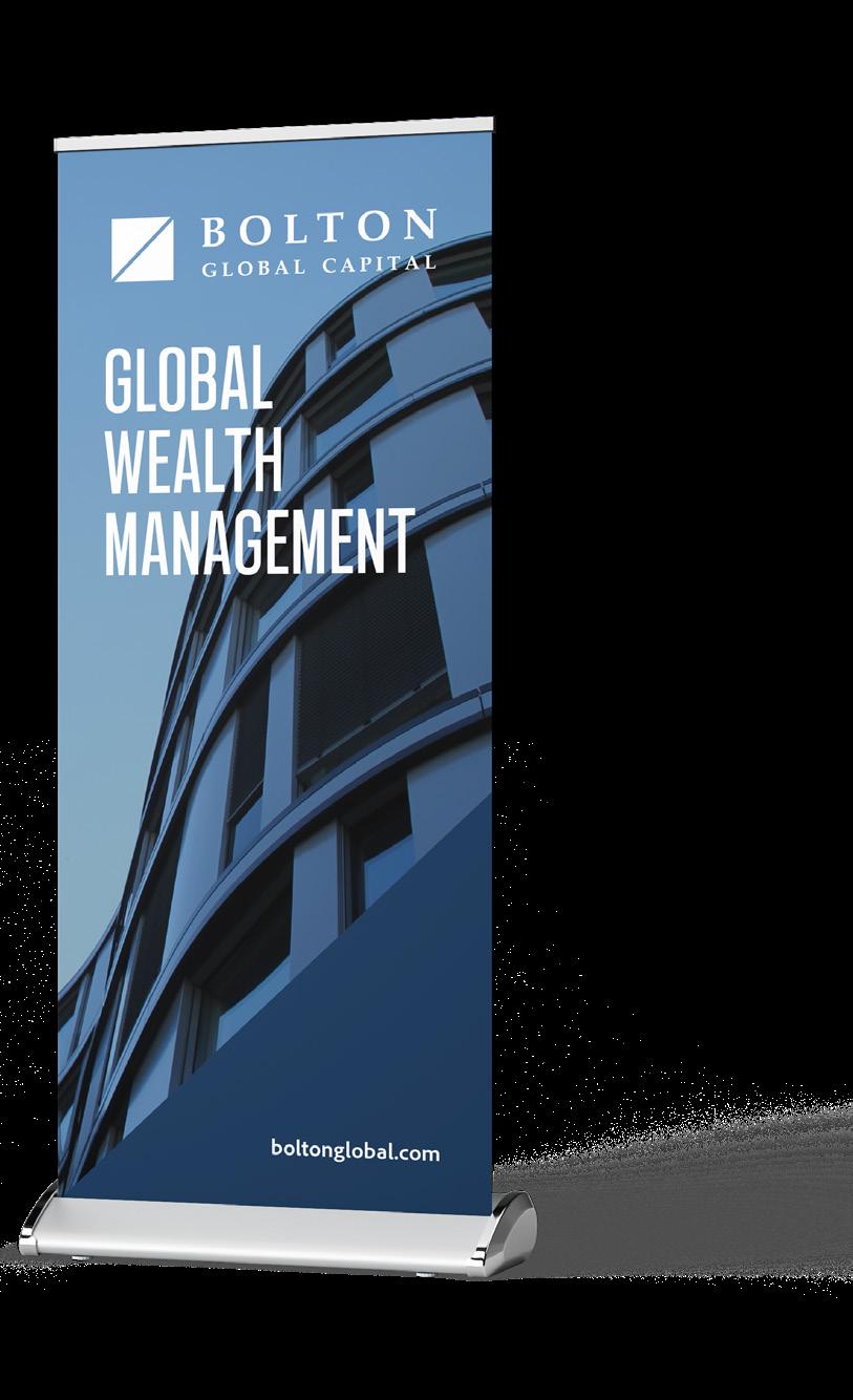
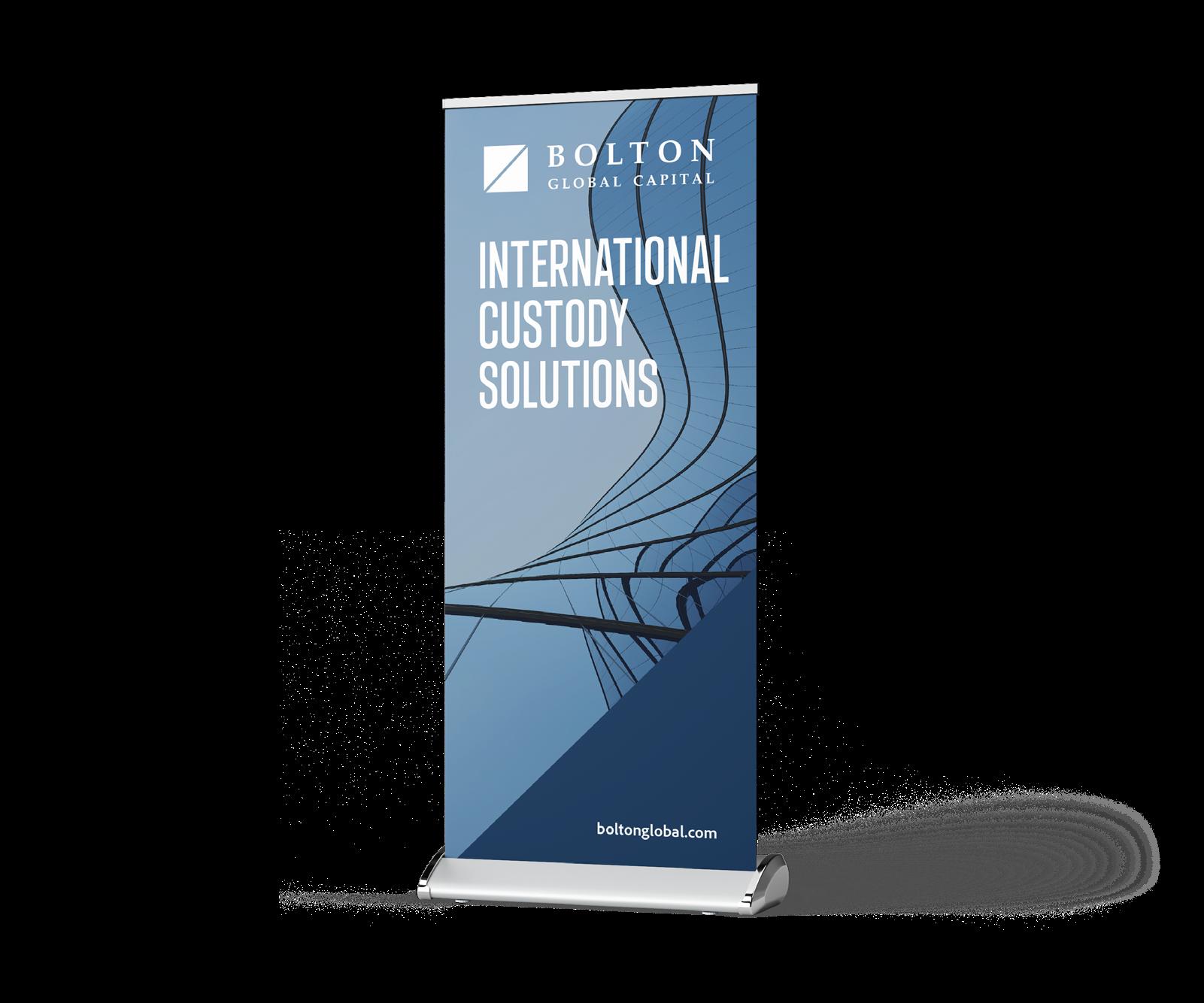
Utilize the hues of the logo as the primary color palette to maintain brand consistency, while creating a distinct appearance for the conference as it is a yearly event with own visual identity.
Incorporate the use of capital letters, bold typography, and large-sized titles to achieve a modern, corporate look, consistent with the headlines and main titles used on the website.
Rectangular and triangular cut shapes as visual organizers and directional elements to enhance the design, ensuring they remain on-brand.
*Brochure was designed with Adobe InDesign
*Some pages of the brochure
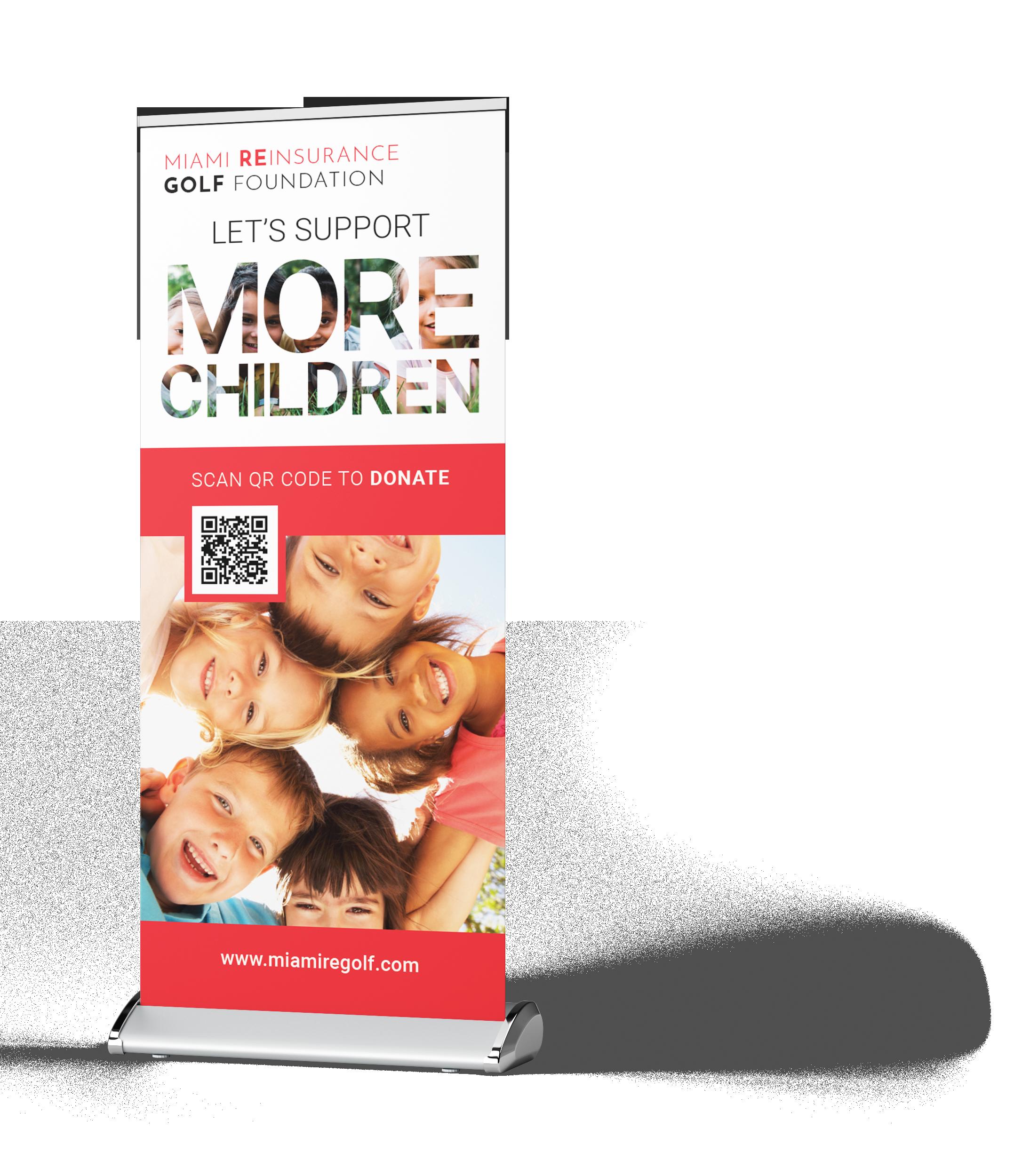
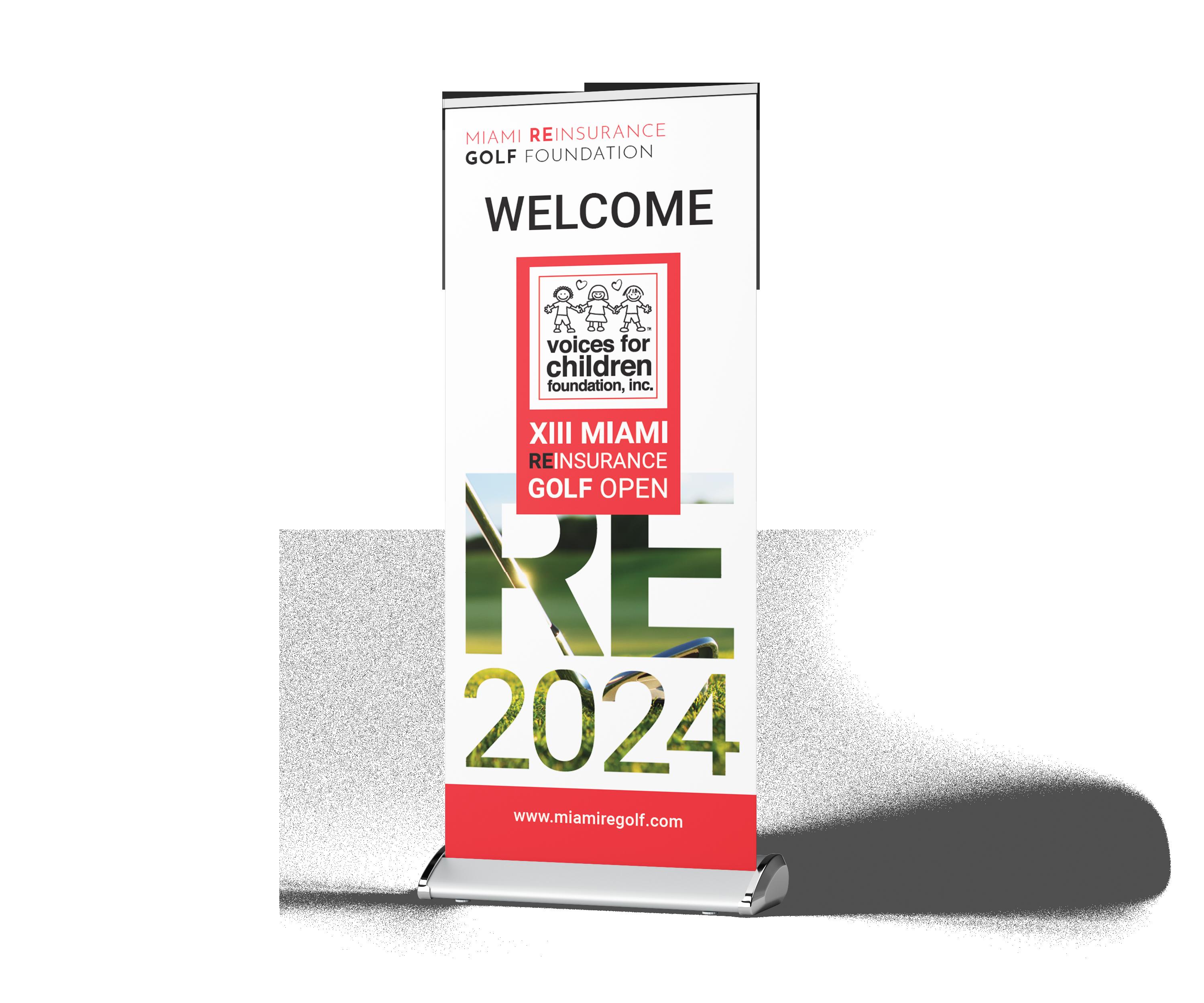
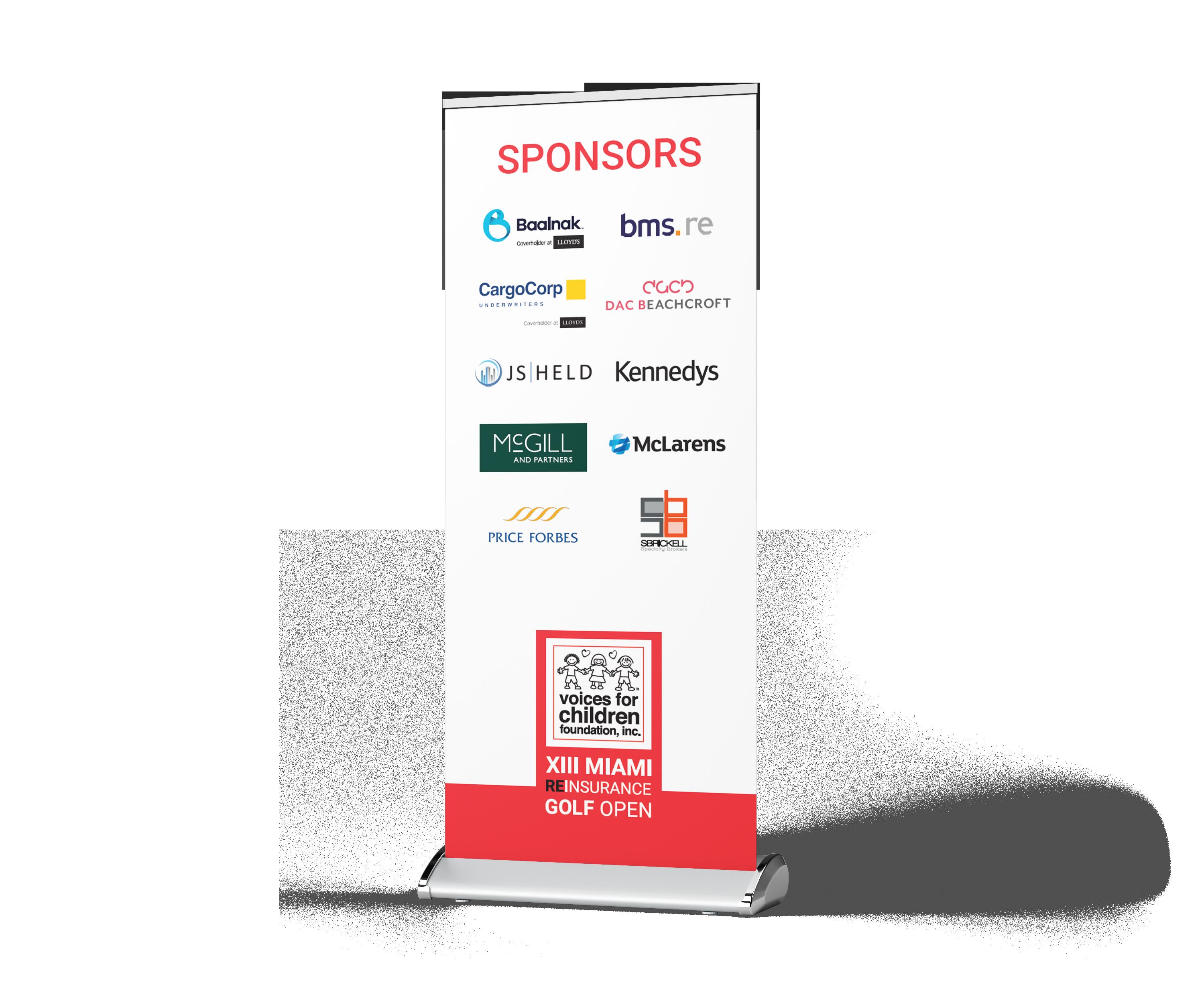
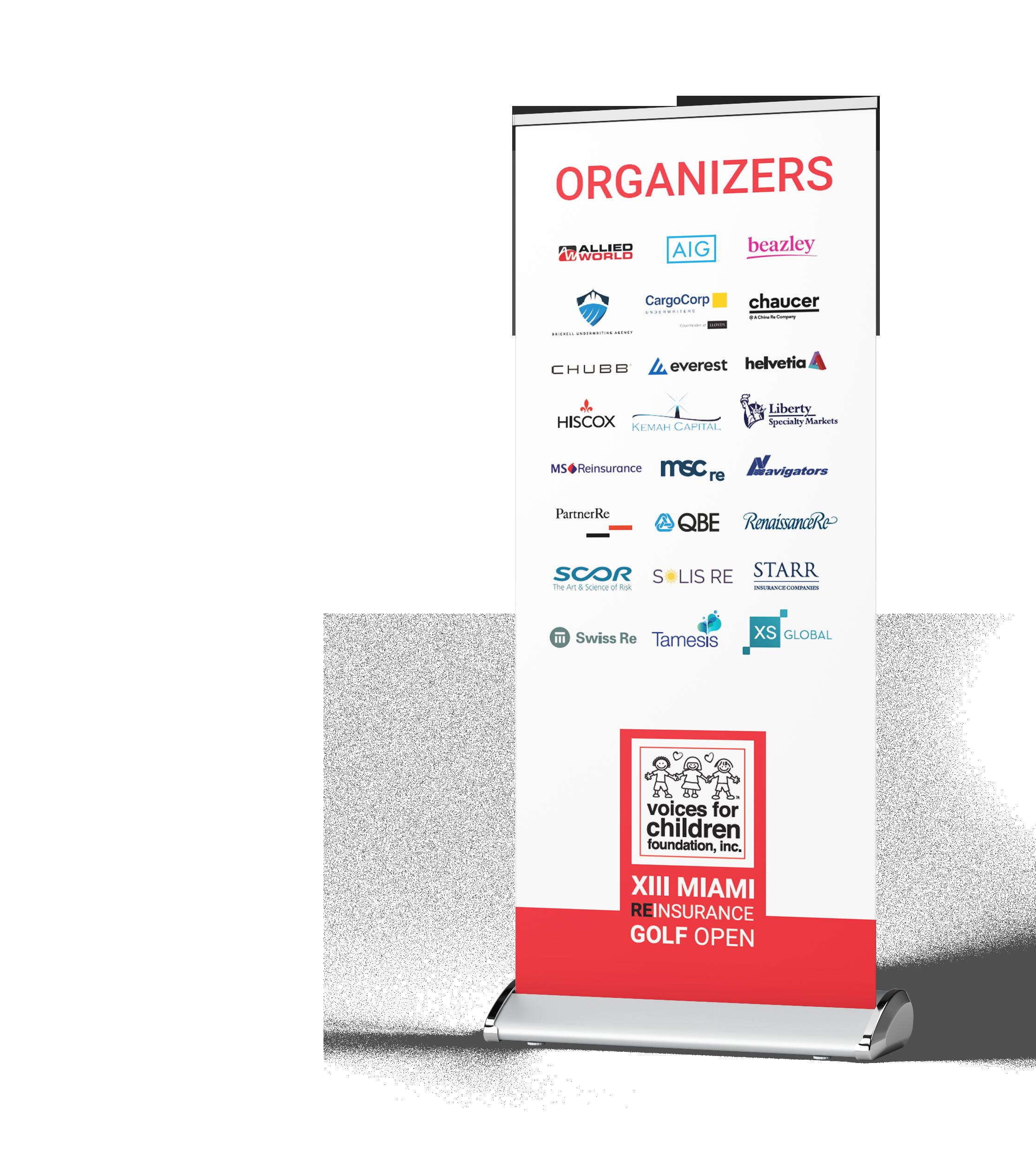
Design a set of branded pull-up banners for events, meetings, and general branding exposure. To establish a cohesive visual style that aligns with the brand identity and can be consistently used across multiple events and occasions. These banners should effectively showcase the brand’s visual identity while conveying its values and purpose through the use of concise vocabulary.
The Miami Reinsurance Golf Foundation mission is to collect funds benefiting “Voices for Children” who provides stability, safety and education to children in foster care. The Foundation organizes a yearly golf event in Miami with the goal of raising funds.
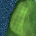
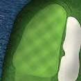
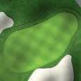
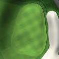
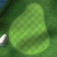
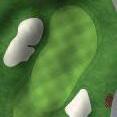
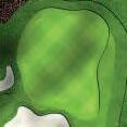
For the golf tournament the follwoing asstes are needed for the execution of the event: Eblasts, flyers, golf score cards and pull up banners.

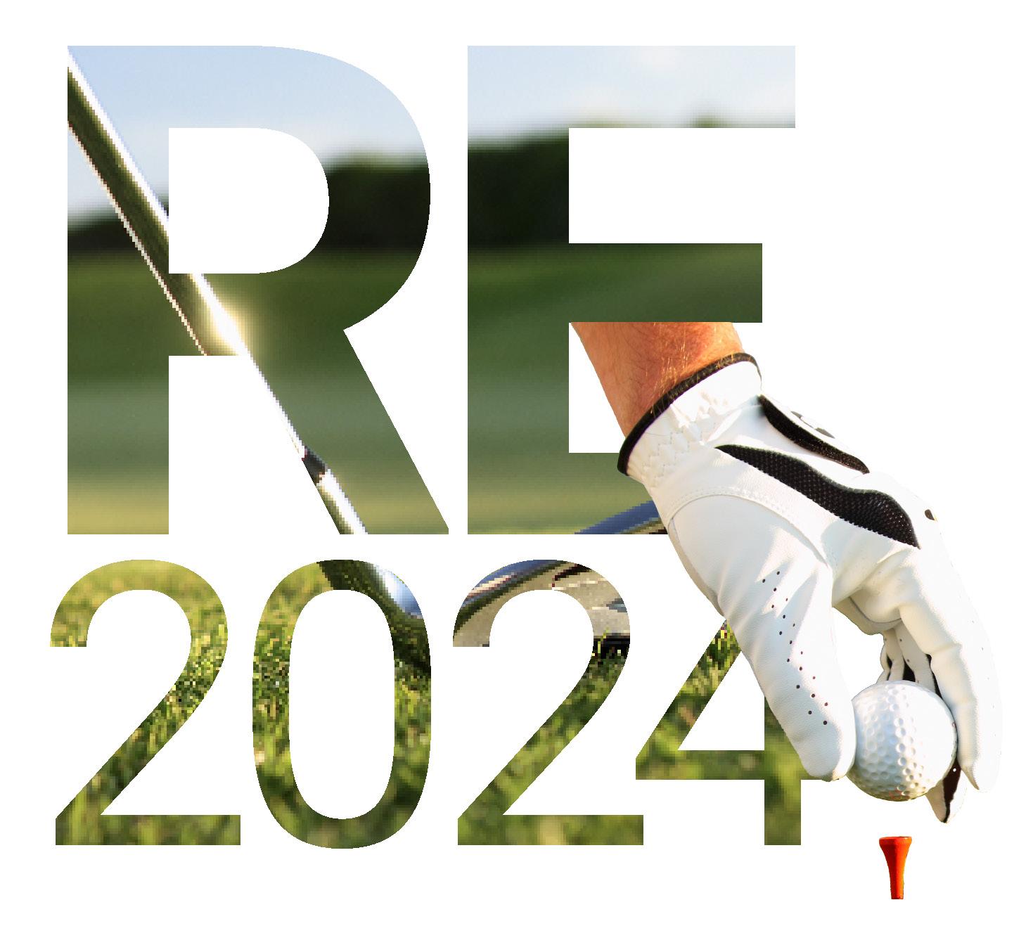
Each year, the golf tournament demands a different visual concept to have a fresh new look. This year, the concept created is based on the use of imagery within text. This creates a entertaining design by visually shpwcasing the correlation of the text with the event. In addition to this, elements are placed out of the text plane creating volume and certain play with depths and visual planes to make the designs more dynamic and interesting. The combination of the text and imagery in this way gets to conceptually represent the union between the golf tournament and the purpose of the children’s voice foundation and their strong alliance of this event throughout the years.
Email blasts to invite the guests to be part of the golf tournament and the post tournament cocktail.
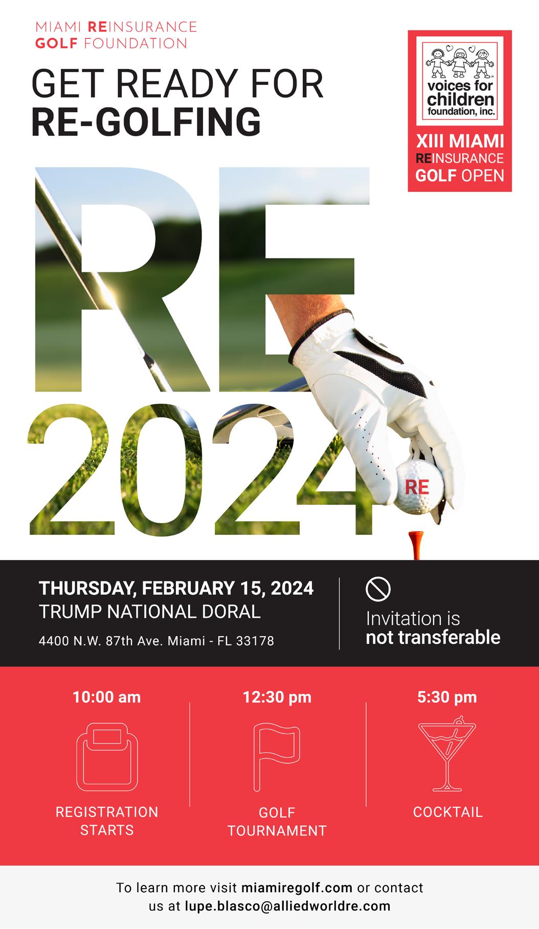
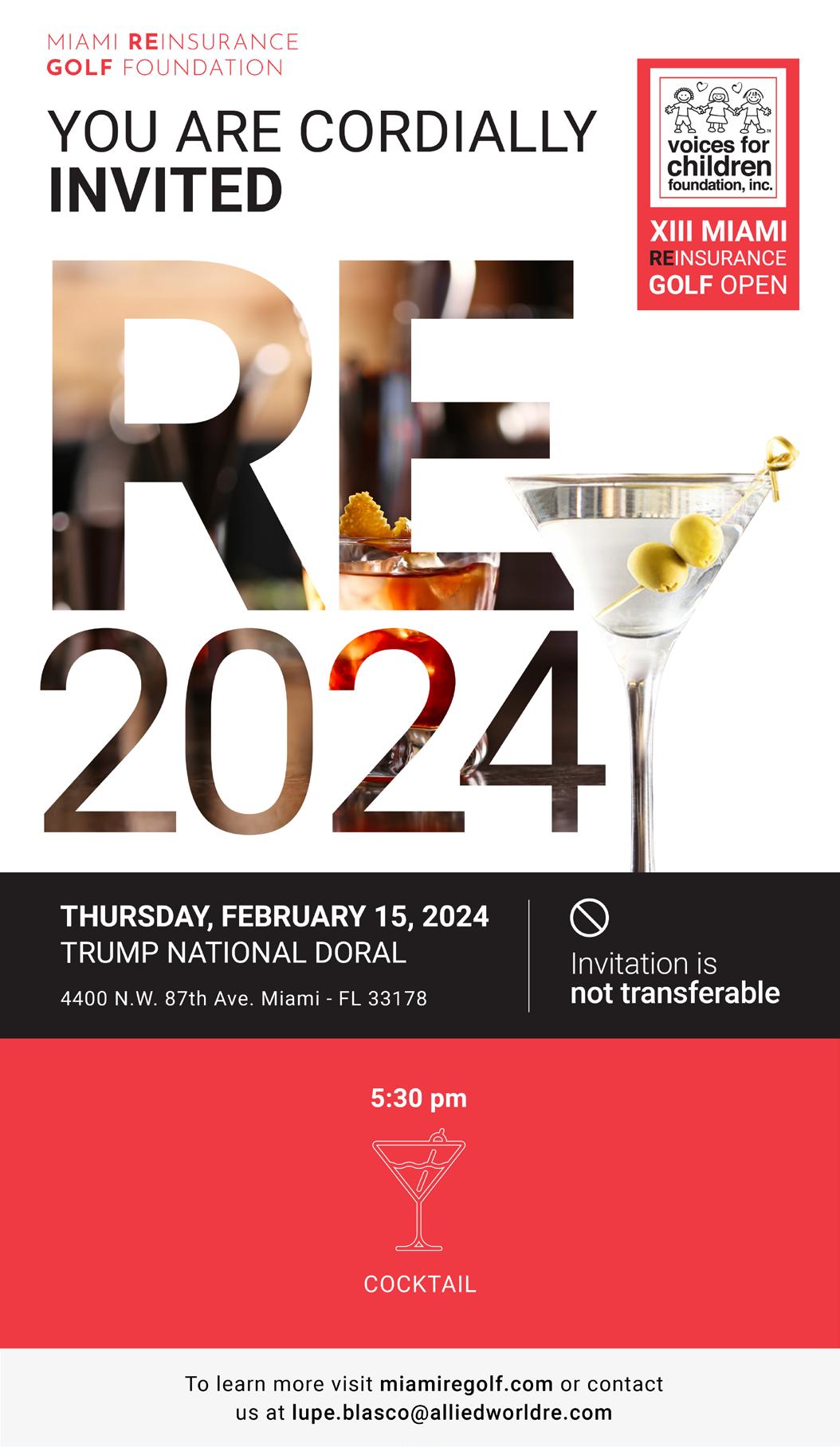
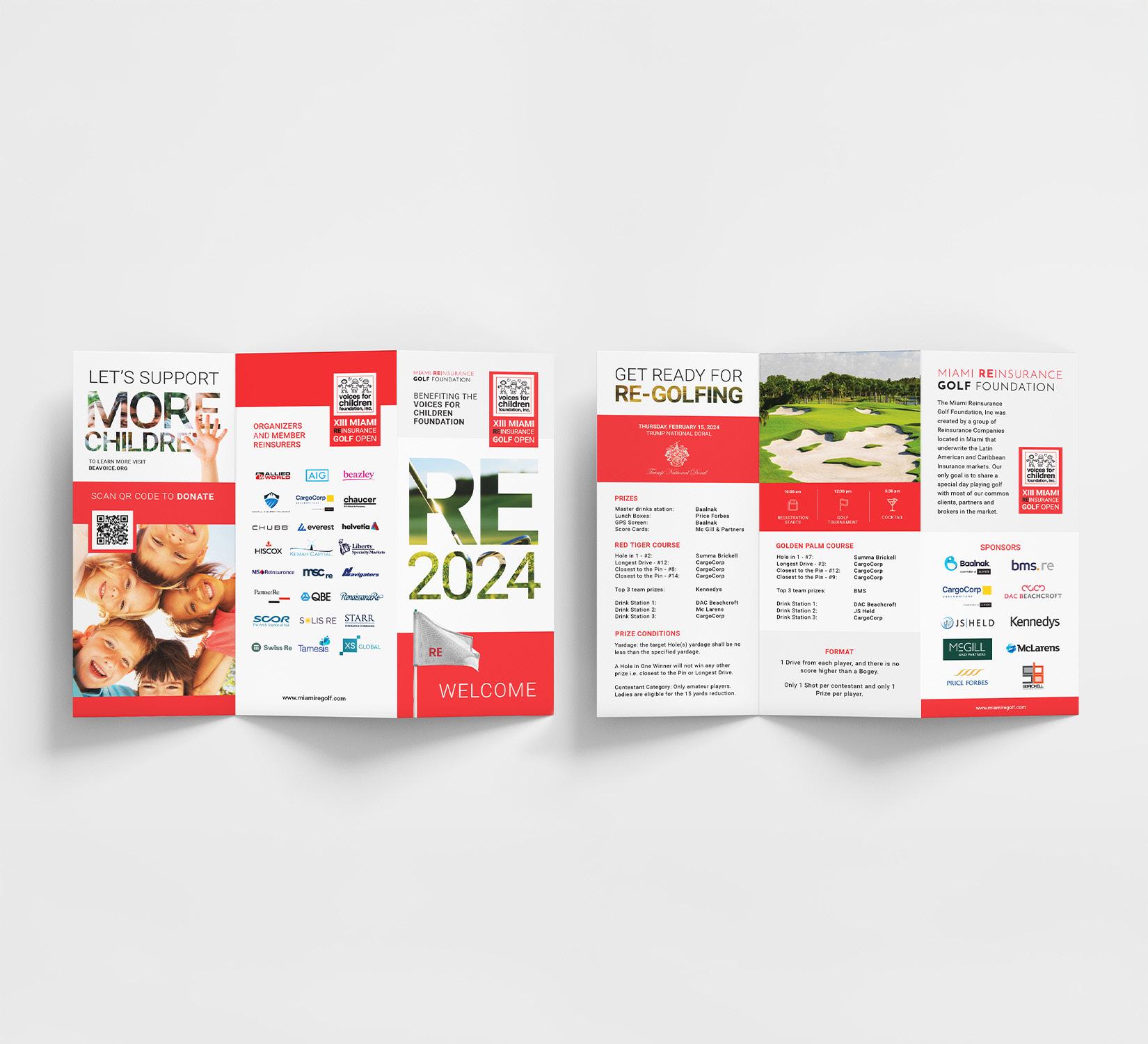
For the flyer and following desings, the idea was to incorporate this years visual concept while communicating the key information of event needed such as the itinerary, sponsors, their purpose, and more indeoth information about the tournament.


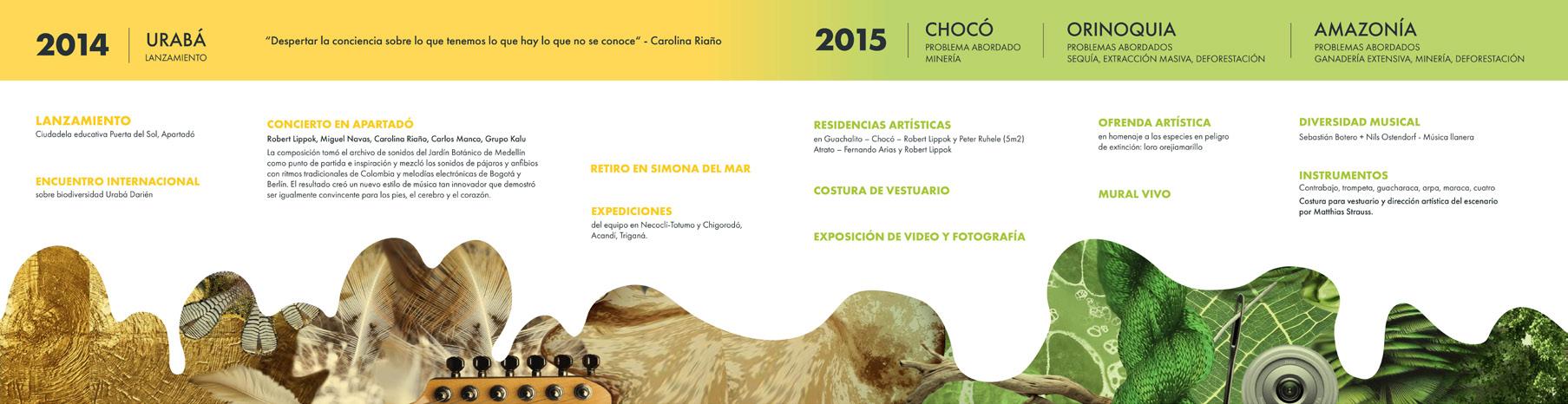
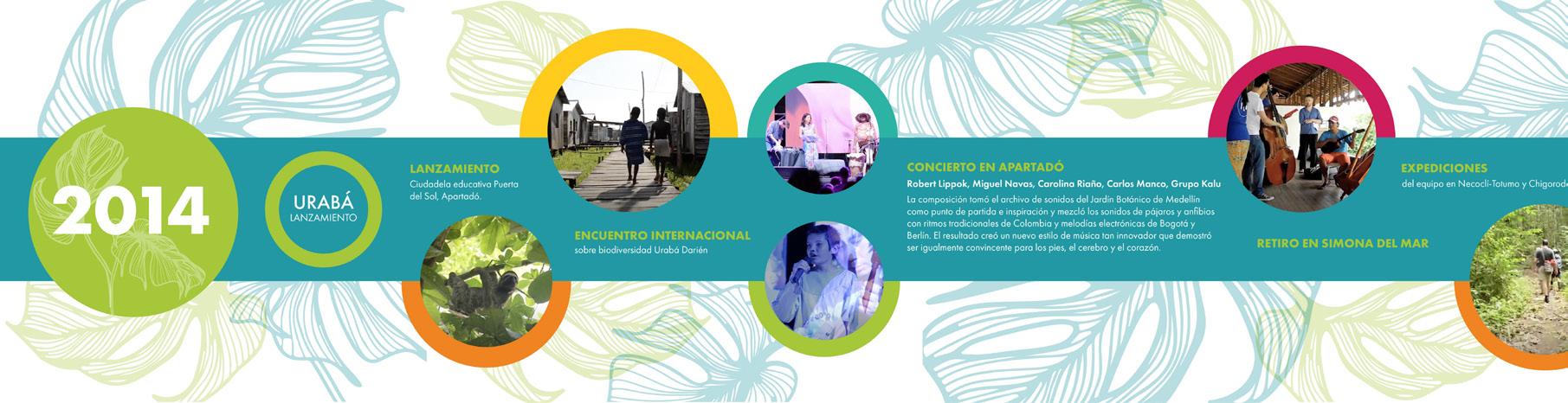
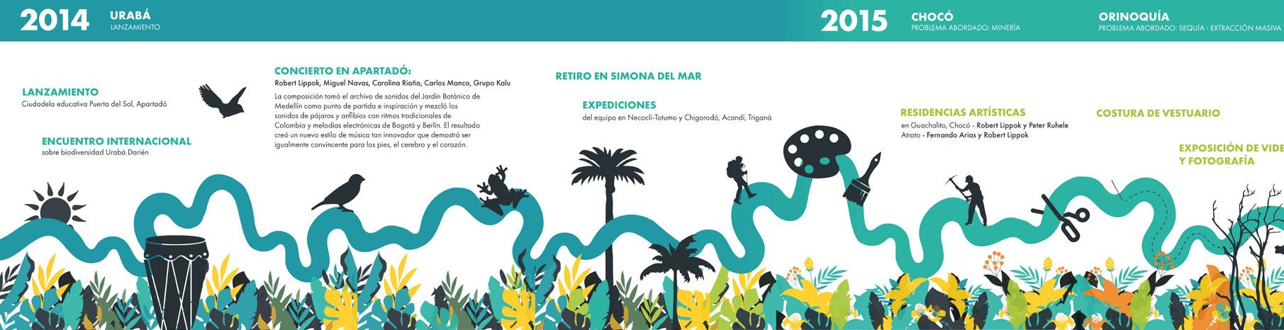
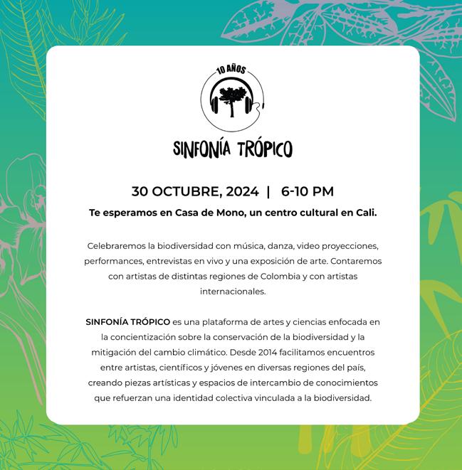
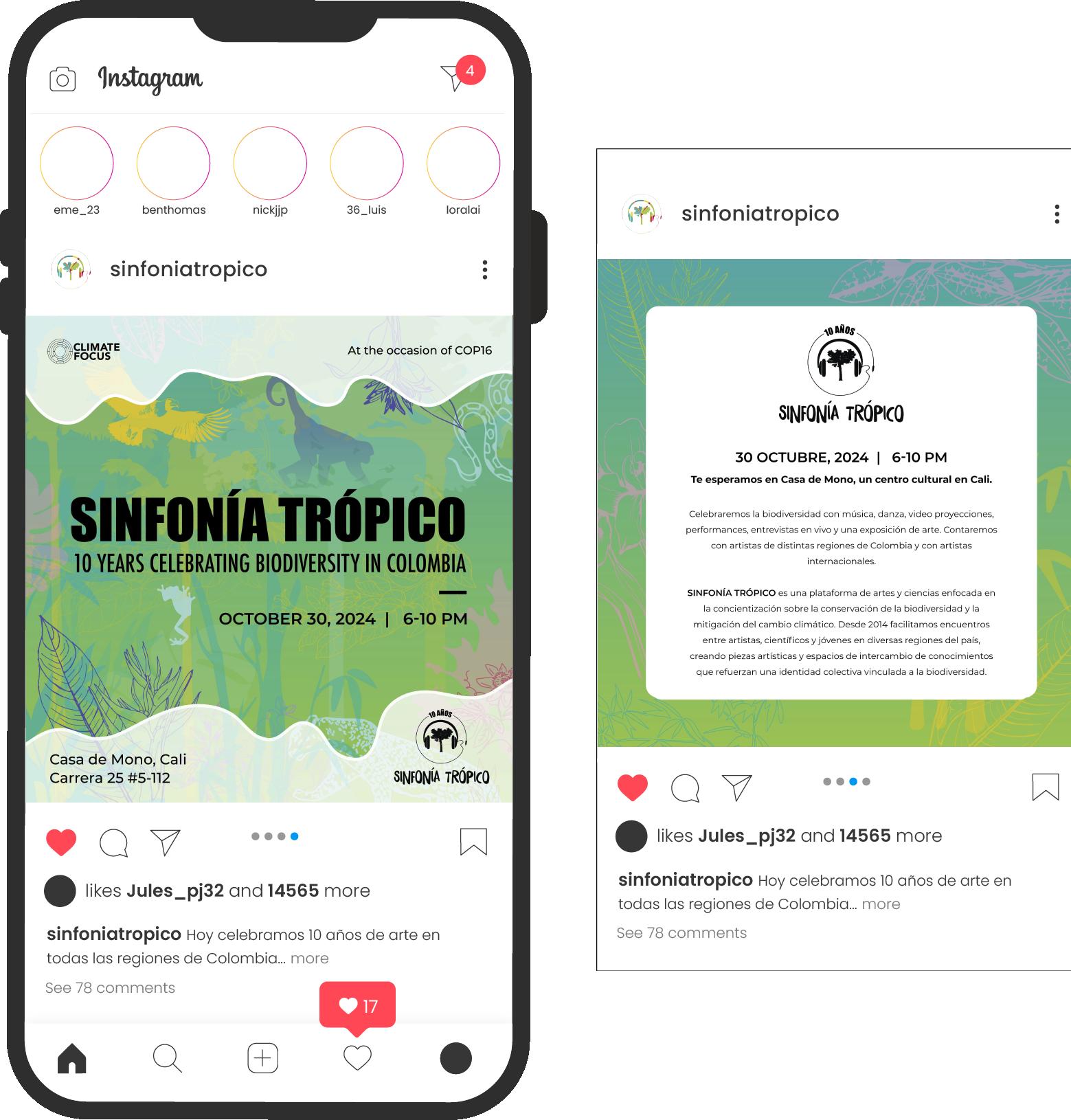
Sinfonia Tropico is an arts and science platform, focused on the conservation and protection of biodiversity. They prganize and exeute encounters in different regions in Colombia strenghtening hte knowledge and sense of identity associated ith biodiversity. By birnging together communities, local and international artists, they create a variety of creatuive activities to further transmit and connect their purpose.
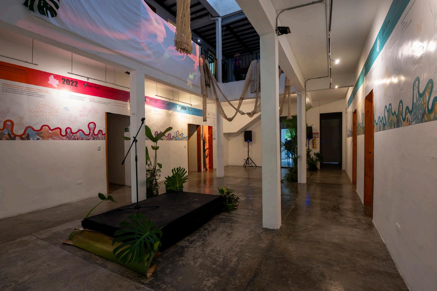
In October 2024, their 10-year anniversary celebration took place in Cali, Colombia. For this event, the primary visual asset was a 10-year timeline that highlighted their main achievements and activities over the years. The objective was to present information in a visually engaging and colorful manner, creating a creative and immersive experience for the audience.
More than showcase their success throughout the years, the brand’s mission was to transmit and inform this timeline events in a more creative and fun way. The time line wraps around the walls of the main central room of the museum, being the central piece as it unravels as the guests go around observing the other pieces expose positioned in the space.
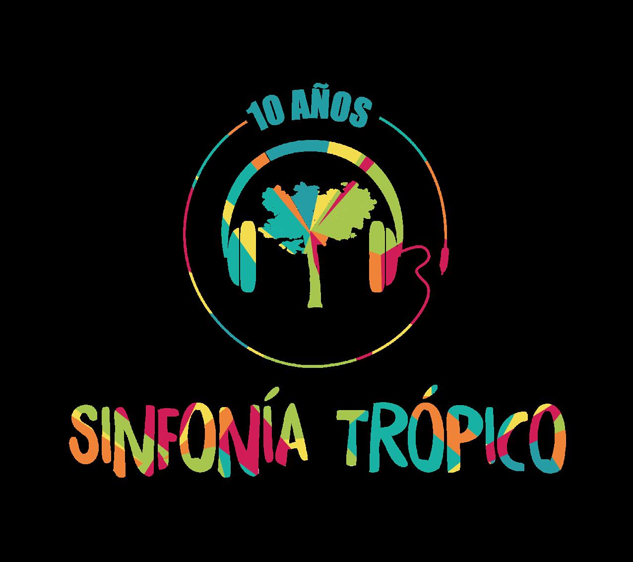
For the night of the event, an adaptation of the original logo was created to commemorate the anniversary of 10 years. Although this event took place in Colombia, most assets where created in both Spanish and English, as many international guests were expected and/or being part of the process and execution of the platform and the celebration event.
Taking into consideration the past designs used for events and their own brand identity, the goal was to create a visual inclined design with a lot of color variation, saturation and dynamic rhythm through the use of natural inspired motifs. The use of organic shapes and silhouettes to cast a a rhythm while working as an informational asset to highlight the biodiversity of Colombia.
CONCEPT #1
Conceptual, dynamic, visual collage of textures.
CONCEPT #2
Visual texture, integration of events, unity.
CONCEPT #3
Friendly, organic, dynamic rhythm, variation.
The final design was a smart combination between details from concept number 2 and 3. A combination of the visual texture created by the outlines of biodiversity of Colombian regions, and the movement created by the organic shapes and iconography of the third design. An incorporation of secondary hues were added to the brand’s color palette to complement the design and create further depth and volume by the combination of the following.
PRIMARY (ORIGINAL)
#96D5D2
#DAE690 #F4D896 #F7B888 #F59DC0 #DB9EC7 #9FDBE9
SECONDARY (ADDITIONAL)
*Timeline and all individual assets made on Adobe Illustrator
The timeline consist of a continuous line representing the stability and continuing of the events throughout the years. Also, it is created with the intention of movement adaptability in its space to conceptualize with the variety and dynamism seen in Colombia’s biodiversity. The patterns and shapes on all of the timeline represent plants, animals, flowers, and trees which mainly characterize the region where they are being placed in. Also, they sometimes allude to iconography about specific events or points explained in the text of the timeline.
*Blank spaces are taking into consideration of the doors in the building which will be eventually cut out of design.
SINFONÍA TRÓPICO es una plataforma de artes y ciencias enfocada en la concientización sobre la conservación de la biodiversidad y la mitigación del cambio climático. Desde 2014, facilitamos encuentros entre artistas, científicos y jóvenes en diversas regiones del país, creando


INSTALACIÓN ARTÍSTICA
Memorias Vivas de los Llanos poéticos.
DIRIGIDO a la realización de una residencia artística de investigación para el desarrollo de obras de arte sobre la biodiversidad del Chocó.
PROBLEMAS ABORDADOS: Minería - Narcotráfico - Violencia
INSPIRACIÓN SONORA para la musicalización de la obra Atrato.
INSTALACIÓN 5M2
TALLERES: - Música - Fotografía
ABORDADOS: Ganadería extensiva - Minería - Deforestación
DE LA DIVERSIDAD
PERFORMANCE 18.992 Árboles Talados Hoy en Guaviare - Colectivo Atempo
REALIZACIÓN DE DOCUMENTALES - La Veda - Don Flaviano - Corazón del Guaviare

PROBLEMAS ABORDADOS: La amenaza a la biodiversidad NOVIEMBRE 20
“La diversidad biológica pero también cultural constituye un tesoro indescriptible de la riqueza del país. La diversidad está amenazada y esa amenaza concierne a todos los colombianos” - Charlotte Streck
LANZAMIENTO en la Ciudadela educativa en Apartadó, en el marco del Encuentro Internacional sobre biodiversidad Urabá Darién.
CONCIERTO RETIRO RESIDENCIA ARTÍSTICA
EXPEDICIONES ARTÍSTICAS En Necoclí-Totumo y Chigorodó, Acandí, Triganá.
MARZO 11-25
PROBLEMAS ABORDADOS: Sequía – Extracción masiva de recursos naturales - Deforestación
“Despertar la conciencia sobre lo que tenemos, lo que hay, lo que no se conoce” - Carolina Riaño
DIRIGIDO a las artes escénicas, performance, fotografía para jóvenes de la comunidad.
TALLERES: - Música - Taller del Cuerpo - Costura de Vestuario - Fotografía
EXPOSICIÓN DE FOTOGRAFÍA
CONCIERTO DIVERSIDAD MUSICAL MURAL DE LA DIVERSIDAD
OFRENDA ARTÍSTICA en homenaje a las especies en peligro de extinción: Loro orejiamarillo.
DRAMATIZACIÓN de textos poéticos.
FESTIVAL CREADO POR COLECTIVO ATEMPO cineforos de ciencia y cultura, taller de agricultura urbana, taller de arte urbano, jardín urbano y mural.
VIDEO INSTALACIÓN Verde
INSTALACIÓN Pneuma Mapalina
DIRIGIDO a la comunidad citadina de Bogotá y a nuestros aliados y héroes ambientales.
PRESENTACIONES EN EL MUSEO NACIONAL DE COLOMBIA Atrato - Verde
MARATÓN SINFONÍA TRÓPICO en Flora ars+natura
exposiciones de fotografías,
símbolo de rompimiento de
DIRIGIDO a la integración social de los jóvenes del barrio La Gloria fortaleciendo de la identidad cultural y la riqueza de la biodiversidad.
EXPOSICIÓN Todos los tonos de la diversidad en Casa 969. TALLERES: - Música - Fotografía - Dibujo - Diseño de Modas
CONCIERTO FINAL Casa 969
DIRIGIDO a jóvenes del territorio para reflexionar sobre el impacto de las acciones humanas sobre la sociedad y el territorio.
TALLERES: - Música - Mural - Cocina - Danza - Diseño de Modas y Costura - Artes Escénicas - Escritura
PROBLEMAS ABORDADOS:
Minería (oro) y deforestaciónagricultura y ganadería extensivas
PRESENTACIONES: ¡Mira mi pueblo! ¿Qué es lo que valOro?
AGOSTO - NOVIEMBRE
DIRIGIDO a jóvenes y maestros en formación en Mitú y alrededores de las etnias Cubeo, Bará, Piratapuyo, Desano, Tatuyo, Guanano, entre otras.
TALLERES: Cuerpos de Agua Cuerpos Reforestados
PROBLEMAS ABORDADOS: Deforestación ambiental y cultural, contaminación de humedales
DE LA DIVERSIDAD
MURALES, FOTOGRAFÍA ANÁLOGA, PERFORMANCE, DANZA E INVESTIGACIÓN CREATIVA Y PARTICIPATIVA en un entorno de reflexión sobre la selva, el agua, la reforestación cultural para restaurar el territorio, la diversidad y la riqueza sociocultural.


PROBLEMAS
TALLERES: - Muralismo - Fotografía - Música - Podcast - Performance - Ilustración Botánica
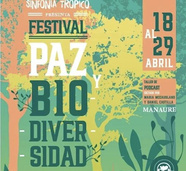
FESTIVAL PAZ Y BIODIVERSIDAD
MURAL DE LA DIVERSIDAD
AGOSTO - NOVIEMBRE
DIRIGIDO a niños, niñas y jóvenes de la Institución Educativa Técnica Ecológica
FESTIVAL Voces del Bosque
PROBLEMAS ABORDADOS: Deforestación del Bosque Seco Tropical
TALLERES:
MURALES DE LA DIVERSIDAD DIRIGIDO
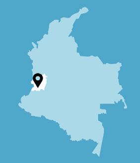
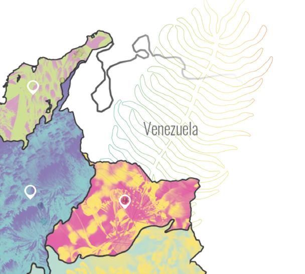
Map of Colombia highlighting the region where the event mentioned took place in. To contextualize and give a light idea to international audience to contextualize more about Colombian geography and the place being mentioned.
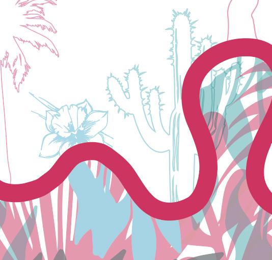
Close up of details. All imagery, silhouettes and patterns are created based of important biodiversity of every region...
QR codes are placed continuously throughout the timeline for guests to be able to be directed to the company’s website. This is not only for people to get the chance to further connect with Sinfonía Trópico, but also to access further more detailed information about all the past and future events and activities.
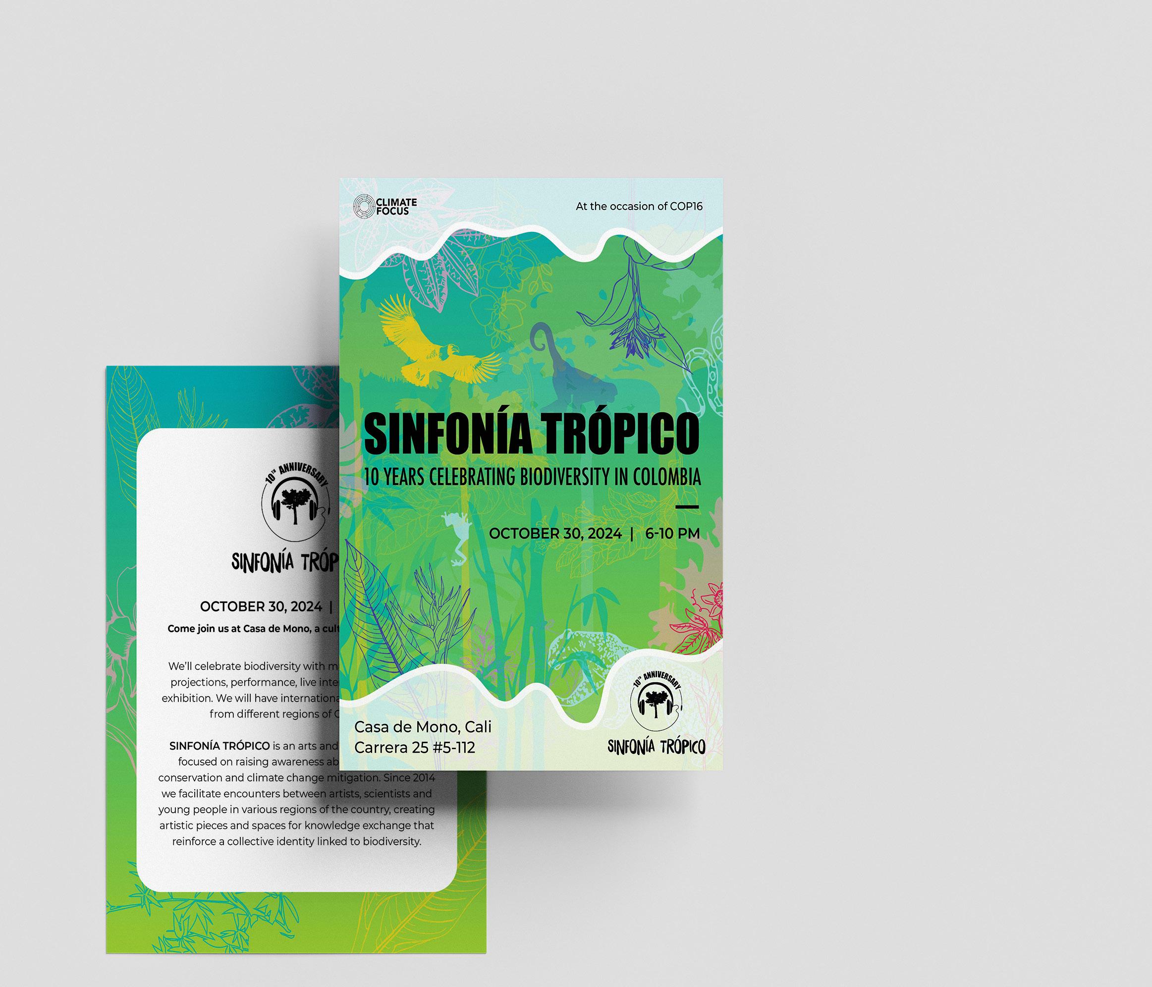
To announce the upcoming event, an adaptation of the timeline design was needed to promote the event through social media and direct invitations. The goal of these deliverables was to create a visually compelling invitation while conveying the right content with a single design, unified with the conceptual visual assets of the timeline.
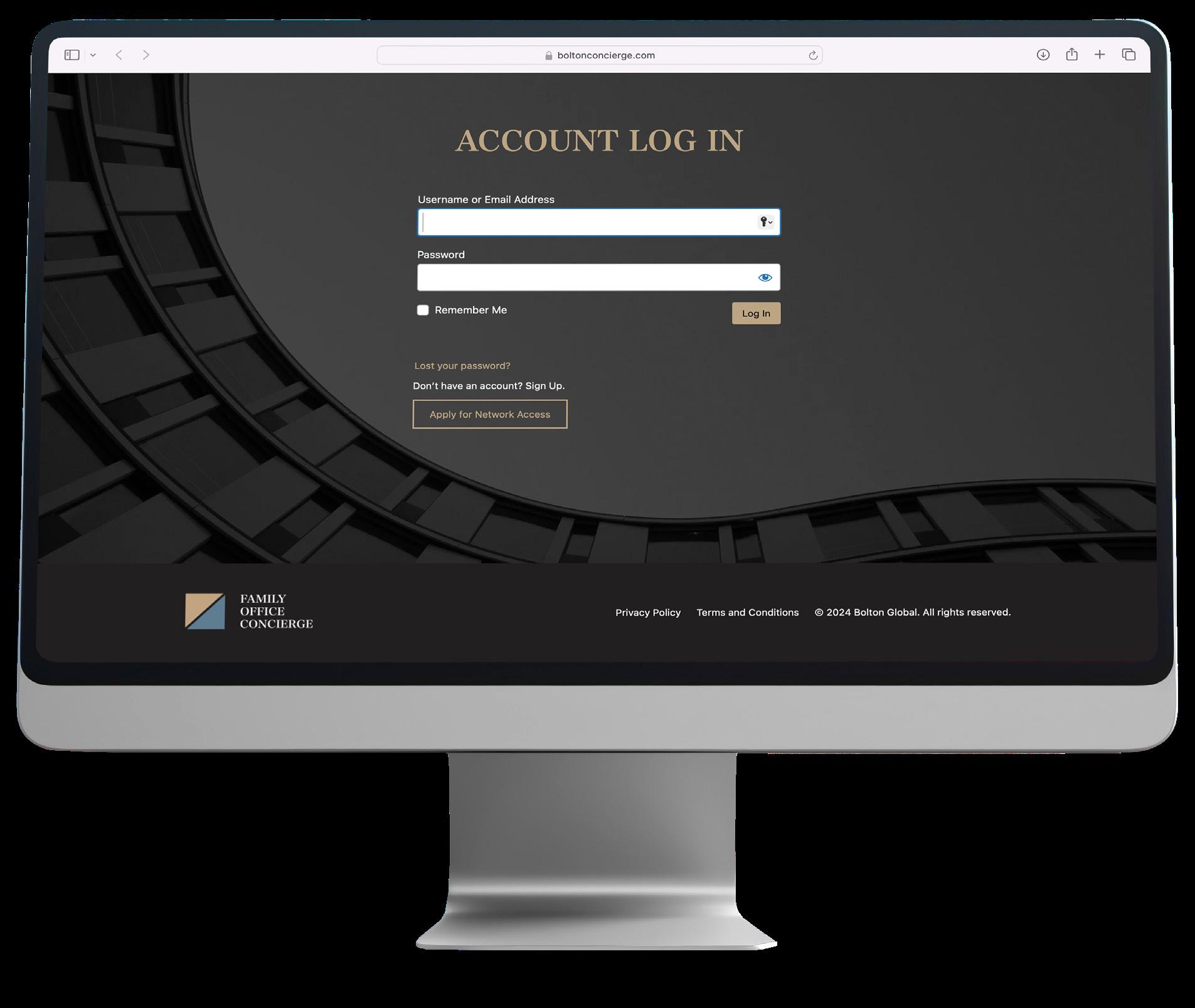
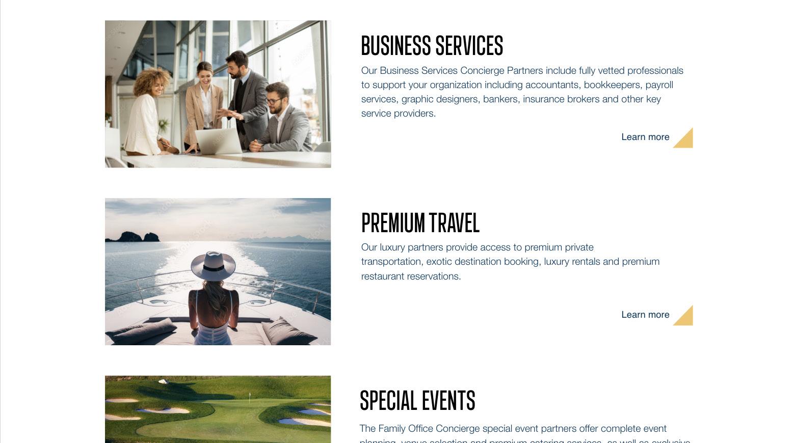
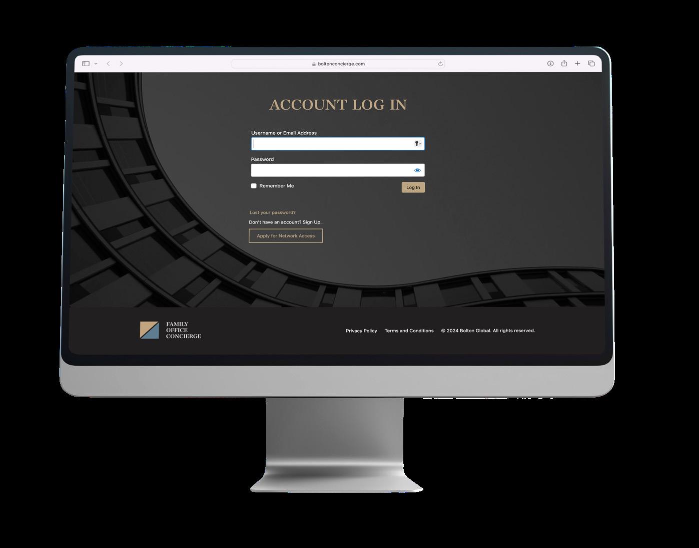
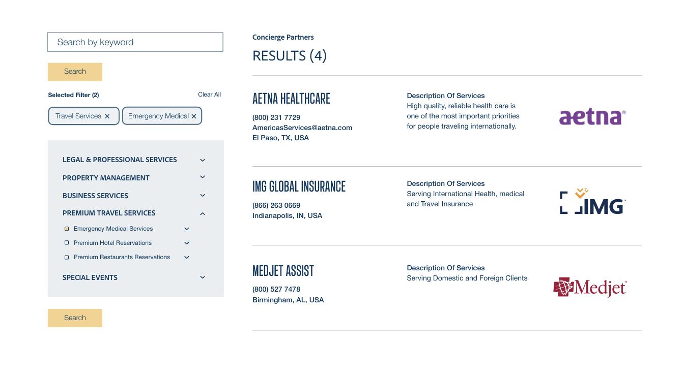
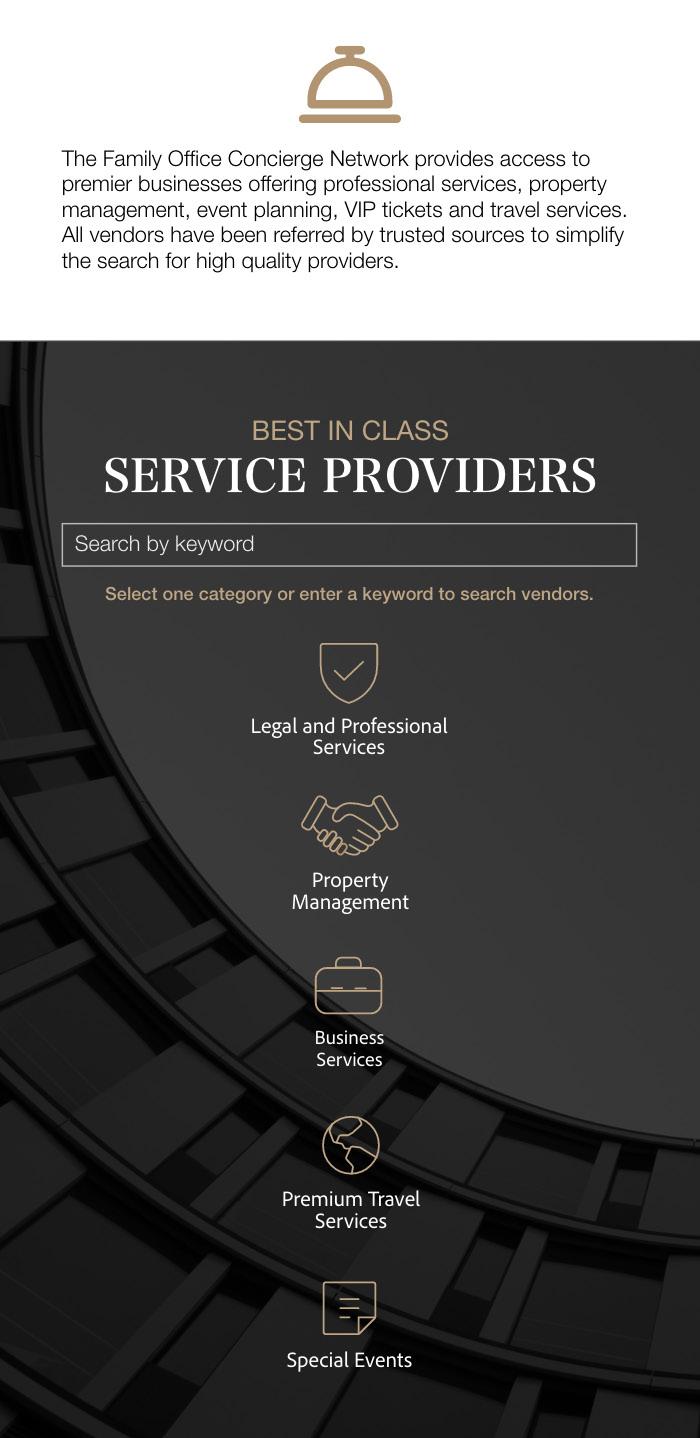
Bolton has an exclusive concierge platform for financial advisors to provide clients with the best class service providers. These services include legal, real estate and property management, special event planning, premium travel and more. As bolton’s brand image was modernized, this website needed to be updated to be coherent with the new design, look and feel. In order to differentiate the website from the main one, the designed was intended to follow the brands new guidelines while creating differentiation from the main website.
An adjusted color palette was chosen to achieve this differentiation. To create a luxurious look, black, white, and subtle gold were used. Not only does this create an obvious contrast from the original website, but it also aligns more closely with the website’s context by being edgier and more luxury-oriented.
Given that the website was coded with non-adaptable code due to the necessary database plugins, the challenge for this design was to create a unique, modern, and elegant platform within the constraints of the design.

*All wireframes and screens where designed in Adobe XD by myself then transcribed to word press by the company’s web coder.
A mobile version was also needed. Adaptations of the original design took place after approval to satisfy mobile user experience.
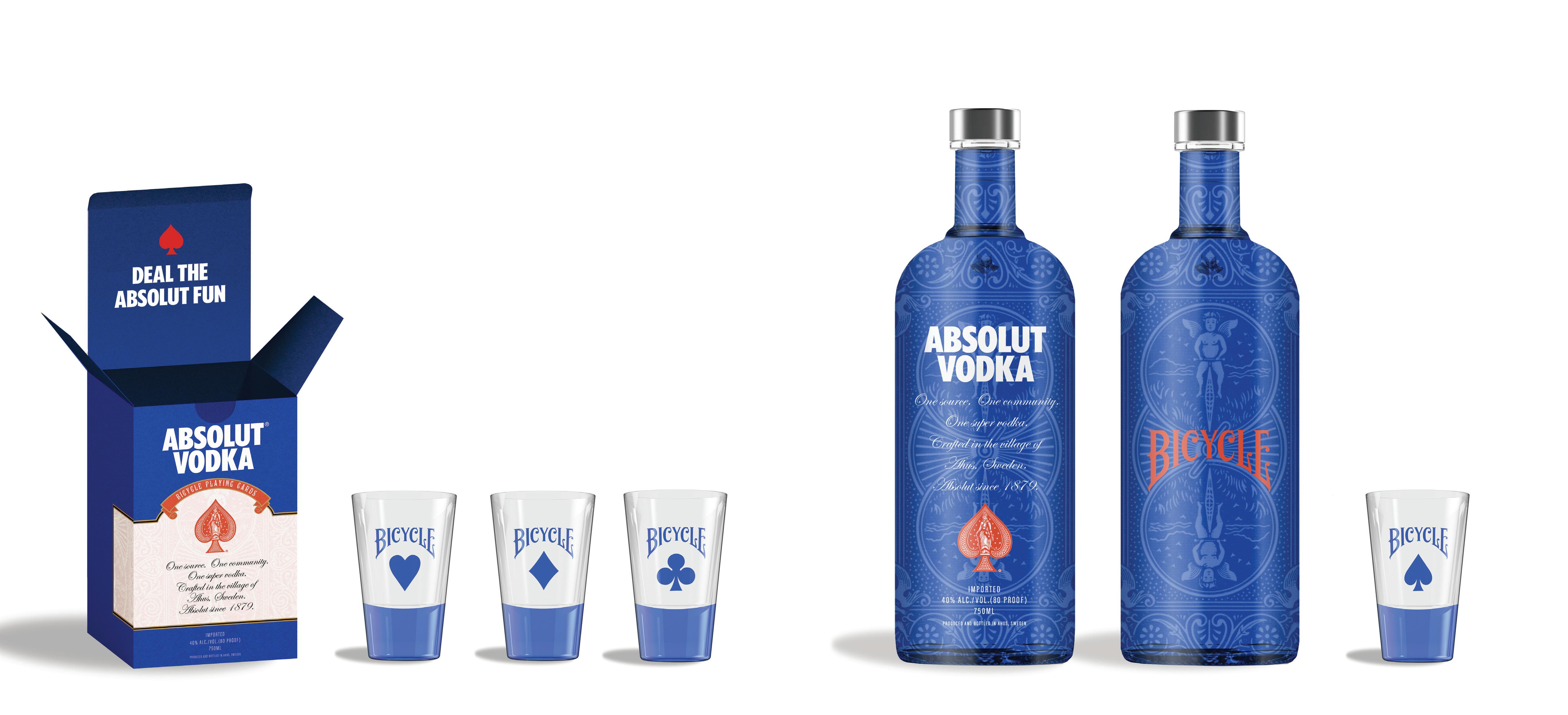
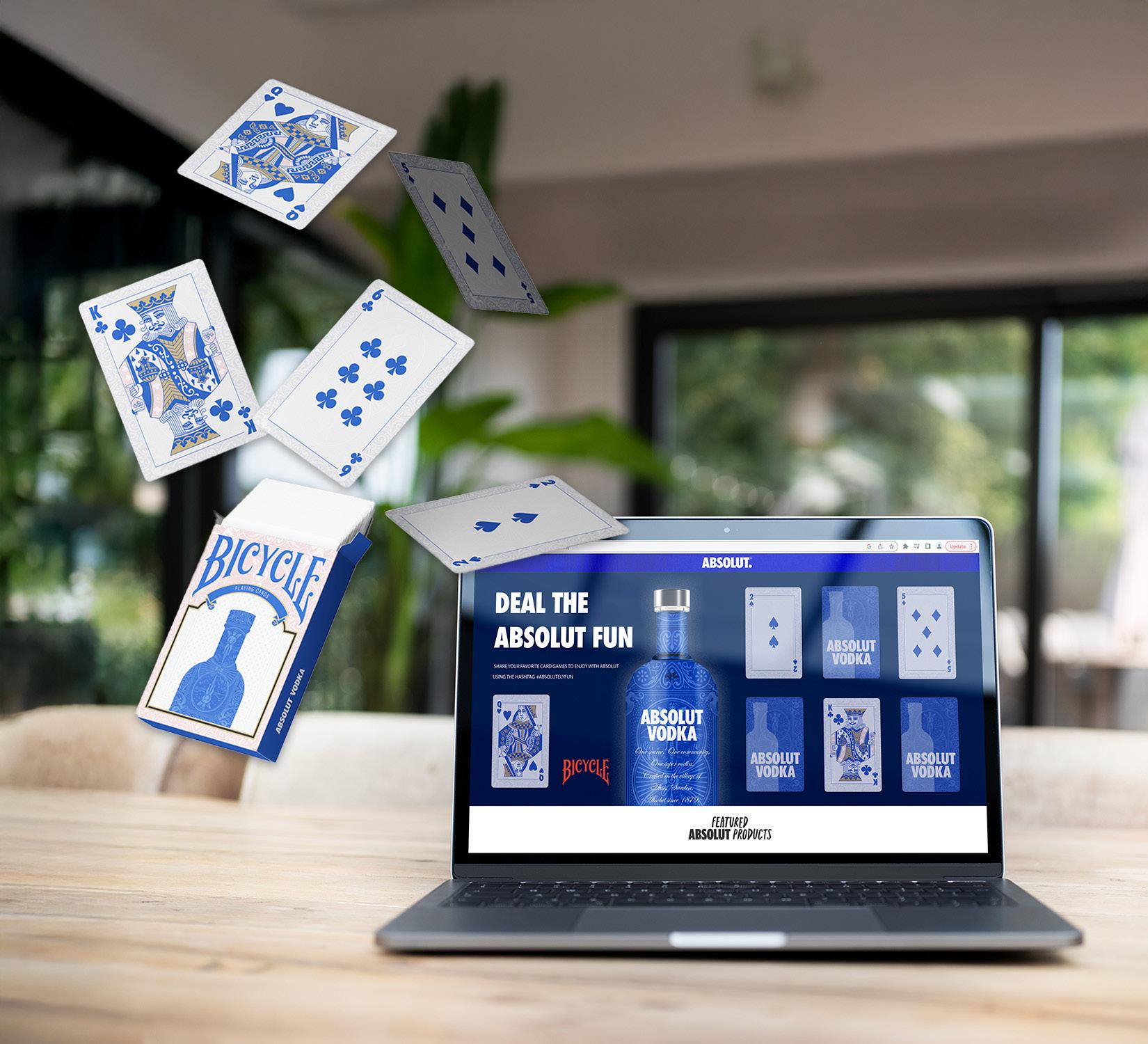
This project consisted of creating a collaboration campaign between two brands with different products and purposes. To successfully create a concept which will align to both brand’s target audiences, purpose, goals, and values.
ABSOLUT VODKA is a premium spirits brand that includes vodka, gin, and liqueurs. They are “Driven by empowerment to challenge convention, we strive to bring people, from all backgrounds, together through creativity.”
BICYCLE CARDS is a brand of playing cards operating since 1885. They believe in combining their rich history and passion for card making to share the magic of playing together.
Both brands driven by the idea of bringing people together through creativity and shared experiences, would benefit in a collaboration where both of their products could be enjoyed at the same time. Not only this, but both brands constantly make collaborations with big brands to further pursue their artistic and creative desire of keeping their products fresh modern and fun for everyone.
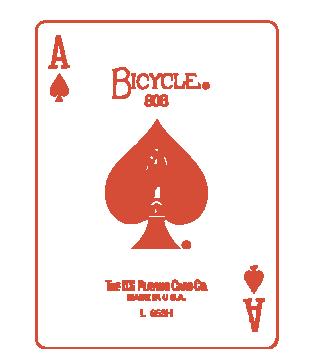
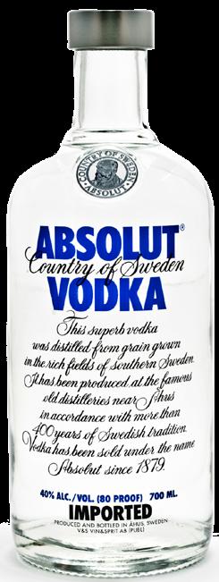
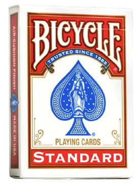
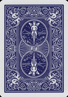
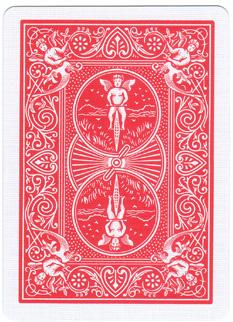
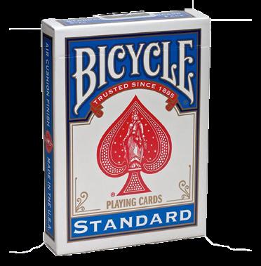
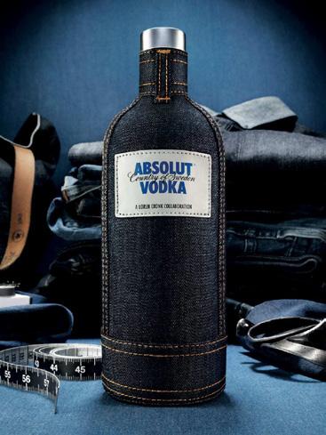
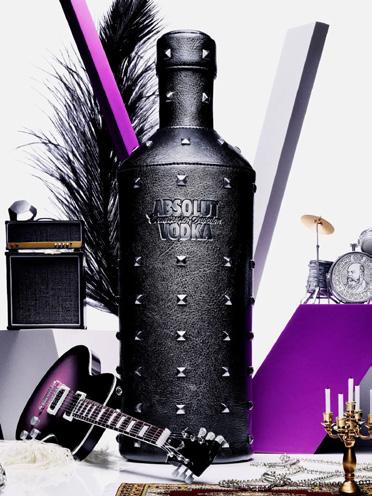
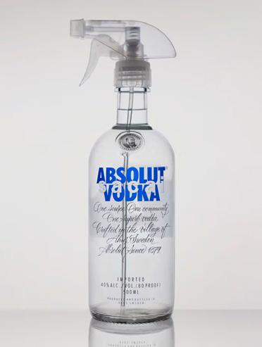
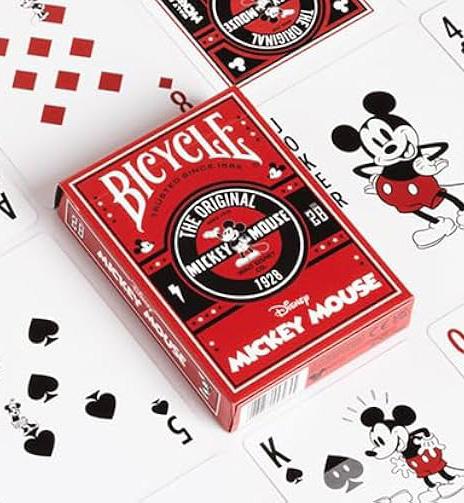
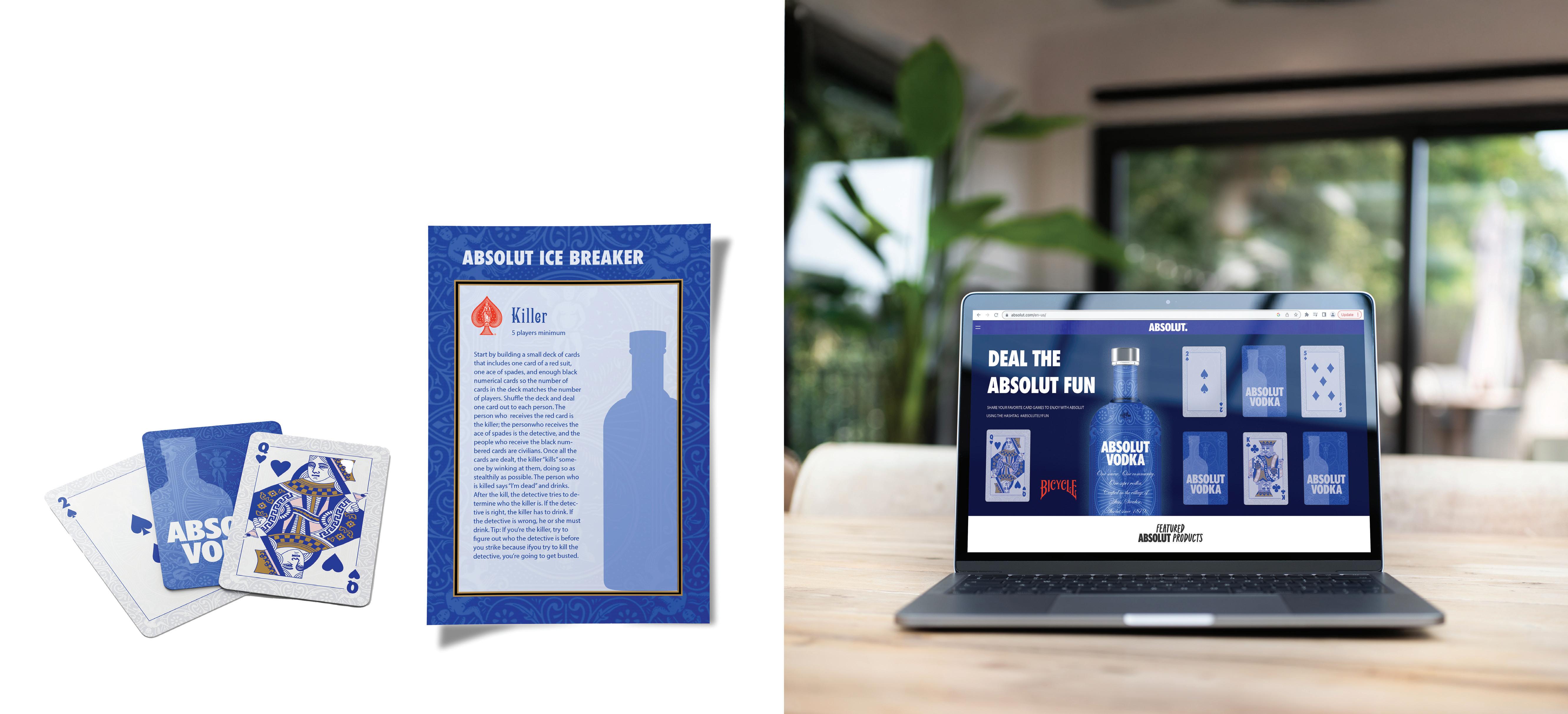
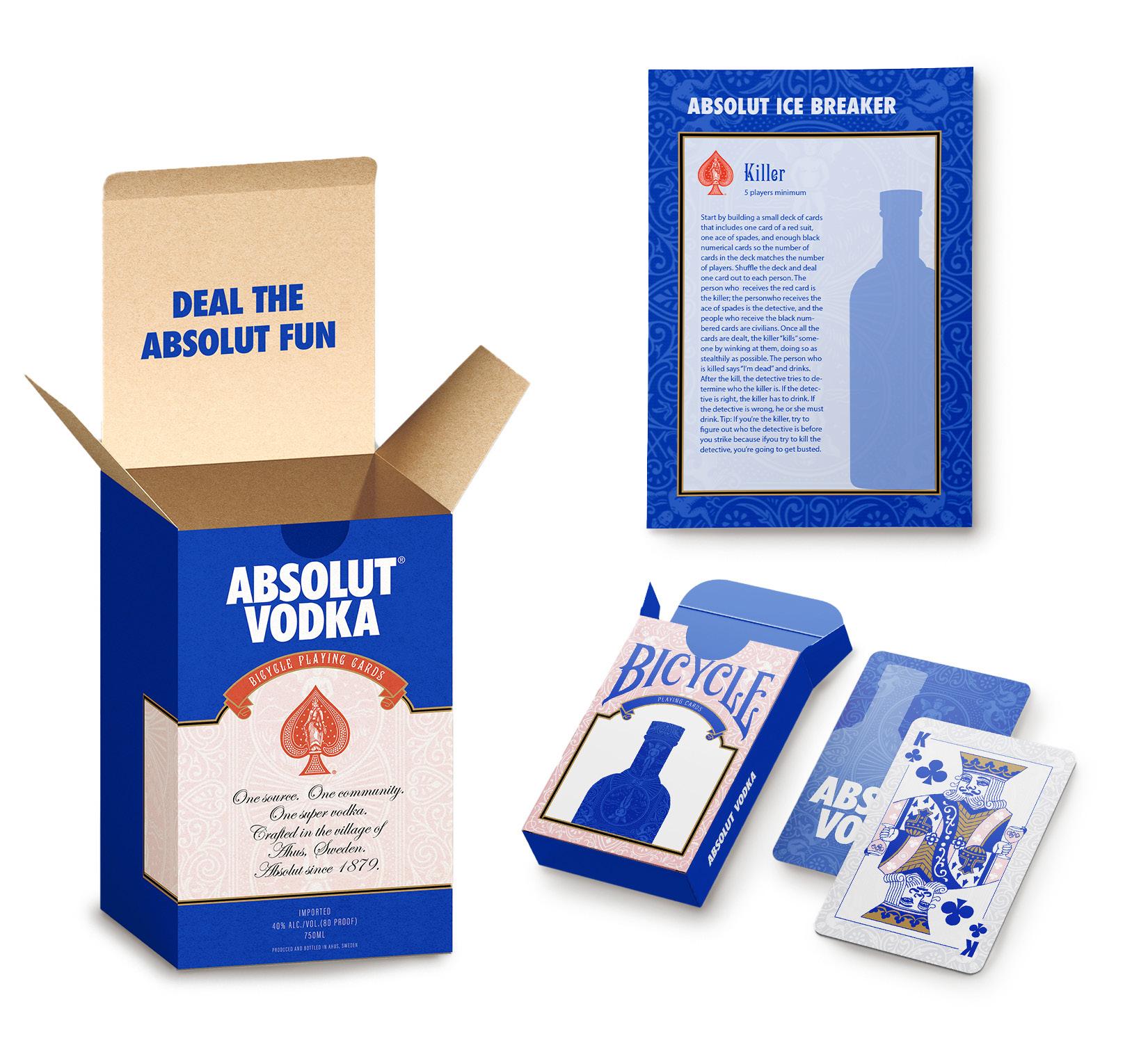
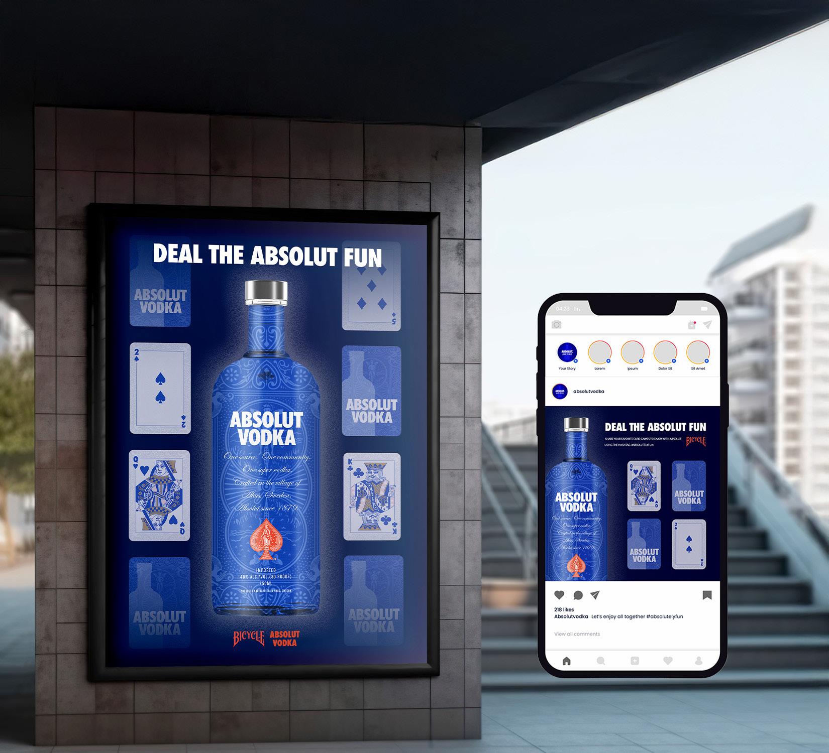
This collaboration consisted of a package product that included a bottle of vodka, a deck of playing cards, four shot glasses, and a card drinking game. The branding design for the product was created by merging prominent visual assets from both brands, such as the textured background illustrations of Bicycle Cards and Absolut’s typography along with its recognizable brand blue color. This design was inspired by the original products of both brands to evoke their classic and iconic identities.
By carefully selecting and integrating both brand personalities into the composition, the goal was to create a design that is new, interesting, and visually appealing while still making it easy to recognize the key visual elements of both brands. This creative fusion allows both companies to expand their brand exposure with a fresh and distinctive look.
The purpose of this package is to promote personal connection, integration, and quality time. All of this which are values that align with the mission and purpose of both companies.
To strengthen the campaign, the tagline “Deal the Absolut Fun” was created. This phrase employs a clever play on words by merging vocabulary from both products and brands. It not only conveys the product’s intention but also alludes to the unifying theme and integration of the two brands.


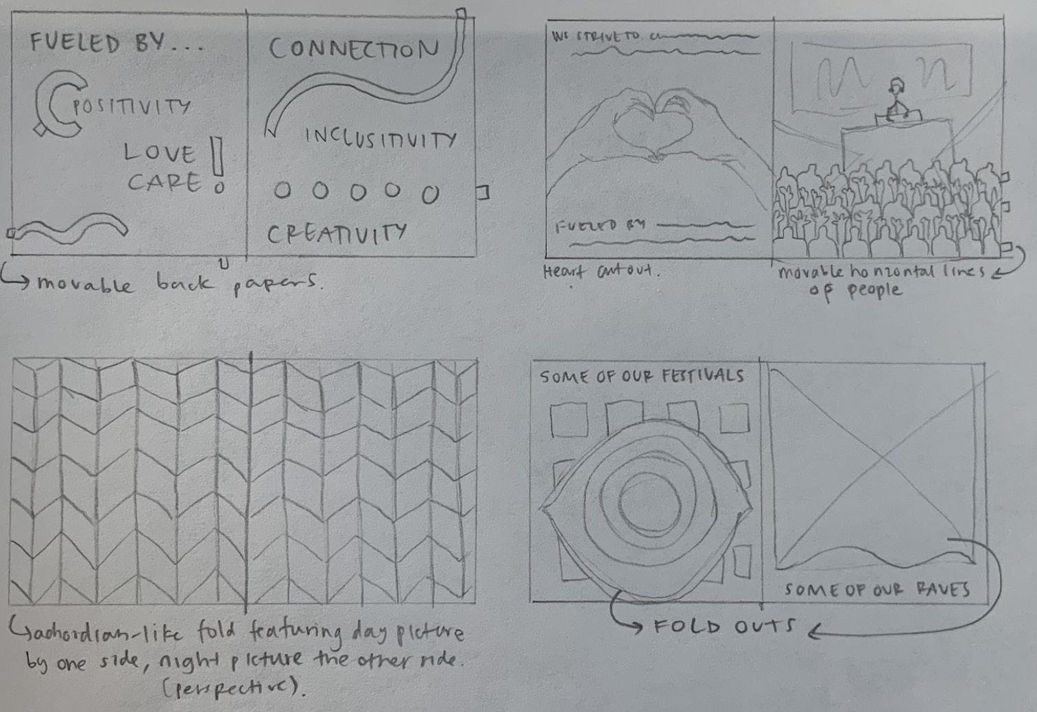
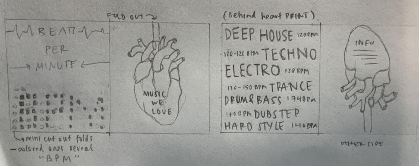
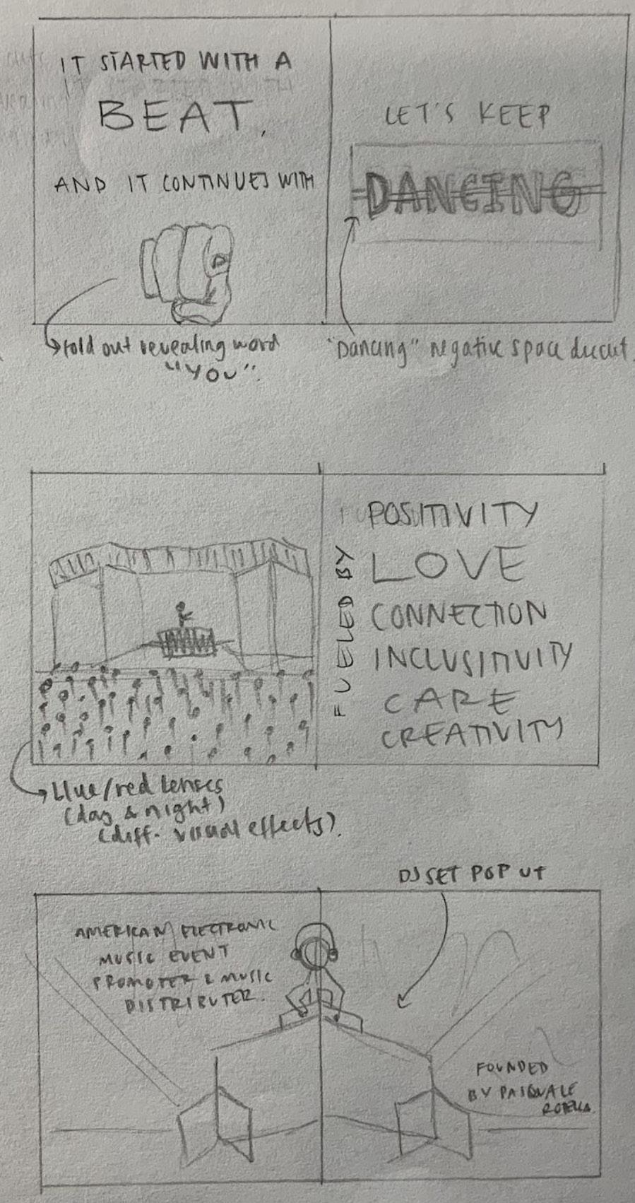
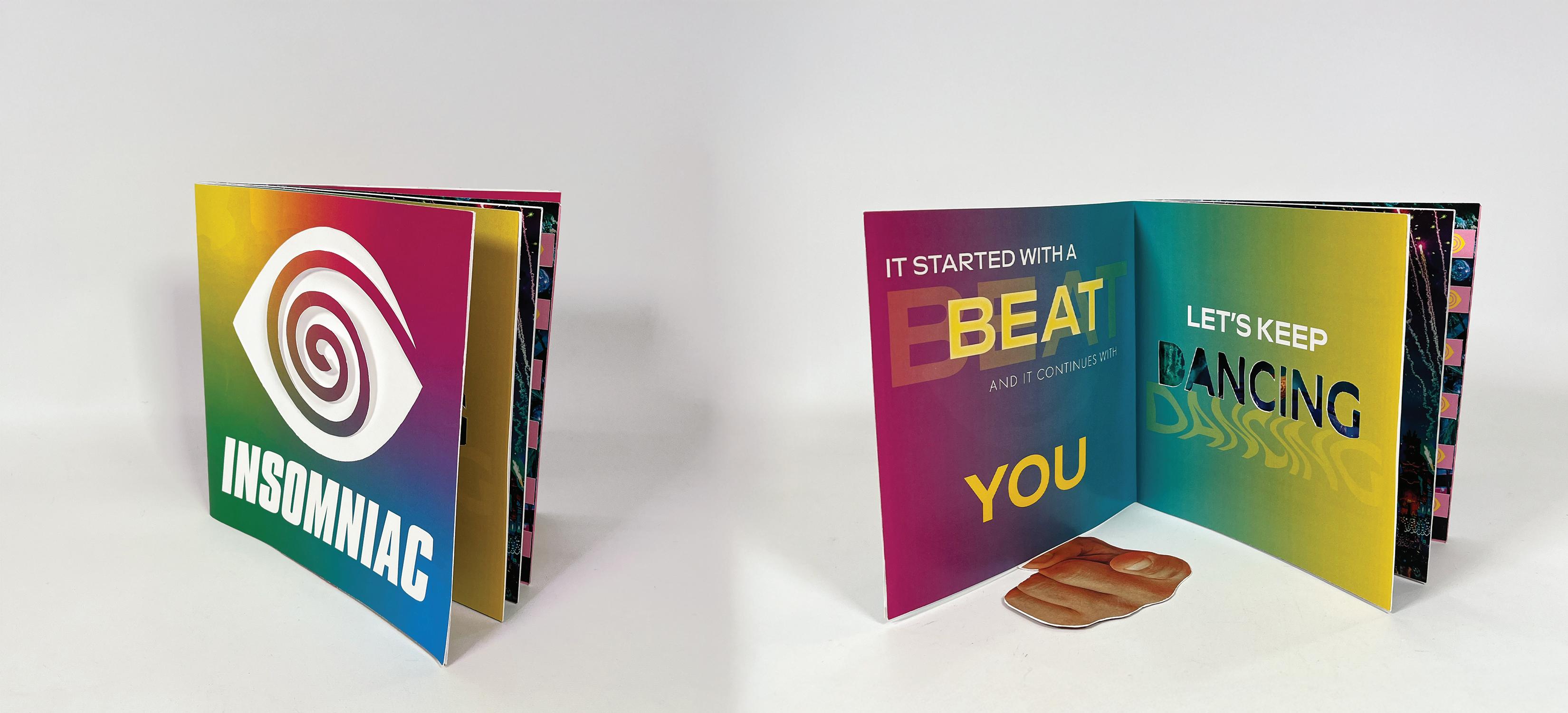
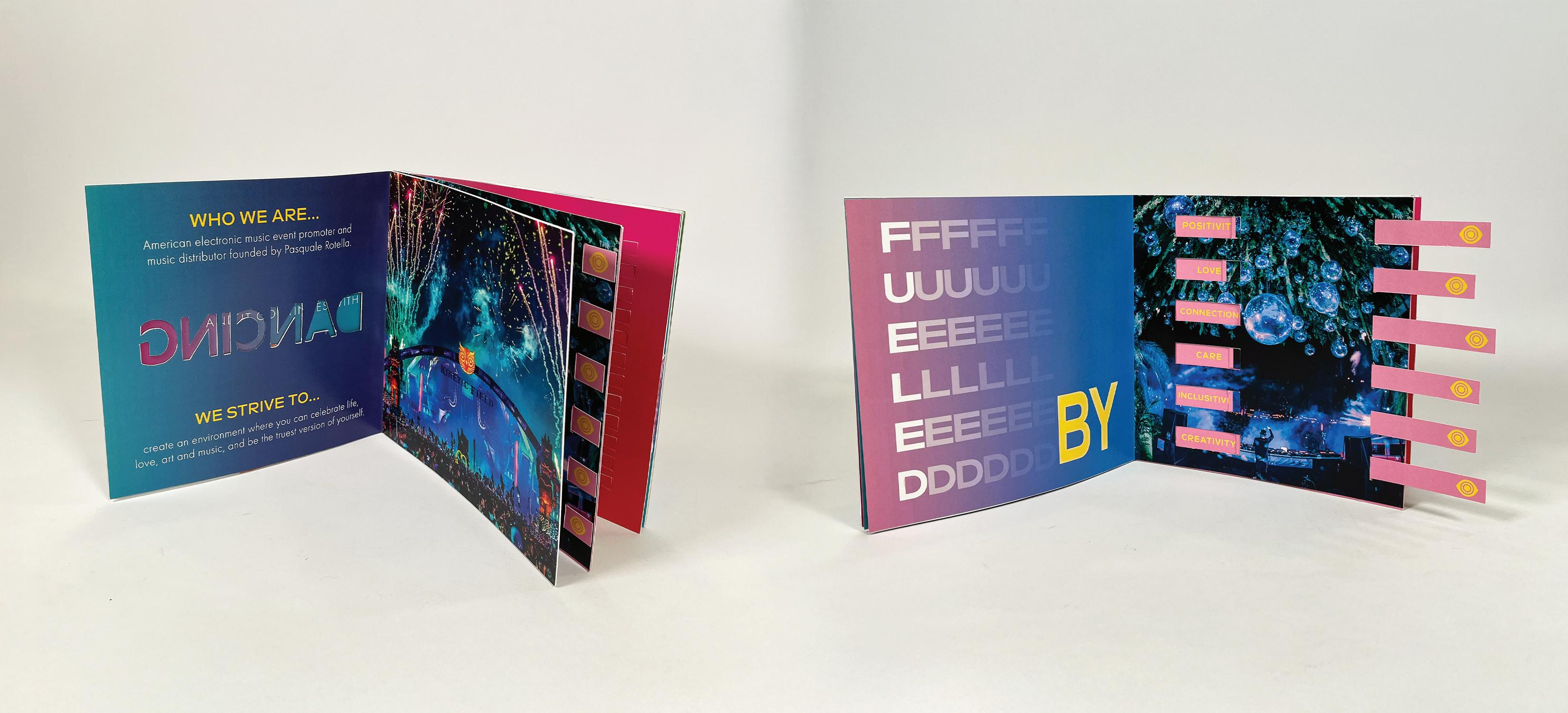
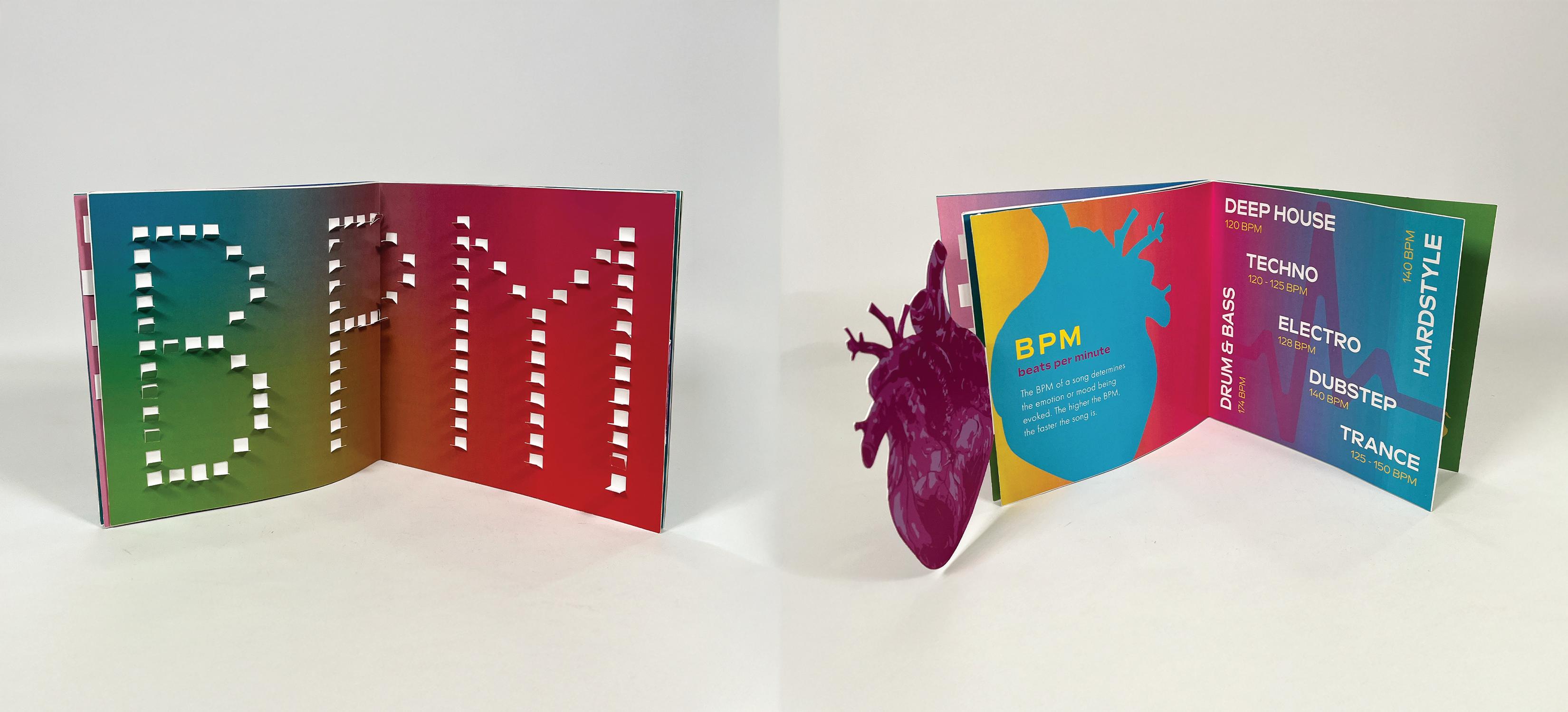
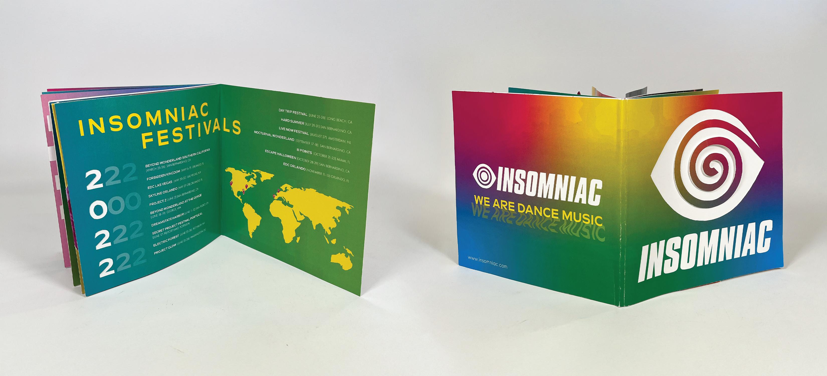
Insomniac is an America electronic music event promoter and music distributer. Their mission is “fueled by self-expression and the spirit of discovery, we responded to a calling to connect and form something bigger than ourselves.” They are driven by their passion of music, positivity, love, inclusivity and creativity. They believe in creating safe and magical experiences where people can connect, celebrate life, art and be the truest version of themselves.
Create a graphical interactive booklet for Insomniac to introduce and promote the company. To portray the their values, purpose, mission and vision in an interactive, colorful, dynamic and fun way to fully transmit their identity and energy. To evoke and portray creativity, passion, love, inclusivity, and fun through the use of visuals and interactive layouts.


#F7EE72 #DCB0C2 #B13E7C


# 4B97C3 #24344B

Inspired by the hues reflected on their events, digital and print branding, the following color palette was put together based on saturated, dynamic and energetic colors. They are incorporated in the design with the use of gradients and high contrast in organic movement compositions to allude to the element of surprise, passion and excitement through a dynamic and expressive palette.
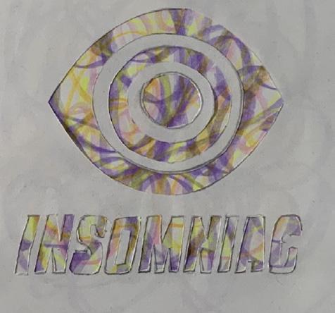
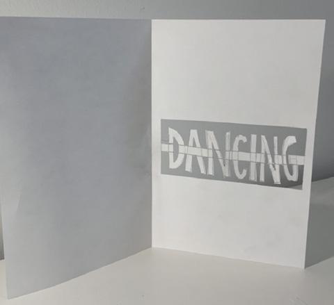
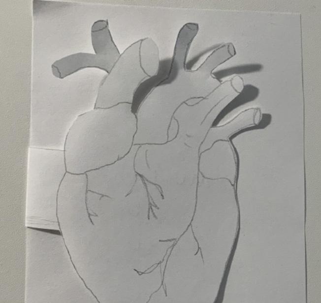
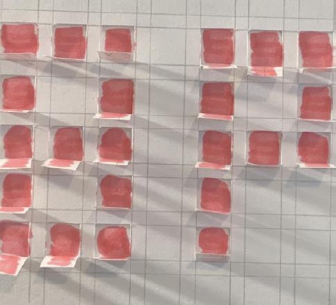
*Designed with Illustrator - print - produced and bounded manually
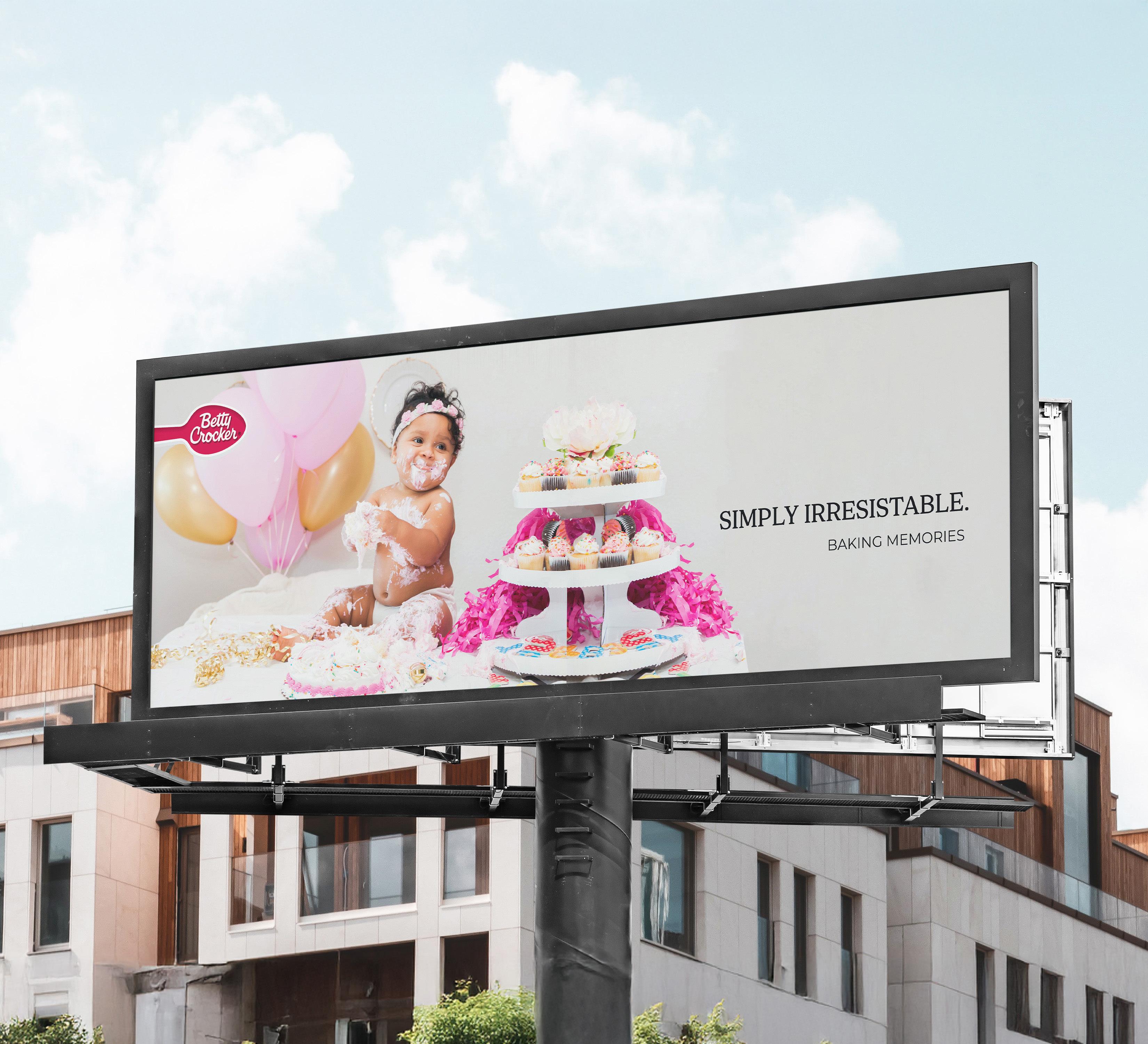
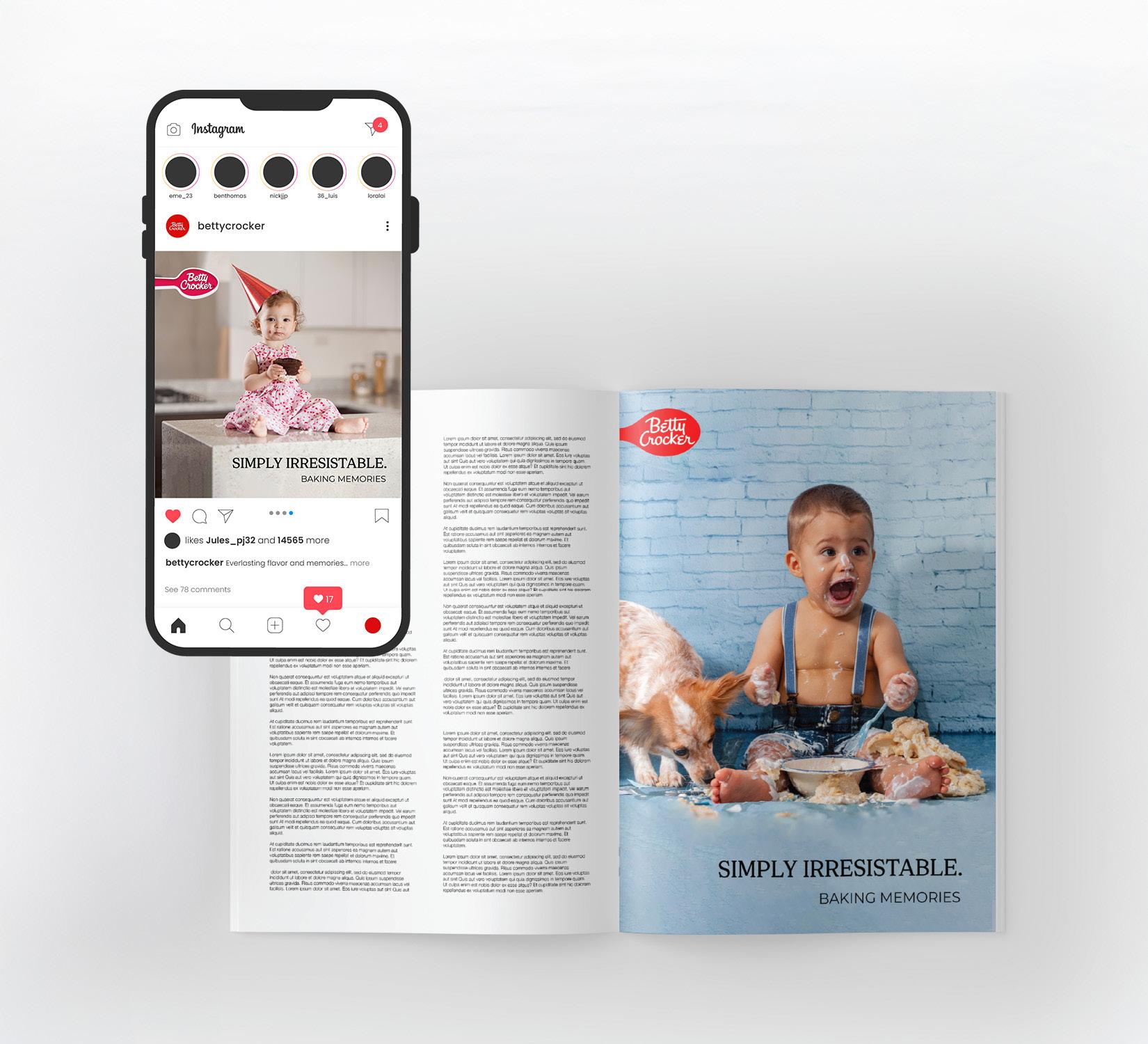
Betty Crocker has been America’s source of modern cooking instruction for over a century. It relies on it’s rich heritage, culinary knowledge and trusted recipe development. It shares passion for food, kitchen wisdom, and lifestyle expertise. Their mission is to answer questions about baking and helping people to learn how to cook. They are known for their made-easy, quality and trustworthy recipes, products and cooking tips.
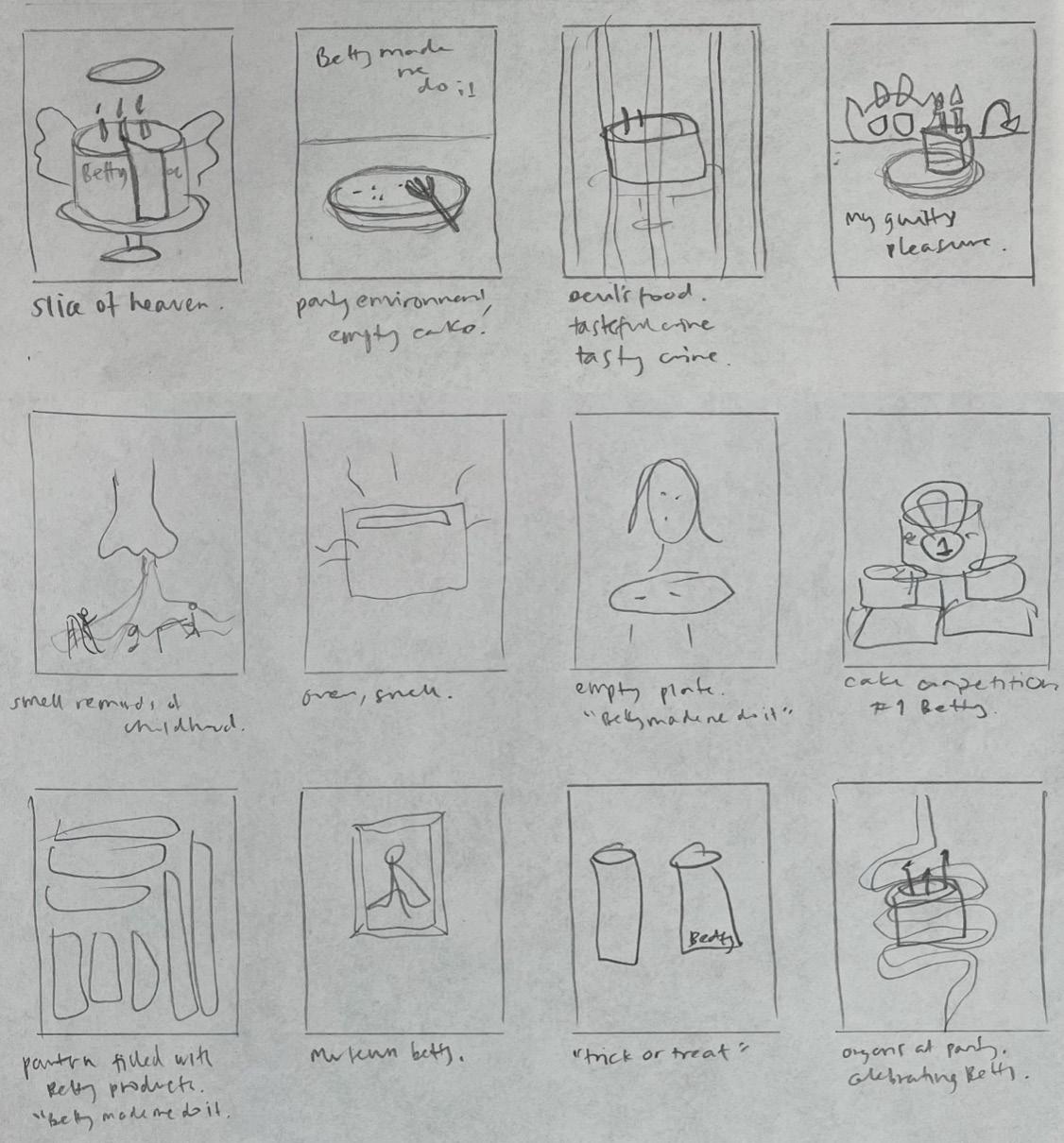
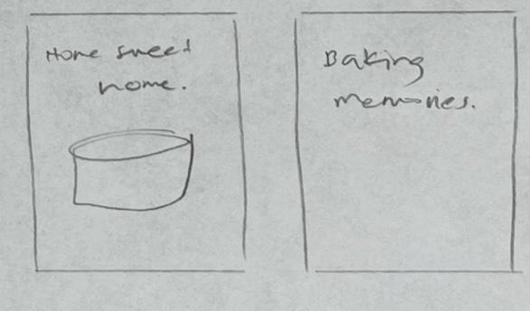
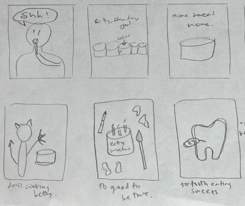
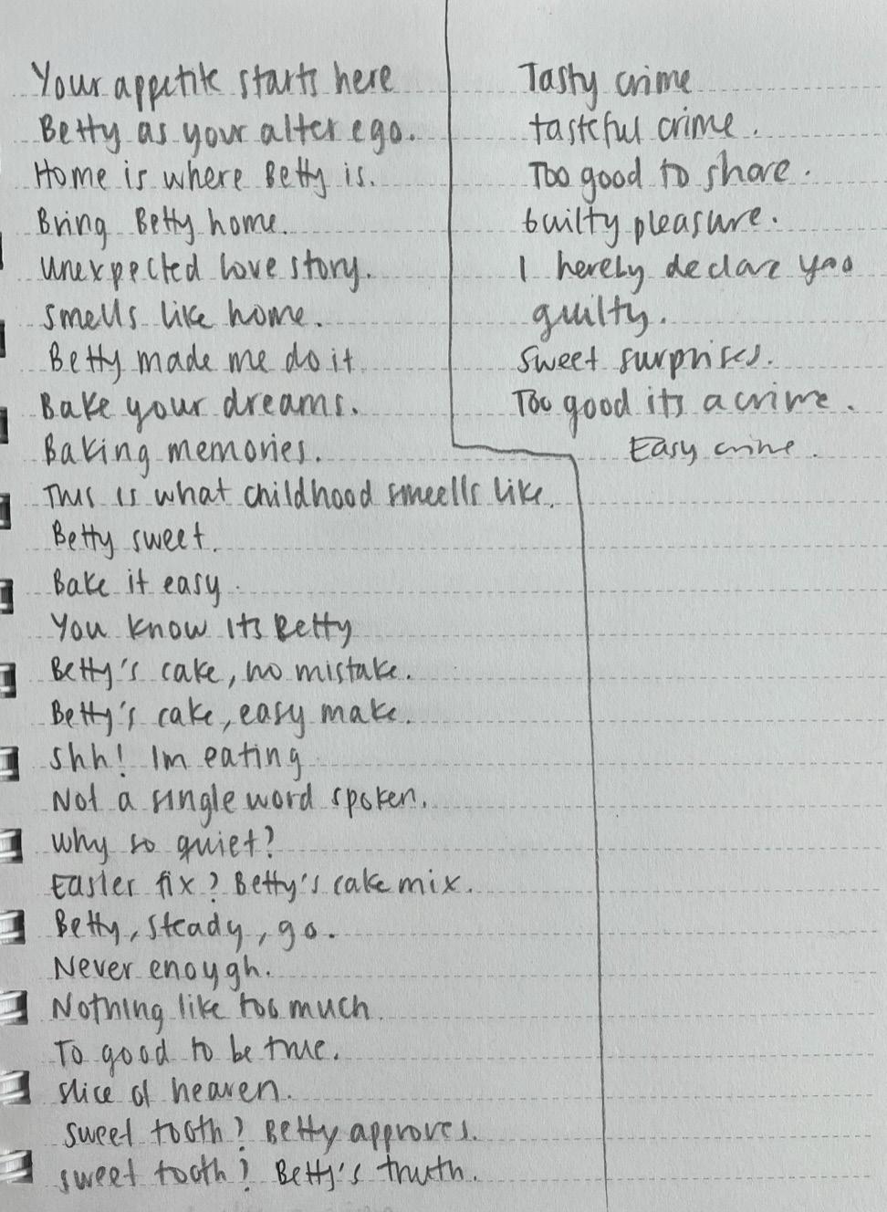
The campaign aims to evoke emotions of innocence, warmth, comfort, and genuine happiness by tapping into childhood memories and the love for family and children. It draws a connection to the human experience of being careless and happy as a baby while enjoying bakery products.
By showcasing relatable and heartwarming experiences, the campaign creates an emotional resonance with the audience. The catchy tagline, “Baking Memories,” encapsulates the essence of the message while subtly highlighting the brand and its products.
- Social media posts
- Billboards
- One page magazine add
- Magazine spread
- Pinterest add