Magazine Article
Design Objective
Pick a topic relating to graphic design or technology and write an article about it. Find an online article relating to some aspect of your topic and extract a portion of it to use as a sidebar article in the layout. Design a 6-page layout around the article that fits the theme of it, including a title, sidebar article, pictures, and page numbers. Incorporate interactive elements into the layout. Design a cover for the magazine that this article would appear in.
Design Brief

The topic chosen is Digital Design of Book Covers. The article is about all of the aspects that go into designing a book cover, including the typeface, genre, color, the content and themes of the book, the composition, and adaptive layout. The overall design of the article layout was to represent books. The top corner of each page has diagonal lines to mimic people dogearing book pages when reading to mark their place. These diagonal lines can be seen not only on the page numbers but also in the pictures. There are also large diagonal lines on the first and last page to get a better feel of the beginning and the end of the article. This diagonal line theme is also subtly included in the text placement, where some of the headers are right aligned towards the top of the page and left aligned towards the bottom. The typefaces chosen were Lemon Milk because it fit with the diagonal lines, and Times New Roman because it is a common typeface used in books. The colors chosen for the article were just white and black so as not to distract from the rest of the colorful pictures, but the sidebar article has been inverted to have white text on a black background to separate it slightly from the rest of the article.

hoviscreative.com
Scan to see the Interactive Version
CRE AT I V E


Aspimara
Design Objective
Design a logo and packaging for a pharmaceutical brand. Create a digital logo complete with logomark and logotype that includes the brand name and generic name. Design packaging for the product based on pharmaceutical packaging regulations. Design and craft a 10’ x 10’ and 10’ x 20’ tradeshow booth at 1/10th scale to be used at Bio International.
Design Brief
This pharmaceutical is called Aspimara, a medicine used for treating depression and anxiety. The logo features a sunflower and bright colors to represent joy. The packaging was designed to fit the branding but also be simplistic for accessibility purposes. A simplistic approach was also used when designing the booth, consistent with the sunflower branding. The concept for the booth interaction is that people could come up and write things that are causing them stress on petal-shaped sticky notes, then put them on the wall to create flowers.


hoviscreative.com
CRE AT I V E


Social Issue Poster Series
Design Objective

Create three posters about three social issues that each relate to one overarching social issue. Choose a minimum of five stock photos for each poster and manipulate the photos into a composite that represents the social issue properly. Provide a brief description about each topic on the posters and include a website URL on each for the viewer to find more indepth information.
Design Brief

The three topics for these posters are Sexual Abuse, Beauty Standards, and Lack of Medical Choices, all to go with the overarching topic of Issues Women Face. The first poster is about Sexual Abuse, featuring a human heart being held on a chain from a hand with spikes and an exploding heart in the background. This poster represents how many women feel chained by love to a person that hurts them. The second poster is about Beauty Standards, depicting a white rose with blood spatter covering the petals and various medical and beauty tools at the bottom pointed at it. The white rose represents the woman in the situation, as she tries to use the tools to paint herself beautiful but doesn’t realize it’s hurting her in the process. The third poster depicts a Lack of Medical Choices, showing a statue bust with a bloodstained cloth over its eyes, a bloody barbed wire shaped gash on the neck, and finally, a blood-red handprint on white cinderblock walls in the background. This represents how doctors try to pull the wool over women’s eyes about their issues, when it is really the doctors at fault. The posters follow a Z pattern layout, starting with the type in the top left, leading the viewer’s eye through the design until reaching the bottom where the information is provided. The color scheme for all three posters was red and white, to make the posters stand out harshly to the viewer.


hoviscreative.com
CRE AT I V E
These picutres were edited to create one of the posters


Alaskan Majors
Design Objective
Design branding for a sports team. Ideate a major league sport not currently playing in a national city. Design a primary logo, secondary logo, wayfinding, and an environmental graphic. Create a design proposal for all the sports branding. Create two mockups of the branding.
Design Brief
The sport chosen is hockey for Alaska, as they do not currently have an NHL team. This team is called the Majors based on the flag of Alaska, which has the Big Dipper constellation, and features Ursa Major. Ursa Major in mythology was a bear, which is where the mascot comes from as well as because bears are very common in the area. The colors chosen were also chosen based on the Alaskan flag, which consists of a dark blue and a yellow, with a lighter blue added to this color scheme to make a midtone for the palette. The stars on the logos are there to also represent the constellation that the idea came from. The typefaces are Trump Town Pro Regular and Raleway Medium because they fit well for a sports logo. The wayfinding chosen are bathroom signs, arena section signs, parking section signs, arena seating row signs, and an elevator decal. All of these feature some aspect of the branding, with either elements of the logos or just the typeface and colors. The environmental graphic is a mural that would be painted on a wall in the hockey arena. The mural features an adult and child bear walking through the Alaskan wilderness as the Aurora Borealis shines above them.
hoviscreative.com
CRE AT I V E 99:96:3:0 69:14:0:0 5:0:94:0
ABCDEFGHIJKLMNOPQRSTUVWXYZ abcdefghijklmnopqrstuvwxyz
Town Pro Regular ABCDEFGHIJKLMNOPQRSTUVWXYZ abcdefghijklmnopqrstuvwxyz
Medium
CMYK: CMYK: CMYK:
Trump
Raleway


Scan to see the Design Proposal


hoviscreative.com
 Environmental Graphic
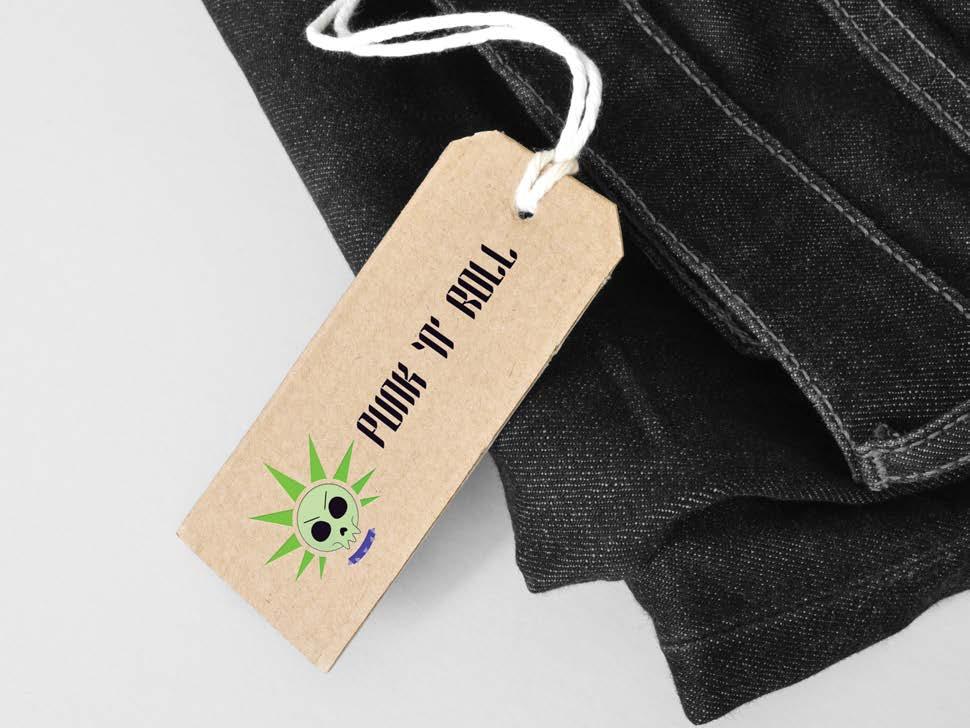
Punk‘N’Roll Design Objective

Design a mobile truck business including branding for the truck and all collateral pieces. Design an identity packet and collateral that utilizes a branded pattern. Create a series of three GIFs advertising the business or products.
Design Brief
Punk ‘N’ Roll is a mobile clothing brand that focuses on alternative styled clothing. The logo is of a skull with spiked hair and a spiked collar to characterize the alternative style of the brand. The colors chosen for the logo and branding are various shades of green and purple to represent the style. The patterns that wrap around the truck, and are used in the rest of the branding, are of spikes, stitches, and barbed wire. The background color of the truck utilizes the darkest shade of purple, whereas the rest of the branding, including logo, pattern, slogan, and social media handle, utilize the lighter colors. This color scheme is also used on the identity packet. The collateral included a hoodie that could be sold or worn by employees and a clothing tag that would be on all the products. The three GIFs are of a person modeling different types of clothing and accessories available in the Punk ‘N’ Roll shop. The first GIF is of different chokers, the second is of t-shirts, and the third is of pants and skirts with patterned tights.

Scan to see the full GIFs

hoviscreative.com
CRE AT I V E CMYK: 80, 87, 100, 0 CMYK: 48, 0, 100, 0 CMYK: 17, 0, 33, 0 CMYK: 66, 67, 0, 0 CMYK: 24, 28, 0, 0 Bai Jamjuree ABCDEFGHIJKLMNOPQRSTUVWXYZ abcdefghijklmnopqrstuvwxyz Gothic 45 ABCDEFGHIJKLMNOPQRSTUVWXYZ abcdefghijklmnopqrstuvwxyz PUNK ’N’ ROLL PUNK ’N’ ROLL GIFs


StoryKeeper
Design Objective
Create a unique app that solves a problem. Design a logo for the app and the associating icons to be used within the app interface, produce a functioning version of said app, and collect feedback from users in a survey. Compile the complete process, branding, and findings into a branded booklet.
Design Brief
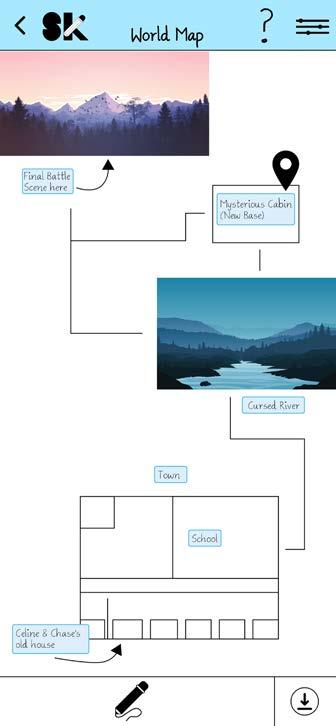
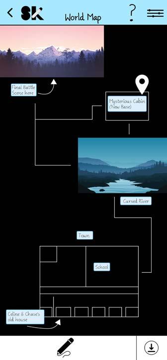
StoryKeeper is an app that allows writers to compile all the information about their characters and map in one place. StoryKeeper’s logo is represented by the letters S and K with a digital landscape within the space of the letters, as well as a pencil that makes up the top diagonal line of the K. The colors chosen for this landscape are also used throughout the rest of the app, with each color representing a different type of screen. Login screens are yellow, Premium screens are light green, Basic screens are dark green, Character screens are orange, and Map screens are blue. All the icons in the app have simplistic designs with rounded edges to fit with the branding. StoryKeeper is free to use regularly but has a premium version that gives the user several more features. The two main features of the app are the Characters Boards and the Map Boards. In the Characters Boards of the app, the user can input information about all the characters from their story and how they may relate to one another. In the Map Board of the app, the user can draw or import a map of their story and provide additional information about specific sections of their map on a Tracker Board. The app also has a Dark Mode which offers a nighttime version of the background.
hoviscreative.com
ABCDEFGHIJKLMNOPQRSTUVWXYZ abcdefghijklmnopqrstuvwxyz Ammys Handwriting CMYK: 87:27:100:17 CMYK: 7:0:96:0 63:0:100:0 CMYK: 6:37:100:0 CMYK: CMYK: 64:8:0:0 CMYK: 84:40:100:40 CMYK: 85:50:0:0 toryeeper Help Home Draw Add Icon Settings Note Erase Add Marker
CRE AT I V E
Ariel Justine is a 35-year-old middle school English teacher. They have two partners they are married to. They are an ambivert and often meet new and interesting friends while grading papers at their favorite coffee place every morning. They love video games and have a group of people they play with, but tabletop gaming is their favorite pastime. Their favorite game is Dungeons and Dragons, where they are a Dungeon Master for seven of their friends. However, because there are so many people in their campaign, it can be hard for them to keep track of all the characters and NPCs. Plus, they want to make a map of their world but do not have anywhere to keep track of it. The app that they currently use only allows them to make a single map and will not let them expand on some of the major areas in the world. They are looking for an app that will allow them to keep track of their characters, as well as their world, all in once place.
“Wait


Milton Wells is a 72-year-old author. He and his wife have been married for 50 years and they both live in Austin, Texas. Writing is Milton’s passion; he has been endlessly creating stories ever since he was a child and has over two dozen books published at this point. To get inspiration and research for his stories, he and his wife have taken many trips around the world to visit some of the most haunted places in the world. However, with so much traveling, he does not have a stable place to write down all the information about his characters and worlds, as he is several books into a series he is writing and does not want to lose track of anything. Also with his age, he is starting to notice some memory issues cropping up, so he would like an app for his phone that he can use instead to remember everything for him.

“Ah!


Wells
Years Old Listening to music
on laptop Looks around room for notepad Easily able to write Song strikes inspiration Stops writing suddenly Can’t find anywhere Happy writing Rushes to go write
remember character description
Ariel Justine 35 Years Old Milton
72
Writing
Can’t
I wrote it down on that new app!”
There’s their description!”
character on app
to Storykeeper
Finds
Goes


hoviscreative.com


 Scan to see the App booklet
Scan to use the App Prototype
Scan to see the App booklet
Scan to use the App Prototype
CVCC Cosmetology Mural
Design Objective
Design a mural for the CVCC cosmetology department. Use photos of the cosmetology students and the classroom area as inspiration and include multiple aspects of cosmetology in the design.
Design Brief
The design chosen is of a girl with long multicolored hair, makeup, and nails. This composition was chosen because it fit well with the required measurements of the wall, providing room for the long hair to flow across the space and showcase multiple different areas of cosmetology. The design is multicolored to bring inspiration and a sense of fun to the space and help keep it bright. The multicolor aspect also works to represent that in cosmetology, the cosmetologist and model aren’t limited to plain boring colors and styles; they can create fun and colorful styles and experiment outside of the box.


hoviscreative.com
CRE AT I V E

Illustrative Animation
Design Objective
Create an animated illustration of an object letterform. Choose a word and create an illustration representing that word that also makes the shape of the first letter in that word. Digitize the illustration and create a 5 second animation of the object letterform.
Design Brief
The chosen word was “Poison.” The illustration is of a poison apple like that of the poison apple in the “Snow White” story, with the apple forming the curved line of the right part of the P, and the poison dripping down on the left to create the straight line that makes the left part of the P. The animation features this same illustration but now the poison can be seen actually dripping from the apple.


hoviscreative.com
CRE AT I V E
Scan to see the full Animation


CVCC Vision Art Show 2023

Design Objective:
Design branding for the 2023 CVCC Vision Art Show. Taking inspiration from previous years, create a minimum of five thumbnails of possible designs for a comp of the Vision branding. Create a minimum of two roughs for these designs. Using the final design, produce a banner, postcard, and a yard sign including all proper Vision logos and marketing.
Design Brief:
The comp features the silhouette of a person leaning on a wall. Around it is a group of lights, each with a different picture within the bulb shining a different color. This gives the effect that each of the pictures are glowing and creating more visual interest. Some of the pictures used within the bulbs are from the CVCC photography students, as the Vision Art Show is also for the photography students to show their work, so it was important to show some of their work within the design as well. The background of the comp is of many different colored bokeh lights to give the illusion that there are more of these lights with images in them that are just out of focus. The final design for the banner, postcard, and yard sign includes the comp with the Vision logo, as well as the accompanying art show branding.
hoviscreative.com
CRE AT I V E


www.hoviscreative.com @hoviscreative


