A-Zoo
Design Prompt:
Design a fully interactive app prototype that fills a niche role in the virtual world. Integrate proper knowledge of the user experience and visual design to make the app navigable and user-friendly. Create a collateral booklet to accompany the app, which acts as a full guide to the branding and identity of the app concept.
Project Pitch:
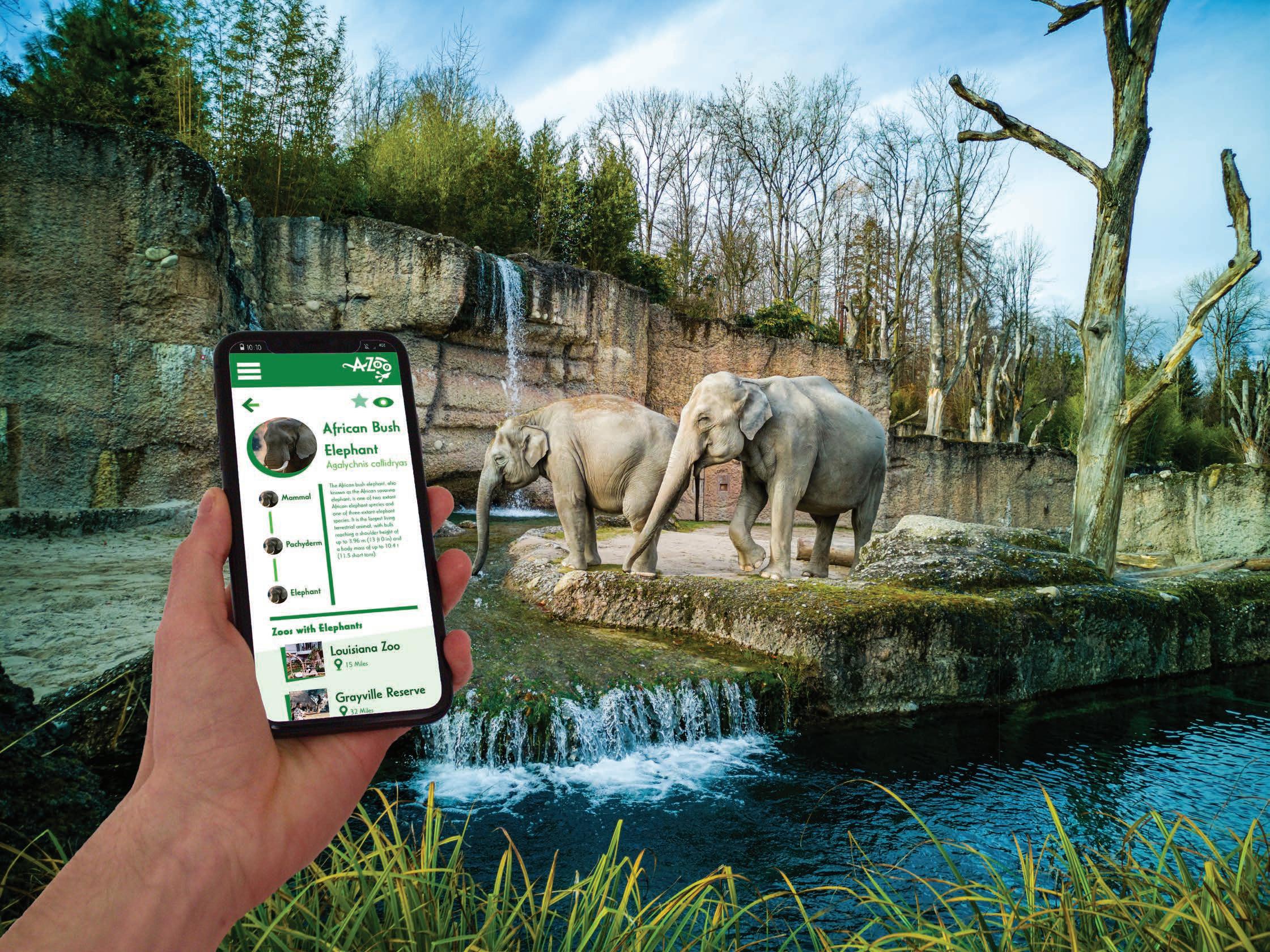
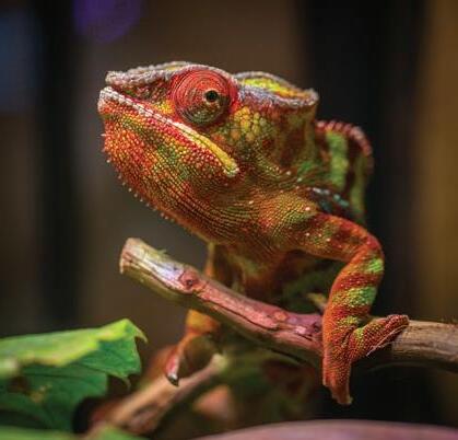
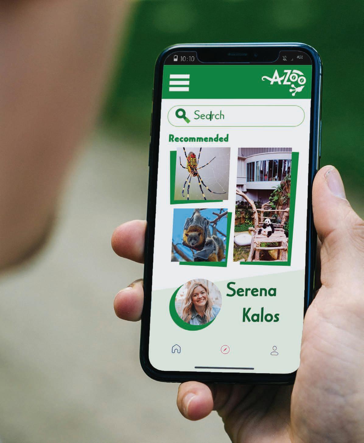
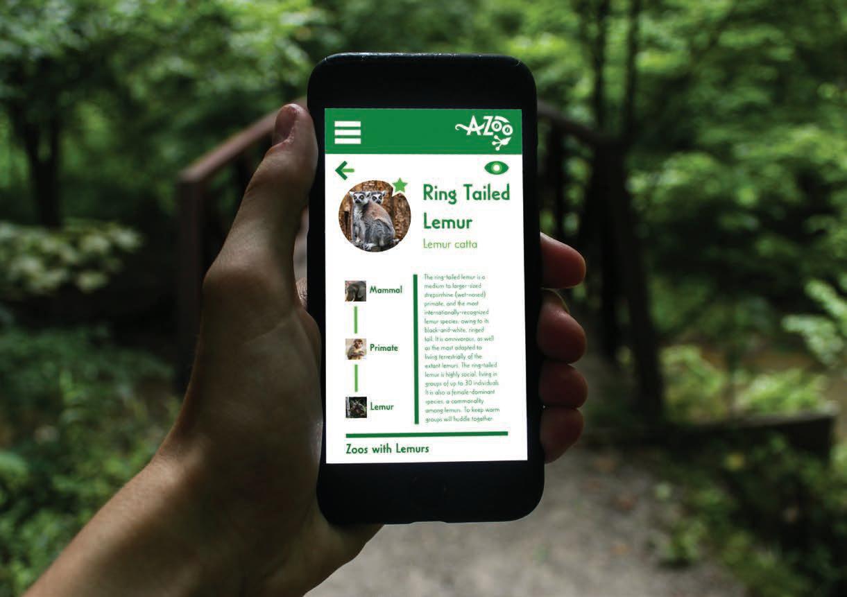
A-Zoo is the all-in-one companion for any and all animal park adventures. This app provides a full suite of information about local zoos around the user’s location, including their schedules, layout, enclosure quality, and which animals are currently on display and at what times.
The branding for A-Zoo employs bold colors and a playful demeanor. The greens used throughout the color scheme reflect that of the plant kingdom, acting as a great contrast to the various colors and patterns of the animals. These greens, paired with the white of the app, create a modern, natural, and energetic look. The primary logo is a curious gecko who has wide eyes of enthusiasm about exploring the world around him, just like the curious users of the app.


CASABLANCA URW
ea c Rin T ed em L u n Z o m oo w h em Crow ed em Gr v R v Audu n a Ruf ed emu em mu or M S e c Animals om e e ephant Ba W o Alpac Ma se Be Spide S a h Zoos N a 1 Mi e 1 M e Grayv e e r Grayv e A u um A dubon P k 32 Mi Mi 123 M R ng Ta ed Lemur em c Mammal Pr m emur he-ma moemu blac -mo muemu mape mmo mu ou a a o oo w m Gray R e e Audu o Pa Home/ Logo Ring Tailed Lemur Lemur catta Favorite Mammal Primate Lemur Random Zoo Zoos with Lemurs Random Zoo 15 Miles 32 Mil The ring-tailed lemur medium to larger-sized strepsirrhine (wet-nosed) primate, and the most internationally-recognized lemur species, owing its black-and-white, ringed tail. omnivorous, as well as the most adapted living terrestrially the extant lemurs. The ring-tailed lemur highly social, living groups up 30 individuals. also female-dominant species, commonality among lemurs. keep warm groups will huddle together Home/ Logo Lemur Ring ailed Lemur Random Zoo Lemurs Zoos with Lemurs Aye-Aye Random Zoo Ruffed Lemur Lemur catta 15 Miles Daubentonia madagascariensis 32 Miles Varecia variegata Home/ Logo Animals Search Recommended Mammals Reptiles Birds Amphibians Home/ Logo Zoos Search Nearest Popular Zoo Popular Zoo Nearest Zoo 17 Miles 23 Miles 45 Miles
User Storyboard
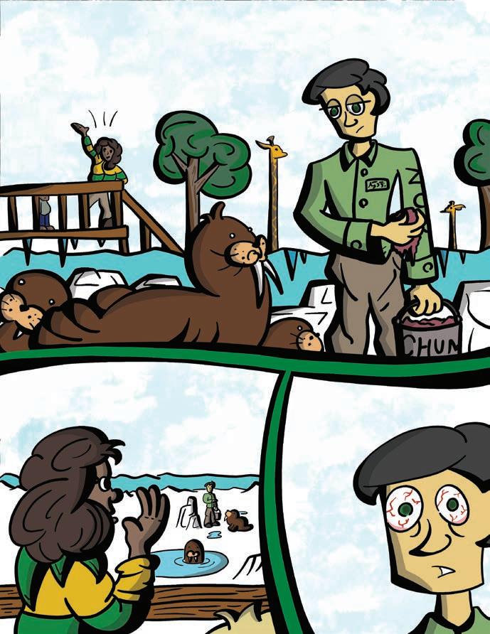
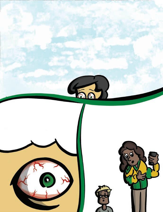
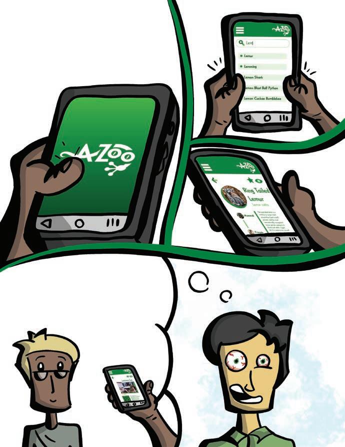
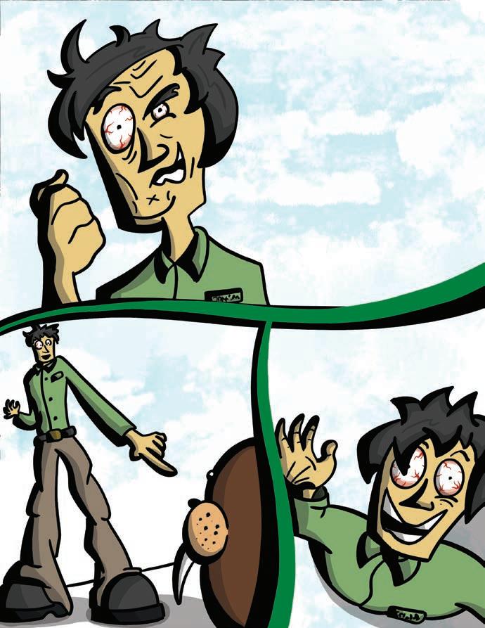
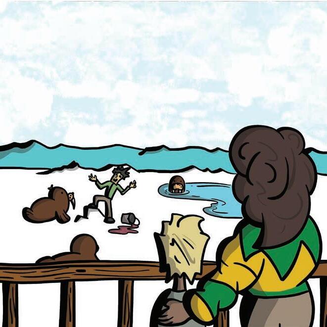


YES. Well, looks like the Louisiana Zoo our destination! Alright, honey, let me check. Mother, what’s wrong with that man? Umm, don’t know honey, don’t know, maybe we should just use A-Zoo. HA! HA! HA! Because when the customersarehappy, they’llbeniceto Jackson, and when they’renicetoJackson, Jacksonwillbehappyin life,andwhenJackson is happy. . WILL HAVE FRIENDS THAT AREN’T WALRUSES! YES!!! HA! HA! HA! Hey!Zookeeper! This the fifth time I’ve been asked that today. Where do you guys keep the Lemurs? WHAT! WHAT! What do you mean you don’t have Lemurs!?! What kind of Zoo is this!? And everytime answer. Afterall, I’m just zookeeper! Why don’t they just use A-Zoo Mother, desire to view Lemur. Keisha Thompson Age: 36 Residence: Atlanta, Georgia Occupation: Stay-at-Home Mother Favorite Animal: Viceroy Butterfly Jackson Williams Age: 29 Residence: West Dundee, Illinois Occupation: Zookeeper Favorite Animal: Panda
Full App Prototype Collateral Booklet Video Tutorial
Design Prompt:
Design a packaging series, consisting of three related products. Prioritize consistency between the product labels and intentional thought and approach to the layouts as appropriate for the product category. The packaging will be integrated into a social media campaign that utilizes an animated GIF advertising the products.
Project Pitch:
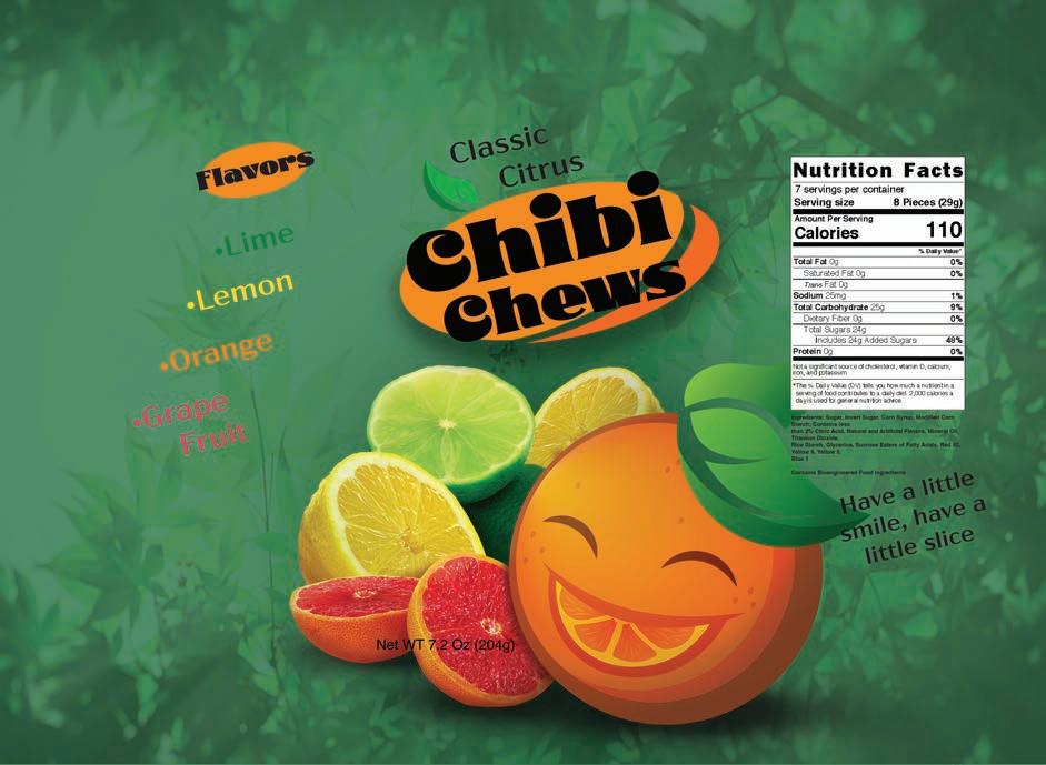
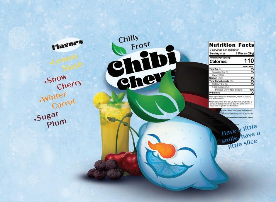
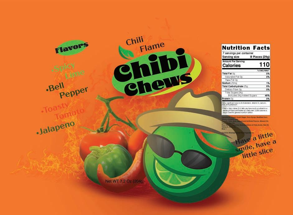
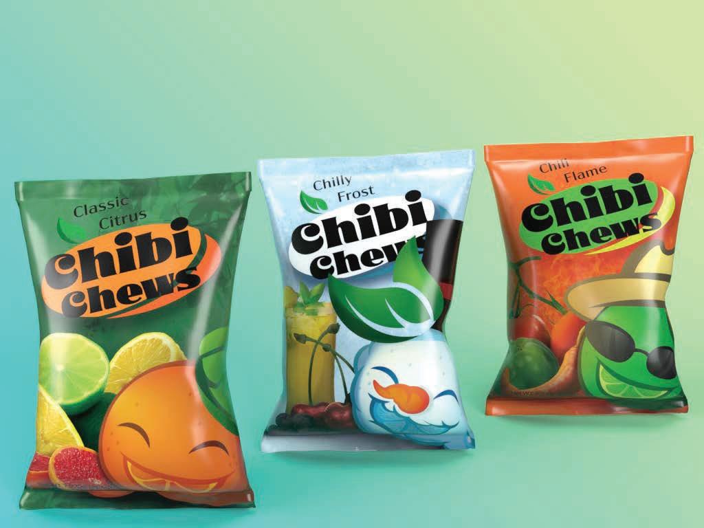
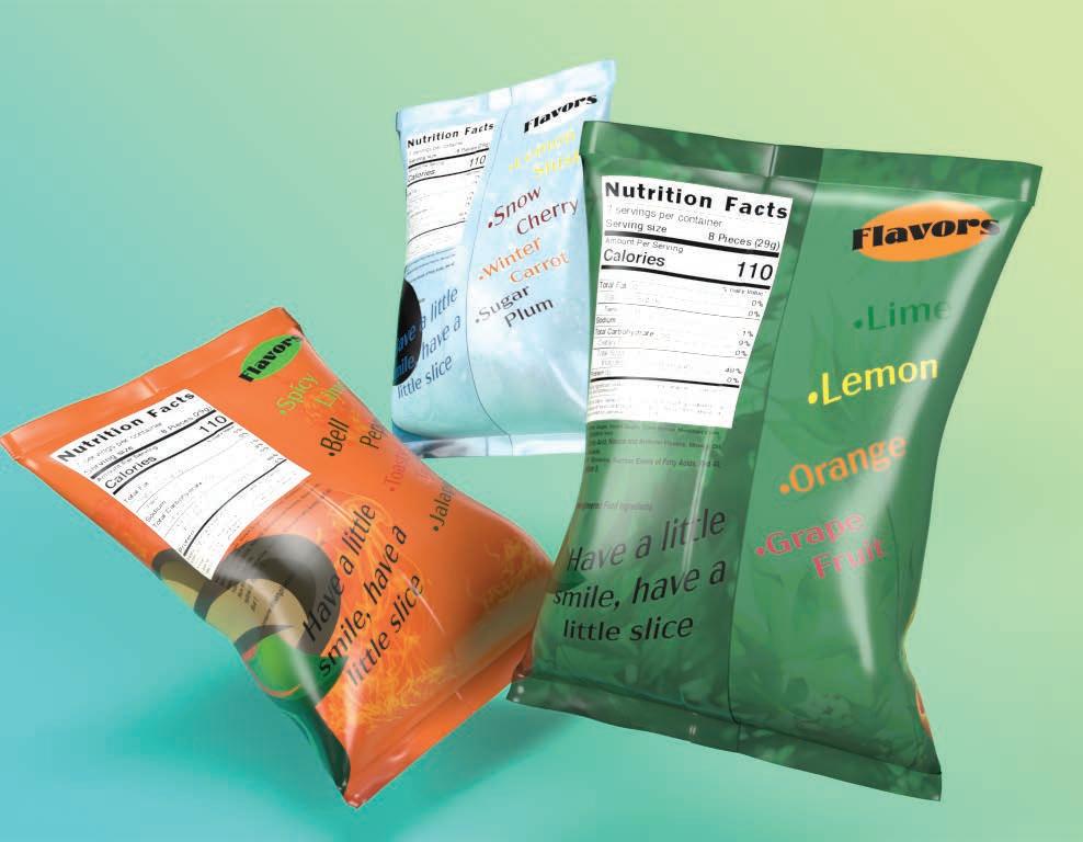
Chibi Chews is a brand of fruity, chewy candies. The overall aesthetic is fun and playful but not too childish, marketing to teens and young adults with a modern take on candy. The packaging is minimalistic while also fully highlighting all necessary details and components, including the logo, mascot, colorful graphics, and the overall theme of each flavor variety. The company slogan, “Have a little smile, have a little slice,” works as a compliment to both the main company mascot and the name. The phrase “little slice” acts as a synonym for the company name, Chibi Chews. Meanwhile, the orange character on the front of the candy bags always has a smile, which is also a citrus slice.
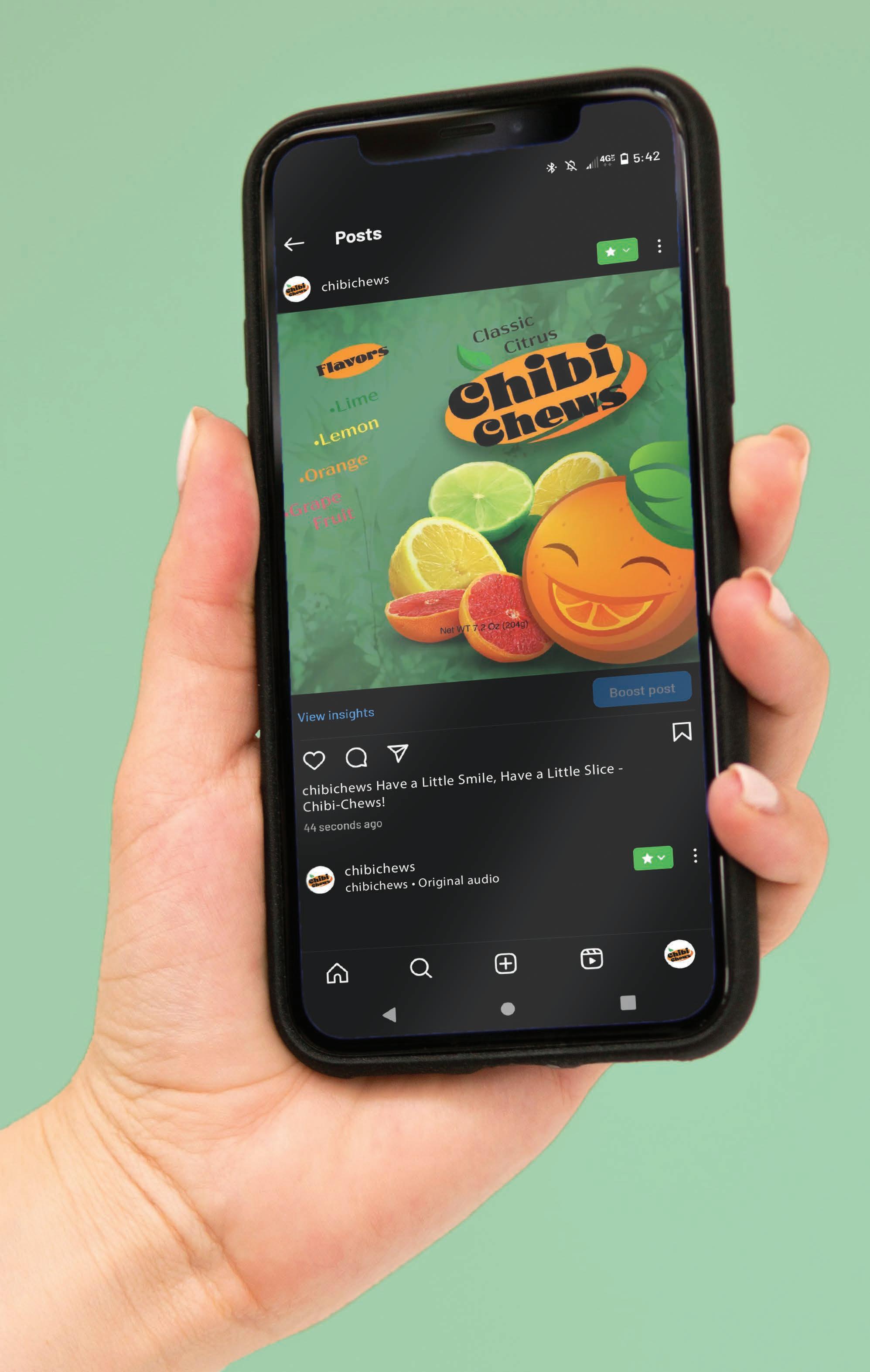
Chibi Chews Promotional
Animated
GIF
Design Prompt:
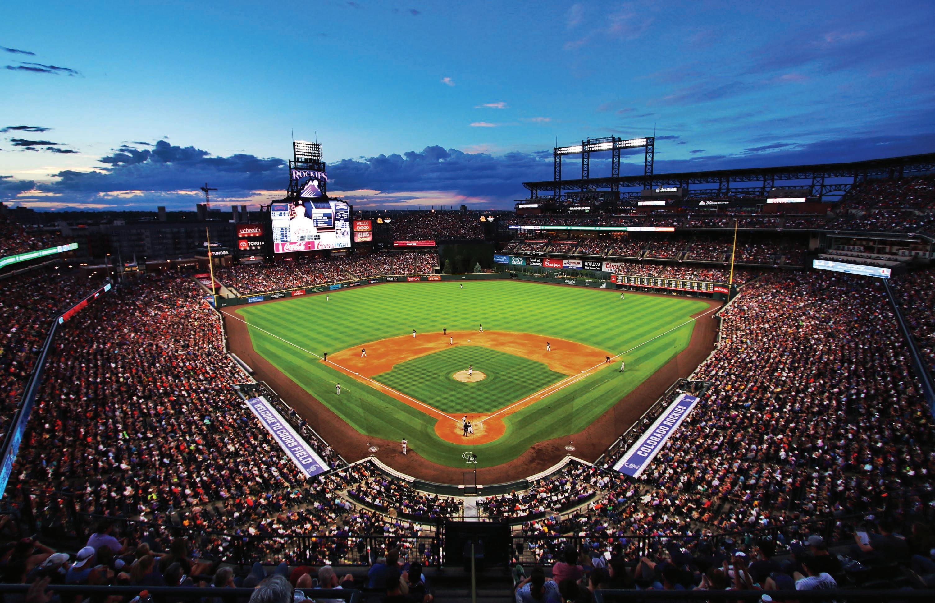
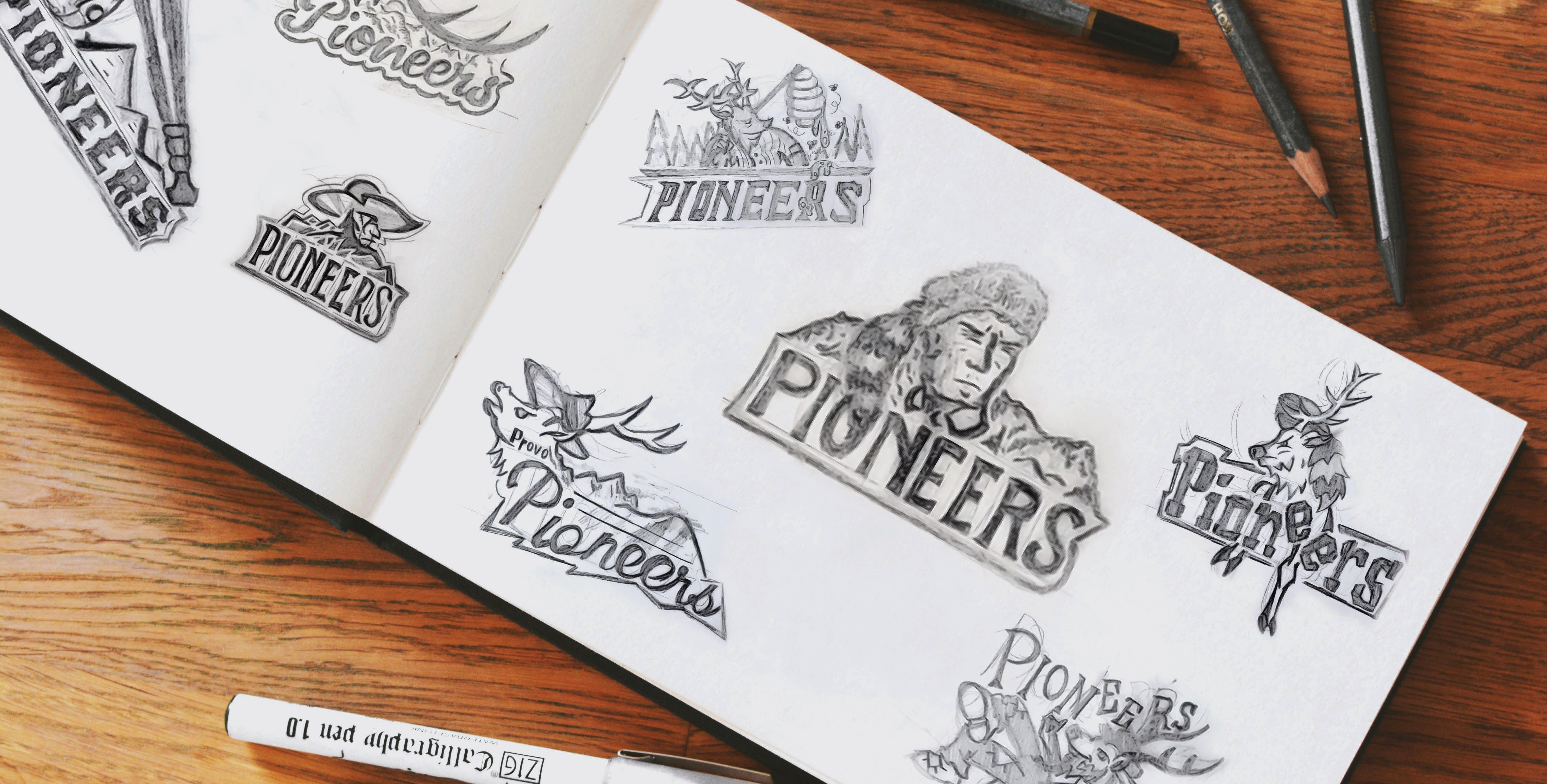
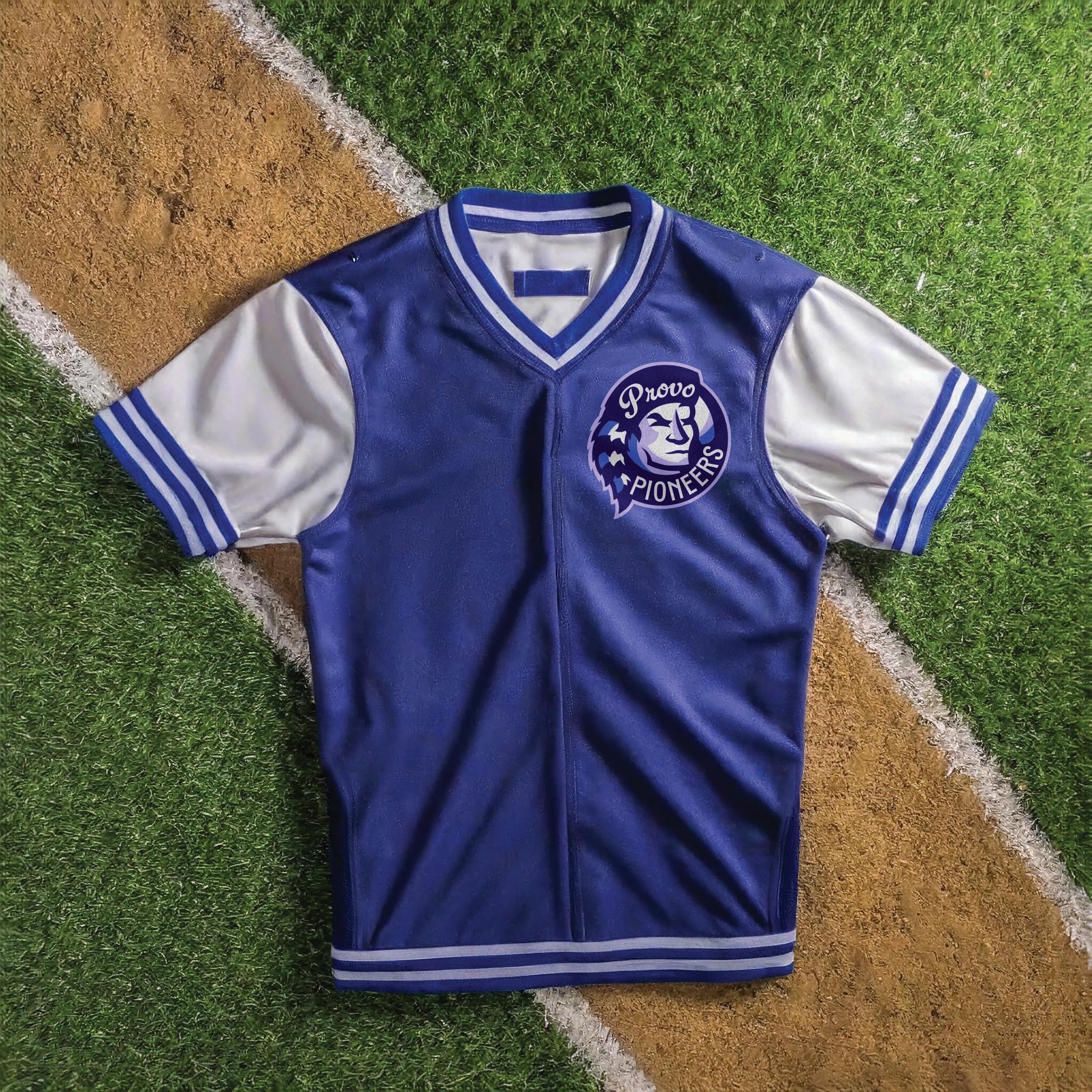
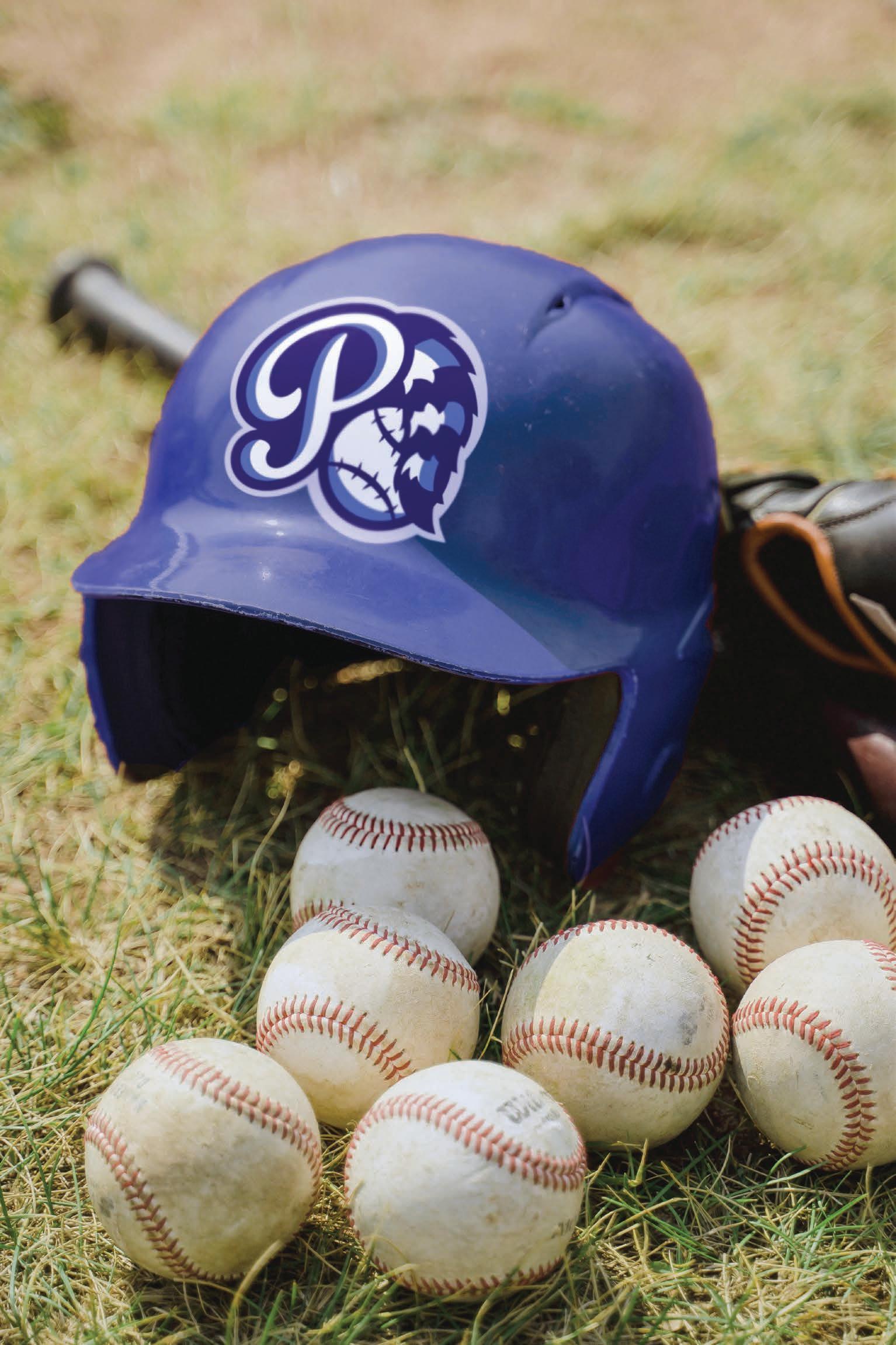
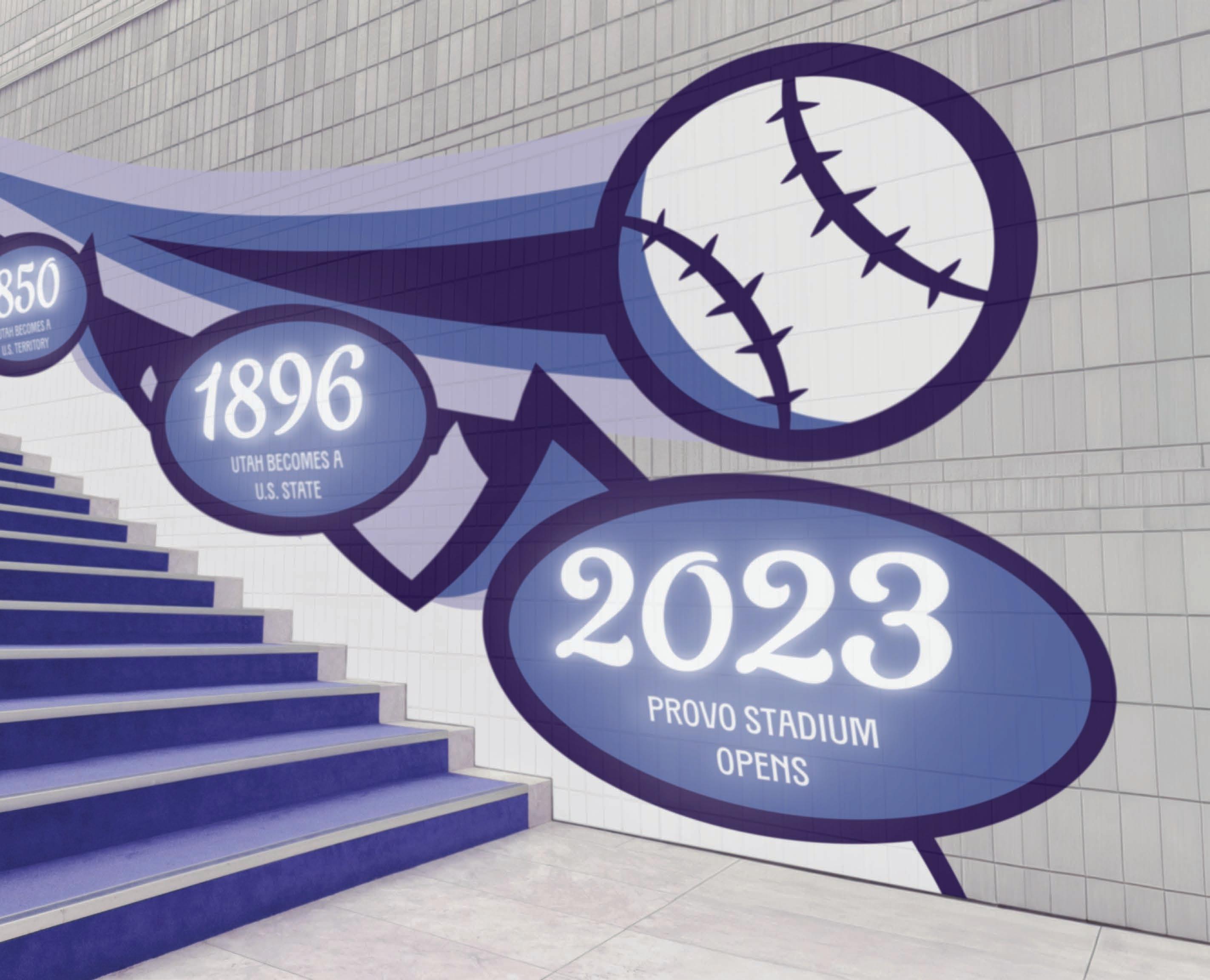
Design a visual identity and backstory for a major league baseball team, choosing a home state that does not already have a major league team in that sport. With this visual identity, meant to represent both the team and the location, apply the brand to both an interactive collateral booklet, and stadium environmental graphics and wayfinding.
Project Pitch:
The Provo Pioneers are a vibrant and dynamic Major League Baseball team hailing from the scenic city of Provo, Utah. Nestled against the stunning backdrop of the Wasatch Mountains, the Provo Pioneers embody the spirit of the region, combining athleticism with a strong sense of community pride at Wasatch Stadium. The branding and marketing of the Provo Pioneers reflect the majestic but rugged heritage of the American frontier, as seen in the company colors, typefaces, and icons. The colors display the beautiful range of blues and violets seen in the Wasatch Mountain Range, while the logos and icons are meant to reflect the feeling of a classic American afternoon out at the baseball game.
Provo Pioneers TXC PEARL REGULAR
Sports Team
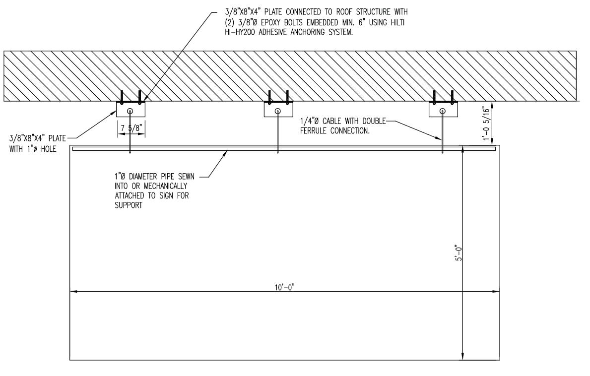
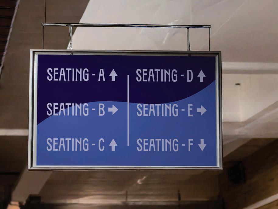
This vinyl sign will hang from the ceiling, directing guests to their seats. It will be connected using bolts and a metal cable.


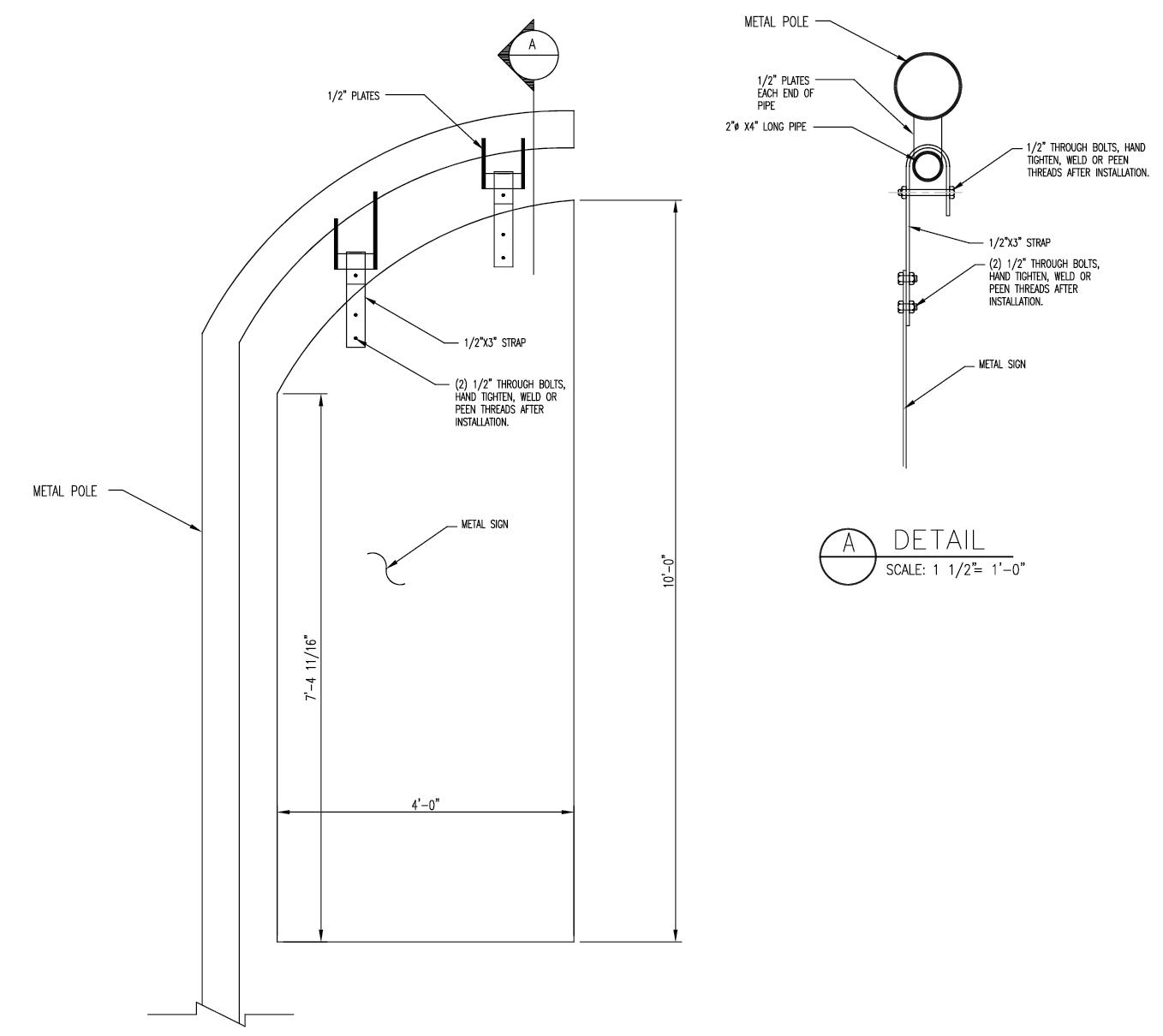
This metal sign will hang down from a light pole in the parking lot, connecting using metal straps and bolts. It will lead guests to the
23
EnTR AnCE 2
C on CEPT s A nd b LUEPR in T s

TEAm CoLLATERAL bookLET
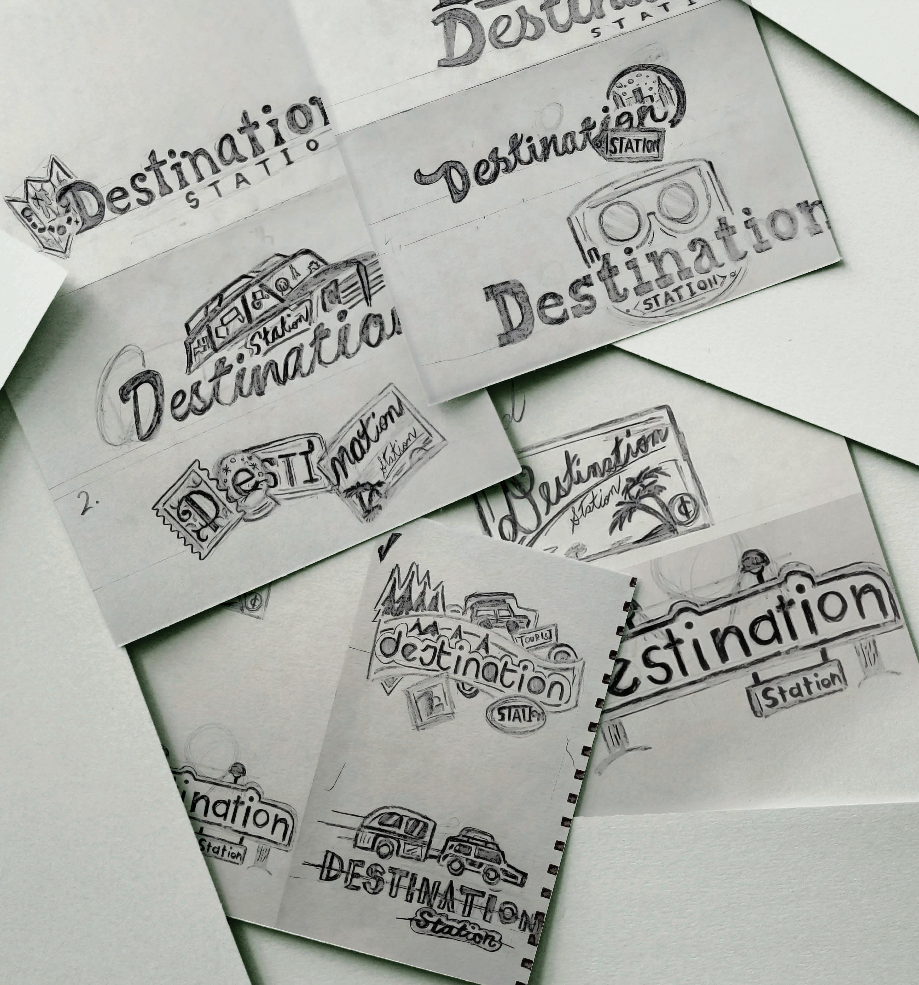
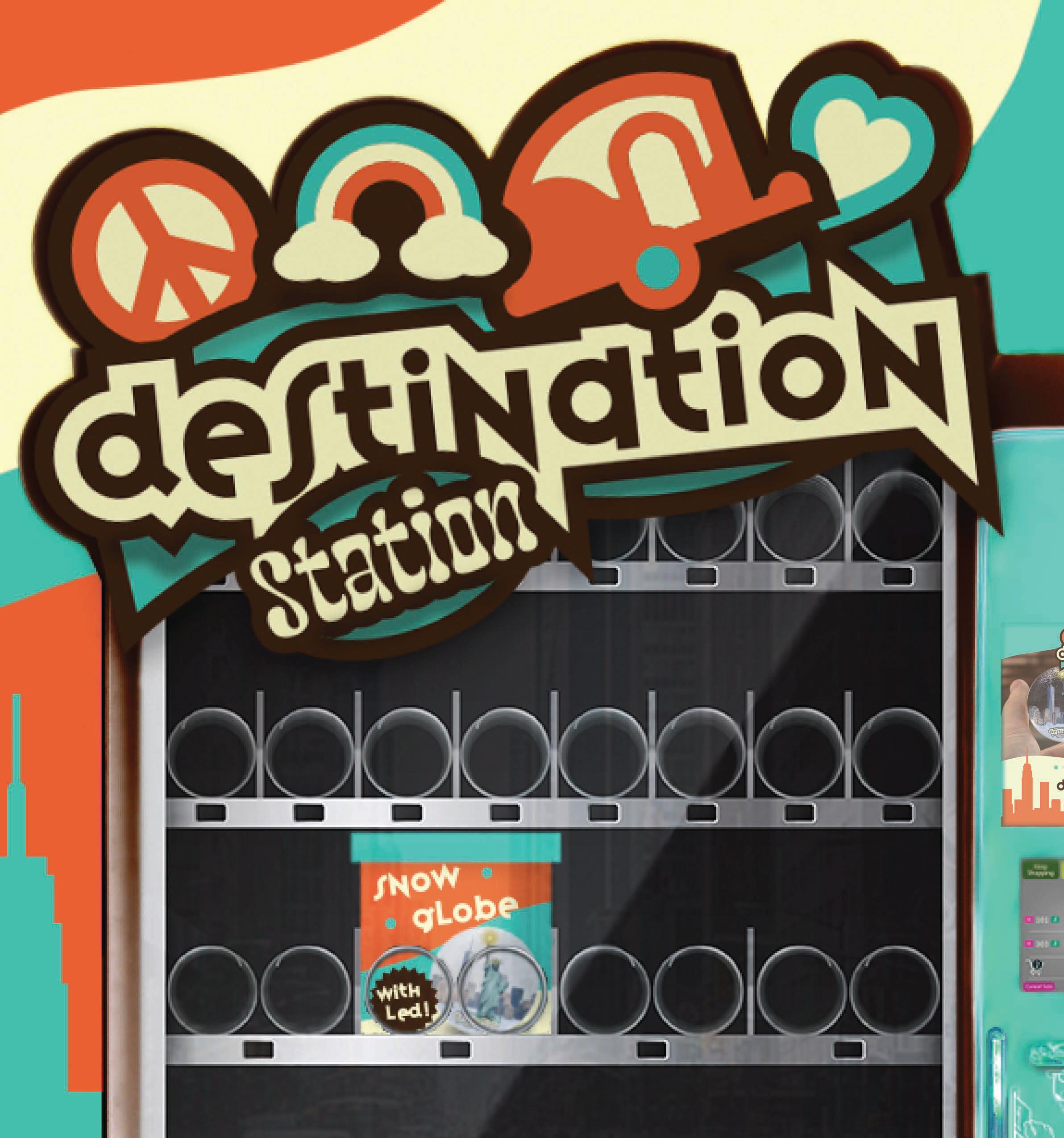
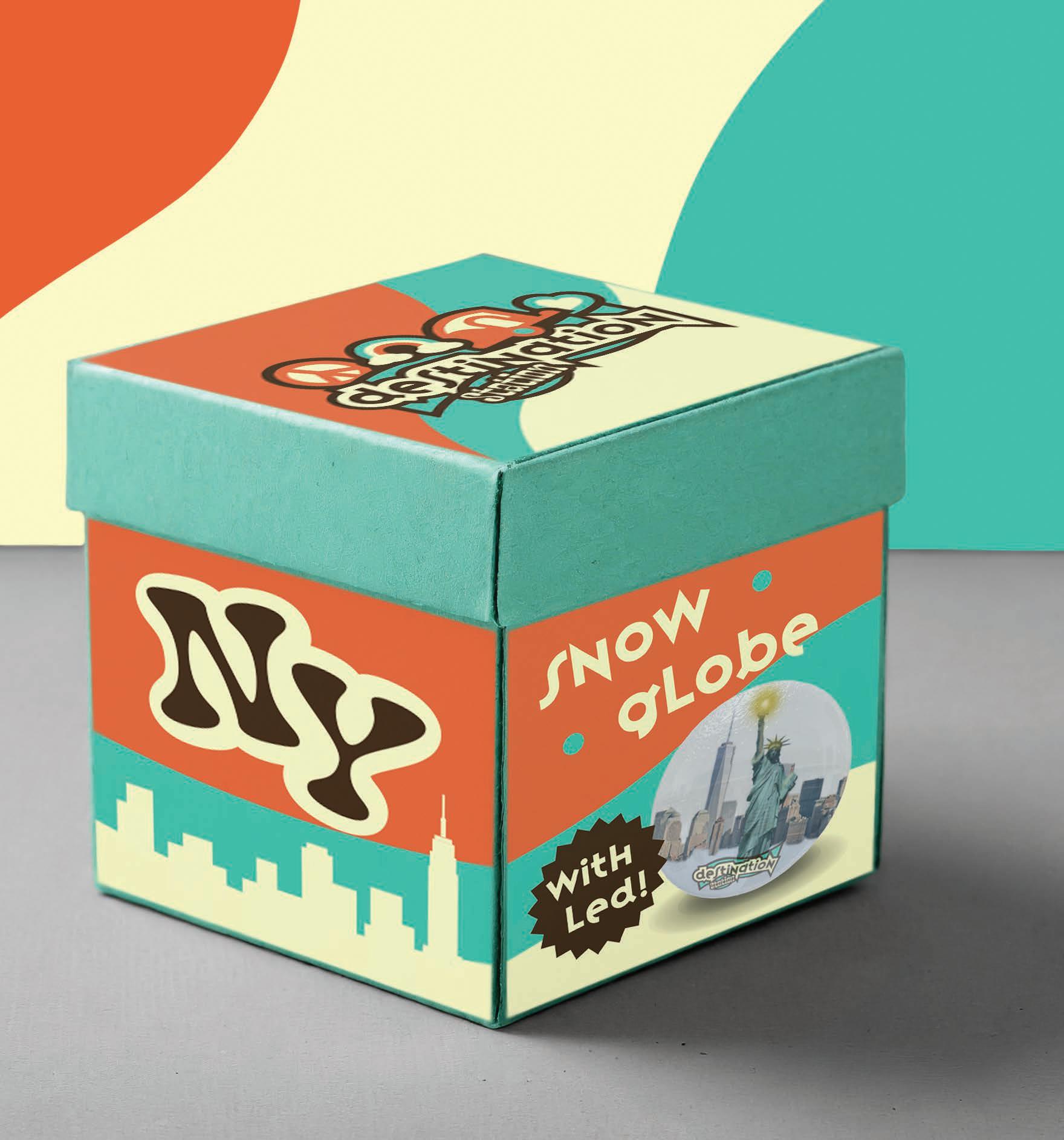
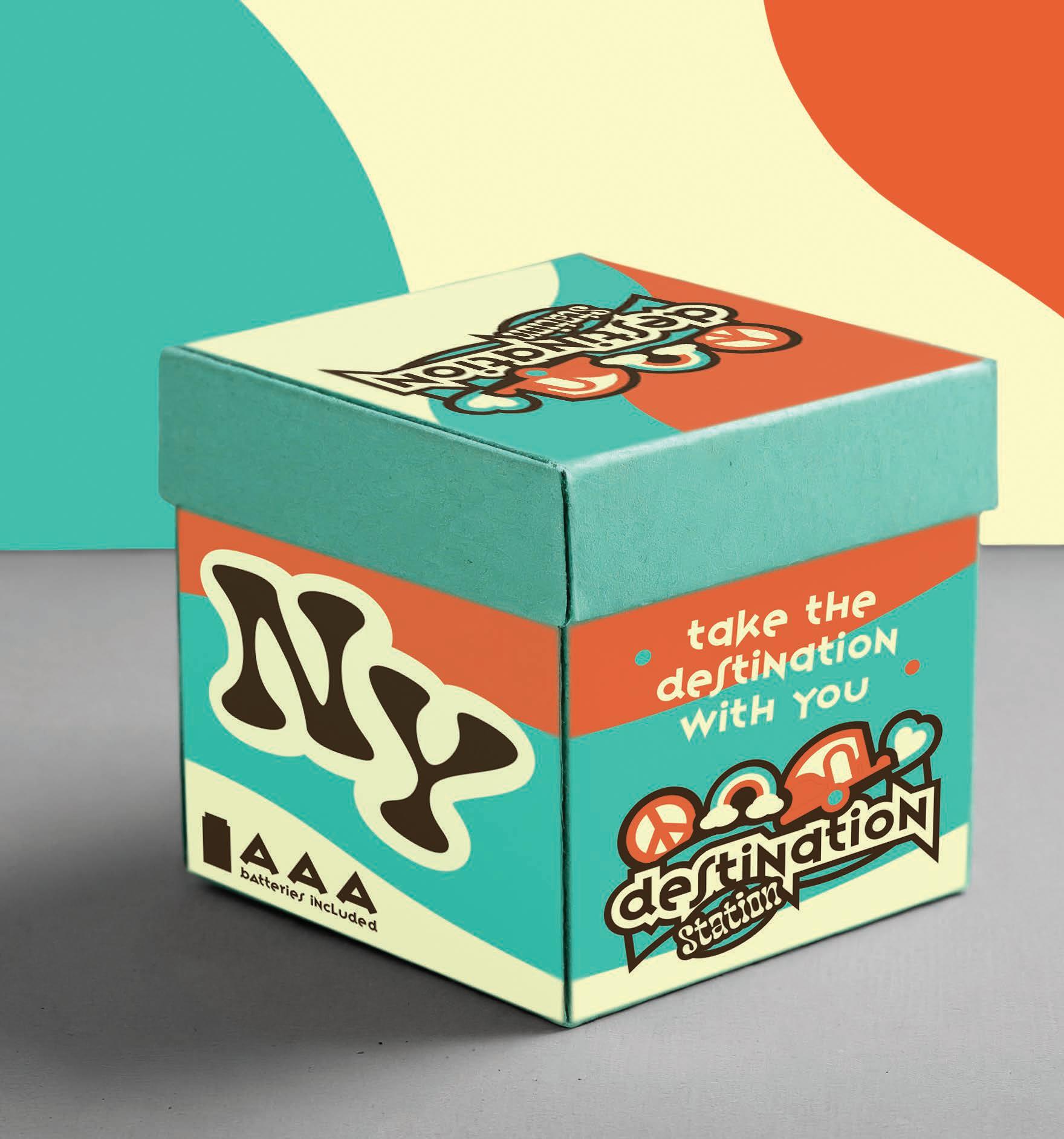
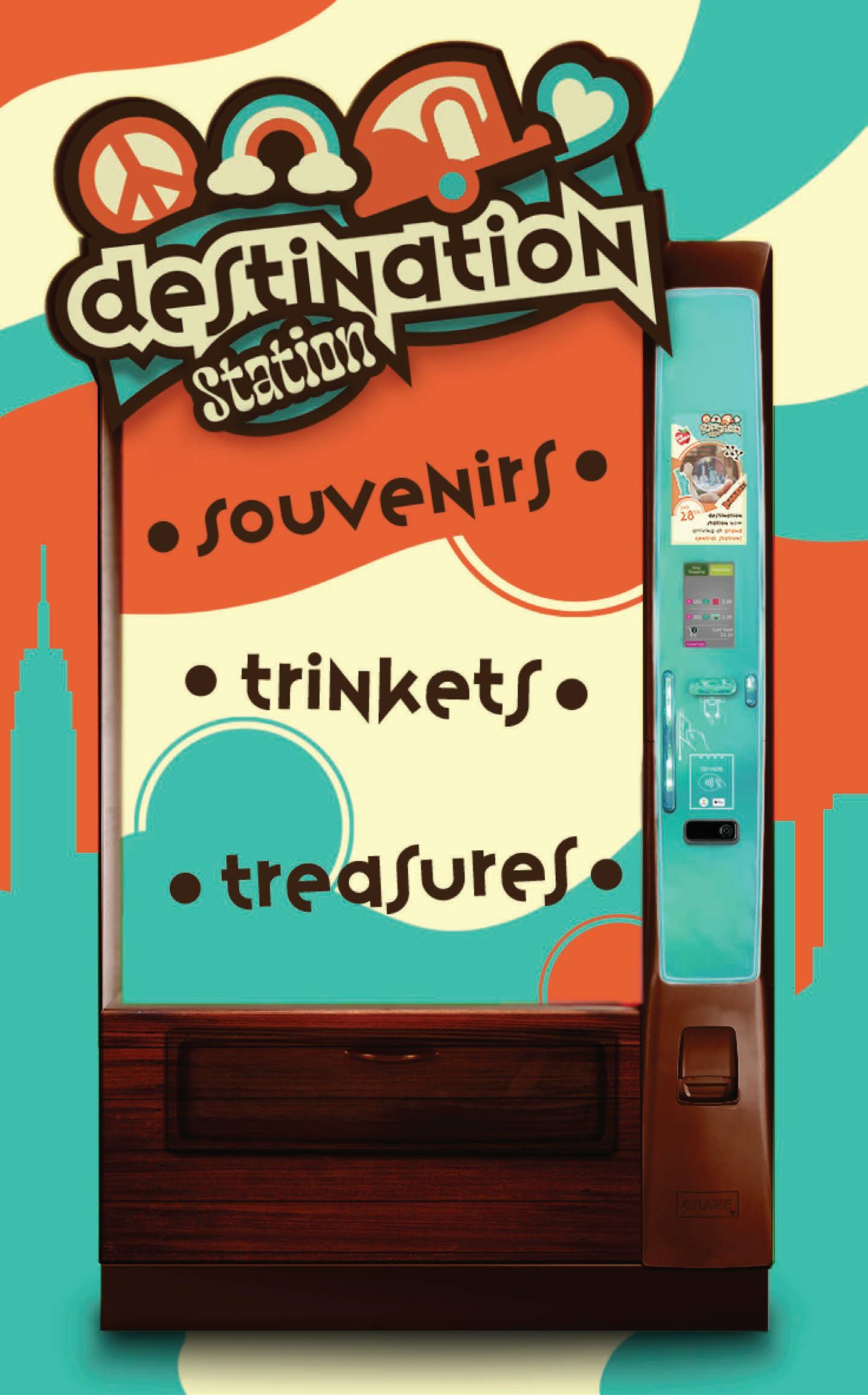
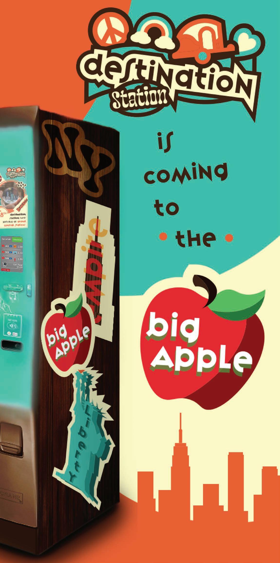
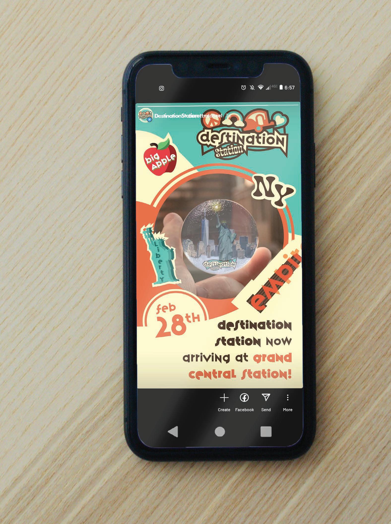
Destination Station
Design Prompt:
Design a vending machine brand identity that delivers a niche product to a select group of customers. Center the branding around this group, specifically marketing to them in machine design, package design, advertisements, and products.
Project Pitch:
The Destination Station is a vending machine that markets to tourists and customers of famous landmarks throughout the United States by selling trinkets and knickknacks in a convenient vending-form gift shop. The standout quality of Destination Station is the ability to deliver quality memorabilia away from the crowded, overpriced gift shops that plague established tourist traps. The visual identity is inspired by the vintage style of Americana, with the warm, inviting color palette alluding to classic roadside attractions and tourist traps. The company branding takes cues from the overpriced trinkets, the gaudy postcards, and the flashy bumper stickers that make up the collection of souvenirs commonly purchased during an old fashioned family road trip.
Design Prompt:
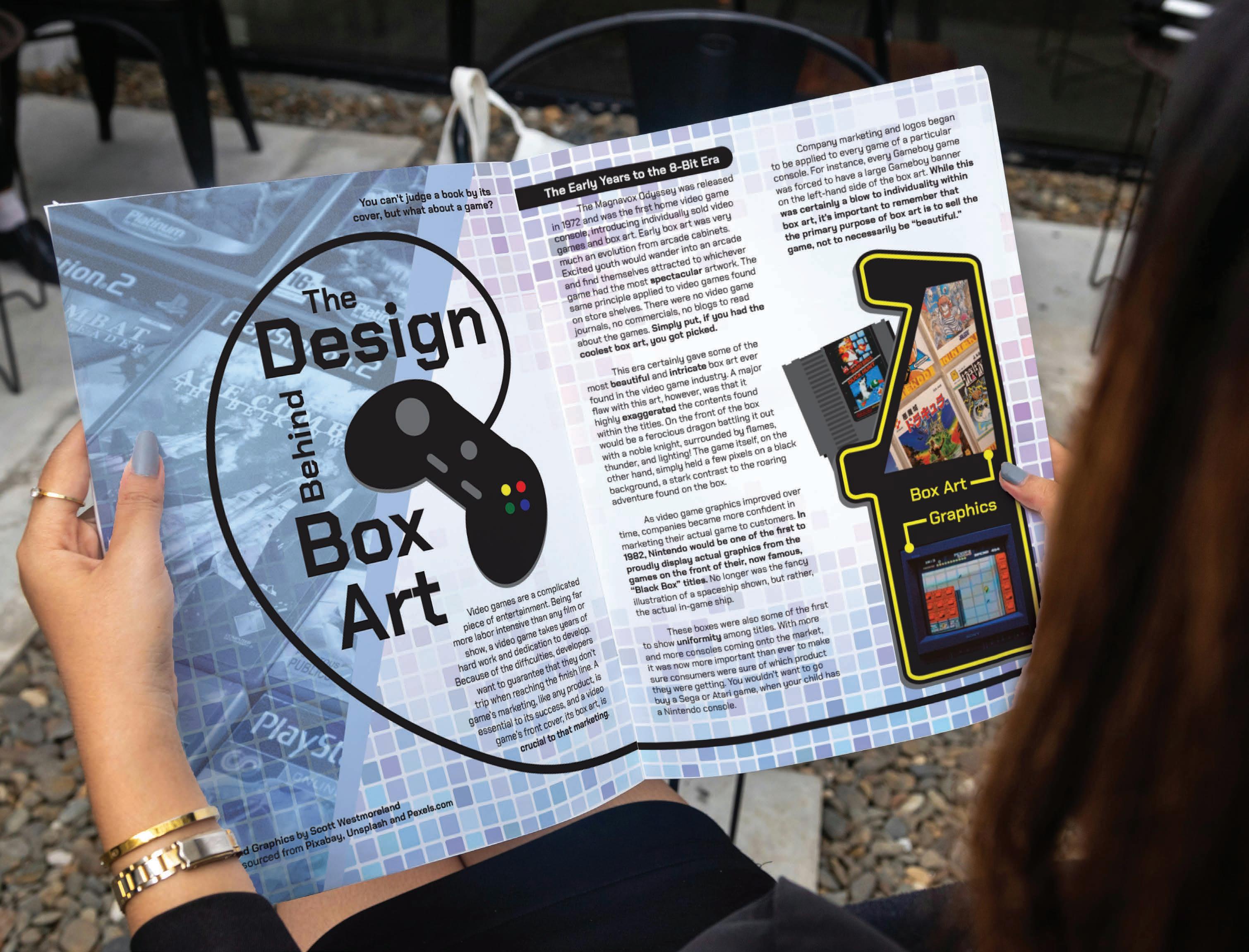
Design a magazine spread to be used as an article in GDUSA. This article will emphasize visual flow and typographical hierarchy while featuring engaging body copy that details an aspect of graphic design history.
Project Pitch:
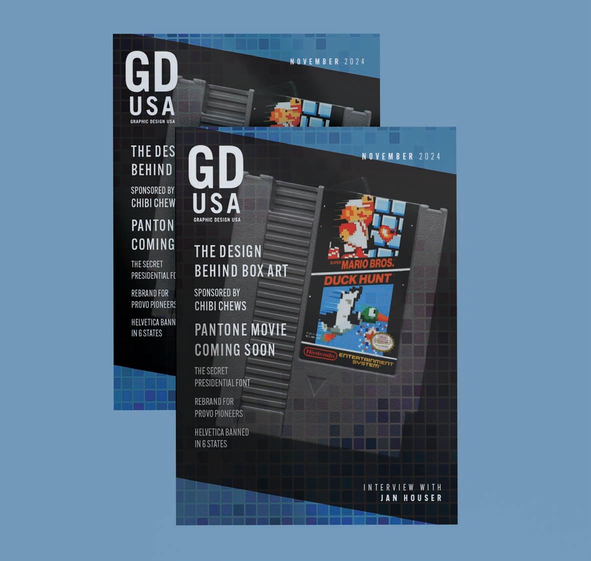
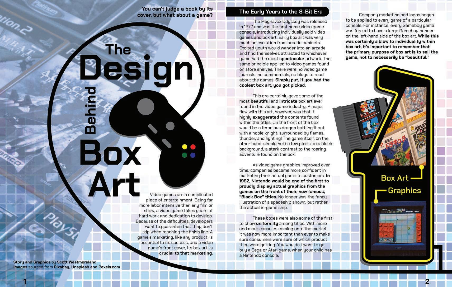
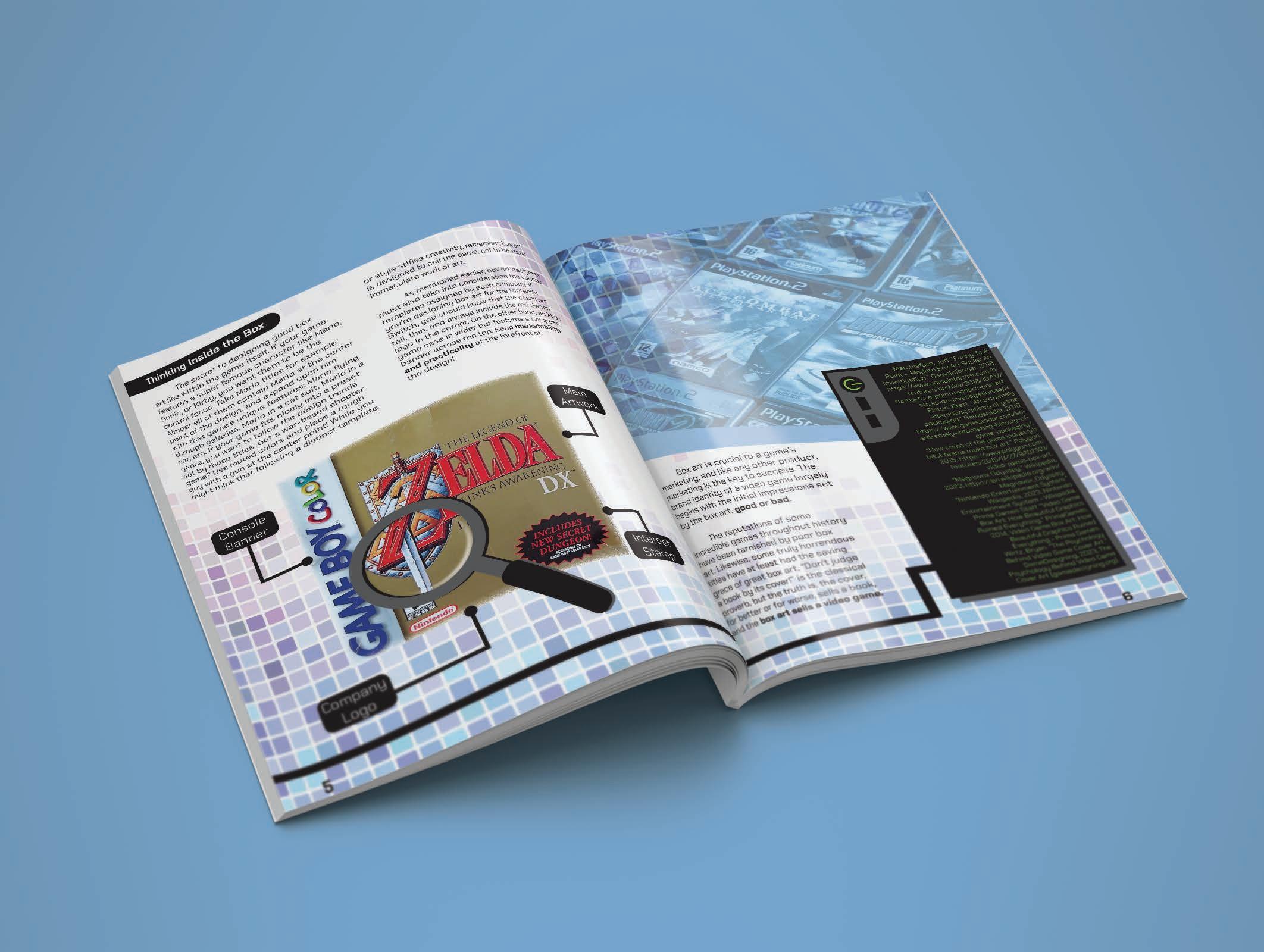
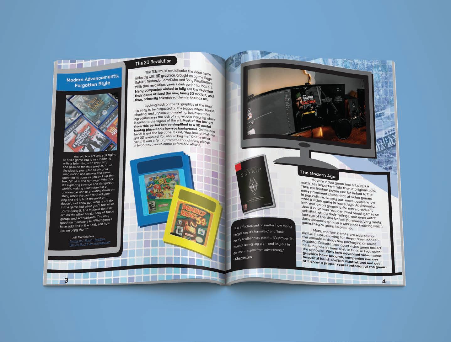
The Design Behind Box Art is a magazine article detailing the history and design of box art in the video game industry. The subject of box art was chosen due to its fascinating design obstacles and goals, which must convey the visuals, gameplay, story, and mechanics of a game all in one easy-to-understand cover. The main san-serif typeface Obvia works well as a readable body copy in regular form while also serving as a striking title in bold, with geometric pixel-like strokes, reminiscent of classical videogames and their displays. All imagery and graphics used in the design are also meant to harken back to videogame displays with large geometric shapes and bold, primary colors. The standout feature of the spreads is the cable that runs along the bottom of all six pages, acting as a continuing line of interest for the readers eye to follow.
The Design Behind Box Art INTERACTIVE
MAGAZINE SPREAD
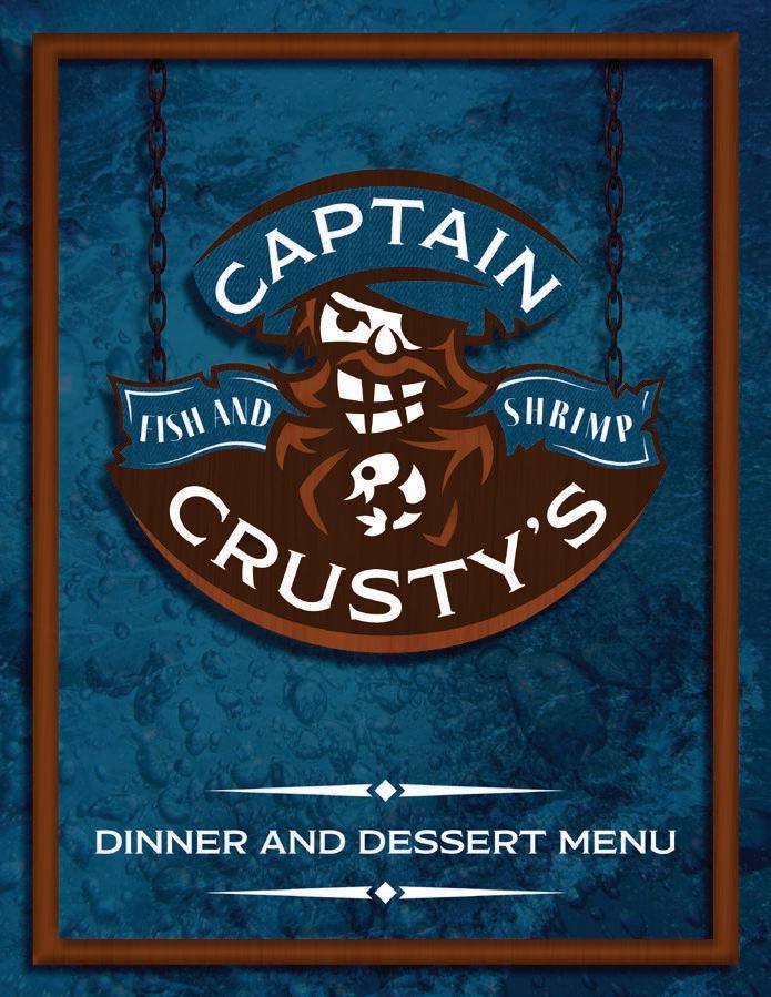
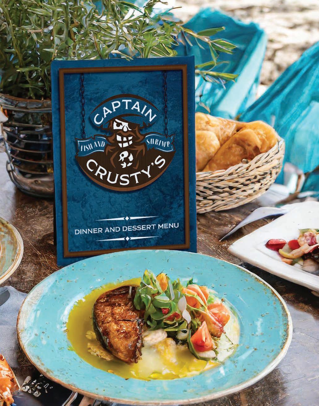
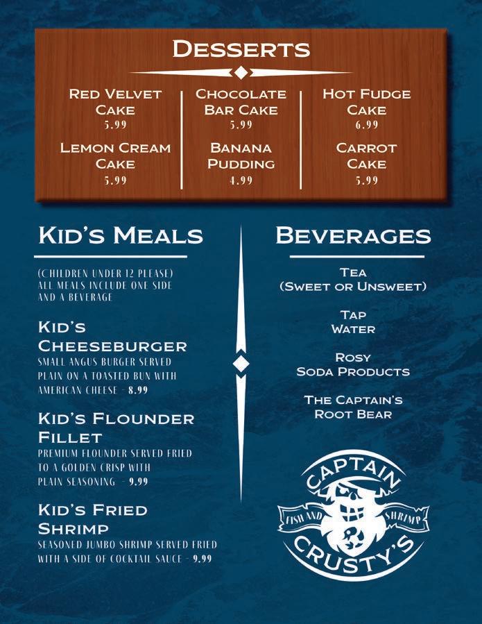
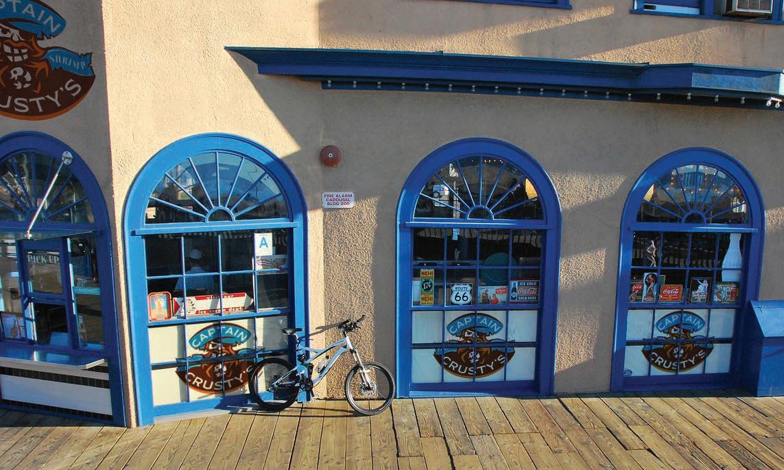
Captain Crusty’s Fish and Shrimp
Design Prompt:
Design a brand identity for a restaurant business. This business will include themed uniforms for the wait staff (male and female variants), outdoor signage, and a comprehensive menu layout that prioritizes visual and typographic hierarchy.
Project Pitch:
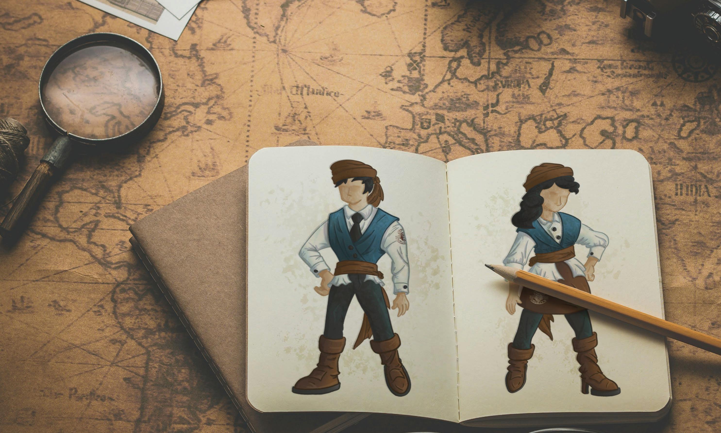
Captain Crusty’s Fish and Shrimp is an upscale fish camp located along the Atlantic coast. They offer topquality seafood at a reasonable price, complemented by beautiful views of the ocean and an immersive pirate ambiance. As customers are seated by a themed member of the wait staff, they can then peruse a finely crafted menu of coastal delicacies. To complement the scurvy aesthetic of the restaurant, the wait staff, menu, and primary branding of Crusty’s are influenced by a noble vessel trekking across stormy waters, with the company colors showing a cool, murky blue contrasted against a warm wooden framing. The captain himself, as depicted in the logo, carries the crude but lighthearted nature of a pirate, complete with a leftover shrimp lost in the waves of his beard.

MODESTOLITE
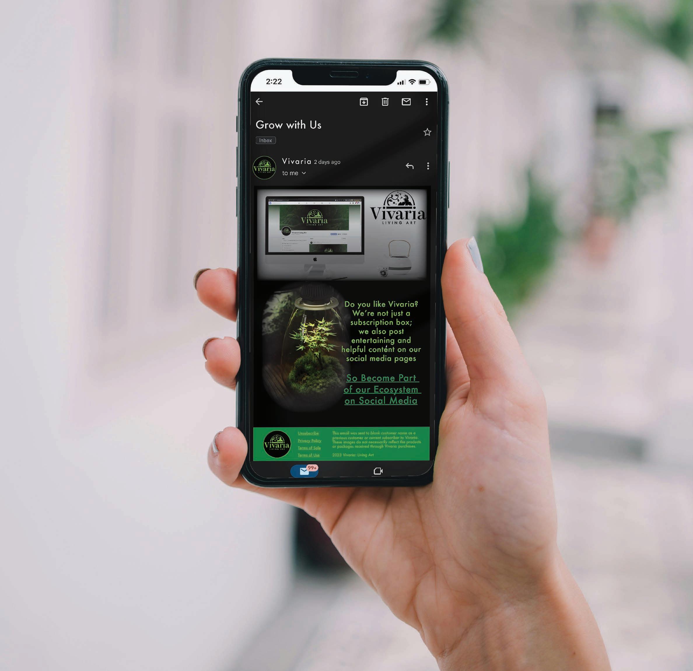
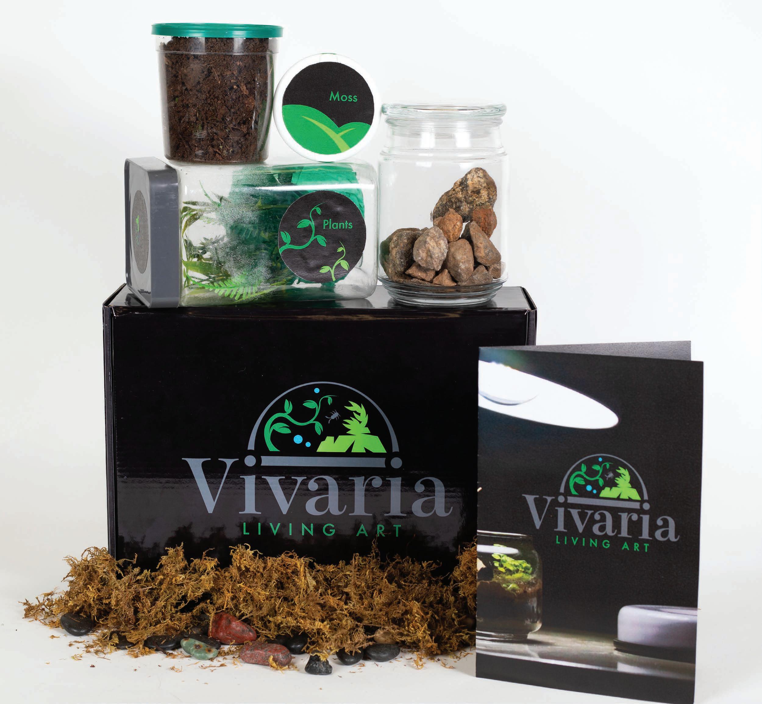
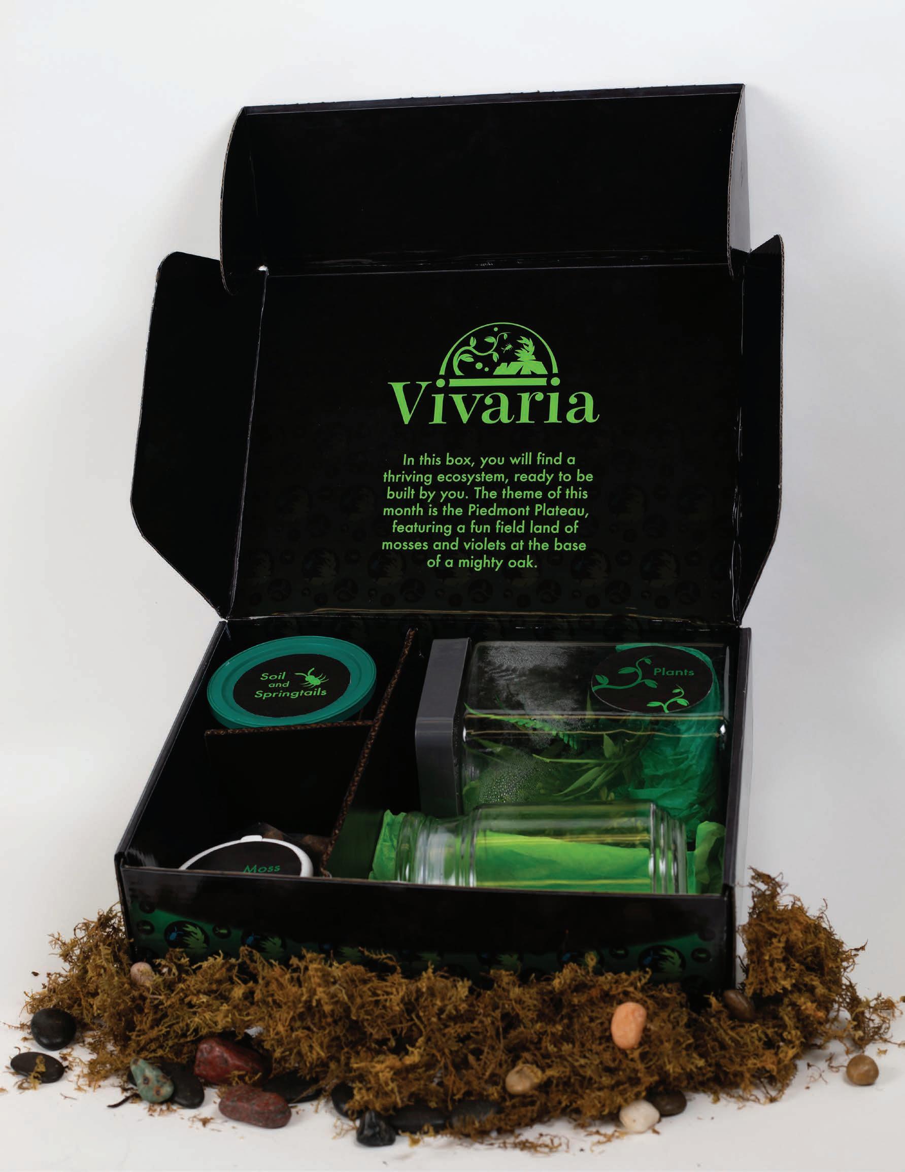
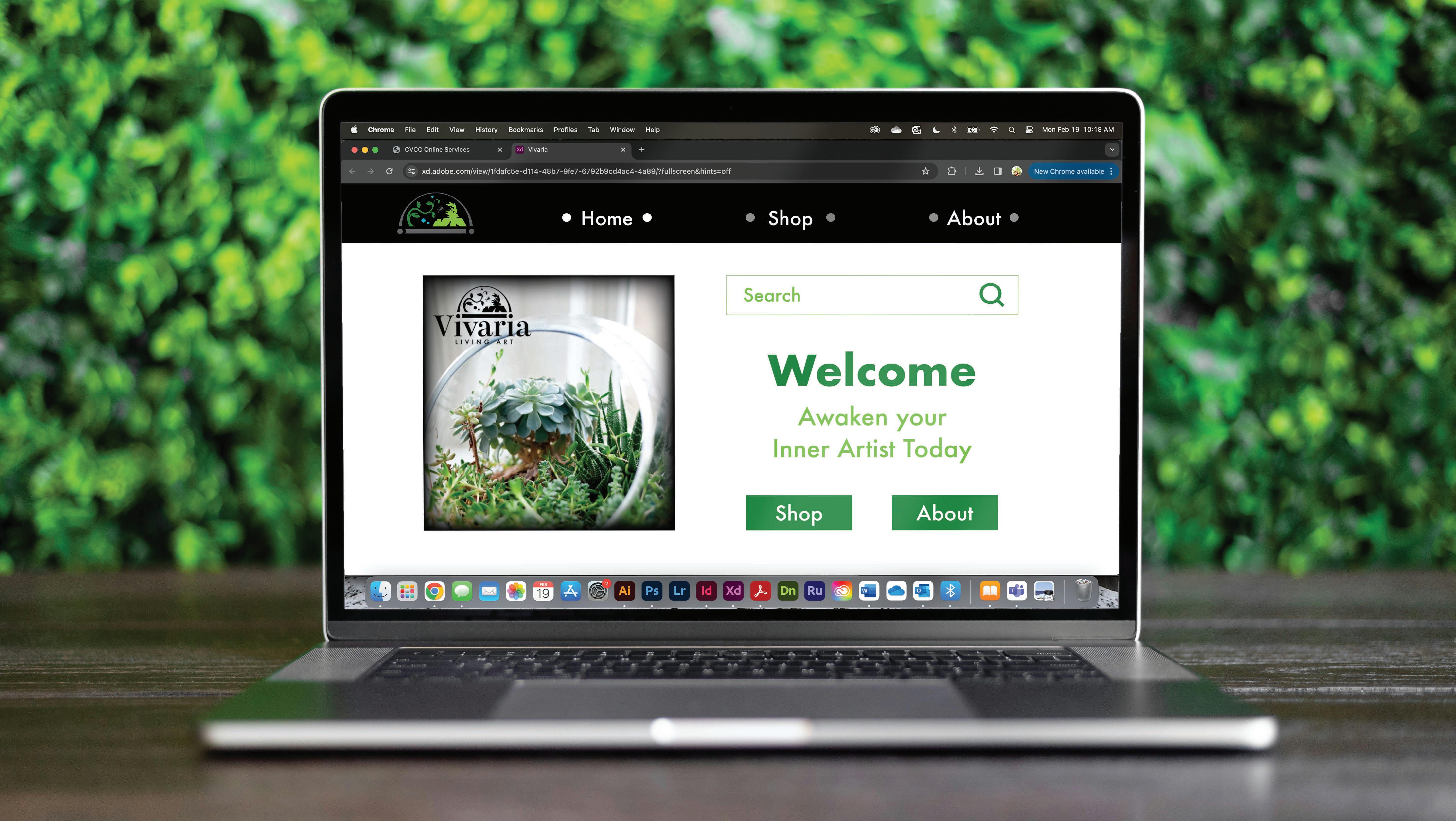
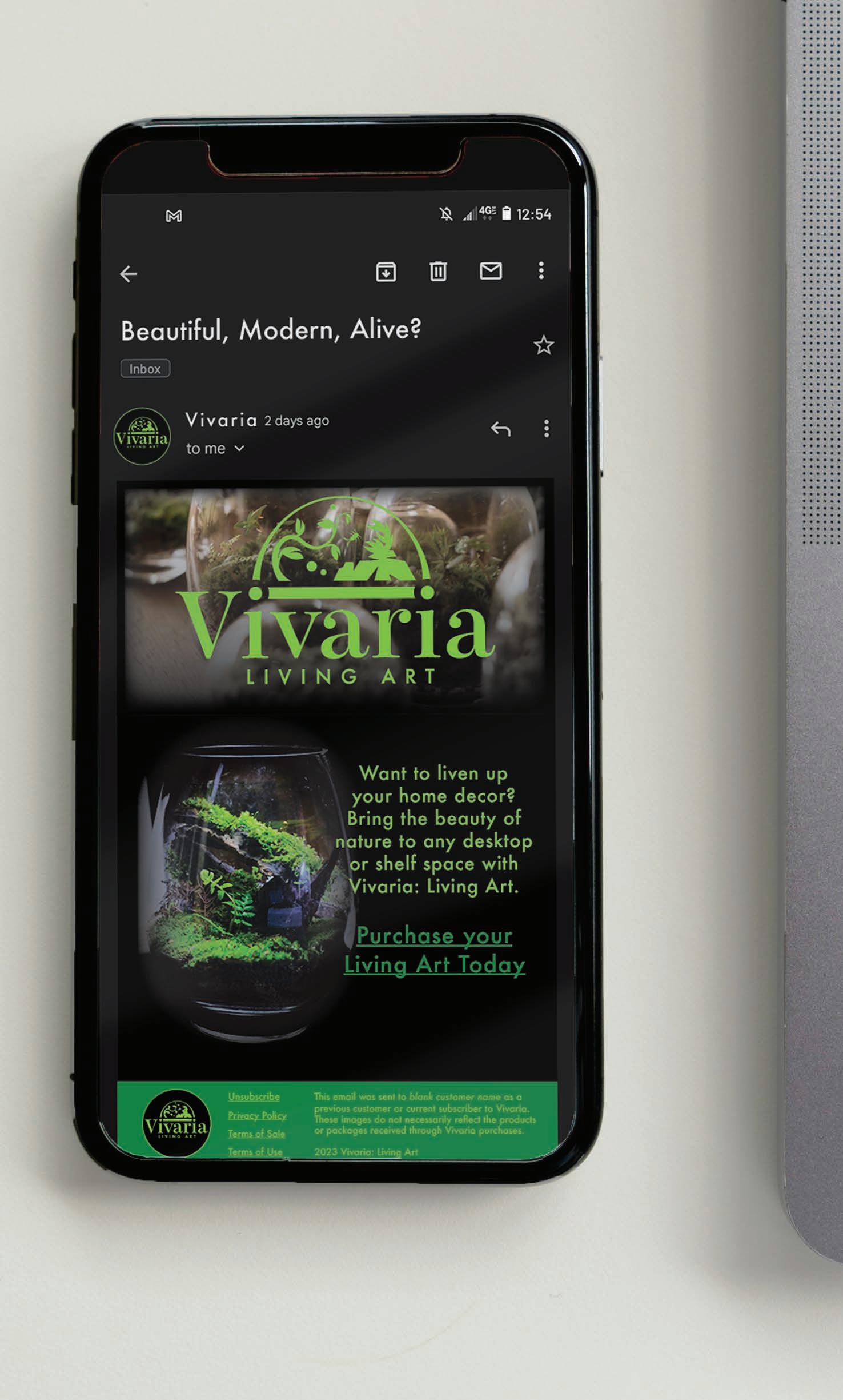
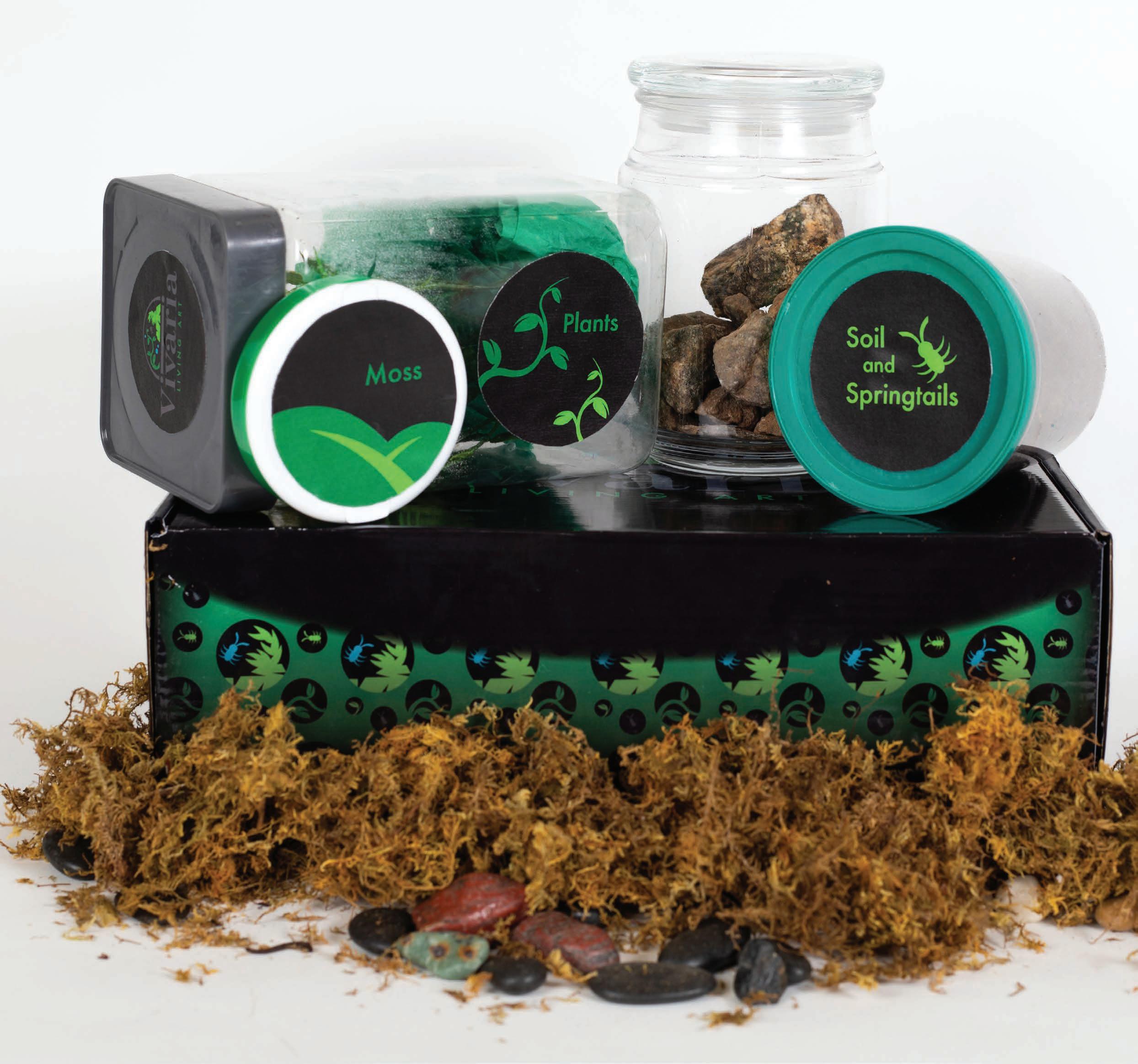
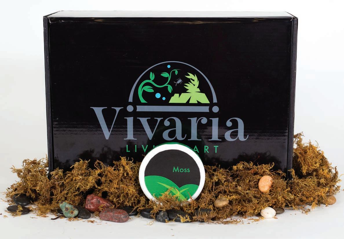
Vivaria: Living Art
Design Prompt:
Design a complete subscription box campaign that includes the following components: a brand identity to be used for both digital spaces and packaging design; a prototype model of the subscription box itself; a working website prototype; a comprehensive digital marketing case study; and a promotional email campaign.
Project Pitch:
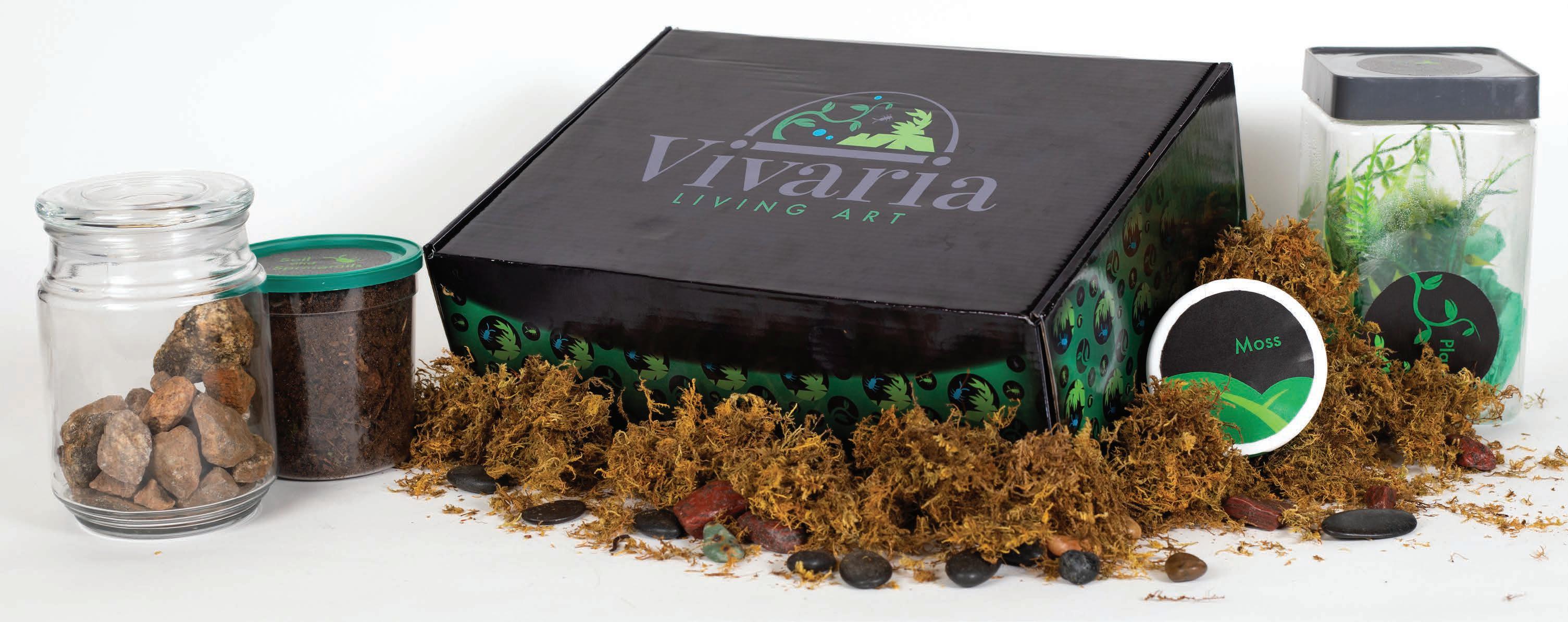
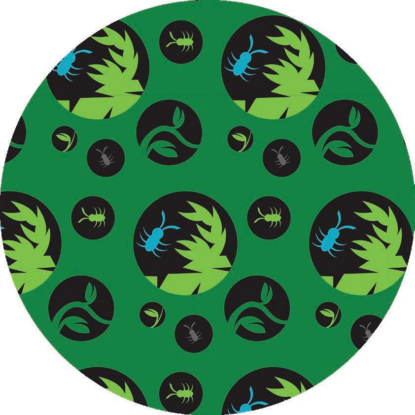
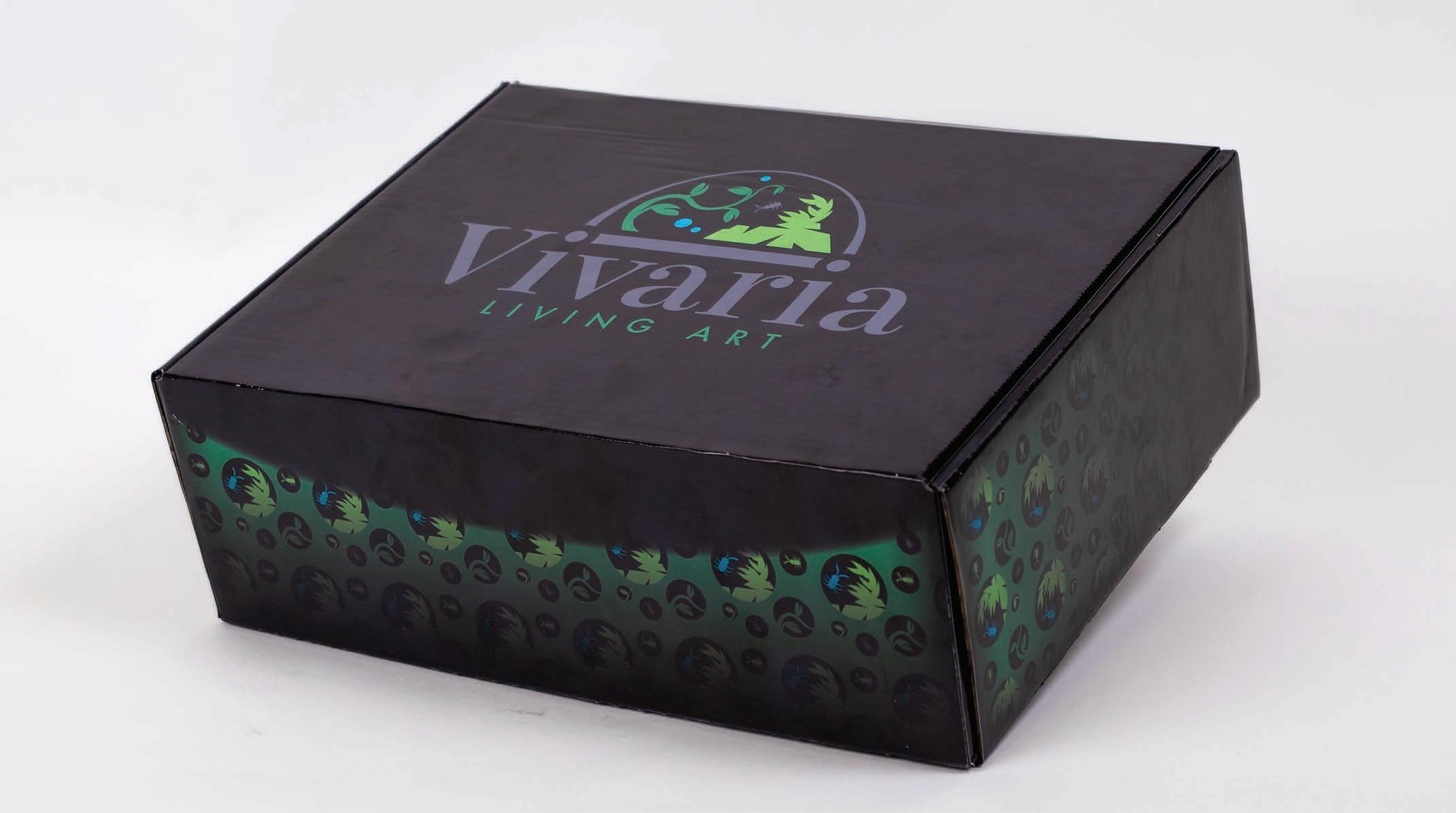
Vivaria is a subscription box service that delivers readyto-construct enclosed terrariums on a bimonthly basis. The company colors, patterns, and packaging all feature a sharp, cool color palette contrasted against a sleek black backdrop, meant to evoke mystery, akin to the wonder of discovering new creatures and plants in nature. Vivaria’s primary email campaign focuses on creating an engaging platform for followers to subscribe to, which includes special offers to long-time subscribers and offers sneak peaks at upcoming products, which are all outlined in a complete digital marketing case study that encapsulates a sum of strategic initiatives, data-driven decisions, and the pursuit of excellence in the ever-evolving landscape of online promotion.
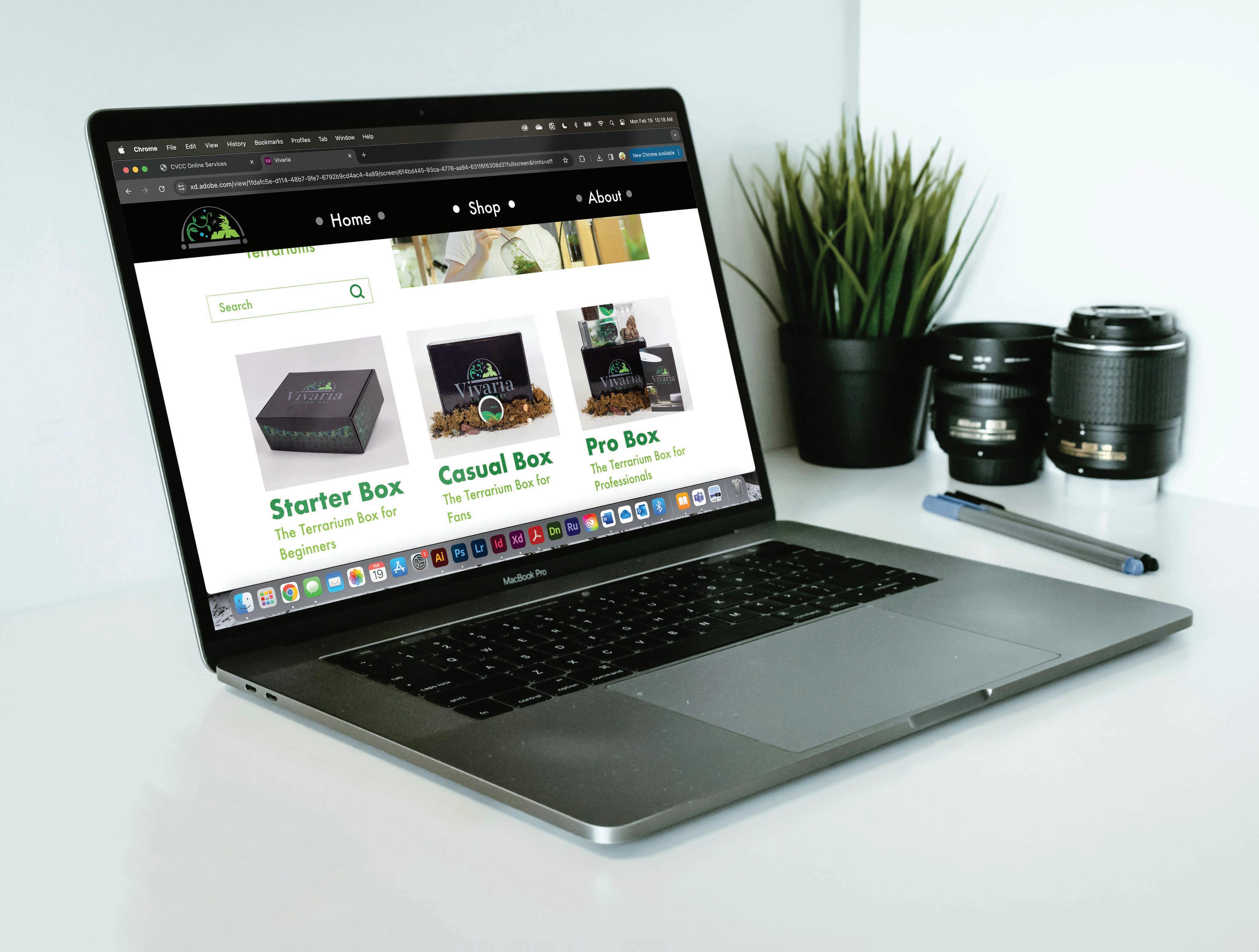
Website Prototype Digital Marketing Case Study
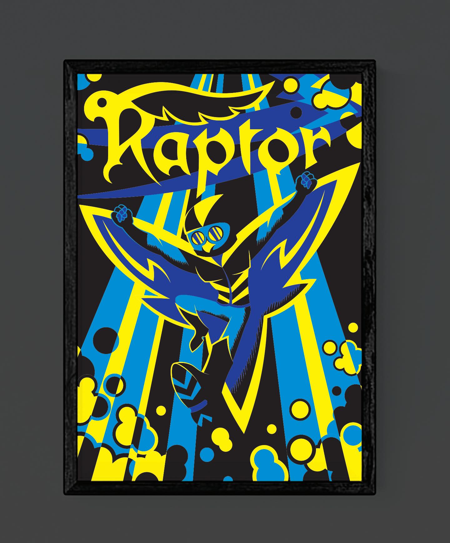
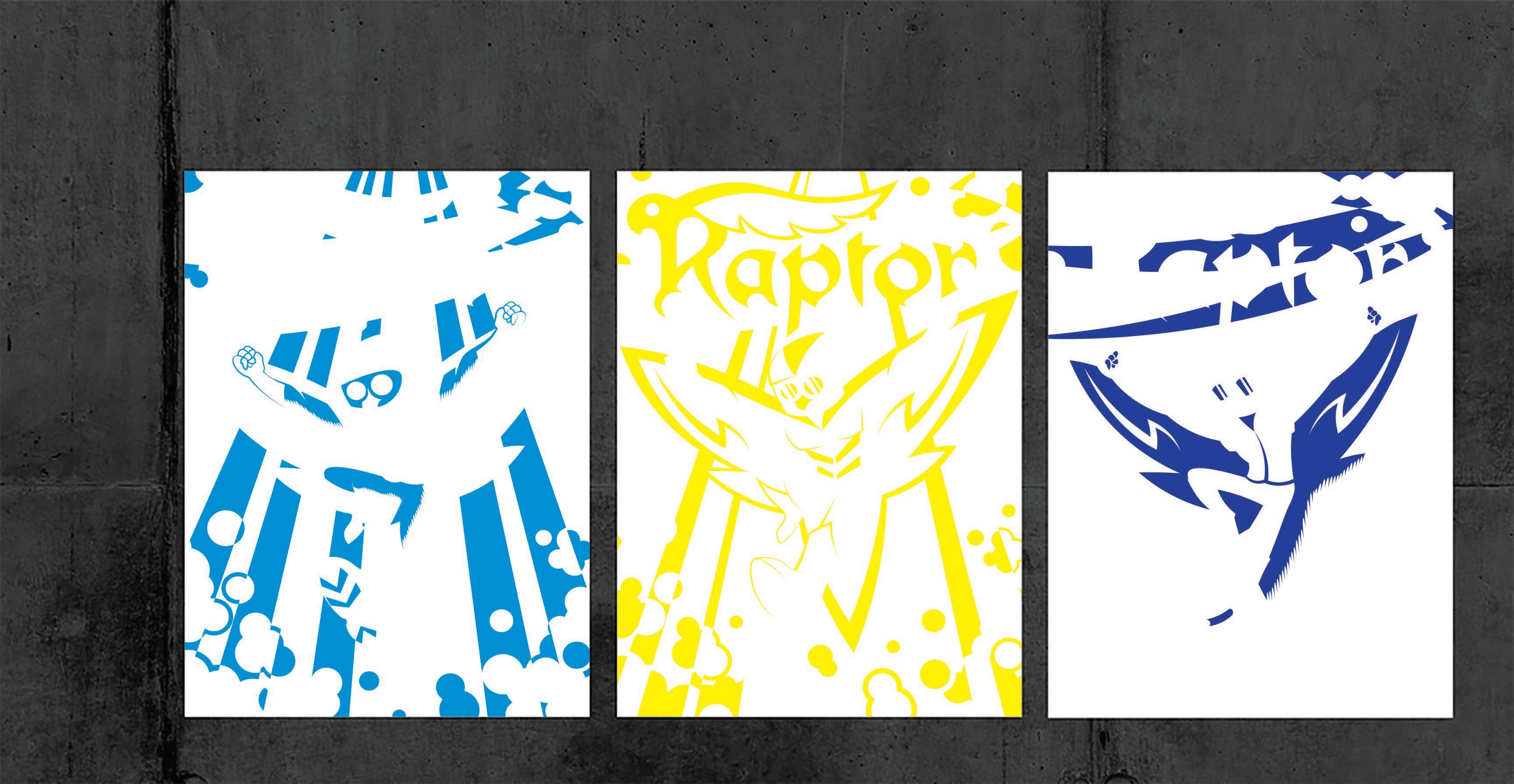
Raptor Screen Printed Poster
Design Prompt:
Create a 3-color design to be screenprinted on a poster stock of paper. Incorporate the paper background as a fourth color to create a dynamic piece while keeping the three base colors from touching one another.
Project Pitch:
The Raptor is a super-powered vigilante whose design takes cues from a homemade source, incorporating jeans, a biker helmet, and a leather jacket, giving the feel of a superhero costume made from whatever pieces were found around the house. The poster design emphasizes movement and is designed from a very low point of view, only increasing the dynamic feel of the poster as the Raptor swoops down from the top of the screen. The colors and imagery are inspired by the Bronze Age of comics. This era of comic books contrasted the bright and bold colors of the earlier eras with darker and more muted palettes, mainly grays and blacks.
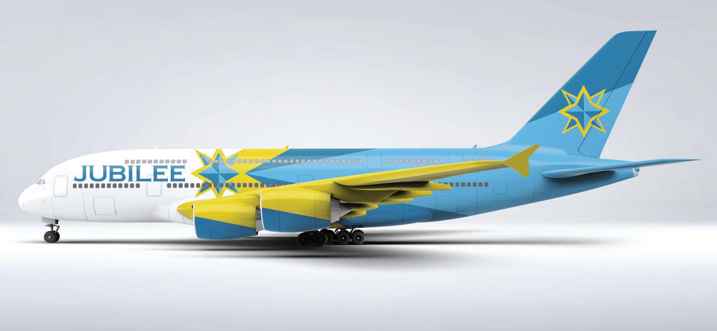
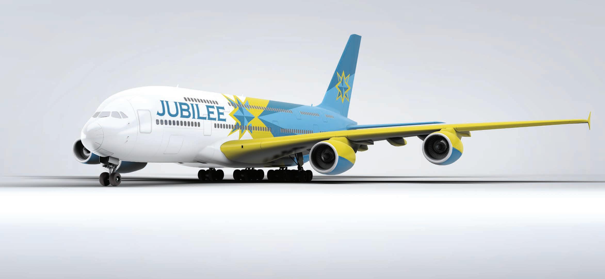
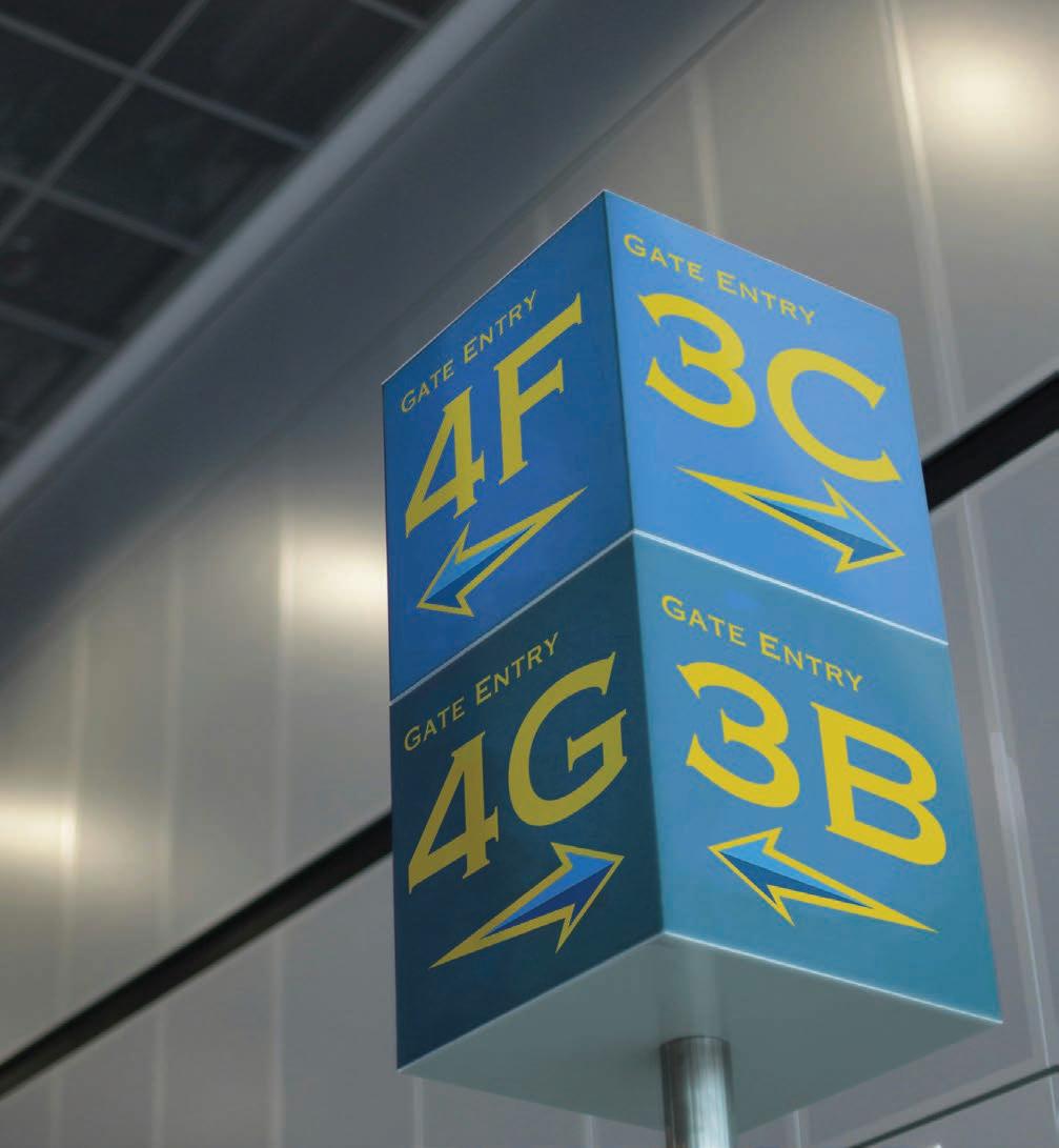
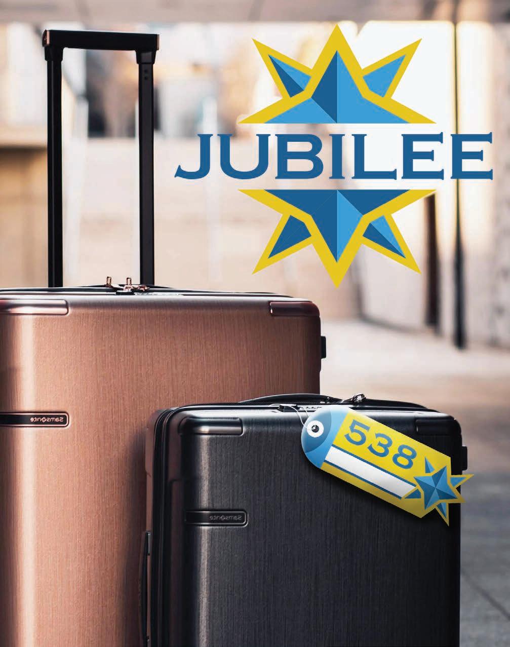
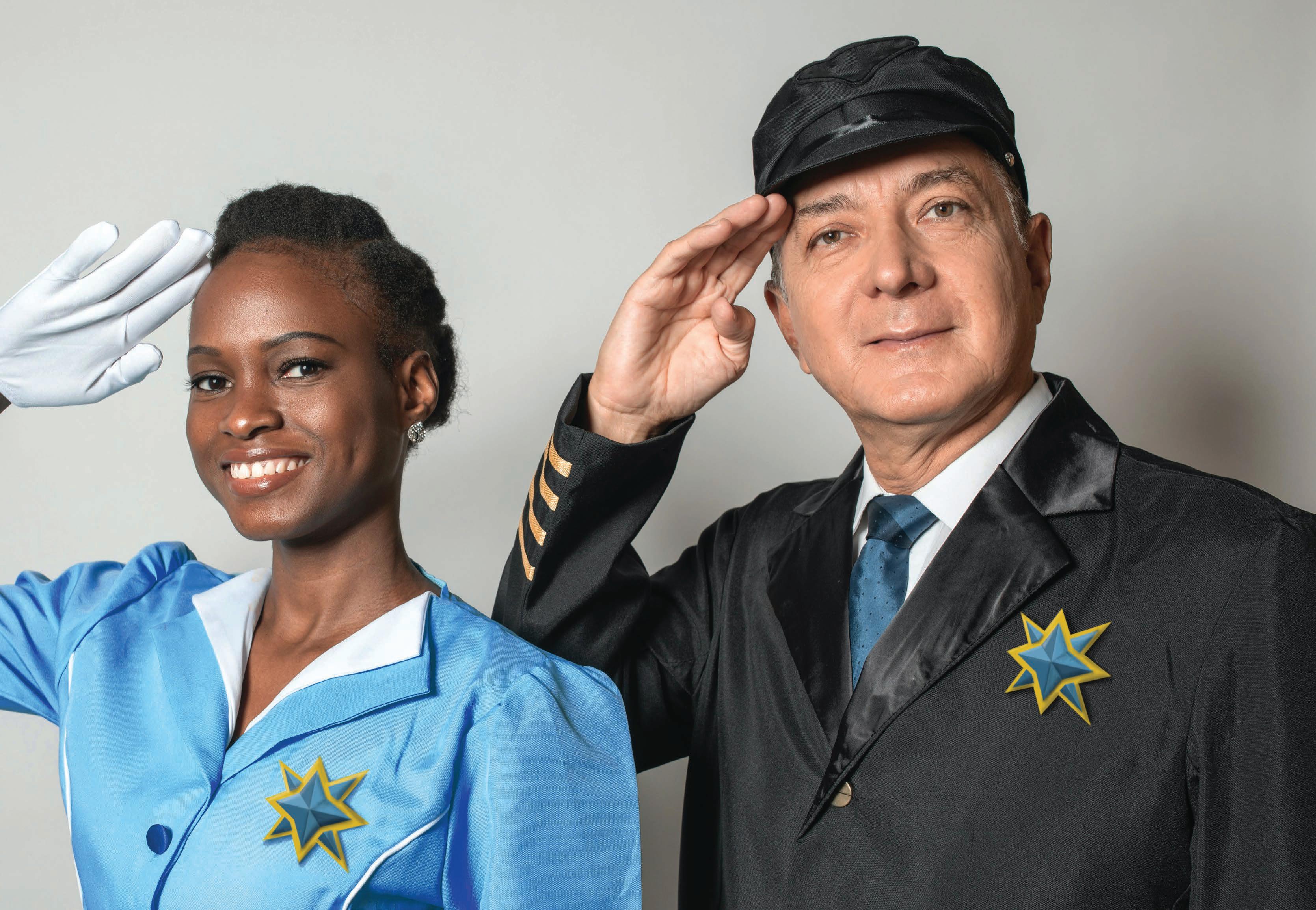
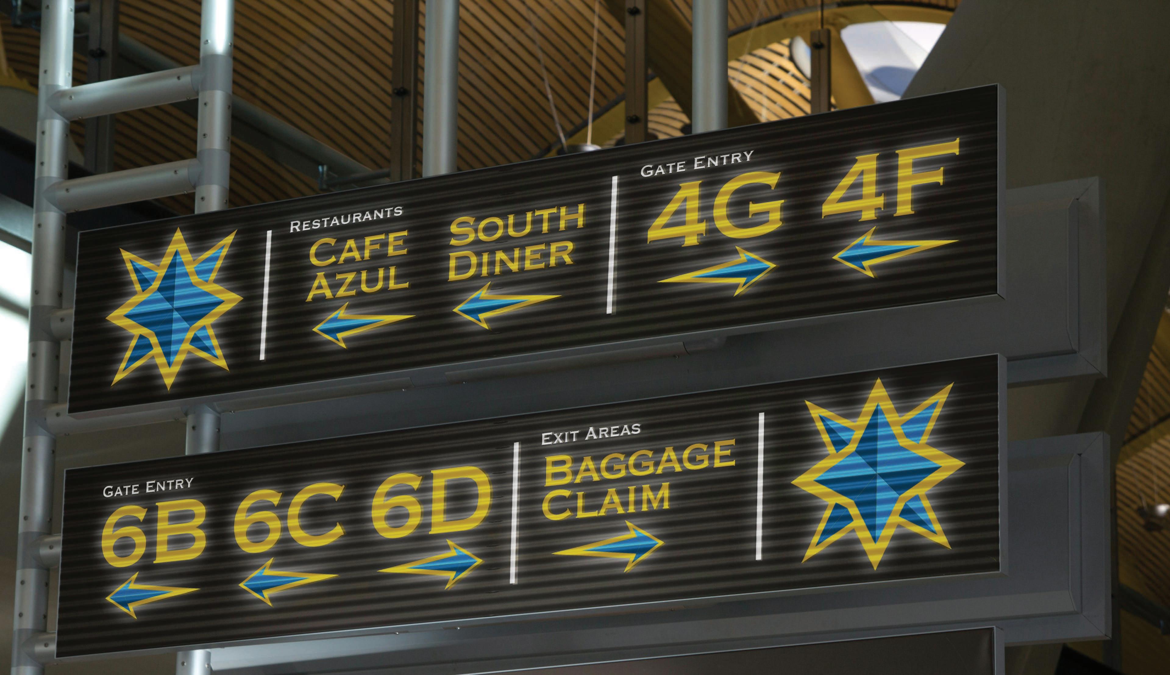
Jubilee Air COPPERPLATE
Design Prompt:
Design a full brand identity for a major airline company, complete with a company pattern, style guide, graphic logo, and color scheme. Implement this branding into a plane design to be used on the company’s jets, as well as signage design for the terminal of the airport.
Project Pitch:
Jubilee Air is the premiere airline for any family theme park adventure. This airline specializes in delivering a stress-free, fun flight experience for the entire family, delivering them safe and sound to star attractions around the US. With this grand but friendly demeanor, Jubilee boasts a regal and professional color scheme meant to evoke the spirit of adventure in the sky. The Jubilee star, the primary brand mark, is a symbol of patriotism and imagination, acting as a shooting star when seen on the tails of a soaring jet. The typography used for the Jubilee logo is a San-serif type, sleek and strong, just like the company. The terminal signage is designed to entice customers while also acting as a welcoming presence for any first-time flyers.
Design Prompt:
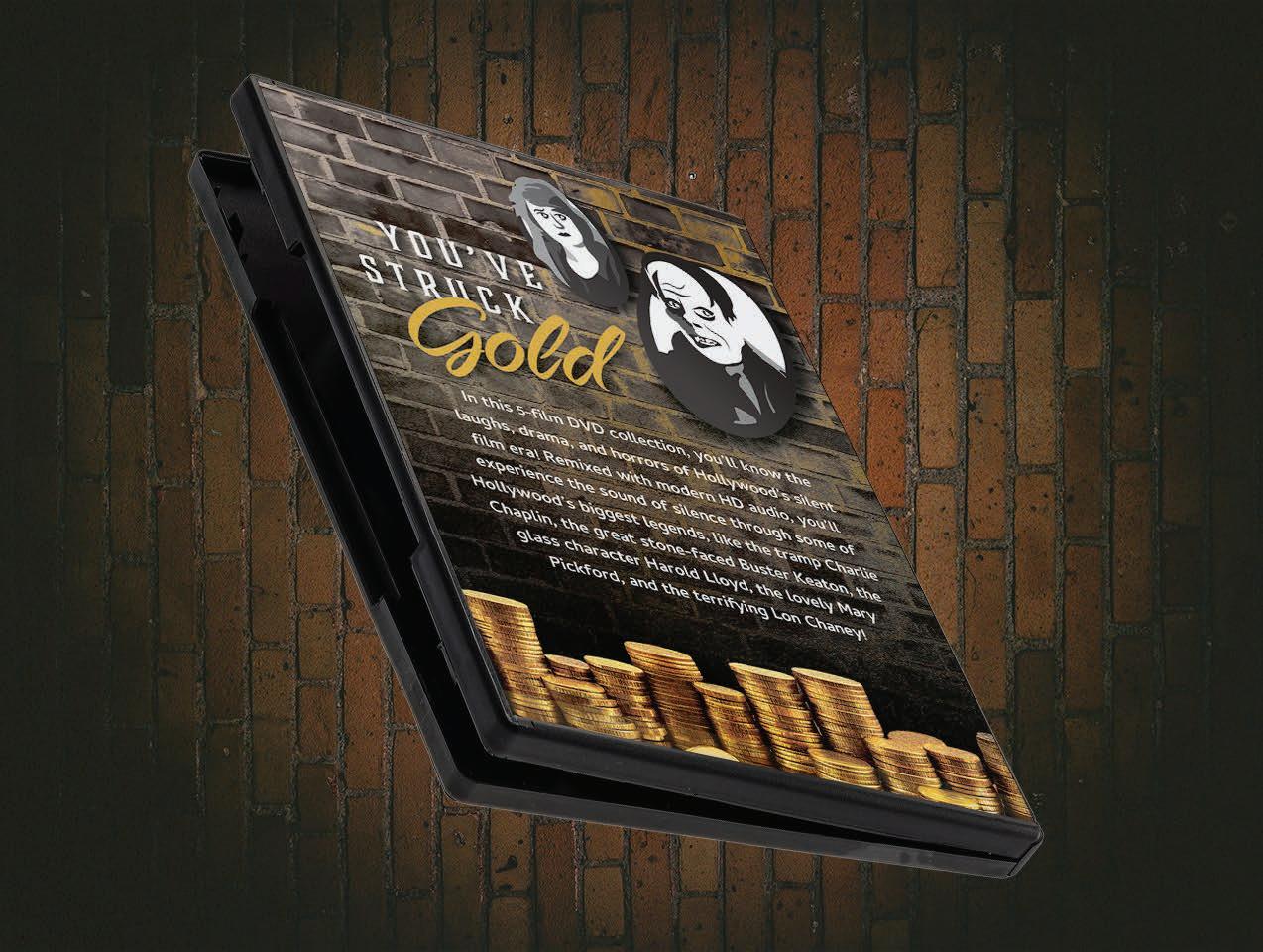
Design a DVD collection of films that emphasizes a primary set of icon graphics alongside a secondary set of icons that are tangentially related to the primary. The visual theme of this DVD collection should then be applied to additional collateral items, such as a popcorn box and a short commercial ad.
Project Pitch:
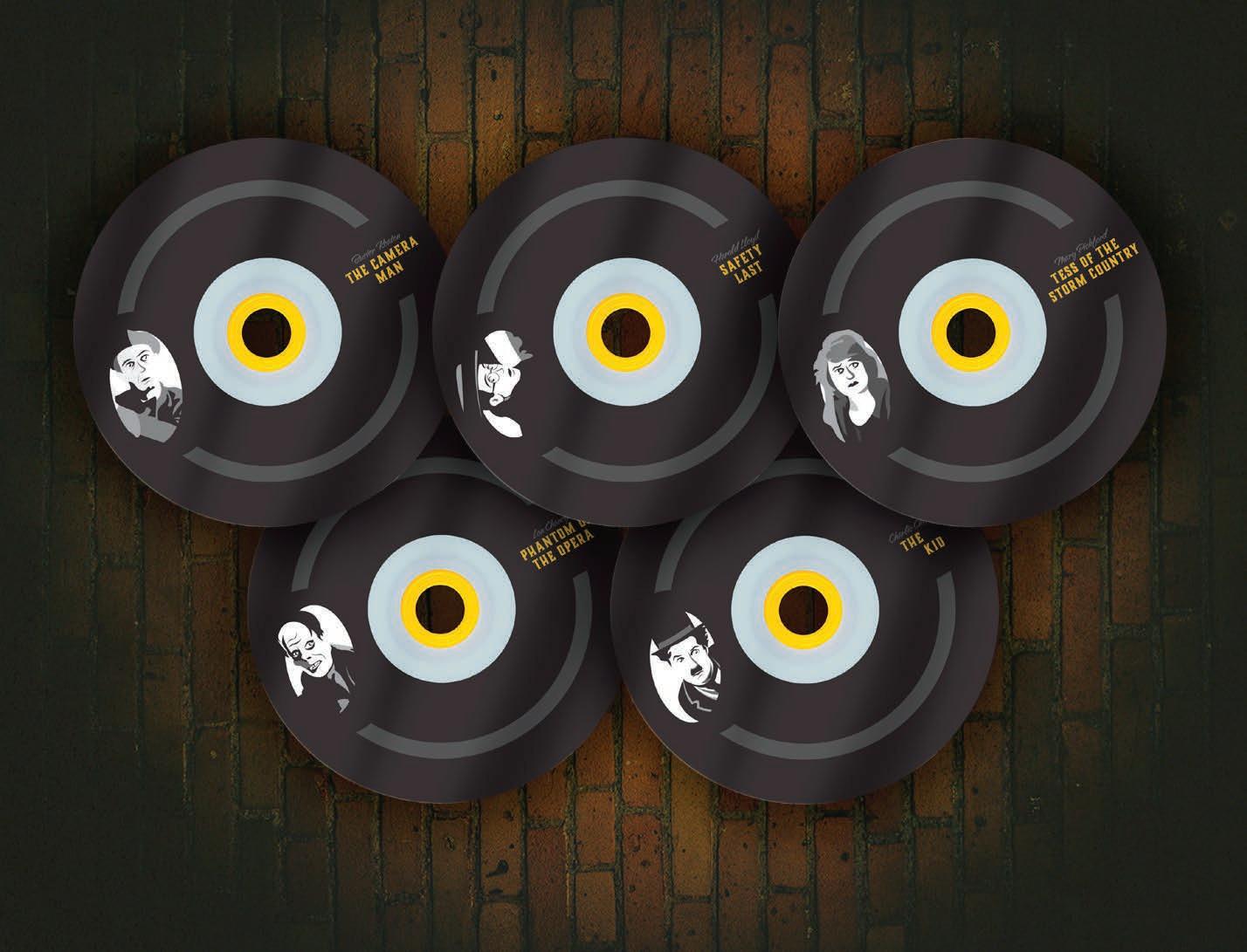
The Silent Gold DVD collection brings together the stars of yesteryear and showcases them in a new and improved format. Included in the Silent Gold DVD collection are five silent classics, featuring the icons of cinema’s early years. Buster Keaton, Charlie Chaplin, Harold Lloyd, Mary Pickford, and Lon Chaney are all immortalized in this classic collection, rendered into memorable icons that are recognizable and emphasize their individual personalities while also standing strong as a cohesive set. The colors of the theme include the full spectrum—of gray, that is!—immortalizing these classic stars in their iconic black and white appearances. Contrasted against this monochromatic theme is a pop of shimmering gold, representing the priceless value of these classic films.


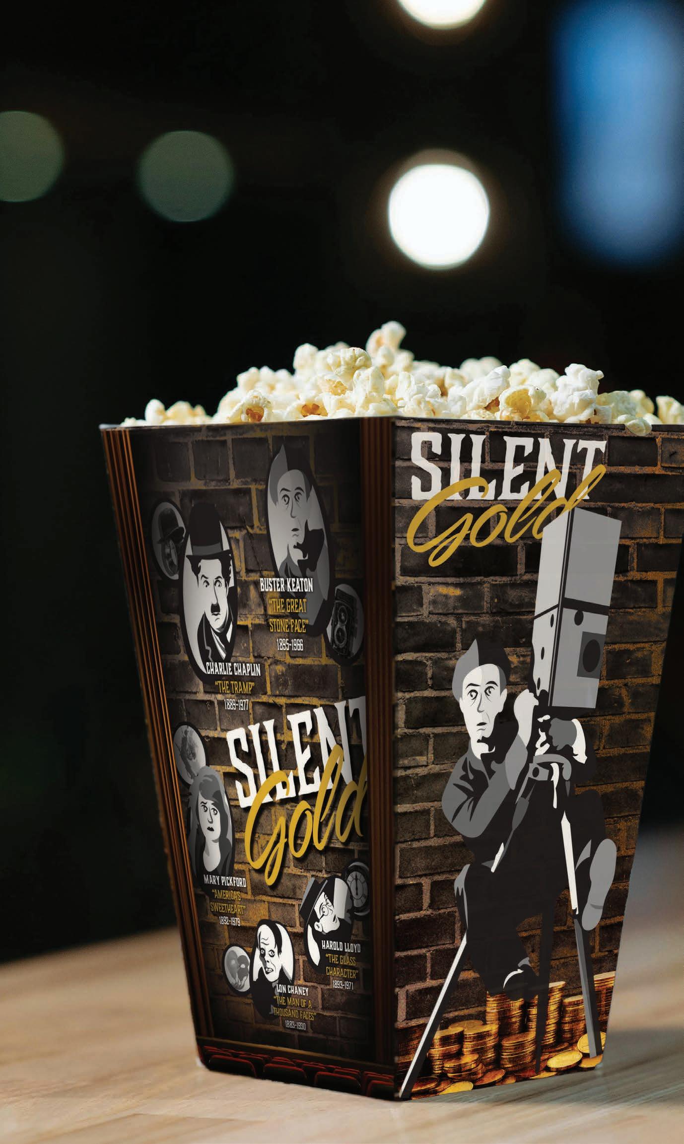
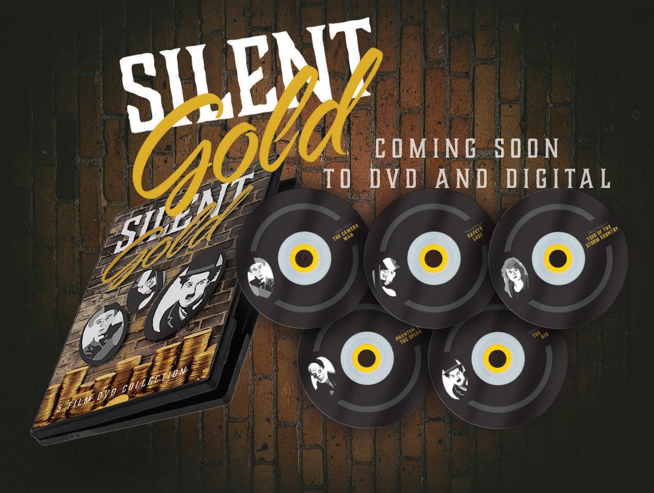
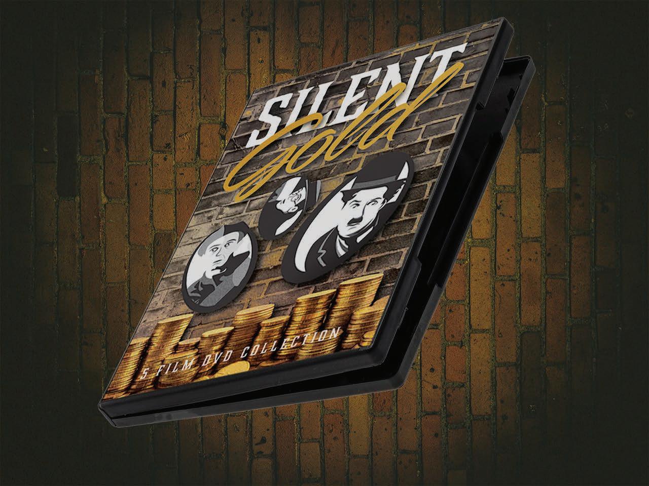
Silent Gold DVD Collection DVD COLLECTION COMMERCIAL
Auramorph Illustrations
Design Prompt:
Take three existing illustration projects and reincorporate them into a digital poster series that can also be rendered in a scientific illustration format.
Project Pitch:
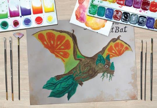
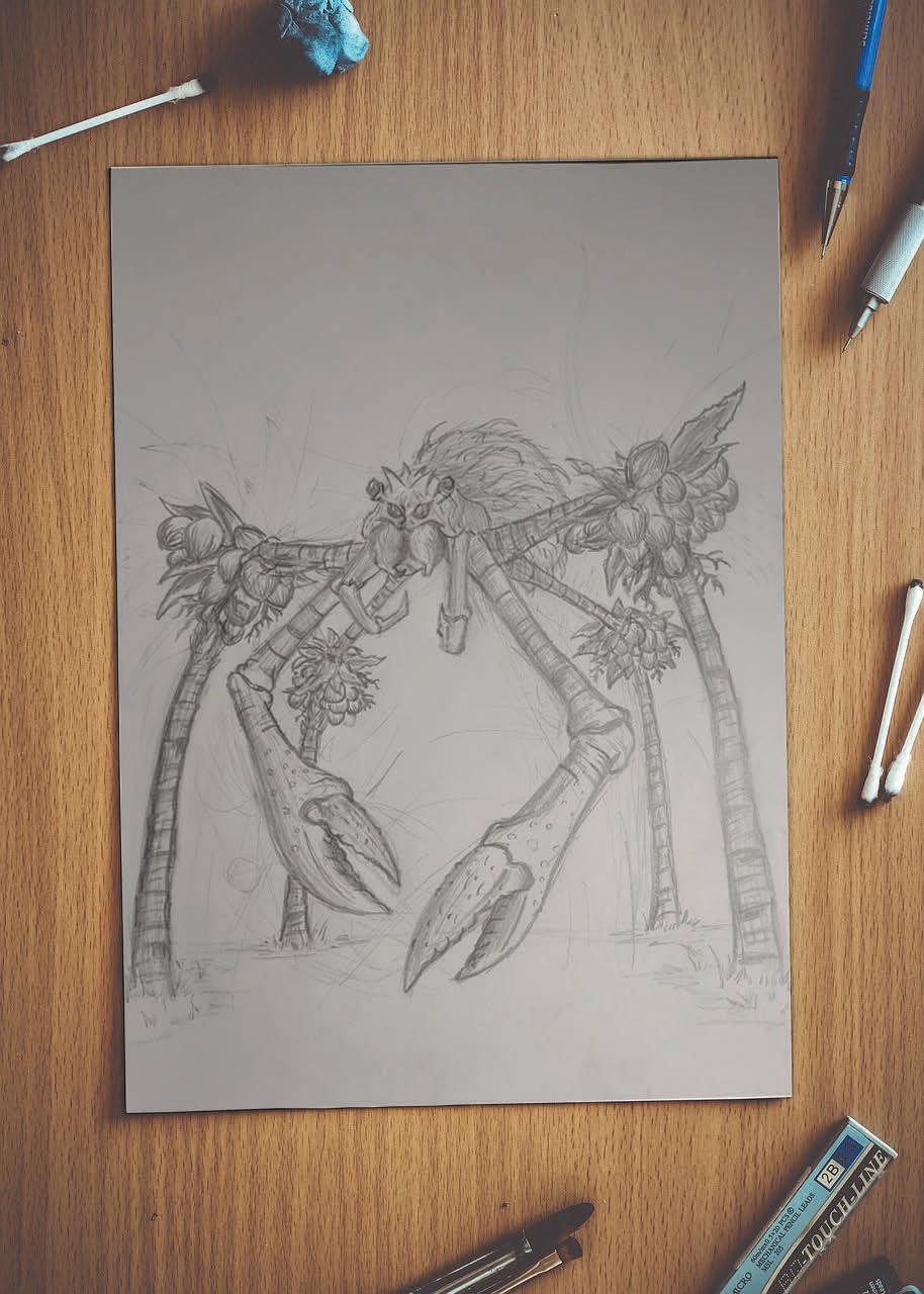
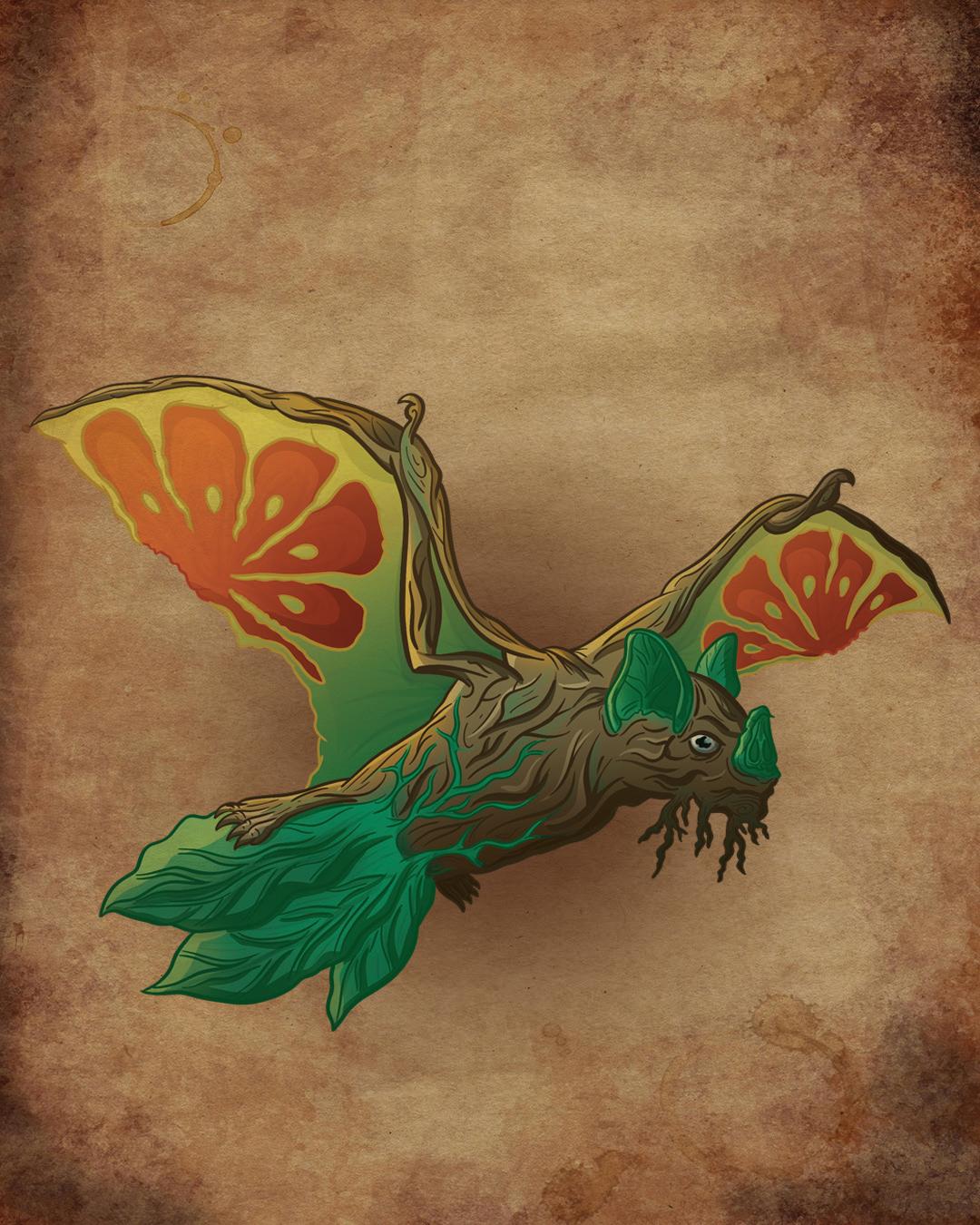
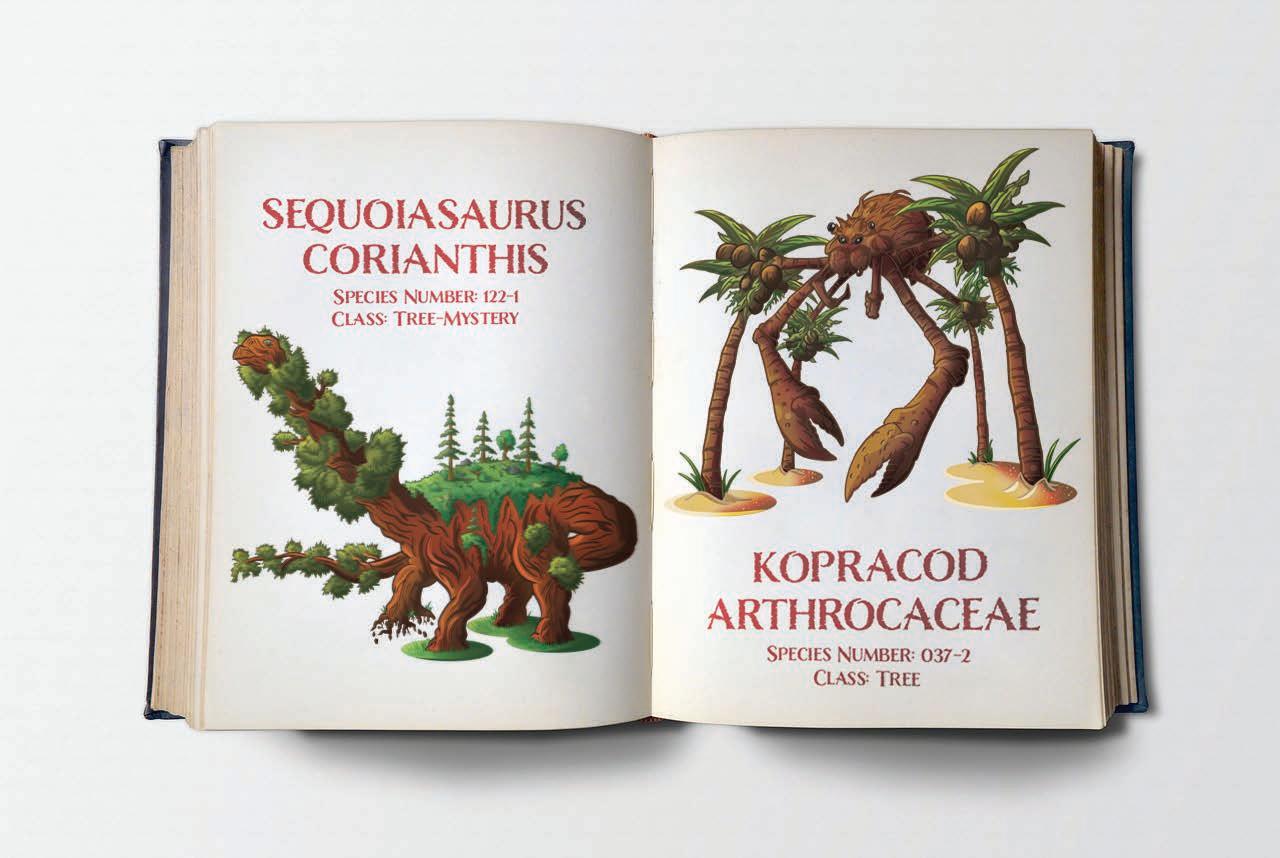
The strange realm of auras is home to several odd and mysterious creatures, known as the Auramorphs. These beings exist in several classes, with the tree class encapsulating creatures that blur the line between flora and fauna, including a sauropod with a tree for a neck, a fruit bat that has real fruit for wings, and a coconut crab with palm-tree-like legs. The design of these creatures takes inspiration from several real-world sources and simply blends them together into a concept that could believably exist, albeit with a suspension of disbelief. This can be seen in the tree-dinosaur hybrid, which combines the similar attributes of a long-necked dinosaur with the spiring branches of a pine tree.
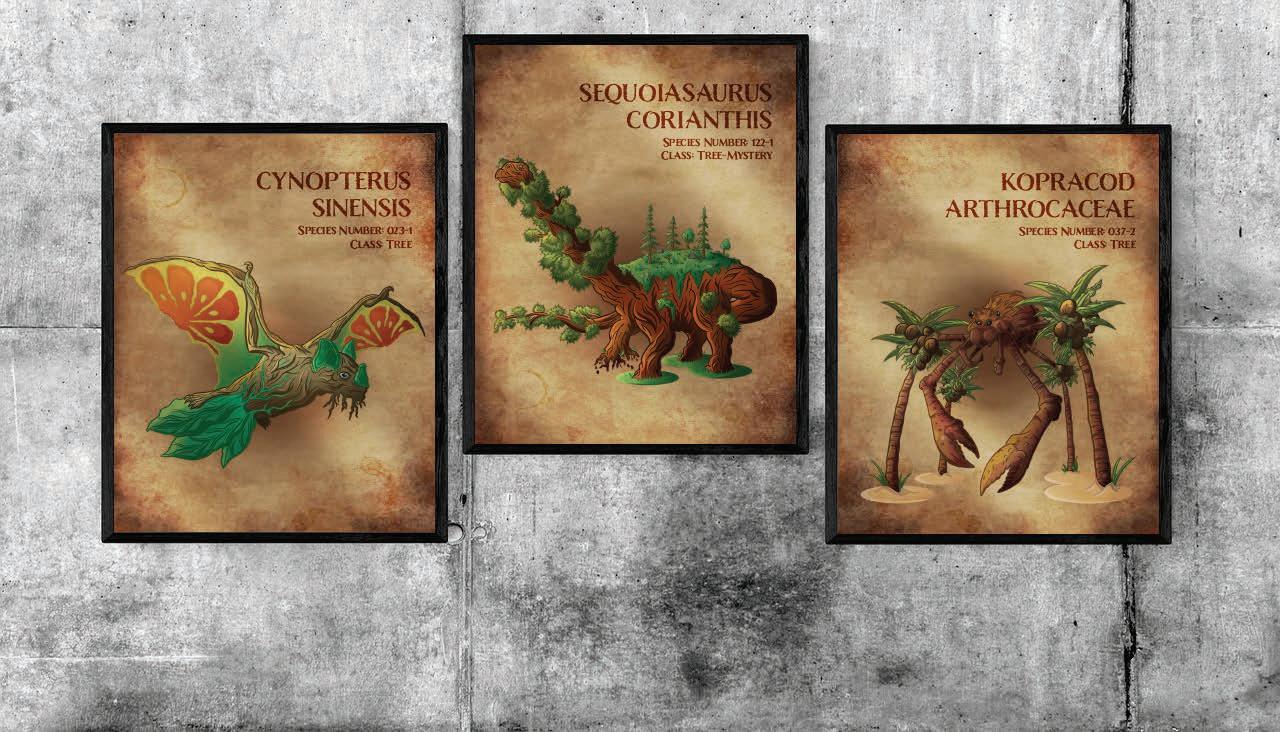
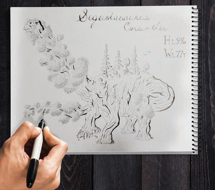
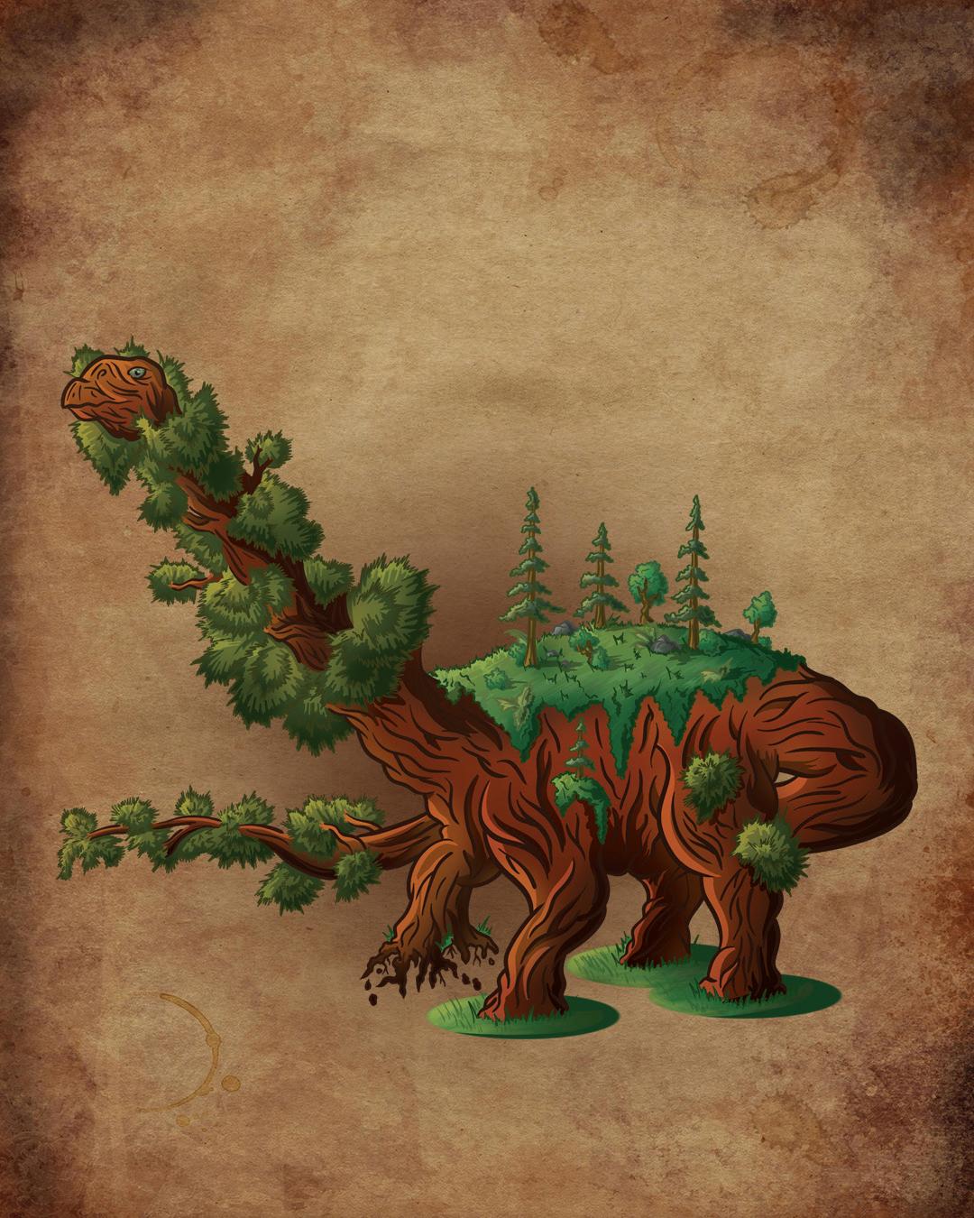
SEQUOIASAURUS
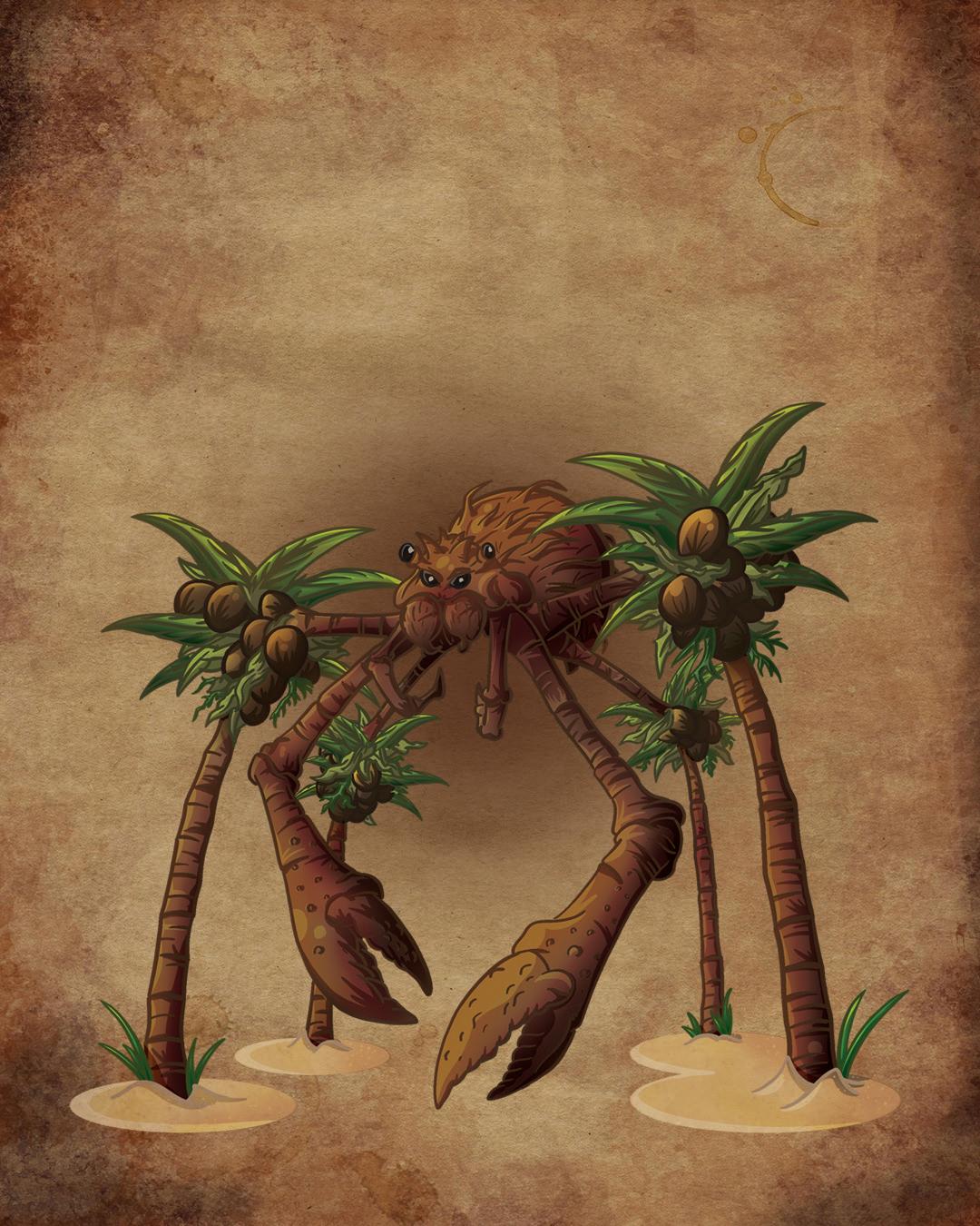
CYNOPTERUS SINENSIS Species Number: 023-1 Class: Tree KOPRACOD ARTHROCACEAE Species Number: 037-2 Class: Tree
CORIANTHIS Species Number: 122-1 Class: Tree-Mystery
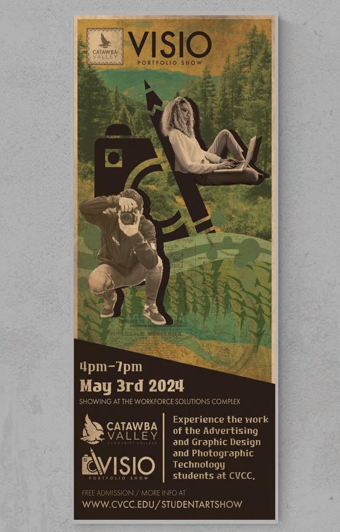
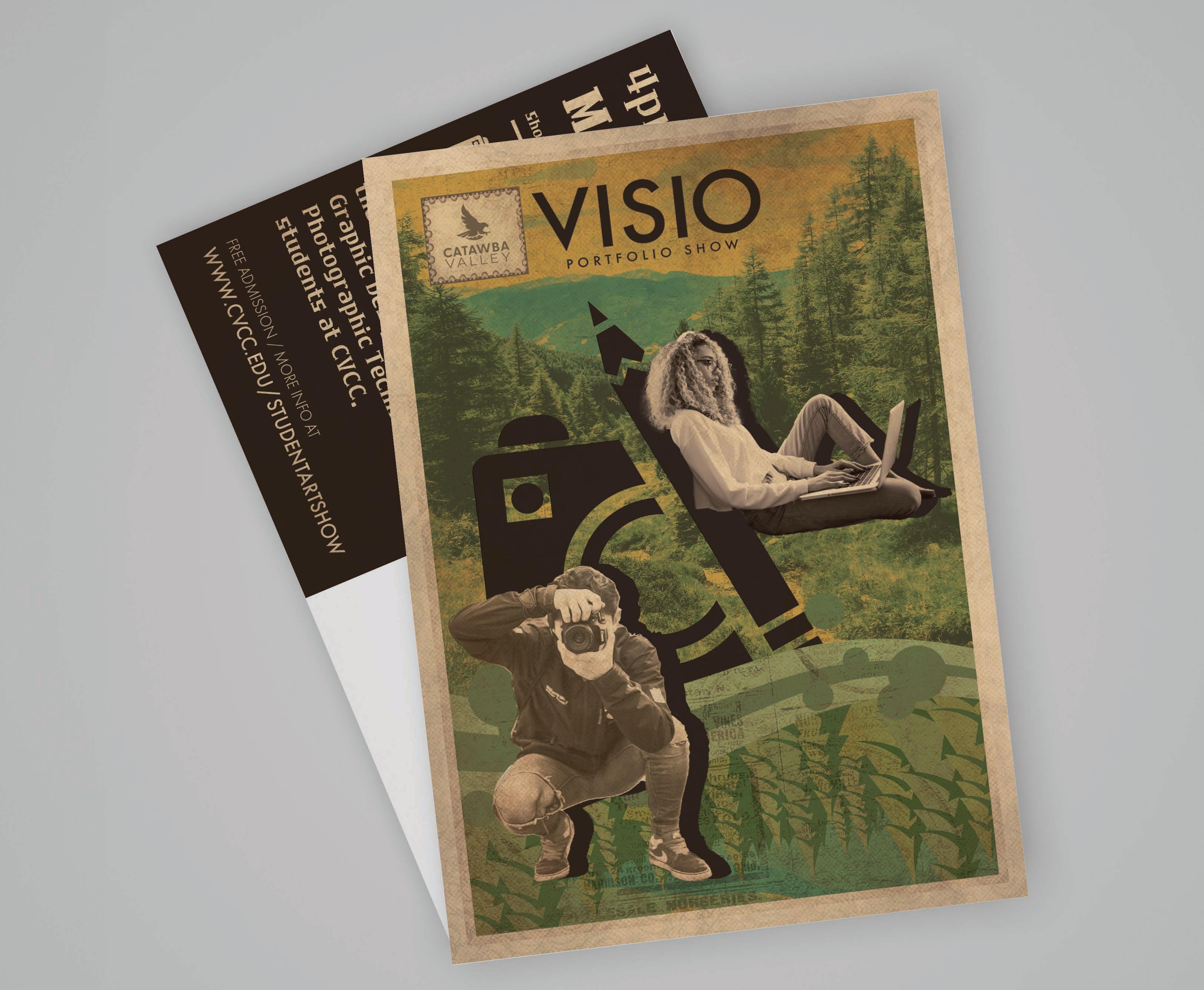
Visio Portfolio Show
Design Prompt:
Redesign the CVCC Portfolio Show by crafting a new name and logo. Additionally, concept a poster design that can be reworked into a postcard, yard sign, and social media layout.
Project Pitch:
Taking the existing name of “Vision,” Visio makes a simple change that results in a clean, modern name that also forms a catchy rhyming scheme with both “show” and “portfolio.” The wordmark is a combination of two iconic creative symbols, the pencil of a designer and the camera of a photographer, representing the two faces of the CVCC portfolio show. The poster design inspiration was taken from classic postcards of the American Northwest, blending together classic earthy tones and woodland imagery. The design itself is balanced around the Visio logo, incorporating a photographer and a graphic designer on opposite sides of the piece, with each side of the background differing between a photo and a digital design as well.
SCOTT MICHAEL WESTMORELAND KESTREL DESIGN 828• 409• 1066 kestreldesign1760@gmail.com linktr.ee/kestreldesign1760
