creative solutions

Weapons and Arsenal Database (WARD)
Design Objective
Design and prototype a smartphone app that proves useful to a unique target market. The design needed to be original and not a concept already available for download. The project requirements were to generate branding for the app along with the screen flow, digital composition, prototype, and plan for monetization.
Design Brief
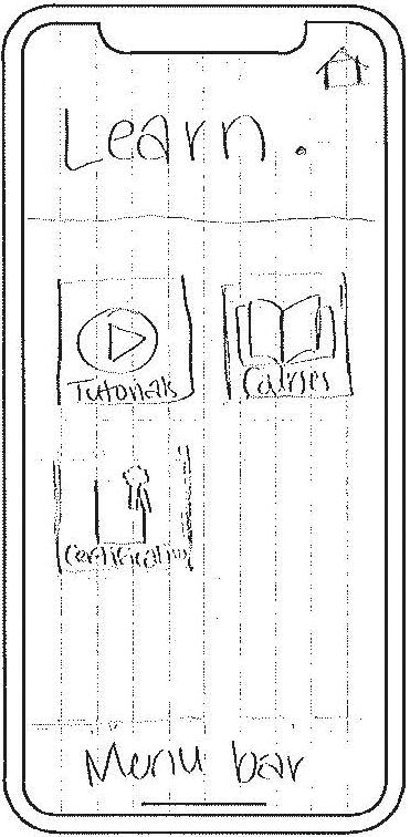
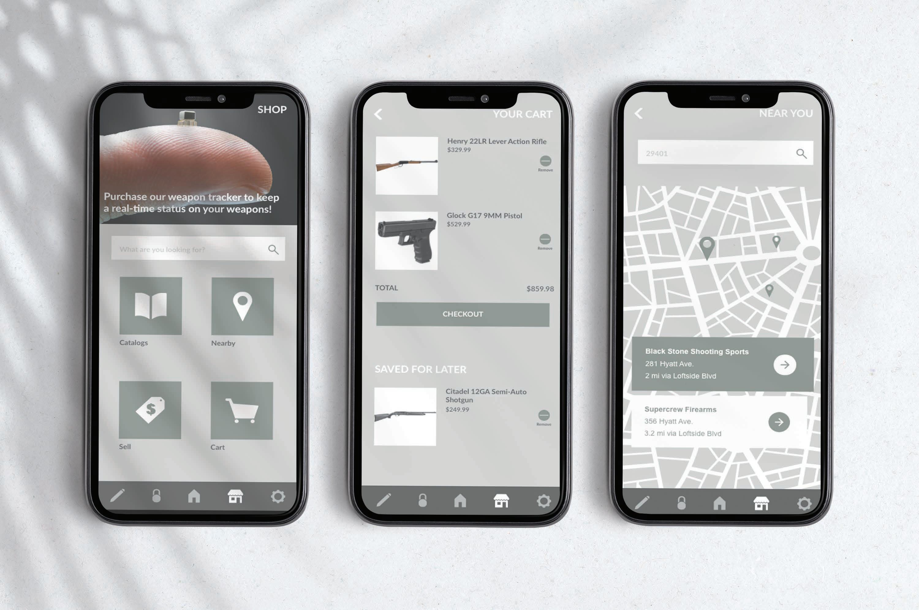
Weapons and Arsenal Database (WARD) was designed to allow aspiring and current weapon users to have a centralized location for tutorials, courses, organization, management, shopping, and selling. With the largest (but not exclusive) target market being men ages 21 to 60, WARD is branded with earthy and strong colors and graphics. The logo and typeface were both uniquely created for WARD to resemble strength, stability, and security. The screens and graphics of the app are designed to provide an easy and free-flowing user experience. WARD is the ultimate app for anyone who desires to safely maintain their weapons.

BIO
Carson Richards is a 51 year-old father of three kids. He is devoted to providing them a safe and happy lifestyle. Outside of his job as a construction sales representative, he enjoys outdoor activities such as hunting, fishing, and hiking. He has been hunting ever since his father taught him gun safety as a little boy. Similarly, he desires to be a family role model of adventure.

COLORS
BIO
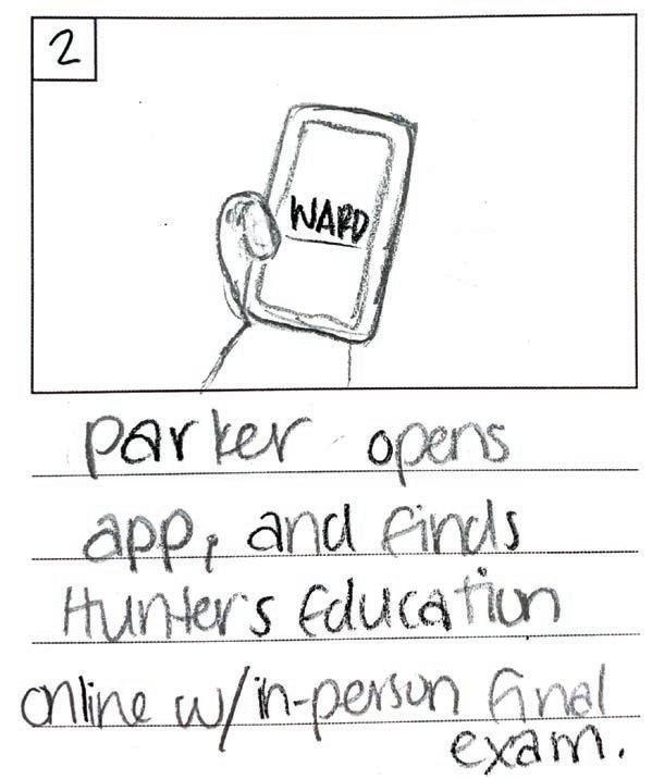
Parker Hodges is a 26 year-old lineman who currently lives in Topeka, Kansas. Because of tornado season, linemen are in high demand in Kansas. He comes from a single-parent household because his father, who was a lineman, died before he was born. He wants to follow in the footsteps of his father and take on the hobby of hunting. He needs resources to assist him in learning hunting and gun safety.
BIO

Houston is a Park Ranger in Arches National Park, Utah. He and his wife love to adventure (as she is a travel photographer). As a ranger, Parker has to educate current and future outdoorsman and sportsman on rules, regulations, and safety. He does have adequate study resoruces, but he longs for an easier way for him and his students to organize their outdoor affairs.
 DARK PINE #19401F
MOSS #64755C LEAD #C4C6C2 ANTLERS #DED1A2
DARK PINE #19401F
MOSS #64755C LEAD #C4C6C2 ANTLERS #DED1A2
LOGO normal
panel IN-APP APPEARANCE standalone reverse ICONS
GUNPOWDER #707970 DUCK BEAK #C4AF54
menu
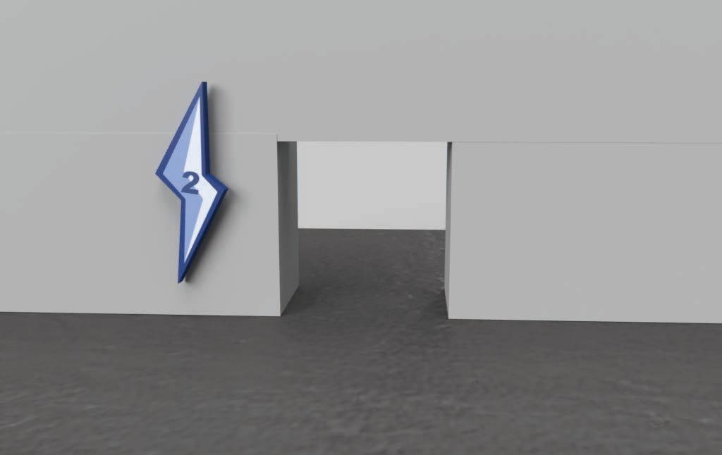
Splash Page Sign Up Forgot Password Login Tutorials Your Weapons Weapon Name/Title License/Registration Digital Display Calendar/Reminders Certi cations Your Current Search Nearby Cart Search Search Results Username/Password Payment Credit/Debit Billing Address Privacy Location Settings Public/Private Data Tracking Logout Catalogs Available Catalogs Zipcode Input Results Courses Available In Progress Recently Watched In Progress Search Con rm New Password Shop Learn Account Settings Digital Armoury Home Page Your Listings Location Manager


Click to interact with the prototype

Cosmetic Salon Mural
Design Objective
Design and mock up a unique mural to be printed for the CVCC Cosmetology Salon. This mural must appear fun, unique, and professional along with cohesive to the current interior design of the salon.
Design Brief
This mural embodies all aspects of the CVCC Cosmetology Salon by making sure to include visual representations of the services offered. It is sleek and classy to enhance the professional environment while also adding an interesting pop of color and design to the space. The photo-withina-photo effect makes the design catch viewers’ eyes from a distance to observe the smaller details up close. The smaller photos used in the composition are photos taken straight from the salon which creates a realistic reflection of the services offered. Additionally, by using the colors naturally found in the salon, the mural maintains the cohesiveness of the color palette.
Thumbnail:

Photo tiles within larger photos
Digital Comp:


Happy Hair
Design Objective
Design and mock up a 3-part packaging series for haircare products. The branding must be unique and target a specific consumer market. Along with the packaging, design, and prototype, build the product website and complete a digital marketing case study to evaluate the measures of marketing for the brand.

Design Brief
Happy Hair is designed to appeal to anyone ages 18-40 that is looking for clean, quality, salon-grade haircare at a drugstore price. The colors of each haircare line are inspired by the key ingredients in each product. Happy Hair utilizes eye-catching “swoosh” graphics to catch the attention of consumers’ eyes when walking down the store aisle. Along with its unique in-store appearance, Happy Hair utilizes a website, email marketing, and social media marketing to get consumers interested and keep them engaged. By consistently using a natural and organic color palette, Happy Hair maintains a cohesive brand appearance and personality.
Hair
Logo may appear in various colors depending on the product lines and their color palettes.


FinalSix Hairline Thin Light Book Medium
Bold ExtraBold Black Heavy
FinalSix Light and Book are the only styles permitted to be used for body copy. Other type styles can vary depending on purpose and visual contrast.


 #889A72 #A7A9AC

Click to view the brand GIF Click to view the case study

Click to interact with the prototype
The Seattle Scene
Design Objective
The objective was to research and rebrand a city to create a print and digital visitor’s guide. The design needed to highlight a key aspect of the city and portray it to potential tourists. The requirements included designing the logo and branding, an eight-page visitor’s guide in both digital and print formats, and a magazine ad insert that appeals to the target demographic of the city.

Design Brief
This city planning guide for Seattle was designed using Adobe Illustrator and InDesign to create unique graphics and interesting layouts. The logo is inspired by stained-glass or mosaic tiles which appeal to the artistic and expressive cultures of the city. This style was maintained across each piece of the project to create a harmonious appeal to men and women ages 18 to 30. To enhance the hierarchy and composition of the guide, the interactive version includes transitions, hyperlinks, and video clips that enhance the user experience and information available.
The Space Needle
Hyatt Place Seattle
Pike Place Market
The Great Wheel
Seattle Elevate. Explore. Experience.
Sans Light Apparat Extralight Italic Ocean Teal CMYK: 82, 52, 54, 31 Ocean Teal Light CMYK: 61, 20, 35, 0 Evergreen CMYK: 60, 39, 77, 21 Dark Pine CMYK: 78, 60, 69, 72 Tulip CMYK: 37, 40, 28, 0 Needle Point Sky CMYK: 22, 0, 9, 0 Peak Sunset Sky CMYK: 4, 26, 32, 0 Pastel Sun CMYK: 1, 5, 45, 0 Food Attractions Hotels
Bodega
Transportation
Olympic Sculpture Park Mecca Cafe
Seattle Water Taxi
Illustrative Map


Click to view the digital guide
“Tree-Kettle” Illustration

Design Objective
Using only black ink, draw a textbook-style technical illustration that combines two objects that don’t go together naturally.
Design Brief
“Tree-Kettle” uniquely combines a tree and a tea kettle to create a unique and interesting illustration. Hatching is used as the shading technique to create a realistic sketch that resembles a textbook diagram. The added animation graphically reduces the drawing to create a visual of the tree sprouting from the kettle. Animating a simplified version of the drawing brings it to life further enhancing the realistic nature of this fantasy object.
Scan to view the animation
Only solid black ink was used to draw. Cross-hatching was layered to create shading and dimension on the different parts of the drawing.
Different millimeter of micron fineliner pens were used to create thinner and thicker lines.
A scribbling technique was used the create the appearance of tree roots that are growing and spreading.
A tea kettle’s spout curves out from the base, making it an easy point to naturally combine it with a tree.
Darkening the corners creates the illusion of curves and ridges in the appearance of the kettle.

The Loving Ladle
Design Objective
Create a unique mobile retail business; generate a logo, brand identity packet, business collateral, style guide, and mockups of the business vehicle.

Design Brief
The Loving Ladle is a mobile soup kitchen designed to reach the outskirts of the low-income and homeless population. The logo incorporates a heart graphic, warm colors, and soft type to emphasize the empathetic and inviting atmosphere of The Loving Ladle. The patterns and brand collateral reflect the items offered at the business to make sure the mission is easily understood by viewers. The design of the business itself is on a renovated bus that is wrapped with vinyl graphics. Overall, these brand elements highlight the experience the Loving Ladle provides.


the La le Cooking on your corner Cooking on your corner the La le Click to view the full style guide


IDEATE Magazine

Design Objective
Design a six-page magazine spread for an edition of IDEATE Magazine. Include a research article and a sourced secondary article. Layout and design the six pages along with the magazine cover.

Design Brief
This magazine spread about “The Rise of Digital Creation” features an original body copy and a sourced secondary article. Each page consists of a unique layout that enhances the visual appeal and hierarchy of the text. Blue is used as the main color in the palette because of its association with technology. Patterns and graphics were included in the background to not only frame the text but allude to the shift to digital platforms. The transitions and animations used in the digital version enhance the hierarchy of the layout and draw the viewer’s eye to the important elements on the page.
Click to view the interactive magazine


Foothills Col-LAB-oratory
Design Objective
Design and mock up the branding and collateral for a STEM lab in the Catawba Science Center. Along with the branding, create some accompanying collateral that supports and markets the brand. Utilize the existing color palette in the lab space for the design.
Design Brief
The logo and branding for the Foothills Collaboratory utilize the colors orange, teal, and navy to resemble that of the existing lab. In the logo, there are multiple elements that resemble math, science, and technology such as gears, circuit wires, and a beaker. These graphics are merged with the outline of foothills mountains to both reflect the name of the lab and what it offers. This logo uses bold colors and strokes along with soft and fun shapes and typefaces to draw attention to the lab’s target audience: school-aged children.
 #F79520 #03BCC3 #2E3192


The Memphis Mustangs
Design Objective
Develop a professional sports team brand in a city that does not currently have that sport. Expand the brand into a wayfinding and environmental graphic proposal for the stadium.
Design Brief
After professional leagues and location research, Memphis was determined to be the best spot for a new Major League Baseball team. Tennessee is known for its southern, cowboy-like culture. The Memphis Mustangs represent this culture with speed, stamina, agility, and strength. The logo depicts a fierce mustang with colors inspired by the popular “Aztec” patterned clothing. The elements of a horseshoe and a southern rodeo marquee support this style and further emphasize the boldness of the team. The logo graphics were expanded into the stadium’s wayfinding and environmental graphics by utilizing the same shapes, colors, and styles. These elements include seating row labels, a directory, a map, gate numbers, seating section signs, and a historic room with wall graphics.


Click to view the team proposal booklet
FAIRPLEX NARROW OT
*Used in various font styles: Book, Medium, Black, and Black Italic
TARGET AUDIENCE
BIO
Hunter is a self-employed, hometown electrician. He is a hard worker who is persistent in his path. He strives to maintain a productive lifestyle.

R: 27
G: 65
B: 140
R: 177
G: 104
B: 50
R: 133
G: 170
B: 242
R: 236
G: 138
B: 67
Status
MOTIVATIONS
• Family
• Performance
• Security
• Sense of accomplishment
R: 231
G: 238
B: 252
R: 244
G: 185
B: 142
Single Education Certificate
HABITS
• Daily exercise
• Hiking
• Volunteer
Recreational Coach
• Overworking
Occupation
Electrician
abcdefghijklmnopqrstuvwxyz 1234567890!?@$%&()*
5. COLOR
The Memphis Mustangs logo is fierce and practical.
Hunter Greenwood Age 29
“No matter how hard you work, someone else is working harder.”
Stadium Map

Section Number Signs


Walkway Directory
Seating Rows

Entry Gate Numbers


History Environmental Graphic
Team
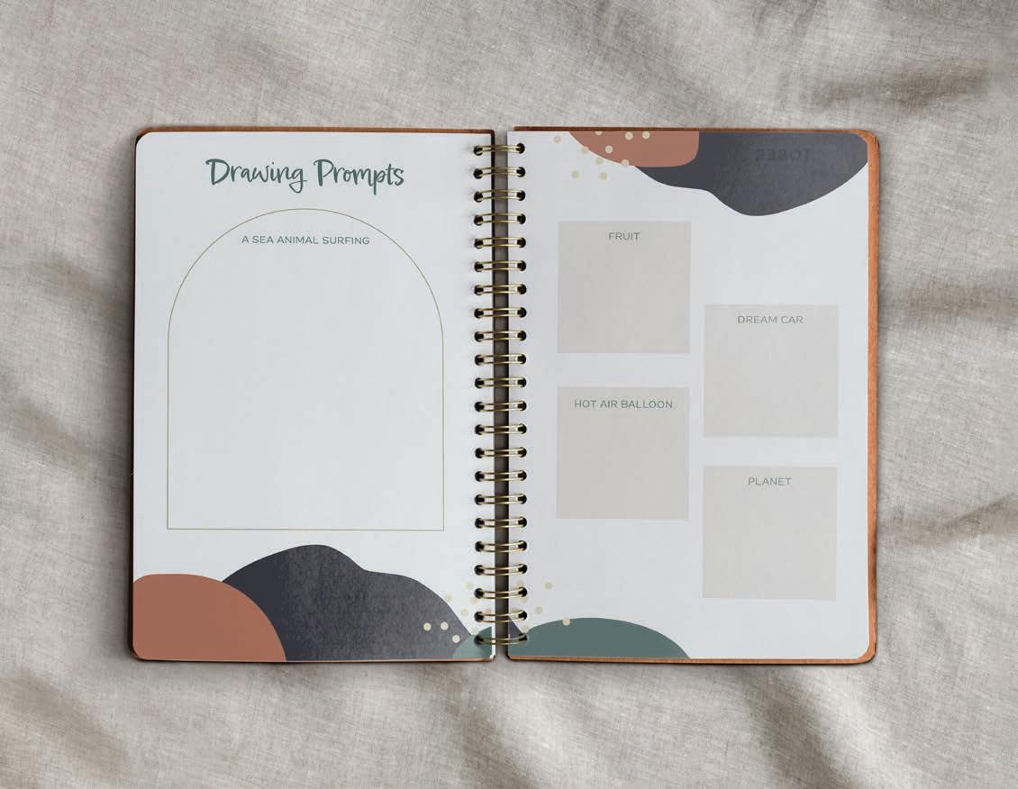
Life Balance Planner Co.
life balancePLANNER
CO.
Design Objective
Create three planner stationery sets for a unique brand. Each set should include a planner showcasing at least five different pages and an accompanying sticker and highlighter pack.

Design Brief
Life Balance Planner Co. is designed to help organize and manage massive to-do lists. Each planner is designed to allow users to creatively prioritize their daily tasks to relieve stress and heighten motivation. The neutral colors and minimal type leave room for users to personalize their planners to their preference. The accompanying highlighter pack and color-coding key help kickstart the organization process for those who don’t know where to begin. Life Balance Planner Co. takes the stress out of the to-do list and helps users take on the day one step at a time!


Primazal
Design Objective
Research and design a brand identity for the pharmaceutical drug Primazal (levothyroxine). Develop a marketing message, package design, and an exhibit trade show booth. For each piece, create mockups of the finished product.

Design Brief
Primazal’s butterfly logo reflects its purpose because it is a thyroid hormone supplement. The thyroid is known for its unique butterfly-like shape. With the marketing message “Take control. Live freely,” this logo fits right in by radiating this positive and transformative mood through its bright, warm gradient. The packaging was designed to match this logo while also remaining clear and concise. The package utilizes brand colors and imagery while also maintaining a simple and readable appearance. The trade show booth matches these assets and was designed digitally along with handcrafting a one-tenth-scale model. The wings of the booth were manipulated to match the butterfly logo’s wings, enhancing the brand’s overall visual impact.
C: 9% M: 13% Y: 69% K: 0% C: 64% M: 0% Y: 29% K: 0% C: 63% M: 0% Y: 78% K: 0% PRIMAZAL Beloved Sans Bold (levothyroxine) Alwyn New Thin


Use Primazal to manage hormone levels PRIMAZAL Did you know 5 in every 100 people past the age of 12 years old su er from hypothyroidism? Use Primazal to manage your hormone levels Most users were symptom free a er six weeks Did you know in every 100 people past the age of 12 years old su er from hypothyroidism? Did you know 5 in every 100 people past the age of 12 years old su er from hypothyroidism? TAKE CONTROL. LIVE FREELY. PRIMAZAL
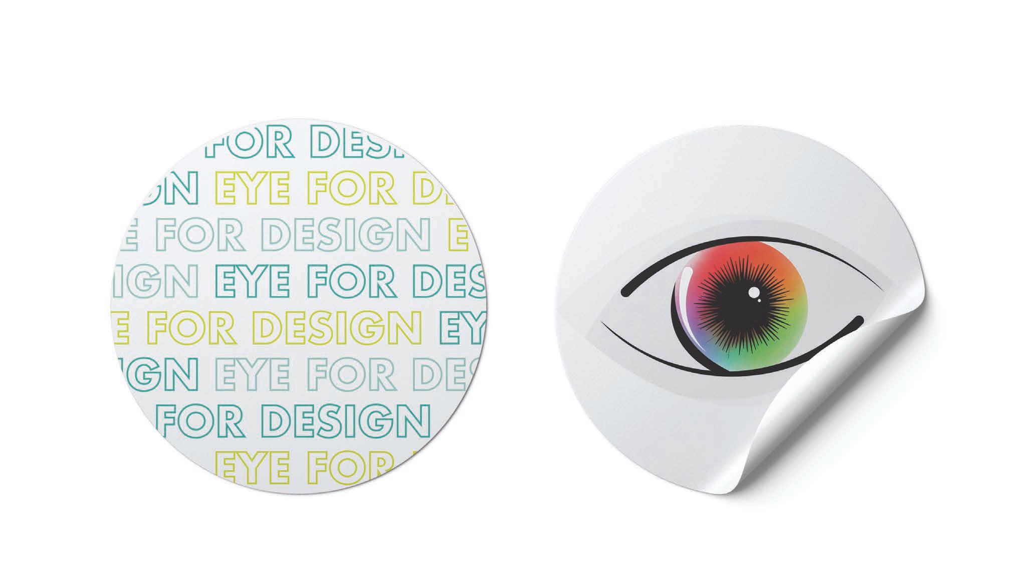
Eye for Design Campaign
Design Objective
Generate a unique campaign of collateral pieces for the Advertising and Graphic Design program. These pieces will be used to attract and inform potential students about the program. Include a postcard, flyer, and stickers.
Design Brief
The “Eye for Design” campaign uniquely advertises qualities possessed by designers and the expectations for the program by using the anatomy of an eye. The color wheel, AGD branding, and CVCC branding are used to represent the college, the program, and aspiring designers to inspire and attract potential students. The strict color palette of blue, green, gray, and white maintains consistency across each collateral piece to make them recognizable as a set. Additionally, the photo of a girl’s eye was manipulated to emphasize the importance of an artistic vision.
IRIS
Controls the amount of light entering the eye and allows for color detection. CORNEA


Bends light to help the eye focus which is necessary for attention to detail.
LENS
Focuses light to create a sharp image.
RETINA
Converts light to create the images that you see and control perception.
OPTIC NERVE
Carries visual messages as electric currents ot your brain to develop color detection and visual contrast.


maltbacreative.com www.instagram.com/maltbacreative/ maltbacreative@gmail.com 828.502.0995
