GIS Map Projects (2023
– 2024)
Chloe Barnes
Application usage:ArcGIS Pro, Blender, Cesium Ion, Visual
Studio Code, and GitHub


Application usage:ArcGIS Pro, Blender, Cesium Ion, Visual
Studio Code, and GitHub
Final Project Assignment for the Spring 2023 Semester.
• Map 1
• Elevation data in Galveston county
• Illustrates the flat landscape and proves that sea level rise will take effect very soon
• Data downloaded from NOAA data site and the National Map downloader site
• Map 2
• Population data (Census Bureau)
• Downloaded block group shapefiles and csv file of total population in data
• Joined the two to create a choropleth map
• Displays population density
• Map 3
• Community neighborhoods, beach point access points, schools. Etc.
• Wanted to highlight the community and the development built there
• Data downloaded from Galveston city’s GIS data hub
• Map 4
• JPEGs that show the difference in effect of sea level rise
• Based on these, we can decifer what areas will be affected first, and so on
• Data downloaded from NOAA download site
This map shows elevation levels in the Galveston area, and neighborhoods off to the southwest and more north are lower in elevation and closer to the sea level. These areas will be affected by sea level rise sooner than other neighborhoods with the higher elevation levels. You can also see right along the coastline, there is a higher elevation, and this is because they built sand banks and a sea wall. This will help protect the city from sea level rise and floods, but only temporarily.
Links
❑ Galveston Sea Level Rise Article/Podcast
❑ Galveston Sea Wall

This map displays population density in Galveston and is separated into the different blocks in the county. I created a tabular join to join the total population data with the block data in it’s atrtibute table. The density was found by symbolizing the Block shapefiles as graduated colors (with 5 classes) and natural breaks, and I “normalized” it with the area of land. As you can see, there are certain blocks that have a high population density compared to others. These blocks will need to be focused on when sea level rise issues begin to occur more rapidly.

This map is just to show the general community places to visit within the city. It includes neighborhoods, and outdoor recreation areas as well such as beach access points and parks. There are other general points displayed as well.


These four maps illustrate how much sea level will rise per 2 feet. The first map starts at 1 foot sea level rise, the second is 3 feet, and so on. These can help people in Galveston know about how much feet of sea level rising it will take to affect the area where the reside. I also inlcuded a link below to understand about how fast sea level rises (how many inches per year on average) to better understand how long it might take for sea level to rise to however many feet.
Links
❑ NOAA: 2022 average sea level rise technical report
Write-Up
• https://docs.google.com/docume nt/d/1duV2CtyYzUJ24KyW62sQxWqsSjr6SblWVvIRbff158/edit
?usp=sharing
Following Projects were all completed in the Spring 2024 Semester.


Step 1: Uploaded this .tif file into Blender that was created in ArcGIS Pro
Step 2: Created a render of the area to make it look more realistic

Step 3: Uploaded the render image back intoArcGIS Pro and colorized accordingly


This project instructions were to submit 3 different versions of data (3 different visualizations of the same downloaded data). The following 3 are the types of visualization I decided on.
1) Cesium Ion Presentation
2) Arc GIS Pro Static Map
3) Animation Video (Posted on YouTube)
Final Project GitHub URL:
• https://chloevbarnes.github.io/GEO409-Final-Project/
City of Louisville
Introduction – This part of the project focuses on tourist attractions, sports stadiums, and green spaces/parks
Cesium Ion
Presentation Public
URL:
• https://ion.cesiu m.com/stories/vi ewer/?id=ea183a 30-9950-4bdfbff2d89c0dcf3219
 Screenshot of project

This data is complementary to a solar mapping capstone project I completed for a separate class, but this map creation uses the same data as the other 2 options.
This map was not submitted for the other project, but it has to do with the same idea: solar mapping in urban areas (Louisville as a case study).
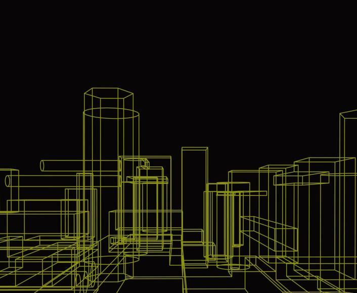
This video was created onArcGIS Pro animation’s tool of the 3D Lidar data. I had the camera fly through the data to get a glimpse at every area of the city.And it showcases the Louisville skyline.
YouTube URL:
https://www.youtube.com/wat ch?v=M5VHKLuKy4s
 Screenshot of YouTube Video
This project was majority in the form of a research paper, and that is a separately uploaded file in my digital portfolio.
I created another public URL for this project as well:
• https://chloevbarnes.github.io/Louisville-SolarExposure/
This map was created to visualize the exact areas in the city of Louisville where solar panels would be best optimized for overall energy optimization.
Working off from the previous static map that displayed the 5 different tiers, or times of day, this map was created from an average total sun exposure throughout 24 hours.
The bright yellow spots, are the areas in Louisville that get the most overall sun exposure throughout every day on average.

This zoning map was created just as a reference to visualize which buildings are where, as well as street names, and the types of development/land use is also shown.
