GUIDELINES BRAND

The purpose of this Brand Guide is to direct the correct and consistent implementation of the Croplands brand, to ensure greater overall brand awareness and recognition with our target audiences.
Included in this guide is important information about the Croplands corporate brand identity and how it translates to core brand elements such as the logo, colour palette and typography, and supporting brand elements such as photography, stationery, and collateral.
This document acts as a reference for all promotional and publishing materials and should be followed as closely as possible to ensure the Croplands brand is of a high quality and is well presented through external interface with the public.
Please ensure all Croplands marketing materials are approved by Marketing prior to being published or printed.

Corporate logo
Clear space
Logo options
Minimum size
Misuse
The Croplands corporate logo is a wordmark and also appears white, reversed out of a red tab. The logo uses the corporate colour, red. The Croplands logo must always appear in colour, unless print restrictions don’t allow for it.
The logo should not be altered or modified in any way. The logo should not be recreated, reconstructed or distorted.
The clear space grid is created to allow the logo to stand out in a clear and bold manner. The clear space is equal to the height of the Croplands logo. No other elements are allowed to enter this clear space. An exception for this is when the Croplands logo is used in conjunction with a product descriptor and identifier to create Croplands product lockups. See page 26.
The Croplands logo should be used in the most suitable format for the application. The logo can be reproduced in spot colour, CMYK or single colour black or white. Please email Marketing if none of these logos are suitable and additional versions of the logo are required.
1. POSITIVE
2. REVERSED
Use over imagery or red backgrounds.
3. MONO - BLACK
Use when colour is not an option and a positive logo is preferred.
4. REVERSED OUT OF RED TAB.
Designed for the top of a page
5. REVERSED OUT OF RED TAB.
Designed for the bottom of a page
The logo reversed out of the red tab (4 & 5) should be used when the positive or reversed version does not create enough brand presence. When placed at 100%, a 5mm bleed allocation has been provided. Do not include this area in to the artwork space. Do not ‘float’ these logos on a page. They must always bleed off either the top or bottom of a page.
To ensure optimum clarity of the Croplands logo when reproducing at a small size, a minimum size usage has been assigned to the logo.
The minimum dimensions are 5mm high x 45mm wide.
45mm wide 5mm high
To maintain a unified appearance, the logo must always be reproduced in accordance with the previous pages.
Never create your own logo. Always use the logo as supplied by Croplands. On this page are examples of what NOT to do with the logo.
Never substitute the Croplands logo font for another font.
Do not attach a tagline to the logo.
Never use stipples of the logo colour.
Do not use the lockup to create other logos or product names.
Never change the colour of any of the elements in the logo.
Make sure to keep the text of the logo readable. Avoid small usage.
Never distort the elements of the logo.
Typography
Typographic style
Colour palette
TYPOGRAPHY & COLOUR
The typeface Gotham Black is used for headings. It can be purchased here: https://www.typography. com/fonts/gotham/styles/multi
Barlow bold is used for product names and descriptors. Download it here: https://www. fontsquirrel.com/fonts/barlow
Futura is to be used for introductory text, pull outs and body copy.
When used in headings text should be all caps. When used for introductory text and pull outs text should be sentence case.
Where space is limited (eg smaller press ads, or the content-heavy guides) Helvetica Condensed is to be used.
Gotham Bold
abcdefghijklmnopqrstuvwxyz
ABCDEFGHIJKLMNOPQRSTUVWXYZ 1234567890
Barlow Bold abcdefghijklmnopqrstuvwxyz
ABCDEFGHIJKLMNOPQRSTUVWXYZ 1234567890
Futura Light abcdefghijklmnopqrstuvwxyz
ABCDEFGHIJKLMNOPQRSTUVWXYZ 1234567890
Futura Book abcdefghijklmnopqrstuvwxyz
ABCDEFGHIJKLMNOPQRSTUVWXYZ 1234567890
Futura Medium abcdefghijklmnopqrstuvwxyz
ABCDEFGHIJKLMNOPQRSTUVWXYZ 12344567890
Futura Heavy abcdefghijklmnopqrstuvwxyz
ABCDEFGHIJKLMNOPQRSTUVWXYZ 1234567890
Futura Bold abcdefghijklmnopqrstuvwxyz
ABCDEFGHIJKLMNOPQRSTUVWXYZ 1234567890
Helvetica 47 Light Condensed abcdefghijklmnopqrstuvwxyz
ABCDEFGHIJKLMNOPQRSTUVWXYZ 1234567890
Helvetica 57 Condensed abcdefghijklmnopqrstuvwxyz
ABCDEFGHIJKLMNOPQRSTUVWXYZ 1234567890
Helvetica 67 Medium Condensed abcdefghijklmnopqrstuvwxyz
ABCDEFGHIJKLMNOPQRSTUVWXYZ 12344567890
Gotham ScreenSmart is a screen-optimised version of the Gotham family, engineered for use on the web.
Purchase here: https://www.typography.com/ fonts/gotham/styles/gothamscreensmart
Alternatively, Montserrat is a good google font to use online.
Find it here: https://fonts.google.com/specimen/Montserrat?category=Sans+Serif&query=montserrat&preview.text=Monserrat&preview.text_type=custom#standard-styles
MICROSOFT
Century Gothic should be used for PowerPoint.
Gotham Bold
abcdefghijklmnopqrstuvwxyz
ABCDEFGHIJKLMNOPQRSTUVWXYZ 1234567890
Gotham Medium abcdefghijklmnopqrstuvwxyz
ABCDEFGHIJKLMNOPQRSTUVWXYZ 1234567890
Gotham Book
abcdefghijklmnopqrstuvwxyz
ABCDEFGHIJKLMNOPQRSTUVWXYZ 1234567890
Gotham light abcdefghijklmnopqrstuvwxyz
ABCDEFGHIJKLMNOPQRSTUVWXYZ 1234567890
Monserrat Extra Bold abcdefghijklmnopqrstuvwxyz
ABCDEFGHIJKLMNOPQRSTUVWXYZ 1234567890
Monserrat Bold abcdefghijklmnopqrstuvwxyz
ABCDEFGHIJKLMNOPQRSTUVWXYZ 1234567890
Monserrat Medium abcdefghijklmnopqrstuvwxyz
ABCDEFGHIJKLMNOPQRSTUVWXYZ 1234567890
Monserrat Regular abcdefghijklmnopqrstuvwxyz
ABCDEFGHIJKLMNOPQRSTUVWXYZ 1234567890
Century Gothic Regular
abcdefghijklmnopqrstuvwxyz
ABCDEFGHIJKLMNOPQRSTUVWXYZ 1234567890
Century Gothic Bold abcdefghijklmnopqrstuvwxyz
ABCDEFGHIJKLMNOPQRSTUVWXYZ 1234567890
Typography is an important element of the Croplands brand and should be kept consistent to improve communication, legibility and overall brand unity.
• All body copy should be left aligned (also called ‘range left, ragged right’).
• Avoid widows (where only one word appears on the last line of a paragraph).
• Avoid orphans (where only one word, or a very short line, appears at the top of a paragraph or column).
• The first line of paragraphs should not be indented.
• Words should not be underlined.
• Words should not be hyphenated at the end of lines as this affects legibility.
• All bullet points should use the standard bullet point (•).
• Always carefully check spelling before disseminating any document or electronic information.
• Ensure all spelling is English spelling as opposed to American spelling.
• Sentence case (all sentences use an initial capital) and lower case (all words are lowercase except proper nouns) should be used in all body copy, introductory text and pull out information as necessary.
• Page headings use UPPER CASE.
• Full stops should be used at the end of all sentences, but should not be used at the end of any headings.
• Ampersands (“&”) should be used as little as possible – instead the word “and” should be written in full.
• Exception is given to page headings where space is limited.
• The use of abbreviations should be kept to a minimum, however where the abbreviation ends with the final letter of the full word a full stop is not usually required (e.g. dept – department). In other cases, a full stop is usually used (e.g. Inc. – Incorporated).
• Prof, Dr, Mrs, Mr and Ms are always used without full stops.
• The use of contractions such as don’t, aren’t and OK should be kept to a minimum in written material.
• Tr y not to overuse “it’s”. This contraction should only be used when it represents ‘it is’. The possessive ‘its’, as in ‘its implementation’, does not have an apostrophe.
Dates should be cited as 01 January 2011 (day month and year). Note the absence of punctuation and “th”. An apostrophe is not used when citing decades. The correct forms are “the 1990s”, “the 90s” or “the nineties”, but not “the 1990’s”.
15%–80% tint of black.
Croplands corporate colour is Pantone 485 C. CMYK and RGB translations of Pantone 485 C can be used when appropriate.
Dark grey and Mid grey can be used as a secondary colours.
Pantone Cool Grey 11 C is used primarily for product names. Pantone Cool Grey 7 C is used for the product Identifier. Tint values for grey should remain in the 15%–80% range of black. The tint may be varied to suit the application.
Pantone 485 C
CMYK: 0/95/100/0
RGB: 201/36/45
HEX: C9242D
Pantone Black
CMYK: 0/0/0/100
RGB: 0/0/0
HEX: 000000
PMS BLACK
CMYK: 65/57/51/28
RGB: 86/87/92
HEX: 56575b
CMYK: 43/35/34/1
RGB: 151/152/154
HEX: 979899
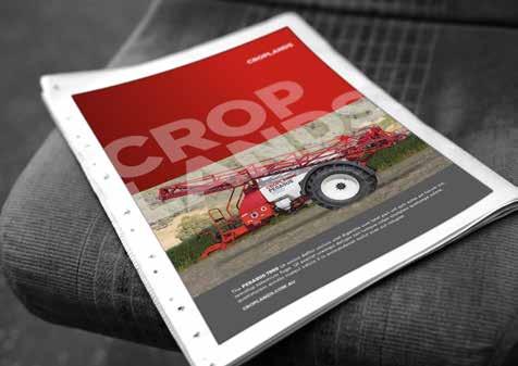
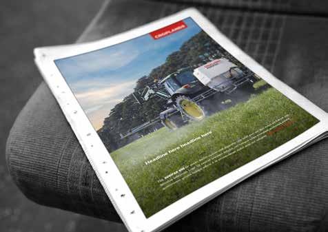
Here are two examples that show how full-page product ads can be laid out.
To ensure consistency across all communications material and maintain the integrity of the Croplands logo, it should always appear in the top right corner where space permits.
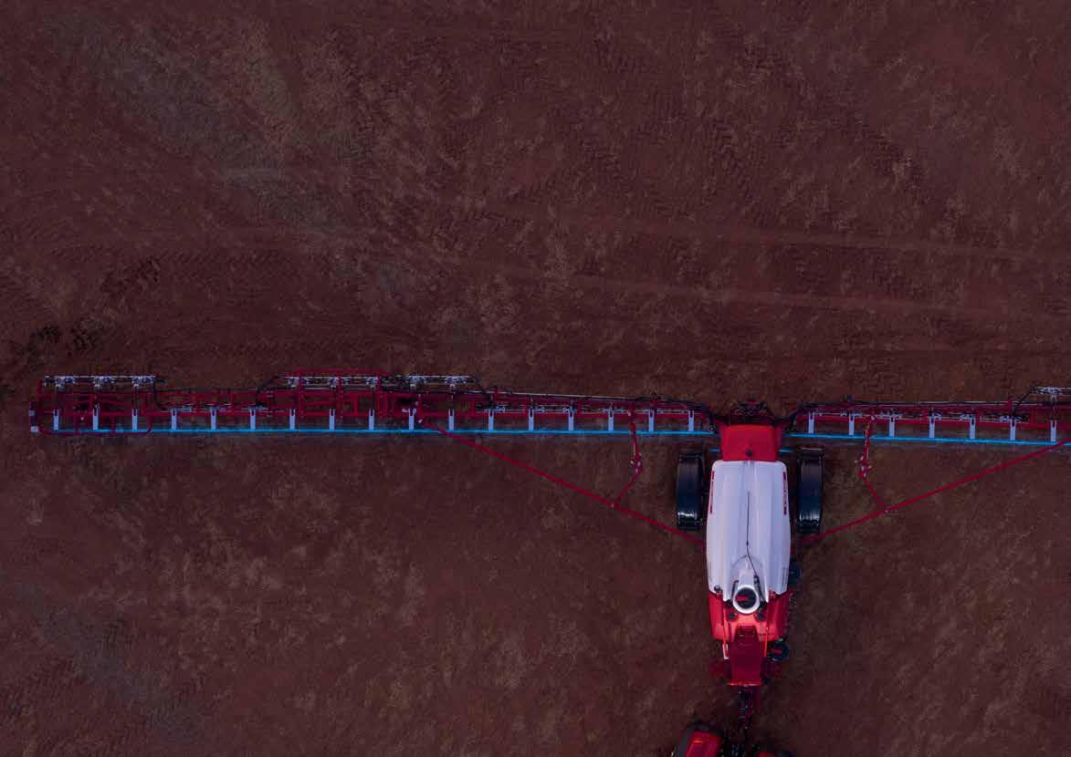
Large blocks of red can be used for Croplands product ads with overlaying text (as shown) or for more retail offers. Otherwise, the use of red should be minimal to highlight the branding of the logo and on the machine imagery.
The base of the print ad can be in a 75% black grey box, or it can be over the image. The contrast of the image may need to be increased by adding a dark gradient layer multiplying over the image.
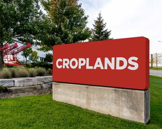
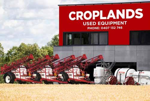
A Croplands only, street facing sign should be the reversed logo within a red shape. The shape will preferably have rounded edges, like the red tabs. Clear space rules apply. See below lock up. Height of the red shape can increase. The wordmark should remain centred.
Box height can be increased
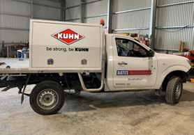
When a Croplands logo accompanies a dealer name and details, it should be the reversed logo within a red shape. The shape will preferably have rounded edges, like the red tabs. Clear space rules apply. See below lock up. Height of the red shape can increase. The wordmark should remain centred. The dealer details should be white reversed out of either red, or a dark grey equivalent to approx 80% black. The text should be Gotham Bold, should appear under, or to the right side of the logo (whichever suits the space available). Clear space rules should be respected.
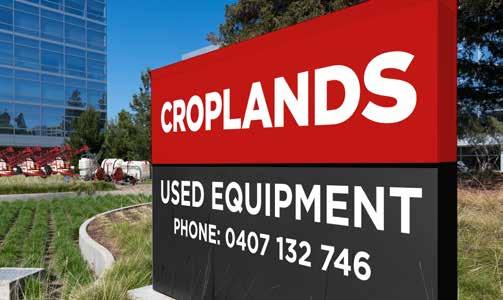
Box height can be increased
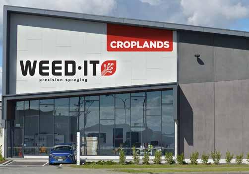
When a Croplands logo accompanies a licensed brand logo, it should be the reversed logo within the red tab. It should appear in the top right corner of the space, and should appear approx 70% of the licensed brand logo. The licensed brand logo should appear to the left/centre, and should be the full colour version on a white background. Clear space rules should be respected.
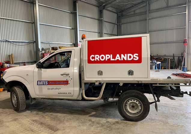
The Croplands logo in the red tab should appear on a clear space on a dealer service vehicle. Clear space area rules apply.
CROPLANDS AUSTRALIA
50 Cavan Road, Dry Creek SA 5094 PO Box 2441, Dry Creek SA 5094
Tel: 0 8 8359 9300
Fax: 0 8 8349 6175
Freecall: 1800 999 162
Freefax: 1800 623 778
Email: sales@croplands.com.au
www.facebook.com/Croplands
www.twitter.com/Croplands
CROPLANDS NEW ZEALAND
Freecall: 0 800 106 898
Freefax: 0 800 117 711 CROPLANDS.COM.AU