
VISUAL STANDARDS GUIDE Nature of Identity Hummer Rebranding
2
3 24 R3 Sketches 26 R3 Digital sketches 28 Logo colors 34 Similar logo research IDENTITY SKETCHES ROUND TWO VISUAL GUIDE INSPIRATION 02 R1 Sketches 08 R1 Delicate sketch 16 R2 Sketches 18 R2 Delicate sketch 20 Digital sketches
INITIAL SKETCHES
We need to develop 300 sketches for three keywords, each of which has three directions: symbolic marks, graphic marks. The ideas were presented through quick handdrawn sketches.
4
OUR MISSION
Our mission is to encourage people to take risks, to break chains, to break through themselves, to develop strong characters, to change the status quo, to change themselves and to face challenges, to be able to cope with any situation.
1
R1 ADVENTURE
Taking risks isn’t about putting yourself in danger. It’s about pushing yourself out of your comfort zone, encountering problems and trying to solve them, and breaking out of yourself.

2
2 Yubo Wang / 04941129 MODULE-01 / GR604: NATURE OF IDENTITY


3
R1 TOUGH
We have strong character and patience and will not be easily knocked down by difficulties. We grow stronger mentally and physically from one difficulty to the next.

4
4 Yubo Wang / 04941129 MODULE-01 / GR604: NATURE OF IDENTITY


5
R1 BREAK THROUGH
We look forward to developing with our own diversity and constantly looking for high-quality partners to help us make breakthroughs.

6
6 Yubo Wang / 04941129 MODULE-01 / GR604: NATURE OF IDENTITY


7
8 8 Yubo Wang / 04941129 MODULE-01 / GR604: NATURE OF IDENTITY
R1: ADVENTURE Refined Sketches Look for challenges and opportunities to succeed.
9
Refined Sketches
R1: TOUGH
It is not easy to be successful.
10 10 Yubo Wang / 04941129 MODULE-01 / GR604: NATURE OF IDENTITY
11
12 12 Yubo Wang / 04941129 MODULE-01 / GR604: NATURE OF IDENTITY
BREAK THROUGH Refined Sketches
a difficult task.
R1:
Complete
13
ROUND TWO
In this phase, we will continue to develop the logo based on last week, we will get a new hybrid keyword, then develop 100 sketches based on this keyword, and finally get 10 computer versions of the sketch.
14 Yubo Wang / 04941129 MODULE-01 / GR604: NATURE OF IDENTITY
15 Yubo Wang / 04941129 MODULE-01 / GR604: NATURE OF IDENTITY
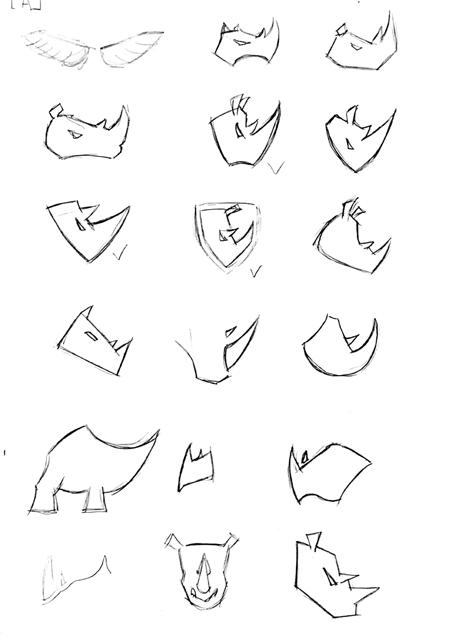
R2 COURAGE
We generated a new keyword from the keywords in the round 1 section, courage, and continued to build on this new keyword.

16 16 Yubo Wang / 04941129 MODULE-01 / GR604: NATURE OF IDENTITY


17
18 18 Yubo Wang / 04941129 MODULE-01 / GR604: NATURE OF IDENTITY Refined Sketches ROUND 2 REFINED SKETCH
19
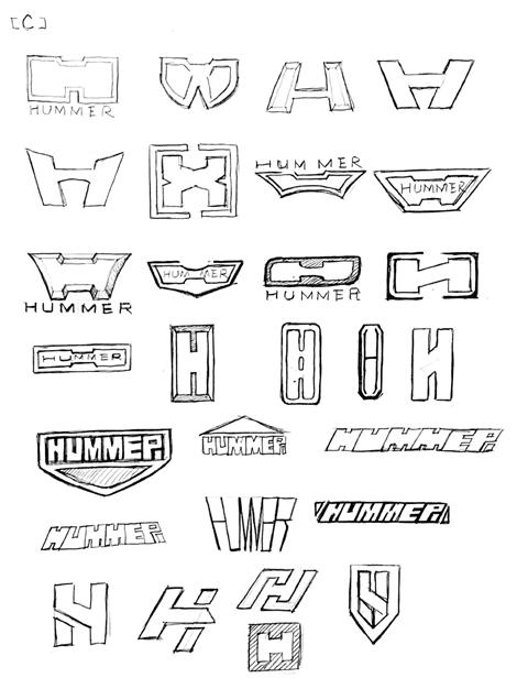
DIGITAL SKETCHES
In the second round of sketching, my keyword was my redefined courage, and I used the initial "H" of Hummer extensively as the starting point of my logo design. I used the initial "H" of Hummer extensively as the starting point of my logo design, and enhanced the keywords in round one in subsequent designs.
20
21
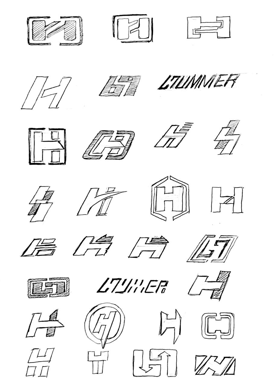
ROUND THREE
At least a dozen more sketches are needed to get to the final logo. The color scheme was given on the final logo, and 20 similar brand logos were found at last.
22 Yubo Wang / 04941129 MODULE-01 / GR604: NATURE OF IDENTITY
23 Yubo Wang / 04941129 MODULE-01 / GR604: NATURE OF IDENTITY
R3 FINAL STEP
To prepare for the final logo, at least 30 sketches are needed here in order to get the final logo.

24 24 Yubo Wang / 04941129 MODULE-01 / GR604: NATURE OF IDENTITY
25
26 26 Yubo Wang / 04941129 MODULE-01 / GR604: NATURE OF IDENTITY Refined Sketches ROUND 3 DIGITAL SKETCHES
27
LOGO COLOR
28
29
LOGO COLORS
30
31
LOGO COLORS
32
33
SIMILAR LOGO RESEARCH


34


35
IDENTIFICATION AND ANALYSIS
NEW IDENTITY INTRODUCTION
The Nueva School's new brand logo is displayed to the audience Brand text logo and graphic logo. By displaying the new logo clearly on a clean background, designers can quickly identify the details of the logo.

LOGO ANATOMY
logo peeling of Right turn retail allows designers to get the proportional relationship between the logo and other positions, so that when it is necessary to print and make the logo, the designer can make the logo according to the correct proportion.

36
TYPE SPECS
Font size can be determined in the production of manuals, posters, and other parts that require text information to unify the visual image. Ensure the visual image of the brand.
LOGO COLORS
The color specification can make the brand logo color show the best color in the background color. Unreasonable background color and logo color may lead to unclear logo and difficult to read.


37
IDENTIFICATION AND ANALYSIS

LOGO DON’TS
Logo don't shows more than one prohibition. Examples of general logo combinations, including common usage specifications. Visual recognition guide for elements and images. In that case, the use of logos is completely prohibited.
ALTERNATE VERSIONS OF THE LOGO
In the Fedexde1 Brand guide, they show the connections and developments between main and subbrands. In the presentation, we can find out which version of the logo is used in what situation, and strengthen the connection by unifying the visual form of the main logo. A good visual guide can show designers how to use logos and develop sub-brand logos.

38
STATIONERY
Stationery is the most used tool by brands and is the detail of a coherent internal and external brand image. Handle stationery with the same vision, keep the brand vision unified.

39
CITED unsplash.com pexels.com wikipedia.org gmc.com pinterest.com
40
41 DESIGN CONSULTATION Hunter Wimmer GR604 Nature of Identity Website: hummercompany.com
42
