COLOR THEORY + APPLICATION OF THE BUILT ENVIRONMENT

1
ANDREA CRIOLLO IND 5325
2
M.0 COLOR + ME M.1 COLOR + CULTURE M.2 COLOR + THEORY M.3 COLOR + DESIGNERS M.4 COLOR + PERCEPTION M.5 COLOR + MOVIES M.6 COLOR + HEALTH M.7 COLOR + BALANCE M.8 COLOR + RETAIL M.7 COLOR + WORKPLACE M.8 COLOR + HOTELS 4-10 11-18 19-20 21-27 28-29 30-36 37-38 39-40 41-50 51-58 59-66 67 CONCLUSION
TABLE OF CONTENTS
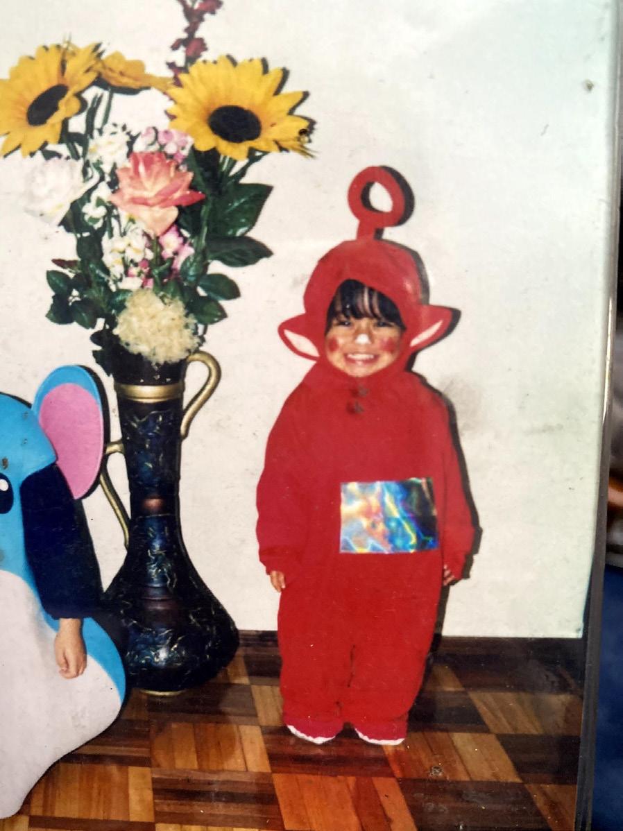
Hi, my name is… ANDREA


3
M.0


4
My hobbies are…


5


6


7
CULTURE IN COLOR


8
M.1
ANDREA CRIOLLO
M.1
ECUADOR


9
ONE OF THE MAIN EXPORTS ECUADOR IS RESPONSIBLE FOR IS CHOCOLATE. CACAO BEANS THRIVE IN THIS ENVIRONMENT AND THE CHOCOLATE MADE IN ECUADOR HAS WON AWARDS AGAINST THE BEST CHOCOLATE IN THE WORLD. BROWNS ARE PROMINENT IN THIS SENSE AND DESCRIBE THE RICHNESS OF OUR LAND AND SOILS.

ECUADOR
ECUADOR IS KNOWN HEAVILY FOR ITS TOURISTIC, ONE OF A KIND SPOTS. ONE OF THESE SPOTS IS THE QUILOTOA VOLCANO CRATER LAKE. THE WATER IS CRYSTAL BLUE AND THE EXPRIENCE IS UNBELIEVEABLE. LIKE THE GALAPAGOS, THE TURQOUISE OF THE WATER REPRESENTS THE CONNECTION OF NATURE AND SIGNIFIES THAT THE AREA IS UNTOUCHED BY HUMANS AND PRESERVED FOR ITS NATURAL BEAUTY.
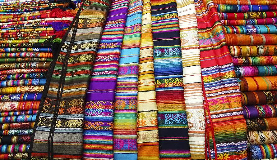
THE TRADITIONAL OUTFITS IN ECUADOR MAY VARY DEPENDING ON THE DIFFERENT REGIONS. NONETHELESS, ECUADOR’S TRADITIONAL OUTFITS USUALLY INCLUDE BULKY GOLD NECKLACES AND AND BRIGHT COLORED TEXTILES ALONG WITH LOTS OF EMBROIDERY. WHITE IS THE COMMON COLOR, REPRESENTING PURITY AND PEACE.
ALTHOUGH ECUADOR IS KNOWN FOR SO MANY BEAUTIFUL THINGS, THIS IS A PLACE THAT IS KNOWN WORLD WIDE AS AN ICON OF WORLD HISTORY. THE GALAPAGOS ISLANDS EXPECT TO SEE MILLIONS OF TOURISTS EVERY YEAR. THE WATERS ARE RICH TURQOUISE AND SIGNIFY THE PURITY OF THIS PROTECTED LANDMARK. THE BROWNS REPRESENT THE UNTOUCHED LAND THAT IS PRESERVED FOR HISTORY.
“EL DIABLO HUMA” IS ONE OF ECUADOR’S SYMBOLS THAT TRACE BACK TO OUR ROOTS. IT IS PART OF AN INDIGENOUS FOLKLORE THAT REJECTS CATHOLICISM. TODAY, THESE MASKS ARE WORN DURING HOLIDAYS FOR TRADITIONAL DANCES ESPECIALLY IN THE HISTORIC CENTER OF THE CAPITAL, QUITO. THE VARIETY OF COLORS REPRESNTS THE MULTITUDE OF BELIEFS AND THE DEPTH OF THEIR CULTURE.
OTAVALO IS A TOWN IN ECUADOR WHERE TRADITION IS NOT YET TAKEN BY MODERNISM. HERE, THE CIVILIANS STILL DRESS IN TRADITIONAL OUTFITS AND SPEAK THE LANGUAGE “QUECHUA.” THERE IS A LARGE POPULATION OF INDIGENOUS CURRENTLY LIVING HERE AND THEY ARE BEST KNOWN FOR MAKING HANDCRAFTED QUILTS. THESE QUILTS CONTAIN VARIOUS COLORS BUT ARE PROMINENT IN GOLD TO SIGNIFY STATUS AND ELEGANCE.

ECUADOR IS A MOUNTANEOUS REGION WHERE THE POPULATION IS GROWING TO THE POINT WHERE THEY MUST BUILD WHEREVER POSSIBLE, HOUSES OF ALL COLORS AND ARCHITECTURAL STYLES LAY ON MOUNTAINS. THE COLORS OF HOUSES ARE NOT REGULATED AND PEOPLE CHOOSE TO EXPRESS THEMSELVES BY PAINTING THEIR HOUSE OF ALL DIFFERENT COLORS.

10
MEXICO


11
SIMILAR TO OTHER LATIN AMERICAN COUNTRIES, MEXICO IS KNOWN FOR ITS STREET ART AND POTTERY THAT IS SOLD BY STREET VENDORS IN VARIOUS AREAS OF THE CITIES. THESE ARE USUALLY HANDCRAFTED AND FEATURE A WIDE RANGE OF COLORS AND PATTERNS. GOLD DETAILS MAKE THESE HANDCRAFTED POTTERY ELEGANT.
MEXICO
TEQUILA IS ONE OF MEXICOS MOST EXPORTED PRODUCTS. THEY EVEN HAVE A CITY IN MEXICO NAMED TEQUILA WHERE THE PRODUCT IS PRODUCED. IT IS SAID THAT MORE THAN 300 MILLION BLUE AGAVE PLANTS ARE HARVESTED EACH YEAR TO MAKE TEQUILA IN MEXICO. MOST ARTISAN LIQUOR IS DECORATED WITH HANDCRAFTED SLEEVES FULL OF COLORS.
CATHOLICISM IS VERY PROMINENT IN MEXICO AND DEVOTION TO THE VIRGIN OF GUADALUPE IS EVEN MORE SO. THE CHURCH WHERE THE ORIGINAL PORTRAIT LIES IS ONE OF THE MOST VISITED SPOTS OF MEXICO’S CAPITAL, MEXICO CITY. THE GOLD AND NEUTRAL TONES ALLOWS FOR A SERIOUS FEEL WHERE PEOPLE ARE FREE TO PRAY AND MEDITATE WITHOUT DISTRACTIONS.
MEXICAN CUISINE IS RICH WITH FLAVORS AND COLORS FROM ALL OVER THE REGIONS. TACOS ARE ONE OF THE MOST WELL KNOWN PLATES AND HAVE EVEN BEEN ADAPTED INTO OTHER COUNTRIES. IN MEXICO IT IS BELIEVED THAT 50 BILLION TACOS GET CONSUMED EVERY YEAR. THE CLASSICAL COLORS OF A DELICIOUS MEXICAN MEAL INCLUDE RED FOR TOMATOES, GREEN FOR CILANTRO, AND NEUTRAL BROWNS FOR THE PROTEIN.
ONE OF THE TWELVE WONDERS OF THE WORLD LIES IN MEXICO. THE MAYAN RUINS NAMED CHICHEN ITZA HOLDS THE MAYAN STEP PYRAMD THAT IS CLOSE TO 1,000 YEARS OLD. THIS SITE IS LIVING PROOF OF THE HISTORY OF THE MAYANS AND THEIR TIES TO MEXICAN CULTURE. THE NEUTRAL TONES LEADS BACK TO THEIR PAST AND THE MATERIALS AVAILABLE TO BUILD.
MEXICAN MUSIC IS IMPORTANT FOR THIS CULTURE. MARIACHIS IS ONE OF THE MOST KNOWN TYPES OF MUSIC/ BANDS AND HAS BEEN ADAPTED INTO OTHER LATIN AMERICAN COUNTRIES. ALONG WITH THE BAND, THERE ARE USUALLY DANCERS WITH LARGE COLOFUL DRESSES.THESE DANCERS ALSO PERFORM A TRADITIONAL DANCE ALONGSIDE THE MUSICIANS DURING FESTIVALS AND OTHER CELEBRATIONS.

EL DIA DE LOS MUERTOS IS CELEBRATED IN MEXICO EVERY YEAR ON NOVEMBER 1ST, AND 2ND. THIS IS A DAY WHERE THE COUNTRY HONORS THOSE WHO ARE NO LONGER LIVING BY PUTTING OUT OFFERINGS, VISITING THEIR GRAVE AND CELEBRATING LIFE ON THEIR BEHALF. THIS DAY IS MARKED BY COLORFUL ROSES, FACES PAINTED IN WHITE, AND A RAINBOW OF TRADITIONAL CLOTHING.
12
M.2 COLOR + THEORY
A MODULE EXPLAINING COLOR IN A THEORETICAL ASPECT.
13
COLOR + THEORY
- Learning about color includes learning about color’s history, theory, upcoming, and founders. A lot of influential people were responsible for the perception of color theories that we have today. This included Sir Isaac Newton, Albert Munsell, and Joseph Albers, among others.
- The first color wheel was developed by Sir Isaac Newton. In addition to this, Newton was also responsible for discovering refracted colors, among other discoveries which he explained in a published book about colors called “Optiks.”

- Hue, value and chroma was developed by Albert Munsell. He also published a book about colors in which he described in more depth the discoveries he made in detail. This book was titled “A Color Notation.”
- Another important book in the color theory includes “The Interaction of Color,” written by Josef Albers.
- Johannes Itten is an important fundamental theoriest in the development of color theory and he too has a various books, some titles include “The Elements of Color,” and “The Art of Color.”

14
COLOR + ARCHITECTURE
ANDREA CRIOLLO

15
M.3
DAVID ADJAYE
DAVID ADJAYE IS AN AWARD WINNING GHANAIAN-BRITISH ARCHITECT WHO’S MAIN FOCUS HAS BEEN MAKING AN IMPACT ON COMMUNITIES THROUGH HIS WORK.
HE IS KNOWN AS ONE OF THE LEADING ARCHITECTS OF HIS GENERATION AND SOME HONORARY TITLES INCLUDE BEING KNIGHTED BY QUEEN ELIZABETH II IN 2017 AND ALSO APPEARING IN TIME MAGAZINE’S 100 MOST INFLENTIAL PEOPLE OF THE YEAR.
THE TURNING POINT IN ADJAYE’S LIFE WAS WHEN HE WITNESSED THE STRUGGLES HIS PARALYZED BROTHER HAD TO SUFFER WHEN ATTENDING SCHOOL DUE TO THE INCONSISTENCIES IN ACCESSIBILITIES THE FACILITY DEMONSTRATED. IT WAS THIS THAT DROVE ADJAYE TO PURSUE HIS CAREER.
GRADUATING FROM LONDON SOUTH BANK UNIVERSITY, ADJAYE RECEIVED HIS BACHELOR’S IN ARCHITECTURE. HE THEN WENT ON TO PURSUE HIS MASTERS FROM ROYAL COLLEGE OF ART.
ADJAYE WENT ON TO OPEN A FIRM OF HIS OWN IN THE YEAR 2000, ADJAYE ASSOCIATES. NOW, HIS FIRM IS GLOBALLY KNOWN AND RESPECTED THROUGHOUT THE WORLD, AND HAS AQUIRED A REPUTATION OF HELPING THE COMMUNITY AND USING THEIR WORK FOR BETTER.

16
ARCHITECTURE
THE IDEA STORE IS A CONCEPT THAT MAKES INFOMRATION AND TECHNOLOGY AVAILABLE TO EVERYONE IN THE COMMUNITY. THE SITE FOR THIS IDEASTORE WAS CHOSEN BECAUSE WHITECHAPEL IS A STREET WITH A LOT OF TRAFFIC, MAKING IT A CENTRAL HUB FOR THE COMMUNITY. WITHIN THIS STREET THERE ARE SO MANY OTHER ACTIVITIES TO DO SUCH AS RESTAURANTS, BREWERIES, STORES AND EVEN A HOSPITAL. THIS MEANT THAT THE IDEASTORE HAD TO STAND OUT AMONG OTHER BUILDINGS, WHICH LED TO THE DECISION OF MAKING THE WHITECHAPEL IDEASTORE LARGE IN SCALE WITH AN INTERESTING, COLORFUL FACADE. OPENED IN 2005, THE IDEASTORE IS STILL A VITAL PART OF THE COMMUNITY TODAY.
WHITECHAPEL IDEA STORE

THE IDEA STORE WAS MADE WITH A COLOR PALETTE OF BLUE AND GREEN HUES. THE SHADES OF BOTH THESE COLORS ARE PROMINENT IN THE FACADE AND EVIDENT WITHIN THE INTERIOR SPACES AS WELL. THE ARCHITECT WANTED THIS BUILDING TO STAND OUT AMONG ALL OF THE OTHER BUILDINGS SURROUNDING IT IN SUCH A BUSY STREET AND DECIDED TO MAKE THIS NOTABLE FACADE WITH BEAUTIFUL COLORED PANELS SO THAT IT CAN BE RECOGNIZED FROM ANY CORNER OF THE STREET. THE FACADE PANELS WERE INSPIRED BY A NEARBY MARKET WHICH ALSO UTILIZED THE SAME LANGUAGE AND COLOR PALETTE AS THE IDEASTORE. SOME OF THE ADDITIONAL REASONS FOR THIS COLOR FACADE INCLUDES THE PASSIVE COOLING SYSTEM THAT THE GLASS CREATES THROUHG ITS WINDOWS, AND IT’S PLAYFUL AND INVITING NATURE MAKING IT A TRUE COMMUNITY HUB.

COLOR

17
SUMMARY
THE WHITECHAPEL IDEASTORE IS A VITAL PART OF THE COMMUNITY. IT IS A PIECE OF ARCHITCTURE THAT SERVES THE STREET, IT’S PEOPLE, AND THE WORLD BY PROVIDING A BLUEPRINT FOR OTHER COMMUNITY HUBS ALIKE. INSIDE OF THIS IDEASTORE THERE ARE RESOURCES FOR THE LOCAL COMMUNITY TO USE, SOMEWHAT LIKE A LIBRARY BUT WITH TONS OF OTHER AMENITIES THAT ARE NOT USUALLY PROVIDED TO THE PUBLIC FREE OF CHARGE.
THE ARCHITECT IN CHARGE OF THIS BUILDING, DAVID ADJAYE, HAS BEEN AN ICON OF HIS GENERATION PUTTING THE COMMUNITY FIRST IN ALL OF HIS WORK. THE WHITECHAPEL IDEASTORE IS ONE OF THE EXAMPLES OF ADJAYE’S CONTRIBUTIONS TO THE COMMUNITY THROUGH HIS ARCHITECTURE. THE BUILDING’S FACADE IS NOTABLE THROUGHOUT THE STREET IT SITS IN BECAUSE OF ITS UNIQUE COLORS, AND METAL STRUCTURE.


THE COLORS OF THIS BUILDING ARE A UNIQUE PALETTE OF BLUE AND GREEN HUES THAT CLASH WITH ITS SURROUNDING ARCHITECTURE. THIS WAS DONE ON PURPOSE IN ORDER TO MAKE THE COMMUNITY HUB EASY TO DETECT, AND INVITING FOR ANYONE WHO WOULD WANT TO USE IT. THE COLOR PALETTE AND PATTERN OF THE GLASS PANELS ARE ALSO IN REFERENCE TO A NEARBY MARKET.
ALL IN ALL, THIS ARCHITECTURE IS A GOOD EXMAPLE OF HOW THE COMMUNITY IS ABLE TO PERCIEVE COLORS WITHIN ARCHITECTURE AND HOW IT AFFECTS THE WAY THAT ARCHITECTURE GIVES BACK TO THE COMMUNITY IN WHICH IS WAS PLACED IN.

18
M.4 COLOR + PERCEPTION
A MODULE EXPLORING HOW WE PERCIEVE COLOR.
19
COLOR + PERCEPTION

- One of the first steps in a project is programming, and it is the design process that invloves gathering data for that project. It is important that the client is always kept in the loop about the decisions that a designer makes.
- Careful consideration of color must be one of the first steps in designing. Different aspects of human characteristics allows for us to percieve color is a different way.
- Some of the types of color contrast that designers can use to design and manipulate interior spaces include simultaneous contrast, contrast of light and dark, cool and warm contrast, complimentary contrast, contrast of hue, contrast of saturation or intensity, and contrast of extension.
- A designer can practice Color Forecasting which allows for identification of trends in consumer preferences, providing predictions that impact various industries. This helps the designer implements trends into their design that are deemed popular.
20
M.5
Spike Jonze (2013)

21
M.5: Andrea Criollo
HER
SUMMARY
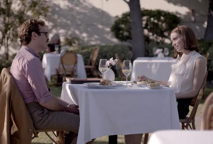
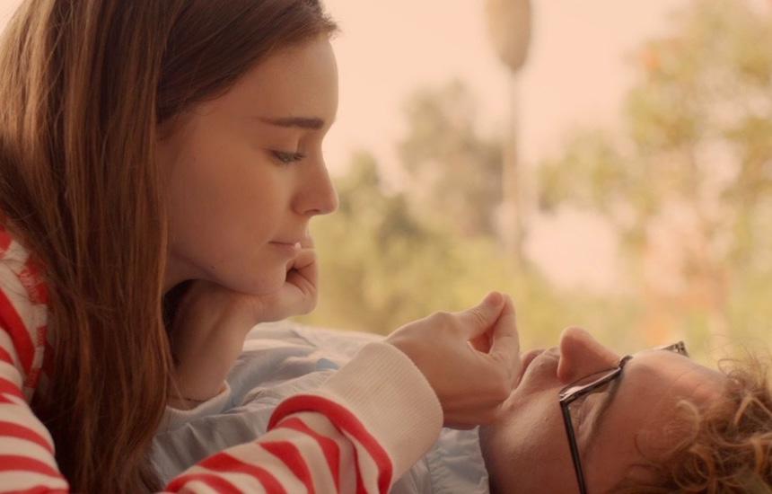
This movie takes place in future Los Angeles, where technology is rapidly advancing. A man who is going through a divorce, finds himself very lonely and in need of love. One day, he comes across an ad for an AI installation and decides to give it a try. Rapidly, he finds himself falling in love with this AI who embodies a person more than it does a robot. It names itself Samantha and seems to impersonate a real human being more everyday. Their relationship is explored throughout this movie, as they both become hyperaware of their own feelings and plan a future together.

22
PALETTE ONE
This movie presents a series of earth tones when the main character, Theodore, is feeling gloomy or lonely. There are several events in which this happens, for example, in one of the first scenes of the movie. Theodore finds himself leaving work and hops on the subway to go home. With his earphones on, he seems to be in his own world. Around him are various people, yet it is suggested that he feels alone regardless. The mood is set by the lack of vibrant colors and the use of the color palette shown. The scene to the right is also a gloomy one. Theodore meets with his wife to sign divorce papers and as they start to fight, the color palette of pale colors represents their love dying for the last time.

23
The second color palette comes from nostalgia and momentary happiness. Theodore has a lot of memories of his wife and their life before their divorce. It is obvious that he is remeniscing their life because of the way that the color palette exposes warm colors. Colors such as ornage and yellow usually bring feelings of warmth and comfort. When Theodore is on the date in the first scene, he is experiencing momentary happiness, which can also be seen as superficial happiness. This scene has mostly yellow undertones, and can depict a sense of happiness that is not too loud or obvious. The same goes for the two scenes adjacent, the happiness that Theodore was experiencing was not overpowering, which foreshadowed that it will not last forever,


PALETTE TWO
24
PALETTE THREE
Finally, the color palette that was depicted in various ways throughout the movie is the pinks, reds, and oranges. These are known to represent love, and it is exactly what they represent in these scenes. Theodore finally gets to experience love through Samantha and it seems like his whole life has meaning again. These scenes have bright red accents for love and care.


25
CONCLUSION
In conclusion, the movie Her by Spike Jonze does a very good job in presenting various color palettes to depict certain feelings and hidden meanings throughout. There are certain scenes where the color palette is more obvious than others but I believe that even this was done on purpose. The colors, the saturation, the vibrance, and the intensity were all used for purposes of capturing a certain feeling. Some scenes had a warm undertone for comfort and others had a cool undertone for gloomy and loneliness. This movie was a spectacular representation of how color goes hand in hand with movies and other design aspects.

26
COLOR + HEALTH
A MODULE EXPLORING COLOR IN THE HEALTHCARE WORLD.
27
M.6
COLOR + HEALTH
- Some of the factors that contribute to our perception of color include age, gender, culture, health, and beliefs.
- Some people believe that colors and health have certain associations. These include:
Red - increases blood pressure, adrenaline, and breathing rate.
Pink - settles the stomach
Blue - slows heartbeat and decreases temperature
Yellow - speeds up metabolism
Silver - heals hormonal imbalances
- There are various forms of color blindness. Deuteranopia, the most common form of color blindness results in vision where reds and greens often appear yellow. Protanopia is when you’re less able to distinguish reds, greens and some blue coloring. Tritsnopia results in and inability to distinguish blues from greens and yellows from violets.


28
M.7 COLOR + BALANCE
A MODULE EXPLORING COLOR AND BALANCE WITHIN COLORS.
29
COLOR + BALANCE
- Balance is the relationship of different hues to one another when each is “percieved” to be equal its “percieved” visual weight. It is also a general term used to describe the physical or perceptual state of equality or order of objects within a larger composition.
- There are three types of spatial balances in colors. These types include symmetry, assymetry, and radial.


- When designing with color, one must take into consideration its relationships to the architecture and the design around it. Only them will you have success with designing with color.
- There are four types of color balances that can be achieved through application. These color balances include value contrast, hue balance, intensity contrast, and size of colored area.
- During your color selection process, determine which of your hues is likely to consume more of the visual space. Organize your colors by weight, and assign their location to maximize your effect of increased or decreased volume.
30
COLOR AND EMPHASIS

31
M.8 ANDREA CRIOLLO
COACH
Address: 7535 N Kendall Dr.
Products for sale:
Luxury Accessories and clothing


Coach is a well-known brand in the fashion industry that focuses its sales on handbags, along with other luxurious accessories and clothing. There are many stores and around the globe, including outlets and boutiques. Their signature material is leather, yet they have accessories of all textures, and materials.
Coach’s logo, shown above, has become an iconic symbol of luxury, and quality. There are currently many iterations of this logo, some being just letters, and others, just the icon of the horse carriage.

32
These photos were provided to me by the social media manager of Coach’s dadeland store. they are both examples of products sold at the coach store, including handbags, wallets, jewelry and more.
The Coach store had many displays available to showcase their products. Contrast of hues was found in one of these displays, show to the left. The display contained a red back drop next to a yellow back drop, and in front of each, a set of two handbags were placed. This allowed for your eyes to be drawn to these two products, as the contrast is strong between backdrops and is strong in the contrast between backdrop and handbag as well.

CONTRAST OF HUES
33
Handbags placed in displays that had colored backing.
Differently lit displays for Coach handbags.

CONTRAST OF VALUES
There were many different lit displays around the store. This one in particular shows contrast of values because of the contrast between the lighting of one display and the lack of lighting in the display directly next to it. This allows for the attention to be drawn towards the well-lit display and could play as both an advatage and a disadvantage because they might be selling more of one product than the other. This might be on purpose if they have an overstock, or might just be the way they wanted their handbags to display.
34
There were chairs towards the front of the storethat created a waiting area. The design features contrast each other in this area because of the variety of materials, textures, and shapes. The chairs are made out of leather, have a smooth texture, and contain very sharp edges, making the overall shape squareish. Each table has a different shape, one with a wooden square top, and the other with a metal circular top. This contrasts the chairs, and contrasts each other. Finally, the rug has a circular pattern and rough fabric texture which verall contrasts the chairs and the tables, making this waiting area an interesting play on design.

CONTRAST OF A DESIGN FEATURE
35
Two leather chairs with one table next to each. Located towards the front of the store as a waiting area.
The handbags are displayed all throughout the store which are the featured item for this brand.
CONTRAST OF TEXTURE
Contrast of texture was not shown in the design of the interior of the store, but rather was shown strategically through the way that the handbags were displayed. To the left there are two examples of this, both in which leather handbags are placed next to fabric handbags to emphasize the difference in each. Although this is not a feature of the interior of the store, it was a design decision taken for a specific outcome, and works well with comparison between two types of bags offered in the store.


36
The focal point of this image are the display of colorful handbags. The designer of this space used a color not seen often throughout the store to make sure that this display stands out. The handbag display being all clustered together in a symmetrical and uniform way draws the attention of anyone walking by. This display is like nothing seen in this store, making it unique and an attention grabber.

FOCAL POINT
37
The entrance of the store frames this view. This is visible even from outside of the store because the display stands right in front of the two glass floor to ceiling doors.

38
ANDREA CRIOLLO
COLOR AND WORKPLACE M.8
M.9
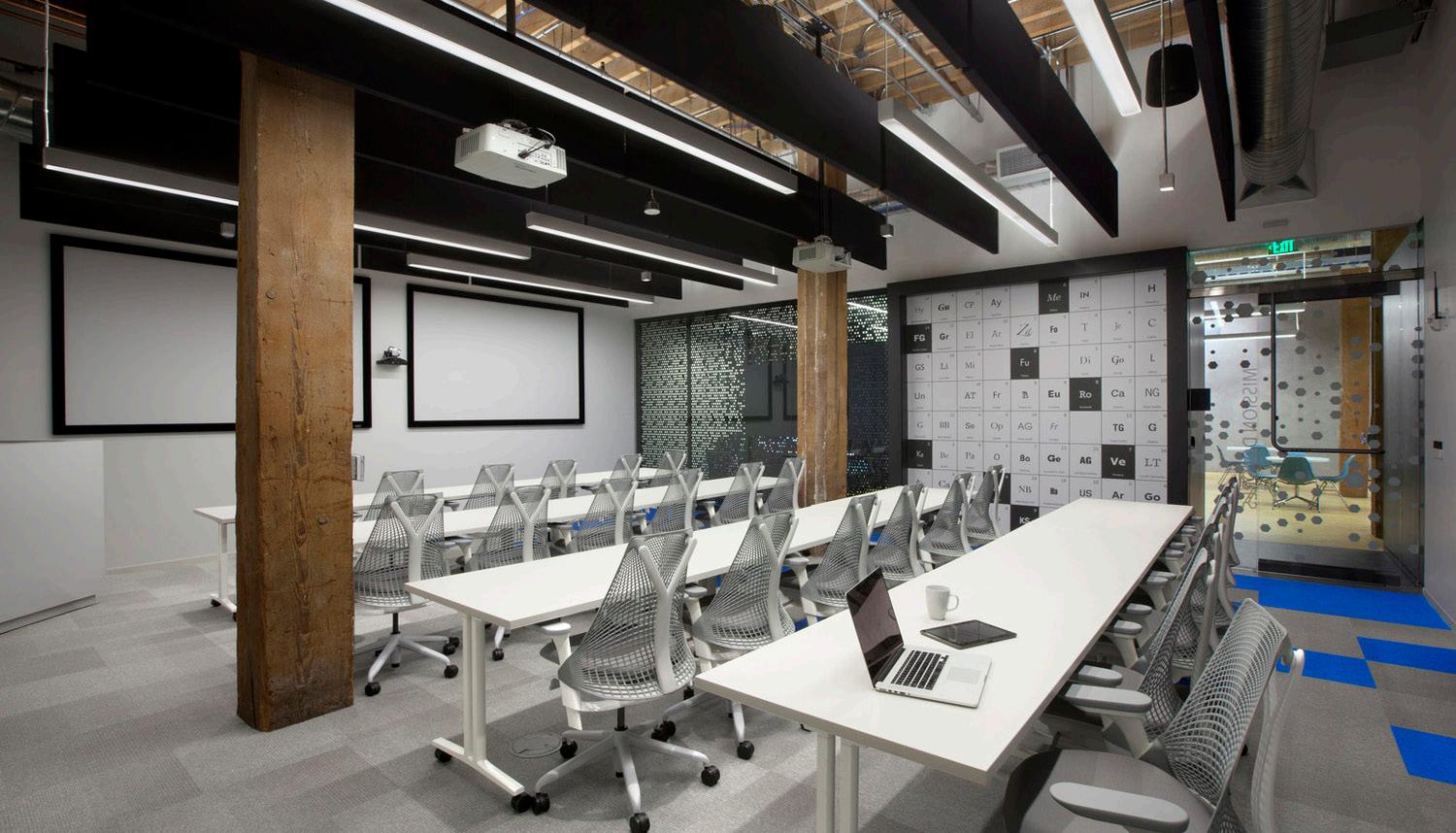
The Adobe 410 Townsend building utlizes many different textures throughout their interior. In the picture to the left, we see various textures clashing with one another. They use the brick on the wall and the steel in the windows and mullions as a brutalist approach, showcasing the bare materials of the building and then pairing them with creative interior finishes.
On the interior aspect we can observe a polished wooden tile as flooring, carpet in certain areas, wooden cabinetry, and plants for greenery.

TEXTURE
39
The linear aspect of the space is geometrical and sharp. It is used to accentuate design in certain spaces such as the picture to the left.
Horizontal lines appear to dominate over verticality. This is also supported by the low ceilings in certain areas and the lack of vertical planar spaces such as walls. The open plan space within the inside of this workplace exentuate its horizontality. The vertical bare horizontal columns also add lines to the space which allow your eyes to follow the inside of the space with ease.

LINE
40
The same pattern is shown throughout the interior in different colors, scales, and materials.

The hexagon shape, shown in the pictures to the left, seems to be a repetative accentuation of design. This pattern is present on walls, glass, and partitions.
The use of a primitive shape such as the hexagon shows simplicity while at the same time allowing for creativity to thrive wih a pop of color for decor.

PATTERN
41
As discussed in the previous analysis, the pattern that is used the most involves a hexagonal shape, but the overpowering shape of the design of this interior is the square.
The square appears throughout the space in many ways, scales, and combinations. In the images to the left, we can see the design that appears on the carpet is a combination of rectanlges.
Although in the picture to the right, the furniture is a curving semicircle, the precense of the squares in the carpet and on the brick wall allow for a linear feel of the overall room.

Aside from decor, the square is apparent in the way the columns are exposed, the cubicles are linear, and the glass walls are perfectly parallel to each other.

SHAPE
42
The space has a clear contrast of work and play shown in their color palette. As seen in the previous slides, the overbearing colors of the work spaces are the dark shades of black and white and the bare colors of construction, including brown, burgandy and grey. There are other spaces which contain blues, violets, and purples, analogous colors in the color wheel. These vibrant hues allow for a relaxed, layed back space to be created, in which the employees can work at their own pace, grab something to eat, or socialize with their fellow coworkers.


COLOR PALETTE

43
M.10
COLOR
+
VARIETY FAENA HOTEL

44
Andrea Criollo
Miami Beach, FL
The Faena Hotel utilizes linear elements projected throughout the hotel in order to provide continuity into the spaces. The golden columns seen in this hall allow for the buidling’s ceiling to seem higher than it really is, and at the same time providing a sense of luxury.
Stepping into this area, no matter where the user is coming from, is like stepping into a fantasy, where columns and ceilings are made of gold, accent red carpets are just as long as they are seen in Hollywood, and floor to ceiling windows provide sun light all day long.

COLOR + LINE
45
Analyzing one of the guest rooms in the Faena Hotel, we see evidence of curvilinear furniture and patterns, alongside a mix of colorful shades of red and blues.
The furniture in this hotel was all custom made by Faena, the designer of this building. The decor was believed to signify passion and love, which is why the overpowering color in this room, and the hotel in general is red.

COLOR + SHAPE
46
In this bar area, different textures are evident throughout the space. The red never fails to be present in every single space in the Faena Hotel, as it is an important accent for the design and a common theme throughout. The different textures present in this area signify luxury and work together to create a space of networking and communication.
The ambient lighting, the leather stools, the gold accents on the ceiling details, the hard surface countertops, and the glass decor all come together to create a space for wealthy interactions.

COLOR + TEXTURE
47
For pattern, we will look again at one of the guest rooms, where the patterns clash and work together to create a playful space for relaxation and comfort. In this area, we witness different patterns that wouldn’t normally be next to each other, yet in this space, because of the flourecent colors of the carpet matching the couches, the zebra seating is able to coexist.
The designer stated that they wanted these bold patterned rugs to pop in contrast with the hardwood flooring they chose, in order to create an accent and a statement in each room.

COLOR + PATTERN
48
The color palette, unlike many luxury hotels, is bold in the Faena Hotel. The designer chose to tep out of the neutrals and take a leap of faith with colors such as reds, blues, and greens.

The red being the most important color, carries important concepts of love and passion throughout the hotel.
Certain areas do have more stereotypical luxury colors present such as gold, black, and white, yet the hotel in itself allows for a playful tone to take place in many areas to honor the Miami Beach atmosphere of beach and art.
COLOR PALETTE
49
CONCLUSION
Color is an important aspect for a designer’s work, yet, often times, it is not studied deep enough to know how to use it correctly. The possibilities with color are endless, wether you want to emphasize, blend, match, combine, or any other design decision, color is able to help you achieve this.
Throughout this course, I learned a lot pertaining to color. I knew the surface level theory of color and how to apply it, but now I know that it goes so much farther than the color wheel and the basic primary colors. I will be able to implement these new findings into my architectural work, and it will allow for my work to be stronger than before.
This course also allowed me to explore things that I was previously familiar with, except with a new set of eyes. Hotels in miami, retail stores at malls, workplaces of some of my favorite corportations, they all utilize color as a design aspect and for very specific reasons that go beyond decor and aesthetics. I am now able to analyze the simplest things with the eyes of a designer and a newly found color enthusiast.
50
