Fall 2022 Process Book
Courtney Patacsil


2


3
“If we are an anomaly in the writing as it were, there must be some way to change the outcome.”
-Arthur Lester (Malevolent Podcast, Episode 20)
Meet the Creator!

Welcome to my Process Book for my Arts102 class! The following pages show the culmination of the work done over the past 16 weeks. The course has been eye opening for me. I didn’t realize just how pervasive design was in the world around me and how many ways that it could be applied even if one isn’t focusing in design. It also forced me to create outside of my normal avenues and step out of my comfort zone.
While this isn’t my first Art Studio class I’ve taken, this is the first one that has been focused on design. While I had drawn before, I had never consciously focused on the composition and how to best make the work impact the viewers the way I wanted it to.
4
Dusty, my cat.
Picture of the creator.
4 Introduction


5 Table of Contents

AI 6-Word Memoirs 6-7 Overview 8-9 Process Details
Abstracting Text 10-11 Overview 12-13 Process Detail

Great Ideas Poster 14-15 Overview 16-17 Process Details
Movie Mark Making 18-19 Overview 20-21 Process Details
Syntax and Semantics 22-23 Overview and Process Details
Process Book 24-25 Overview and Details 26-27 Colophon

5
AI 6-Word Memoir
AI has come a long way in just a short time. The objective of this project was to see how AI generated art could be expanded on while creating a 6-word memoir. This project used an AI art software called dall-E for our base photos. We created our own 6-word memoirs to use to generate the photos to use. Photoshop was then used to edit said photos and place the words for our memoirs.

6
The final appearance of the 6 word memoirs.
The unaltered base for my memoirs along with some pictures of the Photoshop layers.


7
These images show the elements of the original AI photos I used as the base for my memoirs.


8
AI Memoir
Process Details
It was an interesting experience working with an AI art generator. I had been aware of them, but I have never experimented with them to create art for inspiration or to use as a base for art. I think I experimented more with the AI art generator than I would have if I had used Google Images or created my own. When finding images to use for the memoirs, I had to be more open-minded due to the fact that I couldn’t force the AI to make the image that I saw in my head when I first created the text for each memoir. AI art generators will probably not be one of my go-to resources but they would be a great resource if I find myself too boxed in on an idea in

the future. Unfortunately, I do not have access to all of the AI generated photos that I used to create my memoirs. To compensate for this, I isolated the elements from the other photos and screenshot them.
It was difficult finding the words to make the memoir. I either wanted to write too much or the words I could parse out didn’t really make sense. I knew that I wanted the memoirs to reflect experiences I had, so the problem was to find out which ones I did want to choose and how to phrase them.
9
The base AI photo for my second 6-word memoir.
Text Abstraction
What Makes Text Text?
Our second project was to abstract text. If one breaks text down to it’s most basic forms, it is just specific lines that we as people interpret to have meaning. We learned about the specific forms that make up text and the unique traits of font groups. We then used that knowledge to abstract text and see how one can alter text and still have it be recognizable as text even if one can not read what the text is supposed to say.
This project was done in collaboration with other sections of Arts102. This meant that after each section was finished printing and cutting out the text squares, we added them to a board on the third floor of McMaster. Our section was the second section to add their finished product to the board.

10
How the board looked after my class added their abstractions.

11
The image above is showing some of my classmates adding their projects to the board.
Text Abstraction Process Details
I spent a lot of time looking at fonts for the project. In the end, I gravitated towards fonts that were heavily stylized, a fact that I wasn’t aware of until the first in-class session. My first attempt used two script fonts and one Gothic one. The Gothic one, BaroqueTextJF, was the only one that wasn’t too stylized so I left that one as a way to prevent me from making the same mistake again. I created extra artboards to experiment with letterforms so that way I had options to choose from when it came to picking the final three squares. It is intriguing how each font seems to have its own personality associated with it. This was not something that I had thought of much until this project when I not only combed through the variety of fonts but moved the letters around to create unique images. I had


trouble conceptualizing text abstraction which left my first few attempts lacking. Seeing examples of my classmates in progress projects helped me conceptualize the concept, giving me a direction on how to improve.
When we recieved our text abstractions, the class cut them using an Exacto blade, a cork-backed ruler, and a cutting mat. Mine didn’t always cut on the first pass so I made a habit of going across the line twice. This has left some lines in my cutting mat that might cause problems in the future. We then hung up our abstractions on a wall where other sections of this class had hung them. It was interesting to see how other classes had interpreted this assignment. At least one section prior to ours had offset their abstractions, making it so that a grid system is impossible.
12
Illustrator screenshot of some potential text abstraction.
The final product of the text abstraction in Adobe Illustrator.
Several in progress photos taken from Adobe Illustrator and real life. The top and bottom right corner photos were taken from the final collage board. The right middle and top left photos are illustrator screenshots. The photo in the bottom left corner was taken on the desk after I cut out the text squares.


13
Great Ideas Poster
The Great Ideas project is one where people create posters to help encourage others to vote. There are many criteria to make a poster for AIG. Some of which are that the poster must have non-partisan messaging and symbolism.

This was my first attempt at designing a poster. It was interesting to think about how I wanted to design it and how the imagery I used and the connotations I evoked worked together to form the emotional impact of the poster.
Before starting on the creation of the poster, our class looked at examples of previous Great Ideas and AIG posters. This gave me some ideas for how to approach the project.
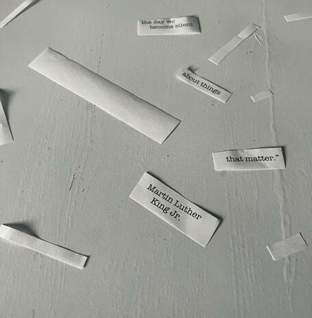
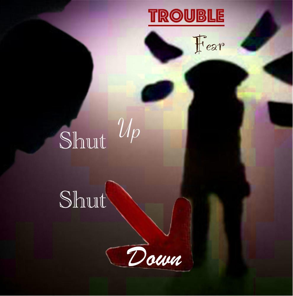
We were given a series of quotes to choose for the message of our poster. I chose “Our lives begin to end the day we become silent about things that matter” by Martin Luther King Jr.
14
The final mock-up of the Great Ideas poster.
Some on the backgrounds that I considered using when making the poster.


15
Photoshop screenshot of in-progress poster attempts.


Thumbnail sketches.

16
Poster design by Courtney Patacsil, Columbia, South Carolina
The final AIG poster.
Great Ideas Process Details

Of the quotes given, I decided to make the poster using Martin Luther King Jr.’s quote “Our lives begin to end the day we become silent about things that matter.” I was worried about making the poster too dark in tone so I focused on more abstracted versions of the quote. The one I decided to develop was based on the idea of falling and fracturing.
My first idea was to print out the quote on printer paper and cut it out and then take a photo of the pieces on a white table. I chunked the quote to emphasize the idea of silence being harmful. That idea was scrapped when the shadows of the paper detracted from the composition. I did like the texture of the table which gave me the direction for how to proceed.
The following day, I paid attention to any textures that I particularly liked on campus and took photos of them. I then put the photos in Photoshop on different artboards to serve as the background. I then chose a color and a typeface
for each artboard and put the quote in. For parallelism, I separated the quote in three text boxes, each with two lines. I then transformed the text into shapes and then skewed the text to create the illusion of movement.
In the end, I chose the picture of the sidewalk as my background texture. I created many copies of the artboard and experimented with how the text was placed and the colors. By chance, I ended up including my feet in the image in one of the edits. I liked how it invoked the marching connotation and went with it. I darkened the photo and changed the photo to a greyscale. After placing the poster into the AIG template, I uploaded the final photo into InDesign into the mock-up I chose.
If I were to redesign the poster, the biggest change I would make would be to change the text to black. I might attempt to retake the background photo to include more of my feet to give more leeway in the background editing.
17
Great Ideas thumbnails.
Movie Logos
Making Logos

This project focused on using Gestalt principles in the creation of logos. We were given a small selection of characters from Beetlejuice (1988), Annie (1982), Willy Wonka & the Chocolate Factory (1971), and Matilda (1996) to make logos of.
While I had been made aware of the Gestalt principles in an earlier Art class, I never gave them much thought. When I used them, it was unconsciously. I don’t think that being more aware of the Gestalt principles will change much about my work overtly. This does give me language to describe what I did and give me a different way to approach a project if I am struggling in some aspect of the design.
18
All of my classmates finals put up on the board so we could comment.
The final logos of Lydia Deets (left) and the Maitlands (right).
Character Logo + Mark
COURTNEY PATACSIL ARTS102-002
Lydia Deets (left), Beetlejuice (1988)
Concept statement: Lydia is a curious, confident, and bold child interested in the dark and macabre. I chose to make the LD out of objects relating to the attic door as that is an important symbol for Lydia. Closure, continuity, and figureground were the gestalt principles focused on in the formation of the LD and the way the elements interact with each other. I chose to make the logo a monochromatic greyscale to play of Lydia’s gothic appearance.
The Maitlands (right), Beetlejuice (1988)
Concept statement: Adam and Barbara Maitland are a bright, lively couple who are very passionate about the things they love. I chose the Salamat typeface because the script brings a personal, warm impression while also being legible. I decided to focus on figure-ground relationships and closure in the way the ghosts are partially shown behind the house. I made the house a monochromatic sepia tone, replacing the original color of the door with white to create a line to draw the viewer’s eyes throughout the logo.

19 arts 102 project 4
The final presentation of my character logos.
Thumbnail sketches for the marks of the Maitlands and Lydia.


20
Logo Making Process Details
In-progress Illustrator screenshot of my mark creation.
Making Logos based on Beetlejuice
I chose to use Beetlejuice (1988) as my base movie because I knew there was a 2018 musical based on it and I wanted to see how different they were. It was interesting to compare and contrast the two versions. After watching the movie, I chose to make my logos on Lydia Deets and Adam and Barbara Maitland.
While it was not too difficult to choose aspects/items for the thumbnails, it was much harder to combine the two. I knew that I wanted to use the house for the Maitlands due to how prominent the house was in their character arcs. I decided on using the sheet ghosts as the secondary aspect since it was the version that I liked best. I placed the ghosts behind the house to invoke the memory of the model town in viewers.
I was thinking about how to combine the items for Lydia’s mark when I got the idea for her mark. I decided to make the mark based off the attic door. While there are few scenes with the attic door in the movie, it marks an important turning point in the movie. The first time we see Lydia interacting with the attic door, the Maitlands prevent her from opening the door. Despite this, Lydia attempts again and appears to
try and pick the lock. I felt that this creativity and tenacity was characteristic of Lydia and made it my mark for her. On a separate piece of paper, I developed the idea more, going through different designs of the L and D until I found one I liked.
After choosing marks that I liked, I uploaded photos of the sketches into InDesign to line. I created shapes and merged them to make the marks. I originally had Lydia’s mark colored with warm, earth tones but then decided to make it greyscale to better reflect Lydia’s Gothic tendencies. I used the Maitland’s original house colors as my base for the palate of the house. I knew for the Maitlands that I wanted text that was scriptlike to reflect their warmness. That guided me to Salamat. I was unaware that I needed to find a text to say Lydia’s name since I assumed the initials would cover that so I didn’t choose one.
If I were to redo this project, I would make the marks more colorful and choose a text for Lydia. I am content with how the elements of the marks interact so I would leave those as is.

21
Syntax and Semantics
The goal of this project was to look at the ways different people viewed different objects and the associations these interpretations carry. My mom is a rhetorician so I was always more aware of semantics and connotations than the average person. I never really thought about how they were used in a marketing sense, which this project seems to lean into. After a brief introduction to the concept of Syntax and Semantics from a design standpoint, we were free to choose our targets.
I decided to choose various iPod models for this project as I have a strong emotional connection to it. My first personal device was a 3rd generation iPod nano that I still have to this day even if I don’t use it. Unfortunately, my iPod has a


Tinkerbell skin so I couldn’t use it for this project as the skin changes the semantics and context of the iPod significantly. I browsed Google and Unsplash for my photos. I decided to use an original iPod for my last photo as the other morphologically different iPod was a square and I didn’t like how the square interacted with the rectangular forms. I placed the original iPod model on the other end of the 3rd generation nano since they were so similar on appearance. When one accounts for scale or thickness, the differences become more obvious. However, the photos I chose don’t highlight the differences due to the lack of background and the forward facing orientation. I considered using a quartered layout however, the columned layout ended up working better due to the length of my descriptions.
SYNTAX
The final format of the syntax and semantics.
SYNTAX (visual elements and relationships)
SEMANTICS:
SEMANTICS:
SEMANTICS:
PRESENCE
SEMANTICS:
SEMANTICS: EXPRESSION (feelings) basic, sporty, trendy, sleek
SEMANTICS: CONNOTATION (associations) college students, travel, movies
PRESENCE (contextual) Little: on a desk, at a concert Lots: at an excavation, at a funeral

SYNTAX (visual elements and relationships) Black rectangle with rounded edges.There is a white rectangle centered in the upper third of the black rectangle. Inside the white rectangle, there is a light grey bar followed by a blue bar at the top. Underneath the bars are five rows of text aligned to the left of the rectangle. Centered in the lower half of the black rectangele is a black circle with symbols at each of the cardinal points. Centered in this circle is a smaller black circle.

SEMANTICS: DENOTATION (specified) electronic > music player > apple product > ipod classic
SEMANTICS: EXPRESSION (feelings) outdated, vintage, functional, sturdy, clunky
SEMANTICS: CONNOTATION (associations) parents, offices, heritage, stable
PRESENCE (contextual) Little: at an electonic exhibit, on a speaker Lots: at a millionare’s house, in a store
22
SYNTAX (visual elements and relationships) Dark greyrectangle with rounded edges.There is a smaller black rectangle that is centered in the top half of the rectangle.The bottom half of the rectangle has a circle centered in it.The circle is black with symbols at the cardinal points of the circle and has a second, smaller circle centered on the inside of the circle that is the same dark grey as the base rectangle. SEMANTICS: DENOTATION (specified) electronic > music player > apple product > ipod nano 3rd gen SEMANTICS: EXPRESSION (feelings) casual, outdated, quiet, functional, nostalgia SEMANTICS: CONNOTATION (associations) my first music player, bus rides, dependable PRESENCE (contextual) Little: in a college dorm,
at a bedroom Lots: at an electronic unboxing, at a dj stand
(visual elements and relationships) Thin silver grey rectangle with a smaller black rectangle with rounded edges centered in the upper three quarters of the grey rectangle. Centered in the lower quarter of the grey rectangle is black circle with symbols at each of the cardinal points.Taking up the center third of the blakc circle is a silver grey circle.
DENOTATION (specified) electronic > music player > apple product > ipod nano 5th gen
slightly smaller black
with rounded
Grey rectangle with a
rectangle
corners centered inside.The black rectangle has a smaller, light grey rectangle that takes up the upper three quarters of the rectangle. Inside the grey rectangle are six circles in two columns with three rows. Each circle is a different color with a white symbol centered in it and a word describing which application the icon represent. Centered in the lower fifth of the black rectangle, there is a small black circle.
DENOTATION (specified) electronic > music player > apple product > ipod nano 7th gen
EXPRESSION (feelings) casual, sporty, portable, hardy
CONNOTATION (associations) replacement ipod, college students, running
(contextual) Little: in a gym, on a college campus Lots: at a farm, at a Broadway play
The original layout for the project.
The iPod pictures that I chose for the project.


My inspiration for this project.

23
Process Book


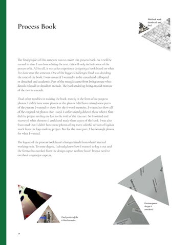
The final project of this semester was to create this process book. As it will be turned in after I am done editing the text, this will only include some of the process of it. All-in-all, it was a fun experience designing a book based on what I’ve done over the semester. One of the biggest challenges I had was deciding the tone of the book. I was unsure if I wanted it to be casual and colloquial or detached and academic. Part of the struggle came from being unsure what details I should or shouldn’t include. The book ended up being an odd mixture of the two as a result.
I had other troubles in making the book, mostly in the form of in-progress photos. I didn’t have some photos or the photos I did have missed some parts of the process I wanted to show. For the 6-word memoirs, I wanted to show all of the original AI photos that I used. I unfortunately deleted those when I first did the project so they are lost to the void of the internet. So I isolated and recovered what elements I could and made them apart of the book. I was also frustrated that I didn’t have more photos of my more colorful version of Lydia’s mark from the logo making project. But for the most part, I had enough photos for what I wanted.


The layout of the process book hasn’t changed much from when I started working on it. To some degree, I already knew how I wanted to lay it out and the format has worked from the design aspect so there hasn’t been a need to overhaul any major aspects.
Final product of the 6-Word memoirs.
Previous poster designs I considered.
Maitlands mark thumbnails and final.

25
My first few pages for my first process spread update.

26
The grid that I used for the process book.
Courtney Patacsil ARTS 102
Meena Khalili University of South Carolina Columbia Columbia, South Carolina 2022

Header Typeface: Coromant Infant Semibold 24pt Subheader Typeface: Coromant Infant Semibold Italic 20pt
Body Typeface: Coromant Infant Light 10pt Caption Typeface: Coromant Infant Bold Italic 7.5pt

27