Christine Seungmin Roh

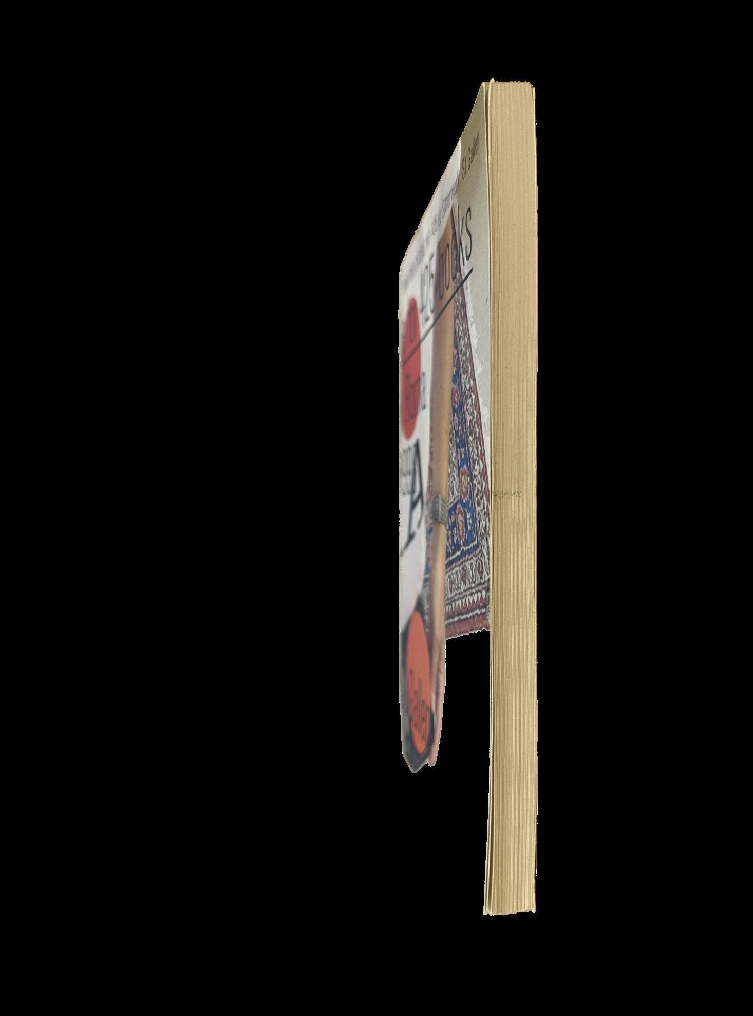
This publication is a catalogue of all the material published up until 2022 by ROMA Publications, founded in Amsterdam in 1998 by Roger Willems, Mark Manders, and Marc Nagtzaam. It appears with the exhibition ‘One can build a table for 425 books’ at Sitterwerk and contains a selection of photographs made between 2001 and 2021 by fellow designer and studio mate Hans Gremmen. As Roland Früh, head of the art library at Sitterwerk, suggests in the preface, “None of the 425 books listed here stand out because they want to; they’re not shining with metallic ink, they’re not oversized, not heavy or loud or shrill. But they radiate something that makes them special.”


TITLE PAGE


no page numbers


Clues to the meaning of many of the masterpieces of art history lie in a rich system of symbols, themes, and motifs that often eludes modern museum-goers. The intimate knowledge of Christian theology, Greek and Roman mythology, and folklore that was so vivid in the minds of viewers during the Renaissance is rarely part of the preparation the contemporary viewer brings to a painting. This insightful, anecdotal, portable book, with 1,000 gorgeous color illustrations, helps to fill in those gaps by decoding th imagery of more than 150 of the most influential and admired artworks of all time.
Covering the works of the Italian, Netherlandish, German, and Spanish Old Masters, from 1450 to 1750, paintings by artists such as Giotto, Botticelli, El Greco, Bruegel, Holbein, Rubens, and Vermeer, all held in public collections, How to Read a Painting” not only helps the viewer to understand the significant details of a picture but also explains the relationship with similar imagery in other works. The guide to Old Master paintings that every art lover has always wanted, this indispensable museum companion will open the reader to a whole new experience of Western art’s most praised and visited paintings.


TITLE PAGE


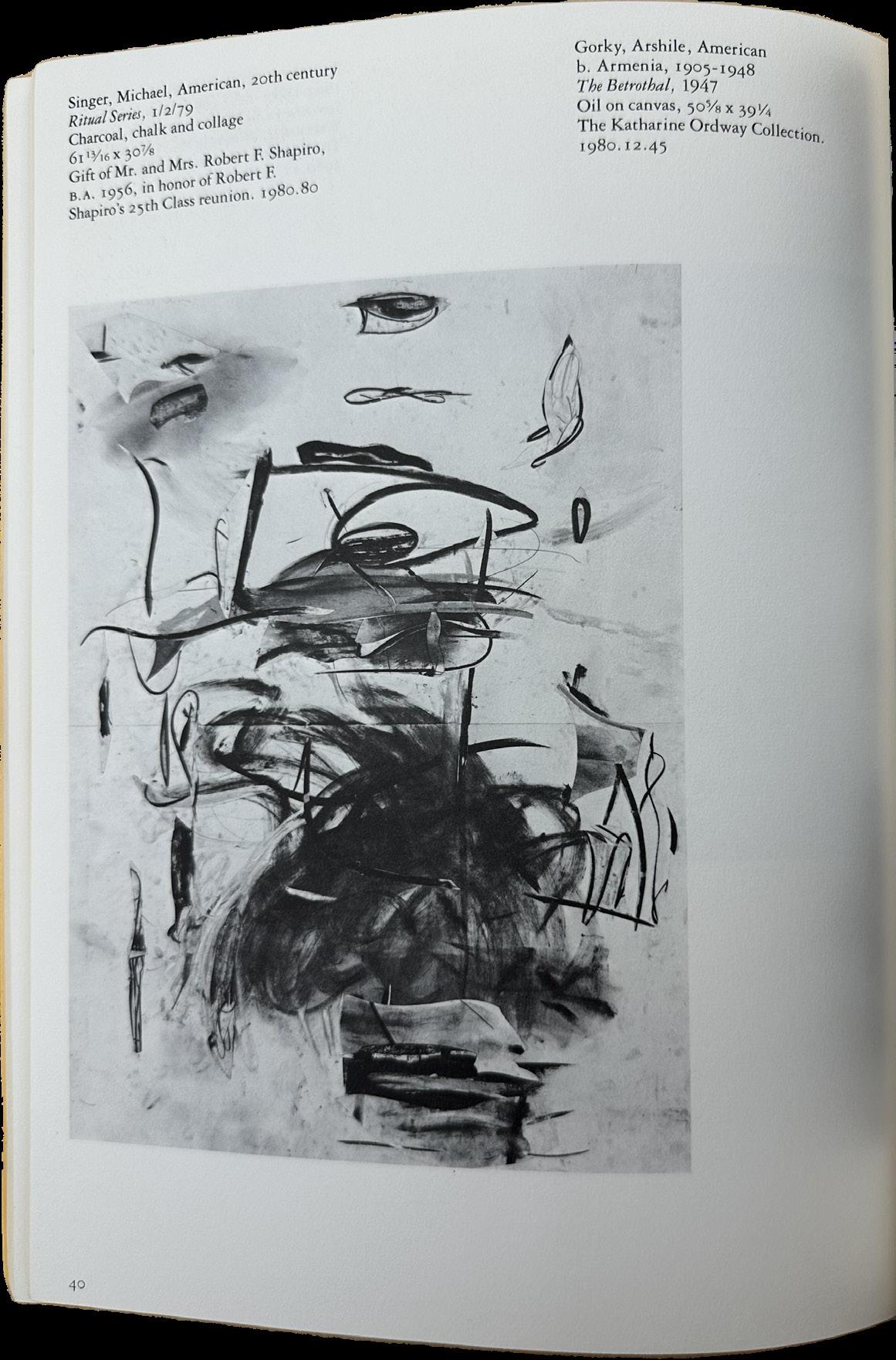
An annual compilation of themed essays, exhibition highlights, and Gallery news, the Yale University Art Gallery Bulletin publishes original scholarship on works in the Gallery’s collection. The Gallery actively seeks out great works of art from ancient times to the present day and in every medium to enrich the collection for teaching and research, and since the late 1940s, almost every issue of the Bulletin has regularly included a full list of acquisitions made since the previous issue. Beginning with the 2010 edition of the Bulletin, these acquisition lists are published online on the Gallery’s website, at http://artgallery.yale.edu/pages/collection/ newacquisitions/newacquisitions.php. Switching to a digital format for this portion of the annual Bulletin contributes to Yale University’s efforts to increase sustainability and conserve our natural resources.


TITLE PAGE


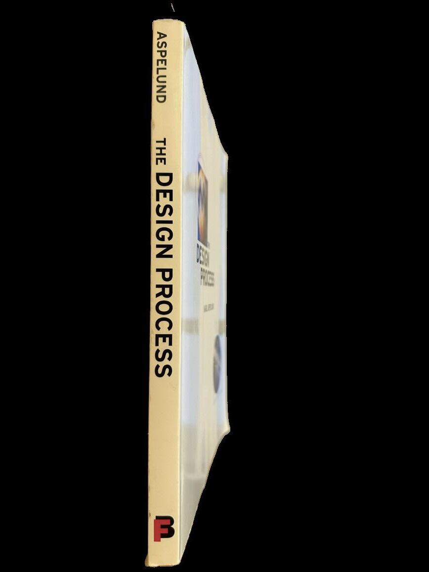
This is an interactive book covering the design process from searching for ideas to defining and maintaining sources of inspiration. The Design Process emphasizes the importance of the designer’s mind as opposed to the designer’s hands, while discussing the need for clearly understanding one’s creativity in order to communicate ideas to others. Aspelund takes the student all the way from inspiration to production, dealing with the designer’s role as a manager, coordinator, communicator, and problem solver.


TITLE PAGE


Like the art of Maya Romanoff, this book is awash in colors, surprises, and new ideas that will open the readers’ eyes to the possibilities of interior spaces. It charts the rise and showcases the work of the man once known as Multifarious Maya, who burst onto the American design scene as a wunderkind in the 1960s when he took his quirky obsession with hand-dyeing fabric and created a line of high-fashion clothes. Fast Company magazine dubbed him “the man who made tie-dye hip for non-hippies.”
Then he switched to embellishing entire rooms to create spectacular spaces—walls, ceilings, and floors—never before imagined. Space is his grand canvas. Like British designer William Morris more than a century before, Romanoff believes in the value of handcrafted art. He works with artisans all over the world to create one-of-a-kind designs.
Fittingly, each book is wrapped in handmade paper made in Romanoff’s Chicago factory.


TITLE PAGE

TYPE PAGE


This book is designed, printed, and bound by Christine Seungmin Roh for Boston University Grad Type II on April 24, 2023. Copies were produced using Basis Premium Paper. ‘Laski Slab’ typeface was used throughout the book.
©christine
