CORA GINSBURG MODERN


ROBE OF CINTAMANI SILK VELVET AND LAMÉ
Vitali BabaniFrench, ca. 1920
In the first decades of the twentieth century, Vitali Babani (1858–1940), the Paris-based purveyor of luxury Asian imports, achieved fame for his sartorial amalgam of East, West, past, and present. He even launched a transatlantic trend for a namesake tea gown, as proclaimed by Vogue in March 1912. Today, however, the reputations of his contemporaries working in similar Orientalist and revivalist veins—namely Mariano Fortuny and Maria Monaci Gallenga—have somewhat eclipsed him within the pantheon of Paris fashion.
Born in Constantinople in 1858 and wed to Rachelle Emilie Braam, in Paris, in 1882, Babani had a shop from 1894 on the boulevard Haussmann, where it remained—save for the years of World War I—until its closure in the 1930s. While information on Babani’s early years is scant, historians have recently made important discoveries about his business operations and his private life as a Turkish Jew whose ethnicity and religion were scrutinized in the French press.
At 98, boulevard Haussmann, one could purchase robes japonaises d’intérieur (Japanese dressing or tea gowns) made to Babani’s specifications in Kyoto, the nexus of kimono manufacture in Japan for centuries. Staged photographs in the July 1905 issue of Le FigaroModes show young Japanese women embroidering silks “dans les ateliers Babani,” while seated on tatami alongside artfully arranged cosmetic and tea ceremony accoutrements. Between 1905 and 1906, the journal also published a series of portraits of actresses and dancers donning his kimonos.
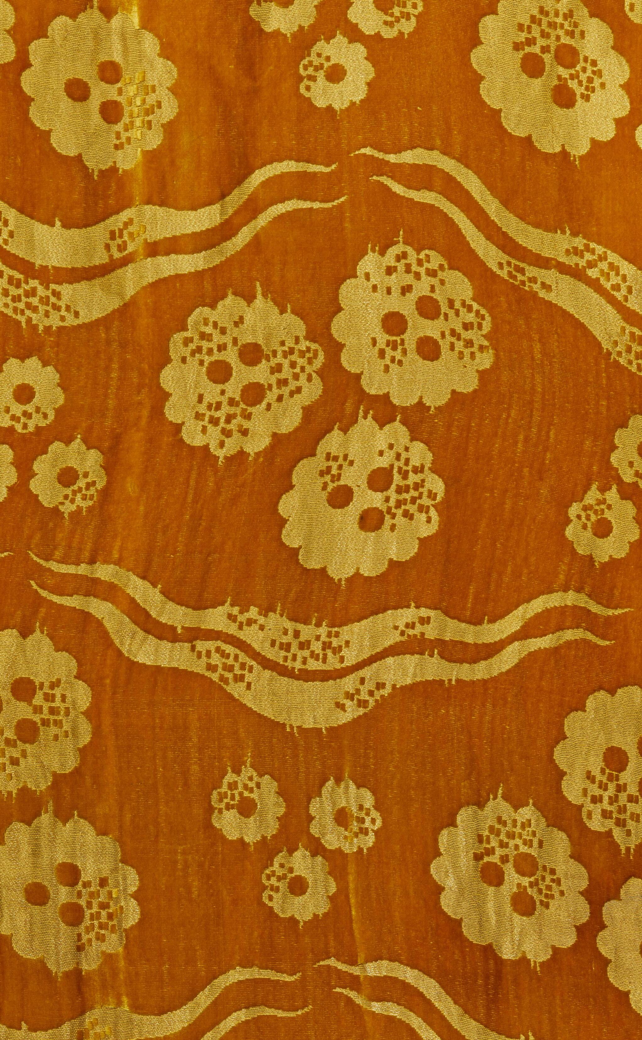
The present robe is later in date than the embroidered Kyoto examples and was tailored in France using local silks, but its silhouette is undeniably Japanese-inspired, with kosode sleeves and a wadded hem as on an uchikake. Unlike traditional kimono construction, where a single length is minimally cut to create all pattern pieces, here, joined lamé panels interrupt the silk velvet to form the sleeves, collar, and bottom third of the robe. Ties at the exterior left hip and right collar end fasten the garment. As such, the robe requires no obi, or belt, and wraps right over left in accordance with Western, rather than Japanese, comportment. The whole is lined in black silk charmeuse.
Élisabeth de Caraman-Chimay, the Countess Greffulhe, owned a velvet and lamé robe by Babani of nearly identical construction, now at the Palais Galliera (fig. 1).
The ochre-orange cut velvet with metallic threads, which was likely woven in Lyon, features three scalloped rosettes containing three circles, a trio of smaller rosettes with one circle within each, and pairs
of wavy lines. The pattern is instantly recognizable as a modernist adaptation of the Turkish cintamani and tiger stripes. Translated from Sanskrit as “auspicious jewel,” cintamani, in Hindu and Buddhist traditions, is the stone that bestows prosperity on its possessor. Wearing the motif provided spiritual and physical fortification. In the fifteenth century, the Ottoman sultans adopted it, often paired with wavy lines, to symbolize the Timurid tamgha and the furs worn by the Persian hero Rostam. The city of Bursa was known for its luxurious velvets and brocades with apotropaic cintamani made for the sultanate as well as for export to Western Europe from the fifteenth to early seventeenth centuries.
It is tempting to suggest that by showcasing cintamani and tiger stripes, Babani alluded to the textile traditions of his birthplace. More likely, however, the design was intended to generally appeal to Westerners fascinated by the geographical and temporal distances of the still-exotic East— both Near and Far in this case—as well as the Renaissance. Although Babani robes of varying quality survive in museum and private collections, the present example and that belonging to the Countess Greffulhe are exceptionally fine and apparently unique garments.
FIG. 1 Evening coat, Babani, 1920, black silk, quilted emerald green silk velvet, gold lamé, black silk taffeta lining. Palais Galliera, Musée de la Mode de la Ville de Paris, 1964.20.16. CCØ Paris Musées / Palais Galliera, Musée de la Mode de la Ville de Paris


DAY DRESS OF WOOL TWILL
Jacques Fath
French (Paris), 1943
During the occupation of France in World War II, German authorities imposed increasing restrictions on the couture industry to curtail its output as well as the wider influence of French fashion. Despite these constraints, Parisian designers whose houses remained open continued to present seasonal collections. Throughout the war years, the French fashion press regularly reminded its readers that it was a woman’s duty to maintain a stylish appearance—even while riding a bicycle or waiting in a queue—and, thereby, support this important sector of the national economy and its skilled workers.
At the outbreak of the war in 1939, Jacques Fath (1912–1954), who had opened his house two years earlier in a small atelier on the rue La Boétie, was already widely recognized for his witty, provocative designs for day and evening. Mobilized that year, he was back in Paris in 1941 and moved his shop to more substantial premises in the rue François Ier. In 1944, just before the end of the war, he relocated once again to a sumptuous hôtel particulier on the avenue Pierre-Ier-deSerbie. Enlisting workers from other couture houses that had closed, Fath increased his staff from 176 in 1942 to 244 in 1944. Throughout this period, L’Officiel de la Couture et de la Mode de Paris, the leading organ of the industry, frequently included Fath’s designs. In April 1941, the magazine praised his latest “charming collection, in which each model while being of a rare elegance, adapts perfectly to the circumstances of current life.”
Illustrated by Bernard Blossac in the Album de la Mode du Figaro in 1943, Fath’s tailored day dress is a rare wartime example by the designer, whose more exuberant postwar creations survive in greater quantity (fig. 2). Made of soft, brown wool woven in a herringbone twill, it conforms to the regulations limiting the quantity of this fabric allowed in a gown as well as the prevailing trend for functionality and comfort. The dress’s color, fabric, pointed collar, masculine-inflected square shoulders, and large patch pockets with flaps deliberately evoke French infantrymen’s uniforms. However, the narrow waist cinched with a matching suede belt ornamented with gold nail heads, and flaring skirt made up of bias- and straight-cut panels intricately pieced, make it an unmistakably feminine example of the so-called robes-tailleurs that La Mode Chic noted were prevalent in the collections for fall 1943.
Although the consumption of wool overall was reduced from prewar years, day dresses and suits of solid-colored, striped, and tartan lainage are ubiquitous in French fashion publications of the early 1940s. Dark and earthy tones—such as the reddish-brown color


of Fath’s dress—were also favored, particularly for fall and winter months, in shades including feuille morte (dead leaf) and tabac (tobacco). The outrageously outsized two-tone metal-and-celluloid buttons on the semifitted bodice front, and smaller versions on the sleeves, add a playful decorative element and further evoke military uniforms; in October 1943, La Mode Chic noted the preponderance of large buttons in two different materials, especially on suits and coats. Practical capacious pockets in a variety of shapes were also a fixture of dresses and suits; L’Officiel devoted a full page to sketches of skirt pockets “in all their forms” by couturiers in November 1943.
Although simplicity may have been the byword for French women’s wartime garments (a positive spin on scarcity), extravagant hats— often made of unusual, unrationed materials—provided eye-catching counterpoint. In Blossac’s illustration depicting a milliner’s shop, the figure in Fath’s dress assesses her reflection in a full-length mirror as she adjusts the tall, elaborately wrapped turban.

RIVERS AND ROADS PRINTED COTTONS
Gretl and Leo Wollner for Knoll International Austrian (printed in Germany), 1972
After the 1965 departure of Florence Knoll Bassett from the helm of the company founded in 1938 by her husband, Hans Knoll, a decidedly European influence took root in the Knoll Textiles division. Following the transition in senior leadership, Barbara Rodes was invited to lead the way toward fresh, original furnishing fabrics. Born in Germany, Rodes had broad experience in the field of fashion and textile design but also in the technical intricacies of printing, weaving, and manufacturing. For this reason, Knoll hired Rodes to coordinate textile works for Knoll Germany; despite her relatively young age, Rodes was up to the task, advancing her own designs in addition to massaging established patterns in Knoll’s inventory. By 1966, she had been elevated to the head of Knoll’s International Coordination Office, a role that oversaw fabric production for all of Knoll’s divisions outside of the United States. Her ascendency was far from over, however—Rodes assumed her position as head of design and development for Knoll Textiles around the globe in 1971.
During her tenure, Rodes not only pushed to collaborate more with buzzworthy fashion designers (including Americans Stephen Burrows, Calvin Klein, and Betsey Johnson) but also steered forwardlooking designs to glorious fruition. Much of Rodes’s legacy is in the close manufacturing partnership she fostered with Pausa AG. Located in Mӧssingen, Germany, Pausa was a leader in printing artistdesigned fabrics since its founding in 1919 and upheld a reputation for experimentation. These two textiles, both designed by the husband-and-wife team Gretl (1920–2006) and Leo Wollner (1925–1995), and from the Wollner family archive, represent the pinnacle of Rodes’s camaraderie with these entities.
Predating her involvement, Leo Wollner had worked, since 1952, with Pausa and its innovative director Willy Häussler, priming the relationship to yield spectacular results for Knoll. Riding the publicity surrounding the dynamic prints by Wolf Bauer released in 1969 as well as the first award-winning design by the Wollners for Knoll, Sling, in 1971, Rodes encouraged the couple to conceive of patterns giant in scale, and forceful in impact. The “Three Meter Print Collection,” as it came to be called, met Rodes’s criteria—and constituted the most challenging project of her career.
Leo Wollner had been keenly interested in devising a way to successfully and seamlessly print extremely large designs since the 1950s, as in his work with Pausa to create the theater curtain for the Großes Festspielhaus in Salzburg in 1958. More than a dozen years later, Wollner looked to Häussler and Rodes to help realize such an


undertaking on a very different but equally ambitious scale. With Pausa as their playground once again, the Wollners conjured four monumental works, each stretching floor to ceiling without repeat. In the production process for the “Three Meter Prints,” Pausa dedicated extra-long printing tables and extra staff; maneuvering the oversized screens necessitated four workers alone. For the design Rivers, what started out as a “huge, three-meter work of black lines on a white ground,” as described in a 1972 Knoll promotional bulletin, ended up as tapering rivulets of fluid color streaming down a snowy velveteen ground. Five colorways were manufactured, all characterized by blurred boundaries between printing inks; this example captures undulating transitions between dusky shades of bark, sand, lavender, and pencil-eraser pink. These blended gradations are not a defect of printing—on the contrary, they are a planned effect stemming from dyes being mixed as printing was progressing.
Roads is a seven-screen pattern printed on cotton-viscose sateen, with ruddy shades infilling dark cloisons bent into a loop suggestive of merging lanes on a highway interchange. In composition, it echoes the companion designs Sails and Trails. This length of Roads is printed on plain-weave cotton with the design oriented in the reverse from other extant examples. Given Leo Wollner’s decades-long close collaboration with Pausa, it was probably a pre-production trial for the finished Knoll product, which was printed on a cotton-viscose satin (see Cora Ginsburg Modern 2021, p. 14).
All “Three Meter Prints” were in production until Rodes’s departure from Knoll in 1978. Rivers was reintroduced in 2022 as part of Knoll’s seventy-fifth anniversary celebration, but as a digitized print in which the Wollner-Rodes-Pausa magic was replaced by computerized engineering. Period examples of Rivers and Roads are found in the Cooper Hewitt, Smithsonian Design Museum (2011-21-5 and 201121-2) and the Museum of Fine Arts, Houston (2022.68).
Provenance: Leo and Gretl Wollner archive, Vienna
Rivers: 112 x 48 ½ in.
Roads: 129 x 49 in. LW
ENSEMBLE OF KNITTED ACRYLIC AND JUMPSUIT OF PRINTED COTTON
Issey Miyake
Japanese, Spring/Summer 1976 and Spring/Summer 1978
Issey Miyake (1938–2022) was not only a fashion designer but also an artist and thinker whose primary medium was fiber, as found in nature and as manipulated. “A piece of cloth”—Miyake’s central tenet in creating clothing—is a reminder that the things we wear begin life as fiber and thread, and may continue to evolve and change even after the wearer puts it on their body. While these two early looks by Miyake are rooted in the carefree and colorful creativity of 1970s fashion, they are also characteristic of his work across his sixty-year career in their textile innovations and still avant-garde silhouettes.
Comprising a peplumed blouse and full, double-tiered skirt, along with a coordinating headscarf, this ensemble of machine-knitted acrylic jersey is a joyous ode to color and movement. To ensure vibrancy, Miyake utilized a relatively new, colorfast fiber known as Pewlon, which was developed in 1967 by the Asahi Kasei Corporation, Japan’s first manufacturer of acrylic. For the garment’s overall shape and the fabric’s pattern of narrow and wide horizontal bands, here in cobalt blue, flamingo pink, rust orange, and cream, Miyake was inspired by the lines that appear when a spinning top is in full motion. As such, the bright hues are shown to ideal effect as the wearer whirls.
In Paris in October 1975, Miyake premiered multicolored variations of the “Spinning Top” ensembles, which, indeed, spun as the models twirled down the runway. He presented the Spring/Summer 1976 collection again, three months later in Japan, in a still more novel spectacle. From January 29 to February 2, 1976, at Seibu Theater in Tokyo, and on February 5, 1976, at the Osaka Municipal Gymnasium, Miyake and the art director Eiko Ishioka presented Issey Miyake and Twelve Black Girls, an electrifying performance of dance, song, and theater with an all-Black cast. It was exceptional for a non-Black designer to give his runway exclusively to models of color. Bethann Hardison, whose agency, Bethann Mgmt, later pioneered opening the fashion industry to diversity, was largely responsible for the casting.
Issey Miyake and Twelve Black Girls was a groundbreaking celebration of visibility and Blackness in fashion at a time when that world was still largely unwelcoming. In her autobiography, Grace Jones credited Issey Miyake and Twelve Black Girls in helping to launch her career.
Two years later, models exuded that same energy while boogying across the parquet at Studio 54 in Miyake’s latest creations. The nightclub’s owners, Steve Rubell and Ian Schrager, hoped to make a splash for the one-year anniversary. For the occasion, Daniela Morera—Italian correspondent and later European editor of Interview


magazine, art director for several of Miyake’s advertising campaigns, and close friend of the designer—connected them with the Miyake Design Studio. The introduction led to Miyake’s East meets Westthemed fashion show cum birthday party, with gilded décor and a heavy dose of disco glamour. Photographs memorialize the excitement of that night in April 1978: Liza Minnelli singing, Yves Saint Laurent visiting the club for the first time, and Miyake himself in the DJ booth.
This jumpsuit, accessorized with fisherman’s ropes and molded plastic fish, was paraded at Studio 54. The cut and construction are deceptively simple; three pattern pieces are seamed vertically at the center back and the left and right front sides, the latter also forming arm holes. The neckline’s shirring enables the silhouette to change according to the wearer’s whims, turning her into designer and stylist and prefiguring the interactive, hands-on approach behind Miyake’s A-POC knit line, which began to show on the runways in 1997 with his “Just Before” collection. As seen at Studio 54, the jumpsuit could be worn high up at the neck, pulled down below the shoulders, strapless, or across one shoulder. Makiko Minagawa, the former textile director of the Miyake Design Studio and creative director of HaaT, designed the engineered laser-beam print, and Yamamoto of Kyoto produced it. Gradated parallel and perpendicular lines, pattern matched at the seams, add further dimensionality to reveal and conceal the wearer’s curves under the cotton’s billowing folds.
These ensembles are very early exemplars of Miyake’s lifelong experimentation with silhouette, drape, and technology as well as his embrace of clothing’s multiplicitous histories and cultures. A related “Spinning Top” ensemble is in the Metropolitan Museum of Art (1977.405.4a, b). A similar jumpsuit from Spring/Summer 1978 is in the 1988 book Issey Miyake: Photographs by Irving Penn (pl. 21).
Provenance: Both outfits come from the wardrobe of Daniela Morera and are a testament to Miyake’s enduring friendship with Morera and her husband Fabio Bellotti, founder of the textile manufacturer Rainbow. The firm also printed the fantastically patterned silks designed by Minagawa for the Fall/Winter 1978 collection; by the graphic designer Tadanori Yokoo for the Fall/Winter 1976, Spring/ Summer 1977, and Spring/Summer 1978 collections; and by the artist Walasse Ting for the Spring/Summer 1979 collection.
We thank the Miyake Design Studio for allowing us to publish these ensembles and for providing invaluable information.

COTTON DAMASKS
Wiener Werkstätte
Austrian, ca. 1910–20
Between its founding in 1903 to its closure in 1932, the Wiener Werkstätte Productivgenossenschaft von Kunsthandwerken (Vienna Workshop Production Cooperative of Artisans) was the preeminent design collective in Austria, whose influence extended throughout Europe. Established by the architect Josef Hoffmann, the painter Koloman Moser—members of the Vienna Secession—and the industrialist Fritz Waerndorfer, the firm was committed to the spread of modernism, the support of handcrafts, a close working relationship between artists and artisans, and an emphasis on beauty in everyday life. Although the Wiener Werkstätte’s products included furniture, glass, ceramics, and leather- and metalwork, its textile and fashion departments, created in 1910 and 1911, respectively, were, arguably, the most well-known and gained widespread recognition and commercial popularity. While the stylistically eclectic and vibrantly multicolored block-printed silks and cottons created in-house were often used interchangeably for dress and furnishing, Wiener Werkstätte artists also designed upholstery-weight wool, cotton, and silk woven fabrics with understated palettes and geometric patterns used exclusively for interiors, which were outsourced for manufacture. From the enterprise’s inception, Hoffmann considered textiles as an integral element of a successful decorative scheme.
This unused bolt of cotton damask, found in Pennsylvania, retains its original Wiener Werkstätte paper label and stitches securing the end of the cloth. Its allover minimalist composition, with blocks of solid-and-striped, sapphire-blue-and-white diamonds widely spaced on a blue-flecked white ground, reflects the pared-down aesthetic that characterized many modernist interiors of the interwar years. Unlike the Werkstätte’s printed textiles that rely on bold surface patterning for their visual impact, here, the juxtaposition of glossy satin and matte twill weaves presents a subtle textural effect. Although a manufacturer’s name does not appear on the label, the damask may have been woven by Wilhelm Vogel, a leading jacquard-weaving firm based in Chemnitz, Germany. Several surviving swatches dating to the 1920s in the comprehensive collection of Wiener Werkstätte textiles at the MAK in Vienna were produced by Vogel.
The bolt was, perhaps, part of the inventory of the Wiener Werkstätte’s New York City showroom that opened in June 1922 under the direction of Joseph Urban, an Austrian émigré, architect, and theatrical designer, in collaboration with Philip Häusler, then director of the Wiener Werkstätte. According to the New York Herald, the spare but luxurious galleries, located at 581 Fifth Avenue, offered a selection of “interior art, original works in gold, silver, brass,
ceramics, glass and ivory, silks, laces and wallpapers in new designs.” Accompanying the invitation to the opening was a card announcing that “Joseph Urban wishes to introduce in America the Master Craftworks of the artists of Vienna.” Press coverage in national and local newspapers and magazines, such as Vogue, noted that Urban’s aim was also to provide much-needed relief to the Austrian capital that had suffered devastation during World War I.
The Wiener Werkstätte’s U.S. showroom lasted only eighteen months, closing in December 1923, and the remaining inventory was sold at a 50-percent reduction. A few factors may have contributed to this short-lived venture including that U.S. audiences were not yet ready to fully embrace the gesamtkunstwerk spirit of the Wiener Werkstätte. Five years later, in October 1928, a New York Times article covering the exhibitions of Wiener Werkstätte objects at the Waldorf and the Metropolitan Museum observed that “America has still much to learn of this art that is essentially Viennese. … How much of the furniture, pottery, silverware or decorative fabrics, so individual … in feeling, may be suddenly assimilated by us is as yet an untested problem.”
The unfurled length of Wiener Werkstätte teal-blue-and-white cotton damask may date to about 1910. Its dense checkerboard pattern of twisting tendrils and leaves relates to elements in several sketches for textiles and metalwork by Moser from the early twentieth century at the MAK (KI 16943-4 and KI 8672-60). Sewn along one selvedge are small paper labels embossed with the firm’s name. Also found in the United States, this Secessionist-style furnishing fabric attests to a market—albeit limited—for avant-garde Viennese design among U.S. consumers.
Unused bolt: 24 x 8 x 2 in.; approx. 9.5 yds. x 47 ½ in. Length: 216 x 45 in. MM


I CIRRI (CIRRUS CLOUDS) PRINTED COTTON-RAYON SATIN Giò
Pomodorofor Manifattura Jsa Italian (Busto Arsizio), 1957
Over the course of a half-century-long career, the sculptor Giò Pomodoro (1930–2002) devoted himself to crafting novel forms that united the natural and manmade worlds in all sizes—from his diminutive, wearable art jewelry of the 1950s and 1960s to his largescale marble and bronze sculptures that dot landscapes across the globe today. From the mid-1940s, Pomodoro and his brother Arnaldo (b. 1926) studied metalworking in Pesaro, the ancestral home of many famed Renaissance goldsmiths. The brothers’ relocation to Milan a decade later placed them among the burgeoning Italian avant-garde. Lucio Fontana introduced them to the city’s artistic milieu, which quickly led to exhibitions and a showing at the X Triennale in 1954. In 1957, he and Arnaldo curated the precious-metals exposition at the XI Triennale.
That same year, Triennale jurors also recognized Giò Pomodoro’s creativity in a completely different medium. Out of a staggering five thousand designs submitted for the textile competition held by the Varese-based fabric manufacturer Jsa, Pomodoro won first prize ex aequo for I Cirri (Cirrus Clouds). Although produced with screens on Jsa’s characteristically smooth and luxurious cotton-rayon satin, I Cirri presents like an engraving, with craftsmanship in the linework that is akin to that seen on his jewelry. Pomodoro played with the various aspects of metal’s materiality and tactility via the textile medium, with the composition further resembling the mottled inks of a print executed from a worn copperplate. At the same time, the design might also be read as an entire aerial view of Earth, perhaps even suggesting the monumentality of Pomodoro’s more mature public works. Alternating bands of layered, multicolored shapes and solid pale turquoise evoke the topography of mountains bordering bodies of water, a climatic and atmospheric allusion that is even reinforced by the fabric’s title.
Despite the success of I Cirri, Pomodoro never returned to textile design after his brief work for Jsa. Although he made numerous drawings for the firm, only two fabrics including this one are known to have been produced. Lengths of I Cirri are in Die Neue Sammlung, Munich; Museum of Fine Arts, Boston (2003.310); RISD Museum; and Royal Ontario Museum (2005.11.5). The original drawing was exhibited in Tra arte e moda, Museo Ferragamo, Florence, May 19, 2016–April 7, 2017. A length of Pomodoro’s other textile for Jsa, Tasmania, is in the collection of the Victoria & Albert Museum (CIRC.202-1957).
108 x 53 ½ in. MDA


HÉDIARD AFTERNOON DRESS OF PRINTED SILK TWILL
Christian Dior
French (Paris), Spring/Summer 1949
Christian Dior unveiled his “Trompe l’Oeil,” or “Optical Illusion.” collection on February 8, 1949. Eschewing the enormously full skirts and molded bodices that had defined the New Look for the past two years, Dior narrowed and shortened skirts while building out the bust with a series of hyperbolic pocket treatments. Floating skirt panels in an array of inventive forms gave the illusion of breadth to the skirt, while the unusually high and oversized pockets amplified the natural shoulder line; combined with bloused backs and tightly nipped-in waists, the “Trompe l’Oeil” line gave the designer’s collection a new sense of youth and vitality, intrinsic to the action required to set these kinetic garments in motion. As Harper’s Bazaar noted, the feeling was for agility, “everything light and flyaway.” “Their simplicity is an illusion too,” wrote the New York Times, noting that Dior’s new chemise dresses were “extremely gracious in motion as they fly away from the stem skirt, [and] are double, unpressed and cut on the bias so that they ripple.”
Created from a printed silk twill strewn with painterly fruits and flowers on a cocoa-brown ground in the style of Dior’s great friend Christian Bérard, Hédiard—named for the famous Parisian grocery store—is a perfect exemplar of the collection’s newsworthy points. Presented as look number 64 and described as a “Robe imprimé fruits exotiques – ceinture bleue” in the original runway show notes, it gives the impression of a simple belted chemisier. It is, however, a threepart ensemble comprising bodice, skirt, and overskirt, drawn into a narrow concave waist by a wide sash belt (here re-created). Enormous pocket flaps, ruched just below the bosom, stand proud of the bust to give breadth to the upper torso, while four flying panels create the impression of a signature Dior corolla skirt, molded to the hips and flaring at the hem. Only when the wearer walked would these petallike panels swing free, “like Maypole ribbons,” revealing “long slices of daylight through them as they move,” as Vogue described it. These panels heralded a transition from the enormous bell-shaped skirts that had dominated Dior’s collections since 1947 toward a shorter and narrower look that would become an alternate silhouette.
As Women’s Wear Daily (WWD) explained, however, “there is still generous use of yardage, since panels are cut circularly and are of double thickness—like a flattened cornucopia.” The new architectural pockets, WWD also noted, “either gaping funnels or projecting flaps high up near the shoulders,” obviated the need for a jacket, making Hédiard an example of what the designer called in his press notes “la robe en taille,” or an afternoon dress that did not require a jacket. The dress is a testament to the virtuosity of Dior’s flou (dressmaking)
atelier, in this case headed by the première Nicole. The collar and pockets are cut-in-one with the front of the bodice on each side, and the back proceeds over the shoulders in one piece, continuing into the sleeves with a series of ingenious darts and clever patterning, allowing the collar to rise high on the neck at the rear while coming to rest in a gentle blouson at the rear waist. While ostensibly skimpy by Dior’s standards, dresses such as Hédiard had “nothing to do with the little austerity shifts of the early forties,” Harper’s Bazaar assured readers. Indeed, the four bias-hung panels of the overskirt required an enormous amount of fabric. Separately cut from a large quadrant panel fully lined in black organza, each was essentially an independent circle skirt on its own.
A sketch by René Bouët-Willaumez of a solid version of Hédiard appeared in the April 15, 1949, edition of Vogue, described as: “Unmistakably Dior—in fact a kind of composite of his collection: the almost slinky sheath, with the close-swathed waist tulip-ing into shoulder-high pockets and, spilling down the front, his now-famous circular, floating panels that move so beautifully.”
The garment presented here may be the original house model (fig. 3); while it does not bear the designer’s woven label, both the underskirt and top carry labels of twill tape inscribed with the number “6824.” A heavily altered version of Hédiard is in the collection of the McCord Museum, Montreal (M967.25.83.1-4).

MATADOR PRINTED SATEEN
Anthony Harrison for Edinburgh Weavers
British (Carlisle), 1959
The storied firm of Edinburgh Weavers began in 1870 as Alexander Morton & Co., and passed down through the family, to sons James and Guy, and ultimately to grandson Alastair. The Mortons produced high-quality upholstery fabric, carpets, and plaid muslins. James took an interest in designs by artists, and in keeping abreast of emergent dye and print technologies, laying the foundation for Edinburgh Weavers, the jewel of the Mortons’ empire. Launched in 1928, this sub-company focused on technical achievement and artistry, catering to architects and interior decorators instead of retailers.
Having taken over the business in 1932, Alastair Morton steered the company with an assured grasp of weaving, but also into the new era of “table printing” (screen printing), a personal interest of Alastair’s—and an area in which his firm would pioneer. Following the 1935 exhibition British Art in Industry (which included over forty Edinburgh Weavers textiles), Alastair released “Constructivist Fabrics,” the first contemporary artist-designed textiles collection. By 1953, when the Institute of Contemporary Arts, London, held Paintings into Textiles, the business was well-positioned to set the pace in this pivotal, postwar movement.
Matador epitomizes the caliber of synergy between Alastair and his cadre. It is one of three prints designed with the painter Anthony Harrison and derives half of its design from his 1958 etching and aquatint, El Toro. Inspired by travels in Spain, the pattern pits one whirling matador-meets-bull abstraction, reproducing the work on paper with fidelity, against a similarly kinetic mass. The black-andbrown shapes bristle with white on a field of red, an overt nod to the fighter’s flashing cape; the lustrous sateen is layered with a translucent red dye that glows energetically, evoking the spectacle’s machismo. Harrison must have worked with Edinburgh Weavers’ designers— or Alastair himself—to flesh out the pattern in half-drop repeat. The company’s logo is on the selvedge, but the Edinburgh Weavers imprimatur is also evident in the cloth’s vivid emotional power.
Harrison likely came to Edinburgh Weavers via Keith Vaughan, his former teacher and Alastair’s regular collaborator. He left Britain for the United States in 1964 and became a citizen in 1973. Though not an immediately recognized name today, Harrison was respected in his time and taught at the Pratt Graphics Center and Columbia University; he is represented in major U.S. art museums. Matador is in the collection of the Victoria & Albert Museum (T.3806-2018).

EVENING GOWN OF SILK CREPE
Elsa Schiaparelli
French (Paris), ca. 1935–38
Elsa Schiaparelli’s relatively simple, yet impeccably tailored, fitted sheath dress serves as the base from which the designer built a complex evening ensemble. Used lavishly, pebbly black crepe cocoons the figure in a jet mantle, or cinches the waist and trails gently behind, affording the wearer several options for a dramatic silhouette.
The key to the garment’s transmutability is one of Schiaparelli’s most successful contributions to the fashions of the decade, the bolero, here, very short and soft with long, bias-cut panels swaddling the waist. A narrow shawl collar at the back dissolves into a collarless bodice at the front, dipping into a narrow V when the panels wrap around each other to encompass the midriff. To make a grand entrance, the panels, which widen toward their ends, could be crossed at the center back and thrown forward over the shoulders, creating the look of a matching wrap or cape that enrobed the wearer in a solid column of black. Once ensconced, the wearer could then let the panels fall, securing them at the rear waist with a hook and eye, from which they formed a flat fan-pleated bustle and train.
Such robes à la transformation enjoyed a vogue throughout the 1930s, with long floating panels that could be draped over the shoulders to form a wrap, then dramatically let down to cascade into a train. Over the New Year’s season of 1936, for instance, Women’s Wear Daily reported: “Quantities of dresses are observed with scarfs or looped panels or trains, which can be draped around the shoulders.”
Whichever couturier inaugurated the idea, such translatable draperies were especially popular from about 1936 to 1938. Molyneux’s version for Winter 1935 was in blue velvet with a “long scarf of the same sapphire velvet that can be cast back at will to wrap a cape around the bust and shoulders according to Excelsior Modes. Jean Patou also produced a black velvet gown with “two long panels lined with red satin forming a train [or] crossing in front to fall to the back in a long cape” the following year, as described by the same magazine in 1936. Finally, Mainbocher introduced a dress strikingly similar to the one presented here for the Autumn 1938 season, this time in black satin, which featured “double panels that become a train or a wrap-around cape, finger-tip length, as the wearer wishes” according to Women’s Wear Daily. A sketch for this ensemble is also in the collection of the Musée des Arts Décoratifs (UF D 61-28-6618).


LABYRINTH, CITY PLAN, ALGIERS, AND IBM PRINTED LINENS
Angelo Testa
American (Chicago), 1942–56
At the turn of the twenty-first century, the “Life Collection of Angelo Testa” was sold at auction. Bolts of fabric (hand screen-printed by the artist), wool wall hangings and carpets, swatches, watercolors, and drawings were neatly condensed into 357 lots spanning Testa’s mid-century career from student to seasoned professional. Scanning the auction catalogue’s pages, a survey of Testa’s strengths in surface design emerges: order, repetition, rhythm, and structure predominate, reflecting Testa’s position in the Chicago Bauhaus camp, but also a mathematically inclined mind. This selection—all from his personal archive—provides a robust sampling of Testa’s output, including a formative work and a corporate commission for a cuttingedge leader in the technology sector.
Dating from 1942, Labyrinth is one of Testa’s earliest designs. He was still printing it in 1947 when Arts & Architecture featured the design’s “wide horizontal bands with geometric cutouts overlaid with a maze of varying width tracery in a continuous line.” Labyrinth was yet again newsworthy in 1949 when the Chicago Tribune announced it was one of six patterns Testa would release to retailers making the fabrics directly available to consumers outside of the decorator’s realm. The paper similarly described the layered design as “a lacy network of thick and thin forms creating a Chinese lattice effect” and denoted three bold colorways: gold forms with brown line work in brown on a natural ground, green with black on beige, and dark gray with black on light gray.
In contrast to the slightly more organic, less strict plan of Labyrinth, Testa’s almost cellular compartmentalization of pattern in City Plan (1945) and Algiers (1952) adheres to his preference for the simplicity of grids. City Plan presents the suggestion of an urban site from a bird’s-eye view; rectangular “buildings” are outlined, solidly shaded, or sleekly pinstriped, and orchestrated in a well-disguised repeat. To follow the pattern’s title for a cue, Algiers may be inspired by the frontal view of ksour, traditional Amazigh architectural fortifications of multistory vaulted granary cellars. Deviating from Testa’s beloved framework, but not entirely, is IBM (1956): stacked end-to-end and side-to-side, the rows of logotype (City Medium, a 1930s font selected by the graphic artist Paul Rand to refresh the company’s branding in 1956) are sporadically filled in with sky blue or heightened with bolder outlines. Testa emphasized the pattern’s verticality by purposefully organizing two columns of bolded logos. Representing the corporate commission facet of his enterprise, which also included custom designs for Playboy Clubs, this is one of two patterns Testa produced for International Business Machines in the mid-1950s.


Perusing the titles of fabric designs auctioned in his lifetime collection, Testa’s playful nature surfaces—especially when the abstracted reference identifiably emerges from the layout. But discernible motifs were never paramount in his mind. In speaking with Testa in 1951, a reporter captured his thoroughly modernist sentiments: “You are just supposed to enjoy the forms and colors in the patterns when you look at them. … The designs aren’t supposed to mean anything, represent anything, or be suggested by anything specific or realistic.”
Examples of these designs are found in the following collections: Labyrinth: Museum of Modern Art (761.2015), Art Institute of Chicago (1982.164), Los Angeles County Museum of Art (M.2009.82.2), and the Cooper Hewitt, Smithsonian Design Museum (1948-119-2); Algiers and City Plan: Art institute of Chicago (2004.969, 1982.160, and 1982.178); and IBM: Museum of Modern Art (762.2015) and Los Angeles County Museum of Art (M.2012.62.1).
p. 33:
Labyrinth: 103 x 50 in.
City Plan: 144 x 51 in.
Opposite:
Algiers: 280 x 51 in.
IBM: 306 x 52 in. LW
ELEMENTS PRINTED LINEN
Olga Lee for L. Anton Maix American (New York), 1952The secret to Olga Lee’s designs for L. Anton Maix is explicitly stated in the title. Conceived for the entrepreneur Lawrence Maix’s “Kaleidoscope” collection, this pattern is characterized by diamond shapes superimposed with precise linear motifs. Elements reveals its strategy; it seems no two printings were alike—by design.
Born in Los Angeles, Virginia Olga Lee (1924–2014) earned her degree in interior and industrial design from the Chouinard Art Institute. There, she met Milo Baughman. Their shared partialities led them to partner in practice and in life; the Angelenos married in 1949, and, in 1951, established their store on La Cienega Boulevard. Their shop offered decorating services and showcased Baughman’s furniture and Lee’s textiles and wallpapers. The couple worked independently and collaboratively, even after their divorce in 1954.
Maix likely encountered Lee when she worked at the furniture purveyor Barker Brothers, from 1948 to 1949, and thought of her when developing the “Kaleidoscope” collection. Lee explored permutations through reconfiguring screens—each an essential “element” of the overall design—and altering colors. Arts & Architecture praised her fusion of “an elongated shape and a repetitive linear design element … mustard yellow in the diamond form and dark brown in the linear.” Other versions feature ovals, overlapped and shaded; Fruit Elements offers up cross-sectioned produce.
Lee’s most fertile period in textiles coincided with the American design ethos that quality can—and should—be made accessible; her efforts were acknowledged through awards and publicity. In 1952, a blue-and-black colorway was selected for the Museum of Modern Art’s Good Design award and exhibited at the Merchandise Mart, Chicago. A panel was included in the ambitious survey Design by the Yard: Textile Printing from 800 to 1956, at the Cooper Union Museum for the Arts of Decoration, New York. The far-reaching appeal of Lee’s aesthetic is also confirmed by showroom samples distributed by the Danish design firm Georg Jensen now in the Cooper Hewitt, Smithsonian Design Museum (1955-114-2 through 1955-114-10).
Variations of Elements are in the collections of the Cleveland Museum of Art (2012.82, 2012.83, and 2012.84); Los Angeles County Museum of Art (M.2009.54.4); Victoria & Albert Museum (CIRC.560-1954); Baltimore Museum of Art (2020.11 and 2020.12); and Stewart Program for Modern Design, Montreal (2022.9).


CONCHIGLIE (SHELLS) PRINTED COTTON
Mario Galvagni for Manifattura Jsa
Italian (Busto Arsizio), 1954
Mario Galvagni (1928–2020) is arguably among Italy’s least appreciated architects. His philosophy of “the ecology of form”— loosely defined as the innate and intrinsic relationship of humans’ ideas and creations to their environment, and often associated with local communities and folkways—may seem self-evident today; however, his intellectual engagement with the concept proved too avant-garde. Casabella magazine repudiated him, and his vision “quite perplexed” Domus editor Gio Ponti. Only very recently has his body of work been reconsidered, with architectural historians suggesting that his penchant for eschewing norms—what Ponti called “evidence of [his] distinctive expression”—might have prompted expulsion from Milan’s architectural milieu during his lifetime.
In 1954, while working on his proposal for the Torre del Mare in Liguria (1960), Galvagni conceived one of his only critically acclaimed structures, the Casa Trasparente (Transparent House), with the architect Paolo Antonio Chessa for the X Triennale in Milan in 1954. The Casa Trasparente utilized synthetic building materials, with walls of polyester-resin fiberglass by Montecatini, the chemicals company that later perfected industrially produced polypropylene. Design journals covered the innovation, and Montecatini showcased the Casa Trasparente in their 1955 advertising campaign.
Although the architects employed synthetics for the exterior, Galvagni used natural fibers for the interior. He worked with Luigi Grampa, the textile entrepreneur behind the Manifattura Jsa, whose printing premises were located in Busto Arsizio, Varese, to produce the Casa Trasparente’s drapery and upholstery fabrics. Installation images show curtains of Conchiglie (Shells) enveloping the corrugated wall panels, along with other Jsa fabrics. A counterpoint to the building’s rigid protoplastic structure, the textile’s expressionistic conches appear hand-drawn and dry-brush painted on the slubbed cotton ground. This painterly execution recalls Galvagni’s recent studies at the Accademia di Brera (1952) prior to completing his architecture degree at the Politecnico di Milano (1953).
After the X Triennale, Galvagni abandoned design to focus on architecture in the 1960s and 1970s and, later, physics. Conchiglie represents Galvagni’s sole attempt at uniting arts and design, and offers a new angle from which to evaluate this mostly forgotten figure who dared to forge his own path.
111 x 53 ½ in.
EVENING DRESS AND CAPE OF SILK FAILLE
Cristóbal Balenciaga
French (Paris), Fall/Winter 1962
In the fall of 1962, as he entered his twenty-fifth year as a Parisian couturier, Cristóbal Balenciaga (1895–1972) remained the undisputed leader of fashion. “Balenciaga the King,” proclaimed Women’s Wear Daily (WWD) following that season’s presentation, while the New York Times’s Eugenia Sheppard declared that he was still: “The Master.” “I truly lived this morning,” one U.S. buyer reportedly sighed, “and now I can go back to New York completely happy for another six months.” During this final decade of his career, Balenciaga fended off challenges to his supremacy from a younger generation by introducing daring innovations that resonate today, while still maintaining his reputation as a master of old-guard impeccability.
Having survived the previous season the greatest symbolic threat to his authority—the launch of Yves Saint Laurent as the head of his own fashion house—Balenciaga introduced several key items that signaled his continued relevance for a younger generation in his Fall/ Winter 1962 collection: the jaunty round bowlers perched low over the forehead and knee-high jockey boots, which Nicolas Ghesquière would revive at the house in 2006, and the continued exploration of the oversized ruffle as the sole mode of decoration for evening wear, which, more recently, Demna Gvasalia has reinterpreted in terms of enveloping parkas-cum-opera coats (notably worn by Rihanna to the Met Gala in 2021, a direct archival reference to Fall/Winter 1962).
The peaks and valleys created in the simple act of gathering a strip of fabric give this dramatic green evening gown and cape a sense of rippling movement, in spite of its monochromatic simplicity. A tight corselette bodice molds to the body from the bust to the abdomen, while the full-length skirt erupts from an elliptical waistline elevated at the front and dipping low in the back, as if the waist itself were trailing behind as the wearer walked. Unlike other couturiers who relied on petticoats or crinolines, Balenciaga constructed skirts that gained their fullness from the air, billowing from the drag created by his client’s gait. The corresponding neckline is broad and high, concealing the bust entirely but revealing the scapula across the cutaway back. Gathered at the neck, the knee-length cape is trimmed with a tubular flounce cut on the bias, churning around the woman concealed inside. This dress was originally created in anthracite gray moiré from Abraham Ltd. for the collection, but Balenciaga’s petite customer ordered this example in a striking green faille, which may be the “billiard green” that a WWD reporter listed as one of the designer’s colors of the season.

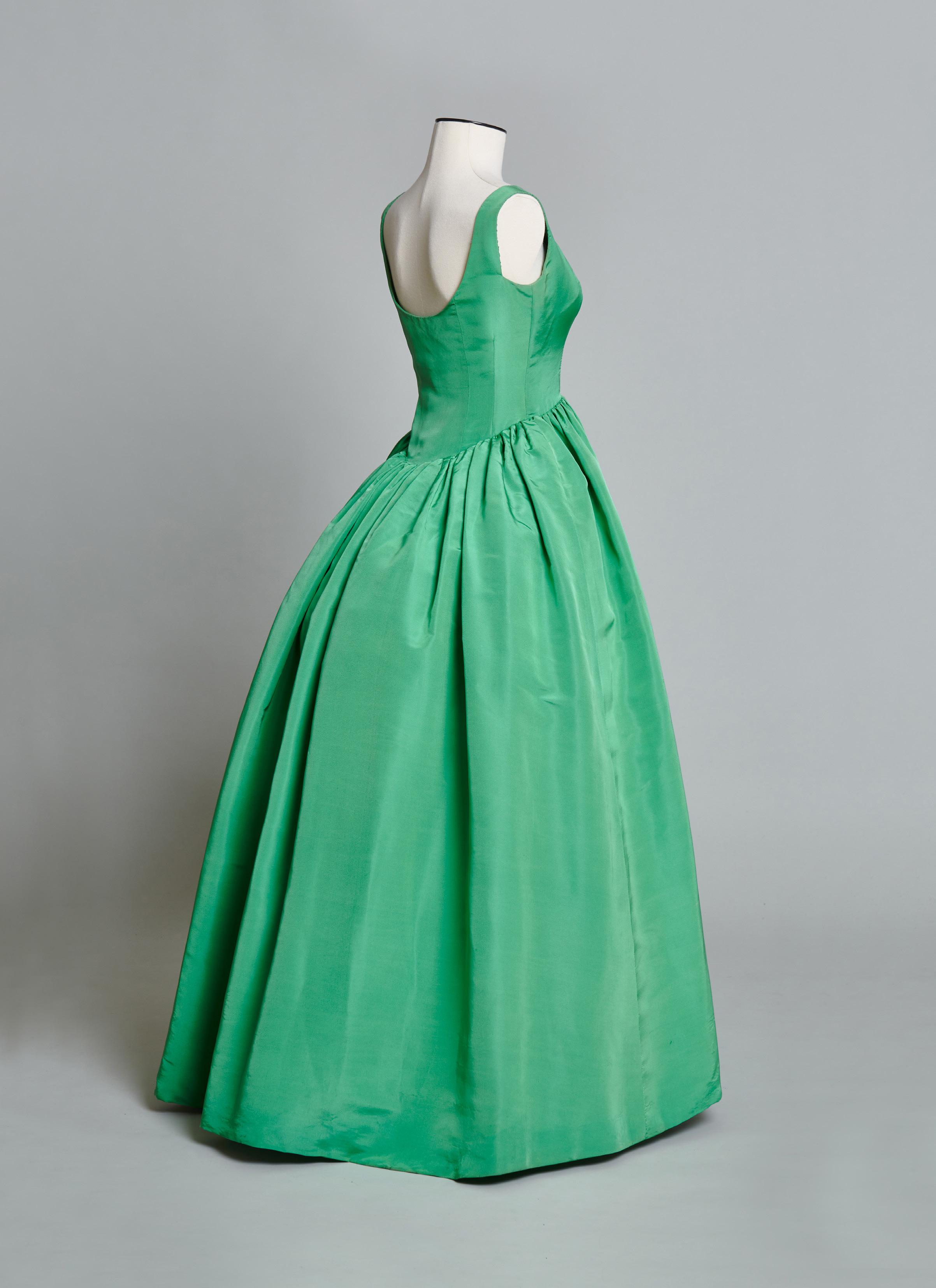
Finding new ways of enclosing and revealing the body within his clothes was key to Balenciaga’s aesthetic philosophy for women. From boleros to shawls and mantles, the designer constantly toyed with the interaction of fit and volume. Throughout the last decade of his career, despite his reputation for inventive geometric precision, Balenciaga also explored the potential of one of the most basic modes of sartorial embellishment, the ruffle, which on this dress is the only foil to the monochrome simplicity of the ensemble. Distilled from the flounces on flamenco dancers’ dresses, ruffles allowed the designer to showcase the inherent light reflecting or absorbing characteristics of the fabrics he preferred such as gazar, moiré, lace, and taffeta. In direct contrast to the precision of his flat seaming, ruffles endowed Balenciaga’s evening garments of the 1960s with a sense of dynamic potentiality and movement; if his straight shifts gave the wearer hieratic severity, ruffles softened and enlivened the edges of the silhouette, allowing line to melt into shadow. Gvasalia has continued to pay tribute to this heritage, issuing a billowing gown in a strikingly similar shade of green for his Fall 2021 couture collection (Look 61).
A photograph by Tom Kublin of his wife Katinka in the original house model, along with a sample of the moiré textile, is in the Abraham Archive at the Swiss National Museum, Zurich (LM 112121.26 and LM 110497.181); see Soie Pirate: The Fabric Designs of Abraham Ltd., vol. 2, pp. 74–75.

FURTHER READING
Blum, Dilys. Shocking! The Art and Fashion of Elsa Schiaparelli. New Haven, London: Yale University Press, 2003.
Frisa, Maria Luisa, Enrica Morini, Stefania Ricci, and Alberto Salvadori, eds. Across Art and Fashion. Florence: Mandragora, 2016.
Ishioka, Eiko. Eiko by Eiko: Eiko Ishioka, Japan’s Ultimate Designer. New York: Callaway Editions, 1983.
Jackson, Lesley. Alastair Morton and Edinburgh
Weavers: Visionary Textiles and Modern Art. London: V&A Publishing, 2012.
Kitamura, Midori, ed. Issey Miyake. Cologne: Taschen, 2016.
Koike, Kazuko. Issey Miyake: East Meets West. Tokyo: Heibonisha, Ltd., 1978.
Labson, Linsey. “Babani: Life and Legacy of a Forgotten Designer, 1894–1935.”
Master’s thesis, Fashion Institute of Technology, 2021.
Magnesi, Pinuccia. Tessuti
d’Autore degli Anni
Cinquanta. Turin: Avigdor, 1987.
Martin, Earl, ed. Knoll Textiles. New Haven: Bard Graduate Center in association with Yale University Press, 2011.
Mayer Thurman, Christa C. Rooted in Chicago: Fifty Years of Textile Design Traditions Chicago: Art Institute of Chicago, 1997.
Pallmert, Sigrid, Barbara Keller, and Karin Wä lchli. Soie Pirate: The Fabric Designs of Abraham Ltd., vol 2. Zurich: Scheidegger & Spiess, 2010.
Palmer, Alexandra. Dior: A New Look, A New Enterprise (1947–57). London: V&A Publishing, 2019.
Staggs-Finchum, Janis. “A Glimpse into the Showroom of the Wiener Werkstätte of America, 1922–1923,” in McFadden, David and Garth Clark, The International Twentieth Century Arts Fair. New York: Brian & Anna Houghton Fair, 1999, 26–35.
Witt-Dörring, Christian. Wiener Werkstätte 1903–1932: The Luxury of Beauty. Munich: Prestel; New York: Neue Galerie, 2017.