CORA GINSBURG

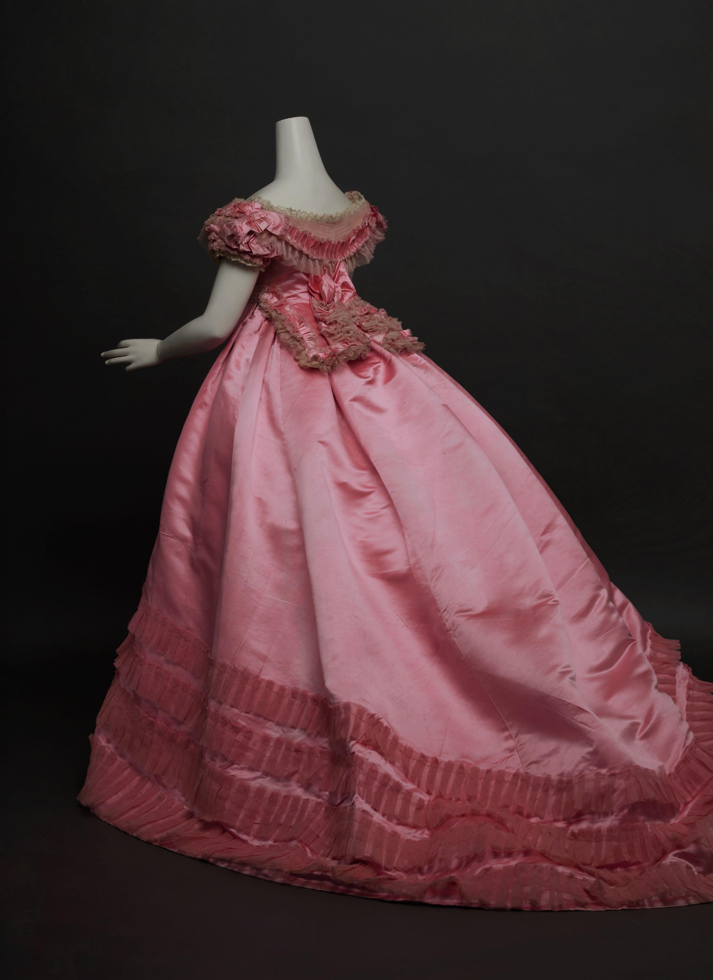
British, ca. 1865
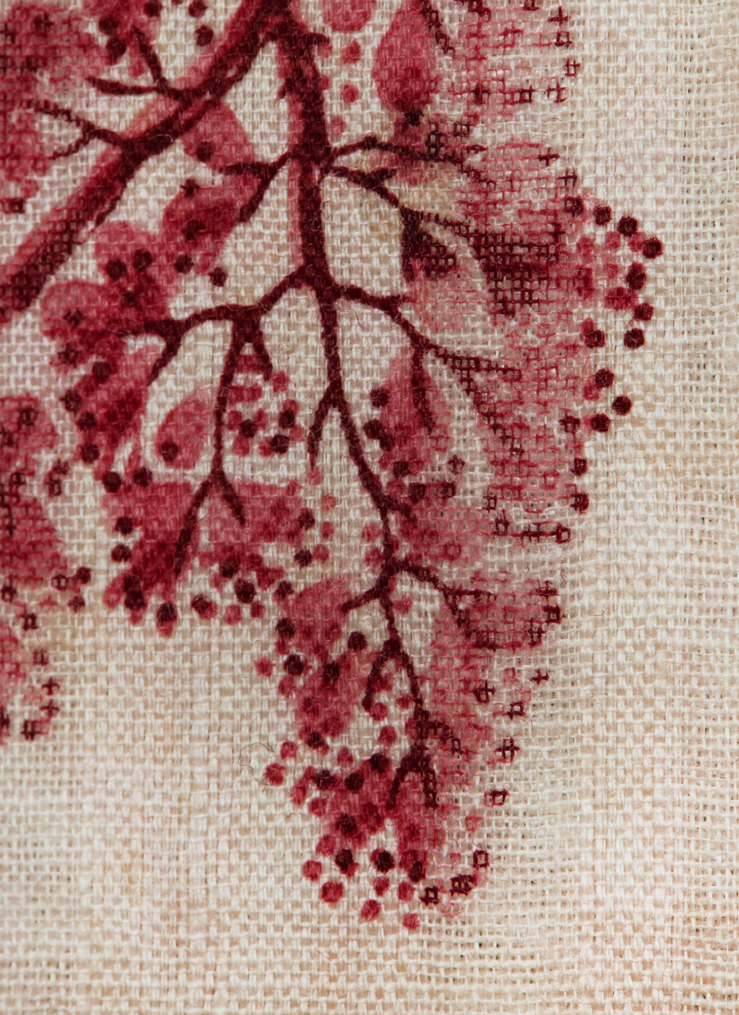
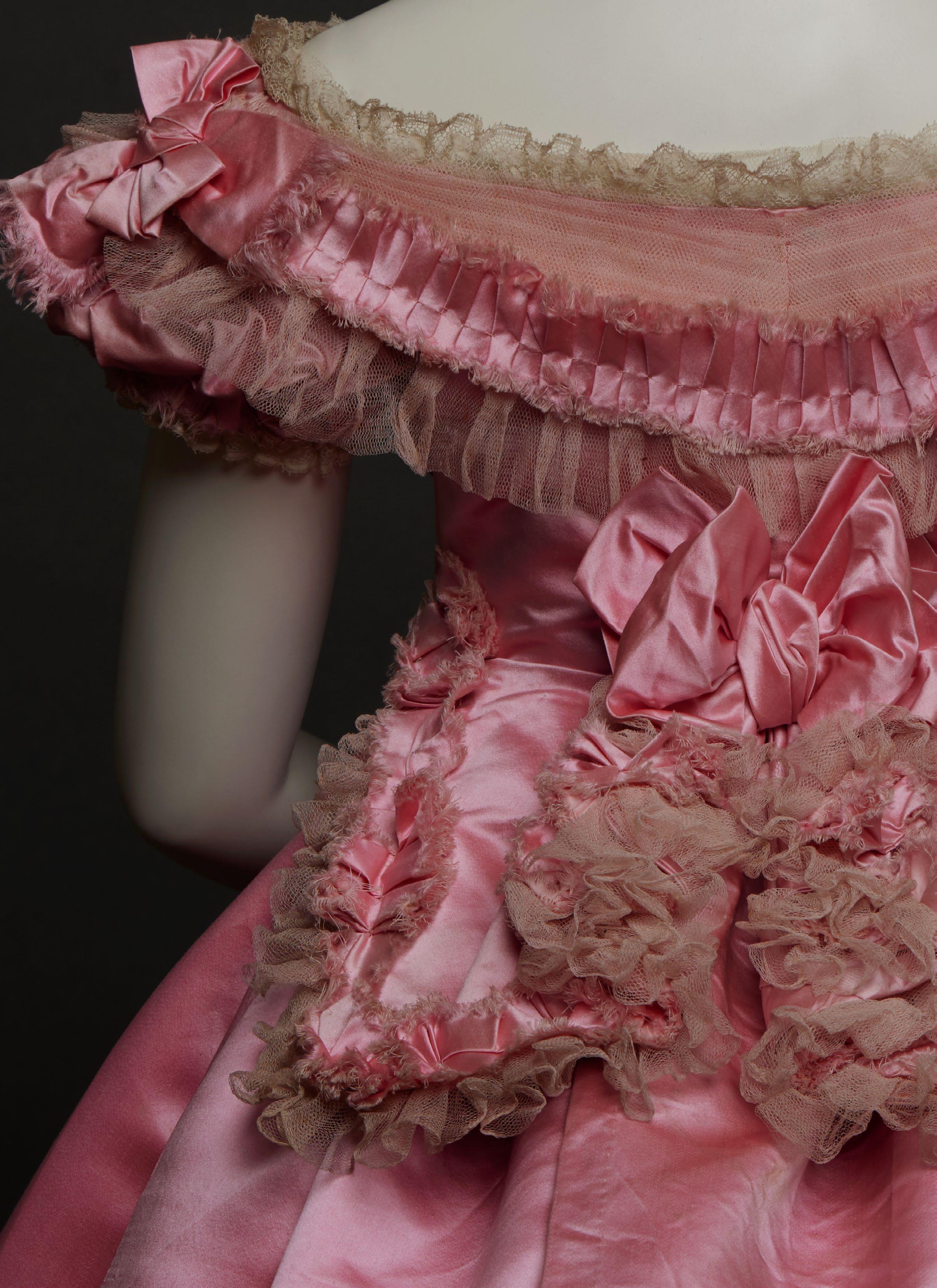
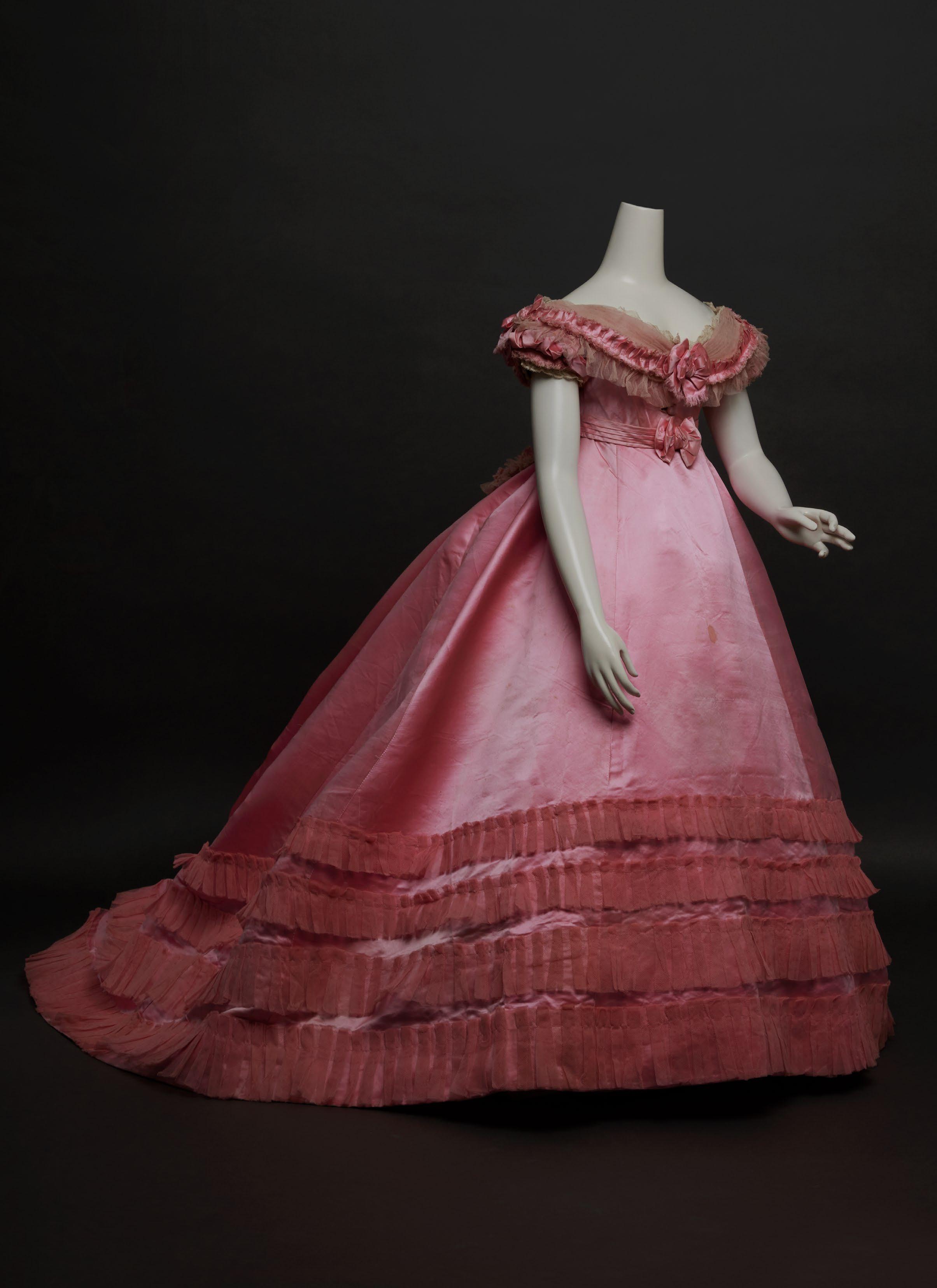
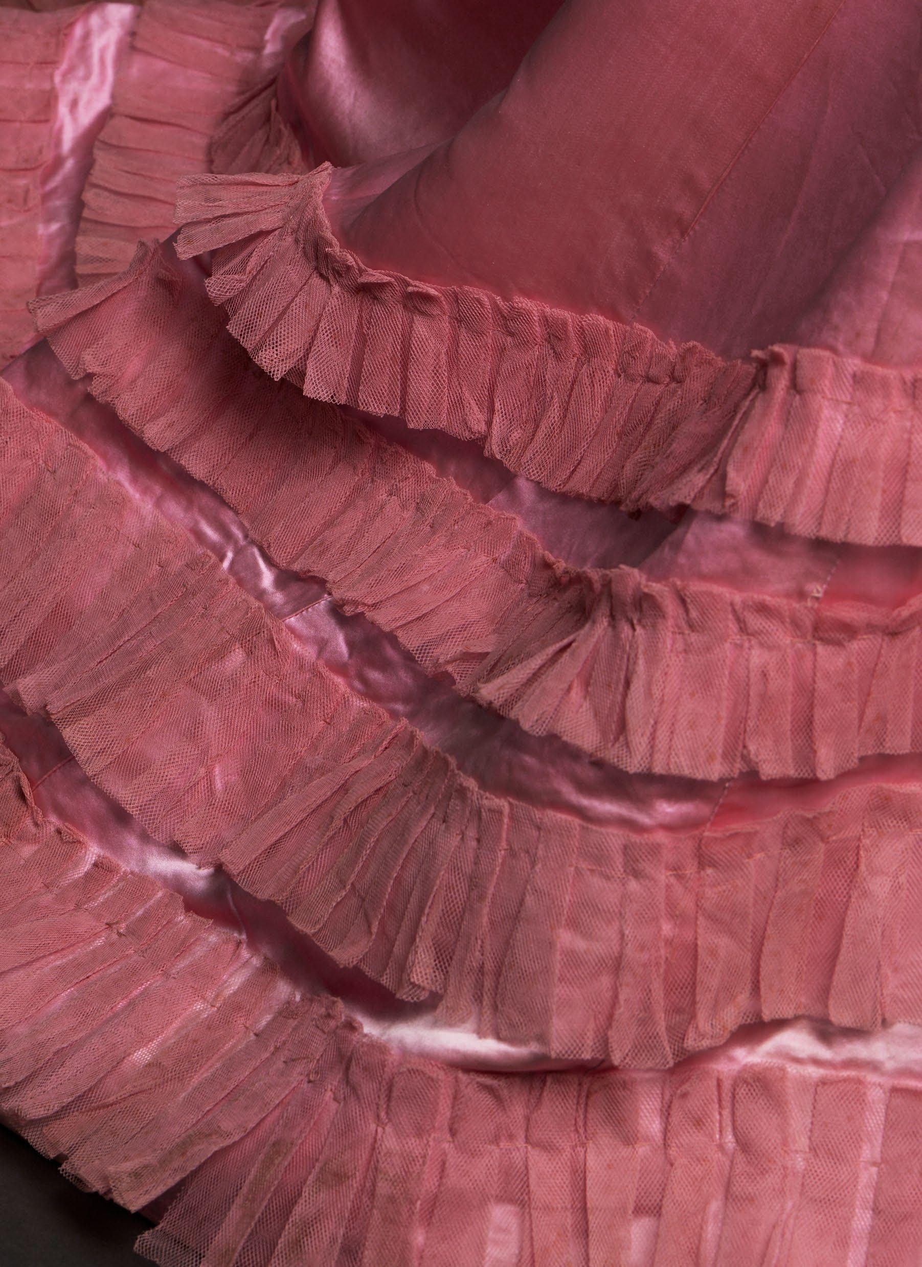
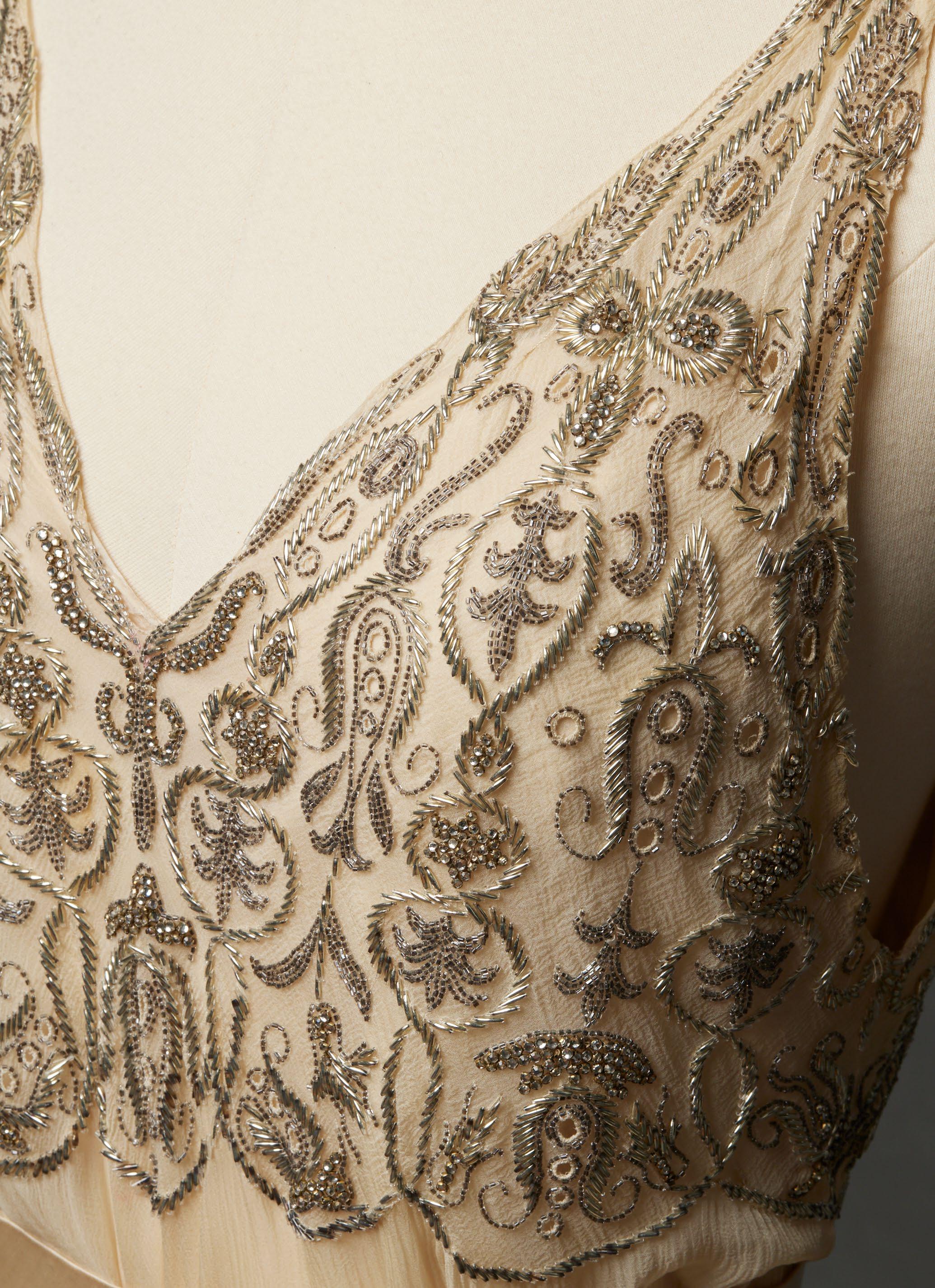
Making her entry into a ballroom, the wearer of this confectionary-like gown that depends on a brilliant shade of pink for its eye-popping effect would surely have drawn attention. The still-vivid color was likely achieved with one of the recently discovered aniline dyes, fuchsine, or magenta, as it was known in Great Britain. First patented by François-Emmanuel Verguin in Lyon in 1858, the color was quickly adopted by stylish women on both sides of the Channel. Despite the widespread popularity of these glaring novel hues, however, fashion editors often cautioned women to use them sparingly in the form of ribbons or other color accents in an ensemble, or to soften their intensity with neutral shades. In February 1864, the Englishwoman’s Domestic Magazine illustrated a “ball toilet” having an underskirt of magenta silk with matching roses overlaid with “a veil or upper-skirt of spotted [white] tulle or tarlatane.” Presumably, the wearer of this magenta dress—relieved only by off-white tulle on the bodice—fully appreciated the visual impact of her evening toilette.
The gown’s features of a low, off-the-shoulder neckline, frothily trimmed bodice with box-pleated satin ribbons, pleated and ruched tulle, prominent satin rosettes, and narrow bobbin lace edging, along with a high, round waist and gored, trained skirt are consistent with fashion plates depicting formal attire of the mid-1860s and correspond to the latest style updates conveyed in periodicals. The Englishwoman’s Domestic Magazine refers to berthas, ruches, tulle draperies, and ribbons, and, in May 1863, the editor noted the fashion for bodices with a “jacket tail behind,” known as a corsage postillion, all as seen here. The magazine also championed the new “short waists,” which, despite “meet[ing] with strong opposition … are sure to win the day at last.” In contrast to the effervescent applied decoration on the upper body, the plainness of the expansive skirt, supported by a cage crinoline, maximizes the satin’s dazzling color and sheen, while the matching tulle flounces at the hem, graduated in depth, accentuate its dramatic sweep. The gown’s silky luxuriance epitomizes the Englishwoman’s Domestic Magazine declaration in March 1863 that “satin is coming very much into favour again both for morning and evening wear, but more particularly for full toilets; trimmed with lace and bouillonnés [puffs] of tulle, no prettier style of grande toilette can be imagined; there is a richness and elegance about satin which cannot be obtained with other fabrics.” In February of the following year, the magazine reiterated that satin was still “much in vogue” for ball dresses and informed readers that although “each lady dresses according to her own taste … almost the only rule which cannot be broken through is that of the crinoline and the long and ample skirt.”
If the wearer followed the advice of the Englishwoman’s Domestic Magazine proffered by the fashion editor in the same issue, she may have accessorized her opulent ball gown with matching “silk boots with rather high heels” that were considered “more elegant than the shoe” and a necklace, deemed “quite indispensable now with low dresses” in December 1865.
A bright-pink silk faille evening dress by Maison Vignon, Paris, dating to the mid-1860s with a basqued bodice and deep band of self-fabric trimming at the hem was sold by Augusta Auctions in August 2018 (lot 215). A pink silk taffeta gown of about 1864, also
BALL GOWN OF SILK SATIN AND TULLE
French, with a similarly trimmed bodice is in the collection of the Metropolitan Museum of Art (1979.346.119a–d). And a coral-pink silk faille formal dress trimmed with tulle and seed pearls by Emile Pingat, purchased by Mary DeCamp Corning in Paris around 1867, is at the Albany Institute of History and Art (1972.95.2).
MM
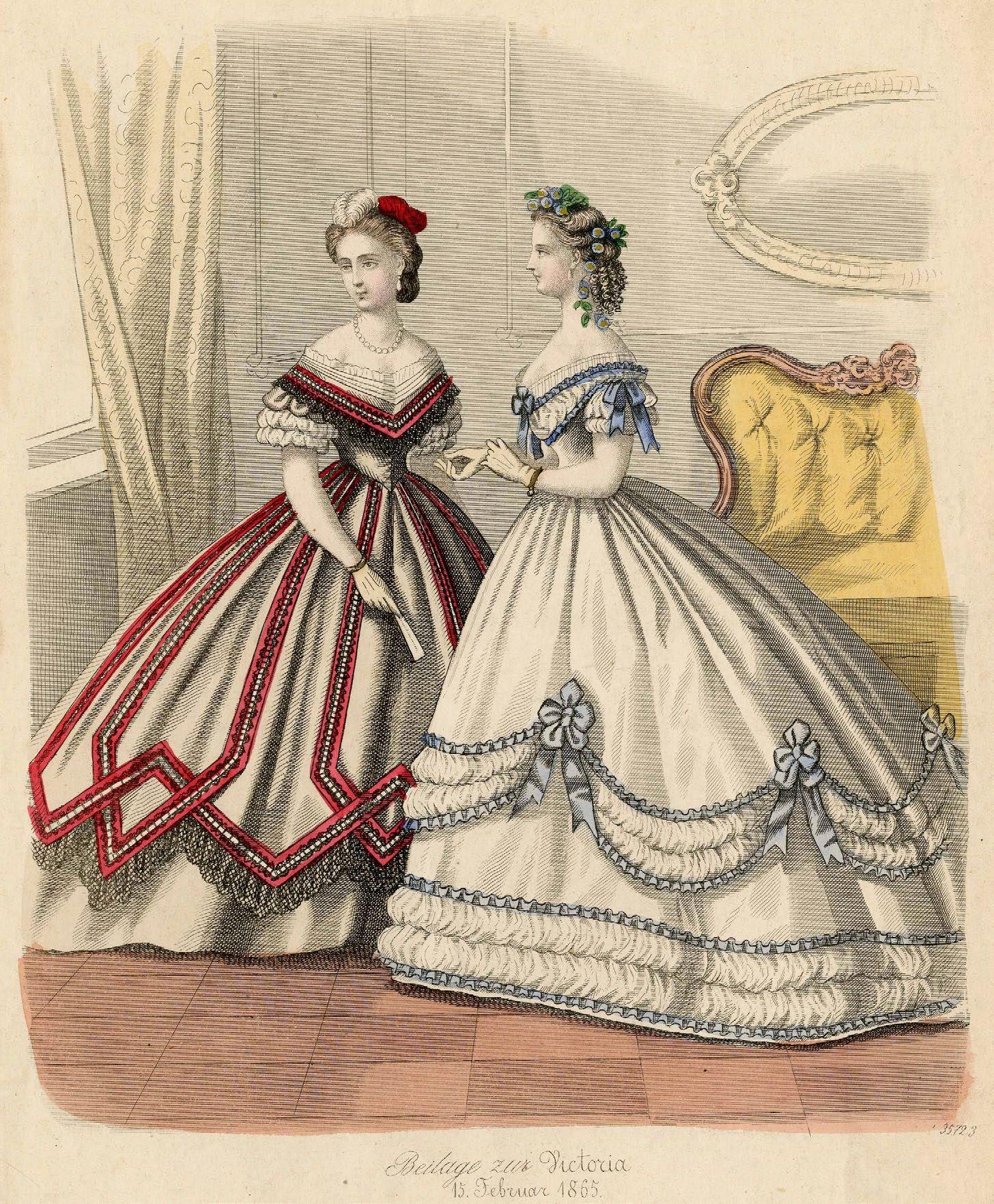
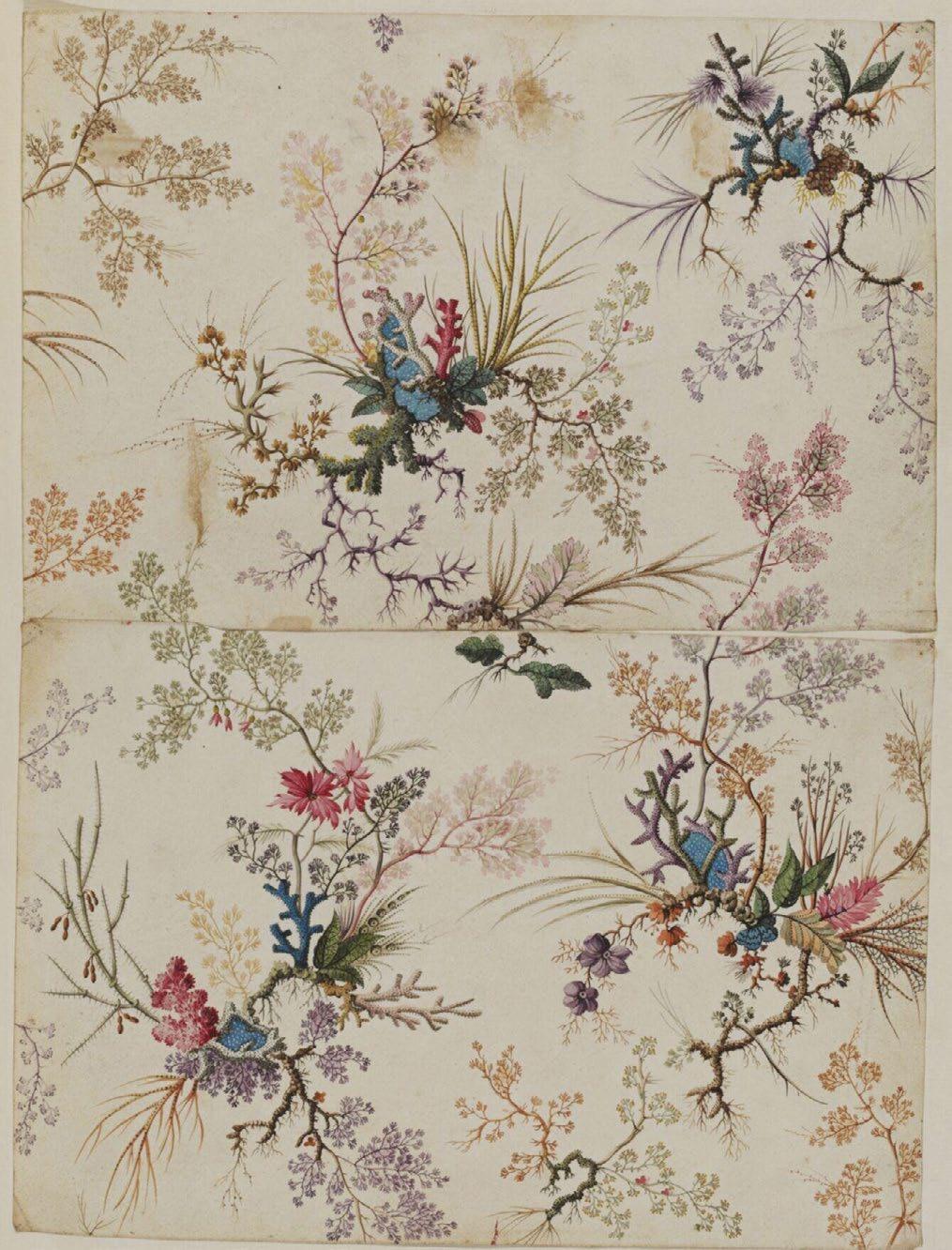
FIG. 1
Beilage zur Victoria, February 15, 1865, hand-colored lithograph.
Irene Lewisohn Costume Reference Library, Metropolitan Museum of Art
MADELEINE VIONNET
Evening dress of embroidered silk chiffon, the embroidery probably by Lesage French (Paris), Fall/Winter 1938
Created a year before she closed her house in 1939, Madeleine Vionnet’s ethereal evening dress, with its milky color and softly draped silk chiffon, reflects the couturiere’s longstanding fascination with garments inspired by Greek antiquity, her exploration of the relationship between fabric and the female body, and her use of embroidery as embellishment.
The gown is constructed from a separate bodice and skirt comprising two bias-cut lengths of chiffon joined at the sides with curved piecing at the front and back hem. The delicate embroidery, executed primarily in beveled, silvered beads, both tapered and short—a specialty of the 1920s and 1930s—and faceted strass, is likely from the Parisbased workshop of Albert Lesage, who, in 1924, took over the preeminent firm of Albert Michonet. Lesage’s wife, née Marie-Louise Favot, had previously been employed by Vionnet, and the couturiere collaborated frequently with the company from about 1925. Stylized leaves and star shapes enclosed within contiguous roundels and ovals, elongated floral sprigs, curlicues, openwork, and a scalloped edge cover the bodice. A narrow coordinating band encircles the hem. The women who carried out the chain-stitch embroidery were known as “Lunévilleuses,” a reference to the French town of Lunéville, long known for its production of white-on-white tambour work utilizing a hook introduced there around 1810. In the mid-1860s, a local manufacturer added beads and sequins to his embroideries, stitched from the reverse side of the fabric—an innovation that resulted in a commercial boom. During the interwar years of the twentieth century, Lunéville embroidery dominated the Lesage ateliers. In Vionnet’s gown, the beads were applied using this technique, while the faceted strass stars were secured with a needle from the front. The bodice and hem would have been embroidered to shape in the Lesage workshop and returned to Maison Vionnet to be made up into the gown. The couturiere’s distinctive label with her thumb print and logo is sewn to the inside right proper seam of the accompanying two-layered bias-cut slip of matching chiffon over crepe-back satin.
Although by 1938 a pronounced late nineteenth-century influence was evident in Paris high fashion in the form of leg-of-mutton sleeves, tight-fitting bodices, and elaborate, bustled skirts, especially for evening wear, Vionnet’s designs continued to attest to her longstanding preferred aesthetic. In April 1938, Femina illustrated a draped halter-neck gown by the couturiere and extolled “the statue line in which that great, marvelous artist Madeleine Vionnet always excelled … ennobling the art of clothing, bringing it closer to ancient beauty.” In repose, the dress presents a columnar silhouette; when the wearer moved, however, the deceptively full lightweight skirt would have flowed around her body, gently weighted by the embroidered band at the hem.
A drawing of the dress showing front and back views (model 4595), created in the atelier of Yvonne and identified as “Robe mss [mousseline] blanche brodée,” is preserved in the Bibliothèque Historique de la Ville de Paris. Two similar chiffon evening dresses—one with a strass-embroidered halter-neck bodice and the other with a Chantilly lace bodice and circular-cut flounces at the shoulders—from Vionnet’s Summer 1938 collection are in the collection of the Museé des Arts Décoratifs (2020.7.1, UF 52-18-112 AB).
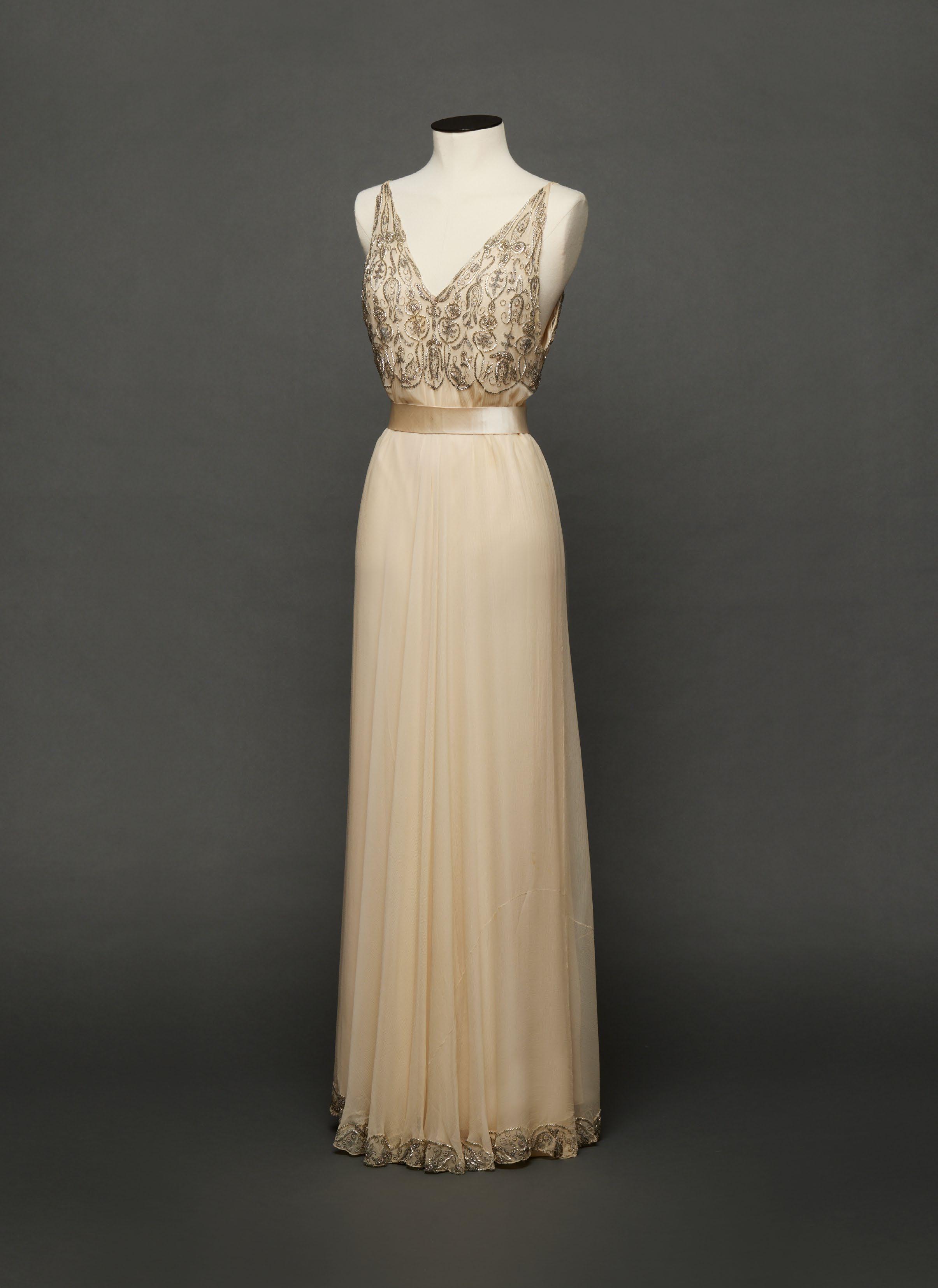
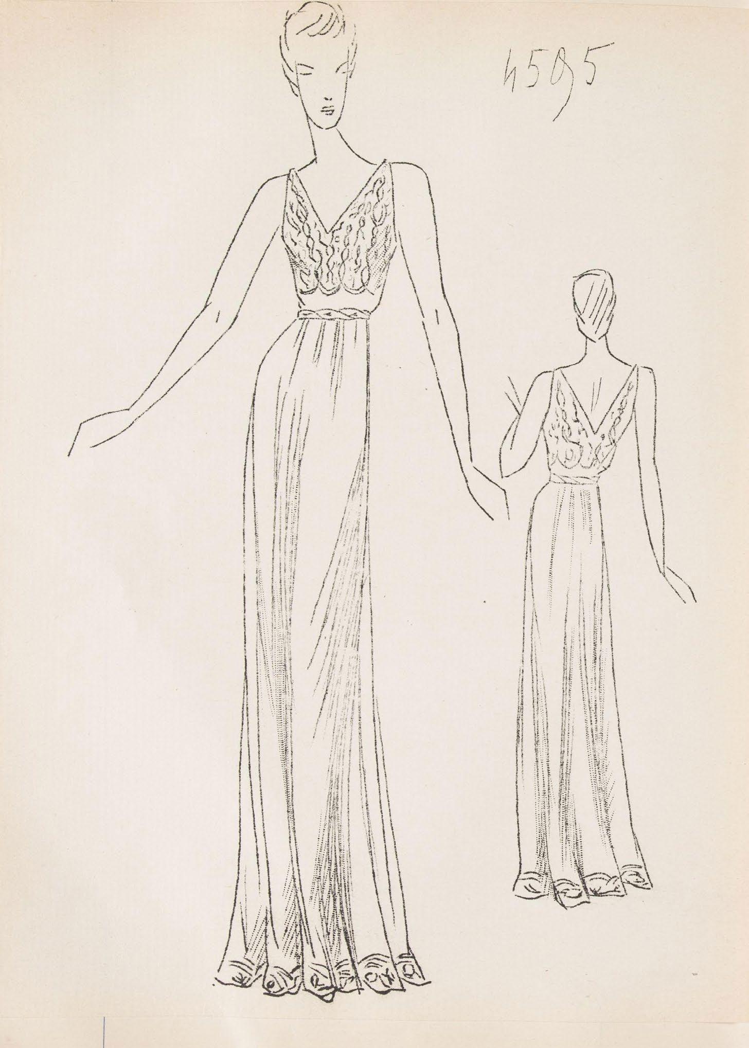
FIG. 2
“Robe mss blanche brodée,”
Croquis Hiver 1938–39, ink on paper.
Bibliothèque Historique de la Ville de Paris, 8-ICOR-0104, fols. 48r–49r
CLABBURN, SONS, AND CRISP
Jacquard-woven “cashmere” silk shawl
English (Norwich), ca. 1851
70 x 70 in.
From the Middle Ages, the city of Norwich occupied an important position within East Anglia for manufacture and trade. A thriving textile industry developed in Norwich, facilitated by access to the nearby port of Great Yarmouth and road transport to London by carter’s wagon. The accomplished workforce was partly due to the influx during the seventeenth century of Huguenot refugees, including Protestant weavers fleeing the Low Countries and France who brought with them their expertise and helped to make Norwich the premier locale for the production of textiles.
By the nineteenth century, Norwich had also established itself as a prolific manufacturing center for silk and half-silk (silk warp and wool weft) shawls, an essential item of dress for every woman of means. Norwich’s export markets included Italy, Spain, Portugal, Russia, the Low Countries, Scandinavia, the United States, and even France, despite prohibitive trade barriers and the Continental Blockade (1806–1814).
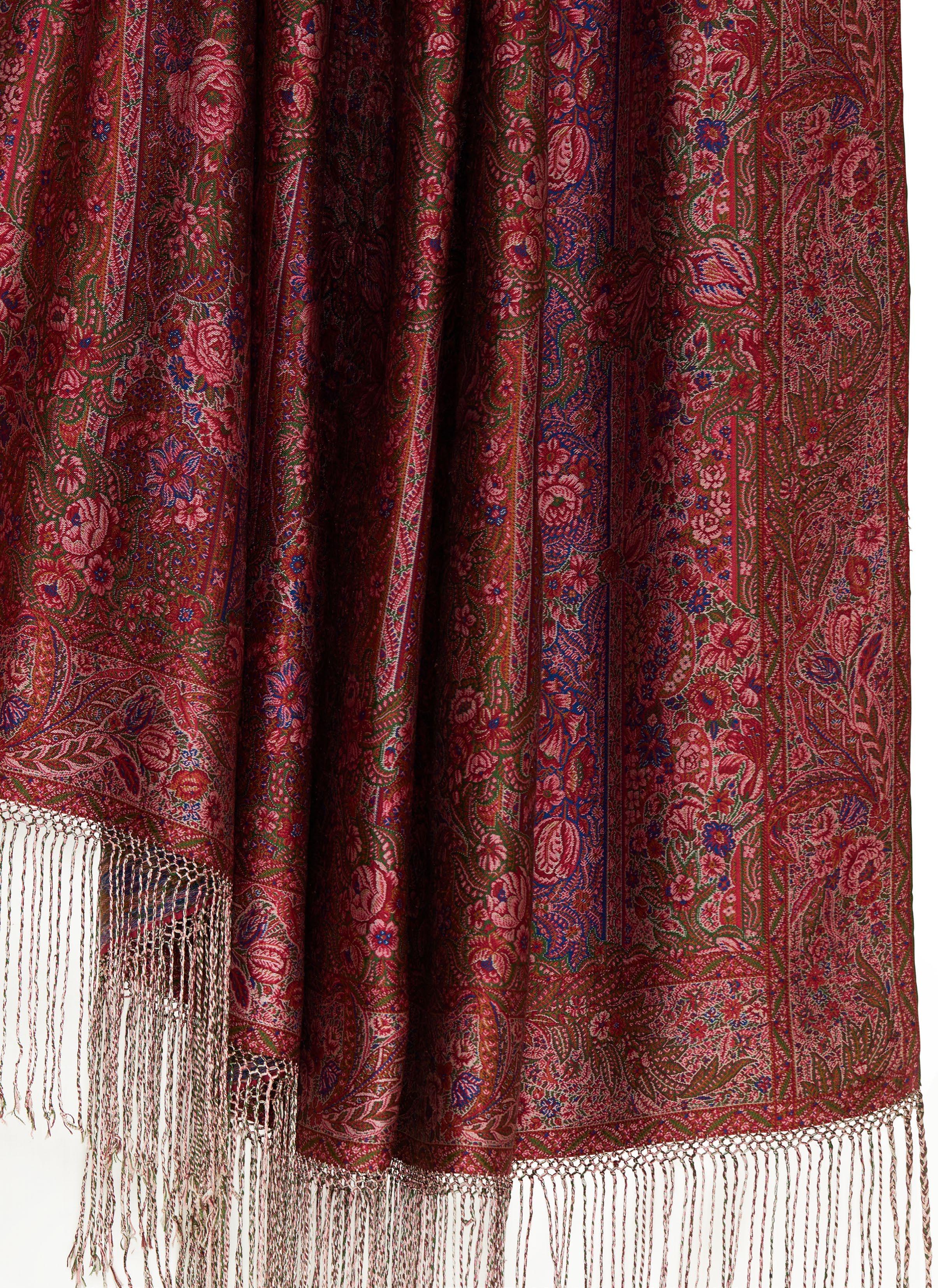
As the fashionable silhouette changed and skirts widened between the early and midnineteenth century, the shawl grew larger. Until then, Norwich shawl patterns had generally been traditional small floral or pine motifs. Between 1849 and 1851, a new wave of realistic flower designs, known as the style végétal, emerged This is perhaps best illustrated in the present shawl, an exceedingly rare example of the highest-quality shawls produced in Norwich—this one by the firm Clabburn, Sons, and Crisp. Here, in the earliest known example in British woven shawl design, we see recognizable flowers, including roses, lilies, tulips, and foxgloves—some nestled within botehs. Ground stripes in the design further indicate the manufacturer’s distinctive style, found in later, more typical Clabburn products. However, the overlaying scrolls and flowers have not been previously seen in extant shawls.
The fineness of the materials and the technical complexity mark this “cashmere” shawl—a term then commonly used for both wool and silk shawls—as a tour de force of Norwich weaving. The shawl is woven in weft-faced twill with an extra binding warp. Uniquely, the warps do not form the fringes, which was the standard way of finishing these shawls. Here, the warp ends are turned over and finely stitched down, then fringes are made by adding groups of silk threads, which are subsequently organized into a macramé heading, and, finally—again, uniquely—plaited. To illustrate the meticulous care taken, the three outermost plaits at each end have double the number of threads, composed of twelve threads forming three-strand braids. The needlework attaching them is exemplary, the utmost precision having been taken to space the fringes at regular intervals. The selvedges are doubled back and finely stitched down. This feature may be that which Clabburn, Sons, and Crisp patented in 1855, when William Clabburn registered a patent for “Improvements in the Manufacture of Shawls and Scarfs,” which enabled shawls to be woven obviating the need to clip the superfluous threads from the back. The reverse, with its mass of brilliant silk threads, makes a hazy show of no fewer than eight mingled colors.
Clabburn, Sons, and Crisp specialized in fine shawls woven entirely of silk. Between 1844
and 1849, the Norwich textile manufacturer Clabburn and Plummer registered twenty-nine designs with the Patent Office. This partnership was dissolved on January 15, 1851. It is possible that the design for this shawl was made by Clabburn & Plummer around 1850 but was not realized until after the firm transformed into Clabburn, Sons, and Crisp the following year. Between 1852 and 1872, Clabburn, Sons, and Crisp registered eighteen shawl designs. The company won many awards for their products and presented some as special gifts: for instance, to Princess Alexandra of Denmark when, in 1863, she married Edward, the future king of England.
The company appears to have never registered the design for this shawl. Because of how complicated and prohibitively expensive it would have been to weave—out of reach to all but the highest echelons of society—there would not have been any benefit to registering the design to protect from piracy. Similarly, the firm’s closest comparable shawl was exhibited at the 1851 Great Exhibition and was said to have been acquired by Queen Victoria. A registration for this design has also not been found. The Art Journal Illustrated Catalogue: The Industry of All Nations 1851 of the Great Exhibition illustrates the shawl and describes:
a rich figured CASHMERE SHAWL manufactured by Messrs CLABBURN, SONS, AND CRISP, of Norwich, which, we understand, was purchased by the Queen. It is a first attempt, in Norwich, at shawl-weaving in a Jacquard loom. For fineness of texture, variety and beauty of colours, and elegance of pattern, it cannot be surpassed.
Other textile manufacturers had adapted the jacquard mechanism as early as the 1830s, but it was expensive and cumbersome and, thus, little used. So the Queen’s shawl and possibly this example may have been among the earliest attempts, rather than the “first,” by a Norwich firm to weave these complex shawl designs on the jacquard loom.
The two shawls share important and singular design features that set them apart from not only the rest of the oeuvre of Clabburn, Sons, and Crisp but also much of European shawl weaving at that time: the allover small repeat pattern, measuring fourteen-and-a-half inches here, with highly naturalistic florals and superimposed rococo flourishes, and the carefully plaited fringes attached by macramé. While later 1860s shawls by Clabburn, Sons, and Crisp have fringes of loose silk threads attached by macramé, the fringes are unplaited, as seen on four shawls at the Art Institute of Chicago (2005.435, 2005.436, 2005.437, 2005.438).
Altogether, the close stylistic and technical similarities between the Great Exhibition shawl and the present shawl suggest that Clabburn, Sons, and Crisp may have also woven this example as a one-off trial piece never intended to go into mass production, or as a second exhibition piece destined for the 1851 Great Exhibition.
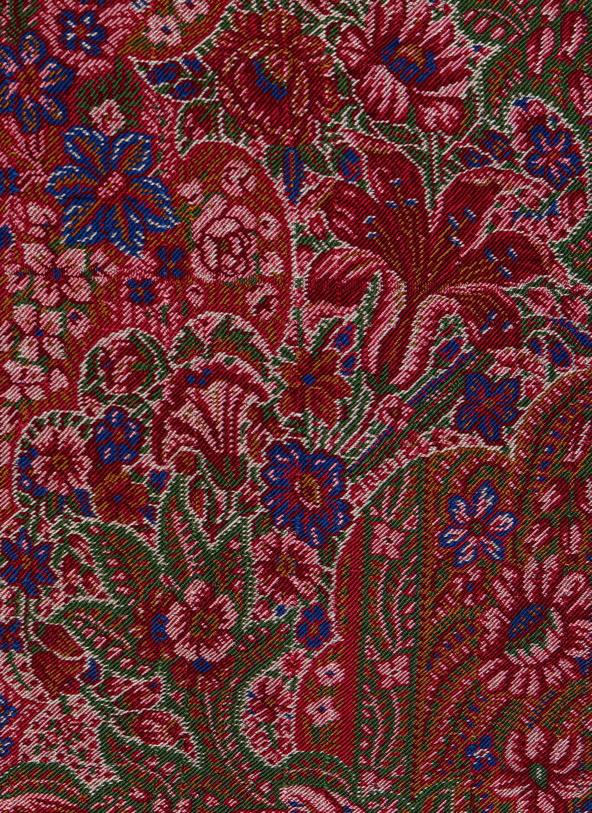
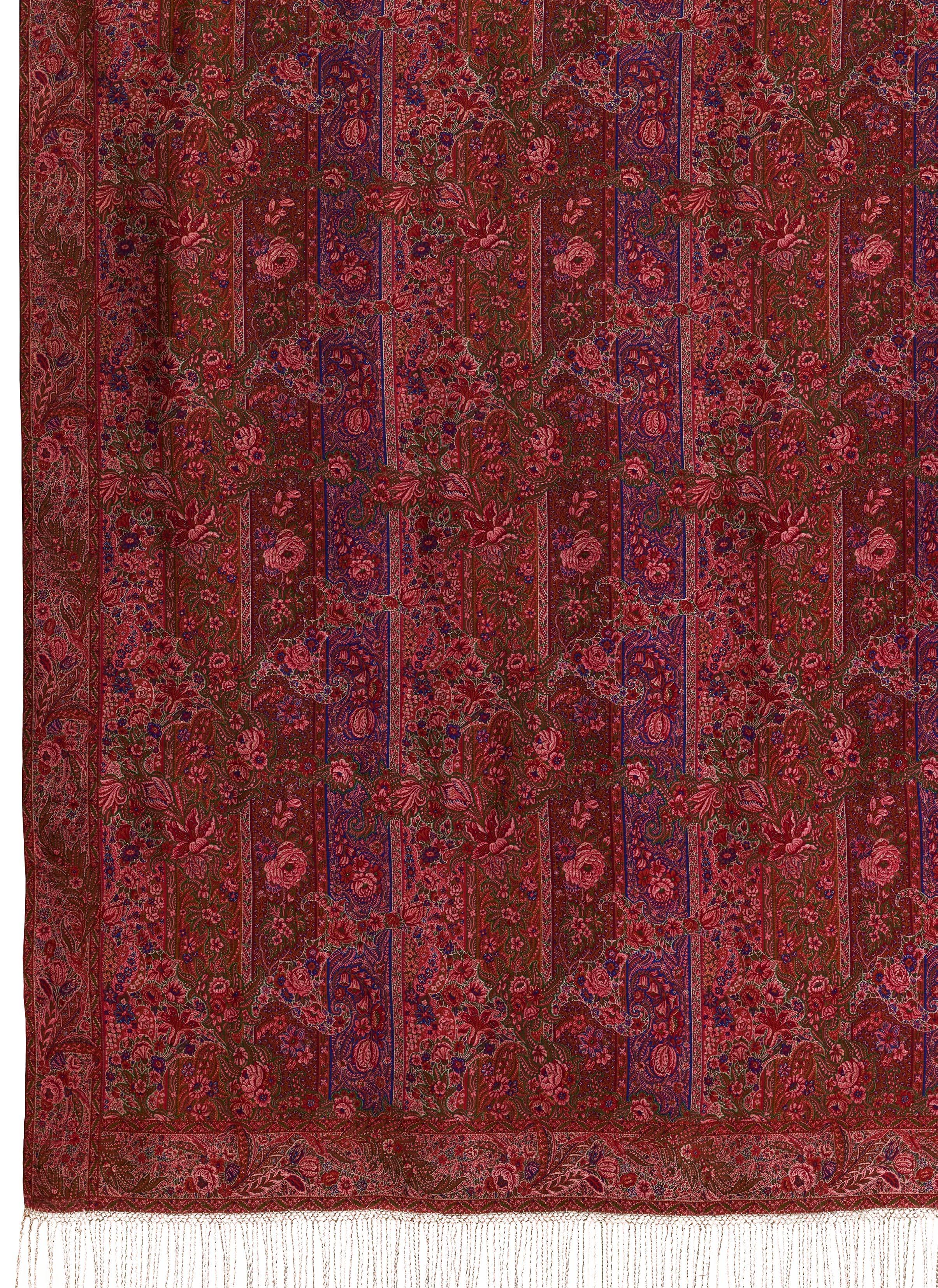
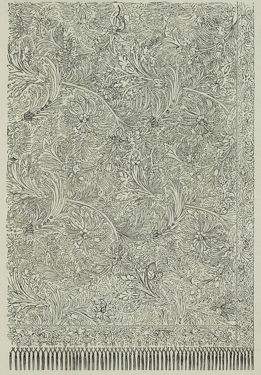
FIG. 3
The Art Journal Illustrated Catalogue: The Industry of All Nations 1851, p. 326. Heidelberg University Library
WILLIAM KILBURN
Block-printed cotton from a dress
British (on Indian cotton), ca. 1787–90
52 x 39 ⅝ in.
Writing of William Kilburn’s printed cottons, Charles O’Brien, one of his former employees, maintained, “His patterns for 1790 … excelled what any other printer exhibited, and is particularly noted here, as being an instance of what might be done were Printers not confined to a certain expence; for the cutting of them is such that no other Printer could or would execute them.” These panels and an accompanying bodice from a dress of Kilburn’s block-printed muslin clearly reveal that O’Brien’s praise was not mere hyperbole. A masterpiece of design and execution, Kilburn’s print touches the limit of what it is possible to achieve with skilled hand block cutting and lightfast natural dyes.
Kilburn was born in Dublin in 1745, the only son of architect Samuel Kilburn. Showing an early talent for drawing, he was apprenticed at Leixlip where Samuel Dixon established a calico printworks in June 1758. Dixon was a watercolor artist with a reputation for flower pieces “exactly designed from Nature,” and his “Picture Ware-House” was in Capel Street where the Kilburns lived. Dixon decided to stop printing at Leixlip after the death of his partner in 1764, going to London to start a picture shop. This was late in Kilburn’s apprenticeship, and he accompanied his master to London. There, Kilburn found a ready sale for his print designs, also making the acquaintance of the botanist William Curtis who engaged him to execute plates for his Flora Londinensis. After contributing to Curtis’s first volume between 1775 and 1777, Kilburn accepted an offer of partnership in a calico printing works in Wallington with James Newton in which he was able to have a share of the profits without advancing capital. His success was such that, at the end of 1784, he was able to purchase the concern and become sole proprietor.
The Wallington works was a fairly modest setup. Insurance records show a “colour house” with a blockcutting shop above, two small adjoining
FIG. 4
William Kilburn, Design from an album, ca. 1787–90, watercolor on paper. Victoria & Albert Museum, E.894:60-1978
buildings, and “Printing & Pencilling shops,” with an adjoining folding loft, stove room, and nearby warehouse. Far exceeding the value of the buildings and equipment were the finished stock and goods awaiting completion within them, insured in 1786 for over £3000. However, Kilburn’s profits in the succeeding years were cut into by copyists who produced cheaper versions of his luxury-market designs. In retaliation, Kilburn spearheaded a petition to recognize ownership in original designs that led to a bill granted by Parliament in 1787, the first copyright of design. Under examination, the London warehouseman Ralph Yates admitted sending Kilburn’s patterns to Peel and Company at Bury from whom he would receive the copy ten days later, to be offered for sale at 4s.9d. per yard.
Kilburn’s prints were chiefly marketed by the Cheapside drapers Brown, Rogers, and Co. When Kilburn married Elizabeth Brown in May 1785, Thomas Brown, principal of the firm, became his father-in-law. Kilburn’s patterns, at the height of their fame, sold for a guinea a yard. The character and quality that attracted such high value are fully witnessed in this example. Nine printed mordant colors are used (black, red, rose, pink, violet, lilac, yellow, buff, and olive) each requiring its own printing block. After dyeing in madder and in a yellow dyebath, blue features were added by block, finishing off with pencilling (hand painting) in blue and yellow. There are limits to how thin a line can be carved in a woodblock that has to withstand repeated pressure while wet, and that fineness is displayed here in exquisitely constructed naturalistic branches. Complementing the fine carving is fine pin work used to give texture and form (rather than shading). Kilburn’s blocks are functionally integrated rather than the typical outline block merely infilled with color; here, each block contributes to building the design.
Original conception and masterful printing are further enhanced by the choice of a superior cloth, a handwoven Indian muslin of superfine quality, thirty-nine-inches wide (nominally “yard and half quarter”). Under magnification, it can be seen that the cotton yarns are spun with exceptional uniformity, possibly the work of a single, highly accomplished hand spinner. In the weave, paired warps in a symmetrical arrangement of three widths create denser stripes that contrast with the open muslin areas. The printed colors show more strongly where they fall on the striped areas, drawing attention to the transparency of the adjoining fabric.
The repeat is based on a classic diamond half-drop arrangement. Featured within are four floral clusters, each with delicate stems gyrating outward from a denser core of gnarled roots or coral-like branches. These delicate forms depict fine filamentous forms of seaweed of the genus Confervae (actually freshwater algae). Especially prominent is the red Conserva coccinea (now Heterosiphonia plumosa). Seaweed is particularly associated with Kilburn’s designs around 1790. At that time, the British aristocracy had been greatly shaken by the French Revolution; the seaweed theme seems intended to evoke Britain’s strength as an island nation, safely separated by the sea from its chaotic neighbor.
Against a background of rising competition from cheap Lancashire prints, and fashion changes that began to confine luxury prints to border patterns, Kilburn gave up printing in 1802. Announcements for the auction sale of his works include mention of “a confiderable quantity of original drawings and books of drawing.” A bound album of such designs that was assembled after Kilburn’s death in 1818, possibly as a memorial, is now in the Victoria & Albert Museum (E.894-1978). On page sixty is mounted the original
body-color design for the pattern printed on the striped muslin. This design testifies not only to Kilburn’s high standard of draughtsmanship but to the fidelity with which the printing blocks were cut. A memoir written in 1832 evokes Kilburn at his drawing table: “Above six feet in height, thin, but well proportioned. … The pencil, in his long fingers, appeared scarcely to touch the paper when drawing, so much had he acquired of grace and freedom.”
A dress in the collection of the Fashion Museum Bath exhibits a simpler floral trail and sprig pattern printed on the same striped Indian muslin (BATMC I.09.54) and is related to a design on page thirty-four of the Kilburn album. The Victoria & Albert Museum holds a dress printed on British muslin with a fine seaweed pattern (T.84-1991) whose design also features in the Kilburn album on page forty-nine. A dress of the 1820s, also on British muslin, at the Vestry House Museum, Walthamstow, (unaccessioned) may be printed reusing Kilburn blocks.
PS
FIG. 5
Bodice, the cotton by William Kilburn, British (on Indian cotton), ca. 1787–90. Cora Ginsburg LLC
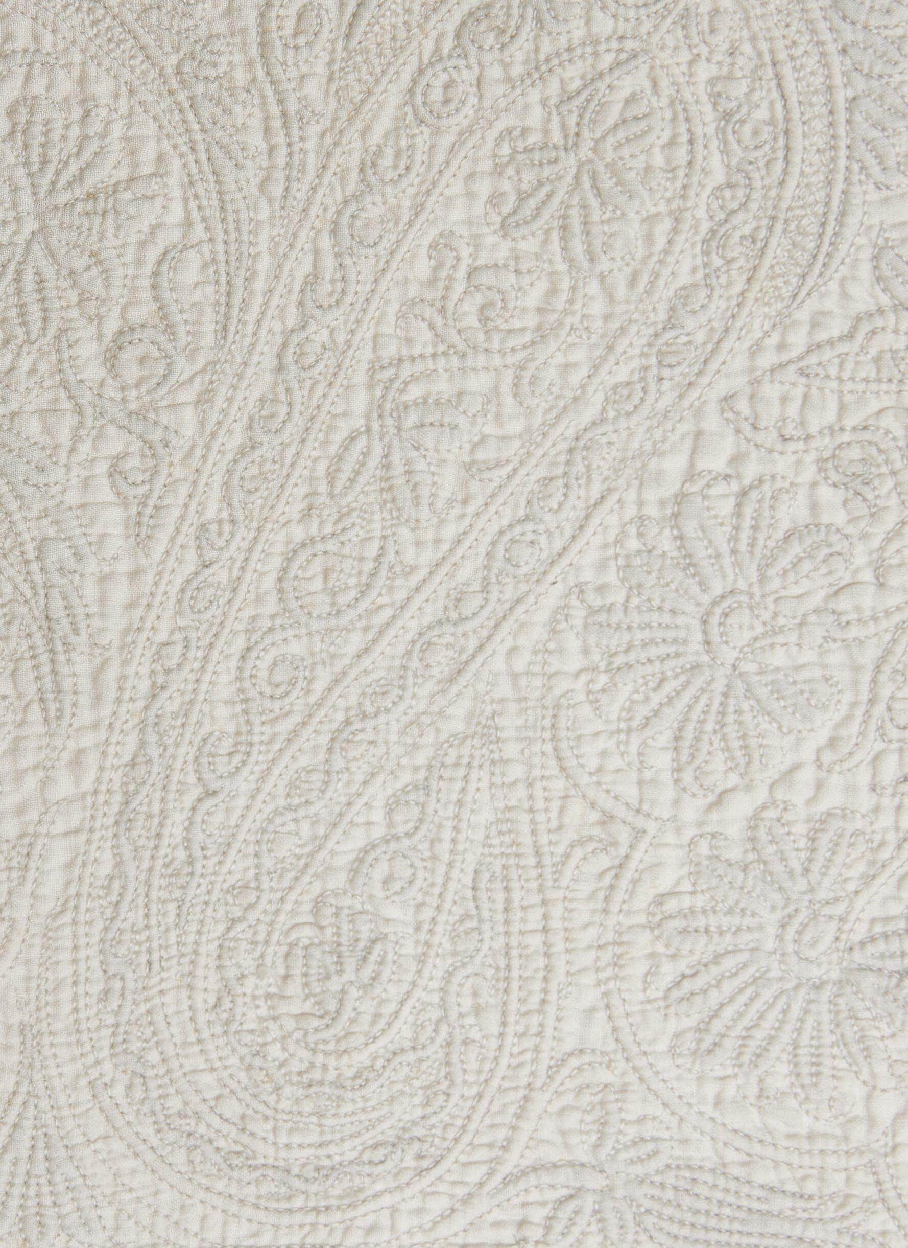
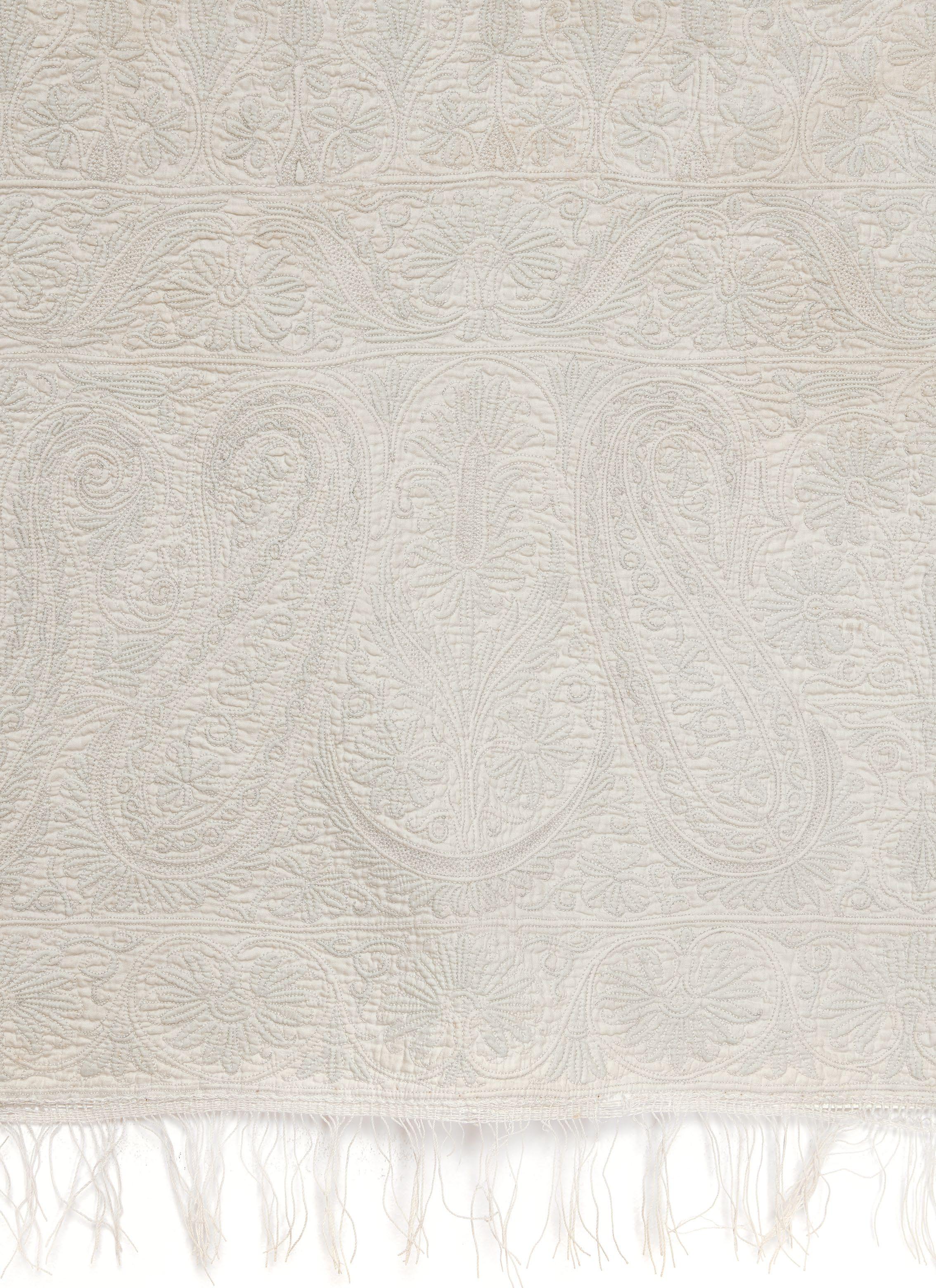
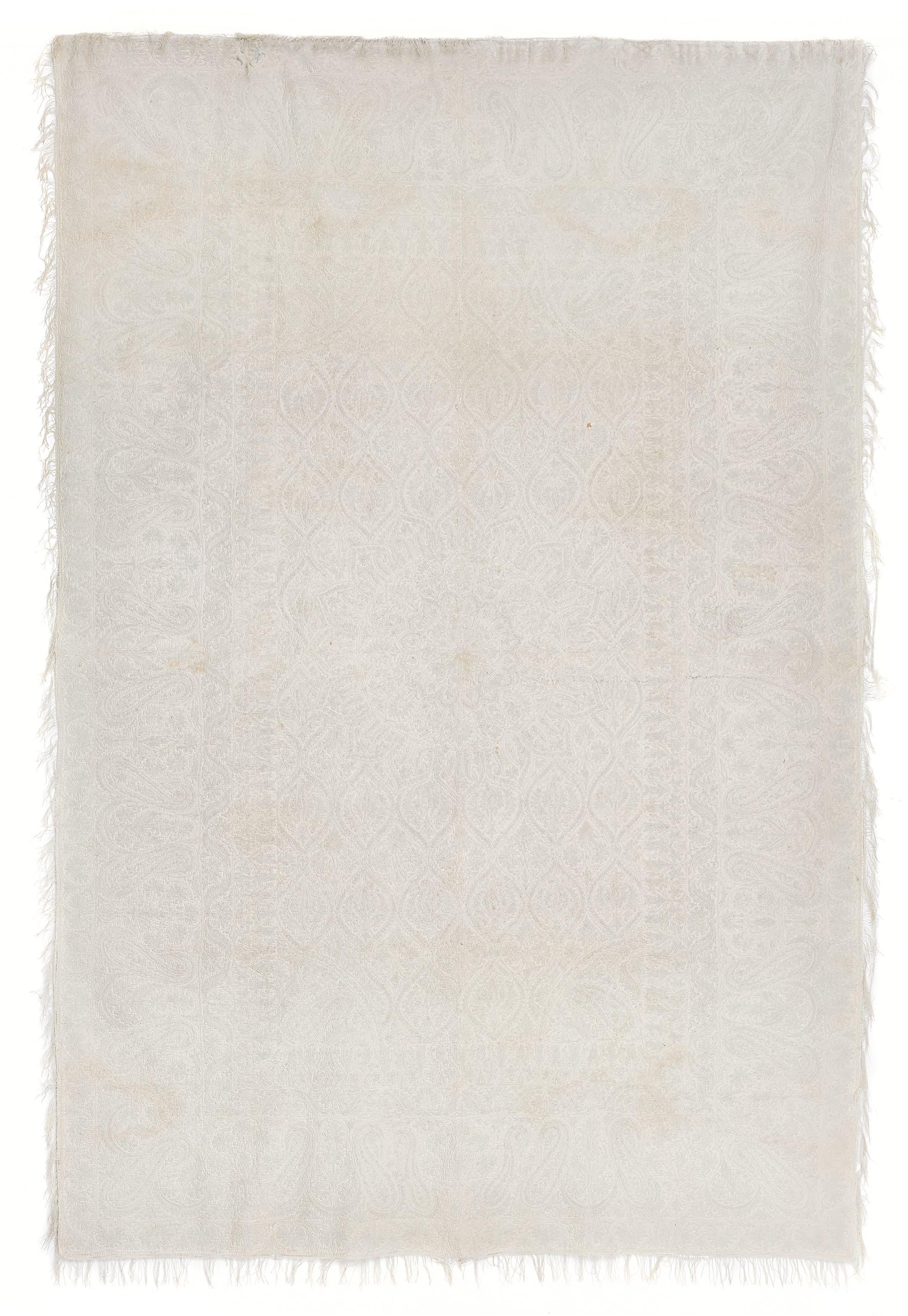
CORDED QUILT
Northern Indian, mid- to late 19th century 94 x 62 in.
Corded quilting is generally not associated with India, but a discrete group of covers and garments, which includes this example, reveals that artists on the subcontinent indeed used this idiosyncratic technique during the nineteenth century. This quilt’s overall composition, with a central medallion, half-quarter-round registers at the corners of the main field, and concentric rectangular border registers, looks to Mughal embroidered floor spreads, Persian carpets and bookbindings, and early Bengali embroidered colchas. Extant rugs and book covers of the Safavid period (1501–1722) use this central lobed medallion. The triple floral sprays and ogives feature in eighteenth-century Mughal arts, while the proliferation of botehs relates to contemporaneous Kashmiri shawl designs.
Executed on a frame, corded quilts require tautness and flat uniformity to avoid puckering. The maker of this quilt would have lightly drawn the design on the cotton face, then worked in small sections using tight, evenly spaced running stitches in cotton thread to create channels between the face and linen lining, followed by the insertion of cotton cord at intervals. The tonal design is extremely subtle, revealing the complexity of the workmanship on close inspection. Unique to this quilt and related survivors is the use of indigo-dyed cotton cord, which conveys an almost imperceptible variation in hue across the white surface. The blue is only conspicuous on the reverse, where areas of exposed cord mark insertion points. Shapes and registers—outlines between the central field and borders, as well as around botehs and ogives—are delineated with white cord. Blue cord is reserved for most filling patterns and smaller ornamental motifs.
This type of quilting is sometimes associated with French Marseilles boutis, often a combination of cording and trapunto. English professional and domestic quilters made allover corded quilts and garments from at least the early eighteenth century, however, and it is more likely that this technique arrived to India through English trade and colonization rather than via France. Iran also had its own tradition of cord quilting, some using indigo-dyed cotton, although examples differ from Indian models in technique, palette, and composition. Nevertheless, it is not impossible that these quilts were made for the Persian market. In the early nineteenth century, Coromandel Coast artists produced painted cottons, traded in Iran via the British East India Company, with designs very similar to these quilts. At the same time, extant men’s garments with blue cord quilting at the Victoria & Albert Museum might also suggest a marketplace within India. These include an unfinished cotton waistcoat, attributed to the city of Ludhiana (7932(IS)), and two man’s caps, attributed to Kashmir (5754(IS), 5755(IS)).
At least five other indigo corded quilts have been identified; four are preserved at the Victoria & Albert Museum, collected from the 1850s to the 1880s (5414(IS), 5415(IS), IS.1386-1883, IS.1387-1883). Most feature medallions and paired or tripled botehs in the borders, like the present quilt. One contains a twelve-pointed star (5414(IS)); another lacks a medallion but bears identical borders to others (IS.1386-1883). A fifth quilt, now lost, was illustrated in volume 45 of The Embroideress in 1933 (pp. 1,062–64). While the precise origins of cord quilting in India are not yet understood, the similarities among these quilts indicate a focused regional manufacture, possibly even within one workshop. The present quilt is a star example of a distinctive and scarce product that expands our knowledge of India’s profoundly rich history of textile arts.
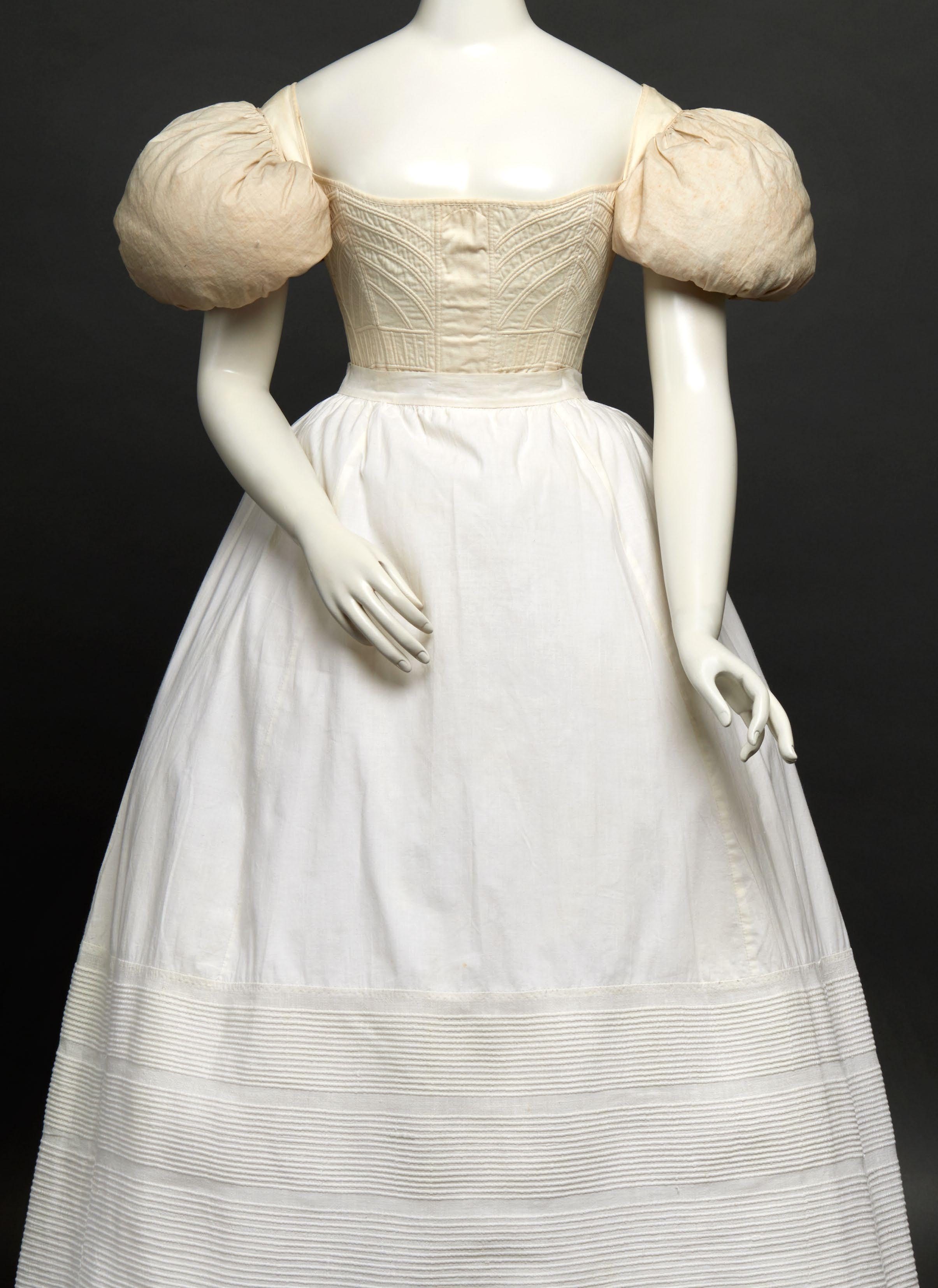
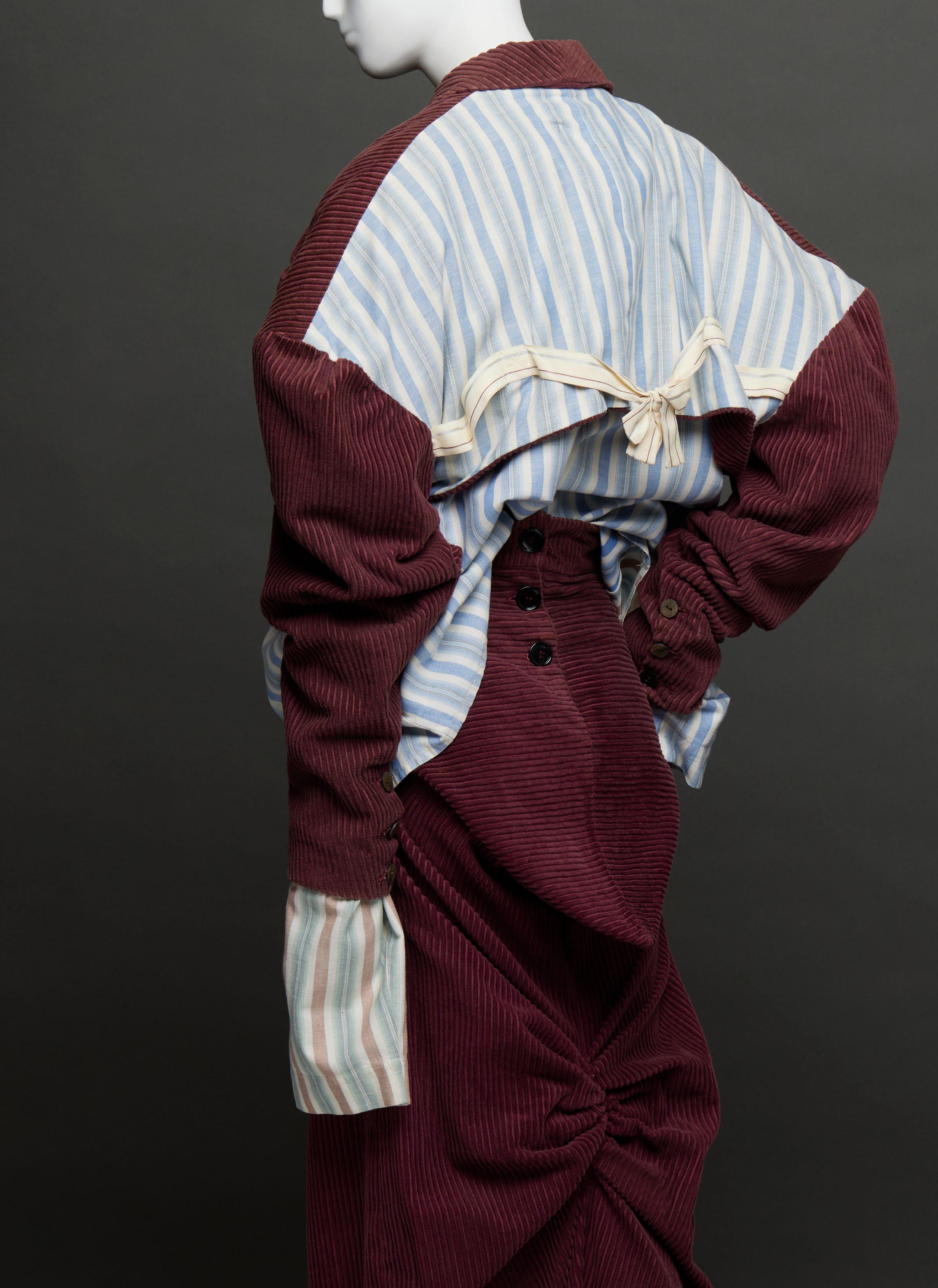
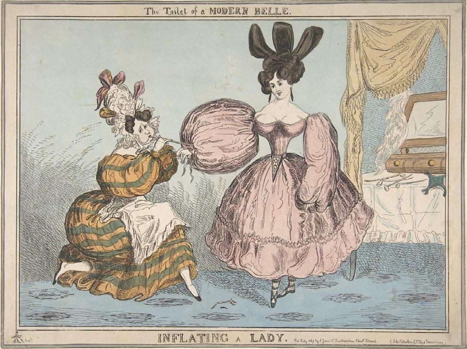
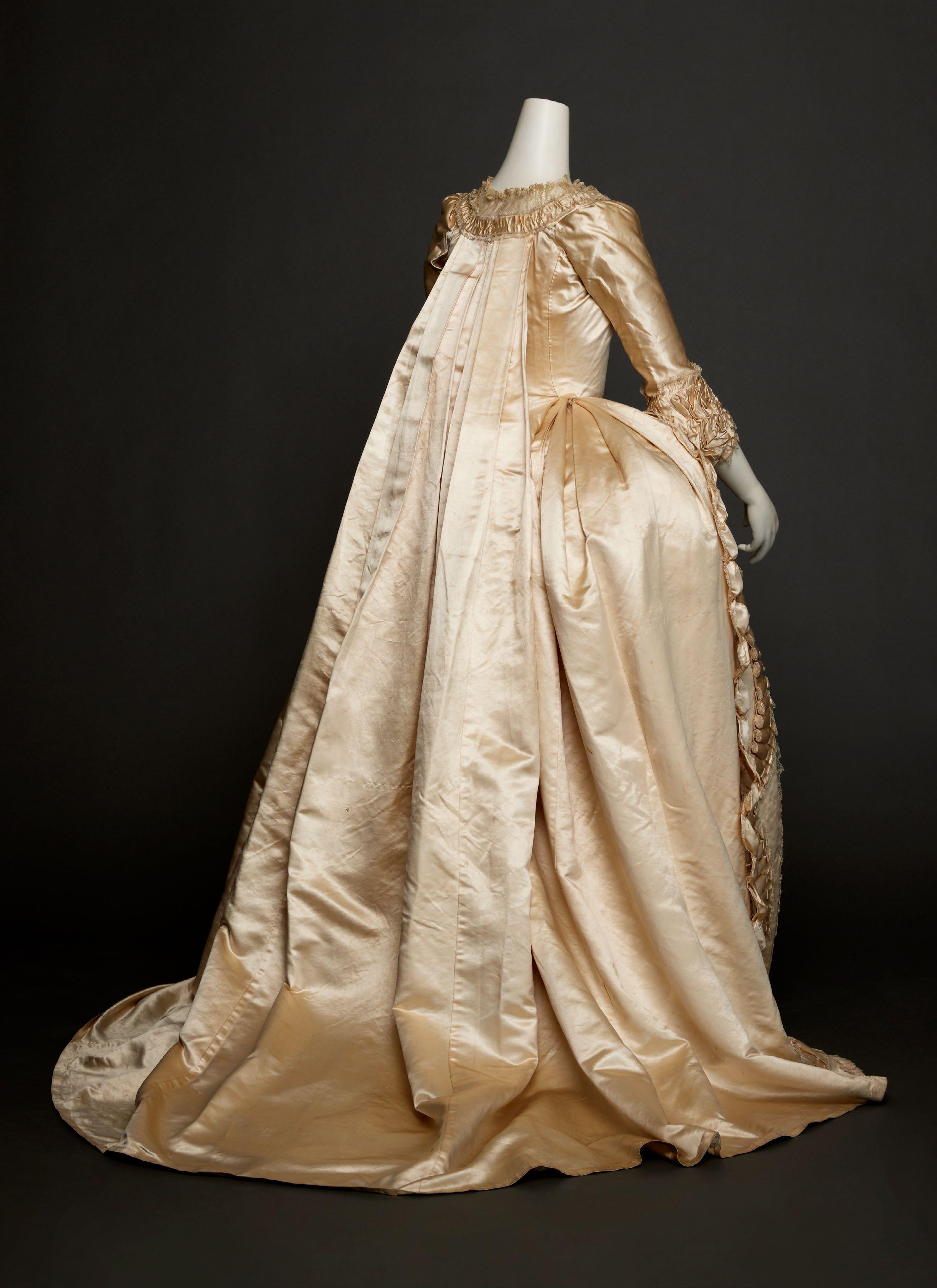
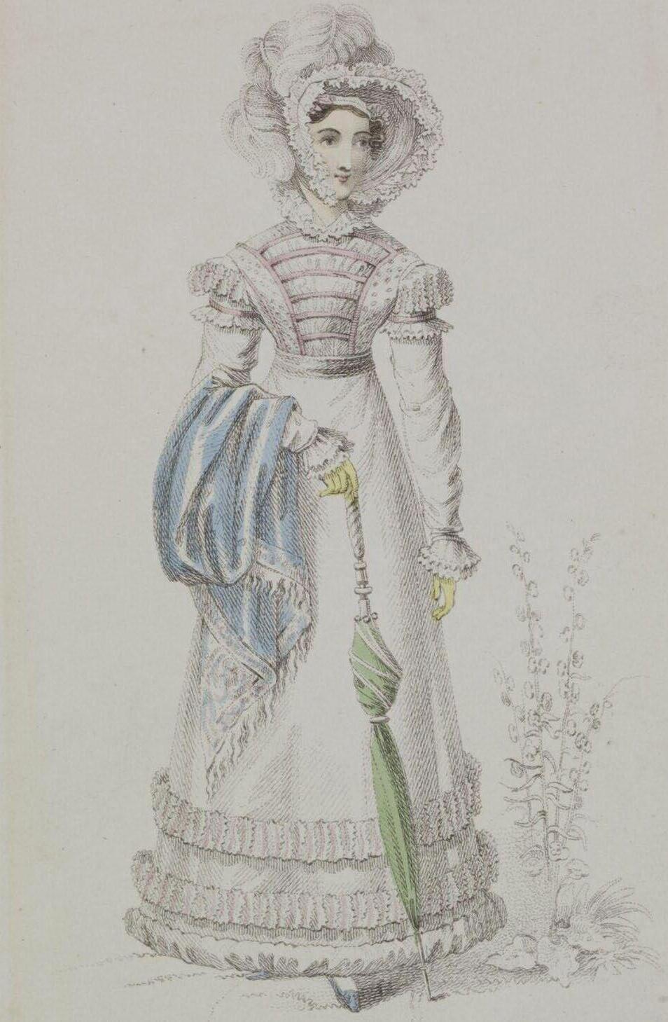
SLEEVE PUFFS, CORSET, AND PETTICOAT
British and American, late 1820s–early 1830s
The buoyant, hourglass silhouette that characterized women’s fashionable dress at the height of the Romantic movement required multiple foundation garments including sleeve supports, corsets, and full petticoats. The most eye-catching and frequently satirized component of the stylish toilette was the balloonlike sleeves. Despite decrying the latest “monstrosities” including “flapping sleeves” in March 1830, the English fashion periodical La Belle Assemblée regularly reported on their many full-length and short variations such as gigot, béret, à la Marie de Medicis, and à l’imbécile, among other descriptors. While some women may have purchased supports with steel or baleen inserts similar to those advertised in the Journal des Dames et des Modes in 1828 and 1833, respectively, most relied on down-filled pads like this pair of fine white cotton. The tightly gathered crescent shape encircles the upper arm and a wide band extends underneath; two sets of linen ties on each support would have secured them to the corset or corresponding ties in the sleeve lining. Probably made by the wearer or her lady’s maid, the puffs ensured the desirable “bouffant” effect.
The voluminous sleeves set off the fashionably small “wasp” waist defined by a heavyweight cotton corset. Unlike the rigid conical shape of eighteenth-century stays, early nineteenth-century corsets outlined the female form with curved seams. As seen in this example of twilled white cotton lined in a matching plain-woven cotton, cord quilting was often employed to emphasize the ideal silhouette. An arched design over the bust and midriff as well as short, parallel lines around the waist are both decorative and gently mold the figure. A bone or wooden busk placed into the center front slot served to maintain posture. Along the center back, the lacing holes are strengthened with bone grommets—a clue to its late 1820s date. Prior to the introduction of these rings, openings were worked entirely with buttonhole stitching. Like the sleeve puffs, the corset was likely stitched at home, although specialized makers touted the elegance, incomparable fit, and comfort of their wares in the pages of contemporary fashion periodicals. Balancing the upper body breadth and further visually narrowing the waist, the white cotton petticoat is woven with three bands of closely spaced cording that holds out the lower skirt.
Dresses with billowing sleeves from the mid-1820s to the mid-1830s survive; however, their accompanying puffs that were integral to the process of the “toilet” are much rarer. After the collapse of the inflated sleeve in 1837, these accessories were likely discarded as decidedly outmoded.
MM
FIG. 6
Imitator of William Heath, The Toilet of a Modern Belle: Inflating a Lady, July 1829, hand-colored etching. Metropolitan Museum of Art, 1970.538.15
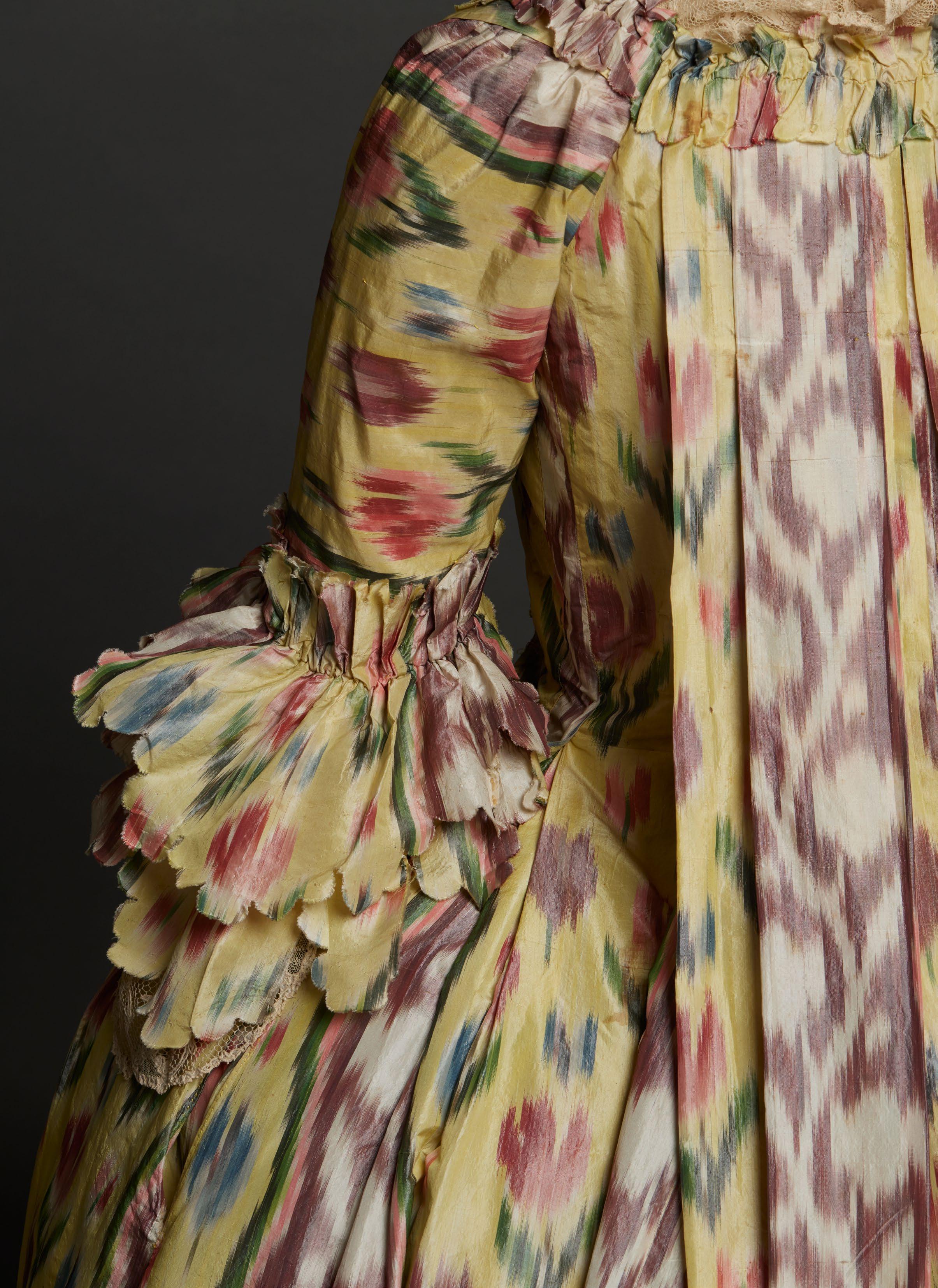
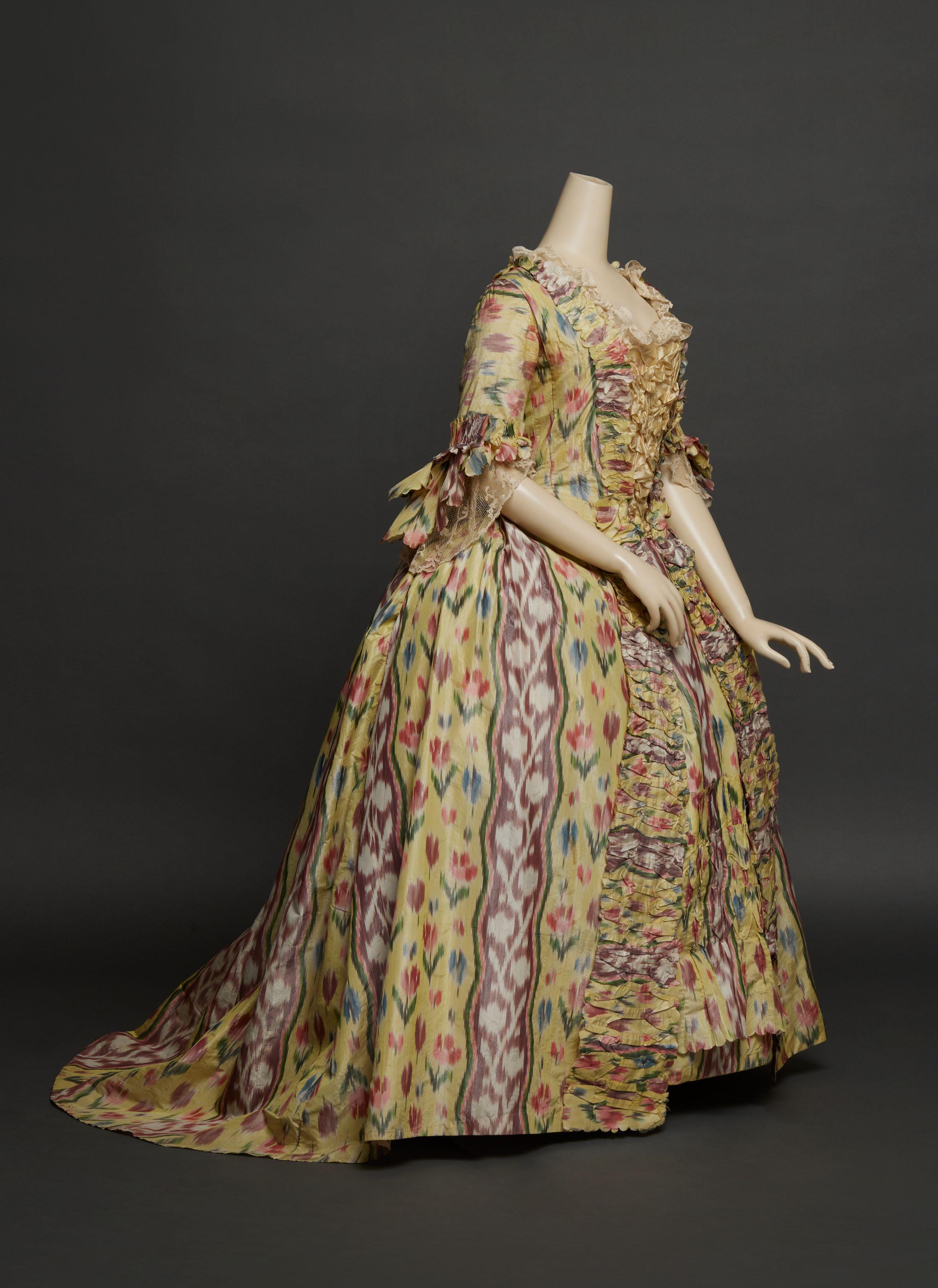
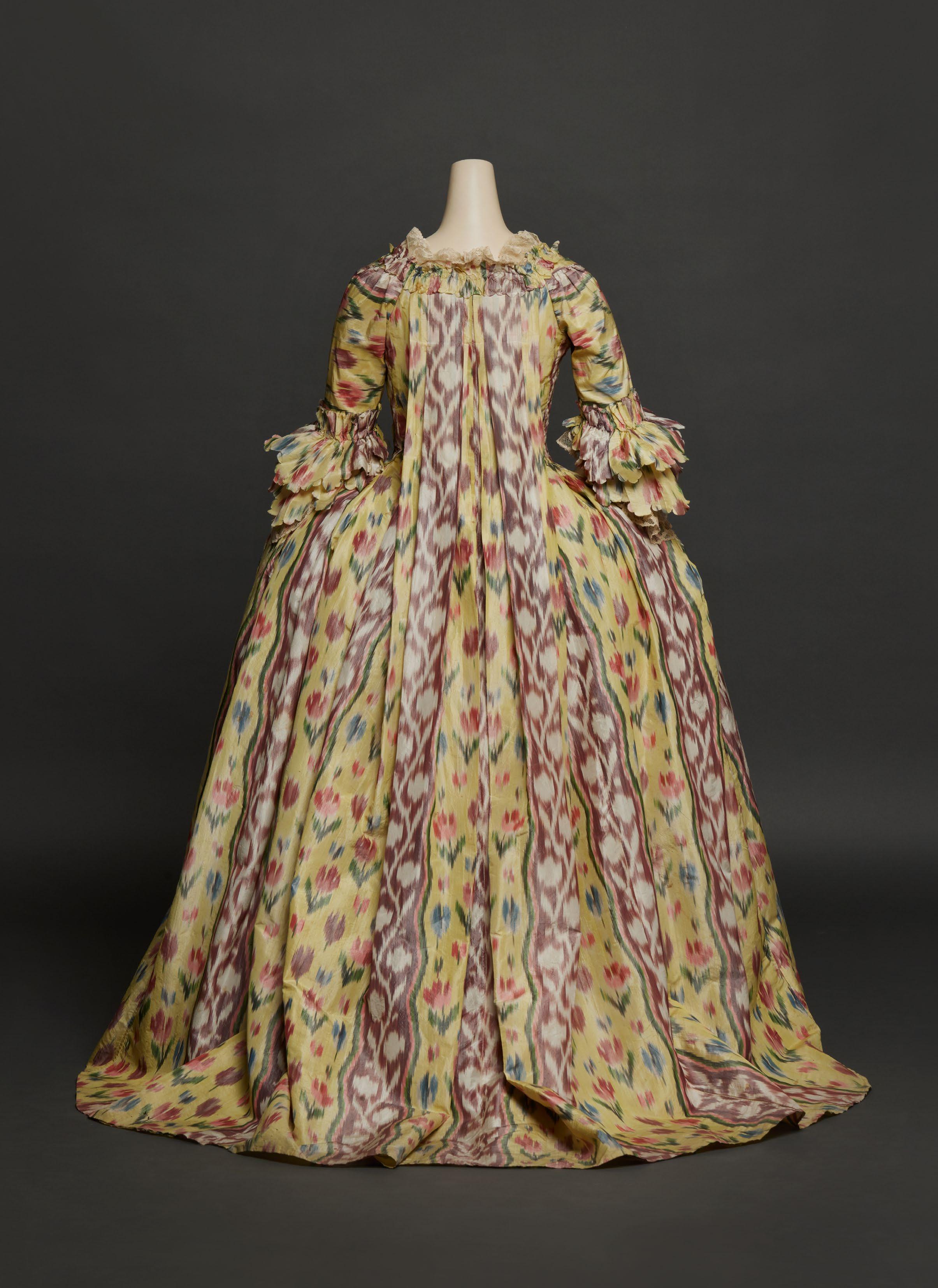
ROBE À LA FRANÇAISE AND PETTICOAT OF WARP-DYED SILK TAFFETA
French, ca. 1765
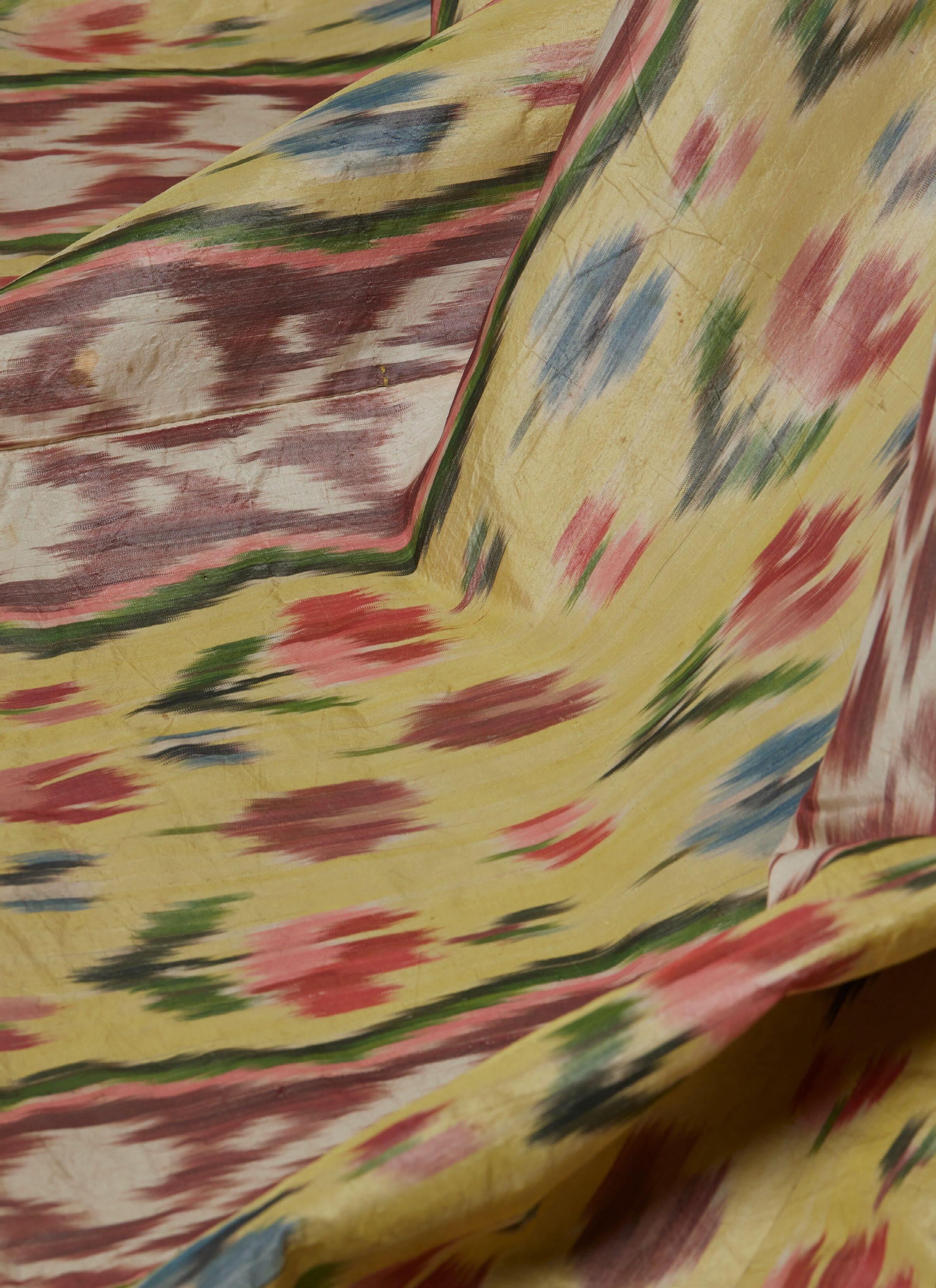
Silk with ikat or warp-dyed patterning—known as “chiné à la branche” and “clouded silk” in France and England respectively—enjoyed a singular popularity across Europe during the mid- to late eighteenth century. Focused production centers developed in London, Valencia, Venice, and Florence, but none matched the workmanship and artistry of the chinés produced in the city of Lyon, the looms of which wove the silk taffeta that comprises this robe à la française and its matching petticoat.
The silhouette of this dress is very typical for robes of about 1765 or slightly later. Its maker has cleverly cut, joined, and ornamented it to maximize the visual impact of the complexly patterned silk. At center back, two complete selvedge widths create a mirror image of vertical stripes falling precisely along the pleats. The pinked, puckered, and pleated robings graduate in size down the front of the gown. The puckering and pinking is echoed in the petticoat’s narrow flounce, constructed from two lengths of silk that have been pleated, seamed horizontally, and secured with running stitch at the top and lower center. Scalloped and pinked double ruffles, gathered and pleated at the cuff, finish the sleeves. The gown was never altered, retaining its original simple linen lining in the bodice and sleeves, though the cotton waistband and tapes were likely a later addition. A coarser, dark linen is pieced at the center back of the petticoat.
Lightweight and lustrous taffetas like this one were called “Florentines.” Ten swatches of Florentines chinés, all with bands of vertical serpentine flower sprays and stripes, appear in a 1764 salesman sample book of Lyonnais silks at the Victoria & Albert Museum (T.373-1972). Florentines would have been ideal during summers in the southeast of France, where chiné taffetas were especially favored by members of the nobility and wealthy merchant class, and where they persisted in dress well into the nineteenth century, often cut up and reused to line garments. Although the exact origin of this dress is not known, it is not impossible that a Provençal woman of refinement and means wore it. A robe à la française and petticoat of chiné taffeta with known Provençal provenance is in the collection of the Palais Galliera. It features a nearly identical treatment of the self-fabric puckered, pinked, and pleated ornamentation and a comparable linen lining within the bodice.
The arrangement of single tulip sprays and wide serpentine stripes indicates a transitional moment in ladies’ dress silks between the standalone floral motifs favored in the 1750s, the exuberant meander patterns of the early 1760s, and the regulated stripes popular by 1770. In his 1757 self-portrait, the Parmense painter Giuseppe Baldrighi depicted himself in a banyan of (likely Lyonnais) chiné taffeta with similarly scaled spotmotif tulips. By the 1760s, this patterning gave way to serpentine flowered designs that could be successfully executed through warp dyeing.
In volume three of the Encyclopédie, first published in 1753, Denis Diderot and Jean Le Rond D’Alembert outlined the labor-intensive process of warp dyeing and, in 1765, Antoine-Nicolas Joubert de L’Hiberderie devoted a chapter to the technique
in Le Dessinateur Chiné à la branche required a specialized workforce, beginning with a designer intimately familiar with making these patterns. He would draw the composition on point paper, carefully considering the placement of motifs, repeat size, and number of colors. The chineur (warper trained in ikat weaving) measured and wound on a drum long warp lengths to correspond to the designer’s pattern and then unwound, stretched taut, tied, and numbered the warps in branches, or clusters, for dyeing according to the pattern. He tightly wrapped the branches with parchment or paper to create areas of resist. These branches were then dyed, unwrapped, and dried, with the process repeated for each individual color. Finally, the warps were reassembled on the loom for weaving.
Although not as costly as some brocaded or figured silks, by 1763, one aune, or French ell (about 0.65 meters), of a chiné might sell for between eight and ten livres, about oneand-a-half week’s wages for an unskilled laborer. A cloth as luxurious and colorful as this one likely fetched even more, however. When compared to the majority of surviving chinés, the palette of this silk is uniquely vibrant, with canary yellow and ruddy purple used in striking contrast as the ground colors. More individual colors and deeper, richer tones required more complicated warping and additional successive dye baths—and, thus, more expense. This silk contains eight main colors, indicating at least as many submersions, not including multiple baths in the same dye to create light and dark variations of a single hue and to layer two colors to create a new one.
This boldly patterned and colored taffeta by Europe’s most adept weavers of ikat exemplifies the Grande Fabrique, a title that ceased with the Revolution. At the same time, only shortly after this silk came off the draw loom, it was evident that chiné weaving had reached its technical and economic limits. In the Journal oeconomique, ou Mémoires, in January 1767, one writer acknowledged the already prohibitive expense of Lyonnais ikats and lamented that, in his view, cost stifled innovation: “The art [of warp dyeing] could acquire greater perfection if the public were willing to pay the price, that is to say, to pay more for the expense, that the possible processes of improvement would occasion.” Despite an extremely brief revival of chiné production under Napoleon, mechanized warp printing quickly replaced resist dyeing, and by the 1820s, the skill and knowledge necessary for chiné à la branche was lost.
MDA
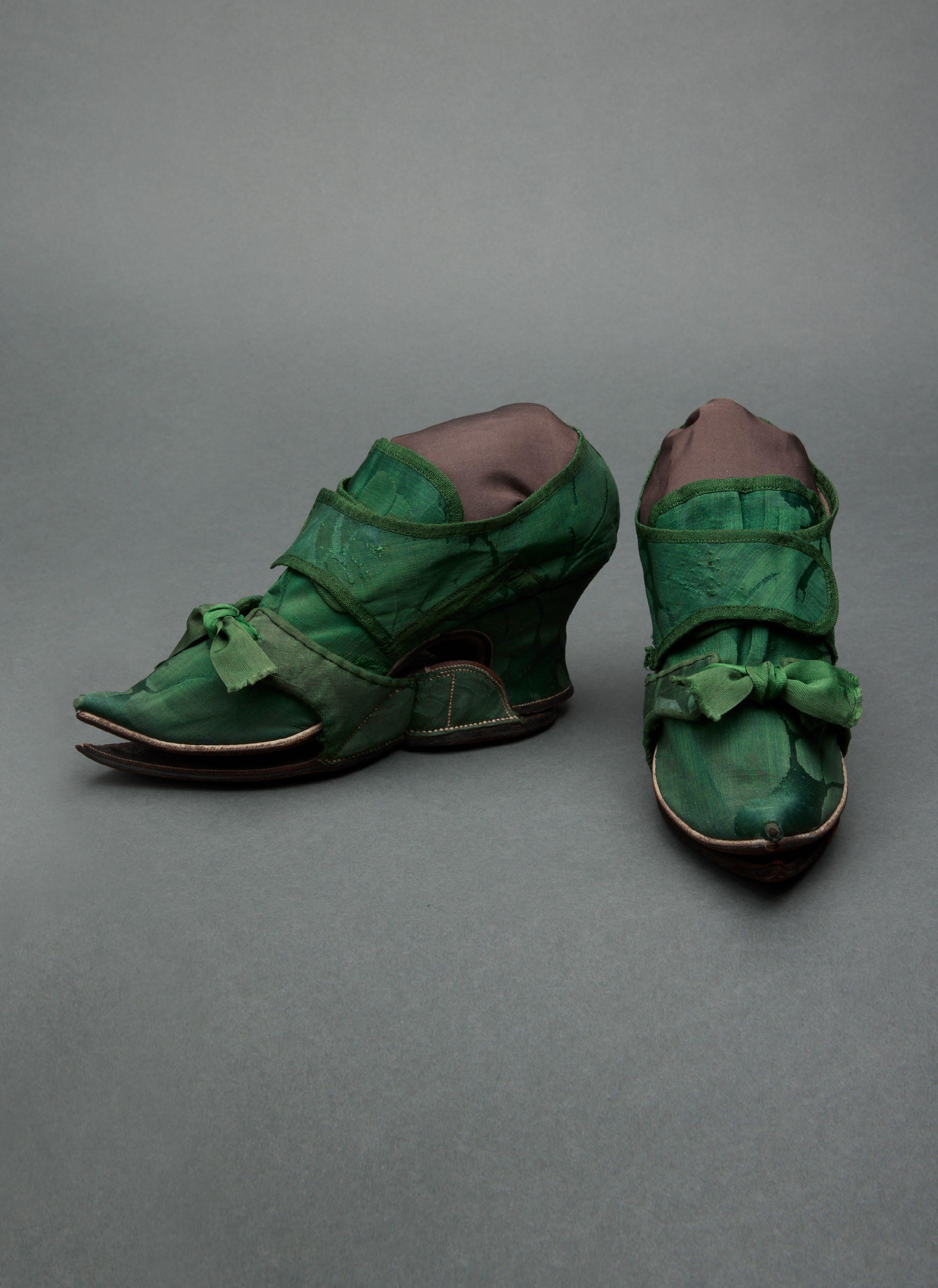
PAIR OF SILK DAMASK SHOES AND MATCHING CLOGS
English, ca. 1740–45
4 ¾ x 9 ¼ x 2 ⅞ in. each
Overshoes, or clogs, protected a woman’s delicate footwear from dirt, mud, and the general wear of outdoor use. While more utilitarian examples might be made from a combination of leather, iron, and wood, it was also customary for a lady of means to commission clogs finished with silk uppers in order to coordinate with a particular pair of her shoes. Such overshoes probably did not travel on foot farther than the distance between, perhaps, a country house entrance and an awaiting carriage. This was likely the case with the present pair of silk damask shoes and matching clogs, which have—very unusually—managed to survive together for nearly three hundred years.
The design and color of the silk as well as the silhouettes of both the shoes and overshoes help to securely date them within the early years of the 1740s. The shoes’ shape—with upturned, pointed toe and thick, waisted heel—is typical of European shoe construction up to this time. By the mid-1740s, this prow-shaped toe had begun to be replaced by a slightly flatter and more rounded toe, while the use of dog-leg seams and white rands continued into the 1760s.
Only a glimpse of the oversized pattern is discernable across the uppers and heels, but the visible composition is indicative of damasks produced at Spitalfields in London from about 1740; these are documented in other extant silks as well as in the drawings of the English textile designer Anna Maria Garthwaite preserved at the Victoria & Albert Museum.
Although this pair was found in England, large-scale damasks in deep hues like forest green were also popular for women’s dress and accessories in the American colonies, where they were called “India damasks,” referring not to their geographic origin but to the British East India Company ships that carried them across the Atlantic.
Overshoes that have remained with their originally intended shoes are exceedingly rare. Early to mid-eighteenth-century examples in museum collections include pairs at the Bata Shoe Museum; Fashion Museum Bath; Killerton House, Devon (NT 1361998.14); Metropolitan Museum of Art (C.I.52.15.2a–d); Museum of Fine Arts, Boston (44.497a-d); Powerhouse Museum (H4448-85); and RISD Museum (09.840). Single shoes with coordinating clogs are in institutions including the Smithsonian National Museum of American History (CS.214253.001-002) and the Victoria & Albert Museum (T.600A-1913).
MDA
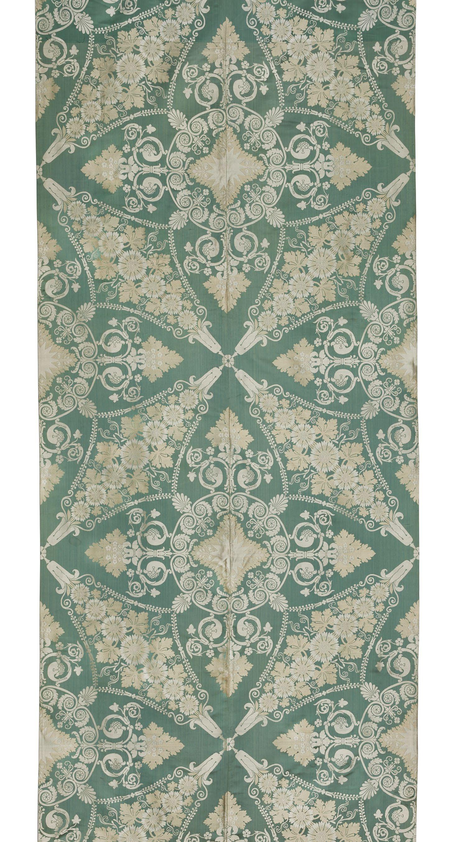
CAMILLE PERNON AND GRAND FRÈRES
Silk lampas
French (Lyon), ca. 1807–08
124 ½ x 42 ½ in.
As part of the revitalization of Lyon’s silk weaving industry in the first years of the nineteenth century, Napoleon’s tapissiers (upholsterers) placed numerous large orders with the city’s silk manufactures for ensembles that would furnish the emperor’s residences. In 1806, Camille Pernon (1753–1808), the premier silk weaver to the Crown since the time of Louis XVI, received a sizeable commission for hundreds of meters of a silk destined for Napoleon’s Throne Room at the Château de Versailles.
The resulting silk lampas, a satin with weft patterning bound in twill, featured a neoclassical composition of flowers, acanthus, palmettes, and foliage in ecru, white, and soft, blue-tinged green. The effect of the full design (in half-drop repeat) is understood when two vertical lengths are adjoined symmetrically, as with the present panel. At this larger scale, the double-wide pattern of pointed quatrefoils with medallions of acanthus and volutes alternates with crosses composed of four elongated diamonds, each oriented at forty-five degrees and densely filled with grape leaves and daisies. The unusual inclusion of daisies may be a reference to Xerochrysum bracteatum (sometimes called “paper daisies”), which were recorded around 1803 in Josephine’s garden at Malmaison and were probably brought from Australia by the explorer Nicolas Baudin.
Ultimately, however, Pernon’s silk was rejected, apparently due to inconsistencies in color, and was moved to the stores of the Mobilier Impérial (today the Mobilier National).
Following Pernon’s unexpected death in 1808, the Lyonnais firm Grand Frères succeeded his workshop, and the silk was installed by the tapissier Alexandre Maigret in the newly appointed Salon de Famille at the Château de Saint-Cloud. In 1826, under Charles X, the Salon was redecorated and the furnishings reupholstered. What remains at the Mobilier National today from Pernon’s original silk suite are five uncut chair seats (GMMP-1320) and several fragments of the two coordinating borders (GMMP-1327, GMMP-1329).
The recent discovery of this panel confirms that yardage removed from the walls, doors, and windows of the Salon de Famille in 1826 was indeed preserved, having turned up nearly a century later on the other side of the Atlantic. In December 1931, the New York–based antiquarian firm Dalva Brothers, Inc. purchased thirty-one yards of “French Empire green lampas” and eighteen yards of a matching border. These came from Symons, Inc., fellow antiques dealers located in Manhattan, although it is unknown how and when Symons acquired them. Five years later, in November 1936, Dalva Brothers sold two joined widths identical to this one to the Metropolitan Museum of Art (36.139), but another ninety years would pass before this imperial provenance was reestablished.
Previously, the only identified extant examples of this silk were three patrons (samples) preserved in the archives of Tassinari & Chatel, now with Maison Lelièvre (TCA 16441, TCA 1644-1645-2084, TCA 1644-23172). After the dissolution of the Grand family business in 1871, Tassinari had acquired the workshop contents, which also contained Pernon’s patrons. Neither Tassinari nor Lelièvre have ever rewoven this design.
MDA
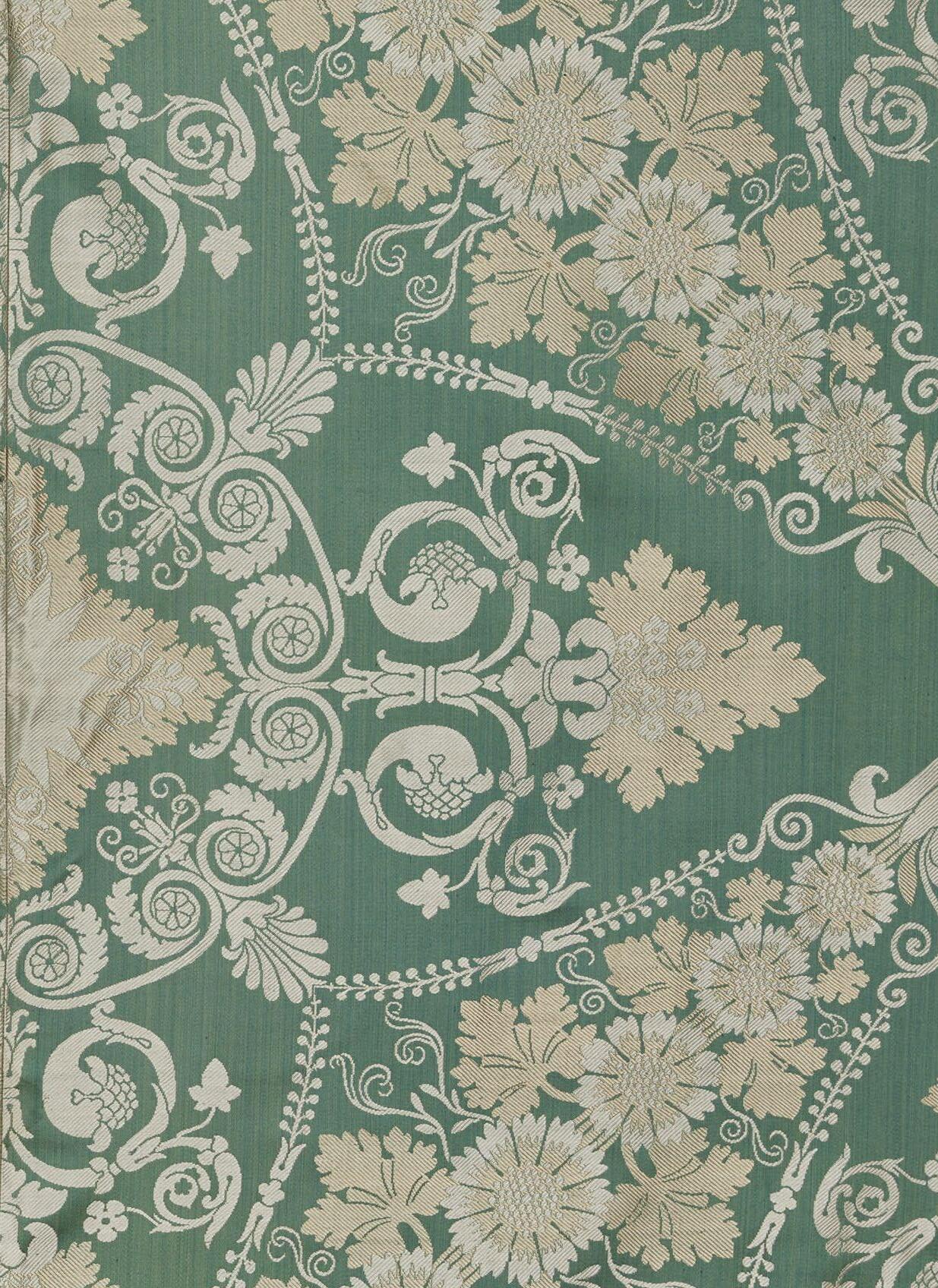
ANNA MARIA GARTHWAITE
Brocaded silk, woven by Peter Ogier III, retailed by Swan and Buck English (Spitalfields), April 1744
45 x 18 in.
Considering that the designer Anna Maria Garthwaite (1688–1763) never received any formal apprenticeship in weaving due to her gender, improbably started her career in her thirties, and left extremely little trace in historical records, it is miraculous today that we know her as one of the most talented and prolific members of the Spitalfields, London silk-weaving community. Her surviving body of professional work—scores of watercolor-on-point-paper masterpieces—is preserved in the collection of the Victoria & Albert Museum. This phenomenal resource is what enables us to attach her name, her clients’ names, and a precise date to these brocaded silk panels.
This figured ivory satin, a “flowered silk” brocaded with discontinuous silk floss wefts, matches the pattern on page four of a design book in the museum’s holdings (T.3931971). These panels hew closely to Garthwaite’s original painted example, with only slight variations in color choices employed by the weaver. Her unmistakably lush, naturalistic style is in full bloom: robust sprays of blue irises tinged with yellow, tawny Asiatic lilies and delicate pink lily of the valley are heightened with vibrant green foliage. A feathery, serpentine floral garland, rendered in figured ribbed faille and accented with soft pink, also meanders over the gleaming satin surface. Garthwaite excelled at envisioning the effects of points rentrés, an interlocking form of weft-shading. Originating in France, this painterly technique was studied and adopted by Garthwaite to enhance the accurate resemblance between real blossoms and those from her brush. The results are the sensitively modeled tones found on each petal depicted on the finished silk.
Inscribed at the top of Garthwaite’s design is the date April 12, 1744, and two names: Mr. Ogier and Mr. Swan. The Ogier family of master weavers was connected with almost every aspect of the silk industry; Peter Ogier arrived in London from France in 1730, and all five of his sons became weavers. Between 1742 and 1749, Garthwaite sold twentythree designs to two family members, both named Peter. Here, she refers to Peter Ogier III, who resided at Spital Square. Mr. Swan (first name unknown) was a mercer; his firm, Swan and Buck, provided luxury furnishing and dress silks to elite clientele. From 1742 to 1744, the firm purchased four patterns from Garthwaite.
For Garthwaite to have noted two individual names on a single design highlights the burgeoning practice of what a member of Swan and Buck termed the “new method of bespoke trade.” Essentially, in this period, weavers switched from maintaining large stock from which all mercers could select to an improved system of restricting individual patterns to specific merchants, circumventing the problem of “ladies not liking to buy patterns which were to be found in all the houses.” This simple shift to what the modern fashion industry later dubbed “confinement” served consumers and suppliers alike. It is also what allows us to definitively know who wove these panels, and who provisioned them.
April 12,
Victoria & Albert Museum, T.393-1971
FIG. 7
Anna Maria Garthwaite, Page from a book of designs for woven silks, dated
1744, watercolor on paper.

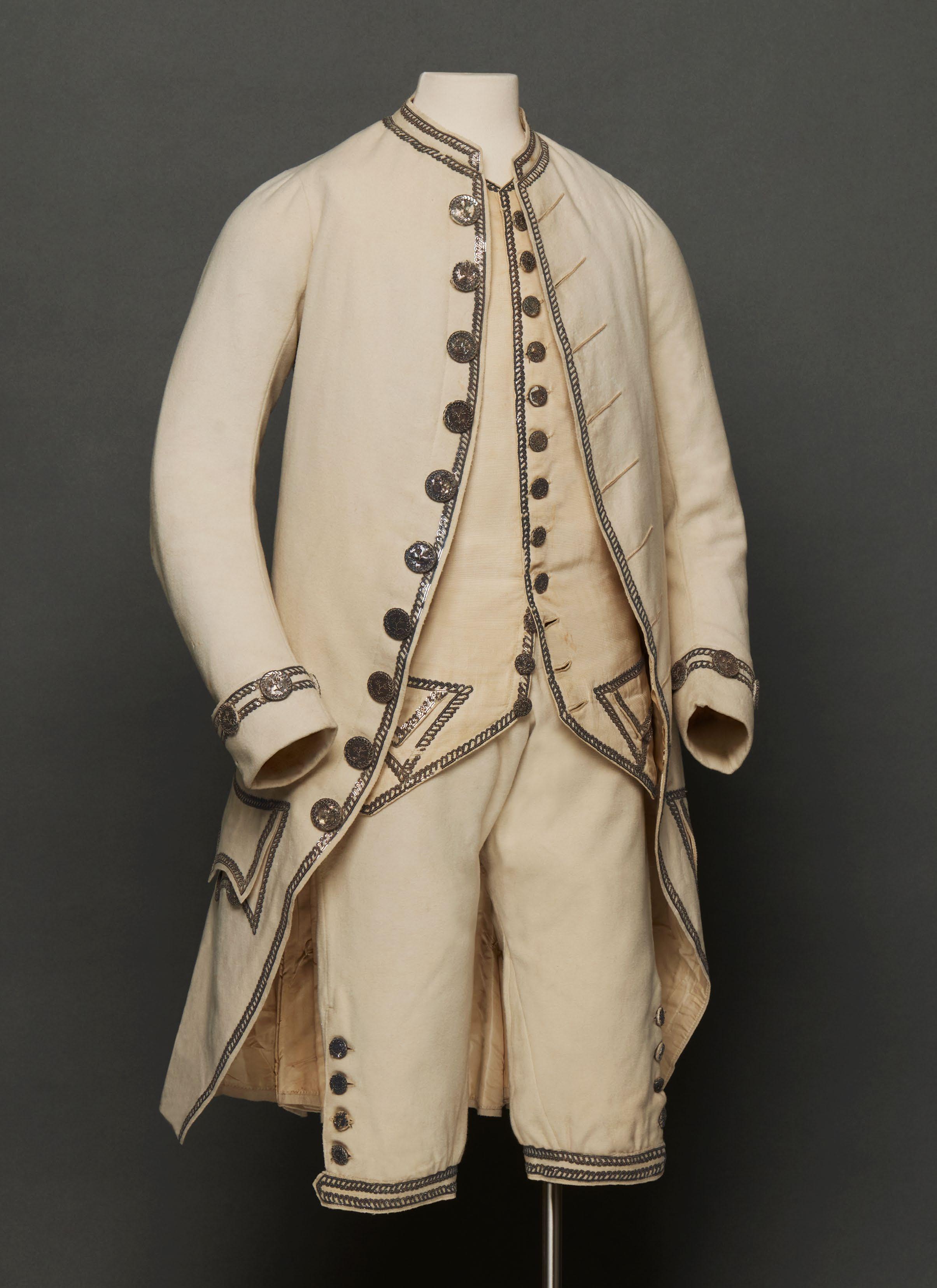
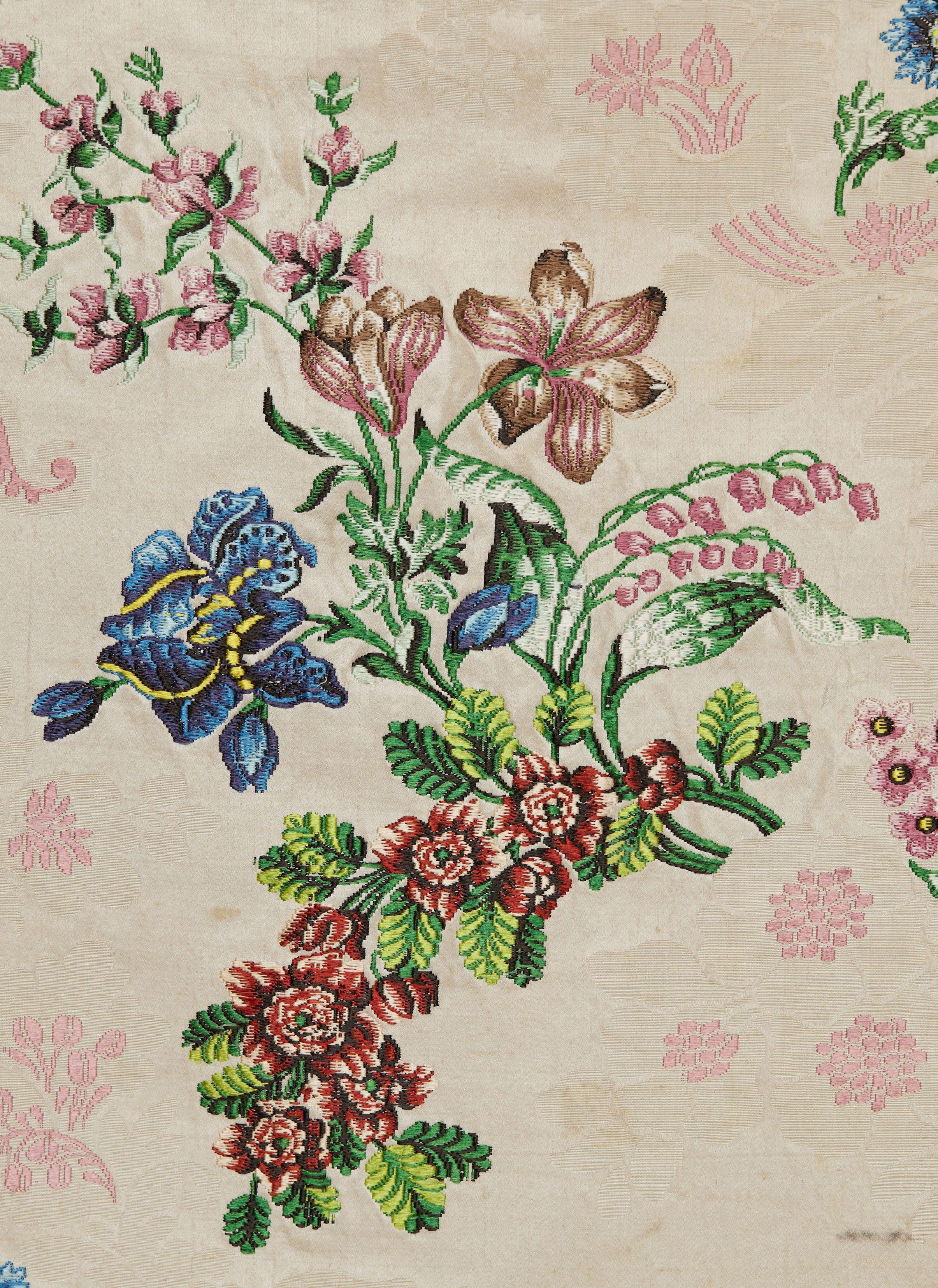
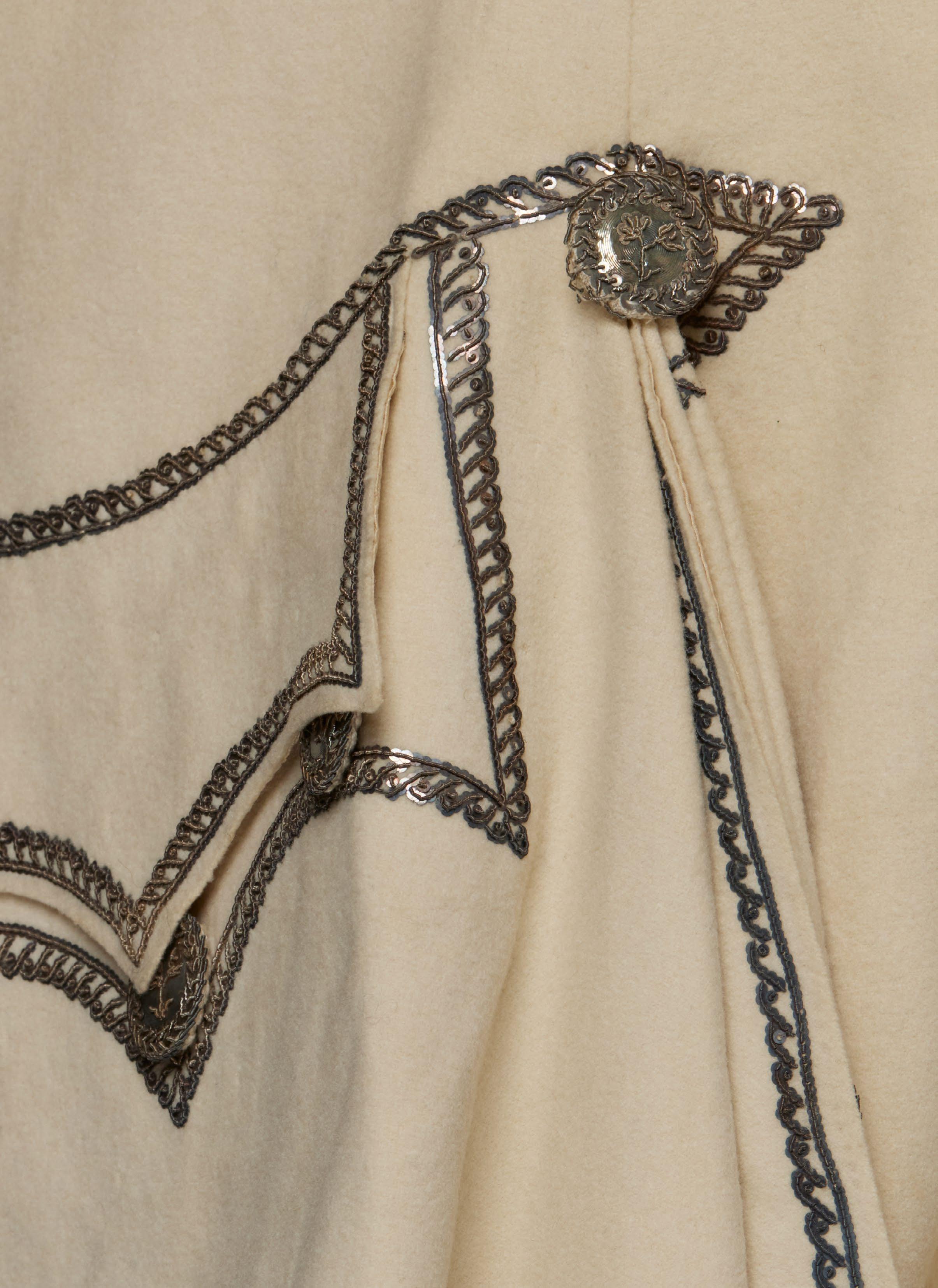
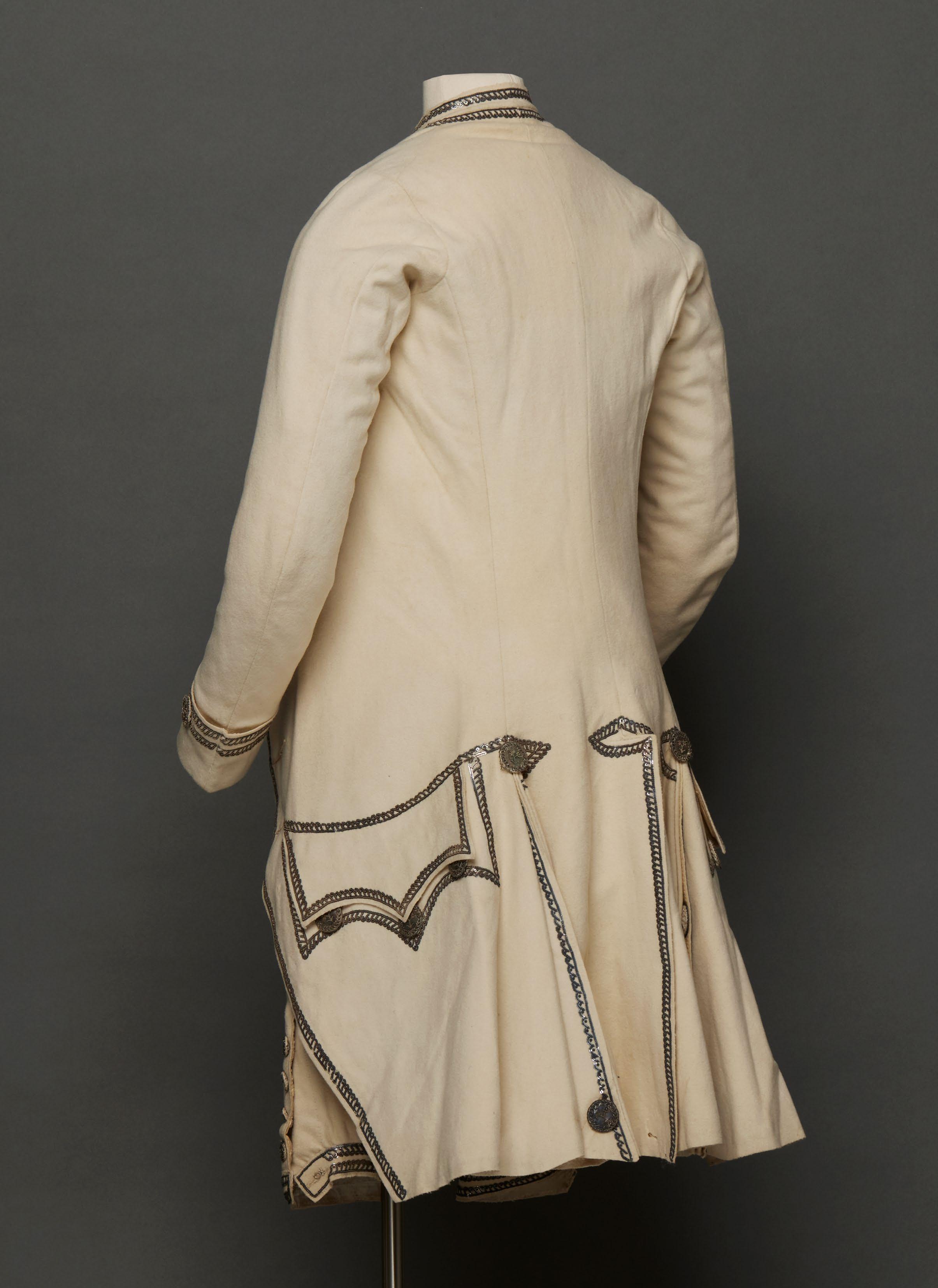
FORMAL SUIT AND WAISTCOAT OF EMBROIDERED WOOL AND SILK English, ca. 1775
This three-piece suit of silver-embroidered wool, with a matching silk waistcoat, speaks to the restraint newly seen in fashionable formal menswear beginning in the 1760s. The hard-wearing, creamy, woollen broadcloth and diminutive ornamentation are markers of the practical, unassuming elegance—in stark contrast to the affectation and garishness of the satirized macaroni—that marked the last decades of the century.
In line with the subdued color and choice of ornament is the slim silhouette, which also helps to date the suit. The coat’s low standing collar, curved and close-fitting sleeves, small cuffs, and narrow skirts as well as the shortened length of the waistcoat at upper hip suggest it was probably made during the mid-1770s. Edging the fronts, cuffs, pockets, and back vents of the coat, along with the fronts of the waistcoat and the knee bands of the breeches, are sequins arranged in parallel curlicues and secured with silver purl, together with buttons embroidered to match. Although far from overtly neoclassical, the embellishment resembles continuous guilloche bands seen in neo-Palladian architecture of the 1770s.
The wool itself is undoubtedly of English manufacture. Since the Middle Ages, wool had been vital to England’s economic expansion and, later, to its colonial expansion, such as in North America, the Caribbean, and Australia. In the seventeenth and eighteenth centuries, regulations banned the importation of continental European silks and Indian cottons, and even British outposts were obliged to purchase English woolen fabrics. The Wool Act of 1698, for instance, limited the import and export of wool from Ireland and the American Colonies. English wool was also an essential commodity connecting the Atlantic triangular trade, as it was often used to purchase the enslaved.
Likewise, the silk fabric from which the waistcoat fronts have been made is also English, and underscores another departure from the ostentation of richly brocaded or embroidered waistcoats of the first half of the eighteenth century. Swatches of very similar English, small-patterned, figured, white silks dating to the 1770s and 1780s can be found in a 1764 salesman’s album of French silks in the collection of the Victoria & Albert Museum; these English swatches were added later (T.373-1972, f. 11v, 37v, 78v).
Silk suits of this period survive in large numbers, but wool suits are rarer, probably due to the tendency toward insect damage. A cream wool suit with more ornate neoclassical silver embroidery and appliqués is in the collection of the Victoria & Albert Museum (656-1898). Other more understated silver-embroidered broadcloth suits of very similar cut and date include examples at the Nasjonalmuseet (OK-03675), Royal Ontario Museum (925.37.1.A-C), and Victoria & Albert Museum (T.149 to B-1937).
Provenance: The Mark Wallis Collection, Surrey, UK. This suit was among a group of garments, from the Seale family of Devon, which were sold in 2024. The likely wearer is John Seale (ca. 1753–1824) of Mount Boone, near Dartmouth. In April 1775, Seale married Sarah Hayne (d. 1815) at Townstal, and this may have been his wedding suit. In 1724, Seale’s father, also John Seale (1705–1777), had purchased the estates of Coombe House and Mount Boone, where Seale and Sarah Hayne resided. Their son was made Sir John Henry Seale, 1st Baronet (1780–1844).”
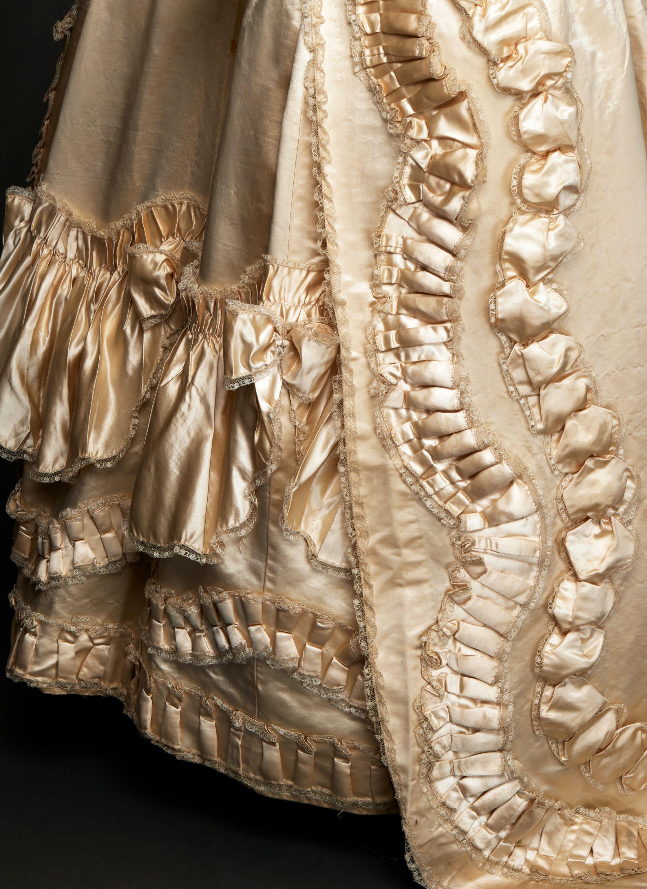
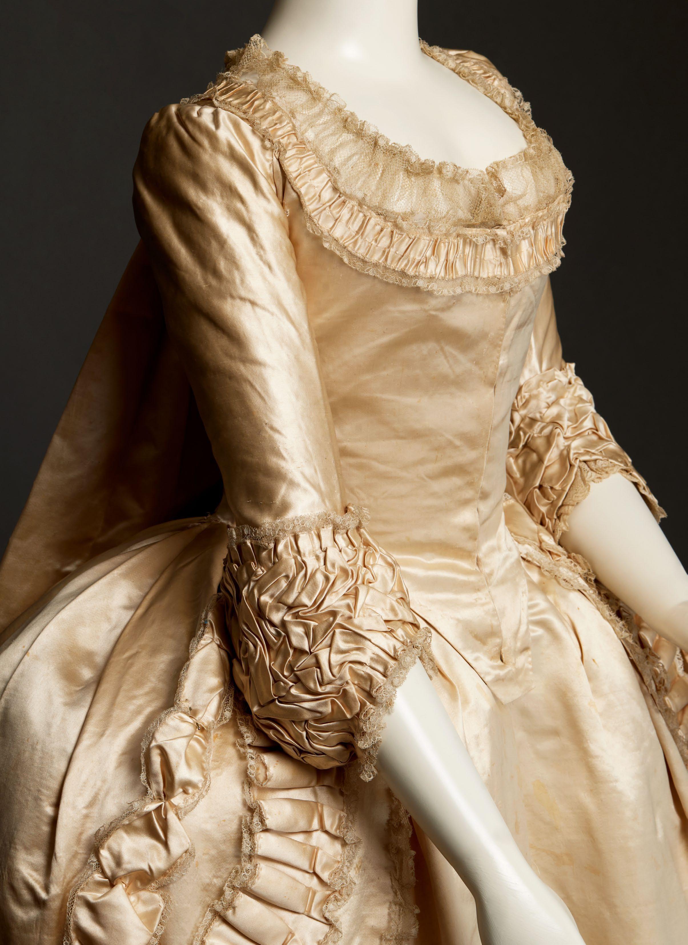
ROBE À LA FRANÇAISE AND PETTICOAT OF SATIN AND BLONDE LACE
English, ca. 1775
This luxuriantly trimmed white satin robe à la française with matching petticoat attests to the increasing preference for plain, solid-colored silks in the last quarter of the eighteenth century that replaced richly brocaded patterned silks of the early and mid-century. Intended for a formal occasion, this complete unaltered dress in pristine condition conveys the elegant, understated sophistication of a neutral monochromatic palette.
The gown’s double box pleats extending from the upper back to the hem, open skirt revealing a matching petticoat, exuberant three-dimensional self-fabric applied decoration including serpentine puffs and padded bands, swagged petticoat flounce with bowknots, and blonde (silk) lace edging are typical of mid-eighteenth-century fashion and dress construction. The tightly fitted closed bodice ending in a deep tab at the center front and ruched cuffs around the elbow, however, appeared in the 1770s, replacing an open bodice filled in by a triangular stomacher and multitiered oval sleeve ruffles. In contrast to the oversized square shape of earlier panniers that were de rigueur for evening and court dress, here, the reduced width and curving sides of the gown’s skirt and petticoat supported by smaller hoops also point to a date of about 1775.
Although white was associated with wedding dress by the mid-eighteenth century—the eponymous heroine of Samuel Richardson’s 1740 novel, Pamela; or Virtue Rewarded, is married in white satin—it was also a fashionable color whose unsoiled appearance would have been difficult to maintain. Over the more than seven decades covered by Barbara Johnson’s album of fabric swatches, in the collection of the Victoria & Albert Museum, that document her wardrobe, this fashion-conscious member of Yorkshire gentry society regularly bought solid-colored silks including white. In 1763, Johnson acquired “a White Sattin Negligee” and, in 1770, she purchased twenty-one yards of “a white Lutestring” to be made up by a London-based dressmaker into a gown worn over a hoop.
In addition to textual sources, paintings also record women’s partiality for shimmering satins. In her full-length, unattributed portrait dated about 1770, Mrs. Cadoux (Tate Gallery, London, N03728) wears a white satin robe à la française with similar ruched serpentine bands on the gown’s skirt, along with swagged flounces and paired ruched bands on the pink satin petticoat. Although rendering lavishly brocaded silks presented a challenge to artists, plain satins equally enabled them to display their skills at depicting the play of light over the fabric’s lustrous surface. A very similar white satin gown and petticoat with a closed bodice, flowing back pleats, and serpentine self-fabric trimming, dated 1775–80, is in the collection of the Victoria & Albert Museum (T.2-1947).
Provenance: This gown descended from Lady Lucy Hicks Beach and shares provenance with a painted-and-dyed Indian cotton robe à l’anglaise, ca. 1780–90, published in the 2024 Cora Ginsburg catalogue and now at the Metropolitan Museum of Art (2024.249). Given the similar sizes of the two dresses, they may possibly have been worn by the same woman, or perhaps sisters or other female relatives. As manifested by Barbara Johnson’s extensive collection of swatches, the wardrobes of well-to-do women included both silk and cotton dresses appropriate for a variety of private and public occasions. Lady Lucy Hicks Beach, daughter of Hugh Fortescue, third Earl Fortescue (1851–1940), married Sir Michael Edward Hicks Beach in 1874 and later became Viscountess St. Aldwyn and first Countess St. Aldwyn (1851–1940). The Hicks Beach family held estates in Coln St. Aldwyn, Gloucestershire, and Netheravon, Wiltshire, since the sixteenth century.
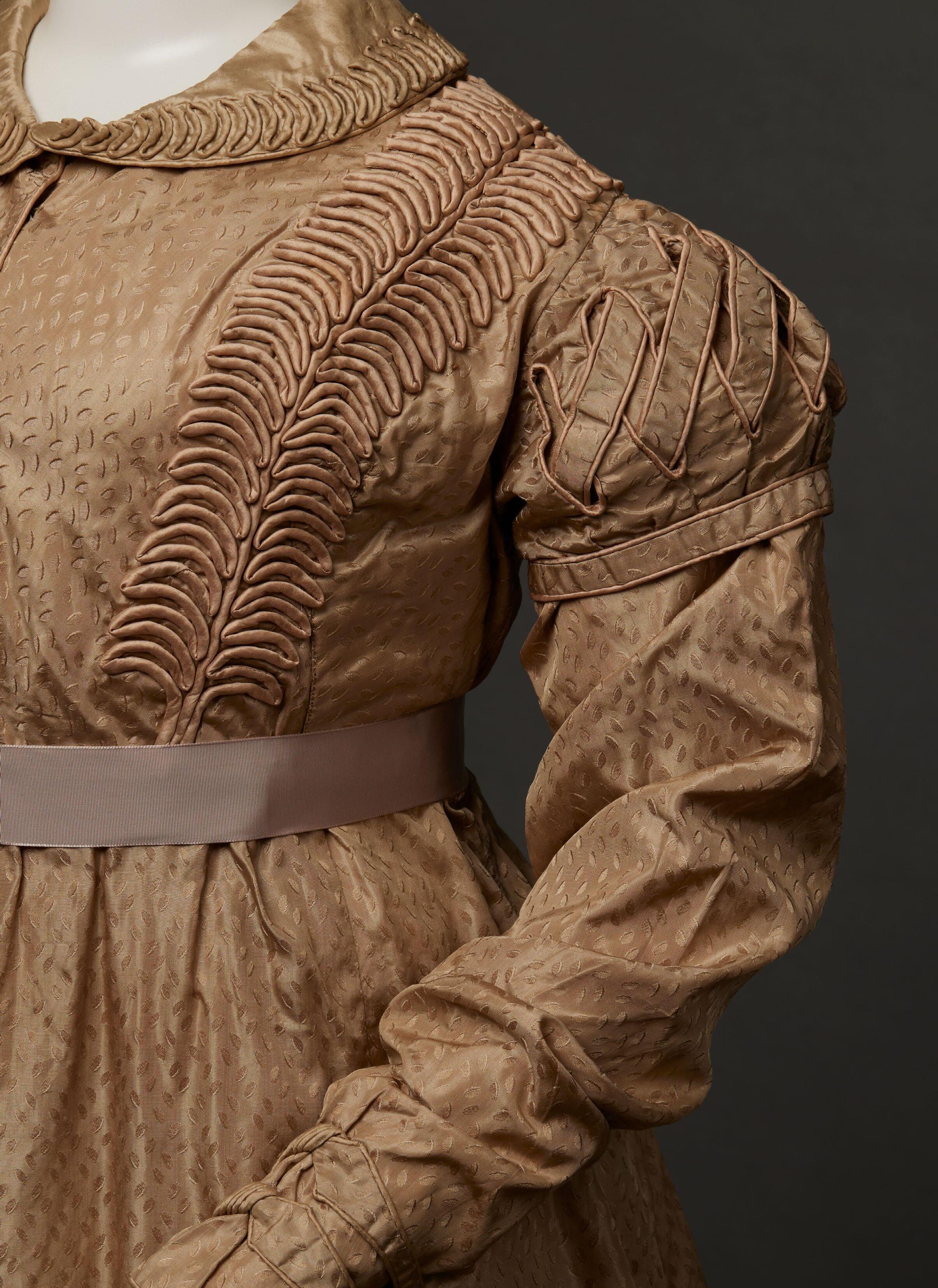

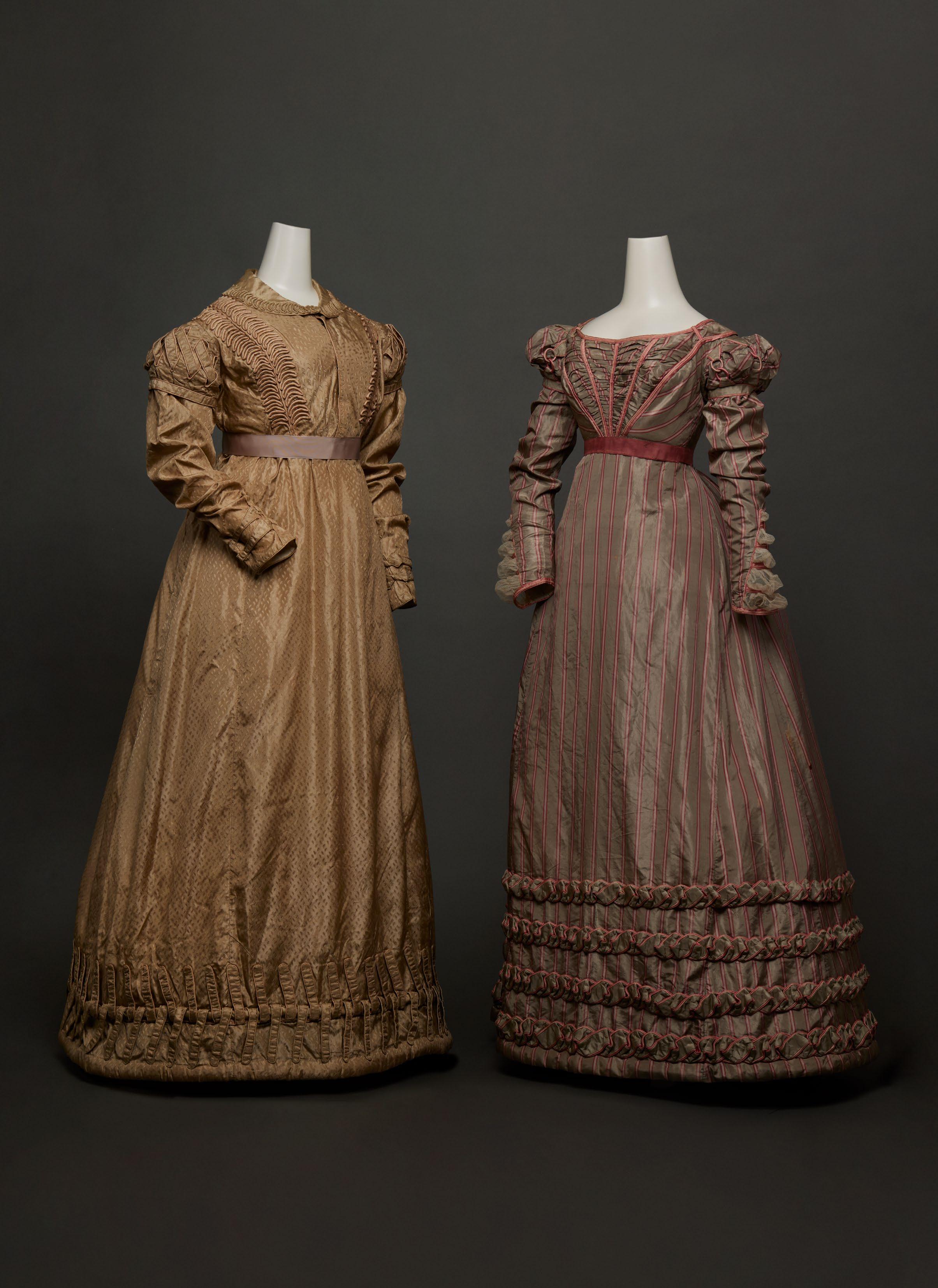
PROMENADE DRESS AND LATE DAY/DINNER DRESS
British, ca. 1820
Around 1810, the emerging Romantic influence on women’s fashionable dress, inspired by styles of the fifteenth, sixteenth, and seventeenth centuries, superseded those of classical antiquity that had been dominant since the late eighteenth century. The white, minimally adorned columnar silhouette gave way to a more colorful A-line shape with an increasingly riotous profusion of applied decoration on the upper sleeves, bodice, and hem. The widespread vogue for what the French referred to as “ le goût gothique” was mutually reinforced by a reciprocal relationship between painting, the theater, and fashion.
These two silk dresses dating to around 1820 exemplify this sartorial shift. The high neck, collar, and apron-front closure of the taupe dress are consistent with morning or walking attire, while the striped gown’s low, wide neckline, back closure, and more sophisticated, formal appearance indicate late day or dinner wear. In both gowns, the sleeves’ puckered fullness with cuffs extending over the top of the hand evokes shapes from the mid-fifteenth century, while the “epaulette” imitates sleeve rolls at the shoulder of women’s dresses in the 1570s. Between 1817 and 1823, fashion plates and their accompanying descriptions in The Repository of Arts, Literature, Commerce, Manufactures, Fashions, and Politics and La Belle Assemblée—the two leading English fashion publications of this period—emphasize the importance of the epaulette and the loops, folds, puffs, plaits, bands, and slashes employed by dressmakers to add novelty to the upper sleeve. Additionally, they detail for readers the myriad “elegant festoons” that adorned the ever-widening hem. The taupe dress features epaulettes of self-fabric interlaced piped bands and a deep border of matching sawtoothed bands.
On the striped gown, the epaulettes’ fullness is secured by self-fabric tabs, interlocking pale- and rose-pink satin corded rings, and four rows of intertwined gray silk taffeta bands; matching satin piping embellishes the lower skirt. The cuff treatment with puffed insertions of silk tulle bound by piping simulates slashing that was associated with archaic Spanish modes. A fashion plate illustrating a walking dress in the November 1822 issue of the Repository notes that “the upper sleeve is full, and slashed à l’Espagnol.” The gored skirts of both gowns are finished with padded rolls, or rouleaux, at the hem that hold out the fullness.
Bodice fronts also manifested exuberant three-dimensional trimming. On the taupe silk dress, symmetrical leaf-shaped bands of padded silk taffeta cover the bust and shoulders and a single band decorates the deep round collar. The striped dress’s tightly ruched bodice front with vertical pink satin bands suggests a stomacher—a triangular piece of fabric used to fill in gowns with front openings from the late sixteenth through the eighteenth century. An evening dress illustrated in the Repository in July 1822 displays a similar bodice front, described as a “stomacher”; a summer carriage dress illustrated in La Belle Assemblée in July 1821 showing a bodice with “antique crossings, and with robings richly embroidered, and edged to correspond with the pink rouleaux across the stomacher” resembles that of the striped silk gown.
Although both gowns retain the high waist of the early nineteenth century, the use of silk rather than cotton for daywear accords with their date. The taupe silk, self-figured
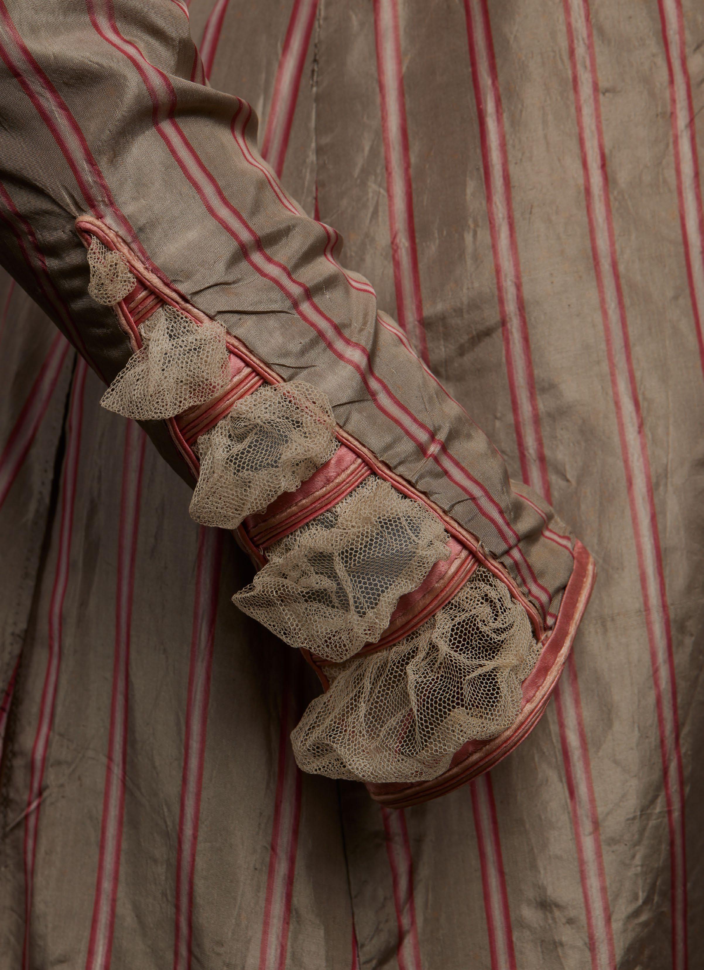
with tiny, stylized leaves is likely a sarsnet—a term that appears frequently in the Repository referring to a lightweight plain- or twill-weave silk, often patterned, that was used extensively for both outer garments and linings. The pale gray silk taffeta with narrow pink-and-white stripes corresponds to a description from the November 1823 issue of La Belle Assemblée of currently fashionable “Lyonese silks with satin stripes” with a ground color “as changeful as the glossy neck of the dove” with a stripe “of some predominant hue, that is suitable to all the different shades and yet strikingly different.”
Similar piped applied decoration, including intricate epaulettes and cuffs, appear on a pink silk spencer and a taupe silk pelisse-robe, both dated about 1820, in the collections of the Metropolitan Museum of Art (1987.232.2) and the Victoria & Albert Museum (T.383-1960), respectively. The latter also features a rouleau at the hem. The triangular cuff treatment on the striped gown resembles that on a ca. 1820 pelisse, also at the Victoria & Albert Museum (T.357-1920). A silk day dress with vertically disposed front bodice trimming and elaborate epaulettes, cuffs, and hem embellishment, dated about 1820, is at the Metropolitan Museum of Art (1984.241).
MM
FIG. 8
“Carriage Dress,”
La Belle Assemblée, July 1821, hand-colored engraving. Victoria & Albert Museum, E.1963-1888
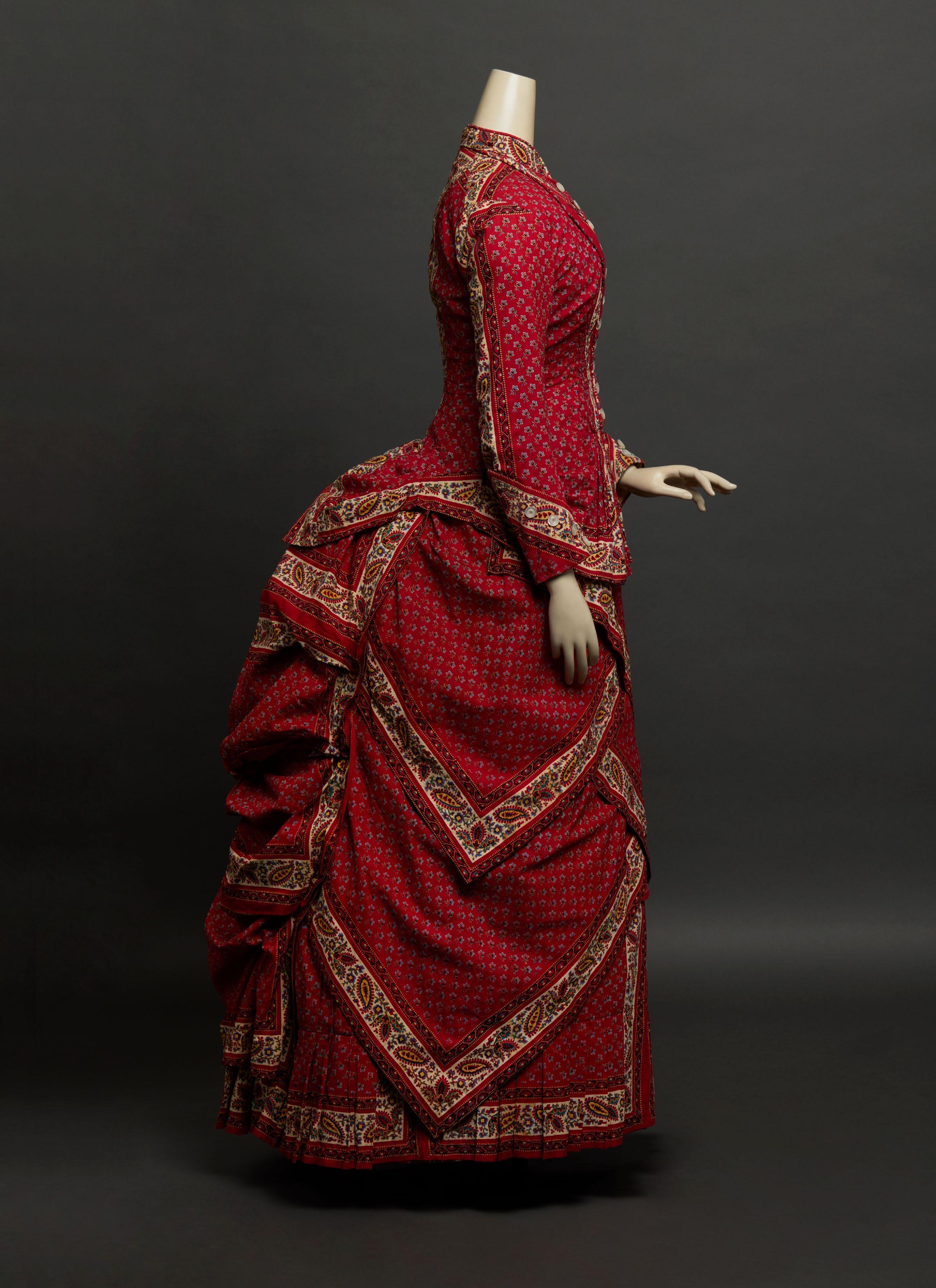
HANDKERCHIEF DRESS OF PRINTED TURKEY-RED COTTON
American, ca. 1885
On the front page of its March 20, 1880, issue, Harper’s Bazar illustrated a “graceful dress of handkerchiefs,” describing it as “one of the most stylish French models for dresses made of the Scotch gingham handkerchiefs, and also for the genuine bandanas” as well as “one of the most successful models used” for this popular type of summer daywear. Although the widespread vogue for handkerchief costumes deemed “most coquettish and dressy-looking for mornings at the watering places and country resorts” was at its peak between 1878 and 1880, the pronounced bustle in this bright-red, two-piece printed cotton dress indicates a date of about 1885, when this novelty toilette made a brief comeback.
The bold Indian-inspired palette corresponds to those of handkerchief dresses that appeared in 1878. In June of that year, Bazar reported that “most unique cotton dresses are made of the soft fine Madras handkerchiefs in gay colors with borders” and that “bright yellow with red and indigo are used in these dresses, which are the caprice of the moment in Paris, and are so popular that the supply of genuine Madras handkerchiefs is exhausted.” In February 1879, the magazine observed that “percales in handkerchief patterns are brought out this season as the result of the handkerchief dresses the fashionable modistes made last summer out of the regular bandanas of gay colors.”
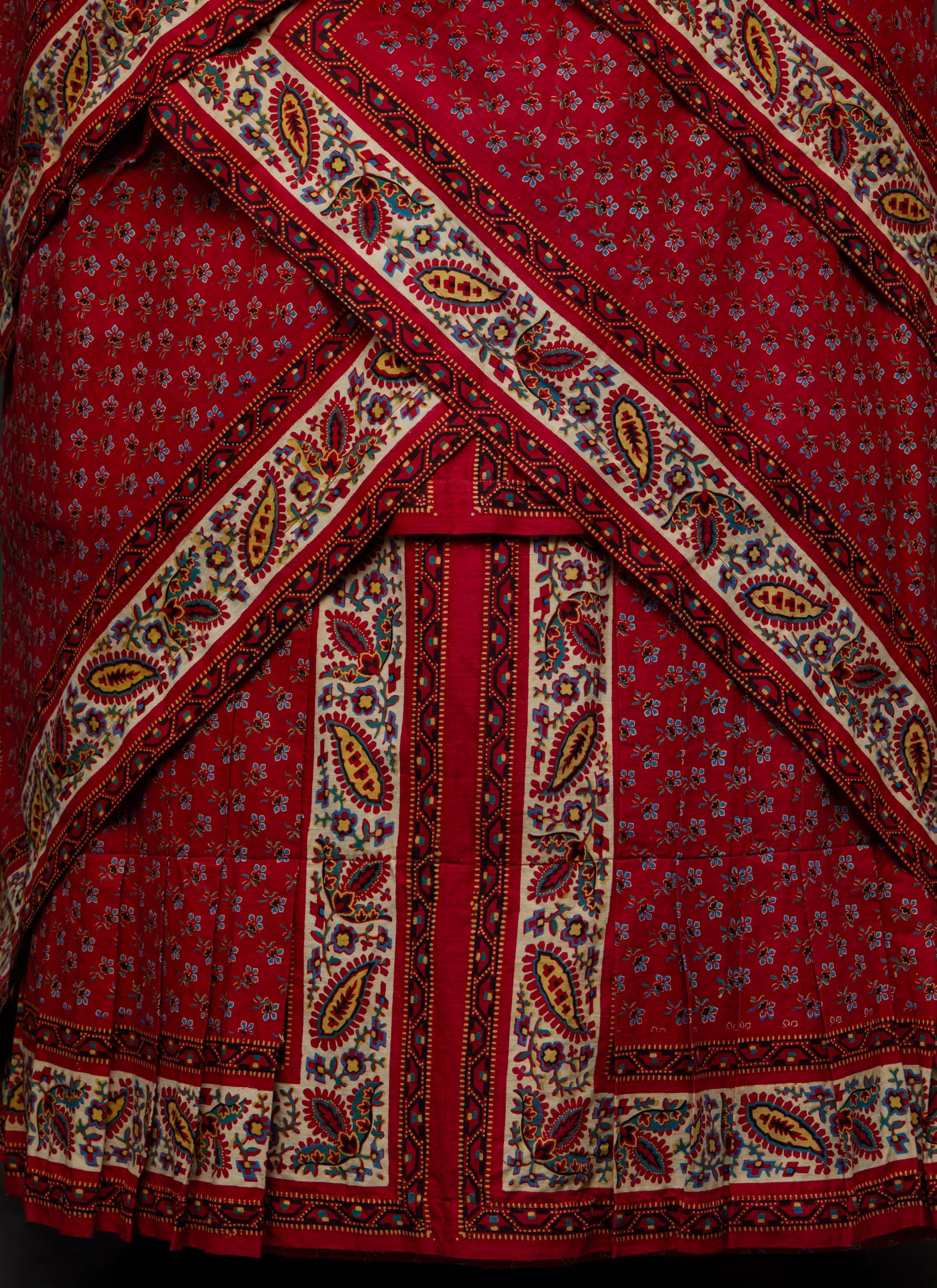
The ensemble’s vivid, colorfast ground color, known as Turkey red, was achieved through a time-consuming, complicated dyeing process introduced into Europe in the eighteenth century. The technique, which incorporates the three main ways of tanning leather, suggests that Turkey red originated in a leather-producing region in the Middle East. Turkey red flourished throughout the nineteenth century, notably in Alsace, Lancashire, and the Vale of Leven, Scotland. The quality of the ingredients—including vegetable oils used to pre-treat the cotton yarn or cloth prior to dyeing; madder root, a plant-based dyestuff; mineral-containing animal blood; and an aluminum mordant—were key to obtaining the highly desirable saturated red hue of the final product. Skill and judgment were required from experienced dyers who undertook the numerous process steps, many of which had to be repeated over the course of several weeks. Once the cloth had been dyed, the distinctively robust motif colors like those in this cotton—white, Prussian blue, black, Persian berry yellow, and green—were added by selectively discharging the red ground and printing the re-whitened areas with wooden blocks, probably used here, or engraved rollers; multiple printing techniques might also be used in a single piece of fabric.
The maker of this dress strategically employed the handkerchief’s pattern of floral sprigs surrounded by wide borders with small geometric botehs and stylized leaves. This design, in imitation of costly Indian Kashmir shawls that had been fashionable in Europe since the late eighteenth century, was quickly adopted by printed cotton manufacturers for a wider audience in the form of accessories and yardage. On the tightly fitted peplumed bodice with shirring and piped revers, the borders delineate the standing collar, outer sleeves, shoulder and curved center back seams, pointed cuffs, and hem. On the overskirt, they heighten the angularity of the diagonally draped overlapping panels and contrast with their vertical and horizontal disposition on the box-pleated underskirt.
In the same March 1880 issue of Harper’s Bazar, the editor explained that the illustrated dress “is composed of square handkerchiefs … that are not cut apart, but are bought all in one piece,” and a few weeks earlier, she noted that although the “squares are all woven in a piece … yet the fabric is sold by the square for 50 cents each, and about twenty handkerchiefs are required for a costume.” This dress incorporates approximately fifteen thirty-inch-square handkerchiefs, both uncut and cut to create the shapely silhouette. In addition to the illustration and description of its cover ensemble, the magazine included a paper pattern, costing twenty-five cents. Intended for skilled home sewers or dressmakers, patterns further disseminated the latest fashion trends among Bazar’s readers.
As seen in the adjacent French fashion plate dating 1886–87, matching parasols often completed this summer attire. In August 1878, Harper’s Bazar related that, in Paris, “a small [matching] umbrella” accessorized the dresses “made of Madras plaids and of bandana handkerchiefs.”
Found in Pennsylvania and likely made by the wearer herself, this conspicuous handkerchief dress speaks to the rapid transmission of current modes from the acknowledged fashion capital of Paris to American women in the late nineteenth century and a long-established appreciation for the vibrant, lively patterning of Indian-style printed cottons. MM
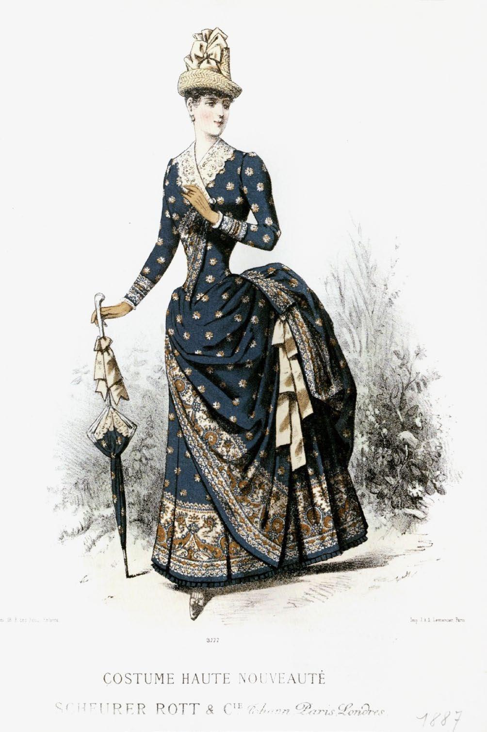
FIG. 9
Ivan Pouillet, Costume Haute Nouveauté, ca. 1886–87, chromolithograph, printed by J. & A. Lemercier for Scheurer Rott & Cie. Musée de l’Impression sur Étoffes, 2009.0.16

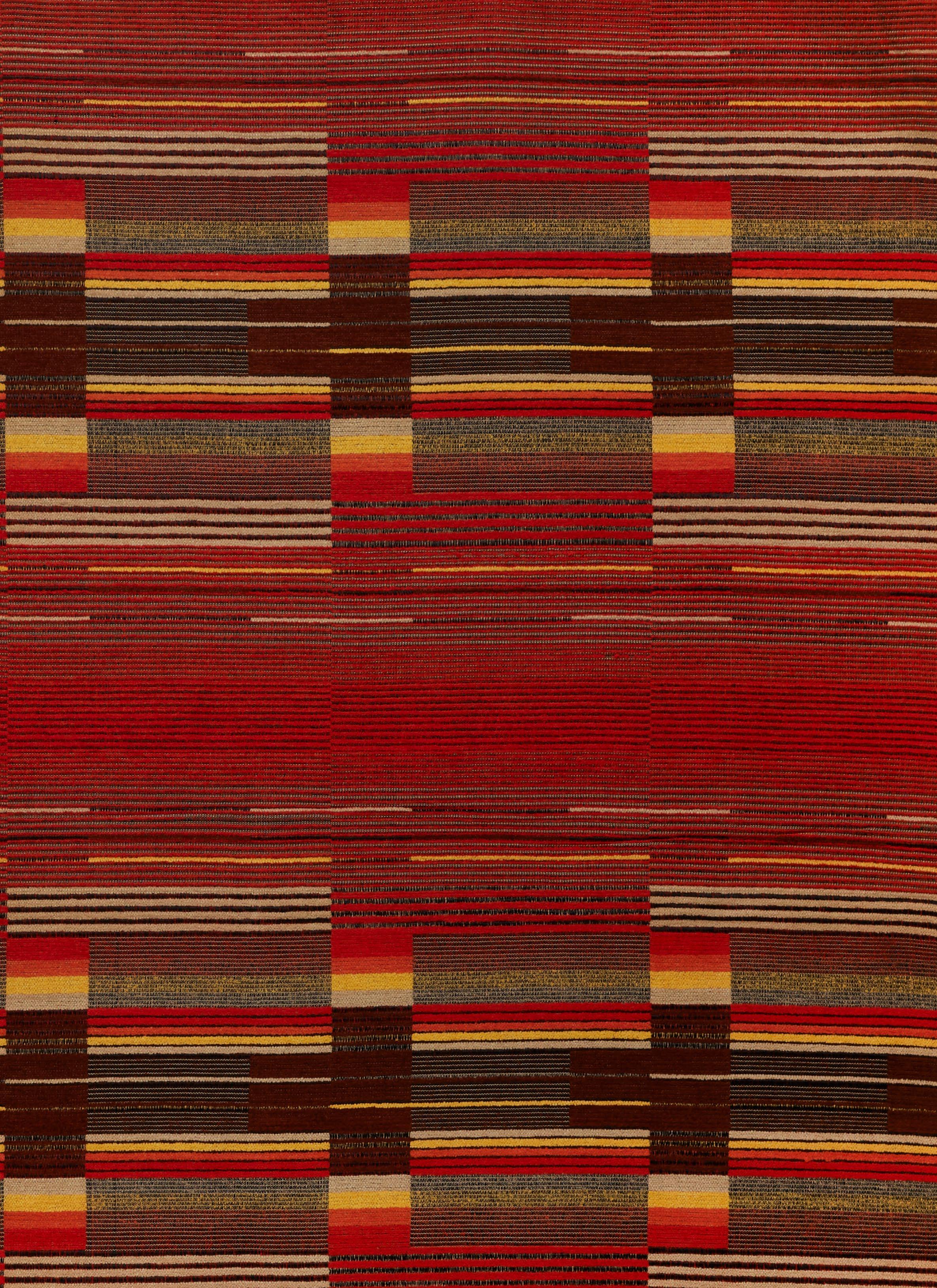
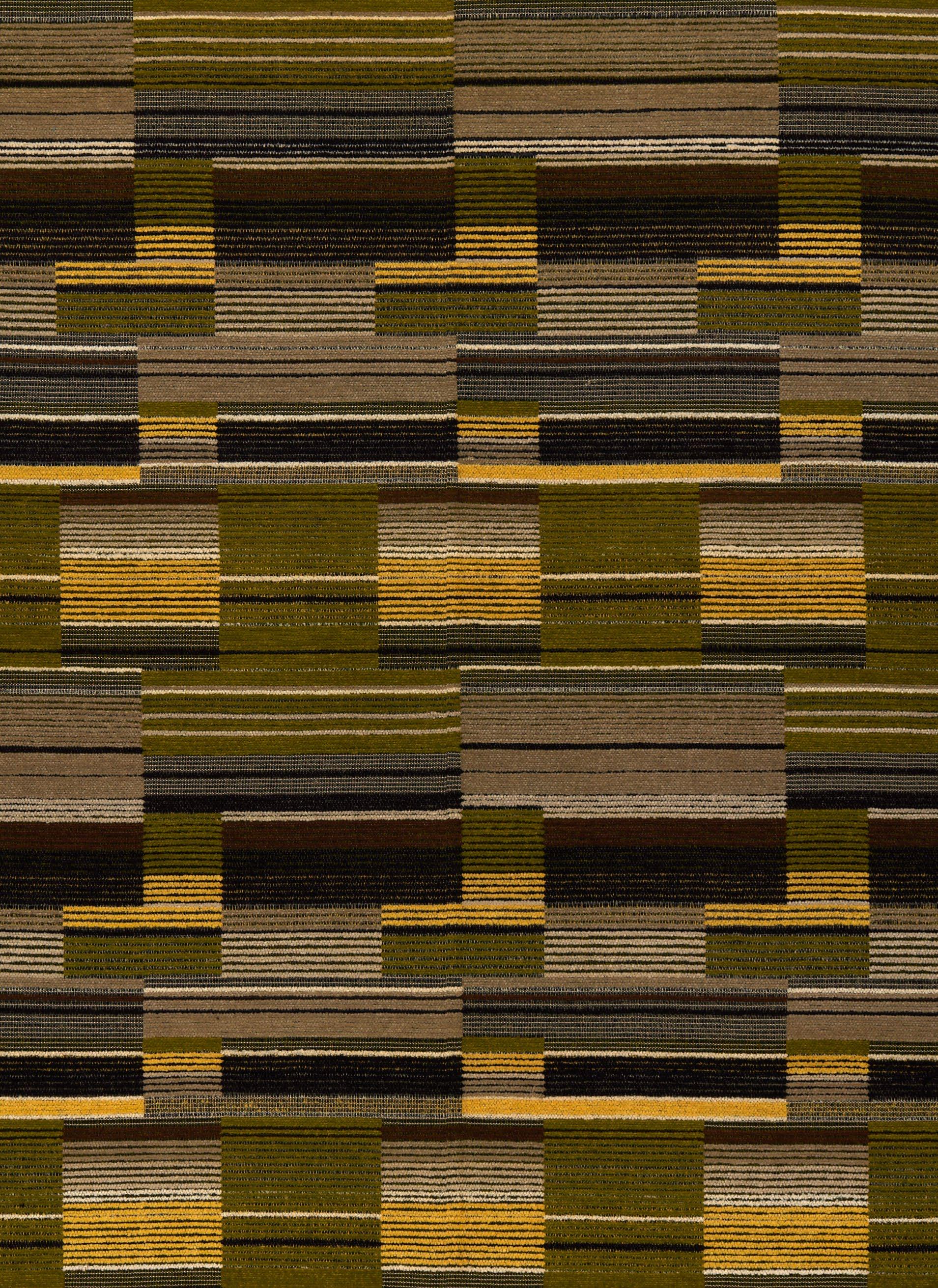
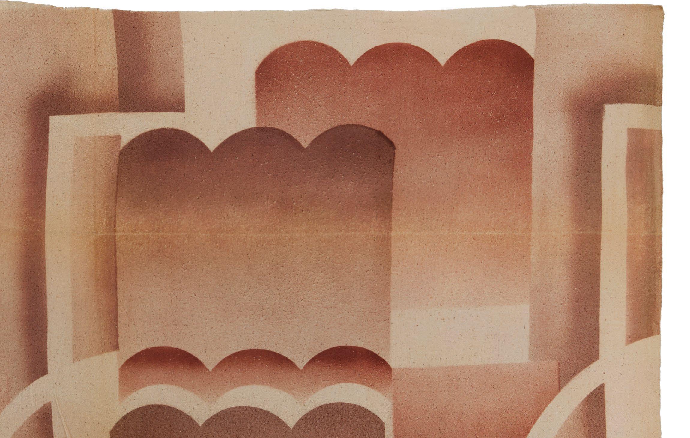
SIGMUND VON WEECH
Woven cotton and rayon samples
German (Schaftlach), ca. 1928–32
50 x 50 in. to 58 x 58 in.
In a 1931 article “The Sensible Home—Modern Interior Decoration” in Creative Hands, the English-language supplement to the German craft and design journal Kunst und Handwerk, the author recounted the wave of European architects concerned with designing interiors on the more intimate scale of new homes and apartments, and the impact of this approach in the United States. Arguing for the need to elevate soft furnishings, in particular, within these spaces, the author offered a case study of one designer’s practice and commitment to handcrafted textiles in this context: the Bavariabased weaver Sigmund von Weech (1888–1982). His interiors are:
representative of the best that is being offered by these modern architectdecorators. One is struck at a first glimpse with the feeling of openness; here is a room in which it is possible to breathe freely and in comfort—an enormous gain compared with the oppressively heavy or ornate styles of former years. … As it is the conviction of Professor von Weech that both furniture and fabrics should be especially designed with reference to their environment, each commission is a new challenge to his creative skill, and is executed with fresh enthusiasm.
This aligned with von Weech’s own teaching and writing. In his article “Handwerk und Maschine in der Weberei” (Handwork and Machines in Weaving) in the periodical Die Form in March 1933, he advocated for the usefulness of handweaving (over mass jacquard production) in textiles for the home and body.
The article in Creative Hands concludes by revealing that the focus on von Weech was intentional. Publishers anticipated a niche market for his textiles within the US decorating world and arguably chose to promote his work over those of other handweavers working in the same experimental, modernist modes—notably the women of the Bauhaus, with whom he was associated.
After studying at the Technische Universität and Königliche Kunstgewerbeschule in Munich, von Weech opened a weaving workshop in Schaftlach in Upper Bavaria in 1920, eventually employing about a hundred people. He was appointed Honorary Professor at the Technische Universität in 1926 and joined the faculty of the Textil und Modeschule in Berlin, where he worked alongside Bauhaus weavers like Margaret Leischner. His designs caught the eye of the Metropolitan Museum of Art, which exhibited his textiles in 1927. He received favorable French press for his weavings that same year. In 1933, Ambrose Heal, chairman of the English furniture company Heal & Son, commissioned a series of carpets from him. He also designed carpets for the Vereinigte Werkstätten für Kunst im Handwerk, Munich (see pp. 83–90).
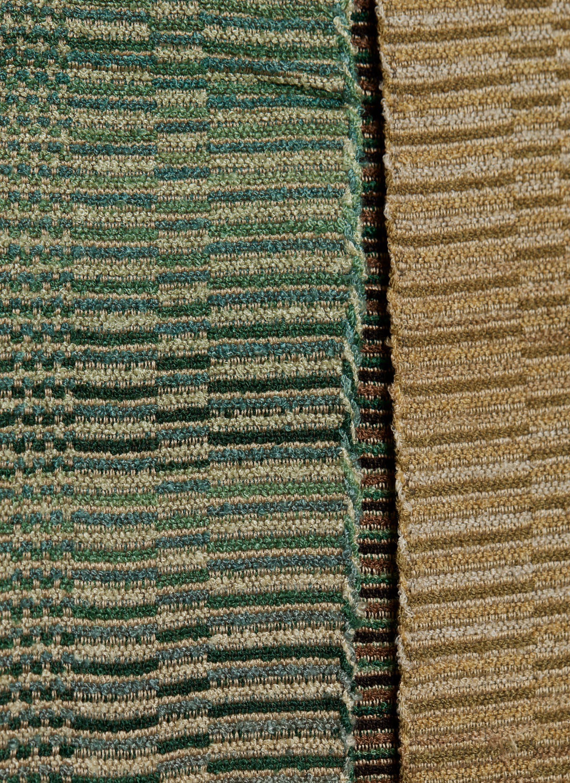
His workshop logo—three stylized shuttles enclosing his initials “VW”—appears on paper labels on some of the present weaving samples. This collection indicates at least one attempt during the late 1920s to bring von Weech’s weavings to US audiences, as the article in Creative Hands had hoped. Found among the New York showroom inventory of the Parisian luxury decorating firm Lucien Alavoine & Company, these large-scale samples illustrate the impressive range of von Weech’s products for upholstery and drapery, as well as the myriad combinations of color, fiber, and weave structure with
which his studio experimented. Primarily warped in thick rayon, the weavings use a variety of materials and patterns. Broken twill in herringbones and chevrons adds depth to wide silk and rayon stripes intended for cushion covers. Allover cotton chenille tufting creates rhythmic geometric designs for curtains, like his proscenium curtain for the Kammerlichtspiele in Munich, and horizontal stripes to complement the softened angles of tubular steel furniture. Two chenille samples are identical to weavings at the Kunstsammlungen Chemnitz (XII/8687, XII/8688) and a fragment at the Metropolitan Museum of Art (2001.149, sold by Cora Ginsburg LLC).
In 1931, von Weech became director of the Textil und Modeschule, where he remained until 1943. While these early textiles illustrate his close association with radical, avantgarde design, the late 1930s marked a momentary departure from that tradition for von Weech, who chose to remain in Germany through World War II and worked under the Third Reich. Although never a registered party member, he accepted design commissions from Nazi officials from the late 1930s. This problematic past, however, emphasizes the difficulty that historians today have in understanding the nuances in the stories of artists and designers who continued to work in Germany during the war. In von Weech’s case, his Bauhaus-aligned commitment to textile experimentation and innovation challenges the belief among some scholars that modernist artistic progress in interwar and postwar Germany—and our acceptance or inclusion of certain figures within the design history canon—must be defined in binary terms today.
Other weavings by von Weech include those in the collections of Die Neue Sammlung, Munich (995/88-1, 995/88-2) and the Nasjonalmuseet (OK-2002-0045). His drawings for textile and carpet designs are at Die Neue Sammlung (997/88, 999/66) and the Victoria & Albert Museum (E.543-1971, E.544-1971).
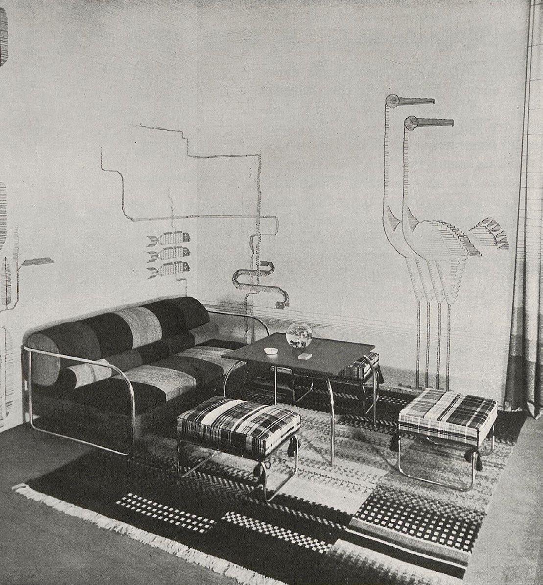
FIG. 10
Interior designed by Sigmund von Weech, Kunst und Handwerk, March 1931.
MDA
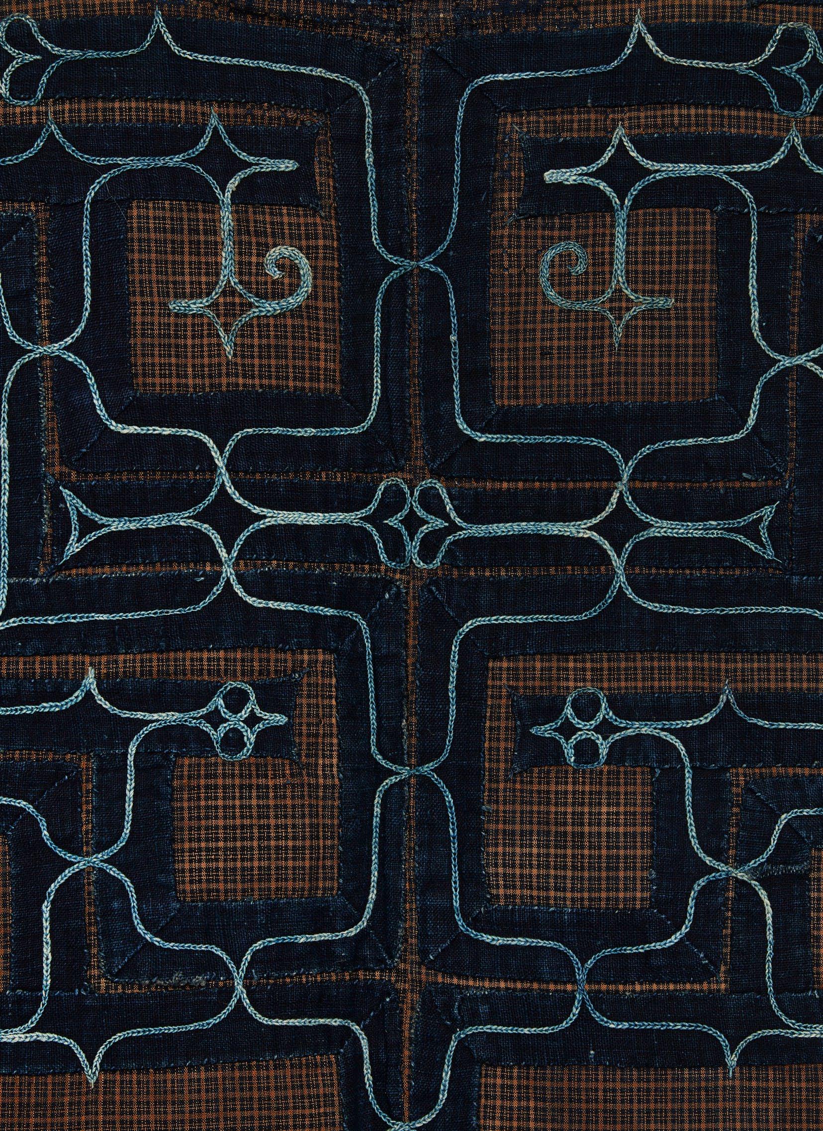
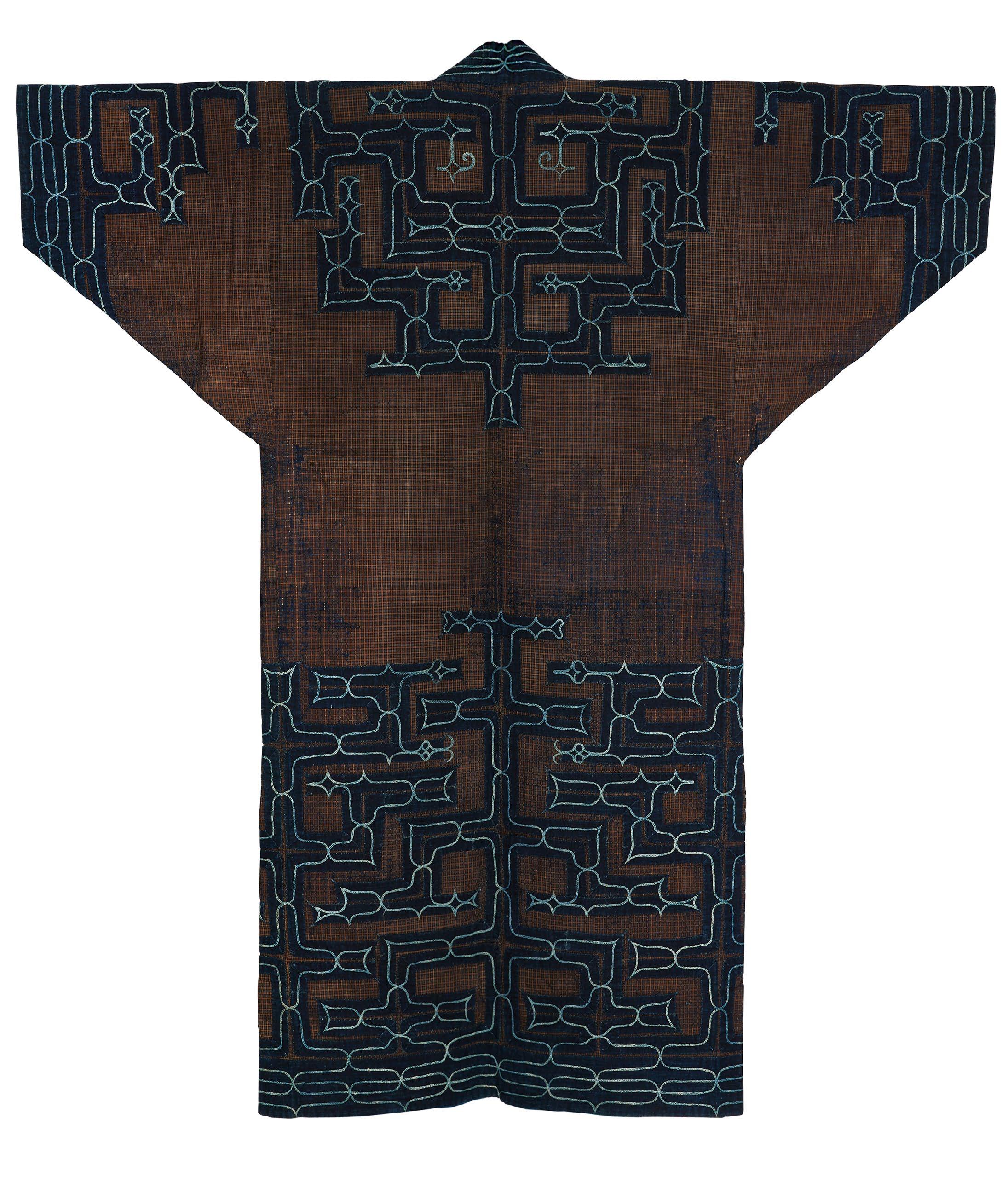
CHIKARKARPE ROBE
Japanese (Hokkaido, Ainu people), late 19th century 53 x 48 in.
For generations, textiles have been central to the ethnic identity of the Ainu people of Hokkaido Island. This can be traced back as far as the cord marking seen on pottery of the Jōmon period (14,000–300 BCE), which represents the earliest known Japanese material culture and retains remarkable similarities to more contemporary Ainu forms and designs. That aesthetic correlation may, in part, be the result of the Ainu’s relative isolation from the rest of the Japan until the Edo period (1603–1868).
At the same time, nineteenth- and early twentieth-century Ainu arts create a dialogue with mainland Japanese products. The present robe—dated to the early Meiji period (1868–1912)—marries the Ainu’s repertoire of apotropaic imagery with materials, silhouette, and ornament from the mainland. Roughly translated from Japanese as “the things we embroider,” chikarkarpe robes like this one exemplify the Ainu people’s new interactions with merchants on the main island of Honshu. While other Ainu bast-fiber outerwear is constructed in the more typical Indigenous mode and closes symmetrically down center front, chikarkarpe robes recycle premade cotton kimonos, with overlapping tomo-eri (lapels) and okumi (front gores). The striped or checked cotton ground fabrics were imported to Hokkaido as finished robes and were then tailored and embellished by women; all textile labor, from the gathering of fibers to the finishing of garments, was traditionally done by the women in an Ainu family.
This example repurposes a yukata (summer kimono) of brown-and-blue plaid cotton. In addition to altering the shape of the body and sleeves, the embroideress added appliqués of indigo-dyed cotton bands, both for reinforcement of the fabric and overall design. She worked the surface in light blue cotton oho (chain stitch) depicting variations of aiushi (thornlike), siki (diamond), and moreu (spiral) motifs—protective and auspicious symbols that within each community and family could hold different meanings—as well as delicate hearts, an element that resulted from mainland trade. This robe was also remade at least twice in its lifetime on Hokkaido. The palimpsests of unpicked embroidery form abstracted patterns across the checked surface, with the pinholes that surround previously appliquéd areas now revealing glimmers of the teal blue cotton lining.
A chikarkarpe robe of very similar cotton with heart-shaped embroidered motifs is in the collection of the Minneapolis Institute of Art (The Thomas Murray Collection, 2019.20.16).
MDA

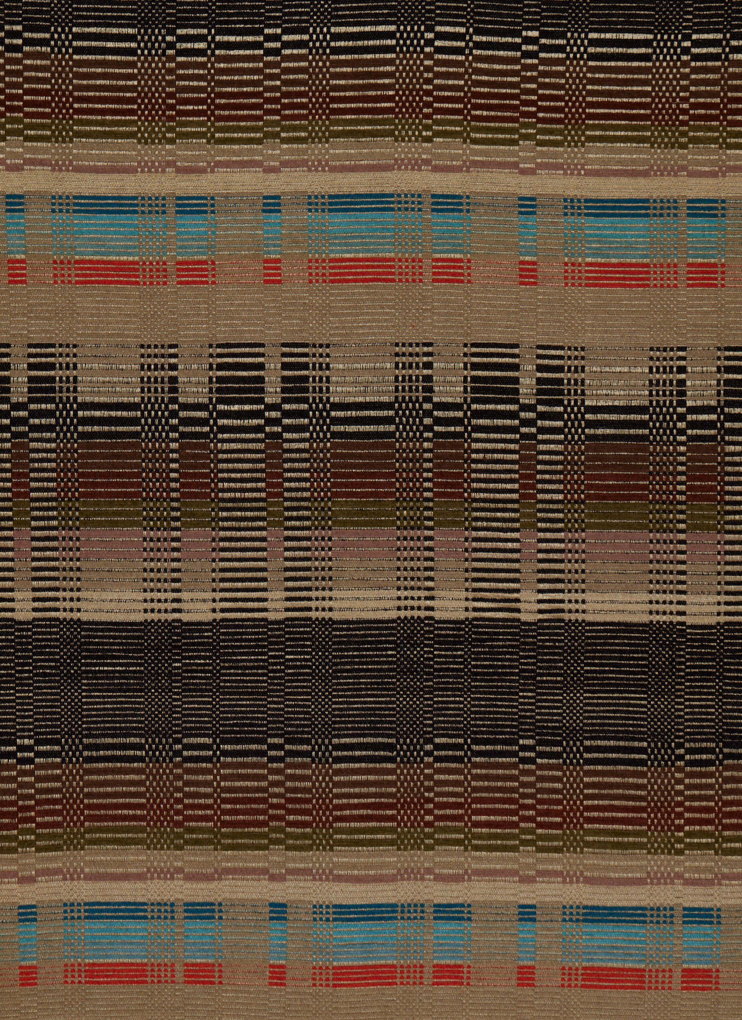
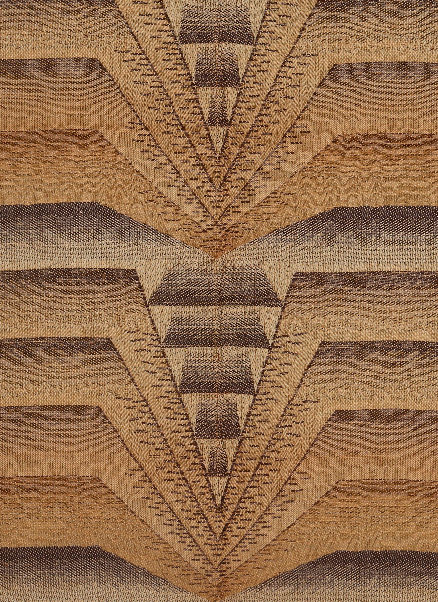
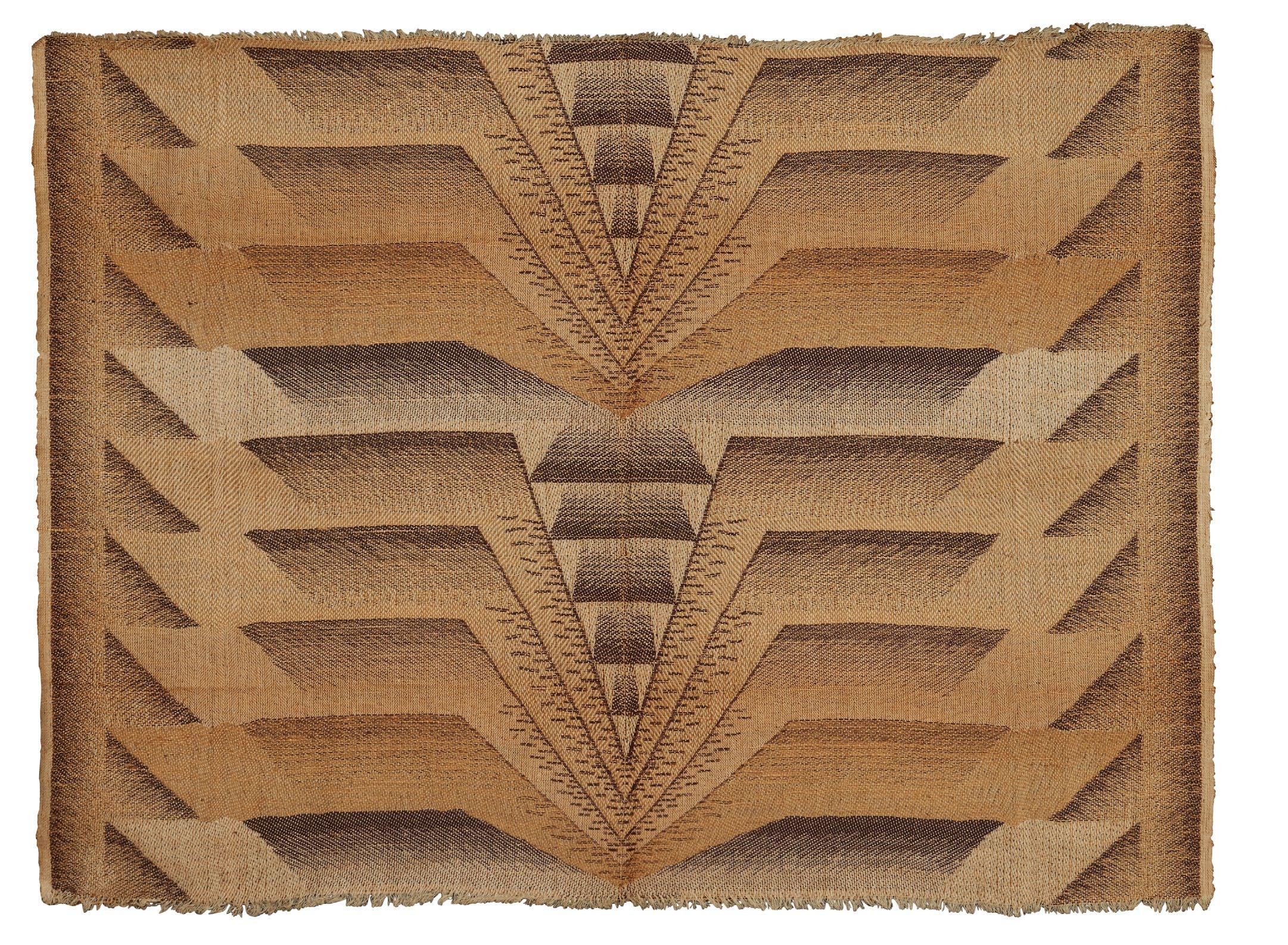
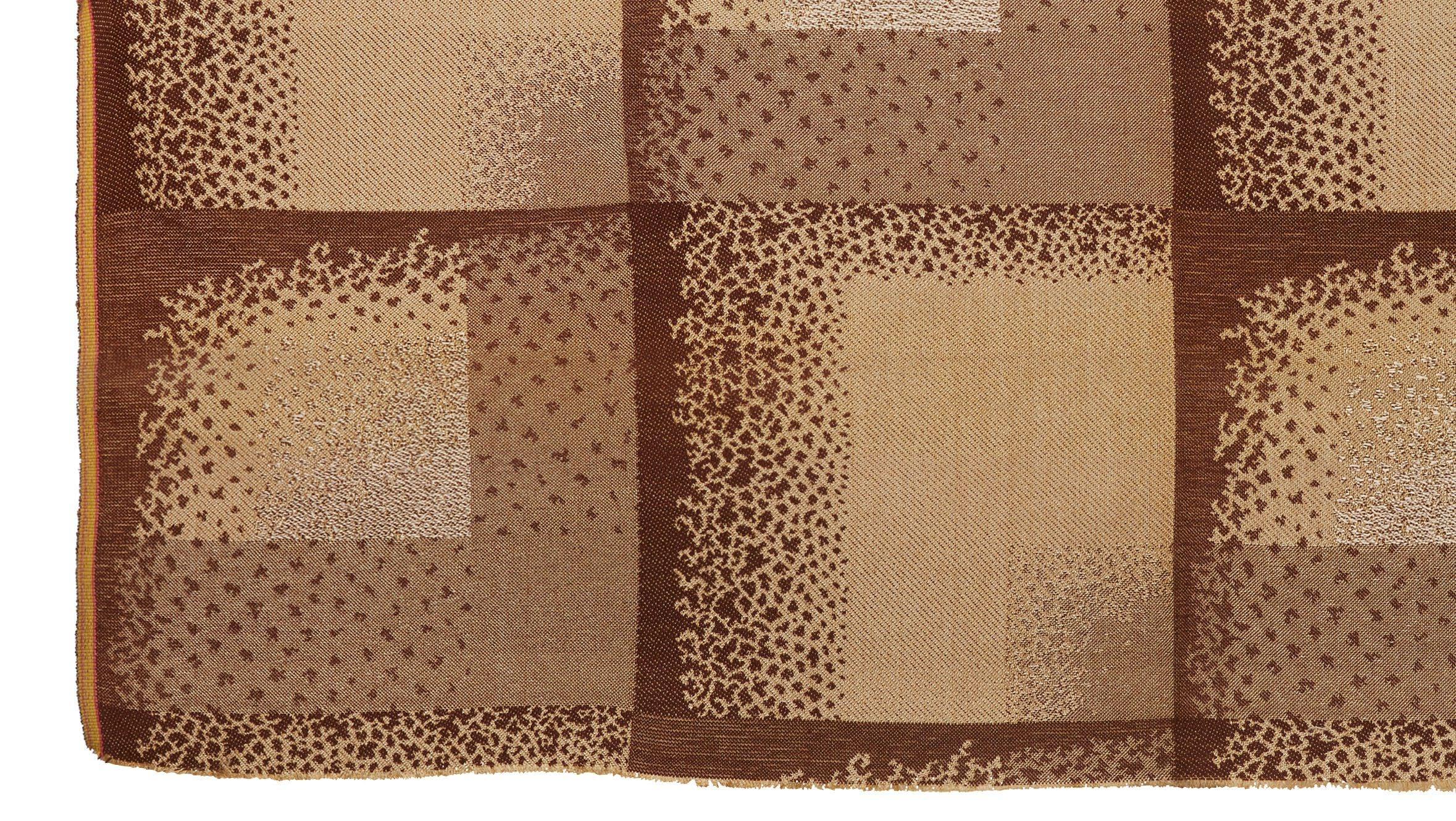
RODIER
Jacquard-woven jute and cotton samples
French (Bohain-en-Vermandois), 1927
36 ½ x 50 ½ in. each
In his 1931 book The Romance of French Weaving, the textile entrepreneur Paul Rodier (1867–1946) offered English-language audiences a thesis of storybook proportions on weaving as fundamental to France’s history and identity. Although focused on the period up to the First Empire, Rodier argued that advancements in the craft had helped the country to gain recognition as a leading technological innovator and tastemaker in art and fashion, and he concluded that the preservation of handweaving in the present and future was necessary to French cultural heritage.
Beyond pen and paper, Paul Rodier’s commitment to protecting traditional weaving was evident in his own commercial defense of the industry via his family business. His father, Eugène Rodier, had founded the firm in 1853 in the town of Bohain-en-Vermandois in northern France, already an established textile manufacturing center. Under Paul Rodier’s watch, Maison Rodier grew to employ some two thousand people.
In the twentieth century, Maison Rodier was most closely associated with production of textiles for the haute couture and ready-to-wear industries, particularly knits and prints in wool, rayon, and silk regularly used by designers including Paul Poiret, Gabrielle Chanel, Madame Grès, and Charles James. For a brief period in the 1920s and 1930s, the firm also produced inventive and unusual woven and embroidered fabrics for furnishing. These received particular attention at the 1925 Exposition Internationale des Arts Décoratifs et Industriels Modernes and the 1927 Salon des Artistes Décorateurs.
Despite Rodier’s prolific repertoire—estimated at five thousand designs annually by 1933—very few extant fabrics are today securely attributed to the manufacturer, and fewer still survive of their oeuvre for furnishing. These two samples, woven in bast and cotton on a jacquard loom, mark a high point in the company’s groundbreaking though short-lived home textile production. In Le Jet d’Eau (Waterfall), thick wefts in tan jute and red cotton, bound in twill with white cotton warps, form a subtle composition depicting a continuous vertical geyser that, in its stylized simplicity, might be confused for the trunk and leaves of a never-ending palm tree. The design was produced in another variant, cotton voile with machine-embroidered motifs in rayon. The unnamed second design, in espresso brown cotton and undyed jute wefts with white cotton warps, adapts the angular rhythm and movement of futurist painting to jacquard weaving and calls to mind the relationship between cars, fashion, and art in 1920s Paris. Attached swatches indicate that Rodier also produced a version with navy blue cotton wefts, and Le Jet d’Eau came in an emerald colorway. Both designs were among the textiles exhibited by Rodier in L’Art de la Soie Moderne (The Art of Modern Silk) at the Musée Galliera in 1927.
Cecil Beaton used these two fabrics, as well as others by Rodier, in numerous portraits of socialites that were featured in American Vogue between 1927 and 1930. Le Jet d’Eau was the backdrop in his portraits of Janet Newbold Ryan Stewart, Daisy Fellowes, and Ellen Wilson McAdoo Hinshaw, granddaughter of Woodrow Wilson. Beaton chose the more angular design by Rodier for his photographs of Martha Jewett Nicholson Doubleday and Edwina Cynthia Annette Mountbatten, Countess Mountbatten of Burma.

ÉRIC BAGGE FOR LUCIEN BOUIX
Silk and rayon furnishing fabrics
French, 1927–28
19 ¾ x 52 in. each
In 1929, the French architect Éric Bagge (1890–1978) wrote his defense of the nonrepresentational in the periodical Art Gout Beauté. In the article, Bagge leaned on his own oeuvre as a testament to the necessity of simplicity as “a reaction against an excess of ornamentation intended to hide compositional weaknesses. … [One must] replace the often poorly treated floral elements with abstract compositions: simplicity, but apparent simplicity.”
The designs for which Bagge was widely lauded rested on that guiding principle of simplicity, and his line of textile designs for the firm Lucien Bouix was no different. As one critic wrote in a January 1929 article on the architect’s textile designs in Mobilier et Décoration: “Eric Bagge has mastered an ornamental grammar whose principles consist of excluding any naturalist motifs, playing only with triangles, diamonds, stripes, and dots, offering curious combinations of marks whose sobriety and … colorings we prize.”
These two furnishing samples, rare survivors of his little-known textile legacy, are typical of his style both in their compositions and their limited, monochromatic color palettes. Hand printed and stenciled on a bourette (slubbed silk), Synthèse features scalloped polygons, right angles, and curved lines in gradations of color from dark chocolate to wine red to salmon pink. Four other colorways are shown in the 1927–28 promotional catalogue for Lucien Bouix. Frisson, also called L’Heure Exquise, a jacquard-woven double-cloth rayon in warm sienna brown and ecru, with a gridded pattern composed of amoebic, pointillist shapes, is completely reversible and visually harmonious on both sides.
Bagge was among the architects and designers whose sleek, moderne aesthetic would make them household names in the aftermath of the 1925 Exposition Internationale des Arts Décoratifs et Industriels Modernes. Trained at the École des Beaux-Arts, Bagge quickly joined the ranks of the Société des Artistes Français and Société des Architectes Modernes and showed regularly at the Salon d’Automne and Salon des Artistes Décorateurs. From his earliest exhibited furniture designs, Bagge avoided the figural and floral—a notable departure from many of his contemporaries, such as Süe et Mare, Jacques-Émile Ruhlmann, and Maurice Dufrêne. Throughout the 1920s, Bagge executed furniture designs for several firms, including Saddier Frères, Mercier Frères, and La Maîtrise, the decorating workshops of the Galeries Lafayette, before departing to establish his own shop. At the 1925 Exposition, Bagge designed the exhibitions of the Manufactures of Gobelins and Beauvais as well as rooms within the Ambassade Française, the exhibitions of Sèvres, and the jewelry exhibition at the Grand Palais—a feat he repeated in 1929 at the Musée Galliera for the first French museum exhibition of jewelry. In 1926, one year before designing these fabrics, he was awarded the Légion d’Honneur.
A fragment of Synthèse in a different colorway is at the Musée de l’Impression sur Étoffes, illustrated in Henri Clouzot, Le Décor Moderne dans la Tenture et le Tissu (1930), pl. 24. A length of Frisson in another colorway is at the Kunstsammlungen Chemnitz (IX/9290) and a bed upholstered in the fabric was used in a Viennese interior by architect Emmerich Revesz (Innen-dekoration, July 1931, n.p.).
MDA
VEREINIGTEN WERKSTÄTTEN FÜR KUNST IM HANDWERK
Block-printed cotton and linen samples
German (Munich), ca. 1928–31
52 x 50 in. to 76 x 50 in.
Inspired by the success of the British Arts and Crafts movement, a number of applied arts schools, professional artist-craftsman alliances, and artist-designer collectives were established throughout Germany in the 1890s and the first decade of the twentieth century. One of Munich’s leading artists’ workshops was the Vereinigten Werkstätten für Kunst im Handwerk (United Workshops for Arts and Crafts). Formed in 1898 by a cadre of respected artists, the United Workshops’ commitment to gesamtkunstwerk rivaled its more acclaimed Viennese counterpart, the Wiener Werkstätte. The textiles presented here were designed between 1928 and 1931 by a few key artists who flourished at the Vereinigten Werkstätten. Lighthearted yet sophisticated, with a conscious rebuke of naturalism, each cheerful pattern survives as a sample length with additional colorways attached, proffering a tantalizing window into interior decorating trends.
Miami, Fransiska, Wien, and Steffi are attributed to the Jewish Hungarian architect Paul László (1900–1993), who, in 1936, escaped to the United States and left his mark on American modernism. Lavishly large-scale tropical foliage resonates with the glamorous title Miami, while Wien calls attention to the affinities with Viennese designs. Steffi is an outlier in the group, a complex geometric pattern alternating dark-and-light swaying striped bands, energized with blocks of diagonal lines and dappled with dots.
Emmy Zweybrück-Prochaska (1890–1956) who was born in Vienna and immigrated to New York in 1939, is represented by Blumengarten, illustrated in Deutsche Kunst und Dekoration, no. 62 (1928). Birds, bugs, and branches wound with streamers mingle with Iznik-style tulips in an open field. Her designs for the Vereinigten Werkstätten—and also those she contributed to the Wiener Werkstätte—are whimsical and light, sparkling with neoclassicism.
The bold, outsized sunflowers of Sonnenblume have yet to be attributed to a specific Vereinigten Werkstätten artist, but Primavera is a documented work by Anton (Tommi) Parzinger (1903–1981), published in Innen-dekoration, no. 42 (1931). Raised in Munich and a student of the city’s prestigious Kunstgewerbeschule, Parzinger worked for the Vereinigten Werkstätten between 1921 to 1935. Seen here in yellow and buff colorways, Primavera is a sprightly, candy-striped pattern of dragonflies and butterflies, tulips and blossoms, ribbons, and fruits exuding Parzinger’s hand, which favored flatness. This design also displays a touch of Japanese textile influence, especially the crosshatching on the plump, spotted fruit that resembles kanoko shibori (dappled fawn tie dye). As a Jew fearing Nazi persecution, Parzinger left Germany for New York in 1939, establishing a tony design studio on Madison Avenue with devotees ranging from Rockefellers to Marilyn Monroe.
Affixed to a black Primavera sample is a small hang tag for Indanthren, advertising its “unsurpassed washfast, colorfast, weatherproof” properties. Indanthren is a trade name for the first synthetic vat dyes, invented by René Bohn in 1901 and patented that year by BASF, an acronym for Badische Anilin- und Sodafabrik (Baden Aniline and Soda Factory). The German chemical conglomerate was founded in 1865 to produce soda, acids, and other compounds necessary for manufacturing dye as a way of capitalizing on a by-product of gas distillation: coal tar, the building block of aniline dyes. Indanthren became synonymous with high-quality cottons, and consumers’ brand recognition would
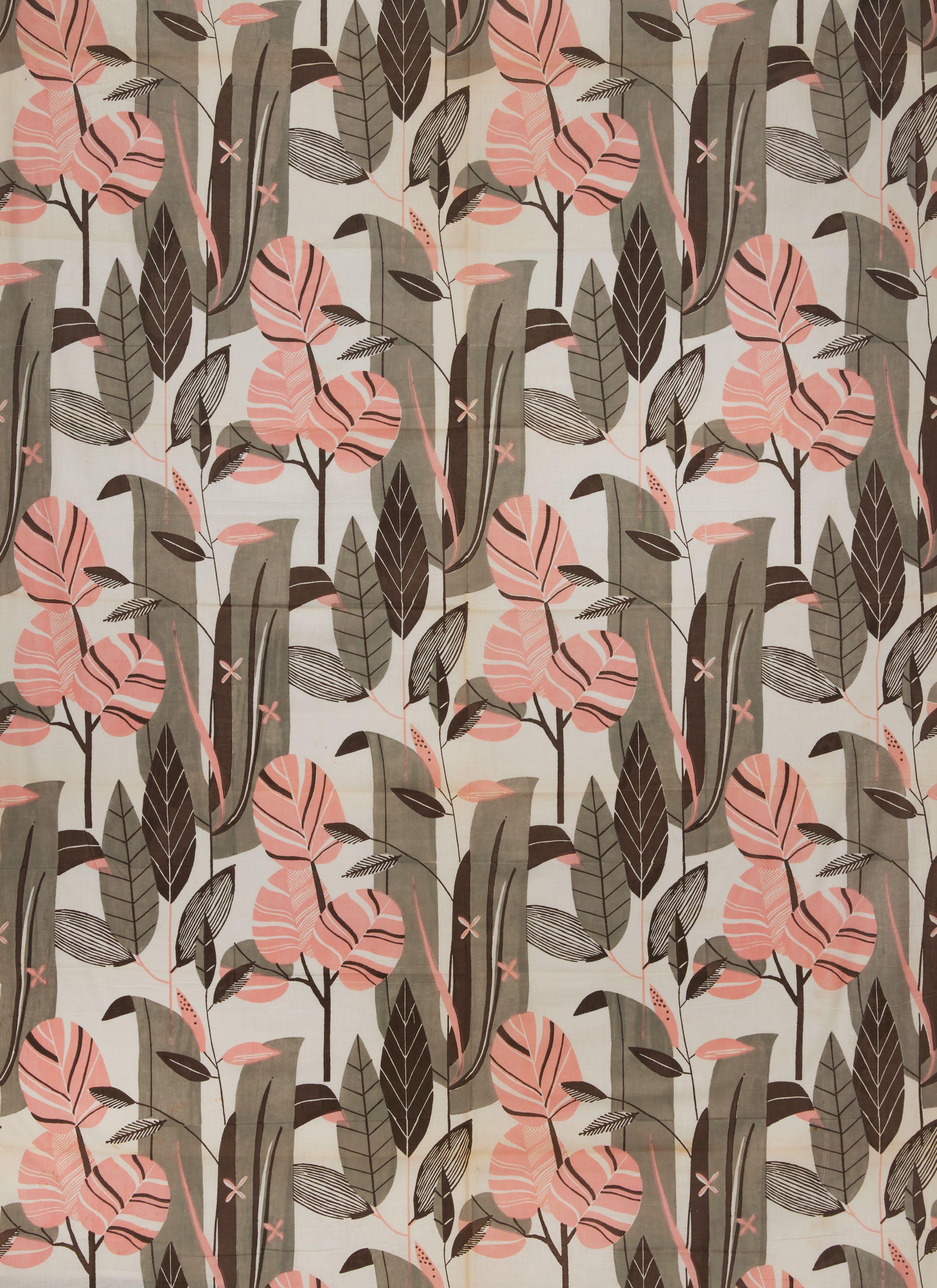
assure them of protection from fading or degradation. As reinforced by the 1928 article “New Printed Fabrics of the United Workshops,” in Deutsche Kunst und Dekoration, no. 62, the dazzling impact of these modern fabrics was paramount: “Never before has color played such an eminent role in all areas of life and the commercial arts as it does today, since the modern dye industry has made an unheard-of abundance of innovative dyes available to the textile industry. The world has become colorful, and from its colorfulness, refreshing forces flow into everyday life.”
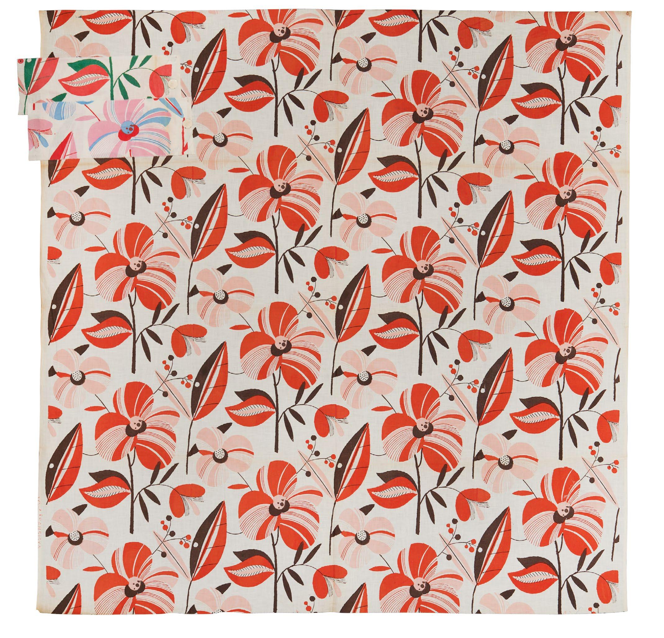
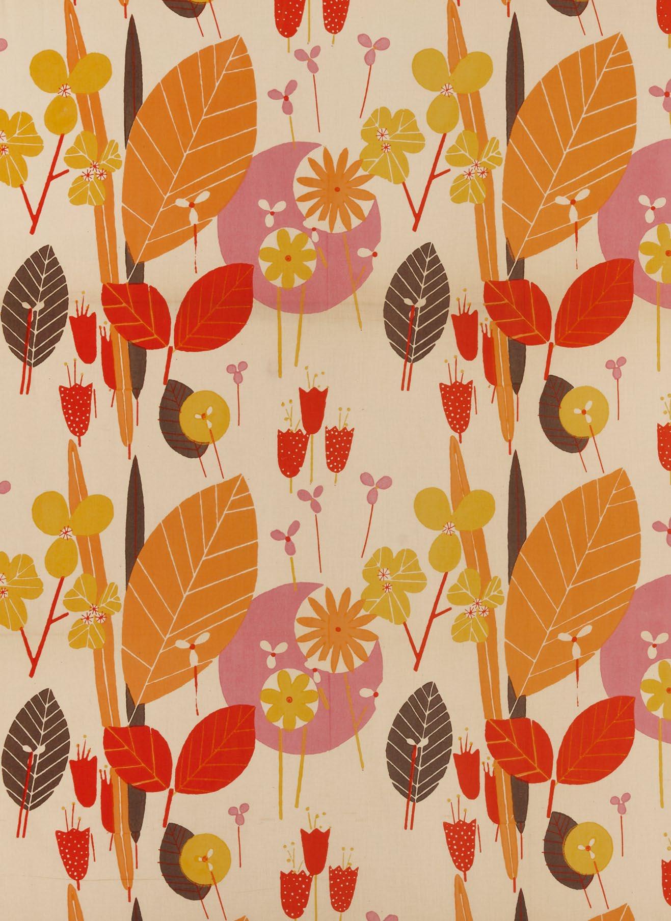
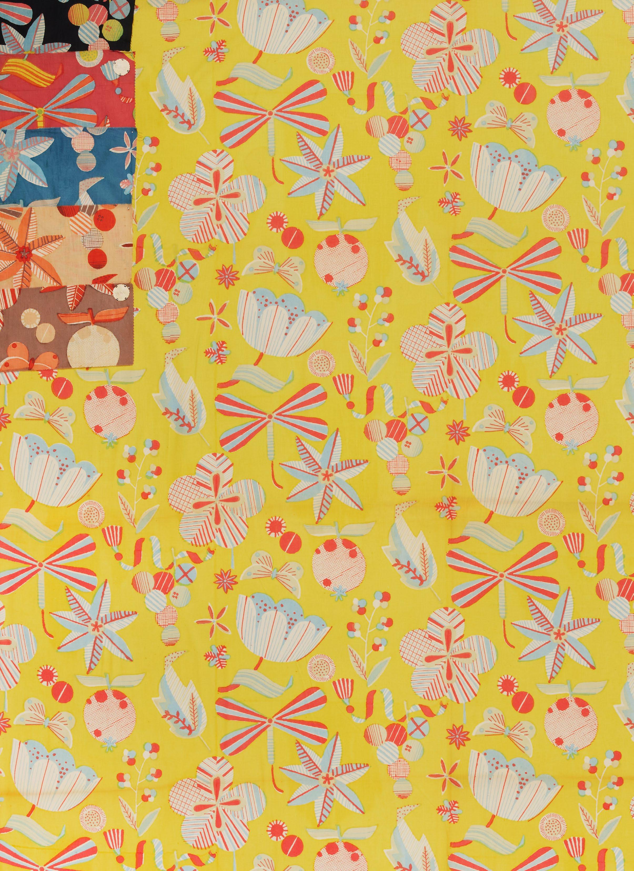
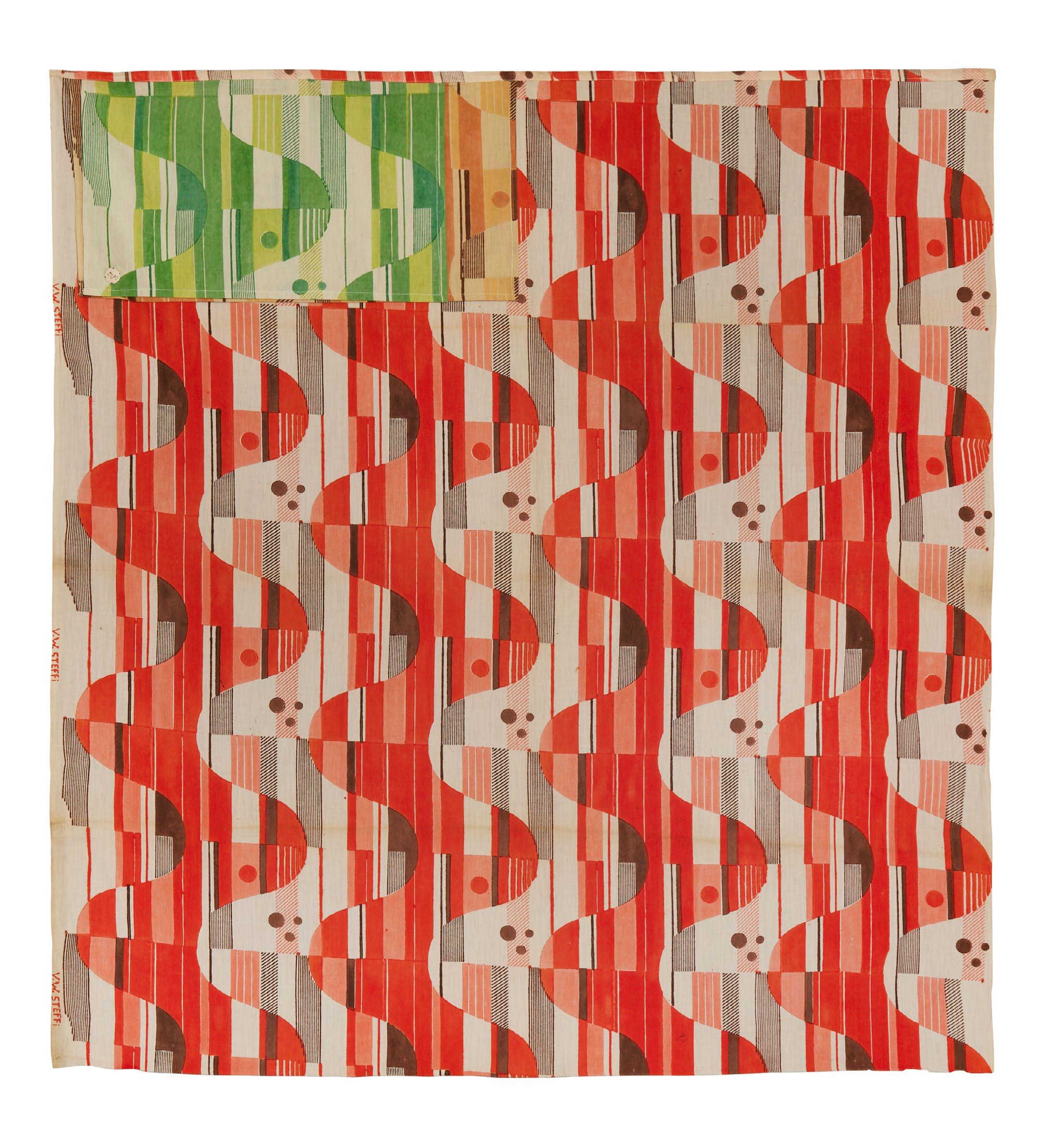
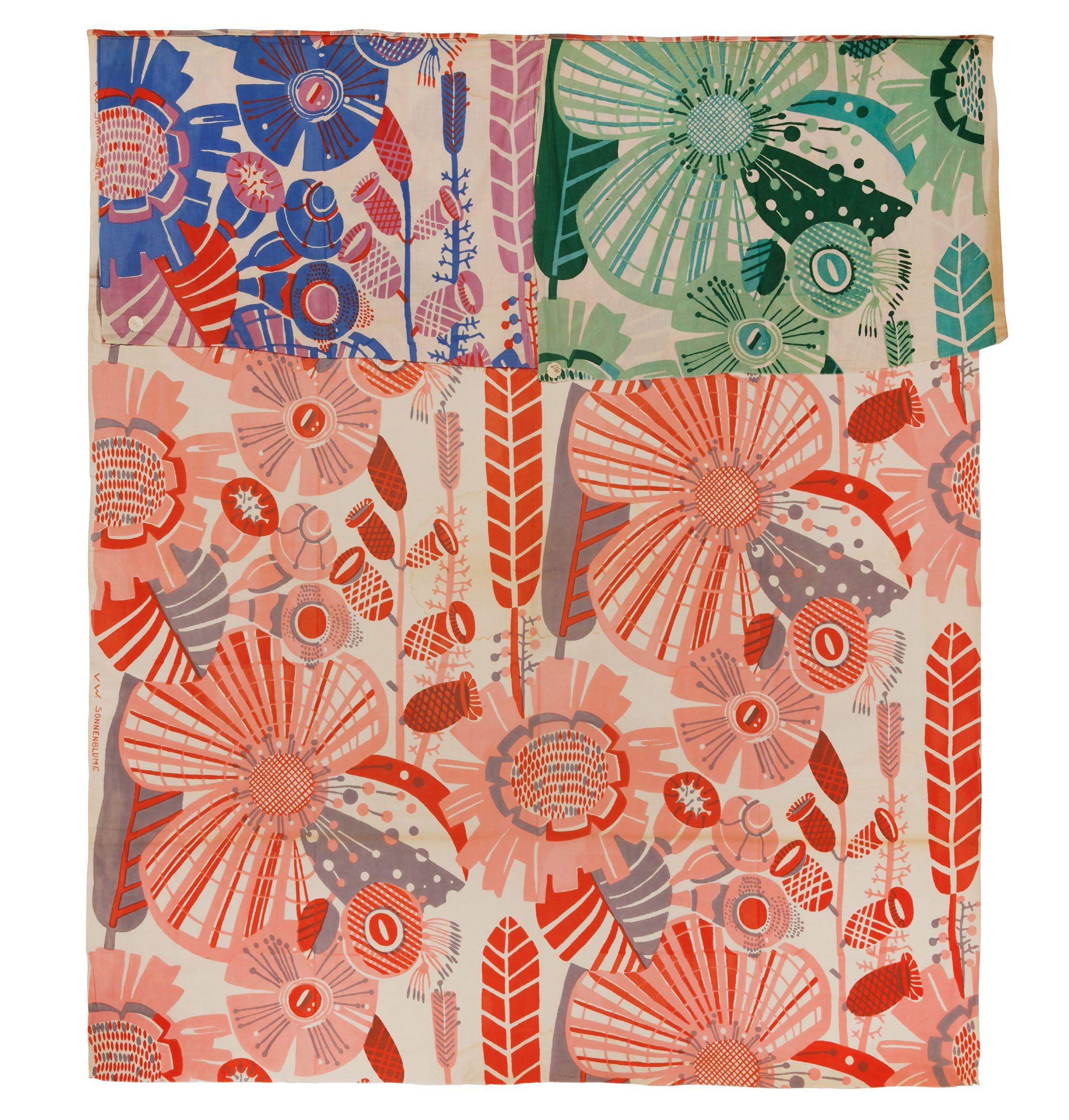
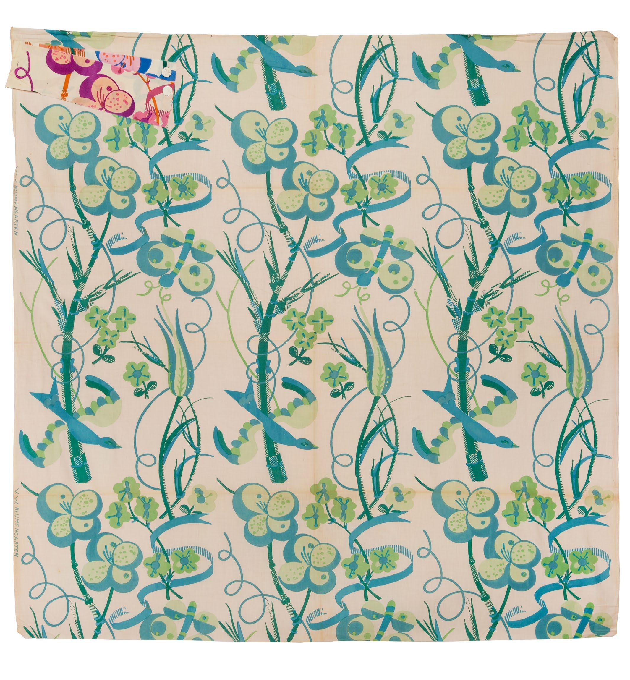
VIVIENNE WESTWOOD AND MALCOLM MCLAREN
Screen-printed cottons
English, 1982–83
110 x 38 ½ in. each
At the dawn of the 1980s, Dame Vivienne Westwood (1941–2022) surveyed the scene of retro fashions and dared to take the pulse of the decade to come. “We just spent 10 years re-assimilating the ’30s through the ’70s. The ’80s will be a technological age for which we need to equip ourselves with a feeling of human warmth from past ages—of culture taken from the time of pirates and Louis XIV.” What she and her partner, the music impresario Malcolm McLaren (1946–2010), proposed alternatively was fashion hovering at the blunt edge of punk aesthetics, but with a more softly sweeping set of historical and ethnographic references. Together, through their World’s End boutique, they helped give stylistic definition to the New Romantic era of brash, adventurous expression suffused with musical poetics.
These screen-printed cottons are rare survivals in yardage form and represent fabrics debuted on the runway. The two bold geometric patterns on eggshell white muslin were featured in their Spring/Summer 1982 “Savage” collection. These motifs derive from parfleches (painted hide containers) crafted by the Dakota people of the North American plains; McLaren’s annotated copy of Indian Rawhide: An American Folk Art (1975) served as the reference. In coloration, the mineral blue, blood red, and clay design most closely resembles traditional parfleches, while the sun-washed peach and granite tones are more indicative of the zeitgeist. Informally cut shifts, tanks, and billowing culottes using these prints were mixed with “dishcloth” garments and parfleche-patterned knitwear. Perhaps Westwood’s own words contextualize what she saw as her place on an artistic continuum: “In taking from other cultures I’m just doing what Picasso did in his painting ‘Demoiselles d’Avignon.’” Whether this is postmodernism or appropriation is the substance of contemporary debate.
Westwood and McLaren mashed opposite ends of the spectrum for their Spring/Summer 1983 “Punkature” collection, a saucy portmanteau of punk and couture. Accessorized with recycled tin-can buttons, leather suspenders, and riveted rubber-and-rope sandals, this collection also relied on distressed fabrics and loose silhouettes. Taking the idea of a futuristic wasteland to heart, Westwood melded trenchant anarchism with a burgeoning flair for historicism by superimposing motifs from eighteenth-century copperplate-printed fabrics (toiles de Jouy) with imagery lifted from Ridley Scott’s scifi film, Blade Runner (1982). Westwood’s son Ben helped with the execution of this concept. He recalled people buzzing about the director’s dark, gritty styling—and his trip with Vivienne to the comics and memorabilia shop Forbidden Planet to source appropriate film stills. This design—rendered in a haunting, dystopian combination of intense puce on a concrete ground—makes use of a romantic scene between Deckard (Harrison Ford) and Rachael (Sean Young) noirishly striped with venetian blind shadows. In a perfect jostling of old against futuristic, horse-drawn carriages, musicians, and bucolic scenery printed in antique bronze metallic pigment float hazily over this murky moment of human and humanoid embrace. Intended for use in full skirts, Westwood chose to print with the imagery oriented to the length, not the width, of the textile—a possible Westwoodian wink to the eighteenth-century manner of printing petticoats à la disposition (to form).
Provenance: Clare Howarth, Vivienne Westwood’s personal assistant in the early 1980s

JOHN GALLIANO
Ensemble of cotton corduroy and shirting fabrics
British, Fall/Winter 1985
Since 1984, John Galliano (b. 1960) has mined the history of dress for inspiration and interpretation, bent gender norms to challenge traditional perceptions of masculinity and femininity, and integrated spectacle and performance into the presentation of fashion and the haute couture.
Born in Gibraltar and raised in South London, Galliano quickly rose to fame in 1984 after his “Les Incroyables” collection, presented for his BA degree at Central Saint Martins, was immediately purchased by the London luxury department store Browns. He cemented his place in the history of the haute couture with his time appointed creative director at Givenchy, in 1995, and at Christian Dior from 1996 to when, after a series of racist and anti-Semitic comments became public, Dior dismissed him in 2011. He subsequently worked with a rabbi and underwent treatment for alcoholism and, in 2014, Galliano was named creative director at Martin Margiela, a position he held until 2024,
“The Ludic Game” collection—so named after the circus in Angela Carter’s 1984 novel Nights at the Circus—was an early and important moment that defined his sartorial trajectory. “A Brueghel painting cavorts around the maypole of a village green in Dorset” was how the designer himself described his third collection, for Fall/Winter 1985.
“The Ludic Game” featured gender-fluid ensembles that, like his two prior collections, upended nineteenth- and twentieth-century notions of tailoring. In what is now seen as a hallmark of his creativity and genius, Galliano moves through and beyond fashion history, reimagining the suit, returning to hand knitting, and referencing the kimono—a garment of perennial interest for Galliano. The presentation at Pillar Hall in Olympia in March 1985 was a celebration of irreverence and whimsy in fashion. Accessories included bedazzled baker boy hats (a nod to local London folk royalty, the Pearly Kings and Queens), necklaces made of spoons, headdresses with English ivy and pussy willows, and clomping Dutch wooden clogs, among other things. The show notoriously ended with a model throwing dead fish into the audience.
Galliano turned familiar, gendered silhouettes into new, unrecognizable forms to be worn on any body—and on any place on that body. While this outfit functions as a complete three-piece suit, the components were also intended to be worn as separates: the shirt could be tied at the waist to morph into a sort of sarong and the skirt could be layered over or under other tops or bottoms. The short jacket recalls both the Regency-era spencer— already a borrowing from menswear, said to have been inspired by George Spencer, 2nd Earl Spencer—and the structured, wide-shouldered sport coats of the 1930s and 1940s, here, expanded dramatically in width and cut off just below the armscyes. Galliano softened the classic rigidity and formality of the button-down in this rendition of his “Big” shirt, made up of three different striped shirting cottons, with exaggeratedly long, swinging sleeves and rounded Peter Pan collar. The floor-length, straight skirt is gathered to add and subtract volume, featuring asymmetrical panels at front and a pointed “tail” that, when tucked in, gives the historicizing effect of a bustle.
A jacket and skirt of corduroy in a different colorway, without the matching blouse, are in the collection of the Metropolitan Museum of Art (2017.43a, b). Nearly identical pieces were formerly in the Mr. Steven Philip Collection.
TITI HALLE CORA GINSBURG LLC
COPYRIGHT © 2025 CORA GINSBURG LLC
ISBN 979-8-9880091-5-3
TEXT
Martina D’Amato (MDA)
Michele Majer (MM)
Philip Sykas (PS)
Judy Wentworth (JW)
Leigh Wishner (LW)
EDITING
Donna Ghelerter
PHOTOGRAPHY
Rachel Robshaw
DESIGN
Martina D’Amato
With special thanks to Caroline Challes, Rosemary Crill, Hilary Davidson, Billy DeGregorio, Avalon Fotheringham, Francesca Galloway, Caroline Karikas, Laurène Nicol, Glenn Petersen, Christine Ramphal, Philip Sykas, Mark Wallis, and Judy Wentworth
+1 212 744 1352 PO Box 425 Sharon, CT 06069 USA info@coraginsburg.com coraginsburg.com