Brand Guidelines
Final | Current at July 2024


Final | Current at July 2024

We are a Tasmanian, not for profit organisation that supports vulnerable people in our communities (people with disability, older people, and carers). Our main aim is to support our clients to live the life they choose in the place they love. We put our clients at the centre of all that we do, supporting them to live independently, whilst maintaining dignity and control of their own lives.
We are a well-established organisation that has over 35 years’ experience in delivering high quality services that meet, and exceed, clients’ needs.
Tagline
Live the life you choose in the place you love
Why we exist
To maximise client independence
Vision
Your life, your choice, our focus
Mission
We create a safe, positive and supportive environment that enables and empowers people to have choice and real control in their lives
Our Values Quality
• We make our services enrich our clients lives.
• We do that bit extra in everything we do.
• We invest in developing our people.
Respect
• We share our best selves in every interaction.
• We commit to safe and inclusive ways of working.
• We listen and respond with kindness and empathy.
Collaboration
• We build relationships to create connection and belonging.
• We work together to find the best way forward.
• We are open to others’ ideas and perspectives.
Accountability
• We see it, we own it, and we will do it.
• We invite feedback to improve outcomes.
• We do our best and learn from our experiences.
What is a ‘brand’ and why is it important to Community Based Support?
A brand is the perception held by people about a business, its customer service, its logo, its reputation, its advertising and its personality. It is built upon every interaction that a business has with people, whether they are its customers or not. A good, strong brand gives a business credibility and increases the level of confidence people have in it.
This in turns assists the business to grow and thrive. It also assists in cementing the name of the business in a person’s mind so when they decide to make a purchase, that brand is one of the first that a person recalls. It also provides employees with direction, motivation and a sense of pride in their workplace. In order for Community Based Support (CBS) to thrive and grow in the current and future aged care and disability marketplaces, it is imperative that our brand is strong, consistent and good.
is
A style guide is a document that contains rules and guidelines so that a company maintains consistency in conveying brand personality through graphics, language, voice and tone.
Consistency is key to communicating effectively, so this guide will help to keep everyone on the same page.
The guide covers visual aspects like colours, photography and typography. It also guides messaging aspects such as language, voice and tone.
Consistency of brand messaging can be compromised if guidelines aren’t followed.
This guide seeks to:
• Keep tone, voice and messaging consistent
• Keep the use of logos, colours, fonts and images consistent
• Help maintain quality and a recognised brand identity.
CBS key audiences include:
• people over 65
• people living with disability
• people under 65 living with mental ill-health
• family, friends and carers as key influencers
• Coordinators of Support, Local Area Coordinators
• Aged Care Assesment Teams
Our communication goals are:
• To make it easy to understand what programs and services CBS offers and how to make the most of them.
• To treat our audience with respect and communicate in a friendly and helpful way. We don’t market at them.
• To be considerate and inclusive. Our audience may be experiencing distress as they navigate big changes in their lives – our job is to make this easier for them.
So that we can achieve these goals:
We speak plainly
We communicate clearly using simple words and sentences.
We are helpful
We make sure the information we are providing is useful. We tell people what they want to know, not just what we want to tell them.
We are genuine
We are friendly, warm and relatable.
We are caring
We understand the stress many of our customers are experiencing and we treat them with empathy and respect.
We are adaptable
We adapt our tone to suit the situation, who we are writing to and what we are writing about. We consider the audience’s state of mind.
If you are ever in doubt, please contact the marketing team for advice.
State and federal legislation make it unlawful to discriminate against people on the basis of their sex, marital status, sexuality, pregnancy, race, national or ethnic origins, disability, age and religion.
Sometimes bias is expressed unconsciously, and this can have the impact of reinforcing bias. We strive to avoid this as it can cause humiliation and offense.
Always use language that is culturally appropriate and respectful of the diversity of Australia’s peoples.
Avoid irrelevant gender or sexual orientation descriptions, such as the female doctor, the lady coordinator or the homosexual manager.
Use ‘executive’ instead of businessman.
Use the term Australian for all groups of people who live permanently in Australia. If it is important to specify the descent or ethnicity of a person or group, use Jewish Australians or Vietnamese-born Australians.
Language and disability
Describing people with disabilities in a way that emphasises their disability over their individuality has the effect of depersonalising and presenting all people who have a disability as a homogenous group. If it is necessary to draw attention to the person’s disability, then place the person first in a description. The focus needs to be on the person, not the disability.
Language and age
Where reference to a person’s age is necessary, then the language should reflect the humanity and individuality of people. Terms sometimes used to refer to older people such as ‘the elderly’, ‘the old’, ‘the aged’ imply that older people are a homogenous group thereby failing to recognise a person’s individuality.
Language and gender
Inclusive language conveys gender equality and is gender neutral. Respect peoples’ preferences around gender and sexual identity with pronoun choice, job titles and personal titles.
Please find language examples in the following tables overleaf.
Language and disability table
Appropriate Inappropriate
People with disabilities/ staff or students with disabilities
People who are blind/ people with visual impairment
People who are deaf, people who are hard of hearing
The disabled/ handicapped/physically challenged/incapacitated
The blind/ visually impaired
The deaf, hearing impaired
Person with epilepsy Epileptic
Person who uses a wheelchair/wheelchair user
Person with intellectual disabilities/person with learning difficulties
Wheelchair bound/ confined to a wheelchair
Mentally handicapped/ retarded
A person with cerebral palsy Spastic
People without a disability
Normal, able bodies
Universal access toilets Disabled toilets
Language and age table
Appropriate Inappropriate
Senior adults, older adults, mature aged
The old, the aged, geriatric, senile. frail
Young people, younger person and children Kids, girls, boys
The Community Based Support logo is an important part of our overall brand identity. In a printed format, it is the most important element of our visual identity. It was designed to communicate our ideas about our support services. The three dynamic people represent a service whereby the person in the centre is well supported by the people around them. It is friendly, fun, energetic, inclusive, timeless, non-gender specific and non-age specific.
The horizontal Community Based Support logo, is our primary logo, and it should be used on white or navy backgrounds when possible.
When printing on black or very dark colours, the white logo is preferred.
There must always be a strong contrast and clear space around the Community Based Support logo.
The logo’s exclusion zone is equal to the height of the letter ‘y’ in Community.
It is important that the appearance of the logo remains consistent.
The logo should not be misinterpreted, modified, or added to. No attempt should be made to alter the logo in any way. Its orientation, colour and composition should remain as indicated in this document – there are no exceptions.
Minimum size
Establishing a minimum size ensures that the impact and legibility of the logo is not compromised in application.
35mm/132pxl The Community Based Support logo should never be smaller than 132px in digital or 35mm in print. Do not apply a gradient to the logo
not change the colour of the logo
Values lockup
QUALITY RESPECT COLLABORATION ACCOUNTABILITY
QUALITY RESPECT COLLABORATION ACCOUNTABILITY
QUALITY RESPECT COLLABORATION ACCOUNTABILITY

PMS 2945C
CMYK 99/74/21/5
RGB 0/81/137
HEX #005189
PMS 106-1C
CMYK 9/3/2/0
RGB 229/237/243
HEX #e5edf3
PMS 7480
CMYK 77/0/77/0
RGB 27/180/111
HEX #1bb46f
Colour palette
• PMS for printed artwork and embroidery.
• CMYK is used for all digitally printed artwork.
• RGB is used for web, email and PowerPoint.
• HEX is used for web and email.
10% tint is used for backgrounds of text boxes on CBS website/Connect newsletter/In the Loop,brochures etc
PMS 526
CMYK 67/9/1/0
RGB 114/59/150
HEX #723b96
Your home and garden
PMS 2398
CMYK 74/1/35/0
RGB 0/185/181
HEX #00b9b5
PMS 7672
CMYK 88/91/1/0
RGB 70/60/151
HEX #463c97


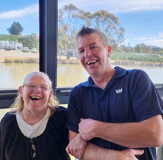
Imagery featuring our clients taking part in activities, outings or portraits from individual stories.
Staff imagery from featured stories, meetings, office events, social workers with clients.
Include descriptive text explaining usage of imagery, permission requirements etc.
Preference of CBS produced imagery over purchased stock images.


Avenir Book
ABCDEFGHIJKLMNOPQRSTUVWXYZ1234567890
abcdefghijklmnopqrstuvwxyz1234567890
Avenir Light
ABCDEFGHIJKLMNOPQRSTUVWXYZ1234567890
abcdefghijklmnopqrstuvwxyz1234567890
Avenir Heavy
ABCDEFGHIJKLMNOPQRSTUVWXYZ1234567890
abcdefghijklmnopqrstuvwxyz1234567890
Avenir Black
ABCDEFGHIJKLMNOPQRSTUVWXYZ1234567890
abcdefghijklmnopqrstuvwxyz1234567890
Avenir is the font type used for all consumer facing mediums including the website, brochures, fact sheets and activity booklets. It has been selected as it is one of the most versatile typefaces for clear and legible body text and provides a sensible unfussy look. It comes in many different weights and styles.
Body copy
Avenir Book: Font size 12pt/14pt
Body copy bold
Avenir Heavy: Font size 12pt/14pt
Subheading
Avenir Black: Font size 14pt/16pt
Heading
Avenir Medium
ABCDEFGHIJKLMNOPQRSTUVWXYZ1234567890
abcdefghijklmnopqrstuvwxyz1234567890
Use Avenir Medium when copy is reversed out of a dark background and as subtle bolding within body copy


Colour combinations

Any combinations using our colour palette


Presentation title here
Section break heading here

HeadingAccae omnis autas est eos pore vel ere pelit harchic itiisi quia volenim porenis utem. Acea debitat ibusamu sanimus as de omnimus, sit quam dis ullam explaci derferio offictat fugiam faccum quatate mporem asperiasit expla velibus ari ullat.
HeadingAccae omnis autas est eos pore vel ere pelit harchic itiisi quia volenim porenis utem. Acea debitat ibusamu sanimus as de omnimus, sit quam dis ullam explaci derferio offictat fugiam faccum quatate mporem asperiasit expla velibus ari ullat.


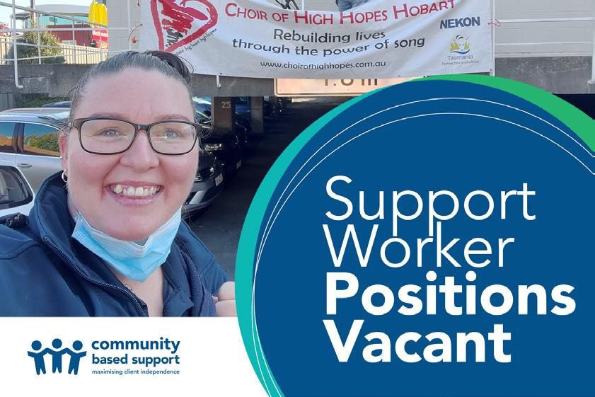
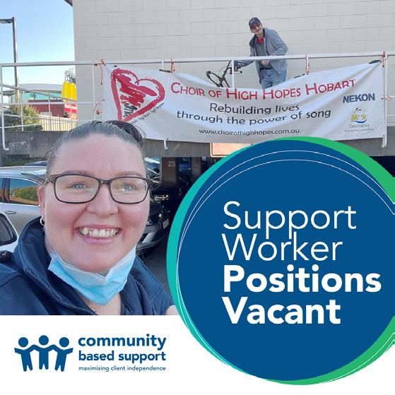
Job post images

Facebook/LinkedIn cover images

YouTube/Video thumbnails


Email signatures


