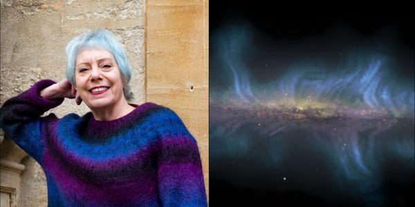
Invited Entries
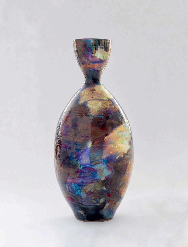
glaze shifts depending on the angle of light, demonstrating how color can reframe our viewpoints. The unpredictable surface patterns evoke a sense of organic transformation, mirroring how color in communication can be both intentional and spontaneous. The metallic hues blend and separate, much like cultural perspectives that merge or contrast through visual
language. By embracing the unpredictable nature of the glaze, this piece invites viewers to
reconsider their interpretations of color not as a fixed entity, but as a dynamic force that shapes
meaning and emotion. ”
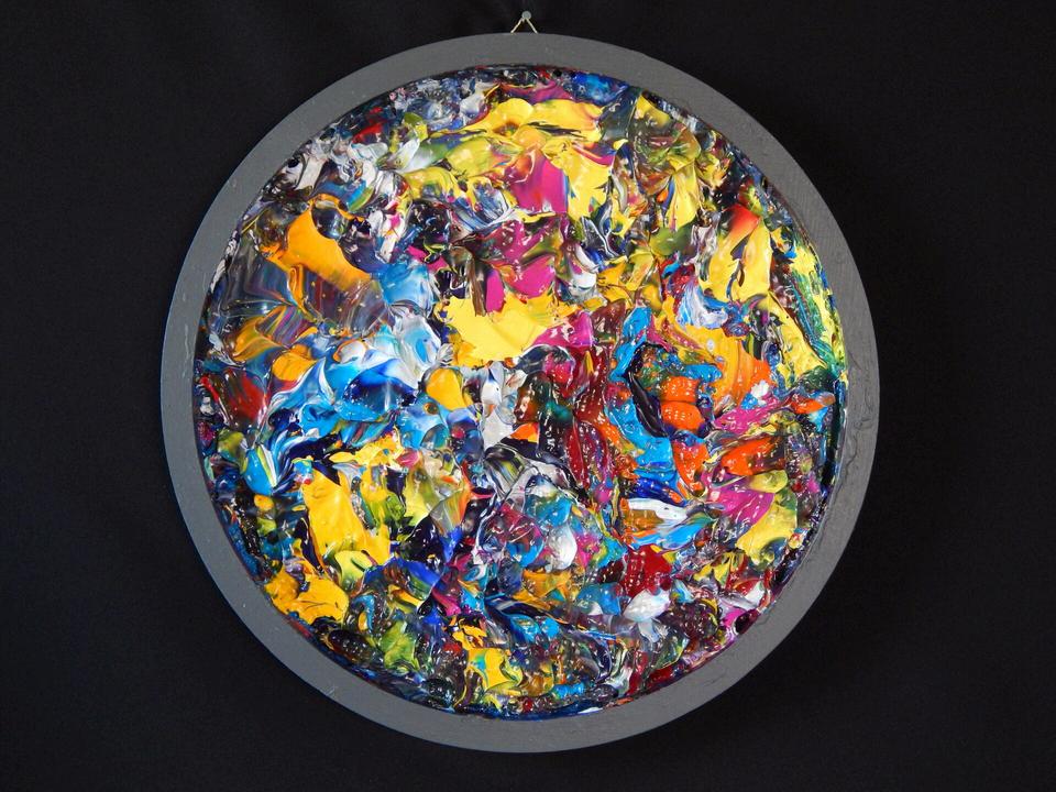
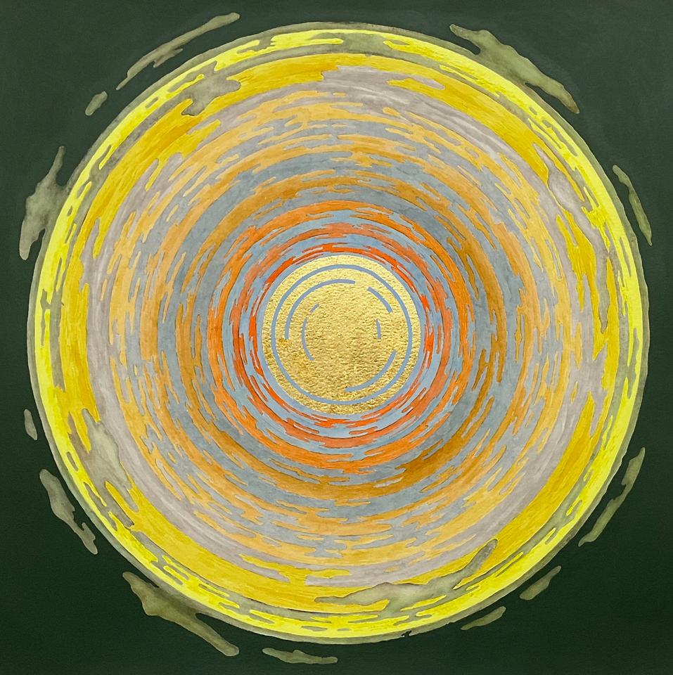
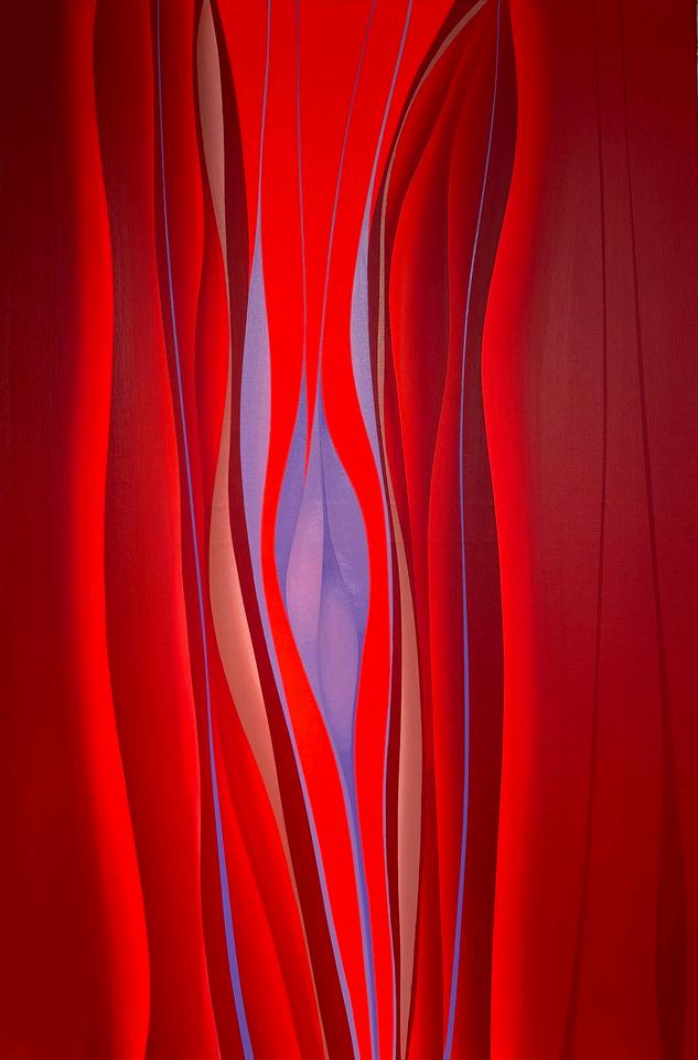
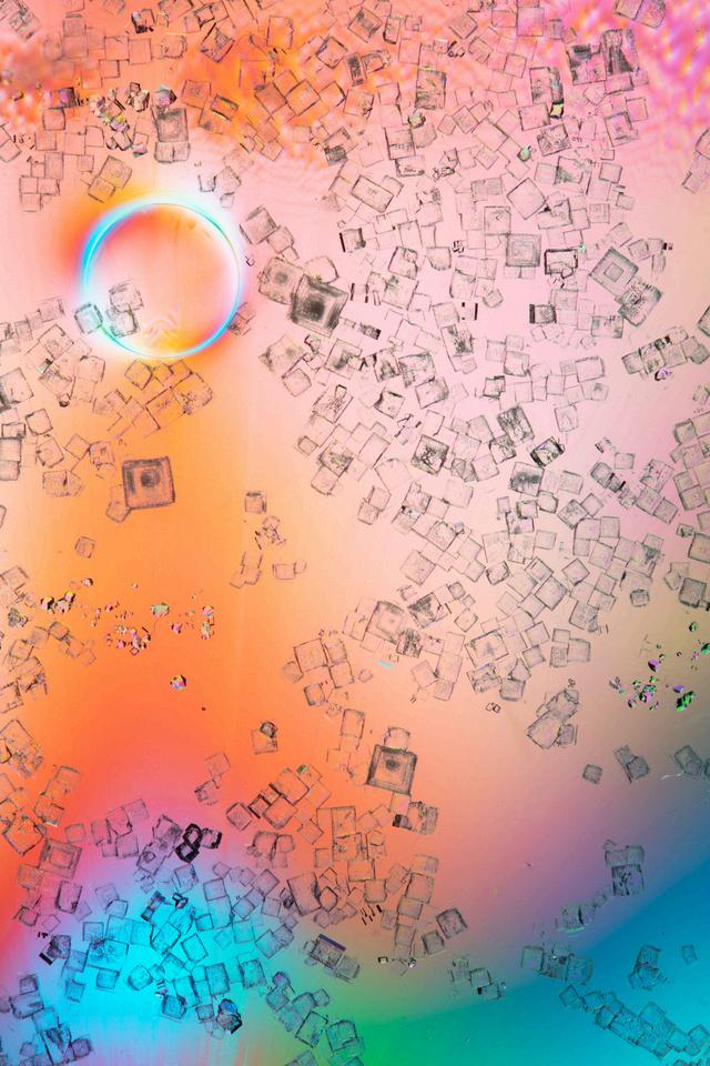
Alba Arguello Ephemeral Reflections, 2024 “This ceramic piece explores the fluidity of color and its impact on perception. The iridescent
Stoneware Ceramics, Iranian Luster Glaze 10.5" x 4.5" x 4.5" Professional
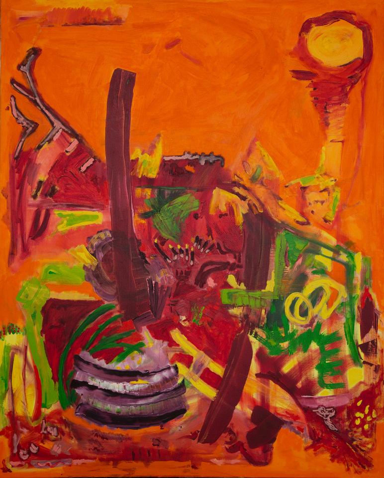
“Color, oil paint, is the main issue in my art. Color as a matter that can be sculpted, shaped, engraved and shoveled In most of my paintings color is strong and dominant, while line and composition – though not neglected – are secondary. In addition to canvas, I often paint on old books, bibles, art books, monetarynotes, accountbooks, comics, etc I'm intrigued by text, print and painting relations Perhaps because I was a bookworm as a child, I enjoy erasing words with paint. A kind of renewed self-definition. Being a 20th century product, realism, modernism, and abstract are my points of reference, and the periods that influenced and shaped me I create from an internal place, but the traditions of art and their history are familiar to me and presence clearly in my background. I believe that art cannot be created in a vacuum
At first, my paintings were figurative The bible and mythology were the subjects that interested me the most. Furthermore, I drew from observation. In the past few years, I've become more absorbed in the abstract. Basic forms intrigue me, I keep reverting to them obsessively and never quench. The free play and the relations between shapes and colors are what I relish.
I enjoy creating series. They release me from the need to decide What to draw and let me concentrate and work solely on the How. I go back again and again to a certain form or composition and explore it thoroughly. When I work, I'm surprised by the gap between intention and outcome, the produce of the matter's will, objection and point of view. In some moments, when the action streams off effortlessly, I feel myself become a mere instrument; I'm only a tube, or an insignificant mediator. These are rare moments of exaltation. ”
Oil on Canvas 150cm x 120cm Professional Ori Aviram Consciousness Born, 2016
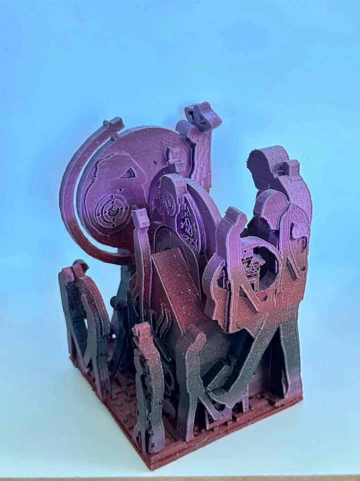
“These sculptures were created on an iPad with 3D modeling programs, sent to a slicing program that writes it in a G-code, sent to the 3D printer, reads the code and prints the art work I
built on the iPad. An exact, intuitive, creative, technical process that I use as a tool for self
expression. The amount of detail you can get working small is exciting and unique to this digital medium. Small, exact, precise, colorful, and personal; it draws the viewer clos
eat
a one to one close connection. They each take about 24 hours to print with me watching and changing color filaments. Colors are imbedded and part of this media. The way the art is made is its own art.
I worked with my hands-fingers when I first started in ceramics at 5 and now I work with my hands-fingers on an iPad creating STL files, NSF art, G-codes files with the same creative language/vocabulary only with a new digital media. ”
Annemarie Baldauf
31724 Yod, 2024
3D Printed Sculpture 7" x 4" x 4" Professional
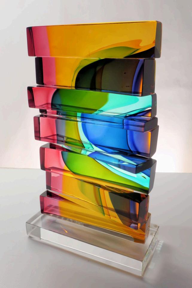
“My sculpture is a combination of two dimensional and three dimensional thought. My goal is to discover something hidden, as yet unknown. My practice is color as a moment of movement, a
mix of energy, transparency and light.
Glass is an actual physical object and also an idea, a material where light has a natural voice. The picture plane shifts into the sculpted form, as color and light jump from real space to glass space, which is a transparent volume. One slides into the other. The luminosity and refractive volume of
glass absorbs and simultaneously reflects color and light. I have spent years thinking about
transparency, the effect of transparency on color, and the mystery of layered color. The glass
sculptures develop over months, and sometimes, years.
My work is an ongoing discovery, an unexpected journey without a predetermined destination.
With color, line and volume, I strive to connect the viewer to the memory of transitory moments.
My goal is to uncover and discover my own language of form to create art that connects a
shared experience with my audience. ”
Christine Barney
Arpeggio, 2023
Glass
11 25" x 6 75" x 3 25" Professional
Barrientos is a multi-media artist working with video, animation, photography, 3D modeling, and 3D printing to explore themes of time, space, and human existence. Her art creates dreamlike, immersive environments that blend reality with imagination, inviting viewers into liminal spaces
that evoke nostalgia and curiosity. Her installations often incorporate interactive elements, allowing viewers to engage directly and reflect on shared human experiences.
Barrientos’ work examines duality, ephemera, and the transitional space between life and death, sparking contemplation about mortality and the unknown. By building virtual worlds, she explores storytelling, superstitions, and world-building, creating spaces that foster empathy and connection. Her art inspires curiosity and invites viewers on a journey of discovery, bridging the past and present through innovative, multi-sensory experiences.
Maria Barrientos en las nubes, 2021
Video
Professional
“My work is composed of paintings and drawings that explore themes of order, disorder, and visual play through the building and breaking of abstract patterns.
I begin with a systematic approach, layering transparent colors in a set arrangement of patterns.
Then I shift to a more intuitive process, adding in opaque shapes that destabilize the structured
composition below.
Color plays a key role in this. I use it to shift foreground and background relationships to create a sense of imbalance in the image. The layering process forms a complex ongoing dialogue between colors, each one affecting those beneath and around it.
By interrupting patterns and playing with color relationships, I create paintings that appear both
familiar and disorienting. And it's my hope that this contradiction keeps you looking. ”
April Behnke
Batty, 2021
Flashe and Acrylic on Canvas
16" x 12" Professional
Unfinished - The Story of My Life #02, 2014 “In my Computational Color Design research, I develop algorithmic methods to generate color palettes for RGB and CMYK outputs. In the “Color Code, Algorithmic Lines” series, I merge mathematical precision with intuitive exploration to achieve self-expression. I strive to create sophisticated and expressive palettes by sampling colors from planes, cuboids, and lines within the RGB Color Model as a framework. My work seeks to harmonize opposing extremes balance and chaos, light and darkness, structure and spontaneity, through the interplay of color and shape. I believe computational color algorithms will continue revolutionizing 21st-century art and design practices, shaping innovative approaches to color selection and defining new digital color aesthetics.”
Mixed Media (Digital Printmaking, Vinyl)
40" x 35" Professional Petronio Bendito
“My work is currently exploring the micro and the macro through geometric and biometric forms.
These paintings evade the objective world and embody ideas of the infinite. Science and divinity
are both simultaneously present. These paintings are a celebration of the deep symmetries found
in the laws of nature. I am hoping to expand on the grandeur that I find in the invisible and unseen
elements of the world. ”
Sally Blair
Untitled, 2023
Oil on Panel 24" x 48"
Professional
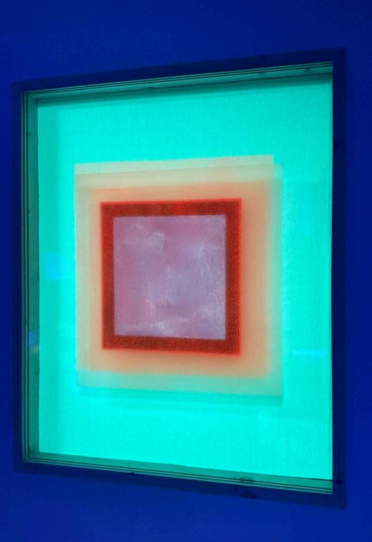
I have always been drawn to abstraction for its singular ability to inhabit a space that foregrounds contemplation. I utilize highly saturated or fluorescent colors in my work to center the necessity of looking- of contemplating- for viewers.
I also use the material qualities of acrylic paint to render visual effects that create contradictions through juxtaposition of contrast, The work has different appearances under interior or daylight and when viewed under ultraviolet or “black” light, which points to the possibility of two, differing truths that exist, simultaneously, in the same object. Asking viewers to contemplate these types of contradictions is also central to my work. Specifically, the socio-cultural applications of this thinking include considering the difference between the phrases “I love you and you have hurt me” and “I love you but you have hurt me. ”
My choice of squares and rectangles is a nod to Modernism, and also a centering of contradiction. A time of shifting paradigms in which many artists responded to social unrest by
creating work that expressed a desire for elevating “universal” human values and achievement, many of the social institutions that arose in this era were also ignorant or outright destructive. ”
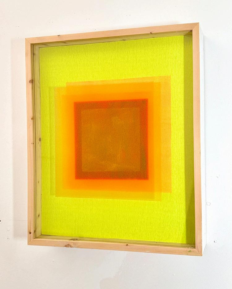
25" x 21" x 3.5" Professional Sterling Bowen departure from the main subject (black light), 2025
Acrylic on Recycled Fabric, Glass, and Wood
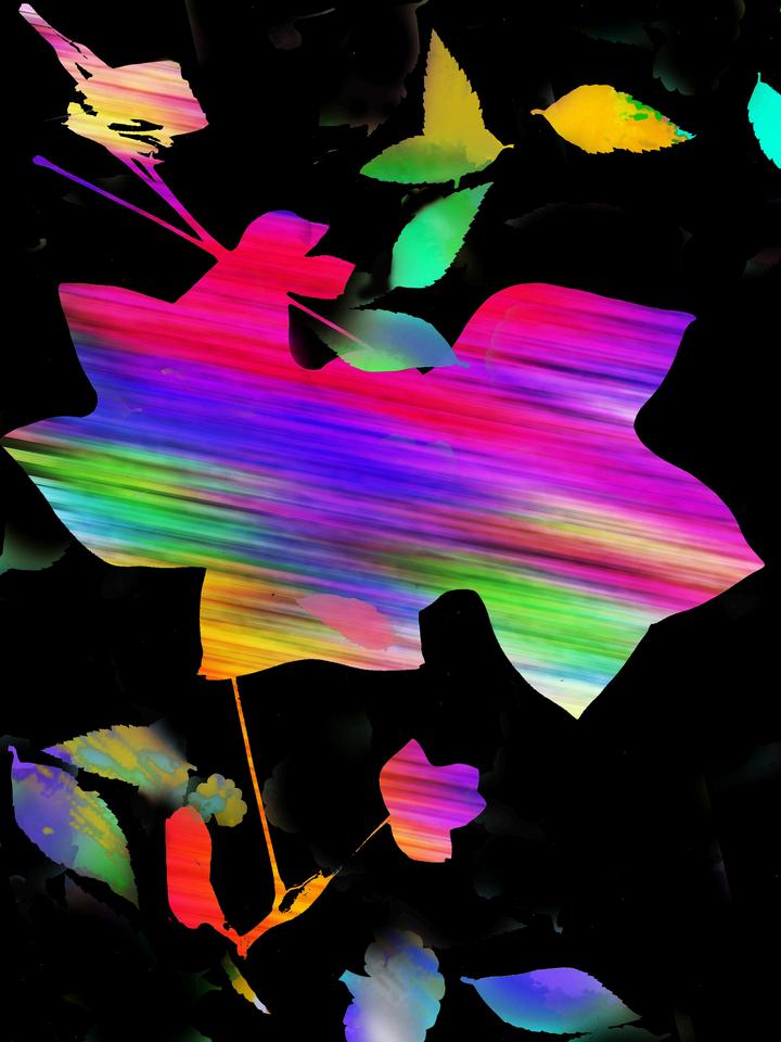
“My digital collage practice evolved out of my work as an abstract painter. Color remains an integral element within this
communicate a portrayed scene's passion and sensations.
Because I am intrigued with natural forms, I start
al paint
ded
Finally, I enhanced some of the pigment with a motion blur tool because the fallen leaves had been rustling in the wind. ”
Betty Butler Shades of Autumn, 2024
Digital Collage 12.5" x 9" Professional
“I began tying knots in the early 1970s when I was in my 20s, completely self-taught and at first focusing on the then-ubiquitous jute plant hangers During the next sev
ral yea
m
w
v
v
rp
rating increasingly sophisticated design, color, and structure. On several lucky occasions in those early years of knotting, I came upon hobby shops holding going-out-of-business sales; at very low prices, I was able to fill a trunk with more than 100 spools of cord, offering a nuanced rainbow of colors, materials, gauges, and inspiration A half-dozen years later, a gallery fire destroyed all my best pieces (although at the time the insurance payment was welcome). My response was a decades-long hiatus.
,
In my early 50s, while enjoying a two-year break between careers, I rediscovered the trunk in which I had stored my collection of cord I began knotting again, and until I retired in 2013, averaged one work per year, each piece representing many score of contented hours of "labor." In retirement, I devote much
more time to knotting and am now producing five or six works per year
Most of my works are wall hangings, although a few are designed to sit on flat surfaces I begin each piece with a fairly well formed idea of the final product. However, as all knotters know, the work constantly
is informed by the individual character of the twine and the dynamism created by combining twines of varying gauges and textures. Some of my works incorporate found objects, and many are inspired by
nature. Color plays a central role in all my pieces, which commonly combine fiber made of cotton, hemp, jute, and rattail. Rather than rely on an infrastructure for support or shape, most of my pieces depend solely on the robust strength of the knots themselves, almost always the humble double half-hitch. I create my pieces on a one-inch thick corkboard, using T-pins to hold the mounting cords in place.
I greatly enjoy the feel of the fiber passing through my hands; the "slap" of the twine on my workboard; the constant challenges that present themselves for conquering or instructing; and the satisfaction of looking critically at my finished work, occasionally feeling proud that a particular square inch or two turned out so well. ”
Cotton, Nylon, and Polyester Cord 20" x 20.5" x 4" Amateur Al Canner Septapod, 2024
“Miriorama, from the Greek infinite visions, is the term used by Gruppo T, an artistic group born in
Italy in 1962 with the aim of experimenting with the concept of Programmed Art - a nexus
between art, design and technology, a term coined by Bruno Munari in the Almanacco Bompiani of the same year. The Group T defines its own poetics on the variation of the image based on the
time T, where each vision flows into the next.
My life is a continuous struggle between two personalities: the creative and intuitive one
controlled by the right hemisphere of my brain, and the analytic and logical one managed, with precision, by the left hemisphere (there isn't a winner - what a pain!). So one half of me is a web developer and deals with boring projects for a computer company.
The other half has attended the Academy of Fine Arts and is passionate about art and aesthetics (I hope this half is not offended by the fact that it was written afterwards - this comment is written by the first half). ”
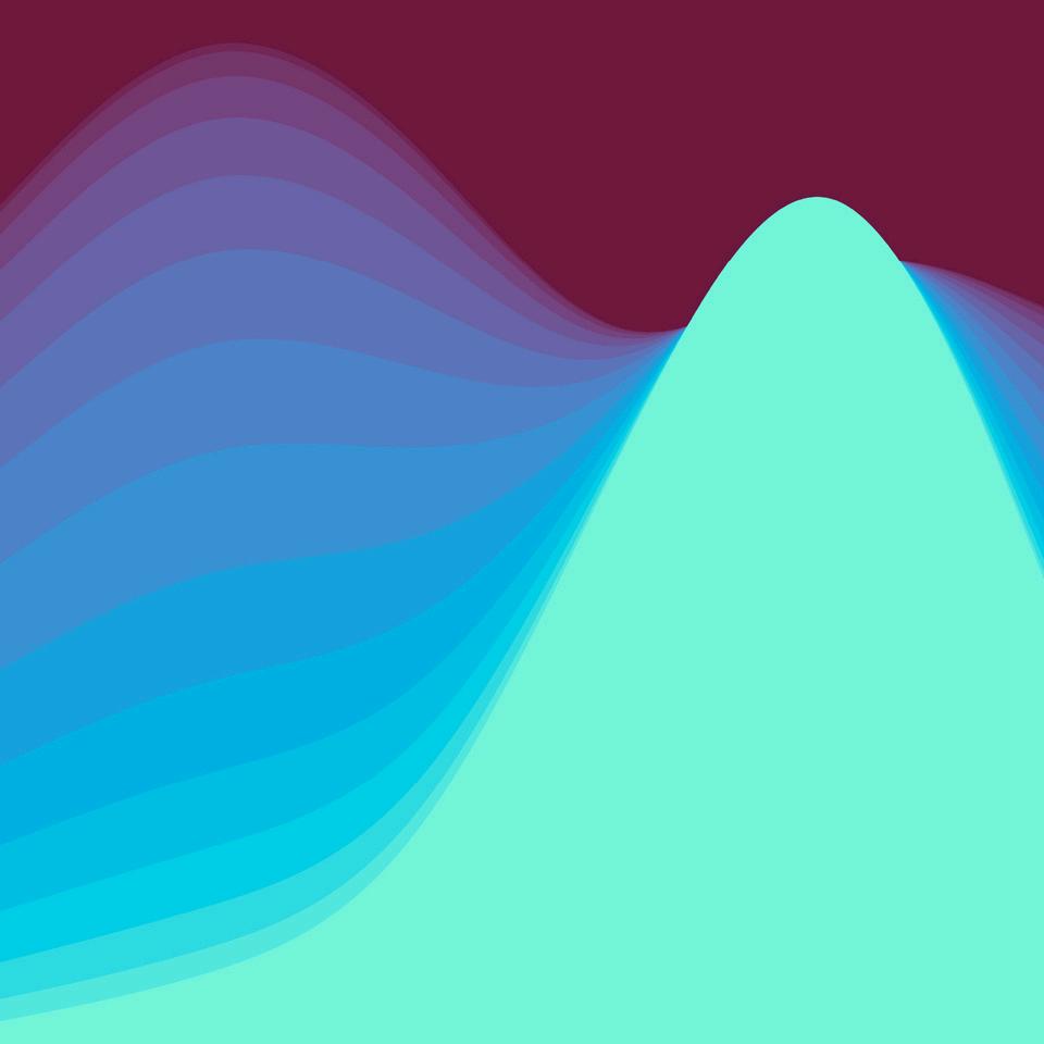
Daniele Caraglio
Miriorama Waves, 2018
Digital 30cm x 30cm
Amateur
“I sustain a mostly figurative focus in reaction to current and historical narratives, including my own. While growing up in Argentina, I cultivated an interest in a courageous opinionated art, I read Social Sciences at the University of Belgrano in Buenos Aires and later completed a Foundation and a BA in Fine Arts at KIAD, University of Kent. Recent global events have led me to
considerations of mortality and loss of innocence in transgenerational stories, the usefulness of art’s centuries old regard of myth, foundational stereotypes and the mundane occurrence of violence.
Interested in the pairing of form and message and formal variations on a theme, I have often worked in series, creating pictorial storylines with some urgency to exhaust the subject and form to the point of understanding or unburdening myself of it. The result is an annotation of feelings and opinions underscoring a dramatic approach to form and message.
I’ll begin to work a concept through sketches, seeking new figurative expression for whatever is the narrative in hand with a view to heighten the pictorial drama. The process may end in a series of graphite or ink drawings, lithographs or/and paintings. Usually an idea will develop into a series comprising various media. Maintaining a consistent practice, I've developed a large portfolio of work including paintings, drawings and prints. I take intervals with the painting of still life and portraiture. “
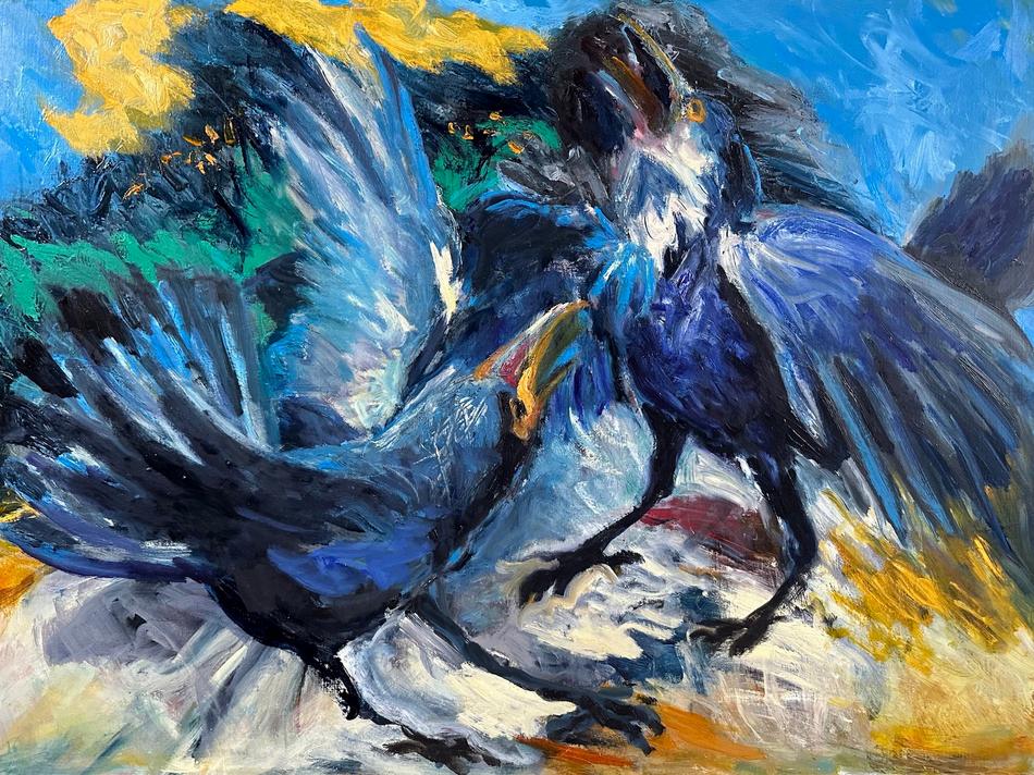
Oil on Canvas 30" x 40“ Professional Sandra Cavanagh Two Crows, 2023
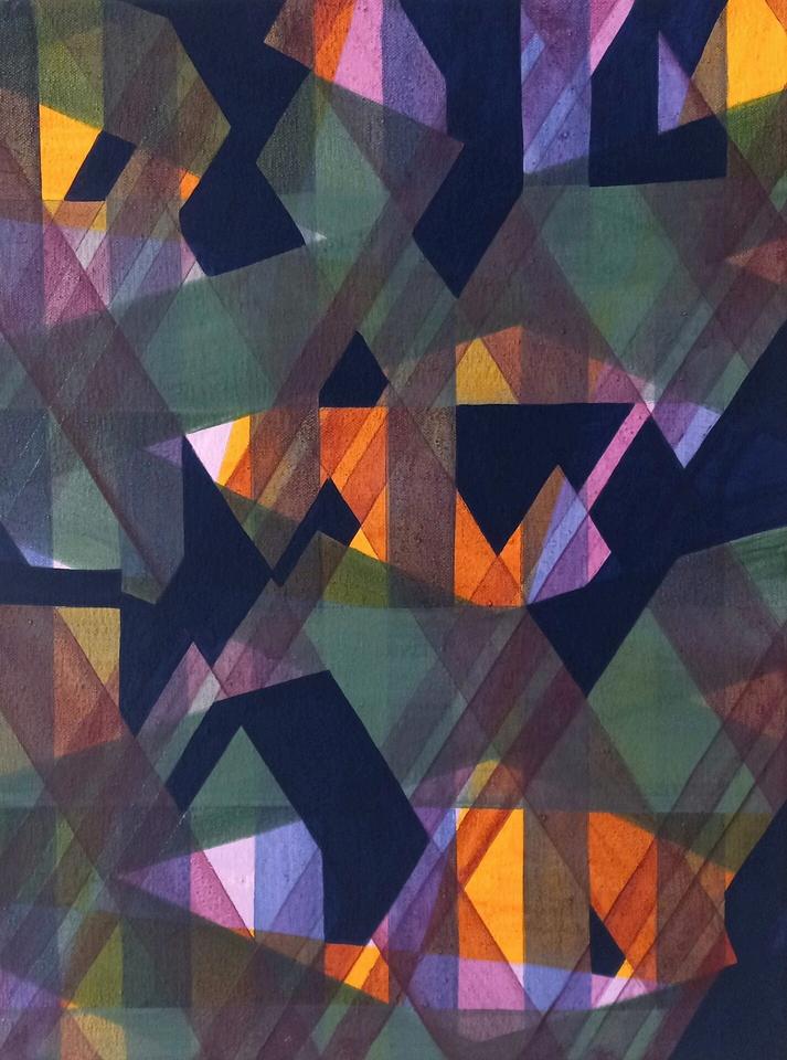
Andrew Chalfen is fascinated by patterns, how they ripple, radiate, refract, bloom, interact, cluster, construct, and deconstruct. His works allude to aerial views, cartography, architectural renderings, musical notation, urban densities, and other natural and man-made patterns, while not literally being any of those things. Rather, his pieces reflect a kind of topography of thought and mood as he works through various aesthetic themes like connections, intersections, and layers, utilizing the repetition of a small selection of formal elements, subtle variation, the timbre of color palate, rhythm, and a combination of generative randomization strategies and intentionality to express themes of nostalgia, anxiety, play, musicality, fragility, impenetrable data, accelerating planetary chaos, and physical and psychic fragmentation.
Wood, Wire, Acrylic, Ink, Colored Pencil on Paper on Panel 11" x 14“ x 3" Professional Andrew Chalfen
Looks Like It Sounds Good, 2022
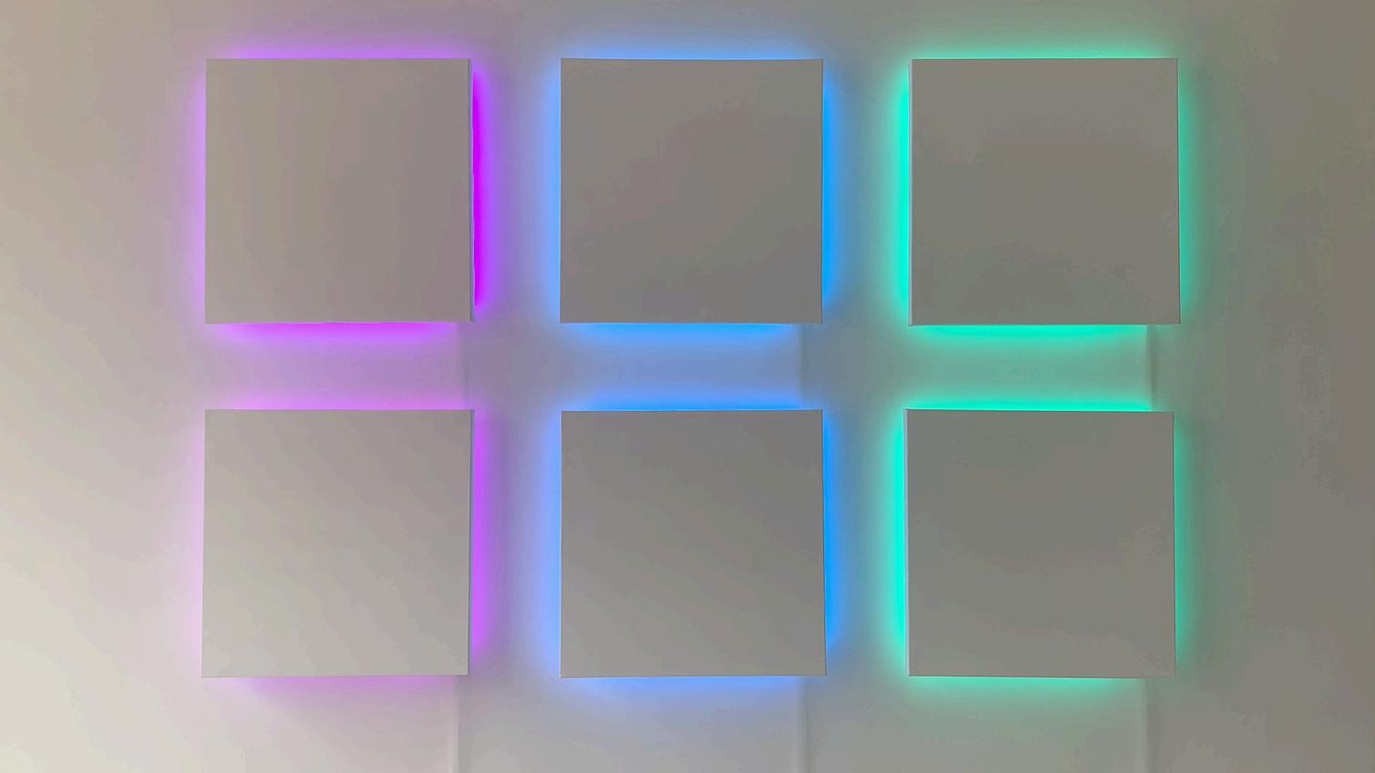
“Light is the source for my work. I’ve used color and light in many variations, always involved with
the sensual experience of looking, and the perceptual experience of seeing. Most recently I’ve
made wall works with a slow shift of light and color within a series of frames, the Inner Light, the
Outer Light, and the Light Circle series. The Inner Light pieces are box frames placed directly on
a white wall, in which the viewer sees colored light slowly shifting from one color to the next. The Outer Light pieces are white-painted canvases, raised slightly off the wall, while Light Circles are white painted wood, also raised from the wall. Moving colored light seeps out from underneath
both, slowly shifting its color as well. These may be shown individually or in groups, which you
see here. While these pieces reference traditional art formats, frames and canvases, they also refer to that which cannot be captured, the light.”
Paint, Canvases, Light, Wiring Professional Susan Chorpenning Outer Light, 2021
“Among my areas of interest as a Creative Theorist, is the development of a framework that satisfies the conjecture, first posited by Aristotle, alluded to by Newton, and reasserted by
Goethe, that musical and color harmony are derived from a conceptually shared mathematical foundation. My accepted submission contains video clips that implement a framework that correlates musical and color harmony by applying the mathematics of musical harmony to produce sets of precisely defined “harmonious” color hues. My paper published in the MIT
Journal Leonardo "Musical Color Harmony: Application of the Principles of Musical Harmony to
Produce Color Hue Sets" describes the conceptual and mathematical foundations of the framework. Another area of theoretical interest is the composition of musical works with algorithmic assistance and the development of the proprietary software that assisted in the creation of the music used in Demo Reel MCH 1. Other areas that I am investigating include Algorithmic Choreography, Musical Tuning Systems, Subtractive Color Painting Palette, and Light Reactive Visual Artwork. ”
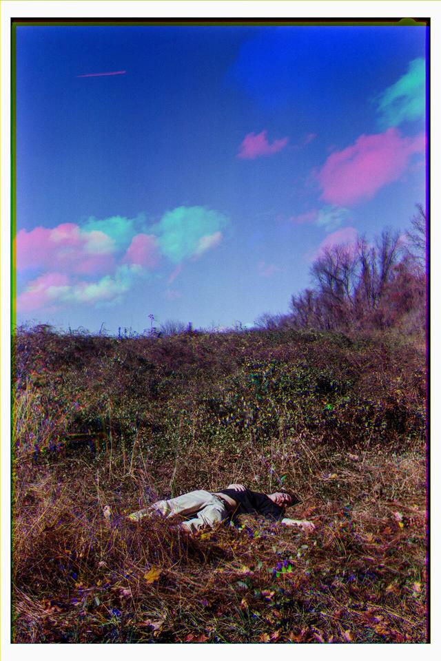
“When the world began to feel a little too gray, I started walking. It was nothing notable, just
walks in the vicinity of my apartment Often, the route was the same - the same houses, the
same alleys, and sometimes the same people. But sometimes, on these otherwise ordinary
walks, I would notice something that felt special Mundane pieces of the landscape arranged
just so beckoned me to come closer, look longer. I got lost in these seemingly ordinary
compositions, photographing something that looked like nothing at all But it meant something to me.
These seemingly ordinary spaces became portals to something extraordinary–the space between day and night, between known and unknown, between here and there In these liminal spaces, I found magic. I decided to let go of my rules, and I dove into this world of magic. I let myself believe campfire stories I let myself remember what it felt like to play outside as the sunlight faded away. I let myself play in the space between reality and somewhere else, delighting in symphonies of color and bursts of neon brushstrokes I saw that even here and now, there is beauty to relish in, joy to surrender to, and magic hiding in plain sight. I begin my process by going for walks, sometimes around my neighborhood, and sometimes while running errands. I allow myself to slow down and notice. When I’m in this state, something always pulls me in - perhaps a group of traffic cones, or the look of artificial lights against a twilight sky. I stop to take photos, which I’ll later bring into Photoshop. While editing, I let myself play. I experiment with color, form, line, and texture, trying to create images that are filled with wonder and mystery. The resulting image is ultimately used as a reference while I’m painting. But I also like to leave space for creativity in the painting process, allowing myself to stray from the reference image and have unexpected moments - splatters of paint or passages of color - that feel right in the moment. Ultimately, with my most recent work, I’m hoping to create opportunities to incorporate fun-having into my process.”
Jennifer Cronin
Long Distance, 2021
Oil on Canvas 36" x 72“ Professional
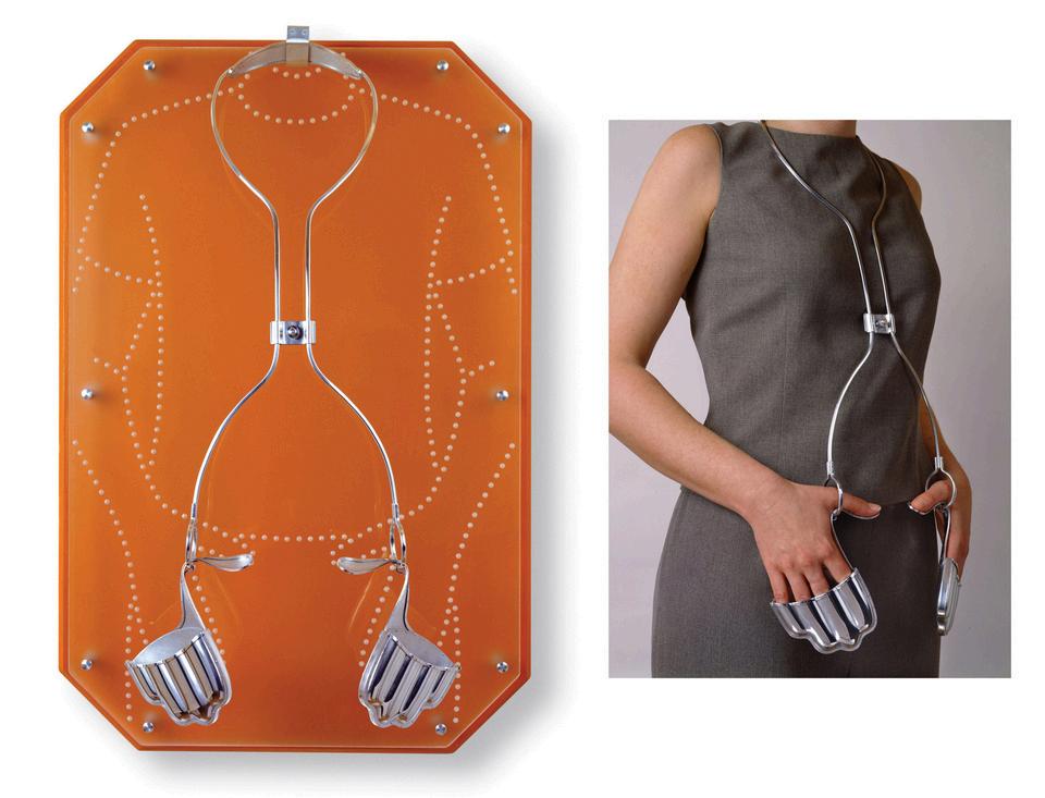
“My artwork addresses the ways we communicate with each other visually, through body language.
Handcrafted of aluminum or sterling silver, these one of a kind, interactive objects become instruments for gestural behavior.
Studies show the majority of our true communication is non-verbal. With the increasing use of e-mail,
social networks, and text messaging, one on one interpersonal communication is fading and our more
authentic feelings are being overlooked. All of my pieces point out various gestures or postures and their associated meanings, in the hope viewers will realize the importance of how our bodies speak for us
Although my work may have a machined look, every part, down to the screws and rivets, are made by entirely by hand out of sterling silver or aluminum. Each is a one of a kind piece that is carefully designed, hand fabricated and formed, soldered and/or cold connected using traditional jewelry and metalsmithing techniques. ‘Unguarded Gestures #1’ is a part series which consists of prosthetic-like neckpieces that encourage the wearer to perform varying degrees of open or assertive gestures These pieces leave the vulnerable midsection of the body exposed—from only slightly covering like the hands in pockets position of the first in the series, to the open and assertive hands on hips of second, to the more freeing active gesturing position of the third. Color is important to my work as it aids in evoking the character of a given gesture. The warm orange shade of ‘Unguarded Gestures #1’ was chosen as orange known for promoting social interaction and boosting energy.
When not worn, the piece hangs on a frosted acrylic displays that resembles a mirror and has on its surface the dotted outline of a person assuming the same posture. The slightly reflective surface of the acrylic allows viewers to see their own posture, as they “fill in” the outline form with their reflection. By viewing and interacting with the work, I seek to make us realize the importance of how we communicate with our bodies and how color can inhance our perceptions and understanding of that language. ” Aluminum, Painted Wood, Acrylic 28" x 18“ x 10” Professional
Jennifer Crupi Unguarded Gestures, #1, 2010
“In ‘Lovers 1, ’ I use colors that evoke a sense of warmth and gentleness as well as bright
fluorescents to illustrate the lightness and buoyancy of new love. The airy quality of the artwork,
the upward brushstrokes the layering of contrasting colors create a feeling of floating and elation, reminiscent of the early stages of romance where everything feels possible and uplifting. ”
Rhiannon Deschenes Lovers 1, 2022
Acrylic 24" x 18“ Amateur
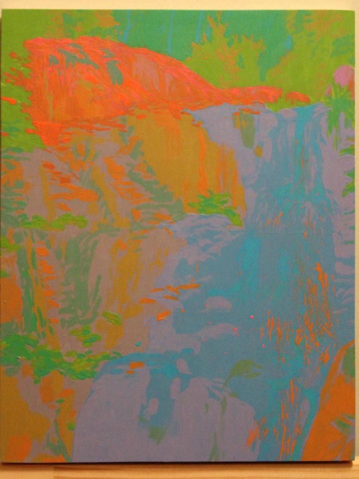
“I am an artist, art educator and content creator focusing on color theory, especially the history of color pedagogy and the evolution of science-based approaches to understanding and teaching
color. In my own artistic practice, my curiosity about color perception often leads me to
experiments in oil, acrylic, and other media. The pieces I am submitting to "Color Shifts" all
respond to questions about how constraining one or more dimensions of color affect the
viewer's perception. "Deep Petunias" attempts to constrain lightness to lower than L*=50. "Hemlock Falls" attempts to constrain Lightness to within a few points of L*=50, while varying
chroma and hue; "Contrast vs. Assimilation" also constrains lightness the same way, but with the goal of exploring the effect of hue angle on contrast/assimilation perceptions of equal-lightnes colors.”
Peter Donahue
Hemlock Falls, 2024
Latex Paint on Birch Panel 14" x 11“ Professional
Donald Dugal
Periodic Table of Unknown Elements: Candlelite, 2022
“I work intuitively. Though I may sketch out a plan for action, decisions of hue, intensity, value, and, yes, title, are decided via the sequences of the painting process. I have recently completed the one hundredth 30” x 30” composition attempting to visualize Elements beyond those of the existing Periodic Table of Elements. The tension between the absorption of watercolor pigment into Arches watercolor paper and further opaque additions of acrylic (and occasionally, gold leaf) provides an imaginative working space. ” Watercolor, Acrylic, Gold Leaf on Arches Paper 30" x 30“ Professional
“For me, abstraction is that conduit between representational reality and imagination. My abstract work exists in the language of dreams, soft focus memories, or selective sharing of
emotions. While the content of my work may allude to planets in the solar system, map structures, bacteria under a microscope or even bubbles from running water, the imagery is
never depicting a real moment, but the imagined moment. I like to generate a feeling or impression while suggesting anonymity of the source subject matter. The imagined content of my work seeks to visually live in those moments before we drift to sleep or awaken, when our
minds are flush with color, figurative distortions or feelings that have no distinctive form in our physical world. ” Acrylic on Board 8" x 8“ Professional
Jonathan Fisher Month of May (part 1), 2023
“I'm an interdisciplinary artist practicing professionally for 20 years. I do photography, digital art, traditional mixed media, illustration, film, book design, and creative direction I have designed 38 published books to
date. My practice is rooted in storytelling and the pursuit of visual innovation, with a commitment to challenging the boundaries between media and perception This pushes creative boundaries by rethinking how fundamental elements–such as color–function in both aesthetic and conceptual terms.
‘Color as Motion’ captures movement through the shifting of colors in a linear, circular, and other dynamic ways through an abstract presentation Sudden rush of colors in the space from one end to another perceive the state of the subject in motion and the artist in motion. It can also make an unmoving element to be seen in motion through the play of colors This shows how powerful colors can be that these do not only create motion in a three-dimensional or two-dimensional state, but rather captures the soul of the moment as well
This piece operated on a central premise: that color, despite its nature here as a static element, can create the illusion of motion. Through blurred forms and intentional shifts in color properties such as hue, saturation, and value, the image captures the feeling of motion–not through detail, but chromatic movement.
Color in this piece carries kinetic weight. It asks: Can a still image move? Can color displace time? Can the blur of pigment become the pulse of human activity? I've explored how the formal properties of visual language–lie color–can unlock deeper experiences. The work challenges the viewers to see color not only as a visual signal, but as a conceptual and temporal one. In doing so, it reflects on the larger role color plays in our collective and individual experience of reality." Photography 11.33" x 7.557“ Professional
Katrina Garcia Color As Motion, 2025
Miranda Greiner is an artist based in New York City, predominantly working in painting. She is a self-taught artist, and trained psychiatrist, who explores the subconscious through the creative process of gestural abstraction. Her work is influenced by the automatism of New York City and contemporary culture.
Miranda Greiner Printemps, 2024
Oil on Linen 30" x 24“ Professional
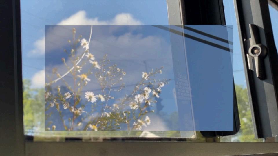
“’Dyed’ is part of an ongoing series of works exploring the intersection of color, architecture, and reclaimed materials. Drawing initial inspiration from photographs of the vibrant lobby of the
Hoechst building in Frankfurt, the piece takes structural and color cues from that space. From
this architectural foundation, a composition developed of bold colors and experimentation with
the tension between matte and glossy finishes. These effects are achieved by painting on both
the front and rear surfaces of glass, allowing light to interact as part of the work. The work is
created on a reclaimed window likely pre-1920s whose frame and original latch are not just
preserved but integrated into the work.
Over the past three years, my practice has focused on the possibilities of glass painting, particularly using salvaged residential windows as both surface and substrate. This series balances the precision of hard-edge painting with an architectural sensibility, exploring how color can define space, texture, and dimensionality. Early works were restrained, emphasizing
transparency and subtle surface accents. Gradually, I introduced increasingly complex foreground elements and employed materials like gesso and matte medium to add texture, obscure clarity, and deepen visual layering. Through this evolving body of work, I experiment with how color applied, reflected, and refracted can transform glass into a dynamic work that holds the history of the material and a visual experience. ”
Eddie Hall
Dyed, 2023
Acrylic on Recycled Window 28" x 26“ x 2” Professional
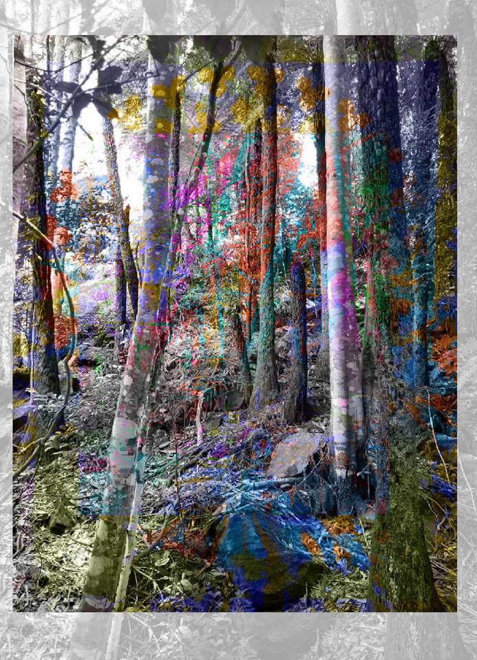
“This photo montage explores complexity in layers of form and of thought, building on a nature image abstracted by invented color. This image merges ideas into a single composition by layering photos in the Procreate app and applying blend modes to control how colors interact with each other between layers, such as adding light or translucency. Color experimentation is always an essential requirement for me to create edges, movement, focus, and meaning. I borrowed a 14th century technique called Grisaille where the artist introduced an image within another image by changing from gray to vivid color to show two meanings or narratives. The Color Shift here defines the two concepts in this piece. First is emphasizing spiritual place in the shift of gray to vivid color and the second is the use of a forest photo from Australia to show the sacred meaning of nature. “ Digitally Manipulated Photo 11" x 8.5“ Professional Sharla Jean Hoskin Sacred Space Series #2, 2025
Shushanik Karapetyan’s artistic practice is deeply informed by her work as a Gestalt psychotherapist, emphasizing the present moment, bodily awareness, and the influence of external forces This
connection between mind and body serves as the foundation for her current collection, which explores themes of women’s health, pregnancy, and motherhood Inspired by her personal journey of conception and the physical changes she observed in her body, Shushanik translates these intimate experiences into a visual language that reflects the physical and emotional intricacies of these processes Her work uses color, texture, and form to convey the layered and cyclical nature of these themes.
The collection is divided into three parts, with Cycle focusing on the stages and variations of the menstrual cycle Shushanik employs soft curves, gradual transitions, and a palette that shifts from cool to warm tones to represent the dynamic interplay of the body’s processes. Pieces such as ‘Ovo’ and ‘The End and The Beginning’ explore moments of ovulation and menstruation, while works like ‘Polycystic’ and ‘Rogue’ shed light on conditions such as PCOS and the presence of cysts. By addressing these oftenoverlooked aspects of women’s health, Shushanik’s work invites viewers to engage with the resilience, beauty, and complexity of the female experience.
Shushanik's creative process begins with a personal experience. In ‘The End and The Beginning, ’ this experience is an acute aw
reness of her bod
ndergoes
r
shifts dur
the men
cycle. She starts by meditating on a color palette and sometimes sketches preliminary ideas to refine her vision. Her technique includes the use of tape to define boundaries, though the initial concept often evolves as colors and shapes shift organically on the canvas. In this particular painting, Shushanik explores the cyclical nature of menstruation—its conclusion and renewal. Dominated by red, the piece employs a limited yet striking palette. Deep reds symbolize the end of the cycle, while lilac purples at the center represent the beginning. Gradations of color add depth, while the fluorescent red infuses the composition with vibrancy, reinforcing the painting's dynamic energy and emotional intensity.
Shushanik Karapetyan
The End and the Beginning, 2024
Acrylic on Canvas 36" x 24“ Professional
Abstract artist, wildlife, and macro photographer, Diana is inspired by patterns in nature.
Repetition of lines and shapes in feathers, bird plumages, spider webs, compound eyes, scales of butterfly wings; symmetries, meanders, and fractals found in landscapes, plants, mollusk shells, and coral formations – these natural elements are fascinating to find and capture. They are an inspiration for her paintings, which transform flat surfaces into three-dimensional spaces through an interplay of lines, values, and shapes.
s
Reconstructed, 2022
Acrylic on Canvas 14" x 11“ Amateur
Diana Kogo
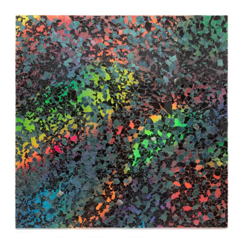
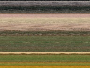
“Colors have this mysterious power to move and captivate us. But what remains of their magic when they slip free from their forms? This question drives my series Chromagenesis, an
exploration where image processing becomes a tool for liberation: by blending an artwork’s pixels, I shatter its contours to let its colors fully express themselves.
A simple random shuffle, however, is not enough. Imagine a single seashell, its subtle hue variations sparkling in the sunlight, enchanting us. Yet, scattered as grains of sand on a beach, those same colors blend into a dull mix, their delicate charm lost. To recapture that essence, the
colored fragments must be reorganized much like in a work of land art. By sorting pixels
based on their inherent properties (hue, brightness and saturation), I recompose a palette freed
from its original form, a vibrant map that evokes the essence of the source artwork.
This quest led me to a unique process for capturing what I call a painting’s “chromatic soul. ”
Drawing inspiration from the Bokashi technique of Japanese ukiyo-e prints, I introduce a
gradient of brightness flowing from top to bottom, while along broad bands from left to right, I
juxtapose color fields that play with subtle, harmonious contrasts. In Chromagenesis, I unravel a
painting’s colors as Richard Diebenkorn distilled California’s light in his Ocean Park series
both of us seeking not to copy, but to reveal a deeper truth through structure and hue, balancing discipline with the freedom of chromatic expression.
Through Chromagenesis, I invite viewers to rediscover masterpieces in a new light, to perceive their chromatic play beyond familiar forms. By varying the arrangements of a single painting, I challenge our gaze: how does a new color combination redefine what we thought we saw?”
Vinciane Lacroix
Chromagenesis : Uncovering the Hidden Soul of a Painting ?, 2025
Digital Paintings Amateur
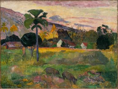
HaereMai, Paul Gauguin
“My work is built around my obsession with waste as raw material and my love of color. I
developed a technique of wrapping embroidery floss around plastic bags to create a color
cord. I then apply this cord to a substrate of waste material. I allow the given material to
determine the "topography." I delight in the discovery of how the patterning of line and color develop. Covering trash echoes the well-intentioned beautification projects of covering over landfills to create green spaces. What remains underneath the surface beauty? Is the transformation complete or is the problem simply removed from sight?
For this piece, and much of my work, I choose colors at random, with no concern or plan for how the colors will respond to one another. I marvel at the unexpected combinations. There are no bad colors. They evoke different moods depending on their context, much like humans who are not static in personality, but rather respond to environmental factors and peers.“ Mixed Media (Fiber)
Leigh Lambert Orbiting, 2021
30" x 24“ x 6" Amateur
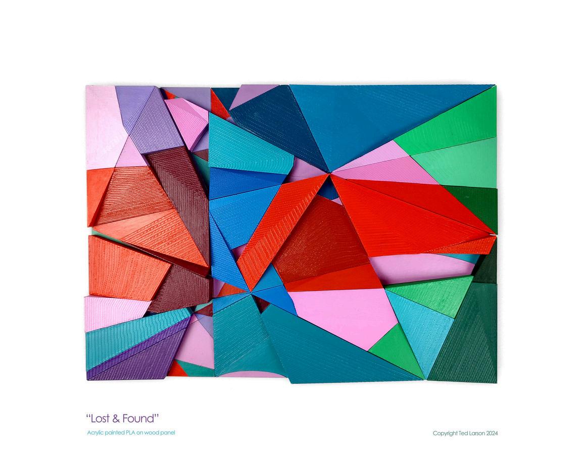
“I am a mixed media artist who uses traditional drawing and painting skills paired with collage and 3D modeling. I currently create color driven abstract art with hard edge geometric structures. My work explores the relationships between color and music theory. Specific color themes evoke for me memories and life experiences. My art is comprised of an objective exploration of color using combinatorial mathematics and non-literal physical forms conveying subjective experiences. I develop my color sets first using one of the monthly hues as “root” chord. At this stage I employ combinatorial math to explore variations of my five frequently used color types- pale, muted, vivid, rich and dark hues. Using chord progression theory I build a thematic set of colors to proceed with. Using sonata form as my process I develop movement and flow, alternating colors and patterns like a song or dance between two people. Many of the ideas I explore have a non-verbal emotional nature. The language of color and design can reach the viewer’s subconscious mind without all the cultural filters and bias that language can constrain us. Everyone is free to experience their own subconscious responses without an overly curated singular verbal message. ”
8" x 11“ x 2" Professional Ted Larson Lost & Found, 2024
Acrylic Painted PLA on Wood Panel
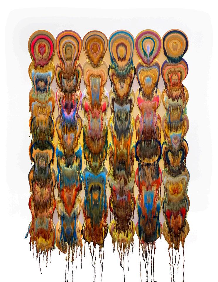
“I’m fascinated by the fluidity of human perception, especially in the instances where someone is
aware of how they are perceiving. In this moment we can also recognize that our senses do not
necessarily produce a faithful reflection of the external world, but a slippery, changing impression.
As a visual artist, I naturally tend to focus on visual perception, and I approach it in the context of our embodied condition– that our sensory input is generated by, and filtered through, our physical
bodies, and our conscious and unconscious mind. I work primarily in the field of digital art, so I’m particularly interested in sensory perception as it intersects with digital technology and lens-based images. Color is a central focus in my work because it is incredibly fluid. A color seemingly changes its properties simply by changing the colors around it. If I can make gray appear pink, and pink appear gray, then I am reminded to question the mailability of any perception, no matter how basic
or complex.
The artwork for this exhibition is part of an experimental series of work. Just as the impressionists
were interested in color and light as it was expressed through the media of paint, I’m interested in
expression through the qualities and properties of my media, including digital color-spaces and printer ink (11-color CMYK). The design of this artwork is a grid of concentric circles. It is a nod to
Kandinsky, but these circles were mechanically precise, created in a digital vector program. I
experimented with ink settings in my printer to produce prints that would run and pool on the
surface of the paper It is an indirect process where I obsessively plan, test, analyze, and theorize about how the digital composition, combined with the printing mechanics, and the ink mixing
processes, will behave. And then I let go. I watch the precise, geometric forms melt into organic pools. The colors mix into rich, golden browns against jewel tones, and miniature streams feather out over an almost glittering surface The process is out of my hands and slides downward towards gravity’s pull. Despite all my efforts at control, the result is always a surprise. ”
Jessica Larva
Chroma Drip: Maroon, 2024
Experimental Giclée Monoprint 46" x 36“ Professional
“I like it when I find a characteristic of something that people usually overlook. These things often are the commodities that people are familiar with and have the “instruction” ways to
use them on the labels. For example, a pen, and its purpose is to write or draw on a surface with
ink The challenge is to see beyond the product’s usage instruction to capture its uniqueness I am merely just a helping hand for the material to show off its potentiality via my work.
If nothing else, it is a storyteller It is produced It performs It transforms Its hidden non-hidden
character is obvious without being obvious.
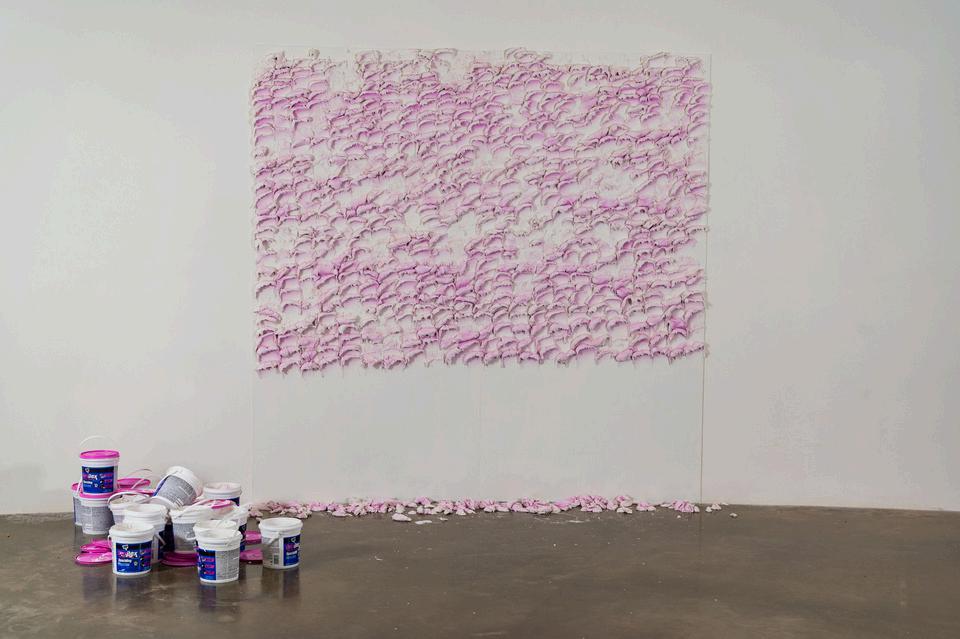
Spackle is used in the performance art piece to examine the transforming potential of repetition and accumulation On a huge canvas or wall the size of an 8-foot-by-8-foot grid, the artist continuously pastes scoops of spackle to it in a repeated action one scoop by one scoop from left to right using a 4 inch squeezee This performance urges the audience to focus on the intricacy, beauty of repetition and the inherent potential of materials we often view as mundane, and to think about the ways in which these ideas impact our individual and collective lives ”
The audience will see how the surface gradually changes from a flat, uniform grid to a rich, textured landscape of peaks and valleys as more layers of spackle are applied. The score acts as a compass that directs the artist as she explores the boundaries and potential of their physical and creative capabilities as the repetitive motion of pasting the spackle transforms into a peaceful and introspective act. Over the course of 120 hours, the material will change from bright pink to completely white. In addition, each scoop on the surface will also reflect the artist’s physical stage. As the performance goes on, the artist will start with a stable strength which leads to evenly scoops of spackle on the surface. Later on when the artist’s strength becomes weaker, she will scoop more material in hope of finishing the performance which will make the scoop become too heavy to stay on the surface and end up on the floor beneath the piece.
Naomi Le
Untitled, 2023
DryDex Spackle
10' x 10' x 5' Professional
“I use the tools of macro photography to create spaces for contemplation on the materials of our lived environment. I have particular interests in salt and in disposable plastics. These are
materials that are everywhere that humans are, and in all kinds of places that we don’t think much about.
The photographs in my Halophilic 3 series are views of salt crystals photographed with the aid of polarized light, which is refracted through layers of transparent, disposable plastics. This
process is a sort of DIY adaptation of principles that are widely used in microscopy. When you’re standing next to the materials, no colors are visible; the colors are only captured through the camera, with the assistance of polarization filters.
I can never be sure exactly what I’m going to see when I start bringing these materials under the
camera. In photographing these wild color palettes, I’m opening up levels of optical experience
that go beyond what we take for granted, and in turn point back towards the limited scope of our vision. In the natural world, we are surrounded by creatures whose senses are tuned to
polarized light. Birds, insects, many life forms underwater, navigate through their lives perceiving wavelengths that our human retinas are not adapted to capture.
Every day, we participate in the flow of materials through global-scale processes of extraction,
distribution, use, and discarding things back out into the world. Making these photographs is
just a process of briefly pulling tiny handfuls out that flow, just for a moment’s pause. ”
Christine Lorenz
Halophilic 3-2165 (Also, There Was No More Sea), 2023
Photography 36" x 24"
Professional
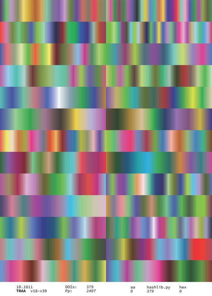
“This work is part of a series of graphics I have made that are based on Digital Object Identifiers, or DOIs. DOIs are unique strings of characters that are frequently used in academic publishing to provide a reference for digital scholarship. This piece traces the publication Transforming Anthropology (TRA) from volumes 18 through 30. I use a
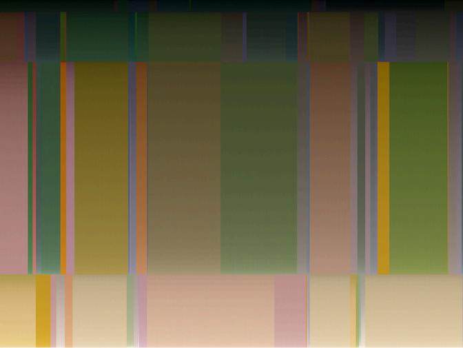
Python script to translate DOIs from the publication into colors and arrange them into a kind of bookshelf covering years of the journal and many articles. Colors and lines ebb and fade based on color contrasts, volumes of the publication, and changes in DOI application. The idea comes from my time working at the University of Chicago Press, the publisher of TRA and many other journals. Every year we would combine multiple print volumes into single bound volumes for archival purposes this is a digital version of that practice. The work speaks to the labor of production of academic knowledge, or as many academics would say: “publish or perish. ” The analytic text that appears at the bottom of the frame gives coded context to the image above. ” Digital, Inkjet Print on Archival Paper 22" x 17" Professional Daniel Martin TRA v18-v30, 2024
“I work primarily with the three-color process, a meticulous and hands-on technique in which I capture three separate black-and-white images of the same subject, each using a different color filter red, green, and blue. By combining these three exposures, I create a full-color image, using the nuances of light, texture, and color to build the final composition. This process is both a technical challenge and a creative exploration of color perception, drawing on the historical roots of early color photography while embracing the unique qualities of analog methods.” Inkjet Print 19" x 13" Professional Evan Murphy
Jacob 1, 2024
“Art is my language. Words often fail me, but the images I create allow me to speak clearly
about what I feel and to share the worlds and images floating through my mind. I have a
ceaseless need to create. Through my struggles with anxiety and depression, I find a sense of grounding through my artistic process of transforming simple materials into something beautiful.
The challenge of turning the hard, cold medium of plain white paper into soft edges and warm
lines provides me with an endless series of puzzles. I cut every line by hand, a process as
complex as it is organic a process that makes the art feel timeless and meditative. The lighting is the capstone that brings a beautiful transformative element to my work. I find it fascinating and liberating to rely on light to imbue my art with life and color. ‘A Glorious Dawn’ is inspired by
imagery taken in infrared and near-infrared by the James Webb Telescope of the Southern
Ring Nebula. I integrate invisible UV painting when the piece calls for it, such as for ‘A Glorious
Dawn, ’ to further push the transformative theme of my work, as a burst of vibrant color is revealed only under specific wavelengths of light. My work shines brightest when surrounded by darkness. I hope it brings a sense of solace to the viewer and invites them to lose themselves in another world, even if only for a moment.” Hand Cut Paper, Invisible UV Paint, and Programmed LEDs 11" x 11" x 4.5" Professional Brittany Otto A Glorious Dawn, 2022
“My work explores abstraction through colour, light and surface. Usually emerging from experiences of place and walking and often site specific, the paintings convey a sensory and embodied experience with
conscious and unconscious elements, whilst also being concerned with the materiality of paint and process
The painting ‘Pollen Painting 4’ 70 x 70 cm, acrylic and graphite on canvas, 2024, is one in a series using the formal qualities of a geometric grid to explore pollen colour connected with the landscape. I visited Kew Gardens Collection and Library to look at Dorothy Hodges pollen grain drawings and polllen colour illustrations in her book ‘The Pollen Loads of the Honey Bee’ published in by the Bee Research
Association,1959 The hand painted colour charts of the pollen she collected are fascinating I wanted to get the sense of the atmosphere of a landscape through its pollen colour, thinking about light, temperature, weather conditions as well as the colours of the pollen that the bees would be collecting from plants and trees. I used to be a beekeeper myself and always enjoyed opening the hives to see the brood cells surrounded by the pollen collected to feed the developing bees
My process starts with stretching the canvases and applying layers of ground, in this case a graphite ground bound with acrylic medium. I painted with a variety of acrylic paints, some bought, some that I made by grinding pigments and combining them with an acrylic binder. I work intuitively in layers, with the pattern developing organically. In between the layers I sand the paint down, so the surface always has a very material quality, almost like a wall painting. I don’t plan the painting, though have ideas about the colour combinations and it develops its own form through painting it, rather like a musical improvisation. I feel it is finished when I like the sense of colour combinations and arrangements and the colours can take you on a journey I work back into the surface with an etching tool drawing the structure of the geometic shapes through, which brings the graphite to the surface. I think of my paintings as meditations on colour and emotion and feel they work best when they achieve some kind of energetic resonance. ”
Amateur Ruth Philo Pollen Painting 4, 2024
Acrylic and Graphite on Canvas 60cm x 60cm
“My work is a dynamic exploration of photography, both color and black and white. When selecting subject matter, I find myself consistently drawn to the landscape, allowing it to inform and inspire my artwork. Each shot evolves with its own timing and compositional demands, leading me to bring structure and fluidity into a harmonious balance. This continuum of color in my landscape capture, “Earth and Sky” , presents its own unique perspective, capturing the world through my ever-evolving lens. This abstract sunset photo, taken from the Lost In Time Ranch Deck, evokes the colorful splendor of the sky, creating the illusion of a view of a planet
against the vastness of space.
My technique is uniquely mine, honed through years of practice and formal training. In my abstract pieces, I am captivated by the interplay of edge tension, color, light, and the dichotomy of motion against stasis. The joy and seriousness of photography are intertwined for me, as it serves as both a means of fun and a pathway towards self-actualization, expressing my world view. Through my work, I wish to bring delight to viewers and evoke emotions, thoughts, and insights, inspiring contemplation. ” Color Photography 10" x 13" Professional Vivian Pitts Earth and Sky, 2024
“In the intricate dance between structure and perception, my piece “One Form, Endless Voices” , explores a fundamental truth: color is not merely a
its own. Each pattern I c
und abili
of color to transform, communicate, and evoke emotion without altering a single line or curve.
Each of my pattern designs begins wit
k of cur
si
I wonder how this form will be transformed by color. Which colors will capture the audience’s attention? How many distinct patterns will emerge from various color combinations? This pattern form, ‘One Form, Endless Voices’ , was inspired by my late friend William Blackwell, AIA, who authored “Geometry in Architecture” . Bill designed geometric patterns using mathematics, and I create them visually with my “creative math” . Mixing my curiosity of fractals, geometry, and inspiration from Bill’s writing and art, this rotating geometric pattern emerged.
Color selection is not mere decoration it is a strategic, deeply intentional process. Initial color combinations from our framework are explored and reviewed in conjunction with the context mood board. Subsequently, multiple color combinations of two to four hues are refined using the NCS Color System and Adobe Illustrator. This process involves adjusting the nuances of hue, value, and chroma to create unique color palettes that align with the framework. These color palettes are applied to the pattern in distinct ways, and it’s the color interactions that alter our perception of the form.
This non-verbal visual language of color serves as a powerful tool to guide viewer attention, create visual hierarchy, evoke emotional responses, and convey complex narratives without resorting to words ”
Sandra Sampson
ONE FORM, ENDLESS VOICES, 2024
Video Professional
“I have always worked with abstract shapes and forms to confront the world around me. I see
today’s environment as hard edged, in-your-face, and overtly political. As a colorist by nature, I
use color to speak to/talk about the world, partly as internal dialog, partly as outward
observation. I use a network of color schemes to suggest disparity coming together. The
transparent geometric shape(s) within each work hint at a false sense of control or perception.
The circle connects to the roots of Geometric Abstraction but also to the Buddhist concept of the Dharma Wheel where the circle becomes a place of mindful meditation through the optical transparency. My work references modern predecessors of Op-art (South American and European), hardedge abstraction, and the P&D Movement of the 1970’s while placing a contemporary twist on it by combining color theory (i. e., the politics of color), hardedge/geometric abstraction, elements of color field, and digital manipulation. ”
Patrick Schmidt
Rescue, 2024
Acrylic on Board 24" x 24" Professional
“Having vision in only one eye, I have always seen the world through a monocular lens. This narrow window has made me hyper aware of fine details and imperfections. The uniqueness of the imperfections interest me the most as my own visual “imperfection” allows me to see the world differently.
I see my work as a testament to the beauty of irregularities, the unexpected poetry of combining color, texture and discarded materials. In the whispered secrets of the fine details woven together, I find a profound connection to the human experience. We are all woven together by fragments and my work celebrates our exquisite resilience and the beauty of our shared story.
In ‘Radian Surface Detail, ’ I explore weaving, line, color, form and texture while working with a structural grid format in mind. I used strong colors to make optimal use of contrast while focusing on embroidering textures. By using colors as pure physical elements a relationship between the materials evolves into a new creation. At the same time they are also seen as independent layers. In this painting, the thick white tones of impasto oil paint and the solid black rope emphasize the bold contrast of colors while maintaining their physical and structural importance in the painting. I also interweave Iridescent colors to add complexity and highlight texture. ” Mixed Media on Canvas, Found Rope, Acrylic and Oil Paint 48" x 36" Professional Kari Souders
Radian Surface Detail, 2024
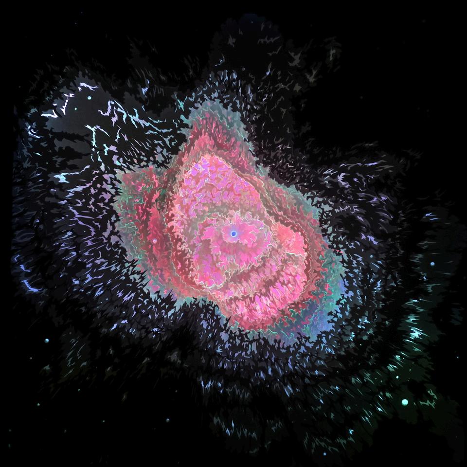
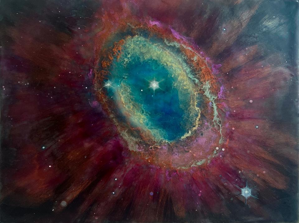
“I am an interdisciplinary artist based in Minneapolis, working across sculpture, sound, video, installation, and image-making. My practice is multi-modal, but united by a core interest in exploring how we perceive the unseen and the unknown. I’m particularly drawn to the ways we process information whether scientific, emotional, or symbolic and how we choose to believe, question, or suspend disbelief. Across all my work, I aim to raise questions about our accepted notions and reactions, our capacity for doubt, and our willingness to explore uncertainty.
‘Ring Nebula II’ is part of my ongoing series Interpreting the Invisible Universe, which transforms
raw telescope data into tactile, layered works using encaustic a medium that allows for
luminosity, depth, and preservation. Drawing on imagery from the James Webb Space Telescope, I isolate different data filters, colorize them, and embed each printed layer into wax, creating a visual structure that mimics the compositional process used by NASA. The nebula’s false-color glow, rendered through beeswax, mica, and inkjet pigment, becomes a poetic
metaphor for the ways we translate scientific data into human meaning.
Color in this work is not merely aesthetic; it functions as a form of communication. The hues represent different wavelengths of light, each carrying scientific meaning. My process becomes one of interpretation—turning spectral data into material form. Working with wax allows me to both preserve and distort this translation, emphasizing the subjective nature of how we perceive and process the cosmos.“
Holly Streekstra
Ring Nebula II, 2024
Encaustic on Wood Panel 9" x 12"
Professional
“Geometric abstraction distinguished by vibrations of color are foundational to my art making process. Together geometry and color make visible my reflections of being in a vast universe.
Give weight to the reality of the unknown. Point to the immensity of space that surrounds each second of our lives. Voice the constant hum of wonder. Accept the ambiguity of ‘I am here’ and ‘Where am I?’
The planes and lines in my work exemplify the geometric concept of infinite extension fired by color embodying a theoretical range of endless potential that I envisage expanding off the edges of the support...moving continuously in all directions. Planes of color, boundlessly expanding. Sometimes repetitive use of geometric form and color patterns are used to assert a rhythmic constancy of the unknowable.
My imagined realities conceptualized with geometry and color symbolize an acknowledgement of what is unseen, what is unknown, what is experienced. Mysteries. Color is chosen to propel the geometry with a multitude of voicings. Color is everything. Holds everything. Speaks and sings. Color shifts. Is this then that. Together color and geometry generate a visual musicality.
Alive. A fluidity of hope as endless variations of form and light unite to reflect an awesome presence. “
Marilyn Stubblebine
Sounds of Blushing, 2024
Acrylic on Board 24" x 30"
Professional
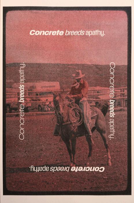
“This print uses only red and black ink to construct prints that appear far more complex than their inputs suggest. The work is grounded in Edwin Land’s Retinex theory, which frames color and tone as relational not absolute, but shaped by light, context, and comparison. These prints don’t aim for perfect reproduction of image or range of color; instead they exist to draw
attention to how we make and see color. The audience viewing the work completes the image. This shift in intent opens space for a different kind of design one that reduces material and energy use, not for efficiency’s sake, but to ask how design might operate under different
material conditions. The process embraces limitation, friction, and misalignment. Just a direct encounter between viewer and surface, mediated by ink, light, and expectation. The hope of the project is to explore how the act of printing can reflect the conditions we’re already living with limited input, unstable systems and still make meaning. ” Risograph Print 18" x 12" Professional Christopher Swift Concrete breeds apathy, 2024
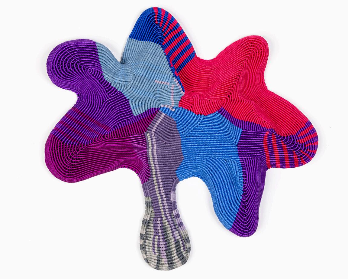
“Ribbons have myriad connotations that cannot be neatly ‘tied up in a bow’ –gift wrapping, hair ties, bondage, diseases, signifiers of rank, awards, tefillin, maypoles, luxury and decoration. My
repetitive assembling of thousands of bits of colorful coiled paper forges traditional handicrafts into modern painting. My paintings are a counterpoint to mass production, with luscious patterning and surface embellishments. I forge traditional handicrafts into contemporary mixed media responses to
Ellen Frances Tuchman
SUSURRARE, 2024
repetition, obsession, feminism, the marking of time, and the atmospheric poetry of color.” Mixed Media: Hand-Painted Paper Quills Hand-Sewn onto Ribbon
50" x 165" x 3" Professional
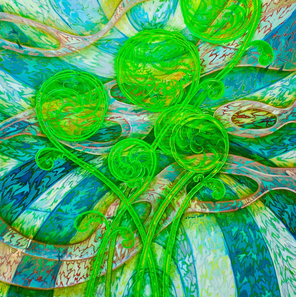
“Limitation, conflict and flux characterize my creative process, and through these parameters I
strive to represent natural phenomena as transcendent visual experiences. Essentially, I strive
to construct transcendental representations of change.
To construct my work, I draw from empirical observation and themes found in Modernism. The Korean minimalist off-shoot movement, Dansaekhwa, which incorporates a creative
philosophy of limitation and restraint of thought, color and mark-making has recently been a
point of reference.
Ultimately, my works’ departure point (nature in transition, conflict and restraint) gets lost in the making of my work which becomes an exercise of finding resolution between binary principles such as tradition and experimentation, representation and abstraction and image and object. I build my work through layers of repetitive mark-making and view these layers as analogous to a
view of the environment as one of constant transition while striving for resolution under circumstantial restraints.”
Craig Voligny
Fiddleheads, 2024
Oil on Panel 36" x 36" x 2" Professional
“As a theatrical lighting designer, I use color to shape, define, and give meaning to the worlds I help co-create. My lighting reveals the human form and the other elements onstage while suggesting: who these people are and wh
safety or danger of t
relations
and w
on an unconscio
blue. ”
sp
;
t
Theatrical Lighting Professional Stephen White Lighting Color as Communication, 2019-2023
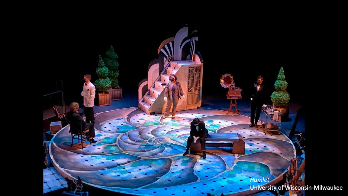
Hamlet, University of Wisconsin-Milwaukee
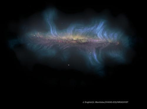
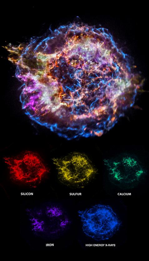
“A team of experts at the Chandra X-ray Center, which operates NASA’s most powerful X-ray
telescope, worked together to process data of Cassiopeia A and create imagery of the aftermath of an exploded star. Turning X-rays (a type of light invisible to the human eye) into
something we can see is both a science and an art. The team includes software engineers and imaging scientists. This image was crafted from raw binary data from Chandra’s X-ray observations, translated into an events table that catalogs each photon’s arrival with a specialized Chandra software, CIAO. With the CIAO software we analyzed the X-ray emissions, identifying specific elements.
Using NASA’s Chandra X-ray Observatory, astronomers mapped the locations of different elements in Cas A’s expanding debris field. The colors in the image represent key elements: silicon (red), sulfur (yellow), calcium (green), and iron (purple). These elements emit X-rays at specific energy ranges, allowing scientists to identify and map them. The blue outer ring represents high-energy X-ray emissions from the expanding blast wave, a remnant of the cataclysmic explosion that sent these elements hurtling through space. Color was applied to the different data slices, representing distinct elements and structures, using Adobe Photoshop. This process transforms invisible high-energy light into a stunning, scientifically meaningful portrait of a stellar explosion, bridging data and art to reveal the cosmic origins of life’s essential elements.”
Team members: Chandra X-ray Center Data Systems Team, Joseph DePasquale, Nancy Wolk, April Jubert, and Kim Arcand. “
Digital Image 12" x 12" Professional Nancy Wolk
Cassiopeia A Supernova Remnant , 2017
“Mixing color swatches and filling sketchbooks with vibrant palettes began as a calming studio practice, but quickly evolved into a deeper exploration of color theory and color psychology. It became evident that color holds a profound ability to heal and transform, aligning seamlessly with my interest in integrative health. In Eastern medicine, colors correspond to chakras, each carrying a unique vibration. Every painting I create now meditates on a specific color theme, inviting contemplation. Our reactions to color are deeply personal, shaped by culture, experiences and memories, forming an intrinsic connection between our lives and the colors around us. I explore color’s impact through monochromatic schemes, complementary contrasts, and the interplay of saturated tones against neutral backgrounds. Multiple layers of encaustic paint create a distinct luminosity, enriching tonal relationships with depth and complexity. Color serves as both a symbol and a channel for meaning, defining the spiritual core of my work.
This piece began as a color study for a larger 30x40 encaustic painting. The color red is strongly associated with passion, energy, and danger, as well as power, strength and courage. Fire symbolizes universal oppositions: conflict between individuals, humanity’s struggle against nature, and the interplay of chaos and beauty. It invites viewers to consider the contrasts
inherent in existence, where beauty and peril intertwine. We are mesmerized by the dangerous beauty of fire. Its destruction is also transformative, serving as a catalyst for renewal. ”
Terri Yacovelli
Burning Red, 2023
Encaustic 10" x 10" x 2" Professional
“My work explores the potential and limitations of materials to create a sense of spaciousness and light. I look at what is present as much as what is not, thinking about the space between boundaries. I am inspired by the simplicity and experimentation of the Bauhaus period. My material-centered process combines intentionality and happenstance, control and surrender, and often leads me to discover and embrace the unexpected. My experiments with botanical dyes on linen have allowed me to blend different plant extracts. roots, and flowers as well as to overdye hues, a process I think of as similar to mixing my own paints. In “Rainbow Connections” , remnants of dyed linen from previous projects have been sewn together into strips and secured by a weft of hand-knotted, dyed linen thread. Machine stitching on the vertical strips and piecing together of different colors within strips create surface variety.“ Textile
35" x 31" x 5" Professional Susan Zimmerman Rainbow Connections, 2023