JFK INT’L AIRPORT
Data Visualization Report Design
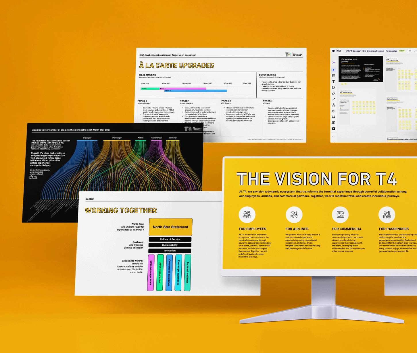
During a strategic engagement with John F. Kennedy International Airport’s Terminal 4, I built a visual tool (see A to the right) to convey the findings of the service-level gap analysis. This visualization was a key element in the final readout report I built with select slides featured to the right.
While the gap analysis data visualization initially appears complex, its form resonated with the client and more clearly translated insights about their current program of initiatives. This style of visualization is now part of Terminal 4’s plan to continue measuring progress toward their larger North Star vision and summarizing future analysis.