BRAND GUIDELINES
WELCOME
Welcome to the Coldwell Banker Southern Realty Guidelines. This document contains all you need to know about how our brand should be used in print and digital materials ensuring it remains consistent throughout. Using our brand correctly is extremely important to us, so we ask that the guide is always referred to and adhered to. We hope you enjoy getting to know our brand better.
BRAND STRATEGY
Our brand is more than our name or our logo. It’s the sum total of everything we say and do. At Coldwell Banker Southern Realty, we set and achieve ambitious goals. The quality of our products and services reflects our identity. Our guidelines have been designed to ensure consistency within our brand, helping to create strong, recognizable, and innovative communications. The following pages demonstrate the flexibility within the identity and should be used to inspire and motivate creative expression.
STRATEGY Brand
THE STORY
Ourbrandismorethanour nameorourlogo.It’sthesum totalofeverythingwesayand do.AtCBSR,wesetandachieve ambitiousgoals.
THE CRAFTSMANSHIP THE QUALITY
Weareabranddevotedtothe serviceofourclients,the successofournetworkandthe remarkablepowerofhome. We’recommittedtocreating dominantwinnersinevery marketweserve.
VISION STATEMENT
Tobethegloballeaderinreal estate,providingexceptional service,innovativesolutions,and acommitmenttocreating lastingrelationshipswithevery client.
ColdwellBankerLuxuryoffers exclusivepropertieswith superiorqualityand craftsmanship,ensuringclients experiencethefinestinluxury living.
MISSION STATEMENT OUR BELIEFS
Ourmissionistoprovide unparalleledrealestate servicesbydelivering exceptionalclientexperiences, embracinginnovation,and fosteringlastingrelationships builtontrustandintegrity.
Webelieveinsettingthestandard forluxuryrealestatebydelivering exceptionalservice, uncompromisingquality,and fosteringrelationshipsbuiltontrust, integrity,andexcellence.
HONESTY & INTEGRITY
Withacommitmenttohonesty andintegrity,weprioritize transparencyandtrust,ensuring everyclientreceivesgenuine, ethicalservicethroughouttheir realestatejourney.
PASSION & LEARNING
Drivenbypassionanda commitmenttocontinuous learning,westrivetostayaheadof industrytrends,ensuringourclients receivethemostinnovativeand informedrealestateservices.
LOGO
Thesinglemostidentifiableelementofour identityisourlogo.Consistentuseofourlogo iskeytoretainingbrandstrengththrough immediaterecognitionofwhoweareand whatwestandforasabrand.
MASTER LOGOS Logo
Our logo is simple, clean, and stylish.


SPACE & SIZING Clear
Clear space is the area surrounding our logo that must be kept free of any text or graphic elements. By leaving space around the logo, we make sure it stands out in all of our communications. The minimum clear space is 50% of the height of the entire logo. Our logo must be sized large enough to be easily read on every application.

THE MINIMUM SIZE
It is sometimes necessary to increase and decrease the logo depending on the print area. Always keep in proportion. Always ensure the text is legible.
COMPLIANCE Logo
Few rules are necessary for maintaining the integrity of the brand. Any changes to our logo can diminish our values and the overall look of our brand. The examples shown here are some specific “do not” for our logo. Please do not compromise the overall look of the logo by rotating, skewing, or distorting in any way - that includes adding unnecessary and unattractive text, decorative elements, shadows, and outlines.


Do not alter the logo’s colors in any way.
Do not lock up text to the logo.
Do not add elements or shadows.
Do not place the logo in a holding shape.
Do not alter the logo’s shape in any way.
Do not make a name bigger than the logo font.
Jane doe
COLOR
Ourbrandisunderpinnedwithacolourpalette designedtobefresh,modernanddistinctive. Differentcombinationsofcolourcandramatically changethetoneandappearanceofadocument soitisimportanttoconsiderhowtheywork together.Tohelpachievegreaterbrand recognitionitisimportantthatourcolourpalette isappliedconsistently.
BRAND COLORS Palette
Theprimarycolourpaletteisconstantthroughoutallcommunications.Acolourhierarchyhasbeen implemented,rangingfromMintFrostbeingthemostimportanttoLightGreybeingtheleastused.
WherepossiblePantonecoloursshouldbeused.Forextraimpact,specialprinttechniquessuchas debossingcanalsobeapplied.
Palette
melancholia HERO COLOR
Palette
SECOND COLOR
Darktaupe,representedbythehexcode#2d2926,embodiesasenseofdepthandsomber elegance.Itsmutedtoneconveyssophisticationwhileevokingfeelingsofintrospectionandcalm. Thisshadecanoftenbefoundindesignsthataimtocreateamoodyatmosphere,lendingitselfwell tocontemporaryaestheticsininteriordesign,fashion,andbranding.
noir
TYPOGRAPHY
Poppinsisourbrandtypeface,itshouldbeused inallinstanceswheretypographyisrequired.Itis asimple,clean,andlegibletypefacethat complimentsourlogo.Typographyshouldn’tbe overlookedasakeyelementwithinourtoolkit.Itis importanttoadheretotheleading,tracking,and textarrangementspecifiedinthisdocumentto achievebrandconsistencythroughout.
PRIMARY FONT Typography
Typographyisapowerfulbrandtoolwhenusedconsistently.Thissetoffontsbestrepresentsthe minimalandelegantfeelofthebrandandshouldbeusedacrossallprintandwebapplicationsHatton isourcorporatetypeface,itshouldbeusedinallbodytextwheretypographyisrequired.Itisasimple, clean,andlegibletypefacethatcomplimentsourlogo.
Typography
SECONDARY FONT
Typography is a powerful brand tool when used consistently. This set of fonts best represents the minimal and elegant feel of the brand and should be used across all print and web applications Public Sans is our corporate typeface, it should be used in all body text where typography is required. It is a simple, clean, and legible typeface that compliments our logo.
FUTURA
Bold is our headings
weight.
Regular is used for captions and some bodies of text.
Regular Italics is used for quotes and interviews.
MAIN COLLECTION Typography
Helveticish
To be used for headings and titles.
ABCDEFGHIJKLMNOPRSTUVWXYZ
1234567890!@#%&()+ abcdefghijklmnoprstuvwxyz
Poppins
Tobeusedfor maincopyand bodyoftext.
ABCDEFGHIJKLMNOPRSTUVWXYZ
1234567890!@#%&()+ abcdefghijklmnoprstuvwxyz
The Seasons
To be used mainly for captions and secondary titles
ABCDEFGHIJKLMNOPRSTUVWXYZ
1234567890!@#%&()+ abcdefghijklmnoprstuvwxyz
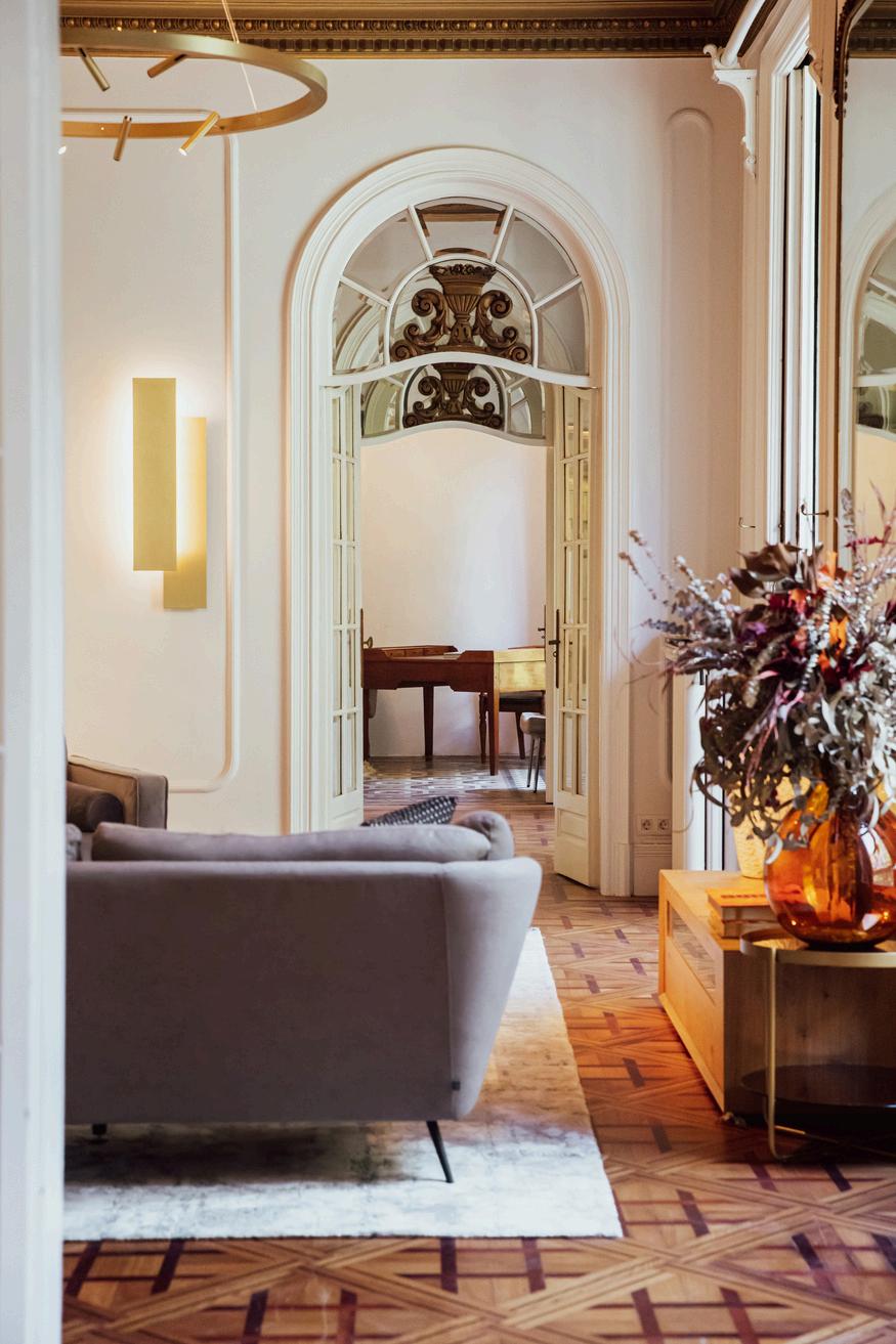
IMAGERY
Ourphotographyandfilmingstylecapturesreal momentswithrealimpact.Itconveysaunique perspectiveonthedynamicnatureofourpeople, communities,operationsandthechangingworld aroundus.
PHOTOGRAPHY Imagery
This photographic style is for banners, advertisements, social media, and reports. It captures who we are and rand. Imagery should contain clean and professional backgrounds which allow for the logo and headlines over the image.