Visual Brand Guide
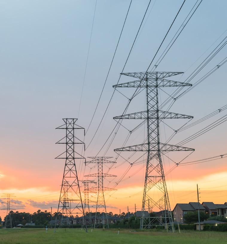
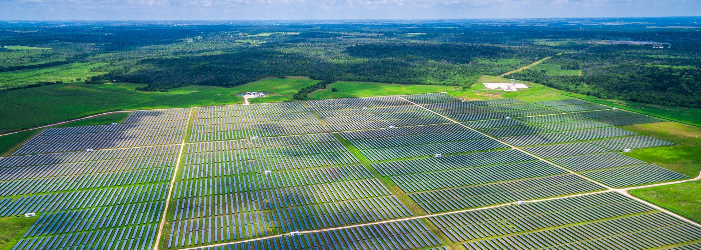
The Permitting Council plays a leading role in creating a clean energy future and modernized infrastructure.
We offer a path for transparency and predictability for all FAST -41-covered projects and serve as a center for permitting excellence for infrastructure projects across the nation.
We are uniquely positioned to proactively and efficiently assist with the completion of environmental reviews and permitting processes.
We bring coordination and collaboration to the permitting process across all stakeholders.
Logo with tagline
Tagline Logos
In special cases where space permits the logo can be paired with the tagline.
Consider legibility when using the logo with the tagline at smaller sizes.
Horizontal Tagline
Horizontal Tagline - Grayscale
Horizontal Tagline - Reversed
Vertical Tagline
Vertical Tagline - Grayscale
Vertical Tagline - Reversed
Colors
Primary Palette
Forward-thinking tech blends with colors found in the natural landscape to create a harmonious, broadspectrum palette, referencing both the technical nature of infrastructure projects and the beneficial effects on the environment.
Primary Palette
Use these primary colors to reinforce messaging and further establish recognizable and unifying visual elements.
Secondary Palette
Use these secondary colors for additional design flexibility.
Proportions and Ratios
For all applications, colors should be used in approximately these proportions.
CMYK: 95,71,40,28
RGB: 23,68,96
HEX: #174460
CMYK: 81,29,26,1
RGB: 25,143,169
HEX: #198FA9
Lime
CMYK: 40,0,100,0
RGB: 166,206,57
HEX: #A6CE39
CMYK: 81,44,3,0
RGB: 43,126,188
HEX: #2B7EBC
Proportion and Ratios
Orange
CMYK: 1,58,91,0
RGB: 242,133,50
HEX: #F28532
Gold
CMYK: 5,23,96,0
RGB: 242,194,36
HEX: #F2C224
Black
CMYK: 0,0,0,100
RGB: 0,0,0
HEX: #000000
Secondary Palette
FPISC Blue
Teal
Ocean Blue
Logo space and size
Clearspace
The clearspace is the minimum empty space surrounding the logo. No other object, design element, or field of color that could cause readability issues should be placed within the minimum margin. The minimum margin is defined as the relative width (with equal height) inside the dark blue square shape defining the arrow point in the logo mark.
Minimum Dimensions
The minimum dimensions are the smallest size allowed for the logo (both horizontal and vertical versions). There are exceptions to these rules. For example, this variation of the logo mark may be used as a website favicon, and in this case, may be smaller than the stated sizes.
Height: 0.45 in.
Web Favicon
Height: 0.7 in.
Height: 1.05 in.
Height: 1.295 in.
Height: 0.5 in.
(48 px)
Typography
Primary
Soleil is a geometric typeface with a clean, open and modern aesthetic offering several styles for flexibility. The predominant font for the Permitting Council, this font offers excellent readability.
Noto Serif features modern styling as a serif companion for Soleil. Paired together, they offer contrast and heighten each other’s refined characteristics.
Noto Serif is used sparingly and with intention for emphasis and contrast: quotes, specific elements in graphics, watermarked elements, etc. The serif is a subtle nod to foundations, structure, knowledge and expertise. The serif presence reminds us that technology and advancements spring from what came before, and that intention takes us into the future.
Alternative Fonts
When possible, the primary fonts listed above should be used in all materials and on the FPISC website. If this is not possible due to system challenges or website governance, these alternative fonts may be used. In addition, alternative fonts will be used in all shared and editable templates across the Microsoft Office Suite.
Noto Serif is broadly available as a Google font and offers convenient use across Google Workspace.
Soleil
ABCDEFGHIJKLMNOPQRSTUVWXYZ
abcdefghijklmnopqrstuvwxyz
1234567890
Light, Light Italic
Regular, Italic
Book , Book Italic
Semibold, Semibold Italic
Bold, Bold Italic
Extrabold, Extrabold Italic
Noto Serif
ABCDEFGHIJKLMNOPQRSTUVWXYZ
abcdefghijklmnopqrstuvwxyz
1234567890
Thin , Thin Italic
ExtraLight , ExtraLight Italic
Light , Light Italic
Regular, Regular Italic
Medium , Medium Italic
Semibold , Semibold Italic
Bold , Bold Italic
Extrabold , Extrabold Italic
Black , Black Italic
Poppins
ABCDEFGHIJKLMNOPQRSTUVWXYZ
abcdefghijklmnopqrstuvwxyz
1234567890
Thin, Thin Italic
ExtraLight, ExtraLight Italic
Light Light Italic
Regular, Italic
Medium , Medium Italic
Semibold, Semibold Italic
Bold, Bold Italic
ExtraBold, ExtraBold Italic
Black, Black Italic
Baskerville
ABCDEFGHIJKLMNOPQRSTUVWXYZ
abcdefghijklmnopqrstuvwxyz
1234567890
Regular, Italic
Semibold, Semibold Italic
Bold, Bold Italic
Permitting Council